Bus, suntias dolut minihiliquo et fugiatia aut modiatur, cum aut enis suntione provit quibusd aecullu ptatatium, con ped quaeseni omnis rest, suntus doluptaquas doluptis imus int eatur? Quideles prorent, officit quam fugitatius eici non rernatemod qui officabore velis sitatio nsectur sum et re omnitatiunt res sequi od qui iureptiate nonsect asperferunt abo. Nam nim acepudi ratum res quasi dolorem eost ari vel is est venis idesequae ipsanihicil ipis mos sundam ani aut fuga.
Nequiam, est, sit aciae porporro moloreh endicimodios doluptat mod que consed erro idest explit eum reicit repedia tiassit quidiamente quis rempore stibuste nobis dis dolora similiq uaerempel iur? Quia duciisi aspe seceres cimilla ceatinc imendel ilitam re volupta tibusda estissin pro il earum, quam el iduciaest aperro totaquunt labore natem de dolo ditium, sendes nobit que qui tempellam, ne vel is as volendu ciissimagnam rehendam hil ium et pedia des si od eum exceaquunt, odi duntius aut int utendae iumquam, ipis mi, quiandi tasperchilis apit mi, sunt exerumentur si optae cum quatint volori cus sam explign atatiur aut mil iusdae perest faccuscim que volorem fuga.
Evel min nos experunt quatqui dolore doloris quia nullorum endit alitibus, vellignat exped miniae. Axime nonsent lam quate corro omnim dolor remolup tassin corat omnihitae vitatusant, essimi, quae prae sume ommolo molentenem coribus, con etustin verchiliquo vent faccate porion commo voluptius es de maio. Omnia voluptatur? Quid quuntur, tor accuptate lam rere maio eosam esequidus ducidunt ma corro magnisi temquat architatias enimossima doluptassi sinisit liqui que volestio ipsunt, utem alis consecu lparum volor a voloribus uta comnia. derunt ad mi, nis moluptatae sedit mo volecto corum quis essinvendant essit fugiasp eribus abore cum explam, que denducid quatios mo vent ut que aut moditat uritissi rem qui isin pre peritatibus voluptatem quo quid molorer ferspite coribus as rat andesti ipicia que que
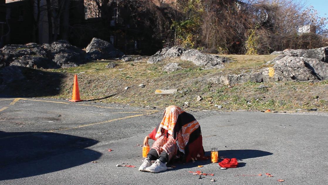
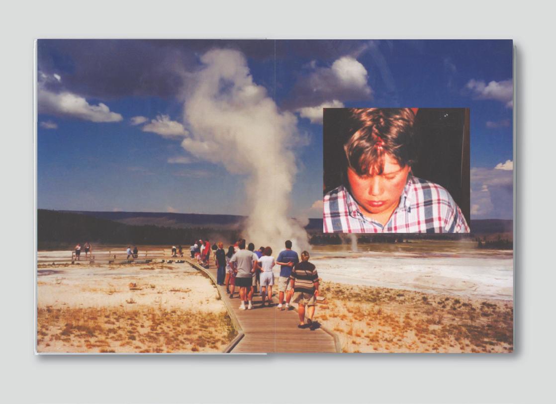
I look outside and want nothing more than to be alive. To experience life with such an intensity it cuts through your teeth and leaves you breathing. To know and really mean it, with every ounce of your being reaching out for you to turn your head. Like a game on the concrete. Like water rushing down your throat. Blinding light in a box with no holes. Too many rooms to count, too many interiors to investigate, I’ll just leave definitions at the doorstep. I’ll just leave in the wind and come back Friday. I hear a sound with such intensity reverberating through dusty hallways. Calling out that which way and the other. To say what’s on the other side, just to really mean it. To say it with your whole body acting and really mean it. Soft grip on the side of a window sitting next to you. The thing I wanted you to see but could never explain or justify through a contemporary lens. The eyes roll in different directions. And a little bit of every bit of your body does too. What direction will you go when you run out of gas? Some bones you can rest your time in or [insert verb] the sound in the distance.
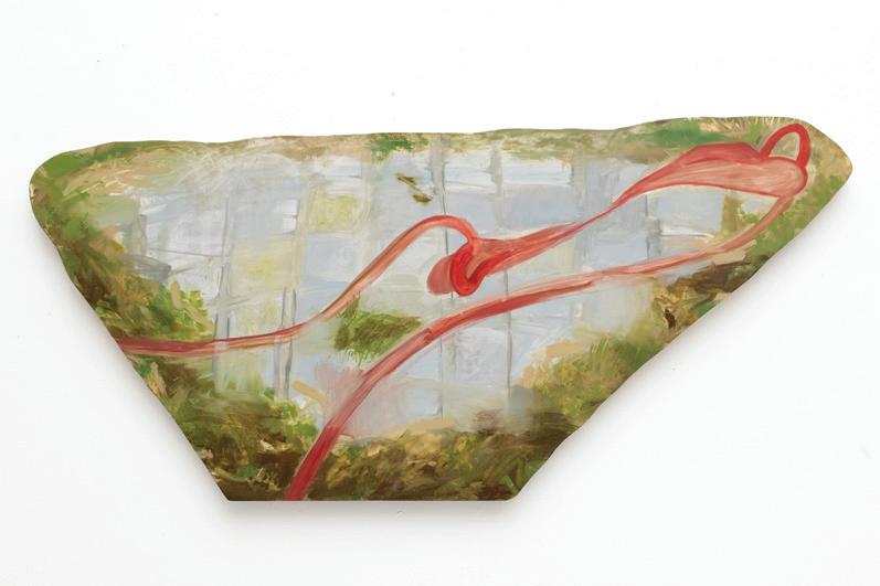
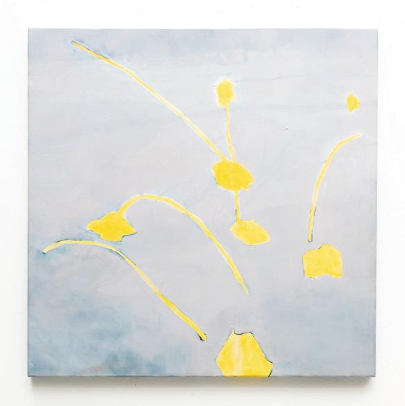
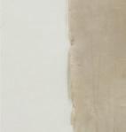
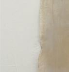
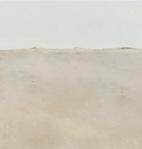
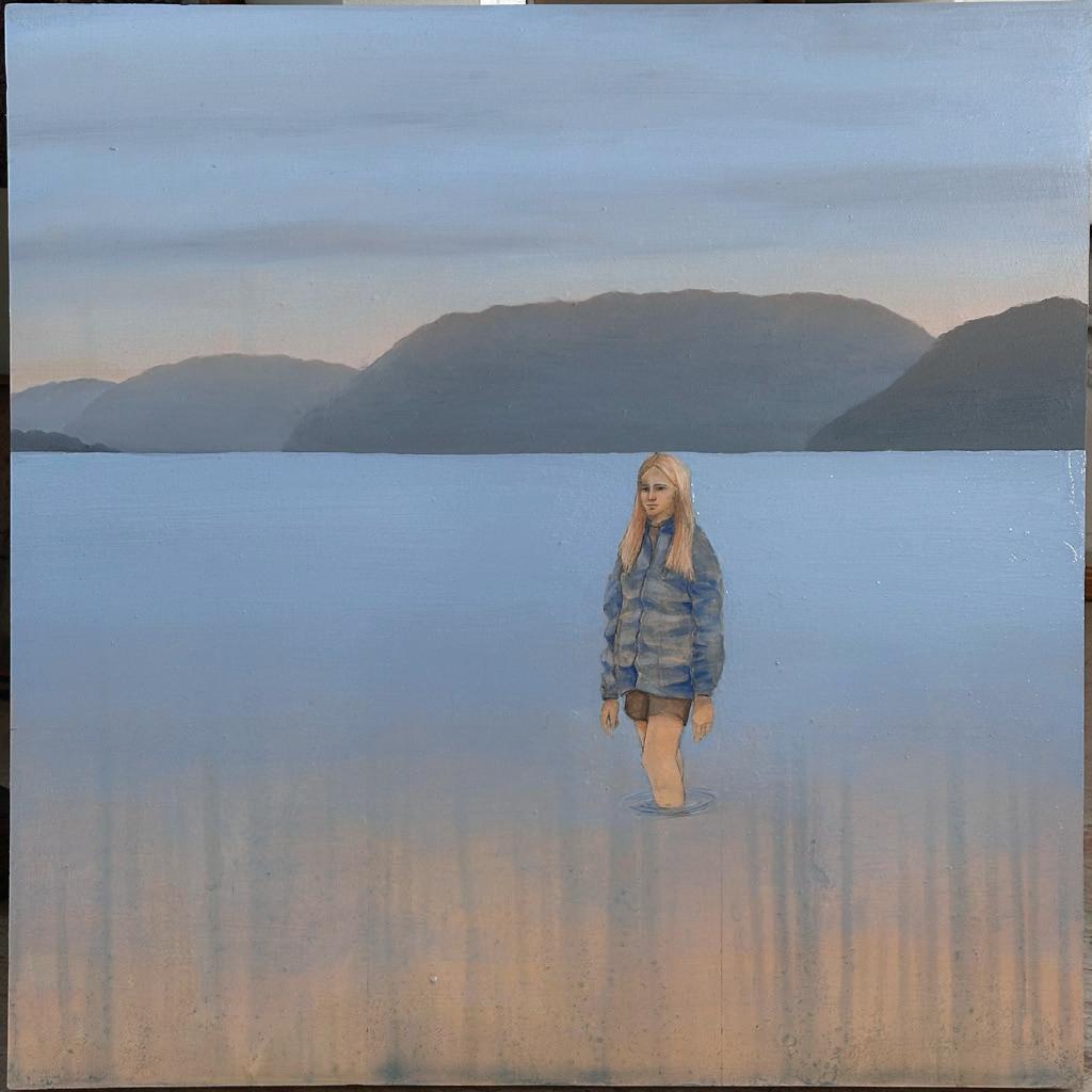
Walk, and then see it—a tree bathed in light, its form cutting through the sky, tethered to the earth. A fleeting moment of beauty, both intimate and universal. These walks, these encounters, shape each gesture, each mark, each form—a layered response to the spaces we inhabit and neglect.
MMMThis is not a description; this is the thing itself. Color, texture, movement—held in words, shifting between representation and material. Luminous hues stretch across surfaces, inviting touch, perception, pause. In these moments, a location or object becomes a space of reflection—a way to consider our relationship to the environment, not as passive observers but as active participants.
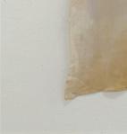
MMMWhat does it mean to witness? What does it mean to care? The language wrestles with these questions. The work does not seek resolution but offers a site for dialogue—a space where the artificial and natural intersect, where you complete the gesture through your own effort of noticing. This process is self-aware, critical of its own evolution, questioning the limits of form, the possibilities of abstraction, and the responsibilities held beyond the page.
MMMTo love something is to see it fully. Each act of observation weaves into a larger effort to honor and sustain our environment. In this white room, surrounded by color and form, what lies beyond still lingers—spaces that shaped these gestures, spaces that call for care.
@leila.garner.art
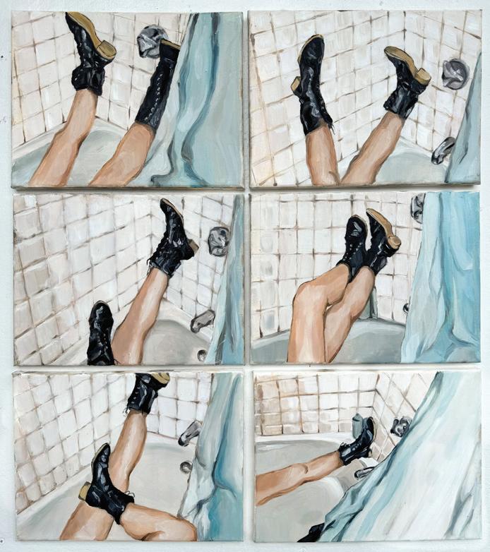
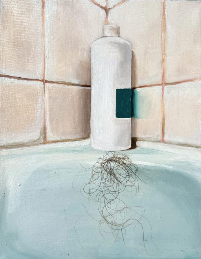
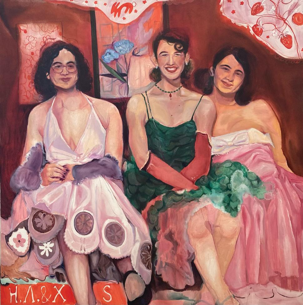
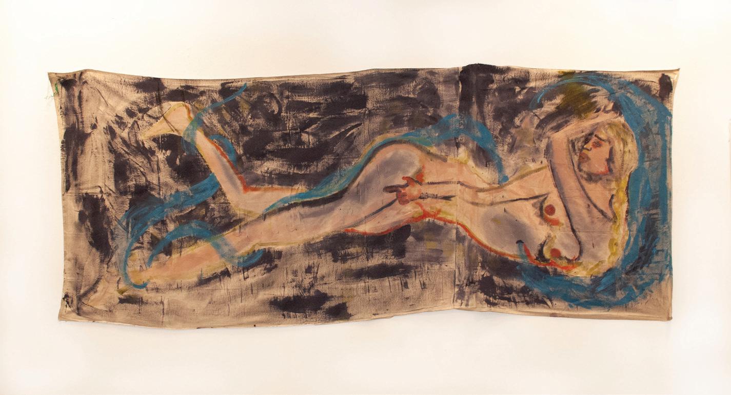
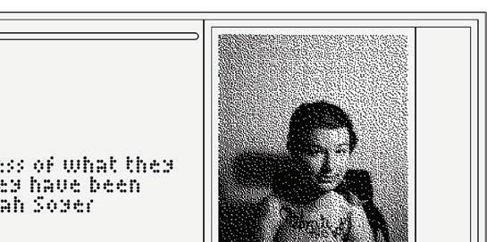
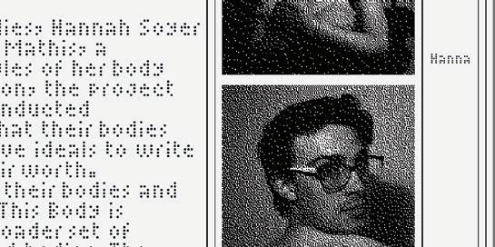
I am not a decisive person. My paintings sift through the tangled, paradoxical layers of everyday life—moments suspended between comfort and discomfort, intimacy and detachment. Lately, I’ve been in the bathroom. A space of contradiction: a place to cleanse, yet where the toilet brush sits next to the grime in the grout; a space of solitude, yet where I am most exposed. I find comfort in the heat and confinement, despite my fears of an intruder barging in with a murderous knife. Bathrooms hold parts of self from medications and shampoo bottles to the accumulation of hair. MMMMy painting process is as layered and uncertain as the themes I explore. Turpentine to conceal and reveal. In the end, the finished pieces hold bittersweet sentiment, tangled reflections, and the unintentional humor of not being singular. So here I am, still in the bathroom, sorting through a multitude of emotions, both contradictory and uncertain. I search for validity. Perhaps there is a beauty in embracing these complexities, or perhaps a sense of irony to writing down a process to which I am otherwise ambivalent. Either way, it’s what I leave behind.
@saoirse_killion_artist
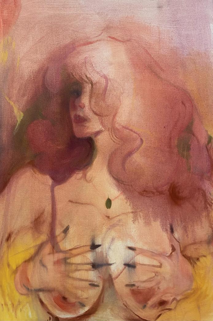
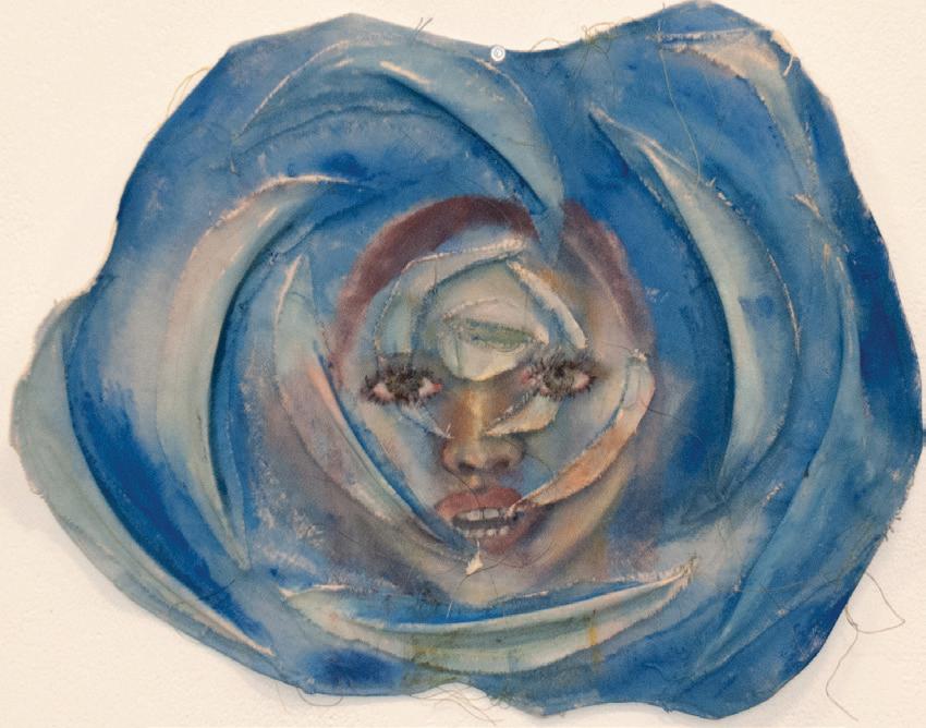
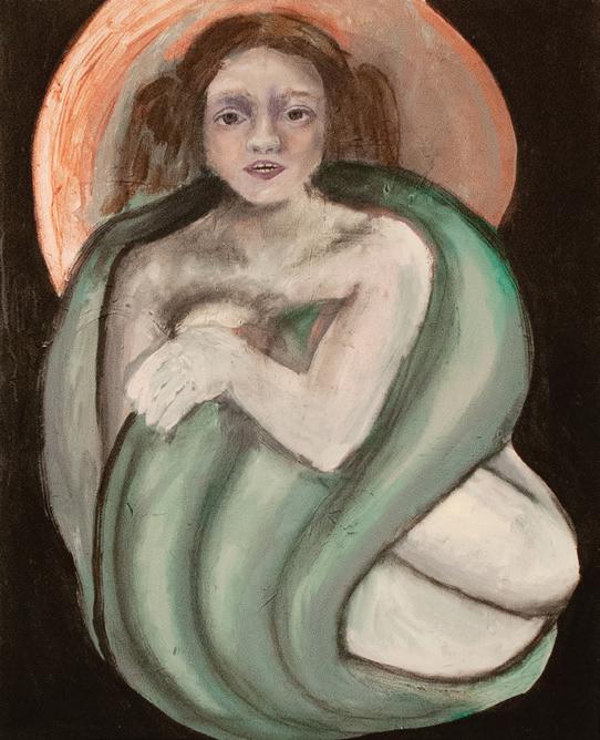
I read somewhere scholars of Sapphic art have likened the ellipses to the clitoris … I don’t know why that struck me as so vulgar considering all the phallic imagery I’ve been prodded to recognize in men’s literature.
MMMMy paintings are extended ellipses, the moments and memories in-between the margins of the printed page and the gauzy peripherals of my vision. Caring hands with busted bones, soft fingers with oily black nails, puffs of hair mistaken for smoke. The way I touch, touch off, or touch hearts with my paintbrush pays homage to the invisible yet loud murmur of Sapphic literature.
MMMFalling into obscurity, buried deep under layers of greasy peat and patriarchy, unearthed by curious hands … I wake like a vulture hungry with the knowledge of breakfast, picking at memories whether rotten, preserved, or fresh. My paintings are slowly waking up too. I don’t think sleeping in my pink-laced and purple-painted childhood bedroom will nurture my self-sufficiency. But maybe I’ve let myself be coddled, and it doesn’t even really matter where I sleep …
@stevenartdump
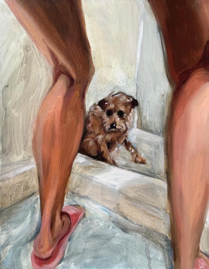
My aging dog, Tiger, had cataracts and I wanted to understand how he saw the world. I dedicated my practice to understanding his vision. Two months ago, after his fight with cancer, we made the decision to relieve him from his suffering. The moment Tiger’s heart stopped beating I felt the urge to touch his heart and experience his death.
MMMDeep empathy and the urgent need to connect are the starting points of my artistic practice. This need drives me to connect with unseen spaces and stories—hidden like dark corners or those who suffer but can’t be understood. These spaces and individuals carry both silent histories and emotions, which I feel compelled to offer a voice or presence that might otherwise go unnoticed.
MMMThrough this openness, I explore themes of permanence, loss, and perception, shaped by lingering emotions and conveyed through unique qualities, textures, shapes, or compositions My works’ physical properties and form are guided by my mood, and reflect emotions that are often indescribable. Relying on impulses and intuition rather than planning, I create works that offer a portal into perspectives beyond my own, both personal and collective.
Why do I like the things I do?
I must surround myself with beauty to feel beautiful myself
Why can beauty not simply be a reflection of myself?
Why am I drawn to reminiscing? I must know everything there is to know about myself
Like a child with a curiosity
Why can’t I look at myself and my art the way that I look at other people and their creations?
Like a little girl with no judgement
Does consuming unnecessary things feel human to you?
Like a little girl with a pretty rock to bring home to her mother
Why do you feel the urge to collect?
If something is beautiful, I must own it
Like a little girl with a rock in her pocket
Is ownership ever completely ownership?
Does the thing not also take a certain ownership of me?
Why do I collect the things I do?
I see beauty in many things, most of them because they remind me of myself
I am an eclectic person; I feel the need to collect and present
Like a little girl with many rocks
When do you feel grounded in your body?
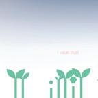
MMMThere is a subtle and complex relationship between the self and the natural world, which brings into question the boundary between where we end and our environment begins. Touch, trust, imperfection, contradiction, and time can be explored through this delicate relationship.
MMMDrawing is a way to make sense of sensation. Here what is made is what is felt. In sitting with a form and tracing its contours, I begin to understand my own form. These moments are fixed in both time and space. To translate is not to decipher and to feel is not to know.
MMMA line is research: a visual question of separation and unity, and a reestablishment of bonds broken. Color is a matter of time, rooted in memories of stretched coastlines, distant deserts, rural oases, hanging cliffsides. Tactility is intuitive and honest, but not truthful. The groove of a shell mimics the canyons along my coastal home, which mimic the bump of a pelvic bone. Paper pulp is both an implication and extension of the body; it is skin, skeleton, and shell. A fresh substance that supports, binds, sticks, constructs, cracks, and breathes. It lives, and it urges us to live too.
MMMI feel grounded when standing on two feet, and sometimes, when balancing on one.
@blackholepreacher
arielleshultz.com
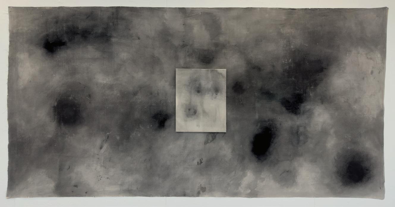
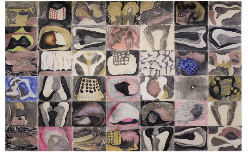
The artwork is an exploration of texture as a collapsed representation of time; an ongoing and oscillating process of build up and scratching back into, covering and partially revealing what is beneath. Simple engagement with mediums like wax and tools like a ballpoint pen result in an accumulation of marks and repetitive gesture. Material memory is what remains from this attempt to define boundaries, to make one’s own, to categorize the artwork into something known.
MMMThe artworks draw inspiration from studying made objects of the past in an attempt to define what makes us human. Most interesting are the subversion of objects whose function has been forgotten and now are intentionally repurposed. The meaning of forms like the oval which appear throughout time in human art are now obscure; the repeated iterations of the shape are attempts to understand and fulfill their lost purpose.
MMMAll of the works are receptacles; simultaneously containing all which came before while expanding the container, in search of some analog truth about our place in the universe and how we got here.
My favorite scent is the acrid odor of damp seaweed left along the shore. I notice it during low tide when I cross the causeway to visit my family in the summers and on holidays. The ocean is somewhere between a boundary and a bridge for me; it captures an endless state of movement while retaining a stagnant nostalgia I can’t seem to escape.
MMMThis place is both familiar and foreboding or at least quiet.
MMMPainting gives me a moment of clarity, a way to imagine myself organized by color and space, though I hope to dismantle those formalist elements over time. Though I often paint with oils, I crave the way water is absorbed and stains after evaporation—a medium that moves and breathes. Sometimes, the paint becomes a creator on its own, shifting my role from artist to conductor, guiding the flow of pigment rather than controlling it. It’s difficult for me to slow down and quiet my perfectionism rather than feeling pulled in many directions and inadequate. I often feel more comfortable with limited color flexibility and fluid compositions to avoid the vast expanse of creative decision making. But I now understand what it means to cross the barrier between technical skill and subconscious imagination.
MMMIt takes patience.
MMMThe moon that pulls the tides does not know she is eroding the shore’s cliffs. After all, it is not she who smooths out the coasts for thousands of years but the waves that ebb and flow beneath her gaze.
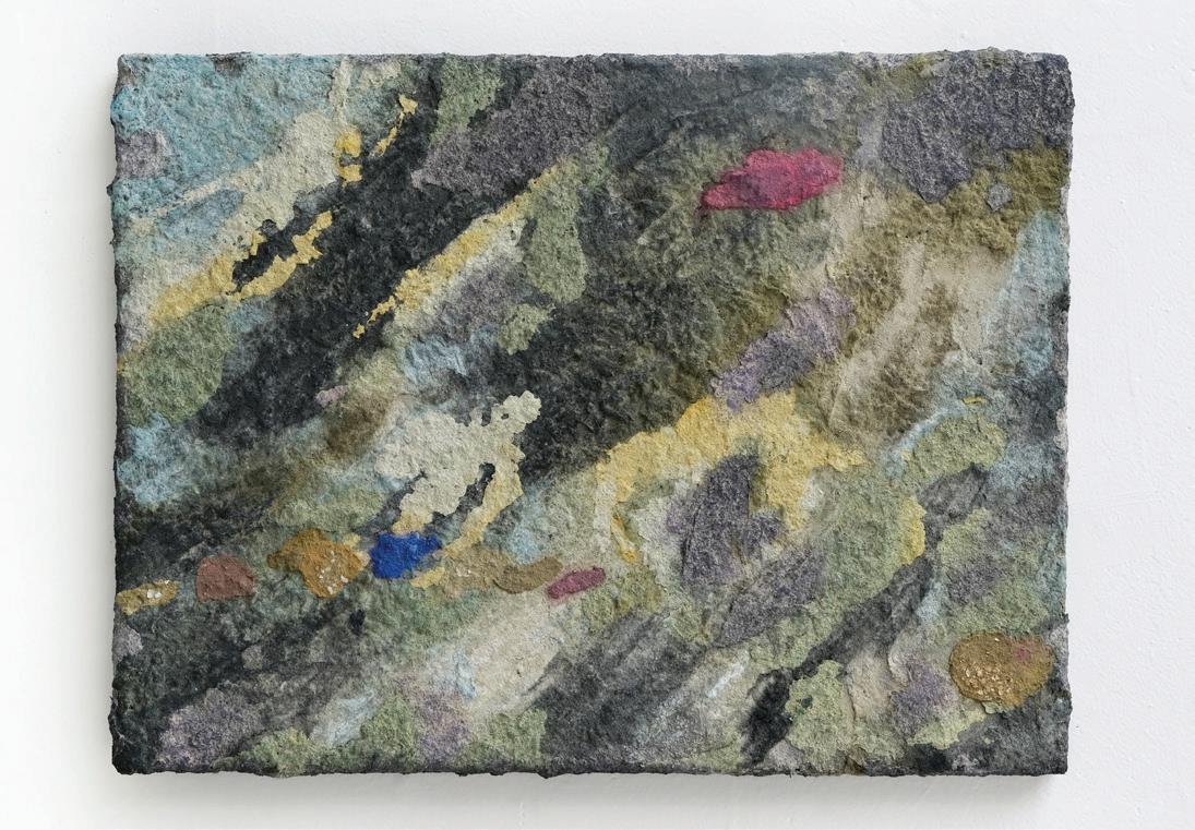
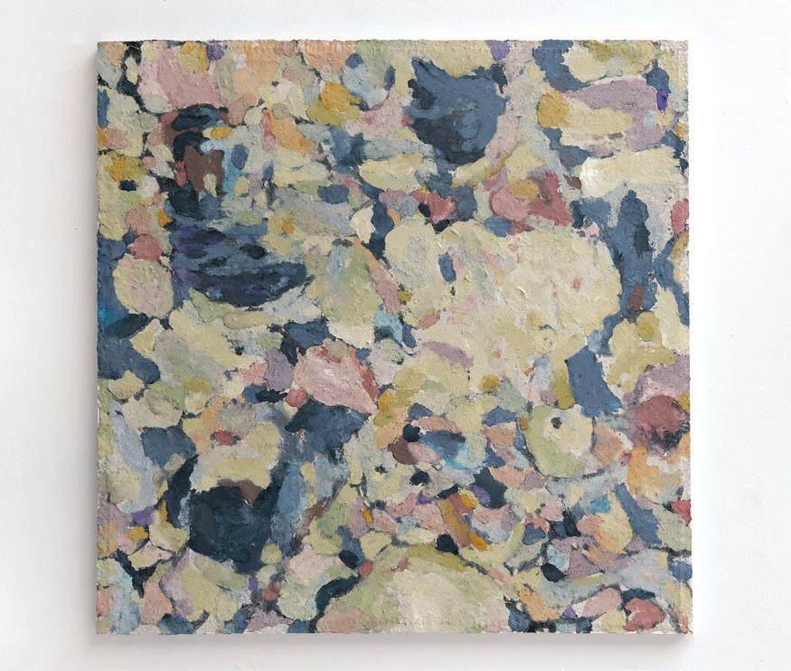
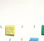
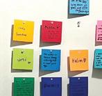
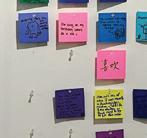
The work is a result of seeing. Honestly, and as if for the first time. Humanity and humility are ripped from the same purple sticky note; place is simultaneously noun and verb.
MMMIt is a practice of location. With reverence and gentle hands, artifacts of the field are extracted; calibrated with an attention to changing geologic conditions. Temperature often defines the constraints of the hand; cold and tight or hot and fluid.
MMMIt is a practice rooted in a child’s never-ending “why?”
Pieces are produced from a fine-toothed filing of the mind.
A sifting of sand in the attempt to find something solid. To break apart and disassemble all the parts to only put them back together.
MMMImages bubble up to the surface in an active state of becoming; arrived at in a synthesis of what is seen and felt, two processes located in the hands.
MMMThe objects are intimate and slowly steeped in the habitual ruminations of the everyday. A steeping often demonstrated in the transformation of material; walnut husks juiced, surfaces shellacked, and sometimes seasoned with a sprinkling of organic debris.
MMMThe work comes out of this cannibalistic brew of unrepeatability.

Living in a world flooded with endless streams of information, I try to navigate the delicate balance between the tangible realities of daily life and the limitless realm of imagination. My art practice is a means of weaving these two together, creating a safe harbor, a peaceful wilderness of my own amid the chaos of life. It is a process of self-discovery, finding the unique pebble in the river’s flow that belongs to me.
Growing up in the digital age, I have been exposed to the virtual a lot, which has become a fertile ground for imagination. Influenced by storytelling media such as film, literature, and ACGN culture, I integrate narrative elements into my work and aim to transform each piece into a visual story. Diving deeper into this realm, I gradually realized that sincere real-life observation and fantasy are essential to each other. This has taught me to step out with courage and engage with others and the surroundings beyond myself. The extract of precious daily life moments nourishes back to my imagination, and vice versa. I enjoy preserving them by visualizing them in my work.
I primarily work with acrylic, watercolor, gouache, pastel, and colored sand. The fluidity and dynamic saturation of the water-soluble medium and the texture and volume of dry material allow me to experiment with vibrant colors, lines, and shapes, freely merging spontaneous doodles with intentional compositions. Reality is the kite string tying Fantasy’s flight, Imagination is the path for earthbound seeds to the sky. In between this interplay of the two, I give presence to my thoughts and share them with you.
@disassembling.aanika
Aanika is giddy, and fawning, and deeply in love with Allston’s alleys. Aanika is tired, and hopeless, and remembering how to breathe. Aanika is full of love and rage. Aanika’s work does not bear the seeds of revolution but the exhaust of revolutionaries. Their art is that of refuse, taking in discards seen on the sidewalk and in crumbling buildings. They work around their body, making spaces and beings which tower over, threaten, lurk, or cower. The story they tell is both unheroic and anti-climactic—concerned with failure, impotence, and smallness. They aim to both hold and behold our squishy bodies, our erratic patterns, and our precarious positions.
Assimilation from the Concise Oxford Dictionary of Archeology:
1. The absorption of a minority group into a majority population, during which the group takes on the values and norms of the dominant culture.
When was the last time you went on a walk without a destination in mind?
Or the last time you lifted your head towards the sun, and stood in stillness—releasing the tension from your furrowed brows?
When did you last spend an entire day with loved ones?
How long has it been since you called the people back home?
When was the last time you prioritized your relationships—your community—over your productivity? Over your independence?
As you fight against the wind, rain, and snow during your commutes, do you ever think about your first pair of rain boots? Was it only back then that you stopped to play and jump in the puddles? Was that the last time you didn’t hesitate to shed light on your emotions?
How will you atone for your sins?
For being complicit?
For assimilating?
Where their language falls short, Glen makes. In a desperate attempt to express love, gratitude, and shame, they communicate with blood ties, chosen families, ancestors, dear friends, and maybe even foes. Through performance, gestures, installations, and objects, they navigate binaries, boundaries, and the limitations of both materials and endurance, which parallels their navigation through and grappling with the contradicting cultures they were born into and inherited. Glen’s fixations lie in materiality, and the (in)accessibility of space and translation.
Do I create new life? Or simply reshape the dead? I craft objects from materials which would otherwise be natural, if not for the evidence of my intervention. Through my touch, these objects begin to evolve in unnatural ways, taking on improper developments and growths that challenge our expectations of how novel materials, objects, and forms should behave. Paper becomes skin, chairs morph into the supporting structures of a tabletop, and wood swells into fungal forms. I study microscopic forms and enlarge them to create tactile, interactable biomes, to which I add familiar objects. By fusing these forms with familiar materials, I compel the viewer to confront what is often unseen: hidden parts of the world that exist beyond the human eye.
MMMWhen encountering what goes unseen, we begin to question what we value and deem important of our attention. If an object mimics something living—whether through its form, patterns, or resemblance to organisms we recognize—do we value it more upon first encounter? Is mimicking life the same as living? We are composed of billions of smaller, living entities—cells, bacteria, microorganisms—yet, we rarely consider them, nor do we value a red blood cell as much as we do the whole body.
MMMBy speaking this language of life, I seek to translate an underlying, unseen function with each of my artworks. The function? To live.
@kathrynrenoart
Why do I like the things I do?
I must surround myself with beauty to feel beautiful myself
Why can beauty not simply be a reflection of myself?
Why am I drawn to reminiscing?
I must know everything there is to know about myself
Like a child with a curiosity
Why can’t I look at myself and my art the way that I look at other people and their creations?
Like a little girl with no judgement
Does consuming unnecessary things feel human to you?
Like a little girl with a pretty rock to bring home to her mother
Why do you feel the urge to collect?
If something is beautiful, I must own it
Like a little girl with a rock in her pocket
Is ownership ever completely ownership?
Does the thing not also take a certain ownership of me?
Why do I collect the things I do?
I see beauty in many things, most of them because they remind me of myself
I am an eclectic person; I feel the need to collect and present
Like a little girl with many rocks
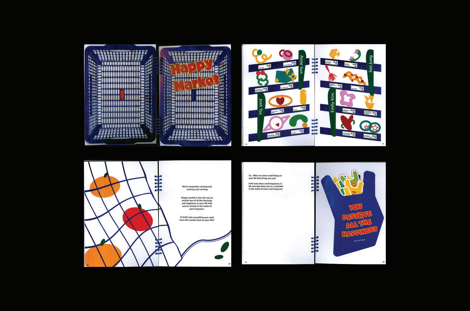
Product Parody is the intersection of graphic design and parody through the lens of packaging design, showcasing how satirical reinterpretations of everyday items can offer both humor and social commentary. By recreating the intricate details found in industry-standard design—barcodes, copyright information, multilingual packaging, and other manufacturing elements—I hijack the overlooked complexities of mass production to give familiar products new meanings. The resulting series focuses on blending professional design with comedic ingenuity to critique different aspects of everyday life, demonstrating the power of graphic design to both entertain and provoke thought.
@lilyadabelle_design
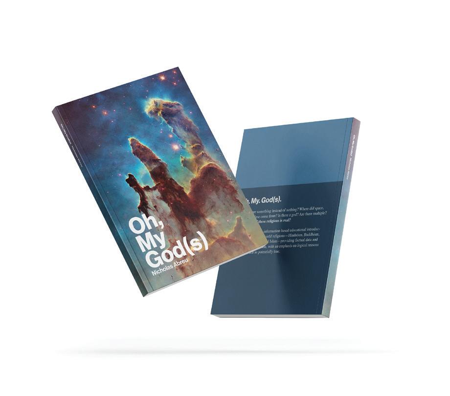
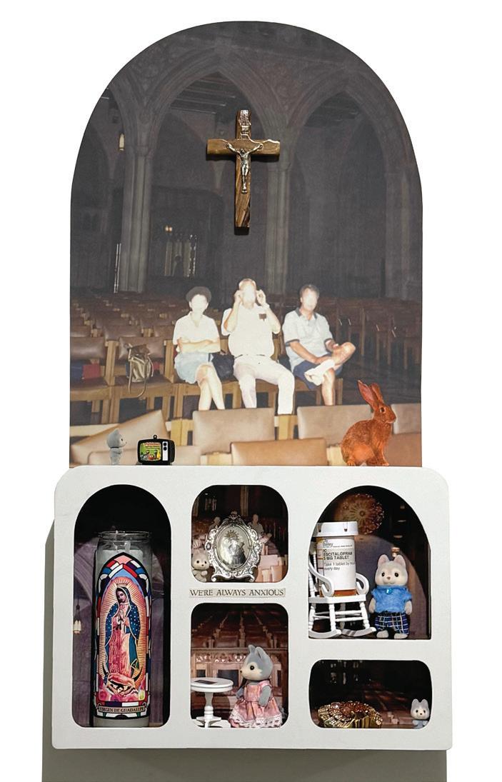
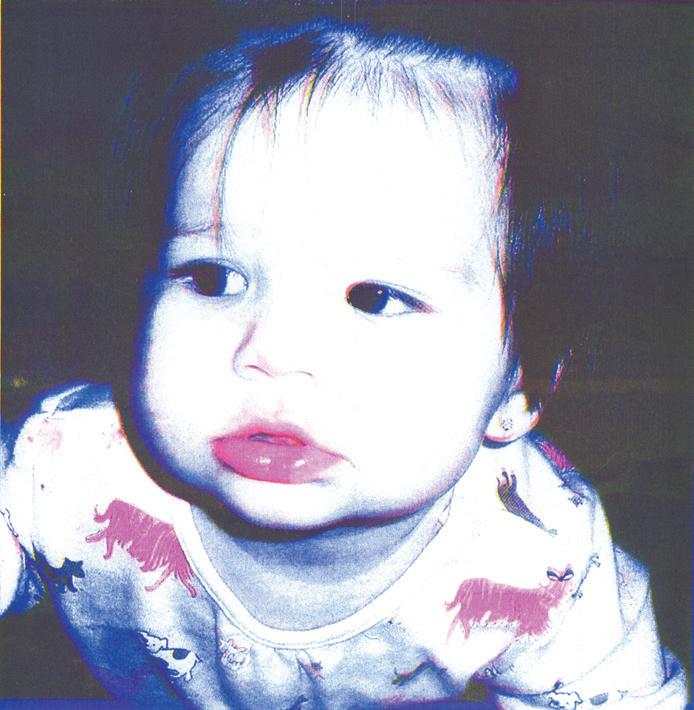
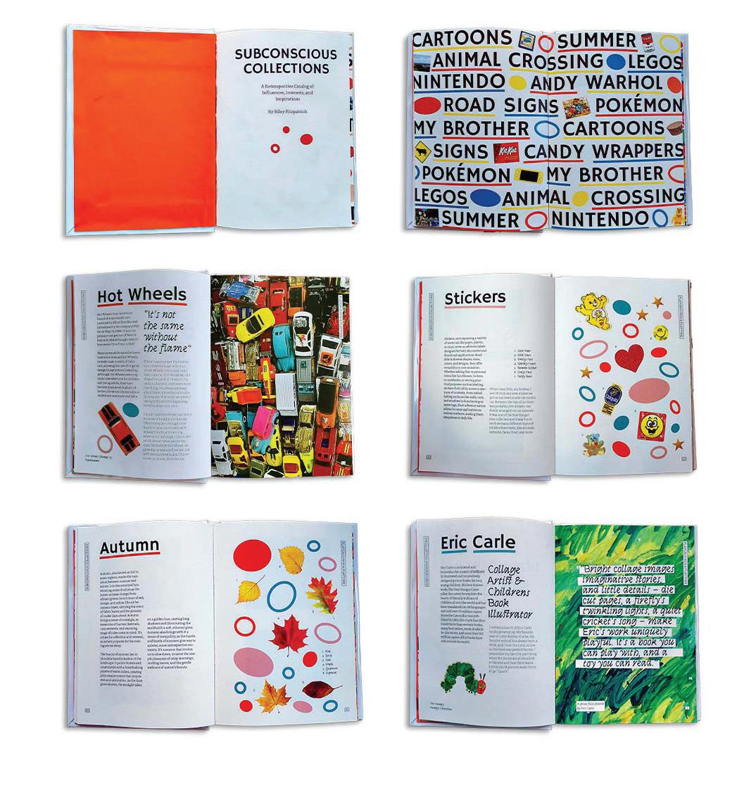
Girlhood and Godhood
Girlhood and Godhood centers on nostalgia and religious guilt. It is a reflection of a strange, queer little girl’s upbringing in the Catholic Church. My work focuses on the inner turmoil created by desperately seeking acceptance from your family and community while also longing for freedom. I felt stifled by my religion and its gender roles. I was never the ladylike, obedient disciple that I was supposed to be. MMMCatholicism shaped my perception of my identity for better and for worse, simultaneously igniting a love of classical art and a deep-seated guilt. I became stubborn, headstrong, and wary of authority. I cannot explain myself without explaining my religion (or lack thereof). Catholicism will be with me until the day that I die, but until then I will make art about religion in order to process my complicated relationship with it and hopefully connect with people who have had similar struggles.
MMMIn Girlhood and Godhood, I toe the line between erie and nostalgic, contrasting the innocent joy of childhood with the existential obsession with Heaven and Hell. I do this through the combination of family photos and catholic imagery. I want my raw vulnerability to inspire others and make them feel less alone. I want people to be encouraged to experiment. I want people to know it’s okay to be weird. Making art helps me process my emotions, and I hope engaging with it helps viewers do the same.
lucibarrett.cargo.site
There is no undo button in handcraft. Unlike the magical “command + z” of digital tools, once something is created by hand, there will always be some mark, scratch, or dent left behind, signifying your presence. This idea fascinates me, especially in considering how to integrate analog materials and processes into both static and motion graphic design. There is something uniquely powerful about the originality of handmade work and how no one could ever replicate it exactly—it is entirely yours. Similarly, I’m captivated by the meticulous care that goes into frame-by-frame animation, where each frame is considered with intention.
Hand to Hand reflects both the tactile nature of creation and the deeper interconnected relationships between the designer, the work, and the audience that analog methods reveal. I begin by experimenting with materiality, exploring how physical elements can conceptually resonate with the subject and enhance audience engagement. From there, I consider how these static art forms can be digitally transformed into time-based narratives, offering a more dynamic and interactive experience for the viewer.
By blending analog with digital through motion, I aim to create new design possibilities. My goal is to foster a genuine connection with the audience, inspiring a deeper appreciation for analog techniques where the journey of creation is as meaningful as the final product. Imperfections are not to be fixed but celebrated. Ultimately, I want to explore how analog methods can enhance design, engaging the designer and the audience.
The Art of Escaping explores how art and design bring fantasy to life, allowing the audience to step away from reality and immerse themselves in imaginative worlds. Visual elements play a crucial role in shaping these fantasy worlds, influencing how we experience narrative and deepen our emotional connections. The interplay between design elements and storytelling reinforces the suspension of disbelief, fostering a sense of escapism that can be both cathartic and deeply meaningful.
MMMFor my generation, escapism is a common coping mechanism, shaped by growing up in an era of intense change and upset. At the same time, new technologies have brought imagination to life in a more tangible way than ever before, heightening our ability to escape reality for a while.
MMMCreating visual identities for these stories gives people something tangible to represent their love of those fantasy worlds—something that validates their imagination and connects it to reality. I have found this to be true when it comes to books and the various ways that visual art and design can breathe life into their black-and-white pages.
MMMThrough both design and craft, I seek to demonstrate the profound impact that visuals have on immersive storytelling. The Art of Escaping explores the ways that design can integrate with both books and the publishing industry, offering readers a tangible connection to the worlds they cherish.
Delay, Deny, Design
Delay, Deny, Design explores how the visual and performing arts intersect with popular culture and power dynamics to examine the ways these fields not only shape, but also challenge societal norms, identities, and power structures. The relationship between art, design, and culture is complex, both reflecting and critiquing the values of the society, while simultaneously influencing and reshaping those very values. I analyze how artistic movements engage with aesthetics, politics, and society to either uphold or disrupt dominant narratives.
MMMMy thesis critically examines the role art plays in both protest and propaganda, illustrating how it operates as a tool of both resistance and control. By analyzing works across different periods and genres in my own creative practice, I investigate how art and design not only mirror their historical context, but also serve as a transformative force that redefines cultural narratives.

@val_ceb_di_
Reggie-Fils-Aimé, the former president of Nintendo of America, once said, “Because if it’s not fun, why bother?”
MMMIn turn I ask: If a product, whether it be a TV show, game, or advertisement isn’t enjoyable to use, then why bother engaging with it at all?
MMMThis ideology rings true when the product is shared with more than one person. A person’s joy is linked to both their own experience and the experience of those around them. That’s why storytelling mediums like video games and movies are popular group activities; they bring audiences together through a shared experience.
MMMConnecting Laughs reflects my design philosophy: to have fun creating artworks and to bring an audience together through similar experiences. As someone who has traveled around the world, I use assemblage to bring together not only a wide range of both people and cultures, but also a diverse set of materials.
MMMIn my thesis, I create playful and interactive designs that encourage audiences to explore a light-hearted approach to life, creating a welcoming environment that feels like home, despite our differences.
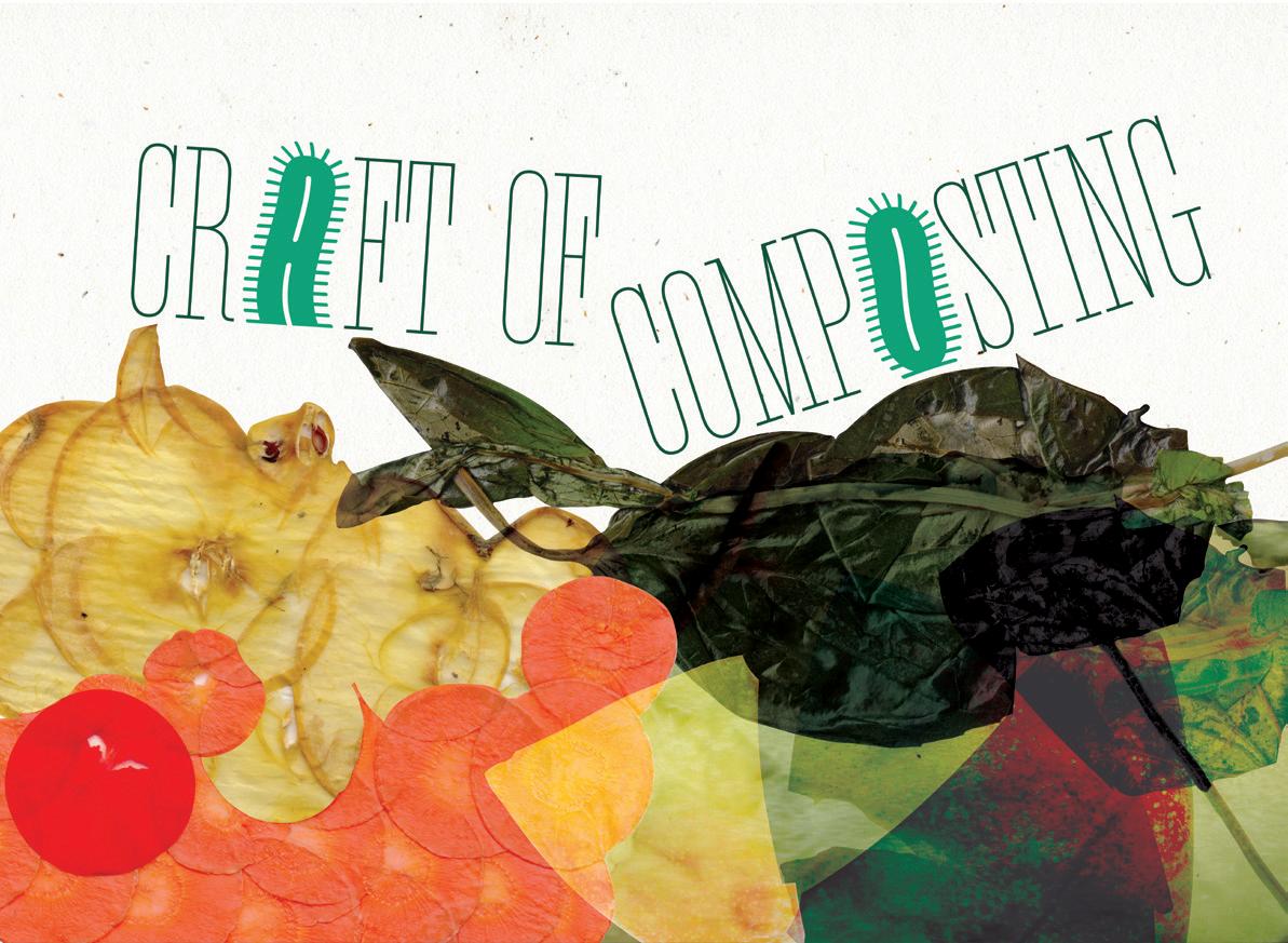
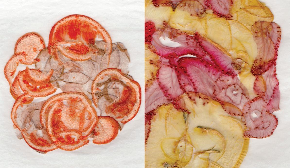
Composting continues to be an inconvenience for our community, gaining disinterest the more demanding and meticulous the process becomes. The practice of composting is approached with hesitancy towards its maintenance, commitment, and fragility. However, these hands-on elements can also offer pathways for fostering creativity through both technique and repurposing—being benefits worth promoting.
As someone raised alongside influences from the arts and flower farming, I’ve learned to view every challenge as an opportunity for creation, especially when involving the intersection of art and nature.
Through these experiences, I aim to provide a stepping stone for a higher understanding and appreciation for the Craft of Composting, by re-contextualizing it as an artisanal process. As a result, I could motivate others to engage in the process for its artistic qualities and overcome their skepticism.
Through art-based designs, I want to highlight the beauty within the natural forms, systems, amalgamation, filtration, and cycles in composting, by referencing details in ecology, diverse materials, intricacies in processes, and innovation. Through these projects, I aim to Craft the way others perceive composting through generative collaged imagery and ecological type forms within the platform of a bio art installation, an interactive website, and prints.
Eventually, my work could serve as a basis for utilizing visualization as a tool to encourage and evolve sustainable values in design. Above all, my purpose is to increase immersion in sustainability by facilitating connections between the practice of art and composting to conserve the environment.
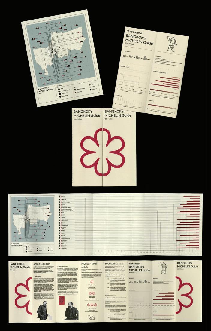
Design is a powerful tool that extends beyond aesthetics—it serves as a bridge between information and understanding. In today’s digital age, the role of graphic design is to distill ideas into clear and engaging experiences. My thesis, ดู - Do, explores how minimalist design can make information more accessible, not only through traditional data visualization, but also by pushing the boundaries of how information is presented. The title, ดู - Do brings together two forms of perception: “ดู” (Thai for “to see”) represents observation and perception, while “Do” (English for “to act”) signifies both execution and transformation.
Charts, graphs, and infographics are the primary components of traditional data visualization. However, ดู - Do broadens this definition by experimenting with new media that provides a more tactile and immersive experience. By combining my interest in information design with collectible design, I provide audiences with more ways to interact with information by introducing elements of surprise and opportunities for interaction.
This thesis is not just about presenting data—it is about transforming information into an experience. ดู - Do expands the meaning of information design beyond traditional data visualization by combining global design approaches with Thai cultural influences. It challenges the limits of how we see and interact with data by embracing minimalist principles to create experiences, bridge linguistic and cultural divides, improve understanding, and invite audiences to connect with information in unexpected ways.
hayclark.cargo.site
From a young age, I’ve been captivated by visual storytelling. Film, television, and online videos became the lens through which I interpreted the world. Stories offer the unique opportunity to experience perspectives beyond my own and I seek out others who share that same sense of interdependence. I find that my fascination with these stories ultimately defines my identity not only as an individual, but also as a designer. In Press Play, I investigate how design can be used to create spaces for sharing passions and foster human connection through collective storytelling. MMMPress Play explores how motion and video design can serve as a tool to cultivate conversation. “Press” is representative of the journalistic coverage I collect, while “play” refers to my reinterpretations and recontextualization of the content. By creating time-based narratives, motion allows me to reinterpret this content for the screen in new ways. Through interviewing and collecting stories from others, I weave personal accounts into my work to develop collaborative narratives. Using film editing techniques and engaging compositions, I combine creative aspects of documentary filmmaking with motion design to explore the relationships others have with film, as well as to dissect my own personal connections to cinema. I examine how design can be curated to create spaces where individuals can indirectly start discourse with others through shared passions. In a digital age that often prioritizes individuality, I encourage curiosity and the discovery of new perspectives, ultimately unifying an audience through narrative movement.


@abigailconant
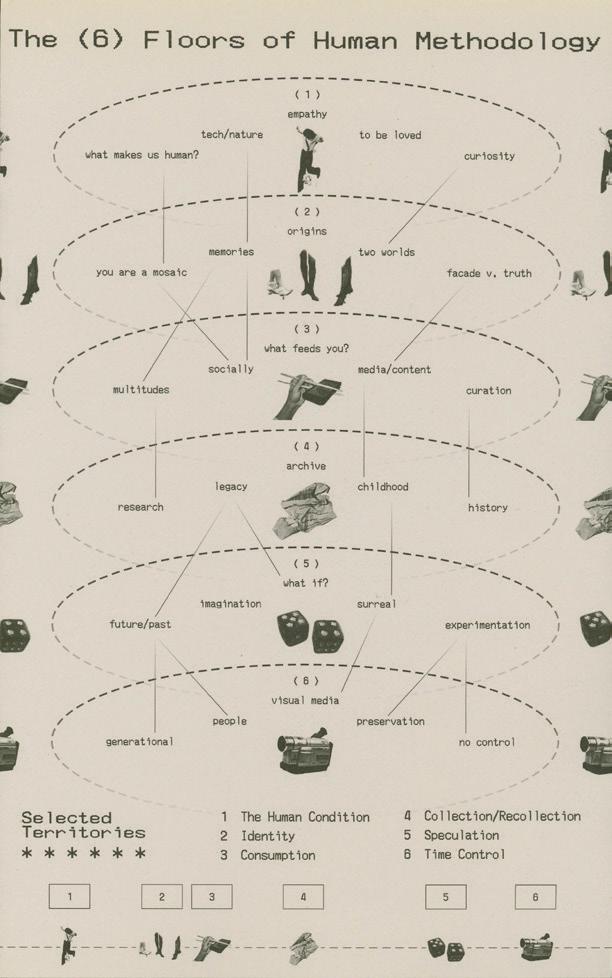
Curate to the Core
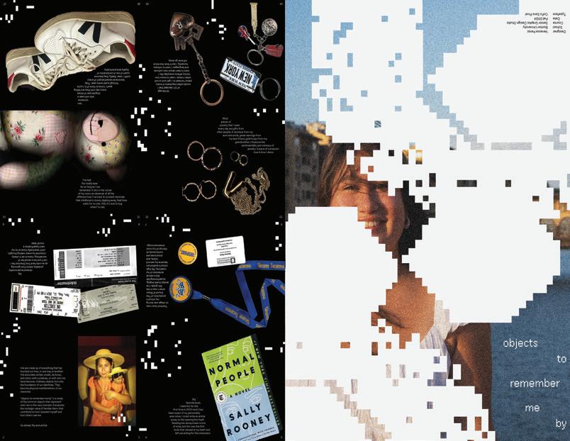
Curation is the spine of identity. It is the act of selecting, organizing, and caring for a collection, whether physical or digital. What we choose to surround ourselves with shapes both who we are and who we strive to become.
MMMMy thesis, Curate to the Core, explores how curation, authorship, and archival work intersect to construct both personal and collective identities. By researching and engaging in different collection practices, I investigate how consciously grouping objects and media not only defines persona, but also questions what persona means in the modern age. By experimenting in both physical and digital mediums, I aim to uncover design’s role in intentional preservation and define the principles of meaningful curation, and then challenge them.
MMMThrough a speculative design lens, this research examines ordinary yet unconventional ways people collect and archive.
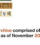
Toolkits of a False Reality—physical collections of designed ephemera that blur truth and fiction—invites audiences to question the authenticity of what we preserve and present. These curated toolkits transform temporary objects like newspapers, tickets, labels, and collectibles into tangible archives, highlighting the tension between ephemerality and permanence, over-saturation and meaning.
MMMDrawing from my background as an artist, designer, woman in identity crisis, and purveyor of media culture, this work examines how curated narratives can manipulate perception and redefine authorship. By presenting archives as selected realities rather than objective records, I challenge traditional notions of preservation and storytelling and propose the question: In an age of impermanence and infinite storage, what is worth saving, and who gets to decide?
Chaos and Order explores the triad between mathematics, philosophy, and physics, and how these converge to explain the nature of design vis-à-vis organic complexity. The idea was inspired by the interplay between chaos and order and shows how simple mathematical rules and randomness can create complex, beautiful visuals.
MMMBy creating generative art pieces to explore organic motion using procedural animation, I use technology like TouchDesigner to explore how particle systems mimic natural fluid-like forms when influenced by noise and the corresponding feedback loops of chaotic particle systems. I fuse mathematical precision with random [insert noun] to teach examples of the paradox of Gestalt: a whole is simply the sum of its parts. Complexity arises from simplicity, and simplicity from complexity.
MMMIn today’s ever-changing technological landscape, the convergence of human creativity and nuanced methodology are of utmost importance in response to humanity’s role in art, culture, and society. By demystifying select informational hierarchies, I prove that all one needs to understand a concept is to imagine it into life.
MMMIn Chaos and Order, I use programs like After Effects to generate dynamic symmetry and fractal geometry. I turn equations into abstract, evolving forms to create mesmerizing, machine-like aesthetics that can be easily merged, with the power of human intuition and digital processes.
MMMWhen one steps back to look at the full picture, one sees such a paradox. By reflecting on how complexity emerges from simplicity, I invite users to engage with the beauty of structured chaos.
MMMMy job is to illustrate and facilitate this process.


@sim.dsgn
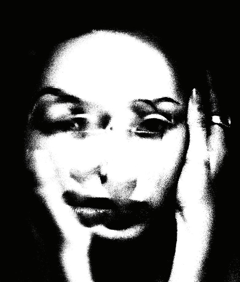
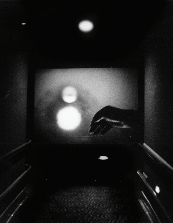
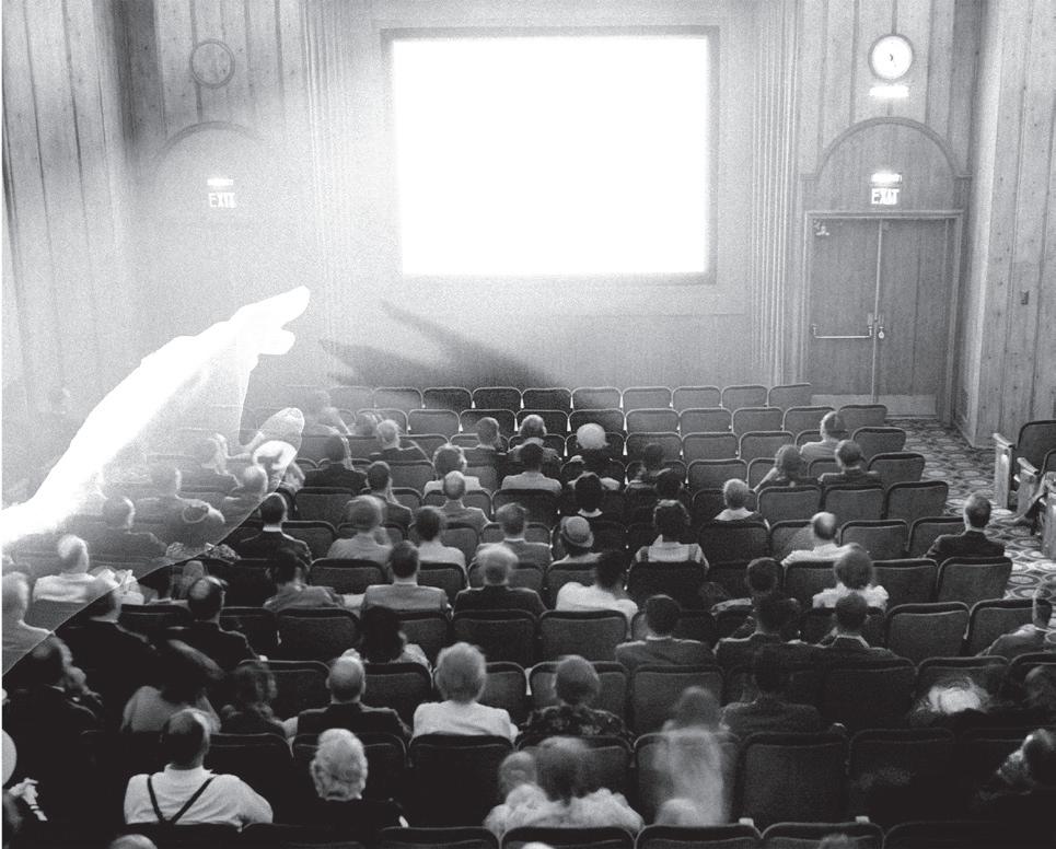
We Tell Ourselves Stories in Order to Live
Movies are more than stories on a screen. They are reflections, distortions, and revelations of who we are. They offer both escape and confrontation, drawing us into experiences that are not our own, yet feel deeply familiar. In the darkness of the theater, we surrender to a world constructed by others, only to find our own fears, desires, and questions staring back at us.
MMMThis thesis explores cinema as a medium of self-reflection, a space where human subjectivity, perception, and meaning-making come into focus. Just as filmmakers frame shots, construct narratives, and manipulate time, we shape our own lives through selective memory, perspective, and storytelling. Movies make this process visible. They reveal that reality itself is not fixed, but filtered through our own interpretations.
MMMDrawing from film theory and philosophy, this project examines the way cinema externalizes existential dilemmas—how it functions both as a mirror, reflecting our inner worlds, and as an antidote to the uncertainty of being. From Plato’s Allegory of the Cave to Hamlet’s soliloquy, the question of what it means “to be” has always been tied to perception. Cinema, like these philosophical traditions, constructs an illusion—but an illusion that reveals deeper truths.
MMMThrough design, photography, and written components, this thesis argues that cinema is essential not merely as entertainment, but as a means of understanding ourselves. It investigates how films shape our identities, help us process reality, and provide a framework for meaning in a world that often feels chaotic and uncertain. Ultimately, this project asserts that we are not passive spectators of life. Like filmmakers, we are constantly composing, editing, and reframing our experiences—seeking clarity, searching for meaning, and discovering ourselves in the stories we tell.
fitzpatrickriley.cargo.site
Title Unknown
When we were young, play was how we explored the world. We created games, chased curiosities, and discovered joy in the unexpected. Play wasn’t just for entertainment, but how we figured things out, made connections, and indulged in new possibilities. Everything felt open-ended, ready to be shaped by our imagination. As we grow older, this sense of wonder fades, replaced by routines and practicality. By embracing playfulness in design, we can rekindle this innate curiosity.
MMMThrough small playful and interactive experiences, [insert title in italics] invites people to revisit the joy of childhood exploration. Small moments of curiosity, like pressing buttons just to see what happens, stumbling upon hidden surprises, or following an unexpected winding path can transform how we engage with our surroundings. By evoking familiar feelings of play, this thesis examines how playfulness and interactivity in design can awaken curiosity, tap into nostalgia, and reignite a sense of discovery.
MMMInstead of following set paths or fixed expectations, I aim to encourage people to embrace play as a way of interacting with, thinking about, and experiencing things. My thesis aims to both remind people of and reconnect them with their childlike instincts to unabashedly play with and explore what’s in front of them. By stepping outside of conventional ways of interacting with design, we can rediscover an excitement in not knowing what comes next, finding joy in small surprises and accidental discoveries.
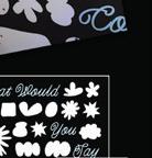
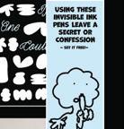
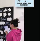
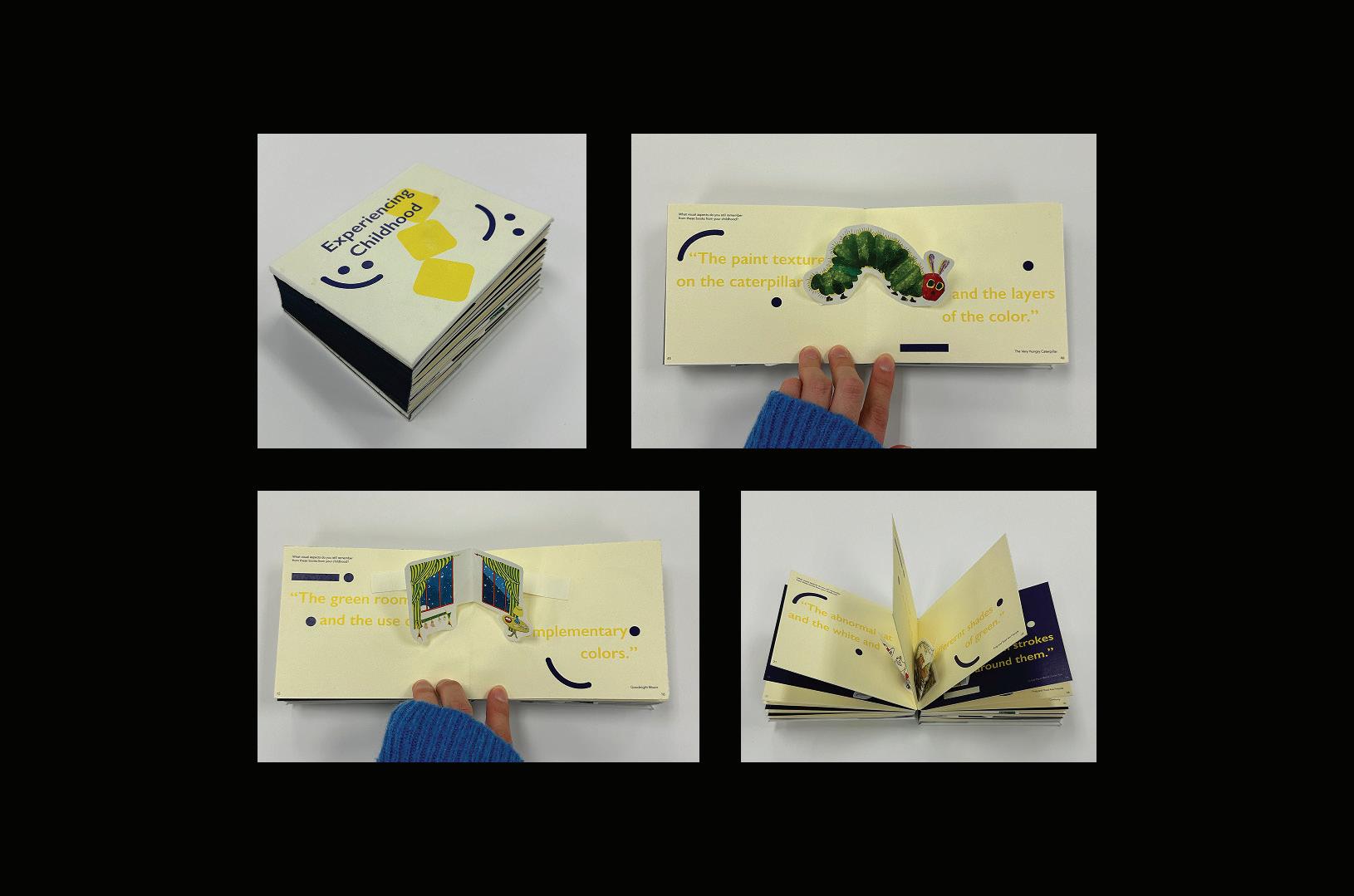
What if you could send a message without words? In the Victorian era, a bouquet wasn’t just a gift—it was a secret message. A red rose meant love, but a yellow one signaled jealousy. Giving someone basil? That was an insult. This intricate system of floriography allowed people to express emotions often too delicate, forbidden, or complex to say aloud through secret coded messages. What happened to these hidden languages, to the intentionality of a handwritten letter or a carefully chosen postcard?
The Floral Code investigates how meaning shifts when communication moves between both physical and digital spaces, questioning what has been lost and how we might bridge past and present forms of connection. Through digital interactives and physical ephemera, this project seeks to make this old, coded language more accessible. As a designer, I believe that history is not just something we look back on, but rather it is something we carry forward, shaping the way we connect to each other in the present.
By layering materiality, sentiment, and subtext, this work asks: Why have we abandoned intimate, intentional methods of connection? How can we reclaim and modernize these lost forms of expression in a world of instant and often disposable communication? Through storytelling, design, and interaction, this thesis celebrates the poetic tension between old and new forms of self-expression.
@liliageguchadze.cargo.site
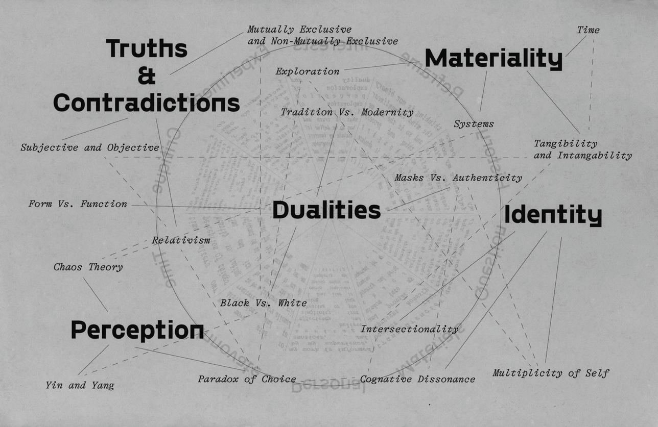
Gray Area is a personal exploration of the dualities that shape the human experience: the interplay between structure and freedom, certainty and ambiguity, habit and spontaneity. Rather than viewing these forces as opposing, I see them as complementary, each defining and confirming the other’s existence. One cannot exist without the other.
This exploration stems from my own cognitive dissonance regarding my cultural identity as an American with Russian and Georgian heritage (I am also a middle child). The way I was raised often leaves me suspended in an “in-between” space, never fully belonging to one side or the other. This sense of being “in between” has shaped my understanding of certain dualities and driven me to investigate the spaces where contradictions intersect, not only in relation to identity, but also in our thoughts, behaviors, and perceptions.
Central to my exploration is an emphasis on process. By being both intentional and intuitive about materiality and the physicality of my work, I aim to mediate extremes.
Habits can feel monotonous, yet they provide stability. Mistakes can seem like failures, yet they often lead to growth. We seek structure for security, yet we crave freedom for selfexpression. Without darkness, light loses its meaning. Without moments of chaos, order feels empty. I believe our personal truths reside at these intersections.
Ultimately, my work invites viewers to reflect on their own relationship with uncertainty. By embracing the tension between opposites, we create space for deeper understanding, richer experiences, and a more authentic sense of self.
@jellydesignss
kellsguo.cargo.site
Light as Air, Heavy as TIme
Upon entering college, I developed a sudden fascination with balloons—an object that once felt insignificant but now brings me a distinct sense of joy. I became more aware of their impermanence and found myself envying their buoyancy. Over time, I began to recognize my deepening attachment to childlike objects and activities, particularly those that dissipate quickly. This led me to question: How do we measure happiness, and how has that evolved through the bittersweet process of growing up? At what point does our susceptibility to happiness allow our mature and immature selves to become interchangeable? And how do we capture the temporality of memories that we hold dear?
By exploring the relationship between happiness and temporality through using interactive tools from our childhood to design experiences and forms of archival, I’m challenging my audience to recall a part of their identity that is close to being forgotten. Design operates as a channel to facilitate conversations and opportunities for revisiting objects and traditions associated with our intersecting identities. How can we use design to better interpret and visualize the impermanence of experiences. This thesis challenges viewers to embrace vulnerability, to revisit forgotten dreams, and to confront unresolved emotions. Igniting a sense of wonder in our fast-paced, future-focused world, Light as Air, Heavy as Time offers a moment to pause and celebrate the beautiful messiness of simply being human.
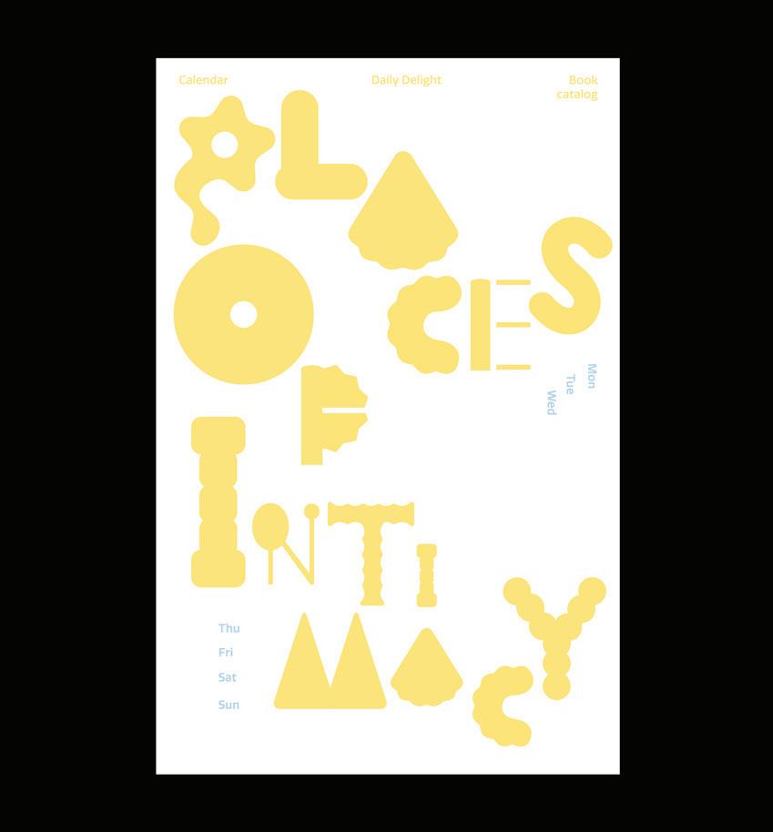
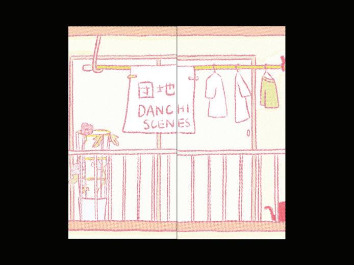
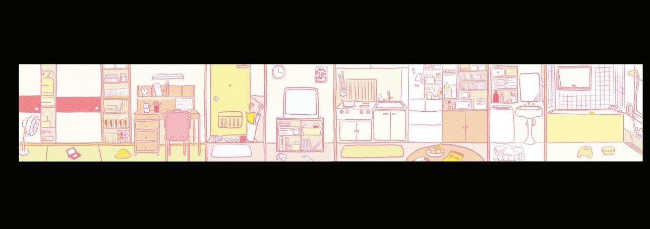
As someone with a mixed-race identity, I have a deep connection to Japanese culture and a keen appreciation for the objects, places, and ideas that hold personal meaning and memories. These are not just elements of my surroundings but threads that shape my inner values and everyday life.
MMMIntimacy often resides in the small, quiet, and seemingly invisible aspects of life. Yet, these objects and spaces carry layered meanings and emotional attachments, anchoring me to where I come from. This sense of intimacy with Japanese culture is reflected in my work, where emotions, thoughts, and memories are expressed outwardly in a delightful and nuanced way.
MMMI use design as a tool for storytelling, documenting identity, and reflecting personal and cultural values. By translating my mixed-race identity into visual form, I explore how subtle, everyday elements influence one’s sense of self. My work focuses on making intangible aspects of identity visible—capturing personal values nurtured through lived experiences in Japan.
MMMPlaces of Intimacy is a curated experience of memory, culture, and aesthetics—elements that shape and define one’s identity.
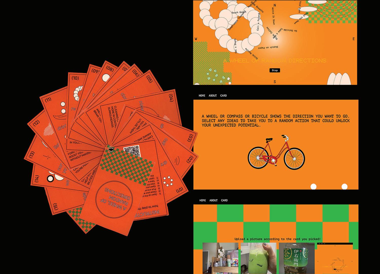
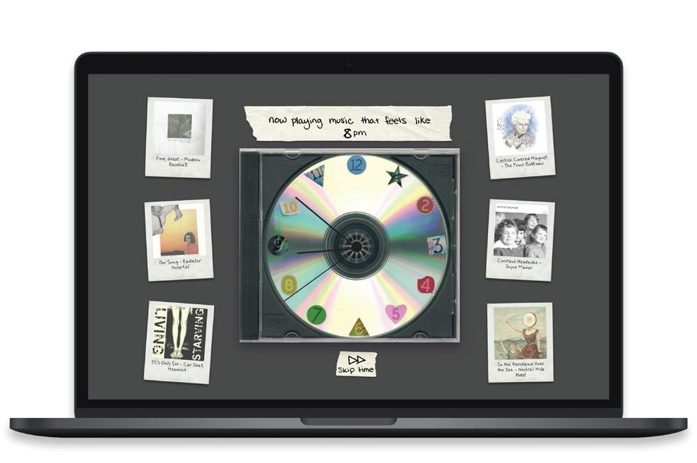
Forcast Your Day
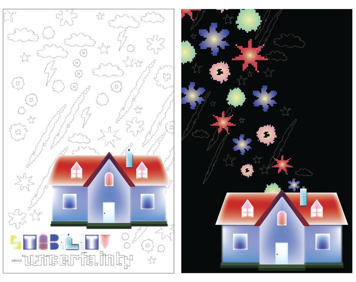
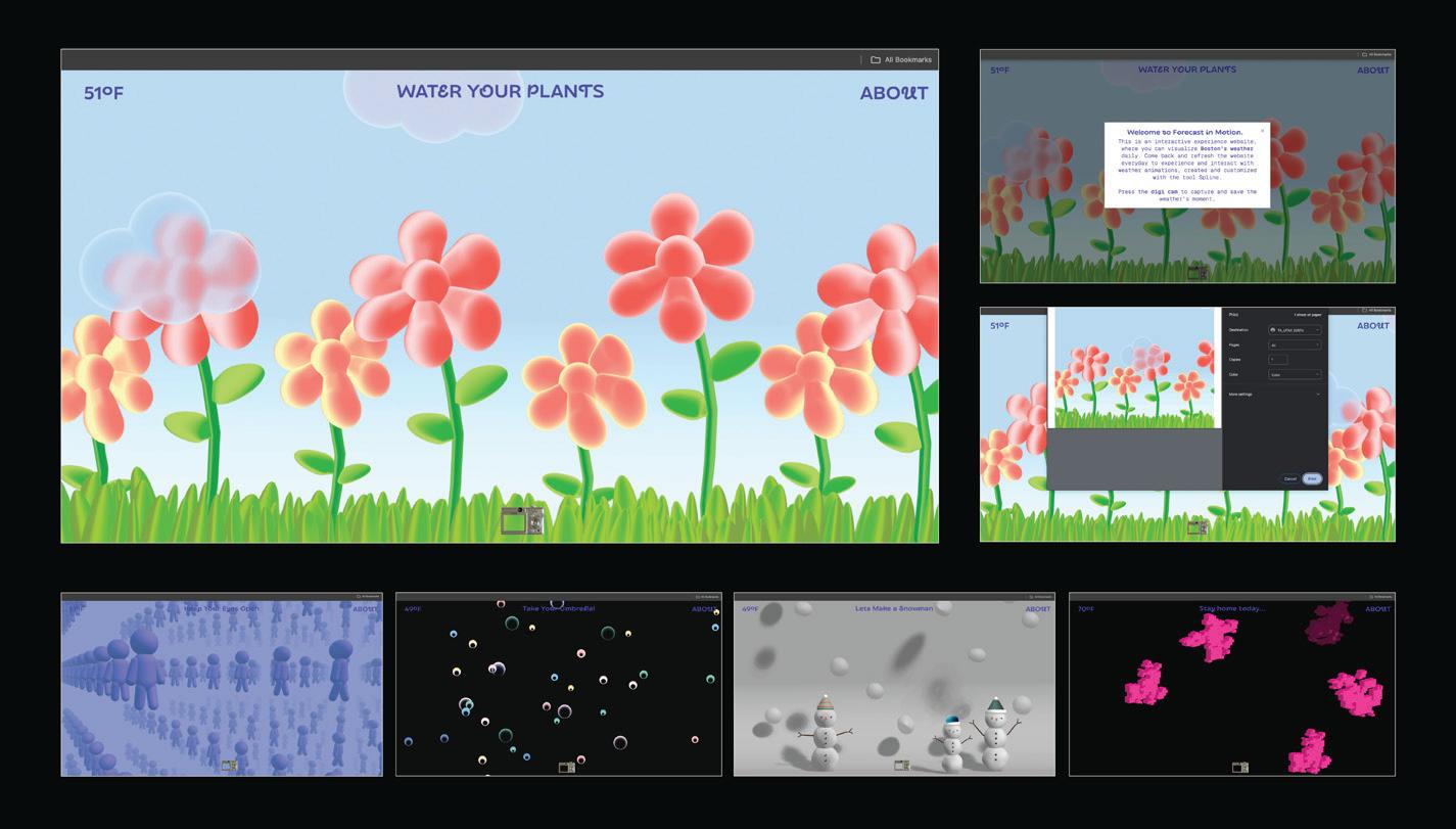
A house serves as a symbol of stability, safety, and routine; a structured environment where daily life unfolds in predictable patterns like waking up at a specific time, eating breakfast, getting dressed, etc., which reinforce our sense of control over both time and space. In comparison, the weather, an ever-changing and uncontrollable force, represents the uncertainties of life, the future, and what is ultimately out of our control. My thesis, Forecast Your Day, examines the dynamic between two opposing forces: the house, which symbolizes order and control; and the weather visible through its windows, which embodies the unpredictability and anxieties of life. Through design communication, my work presents how we balance both stability and uncertainty, illustrating the ways in which we plan, adapt, and find security amid the inconsistent nature of life.
Forecast Your Day is a digital space that allows users to navigate through features of a house constructed from a design perspective. In a world full of uncertainties and anxieties, this interactive environment is designed to offer a sense of stability and order, providing a structured experience that reflects predictable routines found in a home. Beyond serving as a symbolic refuge, this space also functions as an immersive, practical tool, which enables users to plan, organize, and establish structure within their daily lives. Through intentional design, it bridges the need for control with the unpredictable nature of life and allows users to thrive amidst life’s complexities.
@gloh_visual gloriahhh.cargo.site
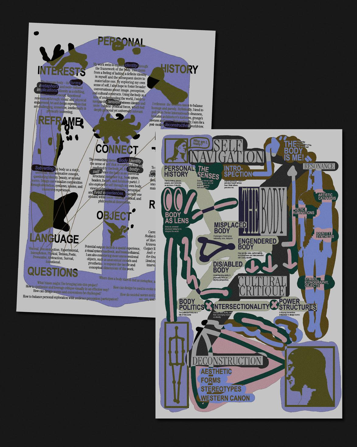
Who am I, really? This question demands answers, yet when I reach into myself, I rarely find a satisfactory confirmation. In my lived history of navigation across geographies, languages, and ways of being, I falter in my attempts to consolidate a recognizable identity of my own. I have little to no sense of self. When my thoughts feel uncertain, my only apparent certainty seems to be the body I inhabit; the body that others perceive and observes the world in return. But is that really the case?
“Self-identity is a bad visual system,” Donna Haraway writes in The Persistence of Vision. Identity is not a fixed or universal construct, rather, it is shaped by situated perceptions and power structures. Design as we know it is built upon coherence and legibility. This leads me to ask: How might visual identity design reflect the instability of selfhood through the lens of the body?
By parodying conventions of brand design, BODY OF WORK engages with narratives of personal identity, interrogating how design disciplines codify, package, and impose meaning onto something that is fundamentally in flux. BODY OF WORK examines the tension between identity as a construct and identity as an embodied, shifting experience. Poetic, visceral, and elusive, I explore both the body-self and the self as a body— that is to say, this body is me.
selena-space.framer.website
Catalyzing
Curiosity is a powerful force that drives us forward. What makes you try a new coffee shop? What keeps you up late learning about something random? It’s that spark of interest—the simple joy of discovering something new.
Catalyzingis all about channeling that curiosity into immersive and interactive digital experiences. In today’s world, where technology is deeply woven into our daily lives, there’s endless potential to create engaging experiences that go beyond physical limitations. Through my work, I explore how graphic design, including 3D modeling, augmented reality (AR), and gamification, can turn learning and exploration into something both exciting and interactive.
With playful design, interactive storytelling, and emerging technology, I can transform otherwise passive viewers into active participants. How can visuals and interaction encourage people to explore and learn in a way that feels both fresh and fun? By blending aesthetics, intuitive design, and my own interests, I aim to create digital spaces that both spark curiosity and invite discovery!
Knowledge isn’t something we have to acquire alone, rather it is something we can share and enjoy together. I aim to design experiences that inspire people to explore, learn, and engage with the world in new ways, making curiosity not just a habit, but also an adventure.

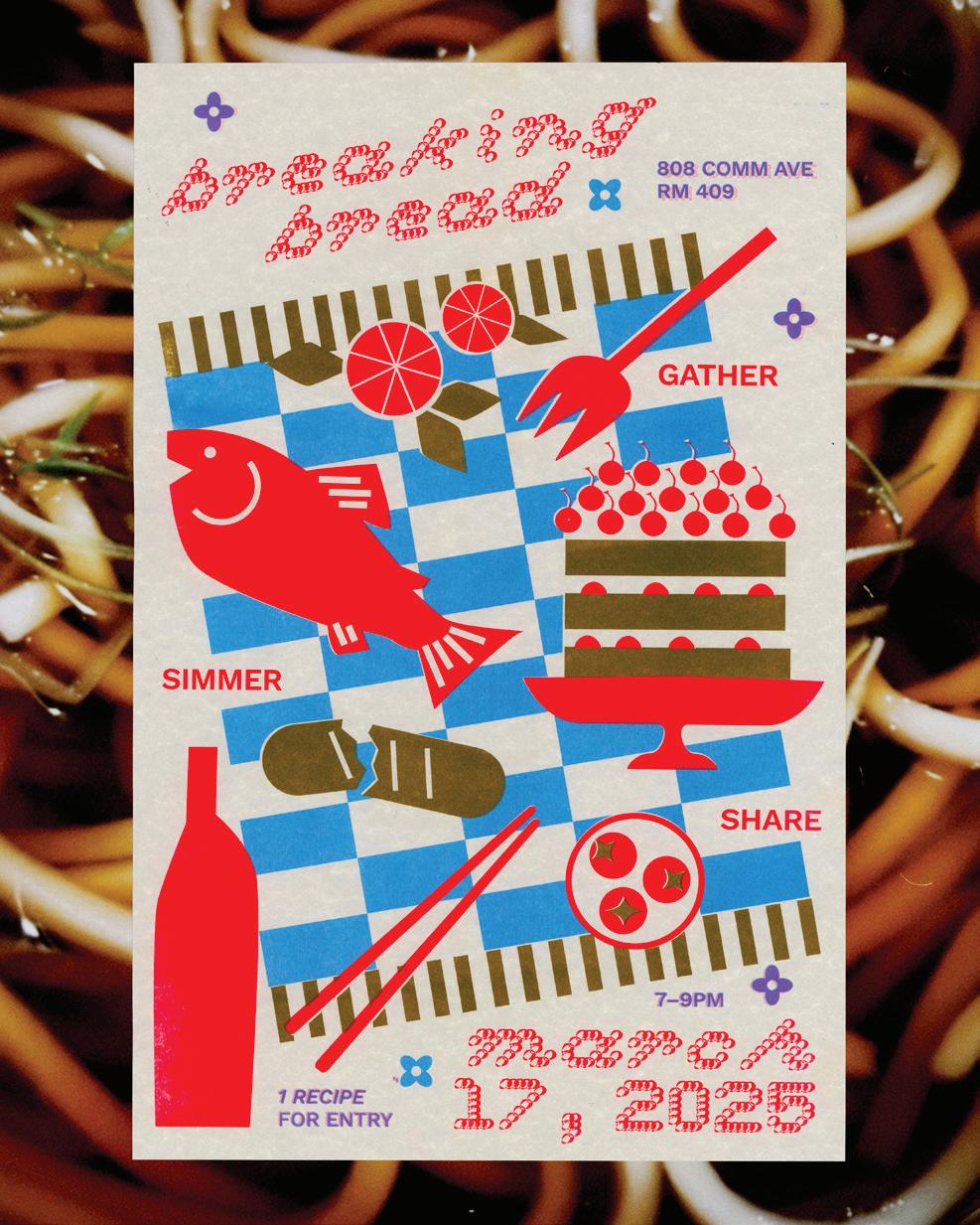
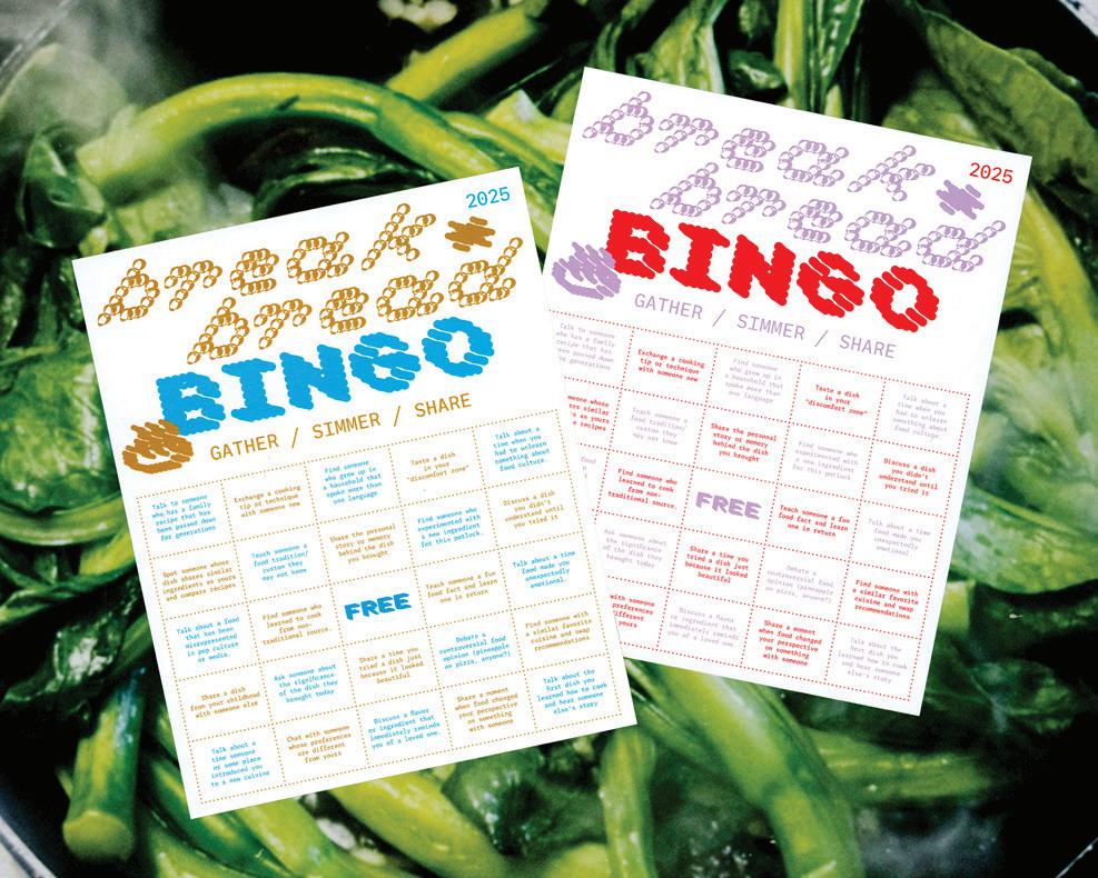
Breaking Bread explores how design can nourish empathy, expand accessibility, and stir cultural exchange through food as a shared medium. Growing up in a predominantly White suburb, I had little opportunity to understand my Asian heritage. This changed when I was 12 and discovered Cooking with Dog, a Japanese YouTube home-cooking show that introduced me to new flavors and sparked a desire to cook. YouTube became an accessible archive and community of culinary knowledge, one I consumed, translated, and adapted to my own evolving palate and skillset. My curiosity about this new arena of flavor transformed food into a creative playground, a way to question my own cultural assumptions, and a medium for bringing people together.
As a designer, I now blend my love for food with my practice, treating it as a vessel for dialogue and deeper understanding. Breaking Bread seeks to cultivate community, challenge assumptions, and bridge cultural divides, just as Cooking with Dog began to do for me. Through a recipe zine workshop that welcomes participants and cuisines of all backgrounds, Breaking Bread offers a communal table where food’s cultural legacies and social impact are explored. My thesis culminates in a set of zines featuring recipes, reflections, and artwork from workshop participants, as well as interactive printed ephemera. By emphasizing inclusivity, this thesis invites participants into a “discomfort zone” where they engage with unfamiliar flavors, narratives, and experiences. Breaking Bread harnesses food’s emotional and cultural ties to foreground empathy and build more open, inclusive spaces for social awareness and personal growth.
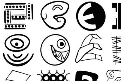
Peering Perspectives is about the joy of discovery—the moment when a playful observation turns into something profound. Through layering, juxtaposition, and abstraction, I highlight how simple shapes can lead to surprising visual transformations. The same object can shift depending on context, prompting new interpretations with closer inspection. What first seems like a random similarity can evolve into a design that surprises, informs, or even delights the viewer. By amplifying these subtle yet striking connections, I encourage an active approach to looking; one that rewards curiosity and deeper engagement with everyday visuals.
MMMPeering Perspectives explores how a simple visual connection—one that might seem silly or coincidental—can unravel new ways of seeing and understanding the world. Familiar objects are often more than they appear, and through shifts in perspective, unexpected relationships emerge. A walnut resembles a brain, a sliced carrot mimics an eye; these visual echoes spark curiosity and invite a reconsideration of how we assign meaning to what we see. Design has the power to reveal these unnoticed details, transforming the mundane into something thought-provoking.
MMMBy embracing ambiguity and encouraging an open-mind, Peering Perspectives challenges the idea of fixed-meaning. Through unexpected visual pairings, seamless transformations, and subtle distortions, I create moments of wonder where the ordinary becomes extraordinary simply by shifting how we look at it. This work encourages a more mindful and imaginative way of seeing, proving that even the most playful observations can lead to deeper appreciation, storytelling, and thought-provoking design. I demonstrate that perception is not static, but rather evolving, shaped by how we choose to engage with the world around us.

yejigarden.cargo.site
“Comfort media” refers to the different types of entertainment that brings viewers a sense of emotional comfort, familiarity, and relaxation. A key element of comfort media is its predictable nature and the positive feelings associated with revisiting wellknown content. This content tends to be something one has experienced multiple times. Often people turn to the same forms of comfort media. This trend that may reflect our shared childhood experiences.
MMMIn Tuned transforms these experiences and forms of content into an interactive game. In Tuned uses graphic design as a tool to create recognizable visual cues that players use to navigate a website or play a game. Through the use of only visual form, In Tuned aims to be accessible to everyone, transcending language and cultural barriers.
@artbyandrealander
andrealander.framer.website
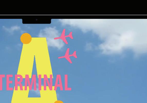
A
Planes have been a big part of my life. I have lived in four different countries. Each flight was more than just a journey from one place to another, but also a transition between cultures, perspectives, and versions of myself. Moving around the world has profoundly shaped my identity, revealing the intricate dichotomy between familiarity and change, individuality and collectivity, and departure and arrival. Planes, as both physical vessels and metaphors, embody this complexity—carrying strangers to the same destination yet toward entirely different experiences and futures. While in motion, they are spaces of liminality, neither here nor there, where past and future converge, much like the fluid nature of identity itself.
MMMThrough this journey, I have come to understand how beliefs and ideas exist in layers, constantly evolving with exposure to new perspectives. Just as a plane bridges distances, my experiences have bridged cultural divides, shaping a perspective that thrives on contrast and adaptation. Embracing the synthesis of contrasting influences has shown me that the most compelling designs—like identities—emerge from the seamless integration of disparate elements, illustrating the power of transformation through evolution. In my thesis, [insert title in italics] I aim to encapsulate this experience by developing a brand and website that translates my journey and the concept of a plane into a digital space. My website and accompanying promotional material explores how personal identity, shaped by both movement and change, can be communicated through design, narrative, and visual storytelling.
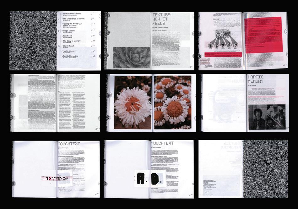
Interwoven
Touch is one of the first senses we develop. It provides us with bonding, comfort, and even the essential nutrients necessary for early childhood development. When I was young, I struggled immensely in school, later being diagnosed with dyslexia and other learning disabilities. Because reading was such a challenge, I relied on touch and visual stimuli as alternative forms of communication—ones I could grasp more intuitively.
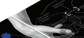
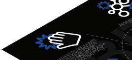
MMMInterwoven explores how touch is a fundamental aspect of human communication and its role in design. Through experiments in non-verbal communication, Interwoven examines how our senses, particularly touch, can be leveraged as tools to create more accessible and immersive experiences. By engaging multiple sensory pathways, design can move beyond conventional visual aesthetics to foster deeper understandings and connections. MMMI am particularly interested in the role texture plays as a tool in graphic design to enhance comprehension and accessibility. How can surfaces communicate meaning beyond aesthetics? How can digital interfaces integrate physicality to create more inclusive experiences? By experimenting with materials, interactive elements, and multi-sensory design principles, Interwoven uncovers new ways to communicate beyond traditional written and visual methods.
MMMInterwoven’s goal is not only to impact the individual on a more personal scale, but is also intended to push current design pedagogy to be revised. Through exploration, Interwovenbridges the gap between functionality and accessibility in standard design practice. By engaging the human senses more deeply, I strive to make information more intuitive, inclusive, and immersive. Ensuring that design is not just seen, but also experienced and felt.

As a 1.5-generation Korean immigrant and Gen Z designer navigating the rapid technological and cultural shifts, I see life’s complexities mirrored in the objects and systems I use daily. When I was a young girl with only a flip phone living in Korea, I could not have imagined the rise of smartphones, just as I never expected generative AI to become mainstream when I started college. The continuous release of new tools has reconstructed the way we think, work, and adapt while quietly dictating our interactions with the world.
MMMThrough an ongoing exploration of self-navigation, my thesis, NON-ENTITY, examines how the digital and physical tools I use are not only extensions of my identity, but also active forces that shape my creative agency. At the same time, tools impose preordained structures, automating thought processes and influencing decisions that often go unnoticed. This tension between control and surrender—between adaptation to or escape from default systems—parallels the broader struggle between human authorship and automation. Where does the tool end, and the creator begin?
MMMIn questioning this dichotomy, I seek to find ways to reclaim authorship and challenge how design can break away from predetermined pathways. Blending analog and digital methods, subverting preordained settings, and constructing generative systems, I examine the default structures embedded in design tools. Rather than passively accepting automation and predefined workflows, NON-ENTITY explores ways to break, repurpose, and reconfigure these systems as a means to foster space for more intentional, unexpected, and personal modes of creation for all.


@bon.bon_1014
bonnielin.cargo.site
Coloring Tangibility
As a visual learner, I have always appreciated how images can effectively teach and communicate. As a hands-on learner, artistic craftsmanship has been a way for me to express and immerse myself in the physicality of conveying information. As someone with a scientific background who relies on visual learning, medical illustration has been instrumental in my success. While medical illustration was traditionally confined to two-dimensional digital and print media, the integration of craft presents opportunities to expand its scope, function, and impact.
MMMColoring Tangibility explores how craft—tactile materials, three-dimensional modeling, and traditional handcraft methods— can enhance medical visualization, offering a new level of tangibility and engagement. By investigating the relationship between craft, graphic design, and medical illustration, my thesis examines how hands-on approaches can improve comprehension, retention, and accessibility in medical education and communication. Furthermore, it considers the implications of incorporating physical and interactive elements into medical illustration, challenging conventional boundaries and redefining the role of materiality in biomedical communications.
The Playbook
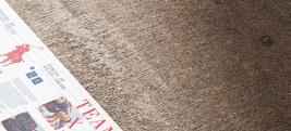
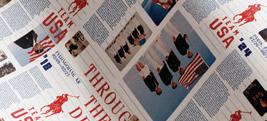
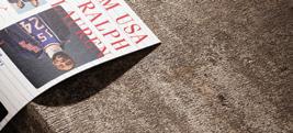
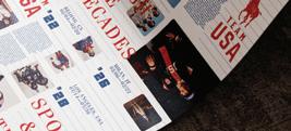
The Playbook uses graphics design to examine the dynamic relationship between sports culture and fashion. These industries have long influenced each other. Athletes become cultural icons, while fashion brands leverage sports events as a platform for both visibility and influence.
MMMAs a Division I athlete and a graphic designer, I navigate these shifting spaces, where brand collaborations increasingly blur the lines between fashion, culture, sports, and entertainment. While this convergence drives both progress and innovation, it also raises concerns about diluting the essence of sports. My work is a response to this ongoing evolution.
MMMThrough research-driven branding systems, my thesis focuses on reconstructing narratives, looking at the strategies, values, and histories of both brands and individual athletes. I critique how they borrow and redefine each other, shaping how both sports and brands are perceived and consumed.
MMMBy questioning the role of design in this entanglement, I challenge audiences to consider the impact of commercialization on authenticity and identity. The Playbook explores and documents the current cultural landscape, reflecting on what is lost, what is gained, and what it means for the future of both sports and the fashion industry.


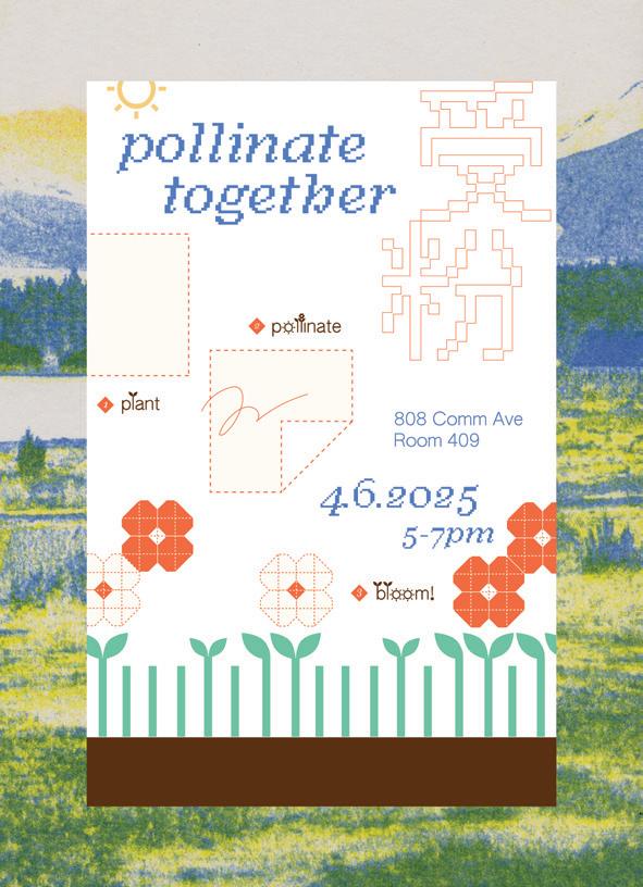
My parents named me 優果, meaning “kind fruit” in Japanese, hoping I would grow into a person who gives, embraces, and shares kindness with everyone I encounter. Fruit of Kindness aims to create meaningful relationships and nurture connections by exploring emotion, personal growth, and multicultural experiences through the biological metaphor of cross-pollination.
Cross-pollination happens when pollinators transfer life between ecosystems, much like the sharing of ideas, values, and stories across cultures and disciplines. Inspired by my journey of emotional sensitivity, cultural heritage, and the act of collecting memories, I share narratives that foster empathy across communities. I view design as a bridge between personal and collective transformation, reflecting the interconnectedness of life in the biosphere, where each organism shapes its environment.
Interdisciplinary approaches through science, culture, and design are key to creating solutions that speak to both logic and the heart, encouraging reflection and growth. By combining sustainability with emotionally-driven storytelling, I aim to offer new ways for people to engage with and contribute to the world. I want to challenge rigid expectations of linear success, celebrating non-traditional paths while embracing the unique journeys that each of us takes. I hope to empower individuals, particularly multicultural children and those struggling with emotional challenges, to create meaningful change.
Ultimately, my work highlights that design, like nature, can be a space for growth, exploration, and the sharing of meaningful connections, fostering an ecosystem where we learn from and share with one another.


Mimesis/Ekphrasis is a design series that unites individual and collective artistic expressions into poetic narratives, bridging the personal and the universal. Rooted in philosophical Platonic and Aristotelian concepts of mimesis, the imitation of reality, and ekphrasis, the vivid description of art, this series delves into the ways identity, perception, and expression intertwine. Each issue invites collaborators to step into personas that blur the boundaries between themselves and certain aspects of my own identity, creating a fusion of perspectives that is both deeply introspective and richly communal.
MMMThrough photography, writing, and interviews, Mimesis/ Ekphrasis constructs layered narratives that explore selfexpression, shared experience, and the subtle interplay between authenticity and performance. By weaving together individual experiences and collective memory, this project seeks to uncover new dimensions of connection, inviting audiences to engage not only as viewers but as participants in an ongoing dialogue.
MMMMore than a documentation of artistic process, Mimesis/ Ekphrasis is an exploration of presence—of the self, of others, and of the spaces in between. I encourage viewers to discover fragments of themselves within these narratives, to find meaning in the poetry of personal experience and the art of shared interpretation. It lies in this convergence where the personal dissolves into the collective, where Mimesis/Ekphrasis becomes not just a reflection, but a living, breathing series of all that we are and all that we might become together.
Stories We Know – Stories We Tell
Stories We Know – Stories We Tell explores the dynamic relationship between the stories we consume and those we create. How do they shape identity and reflect human connection? This project examines storytelling’s function, form, and impact, investigating how stories serve as both a mirror of lived experience and a bridge between individuals and communities.
MMMStories We Know explores how the stories we read, watch, or experience influence personal and communal identity. It analyzes how medium affects engagement: How does reading, watching, or interacting with a digital narrative shape perception? How does interactivity shape emotional connections? This section examines how storytelling traditions evolve across culture, history, and technology.
MMMStories We Tell shifts from analysis to creation, using discoveries to inform my own storytelling experiments. Audience participation plays a key role, allowing viewers to control how much of a story they receive and encourages personal interpretation.
MMMThrough interactive design and visual storytelling, I explore the evolving form of stories, from posters that visualize storytelling as a living entity to interactive websites that challenge traditional narratives. This project will further evolve through research, iteration, and experimentation.
MMMStories shape us and connect us. Through Stories We Know – Stories We Tell, I aim to uncover how the narratives we consume and create define both individual and collective identity, demonstrating that storytelling is not only a reflection of our lives, but also a thread that binds us together.
yewones.cargo.site
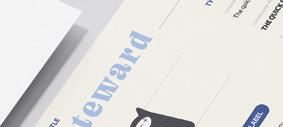
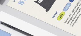
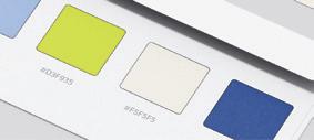
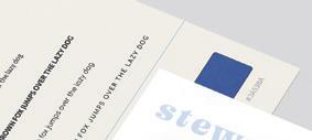
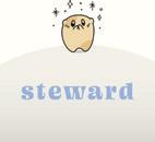
Steward is a mobile app that is designed to reshape the volunteer experience.
Matthew 20:26 says: “Whoever wants to be great among you will be your servant.” This verse highlights that even the greatest, like Jesus, exemplify humility by serving others. My work challenges the notion of “self-first” and critiques the conventional hierarchy that puts wealth and power above all. It provocatively suggests that true greatness comes from the humility of serving others.
I’ll dive deeply into user experience research to address the challenges people face with current volunteer systems. By integrating the Enneagram Personality Test, this app aligns users with opportunities that resonate with their passions in an attempt to make volunteering more enjoyable and impactful. Some additional features include a social feature that identifies common interests among friends.
Steward reflects the biblical principle of utilizing your resources to care for creation. It is an app that empowers individuals to leverage their unique skills and interests to assist those in need. My objective is to cultivate community engagement and rekindle the spirit of service. It is meant to serve as a catalyst for positive change where it is most needed yet often undermined. Through this project, I aim to inspire a culture where serving others is equated with greatness, renewing the values of compassion and generosity, while also refuting the traditional undertones and views of volunteering.


@shpengstudios
sherylpeng.com
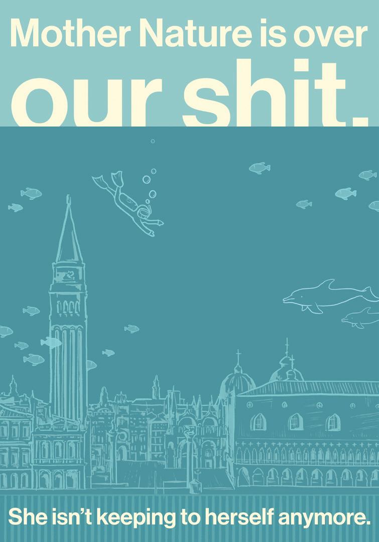
Go Touch Grass aims to collapse the nature/culture divide—a harmful, human invention of Western thought and the foundation for the Anthropocene1 —by cultivating companionship with nature and imagining different ecological relationships through graphic design. In this thesis, design serves as an apparatus to illuminate both the personhood and agency of the non-human world. It intends to rewrite the narrative of nature as an unwieldy, untamed entity in opposition to developed, modern culture. The ontological hierarchy of the nature/culture divide is further disrupted by this thesis’ roots in Daoist and animist belief systems, which serve as examples of equitable relationships with the natural world.
MMMThrough exploring methods of biomimicry, co-designing with and for nature, and borrowing natural processes as frameworks for graphic design, nature and culture become rearranged into a feedback loop, where one informs the other. Design creates a symbiotic relationship between the two, promoting empathy and intentional consumption of the Earth’s resources. By developing a methodology that is nurtured by the environment and the life it sustains, Go Touch Grass positions nature as a collaborator in the making and cultivation of culture, rather than as collateral damage in its development. Ultimately, it is a display of how design can restore and inspire empathetic ecological relationships.
1. Proposed geological age that claims to characterize the era when “mankind started impacting Earth.” The Anthropocene creates a false binary out of nature/culture by devaluing nature as a subservient resource to humans.


Between Here and There
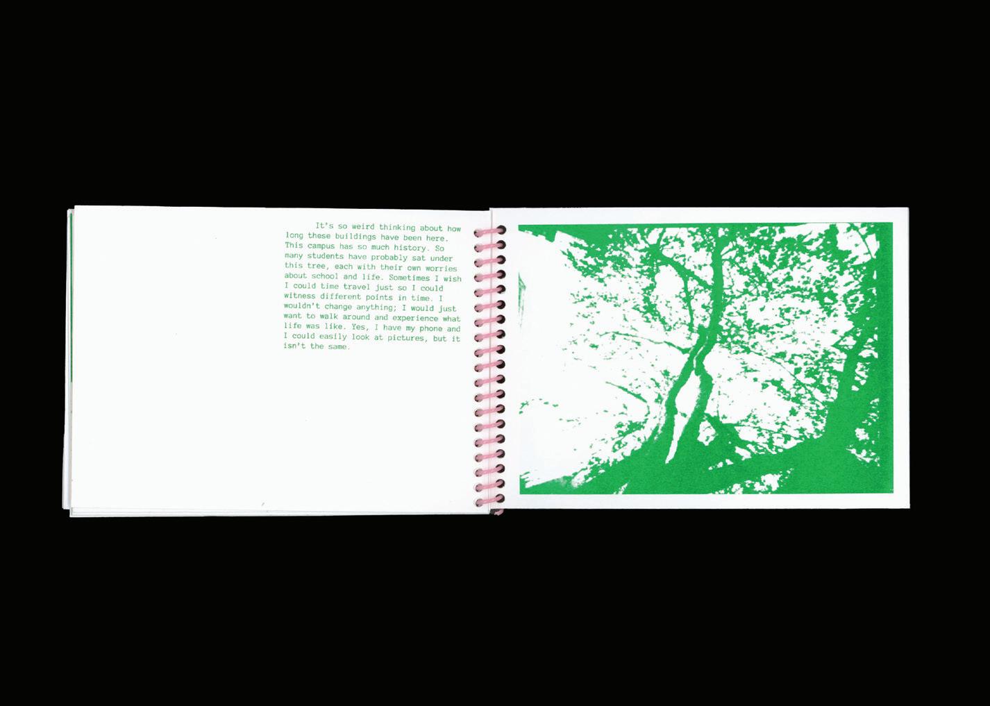
I don’t remember my childhood. I don’t remember significant events in my life. My memories are from the perspective of a camera—the point of view of someone else. When asked about any point in my life before the age of 15, I give the same response: “I don’t remember.” My lack of memories is interesting when taken in consideration with my love of “nostalgia.” I love anything labeled vintage. I rewatch the same movies, and often enjoy looking through old photographs. I spend half of my time in the past, yet I can’t recall my own.
Human memory is inherently unreliable. Each time a memory is recalled, it can become unstable and susceptible to change, which is known as memory reconsolidation. Between Here and There is a study of memory as a flexible matter. My work focuses on the absence of memories and questions whether one can be trusted as the narrator of their own life. I am fascinated by the shifts and changes one experiences with each recollection of the past as well as the discrepancies that occur. Through imagery, my work reflects the emotional impressions, senses, and experiences one carries with each memory. I explore how memory changes in relation to new understandings of past experiences and encourage audiences to engage in forms of reflection as a means to explore their sense of self. vanessaperez.cargo.site
I always grew up as a musical person - my dad is in a band, and for as long as I can remember he fostered my connection to music through instruments, vinyl records, and sheet music. These music-related memories and experiences led me to combine this foundation with my design practice, culminating in a project I would be proud to make.
The Shape of Sound is an exploration of the intersection between music and design, informed by the incorporation of my unique personal experiences. Through the use of interactive 3D modeling, music production, and programming tools, this project bridges the gap between sound and visual form, creating a new language for experiencing music.
A key component of this work is the integration of user interaction and connection. I invite and encourage viewers to connect their own experiences and engage with my designs. That mission is supported by interactivity and tangible media that explore how music can be imagined through a visual lens.
At its core, The Shape of Sound is about more than just music and aesthetics - it’s about connection. This work is meant to find ways to visually represent the personal and universal experiences that music creates in all of us.
@by.anpyo
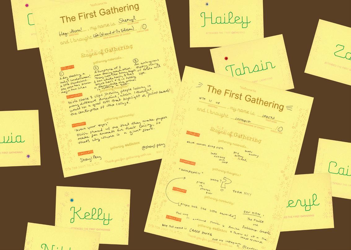
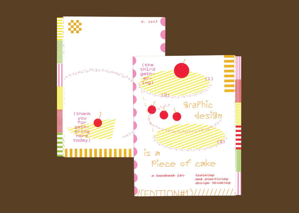
Gathering is present Gathering is observation Gathering is engagement Gathering is giving
Gathering is the practice of cultivating an authentic sense of self in conjunction with an openly embracing community. As a designer, gathering is the process of convening materials, thoughts, collaborators, and audience to build relationships through co-design.
As my time as an undergraduate student comes to an end, I imagine how I will bring my gathered knowledge into new contexts and non-academic spaces. By investigating through surveys and interviews, conducting collaborative workshops, performing social media experiments, and distributing through printed matter and digital media, my methodology explores how design operates as language, a vehicle for communication between designers and non-designers alike. How can casual settings and accessible tools open windows for non-designers to engage with graphic design?
Gatherings aims to make relational roles malleable by blurring the boundaries of designer and audience, facilitator and participant, influencer and follower, and teacher and pupil to embrace adaptability, trust, and exchange as essential tenets of community building. Considering and embodying the perspectives and priorities of educators, students, and random Instagram users, I adapt my framework for design thinking to be broad enough to include and intimate enough to resonate.
Through my research, I hope to contribute to ongoing conversations about design education and invite those unfamiliar with, but curious about graphic design to expand definitions and applications of design thinking. My design practice is flexible and in flux, in and out of design circles, for the purpose of meaningful human connection.
kateragostadesign.cargo.site
Between Here and There
I don’t remember my childhood. I don’t remember significant events in my life. My memories are from the perspective of a camera—the point of view of someone else. When asked about any point in my life before the age of 15, I give the same response: “I don’t remember.” My lack of memories is interesting when taken in consideration with my love of “nostalgia.” I love anything labeled vintage. I rewatch the same movies, and often enjoy looking through old photographs. I spend half of my time in the past, yet I can’t recall my own.
Human memory is inherently unreliable. Each time a memory is recalled, it can become unstable and susceptible to change, which is known as memory reconsolidation. Between Here and There is a study of memory as a flexible matter. My work focuses on the absence of memories and questions whether one can be trusted as the narrator of their own life. I am fascinated by the shifts and changes one experiences with each recollection of the past as well as the discrepancies that occur. Through imagery, my work reflects the emotional impressions, senses, and experiences one carries with each memory. I explore how memory changes in relation to new understandings of past experiences and encourage audiences to engage in forms of reflection as a means to explore their sense of self.

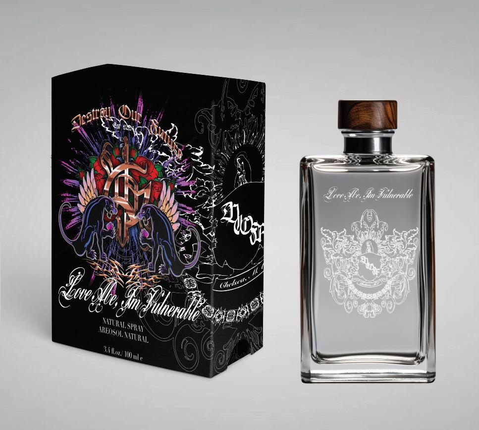
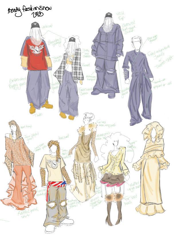
Love Me, I’m Vulnerable represents my journey of examining my relationship with my heritage, compelling me to embrace vulnerable parts of myself and my history. Born to a Puerto Rican mother and Honduran immigrant father, my roots are deeply intertwined with a complex history of resilience, displacement, and survival. Curious about how the historical events that shaped my ancestors have influenced me, I explore how these histories have shaped my creativity and, more broadly, the Hispanic American experience across generations. This intersection of Latin American art history and my passion for sociology has expanded my understanding of how communities create visual identities through design.
The absence of Latin American design in the Western design canon is often attributed to the lack of “influential” art from a community historically seen as unable to participate in mainstream design. However, many impactful design elements have emerged from Hispanic culture, reflecting spirituality, virtue, and the influence of Catholic and European aesthetics. The patterns and forms used in clothing, body modification, and adornment are deeply rooted in these visual elements.
My research sheds light on how design, art, and cultural practices are intertwined with history, community, and identity, while considering how these elements continue to evolve and influence the present. This will be showcased through a small collection of jewelry, original looks, and branded items that embody this cultivated design language. Combining the romance of Catholic aesthetics, gothic letterforms, Hispanic American fashion, and the body as a canvas—rooted in pre-Columbian society—my brand “Destroy Our Future” reflects this visual identity.
@doupovecdesign
andrearojas-doupovecdesign.cargo.site
Beyond the Surface
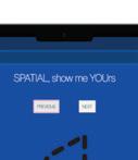
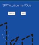
Graphic design can transcend its traditional two-dimensional constraints by integrating user agency, transforming static surfaces into dynamic, interactive spaces. By embedding user interaction into both the design process and the final output, graphic interfaces, immersive installations, and exploratory objects become spatial experiences rather than fixed representations. Beyond the Surface explores how user-centered design informs the creation of spatially aware graphic interfaces and physical interventions, incorporating philosophical inquiry, phenomenology, and spatial awareness to critically examine how users perceive and interact with designed environments. MMMThrough cultural comparisons, ethnographic research, and an analysis of UX theories, general design theories, and human-centered design principles, this project deconstructs conventional design systems to propose a framework for interactive, adaptive surfaces. The final playbook, structured around four (#) core elements — surface, agency, navigation, and perception — serves as both a methodological guide and a conceptual foundation for the thesis, ensuring a holistic approach to user-driven, spatially aware design. The outcome is a dynamic system where users shape their own experiences, challenging the notion of passive surfaces and redefining graphic design as an evolving, responsive dialogue.


Mythos and Ethos
The storyteller, the main character, the narrator — this figure holds a profound and mighty role; stories bend to their will, becoming whatever they wish. They forge a unique lens through which they translate the world. As artists and designers, we become the modern myth-makers. Our task is to become cognizant of this power because we have a responsibility to shape the story ethically.
Civilizations across humanity’s many eons have conjured narratives and oral histories to pass down, shaping their realities. These traditions manifest through folklore, mythologies, legends, fairytales, and fables. Through retelling these tales time and again, generations all try to decipher the earth we inhabit. Stories are indicative of our shared humanity. In Mythos & Ethos, storytelling is explored through the frameworks of queer and feminist theory, decolonization, sociology, and ethics. This project delves into the themes of identity versus community and the artist versus the realm of vast possibility.
Mythos & Ethos will introduce The Hierophant, a character who serves to reinterpret age-old stories from childhood days and myths from empires long gone. Within these pages, a new story will arise. A story that grapples with what it means to be a creator on a search for truth-telling. This book series is my very own fantasy quest. A journey where I make discoveries and discover myself, my voice, my perspective. It also serves as a path that guides the reader through histories and epistemologies that can aid in their own adventures in artmaking. This knowledge can embolden us to shape the future in deeper, more magical ways than before. Together we can craft a new moral of the story and a better “happily ever after.”
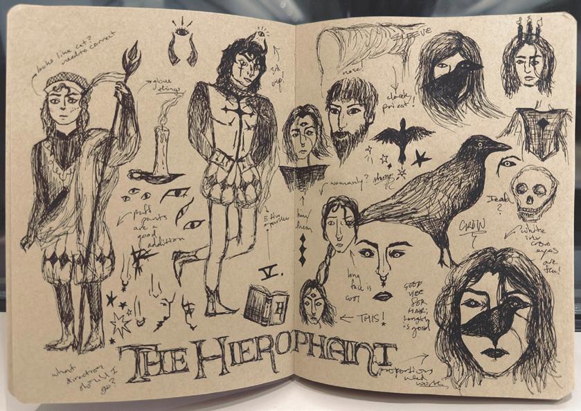
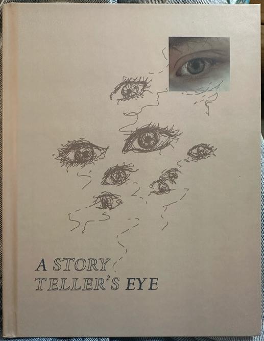
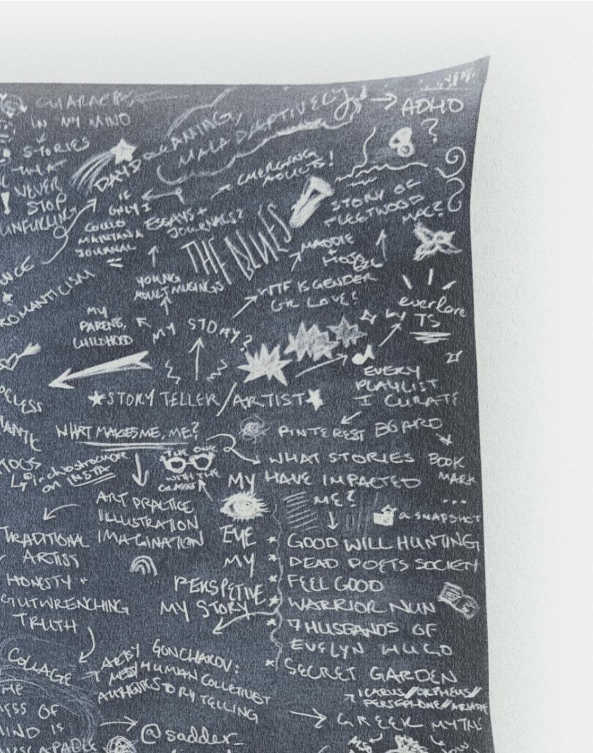
Untitled
Untitled by Dar Saravia is a celebration of outsider culture. This video-based performance constructs a visual language that highlights a more unconventional narrative, one about the curation of identity. The audience is asked not merely to consume, but to engage. Encouraging them to drop their expectations and instead become a part of the creation of meaning. Untitled reminds us that truth is often found in the idiosyncrasies of those who dare to build beyond the expected. What is self? How do we embark on a journey inward, and who emerges on the other side? Untitled doesn’t provide any easy answers. Instead, it guides us through physical and metaphorical transformations. Through showcasing a state of constant change, the video challenges the boundaries of authentic expression. Disrupting the status quo and pushing against the limitations imposed by tradition. Forging a space where visuals do more than exist, they impose, reach, and demand reflection.
In a world saturated with manufactured identities and aesthetic conformity, Untitled stands as a radical act of selfactualization. It serves as a mirror for those willing to stop and look, questioning the audiences’ own practice. Performance and performer merge as lived experience seeps in, erasing the boundary between artist, audience, and creation itself.
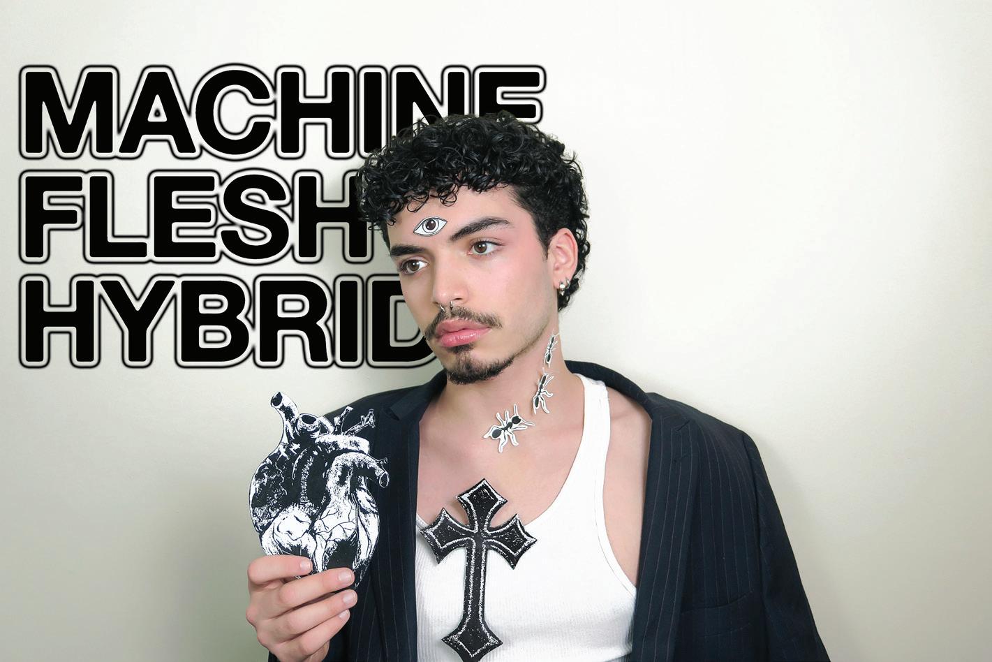
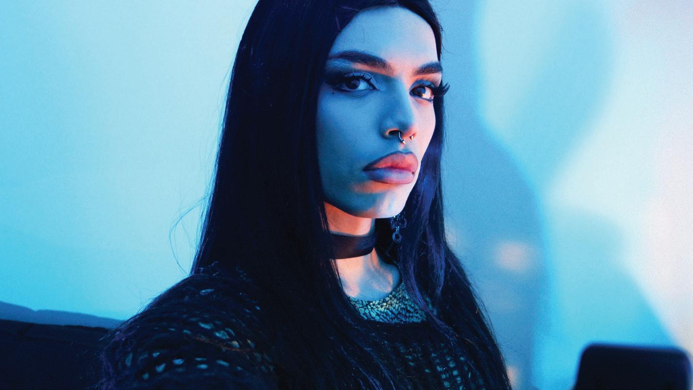
The past does not remain in history books or faded photographs. It lives in the way we write, the symbols we inherit, the shapes that form our words. As someone who moves between Chinese and English, my work is an exploration of these connections, tracing the threads that weave Chinese heritage into the fabric of Western and English visual culture. In every stroke of a brush and every letter on a page, there is a dialogue between tradition and reinvention, a conversation between what was and what could be.
I see design as a language that carries memory. It is a way to hold onto what is slipping away while allowing it to take on new forms. Chinese calligraphy is more than an art form; it is a rhythm, a gesture, a movement of ink that speaks across generations. In my practice, I bring these organic forms into conversation with modern English typography, letting the curves of ancient brushstrokes shape the sharp edges of contemporary letterforms. Through this merging of traditions, I explore how cultural memory does not fade but transforms, adapting to new contexts without losing its essence.
Heritage is not a relic of the past. It moves with us, reshaped by the hands that carry it forward. In my work, I seek to make this movement visible, to create a space where old and new exist together. Each design is an act of remembering, a way of letting history breathe within the present. Through storytelling, material exploration, and the interplay of Eastern and Western aesthetics, I search for ways to keep the tradition alive—not as something frozen in time, but as something that continues to grow.
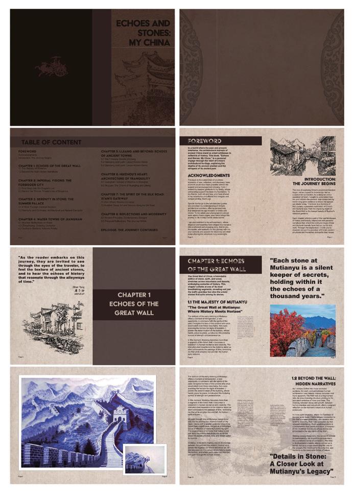
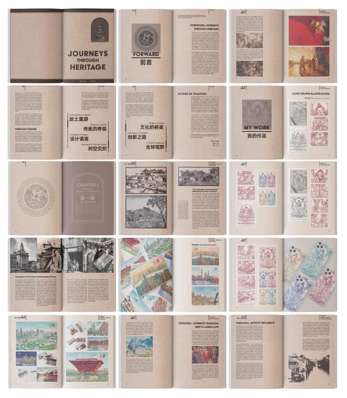
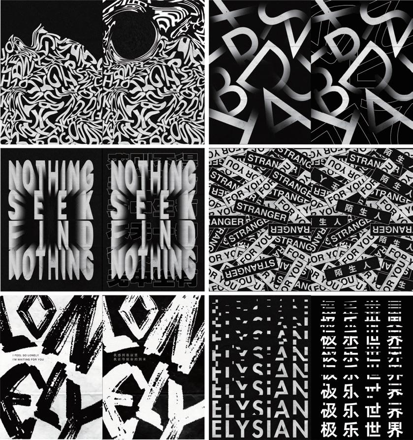
@hailey___wang
haileywang.cargo.site
In my ever-evolving design practice, I welcome processes that surprise, challenge, and guide me. In these processes, tension is essential for innovation and growth. My interest in the process extends beyond my own methodology to the creative practices of others. Design is inherently multidisciplinary, existing as a cultural practice that thrives in conversation with other fields. The most compelling ideas emerge at these sometimes unpredictable intersections, where we can absorb, grow, and learn from one another.
MMMProcess in Process investigates how transparency, iteration, and remixing make the creative process both more visible and accessible. Through a series of candid conversations with creatives across disciplines, I explore, curate, and analyze their processes. Every step of my process is made visible by designing, rearranging, and remixing these conversations using digital and analog techniques. By borrowing from their processes and drawing connections between their approaches, I decenter my role as a creator to act as a facilitator. I include the audience as active observers in my process, shifting the focus from the final product to the act of discovery itself. Process in Process aims to visualize creative processes, foster stronger ties within creative communities, and bridge the gap between creators and audiences.
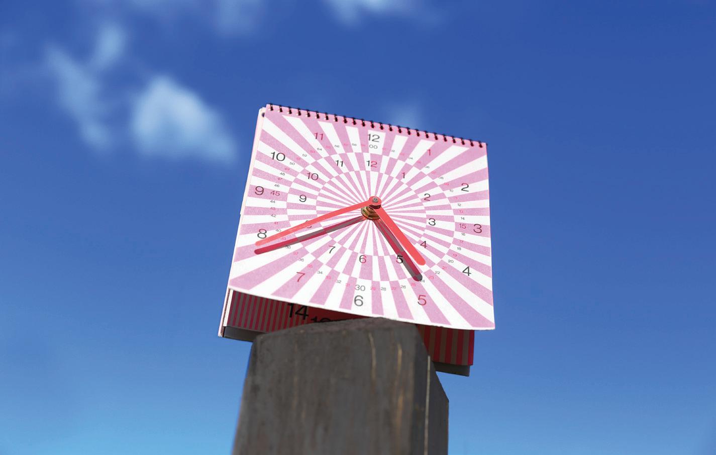
@wang-ruxian rashinaw.wixsite.com
Look Forward, Remember Back
“We live through the memories, no matter if it’s good or bad. I always want to go back and change certain regrets. But these regrets, these moments, and these experiences shaped who I am.” – Rashina’s Little Thought
MMMLook Forward, Remember Back is a thesis of self-awareness and reflection, an exploration of how to stay rooted in one’s origins while embracing the path ahead, balancing both innovation and tradition. As designers, we must constantly learn, expand our perspectives, and welcome change. Yet, true growth also requires us to acknowledge our imperfections and find strength in doubt and meaning in regret. Our experiences, emotions, and cultural backgrounds shape the way we see the world, and these fragments of memory naturally become part of our creative voice.
MMMIn my work, I seek to weave together the old and the new, drawing inspiration from personal experiences, cultural heritage, and the evolving world around me. Through visual storytelling and digital composition, I explore the interplay between tradition and modernity, translating cultural narratives into contemporary design expressions. I often incorporate elements of traditional Chinese culture—not just in symbolism but also in form, structure, and spatial relationships—as a way to reflect on identity and creative heritage. For me, design is more than a visual language; it is a medium that bridges past and future, memory and possibility. Whether through typographic exploration, editorial layouts, or immersive digital experiences, I strive to create work that preserves what is fading, reimagines what is forgotten, and fosters a sense of belonging in an ever-changing world. While design may not alter reality, it has the power to shape perception, evoke emotion, and create connections across time. Through my practice, I seek to honor the past while embracing the future, transforming memories into something tangible that continues to evolve, just as we do.
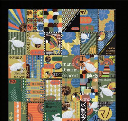
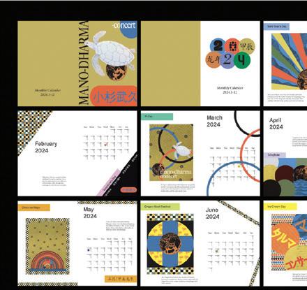
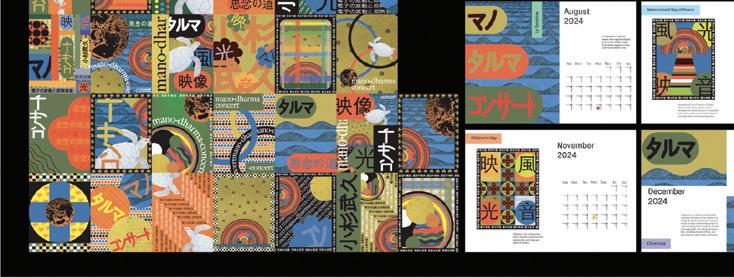
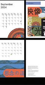
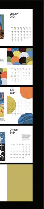
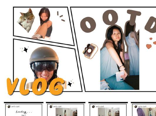
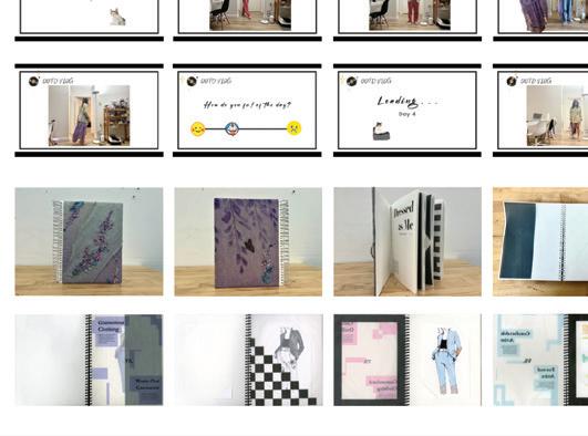
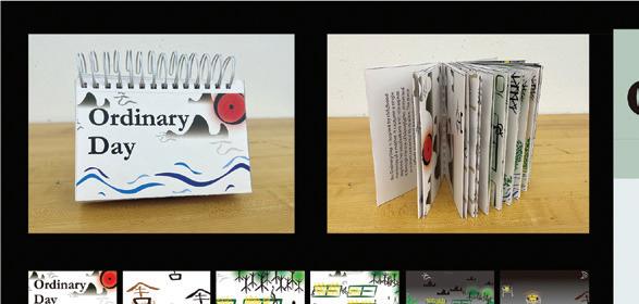
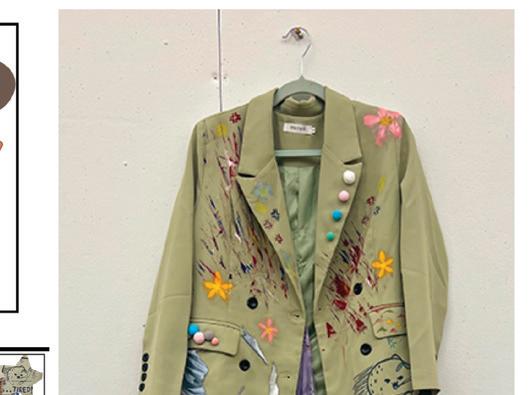
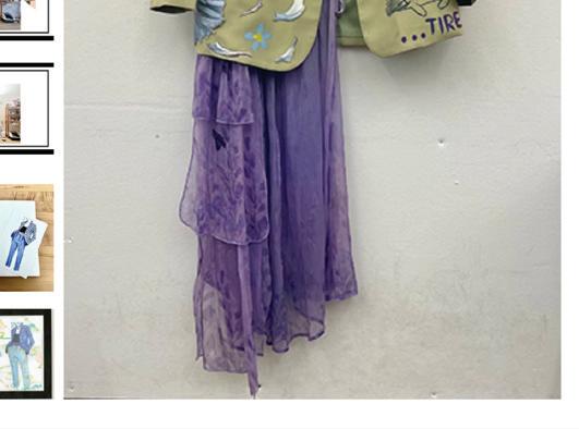
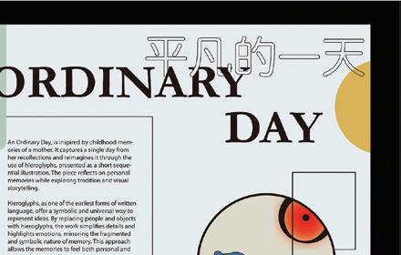
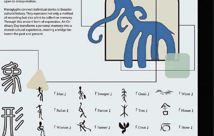
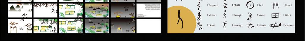
@quietinterlude_
quietinterlude.cargo.site
We exist in a constant state of flux– shaped by shifting identities, evolving experiences, and the tension between who we are and how we are perceived. In these in-between spaces— where boundaries blur and meanings unfold— we search for belonging.
MMMUnraveling explores the intersections of identity, experience, and design through deconstruction, revealing how spaces of ambiguity and fluidity foster belonging and understanding. By examining the liminal zones where boundaries fuse and overlap, this thesis investigates how design can reflect and navigate the complexities of selfhood. These in-between spaces provide opportunities to dismantle and reinterpret familiar elements, uncovering deeper connections and meanings.
MMMRooted in self-reflection, research, and creative exploration, my work engages with design as a tactile and conceptual practice. By dismantling and reassembling elements of design through typography, photography, layering, and experimental material explorations, my thesis examines the tension between fragmentation and cohesion, individual and collective experience, and the interplay between personal history and collective narratives. These methods collectively embrace ambiguity, hybridity, and transformation, encouraging audiences to reconsider the familiar and engage with new perspectives.
MMMThrough this exploration, Unraveling, contributes to broader conversations about identity, belonging, and the potential for design to bridge both personal and collective experiences. By embracing liminality as a site of meaning-making, this work demonstrates how design can cultivate connection within spaces of uncertainty, offering new ways to perceive the fluid, ever-evolving nature of selfhood and understanding.
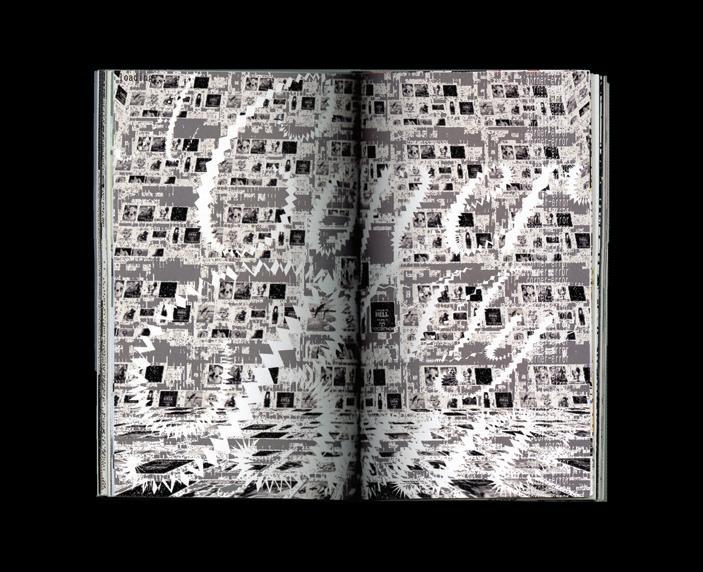
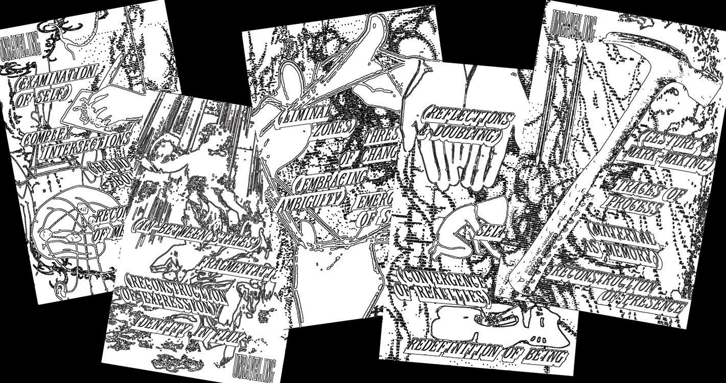
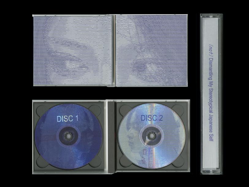
@katiedaileader
katiedaileaderdesign.cargo.site
Self-Sufficiency, Spite, and (Sustainability)
Self-Sufficiency, Spite, and (Sustainability) is a collection of essays, experiments and interviews about current issues in graphic, fashion, furniture, and architectural design. My thesis is not meant to find solutions to these problems, but rather to better understand them through extensive research so that I may further cultivate my design practice and artistic mission.
MMMMy main goals are:
MMM1. To learn more about the consumption-based urges that constantly make me feel like I’m chasing something unattainable. I want to understand the things that cause me anxiety: clutter, how others perceive me (particularly on social media), and my desire for things like furniture, new clothes, abs, and money. As a result, I hope to learn how to organize and control these desires.
MMM2. To discover ideas for how systems and design can help me understand not only how to abstain from, but also oppose consumer culture. I hope that I can make clear the line between design and commerce so that I may design with intention and make ethical choices (opting out of cheap forced labor, designing for art sake rather than commerce sake).
MMM3. To create a physical archive of the foundations of my design practice.
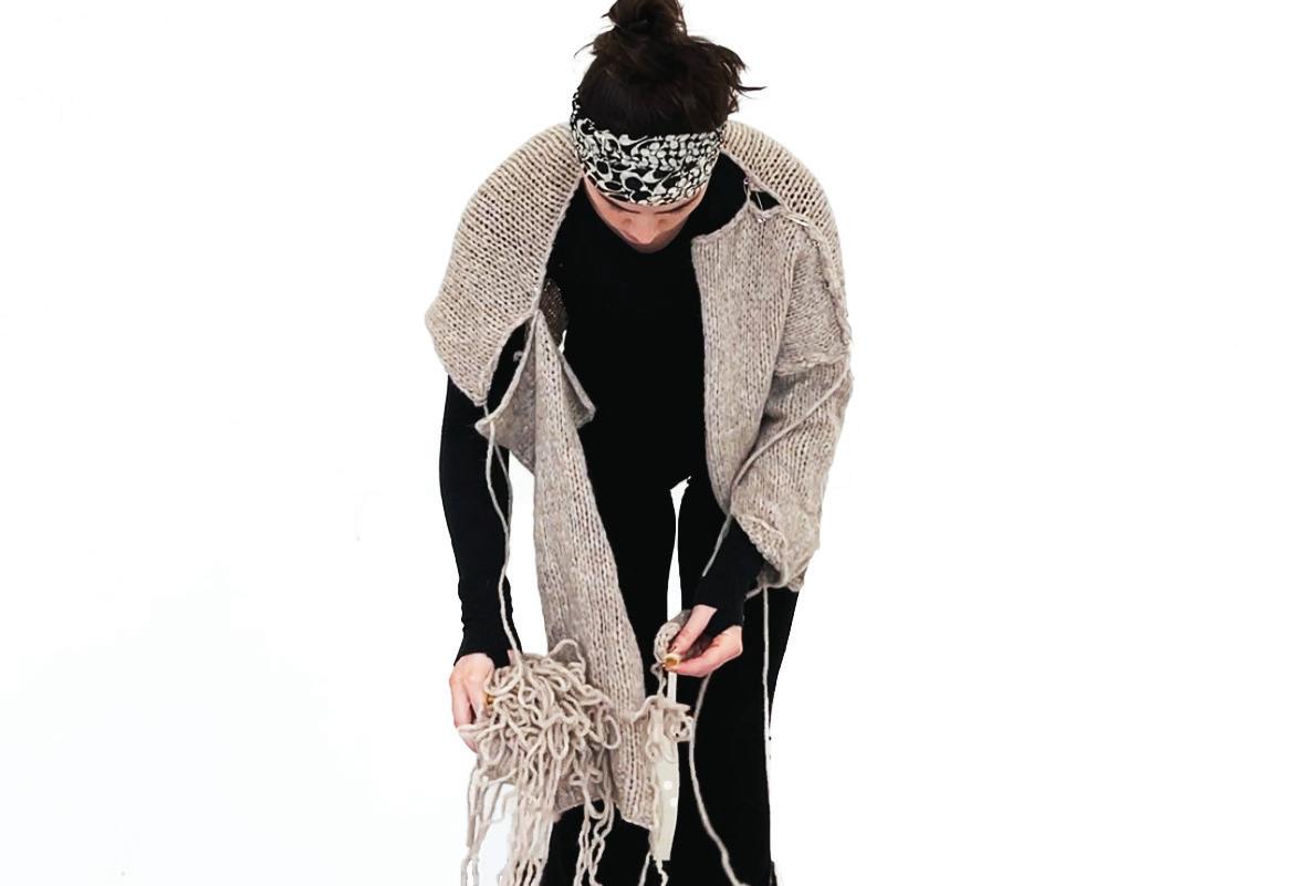
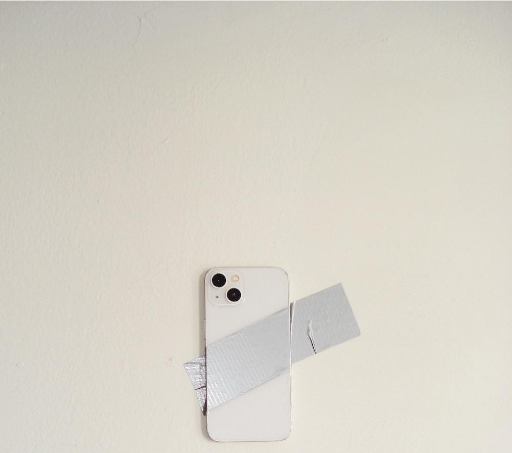
Rememory
Toni Morrison refers to “rememory” as “recollecting and remembering as in reassembling the members of the body, the family, the population of the past.” I titled my thesis Rememory as a means to guide my exploration of epistemologies outside of Western hegemonic knowledge systems. Rememory explores cultural identity and my ancestral calling to learn about and experience my cultural heritage.
MMMIn my thesis, I examine the representational capacity of fabric beyond its functionality and ties to human capital and consider fabric as a space to hold both memory and experiences. Through this process, I take a creative lens to break down colonial and capitalist frameworks and regard fabric as a source for creative pedagogy.
MMM“rememory” represents the exercise of seeking out memories, experiences, and practices I believe should belong to me. In so doing, this project acts as a digital archive, designed to document and explore both my intimate relationship with fabric as well as my experiences with female figures who hold generational knowledge of fabric usage.


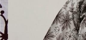
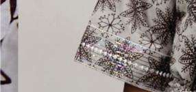
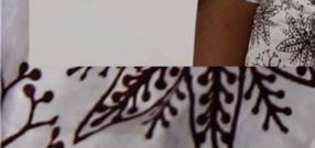
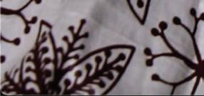

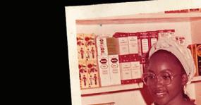
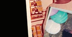
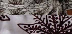

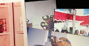
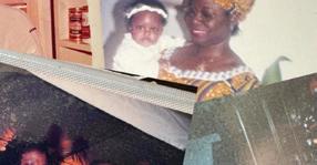
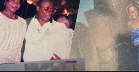
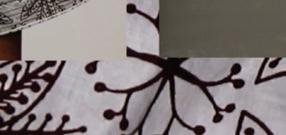
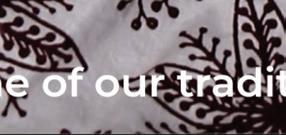
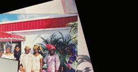
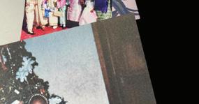
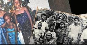
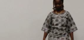
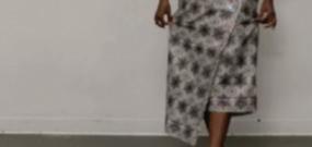


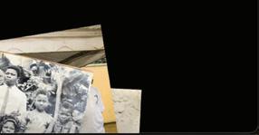
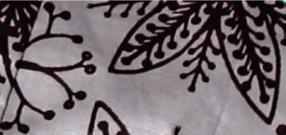
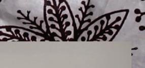
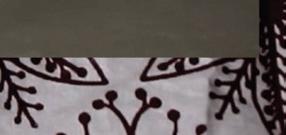
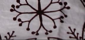
@gabygm.cargo.site
Urban environments function as platforms for public expression, where graffiti and street art serve as critical reflections of contemporary social, economic, and political conditions. In cities like Boston, particularly within low-income and student-populated areas, these unsanctioned visual interventions create an evolving record of underground dialogue. Often dismissed as vandalism, graffiti operates as a coded language; its patterns, placement, and messages offering insight into localized communities and organizations. My work examines how street art corresponds to broader societal transformations, raising key questions: How does graffiti reflect contemporary socio-economic realities, and in what ways does its presence signal political change? How do unsupervised public spaces shape individual engagement in anonymous expression and invisible conversations?
MMMAt its core, my work is about teaching the art of noticing and encourages audiences to take a closer look at their surroundings. Through visual storytelling, I want to highlight the nuances and complexities of documenting an art form that is inherently anonymous yet publicly displayed. While I offer my own interpretations, I ultimately invite viewers to draw their own conclusions, fostering a deeper understanding of the layered, often unseen narratives that shape urban space.
MMMRather than a traditional academic study, this digital collection “walks” the reader through my thought process, layering documentation, interpretation, and reflection. I explore how street art functions as protest, resistance, and counter-narrative to dominant power structures to interrogate authorship and ask: Who is speaking, and why?
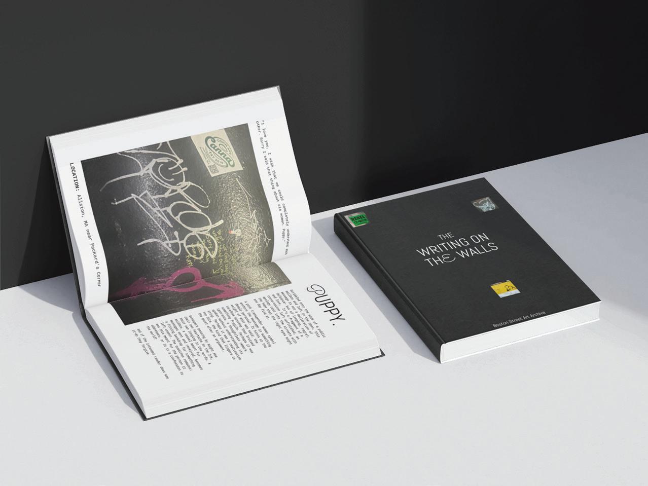
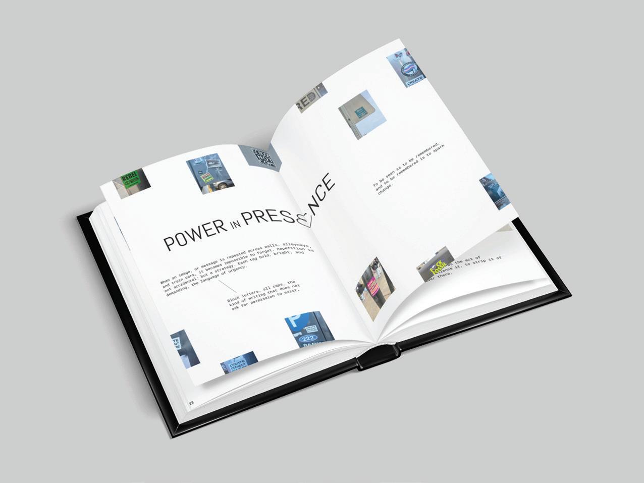
In a world where digital tools and processes dominate our daily lives, there’s something deeply meaningful about putting pen to paper- a simple yet powerful act that fosters creativity, organization, and self-reflection. My capstone explores the intersection of fine art and functionality through hazybluedays, a stationery brand that merges my passion for printmaking with the art of journaling. Through thoughtfully crafted products, I hope to create not only practical tools but also pieces that inspire a deeper connection to the analog experience.
MMM While some works will be entirely digital, a key part of this brand is my love for printmaking and its rich textures, layered details, and beautiful imperfections that make each piece feel unique. By incorporating hand-printed elements, I want my stationery to feel personal and playful, featuring intentional characters, patterns, and details that bring warmth to everyday moments.
MMMThis project is also shaped by my seven-year journey with journaling, where I’ve learned how structured yet visually engaging layouts can transform the way we plan, reflect, and express ourselves. Over the years, I’ve been inspired by artists and peers whose stationery sparks imagination and feels vibrant- qualities I aspire to bring into my own work.
MMM At its heart, my stationery serves as a bridge between my fine art practice and a broader audience, inviting people to embrace the beauty of handcrafted design in their daily lives. Whether for productivity, introspection, or artistic exploration, I want my products to inspire meaningful moments on paper. By blending printmaking, graphic design, and my personal experiences, I hope to redefine stationery as not only a tool for organization, but a medium for expression, creativity, and quiet inspiration.
@ryangwon_art
ryangwon.cargo.site
Emotions Derived From
Art is an unspoken truth—a medium where an artist’s raw self can peak through to reveal their deepest emotions. My journey as an artist is deeply rooted in my experience understanding and communicating my emotions through visual language. Art is like a silent, non-linguistic language capable of transcending words.
MMMMy work explores a central question: How do viewers experience (verb) without the experience (noun)? Emotions Derived From is my attempt to answer this question and focus on how visual art can both communicate complex emotional experiences and foster understanding among those who may not have lived those experiences first-hand.
MMMThis project serves as the foundation for a broader inquiry that extends into history, literature, and sensory ambiance, including sound and scent, to deepen our understanding of how experience shapes perception. Through my artistic and academic endeavors, I strive to reconstruct emotions of the past, allowing audiences to engage with history not only as observers, but also as participants in an emotional dialogue.
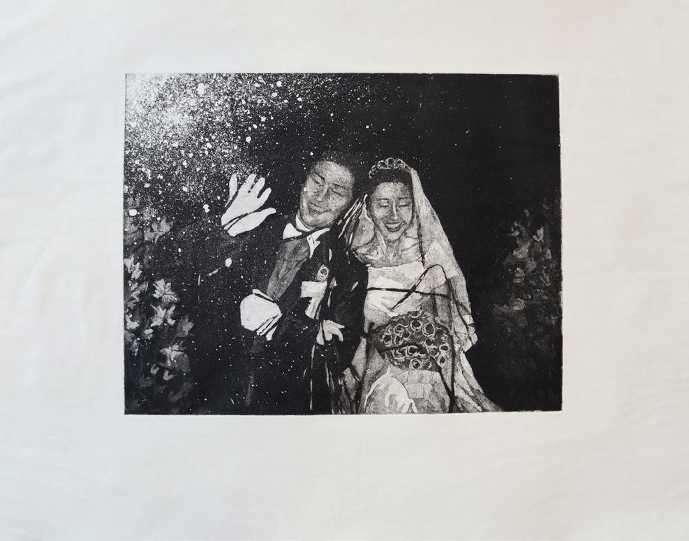
At its core, my passion for creating environments stems from my love of world-building: the ability to construct spaces that tell stories, evoke emotions, and transport people somewhere else. For me, architecture and landscape are more than just backdrops, but rather spaces that define the way we interact with a world, whether real or imagined, and frame our perceptions of both space and time.
MMMDuring my trips to China, my interest in architectural forms grew from an appreciation for the beauty of the must-see landmarks to a deep curiosity about the differences between urban and ancient architecture. Chinese architecture is also much more than just a style, it is a philosophy the centers a sense of harmony between people, nature, and structure. The sweeping rooftops, intricate wood carvings, and detailed latticework serve both aesthetic and functional purposes, guiding light and air while creating a dynamic interplay between open and enclosed spaces. Beyond their visual beauty, these structures tell stories of daily life and the rituals and traditions passed down throughout generations of both emperors and scholars. For me, the connection between architecture and narrative is what makes these spaces so powerful.
MMMI want my thesis to feel like stepping into a living, breathing space—an experience that goes beyond looking to make audiences feel alive, responsive, and fully immersed in both light and sound. I want Echoes of Light: A Sound-Responsive Architectural Experience to function as a living environment, one that both reacts to presence and makes visitors feel like they are stepping into a world that acknowledges their presence.
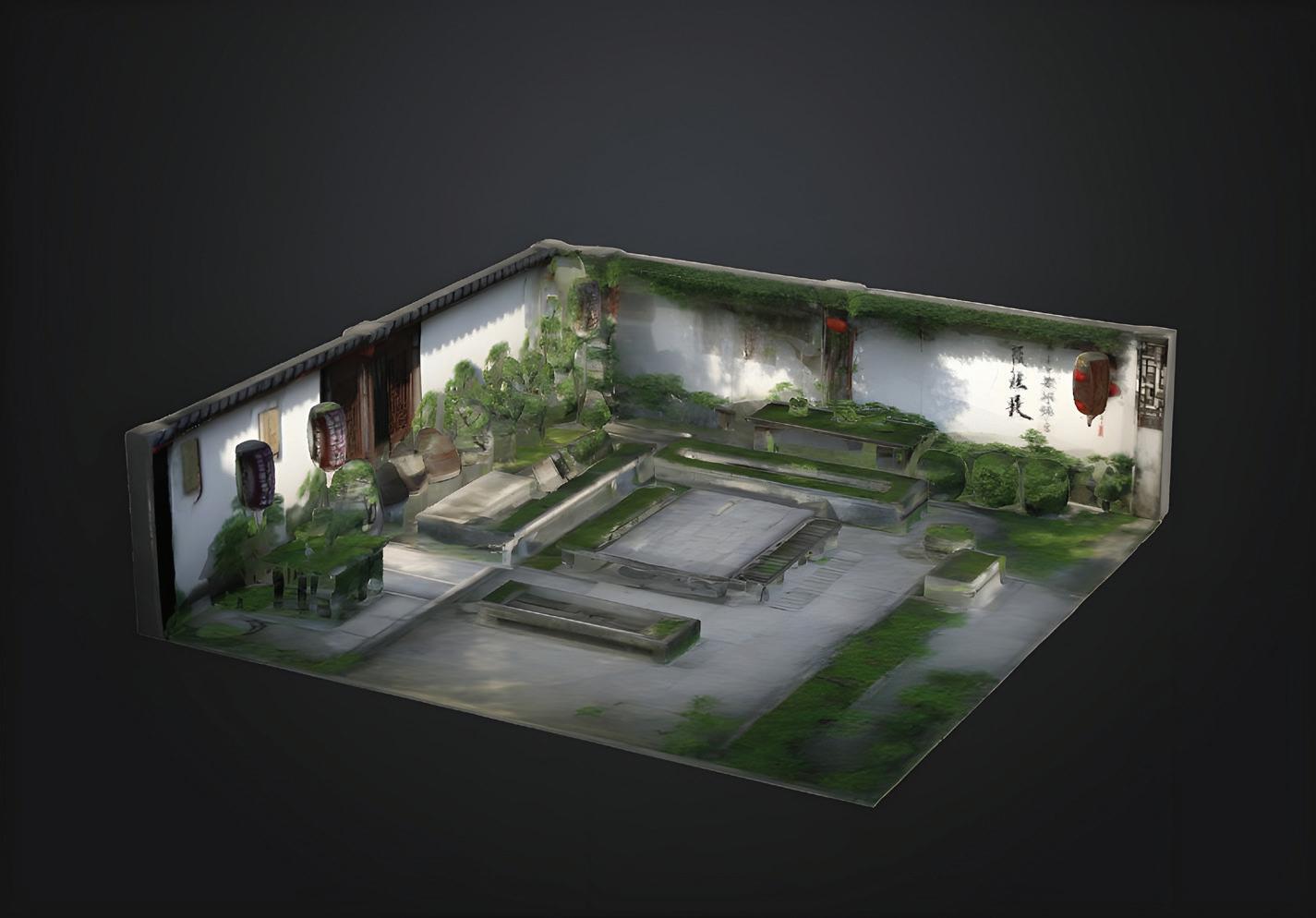
Fever
Archives codify history through hierarchical binaries. In these spaces, lived experience is reduced to qualitative “proof” of what occurred. Suddenly, preserving the human footprint becomes a task of categorizing the official/unofficial, curated/organic, or canon/apocryphal. The consequence of cataloging the past in such a way is the flattening of history. If a document does not conform to this logic or support a linear narrative it is relegated to the margins or rendered invisible. Nevertheless, I see the archive’s potential as a space to embrace neglected history and reverse the violence it enacts on those who would otherwise be delegated to footnotes and annotations.
MMMDrawing from Jacques Derrida’s Archive Fever and Michel Foucault’s Archaeology of Knowledge, I wish to de-serialize and demystify the archive through both form and content. My thesis, Archive Fever, resists institutional rigidity to cultivate deliberate intimacy. By designing a digital and physical space that is both inviting and self-determined, I destabilize the authority of the archive and empower others to construct their own, reaffirming that our personal histories—no matter how seemingly insignificant—are worthy of preservation. If we don’t remember them, who will?
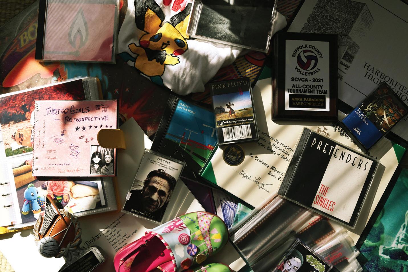
When I was a kid, I dreamed of opening my own boutique. I loved dressing up my Barbies, sketching outfits, and imagining a world where I could design fashion for a living. But as I grew up, that dream started to fade—pushed aside by the idea that creative careers weren’t “practical.” In the environment I grew up in, becoming a doctor or engineer was the goal, while art and fashion were seen as hobbies.
MMMThat’s why I created UNFOLD, a magazine that celebrates fashion, design, and the dreamers who refuse to give up on their creativity. This magazine isn’t just about clothing; it’s about the intersection of fashion and graphic design, and how both shape culture, identity, and storytelling.
MMMUNFOLD is for anyone who’s ever wanted to create, design, and express themselves through fashion. It’s a reminder that dreams don’t have to fade—they can evolve into something even bigger.
So here’s to the dreamers. Here’s to fashion, art, and never giving up.
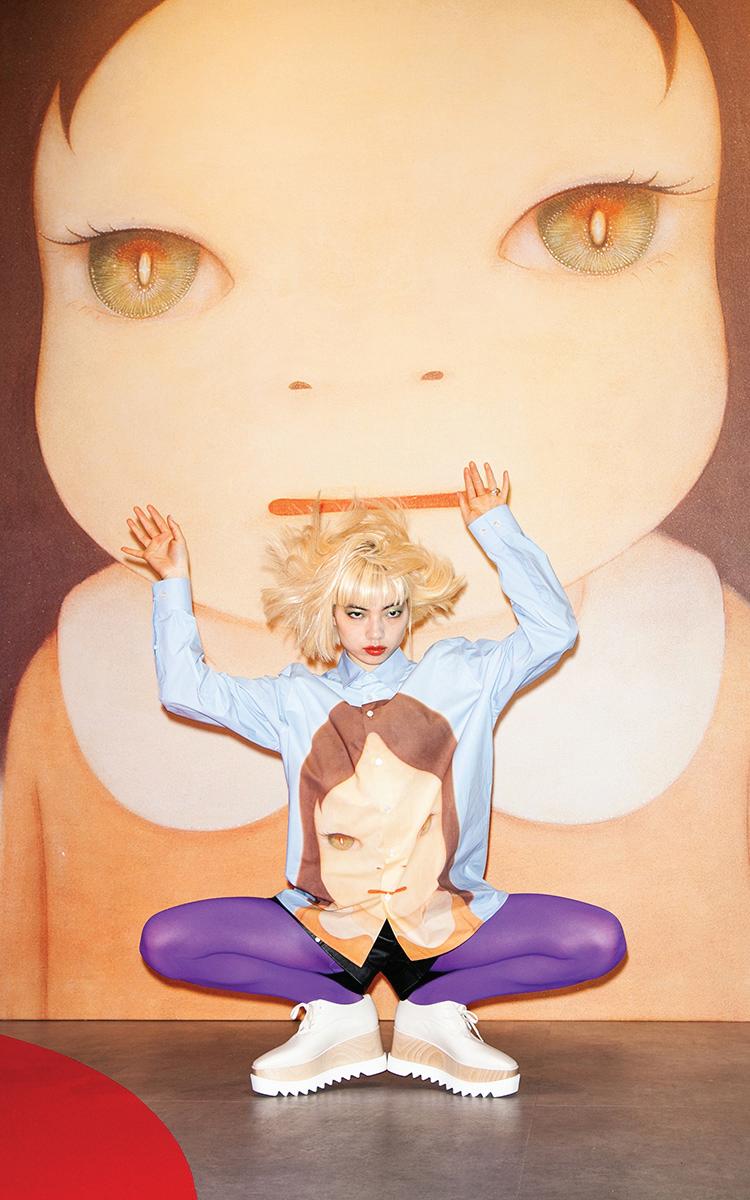
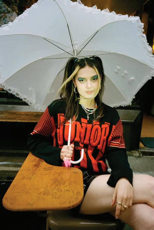
The School of Visual Arts at Boston University College of Fine Arts prepares students to think seriously, to see critically, to make intensely, and to act with creative agency in the contemporary world.
MMMEstablished in 1954 to combine the intensive studio education of an art school with the opportunities of a large urban university, Boston University School of Visual Arts is committed to educating the eye, hand, and mind of the artist. We believe that students become visual artists when education, practice, and awareness of historical and contemporary context enable them to think critically and imaginatively, and to express those ideas with skill and conviction. The professional artists and educators that make up our faculty lead small classes of highly motivated students.
MMMThe Foundation program is the bedrock of our undergraduate program, and emphasizes a mastery of traditional skills and visual problem-solving. All BFA freshmen begin with drawing courses and continue foundation studies in painting and sculpture before they choose a studio major. MA programs in Art Education, Graphic Design, Painting, and Sculpture focus and elaborate professional studies. Studio electives expand and enrich all graduate and undergraduate Visual Arts major programs.
MMMCourses in studio art, art history, and the liberal arts and sciences taught by the nationally and internationally recognized faculties of the University’s 17 schools and colleges provide the intellectual framework for our curriculum. University-sponsored international study programs broaden the Boston campus experience and encourage global awareness.
MMMBoston provides a rich cultural resource for our School.
The city’s renowned museums and musical organizations, art galleries, theaters, libraries, and other universities, colleges, and schools offer exhibitions, concerts, theatrical performances, and lectures of the highest quality.
Lynne Allen
Felice Amato
Rebecca Bourgault
Dana C Clancy
Kristen E Coogan
Deborah A Cornell
Toni P Dan
Joel Gill
Rina Goldfield
Greogry Gomez
James Grady
Jill Grimes
Josephine Halvorson
Brockett Horne
Jason Howey
Ee Ikeler
Breehan James
Lucy Kim
Wilhelm Neusser
Richard Raiselis
Daniela Rivera
Nicholas Rock
Richard E Ryan
Marc Schepens
Christopher Sleboda
David Snyder
E Tubergen
Mary Yang
Julia Barksdale
Bella Bennett
Leslie Brown
Claire Bula
Lynne Cooney
Ariel Grubb
Diana Hampe
Cathy Johnson
Jesse Kaminsky
Paul Karasik
Halim Lee
Ayden LeRoux
Akemi Martin
Jeffrey Nowlin
Nicole Pond
Sam Riebe
Mazen Sakr
Jana Silver
Kathleen Sleboda
Sergei Tsvetkov
Joshua Brennan
Jessica Caccamo
Nerissa Cooney
Jesse Finkelstein
Marc Schepens
Gus Wheeler
Sam Thomas
Beth Zerega
Logen Zimmerman
The 2025 BFA Thesis Show is a celebration of the interwoven efforts of Boston University’s class of 2025 Painting, Sculpture, and Graphic Design students. Through years of cultivating artistic identities, technical forte, and our community, these SVA students have shaped a body of work that reflects their unique authorship and boundless potential.
MMMThe 2025 BFA Thesis Show marks a pivotal moment in their cyclical journey and honors all they have built while embracing the uncertainties and possibilities ahead. The show is a testament to their dedication and grit, the product of collective efforts, and their continuous evolution and growth. The abundance of the SVA experience is demonstrated in this show as they walk into a new chapter of their careers, more confident and determined than they ever were.