

LOOKBOOK LOOKBOOK
FROM THE CREATIVE MINDS AT BOLDTHINK
No need to steal our work. If you see something you like, we can collaborate to create something unique for YOUR business.

AGENCY OVERVIEW

Boldthink is an Indiana-Certified Minority and Women-Owned Business (M/WBE)
At Boldthink, we foster an environment where the very best strategic minds work together to impact your business. There are no silos or departments here, only a flat level organization where everyone collaborates to formulate the most creative outcomes for our clients.
We’re curious, entrepreneurial, and whole-brain strategists that embrace data and get inspired by what we can accomplish. Our passion for what we do and how we do it fuels us to push our ideas further and rethink the status quo. Our clients don’t come to us for just design; they partner with us to position their brand as a revenue-driving business asset. Our strategic approach ensures that your brand delivers clarity, differentiation, and long-term market value. Our work starts from the inside out. We listen, dive deep, and ask a lot of questions. We’ll inspire bigger thinking because that’s what’s required of us to push you further. We analyze every touchpoint, align your leadership, and extract the raw DNA of your brand. From there, we’ll design your messaging and redefine your brand to align with your business goals.
Core Competencies
Brand Strategy
Let’s strategize, plan, and align your brand for growth against business fluctuations, competitors, and market challenges.
Website Design
From designing websites to implementing SEO tactics, we craft and program websites that will attract new customers and employees.
Brand Architecture
We can organize and build out your service portfolio according to target audience preferences, ensuring optimal engagement with your offerings.
Brand Identity, Design, and Names
We have a proven track record of crafting captivating names and developing or revamping visual identities that set you apart from competitors.
Messaging Strategies
We’ll simplify the clutter, create compelling messages that resonate with your audience, and craft brand story frameworks.
Vision & Brand Positioning
Align your vision and uncover your highly-focused statement that showcases your value proposition and gives you an edge over competitors.
Industries we’ve worked with
• Logistics
• Engineering
Construction
Architecture
Finance
Non-Profit • Real Estate
Higher Education
Campaign Strategy & Implementation
We craft and execute tailored campaign strategies for clients across all industries, delivering impactful and measurable results.
Employer Branding
Win the war on talent and attract quality candidates with an employer brand strategy and candidate-focused messaging.
Brand & Market Research
We use various research methods to obtain valuable market insights, gather feedback from stakeholders, and understand how your brand is perceived.
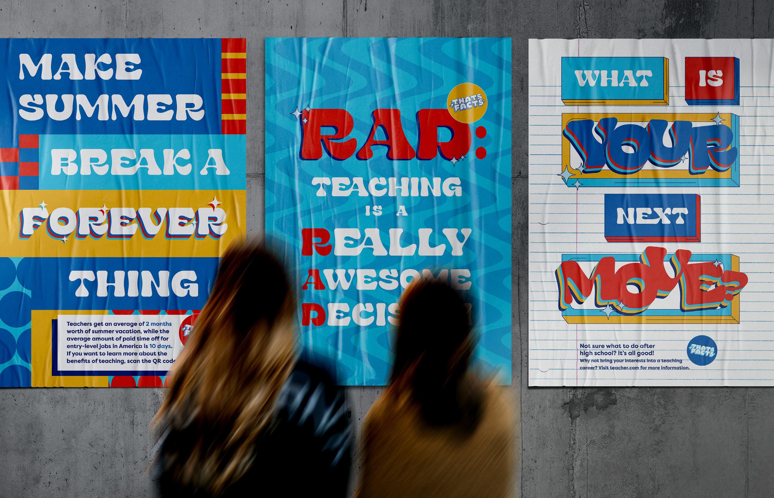
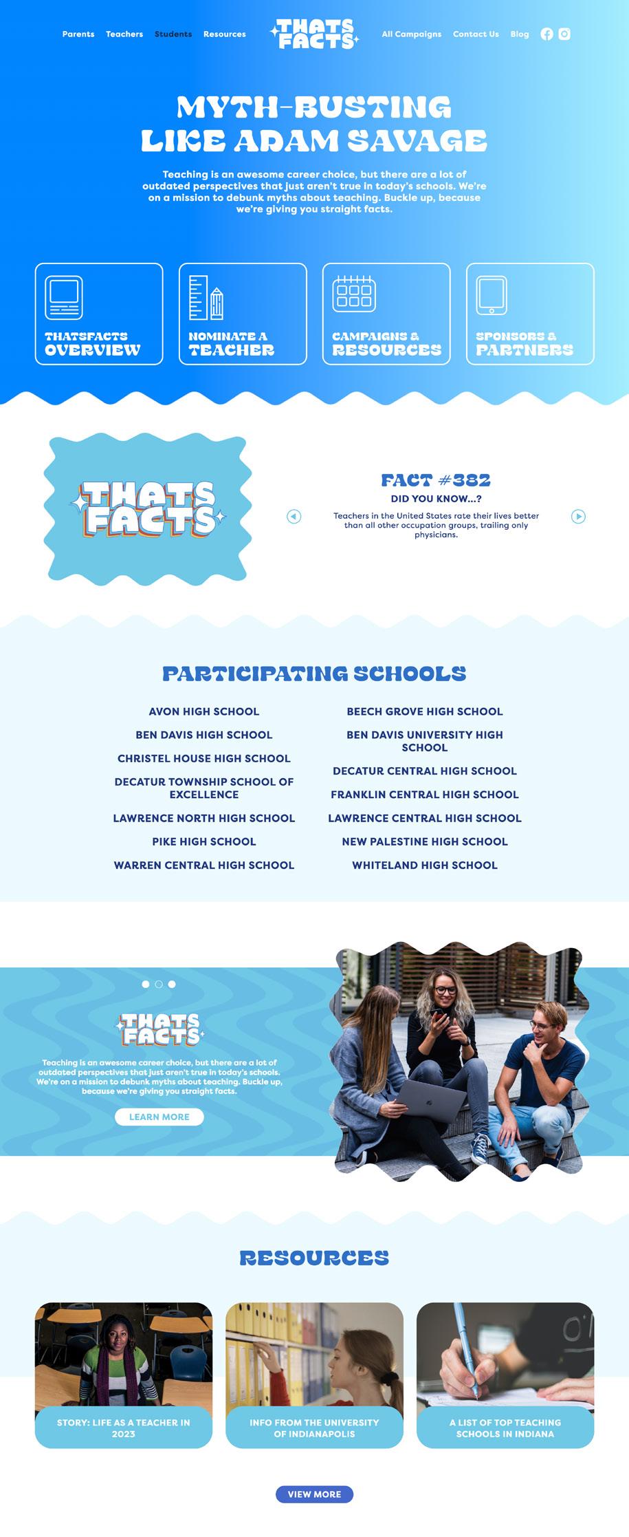
LET’S TEACH, INDIANA!
CLIENT: University of Indianapolis
INDUSTRY: Higher Education
OVERVIEW: When the University of Indianapolis set out to tackle Indiana’s growing teacher shortage, they came to us to help shift perceptions and inspire a new generation of educators. Their goal was clear: reach high school students—especially those from underrepresented communities—and show them that teaching is a respected, rewarding career path. We delivered Let’s Teach, Indiana!—a bold, research-driven campaign with eye-catching colors, funky fonts, and messaging designed to connect. From digital ads and in-school activations to billboards, bus ads, and a dynamic website, we created a full-funnel experience that met students and parents where they were. The impact? A 75% increase in positive perceptions of teaching, a 10% rise in education program enrollment, and 50% reach across high schoolers and parents in Marion County. We combined bold creative with smart strategy—and proved that the right message, in the right moment, can move people to action.


PROACT
INDUSTRY: Non-Profit
OVERVIEW: When ProAct approached Boldthink, we responded by crafting a comprehensive brand identity, aligning every element with ProAct’s mission. We incorporated the iconic Indianapolis skyline to symbolize the organization’s deep roots and connectivity within the community. The addition of raised hands in the design represents ProAct’s hands-on approach and the spirit of volunteerism.
The chosen color palette of teal blue and vibrant orange infuses energy and positivity into the brand. This pattern not only serves as a visual anchor but also reinforces ProAct’s narrative when engaging with community stakeholders.
From brochures to identity suites, Boldthink curated a cohesive visual language that authentically conveys ProAct Indy’s story.


CENTIVE
INDUSTRY: Finance
OVERVIEW: The birth of “Centive” was more than a mere play on words. It’s a fusion of ‘cents’ and the suffix ‘-ive’, encapsulating the essence of having the nature of value. This name adds a sense of purpose and added value to the company.
The logo and visual elements for Centive were meticulously chosen to reflect precision, trust, and a progressive outlook. The color palette, a fusion of a blue and green gradient palette, instills a sense of stability, modernness, and innovation. It’s not what you would expect from a typical accounting firm that tends to lean traditional and bland!
And we all know a brand is incomplete without a digital footprint. Our team designed a website landing page that not only echoes the brand’s values but also provides a seamless user experience.


SOJOURN COFFEE CO.
INDUSTRY: Consumer Products
OVERVIEW: Sojourn Coffee Company approached Boldthink with a unique opportunity to develop their new line of coffee products, targeting both online customers and retail stores across the United States.
From logo design to packaging, website design, and photography, Boldthink delivered a cohesive and visually captivating design system that not only boosted sales but also expanded their roster of wholesale retail customers.


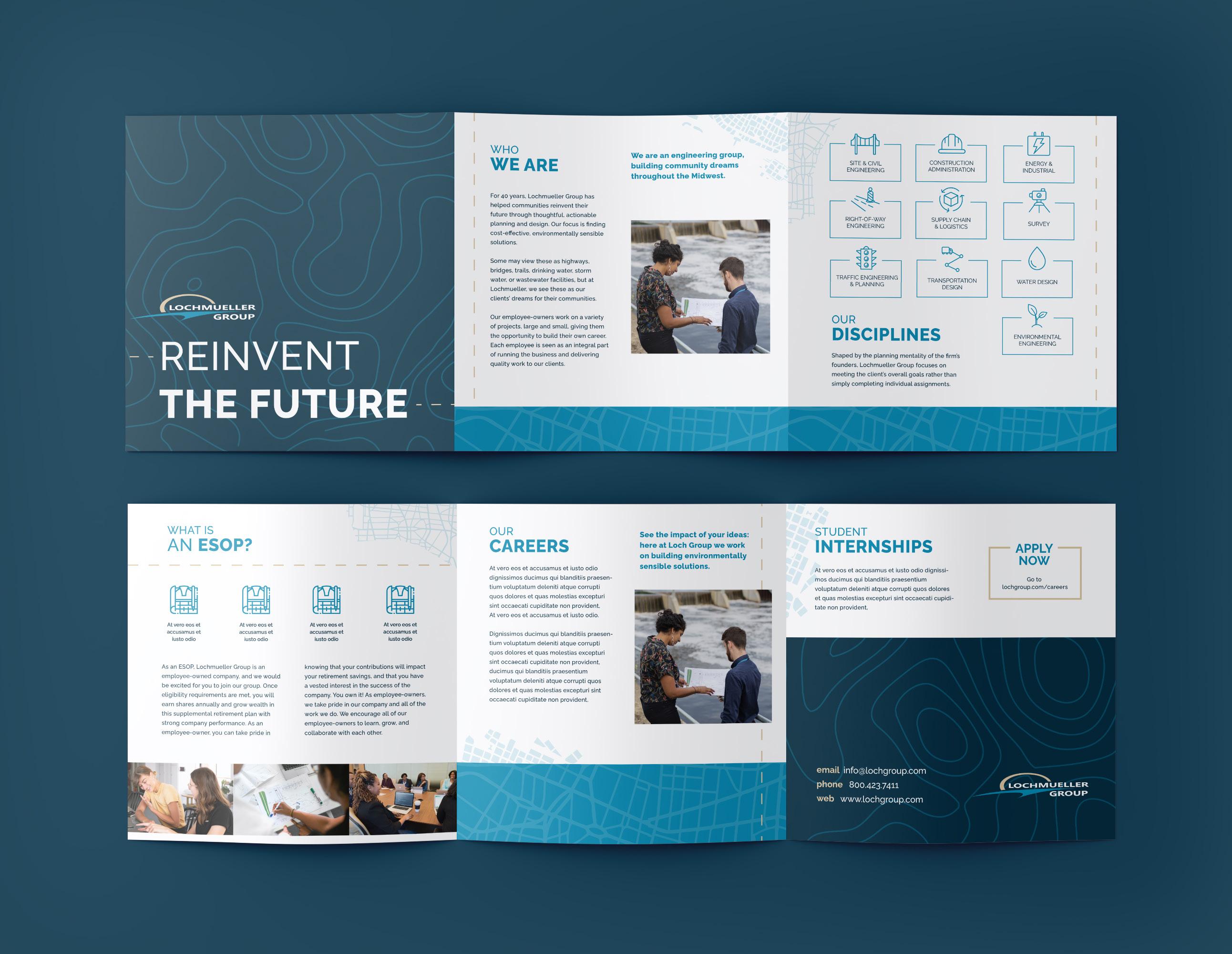
LOCHMUELLER GROUP
INDUSTRY: Engineering
OVERVIEW: To help Lochmueller Group attract and retain top engineering talent, we developed a comprehensive employer branding strategy focused on strengthening their online presence and recruitment efforts. Despite a strong culture and competitive compensation, they struggled to stand out to younger candidates in a crowded market. We started with in-depth research— auditing their brand, surveying employees, and building candidate personas to uncover key motivators. From there, we rebranded their visuals and messaging, revamped their website, and created culture-focused content that showcased their unique strengths. The result? A significant increase in qualified job applications, improved hiring and retention rates, a stronger online presence, and greater brand advocacy. Our strategic approach not only helped Lochmueller capture new talent but also laid the foundation for long-term growth by expanding their market reach and streamlining internal processes for RFPs, proposals, and recruitment collateral.


WOLFRUM & CO.
INDUSTRY: Finance
OVERVIEW: With visionary founders who entrusted us with naming their company and designing a distinctive logo, we created a brand that was truly unique and set them apart from their competitors.
The process of crafting the iconic ‘wolf’ logo was an enjoyable and memorable experience for our team. We took great pride in incorporating luxurious details, such as letterpressed business cards and gold foiled assets, to further enhance the brand’s visual appeal.
Wolfrum & Co. is a brand that demands attention and leaves a lasting impression.


SEQUEL
CLIENT: Athletic Annex
INDUSTRY: Consumer Products
OVERVIEW: Our first step in creating this brand identity was to curate a name that encapsulated the essence of the brand — a journey continuing the story of shoes, the comeback, and offering a second chapter for footwear that deserves a new adventure. Then we conceptualized and crafted a visual identity for Sequel, that included a logo, color palette, and design elements. This brand framework was designed to resonate with the audience, symbolizing the brand’s core values and uniqueness.

ALLEGIANT BUILDING GROUP
INDUSTRY: Construction
OVERVIEW: Equipped with a robust business plan, this new Texas construction company sought a new name and a corresponding brand identity. Through in-depth discussions, we carefully crafted a name that perfectly aligned with their objectives: Allegiant Building Group. In addition to their name, Boldthink developed the foundation of their key messaging, and visual identity to help launch their new venture.


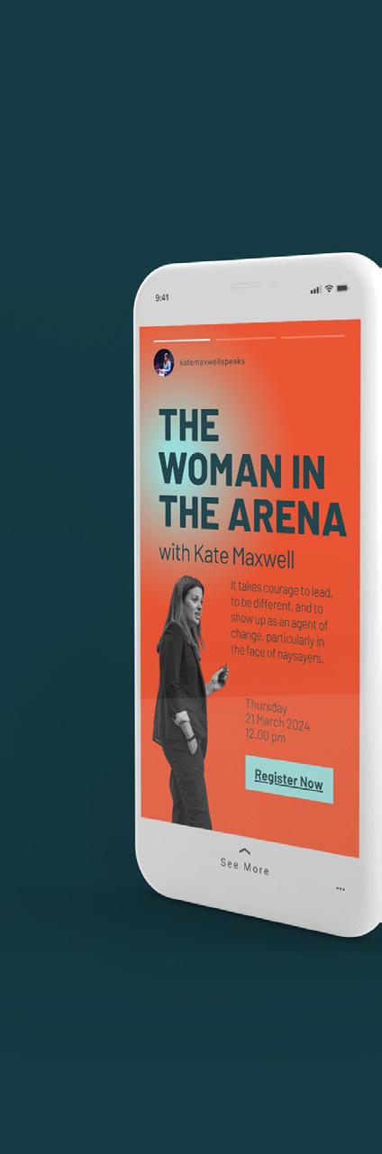
KATE MAXWELL
INDUSTRY: Entrepreneur (personal branding)
OVERVIEW: Kate Maxwell, Chief Technology Officer at Microsoft, embodies the essence of change advocacy and diversity empowerment. Her remarkable journey as a global leader spearheading transformative initiatives underscores the paramount importance of fostering inclusive cultures for unparalleled success.
Our collaboration with Kate encompassed a comprehensive personal branding endeavor. We crafted an identity that resonates with her vision, secured a domain reflective of her expertise, and developed a visual brand identity. The highlight was designing and developing a dynamic website, strategically positioning Kate as a subject matter expert in her industry.


NOBLE
INDUSTRY: Non-Profit
OVERVIEW: Our ongoing collaboration with Noble encompasses a comprehensive array of dynamic marketing initiatives designed to amplify their vision. Embracing the ethos of “If You Can Dream It, We Can Help You Live It,” our partnership involves an variety of strategies tailored to elevate Noble’s presence and impact. From employer branding initiatives to impactful social media tactics, we engage communities, provoke conversations, and showcase Noble’s unwavering dedication to fostering an inclusive society.


AEARO TECHNOLOGIES
INDUSTRY: Technology
OVERVIEW: When a global leader in acoustic, thermal, and vibration control solutions needed to elevate their brand presence, they turned to us for a fullscale transformation. Despite their engineering expertise and global backing, their identity was overly technical, hard to navigate, and lacked emotional connection—leaving them trailing behind more customer-focused competitors. We started with a comprehensive brand and communications audit, diving into their positioning, digital presence, and messaging. From there, we led a complete rebrand—crafting a new visual identity, logos, and print collateral that reflected both their innovation and their people-first approach. We delivered strategic messaging recommendations that humanized the brand and emphasized partnership, not just products. The result? Increased market visibility, deeper customer engagement, and consistent feedback that the refreshed identity better represented their values and capabilities. By aligning their technical strengths with a more compelling, customer-focused brand story, we helped them stand out—and set the stage for long-term growth.


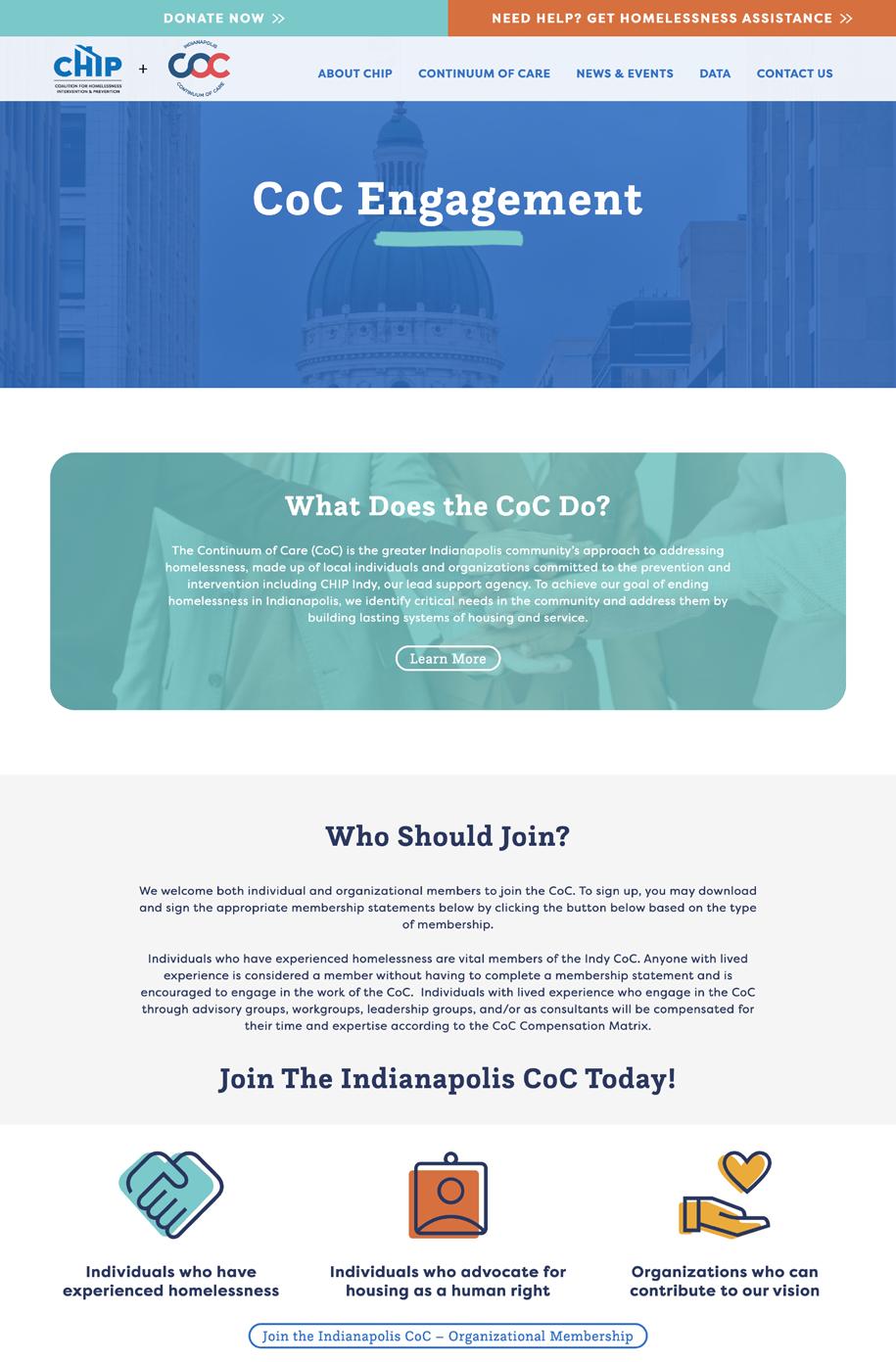
CHIP INDY
INDUSTRY: Non-Profit
OVERVIEW: It’s natural for organizations to want to share as much information as possible with all of their stakeholders. But what often occurs over time is information overload, which can overwhelm visitors and cause confusion. So, how can you prevent this? The key is to streamline your content and design a cohesive look and feel for your website.
Our website redesign with CHIP Indy entailed just that! We created a bolder, livelier website and established a more cohesive and robust brand presence in the digital space. By seamlessly blending the information from the original CHIP website and the Indianapolis Continuum of Care (CoC) website, we developed one unified platform representing both brands.


GUNTER REALTY CO.
INDUSTRY: Real Estate
OVERVIEW: With a name in hand and inspiration swirling, our team embarked on a strategic and creative journey with Matt to capture his unique vision. We curated moodboards that ignited his passion, crafted custom fonts that spoke to his style, and, voila, we bestowed upon Matt an identity that not only stood out in his market but also captured the essence of his magnetic personality.
Now armed with a brand that’s as unforgettable as he is, Matt is ready to conquer the real estate world with unrivaled charm and style.

MR. CANARY
INDUSTRY: Consumer Products
OVERVIEW: Boldthink embarked on an exciting project: the redesign of an e-commerce website for Mr. Canary Company. Recognizing the playful nature of the brand, Boldthink took the initiative to go beyond the expected and provided a delightful brand refresh. This encompassed the creation of captivating new icons, engaging patterns, inviting textures, and vibrant colors.
The ultimate goal was to infuse Mr. Canary Company with a sense of fun and wit, aligning their visual identity with the unique charm of their bird feeders.


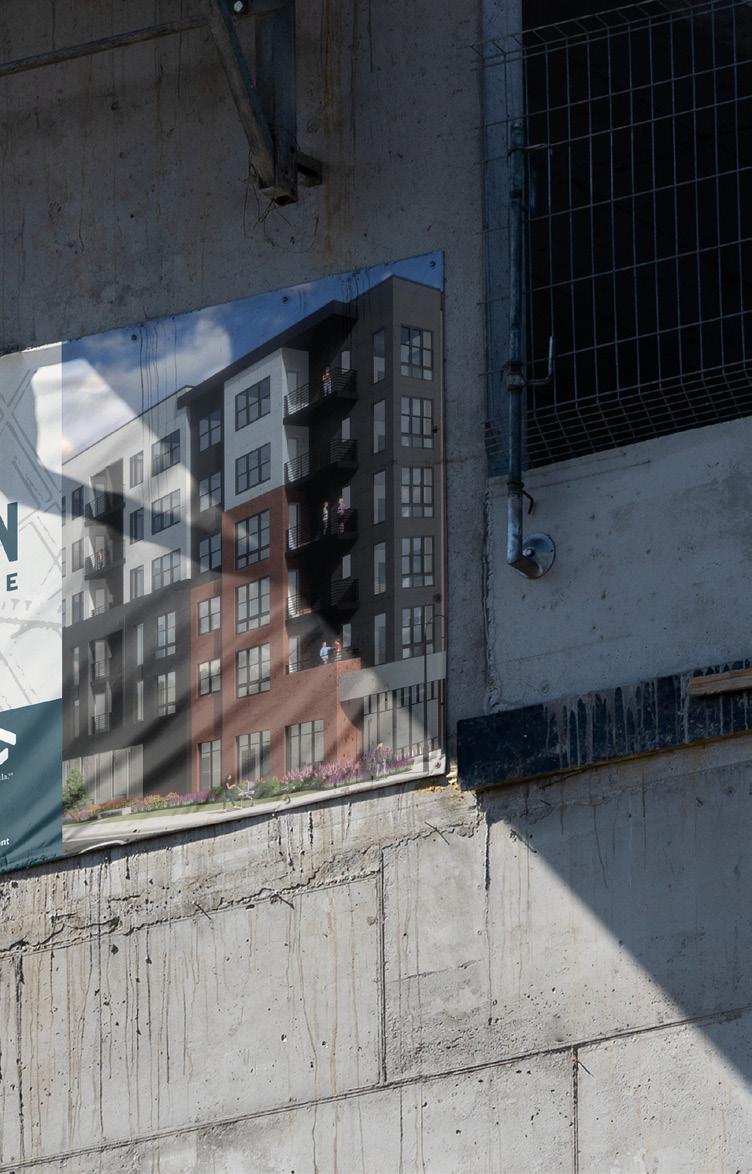
CONNECTION @ SOUTH SIDE
CLIENT: TWG Development
INDUSTRY: Real Estate
OVERVIEW: Boldthink embarked on a collaboration with TWG Real Estate Development to curate a brand experience for a prestigious luxury apartment complex in Pittsburgh, Pennsylvania. We began by crafting distinctive logos that captured the essence and character of the property, infusing them with a touch of ‘modern tech’ and ‘city grit’. Alongside this, we developed patterns, carefully selected modern colors and textures, and designed eye-catching outdoor signage that integrated with the architectural aesthetics. TWG wanted an urban vibe, capturing the city textures and landmarks.
However, our involvement extended far beyond visual elements. We dove into creating impactful advertising strategies that highlighted the unique features and amenities of the apartments, enabling prospective residents to envision their ideal lifestyle. Leveraging our expertise in social media, we devised innovative strategies to captivate and engage the target audience, ensuring maximum exposure and visibility for the property.


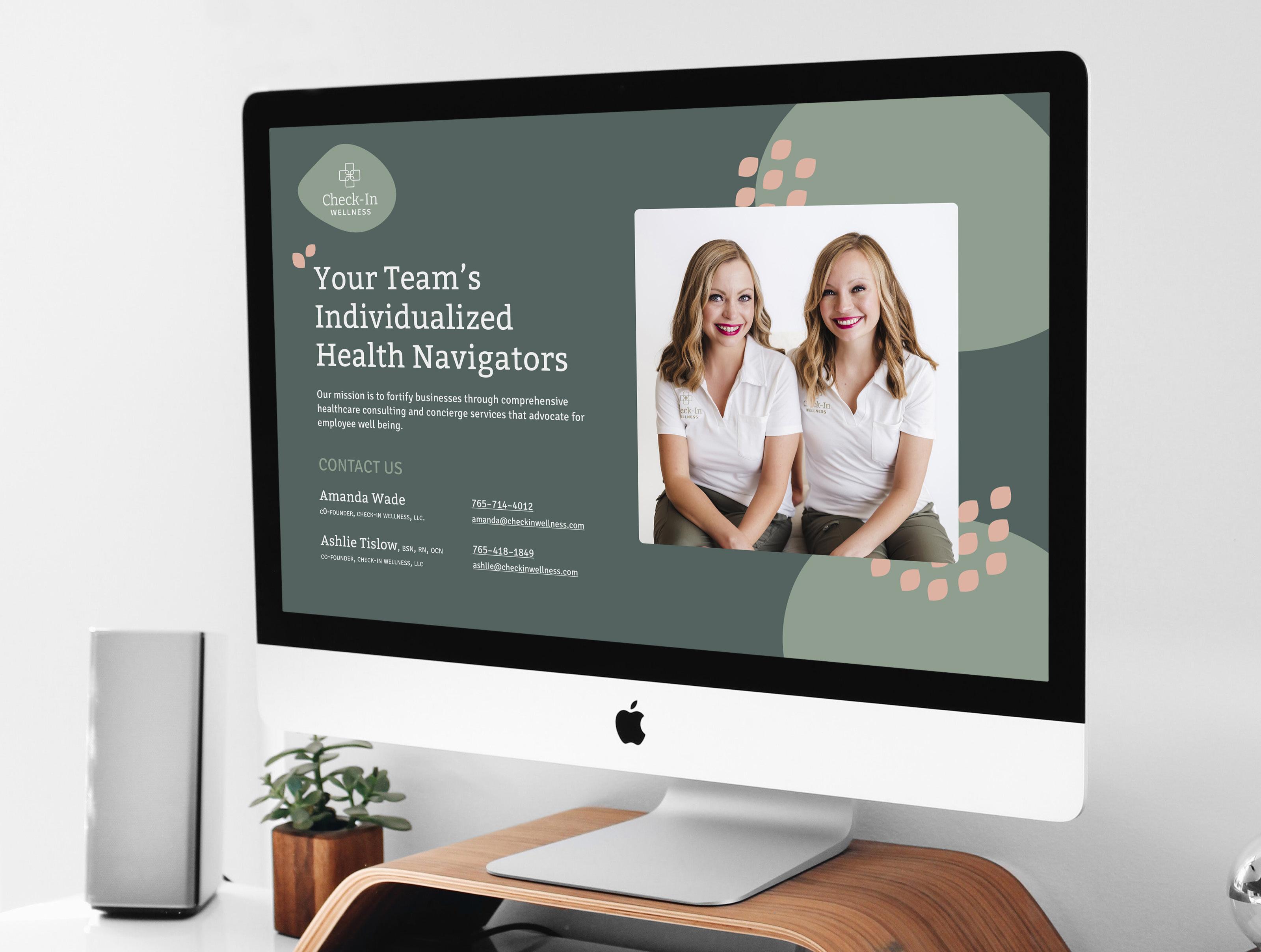
CHECK-IN WELLNESS
INDUSTRY: Healthcare
OVERVIEW: Through our brand sprint process, which involves a series of exercises to explore ideas and goals, we collaborated with the Check-In Wellness team to develop a solid foundation for their venture.
One of our key contributions was assisting them in generating potential business names, ultimately leading to the selection of “Check-In Wellness” as their name. Building upon this foundation, Boldthink also took charge of crafting their brand identity, designing visually appealing business cards, and developing an engaging website landing page that served as the cornerstone of their brand presence.

ACCION PERFORMANCE
INDUSTRY: Logistics
OVERVIEW: Acción Performance approached Boldthink seeking assistance in redesigning their website with a focus on easy updatability. Building upon their already strong brand, Boldthink ensured a cohesive design that extended to the website. We worked together to structure the website’s pages, incorporating industry sections that could be easily searched by clients, integrating case studies, and incorporating key messaging. Additionally, we developed new icons that maintained the brand’s visual identity throughout the website, creating a consistent and immersive brand experience.


POSIE COSMETICS
INDUSTRY: Consumer Products
OVERVIEW: Our collaboration with Posie Cosmetics began with a thorough market research process. This involved analyzing competitive pricing, identifying market positioning opportunities, and crafting key messaging that would give Posie Cosmetics a compelling competitive advantage. Building upon this foundation, Boldthink then embarked on creating a cohesive brand identity, captivating packaging design, and stunning product photography.
To facilitate seamless product distribution, we also assisted the team in establishing an e-commerce website. This digital platform enabled it to showcase and sell its cosmetics to a wide audience, expanding the reach of Posie Cosmetics beyond traditional retail channels.


EMPOWERED VENTURES
INDUSTRY: Logistics
OVERVIEW: We partnered with Empowered Ventures, a newly established company, to provide a range of essential brand services. From developing a business name to creating a complete identity suite and website, we crafted a comprehensive brand plan in collaboration with Empowered Ventures’ leadership. Our services included creating key messaging, designing a logo, and developing a starter website that can easily adapt and expand alongside the company’s growth.


CRANE BUILDERS
INDUSTRY: Construction
OVERVIEW: We were honored to collaborate with Crane Builders, an esteemed company known for their exceptional craftsmanship and commitment to sustainable building practices. As their chosen branding partner, our first step was to revitalize their brand identity by modernizing their logo to better reflect their innovative approach. Next, we embarked on designing a captivating website that not only showcased their portfolio of stunning homes but also educated visitors on the benefits and intricacies of Insulated Concrete Form (ICF) construction.


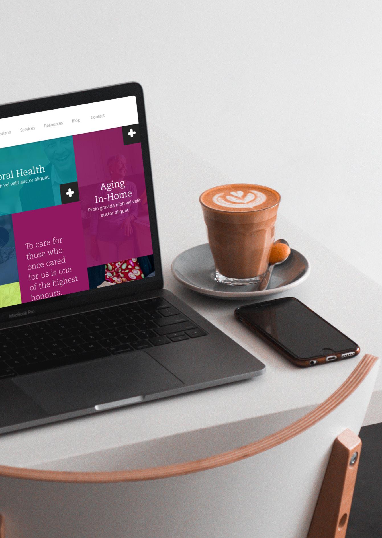


CARE HORIZON
INDUSTRY: Healthcare
OVERVIEW: With only a single brochure to represent their brand, Boldthink embarked on the task of modernizing Care Horizon and crafting compelling key messaging. Additionally, Boldthink conducted insightful interviews with service providers across three office locations in east central Illinois, aiming to understand the brand’s perception and identify areas for improvement. The outcome? An exceptional brand that has gained recognition as a premier service provider, solidifying Care Horizon’s position as a best-in-class organization.

BLUE RIBBON
INDUSTRY: Automotive
OVERVIEW: Blue Ribbon, a long-standing American automotive manufacturer specializing in car care and home cleaning products, approached Boldthink for a comprehensive brand transformation. Our collaboration involved conducting individual discussions with their key distributors to gain insights into the brand’s perception, marketing challenges, and areas for improvement to elevate the company’s performance. Based on these findings, Boldthink partnered with Blue Ribbon’s leadership team to develop a robust brand strategy, focusing on market positioning, key messaging, and a complete brand and design overhaul encompassing the logo and packaging redesign.


WESMONT
CLIENT: TWG Development
INDUSTRY: Real Estate
OVERVIEW: Boldthink embarked on an exciting collaboration with TWG Real Estate Development to craft an immersive brand experience for a prestigious luxury apartment complex. Our comprehensive approach included creating a wide range of elements, such as creating captivating logos that embodied the essence of the property, developing elegant patterns, selecting enticing colors and textures, and designing compelling outdoor signage that seamlessly blended with the architectural aesthetics.


VISIONPATH CFO
INDUSTRY: Finance
OVERVIEW: Hilary Dolbee, our CFO, has been a vital resource for businesses nationwide for over two decades. She’s committed to enhancing decision-making through education and effective communication skills. In 2023, she decided to start her own company, bringing us to the birth of VisionPath CFO.
This new brand began with crafting a name that encompassed what a CFO does and their overall mission for clients. Hilary said best: “Beyond numbers, a CFO guides financial literacy to drive operational excellence and strategic vision.” So, we combined “vision” and “path” to showcase how Hilary takes a client’s vision for their company and guides them down the best path in all facets of business.
Next, we moved on to devweloping the brand identity. We crafted a logo with an approachable yet professional font and a compass with hex signs representing wealth and prosperity. We rounded out the visual identity with a fresh color palette, including a bold purple and custom icons.
Last but not least, we designed and developed a landing page for prospective and current clients to learn more about Hilary and her offerings.


CONTEXT DESIGN
INDUSTRY: Architecture
OVERVIEW: Context Design reached out to our team to help bring their old website back to life. They wanted their site to reflect the grand scale of the work they do—impressive landscapes, master plans, and placemaking projects—while also showcasing their vibrant company culture to attract new talent. So, we got to work, enhancing the use of color and boldness within their already successful brand. We sifted through the previous site and developed more intentional, cohesive page designs that told the story of each unique project. By adding dedicated pages for both their portfolio and recruitment, they’re now positioned to attract top talent and new clients with confidence. With 25 years of successful projects, a talented team, and an undeniably fun culture, we built a site that fully embodies their philosophy: “People + Land.”
Soon after, Context returned to us with a new request—refresh their print materials to align with the updated digital presence. Recognizing that consistent branding is key to standing out as a top-tier firm, they saw the value in ensuring every touchpoint reflected the same elevated identity. We carried the refreshed design system across their print collateral to reinforce their visual impact and strengthen their brand story, no matter where it’s seen.


EVANS MAY WEALTH
INDUSTRY: Finance
OVERVIEW: How do you take a wellestablished financial team and make their website more inviting?
Evans May Wealth, a wealth management company, came to our team of experts to bring their outdated website a modern touch. For this existing bold brand, we enhanced its color palette by adding more vibrancy and dimension, created new brand patterns that could be used on its website and other marketing material, established a hierarchy system for its typography, and conducted a photo and video shoot to leverage branded photography.
With these new assets in hand, our team overhauled the website. While retaining a professional and sleek tone, we incorporated the new brand photography and design elements that made this website feel more friendly and approachable.
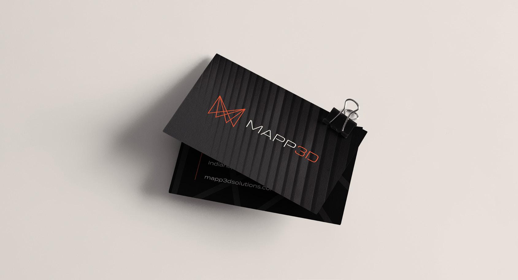

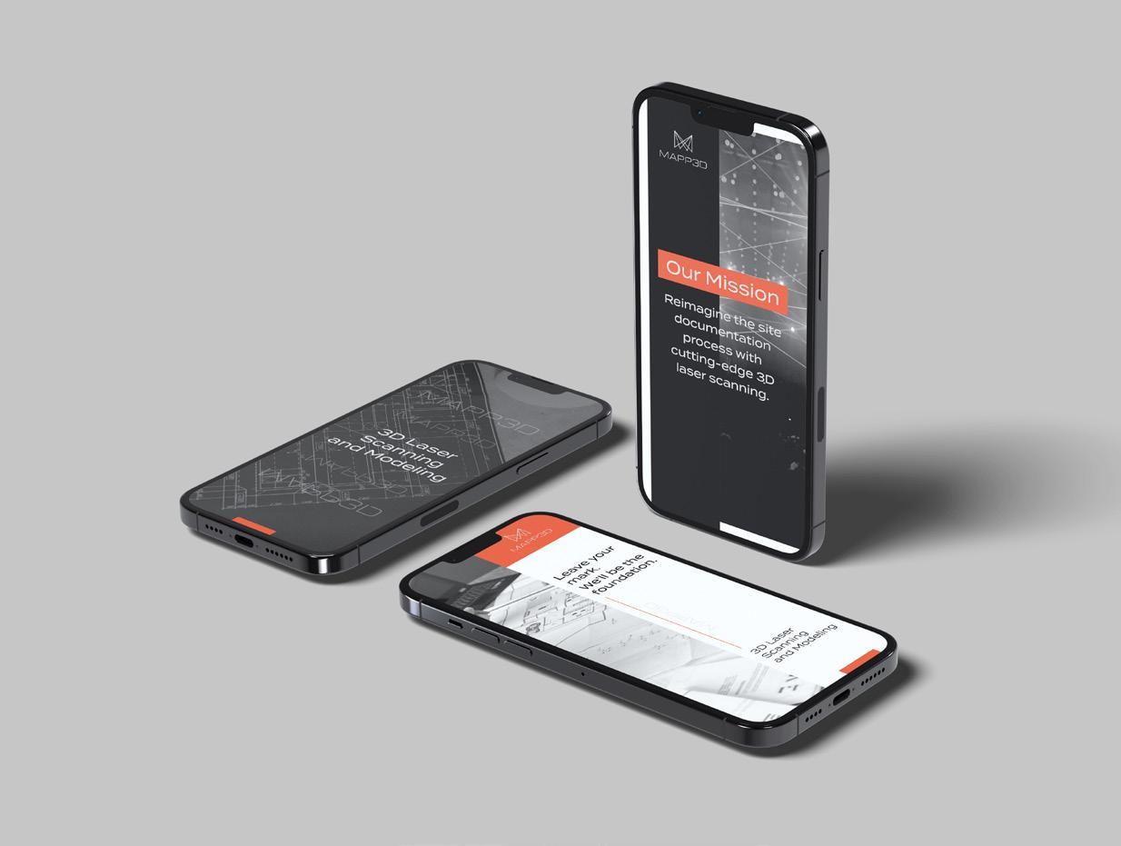
MAPP3D SOLUTIONS
INDUSTRY: Architecture
OVERVIEW: POV: You’re starting a wicked new business and need a kick-ass brand identity to complement it.
Introducing Mapp3d Solutions, Indianapolis’s new 3D laser scanning and modeling service. Mapp3d Solutions is shaking up the architectural landscape in Indianapolis and bringing it into the digital age. It’s here to reimagine the site documentation process with cutting-edge 3D laser scanning for buildings of all sizes.
How did this brand come to life? Let us walk you through the process! We started by doing extensive market research about the industry and where our client would shine the most. We began with various names until we reached the number one draft pick, Mapp3d Solutions!
Then, we created the brand identity, which consisted of a new logo, color palette, typographical system, messaging strategy, mission and vision statements, and core values. With these elements, Mapp3d Solutions is ready to take on the world.


LEGACY CAREGIVING
INDUSTRY: Healthcare
OVERVIEW: Every brand strives to leave behind an unforgettable legacy. So, Legacy Caregiving took the initiative and underwent a complete brand refresh! Our team started by updating the original logo, giving it a bolder presence. We enhanced the color palette by adding more contrast between the colors and creating a hierarchy system.
After we completed the visual identity, we created a message strategy to ensure a clear and cohesive message was presented when people talked about Legacy Caregiving. It’s essential that your team talks about your organization coherently and seamlessly. This ensures your team is aligned on the overall brand and puts more trust in your client’s mind.
Finally, to wrap everything together, we also completed a website refresh! We implemented these elements with the updated brand and messaging into a new website, bringing more clarity and cohesion to Legacy Caregiving’s brand.


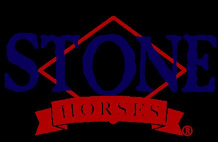
STONE HORSES
INDUSTRY: Craftsman Retailor
OVERVIEW: Stone Horses, established in the late 1990s, is renowned for crafting high-end, personalized horse models that celebrate artistry and precision. Each hand-painted piece—whether a lifelike stallion or a whimsical unicorn—reflects the individuality of its collectors and the unparalleled craftsmanship of American-made products. Despite producing luxury-quality models, Stone Horses’ branding remained rooted in its 1990s origins, with an outdated logo and identity that no longer reflected the product’s exclusivity and artistry. As the market evolved, the brand needed to convey “approachable luxury”—a premium yet warm connection to its loyal community. We conducted a comprehensive brand refresh, modernizing the logo while maintaining key heritage elements to ensure recognition among collectors.
We crafted a cohesive aesthetic that exudes trust, warmth, and exclusivity, mirroring Stone Horses’ products’ meticulous, hand-crafted nature. Every touchpoint was designed to reflect the quality and care poured into each model. Today, Stone Horses proudly boasts a brand as exceptional as its art, connecting deeply with its dedicated collectors while attracting new enthusiasts to a truly unique experience.


CONGREGATIONS WITH COMMUNITY
INDUSTRY: Non-Profit
OVERVIEW: Congregations with Community (CWC), a bold initiative from the Center for Congregations and funded by the Lilly Endowment, unites congregations and community agencies to solve local challenges together. As a new program, CWC needed a standout brand to establish credibility and inspire collaboration. That’s where we came in. We created a vibrant, arts-driven brand identity that reflects CWC’s inclusive, action-oriented mission. The visual system pairs bright, energetic colors with organic shapes to express movement, unity, and innovation. A custom logo anchors the brand, symbolizing partnership and shared purpose. But we didn’t stop at visuals. We developed strategic messaging that emphasizes listening, collaboration, and problem-solving—capturing CWC’s core values. We also designed a user-friendly website to serve as a hub for storytelling, applications, and engagement. The result? A compelling brand that positions CWC as a trusted, inspiring catalyst for change. With a strong identity and clear voice, they’re ready to build lasting partnerships and transform communities.


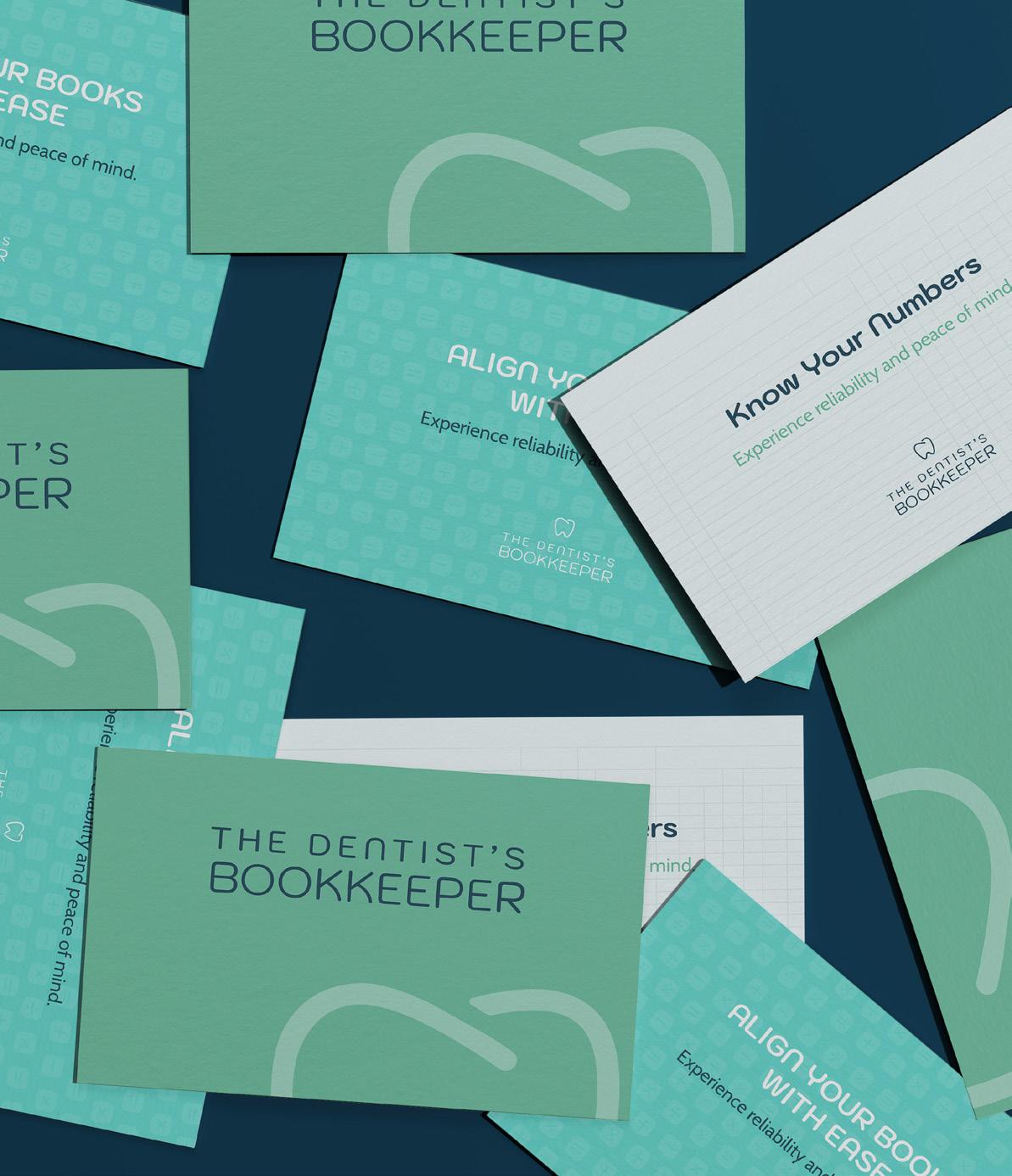

THE DENTIST’S BOOKKEEPER
INDUSTRY: Finance
OVERVIEW: The Dentist’s Bookkeeper came to us with 30+ years of experience and a loyal client base—but no brand identity or online presence. Our challenge: build a professional, trustworthy brand that reflects the founder’s precision, industry expertise, and approachable style. We delivered a clean, modern visual identity designed specifically for dental professionals. The logo subtly blends dental and bookkeeping elements, while the blue and green color palette evokes trust, clarity, and calm. Fun, simple icons and typography keep the brand approachable without sacrificing professionalism.
To match the pace of busy dental practices, we created a streamlined landing page with clear messaging, intuitive navigation, and integrated scheduling tools like Calendly to support lead generation. The result? A brand and digital experience that feels credible, refined, and tailored to the industry. With a new identity and elevated online presence, The Dentist’s Bookkeeper is now positioned as the go-to solution for dental practices looking to simplify their finances and focus on what matters most—their patients.


HOLLAND ORTHODONTICS
INDUSTRY: Healthcare
OVERVIEW: When Holland Orthodontics needed to merge two established practices— Castleton Orthodontics and Larson Orthodontics—into one unified brand, we stepped in to lead the transition. The challenge: create a cohesive identity that maintained patient trust, honored both legacies, and projected stability. Our solution was a polished, modern brand that brought both locations under the Holland Orthodontics name, emphasizing professionalism, trust, and family-focused care. We crafted a visual identity that felt fresh yet familiar, paired with strategic messaging to reassure patients and staff during the transition. Internal communications and patient-facing materials focused on continuity, competence, and a shared commitment to excellence. Beyond the rebrand, we streamlined marketing strategies across digital platforms to ensure consistency and clarity. The result? A seamless brand launch that preserved goodwill, attracted new families, and positioned Holland Orthodontics as a trusted, top-tier provider in northeast Indianapolis. Our expertise ensured the brand not only looked the part—but delivered on its promise.


RJE INTERIORS
INDUSTRY: Business Interiors
OVERVIEW: RJE Interiors, a leader in workplace design, needed a modern brand identity and website that matched the sophistication of their services. Known for delivering premium office solutions across multiple states, RJE faced challenges with brand consistency and an outdated digital presence.
We stepped in to lead a strategic brand refresh—honoring their legacy while elevating their visual identity. After auditing their brand and aligning with partners like Allsteel, we refined their color palette, integrated bold orange tones, and introduced updated typography, patterns, and branded templates to unify their look across platforms.
Internally, the new system resonated with teams; externally, it projected confidence and quality. Simultaneously, we overhauled their website—streamlining content, improving navigation, and enhancing key pages like “About,” “Services,” and “The RJE Difference.” The result: a sleek, professional site and a brand system that now reflects the innovation, expertise, and excellence RJE brings to every client space.


AMOON VODKA
INDUSTRY: Spirits
OVERVIEW: Amoon Vodka, an ultra-premium spirit inspired by mythology and powered by technology, partnered with us to launch a brand that could stand out in the crowded luxury spirits market.
With no digital presence or brand strategy, they needed a cohesive foundation to support their product and audience goals. We developed a full marketing strategy and brand story highlighting Amoon’s elegance, innovation, and sense of empowerment. To showcase the product, we designed and built a sleek WordPress site featuring brand mythology, bottle features, app functionality, and inquiry forms for both consumers and businesses.
We also produced professional product photography and videos that spotlighted the bottle’s advanced technology and visual appeal. Our engagement included a full social media strategy—creating custom graphics, curated content, and platform management to build awareness and drive engagement across Instagram and Facebook.
The result: a refined, high-impact launch that positioned Amoon Vodka as a disruptive, luxury brand ready to make a lasting impression.

HIKER TRAILERS
INDUSTRY: Consumer Products
OVERVIEW: Hiker Trailers, known for rugged, customizable, and affordable off-road trailers, faced challenges in unifying their brand identity, improving customer experience, and standing out in a growing market. We conducted a comprehensive brand audit—analyzing customer feedback, visual identity, website usability, and competitors—to uncover gaps in consistency and clarity. While customers praised Hiker’s durability and value, they also noted inconsistent messaging and design across platforms.
Our research-driven recommendations focused on creating a bold, cohesive brand presence aligned with Hiker’s authentic, adventurous personality. We refined logo usage, defined a unified color palette, and clarified messaging around core values like customization, durability, and self-sufficiency. We also developed strategic brand guidelines to ensure consistency across the website, social media, and marketing materials.
To support a better customer journey, we advised improvements to the online custom-build tool and streamlined sales communication to enhance engagement and ease of purchase.
The result: a revitalized brand that reflects Hiker Trailers’ identity and positions them for long-term growth— with a clear voice and seamless experience that resonates with their community of passionate adventurers.


EAST END
INDUSTRY: Non-Profit
OVERVIEW: East End came to us with an existing website that didn’t reflect the heart, passion, or professionalism behind their work. As a key part of the WestCare Foundation, they needed a site that stayed visually and structurally cohesive with their parent organization—yet allowed East End to shine with its own distinct identity. Their previous site was cluttered, outdated, and didn’t communicate their mission clearly. Information was hard to find, making it difficult for users to understand the full scope of their impact.
We restructured the site to prioritize clarity, accessibility, and storytelling, condensing content into a format that was easy to navigate for community members, donors, and partners alike. With a cleaner layout, modern visuals, and thoughtful UX, the new site brings East End’s work to life—supporting their mission, strengthening community engagement, and positioning them for future growth.


GOOD WORKS INDY
INDUSTRY: Non-Profit
OVERVIEW: Good Works Indy came to us to transform their outdated website into a modern platform that reflects their vision and growing presence in social impact consulting. As a trusted voice helping companies engage in philanthropy, volunteerism, and giving, they needed a site that felt purposeful and professional.
We audited the original structure and content, identifying ways to simplify navigation, clarify services, and enhance visual appeal. The updated design embraced a clean, confident, minimalist look while keeping their signature green and approachable tone. We reorganized and condensed content to create a smoother user experience for busy corporate audiences. The result is a flexible, scalable site that clearly communicates Good Works Indy’s value, drives engagement, and strengthens their position as a go-to resource for purpose-driven companies.
FOOTLITE
INDUSTRY: Non-Profit
OVERVIEW: Footlite Musicals, Indianapolis’s longestrunning volunteer-based community theater, came to us ready for transformation. Their previous website was outdated, hard to navigate, and didn’t capture the energy, creativity, or sense of community that defines their stage. They needed a modern, intuitive site that brought their brand to life—and we delivered. We restructured the site to improve usability, clarified pathways for audiences and volunteers, and introduced bold design elements that reflect the vibrancy of live theater.
The result is a brand-forward digital experience that feels as dynamic as their productions. Beyond the website, we supported their 2024 season with ad campaigns and digital marketing assets to boost visibility and audience engagement. With a stronger visual identity and more cohesive storytelling, Footlite is now better equipped to grow its audience, attract new volunteers, and celebrate its legacy in the heart of Indy’s arts scene.


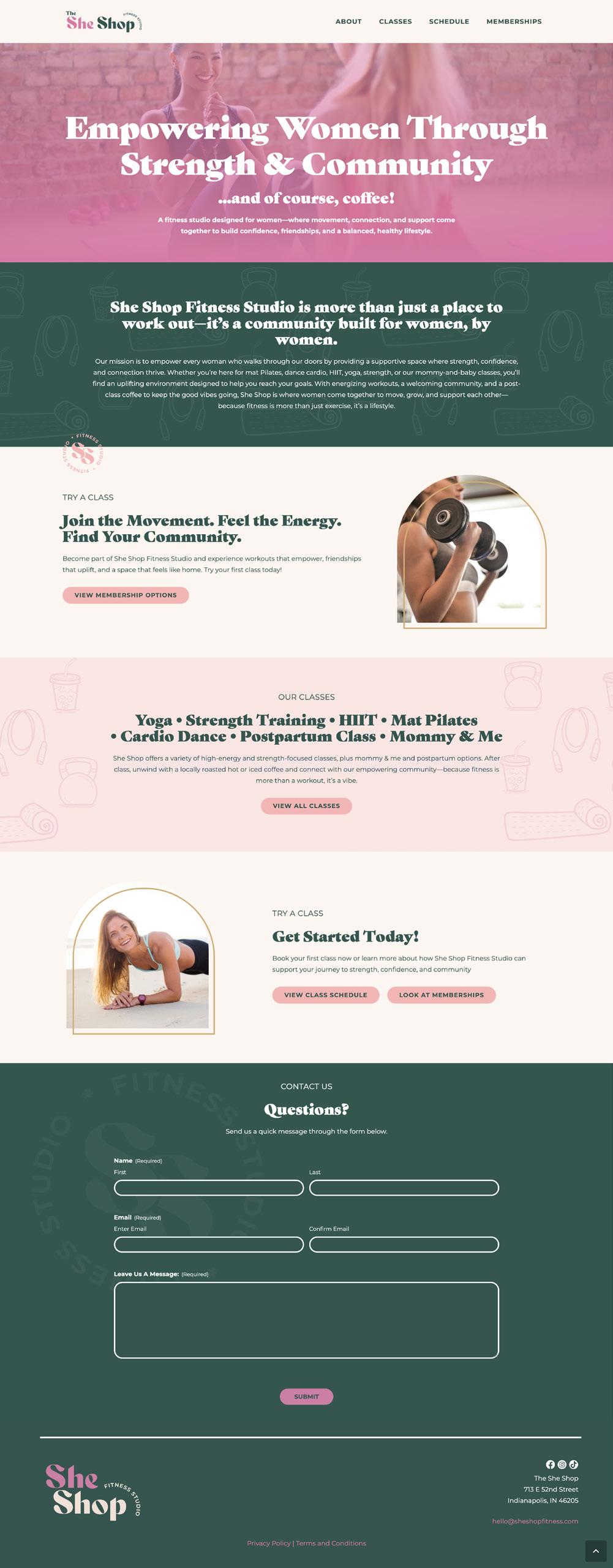
SHE SHOP
INDUSTRY: Fitness
OVERVIEW: Our client came to us with a clear vision—but no name, no brand, and no digital presence. From the ground up, we created She Shop Fitness—a bold, women-powered brand built to inspire confidence, community, and movement. We crafted the name, developed the brand identity, and infused it with energy through vibrant colors, playful icons, and dynamic patterns that celebrate strength and style.
Once the brand was defined, we designed and developed a sleek, personality-packed website that highlights everything from classes to events and signups. The site balances functionality with flair, making it easy for users to engage while reinforcing the brand’s empowering tone. She Shop Fitness now stands out in the fitness space with a fully realized identity—ready to grow, inspire, and lead with purpose.


Boldthink’s Logo Evolution
A lot has changed since our start in 2011—trust us, we’ve seen it all.
From evolving technology to shifting consumer expectations, staying the same is no longer an option. We always tell our clients that change isn’t just inevitable—it’s essential. As a brand agency, we’ve guided organizations through these shifts and continually evolve our own brand to stay relevant and effective. Because if you don’t evolve with your audience, they’ll move on without you.


(This logo transformation included a name change)


Aearo Technologies
Blue Ribbon
IKORCC
J. Greg Allen
Holland Orthodontics


Stone Horses
The Founder’s Huddle

© 2025 Boldthink, LLC. All rights reserved. This is a confidential document only intended for its recipient. No portion of this document, including but not limited to content, processes, images, graphics or pictures are to be copied, reused or distributed without written consent of the agency.
350 Massachusetts Ave #300 Indianapolis, IN 46204
boldthinkcreative.com info@boldthinkcreative.com