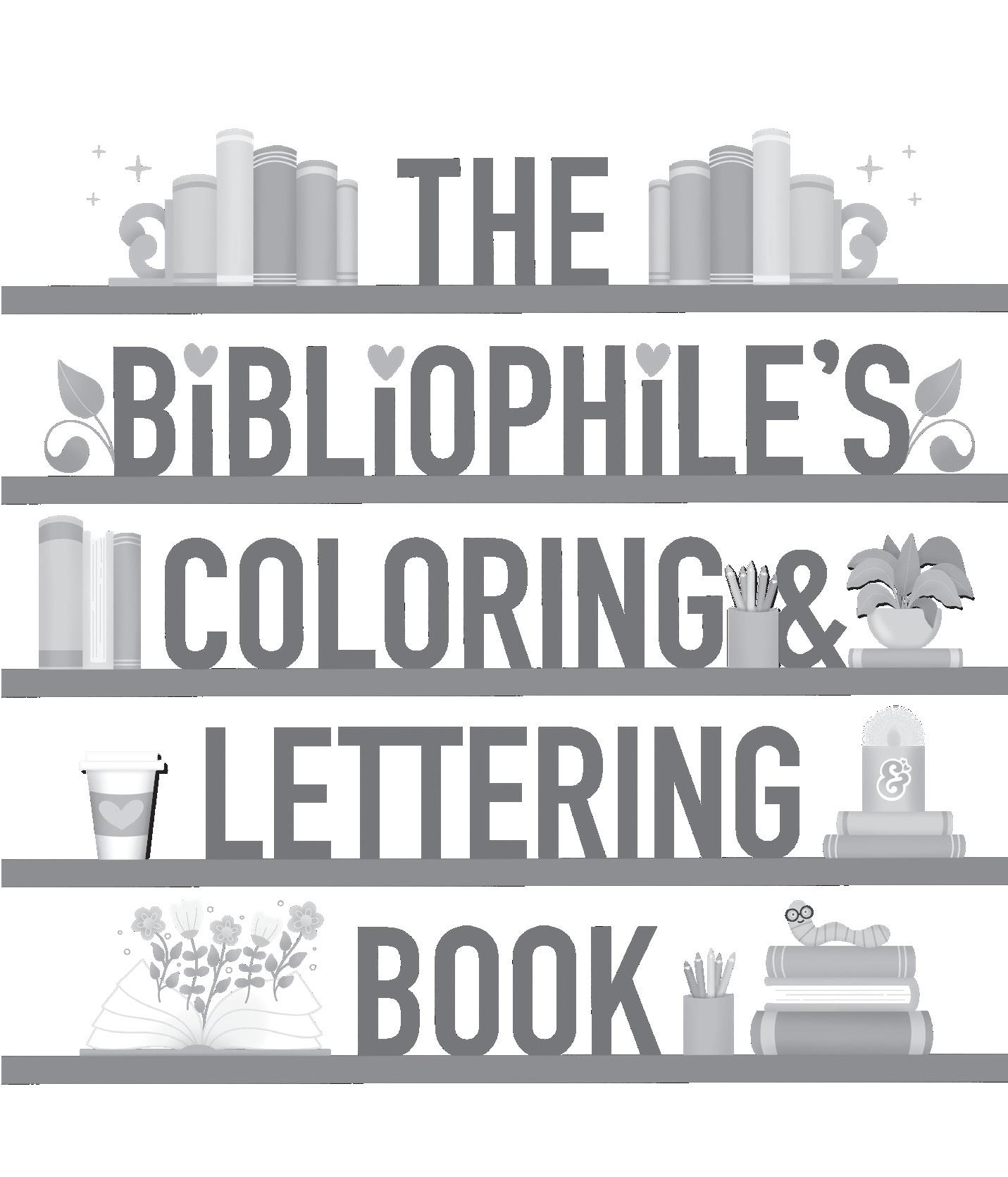
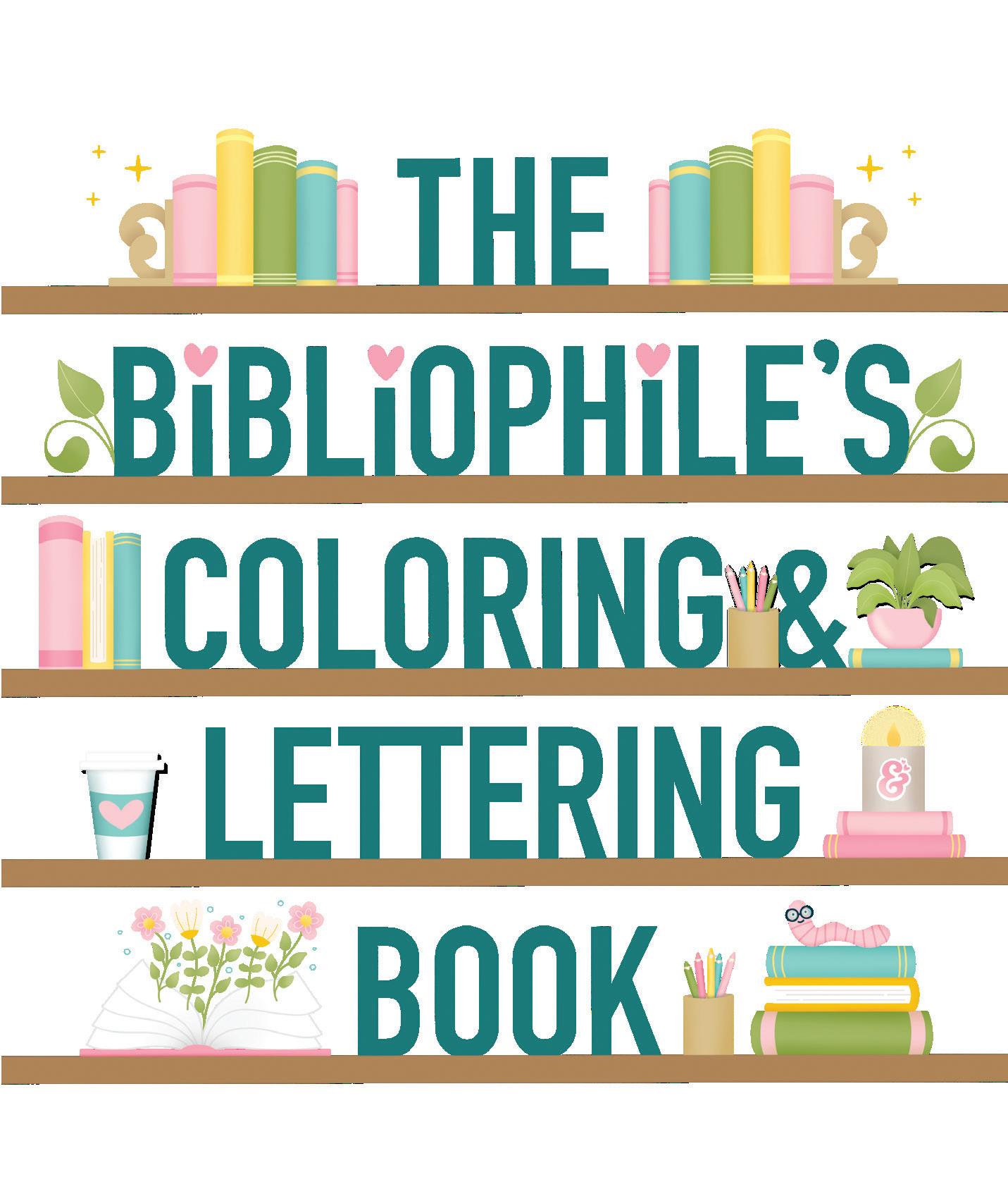
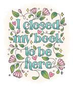
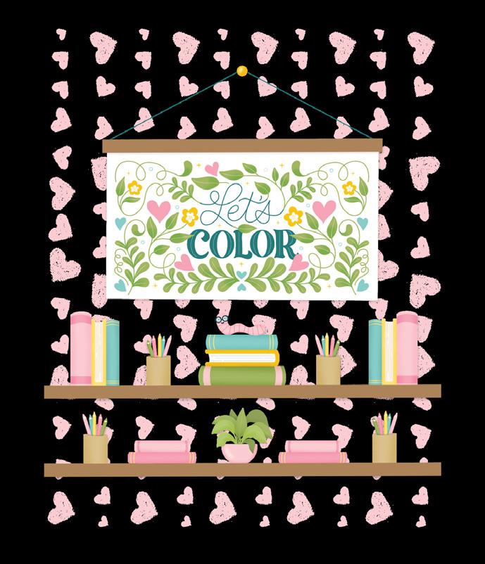
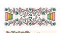
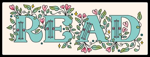
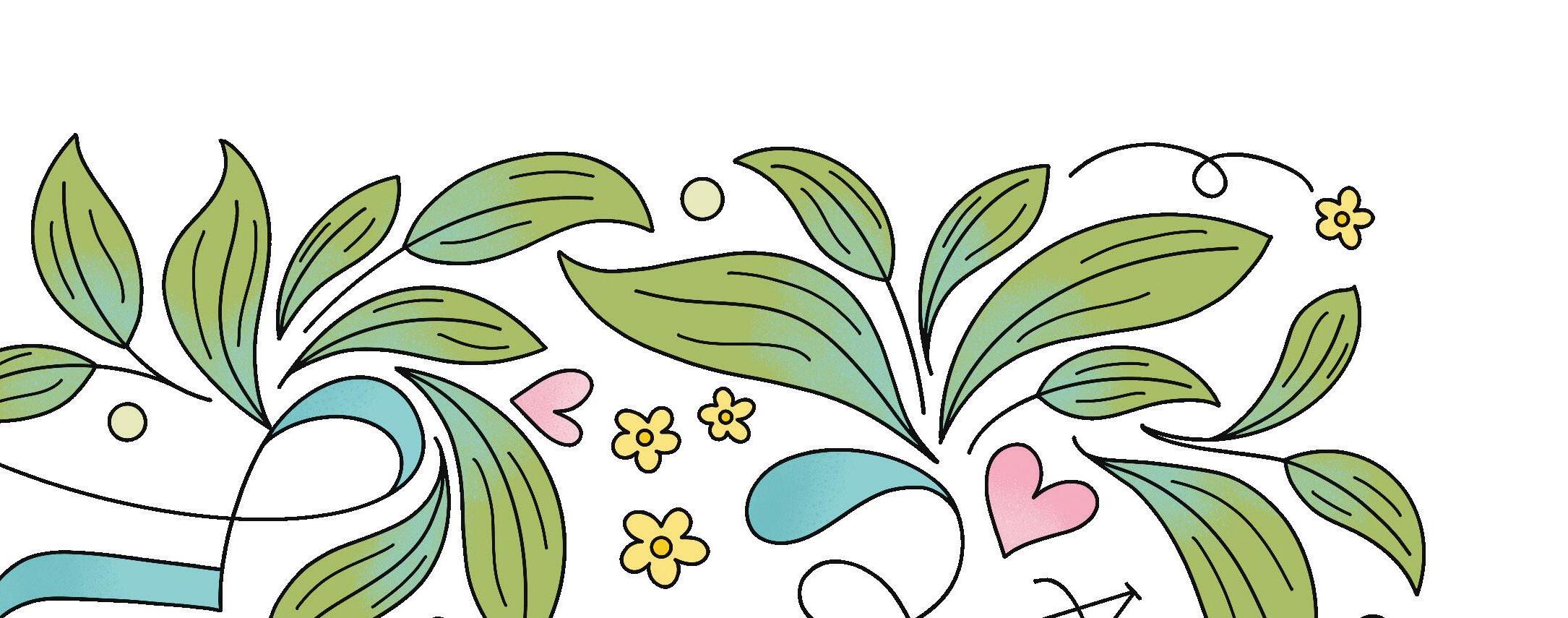
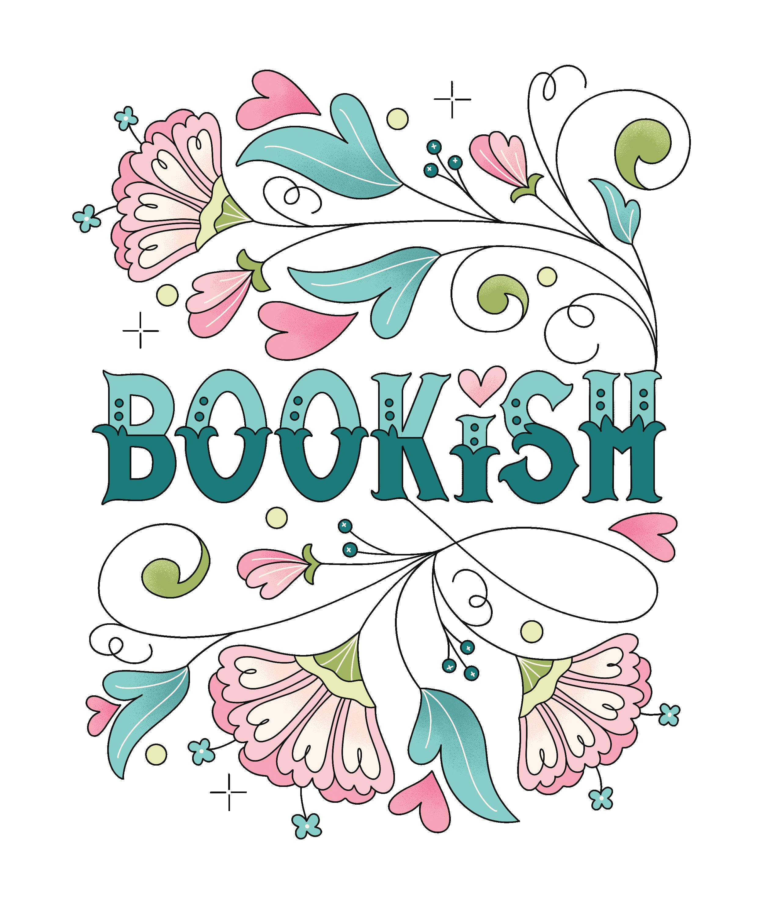
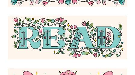
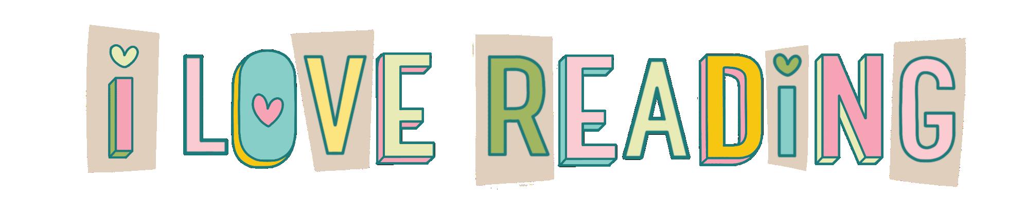
A Cozy Collection of Hand-Drawn Coloring Pages, Trace-to-Learn Lettering Styles & Shareable Bookmarks for Book Lovers
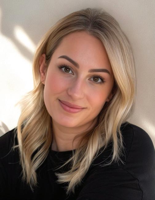
Dawn Nicole Warnaar

A Cozy Collection of Hand-Drawn Coloring Pages, Trace-to-Learn Lettering Styles & Shareable Bookmarks for Book Lovers
Dawn Nicole Warnaar
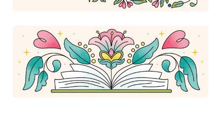
This book is the perfect way to relax and get creative while celebrating your bookish life. Inside are 25 cozy, book-themed coloring pages, 6 charming cut-out bookmarks, and 10 unique lettering lessons so you can personalize your journals, notes, and art projects. Slow down, get creative, and celebrate the joy of books and art with this one-of-a-kind treasure.


This book belongs to:
A Cozy Collection of Hand-Drawn Coloring Pages, Trace-to-Learn Lettering Styles & Shareable Bookmarks for Book Lovers
The Bibliophile’s Coloring & Lettering Book © 2025 by Dawn Nicole Warnaar and Better Day Books, an imprint of Schiffer Publishing, Ltd.
Publisher: Peg Couch
Book Designer: Michael Douglas
Production Designer: Llara Pazdan
Editor: Colleen Dorsey
All rights reserved. No part of this work may be reproduced or used in any form or by any means — graphic, electronic, or mechanical, including photocopying or information storage and retrieval systems — without written permission from the publisher.
The scanning, uploading, and distribution of this book or any part thereof via the Internet or any other means without the permission of the publisher is illegal and punishable by law. Please purchase only authorized editions and do not participate in or encourage the electronic piracy of copyrighted materials.
“Better Day Books,” the floral book logo, and “It’s a Good Day to Have a Better Day” are registered trademarks of Schiffer Publishing, Ltd.
“Schiffer,” “Schiffer Publishing, Ltd.,” and the pen and inkwell logo are registered trademarks of Schiffer Publishing, Ltd.
ISBN: 978-0-7643-7008-3
Printed in India
10 9 8 7 6 5 4 3 2 1
Published by Better Day Books, an imprint of Schiffer Publishing, Ltd.
Better Day Books
Email: hello@betterdaybooks.com Web: www.betterdaybooks.com Visit us on Instagram! @better_day_books
Schiffer Publishing 4880 Lower Valley Road Atglen, PA 19310
Phone: 610-593-1777
Fax: 610-593-2002
Email: info@schifferbooks.com Web: www.schifferbooks.com
For our complete selection of fine books on this and related subjects, please visit our website at www.betterdaybooks.com.
You may also write for a free catalog.
Better Day Books titles are available at special discounts for bulk purchases for sales promotions or premiums. Special editions, including personalized covers, corporate imprints, and excerpts, can be created in large quantities for special needs. For more information, contact the publisher.
For those who believe books and creativity are the best forms of escapism. You are my kind of people.
Welcome Page 9
Meet Dawn Pages 10–11
How to Use This Book Page 13

Coloring Tips Pages 16–17
Coloring Sequence Pages 18–19
Color Palettes Pages 20–21
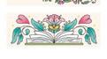
Coloring Pages & Worksheets Pages 23–72

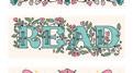
Bookish Lettering Styles Overview Pages 76–77
Lettering Basics
Lettering Tools: page 78
Lettering Steps and Features: pages 78–79
Lettering Tips: pages 80–81
Lettering Style 1: Autobiography Pages 82–85
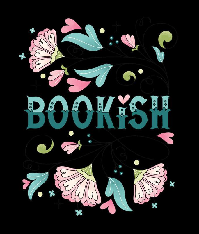
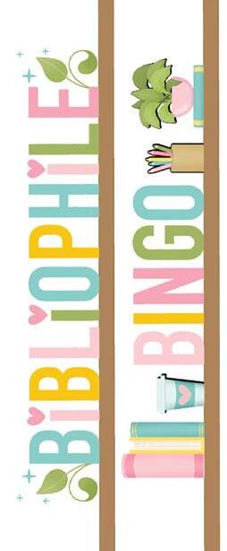
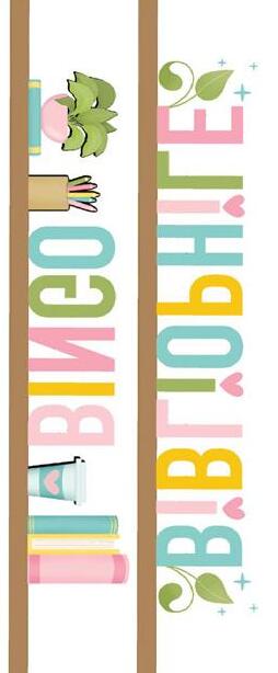
Lettering Style 2: Bibliophile Pages 86–89
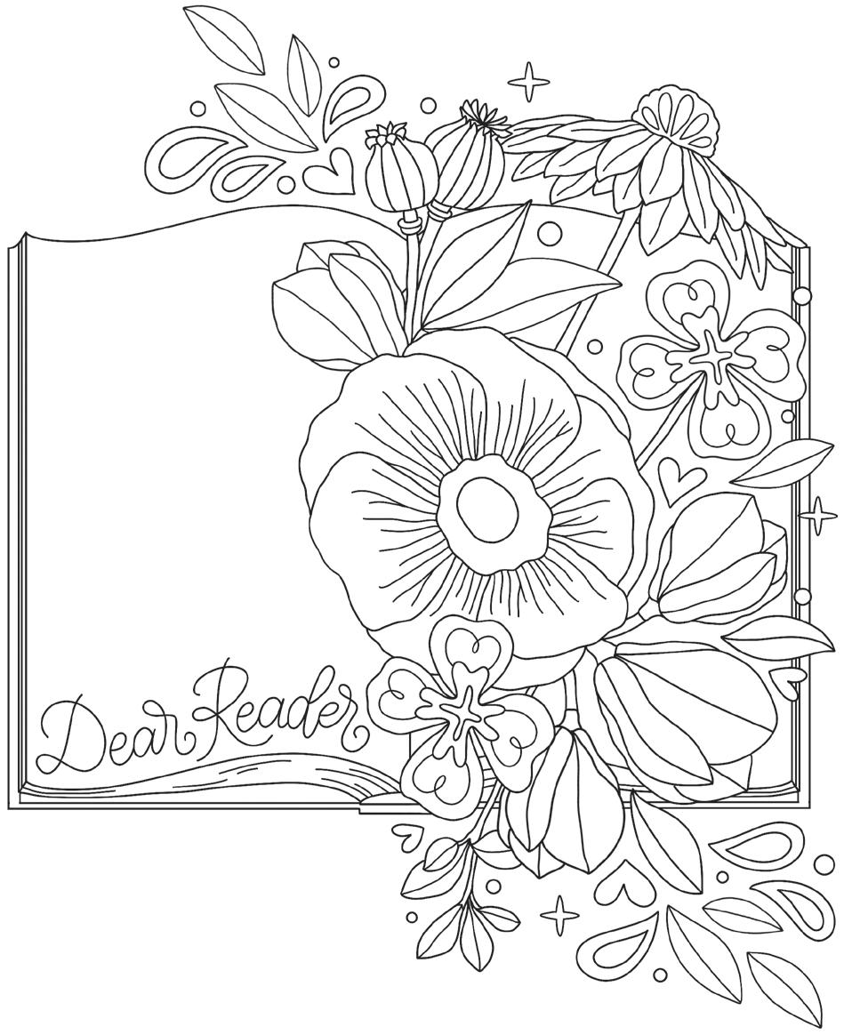
Lettering Style 3: Dear Reader Pages 90–93
Lettering Style 4: Bookworm Pages 94–97
Lettering Style 5: Faerie Tale Pages 98–101
Lettering Style 6: Book Shoppe Pages 102–105
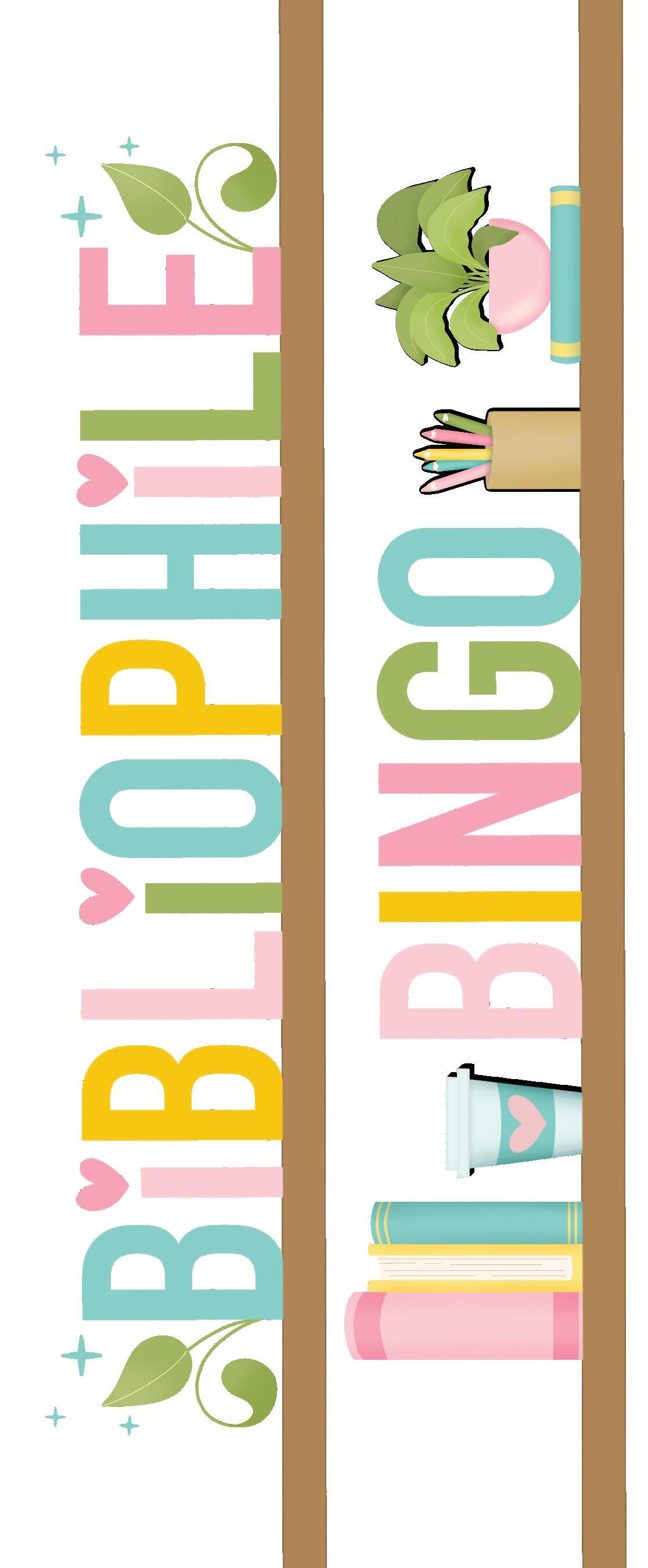
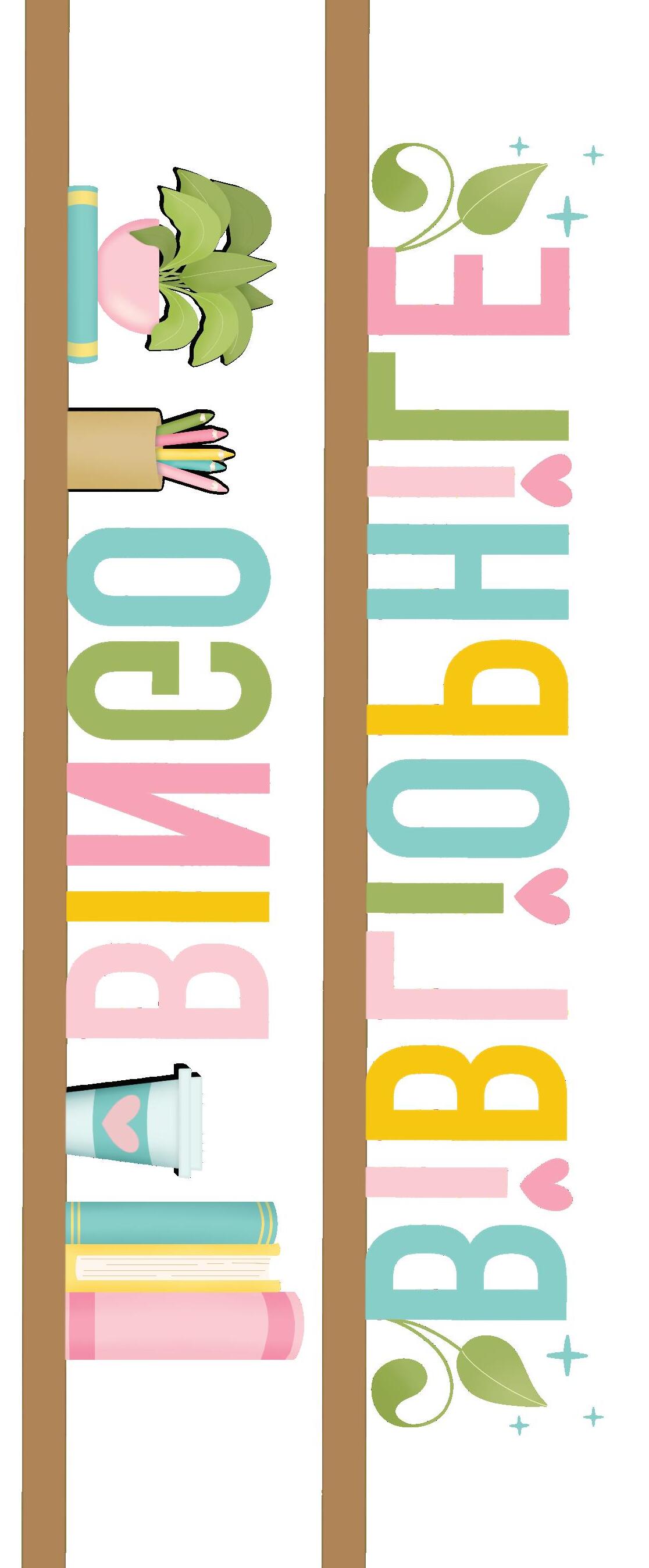
Bibliophile Bingo Pages 126–127
Cut-Out Bookmarks Pages 128 –132
Other Books to Check Out Page 133
About the Author Pages 134–135
Lettering Style 7: Literati Pages 106–109
Lettering Style 8: Rom-Com Pages 110–113

Lettering Style 9: Pen Name Pages 114–117
Lettering Style 10: Ghostwriter Pages 118–121
Creative Customizations Pages 122–123


Hello, fellow bibliophile! Thank you so much for picking up a copy of The Bibliophile’s Coloring & Lettering Book.
While writing the outline to pitch this book concept to my publisher, I came across the following quote and immediately fell in love with it. It’s the perfect intro.
Instead of worrying about what you cannot control, shift your energy to what you can create.
― ROY T. BENNETT
PREACH! Read that one more time. My head and my heart needed those words of encouragement. I’m guessing yours might need them too.
While living in the digital age certainly has its perks, it can also be exhausting to be accessible to others almost all the time and overly connected to the world.
Reading and creating are my favorite forms of escapism because they let me quiet my overactive mind and intentionally shut out the world’s noise for a while.
I’m consumed with the storyline when reading a good book, so I rarely think about emails or social media notifications. I’m also far less prone to worry about little things like whether I need to run to the grocery store for milk for the umpteenth time this week, or big things like “What kind of legacy am I going to leave behind?”
Creating does the same for me, for the most part. But I have to (over)think about things like what colors to choose, what phrases to letter, and what illustrations to draw.
You, my friend, don’t have to stress about those things, because you have this book in your hands, and I’ve done that part for you!
I hope the pages of this book inspire you and help shift any anxiety you’re carrying into calm as you focus on creating.
It’s time to put your phone on Do Not Disturb, turn on your favorite music, pick up a pencil, and shift your energy into what you can create.
We sat down with Dawn to learn a little more about her and her artistic journey. Join us!
a hand-lettering artist and graphic designer?
I graduated from college with an English degree and worked in the hospitality field in Charleston, South Carolina. I loved my job and eventually was promoted to HR manager, so I went to graduate school to obtain my MBA in HR management. Not long after, I met a cute Air Force guy outside a bar in downtown Charleston, which changed my life trajectory. His friends had dared him to hit on the next girl to walk by. That girl was
What fictional world or place would you like to visit?
Velaris, the City of Starlight, from Sarah J. Maas’s A Court of Thorns and Roses book series. I even have a Velaris sweatshirt I bought on Etsy. On the back, it says, “Don’t let the hard days win.”
What music have you had on repeat lately?
While I was working on this book, it was Taylor Swift’s The Tortured Poet’s Department. It’s easily her
me. We got married over a year later and had three babies within four years. In the end, I think he got a lot more than he bargained for!
We move every one to four years, so maintaining a career in HR wasn’t feasible. To stay busy, I started craft blogging, which evolved into what it is today.
I’m an accidental “creativepreneur” (creative + entrepreneur). Blogging involves a lot of graphic design work, so I went back to school again for an advanced certificate in graphic design and shifted to doing more design work. That was about 12 years ago!
What inspired you to focus specifically on hand lettering?
During my time in design school, several instructors said I had a knack for mixing typography styles,
best album. The lyrics are clever and poetic, and I can’t get enough.
What’s your favorite obscure word?
Apricity. It’s the name given to the feeling of the warmth of the sun in the winter. So lovely!
If you could only have three apps on your phone, which three would you pick?
Goodreads, Fit with Coco, Instagram.
If you could instantly become an expert in something, what would it be?
Golf, because then I could finally beat my husband at the game he taught me.
What would you write if you could write a book that was guaranteed to be a bestseller? A psychological thriller with an unreliable narrator and elements of magical realism.
Would you rather live without heat and AC or live without social media?
I could easily live without social media, but I need my AC in the summer and my gas fireplace in the winter!
What’s your favorite season and why?
Autumn. I love the cool, crisp air, cozy clothing, bonfires, holidays, colorful leaves, and all things pumpkin and apple!
and that was just the encouragement I needed to fall in love with type. However, after graduating, I discovered that many fonts are pricey to use commercially and that copyright and licensing can be confusing and gray, so I just started making art with my hand lettering. The more I did it, the better I got (and continue to get) at lettering, and it evolved into a major passion. I love the nuances and organic feeling that doing art by hand creates. The imperfections are part of the charm for me!
What do you do when you feel uninspired or unsure of your creative path?
Read and reread The Crossroads of Should and Must by Elle Luna. That book made me realize how important it is to follow my passions. While no job is without its downsides, it’s a fantastic feeling to
love my career so much that, most of the time, work doesn’t feel like work! My favorite part is that I can inspire others to be creative daily.
What do you hope readers experience as they color and letter their way through this book?
I hope this book reinforces your love of books and fills you with an incredible sense of community among bibliophiles. Even though reading is an individual activity, there’s so much connection in discussing books with others. If you’re new to hand lettering, I hope this book sparks a passion in you to continue learning the art of lettering!
Where can we connect with you?
Visit me at www.bydawnnicole.com and @bydawnnicole on Instagram!
Have you traveled outside the US?
I’ve visited Mexico, Canada, the Bahamas, St. Maarten, Germany, Australia, France, Spain, the Czech Republic, Switzerland, Belgium, Luxembourg, Italy, the Netherlands, and Ireland. We lived in Germany for two years, so it was a great time to travel to European countries affordably!
What bands have you seen in concert?
Gavin DeGraw, Lindsey Stirling, Matchbox Twenty, Shawn James, Sam Hunt, and Kaleo . . . just to name a few of the more recent ones I’ve gone to!
What is currently at the top of your wish list?
The iPad Pro M4 and Apple Pencil 3. Swoon.
If you could be any supernatural creature, what would you be and why?
I was born on Halloween, so I’m going to have to choose a witch—a good witch, of course!
What’s one of your favorite quotes from a book?
We made a choice to do joy on purpose. Not in spite of life’s sorrows. But because of them.
—KATHERINE CENTER, What You Wish For
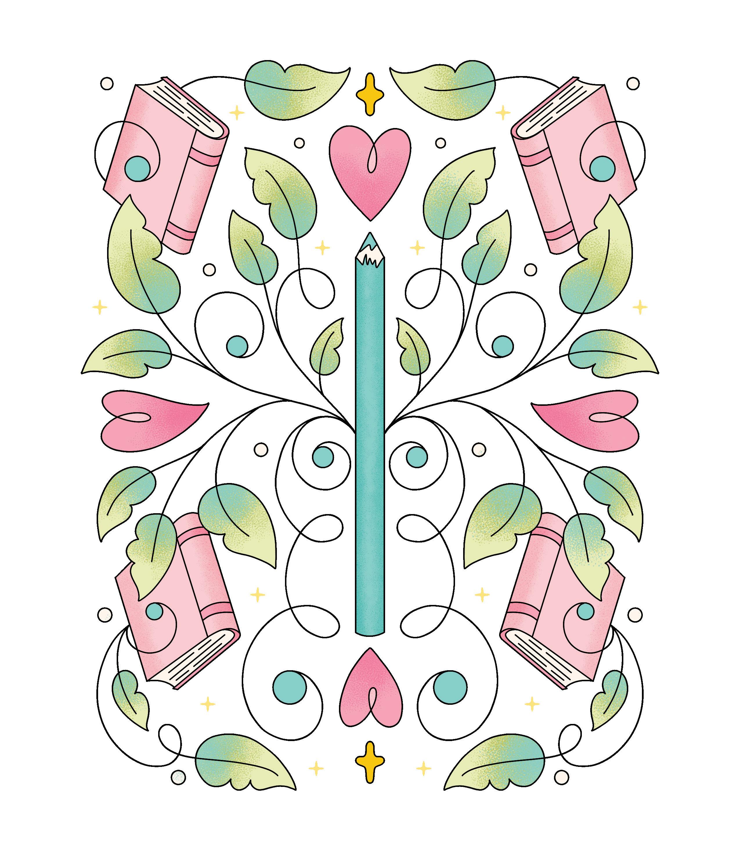
This book consists of three parts: Coloring, Lettering, and Extras.
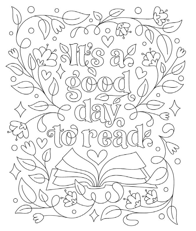
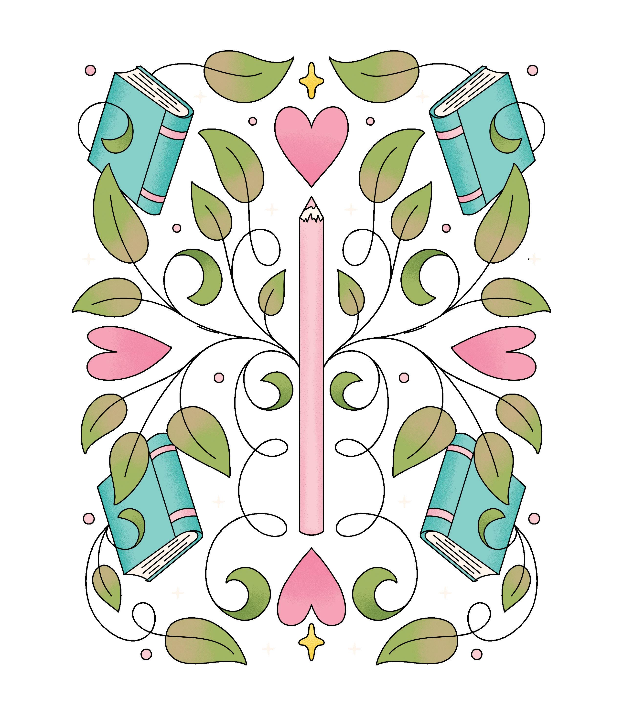
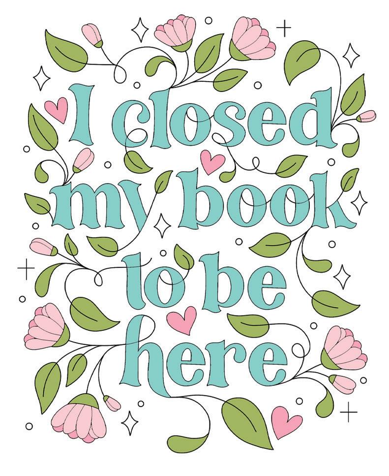
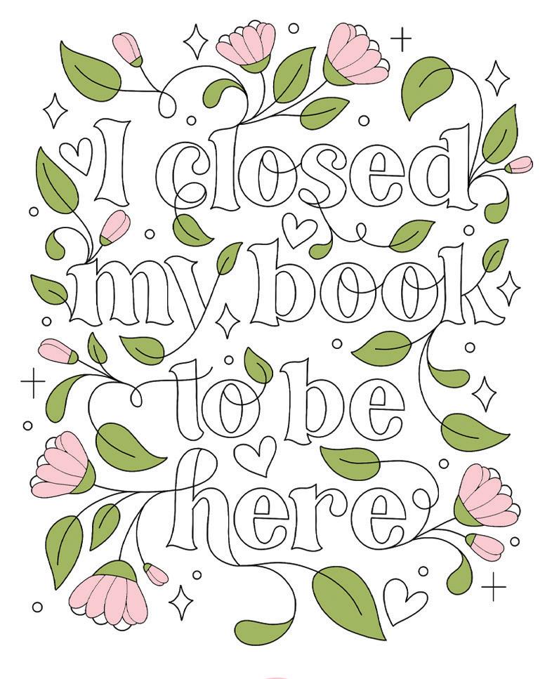
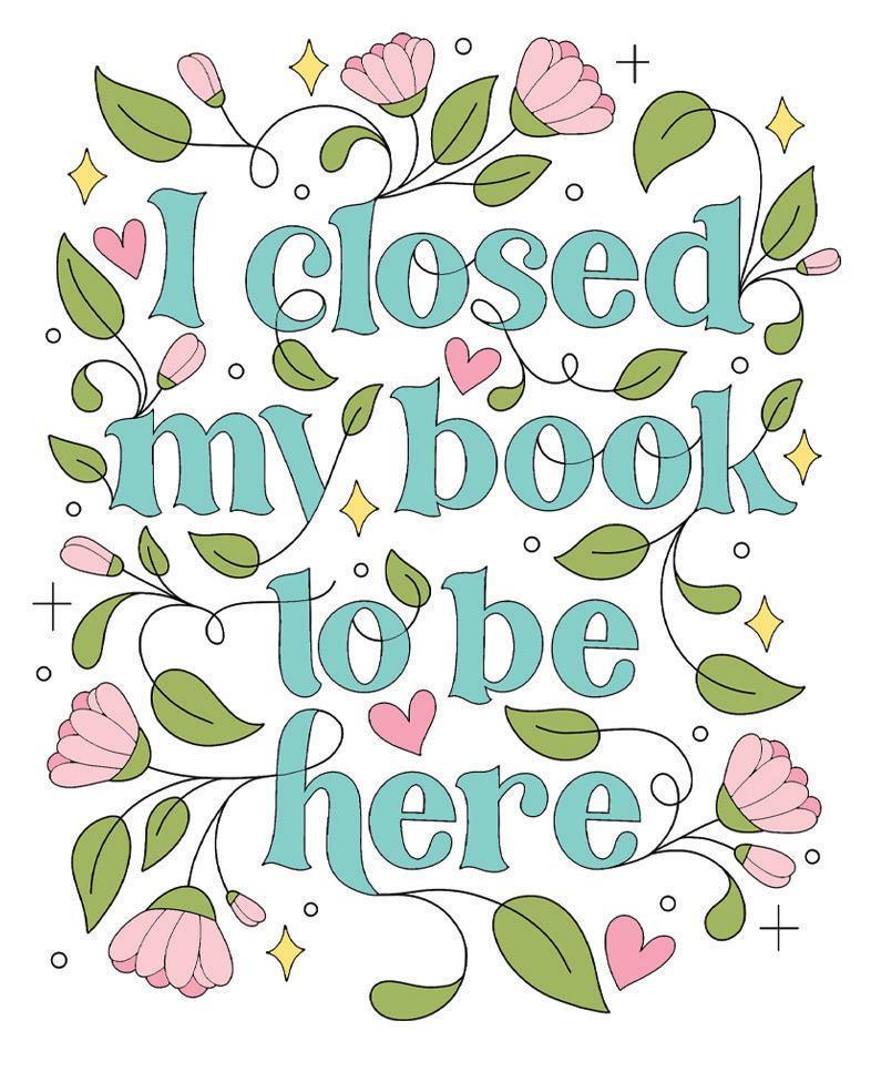
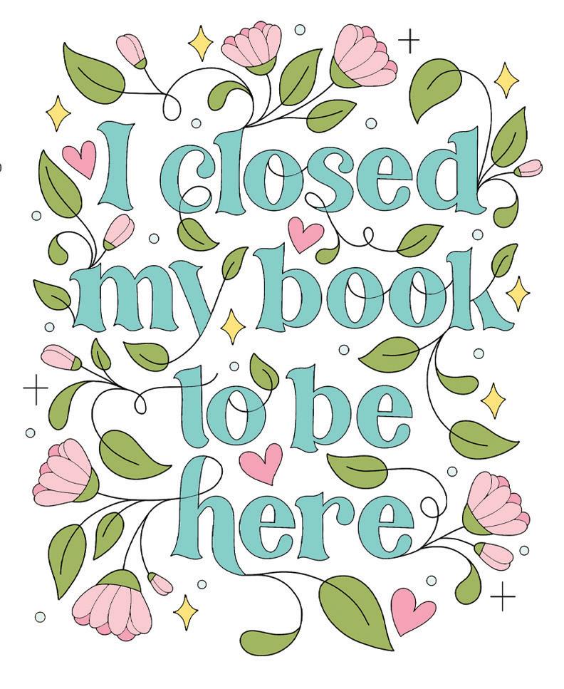
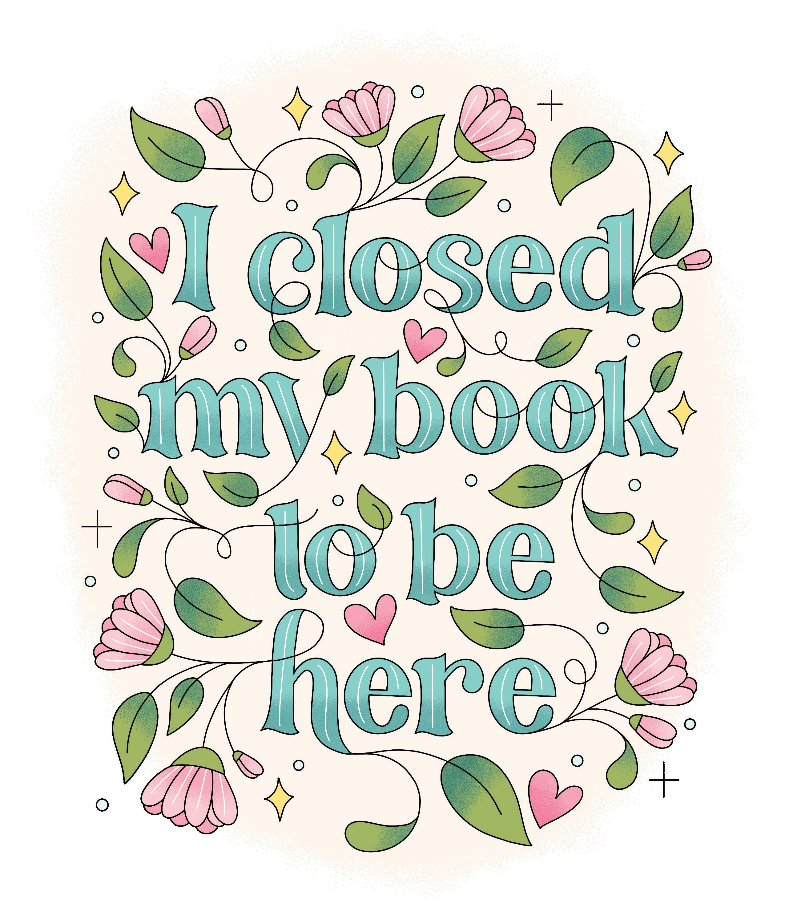
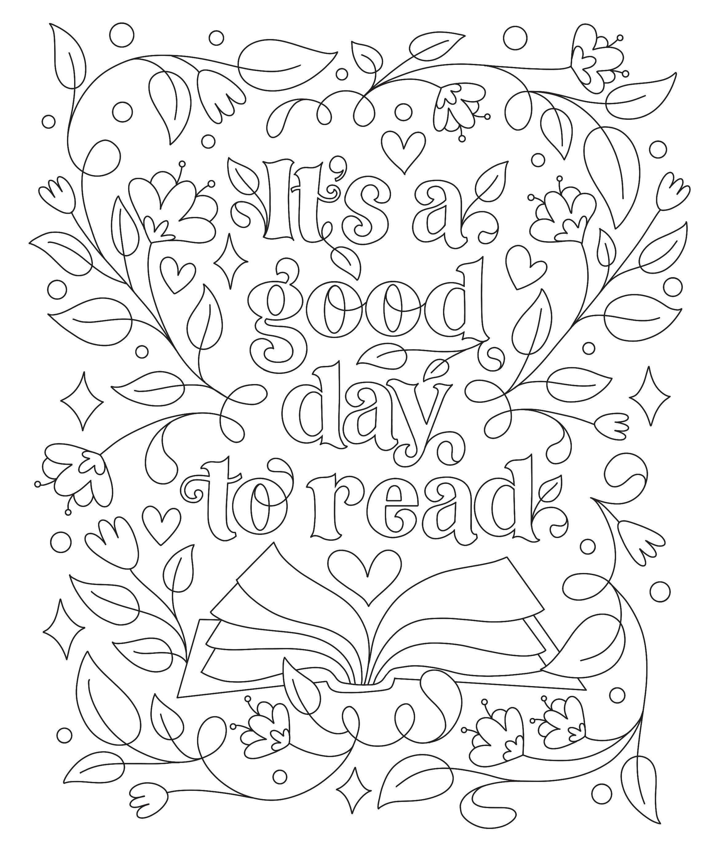
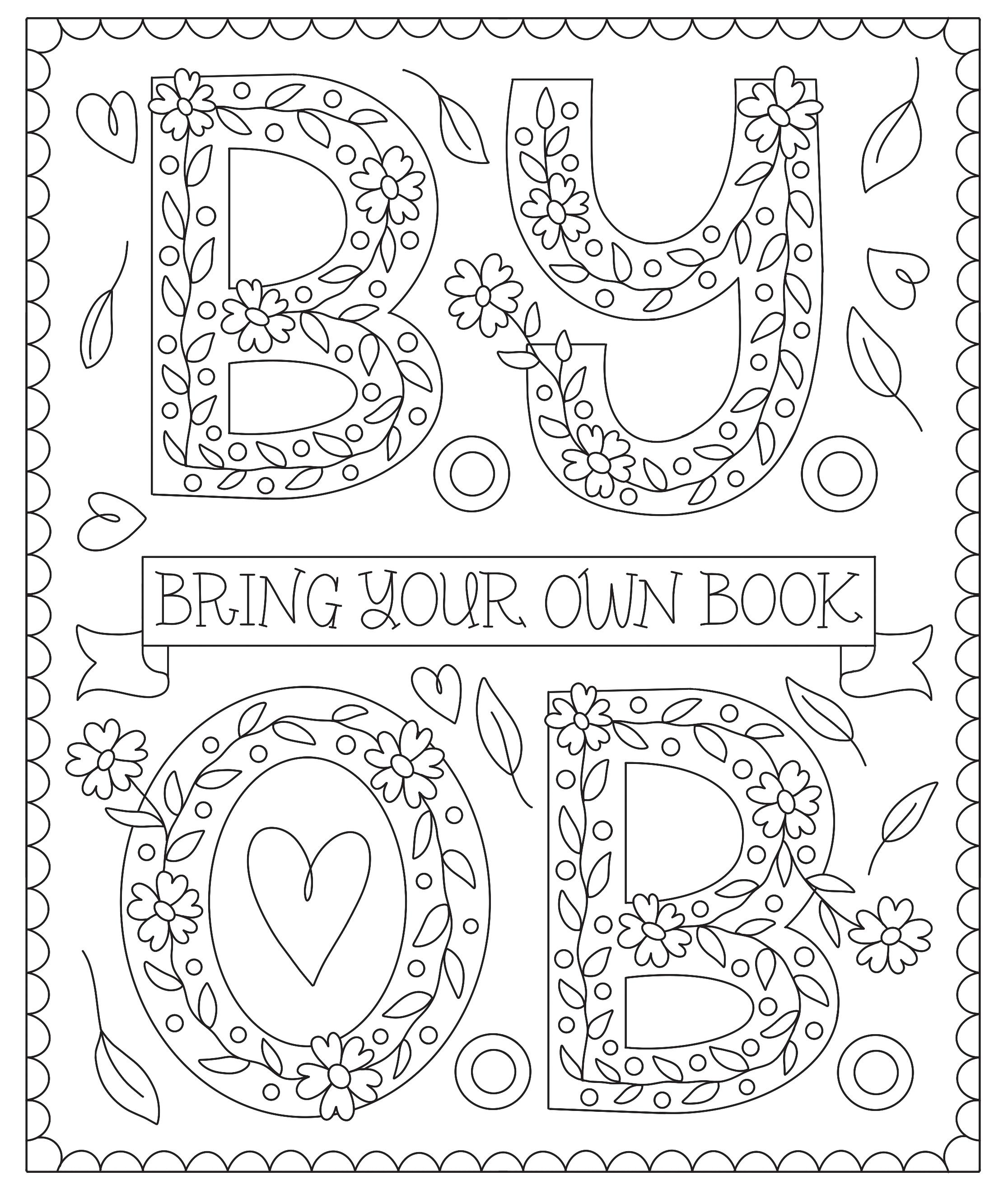
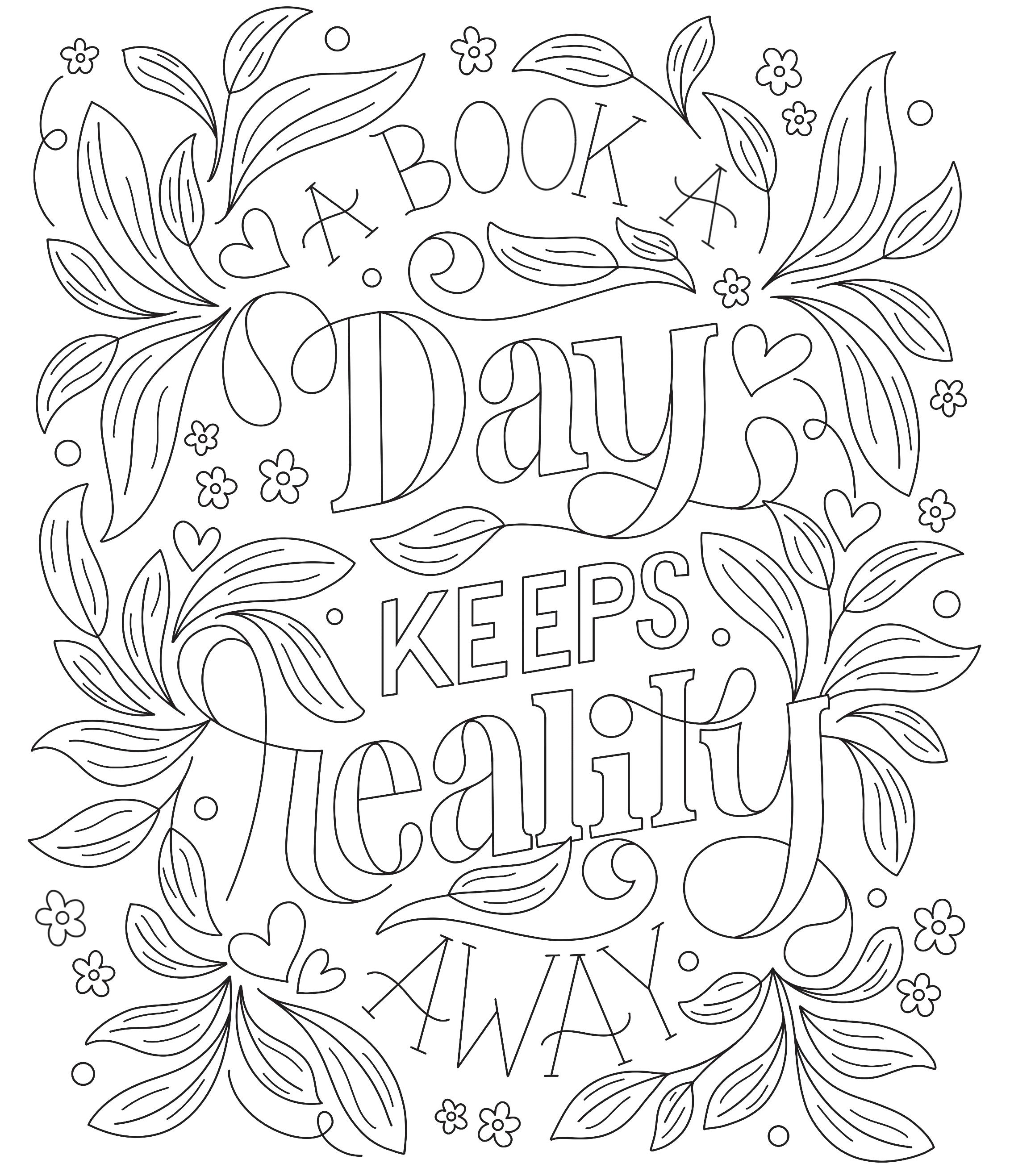
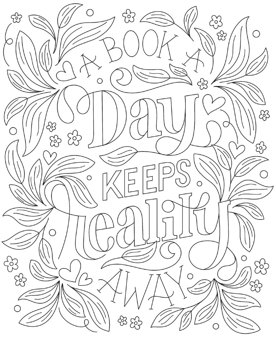
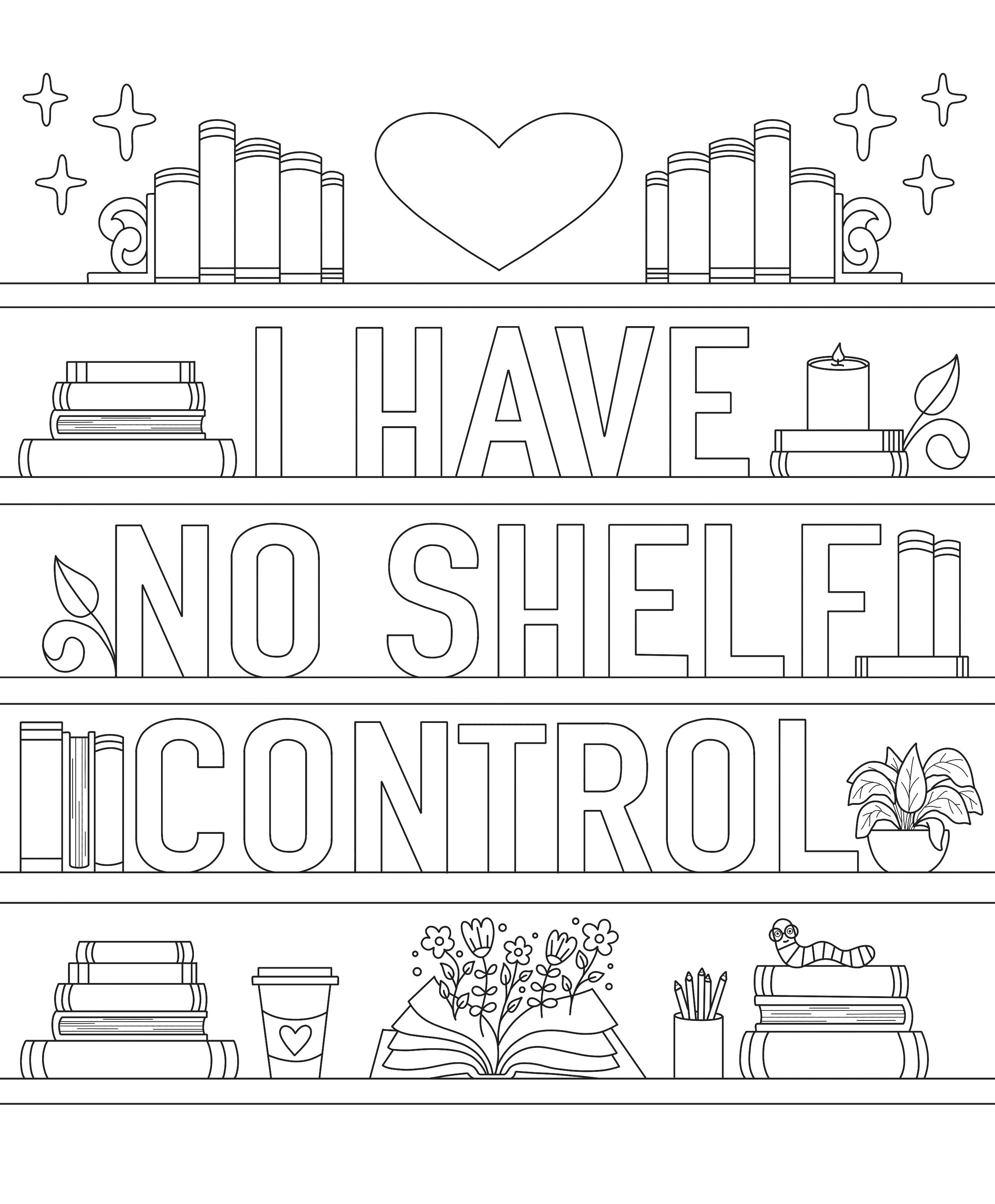
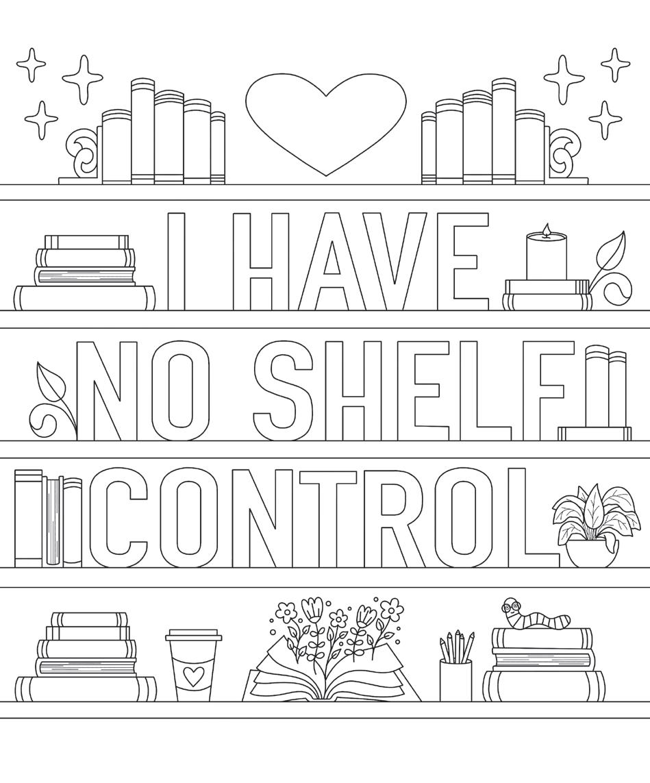
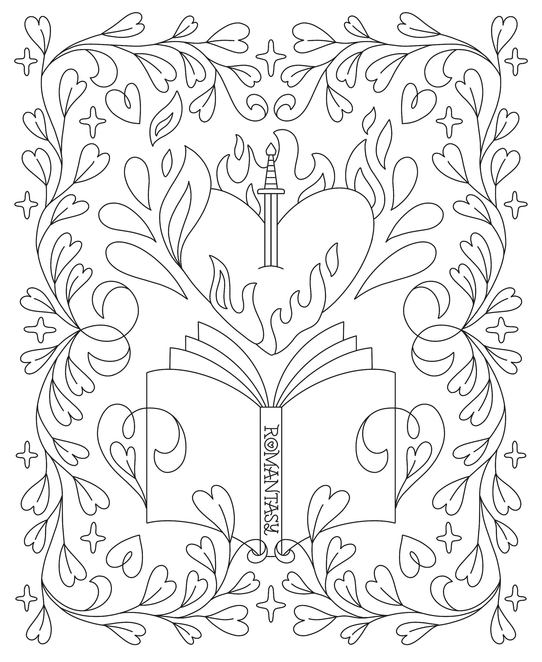
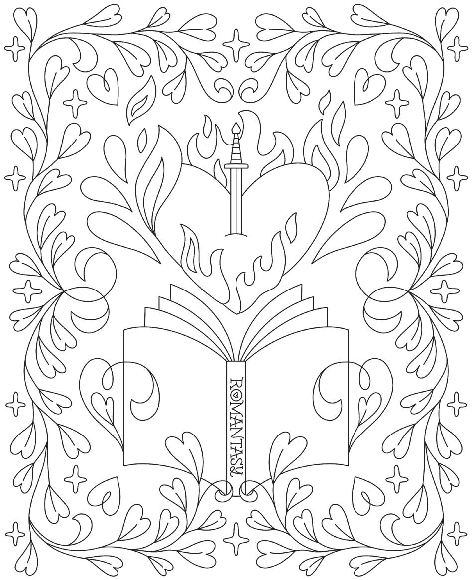
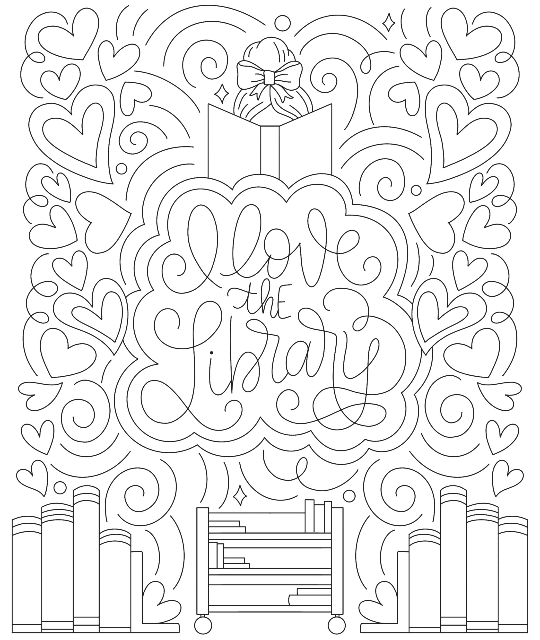
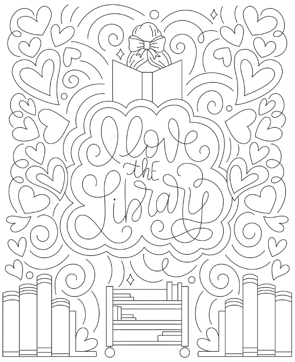
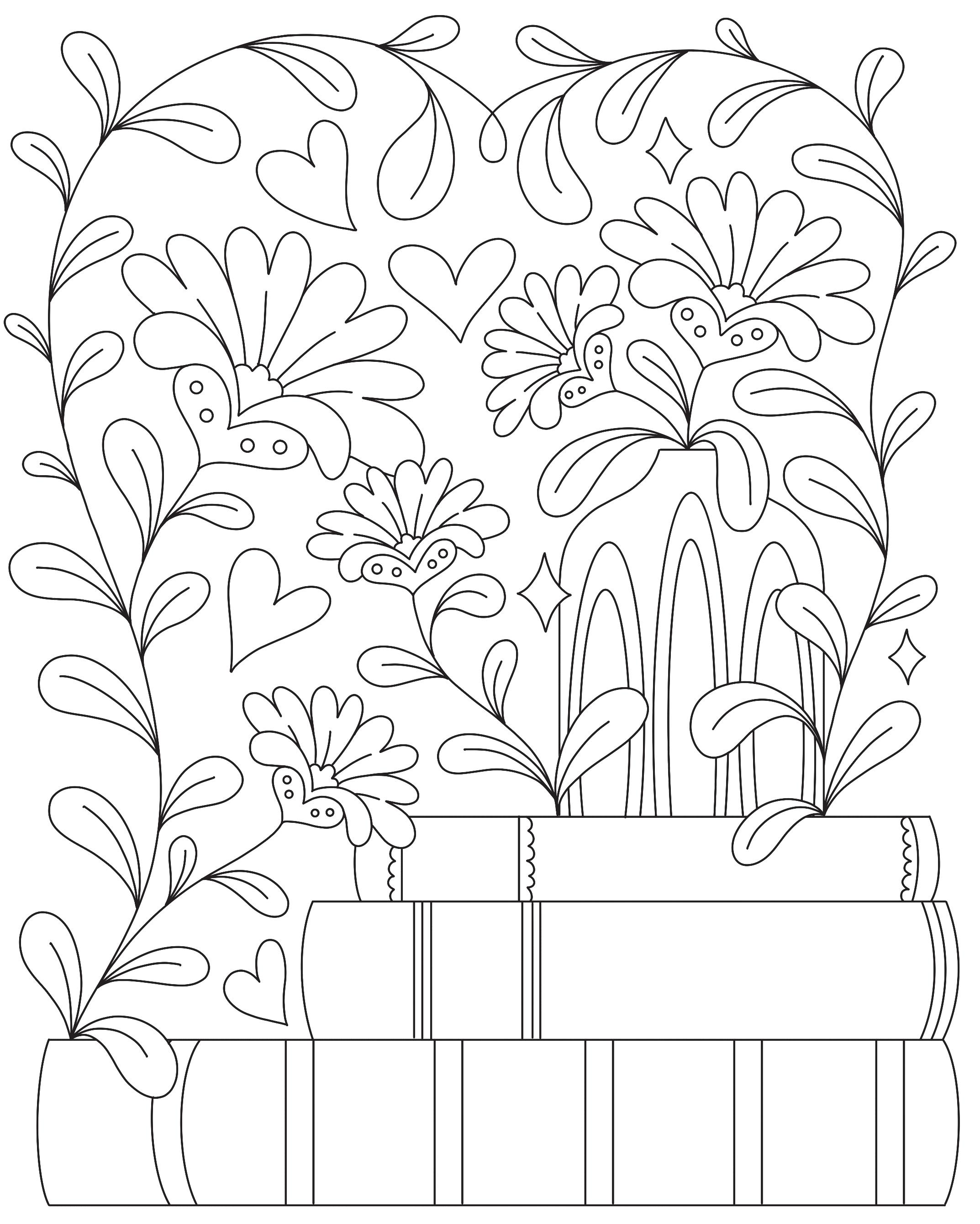
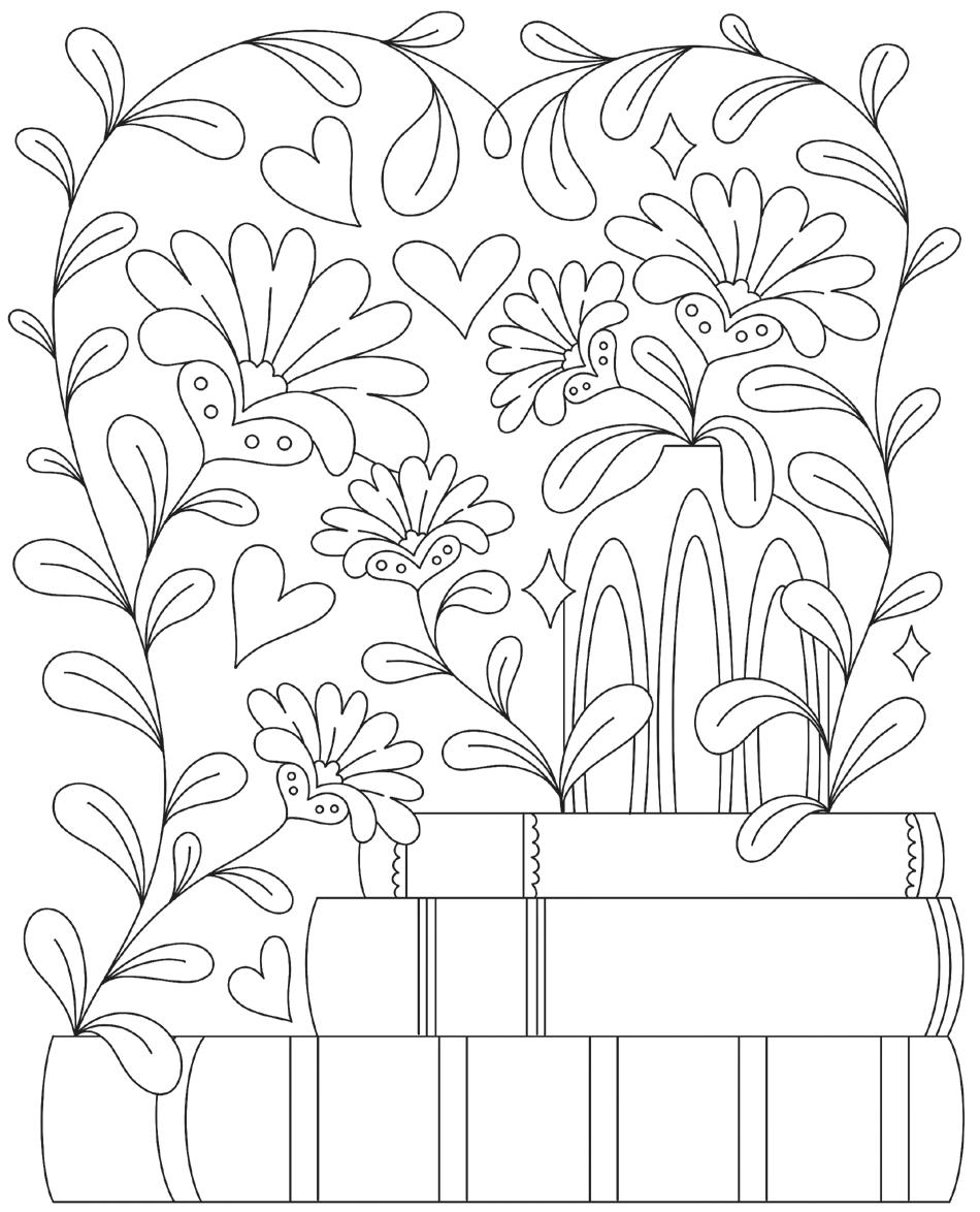
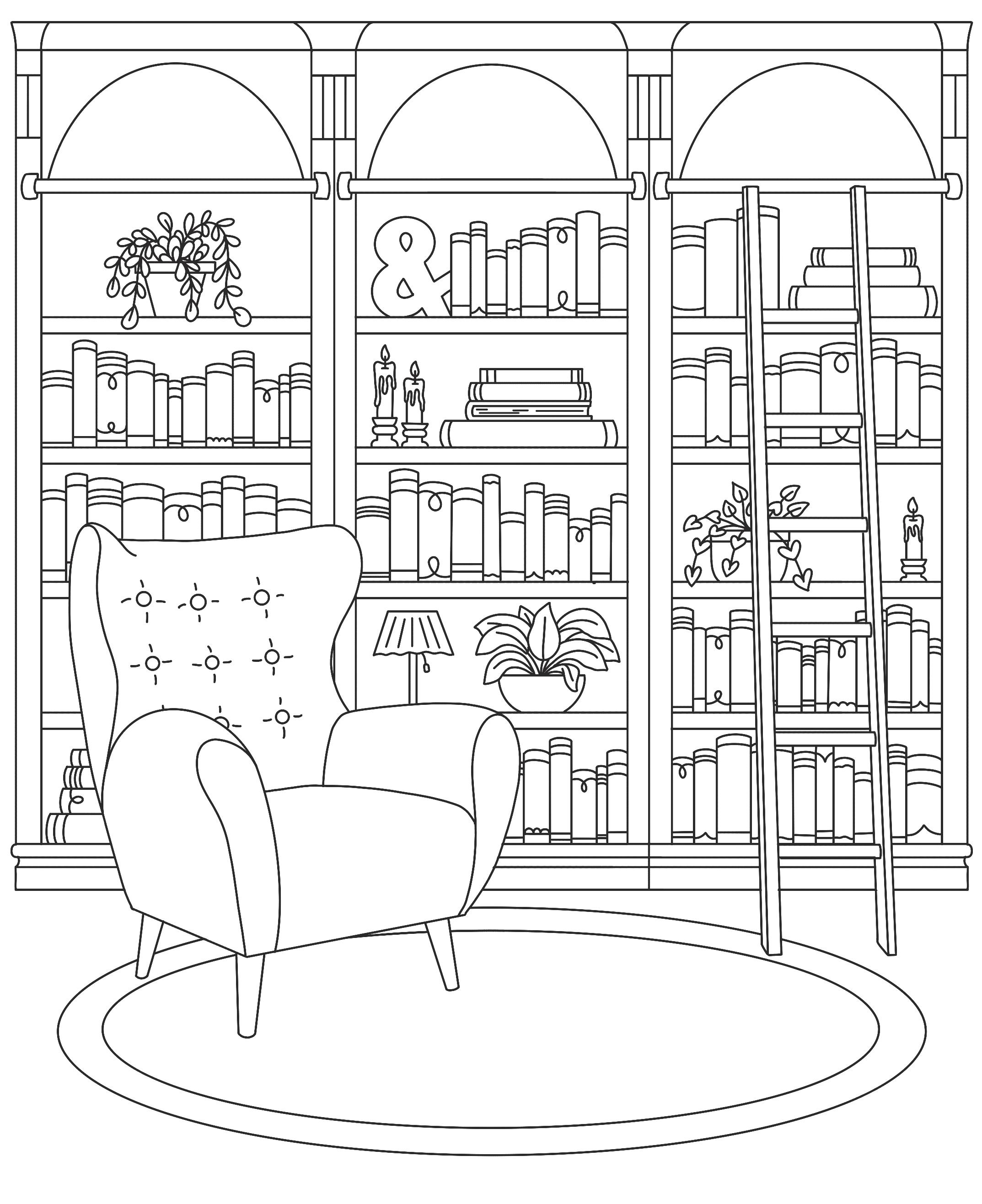
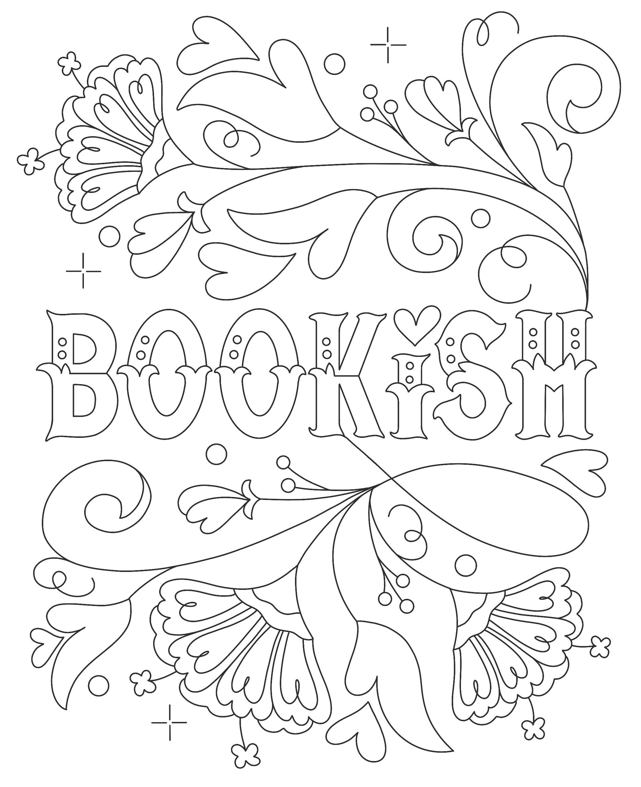
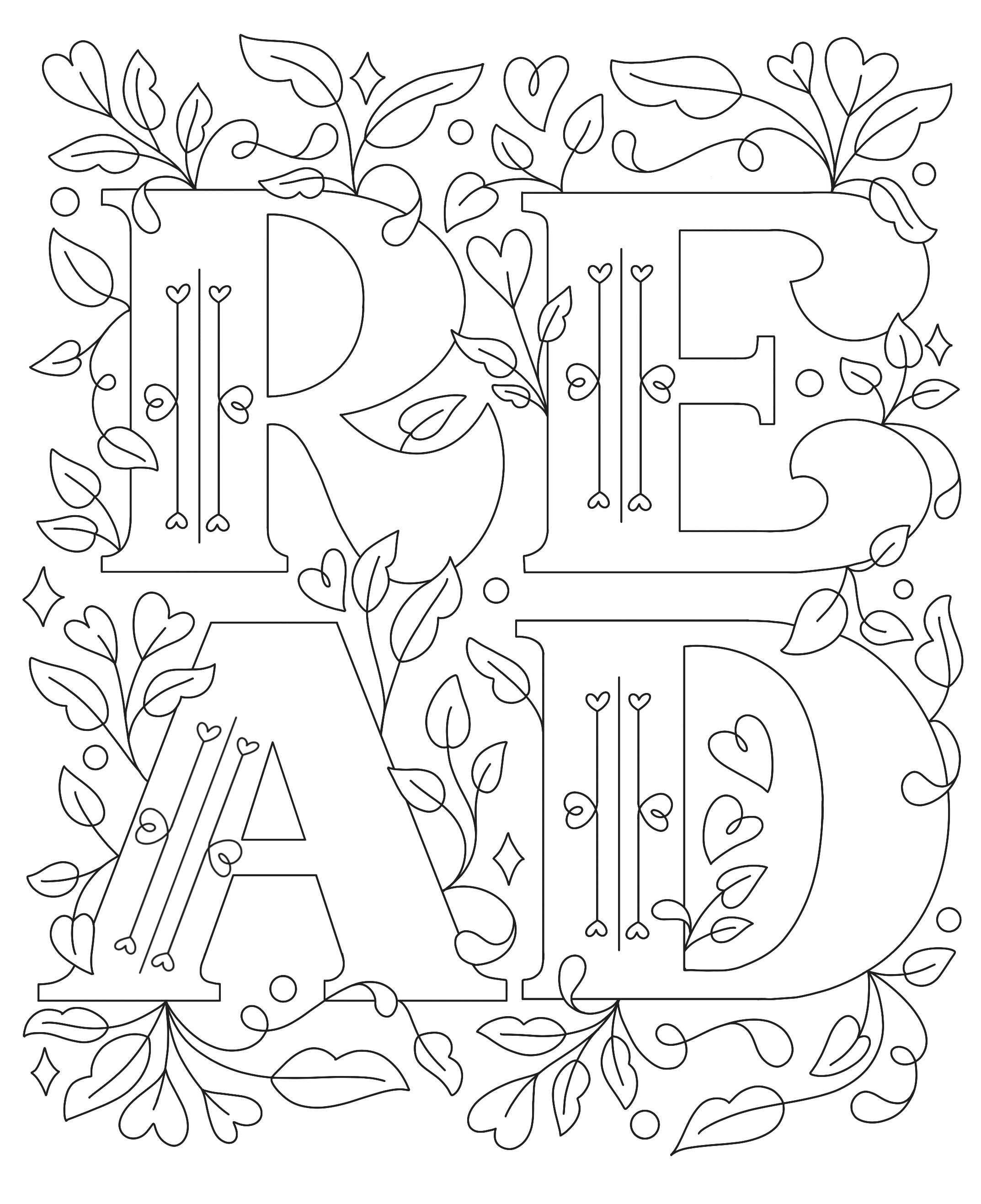
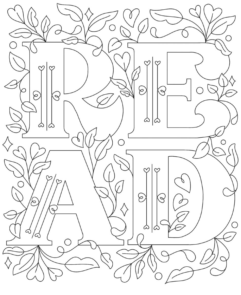
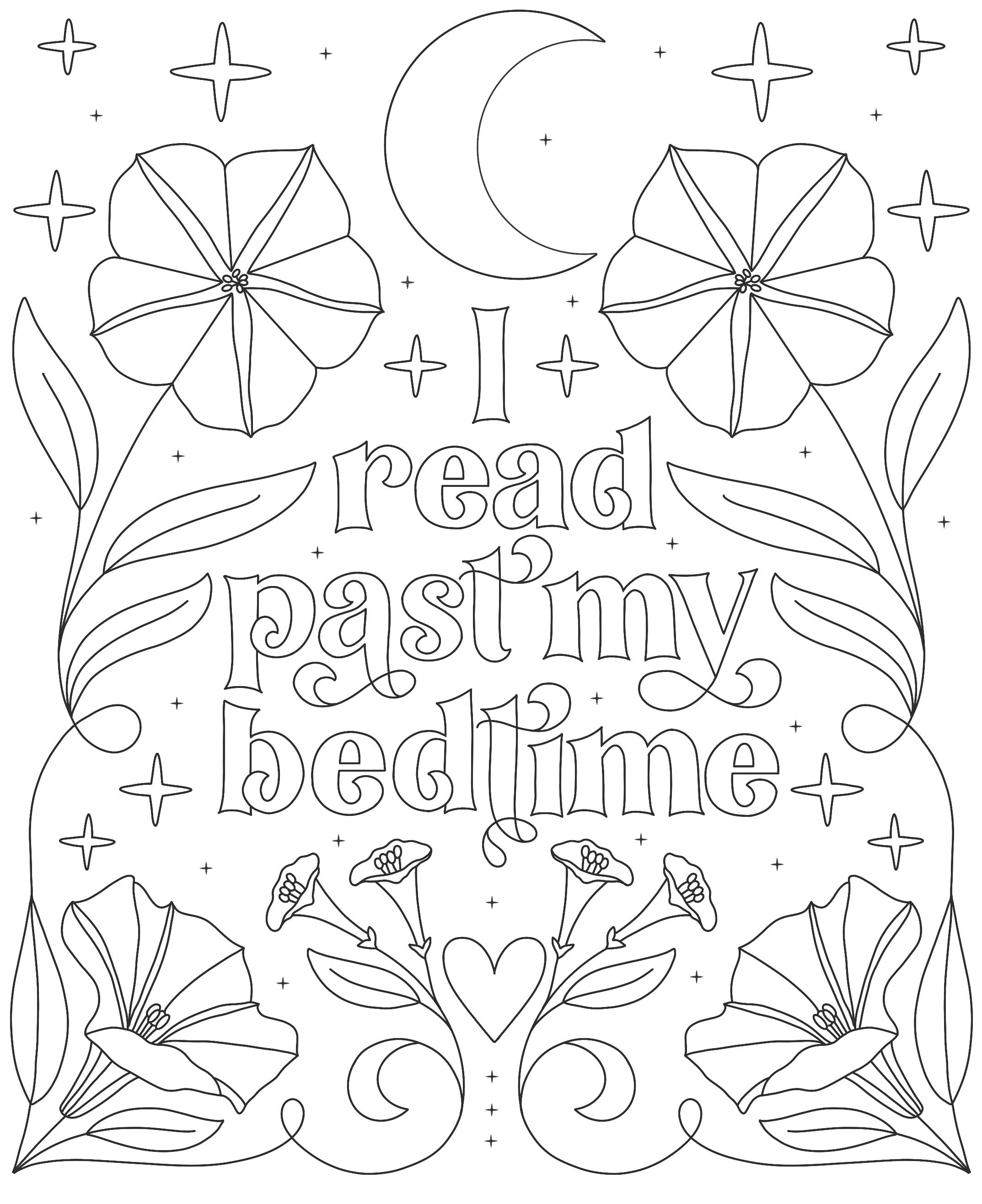
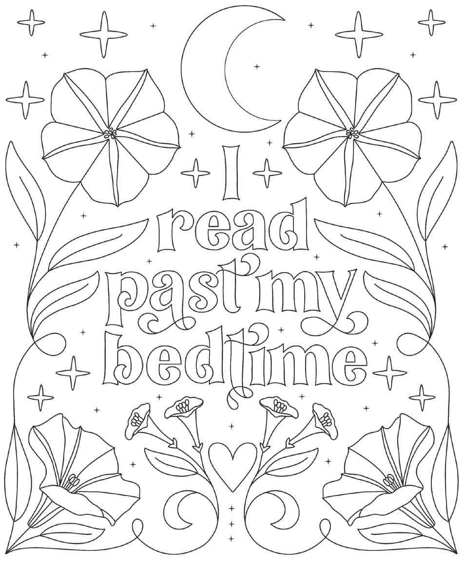
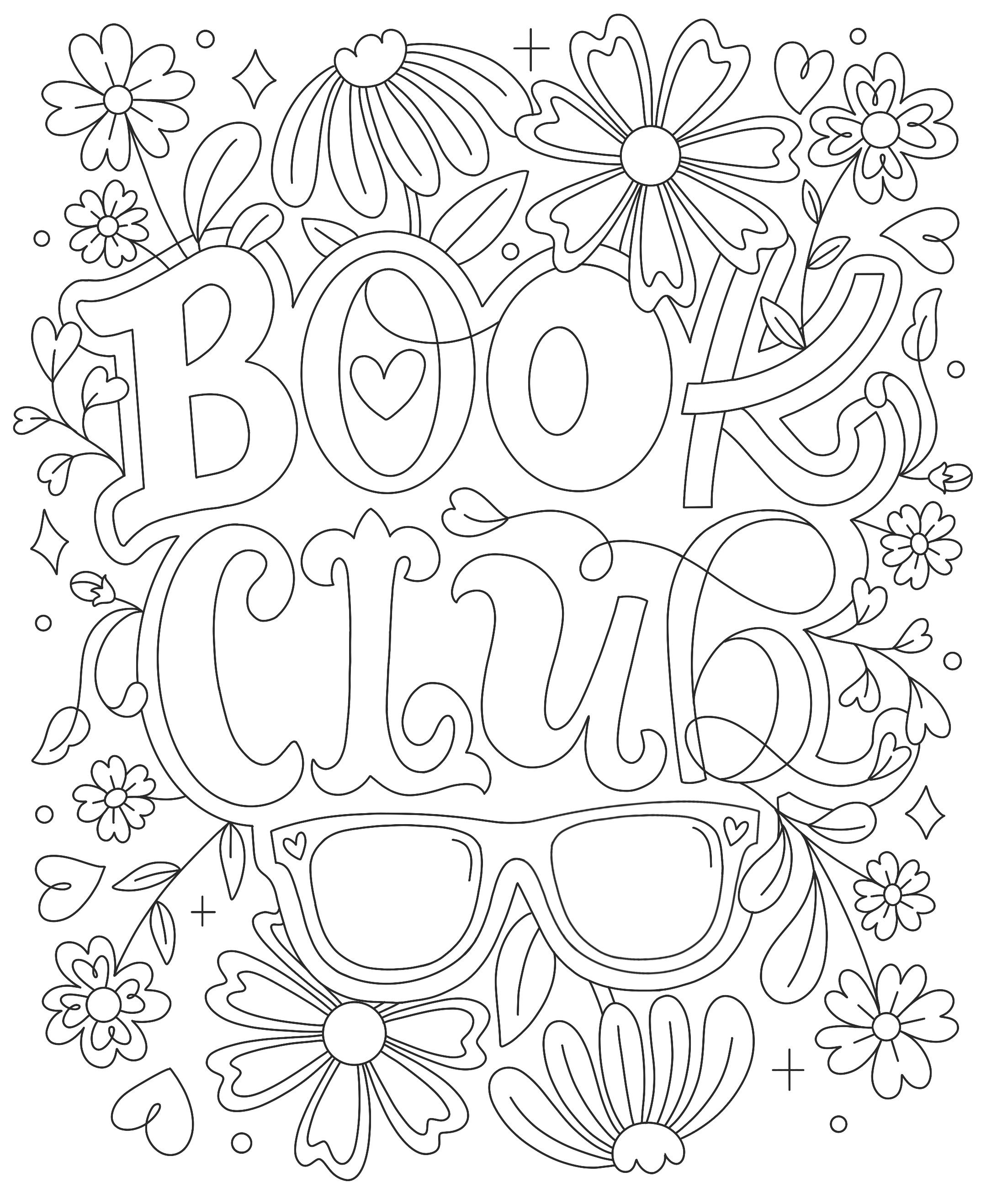
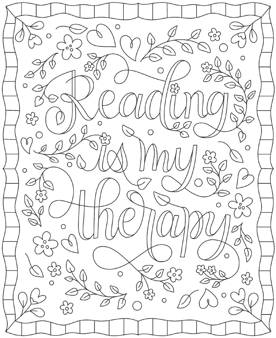
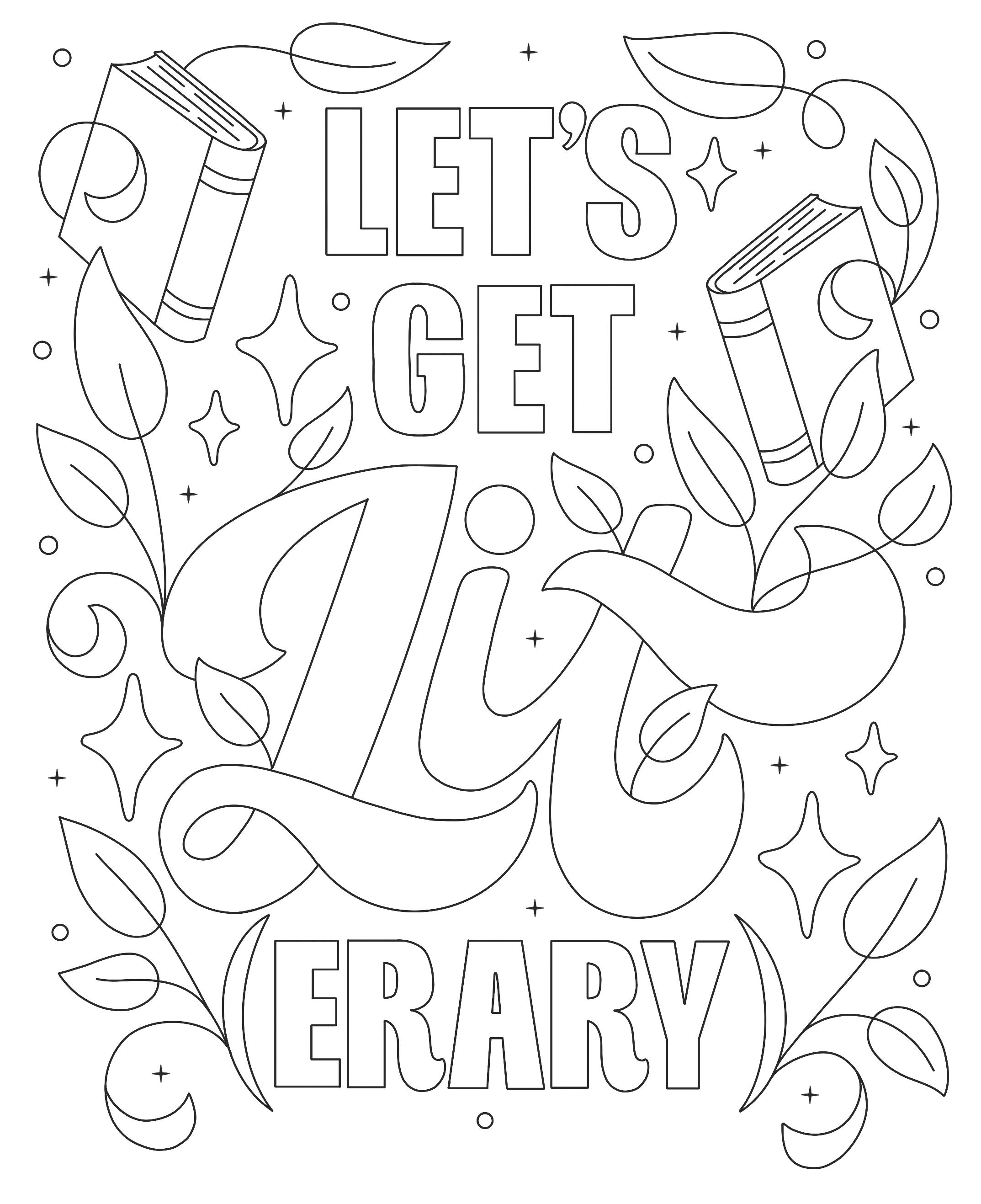
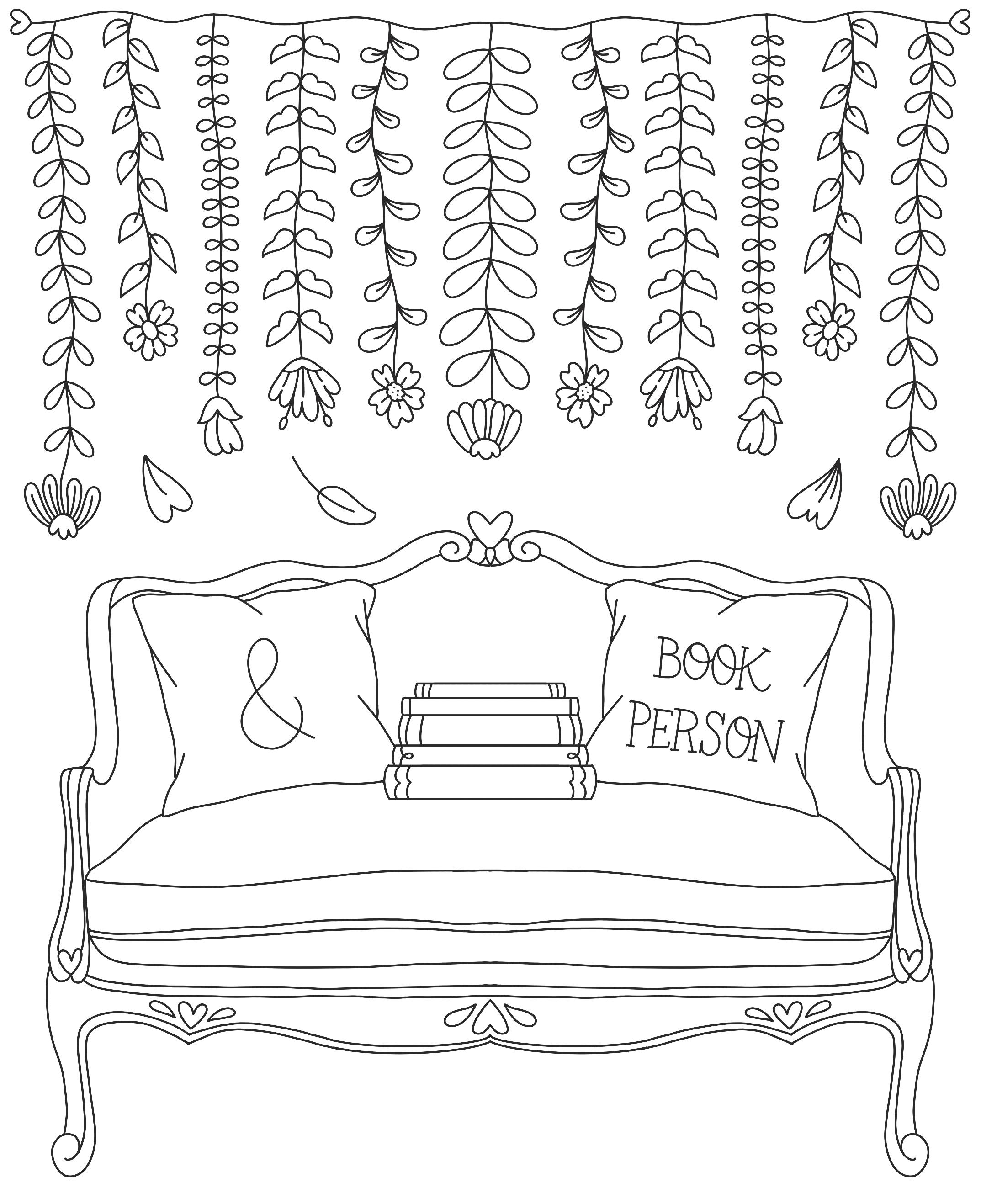
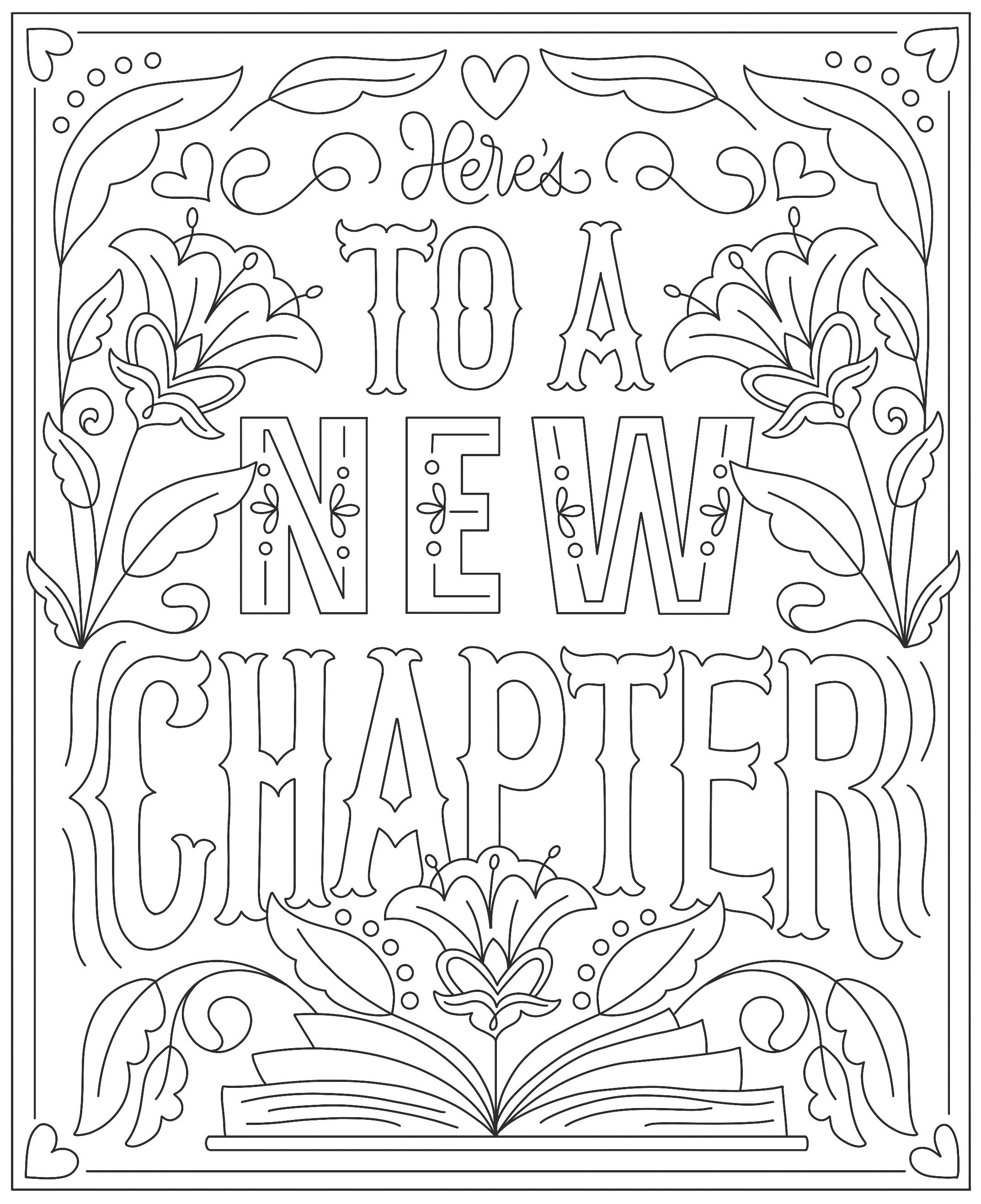
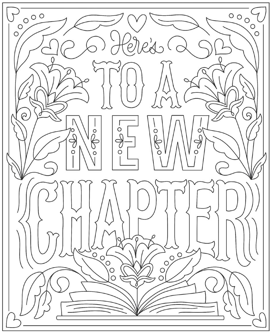
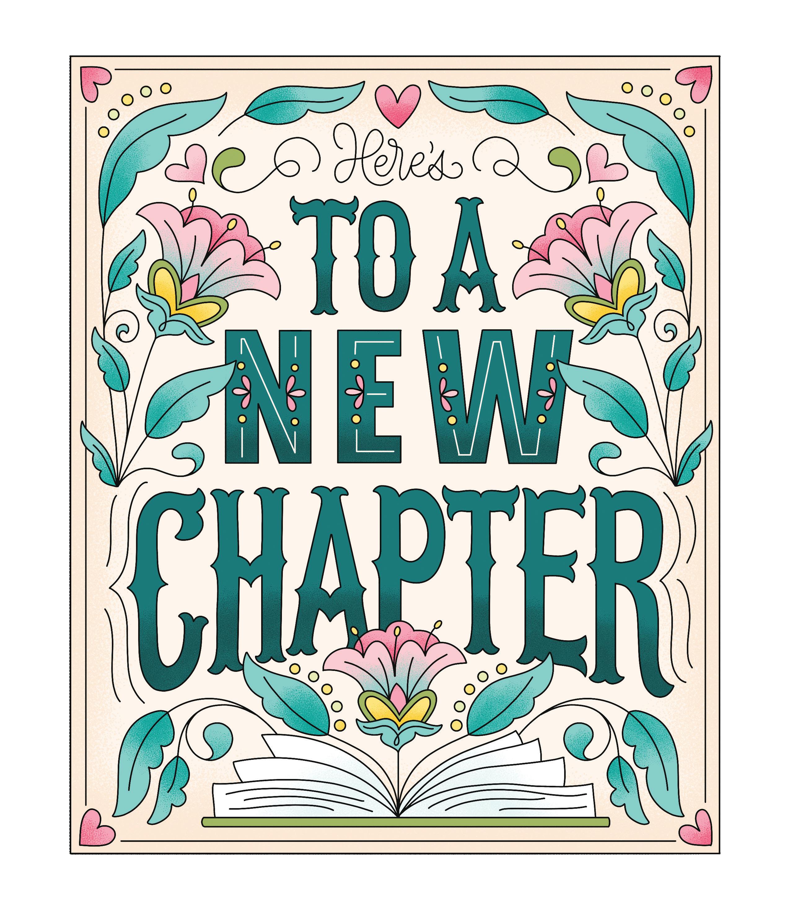
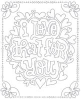
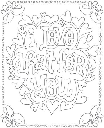
Part One features whimsical and bookish coloring pages. The back of each page includes a coloring worksheet where you can plan your color palette. Each page is perforated, so you can easily tear out your artwork to frame or gift.
Part Two includes bookish lettering styles that you can use to journal, address envelopes, handmake greeting cards, and create your own unique artwork. If you’re new to hand lettering, pick up a copy of my book, The Art of Playful Lettering, to learn the basics in more detail. It has ten more lettering styles, start-to-finish projects, and more!
Hosting a coloring and creativity night with your friends or family would also be a fun way to use this book. Ask everyone to bring a copy of the book, and set out an array of colored pencils, markers, and yummy snacks. Chat about your favorite books or what you’re currently reading as you color and letter.
Part Three contains extra goodies like a bibliophile bingo game and cut-out bookmarks. To make the bookmarks last a long time, I suggest cutting them out and using self-laminating sheets to protect them (you can pick up these sheets at your local craft store or on Amazon).
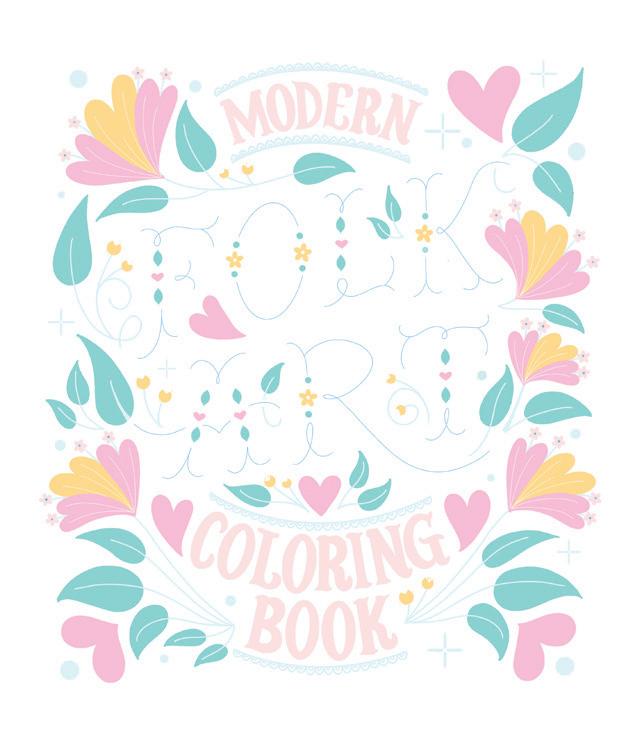
Planning to invite someone who’s not big on reading? They can use my Modern Folk Art Coloring Book instead!
However you choose to use this book, I hope it helps you relax and inspires you creatively!
Here, you’ll find a host of ideas for ways to make your coloring more interesting, more fun, more inspiring, and—dare I say it—better. Through these tips, I hope to inspire you to experiment with and think about more than just the colors you choose as you transform these coloring pages into art.
It’s easy to overlook the background, but it can be a great place to get creative. Try adding subtle color(s) to the background with a colored pencil and filling in white space with a few extra details. A black background can create a chalkboard-like look.
Light your favorite candle, slip on a pair of fuzzy socks, and pour your favorite beverage to enjoy as you color. Create a coloring playlist full of relaxing music you love. I like to listen to instrumental covers of pop hits as I color and draw.
Whether this means literally going outside to enjoy a day with lovely weather or just getting out of your house and coloring at a cute local café is up to you. Creating art out in the public tends to be a great
Deciding on a color palette can be hard. I’ve included ten in this book to get you started, but Pinterest is a great place to find color inspiration. Create a color palette board and fill it with pretty palettes!
Schedule a coloring date with a friend or family member you’ve been meaning to catch up with. Whether it’s your grandma, a niece or nephew, or someone in your household, it’s a great way to connect and create a memory.
Make your artwork look more realistic with shading and layering. Alcohol markers and colored pencils are great for this. Use scrap paper to test layering and pressure first to get a feel for how it will look on your coloring page.
Use various media to create a playful vibe. Mix it up with markers, colored pencils, and gel pens. White gel pens are fabulous for adding details on top of your coloring.
It’s all in the details.
Make these coloring pages your own by adding simple doodles and line work to make them more detailed. I like to add extra dots, hearts, sparkles, and flourishes.
Try picking just one color for a page. Make it monochromatic.
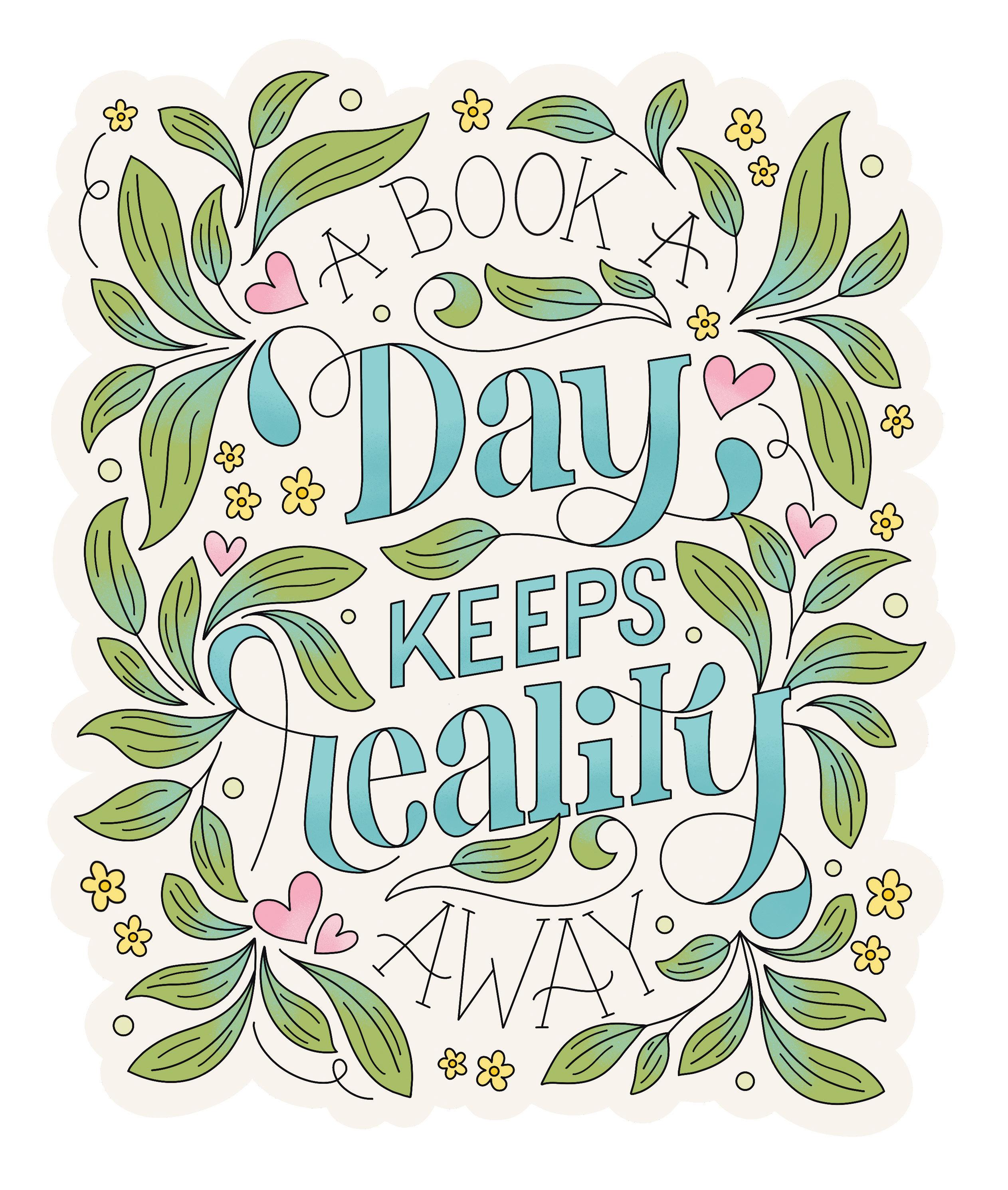
Everyone colors differently, but I find it helpful sometimes to color by color, focusing on placing my chosen palette colors one by one and building up a piece in layers. This can be helpful if you want to make sure you color similar leaves the same green, for example, or different flowers all in different colors—it’s just one way of visualizing your work as you go! Then, after the main colors are filled in, you can go back and add shading or further details. Here is an example coloring sequence to show you what I mean. I hope it inspires you!


Here are ten playful color palette ideas you can use in your coloring! Whatever physical media you are working with, simply do your best to match the colors shown, but don’t be frustrated if you have trouble replicating them exactly. Sometimes beautiful results come from so-called errors! You can also, of course, make conscious choices to swap out or simply remove a color from a palette to change the effect or adapt it to your needs.
1 Library Card
2 Archives
3 Dark Academia
4 First Edition
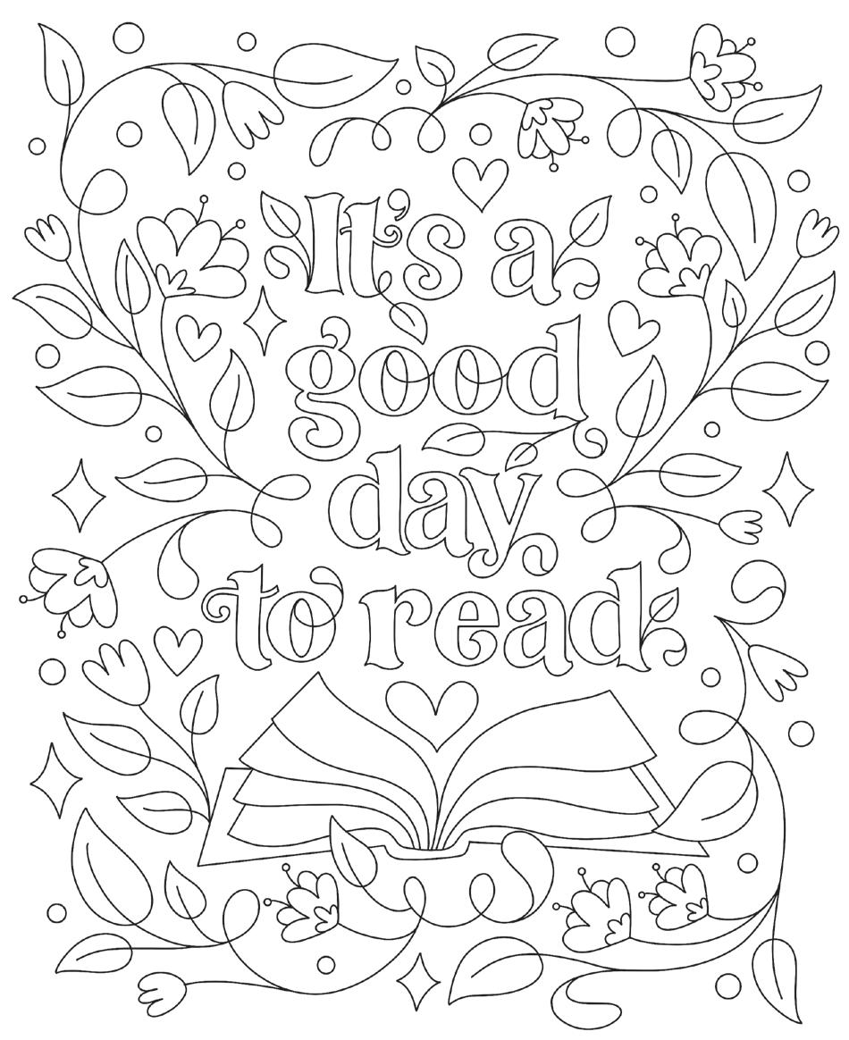
Colored by:
Coloring Materials:
Carve out some time to read today, even if it’s only ten minutes. Reflect on how that reading time impacted your day, and consider making it a daily habit!
The Bibliophile’s Coloring & Lettering Book © Dawn Nicole Warnaar

Colored by:
Coloring Materials:
Everyone has different reading habits. Do you like bringing a book with you to read in public or do you only read at home?
The Bibliophile’s Coloring & Lettering Book © Dawn Nicole Warnaar
Colored by:
Coloring Materials:
Think of that one book that completely sweeps your mind away from reality. What about it gets you so invested in the story?
The Bibliophile’s Coloring & Lettering Book © Dawn
Colored by:
Coloring Materials:
Do you like to buy books, borrow them from the library, or a combination of both? What do you like (or dislike) about each approach?
The Bibliophile’s Coloring & Lettering Book © Dawn Nicole Warnaar
Colored by:
Coloring Materials:
What is your favorite book genre? Why do books of this genre grab your attention or speak to you?
The Bibliophile’s Coloring & Lettering Book © Dawn Nicole Warnaar
Colored by:
Coloring Materials:
If you aren’t already a member of your local library, consider becoming one. You could save tons of money on books and discover all kinds of new ones!
The Bibliophile’s Coloring & Lettering Book © Dawn
Colored by:
Coloring Materials:
Make a stack of books to display somewhere in your home. Choose them on the basis of a specific color scheme, genre, size, or something else.
The Bibliophile’s Coloring & Lettering Book © Dawn
Colored by:
Coloring Materials:
What’s that one book you keep meaning to make some progress in? Pick it up and read through a chapter today.
The Bibliophile’s Coloring & Lettering Book © Dawn Nicole Warnaar
Colored by:
Coloring Materials:
Do you prefer hardback or paperback books? What is it that you like (or dislike) about each type?
The Bibliophile’s Coloring & Lettering Book © Dawn Nicole Warnaar
Colored by:
Coloring Materials:
Have you ever canceled or would you ever cancel plans just so you could read?
The Bibliophile’s Coloring & Lettering Book © Dawn Nicole Warnaar
Colored by:
Coloring Materials:
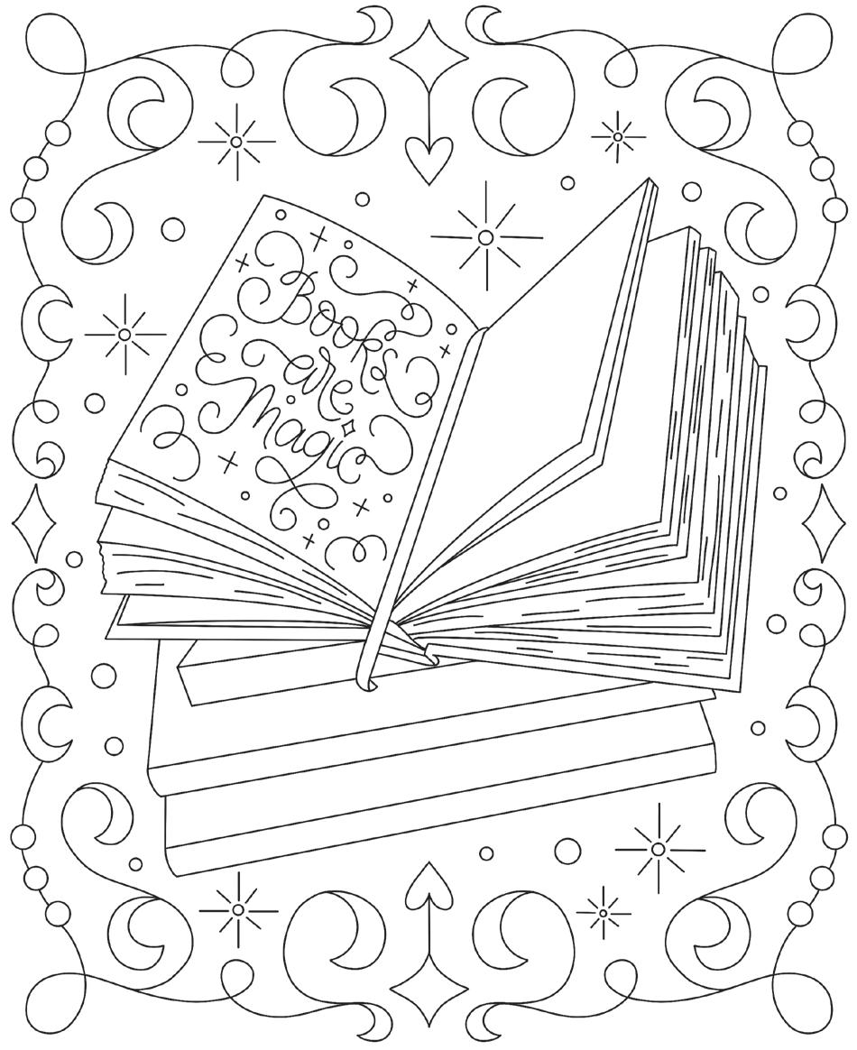
Are there any books that are magical to you?
If so, what makes them magical—the genre, the storytelling, the appearance, or something else?
The Bibliophile’s Coloring & Lettering Book © Dawn Nicole Warnaar
Colored by:
Coloring Materials:
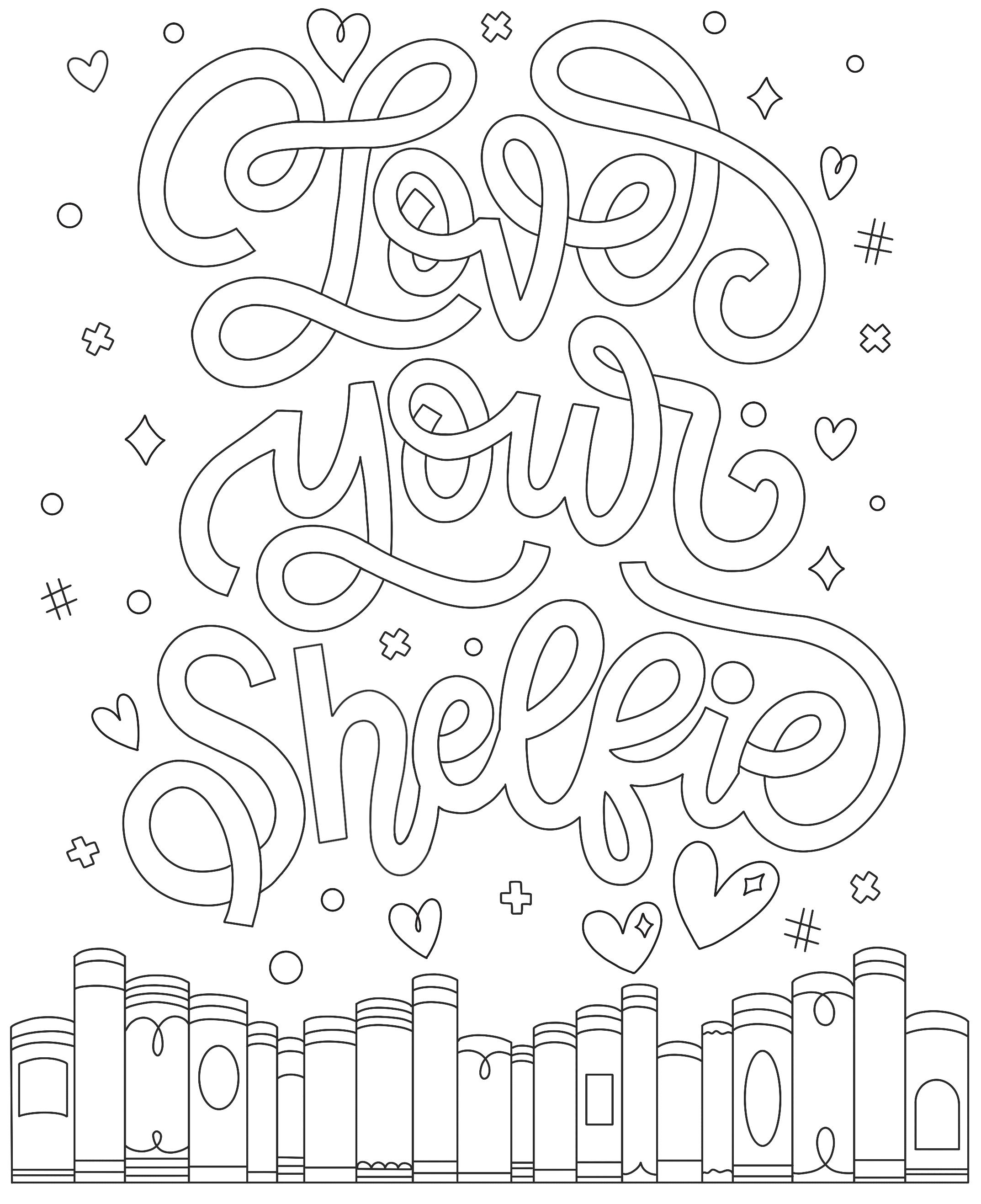
Have you given your bookshelf any love lately? Take some time to reorganize it, dust the shelves, or add some cute knickknacks to it!
The Bibliophile’s Coloring & Lettering Book © Dawn

Colored by:
Coloring Materials:
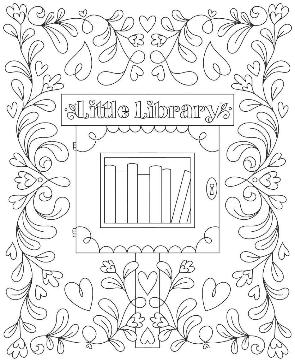
Keep your eyes peeled for mini libraries and think about contributing to or borrowing from one. Are there any books you don’t want anymore or have more than one copy of?
The Bibliophile’s Coloring & Lettering Book © Dawn

Colored by:
Coloring Materials:
Daydream about your ideal reading nook. What kinds of things would you put in it besides books—plants, mementos, a cozy chair?
The Bibliophile’s Coloring & Lettering Book © Dawn Nicole Warnaar
Colored by:
Coloring Materials:
Consider trying a new type of book or genre that you haven’t read before (or have read infrequently)—perhaps poetry, screenplays, or creative nonfiction. Search for a recommendation that piques your interest in this genre.
The Bibliophile’s Coloring & Lettering Book © Dawn Nicole Warnaar
Colored by:
Coloring Materials:
Take some time this weekend to reread one of your favorite books. Light a candle that suits its mood and get yourself a cozy beverage to enjoy while you read.
The Bibliophile’s Coloring & Lettering Book © Dawn Nicole Warnaar
Colored by:
Coloring Materials:
What’s the last book that kept you up late reading? Did you regret the lost sleep the next day, or was it totally worth it?
The Bibliophile’s Coloring & Lettering Book © Dawn
Colored by:
Coloring Materials:
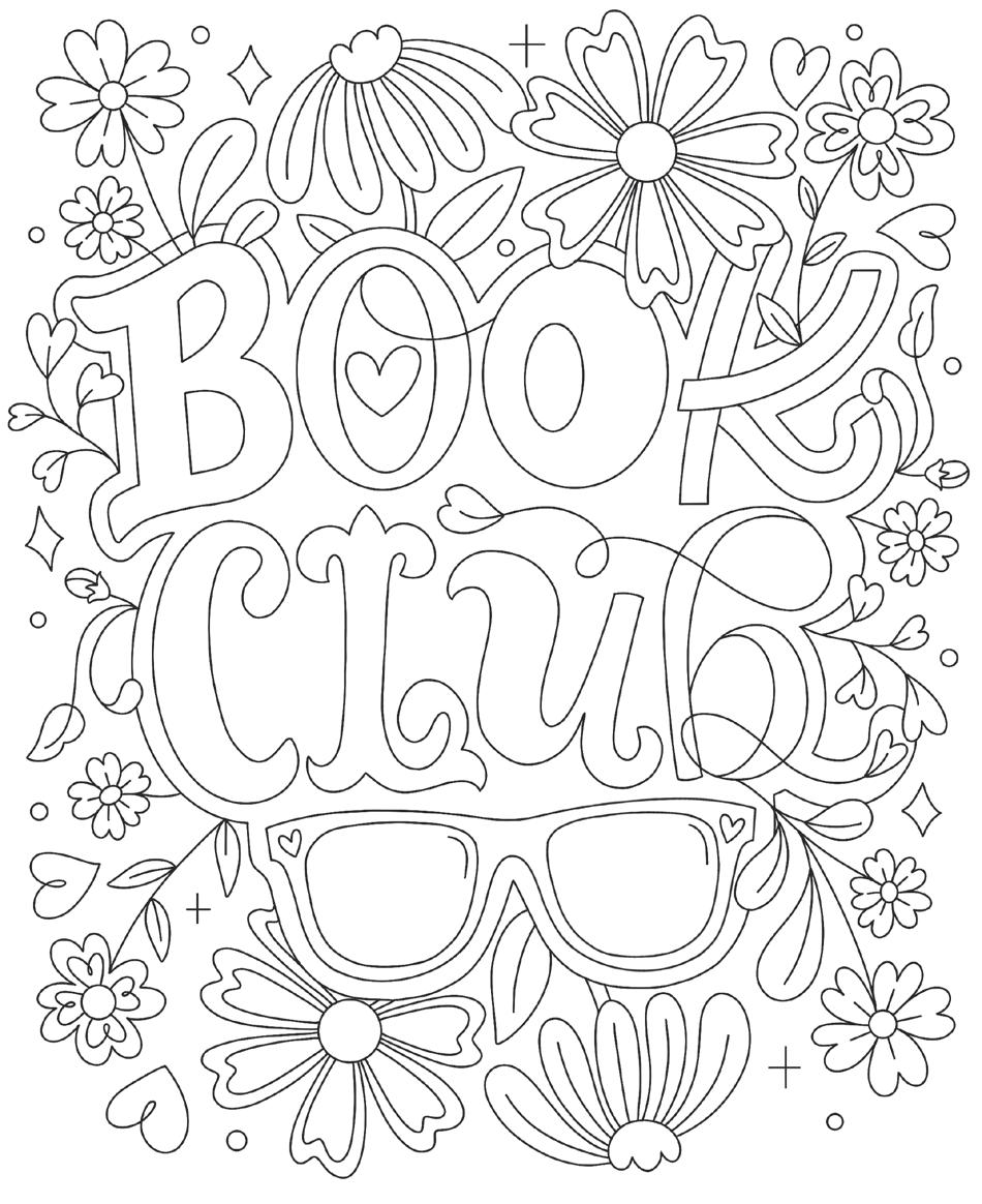
If you’ve never been part of a book club, consider checking one out or forming your own! It’s a great way to socialize and keep you on top of your reading goals.
The Bibliophile’s Coloring & Lettering Book © Dawn Nicole Warnaar
Colored by:
Coloring Materials:
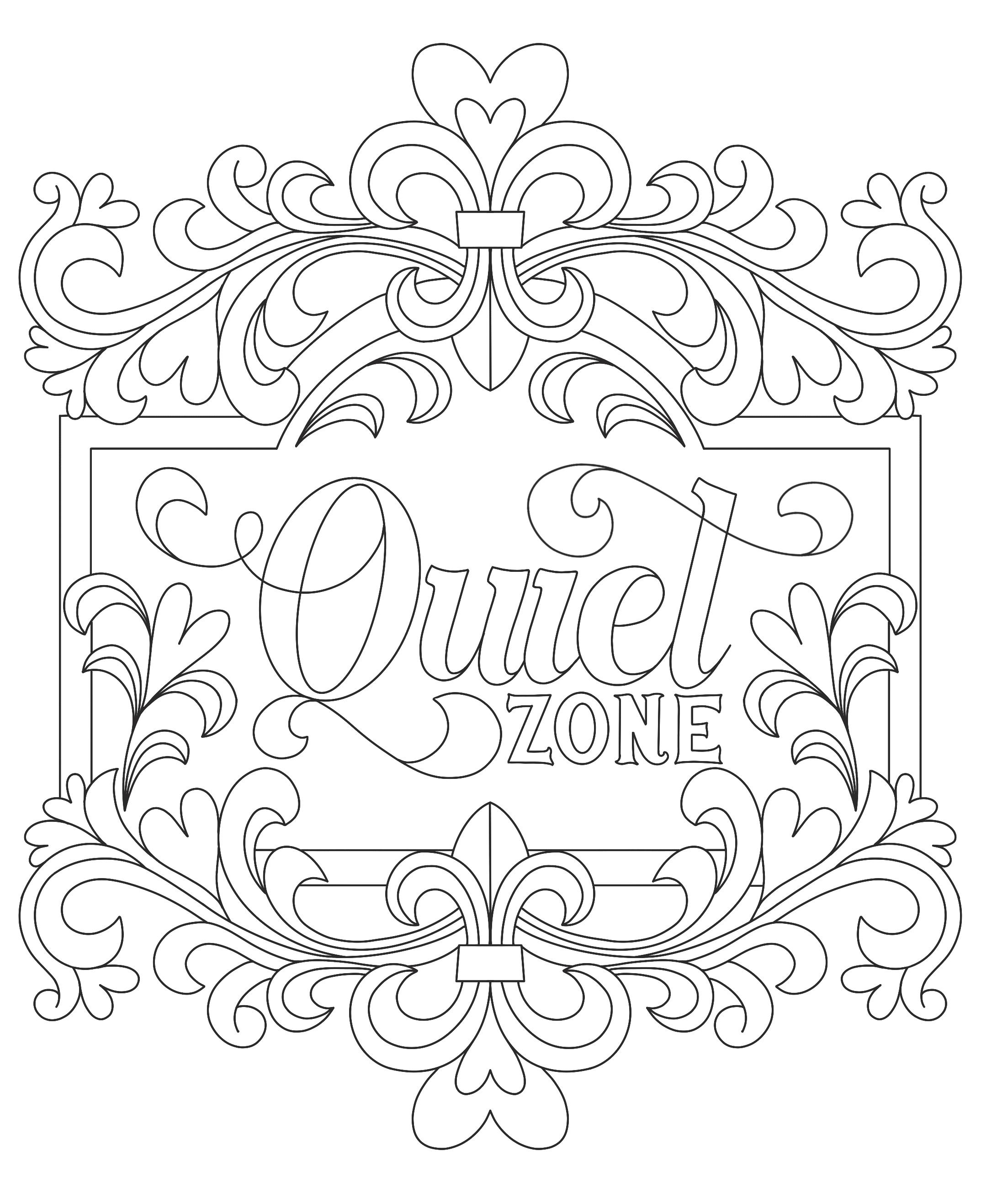
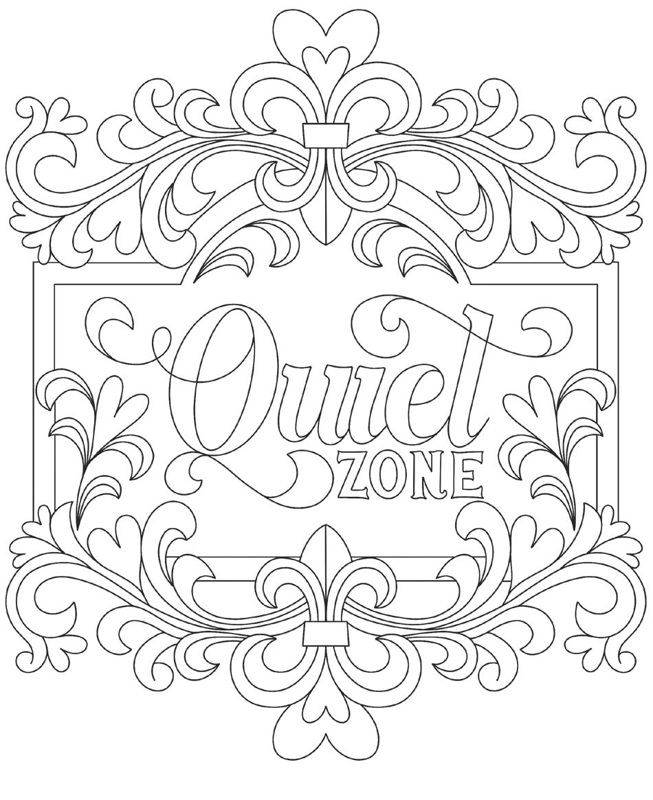
Are you someone who needs silence to read, or do you enjoy background noise like music, television, or simply the hustle and bustle of daily life?
The Bibliophile’s Coloring & Lettering Book © Dawn Nicole Warnaar
Colored by:
Coloring Materials:
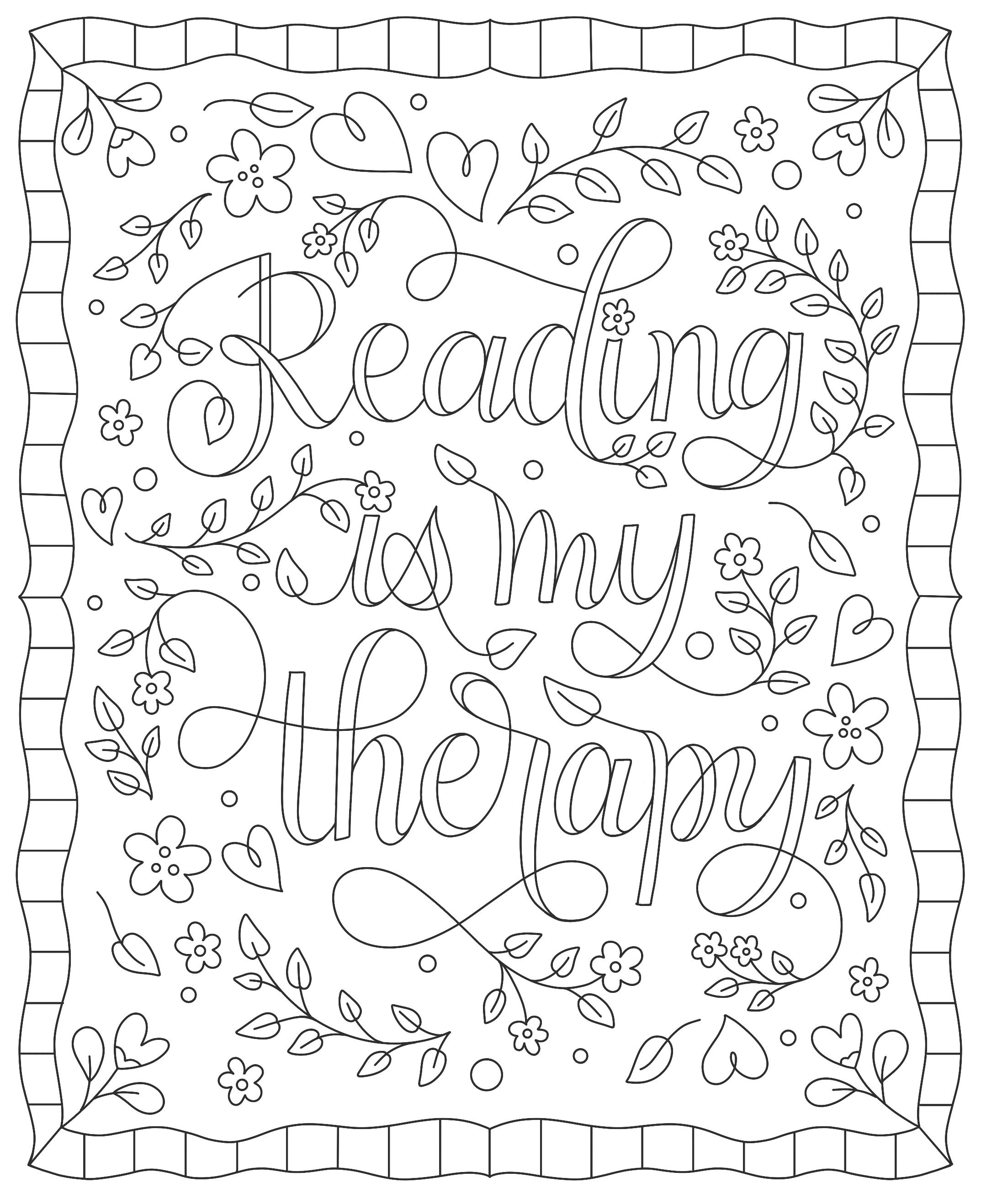
How does reading positively impact your life? Does it put into words feelings that you can’t find your own words for, help you relax and escape, or something else?
The Bibliophile’s Coloring & Lettering Book © Dawn Nicole Warnaar
Colored by:
Coloring Materials:
Think of a few books that get you excited or energize you. What about them makes you feel this way?
The Bibliophile’s Coloring & Lettering Book © Dawn Nicole Warnaar
Colored by:
Coloring Materials:
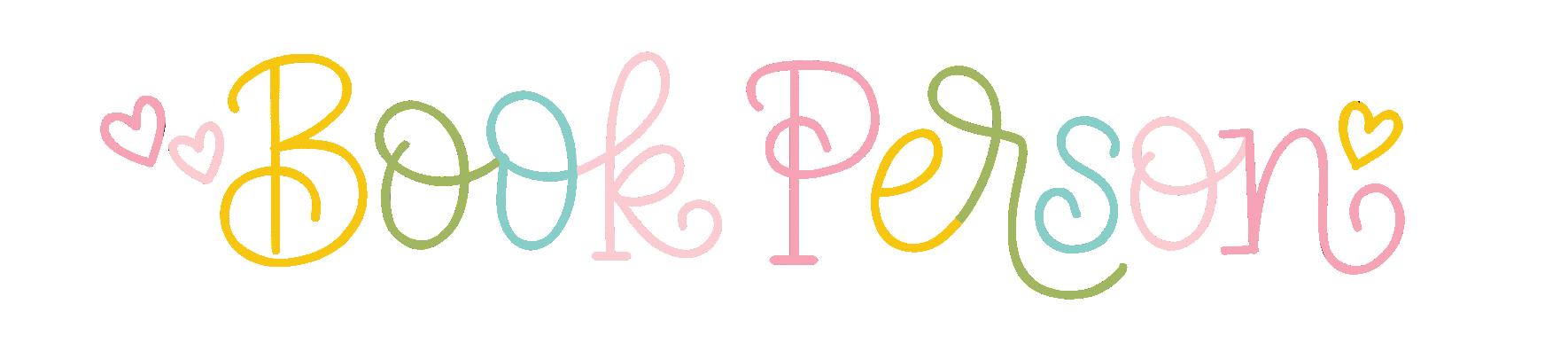
You probably wouldn’t have picked up this book if you didn’t consider yourself a book person. Do you have another book person in your life that you talk about books with?
The Bibliophile’s Coloring & Lettering Book © Dawn Nicole Warnaar
Colored by:
Coloring Materials: Have you ever set a reading goal for the year?
Give it a shot! How many books do you think you could read in one year? Can you think of other goals for your year of reading?
The Bibliophile’s Coloring & Lettering Book © Dawn
Colored by:
Coloring Materials:
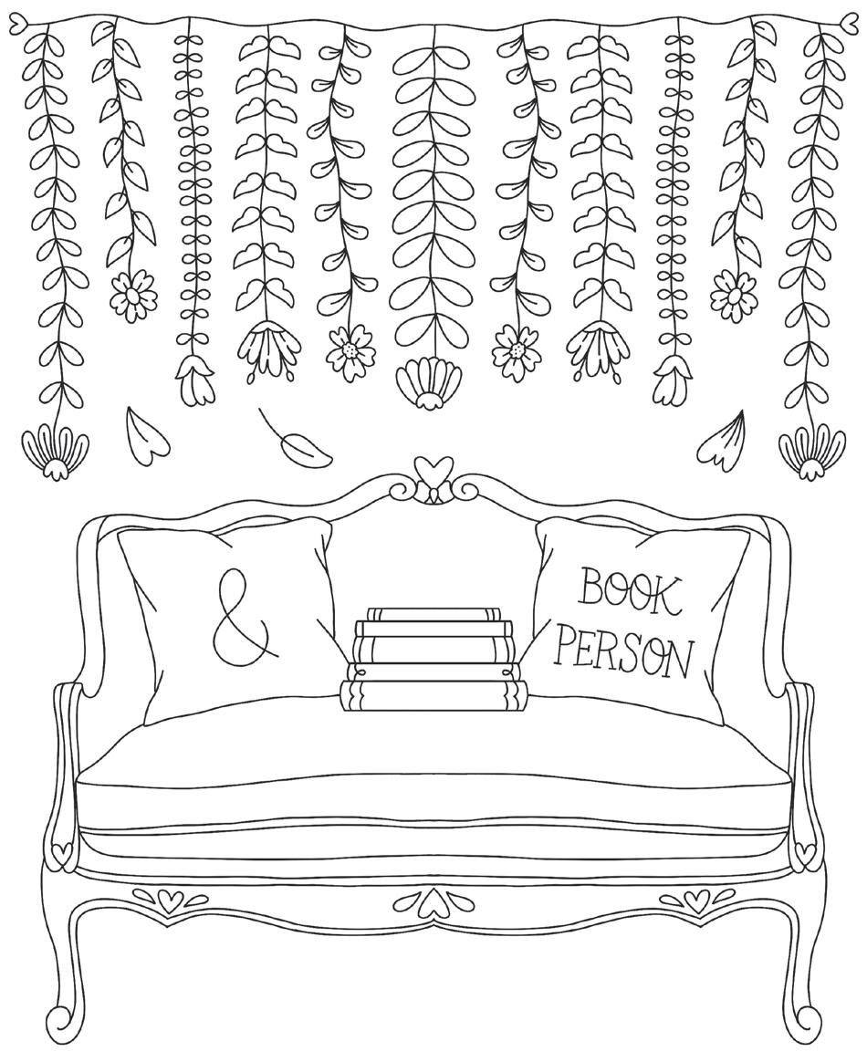
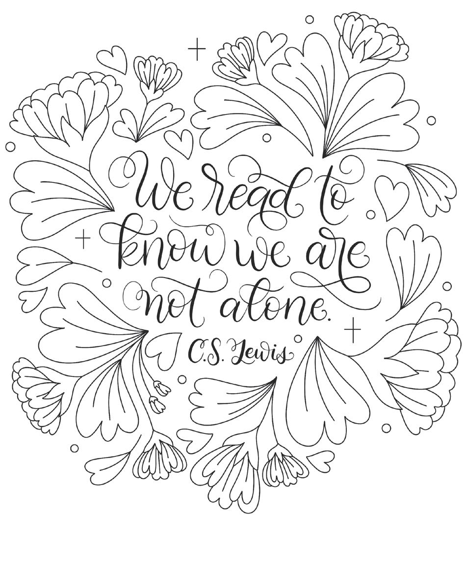
Does reading make you feel less alone? What are some other core reasons you read?
The Bibliophile’s Coloring & Lettering Book © Dawn Nicole Warnaar
Colored by:
Coloring Materials:
What is something you’re looking forward to in the near future? Meditate on it while you color this design.
The Bibliophile’s Coloring & Lettering Book © Dawn Nicole Warnaar
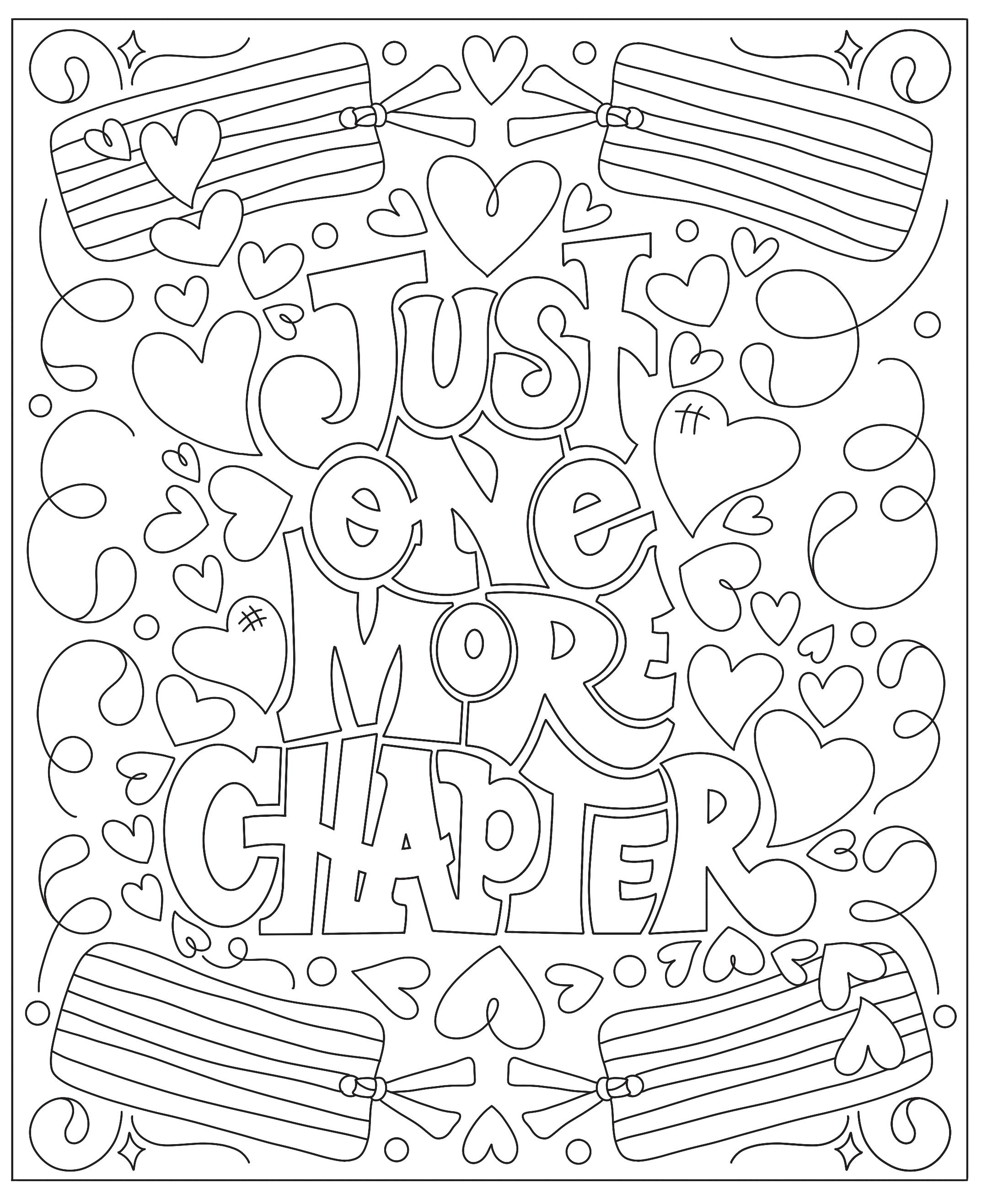
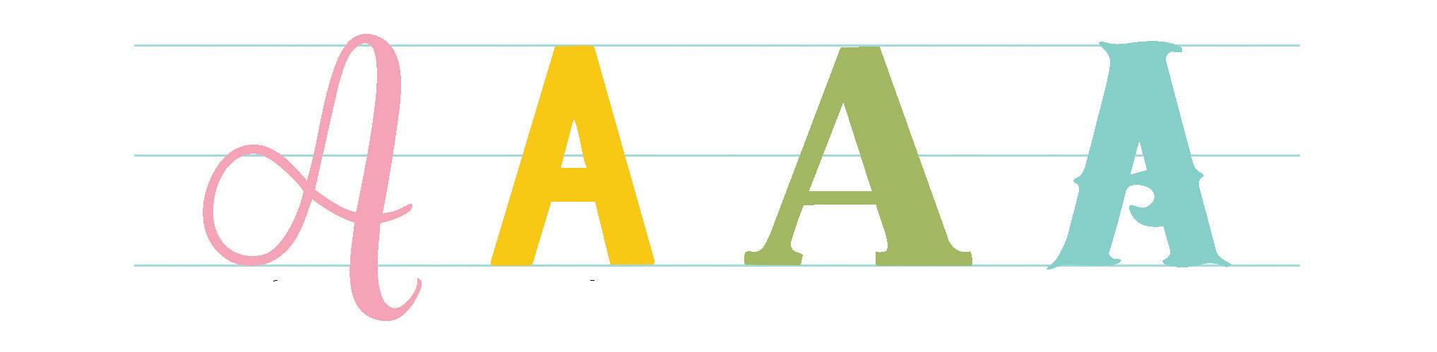
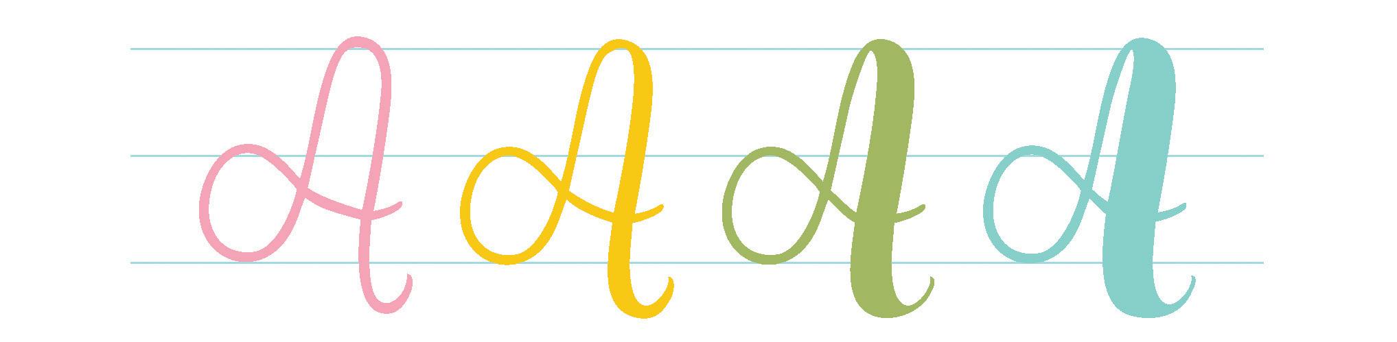
Here’s a look at the 10 lettering styles you’ll learn to draw! At the end of the chapter, I’ll share tips for making these styles your own! The lettering styles in this section were easier for me to dream up and draw than usual because I’m so inspired by my love of books.
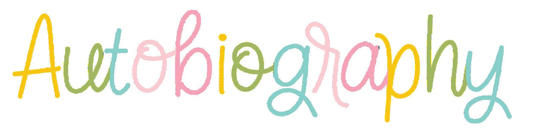
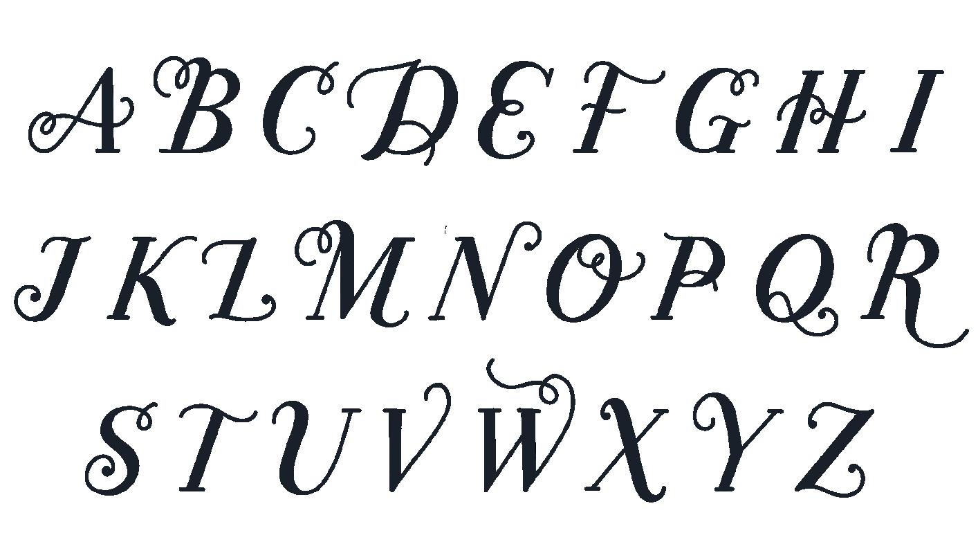
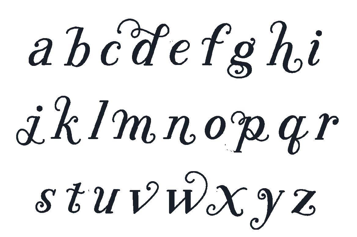
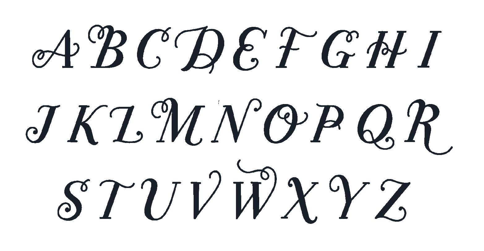
STYLE 1: A monoline style that combines traditional print and script handwriting.
STYLE 2: A dimensional block-lettering style that’s anything but boring.
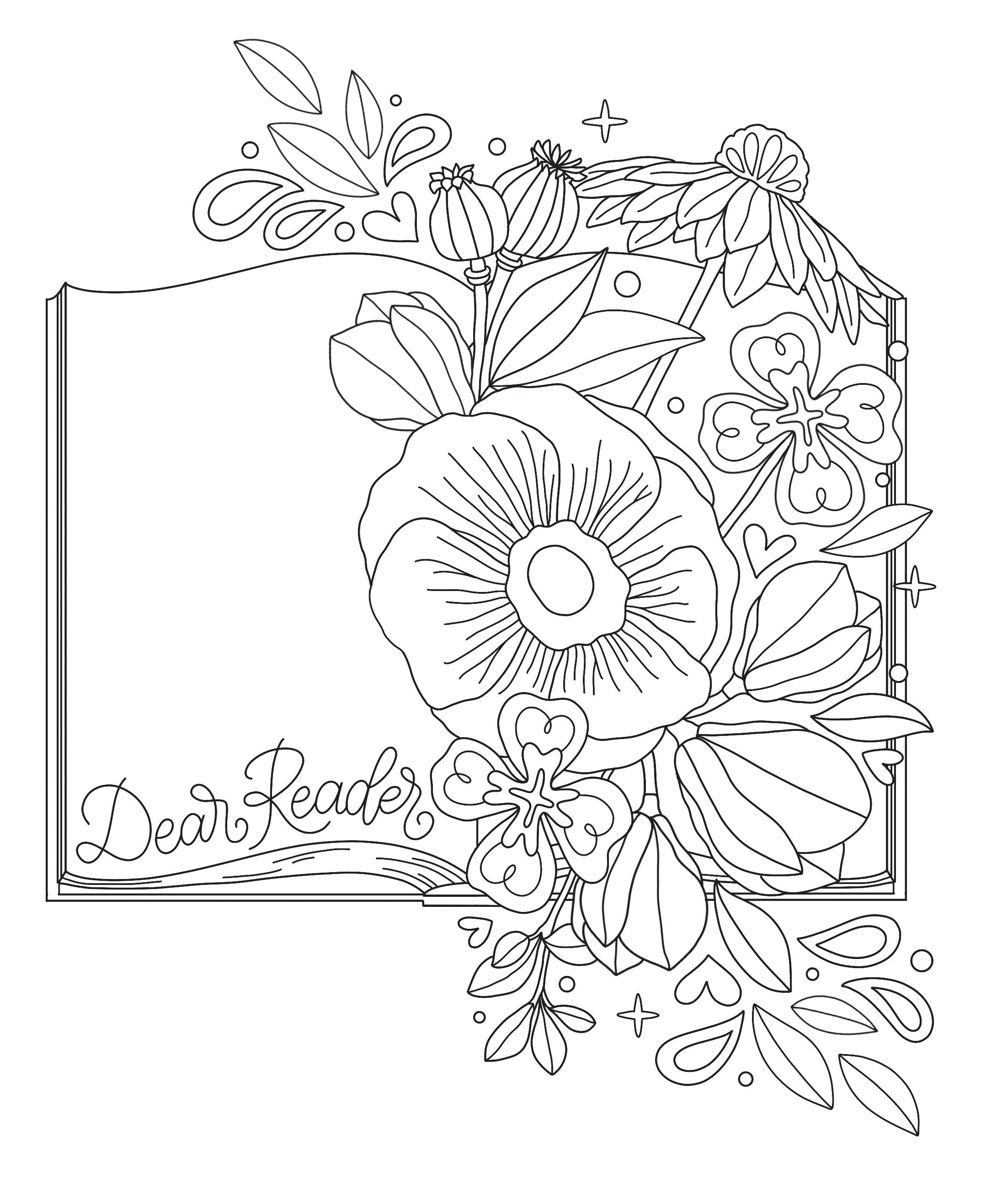
STYLE 3: A calligraphic style with a traditional yet modern vibe.
STYLE 4: A serif monoline style featuring playful lettering arrangements.
STYLE 5: A botanical serif style with fantastical flourishes.
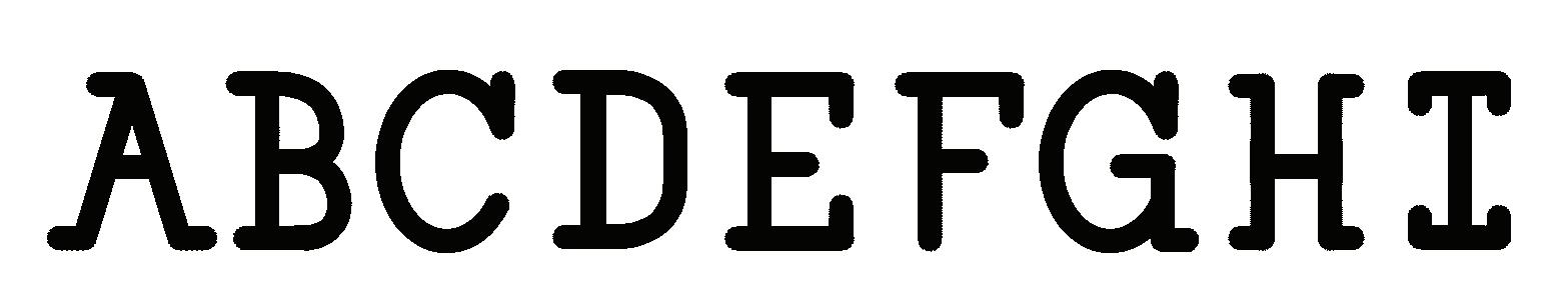
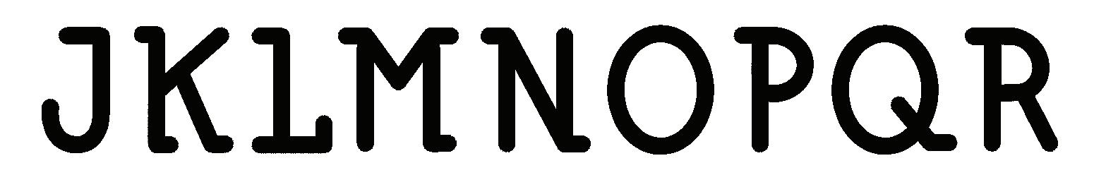
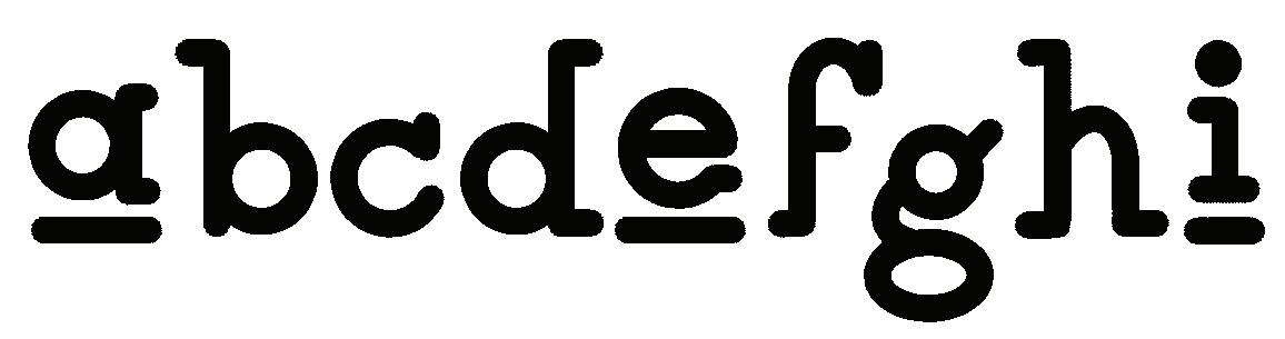
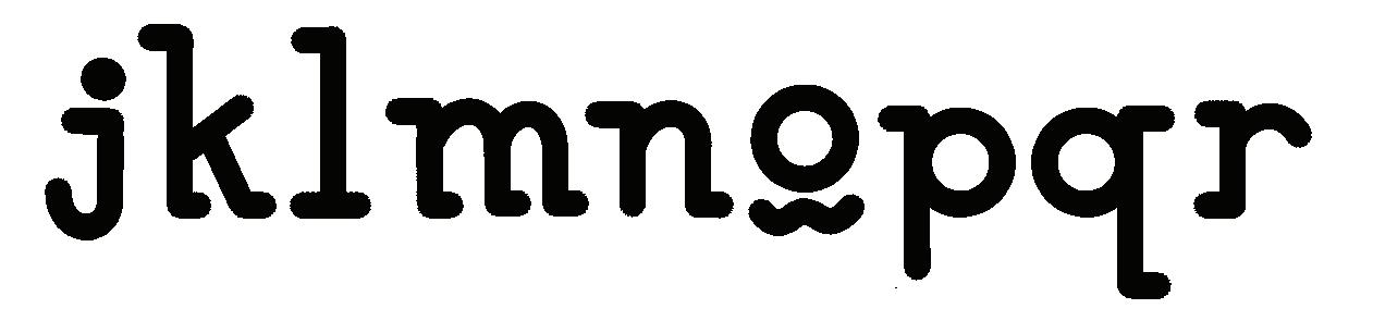
STYLE 6: A bookshelfinspired high-contrast sans-serif style.
STYLE 7: A decorative lettering style with a touch of glam.
STYLE 8: A bubbly, dimensional style with a lot of heart.
STYLE 9: An ultraromantic script monoline with simple florals.

STYLE 10: A decorative lettering style that’s subtly spooky.
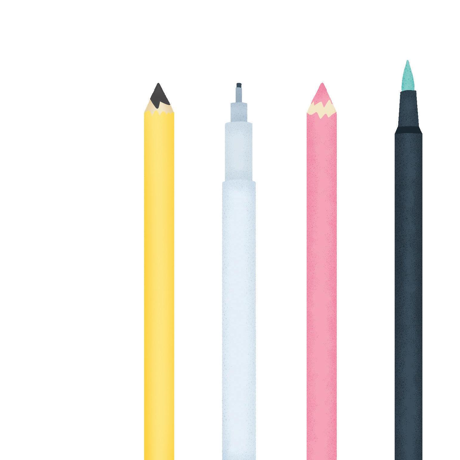
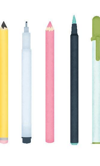
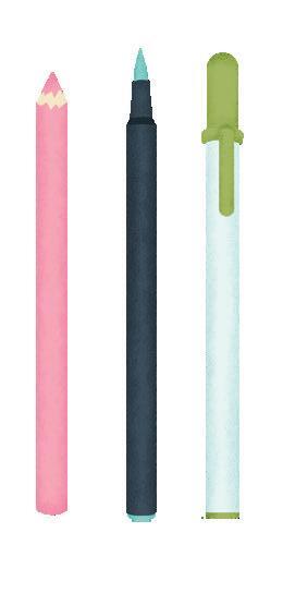
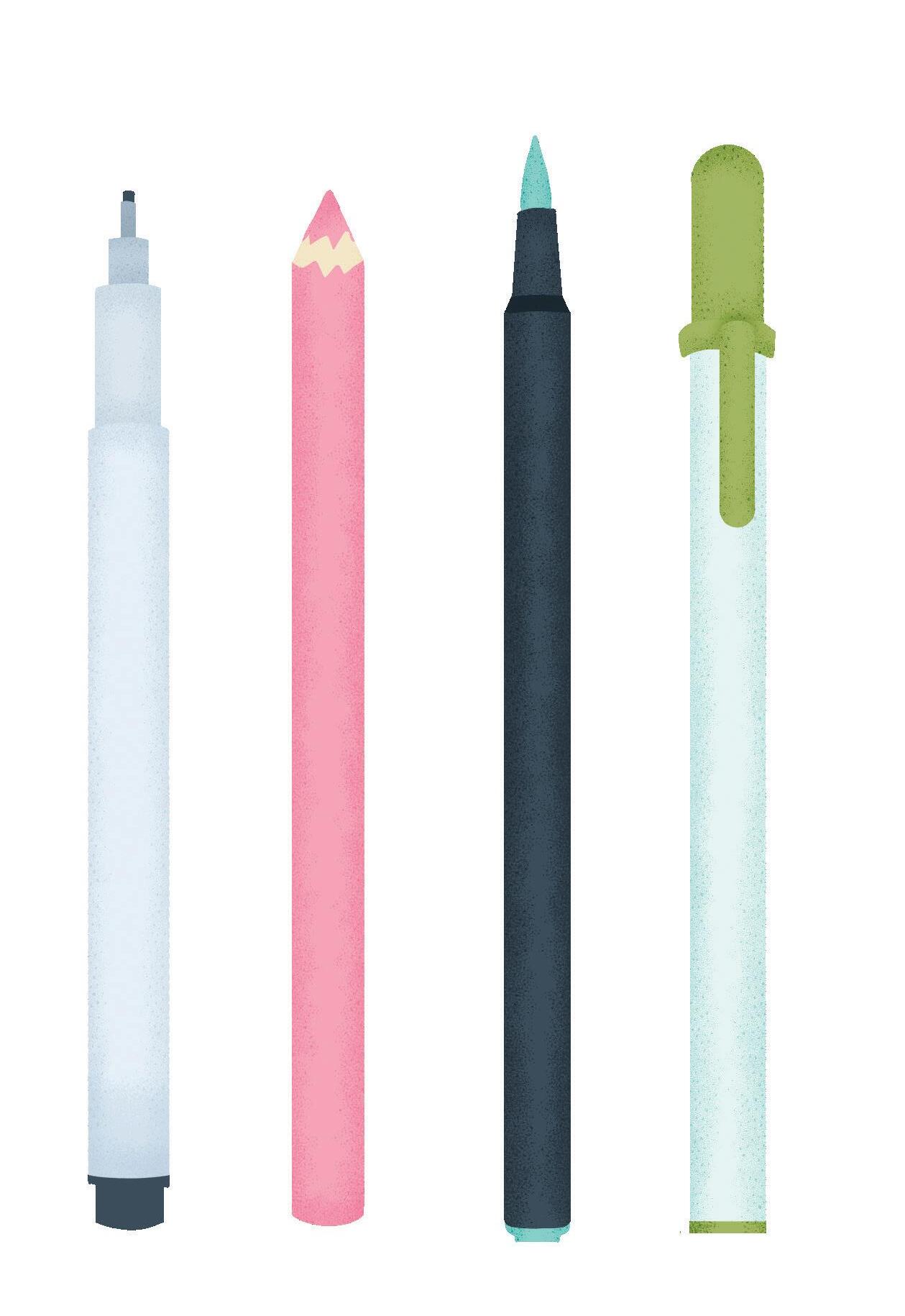
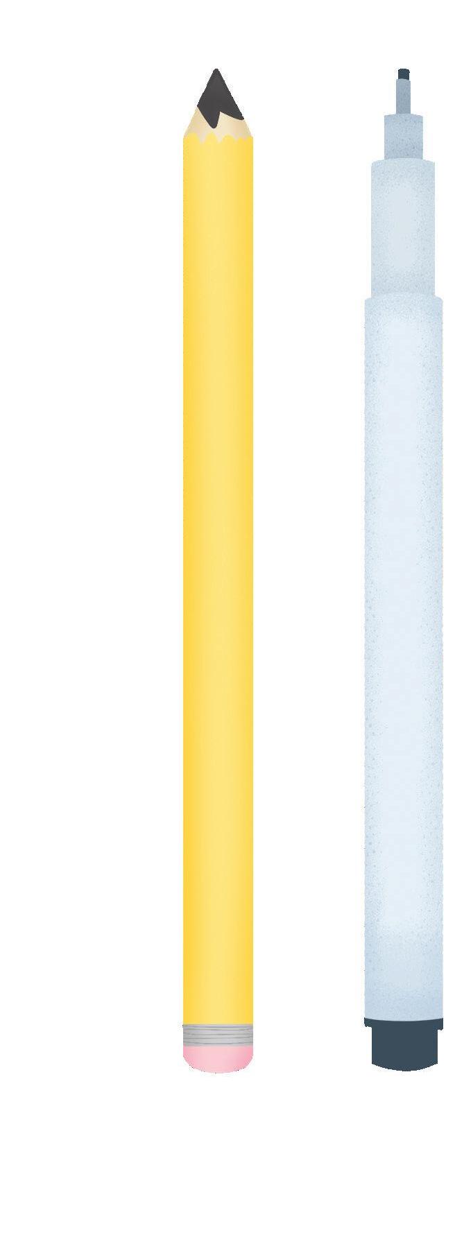
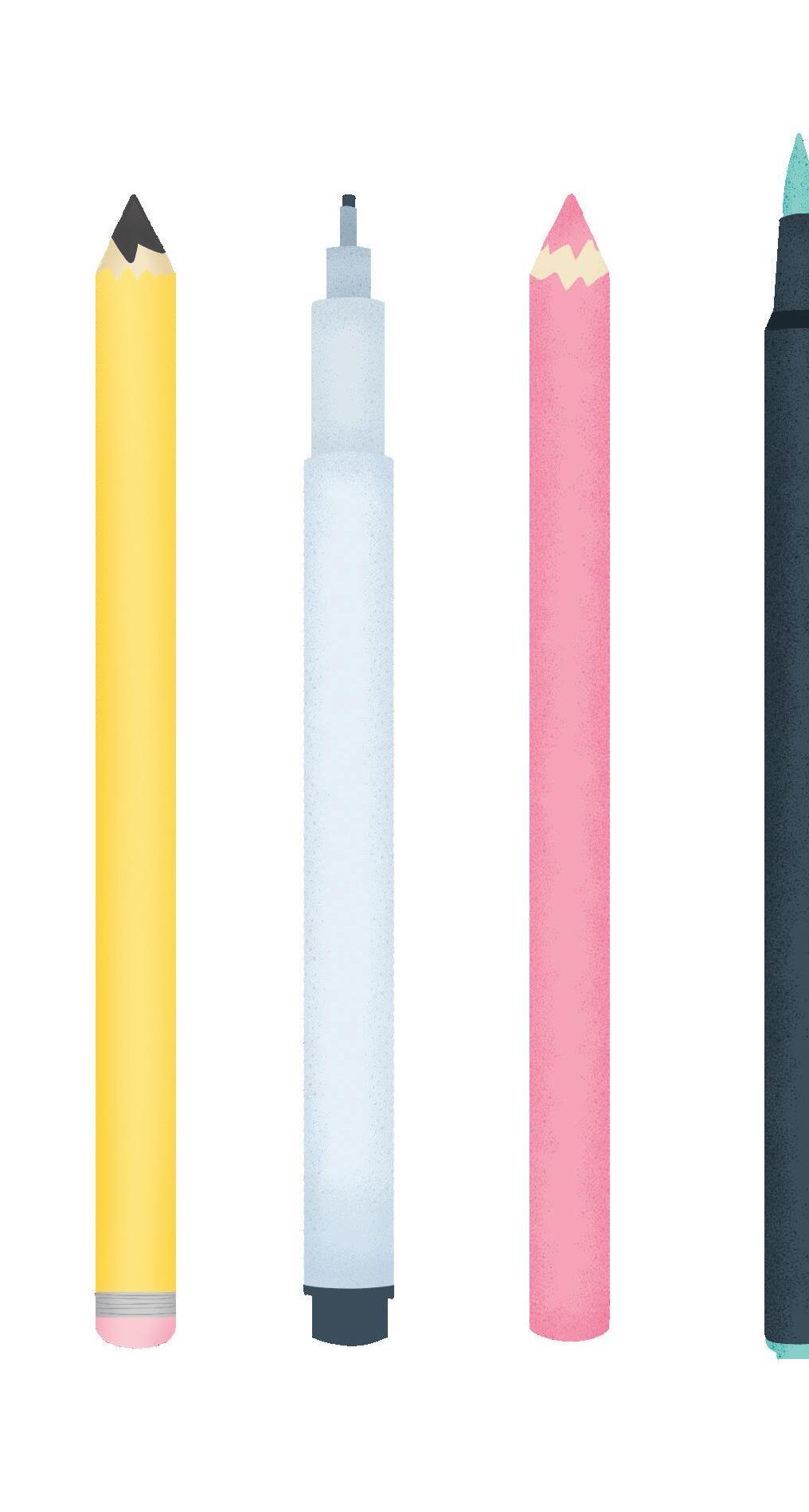
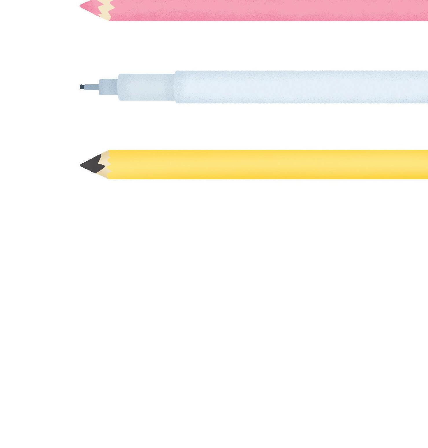
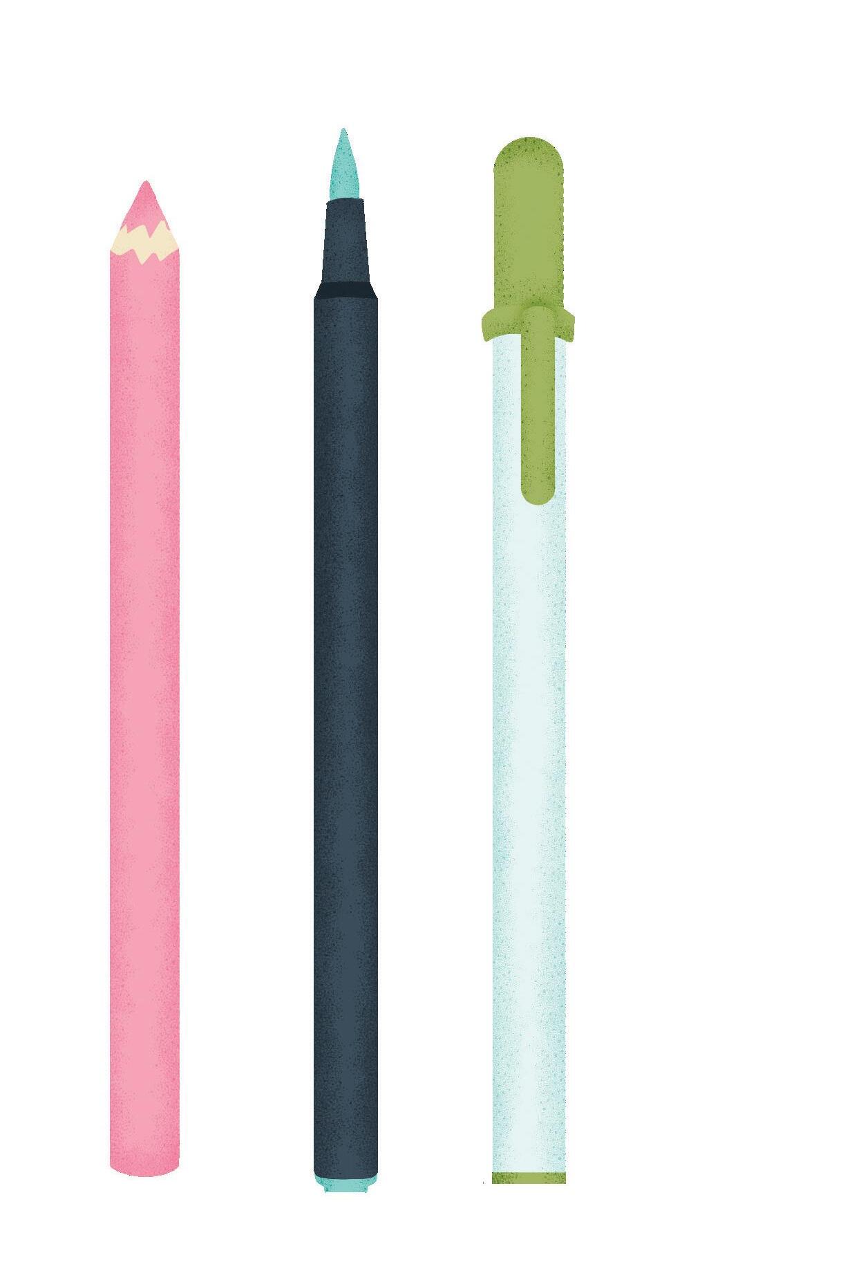
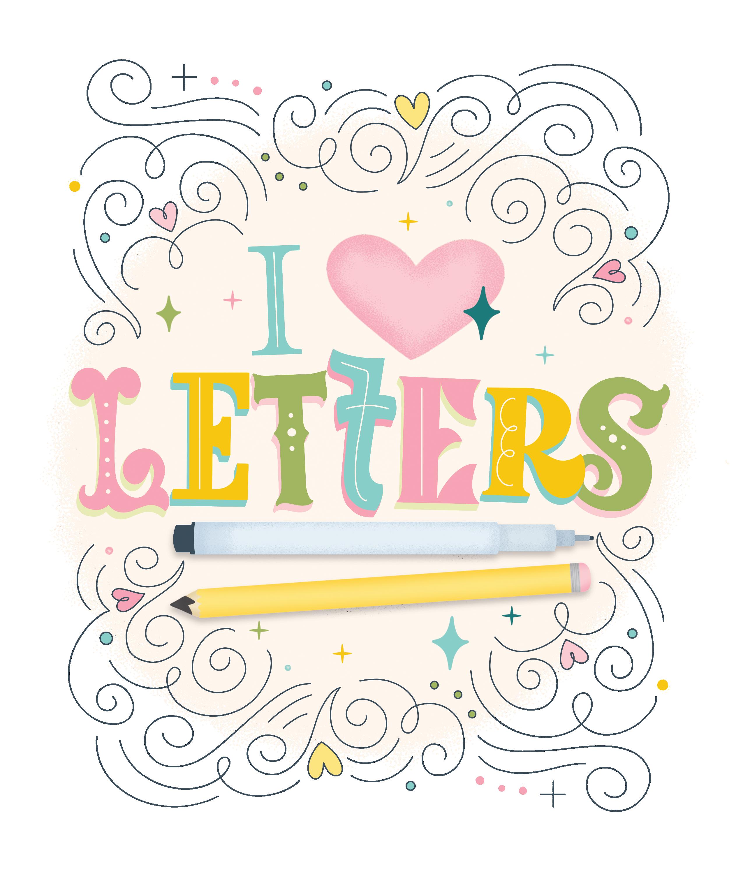
Lettering is simply the art of drawing letterforms by hand. If you’ve wandered the aisles of any craft store, you know there are endless options for paper, pencils, markers, and paints. While all of these can be used to create gorgeous lettering, all you truly need is paper and a pencil.
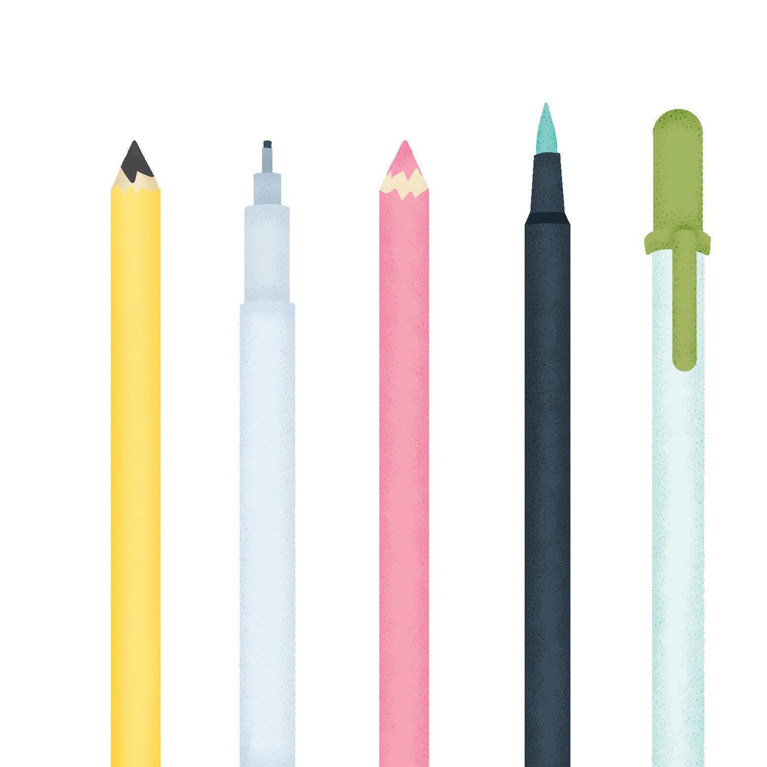
For these 10 bookish lettering styles, we’ll keep it simple. I’ll list the recommended supplies for each lettering phase below: sketching, inking, coloring, and detail work. You’ll learn more about these phases below.
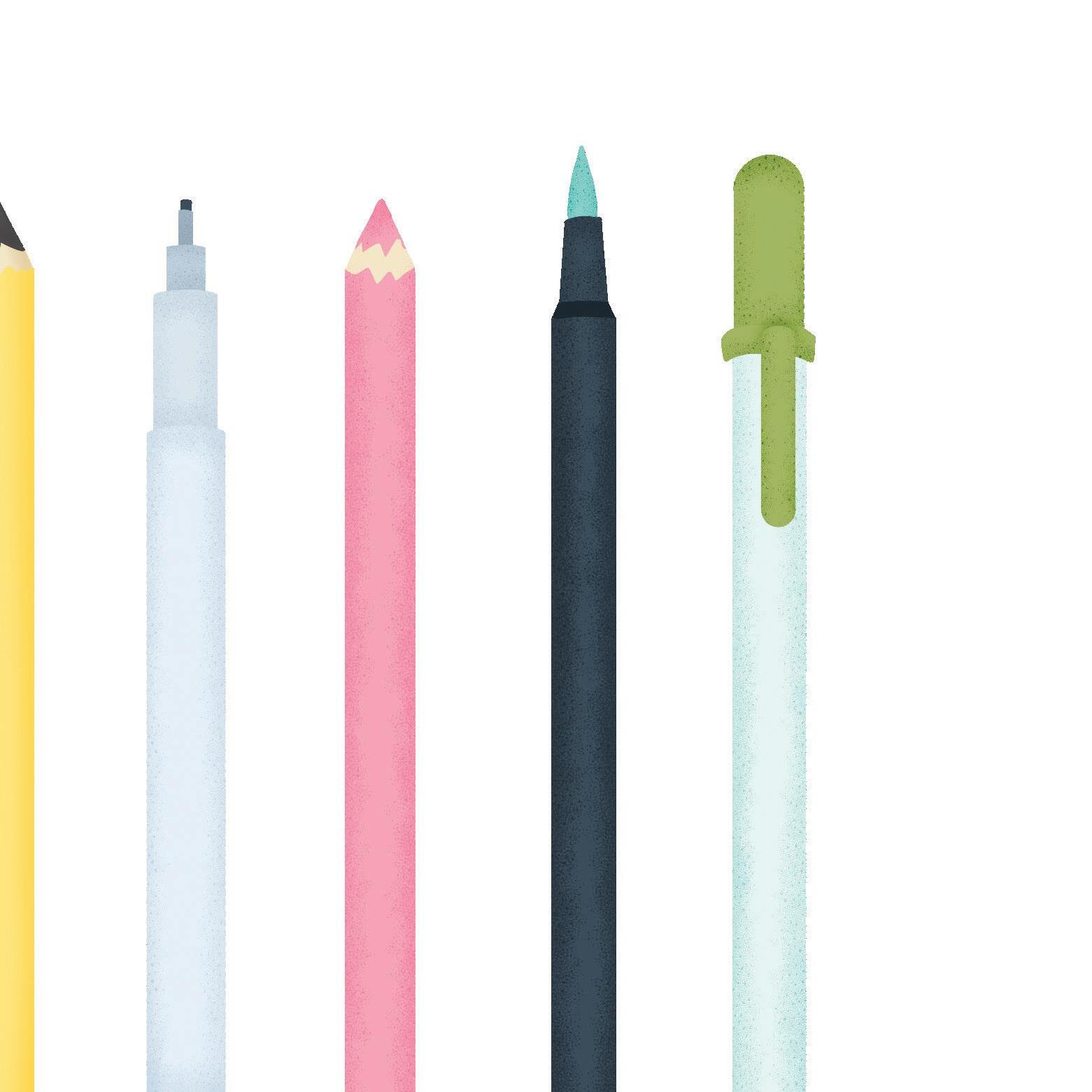
Use a pencil for your initial sketch. Lately, I have been sketching with a basic BIC mechanical pencil that has a built-in eraser.
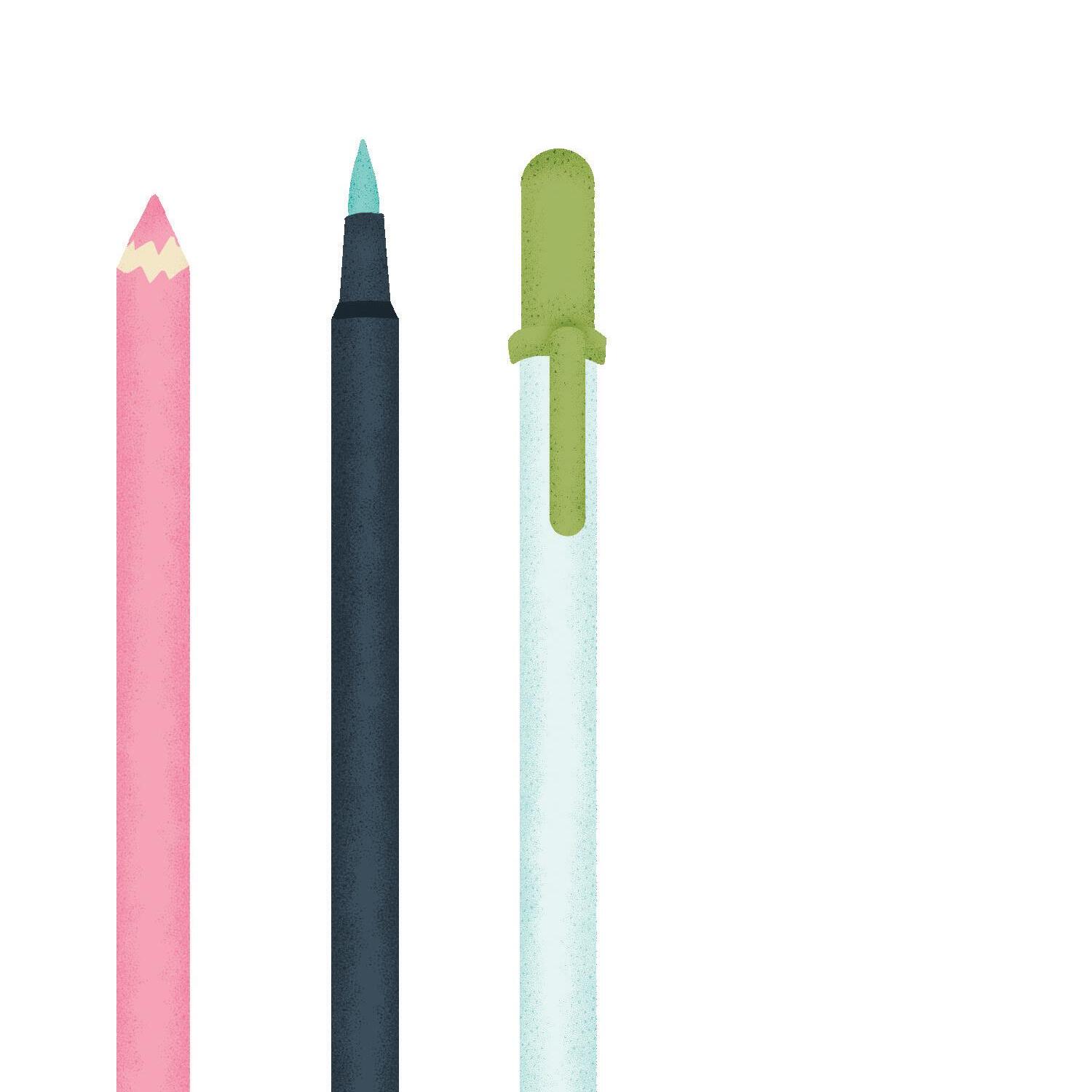
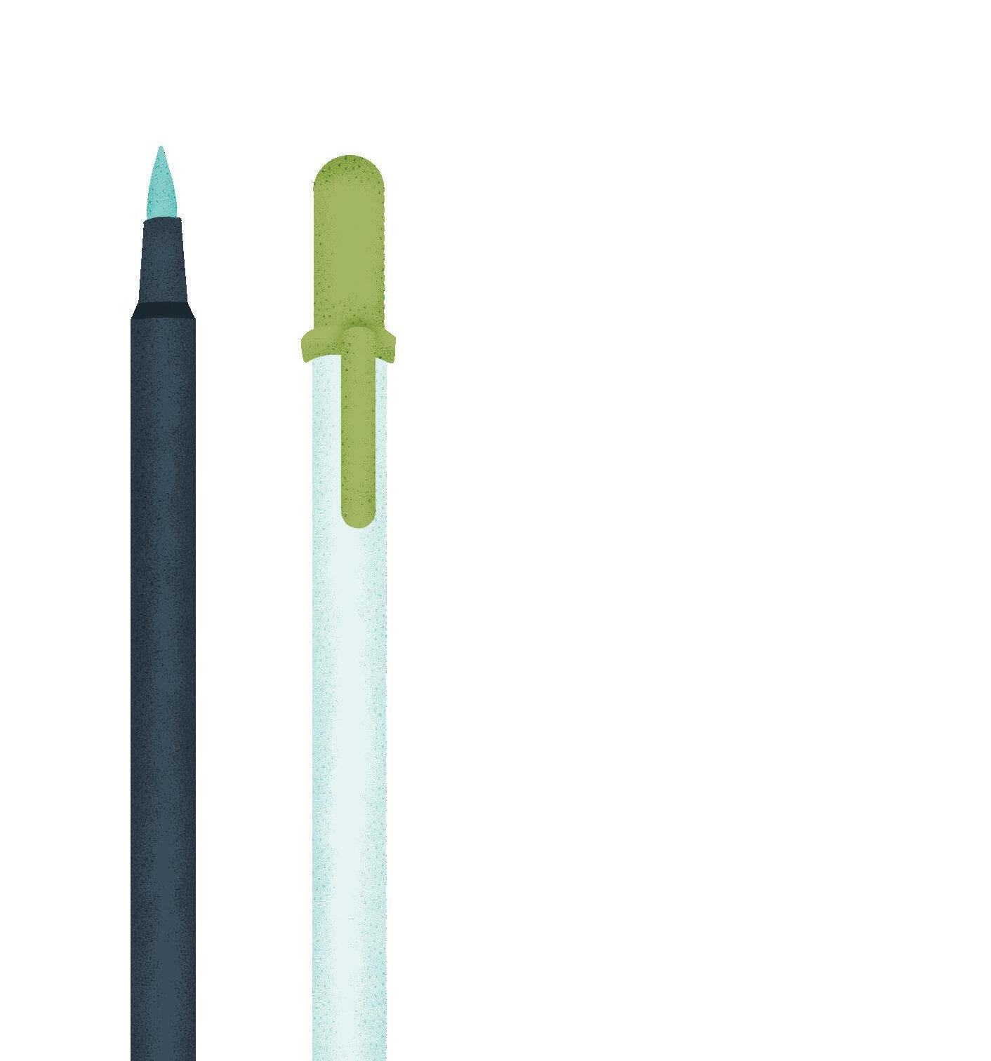
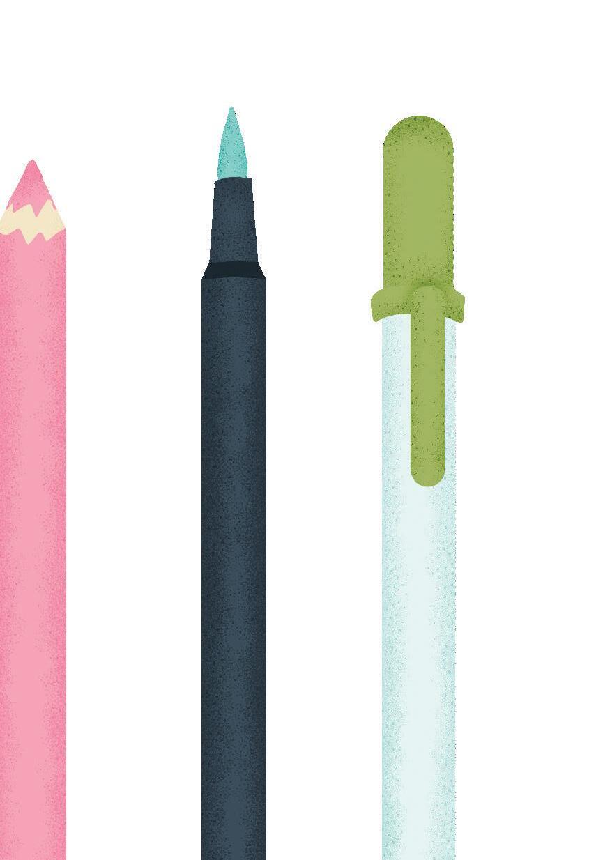
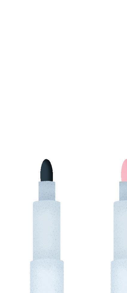
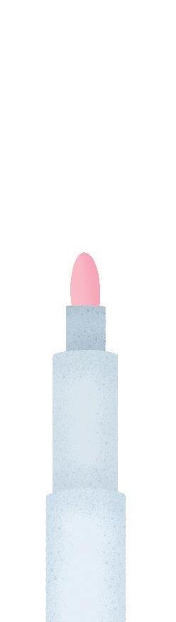
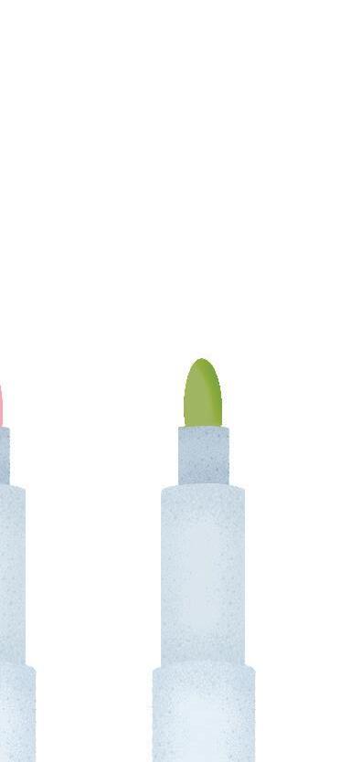
Fineline markers are ideal for inking the outlines. Waterproof markers, such as Sakura Pigma Microns, are ideal, as they won’t smear when you add color. If you’re not creating an outlined lettering style, you can go straight to coloring in your sketch.
If you’re working directly on the pages of this book, I’d recommend using regular colored pencils or water-based markers. You can also use alcohol-based markers, but just be aware that they may bleed through the paper more than water-based markers do. (Tombow makes fabulous brush markers in both water-based and alcohol-based options.) If you’re using your own paper or surface, anything goes!
Gel pens are great for adding details to your letters. White and metallic Gelly Roll pens are my go-to for in-line letter details.
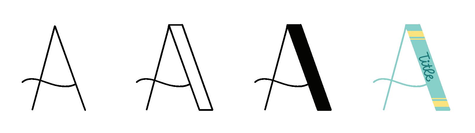
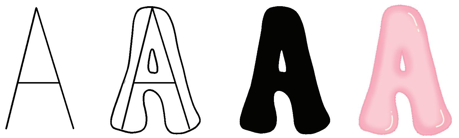
The Basic Steps
You’ll follow the same basic steps every time you draw a letter.
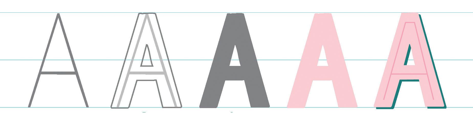
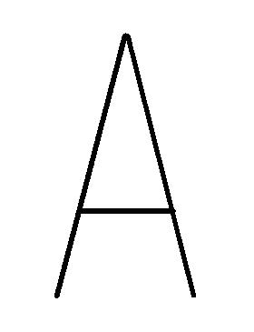
1 Draw the frame.
2 Add weight (thickness).
3 Refine the sketch.
4 Add color.
5 Add details (optional).
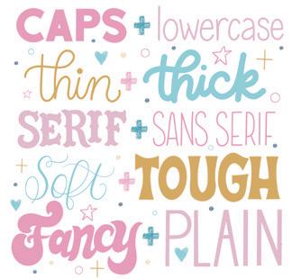
Here are some quick visuals for common lettering and typography terms— some concepts you might want to be aware of or play with as you letter. I taught the basics of lettering in great detail in my book The Art of Playful Lettering, so if this interests you and you want to dig deeper, check that book out!

You can practice right in the book, use tracing paper, or even make a copy of the worksheets so you can do them more than once. If you practice a style more than once, try using different types of supplies. If you’re a lefty like I am, use a blank sheet of paper as a guard sheet. Place it under your left hand as you work to prevent smearing.
If you journal or note-take, these styles make great page headers! Handmade greeting cards, holiday place cards, DIY bookmarks, and fancy envelope art on snail mail are just a few places to use hand lettering in your everyday life.
Try re-creating these styles the techie way. An iPad, Apple Pencil, and the Procreate App are a magic trio for lettering digitally.
When I work on my lettering, I like to put on music, light my favorite Pistachio Biscotti candle, and make a fresh cup of coffee or tea. Creating a cozy atmosphere can help you feel more creative and relaxed.
1


Hand lettering is the art of drawing letters, whereas calligraphy is the art of writing letters using pressure to control stroke width.

2
Lettering is not a font. A font is a specific style of text used when typing on your computer or found printed in the book you’re reading. Lettering is customcreated, be it analog or digital.
3
You can have not-sogreat or downright terrible handwriting and still learn to be good at lettering and calligraphy. My regular handwriting can be described as “meh.”

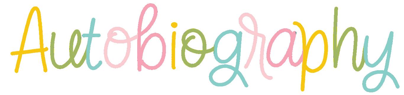
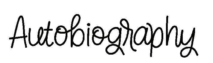
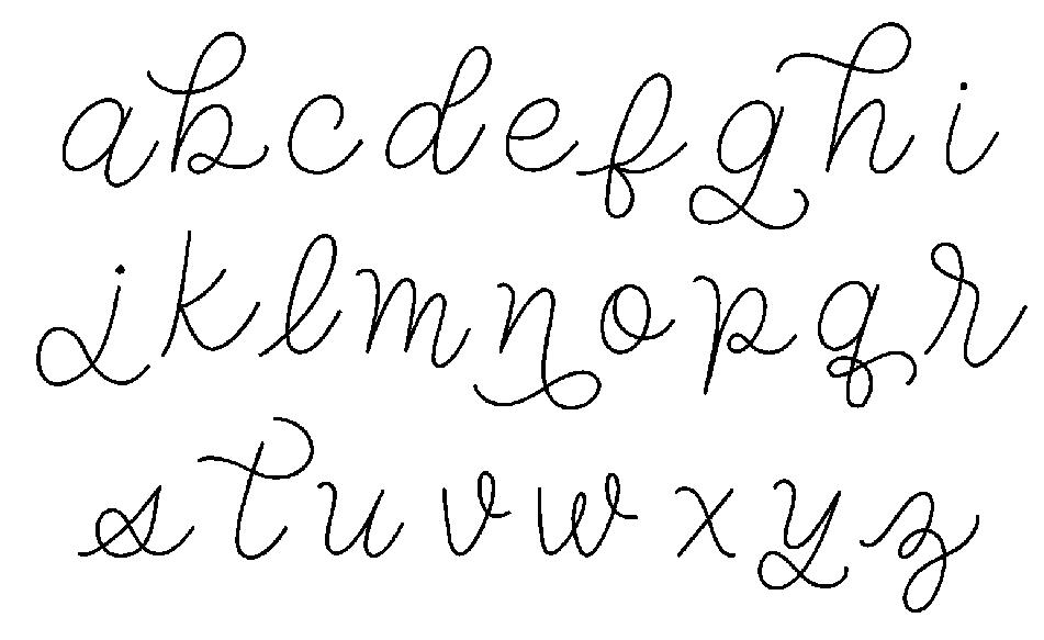
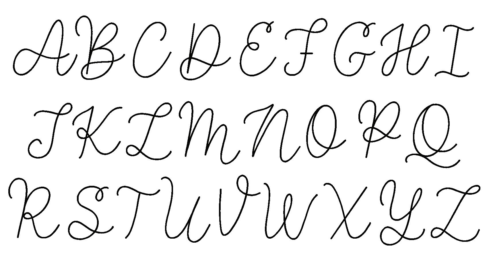
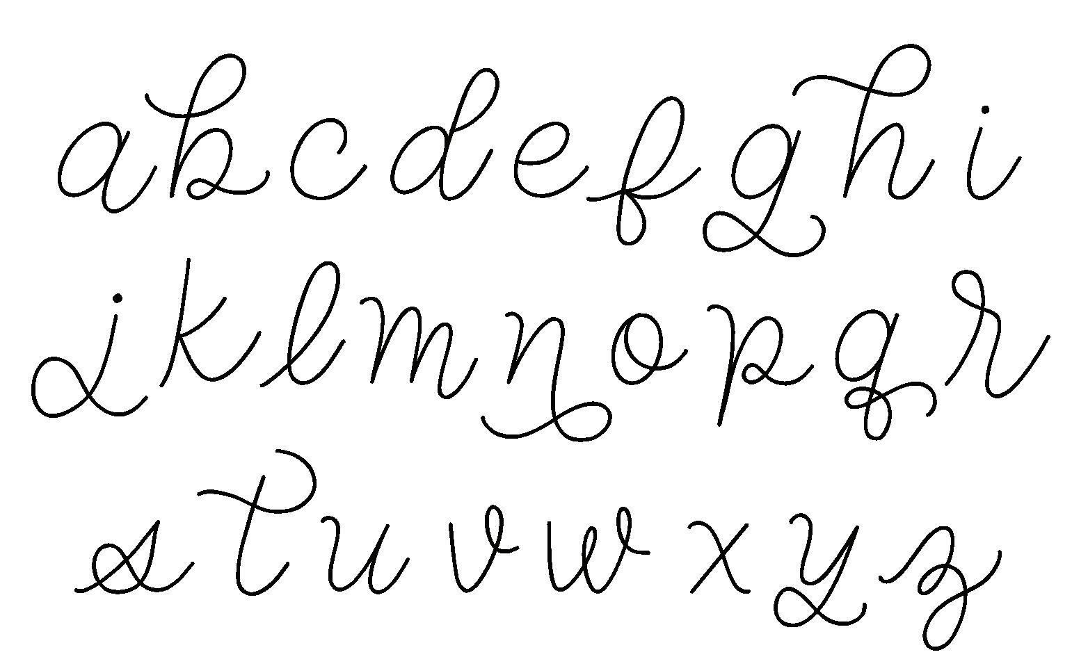
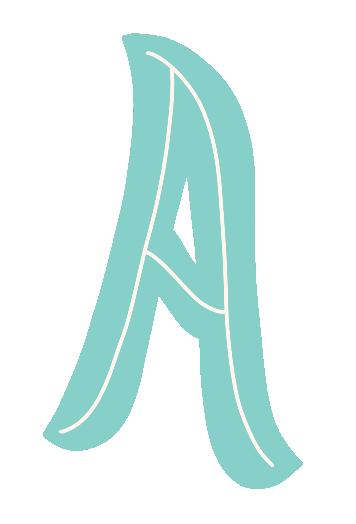
This monoline lettering style is based on my handwriting but is prettied up into more intentionally drawn letters. Some letters are selectively and creatively connected to create a print-and-script mash-up. It’s the perfect simple style to start with, as it’s beginner friendly and ideal for improving the muscle memory that growth as a lettering artist requires. You can keep it simple with a pencil or go all-out fancy with a glass dip pen and ink. Either works well for this style, giving you the power to choose your tools!
AUTOBIOGRAPHY (noun): an account of a person’s life written by that person.
1 Write a word.
2
Selectively connect letters.

3 Add color.
Add extra loops and funky serifs to some letters to make this style more eclectic and playful, as I’ve done in the example below.
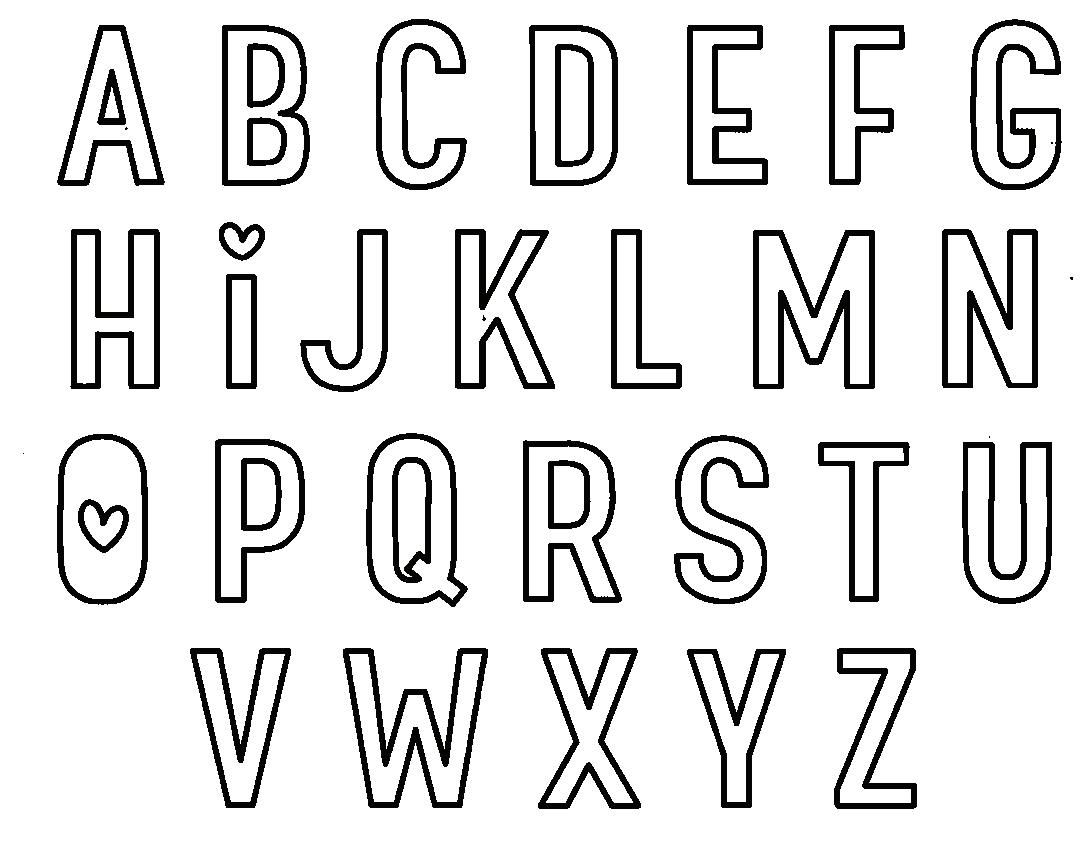
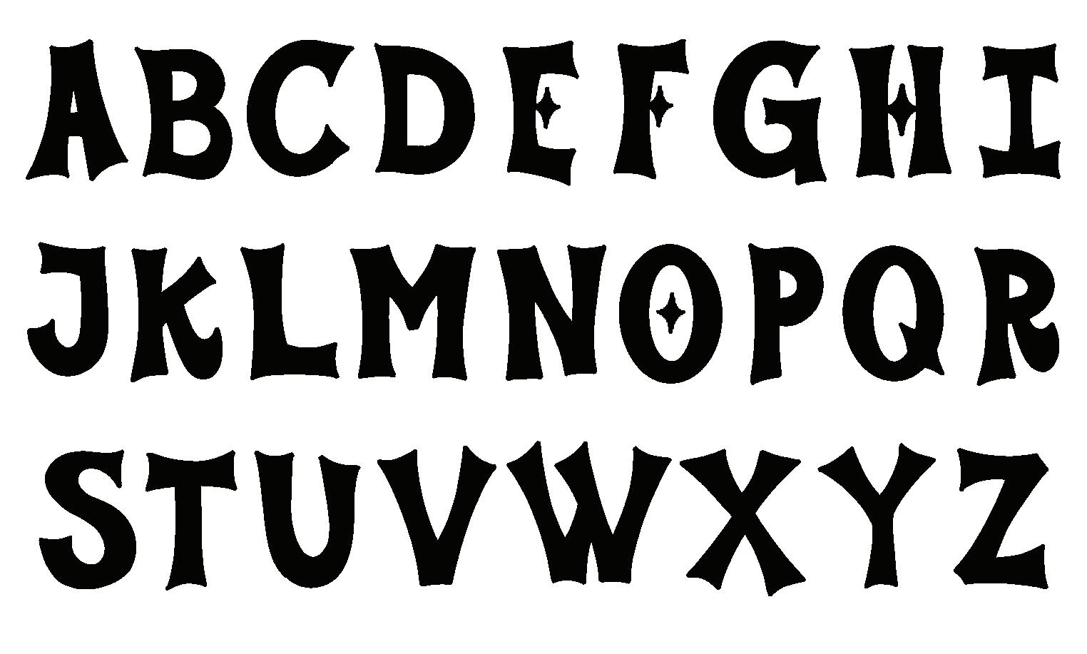
TRACE: Trace each letter below to get familiar with the shapes and strokes.
DRAW: Now, draw the letters on your own!
TRACE: Trace each letter below to get familiar with the shapes and strokes.
DRAW: Now, draw the letters on your own!
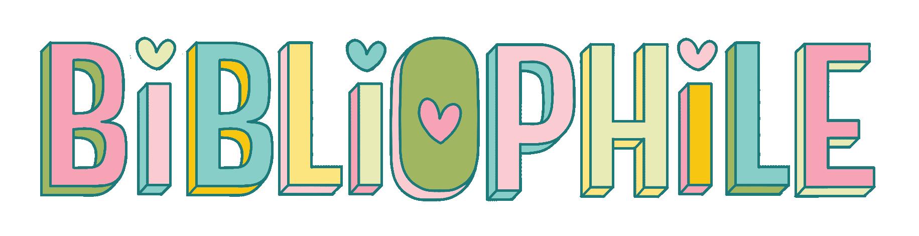
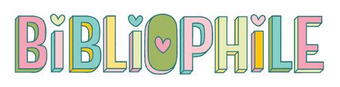
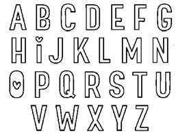
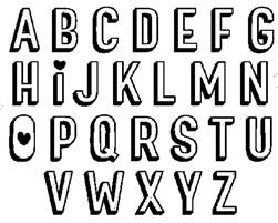
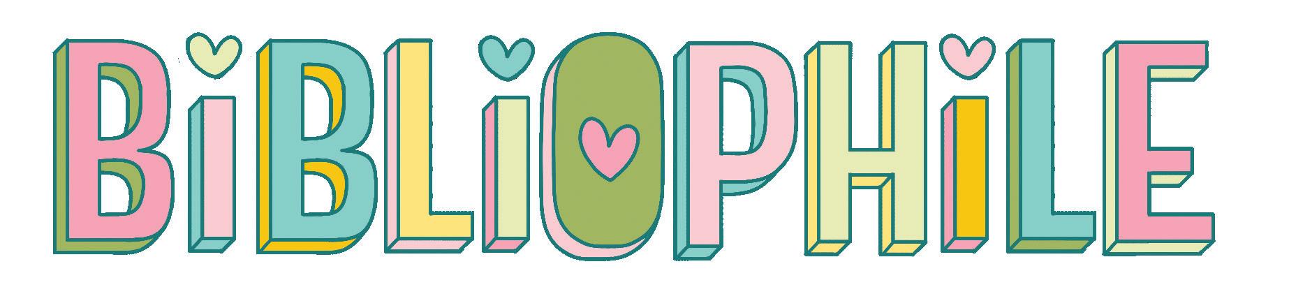
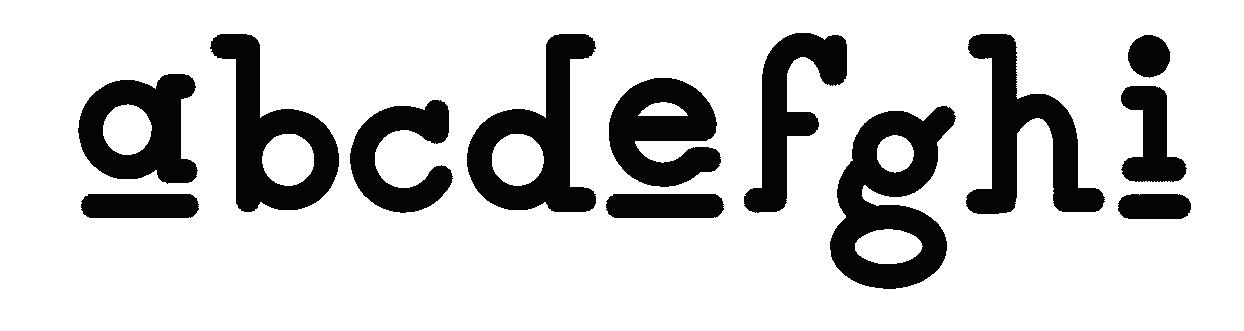
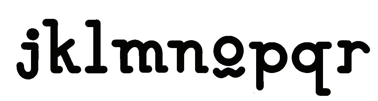
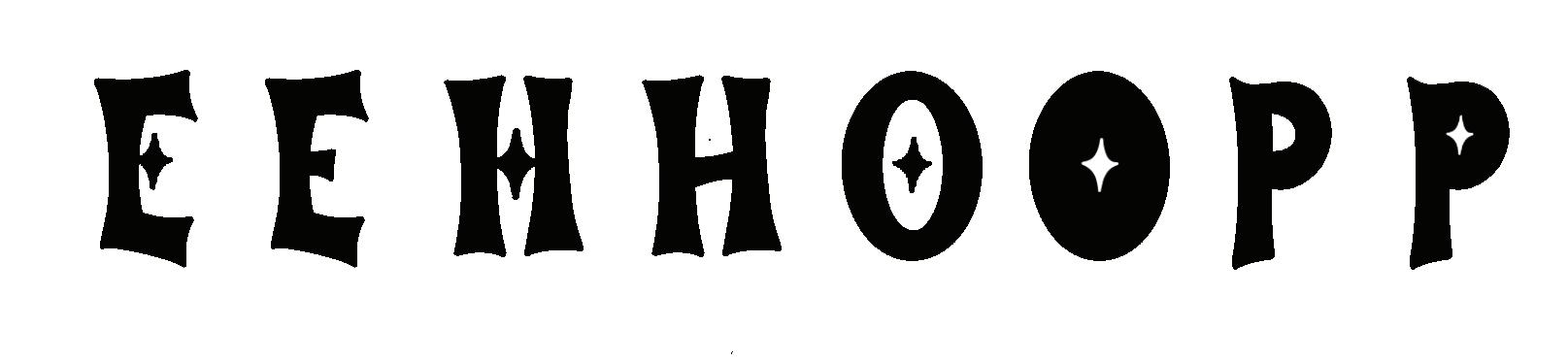
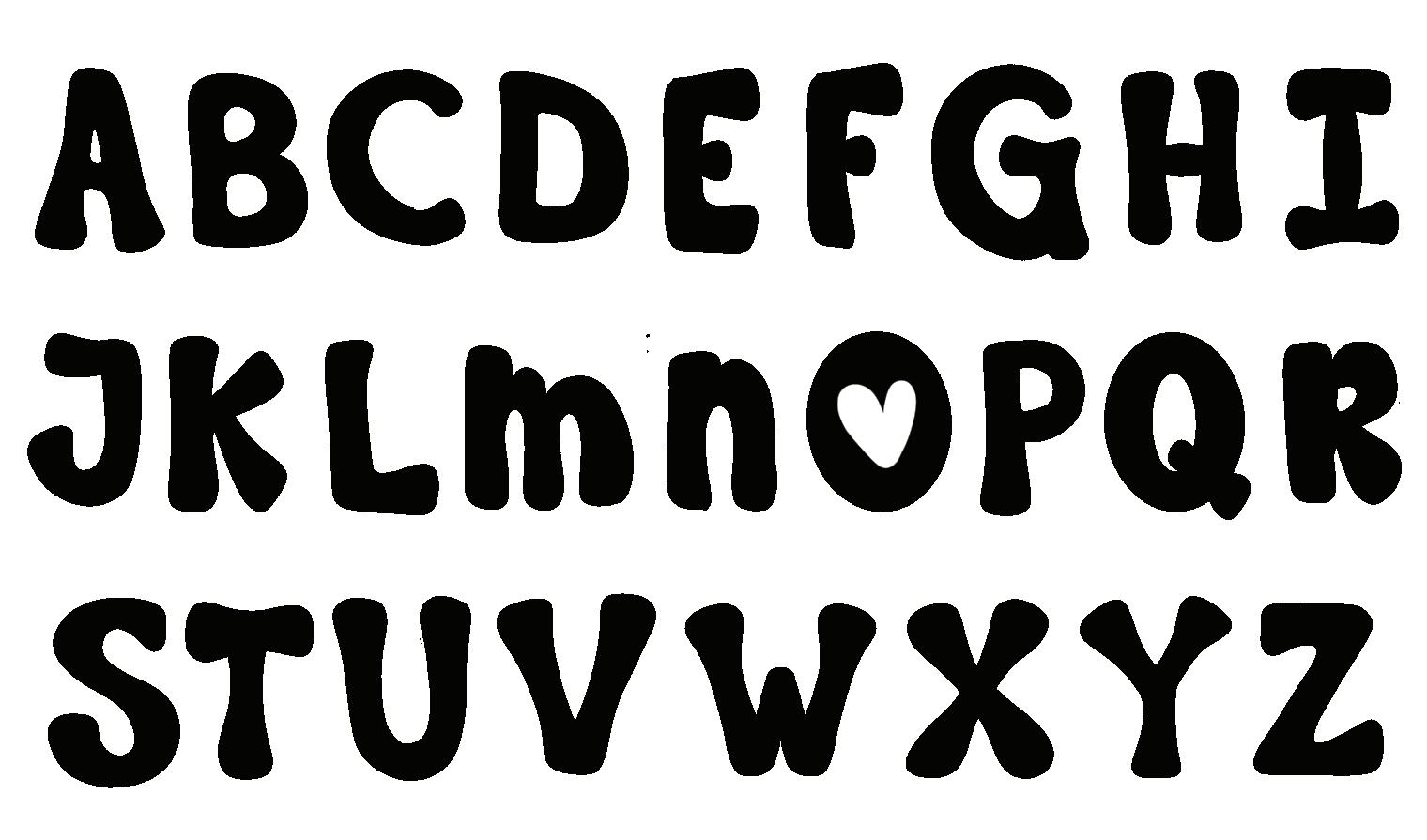
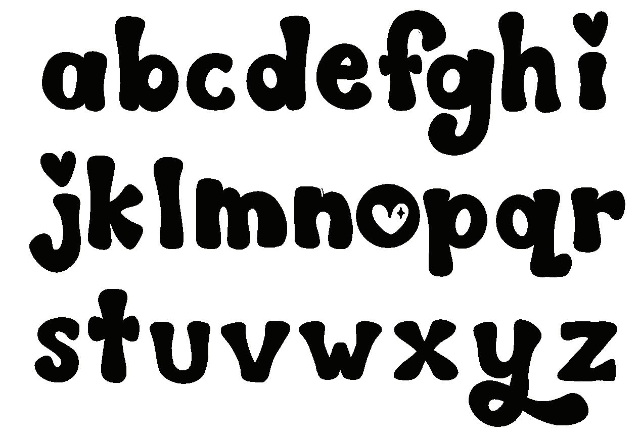
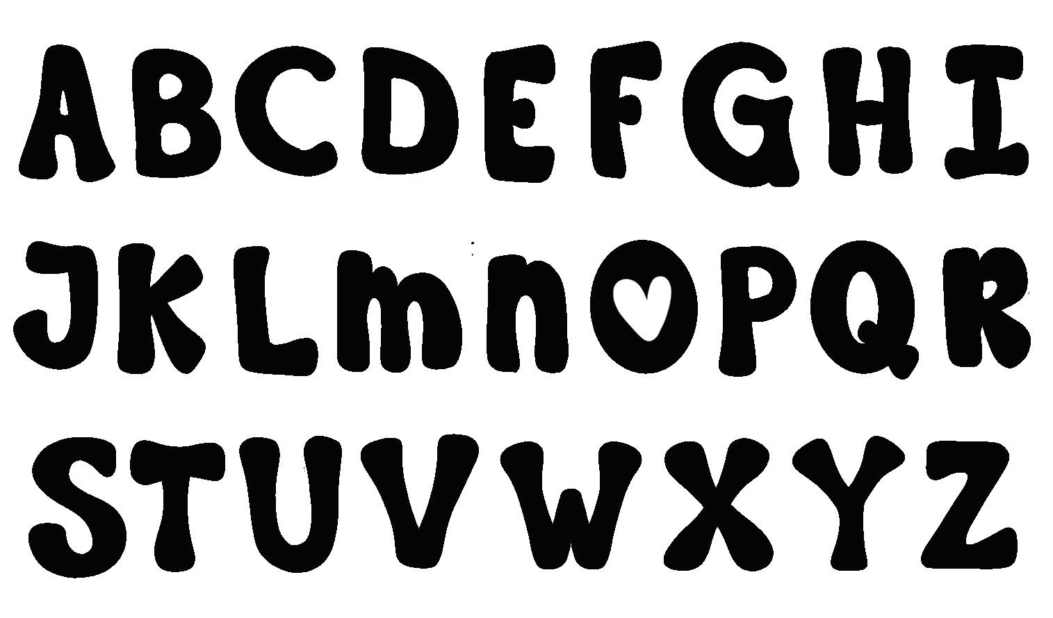
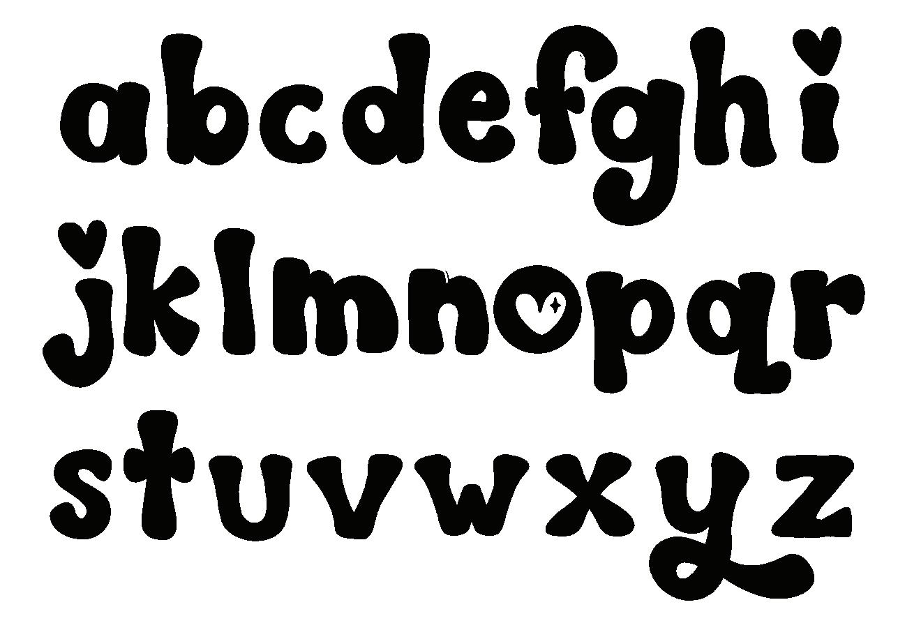
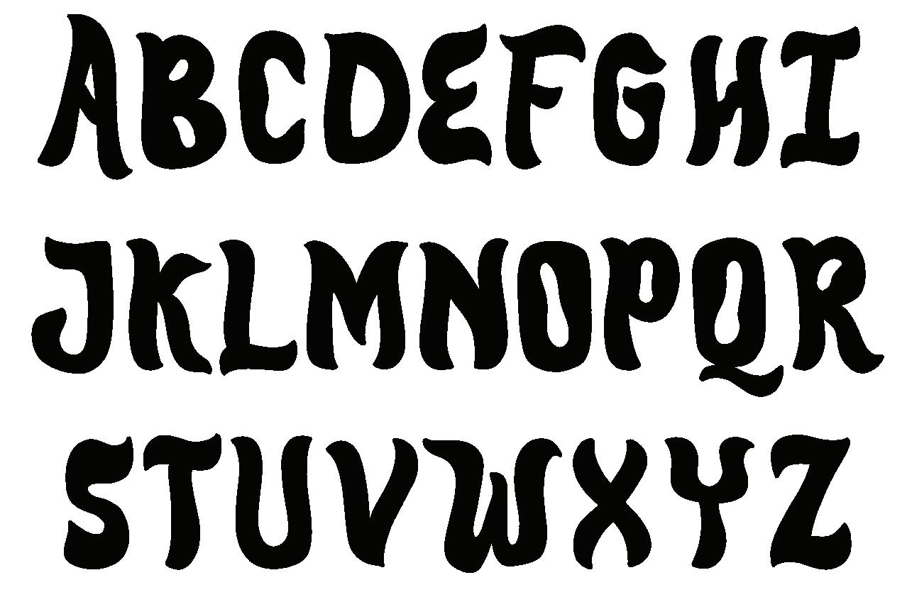
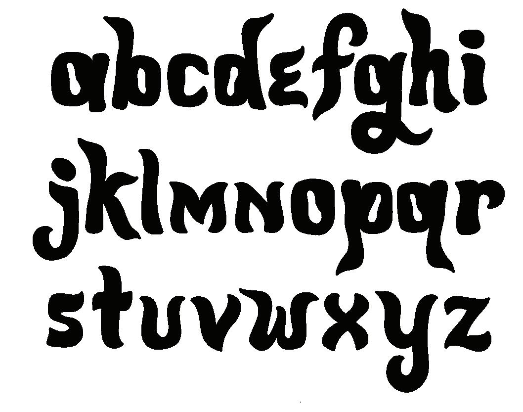
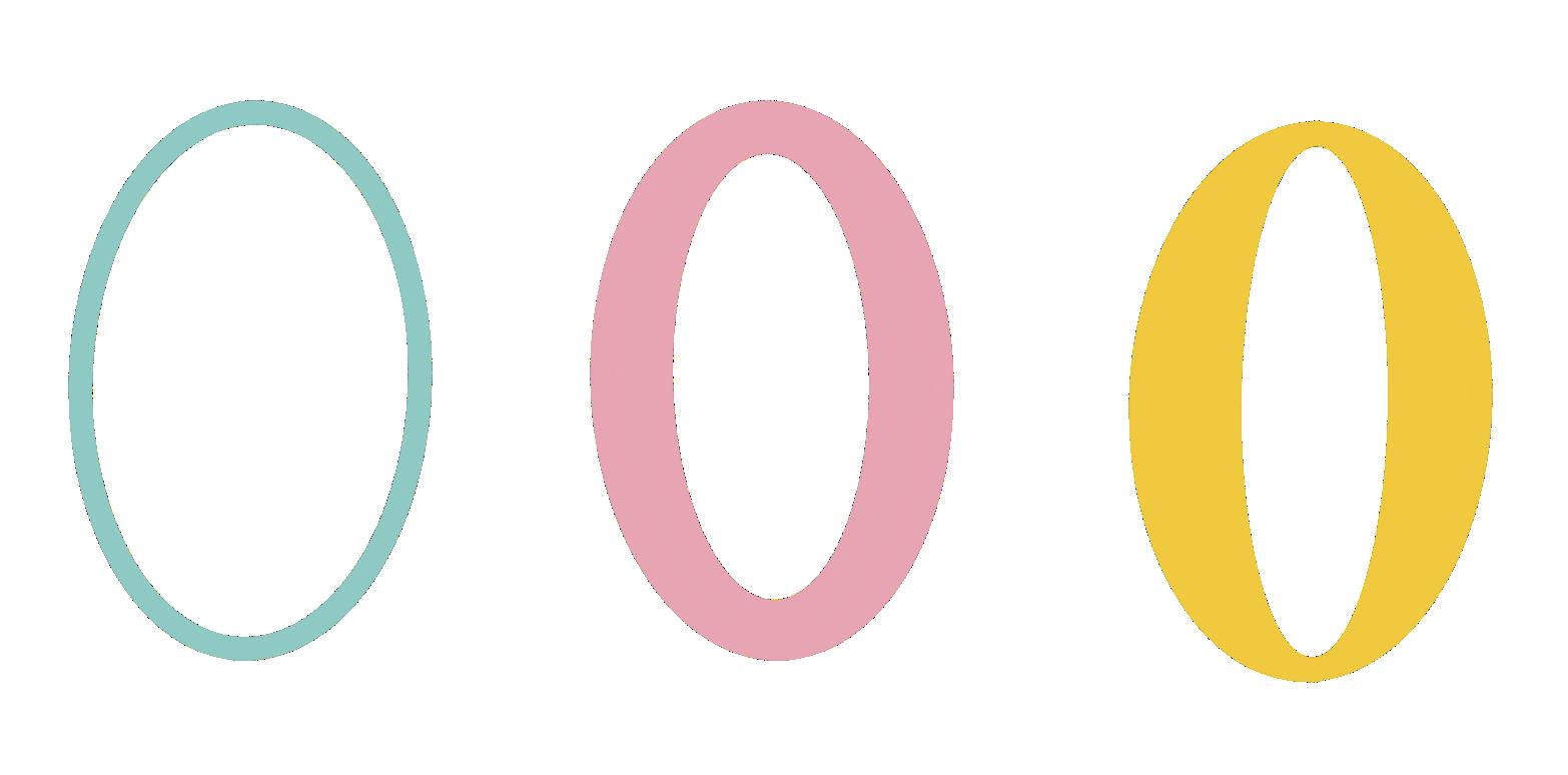
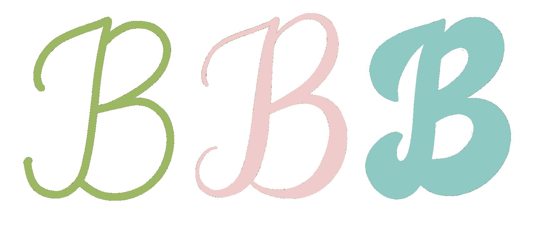
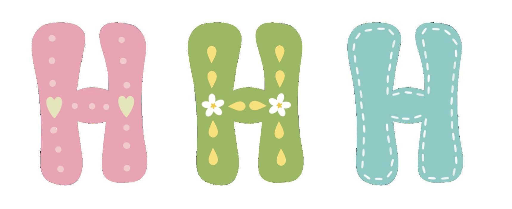
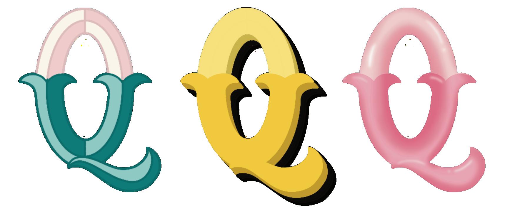
This versatile, almost all-caps lettering style can be used with or without added dimension. It features hearts instead of dots on its only lowercase letter, “i.” (Fun fact: the technical typographic term for the dot over the “i” is “tittle.”) The cutesy “O,” low crossbars, and plentiful color make this block style anything but basic. Check out my Simple Style Tip on the following page for an easy way to make this lettering style even more playful!
BIBLIOPHILE (noun): a person who collects or has a great love of books.
1
Draw the letter frame.
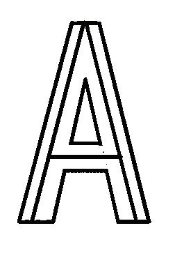
2 Add weight.

3 Add dimension (optional).
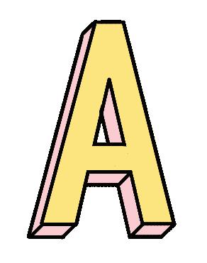
4 Add color.
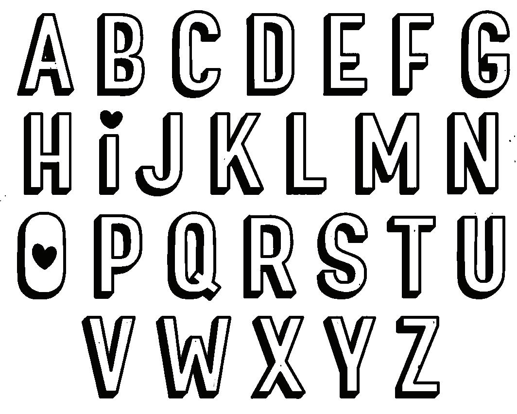
You can use this style with or without the dimension. To make it even more playful, use both together and add some simple details, as shown below.
TRACE: Trace each letter below to get familiar with the shapes and strokes.
TRACE: Practice adding the dimensional layer.
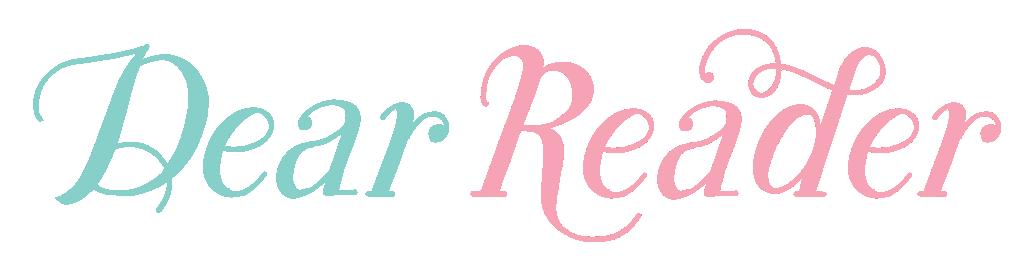
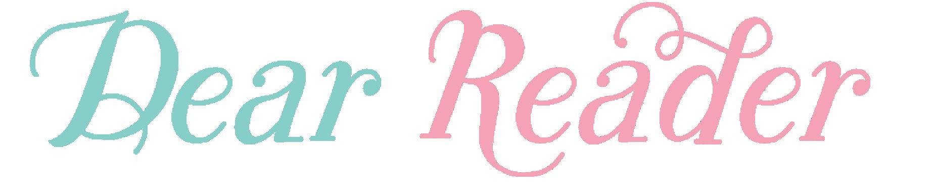
This modern yet classic lettering style is a mash-up that features script and serif elements with calligraphic line weights. We’ll use faux calligraphy to create the varied-weight linework for each letter.
You have the artistic power to change where you add the main elements of this style to fit the word or phrase you are lettering.
Check out my Simple Style Tip on the following page for an easy way to determine where to thicken letter lines and strokes.
DEAR READER (phrase): used by authors to directly address their readers.
1
Draw the letter frame.
2
Add weight, swashes, and serifs.
3 Refine.
4 Add color.
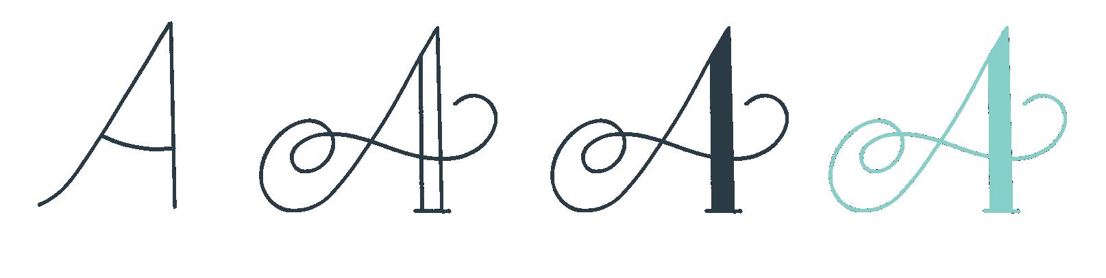
Faux calligraphy is created by drawing letters and then thickening the downstrokes to mimic the look that real dip-pen calligraphy creates.
The graphic at left can serve as a general visual guideline to help you determine which strokes should be thin (upstrokes) and which should be thick (downstrokes).
TRACE: Trace each letter below to get familiar with the shapes and strokes.
DRAW: Now, draw the letters on your own!
TRACE: Trace each letter below to get familiar with the shapes and strokes.
DRAW: Now, draw the letters on your own!
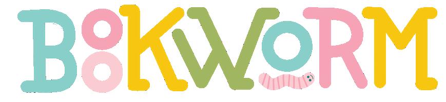
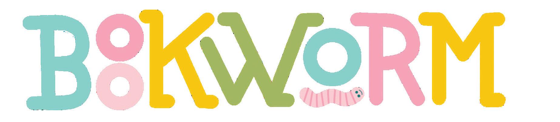
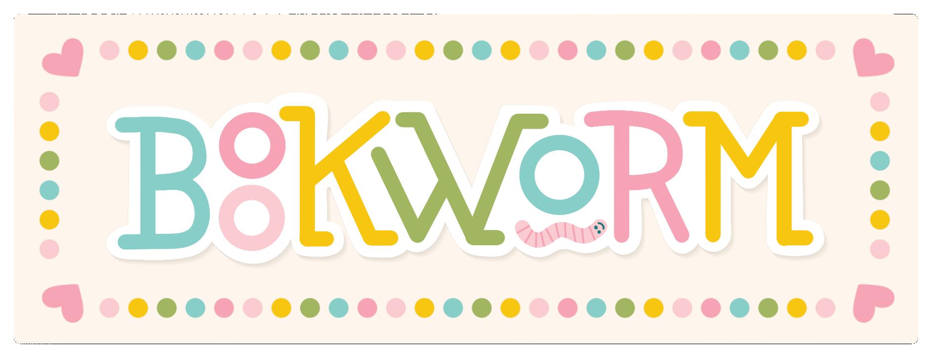
This lettering style features selectively added serifs, stacked letters, and underlined letters, which gives you a ton of creative freedom. Each word you draw will allow you to choose which stylistic features you use. Legibility is vital, so keep that in mind as you decide which letters to stack. I’ve opted to underline the vowels for practice purposes, but you can underline any letter as you create custom words and phrases. Have fun with this style and utilize sketching to try different variations before you commit to the overall design.
BOOKWORM (noun): a person devoted to reading.
1 Draw the letter frame.
2 Add weight.

3 Refine.
4 Add color.

To create this style quickly, opt for bullet-tipped markers. Their rounded tips make it easy to draw letters in this style in one single step.
For monoline lettering with a dip pen, buy ornament nibs. They have a round tip and are also an excellent choice for drawing letters in this style.
TRACE: Trace each letter below to get familiar with the shapes and strokes.


DRAW: Now, draw the letters on your own!
TRACE: Trace each letter below to get familiar with the shapes and strokes.

DRAW: Now, draw the letters on your own!
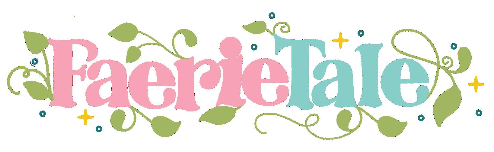
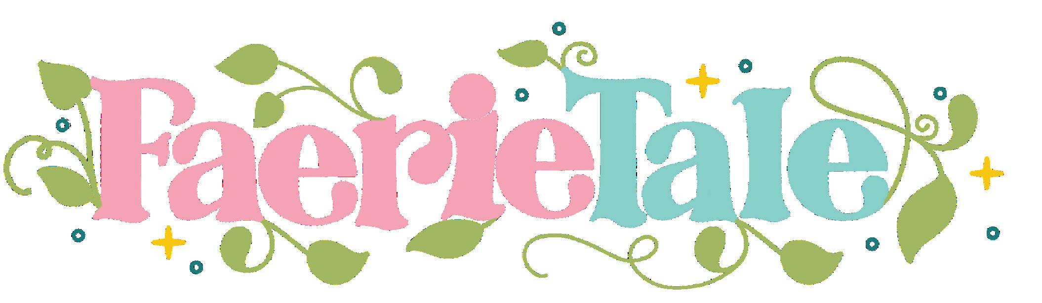
Traditional fairy tales inspired this whimsical lettering style with a fae twist—thus the nontraditional Faerie Tale name. It features fantastical flourishes and simple botanical elements. The curvy serifs, sparkles, and tiny circles evoke a magical feeling. Since this style involves more drawing than other styles, you can focus on tracing my letters on the worksheets. Feeling confident? Create a few words or phrases in this style on your own paper.
FAERIE TALE (noun): a children’s story with magical or fantastical creatures and elements.
1 Draw the letter frame.
2 Add weight, serifs, and botanicals.
3 Refine. 4 Add color, sparkles, hearts, and circles.
Sketch the basic frame for your word or phrase before adding any flourishing, botanicals, or illustrations. The placement will vary each time depending on what you’re lettering.
TRACE: Trace each letter below to get familiar with the shapes and strokes.
TRACE: Trace each letter below to get familiar with the shapes and strokes.
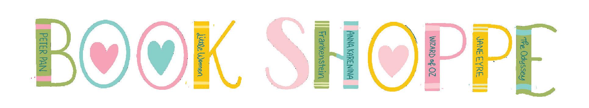
There are not many things bibliophiles love more than a bookstore, so this simple illustrative style leans into rows of beautiful books on a shelf. Uppercase letters work best for readability with this style, but I’ve included both upper- and lowercase alphabets for you to learn. While most letters have a high-contrast variation in the weight of their thin upstrokes and thick downstrokes, the monoline letter “O”s with a heart inside add a playful touch and further convey the love of books.
BOOK SHOPPE (noun): a shop where books are sold (with a deliberately archaic spelling of shoppe).
1
Draw the letter frame.
2 Add weight.
3 Refine.
4 Add color.
While the main lowercase letters I’ve drawn for this style lend themselves well to adding book spines, here are some fun variations to add more playfulness.
TRACE: Trace each letter below to get familiar with the shapes and strokes.
DRAW: Now, draw the letters on your own!
TRACE: Trace each letter below to get familiar with the shapes and strokes.
DRAW: Now, draw the letters on your own!
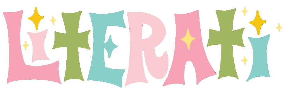
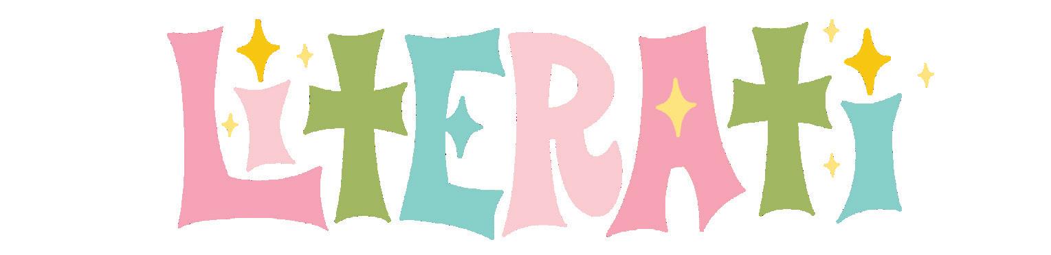
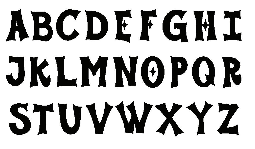
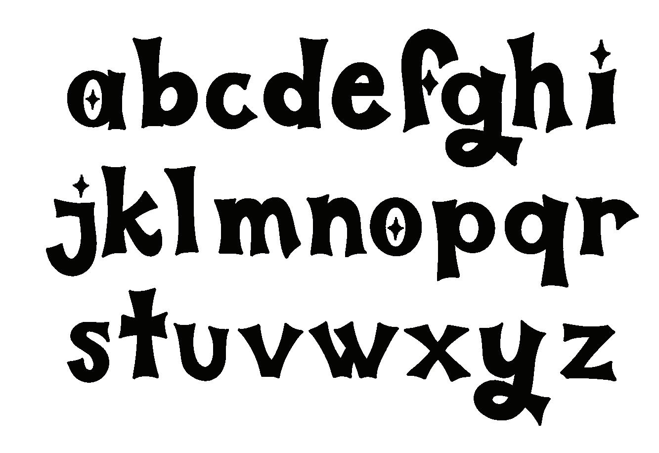
While book lovers may be well read, we’re not stuffy about it! The Literati lettering style is flashy and fun but doesn’t take itself too seriously. It’s deceptively easy to draw and gives off delightfully retro vibes. Simple sparkle illustrations are incorporated into the lettering and the surrounding areas to add a bit of understated glamour.
LITERATI (noun): well-educated people who are interested in literature.
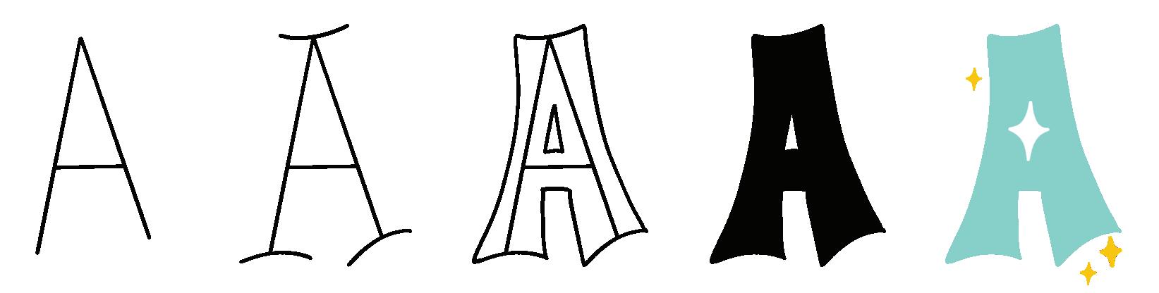
1 Draw the letter frame.
2 Add curved serifs.
3 Add weight. 4 Refine. 5 Add color.
Play around with where you place the sparkle elements depending on the word or phrase you’re drawing. Sometimes, less is more, so you may choose not to use a sparkle for every letter that could accommodate one.
TRACE: Trace each letter below to get familiar with the shapes and strokes.
DRAW: Now, draw the letters on your own!
TRACE: Trace each letter below to get familiar with the shapes and strokes.
DRAW: Now, draw the letters on your own!
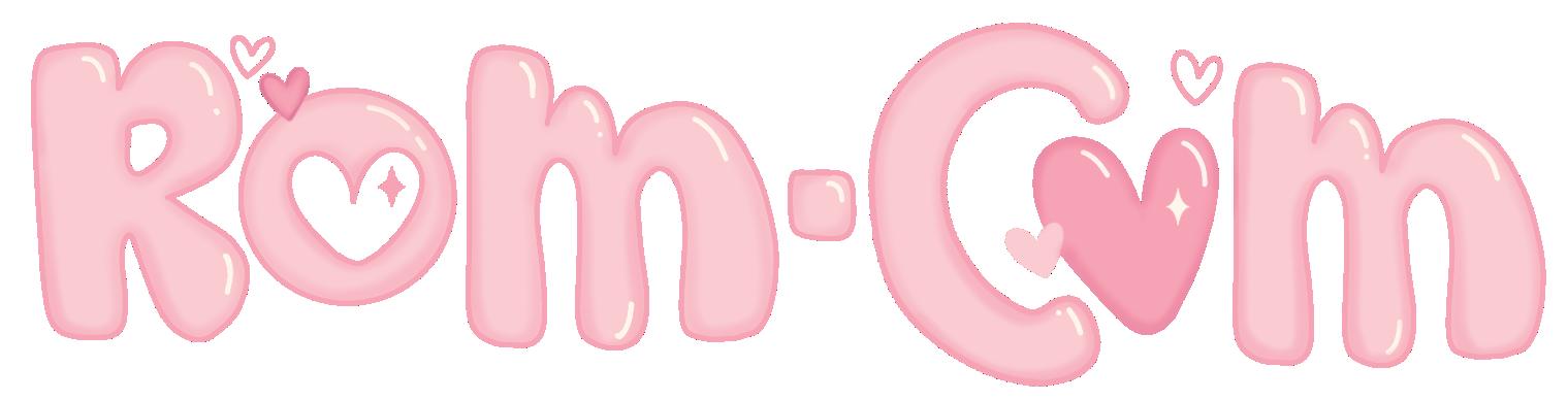
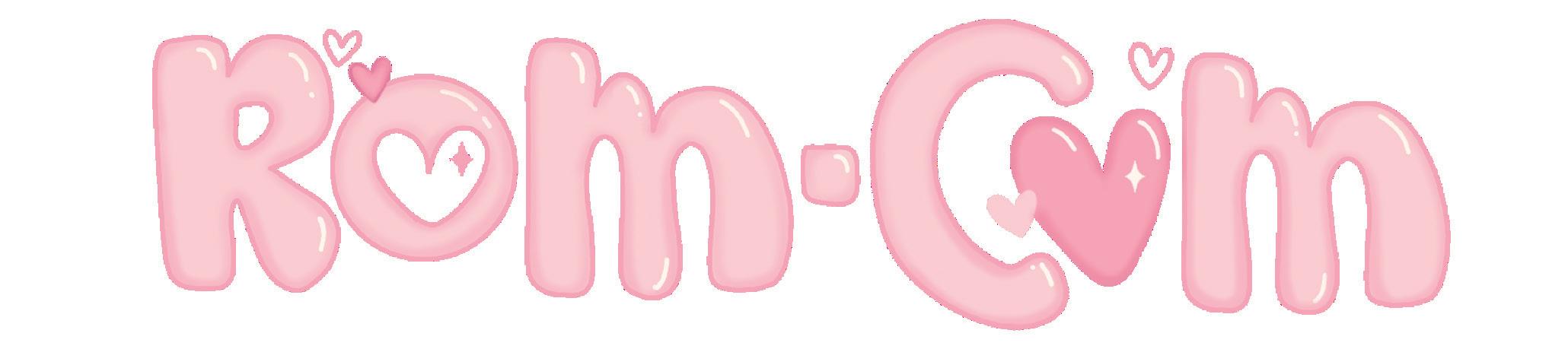
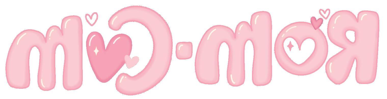
This playful take on classic bubble letters pays homage to the beloved rom-com genre. I’ll willingly admit to overusing hearts in my work, and that’s on full display in this sweet lettering style. A good romantic-comedy novel evokes feelings of joy, hope, and love. I hope practicing and using this style brings out those feelings for you. When it comes to love and hearts, more is more!
ROM-COM (noun): a romantic comedy.
1
Draw the letter frame.
2 Add weight.
3 Refine.
4 Add color.
This style is intentionally loose and wonky. When you add weight in step 2, don’t overthink it. Tracing the frame quickly will help it look bubbly and fun. You can always refine it a bit in step 3. Use a slightly darker color to shade in a dimensional effect along all the edges. Use a white gel pen to add simple highlights to give it a bubbly look.
TRACE: Trace each letter below to get familiar with the shapes and strokes.
DRAW: Now, draw the letters on your own!
TRACE: Trace each letter below to get familiar with the shapes and strokes.
DRAW: Now, draw the letters on your own!
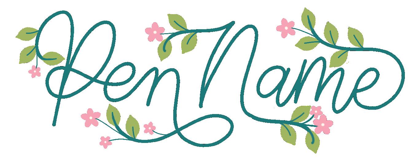
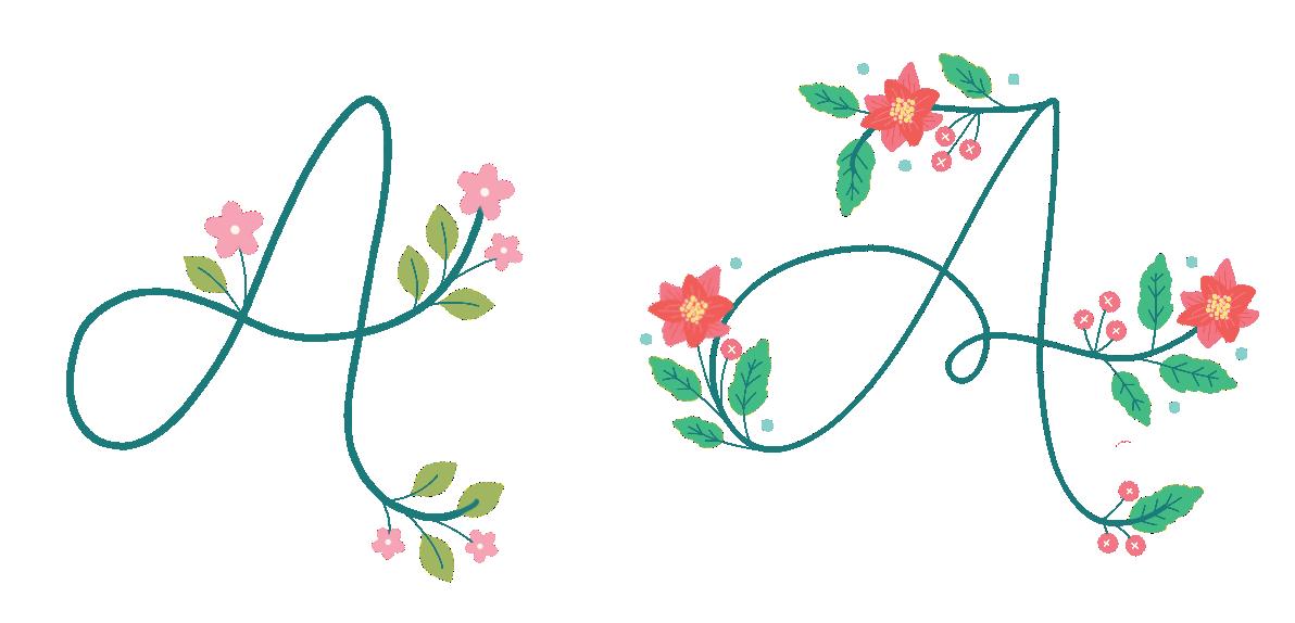
This delicate monoline script is easily altered to suit different seasons, moods, color schemes, and customizations that fit the word or phrase you’re lettering. It starts with a simple script. Then, you’ll elongate some of the letter lines to accommodate the addition of dainty florals and leaves. If you’ve never tried a glass dip pen, it’s a unique and simple-to-use writing tool that’s perfect for this style!
PEN NAME (noun): an assumed name used by a writer instead of their real name.
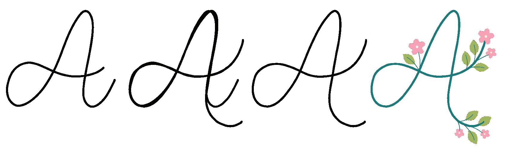
1 Draw the letter frame.
2 Extend select lines.
3 Refine if necessary.
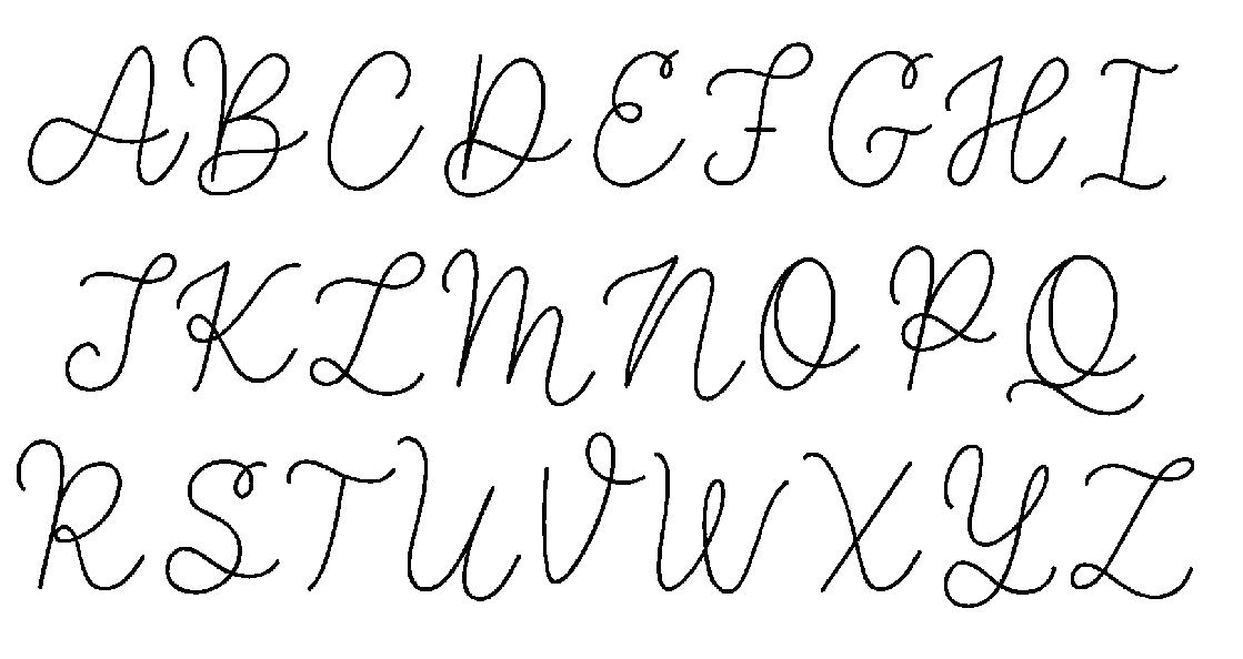
4 Add color and illustrations.
The word or phrase you’re writing will determine the placement of where you can extend lines to add flowers and leaves. Switch up the types of botanical elements you add to easily change the look or seasonal vibe.
TRACE: Trace each letter below to get familiar with the shapes and strokes.
DRAW: Now, draw the letters on your own!
TRACE: Trace each letter below to get familiar with the shapes and strokes.
DRAW: Now, draw the letters on your own!
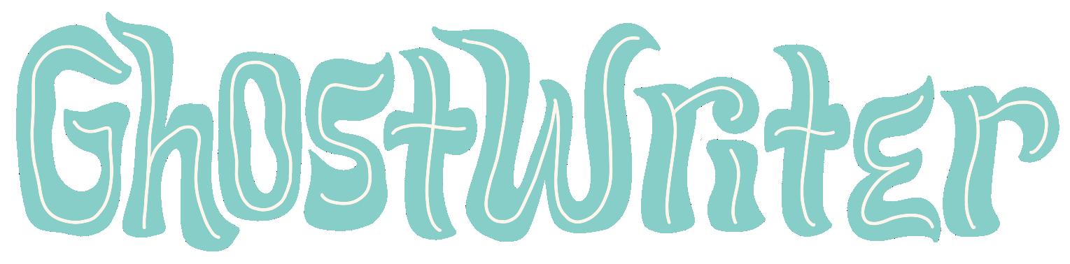
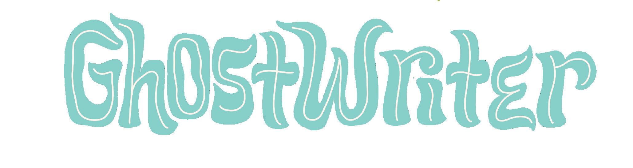
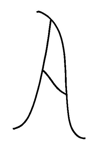
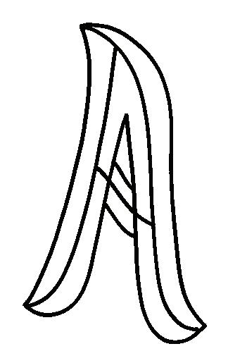
If there’s a book that can keep me up past my bedtime, it’s usually an unputdownable thriller or mystery! Ghostwriter seemed like an obvious choice for a name for this loose, fluid style, since ghostly shapes inspire it. But don’t limit yourself to using this style for scary stuff, because, as you’ll see in the Simple Style Tip on the next page, you can change the colors and instantly get a more playful, retro vibe!
GHOSTWRITER (noun): a person whose job it is to write material for someone else who is the named author.
While this style lends itself well to lettering with spooky vibes, you can use it year-round without changing the letter shapes at all! Making the letters super colorful magically transforms the look from ghostly to groovy.
TRACE: Trace each letter below to get familiar with the shapes and strokes.
DRAW: Now, draw the letters on your own!
TRACE: Trace each letter below to get familiar with the shapes and strokes.
DRAW: Now, draw the letters on your own!
You may recognize these tips from The Art of Playful Lettering, because they’re so important for learning how to customize these lettering styles. I used new examples here in case you already own a copy of that book!
Change the Letter Weight
Change the Letter Contrast
Change the Lettering Style
Add In-Line Lettering Details
Gothic to Tuscan to decorative, the options are many!
As with traditional bingo, your goal is to complete five squares in a vertical, horizontal, or diagonal row.
Each time you complete a row, treat yourself to something fun! It doesn’t have to be expensive. Maybe it’s a new set of markers, a fancy coffee shop drink, an escape room experience, a bouquet of your favorite flowers, a trendy lip gloss, or a new book.
Make a wish list to motivate you to complete your Bibliophile Bingo card.
And have fun along the way!
Draw a quote you love in the Pen Name lettering style
Follow me on Instagram @ bydawnnicole
book from your TBR walk outside
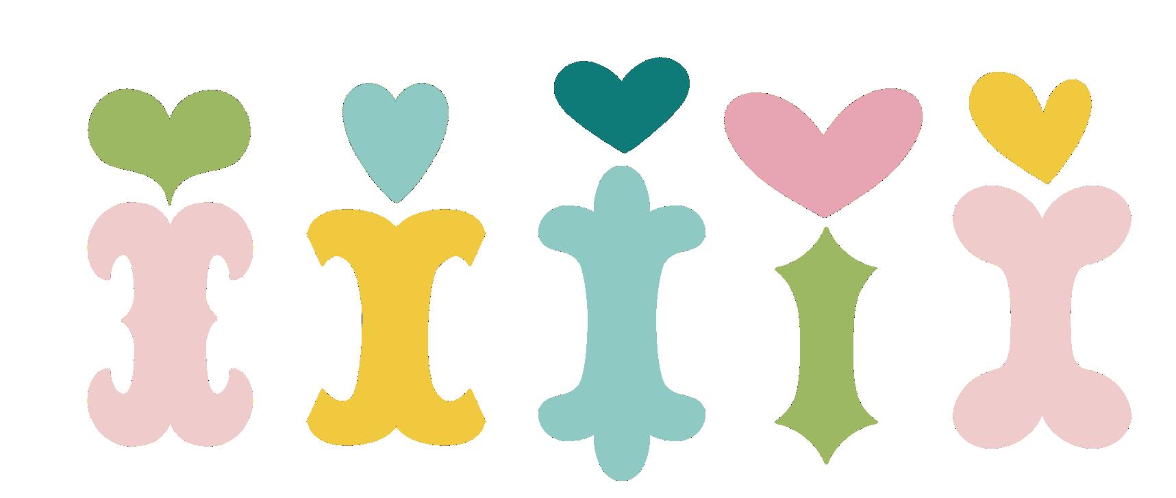
B O O K M A R K S
What bibliophile can resist adding another cute bookmark to their collection? I’ve created six full-color hand-lettered and handillustrated bookmarks you can cut out and keep or gift!
After cutting out your bookmarks, I recommend protecting them using self-adhesive laminating sheets. (You can pick up these sheets at your local craft store; I get mine on Amazon.) These sheets allow you to laminate paper goods without a laminating machine, and they’ll keep your bookmarks pretty for a long time!
I hope you get a lot of enjoyment from this book. If you do, I have published two other books that I think you’ll love just as much.
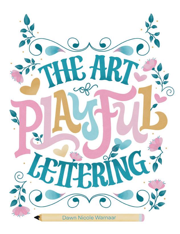


If you liked learning 10 lettering styles and want to learn more styles as well as how to create complete artistic compositions that incorporate lettering, check out my guide to hand lettering, The Art of Playful Lettering. In it, I share all my wisdom as a professional lettering artist in a completely approachable and beginner-friendly way. You’ll learn foundational lettering skills, 10 playful lettering alphabets (all unique to this book!), and more. The pages are filled with places to trace and practice right inside the book. I also include step-by-step tutorials for learning to draw folk florals and embellish your lettering with cute elements. You’ll be amazed at how quickly you learn and what you create!
If you liked the coloring designs and worksheets and want a whole book dedicated to them, then check out my coloring book, Modern Folk Art Coloring Book. Inside, you’ll find 60 original coloring patterns featuring my signature floral designs combined with charming hand-lettered sentiments. Each pattern is perforated for easy tear-out and comes complete with a coloring worksheet to help you plan your palette. It also includes tips and techniques to help you take your art to the next level, and the gorgeous designs are perfect for coloring alone or with friends.

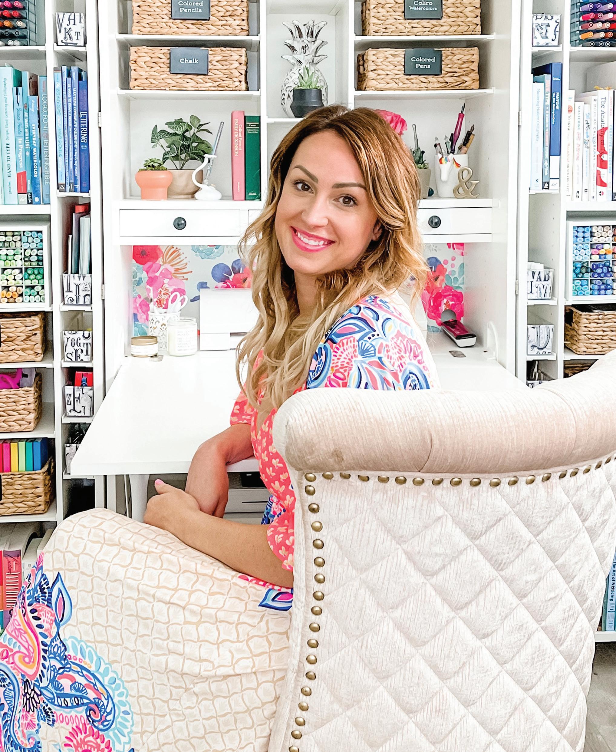
Dawn Nicole Warnaar is a talented and sought-after lettering artist who creates one-of-a-kind fonts, illustrations, and custom designs for clients and brands such as Tombow, Kendra Scott, Silhouette, Create Room, and Mixbook Photo Co. Also a dedicated teacher, she shares her knowledge and expertise through her workbooks, Procreate brush packages, and online courses. With a mission to educate and inspire makers to get creative daily, Dawn has helped many budding artists learn the art of hand lettering and calligraphy, and she is the author of The Art of Playful Lettering and Modern Folk Art Coloring Book. To learn more, visit www.bydawnnicole.com and @bydawnnicole on Instagram.
DAWN’S MISSION STATEMENT
As a lettering artist, I aim to educate and inspire makers to get creative daily while embracing a spirit of community over competition. I believe that growing your lettering skills is a lifelong journey and that focusing on competing with yourself brings more joy than comparing your work to others.
Business is personal at Better Day Books. We were founded on the belief that all people are creative and that making things by hand is inherently good for us. It’s important to us that you know how much we appreciate your support. The book you are holding in your hands was crafted with the artistic passion of the author and brought to life by a team of wildly enthusiastic creatives who believed it could inspire you. If it did, please drop us a line and let us know about it. Connect with us on Instagram, post a photo of your art, and let us know what other creative pursuits you are interested in learning about. It all matters to us. You’re kind of a big deal.
www.betterdaybooks.com better day books
Dawn Nicole Warnaar is a talented and sought-after lettering artist who creates one-of-a-kind fonts, illustrations, and custom designs for clients and brands such as Tombow, Kendra Scott, Silhouette, Create Room, and Mixbook Photo Co. Also a dedicated teacher, she shares her knowledge and expertise through her workbooks, Procreate brush packages, and online courses. With a mission to educate and inspire makers to get creative daily, Dawn has helped many budding artists learn the art of hand lettering and calligraphy, and she is the author of The Art of Playful Lettering and Modern Folk Art Coloring Book. To learn more, visit www.bydawnnicole.com and @bydawnnicole on Instagram.
Calling all book lovers! From Dawn Nicole Warnaar, the author of Modern Folk Art Coloring Book and The Art of Playful Lettering, this book is the perfect way to relax and get creative while celebrating your bookish life! Inside are 25 beautifully illustrated, book-themed coloring pages, 6 cut-out bookmarks, and 10 unique lettering lessons so you can personalize your journals, notes, and art projects. Slow down, get creative, and celebrate the joy of books and art with this one-of-a-kind treasure.
Here’s what’s inside:
25 cozy, book-themed coloring pages for relaxation and inspiration
10 book-themed lettering styles with instructions and practice pages so you can personalize journals, notes, and more
Cut-out bookmarks ready to use on your next read (or share with book-club friends!)
Premium format with thick, high-quality pages and a keepsakeworthy design