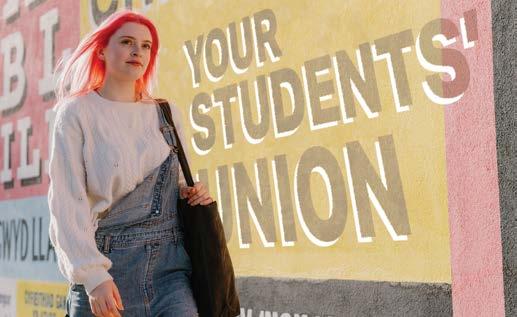
Brand Guidelines
For advertising and recruitment materials for student and staff campaigns.
Example uses include: Flyers and booklets; print and digital campaigns; web and social media content.


For advertising and recruitment materials for student and staff campaigns.
Example uses include: Flyers and booklets; print and digital campaigns; web and social media content.
Our brand identity in print and digital application.
The Logo has been constructed to achieve aesthetic balance and legibility. The scale and proportion of the drawn crest and type elements and their interdependent relationships must not be changed, distorted or altered in any way.
The logo consists of the drawn crest and type elements and the two must not be separated without permission from the Director of Brand and Campaigns
Our primary colours are a key part of our brand identity and should be used consistently across both Marketing and Student Facing Communications brand identity and the Corporate Communications brand identity.
Their use should always consider the visibility and clarity of the brand mark.
Our colours are unique to our brand identity and we utilise them across our communications.
Our logo only appears in these colour ways, or all in black or all reversed out in white.
Main core identity
This is the main coloured version of our logo. It should be used in all communications.
Main core identity
Below are examples of how to select the most appropriate colour variant for the application background.
Variants
On occasions a variation of our logo may be required. These configurations maintain the integrity of our brand.
Whenever our identifiers are used on a coloured or photographic background, the shield elements remain the same and the name of the university can be reversed out in white.
This version of the logo should be used in mono applications such as single colour advertising or the screenprinting of merchandise.
This version of the logo should be used when the legibility of the main logo and variant 1 are poor.


Bangor University’s Welsh Language Policy
Bangor University’s Welsh Language Policy enables the University to achieve its strategic aim of being a bilingual organisation that contributes proactively to the promotion and development of the Welsh language.
When creating content for various channels, please be aware of the following:
You can upload documents for translation or proof-reading here:
https://www.bangor.ac.uk/canolfanbedwyr/translation
Any queries on how to ensure equal treatment of both languages should be directed to Canolfan Bedwyr.
All content needs to be bilingual (with the exception of campaigns directed at international students and markets).
Both the Welsh and English languages should be treated equally in terms of quality and visibility, and Welsh has to appear first, so it should appear either above or to the left of the English text.
For campaigns or content where a message or narrative needs careful consideration to ensure it is consistent in both languages, please involve Canolfan Bedwyr officers from the beginning.
All social media content needs to be bilingual; either opt for a single channel with Welsh and English content, where Welsh is posted first, or have two separate channels.
When creating hashtags for use in original content, ensure these are bilingual. If using hashtags on Welsh posts, please place them at the end of the text rather than within the text, to ensure that hashtags are not affected by rules of mutation.
Any URL links within a post should direct to the respective language pages on the website.
Videos need to be produced in both languages, but it’s worth noting that Welsh and English versions don’t have to be carbon copies of one another. As long as the level of information contained in the videos is the same in both versions and that they’re produced to a similar standard, you have space to be creative in how you produce this type of content.
Subtitles/captions and alt-text need to be created in both languages, in their respective languages. If there is an Englishspeaker within a Welsh video, please use English subtitles for this section, rather than translating their speech to Welsh.
Video cards/thumbnails need to be produced in each respective language using the branded template within this document.
When uploading to Youtube, titles, descriptions and keywords should be added in the respective language.

Our typeface and how to use it.
https://fonts.google.com/specimen/Figtree
Secondary typeface:
https://fonts.google.com/specimen/Noto+Sans
Headers: Figtree (Bold)
Headers will adapt based on their backgrounds. However, the general guideline is that headers will use the Figtree typeface in Title Case
Do not use all uppercase letters for headers, as it can reduce accessibility.
If the header appears on a yellow background, white text is not permitted in order to keep in line with accessibility standards.
Sub-headers: Figtree (medium)
Unlike the header, the sub-header will use Sentence case
Additionally, sub-headers should not adopt the two-tone colour scheme used for the headers.
Two-Tone Headers:
On darker backgrounds or images, the header may use yellow and white text. This ensures the type remains legible and accessible, without compromising the design.
Body Text: Noto Sans
The main body should generally use Noto Sans Regular.
Heavier weights can be used if needed, but care should be taken to ensure they don’t overpower the sub-headers or other elements.
One-Tone Headers:
The header doesn’t always need to incorporate two tones; it can also use a single colour, such as our black, white, yellow, or red, depending on the specific requirements of the design.
Tertiary typeface for presentation usage only:
If our primary font cannot be used for presentation purposes please substitute the typeface with the following system font and weights:
Arial - Regular (body copy)
Arial - Medium (sub-headings)
Arial - Bold (Main headings)
Your home at
Living in our affordable, comfortable and safe halls of residence is the ideal way to make the most of your university experience.
With just over 2,600 rooms, accommodation is guaranteed* for all new undergraduate applicants in one of our student villages; St Mary’s or Ffriddoedd.
* For full details of our halls

guarantee go to https://www.bangor. ac.uk/accommodation
Your options
• En-suite bedrooms (with shared kitchen)
• Budget bedrooms (with shared kitchen and some with shared bathrooms)
• Studios (with en-suite bedroom and private kitchenette)
• Townhouses (with shared kitchen/bathrooms)
• Accessible rooms, including those with wheelchair access
• Provisions for those who are hearing-impaired
• Halls for Welsh-speakers
• Halls for health-care students
• Quiet halls
• Female-only flats
• Alcohol-free flats


At Bangor we place a high priority on caring for and supporting our students. From managing your finances to finding a graduate job, our services are here to help you make the most of your time at university.
Some of our Student Support services include:
• Money advice
• Health and welfare support
• Mental health advice
• Dyslexia support
• Counselling
• Disability services
• Chaplaincy team
• Study skills support
Both headers and sub-headers can be customised with any of our colour options, such as black on yellow or red on white. This flexibility allows designers to create visually striking layouts with minimal restrictions, while ensuring important information is communicated effectively.
Whether it’s exploring your career options, undertaking work experience or setting up your own business, we’ll offer support and provide a range of resources to help you develop your employability and confidence and achieve your career ambitions.
Some of our resources include:
• An online Employability Hub
• Help to find part-time work, internships, placements and work experience
• Search for graduate jobs
• Apply for paid internships within the University
• The Bangor Employability Award, an online course to prepare you for your dream career
• Employability podcast Be’ Nesa’ (‘What Next’)
Two-tone header
(not suitable for sub-headers)
A two-tone header that can be customised with any of our colour combinations. To enhance its impact, you can adjust the size of the first line relative to the second line, creating a more dynamic and visually engaging header.
Larger points can be styled in bold to emphasise key messages, typically used for hero statements or important highlights. The remaining text can then be set in regular or medium weight to create a clear hierarchy and maintain readability.
Main body text should be either black or white, depending on which provides the best contrast and legibility against the background image or graphic. The choice of colour should be carefully selected to ensure clear readability and visual balance, adapting to the tones and complexities of the background. This flexibility allows the text to stand out effectively while maintaining a harmonious overall design.
Our Brand Devices and how to use them.
The primary application of this on any material is intended for Marketing and Student Facing Communications. NOT to be mistaken for the Corporate Communications Shield Device.
The Shield Device has been specifically redesigned as an evolution of our corporate branding shield. This updated version is tailored to better resonate with our target audience, offering a more engaging and appealing design. By incorporating usercentric adjustments, we’ve made the device not only more functional but also visually aligned with the preferences and expectations of our end users, ensuring it stands out and connects with them more effectively.
The Shield Device is a versatile element that can be applied across a wide range of media. Its consistent presence alongside the main logo is crucial for maintaining brand cohesion and recognition. As a key visual identifier, The Shield will play an essential role in reinforcing the brand’s identity moving forward, ensuring a unified and cohesive brand experience across all platforms.
The shape of the Shield can be used as a cut-out, where the inside can hold images, and the outer shape can be filled with colour. This creates a visual representation of the Shield’s form without the device itself, maintaining its outline and structure while allowing for dynamic content inside and outside.
The Shield sits at a fixed 27° angle, which must remain unchanged. It is crucial that this angle is consistent across all media to maintain visual cohesion and brand integrity.
The Shield device can be proportionally scaled, but it should never be resized freely (i.e., stretched or distorted). The line width will also scale proportionally to maintain visual consistency. It is designed to be used in a variety of applications without compromising its integrity.
Transparency, including gradient transparency, can be applied to the Shield Device. However, it should be used thoughtfully to maintain the integrity and visibility of the design.
The Shield device can be flipped horizontally to accommodate design needs, but it should never be flipped vertically. Maintaining this orientation is key to preserving the integrity and recognition of the design.


The Shield Device is incredibly versatile and can be used for a wide range of purposes. Here are a few examples showcasing its full potential. It’s also crucial to include the Shield in every aspect where possible, no matter how subtle. This consistent presence helps strengthen the brand, ensuring the Shield becomes a recognisable symbol, widely associated with Bangor University.


The Shield should only use the brand’s red and yellow colours. This ensures consistency and reinforces the brand’s visual identity across all publications.
The Shield sits at a fixed 27° angle, which must remain unchanged. It is crucial that this angle is consistent across all media to maintain visual cohesion and brand integrity.
Transparency, including gradient transparency, can be applied to the Shield device. However, it should be used thoughtfully to maintain the integrity and visibility of the design.


The Shield Cut-out Device for publication covers should retain its core shape for consistency, while allowing for simplified versions when required to maintain a clean, uncluttered design. Excessive elements or information can lead to a visually chaotic layout.
This also presents an opportunity to leverage the brand’s red and yellow colour scheme effectively. It’s essential to preserve the image-driven design approach, while equally prioritising the strategic use of brand colours for optimal recognition.
The Shield device can be proportionally scaled, but it should never be resized freely (i.e., stretched or distorted). The line width will also scale proportionally to maintain visual consistency. It is designed to be used in a variety of applications without compromising its integrity.
The Shield device can be flipped horizontally to accommodate design needs, but it should never be flipped vertically. Maintaining this orientation is key to preserving the integrity and recognition of the design.


Here, the shield cut-out device is applied to both a cover and a doublepage spread, creating a strong visual impact while framing key elements of the design. On the cover, the shield helps emphasise the logo and primary message, drawing attention immediately.
In the double-page spread, it continues to highlight important content, maintaining a sense of structure and flow across the pages. This application showcases the versatility of the shield cut-out, enhancing the overall layout while providing a cohesive, branded look.
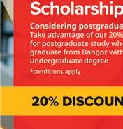
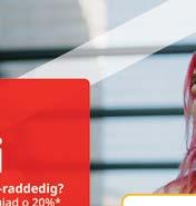
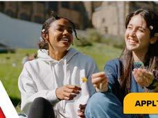
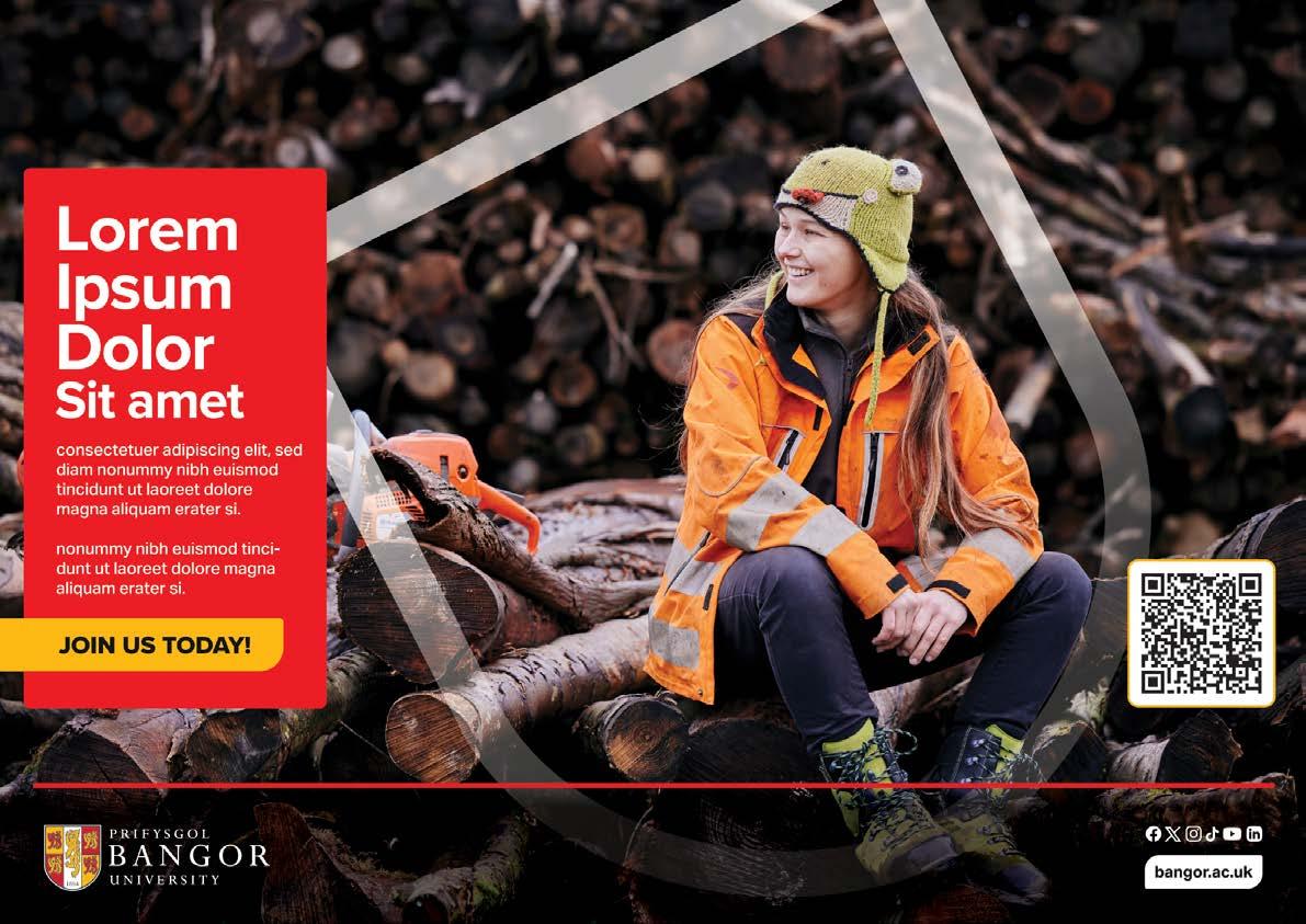
CTA (call to action)
Our CTA design is fully customisable using our brand colours - red, yellow, white, and black. These colours ensure a cohesive, on-brand appearance, aligning with the overall style and messaging of your content.
The CTA can also incorporate website information, offering an effective way to drive traffic and enhance our online presence.
Additionally, our set of social media icons is essential for maintaining brand consistency across all platforms. These icons must be included in all content (where possible) to continuously promote and raise awareness of our social media efforts.

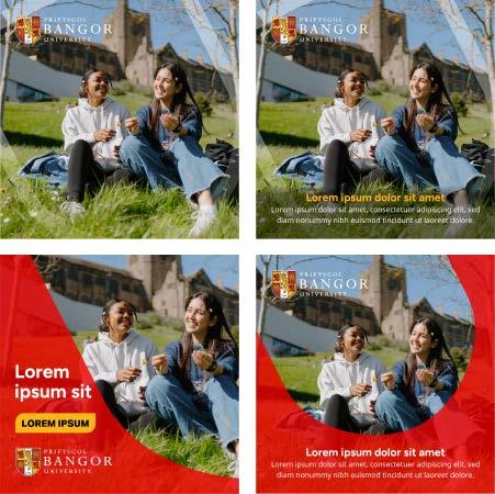
consectetuer adipiscing elit, sed diam nonummy nibh euismod tincidunt ut laoreet dolore magna aliquam erat volutpat. Ut wisi enim ad minim veniam, quis nostrud exerci tation ullamcorper suscipit lobortis nisl ut aliquip ex ea commodo consequat. Duis autem
Secondary Text Overlay Frame
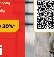
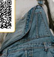
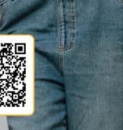
QR Code Frame
consectetuer adipiscing elit, sed diam nonummy nibh euismod tincidunt ut laoreet dolore magna aliquam erat volutpat. Ut wisi enim ad minim veniam, quis nostrud exerci tation ullamcorper suscipit lobortis nisl ut aliquip ex ea commodo consequat. Duis autem
JOIN US TODAY!
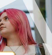
Our approach is image-driven, making the Text Overlay Frame essential from an accessibility standpoint.
By utilising this design element, we ensure that the text sits clearly on top of any background imagery without compromising legibility.
The Text Overlay Frame is specifically designed to enhance readability, even in complex or visually dense images, by providing a high-contrast background.
This approach allows us to feature stunning photography while maintaining accessibility standards, ensuring that the content is easy to read for all users, including those with visual impairments or in challenging viewing environments.
The QR Code Frame has a white background with a distinctive yellow stroke, aligning with our brand identity while ensuring clear visibility.
The footer serves as a key section across print materials, housing the brand’s primary or secondary logo, depending on which best fits the context. It also includes essential links to social media platforms and the website, offering easy access to digital presence.
Additionally, the footer may feature contact information, a brief tagline, or a call-to-action, reinforcing the brand’s identity and encouraging engagement with customers or readers. This area ensures that vital information is consistently visible and accessible.
Capturing and Sharing Our Brand Visuals.


Avoid overly staged or stock images; focus on real moments.
Always get consent for new photography of students or the public.
Consent Form and Guidelines: https://bangor.canto.global/v/PrifysgolBangorUniversity/album/ UE6N6?display=curatedView&viewIndex=1&referenceTo=&from=thumbnail
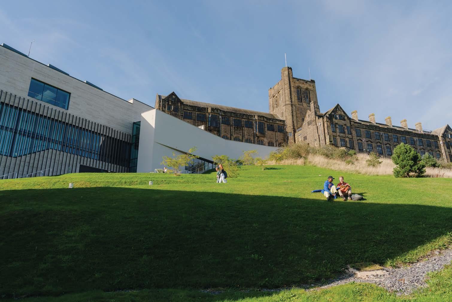
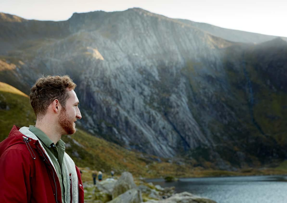
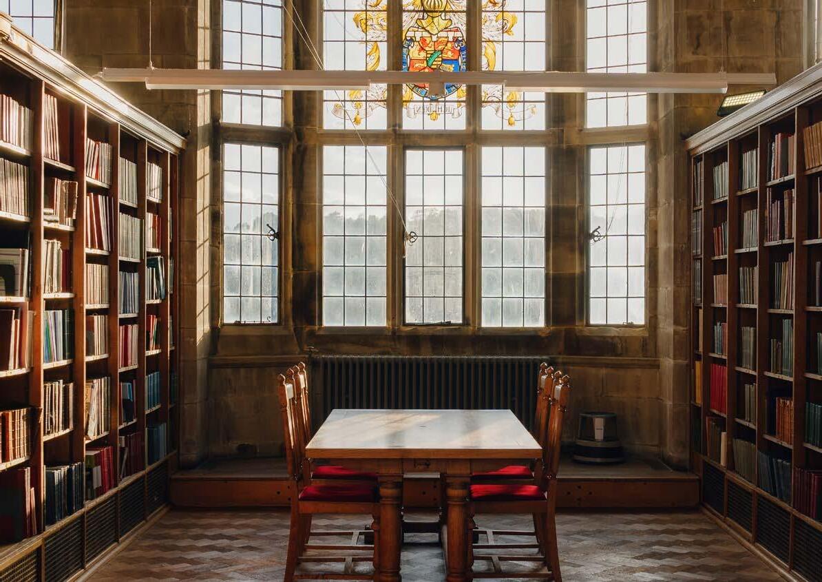
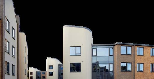
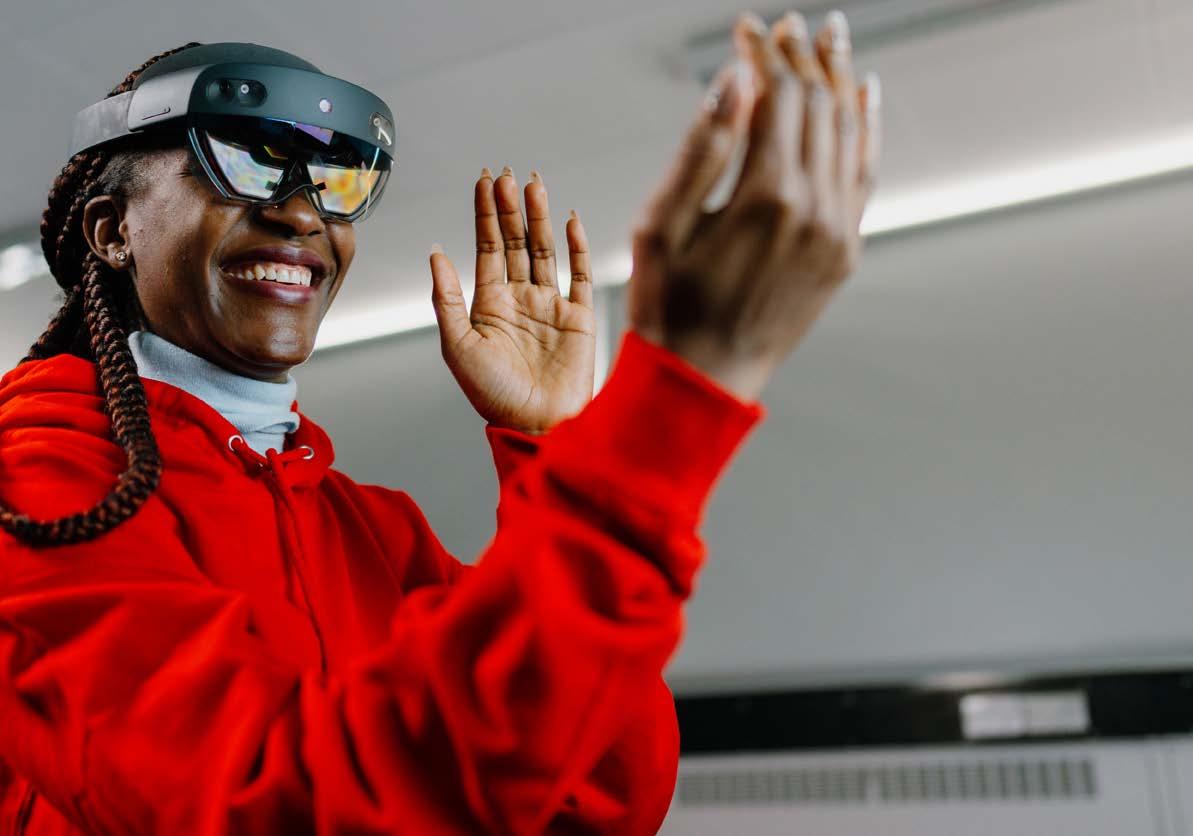
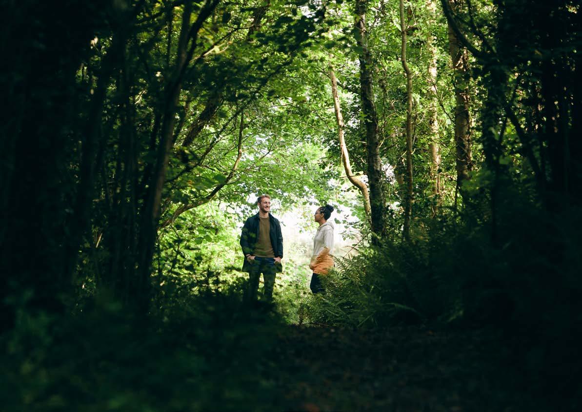
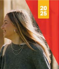
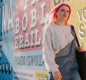
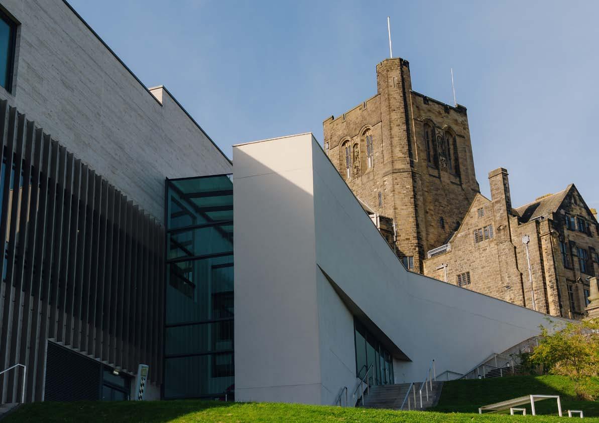
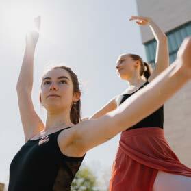
Imagery is at the core of our brand, highlighting the vibrant life and academic excellence at Bangor University.
We focus on candid and professional shots that showcase the brilliance of our campus, community, and surroundings.
Our image library:
Use Canto for University stock images — Bangor University’s official image and video library.
https://bangor.canto.global/v/ PrifysgolBangorUniversity/ landing?viewIndex=1
Capture spontaneous, real-life moments— students interacting, studying, or enjoying campus life.
Ensure high-quality, well-lit images that reflect the university’s professionalism.
Represent our diverse community through inclusive imagery of different ethnicities, genders, and backgrounds.
Show students and staff engaged in campus activities—classes, social events, and sports.
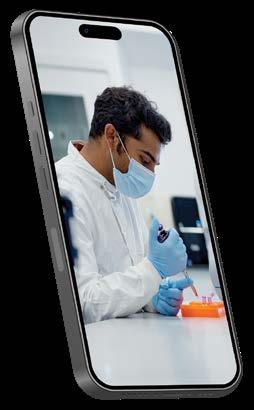
Highlight students in academic settings, labs, and research environments.
Include shots of Bangor’s stunning natural surroundings, including the coast and mountains.
Center images on people to create connection.
Use natural light where possible to create a warm, authentic feel.
Maintain a consistent look across all platforms with subtle editing and natural tones.
Retouching images after a shoot is essential to get the most out of your visual assets. It brings consistency, enhances the overall aesthetic, and allows you to subtly introduce brand identity where appropriate.
The goal is to add vibrancy and energy while keeping the image looking natural and engaging.
Retouching isn’t about changing the photo, it’s about enhancing what’s already there to inspire and connect with the audience.

1. When an image starts off looking dark and desaturated, post-production allows us to bring it to life.
Modified: Brightness and Contract

2. The composition may be strong, but the lighting on the day might not have been ideal, so we adjust brightness and contrast in post to mimic a better lit environment.
Modified: Hue and Saturation

3. We then increase hue and saturation to enhance key colours. It’s important to avoid over saturating, which can make the image look unrealistic.
Where possible, brand colours should be subtly included. In this case, red chairs were already present in the image.
By fine tuning the hue and saturation, we were able to naturally highlight the ‘Bangor red’ without making it feel artificial.
Our mobile photography and video content is an essential part of our visual identity. These guidelines ensure consistency and quality in capturing clear, engaging, and professional media for all platforms.
Whether you’re shooting on location or in a more controlled environment, follow these best practices to maintain a unified look and feel across all university content.
Shoot in 1080p (Full HD) for clear video. Use 16:9 for standard videos, or 9:16 for social media.
Tap the screen to focus on the subject. Lock exposure to avoid lighting changes during the recording.
Use an external microphone for clearer sound.
Do a quick test recording to check audio quality.
Use soft, natural light or ring lights to avoid harsh shadows.
Enable stabilisation or use a tripod to avoid shaky footage.
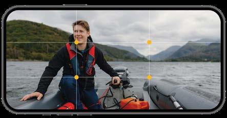
The rule of thirds is a composition guideline that suggests dividing an image into nine equal parts using two equally spaced horizontal lines and two vertical lines.
The idea is to place important elements along the lines or at the intersections known as power points, to create a more balanced, interesting, and visually appealing image.
Use the highest resolution available. Shoot in 4:3 or 16:9, depending on the purpose.
Tap the screen to focus on the subject.
Lock exposure by holding the focus point on the screen.
Use natural light or soft lighting to avoid harsh shadows.
Avoid direct sunlight to prevent overexposure.
Hold the phone steady or use a tripod to avoid blurry photos.
Use the rule of thirds for balanced shots. Ensure the background is simple and clean.
Engagement
On social media, images should be dynamic, engaging, and optimised for quick consumption. They should reflect the energetic and lively nature of Bangor University.
Aspect Ratios
Ensure images are formatted correctly for various platforms.
Brand Consistency
Keep the tone consistent with other platforms—authentic, professional, and reflective of Bangor’s values. Avoid over-stylised filters or edits.
Use clear and concise captions with relevant hashtags. Ensure images align with key messaging and university campaigns.
While not mandatory, including the Bangor University logo and Shield Devices on image-led designs is encouraged. It adds to brand recognition and helps maintain visual consistency across platforms.
Placement
If used, ensure the logo and shield are placed in a way that complements the image without overpowering it. Maintain appropriate clear space around the logo for visibility.
Prepare/research your content prior to uploading your video
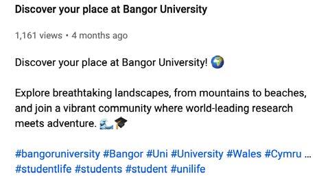
Agree on the title and description of the video in advance and ensure you have the names of any people/schools/companies involved (any accounts to tag via YouTube if relevant).
Title and Description: Make sure your title and description are informative and compelling as they will help people find your video in search results. Avoid adding dates unless it is very specific i.e. Graduation 2025. YouTube will always display the date and time of when the video was uploaded.
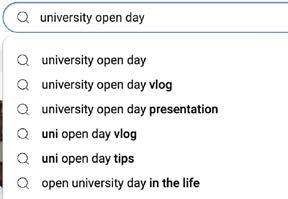
Keywords: To optimise your video for views and likes, open YouTube in a new window and start typing a keyword related to your video (e.g., ‘Open Days’ or ‘University Open Days’).
YouTube will suggest related searches. You can do the same on a search engine such as Google. Use these suggestions to determine the best title and keywords for your video description.
The first couple of lines of the description should contain the most important information since YouTube shortens the description.
Add links & calls to action: Link to your social media, related videos, or external websites. Encourage viewers to like, comment and subscribe.
Subtitles and captions are essential for making your videos accessible to a wider audience, including viewers who are hard-of-hearing, as well as those who speak different languages or prefer watching content in a language they understand.
Adding subtitles not only improves accessibility but also helps make your content more discoverable. YouTube’s search algorithms can index the text in your subtitles, which can boost your video’s visibility in search results and increase its reach.
When subtitles are required, it’s best to create them before uploading your video to ensure accuracy and consistency.

You can use tools like Clideo, Clipomatic which allow you to generate and edit subtitles manually. It’s also important to check your subtitles for spelling and grammatical errors to maintain professionalism. Additionally, proper syncing is critical.
Ensure that the subtitles match the timing of the dialogue or sounds in your video. Poorly timed subtitles can confuse viewers and detract from their experience.
YouTube offers its own auto-captioning system that generates subtitles automatically after uploading your video, but it’s often less accurate than manually created subtitles. To ensure the highest quality and better control over your content, uploading your own. SRT subtitle files is recommended. You can do this directly through YouTube Studio.
In addition to improved accuracy, creating your own subtitles enhances the SEO of your video, as YouTube will index the content in the captions, making your video more likely to appear in relevant search queries.
If you’re targeting international audiences, YouTube also offers an auto-translate feature for subtitles, though it may not always be perfectly accurate.
Closed Captions:
These are optional captions that viewers can turn on or off whilst watching a video.
They are encoded as a separate file (e.g., .srt) and allow users to choose whether to display them.
Closed captions are widely preferred because they provide flexibility and can be translated or auto-generated by YouTube for different languages.

These are always visible because they are “burned into” the video itself.
Viewers cannot turn them off.
Open captions can be a good option if you want to ensure captions are always visible, regardless of the platform or viewer’s settings.
However, they lack the adaptability of closed captions and cannot be edited or translated after uploading.
Best Practice for YouTube:
When adding captions to your YouTube videos, it’s important to understand the difference between closed captions and open captions.
Use closed captions for maximum accessibility and flexibility. They enhance your video’s discoverability through keyword indexing, improve the viewing experience for non-native speakers and are a requirement for compliance with accessibility standards.
https://www.youtube.com/@ bangoruniversity
Welsh https://www.youtube.com/channel/ UCn7s3nQ7EeegkdpSBLmzVrg
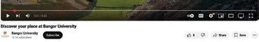
1. Click on the create icon in the top right corner of the page, and then click on the Upload video button.
2. Click on ‘Select Files’ and choose the video file you want to upload (or drag and drop).
3. Add video details (title, description, tags)
4. Create a thumbnail by using the university’s official thumbnail template to ensure brand consistency.
5. Search optimisation – make sure your video is optimised by including relevant keywords in your title, description and tags.
6. If you are uploading longform content, add video chapters by including timestamps in the description.
7. Add to Relevant Playlists: Organise your videos into playlists that are thematically related. Playlists help increase watch time because YouTube auto-plays the next video in the list.
8. Add End Screens to promote other videos or to encourage viewers to subscribe.
9. Use Annotations to add links, calls to action, or other information.
10. PUBLISH.
YouTube tags help YouTube grasp your video’s content and context and will associate it with similar content which will amplify your video’s reach. As a secondary benefit, these tags will also help us to organise and find our own content (e.g. Open Day 2025).
Tags can also be questions such as ‘which university has the best open day?’ (which can often be the result of the top searches by viewers for example).
Hashtags can also be used both as tags as well as in the description of the video (or even the title). Whenever possible, make the most of current, trending topics or hashtags.
Use Keywordtool.io to search for relevant keywords (ensure you are on the YouTube feature).
Google YouTube Trends offers a comparison between multiple search terms to determine which word or phrase bodes a greater interest over time.

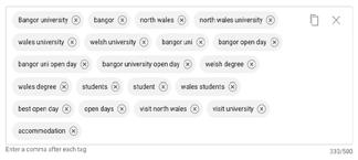
We recommend that every video includes the following tags:
Bangor
Bangor Uni
Bangor University
Uni
University
Student
Students
You should then add additional tags that are specific to the video.

Video Cards
Video cards are preformatted notifications that appear on the YouTube video which you can set up to promote other links and other videos on your channel e.g. when someone in the video mentions an Open Day a small box with a link to an Open Day video can pop up on screen.
Video cards are a great way to keep the viewer engaged and you can add them just before the ‘drop off’ points, where viewers are more likely to click off.
This provides an opportunity to redirect the viewer to other Bangor University content.
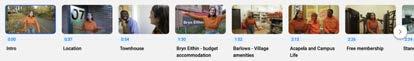
Video chapters are a great way to split a YouTube video into sections, each with an individual preview.
This makes it easier for the viewer to skip or re-watch different parts and is an important part of search engine optimisation (SEO). These are ideal for longer videos.
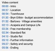
To create video chapters, you need to include timestamps in the video description. Each timestamp marks the beginning of a new section or topic in the video.
Format:
The format for timestamps is 00:00 - Chapter Title, with each chapter starting on a new line.
First Timestamp: Start with 00:00 as the first timestamp to mark the introduction or opening of your video. This is required for YouTube to recognise the chapters.
Example:
00:00 - Introduction
01:30 - Budget Travel Tips
04:00 - Hidden Gems in Paris
07:15 - Best Places to Eat
10:00 - Conclusion
Ensure the Timestamps are Sequential:
Make sure each timestamp is in order and doesn’t overlap with the previous one. If you skip a time, YouTube won’t generate chapters properly.
Upload the Video:
After adding the timestamps to your description, upload or update the video. YouTube will automatically create clickable chapters based on the timestamps.
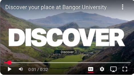
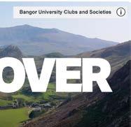
When uploading a video, you must create a thumbnail using the university’s official thumbnail template.
The template is designed to reflect the university’s brand style.
Be sure to follow the layout and colour scheme exactly as provided to keep our channel looking cohesive and professional.
Stick to the style guide for font usage, colours, and graphics. This ensures the thumbnails are easily recognisable across all videos and maintain a unified look for the channel.
Avoid cramming too many elements or words into the thumbnail. It should be clear, clean, and direct, giving viewers a quick understanding of the video’s content.

Lorem ipsum dolor sit amet
at Bangor University
Bangor University
Bangor, Gwynedd, LL57 2DG
Phone: 01248 351151
Email: brand@bangor.ac.uk
Bangor University is a Registered Charity: No. 1141565
www.bangor.ac.uk