Brand Guideline
Graphic Identity Guideline
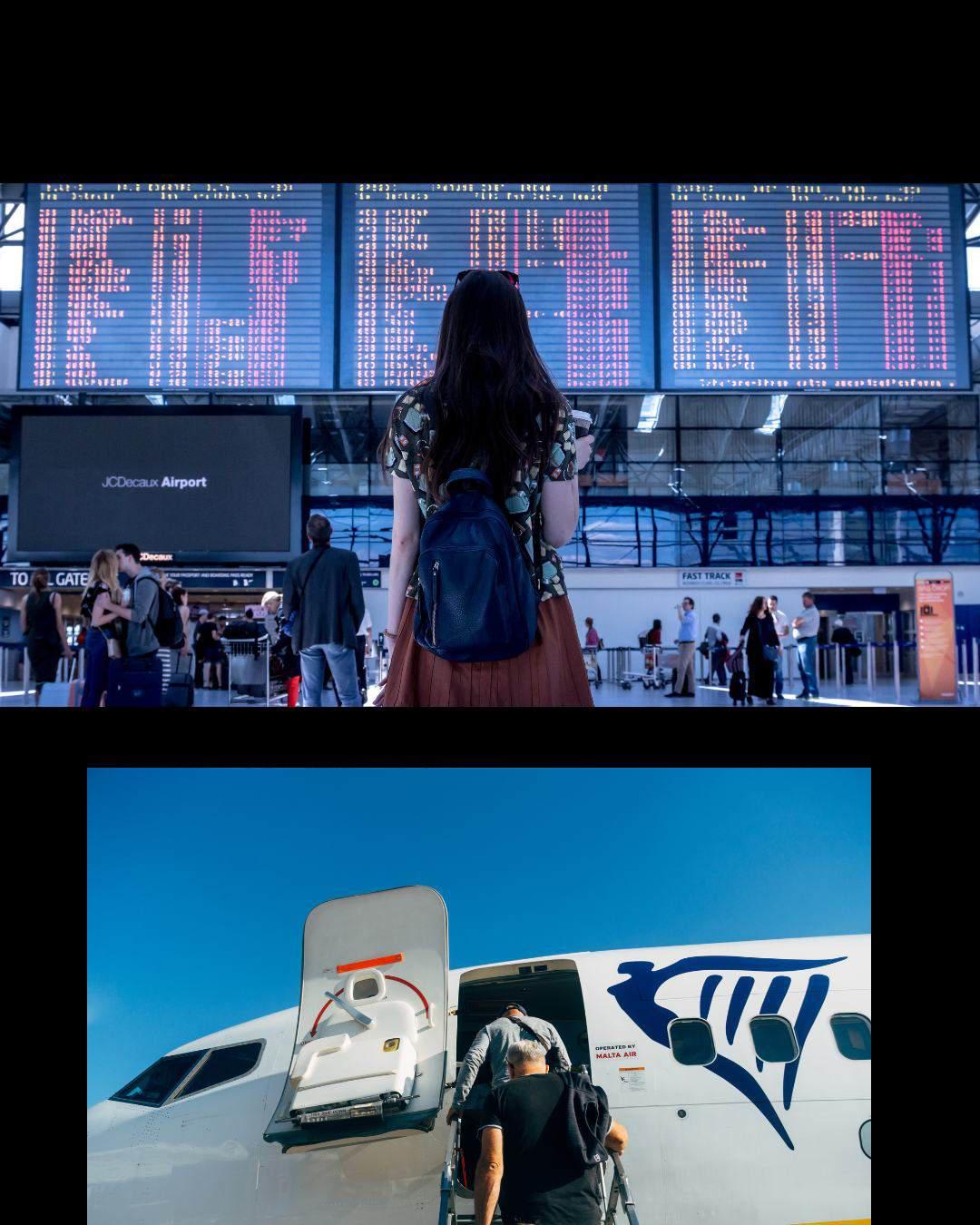
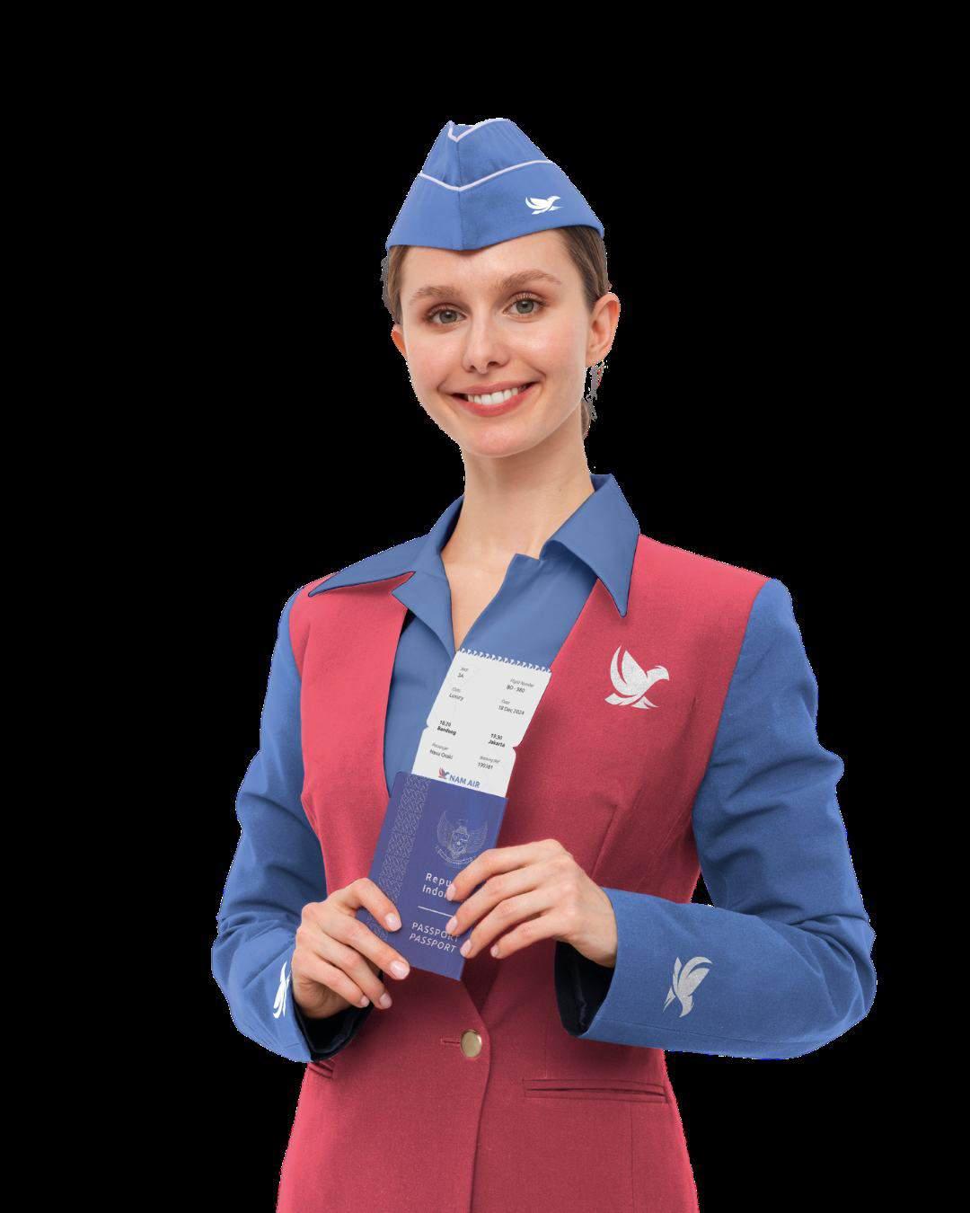
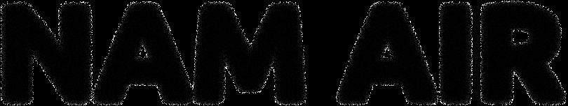
Sriwijaya Group NAM AIR
The old logo
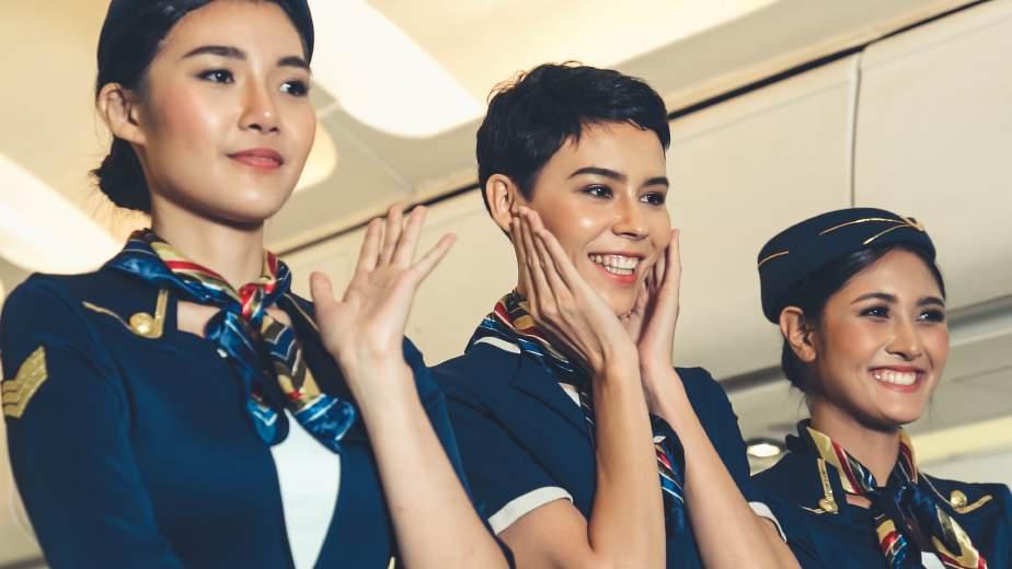
Airline Profile
NAM Air is an Indonesian airline that was established in 2013. The airline is a subsidiary of Sriwijaya Air.
Graphic Identity Guideline
The old logo
NAM Air is an Indonesian airline that was established in 2013. The airline is a subsidiary of Sriwijaya Air.
NAM AIR was named after Sriwijaya Air CEO Chandra Lie's father, Lo Kui Nam.
Vision is based on Nam Air's website
NAM Air employees to provide the best service NAM Air is the only airline that can be trusted and demanded for its services.

Mission taken from Nam Air's website
NAM Air's missions are Knitting the Archipelago, and Serving, Serving and Sharing.

Nam Air offers competitive ticket prices, making it a top choice for passengers looking for economical flights.

With the increasing demand for domestic travel in Indonesia, especially post-pandemic, NAM Air has the opportunity to capture the growing regional traveler market.
Lack of significant differences between NAM Air and Sriwijaya Air in terms of service and branding, thus reducing NAM Air's unique value proposition.


Nam Air only focuses on domestic routes, which limits its growth potential compared to competitors offering international services, making it vulnerable to market saturation in Indonesia.
Nam Air excels in offering economical tickets, but its lack of service differentiation and branding weakens its appeal. Rebranding is needed to create a modern, friendly and relevant image for millennials, thereby increasing competitiveness and strengthening customer

Budget-conscious Young Professionals (Millennials) (Ages 25-35)
Students and Backpackers (18-24 years old)
Those who like to travel
Flexible and dynamic

Hospitality : NAM AIR comes as a warm and friendly travel companion, ensuring customers feel comfortable and valued.
Capturing the spirit of innovation and efficiency in creating a modern and relevant travel experience.
Reliable : Maintain a commitment to provide reliable services, with a focus on safety and timeliness.
Use casual yet professional language to create rapport with customers.
Prioritizing customer satisfaction through caring and high-quality services.
As for our journey, we haven't changed our course, just soared higher.
With Skyo
#flywithNAMAir #TrustInTheSky
I decided to rebrand NAM Air because of the mismatch between the company's vision and its current visual appearance. NAM Air has grown rapidly in terms of services and network.
However, in terms of visual identity, the airline still looks less modern and does not reflect its position as a feeder for Sriwijaya Air, which has full service standards.


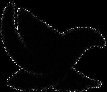
The Nam Air logo concept combines the letter “N” and the pigeon symbol to represent the essence of the airline's identity and vision. The letter “N” was chosen because it is the initials of “Nam Air,” which gives the impression of being simple, memorable, and relevant to the brand identity.
Pigeon is used as a symbol to depict trust and safety, two very important aspects in the aviation industry. Returning to the destination safely, reflects Nam Air's ability to provide trustworthy services.
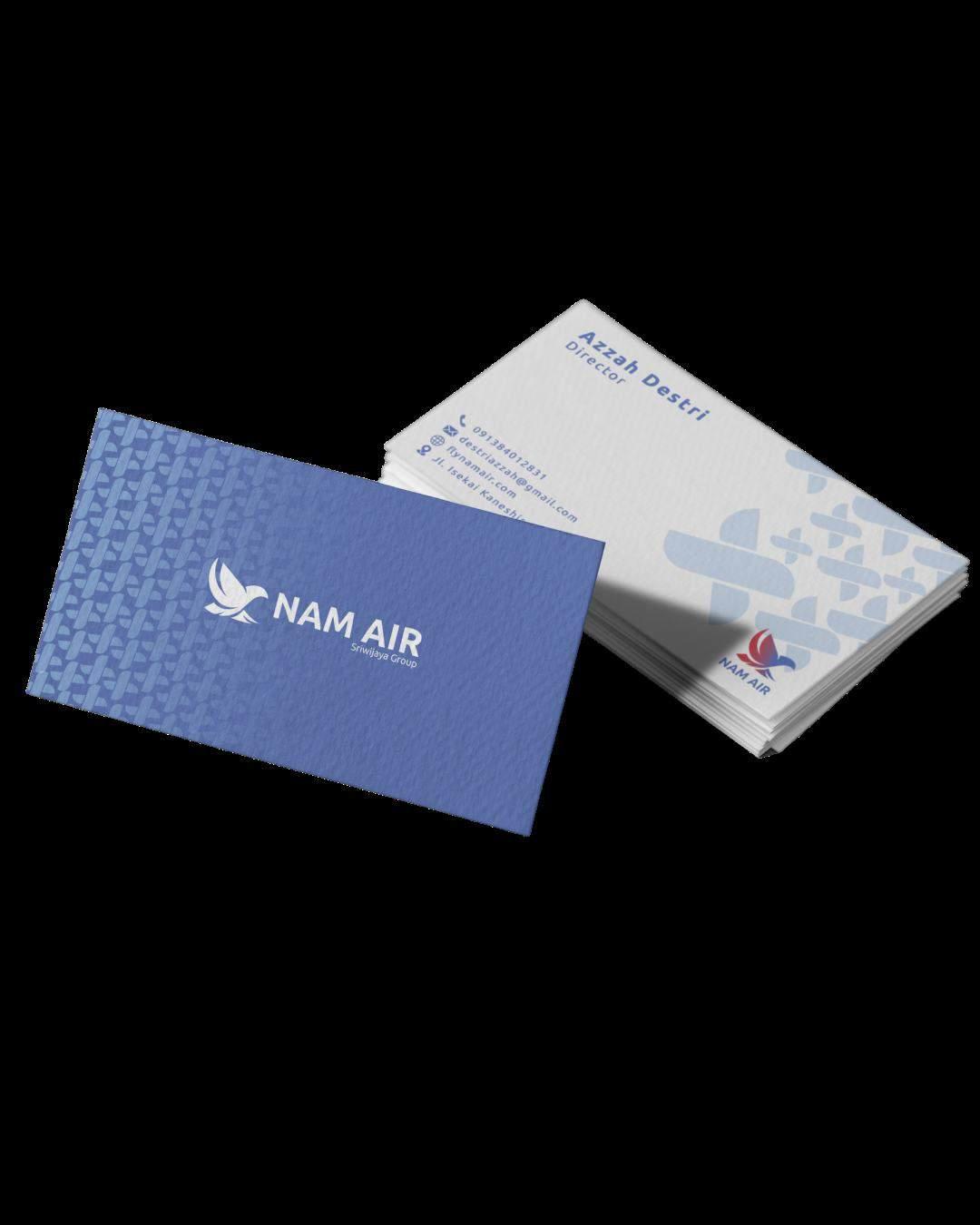
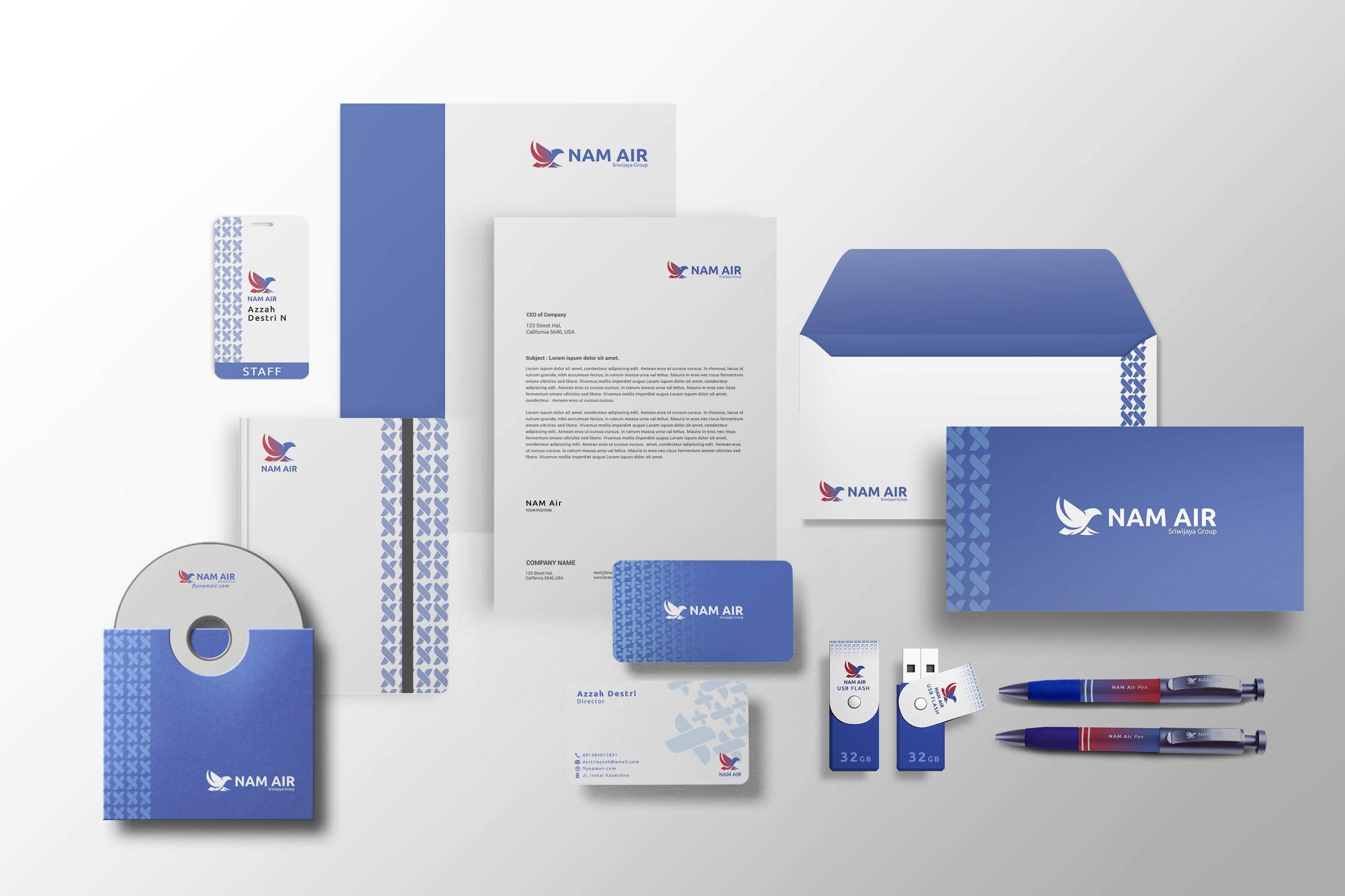
The NAM Air logo is a combination mark of 2 elements
Logomark
Is a symbolic or abstract representation of a brand. Its function is to create a strong visual association for easy brand recall. When you see a symbol such as an apple, a clam shell, an eagle, or three stripes, you automatically connect with the brand it represents.
Logotype
Often referred to as a wordmark, this is a representation of the brand name in text form. The use of typography and writing style gives it a distinctive feature that sets the brand apart from others.
This logo grid is designed using the rule of third principle, creating a balanced and aesthetically pleasing layout. Within this framework, the dove is placed at the focal point of the grid to naturally draw attention. The dove design is formed from a combination of geometric circles and lines, which gives it a modern and professional feel. The circles reflect harmony and continuity, while the lines give a sense of precision and trustworthiness, in line with Nam Air's values.
The grid ensures that all elements are structured proportionally, making the logo easy to apply across various media without losing its visual clarity.
A brandmark captures the essence of a brand in a single image, evoking more than just its name. It’s ideal for use in favicons and other compact formats.
With its wider layout, this format is ideal for websites and billboards, showcasing the logomark prominently.
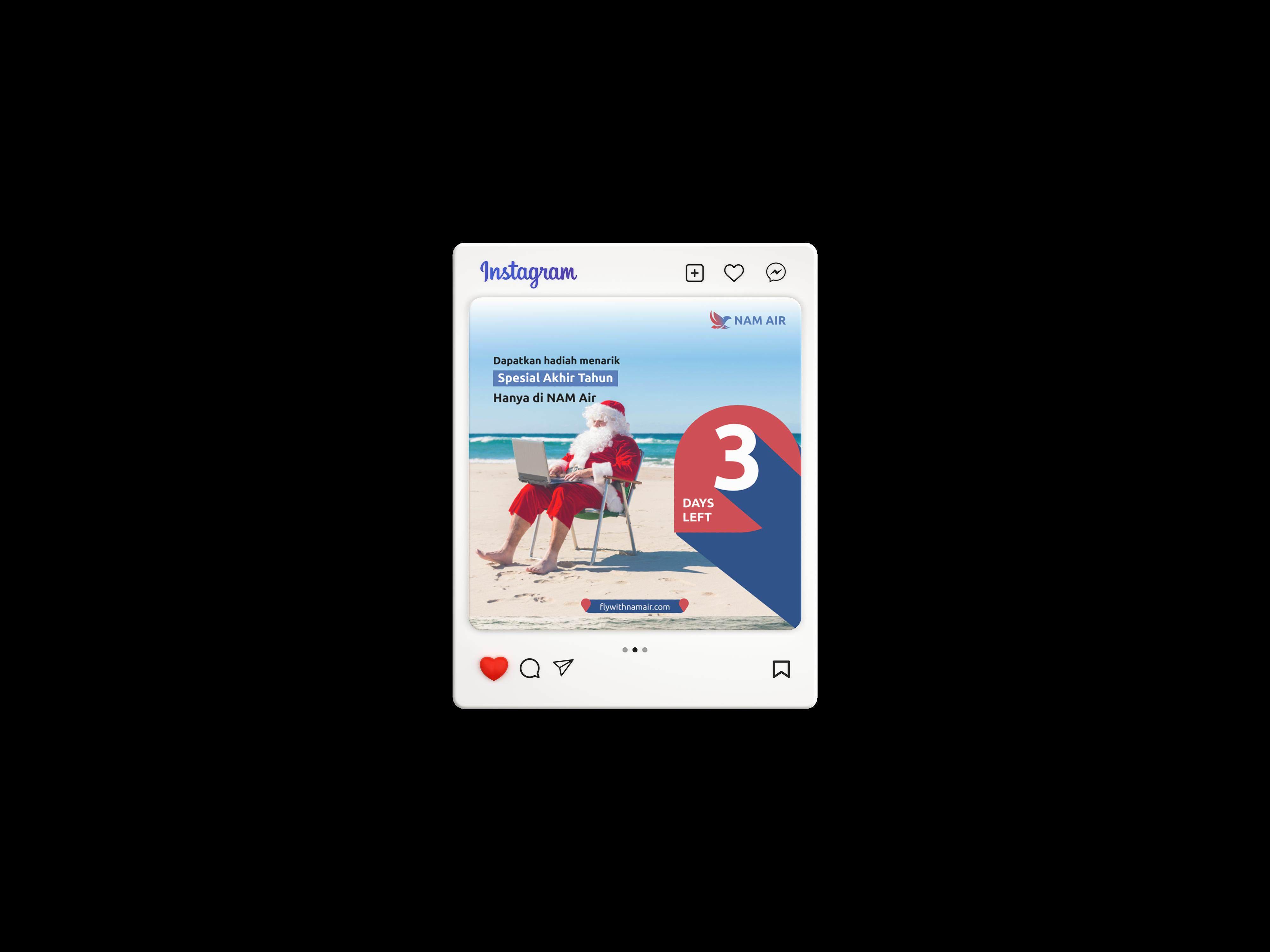
This is our main lockup and should be prioritized whenever possible. In this format, the focus is on the text, making it ideal for social media and marketing materials, particularly in vertical layouts.
Horizontal Vertical Logo + Descriptor
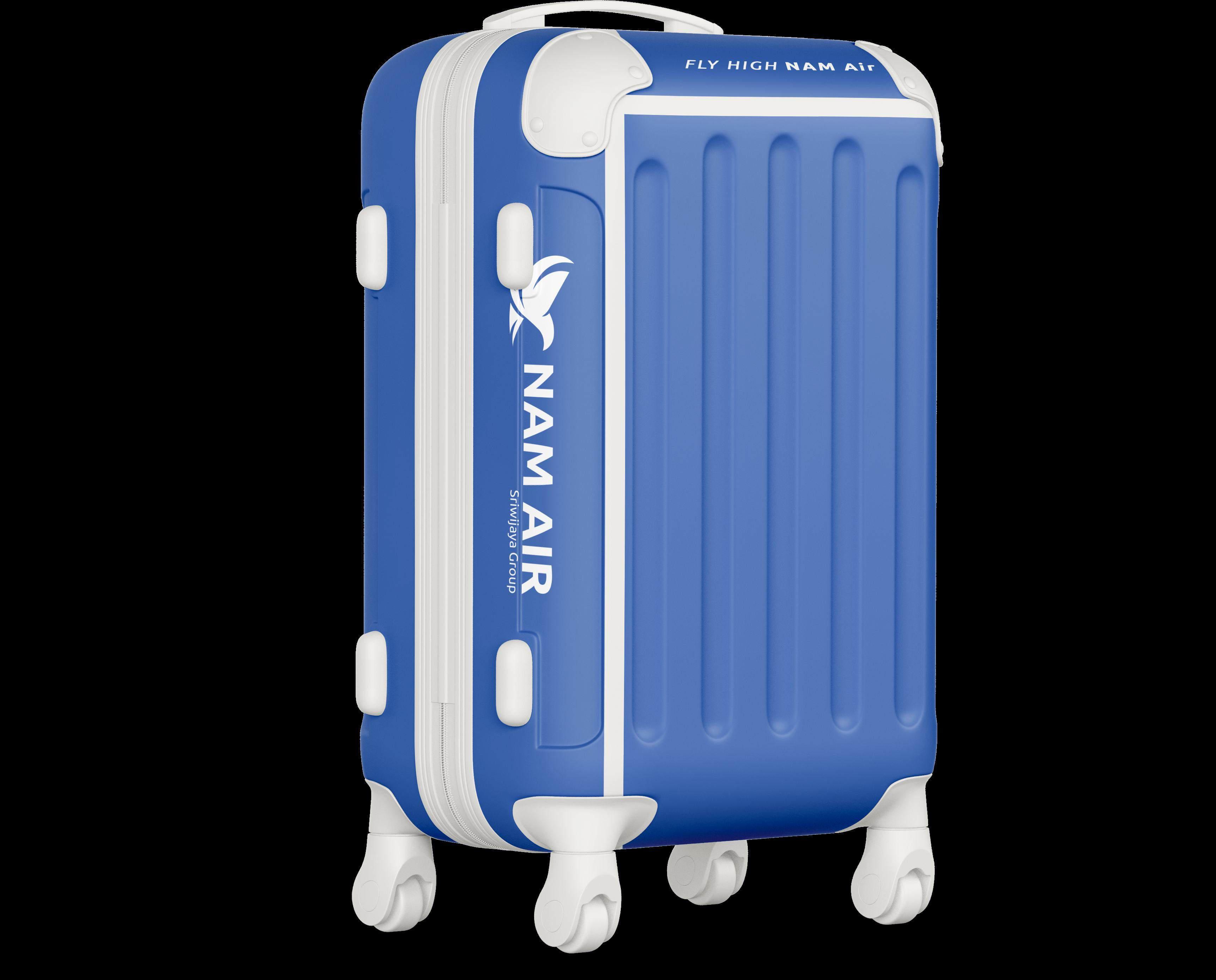
The “Sriwijaya Group” descriptor on the NAM Air logo is used to show NAM Air's affiliation as part of the Sriwijaya group, strengthening the brand identity by emphasizing the hierarchical relationship and trust represented by the parent group.
Logo + Descriptor
As with anything important, our logo needs its own space. When the logo is placed near other visual elements, a minimum safe area provides space for the logo to remain clearly visible. This ensures the visual contrast that is essential for brand identity. Always prioritize visual safety.
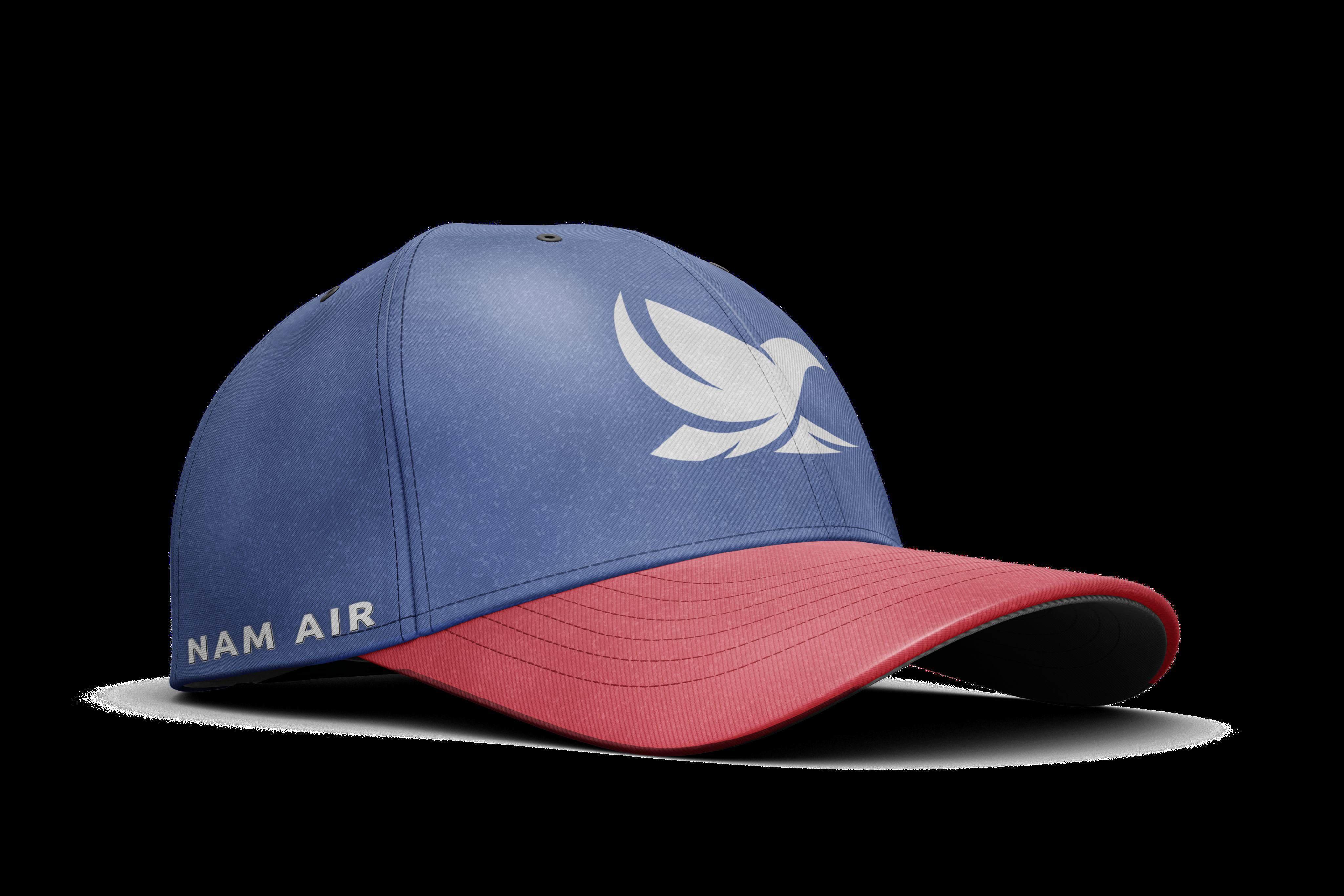
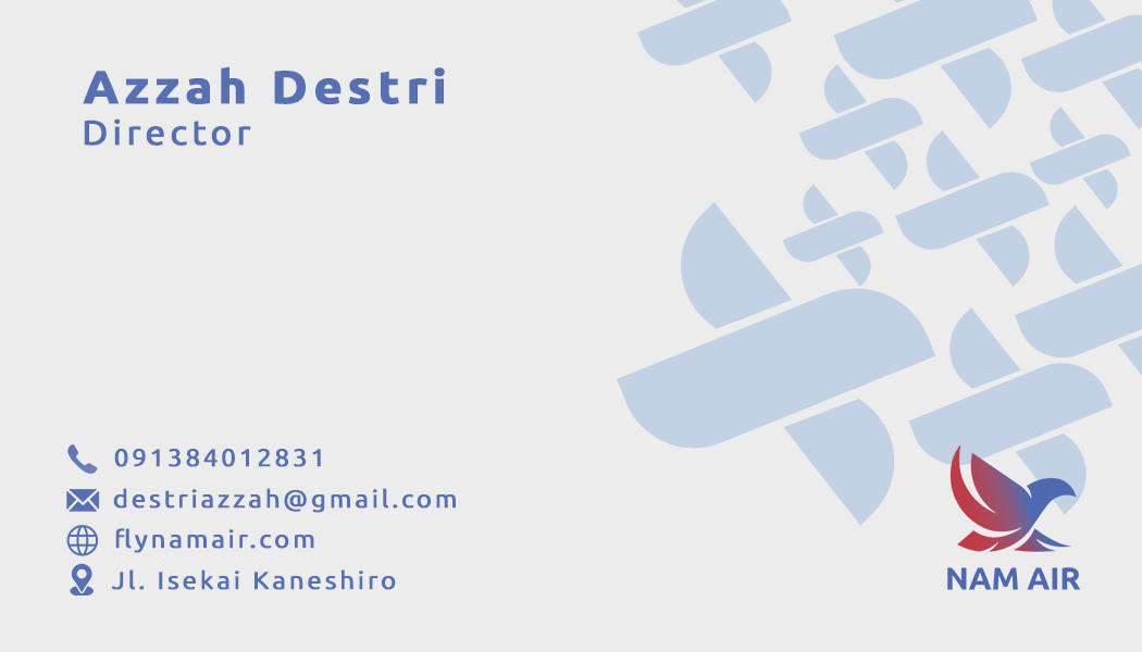
letter N represents NAM Air
The legibility of a logo is affected by pixels, resolution, color pigments, and printing techniques. To ensure consistency, we categorize media into digital and print.
A digital screen consists of a collection of pixels of various sizes and resolutions. When the logo size is enlarged, the logo may become blurry or distorted. This is certainly not ideal, but it can be prevented by setting a minimum logo size to ensure the visual quality remains optimal.
Most printing methods use color pigments to reproduce designs. However, at small sizes, the pigments can overlap and cause smudges. This can certainly be avoided. To maintain readability, a minimum size of the logo should also be applied in printing.

There are 2 ways to place the logo
Placing the logo with typographic content
Placing the logo in a composition

Use the white type on dark or black color backrgound

Match the contrast of the logo in multi-color background
Use monochrome version on any complex background
Use monochrome version of the logo on any blue background
Do not strecht or distort the logo in anyway
Do not rotate the logo, which make it difficult to read
Do not use any sort of shadows to the logo
Do not use any outline version of the logo
Do not change space between icon and typeface
Do not use any random colors to the logo
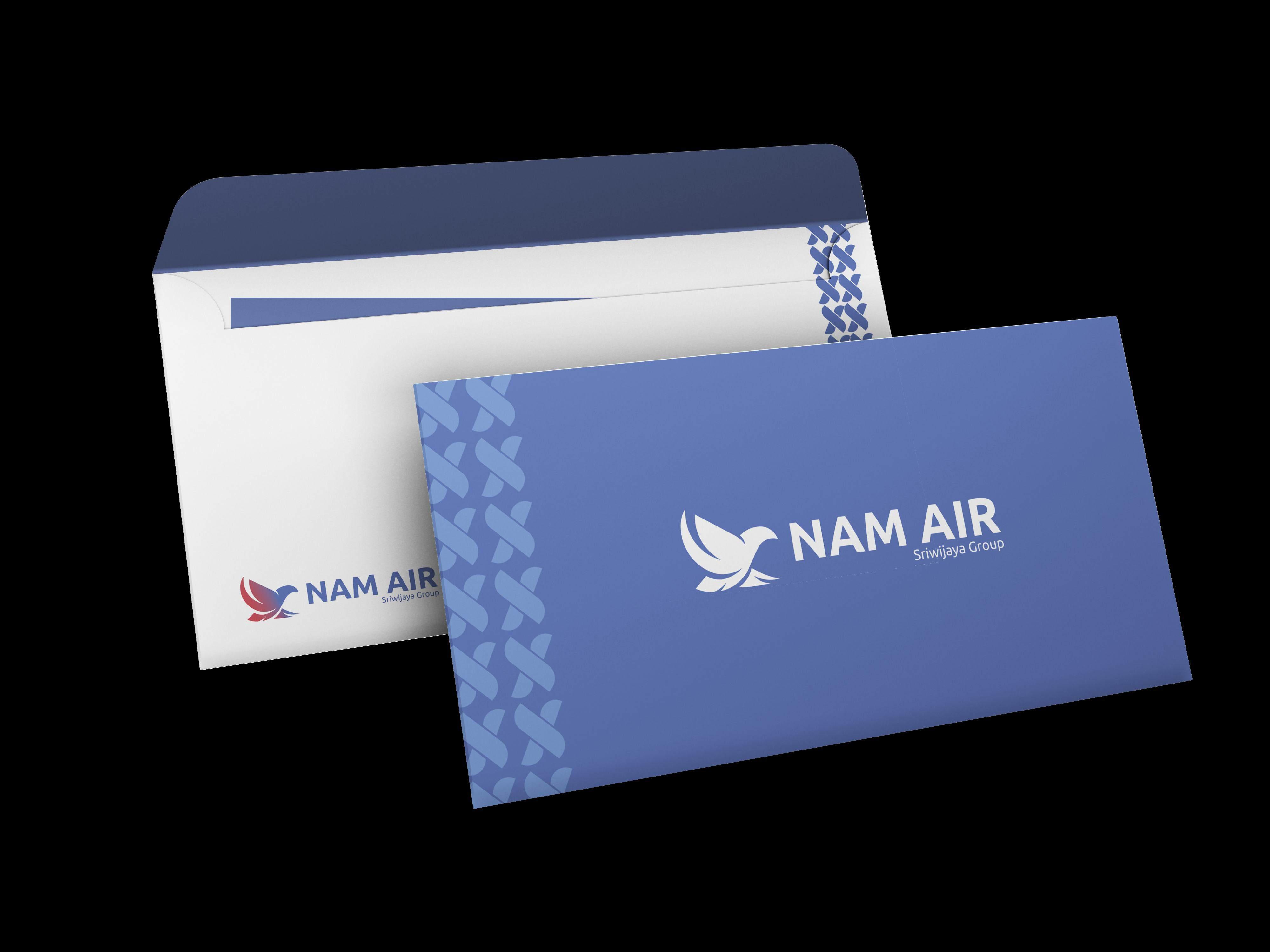
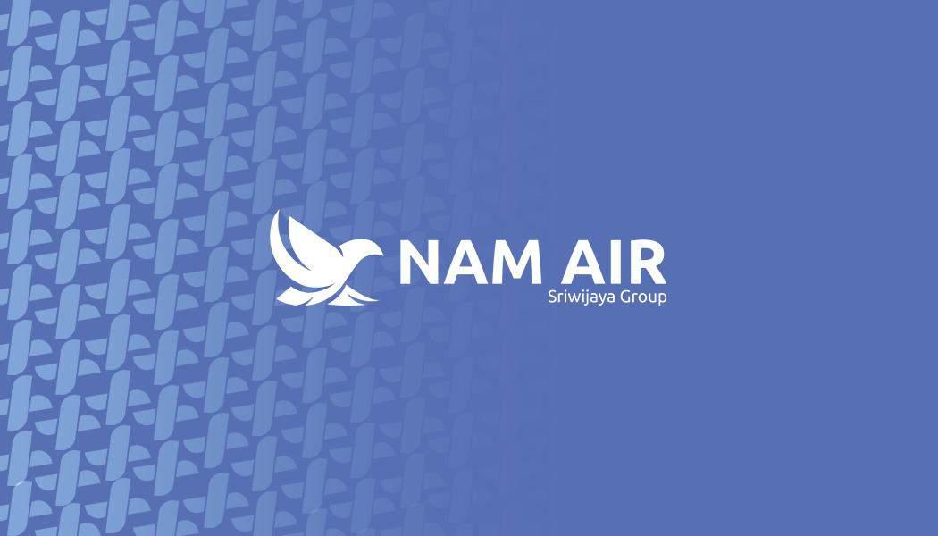
The logo is displayed using a combination of brandmark colors on a different color background. “NAM Air”
This will give you an idea of using the logo on a different color background “NAM Air”
Fill Pattern
Border Line
Stroke Pattern
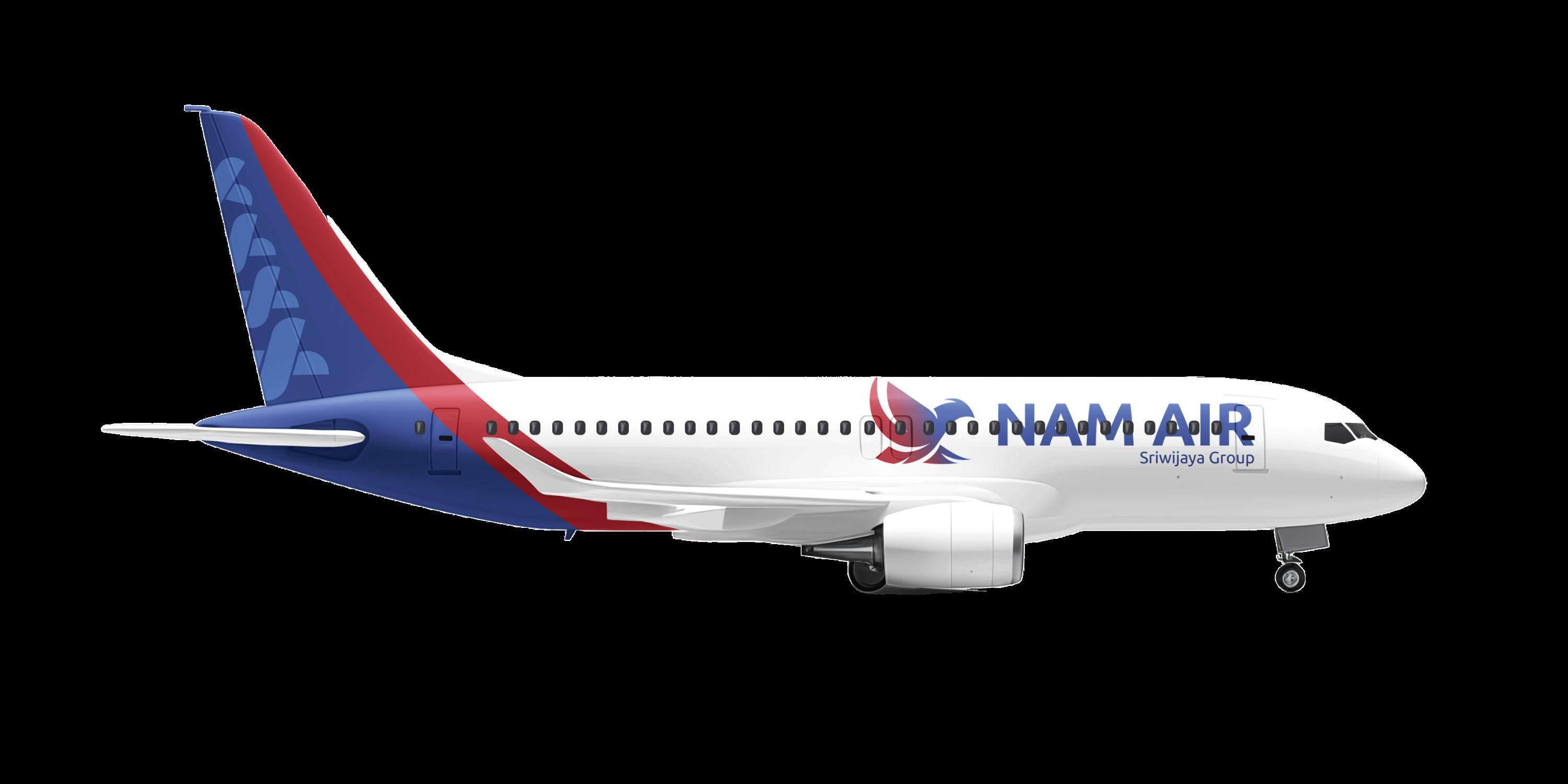
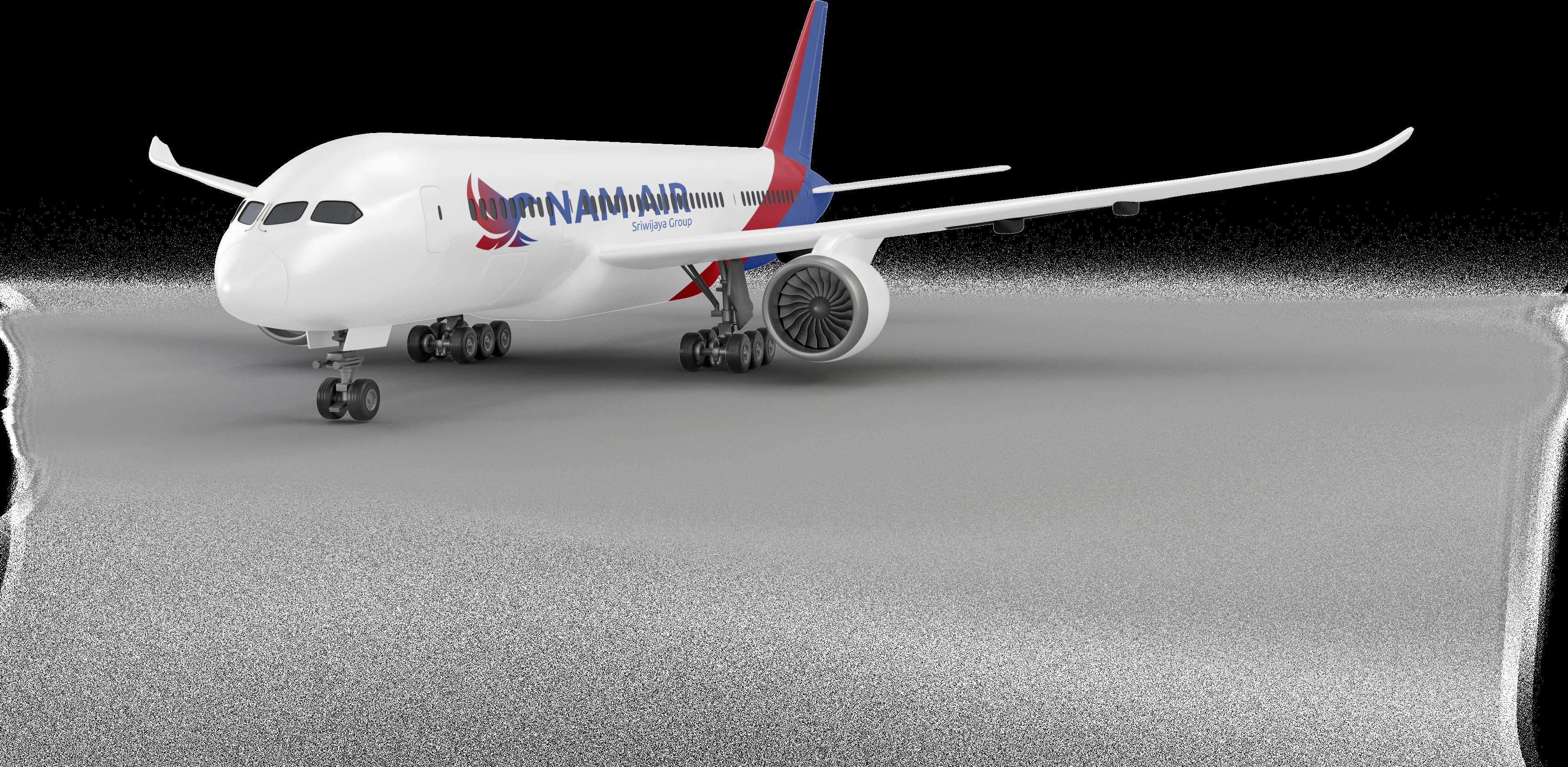
Primary Color
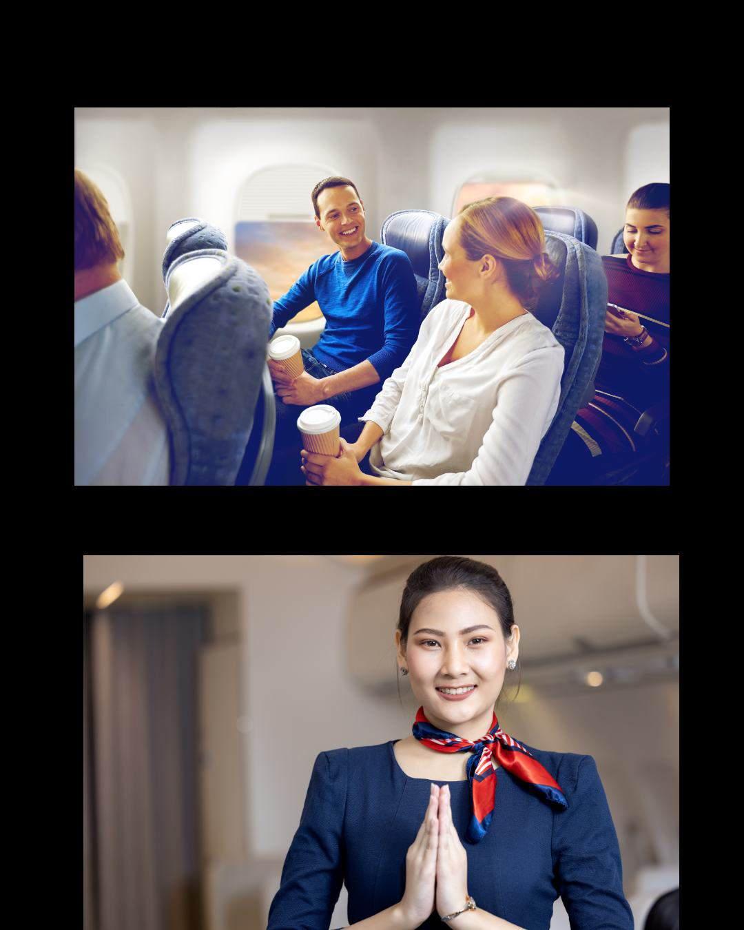
If you're planning a trip, the blue and red colors of our identity aren't just decorative, they play an important role in shaping your experience. Blue brings a sense of calm, trust and professionalism, while red provides energy, vibrancy and a dynamic feel.
Color
Yellow was chosen as the secondary color in NAM Air's rebranding as it symbolizes warmth, optimism and vibrancyAs a secondary color, medium sky blue is used to accent the design elements, adding an interesting dimension without compromising the dominance of the main color. .
If you're planning a trip, the blue and red colors of our identity aren't just decorative, they play an important role in shaping your experience. Blue brings a sense of calm, trust and professionalism, while red provides energy, vibrancy and a dynamic feel.
Blue also creates a modern and calming impression, in line with the airline's

Red also creates a dynamic and attentiongrabbing impression, which is relevant for creating a strong and memorable brand identity. As a color that reflects enthusiasm and competitiveness, red helps Nam Air stand out in the aviation industry.
Yellow was chosen as the secondary color in NAM Air's rebranding as it symbolizes warmth, optimism and vibrancy.

As a secondary color, medium sky blue is used to accent the design elements, adding an interesting dimension without compromising the dominance of the main color.

The design outcomes for this sign system include visual consistency in the use of color, typography, and other design elements. This approach creates a harmonized and recognizable look, ensuring users can quickly understand the information conveyed.
For easy readability, text is always placed in a safe area within the margins. Also, text is only placed on a flat background and should be left-aligned. On a landscape canvas, place the text on the left or right side, while on a portrait, place it at the top or bottom. There is no need to be too rigid with the lines of text, as long as you break the rules creatively.
Perjalanan yang nyaman aman, dan terjangkau.
Perjalanan yang nyaman aman, dan terjangkau.
The Ubuntu font is suitable for Nam Air's rebranding because of its contemporary and modern design, able to withstand various eras and in line with the dynamic millennial style.
This font has a high level of legibility thanks to its clear and well-proportioned letterforms, ensuring the text is easy to read across different sizes and media.
For easy readability, text is always placed in a safe area within the margins. Also, text is only placed on a flat background and should be left-aligned.
On a landscape canvas, place the text on the left or right side, while on a portrait, place it at the top or bottom. There is no need to be too rigid with the lines of text, as long as you break the rules creatively.
Display Typeface : Ubuntu
In every kindly way bringing happiness
Font used : Ubuntu Bold
Body typeface : Ubuntu
Fly Together, Bring the Destination Closer
Fly Together, Bring the Destination Closer
Font used : Ubuntu Regular
size : x points Font size : x points
In case we need additional colors, such in the app, we can use differents shades from brand palletes
Kami hadir untuk perjalanan yang nyaman aman, dan terjangkau.
Dari keberangkatan hingga mendarat, NAM AIR memastikan setiap momen perjalanan Anda menjadi pengalaman yang menyenangkan.
Temukan kenyamanan dan keramahan di setiap penerbangan kami.
Kami hadir untuk perjalanan yang nyaman aman, dan terjangkau.
Dari keberangkatan hingga mendarat, NAM AIR memastikan setiap momen perjalanan Anda menjadi pengalaman yang menyenangkan.
Temukan kenyamanan dan keramahan di setiap penerbangan kami.
Kami hadir untuk perjalanan yang nyaman aman, dan terjangkau.
Dari keberangkatan hingga mendarat, NAM AIR memastikan setiap momen perjalanan Anda menjadi pengalaman yang menyenangkan.
Temukan kenyamanan dan keramahan di setiap penerbangan kami.
Each typography style has its unique feel. The size and thickness of letters can accentuate information or draw attention.
Kami hadir untuk perjalanan yang nyaman aman, dan terjangkau.
Kami hadir untuk perjalanan yang nyaman aman, dan terjangkau.
Sentace case for the body Preferred line spacing
Dekatkan Tujuan
Kami hadir untuk perjalanan yang nyaman aman, dan terjangkau.
Dari keberangkatan hingga mendarat, NAM AIR memastikan setiap momen perjalanan Anda menjadi pengalaman yang menyenangkan.
Same Alignment
Typography
Kami hadir untuk perjalanan yang nyaman aman, dan terjangkau.
Kami hadir untuk perjalanan yang nyaman aman, dan terjangkau.
All caps on body
Dekatkan Tujuan
Kami hadir untuk perjalanan yang nyaman aman, dan terjangkau.
Dari keberangkatan hingga mendarat, NAM AIR memastikan setiap momen perjalanan Anda menjadi pengalaman yang menyenangkan.
Kami hadir untuk perjalanan yang nyaman aman, dan terjangkau.
Wrong line spacing
Kami hadir untuk perjalanan yang nyaman aman, dan terjangkau.
Low contrast on colors
Multiple Alignment
Low contrast on colors


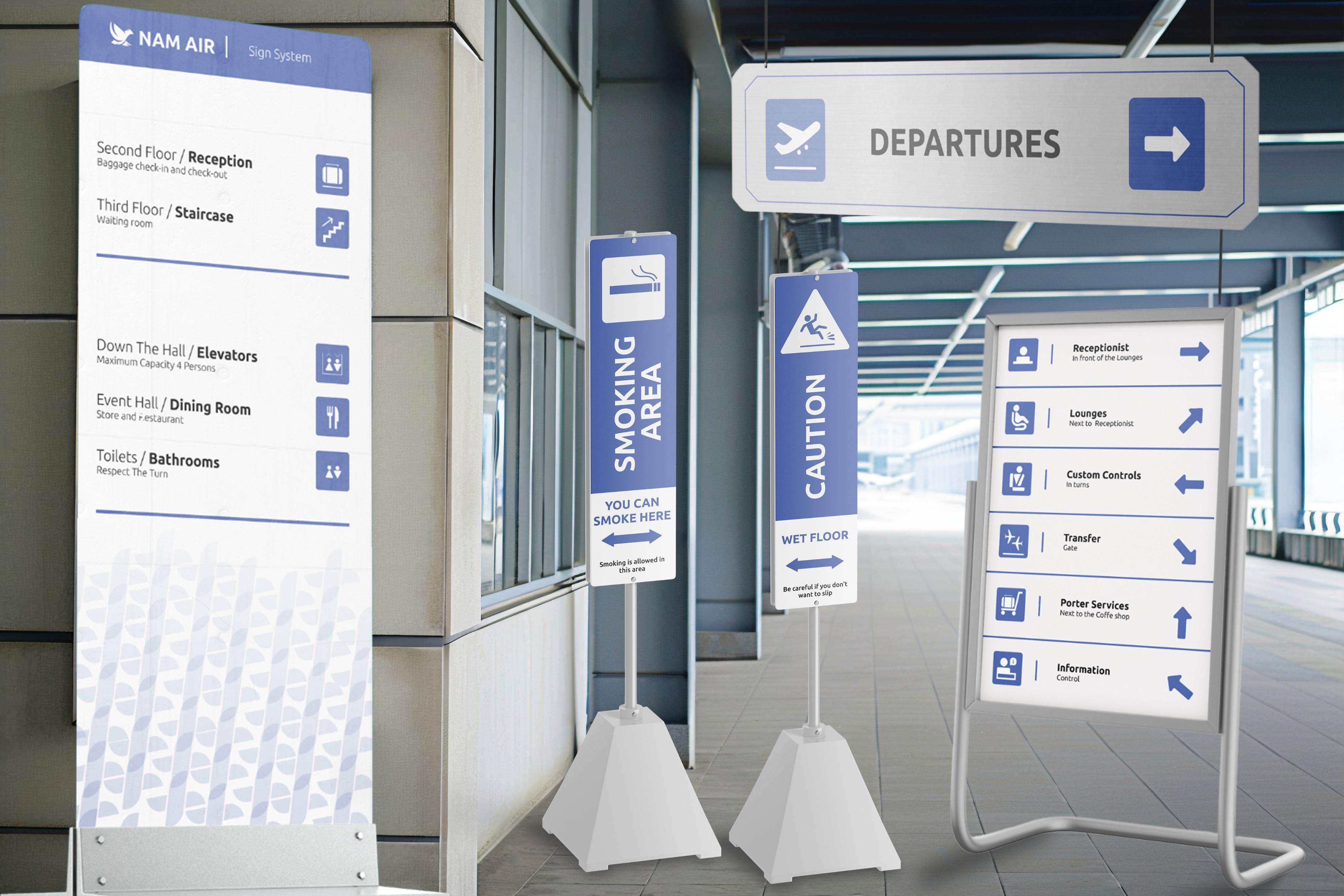
The principle of simplicity is applied so that each symbol is easily recognized by passengers, both in the check-in, boarding and baggage claim areas. This design supports high functionality while ensuring a more comfortable and purposeful travel experience, in line with NAM Air's commitment to provide the best service.
Each pictogram, although simple, is carefully designed to clearly represent the associated meaning or function.
This clarity is a major factor in creating an effective design, especially in an airport context where quick and accurate visual communication is required.
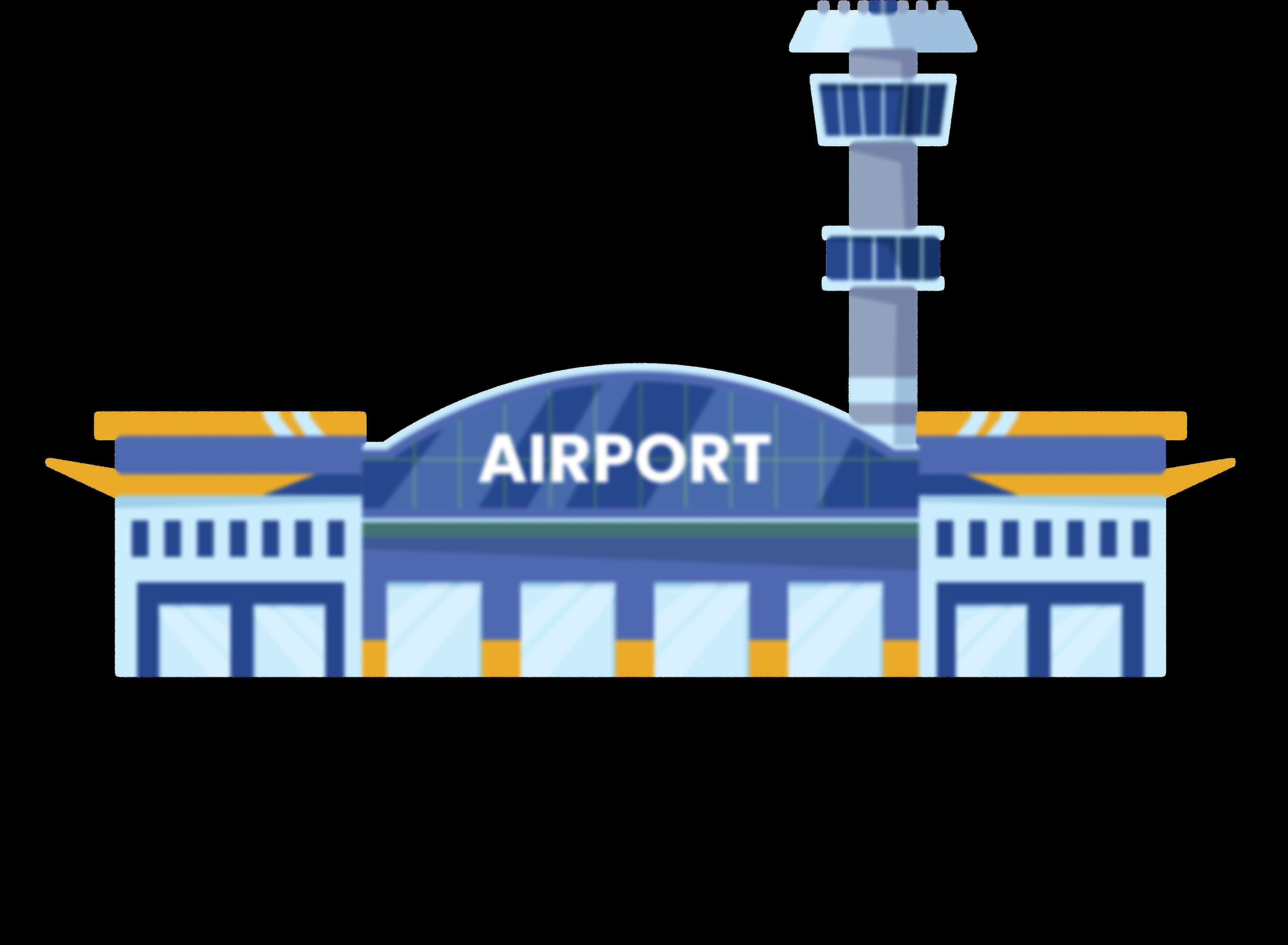
NAM Air airport system sign
The design outcomes for this sign system include visual consistency in the use of color, typography, and other design elements. This approach creates a harmonized and recognizable look, ensuring users can quickly understand the information conveyed.


Receptionist
Lounges
Next to Receptionist
Custom Controls
In turns Gate
Transfer
Information In front of the Lounges
Porter Services
Next to the Coffe shop Control
The text should be placed inside the circle on a flat colored background. While the position of the text is fixed inside the circle, the circle itself can be positioned flexibly. Composition focuses on the right balance between text and image placement.
Generally, a composition consists of two main elements: an image to attract attention or create a first impression, and text to provide further details and clearer explanations. By adjusting the size and position of the circles on the canvas, we can create a variety of layout variations that give each content element its own appropriate space.
Terbang lebih tinggi, kepercayaanmenjagaanda

Always place your content inside the margine
Terbang lebih tinggi, kepercayaanmenjagaanda

setiapkenyamanan bersamaterbang kami
Keep the elements in good balance in the composition
setiapkenyamanan bersamaterbang kami

Icons are simple and easy-tounderstand visual representations to convey a message. It serves as a visual bridge that connects the user's memory with the desired information, thereby clearly encouraging action. NAM Air's outline-style icon prioritizes a minimalist yet effective impression.