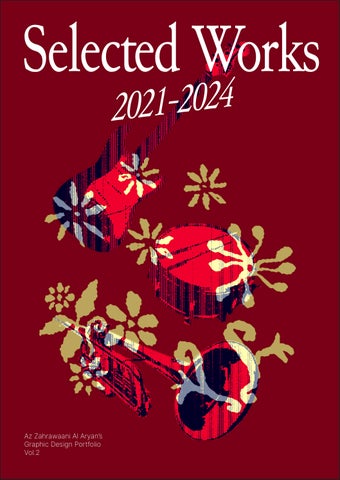
Selected Works 2021-2024: Graphic Design Portfolio Vol.2
Selected Works 2021-2024
Az Zahrawaani Al Aryan’s Graphic Design Portfolio
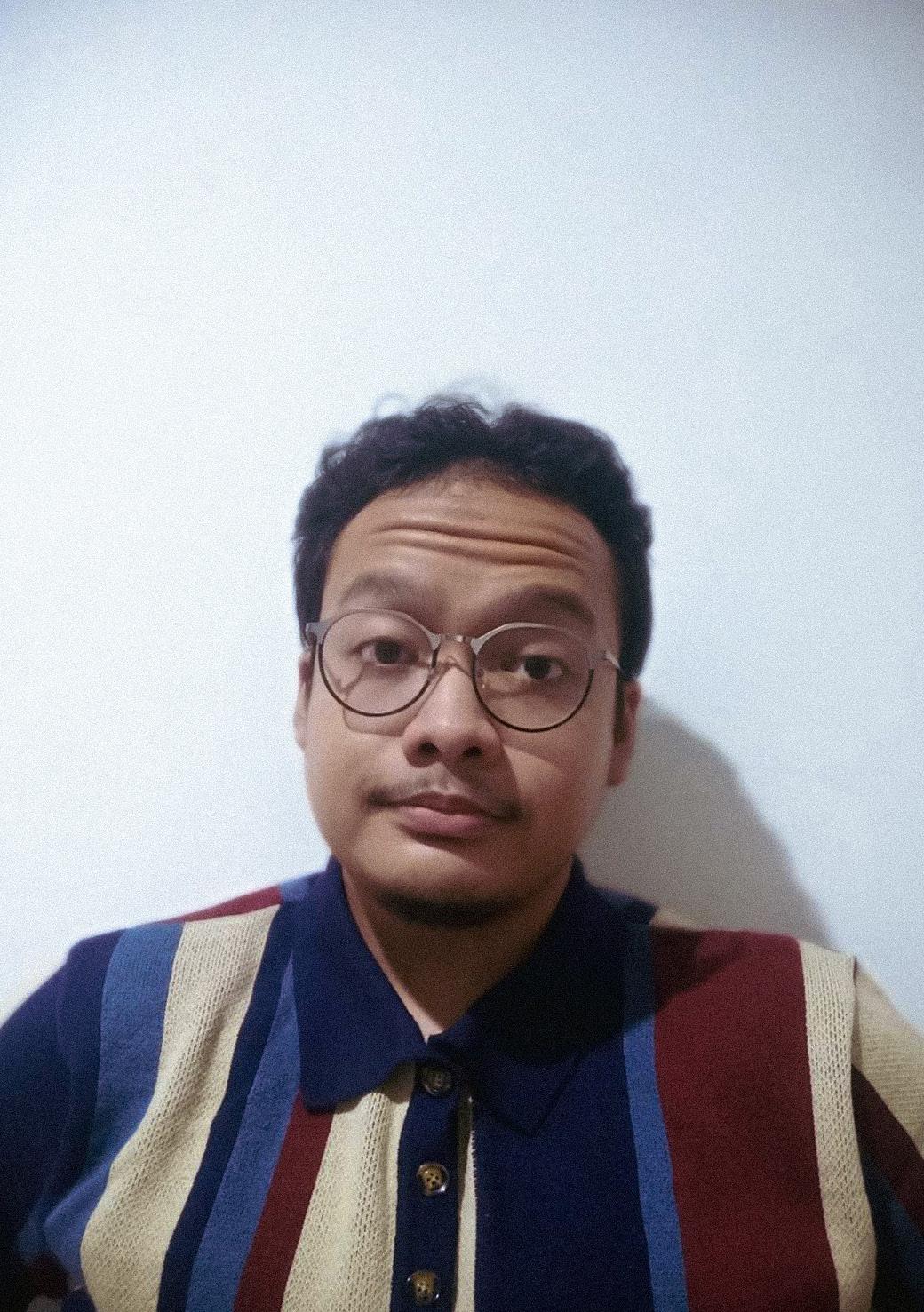
My name is Az Zahrawaani Al Aryan, but you can call me Acha.
A fresh graduate architect with an interest to create visual design with personality. I have a deep interest in branding and typography with an eagerness to approach design as a visual storytelling means.
Graduated as Bachelor of Architecture in Universitas Indonesia, I’ve combined architectural and graphic design approaches during my studies to sharpen my problem solving skills and explore ways to communicate my ideas effectively across mediums. I’ve approached architectural design with an emphasis on contextual research in order to explore possibilities and find the identity of each design. This resonates with how I approach graphic design where I try not to limit myself to certain styles or methods, focuses in finding the personality of each design and telling stories through the visuals.
Personal Data
Birth
Address
E-mail
Phone
Instagram Behance
LinkedIn
I
Surabaya, December 22nd 2000
Jl. Pandugo Sari VII PS2 M-34, Penjaringan Sari, Rungkut, Surabaya, East Java, Indonesia
Jl. Mawaddah V Blok J5 No.5, Klp. Dua, Kec. Klp. Dua, Tangerang, Banten, Indonesia
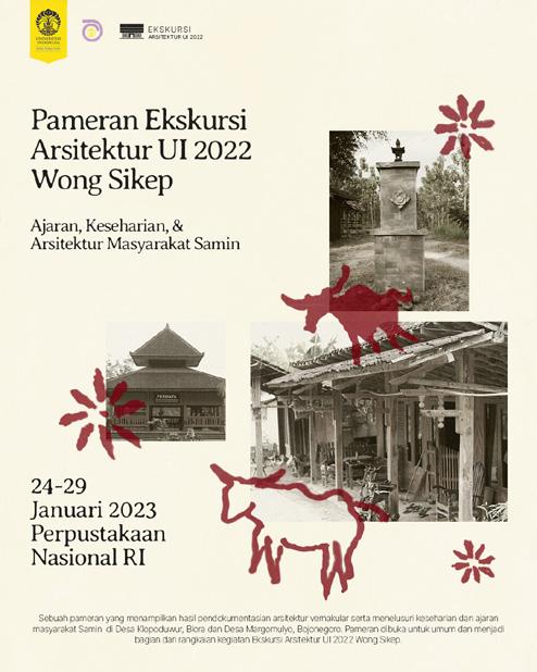
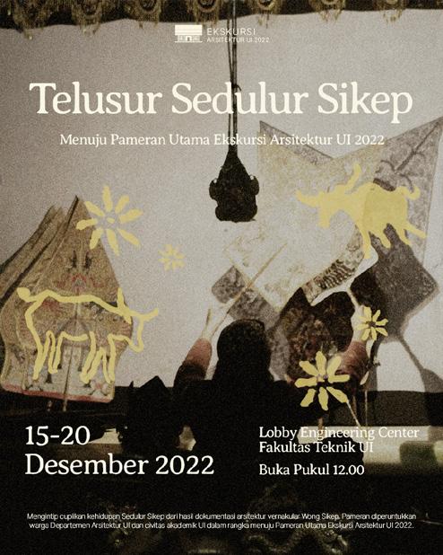
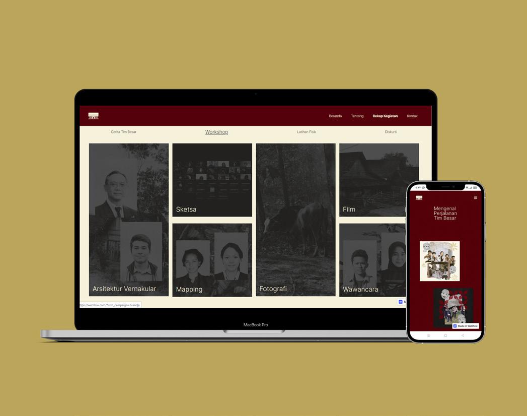
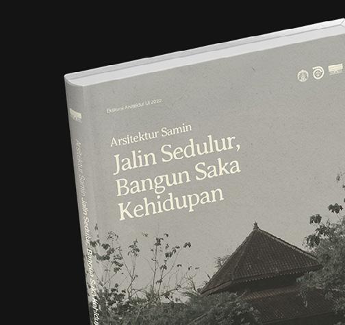
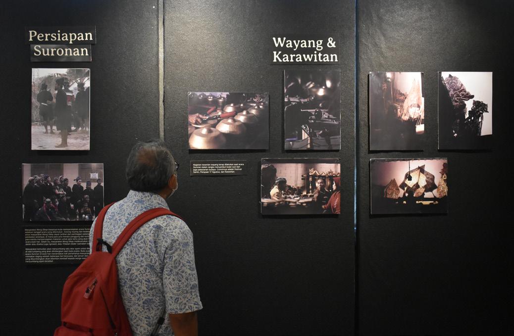
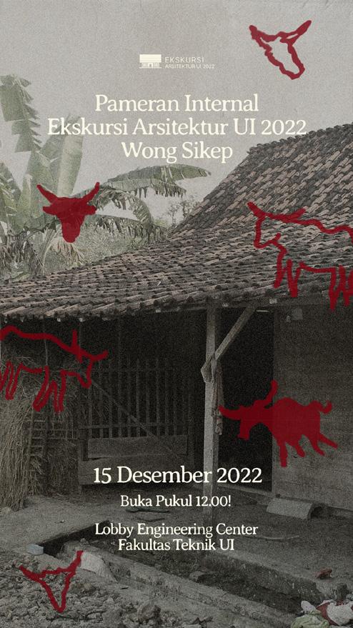
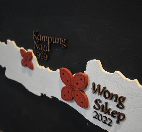
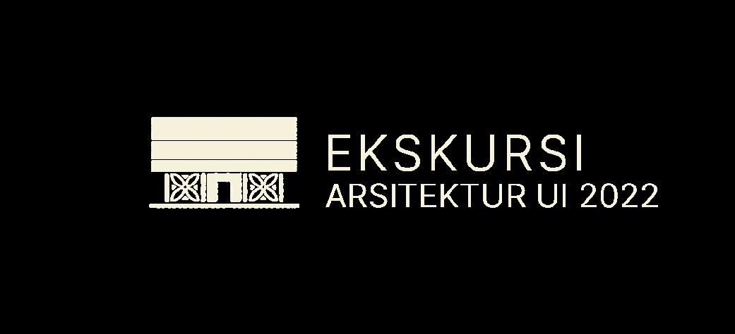
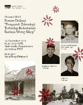
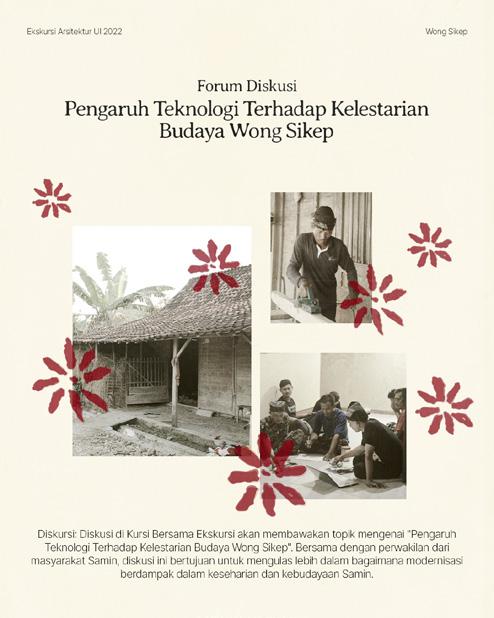
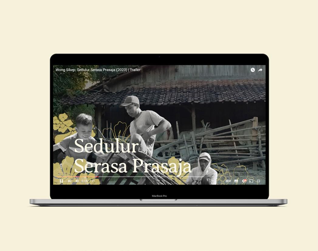
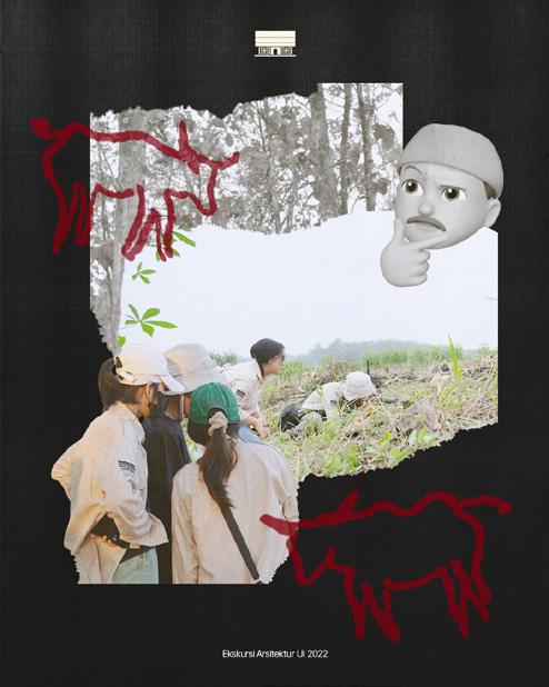
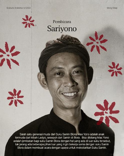
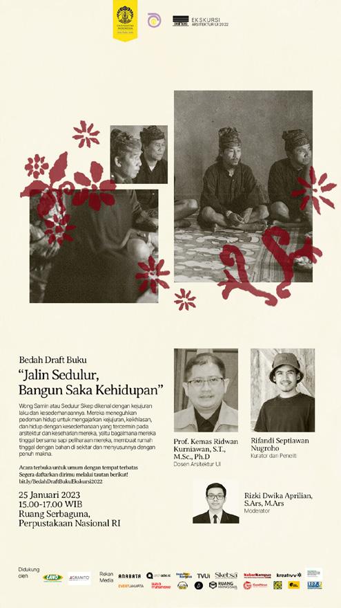
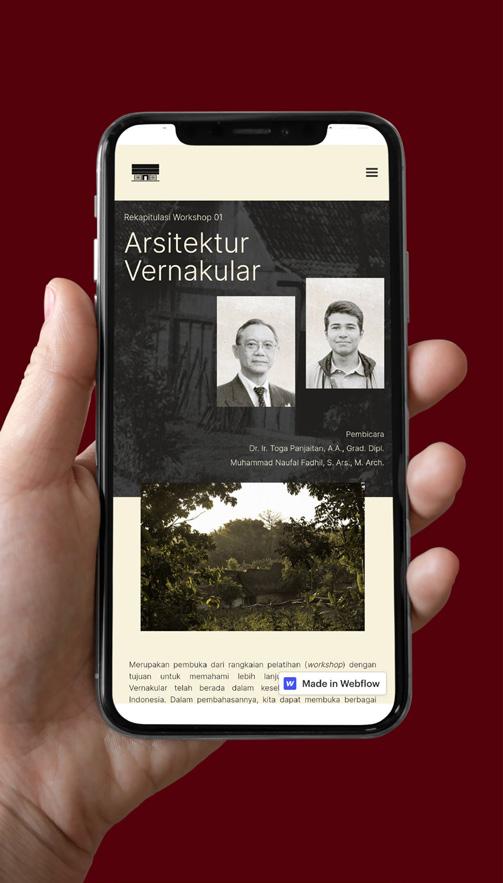
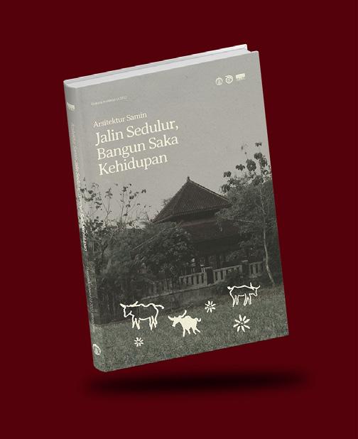
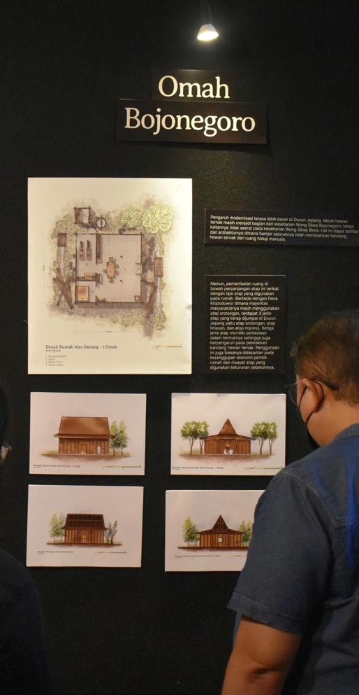
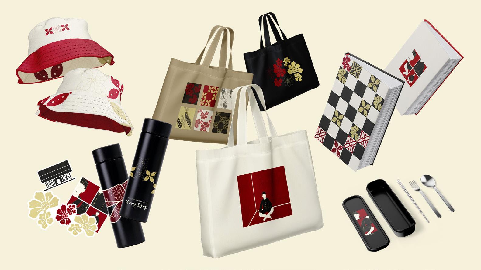
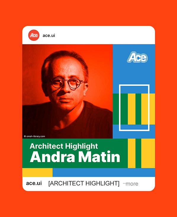
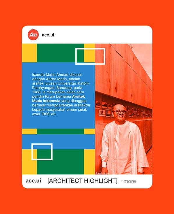
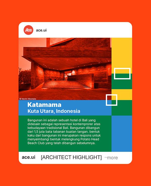
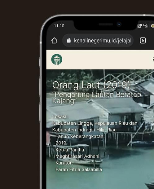
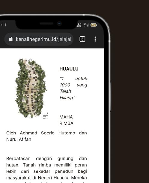
Ekskursi Arsitektur UI is an annual event held by Departemen Arsitektur Universitas Indonesia with the aim to documenting vernacular architecture in Indonesia. In 2022, Ekskursi went to Blora and Bojonegoro to document Wong Sikep's vernacular architecture, culture, and way of life. The documentations are then showcased through an exhibition that are open for public, a book, a film, and additional contents through website and social media.
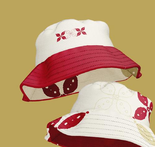
The visual identity are derived from the characteristics of Wong Sikep as a traditional ethnic group that resides in Central Java area and their sedulur sikep belief. The belief encourages the people to consider everyone as brothers or sisters that are obliged to help one another. They don't want class or hierarchy, such as in terms of clothing, food etc.
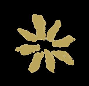
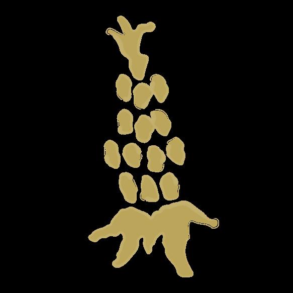
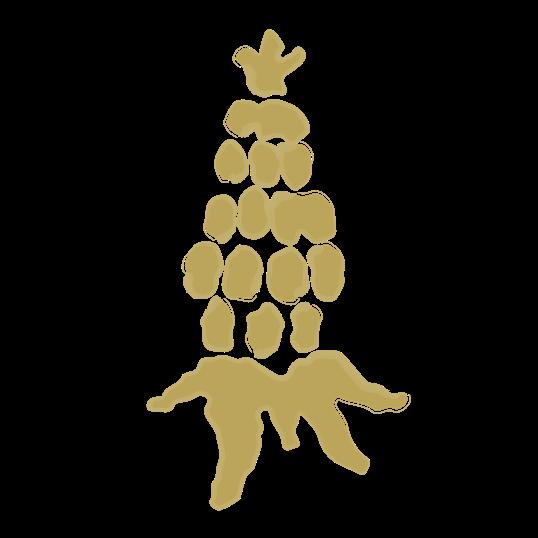
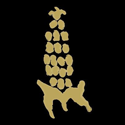
The belief resonates into three key points that encapsulate Wong Sikep way of life, which is respecting nature, honesty and simplicity. These three points are translated into the identity as its colors and compositions that are focused on minimalism and sincerity in incorporating the surrounding nature and culture of Wong Sikep's daily life as the graphic elements. Batik pattern becomes the graphic element with forms derived from typical Central Javanese batik patterns and the local animals and plants in Wong Sikep villages.
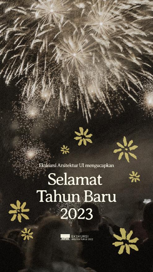
Visual consistency is crucial for the range of contents that Ekskursi produced in different mediums. The graphic elements are composed with minimalism in mind where the batik patterns act as accents that are not dominating the other elements such as photos and typography. The tone are maintained toward muted black and white colours to achieve a modest and classic look with the batik patterns using muted red and gold colors as a striking accents. The concept are inspired by Wong Sikep's traditional clothing that uses mainly black wardrobe with batik cloth and hats as an accent.
Digital contents are the main outputs for marketing campaigns on social media and website while physical contents are produced in the form of Ekskursi book, merchandises, and exhibition needs, such as environmental graphics, wayfinding, captions, illustrations, etc.
Creative & Art Direction
Az Zahrawaani Al Aryan
Alvina Olivia
Chairunnisa Yasmin
Design
Az Zahrawaani Al Aryan
Alvina Olivia
Chairunnisa Yasmin
Ekskursi Arsitektur UI 2022
Design Team
Exhibition Design
Fifi Oktiana
Faradillah Ekaputri
Samiya Romzy
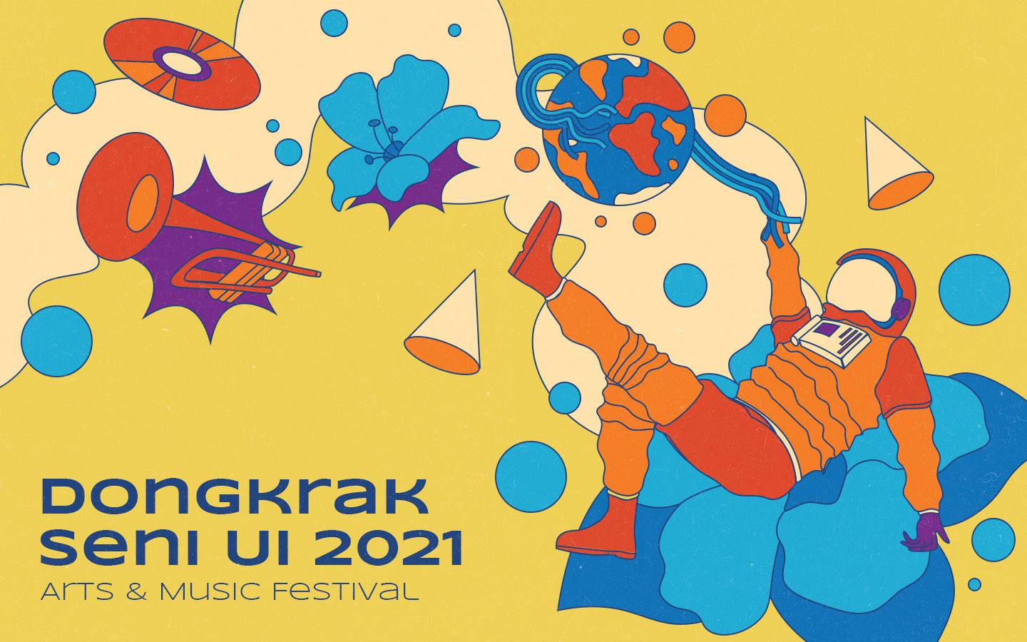
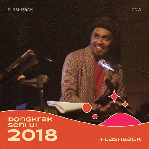
Dongkrak Seni UI 2021
Scope
Visual Identity, Illustration
Role Head of Design
Year 2021
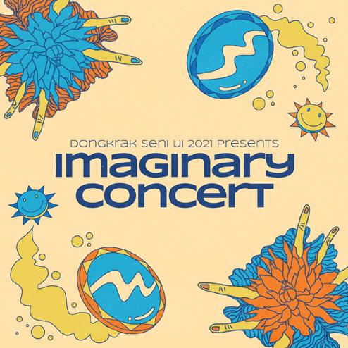
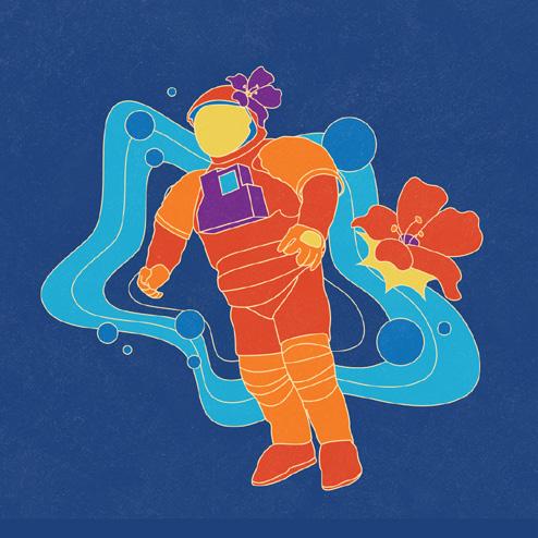
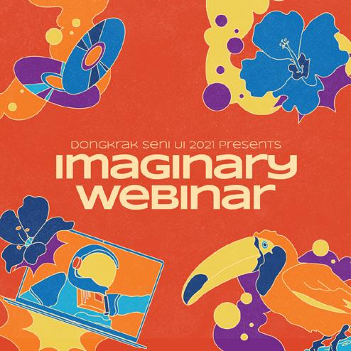
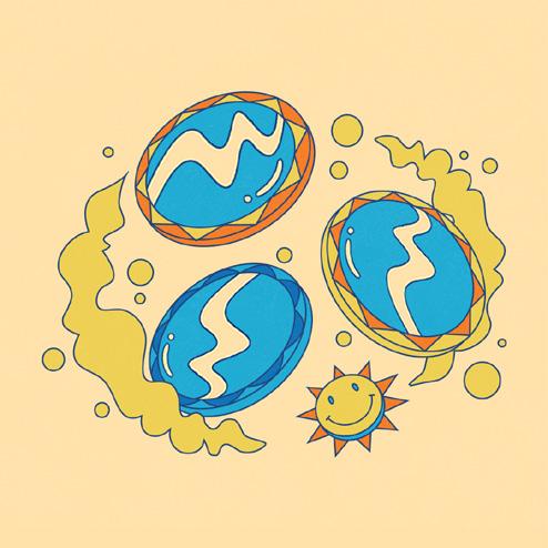
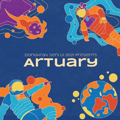
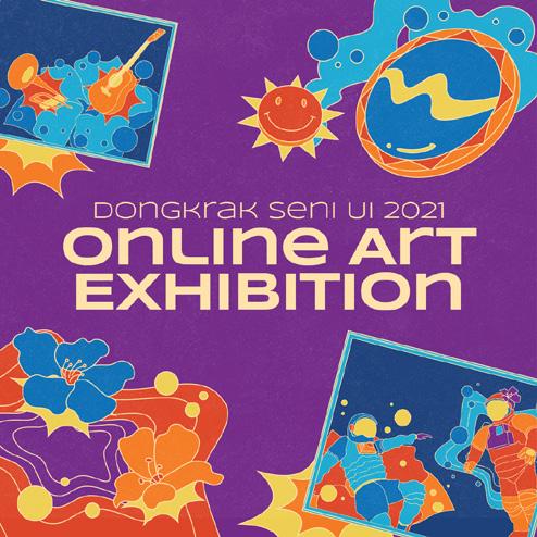
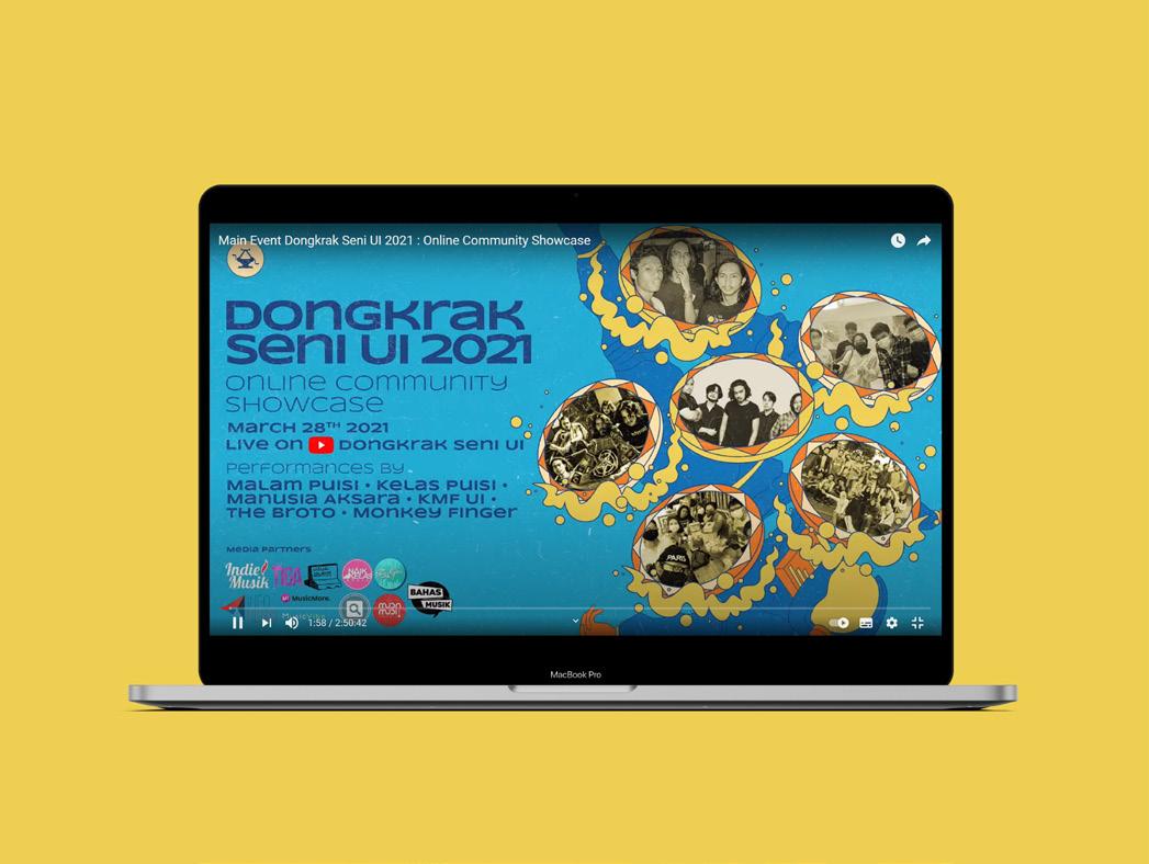
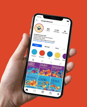
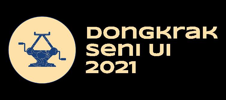
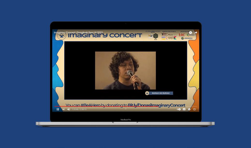
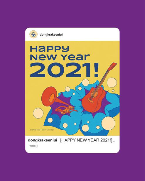
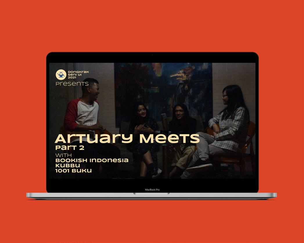
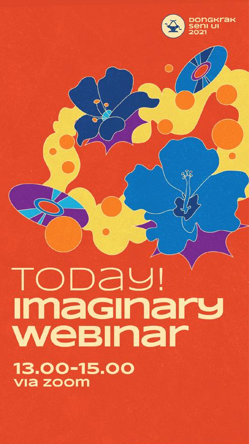
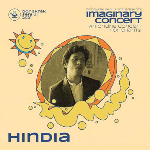
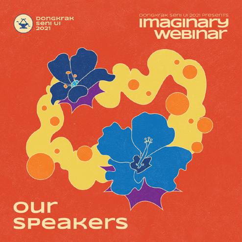
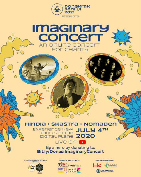
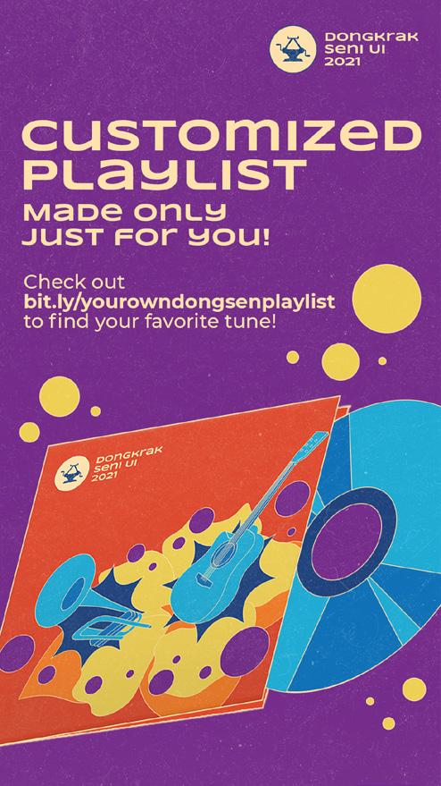
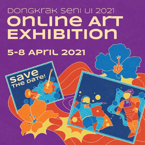
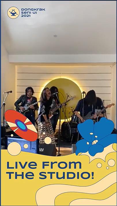
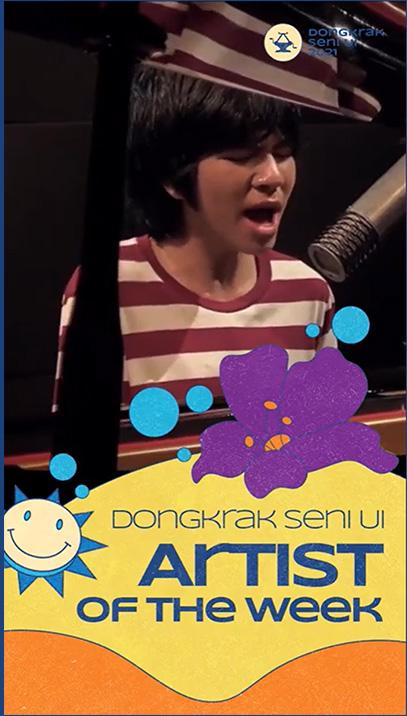
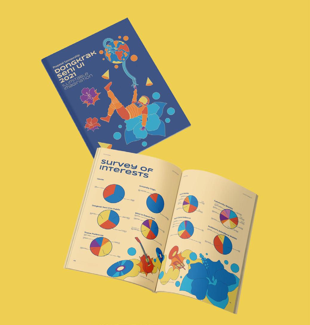
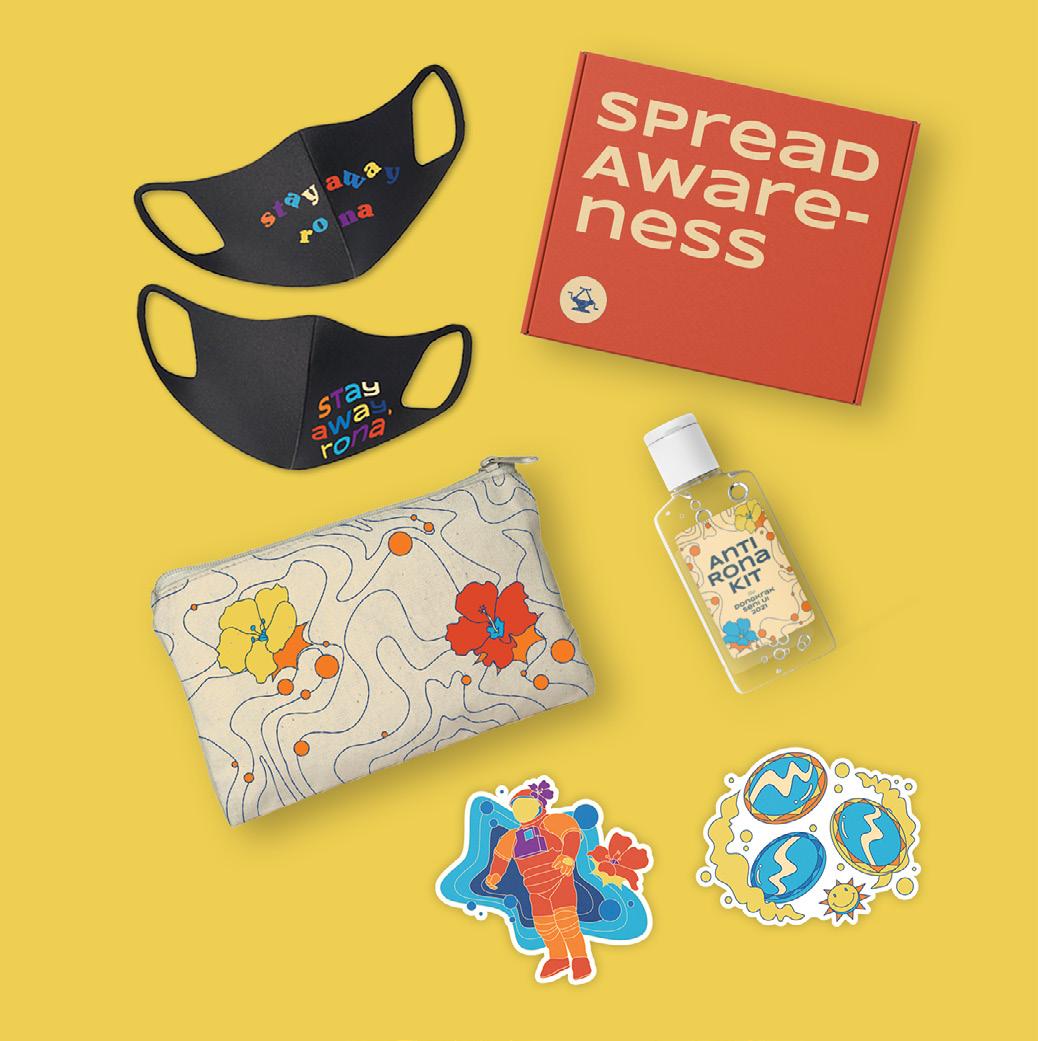
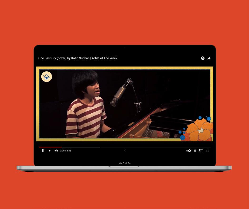
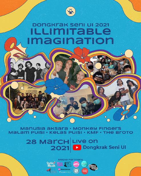
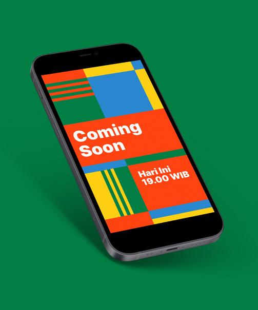
Dongkrak Seni UI 2021 is an annual arts and music festival held by The Faculty of Engineering University of Indonesia. This festival strives to be a platform to elevate local artists, musicians, and communities, while entertaining the arts and music enthusiasts with their performances. In the midst of this COVID-19 pandemic, Dongkrak Seni UI 2021 shifted its events from offline to online experiences such as, online concerts, exhibition, talks and various digital contents.
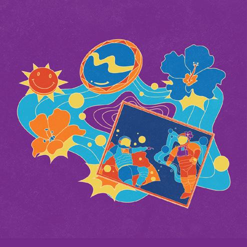
Dongkrak Seni UI 2021 presents “Illimitable Imagination” as its theme that represents imagination as the driving force of art that knows no boundaries. The challenge was, we wanted to capture the sense of imagination that is limitless without creating visuals that are too abstract or cluttering while still giving more room for possibilities. We created a story of a couple of astronauts that went in a journey to multiple dimensions that filled with different kind of things in the search for an island of imagination.
Dongkrak Seni UI 2021 held various events such as virtual concerts, webinar, community showcase, and art exhibition. The “journey” story was translated into visuals that is cohesive and rich with personality but can be distinctive enough when applied across each of these events. Colorful flat illustrations used as the key visual elements to tell the story and evoke the sense of imagination with a style that bridge the gap between realism and abstraction.
Each supporting events had its own identity and bold colors became the main distinctive element when shifting between these events. Illustations with different themes in each of the events became the elements that support the distinction of each identity but it is also created with consistency of style in mind. The approach helps to keep the cohesiveness of the whole identity when implemented across events and across mediums.
Creative & Art Direction
Az Zahrawaani Al Aryan
Chairunnisa Yasmin
Design
Az Zahrawaani Al Aryan
Chairunnisa Yasmin
Dongkrak Seni UI 2021
Design Team
Illustrations
Az Zahrawaani Al Aryan
Chairunnisa Yasmin
Renada Sheila
Motion Design
Daffa Jauhari
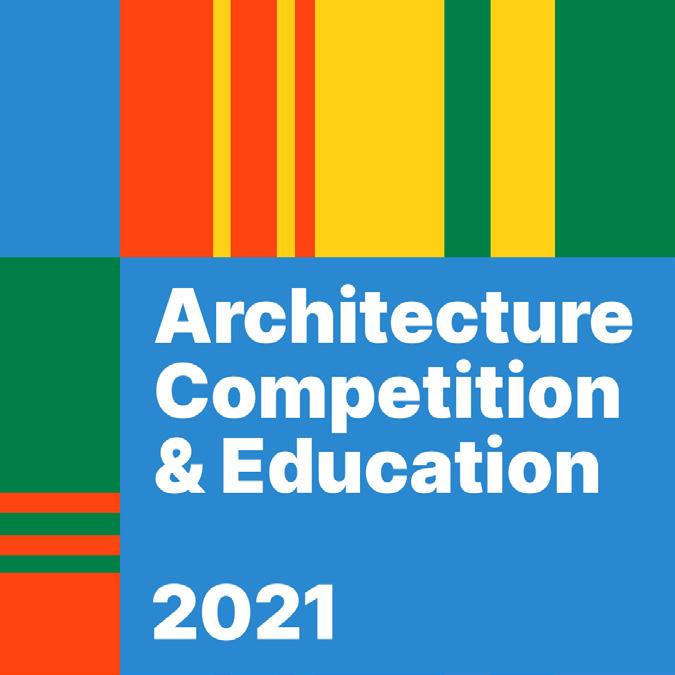
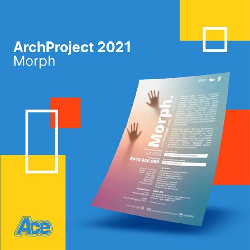
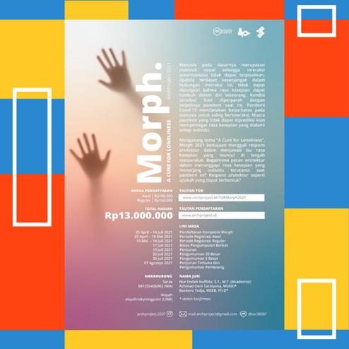
Architecture Competition & Education 2021
Scope
Role
Creative Director
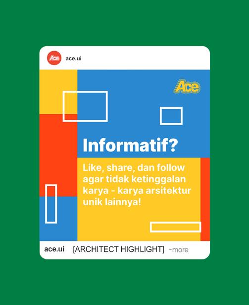
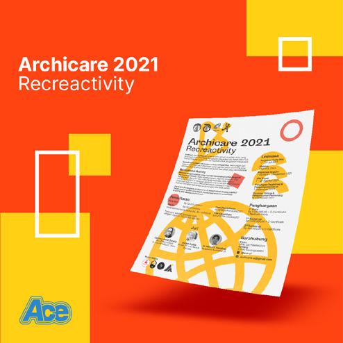
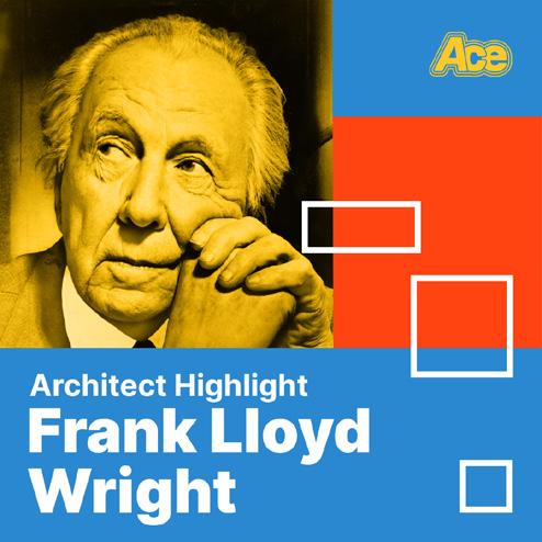
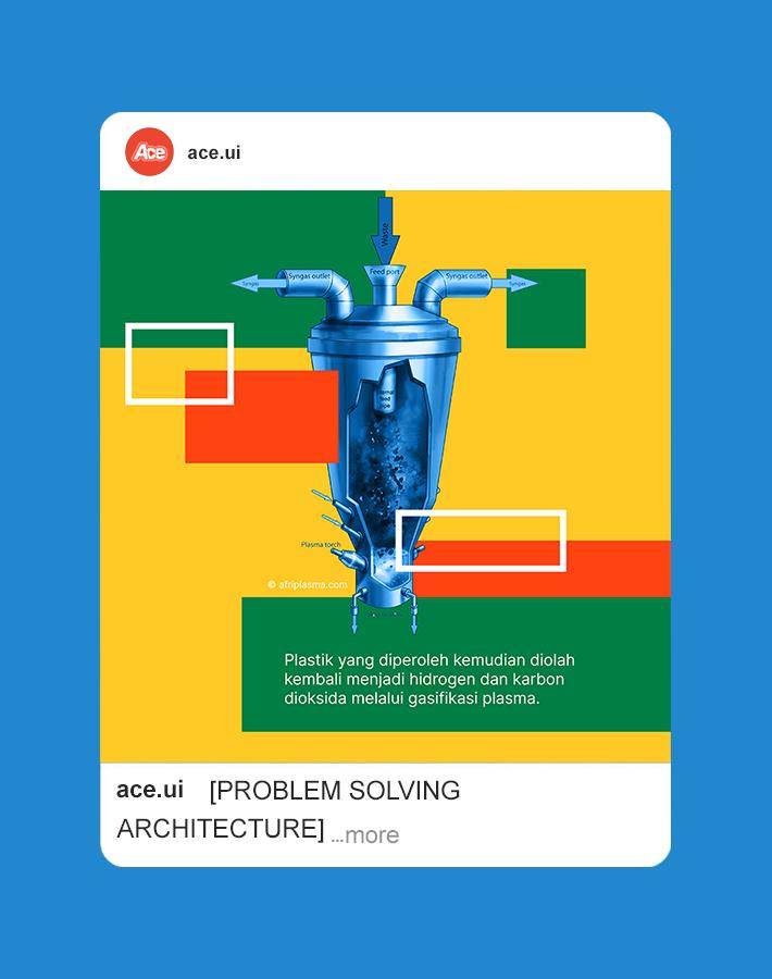
Architecture Competition & Education is an annual project of Ikatan Mahasiswa Arsitektur UI as a platform for sharing information about all things architecture and its competitions. Initially, this project aims to help UI architecture students to keep up with architecture competitions and various informations like fun facts, highlights, etc. This is the second year of its release and we wanted to broaden our coverage to other architecture students and enthusiasts with new contents and media.
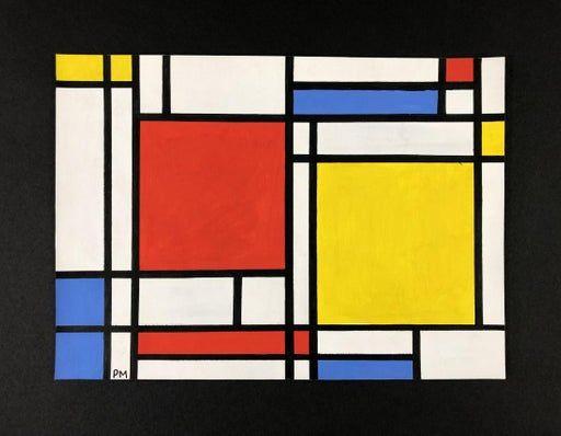
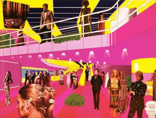
We wanted to reflect our growth with a bolder identity that resonates with visual styles from the architectural world. We took inspiration from two avant-garde architectural movement, De Stijl and Archigram, where we combine the simple and abstract geometric forms of De Stijl with the vibrant and contrasting visuals of the Archigram movement. Therefore, we could create a bold visual language but with simple and flexible composition that best suited with the various architectural contents.
Piet Mondrian Tempera on Paper, 1872-1944
Archigram Monte Carlo Competition, 1969
In implementation, we put the reader’s experience in our best interests. We focused our attention in these 5 aspects: composition, typography, color, imagery, and hierarchy. The simple geometric forms made it possible to frame the contents, with the vibrant and colorful imagery creates a composition that is flexible as needed. The typography used sans serif typeface with neutral color and a composition that is simple and consistent for the best reading quality.
Creative & Art Direction
Az Zahrawaani Al Aryan
Design
Az Zahrawaani Al Aryan
Aysar Ilman
Gabriella Dina
Koming Sawitri
Khusnul Fuadah
Justina Olivia Farah Rahma
Copywriting
Aysar Ilman
Gabriella Dina
Koming Sawitri
Khusnul Fuadah
Justina Olivia
Farah Rahma
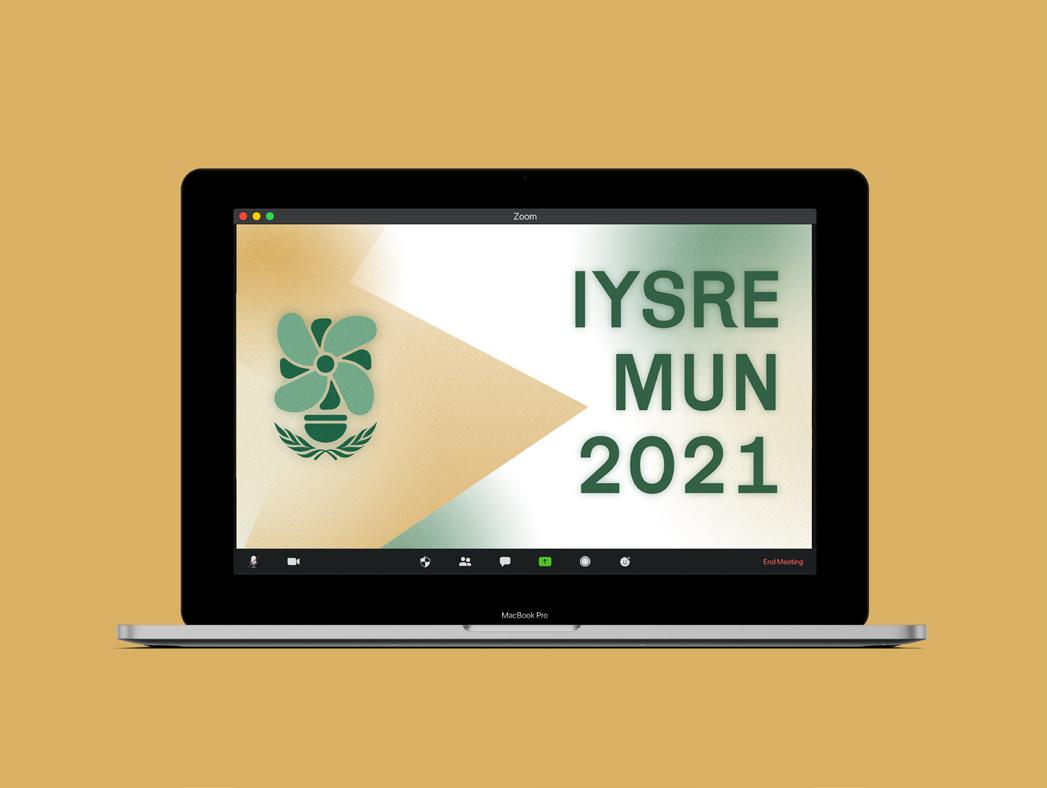
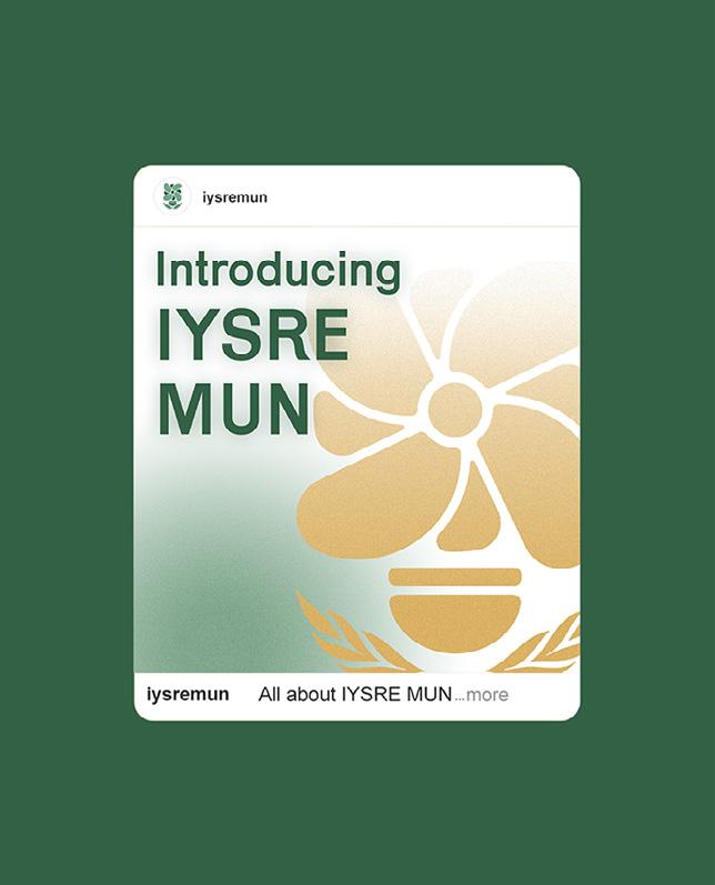
IYSRE Model United Nations
Scope Visual Identity
Role
Head of Creative Design
Year 2021
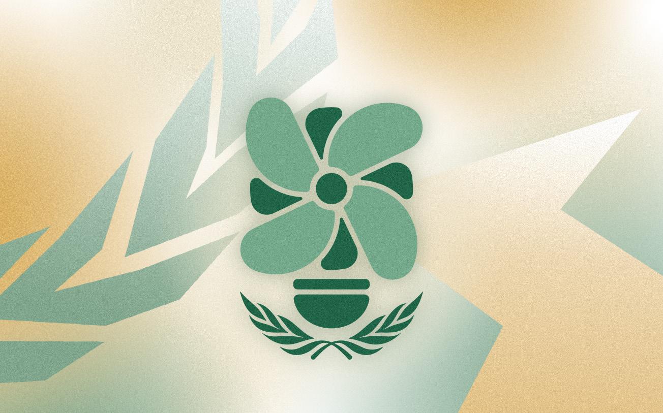
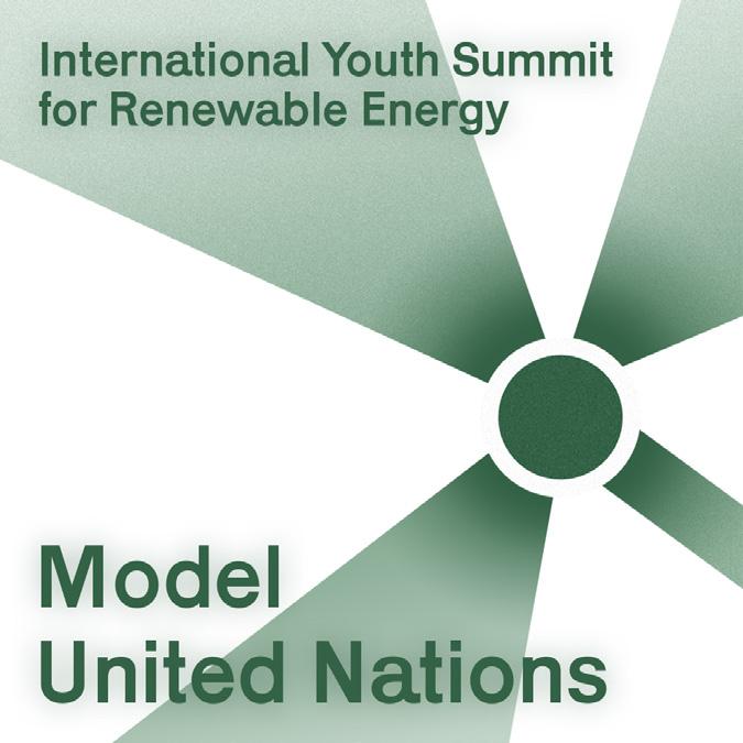
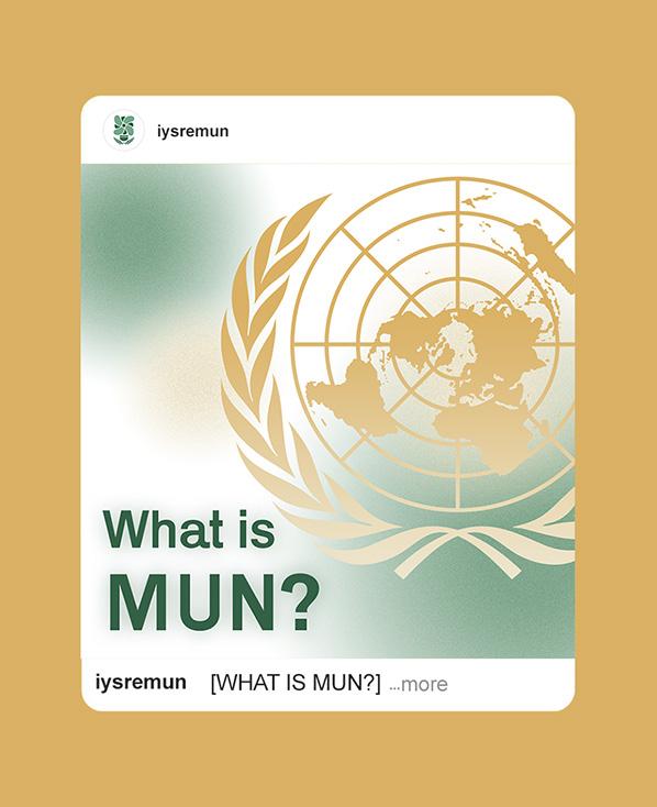
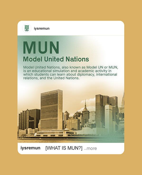
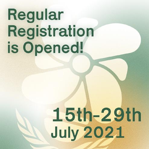
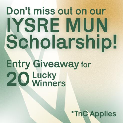
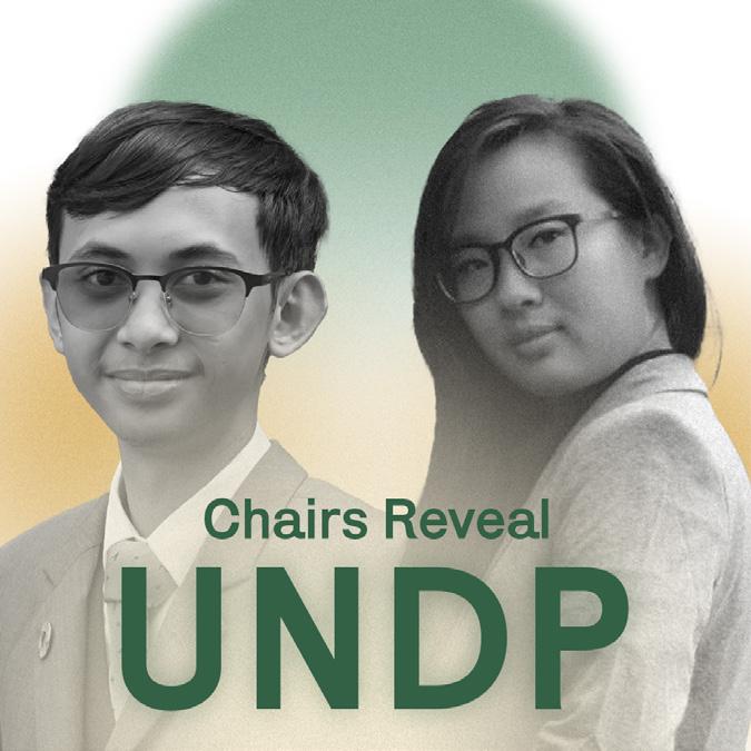
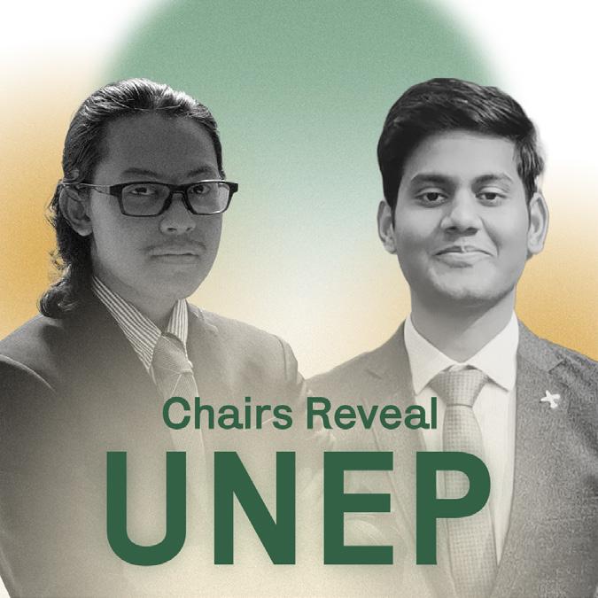
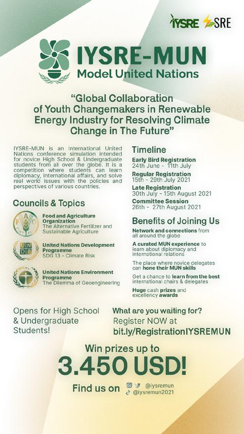
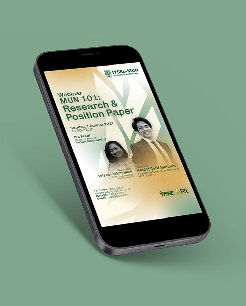
IYSRE Model United Nations is an International United Nations Conference simulation intended for novice high school and undergraduate students from all around the globe, as a part of the International Youth Summit for Renewable Energy(IYSRE) 2021. This is a place where students can learn about diplomacy and international affairs as well as competing with other students or MUN enthusiasts from all around the world through digital platforms.
As a part of IYSRE, this project aims to bring the topic of renewable energy industry for resolving climate change to the table through the MUN conference that is open for students around the world. But, the MUN or Model United Nations itself is already a very prestige and professional field of competition. Therefore, we wanted the identity to be sleek and simple to reflect the prestigiousness but still open for more with visuals that resonate with the field of renewable energy in line with the theme.
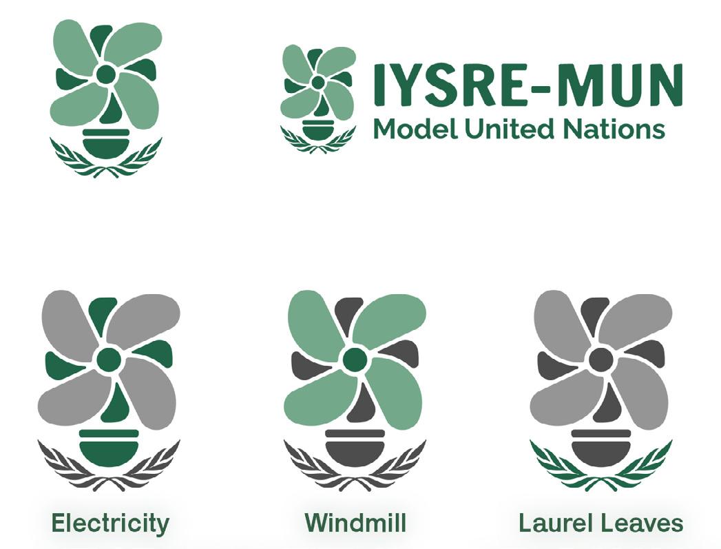
Three elements was used as the primary visual elements that best represent the theme and purpose of the events: electricity, windmill, and laurel leaves. The electricity and windmill represent the field of renewable energy − a part of IYSRE main visual identity − while the laurel leaves represent the field of Model United Nations − inspired by the UN logo. These elements gave us flexibility to communicate the ideas and contents across the event as a consistent visual language. The visuals was then strengthened with gradients of gold, green, and white to create that neutral and sleek look.
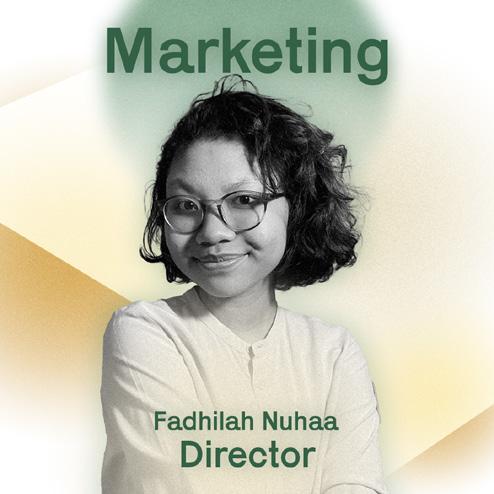
Creative Direction
Fadhilah Nuhaa
Art Direction
Az Zahrawaani Al Aryan
Design
Az Zahrawaani Al Aryan
IYSRE MUN Creative Design Team
Motion Design
Yogi Rakhim
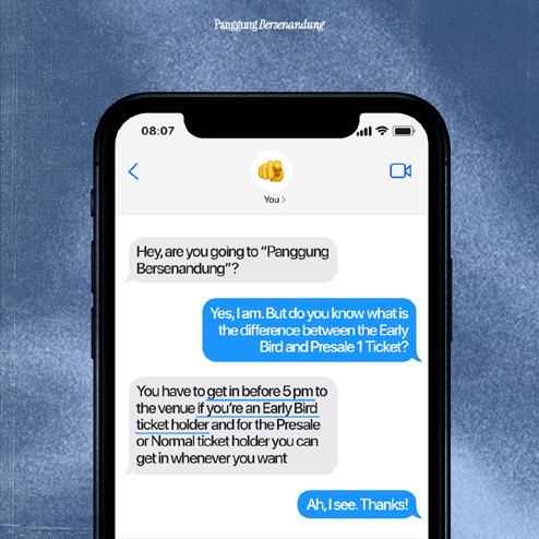
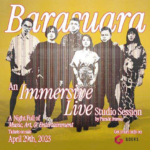
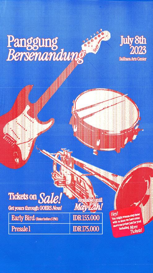
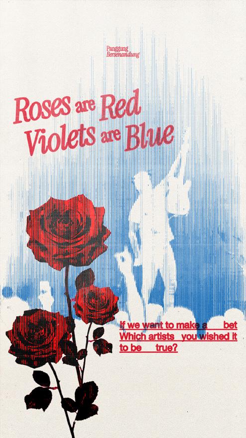
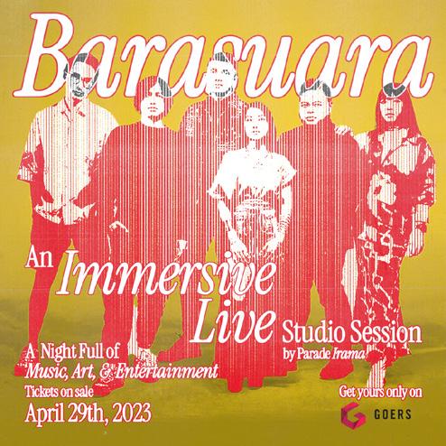
Panggung Bersenandung
Scope
Visual Identity
Role
Graphic Designer
Year 2023
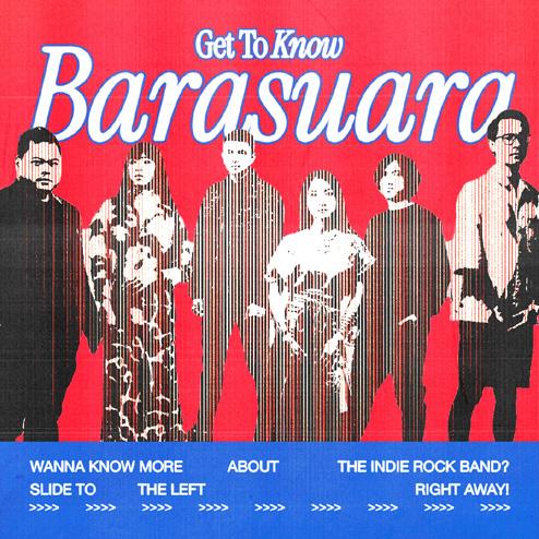
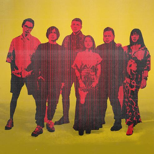
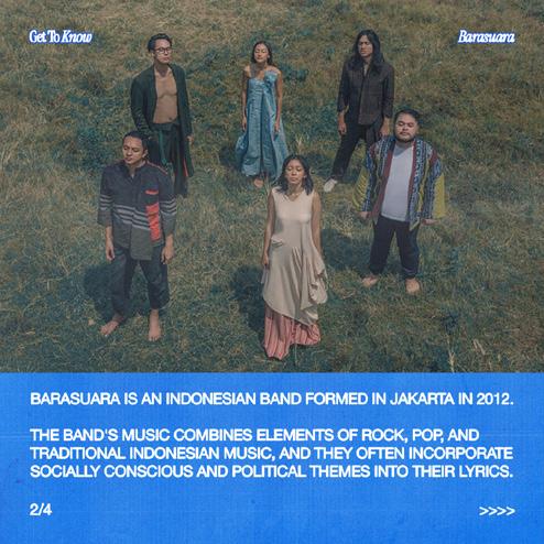
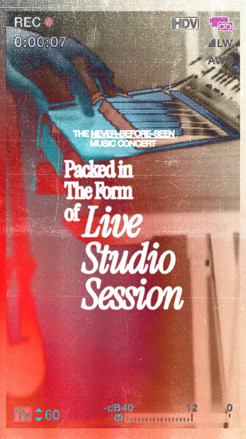
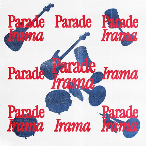
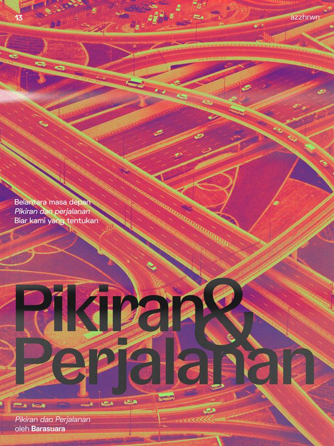
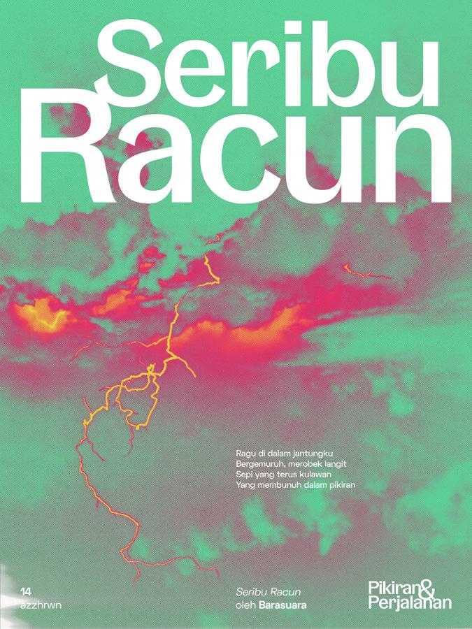
Panggung Bersenandung is an intimate music concert held by Parade Irama. The concert was going to be headlined by Barasuara with performances from other musicians. It introduces itself as a new kind of music concert in the form of 360 live studio session for a more immersive and thematic music performance. Unfortunately, the event was cancelled due to unforeseen difficulties but the identity was already completed for its social media marketing campaign.
The identity highlights the concert's thematic approach as a live studio session with an alternative/indie rock band, Barasuara, set as the headliner. Therefore, the visuals are inspired by retro rock music album and posters with bold colors and hand printed, rough, collage-like photos, illustrations, and typography treatment. Posters, motion graphics, and other graphical contents were created for the social media marketing campaign.
Art
Design
Creative Direction
Jovan Veron
Direction
Az Zahrawaani Al Aryan
Alvina Olivia
Az Zahrawaani Al Aryan
Alvina Olivia
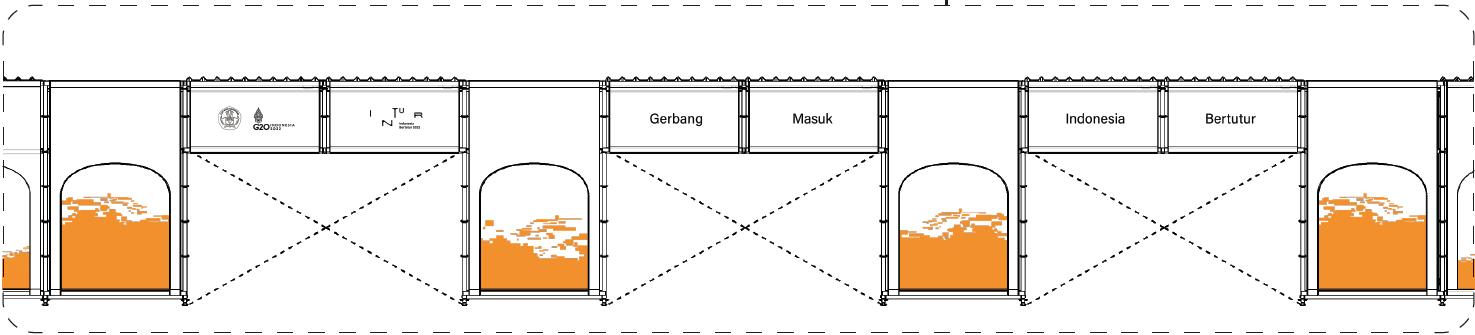
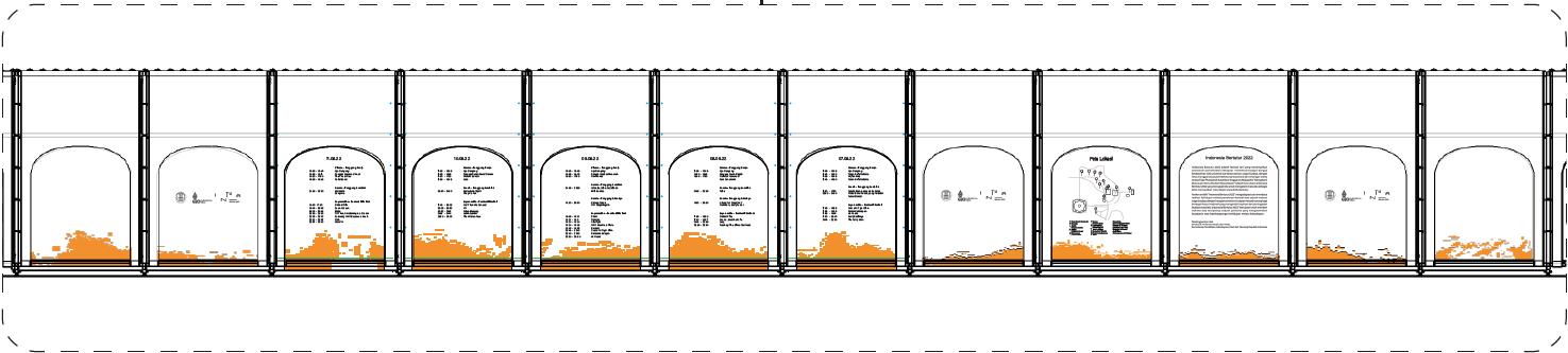
Indonesia Bertutur 2022
Scope Environmental Graphic Design
Role Graphic Design Intern at gemasemesta.co
Year 2022
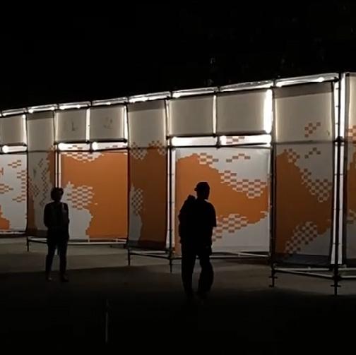
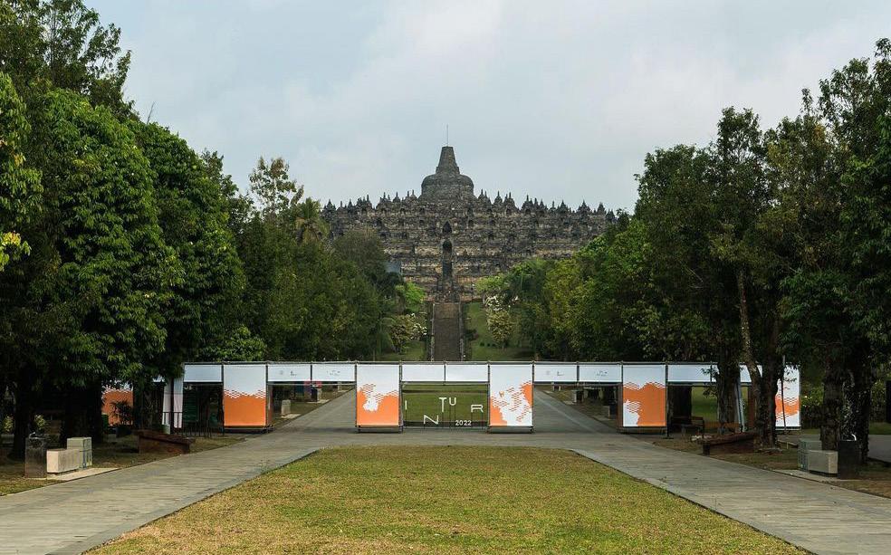
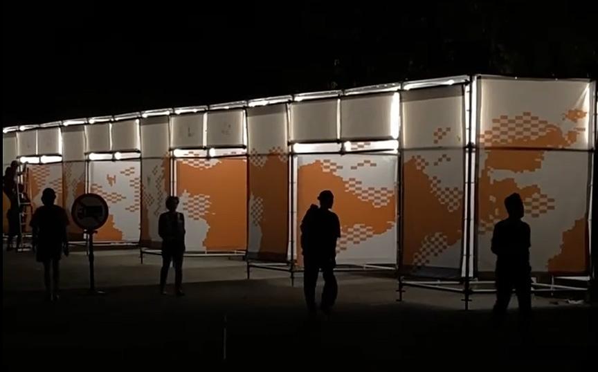
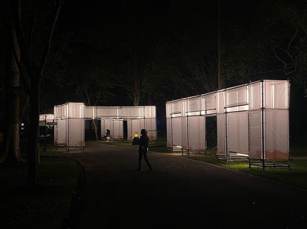
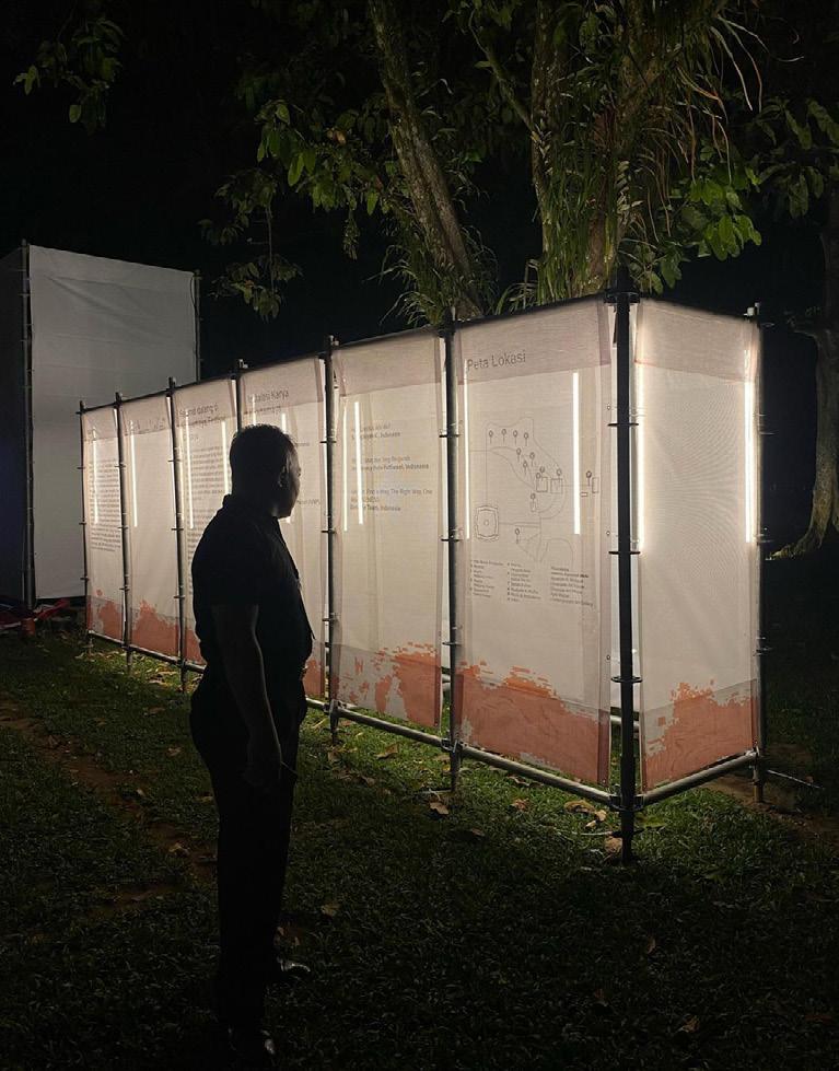
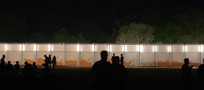
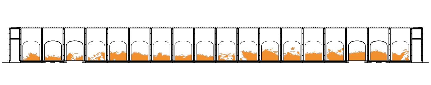
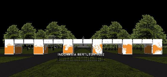
Indonesia Bertutur is a festival held by The Ministry of Education, Culture, Research and Technology (Kemendikbudristek) in the Borobudur Temple Area on 7-11 September 2022. The festival was held as an effort to advance the Indonesia cultural ecosystem, involving around 900 cultural actors and displaying more than 100 works. The brand identity was designed by Garyanes Yulius, with gemasemesta.co tasked in implementing the design for environmental graphics of the festival.
Photo by Ernest Theofilus
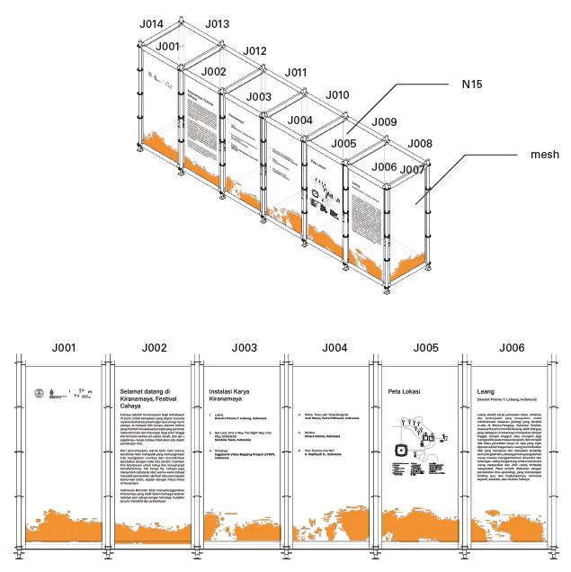
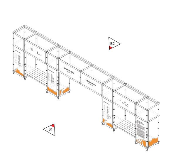
The festival architecture was designed by FFFAAARRR, consisting of rectangular steel modules with partition made out of fabric mesh. The environmental graphics was implemented on the fabric mesh partitions, consisting of the festival's supergraphic and wayfindings. During my internship period, I was tasked on creating various iterations of the supergraphic concept from the festival identity to be implemented on the fabric mesh partitions across the festival.
Photos by Gema Semesta
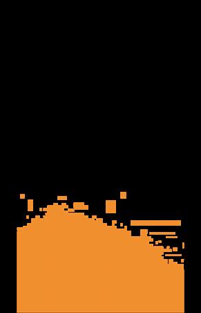
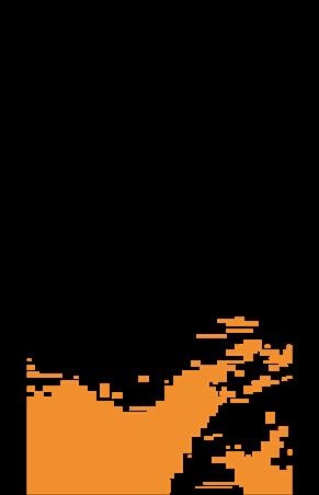
The supergraphic concept was inspired by the Indonesia archipelago treated with a contemporary approach, resulting in organic abstractions of the islands with pixelated shapes. A wide range of supergraphic iterations was created, which will be printed on sheets of fabric mesh that will be arranged to create a continuous form. The semitransparent characteristic of fabric mesh was combined with lighting from inside the modules that will highlight the supergraphic during night time.
The supergraphic was also implemented together with the wayfinding and the festival's curatorial contents for a variety of module sizes and placements.
Branding & Graphic Design
Garyanes Yulius & Team
Architecture FFFAAARRR
Environmental Graphics
Gema Semesta
Farrel Jeremiah
Az Zahrawaani Al Aryan
Septian Dwi Kurni
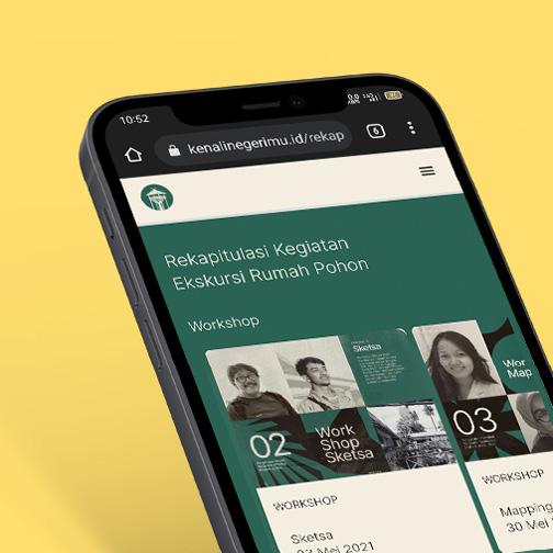
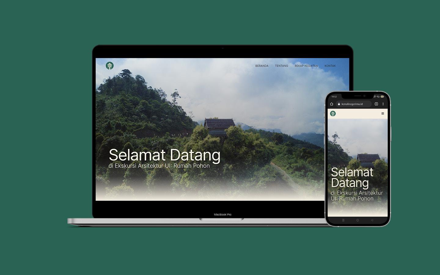
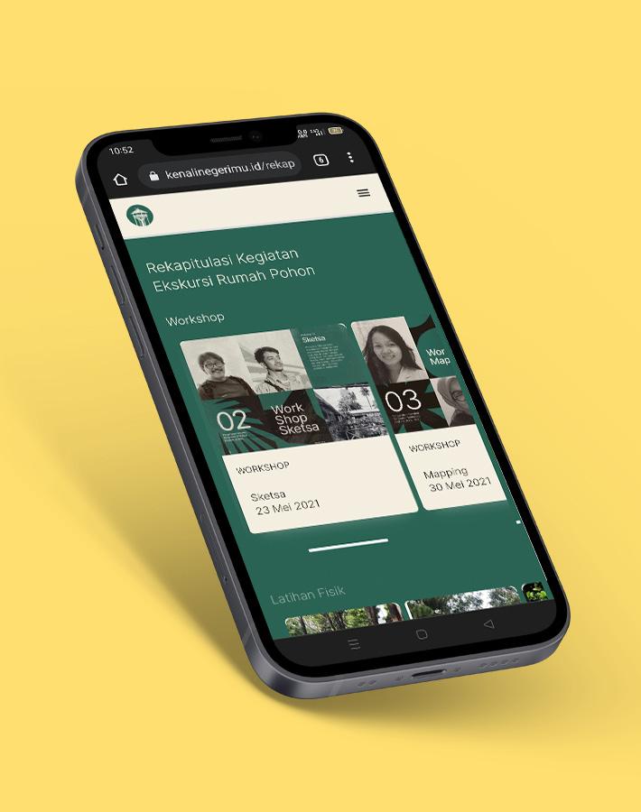
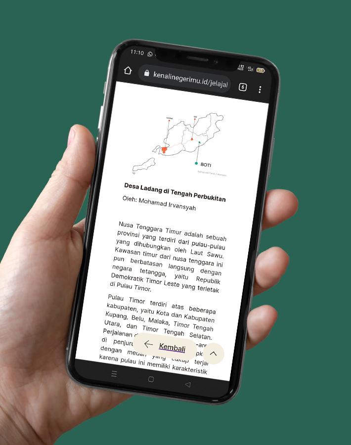
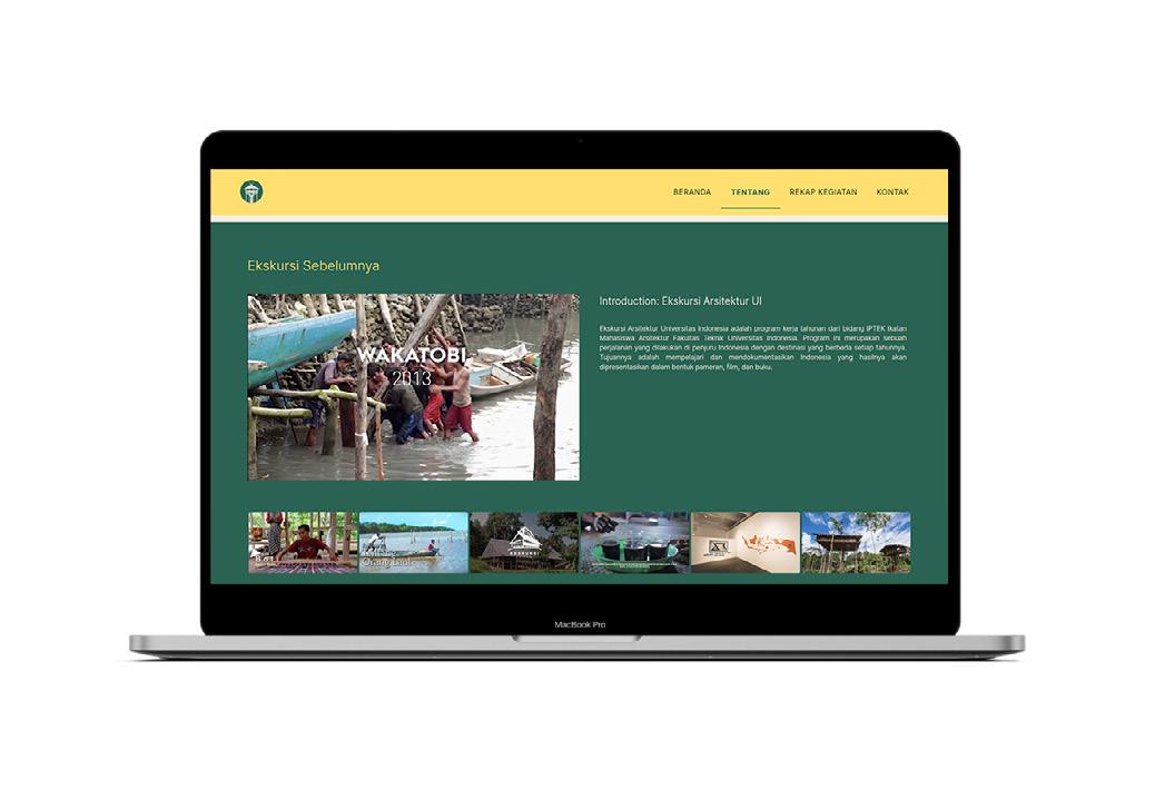
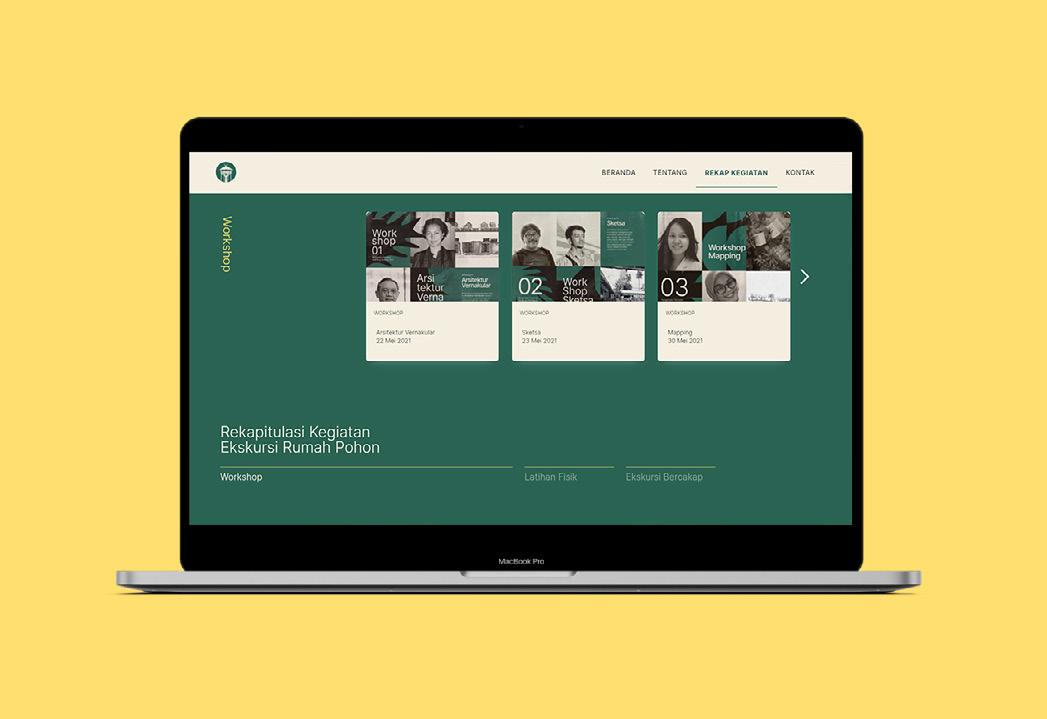
Ekskursi Arsitektur UI 2021 Rumah Pohon
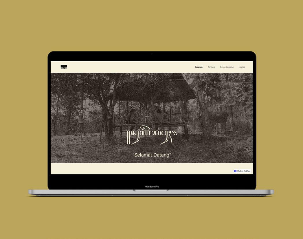
Ekskursi Arsitektur UI is an annual event held by Departemen Arsitektur Universitas Indonesia with the aim of documenting vernacular architecture in Indonesia and showcase it in the forms of exhibitions, books, films, and more. Due to the COVID-19 pandemic situation, Ekskursi had to shift from ofline to online events with the exhibition held in website format that is open for public.
The website is designed to showcase the documentation from this year and some of the past expedition, in the form of articles, films, and virtual exhibition. We wanted to create an insightful and interactive experience by exploring the visual composition and creative ways that the visitor can interact with the exhibition virtually, based on the identity created by the Visual Design Team. We use Webflow to utilize its integrated capabilities to design, build, and launch the website.
Branding & Graphic Design
Abraham Chintianto
Rifki Fauzan
Website Direction
Az Zahrawaani Al Aryan
Graciel Frederika
Website Design
Az Zahrawaani Al Aryan
Graciel Frederika
Ekskursi Arsitektur UI 2021
Website Team
Virtual Exhibition
Adli Kusuma
Puti Asyifa
Sarah Puteri
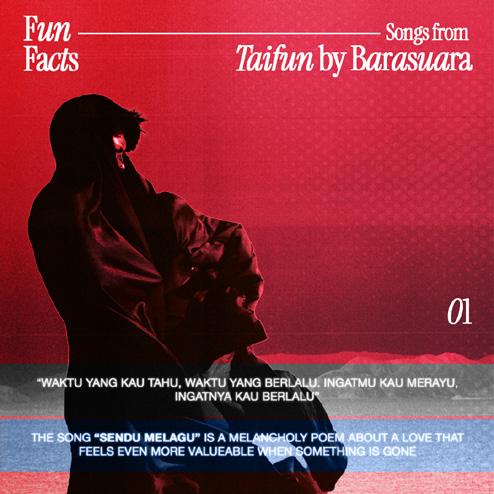
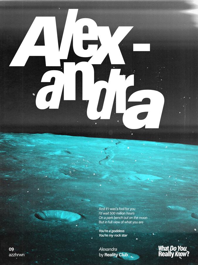
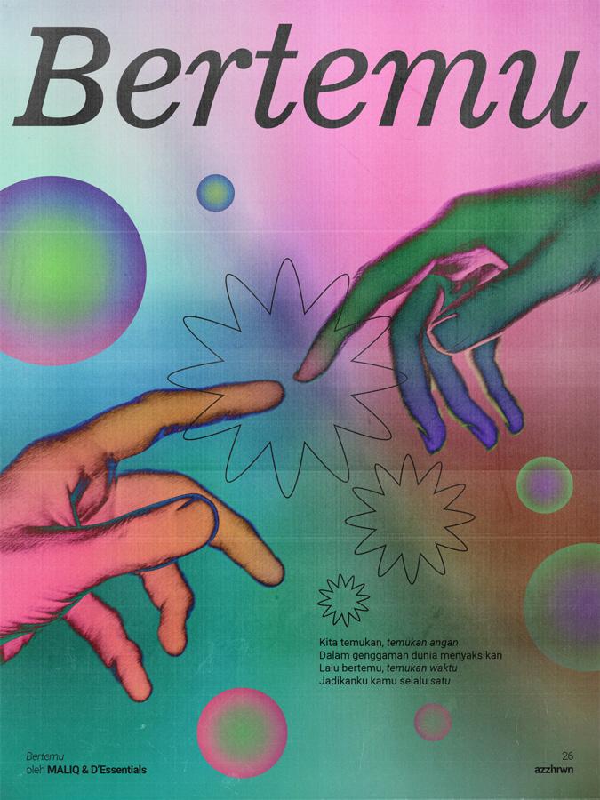
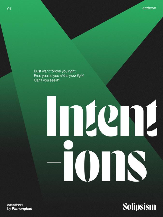
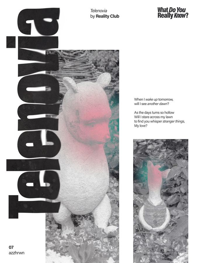
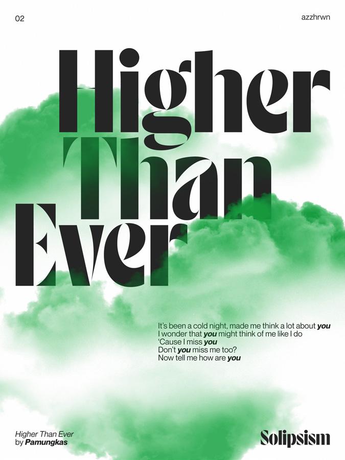
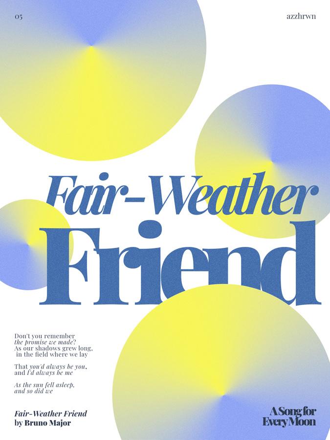
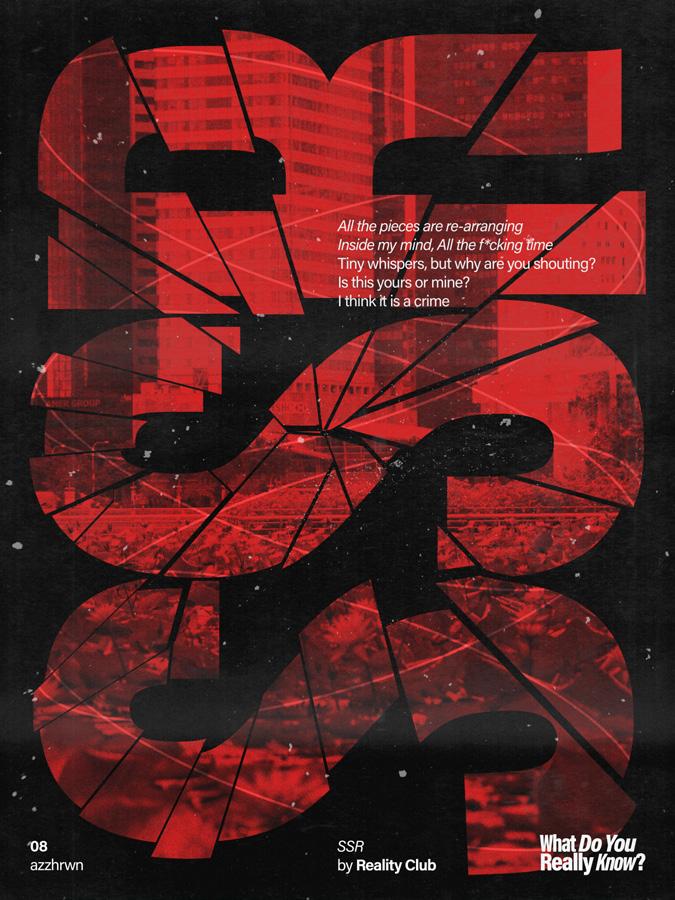
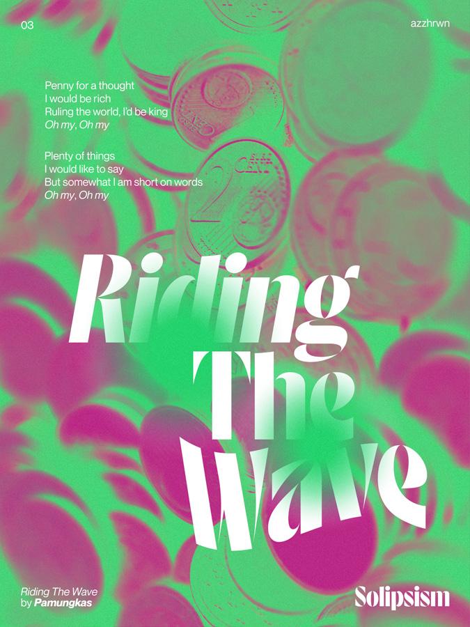
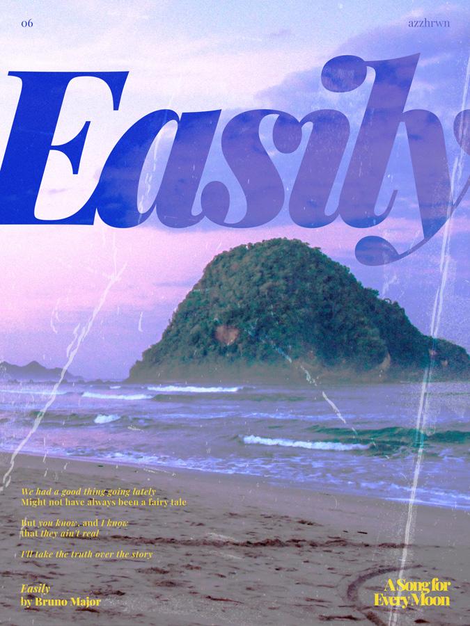
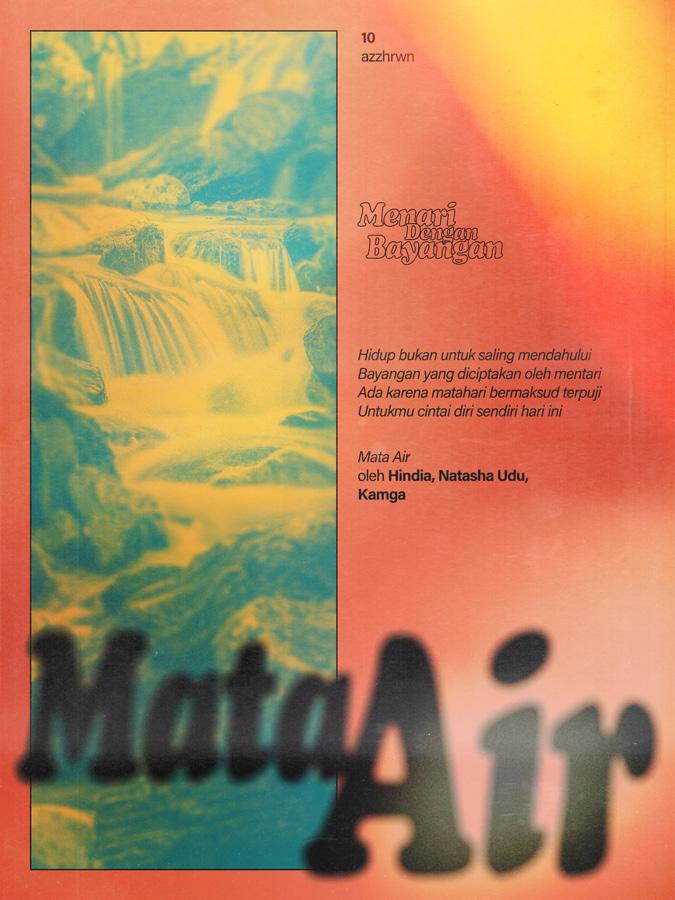
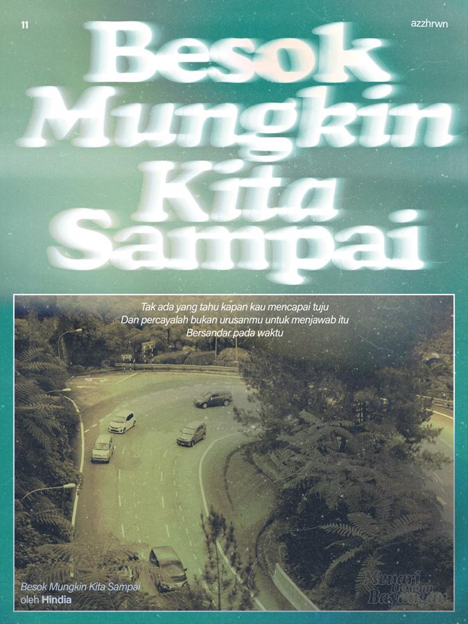
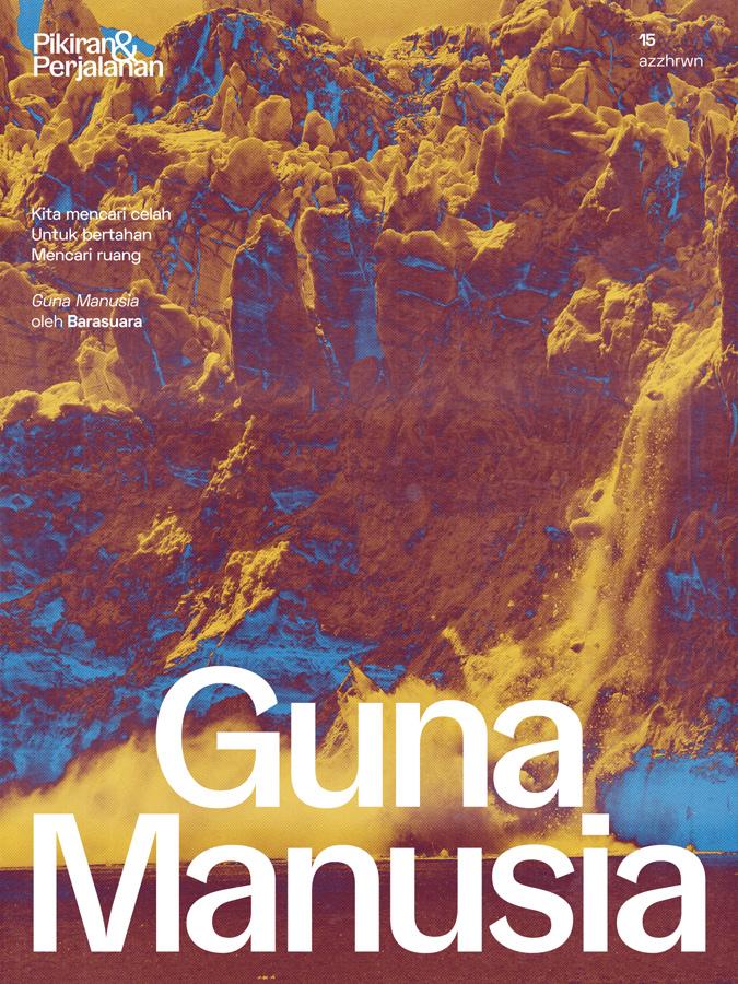
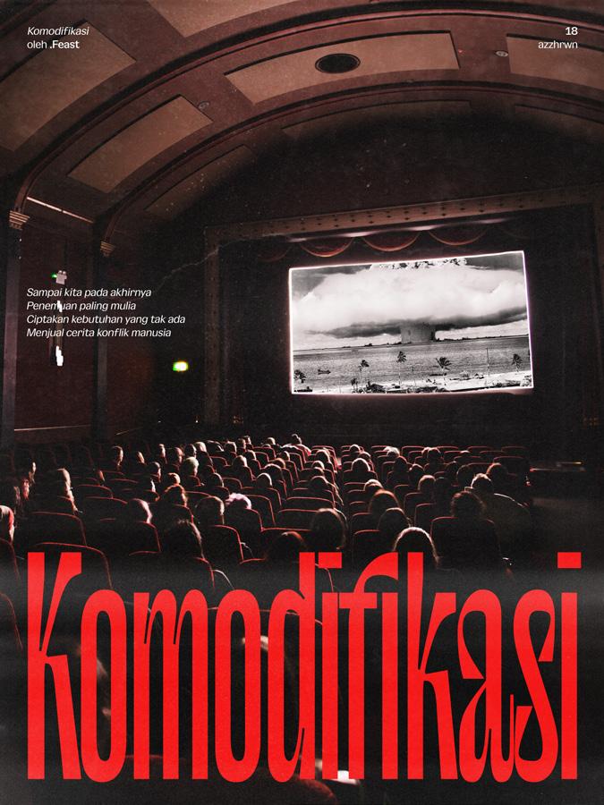
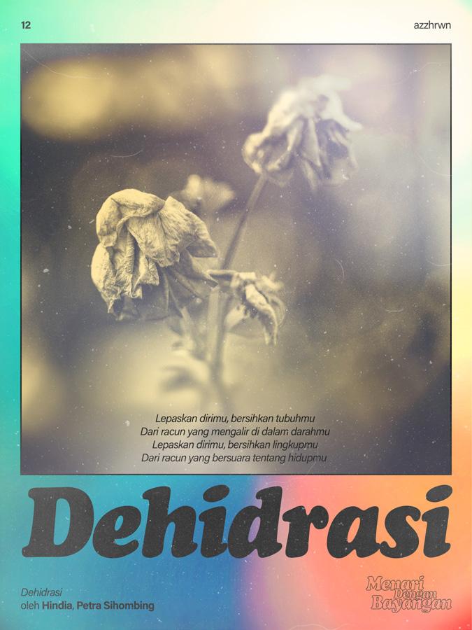
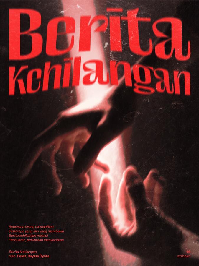
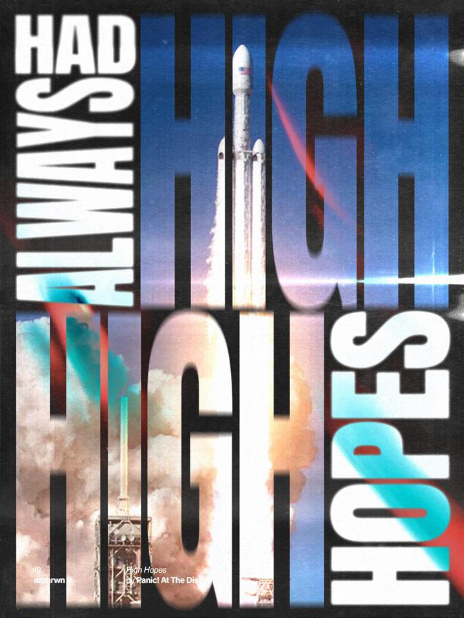
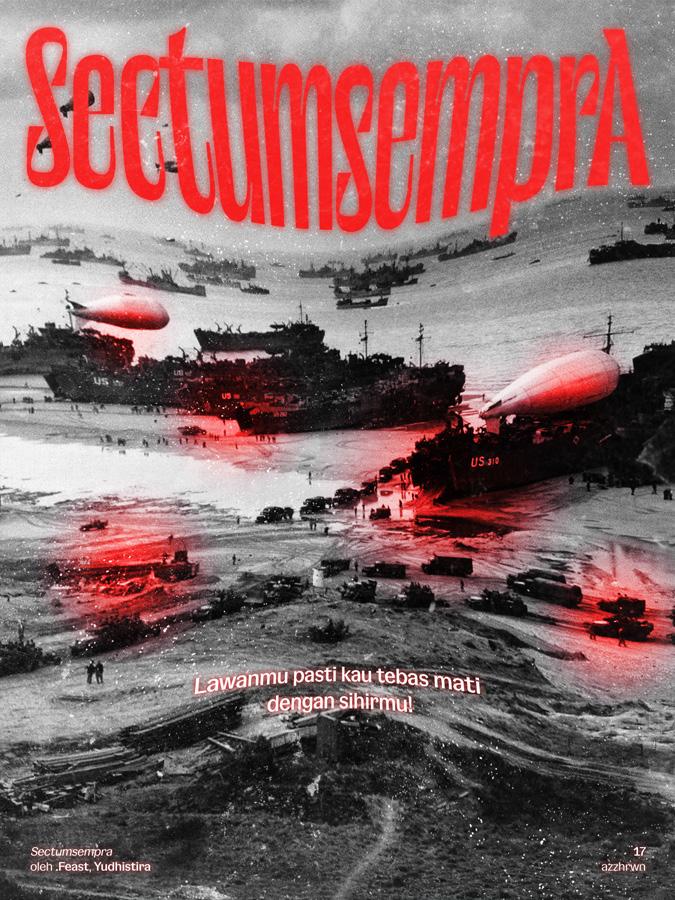
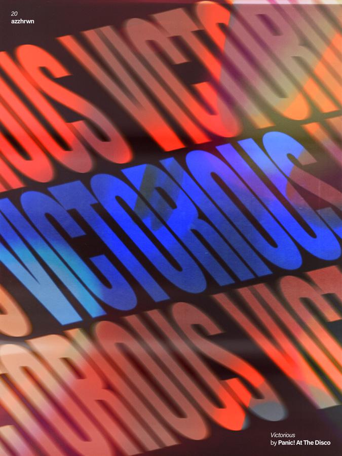
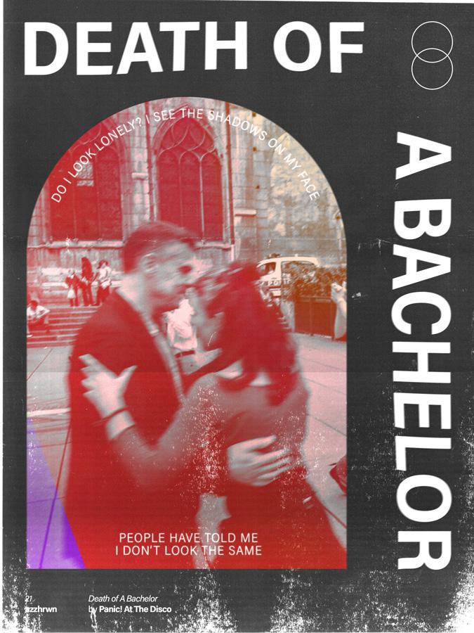
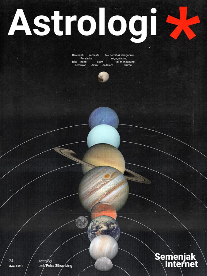
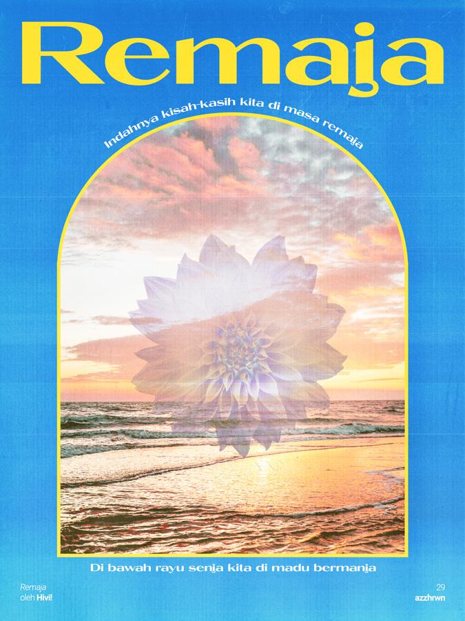
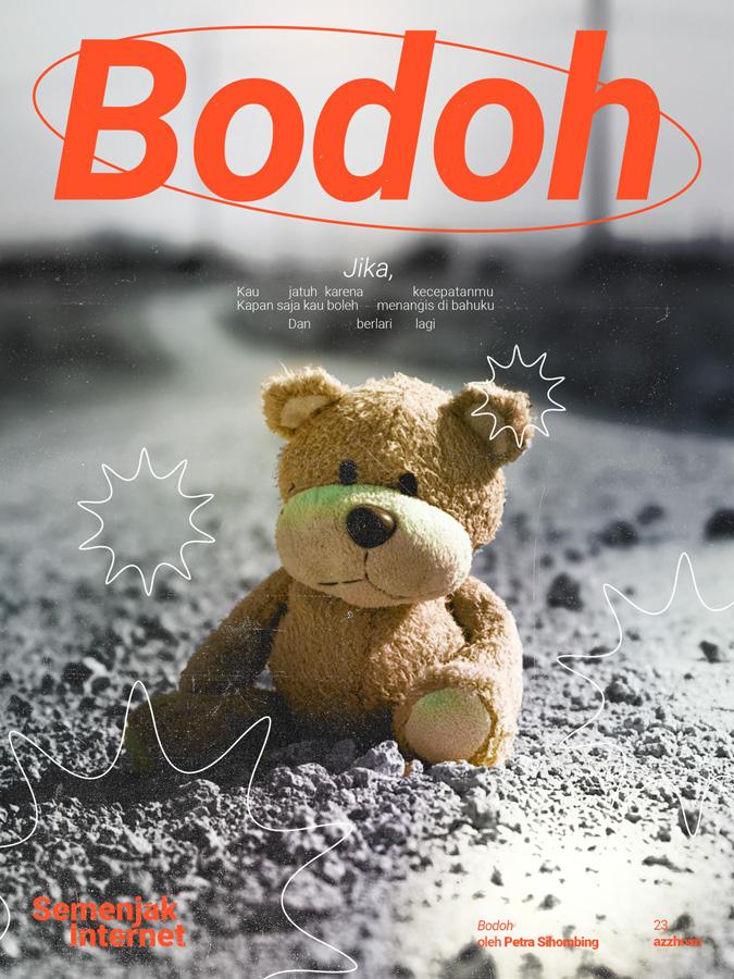
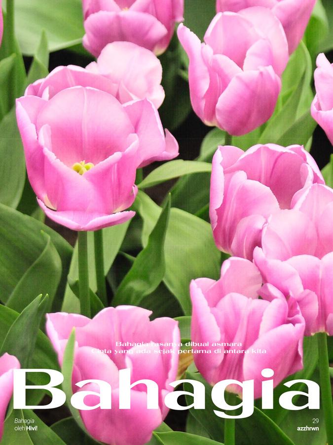
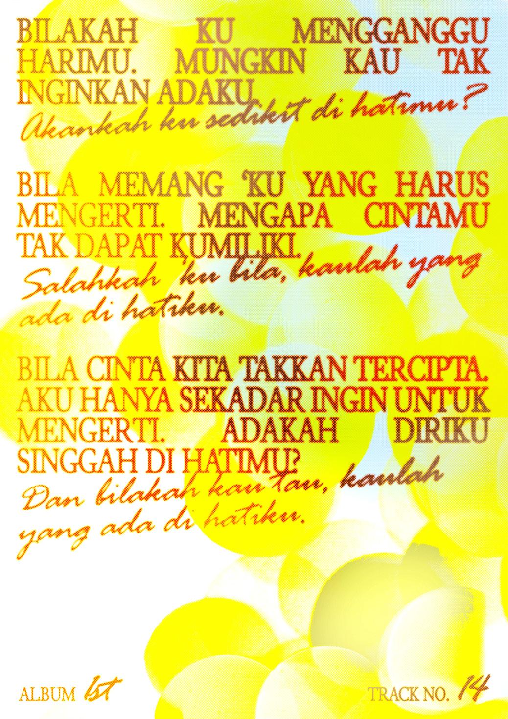
30 Songs 30 Posters
A poster series created as a personal project with a purpose to explore various design styles and typography through visual storytelling. In this project, I created posters from 3 of my favourite songs from 10 different musicians. Each musicians will have its own visual identity and typographic style that best represent the chosen songs.
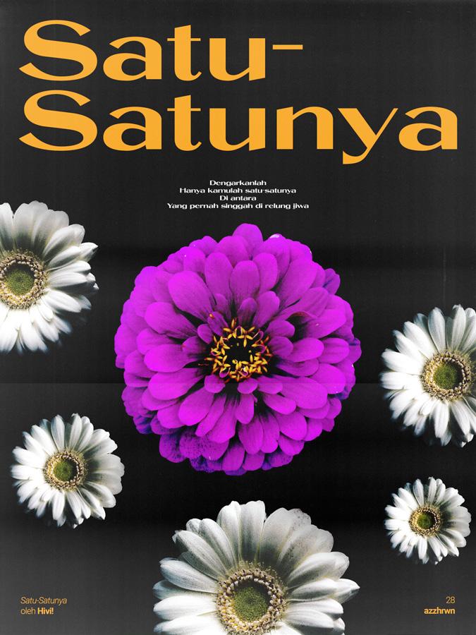
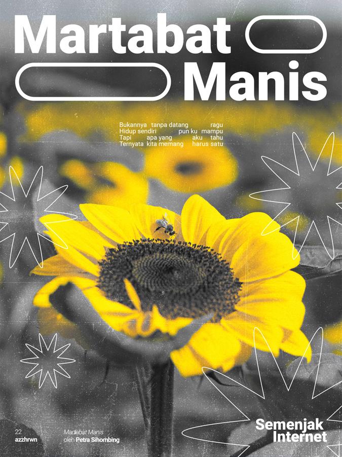
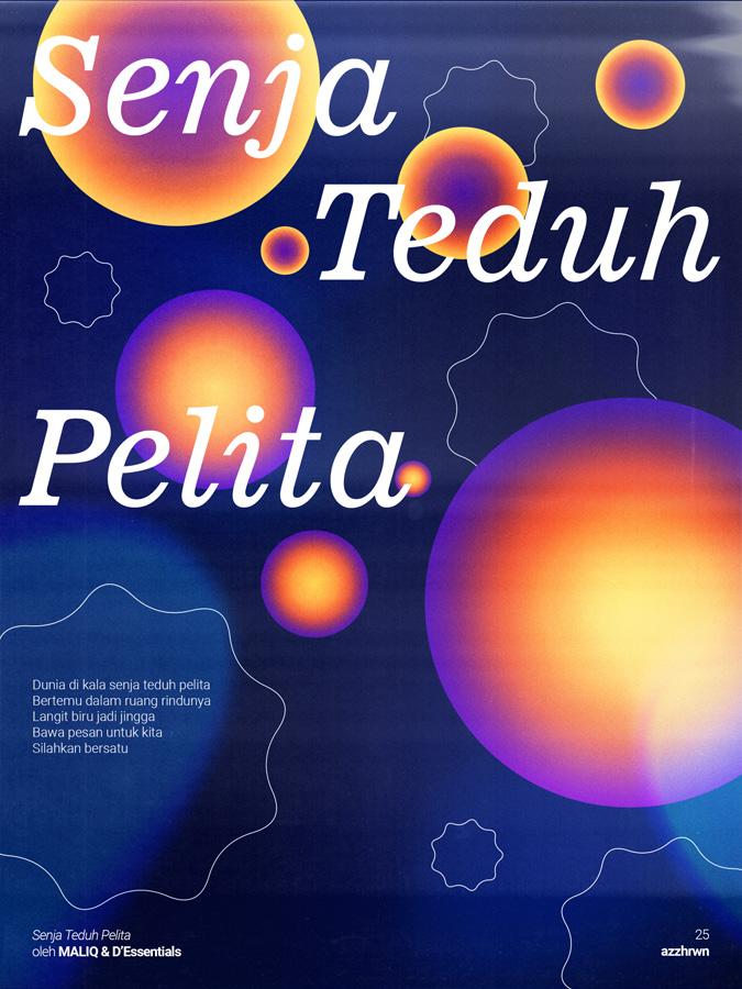
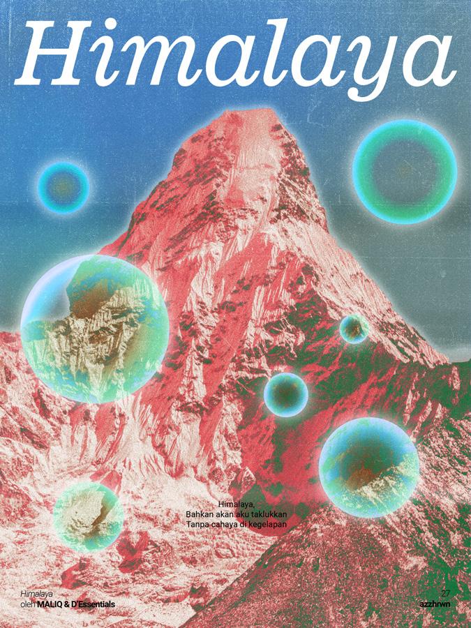
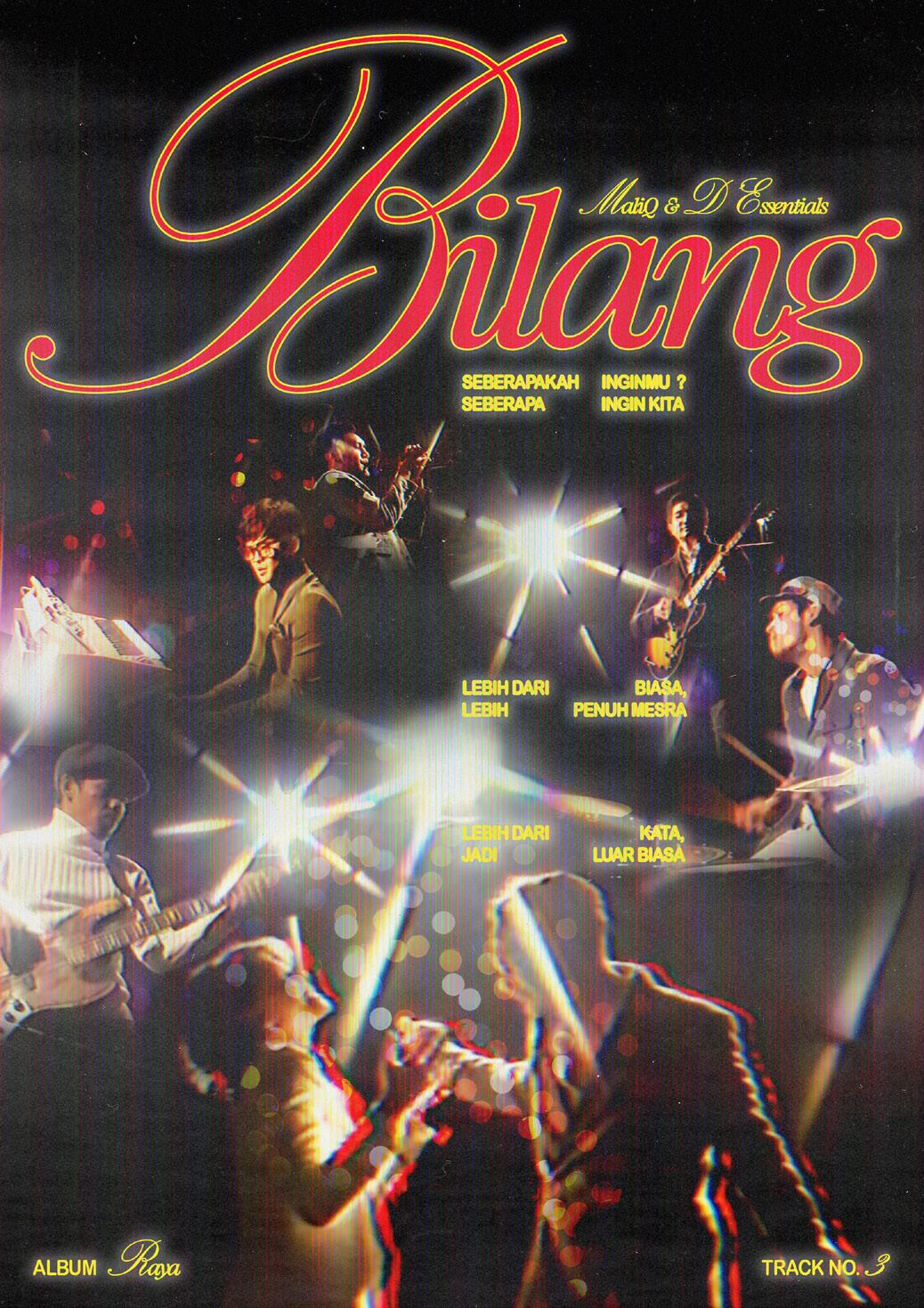
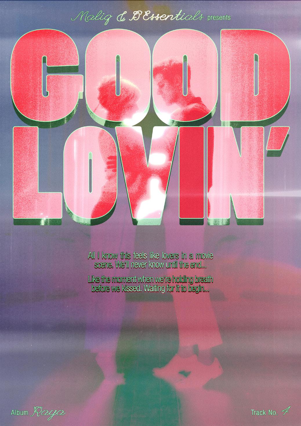
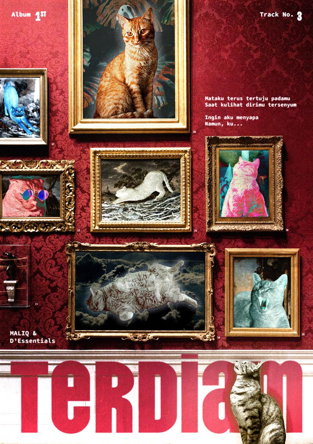
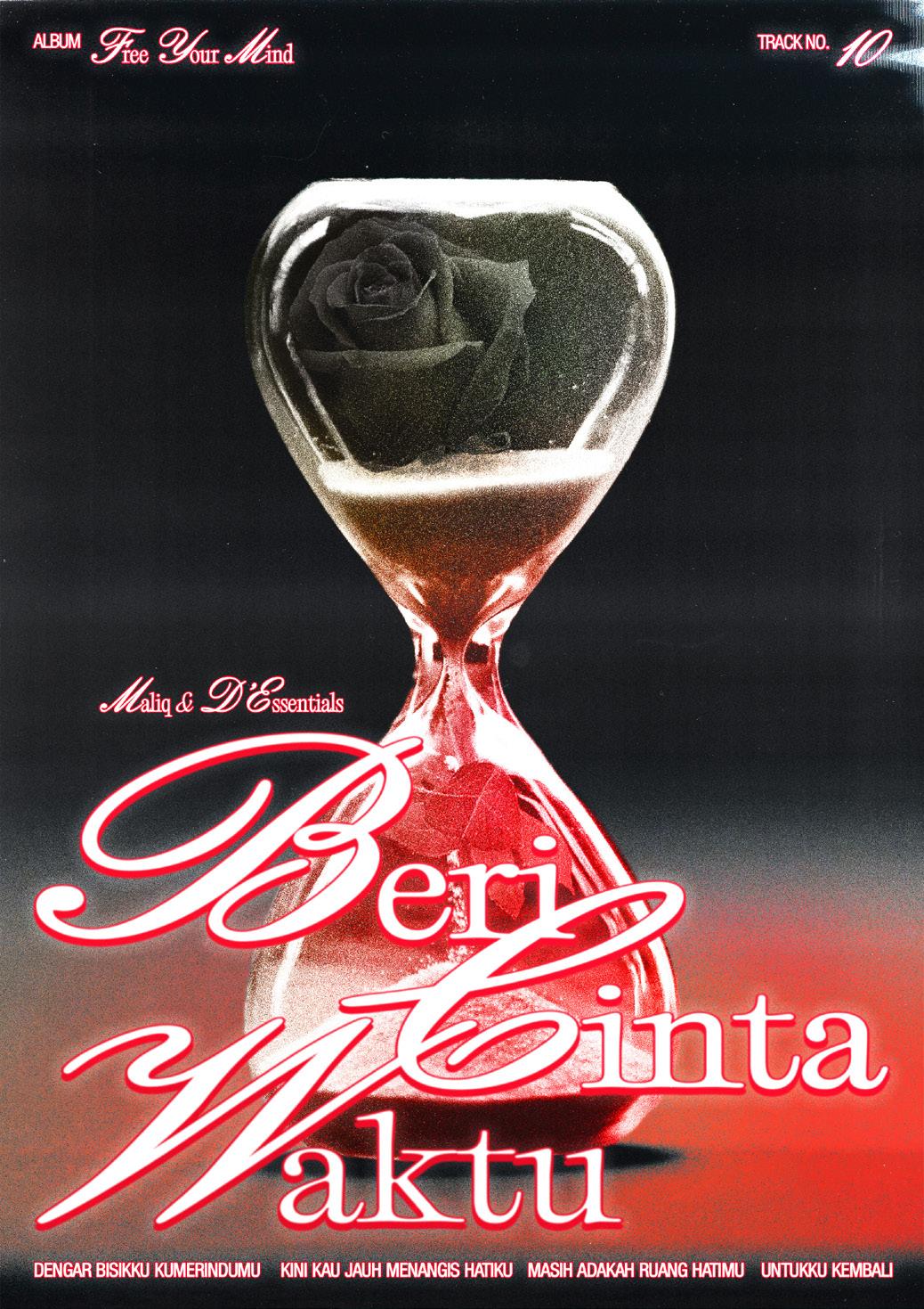
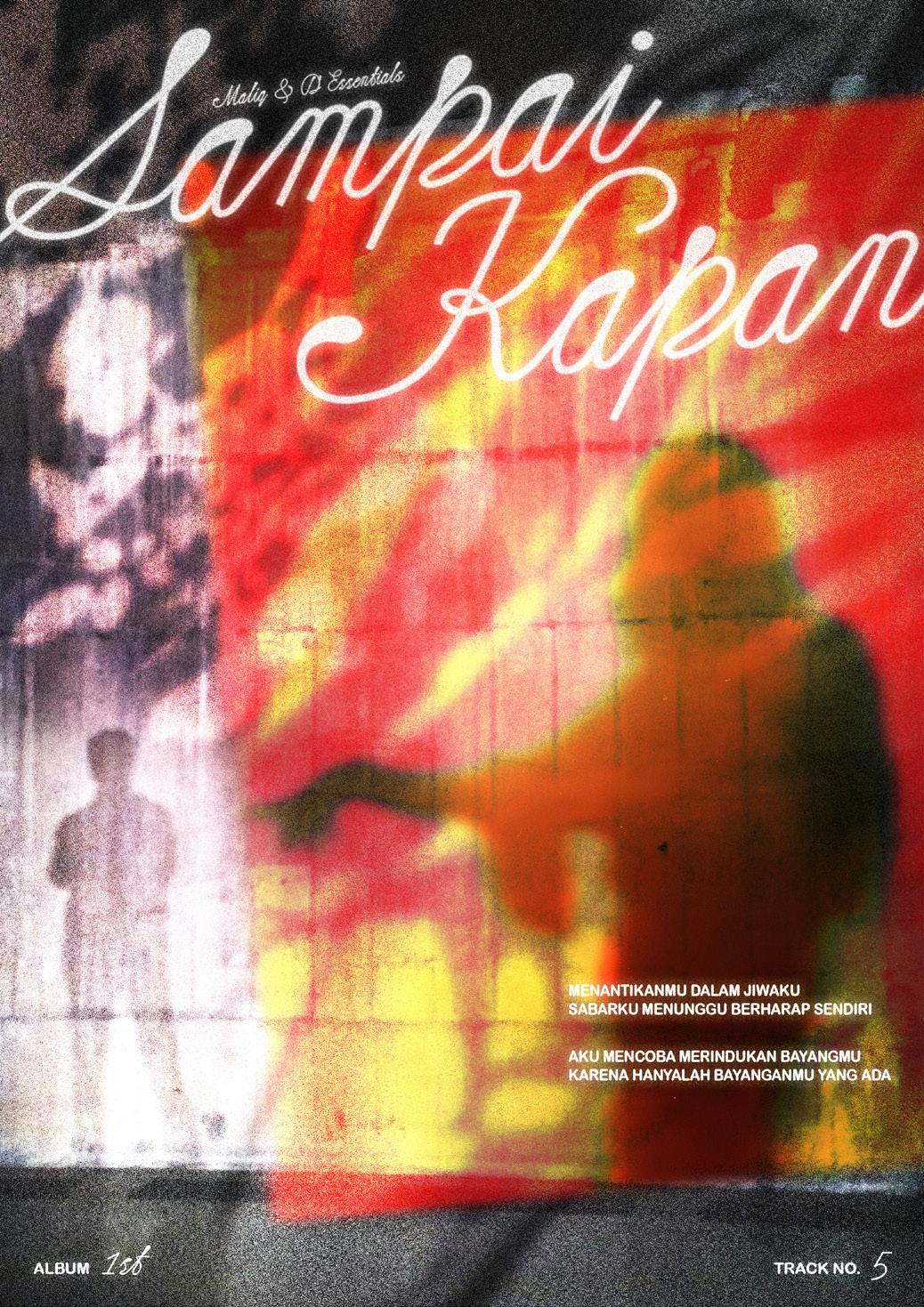
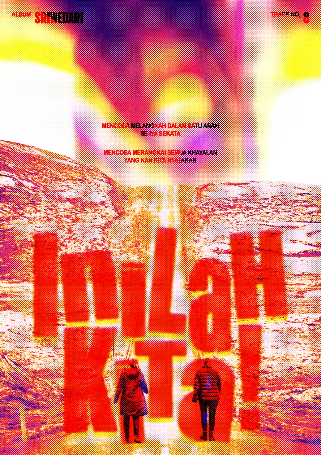
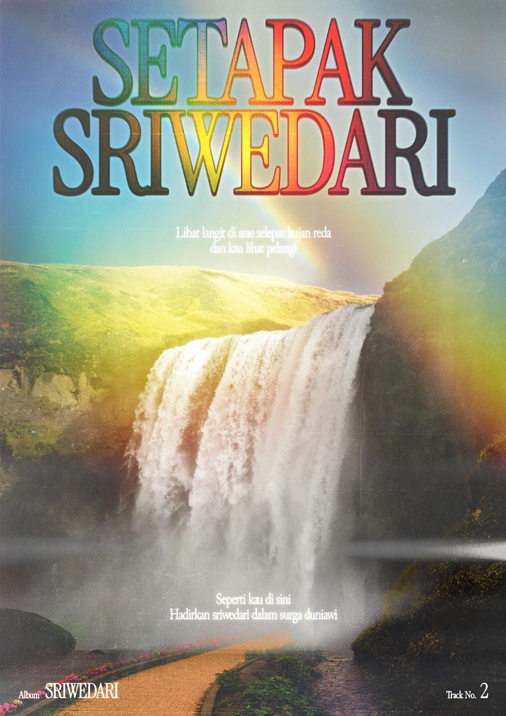
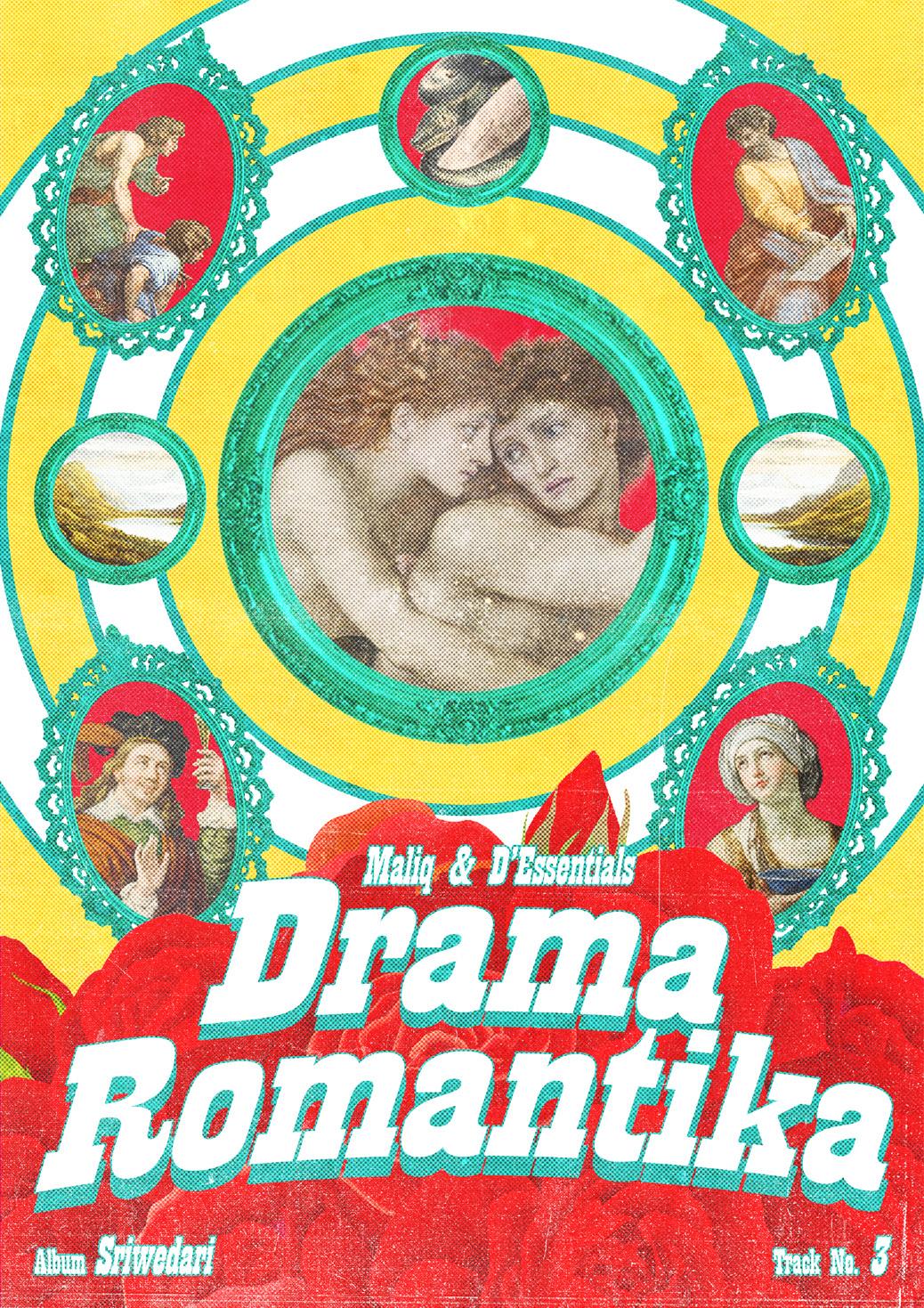
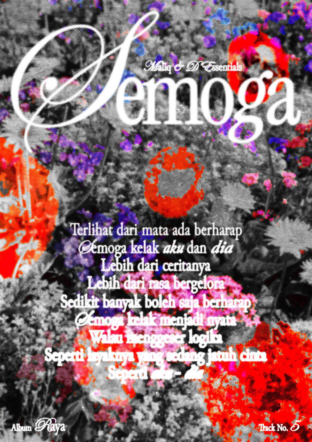
MAD 20th Anniversary
A continuation of the previous music-themed poster series, consisting of 10 posters dedicated to MALIQ & D’Essentials 20th Anniversary. This series focused more on the visual storytelling based on my interpretation of 10 MALIQ & D’Esssentials songs. Distinctive visual composition and typography are incorporated into each posters that resonate with the interpretation of each songs.
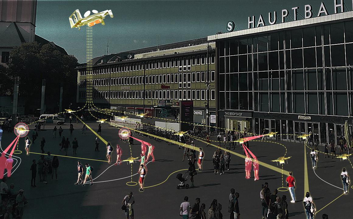
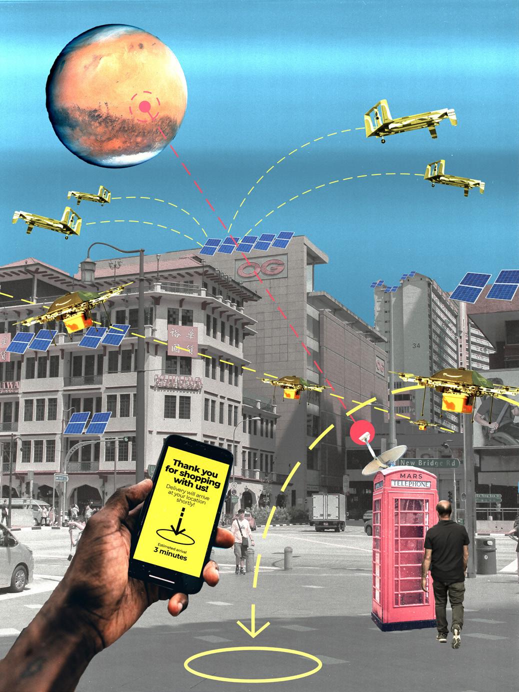
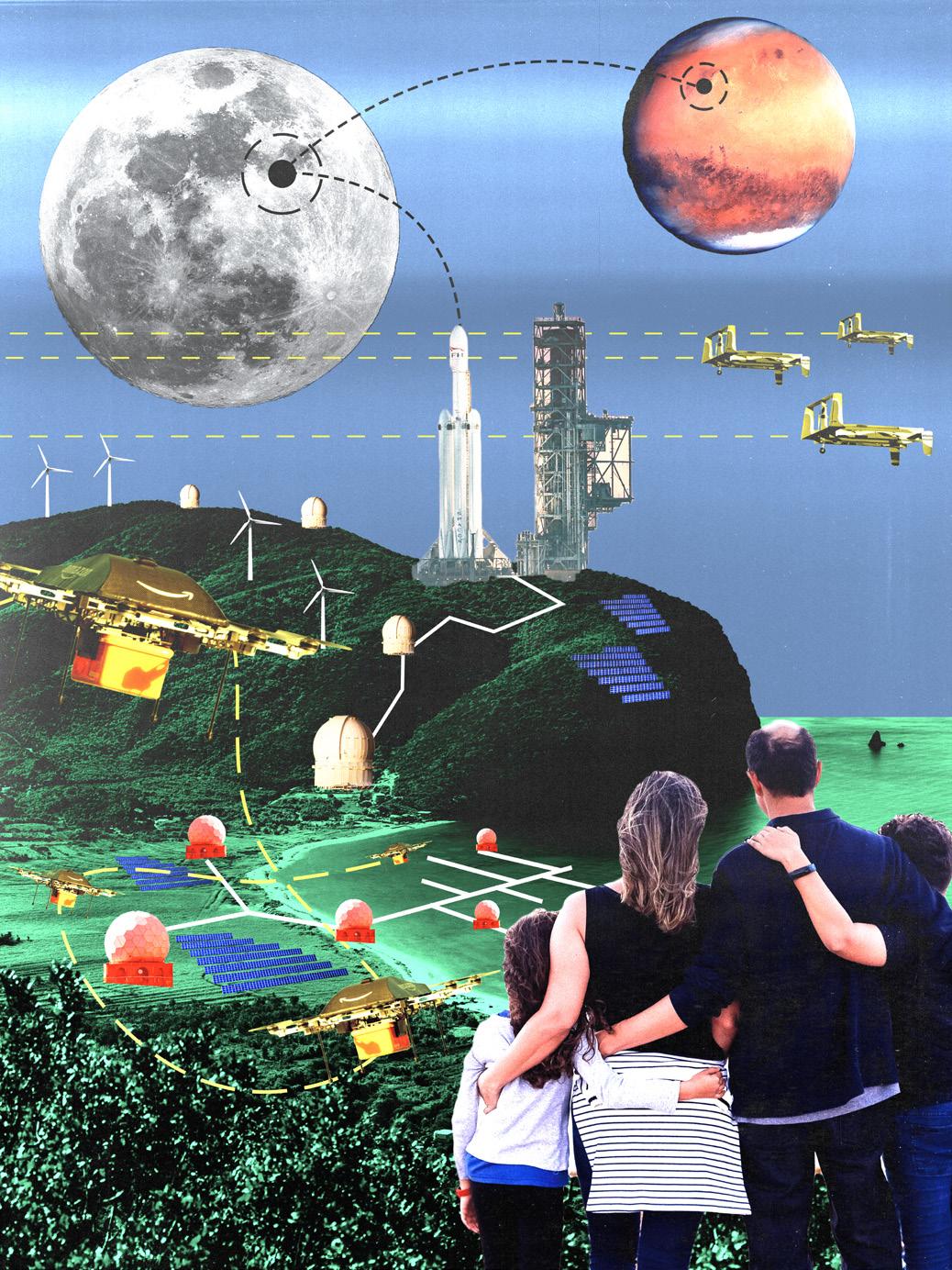
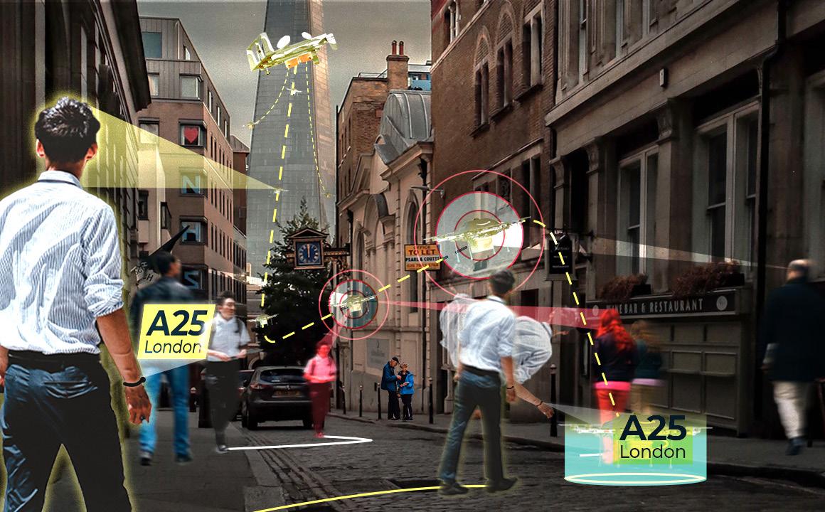
Connecting Mars
Scope
Academic Project
Architectural Design 1
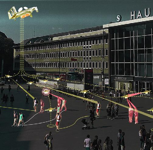
In 2071, we have successfully colonized the Moon and Mars and a sophisticated instant distribution and communication system are needed to connect the colonies with Earth. The system is called “MartianX” and it’s designed to distribute goods from the colony to Earth using matter reconstruction, drone tech, and direct communication system. With MartianX, human can focus on the input-output activities without wasting their time in the complicated distribution side of things.
Encounters
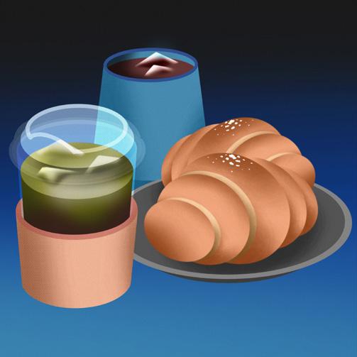
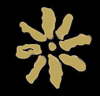
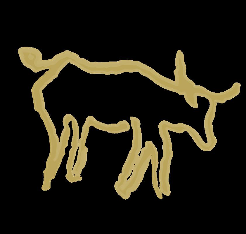
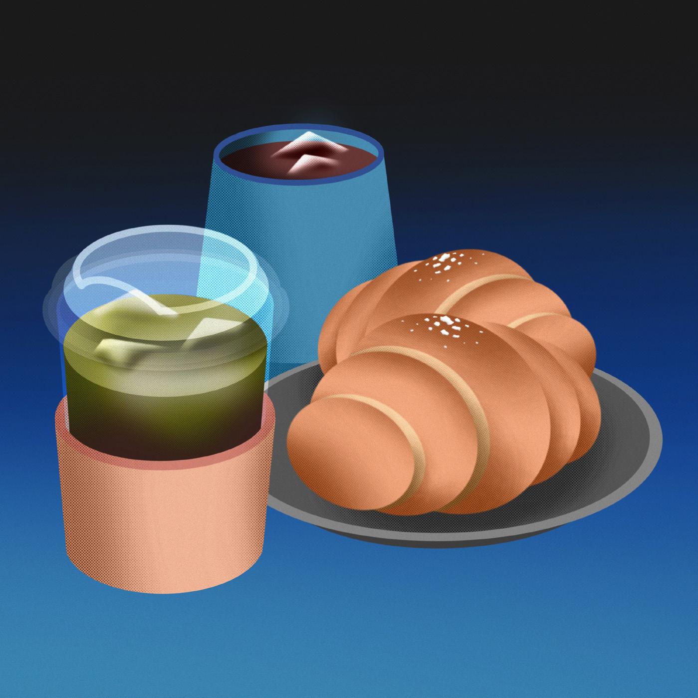
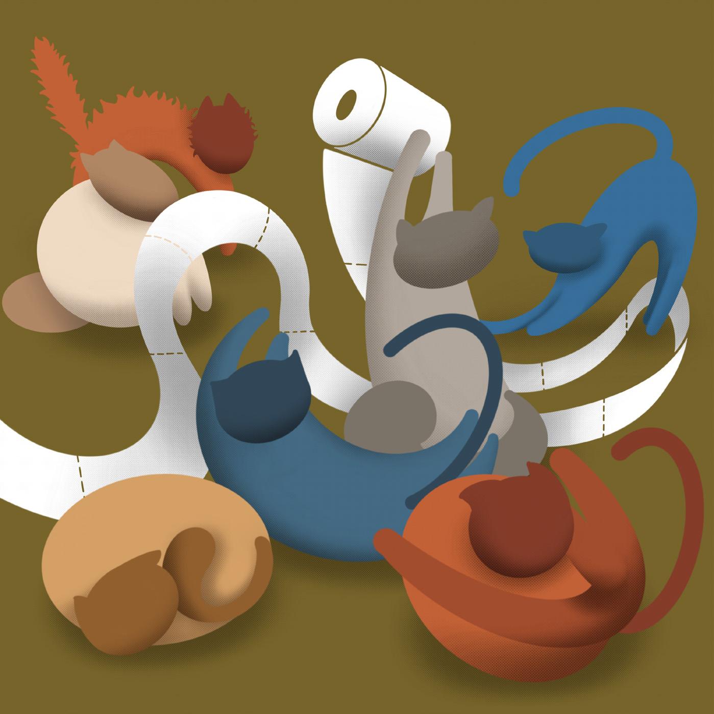
A few illustrations taken from the mundane things I encountered on my daily life, from colourful flowers at the park; saltbreads & coffees with a friend; and cats being cats.
As a designer...
my long-term goal would be practicing a multidisciplinary approach that combines both of my interests in architectural and graphic design or other scopes of design.
Scan the QR code below to check on more of my architectural works on Issuu!
For further discussion, do not hesitate to contact me right away!