
AXEL VERVOORDT GALLERY
We’re pleased to share this book to offer a memory of what the past four years meant for the gallery and all our partners. First and foremost, the artists whose work we were able to present at various opportunities, but also collectors, curators, critics, researchers, performers, enthusiasts, and art lovers. We’re grateful to the artists for allowing us to share their stories and creations within the gallery platform. Without their voices and works of art, the gallery’s existence is impossible.
Reflecting on the recent past, these years became a period of operating a newly relocated gallery space in Hong Kong, for resilience following the COVID-19 pandemic, for the voices of artists who joined our gallery or further underscored a decades-long collaboration, for depicting social issues through art. Some artists did so through community-based installations, others through participatory performances, by making paintings that echoed the ephemeral landscape, or by making interventions that question our perceptions of our worldly reflections.
Over the past four years, in collaboration with the artists, estates, and a wide range of other stakeholders, we have published extensive monographs on Raimund Girke, Angel Vergara, and Shiro Tsujimura, as well as publications on Jaffa Lam and Bosco Sodi. The book now in your hands is the third in an ongoing series, a new edition to a story being written. The first highlighted the start of the gallery; the second detailed the move to new locations in Hong Kong and Kanaal, the revitalised industrial spaces in Wijnegem. Past years have meant further exploration of what the spaces have to offer, including an exhibition in the space known as Karnak, a grid of robust round concrete columns; or a sculpture by George Rickey in the garden, following his solo exhibition.
This is all part of a diverse and inspiring arts community—from Antwerp, throughout Europe, Asia, and around the world— of which we are delighted to be a part. We look forward to future projects, alongside new exhibitions in our gallery spaces and contributions in museums, art houses, and public spaces. Recently, Renato Nicolodi, Kimsooja, Germaine Kruip, and Peter Buggenhout, realised sculptures in public areas, which can now excite, confront, or question walkers, expected or not.
I would like to thank the team and all the staff members who made everything happen. All of this is possible only through cooperation. Many thanks to everyone, who provided logistics or photography, registration or conservation, writing or consulting, for the benefit of the artists and the stories they seek to tell.
Boris Vervoordt
1. BOSCO SODI
Folegandros
Kanaal
December 2, 2023 – March 16, 2024
2. ANGEL VERGARA
Acts and Paintings, Hong Kong
Hong Kong
November 18, 2023 – March 16, 2024
3. WAQAS KHAN
Tabula Rasa
Kanaal
September 30, 2023 – January 13, 2024
4. JAFFA LAM Sailing Kanaal
September 30, 2023 – January 13, 2024
5. DUO EXHIBITION
Pierre Culot and Tsuyoshi Maekawa Resilience
Kanaal
September 30 – November 25, 2023
6. NORIO IMAI
Time Scape
Hong Kong
September 2 – November 4, 2023
7. OTTO BOLL
Space Walk
Hong Kong
June 3 – August 26, 2023
8. PETER BUGGENHOUT
I am the Tablet
Kanaal
April 29 – September 2, 2023
9. BOSCO SODI
Spheres and Sack paintings
Kanaal
March 11 – July 15, 2023
10. KIMSOOJA
Topography of Body
Hong Kong
March 18 – June 3, 2023
11. CHIYŪ UEMAE
Kanaal
February 11 – April 22, 2023
12. RAIMUND GIRKE
1986/1999
Kanaal
January 21 – April 15, 2023
13. SADAHARU HORIO
Hong Kong
February 4 – March 9, 2023
14. GROUP EXHIBITION
Dialogue with the Self-Portrait:
Ida Barbarigo presents Zoran Mušič
Kanaal
October 8, 2022 – February 4, 2023
15. JAFFA LAM
Chasing an Elusive Nature
Hong Kong
October 15, 2022 – January 14, 2023
16. RENATO NICOLODI
Clair/Obscur
Kanaal
September 24, 2022 – January 14, 2023
17.
GROUP EXHIBITION
Brushstrokes and Beyond
Hong Kong
August 20 – November 26, 2022
18. TSUYOSHI MAEKAWA
Kanaal
August 13 – September 17, 2022
19. TSUYOSHI MAEKAWA
Selected Works 1958–2018
Hong Kong
May 21 – September 24, 2022
20. GERMAINE KRUIP
Rehearsal
Kanaal
May 14 – July 16, 2022
21. GEORGE RICKEY
Kanaal
May 14 – September 24, 2022
22. GROUP EXHIBITION
Ryuji Tanaka and Kazuo Shiraga: Material and Action
Hong Kong
April 2 – May 14, 2022
23. SHIRO TSUJIMURA
Kanaal
February 17 – May 7, 2022
24. IDA BARBARIGO
Cafés
Hong Kong
January 15 – May 14, 2022
25. MARCO TIRELLI
Kanaal
November 20, 2021 – March 2, 2022
26. RAIMUND GIRKE
Was weiss das Weiss
Kanaal
October 30, 2021 – February 12, 2022
27. SHEN CHEN
Hong Kong
October 16 – December 23, 2021
Kanaal
March 12 – May 7, 2022
28. BOSCO SODI
Into The Deepest
Kanaal
September 18 – November 6, 2021
29. GROUP EXHIBITION
Investigation of Materiality
Kanaal
August 7 – October 23, 2021
30. GROUP EXHIBITION
Residual Heat (Curated by Chris Wan Feng)
Hong Kong
July 17 – August 28, 2021
31. MICHEL MOUFFE
Nebel
Kanaal
June 19 – September 4, 2021
32. GERMAINE KRUIP
Screenplay
Hong Kong
May 15 – July 10, 2021
33. ANGEL VERGARA
Les Belles Idées reçues
Kanaal
May 8 – July 17, 2021
34. OTTO BOLL
Widening the Language
Kanaal
April 10 – June 5, 2021
35. GROUP EXHIBITION
Jef Verheyen 1955–1962, Antwerpen-Düsseldorf-Milano
Kanaal
February 27 – May 1, 2021
36. LUCIA BRU
Twenty-First Floor
Hong Kong
November 14, 2020 – January 19, 2021
Kanaal
February 27 – March 27, 2021
37. YUN HYONG-KEUN
Kanaal
October 24, 2020 – February 20, 2021
38. KIMSOOJA
Planted Names
Kanaal
October 24, 2020 – February 20, 2021
39. BOSCO SODI
Yūgen II
Kanaal
September 22 – October 17, 2020
40. JAROMÍR NOVOTNÝ
Just a Narrow Range of Possible Things
Hong Kong
September 5 – November 7, 2020
41. CHUNG CHANG-SUP
Kanaal
July 4 – September 19, 2020
Hong Kong
February 6 – May 8, 2021
42. IDA BARBARIGO
Self-portraits / Cose che incantano
Kanaal
July 4 – October 17, 2020
43. ANGEL VERGARA
J’efface, et cela apparaît
Kanaal
March 7 – June 27, 2020
44. TSUYOSHI MAEKAWA
Kanaal
March 7 – June 20, 2020
45. BOSCO SODI
A Thousand Li of Rivers and Mountains
Hong Kong
February 13 – September 1, 2020
KANAAL, TERRACE GALLERY: DECEMBER 2, 2023 – MARCH 16, 2024 FOLEGANDROS
AGIOS GEORGIOS
This series, like others by my father, is best referred to as an anthology. It is written more than painted. It is painted, of course, but through him, it is more like assembling words. His language is different. He traces letters with matter, words with colour, and the sentences are strung with frames. Each step is always interesting: the materials he sources and from where they’re sourced. It’s interesting to connect the beauty of his work to the source simply because it’s beautiful. His paintings, at least to my eyes, are beautiful by rule but sublime only by condition. It isn’t the process of his that defines his work as interesting, redundant, sublime, and ugly. I have always seen it as his connection to the process that makes the work— the coagulation, paint, glue, sawdust, sublime. People are in love with the story, quite understandably, but interacting with a piece from my father begs you to look past the aesthetics or the mythology of the process, and out onto the language he only speaks while he paints. Many have described it as a dance. It is a good description, but it’s more of a mediation. It lacks the performative nature of dance, and it is completely individualistic. With the privilege of living in his studios, carrying painted buckets, and building stretchers as he paints right next to me, it is clear that something is poured into the piece, something unconscious. One does not understand his paintings. One can only hope to understand how to approach them. They’re not something that can be given meaning or held in place much like himself, or anybody. Of the many things written about my father, I found many to be lost in the signs and symbols of his work and personality but of the few things that get at the depth of his work, this sentence by Agustin Arteaga captures an essential quality.
“The abstract character of Bosco Sodi’s works releases emotions which do not respond to a narrative then, but which rather derive from the association with intimate experiences or through references to a collective imagination.”1
The meditative nature of the creation guides the painting by emotion, intimacy, and feeling that, in his trance, he lines his work with. The paintings’ wonder comes from the energy and fascination released in his meditation. It is his ardour for chaos, the time listening for new colours, the labour of preparing the stretcher, the canvas, the mixing of the paint, the feeling as it slips through his fingers, the varying gravity drawing him to different parts of the canvas, the agony he always describes, as he contemplates the piece he works on at night, everything up to the moment when he asks me to come to look at it standing up.2
They become an extension of him. This is why he despises questions asking him to explain his work. It becomes a request to objectify himself, to limit the painting. The only concept that lies in the work is in the structure of it, how he taps into and expresses his unconscious, his meditation. Each painting is entirely unique, tied together only by the artist.
What occurs is an expression of energy, one that one picks up on by tapping into certain meditative feelings of a collective unconscious. The richness of the pieces’ contemplation, lies in a meditative response, one
that instead of expressing, absorbs; to feel the pieces, one has to participate in a reciprocal process. I theorise that the sublimity of his larger paintings comes from an assault on the meditative nature of the work on the senses. One needs less focus to create a sublime connection with the painting. That’s also probably why he always says the paintings are better seen alone, without distraction.
My father always talks about energy—regarding people, earth, food, a building, a cup, all the time measuring it. To him, it’s always about energy. It’s what moves him, what helps him choose. In Folegandros, there’s a walk we often take to a beach called Katergo. The path winds through the valley of a mountain, each step tunneled by rock walls. All around the island, there are unnecessary sculptures that mark paths, only a few of which line walkable roads. The path of interest is singular in the magnitude of the individual parts that make up the barriers. One wonders how many people it took to carry and place each stone segment. Three hundred metres along this path, there was a rock my father always stopped by. Measuring about 50 x 100cm in size, the stone has dozens of holes gouged out by an eternity of restless wind and water. We walked past it, and each time he talked about taking the rock home. He always asked me to help him move it, and it never budged. After about two years, one day, we had half of our family tree staying with us on the island, and he rallied us all together for the impossible task. The group included fifty years olds, teenagers, and children younger than ten. The rock now sits at the front entrance of our family’s Folegandros home.
Of the many impulsive projects he has undertaken in his lifetime, my father’s self-establishment on the island may have been one of the more random ones I’ve witnessed. While on a sailing trip years ago, we stopped on the island for one night. The night turned into two days. Even after, as we walked the port, he eyed a real estate office and saw a posted image of a barren extension circling tentatively a charming precipice at the island’s edge. A quick call enlisted a more-than-eager local Greek man to take him to see the land for sale.
To be honest, at the time, I could’ve cared less. I must’ve just wanted something to do, so he took me along.
At most, my father needed only an hour to decide our future on Folegandros. This included the thirty-minute drive to get there. An unwelcome surprise to my poor mother.
Impulsive is a reductive term. His decision is naturally reflective of his art, or his art is reflective of it; he let the feeling carry him. It demanded that it be acted on, leaving my father ultimately blameless. When the decision bore fruit, he said to me that nowhere else had he ever felt so at peace, so connected to a place. To connect to something as he described it, to think the saltiness of the air, the roughness of the roads, and the marble inscribed along the beaches could be felt and loved as if it was alive. The very feeling demanded to him in his restlessness the creation of a studio. From its completion, another process began to take shape.
As his arrival approached, he collected deadwood that

transfixed him, those that centre the pieces now. He invited Manolo Ros, someone who has always held a special place in his heart as, “Manolete”, an artist friend that lent him a hand setting up the studio. Sourcing the pigments, the tools, the buckets, all from the house of curiosities that deals in 1000 different trades like the surreal department stores in Marcel’s Bleu’s, “The Impersonal Adventure”.
This painting anthology is imbued with my father’s fascination with the island. It extends to the beach walks, the restless wind, and the simplicity he feels when he goes spearfishing. Every connection flows from his meditations into paintings. All share the restless and sublime energy he carries in relation to the setting.
Few times has he explained his paintings, and in reference to this series, he told me they represent the story of humanity. I laugh now, realising that of all the things that could be said, this was the only one that couldn’t rob anything from them. Every aspect of it was sewn with a relationship between the language he speaks and himself. A self that carries with it every subsequent relationship. A culmination of which gives it its humanity. The series is not a history, but it invertedly tells the tale of my father in Folegandros at this specific time. That feeling touches something collectively as one looks at that which has transfixed a person and been cemented somewhere in the patterns and cracks that run through this anthology. It runs partly along with what it means to be human. It says as much about the viewer as it does himself. It requires no connection but immediately establishes one between the spectator and my father. You don’t have to know or understand him to understand his work, but when you understand his work, then you begin to know and understand my father.
– Juan Bosco Sodi Corredor
1.
2. Listening, in a metaphorical sense, in the ways that one is without choice when searching for colour, as though one hears without deliberation. Listening implies more than looking for one colour or searching from an available palette in a supply store but hearing and being in the search for expression via colour. Listening visualises patience, absorption, and contemplation of what’s been absorbed. To be on the lookout for color is like listening for/to a particular line in a song. It’s a certain hue that my father happens upon (like the ceiling of Egyptian tombs, which he did for a series) and then he just thinks about it (moving from hearing to listening) and I remember once, as time passed, he mentioned the ceiling again and that’s what I mean by listening.

Untitled, 2023

ANGEL VERGARA (B. MIERES, 1958)
HONG KONG: NOVEMBER 18, 2023 – MARCH 16, 2024
ACTS & PAINTINGS, HONG KONG
Painting is often considered a static art form. A completed canvas with dry paint departs an artist’s creative studio to be seen by the public. For Angel Vergara, the opposite is true. To paint is to act. It’s not a passive practice, it’s an active one. Throughout his long oeuvre, painting has been a form of constant interaction with visible and invisible forces. By bringing his canvases into the world—out of the studio’s confined, safe walls—he allows them to absorb the environment, continuously changing throughout. For this exhibition, Vergara worked in Hong Kong. As Straatman, he ventured into the city’s natural surroundings, and later, into the metropole’s lively core. These interventions are named “Acts & Paintings”, which gives the exhibition its title.
For art to merge with society and culture, the artist needs to plunge. Vergara does so adamantly, by defining the boundaries of his studio as non-existent. Covered in a white sheet, the artist takes on the alter-ego of Straatman (Dutch for “man of the street”), where the here and now becomes his nomadic studio. The senses are physically diminished, yet mentally heightened. Vergara takes up his environment by surrounding himself with it. Straatman made his first appearance in 1988 during the Venice Biennial. In front of the Belgian pavilion, Vergara set up camp in his nomadic studio formed by Straatman’s white sheet. The intervention was a spontaneous one, as he wasn’t officially invited, but this is a bold demonstration of the unconstrained nature of his practice. Above all, by performing as Straatman, he has a place to paint that allows the artist to relate to his environment. Paradoxically, while concealed beneath the white sheet, he can barely see anything outside of it, yet it allows him to uncover the invisible through the creative act.
As a first step of his stay in Hong Kong, Vergara discovered the nature around the city. He set up camp in places like Tai Tam Reservoir, Deep Water Bay Beach, Shek O Beach, Lamma Island or Mount Davis. The canvases he brought were made in his Brussels studio, with a preconceived yet abstract idea of the Hong Kong landscape. Upon arriving in the actual atmosphere they were based upon, they underwent a metamorphosis: like the biological phenomenon of mimicry, they changed colour and form.
We think of chameleons or octopi changing colour, animals becoming invisible in their habitat or even pretending to look like a predator as a defence mechanism. The shapes and forms of natural mimicry are endless. When discussing the Mimetic Faculty, Walter Benjamin argues however that “the highest capacity for producing similarities is man’s”1. It is in art and writing, that the playful game of mimicry takes on a higher form. Vergara is far from invisible as Straatman, quite the contrary. He doesn’t pretend to look like something else. He doesn’t practice mimicry, but the work he produces under the white sheet morphs in such a way that it assimilates and merges with the surrounding
environment. Doing so in nature is a calm and peaceful activity, a conscious and active meditation. The resulting series breathes these horizontal, painterly landscapes.
Afterwards, Vergara moved from Hong Kong’s serene surroundings to the tumultuous inner city. Straatman appeared in Central District, on the shore of M+, Sheung Wan, Wanchai, Aberdeen, and Flower Street. Here, the Acts & Paintings tighten: the direct and oftentimes chaotic presence of the millions of inhabitants moving through the city requires an intense form of concentration. The resulting paintings are more action-driven and sketch-like, capturing fragments of the direct interaction between the artist hidden under his white sheet and the people passing by—looking, talking, or sometimes even stepping on the canvas. The works form an impossible-to-decipher mental map of a singular moment in time and space.
The aesthetic differences between the two bodies of work—one made in nature, the other in the city—reveal a contradiction. They show Hong Kong as a particle accelerator: calm and composed on the outside surrounded by its mountains, beaches, and water, yet charged and interactive on the inside. This is a paradox, however, as at the core of chaos is peace, yet at the core of peace is chaos. The city is composed of man-made structures. While the disorderly patterns are seemingly harder to contain than nature’s apparent serenity, reality shows that they are inherently connected. A social conflict shares the same disruptiveness as a natural disaster, yet society’s organised functionality shows parallels with nature’s homeostasis. Vergara plunges himself into the natural world as well as the human one in a similar fashion. While the aesthetic outcomes are vastly different, the core remains the same: capturing the ever-changing conditions through intuitive strokes of paint, where art moves with its surroundings.
Movement is a crucial element in Vergara’s practice. This becomes apparent in his well-known video paintings, where the artist’s brush follows video footage, creating a painting that’s constantly in motion. In this exhibition, movement plays a crucial role when we look at the central space. Here, we find two works created during a live performance accompanied by local musicians. In the public’s presence, the artist once again as Straatman, was covered under a white sheet. He positioned himself in the gallery space in front of canvases covered in charcoal. Guided by the music, but equally so by micro stimuli from the visitors and his surroundings, the artist captured his movements by manually erasing the charcoal. What’s left is a trace of the performance, a moment captured in time like an abstract photograph made with a long shutter speed. Perceiving Vergara’s work is like witnessing an event: never still, always shifting, awakening our senses in unexpected ways.
1. Walter Benjamin, Selected writings (Vol. II), ed. Michael W. Jenning (et. al), trans. Edmund Jephcott, (Cambridge: Belknap Press, 1996), pp. 210–213.


WAQAS KHAN (B. AKHTARABAD, 1982)
KANAAL, PATIO GALLERY: SEPTEMBER 30, 2023 – JANUARY 13, 2024
TABULA RASA
Waqas Khan is a visual artist who expresses himself with multi-layered mediums including drawings and installations. Growing up in a rural setting in Pakistan’s far south, Khan reflected heavily upon social associations, communal history, memories, and related narratives—a reflection that prompted a move to Lahore where he graduated as a printmaker from the National College of Arts in 2008.
Khan’s large-scale minimalist drawings consist of forms and compositions that are laboriously built up through repetition and markmaking as a technique. His minuscule dots, lines, and dashes resemble mysterious scripts in some works and echo the celestial expanse in other compositions. Khan’s work is informed by the cosmos, the primordial, and a desire to recreate a unique sensorial experience of space.
In a political and cultural world dominated by discursive violence, his work feels like a breath of fresh air, a tabula rasa. This is especially the case for an artist who comes from a region that through a Western scope has often been equated with turbulence and unrest. The reading of contemporary Pakistani practices has therefore been highly influenced by these perceptions. This made the use of nonrepresentational idioms like the ones used by Khan less evident. The idea of the work as a clean slate opens the possibility for endless, yet well-defined interpretations. It creates a breeding ground for non-violent and community-driven engagement. His paintings and drawings encompass an infinite spectrum, from a macro level—with inspiration drawn from the cosmos, the void, and the primordial—to the micro-level world of atoms, molecules, and biomes hidden from the naked eye—and the aesthetic and intuitive logic that are shared by both. His work is very human on the one hand, referencing cross-culturally by bridging eras and regions, and transcendent on the other, with worlds appearing and disappearing in the finite accumulation of dots and lines that make up his canvases.
While the work allows for a resetting of the mind, the context of its creation deserves to be addressed, too. In the realm of Western art history, discussions have predominantly revolved around debates concerning symbolism, representation, and abstraction. It is tempting to categorise Khan within these paradigms. However, this approach overlooks the diverse practices, histories, and cultures that the non-Western world has to offer. While Khan’s practice centres around a non-semiotic mode of representation, it doesn’t neatly fit into categories like aniconic, Islamic, or religious art either. His works abstain from references to history, politics, and iconography, while at the same time resisting easy classification within standard categories of abstraction or formalism. In this sense, his work very much exists in the now, with a strong relation to community, social interaction, and the hope to evoke an exchange of energies.
An important reference point for Khan’s practice is 2007. While a student at the National College of Arts in Lahore that year, Khan made a series of works titled, “My Dancing Dots”. Inspired by performative classes
and a mathematical understanding of movement and rhythm, the artist began drawing or even embossing lines and dots on different surfaces. By doing so, he seemed to map an understanding of movement and sound, creating and capturing ethereal compositions. This practice shares similarities with Mughal and miniature paintings produced in the region from the 16th to the 18th centuries, especially Ragamala paintings. Much of the knowledge and understanding and therefore the teaching of these types of paintings has been lost, however, which moved Khan to a more personal interpretation of these shapes and forms. While traditional Mughal painting often departs from legends and myths as a basis of their representation, Khan’s work strips away those narratives and figurative forms. By doing so, he arrives at an essence that touches upon something much more universal. The interweaving of his personal history and understanding of the region he grew up in with a more occidental interpretation of art history makes his work transcend into a realm without borders or limits.
Khan’s creation process is deliberate and painstakingly slow. Traditionally, he makes his drawings on thick wasli paper like what was used in Mughal-era painting, while his large-scale works are made on cotton canvases. These are meticulously sanded down, up to the point where the texture almost mimics that of the wasli paper. This thin and fragile canvas provides the perfect surface for Khan to start the meditative repetition that constitutes his work, following an almost childlike intuition. The weeks and months spent in the studio form the boundless shapes of his exhibitions. The works’ complexity is comparable to that of a bird’s eye view of the ocean: endless ripples and waves seemingly interlock in a chaotic amalgam that is impossible to decipher. However, this seemingly overwhelming inconceivability, which feels bigger than life, evokes a soothing feeling, an everlasting calm.
We are but a speck of dust in the nexus of the universe, yet Khan’s work makes one ponder that maybe the everlasting cleaning of the slate is not as threatening as one might think. Tabula Rasa is a mental space of opportunity and connection.
– BP


Congruence, 2023

JAFFA LAM (B. FUZHOU, FUJIAN, 1973)
KANAAL, ESCHER GALLERY: SEPTEMBER 30, 2023 – JANUARY 14, 2024
Jaffa Lam utilises Sailing to refer to the sailboat’s collective power, which functions as a symbiosis of elements— wind, rope, sail, and human strength—that may be harnessed by a group of people working together.
Embedded within the exhibition’s metaphors and themes is an expression of how Lam positions her work: not outspoken, not on the frontline, but a quiet plea for those around her who don’t have a platform in society.
It is a peace she allowed herself when turning fifty: “I used to want to carry big stones no matter how difficult it was, but now I think that being able to gently put down heavy stones is also a kind of spiritual cultivation.”1 In her focal question of what artists can do for society, she reflects on potential influences and values while focussing on how “ordinary individuals and trivial things that have been marginalised by the passage of time in our society”.
Lam migrated from China’s Fujian province to Hong Kong in her early teens. She found herself in a city in transition. A bustling, fluid metropolis—with great prosperity due to the duty-free trade port and thriving textile industries—ballooned with real estate projects that came to dominate the streetscape. The socio-economic context then changed rapidly, with declining industries, mass emigration, and human work replaced by machines or relocation to cheaper locations.
Together with her mother and sister, Lam toiled in garment factories, dreamed of becoming an artist, and started her studies at the prestigious Chinese University of Hong Kong in 1993, “in which there was still a strong emphasis on the self”. A decade later, the 2003 SARS epidemic and societal changes led to the desire to align emotions with those of those around her, resulting in community-based art. But the idea of a dream, she says, remains ambiguous for a second-generation migrant: many parents push their children towards elite jobs. Personal fulfilment is an afterthought.
If anything, Lam wants to be a role model for students who want to become artists and are therefore not part of the upper middle class. She also aims to refocus attention on individuals who have been marginalised by the ravages of time but were once responsible for the flourishing of the city. It is a philosophy that led her to use discarded material, in reference to concepts of renewal and regeneration. At the same time, she’s aware of the rarity of crafts like woodcarving. Other outside constraints are manpower and space—in Fo Tan’s industrial area, where Lam works, a scarce commodity for an artist.
Since 2009, Lam has worked on her ongoing Micro Economy project in which she can try to bring change. This change has centred around people within the community who share a past, whom she understands, and to whom she can connect the heritage of the past to contemporary social realities. Together with those close to her—members of the Hong Kong Women Workers’ Association, stay-at-home mothers, people with a migrant background, and people who lost their jobs because of changing economic circumstances—she creates installations in a variety of materials and formats, always without limiting herself.
The artworks—which never have the finality of being beautiful, unlike some political consensuses— are not mass-produced: each figure has a meaning. Confidence in her community ensures no worries about intellectual property. Although she gets questions about how many people can benefit from her work and what the KPIs are, this is unimportant. What matters is her contribution. She seeks a wider viewpoint by focussing on the emotional values of her work and the impact created inside and outside her micro-economy. Lam examines the long-term repercussions, generation by generation, of how a small individual can ignite societal change. An individual’s action can set transformation in motion within a family, which reverberates within another and develops around a community, a country, and potentially, the world.
Lam recognised overlaps with Hong Kong when she was on a study visit to Antwerp. In both places, history flows through the veins of the street plan, largely defined by buildings that recall trade and labour from the past and present. This ensured that prosperity and migration went hand in hand. Today, much of the heritage that recalls these periods is being erased by real estate projects and gentrification: worker-inhabited zones in the port area gave way to revaluation projects. However, Lam says, history remains tangible, which she demonstrates with the work Bleaching / Piu, an installation shown in 2018 at the Shouson Theatre, Hong Kong Arts Centre, and extended for this exhibition. “Piu” means both “bleach” and “drifting” in Cantonese: the space-filling installation is a metaphorical expression to evoke the spectator’s self-identity; to see what is underneath. The work is composed of used white fabrics that Lam collected in the Kwun Tong industrial district, a region that offered poorly paid work within the garment industry and where many migrants in the 1970s and 1980s, including Lam’s family, found refuge. Earlier this year, Lam expanded the work to include textiles found in second-hand shops in Antwerp’s suburbs, where, in the 1970–80s, migrant workers could find affordable rental housing: close to their work, which led Lam to select uniforms and workwear. Once back in Hong Kong, the whole was sewn together by female workers and the artist. In doing so, Lam ties the workers’ stories together like a patchwork. The work hovers from the ceiling—to invite visitors to participate in Lam’s introspective world, experiencing the dilemma between the possible prosperity and flourishing of the future on the one hand, and the struggles of the present and melancholy of the past on the other. Something else she metaphorically uses to describe herself, as a recurring element and motif in her artworks, is the Hong Kong orchid. The flowering plants grow in a wide range of environments and have a very broad diversity, but whether they are native to Hong Kong is not known with certainty—presumably they got there “by accident”. Still, as of 1997, they are a symbol on the Hong Kong flag. “I am like the Hong Kong orchid,” Lam says. “Where do I come from? What do I want to symbolise?”

Following the official flag format, Lam is now making the Hybrid Peace series (consisting of four works in four respective colours, three of which will be shown at the Hong Kong Arts Centre in 2024) as a mosaic of reminiscence and a shared historical past. The flags are made of recycled umbrella fabric, recalling the peaceful protests that happened in the city, though Lam used the material even before that, as a metaphor for protection and hyper-consumption: thousands are discarded per day, both rain and shine.
Lam’s umbrella textile works are ready to be folded up and tucked away after this exhibition, ready to travel with her in Lam’s nomadic existence. Even her heaviest works, concrete-worked trolleys, have the functionalities to be easily moved by pallet jack. But as long as they’re here, they are invitations to take a seat, rest, and experience a moment of respite. At least, if a comfortable place can be found. Lam embraces the imperfections as opposed to the perceived perfection of technology, AI, and VR. Above all, she says, her works are human. – SB


DUO EXHIBITION
WORKS BY PIERRE CULOT (MALMEDY, 1938 – INCOURT, 2011) AND TSUYOSHI MAEKAWA (B. OSAKA, 1936)
KANAAL, TERRACE GALLERY: SEPTEMBER 30 – NOVEMBER 25, 2023
RESILIENCE
Although Pierre Culot and Tsuyoshi Maekawa never met, striking conversations and correlations arise when viewing the artworks together. Both artists have a profound admiration for materiality. Their distinctive approaches display an overwhelming energy and never-ending urge to give life to matter. They created art out of total freedom, without any dogma or scholarly academism. The title of the exhibition takes direct inspiration from the artists’ expressive oeuvres and the word’s physical and metaphysical meaning. Maekawa aims to heal the wounds of post-war Japan by stitching his burlap canvases, whereas Culot’s monumental clay sculptures stand silently like sanctuaries or walls, while conjuring opposing notions of embracing or defending the space they occupy.
Pierre Culot was a Belgian artist who wanted to build a bridge between British, Japanese, and French traditions. Culot saw nature as the sole generator of life and beauty, and he considered earth or clay as his primary material, forming the heart of the process. His works evolved from basic forms and shapes, such as bowls, plates, and jugs, to more daring, elaborate forms shifting beyond functionality towards architecture. His works are marked by monumentality and freedom, but overall, by a love for materiality.
Working with Bernard Leach, Culot discovered the traditions and finesse of Japanese ceramic art. During trips to Japan, he was inspired by the gestural approach to ceramics, marked by fingerprints, scratches, and edges pressure-welded into what appears to be unfinished shapes. He abandoned round shapes in favour of squares and rectangles. In most cases, he worked with ‘slabbing’, which is attaching slabs of clay together by guillochage, a robust technique that allowed him to create large pieces.
Resilience presented a selection of works from the early 1990s: ten huge vases, partly glazed. These large vases embody proportions like a human torso. “They are the affirmation of my permanence,” Culot said. He added a touch of dark green or grey-green glaze to the edge of a vase or to its interior, achieving an unexpectedly decorative effect of dripping paint. He paid considerable attention to the edges, which gives a perceived sensitivity to the two planes.
The idea of building sculptures by extrapolating his pots was a logical next step. In 1990, Culot presented his first Homme debout (Standing man), tall quadrangular stoneware works combining several hollowed-out, glazed elements designed to accommodate plants. The exhibition includes one of these monumental sculptures. According to Rudi Fuchs:
They are objects of impressive craftmanship, developed in a vivid and contemporary artistic understanding of form, material, and process. However, when we see their strong and compelling presence as objects, it becomes irrelevant whether they are art, craft, or both. What is important, however, is that they are pottery, because Pierre Culot is one of those rare artists who has been able to prevent pottery from slipping into futile preciosity, and to give this craft back its ancient nobility.
The exhibition also presented three capitals, or chapiteaux, produced in 1993. These sculptures—with no underside—are made of terracotta struck with a piece of wood, a very primitive technique related to African traditions. They are made of grey clay, coloured with chromium oxide and influenced by cuneiform writing executed with sticks. During the process, Culot and his assistant Pascal Slootmakers saw the resemblance with Greek pleated garments and made the comparison with the Winged Nike of Samothrace, the masterpiece of Greek sculpture now in the Louvre.
Throughout a career spanning many decades, Maekawa, a former Gutai member, has never stopped working and continues to use his sewing machine as a medium to suture his canvases resulting in woven paintings. The act of stitching and bending canvases into folds and pleats resembles a form of therapy. He used his art to heal the wounds of the war, not to reveal them. Even at the age of 85, Maekawa returns to his studio daily with the same drive for creativity. The exhibited recent works are being shown to the public for the first time.
Maekawa utilises his preferred burlap material for its raw, rough texture. Made from hemp fibres, he appreciates this humble and ubiquitous material that was used as bags for rice and grains. He focusses on the material composition of the artwork, not on its presentation. He incorporates sewn, wrinkled, and twisted waveforms in canvases airbrushed with acrylic paint, exploring the material’s infinite possibilities.
Often compared to the work of Lucio Fontana— for his sculptural investigation of the canvas—and to Alberto Burri—for his love for burlap sacks—Maekawa, faithful to the Gutai philosophy, refuses to be compared to other artists. “I have been creating works for over sixty years now. I think I have concentrated on exploring matter. In particular, I have been persistent about investigating cloth and experimenting with it.”
Resilience was one of the first major exhibitions featuring Pierre Culot’s work following the artist’s death in 2011. The exhibition coincided with the publication of a recent monography, Pierre Culot. 1938–2011 (Brussels: Mercatorfonds, 2023). In the 1970s, he had solo exhibitions at the Stedelijk Museum Amsterdam, V&A London, and Palais de Tokyo in Paris, among others.
– ASD


NORIO IMAI (B. OSAKA, 1946)
HONG KONG: SEPTEMBER 2 – NOVEMBER 4, 2023
TIME SCAPE
“I find everything on earth a resource. Tangible things including wood, steel, and fabric, intangible things such as light, air, as well as people, social events all inspire me in my artwork.”1
— Norio
Imai
Norio Imai’s sixty-year-long artistic career reflects his time at the forefront as well as his constant shuttling between various media and materials. Featuring fifteen works, Norio Imai: Time Scape was the first exhibition to focus on his vintage photographs and videos from the 1970s and 1980s and included the installation, The Video Age (2023). Imai has consistently attempted to reveal the invisible, elusive subject of time. His visual language of photographs and videos are born out of his interest in evolving time and its space in reference to the changes in the Japanese economy and society developed with the era of rapid economic growth.
At the age of nineteen, as the youngest member of the Gutai Art Association in 1965, Imai created white relief paintings on shaped canvases. Jiro Yoshihara, Gutai’s founder, was astounded by Imai’s work, which strongly promoted spatiality, as though he had turned an entire wall into a work of art interspersed with stones—or “canvases”—in spots, much like the Zen Garden of Ryoanji Temple. Imai’s work expanded beyond the two-dimensional canvas into a three-dimensional space and even incorporated the surrounding environment.
When the trend of televisions grew in 1960, a non-traditional value system began to emerge in Japan. “The medium is the message.” This statement advocated by media and culture critic, Marshall McLuhan, drew Imai’s attention. He took a particular interest in abstraction rather than the method and contents of media transmission. All the said interests, apprehensions, and dehumanisation convinced the audience that video and photography were the media best suited to reflect the epochal character. Imai’s works gradually transformed from the concept of materiality to immateriality from the mid-1960s onwards. Specifically, he started exploring unique ways of using film and photographic techniques to capture time in a haptic sense and methods of expression that visualised time in a comprehensive manner.
Featuring Landscape with Camera (1970), the first exhibition space displayed a series of photographs from Red Light (1976). Imai embarked on his journey of performative photographic expression surrounding time in these artworks. Landscape with Camera is a photograph, taken in front of Imai’s home in Osaka, with the subject’s camera and opposing cameras moving toward each other. Red Light is a series of photographs of lights that Imai encountered on the street. Red Light depicts the construction sites, local fashion, and street signs that reflect the times, while highlighting the red traffic lights to warn Japanese society to “stand still” as it relentlessly kept on running in those days. Imai always carried a camera with him around as if the camera was a part of his body. This may have made him look cool and innovative at the time, but this is perhaps a reminder of the
contemporary practice of young urbanites who capture urban landscapes with their cell phones, post them on social media sites, and archive the images.
In Time Scenery/Abenosuji (1977), Imai visualised the time displacement by double exposure of the respective red and blue views of traffic lights at a location around a pedestrian crossing on a large street in his neighbourhood in Osaka. Hand-made gelatine silver print done by Imai himself has made it an extremely valuable work. Imai created an archive of time by capturing everyday scenes that ordinarily would be forgotten by people. He successfully gave volume and materiality to time by exhibiting a series of 1–6 photographs and used “landscape photography”—a landscape or scene that vastly differs according to individual memories and experiences, to express the artistic and regional qualities existing in the ordinary.
Imai started creating video media works in the late 1960s. As the theme of his creative work settled on time, since the 1970s he began pursuing a performative video expression based on time concepts. While filming a TV monitor on the air with a video camera in On Air (1980), instead of winding up recorded tape onto an open reel, he wrapped the tape protruding from the deck around the TV set itself, endlessly until the screen was almost hidden. Imai utilised the materiality of videotape, as expressed through its texture and feel and focussed on the importance of visualisation of time. An installation called The Video Age (2023) was on display right in front of On Air, which Imai created in the summer of 2023 for this exhibition. A collection of videotapes of movies that were once broadcast on television are assembled in the background of a video in permanent playback of images of sandstorms.
Portraits bring one’s identity into confrontation and convey the artist’s message. Imai offers viewers a long passage of time through his self-portraits. One of the portraits, Portrait 0 to 20 Years Old (1976), which was Imai’s first self-portrait, is a screen-printed portrait of himself at age thirty, superimposed on a series of portrait images on a surface glass panel. The chronological arrangement of the works allows the viewer to visually capture the path of time as it progresses from the past to the present. Imai gives the viewer an opportunity to recognise themselves amongst strangers, while presenting a timeline of his development. Photographs of his childhood with his grandmother, his first school uniform on the first day of school, young Imai in black-rimmed glasses, and many more, each moment of his life appears as an image of “I am just like any one of you”.
Imai continued exploring the limits and possibilities of digital media and its expression even after the dissolution of Gutai. Today, he holds a special place as a pioneer of first-of-its-kind video art in Japan. Imai lived his young life amid the social changes from postwar reconstruction period of Japan to its rapid economic growth and has continued to express the “time scape” of that era with his photographs and videos. However, he’s always been interested in and has pursued the most commonplace scenes of everyday life, rather than

self-portraits,
choosing special and unusual subjects. Imai said, “I find everything on earth a resource. Tangible things including wood, steel, and fabric, intangible things such as light, air, as well as people, social events all inspire me in my artwork.”2 Imai has a unique artistic style to incorporate elements of everyday life and express the lived times with humour and rich sensitivity. This is the inheritance of the Gutai propounded by Yoshihara, who exclaimed, “Do what no one has done before!”
– MK

1. Quote
2. Ibid.

OTTO BOLL (B. ISSUM/GELDERN, 1952)
HONG KONG: JUNE 3 – AUGUST 26, 2023
SPACE WALK
“One determinant of my work is my discontent with the established visions on the world around; it cannot be possible, that what we see is all we can see and will see.
A new vision cannot simply originate from things perceived, cannot be achieved just by the synthesis of values drawn from previous experience. I intend to search for what I hope to find: The visible not yet visible; spatial expansion of thought and feeling.”1
– Otto Boll, 1988
A void, be it an old stairwell or an industrial gallery space, is a beginning for Otto Boll. “There is nothing and from this point, you have to start anew,” he says. It’s like a search for the unknown or travelling to a new destination. Something emerges from the void that was previously only in the artist’s mind.
From past training as a glider pilot, since the 1970s Boll has been keenly interested in perceptions, in a complete image of something that can only be gotten through renewed attention and through sharing space and time. The tranquil interplay of lines with which Boll fills the gallery can be considered only this way—as a sculptural event to which he invites us. It’s rarely clear exactly where the lines made of aluminium and steel begin or end, only the approach can help in understanding. “Only their proximity can bring about a pristine experience,” says Boll.2 Most of these sculptures are untitled; some are called “Helix”, referring to the shape of a snail’s shell that also characterises the works, but also to the spiral that follows the pattern of the viewer’s thoughts.
The way the sculptures present themselves is part of the mystery: hanging almost invisibly from thin threads of nylon. These sculptures must be as light as possible and thus consist of a hollow part, although it’s impossible to perceive how the lines change from full to hollow and vice versa. Other works then balance on a pedestal, or on a stone or wooden structure. One sculpture from 2014 is composed of reflective aluminium, mirroring the surrounding reality. Another from 2008 consists of a black wooden curved beam, from which a white chalk line appears to float.
This exhibition features a Super 8 video work from 1980. The spatiality, the experience of reality through distance and close-up, and the finding of the protagonist in a relationship other than the usual three-dimensional one, has remained constant in his work. In 1975, Boll made Flute Drawings, almost strictly geometric patterns of light and dark, where only on reading the title does it become apparent that the light sources are the openings for the mouth and fingers. It is a statement by the artist, an expression of the power of the mind. With black chalk and paper, Boll managed to go where one otherwise could not. The 1980 Super 8 film, Paper Bag Film, builds on this idea, though here the mental availability is translated into a physical one. Returning from the habitual act of going to the bakery, Boll asked about being the inside of the bread bag, an object that otherwise presents itself as merely functional and disposable, and a simple act with which he once again succeeds in questioning spatiality and perception.
With his sensitive works, Boll places himself in an intriguing continuum of artists who engaged in dialogue with spatiality and space itself. Shortly after the turn of the century, constructivists like Naum Gabo, inspired by encounters with the inventor of X-rays and uncovering inner structures behind the façade, stripped sculptures of their unwieldy, monolithic, and bulky nature—dematerialising, as it were, abandoning the concrete thing-in-itself. After World War II, artists sought spatiality and the infinite, with Saburō Murakami or Lucio Fontana making indentations and hollows on the two-dimensional surface of a canvas on paper. In a radical gesture of the void and the immaterial in art, “space painter” Yves Klein saw the sky as his studio, just as Boll seems to employ the space of a gallery as a surface for intervening with a play of lines.
Meanwhile, in the Americas, several sculptors, including Alexander Calder, Ruth Asawa, and Gego, delved into the idea of drawing in space. The latter built sculptures from the late 1950s onwards with an ingenious yet ethereal and organic character, constructed from an interlaced interplay of lines unfolding in space. In 1976, shortly before Boll started what would become his signature oeuvre, Gego made her Dibujos sin papel (Drawings without paper), installed hanging from nylon, close to the wall, hinting at the idea of movement and illusion.
With all these artists, the idea of kinetic movement was part of the very being of the works themselves—a common application of “line” in 1970s art, including in the case of two-dimensional work like Bridget Riley’s undulating “curve paintings”. Boll’s works, however, are hushed in their honest simplicity, and place the action of movement with the visitor: it is through dialogue and interaction, through walking around them and underneath them that only an understanding of the works can emerge. The search for the beginning and end of the meandering lines demands movement, even after which the sculptures keep part of their secret.
The interaction and resonance of human beings and material are reminiscent of the philosophy of Lee Ufan, who, also in the 1970s, started his series “From Line”. “Load the brush and draw a line,” he said, about a series of lines gradually disappearing into “nothingness”—a transformative process of reduction and saturation.3 The pigment seems to evaporate before the viewer’s eyes, just as Boll’s lines seem to dissolve. Lee calls the space between the lines and between the parts of his well-known sculptures, yohaku, the open site of power, “the air around the work, rather than the work itself, takes on density, and the site where these objects are placed vividly reveals itself as an open world.”4
Boll’s lines are like tones of music—the resonance of a stringed instrument that disappears when the string stops vibrating. The void dividing the works is like silence between notes, making the composition legible. The multiplicity of number, direction, and shapes reads like a polyphony, tranquil yet musical. Boll invites us to his sculptural event, as a conductor does in a theatre.
– SB


PETER BUGGENHOUT (B. DENDERMONDE, 1963)
KANAAL, PATIO, GALLERY, TERRACE GALLERY, AND KAAIMUUR: APRIL 29 – SEPTEMBER 2, 2023
I AM THE TABLET
Shortly before he died and to the great surprise of his fans, Lou Reed collaborated with the U.S. rock band Metallica. The song, The View, contains a kind of translation of precepts, given by God through Moses to mankind via the Ten Commandments or Decalogue.
“I’m the aggressor; I am the tablet; These ten stories.” It became one of Reed’s most polarised releases—largely panned by the press; described by David Bowie as the best thing Reed had ever written.
These precepts are in stark contrast to the leitmotif of Peter Buggenhout’s work: human over-consumption, over-accumulation, decadence, the West’s protagonist feeling, impermanence, and the digital dominance and rapid succession that results in a loss of attention and of the willingness to devote time. It is the latter that Buggenhout asks for as an artist, making sculptures that can only be mentally reconstructed in their entirety, after dedicating time and effort to comprehend.
That dedication also reveals that despite the carefully constructed, confrontational, and uncomfortable disorder, the works also offer a stillness, a peace in their indeterminacy. It’s as if the efforts spent in trying to understand the works result in a kind of compassion, perhaps even empathy.
The biblical story of the Ten Commandments is one of destruction and reconstruction, but also it is a story of interpretations, translations, and additions. The shape of the stone tablets, for example, differs strikingly from right angles (Michelangelo) versus rounded tops (Rembrandt), along with sizable height differences, despite the description of the features in the Talmud.
For this series, Buggenhout started from a stone surface in marble, as the basis of his artwork but also as a reference to “the simplest way to reduce the understanding of the world”. Just as the rules of life eventually became illegible through additions, the work’s stone basis is no more than a surface—like a canvas (tableau) of what presents itself almost two-dimensionally. “I wanted to show these marble tablets but on top of them, I added comments, and comments, and comments…. until the stone slabs became illegible, thus causing chaos. Our modern civilisation seems to create the same jungle.”1
Buggenhout places his work in line with the emergence of diffuse confusion. A construction of unexpected materials results—only a look of recontextualisation and associations of different points of view can lead to a reconstruction of the whole in the human mind, like a search for the core through a diaphanous accumulation of robust materials. That core, however, remains only laden with what it is: no narrative, no symbolism, no iconology. For Buggenhout, it is parallel to society, resulting in a similar limbo.
With the latest series, King Louie, Buggenhout refers to a similar destructiveness, but also to a loss of originality through apocryphal additions. Seen today as one of the best-known characters from the Disney adaptation, King Louie did not appear in Rudyard Kipling’s Jungle Book—orangutans do not even occur in India where the story is set. For Disney, the character was a vehicle to project doom, embodied by a clumsy
ape with a self-centred and chaotic personality, working against himself and others but hopping to tones of New Orleans jazz and swing.
With a pasty application of oil paint and silicones, it’s not difficult to think of an extension of informal art and expressionism with the un-functionality of Arte Povera, although, if one had to use an art-historical term, post-minimalism is probably the most accurate. Buggenhout, trained as a painter, accepts a painterly statement when it comes to his sculptures: “The skin is our contact with the world. When you look at the painting, you look at the skin of the painting as it is what makes contact with your eyes. It is about the surface and how the surface communicates. It is not just the form, or the shape, or the material. The part that takes contact is the skin of the sculpture.”2
It is a thought that resonates in the Mute Witness series. Like silent witnesses, they hang on the wall, composed of dented casts covered with canvas. From the depth of the material, but also from cognitive associations with artists who worked with burlap sacks, other materials seem to emerge, as if they want to unveil what has been, untold stories. In their silence and concealment, these works seem even more radical than others, such as the sculptures from the On Hold series, which only just seem to keep balance, where the creak of a wooden beam can be so imagined.
In his On Hold series, Buggenhout combines large inflatable, organic shapes intertwined with rigid constructive materials that both support and restrict them amid their expansion. Formally, the sculpture indicates a state of incompletion and instability, embodying the concept of unfixed identity. The result is an accumulation of brutal, yet brightly coloured materials and objects stripped from their original context and forced/squeezed into a complex composition that pushes the viewer towards confusion and disorientation through a sense of blurred recognition. Again, underneath a seeming turmoil of composition lies a carefully considered logic that is an equivalent representation of the elements and events, the complex reality that surrounds us.
A similar apparent decay is in the Gorgo series, of which this exhibition shows a work—named after the Gorgons of which Medusa is the best known. Some versions of the legend hold that blood from the left side of a Gorgo’s body is fatal poison; blood from the right side is said to be all-healing and could even revive the dead. Like a landscape decomposing or still life in decay, Buggenhout makes almost ritualistic sacrificial images with detritus, dead organic material such as blood and hair. They refer to our vulnerability, but also to the constant cycle of disappearing and reappearing, to a concealing and emerging reality.
That reality, in a perpetual state of transition, which cannot be grasped despite the sum of gestalt moments, is what the works in this exhibition—and those from Buggenhout’s entire oeuvre—share. It’s also why Buggenhout works with different materials and colours, to signify the totality of that complexity. In summary, his materials are ‘abject’: in their original existence (waste,

dust, blood, or guts); others in their use or application—so is the application of paint. Although a synonym for wretched, Buggenhout uses the word ‘abject’ explicitly referring to the French philosopher Georges Bataille. In the shadow of the burgeoning war and power struggles of the 1930s, he used the word abject to describe “the dehumanisation of labour, the class struggle, mass fanaticism”, which is the coercive force of sovereignty, an edifying exclusion that turns a section of the population into moral outcasts, as also later described by Hannah Arendt.3 Buggenhout’s book Erotism also refers to Bataille’s L’Erotisme, his main philosophical work. In it, he explores the concepts of eroticism, violence, prohibition and transgression, continuity, and discontinuity. It is only through transgression that a prohibition acquires meaning, through the revelation of its sacred nature. In an ever-evolving society, man finds himself straddling— on hold—between extremes, and here too: between order and enforcement on the one hand, the urge to transgress boundaries on the other.
But man is blind, Buggenhout says, just as he is blind in making his works, although each step follows one another with an intention. “The process has become the content of the work. When I start making a piece, I take one element, then I add a second one, and a fourth, and a fifth. So, this complete unpredictability, how it’s going to look like in the end, is very often a blind way of working.”4 Not knowing where to go, is why Buggenhout named his most iconic series after a painting by Pieter Bruegel, The Blind Leading the Blind Ongoing since 2000, examples from this series can be found in the collections of Centre Pompidou, Paris, and MONA, Tasmania. As hermetic constructions, they reveal themselves as bodies from another era, perhaps even the future. The layer of household dust Buggenhout adds at the end of the production process literally ‘shrouds’ the work in a haze of ignorance. To quote the Bible again: “Let them. They are blind who guide the blind. And if a blind man guides a blind man, they will both fall into the pit.”
– SB


BOSCO SODI (B. MEXICO CITY, 1970)
KANAAL, KARNAK: MARCH 11 – JULY 15, 2023
SPHERES AND SACK PAINTINGS
A selection of large clay spheres that the artist refers to as “perfect bodies” was installed in Karnak’s industrial column hall. They were mysteriously dispersed throughout the room alongside the site’s permanent installation of Mon Dvaravati statues. Each sphere was handmade and baked in a rustic kiln, creating unique and unpredictable results. The exhibition featured a series of “Sun Paintings” that Sodi made during the pandemic in his studio in Puerto Escondido, Mexico. He painted on found burlap sacks that were used to transport chili pepper. Inspired by the sun’s cyclical rising and setting, Sodi finds spirituality in the everyday, capturing it with the repeated act of painting.
Sodi strips his work of the notion of time—here reflected using centuries-old, timeless methods and pigments that were used in ancient cultures. These pigments ensure that the work radiates a certain organic energy that develops as the materials age naturally with unpredictable hardening and cracking.
The eight sack paintings dispersed throughout Karnak could not be glimpsed in their entirety from a single vantage point. Hidden behind the pillars, visitors achieved only a partial glimpse of the whole, step-bystep discovering the incidental patterns of the spheres and painted dots. The circles on the sacks seem to radiate the shape of the spheres, flattened on the burlap. Both sculptures and paintings relate to one another, while their rhythm and ratio seemingly hold a hidden code or language long gone.
The relationship between the sack paintings and the Dvaravati statues becomes even more interesting once we delve into their history. Both are in a way connected through trade. The Dvaravati statues can be seen as symbols for the spreading of Buddhism in Asia through the Silk Road, where the religion traveled alongside spices, silk, and other luxury goods, to eventually find its way to Dvaravati, a kingdom in present-day Central Thailand. Here, the Dvaravati style was born as a mix of two Indian archetypes: Amaravati and Gupta. Sodi’s sack paintings contain a similar strength through their interconnectedness: painted on burlap bags that originate from Africa and which were used in the coffee trade, to be recycled in Mexico as chili bags for global export, mainly to the Asian market. In choosing this material, Sodi subtly dissects global trade patterns, binding them together with the natural force of the sun, just like the teachings of Buddhism ran like a common thread through the economic network created by the Silk Road, here represented by the Mon-Dvaravati torsos.
The exhibition space is named after the Egyptian temple of Karnak. The atmosphere created by the industrial pillars radiates that of a place of worship. The four defaced Dvaravati Buddha statues embody a universal language: without the head, which usually contained all the details and gave the statues their identifying characteristics. The purity of the sculpted forms reveals the essence of peace and humanity. Western, Asian, and Egyptian iconography meet in this space. Transcending time and space in Karnak, the art objects are on an everlasting search for a universal, empyrean beauty.
– BP


KIMSOOJA (B. DAEGU, 1957)
HONG KONG: MARCH 18 – JUNE 3, 2023
TOPOGRAPHY OF BODY
A hypnotic, heartbeat-like sound welcomes visitors and activates the space with a faint echo and its repetitive, mesmerising rhythm. Kimsooja invites the audience into a private universe in which she peacefully initiates quiet action, embracing and connecting those around her, engaging past and present, nature and architecture, and especially the inhabitants.
At the exhibition’s entrance, visitors find imprints from Kimsooja’s fingers and the residue of her handholding moments in clay, which, despite their repetitive conceptual basis, are inherently and fundamentally different. At the same time, the clay is an imprint of something absent—an emptiness transformed into materiality. The sculptures reference Kimsooja’s acclaimed installation Archive of Mind (2016-), where visitors are invited to make clay spheres and leave them on a table. The action recalls those required for making a bottari, a bundle to protect and conceal belongings for transport or migration in many Asian cultures. Clay tells the participant’s own story, with a sphere shape into which the world, the contemplations, have descended.
The first room shows two abstracted fingerprints, once symbols of identity, now referencing the lines of a topographic map. Titled Geometry of Body, the prints were made between 2013–2016 and developed from another project at a checkpoint at the Mexico-United States border crossing Mariposa Land Port of Entry. By having her fingerprints scanned, she wanted to bring cultural understanding and positive interaction between the two countries, by sharing the emotions, memories, and aspirations we all have in our lives.
Opposite to the fingerprints is the new work, Deductive Object: (Un)fold (2023), consisting of crumpled rice paper into a sphere, which was then gently smoothed again by hand, showing similar topographical lines that can be traced back to the action of the hand. It’s an example of what is an invitation to participatory action, a shared moment of contemplation (as organised at the Centre Pompidou Metz, France). The compositions are not intentional but determined by the coincidences of the folds or created without the action to do so.
Kimsooja documents what she sees and experiences. For her, performance is an interference through not doing, not intervening, without making something, and showing ‘as it is’. Her work can be considered already made, with the emphasis on the prefix al: what she shows has a history, a singularity that she makes us aware of. Carrying an internal, inner history is also the basis of Kimsooja’s interest in textiles: “Cloth is thought to be more than a material, being identified with the body—that is, as a container for the spirit.”1
When she recalls her experience of inserting a needle through fabric, Kimsooja talks about feeling the energy of the entire universe suffusing her entire body. It’s a notion that is central to her oeuvre—often conceptual rather than formal—in her work referring to forced movement and migration, bundling belongings, wrapping, and unfolding.
The Thread Routes series (2010–2019), a chapter of which is included in this exhibition, is directly linked
to her earlier and later work, extending the notion to further dialectics, as Kim Sung Won described: “self and others, man and woman, wrapping and unfolding, spirit and material, civilisation and non-civilisation, traditional and contemporary, city and nature”.2
As a visual poem or anthropology, the work explores the cyclical process from yarn to intricate carpet, as the ethereal, meditative repetition from abstraction to figuration. With it, she shows the global importance of daily labour activities, referring to nature, life, existence, and coexistence, as well as also how weaving and knitting refer to geometric, architectural, and agricultural forms “reveal their primeval truth and aesthetics”.3 She tried to expose how the aesthetics of movement, a strenuous choreography, unfolds in the actions of the bodies. “In a sense, I unwrap their bodies and minds, creating drawings of their movement and life.”4 Again, Kimsooja explores the metaphorical status of needle and thread—with another thread connecting the various scenes without narrative.
Kimsooja developed the idea for her first film series in 2002 in the Belgian city of Bruges when she attended a bobbin lace-making demonstration. The entire series shows different cultural zones around the world, with ‘performers’ sharing labour according to similarities and singularities. The first chapter in 2010, explored Peruvian weaving culture and was described by Rosa Martinez as “reiteration as a rhetorical figure, insisting on the slowness of the gaze and committing herself to lengthy descriptions that highlight the poetry of Peruvian thread works and the pictorial juxtaposition of the elements she interconnects.”5
The third chapter of the series (2012) was filmed in India, a return to the country where she performed and filmed A Needle Woman (1999–2000), A Laundry Woman – Yamuna River (2000), and for the colourful visual and almost ethnographic tour that is Mumbai: A Laundry Field (2007). Thread Routes: Chapter III features traditional dyeing, knitting, embroidery, block printing, wood engraving, and tattooing; the archaeological sites and the temporary dwellings belonging to nomadic communities in the state of Gujarat; as well as two landmarks in Indian architecture: the Queen’s Stepwell (Rani ki vav) and the Sun Temple, Modhera, near the city of Ahmedabad. The archaeological constructions from the 11th century (Chaulukya dynasty), seem to echo the patterns of fabrics through their ornaments and repeating stepwells, as if labour resonates.
Thread Routes’ first three chapters were shown together in various locations, such as at Guggenheim Bilbao, Spain, in 2015, and in 2019 in Poitiers, France, during the city-wide route Traversées, curated by Kimsooja in collaboration with Emma Lavigne and Emmanuelle de Montgazon. For this project, Kimsooja addressed the theme of ‘traversées’, or crossing, in relation to fifteen historical sites, with twenty artists participating.
At this exhibition, Geometry of Body, in dialogue with the video, is an engaging installation of under layers of Indian block printing table covers that the artist collected (2012–2015). These textiles, with stamped

patterns of indigo ink, bear the marks of cyclical, repetitive labour. Coincidentally, Buddhism connects indigo to the symbolic meaning of intuition and inspiration.
The intricate layers of ink tie to the artist’s early experiments and search for an original painting methodology, since beginning college, after which she discovered sewing—and using the fabric of life as a canvas and the needle as a brush.6 As before in her work, a work of art did not come into being as such: a painting was not meant to become one. In the spirit of John Cage, a result is obtained without the ‘need’ to paint. Kimsooja breaks through the material, two-dimensional aspect of painting—she lets the old fabrics tell their stories and memories.
– SB
1. Artist statement accompanying Kimsooja: A Mirror Woman, Peter Blum Gallery, New
2. Kim Sung Won, “Archetype of Mind”, in Kimsooja. Archive of Mind., exh. cat. National Museum of Modern and Contemporary Art, Korea, 2017.

3. Quoted in Rosa Martinez, “A Disappearing Woman”, 2012. www.kimsooja.com/texts/ martinez_2012.html, consulted on 21.08.2023.
4. Quoted in “Kimsooja: Ways of Being.
A Conversation Between Diana Augaitis and Kimsooja”, in Kimsooja. Unfolding, exh. cat.
Vancouver: Vancouver Art Gallery, 2013–2014, p. 91.
5. Martinez, “A Disappearing Woman”.
6. Selene Wendt, “Sewing Into Life”, in Kimsooja. Unfolding, exh. cat. Vancouver: Vancouver Art Gallery, 2013–2014, p. 55.


TERRACE
FEBRUARY 11 – APRIL 22, 2023
Chiyū Uemae was one of Gutai Art Association’s original members who remained in the group until its dissolution in 1972. While Uemae’s oil paintings and mixed media works from the Gutai period have been exhibited in various museums worldwide, his post-Gutai works have rarely been shown outside Japan. This exhibition presents an overview of his Gutai pointillist works from the 1950s and 1960s, a selection of “Kigumi” wooden sculptures from the early 1970s, a collection of impressive “Nui” works from the 1980s and early 1990s, as well as a selection of oil paintings from the later years featuring his characteristic square patterns.
Uemae initially studied nanga, Chinese-style literati painting, before joining Gutai as one of its founding members. Much appreciated by the group’s founder Jiro Yoshihara and his co-founding members Shozo Shimamoto and Kazuo Shiraga, Uemae can be considered a unique Gutai member. Yoshihara insisted that “what is most important, is not the result, but the process of leaving one’s mark on the material”.1 To him, what mattered was the spiritual and not the material, the object and not the subject. Uemae was different. Between 1954 and 1964, he used a pallet knife to create tiny fragments of oil paint and produce paintings of microscopic detail. These works are characterised by repetitive gestures and vivid colours, such as red and yellow, which he superposes. He meticulously filled the entire canvas with these lines and dots. In these tick paintings, the so-called “auto-part”, Uemae aimed for the tactile more than for strictly visual appreciation. The process appeared to be very time-consuming and elaborate. Shimamoto wrote about this in 1984: “He [Uemae] would paint dots of paint, creating layer after layer, one on top of the other. He painted dots of red paint and then dots of yellow paint so the bottom colour disappeared… These works communicate with a completely different forcefulness from those that are more straightforward.”2
French critic Michel Tapié introduced Gutai to European collectors and museums, and he had high regard for Uemae’s work after having seen his solo exhibition in 1966. Yoshihara wrote about this encounter the following: “Michel Tapié singled out Chiyū Uemae’s work as one of the most important. Without going to excess, Uemae continues to move sure-footedly, stepby-step, along his own path.”3
Uemae was deeply interested in the evidence of material, discovering new expressions for items such as match sticks, strings, and cloth, making no distinction between vigorous painting and sculpture. His larger works are laced with extreme applications of paint as a cohesive image. They are also purely about the material, such as oil paint, occupying the surface of the canvas, rigorously applied layer after layer, with small particles of hues, refracting colours.
As of 1975, Uemae began using cloth and thread. He named this series “Nui”, or “Stitch works”. For the artist, it was a change of materials but the intrinsic search for transformation, applied with passion remained the same. He said, “I have created these Stitch works (Nui) as a work of pure art because using oil paints or fibers makes no difference to me. They are both simply materials.”4
Uemae obtained the skills for stitching during an apprenticeship at a kimono cleaning shop, where he was sent at twelve years old. His colleagues praised him for his fine and delicate stitching skills. The choice of this material and technique for non-figurative works was therefore a natural step for him. His “Nui” works are the core of his post-Gutai works; the encounter of the material and abstract art. From 1975 to 1997, he created 176 “Nui” works, of which many were reworked at a later stage.
Like Sadaharu Horio and Chu Enoki, Uemae was never trained at an art college with an academic curriculum. They were labourers engaged in a factory, and they continued working there to earn money for a living until their retirement. But they never stopped creating art and considered it as a necessity and an urge in life. Distinct from other Gutai members, Uemae continually embraced the idea of beauty, while for the others the innovation and originality of the expression were what counted the most.
In his later years, Uemae returned to oil painting and repeatedly used multilayered square patterns in his compositions. They became his signature style, and he used them in various colours and sizes. The origin is probably rooted in his childhood in Kyoto, as they remind us of the “Ichimatsu” patterns — or check patterns — found in the wheat barns in the Kyoto temples.
Uemae’s wide-ranging productivity during his seventy-year career is remarkable. From the creation of two-dimensional works, composed of an accumulation of paint by painting knife in his early years, to the sensitive stitches in his “Nui” works, to sculptural works made of wood, to his later paintings with the square patterns, his investigation of materiality and physicality of the paint, is persistent, focussed, and remarkable. – ASD


RAIMUND GIRKE (HEINZENDORF, 1930 – COLOGNE, 2002)
KANAAL, PATIO GALLERY: JANUARY 21 – APRIL 22, 2023
1986/1999
In the postwar avant-garde, Raimund Girke was one of the few painters who stuck to the traditional, twodimensional application of oil paint with a brush on canvas or paper. For him, a painting was a dialogue, a movement, a performance, between the artist’s intentions, and a support. That result was an expression of the tension between controlled expression and the will of the body’s movements, which is certainly the case with large-format works: “The movement always starts in your whole body and can really be lived out in front of a large canvas. There is no need to stop suddenly. You can walk the length of the paintings. You are not fixed to one point.”1
However, this was not done by artists connected to Art Informel (nevertheless important for young artist’s development as a student) or Abstract Expressionism. Always preserving the structure of almost vibrating cohesive lines, Girke saw painting as a form of writing. In a 2001 interview, he pointed to the same character used in Japanese for both painting and writing.
If a parallel with writing is drawn, one must talk about language. In the late 1950s, Girke decided that white became his modus operandi, his formal way of expression. Not as an achrome, but as the purest, most intense colour, evoking the immaterial, the quiet, the empty. His oeuvre was dedicated to exploring the possibilities of its application, its presence or absence— with an often ethereal or elemental result, sometimes seemingly reductive but always complex in structure. The works from the last dozen years, shown here, are also characterised by dark colours such as grey, blue, and ochre, which intensify and sharpen the white, turn away from the static, and exhibit movement through the repetition of contrast.
The socio-political developments in Germany and Europe during the 1980s are interesting in the light of Girke’s oeuvre. On several occasions, he participated in exhibitions showing the art of the ‘Bundesrepublik Deutschland’, including in Berlin and Dresden, or in Scandinavia and Asia. Girke travelled to Osaka in 1988 for an event in which artists made kites that were released into the air in a traditional manner and subsequently displayed at a travelling exhibition— where Girke’s kite hung alongside those of Robert Rauschenberg and Frank Stella. In 1990, a year after the fall of the Berlin Wall, Girke participated in the exhibition Ambiente Berlin at the Italian Pavilion of the 44th Venice Biennale. At the same time, as in the 1960s, his work continued to be shown at exhibitions on the many interpretations of the monochrome, such as Radical Painting in Williamstown, MA (1984), La Couleur Seule in Lyon (1989), Nonfigurative Malerei / Essentielle Malerei in Wiesbaden (1989) or the travelling exhibition Die Sprache der Farbe (1992).
Even more important, are the several retrospective exhibitions organised during this period, which asked the artist to look over his shoulder at his own oeuvre. The exhibition, Arbeiten auf Leinwand und Papier, at Kunstverein Braunschweig was followed by important touring exhibitions in 1986, 1988, and 1995, prompting Girke to return to museums that have been meaningful to him: for example, the Sprengel Museum Hannover or the Schloss Morsbroich Leverkusen—the first museum to acquire a work by Girke (in 1961).
An interesting return to certain elements can be noticed in his work from this period. Some titles return, such as Schichtung (a title that occurred more often, for example in 1957—a work now in the Bayerische Staatsgemäldesammlungen). The horizontal arrangement and impasto application of paint, core to the work of the 1950s, was sometimes reapplied, with vastly different results, being experiences of three decades of art richer. The ochres and blues, “earth colours / the colours of matter / colours between day and night / colours of the shadow,” as he wrote in 1995, also reappear on the surface.2 At least, that is what the viewer’s experience would perceive: in fact, they are the undertones on which white structures and layers, sometimes impulsive and dynamic, are built. Just as he referred more often to the 1950s in the 1980s, “where the unanticipated, imponderables, also slip in and are accepted,” the decade later, the 1960s-70s were a source of reference:
I’m inclined to believe that since the early 1990s I’ve been going through another phase where I’m increasingly referencing my paintings of the early 1960s and 70s, where the paintings are becoming more tranquil again, more cohesive, more open-ended and yet more unified, where the colour or pictorial field is not ploughed up by brushstrokes. (…) I believe that right now my paintings are again imbued with a largesse, a certain tranquillity and peace.
The artist passed away in 2002. In 2001, he said:
If painting, literature, or music really have power, are intense and true, then that is like a living entity radiating an energy of its own. I move within light as matter, even better perhaps, with light as colour, light manifested in colour.3
This exhibition celebrated the publication Between White / Was weiss das Weiss, published in German and English by MER. Borgerhoff & Lamberigts (September 2022), in close collaboration with the Estate Raimund Girke, and numerous museums, archives, kunsthallen, fellow artists, and other contemporaries who provided precious historical material.
1. This quote, and all others that appear in this essay unless otherwise indicated, come from an interview Dr Dietmar Elger conducted with Raimund Girke in 2001. As reproduced in Dietmar Elger and Raimund Girke, “A Conversation about the Life and Work of Raimund Girke” in Florian Illies, Anke Hervol, et. al.,
Raimund Girke. Between White (Ghent: Borgerhoff & Lamberigts, 2022), pp. 353–356.
2. Noted on the 6th of January in 1995. Reproduced in Raimund Girke. Between White, p. 320.
3. Noted in December 2001. Reproduced in Raimund Girke. Between White, p. 346.

kühl/dynamisch, 1999

Die Welt des Elementaren, 1996

Grosse Bewegung, 1990
SADAHARU HORIO (KOBE, 1939–2018)
HONG KONG: FEBRUARY 4 – MARCH 11, 2023
A TRACE OF TIME
Sadaharu Horio was a pioneer in modern Kobe performance art with a significant influence on Japan’s contemporary art scene. He worked constantly, often in collaboration with his friends, referred to as the “Kukiteam”, which led to an impressive body of performative work. Early in his career, Horio joined the Gutai Art Association in 1966 as one of the group’s third-generation members. Throughout his life and work, Horio remained faithful to Gutai’s avant-garde spirit, even long after the group disbanded in 1972. Gutai artists had an absolute belief in originality and strived to do what had never been done before. This initiative led to a diverse oeuvre of experimental and innovative work.
Horio’s practice focussed on freezing moments in time—in Japanese, this is called “ichi-go, ichi-e”—referring to the uniqueness of the moment. Each singular moment cannot be copied or reproduced. Therefore, he constantly changed his methods, using variable materials like scraps of metal, wood, junk, found objects, and so on. He put together about a hundred exhibitions and presentations per year, which emphasised the idea that exhibiting and performing was an extension of his everyday life. In performances, Horio challenged his audience’s thoughts on art, deconstructing the concept of product-based outcomes, and enhancing the meaning of critical artistic practice. “Everything ordinary or unaffected is basically a performance,”1 he said.
Horio expressed immense interest in children’s paintings and loved to work with kids during his performances. He often said that to achieve the same level of spontaneity, an artist’s psyche must be able to revert to a truly child-like state of wonder, without preconceptions, completely free of fear, unburdened by the ego, and ready to create with ordinary things.
In the final decade of his life, especially after his appearance in In-Finitum at Palazzo Fortuny in 2009 in Venice, Horio did several performances in Western museums and institutions, such as the Guggenheim, NY (May 2013) Artconnexion, Lille, France (March 2014), Körsbörsgarden, Göttland, Sweden (June 2014), Kunstverein Braunschweig, Germany (June 2016), BOZAR Brussels (October 2016).
A few months prior to his death in June 2018, Horio and the Kuki-team staged what became their final performance at Axel Vervoordt Gallery, Kanaal. Utilising the space of empty apartments, they painted on the floor and made monotype prints using the windows as their medium. The five-day performance resulted in many drawings with Chinese ink and watercolour on traditional hand-crafted Japanese Echizen washi paper. The exhibition, A Trace of Time, reveals some of these artworks to the public for the first time. The distinct beauty, unfaltering energy, and swift brushwork that
are evident in these works represent artistic expression performed without hesitation.
Another significant part of Horio’s oeuvre is “Ironuri” or “paint placements”. Every day, as an ever-repeating ritual, he placed a layer of paint on ordinary, found objects. To avoid making the choice of colours himself, he followed the sequence of colours in the paint box. Thereby, he avoided subjectivity or aestheticisation, because what he did could be done just as well by anyone else and could be endlessly continued.
The exhibition, A Trace of Time, demonstrates the consistency of Horio’s practice through early works from his participation in the Gutai group, to later works on paper, “paint placements” created at various performances, and through his monotype prints created during his very last performance at Kanaal. It shows how Horio’s unbridled enthusiasm and boundless energy are as inspiring today as when the Gutai group was first founded.

Failure to the Tableau Thought, 1970


A series of drawings and monotypes on paper, “Atarimae no-koto” (A Matter of Course), realised during various performances in the late 1980s and early 1990s, and some during his last performances at Kanaal in June 2018
DUO EXHIBITION
WORKS BY IDA BARBARIGO (VENICE, 1920–2018) AND ZORAN MUŠIČ (GORIZIA,
TERRACE GALLERY, KANAAL: OCTOBER 8, 2022 – FEBRUARY 4, 2023
1909 — VENICE, 2005)
DIALOGUE WITH THE SELF-PORTRAIT: IDA BARBARIGO PRESENTS ZORAN MUŠIČ
“I see my portraits like any other landscape, a landscape which reflects what I have inside me.”1
Zoran Mušič
The artist couple Ida Barbarigo and Zoran Mušič were tenaciously dedicated to painting and obsessed with specific themes, which they explored through countless variations. Both artists made many self-portraits with a singular style and approach.
A survivor of the Dachau Concentration Camp, Mušič turned towards silence and contemplation through painting. From the beginning of the 1990s to his later days, Mušič spent most days alone, drawing and painting. He painted himself, his body gradually disintegrating and his face disappearing, as the eroding landscapes he had always pursued. The colours of his self-portraits are those of the desert—harsh and sober—eliminating the superfluous and reduced to a minimum. “What interests me is bringing out the interior aspect. I see my portrait like any other landscape, a landscape that reflects what is inside me,”2 he said.
The Spanish critic Kosme de Barañano noted that “all Mušič’s self-portraits are like textual spaces of pain, monuments to the memory of continuing to be alive.”3 When people asked him whether his weakening eyesight was a problem as he aged, he would smile and reply that true vision is internal and that we should aim to paint with our eyes closed. At the beginning of the 1990s, he depicted himself standing tall or sitting in an armchair without any expression with his white hands clasped. Many of these paintings were shown in 1995 in his exhibition at the Grand Palais in Paris. The former French president Mitterrand dedicated a letter to Mušič in the magazine Muséart in April 1995:
“He is a man of great stature, and time has not altered his nobility in any way. Grace and solemnity characterised his life, as they do his paintings. He is a man of few words who prefers listening to confiding. He survived Dachau, and this is undoubtedly the origin of his love of silence and the painful dignity that emanates from the artist, and from his landscapes and portraits. His experience of the unspeakable could be the source of this work, where light is wrested from the shadows and misery by sheer force of will.”4
Mušič not only looked at himself, but he also painted his wife Ida numerous times. She was a necessity to him. She appeared in his paintings like an automatic apparition. The figures appear out of the empty space and seem unfinished. Barbarigo’s face is enveloped in a soft, golden vapour and surrounded by an aura of light that characterises her portraits. “I do not paint others, because I don’t know them,” he once said.5
Mušič also depicts the two of them together with dramatic tension, an encounter that balances fear with familiarity. Barbarigo’s figure gradually gets closer to the artist, penetrating the private space of Mušič’s self-portrait. In all portraits, the position of the slender hands is crucial and sometimes they appear detached from the figure like emerging out of a mist.
Barbarigo’s paintings are about reflection. Each impression the artist committed to canvas belonged to an emotion. Barbarigo said she was looking for herself as she wandered around her two chosen cities—the Zattere in Venice or the Jardins de Tuileries in Paris— always in search of chairs. Her self-portraits evoke the transmission of energies, constantly renewed, and transformed. Barbarigo’s portraits reveal herself in many ways, becoming the things she loves and observes like leaves, peonies, and pineapples. Her attitude towards self-portraits springs from a universal consideration of the nature of the painting: “A painter’s real self-portrait represents his or her entire oeuvre.”6
Barbarigo’s series of “Herms” presents enormous full-figure self-portraits—washed up from a distant era with a view of Marghera at the back. Standing tall with a drawing sheet in her slender fingers and looking right through the visitor with deep, open eyes. Many of these were presented in Palazzo Fortuny in the exhibition, Erme e Saturni, curated by Daniela Ferretti in 2016.
Barbarigo saw herself like the Herms in mythical times, as immobile images fixed on a vision of the future. The figure floats, in a liquid state. Barbarigo said, “I imagine those Herms as street corners; they have no meaning, perhaps if you want, they are female, but a Herm, is also a hermetic situation, purely mysterious, with no possible interpretation. […] Moreover, Herms have the great power to give you directions, and they are essential.”7
Dialogue with the Self-Portrait is an intimate exhibition about looking at oneself and examining the other. Barbarigo and Mušič placed themselves in the same silent setting. As stated in the catalogue Double Portrait, “Painting brings them virtually close and separates them in their shared intent. Their most loyal ally and the only opportunity for them to truly come together.”8
– ASD


JAFFA LAM (B. FUZHOU, FUJIAN, 1973)
HONG
KONG: OCTOBER 15, 2022 – JANUARY 7, 2023
CHASING AN ELUSIVE
NATURE
I used to ask: What can artists do for society?
After years of stumbling, I now realise that it’s not easy only to recognise myself. In my first solo exhibition after nine years, I feel like I’m the Monkey King
who has been meditating alone for 500 years.
I meet the Master, step on the Somersault Cloud and go on a pilgrimage to the West.
The pursuit of the truth is a vast and elusive road ahead.
– Jaffa Lam
For more than 2000 years, Chinese painters and scholars have been searching for how to represent the essence of things, beyond their visible appearances and how they could grasp the complexities of an everchanging world through subtle and evasive landscapes.
Jaffa Lam’s own quest for the indescribable is part of this tradition. With contemporary language and a large variety of mediums, her practice challenges our ontological constructions and perceptions, injecting doubt and fluidity into our rigid modes of representation. Her artistic and personal landscape features natural elements such as rocks, water, or wooden planks that constantly transform into one another. Like an alchemist, the artist plays with the usual categories of our reality of our reality of our reality to upend them and escape from their exclusive specificities, chasing their inner substance through permanent states of transition.
Born in 1973 in Fuzhou, China, Lam moved to Hong Kong as a child. She trained first as a calligrapher and classical Chinese painter at the Chinese University of Hong Kong before turning to sculpture and multi-media installations. Known for her collective, socially-based artworks made from recycled materials and created mainly outside the art market system, she remains imbued with traditional Chinese philosophy. Her installations are often conceived as gardens or metaphorical landscapes, featuring natural elements such as trees, water, light, and rocks, interlaced with industrial components and conceived as contemporary mirrors of our current society.
Taishang LaoJun’s Furnace (2022), the first large installation in the gallery, consists of about 500 volcanic rocks moulded from stones that the artist culled along Hong Kong’s coastline from Sai Wan to Lei Yu Mum and Kwai Chung. Washed by the sea, shaken by the city’s urban development, or buried below land reclamation processes, they carry pieces of the territory’s identity through their various shapes, textures, colours and history. Instead of displaying the originals, which have been put back in their natural environment, Lam chose to reproduce them using different mediums. Concrete, bronze, and aluminium rocks are mixed up on the floor, forming an uncanny and artificial landscape. The ones cast in bronze are shiny like golden gems, while the concrete ones look common and worthless. None are authentic, but is there such a thing as authenticity? In typical Chinese gardens, rocks are viewed as mountains and none of their components are considered for themselves but for what they suggest. By casting them with diverse materials, Lam highlights the symbolic
potential that lies beyond their simple appearance. Implicitly, she questions our modes of representation and the construction of our sense of belonging. What do these stones stand for now that they have been transformed? Do they still relate to the Hong Kong territory?
The installation’s title refers to the famous furnace of Laozi, where the Taoist philosopher is said to have performed alchemical experimentations. Taoism, as a religion and as a philosophy, developed along various beliefs, superstitions, and rituals, including the search for the elixir of immortality. Since the Han dynasty, alchemists have been trying to turn lead into gold, or human beings into gods, yet most of the time, only poisonous remedies and worthless matter have been obtained. Through the moulding and casting processes, the ordinary rocks from the coastline are turned into pieces of art, or metaphorically, some pieces of land turned into symbolic—yet randomise—representations. Perhaps, the artist suggests, one could think anew about identity and free oneself from its spatial, territorialised definition: suffice it to transform a rock into an imagined piece of home. By mixing up values, Lam introduces complexity and confusion to our usual points of reference, opening the field of reality to embrace its larger possible scope.
Reflecting the volcanic nature of Hong Kong’s territory, Lam’s sea of rocks is rough and irregular. It’s filled with stone eggs out of which small pieces of colourful fabric emerge. In the Cantonese culture, eggs are associated with a healing process, although here they resemble grenades that would be about to explode. From the start, the artist creates a tension between the past and the future: are we sent back to the origins of the land characterised by tectonic chaos and eruptions or is this a dystopic vision? Can we walk safely around? Everything remains still, though, as if time had been suspended during this ambiguous state of transition. Still, there’s nothing dramatic in Lam’s practice. Like her favourite hero the Monkey King, she likes to play tricks.1 The legendary animal, whose adventures are described in Wu Cheng’en 16th-century book The Journey to the West, spent forty-nine days confined in Laozi’s furnace as a punishment for having stolen the peaches of immortality. However, he emerged from the brasier stronger than before, discrediting the wise man. As a child, Lam always admired the Monkey King’s trickery, as well as his courage, curiosity, and loyalty. With humour and self-derision, he perfectly embodies her insatiable quest towards the unknown and her free mind. In fact, the whole exhibition can be approached from this epic narrative. The Monkey King is born out of a stone egg fertilised by the wind, itself born from a magic rock impregnated by nature. Made of stone, he has a metallic gaze and is incredibly flexible: he can famously undergo at least seventy-two metamorphoses. As such, he resists any form of predetermined ontology, escaping conventional frameworks and categories. He personifies a state of permanent mutations and, beyond its trickeries, the spiritual quest for enlightenment.
Before reaching Buddhahood, the Monkey King went nevertheless through many obstacles, including being

trapped under a mountain for five hundred years. This is also the number of rocks collected by Lam, as another way to record time. As she will soon turn fifty, Lam feels she is in the middle of the journey of her life, looking for her path and longing for spirituality. The exhibition’s second room is conceived as a meditative and more intimate space. Multicoloured beams of light stem softly from the artworks, projecting a screen of sparking shadows on the wall. They favour the wandering of the mind and self-reflection. In the middle, a large, soft cocoon made from variegated recycled pieces of umbrella fabric has been hung from the ceiling. Emblematic of the artist’s socially engaged practice, Meditation Tent (2011) was created in collaboration with former workers from the textile industry, forced into unemployment during the recession, with whom Lam has been working since 2009. Its egg shape suggests again the potentialities of a future that still has to unfold and a time of suspension.
Visitors are also invited to sit on one of Lam’s installations, Lost Limb Chair (2022), a hybrid chair typical of her work that interweaves natural and industrial recycled materials. For a long time, the artist has favoured functional pieces of art, and she has created a series of organic chairs and benches, mainly based on abandoned pieces of furniture and carved out of found wooden planks. Here, a factory spotlight is transformed into a personal moon that casts its rays above the seat, bringing a piece of night—or flow of dreams, into the room. It also functions as a guiding light for lost people and migrants. The wooden and concrete base of the chair is indeed mounted on three legs and one wheel, crystalising the hardships of leaving one’s place, or the tensions between the desire to flee and the heaviness of one’s own culture and past. The moon, although artificial, aims to ease this path. Like a treasure, a tiny landscape and a secret rock are hidden inside one of the armchairs. A migrant herself, Lam always opted for light materials or movable items. Praising the idea of a mobile identity, she does not wish to be bound to any specific territory, yet she reflects on the complicated contradictions between this aspiration to freedom and the deep need for a private shelter that one can call home.
A Piece of Silence from Standing, nicknamed Moving Faith (2022), consists of an extension of a typical factory trolley that one sees everywhere in Hong Kong, developed as a long stained-glass oval window made from umbrella fabric. A portable spiritual comfort that everyone could easily bring along. Warm light flows from this church-like window, whose pattern represents a young horsetail pine tree. Planted by the British in Hong Kong during colonial times, this species is also the one from which wooden pallets are made, a basic medium very much used by the artist for its low cost and easy availability. The artist plays here with the correspondence between various forms and materials to blur their usual functions and extend their interconnected potentialities. The tree grows out of an industrial artefact while the seams of the fabric recall its fibers.


For Lam, this moving church is not dedicated to any specific god but to nature, which keeps inspiring her. Its title echoes the well-known Chinese proverb saying that “faith can move mountains,” referring to patience and determination as virtues. To its great surprise, and after being imprisoned for five hundred years, the Monkey King was freed by a monk whom he had no choice but to follow on his pilgrimage to India to bring back Buddhist Scriptures. He who kept treating religions with irreverence had to adapt himself to finally make his way towards enlightenment.
Water is perhaps the element that best symbolises these combined feelings of resilience and flexibility. Slowly, it shapes the rocks from the coastline, digs gently the bark of trees, and erodes the soil, always making its way despite obstacles that prevent it from flowing. The last room celebrates its polymorph and metaphorical features. The polished and mirrored surface of A Piece of Good Water I (2017), for instance, evokes the ocean’s unfathomable abyss. Made from stainless steel, the sculpture resembles sea waves that seem to unfurl with plays of light and shadows, alternatively hiding cavities or revealing inconspicuous crests. As a complement, the womb-shaped sculpture entitled A Piece of Good Water II (2017) values the softness of water as a source of life. The multiple interwoven veins of the wood look like tiny rivers that would nourish the new life. If one gets closer to this round and maternal sculpture, one can hear the artist’s heartbeats that stem from the inside. By connecting her life with a piece of recycled wood that she patiently carved, Lam emphasises the symbiosis that links human beings with nature, perceived as a single unity. For many years, she’s tried to give wood the movement and features of water. Recently, she realised she had to stop controlling her chisel and let go. With A Piece of Silence from Lying (2022), she followed the natural wood grain, delicately rounding its nods and embracing its slopes and deviations. Again, making one with nature.
In her quest for the true essence of things, she also tries to make them all equal. This is how such a fantastic vessel as Somersault Cloud (2022) was created. The sculpture involves an authentic scholar rock mounted on a trolley, on the top of which fly a group of clouds. The latter are made of very thin fragmented pieces of wood, painted in white and smoothly carved to give them the appearance of floating vapours. Their light ripples recall a subtle flow of water as well. The cloud somersault allows the Monkey King to fly above clouds and to travel as far as one-third of the circumference of the Earth in a single leap. Here, such a flight might be impeded by the five heavy wheels of the structure. The scholar rock, usually a symbol of wisdom, does not share the Monkey’s liberty of movement and ability. Rather than being swiftly transported by the clouds, it must carry them, holding them like a cumbersome flag. At best, these forged clouds could be used as a sail, suggesting that the wind, thus nature, could supersede profound philosophy in identifying the right direction.
As an ultimate pirouette, the artist placed the sculpture at the very end of the exhibition, near the exit sign, as if the mobile wisdom would roll down the stairs. Alternatively, the volcanic rock could be seen as sending viewers back to the starting point of the show, with its large sea of stones. Isn’t time circular and don’t things repeat themselves? “Does heaven turn? Does the earth sit still?” asks Zhuangzi, and so could ask Lam wittily.2
– Caroline Ha Thuc


RENATO NICOLODI (B. BRUSSELS, 1980)
PATIO GALLERY, KANAAL: SEPTEMBER 24 – DECEMBER 10, 2022
CLAIR/OBSCUR
“I see it as an invitation by the space to create new work; as if the architectural space generates the work as a principle.”1
– Renato Nicolodi
The exhibition’s title, Clair/Obscur, is a direct reference to one of the canonical principles of Renaissance art, especially in painting, which in turn hints at Renato Nicolodi’s training as a painter but also in sculpture and architecture, where contrasting factors create a marble or granite play of light and dark: full and empty spaces; volumes in front of and behind each other.
In the mid-15th century, Leon Battista Alberti wrote one of the key works of the Renaissance as the first printed book on architecture: De re aedificatoria. In the book, Alberti was adamant that the entrance to a temple should be well lit and the interior “not too gloomy”, but on the other hand, regarding the altar, “the awe that is naturally generated by darkness encourages a sense of variation in the mind.”2
Next to geometry, material was one of the architect’s highest assets, Alberti wrote. As ever, Nicolodi is faithful to the singularity of the material, creating between limits and possibilities. Nicolodi’s signature use of concrete led to a white sculpture for this exhibition with a texture reminiscent of a granite surface. The discovery of the possibilities of acrylic resin marked a turning point in his work and thinking—the solidity of the material allows each sculpture to stand outdoors, sparking dialogue with nature and landscape after the context of white walls.
Just as Renaissance artists sought a symbiosis between the ideals of antiquity and those of nature, Nicolodi makes sculptures that transcend different time zones to a certain universality. It’s like the term chiaroscuro itself, which is used to describe the dramatic tenebroso tone of quattrocento paintings but could also form the analogy with modernist literature such as Samuel Beckett’s descriptions of both posture and light. Nicolodi’s archetypal architectural constructions lead to just as wide a range of references: from ancient Rome, Greece, or Mesopotamia to the scenography of Michelangelo Antonioni or even Joel Coen.
The same applies to Nicolodi’s use of titles—some seem to refer to the architectural constructions Alberti talks about, others to Aristotelian concepts. The title, Assenza Presente, sums that up: the present absence, or vice versa. Nicolodi’s work lacks concrete suggestions for interpretation and a manual for interpretation of the concept. “Every painted image of something is also about the absence of the real thing. All painting is about the presence of absence,” art critic and poet John Berger said.3 The shift in Nicolodi’s pursuits from painting to sculpture seemed to endorse this adage in a formalist way: an interest in the massive, monolithic nature of
1. Renato Nicolodi in conversation with the author following the preparation of the exhibition.
2. Leon Battista Alberti, On the Art of Building in Ten Boos, J. Rykwert, N. Leach, R. Tavernor (trans) (Cambridge, MA: MIT Press, 1988), p. 233.
3. John Berger in New Statesman and Society, 15 July 1988.
4. Piero Manzoni, For the Discovery of a Zone of Images, 1957, reproduced in Piero Manzoni:
the Atlantic Wall led to concrete casts of bunker wall imprints, carrying an inherent historical layering.
Painting plays a prominent role in this exhibition, but unlike earlier works that were set up according to a pattern of dark to light and thus always added a layer to the foreground, these paintings—for the first time on canvas—are established light to dark.
Back to Italy, many centuries after Alberti. In the late 1950s, Piero Manzoni worked on his abstract, two-dimensional kaolinite sculptures. As a banishment of colour, they were white, which, like everything else in narrative, was rejected into what he called his achromes
“We absolutely cannot consider the picture as a space on which to project our mental scenography,” Manzoni said.4 In Nicolodi’s work, it is precisely the emptiness, the absence of a narrative, that serves as a vehicle for projecting one’s reflections and contemplations: the architectural constructions can only be walked on mentally. But, like Manzoni, Nicolodi does not provide a manual for interpretation: the universal sacredness he attempts to evoke in his work refers to different eras, and different forms of worldview, without limiting themselves to one.
The suggestion that it is the spectator who completes the work, is a credo that has been repeated with some regularity. Johann Wolfgang von Goethe, for instance, said that the white, marble sculpture of the Laocoön Group, one of the main sources of inspiration for Renaissance artists, was best viewed when the spectator would contemplate it by torchlight at night, reconstructing the fragments of the contrasting play of light and shadow into a tableau vivant in his mind.5 About the peristyles of the Greek temple at Paestum, he said something similar: “Only when one moves around them, through them, does one really communicate life to them.”6
With Clair/Obscur, Nicolodi invites us to a new dialogue, a new communication, in a scenography of stairs, corridors, overlaps, volumes, and repetitions. Perhaps, they could function as a resting point for a society in flux, where any certainty is increasingly questioned by ever-repeating challenges. Again, it is somewhere between limits and possibilities that the dialogue takes place: the limits of entry are demarcated by mental boundaries, but the possibility of reflection goes as far as the wanderer would like.
– SB
Paintings, reliefs & objects, exh.cat., London, Tate Gallery, 1974, pp. 16–17.
5. Johann Wolfgang von Goethe, “Über Laokoon”, in Propyläen, 1798.
6. Johann Wolfgang von Goethe, Italienische Reise, 1816/17.


GROUP EXHIBITION
WORKS BY YUN HYONG-KEUN
, MASATOSHI MASANOBU , LEE UFAN , RAIMUND GIRKE , SHEN CHEN , MICHEL MOUFFE , SHIRO TSUJIMURA , AND PONG YU WAI
HONG
KONG,
SUMMER PROGRAM: AUGUST 20 – OCTOBER 29, 2022
BRUSHSTROKES AND BEYOND
“One-stroke contains the universe and beyond; thousands and myriads of strokes and ink all begin here and end here, waiting only for one to take advantage of it.”
– Shitao1
In a treatise on painting titled, Huayulu (画語録), Shitao criticises the establishment and seeks to convey something more primal in a painting—a single, holistic brushstroke. Shitao’s work proclaims that the artist should be able to show the universe in a way that one profound line integrates everything, embracing the artist’s mind to the body then to the brush, and finally to ink, to achieve their spiritual nourishment. One stroke should even reflect the artist’s moral cultivation.
The group exhibition, Brushstrokes and Beyond, exemplifies artists’ self-cultivation by demonstrating their unique visual expressions to further elaborate how one stroke can extend beyond their limitations. The works of eight artists focus on their expansive approach to creative language gestures, such as scribble, line, and calligraphy.
A primordial line is not merely a single stroke. It is something more cardinal that forms an artist’s sensitivity and cultivation. By illuminating Shitao’s one-stroke concept, this exhibition demonstrates how artists connect with Shitao’s values and wisdom and extensively elaborate their unique ways to show a sense of liberation, imagination, and achieving their boundless potential.
Pong Yu Wai has developed his oeuvre with ink from a ballpoint pen on paper, spinning the thread of his emotion and mind continuously with one line as it multiplies rhythmically. His lifelong drawing work, “Rhythm of landscape”, is a twelve-by-two metre scrolling paper hung from the ceiling. It represents his personal response to Hong Kong’s current social circumstances amid the city’s rich history. A collective force is depicted by drawing very fine, thin lines, yet Pong Yu’s visual language is as fluid as water, gently showing the ephemerality of the universe. Throughout the exhibition’s duration, Pong Yu extended his studio to the gallery, continuing to create the work every day.
Presented in dialogue with Pong Yu’s drawing, Yun Hyong-keun’s sentiments and aesthetics are further investigated by muted, receded colours, and a simple composition of bold strips in ultramarine and burnt umber. The colour permeates into the papers quickly and creates blurred margins around the strips of line. The colours and lines that Yun expressed in two works on paper are imbued with the Seonbi / Sunbi spirit of modesty and harmony with nature, a noble Confucian philosophy. The process of Yun’s art-making is meditative and organic, akin to water seeping into the soil.
Shen Chen’s painting consists of thousands of traces of lines and embraces viewers. A contemporary pioneer of Chinese abstract and experimental ink painting, Chen captures the harmony of ink and the canvas’s blank white space. Using his extensive techniques and knowledge of traditional Chinese ink painting, Chen creates an abstraction between fullness and nothingness. In a disciplined act of repetition, Chen’s painting is highly meditative. Regulating his breathing, Chen’s energy and concentration is reflected on the painting in each line.
The gallery is pleased to present Lee Ufan’s early terracotta work “Tsuchi ni yo ru” from 1986. One of the leading figures of the Korean Mono-ha movement, Ufan experiments with the materiality of raw earth, which is the translation of “Tsuchi”. Each curved stroke on the surface of the soil appears repetitive yet fluid, moving in a way that affirms a sense of existence. From left to right, Lee creates primordial lines on the terracotta, carefully undertaking it with regard to the relationship of the space.
Masatoshi Masanobu’s unconventional way of liberating himself included gestural and intuitive scribbling of the highest quality. As a founding member of the Japanese avant-garde group Gutai, whose slogan was, “Do what no one has done before!”, Masatoshi’s work shows expression, movement, and vibration, often appearing as multiple layers of scribbles in oil paint and enamel. These gestures seem automatic, as though he created art out of total freedom.
Drawing a line can be a representation of an artist’s wholeness, complexity, and state of mind. With ardent strokes, Raimund Girke respectfully borrows the dynamic process from Taoism and yin and yang. Two opposite elements in this unknown universe co-exist in balance, showing the darkness only distinguishable in brightness. In his painting, “Schnelles Weiss” (1997), which is translated as fast white, the white-coloured lines group together analytically and geometrically, then completely abstractly in a way that they seem to fill the entire canvas.
Belgian artist Michel Mouffe is renowned for balancing architectural construction from within the canvas to explore concepts of time, space, being, and spirituality. Mouffe’s painting was inspired by Liu Xiaobo, the social activist who was awarded a Nobel Peace Prize. Mouffe’s works have a rather skin-like feel due to his creation process. Skin, as the human’s veil, is both a protective shell and a public representation. It subtly reveals a part of the hidden inner self in a shiver or contour of protuberances emerging from behind the canvas. The artistic strive between line and colour appears as a multitude of layers fused into Mouffe’s subtle brushstrokes harmoniously placing the two elements to work in unity.
The calligraphic strokes of Japanese artist Shiro Tsujimura express his strong artistic impulses. As a contemporary ceramicist and painter, Tsujimura’s poetic titles are linked to the ephemerality of nature such as “Earth” and “Snow”, yet are highly prolific and energetic. These works were created in 2013 during a live performance in our gallery space in Antwerp, Belgium.
The gallery invited Pong Yu Wai to participate in this exhibition as part of the Hong Kong Gallery Association’s Summer Program, an annual project that focusses on local talent to create a positive impact within the community by allowing artists to present major work and embody a strong platform in the gallery.
– MK
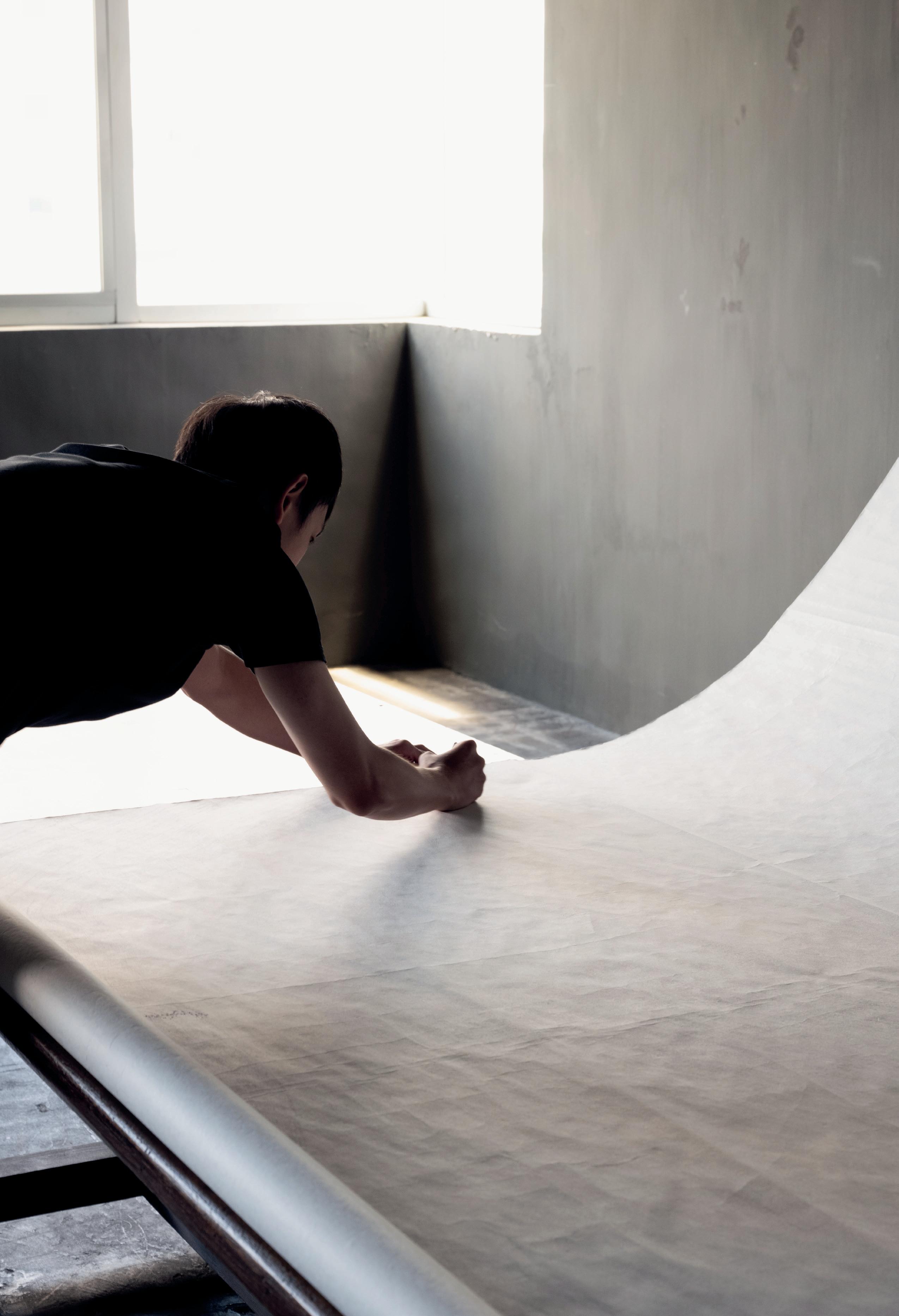


TSUYOSHI MAEKAWA (B. OSAKA PREFECTURE, 1936)
KANAAL, PATIO GALLERY: AUGUST 13 – SEPTEMBER 17, 2022
Tsuyoshi Maekawa was part of the avant-garde Gutai Art Association’s second generation, which he joined in 1962. Like all Gutai members, he was encouraged by their leader Jiro Yoshihara to create something that had never been created before. This urge to create out of total freedom, without dogma or scholarly academism, remained a primary goal for Maekawa throughout his career. Upon Yoshihara’s sudden death in 1972, the group immediately dissolved, and the group’s exhibitions at the Gutai Pinacotheca ended. Maekawa continued to work as an illustrator and graphic designer, but his true passion persisted in making artwork. Even today, at the age of 84, he returns to his studio daily with a strong drive and eagerness for creativity.
During ten Gutai years, Maekawa experimented with materials and techniques by tearing, cutting, and sewing his canvases and adding drippings of paint, resulting in complex and agitated artworks. In his early works, during the chaotic time after World War II, he used burlap sacks as a preferred material. Made from hemp fibres, he appreciated this humble and ubiquitous material that was used as bags for rice and grains. As a result, the life of burlap sacks became elevated from having a basic primal nature to obtaining a composed nobleness.
After Gutai’s dissolution, Maekawa progressively resolved the raw texture of the burlap sack, and he started using cloths as his sole material. His work became quieter and more structured. He used fine cloths on which he added delicate patterns utilising a sewing machine. “What and how much can you express without using paint?” was his main goal at that time. The compositions “Untitled (151030)” and “Untitled (140925)” show refined and precise sewing techniques of pleats and nips exploring the spatial dimensions of the canvas. In a way, these works resonate with Lucio Fontana’s Concetto Spaziale, although Maekawa—faithful
to the Gutai philosophy—refuses to be compared to other artists.
In the 1980s, his work became more silent and meditative. He continued exploring the possibilities of the canvas itself with his sewing machine. He became so skilled that his stitches became tinier and positioned in close rows, almost like pencil lines in relief. He used very few colours, mainly beige and white, topped with some brown or black to highlight the composition and create shadows. When these elements appear on the surface, they gently reveal the calm subtlety and tactility of the materiality. Occasionally, he painted part of the canvas in a vivid contrasting colour like the pink used in “Untitled (1906105)”.
In the 1990s, Maekawa used painting in combination with sewing. The three works “Untitled (2003004)”, “Untitled (1907105)”, and “Untitled (2003002)” present carefully designed patterns in vivid colours that are overlapped with sewed patterns. The lines created by the stitches form an additional layer, playfully interacting with the painted surface.
In the most recent works, Maekawa returns to his first love: burlap, focussing again on the material that composes the artwork, not the presentation of it. He incorporates sewn, wrinkled, and twisted waveforms in canvases that he sprays afterwards with paint.
For Maekawa, the world is full of infinite possibilities. The artist’s overwhelming energy and his never-ending urge to give life to materials is remarkable throughout his career. “I have been creating works for over sixty years now. I think I have concentrated on exploring matter. In particular, I have been persistent about investigating cloth and experimenting with it.”1
– ASD

Untitled (160407), 1977


TSUYOSHI MAEKAWA (B. OSAKA PREFECTURE, 1936)
HONG KONG: MAY 21 – SEPTEMBER 24, 2022
SELECTED WORKS 1958–2018
As was the case for all Gutai members, the act of intuitively creating art was more important than the direct representation of something. Gutai’s spirit continued to persist within Tsuyoshi Maekawa’s practice for about sixty years. His fascination for materials like burlap and hemp cloth can be expressed by every conceivable means— cutting, tearing, and sewing—searching and pushing the limit of the material and the materiality itself.
“Gutai art does not alter Matter… Matter never compromises itself with the spirit; the spirit never dominates matter. When matter remains intact and exposes its characteristics, it starts telling a story and even cries out.”
– Gutai manifesto, declared by Jiro Yoshihara in 1954
The avant-garde group known as the Gutai Art Association was founded in 1954 in Ashiya by Jiro Yoshihara against the backdrop of post-war Japan. With his artistic charisma and international mind, he celebrated the dawn of a new era with his Gutai followers through the fundamental idea of stressing the importance of originality.
Maekawa joined Gutai in 1962 as part of the second generation, which brought fresh air into the group just as Yoshihara attempted to make an artistic shift from action and performance-oriented to material-oriented. Maekawa chose fabric rather than painting on a canvas to express his visual language. From the late 1950s, the fabric of choice was burlap. Composed of plant/hemp fibres, burlap is a woven fabric that was mainly used as bags for rice and grains. Maekawa used this humble and ubiquitous material available during a chaotic time when Japan was experiencing a healing process following the traumas of World War II.
As Japan rose again followed by rapid economic and social developments, the relationship with Western countries deepened at the beginning of the 1960s. Maekawa’s new form of expression was highly appraised internationally. This led to his solo exhibition in 1963 at the Gutai Pinacotheca, which had been established by Yoshihara in Nakanoshima, Osaka in 1962. Named by Michel Tapié, the French critic and advocate of Art Informel in France, the Pinacotheca had instantly become a meeting point for artists—both Western and Japanese—such as Georges Mathieu, Paul Jenkins, and Robert Rauschenberg but also for influential collectors like Peggy Guggenheim. Maekawa’s creative endeavours were also known in Europe by his participation in the Nul 1966 exhibition in The Hague.
In “Mannaka Tate no Blue” (1964), meaning “Vertical Blue in the Middle”, Maekawa randomly placed pieces of burlap onto a canvas, which were torn ferociously by his hand. He then cut and folded the material to make the protruding surfaces using an adhesive bond. Without having a preliminary concept in mind, his intuitive action created the work, which became more important than the final results. The act of destroying the picture was perhaps his way of expressing reconstruction of a land ravaged by war, yet it was also a celebration of freedom and democracy in the new era of Japan—a signal of hope.
The Gutai movement ended abruptly at the time of Yoshihara’s unexpected death in 1972, an emotionally devastating moment for all Gutai artists. During a few years of struggle following the loss of their mentor, Maekawa’s leitmotif was to inherit Yoshihara’s spiritual legacy while striving to endure his creative path. He started to re-explore the rich and tactile textures of materials. Maekawa explains in his interview:
“I always think what can be done with the materials that I use. How I can transform the shapes and forms by expanding their materiality. I like to use burlap and cotton hemp because these suit my hands and skin.”
– Video interview with the artist in his Osaka studio, 2022
Looking for unexpected discoveries during the production process visually and aesthetically pleases Maekawa. Using a sewing machine, Maekawa makes seams defined by their slender, convex, and concave lines created on cotton canvas, which became his predominant style from the late 1970s to today. Maekawa creates elegant and pliable-looking imageries on the surface, often incorporating sewn, wrinkled, and twisted waveforms. When these elements appear on the surface, they gently reveal the calm subtlety and tactility of the materiality. He gradually moved away from Gutai and discovered a new style. In his works from 1979 and later, Maekawa used paint to make wrinkles and shadows. In the ’80s and ’90s, Maekawa used thin cloths and combined different weaves of fabric.
In later works, the compositions become simpler and purer, enhancing the canvas’s three-dimensional effects. He uses less and less colour, which ultimately results in more monochrome works in which he adds a touch of brown or black, creating shadows. This can be seen in “Untitled (181101)”, 2018, affirming the power of materiality, but also opening new trajectories to the space perhaps resonating with Lucio Fontana’s Concetto Spaziale Even after Gutai’s dissolution, Maekawa’s career spans six decades with the same consistent and remarkable search for unique forms of visual language.
– MK


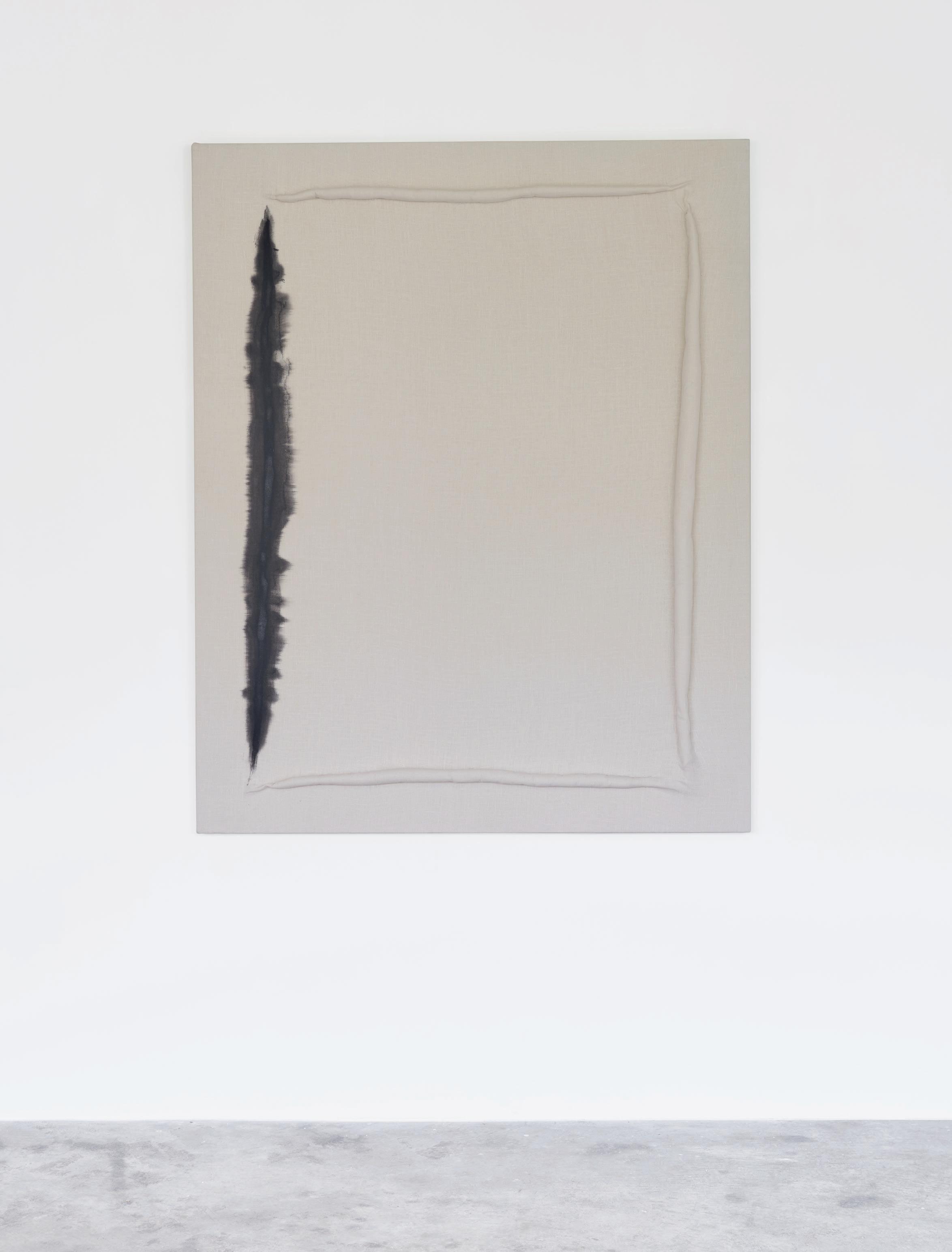

GERMAINE KRUIP (B. CASTRICUM, 1970)
KANAAL, PATIO GALLERY: MAY 14 – JULY 16,
REHEARSAL
2022
Germaine Kruip’s practice is rooted in the different yet interrelated worlds of the stage (theatre, cinema, performance), architecture, and visual arts. Her works thus open and address a wider field of perception than is accessible with the eyes. For Rehearsal, we are notably asked to sharpen our ears—an unusual, even paradoxical situation for an exhibition, for sound waves do not belong to the realm of the visible. Or do they? It is a fortunate coincidence that the word “hear” is present in the exhibition’s title.
What might this “rehearsal”—a cherished term in Kruip’s artistic vocabulary—refer to? Are we not assisting an opening or a show, we might wonder, but rather a moment before it? Rehearsal, for Kruip, refers to a moment of play, to a moment in which the world, the work of art, or anything around us, is in a state of flux and becoming. Similarly, the meanings of works in such a moment are constitutively open and changeable. It’s this moveable state of becoming that Kruip explores in her work and invites us to step into.
We might choose to enter Rehearsal in the Patio Gallery. Here, an in-situ intervention (“Patio Untitled”, 2022) continues Kruip’s longstanding practice to mobilise the existing space as an active agent. By gradually fading out the natural light falling through the rows of roof windows, this work enacts the movement of daylight and daytime. The space transforms itself—and we participate in this work—into a stage for a play of shadow and light; into an action, row after row, of the day growing or fading. This performative intervention stages and encompasses the entire space, situating it, and us, firmly in the here and now.
The sculptural work, “Portal Brass Line” (2022), a geometric polished brass frame developed with instrument-maker Thein Brass, doubles as an instrument and architectural passage, a transitional frame functioning as an entry into a mental field. We could place ourselves “inside” this transitional space and “play” the work, thus creating an almost tangible aural space. The spatial sound resonates in the body as well as in the mental space of the passer underneath, gently activating a broader sensorium. As in Kruip’s oeuvre in general, the work confers power (of creation, of interpretation) to the beholder.
“After Image” (2018), a fleeting, luminous, monochrome projection in landscape format, forms part of ongoing research that began in 2014 titled, “A Possibility of an Abstraction”. This research investigates and stages phenomenological events and effects through installations and performances, fusing cinema and theatre. In “After Image”, a film-like effect is produced without using cinematic means or a cinematic screen. The existing architecture becomes an empty canvas (including its grainy texture) for a filmic play of light and shadow, staging… its own components. As often in Kruip’s oeuvre, the history of the building and place become part of the work, which changes in intensity and contrast with the changing light of day and becomes more theatrical as night falls. “After Image” oozes a meditative atmosphere, inviting a reflection on the notions of positive and negative, on the frames
of our field of vision, our ways of perceiving, and duration itself.
In the absence of representation, as with all abstract art, and perhaps especially with monochrome abstract art, we tend to open our faculties of memory, imagination, and reflection. Emptiness in a place where we expect or desire representation triggers a search for meaning and interpretation—especially in a situation recalling the cinema. Emptiness also allows us to move our gaze across the entirety of the image. Inspired by the notion of Slow Cinema, “After Image’s” visual simplicity adds the element of time. As film scholar Nadin Mai notes in her article “Monochrome Painting and Slow Cinema”: “The duration of the long-takes allows us to take our time to move our gaze along a frame without necessarily getting focused on just one element.”1 By presenting emptiness in this way, Kruip provides us with a lens, a tool for looking actively, mobilising both our eyes and what we might call our mind’s eye.
Kruip’s works function as lenses for perceiving actively and tools for the emancipation and power of the viewer. These two terms, emancipation and power, resonate in the social-political realm and can be explored further by looking into the socio-political history of music, and the exhibition’s relation to this history. Kruip’s new series of works, “The Concert” (2022) refers to the eponymous painting by Vermeer (ca. 1663–66), stolen in a still-unsolved crime from Boston’s Isabella Stewart Gardner Museum in Boston in 1990. Vermeer’s painting is equally missing from the present exhibition: in two black-and-white light paintings in constant back-and-forth movements, Kruip presents geometric reductions of Vermeer’s composition scheme. These fading abstractions realise the semantic meaning of the word abstraction as they extract the essence from an existing object, or, in this case, from a missing image: a work originally produced by a painter with a proto-photographic production process, whose compositions rested firmly on geometric shapes. Kruip’s monochrome, geometric light compositions are reminiscent of hypnagogic images, those fleeting light shapes we see when closing our eyes, and call to mind the French philosopher Michel Serres’ saying, in his book Eyes, that “if you close your eyes, you lose the power of abstraction.”2
“The Concert” invites us to delve into our personal mental museums and reflect on notions of the original, as well as meaning in general, which we are ever so keen to look for. Furthermore, the reference to a concert is significant. Next to representations of mealtime, the concert was the most frequently chosen subject for Dutch seventeenth-century interior painting. Before the advent of paid concerts in the eighteenth century, music had a strong ritual function, and in the private sphere, first and foremost it presented an occasion to play together in “good society”. In Vermeer’s scene, the musicians are absorbed in playing together in a moment of heightened attention and intimacy, even turning their backs to the viewer. In the viewer, such scenes can create an awareness of duration; they

also symbolised a stable, harmonious society, and still provide a feeling of organised security for whoever enters the comfortable and well-composed intimacy of the harmonious interior. In this society, there is no call to emancipation, and power resides firmly with external authorities.
Not so in Kruip’s approach to music (or art). If the brass instrument works can evoke the sphere of ritual, or even foster a therapeutic experience, the key element in the making of music in this exhibition, nevertheless, is composition. This composition is given over to each member of the public, not made by the artist. Here, there is no single, dominant code for musical expression, or for listening. Composition in the hands of the listener implies that listening to music is to co-write, or even rewrite it. Composition, writes theorist Jacques Attali in his book Noise: The Political Economy of Music, is a liberating activity “that is an end in itself, that creates its own code at the same time as the work.”3 Music produced by an emancipated individual is music produced for pleasure outside of meaning, usage, and exchange. This approach to music, celebrated by Attali as a tool for a different form of society, resonates with Kruip’s aspirations and work. For is not “pure” music duration itself, a confrontation with the course of time? Music for the pure pleasure of making or listening calls forth, like Kruip’s work, a comprehensive sensorial knowledge, residing in, and mobilising the entire body. It is up to us to sense and to make sense.
– Merel van Tilburg, in conversation with Germaine Kruip
1. Nadin Mai, “Monochrome Painting and Slow Cinema”, The Arts of (Slow) Cinema, July 15, 2016 [https://theartsofslowcinema.com/2016/07/05/ monochrome-painting-and-slow-cinema/], last accessed 20.09.2023.
2. Michel Serres, quoted in Attali, Noise: The Political Economy of Music, p. 6.
3. Jacques Attali, Noise: The Political Economy of Music, Theory and History of Literature, Vol. 16, University of Minnesota Press, 1985, p. 135.


GEORGE RICKEY (SOUTH BEND, IN, 1907 – SAINT PAUL, MN, 2002)
KANAAL,
TERRACE GALLERY: MAY 14 – SEPTEMBER 24, 2022
Featuring one outdoor sculpture from 1966 and eight works installed inside, the sculptures are activated by the invisible power of the air, an often unpredictable yet astonishing natural force. Just like the wind animates the landscape, the hand of the artist is revealed when the sculptures are set in motion, revealing the beauty of light, form, and composition. The sculptures invite viewers to pause, as their awareness increases of the objects in (suspended) motion, a heightened sensibility that alerts the eye to focus on time, tension, and the work’s true nature. “I like the movement to be slow, so that one has to wait for its emergence and marvel at its slowness,” George Rickey said.1
Three notions are key to Rickey’s oeuvre, which he built during a five-decade sculptural career. Following an initial twenty-year career as a painter, he started making sculptures in his mid-forties, wanting to capture a world in itself. The run-up to those first sculptures is just as interesting as their development itself. Secondly, he played an essential role in the artistic ecosystem with his work as a teacher, critic, and curator. Lastly, that considerable network consisted of artists associated with ZERO and Nul, which is only an indication of the importance of his activities and interventions in Europe, and more specifically North Rhine-Westphalia.
I.
Born in South Bend, Indiana, in 1907, Rickey was the son of an MIT engineer and the grandson of a Scottish clockmaker. The transatlantic crossing and the wind on the River Clyde left profound impressions on him, as did the craft of clockmaking: pendulums, gears, and other mechanics. Initially trained in math and science, from 1926 he took history and drawing lessons at Oxford. A year of study in Paris brought him into contact with Fernand Léger, Amedée Ozenfant, and Stanley William Hayter, who was then running Atelier 17. Hayter convinced Rickey that a painting should have no top or bottom and that it was possible to think outside the canvas; Léger encouraged Rickey to consider nature as the starting point of the artistic product. Initially, this led to paintings and Cézannesque still-lifes that today would be placed in the context of social realism.
An even greater impact on Rickey’s oeuvre is what was then happening on the other side of Europe, shortly before and after the Russian Revolution of 1917. Constructivism, an austere art movement founded in 1915 by Vladimir Tatlin and Alexander Rodchenko and elaborated in 1920 in the Realistic Manifesto by Naum Gabo and his brother Antoine Pevsner, was at the heart of Rickey’s shifting interests. Art, the constructivists said, should reflect the current modern industrial world, and be one with reality. The evolutions in art had so far been an illusion, based on colour and line. Rickey met Naum Gabo after attending a lecture at the Institute of Design in Chicago, that was founded by László Moholy-Nagy. A friendly appreciation developed that lasted decades. Another artist who should be mentioned in this context is Josef Albers, who was seen by Rickey as his mentor. Albers’ movement of colours
can be compared to the relativity and connections of the components of Rickey’s early sculptures, in which colour schemes represented seasons.
“Motion, which we are all sensitive to, which we are all capable of observing without having to be taught, is a sensation that appeals to the senses just as colour does. It has an equivalent of the spectrum, different kinds of types of motion I think that one can, to a very considerable extent, isolate motion as a visual component and design with that.”2
Rickey’s sculptural practice would eventually begin in 1949. The decisive factor was the reappraisal of mechanics when he was researching aircraft, engineering, and maintenance during the Second World War. The memories of his childhood, the compass on the family’s yacht in Scotland, or his grandfather’s clockmaking shop, helped shape his interests. “Technology is not art, but every art has its technology,” he said.3
He met Alexander Calder in 1951 and began a search for what he could add to his formal language— more movement, less simplicity. His sculptures were shown for the first time in a group exhibition at the Metropolitan Museum of Art. That same year, Rickey released Mobikit, a hanging sculpture that the owner could assemble himself, as a motif for more accessibility and democratisation of the arts. Sculptures from these years often referred to nature or ships and their unpredictability using pivots and gimbals.
An influential figure in Rickey’s life was the prominent American sculptor, David Smith. Rickey first met Smith in the artistic circles of Woodstock, NY, in the 1930s, at a party with Edward Millman and Clyfford Still. Smith would later be responsible for giving Rickey his first and only welding lessons. Both artists shared the view that material should reflect the spirit of the age, but Rickey also became convinced that the format should be larger and constructivism’s influence stronger. The form became continuous, the structure of the work was made up of different parts and the negative space became part of the volume. Different materials, pivots, and other techniques to add movement to the work were combined; from then on Rickey spoke of kinetic sculptures rather than mobiles.
“I did not want merely to set a static art in motion, nor did I want to describe the dynamic world around me with a series of moving images. I wanted the whole range of movements themselves performing in a world of their own.”4 Rickey developed an ongoing search for the possibilities of movement in various forms, including knife points or blades, planes, and rectangular planes. Knife points referred to needles he knew from his childhood, to nature, or to scientific notions such as the cloud chamber. Metal planes were polished with short, random strokes, making them sensitive and responsive to light, and thus no longer just under the influence of the wind, but also of the sun, deepening the artist’s dialogue with nature. The dialogue that Rickey had his sculptures enter into with nature developed further.


II.
Rickey devoted himself to teaching and art criticism as early as the 1920s. This foundation became an important part of his thinking throughout his career. After many years of service in various schools, universities, and colleges, he retired from teaching in 1967. Several American universities subsequently awarded him honorary doctorates; schools on other continents, including Asia, invited him to give demonstrations of his work.
Describing and criticising art and placing it in a broader social context, is something Rickey continued to do for a long time. His first article, “Stimulating an Appetite for Art” (1937), indicates with its title his approach and ideological views. Other illustrious titles, including “All Good Art is Public” (1977) did the same, and are interesting from the perspective of an artist whose work is mainly on display outdoors, in the public space. Rickey also wrote about the movement of and in art, noting an article in Jean-Paul Sartre’s Les Temps Modernes from 1946, before Rickey was active as a sculptor, about the American fascination with movement, and how cars and the transport network were ushering in a new life. His 1963 article “The Morphology of Movement: A Study of Kinetic Art” described the work and actions of fellow artists who made kinetic art; the book Constructivism. Origins and Evolution published four years later, placed it in the perspective of the influential art movement. However, he was decisive about his own involvement. “I do not claim to be a Constructivist. Yet I respect the humility, rigor, self-effacement and regard for object-ratherthan-process which characterized early Constructivist work and gave meaning to the ‘real’ in Gabo’s Realist Manifesto.”5
Furthermore, Rickey was a curator and collector. In 1970, the exhibition, Constructivist Tendencies, took place, which was built with works from the collection of George and Edie Rickey. The exhibition included a catalogue with a work by Auguste Herbin on the cover and subsequently travelled to (mainly university) museums in various states. Another focus of their collection was miniatures by Richard Pettibone, which were also the subject of an exhibition. Pettibone, Edward and Nancy Kienholz, Cleve Gray, Peter Sedgley, and Ellsworth Kelly are just some of the names of artists who appear with the Rickeys in historic photographs.
III.
Several other artists that Rickey knew well can be summarised under the headings ZERO or Nul. In 1961, he took part in and wrote a review of the exhibition, Bewogen Beweging (Moving Motion), at Stedelijk Museum Amsterdam, which four years later also hosted the
1. Quoted in Max Imdahl, Erläuterungen zur Modernen Kunst, 60 Texte von Max Imdahl, seinen Freunden und Schülern, ed. by Norbert Kunisch, Bochum: Kunstsammlungen der Ruhr-Univ, 1990, pp. 217–218.
2. Quoted in Jeanne Siegal, Artwords: Discourse on the 60s and 70s Ann Arbor, MI: UMI Research Press, 1985, p. 141.
influential exhibition NUL negentienhonderd vijf en zestig (NUL nineteen hundred and sixty-five). Rickey showed Lines here, next to the Lichtkarussel by Heinz Mack and the Tänzer aus New York by Günther Uecker, among others. That same year, Lumière et Mouvement (Light and Movement) was held at the Kunsthalle Bern, an exhibition that further stimulated European interest in kinetic art. Smaller exhibitions were held at Christian Megert’s gallery and that of Henk Peeters. It was also Peeters who invited Rickey to take part in the final project ZERO on Sea, where together with Yves Klein, Lucio Fontana, and Uecker he installed an intervention on a Dutch coastline pier in Scheveningen. The project, which was scheduled to go ahead in 1966, never came to fruition. Peeters and Rickey did keep in close contact, however, and the former also helped to execute sculptures Rickey had designed, such as the untitled 1965 work in the Stedelijk Museum’s collection.
In 1964, Rickey took part in Documenta for the first time. The work he showed there, Two Lines Temporal I, was purchased by Alfred Barr for the MoMA collection. Barr visited Rickey that same year in the domain he had set up as a workshop in East Chatham, NY—where Rickey could think freely in large format and let his sculptures enter into a dialogue within the context of nature.
He was forced to think in a smaller format, however, when a grant from the German Academic Exchange Service enabled him to set up a studio in Berlin in 1968, which he kept until 1995. The smaller space also led to the format of the works, which were more often intended to be indoors, and sketches and preparatory drawings became the “initial way of expressing ideas”. Activities in and around Germany only increased during this period, including the installation of a sculpture in Münster in 1973—the reaction to which led to Skulptur Projekte Münster in 1977—the installation of two sculptures in the public space of Rotterdam and participation in the Biennale Middelheim in 1971.
In all these cases, the influence of the wind and the unpredictability of nature were central. “Types of motion available to me are, mostly, observable every day in our natural environment,” the artist said. “In clouds, sea, falling leaves, waving grass, kits, sails, soaring birds, and flying fish, slamming doors and shutters, hurricanes, whirlwinds and sandstorms, sometimes silent, sometimes shuddering or roaring, sometimes passing through lips, already, or pipes as music, air moves on.”6
– SB
Exhibition created in collaboration with Kasmin Gallery, New York, the George Rickey Estate and George Rickey Foundation
3. Quoted in George Rickey: Skulpturen, Material, Technik, exh. cat. Berlin: Amerika Haus, 1979, p. 35–39.
4. Quoted in George Rickey in South Bend, exh. cat. South Bend: Indiana University and the University of Notre Dame, 1985.
5. George Rickey, “The Métier,” 1965, in George Rickey: Selected Works from the Estate 1954–2000
exh. cat. New York: Marlborough Gallery, 2016. Article first published in “Contemporary Sculpture: Arts Yearbook,” The Art Digest, 1965.
6. Quoted in George Rickey in South Bend, exh. cat. South Bend: Indiana University and the University of Notre Dame, 1985.

DUO EXHIBITION
WORKS BY RYUJI TANAKA (HYOGO, 1927–2014) AND KAZUO SHIRAGA (AMAGASAKI, 1924–2008)
HONG KONG: APRIL 2 – MAY 14, 2022
TANAKA AND SHIRAGA: MATERIAL AND ACTION
The idea that art is the material manifestation of human spiritual freedom was one of the founding beliefs of the Gutai Art Association, a pioneering post-war, avant-garde group formed in 1954 under the leadership of painter Jiro Yoshihara in Ashiya, Japan. Yoshihara instructed the member artists to create new work with the mantra, “Do what no one has done before!”
Kazuo Shiraga was one of Gutai’s prominent members, and he often encouraged his friend, Ryuji Tanaka, to join as well, which he did in 1965. Shiraga was three years older than Tanaka, but the two artists were from the same prefecture, and both graduated from the Kyoto Municipal Special School of Painting, majoring in Nihon-ga (traditional Japanese painting). Although Shiraga switched his practice from Nihon-ga to oil painting for his pursuit of action painting, he always witnessed Tanaka’s impeccable ways of expressing abstractions using Nihon-ga materials such as mineral pigment and ink. After joining Gutai, Tanaka enjoyed international recognition, with Michel Tapié, Clement Greenberg, and Robert Rauschenberg as visitors to Osaka, where the Gutai group shared a gallery space. In this presentation, works on canvas and paper stand out for their specific form and size, the alternance of dark and light tones and the use of natural materials while offering an overview of Tanaka’s qualities. His long search for the possibilities of abstraction results in works whose surfaces almost seem to float: the glistening of the ores and minerals change with every view. Under the sparkle, which radiates like a glow over the work, surprising colours of deep blue, bright green, or warm red can be seen, as well as numerous other colours that take the viewer along in the artist’s exploration.
Tanaka’s monumental work, Kishi no Fudo (騎士の 風土, 1967), may be translated as “The Nature of the Knight”. Fudo can be transcribed as “Nature” in English, but the origin of the word is a term for the climate, geology, and scenery of a certain region with a strong emphasis on a sense of locality. As an artist whose life thrived in the Kansai region, Tanaka had great dignity presenting his pride and expressing his motherland’s natural beauty through his abstractions. It’s a beauty of the unknown that Tanaka chose the word Kishi (Knight), instead of samurai but it’s quite fascinating for spectators to discover Tanaka’s spirituality as a samurai warrior during the painting’s execution. Exquisite, yet precise sword slashes present in the middle of the painting create a certain stream against the strong current of the wind in the textural background and rich red colour. Tanaka’s colour palette in the 1960s was rather dark and sedate, hence, it’s desirable to find the emotive power expressed in red, showing a strong determination that can be implied as the artist’s spirituality through the act of painting.
Similarly, Shiraga’s painting Kanemitsu, (兼光, 1961) intensively shows the fusion of a spiritual act with the physical body. Kanemitsu’s title is taken from Bizen Osafune Kanemitsu, a legendary swordsmith of the Nanbokucho Period (1337–1392). Kanemitsu’s swords are considered masterpieces with great historical
and artistic importance. The painting could also refer to a specific fabled Samurai sword, the Takemata no Kanemitsu, which has a blade of such supreme sharpness that it could cut iron armour into clean halves. The pursuit of higher performance resulted in the purification of forms and attitude, thence revealing the elegant and wild soul of Kanemitsu. The work is a powerful example of the artist’s physical discipline and search for spiritual transcendence. Ferocious movement using his feet and body as a tool shows traces of action carried out with speed. It creates a dynamic and heavily textured effect that is tinged with violence, yet the evocative movements show a unique quality of the artist’s ability to challenge the canvas.
Fundamental notions of individualism and democracy were introduced to Japanese society in the post-war era and that’s how Gutai’s manifest was established and permeated among Gutai artists. Although Tanaka and Shiraga were individuals grappling with the collective trauma of World War II, they were never afraid of diving into the immersive and new beginning of society with a full body of hope and spontaneity. Tanaka was the one and only Gutai artist who used Nihon-ga materials to express the beauty of nature through his abstractions. He continued to cultivate freeing himself from conventions and dogmas, always in search of his own style of expression throughout his career. Shiraga’s artistic achievement and establishment of performative paintings renewed the interest of Japan’s post-war art movement by Western countries from the 1960s until today. During their lifetimes, Tanaka and Shiraga continued to grow their artistic and personal bonds in a way that was conducive to their mutual influence.
– MK


SHIRO TSUJIMURA (°GOSE, 1947) KANAAL, TERRACE GALLERY: FEBRUARY 17 – MAY 7, 2022
Shiro Tsujimura recently selected the large ceramic works in his studio near Nara, Japan. A number of these were created in the 1990s but were left outdoors in the landscape surrounding his home to “rest” and become of age. These are being presented in public for the first time. The calligraphies included in the exhibition bear poetic names like Spirit, Mountain, Flowers, Truth, Snow, and Earth and were created in 2013 during a performance on the premises of Kanaal. The playful sense of freedom and self-confidence connects Tsujimura’s entire oeuvre and sets him apart from any other contemporary potter and calligraphist.
Tsujimura’s art and approach are founded on the beauty and purity of the earth and its relationship and transformation with nature and fire. He uses local earth from his property to create his own clay. He works it, fires it in a wood-burning kiln, which results in the dramatic rivulets of natural ash glaze that decorates its surface. During the firing, a new, uncontrollable action occurs: some jars fall apart and start to mingle with other pots or bowls resulting in an asymmetrical, seemingly imperfect shape. After the firing, Tsujimura lets his work mature and age with the passing of time in his own wild garden that looks like a jungle. Cracks and flaws are a product of nature and time beyond the will of the human being.
In 16th century Japan, the celebrated Japanese tea masters such as Sen Rikyu valued the beauty found in imperfect and irregular objects often in their most austere natural state. This led to the unassuming aesthetic ideals of wabi-cha: simplicity, purity, restraint, and humility. Entirely self-taught, Tsujimura is an anomaly among Japanese ceramicists. He learned independently, not emulating an honourable sensei. This allowed him the freedom to create his own style. After graduating from high school in 1965, he resolved to become an oil painter. Planning to enrol in art school, he travelled to Tokyo but found the entrance procedures very tedious and dropped out. While visiting the Japan Folk Crafts Museum, Tsujimura was inspired by a classic Ido tea bowl and became attracted to the idea of taking up pottery. However, he continued experimenting with painting on his own for four years, during three of which he also studied Buddhism at Shanshoji, a Zen temple in Nara. It was at Shanshoji that he first became acquainted with a potter’s wheel. Dissatisfied with the glossy surface of oil paint and attracted by the infinite variety of surface textures and colours found in ceramics, Tsujimura decided to pursue pottery rather than painting. He began producing ceramics in 1969 and held his first exhibition at his own house near Nara in 1977. From 1983 onwards, he exhibited in Tokyo, Nagoya, Matsuyama, Kyoto, Okayama, and Yokohama, as well as in New York.
– ASD


IDA BARBARIGO (VENICE, 1920–2018)
HONG KONG: JANUARY 15 – MAY 14, 2022
CAFÉS
Ida Barbarigo’s fascinating oeuvre, which spanned from the mid-1950s until the end of her life, comprises several enigmatic series. The subject of chairs is a prominent feature. Omnipresent in her oeuvre, it remained her leitmotif and became a personal script, a form of handwriting. As in all series, she worked obsessively for months, sometimes several years. Barbarigo’s reproductions of chairs capture the energy of the unseen. In seemingly conscious and unconscious ways, the chairs serve as a primary motive to access deep emotions, only to transform, and evolve into something else entirely. She sensed the atmosphere and vibrancy of life in city squares and aimed to express this materially. Her expressive work gives body to the energy surrounding the chairs at the cafés on the public squares in Venice or Paris, where she loved to sit for hours observing people. The chairs express aspects of melancholy, mystery, or even darker themes when they resemble human skeletons or demons. In all its intriguing forms and figurations, life is accessed via the artistry of her paintbrush. This exhibition marks the first presentation in Hong Kong since the artist’s passing in 2018 at ninety-seven years old and includes twenty-two works from the late 1960s and 1970s. These paintings were kept in the artist’s Venetian home for nearly fifty years, have been recently restored, and are revealed to the public for the first time.
At Venice’s Galleria II Traghetto in 1964, Barbarigo made initial attempts to insert personal profiles within the chairs’ tight rhythms. She added details, such as the folds of textiles, but also fragments of organs, voided inside. The critic Berto Morucchio presented her work on this occasion, and he arrived with his friend Lucio Fontana who encouraged Barbarigo to continue painting in the same direction. This encounter proved vital and left an important trace throughout her career.
During her life experiences, a sudden revelation was the necessary catalyst to gave birth to new series of works. During a stay in Paris in 1969, she visited an exhibition of Piet Mondrian, which left her flabbergasted. Walking around later, she came across a figure seated on a bench in the Tuileries Garden. The man sat in a particular posture reading a newspaper with his legs crossed, wearing a heavy coat, gloves, glasses, and a hat. Barbarigo was struck by the visual strength and described it as fate: “I drew him all the time, that’s how the ‘Clairvoyants’ series was born”. When obsessions took over, she explored her feelings through repetitive drawing and then painting. In this case, she painted the man seated on a chair with drippings of paint running down his face as if seen from a distance through a window while raindrops erase the image. Via these casual encounters and the resulting portraits, she discovered the appearance of mental figures, sometimes predictive of the future. Once, while strolling on the Boulevard Saint-Germain, she noticed a group of figures amid a collection of silver chairs sorted in small groups. The flowing colours used in the paintings give the illusion of a type of disintegration of the characters spread over the chairs on the ground. Symbolically, she titled the works, “Cain, Cain”, and painted them again and again obsessively.
These striking encounters took root within the artist’s imagination, evoking her anxieties, internal tensions, and fears. The dialogue between the artist and her work is that of identification, a sharing of the most essential part of herself. Gustave Flaubert said once: “Madame Bovary, c’est moi.” Importantly, Barbarigo’s pursuit of themes arose from the complexity and endless possibilities of human nature. Little by little, her paintings disclosed her personal life in a proliferation of forms animated by multiple colours. From the repetition of themes, just as a musician uses notes, rises a permanent questioning of feelings and sensations whose successive variations constitute an inexhaustible repertoire of ideas. In each series, Barbarigo used the most knowledgeable techniques she possessed, which may be traced back to her childhood. She overpainted the surfaces with a hard brush littered with turpentine to lighten the material. Her canvases got richer in substances and pigments, without ever being overcharged. The often-violent brushstrokes, placed in all directions reveal random breaks, cuts, streaks of pure colours, bright reds, and emeralds, which also sometimes enamel the surface like droplets in relief, a type of ordered chaos, almost like life itself.
– ASD


MARCO TIRELLI (B. ROME, 1956)
Marco Tirelli grew up at the Swiss Institute in Rome— one of the Italian capital’s national institutes for art and science—where his father was the secretary of the institute. When he was young, he got lost in the vast, magnificent library and within a garden in which natural cycles succeeded each other. Outside, the years of La Dolce Vita and unrestrained creativity were happening, as Federico Fellini captured in several films in the 1960s. Within the institute’s walls, Tirelli found peace and tranquillity. He had his first studio there at the age of fifteen and began developing his initial artistic exercises.
Today, Tirelli lives outside Rome, on Umbria’s country fields. The region, characterised by its gently rolling hills and ephemeral cloud formations, is also known as Umbria Mystica. It has always attracted many artists, including Sol LeWitt and Alighiero Boetti, with whom Tirelli built a friendly appreciation, as well as Piero Dorazio or Cy Twombly, among others. In the neighbourhood where Tirelli lives, electric street lighting is not possible. When there is no moon, only darkness remains. “When I open the window, I see a painting by Malevich. I know the world is there, but all I have in front of me is a black square.”1 Through associations, knowledge, and experiences, he manages to reconstruct the mountains and streets from memory.
Tirelli’s work contains nothing of the claim to totality or finality that was characteristic of suprematism. Michelangelo’s theory, which outlined that a block of marble holds every possible sculpture and every possible idea, is more apt in this regard. For Tirelli, he says, the Black Square is a place for mirroring the soul, with endless possibilities. Giorgio de Chirico’s vanishing perspectives, the metaphysical cities where shadows refer to what is happening outside the canvas, show similar possibilities.
Yet, it is the Renaissance primarily that is more often a source of Tirelli’s contemplation. The exhibitions and showcases that Tirelli builds often take on the encyclopaedic character of a studiolo, a private room in a palace, a microcosm within the world, in which the owner could devote himself to cultural interests. The studiolo of Duke Federico da Montefeltro, another prominent figure of the Cinquecento, counts as Tirelli’s example: he considers it a transparent self-portrait, in which all the elements of his mind, soul, and memory, were depicted on the walls. Various artifacts and elements thereby referred to Classical Greece, the time when a trained memory was vital—as during the rest of history before the development of the print.
Memory and its possibilities are central motifs in Tirelli’s oeuvre. In this regard, the viewer is free to lay claim to their memory, hence the untitled works and exhibitions. Exceptionally, an exhibition title shows the point of view, such as “Immaginario” at the Roman Palazzo Poli, or “Memories”: the result of the collabo -
1.
2.
ration with Patti Smith at the Auditorium Parco della Musica di Roma. Tirelli referred to his installation at the 2013 Venice Biennale as “Theatre of Memory”, referring to the Renaissance tradition of mnemonic devices.
It also refers to the Platonic idea of theatre. We find ourselves, Tirelli says, on a stage upon which nothing is right or wrong, nothing real or imaginary. Light provides representation and eliminates the darkness or the condition of non-perception. The forms to which the world shows itself are constantly changing. Just as light is in molecular motion, the representation of Tirelli’s subjects is also in constant change. The perception of the world is like a mirror, prompted by its stimuli.
Tirelli is aware of his role as an artist and the responsibility to interpret that he places on the viewer. The works he creates start from his memory, from found images from books, postcards, or geographical maps, but also from earlier work or photographs he takes. With airbrushes, rulers, and stencils he recreates a state between reality and falsity; a certain grain on the works imitates photography or the influence of light. The subjects are not objects but representations.
The result has been called encyclopaedic, holistic, eclectic, or anthropological. The reconstructions from the artist’s brain refer for the spectator to other, potential, conceivable formations, cultural or natural history conventions. They are in the context of an enigmatic aura, or interjected narratives, as the artist calls it. He also speaks of osmosis, a filtering movement that takes place at the edge—the intrusion of representations of reality into the human brain. Within sociology, there is the concept of social osmosis: the indirect infusion of cultural knowledge. Umberto Eco (2012) wrote that there are more books than hours to read them, and it’s perfectly possible to learn about their contents through the narratives of others.2 Again: external stimuli.
In 1962, Eco wrote in The Open Work that the multiplicity of meanings defines the contingency of a work of art.3 Interpretation is encompassing, meanings follow different perspectives. The “reception” of an artwork depends on the uniqueness of the viewer. According to Eco, it’s a dynamic process, a game of stimulus and response, without any fixed conclusion or final meaning. In 1990, in The Limits of Interpretation, Eco wrote that the freedom of the spectator has gone too far and that a work should be seen as a coherent whole, as a yardstick for interpretation. In Tirelli’s case, it’s precisely that ever-changing, personal interpretation that provides coherence and completes the work. As the American art critic Barbara Rose commented about Tirelli’s work: “This is the world of the loss of memory Tirelli fights against in his homage to the power of the imagination to remember what it has created.”4
3.
4.
2013 (Pistoia: Ori, 2013). In 2018, Barbara Rose also invited Tirelli to the exhibition La Pittura dopo il Postmodernismo – Painting after Postmodernism, Reggia di Caserta, Italy.


RAIMUND GIRKE (HEINZENDORF, 1930 – COLOGNE, 2002)
KANAAL, TERRACE GALLERY: OCTOBER 30, 2021 – FEBRUARY 12, 2022
WAS WEISS DAS WEISS
Raimund Girke studied at Staatliche Kunstakademie in Düsseldorf, the same academy attended by the founders of ZERO who created the pioneering group in 1958. Girke knew Heinz Mack and Otto Piene well but in the 1950s he became increasingly inspired by Art Informel, Serge Poliakoff’s first exhibitions in Germany, and Kazimir Malevich’s travelling exhibition at Amsterdam’s Stedelijk Museum.
Malevich’s influence gradually took over, causing Girke to work in stripped-down, monochrome white works. He continued to play a role in the background of the ZERO movement, as gallerists such as Adam Seide in Hanover, Günter Meisner in Berlin (Galerie Diogenes), and William E. Simmat in Frankfurt (Galerie d) represented him and included his work in important exhibitions, alongside Piero Dorazio, Almir Mavignier, Günther Uecker, and others. Henk Peeters, an initiator of several groundbreaking manifestations, also invited Girke to his Galerie Orez in The Hague, where he took part in the outspoken exhibition, Nieuwe Tendenzen (New Tendencies); Christian Megert, on the other hand, invited Girke several times to Galerie Aktuell in Bern. Meanwhile, the German art historian and director of the Museum Morsbroich in Leverkusen, Udo Kultermann, was working on his concept, which he called “neue Malerei”. The resulting exhibition, Monochrome Malerei (Monochrome Painting) in 1960, showed Girke alongside the above-mentioned artists, as well as artists who were part of the context in which Girke began to reside. Some of them, like Yves Klein, exerted an important influence on him; with others, such as Walter LeBlanc or Oskar Holweck, Girke met to discuss, as shown in historical photographs. The work Girke showed during the 1960 exhibition, Strukturen, is now in the collection of Busch-Reisinger Museum of the Harvard University Art Museums.
Kultermann’s project gave rise to several initiatives that went a step further, and in Malevich’s spirit, explored the limits of white on white, such as the eponymous exhibition in deCordova Museum, Lincoln, Massachusetts, in 1965, curated by Frederick P. Walkey with advice from George Rickey. Harald Szeemann invited Girke to participate in Weiss auf Weiss at the Kunsthalle Bern a year later. In 1973, there was Basically White at the Institute of Contemporary Arts London.
Girke didn’t see himself as part of any group or movement, which more than once earned him the description of Einzelgänger. The comparison with Agnes Martin or Robert Ryman, with whom Girke exhibited for the first time in 1969 and 1973 respectively, thus turns out not to be just about the visual similarities: they are all artists who, without interfering with certain movements, have remained true to their artistic principles and paradigms.
For Girke, this was the eternal quest for the possibilities of the presence and absence of the colour white, for him “Königin der Farben”. The Lamellenbilder series that Girke made in this period shows a similar conceptual approach to the work of art as these other artists — characterised by repetition, perception, and a precise balance.
In 1975, Girke participated in the exhibition, Fundamentele Schilderkunst, at the Stedelijk Museum, curated by Rini Dippel and Edy de Wilde with Ryman, Martin, and others. It was just one of the initiatives that reflected a theoretical approach to returning to the fundamentals or principles of painting, like Planned Painting, Analytical Painting, Essential Painting, or in the 1980s, Radical Painting. It also resulted in Girke’s participation in Documenta 6 in 1977 – both the painting and drawing sections. At the time, Girke was again clearly starting from the beginning of the painting process, with vertical brushstrokes and an almost homogeneous grey result, which would later be characterised by more contrasts, gestural movements, and pastose substance.
Three works from 1978 and one from 1980 were acquired by the Berlin Neue Nationalgalerie, initiated by Dieter Honisch, and in 1985 were part of the exhibition Neuerwerbungen alongside Lucio Fontana, Josef Albers, and Uecker.
Also in the 1980s, Girke received his first monographic retrospectives and has been curated in group exhibitions on the art of the Bundesrepublik Deutschland in Bonn and abroad. Girke was shown on more than one occasion together with, among others, his former classmate Gotthard Graubner and with Gerhard Richter, whose work Girke also had in his art collection, as one of the artists who embodied the art of the country, which in 1990 would form Germany together with the GDR. The year before, two major works by Girke were shown at the exhibition Ambiente Berlin as part of the Venice Biennale.
Girke’s paintings from the 1980s and ’90s vacillate between dynamism and calm, which is visible in the brushstrokes. Girke returned to the colours of the earth in some paintings, such as blue and ochre — the colours that appear in Farben der Erde (1956), which is on display in this exhibition. In the 1990s, Girke preferred working in large format, lending himself to wide rhythmic movements and an openness to the viewer.
In this period, Girke exhibited twice more with international names that are highly regarded in art history. In 1989, he was one of the artists who took part in Osaka’s Art-Kite event, together with several artists connected with post-war avant-garde artistic movements. Many of them met again in 2001 at an exhibition that brought Claude Monet’s colouring into dialogue with the work of modern artists. Once again, Girke showed the painting Strukturen (1959). He died a year later, in 2002 – the ceremony for the Lower Saxony Art Prize he was awarded shortly before, was held posthumously.
– SB


SHEN CHEN (B. SHANGHAI, 1955)
HONG KONG: OCTOBER 16, 2020 – DECEMBER 23, 2021
KANAAL, PATIO GALLERY: MARCH 12 – MAY 7, 2022
MASTER OF GREY / MASTER OF COLOUR
Shen Chen said that the first time that he saw a Jackson Pollock painting (Number 10, 1949) was in 1981 in Shanghai, when the Boston Museum of Fine Arts brought a survey of 200 years of American art to China, first to Beijing and then to Shanghai. A groundbreaking exhibition that included twelve abstract paintings, it was only the second presentation of Western painting in the country after the end of the Cultural Revolution and the first to show contemporary American abstraction. Its impact was life-changing for countless Chinese artists who saw it, among them Shen Chen. He said that he was stunned, the connection instantaneous. Very few artists in China were making abstract paintings then. Pollock, Franz Kline, and the Colour Field artists threw open a door for him.
“I wanted to make something different from what we were taught to do, something more original, but I didn’t know what, I didn’t know how,” he said, until then.1 The American abstractionists offered answers to many of the questions he had asked himself, their paintings a revelation. His face still lights up with excitement as he recalls that indelible moment, four decades ago. But for all their radicality to him as a young Chinese artist, they were also familiar. Pollock’s painting had “a very Chinese feel to it”, and the American’s drip technique, with its rhythmic fluidity and linearity, reminded him of Chinese ink painting and calligraphy while showing a way forward. This Pollock painting was subdued in colouration, the roiling black gestures foregrounded with dimensions that measured roughly 18 x 107 inches, suggesting a kind of ink scroll painting. The combination of the familiar and the unfamiliar, often a catalyst, proved to be such for Shen who, sometime later, began to make his abstract paintings.
When Shen (who is now based in New York and Shanghai) first came to the United States, to Skowhegan, Maine in 1988, he was “culturally shocked”. His rudimentary English at the time was also a stumbling block. The artists he met didn’t understand ink painting, and he had never seen conceptual art, installation art, video art, or performance before. It was a difficult period but an invaluable one. He had to rethink what he was going to do, surrounded by so much that was confusing, but he dove in, intrigued, absorbing what was foreign to him, assessing, experimenting, accepting, and refusing, in search of his voice, his resolutions.
Grey has been Shen’s primary colour since he started making ink paintings while a student in China. Grey for him constitutes two very distinct mediums. One is ink and the infinite gradations of greys that can be achieved by diluting black ink. The other refers to the Western conception of grey as a mix of complementary hues. But Shen never mixes his colours. He wants to make the constituents of his greys clearly visible to his viewers, a visibility that is essential to his process and integral to the meaning of his paintings. With that in mind, he layers his medium—whether ink, gouache, watercolour, oil, or acrylic—in the sheerest of washes over each other, again and again. As the colours physically interact and as the eye optically blends them, they form a grey without mixing on the part of the artist.
While the paintings on view in this exhibition are seemingly more overtly colourful, more intentionally ravishing in their formulation than the austere palettes of other bodies of work, to the artist they are all expressions of grey.
When Shen paints, it might be viewed as performative and meditative. He selects a brush—its width varies as well as the length of the handle—and sweeps it across the canvas, repeating the gesture, rhythmically, deftly, as if he is marking time. His concentration is preternaturally focussed, mesmerising to observe. It might be considered his version of action painting, although less exuberantly athletic, inspired by Pollock but also by Chinese master calligraphers and ink painters. Shen, in another nod to Pollock and others, prefers to paint on the floor, circling the support. Dipping his brush into his medium, the impress of the stroke depends upon how he loads the brush and wields it. He doesn’t draw his lines but paints them, the fine lines that appear are created by the brush and its edges, as are the patterns and textures. They evoke the delicacy of Agnes Martin’s lines, although, of course, she drew hers. He also applies his brush from all four sides, resulting in a grid, but it is a grid of his devising. It functions, perhaps, more as a net, to capture colour, light, space, and time: his interpretation of an infinity net, perhaps. They might be thought of as a state of mind, a state of being, and not primarily based on the formalist aspects of modern reductivism, rational systems, and the renouncing of narrative and figuration. He frequently states that less is more—that, too, not in the canonical modernist sense. Even as he layers his colours, an addition, he is also erasing what is underneath. At the end of the painting, there are only traces, the process.
The process used to make Chinese paintings is far different from that used to make Western paintings, as is the way the painting is parsed and appreciated, Shen said. For instance, he doesn’t look at a painting directly, at its surface. He looks at the painting to comprehend it from the inside, from its inner space. It’s a more experiential undertaking and not limited to the retinal. Instead, it is somatic, cognitive, as well as spiritual, subliminal. He is not painting landscapes, although they might summon the sensation of Chinese landscapes, especially in his immersive, horizontally stretched polyptychs. He’s searching for something not only beyond landscape but “beyond even abstraction”, something he has not experienced before. “It’s as if you see through your eyes into your innermost thoughts and emotions.” He referred to the concept in Chinese painting that leaves areas blank in a composition, called liu bai (literally leave white 留 白). “It might be white in the painting but to me, it is a space and not white at all, and that space, empty and full, can be whatever you imagine.”
These new paintings are resplendent, luminous, and often lighter in tone as if composed of air, the ineffable, their advancement and recession equivalent to breathing, adding to their sense of animation, and movement. Shen finds it ironic that when he first brought his paintings to China, his work was considered too

Untitled No.77896-21, 2021
Westernised, while in Europe and the United States, they were considered too Asian. But the times have caught up with him. Surely that kind of categorisation is outmoded by now, emptied of significance in a world that, despite preventative attempts by conservative or authoritarian forces, is more tightly, inextricably linked than ever. What he claimed then, as artists everywhere have always done, was freedom of artistic expression, in his case to explore aesthetic vocabularies that suited and inspired him, to use as he wished. What he wanted to do was to create something of his own. It is based on life and a point of view from living in two cultures, yes, but one that is particularised, nuanced, and not to be defined generically, as evidenced by these quietly dazzling paintings that continue to make clear his uniqueness of vision.
– Lilly Wei


Untitled No. 10112-22, 2021
BOSCO SODI (B. MEXICO CITY, 1970)
KANAAL, PATIO GALLERY: SEPTEMBER 18 – NOVEMBER 6, 2021 INTO THE DEEPEST
Bosco Sodi describes black as being “not just one colour of so many, nor is it an element or material of so many. Black bathes everything in an absence, reveals an opacity, and dissolves all shades of shadow and light.” This pure darkness stands in contrast to the light emitting from the golden sculptures, as if, even in the darkest places, illumination exists. These works debuted in 2020 in the exhibition, Ergo Sum, at CAC Málaga, Spain.
When encountering these works, a viewer may feel a sensation like being pulled into a dark cavern, absorbed by the paint and texture, just as the light is absorbed by the pigment. Colour, texture, and materiality play a central role in Sodi’s work. Organic, natural materials are transformed in a way that shows a strong similarity to the Japanese concept of wabi-sabi—in a constant search for beauty and acceptance of the imperfect, incomplete, and passage of time. These often asymmetrical, rough, and intimate aesthetics are achieved through his working process. As an artist, he’s very close to his choice of materials, refusing to use a paintbrush or other typical tools. He relies on his bare hands to paint and sculpt. The use of natural materials like pulp, plant fibres, pigments, sawdust, clay, or volcanic rocks, only enforces this strong and tangible direct relation between the matter and the artist. It is this specific approach that results in such physical and earthly, yet spiritually loaded work.
This specific body of works is characterised by the use of Black 3.0, the purest black in existence. Black has long been studied as a colour, with thinkers and scientists such as Robert Fludd, Johann Wolfgang von Goethe, and Arthur Schopenhauer examining the one colour that absorbs the most light. Not all black is equal though. By using this blackest black, Sodi explores even further the absolute nothingness and darkness it represents.
Where texture often gets lost in the void created by black, the Into the Deepest paintings manage to retain their rich and grainy surface, which is so inherent to the artist’s work. The exact formation of every painting is the result of a unique and intriguing process, in which Sodi creates a guided chaos. One part is fully controlled: the use of the material, the shape of the canvas, and the movements of the artist. What follows, however, is left to the forces of nature, allowing for chance and imperfection to find their way into the work: the paint dries and starts to crack and evolve under the influence of uncontrollable variables like humidity, heat, and air. Therefore, every painting is reminiscent of the specific time and place in which they were created, resulting in a work that’s created as much by natural processes as by human hands. This goes for Sodi’s paintings as well as the volcanic rocks, for which the form and shape were dictated by the movement of the lava erupting from the Mexican volcano Ceboruco. By covering them with ceramic enamel and precious metals, the rocks are transformed into sculptures.
Sodi’s artistic practice is all about finding a balance between chaos and order, human and nature. It relates to the uncontrollable elemental forces of the universe while staying surprisingly sublunary. The spiritual
and physical go hand in hand, creating undiscovered connections within the mind of the beholder. Into the Deepest is meant as a voyage, whether that’s within the subconscious or the material world.


WORKS BY PETER BUGGENHOUT , SADAMASA MOTONAGA , AND TSUYOSHI MAEKAWA
KANAAL, TERRACE GALLERY: AUGUST 7 – OCTOBER 23, 2021
INVESTIGATION OF MATERIALITY
With his On Hold series, Peter Buggenhout (b. Dendermonde, 1963) makes sculptures that seem to be in an uncomfortable state between stability and decay, between the notion of “under construction” and that of a completed balance. The spectator is expected to move around a work to get a complete idea of it, and then to reconstruct the various impressions into a whole, but with confusion and blurred recognition as the result. On Hold, therefore, refers to both the construction of the installation, the inflatable elements under tension that are part of the work, and the perception of the viewer— the uncontrollable goals that man sets for himself but fails to achieve.
On Hold #4, presented on the Terrace Gallery’s wall, is constructed with a seemingly contradictory meticulousness. Certain facets allude to the time-honoured subject of the vanitas scene: transience and decay. Buggenhout enhances these sensory impressions by using different materials, shapes, colours, and surfaces. In the exhibition catalogue for No Shade in Paradise at the Neues Museum, Nurnberg, 2017, where this work was shown, Eva Kraus described its form as “defined by the limits of their surroundings and structure and form are thus mutually dependent upon another”.1
After the Second World War, investigations of materiality, form, and medium were made in an avantgarde art world that tried to redefine itself. In Japan, one of the movements that did this was the Gutai Art Association, founded in 1954. Sadamasa Motonaga (Mie, 1922 – Kobe, 2011) carried out this research in performances and installations, with natural and industrial elements. Most famous, however, were the installations where the central notion was liquid and ephemeral: paint, or water—such as his well-known installation Work (Water) (1956), which was re-enacted in 2013 at the Guggenheim Museum in New York. A series of vinyl sheets filled with dyed water seemed to be in a state of unstable balance, affected by the visitor’s moving gaze and by natural elements such as light and the gravity of their being.
Motonaga’s brazen and monumental Work 145 (1964) demonstrates the artist’s independence from dogma through a spontaneous and commanding torrent of paint which spans the entire width of the canvas. Motonaga poured colour directly onto the canvas, then tipping the canvas to direct the flow of the paint. Motonaga emphasised the performative aspect of artistic production by utilising his own body and its physicality as a creative agent and unfiltered expressive tool. The ensuing patterns, which created from a
balance between intention and chance, manipulation and intuition, stand testament to the artist’s deep respect for the primordial life forces present in all matter and beings.
Tsuyoshi Maekawa (b. Osaka, 1936) was following the same true Gutai spirit, where matter was the true vehicle of expression. Raw, gritty, tough, chosen from life, the weft and weave of burlap are his medium of choice. The work Untitled (1963) represents nothing other than itself. Maekawa places himself fully at the service of matter and the ego of the artist never prevails over it. The artist is at the behest of the medium. The essence of Gutai is concreteness. A painting does not have to represent a landscape or still life: it does not have to represent anything at all. Instead, it presents itself in all its pure materiality. Paint is paint; found canvas is canvas… It is what it is.
A similar complexity of materiality and a rejection to resemble anything or to relate to anything at all is found in Buggenhout’s work. The historical work “Bergen zijn geen kegels” (Mountains are no cones) (1998) presents an amorphous volume created by organic materials hiding a secrecy yet exploring a monumentality. The indescribable mass is like an opaque and sealed-off form, devoid of identity and orientation, constituting the material of the unthinkable and the promise of all possibilities, including those of the void and absence.
The two sculptures in the small space of the Terrace Gallery, which are part of the Mont Ventoux series, refer to the same idea and can only be viewed from a distance, although this does not provide any new insights. The titles are analogies, just like the work itself—after all, the world cannot be understood, and any representation of it would fail to grasp reality.
Buggenhout seems to be placing himself in the tradition of renouncing representation, which was also a central pillar in the post-war avant-garde movements, although he wants to go further—into such a state of abstraction that it is no longer abstraction.
“When we look at an image, we instinctively aim to recognise something in it. My sculptures do not escape this entirely natural impulse on the part of the beholder. However, my works are built up in such a way that each impression one has of what one sculpture could refer to is dismantled as one walks around the work. Once you have finished walking around one of my sculptures, you cannot but conclude that it resembles nothing other than itself.”2
– ASD & SB


GROUP EXHIBITION
WORKS BY KURT CHAN , JAFFA LAM , OCEAN LEUNG , IVY MA , SHAWN TANG , MORGAN WONG , AND WU JIARU
HONG KONG, SUMMER PROGRAM: JULY 17, 2021 – AUGUST 28, 2021
RESIDUAL HEAT
“The use of aesthetics is like picking up a piece of burnt charcoal stick next to a bonfire to sketch, with the warmth still in your hands, daubing the story of the writer. East and West, connected with each other over time, learn from each other not only the aesthetic interest, but also the spiritual tools for understanding the world.”
– Chris Wan Feng
Residual Heat refers to something remaining, but through an introspective and historical approach and re-emerging contemporary state of mind. It is closely related to historical art movements and the broader social and cultural changes. It derives great energy from the combination of aesthetics and spirituality and references to the human condition in the present world.
Divided into three chapters, the exhibition traces the aesthetic tradition and interconnected development of Hong Kong’s local contemporary art practice. The exhibition presents works of various mediums—painting, sculpture, video, and installation—and examines each artist’s intrinsic spirituality, burgeoning inner strength, and their resonance with material and matter, as they actively respond to the history and the present.
Chris Wan Feng invited the poet Liu Wai Tong to select three poems for each chapter of the exhibition. The poems respond to the exhibited works and merge with the sound materials of language and literature.
Have you ever looked at a basin of dark red charcoal fire and wondered whether the residual heat is illusory or real? Art provokes the same thoughts. In this guided tour, the narrator is empowered by magic, to interpret the illusion that is evoked with a gathering of words.
With the flow of space, the exhibition is naturally divided into three different chapters. For each chapter, we have invited Hong Kong poet Liu Wai Tong to select an unpublished poem in response. If you can speak Cantonese, please read it out. The voice and the written material of the poems come into the exhibition from another dimension, here and far away.
DANGEROUS DREAM
“Dreaming is like a bronze bell
Hitting the lobes over and over again
Witness
Light grabs light by the wrist
Say: forgetting me equals Betraying a person surging thousands of miles”
– Artery1
As you pick up this article, you have entered the first chapter of the exhibition. In front of you is the work of Ivy Ma. A mist rises like a flood. Upon closer inspection, it is a collage of cut-up words and photographs from a 1997 newspaper. The work is a footnote to history, both traceable and uncertain. The artist once quoted Tears and Saints by E. M. Cioran: “Angels see everything but know nothing. They are illiterates of perfection.”
The work makes us wonder, is it necessary to exhaust the clarity and logic of language before it is possible to pass through the mist and approach the dream of the history?
Turning right into the exhibition space, is a group of works by Ocean Leung. The works consist of various ready-made materials. They add up, form, and break apart, revealing a cross-section of a certain reality. Materials such as cheap alcohol bottles are illusive to a long state of dream at sunrise after a nightlong reunion. Please carefully examine the micro-narrative of violence at the nail bite. The dream is like a hangover, pointing to feelings of the repressed and complex group mentality of people in Hong Kong after 2019. It is a playful, selfmocking, and helpless sigh.
In front of the window is Jaffa Lam’s work, specifically made for this exhibition, which is a fragmental simulation of the city’s scenery outside the gallery window. The work constructs a dreamlike quality embedded with concrete details such as the stitches that look like rain across the frame, the coins with the Queen’s portrait hidden around the edges, and the tugging threads of recycled umbrellas. The umbrella material has appeared frequently in the artist’s work in recent years and has a special meaning for the people of the city. Recalling a line of poet Liu Wai Tong about umbrellas, “I am their boat, their wing, and I swim across the rapids with them, five years for is like a flash of rainstorm.”
BOUNDARY/LINE
“My old flame asked me to take another look
At her crow’s feet
Whether it has already reached
A piece of glass smashing through the boundary?
Gin Drinkers Bay, Ma Wan, Lingdingyang…
To the west, to the west
Wiped clean by the twilight, my messy knife marks Night, like the lowering of a black flag
You close the lid of my eyes
After leaving the viscosity and residual feeling of dreams, in the second gallery space, the works become sharper and more speculative. The two sections are connected, as this chapter puts forward, “boundary and line” is such an abstract and unstable concept, as if cutting into water using a knife, which leaves no traces at all. It is also filled with the artist’s attention to the city of Hong Kong.
The juxtaposition of two works by Morgan Wong is from two different series of Wong’s work, but a hidden connection is apparent between them. On one side is the empty border line on the map across the ocean, magnified and isolated, the declaration of an exaggerated and false abstract artifact. On the other side are carefully selected pebbles, arranged through natural textures to form another kind of line. The complex and profound pattern that unfolds between these two lines concerns how to invent the world and how to better reinvent the future.
Similarly, when facing the topics of artificial/non-artificial, natural/unnatural, artist Wu Jiaru uses reflective

material to reinvent the viewer’s perspective. Look closely to search for the clues in the crevices of the religious trichromatic boards, and in the dark, mysterious sculptures, and the minimalist circular frames of dark grey. Turn on your phone’s flash and leap into the future with a split-second exposure. Sometimes the future lies in the flat outlines of the sculptures, sometimes it is in the radiant diversity.
Strolling back and forth in this space, you may have passed another circular work several times and seen the subtle change of the light reflected by the graphite on its surface depending on the angle. The artist Shawn Tang created another piece of light through the change of natural light. He emphasises the human body, which has become an important medium of this five-hour performance documented in the video. It also requires the viewer to explore the work in relation to their body in a different way. The four small screens on the other side of the wall are looping the video documentary of different time slots. The viewers can choose to start watching at any point.
REST
“The earth is flat and the wind is parallel
The ocean is round, here to drink
Alone, tens of thousands of homes
The arrow whirled into orbit
You are the beautiful woman who sleeps on the arrow
Be drunk, old wine is good for kindling
There are several midnight routes in the depths of the eye
None of them pass through Africa
The earth died, the moon pale blue as before”
The final section showcases an early work created by Jaffa Lam in 2003 in response to the SARS pandemic, which draws relevance to our current state of another pandemic. It is a monument of humility, a refuge deep in the earth that offers solid protection. On the other wall are a pair of hand-carved wooden sculptures, resembling bellies, which have acquired different textures and colours over time. The essentially soft body is the only material support for individuals to face cruelties in this world and the source of a strong human spirit.
On the wall near the exit is a collection of recent drawings selected by artist Kurt Chan from hundreds of diary-like daily exercises. The horizontal view is like the rise and fall of things, while the vertical view is the extension of meaning. Please read each picture and title carefully, perhaps you can rediscover the personal traces of the city’s recent history. Here, aesthetics becomes a tool of expression and comfort, offering hope for the future in fragility and tenacity.
This concludes the guided tour. It was a personal interpretation, a new experience that I gained as an organiser of the exhibition. A guided tour is also an intellectual adventure, in which the curator is at most an “ignorant teacher” (Le Ma.tre ignorant), and the audience’s viewing can really avoid passivation. As Jacques Ranciere said, “Everything is in everything.” The exhibition is waiting to be discovered.
– Chris Wan Feng, writer and curator of exhibition
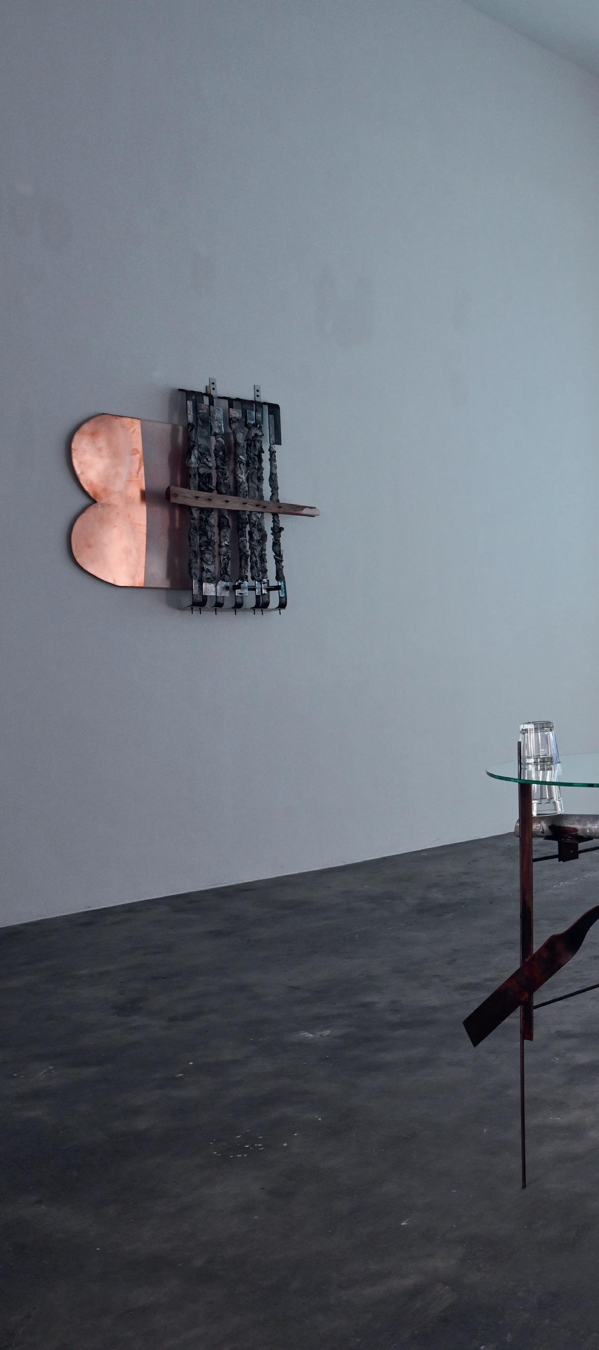

MICHEL MOUFFE (B. BRUSSELS, 1957)
KANAAL, PATIO GALLERY: JUNE 19 – SEPTEMBER 4, 2021
NEBEL
“That morning on the cliff, a moment of horizon disappears in the thickness of the fog. A memory emerges that the truth remains a visible gleam despite the densest mist. This reminiscence illuminates more than our confinement, the pandemic, and the cohort of past and upcoming changes. It brings me straight back to my field. Like dazzling evidence: to paint visibility differently.”1
– Michel Mouffe, Formentera, November 2020
The choice of the German word for mist or fog for the exhibition’s title unveils an essence of Mouffe’s practice: everything relates to the art of looking, sensory experiences, and the surprising ways our gaze can trick us during unprepared moments. It is with “the eyes of the skin” as Juhani Pallasmaa defined it, that we must see, or as Tim Ingold describes: “The eye, in smooth space, does not look at things but roams among them, finding a way through rather than aiming for a fixed target. It is an eye that is tuned not to the discrimination and identification of individual objects but to the registration of subtle variations of light and shade, and the surface textures they reveal.”2
“Far off, the foghorn of the lighthouse, which has become invisible, scans the muffled silence. Saint Augustine emerges, repeating that in order to go where I don’t know, I had to go where I don’t know.”3
The Nebel paintings emerged after Mouffe completed a series of “hidden” portraits titled, A las cinco de la tarde, from 2018 to 2019. These paintings were an exploration into the history of people shot by the Franco regime on the Spanish island of Formentera. The portraits are based on the rare photographic material traces left behind by those who resisted the fascist regime. The faces, however, stay mysteriously hidden behind the canvas, only revealing the contours. In this sense, Mouffe introduces figuration on the brink of abstraction: by concealing the faces behind the canvas, he allows only a shimmer of their past and history to reach us. In the smallest room of this current exhibition, there are three similar paintings: Liu Xao Bo, Daphné Caruana Galizia, and Khaled el Assad each represents a kind of intransigence with a regime or politics they opposed, an act of rebellion that cost them their lives.
Upon finishing these portraits, it was time, however—as Mouffe would phrase it—to leave this old practice behind in which multiple layers of paint were added on two mounted canvases. The Nebel series embarked upon new techniques, by painting on a canvas with a more pronounced grain, only covered with a light primer and two or a maximum of three coats of diluted colour.
“This new time of painting is understood not as ‘to make a painting’, but ‘to do painting’; ‘to be painting’.”4
To view the Nebel series is like being enveloped by a vague, turning mist. Through their subtle and minimal departures, a sentiment comparable to a William Turner painting emerges. Though the paint is applied in a fundamental manner—where one can practically feel the hand of the artist—it evokes the strongest of sensations. It’s the relation with the viewer’s eye that is so crucial: to hear, see, or understand the movement created by the artist, one participates in the active existence of the work. Interacting with his work requires a slow gaze. It is from that precise moment onwards, that we are not in contemplation of an object, but much rather in the feeling of something.
The surfaces of these paintings are, as is often the case with Mouffe’s work, not flat. In combination with the use of colours, it creates an unstable, almost vibrating, and moving experience. His work is irreproducible, unspeakable, and unassignable. Every new step Mouffe takes is one in the direction of challenging the limits of the very act of painting.
– BP


GERMAINE KRUIP (B. CASTRICUM, 1970)
HONG KONG: MAY 15 – JULY 10, 2021
SCREENPLAY
Germaine Kruip presents an immersive dialogue between light and sound, stemming from her years-long study of formal abstraction and the passage of time, and pursuing her production of sculptural and immaterial pieces at the intersection of music, theatre, and visual arts. Using traditional theatre lighting techniques and sculptural percussion instruments, constantly echoing with each other, Kruip creates a contemplative and sensorial choreography inviting the visitors to activate the works themselves while urging them to become fully aware of the spaces they occupy, and the time dedicated within them.
A duo of monumental rhombuses—one in brass and another in silver and nickel—float in the gallery’s first room, facing the mountain framed by the 21st-floor windows. Both pieces were manufactured according to the golden ratio (1.618) in collaboration with renowned German instrument maker Thein Brass, with whom Kruip has been working for years. The pieces are made from a unique metal alloy and fully exist as sculptures and may also be played as professional instruments. When activated with their corresponding beaters, the rhombuses produce deep overtones and generate new fields of resonance that travel throughout the gallery. The instruments set off an intimate, physical experience, leaving each visitor to choose the ways in which the sculptures and space reverberate.
On the wall leading to the adjacent room, a clock counts down from seven minutes and thirty seconds to zero, emulating the digital clocks used in cinemas to display the time remaining before a film starts. The clock discreetly draws the viewers’ attention to the time they spend in the first room and will dedicate in the second.
Triggered by Kruip’s interest in monochrome painting and slow cinema, the light piece occupying the gallery’s second room, “Cinemascope”, proposes a representation through the absence of representation: visitors are invited to sit on a bench in the darkened space to experience monochrome landscapes, created not digitally by a projector but analogically using ten theatre spotlights. Left to their own devices, the viewers are given time to move their gaze along the shifting immaterial landscape. Furthermore, in the absence of a visible narration, visitors are invited to access a spiritual type of engagement with the artwork.
With a seven and a half-minute duration, the light composition emulates some of the most iconic screen ratios used in the history of cinema. The work’s formal simplicity and slowness pave the way for the spectator’s emancipation: handing the power to the viewer has been a recurring wish within Kruip’s work, as it particularly resonates with her theatre light trilogy that began with “A Possibility of an Abstraction” in 2014. Facing the screen, one projects into it and creates their personal narration and image. A work such as “Cinemascope” resonates deeply with the contemporary moment, specifically in how we realise that our perspectives and ideas about reality seek to shape how we live or react to that reality.
The gallery’s third room represents the encounter of the artistic gestures of the two first rooms, in which
Kruip couples the shapes of the cinema screens and their inherent contemplative attributes to the instruments’ resonance. Kruip makes the screen physical and bends its shape in such a way that it becomes an acoustic shield for smaller brass percussion lines. The sizes of the sculptural pieces are directly adapted from the light piece’s ratios in the adjacent room.
The exhibition is a continuation and further development of Kruip’s practice that merges time, space, and perception over the span of two decades. In between the visual arts, the stage, and architecture, she investigates and presents her observations through architectural, sculptural, and performative interventions. Kruip studies the scenography of ungraspable phenomena, such as the ever-changing daylight and the passage of time; the relationship between art and ritual in repetitive gestures, aiming to subtly alter perception; historical attempts to create abstraction by means of geometry—and finally the desires, theories, and ideologies underlying these attempts. Kruip lives and works between Brussels and Amsterdam.
– Studio Germaine Kruip


Cinemascope, 2021
ANGEL VERGARA (B. MIERES, 1958)
TERRACE GALLERY, KANAAL: MAY 8 – JULY 17, 2021
LES BELLES IDÉES REÇUES
“La peinture, c’est la vie qui s’échange.”
– Angel Vergara
Titled Les Belles Idées reçues, this new series of paintings finds its origin in Angel Vergara’s participation during Manifesta 13—the 13th iteration of this nomadic biennial, which found place in Marseille in 2020. Vergara connected with the locality of this city through a preliminary series of workshops conducted with two groups of children, at a school for the visually impaired and via a non-profit community association active in social housing. These encounters formed the foundation of the multiple Straatman performances conducted in the streets of Marseille, where the base layers for these paintings were created. Afterwards, the canvases travelled back with the artist to his studio in Brussels, where new layers were added. It is here that the paintings, through multiple artistic interventions, found their final form.
The canvases form an inevitable, yet compelling mental space created by the artist, which can be seen and interpreted in infinite ways. It’s exactly this paradoxical reading that forms the core of these works, characterised by dialectics and opposites. In 2020, we were proud to present a series of paintings by Vergara titled, J’efface, et cela apparaît. These works originated in the artists’ studio and were later finished and adapted by Straatman— Vergara’s alter ego hidden under a white canvas—in public space. Les Belles Idée reçues turned this process around: the base layers were created in the workshops with kids and on the streets of Marseille, to then be finished in his studio in Brussels. The dialectic logic of public versus private got reversed: these and anti-these switched places, altering the outcome of the synthesis.
When concentrating and taking the time, the attentive viewer can still catch a glimpse of those initial “belles idées reçues” through the newly added layers.
The texture already reveals the patchwork of small canvases that constitutes the whole, where sometimes a frivolous and naïve rainbow or stick figure painted by a child shimmer through. The longer we look, the more the canvases seem to transform and mutate. The impressions left at first glance, might have changed fully by the time one leaves the space.
Vergara seems to create a doorway to another world, inviting the viewer to come closer and plunge. It’s this relation between the body and the work that is so essential and becomes apparent when standing in front of the painting. All of this can also be found in the performance and persona that is Straatman: at the 43rd Venice Biennale in 1988, Vergara covered himself for the first time with a white sheet, in front of the Belgian pavilion then occupied by Guillaume Bijl. It’s at this moment that a nomadic studio was born, or what the artist would call “a place to paint”. Though apparently an anonymised act, it also allows the artist to immerse himself in public space, at the same time transforming it with his presence. This reveals the social and political layer in the work of Vergara, never not aware of his role and position in the (art)world.


OTTO BOLL (B. ISSUM/GELDERN, 1952)
KANAAL, PATIO GALLERY: APRIL 10 – JUNE 12, 2021
WIDENING
THE LANGUAGE
Form, the way something is shown, is essential, Susan Sontag wrote in 1964 in her seminal essay “Against Interpretation”.1 It’s not only the form of Otto Boll’s sculptures that resonates with this quote but also how they manifest themselves in space—apparently floating on nylon threads or with a fine chalk line against a black background; as subtle eruptions from the surface of the wall or as robust articulations of the contours of its surroundings. Boll’s creations oscillate between presence and absence, the seen and the unseen, suggesting both materiality and the void.
“A void for me is a beginning. There is nothing and from this point, you have to start anew. And to have the feeling of the void in the back of your mind, it’s just like looking for another country. It has something to do with possibility. A sense of the known possibility is necessary in combination with the void. On the one hand, there is nothing, but from this point onwards I start to build something, and it has to fill the nothing with something I do by myself,” Boll said.2
For the artist, language is a framework, “a constant companion” in the discourse of his work.3 Boll invites the viewer into a sculptural event, the conception of solidity fading. The minimalist sensibility appeals to human feeling, the bodily sensation. Words try to develop between the heart and the brain, between perception and production. Language occupies a fundamental role in the sensations of the whole body and is always present. Boll’s words are not about the content of the work but about its genesis, or the feeling that describes the visual idea. It leads to reflections, not to interpretations. It is precisely this tranquillity, free of interpretation, that Boll’s work refers to.
The approach to spatiality that characterises Boll’s works is not very different from that of Lucio Fontana, who created a void and invited a space to enter through slashes and holes in his work. By doing so, Fontana aimed to show real space, behind the canvas, as opposed to the two-dimensionality that had long been a defining characteristic of painting. Even before he applied his first Tagli, or cuts, in 1958, Fontana tried to use brightly coloured paint to connect the material with space. “Colour in matter, developing in space, assuming different forms,” he wrote in his famous 1946 manifesto.4 The light installations that Fontana made in the following years broadened the notion of human experience to include sculptures in the space in which the viewer finds himself. At the same time, he broke through the dichotomy of artwork versus exhibition space.
“These artists,” as art historian, critic, and museum curator Margit Rowell wrote about Fontana, Luciano Fabro, and German-born Eva Hesse among others,
1. Susan Sontag, “Against Interpretation”, in Against Interpretation and Other Essays (New York: Farrar, Straus and Giroux, 1966).
2. Interview with Otto Boll for Boll’s first solo exhibition at Axel Vervoordt Gallery, Antwerp, 2012.
3. Otto Boll, “Introduction”, in Otto Boll. Sculptures, exh. cat. Sculpture Park Waldfrieden, Cragg Foundation, Wuppertal, 29 June – 22 September 2019 (London, Cologne: Buchhandlung Walther König,
“explored similar ideas beginning in the 1960s, with a view to stimulating the mind and body’s response to unprecedented physical situations.”5 The reduced form language of Luciano Fabro’s spatial experiences is also interesting to relate to this. Although he called himself a heretic, the Italian conceptual artist Fabro is associated with the Arte Povera—the movement that sought poetry in known materials. Referring to Fontana, he began his famous series of Tautologies in the 1960s, a term he borrowed from literature and rhetoric. With simple interventions to play on the relationship between his sculptures and their surroundings, he created a suggestion of approach and sympathy.6
The mental dialogue that Boll allows his fragile forms to enter with the mind of us, the observer, is like that of Fabro in a way. The invitation that Boll extends to the viewer is located in the mental interspace, which can only be bridged by feeling, sensation, and language. His sculptures call for closeness and presence, he says, at a time when indirectness comes increasingly to the force. Although the experience will differ with each viewing, the physical distance always remains. The question is whether this physical distance is also a substantial, essential one.
However, there is also a fundamental difference in the creation and thinking of both artists. Due to the clear presence of materiality, Fabro’s work always has a subject. Through the metaphorical use of materials— in some cases, marble with veins—his sculptures seem inherently human, but also due to the dimensions that refer to his person. There is always a reference to a certain narrative, a certain passage from a certain past. In Boll’s works, the materials, which are black or grey, with occasional white or silvery accents, do not remind one of anything found in the body, nor do the proportions refer to those of a human being. The human element takes place in the space in between, in the relationship that the viewer enters with the steel, aluminium, or wooden creations.
Introspection, tactility, mental, and physical approach. These are words that have been frequently returning for a year now in various contexts, including in the discourse on art. It makes certain art more urgent and other art more relevant. With his creations, Boll does not want to refer to a certain pattern of thought or a certain form of topicality. To summarise Susan Sontag’s seminal work, “Against Interpretation”, art does not require interpretation, and certainly not reduction to content. It is the form that is essential; with Boll, the form that invites the viewer to seek, feel, and express their language in new ways.
2019). The introduction to this exhibition catalogue consists largely of a letter that Boll sent to the critic and philosopher Jürgen Morschel in 2003.
4. Lucio Fontana, Guido Le Noci, and others, Manifiesto Blanco, 1946. Published in 1966 by Galleria Apollinaire Edizioni, Milan. The essay, also known as the White Manifesto, was written in 1946 by artists and students in Buenos Aires under the direction of Fontana during his time in Argentina.
5. Margit Rowell, ‘Luciano Fabro: Timely and Defiant,’ in The Brooklyn Rail (New York, September 2018). Rowell worked at the MoMA, Centre Pompidou, Centro de arte Reina Sofia, and other renowned institutions.
6. In addition, his series Italie and Piedi are particularly well-known, as well as Habitat Attaccapanni, and Arcobaleni


GROUP EXHIBITION
WORKS BY JEF VERHEYEN AND FRIENDS, INCLUDING BRAM BOGART , ROBERTO CRIPPA , RAIMUND GIRKE , GOTTHARD GRAUBNER , YVES KLEIN , WALTER LEBLANC , HEINZ MACK , PIERO MANZONI , OTTO PIENE , DOMINIQUE
STROOBANT
, GÜNTHER UECKER , AND ENGLEBERT VAN ANDERLECHT KANAAL, TERRACE GALLERY: FEBRUARY 27 – MAY 1, 2021
JEF VERHEYEN 1955–1962. ANTWERPEN – DÜSSELDORF – MILANO
In the late 1950s and early 1960s, cities like Antwerp, Düsseldorf, and Milan were meeting places for artists like Jef Verheyen (Itegem, 1932-Apt, 1984) who aimed to explore artistic boundaries, while their friendships intensified. This exhibition brings together early works from Verheyen and some of his Belgian friends like Englebert Van Anderlecht, Bram Bogart, and Walter Leblanc, and also shows the international context in which Verheyen was prominent with Yves Klein, Günther Uecker, Lucio Fontana, Heinz Mack, and Otto Piene. These artists brought painting back to its essence and opened the road to infinity with concepts like light being an essential mechanism, colour being a pictorial dynamic and transcendental element.
An ambitious internationalist, Antwerp-born artist Verheyen was the link between the Belgian and international art worlds in several places. He was an avid correspondent and wrote numerous letters to artists and collectors. At the Antwerp Fine Arts Academy, Verheyen met Walter Leblanc with whom he shared a passion for questioning painting and a deep interest in light and space. They both belonged to the Group G58, and on several occasions, they were present at the same exhibitions, including the Belgian Pavilion at the Venice Biennale in 1970.
Together with Englebert Van Anderlecht, Verheyen laid the foundations for a new art movement at Hans Liechti’s gallery in Grenchen, Switzerland: De Nieuwe Vlaamse School (The New Flemish School). In this manifesto, the artists and writers insisted on the universal character of their art based on their Flemish origin. For Verheyen, there was a link with Flemish Old Masters for their use of classical painting techniques. There was also a strong interest in geometric and mathematical proportions as a manifestation of universal harmony. In 1960, Verheyen produced several paintings together with Van Anderlecht titled, Ni l’un, ni l’autre (Neither one nor the other). For Van Anderlecht, painting meant a search for hidden inner rhythms to be expressed in short violent brushstrokes.
Verheyen’s real family was not to be found in Flanders or Antwerp but in a more international context. The encounter with Lucio Fontana in 1957 was of capital importance for Verheyen, who was twenty five at that time, while Fontana was fifty eight. He recognised in the painter Verheyen a similar urge to break through the painting, to rejuvenate the genre, to penetrate the essence of art. He supported Verheyen not only with encouragement. He helped him establish contacts with fellow painters like Piero Manzoni and Roberto Crippa and with collectors and galleries in Milan, which was at that time the city of avant-garde art and fashion. Although he was much older, Fontana referred to Verheyen as il mio padre (my father). When Fontana came to Belgium in 1962, five years after their first encounter and after visits, correspondences, and openings, his primary purpose was to create common paintings with Verheyen. At a villa in Knokke, they
collaborated on the common work, Rêve de Môbius, and Belgian Television BRT filmed part of the event.1
In addition to Fontana and Piero Manzoni, Verheyen also felt a strong connection with Yves Klein. They had a shared passion for the sport of judo, and Verheyen admired Klein for his fanatism for formal ritual events, and especially for Klein’s everlasting energy to create art with new materials and burning ambition to free art from its material limitations. In a 1973 interview, Verheyen said: “We grappled with the problem of how to go beyond Tachism and Art Informel. What mattered more to us was to create consciousness-raising painting. We had turned away from Abstract Expressionism. The four of us—Fontana, Yves Klein, Manzoni and I—responded to it with a collective idea. […] We communicated very well with each other. That was because we had the same artistic concerns […] We were pursuing the same ideas.”
Verheyen also found kindred spirits in Düsseldorf, where the ZERO Group was formed in 1957 by founders Otto Piene and Heinz Mack. Günther Uecker joined one year later. Verheyen officially became a member of this movement in 1962. ZERO considered colour to be an emanation of light. The group’s philosophy implied a rejection of the vision that art should be the voicing of a tortured personality in a tortured world. It was art for art. ZERO looked towards the future and searched for new materials and techniques.
Verheyen became close friends with Uecker, of whom he said: “Uecker and I immediately felt that affinity that is so vital to friendships between artists.” Two years later, in 1964, Verheyen organised together with Renaat Braem an ambitious international exhibition in Deurne, Integratie 64, with works by Fontana, Goepfert, Klein, Mack, Piene, Uecker, and others.
Verheyen made his first black paintings in 1956 and he defined them as Schwarz darstellen (depicting black) referring to an idea of Paul Klee. In a letter written in 1975 to Dominique Stroobant, Verheyen stated that this attribution was an invention from himself and was never published by Paul Klee. Current knowledge of particle theory has established that black is not a non-colour but ur-matter. Verheyen sensed this intuitively.
In these early works by Verheyen, one can feel the influence of Taoism and Chinese art, resulting in a more spiritual reading and deeper use of clair-obscure. The darkness of these paintings shows the importance of emptiness in which, according to Verheyen, the essence reveals itself. He wanted to bring painting back to its essence and opened the road to infinity with concepts like light being the essential mechanism, colour being the pictorial dynamic and transcendental element. This concept was explained in the essay “Essentialism”, which Verheyen wrote in 1959.
– ASD


LUCIA BRU (B. BRUSSELS, 1970)
HONG KONG: NOVEMBER 14, 2020 – JANUARY 19, 2021
KANAAL, PATIO GALLERY: FEBRUARY 27 – MARCH 27, 2021
TWENTY-FIRST FLOOR
A SHARED WORLD
The notion of cohabitation has always been a central preoccupation in Lucia Bru’s work. She maintains this dynamic, as she experiments with ever-changing associations of form, to decide on their presentation. Individuals, pairs, trios, groups, heaps, and masses are the many ways in which a universe can be composed, presences noted, and existences affirmed.
There’s no paradox in the use of so-called ‘inert’ materials and the movement that the artist inspires in them; she knows her sculptures are animated by a sense that awakens in us an anterior intuition—a ‘life of stones’—a living sensation that distinguishes itself from anthropomorphism.
For Bru, the act of occupying space establishes interferences, which her sculptures maintain with the place, as well as the visible—or invisible—presence of exteriority. She does it in such a way that they are re-situated, compliant with a logic of belonging that renders visible an oscillation between the work’s affirmed autonomy and the relationship with the context of its appearance. Each new exhibition opens up new levels of co-existence, as ensembles unfurl and invite us into new trajectories.
Here, a mound of porcelain—heaps of little, asymmetrical cubes—echoes a surrounding landscape and captures its light. Further on, a video projection illuminates the sculptures, which are placed directly on the floor. The forms appear enlarged on the screen that fills the expanse of a wall. This sudden shift in scale introduces a new space, another dimension, a fiction of proportions that a living being elected to inhabit. It evokes the eruption of an animal presence, which acts like the metaphor of a spectacle, of a world in which boundaries of hierarchy, gender, and species have ceased to exist. Has that multitude of flat parts, with black masses dotted here and there upon them, come to expand the work’s territory, landscapes or architecture? We need to arrive at a certain height to perceive possible images and divine possible similarities…
However, beyond all speculation, Bru’s sculptures are sufficient in and of themselves. Whether they’re seen as real or enigmatic forms, imposing or minuscule, they have their intensity. At once fragile and wild, obvious or incongruous at times, above all, they hold their own, occupy their place, and activate a necessary flux between the works’ dynamics and the breathing of bodies.
Just as a piece of porcelain, a mirror, a newspaper, or a cat can draw us into worlds of sensitivity, where singular individuals co-exist, so too, this exhibition draws us into that particular moment when, as we take in what surrounds us, we discover ourselves to be participants in a common world, shared amongst us all.
– Joël Benzakin


YUN HYONG-KEUN (MIWON, 1928 – SEOUL, 2007)
KANAAL, PATIO GALLERY: OCTOBER 24, 2020 – FEBRUARY 20, 2021
“Soil, trees, and rocks are what’s beautiful. Without question, they’re simple and tower over anything produced by people, no matter how skillfully made.”
– Yun Hyong-keun in his diary on July 10, 1990
Yun Hyong-keun was one of the leading Korean post-war artists and a member of the Dansaekhwa art movement. Yun had a difficult and harsh life, suffering during the Korean War and the post-war dictatorship, being imprisoned three times, and miraculously escaping from death. His integrity and honest character made him fight against injustice. In 1973, after being imprisoned again and quitting his job, he fully committed himself to art and developed his unique type of painting, which is defined by the curator of MMCA Kim Inhye as “the epitome of minimalism and simplicity”.1
Yun admired nature and was inspired by its simplicity and pureness. He wanted to capture the essence of nature in his painting. Honesty and truthfulness were translated into muted, receded colours, and simple compositions of bold, square-shaped colour fields. Yun reduced his palette to only two types of colours: burnt umber referring to the earth and ultramarine referring to the blue sky. He often referred to his early paintings as “the gate of heaven and earth”. The space between flanking two columns, painted with the mixture of the two paints, is empty yet full, as the Dutch word, vol-ledig, describes it well. This composition is frequently seen in the works produced until the mid-1980s.
Yun had a deep respect for the empty surface and selected his canvases carefully. In the 1990s, he mainly used self-stretched linens on a homemade wooden frame. On this surface, he applied a thin coat to retain the fabric’s fibrous texture. The paints, heavily diluted with turpentine and linseed oils, were applied directly on the linen canvas on top of each other. Due to the characteristics of the materials, paint smears onto canvas quickly and creates blurred margins around the bars. As each brush stroke is unique, different rates of colour absorption can be seen. The process is very natural and organic, like water soaking into the soil. The artist noted in his diary: “Since everything on earth ultimately returns to earth, everything is just a matter of time. When I remember that this also applies to me and my paintings, it all seems so trifling.” Like his words, Yun’s works express a somber, bone-chilling truth about nature, yet they bring us a measure of comfort and humility.
Yun’s lifelong search for simplicity and honesty was deeply rooted in traditional Korean culture resulting in simple, plain, gentle, comfortable, and unpretentious objects where human intervention must be minimised. The choice of objects in his studio shares this aesthetic sense. This also explains his admiration for an artist like Donald Judd, of whom he had a sculpture in his studio. Yun met Judd during his visit to Seoul in 1991 and both artists immediately felt a connection. Two years
later, Judd invited Yun for a solo show at his studio on Spring Street in New York, and the following year at the Chinati Foundation in Marfa, Texas.
The friendship with Judd inspired Yun in his artistic practice to seek for bolder and simpler compositions. The transition in Yun’s usage of paint and formation is seen in works produced throughout the 1990s. The subtle differences among the hues that we find in his early works disappears, and the colour of the paint becomes almost purely black. Also, he uses less oil so that the surface becomes dryer. He often used a different technique—drawing rectangles on the canvas with a ruler and pencil and then covering these with tape. He painted the inside parts and then removed the tape again. Kim Inhye writes: “These works become simpler and more stringent in terms of forms, colours, and process. But these seemingly simple works have a hidden depth, such that gazing into the large black void is like plunging into a deep abyss.”2
The fourteen works, selected with careful consideration, reflect this subtle evolution of Yun’s style, an effort in succeeding the Korean traditional aesthetics that Yun had continuously admired while embracing the notion of Western minimalism about simplicity in material and form.
– ASD
2.


KIMSOOJA (B. DAEGU, 1957)
KANAAL, TERRACE GALLERY: OCTOBER 21, 2020 – JANUARY 9, 2021
PLANTED NAMES
Human rights, justice, and the state of displacement have long been central themes in the work of Korean artist Kimsooja. Her practice involves constant travel, putting her in touch with various cultures, and occasionally sites haunted by extreme violence. Such was the case when she produced the works Bottari – Alfa Beach (2001) and Planted Names (2002), which respond to sites historically associated with the transatlantic slave trade. These works are shown in the context of a summer of racial reckoning, during which global Black Lives Matter protests have continued the movement to fight institutional racism and address the afterlife of slavery.
Bottari – Alfa Beach depicts the horizon of the Atlantic, seen from an island in southwest Nigeria, which was once a slave port. Shot on a dissonantly bright, sparkling day, the video shows a vast ocean horizon inverted. The ocean moves in the upper portion and the sky in the lower, invoking an unsettling sense of the loss of natural cohesion.
“The inversion happened when I saw the horizon from the Alfa Beach in Nigeria where African slaves were sent across the Atlantic Ocean—this was the saddest horizon line I had ever seen in my life, thinking of the destiny of the slaves and their deprived freedom. Thus, the flipped horizon was, for me, a disturbed horizon, a disorientated sense of gravity and of the slaves’ psychological return I perceived in the curls of the waves reaching the same shore from which they had left,” Kimsooja said.1
The inversion calls to mind the words of black feminist scholar Hortense Spillers, who, writing on the Middle Passage, describes “African persons […] suspended in the ‘oceanic,’ [...] removed from indigenous land and culture and not-yet ‘American’ either, [they] were in movement across the Atlantic, but they were also nowhere at all. [...] they were culturally ‘unmade,’ thrown amidst a figurative darkness that ‘exposed’ their destinies to an unknown course.”2 The disrupted horizon image reflects this cultural unmaking, the loss of home and identity through an institution whose violence continues to this day.
A year later, Kimsooja found herself on the other side of the Atlantic Ocean in Charleston, South Carolina, to join in an exhibition titled, Memory of the Water, at the Spoleto Festival USA, 2002. Echoing the Bottari – Alfa Beach video, the four carpets produced for the exhibition, Planted Names, bear the slave names of hundreds of people of African origin kept in captivity at Drayton Hall, the oldest plantation mansion still standing in America. The names appear in stark white thread against black backgrounds, allowing the violence of such an archive to speak for itself. The names recorded
in such a property log are monikers imposed by the enslaver, mostly single words, and often cartoonish nicknames such as “Pringles” or “Prince”. These names, along with the knowledge of the horrific violence with which they were bestowed, produce a sense of discordance in the viewer regarding the utility of the archive. While the use of such names is an act of violence in and of itself, they refer to people whose stories must be remembered and recognised. It functions, as Saidiya Hartman writes in Venus in Two Acts, “at the limit of the unspeakable and the unknown [...] mim[ing] the violence of the archive and attempt[ing] to redress it.”3 Speaking on her decision to use the form of a carpet, Kimsooja said:
“I immediately saw this plantation site as a vast woven carpet where enslaved bodies were embedded. There are so many sad and inhumane stories behind these colonial places. Carpets are not about the beauty of an artist’s design, but about the labour of the carpet weaver, so I chose carpets as the form to celebrate both the slaves’ and the carpet weavers’ labour and time.”4
In the second room, visitors can see four Bottari sculptures that were made in Perth, Australia using locally sourced used clothing and blankets wrapped by traditional Korean bed covers. A bottari (the Korean word for bundle) is usually employed during times of movement, used to transport domestic possessions connected to daily life. Situated at the intersection of sculpture, painting, and installation, the works represent the very idea of displacement and itinerancy. A physical embodiment of “home” uprooted, it is an object laden with experience, memory, and social and existential meaning. By using bed covers to wrap the Bottaris, the objects become sites unto themselves; they are “the underlying theatre for birth and death, one that each and every one of us regards as our own place,” as curator Harald Szeemann said.5
At the same time, Bottaris are intimate works that organise the disorder of existence on a micro level, responding aesthetically to the turbulence and chaos of migration. Kimsooja wraps Bottaris in the pursuit of co-existence, love, harmony, non-violence, and a utopia in this troubled world. The embrace of the ‘other,’ the transcultural idea that we are all ‘woven’ together, is foundational to her work, indeed the reason why she adopted a one-word name was that it “refuses gender identity, material status, socio-political or cultural and geographical identity”.6 Kimsooja offers us an interpretation of today’s world, promoting metaphysical, cultural, and political awareness through art.
– Studio Kimsooja and SB
1. Quoted in Rosa Martinez, “A Disappearing Woman,” 2012. www.kimsooja.com/texts/martinez_2012.html, consulted on 21.08.2023.
2. Hortense J. Spillers, “Mama’s Baby, Papa’s Maybe: An American Grammar Book,” in Diacritics, Vol. 17, No. 2, Culture and Countermemory: The “American” Connection (Summer, 1987), p. 72.
3. Saidiya Hartman, “Venus in Two Acts,” in Small Axe, Number 26 (Volume 12, Number 2), June 2008, p. 1.
4. Quoted in Mary Jane Jacob, “Interview,” in In the Space of Art: Buddha and the Culture of Now, ed. Jacqueline Baas and Mary Jane Jacob, Berkeley, California: University of California Press, 2005.
5. Harald Szeemann, “Die Expertise,” in Welt am Sonntag n. 19, 2000. As quoted in Kimsooja, To Breathe / Respirare, Milan: Charta, 2005, p. 82–83.
6. As stated by Kimsooja, “Action 1: A One-Word Name Is An Anarchist’s Name,” on the website of the artist, www.kimsooja.com/action1, consulted on 21.08.2023.


BOSCO SODI (B. MEXICO CITY, 1970)
KANAAL, PATIO GALLERY: SEPTEMBER 22 – OCTOBER 17, 2020
YŪGEN
For Bosco Sodi, the exhibition created a space for looking and for losing yourself in the act of looking. A space set aside to stare at surfaces, revel in complex textures, move through negative spaces, and catch a glimpse of little vistas and lopsided shadows. It is a space, Sodi might add, to encourage a state of mind called yūgen, a Japanese word the artist borrowed for the title of his exhibition. Sodi defines yūgen as “the profound and mysterious beauty of the universe that cannot be described by words”.
It’s important to keep in mind that yūgen, however elusive a concept, emerges from our sensual engagement with the natural world. It is also about losing control, at least a little bit. There is a short story of a Zen monk who, one autumn day, rakes the temple’s ground of leaves, clearing it completely. Looking across the pristine garden, he feels a sense of dissatisfaction. He grabs a handful of leaves from the pile at his feet and randomly sprinkles a few across the grass, restoring a sense of messiness and harmony to the space. The same kind of impish delight animates Sodi’s work. Yet, there is also a sense of wonder in nature itself, a respect for forces beyond the artist’s control.
Excerpted from a text written by Craig Burnett


JAROMÍR NOVOTNÝ (B. ČESKÝ BROD, 1974)
HONG KONG: SEPTEMBER 5 – NOVEMBER 14, 2020
JUST A NARROW RANGE OF POSSIBLE THINGS
In modern days, there’s a strong tendency to rely only on what is seen. The act and ability to see may result in an illusion or misconception of things and situations. However, Jaromír Novotný’s creative process and artworks gently remind viewers that human intuition has great potential, perhaps more than may be realised. The word “tactile” was derived from Latin for “that may be touched, tangible”. It refers to the physical act of feeling; the experience of touching—for example, the skin. Novotný’s work bears the traces of the human hand and presents itself as a skin around the frame, or a membrane that blocks certain aspects or sensations of vision while allowing others.
Novotný creates his works using acrylic on polyester organza, stretched on a wooden frame. The paper and canvas threads and inserts on the reverse of the painting lead to a great sensitivity. This notion of bare presence conveys that Novotný uses painting as a medium to solidify his artistic vision. The work’s tactility invites viewers to feel rather than see them. As a result, Novotný’s creative process allows the exploration of the painting’s perception and inherent purity. The experience with the work reveals the essence of painting. Because the artist’s hand is visible, so is the process of creation. Novotný presents his painting as a medium, his medium as a subject. Thus, the subject and object are merged. As a result, he rejects conceptual and formal interpretations. Rather than American Abstract Expressionists and Minimalists, and artists such as Willem de Kooning and Donald Judd, Novotný creates emptiness by omitting certain aspects from the work, such as adding an excess of paint on canvas or removing the human touch from painting completely. The result of Novotný’s work is an eloquent but enigmatic form of transparency.
Although the connections with American twentieth-century art and Novotný’s works are interesting, those with art created in China at the time are perhaps even more so. In the twentieth century, in line with Taoism and the Chan (Zen) school of Buddhism, increasing attention was paid to the philosophical concept of emptiness and the void in a painting. “I do my utmost to attain emptiness; I hold firmly to stillness. The myriad creatures all rise together, and I watch their
return,” Lao Tzu wrote centuries ago. Empty space is treated as solid space: “Knowing the white, retaining the black, it is the form of the world.”
Novotný’s approach to empty and solid space leans towards this. About his work, Novotný once said: “Black as the foundation, white as the lightest shade of black.” Synthetic organza came into his oeuvre when he was looking for transparent textiles that could replace the canvas; it transcends the material and makes it a degree whiter. The elements behind it become more diffuse in a certain way—faded by the washed-out contours.
Elements considered in emptiness in Chinese landscape painting are the same as those associated with phenomena of nature—fog, sky, clouds—elements of limited visibility clear up for those who physically move in it; those who spread their attention and imagination.
In Chinese painting, however, the true mystery of emptiness lies in the concept of the qi, the term that refers to the living energy of the work. Without qi, the work is lifeless; qi determines whether a work is perceived statically or dynamically. It stems from the inner self of the artist, because of his interaction with material and technique. It is, to rephrase what was said before, the medium to solidify the ephemera of his artistic vision.1
Novotný points out that the assumptions with which viewers look at a painting, as being determined by memory and the underlying meanings of the (re-) presentation. The perception of the work is based on the notion of reappearance, although the creation of the work itself is also limited to certain constraints.
For Novotný’s works, recurrence can be conducive to creative solutions. With the act of recurrences— with which Novotný experiments a repetition of making units, leaving empty fields, and creating a trace of execution—he can aspire or eventually reach out to boundless limitations. Viewers then may feel his perception towards the paintings and witness his progressions as recurrences. His ongoing quest orbits like a constant circle within the world. The world in which qi is an enigmatic power.
– SB


Untitled, 2020

Untitled, 2020
CHUNG CHANG-SUP (CHEONGJU, 1927 – SEOUL, 2011)
KANAAL, PATIO GALLERY: JULY 4 – SEPTEMBER 19, 2020
HONG KONG: FEBRUARY 6 – MAY 8, 2021
A significant confluence of historical events seems to contrast with Chung Chang-Sup’s contemplative memories during the period these works were created: Korea’s turbulent history during the Japanese occupation at the time Chung was born; the grip of the antagonism caused by the Cold War afterwards; events leading up to the foundation of South Korea in 1948; the subsequent Korean war; and eventually the processes associated with “modernisation” and the search for a cultural identity.
The roots of this contemplation stretch to the artist’s childhood: the first thing Chung saw in the morning was the soft sunlight shining through the windows crafted with handmade tak paper, also called hanji Hanji was used as a base for paintings and calligraphy, as well as architecture, as wallpaper, and as panes for sliding doors and windows. With the ability to control temperature, humidity, and light, hanji had a greater responsibility than mere protection. Rather, it’s like a membrane between the interior and the exterior of the dual world; the inner and the outer.
“Through the screen of tak paper, one can distinctively sense the wind, light, and the flow of time outside his or her room, which allowed us to experience both feelings of being inside and outside. This is the realm of creation with no intention of creating,” Chung said.1
It was this form of creation Chung sought in his practice, trying to process the tak in such a way that he put his breath, odour, and soul into the process, “thus becoming a part of the process itself, becoming one entity with the paper”.2 Chung talked about a conversation with the mulberry fibre, searching for the balance between the composition he had in mind and the spontaneous response of the material.
Inspired by Eastern spiritualism, Chung strived for a transcendental state of self-disappearance, arising from the idea of unification. According to Lewis Biggs in the 1992 Tate Liverpool exhibition, Working with Nature: “These are not the images but analogies, lyrical recreations of the experience of life, with all its formlessness, its decay and change. It is the paper, not the artist, speaking to us.”3
Working with Nature focussed on artists associated with Dansaekhwa, an art movement from the 1960s70s whose name can be translated as “single-colour painting”. Although the artists exhibited together, commented on each other’s work, and sometimes even painted together, Dansaekhwa did not officialise itself, nor was a manifesto written as was done with other post-war, avant-garde movements. Other prominent members of the movement included Park Seo-Bo and Yun Hyong-keun. As with Chung’s work, the works of these artists are the result of the physical interaction with matter.
Although “single colour” should be understood as the purity and spirit of colour based on the broad tradition of calligraphy, this exhibition shows that Chung’s works did not strictly consist of one colour, especially when we talk about his work from the early 1990s. Nor are his works strictly speaking paintings, as the tak was spread, battered, tapped, and kneaded, with his hands or with a wooden stick or threads. Chung reflected on
his work as being “unpainted paintings”—in line with his goal to “depict a world without depiction”.4
The 1960s and 1970s meant the questioning of some of the centuries-old paradigms in art. Donald Judd— who was attached to an army unit building the airport for American forces at Seoul during the war—was captivated by the beauty of traditional Korean architecture. Judd, who is now remembered as the leading figure of American minimalism, worked with his heavily reduced forms away from the (arbitrary?) dividing line and determination between painting and sculpture— something he also addressed theoretically. Reducing the language of forms was nothing new in the post-war art worlds—think of Mark Rothko or other abstract expressionists.
In Korea, artists were fully aware of what was going on in New York, Paris, and Tokyo, and vice versa. Visual material circulated widely. For example, the Korean magazine A.G. reproduced images of Judd in 1969. Artists travelled and interacted at international exhibitions such as Documenta VI, or as in Chung’s case, the second Paris Biennale in 1961. This visit occurred during a period in which Chung practised with oils in the then-predominant Art Informel tradition.
Sharing the same artistic principles and structures even brought Donald Judd and Yun Hyong-keun (who saw Rothko’s work in the 1970s) together with a 1994 exhibition, which would be Judd’s final before his passing.
Yet, it would be too easy to speak of a clear influence of Western—occidental—art movements on those in the East, as claimed many times in the past. Much has been written about the differences between Dansaekhwa and its counterparts in the West, where the reinterpretation of nature as a reflection of the human mind is regarded as the primary criterion.
This urge to blend with nature, as Chung’s reminiscences show, stems from the tradition of Eastern ideologies. While the abstract expressionist relied on the visual, physical experience as the result of the individual, focussing on formal elements, the artist associated with Dansaekhwa had no intention of making “images.”
Also, it should not be forgotten that several Western artists, including Paul Klee, Hans Hartung, Jasper Johns, Ad Reinhardt, and of course Yves Klein, embraced these complex traditions of Buddhism and Confucianism, not putting humanity at the head of the symbolic hierarchy and commanding a respect with nature, opposed to the idea of dualism.
Chung, amongst those who were the first generation to receive formal education himself, rejected the Korean arts academy system that divided Eastern painting from Western painting—and ink from oil, a distinction that was challenged in his art practice. Other voices were heard to eliminate the geographic hierarchy of art criticism. In 1970, Ha Chong-Hyun, another artist associated with Dansaekhwa, described the worldwide phenomenon of the emerging avant-garde art movements in 1970 as simultaneity
As curators Sam Bardaouil and Till Fellrath conclude in their 2016 essay: “Dansaekhwa is a great example of

the negotiation of modernity beyond the confines of a western-centric history of art.”5
“I try in my art to establish harmony between oriental ideas and matter, just as a person who is practicing religion would experience the world of Zen,” Chung said.6 “I believe that oriental spiritualism and occidental materialism are harmonised on the crossroads of my lonely journey.”7
–SB
1. Quoted in “The World of my Paper Works,” in Chang-Sup Chung Retrospective, exh. cat. Gwacheon: National Museum of Modern and Contemporary Art, 2010, p. 239.
2. Quoted in “The World of my Paper Works,” p. 240.

3. Lewis Biggs, “Working with Nature,” in Working with nature: traditional thought in contemporary art from Korea, exh. cat. Liverpool: Tate Gallery Liverpool, 1992, p. 15.
6. Artist’s statement, 1992, quoted in the catalogue of Working with Nature, p. 19.
4. Quoted in “The World of my Paper Works,” 241.
5. Sam Bardaouil and Till Fellrath, “Dansaekhwa: when less becomes so much more…,” in The Art of Dansaekhwa, ed. Jin sup Yoon. Seoul: Kukje Gallery, 2014, p. 51.
7. Quoted in “The World of my Paper Works,” p. 241.

Meditation 91088, 1991
IDA BARBARIGO (VENICE, 1920–2018)
KANAAL, TERRACE GALLERY: JULY 4 – SEPTEMBER 20, 2020
SELF-PORTRAITS
/ SPELLBINDING
The exhibition, Ida Barbarigo – Autoritratti / Cose che incantano, occurred during what would have been the artist’s 100th birthday. Axel Vervoordt, together with architect and curator Daniela Ferretti, selected works from two enigmatic series that are less known to the public, but which represent important themes in Barbarigo’s oeuvre.
The first series is comprised of self-portraits that were painted in the 1980s and ’90s. The works expose layers of the artist’s personality while conveying aspects of melancholy, a dark side that’s mysterious, yet fascinating. A second series is a group of works from the mid-1970s that Barbarigo titled, “son cose che incantano” (Spellbinding or Enchanting Things) or “Les plages d’Orphée” (The Beaches of Orpheus). Both series are based on intensive research and personal introspection while revealing how the artist’s layers of flowing, dripping lines approach an enchanting abstraction.
Barbarigo had a profound familiarity with the psychological condition of the human being. The artist’s career consists of thorough and patient iconographic research of several themes and symbols. These include chairs, flowers, leaves, judges, faces, demons, beaches, and city views. Barbarigo developed these connotative signs over several decades in deep silence and an almost obsessive manner. Art historian Giuseppe Mazzariol described the enigmatic and evocative character of Barbarigo’s work as follows: “The signs recur obsessively, each time losing their descriptive dross and producing images of greater connotative depth, in other words becoming more essential and less explicit, more suggestive, but in the end more definitive.”1
The human figure appeared in her work from 1964 onwards. These were never “real” portraits as such, but she attempted to invoke the silent spirit of the present and the dormant energy of the figure. The starting point for the self-portraits was an unexpected emotion that she felt upon noticing a white apparition moving behind the numerous paintings of flowers and leaves in her studio. She described it as a pale, fugitive, and mysterious figure. Her portraits evoke a certain anxiety, which is at times a definitively tragic atmosphere.
In 1992, whilst visiting a museum in Vienna, Barbarigo was affected by an Egyptian head she encountered. The sculpture haunted her dreams, and she instinctively translated the portrait through her canvases. In an interview with Michael Peppiatt in 1995, she described the strong emotion that came to her like a shock and greatly intrigued her that she had to paint and draw them obsessively.2
Writer and journalist Paolo Levi explains: “The Sphinx is a mysterious, disturbing presence that lives in our collective unconsciousness and dwells in us. Suddenly, in fact, a shadow figure appeared on the surface between the meshes of beautiful material, on a dark background, without any hint of light.”3
3.
4.
In the second series, “son cose che incantano”, Barbarigo presents a vision of “another” world, like a spellbinding dream becoming a nightmare. Infused with a deep melancholy, these works present a dark side that is enchanting, yet fascinating. These works are derived from one of the most central themes in Ida’s practice—the chairs. Omnipresent in her oeuvre, Barbarigo’s reproductions of chairs sought to capture the energy of the unseen. She sensed the atmosphere and vibrancy of life in city squares and aimed to express this in a material way. In this case, she gave body to the energy surrounding the silver chairs from San Marco’s Caffè Florian, chairs that were abandoned and deserted in winter.
As one of Barbarigo’s long-time friends, Daniela Ferretti explains:
“When I think of Ida, most of the time I imagine her sitting at one of the cafés on the Zattere, or Piazza San Marco, or along the Parisian boulevards, contemplating the chairs and above all observing. Observing the mysterious, enigmatic voids and the interstices of simple chairs stacked in piles or abandoned in random geometric lines, she waited for a new vision to come to replace the usual image of these daily objects designing them to reveal their essence. Nothing comes from anything. Everything takes place in a suspended, motionless time and suddenly in a new space appears the other image, the one that emerges from the deepest part of the soul.”
As Barbarigo stated about her use of chairs as signs/ symbols: “They are an agile and ambiguous group who live elsewhere and in another time. I haven’t understood if they are calling me or waiting for me.”4 Indicative of many of the artist’s series, the works of Son cose che incantano present an atmospheric and emotive reawake of the buried images, as archetypes, like images reemerging from a deep psychic abyss.
The grey, black, and white tones of these works evoke the fog and the “disconsolate solitude”. Barbarigo derived the title from Le Nozze de Figaro, in which in the third act Figaro sings the enchanting aria, “Son orse benigne…”.
In the artist’s notes, we find confirmation of the impression of deserted places populated by mysterious presences: “There was a time when Piazza San Marco appeared to me like a great silver beach. In the foreground, the chairs of Florian’s interlaced in a convulsive crisscrossing of backs, seats, metal feet like the ‘cold spirits of Hades’, who, like flagellated clouds, rush towards Orpheus.” – ASD


ANGEL VERGARA (B. MIERES, 1958)
KANAAL, PATIO GALLERY: MARCH 7 – MAY 30, 2020
J’EFFACE, ET CELA APPARAÎT
Angel Vergara creates colour evocations that make certain patterns possible by sweeping movements. Through the artist’s repetitive actions, layers are added as membranes over the paint, which are then wiped out again. The viewer experiences the same internal ambiguity: landscapes seem to emerge, but with different approaches, those facets of perception may disappear again. The work is characterised by contrasts, opposites, and dialectics. Vergara has been investigating this transparent representation of stratification for several decades. He gained fame as a video artist, and these works bear the characteristics of a film—slow and prolonged. A layer is added to a layer; a fragment to a fragment; a frame to a frame. What takes place within the canvas becomes an experience like a film.
Via Vergara’s video works, he poetically questions the role of the artist in society and the economy of the work of art. One can see how recognisable scenes originating in a broad range of media are slowly painted over, resulting in the layer of paint manifesting itself as a membrane over the moving image. As a result, the works are charged with specific temporality, through the constant review of their structure and condition, subject to the connections with the colours of paint and the underlying reality. Vergara did the same by choosing reality itself as the subject, by registering the contours of passers-by with paint on glass plates. The result stands up as an autonomous object, whether it is a digital construction, a painting mounted as a film, or a film mounted like a painting. In each case, the result cannot be dissociated from its decisive performative character.
In 1955, the British language philosopher J. L. Austin introduced the term “performative” during a lecture at Harvard University.1 Austin pointed out how language can create an effect that goes beyond the realm of language itself, or, signs can produce a reality constructed from what one can do with words. It wasn’t long before the term was also used in art theory as the reality-producing level of the artwork, indicating both what it “says” or imagines and what it “does” or induces. Any work that refers to the here and now and the idea of performance without itself being a performance can be called a performative work of art. However, it is not a synonym for “performance-like”.
In the case of artists like Vergara, the idea of performance is explicitly linked to the result of the work of art. This is also evident in this series of works presented at Kanaal. The oil paintings were adapted by Straatman, Vergara’s alter ego that first appeared in Venice in 1988. Straatman works in public while hidden beneath a white sheet, a concept that both attracts and keeps viewers at a distance. Straatman is a nomadic antithesis of the art world, not accidentally concealed in the white of a canvas.
Anonymously and anonymised, Straatman completes the works, marking the edges of the canvas with a few sharp, contrasting oil paint strokes. In this way, the reality that Vergara first extracted from the works by its sweeping movements is once again exposed to an acte-peinture. These acts take place in the public space,
and Vergara activates them in connection with the specific location in which they are created. At times, Straatman (while remaining hidden underneath the sheet) hands passers-by a stick of oil paint, thus transmitting the freedom to add something to the work. Therefore, a new dimension of coincidence is added, beyond the artist’s control. By handing something over in this way, a tangible collective and public dimension is added to the work.
These touches create an effect reminiscent of less geometrically abstracted variants of the thin blue and yellow stripes that flank the red in Barnett Newman’s well-known series of works. Newman, like other Colour Field Painters, wanted to give maximum expression to colour as a phenomenon, evoking an emotional reaction from the viewer. The “visual experience of the painting” could, according to him, be compared to an “encounter… with a person, a living being”.2
Following in the footsteps of, amongst others, Edmund Burke (1757) and Immanuel Kant (1764, 1790), Newman wrote about the sublime, what Kant described as the feeling that “arouses enjoyment but with horror”, such as mountains, the night, the storm, or: the chaos, the emptiness.3 In The Sublime is Now (1948) Newman described the sublime as the exalted—that one cannot achieve through the obstruction of beauty.4 For Newman, it was a reason to turn his back on figurative art. The extent of the mind, he wrote, is unlimited and cannot be adequately represented by an object with certain material limits. Newman called on other artists to free themselves from, among other things, “the impediments of memory”.5
Vergara’s paintings and painted films also comment on the influence and abundance of images that are forced upon us and that block the psychological mechanisms by which we shape our reality. The constant confrontation with images and advertisements makes it almost impossible to distinguish between fiction and reality. Our memory is polluted. On top of that, every paint-ing, every new layer that Vergara adds, is also a memory in action.
In 1982, the French philosopher Jean-François Lyotard, who previously also commented on the notion of the performative, wrote his first essay on the sublime: “Presenting the Unpresentable”.6 According to Lyotard, the sublime is something that takes place here and now, something that, like avant-garde art, wants to welcome the unexpected and the unknown. Lyotard, like Vergara, warns against capitalism in the arts—about the expression of art in market value. Lyotard blames some art for no longer displaying a message, but only a snapshot of unprocessed information.
In a later article (1984) on the sublime, Lyotard included an image of a work by William Turner, whose painted and almost proto-abstract cloudy skies evoke a similarly overwhelming effect as this series of paintings.7
In Vergara’s paintings, however, the shades of colour do not directly refer to natural phenomena. Any recognisability is just a semblance or an illusion—any form of mountains or clouds that arises is a distorted percep -

tion. Vergara almost allows the viewer to enter the canvas through these apparent contradictions.
Avant-garde art is the concern for the event itself and the intuitive, comparable to the feeling that the sublime knows how to evoke, Lyotard said. Vergara’s deconstruction, the anonymity of the character Straatman, and the confidence in the intervention of chance passers-by show how Vergara clings to this concern. Finally, by way of remembrance, or by way of accidental ordering resulting in aesthetic appreciation, Vergara shows a collage of canvases that he used when deconstructing oil paintings. The intuitive act of the artist is presented here as a reminder of the creative process.
– SB
1. Cf. J. L. Austin, “Lecture XI,” How To Do Things With Words: The William James Lectures delivered at Harvard University in 1955 (Oxford: Oxford University Press, 1973), pp. 133–147.
2. Barnett Newman, quoted in Richard Shiff, “Whiteout: The Not-Influence Newman Effect,” in Barnett Newman, ed. by Ann Temkin (Philadelphia: Philadelphia Museum of Art, 2003), p. 82.

3. Immanuel Kant, Observations on the Feeling of the Beautiful and Sublime (Berkeley: University of California Press, 1960), p. 47.
4. Barnett Newman, “The Sublime is Now,” 1948, as reproduced in Reading Abstract Expressionism, ed. Richard Pipes (New Haven: Yale University Press, 1991), p. 137.
5. Ibid.
6. Jean-François Lyotard, “Presenting the Unpresentable: the Sublime,” in Artforum (New York, Apr. 1982, 3).
7. Jean-François Lyotard, “The Sublime and the Avant-Garde,” in Artforum (New York, Apr. 1984, 8).


TSUYOSHI MAEKAWA
(B. OSAKA PREFECTURE, 1936)
KANAAL, PATIO GALLERY: MARCH 7 – JUNE 20, 2020
Tsuyoshi Maekawa trained as a designer and worked during his early years as a producer for film posters and newspaper advertisements. From the early 1950s onwards, he incorporated the use of burlap—a woven, raw fabric composed of plant/hemp fibres that are mainly used for bags for rice and grain—in his artistic practice. He convinced co-founder Jirō Yoshihara of his abilities in 1959, but only formally joined the Gutai Art Association in 1962. In the Gutai Art Manifesto, Yoshihara wrote: “Matter is never assimilated by the spirit. The spirit never dominates matter. If one leaves matter as it is, and simply presents it as matter, it begins to tell us something and even cries out. Bringing matter to life is a way of bringing the spirit to life.”1
Hurried by the heat of gestural abstraction and Art Informel, Maekawa tried to distinguish himself from what was happening on the world stage at the time. “I worked incredibly hard to make paintings that were truly different,” he noted. “All my sacrifice has led to this way of expression, and that could be seen as the ultimate result of my exploration as an artist.”2 In 1963, he had a solo exhibition at the then recently founded Gutai Art Pinacotheca, where Yoshihara was striving to develop “international common ground”.3
“After my solo show, I really tried to convey the idea that I had worked very hard to make everything.”4
However, with Yoshihara’s death in 1972, Maekawa lost his foothold when the group decided to dissolve and stop using the name Gutai. There were years in which Maekawa took on many commissions as a designer to be able to provide for the needs of his family. As a result, at times he lacked time and money to manifest himself as an artist.
Maekawa set up his studio for students in 1974 and began offering painting classes to children. His style as an artist became lighter and more refined. He intentionally combined cloth with different tactility and other qualities, such as hemp cloth and cotton. With the use of a sewing machine (a device Maekawa had in his parental home) or by using (tucked) seams, fine, slender, convex patterns were created. However, the reception of these works was poor; often applications for exhibitions were not accepted. Maekawa made several large works during this period, but due to the lack of storage for rejected works of art, only smaller works are extant, which bear witness to great intimacy.
When the appreciation and recognition of artists associated with the Gutai Art Association grew worldwide in the 1980s, initially little was given about Maekawa’s work. Attention was mainly focussed on actions, installations, and performances, which are mainly associated with Gutai’s first generation. Appreciation grew in Maekawa’s native Japan, with several awards for a new series of artworks and participation in the 1985 exhibition, Action and Emotion, Painting of the 1950s: Art Informel, Gutai, and COBRA at The National Museum of Art, Osaka. This museum was one of many that honoured Maekawa with an award in the 1980s. Nevertheless, he continued to search for new forms of expression.
Later, Maekawa gave a greater role to colour in his work, in which the entire sewn burlap canvases were painted in monochromatic hues. Burlap bags, which already had a function as a means of packaging or transport, again forced Maekawa to think about possibilities with already printed fabrics—as readymade. The compositional simplicity, basic reliefs, and pliable-looking structures, however, build on the calm subtlety that Maekawa brought to his practice. With the use of glistening oil (or varnish pressed directly from tubes) to mark certain areas of the surface and the sometimes wrinkled and twisted waveforms, Maekawa reminds us of his urge to create, always looking for new ways to express himself.
Like the Italian artist Alberto Burri, Maekawa worked with the material that was available at the time, and like Burri, this happened in a healing process after the Second World War. Burri was a physician and used burlap as artistic material in a prison camp. Afterwards, he worked on his famous series, Sacchi (sacks), which researchers saw as metaphorical references to human skin, linking the stitching to his practice as a doctor. At a young age, Maekawa was confronted with the horrors of the war when his hometown was bombed by the Allied forces in 1945 until the day before the Japanese surrendered. With Burri, Maekawa shares the story of how a certain substance, a certain material, forms the narrative of healing and the search for own and new forms of expression.
– SB
1. Jirō Yoshihara, “Gutai bijutsu sengen”, Geijutsu Shinchō 7, no. 12 (December 1956), pp. 202–204. As quoted on web.guggenheim.org/exhibitions/ gutai/data/manifesto.html.
2. Kunio Motoe and Tsuyoshi Maekawa, “The Tale of ‘Second-Generation’ Gutai Artist: The Art of Gutai and Jirō Yoshihara’s True Nature,” in The
world of Tsuyoshi Maekawa (Karuizawa: New Art Museum / Tokyo: Whitestone Gallery, 2013), n.p.
3. Quoted in Ming Tiampo, Gutai: Decentering Modernism (Chicago/ London: The University of Chicago Press, 2010), pp. 2, 76.
4. Koichi Kawasaki and Tsuyoshi Maekawa, “An interview with Tsuyoshi Maekawa. Oct. 3, 2013,
at the artist’s home studio in Osaka, Japan,” in Tsuyoshi Maekawa (Ghent: MER. Paper Kunsthalle, 2014), p. 11.
Cfr. Katie M J Larson, “Alberto Burri and the Image of the Body in Post-Fascist Italy: Reconsidering the “Wound” Motif,” in Art Journal (Sep. 2020, 79), pp. 42–57.


BOSCO SODI (B. MEXICO CITY, 1970)
HONG KONG: FEBRUARY 13 – SEPTEMBER 1, 2020
THE ELEMENTAL PROCESS
Without going outside, you may know the whole world.”
– Lao Tzu
“I try to avoid as much reality as possible so that the work is completely spontaneous.”
– Bosco Sodi
The entire history of painting, whether in medieval China, Renaissance Europe, or postwar America, can be described along the dialectic of inside-outside. At the furthest known moment back in human artistic time, the 35,000-year-old cave paintings at Chauvet, deep within the dark earth, depict the wild animals roaming under the sun of the Paleolithic era. The handprints at Chauvet, outlined in raw pigments, like the many found in caves from the continents of Australia and the Americas, represent an interiority of another kind—humans consciously deciding to mark a trace of their physical existence for the rest of humanity to see: I paint, therefore I am. Every type of painting navigates the emergence of subjectivity into the world, and in that way, all paintings are both existential and cosmological, conveying the conceptual origins of both the self and the universe.
The turquoise pigments that Bosco Sodi used as the basis for his new paintings produced at Axel Vervoordt Gallery in Hong Kong were inspired by the colours used in Wang Ximeng’s twelve-meter-long landscape, “A Thousand Li of Rivers and Mountains”, painted over the course of six months in the year 1113 CE when the artist was just eighteen years old. Though he lived only until he was twenty-three, Wang was mentored by Emperor Huizong (1082–1135) of the Northern Song Dynasty, who himself was a talented painter and calligrapher, and his massive painting marked the apogee of a style known as “blue-and-green” painting, which was produced with malachite green and azurite blue.
In classical Chinese landscape painting (shan shui), the relationship between the artist and their subject is conditioned by a unique set of cultural parametres that although distant in time and culture, have survived in text and spirit. The court painters of a millennium ago were influenced by the beliefs and practices of neo-Confucianism and Chan Buddhism, the latter a hybrid of a migrant South Asian Buddhism and indigenous Taoism. As curator Maxwell K. Hearn concisely explains, during the years 900 and 1100 CE in the Song Dynasty, “Chinese painters created visions of the landscape that ‘depict the vastness and multiplicity of creation itself.’ Viewers of these works are meant to identify with the human figures in the painting, to ‘travel … dwell or ramble’ in the landscape.”1
Wang Ximeng’s incredible painting, a panoramic view across seas between five intricate landmasses, metaphorically represents not only the dynastic stability of the time but is acclaimed by viewers ever since its creation for its sense of placidity conveyed through its
composition, perspective, and technique. A representation of the world, in other words, unfolds as the intricate geography of emotion and a metaphorical journey through life’s travails punctuated by moments of human sociability.
Bosco Sodi’s works with paint can resemble many things in the cultural context of today’s scopic technology—from microscopic images to aerial perspectives on the landscape—but they don’t mean anything specific in themselves. They are definitely, and defiantly, marks of a human but not necessarily a particular one with a delineated biographical narrative. Instead, the figure of the artist is more universal, less individualised, visible to us as a single person manipulating materials to an aesthetic end—and here capitalising on the intrinsic and anciently recognised beauty of turquoise and clay. What he channels and confronts, from kinetic forces to the universal centering effects of gravity, represent elemental forces of chaos and order, and becomes a cosmological metaphor, deeply of the world while also apart from its many manifestations.
Seen through the prism of postwar abstraction in Asia, there is a strong relationship between Sodi’s paintings and Japan’s Gutai movement, whose works were a meeting between action and material, and artists of the Korean Dansaekhwa, or monochrome, movement, whose practices were process-centric explorations with just a few materials in a limited colour palette, rather than product-oriented, image-driven topical explorations. From Japan, in the late 1960s and early ’70s, the Mono-ha group of artists, whose name means roughly “school of things”, emphasised the raw materiality of elements like stone, wood, earth, and steel. In spirit, these relate to Sodi’s sculptures comprising clay cubes, sometimes stacked or presented on the floor, as the Bauhausian logic of modular, elemental construction is countered by the haptic qualities of raw material as entropy erodes their elemental form. As Sodi has said about his work: “The whole philosophy of my work is trying to embrace the accident and the uncontrolled in order to get results that are completely unique. […] I always try to find new ways and new results; that’s why I focus much more on the process than the outcome.”
Sodi’s works are a nexus of the elemental—in terms of their physical materials and abstract concepts from which they are composed, and the universal forces and natural phenomenon that shape their creation and maturation over time. In these ways, Sodi’s creations lie outside the representations of our society today, like a Chinese literati poet-painter whose ambitions were to satisfy the inner heart. Yet Sodi’s works also represent an activity whose motivation, or meaning, remains locked inside itself, leaving us only with its external manifestation in the moment before us.
– H.G. Masters
, 2020


CONTRIBUTOR BIOGRAPHIES (in alphabetical order)
JOEL BENZAKIN is the former director of FRAC Rhône-Alpes and the Centre de Recherches Contemporaines Villa Gillet in Lyon from 1986 to 1990, since when he has been an independent curator. He has worked on specific projects and organised numerous solo and group exhibitions with artists such as Ann Veronica Janssens, Jeff Wall, Dan Graham, John Knight, James Coleman, Daniel Buren, Mel Bochner, François Curlet, Jef Geys, Richard Nonas, Allan Sekula, Michel François, Sophie Whettnall, Saâdane Afif, Lawrence Weiner, Pierre Huygue, Lee Ufan, Anish Kapoor, and others. He was head of exhibitions at the Espai d’Art Contemporani de Castelló (EACC) from 2008-2011. He served as curator of Yes We Don’t at the IAC (Villeurbanne-FR), 2011, and Jeff Wall, The Crooked Path (Bozar, Brussels and CGAC, Santiago de Compostella). In 2011-12, he was the artistic coordinator of the Belgian Pavilion at the Venice Biennale 2011 for the exhibition, Feuilleton by Angel Vergara. He curated Daniel Buren›s exhibition Une Fresque (Bozar) in 2016, the Biennale de Louvain la Neuve in 2017, and exhibitions in the public space of the town of Conflans Sainte-Honorine and Ile d’Arz, as well as Daniel Buren’s installation at LiègeGuillemins railway station, 2022/2024. In 2024, he curates the project The Artist’s Parliament, Esplanade Solidarność, exhibitions of European artists in the public space, Brussels.
CRAIG BURNETT is the author of Philip Guston: The Studio (Afterall, 2014/2020) and Jeff Wall (Tate, 2005). He has written for Art Review, Apollo, and Frieze, as well as essays on John Stezaker, Dana Schutz, Emma Hart, Joan Snyder, and Hening Strassburger among others. His chapbook of poems, Bucolic Stop, was published by School Gallery in 2019.
DR. CAROLINE HA THUC is an independent art writer, researcher, lecturer, and curator. She holds a PhD from the School of Creative Media, City University Hong Kong. Specialising in Asian contemporary art, her field of research focusses on research-based art practices and the emergence of alternative modes of knowledge production in Asia. Her book, Research-based Art Practices in Southeast Asia: the Artist as Producer of Knowledge, was published in the UK (Palgrave Macmillan, London, 2022). She has published books about the contemporary Japanese, Chinese, and Hong Kong art scenes as well as several essays about contemporary Asian art practices. As a curator, she focusses on promoting dialogues between artists from different cultures, while reflecting on social and political contemporary issues. She is now working on a collective artistic research project and a touring exhibition dedicated to the culture of cocoa in Asia.
HG MASTERS is a writer and editor focussing on artists from across Asia. He is editor-at-large for ArtAsiaPacific (AAP) magazine. He worked previously as the managing editor of AAP, as well as editor of the 2010 ArtAsiaPacific Almanac, a compendium of sixty country-by-country reports reviewing the year 2009 in Asian art. As a writer for AAP, he regularly contributes news stories and reviews covering events across Asia. He has written feature-length articles on artists including Lee Bul, Yoko Ono, Mona Hatoum, An-My Lê, Haegue Yang, Raqs Media Collective, Walid Raad, Guy BenNer, Monir Shahroudy Farmanfarmaian, and Sigalit Landau. He has also written catalogue essays for Tradition Transformed, a 2010 exhibition of Tibetan contemporary art at New York’s Rubin Museum of Art, and Palden Weinreb’s solo exhibition at Rossi & Rossi, London.
MEREL VAN TILBURG is an art historian, critic, art educator, and curatorial advisor with an ongoing interest in the role of art in society and a deep commitment to de-hierarchising and critically broadening the discipline of art history from a global perspective, in particular the history and historiography of modern and contemporary art. She has written several essays and reviews for De Witte Raaf, for which she is also part of the advisory board. She wrote her Ph.D. in Geneva, where she was also a scientific counsellor for the exhibition Nightfall / Le Retour des Ténèbres at the Musée Rath (20162017) and has co-directed its catalogue Nightfall. Gothic Imagination Since. Van Tilburg was co-editor in chief of the correspondence between Odilon Redon and his Dutch collector and patron Andries Bonger. She has also published on Félix Vallotton, Ulla von Brandenburg, Prajakta Potnis, and Koen van den Broeck, among others. Currently, Van Tilburg is working on a publication on the Nabis and Symbolist theatre.
LILLY WEI is a New York-based independent curator, writer, journalist, and critic whose area of interest is global contemporary art, in particular emerging art and artists, writing frequently on international exhibitions and biennials. Her work has appeared in dozens of publications worldwide. She is a longtime contributor to Art in America, a contributing editor at ARTnews, and a former contributing editor at Art Asia Pacific in the United States. The author of numerous catalogues and monographs, she has curated exhibitions in the United States, Europe, and Asia. Wei lectures frequently on critical and curatorial practices and sits on the board of several not-forprofit art organizations. She has an MA in art history from Columbia University, New York.
We would like to express our gratitude to the artists and estates:
El Anatsui, The Estate of Ida Barbarigo, Otto Boll, Lucia Bru, Markus Brunetti, Peter Buggenhout, Shen Chen, The Estate of Chung Chang-Sup, The Estate of Pierre Culot, The Estate of Raimund Girke, The Estate of Sadaharu Horio, Norio Imai, Waqas Khan, Kimsooja, Germaine Kruip, Jaffa Lam, Tsuyoshi Maekawa, The Estate of Masatoshi Masanobu, Michel Mouffe, The Estate of Zoran Mušič, Yuko Nasaka, Renato Nicolodi, Jaromír Novotný, The Estate of George Rickey, Bosco Sodi, The Estate of Ryuji Tanaka, Marco Tirelli, Shiro Tsujimura, Günther Uecker, The Estate of Chiyū Uemae, Angel Vergara, The Estate of Jef Verheyen, and The Estate of Yun Hyong-keun.
We would like to thank all those who made these collaborations, exhibitions, artistic processes, and realisations possible.
The Axel Vervoordt Gallery team, both present and past, works very hard to help realise the artist’s vision for every exhibition. This includes curators, art historians, operations, logistics, assistants, administrative, press, guides, receptionists, and creative personnel. Thank you for your work, talent, and contributions.
Axel Vervoordt Gallery
Axel Vervoordt Gallery Hong Kong
Kanaal 21F, Coda Designer Centre
Stokerijstraat 19 62, Wong Chuk Hang Road 2110 Wijnegem Entrance via Yip Fat Street
Belgium Hong Kong
+32 3 355 33 00 +852 2503 2220 info@axelvervoordtgallery.com info@axelvervoordtgallery.com.hk
Executive editor: Sander Bortier
Editors: Sander Bortier
Mariko Kawashima
Boris Vervoordt
Goedele Zwaenepoel
Proofreading and editing: Michael James Gardner
Texts: Axel Vervoordt Gallery
Sander Bortier
Anne-Sophie Dusselier
Mariko Kawashima Bert Puype
Authors upon invitation:
Joel Benzakin, Craig Burnett, Caroline Ha Thuc, HG Masters, Merel van Tilburg, and Lilly Wei
Thank you for the contributions from the artists’ studios.
Graphic design:
Studio Luc Derycke, Ghent, Belgium
Printing and binding: Cassochrome, Waregem, Belgium
Photography:
Jan Liégeois for all exhibitions at Kanaal with an exception for the photography on p. 156 and p. 201: photography credit to Sebastian Schutyser.
Kitmin Lee: all exhibitions at Axel Vervoordt Gallery Hong Kong, except for the exhibitions on Tanaka and Shiraga: Material and Action, Residual Heat, and Brushstrokes and Beyond, taken by Felix Wong. Performances by Angel Vergara: photography credit to Emma De Witte (Hong Kong) and Jenny Abouav (Marseille)
Publisher: Axel Vervoordt Gallery
Photography © 2024 The Photographers Art © 2024 The artists, Estates of the Artists, and Axel Vervoordt Gallery Texts © 2024 The authors
All rights reserved
© 2024 Axel Vervoordt Gallery www.axelvervoordtgallery.com