This project’s program required 30 student apartments to be built along with areas for classrooms and a climbing wall. The main focus of this project was centered around circulation and how people were to navigate the building. Massing and unit housing were important aspects of the development of the final design. Moreover, it also challenged me to think about how to place certain aspects of the building and allowed me to develop a better sense of space and scale. Additionally, utilizing analog drawing allowed for a better sense of relations between different drawing types.
final: model / drawings
constructing the visualharris dimitropolous
This project was based around the idea of creating a composition that could never exist yet appears realistic. It was my first time truly using Rhino 7 paired with Photoshop in order to construct the finished product. This assignment helped me establish fundamental skills with digitally designing a project and rendering a final result.
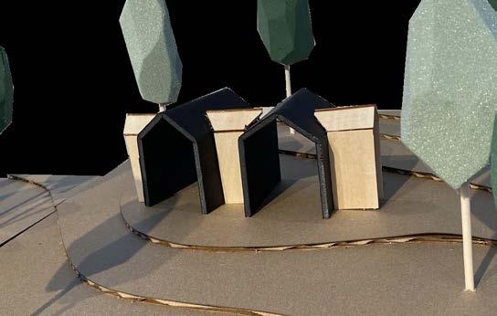
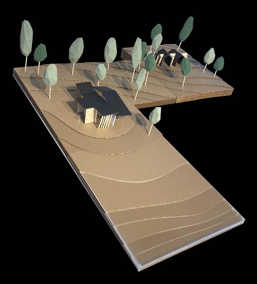
In our first comprehensive project that involved analyzing a site and designing cottages that satisfied a client’s wishes, this project allowed us to research vernacular architecture and bring in elements of it to interact with the environment. My designs focused on framing nature and bring it inside to be admired from the intorior. With a formal concept of two larger boxes being penetrated by a smaller, longer one, the designs branched off into two completely different looking cottages. In this project, I not only wanted to stretch my own abilities but also the idea of vernacular architecture, referencing it at certain points but also not recreating it.
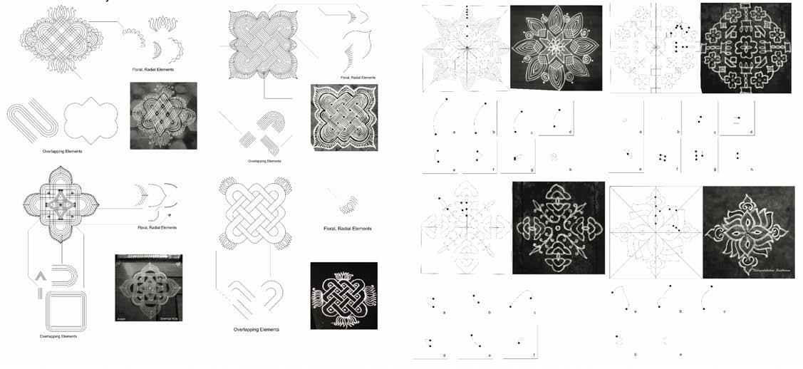
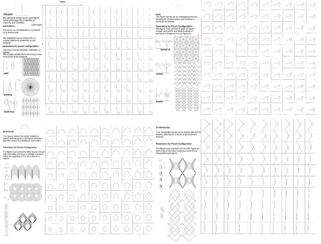
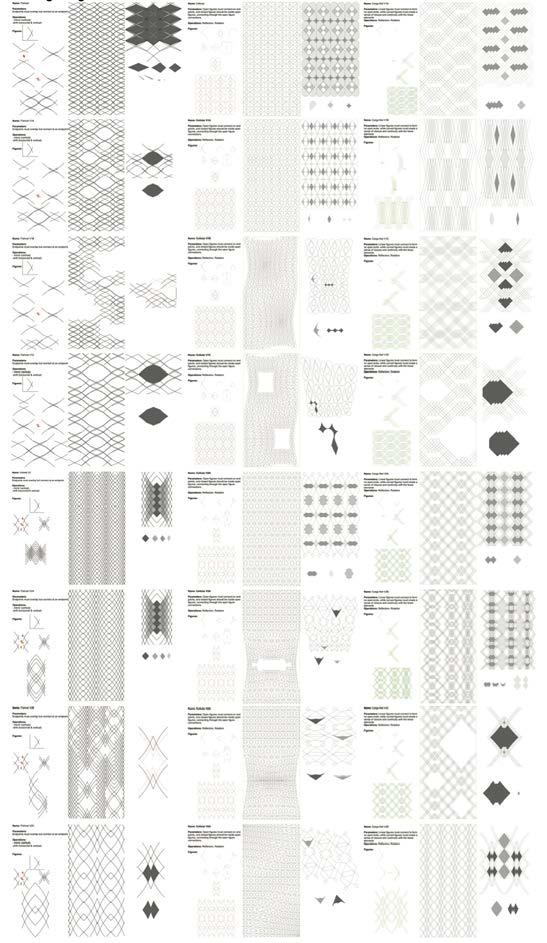
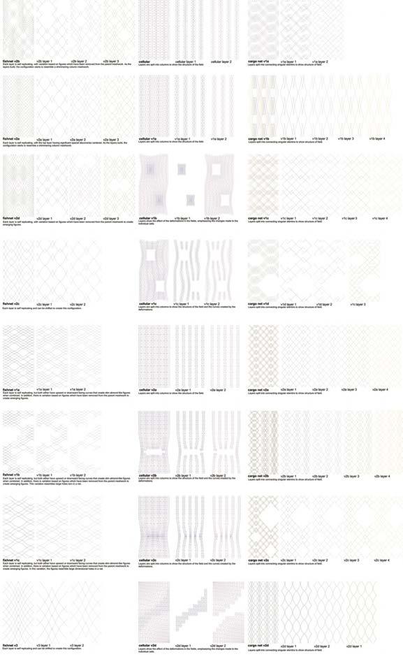
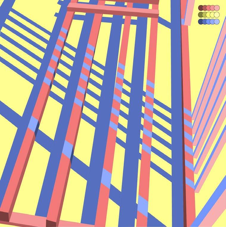
indian kolam interlacing in collaboration with anna demkovitch
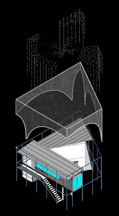
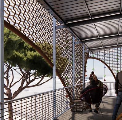
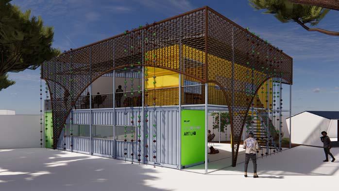
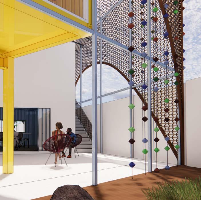
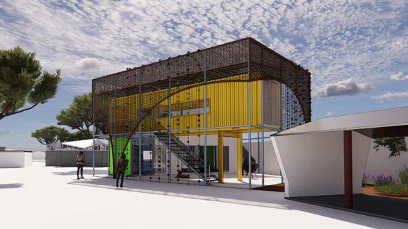
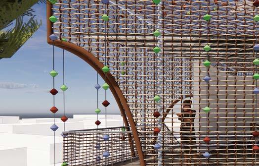
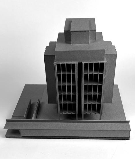
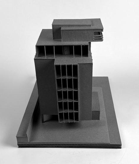
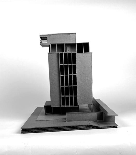
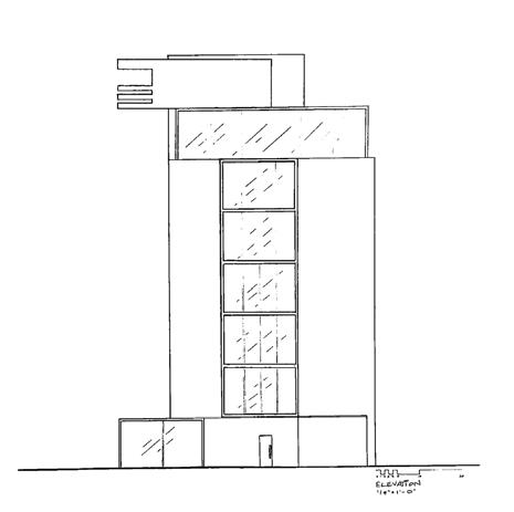
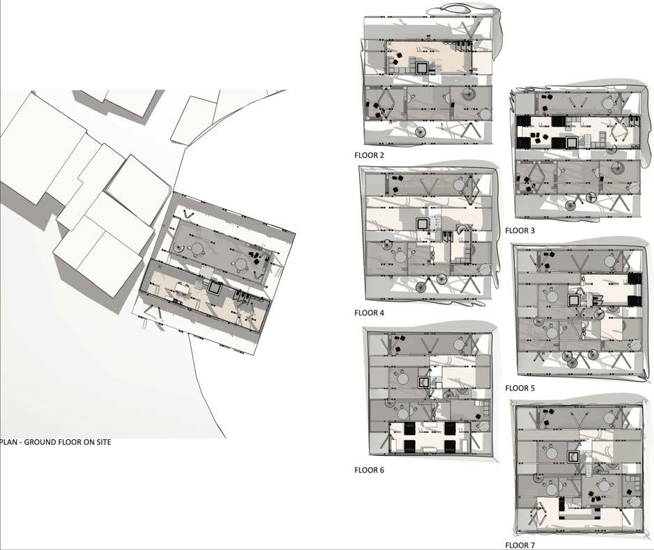
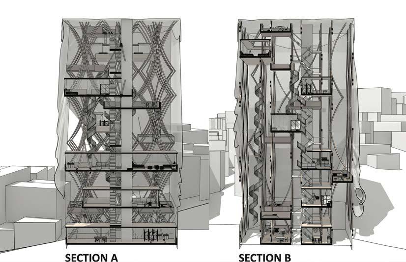
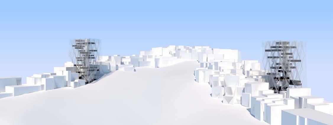
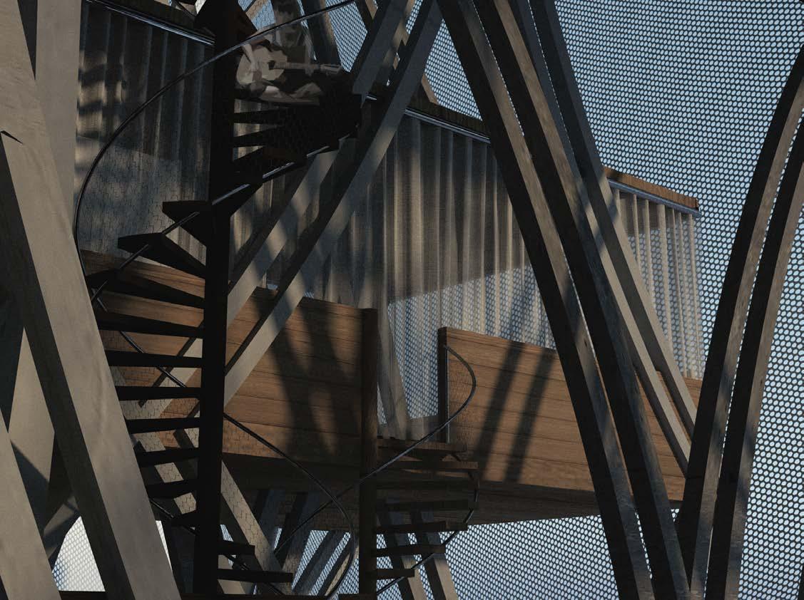
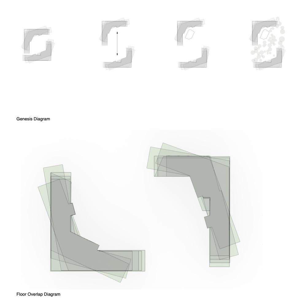
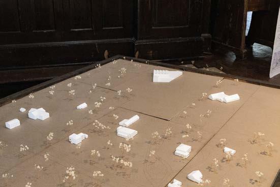
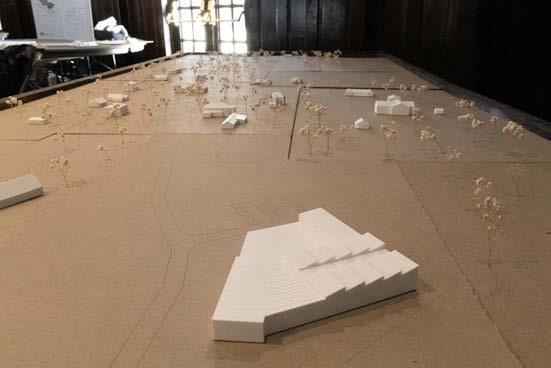
The House of the People, in Rochina, Rio de Janeiro, allows for more vertical expansion in Rio’s largest favela. The project centers around studying cultural pieces, figures, meshworks, and screens, understanding how they function and how they serve as structural members of a building. Our section focused on Indian Kolam interlacing, extracting essential figures from the kolams and creating structural meshworks with them. The program established three main aspects of the building: the house, selfgoverning, and self-education. The chosen design focuses on separating these aspects into three distinct buildings that may exist separate from each other or exist at the same time. The design also focuses on a lack of privacy and a sense of transparency, exhibited by no full enclosure of spaces with only translucent meshes as separations, both interior and exterior. The final building establishes the idea that the structure is constantly a house of the people in progress that flows with the social and economic states of Rocinha. During the course of this studio, there was much collaboration between me and my partner. I contributed to the analysis that led to the overall design of the framing for the building, the 3D modeling of the building, the renderings, and the plans.
study thickening in layers
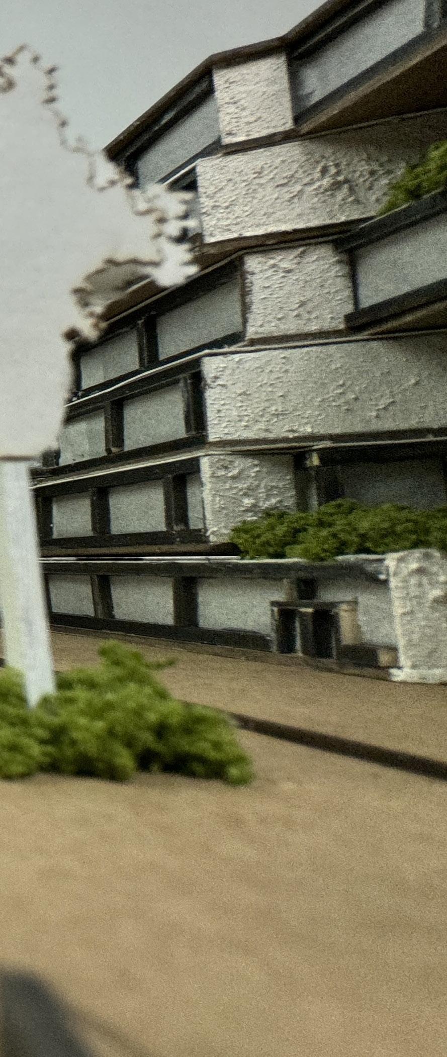
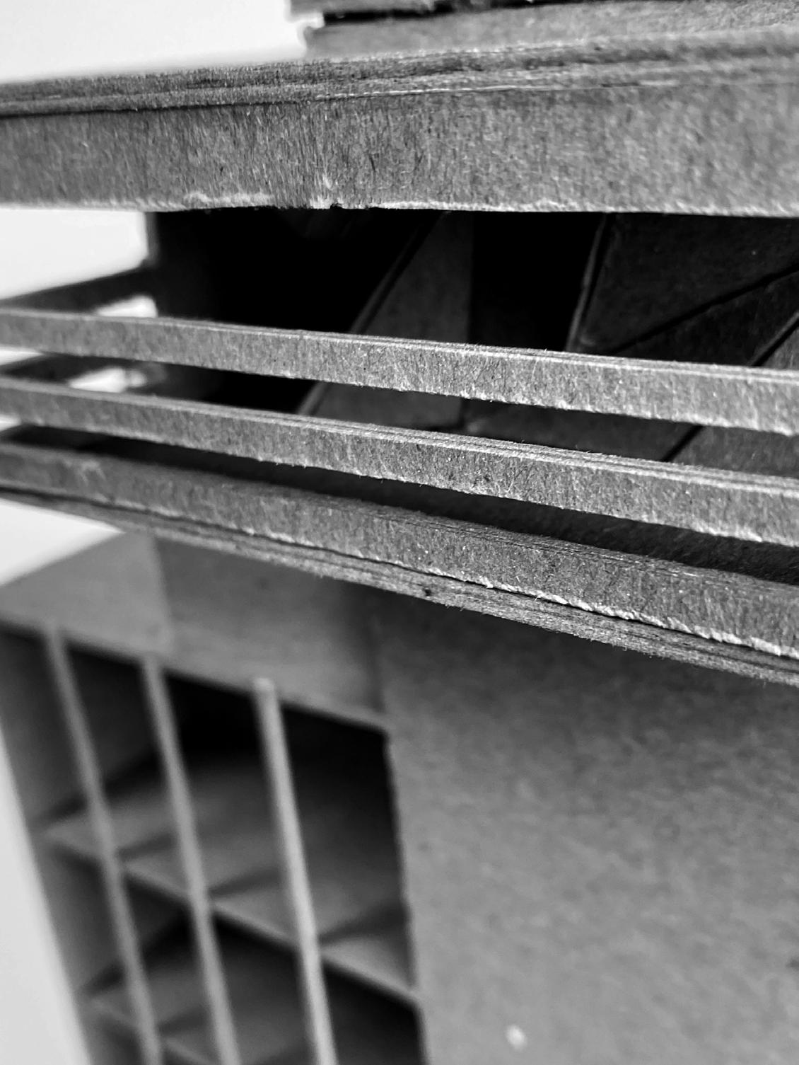
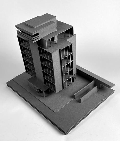
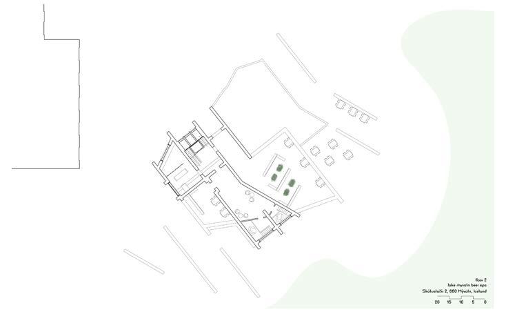
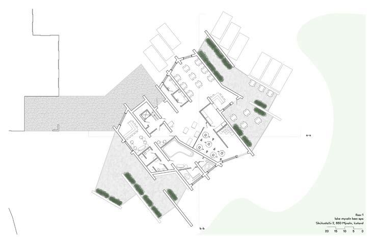
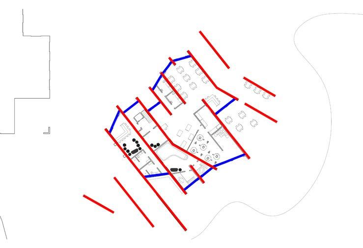
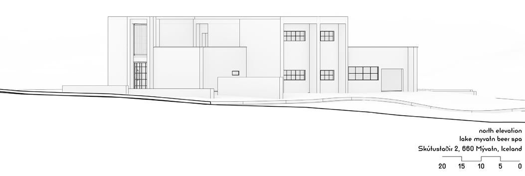
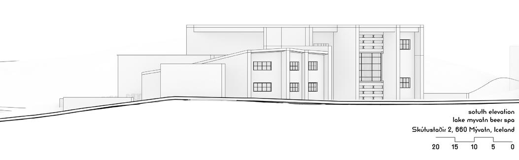
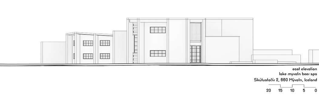
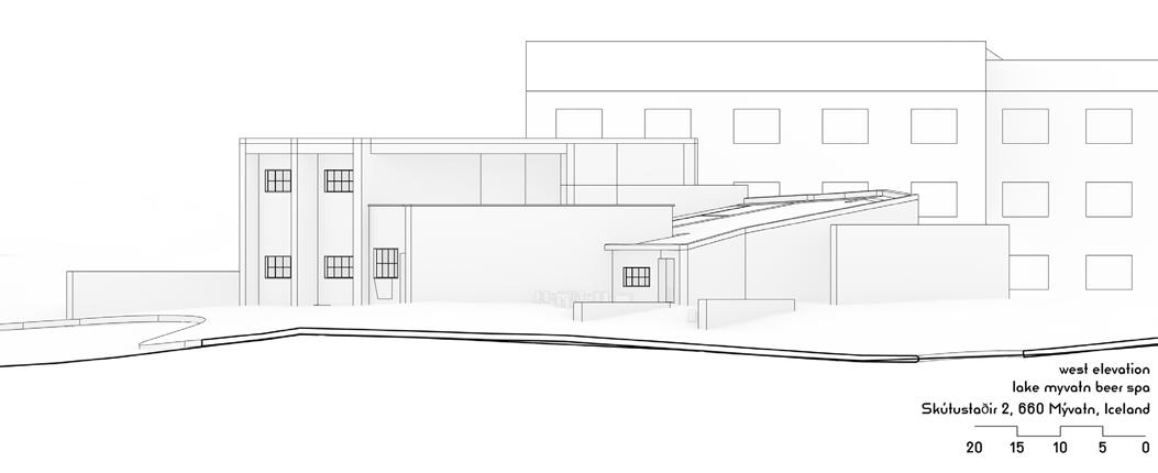
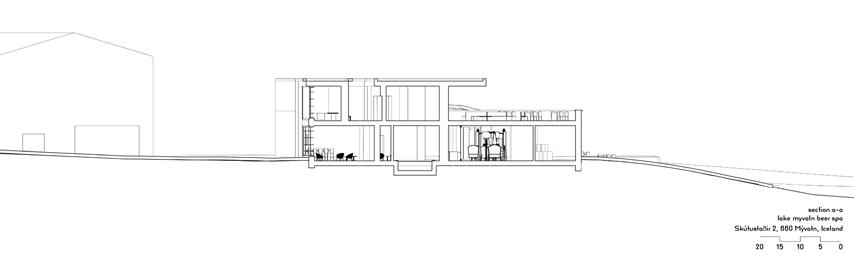
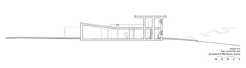
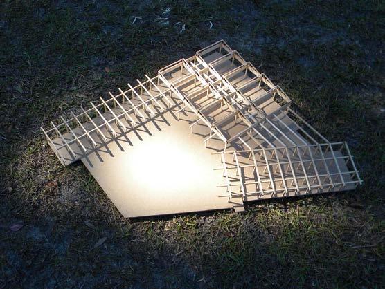
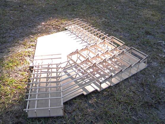
The studio project for first semester was set to be a beer spa in Myvatn, Iceland. It includes a cafe and bar area; showering beer bath areas; a beer tasting area and lounge; a treatment room; and terraces. The design chosen originated from historical Icelandic architecture, although it appears to simply be a brutalist building. It began with the most traditional Icelandic house, which only contains a skali (one large room), which then was cross-sectioned to create more spaces. Then, a section study took place, which looked at the intersections of a section cut placed in plan to establish more interesting spacial forms. These were then combined and rearranged to create a rough final plan. This plan was then adjusted throughout the rest of the semester to establish the final one. The design highlights seven monolithic parallel walls with connection walls between them, where the windows are placed. The rules for the design were established as: parallel walls should not be punched into with only gaps allowed, connection walls are free to serve any purpose, and parallel walls cannot be angled. However, rules are meant to be broken, so the parallel walls became more interesting––angling them a certain way, breaking into them for windows, and constructing more on the site to extend the influence of the design. It is where these rules are broken that pulls the building together and establishes a parallel between a fractured ruleset and fractured sense of expectedness.

bolton prize studio in collaboration with catherine wallace
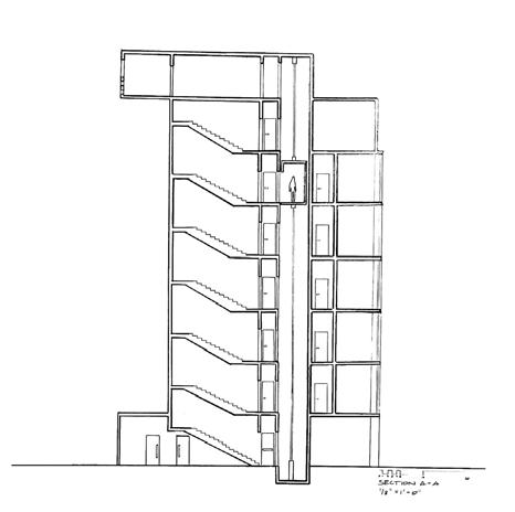
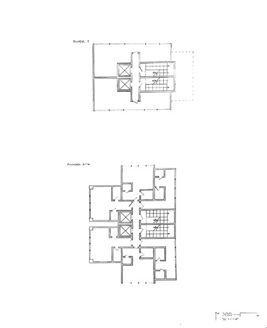
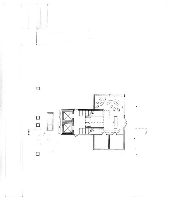
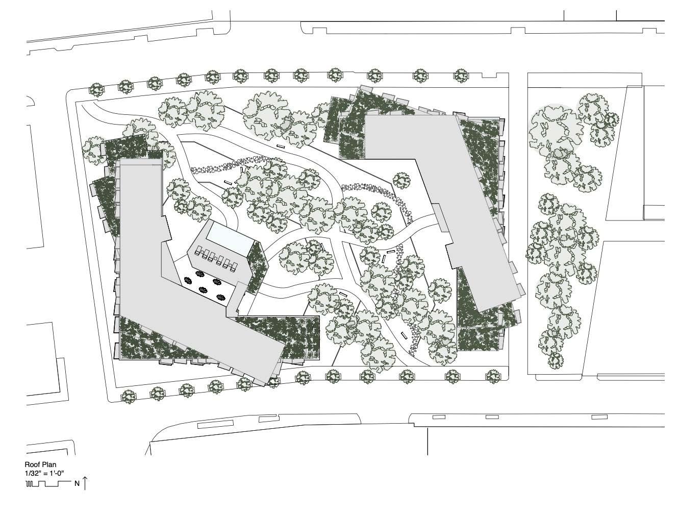
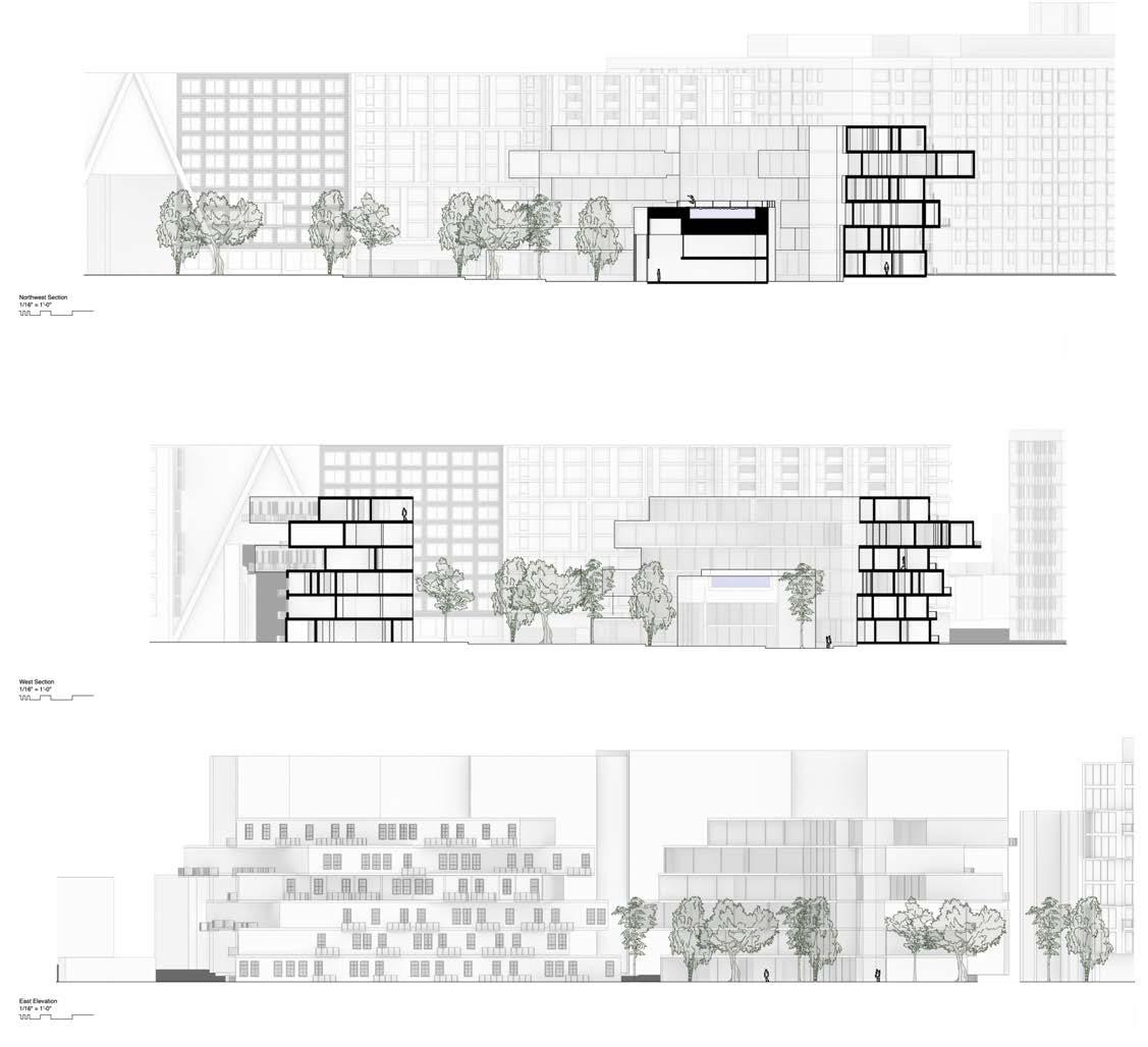
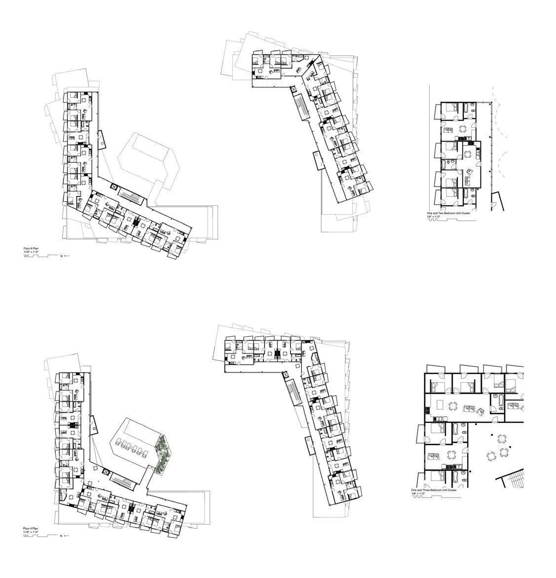
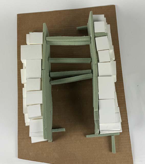
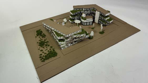
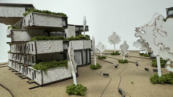
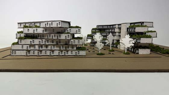
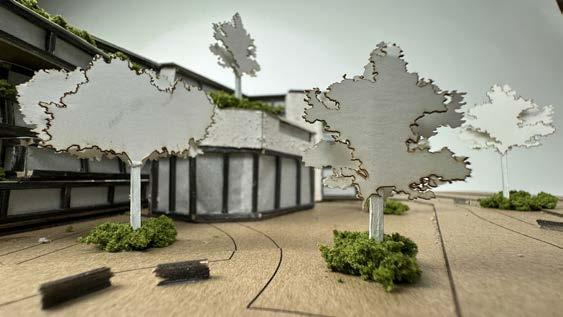
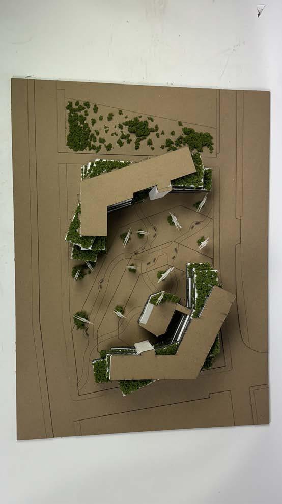
This studio project focused on a student housing complex in Washington, DC for Howard University. The primary goal of this project was to create a housing complex that one would not expect to see on a college campus, so instead of treating every floor the same, there are rotations on every floor. These rotations allow for an undulating exterior. Vertical circulation became the only regulated aspect of the building, leaving stairs and elevators to create the only solid vertical part of the building. Another main design focus was having a large central courtyard, so the footprint of the building is small, reaching upwards instead of outwards. The building is split into two on the two corners of the site, allowing an expansive courtyard in the middle that lowers as you reach the interior of the space. Offset from the center of the courtyard is a community area which houses the main office that is set within an interior greenhouse, a gym above this, and a rooftop pool. During this studio, collaboration was a large focus throughout the process of design. Me and my partner continuously bounced ideas off of each other, and we both contributed to the plans (I focused on the details of the furniture) and physical model. The sections, elevation, and renderings (including contruscting the 3D model) were my main focuses while my partner worked on perfecting the plans.
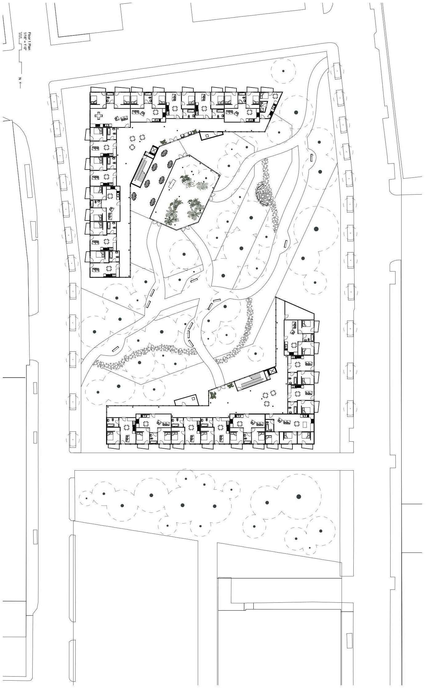
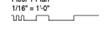
in collaboration with brian youn and carlo fernandez
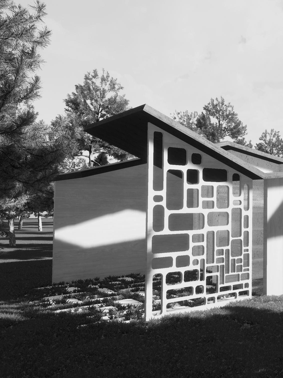
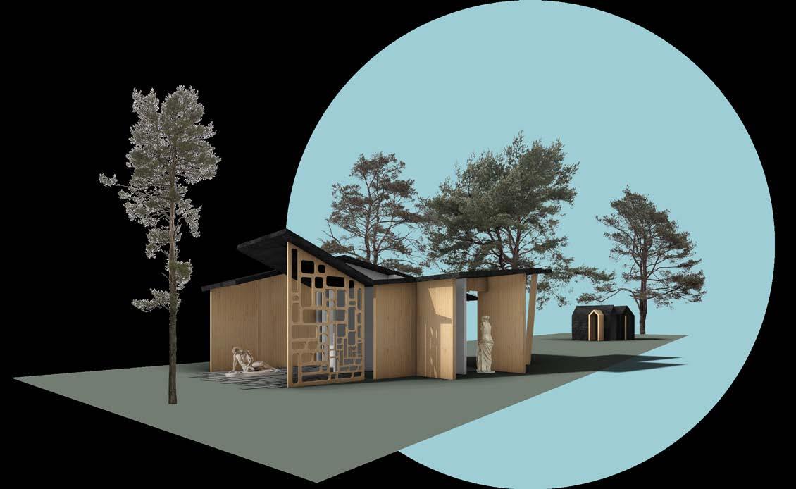
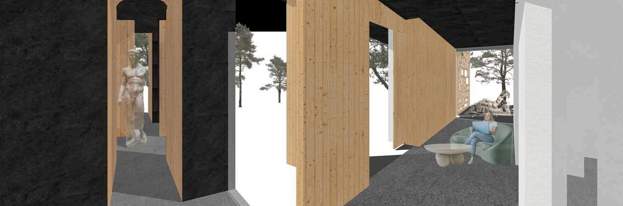
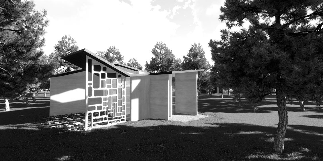
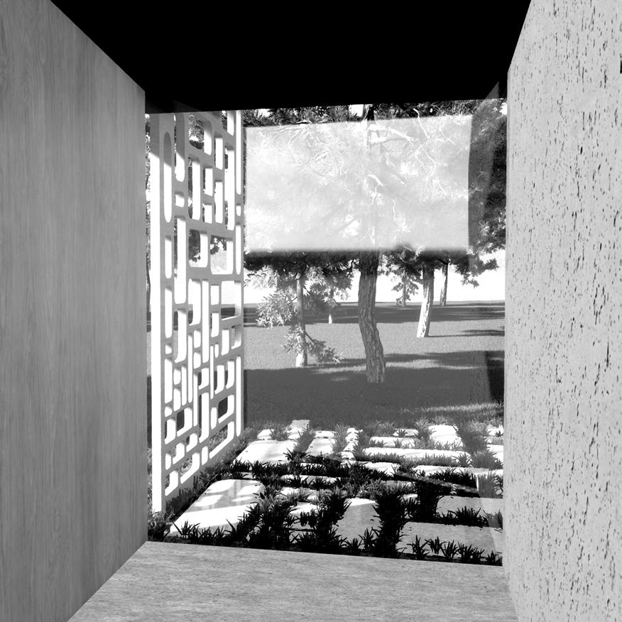
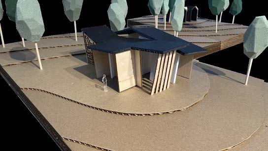
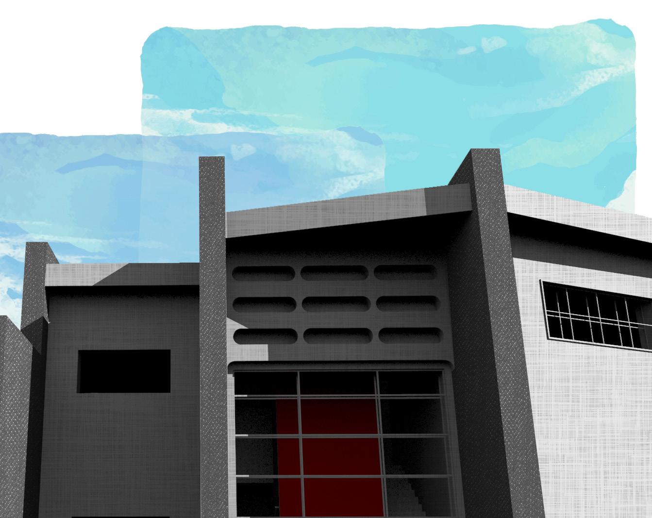
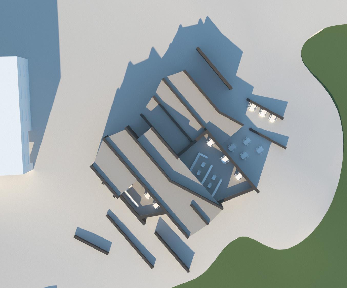
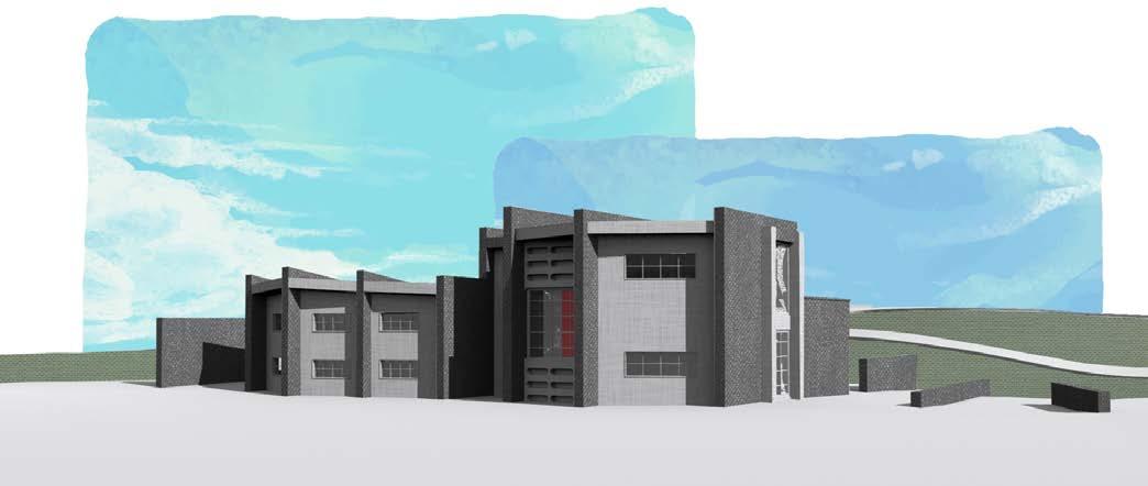
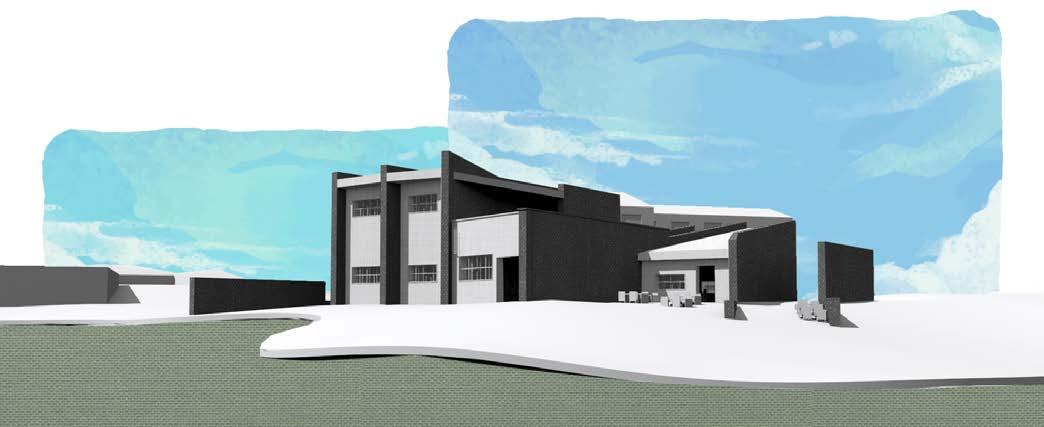
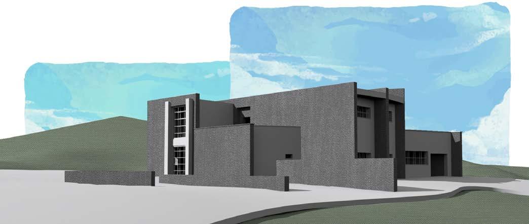
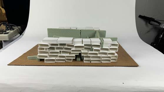
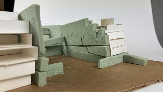
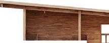
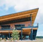
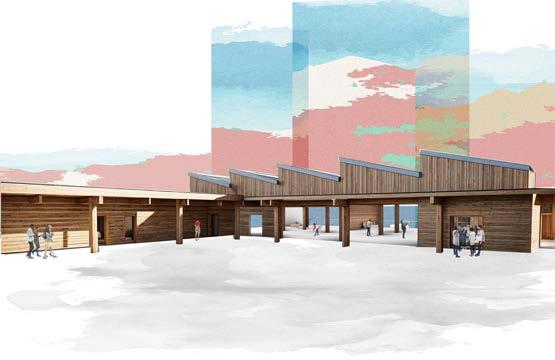
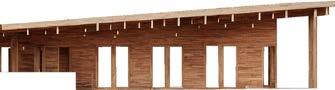
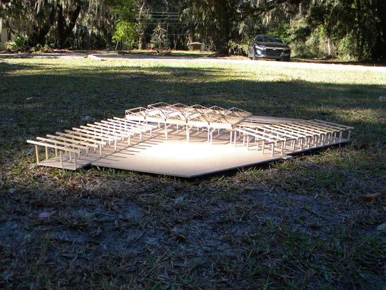
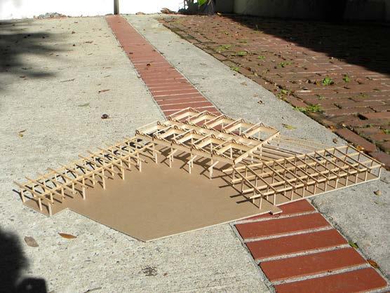
This studio project was based in the Penn Center in St. Helena Island, South Carolina. The task was to create a multi-use building that focuses on workshop spaces, classrooms, an exhibition space, and offices. For this building, there are a couple of main focuses, inclusing the sawtooth roof, garage doors, and plinth. The sawtooth roof is placed over the workshop and exhibition spaces, and the windows are facing North to provide natural indirect light throughout the day. The garage doors allow for natural ventilation based on the natural wind direction of the space. The plinth provides a space for events, performances, and speeches, and it is raised to both account for the possibility of flooding and to provide a better view of the campus. During this project, I contributed the main idea for the overall layout of the three different parts of the building as well as aiding in the overall layout of the final board. We also did a study on saltbox vernacular architecture, in which each person performed individual studies on the form and recreated examples.
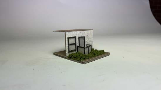
Based on the precedent study of the Saltbox Houses, its unique characteristics are known to be its asymmetrical roof, a two story front facade with a one story rear, and a central chimney location. The unique characteristics of the Salf Box Houses portray a thoughtful solution to common issues faced when building a house. The asymmetrical roof aspect of the house resolves problems such as snow building up, facing strong winds, heat loss, house expansion, etc. The difference in roof height allows it to adapt to its ground conditions without having to alter it to place the house as it slopes downward in the rear. With the central fireplace being one of the most prominent aspect of the house, its location allows to heat up the house in the most efficient way possible. In addition to its function, its simplicity and ease of access makes the Salt Box Houses unique and popular to this day.
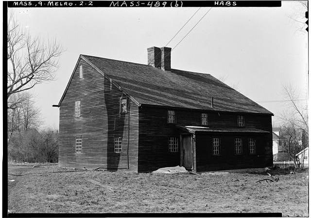
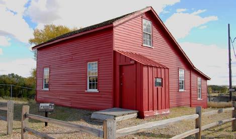
Fort Fred Steele House
in Carbon County, Wyoming. The intent of this house was to house civilian employees of the Union Pacific Railroad and is the only structure standing in the area which is currently used as a historic site.
This example of a Saltbox house shows an asymmetrical entrance with the door to one side, and the Saltbox shape is on the long side, meaning the house will have a higher roofline at the top.

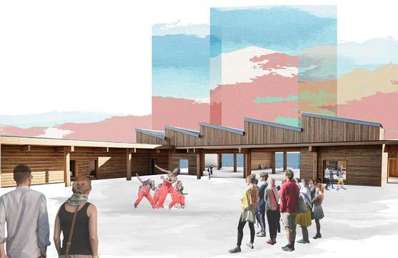
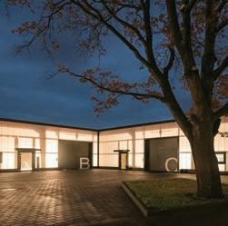
Built to be a center for education, the Learning Sanctuary offers classrooms, flexible workshops and exhibition space, and open outdoor space to be able to adapt to of the learning needs of the Penn Center. The Learning Sanctuary also houses a cafe and private offices for the Penn Center.
ABC - Austin Britt, Brian Youn, Carlo Fernandez
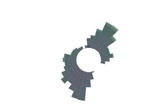
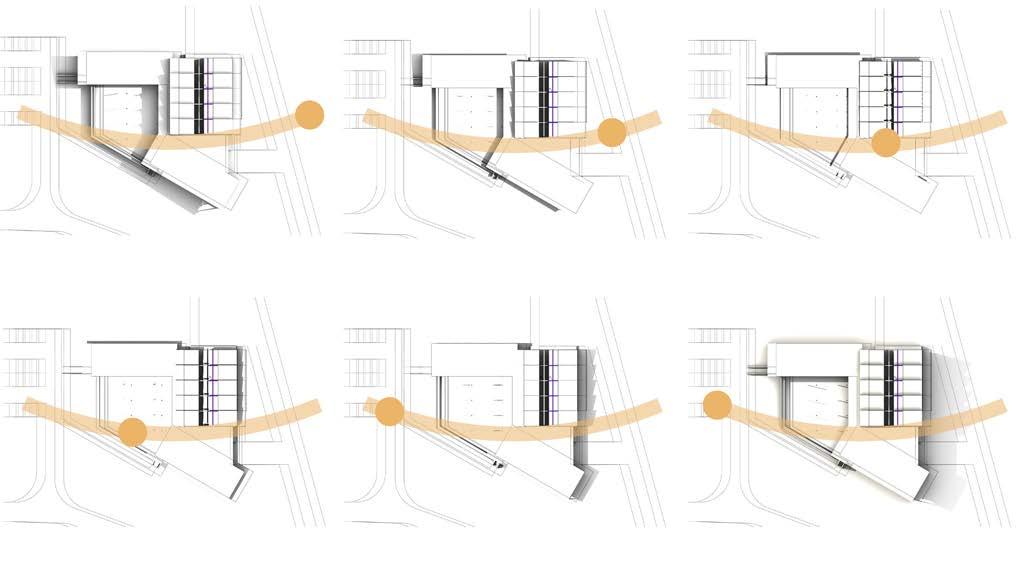
Diagram of the whole Penn Center Site showing where the proposed Learning Sanctuary is located. The dark ring of bars around the building is a wind diagram. The length of each bar corresponds to the frequency of the wind blowing from that direction. For this area, the wind blows primarily from the southwest and the northeast.


Floorplan
Detailed plan of the different spaces of the Learning Sanctuary
Detailed plan of the different spaces of the Learning Sactuary.


Regular Day


Event Day
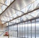
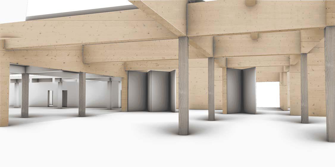
Showcases the program, structure, and the roof.

Exhibition Interior
Showcasing the flexibility of the exhibition / workshop space.


Handwerkerhöfe
André Poitiers Architekt Stadtplaner RIBA Wedel, Germany 2021
An example of how we envisioned the garage doors working in the exhibition space.
Utilized sun path to achieve best indirect light into the sawtooth roof.
Based on the wind path, the building allows for a breezeway in the workshop and exhibition spaces with moveable walls and garage doors to create natural air circulation and ventilation. for the space.
1. Set exhibition space in an orientation to allow for natural ventilation
2. Create a large central gathering space that each program opens up to
Add ammenities like a cafe in a central location
4. Raise up on plinth to protect the buildings from future water level rise
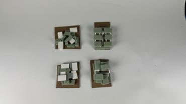
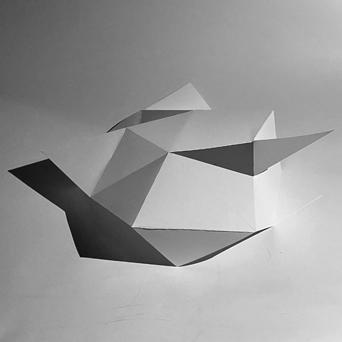
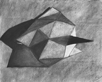
The planes assignment limited the material of a model to a continuous plane with up to 10 cuts in it. Within these confines, I decided to created a geometrical structure that played with lights and shadows on the different faces of it. Moreover, I further analyzed this model through charcoal drawings and then a color composition. The use of charcoal and color allowed me to better see the lights and shadows. I also created a composition of a different model in color to further understand how color can be utilized to see different aspects of shadows. intro to design and the build environmentryan roark
The process of taking the model’s photo and drawing it initially allowed me to better understand the shadows, but the color composition helped me better grasp the concept of how light affected the model.
This class’s main focus was establishing a facade for an already existing inner structure for Mbare, Zimbabwe. The design originates from Zimbabwean weaving and the issue of glass waste in the country. Taking this historical art and combining it with a way to tackle a current issue combines the past with a progression towards the future. The structure of the façade allows for layers of lighting conditions to fall upon the site and art space. Weaved sides and top create a grid of shadows while the recycled glass beads allow colored light to cascade between these gridlines.