The Associated Students, University of California, Davis (ASUCD) improve the quality of campus life by providing resources and services to cultivate a culture of involvement and student leadership. Join us as ASUCD connects the dots between all facets of our campus and builds tomorrow, together.
BRAND MANTRA
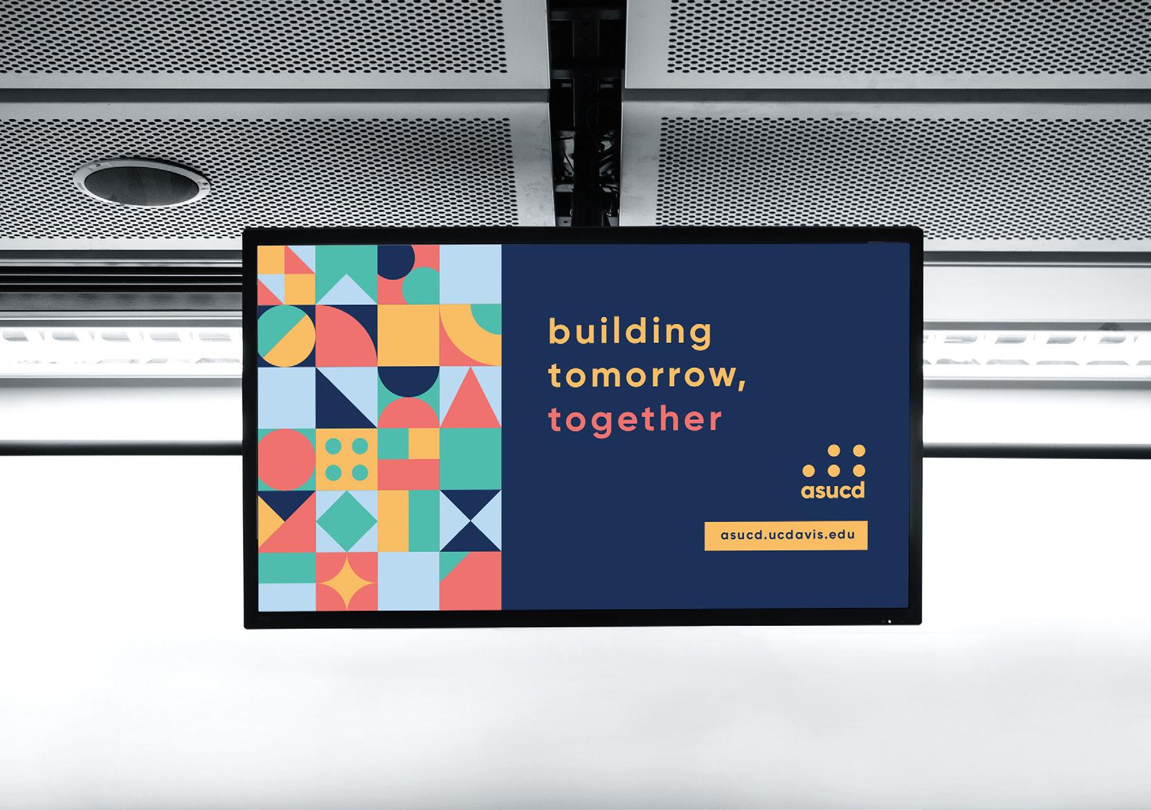
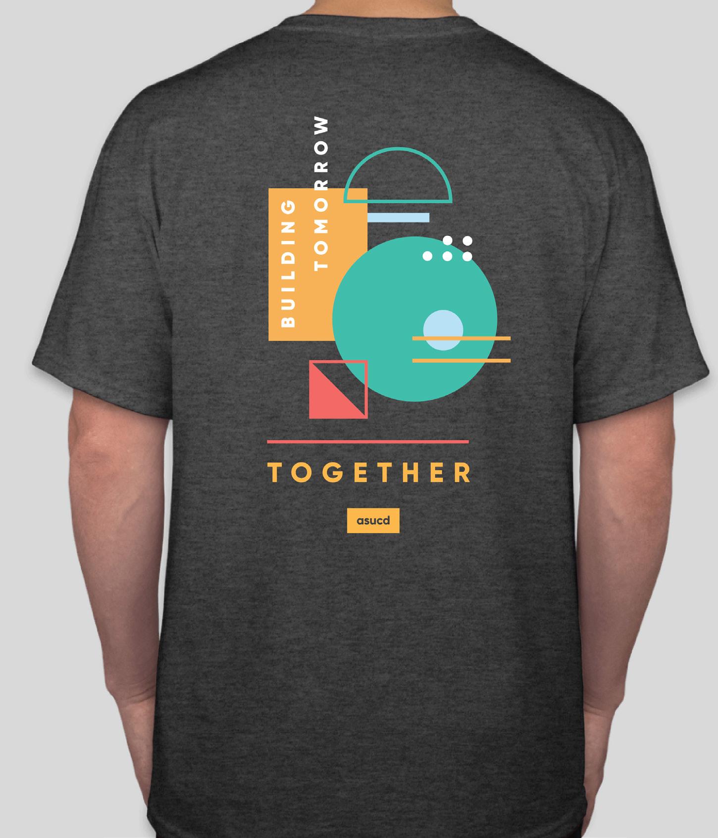
Building tomorrow, together; Connecting the dots
Our brand mantra invites students to take ownership of our campus and shape the future of our generation both at the University of California, Davis (UC Davis) and beyond. It brings us back to the heart of why ASUCD was founded back in 1915, when students identified problems on campus and took the initiative to devise a solution so that their peers and future students could have a better tomorrow. Our mantra also emphasizes collaboration, as our mission counts on the contribution of each individual.
The Four Pillars of ASUCD
Brand Platform
ASUCD CORE VALUES
Our driving motivations behind everything we do.
The core values make up our brand platform and distill our beliefs into four themes. This creates a structure for how we talk about ASUCD and lays the foundation of our identity and messaging. Our brand platform provides a framework for both internal and external communications and should also be reflected in how all of our individual units carry themselves.
DIVERSITY & INCLUSION
ASUCD provides a platform for students of all backgrounds to take ownership of their university. Transparency —honest and open communication—is the key to ASUCD’s performance. Every day, our goal is to celebrate our differences and what it means to be an Aggie.
COLLABORATION
Character traits that guide our voice and expression:
• Open-minded
• Proactive
• Optimistic Personality
• Transparent
Avoid representing the ASUCD brand in a way that highlights a negative context or storyline. Please adhere to the UC Davis Principles of Community.
There are many opportunities for cross-functional collaboration. ASUCD is a team-oriented organization that values vibrant individuals coming together to achieve common goals. We aspire to connect the dots between different aspects of our campus.
COMMUNITY IMPACT
One of ASUCD’s fundamental goals is to create a proactive and positive lasting impact on the UC Davis community. Our units work hard all year to create environmentally-friendly events and opportunities to support fulfilling lifestyles at UC Davis.
PROFESSIONAL DEVELOPMENT
ASUCD provides hundreds of opportunities for student leaders to develop themselves professionally. We believe that mentorship is a key factor in nurturing healthy professional development.
Identity Elements
LOGO
When looking at the association as a whole, we saw how each unit reaches a different student population or part of campus. Our units are able to connect students with other students as well as to the activities they enjoy. That’s when it all fits together. The circle, already known to represent wholeness and community, was the perfect shape to convey the most important message of ASUCD: oneness. We extended this across our identity—each unit and individual’s contribution to the association is represented by a dot.
The ASUCD logo consists of five dots over the ASUCD wordmark. The four circles on the right side of the logo represent the four pillars of ASUCD, which encompasses all of our units and programs. These four pillars merge into a single circle on the left side of the logo, representing the set of values we all operate under and strive to live out.
These five dots express how ASUCD is made up of the sum of its parts, each dot is equally important. ASUCD thrives based on everyone’s contribution and cannot function properly if even one pillar is not aligned, or in harmony, with the rest.
Note: The ASUCD logo represents the entire community as a whole and, therefore, is a critical brand asset. It is vital that the logo stays consistent to display unity between all ASUCD units.
LOGO USAGE
COLORS
When representing ASUCD as a whole, use the logo in gold, white, or black. When representing one of the four pillars of ASUCD, it is acceptable to use that respective color.
PLACEMENT
When creating a composition, please put the ASUCD logo in one of the corner areas of the design or in the center of the page. This does not apply when using the dot logo as a pattern or graphic element.
PROPORTIONS
The minimum width of the logo is 0.75-inches. Any dimension smaller than that will negatively impact its readability.
INAPPROPRIATE LOGO USAGE
Do not intrude on negative white space.
Do not use colors outside of our identity system.
Do not add new parts to the logo.
Do not use gradients.
Do not rearrange the elements of the logo.
Do not rotate the logo.
ASUCD
Do not change the typography.
Do not use the gold-colored logo on backgrounds with inadequate contrast. the logo in order to ensure consistent use.
Do not stretch or condense the logo.
LOGO USAGE
VISUAL IDENTITY ARCHITECTURE
ASUCD’s visual identity architecture is applied across all units and programs, providing flexibility for each brand operating under the organization. Based on our core goal of “oneness,” we designed each unit with its own circle icon logo. Every logo is custom designed but still maintains continuity through the system as a whole because of the consistent silhouette.
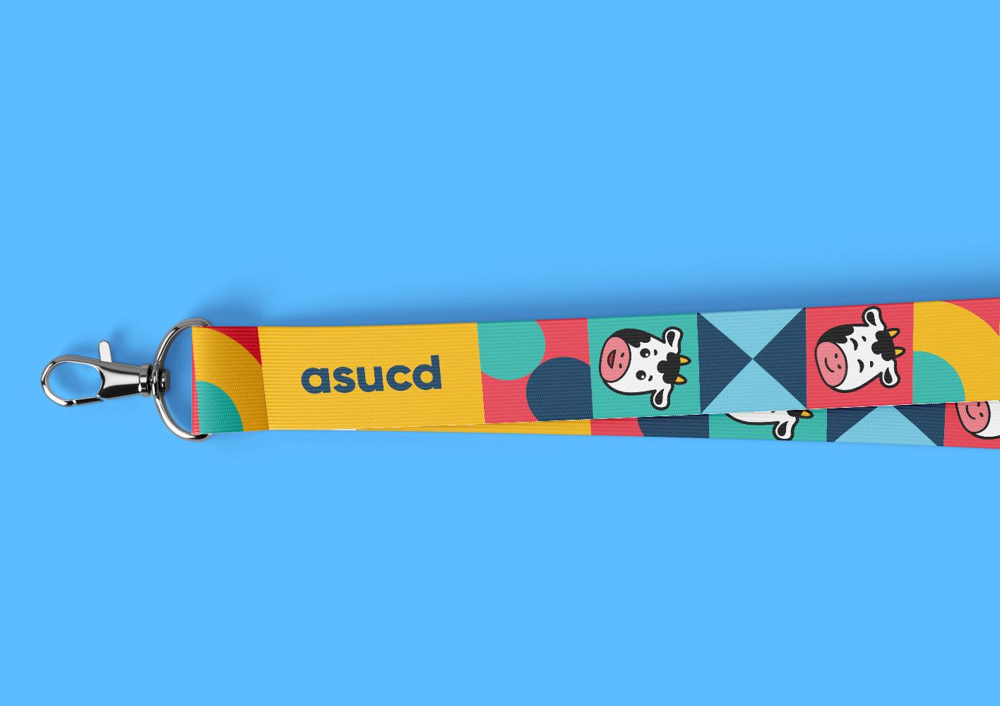
UNIT LOGOS & SIGNATURES
We implemented the circles across our brand by creating circular icon logos for each unit. All units have their own logo and each sector of student government has its own logo. All commissions, committees, and senators use the respective logo of the sector they belong to and do not have their own custom icon. This brings consistency to the brand as a whole and makes it easier to see where each commission and committee belongs in the larger organization of our student government.
ADDITIONAL LOGOS
Some units also have different logo versions they can use in their respective brand materials.
ASUCD SIGNATURE MARKS
UNIT SIGNATURES
COLORS
Aggie Gold
PMS 110 C
CMYK: 0/19/100/15
HTML: #FFBF00
RGB: 255/191/0
hsla(45, 100%, 50%, 1)
Bodega
PMS 302 C
CMYK: 100/48/12/58
HTML: #003A5D
RGB: 0/58/93
hsla(203, 100%, 18%, 1)
Rec Pool
PMS 0821 C
CMYK: 48/0/9/0
HTML: #6FCFEB
RGB: 111/207/235
hsla(194, 76%, 68%, 1
Strawberry
PMS 1787 C
CMYK: 0/89/66/0
HTML: #F93549
RGB: 249/53/73
hsla(354, 94%, 59%, 1)
Arboretum
PMS 3265 C
CMYK: 75/0/43/0
HTML: #00C4B3
RGB: 0/196/179
hsla(175, 100%, 38%, 1)
USAGE RULES
Use the five main colors whenever possible; only use tints when there is a lack of contrast.
Don’t use gold text on light blue or teal backgrounds, lack of contrast between the text and its background makes the text difficult to read. Instead, opt for high-contrast color combinations and use a different background or darker text color.
REC POOL
SERVICES
Light blue is used to represent the services provided by ASUCD because the color is associated with stability, safety, and reliability. These are qualities our units and committees exude, letting students know they can rely on us.
BODEGA
ADVOCACY
This specific navy shade, the same as UC Davis’s navy, represents the advocacy units and committees under ASUCD. The color also highlights the working relationship between student leaders and UC Davis leadership.
AGGIE GOLD
MAIN ASUCD COLOR
The vibrant yellow represents UC Davis’s students’ authenticity, passion, and contribution to the university.
STRAWBERRY
MEDIA
Coral represents the bright, creative spirits within our association’s media and entertainment units and the engaging content they produce.
ARBORETUM
SOCIAL
Teal is the color of our social units and their events because it signifies tranquility, harmony, and a connection to nature. We strive to cultivate spaces where everyone feels at home through our interactions with other students and the environment.
SECONDARY COLORS
Say hello to Proxima Nova!
TYPOGRAPHY
Our new font is Proxima Nova, a geometric sans-serif typeface that is modern and legible. Its geometric qualities suggest reliability and reflect ASUCD’s intention of improving the quality of campus life for students.
Headlines: Proxima Nova Bold
Either use title case or keep all text lowercase to maintain a consistent look with the ASUCD logo. Large headings should never be in all capitals.
Subheadings: Proxima Nova Semibold
Either use title case or keep the text all capitals.
Body Copy: Proxima Nova Light
Other (as needed): Proxima Nova regular, semibold, italics, extra bold
Brand Assets
PATTERNS
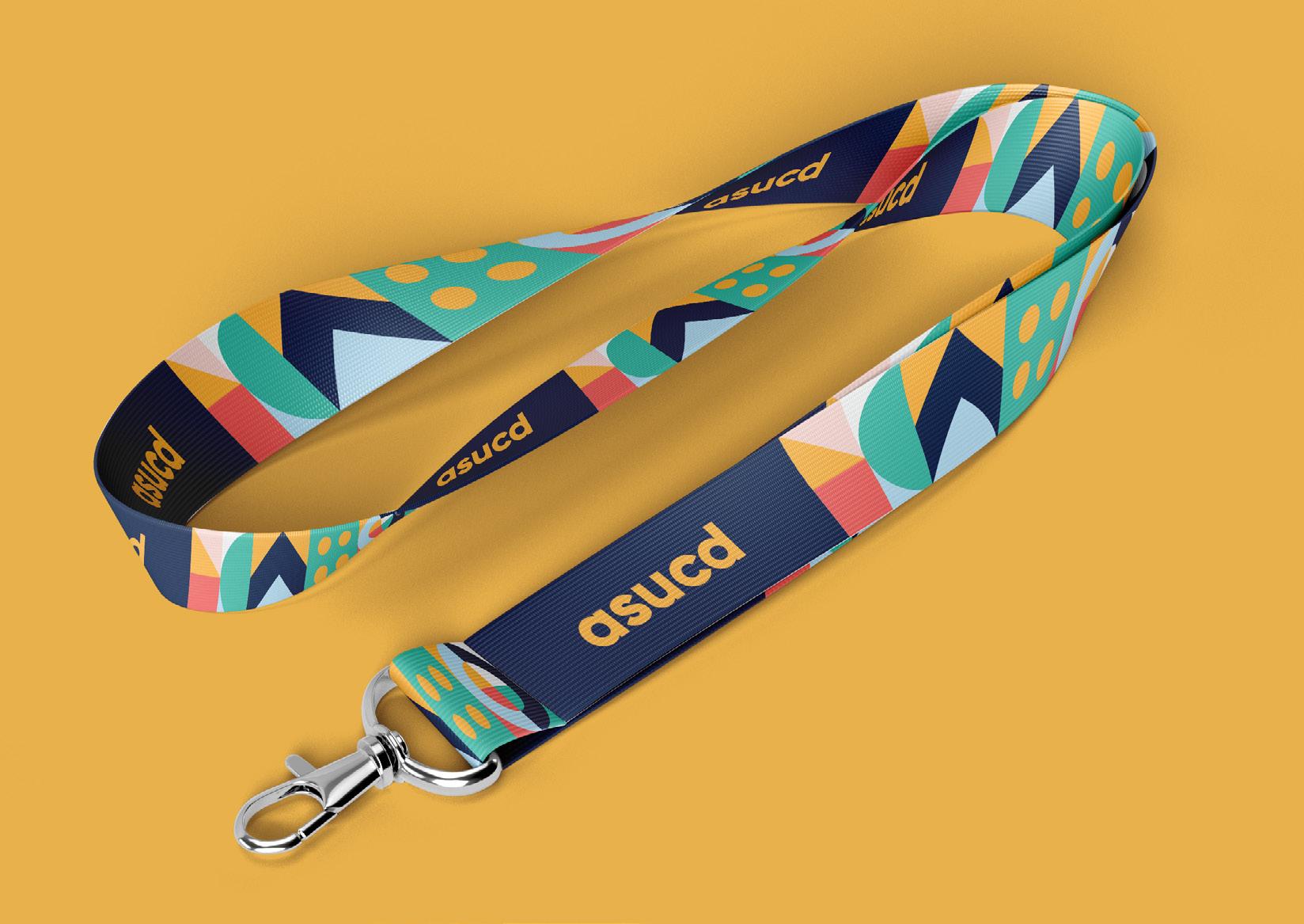
Our visual identity uses geometric patterns based on the idea of “building together” and “connecting the dots” to create our brand vocabulary. Made primarily of squares, each square can be filled with something different inside. These geometric patterns can be styled as lines or filled shapes. This modular system provides a flexible structure where creativity and play can thrive while still maintaining a consistent look.
Here are some examples of how these patterns can be shown.
The geometric shapes can also overlap to create designs with more dimension and reflect the dynamic spirit of ASUCD.
CONNECT THE DOTS
The secondary positioning statement of ASUCD is “connecting the dots” on campus, reflecting how we connect students with one another and to their interests. This can also inspire designs that “connect the dots” between shapes or forms.
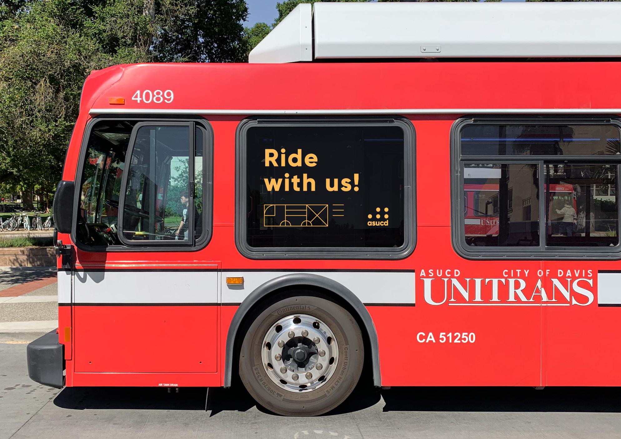
The logo itself can also be used as a graphic element on the page or can be expanded into a dot grid pattern. Since it is made up of circles, we encourage designers to get creative with the logo (i.e., recreating it using physical circular objects and taking a picture).
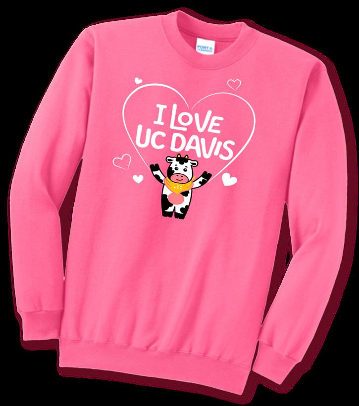
Introducing Dottie!
Dottie the Cow is ASUCD’s new official cow! Designed to make ASUCD’s brand more cohesive, our cow strengthens our identity and messaging while reinforcing our “by students, for students” mission. Dottie is more than just a cow—Dottie represents a student actively engaging with ASUCD units. The aim of this cow is to resonate with students and bridge the gap between ASUCD and the student community.
Dottie’s name comes from our slogan “connecting the dots.” The design reflects ASUCD’s classic five-dotted logo, with the two horns representing the two upper dots and the three rounded tufts of hair representing the bottom three dots.
BACKGROUND
Given UC Davis’ history of being an agricultural school, Dottie is designed as a black and white Holstein, the most popular breed of dairy cow in California. This design was selected by students to represent the student body (in line with our “by students, for students” mission). We chose an anthropomorphic design because we want students to be able to imagine themselves as Dottie experiencing all of the amazing resources and events ASUCD has to offer.
PERSONALITY
Character traits that guide Dottie’s voice and expression:
• Amiable
• Kind hearted
• Optimistic
• Inclusive
• Fun-loving
USAGE
Based on our core goal of “oneness,” we customized Dottie to fit each unit. Using these variants brings consistency to our brand and makes it easier to attribute Dottie to ASUCD as a whole. To avoid brand confusion, use your unit specific cow whenever possible.
Dottie must not be used as a primary identifier; the cow is meant to support your current assets (logo, lockup, etc.), not replace them.
DO’S AND DON’TS
Do
• Use Dottie!
• Stay consistent with the ASUCD brand
• Use Dottie positively and reflecting ASUCD’s values
• Use Dottie as an additional element to your existing ASUCD logo
• For example, use your unit’s logo and unit specific cow icon, not just Dottie.
Don’t
• Don’t create your own cow design
• We want Dottie to be recognized, so use Dottie to maintain consistency
• Never alter the cow icon without approval
• For example, never change the color of Dottie’s spots or alter Dottie’s expressions
• Don’t distort the proportions of the cow
• Don’t modify in any way
• Do not use Dottie one non-asucd promotional materials
Contact projects@creativemedia.ucdavis.edu with questions on how to use Dottie or any specific Dottie design requests.
WHEN TO USE
Dottie is great to use for promotional content for specific events, Instagram, graphics, flyers, etc.
PROPORTIONS
The minimum width of using Dottie is as follows:
• 1 inch for head only
• 1.5 inch for half body and full body
Any dimension smaller than that will negatively impact its visibility.
Here are some examples of how Dottie can be used.
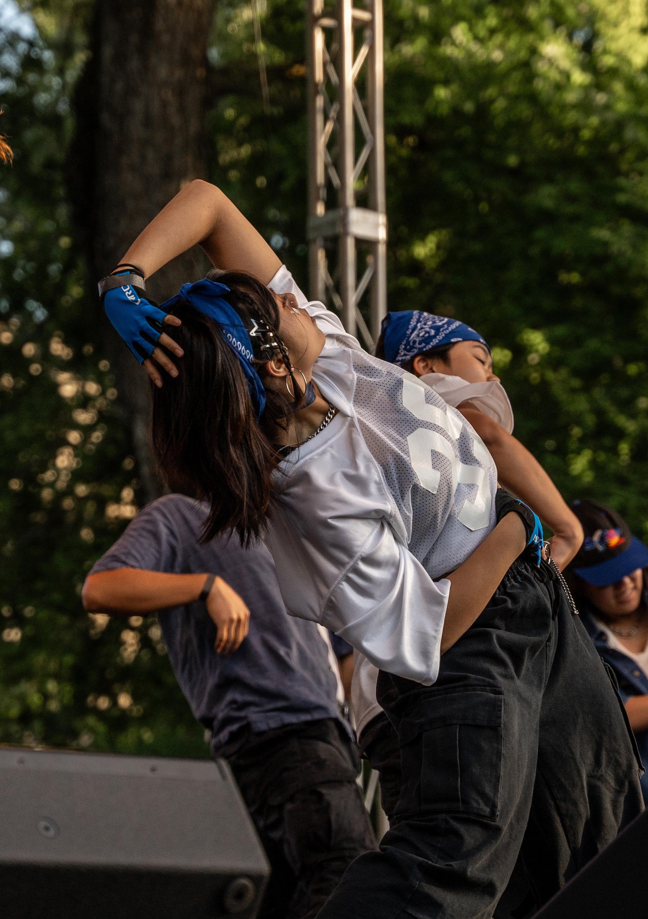
PHOTOGRAPHY
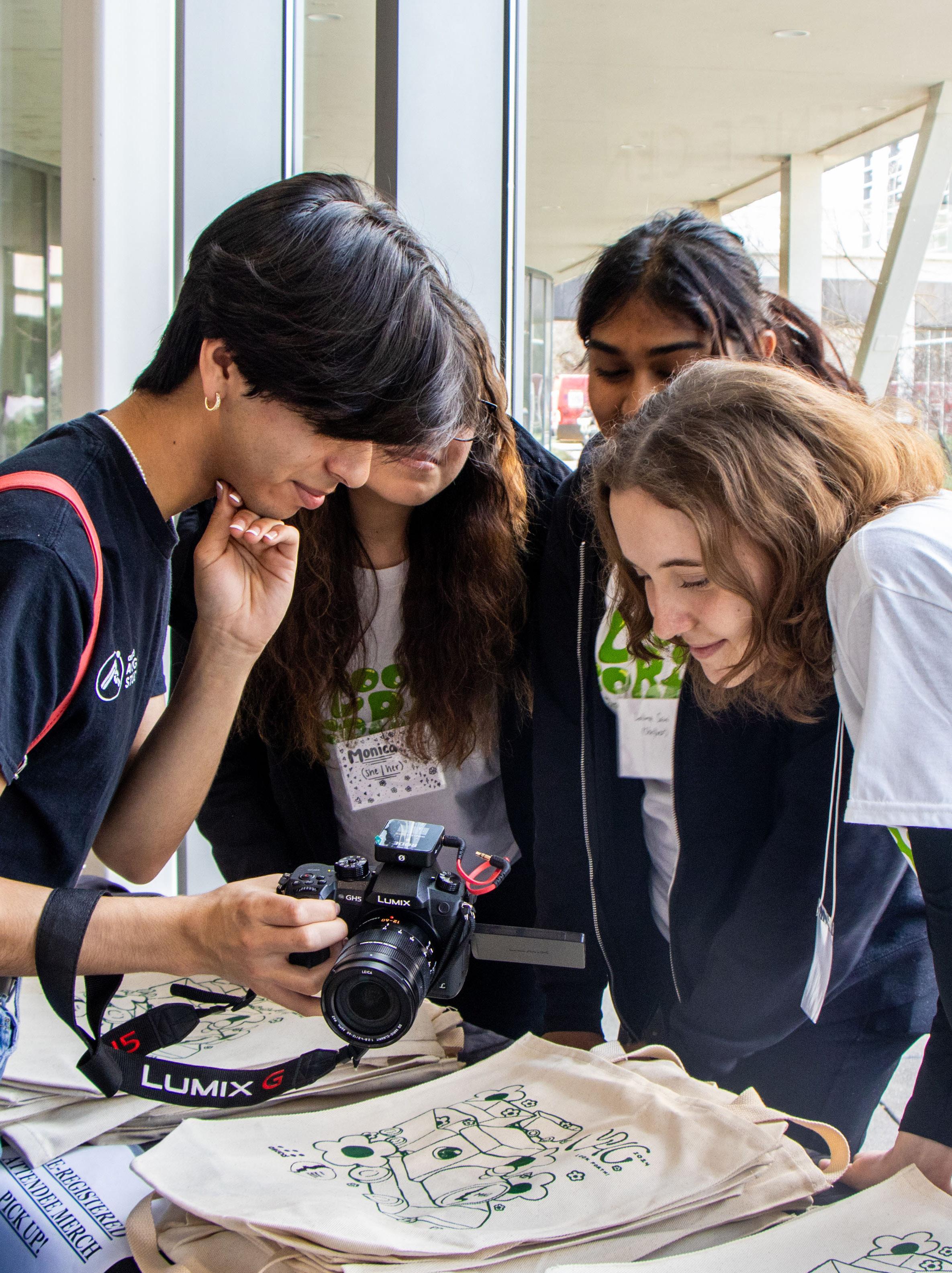
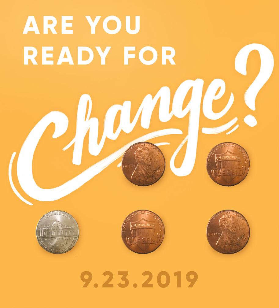
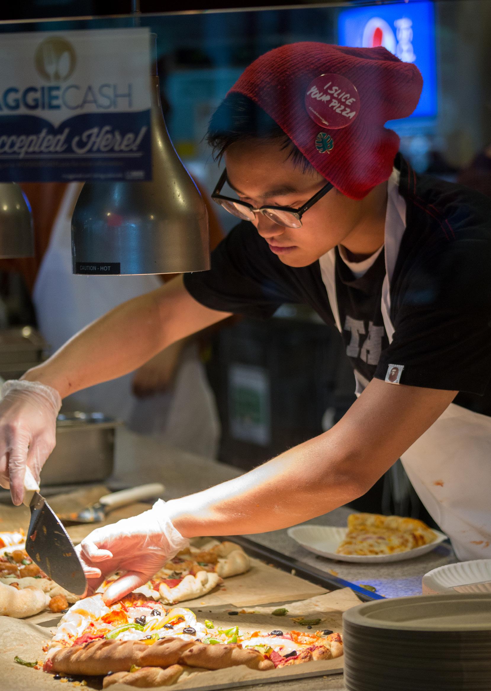
Photography is a way we can bring our values and brand personality to life in a tangible, relatable way. Photos should reflect the student spirit of ASUCD and inspire viewers to get involved or desire to learn more about our service.
Subject Matter: students interacting with each other; ASUCD unit services (i.e., CoHo, The Pantry, Picnic Day, etc.)
• Pursue close-up shots when possible to invite viewers into the scene.
• Capture “in-the-moment” or candid scenes to avoid the look of a generic stock photo.
• Make sure each image has a focused subject. Do not use images where the subject is lost against a busy background.
• The tone of all our photos should be edited with a similar filter so that they are bright and warm-toned.
Questions to Determine Which Image to Use:
• Does the photo tell an authentic story and feel real?
• Does the image spark curiosity?
• Does the photo draw in the viewer and make them a part of the experience?
• Does the image highlight ASUCD students or services?
Photo Criteria:
• All images must be in focus and not over or underexposed
• Acceptable file formats: JPG or TIFF; keep the RAW file in a separate folder to preserve the original image quality.
• Use 300 dpi for printed material, CMYK color mode for print, and RGB for digital usage.
• Be mindful when putting the image on top of a colored background. In such cases, the tones in the image should match or complement each other. In all cases, make sure there is enough contrast between the photo and the background. It is allowed to juxtapose the image with a colored block.
Applying the Brand
GENERAL EMAILS
Please check with Creative Media before using the ASUCD logo on websites, products, packaging, manuals, or documents.
PRINT
Any communication or marketing material that is not typically distributed through digital channels such as websites and social media.
For example, documents, posters, flyers, business cards, merchandise, and apparel.
WEB
Web Images: Images must be at least 72 ppi and be appropriate for public viewing.
Web Copy: Keep your website copy consistent with ASUCD’s values. Ensure that the language is professional, light, and concise.
Your email signature may contain the following components but feel free to exclude any information you don’t wish to share (i.e., phone number, address, etc.).
Here is an example of what it could look like:
First Last Position | Unit Name (123) 456-7890
000 Campus Building University of California, Davis Pronouns
Find the templates here
Unit Icon
POWERPOINT TEMPLATE
Keynote is recommended, but can use PowerPoint as well.
Don’t add more images into the template space, unless absolutely needed.
The template is designed for ease of use and consistency for all presentations. Don’t change the font size or design of the template unless you have received approval from Creative Media.
VIDEOS
All videos and motion graphics are produced by Aggie Studios and Creative Media, unless otherwise approved.
SOCIAL MEDIA
See ASUCD’s Social Media Guidelines for more information.
ASUCD encourages all units to actively use social media platforms to start conversations and convey real, personal stories of students within ASUCD.
• Post on social media platforms at least once a week to maintain an active online presence.
Use captions to engage students
• Be sure to represent ASUCD’s voice accurately (refer to Editorial Guidelines)
• Maintain a consistent voice across all social media platforms.
• ASCUD’s social media voice is light, excited, and informative.
• Keep the language concise and, when applicable, utilize hashtags.
• Always post with an image or graphic. Refer to the Photography Guidelines above for all photos.
Accessibility
Accessibility isn’t just important, it’s mandatory. We have an obligation to help every student achieve their educational goals. These are some valuable resources to ensure all of your communications are as accessible as possible. These recommendations are derived from the Social Media Accessibility section of the UC Davis Brand Communications Guide. We also encourage ASUCD social media managers to review the Accessibility Checklist Table for what you can do to make each social media post more accessible.
DESIGN
When designing, always consider font size and color contrast, whether it’s designing for print or digital materials. Be sure your content is easily readable! Include alt text with all graphics and include image descriptions in the caption. Aim for minimal text or large text. If you have a lot of information, consider turning it into a video or using slides to convey all of the information in one post. Make sure to review your graphics on your smallest devices to ensure readability before posting. Finally, maintain a color contrast ratio of at least 4.5:1 for small text and 3:1 for large text.
SOCIAL MEDIA
Refer to UC Davis’ Brand Communication Guide for Social Media Accessibility and the Accessibility Checklist Table.
Post Copy
Use plain language and be succinct. Do not overuse ALL CAPS. Use CamelCase hashtags by capitalizing the first letter of each word. Only use emojis when they provide meaningful value. Avoid Unicode fonts. When using links, shorten URLs when possible, but avoid using abbreviations, acronyms, or lingo unless explained earlier in the post.
Add image and/or video descriptions in the post caption of all posts.
Assistive Technology
Make sure to include alt text, image/video descriptions, and caption files so that those using assistive technologies like screen readers, magnifiers, voice browsing and recognition software, or video captions have the option to consume our content in an optimal way for them.
VIDEOGRAPHY
Remember to create videos with the goal of creating stories that are accessible to everyone.
Video Descriptions
Include descriptions after each post copy. Describe the video in a few sentences in chronological order, including setting, background, subject(s), actions, graphic elements, sounds, music, and transitions. Include flash imagery warnings in videos with more than 3 or more flashes or flickers per second. Add timestamps (or chapters) for longer videos.
Video Captions
Include captions of subtitles (closed captions, open captions, auto-generated captions) to create accessible content. Make sure to double-check that auto-generated captions are accurate. Always ensure the font color, size, and background adhere to all graphic accessibility guidelines.
WEB
Refer to UC Davis’ Web Accessibility and Best Practices page for policies and regulations around web accessibility.
General
Meet WCAG 2.10 AA standards, at minimum. Ensure the website passes the informal tab test. Test the site to ensure zoom “textonly” doesn’t break it. Consider accessibility in social media and email communications. Utilize resources like the University of California Policy on Information Technology Accessibility and W3C resources. Contact the Student Disability Center or IET Academic Technology Services for assistance, including access to SiteImprove.
WRITING
It is recommended that you keep your writing between a sixth and ninth-grade reading level to be accessible to people regardless of reading level. UC Davis also has a document conversion software to convert documents from text or image- based files into different formats, such as audio, Braille, and e-text.
Elements of Storytelling Editorial Guidelines
REFERENCING ASUCD & ASUCD UNITS
Two formats:
• Associated Students, University of California, Davis
• ASUCD - when not in the wordmark, ASUCD should be capitalized
For Units:
• Capitalize units (i.e., The Pantry, Picnic Day, etc.) and unit positions (i.e., Unit Director).
• Always remember to introduce the full name of the unit before abbreviating (i.e. Coffee House to CoHo).
AUDIENCE
Undergraduate Students at UC Davis
To create a detailed audience profile, consider making user personas with the following information:
• Demographics
• Students Interests
• Spending Habits
• Influential ASUCD or Bodies on the Students
VOICE
ASUCD’s voice is upbeat and fosters an environment of innovative professionalism that values inclusiveness and passion for all students.
Write in the first and second person to make your messages feel more personal.
• Example: “We are here for you!”
Use simple, easy-to-understand language that all audiences can comprehend.
Use inclusive vocabulary.
Be authentic: ASUCD is a resource and platform for students: convey this with your message.
TOPICS & THEMES
All of ASUCD’s posts should be focused on the following:
• Students’ needs
• ASUCD services
• ASUCD units
• Students serving in ASUCD
• How to get involved in ASUCD
• News/announcements
STYLE GUIDE
Here are the following recommended formats of common information:
• Phone Numbers: (123) 456-7890
• Times: 8:00 am–2:00 pm
• Dates: Jun. 9, 2019 or 6/9/19
• Addressing Groups of People: Use genderneutral pronouns when addressing a group of individuals.