STEPHEN ONGPIN FINE ART
Cover:
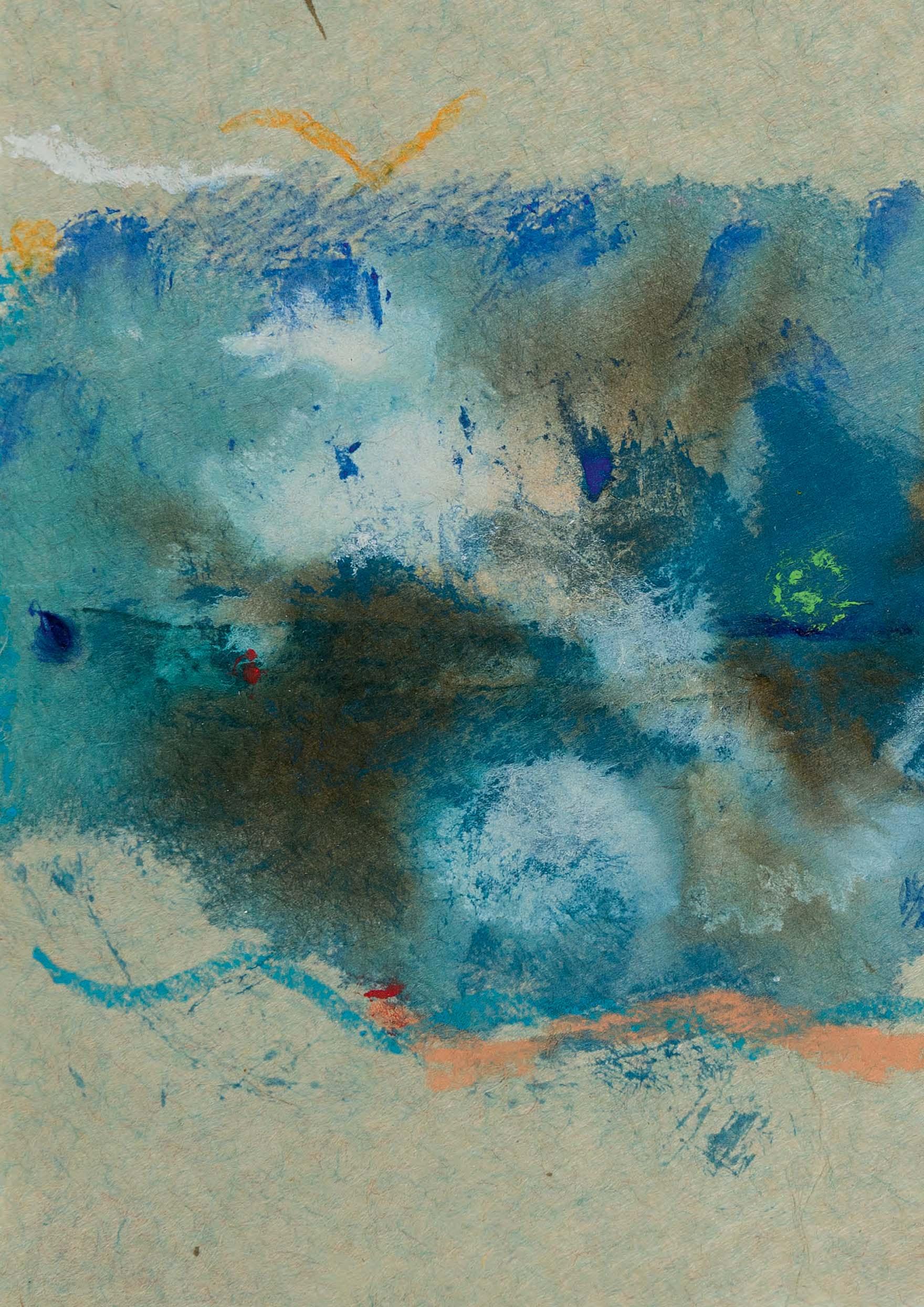
Helen Frankenthaler (1928-2011)
Untitled (P91-20), 1991
No.25
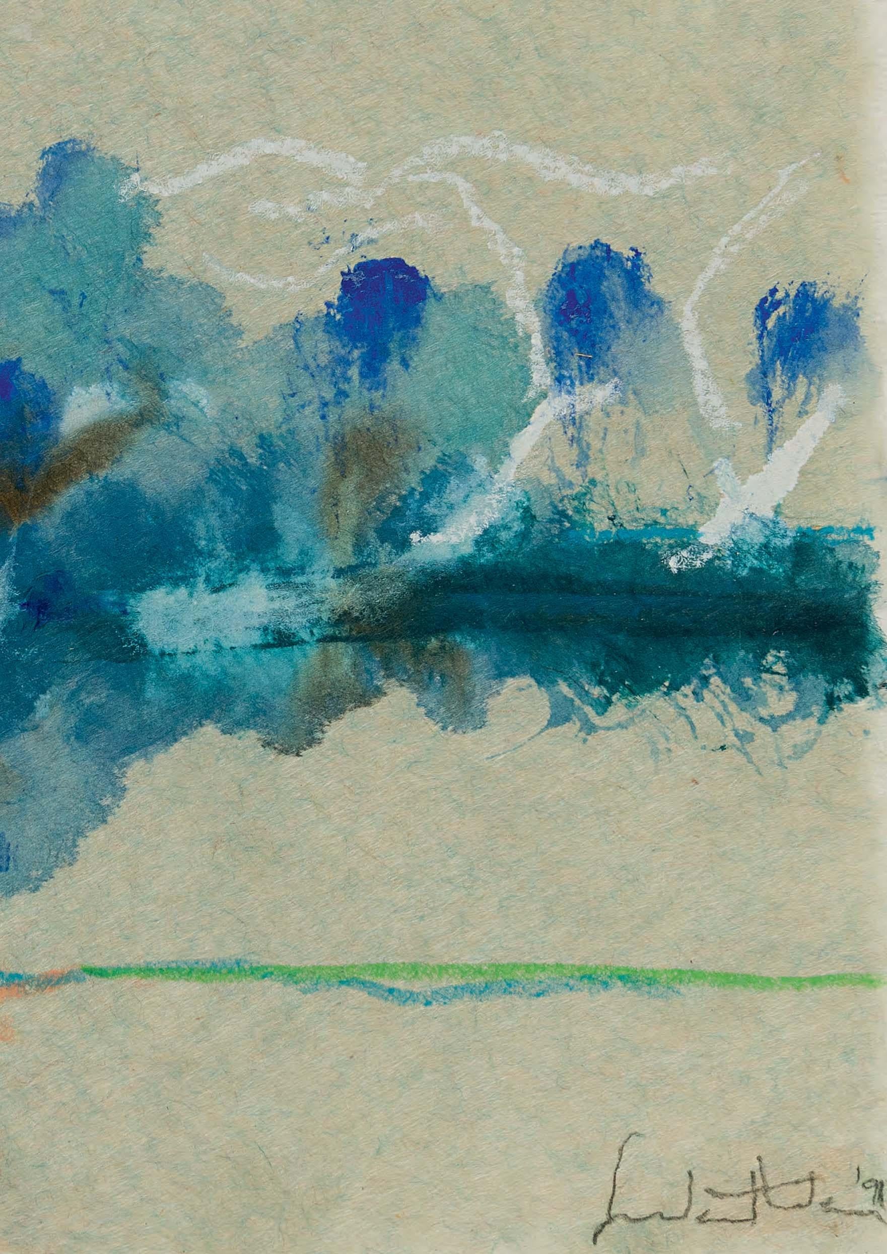
Wilhelmina Barns-Graham CBE (1912-2004)
Three Trees (St. Ives)

No.15

Cover:
Helen Frankenthaler (1928-2011)
Untitled (P91-20), 1991
No.25
Wilhelmina Barns-Graham CBE (1912-2004)
Three Trees (St. Ives)
‘There is a thing about beauty. Beauty is always associated with the male fantasy of what the female body is. I don’t think there is anything wrong with beauty. It’s just what women think is beautiful can be different. And there can be a beauty in individualism. If there is a wart or a scar, this can be beautiful, in a sense, when you paint it.’ (Jenny Saville, 1994)
I am grateful to my wife Laura for her support during the period that I was working on this catalogue. I am also greatly indebted to Team SOFA – Alesa Boyle, Eilidh McClafferty and Megan Corcoran Locke – for their assistance in every aspect of preparing this catalogue and the accompanying exhibition. At Healeys printers, I would like to thank in particular Sarah Ricks, as well as Alastair Frazer. The indefatigable Andrew Smith has photographed the works, and has been tireless in the fundamental task of colour-proofing the catalogue images against the original artworks. In addition, I would like to thank the following people for their help and advice in the preparation of this catalogue and the works included herein: Alexis Ashot, Deborah Bates, Eve Campbell, Cristina Colomar, Anne Connell, Savannah Downs, Rachel and Ben Elwes, Cheryl and Gino Franchi, Lavinia Harrington, Úrsula Romero and Jack Wakefield.
Stephen OngpinDimensions are given in millimetres and inches, with height before width. Unless otherwise noted, paper is white or whitish.
Please note that drawings are sold mounted but not framed. High-resolution digital images and framed images of the drawings are available on request.
All enquiries should be addressed to Stephen Ongpin at Stephen Ongpin Fine Art Ltd. 82 Park Street London W1K 6NH
Tel. [+44] (20) 7930-8813 or [+44] (7710) 328-627
e-mail: info@stephenongpinfineart.com website: www.stephenongpin.com
Watercolour, pen and brown ink and brown wash, over traces of a pencil underdrawing. Laid down. 190 x 273 mm. (7 1/2 x 10 3/4 in.) [sheet]
PROVENANCE: The estate of the artist, and by descent to her daughter, Merle Elspeth Taylor, Kirkcudbright; Her sale, Glasgow, Sotheby’s at the Charles Rennie Mackintosh Society, 21 June 1977 [lot unidentified]; Aitkin Dott & Son, Edinburgh; Private collection, Scotland.
Born in Dunbartonshire, Jessie Marion King studied at Glasgow University and the Glasgow School of Art in the early 1890s, concentrating on drawing and illustration. In 1898 she won a silver medal in the South Kensington National Art Competition, and also earned a travelling scholarship that allowed her to visit France and Italy. She was much admired for her highly individual illustrative style, characterized by a pen and ink technique akin to that of Aubrey Beardsley. In 1899 King joined the staff of the Glasgow School of Art, teaching book decoration and design. By 1902 her work was the subject of an article in The Studio magazine and she had won a gold medal in the category of book design at the International Exhibition of Decorative Art in Turin. King’s work in the years between 1898 and 1905 is characterized by fine detail and meticulous technique. Her compositions were sometimes heightened with gold, while many of her drawings and illustrations were executed on vellum. She was also active as a designer of textiles, jewellery, wallpaper, posters, wall tiles, theatrical costumes and book covers.
In 1908 King married a fellow artist, Ernest Archibald Taylor, and in 1911 the couple moved to Paris, where they established an art school known as the Shealing Atelier. Living in Montmartre, they became friendly with several artists, including Henri Matisse, Maurice Utrillo and Théophile-Alexandre Steinlen, as well as fellow Scots Samuel John Peploe and John Duncan Fergusson, and King’s work became stronger in colour and line. With the outbreak of the First World War, the couple moved back to Scotland, living near Kirkcudbright and setting up a summer school on Arran. In 1915 King drew colour illustrations for Oscar Wilde’s House of Pomegranates, and in later years produced landscape paintings and designs for batik fabrics. Although she died in relative obscurity in 1949, a reassessment of King’s oeuvre was begun in the 1970s, when commemorative exhibitions were held by the Scottish Arts Council and the Fine Art Society in London in 1971-1972, and at the National Library of Scotland in Edinburgh in 1978.
During her time in Paris, one of the projects King worked on was a commission for eighteen watercolour illustrations for a book about the bridges of the city. Another book, planned but never published, was to be devoted to views of Paris churches. As the scholar Colin White has noted, ‘Jessie drew two rather formal illustrations of the Sacré Coeur and St Germain des Prés and then decided to expand the idea to include any buildings in the city she found interesting. She began to go on sketching walks, starting with the district around their own apartment at the back of the Luxembourg Gardens and progressing in everwidening circles. She filled her sketchbooks with drawings in soft pencil which ranged from characters in the streets and architectural details of rooftops or shop fronts to such monuments as the Opéra, the Panthéon and the splendid Fontaine Carpeaux in the Jardins themselves...She also caught the feel of a more private Paris…She made each scene a personal vision and discarded even finished drawings if she felt dissatisfied with their balance or texture. Altogether she completed around 100 drawings.’1
This watercolour is likely to have been drawn on one of King’s sketching outings in Paris. While three of her drawings were included in Paris Past and Present, a book written by her husband that appeared in 1915, most of her drawings of Paris were never published or reproduced.
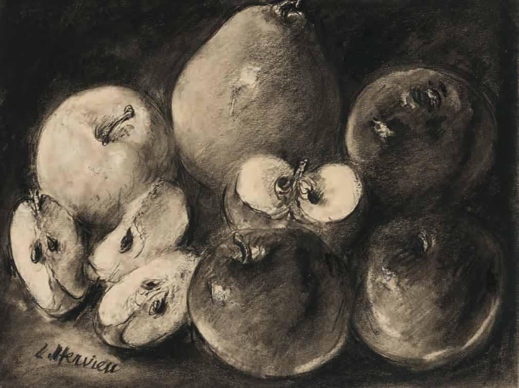
Still Life with Apples and a Pear
Charcoal and stumped black chalk. Signed L. Hervieu in charcoal at the lower left. 252 x 325 mm. (9 7/8 x 12 3/4 in.)
PROVENANCE: Jean-Claude Barrie, the Barrie-Chevalier collection, Saint-Amans-des-Cots (with the collection stamp, not in Lugt, on the old backing board).
An extraordinary figure in the artistic and literary circles of Paris in the first half of the 20th century, Louise-Jeanne-Aimée Hervieu took up painting around 1905, having studied with Lucien Simon, André Dauchez and René Ménard. She participated in the Salon des Indépendants in Paris, and in 1910 had a one-woman exhibition at the Galerie Eugène Blot in Paris. After this, however, she abandoned painting at the insistence of her parents, although she continued to make charcoal drawings and pastels – often of female nudes, still lives and interior scenes – as well as lithographs. Hervieu soon came to the attention of the critic Félix Fénéon, who in 1917 organized the first of several exhibitions of her drawings at the Galerie Bernheim-Jeune. Fond of intense chiaroscuro techniques, she achieved remarkable effects of mood and mystery in her work, often using a razor blade to rub and scratch the surface of her drawings to heighten their visual impact. She became friendly with such artists as Félix Vallotton, Pierre Bonnard and Edouard Vuillard, and provided illustrations for several books, including Charles Baudelaire’s Les fleurs du mal in 1920 and Le spleen de Paris in 1922.
Born with congenital syphilis and always in very poor health, Hervieu was, by her forties, confined to her room and had largely withdrawn from the world. As a result of chronic meningitis, her eyesight gradually deteriorated, and by the early 1920s she had abandoned working in colour. By 1927 she was almost completely blind and had stopped drawing altogether; indeed, the catalogue of her retrospective exhibition at Bernheim-Jeune that year was prefaced by a statement intended by the artist as a sort of artistic ‘farewell’. Hervieu had by then turned to writing, and in 1925 her book L’âme du cirque was published, accompanied by illustrations by Bonnard, Maurice Denis, Picasso, Georges Rouault and André Lhote. In 1936 her novel Sangs won the Prix Fémina; this was followed by Le crime, published in 1937, Le malade vous parle in 1943 and La rose de sang in 1953.
The 20th century art historian and critic Claude Roger-Marx, a close friend and admirer of the artist, published his Éloge de Louise Hervieu in 1953, a year before her death. In it he described her monochromatic drawings, which he likened to those of Odilon Redon and Georges Seurat: ‘Dark curtains open and we enter a world where Love and Death speak in hushed tones.’1 The following year, in his book Maîtres du XIXe siècle et du XXe, he added that, ‘Drawing, for Louise Hervieu, is really about taking possession of the world by giving the word its complete physicality.’2 Roger-Marx also wrote the preface to a posthumous exhibition of Hervieu’s drawings and paintings at the Galerie Marie L. André in Paris in 1969.
In 1978 Roger-Marx bequeathed a very large drawing by Hervieu of seashells and a pearl necklace to the Louvre3, which owns two further drawings by the artist. Other drawings by Louise Hervieu are in the collections of the Musée National d’Art Moderne in Paris and the museums of Bordeaux, Caen and Nantes.
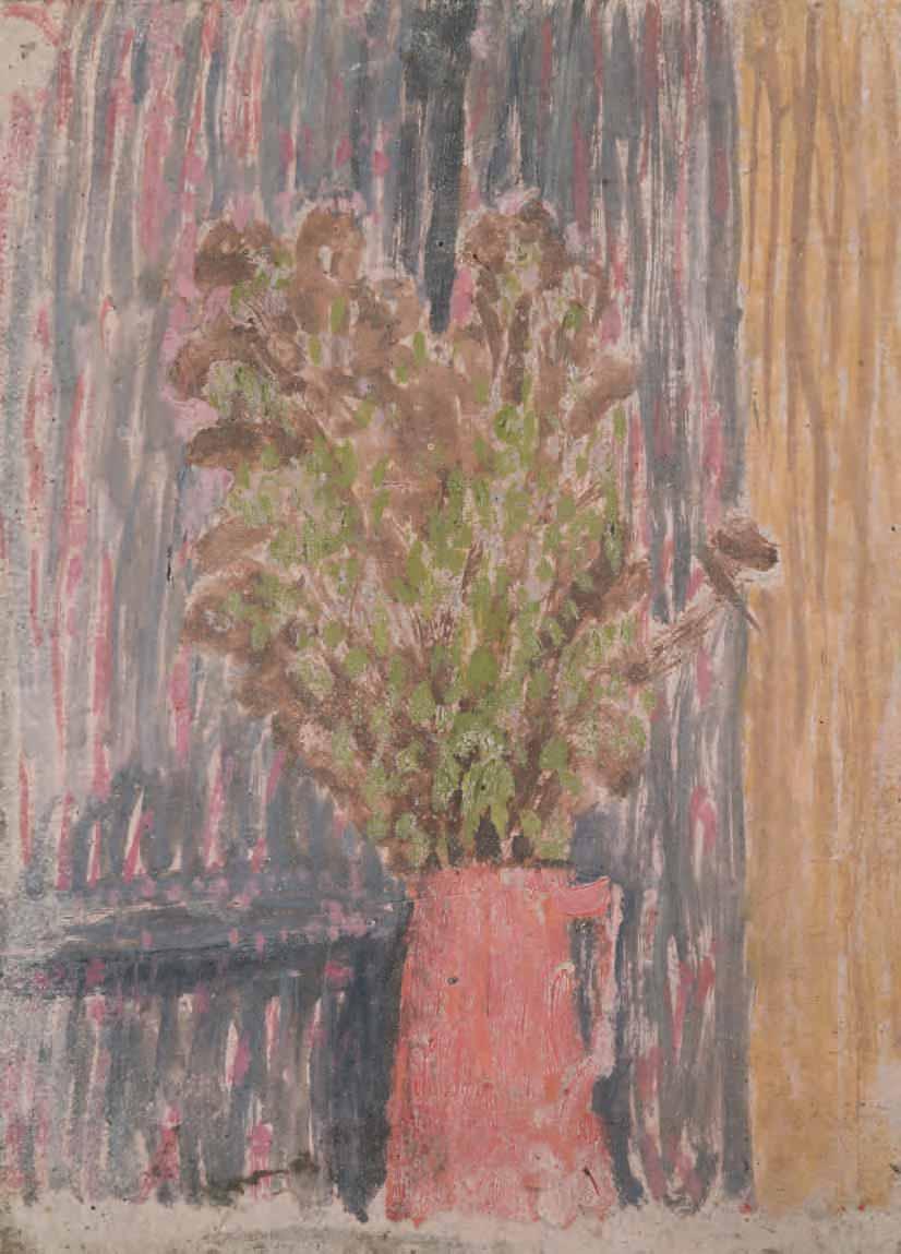
Flowers in a Pink Jug
Gouache on buff paper. 191 x 145 mm. (7 1/2 x 5 3/4 in.)
PROVENANCE: The estate of the artist; Browse and Darby, London; Private collection, London.
Born in Wales, Gwendolyn Mary John drew from an early age, and in 1895 began a course of study at the Slade School of Fine Art in London, where her younger brother Augustus had enrolled the previous year. After leaving the Slade in 1898, Gwen spent six months in Paris, studying at James McNeill Whistler’s short-lived school of painting, the Académie Carmen. Back in London, she exhibited twice yearly at the New English Art Club between 1900 and 1902, and also showed three paintings as part of an exhibition of Augustus’s work in London in 1903. The following year, at the age of twenty-seven, John settled in Montparnasse in Paris, where she earned a living by modelling for artists. Among these was the renowned sculptor Auguste Rodin, with whom John had a long and intense love affair that lasted some ten years, although the true nature of their relationship was known only to a handful of the sculptor’s close friends.
John lived in France for the remainder of her career, over the course of which she produced no more than two hundred paintings. Her subjects were mainly portraits of solitary women and girls, as well as landscapes, interiors and still life compositions, while following her conversion to Roman Catholicism in 1913, paintings and small-scale gouaches of figures at Mass also began to appear in her work. In 1911 the artist moved to Meudon, in the southwestern suburbs of Paris and near Rodin’s country house. By this time she had been introduced to John Quinn, a prominent American collector of modern art who was to become her most significant patron. From 1912 onwards Quinn sent her a yearly stipend, and between 1911 and his death in 1924 acquired almost every painting she wished to sell1
Throughout her career John worked mostly in isolation, having chosen to withdraw from both society and artistic circles, first in London and later in Paris. (As one scholar has noted, ‘She cultivated privacy, and a sense of privacy is one of the dominant feelings of her painting...she always worked in solitude, and took only the little she wanted from the great years of the modern movement in the arts.’2) Although John continued to show at the NEAC in London and also exhibited at the Salon des Tuileries and the Salon d’Automne in Paris, she seems to have been largely unconcerned with making her work better known. Only one solo exhibition was held in her lifetime, at the New Chenil Galleries in London in 1926, which included over forty paintings and watercolours and several albums of drawings. By around 1930, however, John had largely ceased to paint3. Her last datable work was done in 1933, and she seems to have stopped working almost entirely for the last five or six years of her life.
This small still-life may likely be dated to the final decade of Gwen John’s career, when she produced a number of freely-painted gouaches of flowers in a jug. As the artist’s biographer has noted of this period in the early 1930s, ‘Flower studies…[were] repeated time and again and growing smaller. It was as if painting had become for Gwen John what saying the rosary is to others.’4 A closely related composition, of identical dimensions, was at one time with the Browse and Darby Gallery in London5
Two Houses in a Landscape
Gouache on buff paper. Stamped with the estate stamp Gwen John at the lower left. 160 x 123 mm. (6 1/4 x 4 7/8 in.)
PROVENANCE: The estate of the artist; Davis & Langdale Company, Inc., New York; Private collection, New York; Anonymous sale, Hillsborough, NC, Leland Little Auctions, 10 June 2015, lot 532; Jill Newhouse, New York, in 2019; Anonymous sale, Chicago, Hindman, 10 May 2022, lot 49; Private collection, London.
EXHIBITED: New York, Davis and Langdale Company, Inc., Gwen John 1876-1939: Paintings, Watercolors, Drawings, 1993, no.43 (as Cottages Behind a Wall, Meudon).
Although over the course of her career Gwen John was always overshadowed by her younger brother Augustus John, a larger-than-life character who enjoyed success and notoriety, in recent years her critical reputation has come to surpass his, and she has been celebrated as one of the most significant British artists of the 20th century. (Indeed, this is something Augustus himself had foretold, once stating that ‘In fifty years’ time I will be known as the brother of Gwen John.’) At Gwen John’s death in 1939, at the age of sixty-three, the vast majority of her output remained in her ramshackle studio in Meudon, the village just southwest of Paris that she had moved to nearly thirty years earlier. The following year an exhibition of paintings and drawings from the artist’s estate, which had been inherited by her nephew Edwin John, was held under the auspices of the Matthiesen Gallery in London; this was followed in 1947 by a large retrospective exhibition at the same gallery and later at the Arts Council.
John’s beautiful, enigmatic and delicately painted intimist works are almost always modest in scale and subdued in tonality. She painted very slowly and never signed or dated her work, so establishing a chronology for her oeuvre is not always straightforward. John also often repeated a composition, sometimes producing several variants of a particularly successful painting. A late work by the artist, datable to the early 1930s, this small, impressionistic landscape is likely to have been painted at Meudon, where she had lived and worked since 1911. Although always a person who preferred solitude, by the beginning of the 1930s John had become more and more reclusive, and was often in poor health. She had largely stopped painting in oils by this time, although she continued to draw. As the scholar Cecily Langdale has noted of John’s late works, ‘The last colored works on paper are executed in gouache…, in a combination of gouache and watercolour…, or even occasionally in a mixture of gouache and oil… As opaque as any oil painting, they were done about the time she ceased to use oil, and may have been a substitute for her work in that medium. Earlier, her painting and drawing were separate areas of endeavor, with little specific relationship between them. Several of Gwen John’s final works epitomize the convergence of those hitherto distinct areas.’1
A closely related composition of a Cottage Behind a Wall is in a private collection2, while two others were formerly with the Browse and Darby Gallery in London3. All of these may be related to a sheet of compositional sketches by John, today in the collection of the National Library of Wales in Aberystwyth4, which includes seven similar sketches of houses behind a wall. The setting is probably the rue Terre Neuve in Meudon, the same street where the artist lived until 1932.

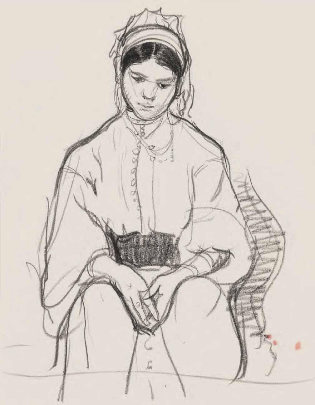
The Moroccan Bride
Black chalk on paper; a page from a sketchbook. A slight sketch of a standing youth drawn in pencil on the verso. Numbered 403 in pencil at the bottom and (8) in pencil on the verso. 300 x 229 mm. (11 3/4 x 9 in.) [sheet]
PROVENANCE: By descent in the family of the artist.
The daughter and pupil of the painter Norman Garstin, Mary Dochie Alethea Garstin began painting seriously at the age of sixteen, and two years later had a work accepted by the Royal Academy Summer exhibition. She often accompanied her father when he undertook the summer schools of painting that he held almost every year in northern France between 1899 and 1927. The Garstin family settled in Cornwall, where Alethea lived for most of her life. Her first gallery exhibitions were joint shows with her father, in London in 1921 and 1924, and she had her first solo gallery exhibition in 1940. Garstin travelled throughout Britain, often using her small red Morris Eight car as a mobile studio, and also made trips to France, Belgium, Italy, Morocco, Kenya, Tanzania and Australia. She remained active well into old age, with her final painting trip abroad undertaken at the age of eighty-two. In 1978, the year of her death, a large retrospective exhibition of work by both Norman and Alethea Garstin was held in St. Ives, Dublin and London.
Alethea Garstin’s paintings, usually on a small and intimate scale, are characterized by a lightness of touch and a freedom of execution. They have been likened to the intimiste paintings of Edouard Vuillard by the artist Patrick Heron, who championed her work. Writing just before her death, Heron noted, ‘I say Vuillard in view of the basic means employed by Alethea throughout sixty years of painting small, delectable, ever-different pictures…I have taken Vuillard as a peg – and if there are for some time to come those who think the comparison with such a master is simply a gratuitous gift to Alethea Garstin… – I shall have no reply, save only to invite contemplation of her output as prolonged and intent as that devoted to her by her smallish band of intense admirers.’1 Paintings by Garstin are today in the Bristol Museum and Art Gallery and the Royal West of England Academy in Bristol, the Plymouth City Museum and Art Gallery, the National Trust and the Government Art Collection.
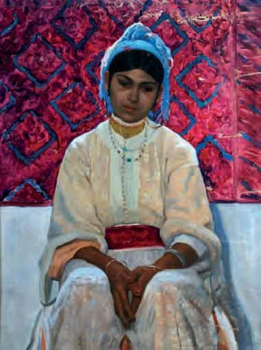
This chalk drawing is a preparatory study for the painting The Moroccan Bride (fig.1), formerly in the possession of the artist’s descendants and sold at auction in 20142. Garstin first visited Tangier in 1928 and returned there each year for the next three years3.
Watercolour over a pencil underdrawing. Inscribed in red ink at the top. Signed in brown ink at the lower right. 280 x 203 mm. (11 x 8 in.)
The Ukrainian-born artist Lidia Zholtkevich was the daughter of the Revolutionary sculptor Alexander Zholtkevich, who lived with his family in Paris between 1908 and 1917. The young Lidia began her artistic training in Paris, first exhibiting her drawings in 1914. The following year she entered the private Académie Colarossi, which was known for accepting female students and allowing them to conduct life drawing from the posed male nude. In 1917 Zholtkevich returned to Russia, and later enrolled at the Vkhutemas art and technical school in Moscow. With a curriculum similar to that of the Bauhaus, Vkhutemas (an acronym for Vysshiye Khudozhestvenno-Tekhnicheskiye Masterskiye, or ‘Higher Art and Technical Studios’) was established in Moscow in 1920 as ‘a specialized institution that would prepare qualified master artists, professors, and directors to work in both industry and higher education. It aimed to fulfill the state’s goals for efficiency and production by linking art with politics.’1
Zholtkevich entered Vkhutemas shortly after Alexander Rodchenko had joined the faculty, at a time when he was moving away from abstract painting towards the Russian avant-garde movement to be known as Constructivism, characterised by bold colours, simple typefaces, and geometric shapes and compositions. The professors of Vkhutemas, mainly leftist artists, led the development of agitational art and propaganda, with the first works of the movement appearing soon after the Revolution of 19172. In 1925 Zholtkevich married the graphic artist, printmaker and illustrator Georgy Alexandrovich Echeistov, and completed her studies in 1929, graduating with a speciality in woodcut prints. Shortly thereafter, between 1930 and 1931, she accompanied the Belarussian painter Meir Axelrod to Crimea to create an artistic record of agricultural achievements in collectivisation. Zholtkevich had begun exhibiting with the Association of Graphic Artists at the House of Printing during her time at Vkhutemas, and in the 1930s received a number of official commissions. Her most substantial work for the government were designs for silk-screened panels for the Soviet pavilions at the International Exhibitions in Paris in 1937 and New York in 1939.
This drawing is likely to date from the 1930s, and may possibly be related to Zholtkevich’s work on behalf of the People’s Commissariat for Food Industry for the Russian pavilion at the 1937 Exposition Internationale des Arts et Techniques dans la Vie Moderne in Paris. The Soviet pavilion, awarded a gold medal by the organizers, commemorated the twentieth anniversary of the 1917 October Revolution. The front of the pavilion was dominated by a monumental, twenty-four metre high statue of The Worker and the Collective Farm Woman by Vera Mukhina, while the interior contained several halls featuring industrial models and social-realist murals3
Adapting the visual language of the revolutionary movement of the 1920s, the present sheet – drawn with two bold colours of black and red, highlighted by a striking teal – depicts a female worker, with the prominent text translating as ‘Voice of the Sugar Factory Worker’. She is presented in a monumental stance, and wears the red headscarf of a supporter of Socialism. The image likely refers to a telegram sent in September 1917 by the workers of the Georgievsky Company Sugar Factory in Petrograd (today Saint Petersburg) to the Russian Provisional Government in the city, condemning the possibility of a corrupt military dictatorship while underscoring the workers’ stance as worthy and principled Socialists. In the telegram, the workers of the Georgievsky Factory declared their full support of the Government: ‘we have utter confidence that only a unitary power in the person of the Provisional Government can save the homeland and the gains of the revolution, and that it will not allow a return to the past and thus assured we continue each in his own place to work calmly and with full energy for the good of the homeland.’4

7 A Derelict Farmhouse
Watercolour and gouache, with pen and brown ink and brown wash. Signed and dated I. Gerhardt / 1948 in brown ink at the lower right.
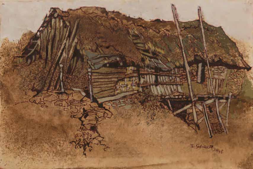
176 x 266 mm. (6 7/8 x 10 1/2 in.)
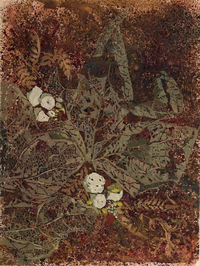
8 A Study of Foliage with White Berries
Watercolour and gouache.
221 x 167 mm. (8 3/4 x 6 5/8 in.)
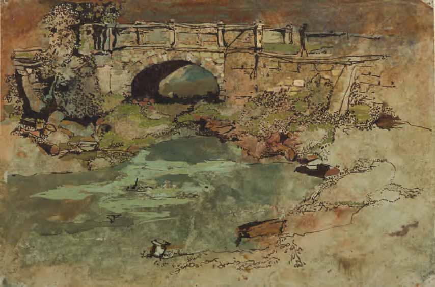
9 Landscape with a Bridge over a Stream
Watercolour and gouache, with pen and brown ink and brown wash, on pale grey paper. A study of a haystack(?) in pencil on the verso.
192 x 292 mm. (7 5/8 x 11 1/2 in.)
Almost nothing is known of the German artist Ingrid Gerhardt. She studied at the free art school established by the painter Jo Strahn in Düsseldorf in the 1940s and lived for much of her later life in France, in the département of Ille-et-Vilaine in Brittany. That she was also active as a printmaker is evidenced by a woodcut of a puppet-master, published in the newsletter of a German amateur theatrical society in 19551.
 9.
8.
9.
8.
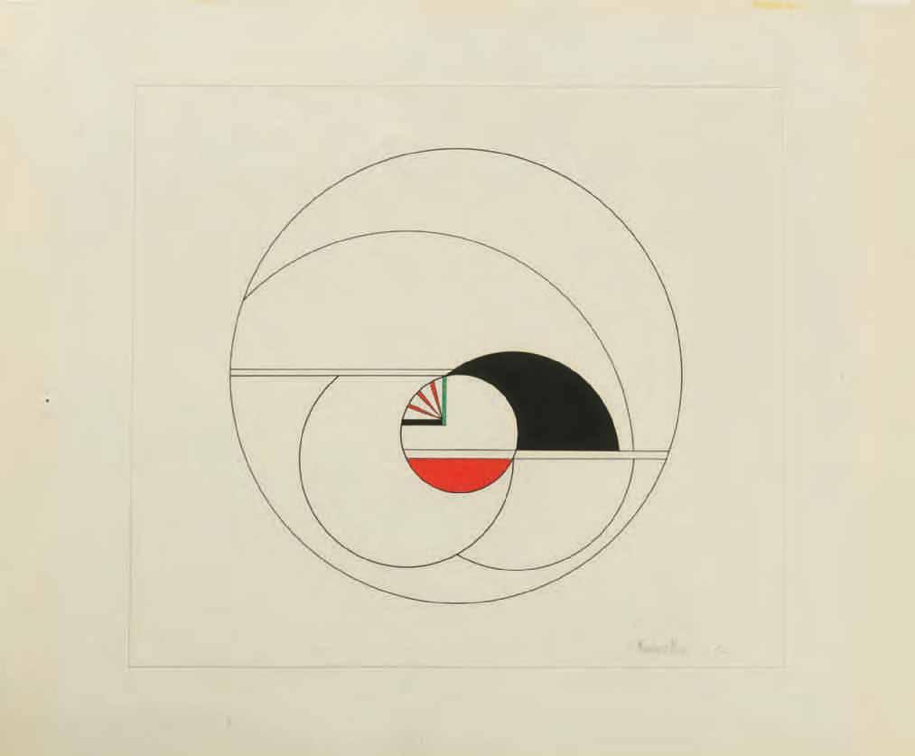
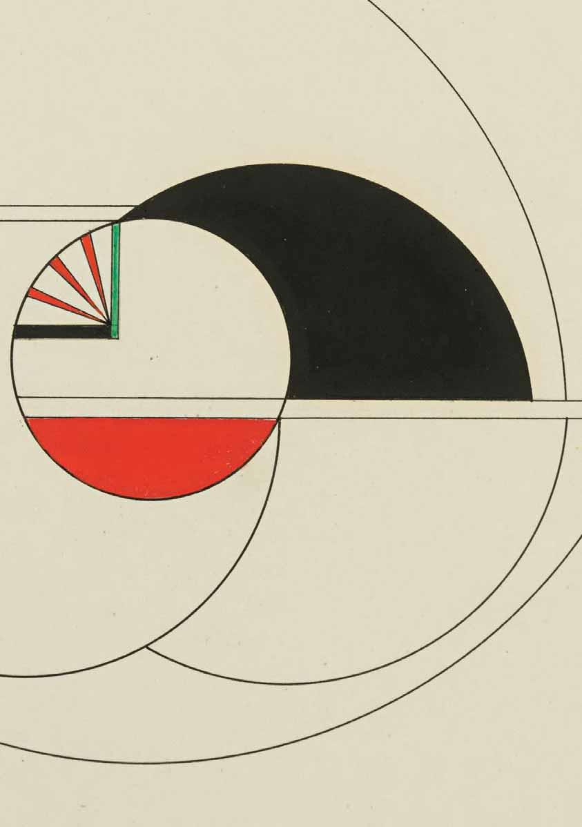
MARLOW MOSS
London 1889-1958 Penzance
Untitled, 1950
Black ink, pencil and tempera, with a framing line in pencil, on stamped Bristol board. Signed and dated Marlow Moss 50. in pencil at the lower right. Illegibly inscribed and numbered C 17 in pencil on the verso.
241 x 271 mm. (9 1/2 x 10 3/4 in.) [image]
318 x 384 mm. (12 1/2 x 15 1/8 in.) [sheet]
PROVENANCE: Carus Gallery, New York, in 1979; Sid Deutsch Gallery, New York; Private collection, Virginia.
LITERATURE: Lucy Howarth, Marlow Moss (1889-1958), unpublished Ph.D thesis, University of Plymouth, 2008, Vol.I, p.288, note 182, Vol.II [Catalogue raisonné], unpaginated, no. Wop 25 (as location unknown, and incorrectly dated 1949).
EXHIBITED, New York, Carus Gallery, Marlow Moss 1890-1958, 1979, no.16.
A British Constructivist artist and a significant figure in the development of non-figurative art in Europe, Marjorie Jewel Moss was born in Kilburn in north London. She was in her late twenties when she began studying at the St. John’s Wood Art School, leaving after a year to enrol at the Slade School of Fine Art in 1917. She remained there until 1919, when, at the age of thirty, she seems to have experienced a mental breakdown. Sometime around 1920 she adopted the gender-neutral first name ‘Marlow’, and also began habitually dressing as a man, sporting closely-cropped, pomaded hair and wearing a cravat, hunting jacket and jodhpurs; as she is said to have later explained, ‘I destroyed my old personality and created a new one.’.
In 1927, at the relatively advanced age of thirty-eight, Moss moved to Paris and studied under Fernand Léger and Amedée Ozenfant at their private art school, the Académie Moderne. It was at around this time that she met her lifelong partner, the Dutch writer Antoinette (‘Netty’) Nijhoff-Wind. Moss was already working in a non-figurative manner when she encountered in Paris the work of the Dutch painter Piet Mondrian, whose artistic theory of Neoplasticism – a purified, rational abstract art of straight lines and simple shapes, combined with black, white and primary colours – had led to the foundation of the De Stijl group in 1917. Moss immediately fell under the influence of the De Stijl aesthetic and produced her first Neo-Plasticist painting in 1929. The following year she introduced close parallel lines (a socalled ‘double line’) into her abstract compositions; an innovation that brought her to the immediate attention of Mondrian. At his suggestion Moss became, in 1931, one of the founding members of the Abstraction-Création group, alongside Jean Arp, Jean Hélion, Naum Gabo, Auguste Herbin, Kurt Schwitters and the De Stijl artists Mondrian, Theo van Doesburg and Georges Vantongerloo, who became a close friend of Moss. Abstraction-Création was dedicated to the promotion of non-figurative art through exhibitions and publications, and Moss was the only British artist, and the only woman, whose works were included in all five of the group’s annual cahiers, the last of which appeared in 1936.
Between 1927 and 1940 Moss lived between Paris and Normandy. Her long friendship with Mondrian, although never warm – in his letters to her, Mondrian always addressed her as ‘Miss Moss’ – lasted throughout her time in France. The two artists looked closely at each other’s work, and Mondrian came to adopt the double line in his own paintings, although it was claimed by Vantongerloo that he did so without crediting Moss for her initial inspiration. As Nijhoff noted of Moss, ‘She understood Mondrian very well and vice versa. They were very well matched…a pair of extraordinary lone wolves.’1
Given her identity as a cross-dressing Jewish artist, it was not surprising that Moss felt compelled to return to Britain in 1940, with the outbreak of the Second World War in Europe, and in 1941 she settled in the village of Lamorna on the far west coast of Cornwall. She worked there in near-isolation,
despite initially reaching out to Barbara Hepworth and Ben Nicholson, who lived not far away at St. Ives, but who seem to have rejected her overtures. Moss studied architecture at the Penzance School of Art and continued to live a somewhat reclusive life in Cornwall. Tragically, the vast majority of her work from before 1940 was lost when her former home and studio in the village of Gauciel in Normandy was destroyed during a bombing raid in 1944. As a result, ‘All that remained from this early period were works no longer in her possession and photographs of works, which she had sent to art associations and interested parties for publication purposes or in the hope of being able to participate in exhibitions.’2 Apart from her Constructivist paintings, based on mathematical principles and with a colour palette limited to black, white, blue, red and yellow, Moss also produced a number of freestanding sculptures and white painted relief works in the 1940s and 1950s. As Nijhoff has quoted the artist: ‘I am no painter, I don’t see form, I only see space, movement and light.’3
After the war, Nijhoff re-joined Moss in Cornwall, though the couple returned several times to Europe, visiting Paris and Holland. The last decade of Moss’s career was a very productive one, perhaps the result of her attempt to make up for the loss of almost her entire earlier output during the war. She exhibited at the Salon des Réalités Nouvelles at the Galerie Charpentier in Paris in 1946 and 1950, and had solo exhibitions at the Hanover Gallery in London in 1953 and in 1958, a few months before her death from stomach cancer. Moss bequeathed her entire estate to Nijhoff’s son, and in 1962 a major retrospective exhibition of her work was mounted at the Stedelijk Museum in Amsterdam. Moss’s home in Lamorna was taken over by another radical queer artist, the painter known as Gluck, whom Moss may have known.
Until relatively recently, Marlow Moss has remained a very obscure figure, particularly in her native country; indeed, only a handful of her works are to be found in public collections in Britain. (The artist was much better known in Holland, where exhibitions of her work were held in the 1960s, 1970s and 1990s.) As the scholar Lucy Howarth has noted, ‘Moss disrupted and subverted her surrounding narratives; she was a British artist in Paris and a European in Cornwall; she was a female artist amongst men, but can be regarded as a pseudo-man amongst female artists. This resistance to categorisation is a large factor in Moss’s obscurity; she is omitted from the histories because she does not fit in.’4 Paintings and sculptures by Moss are today in the collections of the Tate in London, the Henry Moore Institute in Leeds, the Israel Museum in Jerusalem and the Museum of Modern Art in New York, as well as in several Dutch museums, notably the Rijksmuseum and the Stedelijk Museum in Amsterdam, the Gemeentemuseum in The Hague and the Kröller-Müller Museum in Otterlo.
Moss’s work as a painter and sculptor was founded on a rigorous approach to drawing. As Howarth has described the artist’s working process, ‘A work began with thumbnail sketches, in watercolour and gouache, dabs of colour, tentative and playful. From the initial sketches Moss then progressed to a working drawing, finding the mathematical relationships between the areas. In contrast to the freedom of the initial sketch, the working drawings are precise, executed with a sharp pencil, ruler and compass. These drawings are edged with notes and calculations in pencil. Often she collaged on coloured paper, further refining the divisions. Once the complete composition was arrived at, the drawing was transferred to the prepared canvas. The final painting was then executed; with layer after layer of thin translucent paint Moss gradually arrived at the desired intensity of colour, a concrete realisation of her a priori scheme.’5 Apart from two drawings in the Musée de Grenoble and another two sheets only recently acquired by the Rijksmuseum in Amsterdam6, however, almost none of Moss’s works on paper are in public collections today.
The present sheet may be grouped with a small number of independent works on paper by Moss that have been aptly described by Howarth as ‘optical diagrams’7. As she further notes, drawings of this type – of which she lists just twenty-six examples in her catalogue raisonné of the artist’s work8 – ‘are the most undocumented section of Moss’s oeuvre [and] have received scant attention in Moss scholarship... They are distinctly complete works, as opposed to the preliminary sketches and working drawings that were made in preparation for paintings…and they represent perhaps the most overtly experimental section of Moss’s output, reminiscent as they are of Bauhaus student exercises.’9 The use of the colour green in this drawing exemplifies a feature that is only found in a handful of Moss’s autonomous works on paper, since in her painted work the artist adhered to a strict use of only the primary colours of blue, red and yellow, along with black and white.
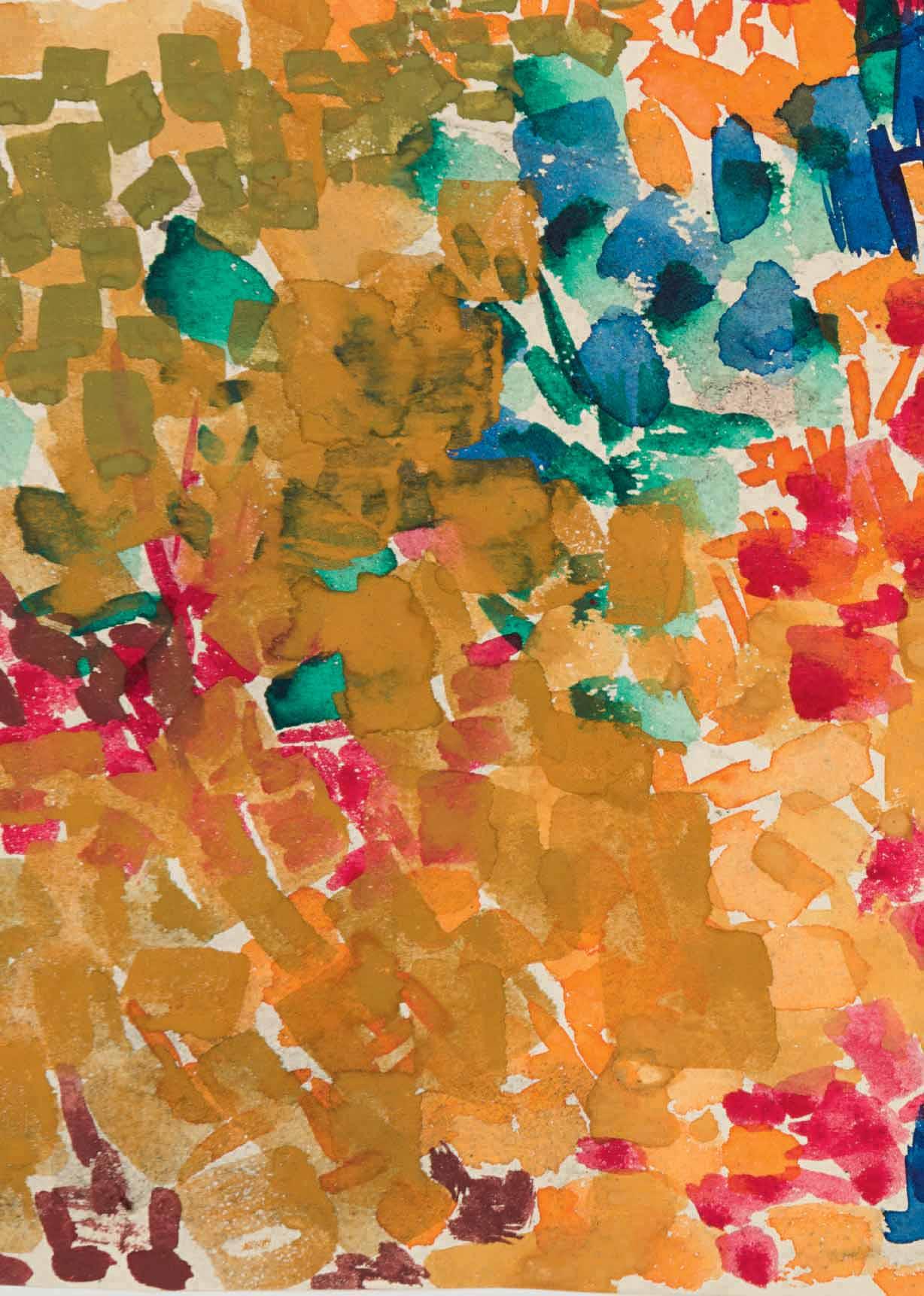
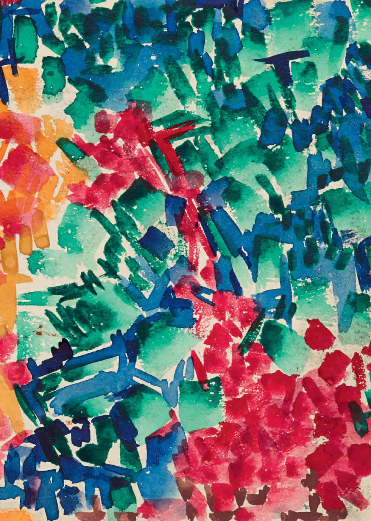
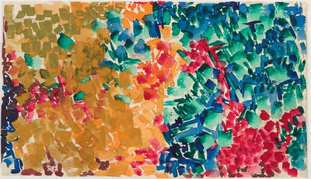
Untitled, c.1959
Watercolour. Inscribed LD - PW. 188 in pencil on the verso. 165 x 290 mm. (6 1/2 x 11 3/8 in.)
PROVENANCE: The estate of the artist; Private collection, Maine.
Born in south-eastern Virginia, Lynne Mapp Drexler studied at the Richmond School of Art, graduating with a degree in Fine Art in 1949. After two trips to Europe in the early 1950s, during which she spent a considerable amount of time in London, she began to study painting seriously. In late 1955 she decided to move to New York City to study with the German-born painter and renowned art teacher Hans Hofmann, enrolling in his school in February 1956 and also earning a scholarship to his summer class in Provincetown, Massachusetts, in 1957. (Among his students, Hofmann counted several of the most significant women artists of the period, including Nell Blaine, Ray Eames, Marisol Escobar, Helen Frankenthaler, Jane Freilicher, Lee Krasner and Mercedes Matter. Joan Mitchell attended one class at Hofmann’s school but never returned, apparently explaining that, ‘I couldn’t understand a word he said so I left, terrified.’) Hofmann taught Drexler to focus on painting in terms of colour, form and space, and his theories about musical analogies in chromatic scales resonated with the younger artist.
When Hofmann closed his New York school, and at his recommendation, Drexler began studying with the Abstract Expressionist painter Robert Motherwell at Hunter College. Both Hofmann and Motherwell strongly supported and encouraged the artist in her work, whose qualities they readily recognized. (However, when she told Motherwell that she was thinking of becoming a teacher herself, he is said to have replied, ‘I’ll flunk you out of here before I see you go to teach. You’re too good a painter.’) As a disciple of both Hofmann and Motherwell, Drexler became associated with the second generation of Abstract Expressionist painters. By the late 1950s she had come of age as an artist, and her first solo exhibition of eleven brightly-coloured abstract paintings was held at the artist’s cooperative Tanager Gallery in New York in 1961, although none of the works sold.
The following year Drexler married the abstract painter John Hultberg, whose career was much more established, since he had gained the support of the gallerist Martha Jackson. In 1961, with Jackson’s help, Hultberg had bought a summer house on Monhegan Island, several miles off the coast of Maine, and he and Drexler spent the summer of 1963 there. They returned to Monhegan almost every year thereafter, and much of Drexler’s later work was inspired by the landscape of this small and remote island. The couple spent some of the next few years on the move, usually due to Hultberg’s teaching commitments, and lived briefly in Mexico before settling in San Francisco. It was in California that Drexler produced her first lithographs, at the Tamarind Lithography Workshop in Los Angeles in 1963.
In 1965 Drexler had her second solo exhibition at a gallery in Los Angeles, which was well reviewed by local critics. (The art critic of the Los Angeles Times noted of Drexler that ‘the artist impresses by her technical virtuosity and her distinctively personal, highly exuberant poetry. Essentially a colorist to whom texture is nearly as important as tonality, this painter manages to sum up characteristic facets of landscape experience ranging from an almost blinding stridency to calculatedly lyrical subtleties.’1) After some time in Hawaii, where Drexler had another exhibition of her work, she and Hultberg settled in New York City in 1967, living at the Chelsea Hotel, where her paintings were hung in the lobby alongside those of other artists who resided there, notably Larry Rivers. Apart from an obvious debt to nature, Drexler’s works were sometimes inspired by her abiding love of classical music, and she would often sketch while listening to concerts and performances at Carnegie Hall or the Metropolitan Opera.
Drexler spent the summer months on Monhegan Island sketching outdoors, creating a repertory of images that would provide the basis for larger abstract paintings created in the winter months in New York. By this time, however, Hultberg’s alcoholism was proving very difficult for her to cope with, so much so that summers with him on Monhegan were often miserable experiences for Drexler, and she sometimes avoided spending time there with him. In 1970 she was hospitalized for severe depression; as she wrote in a letter to Hultberg at around this time, ‘my belief in my own creativity keeps me going but who will know or care 100 years from now?’ Between 1969 and 1975 Drexler showed her colourful paintings in a series of four critically-praised exhibitions at the Alonzo Gallery on the Upper East Side; this period marks the highpoint of her commercial and critical success during her lifetime. However, she was never able to gain gallery representation and support, and struggled to achieve wider recognition. Nevertheless, she once noted that, ‘I’ve always felt deeply within myself I was a damn good artist, though the world didn’t recognize me as such. I wasn’t about to play their game.’
In 1983 Drexler abandoned New York to settle permanently on Monhegan Island, where she lived and worked alone for the last sixteen years of her life. (She and Hultberg eventually separated in 1984, though they never divorced.) The artist was happy there and began to sell her work to a handful of Maine collectors. The scenery of Monhegan was a continuing inspiration, and she became a firm part of the tiny, closely-knit community of people who lived on the small, rocky island year-round. As she pointed out, ‘There is no isolation in a place like this – impossible to find – but solitude is respected…I am not rich…but I have what I want. I mean, as long as I have food, heat, roof over my head, food for the cat and paint, I am happy. Oh, and Jack Daniels.’2 By the early 1990s Drexler’s work had become more stylized and representational, though still brilliantly coloured and, as always, anchored in a love of nature. She continued to work productively, content in the solitude of her beloved Monhegan Island, until her death, while listening to Mozart’s opera Don Giovanni, in December 1999, at the age of seventy-one.
Following Drexler’s death, stacks of unframed paintings and watercolour and gouache drawings, dating from the 1950s to the 1990s, were discovered in her home. Gradually her work began to attract a new audience, initially in Maine and then well beyond the state. In 2008 the first museum retrospective of Drexler’s oeuvre, numbering some fifty paintings, drawings and textiles, was presented at the Monhegan Museum and the Portland Museum of Art in Maine. More recently an exhibition devoted to the artist’s abstract works of the late 1950s and 1960s was held jointly at the Mnuchin and Berry Campbell galleries in New York, while another exhibition of her works was mounted at Bonhams auction house in New York. Paintings, drawings and prints by Drexler are today in the permanent collections of, among others, the Brooklyn Museum, the Art Institute of Chicago, the Museum of Modern Art in New York and the National Gallery of Art in Washington, D.C., as well as the Bates College Museum of Art, the Farnsworth Art Museum, the Monhegan Museum and the Portland Museum of Art, all in Maine.
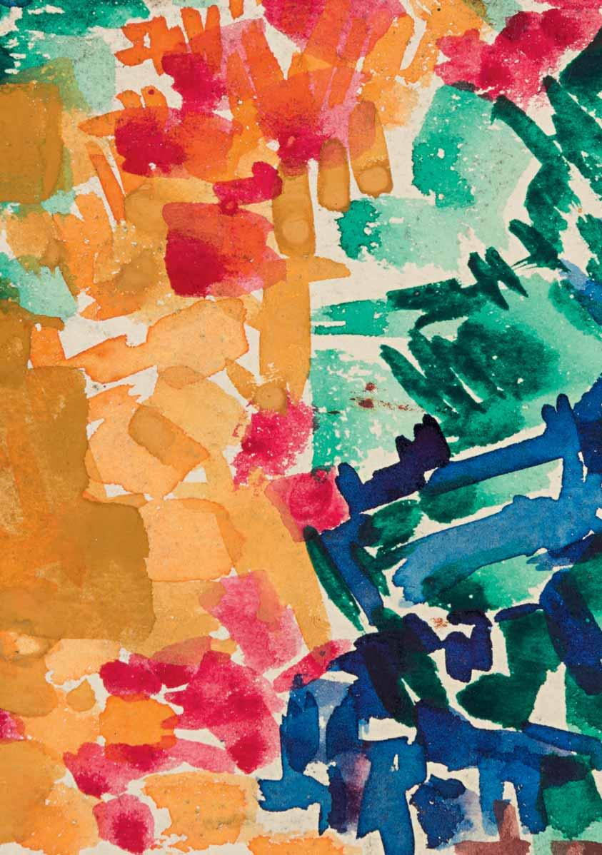
Lynne Drexler’s work was always first and foremost about colour. The artist’s characteristic use of squarish patches of vibrant colour, applied with short brushstrokes, is seen to brilliant effect in this early watercolour, which is datable to c.1959. The present sheet also reflects something of the influence on Drexler of her training with Hans Hofmann, notably his particular emphasis on a rhythmic approach to composition and a vibrant colour palette. This devotion to colour was something that Drexler also admired in the work of such artists as Vincent van Gogh and Henri Matisse3, with both of whom her works were often likened by later writers. A number of stylistically comparable drawings in watercolour or gouache of the same date remain in the artist’s estate4, while others are in private collections.
Pencil and coloured chalks on buff paper, within a fictive drawn mount with double framing lines in pencil. Signed with the initial G. in pencil at the lower right. Inscribed Cornwall / by Gluck in blue ink at the lower right corner of the sheet.
64 x 121 mm. (2 1/2 x 4 3/4 in.) [image]
179 x 253 mm. (7 x 10 in.) [sheet]
PROVENANCE: Michael Palmer, in March 1991; Private collection.
EXHIBITED: Unidentified exhibition A Century of Change, (c.1991?), no.47 (according to a typewritten label attached to the reverse of the frame).
Born into a wealthy Jewish family in London, as a teenager Hannah Gluckstein rebelled against her conservative upbringing, cutting her hair, dressing in men’s clothes and rejecting her given name, eventually insisting on being referred to simply as ‘Gluck’. She attended the St. John’s Wood Art School and, on a visit to the artist’s colony of Lamorna in Cornwall, befriended the painters Alfred Munnings, Samuel John ‘Lamorna’ Birch, and Laura and Harold Knight, who encouraged her in her desire to become an artist. Another early supporter was the department store magnate Gordon Selfridge, who set up a studio within his store for Gluck to paint portraits in one sitting, although she soon abandoned this as she felt it was making her work too slick, and because she preferred to choose her own subjects.
Over the course of her career, Gluck painted landscapes, theatrical scenes, exquisite floral still lives and, most significantly, a series of superb and stylish portraits. She worked very slowly, and chose to only have solo exhibitions, refusing to take part in group shows. Her first exhibition was held at the Dorien Leigh Galleries in 1924, and all sixty works in the show were sold. A second exhibition was mounted at the Fine Art Society in 1926, and again met with critical and commercial success. Around the same time Gluck moved into a large house in Hampstead and had a modern and airy studio built in the garden. She lived there with her lover, the society florist Constance Spry, whose work inspired her to paint the large flower compositions for which she became well known. For her next exhibition in 1932, she transformed the galleries of the Fine Art Society into a ‘Gluck room’, decorated with wall panels and pilasters in a muted colour scheme to create a harmonious arrangement of interior decoration. She also had her paintings framed in a special white, three-stepped frame of her own patented design, which came to be known as the ‘Gluck frame’ and was used for all her work from then on. The exhibition of twenty-nine paintings, including many of flowers, was again a huge triumph, and was followed by another equally successful show in 1937.
In between these two exhibitions Gluck met the socialite and philanthropist Nesta Obermer, with whom she was to have an intense relationship until 1944, and who remained a lifelong friend. After the 1937 exhibition, Gluck spent most of her time travelling with Nesta and seems to have only completed one painting before the outbreak of the Second World War, which shattered the world of high society and style that she had flourished in. Leaving London, she worked on portrait commissions, but began suffering from what seems to have been panic attacks that prevented her from being very productive. In 1944 Gluck settled in the West Sussex town of Steyning, where she lived with the sisters Nora and Edith Shackleton Heald; the latter was to become the artist’s partner for the rest of her life. She painted relatively little, however, and instead focussed her attention on a campaign to improve the quality of fine artist’s materials and establish a recognized British standard for them. Gluck did not show her work in public in London for over thirty-five years, until a retrospective exhibition at the Fine Art Society in 1973, which included mainly works from the 1920s and 1930s, along with some recent paintings. Notwithstanding the huge success of the exhibition, Gluck suffered from poor health and was unable to work again. She died in January 1978, at the age of eighty-two.
Pencil and coloured chalks on buff paper, within a fictive drawn mount with triple framing lines in pencil. Inscribed Cornwall / by Gluck in blue ink at the lower right corner of the sheet. Further inscribed Cornwall / Painted / by Gluck (artist) / or Gluckstein. in blue ink on the verso.
59 x 116 mm. (2 1/4 x 4 1/2 in.) [image]
178 x 253 mm. (7 x 10 in.) [sheet]
PROVENANCE: Michael Palmer, in March 1991; Private collection.
EXHIBITED: Unidentified exhibition A Century of Change, (c.1991?), no.48 (according to a typewritten label attached to the reverse of the frame).
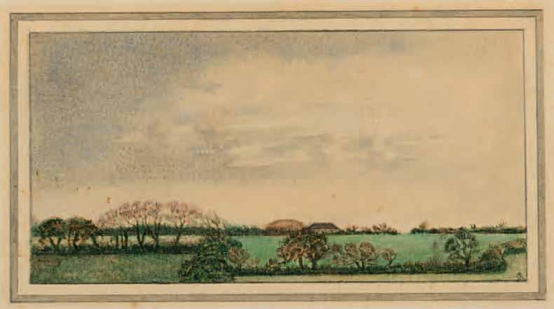
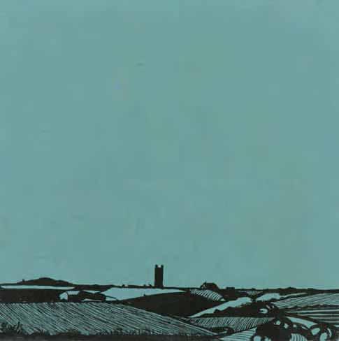
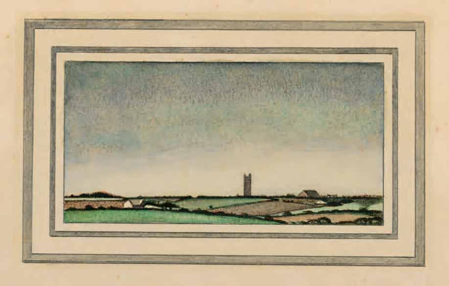
It was in her early years as an artist in the small fishing village of Lamorna that Gluck first developed an abiding love of landscape, inspired by the light and scenery of this area of Cornwall. Indeed, she came to love Cornwall and kept a studio there throughout her life. Her landscape compositions were almost always characterized by a large expanse of sky above a very low horizon. In some unpublished ‘Notes on Landscape Painting’, written in 1940, she recalled of the work she produced in Cornwall: ‘My landscapes were the first that truthfully showed the immediate impression one gets there – that of very little land and great expanses of sky...The sky is a bowl, not a flat backcloth and its colour and light reflect in every blade of grass, every twig…the colour of the sky permeates the landscape under that sky…Wind and weather change continuously, a landscape is chameleon to the light.’1 Gluck kept a studio at Lamorna until 1947, and in 1953 acquired a cottage in the nearby village of St. Buryan.
Although it is often difficult to date the artist’s landscapes, or to identify their exact location, the present sheet is very closely related to a small Cornish landscape painting of 1964, today in a private collection, in which the same tower – perhaps the granite tower of the late 15th century parish church of St. Buryan – appears on the horizon2. (It has also been suggested that the tower depicted may be Prospect Tower, an 18th century architectural folly on the grounds of the Cotehele Estate in eastern Cornwall.) A small ink and wash drawing on blue paper by Gluck of an identical composition – although of a square rather than rectangular format, and with a greater expanse of sky (fig.1) – is in a private American collection3.
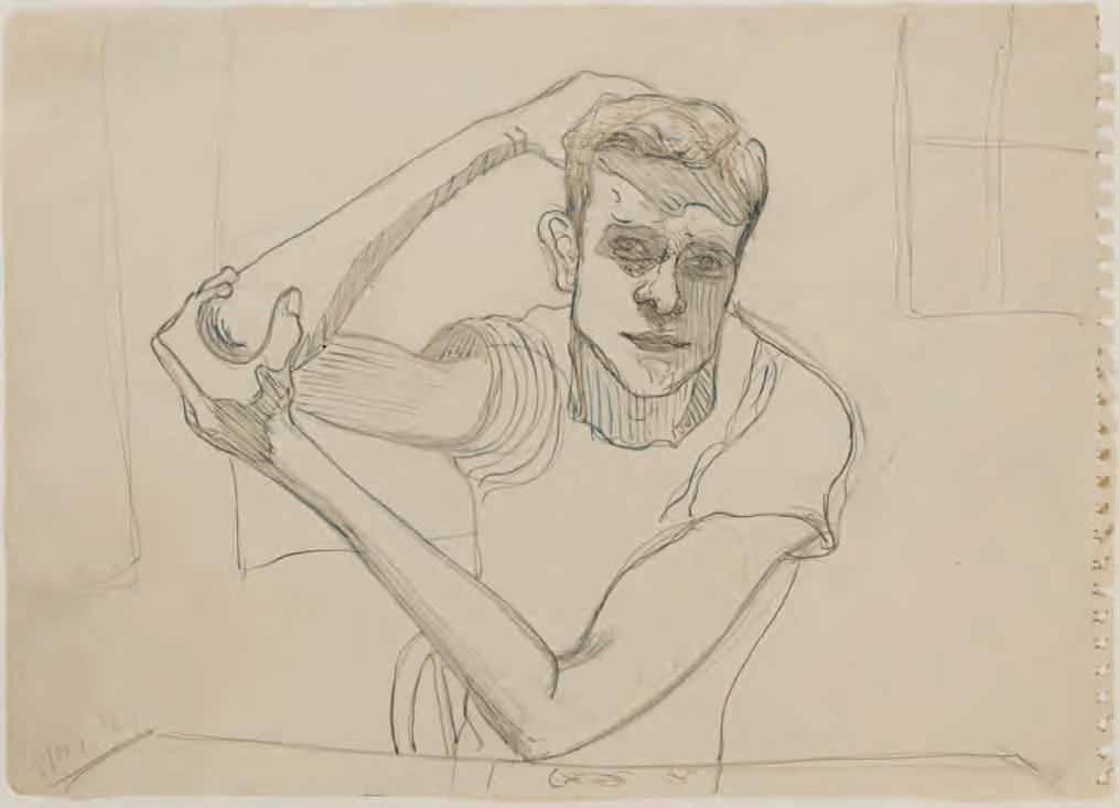
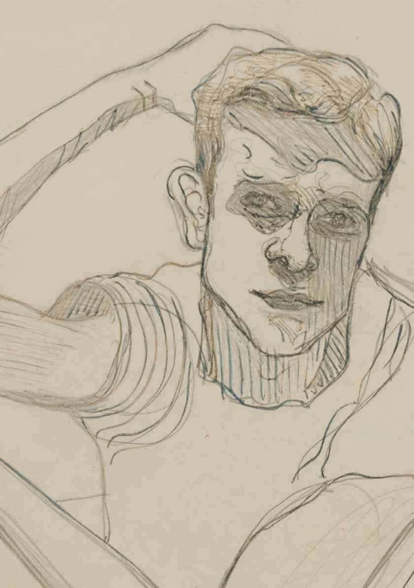
Gladwyne (Merion Square) 1900-1984 New York
Richard Gibbs
Pencil and ink on paper; a page from a sketchbook. Signed and dated Neel ’64 in ink at the lower left. 249 x 350 mm. (9 3/4 x 13 3/4 in.)
PROVENANCE: Robert Miller Gallery, New York; Private collection, United Kingdom.
Although Alice Neel’s career spanned much of the 20th century – she was born in a town in southeastern Pennsylvania three weeks into the new century – it was not until she was already in her late sixties that she began to enjoy critical acclaim, after working for much of her life in relative obscurity. Neel received her artistic training at the Philadelphia School of Design for Women, where she studied between 1921 and 1925. She then spent two important and formative years in Havana, where she lived with her husband, the Cuban artist Carlos Enriquez, with whom she had two daughters. Neel participated in a number of exhibitions in Cuba before eventually returning to America and settling in New York City, which was to be her home – and constant muse – for the remainder of her life. In 1930 she suffered a nervous breakdown, caused by Enriquez’s abandonment of her and his return to Cuba with their second daughter Isabetta. (Their first child had died of diphtheria in 1927.) By 1932 Neel was living in Greenwich Village, surrounded by a vibrant community of artists, intellectuals and political activists, many of whom sat for her. She exhibited in a number of group shows and had relationships with a series of lovers, all of whom appeared in her work. (One of these, Kenneth Doolittle, in a rage, destroyed over three hundred drawings and some fifty paintings in her studio in 1934.) During these years at the height of the Great Depression, Neel worked for the government’s Public Works of Art Program and later the Federal Art Project, part of the Works Progress Administration, with which she remained associated until 1943.
Throughout Neel’s nearly seven-decade career she expressed a particular concern with issues of social justice and civil rights, and much of her work made manifest a kind of radical humanism. A member of the Communist Party since 1935, she was involved with leftist and socialist movements throughout her life. In 1938 Neel had her first solo exhibition at a gallery in New York, and the same year moved uptown to Spanish Harlem. For the next twenty-four years she lived and worked there, in the area of the east side of Manhattan known to its inhabitants as El Barrio, which became the setting for many of her paintings of cityscapes and genre scenes. Her studio was her large living room, and it was there that she painted numerous portraits of her Black and Puerto Rican neighbours, some of which were included in a solo exhibition at the A.C.A. Gallery in 1950. As a review of the exhibition in the New York Times noted, ‘Her approach is frankly expressionistic; she uses a great deal of black, accentuating profile lines, and catches figures in strongly individual poses. And its dramatic intensity succeeds because of unmistakable artistic sincerity.’
Although Neel’s paintings were occasionally included in group exhibitions and she had further solo exhibitions in 1951, 1954, 1960 and 1962, her work garnered relatively little critical attention until an article on her portraiture was published in Art News in 1962. The following year Neel began to be represented by the Graham Gallery in New York, which mounted several exhibitions of her work between 1963 and 1980.
Neel continued to work mainly as a painter of portraits, one of which was used for the cover of Time magazine in 1970; while the same year she painted one of her best-known works, a striking portrait of Andy Warhol. She regularly gave slide lectures about her work throughout the country; these presentations were always highly entertaining and proved very popular. A long-overdue retrospective exhibition of Neel’s oeuvre, numbering fifty-eight paintings, was mounted at the Whitney Museum of American Art in 1974, while another large exhibition of over eighty paintings was held at the Georgia
Museum of Art the following year. By the middle of the 1970s Neel was widely recognized, albeit belatedly, as one of most significant figurative painters of the post-war era, and was the recipient of a number of awards and honours. In 1982 she began being represented by the Robert Miller Gallery, and also contributed to the first illustrated monograph of her oeuvre, which appeared the year before her death from advanced colon cancer in 1984. Today, Neel’s work is held in countless museums in America and Europe, while in recent years she has been the subject of major museum exhibitions in Bilbao, Edinburgh, The Hague, Hamburg, Helsinki, Houston, London, Malmö, New York, Paris, Stockholm and Washington, D.C.
Alice Neel tended to reject the label of portraitist, preferring to describe her work as ‘pictures of people’. The artist’s biographer Phoebe Hoban has recently written that ‘Her stated goal was to chronicle the Zeitgeist, and Neel was, from the very start, fiercely democratic in her subjects, portraying her lovers, her children, pregnant nudes, fringe characters, and famous art-world figures. Neel’s art provides a vivid lens with which to view the twentieth century…Few portrait painters besides Lucian Freud have been as unflinching in their gaze. But while Freud is a clinician, his cold dissection of his subjects often chilling, Neel is an avowed humanist, interested not only in her subjects’ physiognomy but in their heart and soul…“That is the microcosm,” she said. “Everything can be there – the person, his position in life, how he feels, how he thinks, what life does to him, how he retaliates, the spirit of the times, everything.”’1
In general, Neel did not prepare her canvases with preparatory studies on paper, preferring instead to draw with paint directly on the canvas. (As Hoban has pointed out, however, ‘even in her paintings, drawing remained, for Neel, the starting point, the compass through which she navigated her craft. One only has to look at the video snippets of Neel, wielding her brush like a pencil, as she tackles an empty canvas.’2) Nevertheless, drawing played an important role in her artistic practice, the immediacy of the process allowing her to quickly capture a sitter’s pose or a subject seen on the street. As the scholar Jeremy Lewison has noted, ‘the activity of drawing on paper filled the interstices of time; it allowed her to work on other ideas simultaneously, and sometimes more experimentally or casually…It is [the] combination of the detailed and the economical that characterises Neel’s work as both a painter and a draughtsman…Neel’s approach to drawing and painting, if not experimental, is authoritative, distinctive and engaged with a long tradition that she sought to develop rather than overthrow.’3
A committed draughtsman, Neel produced a large number of drawings and watercolours, although several hundred sheets were destroyed by Doolittle in her studio in 1934. While her relatively few surviving drawings of the 1920s and early 1930s were typically executed in watercolour, by the late 1930s she was working mostly in pencil or black ink, and her drawings remained largely monochromatic, with some exceptions, for the remainder of her career. Neel regarded her drawings not as studies for paintings but as fully independent works. For much of her career, however, her drawings were also very private, intimate works, and not intended to be exhibited in public. In 1978 the first retrospective exhibition of Neel’s works on paper was held at the Graham Gallery, and after the artist’s death further gallery and museum shows devoted solely to her drawings and watercolours followed in 1986, 2003, 2008, 2013 and 2015.
Drawn in 1964, on a page from one of the artist’s sketchbooks, the present sheet depicts Richard Gibbs, about whom very little is known. Neel painted several portraits of Gibbs, including works dated 19614 and 19655, while a very large canvas, executed in 1968, is today in a private collection in Minneapolis6. It remains unclear who Gibbs was, however. Neel often painted friends and neighbours, as well as more obscure figures, but nothing further is known of this particular sitter.
In the brochure accompanying the first exhibition devoted solely to drawings by Neel at the Graham Gallery in 1978, the art historian Ann Sutherland Harris wrote of the artist that ‘We realize again that her paintings are full of visible drawing, sketched passages, emphatic contour lines…we are reminded that Neel was trained to draw by the most academic and traditional of methods and that she knows her craft. But her formidable gifts have never been used to describe the surface of life. Her drawings, as much as her paintings, probe for the truth and contribute to her incisive, idiosyncratic but compassionate record of life in America in this century as she had seen it and as she continues to see it.’7
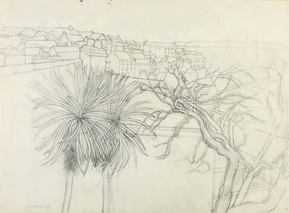
St. Andrews 1912-2004 St. Andrews
Three Trees (St. Ives)
Pencil, with stumping, on paper. Signed and dated W. Barns Graham 1971. in pencil at the lower left. Further extensively inscribed TITLE THREE TREES (ST. IVES) (FROM GOONHILLY BEN NICHOLSONS HOUSE) ST. IVES CORNWALL / DATE 1971 / SIZE WORK. 54 x 74.5 cms. (FRAMED. 71 x 92 cms) or work 21 1/4” x 29 3/8”, Framed 28 1/8” x 36 1/4” / MEDIUM PENCIL DRAWING ON PAPER / ARTIST W. BARNS-GRAHAM [with signature] / 1 BARNALOFT / ST IVES / CORNWALL / CAT NO 02/71/D in black ink on the backing board.
530 x 755 mm. (20 7/8 x 30 in.) [image]
560 x 761 mm. (22 x 29 3/4 in.) [sheet]
PROVENANCE: Acquired in the late 1980s, possibly directly from the artist, by Lea Ford, London; Anonymous sale, London, Sotheby’s, 20 March 2019, lot 209; Private collection, London.
The Scottish painter, draughtsman and printmaker Wilhelmina (known as ‘Willie’ to friends) BarnsGraham was born in St. Andrews in Fife and studied at the Edinburgh College of Art between 1931 and 1937, her tenure sometimes interrupted by recurring health issues caused by weak lungs. While at the College she earned several awards and travel scholarships, and had her work included in the annual Summer Exhibitions of the Royal Scottish Academy. In March 1940, the twenty-seven-year-old artist moved to St. Ives in western Cornwall, where she met Ben Nicholson, Barbara Hepworth and Naum Gabo, as well as the local ‘primitive’ painter Alfred Wallis and the potter Bernard Leach. Barns-Graham maintained a studio in St. Ives for the rest of her long career, which was to last almost eight decades. In 1942 she became a member of the St. Ives Society of Artists and the Newlyn Society of Artists, exhibiting paintings influenced by Cornish landscapes at both institutions between 1942 and 1949.
After participating in numerous group exhibitions in Cornwall and Edinburgh, Barns-Graham had her first solo exhibition at the Downing Gallery in St. Ives in 1946, followed by a second show there two years later. In 1949 she left the St. Ives Society of Artists and became a founding member of the more progressive breakaway group, the Penwith Society of Artists, where she was to exhibit regularly for the next fifty years. Her work began to be included in group shows in London and she also spent some time in Grindelwald in Switzerland, inspiring a series of paintings, drawings and gouaches of glaciers executed between 1948 and 1952. In 1950 Barns-Graham’s painting Upper Glacier was acquired by the British Council, and the following year her large painting Porthleven won the St. Ives Festival of Britain prize for painting, while the same year her work was included in Herbert Read’s book Contemporary British Art
In 1952 Barns-Graham had her first solo exhibition in London, at the Redfern Gallery. Her travels took her to Paris, Venice and Tuscany, and by 1956 her work was regularly being exhibited in London. Although she was fully integrated into the modernist milieu of St. Ives, with the arrival of artists such as Peter Lanyon, Roger Hilton, Terry Frost and Bryan Winter, Barns-Graham often felt at a disadvantage in the competition for recognition and contacts with dealers in London and abroad. She was also unfairly regarded, by some critics and scholars, as a relatively minor member of the St. Ives school1. In 1960 Barns-Graham began to divide her time between Cornwall and Scotland, having inherited a house near St. Andrews. (She also rented a studio in London between 1961 and 1963.) In 1963 the artist moved into a studio at No.1 Barnaloft on Porthmeor Beach in St. Ives, and by the mid 1960s she had begun to work in a severely geometrical mode of abstraction.
Throughout the 1960s, 1970s and 1980s Barns-Graham’s paintings were shown widely in galleries in Cornwall, London and Scotland, as well as in touring group exhibitions organized by the Arts Council. Although by this time her reputation was largely established as an abstract artist, she continued to paint
representational subjects, notably the Cornish landscapes that had been the subject of her first solo exhibitions. (The artist’s landscapes, which later included views of Scotland, Italy and Switzerland, often led in turn to more abstract compositions.) The late 1980s found Barns-Graham producing a vast array of freely-painted, colourful abstract paintings, usually executed on paper rather than canvas, as well as screenprints, which introduced her work to a new audience and market. In 1989 a retrospective exhibition of fifty years of her work was held in museums in Penzance, Edinburgh, St. Andrews, Perth and Ayr, followed three years later by another travelling exhibition on the occasion of the artist’s eightieth birthday. As she stated in 2001, the same year that she was awarded a CBE, ‘In my paintings I want to express the joy and importance of colour, texture, energy and vibrancy, with an awareness of space and construction. A celebration of life.’ Barns-Graham continued to work on her vibrant paintings and screenprints until her death in January 2004, at the age of ninety-one.
Barns-Graham was a draughtsman of considerable talent. As she stated in 1989, ‘I have always been interested in drawing and have spent considerable time constructing my compositions…After sessions of drawing, I turn my back on the experience and return to painting in the abstract, where there is a meeting point of abstracted ideas. This swing between outward observation and inward perception, or vice versa, has always increased my awareness.’2 Her drawings were admired by Ben Nicholson, with whom she shared a similar approach to the depiction of landscape in her works on paper, and the two artists often went on sketching expeditions together. As has been noted by one scholar, ‘a natural draughtsman, she quickly mastered the ability to resolve a landscape into a few significant lines...The Nicholson approach treated the land as sculpture, not as a plane laid out under the sky, and this necessitated the characteristic high viewpoint of both Nicholson and Barns-Graham. The experience [of sketching alongside Nicholson] encouraged her to seek out places where these sculptural forms were found in nature, whether in Cornwall, the Scillies, the Grindelwald glacier, the clay workings of Palinuro, the rocks of Formentera or later the landscape of Orkney. Her encounter with these places forms a constant background to her work.’3
The view depicted in this large drawing, as noted on the backing board, was taken from the terrace of Ben Nicholson’s former home in the centre of St. Ives. Nicholson had moved to the house, then called Trezion, in 1955, and had renamed it Goonhilly, a Cornish name. As Nicholson described the view, in a letter of February 1955 to Herbert Read, ‘It’s an absurd place, almost as if one had made it and its surroundings oneself – v. romantic and with a whole series of different levels from which one sees between rooftops the Atlantic, the Island, St. Ives Bay, Godrevy & finally, from the topmost ‘lookout’ level, slap down into the harbour itself.’

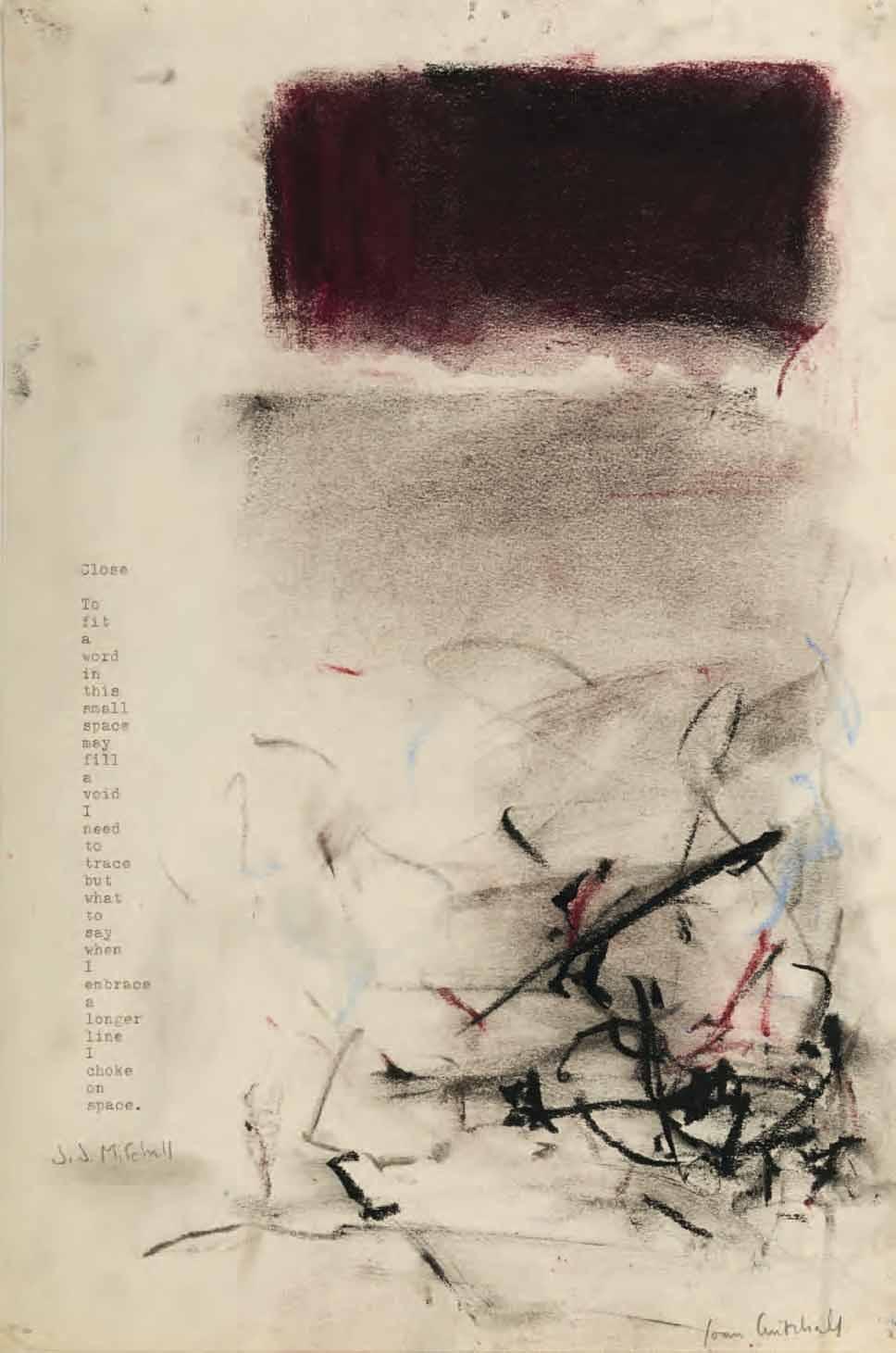
Pastel and typewriter ink on paper; a page from a sketchbook. Signed Joan Mitchell in pencil at the lower right. A poem by J. J. Mitchell entitled Close typewritten along the left edge of the sheet: Close / To / fit / a / word / in / this / small / space / may / fill / a / void / I / need / to / trace / but / what / to / say / when / I / embrace / a / longer / line / I / choke / on / space. Signed J. J. Mitchell in pencil at the lower left. 353 x 235 mm. (13 7/8 x 9 1/4 in.)
PROVENANCE: Acquired from the artist by a private collector, New York; Thence by descent.
One of the foremost American Abstract Expressionist painters, Joan Mitchell produced a superb body of oil paintings, pastels and prints between the 1950s and the 1980s. Trained at the School of the Art Institute of Chicago, from which she graduated in 1947, Mitchell spent time living and working for brief periods in Mexico, Paris and the south of France before settling in New York. 1950 marks the true start of her career as a painter, with the early influence of artists such as Willem de Kooning, Arshile Gorky and Franz Kline visible in her work. She became a habitué of the Cedar Tavern in Greenwich Village, a popular meeting place for avant-garde artists and writers, and was friendly with such painters as de Kooning, Kline, Phillip Guston, Grace Hartigan and Helen Frankenthaler, as well as the poets Frank O’Hara and John Ashberry. In 1951 Mitchell took part in the seminal Ninth Street Show, organized by the artist’s group known as ‘The Club’ and the art dealer Leo Castelli. She had her first solo exhibition at Eugene Thaw’s New Gallery in New York in 1952, which was a critical if not commercial success, and the same year moved into a studio on St. Mark’s Place that she would keep until the early 1980s, even when living and working abroad.
Although Mitchell had a series of seven solo exhibitions at the Stable Gallery in New York between 1953 and 1965, by 1955 she had also begun to divide her time between New York and Paris. There she met the French-Canadian painter Jean-Paul Riopelle, with whom she would have a long and often fractious relationship. Her work began to be included in group shows and museum exhibitions, notably at the Jewish Museum in New York in 1957, the Venice Biennale in 1958, Documenta II in Kassel in 1959 and the Guggenheim Museum in New York in 1961. By this time her paintings had been acquired for the collections of both the Whitney Museum of American Art and the Museum of Modern Art in New York, as well as the Art Institute of Chicago. After 1959 Mitchell painted almost all of her work in France, and she was to spend the last thirty-five years of her career there, supported by the French dealer Jean Fournier, at whose eponymous Parisian gallery she exhibited from 1967 until her death.
When Mitchell’s mother died in 1966 she inherited part of a family trust, and the following year purchased a large house, known as ‘La Tour’, at Vétheuil, a town on the banks of the Seine about sixty kilometres northwest of Paris. Mitchell and Riopelle lived there together, and she had a separate large studio behind the house. The size of the Vétheuil studio enabled her to work on a grander scale than before, and the first works she produced there reflected ‘the artist’s determination to allow her new, bucolic environment at Vétheuil to take her in new directions. Her move from Paris to the quiet and always beautiful two-acre property overlooking the Seine afforded her a new privacy and a physical connection with the landscape.’1 The paintings Mitchell produced at Vétheuil have a more expansive approach –perhaps partly inspired by the changing landscape, with a broad view of the Seine river, that she could see from the windows of her new home – than the works she had produced in her Paris studio. She was also able to create works in a diptych or triptych format, and sometimes even larger, fourpanel compositions, characterized by bright colours and bold, energetic brushstrokes. The first major retrospective of Mitchell’s paintings took place in 1974 at the Whitney Museum.
In 1979 Mitchell and Riopelle separated, and for some time thereafter she found herself unable to work on large canvases. She took a small studio in Montparnasse in Paris, and there began to work on a series of pastel drawings. As the scholar Jane Livingston has written of these works, ‘Mitchell’s work on paper was something she separated entirely from her painting activity and an endeavor about which she apparently had mixed feelings. She would say that her pastels were “lady paintings”. She did not want to be called a lady painter unless she was using the term herself, nor did she truly invest her deepest energies or intellect in these drawings…Although making drawings probably never rivaled printmaking in her own priorities, her place in Montparnasse gave her respite, and a way of continuing to work that seems to have been cyclically therapeutic. Ironically, her activity in this studio was literally toxic to her; she worked in a badly ventilated space, using powdery substances, including cadmium, which certainly exacerbated the lung problems that became more and more debilitating.’2
With the loyal support of her dealers Jean Fournier in Paris and Xavier Fourcade in New York, Mitchell’s work was acquired by a network of private collectors in America and Europe. Soon after returning to large-scale painting around 1980, the artist had her first European museum exhibition at the Musée d’Art Moderne de la Ville de Paris. The early 1980s found her creating some of her finest works, notably the Grande Vallée series of twenty-one lyrical canvases painted during the period of just over a year, between 1983 and 1984. She also began producing a series of colour lithographs at the Tyler Graphics studio in upstate New York. Health issues and a cancer diagnosis, however, meant that there were long periods when the artist was unable to work as before. Another major retrospective exhibition travelled throughout the United States in 1988-1989, and Mitchell continued working on paintings and prints until the very end of her life. She died, of advanced lung cancer, in October 1992, at the age of sixty-six.
Mitchell’s works on paper – mainly executed in pastel, but also in watercolour, charcoal, ink and wax crayon – were widely exhibited both during and after her career. A retrospective exhibition devoted to her pastels was held at the Whitney Museum of American Art in 1992. In the catalogue of that exhibition, Klaus Kertess wrote of her pastels that ‘They have an elemental directness as well as a sensuous, chromatic braveness not customarily associated with the pastel’s paler and politer proclivities. They are at once vulnerable and defiant. Mitchell has fully exploited the fragile powdery effusiveness of pastel – the way it fugitively settles into and illuminates the nap of the paper surface. Pastel’s willing responsiveness to the varying pressures of the hand has been deployed in a startling panoply of mark making, from blurred staccato tracks, to amorphous wisps, to sinuous trajectories of athletic aggressiveness. These pastels have a kind of velvet fury.’3
Similarly, in a review of the 1992 Whitney exhibition, one critic noted of Mitchell’s pastels that ‘Essential to all of her work is the attention she gives to the physical weight of pigment. The pastel is applied in thick, emphatic strokes here, tangles of loose calligraphic thread there, with a judicious use of rubbing, smudging and overdrawing throughout. The interwoven colors are many and rich, with a bias toward vegetable hues – succulent greens, dark reds – that make a few of these drawings look like informal but exotic bouquets.’4
Drawn in 1975, this is one of Joan Mitchell’s ‘poem pastels’; a series of unique abstract pastel compositions incorporating typewritten free-verse poems by five of her poet friends – James Schuyler, Jacques Dupin, J. J. Mitchell, Chris Larson and Pierre Schneider5. The artist referred to this group of pastels, in a letter to her New York dealer Xavier Fourcade, as ‘colour abstracts.’ As Jane Livingston has noted ‘The pastels she did for special occasions, particularly the ones made collaboratively with five of her poet friends…had a special meaning for her that set them apart from the small drawings done in series.’6
The present sheet incorporates the poem Close by the writer and poet J. J. Mitchell (1940-1986), a close friend of Frank O’Hara, who stayed with Joan Mitchell at Vétheuil from the summer of 1974 to the end of 1975.
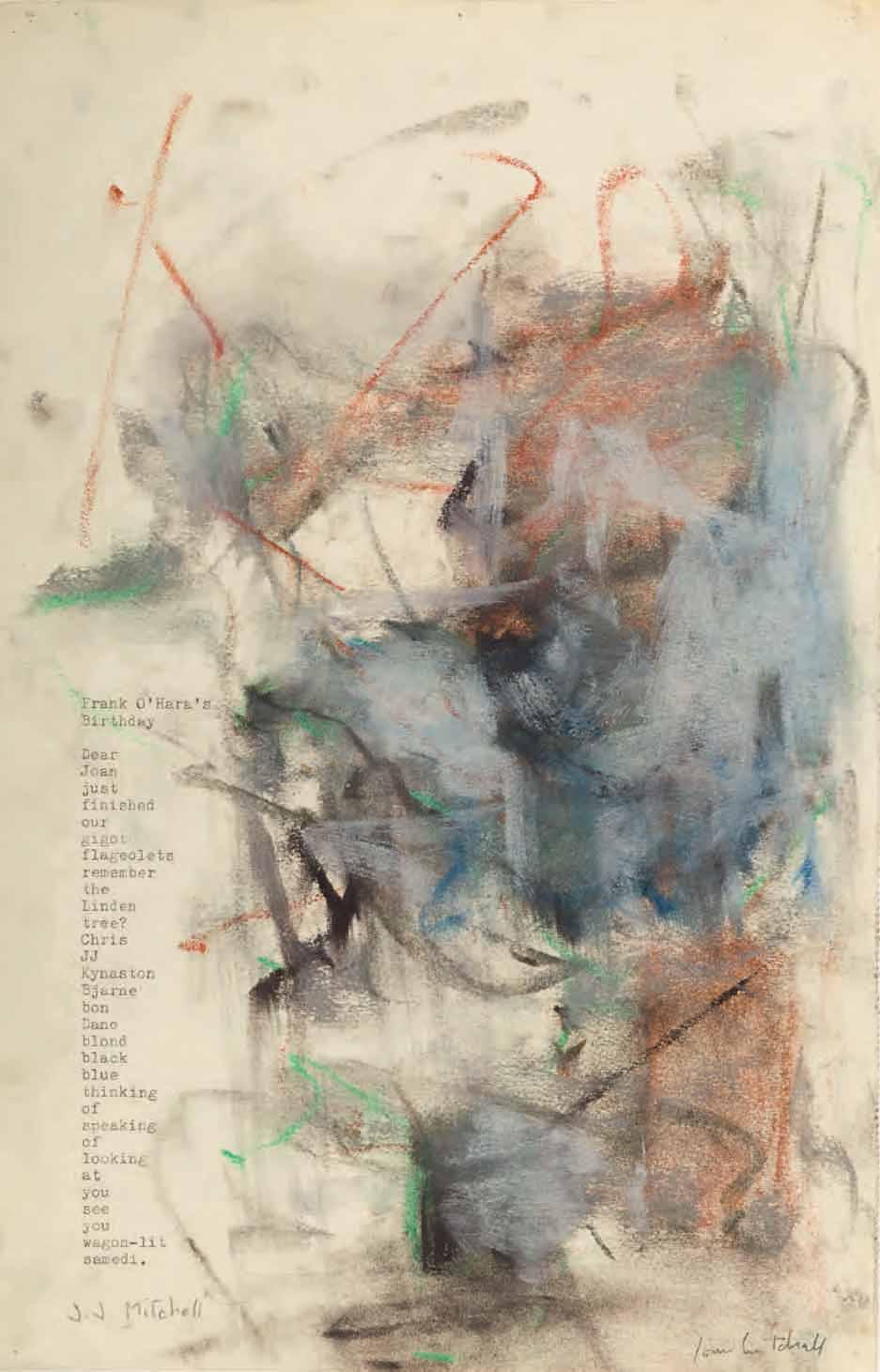
Pastel and typewriter ink on paper; a page from a sketchbook. Signed Joan Mitchell in pencil at the lower right. A poem by J. J. Mitchell entitled Frank O’Hara’s Birthday typewritten along the left edge of the sheet: Frank O’Hara’s / Birthday / Dear / Joan / just / finished / our / gigot / flageolets / remember / the / Linden / tree? / Chris / JJ / Kynaston / Bjarne / bon / Dane / blond / black / blue / thinking / of / speaking / of / looking / at / you / see / you / wagon-lit / samedi. Signed J. J. Mitchell in pencil at the lower left. 365 x 236 mm. (14 3/8 x 9 1/4 in.)
PROVENANCE: Acquired from the artist by a private collector, New York; Thence by descent.
LITERATURE: Jenni Quilter, ‘“Love Is the Condition of Arriving at Infinity”: Joan Mitchell and Poetry’, in Sarah Roberts and Katy Siegel, ed., Joan Mitchell, exhibition catalogue, San Francisco and Baltimore, 2021-2022, p.197.
Joan Mitchell once stated that ‘Music, poems, landscape, and dogs make me want to paint...And painting is what allows me to survive.’ The artist had a deep and abiding love of English and French literature and, in particular, poetry. She had grown up in a literary household in Chicago; her mother edited Poetry magazine and was a poet, writer and playwright herself, while the Mitchell home was often visited by such writers as Dylan Thomas, Thornton Wilder, T. S. Eliot and Edna St. Vincent Millay. At the age of ten, Mitchell had one of her own poems published in Poetry magazine.
Mitchell was close friends with a number of writers and poets, including John Ashbery, Samuel Beckett, Jacques Dupin, Frank O’Hara, Nathan Kernan, Pierre Schneider and James Schuyler. Her work was often directly inspired by poetry, and indeed she once described her painting as ‘more like a poem’. As she added, in a 1957 interview, ‘My art embodies the qualities that differentiate a line of poetry from a line of prose.’ In 1988 Mitchell collaborated with the poet Charles Hine on Smoke, a book of his verse illustrated with aquatints by the artist, while another collaborative project, Poems, with colour lithographs by Mitchell alongside poetry by Nathan Kernan, was to be her final work, appearing just before her death in 1992. As has been noted of the artist, ‘For Mitchell, poetry was a call across water, a model for hailing one another. It gave her a form in which to feel the world.’1
The present sheet is another of Joan Mitchell’s ‘poem pastels’ of 1975, and likewise incorporates a poem by J. J. Mitchell (no relation to the painter), who stayed with the artist at Vétheuil for several months between 1974 and 1975, during which time they collaborated on a series of pastel compositions featuring his poems. As Erin Kimmel has noted, the artist embarked on this group of pastels ‘when she was struggling to paint. Accustomed to switching modes when stuck, she asked J. J. Mitchell…a young writer who was moonlighting as her dog walker, confidant, and secretary of sorts, to use her mother’s Hermes typewriter to type up some of the poems he had written while staying at La Tour in Vétheuil. She took the pages and added pastel. Pleased with the result, she expanded the collection to include works that feature the poetry of other poet-friends, including Jacques Dupin, Pierre Schneider, and Chris Larson, as well as [James] Schuyler. Mitchell later objected to describing these works as collaborations. “I just took the poems,” she said.’2
In these distinctive works, it was usually the painter who directed where on the sheet of paper the typewritten poem should go; ‘In a letter to Xavier Fourcade, Mitchell referred to these [poem pastels] as “color abstracts” that respond to the “shape of the poem itself.”’3 In a letter to another poet, Karen Edwards, written at the end of 1975, Mitchell suggested that it was working on these ‘poem pastels’ that allowed her to return productively to painting: ‘Working with other people’s feelings – i.e. their poems, has helped a lot.’4
As Kimmel has written of the poet J. J. (John Joseph) Mitchell (1940-1986), ‘A younger member of the New York School, J. J. deftly chronicled daily life at La Tour in his poems, moving seamlessly between comedy and pathos. From the fits and starts of Mitchell’s creative process to the comings and goings of Jean Paul Riopelle to the wisdom of Mitchell’s cherished German shepherd, Iva, they track the entire reality of Mitchell’s newly consolidated life in the country, including the dark, alcohol-drenched intimacy she shared with J. J.’5
The present poem, Frank O’Hara’s Birthday, must have had a special significance for both Mitchells, who were each close friends of the poet and museum curator Frank O’Hara. Indeed, J. J. Mitchell was with O’Hara on the night of July 24th, 1966, when O’Hara was hit by a dune buggy on a beach on Fire Island in New York, dying the following day in hospital of internal injuries. Joan Mitchell later used the date of O’Hara’s death as the title of a suite of paintings dedicated to him.
As Sarah Roberts has pointed out, ‘A former partner of O’Hara’s, J. J. wrote light, crisp poems that often directly addressed Mitchell and her dogs, like affectionate notes to a friend.’6 His poem Frank O’Hara’s Birthday is addressed to the painter, and is a tender evocation of the time they were spending together at Vétheuil, as well as of memories which both artist and poet shared of O’Hara and of mutual friends, on a day that would otherwise have been a cause for celebration (‘black / blue / thinking / of / speaking / of / looking / at / you ’). Given the title of the poem, it is likely that it was written on or around March 27th, 1975, on what would have been O’Hara’s 49th birthday. Two further ‘poem pastel’ versions of Frank O’Hara’s Birthday, each with a different composition, are known7
Another example of Joan Mitchell’s and J. J. Mitchell’s ‘poem pastels’ from this 1975 series, entitled Blue, is today in the Museum of Modern Art in New York8. Three others, all from the collection of the artist’s friend Joseph Le Sueur, appeared at auction in New York in 20079, while another, entitled Drowned, was sold at auction in Philadelphia in 200410. A further ‘poem pastel’ by Joan Mitchell and J. J. Mitchell, entitled What Makes This, is in a private collection11
Seventeen of Joan Mitchell’s collaborative ‘poem pastels’, incorporating poems by both J. J. Mitchell and James Schuyler, were shown at the Tibor de Nagy Gallery in New York in 2002. As a New York Times review of the exhibition noted, ‘These paintings don’t necessarily illustrate the poems directly; in fact, in some cases it isn’t clear whether text or image came first. But more often than not the components share a mood.’12
Of the same exhibition, another critic opined that ‘Joan Mitchell dismissed her works on paper – even painting-scale pastels of four-foot dimensions – as “lady paintings”…[however, in] petite and lovely sheets on which she combined her own pastel drawings with concrete poems by poet friends…Mitchell shows an unusually advanced sensitivity to balancing image and text on a page and making art of their interwoven imagery. The drawings are rather Zen-like, with floats and falls of icy or smoky color and hints of emerging form. They are subtle and delicate and at the same time frank and tough and sometimes angry (Not one bit ladylike!)…Mitchell may have dismissed her small-scale works on paper, but no one else should.’13
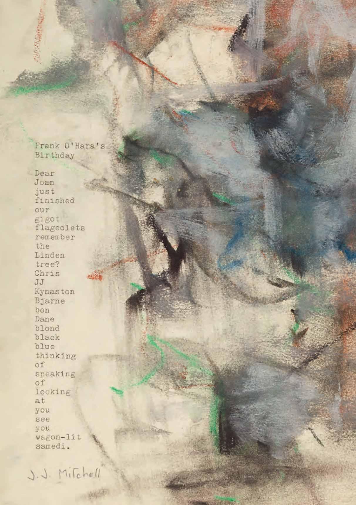
Untitled
Pen and black ink and blue wash on white paper. 241 x 319 mm. (9 1/2 x 12 1/2 in.)
PROVENANCE: The estate of the artist, with the studio stamp DM 1998 in an oval (not in Lugt) in black ink at the lower right; Probably the posthumous vente Dora Maar (‘Derniers souvenirs de Dora Maar: Succession de Madame Dora Markovitch’), Paris, Hôtel Drouot [Piasa and Mathias], 27 May 1999, lot unidentified; Private collection, New Jersey.
Born Henriette Théodora Markovitch in Paris, the only child of a Croatian father and a French mother, and raised in Argentina until the early 1920s, Dora Maar studied in Paris at the Union Centrale des Arts Décoratifs and at the Académie Julian. In 1927, she also took classes in the studio of the painter André Lhote, where she met the photographer Henri Cartier-Bresson, before enrolling in the Ecole Technique de Photographie et de Cinématographie de la Ville de Paris. Initially undecided between pursuing a career as a painter or photographer, she opened a photographic studio, in association with the art director and set designer Pierre Kéfer, in Neuilly-sur-Seine in 1931.
Maar soon established a reputation as a fashion photographer, while also producing photographs of advertising images, architectural and urban views, portraits and nudes; many of these were done on commission for magazines, books, and beauty and fashion companies. In 1932 and 1934 her photographs were exhibited at galleries in Paris, shortly before her professional relationship with Kéfer ended. In 1935 she met André Breton and began to be involved in the activities of the Surrealists, who admired her sometimes fantastical photomontages. Maar’s work was included in several Surrealist publications and exhibitions in the mid to late 1930s, while among her circle of friends were the female Surrealists Nusch Eluard and Jacqueline Lamba, as well as the American photojournalist Lee Miller.
Dora Maar is said to have encountered Pablo Picasso at the café Les Deux Magots in Paris in January 1936, and the two soon began an intense relationship. She first appears in Picasso’s paintings in the summer of that year, and was to be his mistress and muse for nine years, between 1936 and 1943; through the period of the Spanish Civil War, the outbreak of World War II and the Occupation of Paris. Picasso painted numerous portraits of Maar, most famously as an anguished, weeping woman in a series of paintings executed throughout 1937. She was the only photographer allowed access to Picasso’s studio as he was painting the massive Guernica in May and June of 1937, and produced dozens of photographs of the master at work on the large mural which later became an important resource for later scholars documenting the genesis of this seminal work. She also taught Picasso basic photographic techniques, and they collaborated on some experimental works, several of which were published in the magazine Cahiers d’Art in 1937. Maar eventually gave up photography and, encouraged by Picasso, turned to painting. Together with another artist, she had an exhibition of her work in June 1944, while her first solo show took place at the Pierre Loeb Gallery two years later. This was, however, the last time her work was to be seen in public for over a decade.
Maar’s relationship with Picasso ended after the war, following the appearance of his new lover, Françoise Gilot. She started to suffer from depression, enduring a nervous breakdown that led to treatment by the renowned psychiatrist Jacques Lacan. She continued to paint, however, and began to focus on a series of increasingly reductive landscapes inspired by the area around the Provençal town of Ménerbes, where she spent her summers.
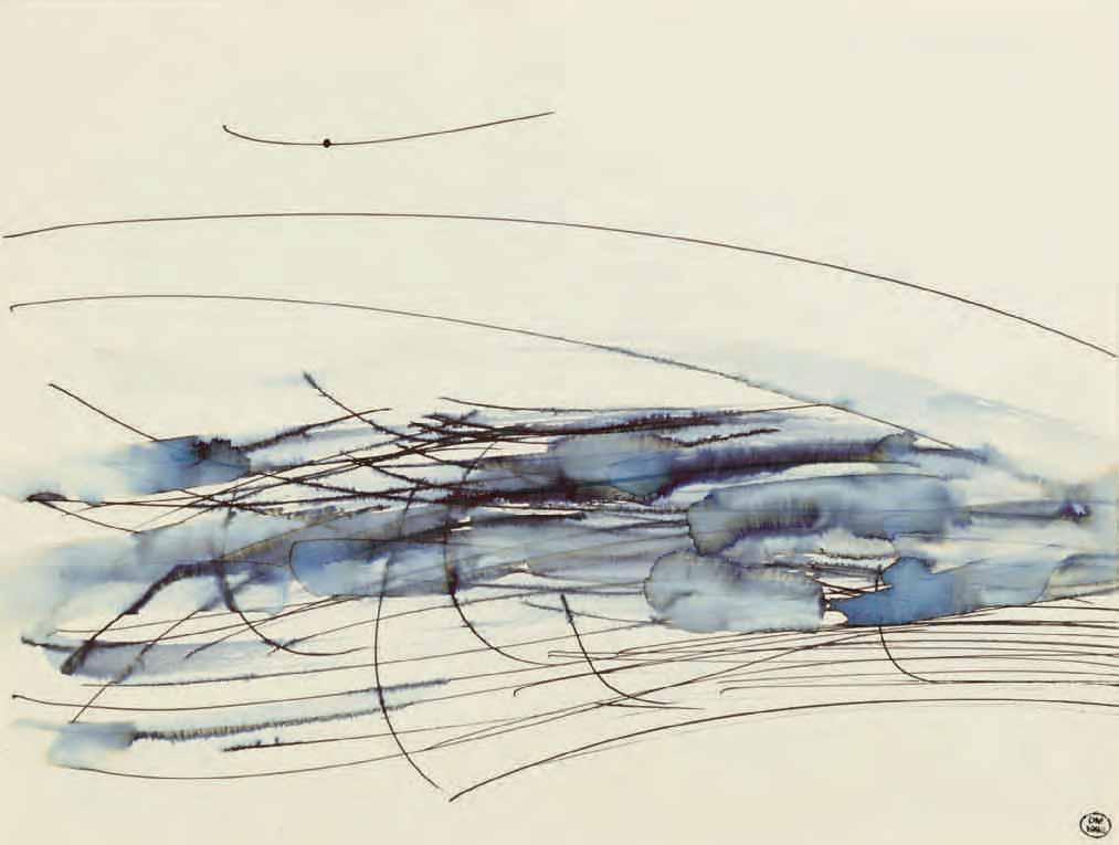
Untitled
Brush and dark brown and light brown washes on white paper. 210 x 270 mm. (8 1/4 x 10 5/8 in.)
Watermark: [B]ASSEAU EXTRA STRONG
PROVENANCE: The estate of the artist, with the studio stamp DM 1998 in an oval (not in Lugt) at the lower right; The posthumous vente Dora Maar (‘Derniers souvenirs de Dora Maar: Succession de Madame Dora Markovitch’), Paris, Hôtel Drouot [Piasa and Mathias], 27 May 1999, lot unidentified (bt. de Roquemaurel-Galitzine); Dominique de Roquemaurel-Galitzine, until 2021.
LITERATURE: Giulia Pentcheff, Collection Dominique de Roquemaurel-Galitzine. Dora Maar: Seule au bord de la Terre, exhibition catalogue, Marseille, 2022, p.81, no.67.
EXHIBITED: Marseille, Galerie Alexis Pentcheff, Dora Maar: Seule au bord de la Terre, 2022, no.67.
The last forty years of Dora Maar’s life were spent largely as a recluse, living between her apartment on the rue de Savoie in Paris and a large but dilapidated house in Ménerbes, which Picasso had given to her in 1945. She saw very few people, allowed almost no one into her home or studio, and devoted herself mainly to painting brooding Provençal landscapes devoid of figures. It has been suggested that the growing focus on abstraction in these works was an attempt to free herself of the pervasive stylistic influence of Picasso, whose work was always rooted in representation.
Throughout the 1950s Maar continued to maintain friendships with artists and writers such as Balthus, André du Bouchet, Marc Chagall, Nicolas de Staël (who was a neighbour in Ménerbes), Paul Eluard, André Masson and Man Ray, as well as collectors like Douglas Cooper and Marie-Laure de Noailles. Among the very few visitors to her studio whom she allowed to see her work was her friend, the American writer James Lord, who stayed at Ménerbes in the spring and summer of 1954. Despite her almost ascetic removal from the art world, however, Maar never faltered in her belief that her talent would one day be recognized. As she once told Lord, ‘I must dwell apart in the desert. I want to create an aura of mystery about my work. People must long to see it. I’m still too famous as Picasso’s mistress to be accepted as a painter.’1
For many years, Maar, who did not drive, would travel on a motorcycle around the mountainous valley of the Luberon region near Ménerbes, sketching the landscape. (As Lord recalled, ‘Dora riding out on her motorbike to make watercolors in the countryside, I thought, looked rather ludicrous, her hair done up in a woolen scarf and with a sack slung over her shoulders, decidedly too old for that kind of conveyance.’2) Some of Maar’s landscape paintings, many verging on abstraction, were shown in two separate exhibitions at a gallery in Paris in 1957 and another in London in 1958. Of the first of these shows, one writer noted that the artist ‘succeeds admirably in catching the savage beauty of this corner of France’3, while writing of the second, the critic John Russell described the works as ‘a hermit’s paintings’ and Maar as ‘an attentive student of nature, in whose work a fondness for plunging perspectives and great trailing scarves of color was kept in check by the finest regard for the structure of the scene before her.’4
Untitled
Brush, oil and purple and green washes on white paper. Inscribed DT. in purple ink on the verso. 210 x 270 mm. (8 1/4 x 10 5/8 in.)
Watermark: [BASSE]AU EXTRA STRONG BASSE[AU].
PROVENANCE: The estate of the artist, with the studio stamp DM 1998 in an oval (not in Lugt) at the lower right; The posthumous vente Dora Maar (‘Derniers souvenirs de Dora Maar: Succession de Madame Dora Markovitch’), Paris, Hôtel Drouot [Piasa and Mathias], 27 May 1999, lot unidentified (bt. de Roquemaurel-Galitzine); Dominique de Roquemaurel-Galitzine, until 2021.
LITERATURE: Giulia Pentcheff, Collection Dominique de Roquemaurel-Galitzine. Dora Maar: Seule au bord de la Terre, exhibition catalogue, Marseille, 2022, p.116, no.106.
EXHIBITED: Marseille, Galerie Alexis Pentcheff, Dora Maar: Seule au bord de la Terre, 2022, no.106.
By the early 1970s, Dora Maar’s paintings and drawings had become completely abstractive, characterized by experimental techniques and a bold use of various media. Living in seclusion, either in Paris or the unheated house in Ménerbes, she saw almost no one and, deeply religious, spent much of her time in prayer and writing poetry. Nevertheless, she continued to work productively as an artist, with characteristic rigour and determination, until the end of her life. (Although she generally refused to have her paintings or works on paper exhibited, or to be illustrated in books or catalogues, in 1990 she allowed the dealer Marcel Fleiss of the Galerie 1900-2000 in Paris to show some of her landscapes and still-lifes.) An exhibition of paintings and photographs in Valencia in 1995 was the only museum show of her oeuvre to take place in her lifetime; the exhibition was meant to travel to the Centre Pompidou in Paris but was eventually cancelled due to the artist’s unhappiness with it. Almost completely forgotten by the world at large, Maar died in 1997, at the age of eighty-nine. Some twenty-two years after her death a major retrospective exhibition devoted to her work was held at the Centre Pompidou in Paris and the Tate Modern in London.
While Dora Maar’s career as a photographer has now been quite well documented and studied – in 2004 a set of 1,900 negatives and 300 photographic prints from her estate was acquired by the French state for the collection of the Centre Pompidou – her activity as a painter and draughtsman is much less well known. These intensely private works were produced in isolation, over a period of several decades, and unseen by almost everyone she knew. As has recently been noted by one scholar, ‘Her work as a painter, which spanned most of her career, is known only to specialists and aficionados of her oeuvre; it has yet to find its place in terms of either aesthetics or the history of art…Accidents, interruptions, reversals, and reconciliation are the components of Maar’s fitful career as a painter. Although at odds with standards of artistic success, her trajectory is no less revealing of the vitality and creative freedom that can be seen throughout her career.’1
This group of drawings are part of a series of bold, abstract compositions, executed in either watercolour, gouache, thinned oil paint, ballpoint, ink and wash and felt-tip pen, that Maar drew from the 1960s onwards, almost all of which were never seen or exhibited in her lifetime. Parallels may be found among the painted landscapes on canvas that she produced in the 1950s, although the works on paper are more spontaneous in execution. The artist, who left almost no writings or letters about her work, rarely signed her drawings, and an accurate dating of them remains problematic.
Untitled
Brush, oil and light blue wash on white paper. 210 x 270 mm. (8 1/4 x 10 5/8 in.)
PROVENANCE: The estate of the artist, with the studio stamp DM 1998 in an oval (not in Lugt) at the lower right; The posthumous vente Dora Maar (‘Derniers souvenirs de Dora Maar: Succession de Madame Dora Markovitch’), Paris, Hôtel Drouot [Piasa and Mathias], 27 May 1999, lot unidentified (bt. de Roquemaurel Galitzine); Dominique de Roquemaurel-Galitzine, until 2021.
LITERATURE: Giulia Pentcheff, Collection Dominique de Roquemaurel-Galitzine. Dora Maar: Seule au bord de la Terre, exhibition catalogue, Marseille, 2022, p.130, no.131.
EXHIBITED: Marseille, Galerie Alexis Pentcheff, Dora Maar: Seule au bord de la Terre, 2022, no.131.
In a letter to Dora Maar published as the introduction to the catalogue of an exhibition of her landscape paintings and watercolours, held at a gallery in Paris in 1957, the English scholar, critic and collector Douglas Cooper, who was a friend of the artist, wrote ‘How much progress, of change of spirit, separates your landscapes of today from your painting before the war...I would like you to know that what I like the most about your recent paintings, is the direct inspiration from nature, the spontaneous and not at all forced romantic spirit, and above all the fine painterly technique of which they are the proof. Shall I dare to tell you, without insisting too much, that I see on the one side a relationship with Turner, and on the other, a rapport with Courbet?...You have a real vision as a painter, you have the courage to pursue this vision up to its realization on the canvas, and you are especially well-served by a very skilled hand, by a remarkable manner of handling of paint, a sensibility and an instinct which is very sure.’1
At the time of her death, Maar left no will, and had no known heirs. She owned numerous works by Picasso, all given to her by the artist, and although she sold a number of these towards the end of her life, in order to have money to live, the vast majority of her collection remained in her possession. The contents of her homes in Paris and Ménerbes, including the works by Picasso, were conservatively valued at 150 million francs after her death, and were dispersed in a series of auctions in Paris in 1998 and 1999. The first two sales alone, comprised of paintings, drawings and objects by Picasso, realized a total of 213 million francs.
The present group of abstract sketches were among the contents of the artist’s studio – including numerous paintings and portfolios of works on paper, prints and photographs, the output of a career that lasted almost sixty years – that were dispersed in the last of a series of auctions of her estate in 1998 and 1999. Much of this previously unseen material was sold in batches of loose sheets, however, without having been properly inventoried, catalogued or even photographed.
Three of the four works on paper here exhibited were until recently in the collection of the jewellery designer and artist Dominique de Roquemaurel-Galitzine, who purchased three boxes of unmounted drawings by Maar, numbering over 160 sheets, at the vente Dora Maar in 1999. For around twenty years these drawings remained untouched in their cardboard boxes, stored by de RoquemaurelGalitzine on top of a cupboard, although some fifteen sheets from her collection were included in the Dora Maar exhibitions at the Centre Pompidou and the Tate Modern in 2019.
Milwaukee 1913-2003 New York
Untitled (Expansionist Series)
Acrylic on paper. Signed Springford in blue ink and numbered 770 in pencil on the verso, laid down on board.
203 x 251 mm. (8 x 9 7/8 in.)
PROVENANCE: The estate of the artist; W. Alexander, New York; Private collection, California.
The American abstract painter Vivian Springford was born in Wisconsin and lived in Detroit before settling with her family in New York in 1930. After graduating from the Spence School she studied at the Art Students League in New York between 1932 and 1946, during which time she worked as a commercial illustrator and portraitist. By the middle of the next decade, however, Springford’s own work was tending toward abstraction, and she became loosely associated with Abstract Expressionism, the dominant style in New York in the late 1950s. What set her paintings apart from her contemporaries was her particular interest in Eastern forms of thought and expression, in particular Chinese calligraphy, and its profound effect on her visual language. At this time the artist was sharing a studio with the expatriate Chinese artist Walasse Ting, who introduced her to Asian art and, although much younger than her, may have been an influence on her technique.
Springford’s early ‘Calligraphy’ series of paintings employed acrylic paints on rice or mulberry paper, which she would then mount onto canvas. As she noted at the time, ‘I liked the direct approach of the early Chinese painters…Whatever they put down on paper stayed there; they didn’t edit. They didn’t copy nature, either; they interpreted it. Some of the older Chinese drawings are much more abstract than anything done today. I adapted their rhythm and free motion to my own abstract paintings.’1 These largely monochromatic abstract works were first shown at the National Academy of Design in 1959 and were also the subject of her inaugural solo gallery exhibition the following year, when the artist was forty-seven years old. Indeed, having worked for many years as a commercial illustrator before turning to abstract art, Springford was considerably older than many of her like-minded peers; Helen Frankenthaler, for example, was fifteen years her junior.
By the early 1960s Springford’s work was becoming more colourful, though still painted in a highly calligraphic style on bright white rice paper. These works were exhibited in a second solo show at a gallery in New York in 1963, which, like her first exhibition in 1960, garnered relatively little critical comment. Soon afterwards, the artist, who was now aged fifty, suffered a back injury that left her unable to paint on a large scale for some time, and she turned towards a series of drawings in pen and crayon. She began travelling widely, and it was on one of these trips that a new inspiration arrived. On a visit to Yellowstone National Park in Wyoming in 1965, the artist became captivated by the park’s hot springs; oval-shaped pools made up of mineral deposits, characterized by intensely bright colours of blues, greens and yellows, from which bubbled up steaming waters from deep underground. Springford was inspired by these geological formations to create a group of vibrant concentric compositions of pool-like forms, using poured, diluted acrylics on rice paper, that became known as the Morning Glory series, named after one of the thermal springs at Yellowstone. Later abstract paintings were the result of photographs taken during further travels in the 1970s; to Tanzania, Martinique and the Himalayas.
The 1970s also found the artist working on several other sequences of very colourful abstract paintings, including the Cosmos series, the assemblages known as the Star Stuff and Scuba series, and the Expansionist series, all of which were based on natural phenomena. As Springford wrote in 1976, ‘Painting is my attempt to identify with the universal whole. I want to find my own small plot or pattern of energy that will express the inner me in terms of rhythmic movement and color. The expansive center of the universe, of the stars, and of nature is my constant challenge in abstract terms.’2 These works were characterized by diaphanous washes of brilliant colour and overlapping layers of forms.
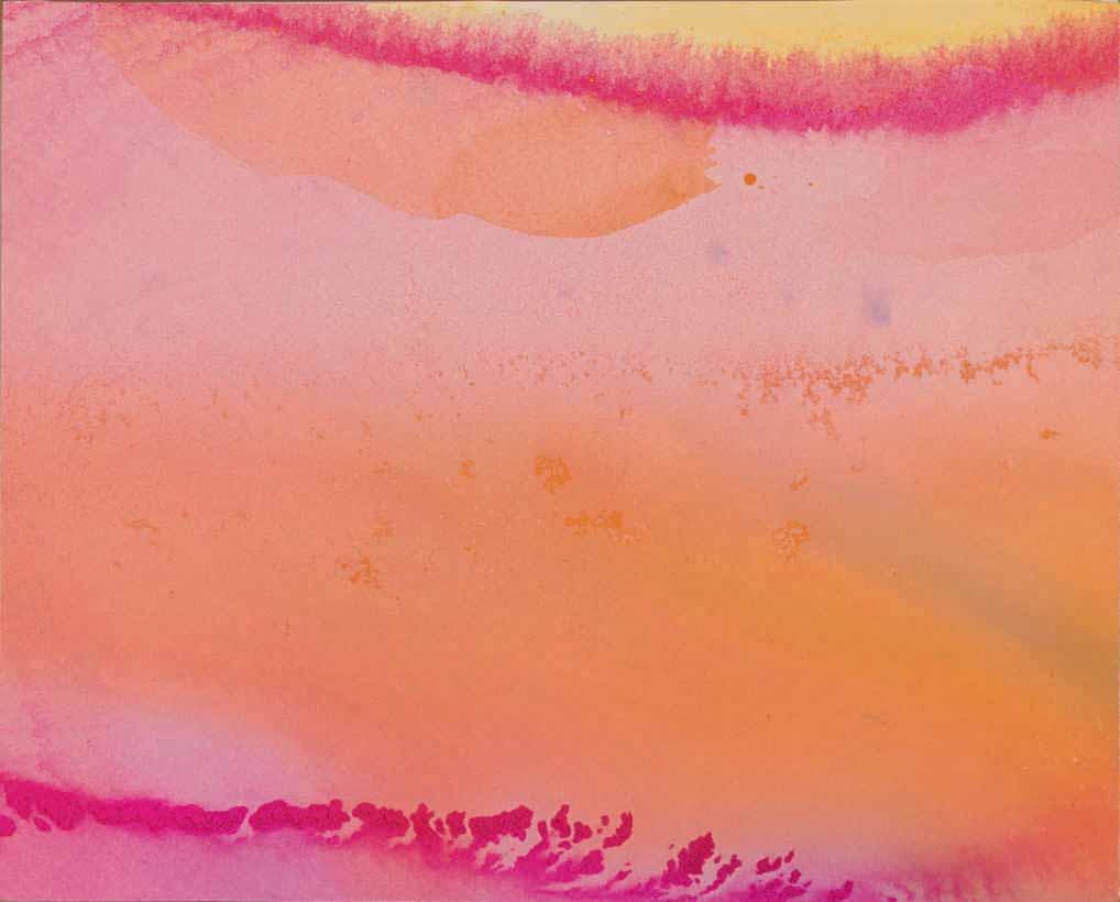
Although a few of her works were included in group shows, as well as in the exhibition Women Artists: Works on Paper at the Brooklyn Museum in 1975 and two small solo shows in 1975 and 1979, Springford tried in vain to interest art galleries, curators and collectors in her paintings. Between 1970 and 1986 she sent dozens of colour slides of her work to museums, artists and critics, with little success. By the end of the decade, her failing eyesight had been diagnosed as macular dystrophy, and after around 1986 she ceased to paint at all. She did, however, produce a series of small, three-dimensional sculptures made of bones which she photographed before disassembling and re-forming the materials into other shapes. These sculptural objects no longer survive and are only recorded in photographs.
Eventually becoming almost completely blind, Springford was, for the last two decades of her life, largely confined to the small apartment in New York where she lived for seventy years. Her oeuvre as an artist remained mired in obscurity, lacking any support from galleries or collectors, and almost her entire extant body of mature abstract work – numbering perhaps two hundred chromatic paintings executed over a period of two decades – was kept in a storage unit in New York City. It was not until the early 1990s that Springford’s work was rediscovered and she began to be represented by the art dealer Gary Snyder. In 1998 an exhibition of her paintings at the Snyder’s gallery in New York was a revelation to collectors and critics alike, and was almost completely sold out before the show even opened. Although Springford was gratified by this long-awaited recognition, her health continued to decline, and she died in January 2003, just shy of her ninetieth birthday.
Since her death, Springford’s paintings have been exhibited at the Museum of Fine Arts in Boston, as well as in galleries in New York, Chicago, New Mexico, Wyoming and Tokyo, while a biographical essay devoted to her was included in the catalogue of the important exhibition Women of Abstract Expressionism at the Denver Art Museum in 2016. Works by the artist have lately entered the collections of the Guggenheim Museum in New York and the Boston Museum of Fine Arts. Most recently, Springford’s work was included, alongside that of Gillian Ayres, Helen Frankenthaler, Grace Hartigan, Elaine de Kooning, Lee Krasner, Joan Mitchell and many others, in the exhibition Action, Gesture, Paint: Women Artists and Global Abstraction 1940-1970, held at the Whitechapel Gallery in London in 2023.
The present sheet, which is datable to c.1976, is part of Vivian Springford’s Expansionist series of abstract works, which were, for the most part, painted on high-quality Arches paper rather than canvas. As has been noted of the series, ‘The Expansionist works are divided between treatments of what [the artist] saw during the eruption of the Soufrière volcano on the island of Guadalupe in 1976 – intense reds, oranges and blues flow in every direction – and lunar studies, cool blues of the moon and clouds. The Expansionist works are denser in color than the Cosmos paintings. Often they feature a curved bar of dark color, a high tide mark which resolves the composition into a form resembling a horizon, or wave top, that invokes the line of energy found in the composition of traditional Chinese painting.’3
Another writer has added that ‘Springford’s Expansionist series…references the ever expanding universe. We can almost see this movement as Springford’s colors seem to seep outward, drawn out by the paper’s absorbent pulp…The Expansionist series reveals Springford’s remarkable dexterity with her chosen medium.’4 Indeed, the present sheet attests to the fact that, as a third writer has pointed out, ‘[Springford’s] works on paper, though modest in size, reveal a sophisticated balance of control and freedom.’5
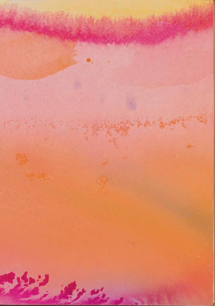
New York 1928-2011 Darien
Acrylic on paper. Signed and dated 22 July ’81 Frankenthaler in pencil at the lower right. Signed, dated and dedicated 2 Dec ’81 / Happy Birthday Dear Erni! / Love Helen in pencil at the lower left. 279 x 381 mm. (11 x 15 in.)
PROVENANCE: Gifted by the artist in December 1981 to Ernest and Barbara Kafka, New York and Provincetown, Massachusetts; Their posthumous sale (‘A Way of Life: The Collection of Barbara and Ernest Kafka’), New York, Sotheby’s, 20 May 2022, lot 265.
Born into a life of privilege on the Upper East Side of Manhattan, the American painter, draughtsman and printmaker Helen Frankenthaler was educated at Brearley and the Dalton School (where her first art teacher was the Mexican painter Rufino Tamayo), before completing her studies with the abstract painter Paul Feeley at Bennington College in Vermont. Her early work was strongly influenced by the paintings of Willem de Kooning and Arshile Gorky, as well as the earlier work of Wassily Kandinsky and Joan Miró. Soon after setting up her studio in New York Frankenthaler became close to the eminent art critic Clement Greenberg, with whom she was to be in a relationship for several years. When the painter Adolph Gottlieb saw her paintings at Greenberg’s apartment, he decided to include a work by her in his selection for a group exhibition entitled Fifteen Unknowns at the Kootz Gallery in 1950. The following year Frankenthaler was the youngest artist to be a part of the Ninth Street Show, an exhibition organized by members of the New York school known as ‘The Club’, while later that year the twentythree-year-old artist had her first solo show, of eleven paintings, at the Tibor de Nagy Gallery.
Perhaps the most significant event of this period, however, was Frankenthaler’s discovery of the work of Jackson Pollock, initially at his exhibition at the Betty Parsons Gallery in 1950. Greenberg introduced her to Pollock the following year, and she began closely studying his methods on visits to his studio in Long Island. The influence of Pollock on her own paintings was to be significant. As noted by the scholar Barbara Rose, ‘The overt physicality of Pollock’s method, the sense of the painting having been, as Frankenthaler puts it, “choreographed”, made possible a large scale, a boldness and an openness that appealed to her.’1 By the end of 1951 Frankenthaler had become a part of the vibrant artistic community in New York, despite being younger than almost all of her contemporaries. She became friendly with Pollock and Lee Krasner, as well as with Gottlieb, Willem and Elaine de Kooning, Grace Hartigan, Franz Kline, Joan Mitchell, Barnett Newman and David Smith.
In October 1952, following a trip to Nova Scotia with Greenberg, Frankenthaler painted a monumental canvas that she titled Mountains and Sea, in which her characteristic stain technique first came to the fore. The painting, the largest she had attempted up to that point, is of seminal importance in heralding the direction of the artist’s later career. Working on the floor, Frankenthaler began pouring and spilling paint directly onto raw unprimed canvas, ‘extending Pollock’s method by thinning down her medium so that paint not only sank into but soaked right through canvas, she created a stained image that was not literally on top of or illusionistically behind the picture plane but literally in and of the ground.’2 In April 1953, Kenneth Noland and Morris Louis, two older painters from Washington, D.C., visited Frankenthaler’s New York studio and came away impressed with what they had seen, particularly the revelatory Mountains and Sea, which was to be a significant influence on their development of Colour Field painting.
Frankenthaler’s paintings began to receive more attention as she continued to have exhibitions at the Tibor de Nagy Gallery between 1953 and 1958 (and in later years at the André Emmerich Gallery), and had her work included in museum shows. In 1958 she married the artist Robert Motherwell, and two years later an early retrospective exhibition of her work was mounted at the Jewish Museum in
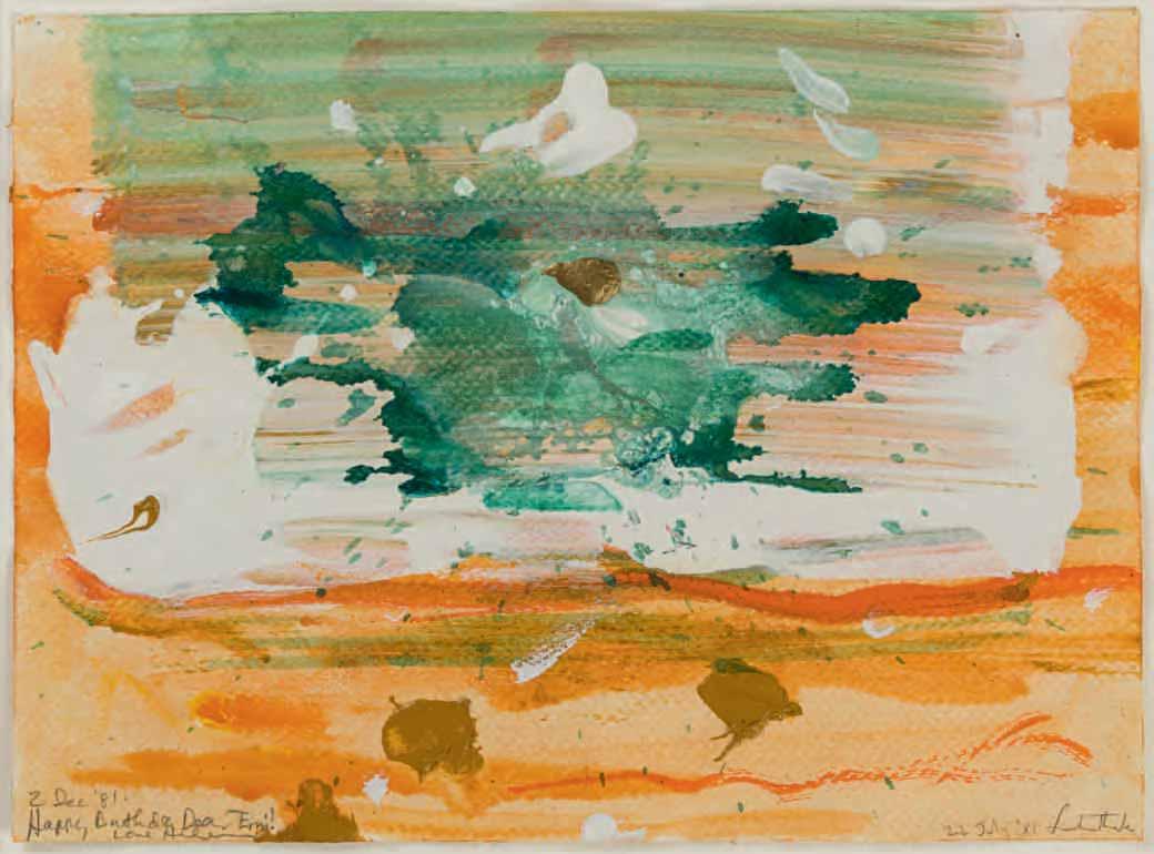
New York. By this time her paintings had been acquired by the Whitney Museum of American Art and the Museum of Modern Art in New York, while in 1959 she had been represented in the Documenta II exhibition in Kassel and in biennials in Paris and São Paulo. At the age of thirty, Frankenthaler was now firmly established as one of the leading members of the second generation of the New York school of abstract painters.
Solo gallery shows of Frankenthaler’s work – in New York, Los Angeles, Paris, London, and elsewhere – continued throughout the 1960s, as did important museum surveys in which her paintings were included. Frankenthaler was one of three artists chosen to represent the United States at the Venice Biennale of 1966, and in 1969 was the subject of a retrospective exhibition at the Whitney Museum in New York; a show which travelled to England and Germany and introduced her work to a much wider public abroad. Her success continued throughout the 1970s with museum and gallery exhibitions, as well as several public mural commissions, executed as paintings, ceramic tiles or tapestry. Frankenthaler also worked productively as a printmaker, creating etchings, monotypes, lithographs and colour woodcuts.
In 1989 another major retrospective exhibition of forty paintings opened at the Museum of Modern Art in New York and toured to Fort Worth, Los Angeles and Detroit. Ten years later Frankenthaler settled in the town of Darien, on Long Island Sound in Connecticut, where she lived and worked for the remainder of her career. In an interview published not long afterwards, in 2003, she summarized her approach to her work: ‘With any picture, on paper or on canvas, the main idea is: does it work? Is it beautiful?...There is no ‘always’. No formula. There are no rules. Let the picture lead you where it must go.’3
Helen Frankenthaler produced a large and varied body of vibrant works on paper – drawn in ink, crayon, gouache, watercolour, oil, acrylic and pastel – throughout her long and storied career. Aptly described as ‘among her most spontaneous and personal works’4, her drawings were almost always produced as autonomous works, rather than as preparatory exercises towards paintings or prints. The first owners of this large sheet were Barbara (1933-2018) and Ernest (1932-2021) Kafka, an intellectual couple from New York who spent their summers in Provincetown, Massachusetts. The Kafkas befriended several members of the local artistic community in Provincetown, notably Frankenthaler and her husband Robert Motherwell, as well as Lucas Samaras and Frank Stella. (Frankenthaler had first visited Provincetown in 1957, and established a studio there in 1961, returning every summer that decade.) The friendship between Frankenthaler and Barbara and Ernest Kafka led the artist to gift several works to the couple. Drawn in acrylic on paper in July 1981, the present sheet was given by the artist four months later to Ernest Kafka, on the occasion of his 49th birthday.
As the art historian Karen Wilkin, writing in 1984, noted of the artist’s works on paper of the late 1970s and early 1980s, ‘Frankenthaler places unprecedented emphasis on inflected expanses of color, on nuances of dark and light, of transparency and opacity, and on a new, heightened physicality. The impact of these pictures comes neither from drawing nor from graphic configurations, as in the works of the 1950s and 1960s, but rather from the fact of painting and the special qualities of paint...Some of the new painterliness of Frankenthaler’s works on paper of the last ten years is the result of her using acrylic paint but without [any] additives...Frankenthaler’s works on paper have always demonstrated her dialogue with her materials: the transparency of her watercolors of the 1950s or the haloing stains and declarative shapes of her oils on paper of the 1960s were expressive of the peculiarities of their media. The new surface variation of her works on paper of the past decade is her response to acrylic’s properties. Thinned, it flows and is as transparent as watercolor; thick, it holds its shape and retains the imprint of the tool that manipulates it, like oil. Yet it is more intense than watercolor when thinned, and unlike oil, it produces no encircling stain… These are sensuously worked paintings on paper that combine the immediacy, clarity, and directness of Frankenthaler’s most transparent early works with a new, vigorous physicality.’5
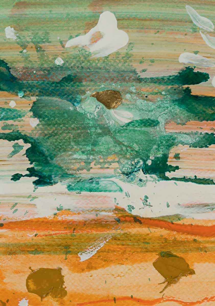
Long Beach 1941-2022 Amagansett
Old House Lane, No.1
Pastel on two sheets of paper. 1120 x 1525 mm. (44 1/8 x 60 in.)
PROVENANCE: Paula Cooper Gallery, New York, in 1987; John C. Stoller & Co., Minneapolis, in May 1987; Private collection; Anonymous sale, New York, Sotheby’s, 25 September 2018, lot 250; Private collection.
EXHIBITED: New York, Paula Cooper Gallery, Jennifer Bartlett: Old House Lane, 1987; New York, Marianne Boesky Gallery, The House was Quiet and the World was Calm: Jennifer Bartlett 1970-2014, 2019.
Active as a painter, draughtsman, printmaker and writer, Jennifer Losch Bartlett was born in California and studied at Mills College in Oakland and at the Yale School of Art and Architecture in New Haven, graduating in 1965. In the late 1960s she began painting on uniformly-sized small steel plates1 and had solo exhibitions of these works in New York in 1970 and 1972. Two years later the artist began a long and fruitful association with the Paula Cooper Gallery in New York. Bartlett first came to prominence when her monumental work Rhapsody – made up of 987 painted steel plates, each one-foot square, and arranged in 141 vertical rows of seven plates each – was exhibited in 1976 at the Paula Cooper Gallery to considerable critical acclaim and was quickly sold to a private collector. (The 153-foot-long painting is now in the collection of the Museum of Modern Art in New York.) Bartlett continued to produce works in series for much of her later career, notably the sequence of some two hundred drawings, executed in various media, entitled In the Garden and done between 1979 and 1980, and the twenty-four paintings of the Air: 24 Hours series, painted between 1991 and 1992. She also began working on print projects, again often executed in series, such as an assemblage of screenprints and colour woodcuts entitled At Sea, Japan, which appeared in 1980.
Working between studios in Manhattan (and later Brooklyn) and Amagansett on Long Island, Bartlett continued to be very productive throughout her career. She undertook a number of specific commissions for large-scale decorative mural work, notably for the Federal Building in Atlanta, Georgia, the AT&T Building in New York, the Institute for Scientific Information in Philadelphia, the Volvo corporate headquarters in Gothenburg in Sweden and the home of the collector Charles Saatchi in London. Bartlett’s paintings have been exhibited at the Venice Biennale, Documenta in Kassel and at the Whitney Biennial in New York, and the artist was elected to the National Academy of Design in 1990. Works by Bartlett are today in the collections of numerous museums throughout America, as well as in Australia, Bermuda, Britain, Denmark, Israel, Japan and South Korea. Museum surveys of her work have been held at the Walker Art Center in Minneapolis in 1985, the Museum of Modern Art in New York in 2011, and the Pennsylvania Academy of Fine Arts in Philadelphia and the Parrish Art Museum in Water Mill, New York, in 2013-2014.
A gifted draughtsman, Bartlett was fond of working in pastels, particularly from the 1980s onwards. Drawn in 1986, the present sheet is the first of a series of large-scale pastel works, entitled Old House Lane, executed that year. Although houses (along with gardens, pools, the sea, and boats) had been a recurring motif in Bartlett’s paintings since the early 1970s, the structure depicted in this work is more specifically derived from the artist’s 1984 commission for the Volvo headquarters in Sweden. The Volvo scheme was made up of several site-specific elements, part of which was a freestanding ‘sculpture’ of ‘a small, square one-room house in the indigenous style of a Swedish summer cabin – with white-painted
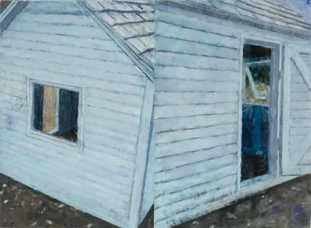
vertical clapboards, a copper roof and dirt floor.’2 In the years following the Volvo project, Bartlett created similar three-dimensional sculptures of clapboard houses which were paired with paintings of the same motif; examples of these hybrid works are today in the Honolulu Museum of Art and the artist’s estate3
The present sheet, together with the rest of the Old House Lane series of pastels, was exhibited at the Paula Cooper Gallery in New York in 19874. In a lead review of the exhibition in The New York Times, the critic John Russell noted that, ‘Like almost all her best work, Jennifer Bartlett’s new pastels at the Paula Cooper Gallery, 155 Wooster Street, are a mix of symbolism and autobiography. Large in scale and confident in tone, they fill the entire gallery without any flagging of energy. Fundamentally they are made up of the same three disparate elements, combined and re-combined in a landscape that she got to know a year or two ago on the North Shore of Long Island. The elements in question are a boat, a house and a white picket fence. It is not clear that the little vessel has ever raised sail, let alone been to sea, and it may even be that it is primarily a sculpture, rather than a functioning boat. Nor is it clear that anyone could live in the house – first, because it is too small, and second, because it is still some way short of habitability. The fence is a fence, all right, and it comes with a fine big lock, but once again we are not quite sure what is being fenced in (unless it is, perhaps, ourselves). Veteran Bartlett-watchers will know that no matter how enigmatic their form, these three elements are enrolled in the service of a powerful and idiosyncratic imagination…They make a sturdy and eminently pictorial trio, but they also have an emblematic role, in that the boat stands for all boats, the house for all houses, the fence for all fences. They have strong American associations…The house is clapboard, painted white, like a million others. The fence is plain, but not dainty. Here and there, a stretch of dune, peppered with long grasses, gives the location away. It is a scene untouched by human presence. No footprint marks the sand. No mail has been left for the windowless house. No swimsuit dries on the prow of the boat. Seeing no empty cans, no garbage bags, no copies of last week’s newspapers, we decide that the boat, the house and the fence are a self-sufficient community that leads its own life and sees humankind as irrelevant.’5
As Russell’s review of the 1987 Old House Lane exhibition continues: ‘It could be that one or two images would give us the whole story, but that is not Ms. Bartlett’s way. Shifts of scale, weather and abutment give the show a continuous variety. All three elements appear sometimes as monumental presences, sometimes as delicate evocations silvered by moonlight. If the name of “pastel” suggests to you a furry, powdery, vulnerable presence, you can set that idea aside. Ms. Bartlett’s pastels are strong and plain in their execution...We do not have to pore over them, fearful that if we lean on the glass case they will turn to dust. They hold the eye from a considerable distance and have an almost architectonic quality. By adopting a mainline representational idiom, Ms. Bartlett may seem to many visitors to be carrying on an American tradition that goes way back to Homer and Sargent and has had many a gifted exponent since. And her pastels can, undeniably, be read and enjoyed on those terms. But their real hold upon us comes from the extent to which the boat, the house and the fence are metaphors not only for human archetypes that will be with us for all eternity but for a menage a trois that turns out, against the odds, to work well.’6
The composition of Old House Lane, No.1 is, like many of Bartlett’s paintings, divided into two distinct parts. When asked in a recent interview why the diptych format appealed to her, the artist replied, ‘Ever since I was little I have thought that two are better than one. Not in terms of people, just in terms of looking at something. I like seeing things kind of “off” and from different points of view. The diptychs border on abstraction, even the figurative ones. The two panels create discord within the images themselves.’7
Another large pastel drawing by Bartlett from the 1986 Old House Lane series is today in the collection of the Brooklyn Museum8, while two others were later included in the 1988 exhibition Recent American Pastels at Middlebury College, Vermont9. Most of the other Old House Lane pastels have remained in private collections since the 1987 Paula Cooper exhibition, although a handful of works from the series have appeared at auction in recent years10
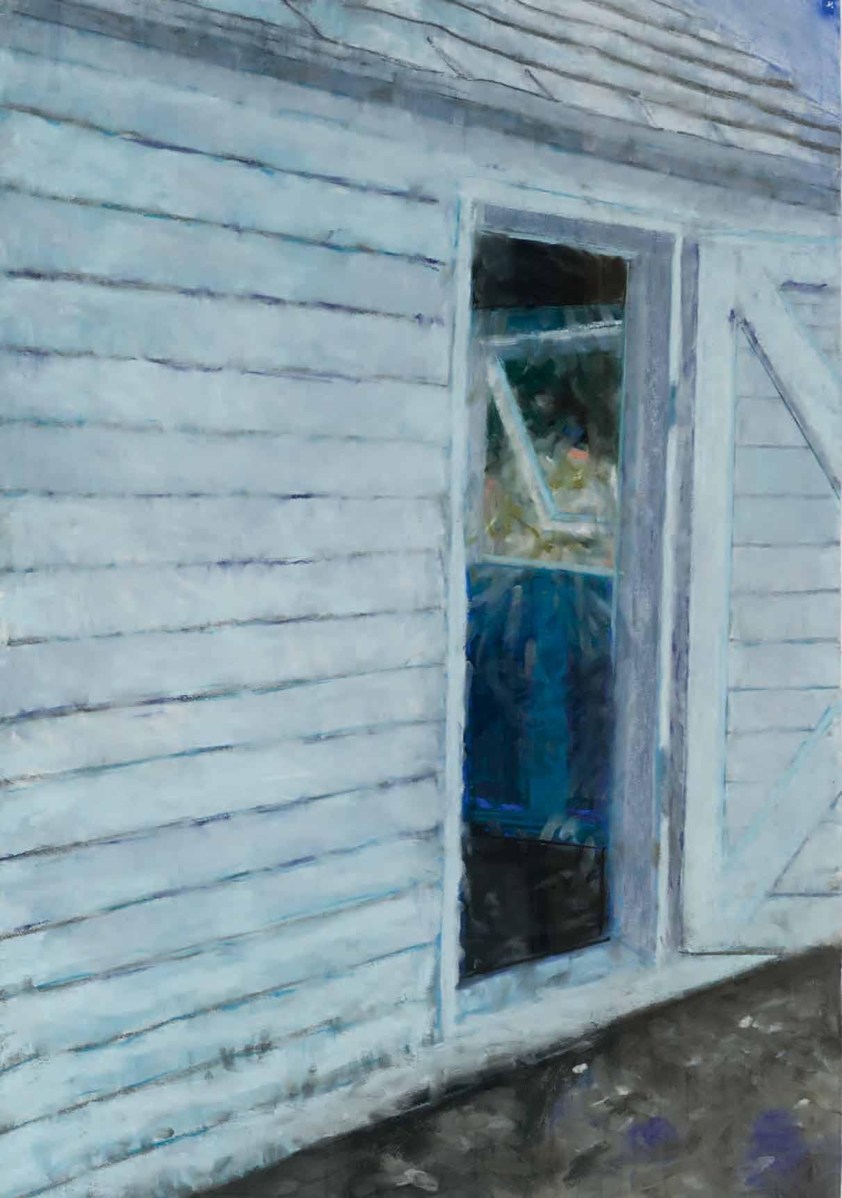
Gouache, watercolour and coloured chalks, with touches of oil paint, on handmade paper. Signed and dated Frankenthaler 91 in pencil at the lower right. Inscribed Geschenk von Helen Frankenthaler / erhalten am 10.8.1991 / Titel: P91-20 / Gemalt auf Papier No.34.1 aus / Strange Papers on a typewritten label pasted onto the old backing board. 216 x 283 mm. (8 1/2 x 11 1/8 in.)
PROVENANCE: Given by the artist to a private collector, probably Fred Siegenthaler, Langnau im Emmental, on 10 August 1991; Private collection, Europe; Anonymous sale, London, Sotheby’s, 26 October 2000, lot 146; Private collection, London.
As has recently been noted of the artist, ‘Helen Frankenthaler has spoken of the intimacy of the paper medium. Her late paintings on paper embody her belief in freshness, directness, openness, and immediacy… She has used papers tinted a wide range of colors. Some pieces were executed on Japanese paper and others on very unusual lawn grass paper. Frankenthaler has utilized brushes, sponges, rubber spatulas, and scraping devices. She has thinned her pigment so that it runs and pools…With all this variety, there is a powerful and consistent sensibility. It is present in her feeling for space and form, her unique choice of colors, and in the gestural signature of her body, arm, hand, and wrist.’1
The present sheet is drawn on an unusual type of handmade paper supplied to Frankenthaler by the Swiss papermaker Fred Siegenthaler (b.1935), who also is likely to have been the recipient of the drawing as a present from the artist in 1991. Trained first in Switzerland and later in Munich, Siegenthaler worked as a paper engineer for the pharmaceutical company Sandoz AG, conducting research into producing paper products using various raw materials. He travelled extensively, living for long periods in South and North America and Asia, while at the same time researching paper history, collecting rare papers and working as a paper artist. In 1967 Siegenthaler opened a small paper workshop, and by the 1970s was providing handmade custom papers to Frankenthaler, as well as to Horst Antes, Marc Chagall, Jasper Johns, Marisol (for whom Siegenthaler created a paper made from one of her evening dresses), Joan Miró, Claes Oldenburg, Meret Oppenheim, Robert Rauschenberg, Larry Rivers and Cy Twombly, among others. In 1986 Siegenthaler established the International Association of Paper Artists and Papermakers.
Siegenthaler’s most significant work was the publication, in 1987, of Strange Papers: A Collection of the World’s Rarest Handmade Papers. Sourced from paper makers from countries around the world, the compilation of paper samples in the book included many made from exotic raw materials not usually associated with papermaking, such as asparagus rinds, carrots, leather, corn husks, feathers, various grasses, silk, hemp, stinging nettles and tree fibres2. The book Strange Papers, which weighed some twenty-two pounds, was published in a limited edition of two hundred copies, and is usually only found today in such institutions as the New York Public Library.
As the inscription on the typewritten label attached to the old backing board notes, the present sheet was drawn on a sample of paper No. 34.1 from Strange Papers, identified therein as ‘Dyed Manila Blend Paper’. This particular paper, made of abaca fibres, was produced by the British papermaker Maureen Richardson (b.1930) of Whitney on Wye in Hertfordshire3
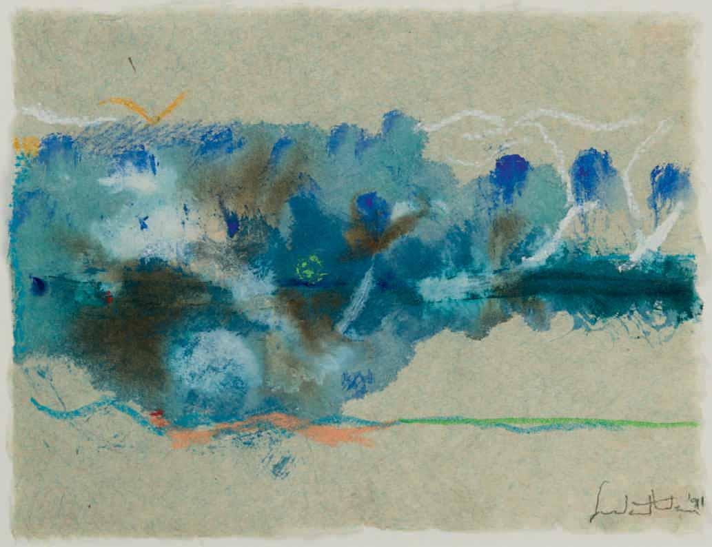
Untitled, 1993
Acrylic on paper. Signed and dated Gillian Ayres 93 in pencil at the lower right. 402 x 565 mm. (15 7/8 x 22 1/4 in.)
PROVENANCE: The estate of the artist.
One of the leading English abstract artists of her generation, the painter and printmaker Gillian Ayres was accepted into the Slade School of Fine Art in 1946 but, aged sixteen, was too young to be admitted. She therefore studied at the Camberwell School of Art between 1946 and 1950, where she was taught by William Coldstream, Victor Pasmore and Claude Rogers, all of whom had been part of the pre-war group of realist painters known as the Euston Road School. Ayres rejected the representational painting style and techniques that dominated at Camberwell, opting instead to pursue non-figurative modernism, at much the same time as the work of one of her teachers, Victor Pasmore, was also undergoing a shift from realism to abstraction. Ayres left Camberwell before her final exam, and soon began working part-time at the AIA (Artist’s International Association) Gallery in London, together with Henry Mundy, a painter she had met at Camberwell. The couple were married in 1951 and, despite divorcing in 1976, lived together for most of their lives. At the AIA Gallery, Ayres became friendly with such artists as Adrian Heath, William Scott and Roger Hilton, who was a particular influence on her work.
Already committed to abstract painting as her preferred mode of expression, in the second half of the 1950s Ayres was struck by her first exposure to Abstract Expressionism in the form of exhibitions of recent American painting at the Tate Gallery and the Whitechapel Art Gallery in London, which inspired her to produce abstract compositions on a much larger scale. She had her first solo exhibition in 1956, and a year later was commissioned to paint a monumental mural, some eighty feet in length, for the dining hall of a girl’s school in north London. (Not long afterwards, however, the work was covered with wallpaper, and it was only rediscovered in 1983.) In 1960 Ayres had three of her paintings included in the seminal ‘Situation’ exhibition at the Royal Society of British Artists; the only woman to be represented.
In 1959 Ayres embarked on a teaching career which was to last for over two decades, throughout the 1960s and 1970s. She taught for seven years at the Bath Academy of Art in Corsham, then at the Saint Martin’s School of Art in London between 1986 and 1978, and finally at the Winchester School of Art of the University of Southampton. Her teaching commitments left her little time to focus on her own work, although she continued to paint bold abstract paintings. Apart from three gallery exhibitions in the 1960s, her work was not seen in public during this period, as she devoted herself to teaching and to raising her two sons. It was not until 1981 that Ayres gave up teaching and moved to Wales to work full-time as an artist. From then onwards, she had regular solo exhibitions at galleries and museums in London and throughout Britain, notably shows at the Museum of Modern Art in Oxford in 1981 and the Serpentine Gallery in London in 1983. Her massive canvases were widely admired by critics and collectors, and the artist was shortlisted for the Turner Prize in 1989.
Awarded an OBE in 1986 (and later appointed CBE in 2011), Ayres left Wales in 1987 and settled in a remote 15th century cottage on the border between Devon and Cornwall, where she lived and worked for the remainder of her career. She was elected to the Royal Academy of Arts in 1991 and became a Senior Fellow at the Royal College of Art in 1996. In 1997 a retrospective exhibition of her work was held at the Royal Academy, and the following year she began to be represented by the Alan Cristea Gallery in London, who hosted several solo shows of her paintings and prints and also helped to organize museum exhibitions in the United Kingdom and abroad. In 2004 fourteen of Ayres’s major paintings, dating from different periods of her career, were destroyed in a warehouse fire. Ayres continued to work until a year or so before her death, when illness prevented her from painting.
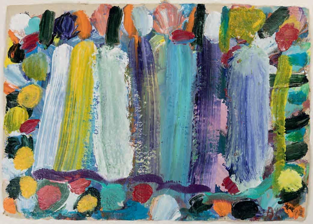
Nevertheless, in the last year of her life she was honoured with major retrospective exhibitions at the National Museum of Wales in Cardiff and at the CAFA Art Museum in Beijing, as well as the publication of a five hundred-page monograph devoted to her work. Recently, Ayres was one of the artists included in the 2023 exhibition Action, Gesture, Paint: Women Artists and Global Abstraction 1940-1970 at the Whitechapel Gallery in London. Paintings and prints by Ayres are today in the collections of numerous museums in Britain, America and Australia, including the Tate, the British Museum and the Victoria and Albert Museum in London, the Yale Center for British Art in New Haven and the Museum of Modern Art in New York.
Throughout the six decades of her career, Ayres pushed the boundaries of abstraction, creating complex compositions that seem both playful and intense. Her use of colour was a defining feature of her work, and she often used vivid and contrasting colours to create a sense of movement and dynamism in her paintings. As the artist once said, ‘To me, art – colour in art – is wonderfully indulging… All the painting I’ve liked has always been colour painting. I’ve found that I respond to colour more than anything.’1 Indeed, Ayres’s paintings and prints are often described as a celebration of colour, and she saw her role as an artist to bring the life of colour to the surface and let it speak for itself. Her exuberant works are characterized by vibrant colour, thick impasto and textural, painterly richness, with the artist sometimes applying the pigment with her hands. As the Ayres scholar Mel Gooding has written of her oeuvre as a painter and printmaker, ‘though she delights as an artist in finding marvellous analogies, of colour, shape, form and texture, to aspects of the world as given, these visual and tactile correspondences are always embedded in the materiality of paint…embedded in the physical facts of swirling viscosity and vigorous impasto, in the stroke and smudge and stain of ink. These paintings and prints are, before and after any exercise of the playful mind, thrilling objects occupying real space.’2
Although Ayres developed a parallel reputation as a printmaker, producing graphic works that were as radiant as her paintings, it is interesting to note that she never seems to have produced drawings, either as preparatory studies for larger works or as independent exercises, preferring instead to compose her pictures directly on the canvas. One writer has noted of Ayres that ‘the major element of [her] paintings is a passion for colour, for paint and the modelling of paint. This is a vision of the world as flesh as paint. Both the colour and materiality of paint are emphasised, placing the evidence of the physical process of painting continually before us – the smears and twists of arm and hand.’3
In the 1990s, Ayres began to incorporate more geometric shapes and patterns into her work, creating a series of paintings that explored anew the relationship between form and colour. The present work, dating from 1993, was inspired by a visit to Provence, where Ayres stayed with the painter Frederick Gore. She had met Gore while studying at the Camberwell School of Art in the early 1950s, and Gore later hired her as a teacher during his time as head of the painting department at the Saint Martin’s School of Art, a post to which she eventually succeeded. Despite their considerably different approaches to painting – Gore was very much a figurative and landscape painter – they remained close friends throughout their lives, and Ayres wrote the foreword to the catalogue of a retrospective exhibition of Gore’s work at the Royal Academy in 1989.
In works such as this, Ayres celebrates the sheer physicality of paint, using thick coatings of colour and large brushstrokes to create progressively distinct yet never wholly figurative shapes. (As the artist remarked in 1995, ‘Shapes. Spaces. It’s the way I see the world.’4) Gooding has commented that ‘It hardly needs saying that Ayres has an extraordinary technical mastery of her art. She works in diverse media and with perfect decorative control at every scale, from the miniature…to the mural…she is a supremely gifted colourist, able to work with the brightest and most intense chromatic primaries and the most subtle of soft tonalities, with the drama of black and white, the sonorous minor keys of magenta, blue, purple and maroon and the most acidly sharp yellows, greens and oranges, and to deploy them together with a seemingly effortless bravura; she has an inexhaustible repertoire of stroke, shape, form and motif.’5
Among stylistically comparable works by Gillian Ayres of the same date and technique is a painting in the Jerwood Collection6.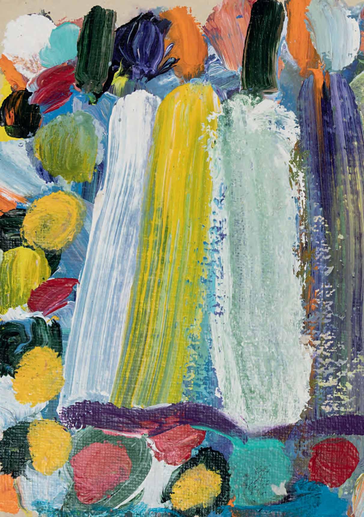
New York 1928-2011 Darien
Untitled (P94-5), 1994
Acrylic on light brown paper. Signed Frankenthaler in pencil at the lower right. 514 x 658 mm. (20 1/4 x 25 7/8 in.)
PROVENANCE: Bobbie Greenfield Gallery, Santa Monica, in 1995; Knoedler & Company, New York; Gagosian Gallery, London; Acquired from them by a private collection; Anonymous sale, London, Christie’s, 1 July 2022, lot 695.
EXHIBITED: Santa Monica, Bobbie Greenfield Gallery, Helen Frankenthaler: Recent Prints and Paintings on Paper, 1995, unnumbered.
‘A really good picture looks as if it’s happened at once. It’s an immediate image. For my own work, when a picture looks labored and overworked, and you can read in it – well, she did this and then she did that, and then she did that – there is something in it that has not got to do with beautiful art to me. And I usually throw those out, though I think very often it takes ten of those over-labored efforts to produce one really beautiful wrist motion that is synchronized with your head and heart, and you have it, and therefore it looks as if it were born in a minute.’1
Works on paper were an important part of Helen Frankenthaler’s oeuvre throughout her career, and their significance grew from the late 1970s onwards. Whenever she travelled, as she did extensively throughout her life, Frankenthaler would create watercolours and pastels whose forms and colours would sometimes serve, later in the studio, as inspiration for larger pieces. The artist has noted that ‘Working on paper can even replace working on canvas for me, for periods of time…more and more, paper is painting. ’2 While her work may be described as a dialogue between drawing and colour, as early as 1967 she was already stressing the significance of the former: ‘My conscious interest was more in drawing and the drawing of color than in color alone.’3 Indeed, although best known and highly regarded as a colourist, Frankenthaler has always emphasized the primacy of drawing in her process: ‘For me, as a picture develops, color always comes out of drawing. I never start out only with color.’4
In 1974 Frankenthaler began renting a summer house at Shippan Point in Stamford, Connecticut, facing the waters of Long Island Sound, and in 1978 she bought a home there, establishing a second studio where she was able to work throughout the year. As has been pointed out, ‘the long, horizontal divisions and subtle tonalities of her paintings of the 1980s and 1990s can be read as subliminal reactions to the changing light and the seasonal variations of sky, sea, and beach, seen from her seaside Connecticut home.’5 Indeed, the horizontal format common to much of Frankenthaler’s work, especially those on paper, has often been seen as indicative of a response to nature. However, as the artist pointed out in a 1997 interview, ‘Landscape is a loaded question for an abstract painter. When one looks at an abstract horizontal canvas, one more or less consciously perceives nature or a horizon or a view. One is not apt to think of a figurative reference, which is more apt to be vertical.’6
Of working on the southern shoreline of Connecticut, Frankenthaler has said, ‘You are always staring at horizon lines – horizon lines that vary. There are hazed-out parts of Long Island across the Sound, parts of it can be visible, parts not…I wasn’t looking at nature or seascape but at the drawing within nature.’7

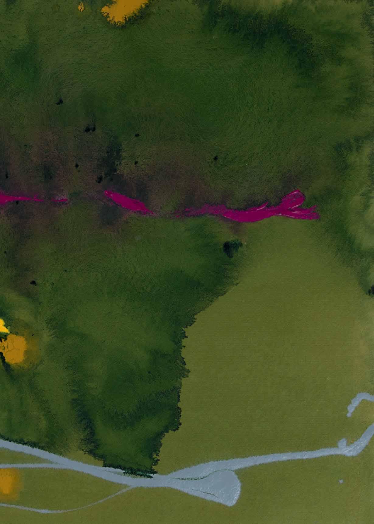
New York 1928-2011 Darien
Untitled (P94-29), 1994
Acrylic on buff paper. Signed Frankenthaler in pencil at the lower right. Dated Aug 94 and inscribed P94-29 in pencil on the verso. 510 x 675 mm. (20 1/8 x 26 5/8 in.)
PROVENANCE: Bobbie Greenfield Gallery, Santa Monica, in 1995; Bernard Jacobson Gallery, London, in 2000; Private collection, London.
EXHIBITED: Santa Monica, Bobbie Greenfield Gallery, Helen Frankenthaler: Recent Prints and Paintings on Paper, 1995, unnumbered; London, Bernard Jacobson Gallery, Frankenthaler: On Paper 1990-1999, 2000, no.5.
Although Helen Frankenthaler continued to create vibrant, challenging works in various media well into the 21st Century, the paintings and drawings she produced after the 1989-1990 touring retrospective of her work are somewhat less well-known than those of the previous decades. This large sheet was drawn in 1994, during a period of a decade – between 1992 and 2002 – when Frankenthaler produced very few paintings and worked almost exclusively on paper. Speaking on the occasion of an exhibition of her works on paper from the decade of the 1990s, the artist said that ‘I get lost, whatever medium I’m working in – painting, sculpture, works on paper, graphics…for the time I am totally into creating a work. I am obsessed and the energy flows, the adrenalin flows, the ideas flow. I can’t work fast enough and that’s great. As I said before, to push is hell…I know when I started all these works on paper not too long ago, the first few felt slow and unresolved and then suddenly something clicked and I couldn’t get them out fast enough and I wanted more and more paper. Every so often I’d tear one up and my studio assistant would tremble but that’s the way it goes.’1
As the critic and curator Karen Wilkin has noted of Frankenthaler, ‘throughout her long career, she has worked on paper with the same seriousness that she brings to her large-scale paintings, producing an impressive body of watercolors, gouaches, and mixed media works whose ambition, invention, and accomplishment are in no way inferior to that of her canvases. Each medium elicits different responses from Frankenthaler, yet all of her diverse efforts – whatever their materials, scale or process – depend for their impact on her distinctive handwriting, her faultless sense of tone and scale, and above all, her command of color. But of all of her investigations of various media, Frankenthaler’s works on paper enter into the most intimate dialogue with her canvases…Frankenthaler’s works on paper are never preparations for canvases but represent a parallel exploration; each line of enquiry informs the other.’2 As Wilkin has also observed, ‘Over more than half a century, Frankenthaler remained a fearless explorer in the studio, investigating a remarkable range of media. She adopted acrylic paint, on canvas and paper, early on, reveling in its intensity even when thinned to a stain and in the fact that it did not produce a “halo” effect, as happened with staining with oil paint.’3
In the catalogue of a recent exhibition of Frankenthaler’s work from the 1990s, the art historian Thomas Crow has written that ‘One feels that Frankenthaler…never put down a stroke or floated a wash without at least some intuition of the likely associative meanings that every such gesture would carry when conjoined with its neighbors. Her images do not fall under the heading of pleasing approximations of observed phenomena; rather, they seem truer to sense impressions, to mental events that remained inchoate until discovered in the physical action of painting and thereby lent physical form.’4
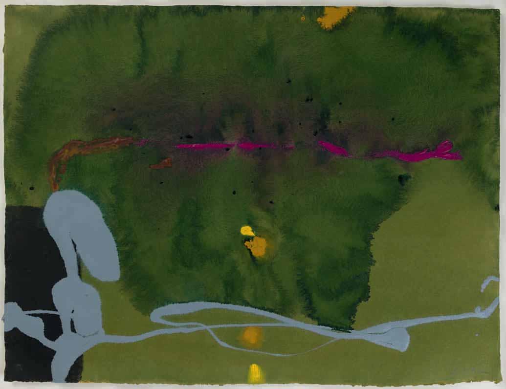
Watercolour. Signed with initials and dated LR05 in pencil at the lower right. 345 x 348 mm. (13 1/2 x 13 5/8 in.) [sheet]
PROVENANCE: W/S Fine Art, London.
EXHIBITED: London, W/S Fine Art Ltd., Libby Raynham. That Inward Eye: Paintings in Watercolour, 2006.
Born in the village of Lenham in Kent, the painter, draughtsman and printmaker Elizabeth Anne (‘Libby’) Raynham studied at the Slade School of Art in London between 1970 and 1974, winning the David Murray Prize for landscape painting at the Royal Academy in 1972. It was while she was studying at the Slade that she began to produce abstract compositions, which were studied and developed in a series of illustrated notebooks or journals; a practice she has maintained throughout her later career. Raynham has worked in France and on the Aegean island of Samothrace in Greece, but since the late 1970s has lived and worked in Zurich in Switzerland, following her marriage to the Swiss architect René Haubensak. She had her first solo exhibition in a gallery in London in 1979 and has regularly exhibited her work in solo and group exhibitions in London and Zurich, most recently in 2019 and 2022. Raynham’s work is also included in the Deutsche Bank corporate collection in London and is on public view in the Hirslanden Clinic in Zurich.
Raynham works primarily in pastel, gouache and watercolour. As one scholar and curator has noted, ‘Some art is immediate and forceful in its impact on the viewer; some is slow, quiet and mysterious in its working. Libby Raynham’s watercolours are of the second kind. As she herself has said, ‘they are there to be contemplated, just as contemplation plays an important part in their making.’ They are abstract and on first encounter may seem baffling – the discreet expression of a private world. While the beauty of the colour and the handling is evident, they are neither simply pretty nor effusive. This is serious art, produced with rigour and dedication, and as such it makes few concessions to the viewer. It requires a serious response, which entails concentration, openness and humility. But it amply rewards such a response, because this art is heartfelt and authentic.’1
The same writer has further opined of Raynham’s works on paper that, ‘To get to know and to understand these paintings, you have to look closely at them. They are exquisite fabrications, built up slowly over time. Watercolour is applied in layers of wash to achieve deep, sonorous colour harmonies, sometimes punctuated by accents of brighter colour. At the edges, residual lines of colour are the traces of these superimposed layers. The space is often divided geometrically into blocks or bands, which establish the compositional structure and which may set up rhythms across the surface. A positive shape is answered by its negative, or one brushstroke by a counter brushstroke. With seeming inevitability a resolution is achieved, with all the elements held in a delicate balance.’2
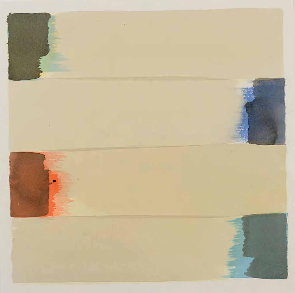
Ultramarine
Watercolour. Signed with initials and dated LR05 in pencil at the lower right. Signed, titled and dated Libby Raynham Ultramarine 2004 in pencil on the verso.
725 x 530 mm. (28 1/2 x 20 7/8 in.) [sheet]
PROVENANCE: W/S Fine Art, London.
EXHIBITED: London, W/S Fine Art Ltd., Libby Raynham. That Inward Eye: Paintings in Watercolour, 2006.
Writing in 2006, the year after this large watercolour was executed, the artist and museum curator Michael Wilson noted that, ‘For over three decades, Libby Raynham has pursued her artistic course, honing her skills, without regard to critical or commercial success, driven solely by the need to express herself and to be true to herself. ‘Painting is for me’, she says, ‘a matter of necessity’…[She] is extremely reluctant to talk about her paintings: ‘it is in painting and not in words that I find my voice.’ Her titles come after the works, not before, and are intended to help the viewer find a way in. The inspiration is wordless. Nevertheless, as she herself acknowledges, the paintings have their origin in her experience, and in particular her encounter with nature in its myriad forms. She is acutely alive to nature and to light, atmosphere and weather conditions, but the places and memories that inform her work above all others are those for which she feels deepest affection, the orchards and hop gardens of Kent where she grew up, the vineyards of France, the moors of Scotland and ‘everywhere the sea’. Perhaps it is because she has lived in land-locked Switzerland for almost thirty years that these remembered landscapes and seascapes have such a hold on her.’1
As Wilson adds, Raynham ‘records her initial ideas in books she makes herself, journals in effect, briefly noting an arrangement of shapes and colours in direct watercolour brushstrokes. These ideas are then pondered on and developed over time, often in series of paintings. The process is long and involves periods of quiet and contemplation interspersed with moments of confident, fluent execution – like a performance. Not for nothing has she long been an admirer of the deft brushstrokes of Chinese painting. She is respectful of her materials – her paints, her brushes, and her paper – and is exact and masterful in their use, but the act of painting is driven by intuition, so that every painting is an exploration, a journey of discovery…it is in a free, gestural brushstroke across a field of watercolour wash that we can sense the movement of the hand of the artist and at the same time her presence, as she ventures into the imagined space of her art…in the predominant colour of a painting, in a tawny pink or greeny-blue, we may find a clue to the memory of a season or of the sea that feeds into it, a clue that is reinforced by an evocative and sometimes enigmatic title…But the context of the paintings, if we can call it that, is thoroughly subjective; they are about the experience of the artist herself – her memories, thoughts, sensations and feelings in her encounter with the world, and her sense of herself as part of nature.’2
As Raynham has noted elsewhere, although the watercolour medium leaves little margin for error, ‘Every now and then a mistake may happen that leads to a new idea, but the aim of the painting process remains to realize an inner idea.’3
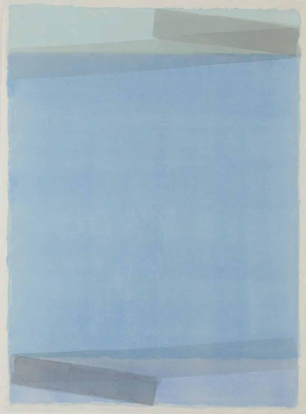
Parted Per Pale
Oil on panel. 30.5 x 30.5 cm. (12 x 12 in.)
EXHIBITED: London, Stephen Ongpin Fine Art, Paintings by Anne Connell, 2009, no.2; Manchester, New Hampshire, St. Anselm College, Alva de Mars Megan Chapel Art Center, The Silent Heart: Modern Illuminations by Anne Connell, 2016; Wyoming, Ucross Foundation, Ucross Art Gallery, Views from Oregon: Sixteen Artists, 2017.
The American artist Anne Connell lives and works in Portland, Oregon. She has spent much time in Italy, mainly in Rome and Florence, and her work reflects a keen interest in the art of the early Renaissance. Connell’s paintings, drawings and collages often sample images and patterns from Quattrocento sources, while at the same time representing these elements within a distinctively modern idiom, to create an expressive vocabulary with its own meanings and purposes. As a New York Times review of a 2001 exhibition of her work noted, ‘Borrowing patterns and fragmentary images from Italian Renaissance painting for her small, lovingly made panel paintings, Connell creates a quietly luminous symbolist poetry that seems at once antique and post-modern.’1 Another feature of her work is the sheer craftsmanship involved in its creation, characterized by a painstaking technique of oil, silverpoint and, occasionally, gold leaf on prepared panels or paper.
As one scholar has written, ‘Anne Connell paints with oil and gold leaf on wood panels, producing carefully crafted objects that are beautiful to look at and intriguing to think about. Because she uses techniques derived from Italian painters of the fifteenth century – for example, the application of gold leaf to key parts of the composition, or the architectural elaboration of enclosed space – her paintings seem like souvenirs from an earlier visual world. Many of the paintings…feature images and details borrowed from the canon of northern Italian painting, although the images and details she chooses are seldom in themselves canonical: stairs, fruit trees, floor tile patterns, archways – the furniture, as it were, among which the Sienese or Paduan painter would lodge his intercessors and miracle workers.’2
Connell’s intimately scaled works reward the quiet contemplation of the viewer. As the American writer and novelist Elizabeth Gilbert has so aptly noted of her work, ‘Anne Connell invents worlds. Tiny, immaculate, and fascinating glimpses of worlds, to be precise. (And “precise” is the correct word to use here, because Anne paints with the detailed rigor of a master jeweler.) There is no actual place on earth that quite resembles her contrivances, but they have always evoked in me a deep sense of homesickness, nonetheless: a tangible longing to make myself very small and very quiet, so that I could slip somehow right into that world which does not – but which absolutely should – exist. That sense of enchantment, of magic, shimmers in every corner of this fabulist’s work, and it is not easily forgotten.’3
The present work was painted in 2007. In heraldry, a pale is a band, or ordinary, placed vertically in the middle of a shield; parted per pale is the heraldic term which describes the division of the field into two equal parts by a vertical line. The view seen through the oculus is a detail from Piero della Francesca’s Triumph of Federico da Montefeltro of c.1465, in the collection of the Uffizi in Florence.
Charcoal, with stumping, on transparent paper superimposed on top of a second sheet of white paper, on which is drawn a similar subject in red chalk. The two sheets lightly attached to each other with masking tape at each of the four sides, with a narrow strip of card added to the bottom of the second sheet as a support. Signed and dated Saville / 2009 in pencil at the lower right. 890 x 587 mm. (35 x 23 1/8 in.)
PROVENANCE: The studio of the artist, Oxford; Donated by her to the Royal Academy benefit exhibition and auction RA Now, October 2012, where acquired by a private collector.
LITERATURE: Cheryl Brutvan, ed., Jenny Saville, exhibition catalogue, West Palm Beach, 2011-2012, illustrated p.72; New York, Gagosian Gallery, Jenny Saville: Continuum, exhibition catalogue, 20112012, p.5, fig.1 (shown in a photograph of the artist’s studio in 2011); Oxford, Modern Art Oxford and Ashmolean Museum, Jenny Saville, exhibition catalogue, 2012, unpaginated; Martin Gayford, ‘Erotic Emin Doodles, Gormley Robot Raise Cash for Royal Academy’, Bloomberg.com, 9 October 20121.
EXHIBITED: West Palm Beach, Norton Museum of Art, Jenny Saville, 2011-2012, unnumbered; Oxford, Modern Art Oxford and Ashmolean Museum of Art and Archaeology, Jenny Saville, 2012, unnumbered (on loan from a private collection); London, Royal Academy of Arts; RA Now, 2012.
Described by the art historian Linda Nochlin as ‘the most interesting and exciting painter of our times’2 , Jenny Saville was born in Cambridge and studied at the Glasgow School of Art, graduating in 1992 with a final show in which every painting was sold. Shortly afterwards, her work came to the attention of the collector Charles Saatchi, who commissioned Saville to produce a number of paintings which were later included in the exhibition Young British Artists III at the Saatchi Gallery in London in 1994, where the work of the twenty-three-year old artist received a significant amount of critical attention. Working on a very large scale, Saville created paintings characterized both by an abiding interest in the naked female body and the sheer physicality of oil paint. A desire to learn more about anatomy led to an opportunity, during a stay in America in 1994, to make a careful study of cosmetic surgical procedures. Saville’s paintings were included in the controversial exhibition Sensation: Young British Artists from the Saatchi Collection at the Royal Academy in London in 1997, which brought her work to the notice of the public at large3. Saville had a solo exhibition at the Gagosian Gallery in New York in 1998, followed by another in 2003.
Saville’s abiding interest in the human body, as well as her visceral painting style, have often seen her work regarded in the context of such 20th century masters of figurative painting as Francis Bacon and Lucian Freud. Throughout her career, she has also looked to the art of the Old Masters – artists such as Leonardo, Michelangelo, Rembrandt, Vermeer and Velásquez – for inspiration4. Appointed a lecturer of figure painting at the Slade School of Fine Art in London, Saville taught there between 2000 and 2006. A museum exhibition of her work was held at the Museo d’Arte Contemporanea in Rome in 2005, and the following year she completed a commission for three paintings to decorate the chapel of the Museo Carlo Bilotti in Rome5. In 2007 she was elected to the Royal Academy, and in 2011 and 2012 a retrospective exhibition of her paintings and drawings, which included the present sheet, was held at the Norton Museum of Art in Florida and at the Ashmolean Museum and the Modern Art Museum in Oxford. A major solo exhibition took place at the George Economou Collection in Athens in 2018-2019, while another was held in the Museo Novecento and several other locations in Florence in 2021-2022. Gagosian continues to represent the artist, and has mounted gallery shows of her paintings in London, New York and, most recently, Paris. After working for several years between studios in London and Palermo in Sicily, Saville today lives and works in Oxford.
In 2007 Saville gave birth to a son, followed by a daughter in 2008, and the experience of motherhood soon found expression in her work. The artist made drawings of herself throughout her pregnancies, and asked several expectant mothers to model for her while working on this series of compositions. Saville has described the genesis of these works: ‘I had thought about doing mother-and-child images because I have never done anything with children before. I’ve tried to stay away a little bit, about the issues surrounding biology being determinate and that women are here to have babies. But, it’s so powerful and I thought, well, I quite like tackling grand, old subjects. It’s a challenge to make a painting with a child that isn’t sentimental. It’s a real challenge to actually make the sort of physicality of a baby’s body, and not be cutesy and Baroque and bubbly; to find a dynamic within the body. Children are quite animalistic and that is difficult to create.’6
This large charcoal drawing is part of a group of drawings, executed between 2008 and 2011, that explore themes of pregnancy and motherhood. While a handful of these drawings of pregnant women with infant boys are drawn in pencil and charcoal on fairly sizeable sheets of transparent vellum paper, such as the present drawing and another one of similar dimensions7, most are drawn on much larger sheets of paper, sometimes well over two metres in height8.
As Simon Schama has written of this series of studies of mothers and children: ‘...take a look at what Saville has done with her astounding paintings and drawings of her naked self with her baby boys exploding every which way from arm and lap...Not since Leonardo (whose own studies were a departure point for Saville) and Rembrandt has an artist got the peculiar body language of very small children exactly right. One of the baby boys arches his back in precisely that pre-tantrum power-moment no parent is likely to forget; others have the juicy-lipped, groggy fullness of the milkily sated...To convey the whirl of them in motion, the storm of fidget, Saville has done something so simple, so brilliant and yet so unprecedented that once you’ve seen it you can’t believe no one arrived at the idea before. She has retained all the drawn pentimenti of possible positions for the infants into the eventual painting or drawing, so that the same image contains within it a baby boy asleep, another in a tensed tantrum, another hanging loose, another in arms, another tumbling away...Saville has created movie animation for modern art and the effect is liberating, exhilarating, dumbfounding in the best possible way.’9
Like other works from this series, this powerful drawing is inspired by Renaissance images of the Virgin and Child, in particular Leonardo da Vinci’s monumental cartoon of The Virgin and Child with Saint Anne and Saint John the Baptist, also known as the Burlington House Cartoon, in the National Gallery in London10 As Saville has recalled, ‘I have quite a personal relationship with Leonardo da Vinci, because my parents had a very small reproduction…of the Burlington House Cartoon. I moved house quite a lot as a child and that used to reappear quickly, so that was my permanence – the drawings I made that I carried around, and this image. I used to go and see it when I went to school, so it became a powerful icon in my life.’11
A characteristic of these large drawings is Saville’s self-assured draughtsmanship. As she has said of these graphite and charcoal drawings, ‘in this series, I’ve embraced drawing in a new way. I’m a bit more confident.’12 This drawing, Mother and Child Study I, is drawn on two sheets of paper, one superimposed over the other to create a layered effect. The upper drawing, executed in charcoal on transparent, vellum-like paper, has been placed over a second large sheet on which a similar mother and child has been drawn in red chalk. As the artist has stated, ‘I wanted the sense of internal/external shifting, the intense physicality of holding an energetic son, less than a year old, while heavily pregnant with another baby. For two years, I was literally making flesh. The sense of weight was very powerful; so was the sense of holding and reproducing – not just holding a child in your arms, but one in your body too. I kept thinking of the formation of flesh and limbs inside my body, of regeneration – while I was in the act of painting flesh, a similar process was taking place inside my body. My multiple drawings – one on top of another – are a way of communicating these feelings. You’re literally reproducing yourself while you’re pregnant, like the way the lines reproduce themselves. The procedure became obsessive and spawned a whole lot of work…I wanted to see if I could make a convincing and vital image of a mother and child.’13
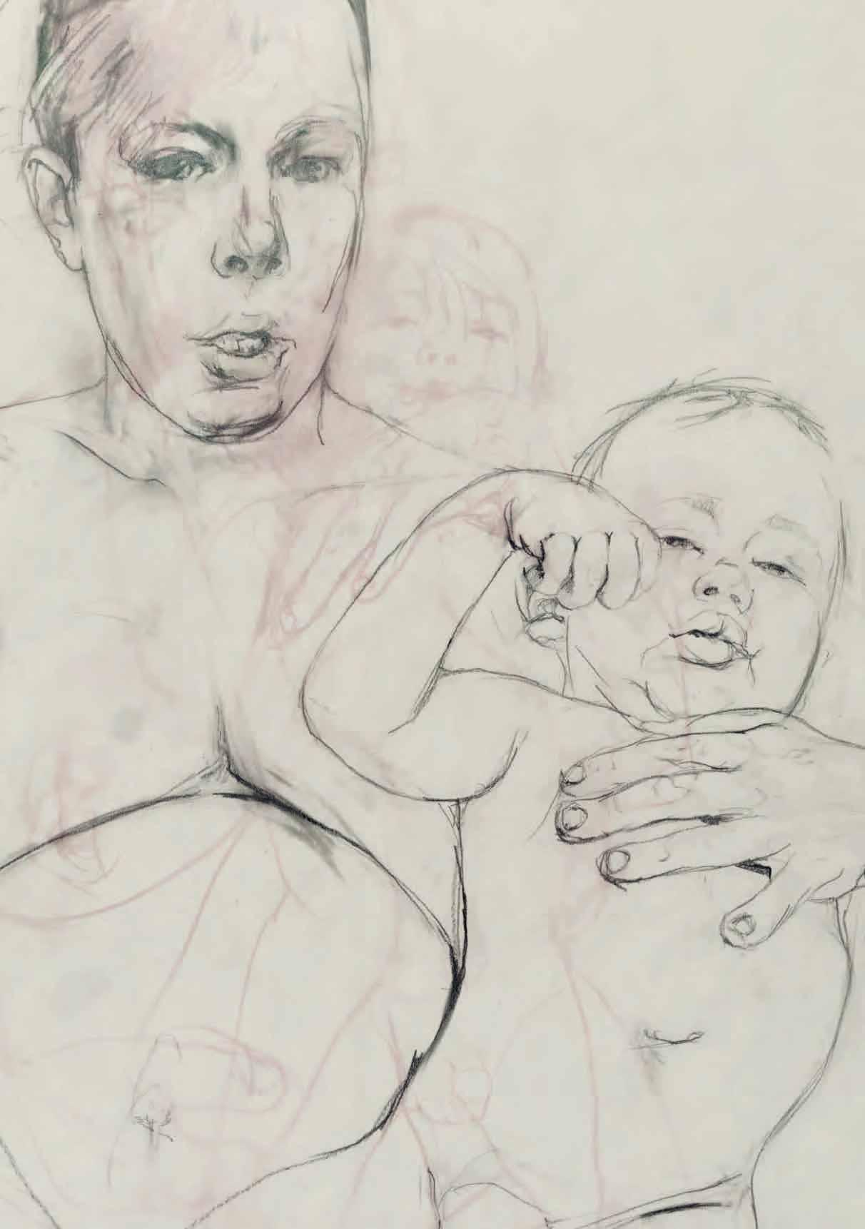
Oil and silverpoint on panel. 26.5 x 21.8 cm. (8 1/2 x 7 1/4 in.)
EXHIBITED: London, Stephen Ongpin Fine Art, Anne Connell: Variety and Glow. Recent Work, 2014, no.1; Manchester, New Hampshire, St. Anselm College, Alva de Mars Megan Chapel Art Center, The Silent Heart: Modern Illuminations by Anne Connell, 2016; Wyoming, Ucross Foundation, Ucross Art Gallery, Views from Oregon: Sixteen Artists, 2017.
Since 1990, Anne Connell has had several solo exhibitions of her work, in galleries in Boston, Denver, New York and Portland. In 2009 Stephen Ongpin Fine Art in London mounted the first exhibition of her paintings to be held outside America, which was followed by a second solo exhibition in 2014. Connell’s work has also been included in several group exhibitions, notably The Masters ReMastered at the Museum of Contemporary Art in Fort Collins, Colorado, in 2009, and Views from Oregon: Sixteen Artists at Ucross, Wyoming, in 2017. Grants and awards she has received include a Senior Research Fellowship to Italy in 2002-2003 as a Fulbright Scholar – the first visual artist in many years to be so recognized – and residencies at the MacDowell Colony, Yaddo and the Ucross Foundation.
‘Because Connell samples patterns and images from Italian Renaissance paintings and disposes them in unfamiliar ways, her compositions often appear elliptical or implausible...Disparate modes, in other words, combine in a single painting to give us objects in relief and, at the same time, their opposite – continuous transitions of shade, color and outline all over a flat surface…the painting marks its distance from its Renaissance precursors by refusing to alleviate our awareness of the illusionistic surface...Thus, while it’s important to gauge the depth of her involvement in the aesthetics and vocabulary of the Quattrocento, we should also look after Connell’s affiliations with the art of this century. She can, for instance, seem studiously postmodern. After all, she quotes intently from an arbitrarily limited archive, and observes procedures and arrangements that emphasize the artificiality of painting and highlight the beauty of technique without necessarily leading anywhere…the fact that the surfaces of her paintings are rendered with extraordinary care can preempt our perception of their other qualities. We can admire the way in which objects…are built up out of paint on wood so as to appear almost three dimensional, and infer that the artist works this slowly and carefully in order to fix in time and space a perception of beauty. But we should also detect in these surfaces a certain velocity of expression that is in some sense personal and fleeting…[Connell’s paintings] are composed out of the materials of her workshop even as they are derived from paintings made by the artists whose techniques she emulates. All this is a way of saying that from these exquisite objects there emerge voices, that these carefully arranged compositions are in fact emblazoned with the sounds of their maker’s murmurings.’1
Painted in 2010, this small panel was included in a loan exhibition of twenty-four of Connell’s paintings and works on paper, organized in association with Stephen Ongpin Fine Art, that was held at the Chapel Art Center at Saint Anselm College in New Hampshire, in 2016.
Pencil and conté crayon on Fabriano paper. Signed and titled Looking for a reason / pencil & conte on / fabriano / Pippa Young in black ink on a label pasted onto the reverse of the frame. 297 x 209 mm. (11 5/8 x 8 1/4 in.)
Pippa Young came to art late in life, after a previous career in a graphic design and marketing consultancy. As she has stated, ‘I think I was destined to do something creative from an early age, but it took me a long time to become a fine artist…I was always drawing or making something as a child and apart from a brief period as a teenager when an aptitude for maths made me consider sound engineering as a career, I’ve always been involved in visual art in one way or another…It was only later, when my children were older, that I realised I wanted to create work on my own terms rather than always answering someone else’s brief. That was when I signed up for a fine art degree course at Falmouth University as a mature student.’1 Young graduated with a first-class honours degree in 2012, with a degree show that was sold out. Since 2010 she has shown paintings and drawings in solo and group exhibitions at galleries in England and Scotland. She lives and works today in Penzance in Cornwall.
As has been noted of the artist, ‘Though primarily known for her painting, with its ambiguous mixture of symbolism and combinations of visual languages, drawing is the foundation of her practice, the medium in which she explores and develops her ideas.’2 Young’s drawings are executed in pencil, mixed media, charcoal or silverpoint, and her precise technique is, as she has said, inspired by early Renaissance or Netherlandish painting. While at first glance enigmatic drawings such as the present sheet appear to be a form of portraiture, the artist does not regard them as such. As she has pointed out, ‘The images often show representations of people, but they are not intended to be portraits – rather they are a metaphor for something more universal. The figure in my painting is a means to communicate directly with the viewer and the absence of context allows the figures to occupy their own subjective space, timeless and unadorned.’3
Young elaborated on this aspect of her practice in a recent interview: ‘Given the predominance of the human figure in my work – often although not always a single figure – there is an assumption that it is portraiture. However, my intention is not to create a likeness: the figures are not real people, they are portraits of the human condition. Through the collaging of slightly mismatched body parts, and the inclusion of non-traditional elements of portraiture, I wanted to make clear these were not real people. I am trying to see where I can take the genre…Figures are set against blank backdrops, removing any specific historical or social context. I often avoid showing hair for the same reason, as it fixes the figure in a time and place. There are no clues for identification, so the viewer is encouraged to think differently about the figure, to focus on psychological depths rather than surface characteristics. I have tried different backgrounds at various points, but with certain details added the work inevitably becomes overly narrative-driven, which is not my intention; those experiments always get painted over. Rather than tell a story, I want to plant questions in the viewer’s mind.’4

Born 1984
041220151708
Curled Indian Bean Tree Leaf (Catalpa bignonioides)
37° 10’ 31.3” N / 3° 41’ 28.7” W
Watercolour, over a pencil underdrawing. Signed and inscribed Jess Shepherd / 041220151708 in pencil at the lower left. Further inscribed, signed and dated Catalpa bignonioides / Found while I was raking the back / garden in Belicena, Granada, Spain. / Jess Shepherd / 2015 in pencil on the verso.
128 x 188 mm. (5 x 7 3/8 in.) [sight]
138 x 209 mm. (5 3/8 x 8 1/4 in.) [sheet]
An artist and botanist, Jessica Rosemary Shepherd obtained degrees in botany at Plymouth University and plant taxonomy at the Royal Botanic Garden in Edinburgh. After working as a Curator of Natural History at the Plymouth City Museum and Art Gallery, she joined the staff of the Shirley Sherwood Gallery of Botanical Art at the Royal Botanic Gardens in Kew, where she worked between 2010 and 2014, while also active as a freelance botanical illustrator. In 2011 she was elected a fellow of the Florilegium Society of the Chelsea Physic Garden in London, and the following year became a fellow of the Linnean Society. The artist, who recently changed her name to Úrsula Romero, lives and works today in Andalusia in Spain.
As the artist has written, ‘I am a botanical painter. When I paint plants I try to become them. There is a great deal of observation involved even before my brushes touch the paper. I believe that a good picture is made using not only sight, but also touch, sound, smell and movement. One has to be aware of all of these elements in order to portray the plant well and describe the space that the plant is growing into, both over and underground.’ This small watercolour was drawn as part of the Leafscape project; a series begun one day in 2015 in London, when the artist picked up a Catalpa leaf from the pavement. As she recalled, ‘At the time I felt the condition of the leaf reflected my own story – city-bruised and unanchored, so I decided to paint it larger than life size to capture all its blemishes.’1
As Romero’s work and technique have been described, ‘her under-the-microscope watercolour paintings of leaves in varying degrees of decay glow with carefully captured texture, light and life…Shepherd works for up to 10 hours a day meticulously layering sometimes as many as 30 translucent washes of watercolour. She usually outlines the leaf, the midrib and the primary veins in pencil but will do a lot of the drawing after this stage in paint with a brush. “This is my way of avoiding graphite, which can dirty the colours when painting with watercolour.” She also learned…that burnishing the paper helped maintain the vibrancy and luminescence of pigments.’2
The titles of some of the artist’s watercolours reflect the precise circumstances of her contact with the particular leaf depicted; ‘Life just seems so incredibly random and yet not. Once I started questioning mankind’s use of scale and measurement to record size and space, I realised that to refer to time as a measurement in the collection was an absolute must. So the titles record the exact time I found the leaf.’3 As noted by the artist on the verso, the present sheet was drawn in 2015 in Granada, Spain. Romero later recalled that, ‘The leaf was from a Catalpa tree growing in the garden. The leaves would fall off from the tree and dry so quickly in the sun that they would retain their colour for months afterwards, thus making the ideal specimen from which to paint from.’4

Five Eyes 3 (Caligo)
Pastel on paper; the outlines silhouetted, cut out and mounted in a display box. Signed and dated S. Schüffler 2015 in pencil at the lower right of the backing board.
110 x 178 mm. (4 3/8 x 7 in.) at greatest dimensions.
322 x 322 mm. (12 5/8 x 12 5/8 in.) [box]
Born in Kassel, the German artist Svenja Schüffler earned an undergraduate degree in Geology at universities in Darmstadt and Havana, and a postgraduate degree in Geographic Information Science and Systems in Salzburg. Her artistic projects are informed by her background in geosciences, and focus on topics related to human and earth sciences; her work intersects academia and art. She has had several gallery exhibitions in Berlin and across Germany, and has participated in forums exploring the interrelationships of science and art. After working in Cuba and Spain, Schüffler has lived in Berlin since 2011, and in 2016 founded an art project known as the Institute of Uncertain Knowledge in Berlin.
Five Eyes 3 (Caligo) is part of a small series of illusionistic compositions by Schüffler depicting butterflies or moths, drawn in coloured chalks and painstakingly silhouetted, all dating from 20151. As has been noted of her works of this type, ‘With great mastery the artist combines traditional skills like gilding, frottage printing and oil-based paper dye technique with modern techniques like airbrush stencil works and a scratch technique under pastel chalks that she had conceived herself. In terms of their great focus on detail and precision, these scratched pastel chalk drawings are characteristic of Svenja Schüffler’s artistic creation. They are the result of a meticulous work process with a magnifying glass that may take up to a few weeks or even months.’2
Furthermore, as noted in the accompanying text to a recent exhibition of her work, in which several examples from the artist’s Five Eyes series were included, ‘Enabled by tools that are surgical in nature, Svenja Schüffler creates exquisite networks of linear patterns on paper. These delicate structures serve as foundations for subsequent drawing in pastel chalks, simultaneously subtle and precise. Ms. Schüffler further enhances her imagery through confident use of a diverse mix of techniques, such as gilding, frottage, airbrush and assemblage. The resulting effect of these layered drawings is a stunning richness of detail, coupled with the illusion – and at times, the reality – of sculptural dimension. The sensitive viewer is thereby offered a wealth of visual stimuli to feast upon, along with the opportunity to question the certainties of their perceptions.’3
The owl butterfly (the genus Caligo) is known for the large eyespots on its wings, which resemble the eyes of owls. Native to the rainforests of Central and South America, the owl butterfly can grow to quite a large size – between 65 and 200 mm. – and can fly only a short distance at a time. It has been suggested that the eye-like markings on its wings serve to deter predators, who would be frightened away by what may appear to be the ‘eyes’ of a lizard or amphibian.
Vibius
Charcoal and pastel on paper. Signed and dated A. Lambert 2017 in charcoal at the lower left. 841 x 795 mm. (33 1/8 x 31 1/4 in.)
PROVENANCE: Jill George Gallery, London.
EXHIBITED: London, Jill George Gallery at the Coningsby Gallery, Alison Lambert: New Charcoal Drawings and Monotypes, 2017.
Born in Kingston in Surrey, Alison Lambert studied at the University of Derby before earning a degree in Fine Art at Coventry Polytechnic between 1981 and 1984. After her graduation she moved into a large studio in the Canal Basin Warehouse complex in Coventry, where she still works today. Lambert had her first solo exhibition in 1988 and has since regularly shown her work in solo and group shows in London and elsewhere. While her earliest drawings were rooted in pagan or mythic themes and featured human figures and horses, she eventually developed an interest in more classical forms. These in turn led to a series of monumental drawings of single figures, larger than life-size, which were begun around 2000 and garnered considerable critical attention when they were exhibited in 2005.
For the past two decades the artist has chosen to concentrate on a series of large-scale charcoal drawings of heads and faces. These compelling works – of which the present sheet, executed in 2017, is a fine example – are characterized by a visceral technique involving the repeated and vigorous application and eradication of charcoal, as well as the tearing and pasting of strips of paper to create densely layered images that, in the words of one writer, ‘inevitably cause us to reflect on their deeper meaning and their emotional force.’1 The artist has also been active as a printmaker, establishing a print workshop in her studio around 2007 and producing monotypes and etchings. Drawings and prints by Lambert are today in the collections of the British Museum and the Victoria and Albert Museum in London, the Pallant House Gallery in Chichester and the Swindon Museum and Art Gallery, as well as the Minneapolis Institute of Art in Minnesota and the Art Gallery of Hamilton in Ontario.
Writing in 2005, the scholar Alan Dyer noted of Lambert that, ‘In [her] new work she concentrates exclusively on portraiture, on the capacity of the human face to express or communicate intense emotion. The familiar scraped and torn surfaces of the drawings no longer strip away and undermine the identity of her subjects, they serve, rather, to intensify the emotional charge which is written into their facial features. It might be expected that the heavily eroded surfaces of the drawings would rob Lambert’s subjects of their identity and sense of humanity but this is not the case. The fragmented and ‘worried’ surfaces seem to accentuate the humanity of her subjects by giving them an even greater emotional intensity.’2
Despite their initial appearance as realistic portraits, Lambert’s highly expressionistic drawings of heads are not actual likenesses of specific people or studies from life. Instead they are the product of the artist’s imagination, based on an amalgamation of source material collected by her, mainly photographs of heads from books, magazines and newspapers. (Sometimes the drawings are given classical, Biblical or mythological names, the better to establish them as archetypes3.) The drawings reflect Lambert’s belief in capturing emotional states through a rendering of facial features. As the artist herself has stated, ‘I always have in mind a particular kind of emotion, like a raw truth, and it is this that I’m trying to bring out in my drawings of the head and face. The features of the head – who the person might be or whether they are male or female – doesn’t seem to be important. What is important is that I try to pull out of this person, in the strongest possible way, a raw expression of emotion or a distinct feeling. When this has been done to my satisfaction the drawing is finished.’4
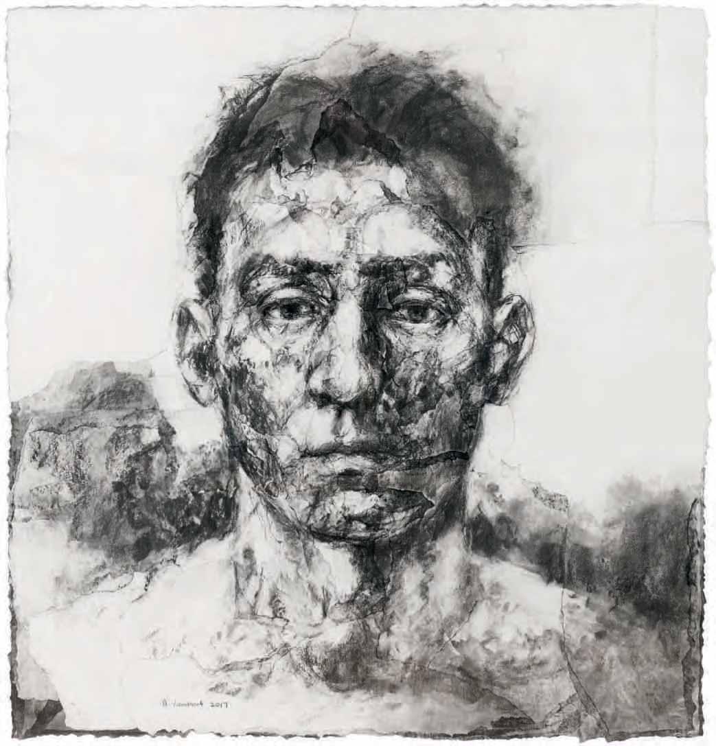
In a 2011 interview, Lambert described her working process: ‘I start each piece slightly differently but it is always on a plain sheet of paper. Usually I sprinkle charcoal on to the paper then, using my hands and a brush, I begin to describe a form. I then continue with a piece of charcoal and an eraser until the form becomes more evident. I continue to draw, rub out areas and change things around. If an area needs fresh white again due to too much rubbing out or the need to introduce light, I attach fresh pieces of white paper and continue to draw over the top and so on. Sometimes certain areas of a drawing can be many layers thick…I use thick willow charcoal, black pastel, tablet erasers from the Tate shop, soft brushes and a cobblers knife which has been adapted for me.’5
The potency of Lambert’s drawn images is further made manifest by her intensely physical and almost violent working method. The artist tears away, scratches, scrapes and collages the layered surfaces of her drawings, while at the same time rubbing out and redrawing the forms over and over again in charcoal. This visceral technique has been a particular hallmark of the artist’s draughtsmanship from the beginning of her career. As Dyer has written, ‘In spite of the many changes her work has undergone, Lambert’s drawings have always been instantly recognisable for their remarkable physical characteristics; their deeply eroded and scraped surfaces; and their intense graphic qualities arising from her highly personal use of charcoal and black pastel. It is through her unique method of working – repeatedly drawing and erasing, tearing and gouging – that she has tried to delve beneath the skin of her subjects, to expose and lay bare the subjective condition of her characters and to explore the expressive possibilities of the human body and face.’6
The sheer scale of these drawings, and the constant addition and subtraction of both paper and charcoal, resulting in a thickly layered surface, means that these immense works on paper are more constructed than simply drawn. As Peter McCarthy has pointed out, ‘Lambert intends these drawings to be seen in public or domestic interiors where their large scale might be experienced close to. Viewed at arm’s length, which is the artist’s habitual viewpoint, the imagery separates into its constituent parts. The chief experience at that distance is of unremitting tactility…The effort required in realising a fully worked image in this particular graphic idiom is considerable. It is not surprising therefore that she has gravitated towards a gestural, expressionistic style in which the combination of deliberate and accidental marks allows the steady build-up of both surface and image.’7
Lambert has only ever worked as a draughtsman, and never as a painter. However, as McCarthy has stated, ‘In her work, the act of drawing is radicalised and extended until it gains the status of a fully-fledged image-making process. It is also, ironically, a painterly process. There is an absence of line. The form is modelled as fully as it would be in a painting except that the medium is dry and the effect monochromatic. Tactility is also more pronounced than it would normally be in a traditional drawing. Paper and charcoal are combined and reworked until they form a crust that is as pitted and worn as any heavy impasto.’8 As the Canadian novelist Esi Edugyan, who owns one of Lambert’s large-scale drawings of heads, has described these works, ‘Utterly complex and mysterious, their expressions are impossible to pin down in a single word, and reflect back a strange and always changing combination of emotions that depend entirely on the mood of the viewer...It is this impossibility of emotions that Lambert captures. You find yourself fumbling to figure out exactly what it is you’re seeing, even as on a deeper level you’re already responding to it.’9
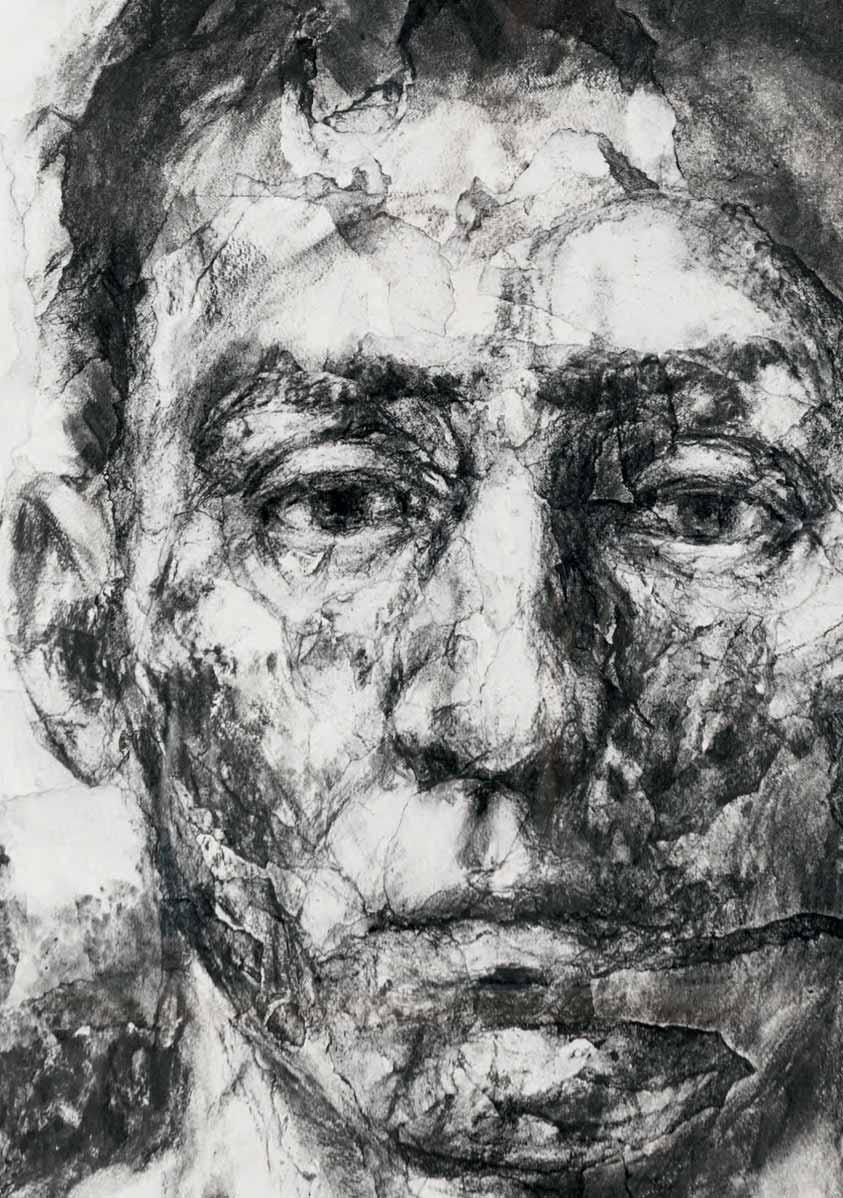
Collage and gouache on hand-marbled paper mounted on panel. 255 x 255 mm. (10 x 10 in.)
Much of Anne Connell’s work echoes her abiding love of early Renaissance painting. This and the following work are part of an ongoing series of mixed-media collages by the artist which incorporate antique paper ephemera from Italian flea markets, handwork appropriations of architectural details from Quattrocento and Cinquecento paintings, and other idiosyncratic motifs. As the artist has commented, ‘In essence, just about everything I’ve ever made has been a collage of some sort or other. I always expect my literal collages – the paper and glue ones – to come together more easily than my paintings, yet they never do.’
The present sheet was drawn in 2018. The tiny villa seen here can be found in the landscape on the south wall of Benozzo Gozzoli’s Chapel of the Magi, painted around 1459 in the Palazzo MediciRiccardi in Florence. The ladder is an adaptation of that in the armorial bearings of the medieval tilers’ guild of Paris.
Silverpoint, collage and gouache on paper mounted on panel. 255 x 255 mm. (10 x 10 in.)
‘Anne Connell’s exquisitely rendered fragments of Italian Renaissance paintings reveal both a knowledge of and a fascination with that period’s values, symbols and – most importantly – its conventions of illusion. Only rarely does the modern world seem to intrude into these vivid, jewel-like compositions…Still, on closer examination, Connell’s work reveals itself to be as firmly based in much more recent developments in art as it is in the time-honored tradition of easel painting as a window into another world. Like many of her contemporaries, she appropriates from a variety of sources, often combining images to create works that celebrate a balance of beauty and intellectual substance.’1 As the artist herself has stated, ‘My pictures are allusive, enigmatic, and suggest the possibility of an obscure narrative while precluding any definitive interpretation.’
The present sheet, completed in 2019, is partly drawn in silverpoint, a technique more often associated with Italian and Flemish drawings of the 14th and 15th centuries. The tree shown here, executed in silverpoint, is an adaptation of one in Pinturicchio’s fresco of Enea Silvio Piccolomini Presents Frederick III to Eleonora of Portugal, painted between 1502 and 1508 in the Piccolomini Library in the Duomo of Siena. The tower (with altered perspective) comes from Benozzo Gozzoli’s fresco of The Arrival of St. Augustine in Milan of 1464-1465, in the apsidal chapel of the church of Sant’Agostino in the Tuscan hill town of San Gimignano.
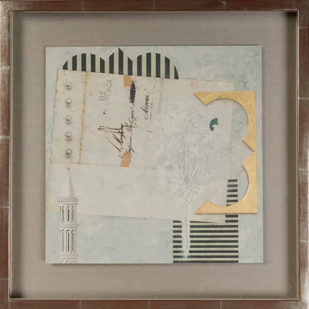
Watercolour on Arches paper. Signed with the artist’s initials RS in pencil at the lower right. 1002 x 1540 mm. (39 1/2 x 60 5/8 in.)
A recipient of several awards for her horticultural studies, Rosanne (Rosie) Sanders is one of the finest botanical artists working today. Apart from taking a foundation course at the High Wycombe College of Art, however, she is largely self-taught as an artist. Sanders started her career as a botanical painter in 1974, soon developing a particular reputation for her striking watercolours of flowers and fruit. She has earned commissions from the late Queen Elizabeth II and Queen Elizabeth The Queen Mother, as well as the Royal Horticultural Society, from whom she has won several gold medals for botanical illustration.
In 1988 Sanders wrote and illustrated a book entitled The English Apple, which was followed in 2010 by The Apple Book. In 2015 and 2016 a lavish monograph, Rosie Sanders’ Flowers: A Celebration of Botanical Art, was published in English, German and Spanish editions, while a book devoted to the artist’s watercolours of various types of roses appeared in 2019. In recent years the artist has been working on a series of large-scale monochromatic studies of woodland landscapes drawn in graphite and charcoal. Sanders lives and works in Devon, and has exhibited widely in London and elsewhere during a career that has lasted nearly fifty years. Her watercolours have been exhibited at the Royal Horticultural Society’s Chelsea Flower Show, and examples of her work are today in the collections of the Hunt Institute for Botanical Documentation in Pittsburgh and the Yale Center for British Art in New Haven, Connecticut, as well as the Shirley Sherwood Collection of contemporary botanical art at the Royal Botanical Gardens in Kew.
Sanders is best known for her watercolour drawings of flowers, usually on a very large scale. In her studio, she strongly backlights the flowers, to better capture the translucency and texture of the petals to their full advantage, and often studies them from unusual angles. As the artist has noted, ‘I felt I wanted to be an artist and not an illustrator. It’s part of my nature, I’ve never liked being in a tradition. So I have tried hard to see a different view of a plant…I can’t just sit down and paint me an orchid. It is about my response to the flowers. Something happens when I am painting and it’s not necessarily conscious.’1
Elsewhere, Sanders has expounded on her process; ‘I spend a great deal of time thinking about my next painting before I ever begin to put paint to paper…It’s hard to say what I am looking for, or why I choose a particular plant or flower, but I think generally it is shape and colour. It is not of prime concern to me what type the plant is, so while the subjects are plants, the paintings are not botanical in the traditional way. Having said that, it is important that I am true to the nature and form of the plant I have chosen; the paintings have a description of great particularity.’2 The artist usually works standing up at a tilted work table, with the plant she is studying placed on a ledge in front of her, at eye level and strongly backlit. She works with intense concentration, often for several hours at a time, constantly leaning forward to examine the shapes, colours and texture of the flower before turning her attention once again to the sheet of paper on the work surface, on which her subject is drawn several times larger than life size.
As one critic has noted of the artist’s watercolours, ‘If traditional botanical drawings capture a flower’s scientific qualities then Rosie Sanders’s paintings celebrate its visceral beauty. Back-lit and blown up out of proportion, they are the sensual stars of Sanders’ canvases, ripe with colour and movement. While meticulously realistic in execution, they are also larger than life and always painterly...As well as a lustrous quality, her work also has a realism that delights in her subject’s imperfections. A keen gardener, many of Sanders’s blooms are picked from her own garden or grown in her greenhouse and while she will source some from florists, they rarely have the drama her paintings require…Painting is an obsession for Sanders, who pours passion into each piece of work.’3
Another writer has remarked of the artist that ‘She picks flowers from her garden, observes them at close quarters and, bending closely over her ‘model’, proceeds to use a time-consuming, infinitely patient technique to set them down on paper in the minutest detail yet on a large scale. In the process, the flowers change – imperceptively but unequivocally: they become more three-dimensional, they turn into plant-architecture. Their structure is made visible, and the flower petals that are stretched over the ribs and veins that give them their structure come to life. You can see and feel the tension and freshness of a plant bursting with life, or the slow relaxation, wilting and desiccation of individual parts of a flower…Strong backlighting can make the colours of flowers glow like stained glass…Sanders observes these diaphanous light effects and consciously reproduces them; with extreme accuracy, indeed even perhaps a little more clearly, more strongly and more pointedly than reality, in a way that no photographic take on the subject could ever manage. Her close observation brings out for us the silent drama that inhabits flowers…The size of her paintings reveals the subtle presentation in detail of plant structures and the various contrasts of light shining on or through petals, and of radiance and fading. It is this hint of something more, something that photography cannot convey, that makes her flower paintings so overwhelming.’4
Sanders has stated that her watercolours are not really intended to be looked at close-up, but instead should be seen from a bit of a distance, with the viewer standing back from them. Of her work, the artist has noted that ‘I am most attracted to strong shapes and patterns. I like shapes that are strongly linear and make good negative spaces and I particularly love the dark colours, especially black, because I like the very subtle dark tones that are almost impossible to see…When you have a dark flower and you light it from behind, not only does it accentuate the darks but it exaggerates the lights too and that makes for very lively contrasts.’5 This particular interest in dark shades has led Sanders to paint several series devoted to luxuriant deep blue or black flowers, notably irises and tulips.
Irises make up a significant proportion of Sanders’s watercolours of flowers. As she has stated, ‘Irises I actually love, it’s one of my most favourite things…Irises are so…sensual and voluptuous and there’s something about the way [the] petals come out…and it’s that that I…want to get the feel of.’6 The artist grows irises in her garden, and when she wants to paint one she brings it into her studio to study, carefully placing and lighting the flower. In one interview, Sanders noted that, ‘I tend to go with the plant. If it moves a bit, I’ll go with it. With irises I would have quite a few gardening stems because they don’t last long enough for you to do the whole painting. I probably get one large petal done in a day and you come down next morning and it’s died. Then you simply splice another one in…I do like subjects that have a certain presence. I am not so keen on orchids now, they are a bit stiff, whereas irises are so soft and sexy but have this incredible strength. They are like women. They don’t get blown over, they stand tall. They are powerful and feminine.’7
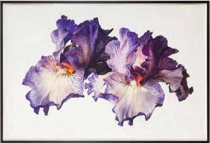
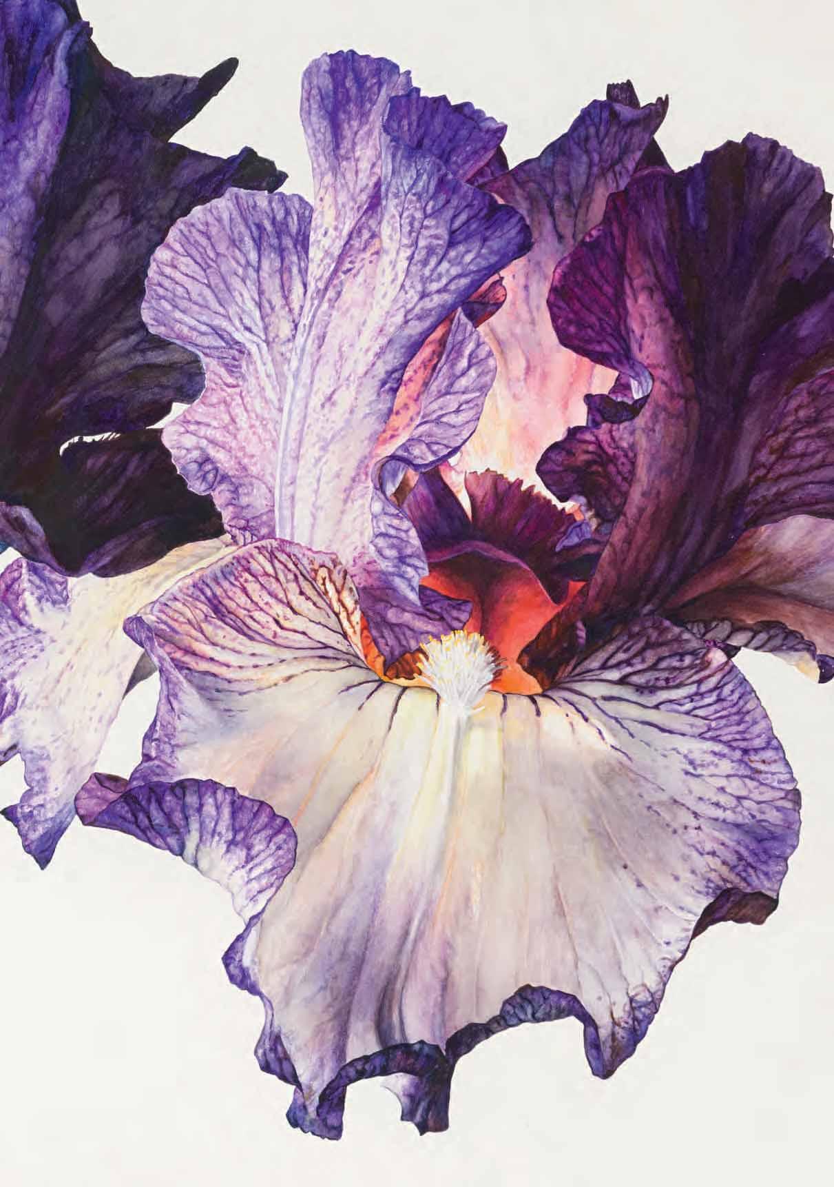
Cortili 01
Ink and gouache on black paper. Signed and dated Eve Campbell 2021 in pencil at the lower right. 420 x 300 mm. (16 1/2 x 11 3/4 in.) [sheet]
The young Scottish printmaker and designer Eve Campbell studied at the Glasgow School of Art, graduating with a degree in textile design in 2018. As she has stated, ‘I grew up surrounded by art, design and making, in the house my architect grandfather built…My mum is a ceramicist, my dad is a painter and I learnt to draw by watching them. Today we work alongside each other and are always bouncing ideas and opinions around.’1 Offered a place at the school of architecture in her final year of art school, she turned it down, although according to her ‘it did highlight my desire to create design for living in…For my final-year project, I set out to use print as a technique to transform and bring life and colour to architectural spaces. I enjoyed creating large, bold prints and often found myself hanging my prints on the wall to view in full. They were like artworks, yet versatile in size, shape and affordability. This developed into wallhangings that I saw as the perfect solution for transforming a space.’2
Campbell produces screenprints, wall hangings and ceramics, as well as drawings. Much of her work is directly inspired by the scenery, natural forms, plants and rocks of her surroundings in the Argyll region of western Scotland. As the artist has noted, ‘In my work, I try to capture the transient nature of surface and form on the boundary between land and shore on Scotland’s West Coast. My designs, which are created using paper stencilling and screen-printing techniques, reflect the microcosms of colour, pattern, shape and texture to be found in this special place.’3
The artist has won a number of awards, including the John Lewis Award for Design and Innovation at the New Designers exhibition in London in 2018. In the same year she was a finalist for the Marks & Spencer TexSelect Fashion Fabric Award, and in 2019 collaborated with the fashion retailer White Stuff on a womenswear collection which utilized her prints. In 2020 Campbell won the Emerging Artists Award at Creative Scotland’s Visual Artist and Craft Maker Awards. A first solo exhibition of her work, entitled Vestige, was mounted at the An Tobar arts centre in Tobermory, on the island of Mull, in the summer of 2021. Most recently, Campbell exhibited a series of wall-hangings, entitled Caladh and inspired by visits to the small and remote Caladh Harbour and the island of Eilean Dubh in western Scotland, at the Collect fair for contemporary craft and design in London in March 2023.
Campbell works from a small print studio4 in the village of Tighnabruaich, on the shores of the Kyles of Bute on the west coast of Scotland. Her large-scale prints and wall hangings are unique creations, produced in single editions utilizing a complex method of layers of paper stencilling, masking and screenprinting. The designs are based on her drawings; ‘I was always good at drawing and I remember my first Daler Rowney sketchbook. From watching mum and dad draw in their sketchbooks, I learnt how to fill mine…I fill sketchbooks with drawings of the woods, shore and islands and then use these to create my designs.’5 As has been noted of the area around the artist’s home and studio at Tighnabruaich, ‘The combination of beach, heath, hills and forest is a constant source of inspiration…and Campbell is often found sketching in the woods or on the shore, capturing nature’s shapes, colours and patterns. These feed into her designs, becoming more abstract through a process of drawing, collage and print. “I’ll start off by filling a sketchbook with drawings,” she explains…“Once I have a bank of drawings that capture my subject, I take these to the print table. I select colours and cut relevant shapes out of newsprint and begin the printing process.”’6
Cortili 05
Ink and gouache on white paper. Signed and dated Eve Campbell 2021 in pencil at the lower right. 420 x 300 mm. (16 1/2 x 11 3/4 in.) [sheet]
As Eve Campbell has described her work, ‘With an interest in creating surface pattern inspired by Scottish nature and architecture I create printed wall hangings and ceramic tiles. Through paper stencilling and screen printing my prints capture the colours, shapes and patterns of nature on Scotland’s West Coast.’1 As she has recently added, ‘I love colour and pattern…At art school you would sometimes be drawn to Pinterest for inspiration, but both my parents are artists and always pushed me to just go out and draw. You take what is in your surroundings – for me the west coast – and those are the shapes and patterns you pick up.’2 The artist has also stressed ‘the importance of having strong sketchbooks with an abundance of drawings and research…This is where all my designs start and with a jam-packed sketchbook you are more likely to create unique and imaginative designs. Allowing ideas to flow freely keeps you inspired and helps you move forward.’3
The present pair of gouache drawings are part of a series of works on paper entitled Cortili (‘courtyards’ in Italian) that were created by Campbell during the recent pandemic4. Unlike much of her work, which is based on the landscape and nature of her native Scotland, the Cortili series evoke the artist’s memories of Venice, where a cortile, or inside courtyard – often with a well in the centre – is found within a number of larger buildings, notably the Doge’s Palace. Some of the Cortili drawings were developed into larger printed wall hangings.
It has been noted of the artist that, ‘Under normal circumstances Eve [Campbell]’s work is influenced by the coast and landscape of west Scotland. During lockdown however, limited to [her] flat and missing the stimulation of nature, she started to construct imaginary scenes, or settings, within the constrictions of a cardboard box. Each day the scene changed and with it came a new drawing. As these evolved, memories of time spent in Italy, and in particular Venice and the 8000 square meters of gold mosaic that cover the walls, vaults and cupolas of St Mark’s Basilica, started to influence the constructions. The built environment shaped by restrictions of geography and the human ability to create beautiful spaces for social gathering or quiet reflection started to mirror Eve’s experience of lockdown. The Italian word ‘Cortili’ describes enclosed areas typically found within buildings. Eve’s ‘box constructions’ came to represent an escape, a playful imaginary world. Eve’s Cortili collection has the atmosphere of sanctuary in the way an Italian courtyard combines nature with architecture to create harmony.’5
Born 1984
27 Degrees
Watercolour on paper. 1000 x 1500 mm. (39 3/8 x 59 1/8 in.)
Born Jessica Rosemary Shepherd, the artist and botanist Úrsula Romero lives and works in the village of Albuñuelas, in the Lecrin Vallery of southern Spain. Her work is in the collections of the Fitzwilliam Museum in Cambridge, The Wellcome Trust, the Royal Horticultural Society and the British Library in London and The Box (formerly the Plymouth City Museum and Art Gallery) in Plymouth, as well as the Shirley Sherwood Collection of contemporary botanical art and the Botanic Gardens in Denver, Dublin, Edinburgh, London, Madrid and New York. Most recently, Romero’s watercolours were included in the exhibition Ellas ilustran botánica in the Casa de las Ciencas in Logroño in Spain.
This monumental watercolour is part of a recent series of works devoted to blue flowers, on which the artist has been working for the past several years, and which has taken her as far afield as the island of Tasmania in Australia. As has been noted, ‘Úrsula Romero has been immersed in the colour blue since 2017, exploring what this intense and captivating colour means to us culturally; why regardless of race or religion, it is the worlds’ favourite colour and why paradoxically it is so rare in nature. In the footsteps of the 18th Century Romanticists, Úrsula has been travelling across the globe in her search for the unattainable; seeking new ways of depicting the beauty of blue flowers with each journey she takes…Blue Flower is not a theoretical and rational study of botanical art, but an exploration of the visual directions in which the natural world can lead us…Blue Flower will remain unfinished.’1
According to the artist, this watercolour of poppies was done soon after she met the enigmatic British artist Nick Fudge2 in Spain. As she has noted of the present work, ‘I decided to title the painting ‘27 Degrees’ because the petals of the central flower make a cross, a destined cross that is also present in the astrology charts of two people who both had eclipse points at 27 degrees of the fixed signs – YBA Nick Fudge and myself. We met back on 4th May 2019 in a village in Granada. It was an unexpected event that shook up my world, the way I paint, and the way I saw other paintings. For the next three years, Nick taught me the history of art and we developed a friendship through correspondence during the Pandemic. He was isolated in Lisbon at the time and I myself in a small isolated house in the mountains of Granada. The painting 27 Degrees is about this bolt out of the blue. A divine intervention. A happy, fated event that paved the way for two painters to help each other with their work during an incredibly challenging time in our world’s history.’3
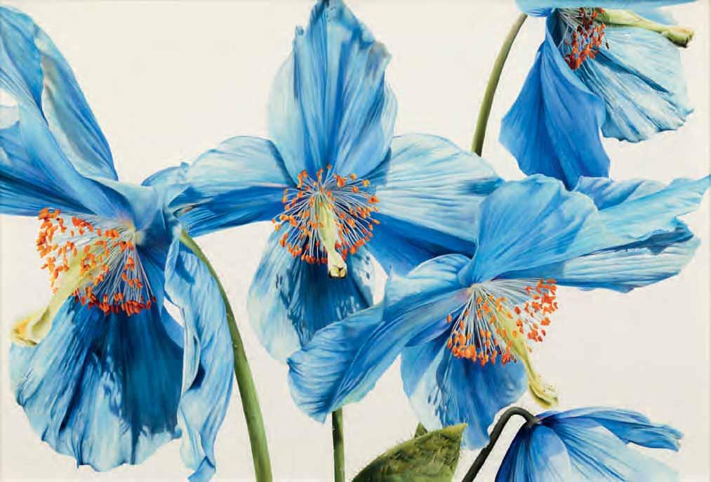
Born 1984
Lament
Watercolour on paper. 1000 x 1000 mm. (39 3/8 x 39 3/8 in.)
As the artist has written, ‘I trained in botany before committing myself fully to painting so that I would understand the processes of plants more comprehensively. Equipped with this scientific knowledge, I am now testing new approaches to my artwork to push the capacity for botanical illustration to bring greater awareness of plants and our interaction with them. I hope to inspire people to think beyond their experience whilst enriching our current perceptions of botanical illustration, its applications and how it sits within the larger scope of the visual arts.’
Of this large watercolour, which is also part of the Blue Flower series, Romero has stated: ‘The Poppy – it grows in the harshest of environments. It is the flower of dreams, of fate, of escape, of seduction, intoxication, transformation, transcendence, of fertility, death and of survival against all odds. For me, the Himalayan Poppy has an almost unnatural blueness about it which makes it even more otherworldly. I found these poppies in Cluny Gardens in Perthshire on an expedition trip back in 2018. Poppies in black space are about hiding and not being seen properly. Of having to flower in the darkness. As with a lot of my paintings, there’s a ‘doublet’ – two flower heads that have lost their petals. They stand there naked, slightly deformed, with a skirt of anthers, not really looking at one another. The piece is about the distance between lovers and hidden hope.’1
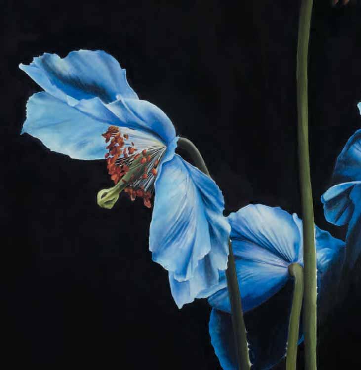
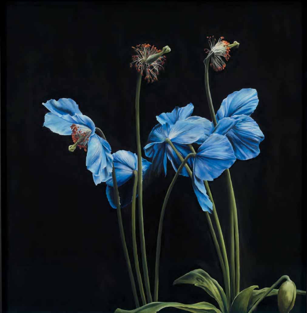
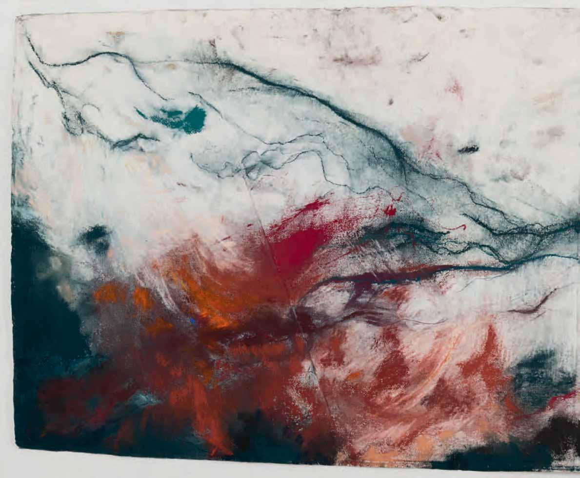
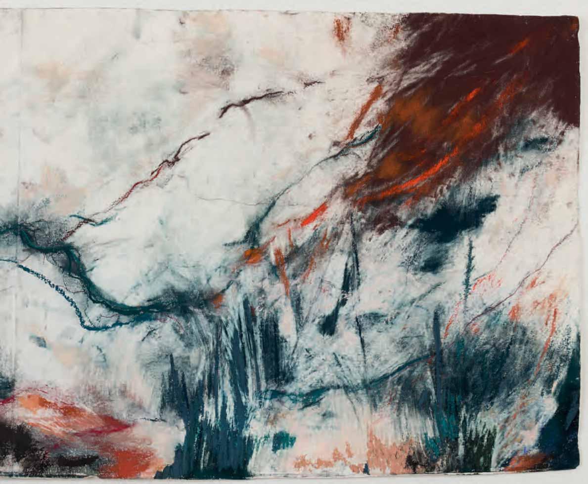
Born 1986
yes risk joy
Pastel and pencil on handmade Khadi paper. Signed Lavinia in pencil on the verso and titled yes risk joy in pencil on the verso.
770 x 1981 mm. (30 1/4 x 78 in.)
An Italian-British artist, Lavinia Harrington is presently completing her MFA in Painting at the Slade School of Fine Art in London. She graduated from Oxford University with a degree in the History of Art in 2008, and two years later gained her MA degree at the Courtauld Institute of Art. She has fifteen years of experience working in arts education; delivering public talks for the National Gallery in London and teaching in museums, galleries and schools across the United Kingdom and Italy. In 2022 she took part in the group show I Felt That at The Tub, an artist-run project space in Hackney.
Harrington works primarily on paper, using handmade papers to which she applies pastels, raw pigments and water-based materials, responding to the tactual sensation, fragility and intensity of the medium. Much of her visceral process involves the folding and layering of paper, often applying the pastel or pigment directly onto the sheet laid flat on the floor, while collage and assemblage are also an important part of her method. As the artist has stated, ‘My pieces emerge over many unseen, unresolved layers and erasures, and are folded and unfolded in the process…Working with paper has become integral to my practice for the intimacy and immediacy it elicits.’1
In a recent interview, Harrington has added that, ‘Since I can remember, colours and music have provoked visceral and at times overlapping sensory experiences; with colours evoking vivid textures and sounds, and music feeling tactile as fabric. It’s hard for me to explain my process in words, as I work instinctively and often draw from entangled emotions and physical sensations in flux by fully immersing myself in the process. Each drawing, if I manage not to rip it up or overwork it, eventually finds its own rhythm. But getting to that stage can take a long time, the final marks emerge over many unresolved and unseen layers. I know a work is finished when it feels strangely familiar.’2 The artist has also noted that her compositions are ‘guided by a steady process of personal cartography. I understand my works in part as maps of felt experiences.’3
This monumental pastel work, nearly two metres in length, was completed in February 2023. As Harrington remarks, she began the piece ‘by working on the floor – moving on and across the paper –folding and unfolding it a number of times in the process…[The] action of making the piece evolved over the course of the end of January and February – working with timed sessions, often determined by the length of Dvorak’s music4 – whether I listened to it all through once or multiple cycles of it back to back…My work is not illustrating a poem or piece of music, but I’ve noticed there are a series of poems and musical pieces as well as particular works that I will return to again and again over a particular arc of time and over the course of making a series of pieces.’5 The title of this large pastel, yes risk joy, is taken from Louise Glück’s poem Snowdrops. Other poems which inspired Harrington in the making of this work include Birdwings and The Guest House by Rumi and What if this road by Sheenagh Pugh.
Harrington’s grounding in the history of art, as a student, scholar and teacher, has had a profound impact on her work. As the artist has said, ‘having specialized in the Italian Renaissance, I’ve spent most of my academic and professional career looking predominantly at artworks by white western male artists… But, it’s been my focus on women artists that has felt most empowering in terms of developing my own practice. I was drawn to pastels as a medium after handling one [of] Joan Mitchell’s breathtaking drawings in the gallery I worked for back in 2014. My recent pilgrimage to see her sensational exhibition in Baltimore was nothing short of lifechanging…I find the immediacy and intimacy of works on paper…really appealing, particularly works by Sophie Taeuber-Arp, Helen Frankenthaler, Louise Bourgeois, Jenny Saville, Rachel Jones and Joana Choumali.’6
No.1 Jessie Marion King
1. Colin White, The Enchanted World of Jessie M. King, Edinburgh, 1989, p.86.
No.2 Louise Hervieu
1. ‘De sombres rideaux s’entrouvent et nous pénétrons dans un monde où l’Amour et la Mort parlent à voix basse’.
2. ‘Dessiner, pour Louise Hervieu, c’est vraiment prendre possession du monde en donnant à ce mot toute sa plénitude physique.’
3. Inv. RF 36812; Paris, Musée du Louvre, Donations Claude Roger-Marx, exhibition catalogue, 1980-1981, pp.62-63, no.34. The drawing measures 526 x 688 mm.
No.3 Gwen John
1. Quinn eventually came to own some twenty paintings and around fifty drawings by Gwen John.
2. David Fraser Jenkins, ‘Gwen John: An Appreciation’, in Cecily Langdale and David Fraser Jenkins, Gwen John: An Interior Life, exhibition catalogue, London, Manchester and New Haven, 1985-1986, p.17.
3. It is interesting to note, however, that by 1930 works by Gwen John were already in the collections of the Tate Gallery in London, the Manchester City Art Gallery and the Whitworth Art Gallery in Manchester and the Hugh Lane Gallery in Dublin, as well as the Art Institute of Chicago and the Albright-Knox Art Gallery in Buffalo, New York.
4. Susan Chitty, Gwen John 1876-1939, London, 1981, p.193.
5. See https://browseanddarby.co.uk/artists/40-gwen-john/works/ [accessed 11 May 2023].
No.4
Gwen John
1. Cecily Langdale, Gwen John, New Haven and London, 1987, p.107.
2. Ibid., pp.231-232, no.350 (where dated to the early 1930s).
3. One of these is illustrated in London, Browse & Darby, Gwen John, exhibition catalogue, 2007, no.31, and another is illustrated in London, Browse & Darby, Gwen John, exhibition catalogue, 2010, no.23.
4. Langdale, op.cit., p.232, no.350, pl.378a. The drawing is dated 27 February 1932.
No.5
Alethea Garstin
1. Patrick Heron, ‘Introduction’, in St. Ives, Penwith Society of Art, and elsewhere, Norman and Alethea Garstin: Two Impressionists – Father and Daughter, exhibition catalogue, 1978, p.6.
2. Anonymous sale, Penzance, David Lay Auctions, 31 July 2014, lot 206. The painting measures 79 x 60 cm.
3. Another painting of the same period by Alethea Garstin is The Reverend Charles Francis Benthall on Holiday in Morocco, owned by the National Trust and on view at Benthall Hall in Shropshire (Inv. 509822; The Public Catalogue Foundation, Oil Paintings in National Trust Properties in National Trust II: The Midlands, London, 2013, illustrated p.189).
No.6
Lidia Zholtkevich
1. Ksenia Nouril, Museum of Modern Art, Object: Photo. Vkhutemas, 1920-30; published online at https://www.moma.org/interactives/ objectphoto/schools/15.html [accessed 16 April 2023].
2. Other influential instructors during Lidia Zholtkevich’s time at Vkhutemas were the painter and designer Lyubov Popova and architect Alexander Vesnin.
3. The decoration of the Soviet pavilion also included a semi-precious stone mosaic map of Soviet industry and culminated in a mural by Alexander Deineka celebrating the legacy of the first two decades of Soviet power.
4. Quoted in translation in Mark D. Steinberg, Voices of Revolution, 1917, New Haven and London, 2001, p.197, no.65.
Ingrid Gerhardt
1. Der Spielkreis: Rundbrief der Landesarbeitgemeinschaft für Laienspiel und Laientheater im Land Nordrhein-Westfalen, June 1955, illustrated on the cover.
Marlow Moss
1. Antoinette Nijhoff in Amsterdam, Stedelijk Museum, Marlow Moss, exhibition catalogue, 1962; Quoted in Lucy Howarth, Marlow Moss, 2019, p.10.
2. Sabine Schaschl, ‘A Neglected Forward and Lateral Thinker’, in Sabine Schaschl, ed., A Forgotten Maverick: Marlow Moss, exhibition catalogue, Zurich, 2017, p.7.
3. Nijhoff, op.cit.; Quoted in Howarth, op.cit., 2008, Vol.I, p.241.
4. Howarth, op.cit., 2019, pp.1-2.
5. Howarth, op.cit., 2008, Vol.I, p.253.
6. See https://www.rijksmuseum.nl/en/press/press-releases/rijksmuseum-acquires-three-works-by-marlow-moss [accessed 10 May 2023].
7. Howarth, op.cit., 2008, Vol.I, p.288.
8. Howarth, op.cit., 2008, Vol.II [Catalogue raisonné], nos. Wop 1 to Wop 26. Several independent, non-preparatory drawings of this type by Moss are also illustrated in Schaschl, ed., op.cit., pp.72-77 and p.92, and in Howarth, op.cit., 2019, figs.19-22.
9. Howarth, op.cit., 2008, Vol.I, p.289.
No.11
Lynne Drexler
1. Henry Seldis, ‘Drexler Art Evokes Bright Atmosphere’, Los Angeles Times, 5 April 1965, p.8.
2. The artist quoted in John Dorfman, ‘Symphonies of Color’, Art & Antiques, December-January 2021-2022, p.63.
3. Hans Hofmann had studied alongside Matisse in Paris in the early years of the 20th century.
4. One example is illustrated in Dorfman, op.cit., p.61, and several others are illustrated in New York, Mnuchin Gallery and Berry Campbell, Lynne Drexler: The First Decade, exhibition catalogue, 2022, unpaginated.
No.13
Gluck
1. Quoted in Diana Souhami, Gluck 1895-1978: Her Biography, London, 1988, pp.41-42.
2. London, The Fine Art Society, Gluck, exhibition catalogue, 1973, no.52 (as St. Buryan); London, The Fine Art Society, Gluck, exhibition catalogue, 2017, no.19 (as Nevermore). Signed and dated Gluck 1964, the painting, executed in oil on board, measures 11.8 x 23.4 cm. (4 5/8 x 9 1/4 in.). An image of the painting is also visible at https://oldweirdalbion.wordpress.com/2018/01/10/gluck-landscapes/ [accessed 15 May 2023].
3. London, Stephen Ongpin Fine Art, A Sense of Place: Landscapes of the 19th and 20th Centuries, exhibition catalogue, 2021, no.70. The dimensions of the drawing are 126 x 126 mm.
No.14
Alice Neel
1. Phoebe Hoban, Alice Neel: The Art of Not Sitting Pretty, New York, 2021, pp.vii-viii.
2. Ibid., p.357.
3. Jeremy Lewison, ‘Intimate Relations: Drawings by Alice Neel’, in Skärhamn, Nordiska Akvarellmuseet (Nordic Watercolour Museum), Alice Neel. Nära Relationer / Intimate Relations: Teckningar och Akvareller 1926-1982 / Drawings and Watercolours 1926-1982, exhibition catalogue, 2013, pp.16, 18 and 21.
4. A head and shoulders portrait of Gibbs, with dimensions of 63.5 x 30.6 cm., was with the Xavier Hufkens Gallery in Brussels. The painting is illustrated at https://www.xavierhufkens.com/artworks/neel-036-1961-alice-neel-richard-gibbs [accessed 8 March 2023].
5. A three-quarter length painting of a shirtless Gibbs seated at a table, measuring 96.5 x 86.4 cm, was with Victoria Miro Gallery in London; see https://www.victoria-miro.com/exhibitions/419/works/8cdefe3c83ab80/ [accessed 11 April 2023].
6. Kelly Baum and Randall Griffey, Alice Neel: People Come First, exhibition catalogue, New York and elsewhere, 2021-2022, illustrated p.180. The dimensions of the large painting are 162.6 x 127 cm.
7. Ann Sutherland Harris, in New York, Graham Gallery, Alice Neel: A Retrospective Exhibition of Watercolors and Drawings, exhibition catalogue, 1978.
Wilhelmina Barns-Graham
1. This critical imbalance was somewhat confirmed when the Tate Gallery’s major 1985 exhibition St. Ives 1939-64: Twenty-Five Years of Painting, Sculpture and Pottery included just three works by Barns-Graham, while Lanyon and Hilton were represented by nineteen and twenty paintings, respectively.
2. Wilhelmina Barns-Graham, ‘Collected Thoughts’, in Penzance, Newlyn Art Gallery, and elsewhere, W. Barns-Graham: Retrospective 19401989, exhibition catalogue, 1989, p.12.
3. Douglas Hall, ‘Introduction’, in ibid., p.7.
No.16
Joan Mitchell
1. Jane Livingston, The Paintings of Joan Mitchell, exhibition catalogue, New York and elsewhere, 2002-2004, p.34.
2. Ibid., pp.37-38.
3. Klaus Kertess, in Joan Mitchell: Pastel, exhibition catalogue, Robert Miller Gallery, New York, 1992.
4. Holland Cotter, ‘Art in Review: Joan Mitchell: Pastel’, The New York Times, 8 May 1992, p.C31.
5. Five of these ‘poem pastels’, incorporating poems by Dupin and Schuyler, are illustrated in Cordélia de Brosses, ‘Faire de la poésie en peinture: Monet et Mitchell au prisme de leurs inspirations littéraires’, in Suzanne Pagé, Claude Monet - Joan Mitchell, exhibition catalogue, Paris, 20222023, pp.207-209, fig.7 and nos.65-68. Four others, with poems by Schuyler, Dupin and J. J. Mitchell, are illustrated in Sarah Roberts and Katy Siegel, ed., Joan Mitchell, exhibition catalogue, San Francisco and Baltimore, 2021-2022, pls.80-81 and pp.205-206, figs.7.5-7.6.
6. Livingston, op.cit., pp.37-38.
No.17
Joan Mitchell
1. Quilter in Roberts and Siegel, ed., op.cit., p.197.
2. Erin Kimmel, ‘Poem pastels’, in Roberts and Siegel, ed., op.cit., p.206.
3. Ibid., p.206.
4. Letter to Karen Edwards of 17 November 1975; Quoted in Sarah Roberts, ‘Territories’, in Roberts and Siegel, ed., op.cit., p.205.
5. Kimmel in Roberts and Siegel, ed., op.cit., p.206.
6. Sarah Roberts, ‘Territories’, in Roberts and Siegel, ed., op.cit., p.204.
7. One pastel was sold at auction, New York, Doyle, 11 April 2000, lot 101. The other, in which the typewritten text is on a separate piece of paper pasted onto the surface of the sheet, was sold at Artnet Auctions, 2 June 2021, lot 134120, and was later with Gazelli Art House, London, in 2022. The latter pastel is illustrated at https://ocula.com/art-galleries/gazelli-art-house/artworks/joan-mitchell/untitled-pastel-poemfrank-oharas-birthday/ [accessed 8 May 2023].
8. Inv. 500.2012. An image of the pastel is visible at https://www.moma.org/collection/works/146160?classifications=any&date_begin=Pre1850&date_end=2023&q=joan+mitchell&utf8=✓&with_images=1 [accessed 8 May 2023].
9. Anonymous sale, New York, Sotheby’s, 12 September 2007, lots 463 (entitled Keep Coming Baby), 463A (Sorry to Have Lost You) and 463B (You Love More Than You Do).
10. Anonymous sale, Philadelphia, Freeman’s, 27 June 2004, lot 132.
11. Kimmel in Roberts and Siegel, ed., op.cit., p.206, fig.7.5.
12. Holland Cotter, ‘Art in Review. Joan Mitchell: ‘Working with Poets: Pastels and Paintings’’, The New York Times, 19 July 2002, p.E34.
13. Brenda Richardson, ‘Joan Mitchell: Whitney Museum of American Art’ [review], Artforum, September 2002.
No.19
Dora Maar
1. James Lord, Picasso and Dora: A Memoir, London, 1993, p.124.
2. Ibid., pp.172-173.
3. Alexander Watt, ‘Paris Commentary’, The Studio, May 1957, p.146.
4. John Russell, ‘Art News from London’, Art News, May 1958, p.46.
No.20
Dora Maar
1. Damarice Amao, ‘Obligatory Painting’, in Damarice Amao, Amanda Maddox and Karolina Ziebinska-Lewandowska, ed., Dora Maar, exhibition catalogue, London and Los Angeles, 2019-2020, pp.155 and 162.
No.21
Dora Maar
1. ‘Que de progrès, de changement d’esprit, séparent tes paysages d’aujourd’hui de ta peinture d’avant-guerre...Je ne parlerai pur moi, mais je voudrais que tu saches que ce qui me plaît surtout dans tes tableaux récents, c’est une inspiration directe de la nature, c’est un esprit romantique spontané et nullement forcé, et surtout c’est le bon métier de peintre dont ils font preuve. Oserais-je t’avouer, sans trop insister, que j’y vois d’un côté des rapports avec Turner, et d’un autre, des rapports avec Courbet?...Tu as une vraie vision de peintre, tu as le courage de poursuivre cette vision jusqu’à sa réalisation sur la toile, et tu es surtout bien servie par une main habile, par un façon remarquable de manier la pâte, une sensibilité et un instinct très surs.’; Paris, Berggruen & Cie., Dora Maar: Paysages, 1957, unpaginated.
No.22
Vivian Springford
1. From an unpublished draft of a press release for Springford’s first solo exhibition in 1960; Quoted in Alexandra Schwartz, ‘Vivian Springford: A Life’, in New York, Almine Rech Gallery, Vivian Springford, exhibition catalogue, 2018, p.42.
2. Quoted in Schwartz, ibid., p.37.
3. Joe Gioia, ‘Finding Vivian Springford’, Vivian Springford Archive, https://vivianspringford.com/about-bio [accessed 28 April 2023].
4. Hall W. Rockefeller, ‘When it is the cosmos you are dealing with, what is art history?’, Vivian Springford Archive, https://vivianspringford.com/ cosmos-essay [accessed 29 April 2023].
5. Arlene Shechet, ‘Vivian Springford’, in New York, Almine Rech Gallery, op.cit., p.62.
No.23
Helen Frankenthaler
1. Barbara Rose, Frankenthaler, New York, 1971, p.31.
2. Ibid., p.34.
3. Ted Loos, ‘Helen Frankenthaler, Back to the Future’, The New York Times, 27 April 2003, p.30.
4. Karen Wilkin, Frankenthaler: Works on Paper 1949-1984, exhibition catalogue, New York and elsewhere, 1985-1986, p.26.
5. Ibid., p.93 and pp.96-97.
No.24
Jennifer Bartlett
1. As one writer has noted, ‘She wanted a simple, flat, uniform surface to paint on, a surface that did not require wooden stretchers, canvas, and all the bothersome paraphernalia of oil paint’; Calvin Tomkins, ‘Getting Everything In’, The New Yorker, 15 April 1985, p.55.
2. Roberta Smith, ‘Flooding the Mind and Eye: Jennifer Bartlett’s Commissions’, in Marge Goldwater, Roberta Smith and Calvin Tomkins, Jennifer Bartlett, exhibition catalogue, Minneapolis, 1985, p.130. The cabin sculpture is illustrated on p.132.
3. The latter is illustrated in Klaus Ottmann, Jennifer Bartlett: History of the Universe. Works 1970-2011, exhibition catalogue, Philadelphia and Water Mill, 2013-2014, pl.7.
4. Installation images of the exhibition, including the present work, are visible online at https://www.paulacoopergallery.com/exhibitions/jenniferbartlett9#tab:slideshow;slide:2 [accessed 21 April 2023].
5. John Russell, ‘A Mix of Archetypes and Autobiography in the New Pastels of Jennifer Bartlett’, The New York Times, 27 February 1987, pp.C1 and C28.
6. Ibid., p.C28.
7. Terrie Sultan, ‘Interview with Jennifer Bartlett’, in Ottmann, op.cit., p.30.
8. Inv. 87.29 a-d; Old House Lane, No.15. Executed in pastel on paper, in four parts, the dimensions of the work are 762 x 4470 mm.
9. Old House Lane, No.2 (then in a private collection, France) and Old House Lane, No.14 (then in the collection of the artist); Jim Butler, Recent American Pastels, exhibition catalogue, Vermont, Middlebury College, Christian A. Johnson Memorial Gallery, 1988, unpaginated, nos.5 and 6; the latter illustrated.
10. Old House Lane, No.28 (Anonymous sale (‘Property from a New York Charitable Family Trust’), New York, Christie’s, 29 September 2022, lot 161); Old House Lane, No.23 (Anonymous sale, New York, Christie’s, 18 December 2018, lot 3); Old House Lane, No.25 (Anonymous sale, Toronto, Waddington’s, 6 December 2018, lot 829); Old House Lane, No.12 (Anonymous sale, New York, Sotheby’s, 15 November 2006, lot 639); Old House Lane, No.22 (Anonymous sale, New York, Christie’s, 9 November 2005, lot 572); Old House Lane, No.26 (Anonymous sale, New York, Sotheby’s, 20 November 1996, lot 350) and Old House Lane, No.34 (Anonymous sale, New York, Sotheby’s, 9 May 1996, lot 313).
No.25
Helen Frankenthaler
1. Robert S. Mattison, ‘Helen Frankenthaler: Paper is Painting’, in London, Bernard Jacobson Gallery, Helen Frankenthaler: Paper is Painting, exhibition catalogue, 2010, p.9.
2. For further information about Fred Siegenthaler and the book Strange Papers, see https://books-on-books.com/tag/helen-frankenthaler/ [accessed 3 May 2023].
3. The process of making this particular paper is described by Richardson in Fred Siegenthaler, Strange Papers, Muttenz, 1987, pp.81-82.
No.26
Gillian Ayres
1. Quoted in Fiammetta Rocco, ‘It’s Colour She Loves’, The Independent, 23 September 1995; https://www.independent.co.uk/arts-entertainment/ it-s-colour-she-loves-1602676.html [accessed 11 May 2023].
2. Mel Gooding, ‘‘Harmonies entire’: The later work of Gillian Ayres’, in London, Alan Cristea Gallery, Gillian Ayres: Paintings and Works on Paper 1980-2004, exhibition catalogue, 2004, unpaginated.
3. Tony Godfrey, ‘London and Oxford. Stephen McKenna, Gillian Ayres, Painting 83’ [exhibition reviews], The Burlington Magazine, February 1984, p.110.
4. Quoted in Rocco, op.cit.
5. Gooding, op.cit., unpaginated.
6. Inv. JF30; An image of the work is visible at https://artuk.org/discover/artworks/untitled-226210/search/actor:ayres-gillian-19302018/page/2/ view_as/grid [accessed 12 May 2023].
No.27
Helen Frankenthaler
1. The artist, quoted in Barbara Rose, Frankenthaler, New York, 1971, p.85.
2. Quoted in John Elderfield, Frankenthaler, New York, 1989, p.284.
3. Quoted in Ibid., p.184.
4. Quoted in Karen Wilkin, Frankenthaler: Works on Paper 1949-1984, exhibition catalogue, New York and elsewhere, 1985-1986, p.8.
5. Karen Wilkin, ‘Appreciation: Helen Frankenthaler (1928-2011)’, American Art, Fall 2012, p.103.
6. Quoted in ‘A Conversation: Helen Frankenthaler with Julia Brown’, in Julia Brown, After Mountains and Sea: Frankenthaler 1956-1959, exhibition catalogue, New York, 1998, p.33.
7. The artist, quoted in E. A. Carmean, Jr., Helen Frankenthaler: A Paintings Retrospective, New York and elsewhere, 1989-1990, p.64, under no.26.
No.28
Helen Frankenthaler
1. Tim Marlow, ‘Interview with Helen Frankenthaler’, in London, Bernard Jacobson Gallery, Frankenthaler: On Paper 1990-1999, exhibition catalogue, London, 2000, p.7.
2. Karen Wilkin, ‘Frankenthaler at Eighty’, in New York, Knoedler & Company, Frankenthaler at Eighty: Six Decades, exhibition catalogue, 20082009, p.7.
3. Karen Wilkin, ‘Appreciation: Helen Frankenthaler (1928-2011)’, American Art, Fall 2012, p.103.
4. Thomas Crow, ‘Drawing within Nature’, in New York, Gagosian, Drawing within Nature: Paintings from the 1990s, exhibition catalogue, 2023, p.15.
Libby Raynham
1. Michael Wilson, ‘That Inward Eye’, in London, W/S Fine Art Ltd., op.cit., unpaginated.
2. Ibid.
1. Michael Wilson, ‘That Inward Eye’, in London, W/S Fine Art Ltd., op.cit., unpaginated.
2. Ibid.
3. ‘Ab und zu kann es geschehen, dass ein Fehler geschieht, der zu einer neuen Idee führt, aber das Ziel des Malprozesses bleibt, eine innere Idee zu realisieren.’; Quoted in Maya Blattmann, ‘Weiche Züge widerspiegeln die Gedanken’, Jungfrau Zeitung, 14 May 2001.
No.31
Anne
Connell1. Ken Johnson, ‘Art Guide. Anne Connell; Gail Gregg’, The New York Times, 25 May 2001, p.E30.
2. Christopher Zinn, ‘Eloquent Objects’, in Portland, OR, Marylhurst University, The Art Gym, Anne Connell: A Little View, exhibition catalogue, 1999, p.4.
3. London, Stephen Ongpin Fine Art, Paintings by Anne Connell, exhibition catalogue, 2009, unpaginated.
No.32
Jenny Saville1. https://www.bloomberg.com/news/articles/2012-10-08/erotic-emin-doodles-gormley-robot-raise-cash-for-royal-academy#xj4y7vzkg [accessed 1 September 2022].
2. Linda Nochlin, in New York, Gagosian Gallery, Jenny Saville: Migrants, 2003, reprinted in Simon Schama et al, Jenny Saville, New York, 2005, p.11.
3. As one writer has noted of Saville, ‘Her vast canvases, typically of the female body at its most exposed and corporeal, without narrative and occupying an empty space, made an unforgettable impact at the RA’s Sensation show in 1997, not least because of their painterly quality as well as their power to express both disgust and beauty.’; Fiona Maddocks, ‘Pleasure of the Flesh’, RA Magazine, Summer 2012, p.78.
4. In 2016 Saville exhibited a series of twenty drawings, inspired by the work of Venetian draughtsmen of the 16th to 18th century, at the Ashmolean Museum in Oxford.
5. These were installed in the chapel in 2006 alongside other site-specific works commissioned by the Italian collector Carlo Bilotti from Damien Hirst and David Salle.
6. In an interview of June 2011; Quoted in Cheryl Brutvan, ‘A Woman who Paints’, in Brutvan, ed., op.cit., p.20.
7. Brutvan, op.cit., illustrated p.73; Oxford, Modern Art Oxford and Ashmolean Museum, op.cit., unpaginated (as in a private collection). The drawing is dated 2009 and measures 960 x 630 mm.
8. These larger works include four numbered charcoal drawings entitled Reproduction Drawing (after the Leonardo Cartoon), all in private collections; these are illustrated in New York, Gagosian Gallery, op.cit., 2011-2012, pp.60-67. Some of these drawings are also illustrated in Brutvan, op.cit., pp.74-79 and in Oxford, Modern Art Oxford and Ashmolean Museum, op.cit., unpaginated.
9. Schama et al, op.cit., p.12.
10. Luke Syson and Larry Keith, Leonardo da Vinci: Painter at the Court of Milan, exhibition catalogue, London, 2011-2012, pp.288-291, no.86.
11. Jenny Saville, ‘There’s no one better when you’re learning’, The Times, 8 November 2011, p.10. In the same interview, she adds: ‘There’s no one better to look at when you’re learning how to draw than Leonardo…Leonardo’s sketch for the Burlington House Cartoon…is, I think, the greatest drawing ever made in the history of art. It really pre-empts everything that happens in art all the way up to abstraction. I never tire of looking at it. I have it around me all the time. You see it in Giacometti, you see it Auerbach now, this sort of energetic mass of forms. It shows you – to the most extreme level – what Leonardo could do, which was internal structure mixed with movement. I think that the intelligence of the artist is shown in the drawing. His lifelong curiosity has always been something I really loved: his desire to see something through drawing, to understand something himself rather than just relying on other sources.’
12. ‘Continuum: Painter Jenny Saville magnifies infancy and motherhood on Gagosian’s walls’, Columbia Spectator, 16 September 2011.
13. ‘Jenny Saville in Conversation with John Richardson’, in New York, Gagosian Gallery, op.cit., 2011-2012, p.6.
No.33
Anne Connell
1. Christopher Zinn, ‘Eloquent Objects’, in Portland, OR, Marylhurst University, The Art Gym, Anne Connell: A Little View, exhibition catalogue, 1999, pp.6, 8, 14 and 16.
No.34
Pippa Young
1. ‘Familiar strangers with Pippa Young’, SkyLightRain, 17 May 2015; http://www.skylightrain.com/pippa-young-art/ [accessed 12 May 2023].
2. ‘Pippa Young: A Shifting Uncertainty at Arusha Gallery, Edinburgh’, Aesthetica, 12 October 2015; https://aestheticamagazine.com/pippa-younga-shifting-uncertainty-at-arusha-gallery-edinburgh/ [accessed 12 May 2023].
3. Quoted in https://www.pippayounggallery.co.uk/about1-cl62 [accessed 12 May 2023].
4. Pippa Young in conversation with Rebecca Birrell, 1 April 2022; https://www.pippayounggallery.co.uk/essay-by-rebecca-birrell [accessed 12 May 2023].
No.35
Úrsula Romero
1. Gary Cook, ‘The ARTS Interview: Botanical Artist, Jess Shepherd’, The Ecologist, 1 February 2017; https://theecologist.org/2017/feb/01/artsinterview-botanical-artist-jess-shepherd [accessed 17 May 2020].
2. Ibid
3. Cook, op.cit
4. E-mail correspondence, 26 October 2017.
No.36
Svenja Schüffler
1. For images of other works from the Five Eyes series, see https://www.svenja-schueffler.de/index.php/project/five-eyes-caligo/ [accessed 20 April 2023].
2. ‘Introduction: How to Manage the Apocalypse?’, in Svenja-Schueffler.de, https://www.svenja-schueffler.de/index.php/project/how-to-managethe-apocalypse/ [accessed 20 April 2023].
3. ‘Svenja Schüffler’, in Berlin, Jorg Maass Kunsthandel, https://www.kunsthandel-maass.de/schffler-svenja-en [accessed 20 April 2023].
No.37
Alison Lambert
1. Alan Dyer, Peter McCarthy and Ray Racy, Alison Lambert: Emotion and Expression, exhibition catalogue, London, 2005, p.xi.
2. Alan Dyer, ‘Image, identity and emotion’, in ibid., pp.7-8.
3. The title given to the present sheet, Vibius, is a Latin male first name dating from ancient Roman times, though it was never a very common name. It was also the surname of a plebeian family of ancient Rome.
4. Alison Lambert, quoted in Alan Dyer, ‘Emotion and facial expression’, in Dyer, McCarthy and Racy, op.cit., pp.107-108.
5. Matt Jones, ‘Alison Lambert: Emotion and Expression’, Now Then: A Magazine for Sheffield, June 2011.
6. Alan Dyer, ‘Image, identity and emotion’, in Dyer, McCarthy and Racy, op.cit., p.9.
7. Peter McCarthy, ‘The new work (2003-2005)’, in Dyer, McCarthy and Racy, op.cit., p.38.
8. Peter McCarthy, ‘Broadening the vocabularies of image-making’, in Dyer, McCarthy and Racy, op.cit., pp.15-16.
9. Esi Edugyan, ‘The payoff’, MoneySense, June 2012, p.74.
No.39
Anne Connell
1. Maria Porges, The New Traditionalists, exhibition catalogue, Eugene, OR, University of Oregon Museum of Art, 1996, p.11.
No.40
Rosie Sanders
1. Boudicca Fox-Leonard, ‘The amazing botanic woman’, The Telegraph, 2 December 2016.
2. Rosie Sanders, ‘From Flower to Painting’, in Rosie Sanders’ Flowers: A Celebration of Botanical Art, London, 2016, p.10.
3. Fox-Leonard, op.cit.
4. Andreas Honegger, ‘The Drama of Stillness’, in Rosie Sanders’ Flowers, op.cit., pp.12-13.
5. Sanders in Rosie Sanders’ Flowers, op.cit., p.10.
6. The artist, quoted in the short film Rosie Sanders, c.2009; https://www.youtube.com/watch?v=Ktpw8bokixU [accessed 26 April 2023].
7. Fox-Leonard, op.cit.
Eve Campbell
1. Quoted in Judy Diamond, ‘Art: Eve Campbell Wallhangings’, Homes and Interiors Scotland, 4 October 2021; https://homesandinteriorsscotland. com/2021/art-eve-campbell-wallhangings/ [accessed 13 May 2023].
2. Ibid.
3. Quoted in ‘White Stuff launches collection with Eve Campbell’, FashionUnited, 9 September 2019; https://fashionunited.uk/news/fashion/whitestuff-launches-collection-with-eve-campbell/2019090945168 [accessed 13 May 2023].
4. As Campbell has said, ‘Ever since I got my first screen and squeegee for my tenth birthday, it was my dream to be a printer and have my own studio.’; Quoted in Diamond, op.cit.
5. Quoted in ‘Karen McPhail and Eve Campbell. Creativity running in the family’; Fishink, 7 September 2020; https://fishinkblog.com/2020/09/07/ karen-mc-phail-and-eve-campbell-creativity-running-in-the-family/ [accessed 14 May 2023].
6. Diamond, op.cit.
Eve Campbell
1. https://www.evecampbell.co.uk/about [accessed 14 May 2023].
2. Quoted in Gabriella Bennett, ‘Ta-ta tartan! Four Scottish craft designers to watch’, The Times, 10 March 2023.
3. Quoted in ‘White Stuff launches collection with Eve Campbell’, FashionUnited, 9 September 2019; https://fashionunited.uk/news/fashion/whitestuff-launches-collection-with-eve-campbell/2019090945168 [accessed 13 May 2023].
4. Other drawings from Campbell’s Cortili series are illustrated at https://www.evecampbell.co.uk/drawings [accessed 14 May 2023].
5. https://www.evecampbell.co.uk/cortili [accessed 14 May 2023].
No.43 Úrsula Romero
1. https://ursularomero.com/blaue-blume [accessed 5 May 2023].
2. Nick Fudge (b.1961) studied at Goldsmiths College in London as part of the so-called YBA (Young British Artists) group of visual artists, led by Damien Hirst, most of whom graduated from the BA Fine Art degree course between 1987 and 1990. On the eve of his graduate show, however, Fudge destroyed all of his artwork and spent the next twenty-five years away from the art world, mainly travelling around America, until 2015. He works today primarily as a digital artist.
3. E-mail correspondence, 4 May 2023. As the artist has also pointed out, ‘The poppies on white was a happy painting because I painted it very quickly and planned it out when I met [Nick Fudge].’
No.44
Úrsula Romero
1. E-mail correspondence, 4 May 2023.
No.45
Lavinia Harrington
1. E-mail correspondence, 6 May 2023.
2. An interview with Lavinia Harrington’; https://static1.squarespace.com/static/5ffdc5712a5c024fdfd23e3c/t/62c430303c0ea87b40203 ed4/1657024561118/I+FELT+THAT+-+An+Interview+with+Lavinia+Harrington.pdf [accessed 10 May 2023].
3. E-mail correspondence, 6 May 2023.
4. Specifically, Antonín Dvo ák’s Symphony No.9 in E Minor, Op.95. As the artist has stated, ‘Dvo ak’s Symphonie was brought up in conversation one night by another artist at the Slade – I remember being so gripped hearing it on my journey home that I continued to listen to it on repeat until the early hours of the morning. The colours, textures and the sensations it conjured up / stirred in me - felt filled with a sense of rupture, fearlessness and a sense of possibility.’; E-mail correspondence, 6 May 2023.
5. E-mail correspondence, 6 May 2023. She added that ‘[The] selection of pastels [and] colour palette…resonated with particular emotional and physical sensations I hoped to grapple with and explore and overlapping ‘colour’ sensory experiences when listening to music.’
6. ‘An interview with Lavinia Harrington’; https://static1.squarespace.com/static/5ffdc5712a5c024fdfd23e3c/t/62c430303c0ea87b40203 ed4/1657024561118/I+FELT+THAT+-+An+Interview+with+Lavinia+Harrington.pdf [accessed 10 May 2023].
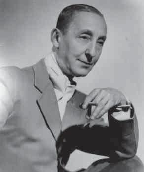

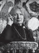
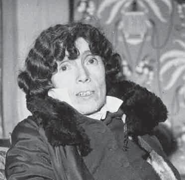
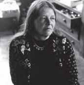
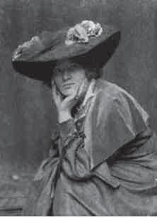
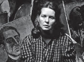
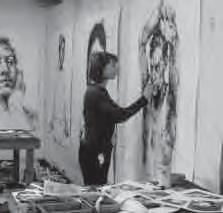
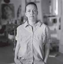
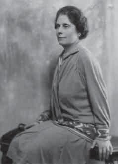
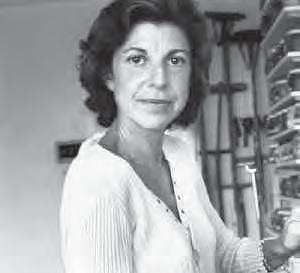
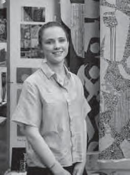
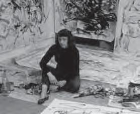
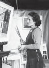
AYRES, Gillian; No.26
BARNS-GRAHAM, Wilhelmina; No.15
BARTLETT, Jennifer; No.24
CAMPBELL, Eve; Nos.41-42
CONNELL, Anne; Nos.31, 33, 38, 39
DREXLER, Lynne; No.11
FRANKENTHALER, Helen; Nos.23, 25, 27, 28
GARSTIN, Alethea; No.5
GERHARDT, Ingrid; Nos.7-9
GLUCK; Nos.12-13
HARRINGTON, Lavinia; No.45
HERVIEU, Louise; No.2
JOHN, Gwen; Nos.3-4
KING, Jessie Marion; No.1
LAMBERT, Alison; No.37
MAAR, Dora; Nos.18-21
MITCHELL, Joan; Nos.16-17
MOSS, Marlow; No.10
NEEL, Alice; No.14
RAYNHAM, Libby; Nos.29-30
ROMERO, Úrsula (Jessica Shepherd); Nos.35, 43, 44
SANDERS, Rosie; No.40
SAVILLE, Jenny; No.32
SCHÜFFLER, Svenja; No.36
SPRINGFORD, Vivian; No.22
YOUNG, Pippa; No.34
ZHOLTKEVICH, Lidia Alexandrovna; No.6
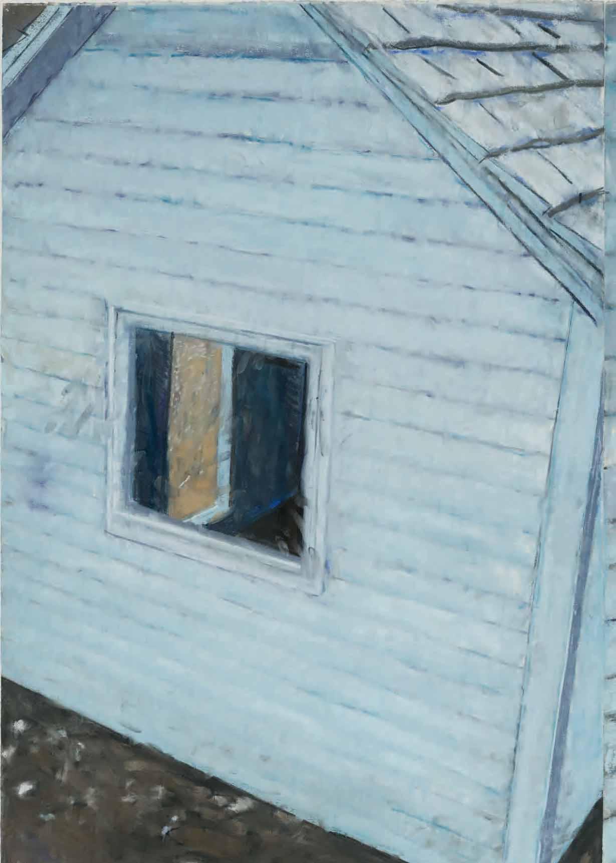
 Jennifer Bartlett (1941-2022)
Old House Lane, No.1 No.24
Jennifer Bartlett (1941-2022)
Old House Lane, No.1 No.24