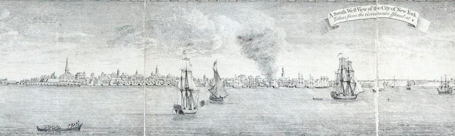
Born of revolution, Bernard Ratzer’s famous plan was based on surveys ordered by New York’s Royal Governor, Sir Henry Moore, in response to the Stamp Act Riots of 1765. Moore and his military advisors were concerned that New York would become a center of violence by colonialists, and they needed a far more accurate map of the city than was then available. Ratzer, a British Army engineer, was chosen to perform the necessary survey and to draw the resulting map. Ratzer completed his initial survey and drew the first of his plans of the City in 1766. This plan focused on the Southern part of Manhattan up to about modern 50th Street. When it was published his name was misspelled, and this initial effort is commonly referred to today as the “Ratzen Plan.” The work was magnificent, a quantum improvement in detail over previous maps of the city, but even more detail and most of all a broader scope was sought by the British governmental and military offcials who ordered the map.
In 1767, Ratzer began a more comprehensive survey of the areas surrounding the city. The resulting plan was issued in 1770. Commonly referred to as the “Ratzer Map.” it is one of the most remarkable maps ever produced, and certainly among the most artistic urban maps of its day. Its level of detail was unprecedented, extending not only to the island’s physical topography but including buildings, wharves, roadways, farms and homes. Important landowners are identified on the map, their estates covering much of upper Manhattan. Details of nearby Brooklyn and New Jersey helped meet the military’s needs for vital information about those sites of battle information that became critical during the several attempts at pincer movements against Washington and his troops once war broke out.
At the bottom of the map Ratzer included a magnificent “South West View of the City of New York from Governor’s Island.” Drawn by Lt. Thomas Davies, this view was a striking decorative element, but more it would serve as a valuable aid to those approaching from or anchored in the harbor. Only a handful of examples of the 1770 issue are known, but in 1776 as war appeared increasingly likely, the map was republished by the London firm of Faden & Jeffreys. Numerous examples accompanied the British army and navy to the colonies. As the most detailed and topographically accurate map available, this issue was used extensively by British officers in the field throughout the American Revolution. Examples like this one, which has been dissected and mounted on linen to be folded into a protective cover, were likely used in such a fashion. A similar example, replete with notes by the British army general Hugh Percy, is in the collection of the Brooklyn Historical Society.
JOHN CARWITHAM (1723-1741)
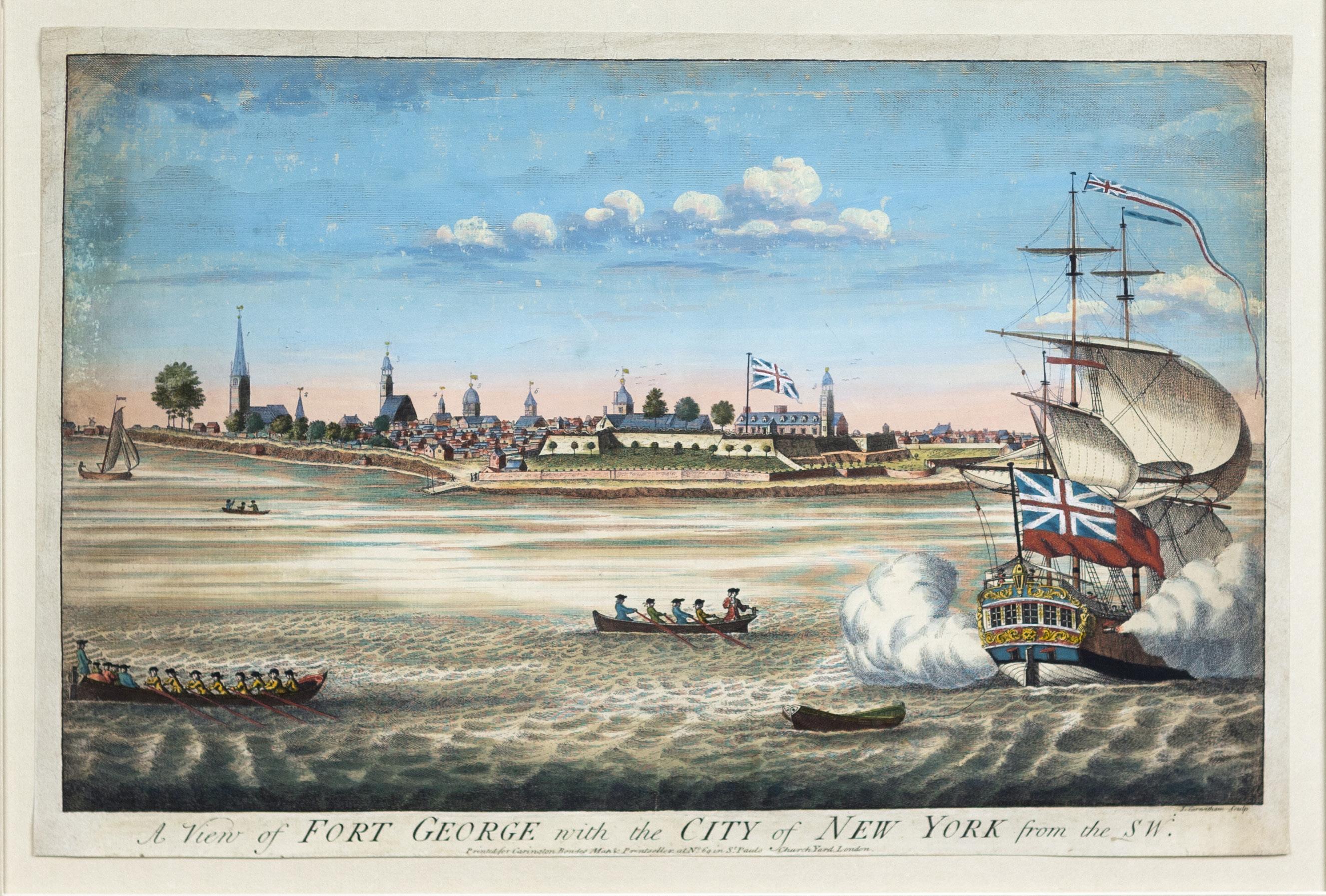
A View of Fort George with the City of New York from the SW
Engraving with original hand color London: Carrington Bowles, ca. 1764 11 ⅝” x 17 ⅝” sheet, 19 ¾” x 25 ¾” framed
$12,000
This early view of New York depicts the southern tip of Manhattan Island as it appeared sometime between 1731 and 1736 (likely around 1734). Almost certainly the view originated from a drawing by the English immigrant artist William Burgis (active 1717–1730s) since the right half of the print showing the fort and the large ship in the foreground replicates a mezzotint that Burgis dedicated to John Montgomerie, the colonial governor of New York. King George II appointed Montgomerie in 1728, but he governed only a few years before dying in 1731 during a small pox epidemic. The view is one of the earliest depicting New York from the west with the broad Hudson River in the foreground. Stokes refers to the view as “one of the most important, interesting, and sought-after prints of Old New York” (Volume 1, plate 31, page 269).
PRE-REVOLUTION VIEWS OF NYC
WITH THE FINEST ORIGINAL COLOR TO EVER COME ON THE MARKET
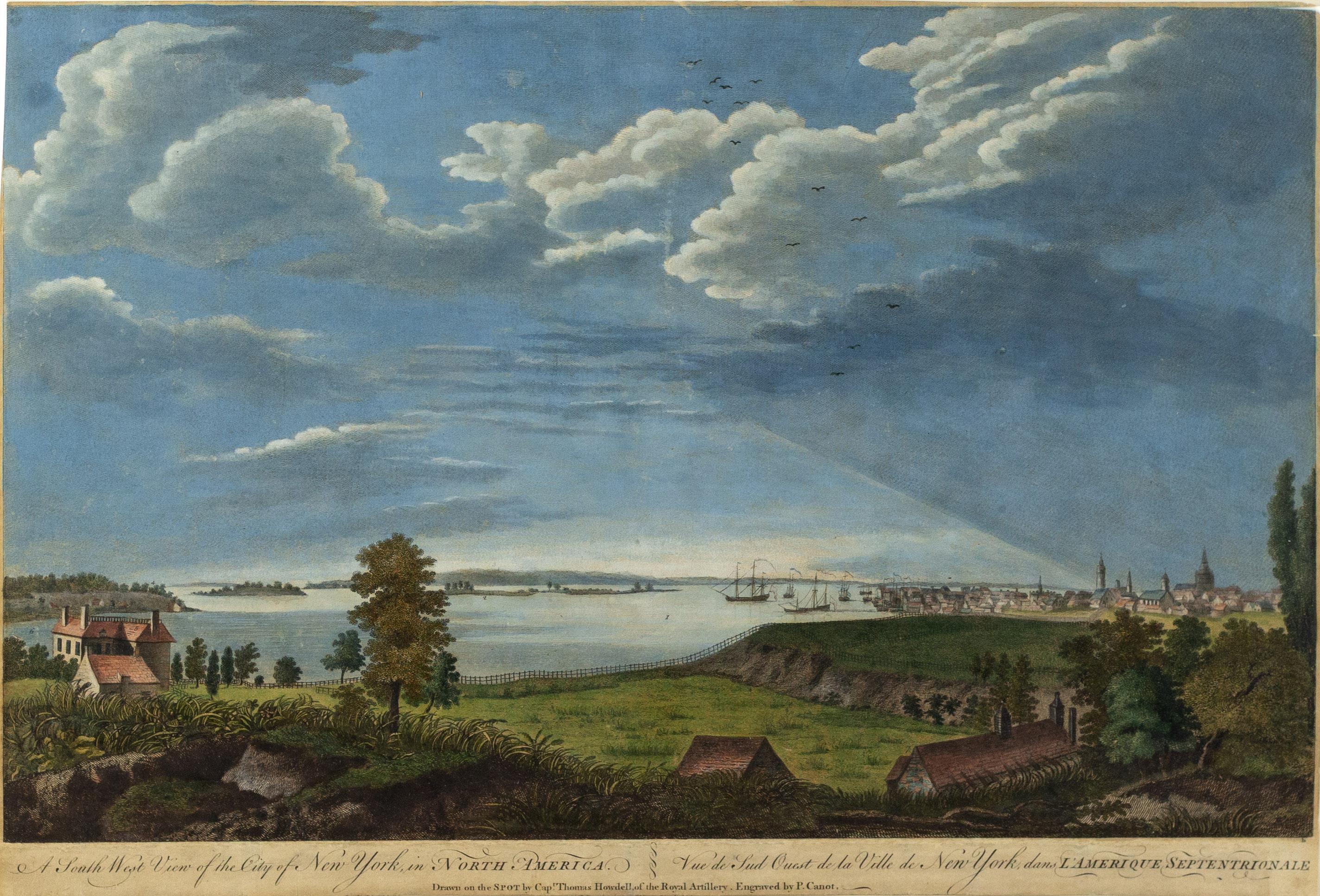
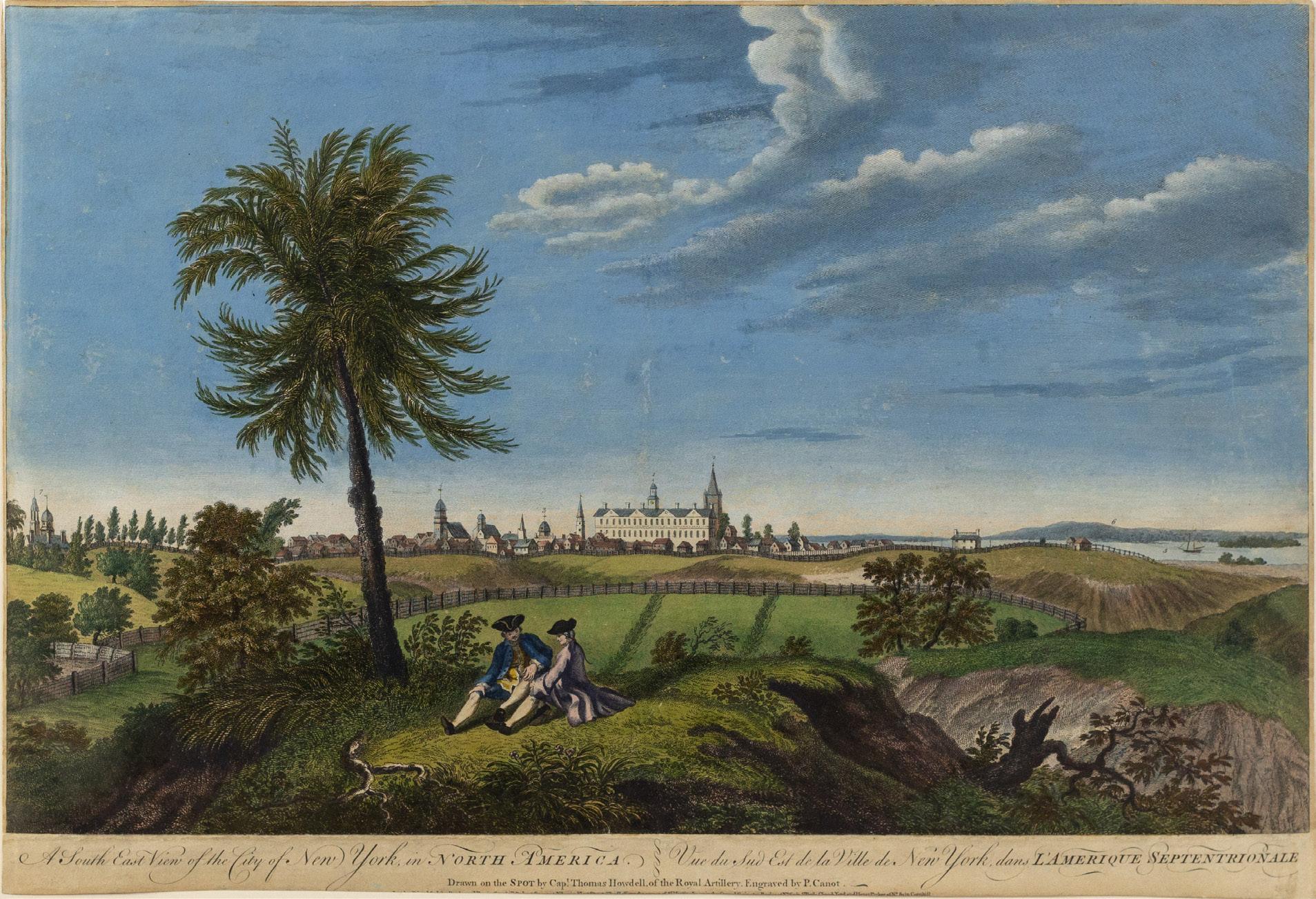
(TOP) PIERRE CHARLES CANOT (1710-1777), after THOMAS HOWDELL
A
South West View of the City of New York in North America
Mezzotint with exceptional original hand color
London: John Bowles, 1768
13 1/2” x 19 7/8” sheet
$14,000 (BOTTOM) PIERRE CHARLES CANOT (1710-1777), after THOMAS HOWDELL
A
South East View of the City of New York in North America
Mezzotint with exceptional original hand color
London: John Bowles, 1768
13 1/2” x 19 7/8” sheet
$14,000
Thomas Pownall, a British statesman who arrived America in 1753 and took positions in colonial government (Governor of Massachusetts,1757; Governor of South Carolina,1760), organized leading print dealers in London to publish a series of plates related to military actions in North America. These views were either drawn by Pownell himself or by officers of the British Navy and Army, including Captain Thomas Howdell of the Royal Artillery. They began with images of sites and events of the French and Indian War (1755 - 1760). Later the views included cities and scenes of various locations from Canada to the Caribbean. Initially, the prints were sold individually or as small groups or parts. However by 1768, Pownell issued and sold the views as a set which consisted of twenty-eight prints with a title page bearing the title, “Scenographia Americana." It holds the distinction as the first great published collection of American views.
The South West scene is taken from Mount Pitt, near present-day Henry and Montgomery streets in the lower east side of Manhattan. At the far left are two buildings from the Henry Rutgers' estate and on the far right are Trinity and Middle Dutch churches. Brooklyn, Nutting Island (now Governor's Island) and Staten Island can be see in the distance to the left.
The South East scene is taken from near today’s corner of Varick and Beach Streets in lower Manhattan. The main building shown is Kings College, now known as Columbia University. The buildings depicted from left to right are St. George's Church, the jail, the New Dutch Church, the French Church, the South Dutch Church, City Hall, the Presbyterian Church on Wall Street, King's College (with a cupola), and Trinity Church. In the foreground sit two young men in typical 18th century dress.
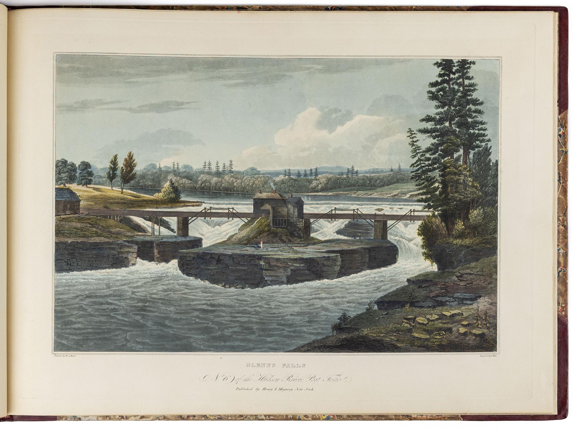
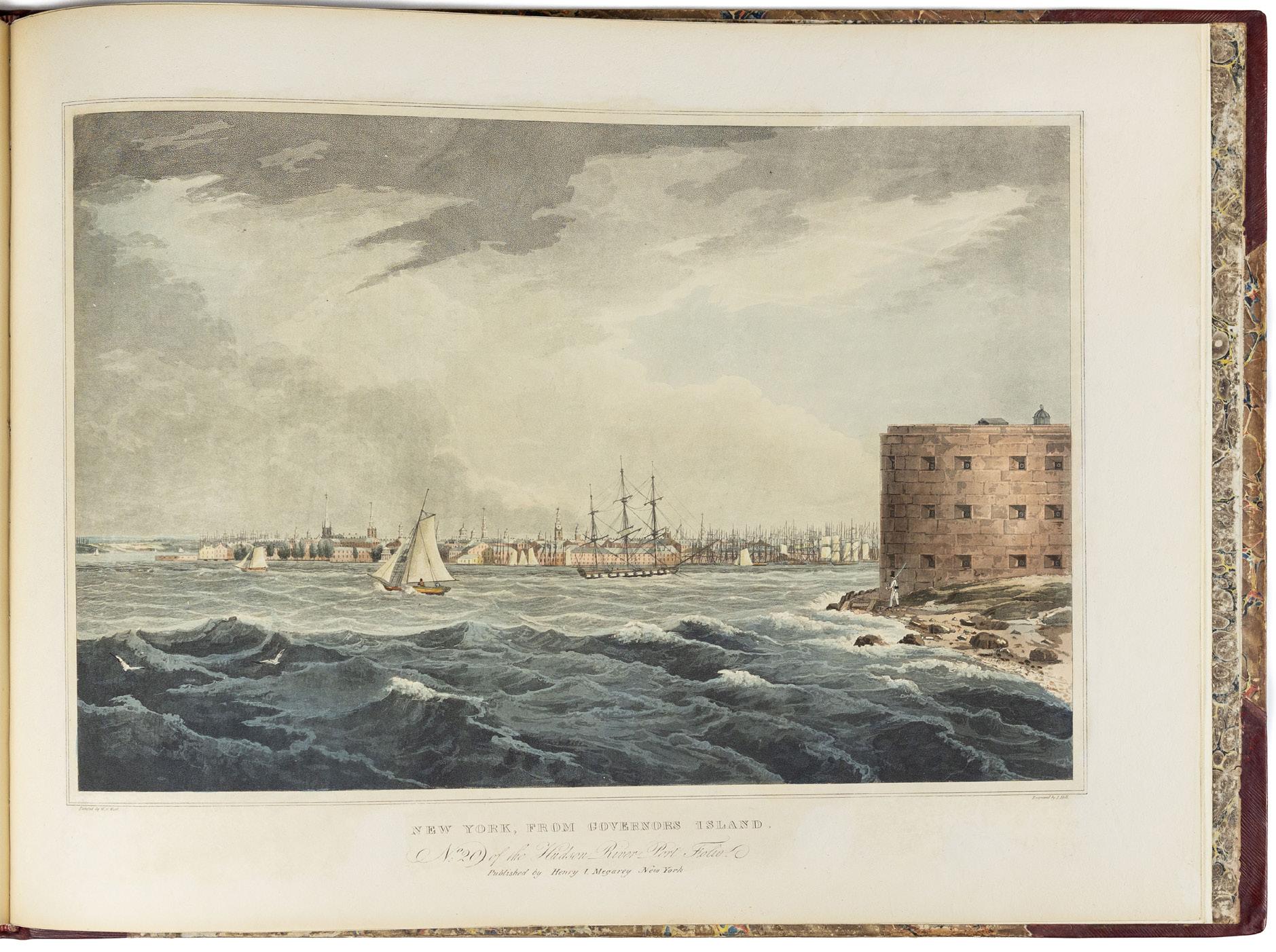
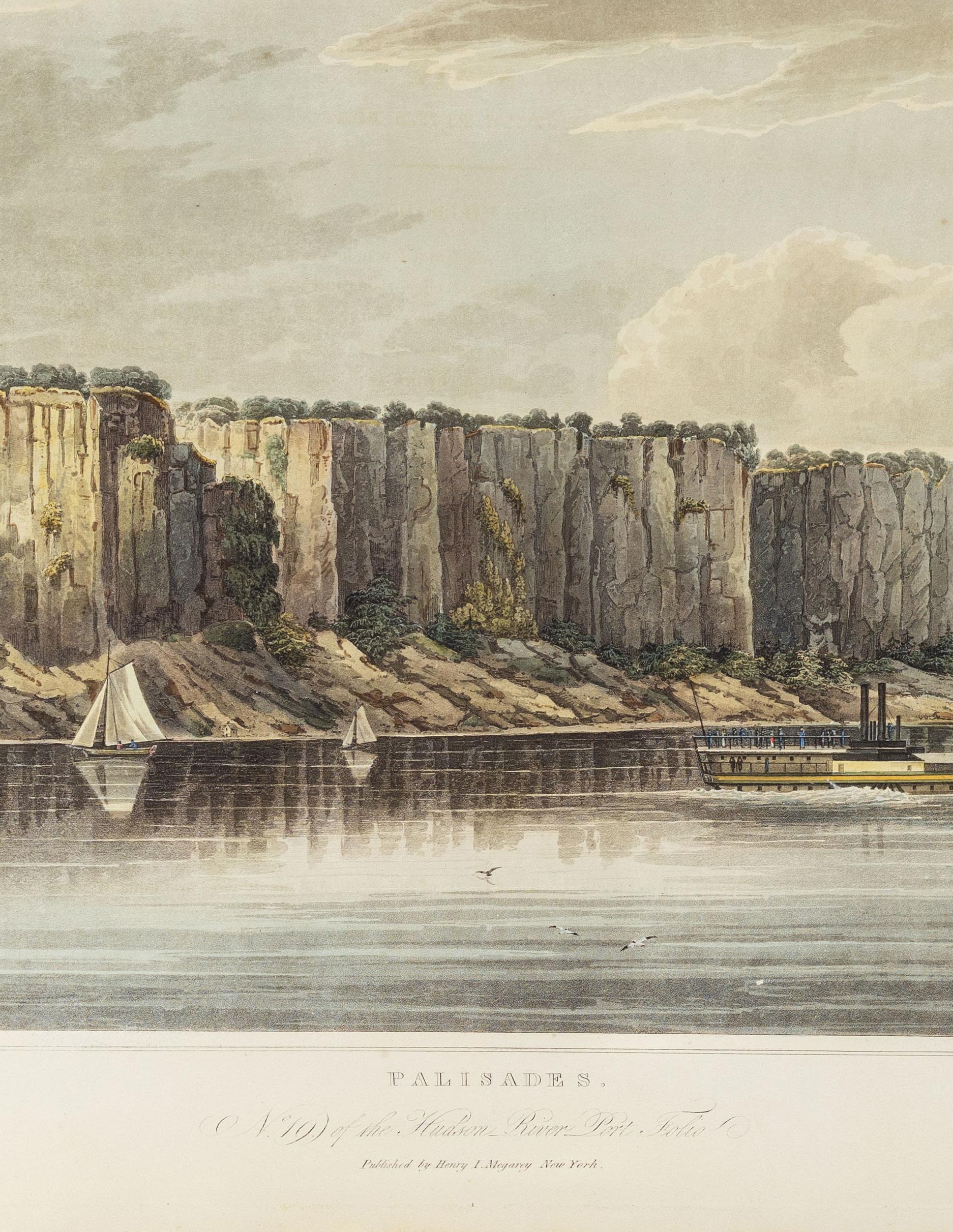
Drawing on the aesthetic category of the Picturesque — a contrast to the Sublime that so much characterized image-making of the American West — The Hudson River Port Folio depicts the spine of New York almost from its headwaters at Luzerne down through New York Harbor some 180 miles south. It is the vision of William Guy Wall (1792–1864), the grandfather of the Hudson River School (Thomas Cole’s trip up the Hudson happened in the year the present work was completed). Born in Ireland — cf. Finola O’Kane’s 2013 Ireland and the Picturesque (Yale UP), which argues for the Irish origin of the British Picturesque — Wall showed the early industrial Hudson Valley as a harmonious confluence of natural beauty and human endeavor.
John Hill and his son John William Hill commercialized Wall’s paintings after an aborted attempt by John Rubens Smith. This accounts in part for the odd numeration; nos. 2, 3, 5 and 11 (here numbered 12) were reworked compositions of Smith’s. As with so many ambitious illustrated publications, the work was issued in parts of 4 plates; the initial goal had been 24 plates in 6 numbers but the final number never made it to press. No title-page was ever issued, and numeration is inconsistent (e.g., in the Metropolitan Museum set “Troy from Mount Ida” is numbered 11). I have seen no mention of a blue run for “View Near Fort Miller;” is it perhaps a proof plate?
Examples of the portfolio with all plates in the original state — the whole portfolio was reissued in 1828 by the Carvills, with their names added — are rare indeed (it receives Howes’s second-highest scarcity rating of “d”). The Reese copy sold in 2022 ($201,600) and the present copy at the Bobins sale in 2023; before those Christie’s confirms that no complete set of the first-edition plates had come to auction since 1948.
Norman Bobins began his vast collection of color-plate books in the early 1980’s — many having been purchased at Arader — and began to disburse them in a series of landmark sales at Christie’s. The present item was lot 80 in part 1 (16 June 2023).
Deák 320; Howes W 47; Koke, Checklist 73-94; Reese, Color Plate Books 6.
THE CITY IN FLAMES
New York, 1835
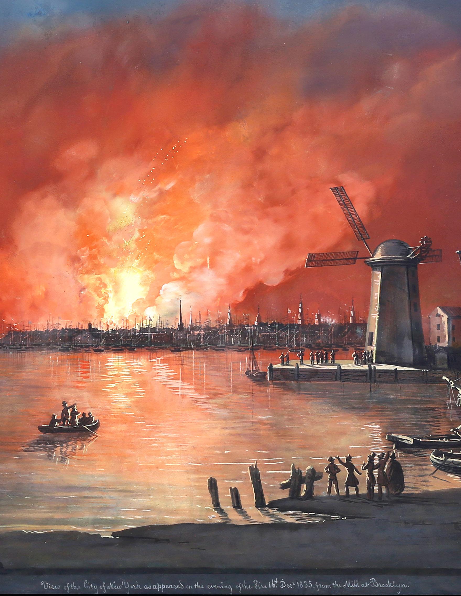
On the eve of December 16, 1835, a warehouse at 25 Merchant Street (now Beaver Street) in Lower Manhattan, New York City burst into flames. The weather conditions were the primary cause for the devestating wreckage to ensue. Frigid temperatures had frozen many of the city’s water sources, severely hampering firefighters’ ability to control the flames. Strong winds spread the fire rapidly and engulfed wooden buildings in the densely packed commercial district. Ultimately more than 600 structures were destroyed and resulted in around $20 million in damages—a staggering sum at the time.
This historic event, known now as the Great Fire of 1835, was cemented in public memory in great part due to the Italian painter Nicolino Calyo. Born in Naples in 1799, Calyo studied at the Academy of Fine Arts in Naples. After participating in the 1820 rebellion against the Bourbon king of Naples, Ferdinand IV, he was forced to flee the territory, and briefly settled in Malta from 1829 to around 1832. He crossed the atlantic and eventually made his way to Baltimore by 1834. On June 16, 1835, the Baltimore Republican reported that Calyo was on his way north to Philadelphia and New York to paint views of those cities.
Calyo arrived in New York just in time to witness the great fire of December 1835, which destroyed much of the downtown business district. His large gouaches of the fire, reminiscent of Neapolitan views of the eruption of Mount Vesuvius, established Calyo’s reputation in the city. Two of his paintings were reproduced in aquatint by William James Bennett which led to the canonical status of Calyo’s depictions of the fire. Caylo’s remained deeply connected to the city that brought him fame and settled there for the rest of his life, with the exception of possible trips to Spain.
In addition to his depictions of the Great Fire, his oeuvre consists of views of American cities, harbors, and natural wonders, as well as a series of images of local street vendors entitled New York Street Cries, Chanters and Views (1840- 44). He also created a diorama of the Mexican War in 1847 and a panorama of the Connecticut River in 1848.
Calyo’s work can be found in the collections of The Metropolitan Museum of Art, New- York Historical Society, and the Museum of the City of New York; Baltimore Museum of Art and Maryland Historical Society, Baltimore; and the Amon Carter Museum, Fort Worth, Texas.
NICOLINO CALYO (1799-1884)
View of New York City as It Appeared on the Eve of the Fire, 1835
Gouache on paper
Signed, dated, and inscribed at (I.r.):
‘View of the City of New York as it appeared on the evening of the fire 16th Dec 1835 from the mill at Brooklyn’; (at l.r.): ‘From N. Calyo. 402. Broadway N. York’
20” x 27 ½” visible, 28 ⅜” x 36 ½” framed
$135,000
In his View of New York as It Appeared on the Eve of the Fire, 1835, Calyo rendered the blaze in Manhattan from the shoreline in Brooklyn. The sky is drenched a dramatic red as the fire licks the night sky. A handful of spectators crowd at the water’s edge and beneath the windmill at the right, watching the devastation.
One of at least 22 known depictions of the great fire completed by Calyo. Other examples found at the Metropolitan Museum of Art (54.90.174), Museum City of New York (60.119.8), MFA Houston (B.2013.3), New York Historical Society (1926.78) (1980.53) (1980.54)
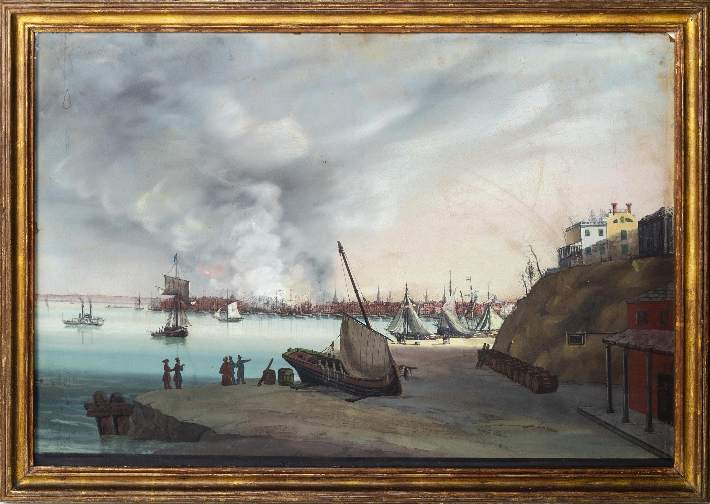
AMERICAN SCHOOL (19TH CENTURY)
View of New York taken from Brooklyn on the Hudson (?) Fire...December..1835
Watercolor and pastel on paper
Inscribed at lower edge" View of New York taken from Brooklyn on the Hudson (?) Fire...December..1835"
19 3/4" x 29" visible, 22 1/4" x 31 1/4” framed
$65,000
This daytime view of New York taken from Brooklyn following the great fire is another popular interpretation of the tremendous event. Examples by Calyo of this diurnal scene can be found at the Metropolitan Museum of Art and New York Historical City.
Relative to Calyo's paintings, the present work concedes a better view of the Brooklyn Heights which sits just above the bluff on the near right. The yellow and white buildings are reminiscent of the Four Chimneys House in Brooklyn where George Washington held his headquarterers during the Battle of Long Island.
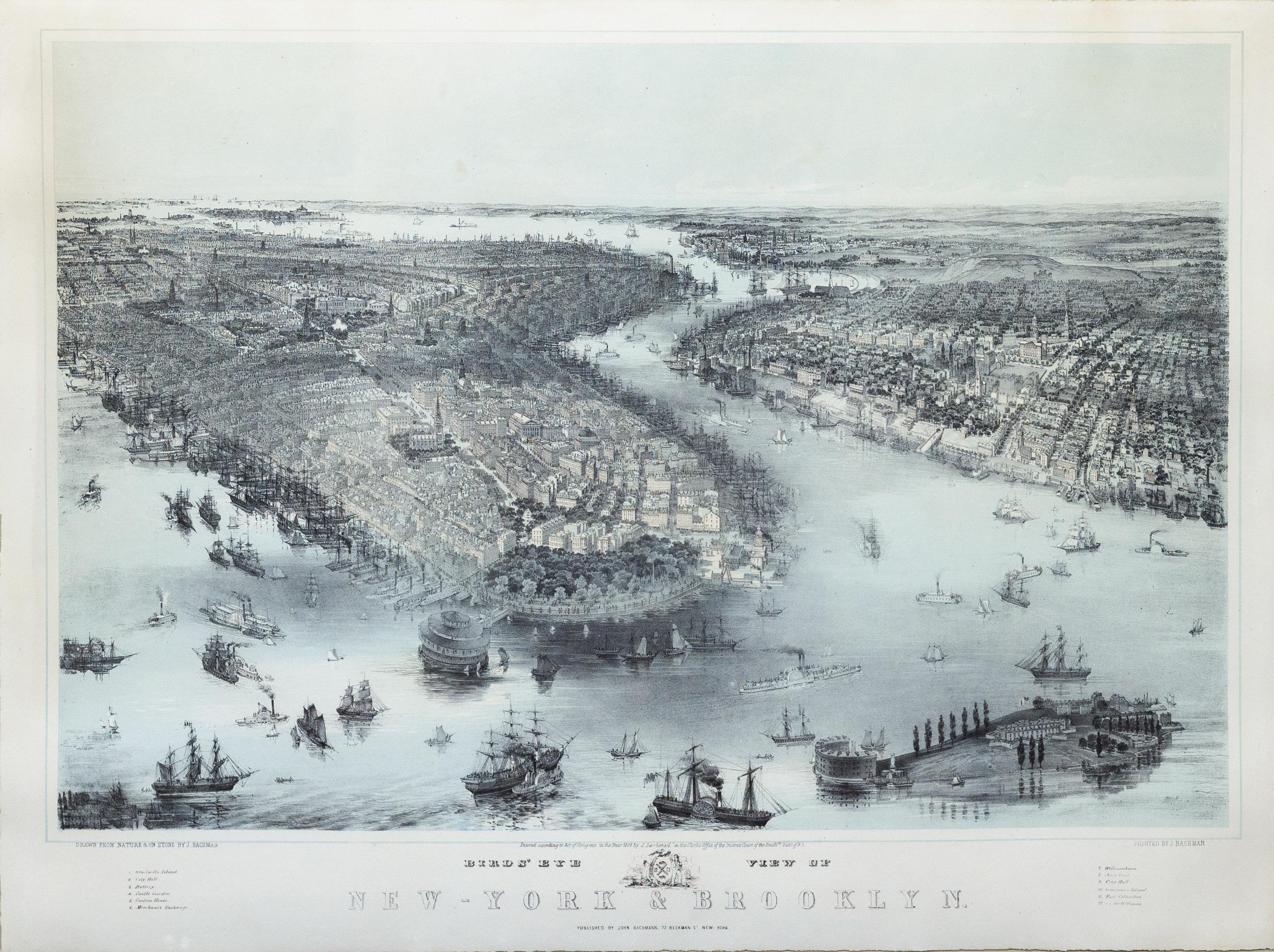
JOHN BACHMANN (1814–1896)
Birds’ Eye View of New-York & Brooklyn
New York: J. Bachman, 1851
Lithograph with original hand color
24 3/4” x 31” sheet; 34 1/2” x 41 1/2” framed
$13,000
This marvelous view of New York and Brooklyn is based on a drawing by the Swiss-American artist John Bachmann (1814-1896), and shows a vibrant seaport teeming with commercial vessels, a testament to the city’s prominence as a bustling center of business and industry.
This scene includes meticulous renderings of the architectural landscape of lower Manhattan and Brooklyn, including Castle Garden, which was then an entertainment hall, he shown offshore of Battery Park. It would soon be surrounded with landfill as Manhattan’s shoreline was continually extended in the second half of the 19th century.
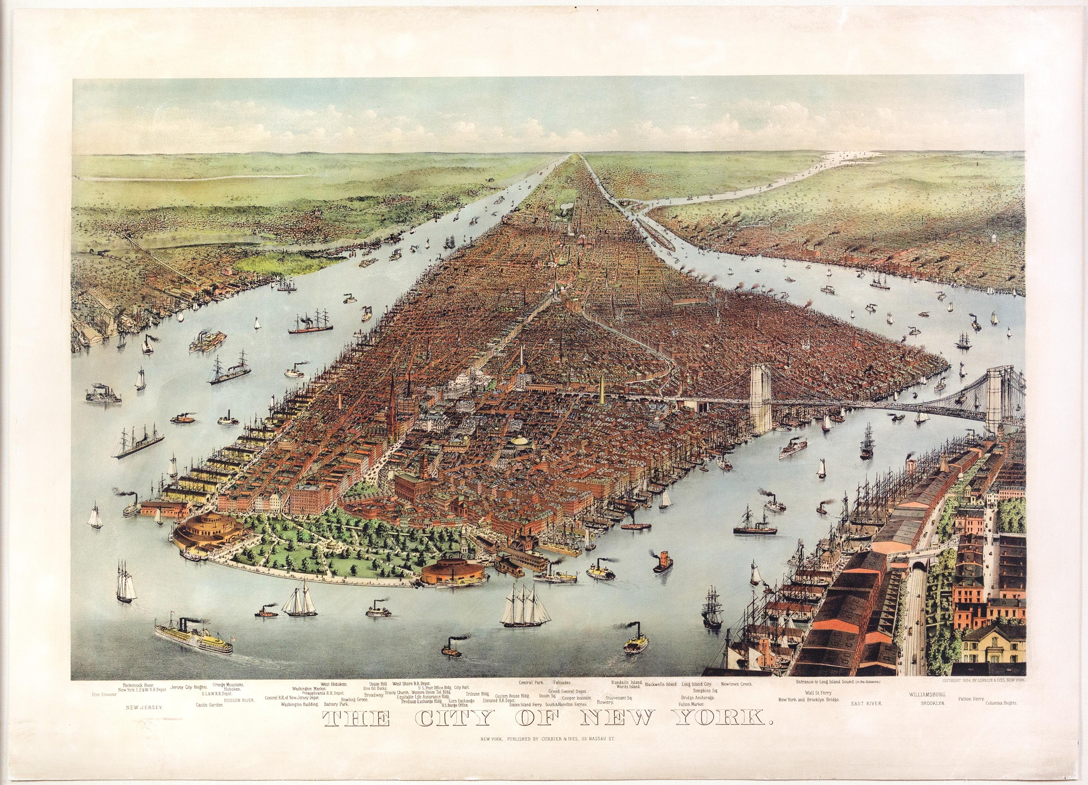
NATHANIEL CURRIER (1813 - 1888)
JAMES MERRITT IVES (1824 - 1895)
The City of New York
Lithograph with original hand color
New York: Currier & Ives, 1884
28 ½” x 39” sheet, 35 ½” x 45 7/8” framed
$16,000
In this highly detailed image, Manhattan is pictured from the south overlooking the business district. A steamer rounds the tip of the island while other boats scatter the surrounding waterways. New York stretches forth in its entirety, flanked by the Hudson River on the left and the East River on the right. On the right, the Brooklyn Bridge is shown just one year after its opening. Glimpses of New Jersey, Queens, and Brooklyn can be seen in the outskirts. Currier and Ives’ City of New York is truly a magnificent work, and depicts the world’s commercial center in a boom of technological and economic progress.
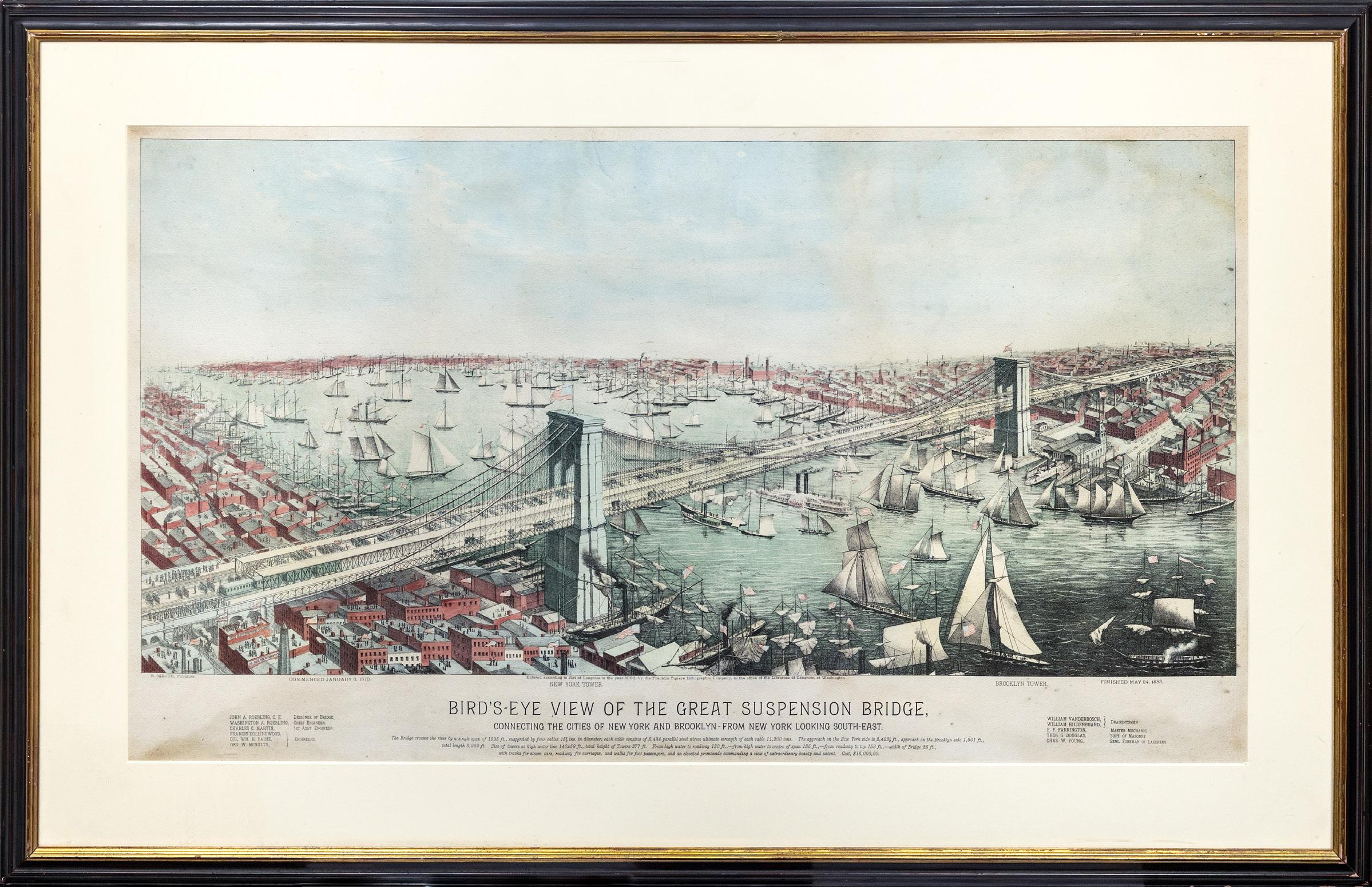
A. MAJOR.
Bird’s-eye View of the Great Suspension Bridge connecting the cities of New York and Brooklyn
Lithograph with original hand color
Washington: Franklin Square Lithographic Company in the office of the Librarian of Congress, for the Judge Publishing Company, 1883
21 ⅛” x 37 ⅛” visible, 29 ¾” x 45 ¾” framed
$7,500
Fine large view of the Brooklyn Bridge looking southeast towards Brooklyn, celebrating the completion of the Bridge on May 24, 1883.
The lively expansive view show the two connected towns, along with dozens of boats in the East River.
The view is a tribute to the builders of the bridge in the truest sense, listing the Designer, Chief Engineers and Assistant Engineers at the bottom left and the Draughtsmen, Master Architect, Superintendent of Masonry and General Foreman of Laborers at the far right, but curiously not mentioning the important role played by Emily Warren Roebling, herself an engineer.
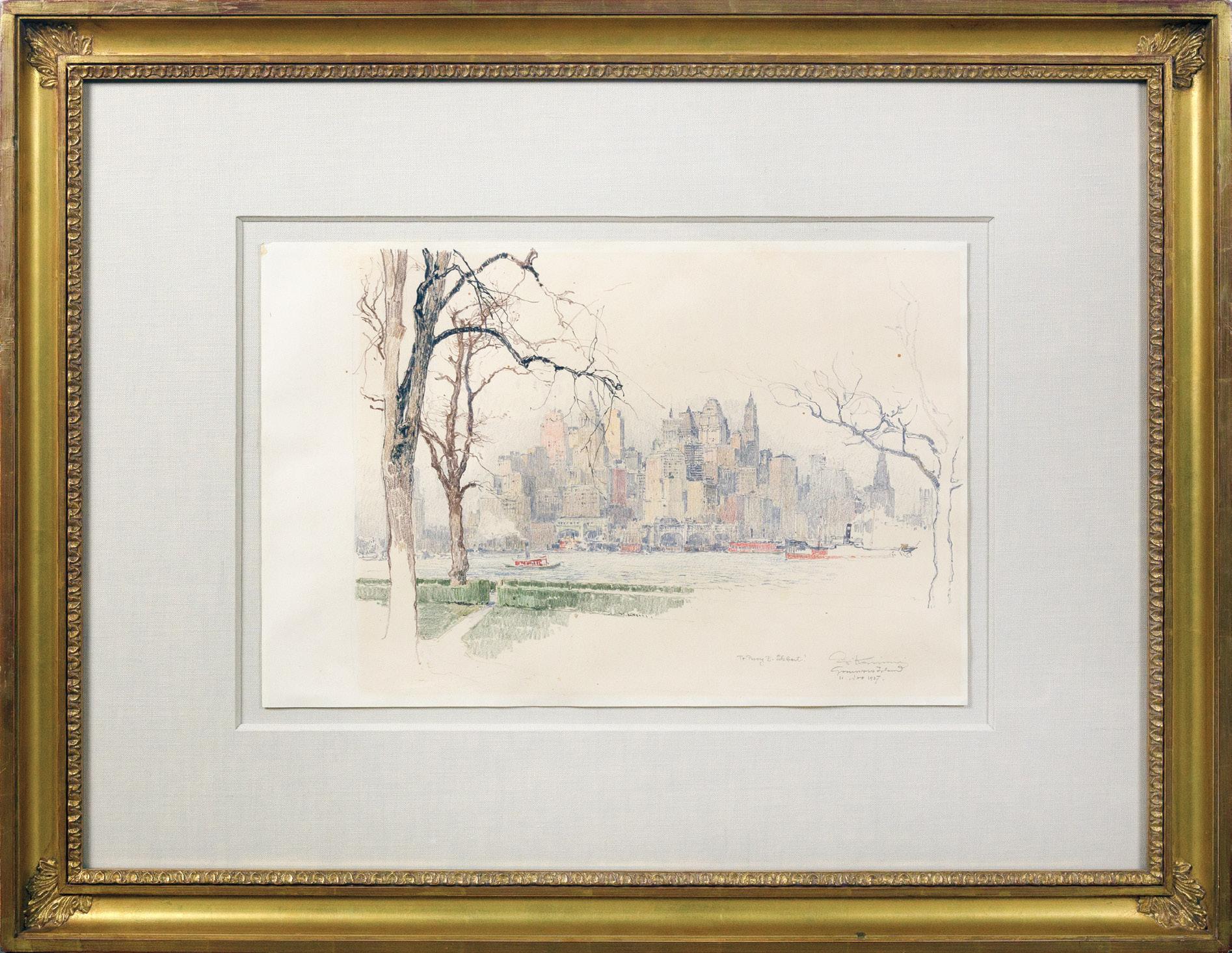
View of [New York from] Governor’s Island
Pastel and graphite on paper 1927
17 3/4” x 12” sheet, 31 1/4” x 24 1/4” framed
$8,500
In Pettau in 1881, Luigi Kasimir was born as part of the Austro-Hungarian monarchy. Later in his life, he studied at the Vienna Academy of Art, and it was here that the artist was introduced to colored etching from his teacher William Unger. As one of the first to really develop this technique, Kasimir lead the way to create etchings that were no longer colored in a casual manner. His process typically began with a sketch in pastel. He then would transfer the image to multiple plates, the number of plates depending on the number of colors used in the printed image. The artist would then apply the color to each plate by hand and print in succession.
Kasimir’s subject matter centered on European and American urban landscapes and architecture. The watercolor represents the first step in Kasimir’s process: it is a study for the final, colored etching. Impressively, this study proves to be a frame-worthy work of its own. The scene becomes alive with every variation of line and change in tone. The trees on the left appear to come off the page, whereas the trees to the right fade off in a subtle yet noteworthy play on perspective.
LUIGI KASIMIR (1881-1962)
FORMATIVE YEARS OF THE SKYLINE
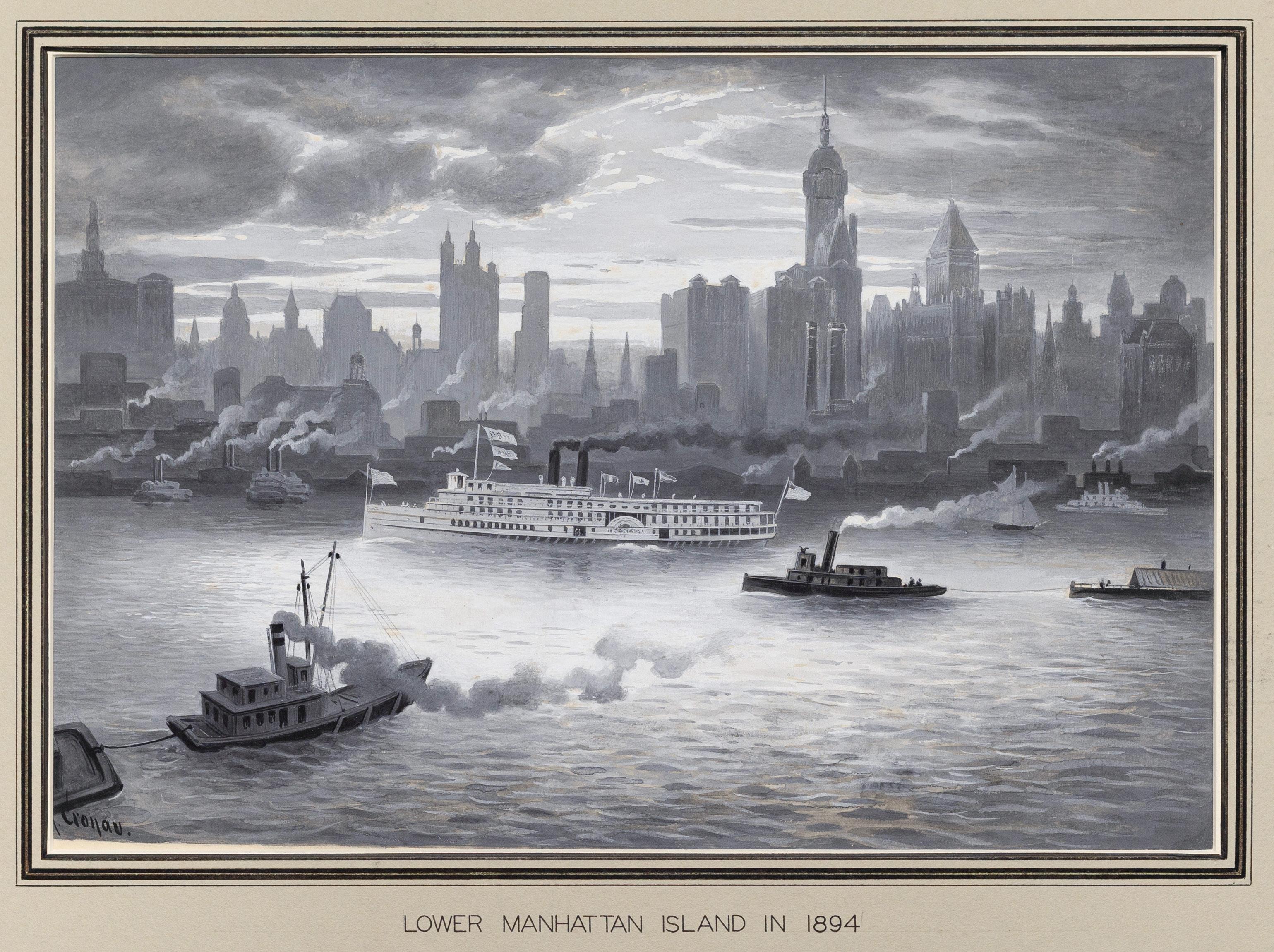
RUDOLF DANIEL LUDWIG CRONAU
(1855 - 1939)
Lower Manhattan Island in 1894
Watercolor and gouache on paper
Signed lower left: “R. Cronau” ca. 1908-1913
Paper size: 10 3/8 x 13 3/8 in.
Mat/Mount size: 14 1/8 x 19 ¼ in.
$15,000
To understand New York in the late 19th century, one must look to the sky, where the city’s first skyscrapers began reshaping its identity and skyline. Faced with limited land and a booming population, architects and developers turned to new technologies like steel-frame construction and the safety elevator to build upward rather than outward. These innovations enabled the creation of towering structures such as the New York World Building (1890) and the Park Row Building (1899), which symbolized progress, ambition, and economic growth. This era marked the beginning of New York City’s transformation into a vertical metropolis, setting the foundation for its future as a global center of commerce and architecture.
Cronau's view here is shown taken from the vantage point in New Jersey, looking east out over the Hudson River and towards Manhattan. Rendered in Cronau's typical grisaille style, the skyline of lower Manhattan emerges from rolling clouds. The main identifiable buildings are, from left to right, City Hall (completed 1812), Park Row (completed 1899), Hudson Terminal (completed 1908), Singer Building (completed 1908), and the Bankers Trust Company (completed 1912).
Considering the skyline pictured, the title on the mat "Lower Manhattan Island in 1894" sows some confusion. Foremost, both the Singer Building and the Bankers Trust Company did not start construction until after the noted year. Adding to the complication is the anomaly of the Woolworth building’s absence. Construction started for the Woolworth Building on November 4, 1910 and was completed in 1912, overlapping with the Bankers Trust Company, but only the latter building is pictured fully erected.
On a special assignment for a German newspaper, Die Gartenlaube, artist Rudolph Cronau first traveled to America in 1881. There, he documented its cities, frontier lands, and the culture and customs of the Native American populations for curious European audiences fascinated by the American frontier. Upon his return to Germany in 1882, Cronau published 50 collotypes in a book about his American trip entitled Wunderland to Wunderland which was widely circulated. His illustrations are noted for their detail and precise craftsmanship in the German romantic style, characteristic of the training he received at the Royal Academy in Düsseldorf.
In 1894, Cronau returned to America as a foreign correspondent and was based in Washington, D.C. However, due to a falling out with his employers, he moved north to New York where he found work as a free-lance writer. Cronau eventually settled in New York, becoming an American citizen in 1900.
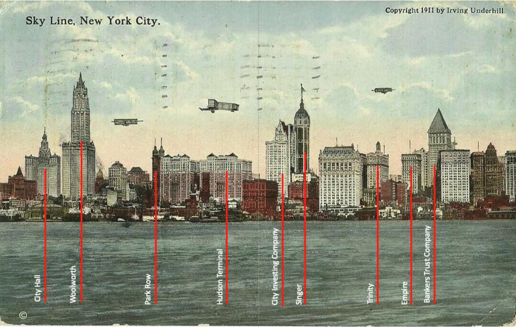
(ref) Postcard from 1911
showing the skyline of lower manhattan
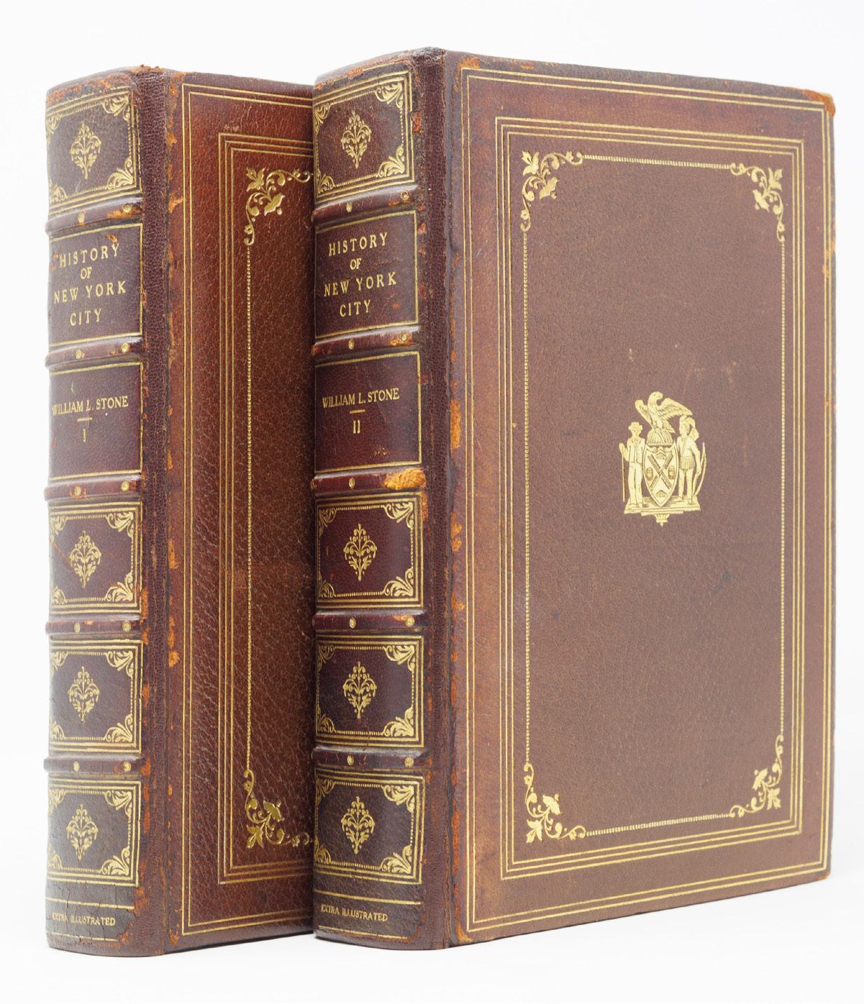
EXTRA-ILLUSTRATED HISTORY OF NEW YORK
WILLIAM L. STONE (1835-1908)
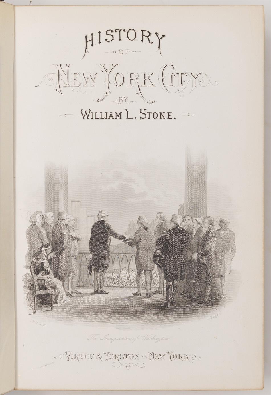
[History of] New York City from the discovery to the present day
One volume in two. New York: Virtue & Yorston, 1872. First edition.
Octavo in 4s (9” x 5 15/16”, 228mm x 151mm).n the spine, seven gilt fillets.
With 186 insertions: 121 engraved plates (of 20; plus 85 wood-engravings integral with the text) of which 3 are hand-colored, an engraved map, a folding engraved map, an artotype, 58 lithographs (of which 14 are chromolithographs, of which 1 is folding) of which 3 are double-sided and 1 folding, 3 gelatin-silver photographs, and an autograph clipped from a letterpress document.
$2,500
Bound in slightly later morocco (re-backed, with the original back-strips laid down) with the (1915) seal of New York city gilt at the center of each board within a quintuple gilt fillet border and a dotted gilt roll border with gilt corner-fleurons. On the spine, five raised bands. Title gilt to the second panel, author and number gilt to the third, and “EXTRA ILLUSTRATED” to the tail. Gilt fillet to the edges of the boards. Gilt inside dentelle. Brown end-papers. Top edges of the text-block gilt.
As New York grew from a Dutch encampment at the southern tip of the Lenni Lenape island of Manaháhtaan (“the place for gathering bow-wood”) into the first capital of the United States in 1785, the biggest port in the nation with the completion of the Erie Canal in 1825, and over the course of the XIXc the premier destination for immigration, New Yorkers’ egos began to match the grandeur of their city. “Valentine’s Manual” — D.T. Valentine’s Manual of the Corporation of the City of New York — ran from 1841 to 1870 (resurrected in the XXc) and published a great many historic documents as well as depictions of the city, largely by lithograph.
William Leete Stone Jr. (1835-1908), a New York City native educated at Brown University (his maternal uncle was the Rev. Dr. Francis Wayland, Brown’s president), filled the gap of antiquarian interest and published the History of New York City in 1872. Richly illustrated, it surveys the city from Hudson (not Verrazzano, who entered New York harbor in 1524) right through to the year of publication, and includes appendixes of potted histories and primary documents.
An early owner of the book — perhaps even Lambert (on whom more below) — used the roughly 800-page book as a mere scaffolding for a collection of engravings, lithographs, photographs and even an autograph (that of Richard Varick,
who served 11 consecutive 1-year terms as mayor from 1789 to 1801) that evidence not only a proud New Yorker but a one committed to collecting illustrations. There is not space to discuss each insertion (over 160), but particular mention might be made of the facsimile of a 1755 plan of the city, the folding chromolithograph of Central Park (which was not completed till 1876) and the manuscript caption to the steel-engraving of the court house in White Plains at which the selection of delegates to the First Continental Congress was made.
Elizabeth Willets Lambert (1864–1942) came from a distinguished Quaker family (her great uncle was the founder of Swarthmore College) and married Dr. Samuel Waldron Lambert, who served as head of Columbia’s College of Physicians and Surgeons, as well as the president of the New York Academy of Medicine (responsible for the reprinting of the original blocks of Vesalius’ De humani corporis fabrica). Mrs. Lambert was a distinguished collector in her own right, largely — if the evidence of records of her bookplate is brought to bear — of New Yorkiana and culinary books (a major strength of the Academy of Medicine).
Not in Howes; Nestler, Bibliography of New York State Communities 856.
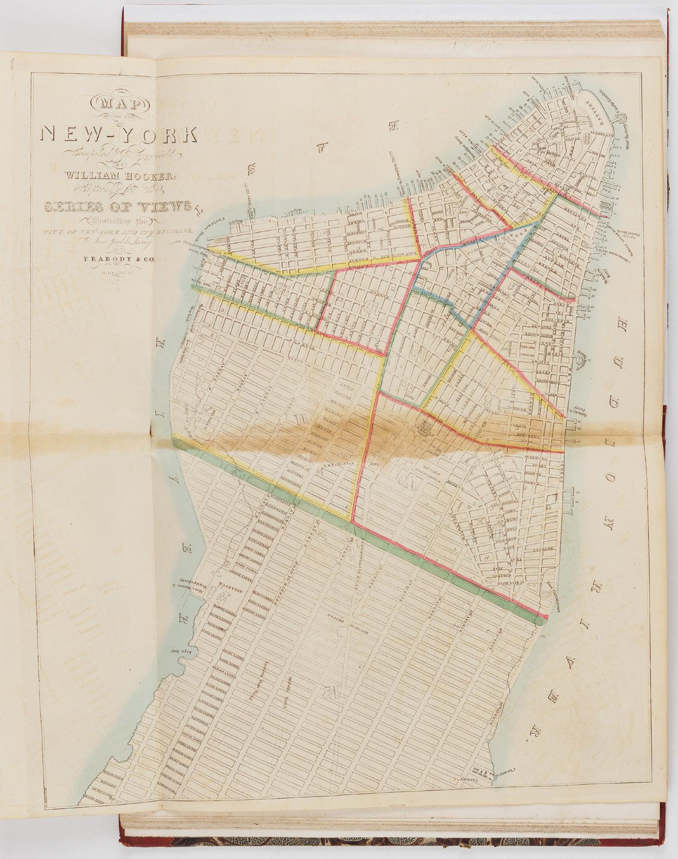
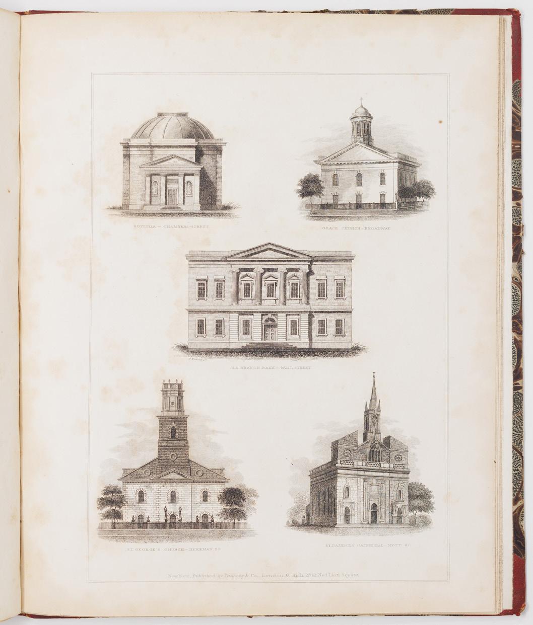
RARE COMPLETE SET OF THE PEABODY VIEWS
THEODORE SEDGWICK FAY (1807-1898)
illust. JAMES HARRISON DAKIN (17701850)
Views in New-York and its Environs...
New York: Peabody & Co., London: O. Rich; 1831[–1832–1833–1834]. First edition.
Quarto (10 13/16” x 8 ½”, 274mm x 217mm). With an engraved title-page, 15 engraved plates (11 with two views) and a hand-colored engraved folding map.
$8,500
Bound in contemporary half red sheep over marbleboards. On the spine, six panels. Title gilt to the second panel. All edges of the text-block speckled brown.
Some chipping to the extremities. Tissue-guards heavily tanned (as usual), with some tanning and foxing, mostly mild. The third and fourth plate (i.e., pll. 5 & 6 and 7 & 8) proofs printed on India paper, the former mounted and the later tipped in.
Theodore Sedgwick Fay (1807–1898) was born in New York and at 21 was already an editor of the New-York Mirror, for which Edgar Allan Poe would serve as critic, which perhaps not coincidentally promoted the publication quite heavily in its own pages. Fay’s text is florid and charming, clearly influenced by the Romantic poets and the British embrace of the picturesque. James Harrison Dakin (architect of the Gothic main building of NYU, demolished 1894) drew only six of the views, but Deák suggests that he “may have directed the choice of the sites.” The presiding genius of the work seems in fact to have been the publisher, Peabody, hoping to capitalize on the success of the Bourne views, published 1830–1831. Deák finds the Peabody views superior: “the Peabody prints, which are somewhat larger, are more energetically conceived, with a thrust toward a painterly effect.”
Although ten parts of the work had been planned, only eight were issued (the eighth part with disturbed pagination and an additional plate). The publisher’s part-wrappers note that “A very few proofs on India paper have been taken: price Six Shillings.”, which was twice the price of the full part.
Deák, Picturing America 399; Howes F 64; Stokes, Iconography of Manhattan 102.
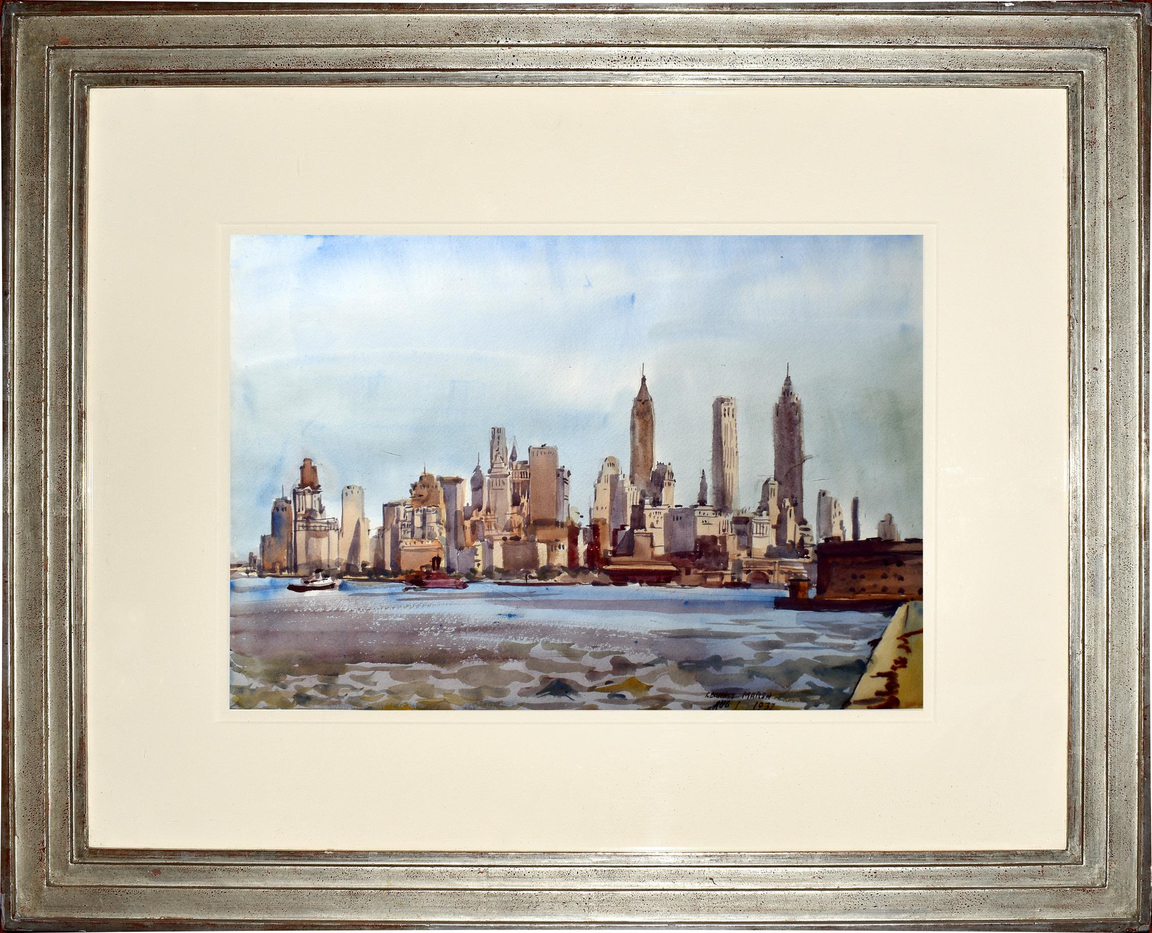
REGINALD MARSH (1898-1954)
REGINALD MARSH (1898-1954)
New York Skyline
Watercolor and pencil on paper
Paper size: 14” x 20”
Signed and dated, lower right:
Reginald Marsh Aug 1, 1937”; stamped lower right: “Marsh Collection”
$36,000
Reginald Marsh is the most celebrated of the “Fourteenth Street School,” a group of dedicated urban realists who comprised the second generation of painters devoted to depicting the everyday life of the populace of New York City. In that, they succeeded the group later to become known as “The Ashcan School,” who developed around their leader, Robert Henri, and achieved fame especially with the exhibition of “The Eight,” held at New York’s Macbeth Galleries in February, 1908. The later painters tended more to emphasize rather individuals than urban scenes; along with Marsh, this group would include Isabel Bishop, the brothers Raphael and Moses Soyer, Kenneth Hayes Miller and others. Marsh’ s fame was established beginning in the late 1920s and in 1943 he was made a full Academician of the National Academy of Design in New York. Marsh taught at the Art Students’ League from 1935 until his death in Dorset, Vermont in 1934.
Marsh was born in Paris to American parents; his father, Fred Dana Marsh, was a well-known painter and muralist also especially devoted to the urban scene; affluent, he more or less stopped painting in early middle age. The younger Marsh grew up in an artistic enclave in Nutley, New Jersey, where the family settled In 1900. After graduating from Yale University in 1920, Marsh began his career as a free-lance illustrator in New York City for the Daily News, Vanity Fair, the New Yorker, and other publications, while studying at the Art Students’ League. Much influenced by John Sloan and George Luks among “The Eight,” he also studied with Kenneth Hayes Miller, probably the most important of his teachers, who made a specialty of painting women shoppers and shopkeepers. Marsh went to Paris in 1925-26 for further instruction in order to achieve his ambition to render contemporary art in the style of the Old Masters. About 1929, Marsh began to use tempera rather than oil paint, and his search for older traditions is especially evident in his use of glazing. He was also an excellent watercolorist, and created vivid, large brush and ink drawings. Marsh chose as his most familiar subjects everyday figures on the street, in subways, bums, vaudeville and burlesque houses, scenes at Coney Island, and amusement parks, rendering these gritty themes in the procedural traditions of the Old Masters. A great admirer of Rubens and Delacroix, his figures are rendered broadly, even extravagantly in a baroque manner, with great exuberance and rowdiness. Though much of his visual material reflected the Depression era, Marsh remained aloof from political entanglements.
As early as 1927, Marsh undertook to add a very different theme to his repertoire-the shoreline of Manhattan Island, always devoid of figures. He had always had a strong interest in the New York waterfront, and created many panoramic views of Manhattan in oil, watercolor, tempera, as well as a group of eight etchings. The watercolor, New York Skyline, is one of the finest of these. He painted this subject over and over again with variations, though they almost always appear to be views from across the East River from Brooklyn or Queens, looking down from Midtown at the right, toward the Battery. Only a few appear to be painted from across the Hudson River Here, The Chrysler Building is the tall structure at the right, and the Empire State Building is the tallest structure near center. But one should probably not search too far for topographical accuracy. This series of paintings differ from one to the other, sometimes quite similar, sometimes differing widely, yet depicting some of the same structures. Here, for instance, the large structure on the near right would seem to suggest one of the forts located in Brooklyn, lower Manhattan, or even Governors Island. Other structures would seem to be missing here-such as the Woolworth Building; or omitted is the landmass of Roosevelt Island. Marsh was celebrating the city, not creating topographical views for atlases or tourists. He was enjoying the artist’s prerogative of choosing, moving, and creating the visual content of his work, all in celebration of the modern city.
Alternative versions might include the Brooklyn Bridge at the left, sometimes introducing a panorama of New York, at other times the primary feature, with the skyline as a backdrop. In New York Skyline here, a small tug appears at the very far left; in other versions tugs are more prominently placed, and during this period Marsh also painted close-up views of the tugs which obviously held interest for him. The apogee of his interest in tugs along the New York waterfront was reached in the murals he painted for New York Customs House in 1937, one of two WPA mural projects he undertook; the others were for the Post Office Building in Washington, D. C. In the New York murals, the tugboats loom large along with longshoremen, dock woks, ocean liners and cargo vessels. One might even suggest that the tug was, for Marsh, the equivalent of the everyday folk of his interior views of the city; just as he shunned the upper classes, so he generally omitted luxury liners. Nevertheless, these pictures celebrate New York City, perhaps purposely in the face of economic hardship, for the river streams smoothly, while the city’s tall buildings reach up into a placid blue sky. On his return from, Europe in 1926, Marsh wrote: “I felt fortunate indeed to be a citizen of New York, the greatest and most magnificent of all cities in a new and vital country whose history had scarcely been recorded in art...New York City was in a period of rapid growth, its skyscrapers thrilling by growing higher and higher. There was a wonderful waterfront with tugs and ships of all kinds…” New York Skyline is testimonial to Marsh’s celebratory sentiments and convictions.
The Birth and Death of the Greatest Beaux-Arts Building in America
PENN STATION
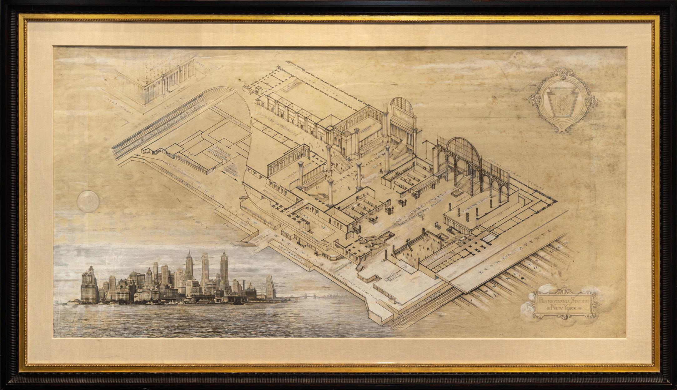
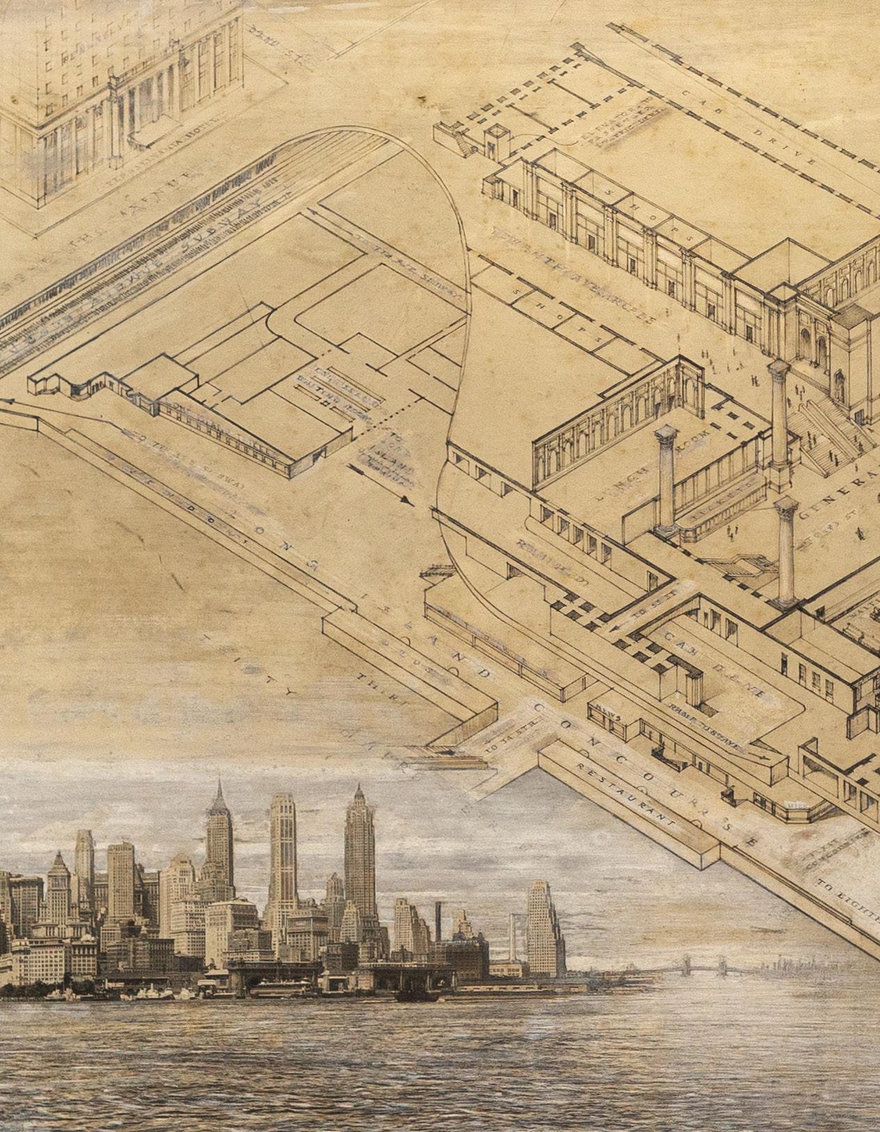
(TOP) ANGELO MAGNANTI (1879-1969)
Pennsylvania Station New York
Graphite, ink and gouache on artist’s board
New York: for McKim, Mead & White; ca. 1946
63” x 32” visible; 73 ½” x 42 ½” framed
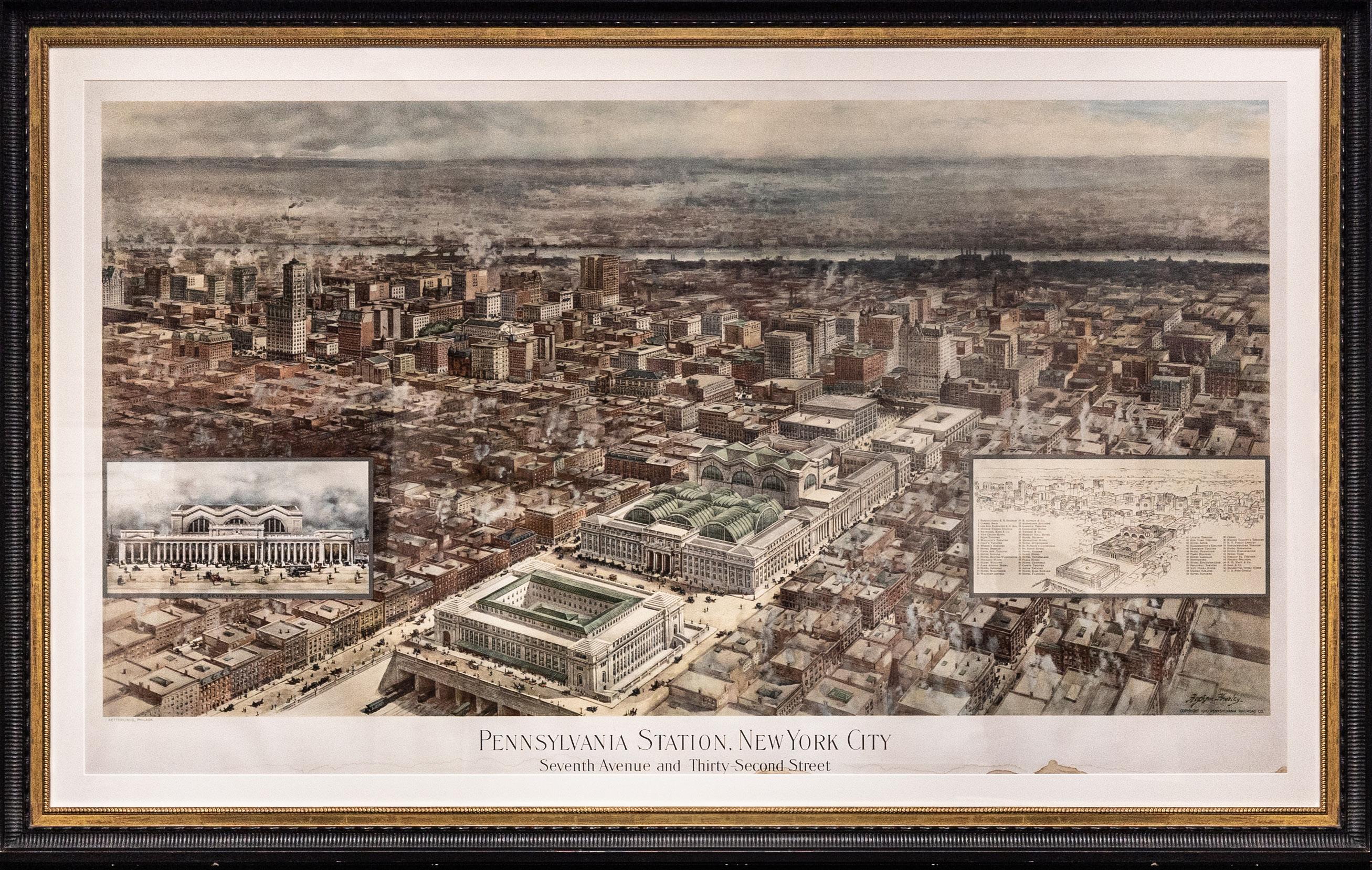
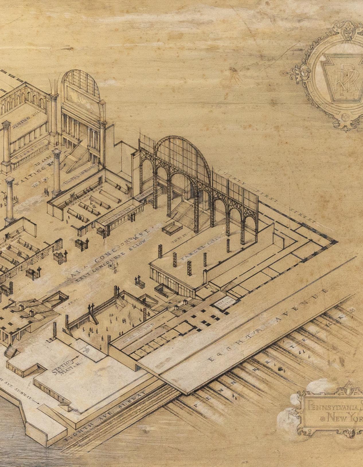
(BOTTOM) HAWLEY HUGHSON
(1850-1936), after
Pennsylvania Station, New York City Seventh Avenue and Thirty-Second Street
Chromolithograph on card
Philadelphia: Ketterlinus for the Pennsylvania Railroad Co., 1910
33 ¼” x 57 ½” sheet, 39 ½” x 61 ¾” framed
$125,000 for the pair
In 1910, the New York terminus of the Pennsylvania Railroad Company opened on two full blocks between Seventh and Eighth Avenues and West Thirty-First and Thirty-Third Streets. Charles Follen McKim was the lead architect at McKim Mead and White, the firm responsible for some of America’s great buildings: the East and West Wings of the White House, Symphony Hall in Boston, the major clubs of New York (Century, Metropolitan, University, Harvard, Harmonie, Racquet & Tennis). The original Penn Station was considered the greatest of them all.
Hawley Hughson (1850–1936) was born in London but became one of the preeminent chroniclers of American buildings. Although romanticized, his building portraits and panoramas are among the best documents of a period of rapid change that shaped the cities of the United States. His depiction of the brandnew Penn Station is among his most recognizable, and documents much of midtown Manhattan (the Plaza Hotel at 59th and Fifth is depicted in part at the lefthand side, the Hotel Martha Washington (now the Redbury on 29th St.) is at the right), as well as Queens and Brooklyn beyond. The skyscrapers were still to come; the tallest building in New York in 1910 was the Metropolitan Life Insurance Building.
The station’s flow of passengers increased and hit its zenith in 1945-1946, precisely when MMW commis-
sioned the “decorator” Angelo Magnanti (1879–1969) to depict their renovation of the station to accommodate the surge of pedestrian traffic. This would eventually be installed as a mural in the station master’s office (other surviving Magnanti murals are at the Dollar Savings Bank, the Frick Art Reference Library and the conference room of the U.S. Supreme Court; he also designed mosaic ceiling at the Williamsburg Savings Bank). The New-York Historical Society in its MMW archives holds a less-developed sketch (2”:1’ scale) executed in color with gilt, presumably as a proposal to the firm, signed and dated “A. Magnanti/1946.” The present work is drafted quite precisely, with washes of gouache and ink in a quasi-grisaille depiction of a sectional view of the station. At the lower left is a view of lower Manhattan from the South, rendered in nearphotographic accuracy.
The combination of the age of air travel and the 1956 Federal Aid Highway Act signed by Eisenhower ended the dominance of railroads. The mural stood in the station-master’s office until the destruction of the station in 1963, widely considered one of the great architectural travesties, and the proximate cause of modern historical preservation. The new Penn Station is generally reviled; only in 2021 was the sin somewhat redeemed with the opening of the Moynihan Train Hall in the James A. Farley Building across Eighth Ave. — also, luckily, designed by McKim, Mead & White.