Poc y
TM
Design
1 Brand Identity POCKY 5/10/2022
Anna Imark
Studio
Pocky is about sharing happiness with friends, family, coworkers – anyone, anytime, anywhere!
Just open a box, pass it around, and watch the smiles and happiness spread.
Brand Vision Brand Positioning
Unlike other biscuit snack options, Pocky is here to create happy memories, bring people closer together through sharing, and our brand focuses on the needs and happiness of our consumers and customers.
Brand values
Pocky’s core values are collaboration, integrity, passion, diversity, happiness, and sharing.
Brand Culture
The Pocky brand represents the qualities of sharing, connecting, joyfulness, and being diverse.
Pocky Rebrand Guidelines
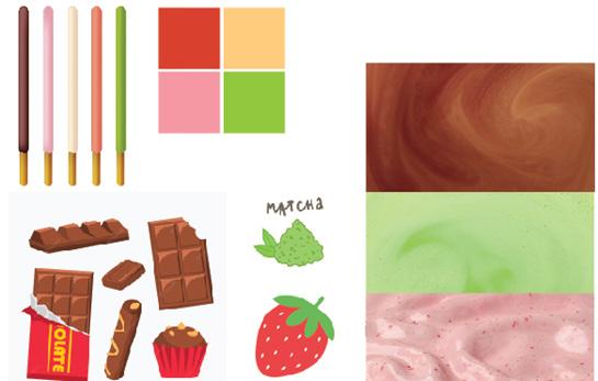
Image library
Pocky Rebrand Guidelines
The Logo
Pocky communications are made up of four elements, the Logo is the focal point and will stand out, making it a very reconisable symbol.
Our logo is a combination of our Wordmark, Icon, and tagline. The Icon - represented by the “K” is part of the Wordmark, and represents the sound of a Pocky stick breaking.
Poc y
taste of happiness
Tagline
Pocky Rebrand Guidelines
The Logo The
The Icon The Wordmark The Wordmark
:) TM
The Logo
The space between the Wordmark and the Tagline
The space between the Wordmark and the Tagline is equivalent to the width of the pocky stick used for the “K” in the Wordmark/Logo.
Poc y
TM
taste of happiness :)
Pocky Rebrand Guidelines
The Exclusion Zone
The Exclusion Zone ensures that the entire Logo is legible by isolating it other competing visual elemnts.
The zone shown should be considered as the minimum amount of safe distance, giving room for the logo to breathe.
The exclusion zone is equal to half of the heigh of the Icon (“k”)
taste of happiness
Pocky Rebrand Guidelines
x x x Poc
y
:) TM
The Exclusion Zone
Examples
This page shows why the clear space is so important. In the two examples provided, if the other elements come much too close to the Pocky logo, it will create a cramped and annoying feel to the spacing and a messy visual. The bottom two Examples show the correct way of treatment for the Logo and the Exclusion Zone.
Pocky Rebrand Guidelines
taste
:) TM Poc y taste of happiness :) TM Poc
taste of happiness :) TM Poc y taste of happiness :) TM THE
THE
Poc y
of happiness
y
BEST ASIAN SNACK EVER
BEST ASIAN SNACK EVER
The Signature
The Signature states “taste of happiness :)” written in the Tw Cen MT typeface. Here at Pocky, we strive to bring happiness to everyone with each stick, hoping that after eating one, you will smile from ear to ear.
Pocky Rebrand Guidelines
The Icon
We prefer to use the Icon on its own instead of the full Logo mark in only some instances. Most of the time, we would like the the full Logo mark to be displayed. In situations such as on a T-Shirt or on small merchandise, the Icon may be used. On packaging however, we would like to incorporate the entire Logo.
Note: The Icon may exist without the Wordmark and Tagline, but the Wordmark and Tagline should never exist without the Icon.
The Icon
Pocky Rebrand Guidelines
the Icon
The Icon’s Exclusion Zone
If you are using the Icon instead of the Logo, the same exclusion rules apply.
The Icon’s exclusion zone is equal to half the height of the Icon x x x
Pocky Rebrand Guidelines
Pocky Rebrand Guidelines
Minimum Sizes
Establishing a minimum size ensures that the legibility of the Logo is not compromised in application.
Digital
The Pocky Logo should never be reproduced smaller than 70px in any digital communication.


Print
The Pocky Logo should never be reproduced smaller than 20mm in any print communication.
Print
20mm / 0.8in
Print
6mm / 0.24in
Digital 70px Digital 21px
Black and White
Pocky Rebrand Guidelines
Poc y taste of happiness :) TM Poc y taste of happiness :) TM
Logo Color Options
Pocky Red
The Pocky Red Logo, pictured right, is our primary color, used only in situations where the brand palette is not being used. Our other primary color is our Pocky Bread-stick Color.
Other colors include Pocky Brown, Pocky Pink, Pocky Green, and Pocky Off-White to symbolize the other well-known flavors.
The Pocky Red + Bread-stick Logo should only be used with Black, White, and non-duotoned photography.
The Logo may be one solid color, of any of the following, as well.
If color is not an option for technical reasons or if the brand green lacks contrast or competes with other visual elements, you have permission to use either the black or white Logo options.
Primary Secondary
Pocky Rebrand Guidelines
Pocky Rebrand Guidelines
Logo Color - Codes
POCKY Red
RGB: 214, 66, 46
HEX: #d6422e
CMYK: C0 M69 Y79 K16
PMS Uncoated: P 45-8 U
POCKY Bread-Stick
RGB: 236, 192, 134
HEX: #ecc086
CMYK: C0 M19 Y43 K7
PMS Uncoated: P 17-11 U
POCKY Green
RGB: 146, 200, 62
HEX: #92c83e
CMYK: C27 M0 Y69 K22
PMS Uncoated: P 157-8 U
POCKY Pink
RGB: 245, 152, 164
HEX: #f598a4
CMYK: C0 M38 Y33 K4
PMS Uncoated: P 65-4 U
POCKY Brown
RGB: 147, 88, 40
HEX: #935828
CMYK: C0 M40 Y73 K42
PMS Uncoated: P 32-14 U
POCKY Off-White
RGB: 234, 229, 223
HEX: #eae5df
CMYK: C0 M2 Y5 K8
PMS Uncoated: P 169-1 U
Do Nots for Color
DON’T
These are a list of DO NOT dos while changing the color for the Logo.
TM
Poc y
taste of happiness:)
DO NOT make the POC
Y a different color than the K and the tagline
Poc y
taste of happiness:)
TM
DO NOT change the color of the bread-stick, the “sound sticks”, or the :) Only exception is white, and black if must
Poc y
taste of happiness:)
DO NOT outline ANY part of the Logo
TM
Poc y
taste of happiness:)
TM
DO NOT make the POC
Y, and K a different color than the tagline
Poc
TM
y taste of happiness:)
DO NOT forget to change the color of the TradeMark
Pocky Rebrand Guidelines
Pocky Rebrand Guidelines Do
taste
Poc y taste of
Poc
DO NOT remove or reposition the TM DO NOT add any extra elements DO NOT rotate DO NOT reduce tagline
DO NOT increase tagline separatley DO NOT use colors that are not a part of the color pallet NEW Poc y taste of happiness:) TM Poc
taste
TM Poc y taste of
TM
Nots - in general Poc y
of happiness:)
happiness:)
y tasteofhappiness:)
separatley
y
of happiness:)
happiness:)
Brand Typography
The Logo is made up of two typefaces.
POC Y uses Pottery Wheel
The tagline uses Tw Cen MT - regular
If Pottery Wheel is unavailable, the typeface that would be most appropriate to use would be
Pottery Wheel Tw Cen MT
Bebas Neue Rounded ie
Bebas Neue Rounded
Pocky
Rebrand Guidelines
POC Y
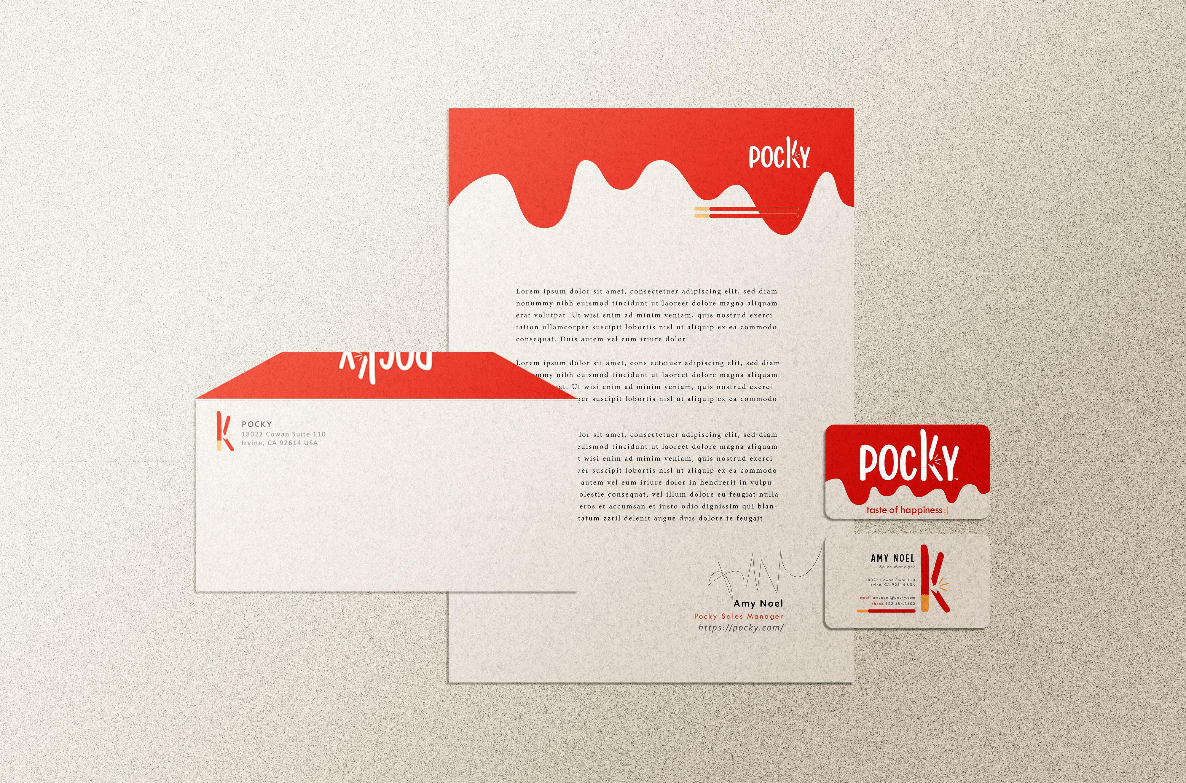
Pocky Rebrand Guidelines Business System Letterhead Envelope Business card (front & back)
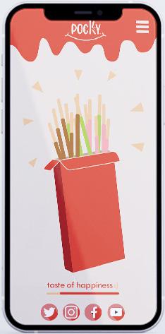


Pocky Rebrand Guidelines Digital Media Pocky Website Web and Phone 1920x1080 px- Web 375x812 px - Mobile (Iphone X)


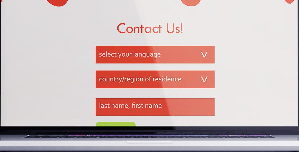


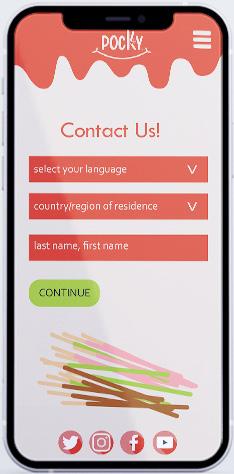
Pocky Rebrand Guidelines Digital Media secondary Pocky Website Secondary Page Contact Page Web and Phone 1920x1080 px- Web 375x812 px - Mobile (Iphone X) CONTINUE
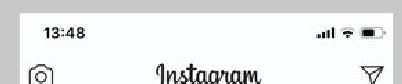
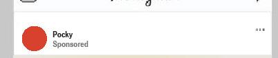


Pocky Rebrand Guidelines Additional touchpoints - Instagram Ad share
Poc y TM
Additional Touchpoints - billboard
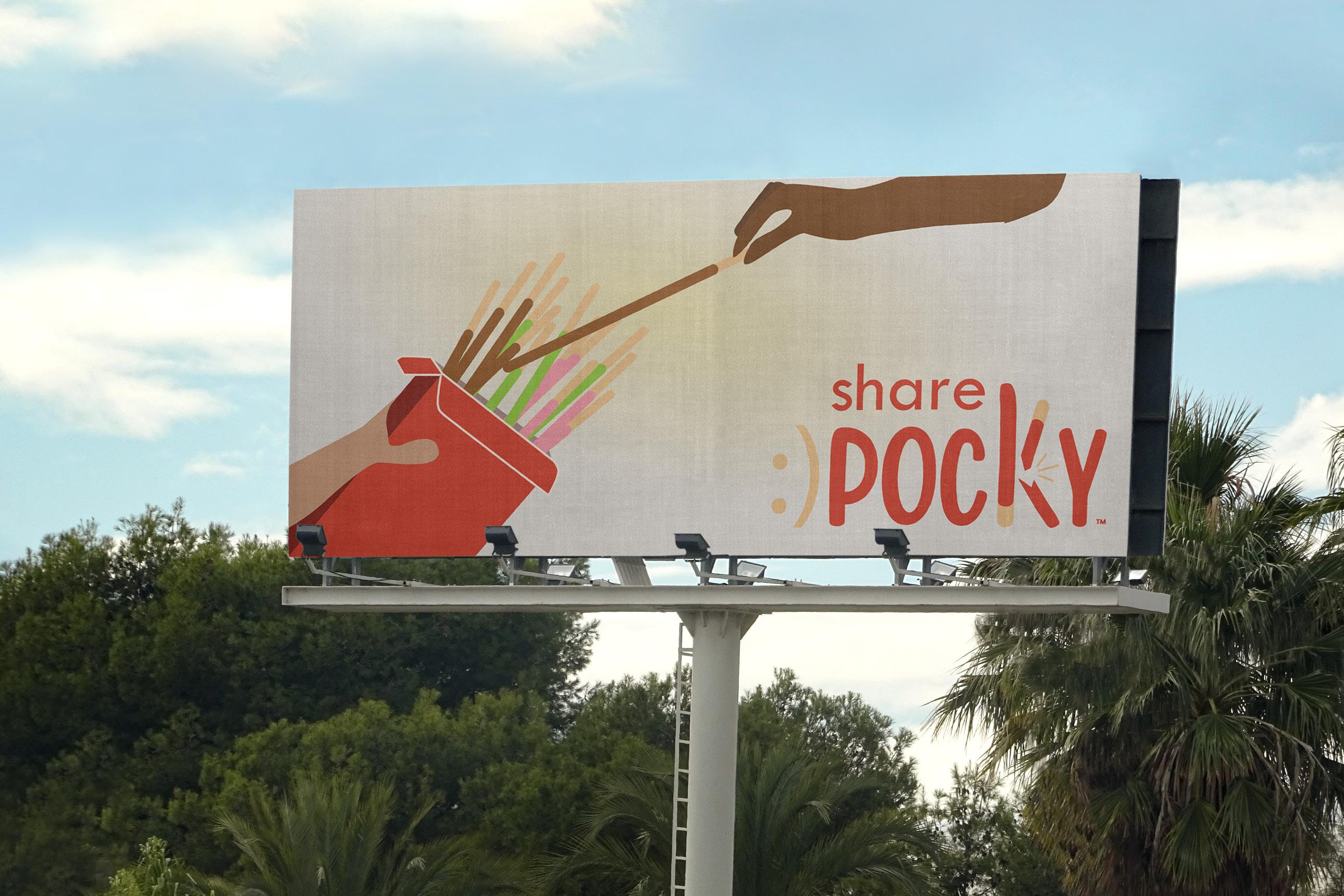

Pocky Rebrand
Guidelines
Billboard on the side of the road share Poc y TM :)
Competition
There are a lot of other Asian snack brands, along with other biscuit/pretzel/breadstick brands out there that are competitors
Pepero
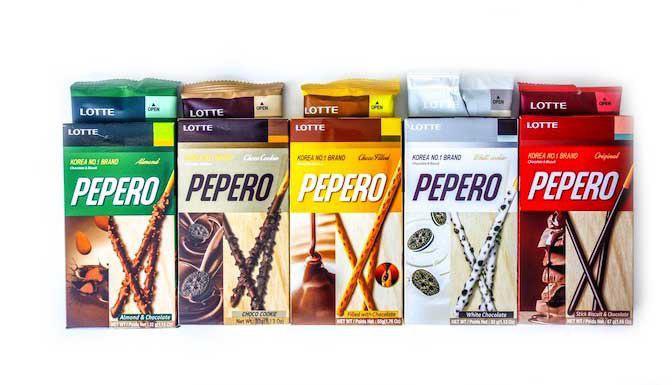
o Direct competitor
o Similar biscuit design (a stick)
o A few more variants than Pocky
o Found in any leading supermarket and other confectionary stores
Pocky Rebrand Guidelines
Competition
There are a lot of other Asian snack brands, along with other biscuit/pretzel/breadstick brands out there that are competitors
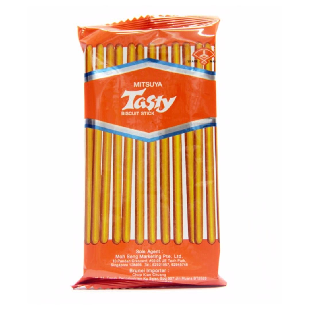
Mitsuya
o Indirect competitor
o Similar biscuit design (a stick)
o Only 1 flavor
o Found in any leading supermarket and other confectionary stores
Pocky Rebrand Guidelines
Competition
There are a lot of other Asian snack brands, along with other biscuit/pretzel/breadstick brands out there that are competitors
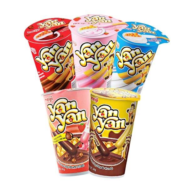
YanYan
o Similar biscuit design (a thicker stick)
o Dip the stick into a pudding
o Several flavors
Pocky Rebrand Guidelines
Thank You!
Pocky Rebrand Guidelines
TM
Poc y
