


TABLE OF CONTENTS
1-4
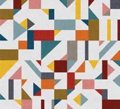
Wellness House Design
Residential Design
Kitchen & Bath Design
Residential Design
5-6 7-10
NEXT Project
Corporate Design
11-12
Searcy Branding
Group Commercial Design
13-14
Boutique Hotel Hotel Commercial Design
15-18
Qualia Pediatric Clinic
Healthcare Design
DESIGN STATEMENT
God created this world for us to experience and live together while enjoying his creation and spreading his word to others. We as a society have created a place where we have hierarchies, tear down nature, and leave people to starve. We live to get a job, raise our status, and take care of ourselves, which is different from what we were created to do initially. Changes have been made continuously, but none are permanent. I design to make a persistent change in this ongoing cycle we call reality. People should have access to things to meet basic needs , and if they don’t we as a community should be uplifting them and helping them. I strive to help people and our environment all in one process . The cycle of selfishness needs to be reformed into lifting others up so they can lift the community around them. Through using LEED, WELL, and sustainable practices I hope to create spaces that transform, inspire, and evolve people and groups to rebuild from within and spread outward change. This is the new cycle that I hope to give a little push in the right direction towards a permanent change .
*Scan QR Codes throughout for extra information and final products*
1WELLNESS HOUSE DESIGN

Board
PROJECT DESCRIPTION
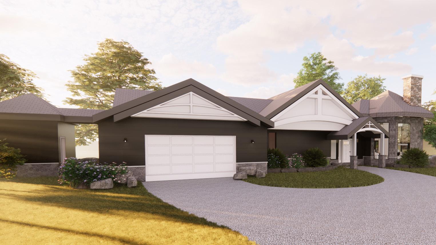
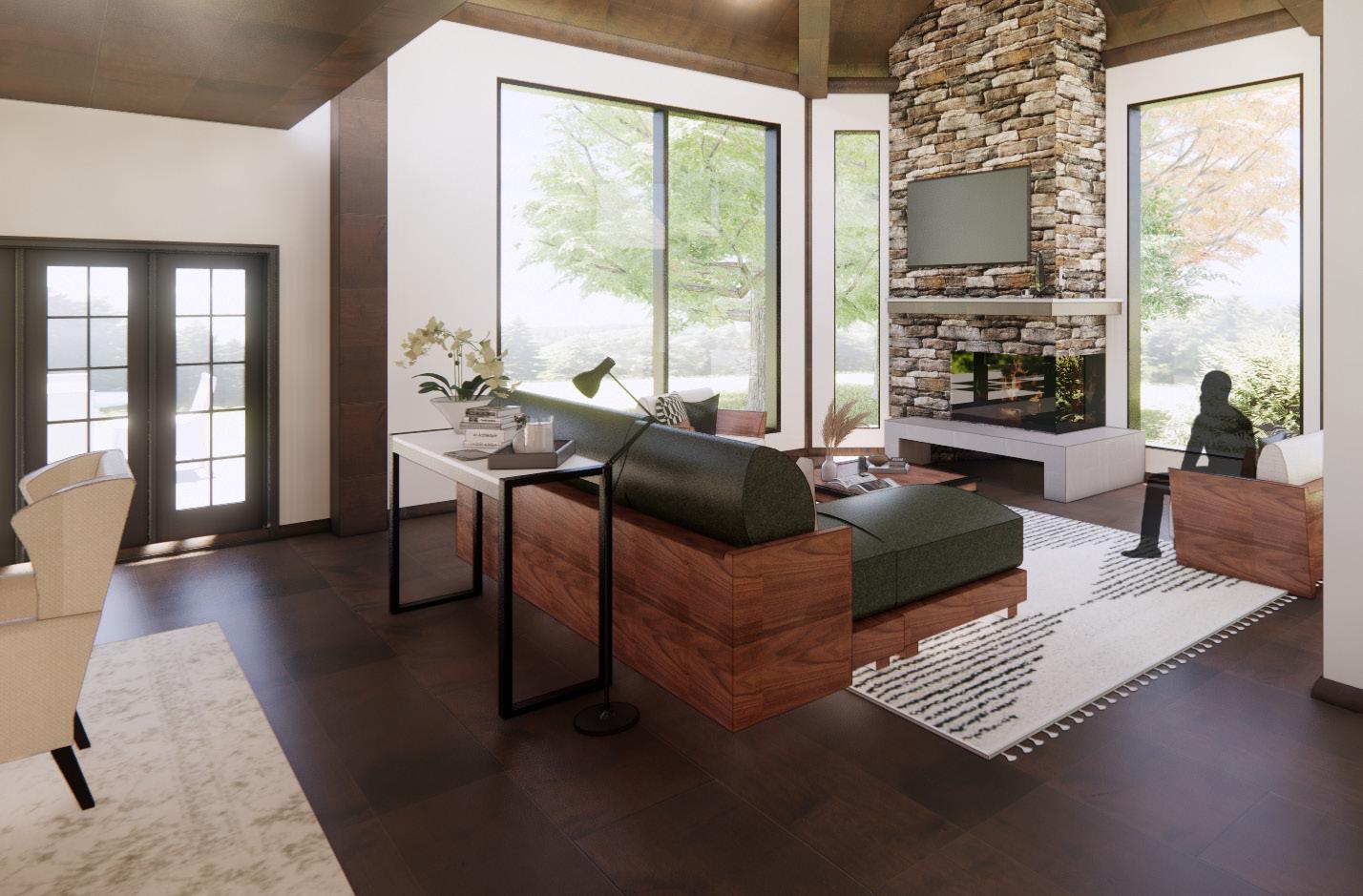
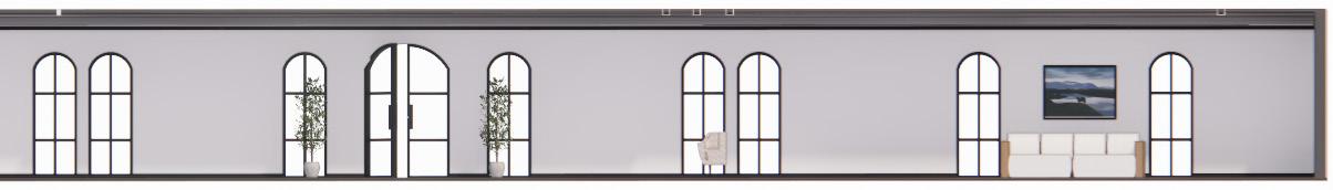
This house was being designed for a small family of three in which the father was a war veteran who was diagnosed two years ago with PTSD from a sever injury that resulted in him being wheelchair bound. There is a mother who had an investment firm and a son who is in 10th grade. The main goal was to design a residential home that supported wellness in every aspect of the home. This meant including aging in place, accessibility, universal design, wellness, and trauma informed design in every feature of the house. Everything in the house was made in order to promote a healthy mindset and lifestyle in order to provide the clients with a true forever home.
SITE REASONING

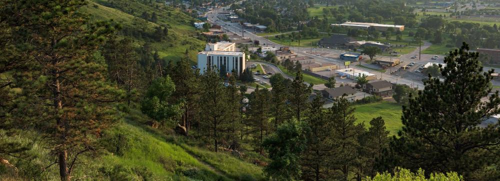
This site is in Rapid City south Dakota. The location was chosen for the client because it is a suburban area with a sense of community. This city has plenty of attractions like Mount Rushmore, and state parks. This specific lot has beautiful views of the mountains and rapid creek. It is one of the best properties along the entire creek. The lot is built out of the ever-bustling town so the clients may enjoy the peace, quiet, and nature. The lot is still a good distance from the city so they can still go into town when needed. It is also only 9.4 miles away from the high school that has a great rating of 7 /10. This lot is 4 acres with scenic views and enough room to build a sufficient house and still enjoy the outdoors. There is a good amount of distance between this lot and its neighbors while still being able to see them and travel a short distance to each house, so the clients can still have a sense of community.
22875 Forest Rd, Rapid City, SD
1 2022 Sophomore 2nd Semester
WELLNESS
APPLIANCES & FIXTURES
Black Floor Lamp
Automatic under-cabinet lights
Touch-less Kohler water faucet
Freestanding bathtub
Gold sconces light
Toto water efficient wall hung toilet
Wolfe French door oven/ warming drawer
Induction stove cook top


Wellness: In the home there is an abundant amount of natural lighting, which helps with mental health and promotes physical health. There is also a lighting system that changes with the time of day to help with one’s circadian rhythm.

Accessibility : The house has clearance for accessibility in every room with 36” doors, and differentiating counter-top heights. The house has big enough clearance for a wheelchair to comfortably maneuver around. Each rug in the house is also low pile.


Universal Design: There are handles for every door to help with grip, and ADT smart home through the house that helps anyone easily manage and change things around the house to their liking.
PTSD/Trauma Informed Design: The colors blue,brown and green are used in the house to stimulate strength,growth, and peace. The colors are muted to avoid triggering PTSD. Lastly there is a large amount of windows to connect the house to nature which help to promote a feeling of safety.

Aging in Place: There is censored flooring throughout the house which senses when someone falls. There is also motion activated under-cabinet lighting.
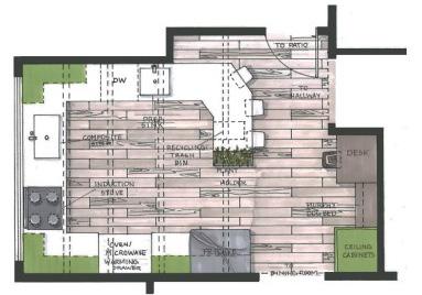
Foyer Mud Area Garage buffet china cabinet Warming Drawer Fridge Dryer Folding Fireplace 4' 0" Drawers MW 1/2 Bathroom 72 SF Coat Closet 30 SF Laundry Room 91 SF Guest Bedroom 149 SF Teen Bedroom 153 SF Office 82 SF Teen Bathroom 128 SF Living Room 364 SF Dining Room 349 SF Kitchen 337 SF Closet 78 SF Master Bedroom 305 SF Workout Area 117 SF Master Bathroom 205 SFA101 8 A101 4 1 3 5 6
DESCRIPTION 2
HOUSE DESIGN Floor PLAN
CONCEPT EXPLANATION


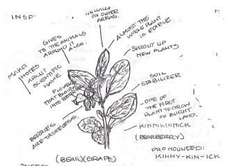
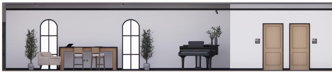
The kinnikinnick plant is known for putting down strong roots and creating a stable foundation to promote the growth of other plants and can survives year around. Vets have moved around their whole life and are known to feel alienated once they get back to normal life. They feel like they can’t fit back in because of all that they have gone through, and the side effects it had. Through the use of abundant wood and natural earth tones the house is meant to evoke a sense of belonging and stabilization. With beams and wood ceilings encompassing them to make them feel safe and surrounded. There are noticeable but calm contrast in the house to develop a feeling of serenity and peace.
LIVING ROOM KITCHEN 3 Revit & Enscape

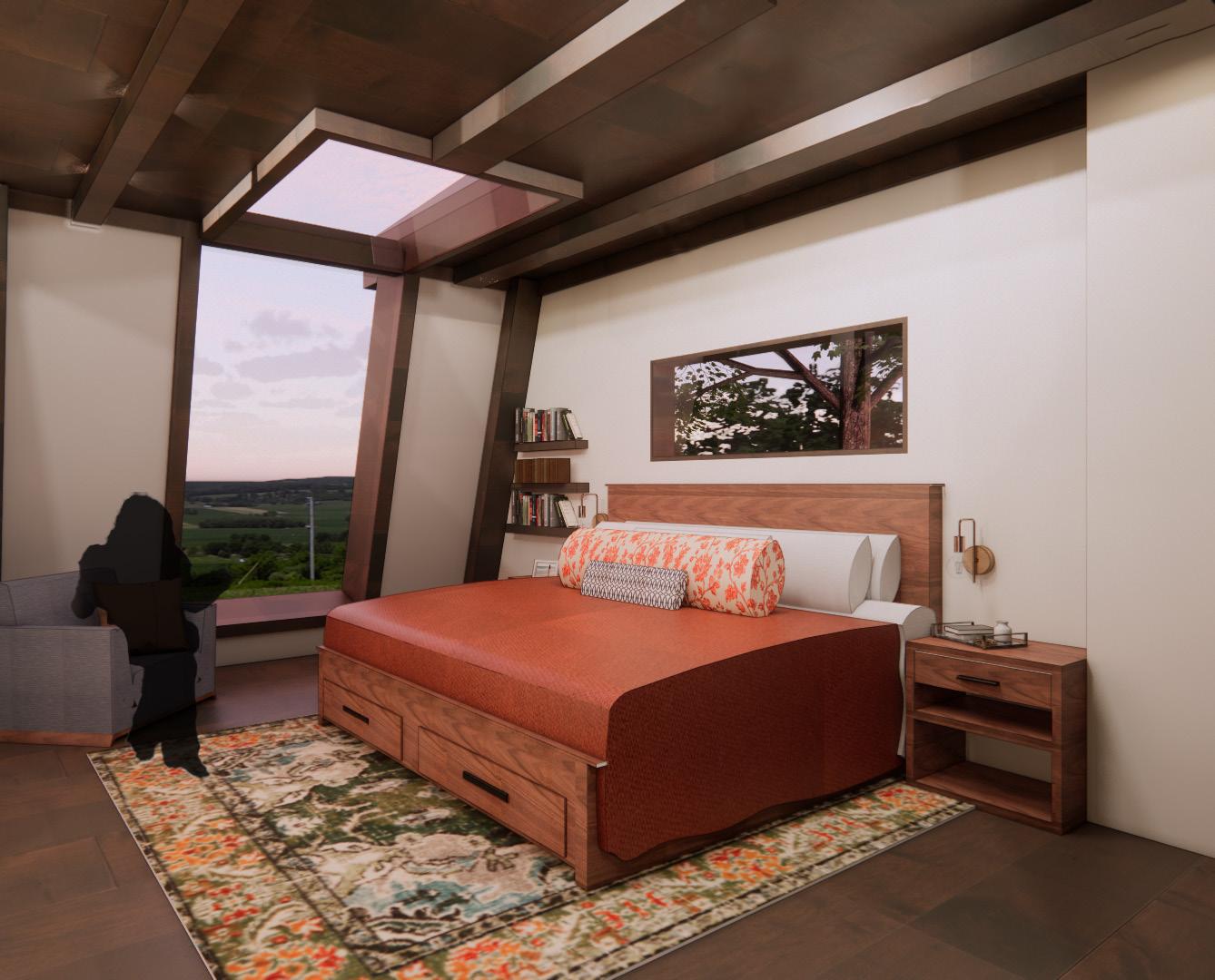
Wellness is when the mental, physical and religious state of being are all at a satisfactory and or healthy level. It has been discovered that the way a house is built and or organized can have a positive effect and promote’’ good physical health and mental health,”. With things such as good air quality, natural/ intentional lighting, ergonomic comfort, and acoustical comfort a, “healthy, balanced home,” can be built. It can also be accomplished through meeting people’s individual needs in the home such as, PTSD, trauma informed design, aging in place, and inclusive/universal/ accessible design. PTSD is sometimes the result of a person going through a traumatic and or life altering experience. 20% of Americans are effected by it.(Real life, p1-2).Trauma informed design is a way in which the PTSD and or regular trauma is considered into the ending design and or layout of the house. In this house there are low ceilings made out of wood in the most private spaces to provide a sense of security and protection in places where someone is most vulnerable.
WELLNESS STATEMENT
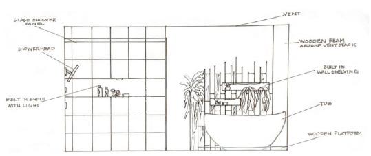
BATHROOM
Cloud 4
MAIN BEDROOM
MAIN
Adobe
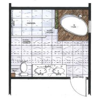
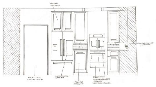
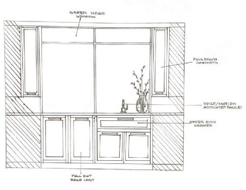
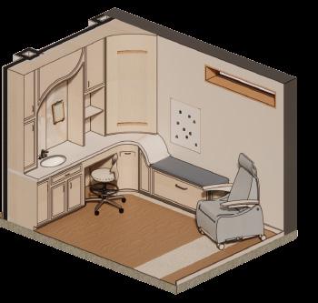
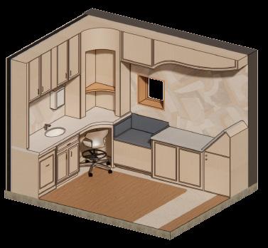
2KITCHEN &BATH DESIGN
PROJECT DESCRIPTION
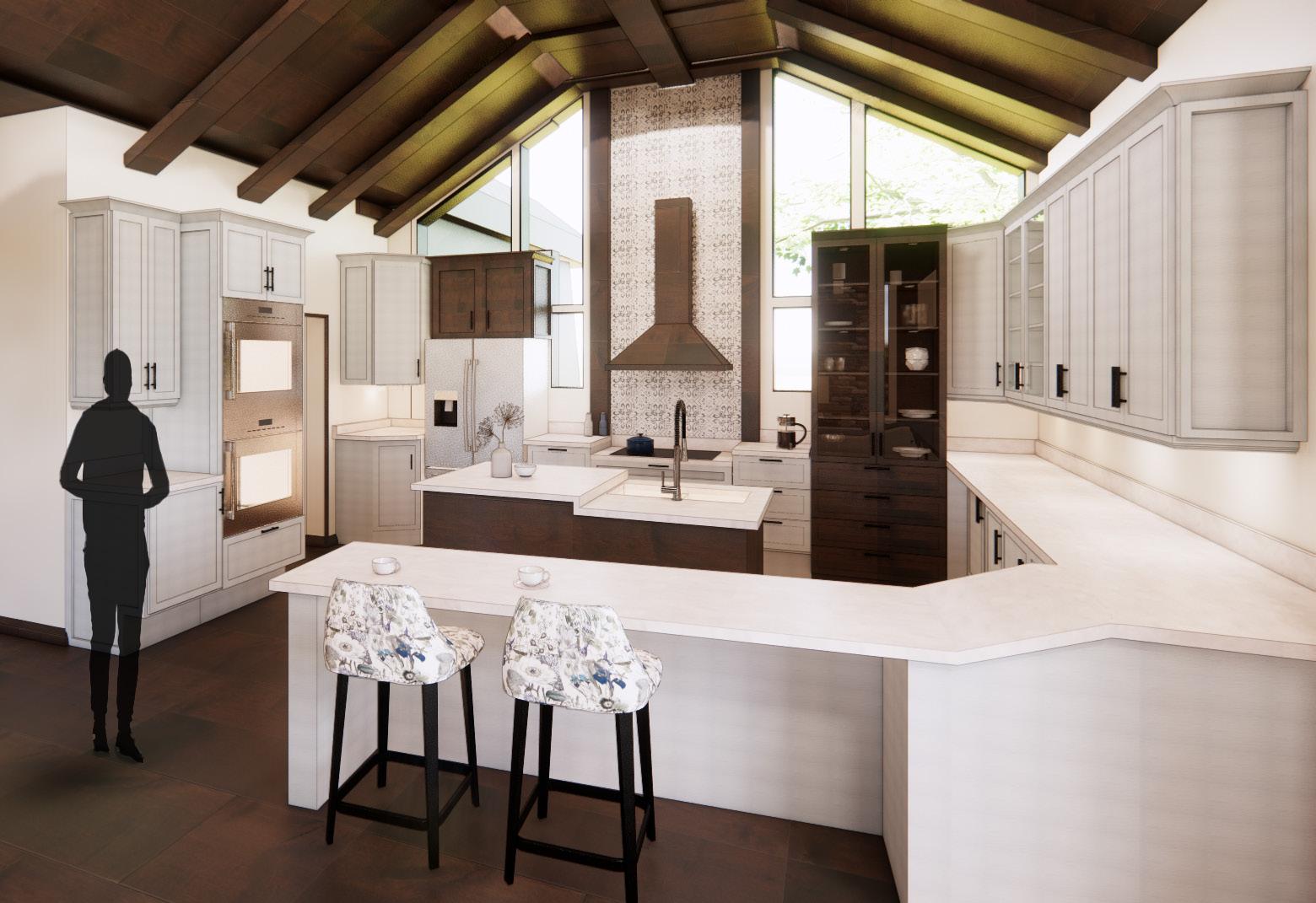
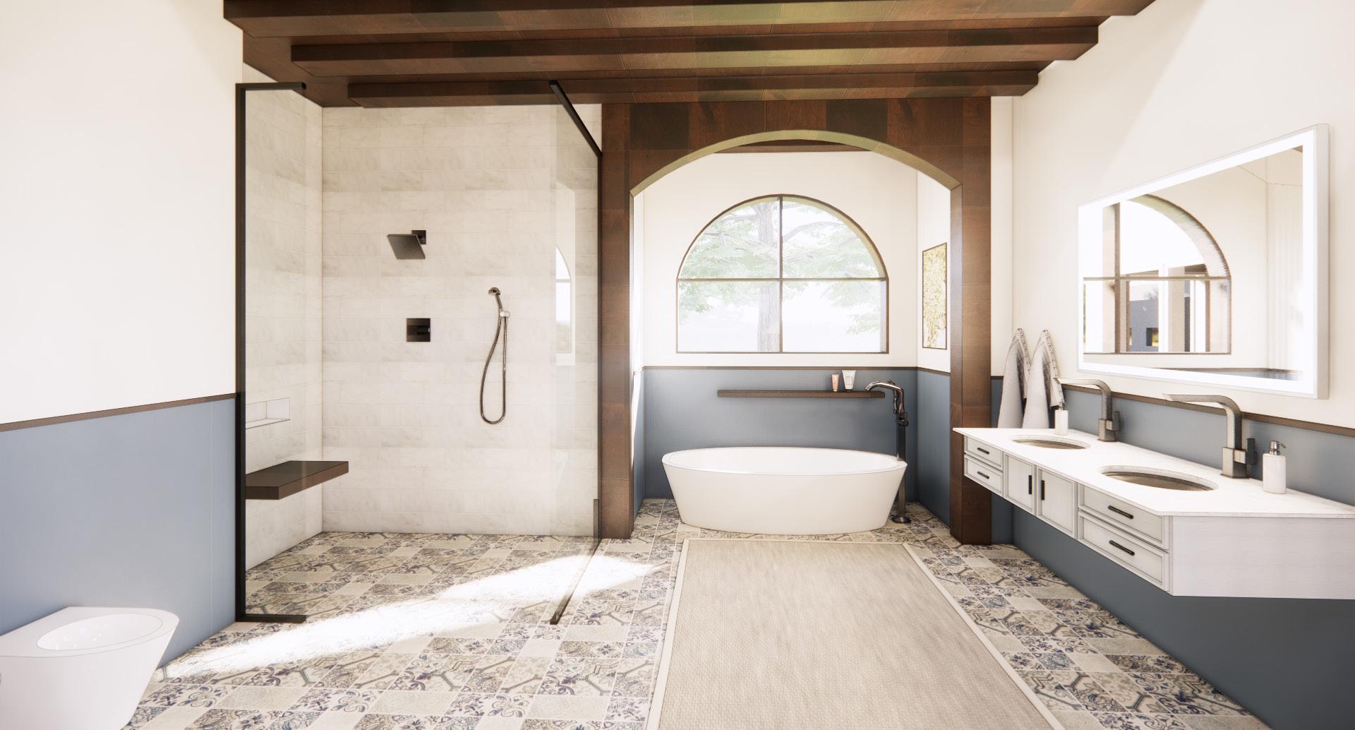
The NKBA project focused directly on the kitchen and bathroom. This project entailed upgrading a house for a retired couple with 2 golden retrievers who desired a forever home to grow old in. Jalen and Shawn enjoyed and wanted to entertain their friends in their house comfortably. They requested a kitchen and bathroom that incorporated universal design, aging in place, and sustainability while providing different elements that catered to the dogs.


5 2022 Sophomore 1st Semester
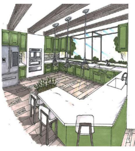
The kitchen and bathroom contained key components to allow for aging in place, universal design, with an addition of elements that catered to the family’s dog. The choice of colors, layout, and additions to the house took these components into consideration. The kitchen has multiple additions, including a pot filler/over the cabinet area for the dog, a large bay window to allow for maximum lighting, a smart fridge, and under cabinet sensor lighting. The bathroom included a zero clearance shower, and a temperature controlled shower system.
Hand Rendered & Photoshop 6
KITCHEN AND BATH DESIGN
3 NEXT CORPORATE DESIGN

Booklet
PROJECT DESCRIPTION
NEXT, is a leading global consumer robot company based in Providence, Rhode Island. At NEXT we create consumer electronics and appliances that are designed to help you. Our purpose is to improve everyday living through robotics . Designed with you in mind, NEXT products offer innovative solutions to make your life easier with intuitive and responsive controls, sleek, stylish designs, and Eco-friendly features. Our NEXT researchers, engineers and product engineers, are working to build an ecosystem of robots and smart home devices to help consumers make their homes easier to maintain and a healthier place to live . We are committed to the discovery process through technological exploration to foster innovation that provides practical and valuable robot products for the home NEXT aspires to be an inclusive and diverse company that embraces all walks of life and celebrates the greatness of individuals and to help them reach their full potential. NEXT has decided to invest in a new research development hub in the heart of the thriving Seaport District of Boston Massachusetts. The Seaport district or simply the seaport is part of the larger neighborhood of South Boston, and is also sometimes called the innovation district. NEXT feels strongly that they want to partner with companies that match their core values.


The colors were taken from different parts of the koi fish and are representative of different aspects of the design and the company. The blue is the employees that are working in the company, while the red/orange is what the employees need. This is things like a sense of belonging, control, productivity, comfort, and safety. These are vital for employees to thrive in the workplaces, which amplifies the company’s success. The black is the technology binding the two colors together to provide the most efficient and forward thinking company. The brand is to be reflective of our work community and how our robotics take away everyday burdens while meeting our wants that seem unachievable.
CONCEPT EXPLANATION
We walk through daily life now unconnected and without help. We see this as the normal way to go about our day because of the crisis in 2020 that caused us all to disconnect from all aspects of life. We used to laugh together, relate to each other, and have tight-knit relations with our coworkers. NEXT Robotics will provide technology and a space that helps us work together again to make our lives more manageable so we can grow to our full potential. We aim to give a sense of propinquity again. That allows a community to build and blossom to provide clients with a more efficient life and workers with a more effective and meaningful work environment. Through repetitive loose curved lives , strong but balanced colors , and intentional abstract shapes , the building will reflect the morals found above in the koi fish by mimicking different aspects of the fish.
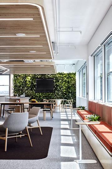
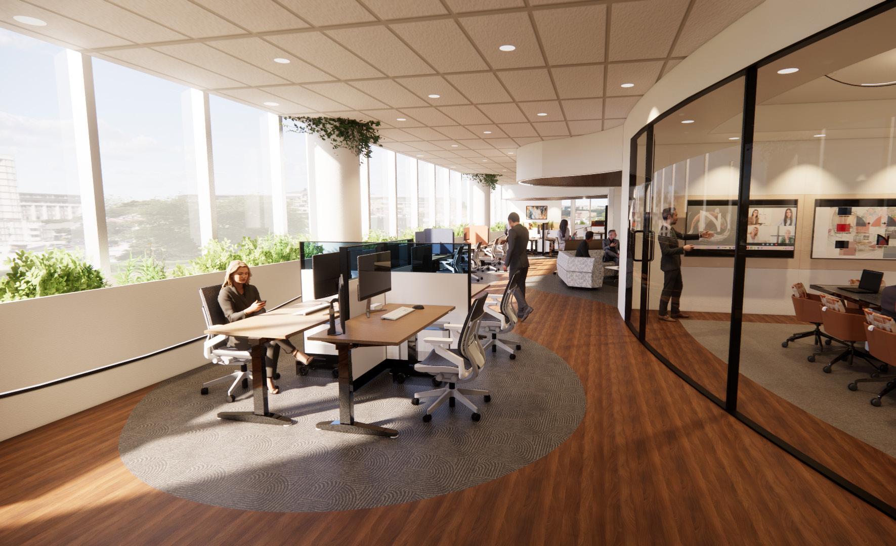
NEXT ROBOTICS
7 2022 Junior 1st Semester
LOGO DEVELOPMENT
NEXT ROBOTICS COMPANY (CORPORATE DESIGN)
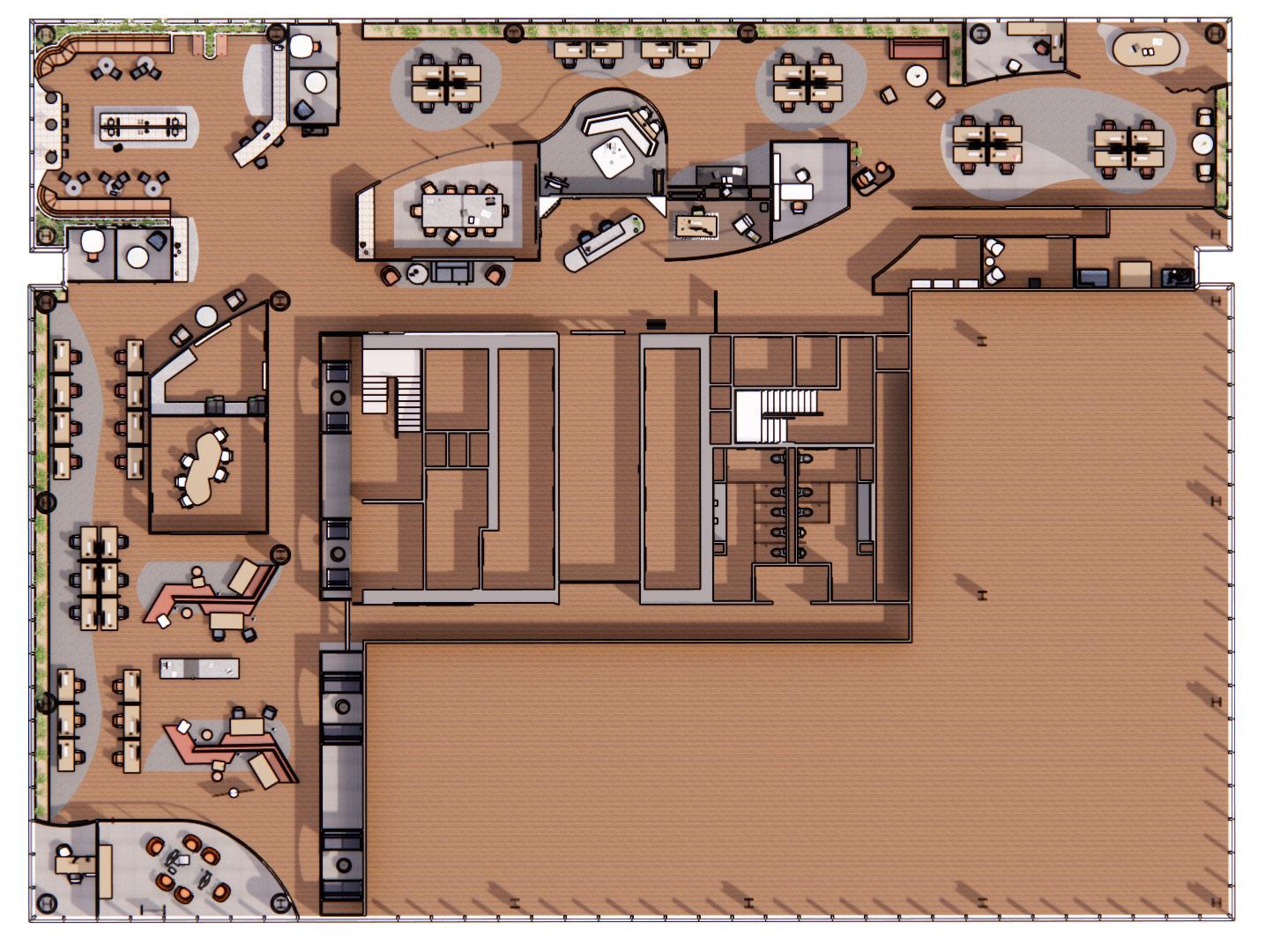
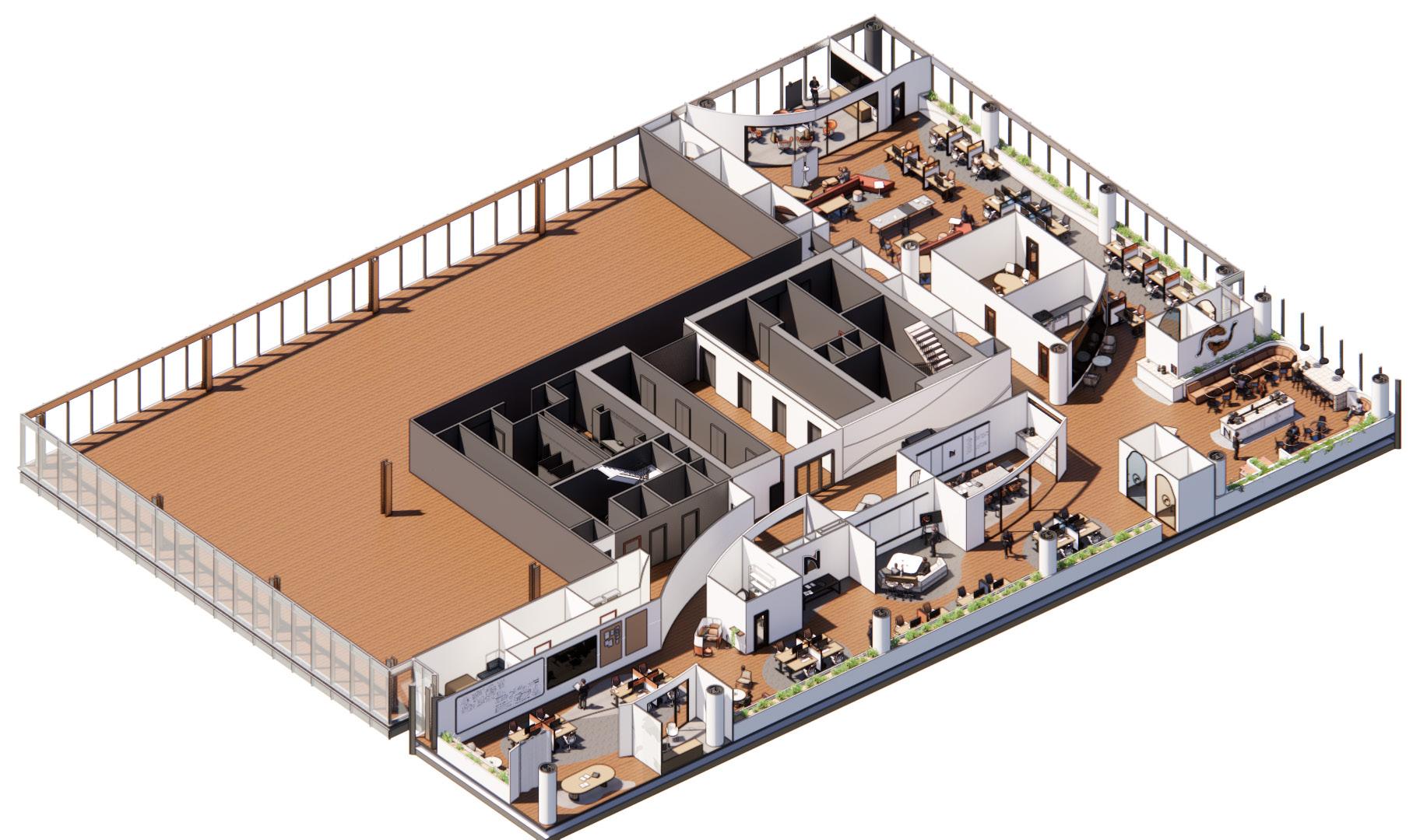
8 1. Project Rooms 2. Design Director Private Office 3. Design Team Work Stations 4. 2 Dedicated Team Spaces 5. Test/ Prototype Work Stations 6. Engineering Work Stations 7. Resource Center 8. Small Phone Booth 9. Large Phone Booth 10. Work Cafe NOT IN CONTRACT 1 2 4 5 3 1 6 7 9 8 10 9 8 12 11 13 17 14 16 15 18 19 21 23 22 26 25 24 20 11. Product Management and Development Work stations 12. Large Meeting Room 13. Product Management and Development 2 Work Stations 14. Dedicated team Space 15. Reception Seating Area 16. Reception Desk 17. Product Management and Development 3 Work Stations 18. Retail Mock-Up 19. Home Office Lab 20. Development Private Office 21. Product Inclusion Private Office 22. Materials/Retail/Guest Work Stations 23. Inclusive Design Lab 24. Product Storage 25. Mother’s Room 26. Wellness Room


The floor plan reflects the shape and movement of a koi fish. Spaces like offices are put towards the middle in order to provide workers with the space next to the windows. By doing this it makes the hierarchy disappear throughout the workspace and promotes equality. Throughout the space there are plenty of opportunities for the workers to step aside and take some needed time alone. The cubicles are used along the left side in order to give the workers more comfortable areas to talk things through and congregate with fellow workers while staying near their work if they need to reference it or return to it at any time. This will allow for more collaboration throughout the day without distracting fellow co workers. This will allow the team to grow and connect more.
LARGE MEETING ROOM
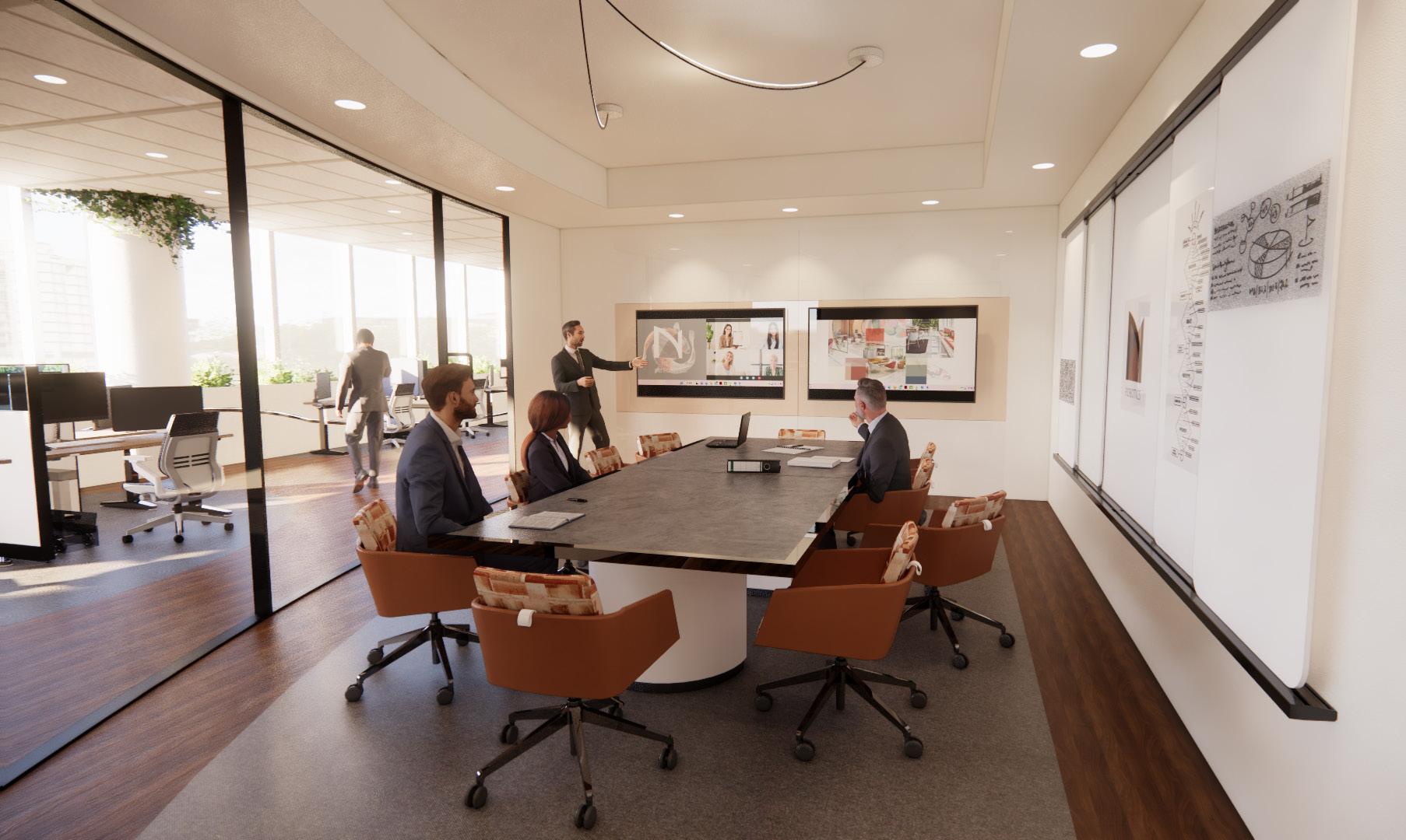
WORK CAFE 9 Revit & Enscape
LAYOUT EXPLANATION
The floor plan reflects the shape and movement of a koi fish. Spaces like offices are put towards the middle in order to provide workers with the space next to the windows. By doing this it makes the hierarchy disappear throughout the workspace and promotes equality. Throughout the space there are plenty of opportunities for the workers to step aside and take some needed time alone. The cubicles are used along the left side in order to give the workers more comfortable areas to talk things through and congregate with fellow workers while staying near their work if they need to reference it or return to it at any time. This will allow for more collaboration throughout the day without distracting fellow co workers. This will allow the team to grow and connect more.
NOT IN CONTRACT
Retail Mock- Up Area
Asymmetrical Phone Booth Rooms
Digital
Interactive Announcement Screen
Project Rooms
Cloud 10
Adobe
WORK STATIONS
FLOOR PLAN AXON
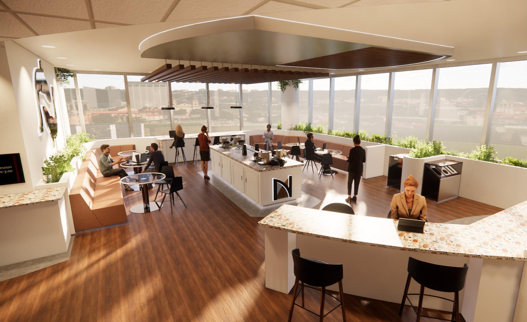
4 SEARCY BRANDING DESIGN
PROJECT DESCRIPTION
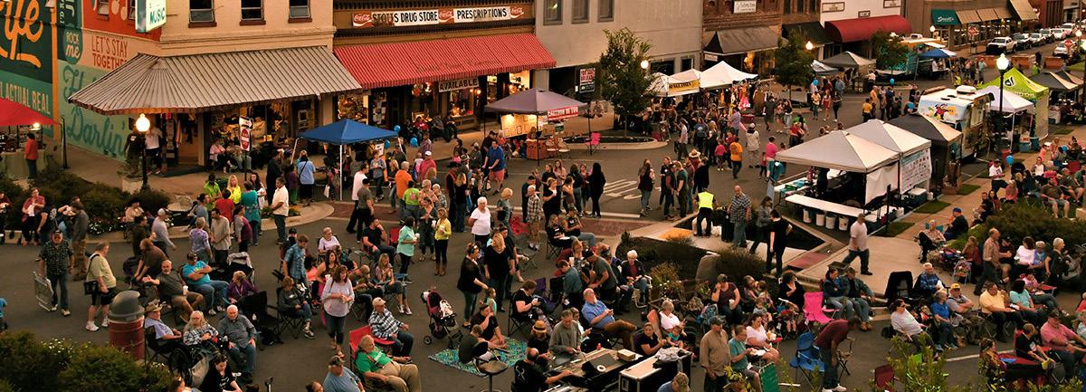
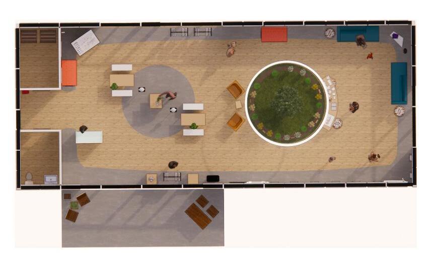
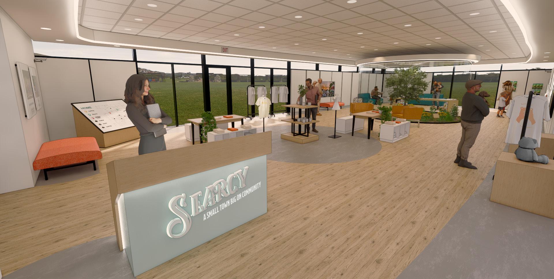
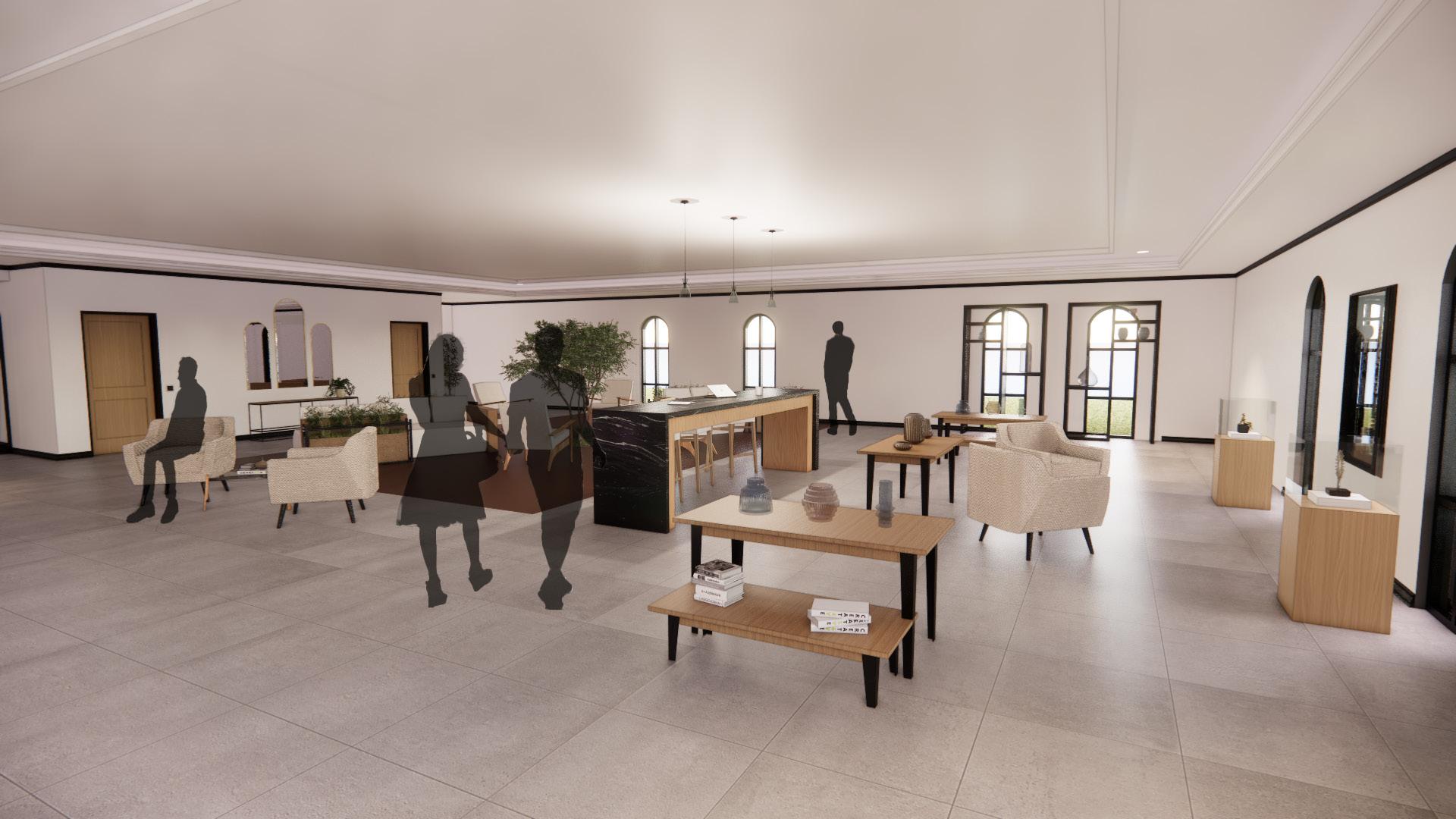
The branding project is something that the school presents to students every year, with a new theme. This project is meant to bring different majors and minors together to create something as a team. In the year of 2023 the teams were tasked with re-branding the city of Searcy Arkansas. The city needed a new solidified identity to be known by since there were so many different brands going on within the city. They wanted something that would thoroughly represent the community, location, history and the people of the town. Through a few amenities of a known park, library and new welcome center the team was to show the brand and how it would play into the town and places that were already there. Since this was a group project the interiors split up the spaces. I personally focused on the 2 acre park and the new welcome center.


These designs on the left were some of the final branding design that our graphic designers came up with for the town, our second revenue area which was a cafe, and a mascot for the park. Each logo was its own while making sure to tie back to the base design and colors of the brand created. All the colors were based off of a colorful mural in town. This was decided due to its playful nature it could have while still being able to be professional when needed. Every logo came in different colors and with varying slogans depending on the location. We worked hand and hand with them to integrate the brand and their designs into our renderings.
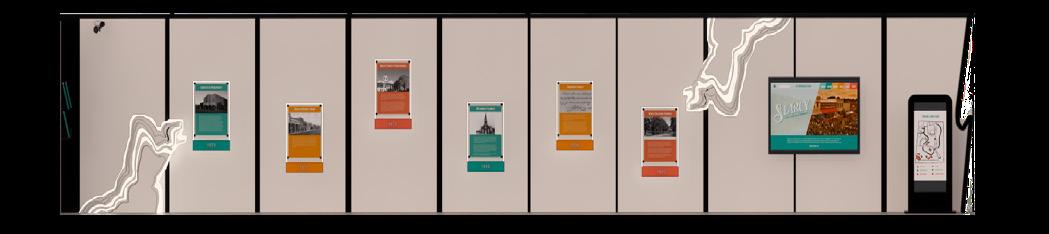
The timeline wall provided an area where one could learn about the towns lineage in a simple and enjoyable way. Understandable for all ages.
11 2023 Junior 2nd Semester
1 2 3 4 5 6 7 8 9 1 2 3 4 5 6 7 8 9 Timeline Wall Kid’s Area Merchandise Welcome Desk Kiosk Info Station Interactive Map Restroom Storage Garden Exhibit
BRAND IDENTITY
WELCOME CENTER
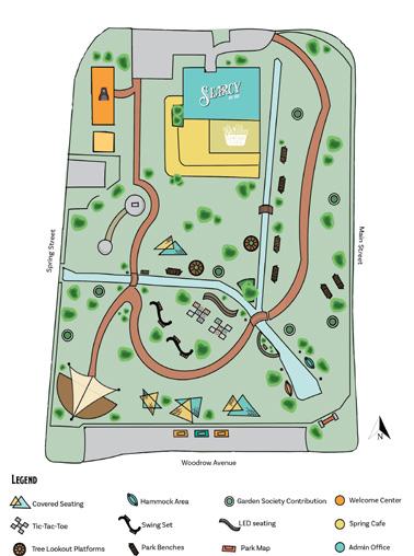
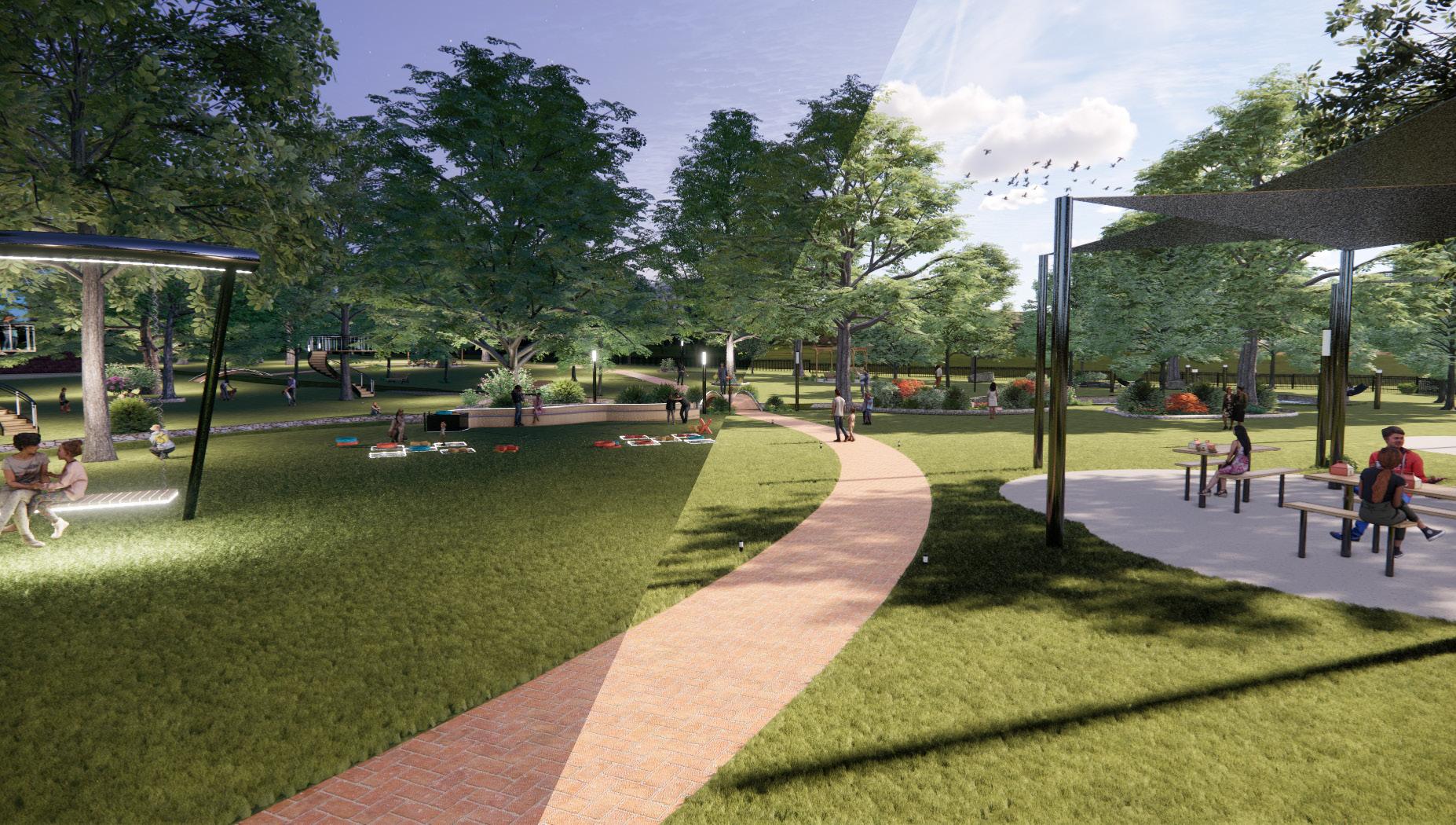
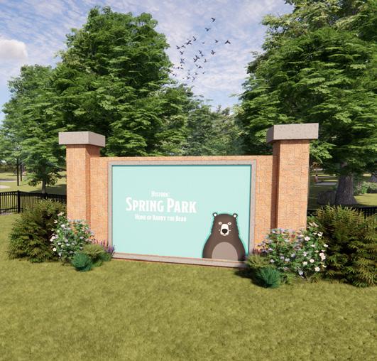
Spring Park features passive design elements combining the historical nature of the space with a modern twist. Similar to the Welcome Center and Spring Cafe, Spring Park is meant to be a place that fosters community with seating scattered around the park and an amphitheater as a gathering place for events. Visitors can play “life-size” Tic Tac Toe, bird watch at the binocular stations, and experience the gardens at ground level or from the lookout platforms wrapping around various trees. The way-finding for the park is divided into a three-color system: orange is for play, coral is for family, and teal is for relaxing.


12
The welcome center is a space to give the community and visiting people a interactive knowledgeable, and enjoyable first impression of the town. It gives a vision of the town in an open colorful, and informational area to show how to get involved and learn about this small lovable town.
SEARCY RE-BRANDING (GROUP PROJECT)
5BOUTIQUE HOTEL DESIGN
Board

HOTEL NOR URLJÒS
HOTEL NOR URLJÒS


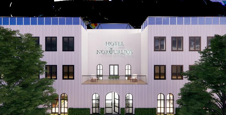
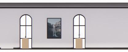
Reykjavik Iceland is known for being one of the greenest, cleanest, and safest place on earth. Through their colorful and modest exteriors to their origins of green architecture, they keep up with the time while staying true to their roots. Hotel Norðurljós is the perfect place to experience it all. With large windows connecting to nature, a grand skylight to watch the northern lights, and a glass Iceland Antique shop tourist are sure to get the best of Iceland. This hotel aims to be modern, sleek and clean, by the variety of thick textures, monochromatic color scheme, and smooth transitions between spaces.
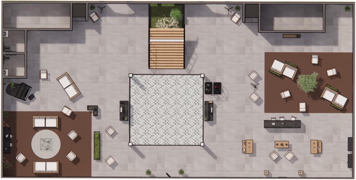
The floor plan is an open concept lobby with floor changes in the more comfortable seating areas. The lobby includes 2 elevators, 2 reception desk and a miniature antique store full of local Reykjavik glass antiques.
CONCEPT
13 2022 Junior 1st Semester
STATEMENT
1 2 5 4 3 6 6 5 1 3 4 5 6 1 2 Seating Reception Antique Shop Unisex Restrooms Storage Rooms Elevators
BOUTIQUE HOTEL CHARETTE
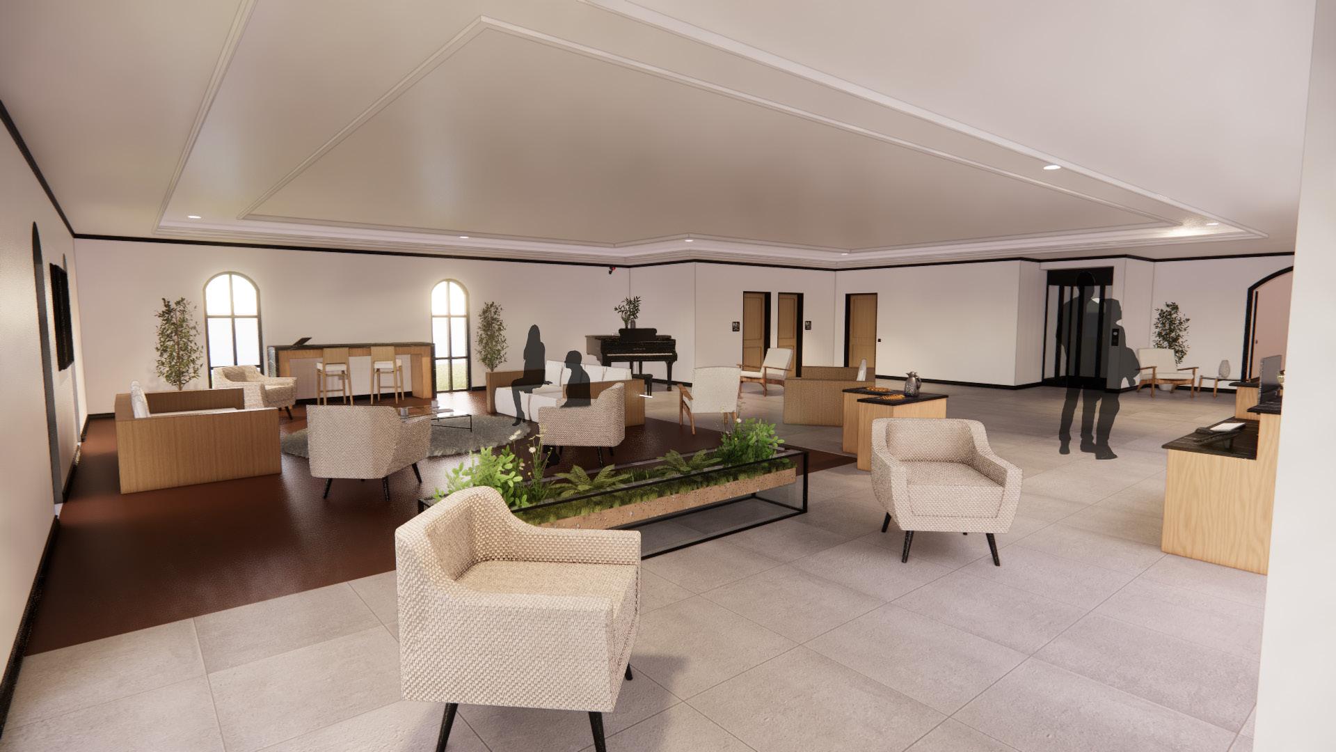

The left side of the lobby includes casual seating along with seating near the grand piano to enjoy music. Both sides of the lobby have entry ways to hotel rooms along with elevators. Each also has a storage room with key card access. There is two unisex ADA bathrooms available with easy visible signage. This more relaxed area also includes a hospitality table for all the guest to enjoy quick pastries and fruit infused water.
14
The right side of the lobby includes a miniature antique shop that has glass Icelandic antiques that reflect and spread light just like the northern lights. The seating area right next to it has a nature section in the middle to connect the customers to the green side of Reykjavik Iceland. There is a bar area to separate the sitting area from the antique shops to encourage customers to go check out some of the one of a kind antiques. The storage on this side has two doors both key card access. The door on the left is mainly for concierge and the right is for other workers to access the storage.


Construction Documents Board
6PEDIATRIC CLINIC DESIGN
PROJECT DESCRIPTION
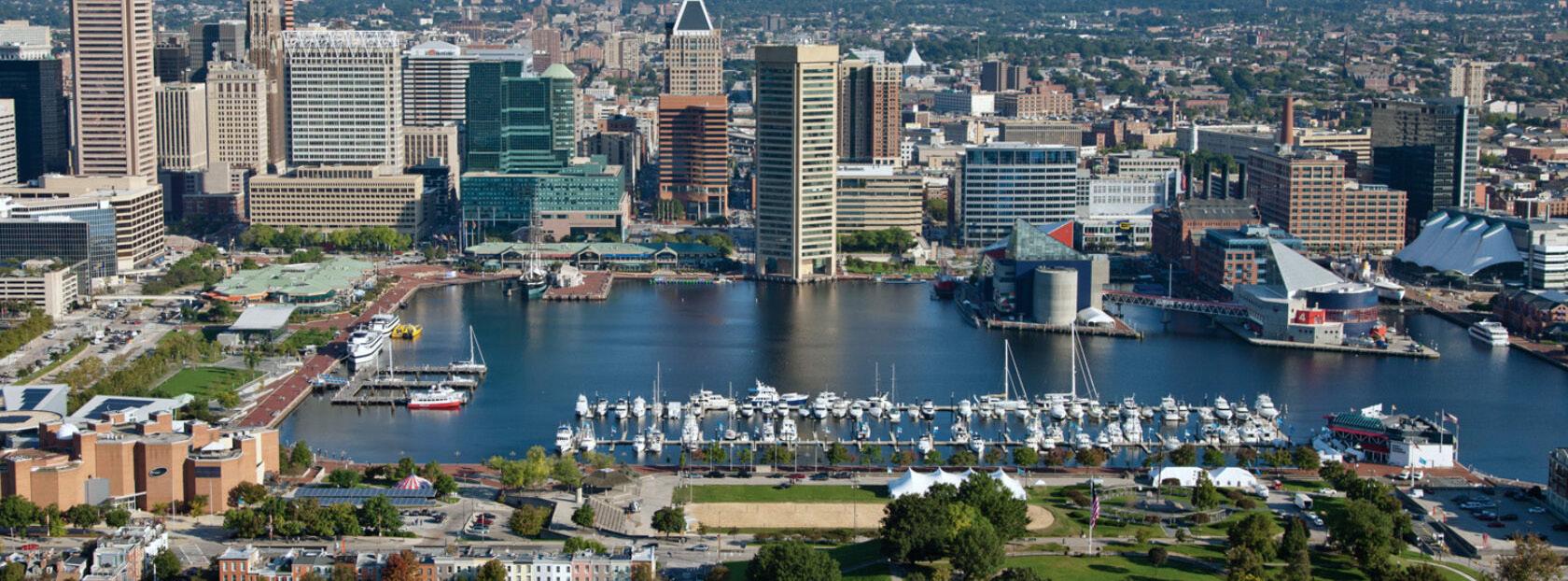
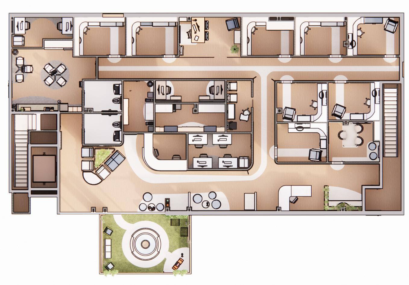
A newly constructed pediatric primary care clinic in Baltimore, Maryland, will be completed in the fall of 2024. This new clinic will provide comprehensive pediatric primary care from birth to age eighteen (18) with accommodations to treat behavioral health issues. The clinic’s design scope will include Exam Rooms, Public Areas, both Administrative and Physician Workrooms, Manager’s Office, Nurse’s Station, Staff Lounge, Medical Room, Soil Room, both Family Restrooms and Staff Restrooms, a Patient Education Space, and an Outdoor Area. The design should include spaces that support healing, intuitive way-finding, and evoke confidence and trust for children from birth through eighteen (0-18) years old, their siblings, and their families. The design should support a seamless interaction for patients and family, to optimize the experience and outcomes through interior design.

QUALIA PEDIATRICS
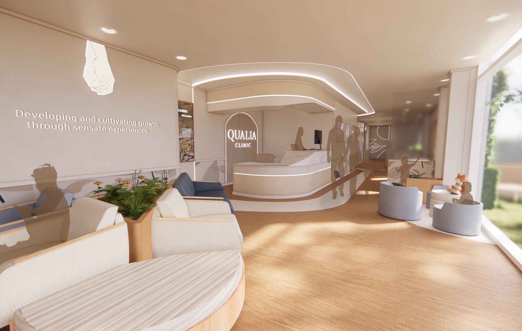
“Developing and cultivating growth through sensate experiences.”
CONCEPT RESEARCH/BREAKDOWN
Touch is one of the first senses to develop in the womb as early as 16 weeks in the womb. Physical touch communicates empathy, care, comfort, and love in an extremely impaction way. It affects the way we bond with others and form relationships. Touch is not only an action but also a language that provides intimate connections, and emotional well-being, and helps us to feel a sense of belonging. Physical touch also helps you give and receive positive energy that helps you to connect with the people around you.
CONCEPT STATEMENT
Touch is one of the first senses we cling to as humans. It is something that comforts us, makes us feel loved, and gives us a sense of security. Touch provides us with the push we need to begin healing and connects us back to the areas we feel the most comforted. When in a hospital as a kid and even a teenager we long for reassurance and comfort of our family as we are receiving news or going through treatment, and family members want to be near and touch their loved ones. Through calm colors that evoke warmth, censored textures, and focus on the way people interact with the space, the clinic will make one feel like they are back in the comfort of their loved ones to relieve stress and anxiety.
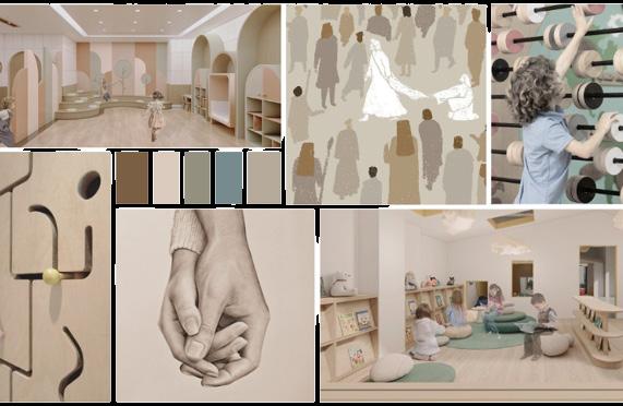
15 2023 Senior 1st Semester Touch Connection Healing Protection Development Mental Emotional Wellbeing


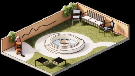


OUTSIDE AREA
The outdoor space is an area for kids and parents to interact with each other in a playful manner to relieve stress and anxiety before going into the clinic. This area has a center fountain filled with bubble water to encourage the kids to play. There is seating around this and a step up to allow any age to be able to reach the fountain. In the corner is stacking blocks for younger kids, and on the back wall there is a knob that kids can move back and forth on the curved line. With seating surrounding the area parents can either sit and watch their children or play with them. There is a small speaker on the outside to let the family know when it is time to go back with the doctor.
FLOOR PLAN
The space incorporates every possible nook and opportunity for children and their families to interact. This is to improve the clinic experience and the long lasting effects they can have on relationships. That includes kids relationships with doctors, parents, and sometimes other siblings.
1 3 4 5 6 7 8 9 10 11 12 13 14 15 Reception Outdoor Area Checkout Behavioral Exam Room Standard Exam Room Soil Room Manager’s Office Staff Lounge ADA Restroom Admin Work Room 1 2 3 4 5 6 7 8 9 10 11 12 13 14 Staff Work Room Patient Education Vitals Nurse Station Medical Room 15
16
PEDIATRIC CLINIC DESIGN (HEALTHCARE)
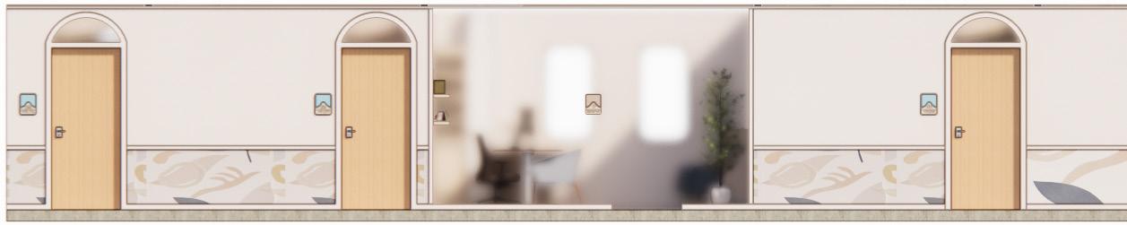
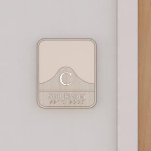
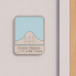
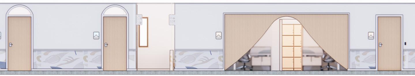
HALLWAY VIEW
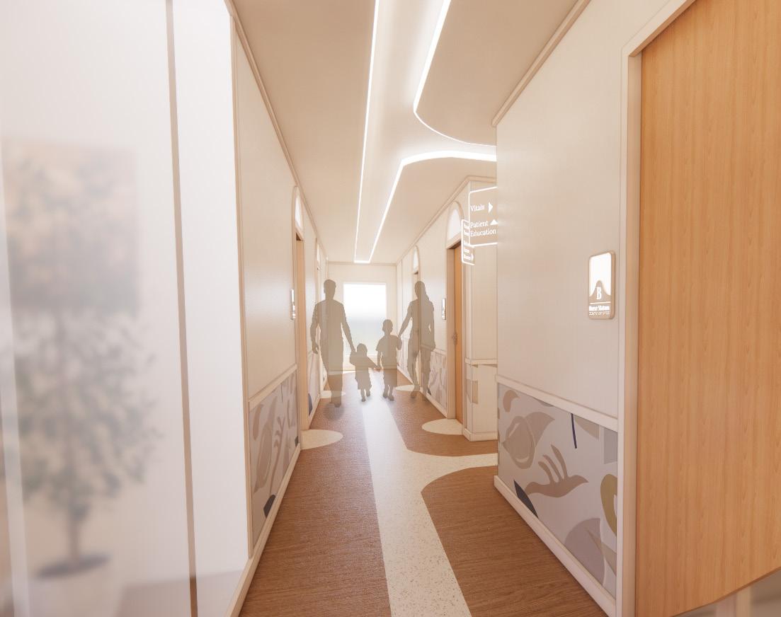
CORRIDOR AREAS
Throughout the hallways there is playful wallpaper up to the height of the children to give them a sense of calmness while walking to the exam room. On each door there is a window above that is glossed to open up the space while still providing privacy. There is flooring that reflects this shape to point out which rooms are exam rooms. Along with this the door tags are lit up with different colors to represent different zones in the clinic. The rooms for patients are the 100’s while the staff rooms go by letters. The doors include door tags with braille and ergonomic door handles so anyone can read and use the doors.


RECEPTION/WAITING AREA 17 Revit & Enscape
EXAMINATION ROOMS


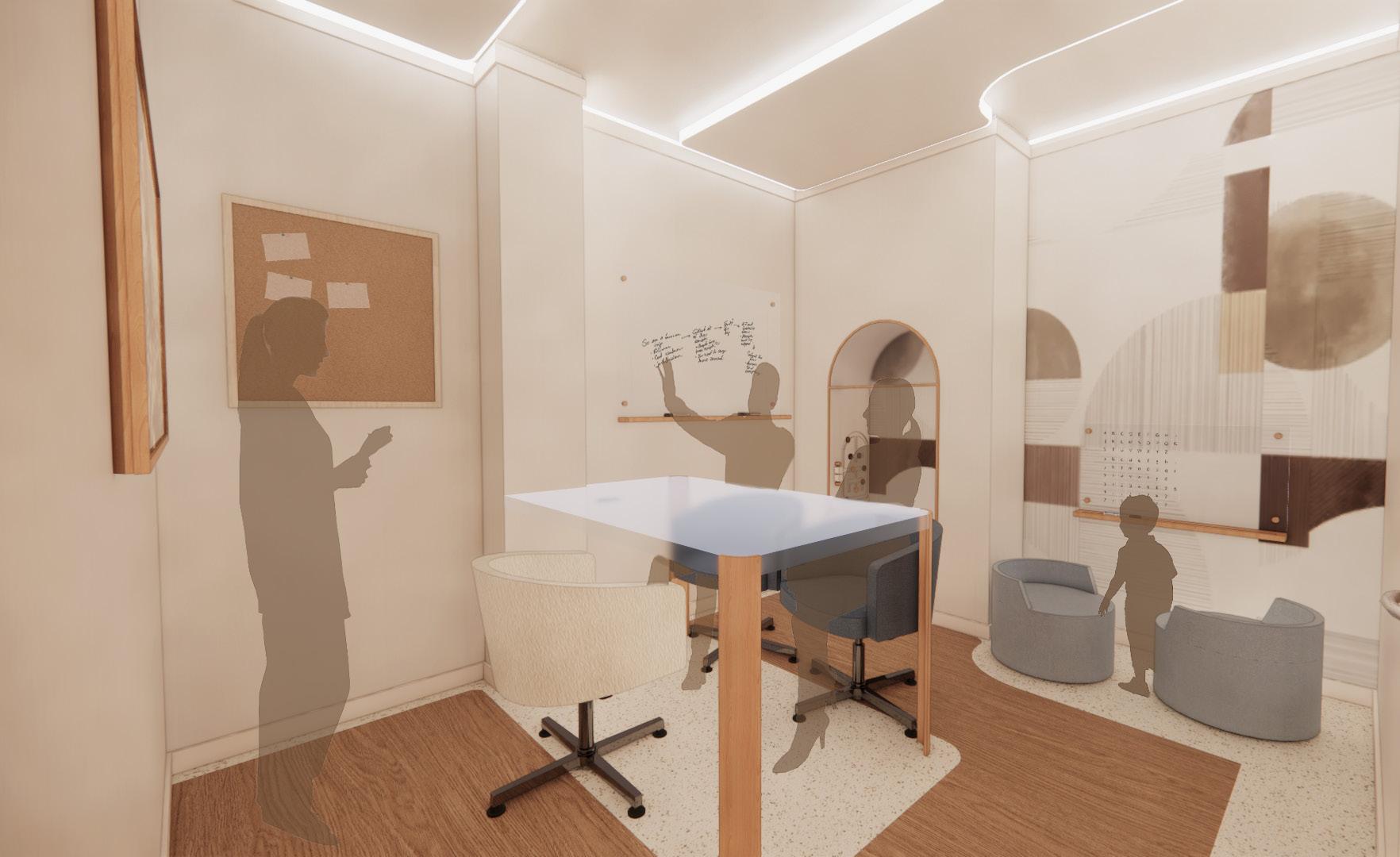
There are two separate exam rooms. There is one that focuses on the behavioral/mental illness, and the other one hones in on more physical illness. These two were created to meet the specific needs of the variety of patients. Each has at least two seats for family to sit down and interact with their child to comfort them during this difficult time. Each room also has some interactive feature to keep the patient and other siblings entertained throughout their visit. There are different things for children to interact with in each of the exam rooms. In the behavioral exam room there is a magnetic board with letters by the seating for the family, and straight across from the patient there are pictures of nature to calm the patient and connect them to the outdoors. In the standard exam room there is a reflective area above the bed that lights up to encourage a playful mood. This room also includes a pull out chair that is built into the cabinet area.
PATIENT EDUCATION
Adobe Cloud 18
Angel Robison angelrobison@icloud.com (801)-428-9550