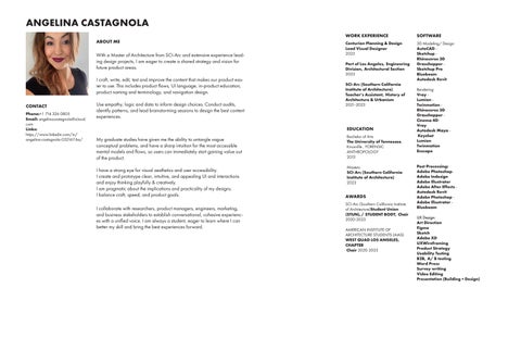
ANGELINA CASTAGNOLA

CONTACT
Phone:+1 714 326 0805
Email: angelinacastagnola@icloud. com
Links:
https://www.linkedin.com/in/ angelina-castagnola-0321611ba/
CONTACT
Phone:+1 714 326 0805
Email: angelinacastagnola@icloud. com
Links:
https://www.linkedin.com/in/ angelina-castagnola-0321611ba/
With a Master of Architecture from SCI-Arc and extensive experience leading design projects, I am eager to create a shared strategy and vision for future product areas.
I craft, write, edit, test and improve the content that makes our product easier to use. This includes product flows, UI language, in-product education, product naming and terminology, and navigation design.
Use empathy, logic and data to inform design choices. Conduct audits, identify patterns, and lead brainstorming sessions to design the best content experiences.
My graduate studies have given me the ability to untangle vague conceptual problems, and have a sharp intuition for the most accessible mental models and flows, so users can immediately start gaining value out of the product.
I have a strong eye for visual aesthetics and user accessibility. I create and prototype clear, intuitive, and appealing UI and interactions and enjoy thinking playfully & creatively.
I am pragmatic about the implications and practicality of my designs. I balance craft, speed, and product goals.
I collaborate with researchers, product managers, engineers, marketing, and business stakeholders to establish conversational, cohesive experiences with a unified voice. I am always a student, eager to learn where I can better my skill and bring the best experiences forward.
Centurion Planning & Design
Lead Visual Designer 2023
Port of Los Angeles, Engineering Division, Architectural Section 2023
SCI-Arc (Southern California Institute of Architecture)
Teacher’s Assistant, History of Architecture & Urbanism 2021-2023
SOFTWARE
3D Modeling/ Design: AutoCADSketchupRhinoceros 3D
GrasshopperSketchup Pro
Bluebeam
Autodesk Revit
Rendering: VrayLumionTwinmotionRhinoceros 3D
GrasshopperCinema 4DVray
Bachelor of Arts
The University of Tennessee, Knoxville , FORENSIC ANTHROPOLOGY 2013
Masters
SCI-Arc (Southern California Institute of Architecture) 2023
SCI-Arc (Southern California Institute of Architecture)Student Union (STUN),/ STUDENT BODY, Chair 2020-2023
AMERICAN INSTITUTE OF ARCHITECTURE STUDENTS (AIAS) WEST QUAD LOS ANGELES, CHAPTER Chair 2020-2023
Autodesk MayaKeyshot Lumion
Twinmotion
Enscape
Post Processing:
Adobe Photoshop-
Adobe Indesign
Adobe Illustrator
Adobe After EffectsAutodesk Revit
Adobe Photoshop -
Adobe IllsutratorBluebeam
UX Design:
Art Direction
Figma
Sketch
Adobe XD
UXWireframing
Product Strategy
Usability Testing
B2B, A/ B testing
Word Press
Survey writing
Video Editing
Presentation (Building + Design)
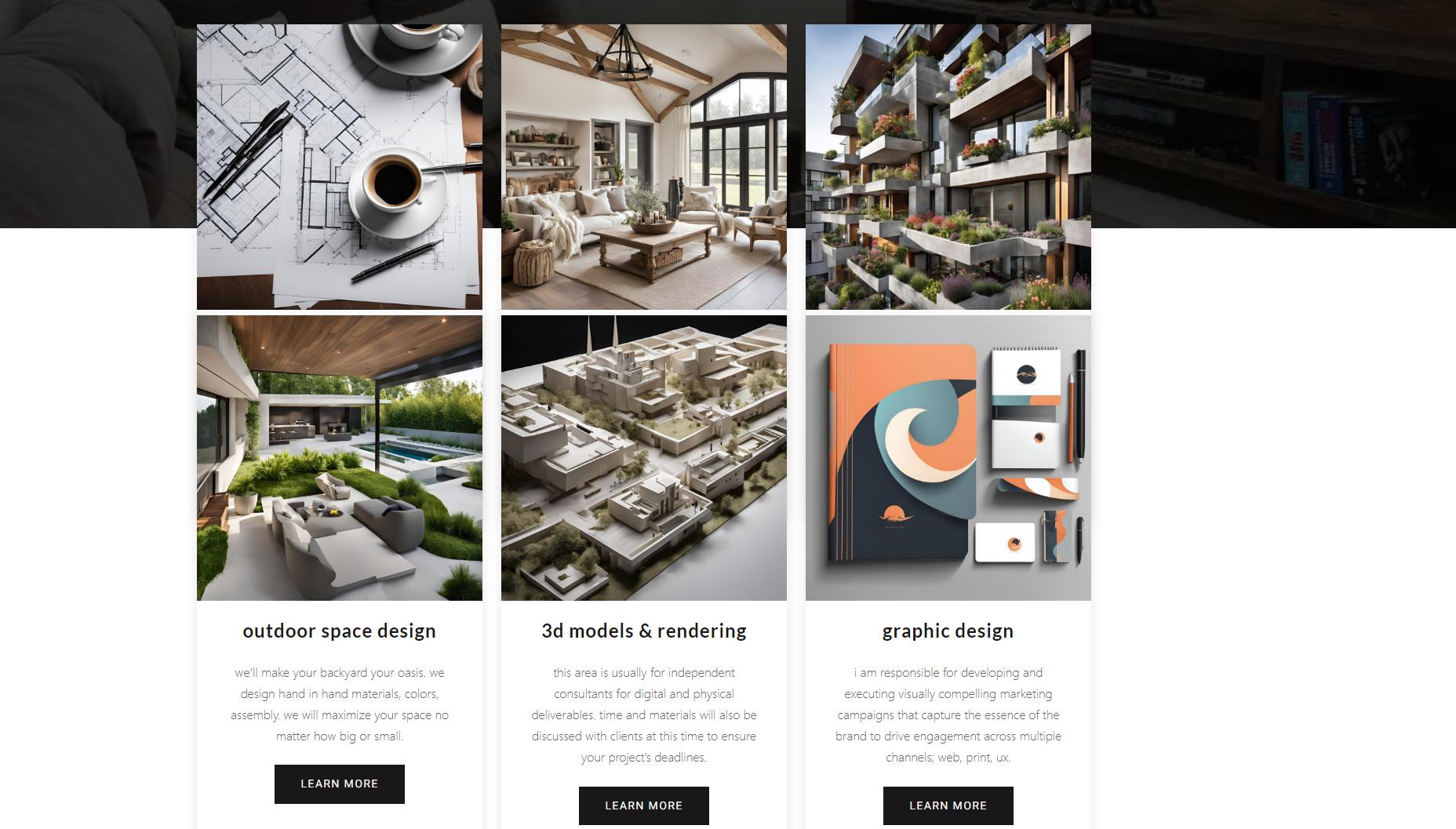
Project Overview:
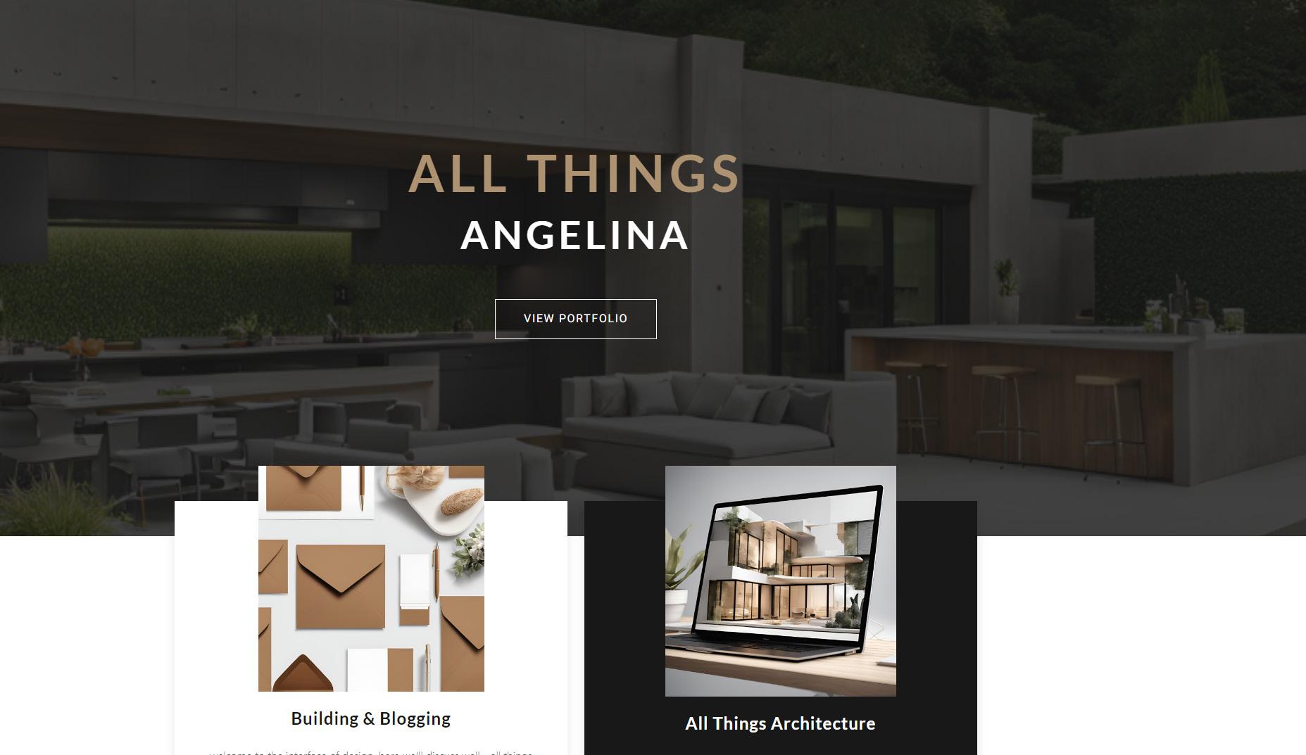
Personal architecture website
Project Type: website launch
Role:
client, UX designer, UI Designer, UX researcher
UX portfolio filled with identity of design work, leaving visitors with a well-rounded impression of my work and vision. The site is full of engaging elements like the gradient background, whose colors harmonize the serene ambiance.
The top fold of the homepage is visible as soon as visitors reach the site. Since it takes only seconds to make an impression on a user, I treated it as valuable web design real estate.
The energetic combination of colors stands out on the professional portfolio, making the top fold appear both sophisticated and playful. The layout on the homepage is simple with an organized full screen grid.
The created a custom logo design that stays fixed to the screen and acts as a convenient link to the homepage. Thanks to its subtle glow, the fold logo remains visible against any foreground color.
As a UX designer, I created smooth and effortless digital interaction to allow visitors to not simply observe my portfolio, but interact with it in unusual ways, it shows the creativity and design skills—offering a sneak peek at what they can expect from the work. In addition, I aimed to make the portfolio/website unique and memorable.
The color palette incorporates calming color tones and soothing imagery so that visitors “feel calm and safe.”
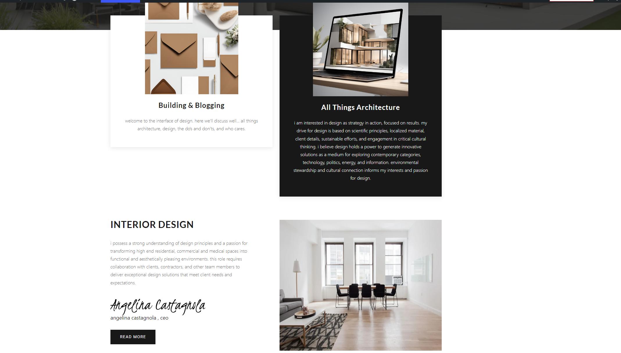
Clean, symmetrical lines outline the projects on the background. The digital projects appear on a desktop, tablet or cell phone screen, conveying the ability to tailor the work to any device.
The digital showcases chosen to feature also include props that emphasize the final product design.
The right-sized images don't overwhelm site visitors, but still show the detail of the work as well as talent.
Minimal amount of text as well as highlight opportunities of interest and project details.
I strategically place these essential details on the portfolio using a readable font and minimal amounts of text. Visitors will want to find the details they need quickly without having to search.
I understand complementary colors and their effect on the visitor to create a seamless user experience that engages without overwhelming or distracting. I uses a combination of earthy, and neutral colors on the website to foster a more attractive experience.
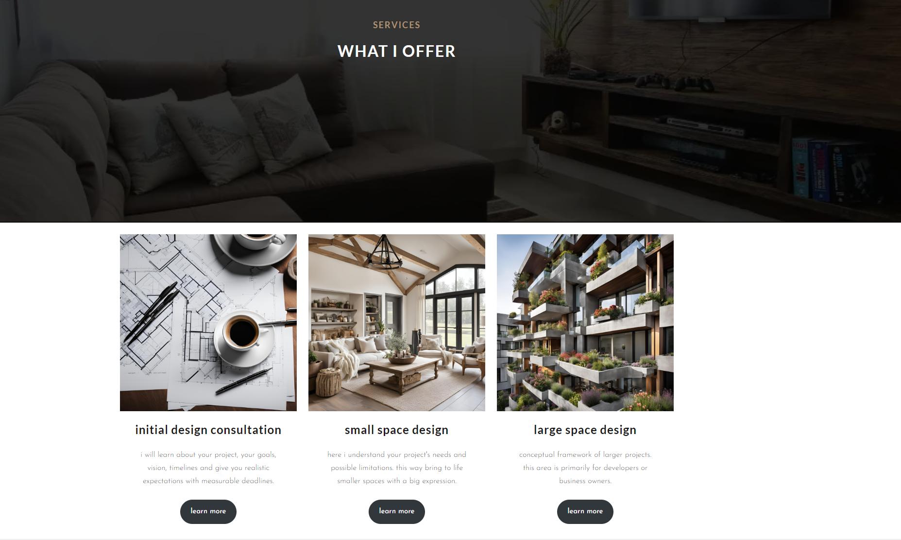
As the user scrolls the words above slowly disappear to enhance your current interest. The visual remains on the lower grid of design elements, all while still having accessibility to the fold homepage.
Each element has a call button for further information as in time and details or cost, where it visible in initial look tends to discern users from an enjoyable search.
I showcases just six core projects I’ve worked on recently to give visitors a focused overview of my work. Using a friendly written tone throughout, I aimed to be approachable, encouraging visitors to reach out for more details and get excited about their next project.
Challenge: The client needs a website thats easy to use and aesthetic
Importance: Improving the onboarding experience was essential to increasing user engagement and reducing churn.
User Research: Outline the research methods- surveys, personas, usability tests).
Findings: Summary of insights from the research that guided design decisions: Client wants a neutral palette with modest color, was concerned of the name of the branding at first.
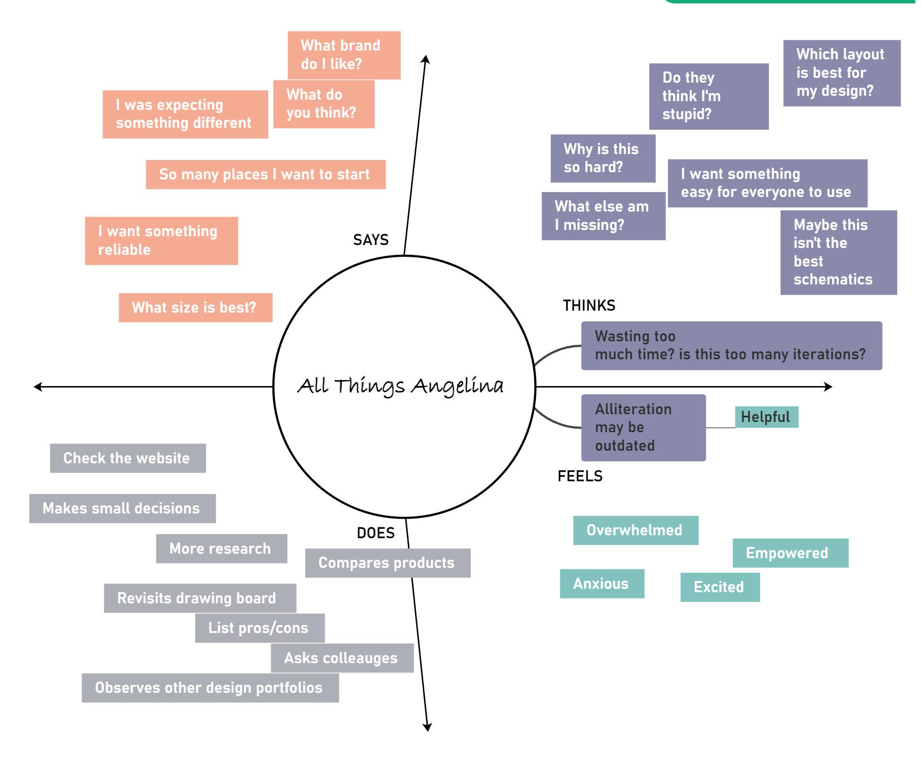
Empathy Maps, Personas: Empathy maps or personas created based on research findings.
Research Methods: Conducted 10 user interviews and ran a survey with 100 users.
Findings: 70% of users found the exploratory process exciting and easy.
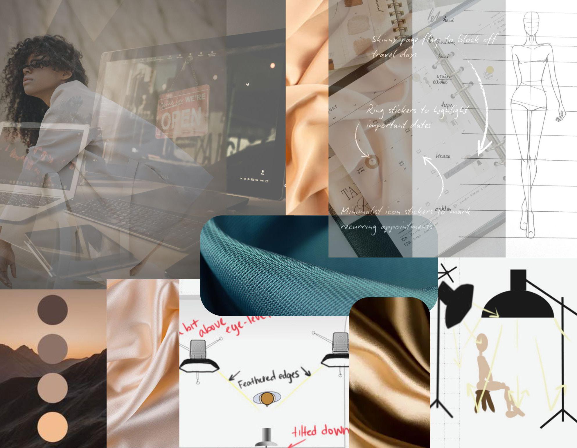
Design Process:
Wireframes and “mood board” sketches to illustrate initial design thinking.
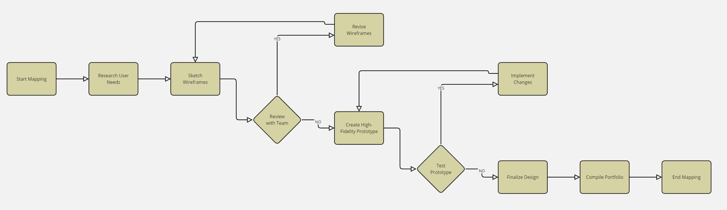
User Flows: Diagrams of user flows to explain how users would move through the product.
Usability Testing: Navigation and flow aspects of the design were tested Method: Outline the testing method (e.g., in-person usability tests, A/B testing, remote testing).
Findings: Share insights from testing and how you iterated based on feedback.
Testing: Conducted usability tests with 5 users to evaluate the new onboarding flow. Feedback indicated that users found the layout intuitive, but the contact button was difficult to see .
Metrics: Quantitative improvements- improved visibility, and receipt of contact.
Impact: Explain the overall impact of the design on the business or users.
Results: After the redesign, 15% improvement in user retention.
Reflection: Lessons learned from the project— bias to aesthetics of project, clear navigation,the experience helped me grow as a designer by pushing outside of comfort zones.
Project Overview:
Personal Business Spray- Tanning website
Project Type: website launch
Role:
UX designer, UI Designer, UX researcher
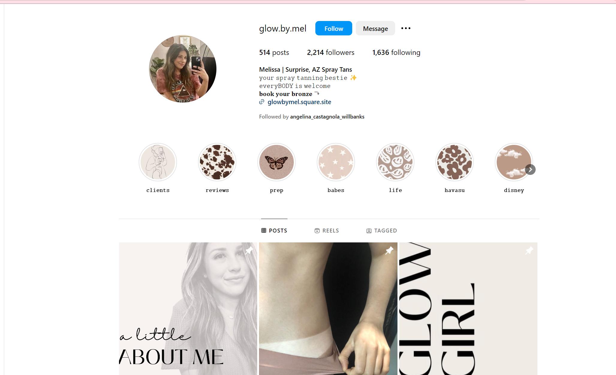
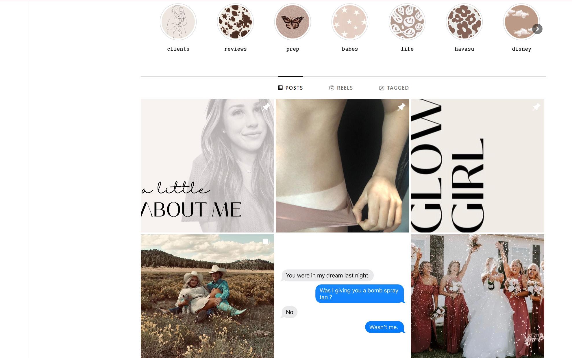
Client asked for a website for her spray tanning business in Arizona.
The website design process consisted of wire-mapping, sketching, and interviews.
While the schematic design is similar to the Instagram social media business branding as seen, the website was short lived.
Client business was new (2020) and did not know the realistic life of the business due to the world pandemic at the time.
After 150 clients surveys were completed, 72 people (48%) reported the website was easy, and appealing to use with booking, but preferred working with the Client directly.
Client and I regrouped our efforts to rebrand her social media page to reflect the same warm, neutral colors of her website. Iconography and personality/ real tanning clients was important to the client.
* clients consented to their photos