

BRANDING GUIDE Amelie Hebert Kingwood, TX 832-603-7085 howdy.amelie@gmail.com
TABLE OF CONTENTS Deliverable List
DELIVERABLE LIST
Main Logotype (8 files total)
• PNG
◆ Black
◆ Black with padding
◆ White
◆ White with padding
• SVG
◆ Black
◆ Black with padding
◆ White
◆ White with padding
Catchphrase (8 files total)
• PNG
◆ Black
◆ Black with padding
◆ White
◆ White with padding
• SVG
◆ Black
◆ Black with padding
◆ White
◆ White with padding
Podcast Cover Art (4 files total)
• PNG
◆ default
◆ with padding
• PDF
◆ default
◆ with padding
The file path to mentioned deliverables will be detailed next to this icon
Combo LogoMonstrance (8 files total)
• PNG
◆ Black
◆ Black with padding
◆ White
◆ White with padding
• SVG
◆ Black
◆ Black with padding
◆ White
◆ White with padding
page 2
Main Logotype Catchphrase Combination Logo Podcast Cover Art Branding Colors Color Rules & Notes Misc Layout Suggestions 2 3 4 4 5 6 7 7 ........................................... ........................................... ........................................... ........................................... ........................................... ........................................... ........................................... ...........................................
WHEN USING THIS LOGO...
DO:
• Scale it proportionally
• Keep the design in one solid color
DO NOT:
• Change the coloring of one word
• Change the coloring of individual letters
• Stretch the design disproportionately
PROPORTIONALITY
Height:Width (default)
1:3
Height:Width (wPadding)

2:5
FILE FORMAT OPTIONS
Inside of the “MainLogotype” folder, there are folders for the two file formats of this deliverable: PNGs and SVGs.
PNGs (Portable Network Graphics) are relatively universal. They have transparent backgrounds and are pixel based (also called raster files). They can be used for digital or print formats.
SVGs (Scalable Vector Graphics) are a smaller file size but generally used for only digital media or VERY large scale printing. Since there are “live” shapes in vector files (outlines are treated as infinite points, not pixel block units), this format will be infinitely scalable. Not as universally accepted.
FURTHER FILE OPTIONS
Inside of each of the PNG and SVG folders, there are both black and white options AND default and padded layout options for the main logotype. File naming convention are as follows: “DeliverableName_Color_ SpacingSpecs”.
When deciding between using the black or the white logotype, the section on “Color Rules & Notes” found on page 7 of this branding guide will be useful.
When deciding between using the default (tightly cropped) or padded version of the logotype, it really just depends on the control you want.
Padding is the technical term for the space that is coded around an image file. Here, your logotypes that say “wPadding” at the end of the file name have that spacing hard coded, which is a bit of a cheat on my end. It’s not technically what I would hand off as a final deliverable to a design team, but I think it will serve you well.
Some design tools (ie: an easy website builder, online fast printing services, anything that says “upload your image here” , etc.) might not have the interface you need to get the design laid out as perfectly as you had in mind. When you don’t have the ability to pixel push, I find file setups like the padded ones I’ve provided are a big help.
When you just need the bare bones design itself, use the default, unpadded design. Still leave space for the design to “breathe” and don’t overlap it with other elements.
Ultimately, there’s no true right or wrong choice here; I just wanted to give you formatting options to potentially save your sanity!
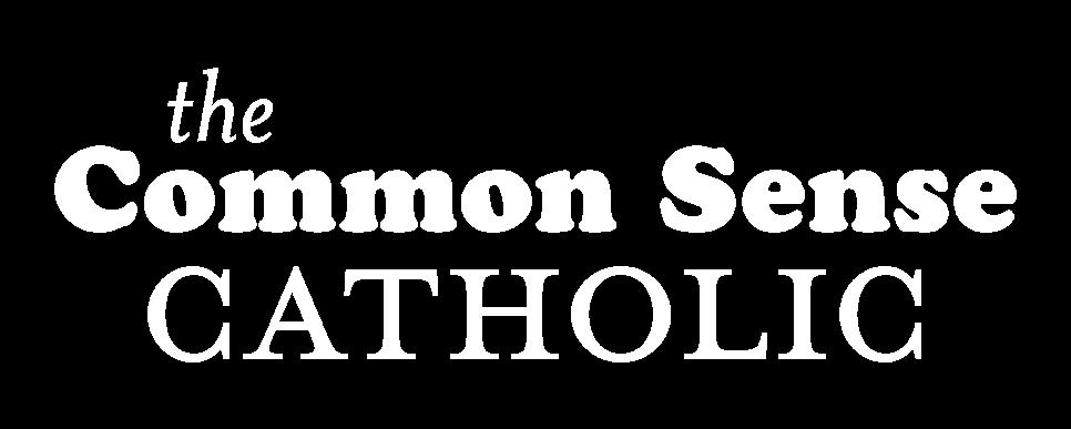
page 3 MAIN LOGOTYPE
theCSC_Deliverables_Invoice001 > MainLogotype
“MainLogotype_Black” on Robin’s Egg background
“MainLogotype_White” on True Black background
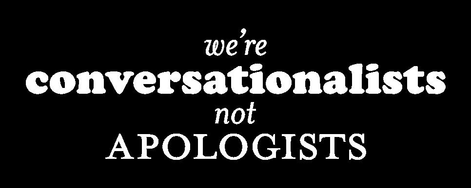
CATCHPHRASE COMBINATION LOGO

WHEN USING THIS LOGO...
DO:
• Scale it proportionally
• Keep the design in one solid color
DO NOT:
• Change the coloring of one word/individual letters
• Stretch the design disproportionately
Proportionality is the same as the main logotype. PNG and SVG file options provided.
theCSC_Deliverables_Invoice001 > Catchphrase
WHEN USING THIS LOGO...
DO:
• Scale it proportionally
• Keep the design in one solid color
DO NOT:
• Change the coloring of one word/individual letters
• Change the coloring of the image
• Stretch the design disproportionately
AVOID:
• Overuse, as you don’t want the imagery of this combo logo to “speak” louder than the main logotype
PROPORTIONALITY
Height:Width (default) 1:2
Height:Width (wPadding) 11:20
These rules and suggestions apply to this combination logo and any/all future combination logos as well.
PNG and SVG file options provided.
theCSC_Deliverables_Invoice001 > CombinationLogo_Monstrance
page 4
“Catchphrase_White” on True Black background
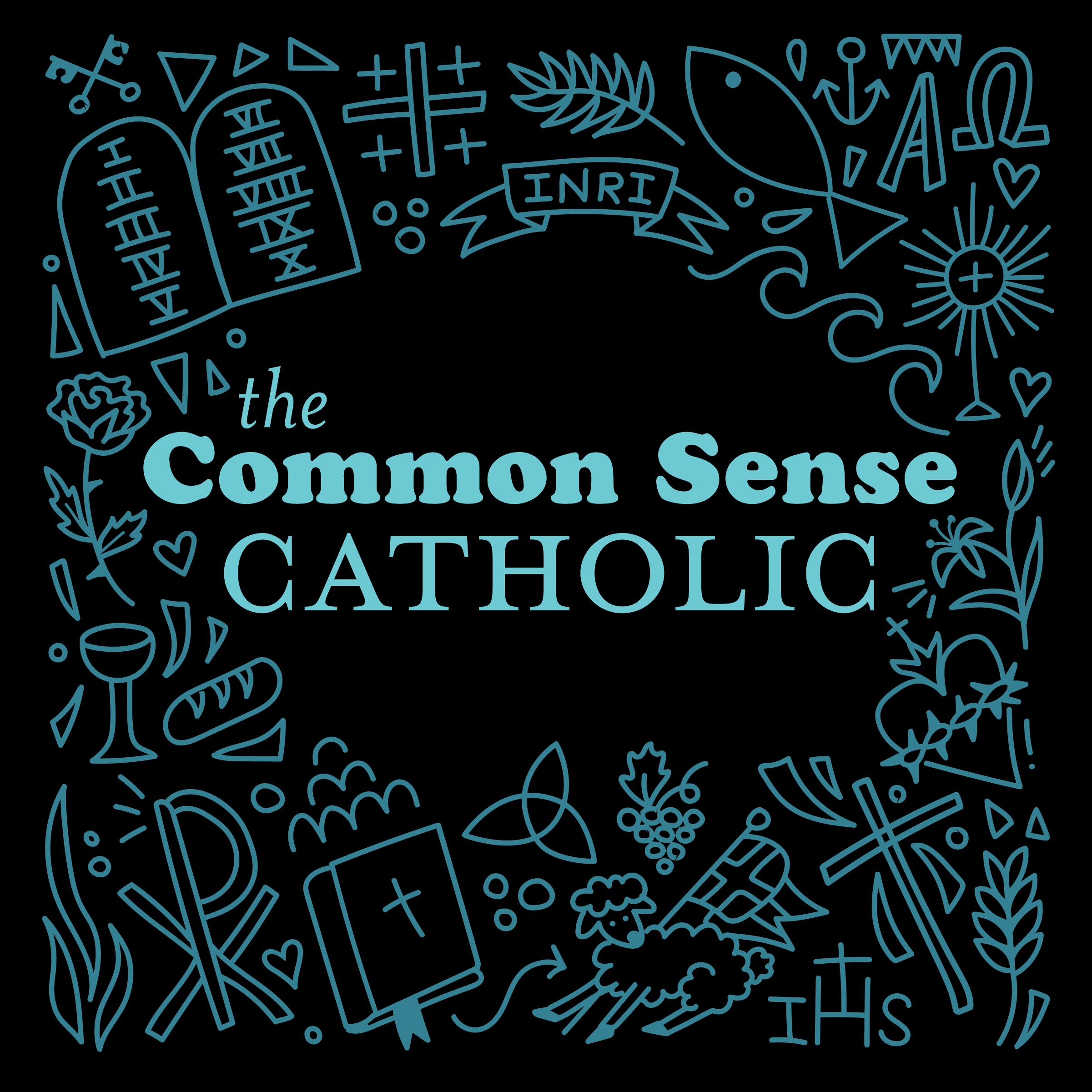
“CombinationLogo_Monstrance_Black” on Dusty Teal background
WHEN USING THIS LOGO...
My suggestion is that this design should ONLY be used in reference to the podcast, never as an ancillary design.
While tempting to say, “this would look great on a shirt!” this design is really pretty beefy and detailed. The other deliverables you have chosen are better stand-alone pieces than this solid block of a design. In a solid black precise square, it is always going to look like cover art. Use it sparingly. It’s not your primary calling card. theCSC_Deliverables_Invoice001
PROPORTIONALITY
Height:Width (default) 1:1
Height:Width (wPadding) 1:1
PNG and PDF file options provided.
page 5 PODCAST COVER ART
> PodcastCoverArt
BRANDING COLORS
#000000
TRUE BLACK
This is your default neutral color. This is the darkest hue of your color set. A great, classic foil to True White.
Passes contrast tests with all other branding colors. (For more info on Contrast Tests, see “Color Rules & Notes”)
TRUE WHITE
This is your other neutral color option. It’s a classic background color or a great way to use negative/positive space when paired individually with any of the other colors.
Passes contrast tests with all other branding colors.
DUSTY TEAL
This is your go-to pop of color and should be your brand’s signature shade.
Passes contrast tests with True Black and True White. Does NOT pass contrast tests with Robin’s Egg.
ROBIN’S EGG
This is the little brother to Dusty Teal. This color doesn’t always have to be on the radar; it will be the most effective with limited use.
Passes contrast tests with True Black. Does NOT pass contrast tests with Dusty Teal & True White.
page 6
R: 0 G: 0 B: 0 C: 0 M: 0 Y: 0 K: 100 R: 51 G: 129 B: 147 C: 65 M: 12 Y: 0 K: 42 R: 109 G: 202 B: 211 C: 48 M: 4 Y: 0 K: 17 R: 225 G: 225 B: 225 C: 0 M: 0 Y: 0 K: 0
#338193 #6dcad3 #ffffff
COLOR RULES & NOTES
WHAT IS A CONTRAST TEST?
In color theory, each and every hue (color) has value (lightness or darkness). When two hues are right next to or layered on top of each other, their values have a measurable contrast ratio. Below a certain threshold, an individual with perfect vision can’t identify the contrast and at other thresholds, certain colorblind or visually impaired individuals will struggle, too.
WHAT COLOR CODE TO USE?
HEX CODES are most commonly used in web design and other modern digital spaces. This is the go-to color system for most things because it is one convenient alphanumeric code, not multiple separate data sets like the other options.
RGB is used in digital designs, but it is somewhat outdated because hex codes are so much easier to type in and keep consistent with their single value line. The acronym comes from “Red, Green, Blue” and is a reference to how the additive color space of light works. These colors add together to create white when using colored light (ie: screens).
I’ve plugged the hex codes of your branding colors into a contrast tester and provided you with the results. If a color combination passes, it’s accessibility friendly to put those colors butted up against each other. Thus, avoid putting the two blue hues provided in a design touching each other as it does not pass a contrast test.
CMYK color codes are really only used for print-based designs and paint mixing. The acronym comes from “Cyan, Magenta, Yellow, blacK” which are the default ink colors in most printers and can mix to any color. They are the primary colors of the subtractive color space; these colors have to be subtracted from each other to create white.
Choose the color code based on the final deliverable. Note that hex codes don’t always translate to the same exact RGB or CMYK sets. You’ll drive yourself crazy trying to color match perfectly screen and print unless you’re paying for Pantone printing and color matching ...so don’t worry if there’s some inevitable differentiation here!
MISC LAYOUT SUGGESTIONS
SOME OTHER GENERAL THOUGHTS:
• Grayscale photos are probably going to look the classiest paired with these branding items. If you find photos you like, I can convert them.
• Don’t go for the collage look. Clean margins, right angles, and no overlaps of shapes will keep the doodle imagery from looking like the inside of a middle school girl’s notebook.
• For the most part, align text left in paragraphs. Occasionally, it’s okay for smaller callout quotes or one-off items (ie: the catchphrase) to be centered.
• The fonts I used in your logotype are:
Cooper Std - Black
Mrs Eaves Small Caps OT - Roman Small Caps
Mrs Eaves OT - Italic
Let me know if you have any further questions. Follow-up consulting was included in this branding guide package.
page 7
