Alpha Dog Advertising
BRAND IDENTITY BROCHURE

Everyone wants to be an overnight success, but few realize – they don’t really exist.
All the brands you’re familiar with took years of consistent effort to get where they are today. They knew their brand and products inside and out, including their capabilities, the industry landscape, and where to position their brand. And even then, it usually takes 3–5 years (for B2B) or even 8–10 years (for B2C) to truly connect with an audience. Resist the urge to give up if your results aren’t instant.
How should you weather those first years? By strategizing where best to market your brand, how, and how often. This is where partnering with a marketing agency is key: they will identify a path to follow that will attract your target audience, maximize your engagement with them, and move them to take action.
And don’t trust your brand to someone who just “plays around” with design tools. If you’re serious about growth, work with a professional marketing agency that knows how to build brands. Developing a strong marketing strategy is an investment that pays off. If you want to be taken seriously, your brand should look and feel like you mean business.
To grow your brand and set it up for future success, work with an experienced marketing agency that puts your best interests first.

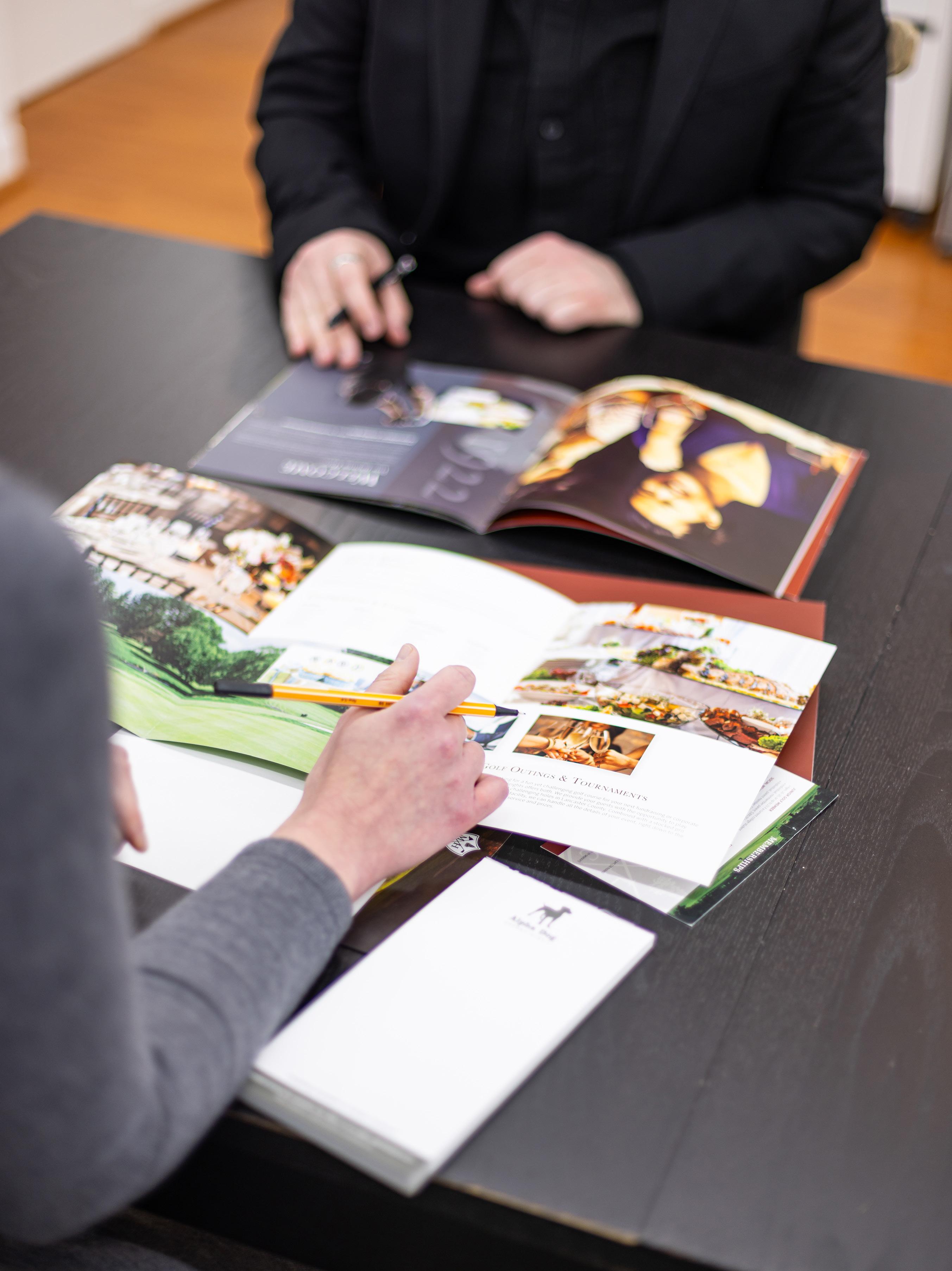
Alpha Dog Advertising has produced countless marketing pieces for our clients. To provide a sense of our work as a full-service agency, we have assembled a few of our favorite case studies and brand explorations on the following pages. We hope this guide gives you an understanding of our capabilities, our acumen, and our value in leading brands to better revenue.
Many clients come to us because they’re facing a specific problem they need help to overcome. The following case studies highlight their challenges and our solutions.
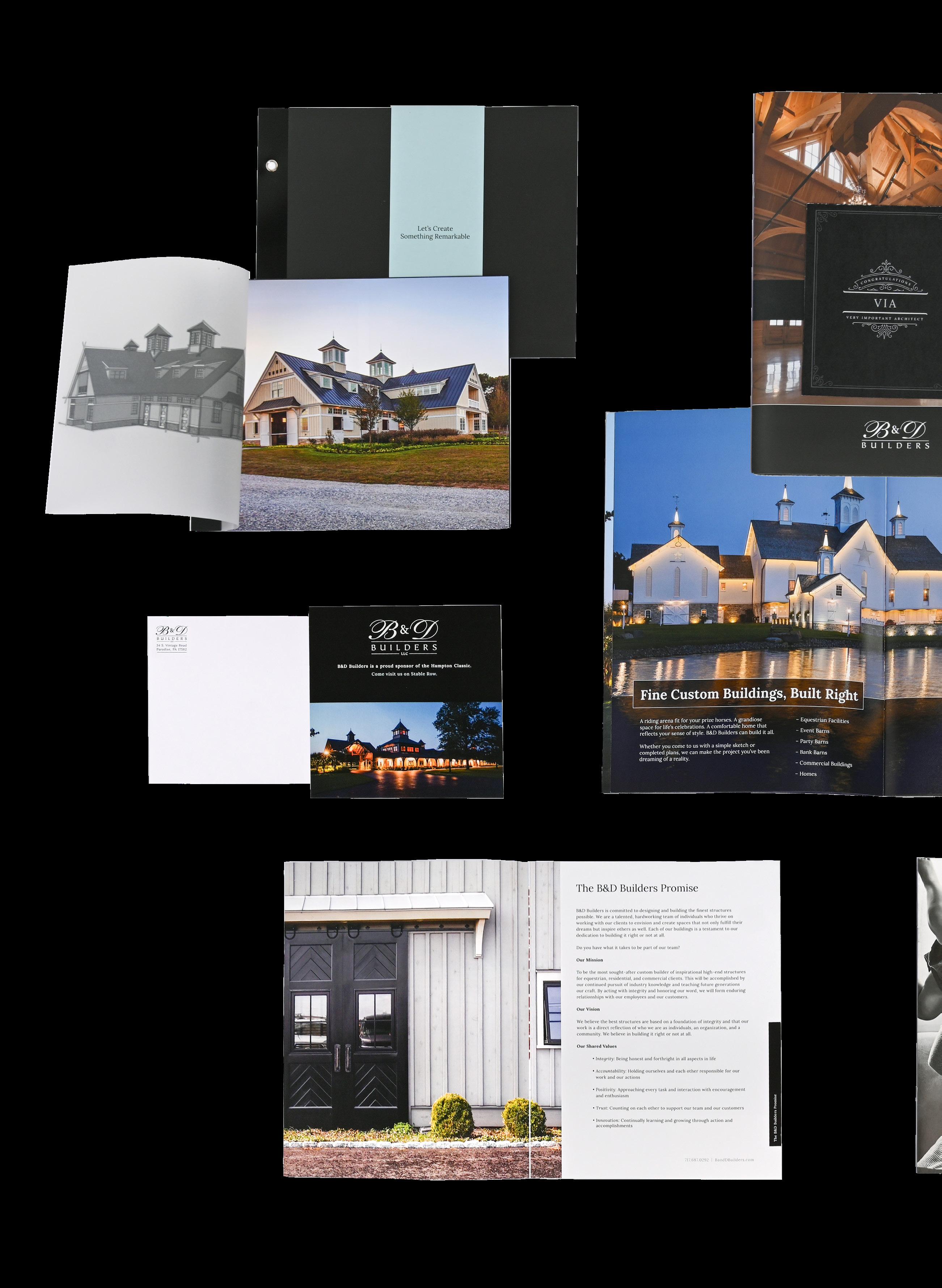
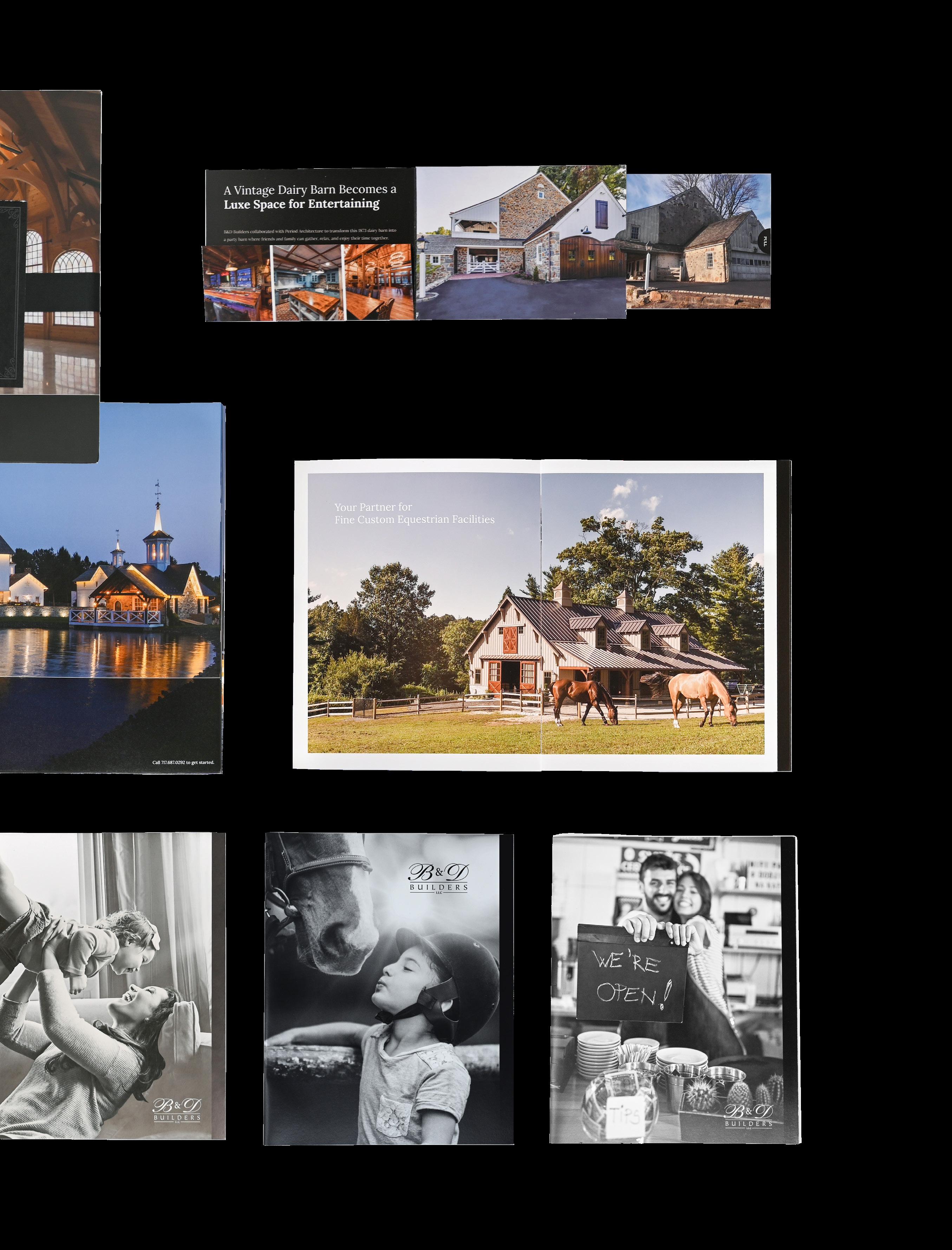
B&D Builders is a full-service custom builder renowned for their residential and commercial work, particularly in designing and building luxury homes, equestrian estates and arenas, event barns, and restaurants. Their skilled designers and craftsmen have brought creativity and attention to detail to hundreds of buildings across the US and Canada.
How
In their first 15 years, B&D Builders had built a solid reputation in the luxury equestrian market. Now, they wanted to expand their reach to people building upscale residential estates, commercial structures, and event facilities.
Alpha Dog developed a number of strategies and tactics to build B&D Builders’ brand awareness and reach new audiences. To start, we created a cohesive brand strategy, including an updated visual identity and voice for a premium custom builder. We established their primary audience to be residential and commercial architects with ambitious budgets and goals, and focused on investing in these partnerships. We identified their secondary audience to be affluent property or small business owners looking to build unique structures for luxury homes, as well as equine, event, or storage use.
This strategy led to a multitude of marketing avenues, starting with the creation of brochures, sales pieces, and print ads. We positioned these ads to run in industryleading magazines in the Mid-Atlantic and beyond, in the equestrian estate sector and particularly in the luxury residential market. We also overhauled their website, creating an experience-forward journey through their projects while attracting SEO attention with keyword placement and the addition of pertinent blog content about the industry.
We also advised leveraging their social media presence to tell the story of their projects, to drive viewers to their website with engaging content and beautiful photography. Our series of blog posts highlights their projects as well as thought leadership, with topics of interest to homeowners, builders, and architects alike. This multi-fronted strategy has kept B&D Builders at the forefront of the luxury construction industry as our engagement with their brand continues.


DATA
We overhauled their website, creating an experienceforward journey through their projects while attracting SEO attention with keyword placement and the addition of pertinent blogs about the industry.
In 2019, when Alpha Dog began working with B&D Builders, their revenue was $26 million; by 2022, their revenue rose to $52 million , a compound annual growth rate of 15% year over year.
The type styles below should be used to develop a typographic hierarchy for B&D Builders’ marketing materials.
• LORA is the principal typeface, used for all headings and body copy.
Principal Typeface
1234567890
Colors define a mood and give a sense of character. A brand’s colors are just as important to its identity as its logo. To maintain visual consistency, it is vital to use the same Pantone colors or CMYK builds across all marketing materials. Pantone is preferred for most print production or offset print projects, CMYK is for digital press projects, and RGB is for digital uses.
Steeped in knowledge, hardworking, ethical, driven, and service-oriented


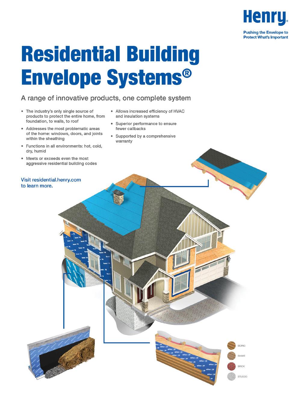
Henry is North America’s premier provider of building envelope products and solutions. Their offerings include high-performance protective products, including roofing underlayments, sealants/primers, flashing systems, liquid and sheet-applied air/vapor barriers, and roof coatings.
How can a building materials brand market a more expensive, higher-quality product to an extremely budget-conscious audience?
Henry Company, a maker of building materials since 1933, had created a new, innovative building envelope solution but was unsuccessful in effectively communicating the value of the product to builders and homeowners. While this new product was more expensive than its competitors’, its higher quality and lifetime warranty meant customers would save money in the long term. Also, most trade professionals were more comfortable with the competitors’ cheaper products that are mechanically installed, in contrast to the Henry system, which requires hands-on application.
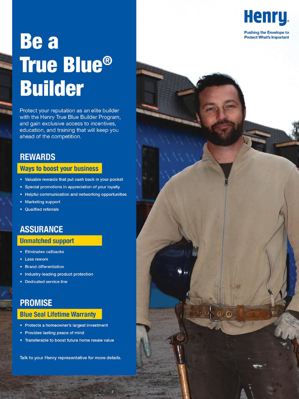
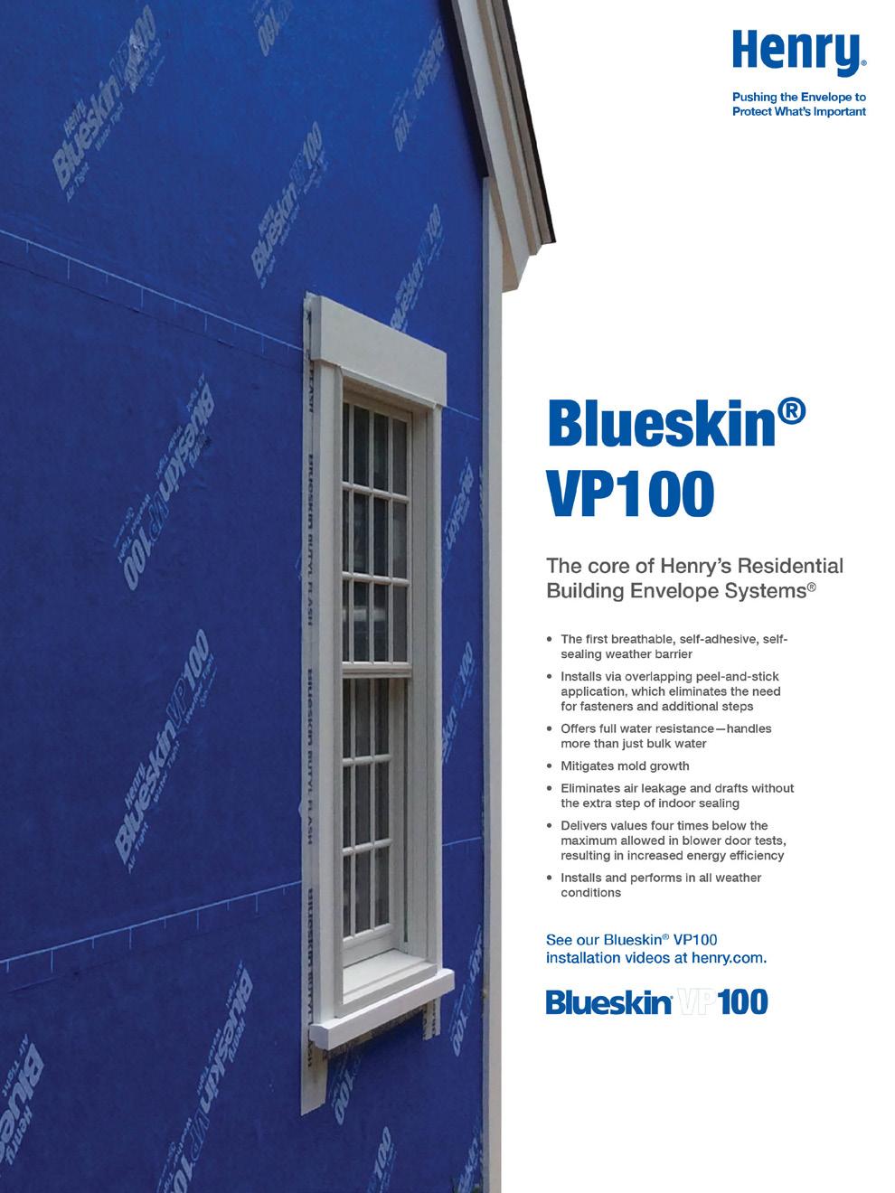
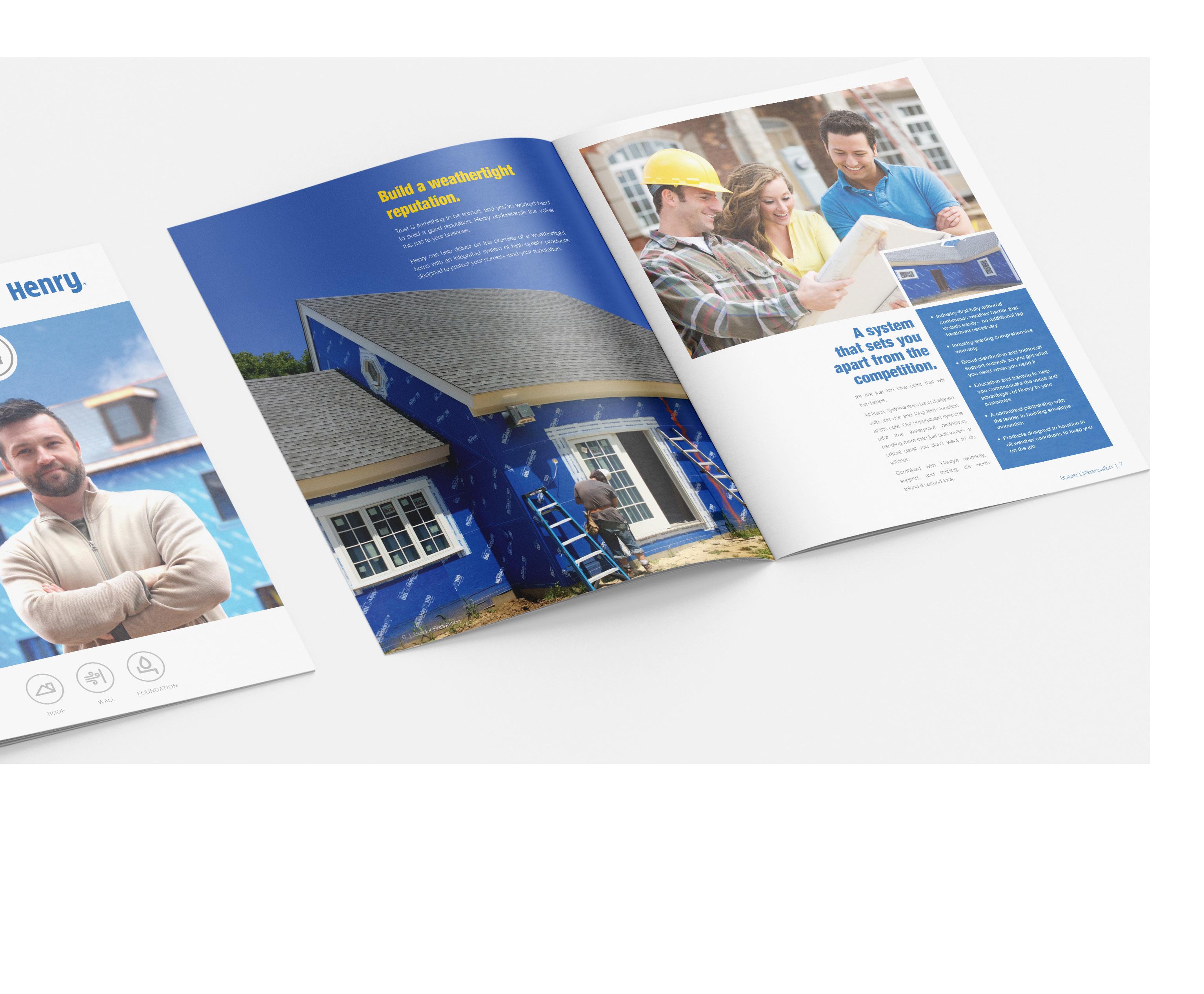
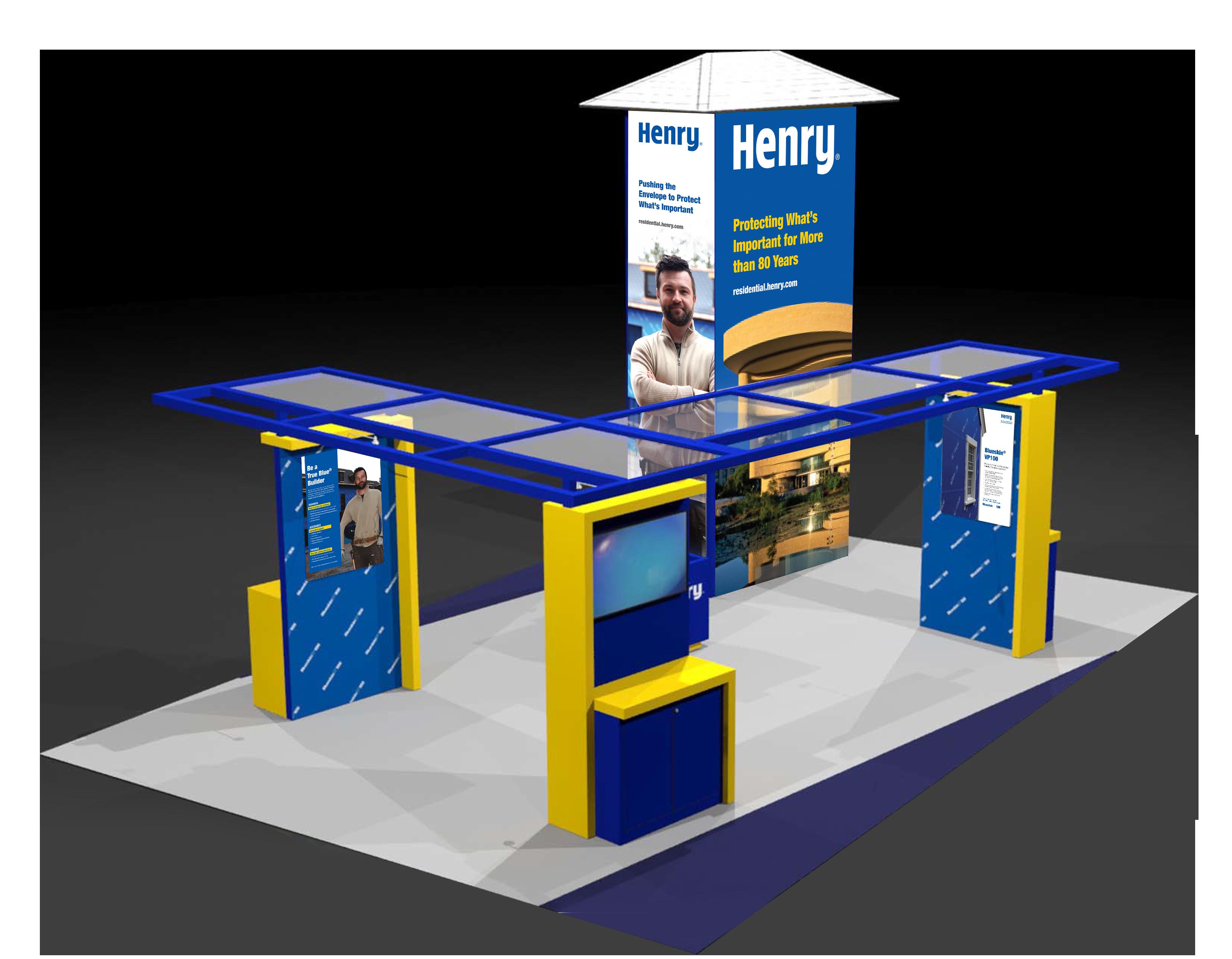
To communicate the advantages of the Henry self-adhering, self-sealing residential building envelope system (RBES), Alpha Dog first performed a message mapping project to identify the target audiences, their pain points, and their needs. We then created a brochure to show builders how RBES protects not only the structure, but also the builder’s reputation. Unlike its competition, which requires nailing and thus introduces nail holes, the RBES sticks directly to walls without nails to keep water, vapor, and air from leaking through. Our messaging strengthened Henry’s reputation as an innovator in the industry and a trusted maker of superior products.
Alpha Dog created a fully branded, easy-to-use digital version of Henry’s True Blue Lifetime Warranty and Multi-Unit Registration for homebuilders. We also created sell sheets and trade show collateral for the brand and RBES specifically.
A homeowner’s brochure was created to give families peace of mind that they made the best decision when choosing Henry products. Filled with easy-to-understand graphics and packed with data, the brochure reinforced the trust placed in the brand to bolster not only the relationship between homeowner and Henry but between homeowner and builder as well.

Our messaging strengthened Henry’s reputation as an innovator in the industry and a trusted maker of superior products.
DATA
Before Henry approached ADA, they were known for only 1 product, which made up 90% of their sales, and they were losing money. Within 6 months of creating new messaging and marketing strategy, their system sales went up 40%, with product sales going up 60%.
The type styles below should be used to develop a typographic hierarchy for Henry’s materials.
• Helvetica Neue is the principal typeface, used for all headlines and body copy.
Principal Typeface
Bb Cc Dd Ee Ff Gg Hh Ii Jj Kk Ll Mm Nn Oo Pp Qq Rr Ss Tt Uu Vv Ww Xx Yy Zz
1234567890
Light Condensed | Roman | Bold Condensed | Bold | Black Condensed | Black
Colors define a mood and give a sense of character. A brand’s colors are just as important to its identity as its logo. To maintain visual consistency, it is vital to use the same Pantone colors or CMYK builds across all marketing materials. Pantone is preferred for most print production or offset print projects, CMYK is for digital press projects, and RGB is for digital uses.
Confident, trustworthy, knowledgeable, innovative, and a proven leader in the building envelope industry
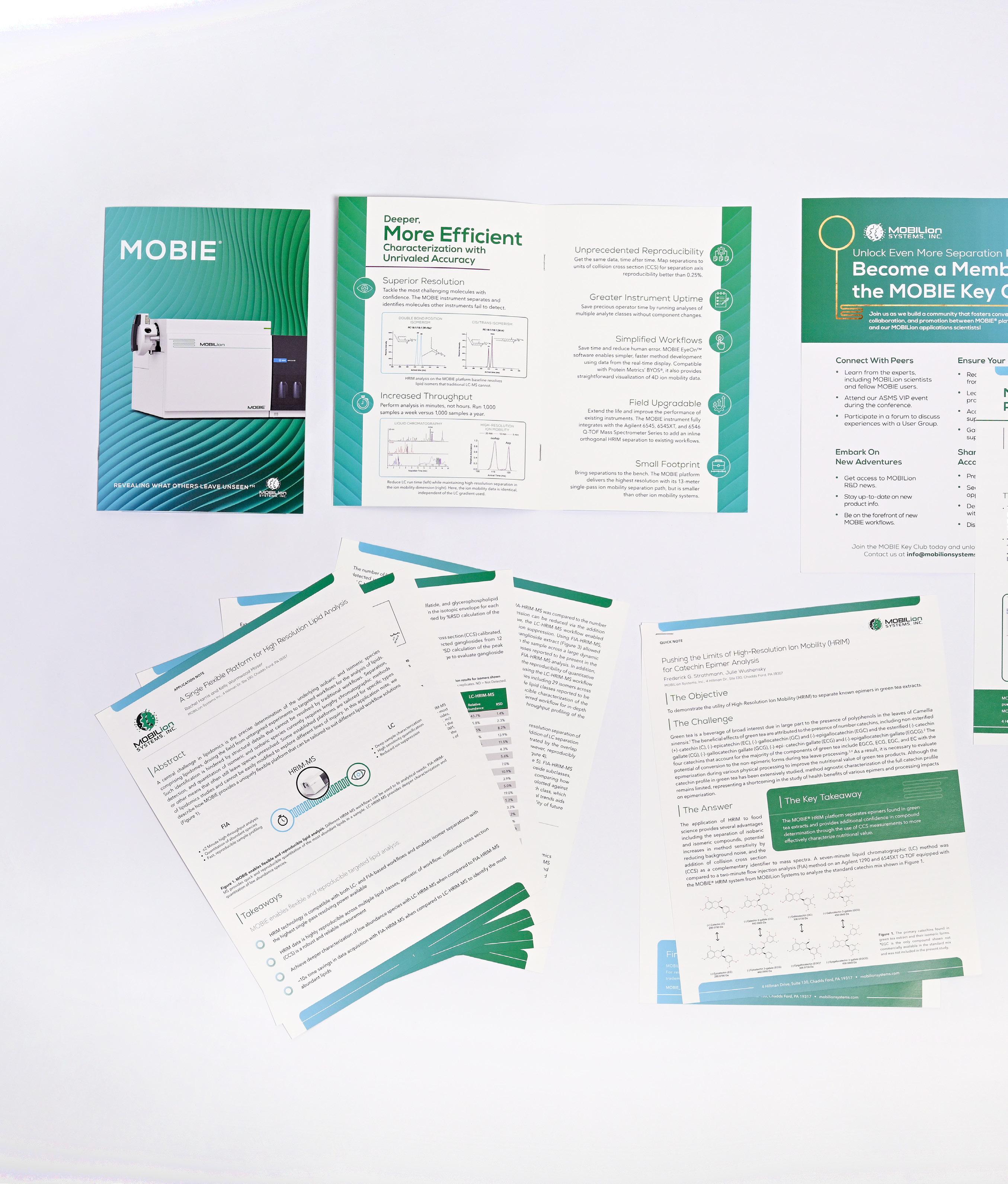
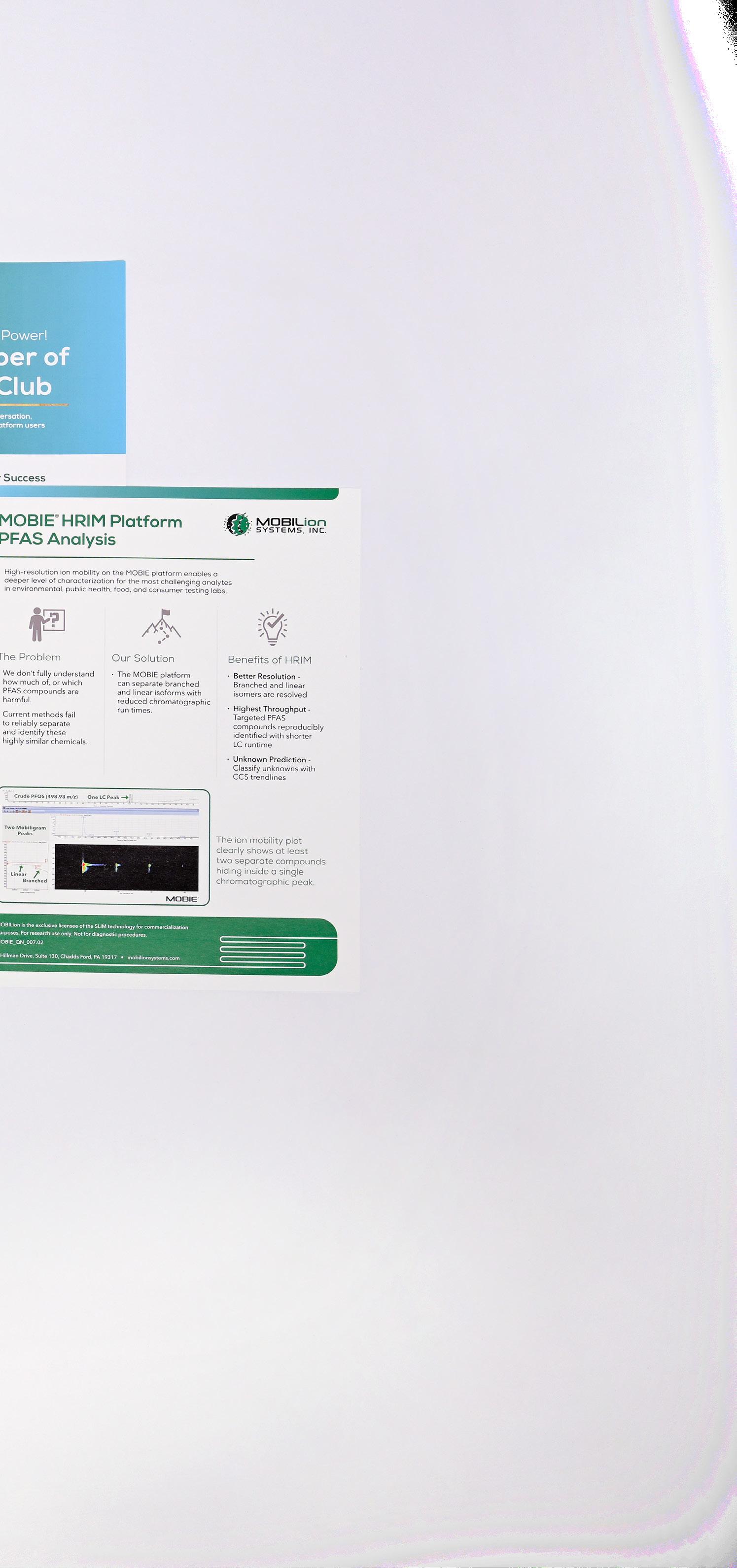
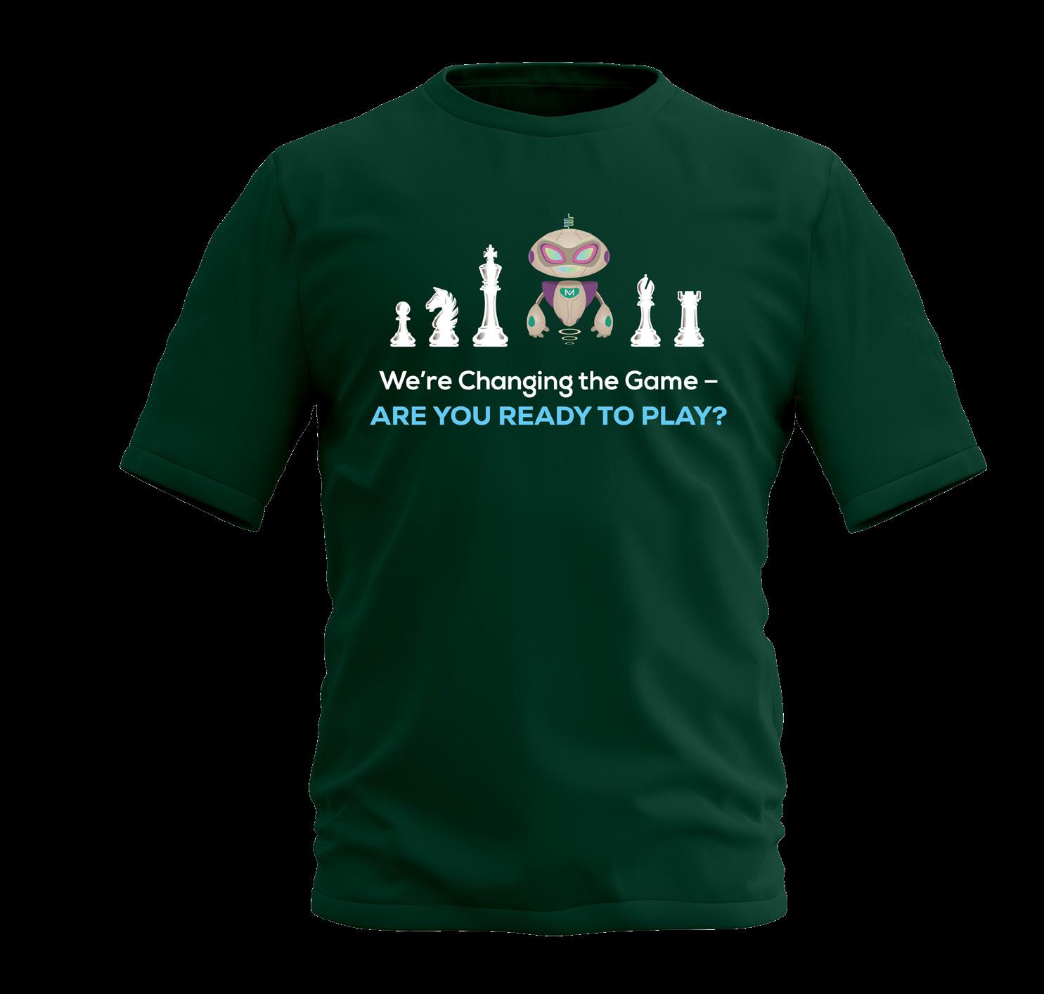
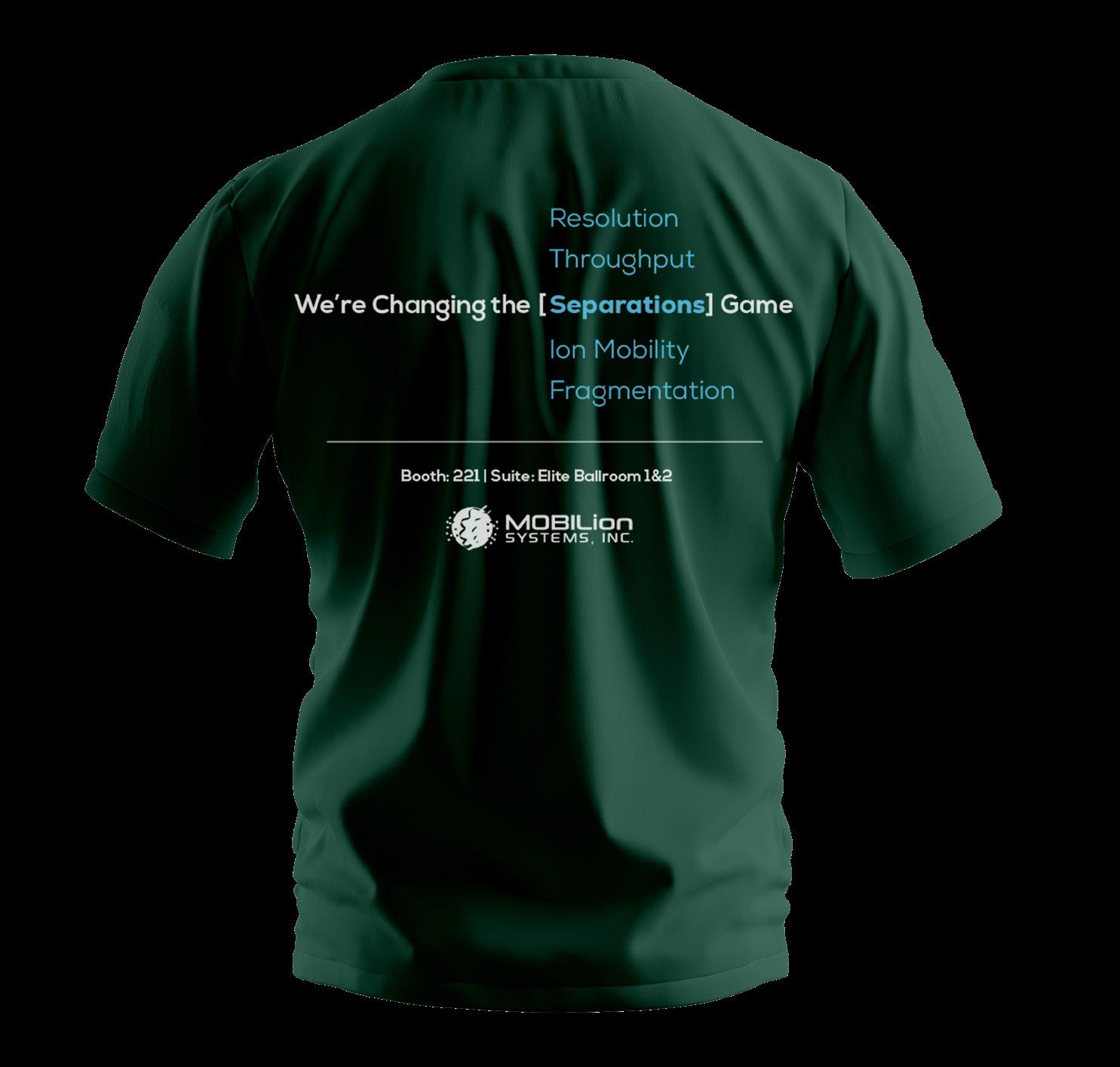
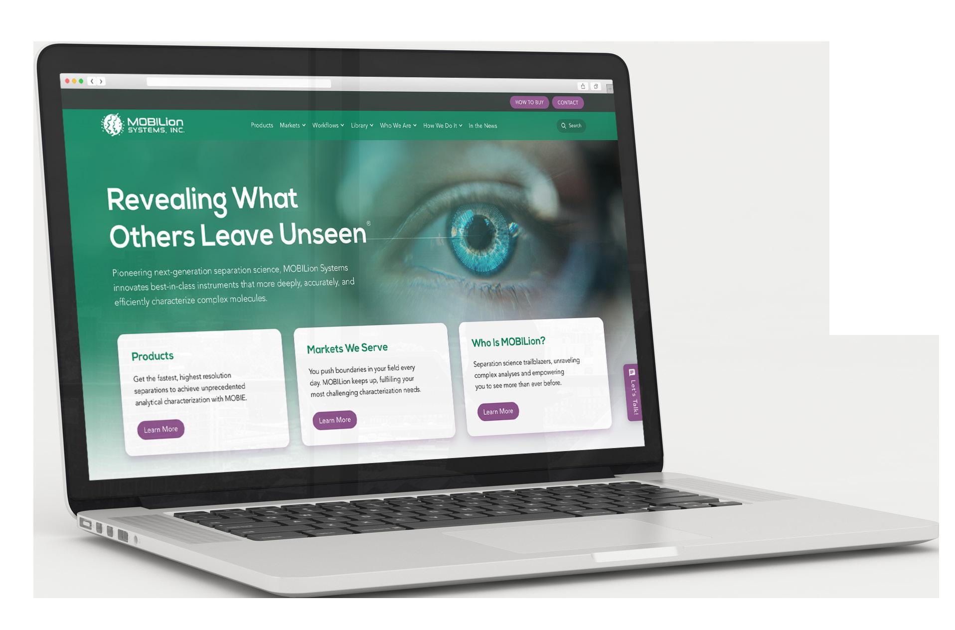
Pioneering next-generation separation science, MOBILion Systems innovates best-in-class instruments that more deeply, accurately, and efficiently characterize complex molecules. Their exclusively licensed technology detects chemical signatures that others miss, enabling their flagship MOBIE platform to offer cutting-edge solutions for multiple workflows.
MOBILion is a producer of mass spectrometry instruments for the biopharma and life sciences industries. The data their products produce is critical for use in cell-gene therapies, pharmaceutical production, and toxicological applications. The company sought a higher level of brand awareness among the scientific community and from investors; previous marketing attempts had not achieved the desired goals. The company’s website didn’t rank well in Google Search, and having multiple marketing partners became unwieldy and unproductive. The restrictive effects of the global pandemic further curbed the brand’s name and products from reaching decision makers in the industry.
Initially, Alpha Dog created a brochure for the company’s flagship product. We recommended streamlining MOBILion’s marketing efforts by using one agency for efficiency in messaging, design, and content creation. In a short time, all marketing efforts came from Alpha Dog as the agency was tasked to take on complete support of the brand. We established definitive brand standards for MOBILion, honed their messaging, and created templates for their social media posts, case studies, and application notes. With a new website already in progress, Alpha Dog identified SEO keywords and wrote new copy to maximize their effectiveness, and we also contributed graphics and other design elements. The result was a polished, user-friendly site that matched the brand’s personality and professionalism.
As MOBILion expanded its reach globally, Alpha Dog assisted with PowerPoint presentations, trade show collateral, and videos that were shown at international conferences to hype the brand. Ultimately, further projects — such as brochures, sell sheets, trade show theming, and experiential marketing — have been implemented to ensure MOBILion’s place at the forefront of the mass spectrometry industry.


In a short time, all marketing efforts came from Alpha Dog as the agency was tasked to take on complete support of the brand.
The type styles below should be used to develop a typographic hierarchy for MOBILion’s marketing materials.
• Nexa Book Regular is the principal typeface, used for all headings and subheadings.
• Avenir Next Medium is the secondary typeface, used for all body copy, footnotes, captions, and small labels.
Principal Typeface
1234567890
Secondary Typeface
1234567890
Colors define a mood and give a sense of character. A brand’s colors are just as important to its identity as its logo. To maintain visual consistency, it is vital to use the same Pantone colors or CMYK builds across all marketing materials. Pantone is preferred for most print production or offset print projects, CMYK is for digital press projects, and RGB is for digital uses.
Energetic, rebellious, cutting-edge, and
an authority on what’s next in the mass spectrometry industry
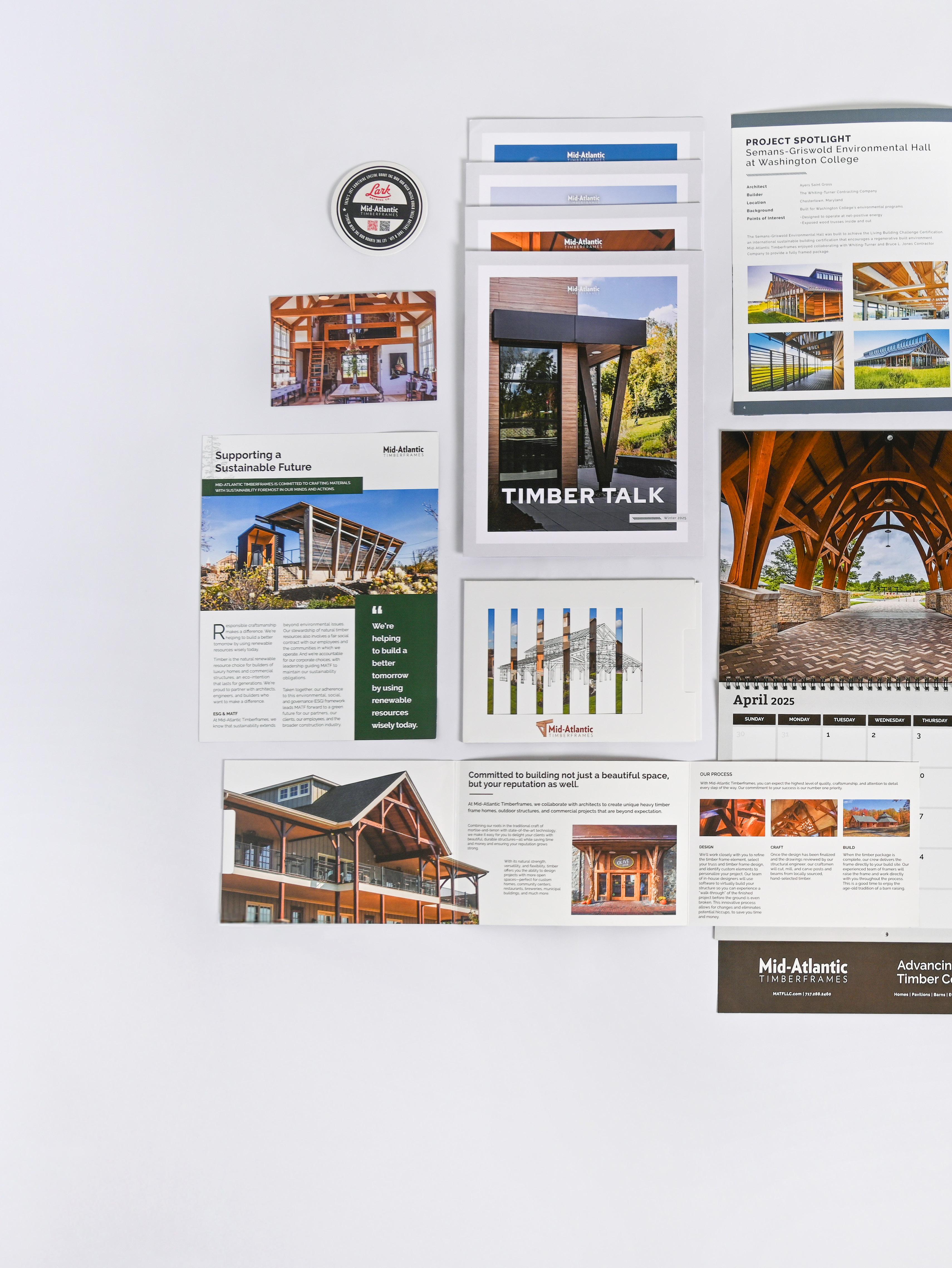
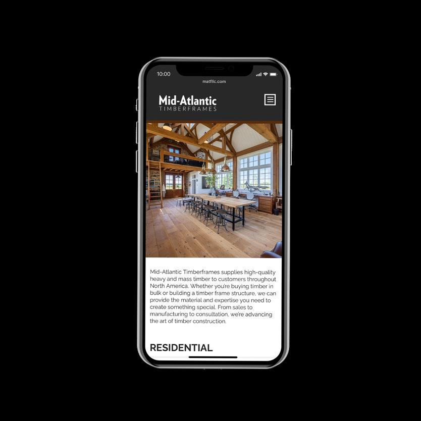
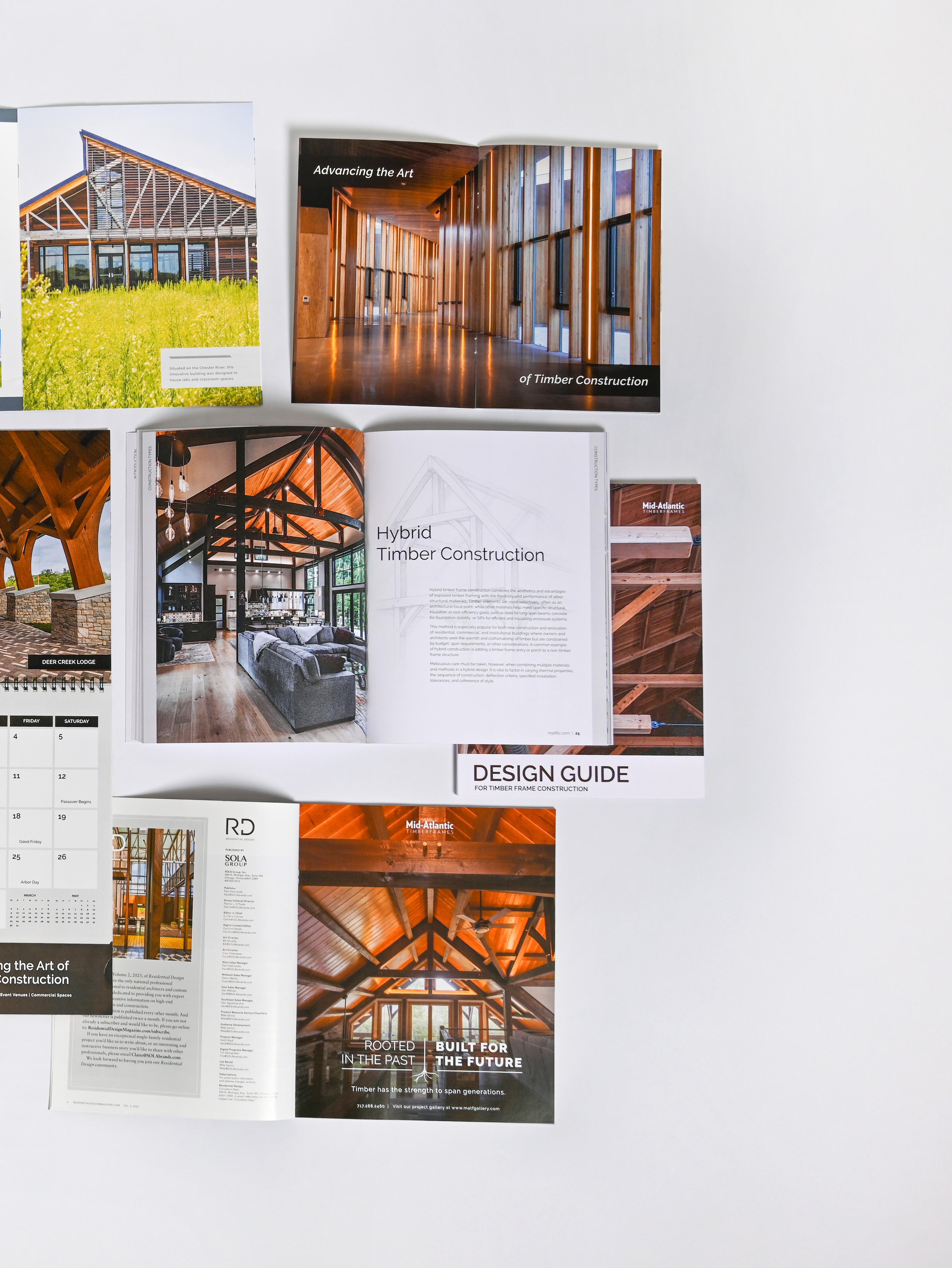
Mid-Atlantic Timberframes is a leading authority in the art of heavy timber construction, from computer-aided design and CNC machining to the centuries-old traditions of hand-finishing posts and beams and raising timber frames using hand tools and mortise-and-tenon joinery. Their timber frames support hundreds of structures, including commercial and municipal buildings, custom homes, equestrian facilities, worship centers, and restaurants.
Mid-Atlantic Timberframes (MATF) engaged Alpha Dog to garner more qualified bid opportunities nationally. Previous marketing efforts had focused mainly on a business-to-consumer message, which captured only part of their target audience (homebuyers) and did not resonate with their commercial audiences (residential architects and custom home builders).
Alpha Dog’s recommendation was to develop an integrated and cohesive marketing plan built around custom builders and residential architects as the primary target audience, with affluent homebuyers as the secondary target. We identified the top targets for each category and developed a series of touchpoints to communicate the value of MATF to each one. Each touchpoint built on the others to create a cohesive and consistent message to build the brand for the long term and increase sales/bid opportunities in the short term. Our multi-tiered approach included digital marketing, print advertising, and direct mail. This strategy kept the brand in front of potential customers year-round and provided them with the information they needed to make a well-informed decision when choosing a design/build partner.
Using this marketing strategy, MATF captured enough qualified leads in the first quarter of 2017 to cover their entire annual marketing budget (and then some). By the end of the year, this new approach had helped increase sales by 50%.
Using this marketing strategy, MATF captured enough qualified leads in the first quarter of 2017 to cover their entire annual marketing budget (and then some). By the end of the year, this new approach had helped increase sales by 50%.
When MATF engaged Alpha Dog as its agency of record in 2019, their annual revenue was $4 million; by 2022, their revenue hit $14 million , a compound annual growth rate of 28.5% year over year.
The type styles below should be used to develop a typographic hierarchy for Mid-Atlantic Timberframes’ marketing materials.
• Raleway is the principal typeface, used for all headlines and body copy.
Principal Typeface
Colors define a mood and give a sense of character. A brand’s colors are just as important to its identity as its logo. To maintain visual consistency, it is vital to use the same Pantone colors or CMYK builds across all marketing materials. Pantone is preferred for most print production or offset print projects, CMYK is for digital press projects, and RGB is for digital uses.
The USGA is a nonprofit organization dedicated to advancing the game of golf. It conducts the US Women’s Open, the premier championship tournament for professional and amateur female golfers, as well as the men’s US Open. Additionally, the USGA also governs the sport with a global set of rules pertaining to golf play, equipment, handicapping, and amateur status.
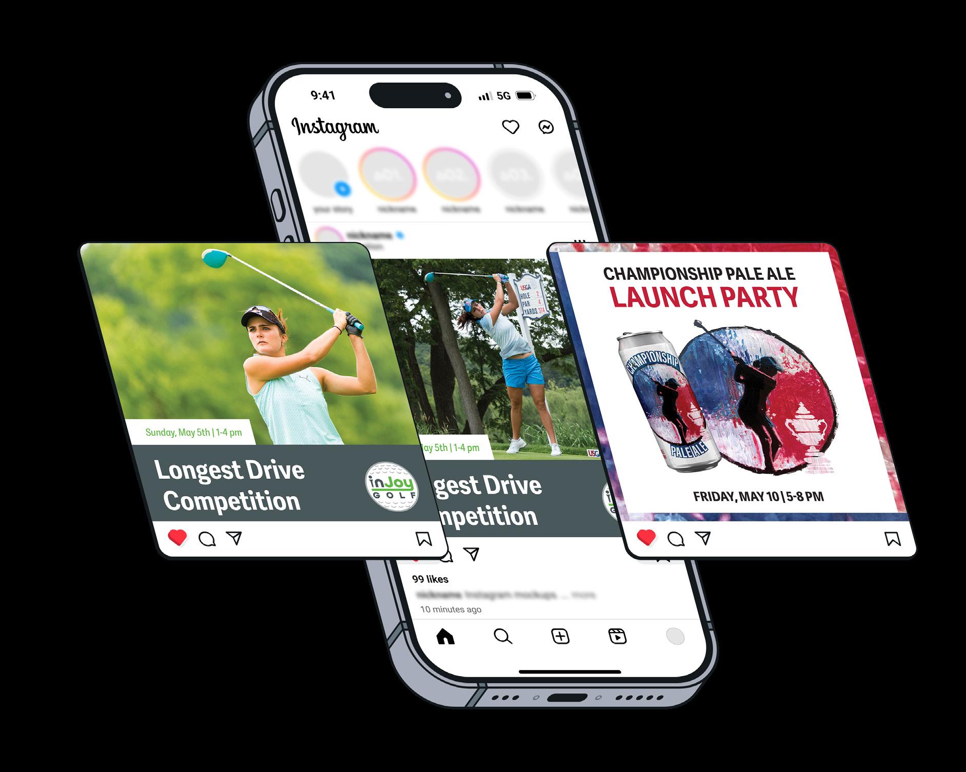
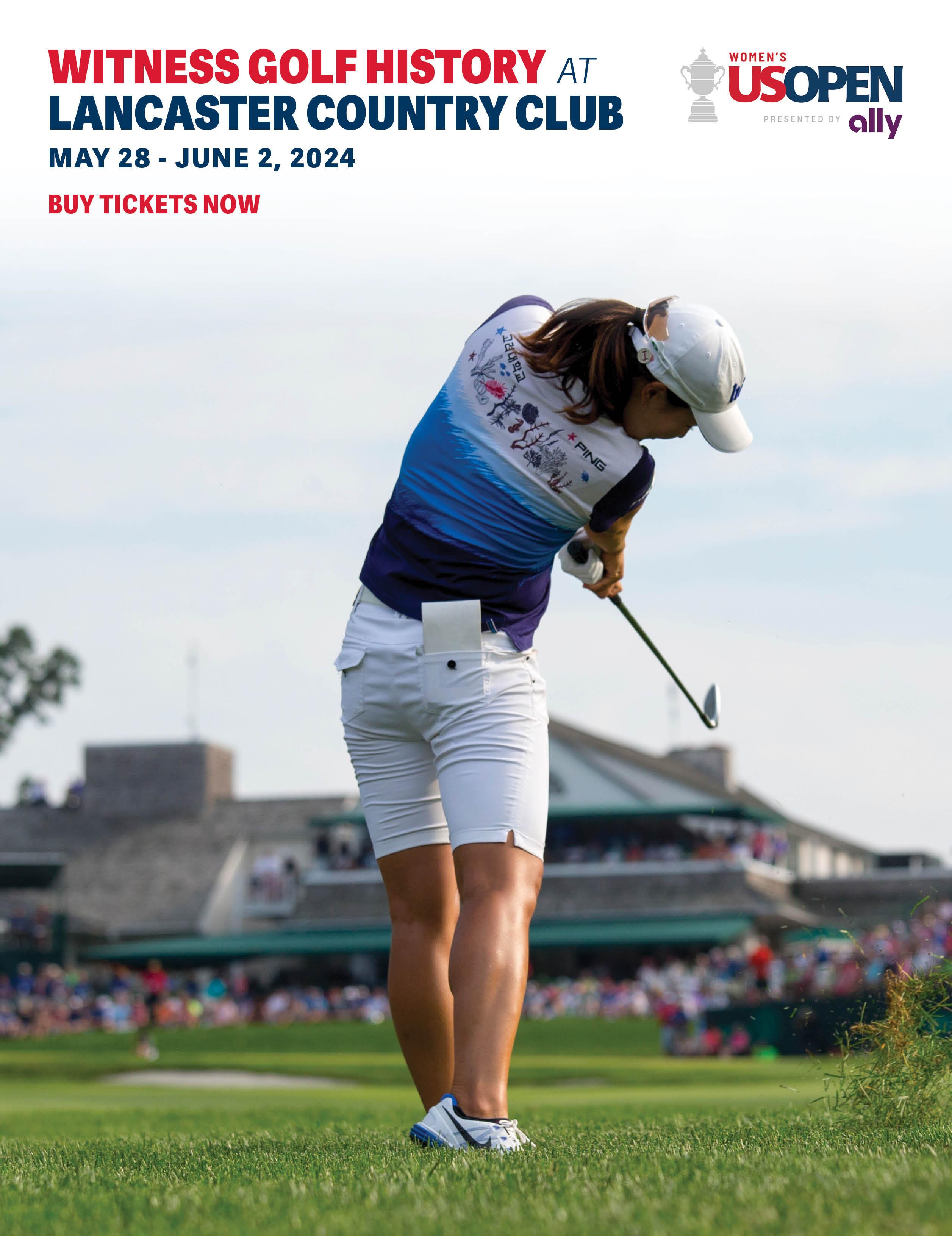
How can brand awareness be elevated and ticket sales increased, even after a record-setting event?
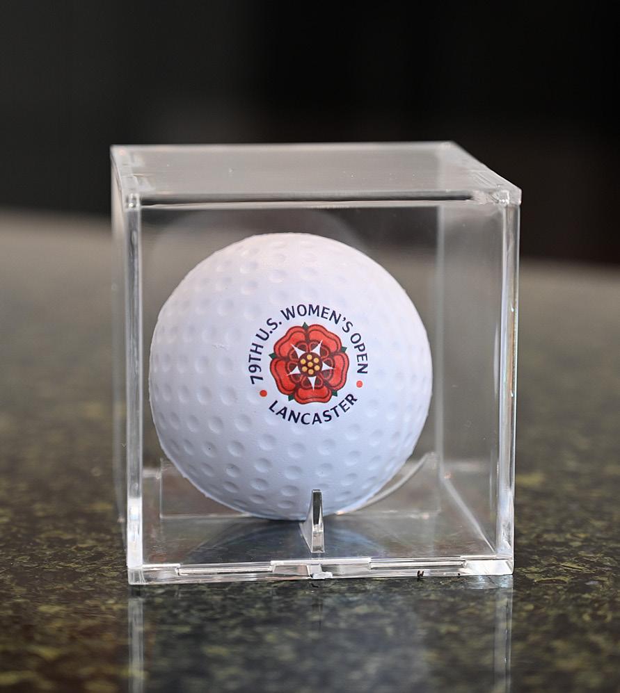
Since 1946, the US Women’s Open Championship has been a showcase for the greatest female golfing talent in the world. When the tournament came to Lancaster Country Club for the first time in 2015, it drew an estimated 135,000 fans over six days, far and away the largest crowd ever to attend the event. The Open was scheduled to return to LCC in 2024. To promote the event, the USGA sought a local agency with media, PR, experiential, and digital marketing expertise to develop interest from the surrounding East Coast metro areas while also challenging the agency to increase ticket sales to beat the long-standing record.
Drawing upon our experience with regional traditional media and our relationships with online influencers, as well as our inherent knowledge of the local marketing landscape, Alpha Dog devised a multipronged approach. The beautiful Harton S. Semple Trophy became the touchstone of in-person experiences at various sporting events, including NBA, AHL, ALPB (an MLB partner), and other professional-level games. A photo booth captured pictures of fans with the trophy while also gathering their email addresses, giving them a chance to win premium tickets.
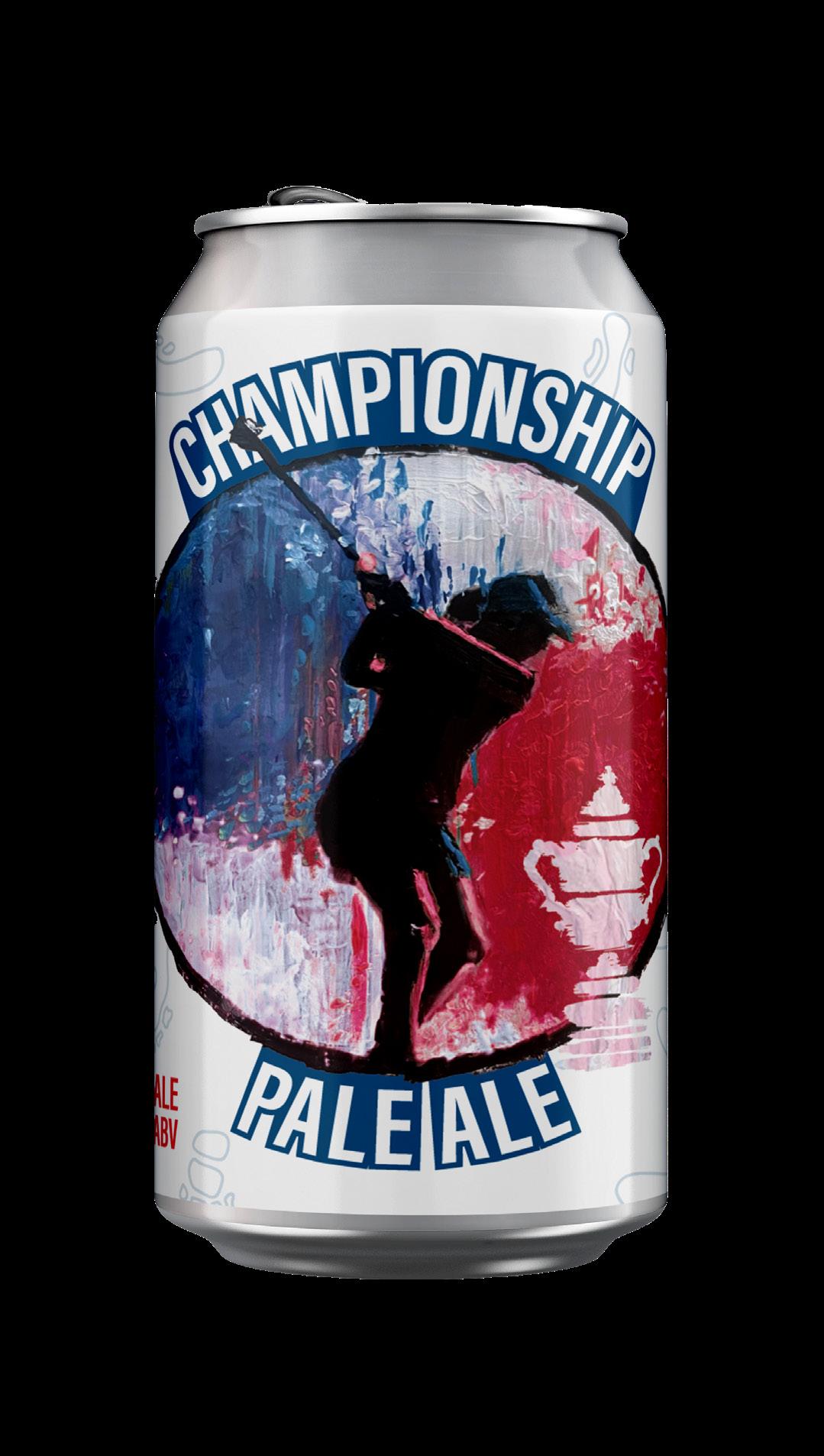
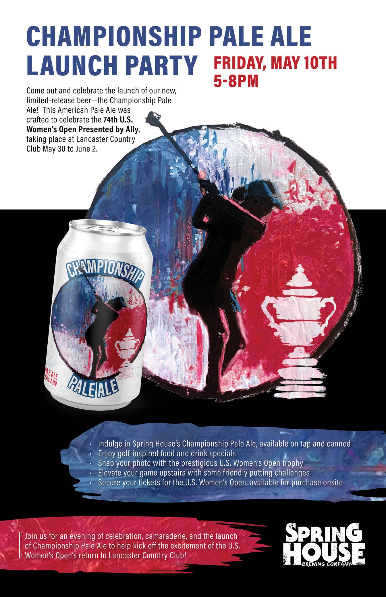
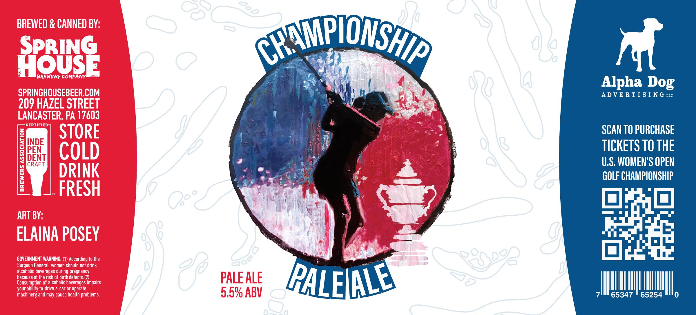
More events were conceived to spur interest, including a long drive contest at an indoor golf simulator, and a “hidden ball” challenge to find 18 special US Women’s Open golf balls at retail, restaurant, and golf facilities in the tri-county region, the latter drawing coverage from all nearby major TV stations. In conjunction with local beer makers Spring House Brewing Co., Alpha Dog developed Championship Pale Ale, an American-style pale designed to be crisp and satisfying both on and off the course. The label featured commissioned work by a local artist, further cementing the event’s ties to Lancaster. The beer quickly sold out at the US Open and retailers, with many cans snapped up by collectors.
As the event drew nearer, ticket sales skyrocketed. In the end, 150,000 fans descended on LCC, beating the existing record by 15,000 tickets and garnering praise from the USGA, LCC, local media, and the spectators who attended the six days of competition.
In the end, 150,000 fans descended on LCC, beating the existing record by 15,000 tickets and garnering praise from the USGA, LCC, local media, and spectators.
The type styles below should be used to develop a typographic hierarchy for the USGA’s marketing materials.
• National is the principal typeface, used for all headlines and callouts.
Principal Typeface
Colors define a mood and give a sense of character. A brand’s colors are just as important to its identity as its logo. To maintain visual consistency, it is vital to use the same Pantone colors or CMYK builds across all marketing materials. Pantone is preferred for most print production or offset print projects, CMYK is for digital press projects, and RGB is for digital uses.
Proponents of tradition; refined, reserved, encouraging, and professional
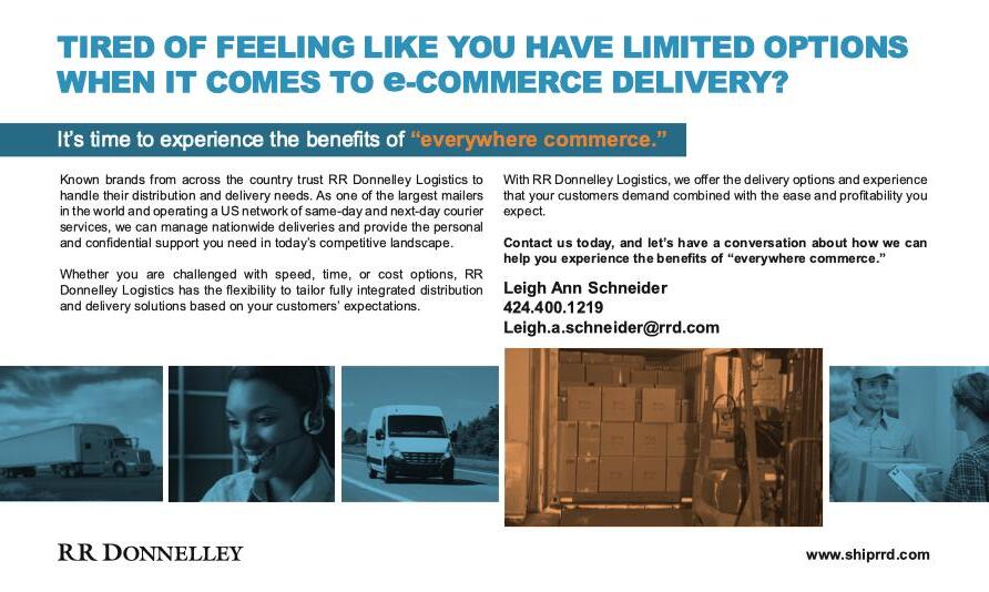
RRD has roots dating back to 1864 as RR Donnelley, a household name in the US for printing phone books, catalogs, and magazines. Following a 2016 corporate restructuring, the company formed RRD, a solution-focused resource for retailers, manufacturers, and fulfillment centers to coordinate and ship their products worldwide. Together with divisions in packaging, print, and marketing, this supply chain leader enables businesses to integrate services from product introduction to shipping.
How should a global logistics provider roll out a new delivery service to e-retailers on a short timeline?
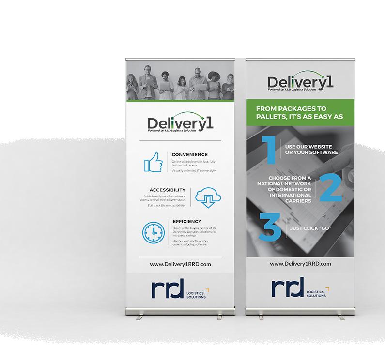
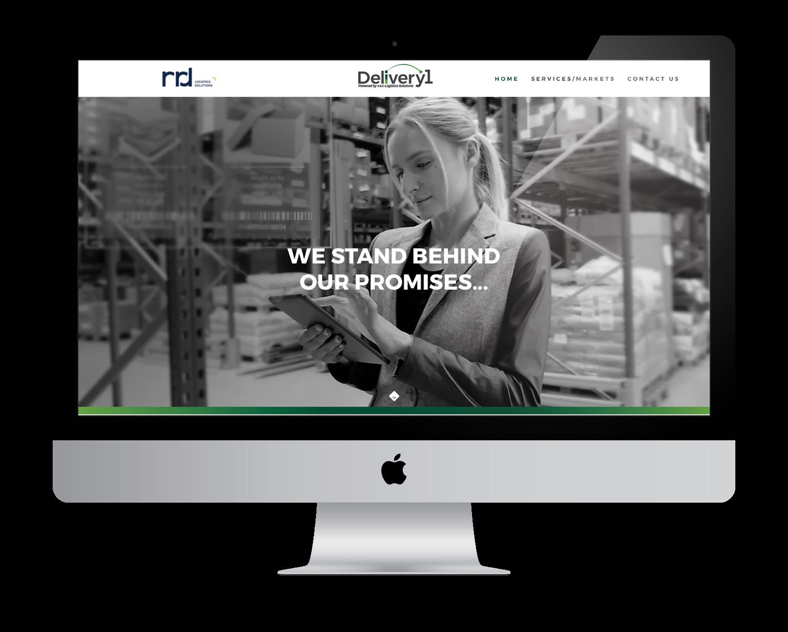
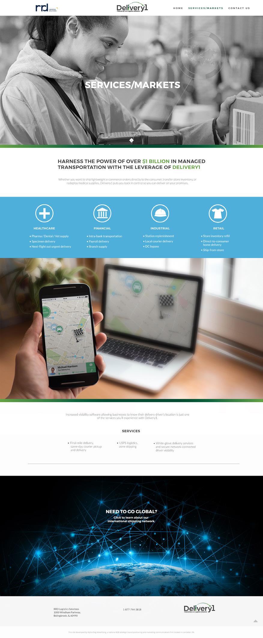
RRD, a specialized division of RR Donnelley focused on supply chain and logistics solutions for e-commerce retailers, was preparing to launch a new service called Delivery1 — and timing was critical. The debut needed to happen just weeks before the Internet Retailer Conference & Exhibition (IRCE), a major industry event. RRD turned to Alpha Dog to help them introduce and build awareness for Delivery1 under this tight deadline.
Alpha Dog developed a targeted, event-specific strategy centered around clear value communication to position Delivery1 as a flexible, data-smart solution. Our team produced coordinated booth graphics, including wall panels and pull-up banners, as well as sell sheets, print handouts, and a branded landing page on RRD’s website with a clear call to action.
Each asset was designed to work together, guiding trade show attendees from physical interaction to digital engagement. Messaging focused on Delivery1’s core benefits:
• A single-source data tracker for seamless oversight
• Flexible last-mile delivery options
• Notable cost savings compared to traditional models
Despite the condensed timeline, Alpha Dog delivered a full suite of materials — concepted, designed, approved, and produced — all ahead of IRCE. Sales reps were equipped with an impactful booth and marketing pieces, while the digital experience extended the conversation beyond the show floor.
By pairing thoughtful strategy with efficient execution, Alpha Dog helped RRD make a strong first impression, effectively launch Delivery1, and begin building momentum in a highly competitive logistics landscape.
Sales reps were equipped with an impactful booth and marketing pieces, while the digital experience extended the conversation beyond the show floor.
The type styles below should be used to develop a typographic hierarchy for RR Donnelley’s marketing materials.
• Montserrat Bold is the principal typeface, used for all major headings.
• Lato is the secondary typeface, used for minor headings, subheadings, and body copy.
Principal Typeface
Secondary Typeface
Regular | Bold
Colors define a mood and give a sense of character. A brand’s colors are just as important to its identity as its logo. To maintain visual consistency, it is vital to use the same Pantone colors or CMYK builds across all marketing materials. Pantone is preferred for most print production or offset print projects, CMYK is for digital press projects, and RGB is for digital uses.
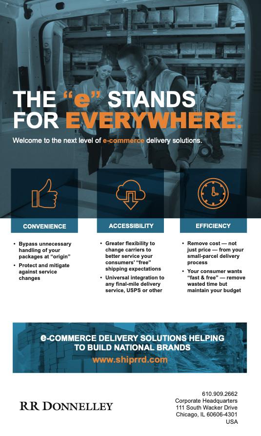

Same- and next-day delivery options
Time-definite, reliable delivery
Enhanced security for high-value goods
Secure network for increased driver visibility
Established network of accelerator terminals throughout US Consistency of quality
For over 150 years, RR Donnelley has built its reputation safeguarding the customer promises of national and international brands. Now we are excited to introduce Delivery1, a first-of-its-kind logistics program that puts the control of deliveries back in your hands by allowing you to deliver to any business or residence using an expansive list of final-mile delivery providers.
Experience these other services provided by Delivery 1:
• Final-mile delivery
• Same-day courier pickup and delivery
• Postal logistics

• Zone skipping
• White-glove delivery services
• All connected through one secure, highly-visible solution
Michael Masengarb Managing Director - Delivery1 717-892-0346 michael.w.masengarb@rrd.com

A consistent visual aesthetic and clearly defined personas give your brand an identity all its own. The examples on the following pages show how we crafted the right look, logo, and voice for our clients’ brands.
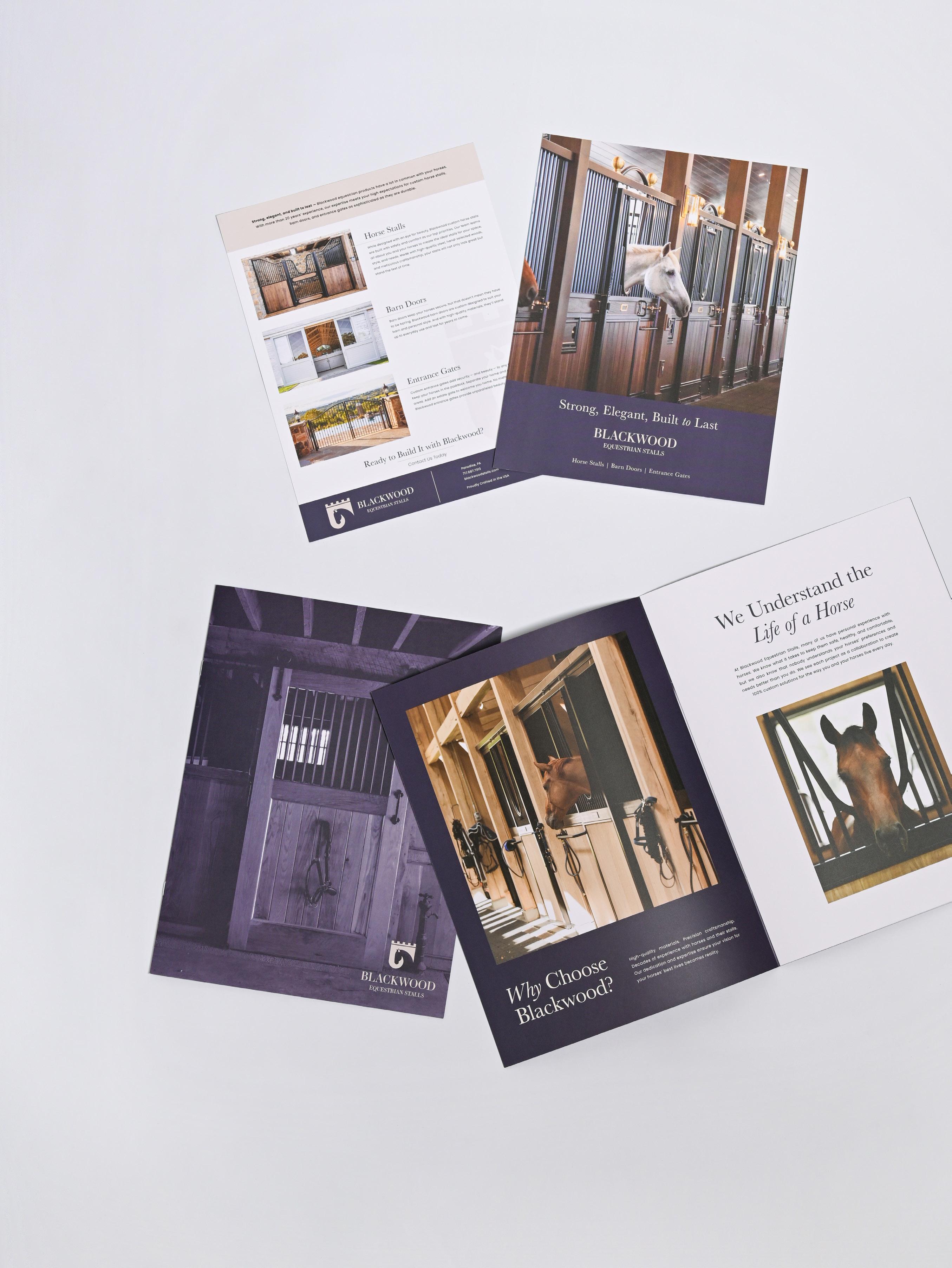
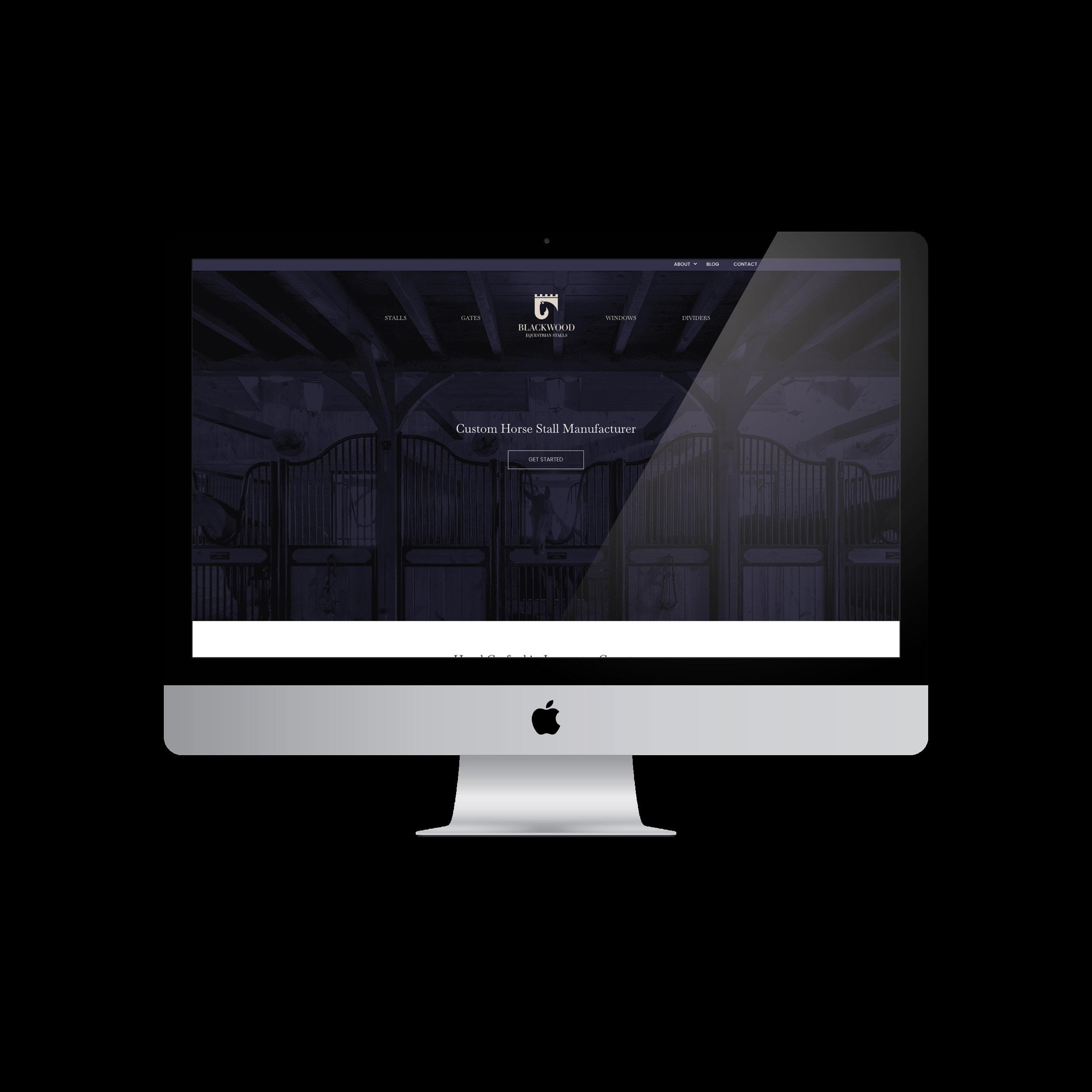
Custom crafters of high-end stalls, gates, windows, and dividers, Blackwood Equestrian Stalls elevates the horse barn with heritage-influenced design and materials to create unique yet familiar upscale spaces.
Primary #8C9C80
#C9A78E
Baskerville - Headings Only
ABCDEFGHIJKLMNOPQRSTUVWXYZ
abcdefghijklmnopqrstuvwxyz
1234567890
Regular | Semi Bold | Semi Bold Italic | Bold
Poppins - Subheadings & Body Copy
ABCDEFGHIJKLMNOPQRSTUVWXYZ abcdefghijklmnopqrstuvwxyz 1234567890
Thin | Light | Bold
Luxury-forward, uncompromising, meticulous, proud, and bold

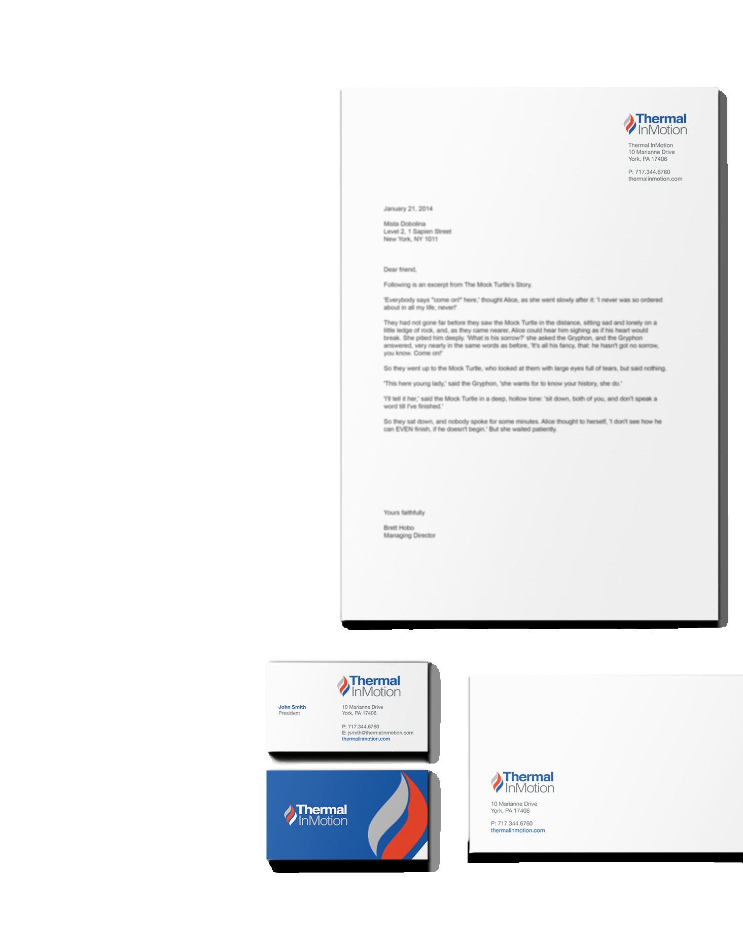
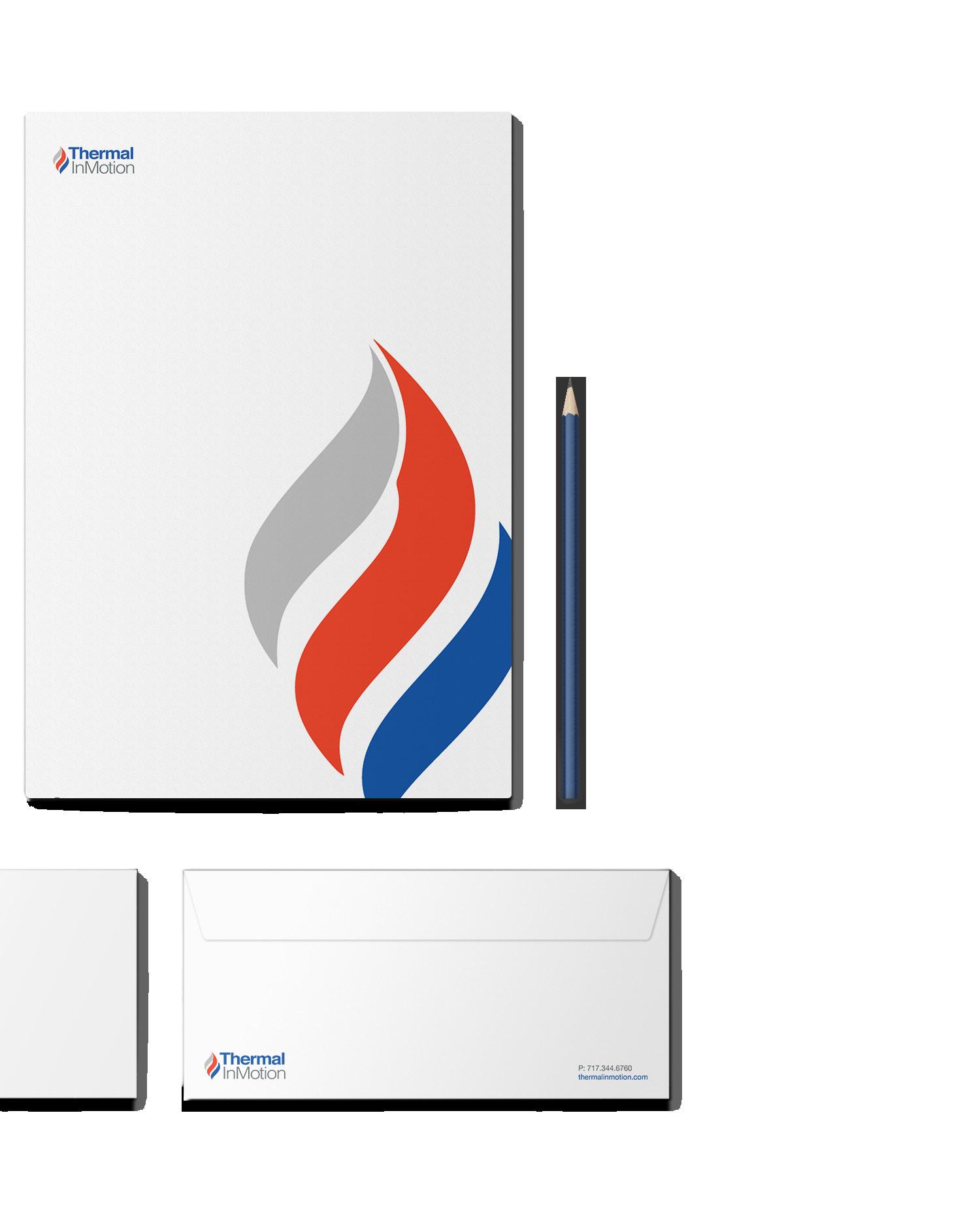
Thermal InMotion is a leader in the design, build, and installation of boilers, HVAC products, and related accessories for industrial applications.
ABCDEFGHIJKLMNOPQRSTUVWXYZ abcdefghijklmnopqrstuvwxyz 1234567890 Helvetica
Headlines - Bold, Title Caps Section Headers - LIGHT, ALL CAPS Body Copy - Regular
Knowledgeable, experienced, accountable, detailed, flexible, and focused
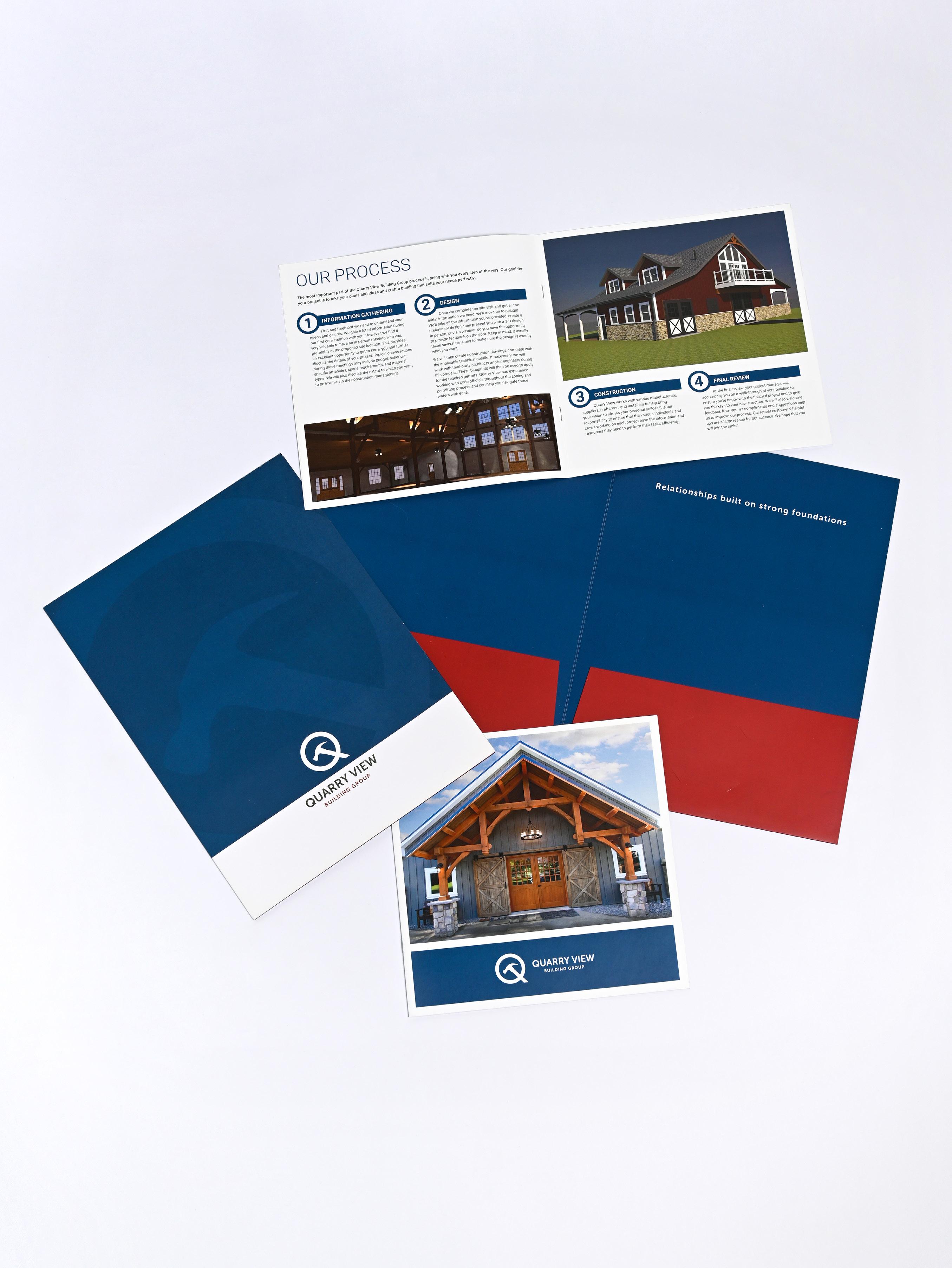
Founded squarely on a heritage of craftsmanship, Quarry View creates timber frame structures for residential, hospitality, restoration, and equestrian spaces.
Museo Sans - Logo Text Only
ABCDEFGHIJKLMNOPQRSTUVWXYZ abcdefghijklmnopqrstuvwxyz 1234567890 700
Roboto - All Other Text
ABCDEFGHIJKLMNOPQRSTUVWXYZ abcdefghijklmnopqrstuvwxyz 1234567890
Honorable, quality-obsessed, principled, thorough, and faith-based
Relationships built on strong foundations
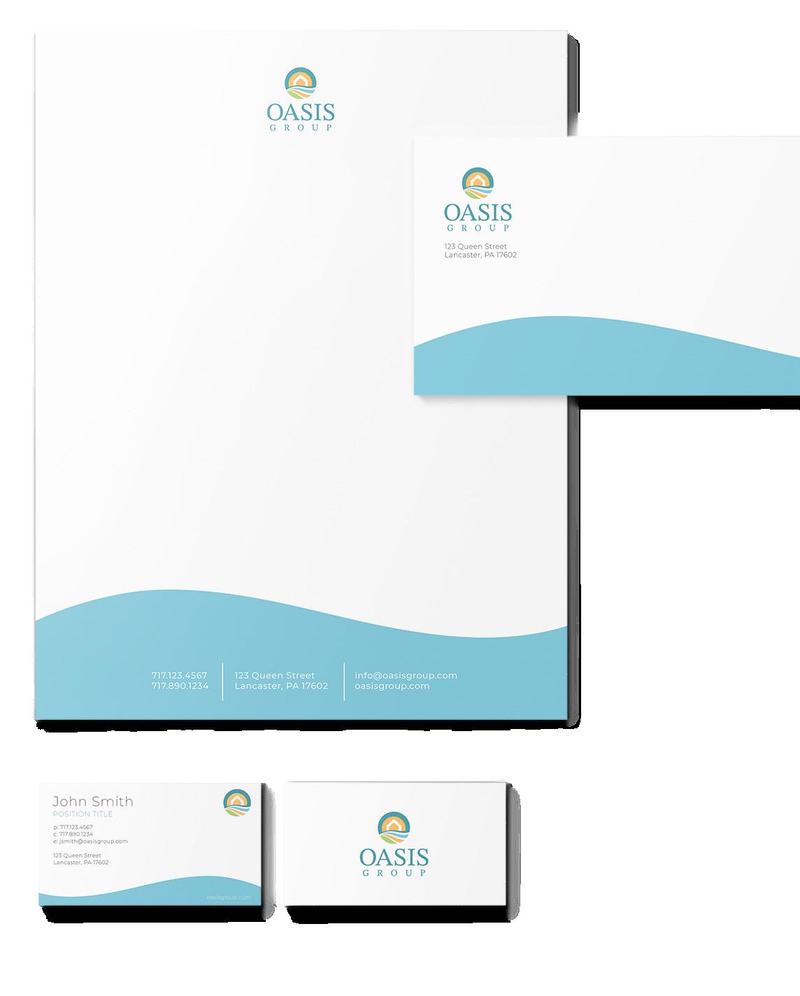
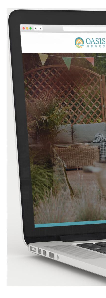
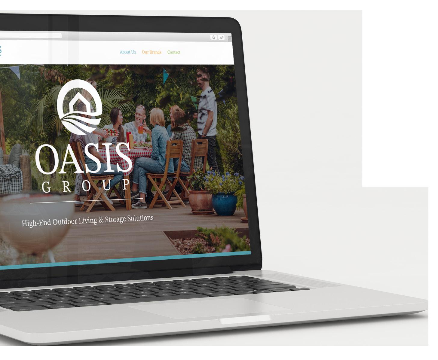
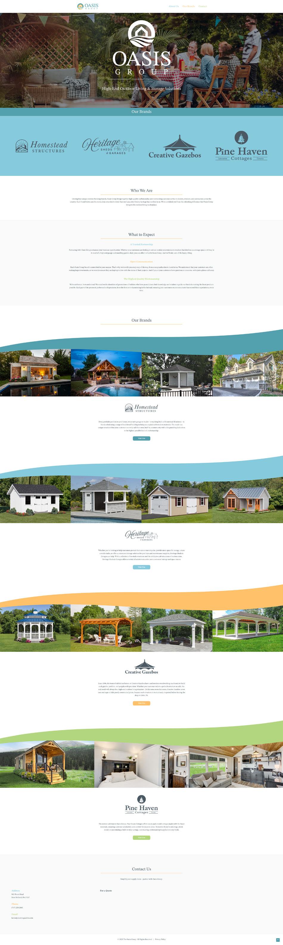
An umbrella for five companies, Oasis Group produces gazebos, sheds, garages, park cottages, pool houses, and other structures for outdoor living.
Primary #539FAC
STIX Two Text - Logo Text Only
ABCDEFGHIJKLMNOPQRSTUVWXYZ abcdefghijklmnopqrstuvwxyz 1234567890
Regular
Montserrat - All Other Text
ABCDEFGHIJKLMNOPQRSTUVWXYZ abcdefghijklmnopqrstuvwxyz 1234567890 Thin | Thin Italic | Light |
|
|
| Medium
| Black
Trusted, reliable, friendly, straightforward, and hardworking

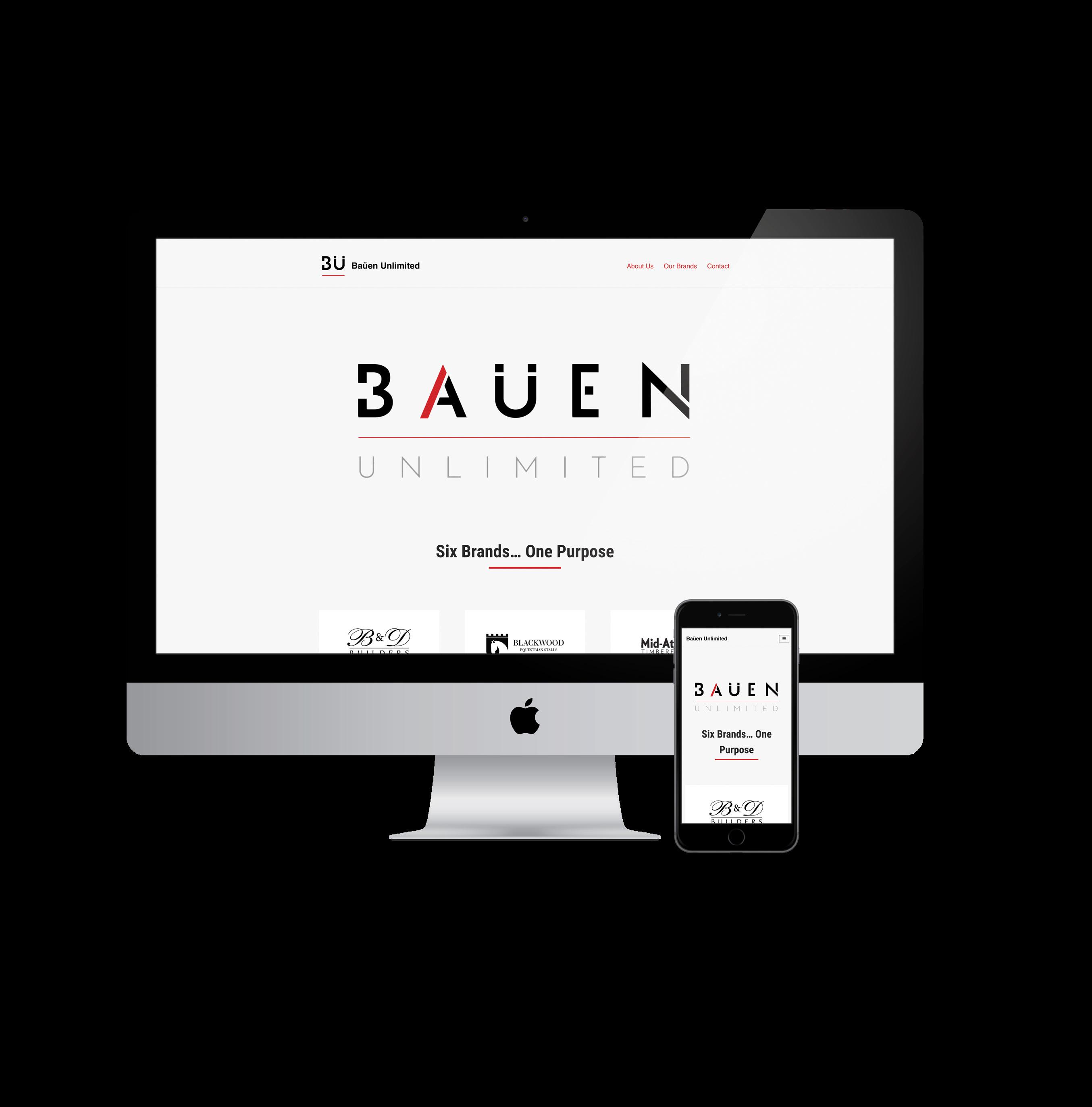
Baüen Unlimited is a family of brands focused on high-quality design, materials, and construction of luxury homes, equestrian estates, and commercial, scholastic, and worship buildings.
ABCDEFGHIJKLMNOPQRSTUVWXYZ abcdefghijklmnopqrstuvwxyz 1234567890 Roboto
Headlines - Condensed Bold, Title Caps
Subheads - CONDENSED REGULAR, ALL CAPS Body Copy - Regular
Baüen Unlimited brands are united by the same passion, mission, and goals — to bring superior design, high-quality materials, fine craftsmanship, and unmatched customer service to your custom residential and commercial building projects. We believe every project is an opportunity to create something extraordinary.


Utilizing computer-aided design and CNC machining, combined with centuries-old traditions of hand-finished craftsmanship and mortise-and-tenon joinery, Mid-Atlantic Timberframes is a leading authority in the art of heavy timber construction for custom homes, equestrian facilities, commercial and municipal buildings, and more.
First-class workmanship meets state-of-the-art technology for laser cutting, CNC forming, and metal fabrication services. Top-quality materials ensure each custom gate, staircase, railing, or other architectural element is built to last.
Makers of custom doors, windows, cupolas, hardware, and other architectural millwork elements that apply old-world craftsmanship, modern technology, and high-quality materials to add the perfect finishing touches to any project.
From reclaimed wood flooring, hand-hewn beams, and wall/ceiling planking to hand-forged iron hinges, latches, and more, Vintage Wood & Forged Iron is a vital source for statement pieces that add unparalleled character to any space.
A custom horse stall builder dedicated to precision craftsmanship, high-quality materials, and the safety and comfort of the horses they build for. Their custom stalls, windows, dividers, and entrance gates are thoughtfully planned and meticulously crafted to add unsurpassed character and functionality to any equestrian estate.
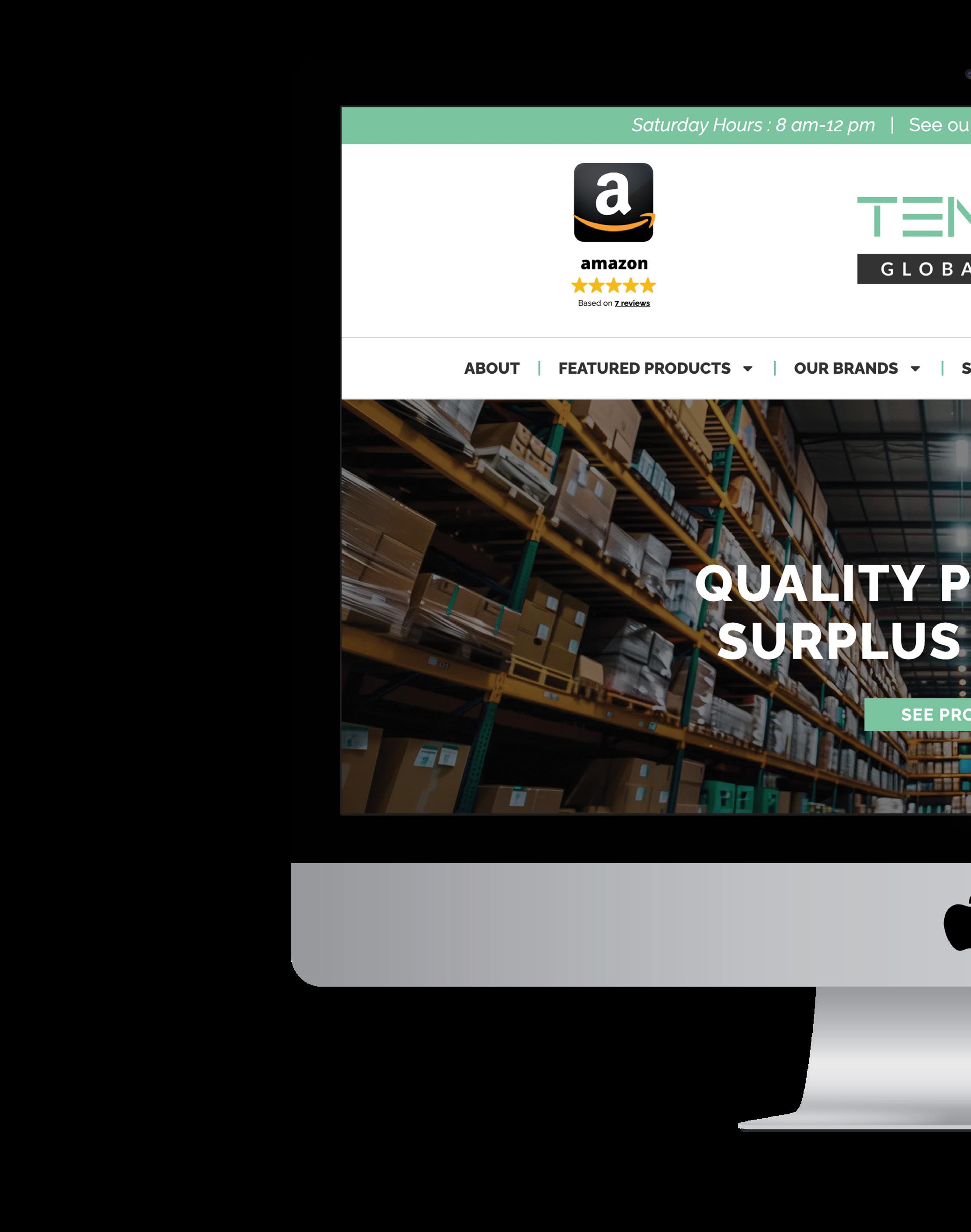
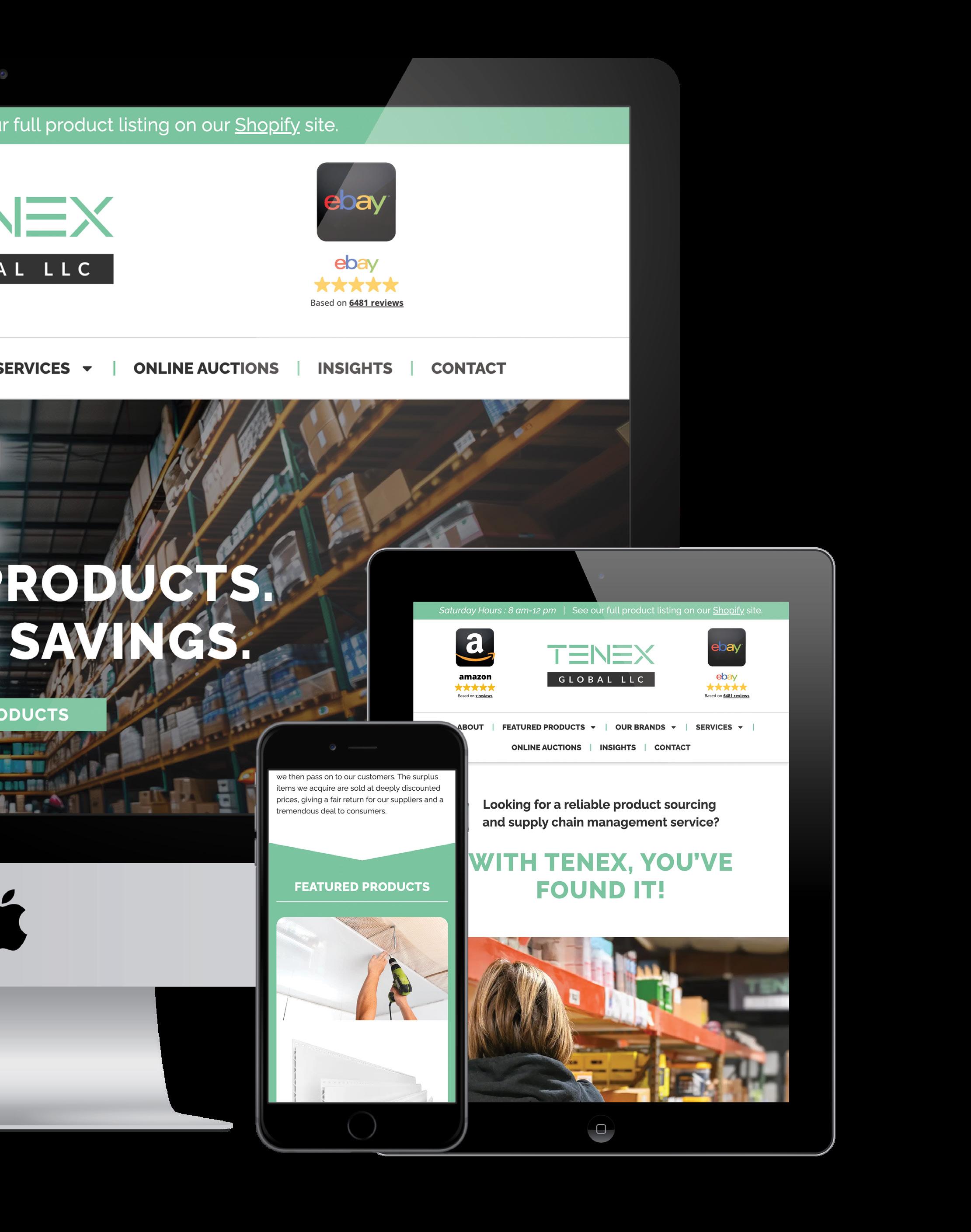
Tenex Global offers liquidation and surplus products from around the world, specializing in building materials and major appliances, including proprietary brands. They also offer supply chain management as a service to source needed materials in the B2B sector.
abcdefghijklmnopqrstuvwxyz 1234567890 Raleway
ABCDEFGHIJKLMNOPQRSTUVWXYZ
Headlines - EXTRA BOLD, TITLE CAPS
Subheads - EXTRA BOLD, TITLE CAPS
Body Copy - Light
Enterprising, client-focused, dependable, collaborative, and enterprising
Every brand is unique and has specific needs to reach its goals. So why do some of the biggest brands choose Alpha Dog when they could work with anyone?
As a full-service agency in a boutique-sized package, we have several distinct advantages that make us the right choice for businesses just like yours.
1. 2. 3. 4. 5.
Marketing Strategy, Messaging, Consultation
Design, Website Design & Development, Photography & Video, Copywriting & Content
Search Engine Optimization (SEO), Email Marketing, Search Engine Marketing (SEM), Social Media, Consultation
Product Launches, Media Cultivation

At Alpha Dog Advertising, we believe that when an agency focuses on business development first, marketing strategy follows seamlessly. We’ve helped dozens of companies expand their reach, grow their earnings, and advance their opportunities — and we can do the same for you. Contact us today and let’s explore how we can lead your brand to better revenue. alphadogadv.com