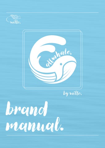

brand manual.
no more discomfort. period.


contents. values. tone of voice. logo & sub-logo. colour palette. typeface. graphical assets. 4 6 8 14 18 20
values.
willow noun
‘a tree or shrub of temperate climates which typically has narrow leaves, bears catkins, and grows near water.’
The use of willow bark dates to 400 BC; people were advised to chew on the bark to reduce fever and inflammation. It continues to be used today for the treatment of pain. Considering the brand’s goal of providing pain relief to users, the name is an homage to its legacy.
the product. allwhale.
AllWhale is a non-pharmaceutical alternative to treating dysmenorrhea (menstrual cramping). It does this through the commercialisation of extracorporeal shockwave therapy (ESWT) technology, which has previously only been available to consumers through pain clinics or medical intervention.

4
we are...
integral.

Willo is honest and transparent in all business interactions. We work with ethical principles in mind, and uphold a strong moral code. We maintain a commitment to doing what is right, even when it is difficult or unpopular.
empathetic.
We strive to understand and connect with the needs and emotions of others. It involves being sensitive and attentive to the experiences and feelings of customers, employees, partners, and other stakeholders.
convenient.
All of WIllo’s products - as well as the way we portray ourselves - aim to be as accessible as possible. We understand that consumers have busy and often hectic lives, and seek to make their experience as effortless as possible.
reliable.
Willo aims to consistently deliver highquality experiences to its customers. We understand that users value consistency and dependability, and we seek to establish a reputation for delivering on our promises.
In essence, integrity is the foundational value that underpins all of our other values and is essential for building trust and credibility with all stakeholders.
In essence, empathy is a value that recognises the importance of human connection and the role it plays in building lasting and meaningful relationships with stakeholders.
In essence, convenience is a value that recognises the importance of providing customers with a hassle-free and enjoyable experience that meets their needs and preferences.
In essence, reliability is a value that recognises the importance of trust and dependability in establishing a strong brand reputation and fostering customer loyalty.
5
tone of voice.
Willo’s tone of voice should be empathetic, informative, and comforting. Ultimately, we should aim to alleviate the consumer’s concerns and worries about their pain by offering helpful and actionable education, which can be used in conjunction with our products. We should be sensitive to the physical and emotional toll that pain can have on an individual, and seek to provide reassurance that Willo cares about the consumer’s experiences and needs.
type.
Willo - and its sub-brand AllWhale - should appear as typed here, when written in body text.
When the brand and/or sub-brand are written as a header or sub-header, in the canvas script font, should be done so in all lowercase lettering, followed by a period. All other
The tone of voice should also convey a sense of expertise and authority, with a focus on educating customers about the benefits of Willo’s products. We should use clear and concise language to explain how the provided solutions work, and provide evidence-based information to support its claims.
headings and sub-headings should also be succeeded by a period. Willo AllWhale
6
willo. allwhale.
in

7
logo & sub-logo.
This section of the manual is to inform the correct use of the Willo logo (and AllWhale sub-logo) and its variants to ensure brand consistency and image. The logo has been crafted with great care, so please adhere to these guidelines closely. Both the logo and sub-logo are designed with the canvas script font in mind, and has few alterations made to it. It is tweaked only slightly, to allows for its easy integration into the graphical elements of the logo design.
Use our logo consistently across all platforms, whether it’s our website, social media, or marketing materials.
Place our logo in a prominent location where it can be easily seen and recognised. It should not be hidden or obscured by other design elements.

willo. allwhale.
8
In terms of our AllWhale sub-logo: The AllWhale sub-logo should be larger in size than the Willo logo; the consumer’s focus should be initially geared towards the product rather than the brand.
Place our AllWhale sub-logo in a location that complements the Willo logo, and does not interfere with its visibility or recognition.

Both Willo and AllWhale can also be written, on their own, using the canvas script font. This alternative should be deployed sparingly. By following these guidelines, you can effectively use our Willo logo in conjunction with our AllWhale sub-logo, helping to reinforce our brand identity and consumer recognition.
allwhale.
9
by willo.
scaling & spacing.
Ensure that our logo is appropriately sized for the intended medium. A small logo on a large billboard will not be effective, nor will a large logo on a business card.
Maintain clear space around our logo and sub-logo to ensure that they stands out and are not crowded by other design elements. The amount of clear space required can vary, but as a general rule, a space equivalent to half of the height or width of the logo is recommended, as detailed here.
10
by willo.
by willo. by willo.
in 3D space.
Both the logo and icon can be represented in 3D space, to be used in signage, merchandise and promotion.

Pay attention to the logo’s perspective and ensure that it appears natural and consistent in the 3D space. Avoid distortions
or perspectives that make the logo appear unnatural or unrecognisable. In some instances, adding texture to the logo can make it more visually interesting and emphasises its form. It must be ensured, however, that its legiblity is maintained.
11


12
allwhale. willo. allwhale.
allwhale. allwhale.
logo do's.
by willo.
logo don'ts. allwhale.
Do not recolour the Willo or AllWhale logo in ways which have not previously been used.
Do not resize any individual features of the Willo or AllWhale logo.


Do not distort or warp the Willo or AllWhale logo.
Do not use the negative monotone variants of the Willo or AllWhale logo on dark backgrounds.
13
allwhale.
allwhale.
colour palette.
The Willo and AllWhale branding follows the same colour palette to ensure their consistency with eachother. These are to be integrated into all major graphical assets, such as full-bleed splash images in printed documents, or for interactive elements in webbased publications.
However, be aware of the limitations of our colour palette, such as how many colours can be used together effectively, and how they will appear on different devices or printing methods. Typically, two-tone graphical elements are more effective than the incorporation of all three colours.
Afternoon Sky
14
HEX #87CEEB L 79 a -18 b -22 C 49 M 1 Y 5 K 0 R 135 G 206 B 235 HEX #BF9ACA L 68 a 20 b -20 C 29 M 45 Y 0 K 0 R 191 G 154 B 202
Lilac Pink
Accompanying the three primary brand colours, seared grey (#495159) can be deployed for minor graphical elements, such as lines and frames.
Traditional black (#000000) and white (#FFFFFF) are reserved for text to ensure accessibility and legibility, as well as some minor graphical features.
15
HEX #FFA4BB L 77 a 36 b 2 C 0 M 49 Y 10 K 0 R 255 G 164 B 187 HEX #495159 L 34 a -2 b -6 C 69 M 54 Y 45 K 40 R 73 G 81 B 89 HEX #000000 R 0 G 0 B 0 HEX #FFFFFF R 255 G 255 B 255 C 0 M 0 Y 0 K 100 C 0 M 0 Y 0 K 0 Amélie’s Tutu
Seared Grey
gradient usage.
A common graphical feature of the Willo and AllWhale branding is the use of gradients, which combine two of the three primary colours.
Morphing gradients should be used over standard gradients, using those that are

only created from the three primary brand colours. They should be used over the standard gradients if used for backgrounds, or alternatively new ones can be created on fffuel.com, using the ffflux gradient generator, for example.

16

17
typeface.
The Willo and AllWhale brands make use of the following font families:
Canvas Script Heavy & Canvas Script Regular: the canvas script family is used for headings and sub-headings exclusively. Given its small stature on the page, it should only be deployed at a font size no smaller than 30pt. Generally speaking, the heavy alternative is reserved for main headings, whilst the regular is used for sub-headings, ensuring that the text hierarchy is maintained.
Canvas Script Regular can also be used for pull quotes and testimonials.
Gotham Medium, Gotham Medium Italic & Gotham Book: the Gotham family is used for all print-based body copy. By default, the Book variant is preferable, with Medium used to pick out details from bodies of text, and Medium Italic for references or external links.
In instances where the Willo and AllWhale brands are represented in an online context, Arial family of fonts can be used in place of the Gotham family, as the former is more accessible and, as a result, will adhere to web content accessibility guidelines (WCAG).
Arial Bold
Arial is a commonly available font that is included in most operating systems and web browsers. This means that it can be used on any website without requiring visitors to download additional fonts.
It is also easier to read, as it is a sans-serif font.
18
in web.
a b c d e f g h i j k l m n o p q r s t u v w x y z A B C D E F G H I J K L M N O P Q R S T U V W X Y Z 1 2 3 4 5 6 7 8 9 0 ? ! * + ( . , )
Regular a b c d e f g h i j k l m n o p q r s t u v w x y z A B C D E F G H I J K L M N O P Q R S T U V W X Y Z 1 2 3 4 5 6 7 8 9 0 ? ! * + ( . , )
Arial
Canvas Script Heavy
a b c d e f g h i j k l m n o p q r s t u v w x y z
A B C D E F G H I J K L M N O P Q R S T U V W X Y Z
1 2 3 4 5 6 7 8 9 0 ? ! * + ( . , )
Canvas Script Regular
a b c d e f g h i j k l m n o p q r s t u v w x y z
A B C D E F G H I J K L M N O P Q R S T U V W X Y Z
1 2 3 4 5 6 7 8 9 0 ? ! * + ( . , )
Gotham Medium
a b c d e f g h i j k l m n o p q r s t u v w x y z
A B C D E F G H I J K L M N O P Q R S T U V W X Y Z
1 2 3 4 5 6 7 8 9 0 ? ! * + ( . , )
Gotham Medium Italic
a b c d e f g h i j k l m n o p q r s t u v w x y z
A B C D E F G H I J K L M N O P Q R S T U V W X Y Z
1 2 3 4 5 6 7 8 9 0 ? ! * + ( . , )
Gotham Book
a b c d e f g h i j k l m n o p q r s t u v w x y z
A B C D E F G H I J K L M N O P Q R S T U V W X Y Z
1 2 3 4 5 6 7 8 9 0 ? ! * + ( . , )
19
The use of full-bleed splash images in printed publications can be used to divide up sections of information. By default, a wave texture - as shown above - is ideal. These can be overlaid with either of the three primary brand colours, or seared grey (#495159).

graphical assets. wave textures. illustrations.
More specific to the AllWhale sub-brand, a number of whale illustrations have been created, utilising the three primary brand colours. These should be used sparingly (no more than one in a single composition, and should not detract from the main information presented. Suitable placement would be, for example, on the product’s packaging, or on printed advertising collateral, as a purely aesthetic feature.
The wave imagery is pasted over the block colour with a 40% transparency; luminosity blending mode. These settings should be maintained across all instances.

20
frames.

Other full-bleed splash pages often depict images of people - specifically, women. In these instances, a graphical frame is often used to ‘focus’ on the composition’s main subject; this is a purely aesthetic choice. These frames are either coloured white (#FFFFFF) or seared grey (#495159), dependent on the background colour. These frames can also be used to bring attention to certain information, in a similar manner to pull quotes.


21
Canvas Script Heavy a b c d e f g h i j k l m n o p q r s t u v w x y z A B C D E F G H I J K L M N O P Q R S T U V W X Y Z 1 2 3 4 5 6 7 8 9 0 ? ! * + ( . , ) Canvas Script Regular a b c d e f g h i j k l m n o p q r s t u v w x y z A B C D E F G H I J K L M N O P Q R S T U V W X Y Z 1 2 3 4 5 6 7 8 9 0 ? ! * + ( . , ) Gotham Medium a b c d e f g h i j k l m n o p q r s t u v w x y z A B C D E F G H I J K L M N O P Q R S T U V W X Y Z 1 2 3 4 5 6 7 8 9 0 ? ! * + ( . , ) Gotham Medium Italic a b c d e f g h i j k l m n o p q r s t u v w x y z A B C D E F G H I J K L M N O P Q R S T U V W X Y Z 1 2 3 4 5 6 7 8 9 0 ? ! * + ( . , ) Gotham Book a b c d e f g h i j k l m n o p q r s t u v w x y z A B C D E F G H I J K L M N O P Q R S T U V W X Y Z 1 2 3 4 5 6 7 8 9 0 ? ! * + ( . , )

I've been dealing with chronic period cramps for years, and have tried everything from medication to physical therapy with limited success. However, after using [the product] for just a few weeks, I'm already feeling a significant reduction in pain.
 - Jane S. (Exemplar Testimonial)
"

lauren shortel - 1900042