Alexandra Kellogg
Kelloggag@appstate.edu Linkedin.com/alexkellogg4 Boone, North carolina, 28607
F

Interior Design portfolio TABLE OF CONTENTS PRINCIPLES OF DESIGN 3D FORM SPACE MANIPULATION BURTON OFFICE B02 RESIDENCE SEASCAPE 1 APP STATE HICKORY 2 3 6 4 5 8 Alexandra Kellogg 2020- PRESENT Student work PLAKAT HOTEL 10
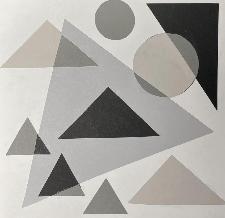
Principles of Design
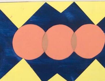
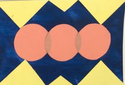
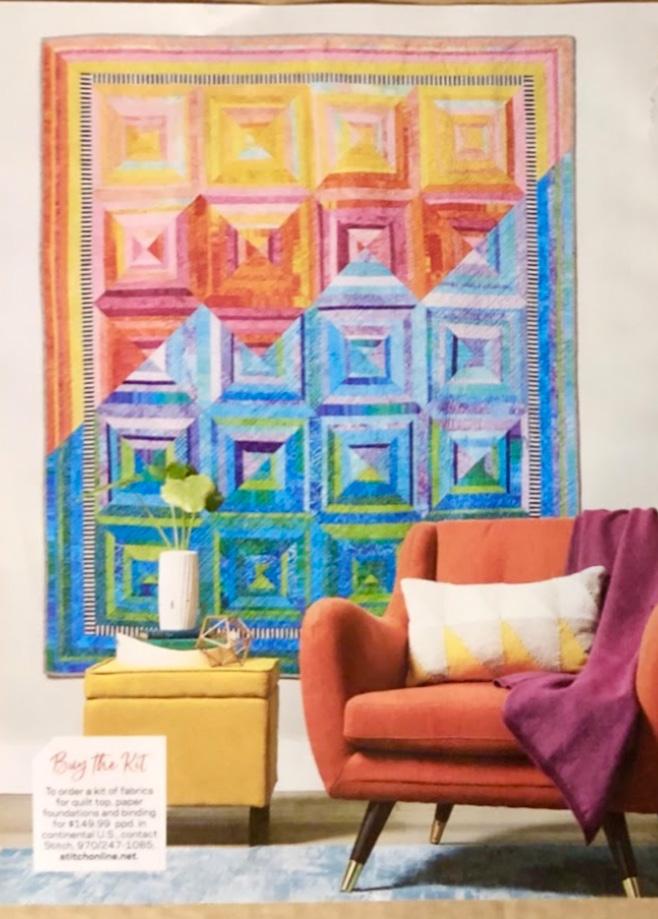
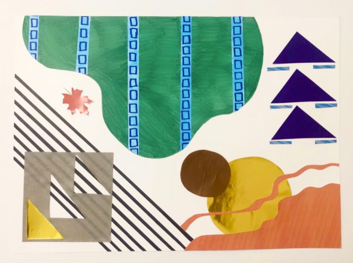
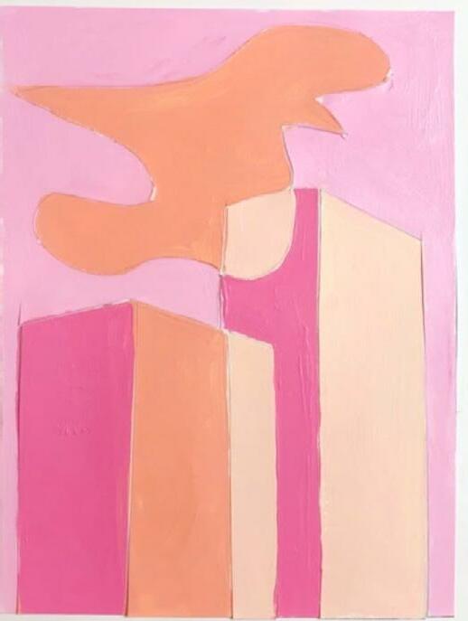
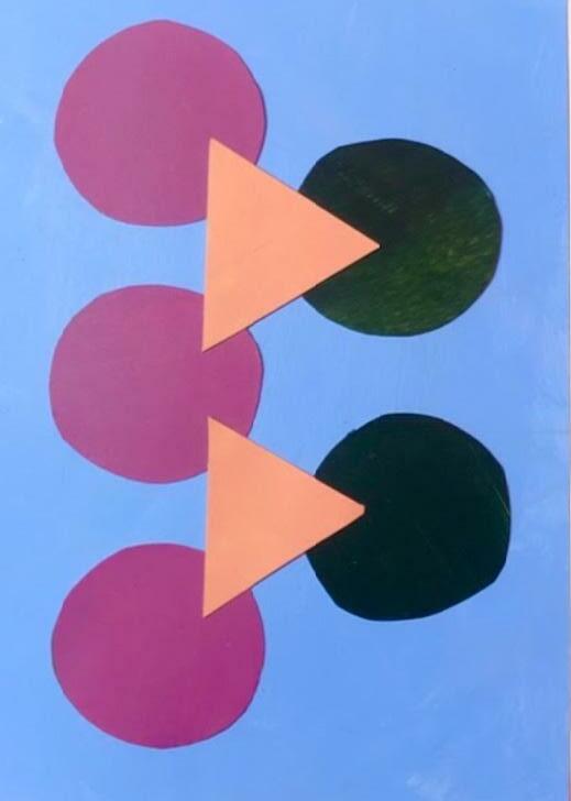
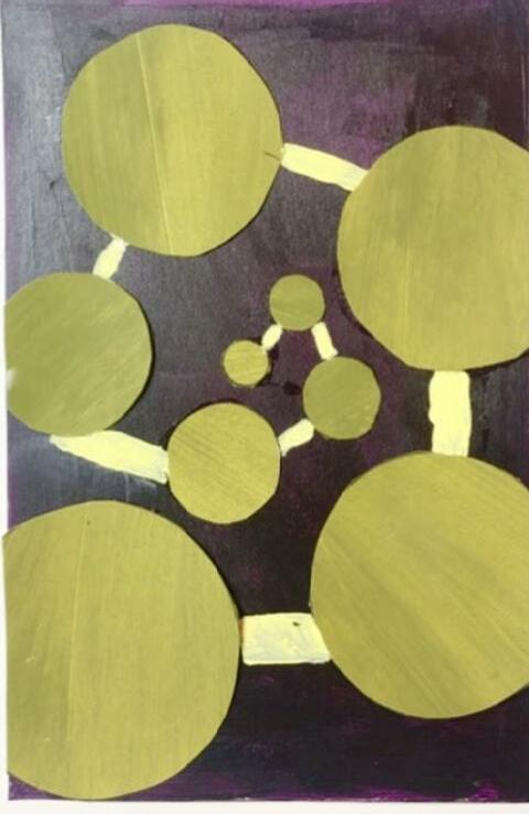
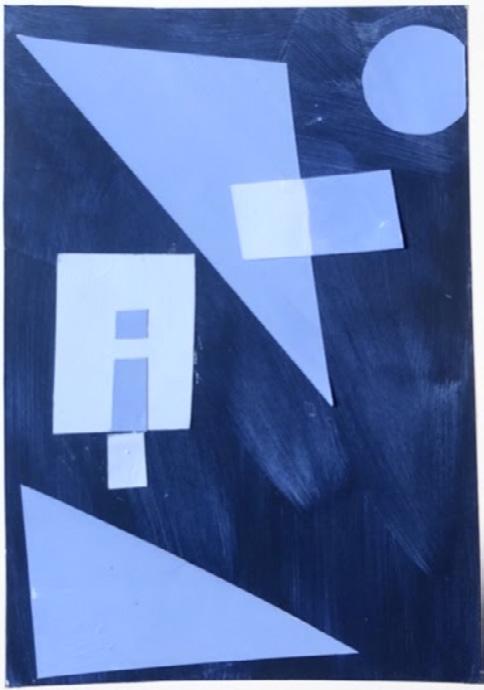
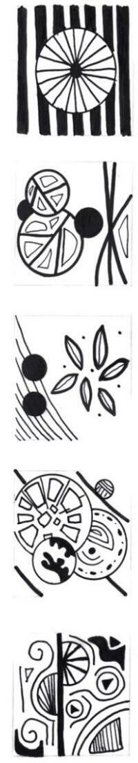
Through the exploration of lines, shapes, and colors, these projects allowed creative thinking and individualistic expression. In the shape composition project, we cut out shapes and created color schemes using the pantone website. The line drawings were produced by micron pens and an assortment of thin, grey markers. For our final project, we were to deconstruct a magazine cover and create a finished piece using all of the techniques we had learned in the Visual Literacy I course.
Shape
Line
Compositions
Drawings
Magazine Deconstruction & Final Project
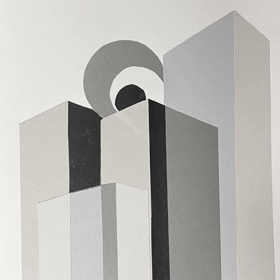
3D Form
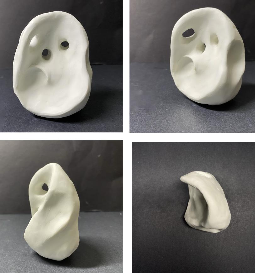
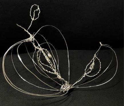
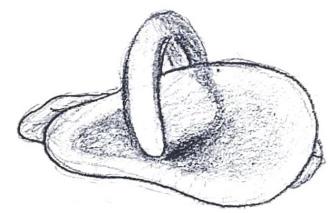
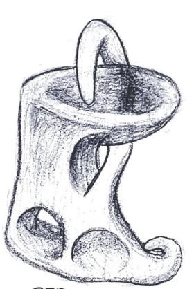
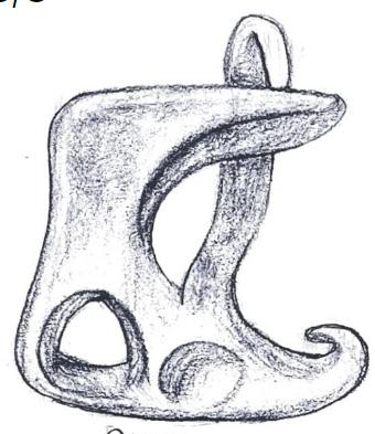
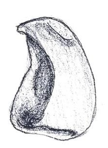
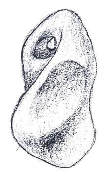
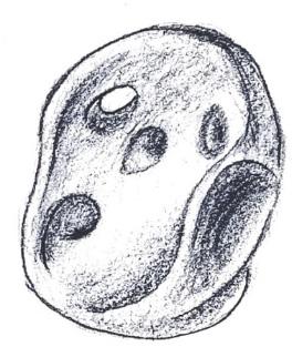
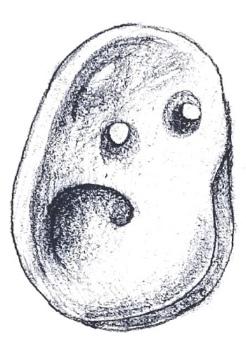
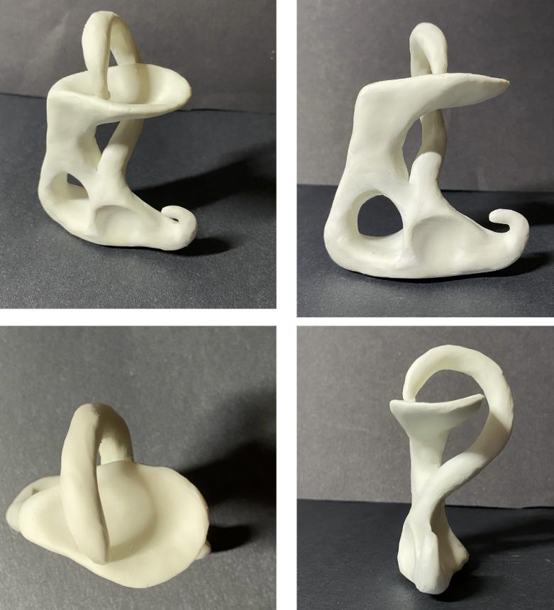
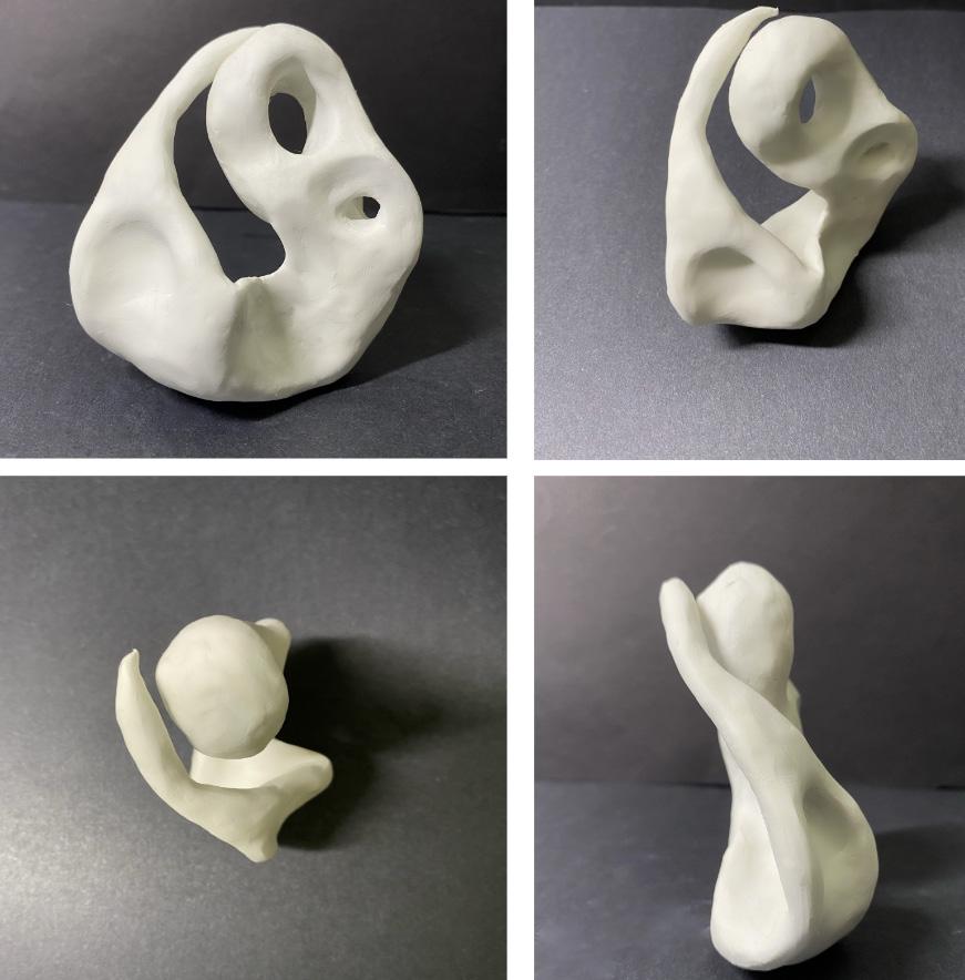
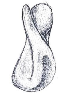
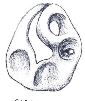
With a more hands-on approach, the projects in the Visual Literacy II course consisted of materials such as foam core, multiple sizes of gauged wire and modeling clay. For process work, I sketched my ideas to elevate my final creations. For the Wire Model Project, I created an apple to showcase the interior complexity of such a simple shape. Lastly, the clay models were created to portray the importance of convexivity and concavity within forms.
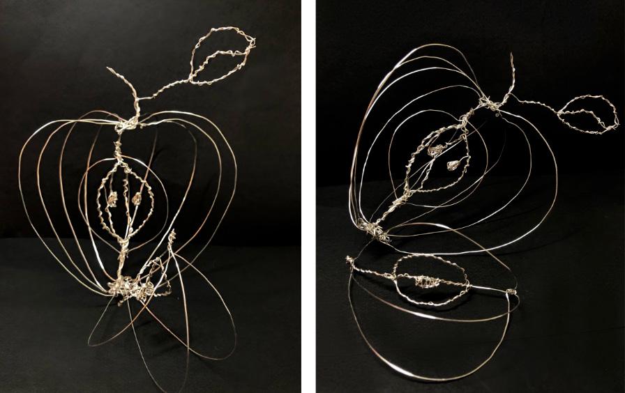 Geometric Model
Wire Model Clay Sketches Clay Models
Geometric Model
Wire Model Clay Sketches Clay Models
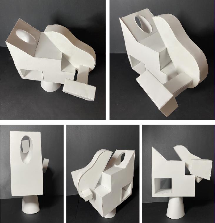
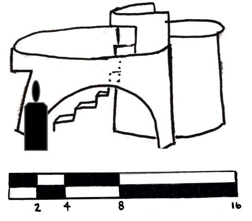
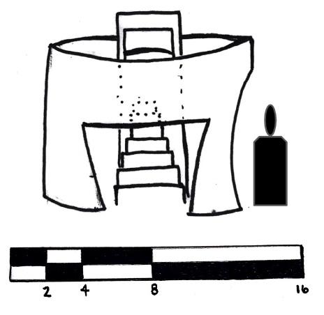
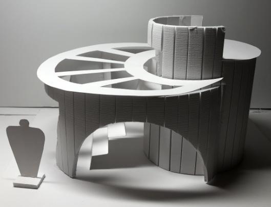
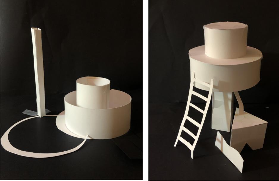
Space Manipulation
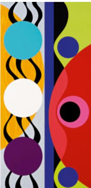
To begin the space manipulation project, the first step was to research a well known artist that incorporates layers of textures and shapes. After choosing Beatriz Milhazes, I found that her work was striking. The inspiration that I gained was immediate and I created a paper model to help craft the idea of my final project. After using similar geometry and organic shapes that Beatriz Milhazes applies to her work, I created a design from foam core that exemplified the understanding of space manipulation and incorporated scale models and figures.
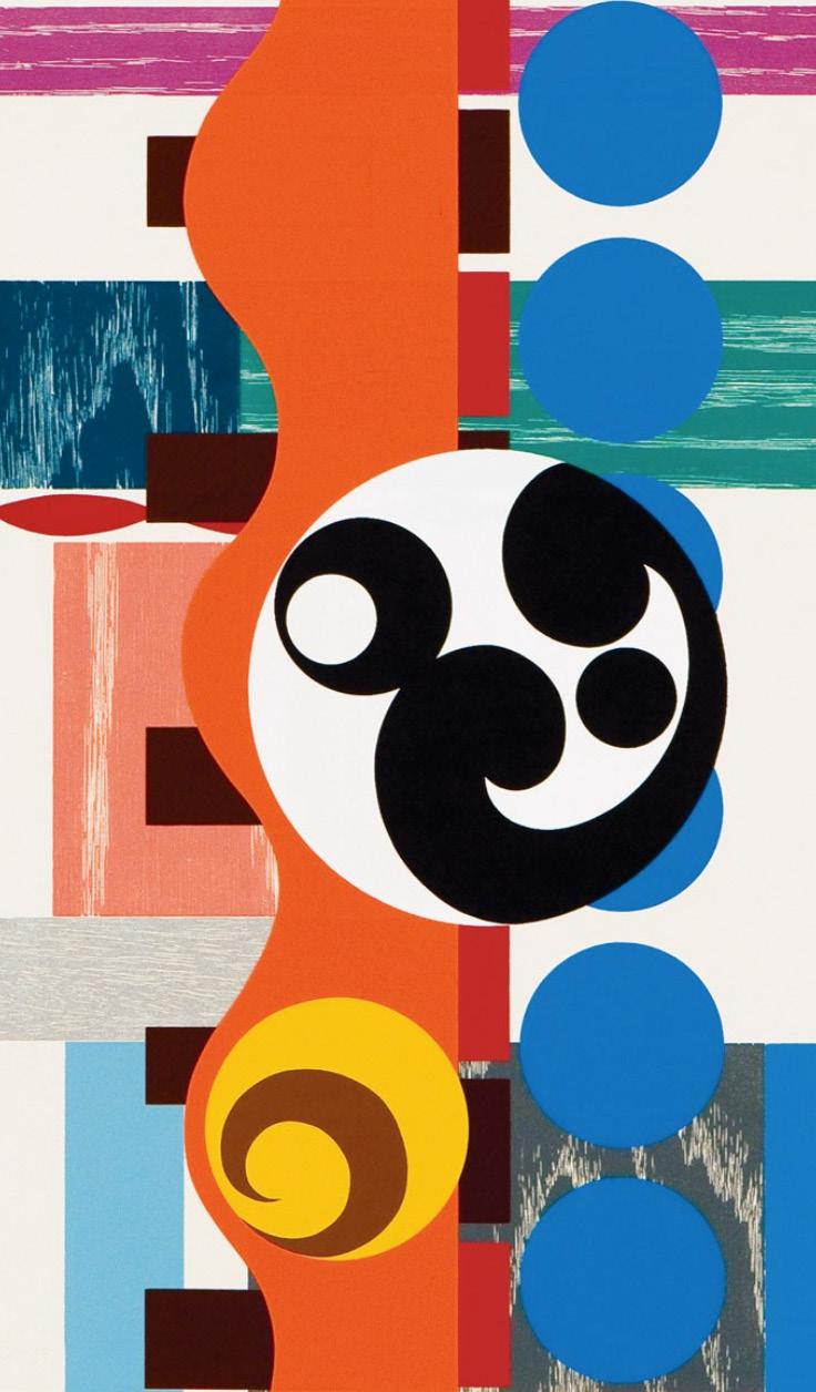 By: Beatriz Milhazes
Parti Diagrams Study Models
Elevation Drawings to Scale
Final Model
 By: Beatriz Milhazes
Inspiration Artwork
Burton OFFICE
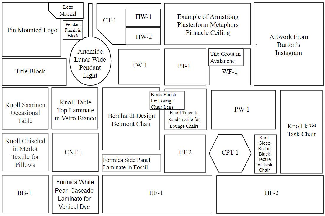
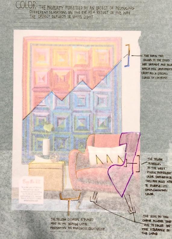
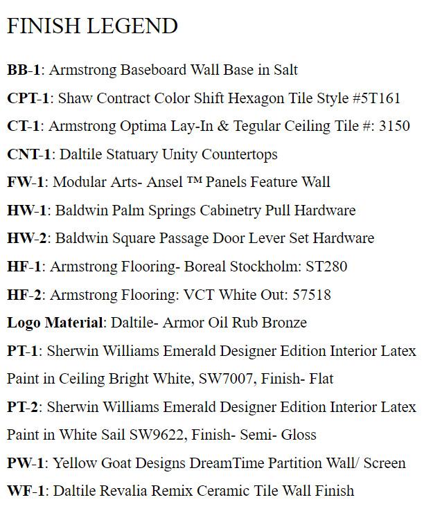
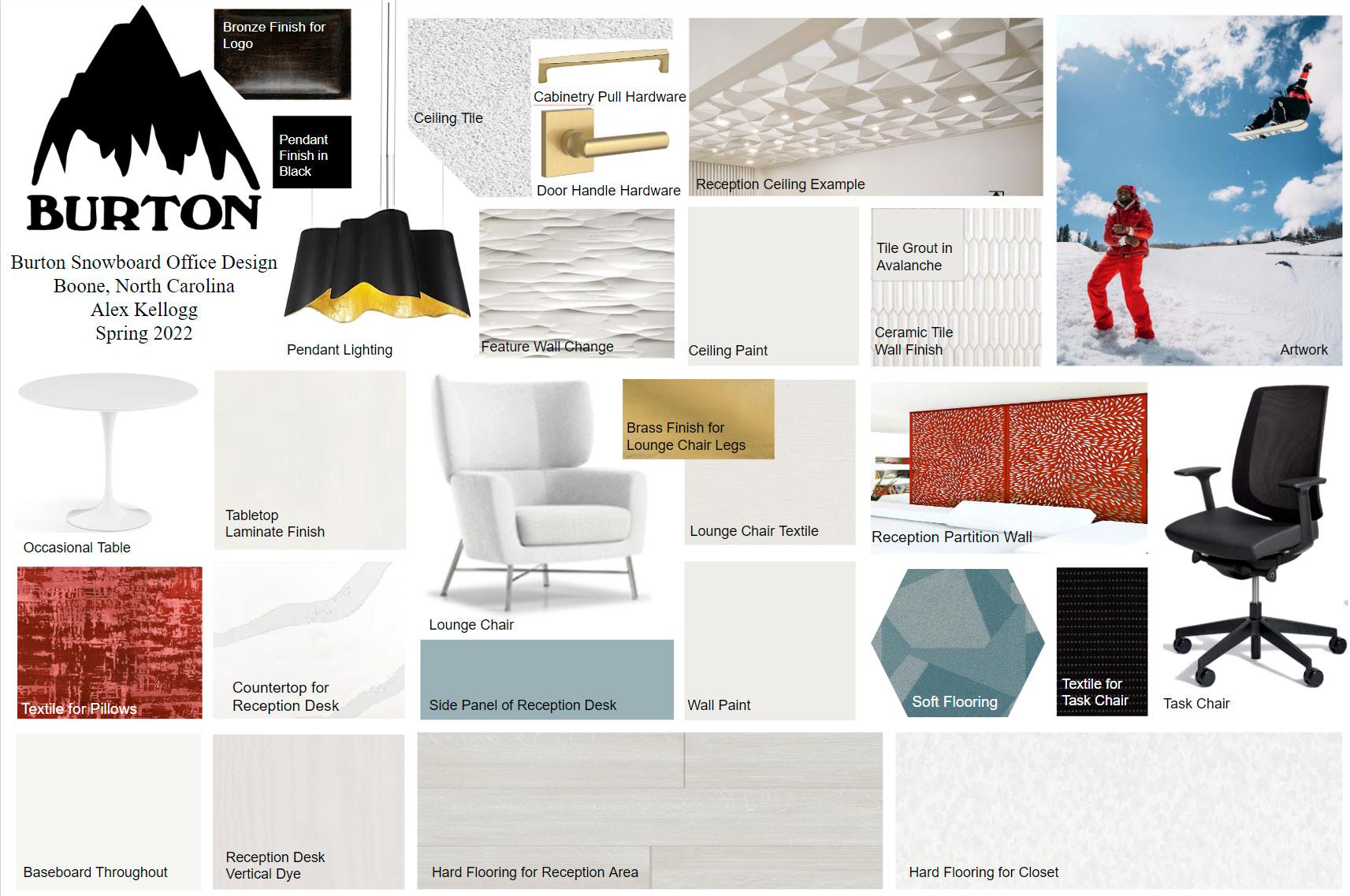
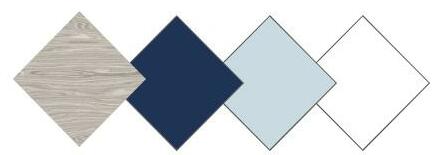
After receiving a furniture and floor plan template based off of a Burton Snowboard Office, I created a materials and finishes board using a triadic color scheme, which was based off of artwork I picked straight from Burton’s Instagram page. Alongside plenty of light features were yellow, blue, and red tones to add a colorful pop to the space. Within the finish legend are commercial grade companies that contain high end materials and finishes.
B02 Residence
After watching a tutorial presented in an Architectural Modeling & Graphics course, a project was assigned with an objective to design our own two story building using Autodesk Revit. Rendered with realistic, architectural components such as topography, roof slope, mullion elements, foundation assembly and finish materials of our choice, this building was one of the first designs that I created using Revit.
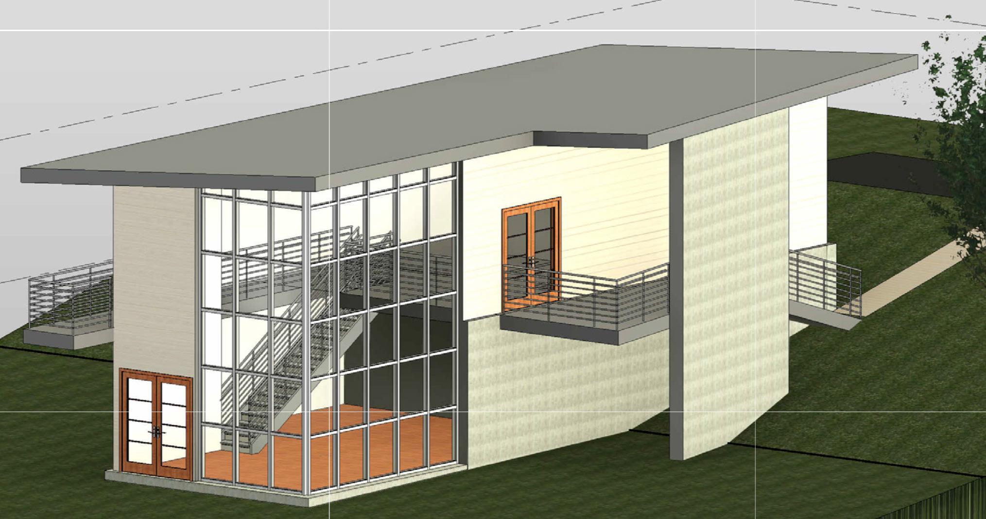
Exterior Rendering
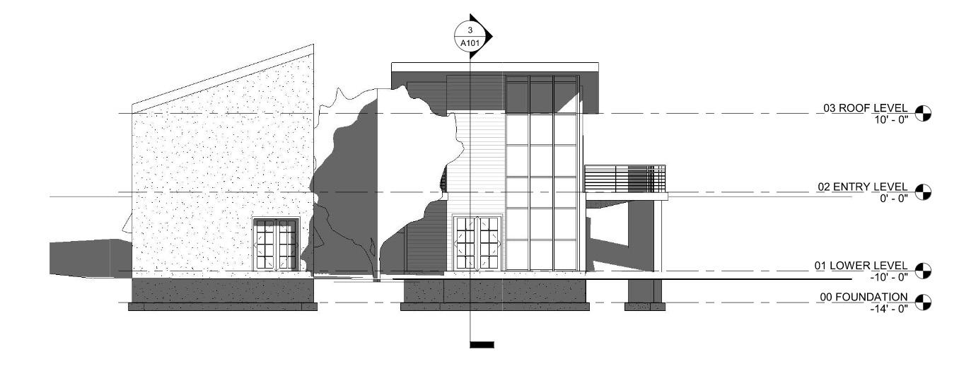
East Elevation
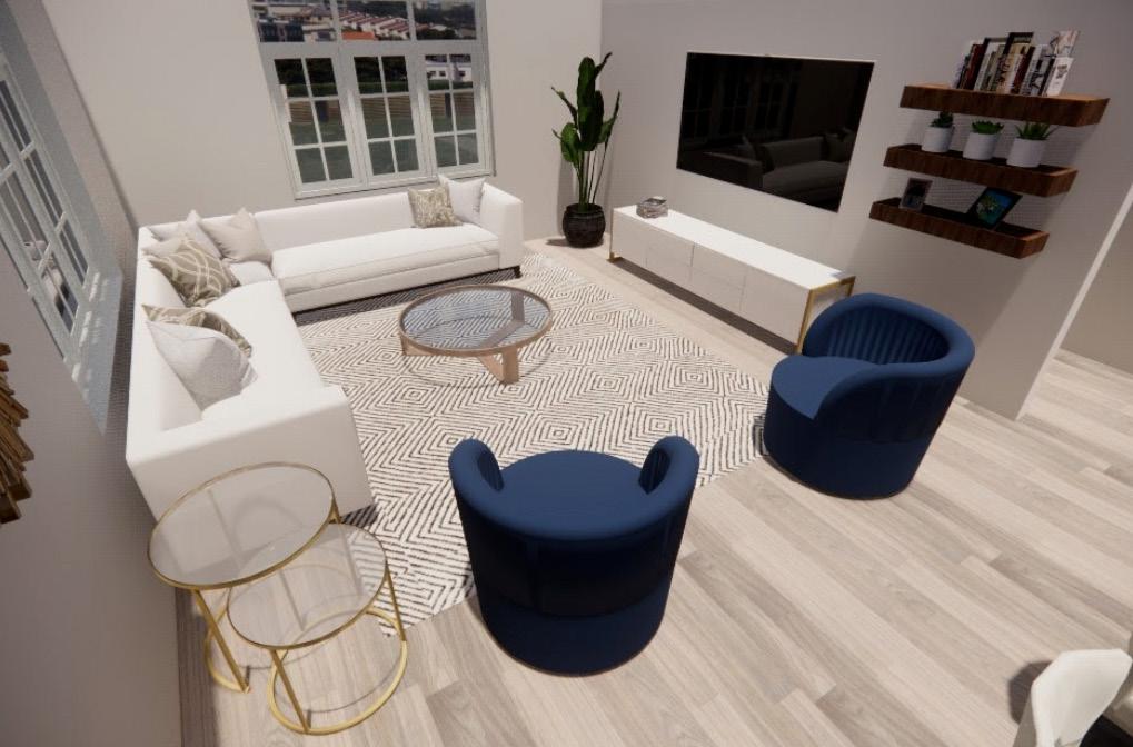
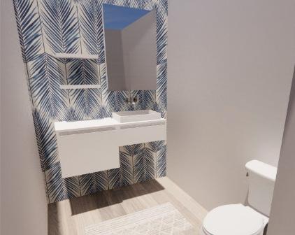
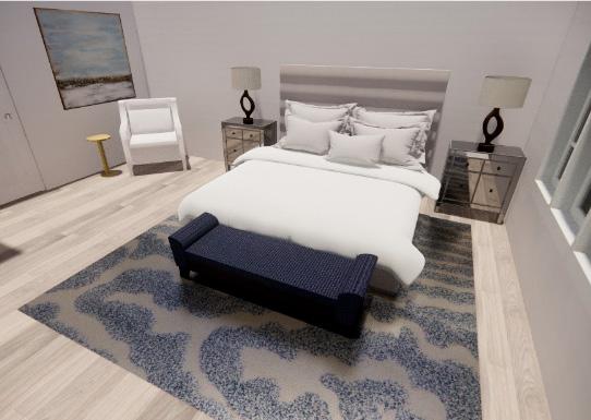
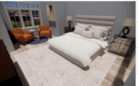
Seascape
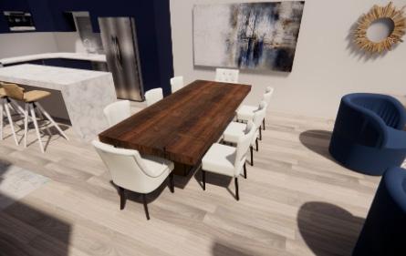
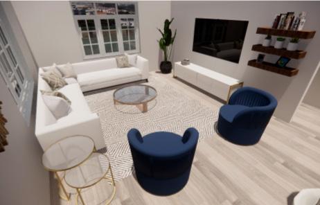
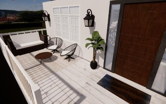
To begin this residential project, I first came up with a concept to fit the location of the residence. The concept that I chose was “coastal contemporary”, as it resides in Fernadina Beach, Florida . After space planning and creating a ceiling/lighting schedule, this coastal contemporay home was fully rendered in SketchUp, along with a full furniture and finish schedule consisting of sustainable and ecofriendly companies.
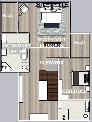
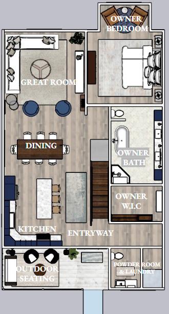
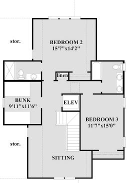
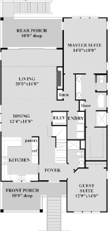
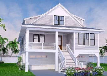
Residence Located in Fernadina Beach, Florida Main story floorplan Second story floorplan Ceiling & Lighting Plan Space & Furniture Plan Space & Furniture Plan
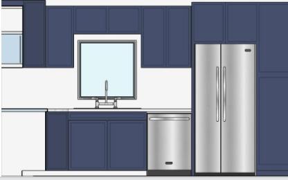

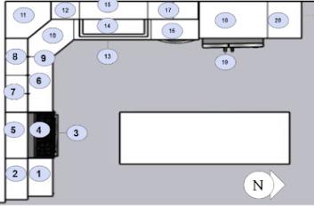
Kitchen Cabinet Schedule
Kitchen Rendering Progress Work Dining Room Accessible Powder Room Outdoor Patio Family Room
Owner Bathroom Owner Bedroom Guest Suite
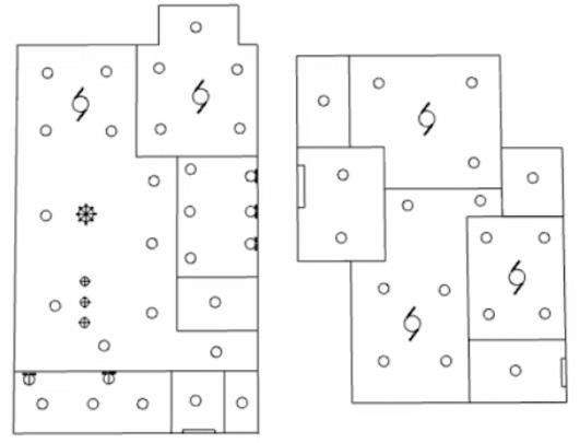
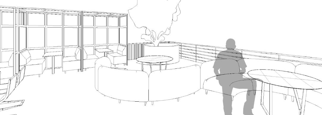
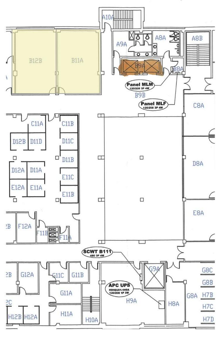
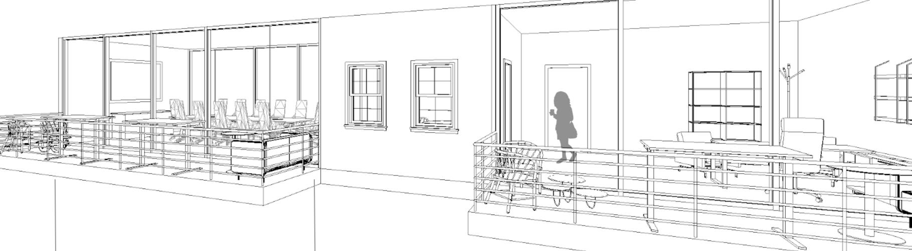
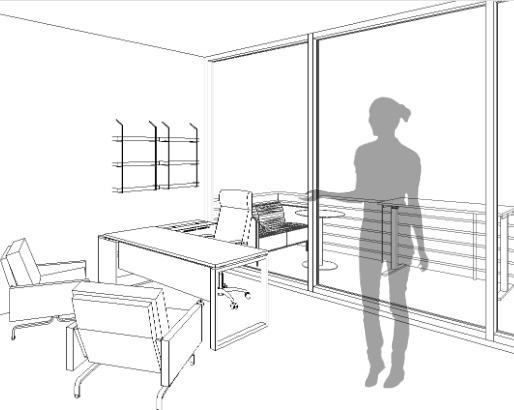
APP STATE HICKORY
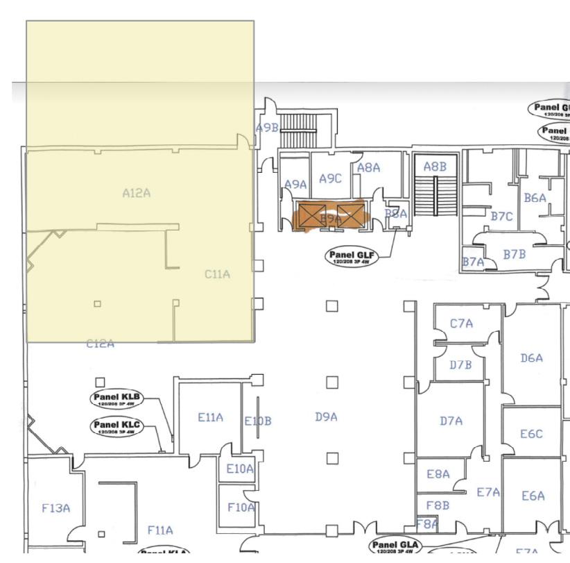
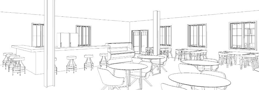
Focusing on Office Design for this course, we were excited to hear that Appalchian State University was opening a new campus in Hickory, North Carolina. Our professors were able to recieve the floorplans in which we could utilize throughout the course. To begin, I space planned in AutoCad then began adding furniture to further complete the chosen spaces. Using Autodesk Revit, I rendered an outdoor cafe/ lounge area, private offices, conference rooms and fully furnished balconies located on the second floor.
Outdoor Lounge/ Cafe
Ground Floor Plan Outdoor
Cafe
Indoor Cafe
Outdoor Balconies
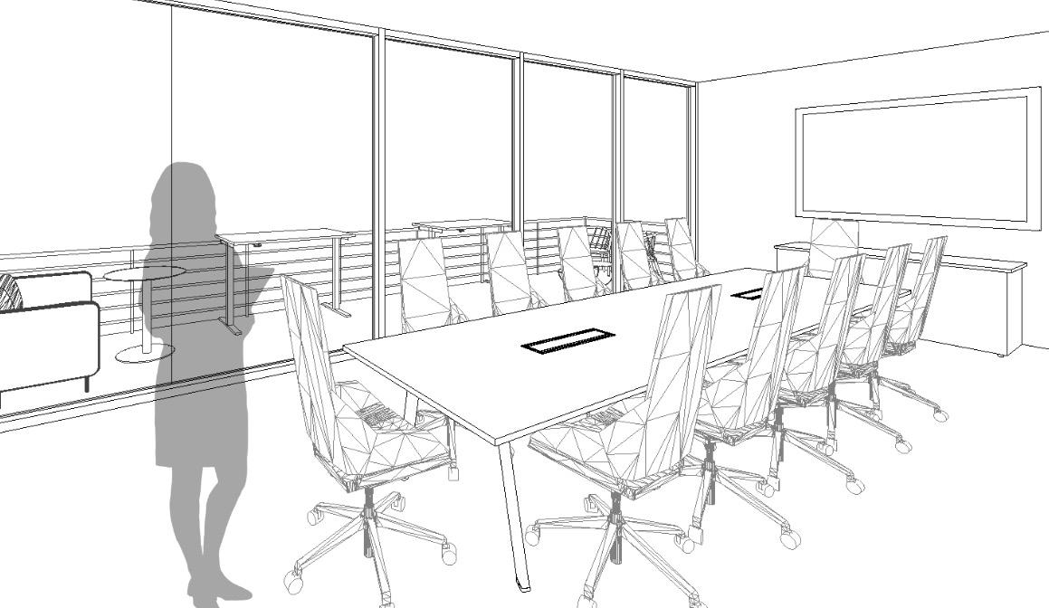
Conference
Room
Office
First Floor Plan
Private
Space
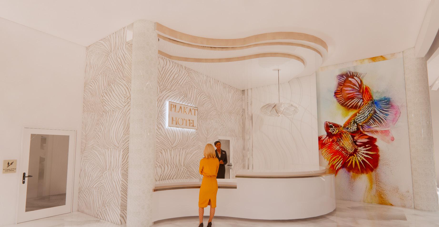
Plakat HoteL
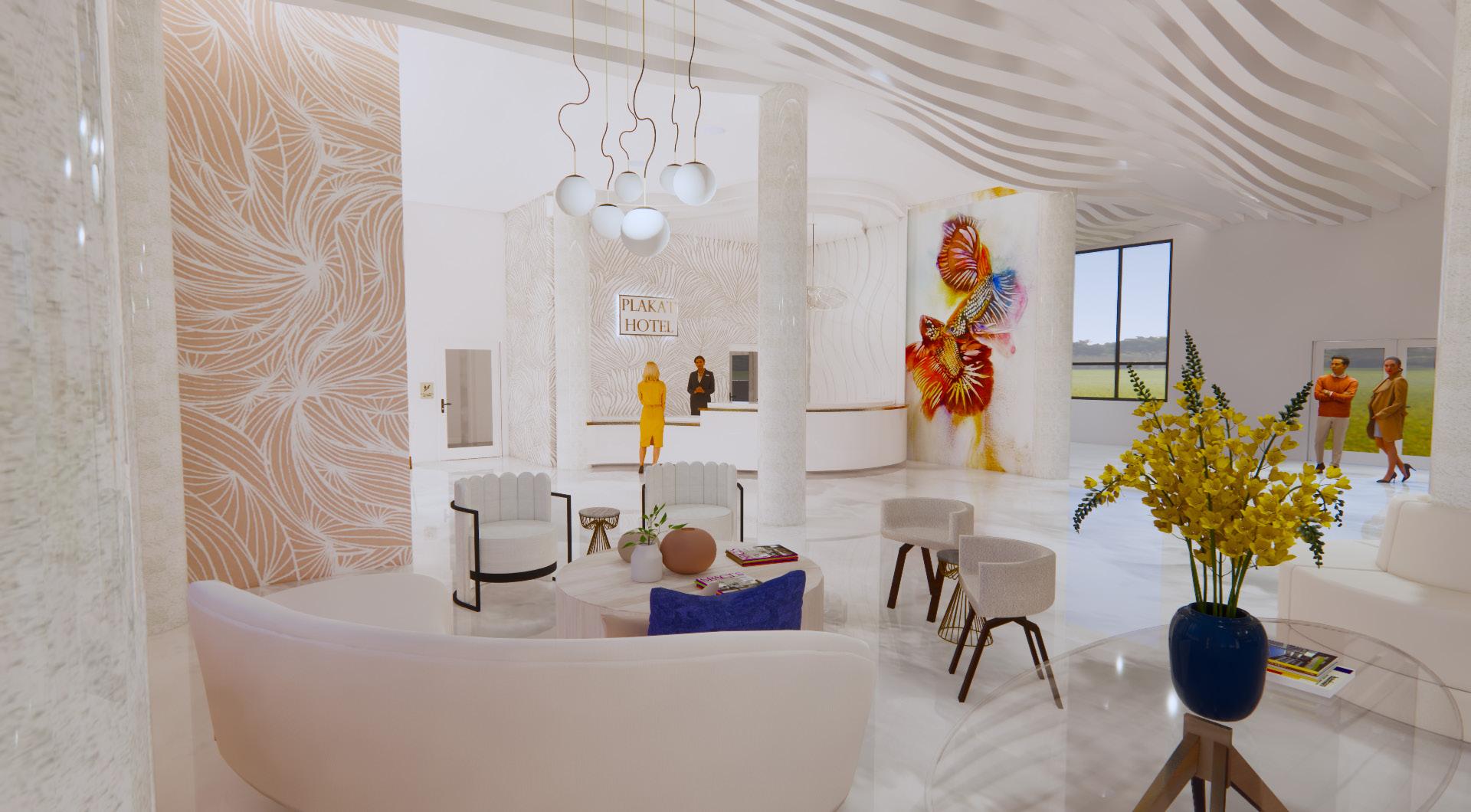
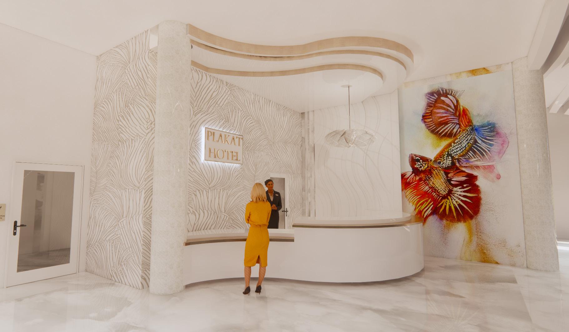
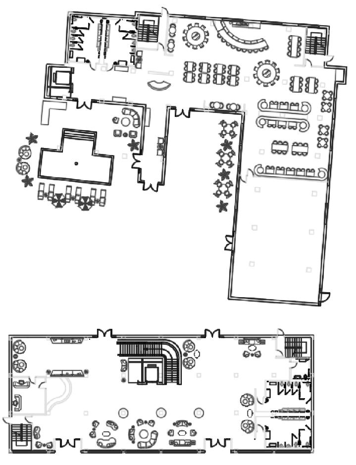
The prompt of this project was to showcase our designs for a theoretical urban and biophillic hotel located in Bangkok, Thailand. Presented are floor plans created on AutoCad and renderings completed in Sketchup. For this four story building, I used sustainable commercial grade companies to ensure that biophillia was incorporated even in an indirect manor. The concept of this hotel is the “Siamese Fighting Fish” also known as “Plakat” in the Thai language. The forms and colors of the fish were taken into consideration when making every design choice for the hotel.
B)
Ground Floor Plan (Building A &
Reception Desk Design
Reception Desk & Lobby Design
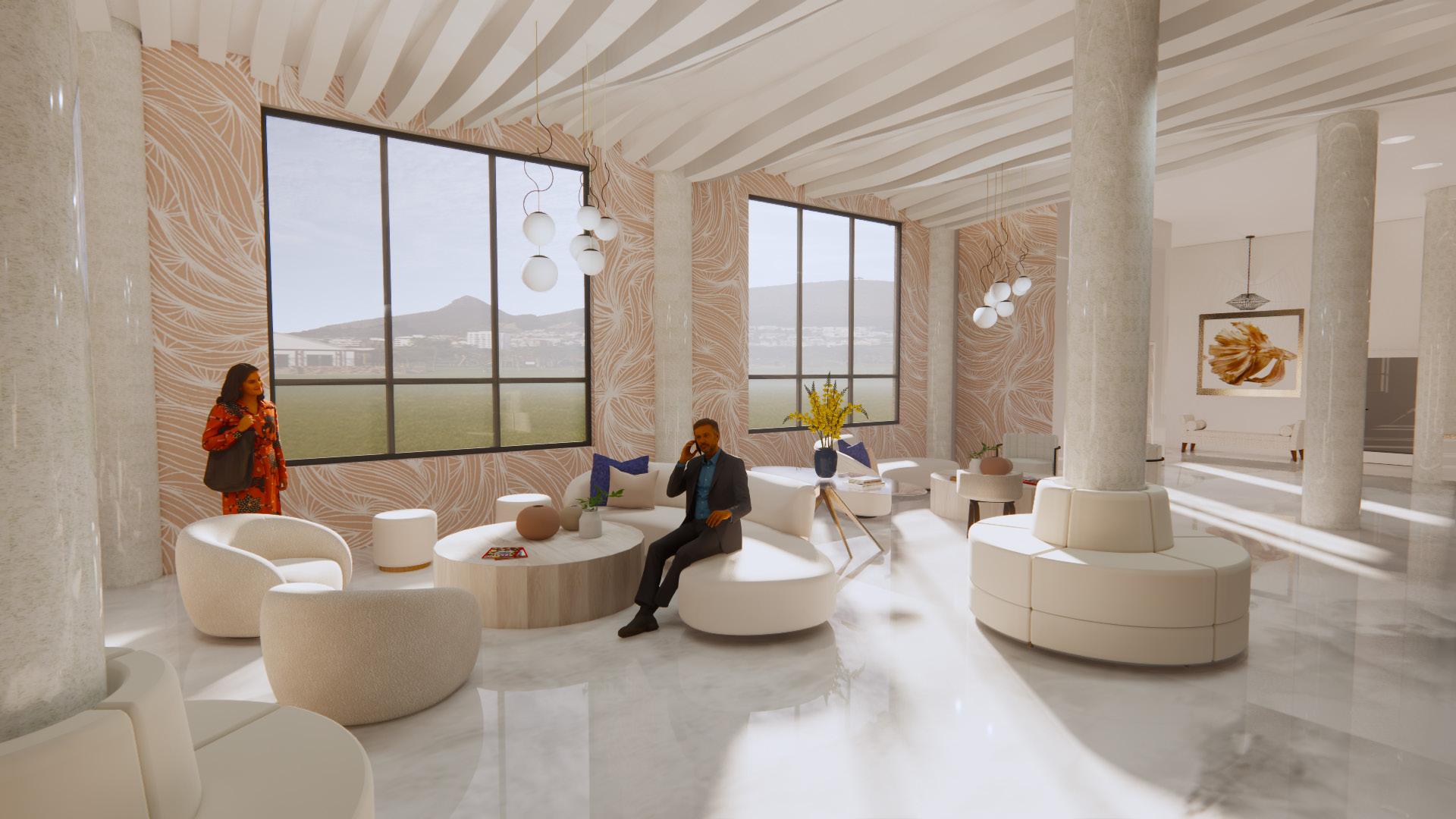
Lobby Perspective
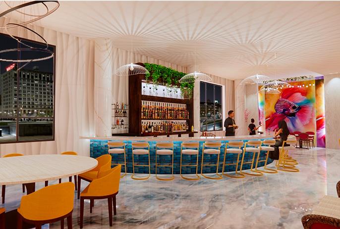
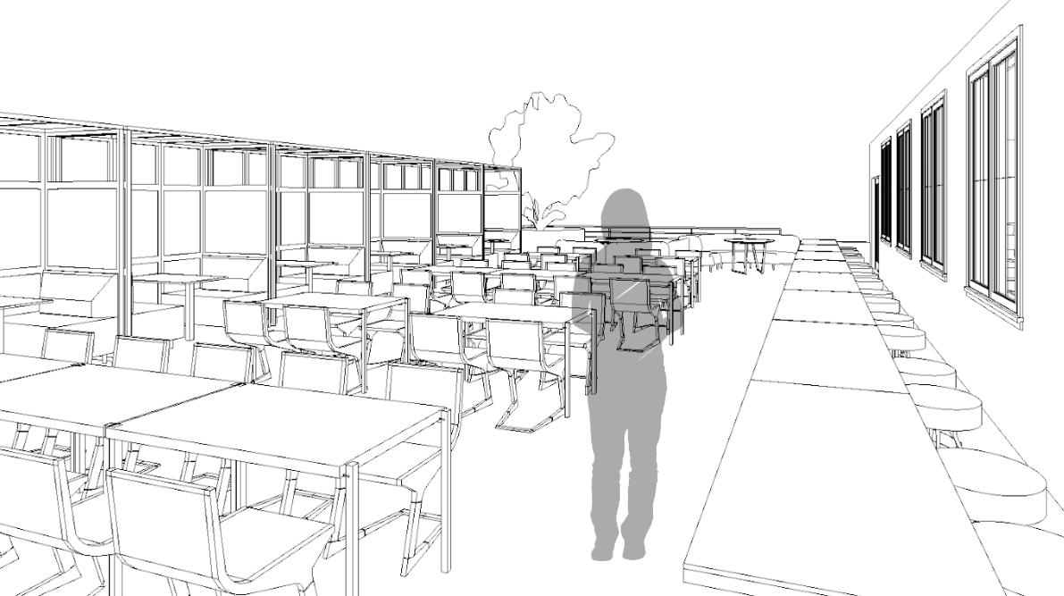
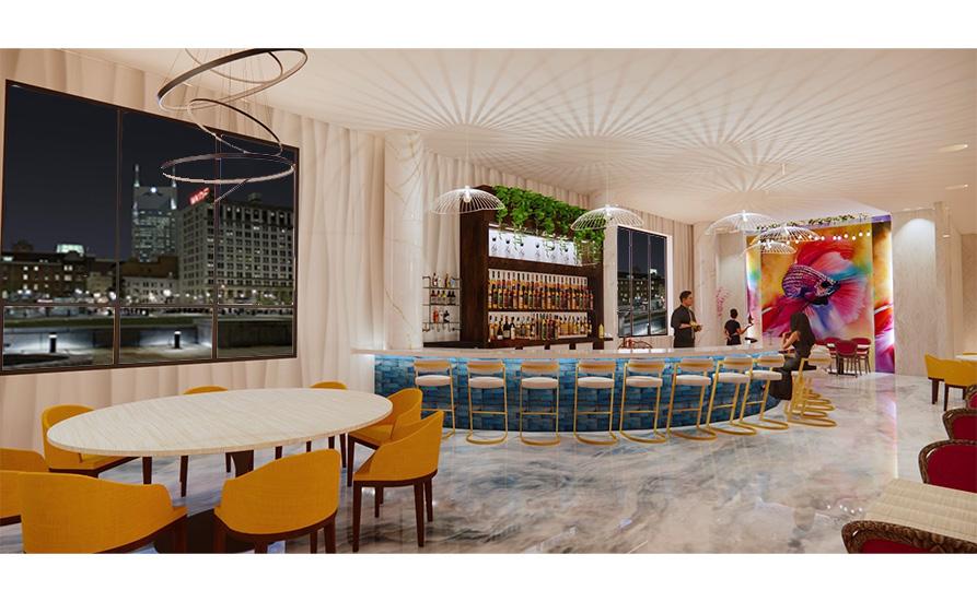
Aroi Bistro
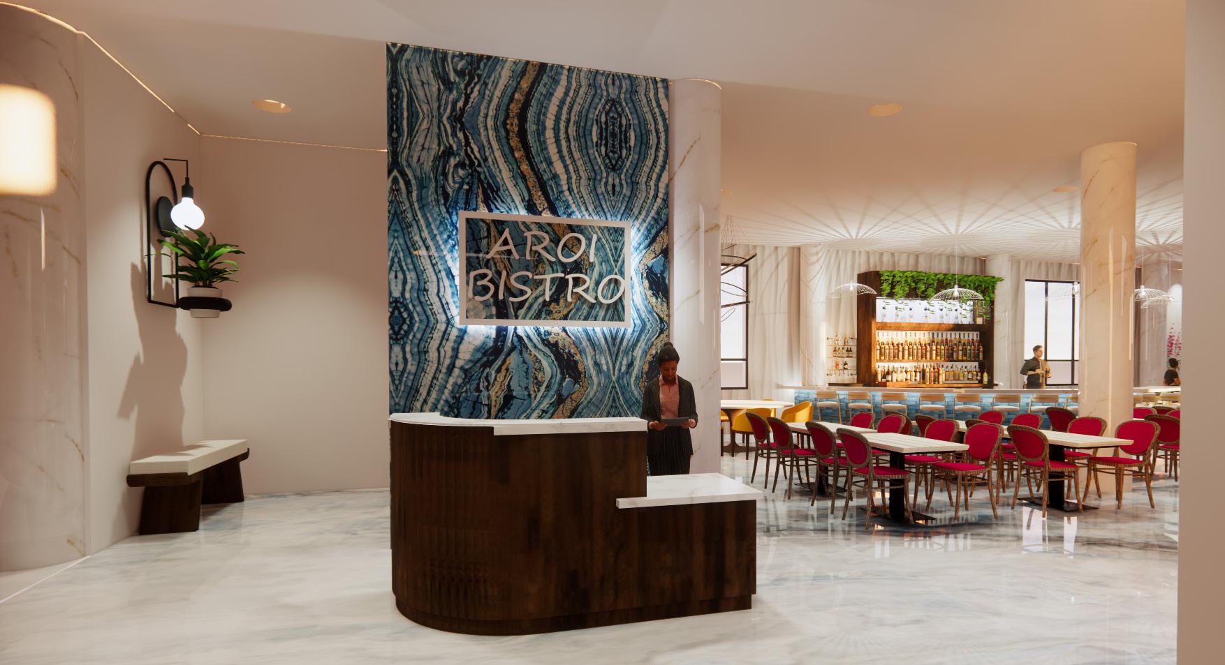
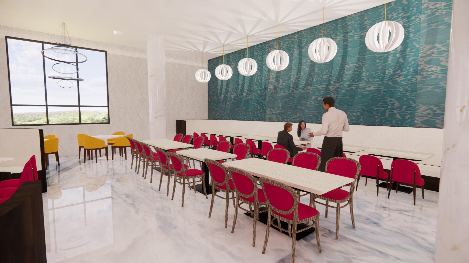
Within the Plakat Hotel is a restaurant called the Aroi (delicious in Thai) Bistro. Customers are directly lead to a host stand when using any of the three entrances. With more than 100 seats available, the Aroi Bistro also contains outdoor seating and a bar area. More than 75% of the seating is ADA compliant, allowing this restaurant to have a more inclusive enviornment, while also showcasing the colors and forms of the orignial concept.
Host Stand Design Perspective
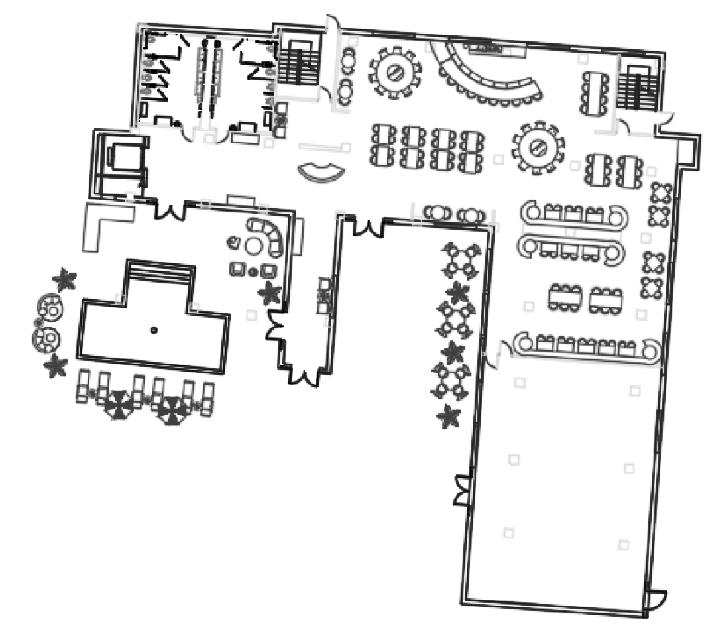
Ground Floor Plan (Building B) Restaurant Seating Perspective
Restaurant & Bar Design Perspective
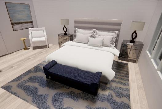
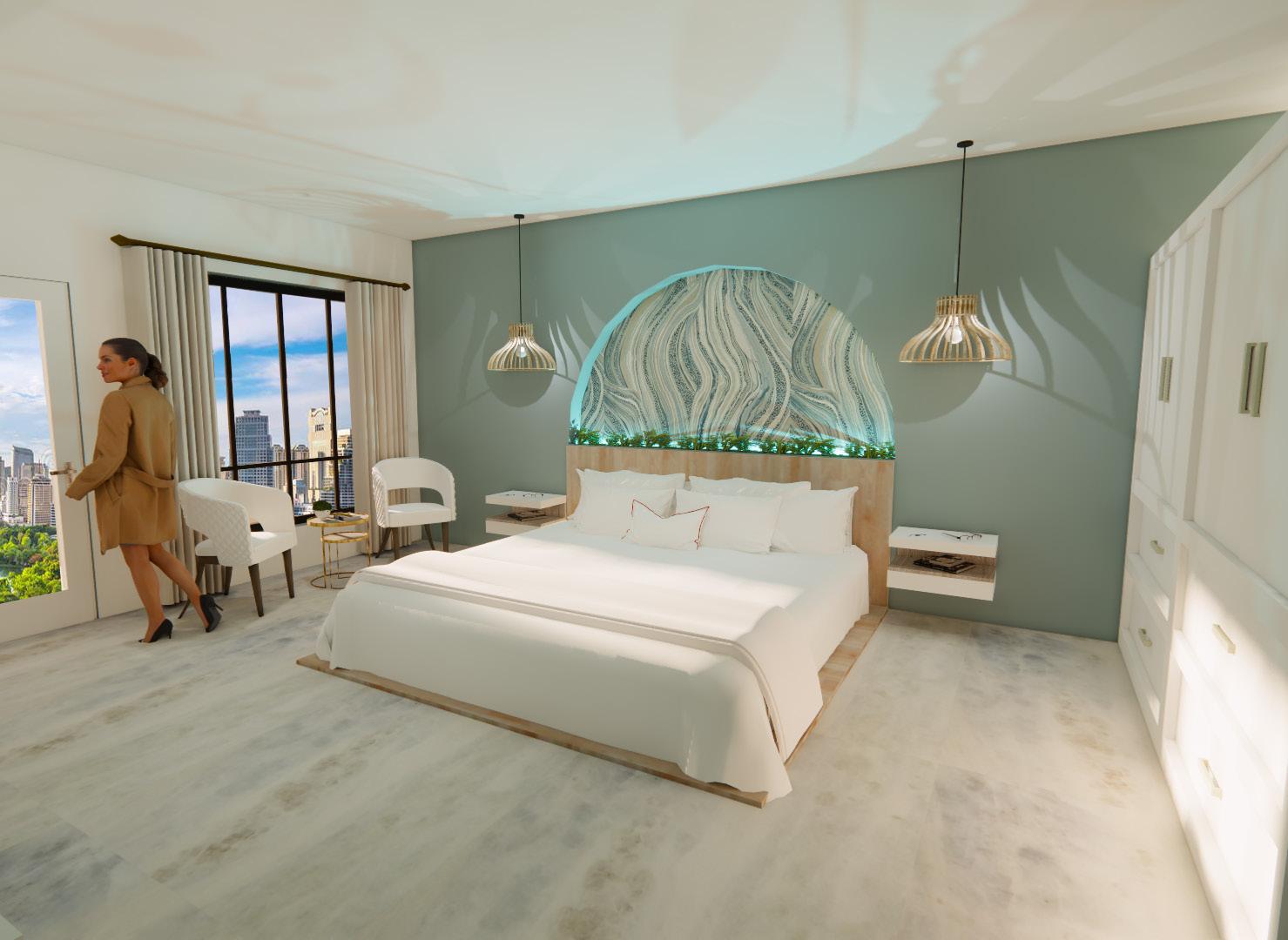
Guest Suite Design A
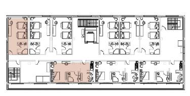
First Floor Plan (Building A)
Guest Suites
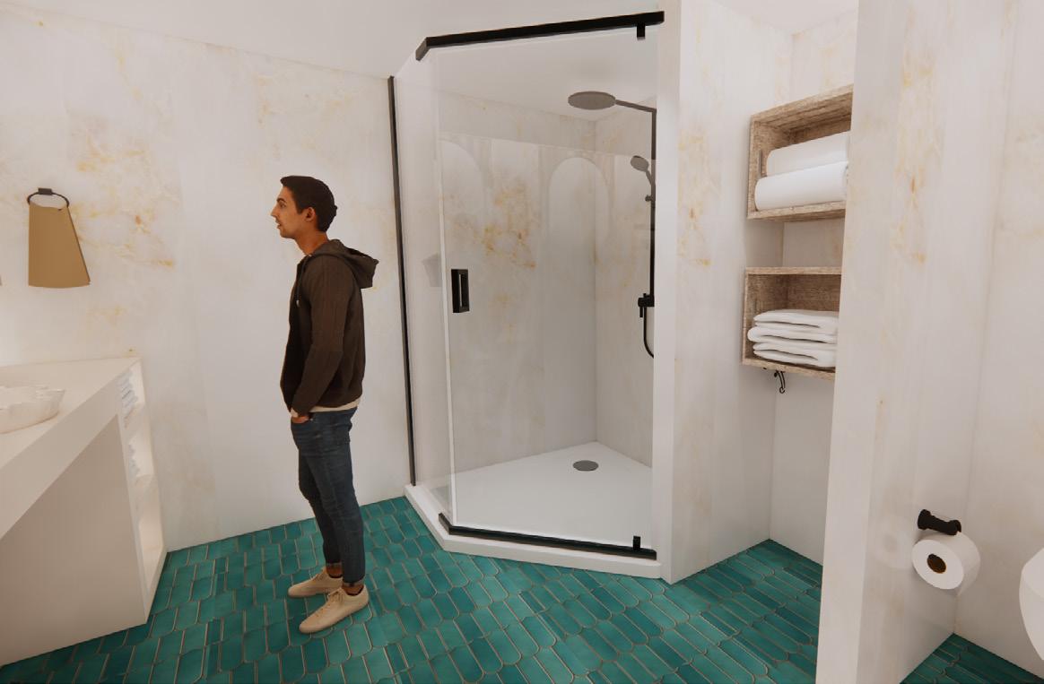
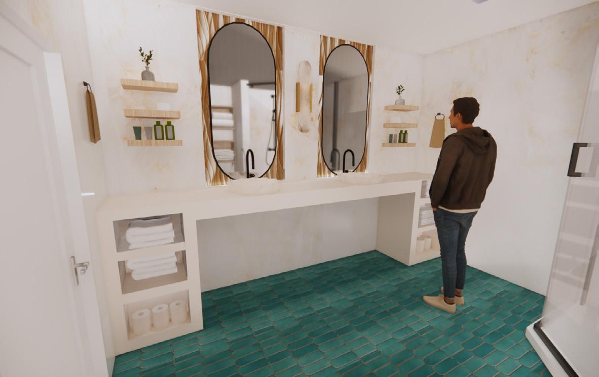
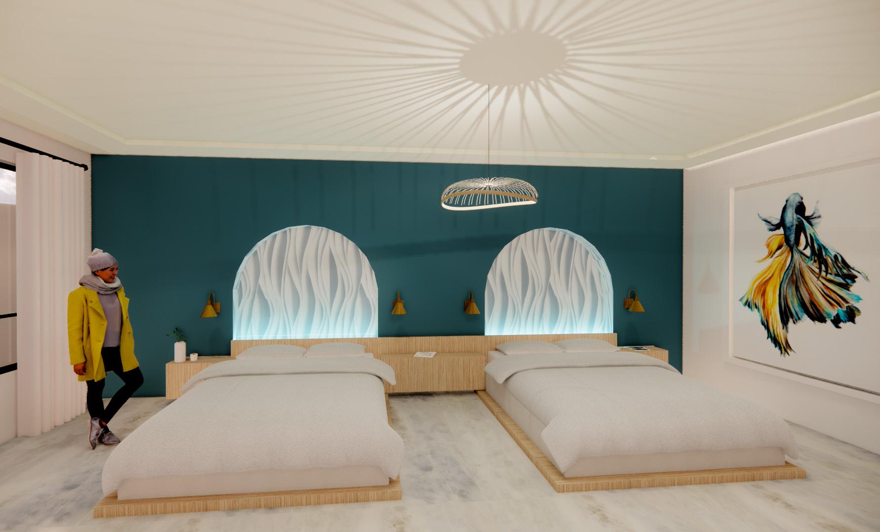
Two different guest suites were created in the Plakat Hotel to ensure ADA compliancy, as well as design versatility. Guests have the option between a room with two queen beds, or one room with a King attatched to a lounge area. Biophillia is incorporated in each design through an indirect approach, by ensuring that every item of furniture used fabrics and materials that were ecofriendly or sustainable.
Guest Suite Restroom
Restroom Perspective
Guest Suite Design B
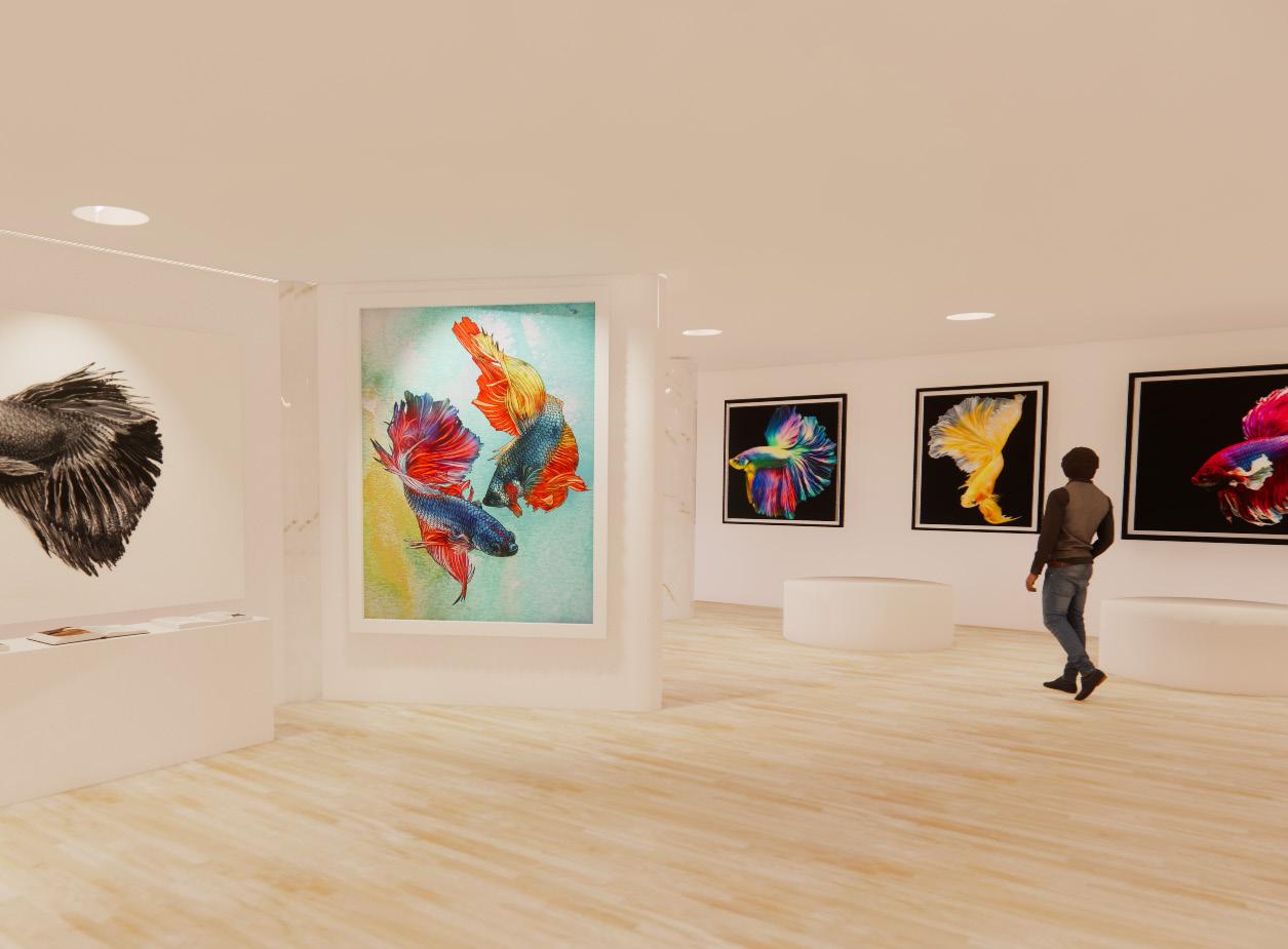
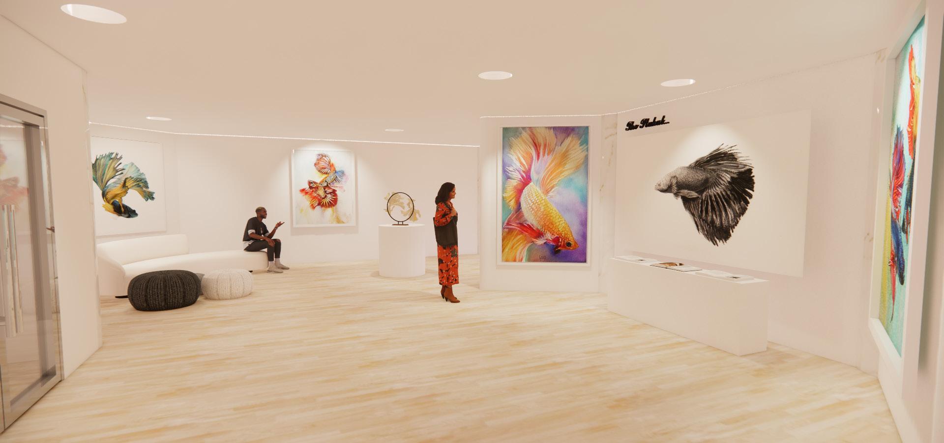
Art Gallery
For the prompt of this project, the Plakat Hotel needed to have an interactive guest space relating back to our chosen concept. I chose an art gallery, as this showcases the choices behind each design, while also adding a sense of history and importance of the Siamese Fighting Fish in the Thai culture. Each painting and material in the art gallery is sourced locally from painters and vendors. Lighting is very important in art galleries, so to enhance that, I went into enscape and added wall grazed lighting.
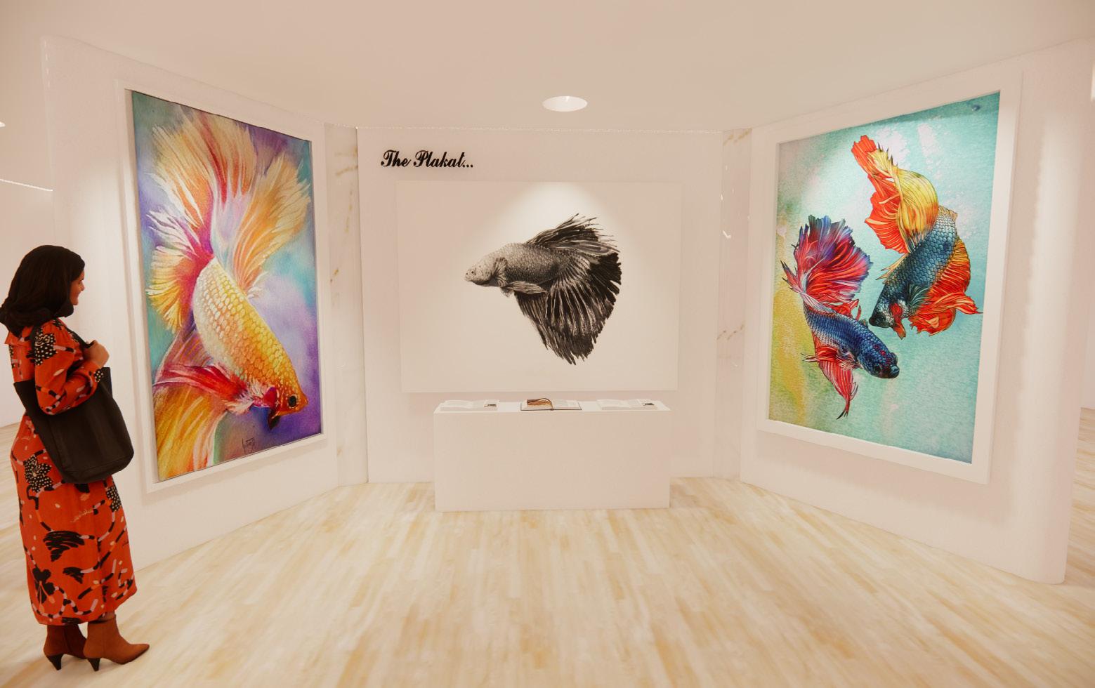
Entrance Perspective
Art Gallery Perspective
Art Gallery Perspective