Architectural Portfolio
Selected Works: 2022-2025
Introduction
This portfolio contains selected works from my time in Architecural Design at Washington University in St. Louis (WashU) so far. The chosen works highlight my skills as a blooming architect while also showing the development of my style and passion. The chosen projects highlight my design education while shining light on my style, creativity, passion, and diversity between projects.
I am well-aquainted with the Rhino, Grasshopper, drawing and the intricate modeling process as showcased throughout my protfolio. I also do extensive work with Illustrator, Photoshop, and InDesign for several different projects, proposals, and submissions in my classes. I will be carrying these experiences and knowledge with me wherever I work in hopes to not only learn more, but to grow and reach even greater heights.
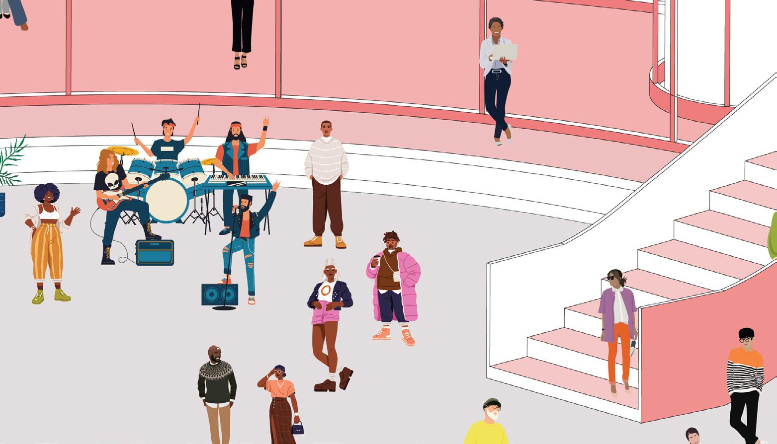
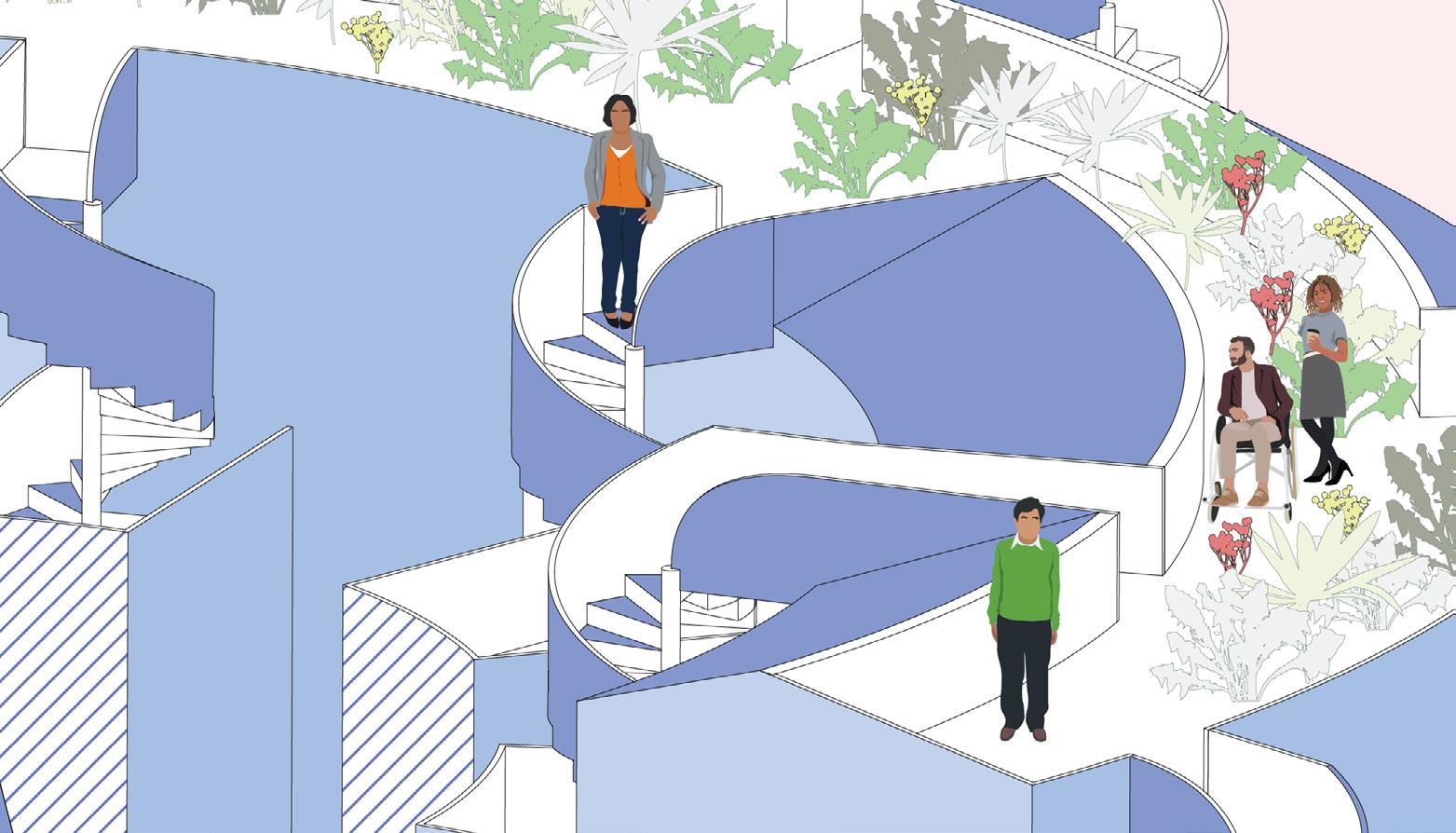
My passion for the architectural field comes from my grandfather and my experiences with theme parks. My grandfather worked extremely hard to provide for my grandmother and mother to get them out of poverty and to a better life. He did just that and is now the man that inspires and drives me to create and design. My love for theme parks come into play as it was the first trip I took as a child that I can remeber. At first, theme parks were a place where the big kids got to ride scary-looking rides. Now, they inspire me to no end. From the queues to the food hall, theme parks and themed atrractions are my greatest passion in life.
Table of Contents
Fire Station No. 31
NOMA Competition: Albina Bridging the Gap The Nesting Tower: CHICAGO reFRAMEd The Diamond Tapestry Museum
The Laskey Charrette: Filiale 4-9 10-15 16-23 24-29 30-35
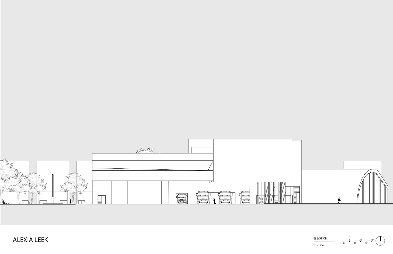
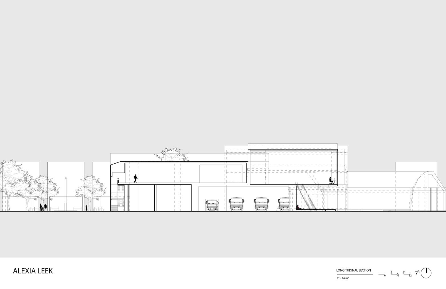
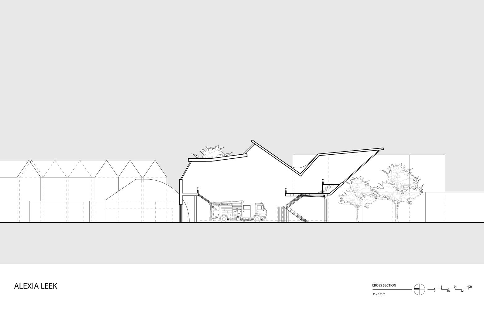
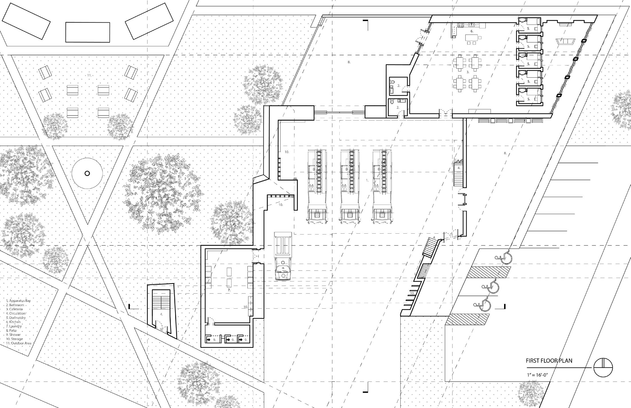
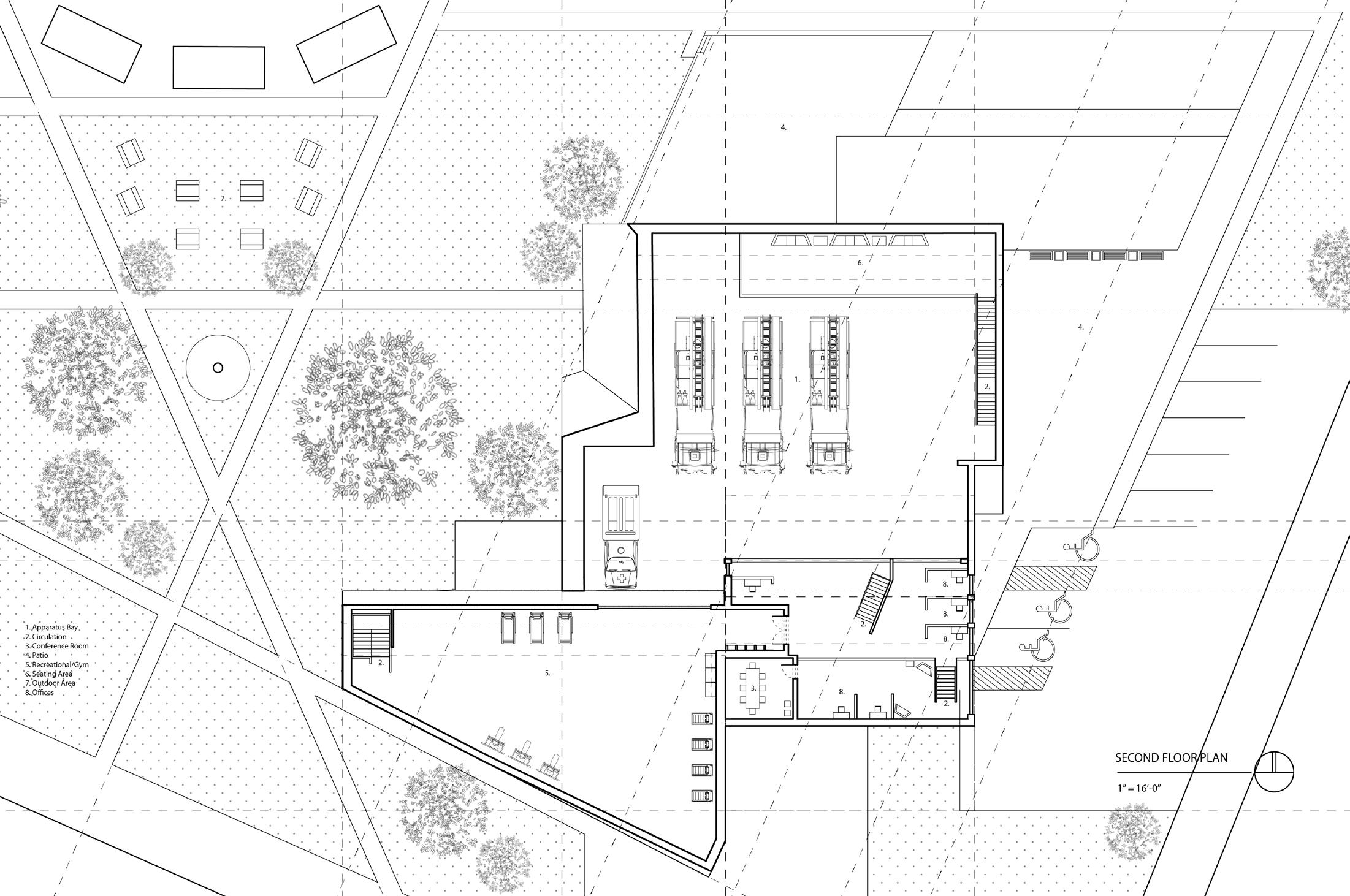
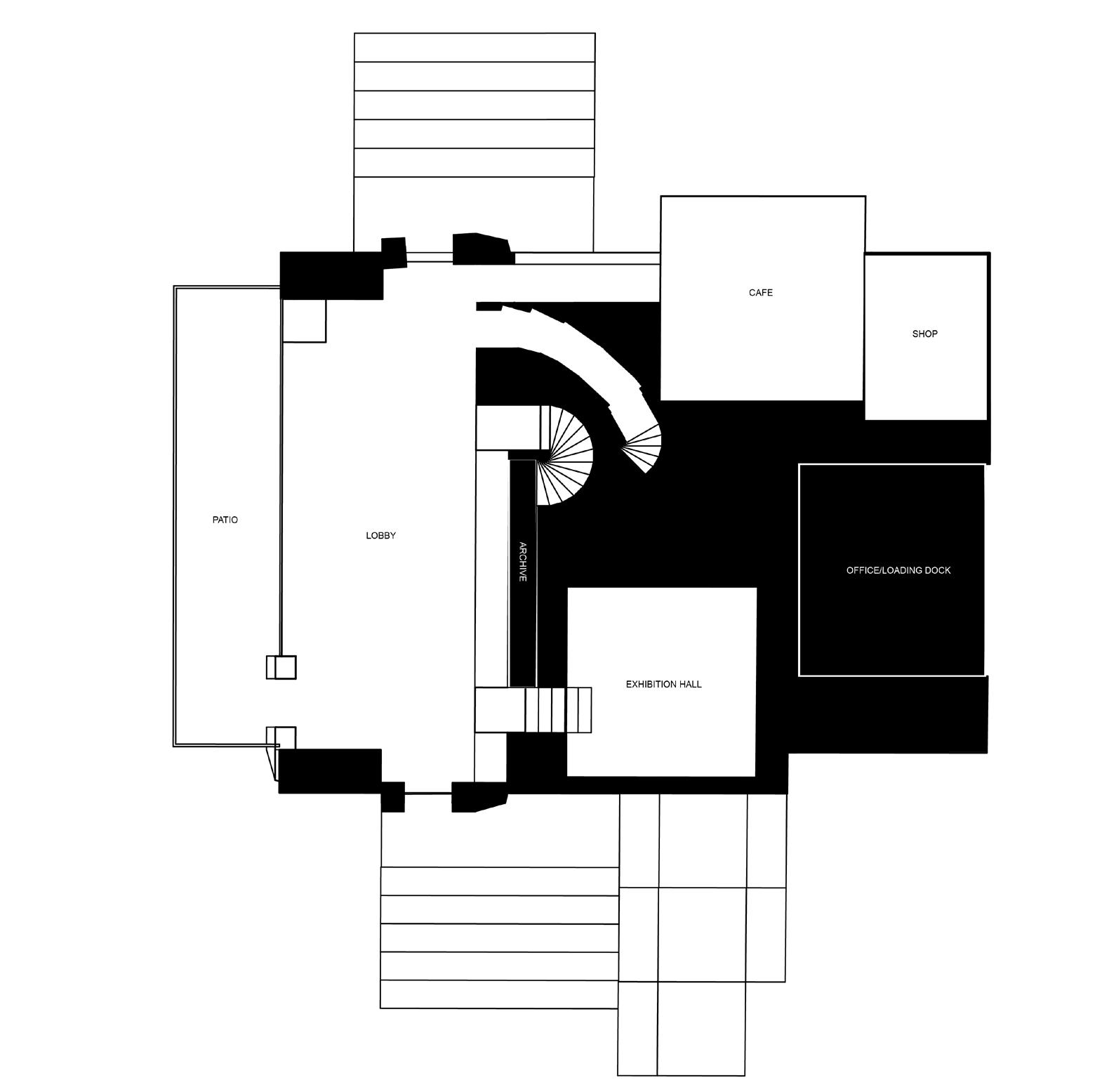
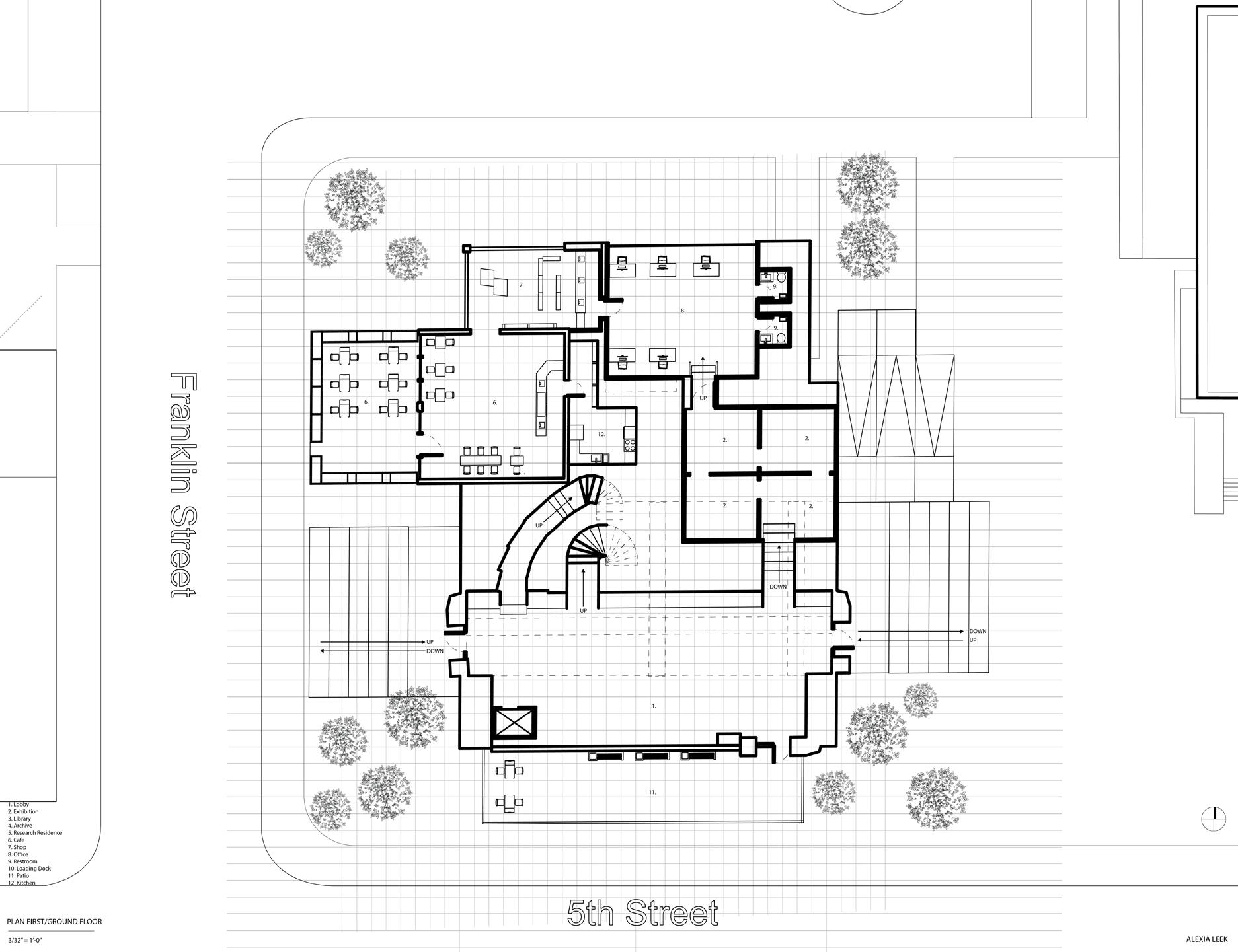
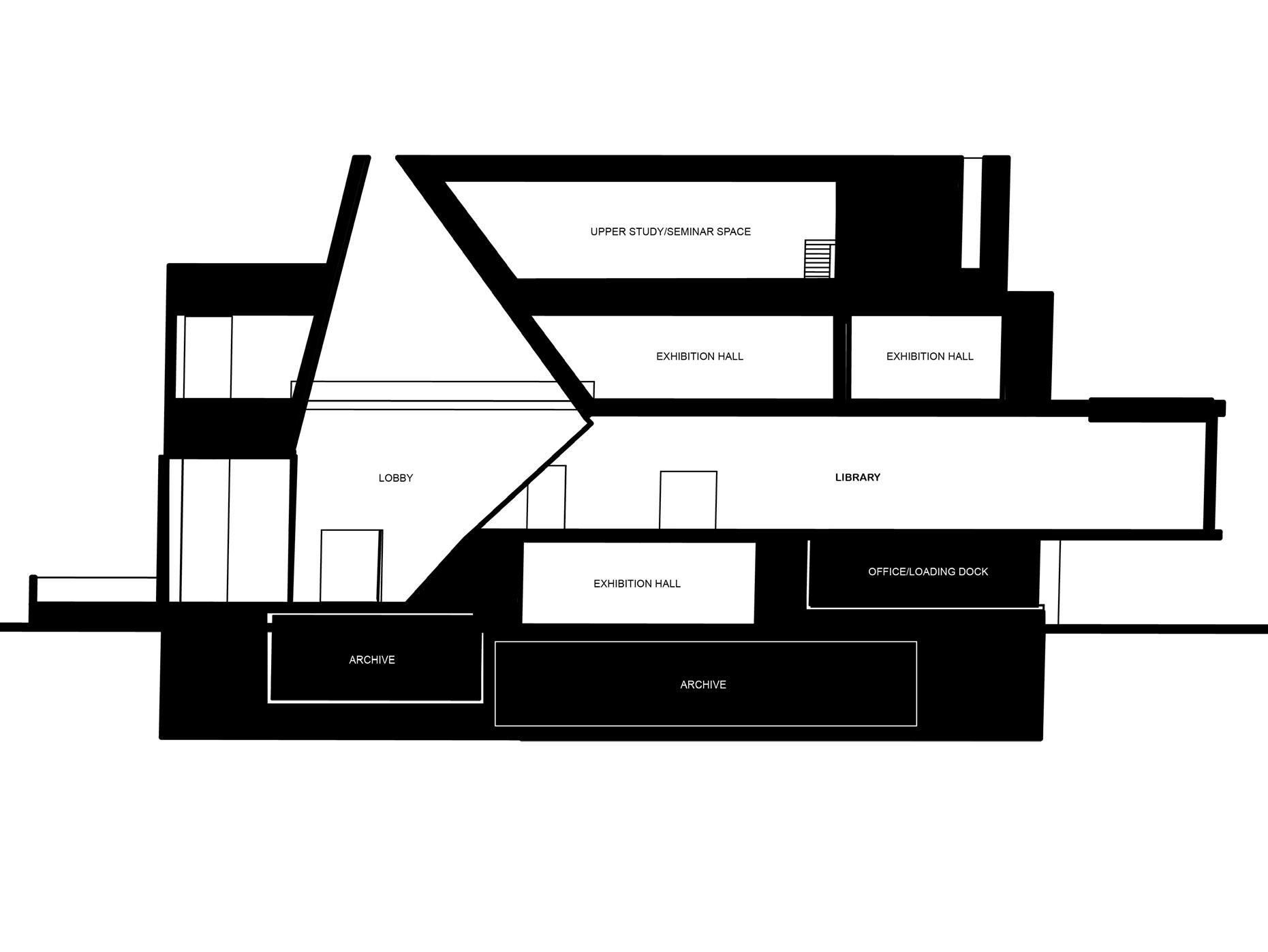
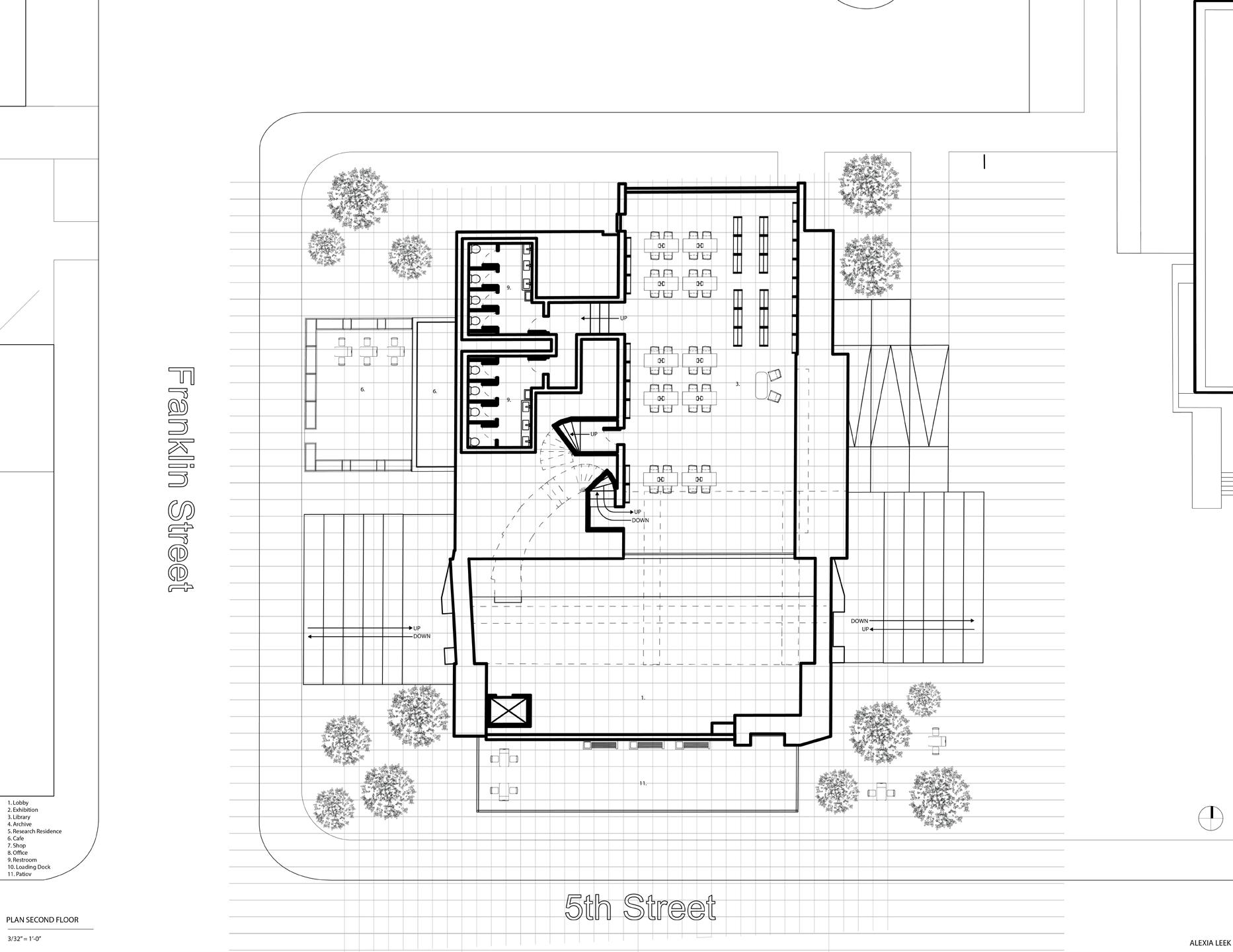
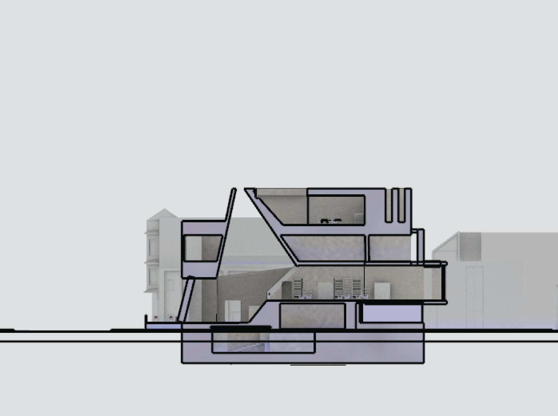
Fire Station No. 31
OBJECTIVE
The objective of the Station 31 project focuses around the design and creation of a fire station where students would explore architectural development of public service buildings. Using knowledge from a class trip and lectures given by professors, groups of two research and create an analysis for a precedent fire station. From that anaylsis of materials, circulation, heating, and community, the groups created a plan of each floor, two sections, an axon, and three diagrams and presented their research in class.
Fire Station No. 31 focuses on the interaction between spaces using an elemental approach. The fire station follows a grid created by the site and the grid lines can be seen throughout its design. These grid lines don’t stop at just the fire station, they continue past it, creating a courtyard for the entire community to enjoy. Lighting is the first focal point in this project becuase the natural light illuminates the entire building making an ecofriendly environment by limiting the amount of unnatural light used. If lighting was the first focal point, than the apperatus bay is the second. In this project, the apperatus bay is large and open, not only for emergency calls, but to allow the outside inwards and vice verse, creating an conversation between the St. Louis community and the station.
Precedent: Fire Station in Houten, Netherlands by SAMYN and PARTNERS
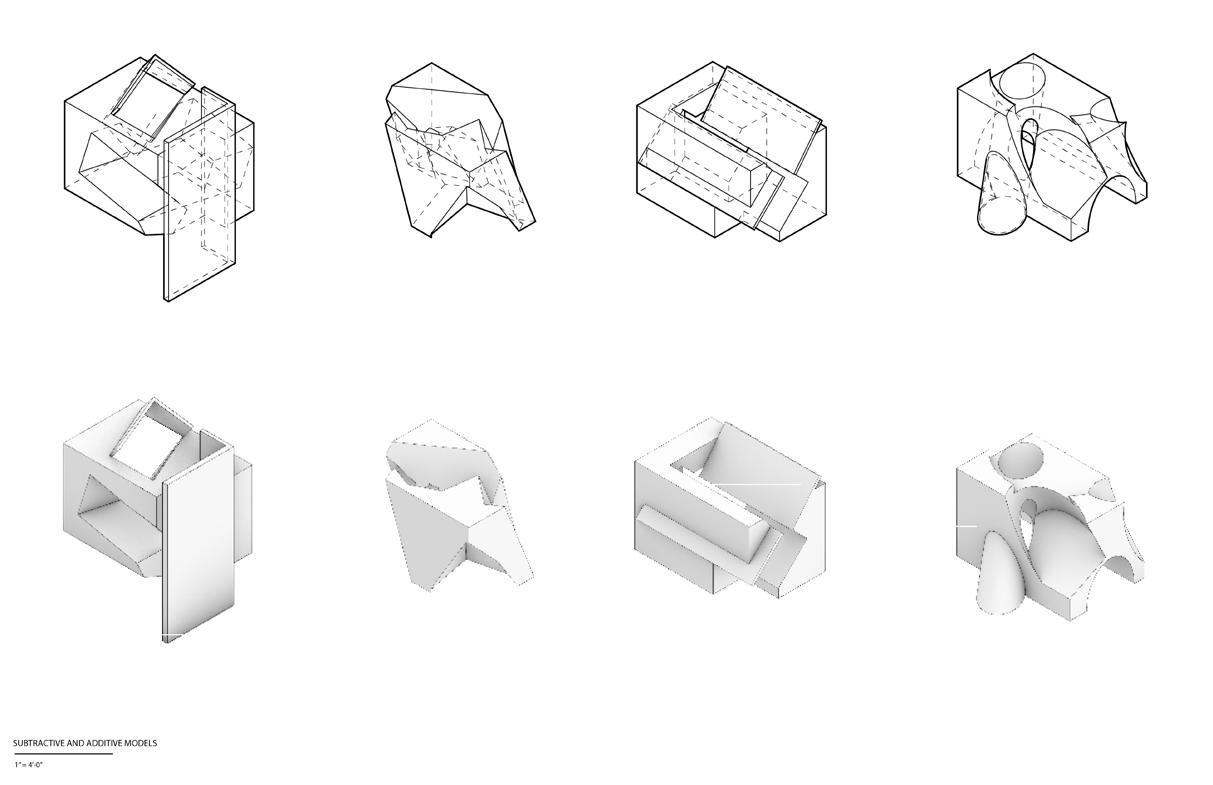
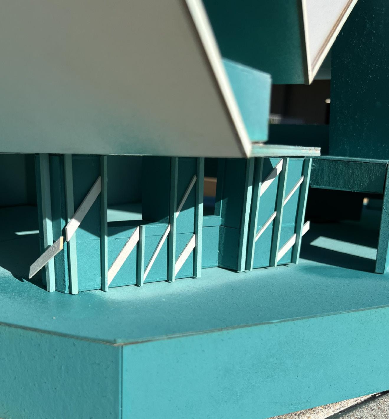
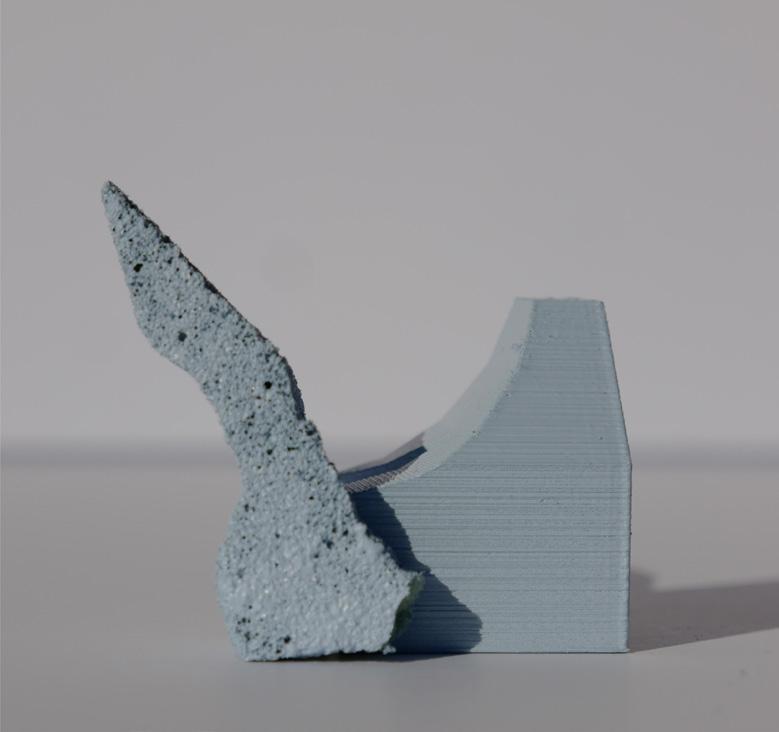
Massings and Relief
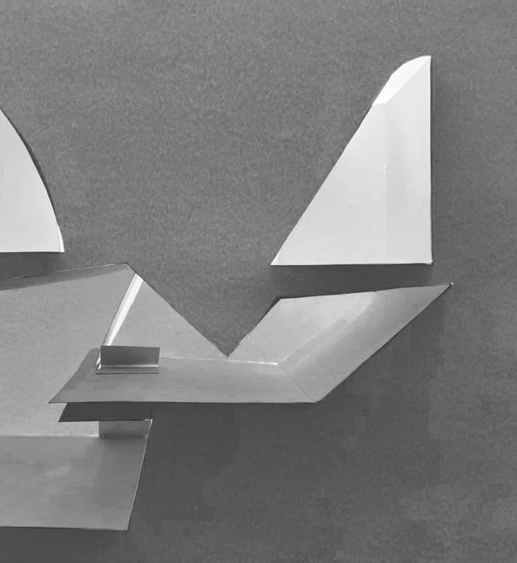
After research, massing models were created via additive and subtractive methods to get the basis of an interesting section cut. That section cut was turned into a relief model as seen on the right.
The relief model would be part of how the final model gained its overall shape.
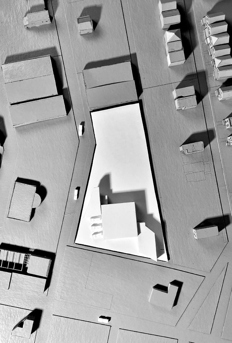
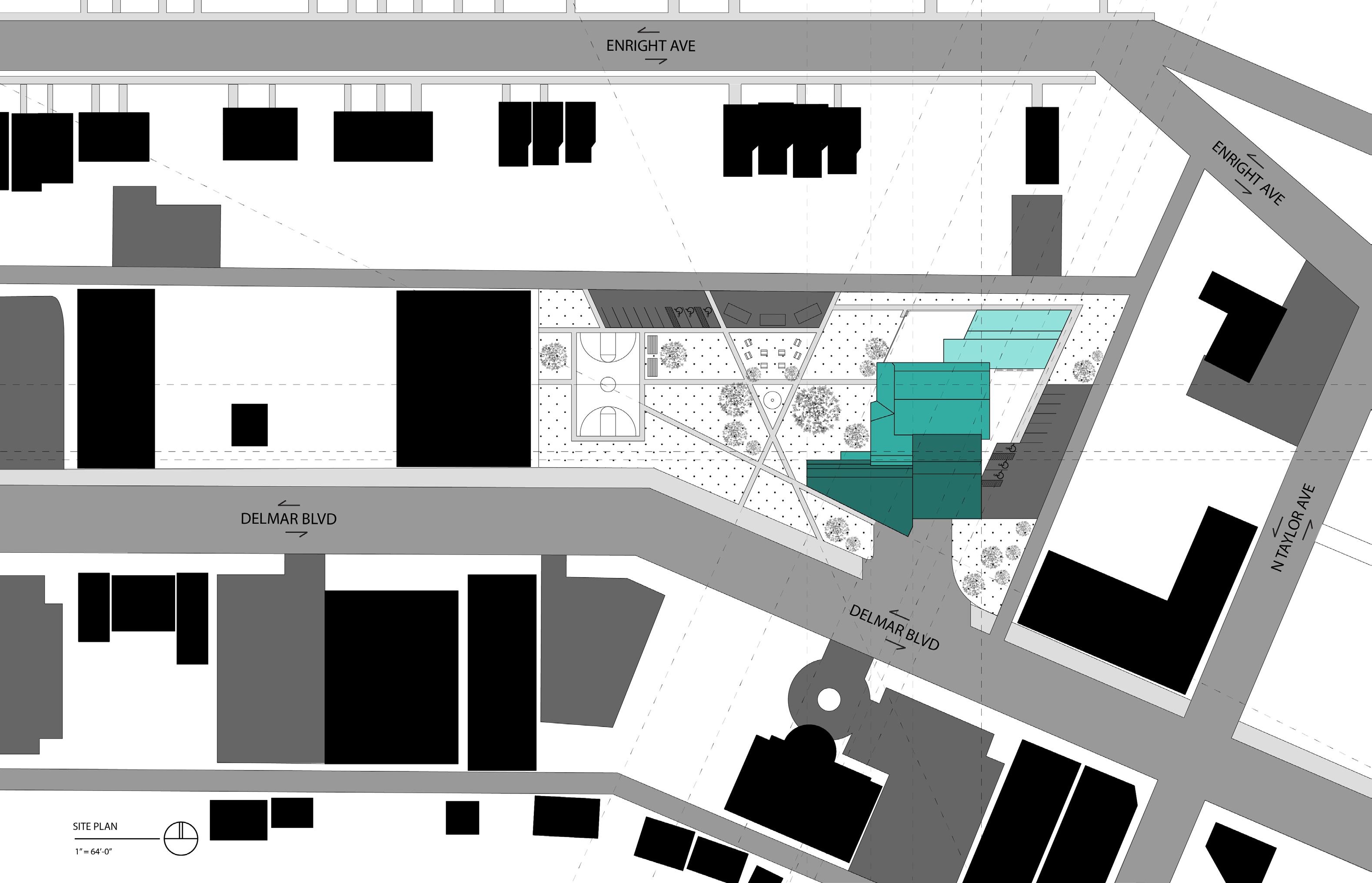
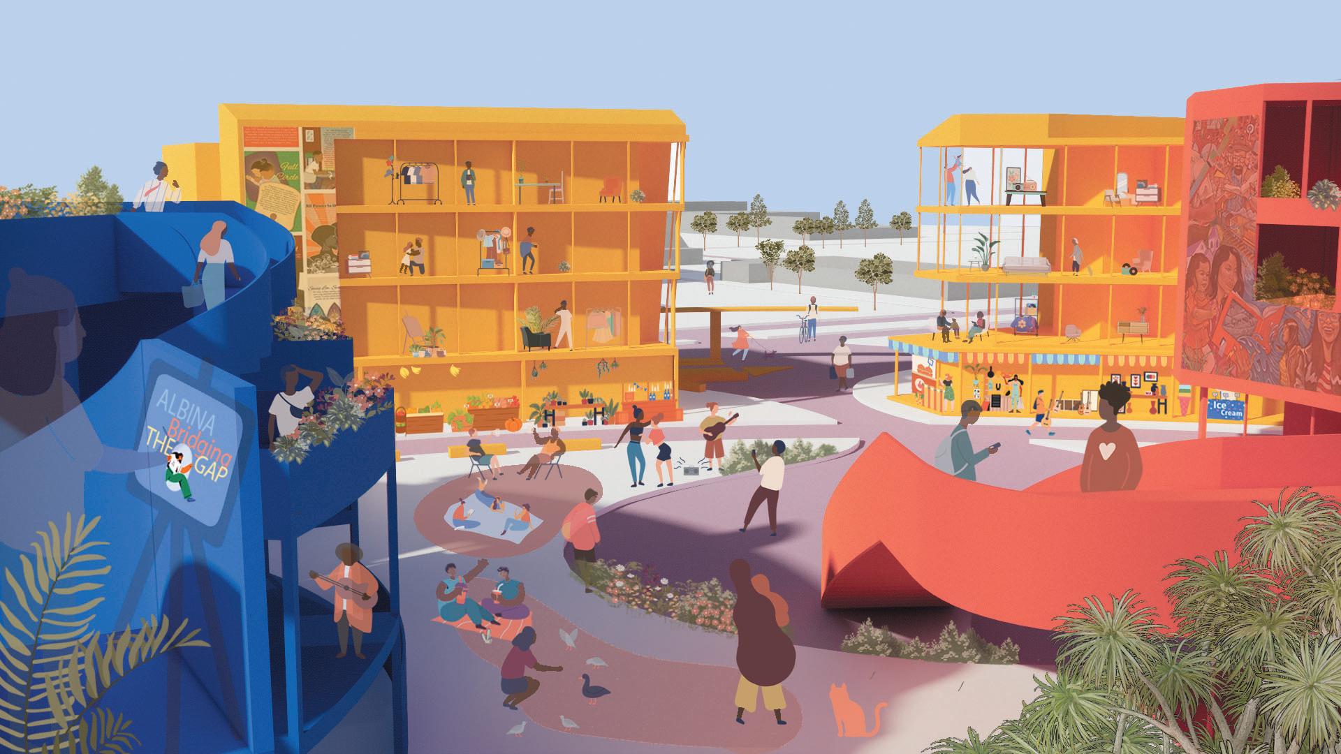
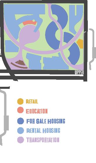
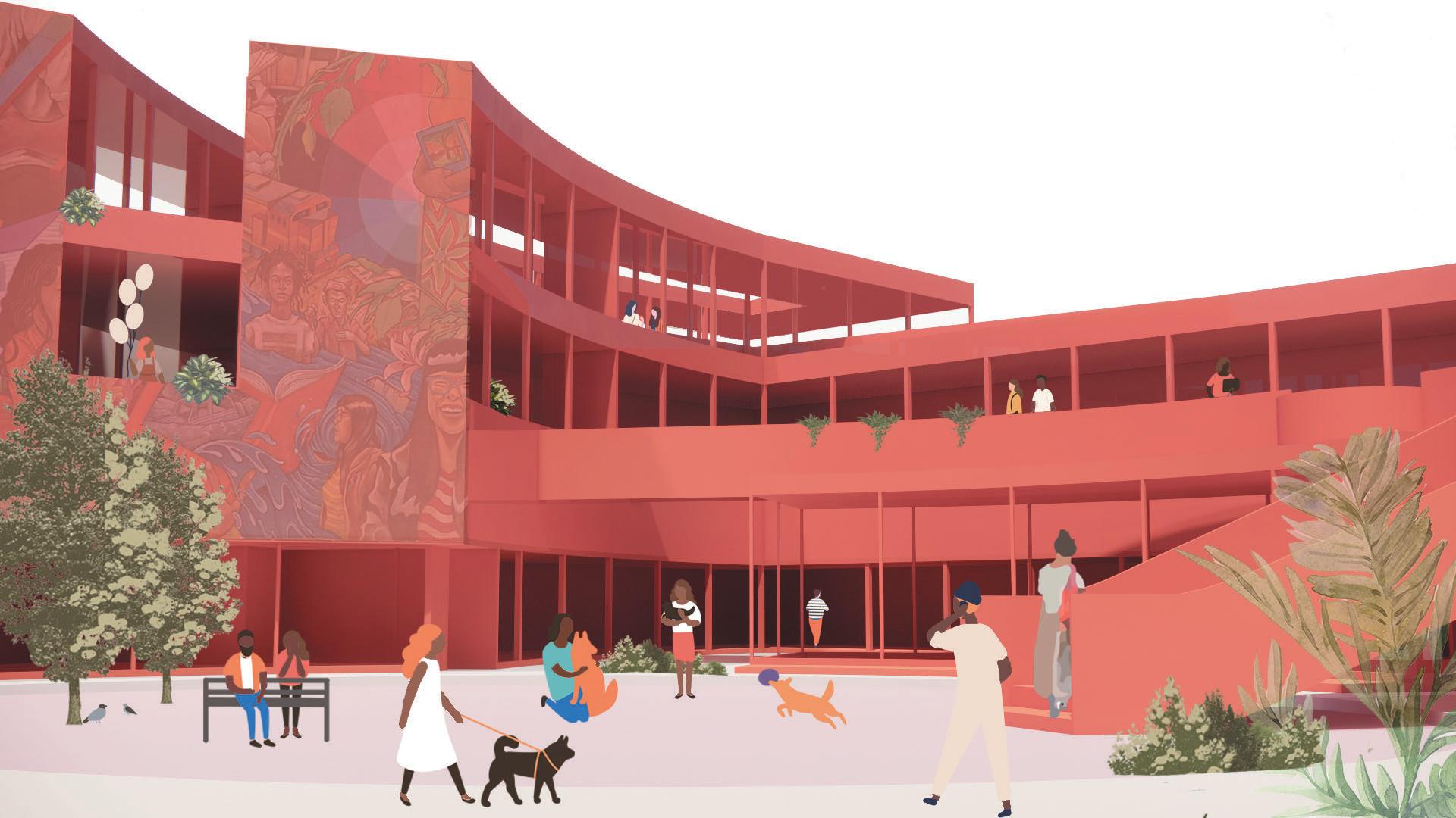
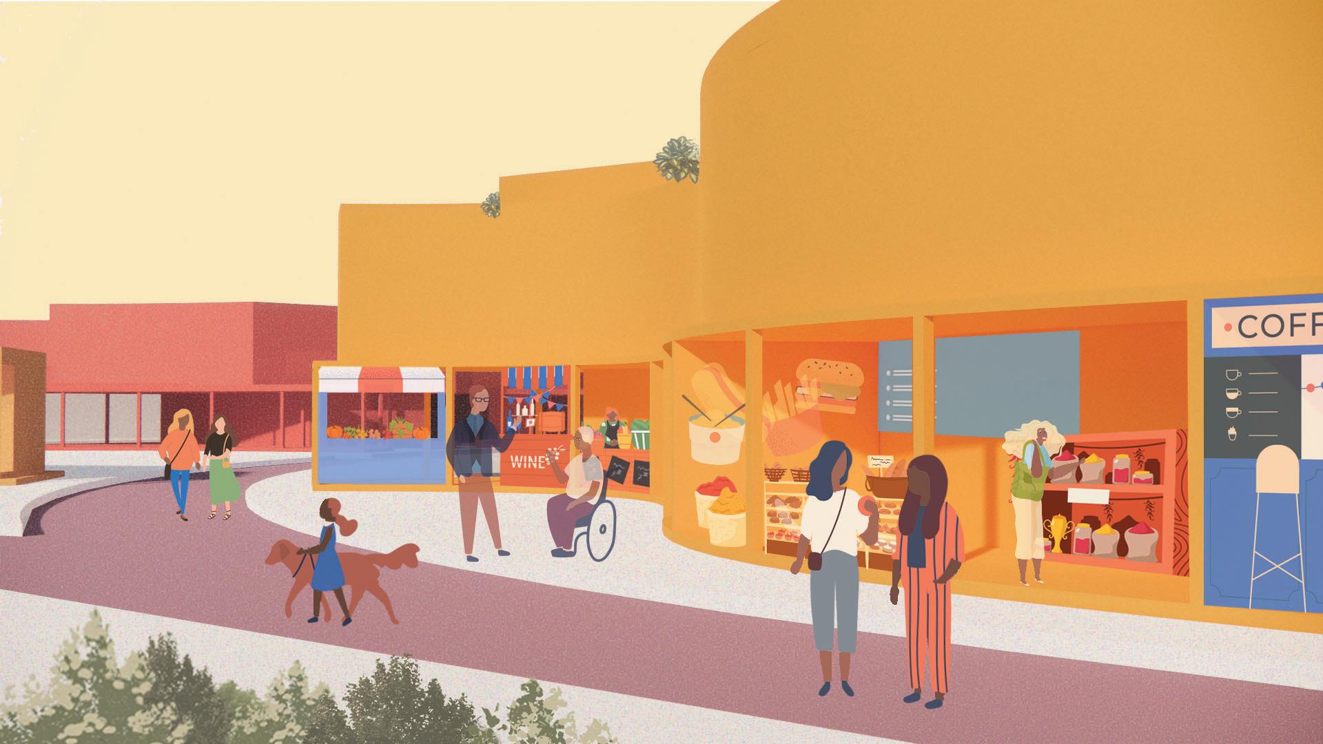
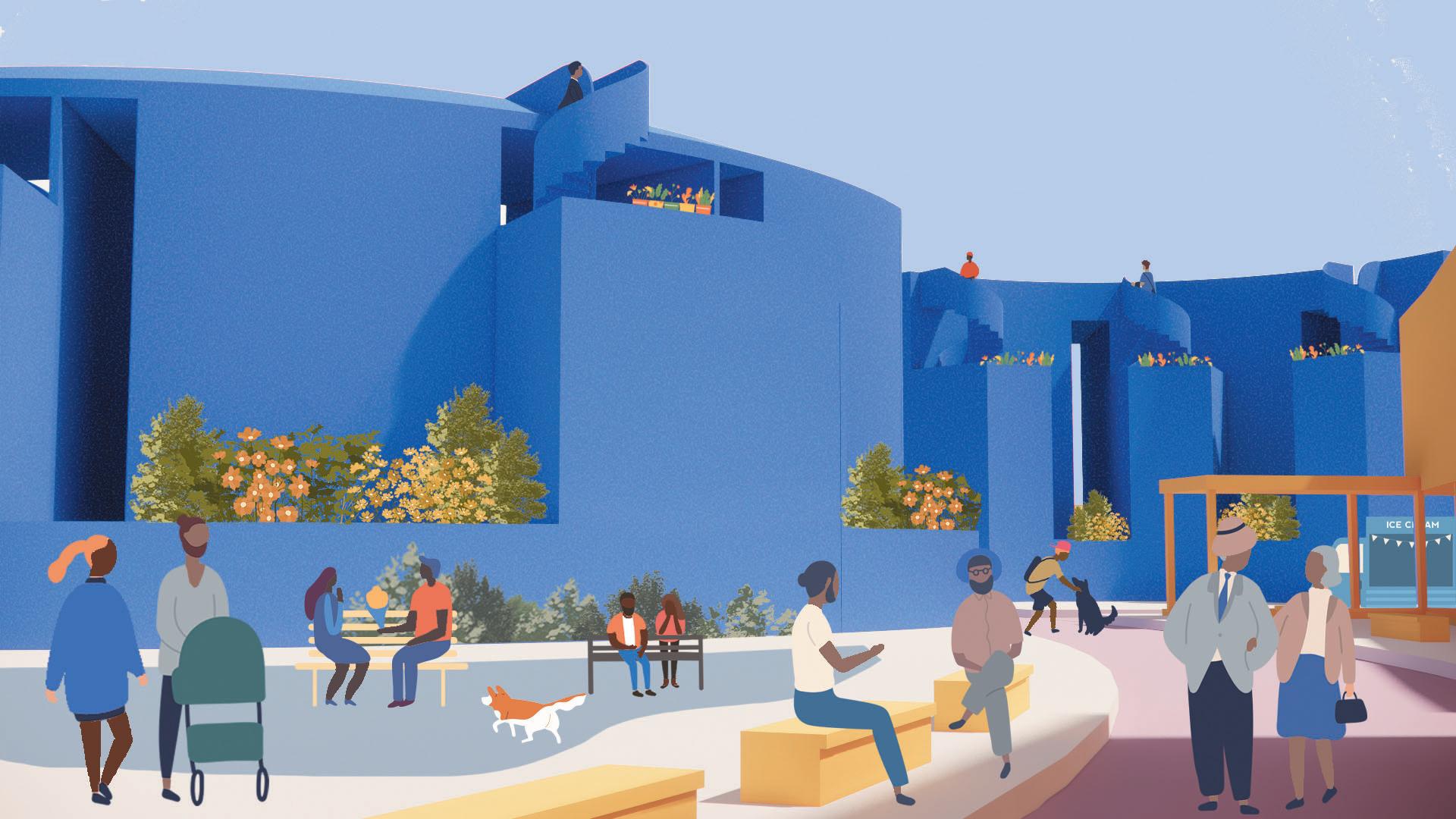
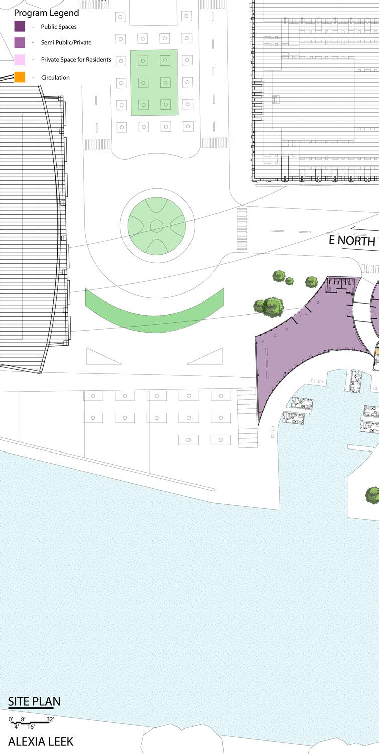
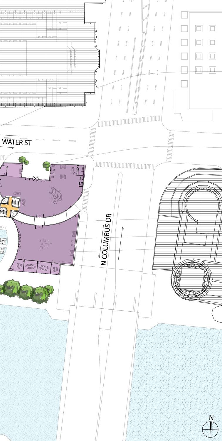
NOMA Competition: Albina Bridging the Gap
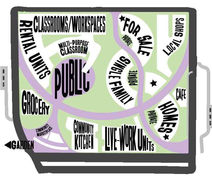
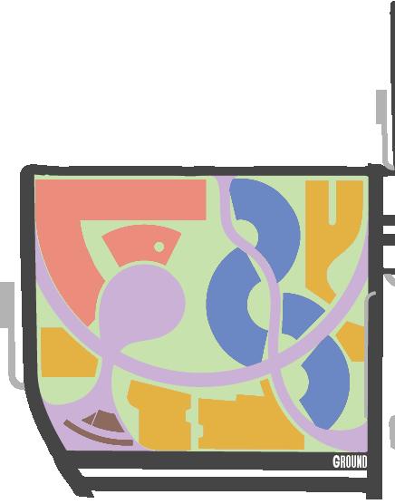
A project the envisions a pedestrian-centric community center designed to foster connectivity and engagement.
OBJECTIVE
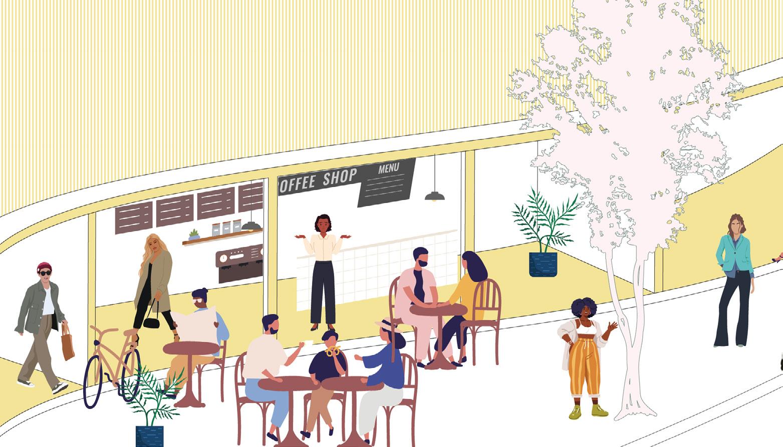
To express the intentions of adding to the community's joy and celebrating its history, this design focuses on bringing revenue into the community, introducing generational wealth to its residents, and bridging the relationship between the design strategy and the existing elements of the neighborhood. On the ground floor, retail spaces inhabit the outer profile of the site, indicating a welcoming environment where residents and visitors alike can interact and enjoy the space. The retail-related portions of the program include a space for local shops along the east side as a means of producing revenue for the community members and supporting the local businesses within Albina. Along the southern portion of the site exists a community kitchen in which Albina residents have the opportunity to learn how to turn freshly grown ingredients into healthy, filling meals. These freshly grown ingredients will come directly from Albina’s very own Cooperative Garden, positioned in close proximity to the western portion of the site as an indication of this partnership. The Albina Cooperative Garden will also be one of the sources of produce for the grocery store along the western portion of the site. Lastly, the northwest corner of the ground floor is dedicated to multi-purpose classrooms and workspaces, designed to work in collaboration with the Emanuel Legacy Hospital.
As one moves toward the interior portion of the site along the ground floor, spaces transition from public, to communal or semi-private, and finally to completely private. For-sale housing is visually guarded by the retail spaces on the ground level, indicating a sense of privacy. Amongst the three paths within the site, there is one dedicated to providing residents access to their homes without completely isolating them from the community and its events. The privacy of the path is indicated by its position along the innermost portions of the house. Between the modulated forms for the forsale housing, space is dedicated to semi-private gardens/yards, adding to the sense of ownership and personalness associated with housing. The upper level is complete with rental housing programmed above the retail, and classroom/work spaces. The separation of floors acts as a division of space providing a sense of privacy for the residents, much like the inward-facing nature of the for-sale housing, while still allowing connection to the greater site through visibility and straightforward accessibility. This separation also gives residents a sense of ownership over the spaces they will call home.
This project was done as a deisgn team where each member worked within their strengths to create the best project we could. I focus on the background and research of the project. Finding out what the community wanted, what the people wanted, which parts of their history would be important to include, and how to best help the fractured relationship between the site and the Emanual Hospital. I worked on the color palette, font, research, diagrams, maps, and the timeline.
Design Team: Alex Riedel, Alexia Leek, McKale Thompson, Cici Yao, Cindy Wang, Erica Miller, and Michael Jin.
The essence of this project extends beyond merely bridging the physcial and the residential community, it aims to address not only the spatial among various communities, mitigating vertical segregation. This propsal residential, retail, and entrepreneurial opportunties within the community, es that accommodate local businesses, a communal kitchen, versatile and a vibrant plaza designed to foster community connection and engagement. izes a steadfast commitment to cultivating a thriving, interconnected rich historical significance.
physcial gap between Emanual Hospital seperation but also the social divisions propsal is centered on the integation of community, envisioning the creation of spacversatile classrooms, collaborative workspaces, engagement. This development symbolinterconnected community, rooted in inclusivity and

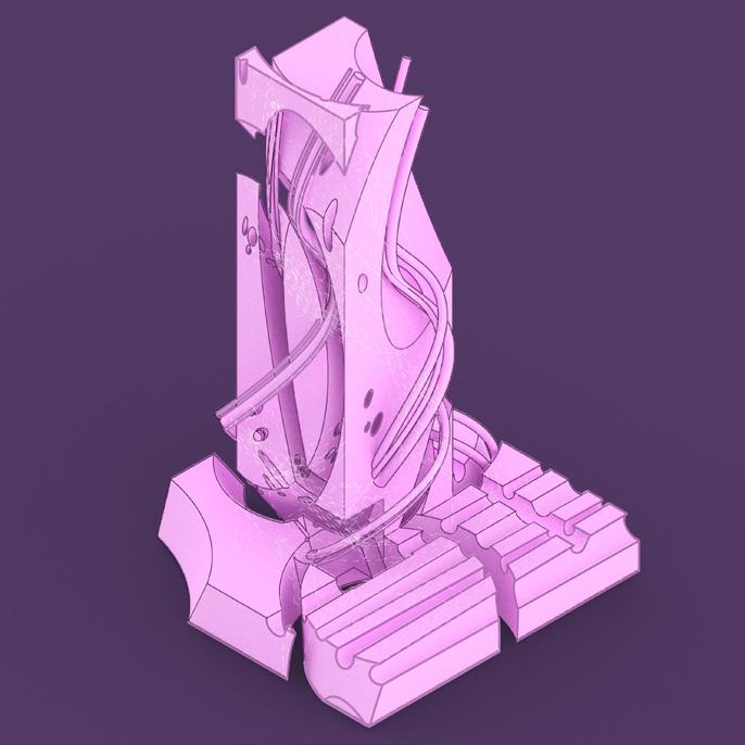
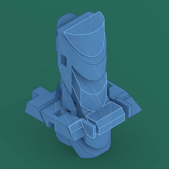
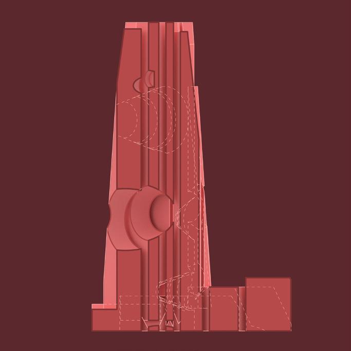
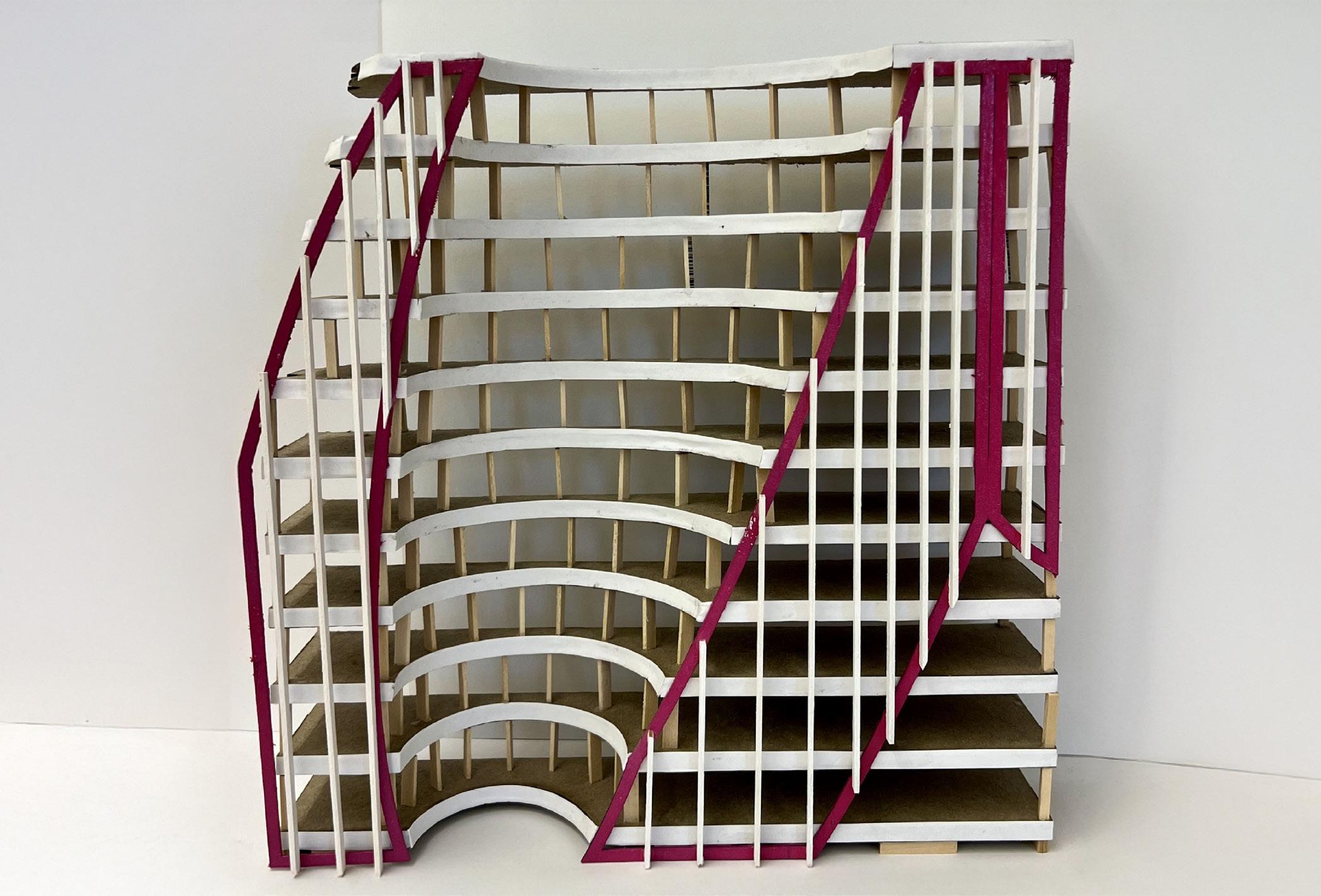
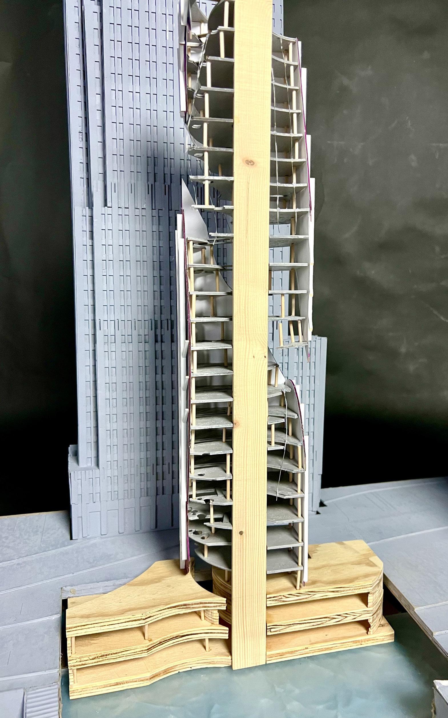
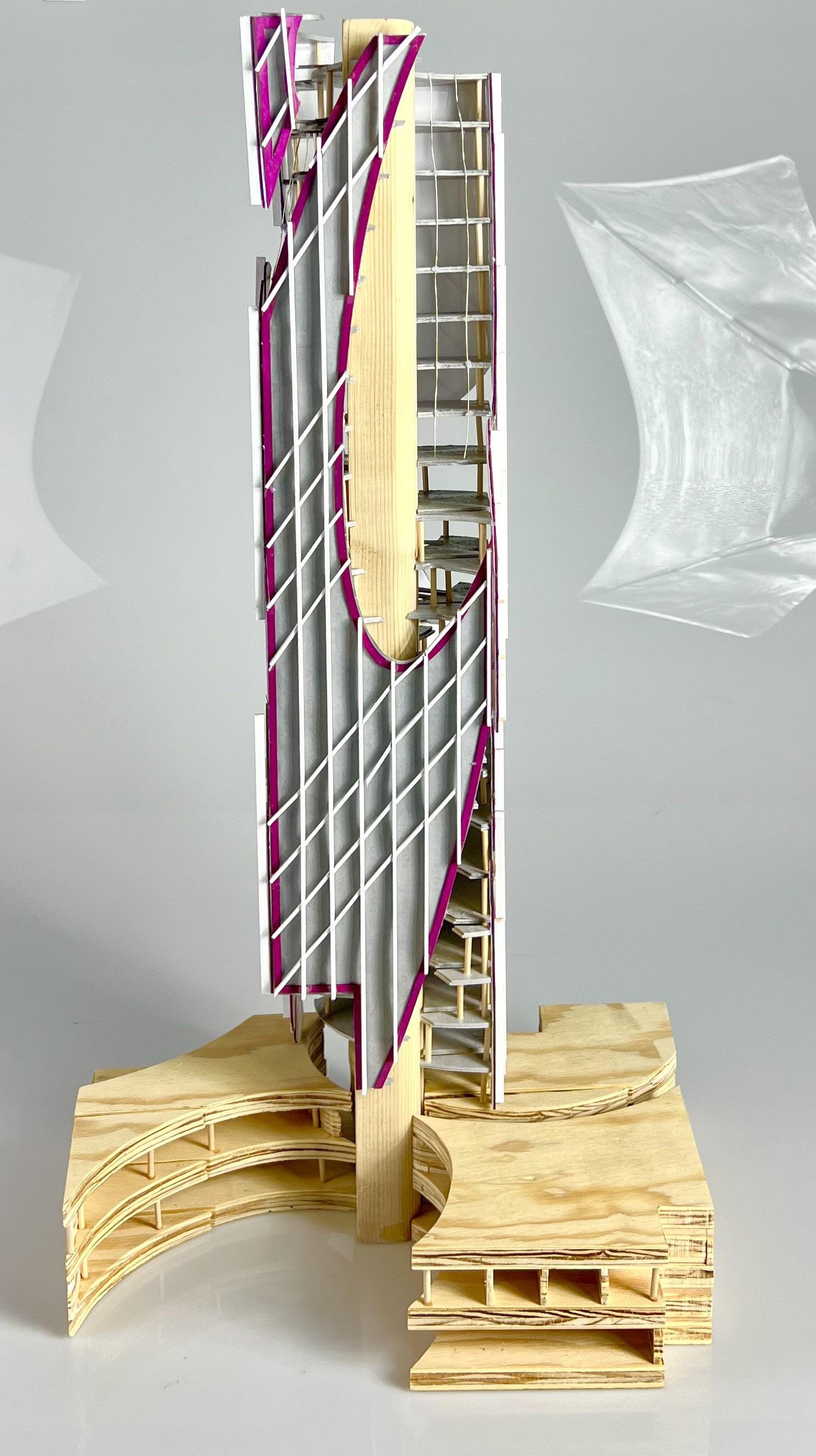
The Nesting Tower: CHICAGO reFRAMEd
OBJECTIVE
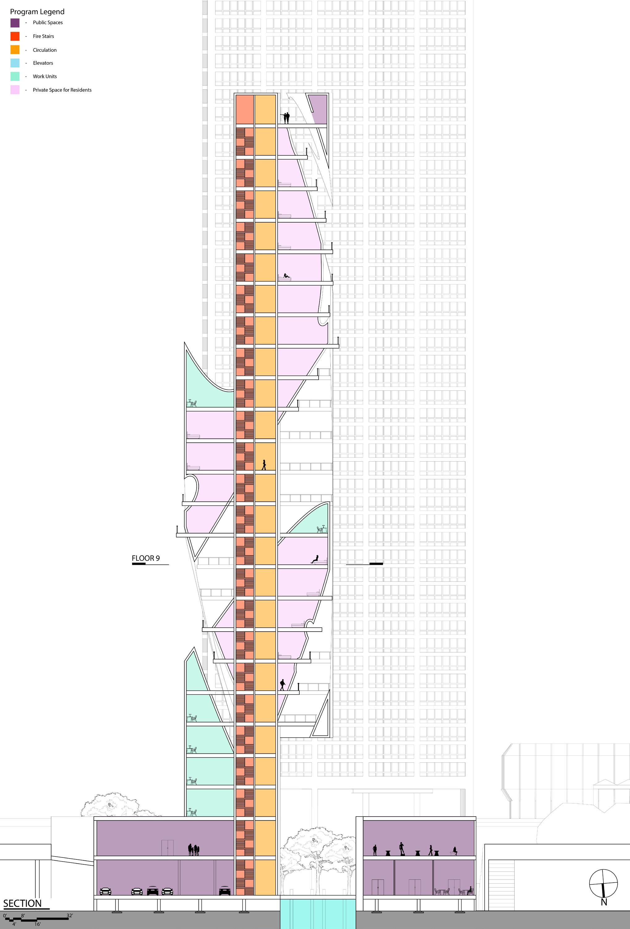
The objective of CHICAGO reFRAMEd is to explore the design of a new 25 story tower along the banks of Chicago River sited amongst many other towers. While one of the historic impacts of Chicago on the tower typology was the frame, as defined by Colin Rowe, the studio will reconsider the inviolability of a repetitive structural pattern in favor of strategically breaking the frame at key moments. The challenge of the design problem is to manage multiple conditions including a transformation of the urban dynamics, the invention of a creative vision of Chicago’s skyline, and a series of interior communal spaces. The project will engage in a critical conversation on the civic dimension of the site and within architectural discourse. The new tower emerges as the catalyst for blending private and public realms into the deterritorialization of restricted urban life.
The Nesting Tower is my take on a new tower nesting into the site along the Chicago River. The Nesting Tower has a personal marina for residents that connects the riverwalk for the public. The entrance at the city level and the entrance at the riverwalk level are 100% public and available to anyone who may pass. Once you start moving upwards in the tower, more space because dedicated to work and studios for artists to hone their skills. After the many studio and work units, the tower because completely private for the residents in the tower. There are plenty of balconies so people can look out to neighbors or enjoy the space.
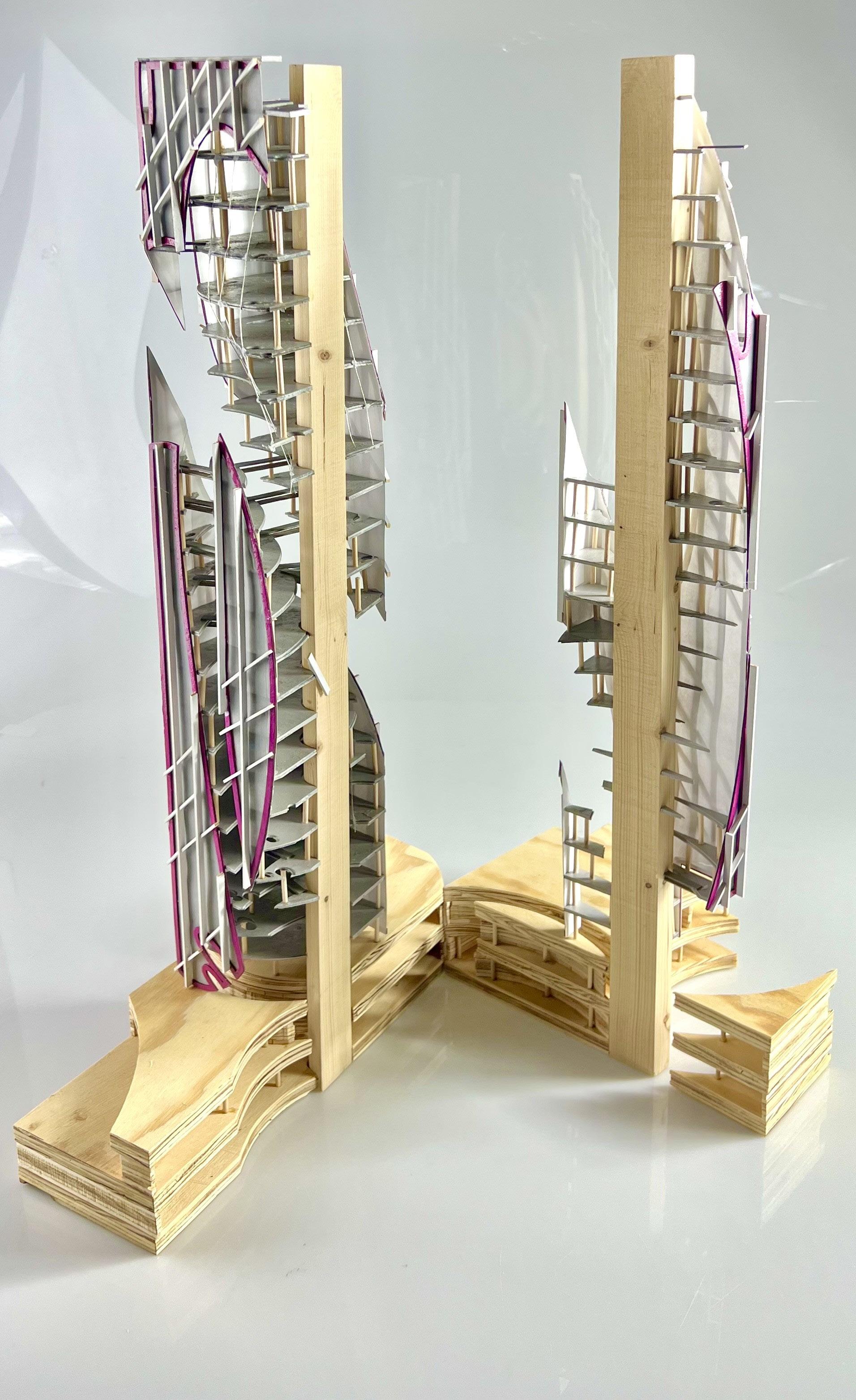
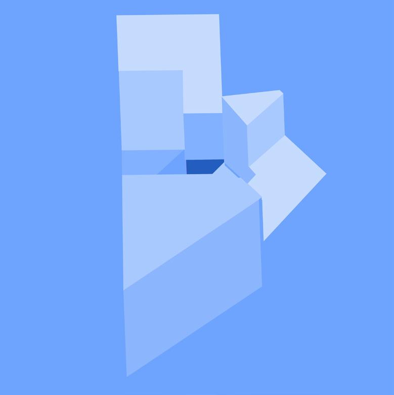
Study Models and Facade Studies
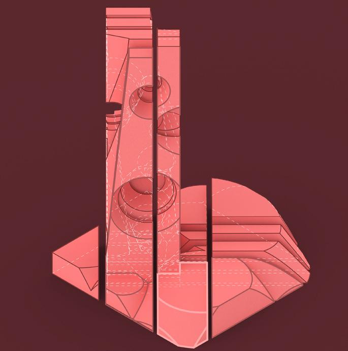
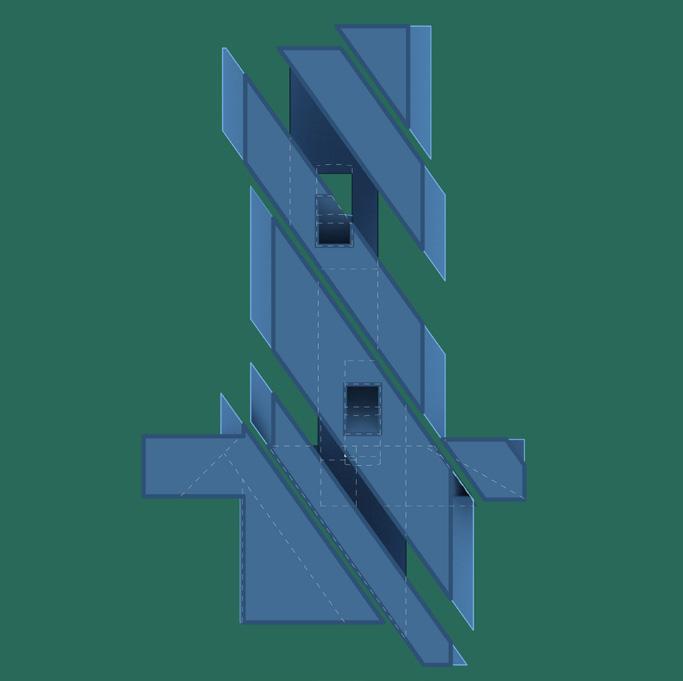
At the start of this project, we constructed massings in grasshopper using basic grasshopper commands on two volumes: a vertical one and horizontal one. We had to subtract and add a certain number of seperate volumes to make three iterations. We then chose the one with the most potential. For this project, the most interesting iteration was the first one as the slipping and nesting elements caught many eyes, becoming the focal point of the final tower.
The facade studies came much later. The focus of the facade studies was to take a section of your building and create a facade that would not only fit the building vibe but mesh well with the rest of the city. This project’s facade focused more on the relationship between curved and straight walls while also trying to maintain a swirling pattern first seen with the vine-like pipes in the orginal study model which can be seen in facade study 1. While the pipes themselves didn’t make it into the final product, their implication can be seen in the final envelope.

Defining Space
The project became a conversation between many different elements. From the riverwalk to the city and from public to private while making sure both communities still iteracted with each other, The Nesting Tower became a testament to the back and forth an connection between public and private spaces. Creating plenty of oppertunities for interaction between people, the tower, and the surrounding city of Chicago. Each space is difined as public, private, semi-public/private, circulation, or work. The core is the unifying factoring that allows the movement between all the spaces. With its glass facade, one can see everything happening as they move up and down the building with the glass being frosted to ensure privacy for residents.


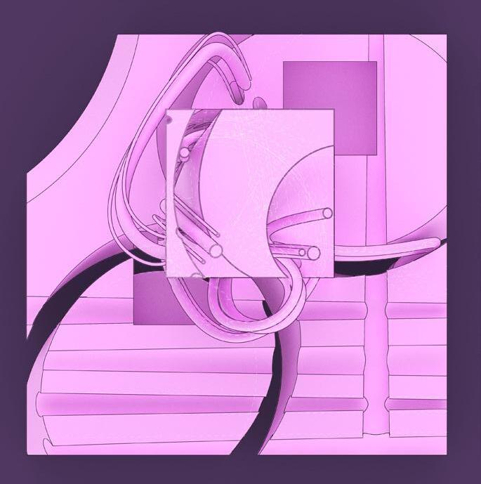
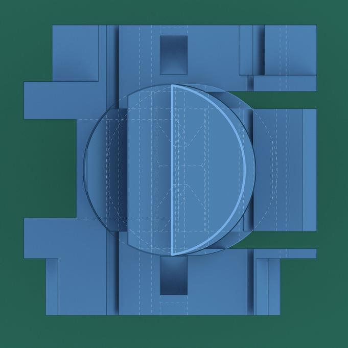
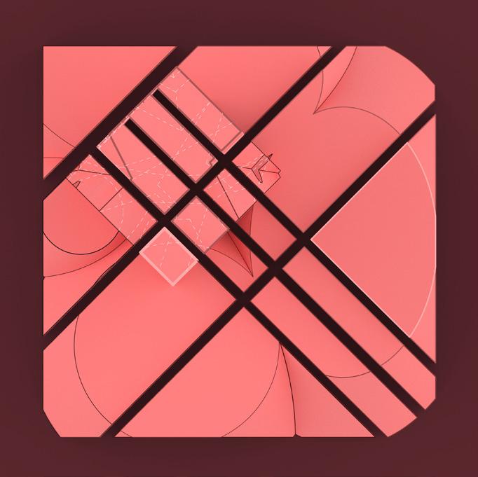
The Diamond Tapestry Museum
OBJECTIVE
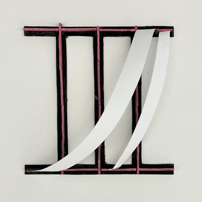
This project was rooted in built-in storage and building from the inside out. Using geometries found in the Prada Foundation along with a selected color palette, groups of two used trace paper in order to bring those geometries to the surface. From that anaylsis, the groups created nine sketch models and from those sketch models groups started to explore typological piles. Moving on from the sketch models and typological piles, the groups designed and built a shelf for the storage of those typological piles.
This project focused around a skewed diamond shape found in one of the many typological pile combinations. The diamond space created a contrast between play between extrusion and subtraction using grids while also playing with the idea of fun vs. work. The diamond space is the connecting factor and central hub to the rooms branching off into different directions, it is the necesssary movement between rooms with color tapestries and art. Meaning it is working component of the building while the adjacent rooms act as the fun component. Bridges were used to physical and metaphorically bridge the gap bewteen the two, allowing for a space above and below when a person walks through. Hallways, stairways, and even the interior space itself all followed the same grid system used in the original diorama while also using a grid system created by the arleady existing architectural projects in Columbus, IN.
Storage is all throughout the museum from the storage in the basement, purposely done to limit the amount of light each piece of art gets, to the bookshelves throughout the library. Making the museum experience better for everyone as it gave a childlike whismy to explore and discover all the built-in storage.
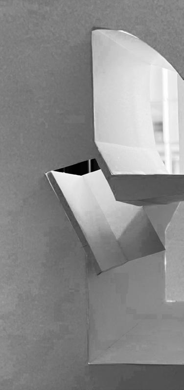
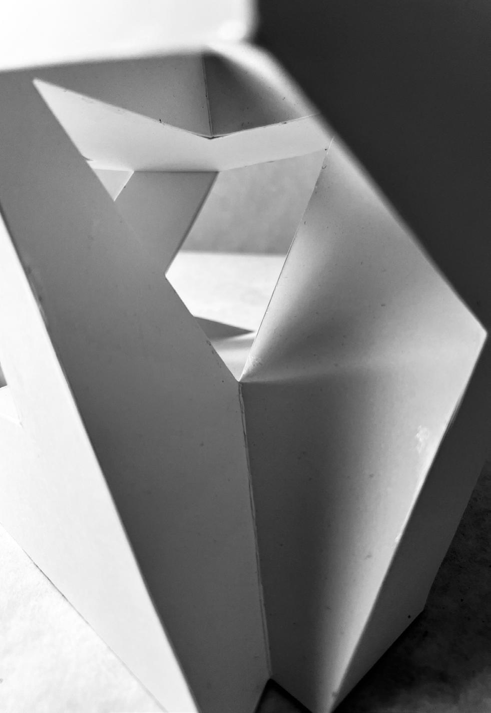
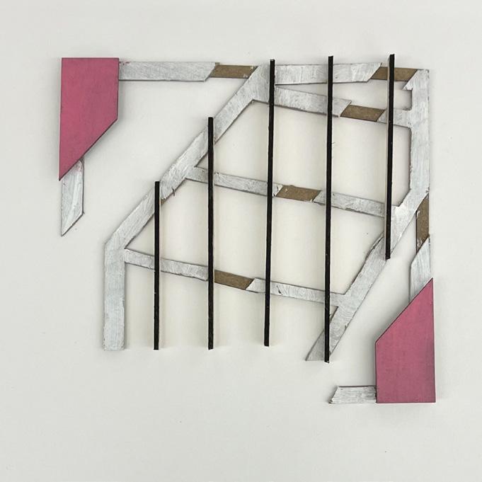
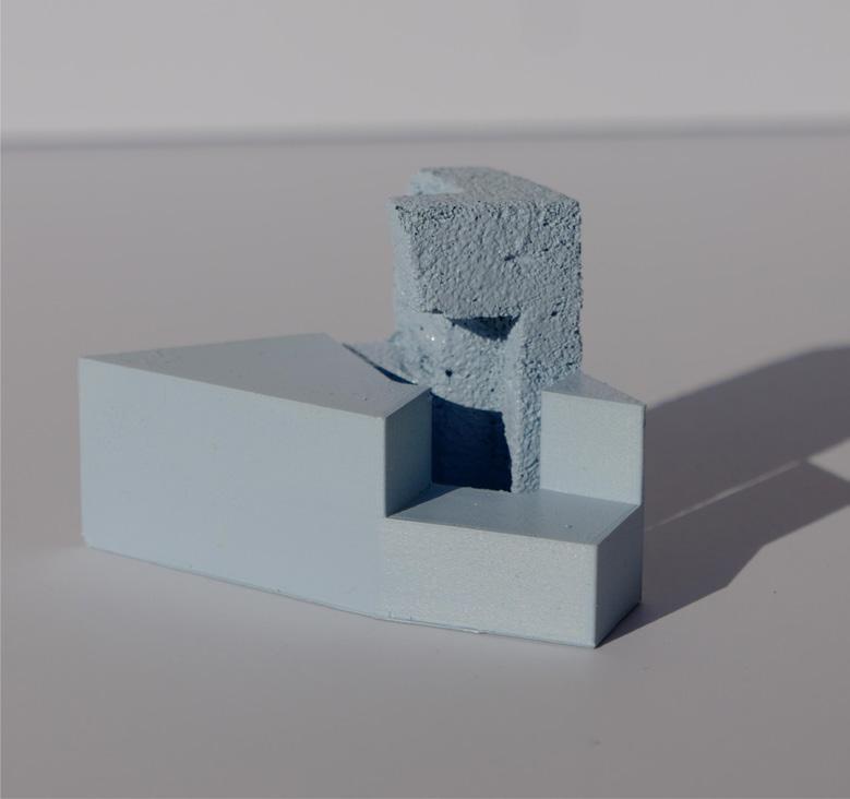
Topological Models
These topological models were made as a visual aid to better understand how objects would connect and the spaces that connection made.
The topological model to the right is the model the diamond tapestry museum followed. The overhanf of the foam pieve created an imply courtyard space with a cover to prevent rain. The shape of the base piece was also very interesting and is how the diamond tapestry museum recieved it’s shape.

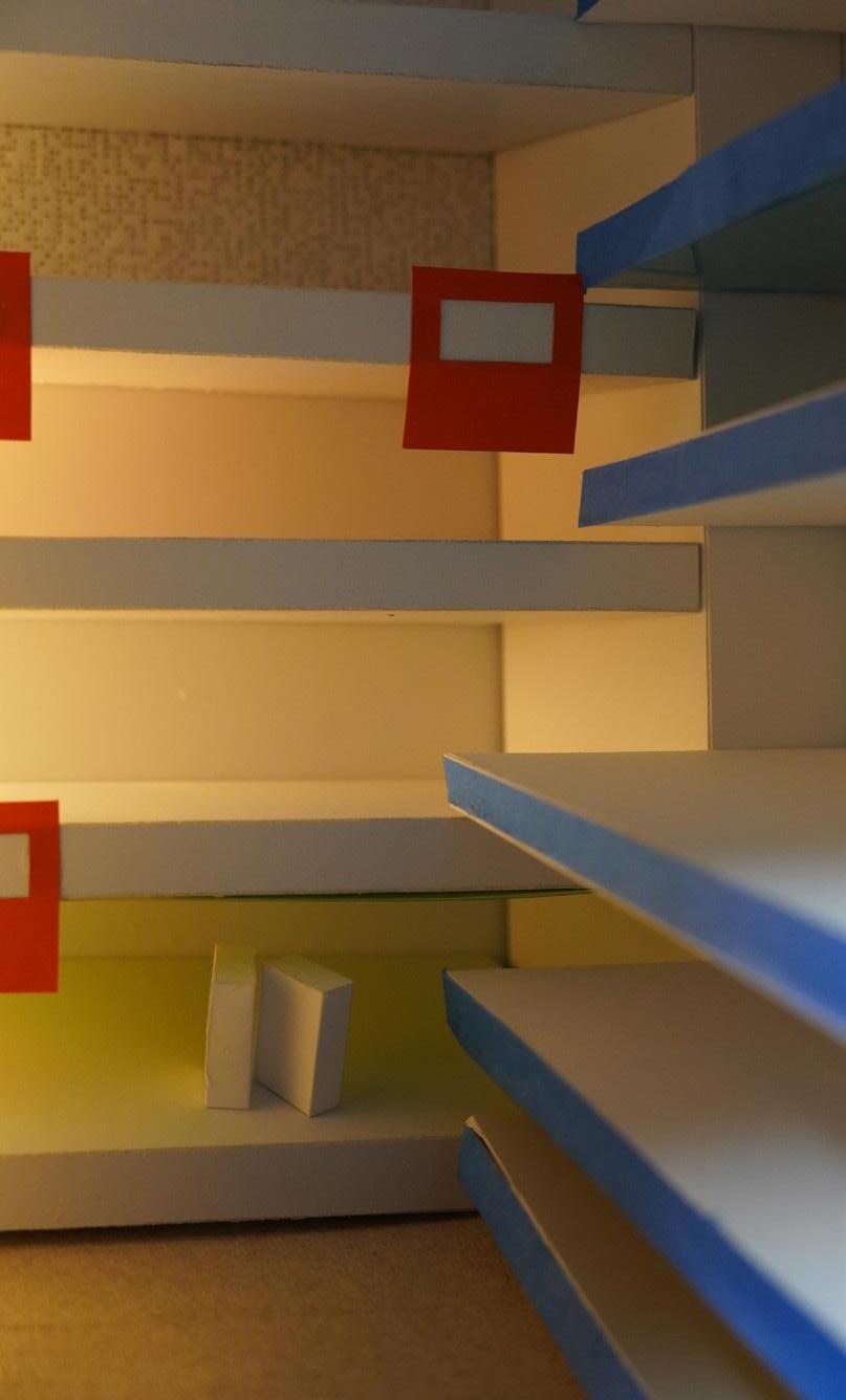
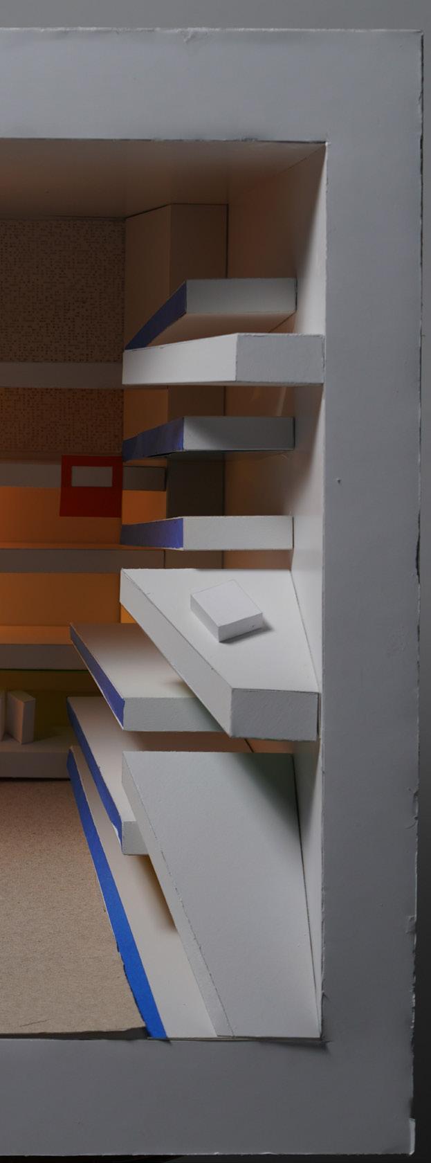
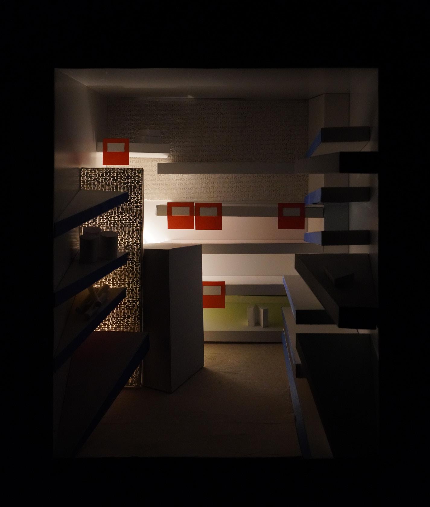
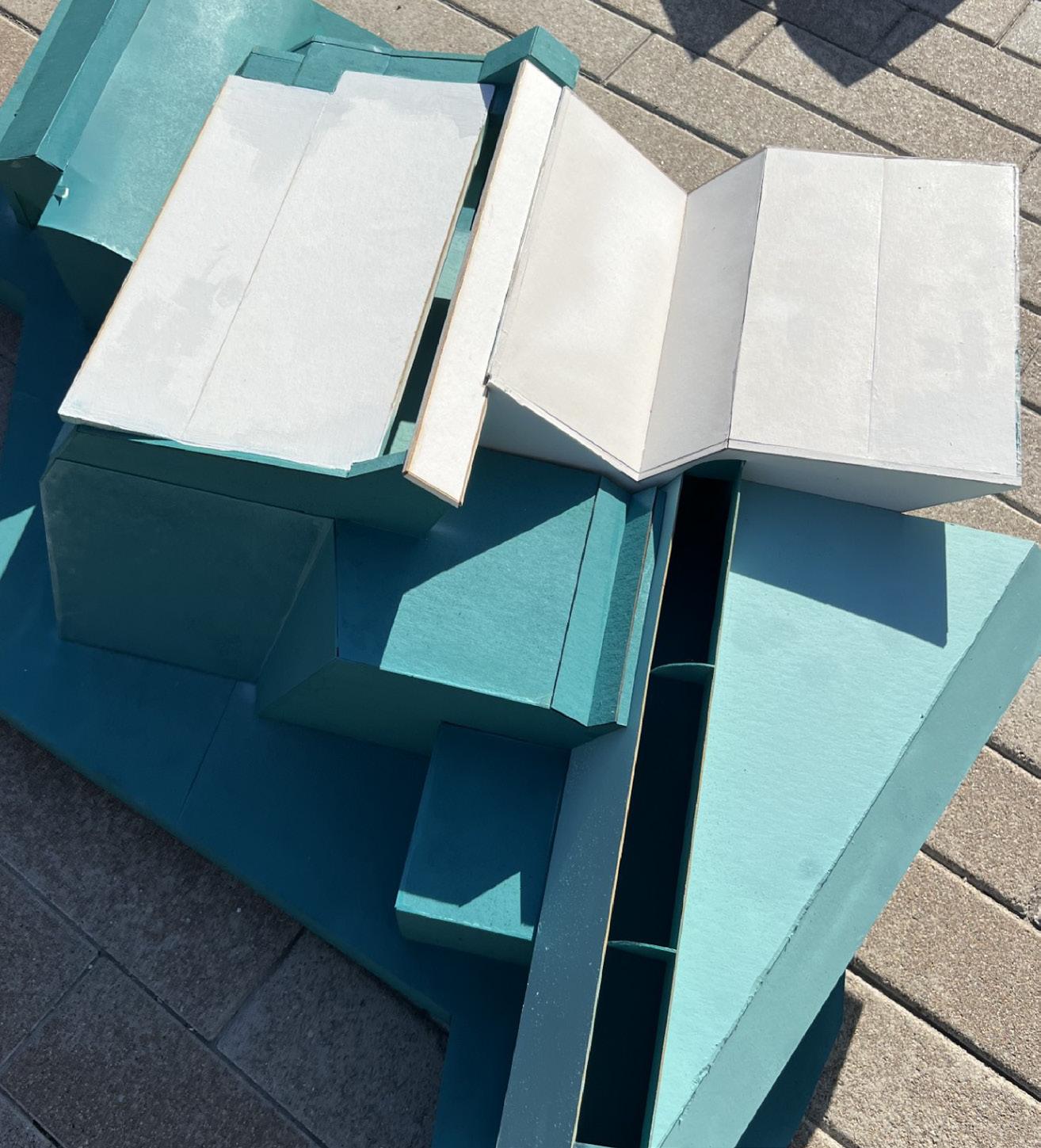
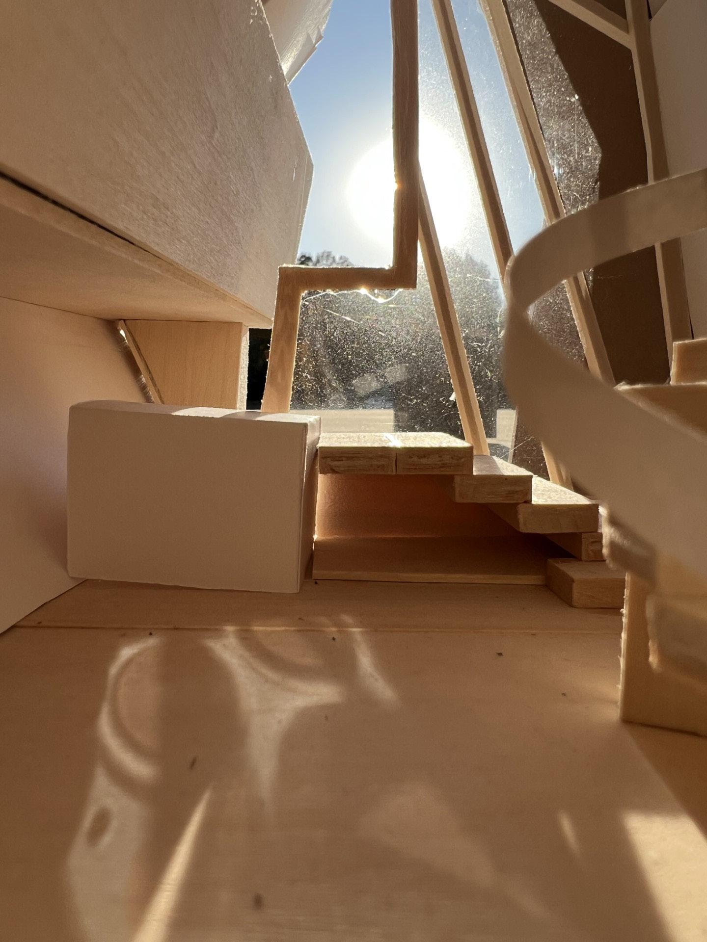
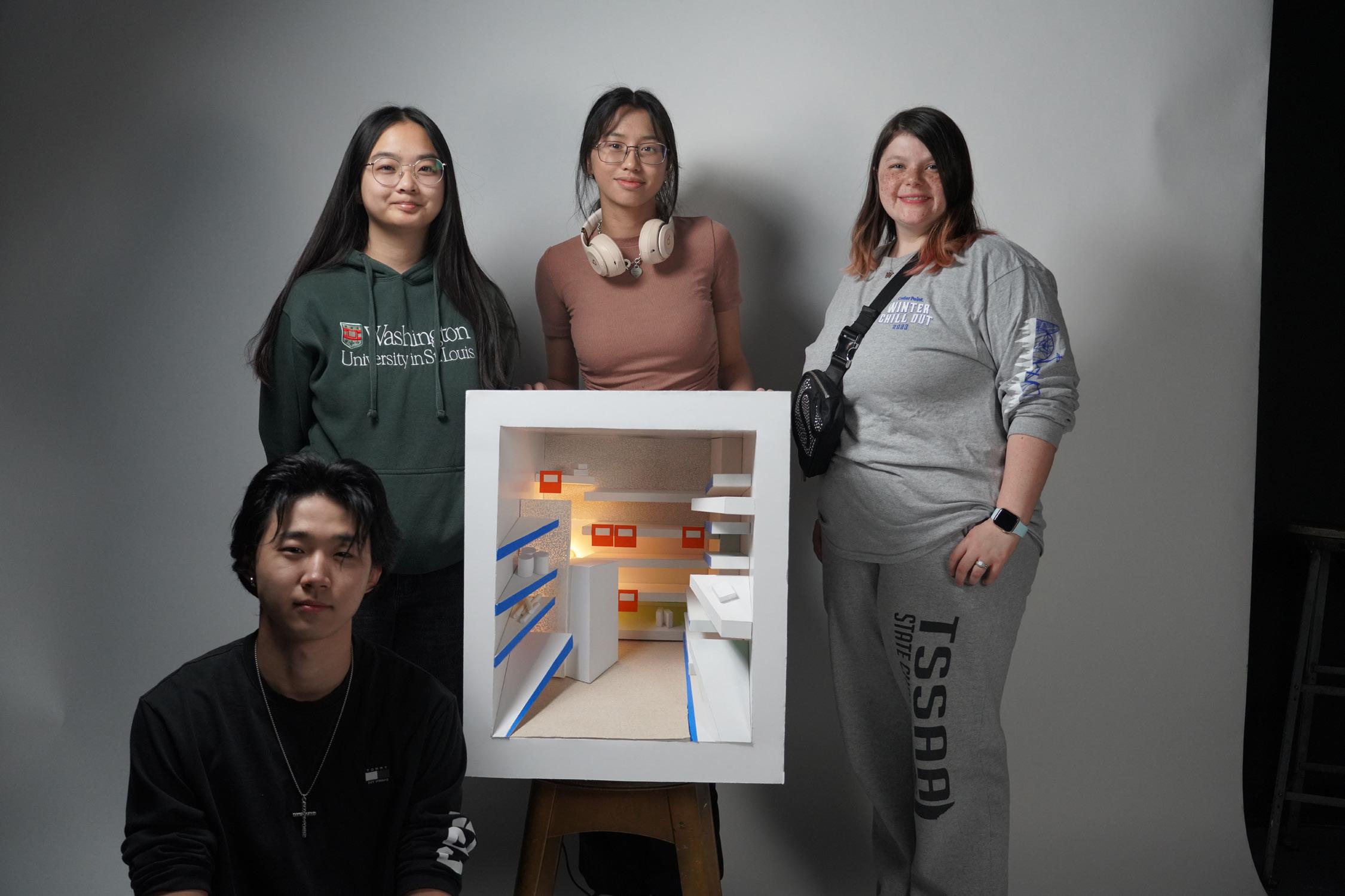
The Laskey Charrette: Filiale
OBJECTIVE
The Laskey Charrette was an amazing opportunty for students to work in groups and create a full model in the span of a weekend. The theme of the charrette was “Pictures are the Context” and it examines how photographs influence and distort our perception of the built environment.
The goal is to translate the photograph into a diorama. To do this, students in groups of four chose a photograph of a room to fabricate into a diorama. To do so they translate the two-dimensional cues of a photograph - light, shadow, edge, color, texture et. – into physical form. The room photographs for the two day workshop are all chosen from the work of Thomas Demand (b. 1964, Munich). Demand is a German artist famous for collecting mass media imagery to inform the rooms he constructs as paper models and then photographs them. For Demand, and for us, the pictures are the context; the photography depicts rooms that are built from the imagery we collect.
The group work was split into three parts: the room volume, key elements/furniture, and small elements to populate the room. However, in our group, we would help wherever we could throughout the building process. I focused on the smaller elements that helped populate the room along with working on some shelves and placement of furniture.
Design Team: Alexia Leek, Cladine Noel, Daniel Du, Lily Wang
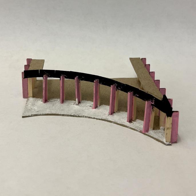
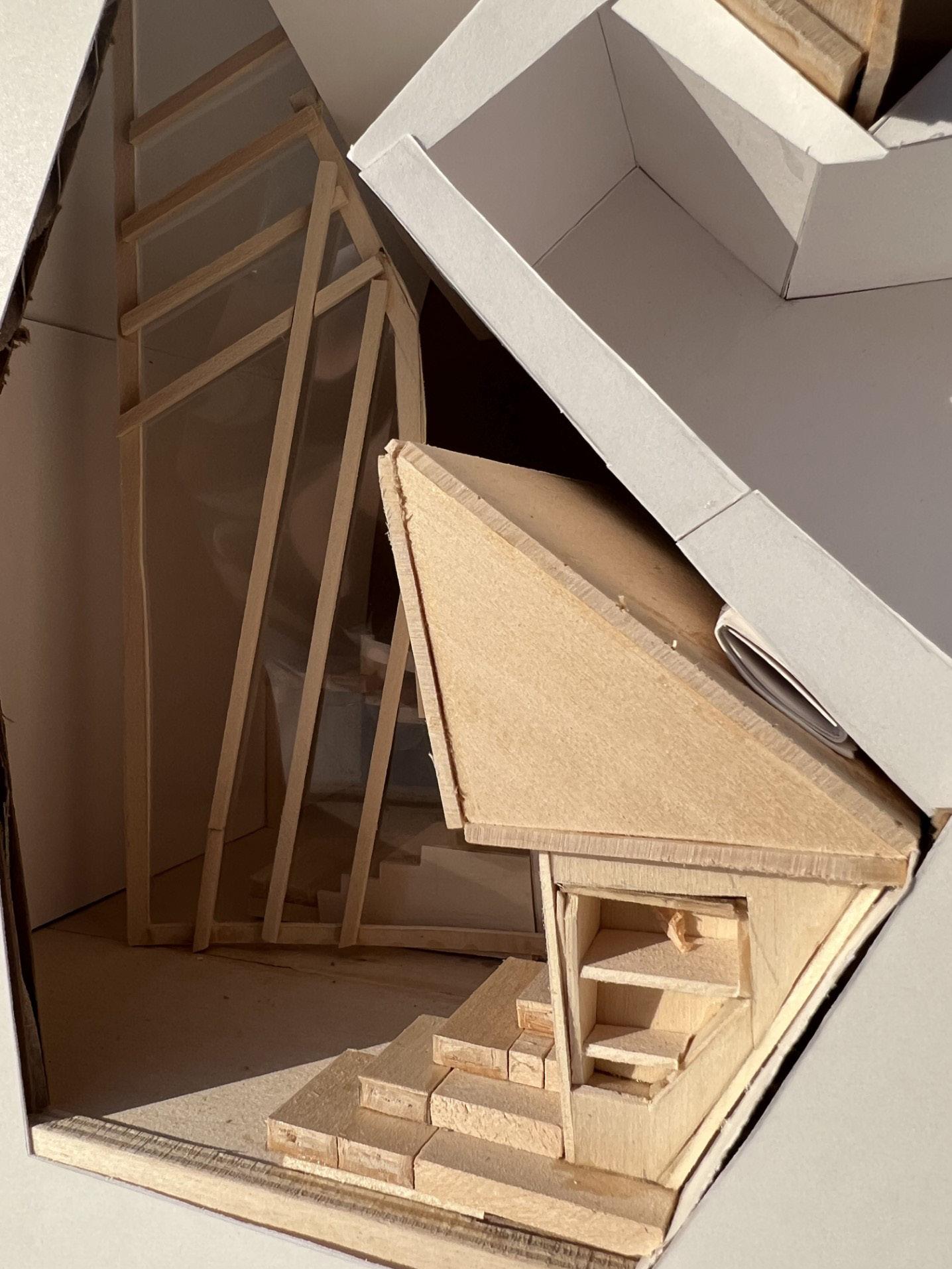
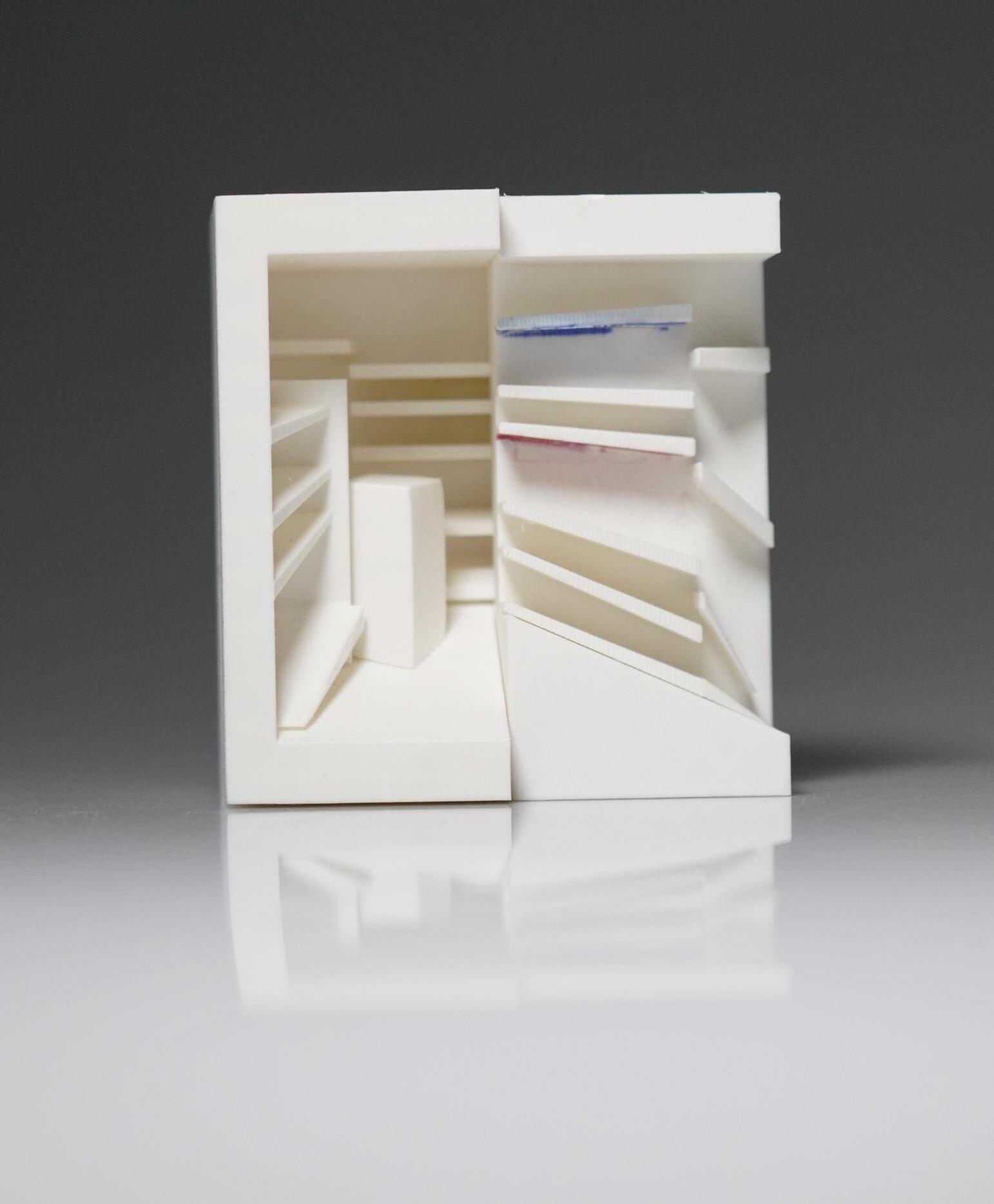
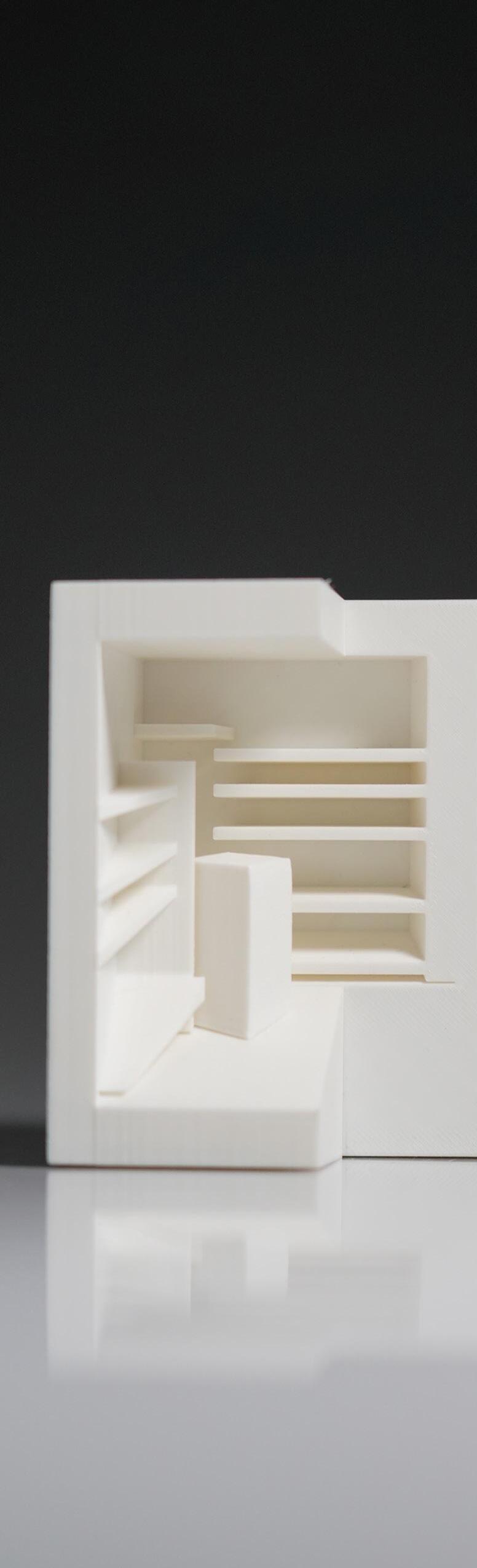
Study Model
These are image of a small 3D printed massing model made by Daniel Du to help us better understand the envronment we would be creating. As we were making the study models with section cuts, it became clear we could focus on light and how light reflects in the environment. At first we were going to make the walls thin enough to have the light shine through; however, we later opted for cutting a small section in the wall to allow more light throughout the model.
We used a small light to mimic the light we wanted to represent in our full size massing. These study models also helped us see the prespective of our photograph and how we might start to attach different elements a lot better.

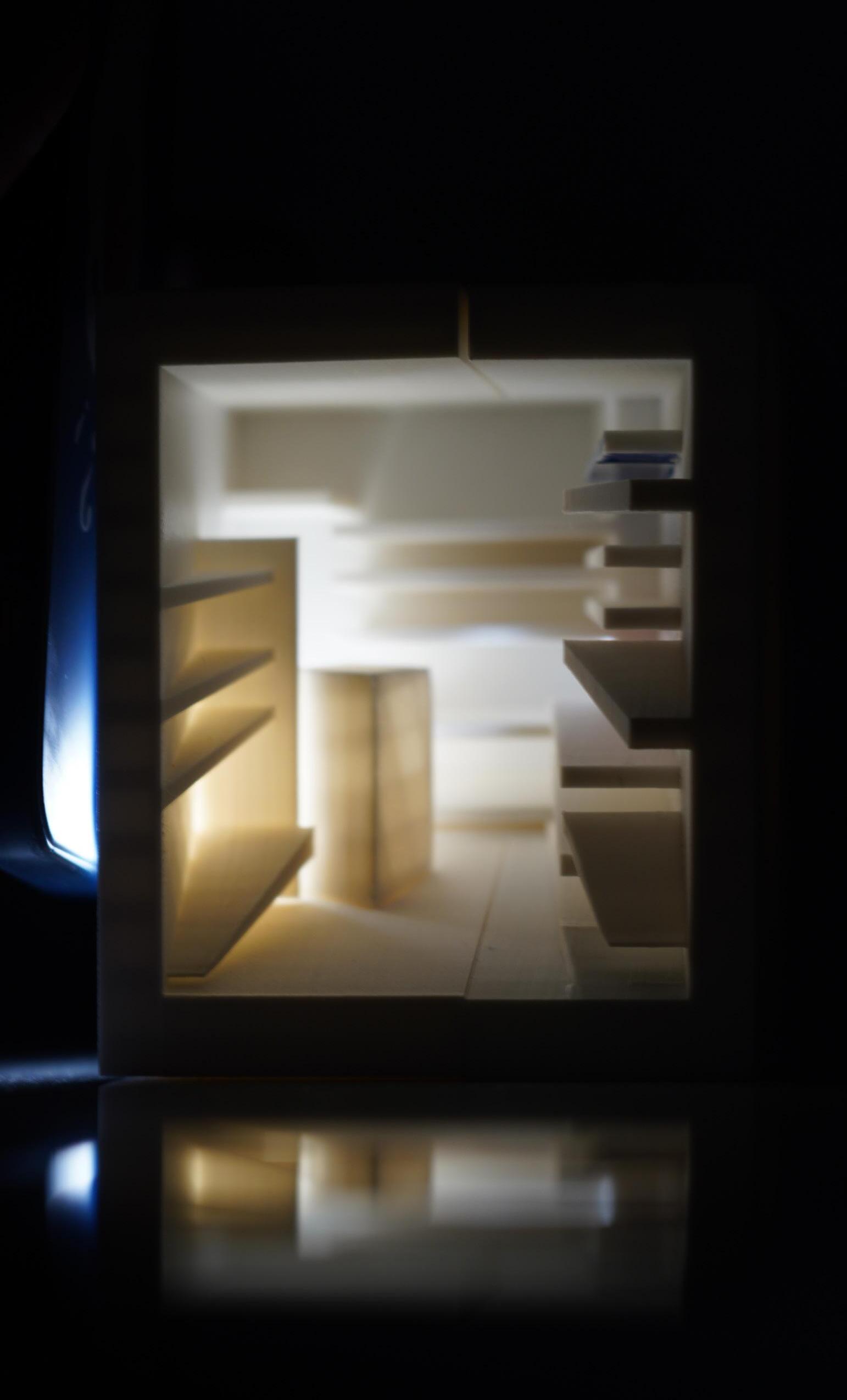
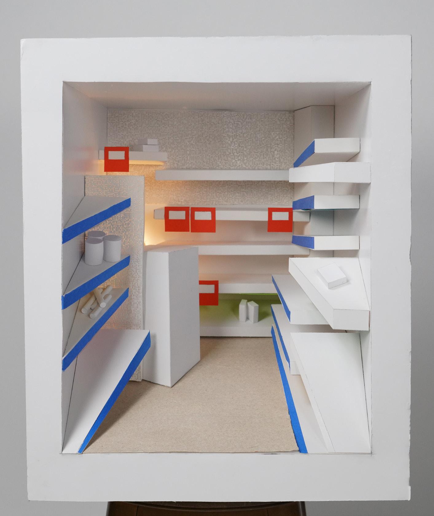
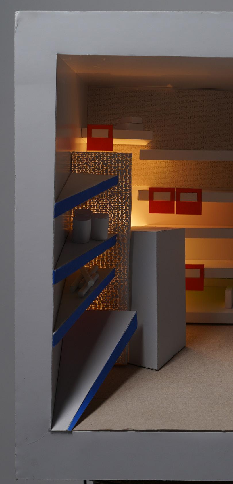
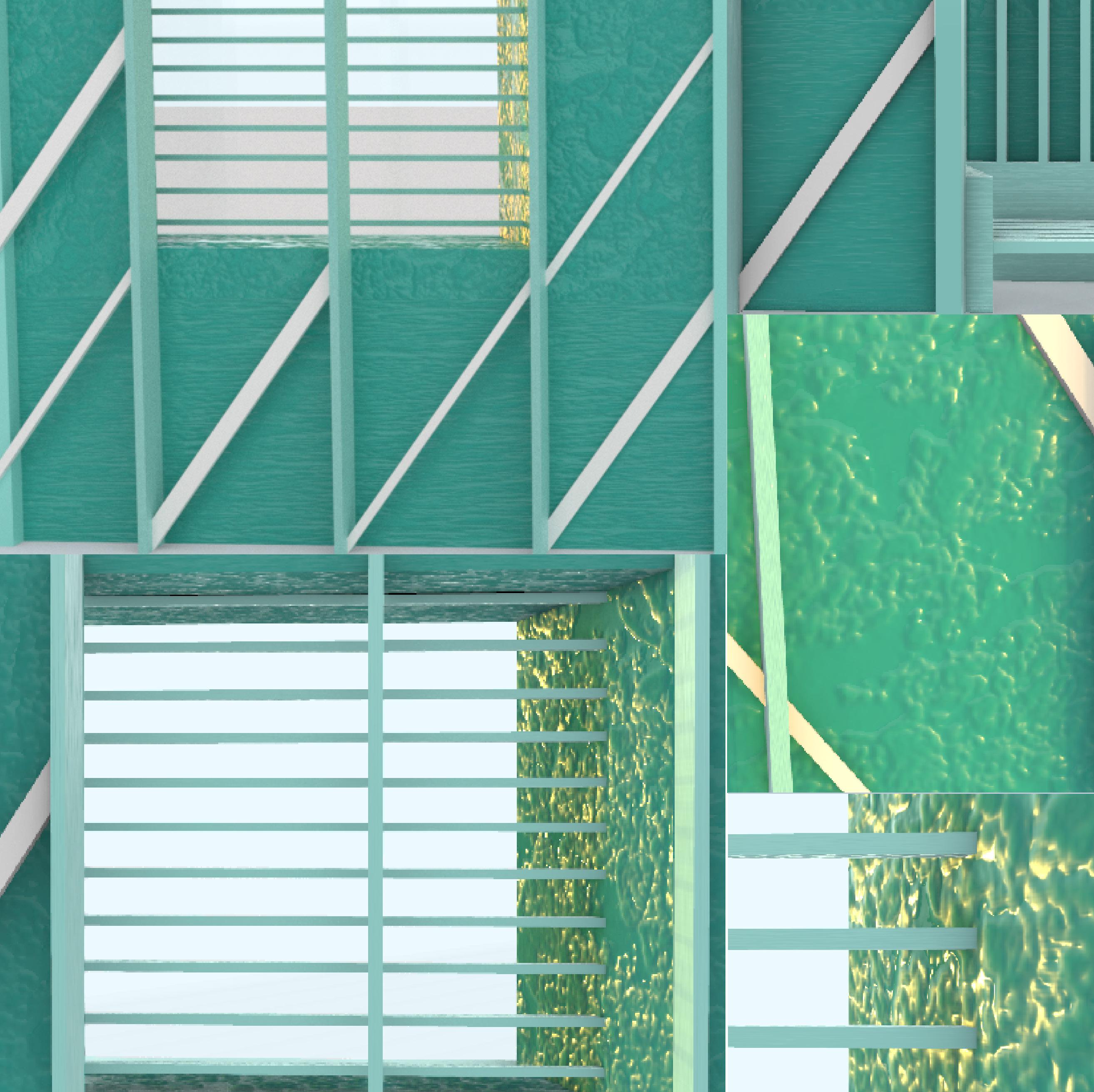
The teams final model focused heavily on light and how light produces different scenes with different colors and feelings. We wanted to focus on light because in our precedent photo clearly had a same light source behind a partition and small rectangular table.
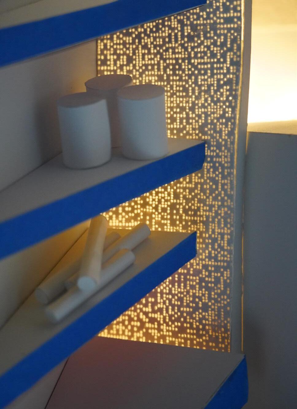
The three scenes the project was set in was morning, sunset, and night. The team demonstrated this by overlaying the images to better show the transition between each time. We chose these specific times because they best represented the lighting throughout the day. We achieved this effect by using an LED light bulb that had different light settings along with taking pictures of the model in a room that was able to be blacked-out to achieve maximum effect for Night Time.
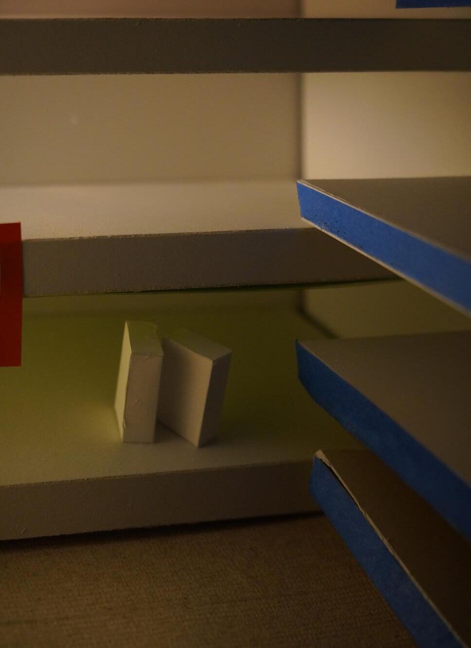
The shelves had colored acrylic underneath them so that when a light was shown on them, they would reflect that light to “color” the products on the shelf. The small pops of color in an otherwise stark white environment beathes life into the model. Creating a feeling closer to that of a lived in environment.
This lighting effect can be seen most in the morning and mid-day photographs as the light was strongest during these times. Below the model photos, there are additional photos of the many other details in the final model. These photos were used to better show the reflecting light effect as the reflecting light was meant to “color” the white objects underneath. We also wanted to bring attention to the shelf partition that was beautifully crafted using a laser cutter.