PORTFOLIO
GRAPHIC DESIGN
Graphic Design Portfolio 1
lexand
Balint
2023
2 ABOUT A TAVOLA - COOKBOOK PLATFORM STUDIO - BRANDING 33 CANTI - WHISKY BRANDING 3 5 17 29 Alexandra Balint Graphic Designer Autumn, 1999
Alexandra Balint
ABOUT ME
Hey! My name is Alexandra and I am 23. I am a Junior Graphic Designer in my adoptive city Belfast - before that I was born in Romania and grew up in Italy.
I recently graduated from Belfast School of Art in Graphic Design and Illustration, within this course I had the opportunity to work for Hastings Hotels during my placement year where I experienced the role of an in-house graphic designer.

The reason I pursued graphic design studies is because I love storytelling, graphic design is the art of using images, typography, and other design elements to tell a story. It is a powerful way of communicating a message that goes beyond words and engages the viewer on an emotional level. I enjoy designing for editorial and branding, and I am truly enthusiastic about design within the film industry.
When not designing you will probably find me cycling to the furthest forest, I am passionate about vintage clothing and second hand bookslet’s bring back the 90’s trends.
EDUCATION
2019 - 2023
Ulster University - Belfast School of Art, Belfast, Northern Ireland
BD (Hons) Graphic Design and Illustration
2018 - 2019
Belfast Metropolitan College, Belfast, Northern Ireland
B2 First (Cambridge First Certificate in English)
2013 - 2018
Liceo Artistico Aldo Passoni, Turin, Italy
Diploma in Visual Arts
INDUSTRY EXPERIENCE
2021 - 2022
In - house Junior Graphic Desginer Placement Year with Hastings Hotels
SOFTWARE SKILLS
LANGUAGES
English Proficient
Italian Proficient
Romanian Intermediate
Graphic Design Portfolio 3
4
Alexandra Balint
LAYOUT DESIGN , EDITORIAL , STORYTELLING , ART DIRECTION
PHOTO
EDITING , WRITING , TYPOGRAPHY , BOOKBINDING
A Tavola Cookbook
Graphic Design Portfolio 5

6
Alexandra Balint
THE COOKBOOK FOR THE ITALIAN STUDENT ABROAD
Atavola is the result of wanting to create a design that celebrates my roots. This book is a collection of memories, people, places, moments and mainly flavours that have accompanied me.
Coming to the end of my degree I look back and I want to share with my family and friends my adventures. With this book I want to tell a story that is widely shared and certainly many other people are living - a story of sharing a home with new friends, meeting people from all cultures, cooking food and exploring dishes.
Food has always been a means of sharing, well-being and showing love. The book features recipes that have an emotional connection to places and people that have positively influenced my journey away from home.
Several factors contributed to the decision to write the book entirely in Italian.
My mum has been a great supporter and this book holds great emotional significance for me - my reason was to allow her to have a copy and being able to read it.
Besides, as a designer, i felt inspired to create something in my own language. I enjoy celebrating people, places, moments, and this time Italian language highly inspired me to create this book dedicated to Italian-speaking students abroad.
The target audience is Italian-speaking students who left home to study abroad, young audience interested in cooking and have an eye for design.

Graphic Design Portfolio 7
TYPOGRAPHY
The book consists of two typefaces, the display font Montecatini and the bodycopy Ofelia Text. The typographic approach is inspired by the design of the traditional italian Trattoria restaurants. Due to the nature of this topic I selected a typeface that could highly represent the italian eating culture.

Together they create a blanced contrast, the display typeface is elegant and characterized by a strong personality, while the bodycopy is highly legible due to its neutrality.
The distinctive aspect of a traditional italian Trattoria restaurant sign is the rectangular red coloured shape, with a white Liberty-like typeface.
This piece of italian design inspired the typography of my cookbook - I
wanted to reproduce this aspect of the italian culture and transporting that feeling of eating in a Trattoria restaurant but at your own home, abroad.
Montecatini takes its cues from the elegant Stile Liberty travel posters of Italy in the early 1900s. The typeface has a dynamic capacity and the wide selection of ligatures, weights, and widths make it versatile to use. Its elegant and rich appearance creates a perfect contrast against the chosen bodycopy. Ofelia is a modern geometric sans serif family characterized by its simplicity and extensive functionality. Its geometric characteristics evoke neutrality, while letters like /a, /f and the comma give it a gestural touch. The typeface is easy to digest when used for the bodycopy.
Alexandra Balint


Graphic Design Portfolio
COLOUR SCHEME
The colour palette is inherited from my mum’s ricepes notebook, making this a homage to this hobby we both share. Blue evokes a feeling of calmness and tranquillity that reminds the homely welcoming feeling.
Pink is associated with love and kindness, but is also the color of friendship and conviviality which is highly celebrated throughout the book.
Red is the colour of the Trattoria restaurant signs and is often associated with food and appetite.
All the colours stand together creating a fresh and modern feel for the book. The bodycopy uses a 95% dark grey colour.
Alexandra Balint 10

Portfolio 11
Graphic Design


12
Alexandra Balint

Graphic Design Portfolio 13

14
Alexandra Balint
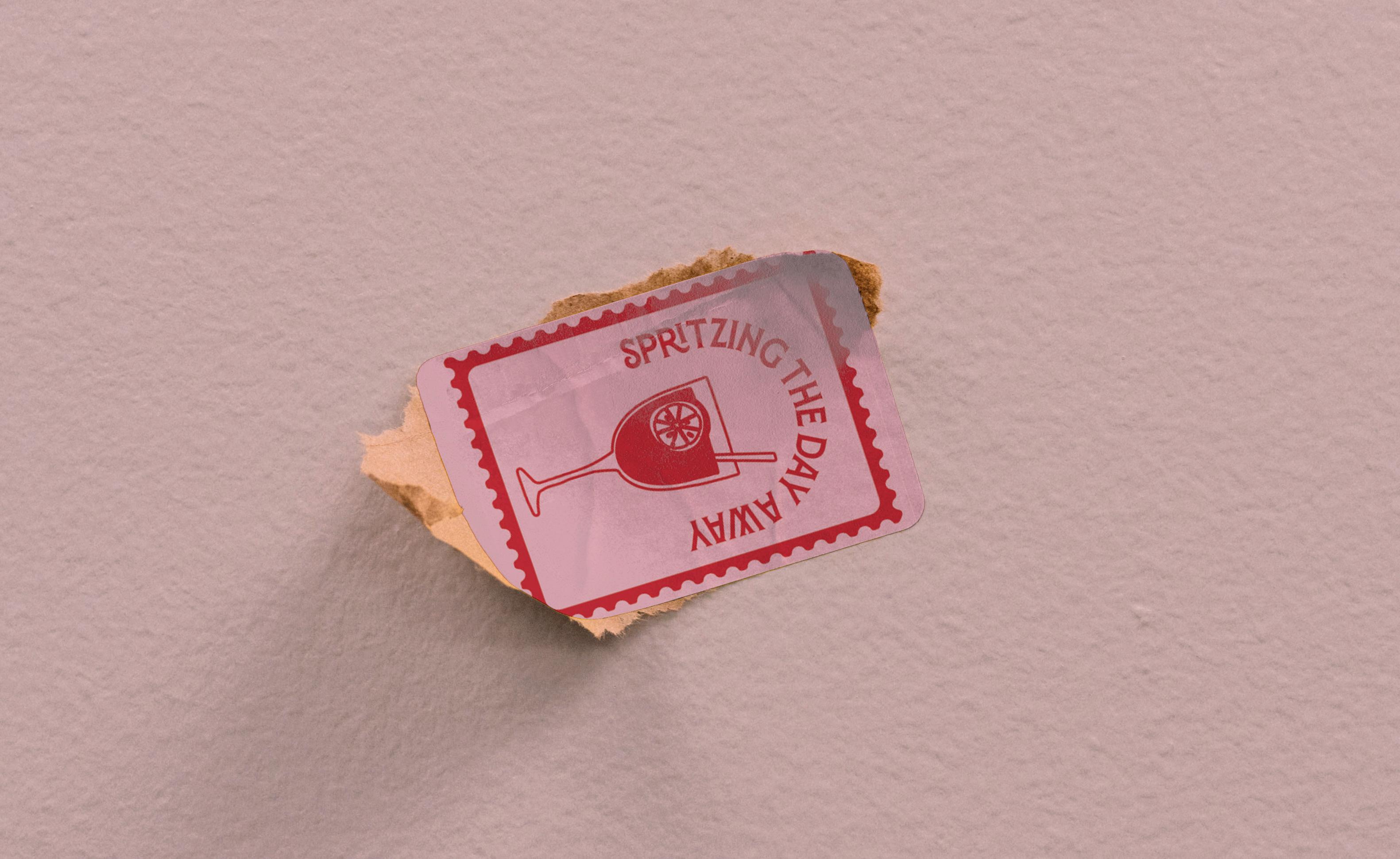
POST STAMP STICKERS AND BRANDED APRON
As part of this project I designed a branded apron and sticker creating almost a brand within the cookbook. “Spritzing the day away” is a cheerful exclamation dedicated to the famous italian Aperol Spritz, loved by many is the typical drink italian student would have when going for Aperitivo.
Graphic Design Portfolio 15
16 BRANDING
MERCHANDISE
SOCIAL MEDIA UX DESIGN , BILLBOARDS , ADVERTISING
Alexandra Balint
,
DESIGN ,
Platform Studio
Branding
Graphic Design Portfolio 17

18
Alexandra Balint

Graphic Design Portfolio 19
THE FIRST GYM INSIDE UK’S 20 BIGGEST TRAIN STATIONS
Platform Studio along with Network Rail wants to facilitate train commuters offering an accessible fitness studio in the UK’s 20 busiest train stationsaiming to improve people’s health while keeping in mind the busy schedules.
The presence of a gym in the train station will encourage passengers to travel by train regularly, and avoid travelling any further for a gym - making this a convenient way to keep active. This will improve the communities’ health and wellbeing and will address the climate crisis encouraging a park and ride method. The visual identity of Platform Studio intends to represent a playful and
dynamic personality. The studio will offer a wide range of classes: Yoga, Pilates, HIIT Workout, Stretch and Balance and Aerobics. The classes will run in the mornings and the afternoons, suitable for all passengers who want to exercise before or after work.
The orange is one of the primary colours of both Platform Studio and Network Rail - it is incorporated in both logos, therefore creates a consistency between the two.
Orange evokes emotions of energy, stimulation and enthusiasm.
The blue - as complementary colour of the orange - creates a bold visually dynamic personality.
Blue evokes strenghts and along with the orange creates a felling of vitality.
The white creates a sense of space, adds highlights and creates contrast to the designs - it is a refreshing colour.

Alexandra Balint 20
Promotional leaflet design


Graphic Design Portfolio 21


22
Alexandra Balint
PLAN YOUR WORKOUT ACCORDING TO YOUR JOURNEY
The app is designed to facilitate the users to book their workouts along with their journey. Each station will offer a variety of fitness classes suitable for the commuters who travel in the morning or the evening.

Graphic Design Portfolio 23


 Alexandra Balint


Graphic Design Portfolio


Graphic Design Portfolio 27
Alexandra Balint 28 BRANDING , PACKAGING DESIGN , SOCIAL MEDIA LIMITED EDITION , BILLBOARDS , ADVERTISING
33 Canti Whisky branding
Graphic Design Portfolio 29

A LIMITED EDITION WHISKY IN HOMAGE TO THE DIVINE COMEDY BY DANTE ALIGHIERI
33 Canti is the concept of a Limited Edition Whisky dedicated to those who love literature and have a passion for classic poems. This is targeted to collectors with big bookshelves and an appreciation for whisky.
The design uses blackletter font with a limited colour palette that reflects the most commonly used ink during Medieval times (blue and red mainly).
33 Canti is distilled in small batches in Distilleria Puni - The first Italian Malt Whisky Distillery, making this a unique piece of collection characterized by an unforgettable taste.
The aromatic profile is characterised by peat, lemon and caramel,making this an irresistible and seamless blend of flavors that makes a perfect
Graphic Design Portfolio 31
 Alexandra Balint

Graphic Design Portfolio
 Alexandra Balint

Portfolio
Graphic Design

ADVERTISING AND SOCIAL MEDIA PRESENCE

Graphic Design Portfolio 37
38 LET’S CREATE , LET’S CREATE , LET’S CREATE
CREATE , LET’S CREATE , LET’S CREATE
Alexandra Balint
LET’S
Graphic Design Portfolio 39 CONTACT +44 7305633794 alexandra.balint24@yahoo.com balinta.myportfolio.com @guacam.ale IC ONS & SOCIAL MEDIA L OGOS FOR BUSINESS C ARD IC ONS & SOCIAL MEDIA L OGOS FOR BUSINESS C ARD IC ONS & SOCIAL MEDIA L OGOS FOR BUSINESS C ARD ONS & SOCIAL MEDIA L OGOS FOR BUSINESS C ARD
40
Alexandra Balint


