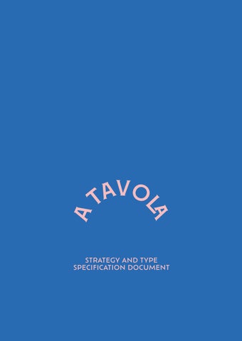
atavola
STRATEGY AND TYPE
SPECIFICATION DOCUMENT
1
2
3 content rationale typography colour scheme and paper stock grid system bookbinding method 5 7 11 13 19
SPECIFICATION DOCUMENT
c oncept strategy
A food lover’s story about missing home, celebrating their roots, and cherishing good memories.
Atavola is the result of wanting to create a design that celebrates my roots. This book is a collection of memories, people, places, moments and mainly flavours that have accompanied me.
Coming to the end of my degree I look back and I want to share with my family and friends my adventures. With this book I want to tell a story that is widely shared and certainly many other people are living - a story of sharing a home with new friends, meeting people from all cultures, cooking food and exploring dishes.
Food has always been a means of sharing, well-being and showing love. The book features recipes that have an emotional connection to places and people that have positively influenced my journey away from home.
For instance, the broccoli soup and cheese toastie is the comfort food I share with my flatmate, the courgette fritters is the food I always ask my mom to cook when I go visit home. My sister taught me how to make the leek and potato risotto.
Several factors contributed to the decision to write the book entirely in Italian.
My mum has been a great supporter and this book holds great emotional significance for me - my reason was to allow her to have a copy and being able to read it.
Besides, as a designer, i felt inspired to create something in my own language. I enjoy celebrating people, places, moments, and this time Italian language highly inspired me to create this book dedicated to Italian-speaking students abroad.
target audience
Italian-speaking students who left home to study abroad, young audience interested in cooking and have an eye for design.
The book consists of two typefaces, the display font Montecatini and the bodycopy Ofelia Text. The typographic approach is inspired by the design of the traditional italian Trattoria restaurants. Due to the nature of this topic I selected a typeface that could highly represent the italian eating culture.
Together they create a blanced contrast, the display typeface is elegant and characterized by a strong personality, while the bodycopy is highly legible due to its neutrality.
The distinctive aspect of a traditional italian Trattoria restaurant sign is the rectangular red coloured shape, with a white Liberty-like typeface.
This piece of italian design inspired the typography of my cookbook - I wanted to reproduce this aspect of the italian culture and transporting that feeling of eating in a Trattoria restaurant but at your own home, abroad.
Montecatini takes its cues from the elegant Stile Liberty travel posters of Italy in the early 1900s. The typeface has a dynamic capacity and the wide selection of ligatures, weights, and widths make it versatile to use. Its elegant and rich appearance creates a perfect contrast against the chosen bodycopy.
MonteCAtInI prO noRMale ULtra
montecAtInI pro normale boLd
MONTECATINI PRO NORMALE SEMIBOLD
MONTECATINI PRO NORMALE MEDIUM
MONTECATINI PRO NORMALE
MONTECATINI PRO NORMALE LIGHT
Ofelia is a modern geometric sans serif family characterized by its simplicity and extensive functionality. Its geometric characteristics evoke neutrality, while letters like /a, /f and the comma give it a gestural touch. The typeface is easy to digest when used for the bodycopy.
Ofelia Text Bold
Ofelia Text Semibold
Ofelia Text Medium
Ofelia Text Itlaic
Ofelia Text Regular
Ofleia Text Light
The colour palette is inherited from my mum’s ricepes notebook, making this a homage to this hobby we both share. Blue evokes a feeling of calmness and tranquillity that reminds the homely welcoming feeling.
Pink is associated with love and kindness, but is also the color of friendship and conviviality which is highly celebrated throughout the book.
Red is the colour of the Trattoria restaurant signs and is often associated with food and appetite.
All the colours stand together creating a fresh and modern feel for the book.
The bodycopy uses a 95% dark grey colour.
All pages
Scale 50%
Columns 8
Rows 5
Gutter 5mm
All pages Page example 20 - 21
Drop cap 3 lines
Kerning on first three lines 100
Justified text last line left aligned
Come prima cosa bisogna preriscaldare il forno in modalità statica a 220°C. Taglia le patate dolci a strisce e stendile su una teglia ricoperta di carta da forno. Condisci con po’ di olio e sale e cuoci in forno per 20 minuti. Una volta cotte, mettile da parte.
Sciacqua bene la quinoa, che altrimenti avrà un sapore amaro. Metti in una pentola la quinoa e l’acqua, mantenendo la proporzione di una tazza di quinoa e una tazza di acqua.
Copri e cuoci a fiamma bassissima per 10 minuti circa: il tempo dipende anche leggermente da quanto saranno grandi il fornello e la pentola che utilizzate. In ogni caso puoi aprire il coperchio ogni tanto per controllare. Una volta asciutta, la quinoa è pronta: spegni il fuoco, condisci con sale e un filo di olio.
Nel frattempo fai saltare i ceci già cotti in una padella con le spezie: curcuma, pepe nero, e paprika. Due minuti a fuoco medio, mescolando, e i ceci sono pronti.
Prepara le bowls: in ognuna metti un po’ di quinoa, una manciata di spinaci freschi, le patate che nel frattempo si sono cotte e i ceci speziati. Per finire, puoi aggiungere un po’ di mandorle o qualsiasi altra frutta secca a piacereanche in questo caso puoi aggiungere altri ingredienti a tuo piacimento, per esempio pomodorini e cetrioli.
Paragraph specification
Icons
Montecatini N. Ultra
11 pt
Recipe name
Montecatini N. Ultra
36 pt
36 pt leading
Time and portions
Montecatini N. Semibold
8 pt
Ingredients
Montecatini N. Ultra
18 pt
Ingredients list
Ofelia Text Semibold
8 pt
13 pt Leading
Page number
Montecatini N. Bold
8 pt
Page specification
Page example 26
Scale 50 %
Bodycopy
Ofelia Text Regular
8 pt
10 pt Leading
Copting Binding is ideal for giving the book a handcrafted feel which greatly relfects the nature of this topic. Additionally, this method facilitates the cooking process by allowing the book to lay flat rather than having to flip pages.
The combination of 250gsm paper and this binding style gives it the feel of a limited edition, and the contrast of the colourful pages with the red thread creates a striking effect.
Though this technique did not give my book a robust feeling, perhaps it feels slightly wobbly, I appreciate it in its entirety as I consider it to be original and personal in its handmade feeling.
1 inch from top
5.5 cm in between all
1 inch from bottom
