2 minute read
rat i o elan
c oncept strategy target audience
A food lover’s story about missing home, celebrating their roots, and cherishing good memories.
Advertisement
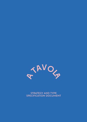
Atavola is the result of wanting to create a design that celebrates my roots. This book is a collection of memories, people, places, moments and mainly flavours that have accompanied me.
Coming to the end of my degree I look back and I want to share with my family and friends my adventures. With this book I want to tell a story that is widely shared and certainly many other people are living - a story of sharing a home with new friends, meeting people from all cultures, cooking food and exploring dishes.
Food has always been a means of sharing, well-being and showing love. The book features recipes that have an emotional connection to places and people that have positively influenced my journey away from home.
For instance, the broccoli soup and cheese toastie is the comfort food I share with my flatmate, the courgette fritters is the food I always ask my mom to cook when I go visit home. My sister taught me how to make the leek and potato risotto.
Several factors contributed to the decision to write the book entirely in Italian.
My mum has been a great supporter and this book holds great emotional significance for me - my reason was to allow her to have a copy and being able to read it.
Besides, as a designer, i felt inspired to create something in my own language. I enjoy celebrating people, places, moments, and this time Italian language highly inspired me to create this book dedicated to Italian-speaking students abroad.
Italian-speaking students who left home to study abroad, young audience interested in cooking and have an eye for design.
The book consists of two typefaces, the display font Montecatini and the bodycopy Ofelia Text. The typographic approach is inspired by the design of the traditional italian Trattoria restaurants. Due to the nature of this topic I selected a typeface that could highly represent the italian eating culture.
Together they create a blanced contrast, the display typeface is elegant and characterized by a strong personality, while the bodycopy is highly legible due to its neutrality.
The distinctive aspect of a traditional italian Trattoria restaurant sign is the rectangular red coloured shape, with a white Liberty-like typeface.
This piece of italian design inspired the typography of my cookbook - I wanted to reproduce this aspect of the italian culture and transporting that feeling of eating in a Trattoria restaurant but at your own home, abroad.
Montecatini takes its cues from the elegant Stile Liberty travel posters of Italy in the early 1900s. The typeface has a dynamic capacity and the wide selection of ligatures, weights, and widths make it versatile to use. Its elegant and rich appearance creates a perfect contrast against the chosen bodycopy.


