


LUNCH is the design research journal of the UVA School of Architecture.
Published by Applied Research and Design Publishing, an imprint of ORO Editions. Gordon Goff: Publisher
www.appliedresearchanddesign.com info@appliedresearchanddesign.com
Copyright © 2022 LUNCH and the University of Virginia.
All rights reserved. No part of this book may be reproduced, stored in a retrieval system, or transmitted in any form or by any means, including electronic, mechanical, photocopying of microfilming, recording, or otherwise (except that copying permitted by Sections 107 and 108 of the U.S. Copyright Law and except by reviewers for the public press) without written permission from the publisher.
You must not circulate this book in any other binding or cover and you must impose this same condition on any acquirer.
Editors: Colleen Brennan, Leah Kahler, Chris Murphy, and Ben Small Faculty Advisors: Brad Cantrell and Sneha Patel
Book Design: Colleen Brennan, Leah Kahler, Chris Murphy, and Ben Small Project Manager: Jake Anderson
10 9 8 7 6 5 4 3 2 1 First Edition
ISBN: 978-1-957183-12-1
Color Separations and Printing: ORO Group Ltd.
Printed in China.
Typeface: Bau Pro
AR+D Publishing makes a continuous effort to minimize the overall carbon footprint of its publications. As part of this goal, AR+D, in association with Global ReLeaf, arranges to plant trees to replace those used in the manufacturing of the paper produced for its books. Global ReLeaf is an international campaign run by American Forests, one of the world’s oldest nonprofit conservation organizations. Global ReLeaf is American Forests’ education and action program that helps individuals, organizations, agencies, and corporations improve the local and global environment by planting and caring for trees.

Dear reader,
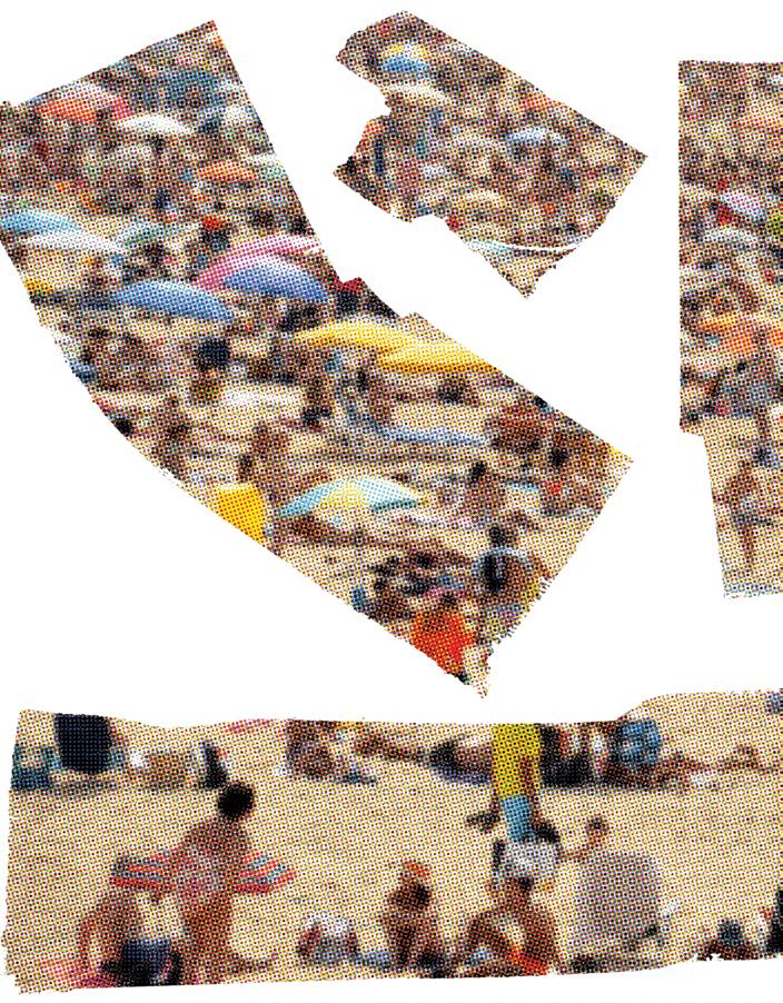
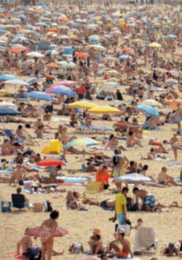
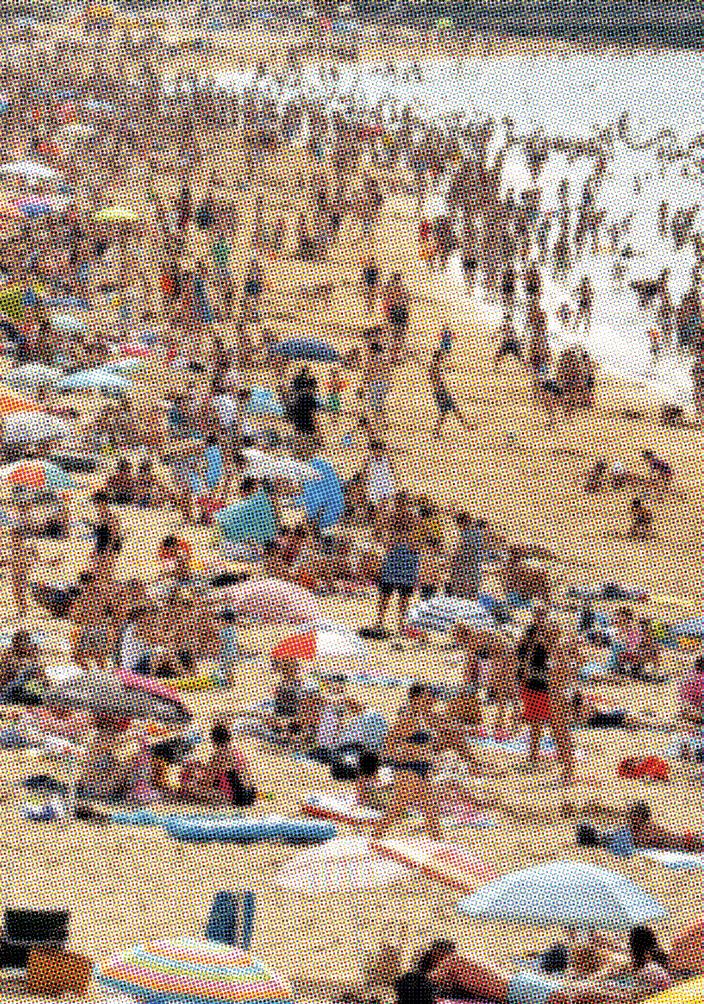
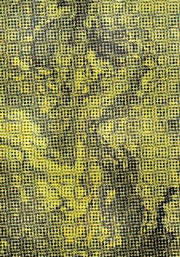
When the editorial team came together in late 2019 to develop the call for submissions for LUNCH Journal’s fifteenth issue, the world was a different place. That time, the “pre-pandemic,” found us ruminating on the thickness of lines, the thinness of our computers’ screens, and the tantalizing possibility of that which refuses oversimplification in pursuit of complexity. Sitting knee to knee, breathing with blissful and maskless comfort, we chattered on about vibrant bikini-crowds sweating on each other at the beach, the crushing thickness of walls in dummy crash tests videos, ogled the cushiony depth of Iceland’s moss-covered rock formations, and pondered the fortitude of braided strands. These images, we decided, were thick, and we liked it.
In the coming months, the editorial team, our contributors, and the entire rest of the world bore witness to what felt like radical, pivotal shifts in the trajectory of reality. Almost overnight, those thick crowds sweating at the beach disappeared; ushering in eighteen months of a pandemic that revealed to us the shocking thinness of our own skin. The porosity of our bodies changed everything about how we interacted with our friends, loved ones, and neighbors. It upended the way we move through the world and how we understand the air that we breathe. Then in the summer of 2020, the murders of George Floyd, Breonna Taylor, Ahmaud Arbery, Tony McDade, and too many since, ignited a conversation on the long history of race-based violence in the US and around the world.
As we collectively grieved, the range of things we believed were possible became far more expansive, in ways that inspired both incredible fear, but also incredible hope. Calls for examining institutional entanglements with white supremacy grew, and we began to see cities across the south toppling, dismantling symbols of white supremacy in court houses, schools, and public spaces. Finally in July of 2021, nearly four years after white supremacists marched on the University of Virginia’s campus, occupied downtown Charlottesville, and killed Heather Heyer, the monument at the heart of the conflict was removed.
When we began ruminating on the playful aesthetic of THICK for the fifteenth issue of LUNCH, we couldn’t have imagined what we would experience together over the next year. But our contributors offered us a beautiful breadth of ways to think through this time and its thickness and thinness as it waxed and waned. Thickness isn’t always the goal. In fact, “You need thin. Thickness all the time would be exhausting,” as Garnette Cadogan reminded us. Sometimes thinness just is. It can’t or won’t thicken, but in its own stubbornness, the strands that bind us together bend and give with flexibility and the strength of many.
Dear reader, we’ve been through it; through thicket and thin wood. But we’re still not out of the woods. Through thick and thin, slice the bread so there’s more to go around, even if it means we each get less. Neither are easy, but since when has anything worth doing been easy?
Yours through thick and thin, Ben Small, Colleen Brennan, & Leah Kahler
Alissa Ujie Diamond
Erin Besler & Ian Besler
Chloe Nagraj Jonah Pruitt
Bjorn Sparrman
Ila Berman
Julie Larsen & Roger Hubeli
Kevan Klosterwill
Brian Davis
Katie LaRose
Charles Weak
Matthew Wilson
Mantha-Blythe & Brynn
ThaÏsa Way
Hannah Jane Brown
Samantha K. Sigmon
Aroussiak Gabrielian & Alison Hirsch
ALISSA UJIE DIAMOND
This piece begins with questions arising from the School’s celebrations around the 100th Anniversary of its founding in 1919. Unmentioned in this year’s laudatory missives was the fact that in 1919, Paul Goodloe McIntire, a wealthy local man and “philanthropist,” most infamously known for the donation and installation of many statues featuring explicitly racist imagery, provided the funds to found the School of Art, the precursor institution to today’s School of Architecture.1 Philanthropy derives from a Greek origin: philanthropos,2 translating to man-loving, which in this case describes a particular kind of love that Black spatial scholars like Sylvia Wynter, Katherine McKittrick,3 and others4 critique. Wynter states that these projects of producing the “ideal man” served to:
invent, label, and institutionalize the indigenous peoples of the Americas as well as the transported enslaved Black Africans as the physical referent of the projected irrational/ subrational Human Other to its civic-humanist rational selfconception.5
She calls this figure Man2, replacing a racialized religious ideal of human perfection (Man1) with a scientific one. These ideological projects used emerging “scientific” and “rational” logics to produce the tropes of the racialized “Others” necessary for the project of imperial-industrial modernity. These ideologies used modern science as the new unquestionable, greater-than-human Truth. Many mainstream thinkers of the time used this bulwark to hide constructed racial-political systems behind a curtain of scientific expertise and physical “proof.”
It’s my first year of studio. The students tell me: “The Architecture School…those kids never sleep.” My professor told me to rest, but in the same breath gave me a long list of deliverables, and I can do it. I can’t remember when I last slept, and I just realized I’m hallucinating. As I call for a ride home, I see that my eyelashes have fallen out, leaving a hairy smile on my index finger.
As late as 1978, architect James Stirling reflected on his Beaux-Arts training alongside Colin Rowe, and his desires during studio reviews in the late 1970s:
Colin Rowe and I have fantasized quite often on the making of a conversation along these lines at the rarefied revues [sic] at Yale or Harvard. Would we dare ask a bad project student, ‘Couldn’t you get any n***ers to help you?’31
As a person who has been assigned readings by Colin Rowe in multiple design theory courses, I was surprised by this statement, which evidences unspoken aspects of the inertial exclusivity of design culture, and the persistence of older models for design processes. First, the prod at “bad” students betrays the ongoing alignment of racial and gendered ideologies and who “counts” as an architect. Why did you fail? Because you couldn’t master others.
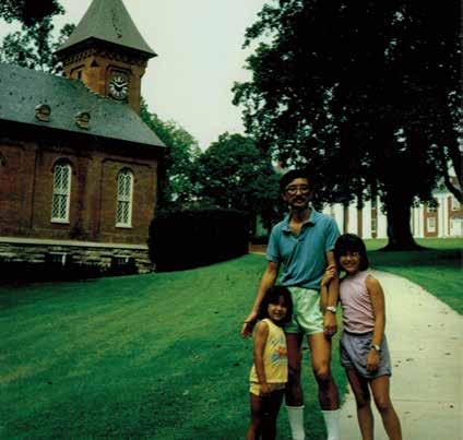
The Author (right) and her Father and Sister at Lee Chapel at Washington and Lee University, 1989.
Our design precedents are imperial models: Hadrian’s Villa, Palladio’s works, and their Jeffersonian legacies, baked into contemporary perspectives on “good” urbanism and design. We are still working toward an incredibly specific “universal” ideal: a newly re-digested set of slightly broadened histories of the powerful applied to today’s spaces. Second, the jest insists we must be as productive as a plantation master’s operation. These attitudes persist today in the idea that one must work at an ever-faster pace, be ever more productive, and sacrifice self and communal care to enable the “excellence” of a design product. These histories show up in our lives and educations every day, in myriad ways varying with positionalities of the people engaging with this institution.
I’m on maternity leave with my second child. I grew up in Lexington, Virginia, the “Shrine of the South.” Images of Confederates are like wallpaper to me, I’ve seen them my whole life, and I no longer think much of it Fig. 5). Fifteen-year-old high school activist Zyahna Bryant’s letter to Charlottesville’s city council snaps me out of it:
When I think of Robert E. Lee I instantly think of someone fighting in favor of slavery. Thoughts of physical harm, cruelty, and disenfranchisement flood my mind. As a teenager in Charlottesville that identifies as black I am offended every time I pass it. I am reminded over and over again of the pain of my ancestors and all of the fighting that they had to go through for us to be where we are now. Quite frankly I am disgusted with the selective display of history in this city. There is more to Charlottesville than just the memories of Confederate fighters.32
As an undergraduate who entered the UVA architecture program in 1998, I walked daily to class. Having grown up in central Virginia, UVA echoed the spaces where I grew up: elite, white, eternal institutions. But this fall I encounter Jeffery Hantman’s Monacan Millennium, where he observes that indigenous people have continuously inhabited the region encompassing Charlottesville for at least 10,000 years.33 The 400 years of “permanent” European colonization of this land amounts to at most a mere four hundredths of the time human societies have interacted with this place. The buildings I see are a recent crust over a living social system that reaches across countless generations.
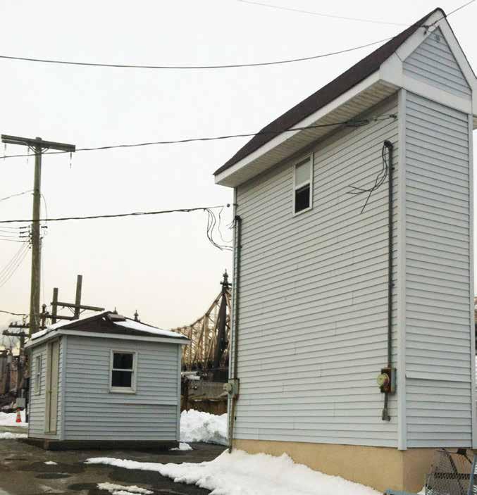


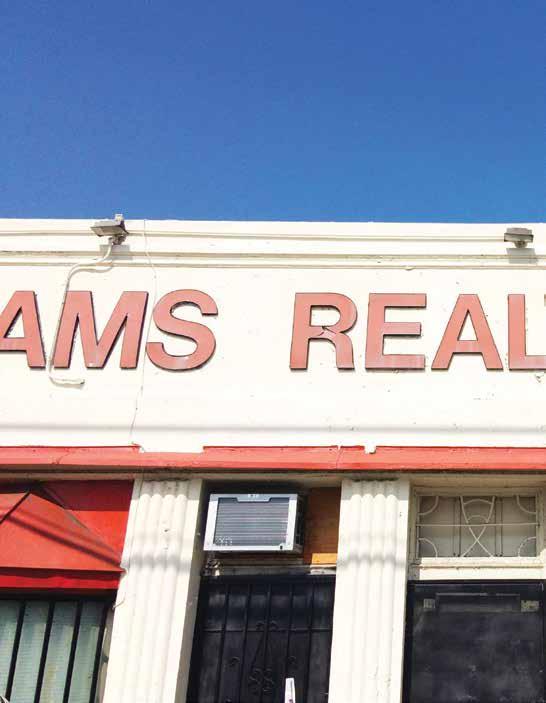

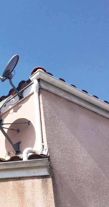

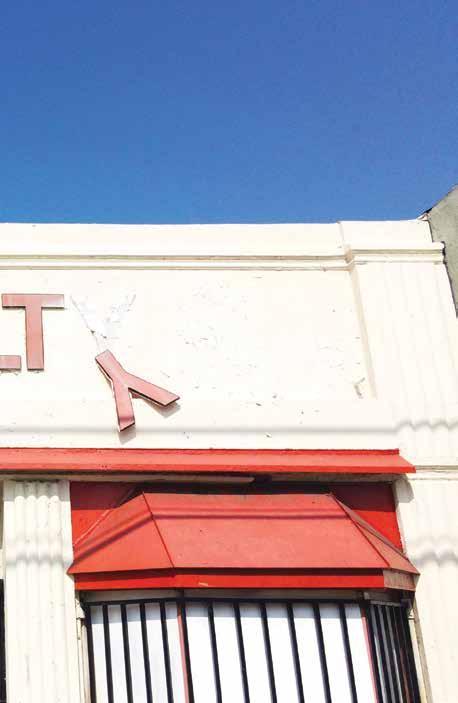


1 Los Angeles is replete with buildings that embody the formal qualities of digital models created with SketchUp software, which is available for free online and primarily marketed to amateur, rather than professional, practitioners. This visual association, of course, has nothing to do with the design or fabrication of these buildings (presumably the vast majority of buildings in the world have never existed as digital models, at least not as part of the design process, but rather, were likely planned to the minimum degree specified by local building codes). The “SketchUp look” is characterized by unorthodox relationships between proportions and surface treatments, as if imagined and iterated exclusively on the screen of a small laptop computer. Perhaps a canonical exemplar of the “SketchUp look” can be found in architect Rafael Viñoly’s 432 Park Avenue tower, completed in 2015. The overall proportions are uncomfortably narrow and tall,* and the enormous and unarticulated window openings only emphasize the sense of visual discord: As if a low-resolution rendering for a tower was suddenly dropped into place at the edge of Central Park.
*Note: 432 Park Avenue is currently among the first results that return in an internet search for the phrase ‘Pencil Building.’
2 The unending charm of Masahiro Mori’s term* is in the poetically evocative tint that it casts on what could have otherwise been an obtuse and dispassionate observation. Pointing out that there’s a varying degree of creepiness to things that seem to reproduce facial expressions, postures, and gestures (such as robots, androids, or other automata) isn’t especially novel, but to articulate it with a level of precision and a terminology that so strikingly expresses both an emotion and a place is what elevates the label and embeds it indelibly in the imagination; it’s a term that can’t be unheard, or unremembered. Rather than simply describing the relationships of two values on a coordinate plane (the “valley” derives from the graph that accompanies Mori’s article describing the phenomenon), it brings to mind a haunting and hazy emotion tied to some specific destination and experience; The Uncanny Valley sounds like a setting torn directly from the fabric of a dream or a distant memory. It lets the mind wander, stumbling upon the eponymous Valley on a map, like the Badlands or the Barrens, it’s a place that evokes an emotion just in the evocation of its name. The staying power and provocative potential of the term leads one to imagine an entire expanded category of sensations or impressions in which representation and interactive overlay seem to have callously wandered too close to the boundary that neatly divides the real from the unreal, or the living from the inanimate. We might more appropriately start to describe ourselves as having momentarily tumbled into the Uncanny Valley when we drunkenly try to double-tap a sunset viewed through a window, or sleepily swipe-left a glossy portrait in a magazine.
*See: Masahiro Mori, “The Uncanny Valley,” Energy, Vol. 7, No. 4 (1970): 33–35.
3 The quirkiest applications of prosaic interior details—such as trim plates, molding, ventilation covers, fire egress signs, and strobes—are found in transitory spaces, particularly convenience stores, airports, and fast-food chains. Conversely, places that self-consciously assert some cultural or historical novelty, like the Getty Villa, also brim with bizarre accents and fittings. In resolving surface finishes, the richest outcomes happen when the stakes are either incredibly low or delightfully high; as if attempting to render the incidental into invisibility.
4 The blunt immediacy of language in labels that are applied to buildings (“BLOCKED”) seems especially reserved for points of ingress or egress.* The management company for a building in the Jewelry District in Los Angeles hangs signs across the glass entryway doors at night that read: “THIS DOOR IS CLOSED,” which seems to aspire for the blunt utility of “BLOCKED,” but falls amusingly short of its aim due to the absurd obviousness of the message. Anyone can see that the doors are closed just by looking at them (“THIS DOOR IS LOCKED” is probably the less ambiguous message that the management company intended to convey). As with the filler copy usually reserved for blank storefront signs, it’s interesting to imagine the other uses to which this kind of labeling could be applied, or to imagine a cityscape cluttered with equal amounts of labeling and building. Such graphic applications start to turn buildings themselves into signs, billboards, and diagrams, in a way confusing the distinction between the plan and the built object.
*See, for instance: “ENTER” or “EXIT,” “OPEN” or “CLOSED,” “CAUTION” or “CUIDADO.”
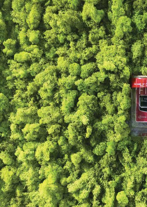
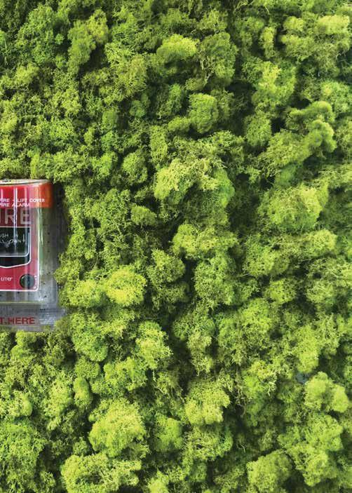
5 While the creeping spread of the not-quite-living “living green wall” (the name itself positively vibrates with a sense of barely repressed threat) seems to have had an out-sized impact in hotel lobbies and the occasional corporate office interior, the otherwise institutional entryway of a historic greenhouse conservatory on Chicago’s West Side, of all places, strikes a discordant tone. I spent an afternoon lurking in the lobby, trying to seem nonchalant while watching with rapt fascination as a disinterested facilities member opened bag after bag of dried lichen and hot-glued it to the wall. Your vision wanders around the periphery of the surface and your eyes can so easily create the impression that you’re hovering at low altitude over a charmingly even-tinted forest in a helicopter or perhaps a small prop plane. The stubborn impropriety of the fire alarm, which seems rudely unaware of its presence in disrupting the scene, can easily be redacted by closing one eye and holding up a thumb to blot-out the scale, and suddenly the forest seamlessly reemerges.
6 The digital turn in typesetting, more typically referred to as the advent of ‘desktop publishing,’ didn’t simply reach its conclusion with the banality of holiday newsletters and “Lost Dog” signs. Like movable type and the standardization of lettering and punctuation before it, every technological shift deprives us of some nuance or irreproducible quirk in the interest of convenience. If the mood struck them, people used to simply make up their own punctuation marks when they had pen and paper to work with! The implications for the built environment, how our neighborhoods and streetscapes look and feel, continue to reflect and synthesize the outsize influence of those moments in the ’80s and ’90s when the palette of letterforms started to become locked-in: perhaps starting with the typeface Chicago in Apple systems, and expanding to include dreary storefront evocations set unimaginatively in Helvetica, Mistral, Copperplate, and other charmless palettes of letterforms. Cooper is the only one with any redeeming character to speak of, and typically the ludicrously inept are the only signs worth noticing. There’s a dentist office down the street that decided to imitate the Coca-Cola lettering and ribbon in their signage for God only knows what reason: the words “Dental Implants” written out in loopy curves and swoops. Occasionally, while looking at historic photography, you might notice the tender care and character evident in hand-painted advertising murals and other signs prior to rapid reproduction.* With digital lettering in retail signage today, it seems like the only marks of distinction come from the incomprehensible choices.
*Note: Some technical schools still offer sign-painting classes, and inevitably the school building itself becomes the display surface for the classes’ efforts: Ever the selfless martyr, the building is offered-up in the interest of educational development.
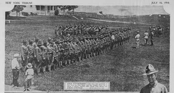
4 (above) New York Tribune, Training Camp at Fort Terry, 1916.
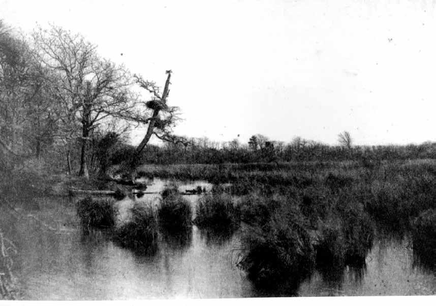
6 (opposite) Entangled narratives at Plum Island
scientific research, contamination, and conspiracy.

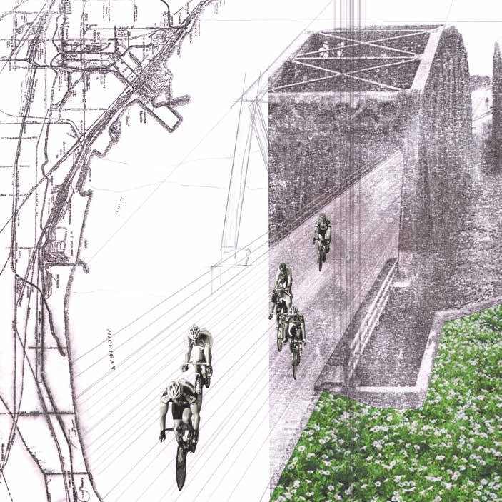
The history of Northwest Indianians emerges from our special relationship with the southern tip of Lake Michigan. Following many of the ancient trading routes of the Native American Potowatamie Tribes, tracks were laid to connect Detroit and the exploding city of Chicago in the 1840s. The area along the coast stayed relatively sparsely populated for decades despite the growing railways. The combination of cheap, swampy land and easy connection to the concentrated railroads created massive incentive to relocate and expand industry to Northwest Indiana from Chicago.
Rapid takeovers of windswept dunes for industry began in the 1890s. Standard Oil, Inland Steel, U.S. Steel Garyworks, Bethlehem Steel, and four coal power plants took dominance over the crescent of lakeshore. They brought people by the thousands to work and build on a scale difficult to fully comprehend. Worker’s Progress Association writers wrote about Northwest Indiana, “This region, within a few miles of the eastern city limits of Chicago, lay dormant during the nineteenth century waiting for electricity and the machine age to give it life.1”