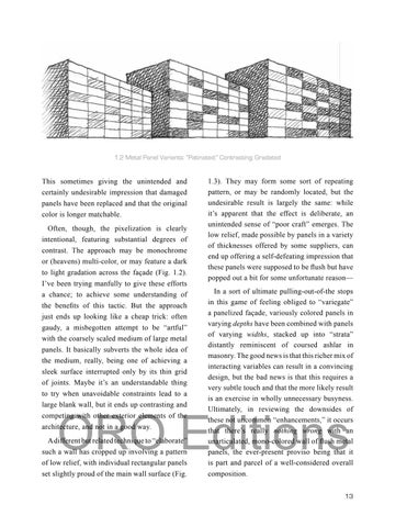
1.2 Metal Panel Variants: “Patinated;” Contrasting; Gradated
This sometimes giving the unintended and certainly undesirable impression that damaged panels have been replaced and that the original color is longer matchable. Often, though, the pixelization is clearly intentional, featuring substantial degrees of contrast. The approach may be monochrome or (heavens) multi-color, or may feature a dark to light gradation across the façade (Fig. 1.2). I’ve been trying manfully to give these efforts
1.3). They may form some sort of repeating pattern, or may be randomly located, but the undesirable result is largely the same: while it’s apparent that the effect is deliberate, an unintended sense of “poor craft” emerges. The low relief, made possible by panels in a variety of thicknesses offered by some suppliers, can end up offering a self-defeating impression that these panels were supposed to be flush but have popped out a bit for some unfortunate reason—
of low relief, with individual rectangular panels
In a sort of ultimate pulling-out-of-the stops in this game of feeling obliged to “variegate” a panelized façade, variously colored panels in varying depths have been combined with panels of varying widths, stacked up into “strata” distantly reminiscent of coursed ashlar in masonry. The good news is that this richer mix of interacting variables can result in a convincing design, but the bad news is that this requires a very subtle touch and that the more likely result is an exercise in wholly unnecessary busyness. Ultimately, in reviewing the downsides of these not uncommon “enhancements,” it occurs that there’s really nothing wrong with an unarticulated, mono-colored wall of flush metal panels, the ever-present proviso being that it is part and parcel of a well-considered overall
set slightly proud of the main wall surface (Fig.
composition.
a chance; to achieve some understanding of the benefits of this tactic. But the approach just ends up looking like a cheap trick: often gaudy, a misbegotten attempt to be “artful” with the coarsely scaled medium of large metal panels. It basically subverts the whole idea of the medium, really, being one of achieving a sleek surface interrupted only by its thin grid of joints. Maybe it’s an understandable thing to try when unavoidable constraints lead to a large blank wall, but it ends up contrasting and competing with other exterior elements of the
ORO Editions
architecture, and not in a good way.
A different but related technique to “elaborate”
such a wall has cropped up involving a pattern
13


