42 minute read
The Context: Oddities Outside ............................................................ 88


1.2 Metal Panel Variants: “Patinated;” Contrasting; Gradated
This sometimes giving the unintended and certainly undesirable impression that damaged panels have been replaced and that the original color is longer matchable.
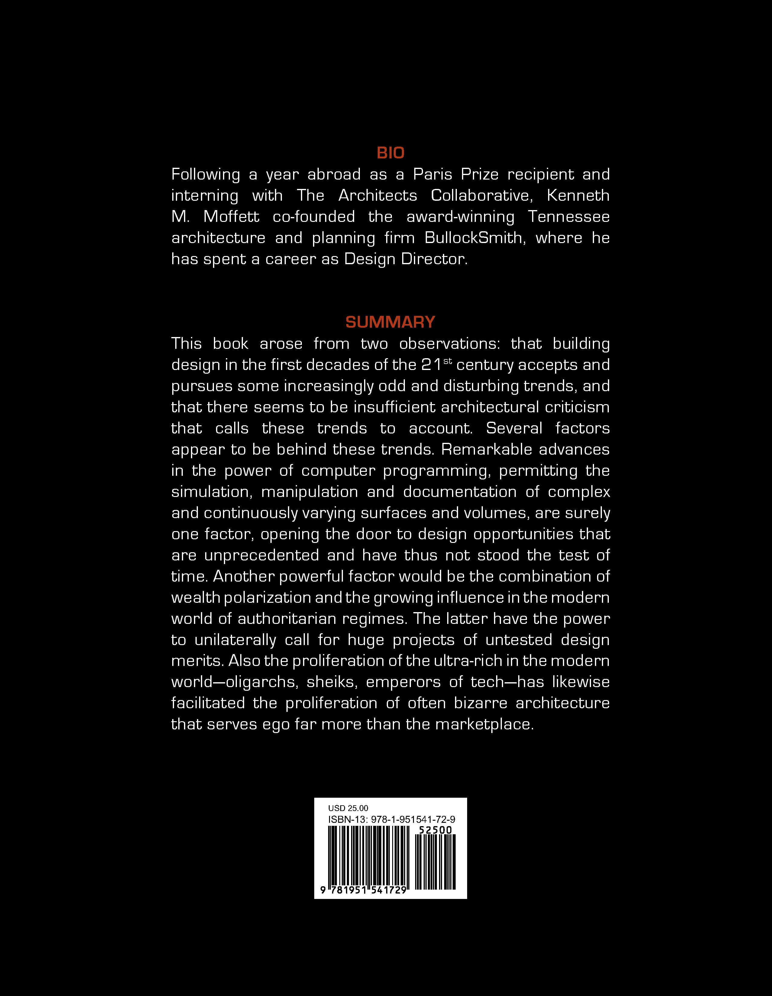
Often, though, the pixelization is clearly intentional, featuring substantial degrees of contrast. The approach may be monochrome or (heavens) multi-color, or may feature a dark to light gradation across the façade (Fig. 1.2). I’ve been trying manfully to give these efforts a chance; to achieve some understanding of the benefits of this tactic. But the approach just ends up looking like a cheap trick: often gaudy, a misbegotten attempt to be “artful” with the coarsely scaled medium of large metal panels. It basically subverts the whole idea of the medium, really, being one of achieving a sleek surface interrupted only by its thin grid of joints. Maybe it’s an understandable thing to try when unavoidable constraints lead to a large blank wall, but it ends up contrasting and competing with other exterior elements of the architecture, and not in a good way.
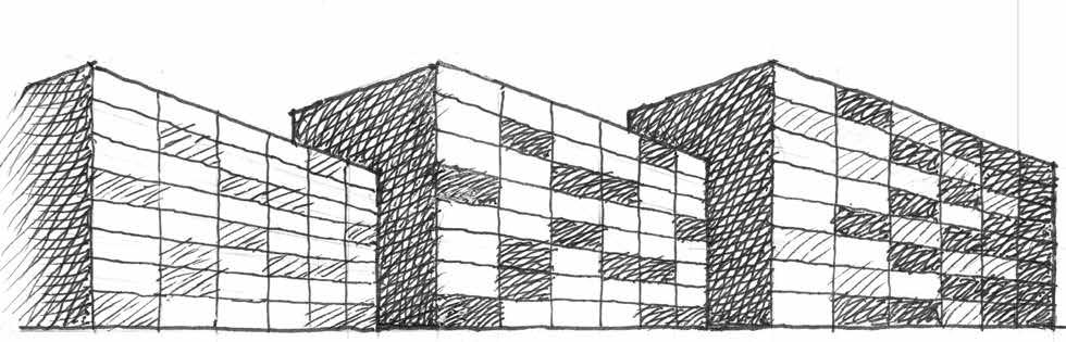
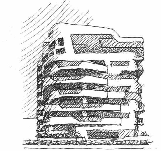
A different but related technique to “elaborate” such a wall has cropped up involving a pattern of low relief, with individual rectangular panels set slightly proud of the main wall surface (Fig. 1.3). They may form some sort of repeating pattern, or may be randomly located, but the undesirable result is largely the same: while it’s apparent that the effect is deliberate, an unintended sense of “poor craft” emerges. The low relief, made possible by panels in a variety of thicknesses offered by some suppliers, can end up offering a self-defeating impression that these panels were supposed to be flush but have popped out a bit for some unfortunate reason—
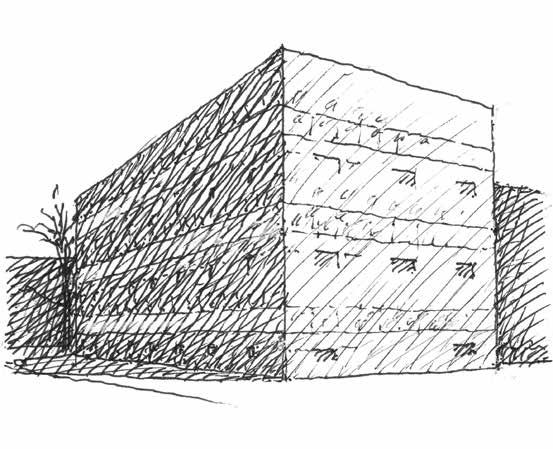
In a sort of ultimate pulling-out-of-the stops in this game of feeling obliged to “variegate” a panelized façade, variously colored panels in varying depths have been combined with panels of varying widths, stacked up into “strata” distantly reminiscent of coursed ashlar in masonry. The good news is that this richer mix of interacting variables can result in a convincing design, but the bad news is that this requires a very subtle touch and that the more likely result is an exercise in wholly unnecessary busyness. Ultimately, in reviewing the downsides of these not uncommon “enhancements,” it occurs that there’s really nothing wrong with an unarticulated, mono-colored wall of flush metal panels, the ever-present proviso being that it is part and parcel of a well-considered overall composition.
ORO Editions
1.3 Metal Panel Variants: Proud Panels; Mixed Widths/Lengths/Depths /Colors
1.4 Eberswalde Technical School Library, Eberswalde, Germany
If the goal of these efforts is, in effect, to “decorate” an otherwise largely blank panelized façade, Herzog & de Meuron took that goal to another level at their library in Eberswalde, Germany, where enlarged images from photographs and paintings were applied by screen printing techniques onto gridded bands of concrete and glass. One interesting effect was the “blending” of the glazed bands with the concrete bands, such that there isn’t much in the way of any intermediate scale development between the extremes of the overall volume and this applied pictorial patterning, aside from some unartful punched openings (Fig. 1.4). As a result, there is an odd juxtaposition of this finegrained and repeating monochromatic detail with the direct mundanity of the box building, as if to distract from or dematerialize it, and in this regard the project constitutes a sort of link between this discussion of variegation and the next of dematerialization.
Wall Opening Pattern Variegation
This compulsion to add variety to a large and plain wall surface has manifesting itself in some other ways in the last couple of decades. When the façade is fenestrated, we note that the vicissitudes of style preference have evolved, as evolve they will, since the early days of modernism. Once “ribbon windows” became buildable, if not especially economical, we saw their well-known appearance in iconic buildings such as the Villa Savoye, and before long the continuous ribbon window became an accepted and ubiquitous treatment for commercial architecture, recurring to this day. (The advent ORO Editions of the curtain wall saw the proliferation of the even more ubiquitous glass screen—the entirety
2FRAGMENTATION:
SHAPE CHANGED BY BREAKAGE
Say we think in terms of an “initiating form”: not necessarily a box building, but something identifiable as a single entity of a building. That was largely the case in the previous chapter where changes were nominally two-dimensional in nature. But now ways are going to appear that modify such a form. The most familiar, it’s probably safe to say, consists of variations—three in this discussion—on a theme of breaking things. But the pieces remain, and the form becomes an agglomeration of forms. The approach is a familiar and (sometimes) legitimate one, but nowadays it’s being taken to some disturbing extremes.
2a. Stratifying: Disengagement by Layers
Buildings with more than one floor are “stratified” by nature: they’re layer cakes, an attribute more intrinsic than any other. So in the urge to do something a little different, a little odd, it’s natural that playing with these layers will have readily become a thing, in particular since they’re there anyway: a messing-around of first resort, with no immediate need to ramp up to major surgery or earthquake-like effects.
Precedents
Italian Gothic comes to mind, its light and dark striping a common result of infilling with cheaper materials, bonding structurally at alternate bands, or trying to exaggerate a
building’s width. Ultimately in such cases aesthetic impact becomes a means to its own end, adding contrast and pattern to what might be an otherwise plain wall surface. In modern times accent bands in masonry walls have also been popular, but with results often more on the awkward than the elegant side. To wit, James Stirling’s No.1 Poultry in London, far from Big Jim’s best work, demonstrates that to apply the Italian precedent in equal bands is to misjudge the motif: history’s foremost exemplar, Siena Cathedral, reserved the eye-popping equal-ORO Editions zebra-stripe proportions for only select aspects of its fabric.
In Compression
Such enhanced expression of horizontal striation varies widely in scale in pertinent works of the present century, from such wall-pattern figuration to all-out floor-by-floor articulation. Zaha Hadid’s Center for Contemporary Art in Cincinnati takes the latter approach, with a predominating impression of its several floors as blocks or bars that have been compressed or collided vertically (though to be sure there are places where the opposite impression prevails, with glass infill between solid masses as if they were separated in tension) (Fig. 2.1). Modest lateral shifts as well as contrasting materials are the expressive means. In this early built work of the architect, the constraints of its predominantly solid-walled program plus a limiting urban site have been met, by these ingenious means, to defuse a potentially blocky and massive result. (All well and good, though this may be the first and last opportunity on these pages to praise the architect’s contextual sensitivity on an urban site. We shall see.)
Snøhetta’s San Francisco Museum of Modern Art Expansion also evokes compression, its big bowed, notched, and carved north face rippled as if a carpet rucked into wrinkles (Fig. 2.2). Its sense of sleekness and continuity doesn’t marry that well with the sometimes difficult reality that buildings often need windows, and here they constitute occasionally rude interruptions in that subtly varied continuity. The utter difference of the building from the original Mario Botta museum, of which it is an expansion, has been noted by critics with some measure of displeasure—but it’s fair to say that if the museum had wanted more of the same, Botta would have been the logical hire, while Snøhetta will have been far more likely to do something very different, which they did. Botta’s building is itself another modern-day interpretation (as are many by the architect) of Florentinish striping at a lavish scale. Ultimately, the two stratigraphic motifs are so completely different that there is no sense of filial connection between them: the addition seems some other project entirely that just happens to be shoved up against the original.
In Tension
Stratifying as a dominating morphology can also evoke the opposite of compression, and in fact a sense of tension or pulling apart is the more ubiquitous among recent exemplars. Mention has been made of “ribbon windows,” a type of building striping that alternates continuous bands of glazing with continuous bands of a solid spandrel material:
ORO Editions
2.1 Contemporary Arts Center, Cincinnati, OH
2.2 San Francisco Museum of Modern Art Expansion
2.3 Edmonton International Airport Offices and Control Tower, Alberta, Canada a volume pulled apart into layers of solid and void. Its original default version finds the glazing continuous for simplicity and internal flexibility, and the spandrel with its raised sill continuous because full height glazing was a cost problem, a heat gain problem, a furnishing problem, and sometimes a privacy problem. In our brave new world these constraints have evolved in a number of ways, but when banded glazing is in the offing nowadays for whatever reasons, the spandrel has tended to metastasize, rising to the challenge of, well, looking like something that isn’t a spandrel: preferably, something unusual, and thereby, often, something peculiar.
Edmonton International Airport’s office and control tower building, by DIALOG, takes its innocent little spandrels and gives them a constantly varying wiggleworm profile, fatter and thinner, shorter and taller. A subtle sense of axial tension pulls the malleable layers apart, though that could also be attributed to a wind-induced flutter (Fig. 2.3). To its credit some of these variegations respond to practical considerations such as solar and view control, and the effort to transcend the repetitiveness of banding is well-intentioned. Although if looked at in a certain literal-minded way the treatment is clumsy—the spandrels evoking a beginner’s pottery handbuilding exercise—the carefully achieved execution affords a sort of self-validation. In fact, many cases of the recently peculiar depend on good materials and execution to help render an oddity convincing: it looks so real, so accurate: it must be ok.
While the airport spandrels vary smoothly and within fairly narrow bounds, Hadid’s City Life Apartments in Milan carve and stretch the spandrels up and down (and also in and out to a degree). The point for the narrative is the vaguely ripped apart quality of the spandrels, a slightly
ORO Editions
violent vibe (Fig. 2.4). A sort of ultimate version of this quality appears at Columbia Medical School in Diller Scofido + Renfro’s Roy and Diana Vagelos Education Center. The pertinent narrow end of this tallish building stacks up all the interestingly shaped spandrels and slab edges it can find, along with some boxy mix-ins (Fig. 2.5). The diagonals in particular, expressive of sloped seating profiles, emphasize an elastic quality, as if all these pieces once fit together somehow but the thing has been stretched up, the resulting oddly shaped interstices infilled with glass. A number of spandrel faces and other solid elements feature sharply converging diagonals, pushing the ensemble beyond the daring and ingenious into the arguably awkward. There’s a sense that maybe those were supposed to line up; that some alignment error crept from drawings into reality. Ultimately this building pushes the subject of spandrel bands past the point where that’s not what they really are anymore, so it’s a sort of end pin for this sequence of ways to stratifyingly skin a cat (or a building).
2.4 CityLife Apartments, Milan
Clearly there is more going on in terms of the form definition of these buildings than varying the shapes of their spandrels: they are all at pains to distance themselves from what a building often wants to be, like it or not, in strictly economic and functional terms: a box. The Cincinnati and Columbia projects articulate their narrower end elevations toward that end, while the Milan project sweeps its corners in a further effort at deboxification. The San Francisco museum addition tortures the long side of its box toward that same goal. It falls to the Edmonton project to be truly something else, with a footprint that is ORO Editions significantly curved, and thereby it has one foot in a later chapter. 2.5 Roy and Diana Vagelos Education Center, NYC
3DEFORMATION:
SHAPE CHANGED BY DISTORTION
The preceding approaches of breaking up a basic shape to increase its morphological interest actually have some substantial precedents. In light of this, it does seem likely that designers aspiring to avant-garde status would want to try something a little more new and nifty, without the risks of familiarity that come with those precedents. So what to do? A popular answer seems to be to take the basic form that the project wants to be and mess with it: stretch it, twist it, shove it, push it over. Not wholly without precedents either, to be sure, but more boldly focused on one hard-to-miss “move:” a little formative ultraviolence.
3a. Stretching: Skyscrapers, Groundscrapers
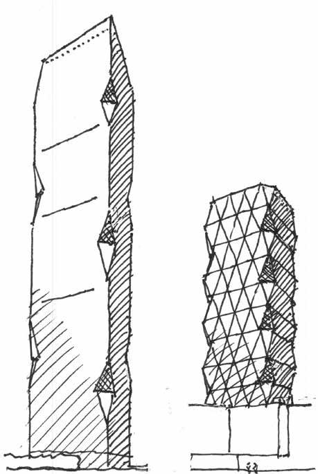
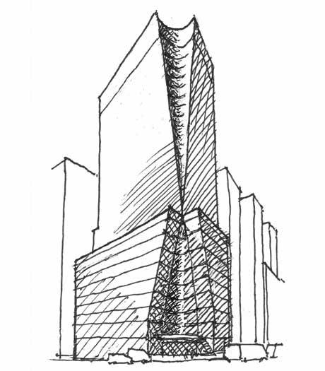
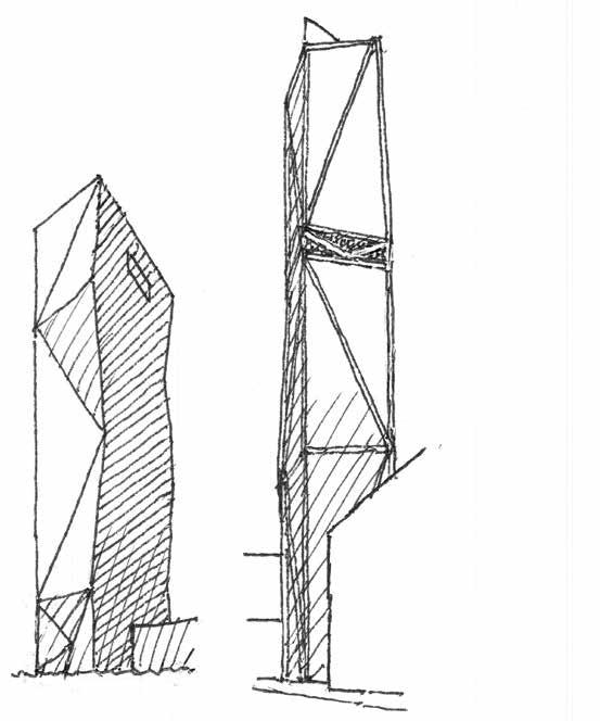
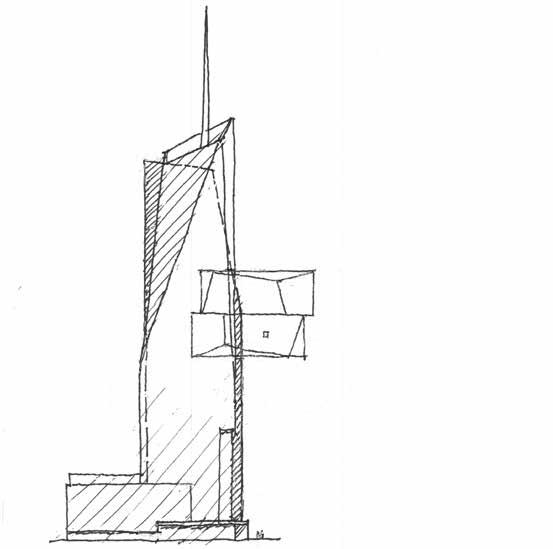
The presence of “stretching” in architecture’s past is there if you look for it. Gothic church towers featuring spires can seem attenuated by having been stretched upward. Some Norwegian stave churches consist of a recursive stack of elements that become taller and thinner. In modern times we note the attenuative qualities of stepped back art deco towers, and, a bit more recently, the rather too obvious effects of a few tall facades that feature sweeping upward concavities (Fig. 3.1).
While less obvious, precedents evoking “lateral” stretching are also out there. Some probably unintentional examples could include the bell tower of Hawksmoor’s Christ Church
Spitalfields, stretched to fully enfront the nave beyond, or the longitudinal profile of Aalto’s Finlandia Hall, thinning out toward the middle as if stretched like taffy. Or dare one question an aspect of Kahn’s canonized Kimbell Art Museum, its pair of porches so very elongated— stretched, almost—between the comparatively skinny columns at the ends (Fig. 3.2). As a more general thing, lateral stretching has appeared as sweeping transverse concavities that can evoke a project stretched to serve the limits of its site and program. But none of this ORO Editions was likely to have been conscious precedent for the following:
Stretching Up
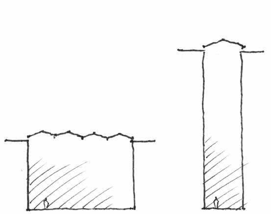
The phenomenon of very tall buildings is well enough known, although I guess that depends on the background of the reader. Architects and urbanists are covered up with publications and websites that keep them abreast, at least superficially, of the steady onset of architectural tallness. Supertall buildings—defined as those between 300 and 600 meters in height—are planned, underway or in existence all over the world, perhaps most notably in China, the Arabian Peninsula, and Southeast Asia. Although the Empire State Building was the world’s tallest building until 1970 at 380 m, by far the largest number of these supertalls are being planned or built in the 21st century, including upwards of 30 in Manhattan alone.
3.1 Borgund Stave Church, Norway, and Profiles of Borgund Stave Church; Ulm Minster, Germany; Chrysler Building, NYC; Solow Building, NYC
3.2 Christ Church Spitalfields, London; Finlandia Hall, Helsinki; Kimbell Art Museum, Fort Worth, TX
Once those became sort of commonplace, “megatall” buildings, up to a kilometer in height, became the next pointless goal. Among those currently planned, that goal will be reached by one, the Kingdom Tower in Jeddah, once completed (Fig. 3.3). The Burj Khalifa in Dubai (a mere 828 m tall) and others are built or under construction in Shanghai, Mecca, Kuala Lumpur, Bangkok, and elsewhere. They are uniformly variations on attempted sleek modernism, and indeed a good many are expressive of “stretching,” their profiles thinning out as they rise. (Exceptions bear noting, including the bunch-o-sharp-points treatment atop Jakarta’s planned Signature Tower, and a massive traditional design of surpassing clumsiness in Mecca.) Did I say pointless? Well, they are, really. To be sure, there is some theorizing around and about that tall and very tall buildings are good in basic ORO Editions ways: they take the place of a sprawl of lower buildings, they’re profitable for developers if you
call that an advantage, they afford some mighty nice views, and, well, I’m sure there are other advantages. But there are a few corresponding disadvantages, among them low floor efficiencies due to all the elevators, difficult issues of seismic forces and wind turbulence, access and public safety concerns, cost premiums, extra demands on civic infrastructure, sustainability issues— you get the idea.
On the face of it there would appear to be three overarching forces leading to the proliferation of tall and very tall buildings. One might logically wonder whether urban development pressures due to overpopulation are a factor in urban densification generally, helping to push up the supertalls. The world has a good many more people than it ought to, surely a passable assertion with 7.5 billion and barreling headlong toward a “physical maximum” of 10 billion. (The world’s population in 1960 was 3 billion.) But this matter is somewhat off topic, and anyway, all things considered, maybe the planet has begun to take matters a bit more into its own hands as far as dealing with this increasingly itchy fungus on its epidermis is concerned.
In reality two other issues are more likely to be at fault. A combo of ready capital and technological advances is one, and surely the other is simply ego: it feels cool to have built something so absurdly tall, and it evidently feels cool to live there. Or not: one thinks in particular of the “splinter” buildings that have ruined Manhattan’s midtown skyline, which are all about oligarchs and other hyper-rich who need a place to launder some money, or to simply have on hand to flip later, or to move into if things go south in the homeland, leaving their manymillion-dollar condos vacant much or all of the time. Or maybe a lot of them are just empty,
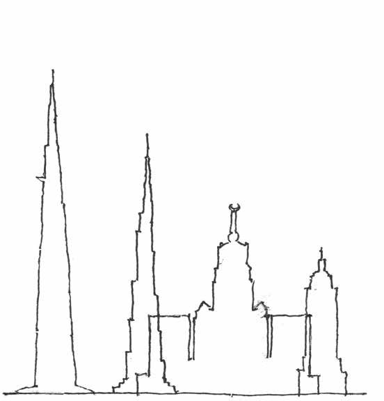
3.3 Kingdom Tower, Jeddah, Saudi Arabia; Burj Khalifa, Dubai, UAE; Abraj Al Bait, Mecca, Saudi Arabia; Empire State Building, NYC
period, as economies and politics continue to mess things up by changing all the time. These places are super skinny as well as super tall, for engineering can and does achieve wonders nowadays, but the results are disproportionate and unnerving. Awe is not the emotion they evoke: it’s more something like repellence, as with a grotesque invasive plant sprouting up on your property. In A Pattern Language, Christopher Alexander opined that four stories really ought to be as tall as buildings get, with a few exceptions: you know, something the reasonably fit could climb with no difficulty, and from which you are able to see activities outside, and to be seen. A silly ORO Editions idea, some may say, but it has a lot going for it. Too bad it’s too late.
Stretching Out
The cutesy term “groundscraper” has been coined for the phenomenon of something along the lines of a skyscraper in size that lies down on the ground instead. Of course, such great big long buildings have long existed—factories, for a prime example—so they aren’t quite as odd as something a kilometer tall. There’s a particular subtype, though, that’s of interest, wherein a relatively low-rise building stretches out in all directions to sometimes questionable degrees. “Pancake” would be a more apt moniker. These can be criticized, as can anything, but by and large their great big carpets of roof seem almost defensible, the more so to the degree that roof openings and skylights mitigate a sense of entering a labyrinth of dim caverns beneath. Best to leave the subject as a lightly annotated list (Fig. 3.4):
• National Kaohsiung Center for the Arts:
Taiwan: Mecanoo: 740’ long and almost as wide. Dim, monochrome, cavernous interstitial caveways amongst the venues seem a harsh price to pay for the gimmick of the great big square wavy roof. • Rolex Learning Center: École Polytechnique
Fédérale de Lausanne: SANAA: Another big square single undulating space, but well equipped with roundish lightwells and courtyards. Both of these seem a bit expressive of having been laid down and stretched over some bumpy pre-existing elements, resulting in the wavy profiles. Monochrome. Ok, so what’s the rule against color in these flatbreads? Perhaps their architects happened to be among that large majority who are simply afraid of it?
• National Library: Qatar: OMA: Grinning, squashed lozenges comprise three of the four very long elevations, seemingly teetering on their bottom points. Partially redeemed by the interesting but inefficient-looking great big single public space. The presence of books (of all things) helps ameliorate the all-white interior.
• McCormick Tribune Campus Center: IIT:
OMA: While not remotely in the league of the above in scale terms, the building is still pretty big, managing to become a largish labyrinth with its angled passages and angular light courts. At last, substantial colorfulness does appear. The project manages to also embody another and rather unique morphological type, that of the lightly crushed flattish building, being deliberately bent at the middle in order to pass under the bypassing L train.
This seems pretty unconscionable, being both silly looking and a taunting affront to the surrounding Miesian campus. Yes, the place did need some variety, but really-
• Apple Park: Cupertino: Foster: Not along the lines of the above at all, but notable as a (curvi) linear groundscraper: the enormous doughnut will present a morphological problem should it come time to make additions. Its diameter is over twice the length of the Taiwan Arts
Center.
One aspect of this approach to architecture that is just a little bit unsettling is that it faintly reminds one of the genre of “encapsulated civilizations” in novels, movies, etc.: “Dark City,” “THX 1138,” Caves of Steel, The Dark Forest, and much else: in short, a retreat from the harsh real world into an extensive manmade one, often grim and, yes, monochrome.
ORO Editions
4DEGRADATION:
SHAPE CHANGED BY REMOVAL
Not meaning designs that are actually flat-out degrading, though in some cases this might indeed be considered the situation. Degradation here refers to—well, some synonyms could be abatement, decomposition, degeneration. It still sounds a bit negative, I guess, though it’s true that not all projects employing the following approaches necessarily turn out to be the worse for wear. A distinction should be made, as with the approaches to deformation, that these don’t involve “breakage,” with the pieces now parts of a revised composition. Material does get removed in one way or another, but it doesn’t stick around: only “traces” remain. The goal seems a “softening” of a work’s morphology: a decrease in assertiveness and an increase in vagueness. A brave new world of the amorphous.
4a. Weakening: Edges Eroded
That title is a bit judgmental sounding, implying architecture that has lost its vim and vigor, literally or figuratively. The general idea is that a “normal” architectonic volume has lost some measure of clarity, for better or worse, though it’s fair to note that under this umbrella there are occasional works that pull it off.
Precedents
These are harder to come by than in some other cases. As with “exfoliating,” ruins, whether Roman or Romanesque, are loved by architects and could be a possibly subconscious forebear. Mannerism may also
sort of count, with its visual trickery and unexpected elements undermining the norms of the Renaissance. In modern days the M word has been applied to the work of Robert Venturi and his ilk who favored ambiguity and contradiction. “The unexpected” characterizes some of the following, while others are more self-consistent. An overarching impression would be that something has been taken away—a plumb edge, a set of self-respecting corners, a restfully flat façade. And as opposed to earlier issues wherein the damaged goods remain as part of the changed ensemble, these ORO Editions are changes—removals—that are gone from the scene, leaving a “weakened” result.
Funny Edges
Or some call them corners, but the place where two sides come together, that’s an edge. Well, the funny edges in question reveal a seeming weakness for taking nibbles—called “birdsmouth” cuts, a carpentry term—out of those oh, so continuous edges of high-rise buildings. We see it at Goettsch Partners’ R&F Yingkai Square Tower in Guangzhou, where the nips or clips alternate side to side as they go up, lending a peculiarly wiggly impression. Manhattan’s Hearst Tower, by Foster, goes full bore with the motif, the birdsmouths touching each other in succession up each edge and mating into the triangular “diagrid” patterns defining each building face. In both cases, “weakening” does seem an appropriate characterization (Fig. 4.1). The Hearst Tower in particular reminds one of a concertina, stretched to its limits, no dependable vertical edges left anywhere, the squeezebox looking ready to collapse back down momentarily.
4.1 R&F Yingkai Square, Guangzhou, China; Hearst Tower, NYC
I suppose there’s no accounting for taste and some may like the look of those for some reason, but another case of funny edges defies a search for saving graces. Manhattan’s 7 Bryant Park, by the Pei firm, applies concave carvings-out at a prominent exposure that converge, from the top and the bottom, to a squeaking singularity of ultimate convergence (Fig. 4.2). Awkward seems inadequate to describe this implosion, which proudly stands as the building’s main statement, clearly an effort to do something that had never been done before, despite arguably good reasons for that having remained the case. Funny Corners For whatever reason, corners, as opposed to ORO Editions edges, have been less tempting as targets for the carving knives when those dull old rectilinear 4.2 7 Bryant Park, NYC
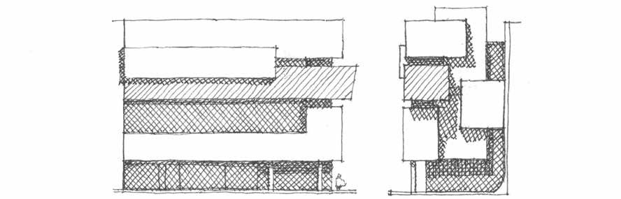
4.3 Sheldon and Tracy Levy Student Learning Centre, Ryerson University, Toronto (Side and Front Elevations)
junctions just can’t be borne any longer. The Student Learning Centre at Toronto’s Ryerson University, by Snøhetta and Zeidler, will be our prize exhibit, though surely others are sprouting up at a brisk pace (Fig. 4.3). If there is a simplistic description of what’s going on with the corners of this midrise block, it’s one of chopping off diagonally opposite corners, leaving substantial triangular chamfers. Lest that appear too systematically obvious, further corner-related things are going on, primarily a “chamfer below a chamfer” to form a significant sloped soffit at the main entry. This eye-catching set of facets is treated to a bright blue glazed cladding treatment, a veritable sapphire being ground and polished into shape at building scale, or so one might assume was the architect’s image as well as one having potential client appeal. Evidently the university wanted a signature statement and this does provide that, but the ultimate effect of all the buffing off of corners is to render it a bit clunkily neither fish nor fowl: with its perhaps unavoidably boxy proportions, and despite a resort to a slight tilting of some primary surfaces, the building volume is now neither hard nor soft but something a bit irresolutely in between, and tipsy looking in the bargain.
Funny Faces Having scrutinized edges and corners, one notes that the surfaces that make them possible, a building’s faces, have also been fooled around with in ways that can weaken a concept. But not necessarily, as with Robert Stern’s Carpe Diem Tower in Paris and Heller Manus’ 181 Fremont in San Francisco, both featuring “pleated” facades divided among slightly tilted facets (Fig. 4.4). (Pleating isn’t really quite the correct term for this creasedand-bent morphology, but lacking a better one it will do.) The former is pleated on its opposite narrower elevations, with the latter, in very shallow relief, on all sides. Its expressed framework is the less elegant of the two, a chunky scale existing in response to the city’s worrisome and, well, inevitable earthquake potential. In both cases the pleating does enliven the buildings’ profiles and seems not to result in an appearance of “weakening,” which intuitively one would think could indeed be a risk of such planar bends and breaks, vaguely suggestive that a destructive “crumpling” is ORO Editions getting underway. But hey, good for them, it seems to work in these cases, and bold 21st
4.4 Tour Carpe Diem, La Défense, Paris; 181 Fremont, San Francisco century formative innovations that seem to work do deserve notice amidst all those that don’t so much.
As for a lower-rise version, Krueck & Sexton’s FBI office building in Florida, first met earlier in the context of detached facades, also features some pleated treatment (Fig. 2.20). The inconspicuous junctures of its facets give the impression of a single surface that has been creased a bit, with a rather elegant result that, if anything, gives added perceived strength to the façade. So on the strength of these few projects, a shallow pleating of vertical faces emerges relatively unscathed in our hunt for the questionably weakeningly peculiar. And not surprisingly, for they’re really a bit out of place here, such creasing involving no “removal of material”: since the enclosing fabric remains intact, there is, as it turns out, no conclusive sense of “weakening”
The high-rise façades of Cook + Fox’s Bank of America Tower in Manhattan sport neither chamfers nor pleats, but very elongated triangular or trapezoidal facets (Fig. 4.5). They facilitate a pretty convincing expression of a volume’s gradual diminution with height: in effect, a modern movement version of the setback treatments exemplified by the Empire State and Chrysler Buildings. The unassertive flatness of these surfaces contrasts dramatically with the awkward concavity of similarly attenuated facets at 7 Bryant Park nearby. These stretched out facets recall some of the “tilting” cases, such as the Shard and One World Trade Center, but a distinction is clear, for the latter involve full-ORO Editions height applications of tilting surface as opposed 4.5 Bank of America Tower, NYC to partial height facets. One is obliged to note
5THE CONTENTS:
ODDITIES INSIDE
Needless to say, architecture is about a lot more than shape and surface, even though that’s just what many of these problematic works do appear focus on, rather to a fault. If we open the front door (it will often be either shamefully grandiose or a hard-to-find mousehole) and peek inside, a wide spectrum of troublesome “inside issues” are to be found, some of which go hand-in-glove with the oddities of form that have been discussed heretofore. But they also range over the whole speckled spectrum of built form, good, bad and indifferent, of recent decades.
Spatial Matters
Herewith a theory about great big rooms in the middle of buildings (often and oddly called atriums. An atrium is an open-roofed entrance hall or central court in an ancient Roman house: I knew that from architectural history, and Google says so, so it must be right). Anyway, my theory is that at least some of it is about economics. Putting a big room in the middle permits some overlooking spaces to pretend, inadequately, that they can see outside; they permit a building footprint to be big and fat and thereby less expensive in terms of exterior walls and, oftentimes, site area; and they reduce or
obviate the need to relate to the outside world. They may have pleasant shrubbery and may have some wide-open use areas that are less expensive to build that self-respecting rooms, and, true, well-crafted “atria” have some environmental benefits, no question. But some can seem empty and alienating: they often lack human scale, sort of by definition, and occupants can tend to feel a bit lost in them. Proportion can be, though not always, problematical, some being too vast to offer a sense of place and some so tall as to be more in the nature of a lightwell (Fig. 5.1). Yes, there are some nice ones out ORO Editions there, but often enough they are a solution in search of a problem: a “statement” wherein a
like spaces stuffed with presentations going on cheek by jowl amidst the dusty detritus of “creative chaos,” an improvement over the oldfashioned rooms? The “jury room” exercises in gratuitous, often downright sadistic verbal abuse on the part of tenured critics have, one gathers, become a bit more civil nowadays, but it seems as if, in many cases, also gone is the dignified exercise of taking your work to a nice space appropriate to that effort of instructive closure, as opposed to a gray corner of a big basement or something much like it.
The Workspace
5.1 Lost in the Atrium
question was not necessarily asked; an ego trip for a designer or a developer or both.
Speaking of big empty spaces that you can feel lost in, here’s a sort of a sidebar about another variety of often large and amorphous interior space: the design school studio. To this day, great big noisy rooms full of a lot of design students beavering away appear to remain the go-to way to accommodate “studio courses.” The grueling centerpiece of the architecture curriculum, these consume far and away the most student time in the pursuit of learning how to design, even though not so many will spend a lot of time on that activity in their future careers. This jeremiad has its roots in my own long-ago experience with studio rooms— with doors!— meant to accommodate 20 or so students. A sense of place prevailed, as well as a sense of community. Is it the same in the big barn studios, and I just never had the experience in order to know that? Is the cult of ultimate
The design studio matter leads directly into the more general issue of the commercial workspace. In fact, some of the same critique applies, concerning large open spaces paved with long tables, operators of laptop computers lined up double loaded. (Who knows, the pandemic may have changed some of these workspace issues completely in the long term, but the future remains, as always, almost impossible to predict.) Anyway, surely it was unnerving to be constantly avoiding eye contact with the other person across the table; I suppose you can get little baffles for this. That condition appears to have been the new normal—at least before this new, new normal came along—at widely publicized tech company workplaces, even as one suspects that the typical condition at local office suites of regular business sorts remains the cubicle. (And how many Partners, despite the coastal egalitarian notion of moving inboard beside the elevator core so the help can see out, do we suppose have given up their perimeter offices?)ORO Editions flexibility, resulting in cheap movable partitions that afford no acoustic separation, and corridor-
Disliked by many, the cubicle was the brilliant innovation that allowed office
partitions to be depreciated like furniture, not to mention to reduce that expensive square footage consumed by mid-level personnel. It’s all part of the great sucking in, the black hole of office dehumanization, increasing “efficiency” for the buyers’ and sellers’ benefits, a trend accelerated by the advent of the illusion of being able to do much of your work in the space required by a chair and a laptop. The cubicle, much maligned, at least provides a sense of place for an individual, and can accommodate small personal possessions, poignantly serving as reminders that one is not quite the cog in a machine that may often seem the case. Evidently the cog image is the wrong attitude, anyway; we are collaborators, happy to be thrown together in the mosh pit to facilitate a maximum of productive interaction. Evolved trends have eliminated the wasted square feet that personal space required, and the most progressive among us are expected to be happy with the freedom to just perch anywhere—no more bad old regimentation. “Phone booths” and conference rooms ostensibly restore the desirable variety of spatial and acoustic needs, and there’s always the pantry or ping-pong or foosball. Why, you would hardly need to leave at all: perhaps next will come the bunk cubicle, if in fact it is not already here: roll in for a while and swing down the hatch for some healthful sensory deprivation. I have a sneaking feeling that a very small minority of brick and mortar businesses across our once great land has risen up to provide such homey amenities, beyond the time-honored dingy break room.
The relationship of the workspace to a “larger sense of a sense of place” also merits concern. True, the rows of long tables do often get divided up into shorter rows (and gaily tossed
around if a Gehry Partners vibe inspires you). At least deadly rows of wage slaves converging to the horizon, the mid-century space-planning norm, are a thing of the past. But what of the many high rises we have seen fit to criticize, or, for that matter, the man-in-the-street-in-thebox that is the far more widespread condition? The outdoors outlook for the work-spacer in the high-rise is often the next high-rise over, or perhaps a vertiginous glimpse of the “atrium” provided in lieu of an actual perimeter exposure. Neither offers a sense of orientation, a home base, a position in the immediate surrounding environment: both are more akin to a fully glazed spaceship, which a fair number of high rises resemble, and with about as much contextual connection. The box beside the parking lot has its own alltoo-easy-to-criticize issues in this regard, for its outlook is not only US Route 441 or the next box over, but some fair number of intervening cars. That said, hopelessly old-fashioned touches such as a small courtyard or a modest laneway with indigenous landscaping do crop up occasionally. One can only hope these reminders that our species is grounded in nature rather than bits & bytes will prevail, since visual access to green space and natural light—to say nothing of direct access, an ever more distant option—have been amply demonstrated to have a beneficial effect on physical and psychological health. Those images and those facts sum up an insight one hopes at least a few might share: that a window on grade onto a modest and wellproportioned shared courtyard trumps a glimpse of some high-up urban air any day. Too late for some but not all: the whole notion of the city’s ORO Editions intrinsic culture-of-congestion nobility is being called into question in some radical quarters—
Floors and Ceilings
To judge from published architecture, we have the lingeringly popular “industrial chic” to thank for a lot of oriented strand board, exposed utilities, and concrete. The look may have come about from several directions: the widespread adaptive re-use of old abandoned factories and warehouses (an excellent pursuit on the face of it); a reaction to the bland corporate look that dominated office suites for so long; and a wish on the part of sleek techies to play house as if in a nobly scruffy startup existence in such “quickly thrown together” stage-set digs.
Regarding the adaptive use condition, whence comes its desirability? Well, beyond the big one of affordability, a variety of textures and materials, along with a variety of interior spatial proportions, have understandable appeal. But the retrofit of the shiny spiral ductwork must be carefully specified, laid out and installed or it will look slipshod, and the random stitching of EMT conduit across those exposed slabs and down those old brick walls has a debasing effect. Said brick is often what was exposed when the old plaster fell down, and a lamentably common practice is to leave the ragged-edged bits of what’s left in place, as if this grim “found object” condition was artistic. (Or as if we were too earnestly busy with all that coding to bother. It’s simply easier not to try to pry it off, so let’s all just agree to pretend that we like the look of living in an old basement, the look we got accustomed to in studio courses.) had “scuffed” as an intended imagery, and is meant to be laid in an interrupted non-pattern. A final note as to concrete, whether exposed on floors, walls or ceilings: in addition to its unfortunate environmental issues, concrete is an intrinsically unattractive material, really: generally a depressing medium gray and prone by its nature to getting dirty. With the utmost in painstaking effort, concrete walls can be cast and polished into a seductive surface resembling stone, but this is seldom in the cards. As for concrete floors, staining is a popular treatment, if you don’t mind the resulting impression that it has been through a disastrous flood and some long-delayed cleaning up has never occured. They do look a little better if polished, exposing the aggregate to varying degrees, but this is a poor-man’s terrazzo; real terrazzo is, let’s face it, much to be preferred, if it can be afforded, for all too often it all comes down to money.
Ceilings, in many cases in our brave new world, are actually not there: perhaps the signature feature of industrial chic is the exposure to view of ducts, conduits, plumbing, beams and corrugated deck (Fig. 5.2). This chaos would be bad enough, but oftentimes steel members must be fireproofed, and since intumescent paint is costly, this consists of that spray-on material that looks like gray oatmeal except a lot bumpier. To say that this is not a good look is to deal in massive understatement. An interesting co-development of ceilings sans underwear has been the incremental reappearance of the ceiling, that is, of planar acoustic ceiling panels suspended below all that naked stuff, if for no other reason than that proper acoustic treatment is really, really important. Try to be heard in As for floors, our choice often seems to come down to exposing the concrete slab or putting down carpet tile of a pattern that fits well with that old basement quality. That is, ORO Editions it often seems to range from black to gray, most any restaurant or nightspot that opened in a variety of patterns that appear to have its doors in this century and you know what I
6THE CONTEXT:
ODDITIES OUTSIDE
Respect for the context of an architectural project—both the immediate vicinity and the larger cultural vicinity—has long been a watchword of design well done. Having peeked inside selected odd buildings and building trends of the current century, it is incumbent upon us to look around outside as well to see whether that watchword is still in evidence, or not so much: to see whether the peculiarity of these recent years has had a tendency to leak out.
The Outside: Who Needs It?
Some of the projects we have had a look at are sewn up tight as a drum, spaceships indeed, turning their backs on their sites and surroundings. To note a precedent of sorts, some time ago it became a moral stance to be mightily critical of the Portman hotels (such as the Marquis, noted previously) with their largely solid-walled plinth bases turning a blank, cold, streetwall shoulder to the life of the city, their whole rationale being to encapsulate the glitzy atriumized wonders within for the semi-private delectation of their patrons. And yet, so many of the projects we have discussed, buildings in our
presumably more enlightened times (along with innumerable others of an atriumized bent), do much the same, persisting in turning something of a blind eye to the world around them. True, that world is often very unappealing, but that’s not necessarily a sufficient excuse to ignore it. It’s only fair to provide a specific example or two. We’ve perused the facades of 41 Cooper Square in NYC, but buried within is a wholly different oddity, a whirling biomorph of negative space eroding its way upward, all about stairsteps and staircases, an Escherish ode to vertical circulation. (This variant of ORO Editions atrium as biomorphic cavern is a thing, it seems, cropping up also in Holl’s Simmons Hall at
6.1 Cross Sections of Atria: 41 Cooper Square, NYC; Simmons Hall, MIT
MIT and other interiors of rumen-reticulumomasum character) (Fig. 6.1). This atrium’s one exterior exposure is one of the “torn-open” breaches in the façade, facing a nice view of lushly wooded Cooper Triangle, but it is off to the side, as well as screened off by an awkward pseudo enclosure of swooping grids. So lip service is given to the outlook, but the project really wants to turn inward, it’s ripped wrapper all but dissing the adjoining neighborhood.
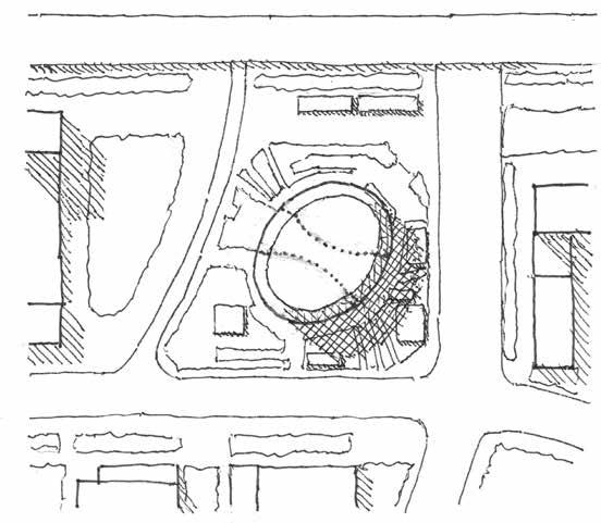
In contrast, ZHA’s Leeza SOHO Tower, albeit of a very different scale and proportion, opens up its own version of a biomorphic interior void with considerable exterior glazing. As with 41 Cooper Square, the atrium is not particularly meant to be a place for people to spend much time in, even if they wanted to. It does connect visually with the building’s context, though it’s true enough that there’s not much of note to respond to in the building’s neighborhood of miscellaneous towers, freeways and undeveloped wasteland. The site itself finds the tower isolated, smack in the middle of an amorphous open space otherwise randomly scattered with a few small low-rise support structures. (Fig. 6.2). It sits a bit primly on the dwarfed pavements and landscaping, as if on display on a coffee table like the tasteful vase it resembles. And is that glimmer around its base a shallow moat? These several factors are expressive of a rather aloof disconnect of the building from site and context factors, somewhat contradicting the transparency of the atrium in terms of making some sort of civic connection.
ORO Editions 6.2 Leeza SOHO Tower, Beijing: Site Area Plan
The Art of Exterior Spacemaking: Forgotten?
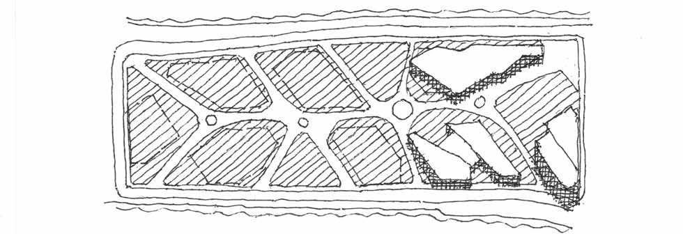
The Leeza SOHO’s treatment of its site’s exteriors as somewhat vestigial is a lead-in for the pretty big general subject of buildings’ responses to immediate context, and how this has and hasn’t been done well in recent years. We’ve had a look at the Cornell Tech buildings (the Bloomberg and Tata Centers): what of future placemaking as that campus expands south? Well, its award-winning master plan lines up chunky definers for future buildings, the remaining open space largely appearing as just that: remainders, leftovers (Fig. 6.3). One almost expects the main pedestrian way to loop around and end in a culde-sac, given a certain resemblance on the part of the plan to suburban developments of chunky houses with leftover space remaining. But the compelling longitudinal shape of the available site forced a grudging sort of main axis to appear, and with minimal notable effort at defining focal points, termini, or a sequence of well-defined and linked open spaces. It’s all sort of slushy, mushy, and overstuffed, a bit like the first buildings and, more than likely, those to come.
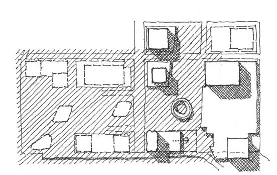
Another big deal in Manhattan, heretofore of note for some semi-tilting elements, is Hudson Yards. Its high-rise buildings (and they are all high-rise buildings, excepting the merely midrise one-percenter mall) strive manfully to look different, despite all having about the same proportions and more or less the same flattish semi-reflective cladding. Since they are mostly basically square, which it is hard for a very tall building to not be, particularly when it is expected to be profitably leasable, they do a right poor job of defining exterior space (Fig. 6.4). Early versions of the master plan showed an amorphous, windswept plaza with any serious effort at making it identifiable as a place yet to be devised; later versions and, yes, the reality, gives us that very windswept plaza—yes, with valiant attempts at “enhancement”— but now with “Vessel” rearing up, a bulbous chess king shouldering up suggestively alongside the queen—the “Shed”— who appears to have hastily thrown on a flimsy nightgown, the two succeeding in stealing each other’s thunder (Fig. 6.5). (Please excuse a third chess-piece metaphor and the second involving chess-piece nightwear.) Well, Shed at least has a useful purpose, on occasion, whereas Vessel
ORO Editions
6.3 Cornell Tech, NYC: Site/Master Plan (Showing Buildings as of 2020)
is just a dumb, super-expensive construction, an empty pot serving aptly as the centerpiece of an empty place. It sits precisely where it can also fail to help define axial sequences or peripheral space definition. Sadly there is none of the latter anyway, for the towers rise straight up from the darkling plain, leaving swaths of stone pavement leading nowhere in particular, or so it seems. Two miles away, Rockefeller Center remains the foremost exemplar in Manhattan of high-densitydevelopment-urban-spacemaking, its lessons successively overlooked at Lincoln Center, the World Trade Center, and now Hudson Yards.
Coming back down to something closer to human scale, if that’s not too much to ask, one finds that all is not lost: that there are a fair number of projects that feel they must hold the banner of modernism high but still manage to offer more than short shrift to exterior open space definition, wherein the building-as-object gets remorphed into something a lot more interesting in order to have an interactive relationship with its site context:
6.4 Hudson Yards, NYC: Site/Master Plan (Showing Buildings as of 2020)
6.5 Vessel Confronts Shed; Overlords Look On
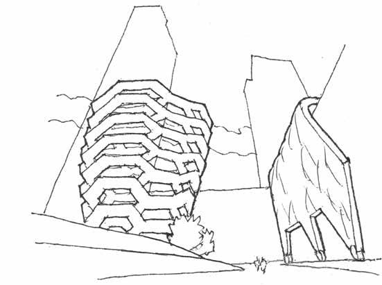
• Perkins and Will’s University Center at Case
Western Reserve achieves something of the opposite of an “object building”: its footprint a deferentially residual shape, it has some assertive profiles but can also appear as little more than a very nicely crafted boundary for open spaces that it deftly helps to define, ultimately sloping down gently to disappear at grade (Fig. 6.6). • In a more compact composition, much of Weiss
Manfredi’s Vet School expansion at Cornell is connective tissue, linking up big pieces of an existing building complex to configure a spatial sequence, of all things (Fig. 6.7). It
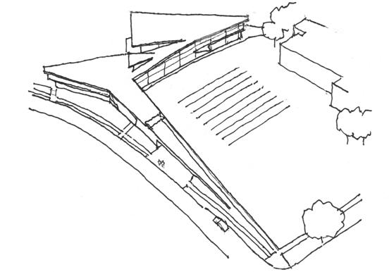
ORO Editions 6.6 Tinkham Veale University Center, Case Western Reserve University, Cleveland
ORO Editions