Aalto 10 years
The story behind our letter A Designer Rasmus Snabb thought he had created just a simple logo, yet it managed to cause a complicated tangle. Text: Paula Haikarainen Photo: Mikko Raskinen HE CAME UP with it at a playground.
His two-year-old daughter Frida was tirelessly climbing up the stairs of a slide only to slide right down again, and Rasmus Snabb was thinking he needed an idea that was as simple as possible. After they got back home, Snabb drew his contest entry, wrote down its reasoning and mailed them for consideration by the jury of Aalto University’s logo design competition. The deadline for submissions was fast approaching, but his entry got there on time. Rasmus Snabb’s Invitation was named the winner in May 2009.
Quotation mark
‘I was living and working in Denmark at the time, and only heard about the competition one week before the deadline. There was no time to fine-tune a solution, I needed to focus on coming up with a strong idea,’ Snabb says now, 11 years after the competition. Aalto University Foundation arranged an open design competition for the new university’s logo. In all, 117 submissions were received. ‘I didn’t really think that I might win, I only wanted to communicate to President Tuula Teeri what kind of university I would like to be building.’ Snabb became familiar with the turmoil and resistance surrounding the founding of Aalto when he studied graphic design at the University of Art and Design Helsinki. ‘In my comments, I said that the students in particular don’t want historical or heraldic coats of arms, lions or innovation squiggles, preferring openness and freedom instead. We wanted a new kind of university, somewhere that allows you to influence things yourself. A place that permits curiosity and getting called into question.’
Exclamation mark
Snabb’s logo spelled out Aalto University, but included an exclamation mark, question mark and quotation mark among the letters. ‘This caused a brouhaha both in Finland and internationally: a university plans to adopt such a logo, they must 10 / AALTO UNIVERSITY MAGAZINE 26
be crazy! To top it all off, some German graphic artist found a similar visualisation online. It had been made for a smallcircle typography seminar and wasn’t visibly present anywhere else. I wouldn’t have even known where to pinch it from.’ Because of the alleged plagiarism, a decision was made to edit the proposal – thankfully, says Snabb. He thinks the original submission would have been awkward in practical application. He drafted a new, simplified version, where the letter A stands beside the name of the University followed by one of three optional punctuation marks. This logo remains in use, though it has been subtly altered over the years by, for example, discontinuing the use of coloured logo versions.
Question mark
During the early years of Aalto, freelance designer Rasmus Snabb was also responsible for the University’s visual appearance more broadly. He thinks that, ideally, the appearance forms its own visual language, a tool users can utilise in a manner characteristic to themselves. It needn’t be a sacred, unchanging thing.
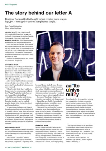
aa”lto u!nive rsit?y ‘Immediately after the competition-winning logo was published, the Aalto community started making its own versions of it. Even though they were doing it jokingly, I felt that people wanted to make the logo their own,’ Rasmus Snabb says. Nowadays, he’s Head of Design and a partner at Miltton Group. Snabb was pictured in the lobby of the main building of Aalto, Dipoli, which houses a neon sign version of the University’s logo.
‘The logo could even be so free-form that users are permitted to choose any symbol to stand beside the letter A, a skull, for example. But I doubt the University’s branding will let loose to that extent,’ says Snabb. He believes Aalto’s distinct and powerful logo is now a source of pride for the University. •
