This report explores the widening economic divisions across nearly 3,000 U.S. counties, building on the foundational Segregated City study (1). Using dissimilarity measurements, the following analysis reveals increasing geographic separation by income, education, and occupation. Overall, the findings show that economic division has slightly risen between 2010 to 2022, with the median index moving from 0.194 to 0.199. However, for counties of a population of 100,000 and larger, there was a slight decrease from 0.291 to 0.284. Of the 7 sub-indexes that combine to make this overall economic division index, the only one to decrease was the separation of wealth sub-index, which decreased by 22%; however, the group being measured in this index also nearly tripled in size during those years, growing from 4% to 11% of the population, likely attributing to the change. The separation of all groups measured by the 6 other sub-indexes worsened, especially for those experiencing poverty, working in service professions, and with lower education levels, which increased by 16%, 21%, and 24%, respectively.
When exploring correlations and potential influences on these divisions, housing costs emerged as the strongest connection. Larger gaps in rent and home values within counties often display higher division indexes. There was also a notable relationship showing counties with higher percentages of people making $200K+ and people with college degrees were also counties with higher separation of those in poverty and with lower education. Moreover, the inverse did not have the same association – percentage of people in poverty and people without high school diplomas showed very weak correlation with the separation of high income and higher education indexes.
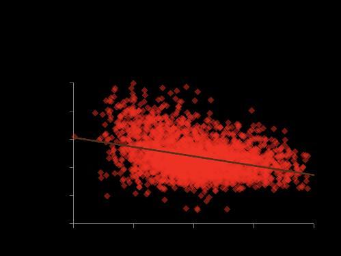
Looking beyond the immediate and obvious negatives of these geographic divisions, the indexes were also analyzed next to data from the Opportunity Atlas (4), which examines the root of today’s affluence and poverty back to neighborhoods where people grew up. There was a consistent negative correlation across each of the indexes with their data on incomes at age 35 of children by where they were raised. This trend could suggest areas with higher economic division have often negatively impacted the opportunities for their county’s children and this connection was strongest among children from low-income families.
These findings underscore the need for systemic changes to address both the economic gaps and the geographical gaps they form between us. Localized strategies tailored to the unique needs of specific communities are critical for reducing division and fostering upward mobility.
The inequality of wealth in the United States is not a new story. The Segregated City by the Martin Prosperity Institute (1) was the model study for this research and it fittingly started by quoting Plato’s The Republic: “any city, however small, is in fact divided into two, one the city of the poor, the other of the rich” (6). This divided reality, observed by Plato, continues today. There have been numerous studies conducted, and countless articles published on growing income gaps, the increasing wealth of the top 1%, and the staggering number of American households not earning enough to meet their basic needs. The Urban Institute (7), Pew Research Center (5), Institute for Policy Studies (2), and United For ALICE (11) are just a few resources that have shared findings in these areas.
In the Segregated City, Richard Florida and Charlotta Mellander (1) analyzed the division in 350-plus metro areas within the United States in 2010. Like their study, this report will explore the geographical separation of people based on their differences in income, education, and occupation. Using the same Index of Dissimilarity on that three-segment approach to an economic division index, this report seeks to continue the narrative from the Segregated City study. It explores a wider reach of nearly 3,000 counties in the United States (Appendix 3) and examines how the economic gap in these communities have progressed in the past decade.
The Dissimilarity Index was chosen as the method of determining division levels in this research due to its longstanding history as one of the best measures of dissimilarity of two groups and as a natural continuation of the study this research is built upon, Segregated City by Martin Prosperity Institute. Despite some of the limitations and flaws in the Dissimilarity Index that have been presented in over the past 50 years, it has remained the standard (9) due to its comparability and ease of interpretation among readers. The index can be read as 0 having no dissimilarity and 1 having complete dissimilarity. Within this study, an index of 0 says that people of all economic statuses are equally dispersed throughout the county; an index of 1 says that there is complete geographic separation of groups of different economic statuses within the county. More details on the dissimilarity index and the methodology can be found in Appendix 1.
The change in geographic lens from metro areas to counties and county equivalents (Appendix 4) was made due to the better consistency of counties overtime and the direct correspondence of the census tract boundaries with county boundaries, which is the crucial sub-geography to determine the economic division within the greater geographic area. It is important to note that the geographic analysis on Metropolitan areas did benefit from consistently larger population groups and a link to human behavior centering around major cities. However, these same benefits limit comparison over time as populations increase to create new metros, populations can decrease to remove metros, and commuting patterns can change to adjust the metro boundaries. Counties remain much more consistent in these ways, benefiting from closer ties to governmental jurisdictions, including location within a single state. The Census Bureau defines 3,144 counties and county equivalents, not including Puerto Rico, of which this study was able to include 99.8% of the U.S. population from 2,917 of the counties (Appendix 3).
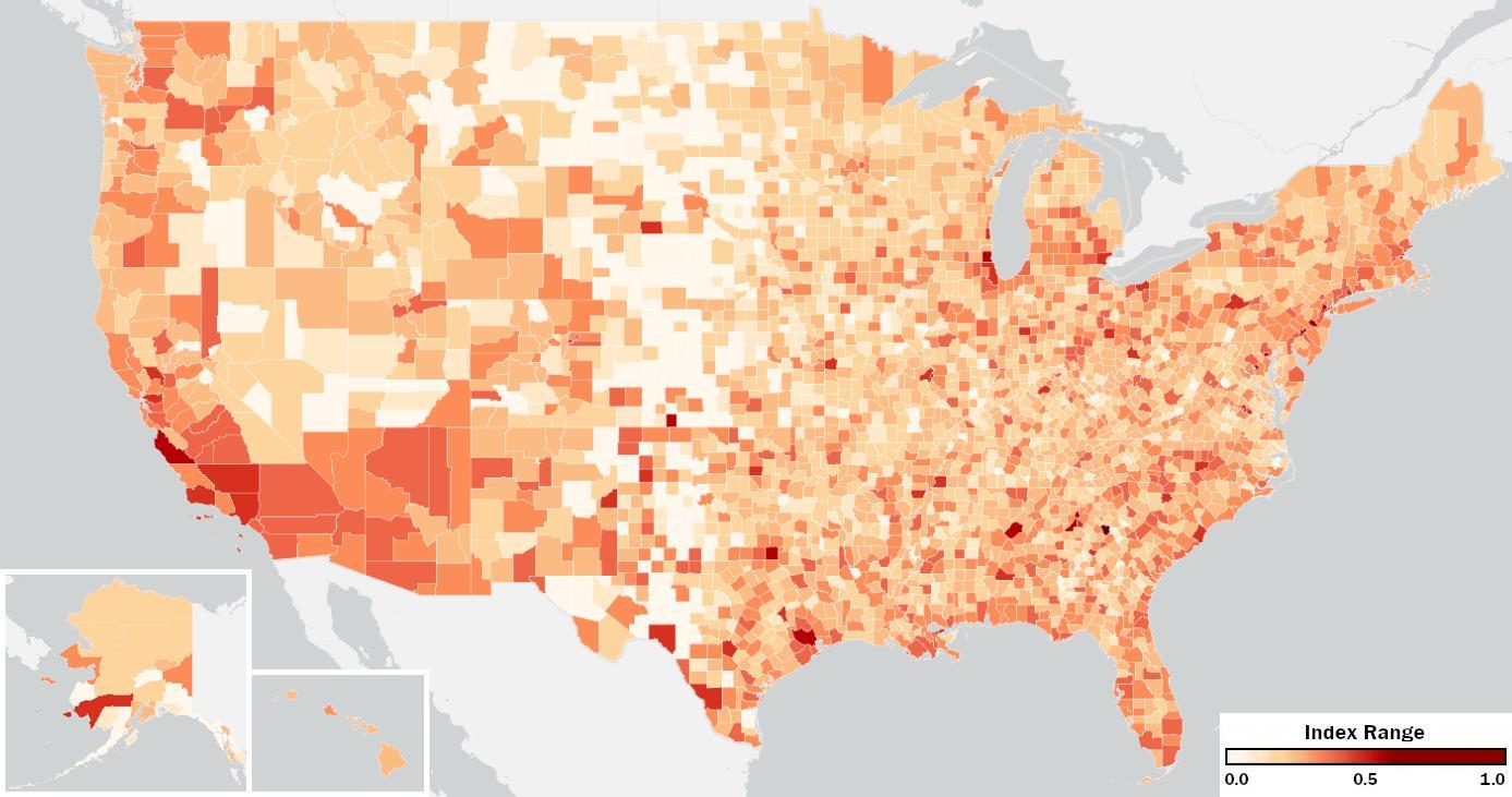
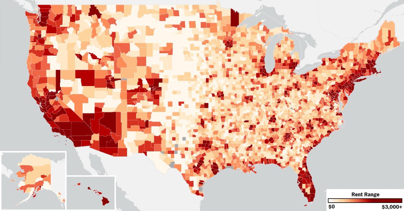
The Overall Economic Division Index is grounded in three categories of economic division: income, education, and occupation Each of these categories are indexed with a combined seven sub-indexes to make calculate them. Each of the three categories are discussed separately below, along with the indexes that make each of them up. Income, education, and occupation are all given equal weighting in this Overall Economic Division Index. Figure 1 below maps the Overall Economic Division Index to each U.S. County, ranging from 0 to 1, least to most divided. The subsequent page displays the 50 most economically divided counties in the U.S., approximately the top 2%. See the appendix for the full list.
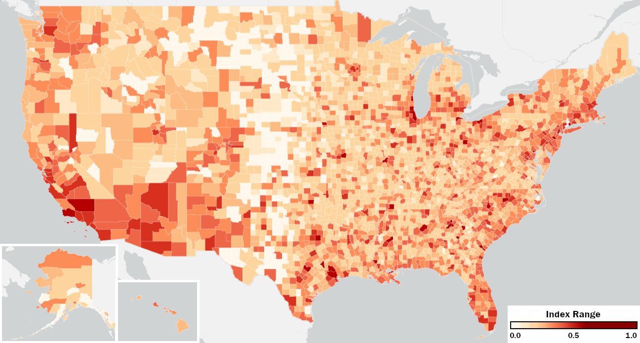
FIGURE 1
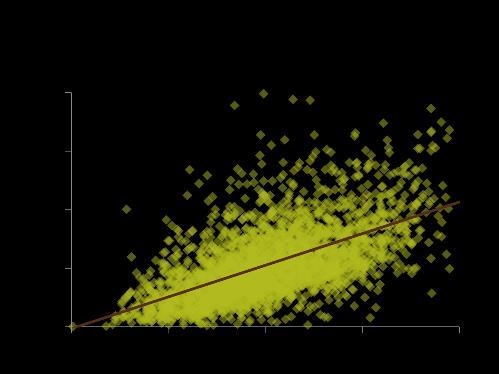
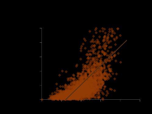
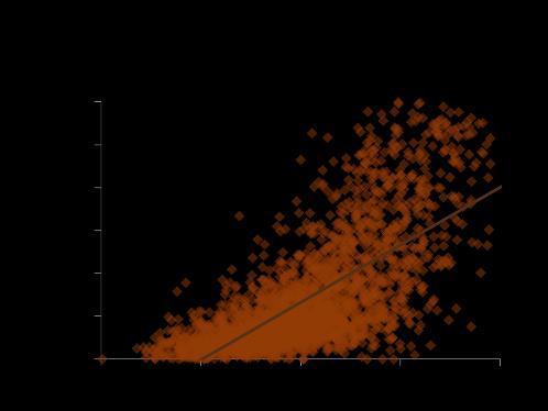
In exploring potential influences and results of the divisions, a range of county metrics were looked at for correlation. The overall index had a notable positive correlation with the average monthly rent (0.51), but the stronger correlation found was in the range, maximum minus minimum, of home values (0.62) and monthly rent (0.70) within the counties (Appendix 5-6). This means that when the range of rent and home values are higher than economic division typically is as well. Whether the division of people occurred first or division of housing costs did, this correlation shows they are intertwined.
The most notable negative correlation with the overall index was the Opportunity Atlas measurement of average household income at age 35 of individuals based on the county they grew up in (Appendix 7-9). The average for individuals from low-income and middleclass parents had a correlation of -0.46 with the index, meaning children who grew up in counties of higher economic division tended to also have lower incomes by age 35 than those that grew up in counties of lower division. Furthermore, this connection carried over to children from high income families with a correlation of -0.40. Regardless of a family’s income, economic division correlates with worse economic outcomes for their children.
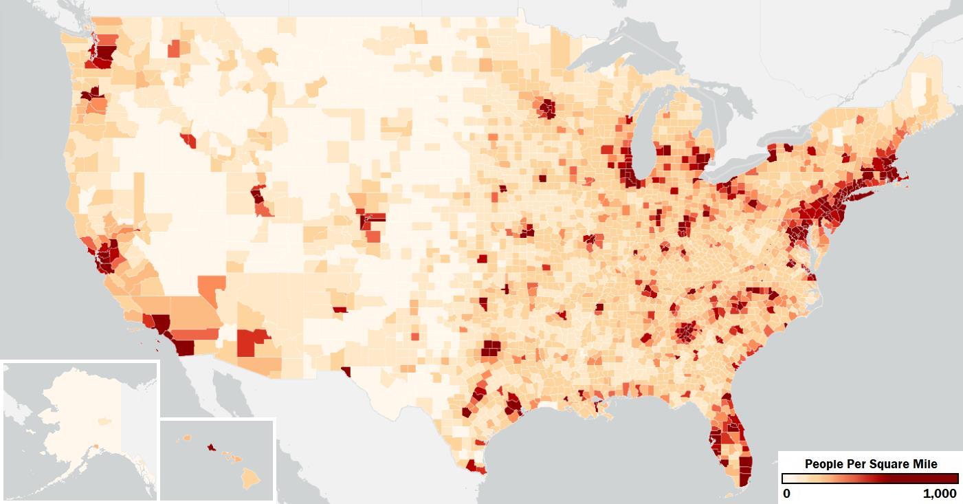
While the correlation value between this overall index and population density is only 21% for all counties, there is a clear visual connection when comparing Figure 1 with the population density counties map in Appendix 10. When just looking at the 50 counties with the highest index values, only 2 of the counties have a population density of less than 100 people per square mile, while over 70% of all counties have a population density of that or lower.
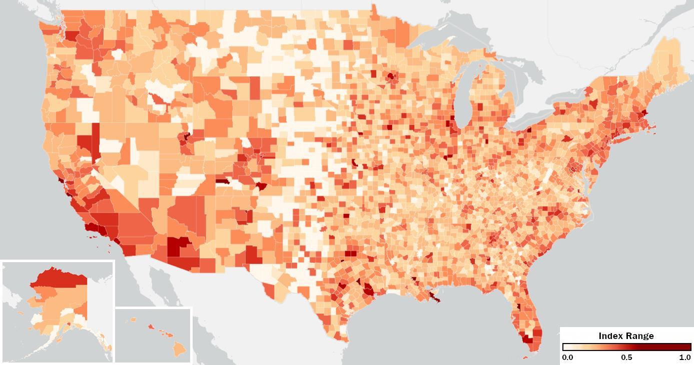
The first of the three divisions explored to develop the overall economic division index is the income division within counties. This is approached through two measures of dissimilarity: how geographically separated high-income households are and how geographically separated families below the poverty level are.
The wealth group in this analysis was defined by the Census income bracket of households making $200,000 or more annually, representing about 11% of households. Based on the research from the Institute for Policy Studies (2), we know that the “richest 5% of Americans own two-thirds of the wealth,” so this 11% likely holds the high majority of wealth in the United States with much more ability than most to determine how separated they want to be from the rest of the population. Below, Figure 2 maps the index of Separation of Wealth.
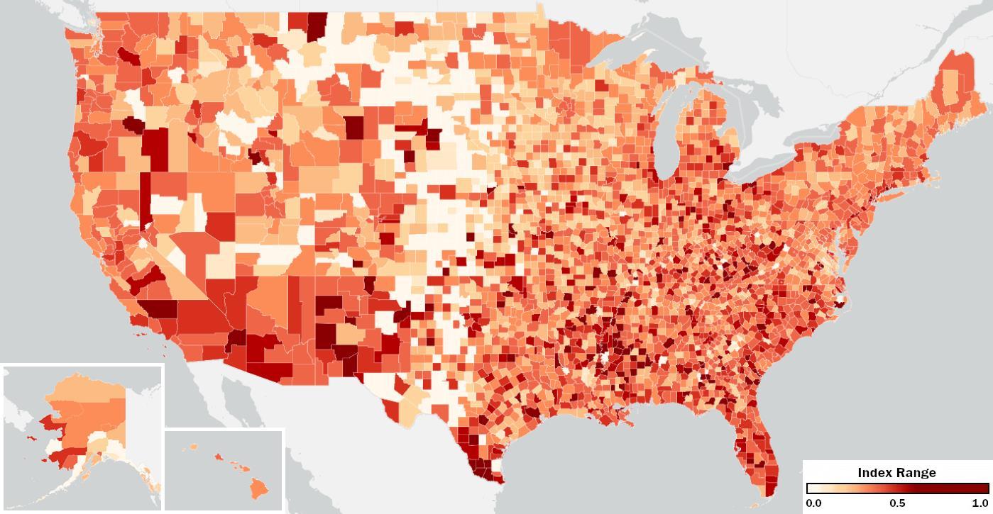
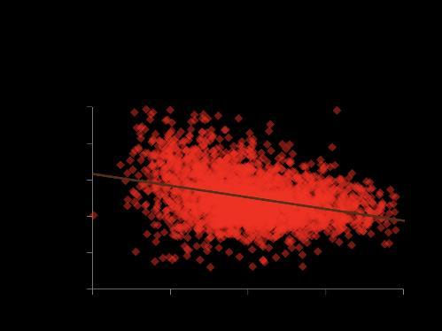
Of the seven indexes measured, the separation of wealth index had the lowest correlation with housing costs. Since wealth naturally reduces the barrier of housing costs, this is not an unexpected finding. However, it was surprising to find that this index had the strongest negative correlation with the age 35 income of children raise in the county (-0.50 to -0.40), meaning that separation of wealth, more than most indexes, is related to lower future incomes for children from their county.
The next page displays approximately the top 2% of counties for separation of wealth.
Nearly 1 in 10 families in the U.S. are living below the federal poverty level. United for ALICE (10) reports in 2022 that more than 4 in 10 households are living below the ALICE threshold, defined as households that do “not [have] enough to afford the basics where they live.” The inability to afford basic needs is a massive problem and these families are becoming increasingly isolated from those currently in more fortunate circumstances.
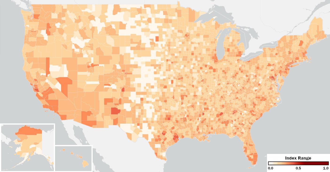
Figure 3 below maps the Separation of Poverty Index to each U.S. County, ranging from 0 to 1, least to most separated.
Apart from the correlations with the overall index, the Separation of Poverty Index had moderate, positive correlation with the percentage of households earning more than $200,000 annually (0.40) and percentage of people with a bachelor’s degree or higher (0.44). This is explored more in later sections as we found this trend of higher portions of the population from the groups in more fortunate circumstances connected with higher isolation of those in less fortunate circumstances in their county.
The next page displays the 50 counties with the highest separation of poverty, approximately the top 2%. See the appendix for the full list.
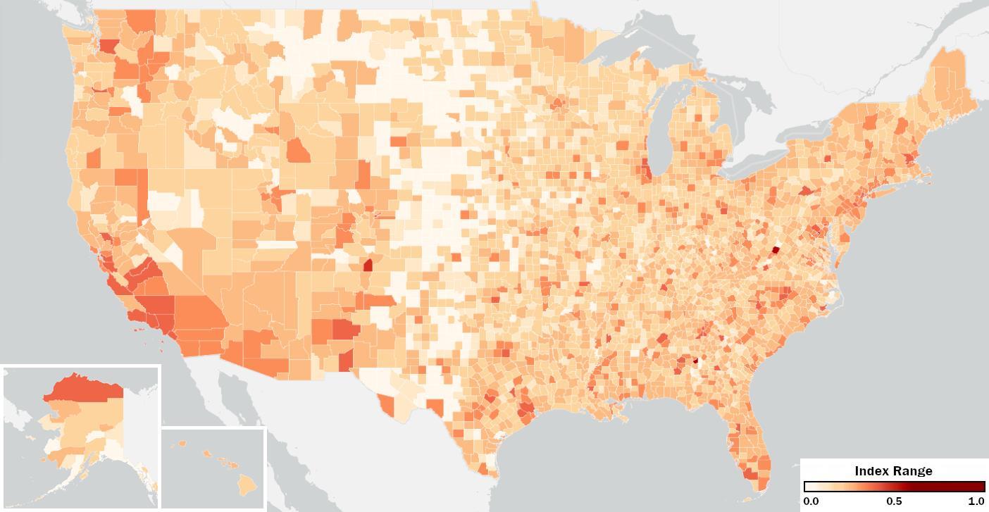
The Overall Income Division Index is the average of the Separation of Wealth Index and the Separation of Poverty Index for each county. It represents the degree of which a county is divided by the income levels of its residents.
Figure 4 below maps the Overall Income Division Index to each U.S. County, ranging from 0 to 1, least to most divided.
Given that this index is the combination of the individual wealth and poverty separation measures, it follows correlations with these two measures. While income is only one part of the equation when it comes to economic classes, the Income Division Index has shown and continues to show the highest levels of division. The median Income Division Index for counties is 0.28. This is 50% higher than the median for the Educational Division Index and nearly double the median for the Occupational Division Index.
The next page displays the 50 counties with the most Income Division, approximately the top 2%. See the appendix for the full list.
The second of the three groups making up the overall economic division index is division by education level. Like income division, there are two measures of dissimilarity calculated. The first looks at how adults with higher levels of education are separated from the rest of the county and the second looks at adults with a lower level of education for the same separation.
Overall, education level continues to rise in the United States. As of 2022, 34% of American’s 25 and older have a bachelor’s degree, up from 28% in 2010. This index explores to what degree this group of adults with bachelor’s degrees are separated.
Figure 5 below maps the Separation of Higher Education Index to each U.S. County, ranging from 0 to 1, least to most separated. FIGURE 5
This level of higher education is often associated with higher income, and it does share some of the same correlations found with the wealth index above. Similarities include the moderate negative correlations with the household incomes at age 35 for low and middle income include parents. Unlike wealth though, it shares the moderate to strong positive correlations with housing costs.
The next page displays the top 2% of counties for separation of higher education.
Like the rising percentage of people attaining a bachelor’s degree or higher, the percentage of people who receive a high school diploma has been increasing. In 2022, 11% of people aged 25 and older did not have a high school diploma. Despite this currently being 1 in 10 Americans, it is encouraging to see this percentage has dropped from 15% in 2010, 20% in 2000, and 30% in 1980. This index explores how separated people without high school diplomas are from others in their county.
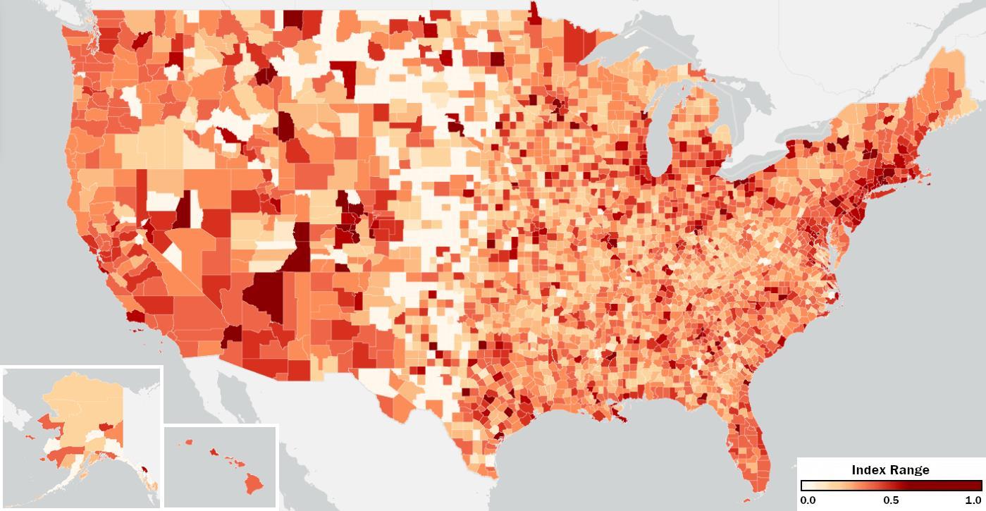
Figure 6 below maps the Separation of Lower Education Index to each U.S. County, ranging from 0 to 1, least to most separated.
This index shares several of the same correlations as the Separation of Poverty Index, but at slightly stronger levels. When it comes to housing, this index has moderate positive correlations with the average costs of homes (0.45) and rent (0.57) as well as strong positive correlations with the range of cost across the county for homes (0.62) and rent (0.68). It also shared moderate positive correlations with the percentage of households with incomes $200K+ (0.46) and people with bachelor’s degrees (0.50). While the poverty index was only weak in its correlation with the population percentage in business/creative and industrial jobs, the separation of lower education has a moderate positive correlation with business/creative jobs (0.41) and a moderate negative with industrial jobs (-0.42). This can be read as higher percentages of business/creative jobs and lower of industrial jobs are seen in counties with higher levels of separation of lower education individuals. The next page displays the top 2% of counties for separation of lower education.
The Overall Educational Division Index is the average of the Separation of Higher Education Index and the Separation of Lower Education Index for each county. It represents the degree to which a county is divided by the education levels of its residents.
Figure 7 below maps the Overall Educational Division Index to each U.S. County, ranging from 0 to 1, least to most divided.
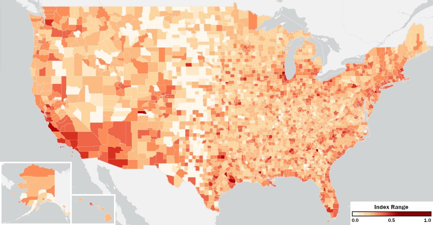
FIGURE 7
This combined index tends to follow correlation trends with the Separation of Lower Education Index more than the separation of higher education. It shares the strong positive correlations in housing costs, along with the percentage of high income and high education, and negative correlation with the percentage of industrial jobs. The combination, however, also brings forward some moderate positive correlations that were weaker in the two individual measures. The first being a relationship with the population size (0.42) where larger population tends to connect with higher educational division. The second is enrollment in higher education, both undergraduate (0.40) and graduate school (0.40), where counties with higher percentages of enrollment also tended to have higher educational segregation. This correlation clearly makes sense with the separation of higher education as graduate students, recent graduates, and professors cluster around campuses, but there is more to explore in relation to the separation of lower education.
The next page displays the 50 counties with the most Educational Division, approximately the top 2%. See the appendix for the full list.
The third and final group making up the overall economic division index is division by occupation, which contains measures of separation for 3 different sets of professions: Industrial, Service, and Business/Creative.
In the past decade, there have not been major changes in the percentage of people working across these 3 groups of professions. Industrial professions still account for about 22% of the workforce. This group includes people with jobs in natural resources, construction, maintenance, production, transportation, or material moving. Figure 8 below maps the separation of these industrial professions to each U.S. County, ranging from 0 to 1, least to most separated.
The separation of industrial professions correlated strongest with the range of rent in the county (0.64), where counties with a higher range of rent prices between their census tracts typically had a higher index for separation of industrial professions. In this way and others, it is reflective of the Separation of Poverty Index correlations. Unlike it, this index is one that has a moderate correlation (-0.40) showing that when this index is higher, children from that county tend to have lower incomes by age 35.
The next page displays the 50 counties with the most separation of industrial professions, approximately the top 2%. See the appendix for the full list.
The Census Bureau (8) classifies about 17% of the workforce over 16 years of age as service occupations. These are professions in food service, law enforcement, fire prevention, health care support, personal care, cleaning and other like services. Figure 9 below maps the separation of these service professions to each U.S. County, ranging from 0 to 1, least to most separated.
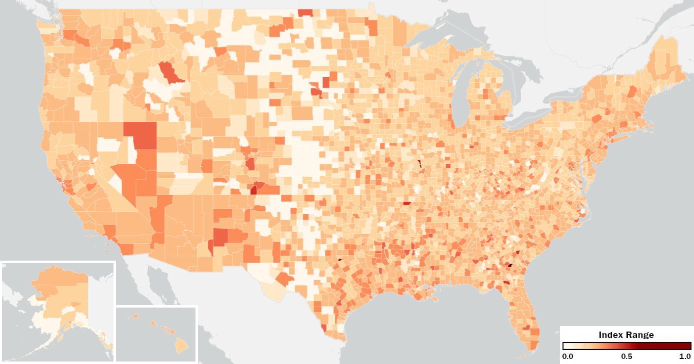
FIGURE 9
Of the seven individual indexes, there were the least number of correlations found with service professions. The only correlation that passed into moderate range was with the range of rent in the county (0.44), which was a strong correlation found with all the other indexes except wealth, where it was also moderate. Nevertheless, while it did not show strong correlations, it was not without change. Among the other indexes, the Separation of Service Professions Index increased at the second highest rate, 21%, since 2010 and now averages notably higher than the separation of the other two profession groups, industrial and business/creative. One possible reason for its lack of correlation is its consistency among counties. Of all the groups that separation was measured for, the percentage of service professionals is the most consistent with more than 95% of counties having between 10-25% of their work force here. The percentage of service professionals had a standard deviation of just 3.7% compared to the other groups averaging 6.7%. This consistency flowed into the index as well with a standard deviation half the size of the others. The next page displays the top 2% of counties for separation of service professions.
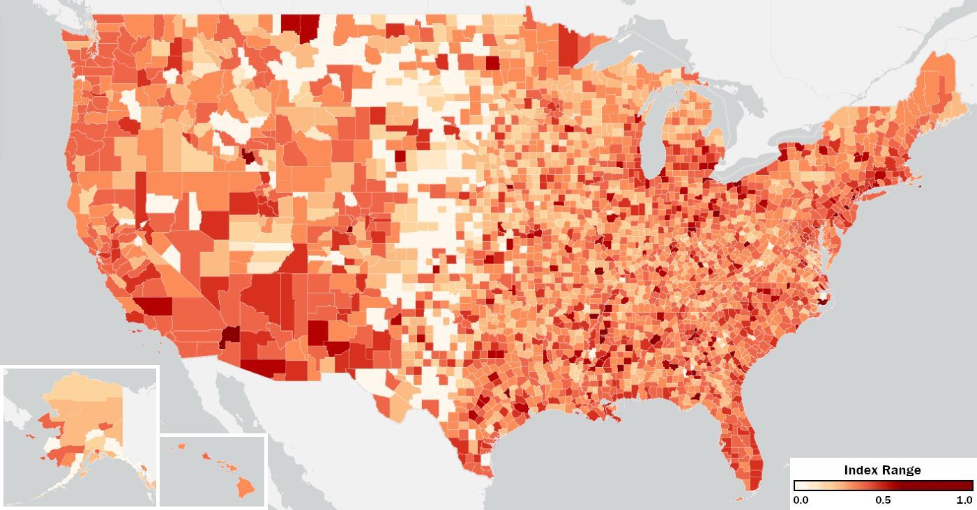
The largest professional group of the past decades is the business/creative professions. 61% of people in the workforce fall within this group, spanning from people working in finance and sales to science and technology to arts and education. Figure 10 below maps the Separation of Business/Creative Professions Index to each U.S. County, ranging from 0 to 1, least to most separated.
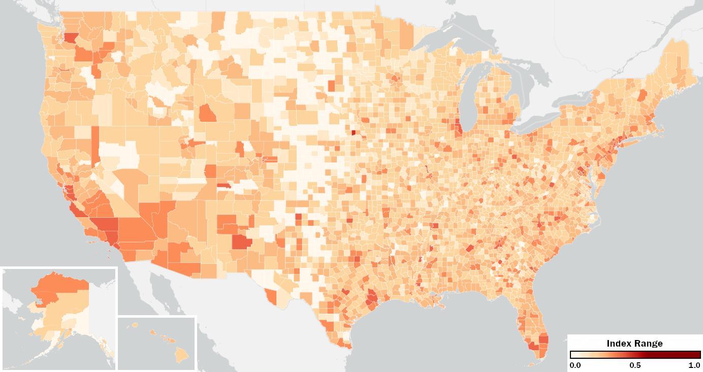
FIGURE 10
The separation of business/creative professions has similar correlations with the separation of wealth and higher education from above. This includes strong correlations with the ranges of home values (0.62) and rent (0.67), as well as the negative correlation with the average income at age 35 of children from low-income (-0.41) and middle-income (-0.40) parents in their county. Uniquely, it is the only individual index to have a moderate correlation with the total population (0.41) and with the population enrolled in undergraduate (0.40) and graduate school (0.41).
The next page displays the 50 counties with the most separation of business/creative professions, approximately the top 2%. See the appendix for the full list.
The Overall Occupational Division Index is the average of the Separation of Industrial Professions Index, the Separation of Service Professions Index, and the Separation of Business/Creative Professions Index for each county. It represents the degree of which a county is divided by the occupations of its residents.
Figure 11 below maps the Overall Occupational Division Index to each U.S. County, ranging from 0 to 1, least to most divided.
As a combination index, it follows correlations with the three separation measures that form it, primarily the separation of industrial and business/creative professions. The Occupational Division Index has the lowest median value of the three core indexes within the overall index. Occupational division has a median of just 0.143 compared to 0.280 and 0.181 for income and education, respectively. However, since 2010 it has been on the rise and at a higher rate than the others, a 15% increase. This has shrunk the gap between the income and educational divisions. Most notably, since income division decreased by 8% in its index, the gap between income and occupational division shrunk by a total of 23%.
The next page displays the 50 counties with the most Occupational Division, approximately the top 2%. See the appendix for the full list.
To explore how the economic division in the United States has changed, we looked at the results from the 2022 analysis and then reconstructed the same measurements using 2010 census data, the same year used for the Segregated City study on U.S. metros. It is worth noting that both of these years were on the heels of major events in the U.S. and the world. The 2010 data would have been collected after the 2007-2009 major economic recession. The economic impact of these years could have impacted the geographic locations where people lived in 2010, the occupations they currently had, and even the income bracket they found themselves in. 2022 was also following an atypical time from the impacts of the 2020 COVID-19 pandemic that again affected many Americans financially, occupationally, and in their pursuits of education.
Index medians changed from 2010 to 2022 as follows:
5
6
7
Overall, there was a slight increase in economic division since 2010 with the median moving from 0.194 in 2010 to 0.199 in 2022. The only index to show a decrease was the Separation of Wealth (households making $200K+ annually, inflation adjusted), which dropped from a median of 0.373 to 0.291 (approximately 22% decrease). However, despite this, the Separation of Wealth remains the highest index score both in 2010 and in 2022, consistent with the findings of the Segregated City study.
Since 2010, the percentage of households in the U.S. making more than $200K increased from just 4% to 11% in 2022. There appears to be some connection between the portion of the population that a group holds and how separated they can be from the remainder of the population. This can be seen in how the Separation of Business/Creative Professions is typically the lowest index and is the group with the largest portion of the population (61%). Likewise, the Separation of Poverty and Lower Education Indexes are the second and third highest next to Wealth with the second and third smallest population portions. So, the index decrease could be a symptom of the increase in the portion of the population that happened within this group making $200K or more. However, this is not consistently true with other groups; for example, the group with a bachelor’s degree or higher has increased in percentage since 2010, but the division index has as well. Regardless of why the decrease happened, the drop in Separation of Wealth in combination with it being the highest index score is the key reason why the overall increase is not higher than it is. Since Separation of Wealth has typically been lifting the average, its significant decrease nearly negated the effect from every other index increasing.
The largest of the increases seen since 2010 was in the Separation of Lower Education, individuals who didn’t finish high school. This index showed a 24% increase in division from 2010 to 2022. Inverse to households making more than $200K, the number of people who didn’t graduate high school decreased from 15% in 2010 to only 11% in 2022. The second highest increase was the Separation of Service Professions, which jumped 21%. Looking at these two increases next to each other could appear as though they are connected and people within these groups may be overlapping, however the correlation between these indexes is only a moderate one of 0.53. Most other indexes are correlated together at much stronger values of 0.65 to as strong as 0.94. In fact, this is the weakest correlation that the Separation of Service Professions Index has with another index.
The last finding of note in the historical comparison occurred from analyzing only the largest counties. Overall, counties of larger population sizes followed a similar pattern of which indexes increased and decreased the most over the past decade, but the larger counties actually decreased in the Overall Economic Division. There was a 2% decrease for counties over 100,000 populations, approximately 20% of counties. For counties with populations over 500,000, approximately 5% of counties, there has been an overall decrease of 3% in the Economic Division. Decreases at both of these levels are still driven from the decrease in the Separation of Wealth Index.
In examining the economic divisions across different counties, various factors contribute to the extent of these separations. Some counties experience greater disparities between different socioeconomic groups, while others show more integration across economic and social lines. Understanding why some areas are more divided than others requires looking at several key indicators such as population size, income levels, racial diversity, housing costs, and educational attainment and how these factors influence economic division. By analyzing correlations between these indicators, we can gain some insight into how certain conditions relate to economic division within counties overall. These findings will hopefully help spark further conversations with deeper local knowledge within individual communities.
As seen in the 2010 Segregated City study, a correlation exists between all the indexes analyzed in this study, ranging from moderate (0.52) to very strong (0.94). This study noted that "while some [counties] rank higher and some lower on individual types of economic segregation, the troubling reality is that segregation is all of a piece." This variation in correlation demonstrates that each component is unique, yet the consistent pattern across the indexes underscores their interconnectedness and highlights the broader issue of economic division.
Of the various sub-indexes making up the Overall Economic Division Index, there are generally two focuses: the separation of a group in generally more challenging economic circumstances or the separation of a group in generally more prosperous economic circumstances. The ones focused on generally more prosperous circumstances are households that make $200K or more annually, individuals employed in the business/creative professions, and individuals with an education level of a bachelor's degree or higher. When looking at the counties with higher percentages of any of these groups, there is a moderate positive correlation with the Separation of Lower Education Index (0.41 to 0.50). There is also a moderate positive correlation with the Separation of Poverty Index with the percentage of households making $200K+ (0.40) and percentage of people with a bachelor's degree or higher (0.44).
Exploring the percentage of population for any of the groups in more challenging economic circumstances such as families in poverty, service or industrial professionals, and those who didn’t graduate high school revealed only very weak correlations (less than 0.20) and negative correlations with the indexes, such as the percentage of industrial professions negatively correlating with the Separation of Lower Education Index at a value of -0.42. While correlation does not mean there is a causal relationship, this trend could indicate that when there is a higher portion of people in these prosperous economic circumstances, the people of more challenging economic circumstances are more geographically separated. Meanwhile, when there are higher portions of people in the more challenging economic circumstances, there is no change or even a reduction in the economic division of the county. The 2010 Segregated City study found a higher separation of the groups with prosperous economic circumstances and these correlations reinforce that finding, but it also could speak to the power dynamic between these groups. The groups with prosperous economic circumstances have more access and opportunities to shrink or grow these gaps in their communities.
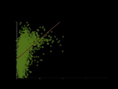
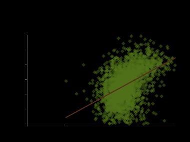
In the Opportunity Atlas by Opportunity Insights, the average income of 35-year-olds who came from low, medium, and high-income families is measured based on where they grew up. This data reveals a moderate negative correlation between the income of those from low-income and middleincome families and the Overall Economic Division Index (0.46). While this negative correlation is present across all subindexes, the most significant relationships are seen with the Separation of Wealth Index (-0.40) and Occupational Division Index (-0.44). Only slightly weaker is the correlation between the income of those from high-income families and the overall economic division (-0.40). This suggests that areas with lower economic division create better opportunities for children of all income brackets, but especially for those of low-income families to improve their economic circumstances.
Regarding the 2010 study observation of college towns trending in the top 10 lists for these division indexes, the correlation in the 2022 data is less substantial. For instance, from the previous study we expected a positive correlation between the proportion of people enrolled in college in a county and the Separation of Poverty Index, as college students tend to cluster around campuses. However, the correlation here is only 0.29. The only moderate correlation found is with the number of people enrolled in undergraduate and graduate school (0.40), which is influenced by population size and correlates with the same indexes. However, when the percentage of the population enrolled in college was added as an independent variable in multiple linear regression models, its significance
became clearer (Appendix 11). While a large college-enrolled population alone may not result in higher economic division, it plays a significant role when combined with other county variables.
The Racial Entropy Index, which measures the geographic division of areas based on seven race/ethnicity categories from the Census Bureau (8), shows a moderate positive correlation with the Overall Economic Division Index (0.59) as well as with each of the three sub-indexes in this study (0.51 to 0.54). This correlation is not surprising given the significant economic disparities that exist among racial and ethnic groups in the United States. For example, 17% of Black people live in poverty compared to 9% of White people, and only 28% of Black people hold a bachelor’s degree, compared to 42% of White people. These figures underscore the disproportionate impact of economic division on people of color and highlight that addressing issues of economic inequity is also part of the fight to reduce racial disparities in our nation.
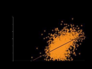
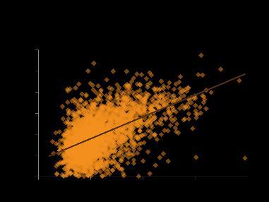
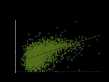
Lastly, turning to housing, moderate positive correlations between average rent and home values in a county and certain indexes were found. However, the strongest positive correlations arise when considering the range of home values and rents within the county. This range is defined as the difference between the census tract with the highest median home value and the tract with the lowest median home value, and similarly for rent. The home value range shows a strong positive correlation with the Overall Economic Division Index at 0.62, driven primarily by a 0.65 correlation with the Educational Division Index and a 0.62 correlation with the Separation of Business/Creative Professions Index. The rent range has an even stronger positive correlation of 0.70 with the Overall Economic Division Index, with particularly strong correlations of 0.71 with the Educational Division Index, 0.65 with the Occupational Division Index, and 0.61 with the Separation of Poverty Index. Again, although correlation does not imply causality, it's easy to see how significant disparities in housing costs between areas could lead to a concentration of lower-income residents in more affordable areas, deepening economic divisions. Lack of affordable housing is a genuine issue in many areas and support for development projects has real potential for bridging economic gaps and supporting upward mobility.
The seven individual indexes are all calculated based on the Index of Dissimilarity. Developed by sociologists Douglas Massey and Nancy Denton, it compares the distribution of a selected group of people with all others in that location. The more evenly distributed a group is compared to the rest of the population, the lower the level of segregation. This Dissimilarity Index ranges from 0 to 1, where 0 reflects no dissimilarity and 1 reflects complete dissimilarity. The Dissimilarity Index (D) is expressed as:
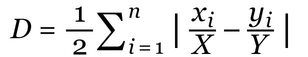
where xi is the number of individuals in our selected group in tract i, X is the number of the selected group in the county, yi is the number of all other individuals in the Census tract, and Y is the corresponding number in the county. N is the number of Census tracts in the county. D gives value to the degree to which our selected group is differently distributed across Census tracts within the county, compared to all others. D ranges from 0 to 1, where 0 denotes minimum spatial division and 1 the maximum division. The more evenly distributed a group is compared to the rest of the population, the lower the level of division.
The combined measures of income division, educational division, and occupational division, as well as the Overall Economic Division Index, are created by averaging these individual sub-indexes, so the resulting combined index ranges remain as 0 to 1. These combined index values create a relative measure where the lowest index value indicates the least divided county and highest index value indicates the most divided county.
Appendix 3 – Of the 3,144 county and county equivalents defined by the U.S. Census Bureau, 227 were excluded from analysis and show as 0 on the mappings due to only having 1 populated census tract within their boundaries. Without 2 or more populated census tracts, the resulting dissimilarity measurements and overall economic division index will always be 0 The remaining 2,917 were all included in the analysis and rankings, which includes 99.8% of the U.S. population.
Appendix 4 – Census Bureau Counties and County Equivalents
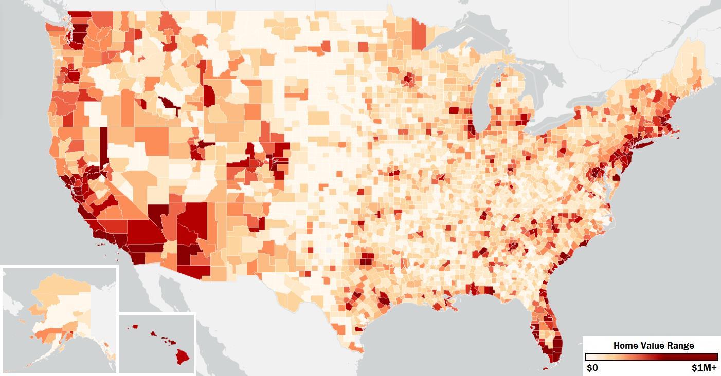
Appendix 5 – Range of average census tract rent cost within a county
Appendix 6 – Range of average census tract home values within a county
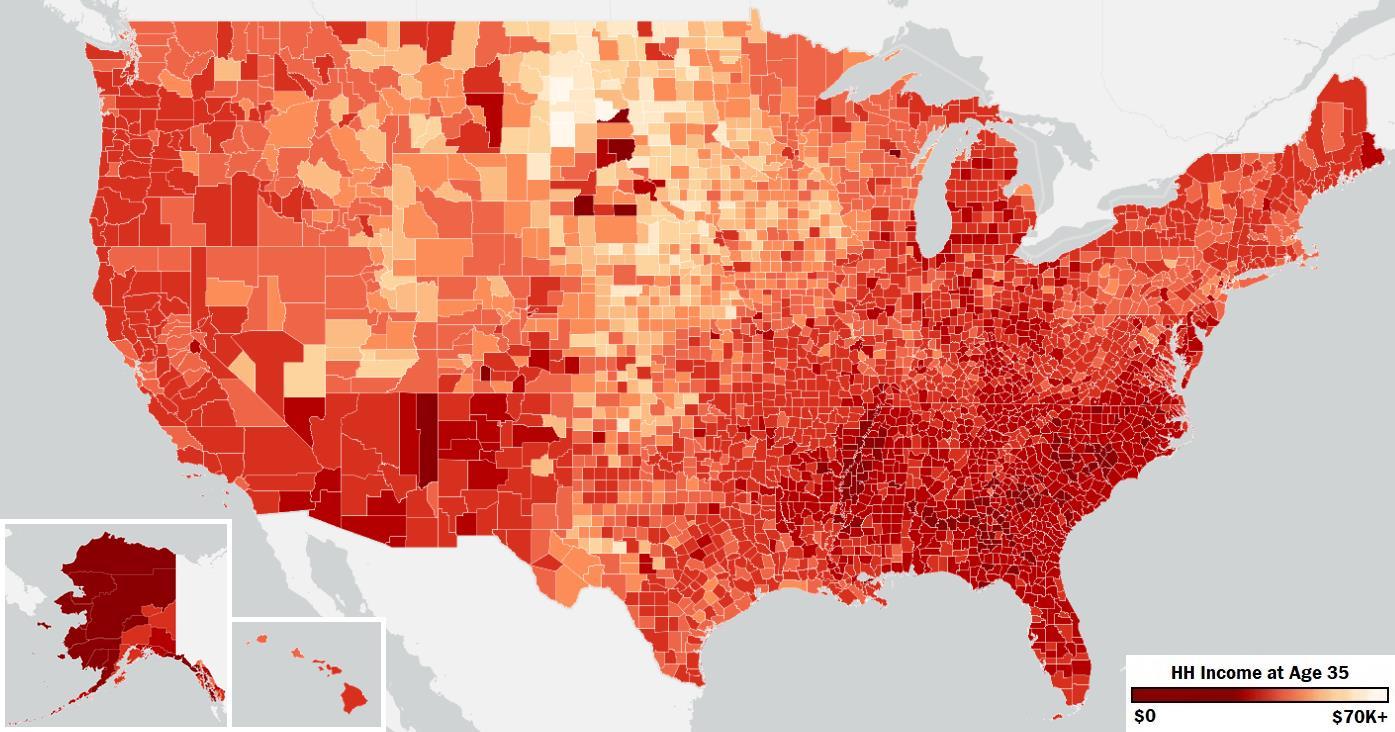
Appendix 7 – Average household income at age 35 for children from low-income parents based on the county they grew up in
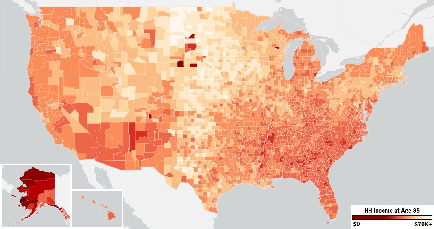
Appendix 8 – Average household income at age 35 for children from middle-class parents based on the county they grew up in
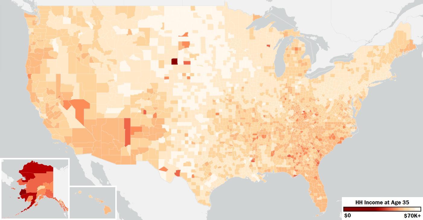
Appendix 9 – Average household income at age 35 for children from high-income parents based on the county they grew up in
Appendix 10 - United States population density by county from the 2022 ACS 5-Year Averages
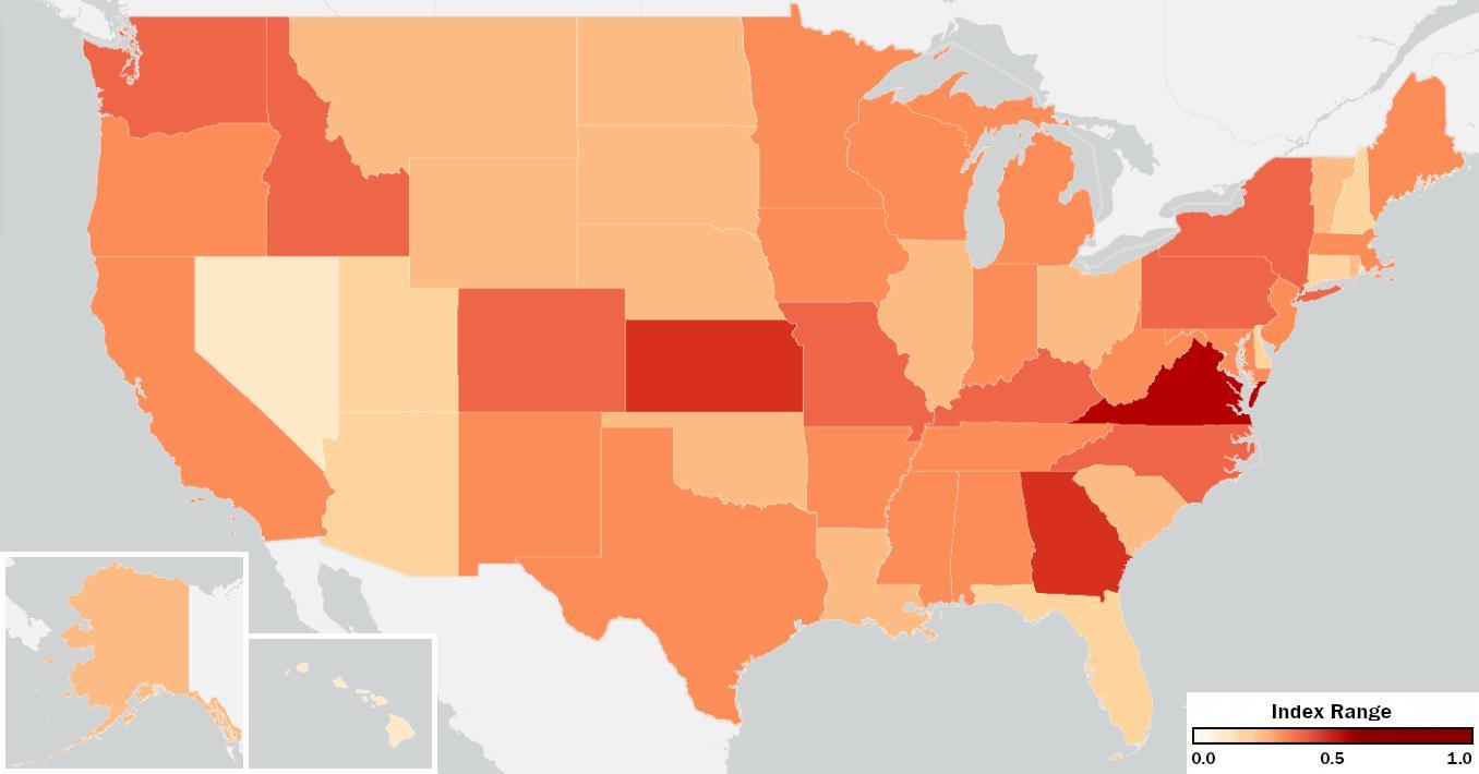
Appendix 11 – The overall economic division of different counties within U.S. states
Appendix 12 – The percentage of population enrolled in ungraduated or graduate school notably increased the R2 value in the multilinear regression model for predicting the economic division index and consistently showed statistical significance at the 99% confidence level
1) Florida, R., & Schwartz, A. (2015). The segregated city. Martin Prosperity Institute. Retrieved December 6, 2024, from https://rogerlmartin.com/mpi/wp-content/uploads/2015/02/Segregated-City.pdf
2) Institute for Policy Studies. (n.d.). Wealth inequality facts. Institute for Policy Studies. Retrieved December 6, 2024, from https://inequality.org/facts/wealth-inequality/
3) Kincaid, S. (2021). Entropy index: Explanation. Encyclopedia of Geography. Retrieved December 6, 2024, from https://www.census.gov/topics/housing/housing-patterns/guidance/appendix-b.html
4) Opportunity Insights. (n.d.). Opportunity atlas data. Opportunity Insights. Retrieved December 6, 2024, from https://opportunityatlas.org/
5) Pew Research Center. (2020). Trends in income and wealth inequality. Pew Research Center. Retrieved December 6, 2024, from https://www.pewresearch.org/social-trends/2020/01/09/trends-in-incomeand-wealth-inequality/
6) Plato. (1973). The Republic and other works (B. Jowett, Trans., p. 111). Anchor Books.
7) The Urban Institute. (n.d.). Wealth inequality charts. The Urban Institute. Retrieved December 6, 2024, from https://apps.urban.org/features/wealth-inequality-charts/
8) U.S. Census Bureau. (n.d.). American community survey 5-year estimates: Census data. U.S. Department of Commerce. Retrieved December 6, 2024, from https://www.census.gov/programssurveys/acs
9) U.S. Census Bureau. (n.d.). Dissimilarity index history. U.S. Department of Commerce. Retrieved December 6, 2024, from https://www.census.gov/content/dam/Census/library/workingpapers/2003/demo/massey.pdf
10)United for ALICE. (n.d.). United for ALICE national overview. United for ALICE. Retrieved December 6, 2024, from https://www.unitedforalice.org/national-overview
11)United for ALICE. (n.d.). National reports. United for ALICE. Retrieved December 6, 2024, from https://www.unitedforalice.org/national-reports