Social Media Playbook


2 Social Media Playbook CONTENTS About 3 Style Guide 5 Types of Ads 6 Lexicon 11 Color Cues 12 Layouts 12 Image Use 16 Typography 18 Colors 20 Graphic Elements 22 Composition 23
This social media playbook was designed with your social media manager and graphics team in mind. This book will help you create social media in the most efficient, consistent, and impactful way possible.
This playbook defines the characteristics of your social communications visually and with regard to lexicon. It includes a style guide to in creation of static ads, animation, photography and videography guidelines will help your social media stay true to your brand.
Cheers, zö agency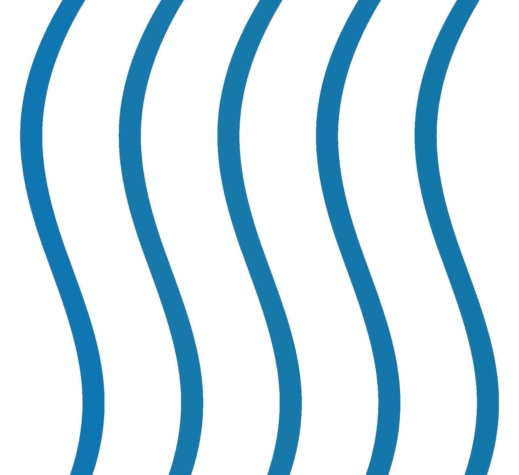

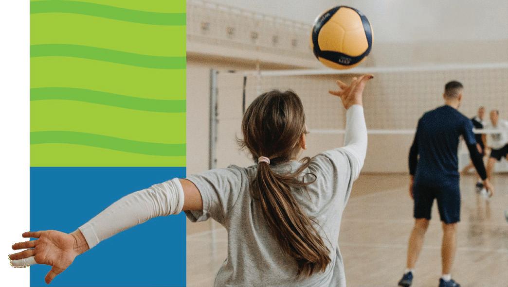
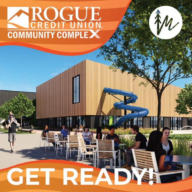
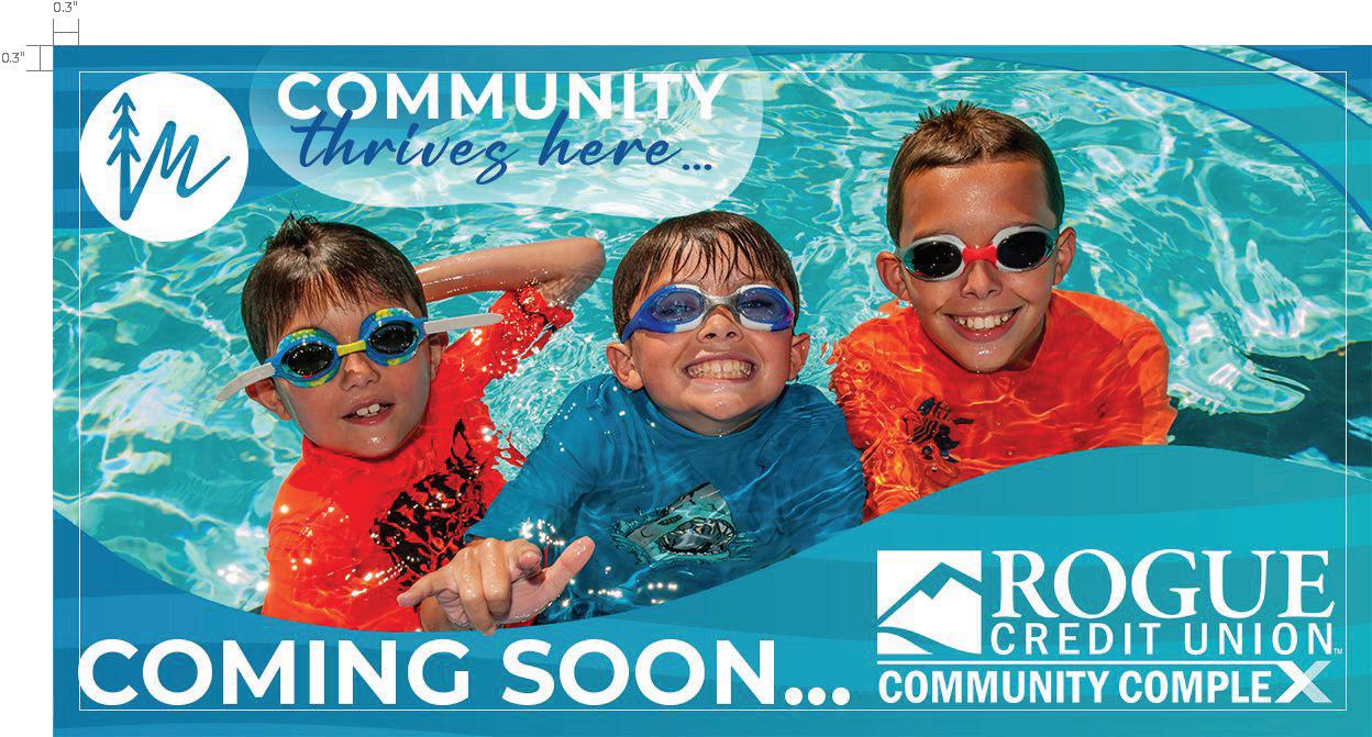
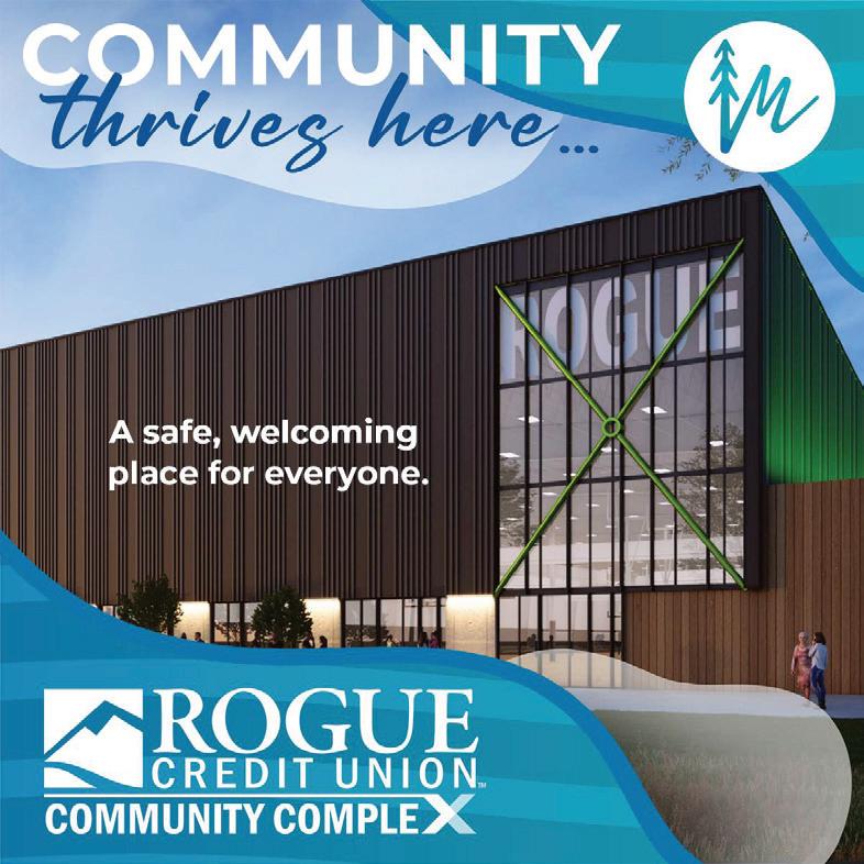
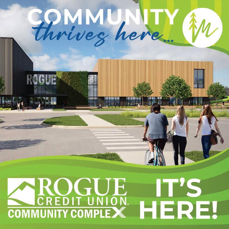
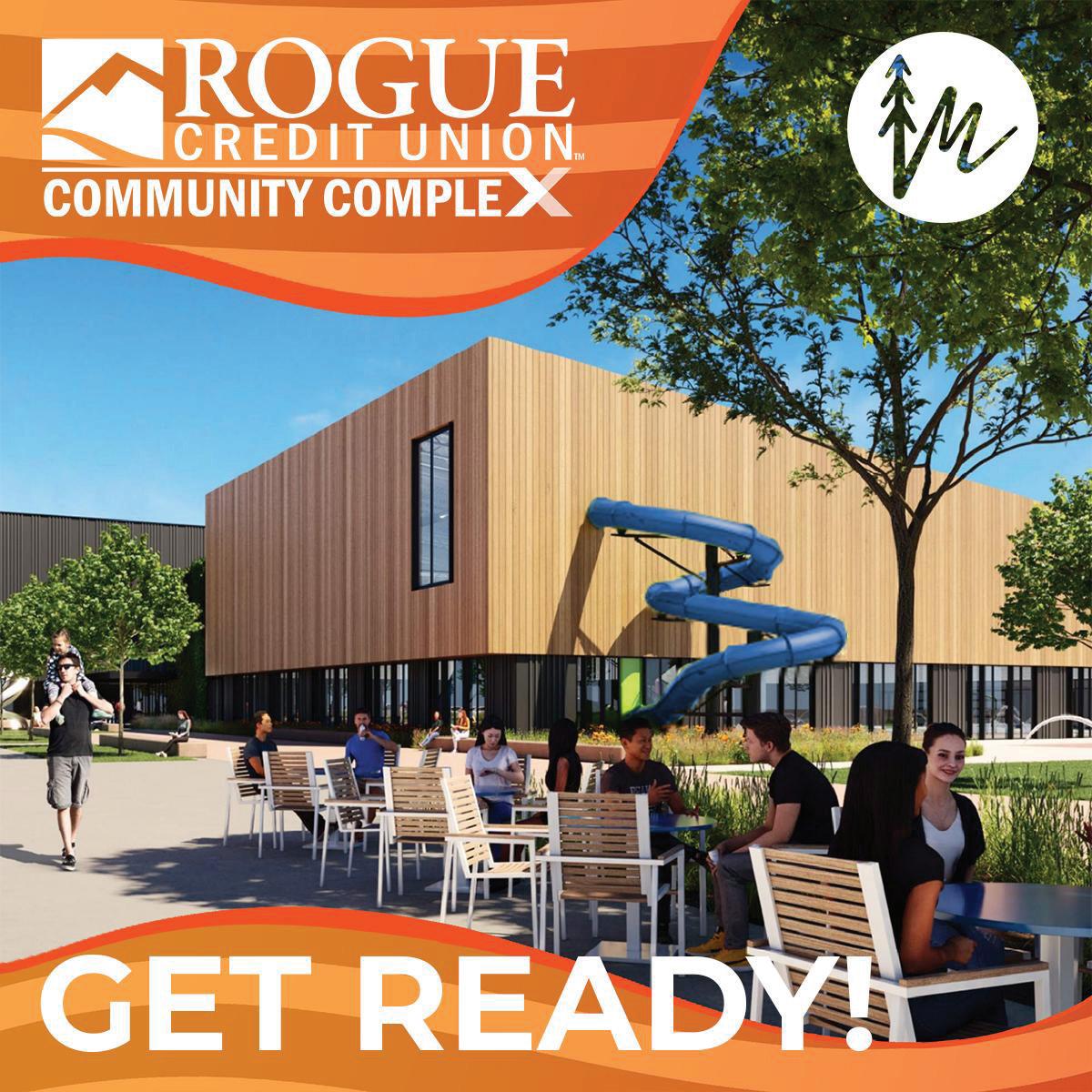
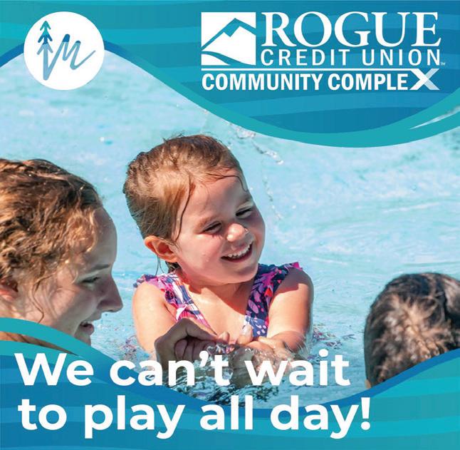
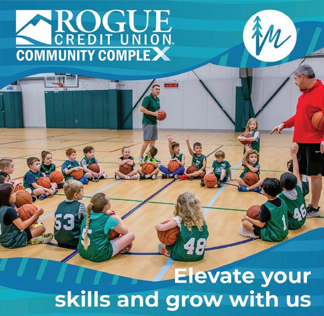
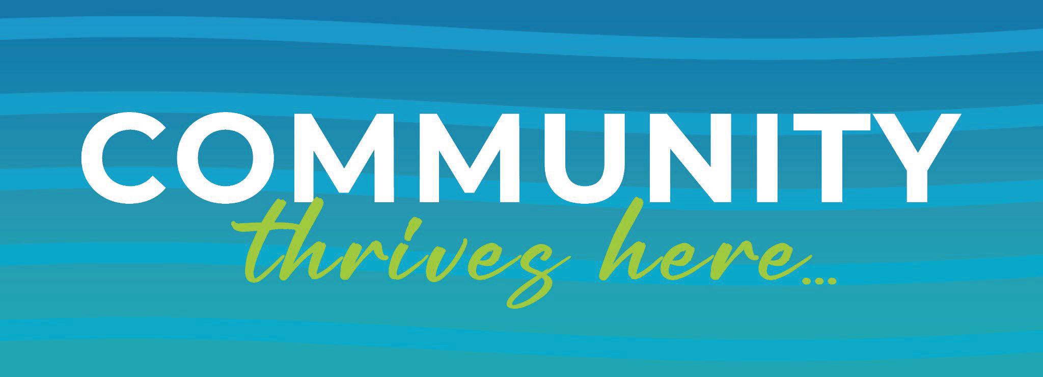
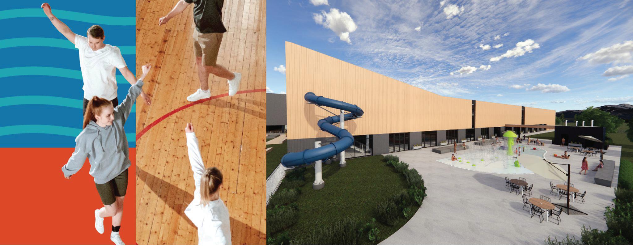
Static posts create a strong visual link to the experience of Rogue X.
Posts employ the same colors, gradients and visual cues throughout.
These posts cue the viewer and are recognizable.
Through consistent color, font, language and imagery, static posts help your audience become familiar with Rogue X well before opening day!
Static posts emphasize voice and personality.
Copy is the star in your static posts. Copy works hard to express the energy and experience. But it needs to be short and sweet


Use language that speaks to the majority of future users of Rogue X. If you’re speaking to moms, be clear who that is for. If you’re speaking to event organizers, draw attention to them.
Stay authentic .
Your brand elevates the quality of life for the community! Embrace that in your copy!
Inspire.
Your brand inspires joy through play - lean heavily into uplifting copy!
Watch how your posts land with your audience. If you notice a big lift in commenting and sharing, analyze what worked well and gravitate towards that type of post.
75% of all posts that discuss the project early on should utilize the blue for consistent visual cues. 25% of the posts may integrate the orange and green.
75% of all posts that discuss the project nearing opening should utilize the orange for consistent visual cues. 25% of the posts may integrate the blue and green.


75% of all posts that reveal the opening should utilize the green for consistent visual cues. 25% of the posts may integrate the orange and blue.
All graphic elements can be placed around the composition while maintaining a 0 3” margin from the edges of the piece.
The “Community Thrives Here” logo and City of Medford icon can be placed near the corners, and sizes can vary depending on the pieces’ dimensions.
You can use images that best represent the concept of the ad/design, while being interesting and joyful.
You can use Montserrat Bold (All Caps) for big titles. While the text is aligned to the left corner it can be used in a variety of ways, according to the layout.
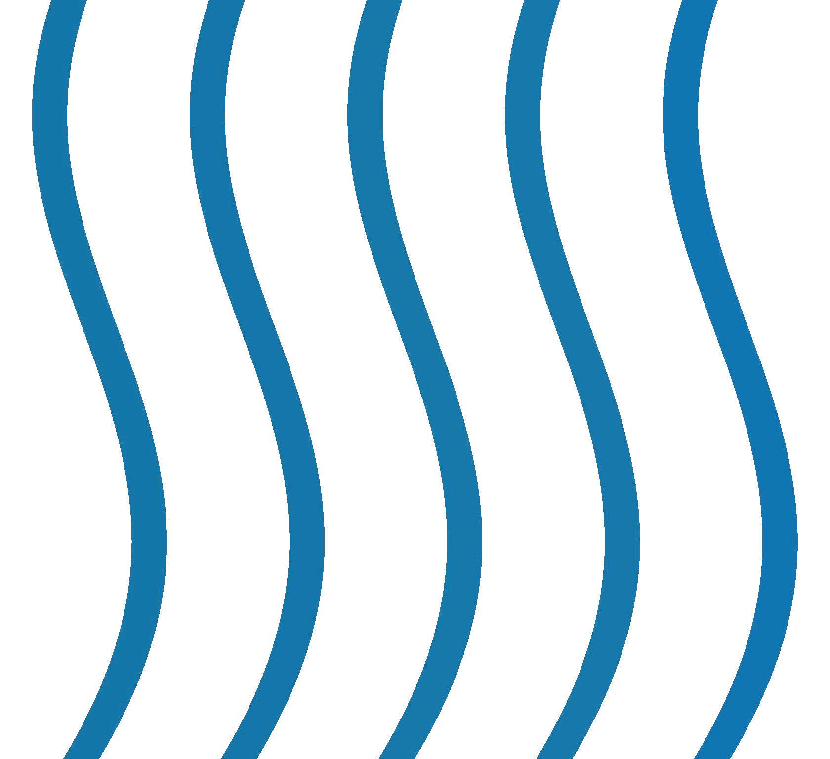
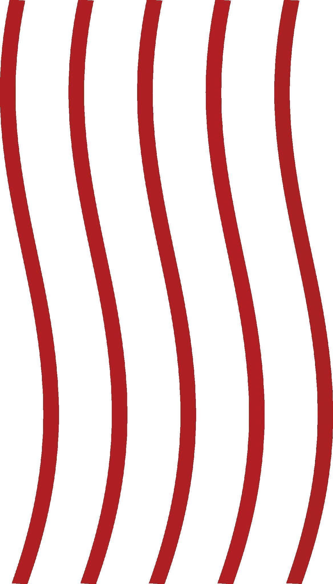
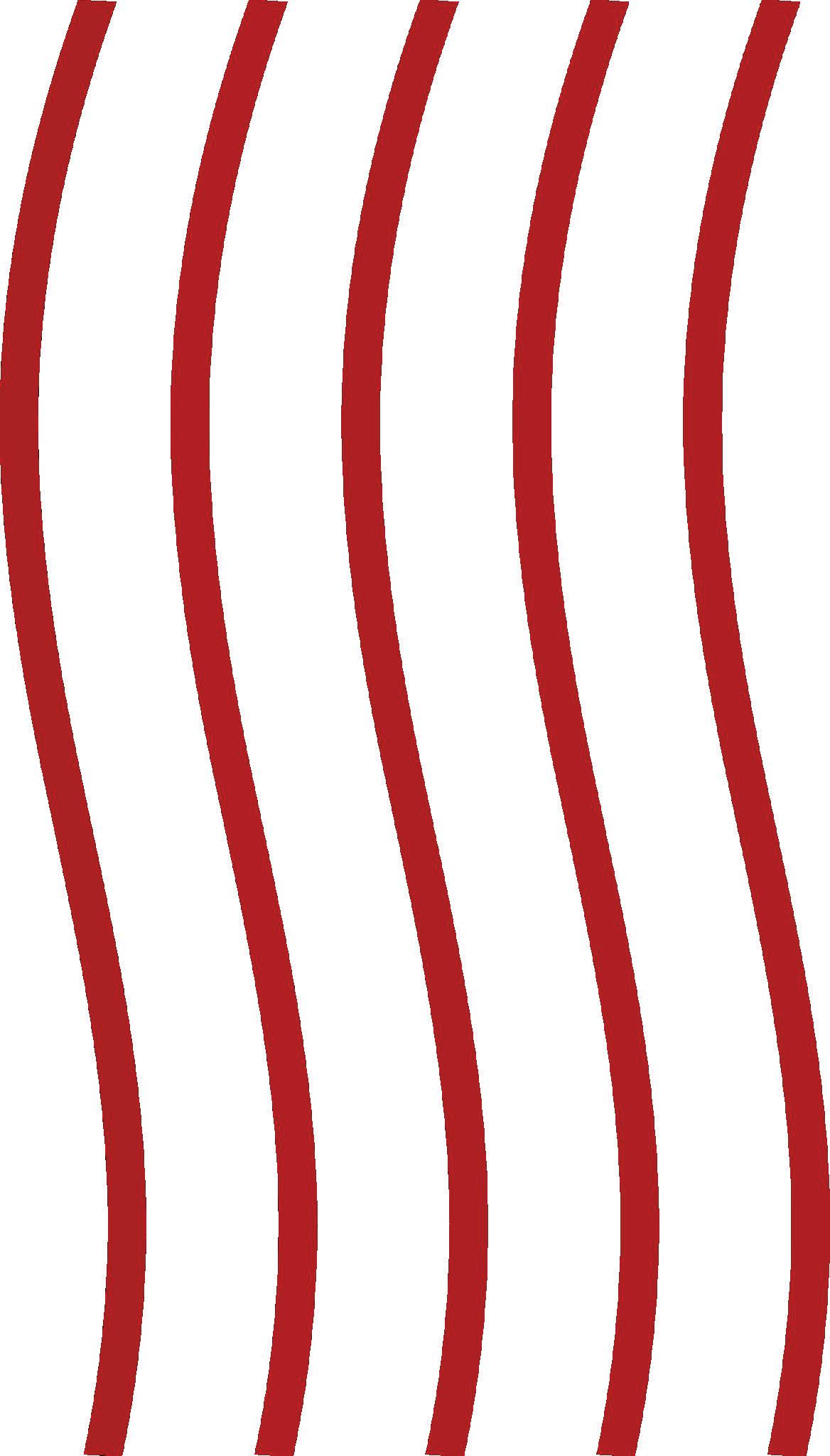
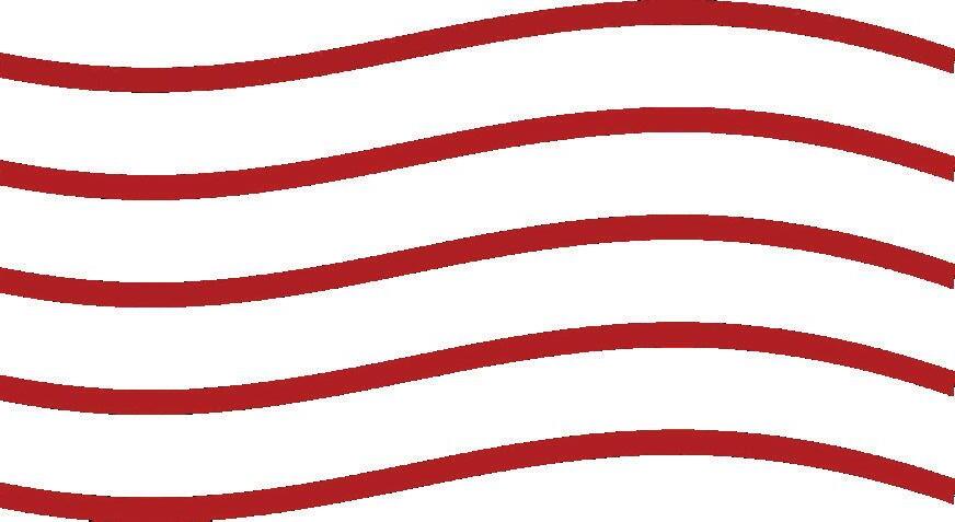
There’s a selection of graphic elements like waves and curves with gradients. See page 22 for more information about graphic elements you can use.
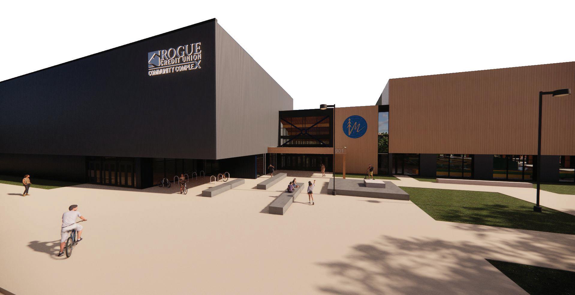
The Rogue X Community Complex logo has to be more prominent than other logos.
These follow the same margin restrictions and logo/icon usage from the landscape (16:9) ad layout, with some variations for placing to better suit the space.
Our eye naturally looks for the biggest and easiest piece of text on a post. Then the image, and then the remaining info. Make sure you design for ease of absorption.
Don’t let too many items compete for the eye. 75% should be image, 15% the message and 10% logos, roughly
Keep the message simple
Simple clean font for the key message, in less than 8-10 words, is ideal.
When preparing your content calendar, be sure to embrace diversity in ages, ethnicities, gender and interests in a well balanced way throughout. Your feed should feel inclusive when viewed as a whole.
Your brand is accountable to delivering through your social posts. When reviewing your image selections, check them against your value statements. Does the image align with your brand?
Images that show experience are ideal for your brand. Moods could include images of a relaxing day in the park. Energy could be happy children at play. Action could be an active sport. Drive towards images that show experiences we can connect to.
In social posts it is best to up close and avoid images that require you to squint to ‘understand’ what you are looking at. Crop in!
Montserrat Bold / All Caps / 35pts
Use for sub titles or smaller headers.
Montserrat Bold / 18pts
SMALLER HEADERS CAN ALSO LOOK LIKE THIS .
Montserrat Normal / All Caps / 14pts
For paragraphs and smaller blocks of text. This paragraph is an example of how your content will look when using the fonts shown.
Montserrat Normal / 10pts
Montserrat Bold / All Caps / 35pts
Montserrat is a font family with plenty of width options and can be very versatile. We use Montserrat bold as the main option for big titles to give emphasis to the message.
Make sure the colors you use can contrast over color backgrounds. If the color of your background is too saturated opt to use white for the fonts to make them pop out.
Aoutoory Dragon Bold / 38pts
This is a secondary font option, only used in very specific moments, like the “Community Thrives Here” mark, as a way to soften the message and create contrast from the bolder Montserrat.
Don’t bur
Give your fonts plenty of breathing room around them - the message is important!
HEX: #1577A9
RGB: 21, 119, 169
CMYK: 87% , 47% , 15% , 1%

HEX: #D94827
RGB: 217, 72, 39
CMYK: 10% , 87% , 100% , 1%
HEX: #A1CA3A
RGB: 161, 202, 58
CMYK: 42% , 1% , 100% , 0%
HEX: #1577A9
RGB: 21, 119, 169
CMYK: 87% , 47% , 15% , 1%
HEX: #04A6B4
RGB: 4, 166, 180
CMYK: 77% , 14% , 29% , 0%
HEX: #D94827
RGB: 217, 72, 39
CMYK: 10% , 87% , 100% , 1%
HEX: #DD8126
RGB: 221, 129, 38
CMYK: 11% , 58% ,
100% , 1%
HEX: #A1CA3A
RGB: 161, 202, 58
CMYK: 42% , 1% , 100% , 0%
HEX: #5E873B
RGB: 94, 135, 59
CMYK: 67% , 28% , 100% , 11%
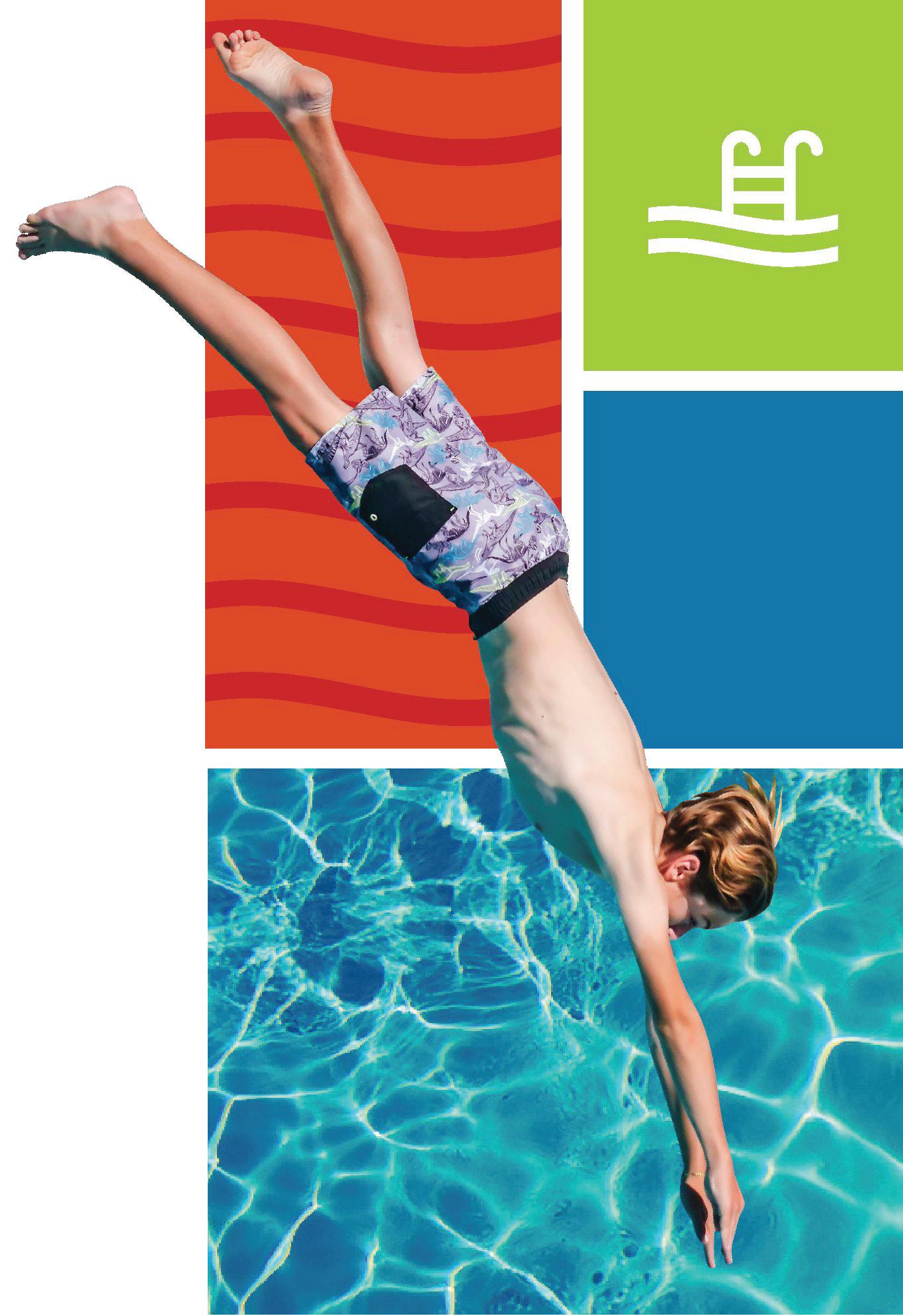
The image draws you in, you can almost feel the water and sun.
Color.
It pops with color (again, energy) in appropriate balance.
Accents.
It utilizes approved accents selectively
Composition.
It is balanced in equal measure.
While this specific image may not be one you choose, the example follows some golden rules…
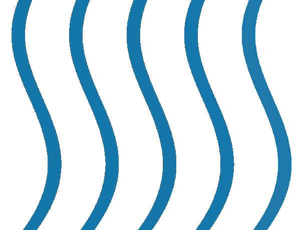
Waves can be used as details to differentiate color blocks or to give more personality to the layout. It can be used in a variety of ways, colors and transparency modes to compliment imagery.
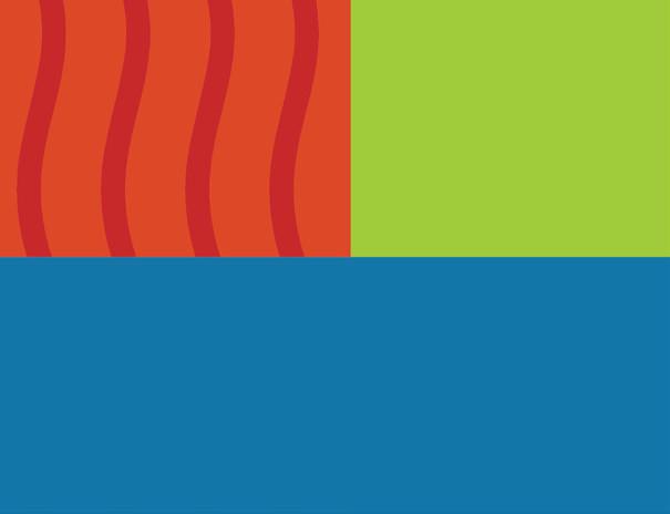
These can be defined as colored sections that can be filled with text, waves, and images to make a design pop out. Be creative in the way you intervene these with imagery
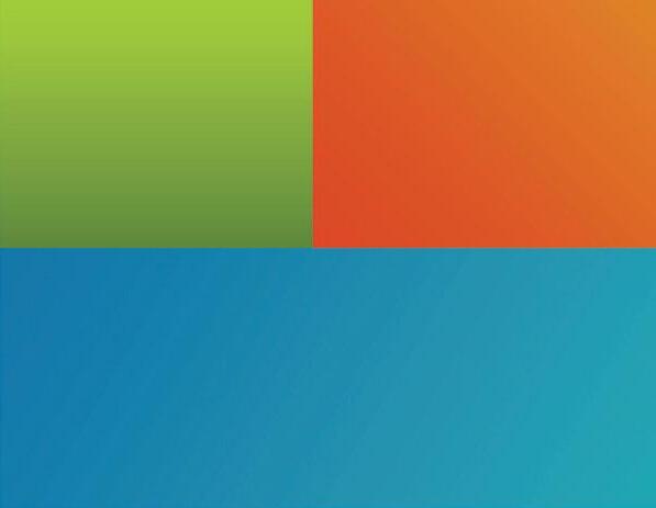
The colors we use can be plain, but can also be very dynamic . These gradients add an extra layer of depth and contrast when needed.
Use the golden ratio to create better distributed and more balanced layouts that you can later fill out with content, imagery or color blocks.
Use these to section areas of the design, that can distribute information in a more organized way or simply add color to the design composition.
The images we use can be cropped in creative ways to make eye-catching designs. Make sure that you use images that make sense to be cropped, otherwise it will look messy.