

This document showcases the brand guidelines and digital identity for NHL International for the 2024 - 25 season.
It acts as a practical guide to not only understand the brand, but also ensure that consistency is maintained across all assets that are created.
NHL International is the home of the NHL around the world, championing local stars, and acting as a base for international fans to celebrate the game.
Our accounts cover Europe, Australia, Sweden, Finland, Germany, Czechia, Switzerland and Spanish speaking countries, across Instagram, X, Facebook, TikTok and Whatsapp.
When designing, we tailor each asset to have a local tie to the market it will be posted to, with market specific branding, and local language text.
This guide will provide you with everything you need to know when designing for NHL International.
This year, our brand reintroduces the approach of using unique accents for each market, allowing every region to have its own distinct identity.
These accents are used carefully, to ensure that they are complimenting our new brand, and not working as two separate units.
We’ve developed a dynamic, clean & minimal style that ensures a cohesive brand presence while offering flexibility. The result is a versatile brand that supports consistent messaging across all channels, empowering each market to connect more effectively with its audience and driving our brand forward with clarity, creativity, and impact.
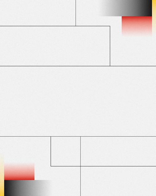
We use a slightly off-white as our background colour. It helps to keep all elements visible and ensures they do not get lost.
Black lines are used as graphic elements and dividers to separate & house different pieces of information across designs. They must always connect to the edge of the artboard and/or another line.
Boxes may also be used as blank elements to fill white space, but they should never overcrowd the design or appear isolated.
For further details and examples, see Section 08 (Brand Misuse).
Grain
A slight grain is overlaid on all designs. The application style (below) should ALWAYS be followed, otherwise assets become too difficult to read and distorted.
Blending mode = Linear Burn, Opacity = 20%
Gradients
Must sit in corners of the canvas, opposite one another. There should always be 2 filled corners with gradients per design.
Gradient positioning must stay the same across markets.
Details of the individual market gradients can found in Section 4.
Base template backgrounds can be downloaded here.
Grain
Should always be the top layer of the artboard.
Copy directly from existing templates to new artwork.
Try to use base template backgrounds first, before creating your own
More info & examples of gradient combinations can also be found in Section 04. If new styles need to be created, there should always be 3 different proportions of rectangle, and should try to stay as similar as possible in the both corners of the canvas.
Black Lines Weight = 2pt
Hex Code = #1D1D1D - see Section 04.
Boxes should never be floating. Should always extend to edge or join to another black line.
Should always be at least 80 pixels away from Canvas edge (vertical lines from top/ bottom edge, horizontal from left/right edges).
Position so that gradients have enough breathing room.
Background Colour
Hex code: #F5F5F5 - see Section 04 for more details.
Backgrounds should ALWAYS be this colour across templates.
Exceptions can be made for hero graphics.
Details
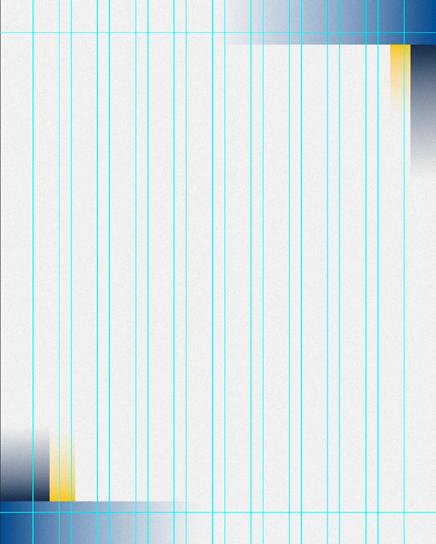
A grid should be used as a base for all designs. When it come to positioning of text, boxes, images etc. try to follow the guides as much as possible. The large grid should give a fair amount of freedom.
How to enable
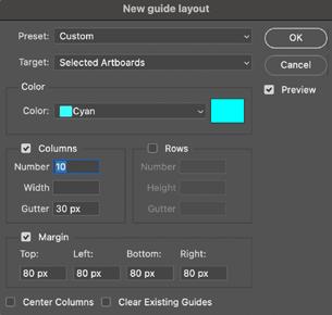
To insert a grid, go to :
View > Guides > New guide layout and input the settings given in Figure 1.
Margins
NO text/team logos should enter the ‘deadzone’ (Figure 2) of 80 pixels from the artboards edge. (Sat/Sun logos and account handles are an exception).
Background elements, e.g. Gradients and Black Lines are fine to enter this area.
See Section 08 (Brand Misuse) for further information/ examples.
The same grid & margins settings are also applicable for 1x1 assets.
Primary
Our primary typeface is Termina Demi, a typeface that can be used across multiple different languages.
We use Termina Demi for all titles in all uppercase. It is also used in subtitles to add emphasis on certain words (see next page).
Secondary
Our secondary typeface is a combination of Termina Demi and Termina Regular, once again in all uppercase . As mentioned above, Termina Demi should only be used to add emphasis, NOT for the whole subtitle.
Primary - Termina Demi
Tertiary
Where necessary, our tertiary typeface is Termina Light, and again is in all uppercase. The most common use for it is for team names when in combination with Sub Titles (see next page). If not being paired with a sub title the secondary typeface rules should be used instead.
Secondary - Termina Demi & Regular
Tertiary - Termina Light
Hierarchy
Hierarchy is an organizational system that arranges design elements in ranking of importance. Our hierarchy and the rules that come with it can be found opposite.
Leading
Leading is the space in between lines of text. Rules can be found opposite for how it should be used across our branding.
Tracking
This is the space between individual letters of a whole word. Rules can be found opposite for how it should be used across our branding.
Alignment
Refers to the way in which we arrange the text on a page. Type across our branding should NEVER be right aligned. It affects readability too much, especially across smaller copy, e.g quotations.
With Tampa, I was in Stockholm in 2019 and I saw how much how much it meant to Victor Hedman, my good friend, so I was always thinking it would be cool to play in the Czech Republic, NHL, where my family can see me, my friends, and just to get that feeling of playing an NHL game in Prague.
Core Colours
We have two colours that make up our core colour palette.
In relation to templates, ‘White Smoke’ should only ever be used as a background colour. ‘Eerie Black’ is then used for the rest of the elements that require the use of colour outside of gradients (type, black lines, account handles, etc).
The brand follows a sleek, clean look & feel. In this instance, white brings simplicity and clarity, while black adds boldness and depth. Together, they create a minimalist aesthetic that is versatile and impactful, enhancing readability and allowing other design elements to stand out, resulting in a memorable and elegant brand identity.
Each market has their own set of gradients. One dark, one mid and one light.
The gradients have introduced to give each market it’s own identity, and develop each brand as their own.
No priority is given to any of the 3, as long as balance is kept, they compliment the brand, and do not look too disruptive.
Gradients can be downloaded here.
To install to Photoshop:
Download File > Open Photoshop > Window > Gradients > = (Burger Menu/Options) >
Import Gradients > Select Downloaded File
Alternatively, all gradients follow these presets:
Gradient Fill:
Style = Linear
Angle = Match template style
Scale = 100%
Reverse = No
Dither = Yes
Align with layer = Yes
Method = Smooth
Gradient Editor:
Type = Solid
Smoothness = 100%
Left Colour = Market Specific
Left Colour Opacity = 100%
Left Colour Location = 0
Right Colour = #F5F5F5
Right Colour Opacity = 100%
Right Colour Location = 80
Czech Gradient Dark
Each market has their own set of gradients. One dark, one mid and one light.
The gradients have introduced to give each market it’s own identity, and develop each brand as their own.
No priority is given to any of the 3, as long as balance is kept, they compliment the brand, and do not look too disruptive.
Gradients can be downloaded here.
To install to Photoshop:
Download File > Open Photoshop > Window > Gradients > = (Burger Menu/Options) >
Import Gradients > Select Downloaded File
Alternatively, all gradients follow these presets:
Gradient Fill:
Style = Linear
Angle = Match template style
Scale = 100%
Reverse = No
Dither = Yes
Align with layer = Yes
Method = Smooth
Czech Gradient Light
Spanish Gradient Dark
Gradient Editor:
Type = Solid
Smoothness = 100%
Left Colour = Market Specific
Left Colour Opacity = 100%
Left Colour Location = 0
Right Colour = #F5F5F5
Right Colour Opacity = 100%
Right Colour Location = 80
Finland Gradient Dark
Individual Markets
Each market has their own set of gradients. One dark, one mid and one light.
The gradients have introduced to give each market it’s own identity, and develop each brand as their own.
No priority is given to any of the 3, as long as balance is kept, they compliment the brand, and do not look too disruptive.
Gradients can be downloaded here.
To install to Photoshop:
Download File > Open Photoshop > Window >
Gradients > = (Burger Menu/Options) >
Import Gradients > Select Downloaded File
Alternatively, all gradients follow these presets:
Gradient Fill:
Style = Linear
Angle = Match template style
Scale = 100%
Reverse = No
Dither = Yes
Align with layer = Yes
Method = Smooth
Finland Gradient Light
#CCCCCC
Germany Gradient Dark
Gradient Editor:
Type = Solid
Smoothness = 100%
Left Colour = Market Specific
Left Colour Opacity = 100%
Left Colour Location = 0
Right Colour = #F5F5F5
Right Colour Opacity = 100%
Right Colour Location = 80
Germany Gradient Light
Sweden Gradient Dark
Each market has their own set of gradients. One dark, one mid and one light.
The gradients have introduced to give each market it’s own identity, and develop each brand as their own.
No priority is given to any of the 3, as long as balance is kept, they compliment the brand, and do not look too disruptive.
Gradients can be downloaded here.
To install to Photoshop:
Download File > Open Photoshop > Window >
Gradients > = (Burger Menu/Options) >
Import Gradients > Select Downloaded File
Alternatively, all gradients follow these presets:
Gradient Fill:
Style = Linear
Angle = Match template style
Scale = 100%
Reverse = No
Dither = Yes
Align with layer = Yes
Method = Smooth
Sweden Gradient Light RGB 204 204 204
19 15 16 0
#CCCCCC
Swiss Gradient Dark
RGB 182 0 12
Gradient Editor:
Type = Solid
Smoothness = 100%
Left Colour = Market Specific
Left Colour Opacity = 100%
Left Colour Location = 0
Right Colour = #F5F5F5
Right Colour Opacity = 100%
Right Colour Location = 80
Swiss Gradient Light
All team logo & swatches are accessible from the links below. There will be others that are available in the style guides, but where possible, please use the colour/logo combinations that are represented on this page when used as backgrounds.
(If required, access Individual Team Style Guides for dark/light background variations)
Anaheim Ducks
Access Style Guide Here
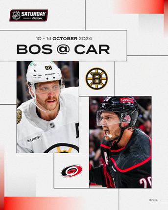
Boston Bruins Access Style Guide Here
Buffalo Sabres Access Style Guide Here
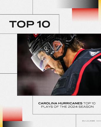
Carolina Hurricanes Access Style Guide Here
Columbus Blue Jackets
Style Guide Here
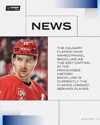
Calgary Flames
Style Guide Here
Chicago Blackhawks
Style Guide Here
Colorado Avalanche
Style Guide Here

Dallas Stars Access Style Guide Here

Detroit Red Wings
Style Guide Here
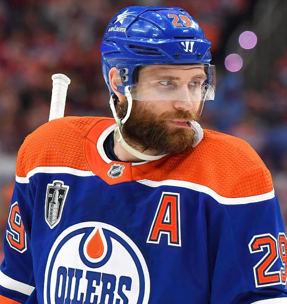
Edmonton Oilers
Style Guide Here
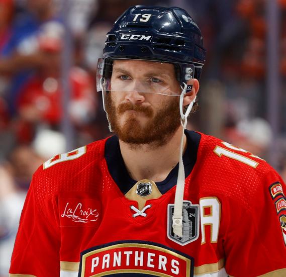
Florida Panthers
Style Guide Here
Los Angeles Kings
Style Guide Here
Minnesota Wild
Style Guide Here
Montreal Canadians
Style Guide Here
New Jersey Devils
Style Guide Here


All team logo & swatches are accessible from the links below. There will be others that are available in the style guides, but where possible, please use the colour/logo combinations that are represented on this page when used as backgrounds.
(If required, access Individual Team Style Guides for dark/light background variations)
Nashville Predators
Access Style Guide Here
New York Islanders
Access Style Guide Here
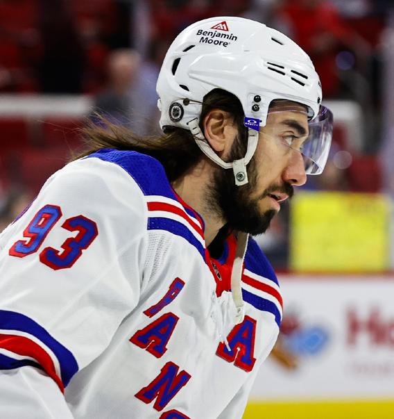
New York Rangers
Access Style Guide Here
Ottawa Senators
Access Style Guide Here
Philadelphia Flyers
Access Style Guide Here
Pittsburgh Penguins
Access Style Guide Here
Seattle Kraken
Access Style Guide Here
San Jose Sharks
Access Style Guide Here
St Louis Blues
Access Style Guide Here
Tampa Bay Lightning
Access Style Guide Here
Toronto Maple Leafs
Access Style Guide Here
Utah Hockey Club
Access Style Guide Here
Vancouver Canucks
Access Style Guide Here
Vegas Golden Knights
Access Style Guide Here
Winnipeg Jets
Access Style Guide Here
Washington Capitals Access Style Guide Here
Utah Hockey Club
Has replaced Arizona Coyotes. Completely new logo set and brand for this season has been introduced.
Anaheim Ducks
Introduce a whole new set of branding, which is a “callback to the Ducks’ roots, giving a modern flair by concentrating more orange into it”
Los Angeles Kings
Like the Ducks, the Kings have also had a complete rebrand. Their new primary mark contains “core elements from the club’s 90s era and original crown from the team’s inception in 1967.”
“Additionally, the club have introduced new word marks, brand font and updated colour palette, which features a new “enhanced silver,”
Boston Bruins
For this season, Boston have reverted back to their core logo, after using the anniversary crest last year.
Please familiarise yourself with their style guide for any other changes.
Team logos should always be enclosed within a 205px x 205px box. Within this box, logos should then be kept a safe distance of 40px away from the edge on all sides. If a logo is vertical, then it should only be extended to meet the 40px edge vertically (see Kraken example for clearer visualisation).
Special considerations have to be made for horizontal logos, as seen by the Kings, Capitals and Stars logos opposite. The 40px safe zone is too small for them, as they become unreadable. Therefore, for these logos ONLY the horizontal safe zone distance is reduced to 20px, instead of 40px. Vertical safe zone distance stays at 40px.
Home Team
Unless stated otherwise in a brief, home teams will always play in their ‘Home’ jersey.
This is always their full colour variation, but as some teams have multiple full coloured jersey styles, please access the site below to identify the appropriate one for each team.
As seen opposite, Dallas are the home team, and therefore play in their green ‘home’ jersey.
Away Team
Unless stated otherwise in a brief, away teams will always play in their ‘Away’ jersey.
This is always their white variation.
As seen opposite, Edmonton are the away team, and therefore play in their white jersey.
Jersey Colours
To see details of what jerseys each team play in visit: NHLuniforms.com OR
Relevant teams Style Guide found here
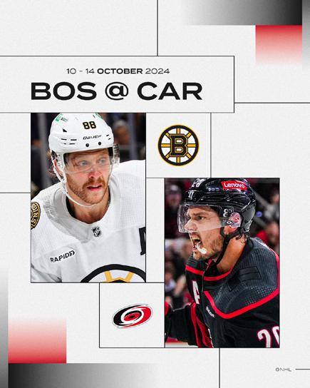
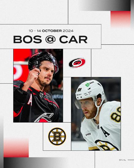
Figures 1–6 illustrate the various sizes available for use with imagery. If two images are required on the canvas (see Figures 1–3), never use full-length shots. Both players should also be the same size.
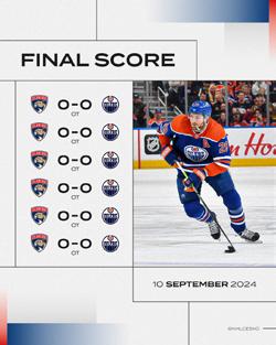
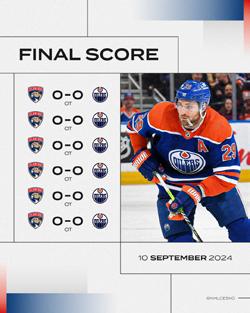
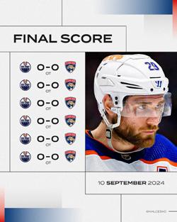
If only one player is present on the canvas, full-length shots may be used (see Figure 4).
Do not make images too large, as this can result in parts of the players being cropped out of the frame (see Figures 7–9 for examples).
Eye-gazing direction (2 players)
If two players are on the canvas, their eyes should always be directed towards each other. Therefore, both players should be facing the centre of the canvas.
Eye-gazing direction (1 player)
If there is only one player on the canvas, you may choose the direction they face. However, consider the balance of the canvas when making your decision.
Incorrect use (Figures 7-9)
Fig 7:
Players too small - shouldn’t be full length for 2 player GFX. Players are 2 different proportions - need to be roughly the same.
Fig 8:
Players positioned too high, too cropped. Facing the wrong direction for 2 player GFX. Should be facing each other.
Fig 9:
Too zoomed in, meaning they are cropped too much.
Figure 1 - 6
Correct use examples
Figure 7 - 9
Incorrect use examples


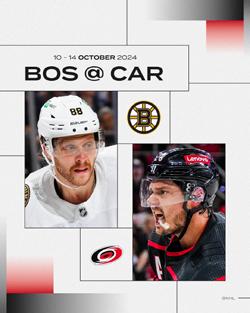
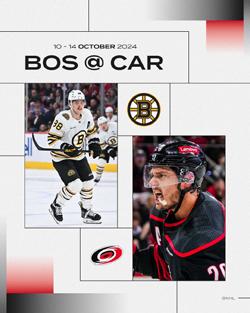

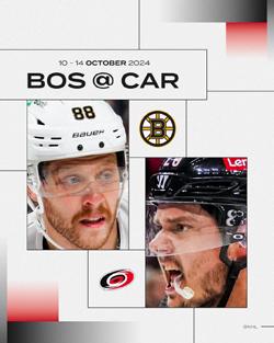
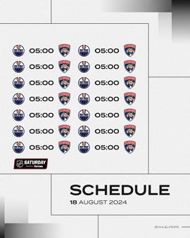
Away teams should always be on the left side of a graphic, and home teams on the right.
If in a vertical format, away teams should be on top, home teams below.
Match ups should follow the same format, with the away team being written first, followed by the home team.
e.g.
This year, we are relaxing restrictions on the use of imagery featuring players without their chinstraps attached or with their mouthguards hanging from their mouths. As a result, a wider range of imagery will now be permissible.
However, common sense must still be applied when selecting images. For example, images where a player is at an unflattering angle, not looking their best, or where team branding is compromised should still be avoided.
Despite the relaxing of restrictions surrounding chinstraps, players must still be wearing their helmet in imagery.
Under no circumstances can images be used where a player is not wearing a helmet.

Placements
SAT/SUN logos should only ever sit in the top left and top right corners, and must be contained within their own box.
Their position is decided based on which corners the market gradients are in.
E.G. If the market gradients are in the top right of the canvas, the SAT/SUN logos should be positioned in the top left corner.
Safe Zones
Logos must be at least 60px from the nearest corner. For a top-left logo, it should be 60px from both the left and top edges.
The minimum safe zone is 60px from all edges (Figure 1).
Only one edge of the logo box may be extended if needed (Figure 2: logo top left, right edge extended; Figure 3: logo top left, bottom edge extended).
These rules also apply to both NHL SAT/SUN logos.
When positioned in the top right the same rules apply, but flipped.
Whilst figures detail 4x5 examples, these guidelines/rules are also applicable for 1x1 assets.
Examples in use can be found on the next page.

Good Use
Examples of the SAT/SUN logos being used correctly can be seen in Figures 1-3.
An example of all the variations is given.
Figure 1 = Minimum Safe Zone
Figure 2 = Right Edge Extended
Figure 3 = Bottom Edge Extended
Bad Use
Figure 4 shows the Minimum Safe Zone not being adhered to on the bottom edge.
This is NEVER acceptable. The minimum 60 pixels safe distance must be adhered to in all instances.

Placements
Account handles should only ever sit in the bottom left and bottom right corners, and must be contained within their own box.
Their position is decided based on which corners the market gradients are in.
E.G. If the market gradients are in the bottom left of the canvas, the account handles should be positioned in the bottom right corner.
Safe Zones
Handles should be positioned at least 60px from the nearest corner. For example, a logo in the bottom right must be 60px from both the right and bottom edges.
The minimum safe zone is 60px from all edges (Figure 1).
Unlike the SAT/SUN logo boxes, the edges of the handle box can be extended to enhance balance and composition. Figure 2 shows the left edge extended for a bottom-right handle, while Figure 3 shows the top edge extended.
These rules apply to all account handles.
When positioned in the bottom left the same rules apply, but flipped.
Whilst figures detail 4x5 examples, these guidelines are also applicable for 1x1 assets.
Examples in use can be found on the next page.
Placements
Placement
Examples of the account handles being used correctly can be seen in Figures 1-3.
An example of three different variations is given.
Figure 1 = Minimum Safe Zone
Figure 2 = Left Edge Extended
Figure 3 = Double Extended Safe Zone
These account handles are positioned in the bottom right corner. As mentioned on the previous page, if the account handles need to sit in the bottom left corner, the same rules apply, but flipped.
Figure 4 shows the Minimum Safe Zone not being adhered to on the top edge.
This is NEVER acceptable. The minimum 60 pixels safe distance must be adhered to in all instances.

This section shows common mistakes, with examples of where the brand is used incorrectly.
Figure 1.
Do not have floating boxes. Lines should at least connect to another box.
Figure 2.
Do not position boxes to overlap gradients. Leave breathing room.
Figure 3.
Don’t overcrowd the canvas with unnecessary boxes.
Figure 4.
Never use solid fills on boxes, unless matching the background colour or team colours (where applicable).
Figure 5.
Text and team logos must always be inside the 80 pixel margins.
Figure 6.
Gradients should never overcrowd the canvas.
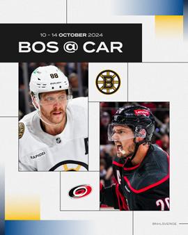
Figure 1.
Type must adhere to the safe zone guidelines.
Figure 2.
Type must adhere to the hierarchy guidelines
Figure 3.
Type must adhere to the sizing guidelines.
Figure 4.
Type must adhere to the primary/secondary/tertiary styling.
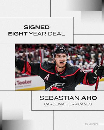
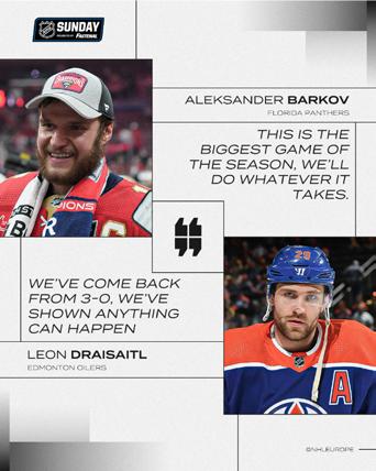
Figure 1.
Don’t overlap image boxes.
Figure 2.
Don’t overlap black line boxes over images.
Figure 3.
Designs with 2 players on should face each other.
Figure 4.
Image sizes should be the same proportion.

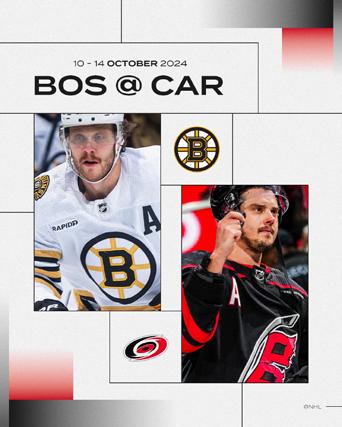

Figure 1.
Sat/Sun logos should always have a minimum 60px safe zone.
Figure 2.
Sat/Sun logos, if needed, should only have one extended edge.
Figure 3.
Account handles should always have a minimum 60px safe zone.
Figure 4.
SAT/SUN logos should only ever be in the top right/top left corners.
Figure 5.
Account handles should only ever be in the bottom right/bottom left corners.
Figure 6.
Account handles & SAT/SUN logos must be contained in a box on their own.
For any questions regarding the brand guidelines, please contact:
rebecca.thomson@img.com milli.thornton@img.com fie.adolfsen@img.com david.brake@img.com