
Brand Guidelines. V1.02 - 16.02.24
Contents.
Introduction.
A helpful guide
Our Brand.
Our promise
Positioning statement
Our personality
Our values
USP/ESP
Brand pyramid
Visual Identity.
Our logo journey
Logotype
Logo usage
Core colours
Photographic Style.
Photographic style
Photography dos and don’ts
Typography.
and
and paragraph
Brand Activation. Activation Activation our blue dots Our ‘m’ icon Eshot Website 03 05 06 07 08 09 10 12 13 15 17 19 20 23 24 25 27 28 29 30 31
Brand typography Body copy
weights Character
styles
A Helpful Guide.

This document has been developed to help you understand the thinking behind our brand, its values, our vision and how to apply it.
These guidelines are here to help you capture our brand story and enable you to incorporate the essence of Movar and what it means to people within their individual role. Let’s do this in an engaging and meaningful way. Above all let’s be true to our belief of being big enough to deliver, small enought to care
What people outside of our organisation see and hear about us is important. The brand and its name should reflect positive, clear, jargon free communications at all times.
The staff and customers we support are natural ambassadors of our brand and they are the ones who also need to feel that our name is being expressed in the right way.
If we shout proudly of who we are and what we stand for we will appeal to more people in more ways.
3
Our Brand.

4
Our Promise.
Our trusted team works with clients to quickly unearth their pain points and better understand their objectives in order to deliver reliable, cost effective solutions leaving them reassured and empowered.
5
Positioning Statement.
We’re ambitious and curious lateral thinkers, committed to delivering unrivalled value for clients across the globe by utilising a powerful combination of traditional experience and digital expertise.
6
Our Personality.
Dependability is at our core, and our friendly, approachable, inspiring team delivers positive outcomes with passion, empathy and integrity.
7
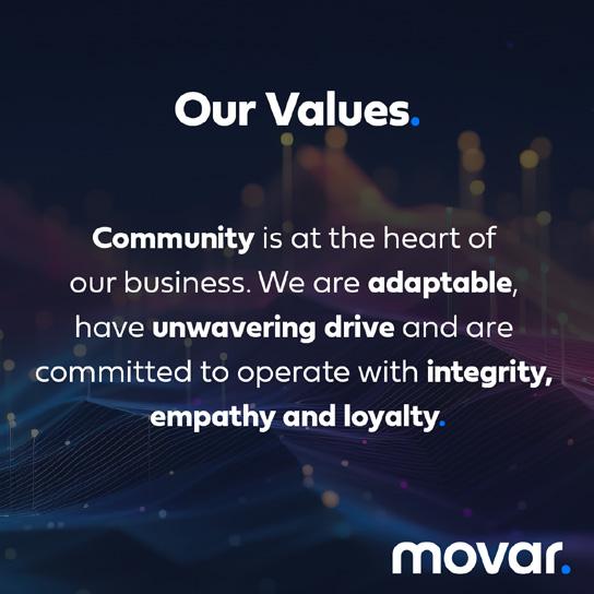
Our Values.
Community is at the heart of our business. We are adaptable, have unwavering drive and are committed to operate with integrity, empathy and loyalty.
8
USP/ESP.
We’re fresh thinking, global problem solvers. Equipped to tailor our approach for each clients unique challenges with a cost-effective blend of traditional know-how and technical expertise to guarantee your success.
9
Brand Pyramid.
Our Promise
Our trusted team works with clients to quickly unearth their pain points and better understand their objectives in order to deliver reliable, cost effective solutions leaving them reassured and empowered.
Positioning Statement
Our Personality
Our Values
We’re ambitious and curious lateral thinkers, committed to delivering unrivalled value for clients across the globe by utilising a powerful combination of traditional experience and digital expertise.
Dependability is at our core, and our friendly, approachable, inspiring team delivers positive outcomes with passion, empathy and integrity.
Community is at the heart of our business. We are adaptable,have unwavering drive and are committed to operate with integrity, empathy and loyalty.
We're fresh thinking, global problem solvers. Equipped to tailor our approach for each clients unique challenges with a cost-effective blend of traditional know-how and technical expertise to guarantee your success.
USP/ESP
10

Visual Identity.
11
Our Logo Journey.
a logo is inspired directly by the values and personality
Movar (verb).
(transitive) to move, set in motion, propel
Kerning of letter spacing brought closer signifying working together as a team
Arches are one of the most prolific shapes in construction
Soft, even, rounded curves through the font relect being friendly and approachable
Perfectly round “o” and “a” are shapes also often found in construction
Original font is called “fieldwork”
“...Traditional experience and digital expertise”
Traditional font style with a modern treatment
Ultimately, once you have completed your journey with Movar, your project is completed sucessfully - we deliver
Vibrant touch of blue brings in the corporate colour that can be activated throughout website and branded collateral
Rebounding “V” symbolises Movars ability to turn a project around
12
Our Logo.
13
Our Logo.
Protection area
In order to ensure the integrity of the brand, no graphic or text elements should overlap inside the safe zone.
The blue stripped area indicates the safe zone. Other graphical and visual elements can be safely positioned up to the adjoining blue area. The blue area must be kept free of all other graphical and visual elements.
The minimum required clear space is defined by the measurement of the ‘O’ from Movar within the logo.
Minimum size
The minimum size of the logo should never be below 35mm wide and must be scaled maintaining aspect ratio when enlarged/decreased in size at all times.
When developing digital designs, the minimum size of the logo should never be below 200 px to ensure clarity and readability.
Protection area
Minimum size
Print: 35mm
Digital: 200px
14
Logo Usage.
Colour variation and their correct use
There are two simple versions of the logo.
One dark verision to be used on white/light backgrouds.
One light version to be used on black/dark backgrounds. Whenever possible, this light version should be used with our ‘Midnight Blue’ background - see page 18
15
Logo Usage.
Dos and don’ts
Please treat our logo with love and care.
We have spent a long time developing our logo so that it looks its very best. Please do not harm our logo with any of the examples featured here.
Do not change to o -brand colours
Never
Do
Do
16
skew, or distort in
way
not crop logo
Do not tilt,
any
Do
Experience the di erence.
not use within a sentence
Do not outline the logo
Do not use without the signature blue dot
squish or stretch the logo
not use dark on dark or light on light when using overlayed with any colour/image
Core Colours.
At the heart of our brand identity are two core colours
- Midnight Blue, and Electric Blue. Midnight Blue may be used as a background colour while Electric Blue should only ever be used as a highlight, call out or CTA. We don’t use black, always Midnight Blue.
Pantone colours
Spot colours should only be used in very specific application and only our core colours. Please contact the marketing team if you have specific requests.
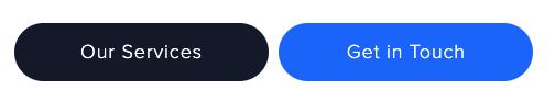
CTA colours
The CTA Cool, and CTA Hot colours referenced should predominantly only be used in digital applications.
As the names infer, general calls to action should use our CTA cool, and dominant calls to action should use our CTA hot.
Midnight Blue
Pantone: 282C
CMYK: 100, 85, 50, 65
RGB: 19, 27, 48
HEX: #131b30
Electric Blue
Pantone: 293C
CMYK: 100, 30, 0, 0
RGB: 0, 115, 255
HEX: #0073ff
17
CTA Cool
CTA Hot
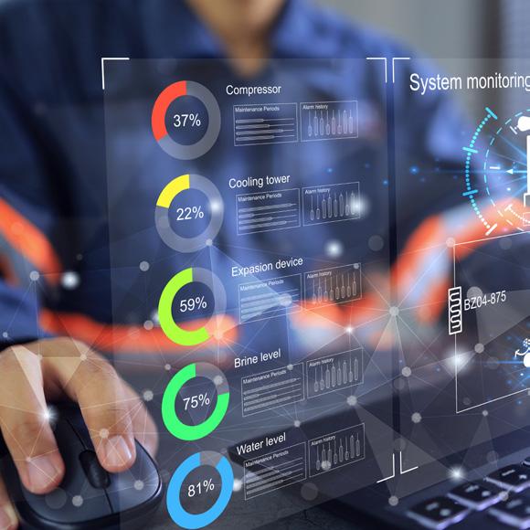
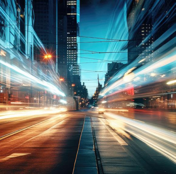
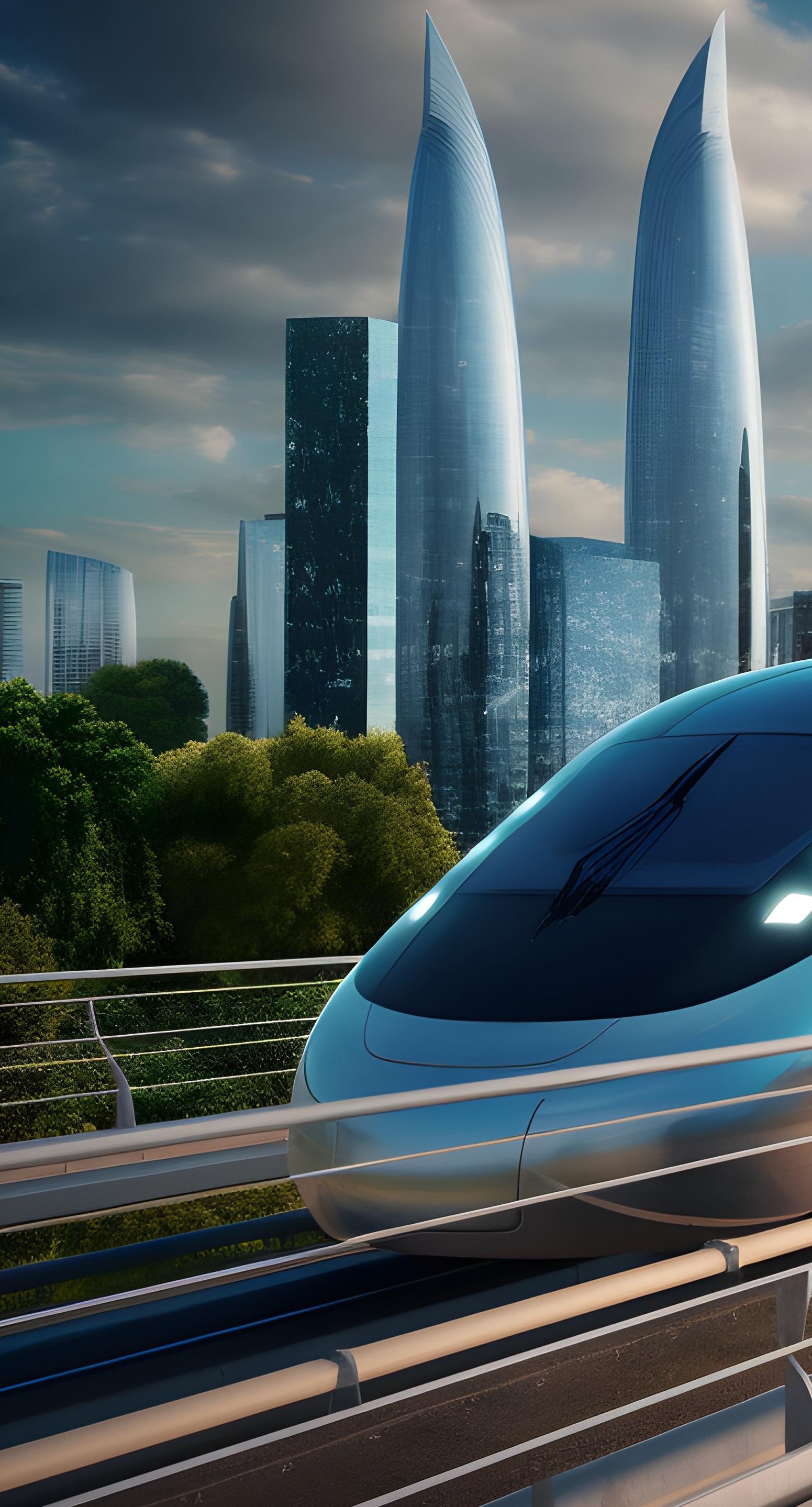
Imagery Style.
4 18
Photographic Style.
We all know that a 1000 words can be expressed in a single picture alone.
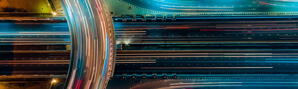
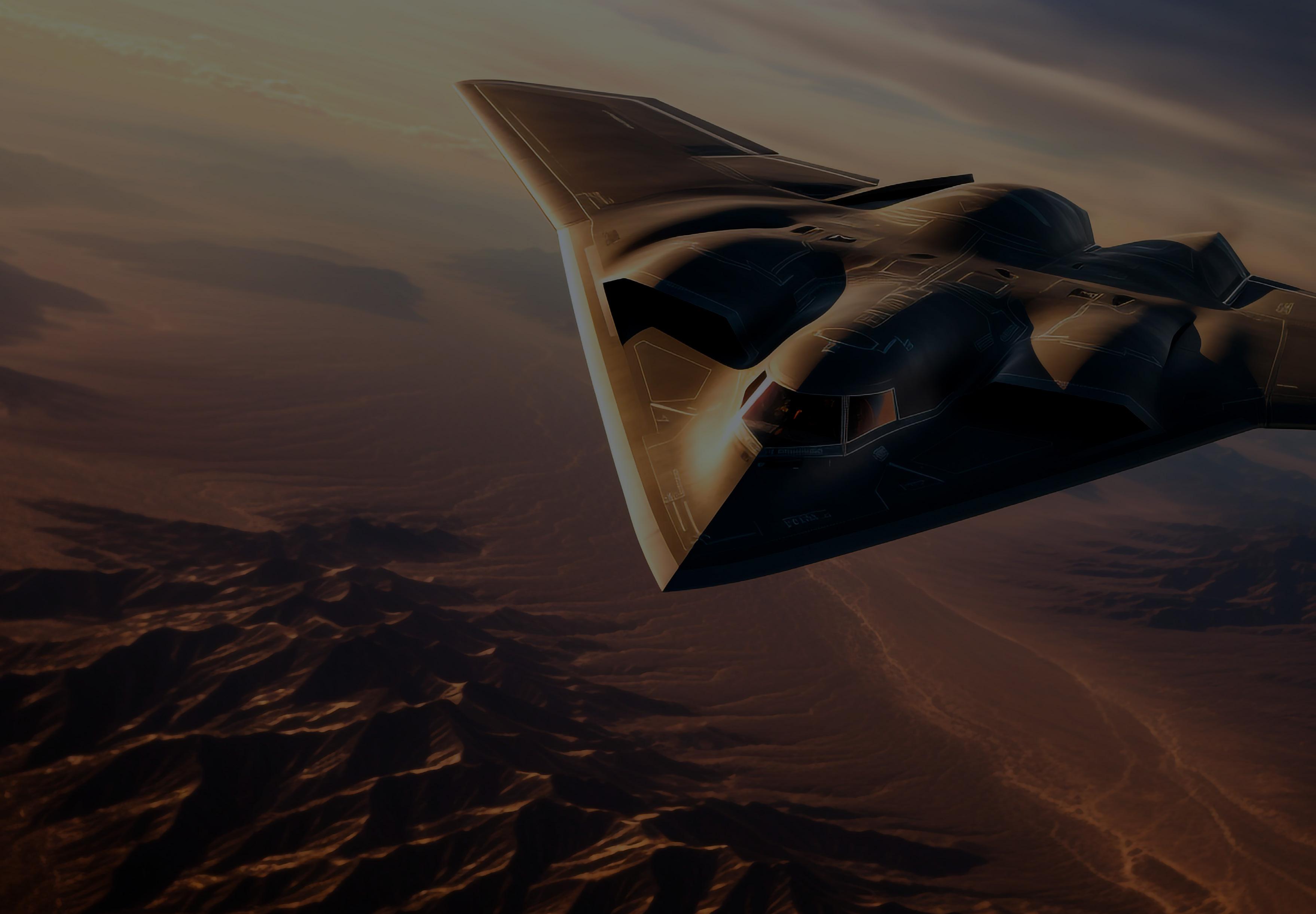
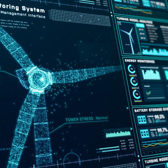
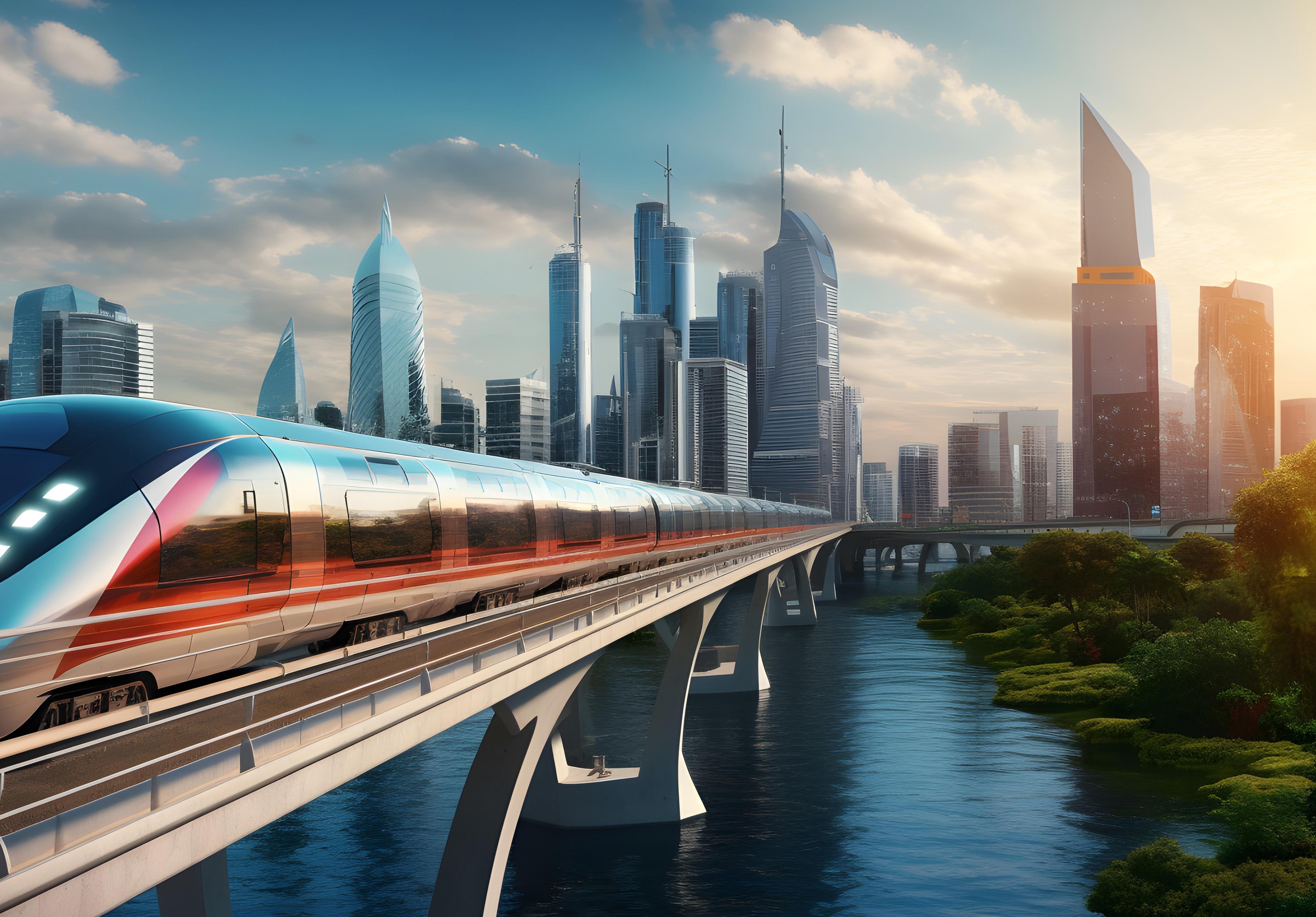
The way we use imagery within our brand story is very important. We encourage you to use technical, systems and process driven photography that resonates with our market positioning of having ‘traditional experience and digital expertise’. Where possible try to consider our values when selecting photograhy: community, adaptability, unwavering drive, integrity, empathy and loyalty.
Where using people in our photography we focus on a collaborative teamwork or technical expertise style. Landscapes and cityscapes should always be inspiring and portray movement and not be dull.


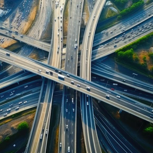


5 19
Photography Dos And Don’ts.
DO
As much as possible, try to use photography that has an element of movement
Try to use technical, systems and process driven photography
If using landscapes and cityscapes, ensure they are inspiring and portray movement
Images including people should not look forced or staged
If using people, ensure they are interacting together
Show images that are clear and have a simple but impactful meaning
Generative AI photography is ok, as long as its not obviously AI
DON’T
Show negative imagery
Use ‘cheesy’ over the top stock photography
Use photography with people looking at the camera
Use generative AI that is clearly fake
Show images of people that you do not have permission to use
Be predictable, we are not just average
20
21

Typography.
4 22
Brand Typography.
For titles, headings and subheading, our chosen typeface is ‘Fieldwork’, and our body font is ‘Proxima Nova’.
Both of these fonts are professional, strong and verstile geometric sans style fonts and require a commercial license. They are available with any Creative Cloud subscription in addition to a number of online distributors.
If you are producing materials in-house, or are unable to obtain a license for the fonts outlined, our preferred replacement typefaces are ‘Montserrat’ for titles, headings and subheadings, and ‘Roboto’ for body copy. Both of which are widely available for download.
Headlines / Subheadings
Headlines should always be followed by our signature blue dot wherever possible. Subheadings should only be used when they follow a headline. Subheadings should always be in all lowercase.
Leading and tracking
Tracking should always be ‘0’. Leading (or lineheight) should always be at least 6pt+ from used font size. Ascenders and descenders should never overlap.
Headlines:
Headlines Should be Title Case Where Possible.
Our Signature Blue Dot Follows Headlines.
Subheadings:
subheadings follow headlines where required
they are intentionally all lowercase
5 23
Lowercase.
Body Copy And Weights.
Whether using our chosen core brand fonts or our recommended replacements, there are general rules that should be followed when it comes to body copy.
Tracking
Tracking should always be set to ‘0’.
Leading (lineheight)
Leading should always be set 6pt more than the size of copy you are using for legibility purposes. For example, if your copy is size 10pt, your leading should be 16pt.
Digital & Web
Where possible, please try to adhere as closely as possible to the print instructions above in terms of tracking and leading values.
Fieldwork
Bold
ABCDEFGHIJKLMNOPQRSTUVWXYZ
abcdefghijklmnopqrstuvwxyz
Bold italic
ABCDEFGHIJKLMNOPQRSTUVWXYZ
abcdefghijklmnopqrstuvwxyz
Light
ABCDEFGHIJKLMNOPQRSTUVWXYZ
abcdefghijklmnopqrstuvwxyz
Light italic
ABCDEFGHIJKLMNOPQRSTUVWXYZ
abcdefghijklmnopqrstuvwxyz
Proxima Nova
Regular
ABCDEFGHIJKLMNOPQRSTUVWXYZ
abcdefghijklmnopqrstuvwxyz
Italic
ABCDEFGHIJKLMNOPQRSTUVWXYZ
abcdefghijklmnopqrstuvwxyz
Bold
ABCDEFGHIJKLMNOPQRSTUVWXYZ
abcdefghijklmnopqrstuvwxyz
Bold italic
ABCDEFGHIJKLMNOPQRSTUVWXYZ
abcdefghijklmnopqrstuvwxyz
24
Character And Paragraph Styles.
Here is an example of how we use Fieldwork and Proxima Nova in context. The following formatting attributes are broken down into weights, sizes, leading and tracking.
Heading
Fieldwork Bold
Size: 26pt
Tracking: 0/auto
Leading: 32pt
Subheading
Fieldwork Light
Size: 18pt
Tracking: 0/auto
Leading: 24pt Body
Proxima Nova Regular
Size: 12pt
Tracking: 0/auto
Leading: 18pt
Scalable Delivery Solutions.
big enough to deliver, small enough to care
Our Digital Project Controls services, powered by cutting-edge data analytics, usher in a new era of project management excellence. We harness the power of data to provide unparalleled insights, enabling you to make informed decisions.
25

Brand Activation.
4 26
Activation Examples.
These are brand activation examples to show how the various elements of the brand are effectively utilised.
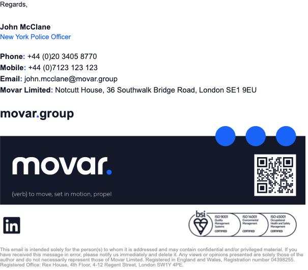
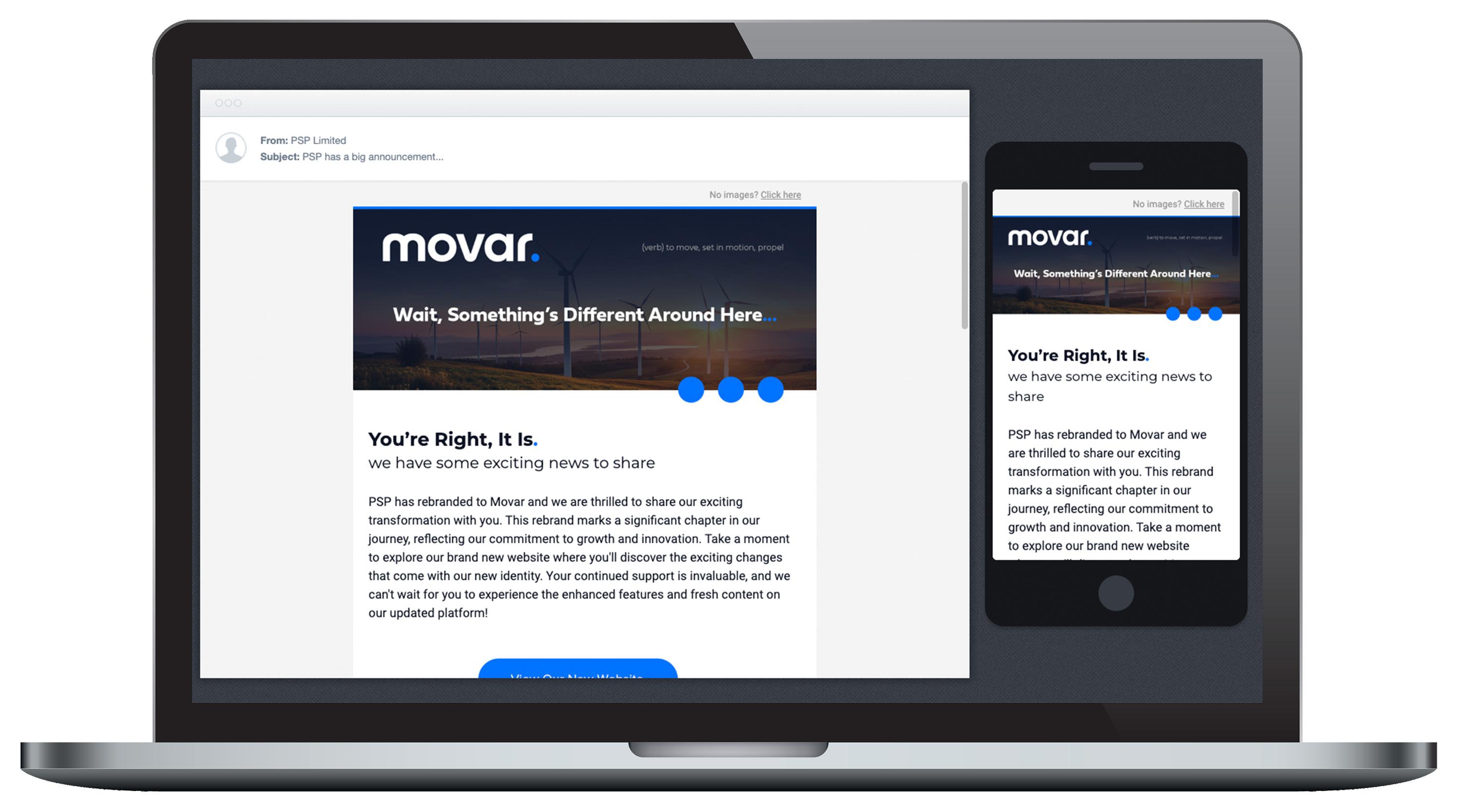
Email Signature:
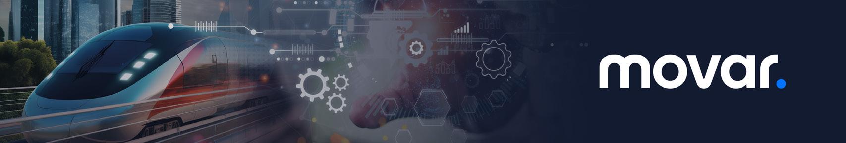
Social Banner:
Social Tiles:
5 27
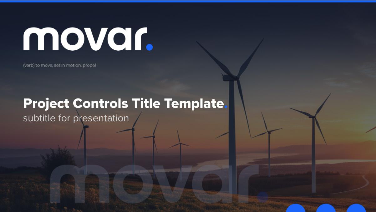
PPT Title Slide:
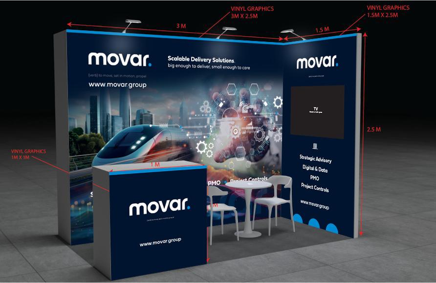
Exhibition Stand:
Activating Our Blue Dots.
Our three blue dots are used to represent the feeling of movement, always moving forward, continued relationships and continued progress in technology.
In a enclosed format such as a presentation slide, bid document, poster, brochure etc., the blue dots are activated in the bottom right corner of the enclosure with half of the dots bleeding off the document.
In a digital format such as a website or email campaign, we use the blue dots to complement various devisions of clear background transition. These can be positioned to the right or left but should never be centred.
28
Our ‘m’ Icon.
Occasionally there may be times that there is a need for a brand ‘icon’. our ‘m’ icon can be used to represent the brand in such circumstances as a WhatsApp group icon, a avitar icon, a social icon or a website favicon. This should be used in either its common or inverted style outlined.
Do not use this icon on it’s own to represent the brand. It should only be used in support of the main brand as a complementary icon.
29
Launch Eshot.
30
31
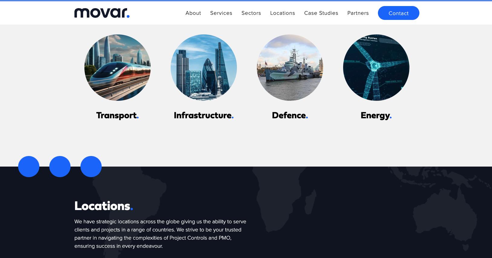
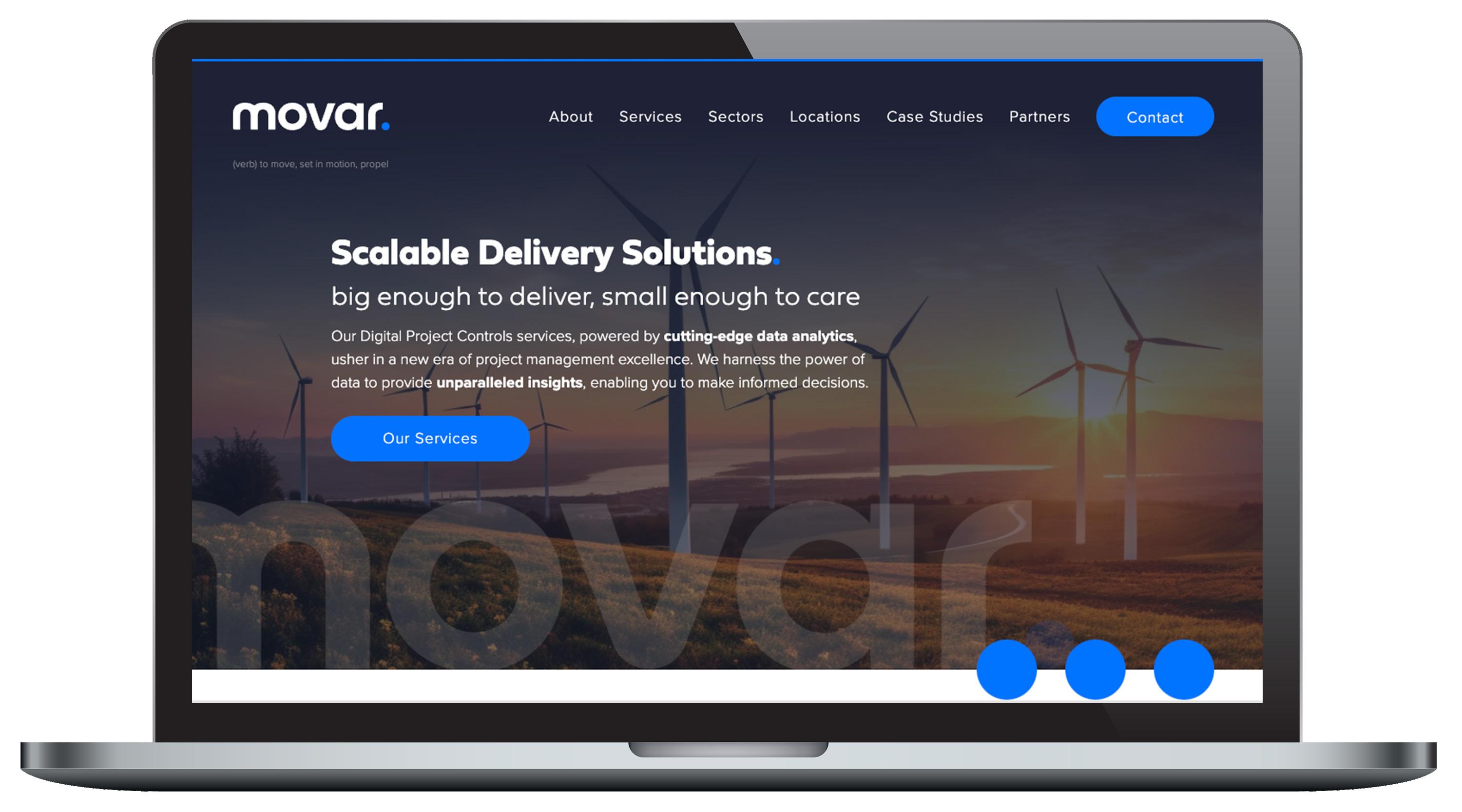
Website.

Movar Limited Brand Guidelines V1.02 - 16.02.24 Movar Group Limited is registered in England and Wales number: 04398255. VAT No: 793 7851 70. Registered Address: Notcutt House, 36 Southwark Bridge Road, London SE1 9EU Phone: +44 (0)20 3405 8770 Email: info@movar.group www.movar.group
