4 minute read
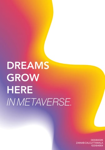
DESIGN PROJECT 2.


ARTEFACT: DESIGN BRIEF and STATEMENT
The design brief for project two was to design a digital artefact with which the users could engage with in the metaverse. After research and design development stages the magic pencil was chosen as the artefact for Anglicare Victoria in the metaverse. The magic pencil will help the audience engage, communicate, and get in touch with their feelings in the metaverse. The pencil will help the audience to express their emotions without being vocal about it.
Advertisement
Six emotions will be represented; joy, sad, disgust, love, fear, and anger. As everyone might not be comfortable expressing their feelings there will be a default pencil as well that will act as a neutral option. By introducing the magic pencil Anglicare can establish a safe space within the metaverse for all its users. Foster children and young adults require assurance and validation, and the magic pencil can prove to be a helpful tool in achieving these objectives.
OVERALL RESEARCH and STRATEGY
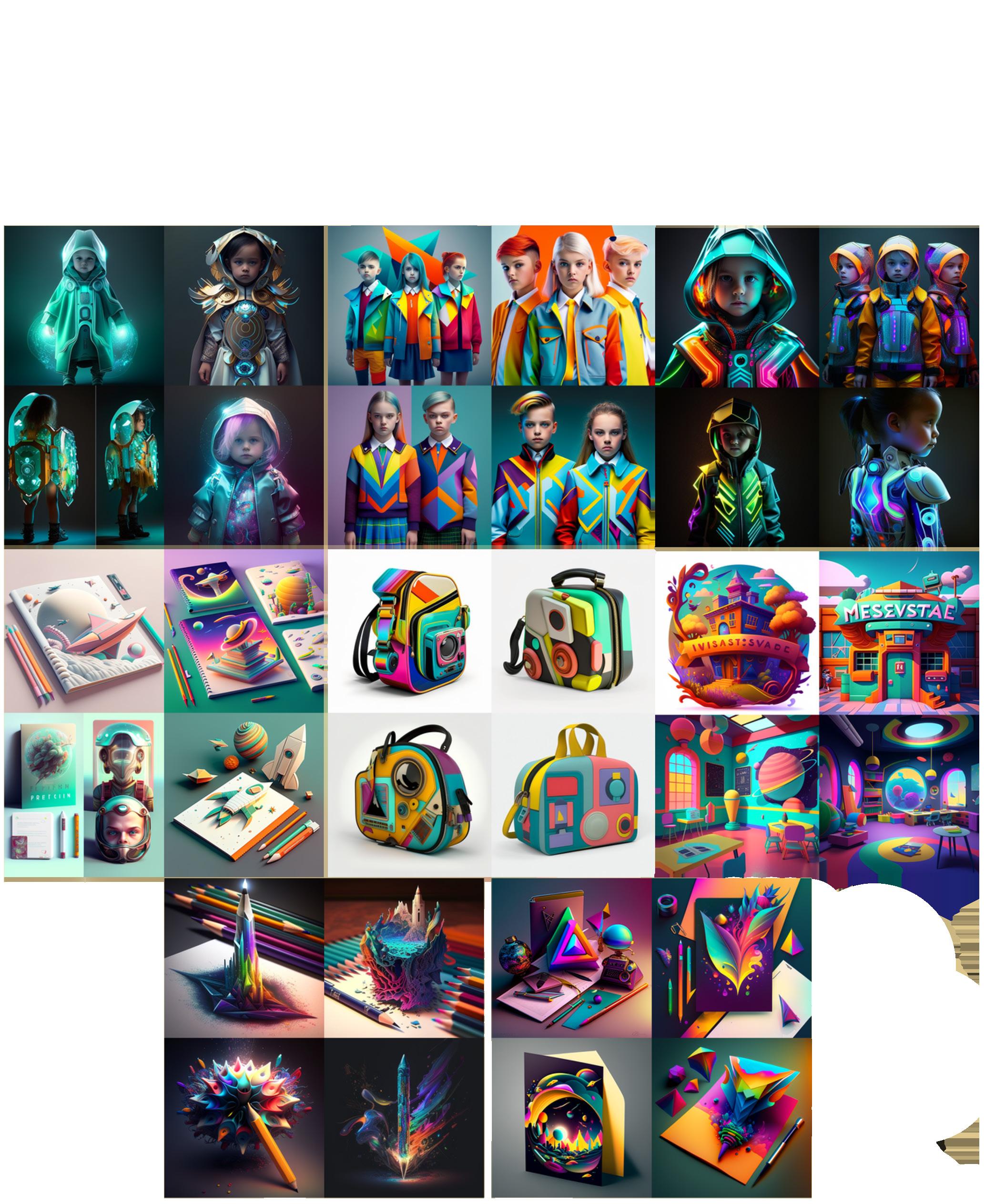
The research for the digital artefact was divided into two phases. In the first phase my team and I focused on generating images through Midjourney. In the second phase we focused more on personalising the artefact for the users and providing them with a more customisable experience in the metaverse. The strategy for the digital artefact was to help the users have a more unique and memorable experience in the metaverse. The motivation of the artefact was to encourage users to interact and engage more with others in the metaverse and have a personalised experience. The artefact was designed keeping in mind the three themes again as we wanted the users to know that their opinions are valued and can freely express themselves without any hesitation.
Findings Analysis

The research revolved around objects that would prove to be an interactive tool in the metaverse experience. Images were generated through Midjourney. The objects that we looked up as a potential artefact were school uniforms and educational items. The aim was to encourage engagement through the artefact. The artefact had to look friendly. Hence, we looked for objects that would be colourful and suitable for the target audience.
My team and I analysed school uniforms for the first artefact choice. School uniforms focused more on freedom and inclusivity. Through the use of various colours and style of clothes the themes were visible. But there was not much focus on the theme of growth.
The educational tools offered a range of options and were able to depict growth, freedom and inclusivity in multiple ways depending on the object selected and its use in the metaverse.
Insights Research Outcomes
After analysing the various options my team and I decided to go ahead with the educational tool and chose that as an option for the digital artefact. As it was a familiar, daily use item, there was a lot that we could do with using educational objects as an artefact. The objects would act as a multipurpose tool and would help us in promoting engagement and interactivity in the metaverse. Depending on the object we could provide customisable options as well.
PHASE 1: The phase one research outcomes were generated through Midjourney and were images of fashion and educational objects with a futuristic touch to it. The outfits had a very high-tech and modern look to it and represented the theme of inclusivity really well. The educational objects appeared magical and futuristic and represented all the themes in multiple ways because of its visual appearance.
image source: Midjourney
Graduation Cap
Design Process
The design process included the development of an educational object as a digital artefact. The options that my team explored were a graduation hat, magic pencil, and school bag. The graduation hat represented the themes of freedom and growth but as it was not a daily use item we found its relevancy and purpose less for the target audience.
The pencil managed to depict freedom, inclusivity, and growth and fulfilled these criterias in different ways. Freedom could be a form of expression, inclusivity could be in the form of note-sharing and growth as it is a daily use object in terms of education. The school bag represented growth in the form of independence but failed to depict freedom and inclusivity. Hence, we decided to further explore the magic pencil as an artefact in the metaverse.

Design Evaluation
The magic pencil depicted the themes of freedom and growth clearly in comparison to inclusivity. My team and I wanted to be more explicit in depicting inclusivity hence, we decided to provide the users with a personalised experience for the magic pencil.
The magic pencil would have different variations that would revolve around different emotions; default, sad, joy, and angry. The purpose of this was to make the users feel more welcomed and safe in the metaverse and allow them to express their feelings anonymously. Each colour would represent a specific emotion. Blue for sad, yellow for joy, and red for angry. If a user feels uncomfortable sharing their feelings a default pencil would be provided as well which would be represented by Anglicare Victoria’s brand colours. But using colours to express emotions was not an option that would really engage people according to the feedback recieved.

Why only colours can represent emotions?
PHASE 2: As the chosen artefact was a pencil my team did some further research about how we could give a more personalised and customisable experience to the user. We focused on emotions as our target audience is from the younger age group and we wanted them to feel like they are in a safe space. We tried representing emotions through colours but we wanted to explore further and hence we conducted research on Adobe Stock by looking up the words of each emotion. Several images that represented emotions in different ways rather than colours could be seen and proved to be helpful in developing the design further and making it more interactive for the target audience.

Final Design Outcomes

From the phase two research outcomes we came to a conclusion that emotions can be depicted in different ways other than colours. Hence, we decided to represent six emotions in an unique way for the user to engage with in the metaverse. Joy was represented using ribbons as a form of celebration, disgust through smell, fear through strom and lightning, love in the form of flowers, sad through tears, and angry though smoke/explosion.
For the users who feel uncomfortable sharing their emotions would be provided with a default pencil. The emotions would be hidden from the other users as the purpose of the magic pencil is to help each individual cope with their feelings and understand themselves better while being part of a safe sharing space in the metaverse. But for a personal oneon-one experience it would be visible to the teacher/mentor in the particular space.
image source: adobe stock