VISUAL DEVELOPMENT GUIDE
GR 604: The Nature of Identity
Yumo Wang // Spring 2024


GR 604: The Nature of Identity
Yumo Wang // Spring 2024


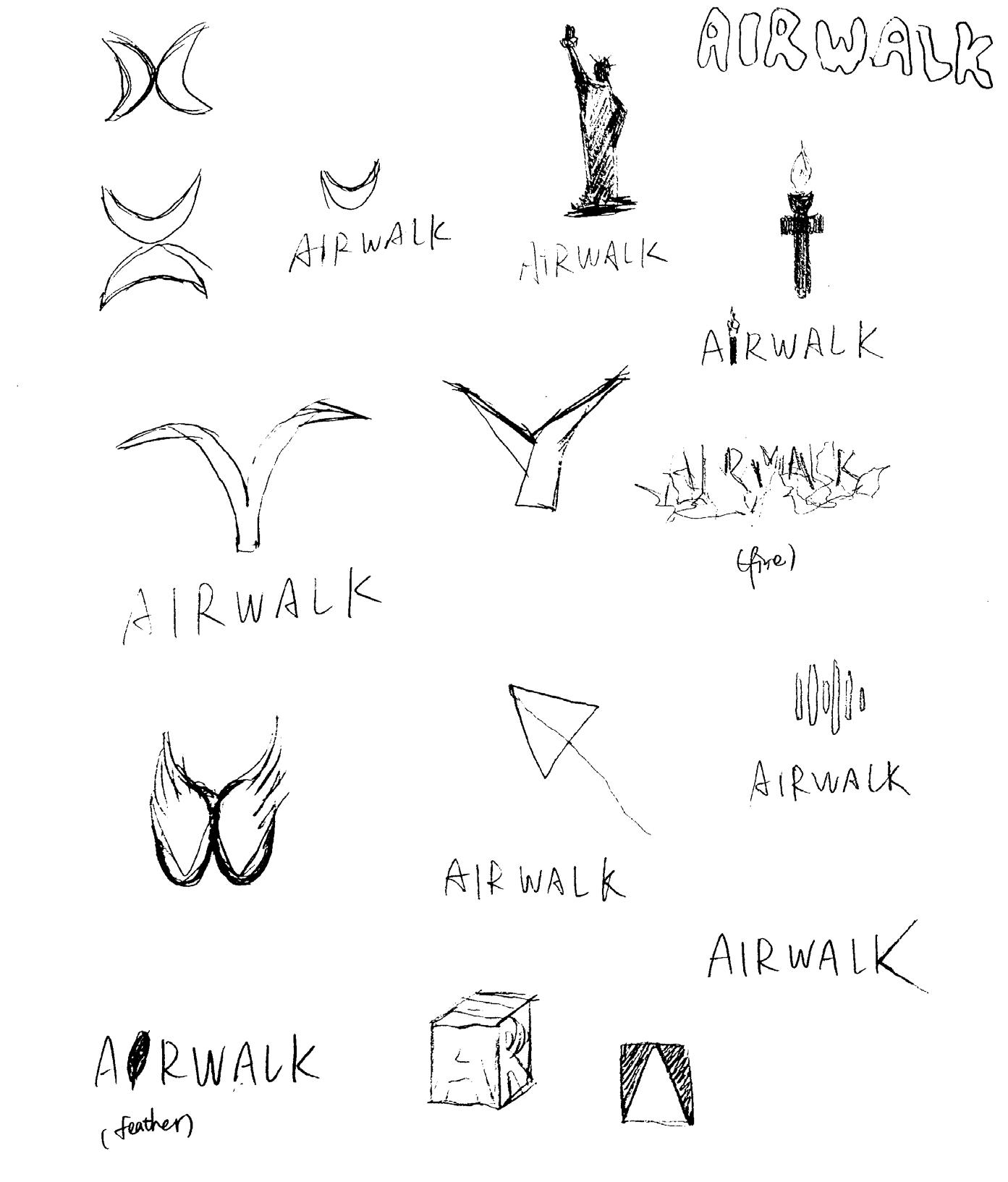
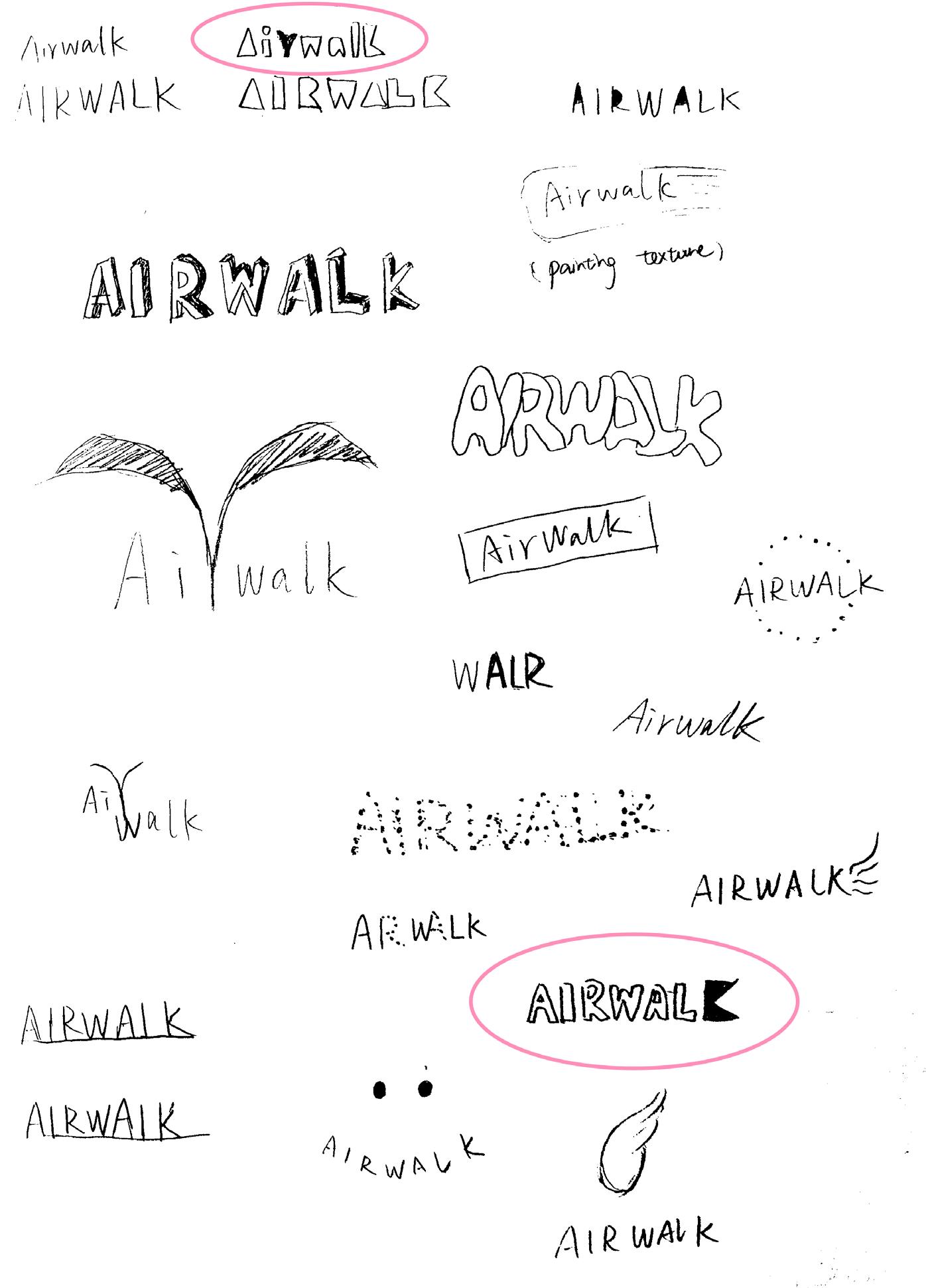
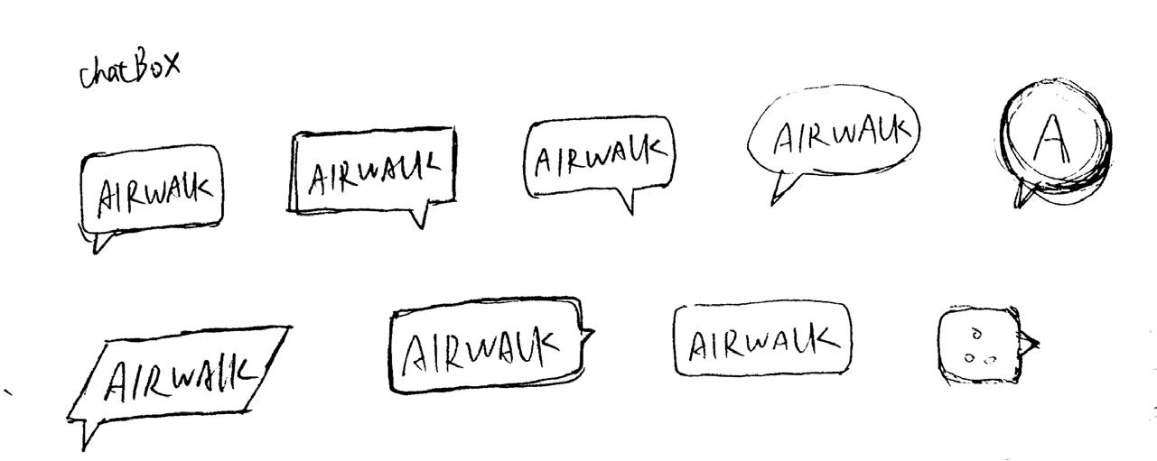
In the first round, we expanded the phrases based on the brand’s three keywords and drew 100 preliminary sketches for each phrase, covering three categories: symbols, graphics, and wordmarks. We then selected and refined the 10 most promising logo sketches for each phrase, for a total of 30 sketches.
Self-Expression Express yourself boldly and freely
In the mid-1990s, we were identified with what we stood for—irreverence and self-expression.
Passionate Excitedly engaged We are fueled by passion and progression, driven by people pushing innovation, supporting the scene, and taking risks.
Rebellious The independent way of thinking and acting We originate from defiance and unease, embodying a spirit of rebellion and independence.
Self-Expression Express yourself boldly and freely.
In the mid-1990s, we were identified with what we stood for—irreverence and self-expression.
Self-Expression Express yourself boldly and freely.
In the mid-1990s, we were identified with what we stood for—irreverence and self-expression.


Self-Expression Express yourself boldly and freely.
In the mid-1990s, we were identified with what we stood for—irreverence and self-expression.

Self-Expression Express yourself boldly and freely.
In the mid-1990s, we were identified with what we stood for—irreverence and self-expression.
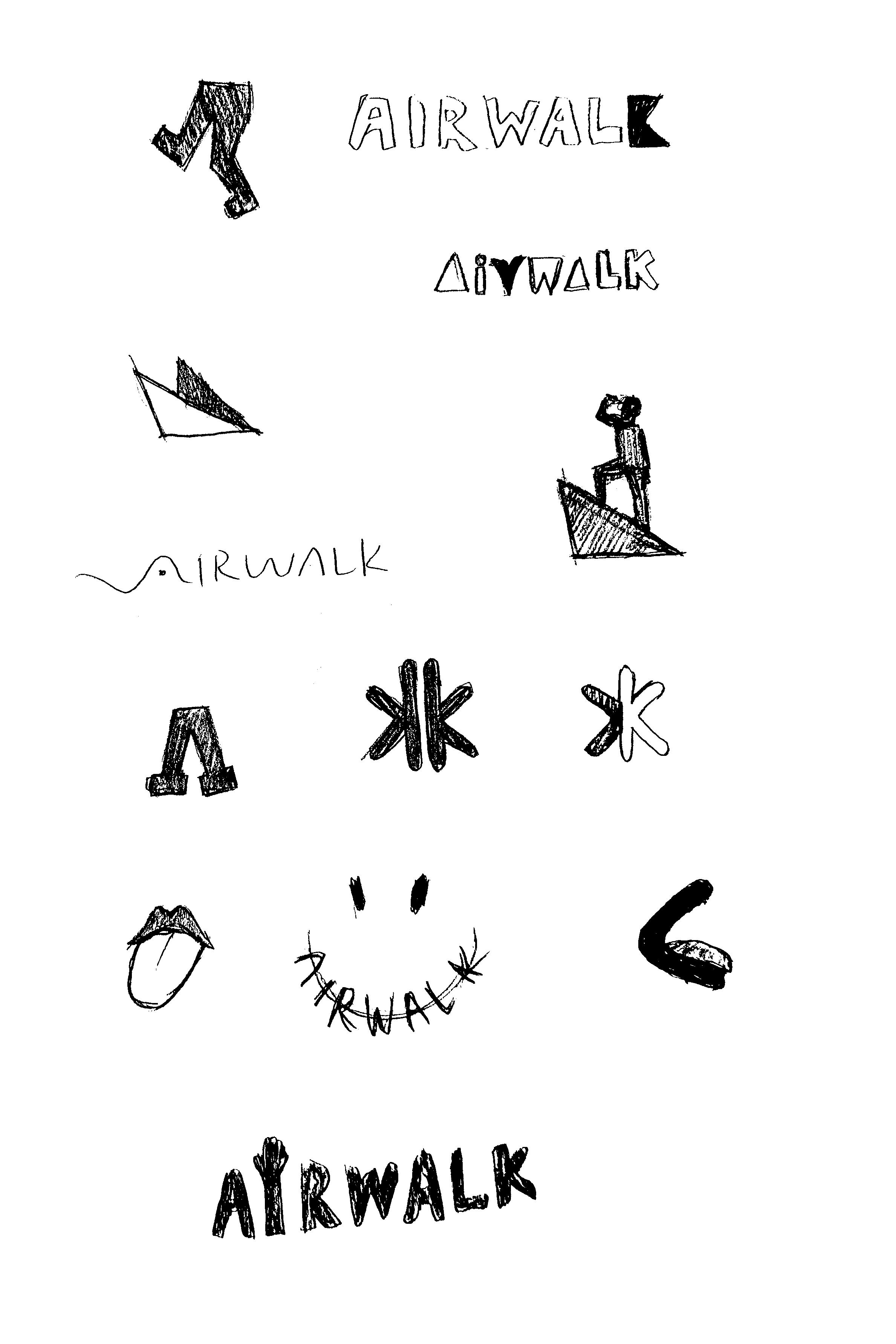
Passionate—Excitedly engaged. We are fueled by passion and progression, driven by people pushing innovation, supporting the scene, and taking risks.
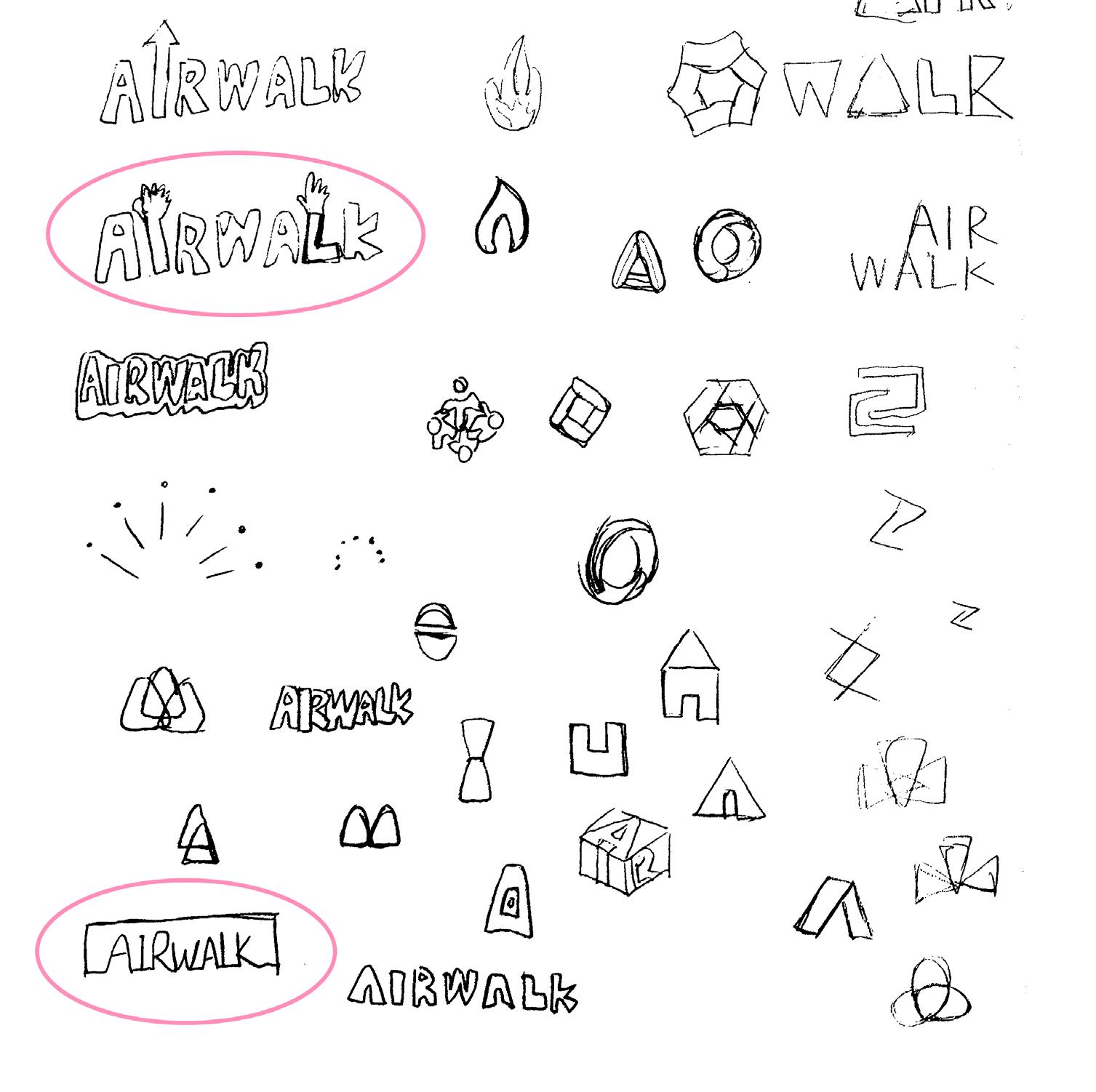
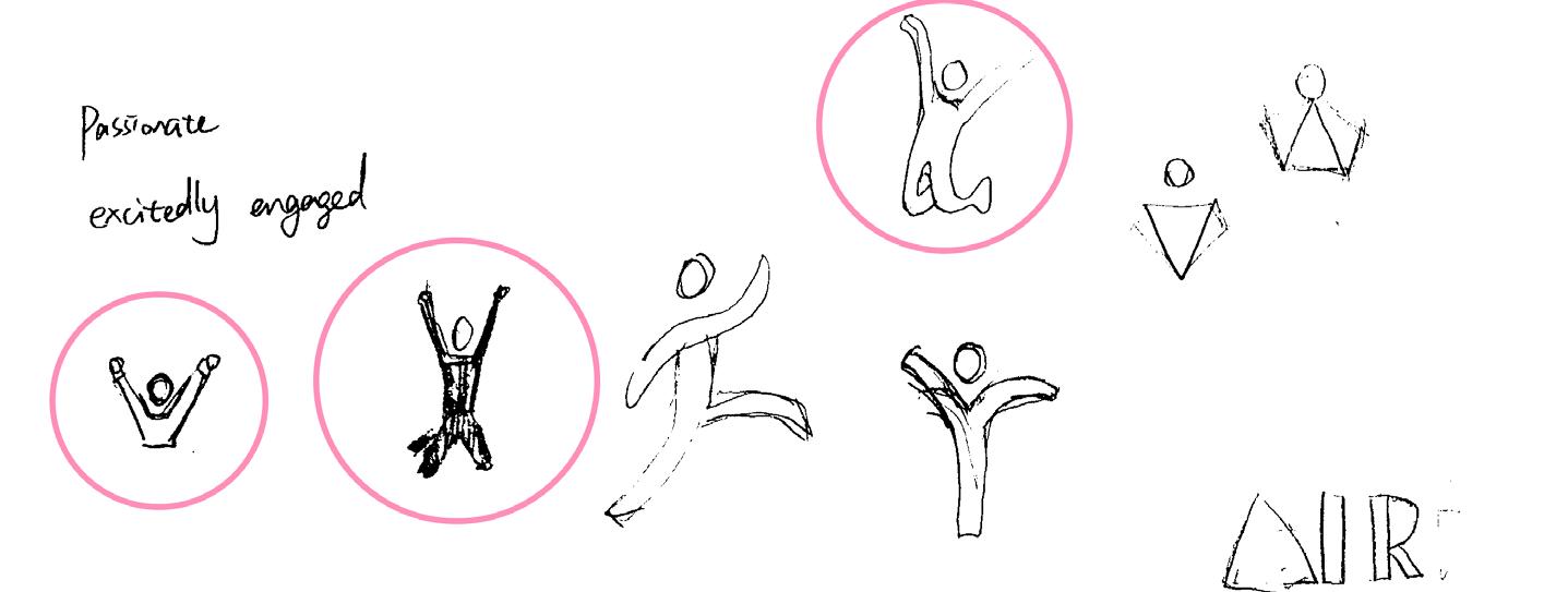

Passionate—Excitedly engaged. We are fueled by passion and progression, driven by people pushing innovation, supporting the scene, and taking risks.
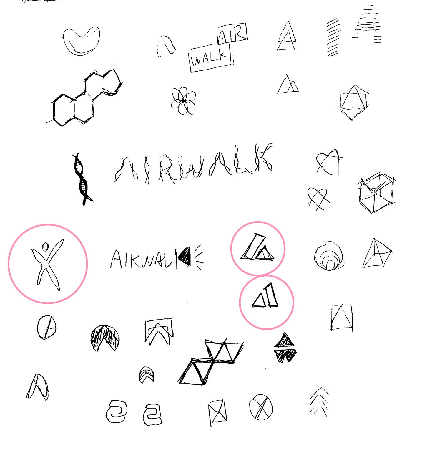

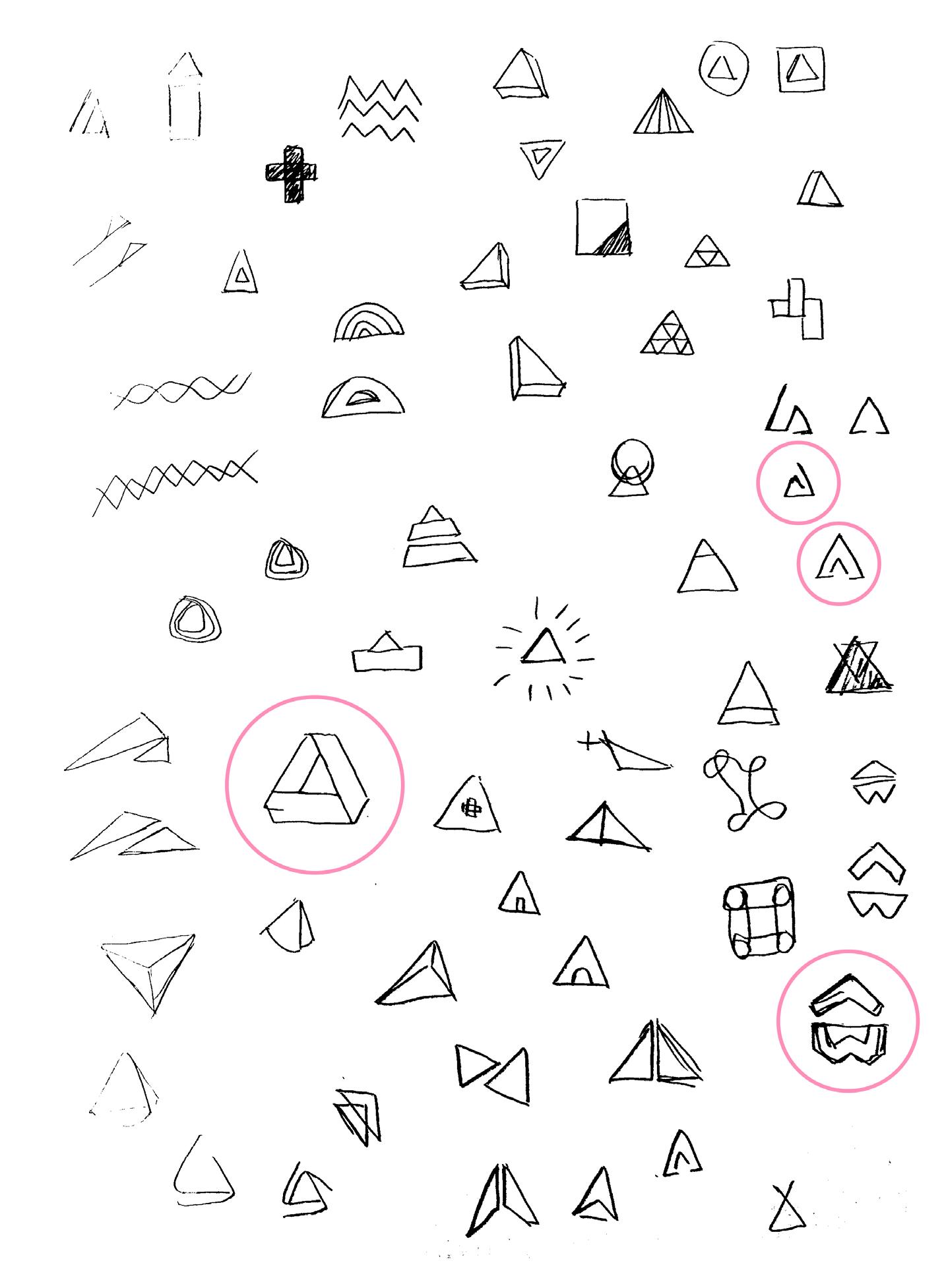
Passionate—Excitedly engaged. We are fueled by passion and progression, driven by people pushing innovation, supporting the scene, and taking risks.

Rebellious The independent way of thinking and acting.
We originate from defiance and unease, embodying a spirit of rebellion and independence.
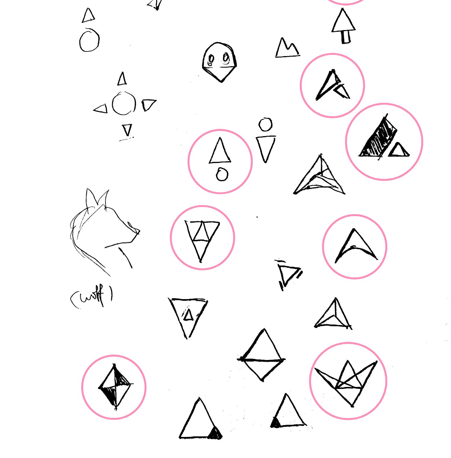
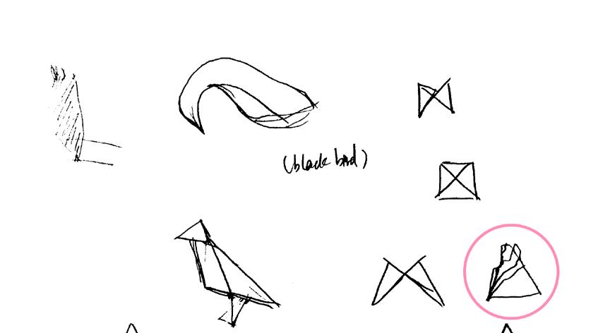
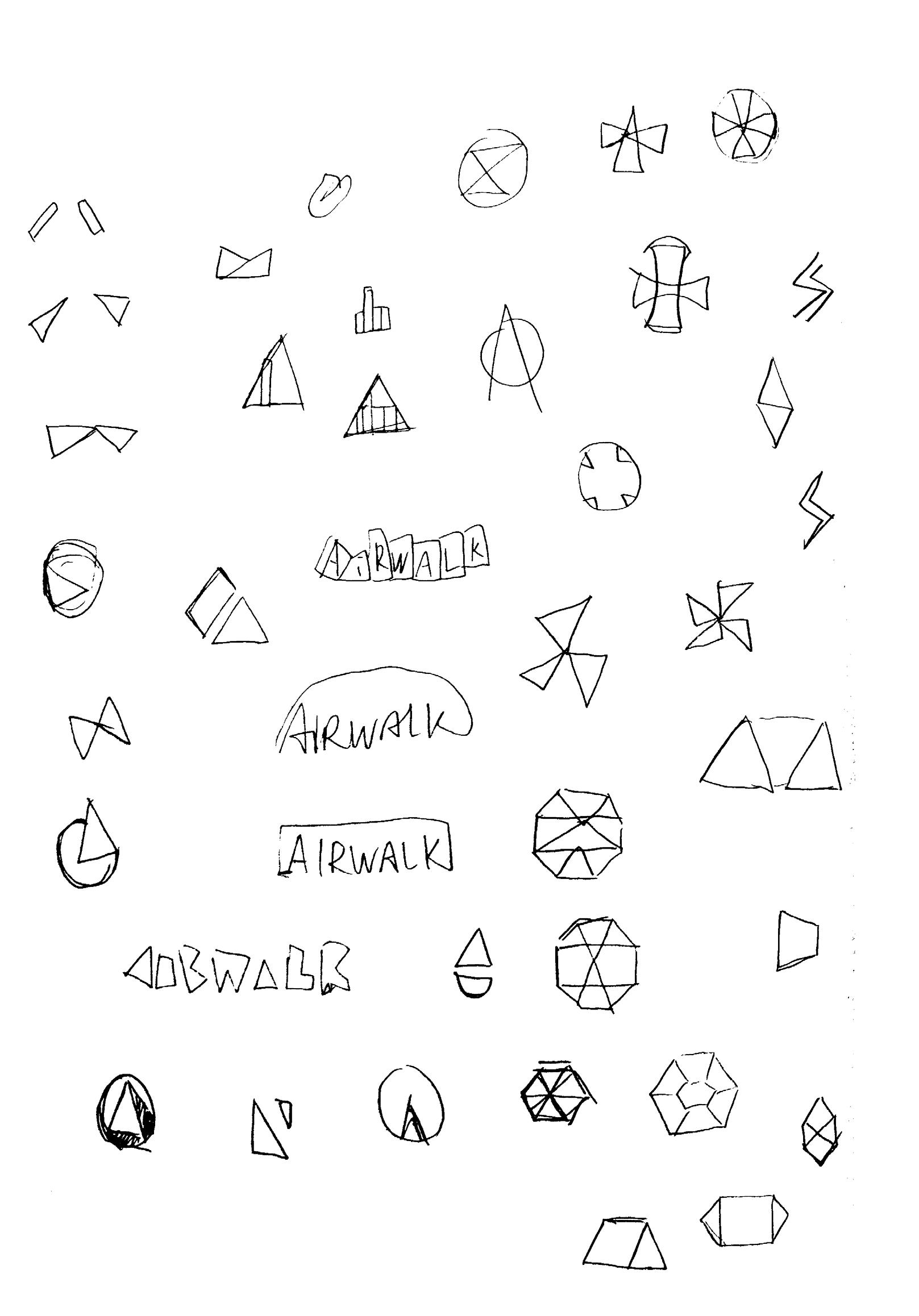
Rebellious The independent way of thinking and acting.
We originate from defiance and unease, embodying a spirit of rebellion and independence.
The second round of design will focus on exploring the core values of the brand, emphasizing self-expression and personalization.
We will try to capture the attitude and spirit of skateboarders, such as questioning and frustration with the system.
These designs aim to inspire independent thinking and courage among young people, encouraging them to express their voices boldly.
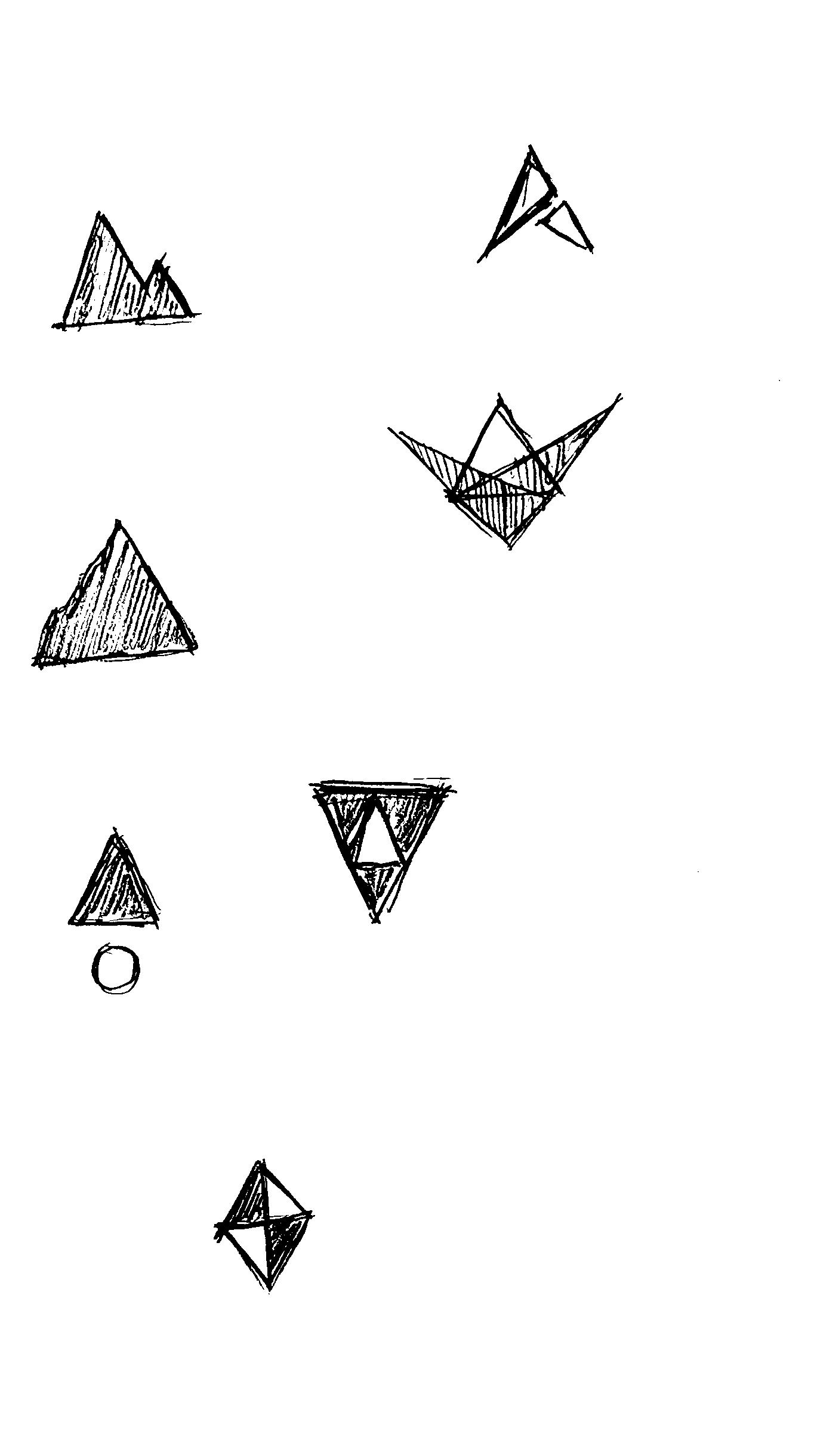

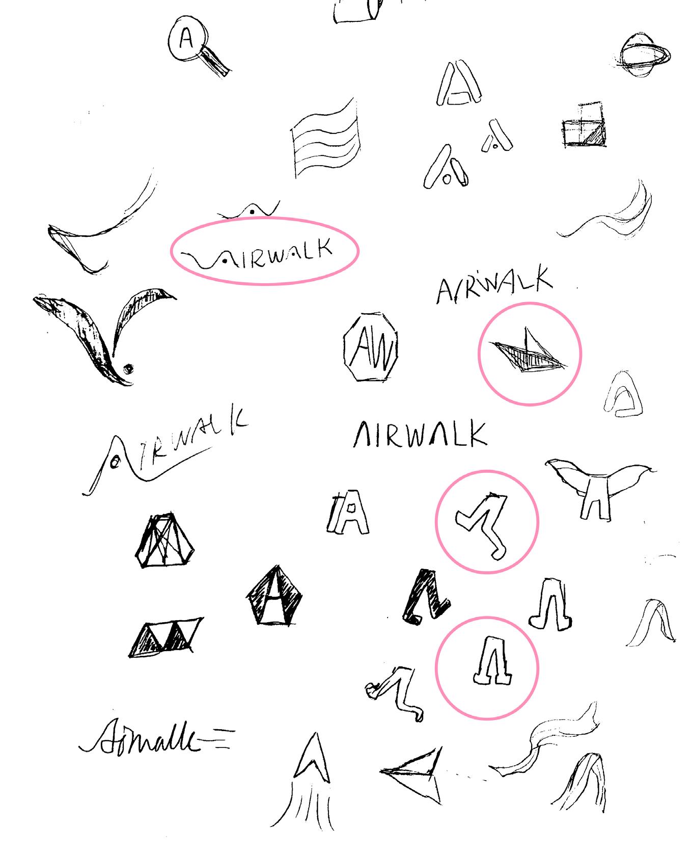
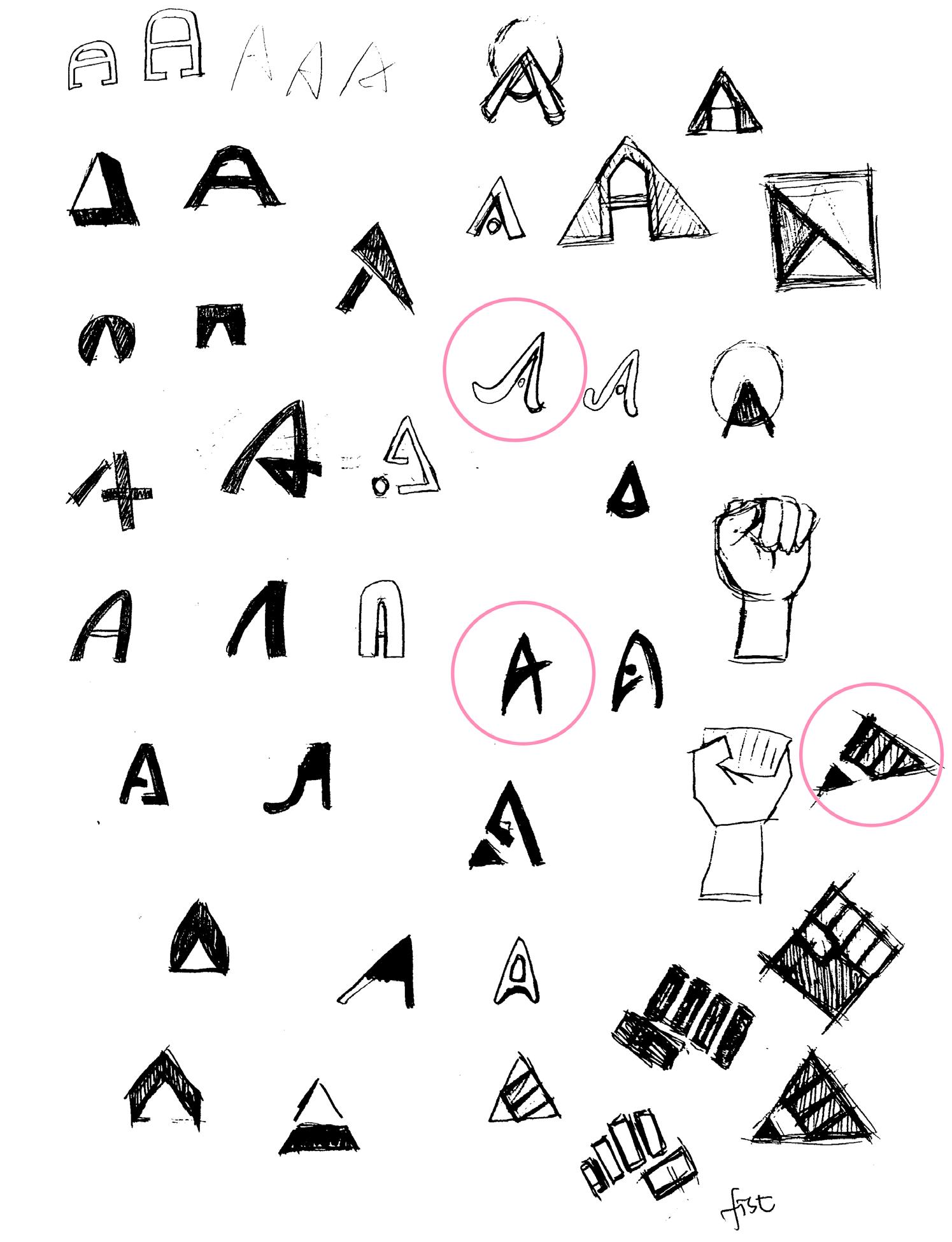
In the second round, based on the feedback and direction from the first round, we continued with 100 new sketches and selected and refined the 10 most promising logo sketches.
Self-Expression
Express yourself boldly and freely.
Passionate
Excitedly engaged.
Rebellious
The independent way of thinking and acting.


Self-Expression
Express yourself boldly and freely.
Passionate
Excitedly engaged.
Rebellious
The independent way of thinking and acting.


Self-Expression
Express yourself boldly and freely.
Passionate
Excitedly engaged.
Rebellious
The independent way of thinking and acting.

Self-Expression
Express yourself boldly and freely.
Passionate
Excitedly engaged.
Rebellious
The independent way of thinking and acting.
Movement and protest are also reflected here.Airwalk embraces movement beyond physical activity and urges youth to engage in various movements and cultural activities.
Simultaneously, protest embodies resistance and defiance, resonating with skateboard culture’s uncompromising attitude.


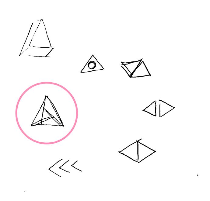
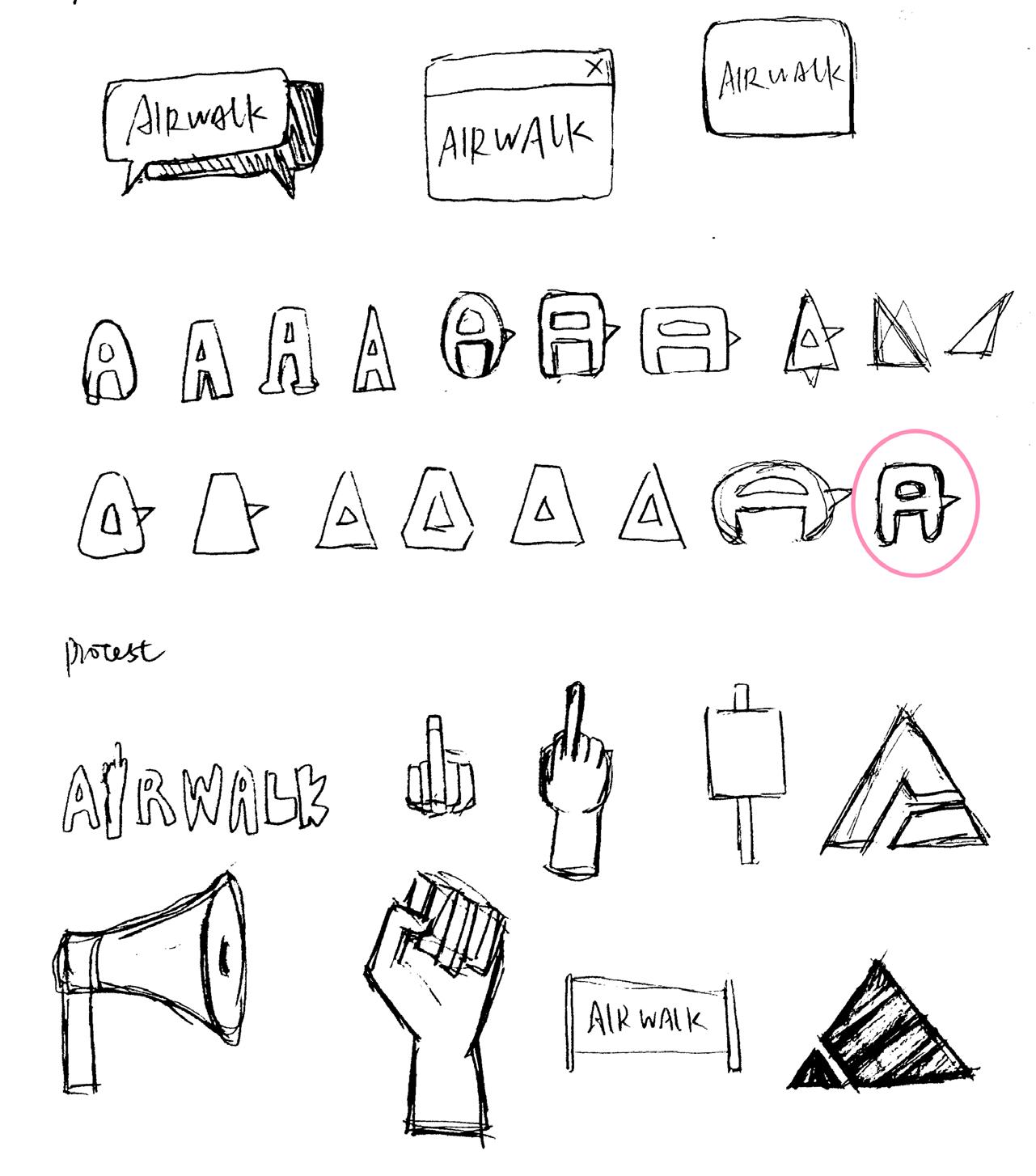
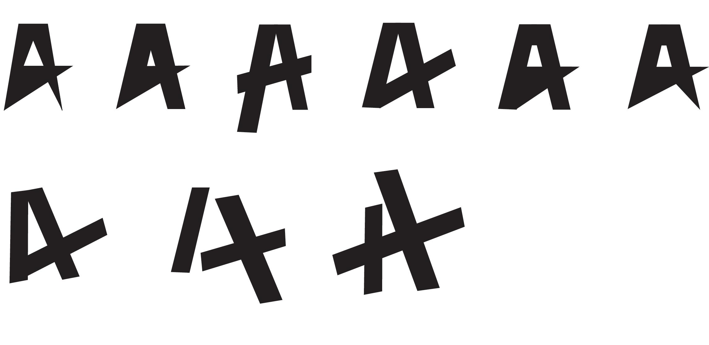
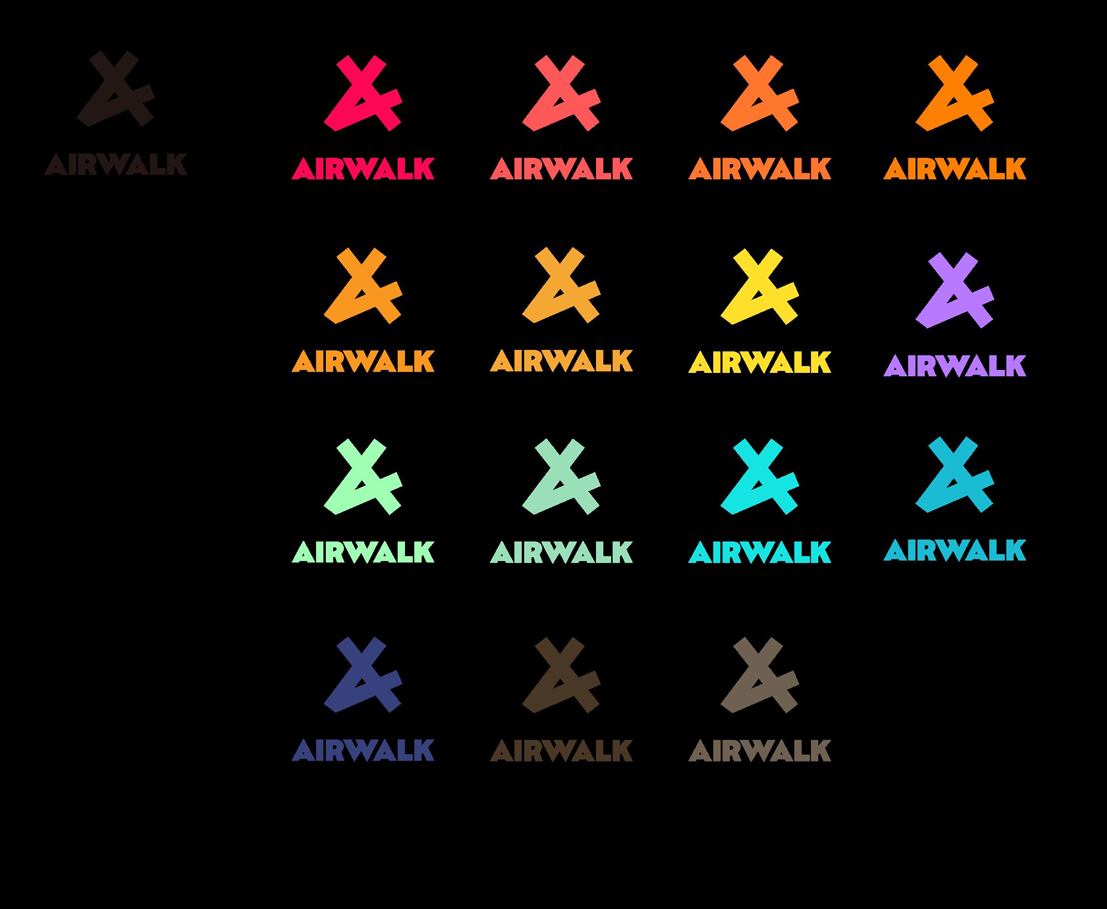
In the third round, we ultimately need to have three refined computer drafts for three directions, achieving by developing dozens of computer drafts for each direction.
Self-Expression
Express yourself boldly and freely.
Passionate
Excitedly engaged.
Rebellious
The independent way of thinking and acting.
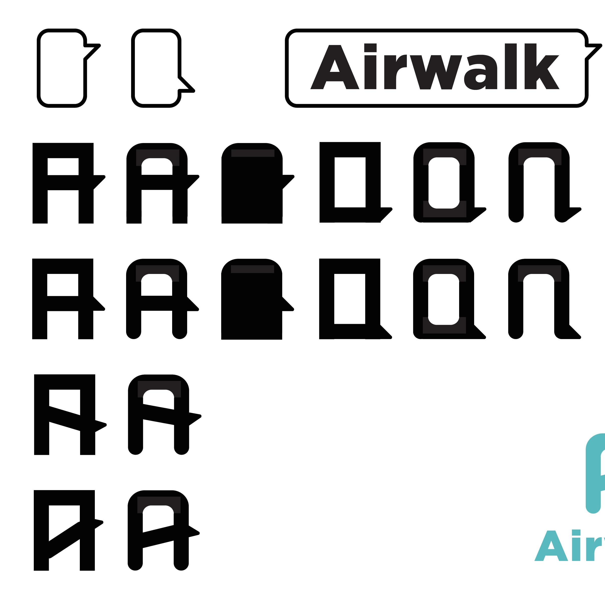
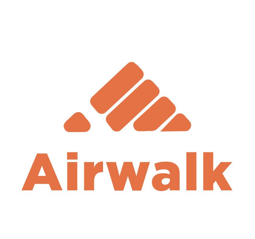
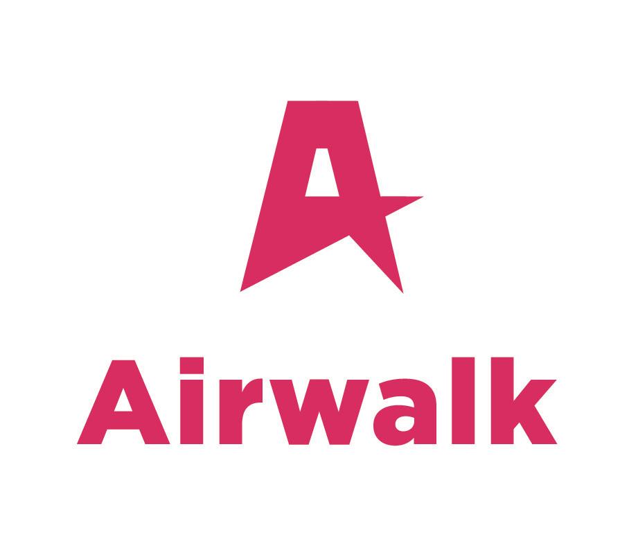
In these sketches, the design elements I used include dialog boxes (representing self-expression), fists (representing protest), and A letterforms (representing bold, cool, or movement).

COMPUTER DRAFT 1
Self-Expression
Express yourself boldly and freely.

COMPUTER DRAFT 2
Self-Expression
Express yourself boldly and freely.

COMPUTER DRAFT 3
The independent way of thinking and acting.
Self-Expression
Express yourself boldly and freely.
Passionate
Excitedly engaged.
Rebellious
The independent way of thinking and acting.


Self-Expression
Express yourself boldly and freely.
Passionate
Excitedly engaged.
Rebellious
The independent way of thinking and acting.
Self-Expression
Express yourself boldly and freely.
Passionate
Excitedly engaged.
Rebellious
The independent way of thinking and acting.


In the fourth round, we experimented with some textures to show the soul of the brand and selected a suitable font to create the wordmark.
The spirit or attitude of skateboarders towards social dissatisfaction, rebellion, and personal expression represents the brand soul of Airwalk. Therefore, I think the keywords of logo design are personality, sharpness, and expression. So I combined textures such as tape, spray paint, chalk, and brushes to show the soul of the brand.


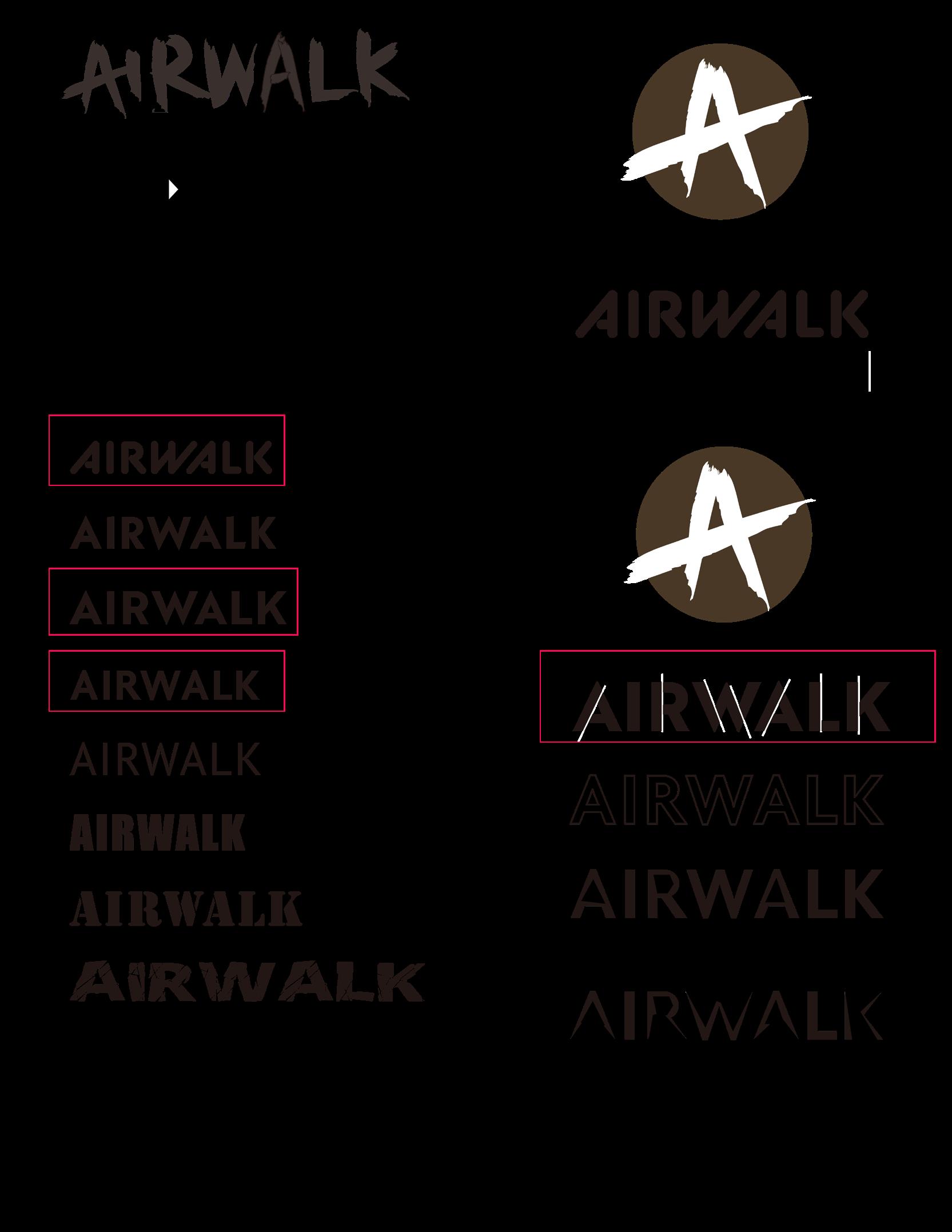
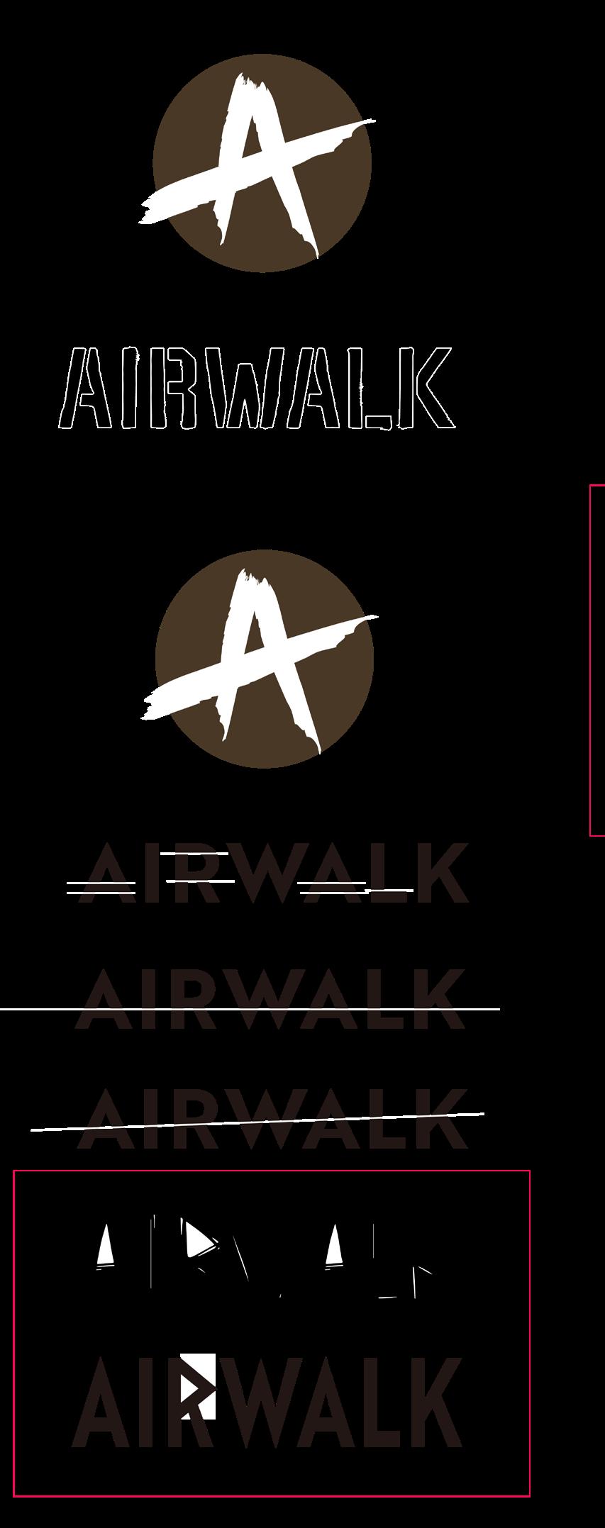
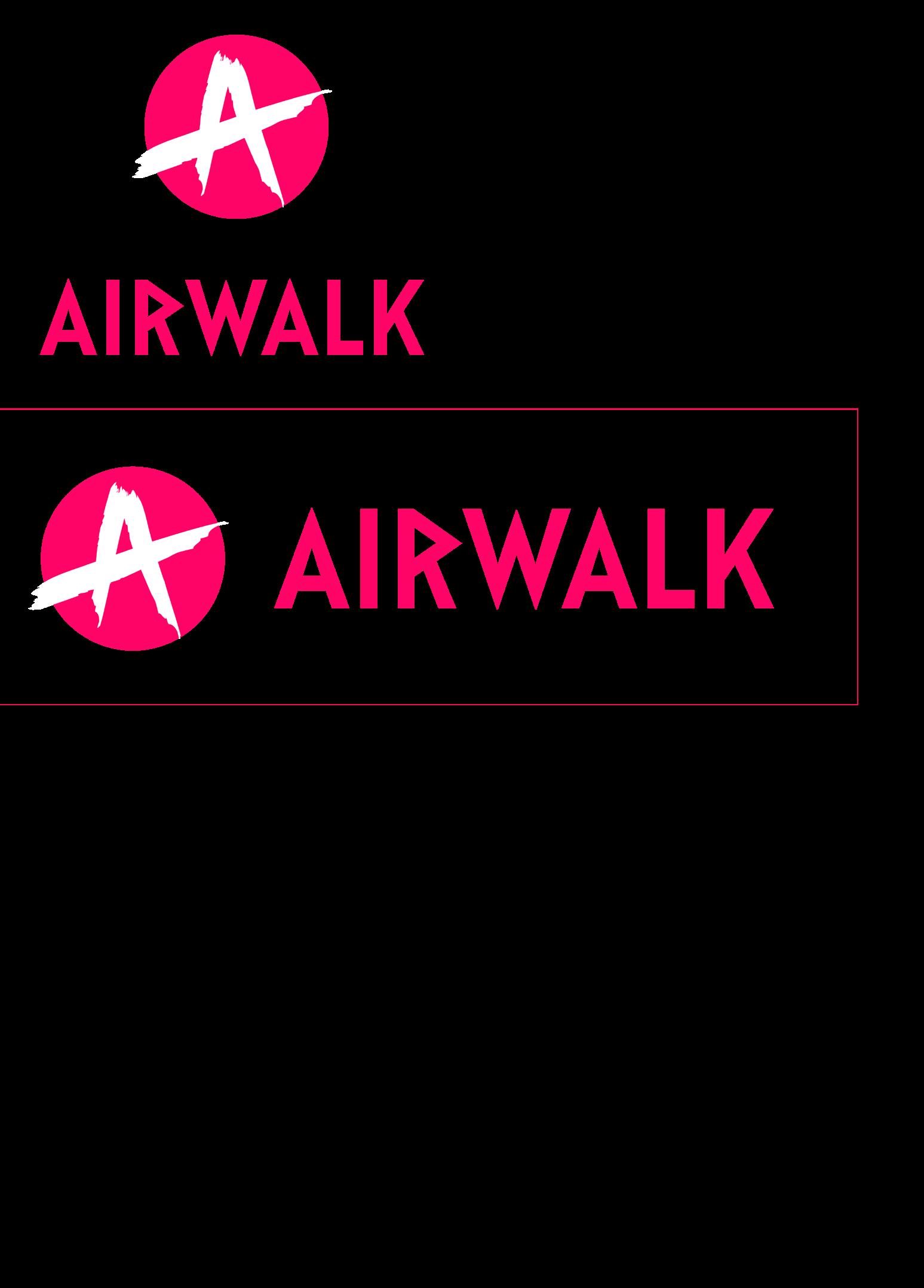
After the last round of experiments, a sharp brush works best because it reflects the soul of the brand. In addition, I think the A with a sharp brush effect was not enough as a logo, so I placed it in a circle to strengthen the brand’s visual identity. I also selected some fonts with a similar stroke effect and redesigned one to create the word mark.
This is Airwalk’s new logo, which is a combination of a distinctive A and a circle. This logo is based on the brand’s keyword–rebellion (independent way of thinking and acting). It uses sharp strokes to show rebellion.
Signature


By delving into the visual standards guidelines and design elements of other successful brands, brands can gain inspiration and learn which design elements most effectively convey the brand’s soul and personality.
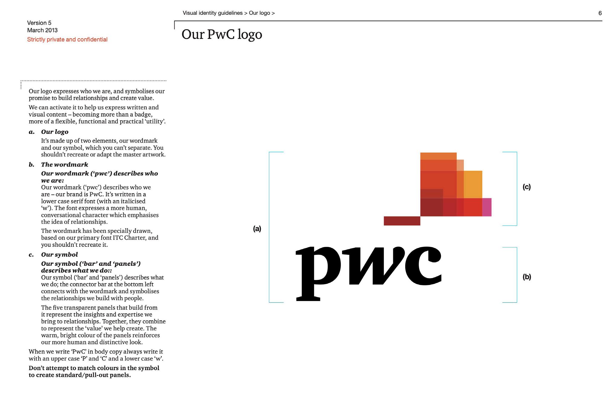
INTRODUCTION – PWC
It introduces the reasons and meanings of the logo’s design based on its components. A comprehensive introduction to the brand’s identity by dividing and annotating it.
The anatomy of the logo is placed on a grid, showing the rigor of its design by labeling the logo with uniform slope, height, and width.

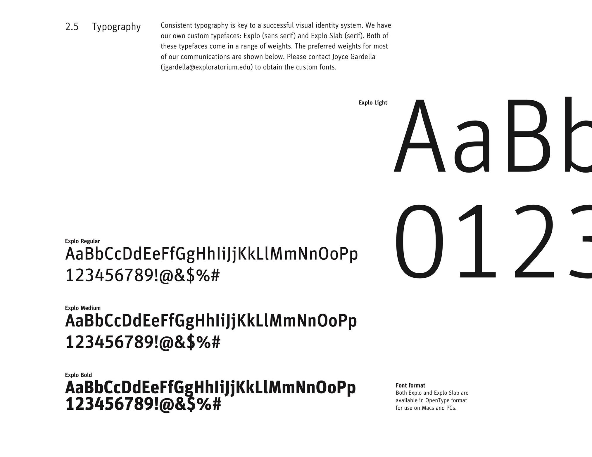
The page’s typography is designed to have visual interest and movement, illustrating the way it is formatted, the fonts used, and the formatting.
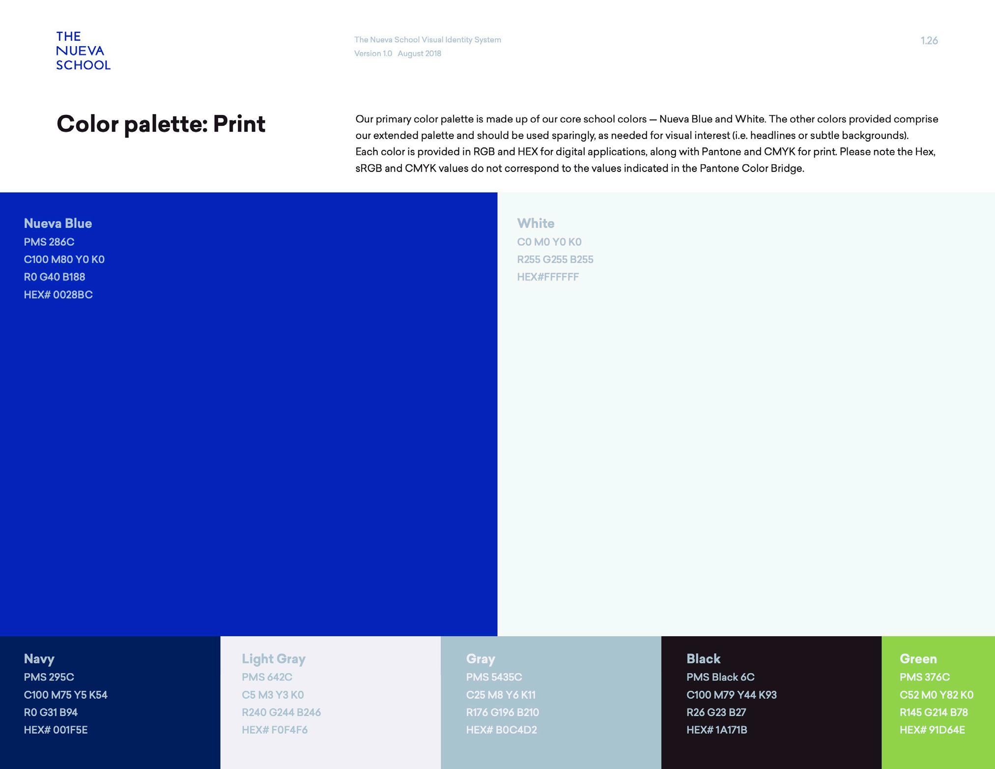
The page uses a lot of space to display the brand colors, and the visual hierarchy is clear.
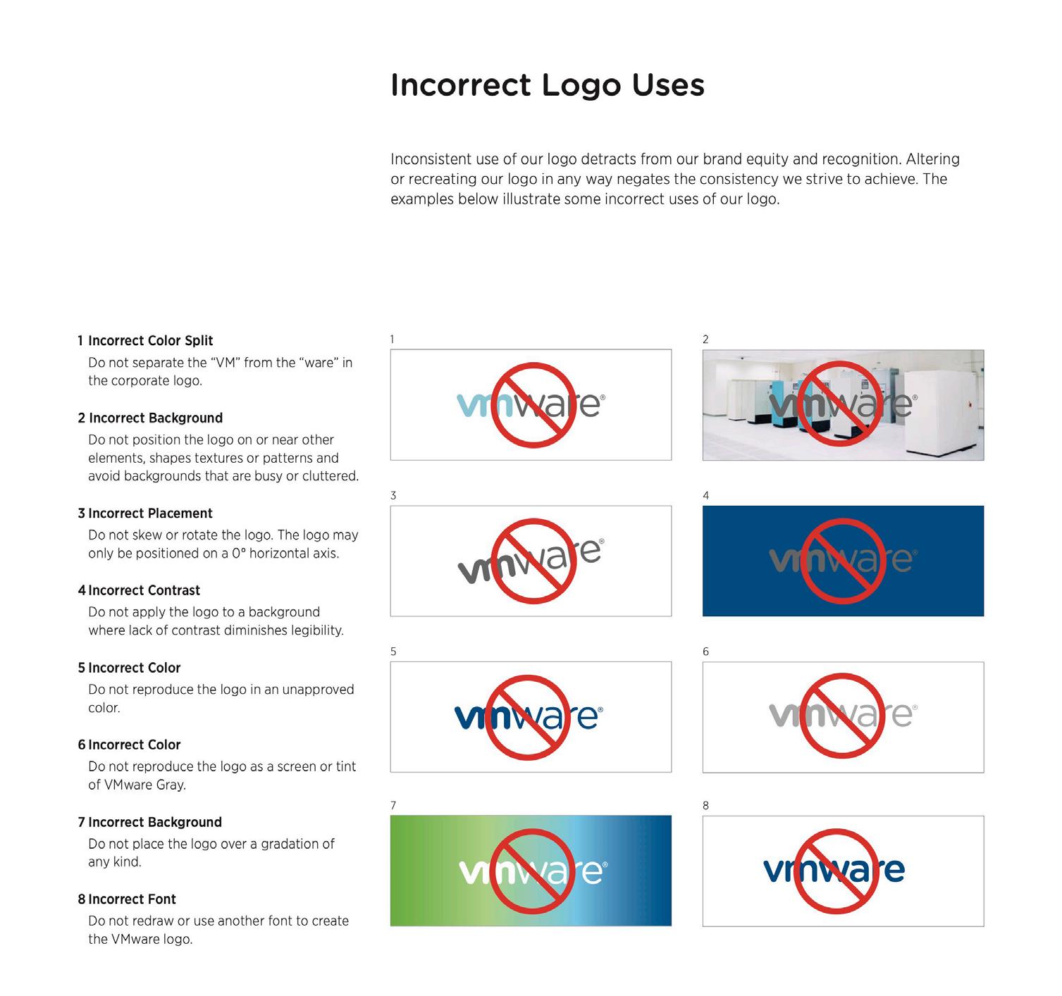
By combining prohibited symbols with explanatory text, it will be clearer to readers how the logo cannot be treated.
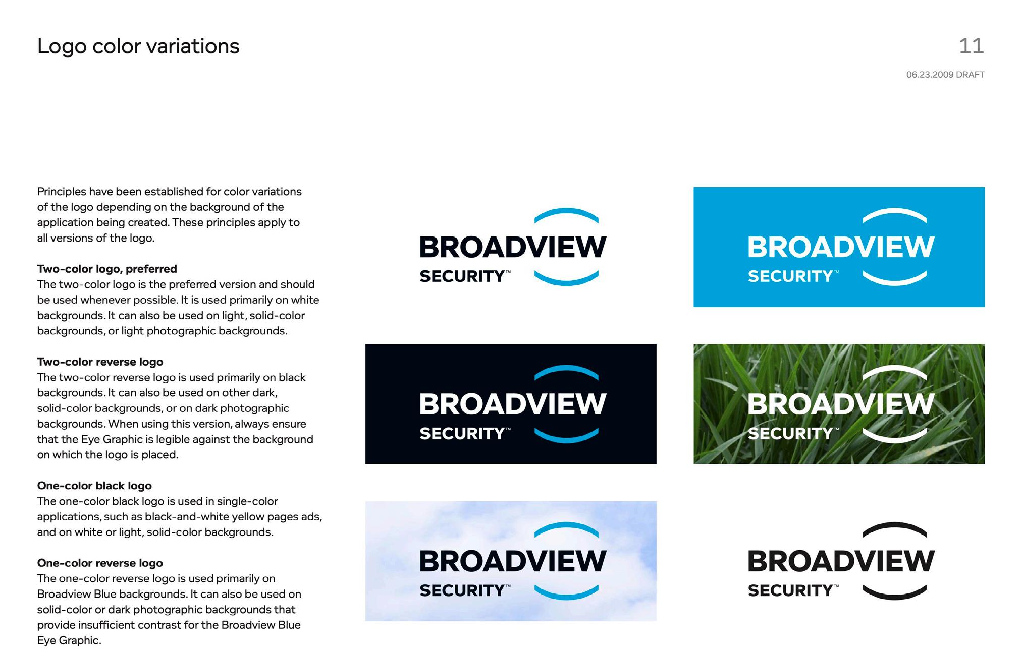
This page shows an idea for an alternative version of the logo. An illustration that differentiates alternative versions of the logo based on the number of colors and inversions would help readers better understand its content.


When designing a new logo, it’s important to research logos that are similar to it. This helps ensure that our designs are innovative and unique, avoiding overlap with other brands’ visual identities while reducing potential legal issues.
This comparative analysis helps protect brand image and investment, while also guiding us to better position our brand and design direction.
All the logos feature an uppercase “A” or a triangle, creatively altering or incorporating these elements into their designs, similar to the new logo Airwalk is developing.
Caterpillar Inc
Its logo combines an A and a triangle. The yellow triangle is reminiscent of sand.

adidas
Its logo is a triangle composed of three bars, which is visually dynamic.

Reebok
Its logo consists of thick lines, giving a sense of stability.

Fila
Its wordmark uses a triangle instead of the A, and the letters are coherent and graphic.

Los Angeles Angels of Anaheim
Its logo consists of a circle and A, which has a threedimensional effect.

Army Black Knights
Its logo consists of a knight illustration and an A, giving it a defensive feel.
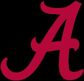
Alabama Athletics
Its logo is an A with curly edges, giving it a playful and lively feel.

Atlanta Braves
Its logo is an A with a hammer. The letter A is personified.

Arizona Wildcats
Its logo consists of A’s in two different serif fonts, with a rich visual hierarchy.
Auburn Tigers
Its logo consists of AU in slab serif font. The two letters are superimposed on each other, giving a composite feeling.
OUR WEBSITE URL https://www.inspiring-unconventional-expression.com
DISCLAIMER
This is a non-commercial project for educational purposes and is not intended to represent or replace the original brand. The official Airwalk brand can be accessed at airwalk.com.
TYPOGRAPHY
Brother 1816
Rufina
REFERENCE
https://www.google.com