


FULL NAME PROFILE EDUCATIONCONTACT Yoan Theresa Ervandi 04Bandung/11/2000 SMA Santo Aloysius 1 SocialBandungSciences Major (2016 – 2019) be.ig.e.p. (+62) 81 394 567 be.net/yoantheresa@yoantheresayoantheresa@gmail.com000/@labshimeji Binus University Alam Sutera DKV New Media (2019 – 2023) DATE OF BIRTH
EXPERIENCES & SKILLS TECHNICALEXPERIENCESSKILLS SOFT SKILLSAdobeAdobeAdobeFebGraphicTHINKING*ROOMDesignIntern2022–Jul2022IllustratorPhotoshopInDesign Adobe After Effects BlenderProcreate Willing to learn Good 2020GraphicFreelancePunctualTimeProblem-solvinglistenermanagementDesigner–present
BIR BANGPLETOKPLETOK
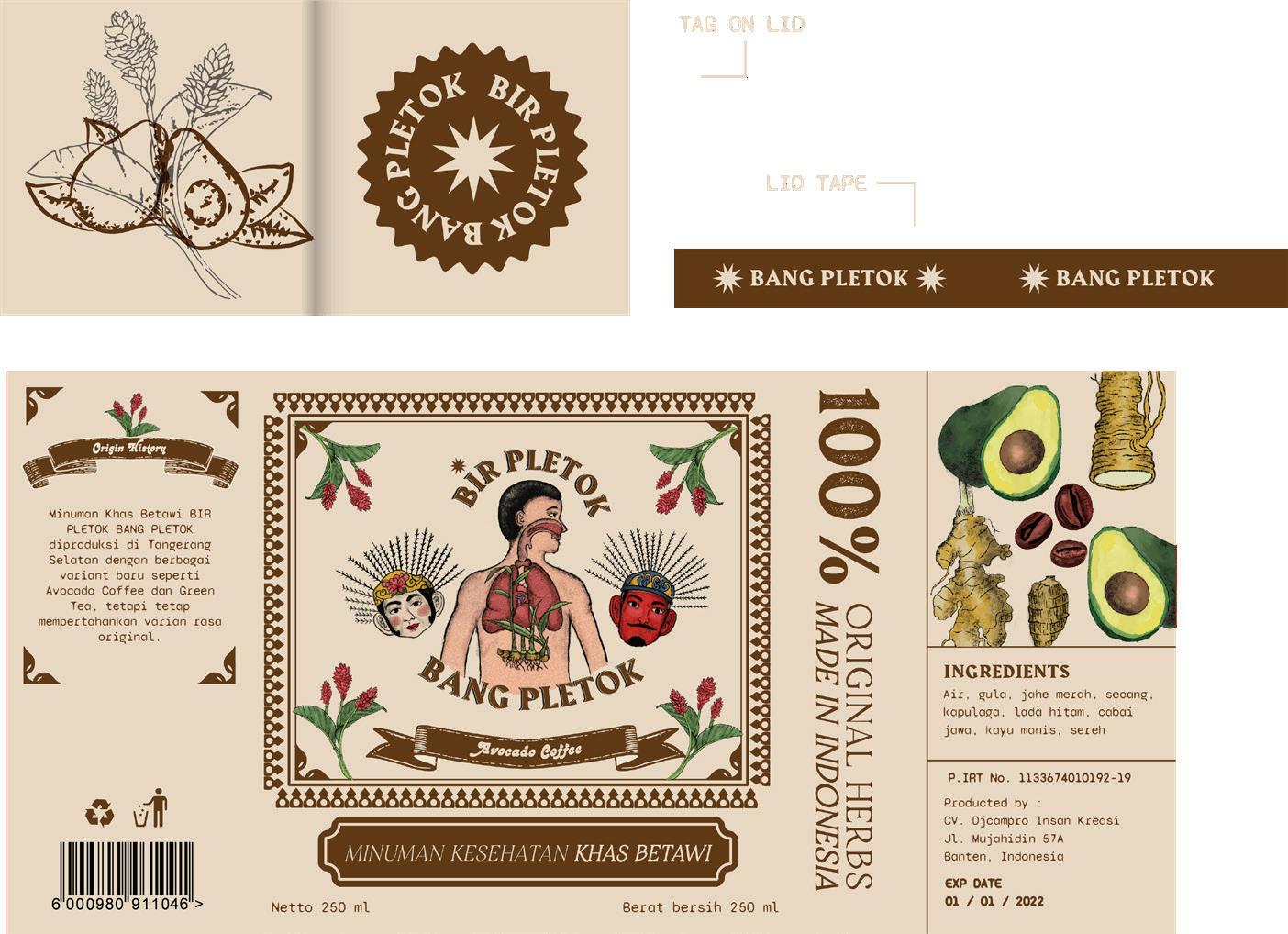
YEAR Early 2021 Illustration, Packaging Design SUBJECT Bir Pletok Bang Pletok is a Betawinese herbal drink produced in Tangerang. The visual combines traditional elements and modern design techniques to interpret the brand, such as ondelondel, Betawi’s traditional house ornament, and also variety of spices illustrations which generally used as jamu’s ingredients. The goal is to evoke nostalgia towards Indonesian vintage packaging and bring recognition of its uniqueness into the local or foreign markets.


B NKHAS BETAW BIRPPLET B MINUMA


Bir Pletok Bang Pletok comes in three flavors variety. The distinction of each packaging is shown by colors & illustrations according to its flavor.


SPACE GROTESK TYPE SPECIMEN POSTER YEAR April 2022 Poster Design SUBJECT Typography exercise during my internship at Thinking*Room. A type specimen poster using Space Grotesk which is inspired by outer space.


TWO POSTERSCONTRASTINGSERIES YEAR April 2022 Poster Design SUBJECT A poster series for contemporary art museum exhibition of two contrasting things between Imagination & Reality. I was inspired by Japanese contemporary art and using only CMYK colors as its main pallete.


Additional posters for Two Contrasting Posters series.


Coconut leaves on top of the logotype means the product is sourced from vcoconut palm tree.
GULA KULONPROGOKELAPA YEAR September 2021 Logo Design SUBJECT Gula Kelapa Kulonprogo is a logo redesign assignment done for KPN (Koperasi Petani Nira).
The sweet taste of sugar is always associated with excitement, that’s why I decided to create an assymetrical logo in order to express its personality. Organic aspect from coconut sugar is portrayed by dynamic layout of the logo.


Pattern is derived from Kulonprogo’s batik motif

POT MEETS POP YEAR July 2021 Illustration, Packaging Design SUBJECT
Founded in 2009, Pot Meets Pop is an Indonesian denim brand that is inspired by reggae culture. Combining the rugged workwear style with contemporary aesthetic. I redesigned the paper bag and bandana sleeve by creating playful characters with gestures such as dancing and playing ukulele to enhance their brand essence.


MUSS YEAR July 2021 Illustration, Packaging Design SUBJECT Muss is a start-up local fashion brand based in Bandung. The brand is heavily influenced by its creator’s deep love with skateboarding and music. “Skateboarding got me to travel places I’ve never been before” says the founder. The Muss illustrations was born inspired by his words and traits to define the brand identity. ‘Messy, rebellious, experimental.’ Those three keywords generate my idea to make a character that reflects Muss.


HUMA
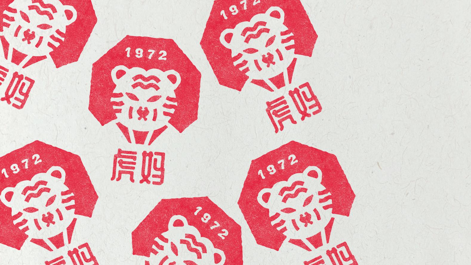
YEAR July 2022 Branding Curriculum SUBJECT I was tasked to create a Tiger inspired Art University brand identity during my internship program at Thinking*Room. After doing a lot of research and brainstorms, I came up with HUMA (Hunan University of Martial Arts) which also can be translated into ‘Mother Tiger’ in Chinese.
Mother Tiger herself is a martial arts prodigy who lives in a mountainous province of Hunan. Eventually, after she passed away, her students and followers built HUMA to commemorate and re-live the spirit of tiger prodigy.


Please keep in touch, e. yoantheresa@gmail.com p. (+62) 81394567000 ig. yoantheresa

