

Graphic Designer Yiwei Li, mfa


(FILE NEW)
File New typically refers to the action of starting a new project or document within a design software in the computer. It represents the dynamic connection between saving and loading in the creative process. In design, as in life, we are constantly cycling between these two actions. Every project saved is a record of our progress, and every file loaded is an opportunity to revisit, refine, or transform ideas.
File New is not just a portfolio; it symbolizes my future as a designer. Just like opening a blank file in design software, my creative journey is filled with untapped possibilities, waiting to be shaped by ideas, experiments, and experiences. This title reflects my approach to design, where every project starts with curiosity, a willingness to explore, and the excitement of creating something new from scratch.
Contents
(FILE ONE)
Defining Life (Rebranding Life) // Page 07
(FILE TWO)
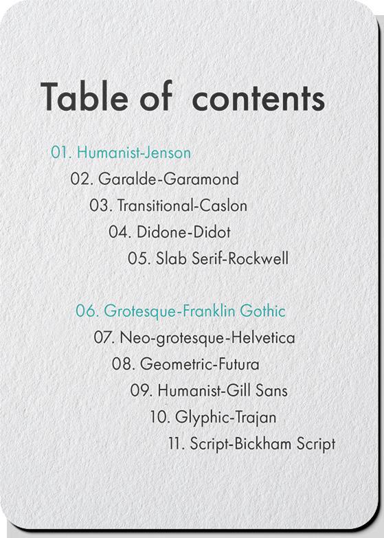
Playing with the Alphabet (Typography Cards) // Page 41
(FILE THREE)
The Mystery of Typefaces (Alphabet Posters) // Page 55
(FILE FOUR)
Growing with Every Step (“Plant It” App Design) // Page 65
(FILE FIVE)
Belongs to Our Bond (Podcast Chapbook) // Page 79
(FILE SIX)
Stay Alert, Be Safe (“Bsafe” Branding) // Page 95
(FILE SEVEN)
Start the Day with Coffee (Cafe App Redesign) // Page 131
(FILE EIGHT)
Neon Shadows of the Future (Movie Trailer) // Page 147
(FILE NINE)
Popcorn Fantasy (Object Video) // Page 155
(FILE TEN)
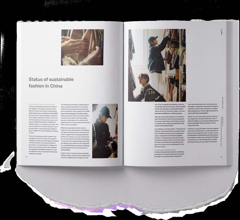
Sustainable Fashion in China (MFA Thesis Project) // Page 165
(FILE TWO)
Rebranding Life
(COURSE)
The Nature of Identity
(INSTRUCTOR)
Hunter Wimmer
(SEMESTER)
Spring 2024
(CATEGORIES)
Branding Design
UI Design
Editorial Design
(DELIVERABLES)
Guide books and a website
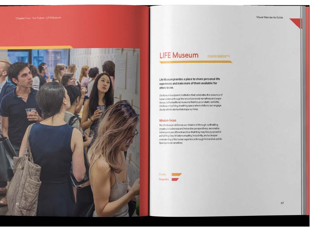
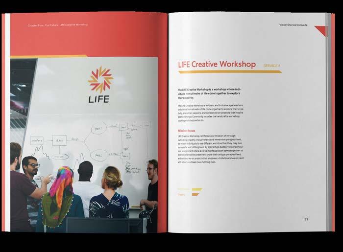
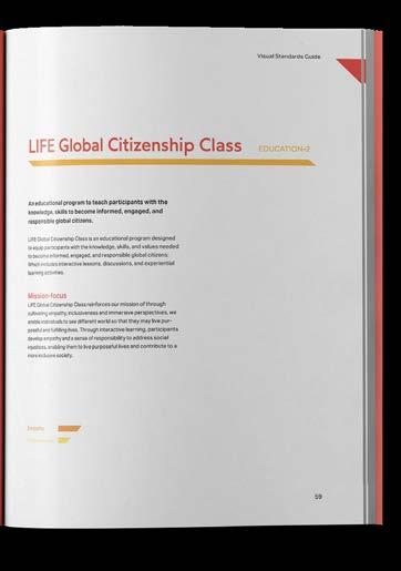
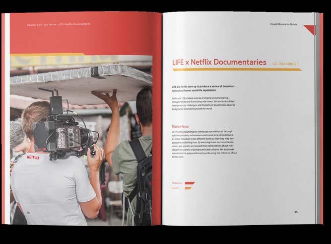
(OBJECTIVE)
Select a brand that is inactive, struggling, or no longer in operation, and explore its foundational values and legacy. Reimagine and revitalize the brand by creating a fresh visual identity that preserves its original spirit. Using the new brand strategy and guidelines, propose a range of business opportunities that allow the brand to thrive beyond its initial industry.
(APPROACH)
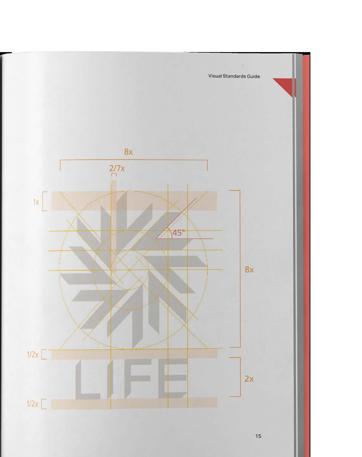
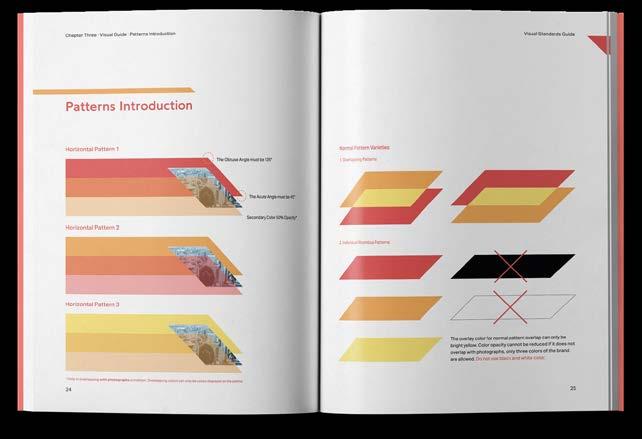
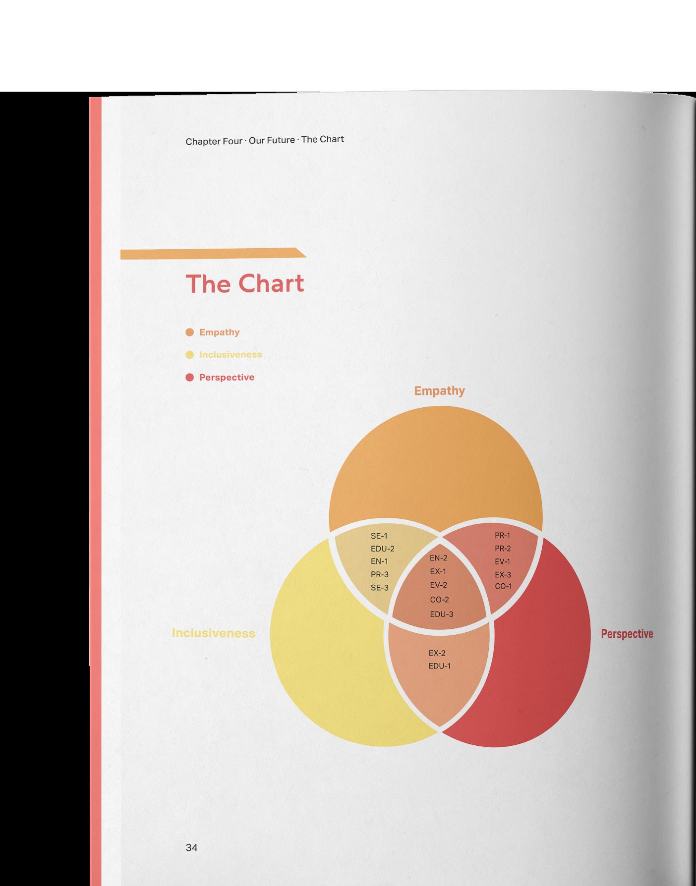
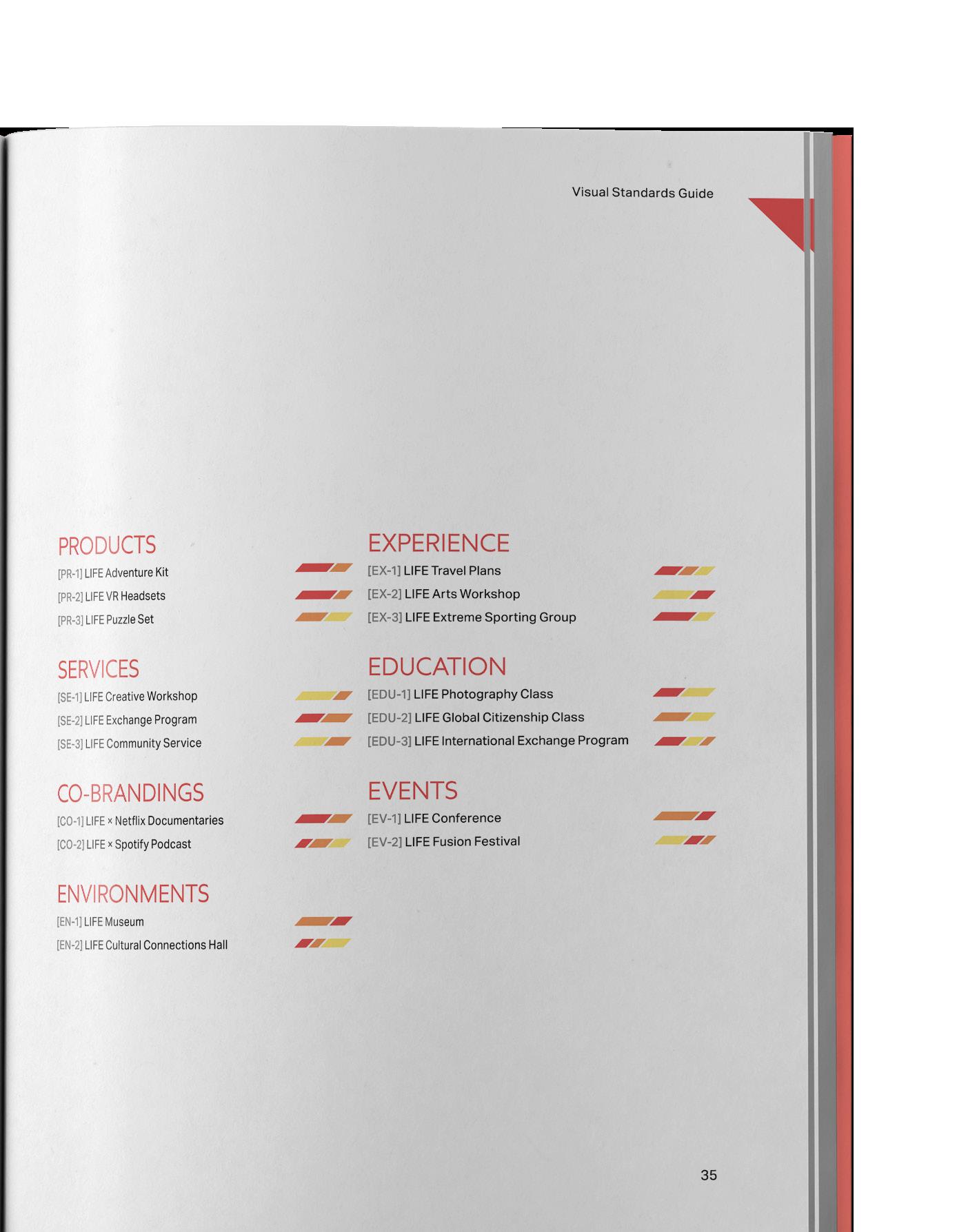
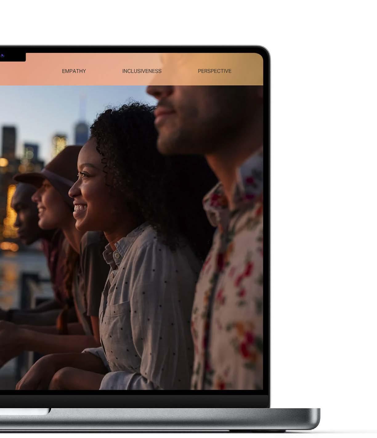
I reimagined Life Magazine beyond its traditional photo journalism roots, retaining its core essence while centering on inclusivity, immersion, and empathy. This new version emphasizes meaningful connections, social engagement, and human empathy, resonating with today’s socially conscious youth.
Defining Life Instructor, Hunter Wimmer


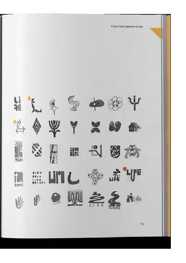

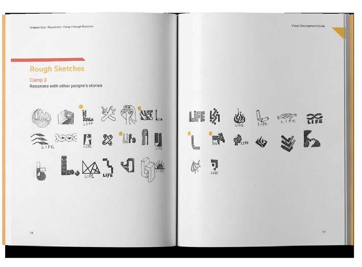

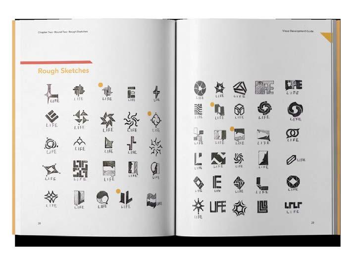


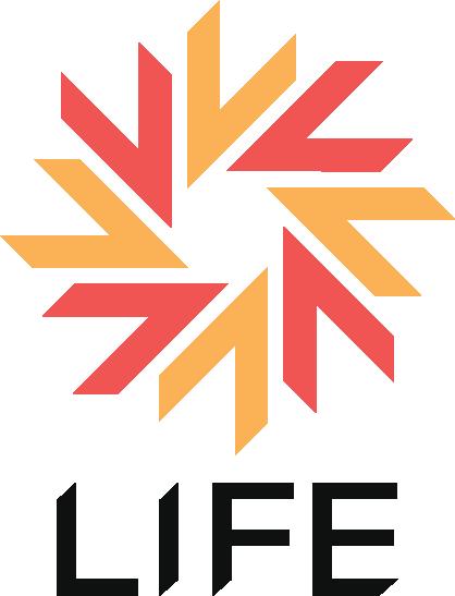
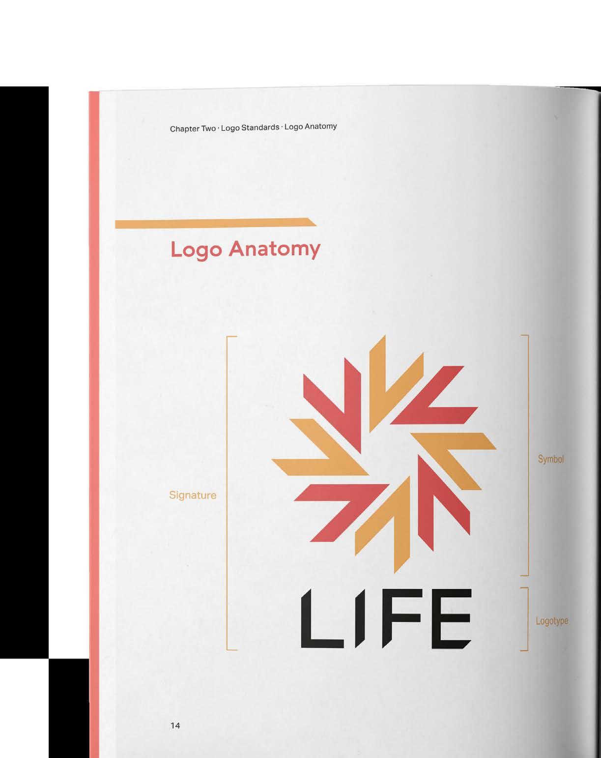
Letter “L”
Pinwheel
Camera Shutter


(FILE ONE)
Typography Cards
(COURSE)
Type Forms
(INSTRUCTOR)
Anthony Palmer
(SEMESTER) Fall 2020
(CATEGORIES)
Typography Visual Design
(DELIVERABLES)
Play cards
(OBJECTIVE)
Design visually striking typography cards that showcase the beauty and versatility of typefaces, blending creative layouts with clear readability to inspire appreciation for type as both art and function.
(APPROACH)
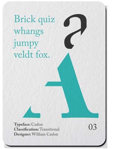
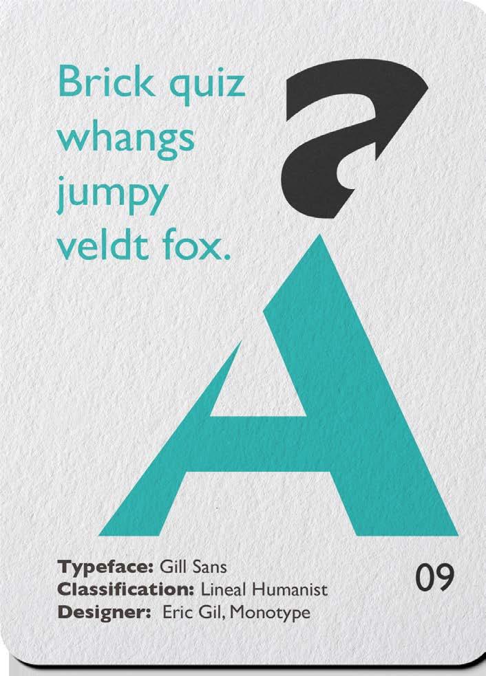
I broke with tradition and used segmentation to design the cards to make the overall layout of the cards more dynamic. Each card corresponds to a different type of font. Although there are segmented letters on the cards, the details of the fonts can still be seen.
Playing with the Alphabet Instructor, Anthony Palmer


Franklin Gothic
Franklin Garamond Helvetica Gill Sans BickhamScript
Rockwell
Futura
Trajan
CaslonJenson
Gill Sans
Gothic
Bickham Script Trajan Futura
Helvetica
Rockwell
Caslon
Jenson


(FILE THREE)
Alphabet Posters
(COURSE)
Type Forms
(INSTRUCTOR)
Anthony Palmer
(SEMESTER) Fall 2020
(CATEGORIES)
Typography
Visual Design
(DELIVERABLES)
Posters of three typefaces
(OBJECTIVE)
To create a series of alphabet posters that highlight the foundational role of typography in design, using diverse typefaces and layouts to enhance letter recognition and phonetic awareness. Each poster promotes visual communication and engages early learners in an inspiring design-focused environment.
(APPROACH)
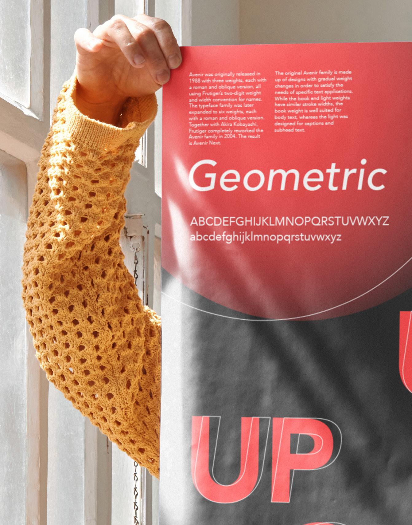
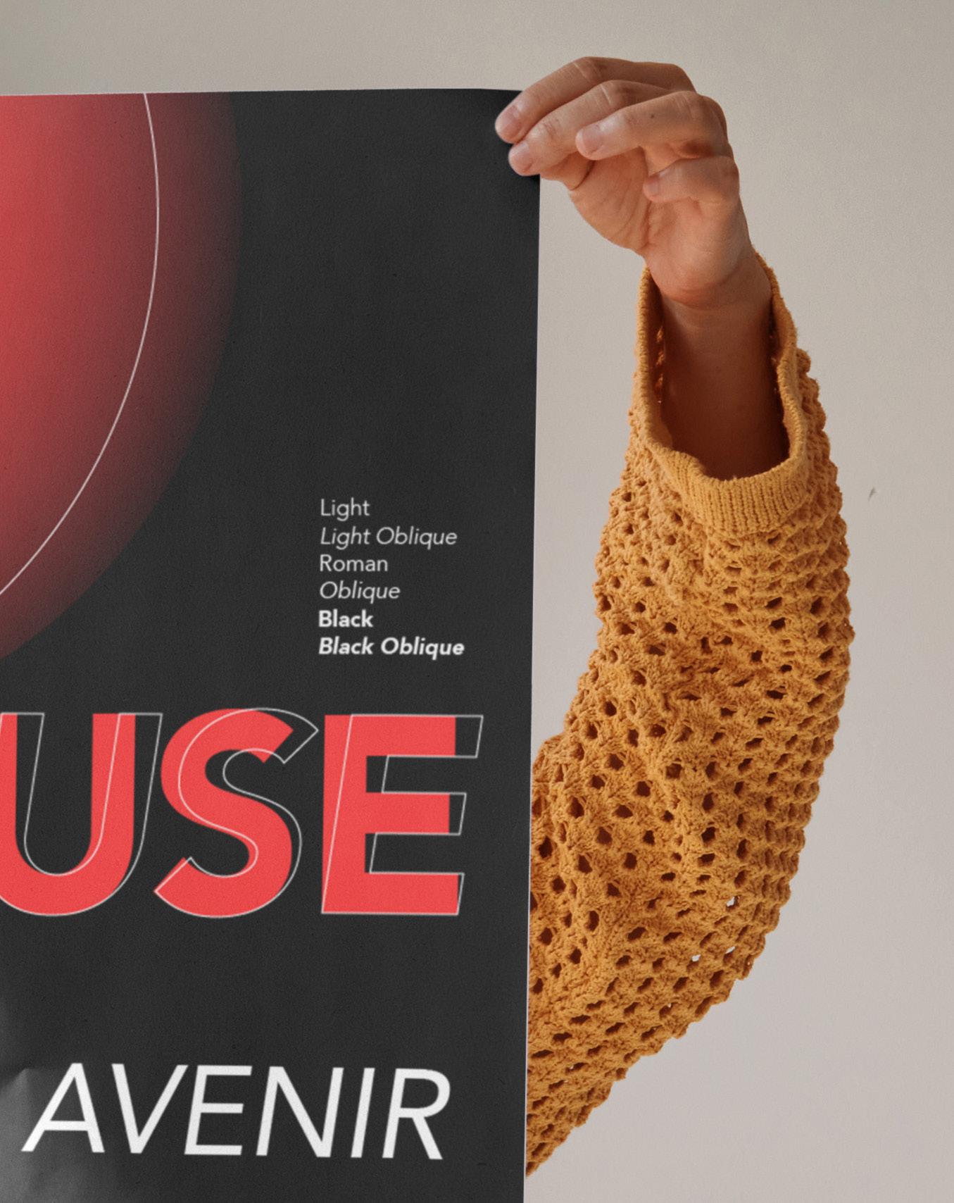
I selected three fonts for the poster—Avenir, Bodoni, and Garamond—each representing a distinct typographic category: Geometric, Didone, and Garald. To enhance visual contrast, I used an asymmetrical layout and high-hue colors, allowing each font’s subtle characteristics to stand out against the black background. In addition, I added an italic outline to the headline text, which allows the audience to see the contrast between the regular and italic fonts.
The Mystery of Typefaces Instructor,
Anthony Palmer


(FILE FOUR)
“Plant it!” App Design
(COURSE) User Experience
(INSTRUCTOR) Edward Cho
(SEMESTER) Spring 2024
(CATEGORIES)
UX/UI Design Case Study
(DELIVERABLES)
Mobile app of indoor planting
(OBJECTIVE)
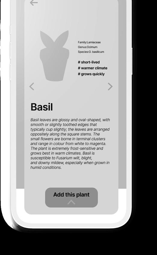
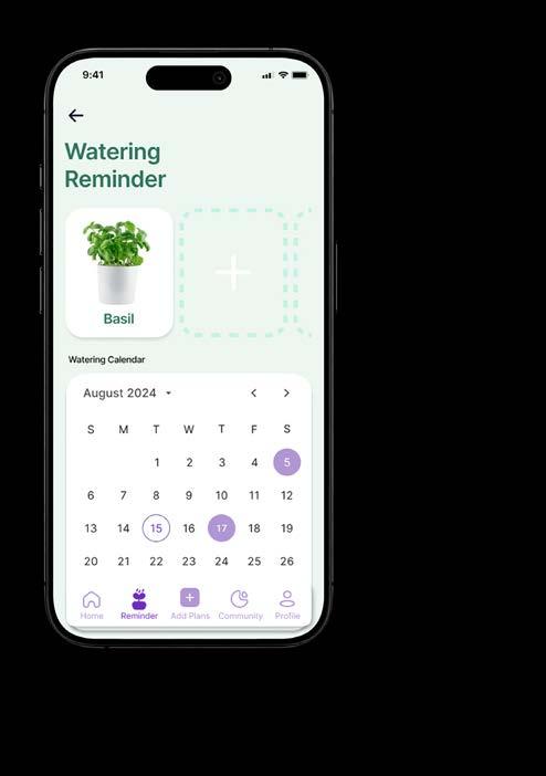
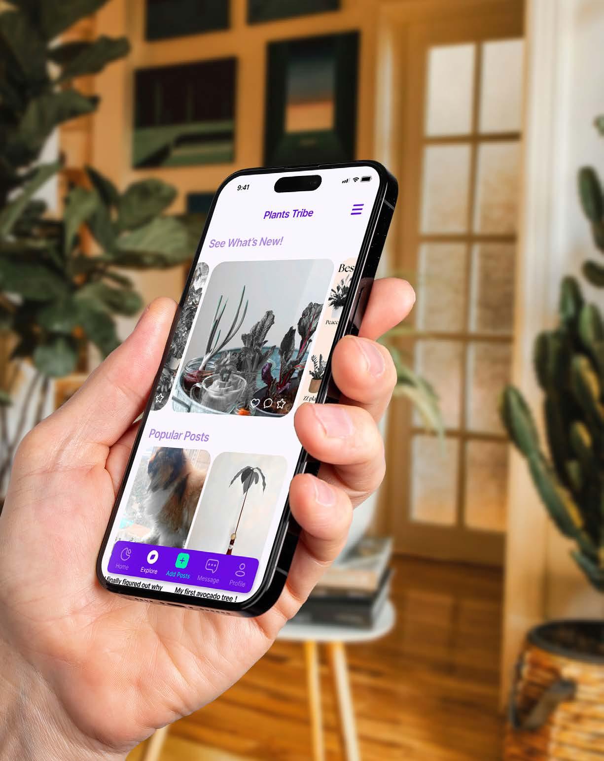
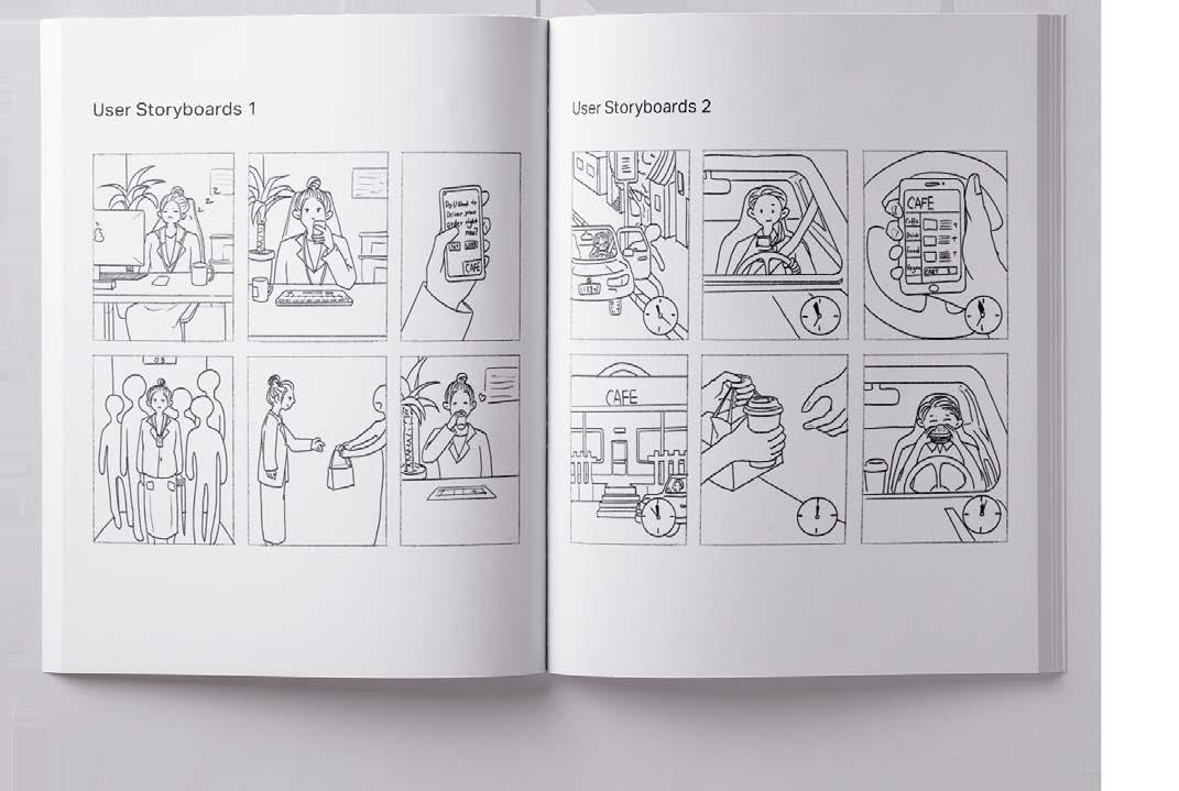
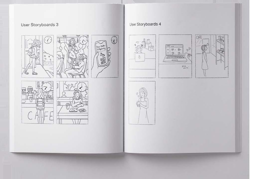
I designed an intuitive and user-friendly app that empowers urban residents to successfully engage in urban planting. ‘Plant It’ will offer personalized assistance and resources for growing plants in city environments, with a focus on accessibility, community engagement, and sustainable urban living.
(APPROACH)
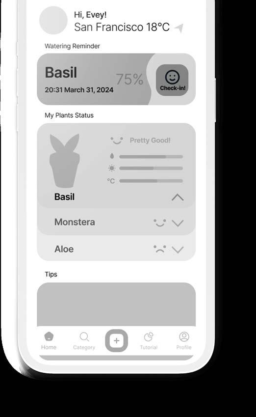
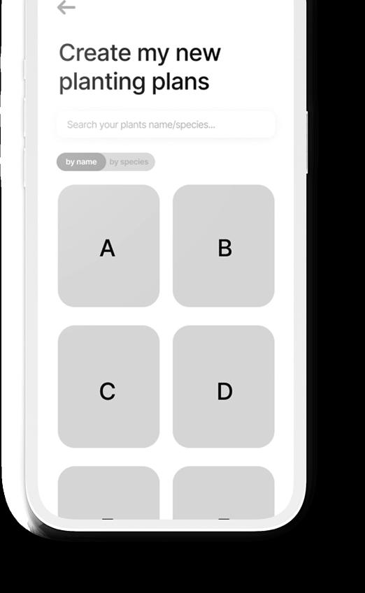
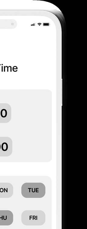
The target audience of this app is plant cultivation enthusiasts living in cities, with an age range of 20-50 years old. In the app, users can customize their own cultivation plans according to their living habits and different potted plant types. This includes watering and fertilizing schedules, with the app’s watering reminder feature helping users care for their plants more effectively. At the same time, the app has a plant community function, where users can share their planting experiences and planting results in the community.
Growing with Every Step Instructor, Edward Cho


PLANT IT!
PLANT IT! is an application for urban indoor gardening. It offers access to expert guidance, customized planting plans, and personalized watering reminder functions, ensuring each plant receives optimal care. Additionally, users can connect with a vibrant community of fellow urban gardeners.


(FILE FIVE)
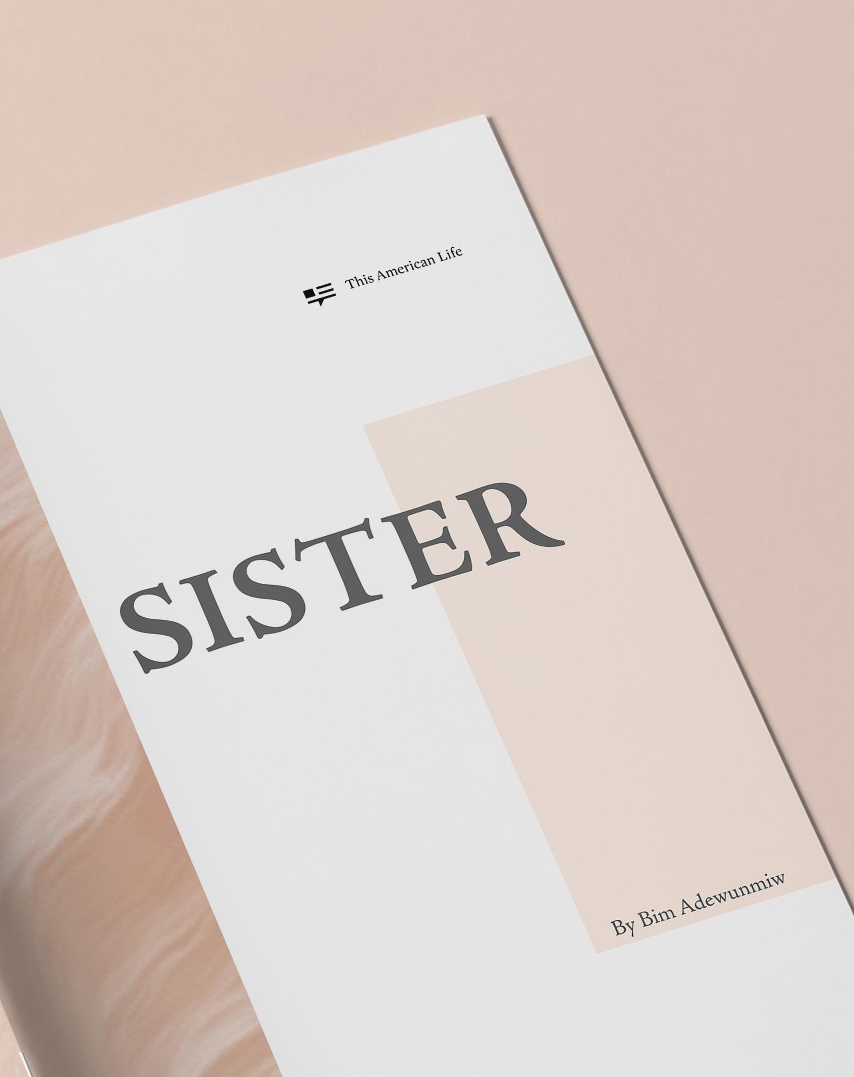
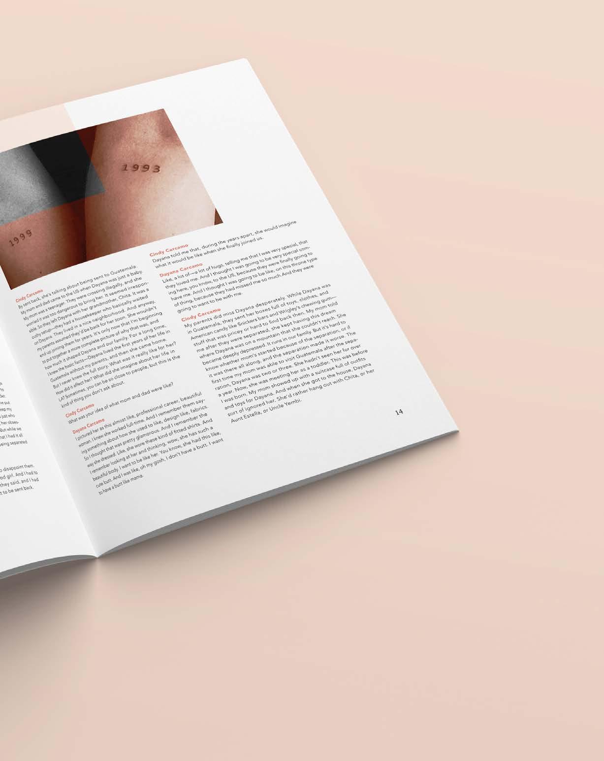
Podcast Chapbook Design
(COURSE) Type Systems
(INSTRUCTOR)
Hunter Wimmer
(SEMESTER) Spring 2022
(CATEGORIES)
Editorial Design Typography
Layout Design
(DELIVERABLES)
Chapbook of a podcast
(OBJECTIVE)
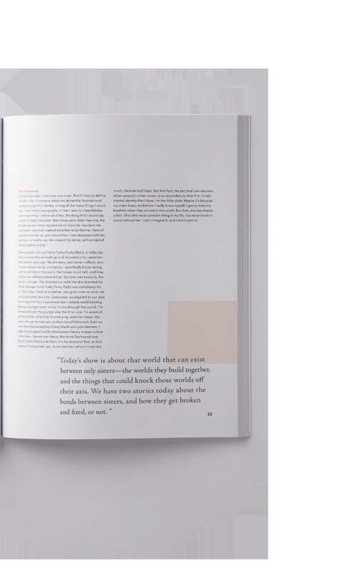
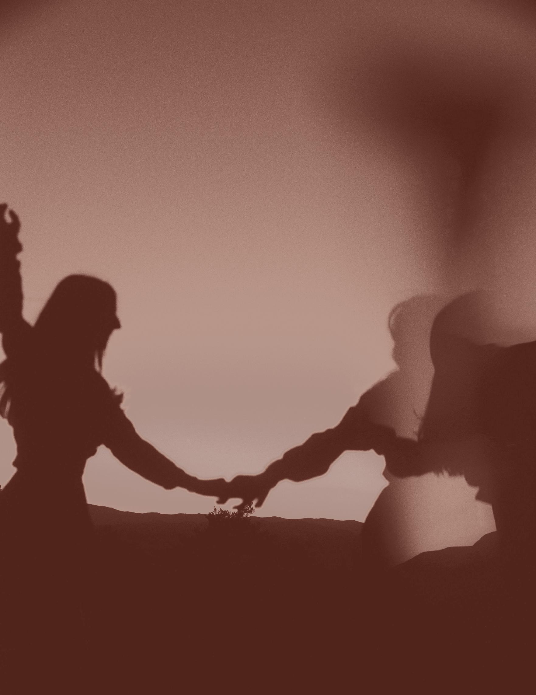
This project is a podcast transcript chapbook with a theme centered on sisterhood, featuring a visually coherent layout and photography to capture its essence. The design will emphasize the core of the podcast content—Bond, using creative typography and images to enhance the emotional connection and reflect the unique bond between sisters.
(APPROACH)
According to the theme of the podcast—sisters, I chose a cream yellow as the main color to create a calm and warm feeling. And added black and white pictures in the spread to contrast with the cream yellow pictures, just like sisters, the two complement each other. In the font selection, I used a serif typeface for the title, and in order to enhance the contrast of the layout, I chose a san serif typeface for the text body.
Belongs to Our Bond Instructor, Hunter Wimmer


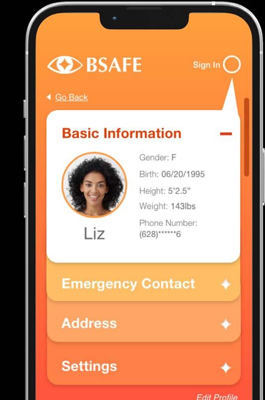
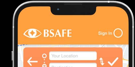
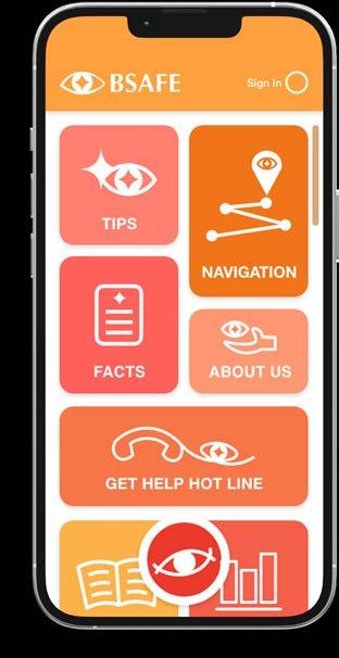
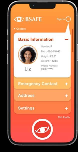
(FILE SIX)
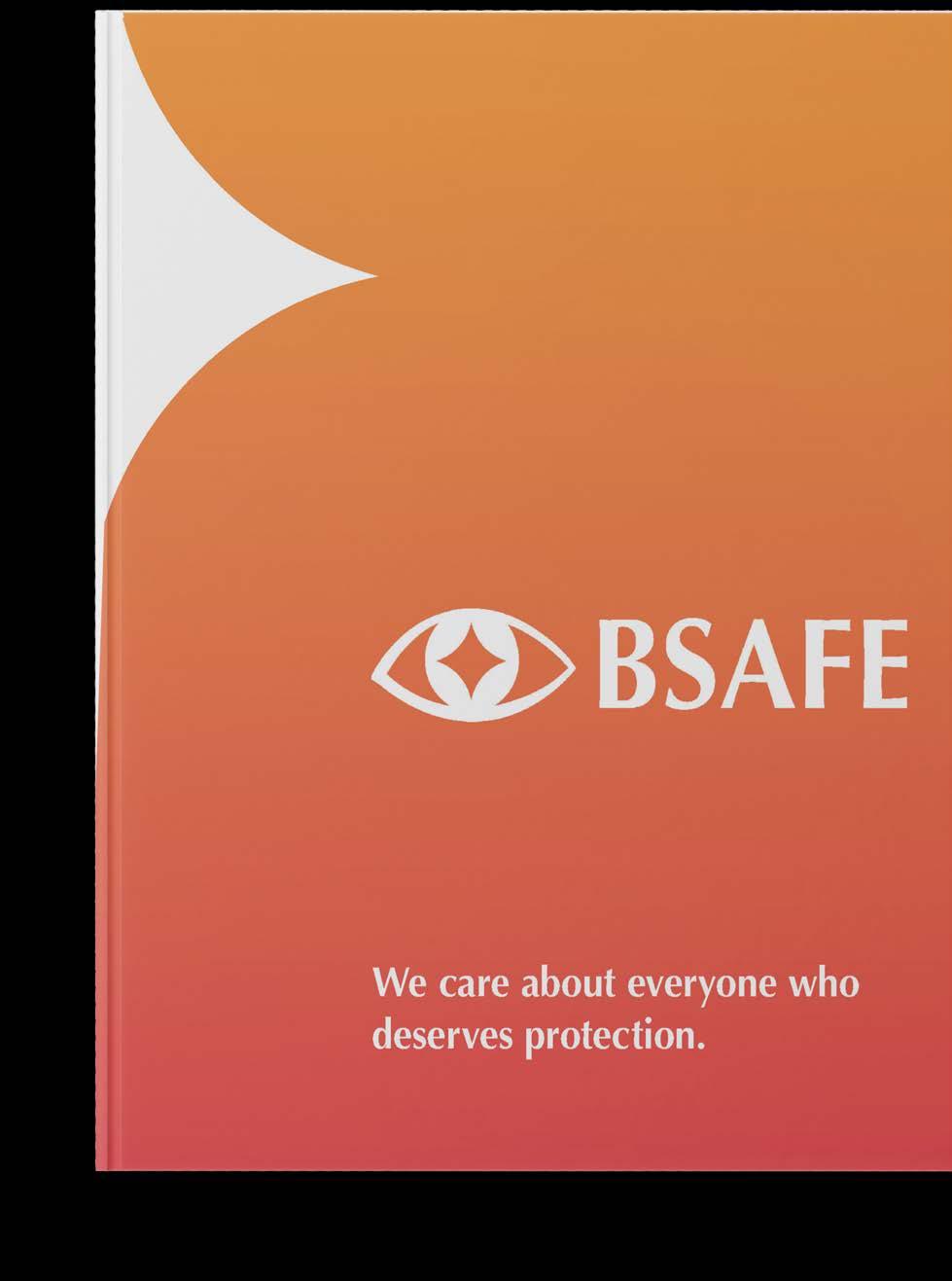
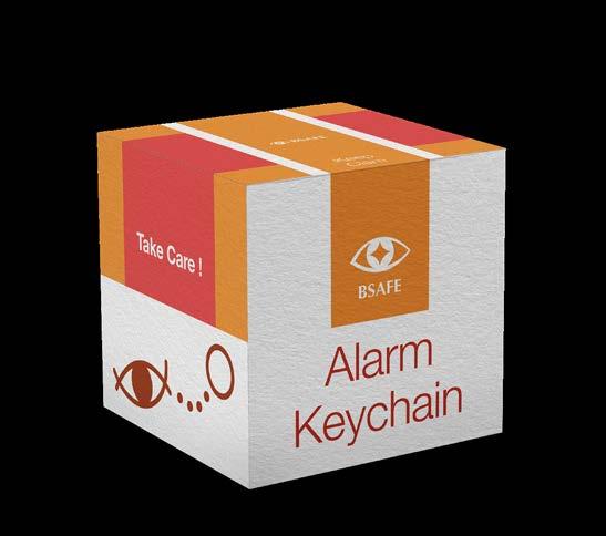
Bsafe Branding
(COURSE) Visual Thinking
(INSTRUCTOR)
Sandra Isla
(SEMESTER) Spring 2022
(CATEGORIES)
Brand Identity Layout Design
Promotional Design
UX/UI Design
(DELIVERABLES)
A branding book, three posters, an app and the event promotional materials
(OBJECTIVE)
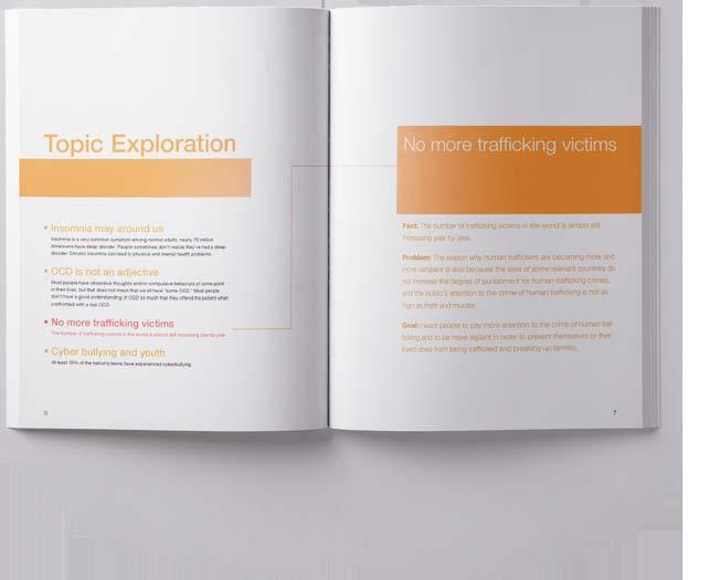
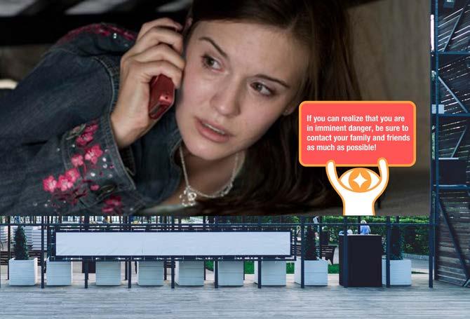
The goal of this project is to enhance the self-protection awareness of urban residents to help reduce the potential risk of human trafficking. The target audience of this project is children, women and men with weak self-protection awareness.
(APPROACH)
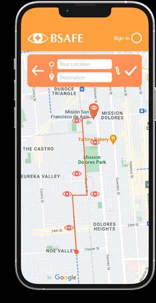
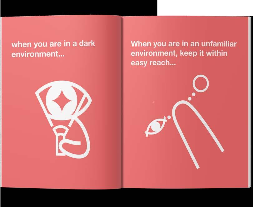
Bsafe’s brand mission is to empower and protect communities through awareness, prevention, and support in the fight against human trafficking. In terms of brand definition, the main color of the brand is orange, which is eye-catching and has a warning connotation. At the same time, orange is also a relatively neutral color to correspond to my target audiences of different ages and genders. In terms of the design concept of the logo, I chose the visual element of human eyes, which represent attention and vigilance.
Be Safe Instructor, Sandra Isla


(FILE SEVEN)
Cafe App Redesign
(COURSE)
Digital Studio Design 1
(INSTRUCTOR)
Lloyd Mitchell
(SEMESTER)
Spring 2022
(CATEGORIES)
UX/UI Design
Visual Design
(DELIVERABLES)
A branding book, three posters, an app and the event promotional materials
(OBJECTIVE)
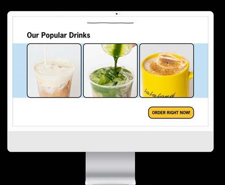
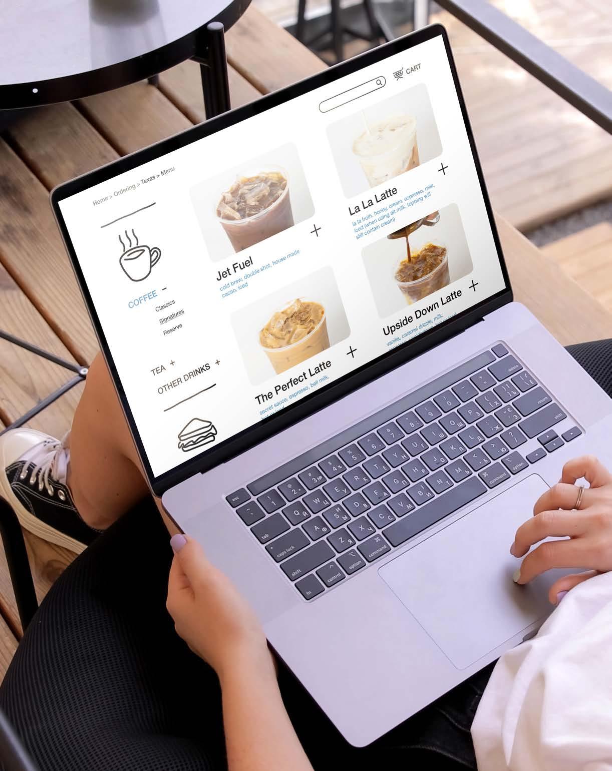
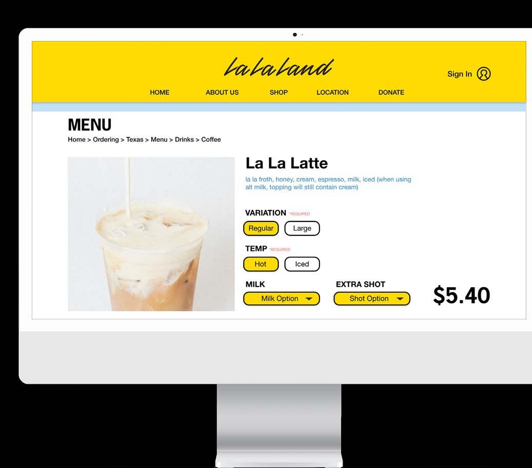
The goal of the La La Land Kind Cafe app redesign was to enhance the user ordering experience through an intuitive, playful, and whimsical interface. The redesign focused on smoother navigation, simplified ordering, and a visually engaging platform that embodies the cafe’s mission of “kindness and connection.”
(APPROACH)
I chose yellow and light blue as the colors of the user interface. I added a hand-drawn style of lines to the user interface to create a playful feeling, so that users can feel better when experiencing coffee purchases.
Start the Day with Coffee Instructor, Lloyd Mitchell


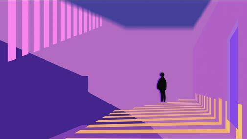
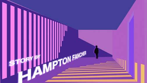
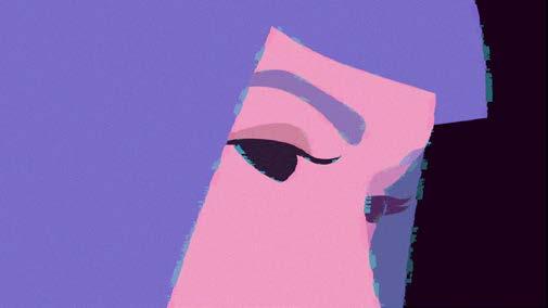
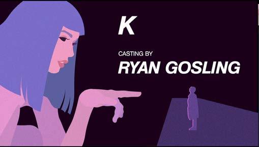
(FILE EIGHT)
Movie Trailer
(COURSE)
Motion Graphic 1
(INSTRUCTOR)
Frank Pietronigro
(SEMESTER) Fall 2023
(CATEGORIES)
Video Editing Illustration
Visual Design
(DELIVERABLES)
A trailer video of movie Blade Runner 2049
(OBJECTIVE)
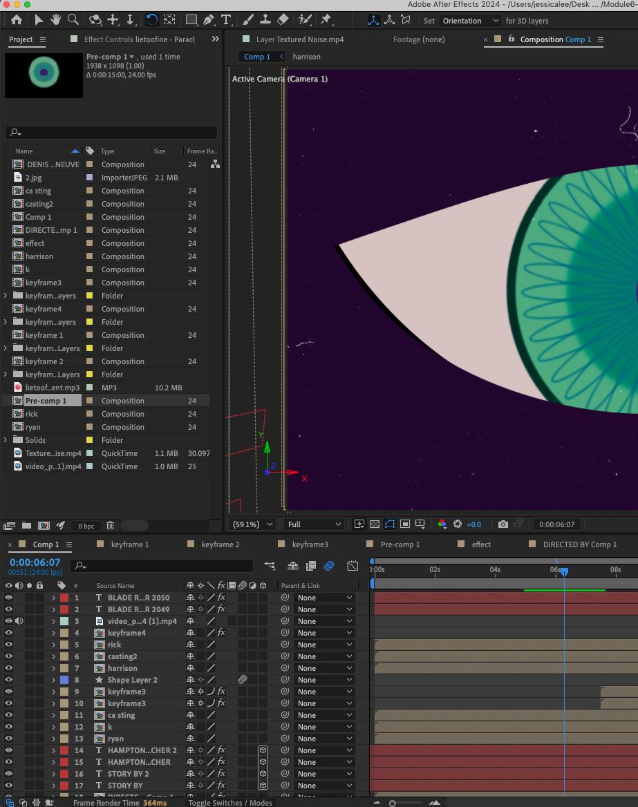
The purpose of this project is to understand the various functions of Adobe After Effects and be able to flexibly apply these functions to make animated videos. Motion graphic is different from traditional graphic images in that it needs to use different types of dynamics to show the attractiveness of the visual layout.
(APPROACH)
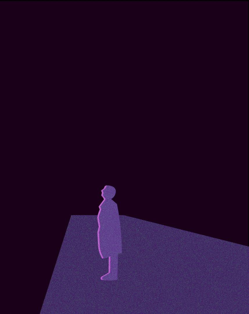
I chose the movie Blade Runner 2049. When making the trailer, I chose several well-known storyboards in the movie and turned them into illustrations. In addition, in several shots, I combined spatial perspective to make the text more dynamic to break through the boundaries of the two dimensions.
Neon Shadows of the Future Instructor, Frank
Pietronigro


(FILE NINE)
Object Video
(COURSE)
Motion Graphic 1
(INSTRUCTOR)
Frank Pietronigro
(SEMESTER) Fall 2023
(CATEGORIES)
Video Shooting
Video Editing
Visual Design
(DELIVERABLES)
An edited video of the popcorn bag
(OBJECTIVE)
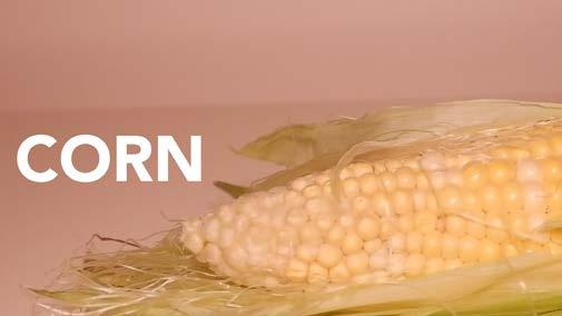
To create a dynamic and visually engaging motion graphic video that showcases an object’s form, function, and narrative potential through movement, composition, and visual effects. This project aims to develop skills in animation, timing, and storytelling while exploring innovative techniques to transform an everyday object into a captivating focal point for viewers.
(APPROACH)
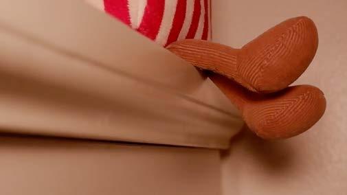
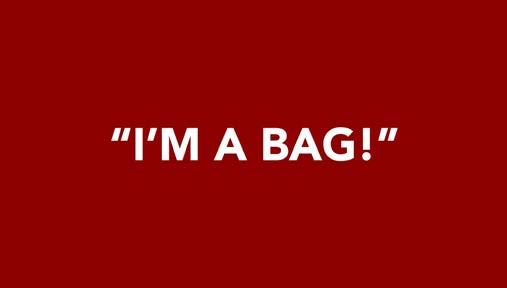
The whole video uses a relatively abstract narrative style to tell the story of a bag with a popcorn shape and personality. I used multiple angles and different lighting to shoot this bag to make it look more like a lively and cute creature. The story is about the bag’s doubts about its own identity and its final cognition, which is a bit absurd but interesting.
Popcorn Fantasy Instructor, Frank Pietronigro


(FILE TEN)
MFA Thesis Project
(COURSE)
Visual Communication Lab
Thesis 1, 2, 3
(INSTRUCTOR)
Jeremy Stout
Laurie Makela
John Nettleton
(SEMESTER) Fall 2023
(CATEGORIES)
Branding Identity
UX/UI Design
Motion Graphic Design
Editorial Design
Promotional Design
(DELIVERABLES)
Retail Environment design, UX/UI design and interactive promotion design
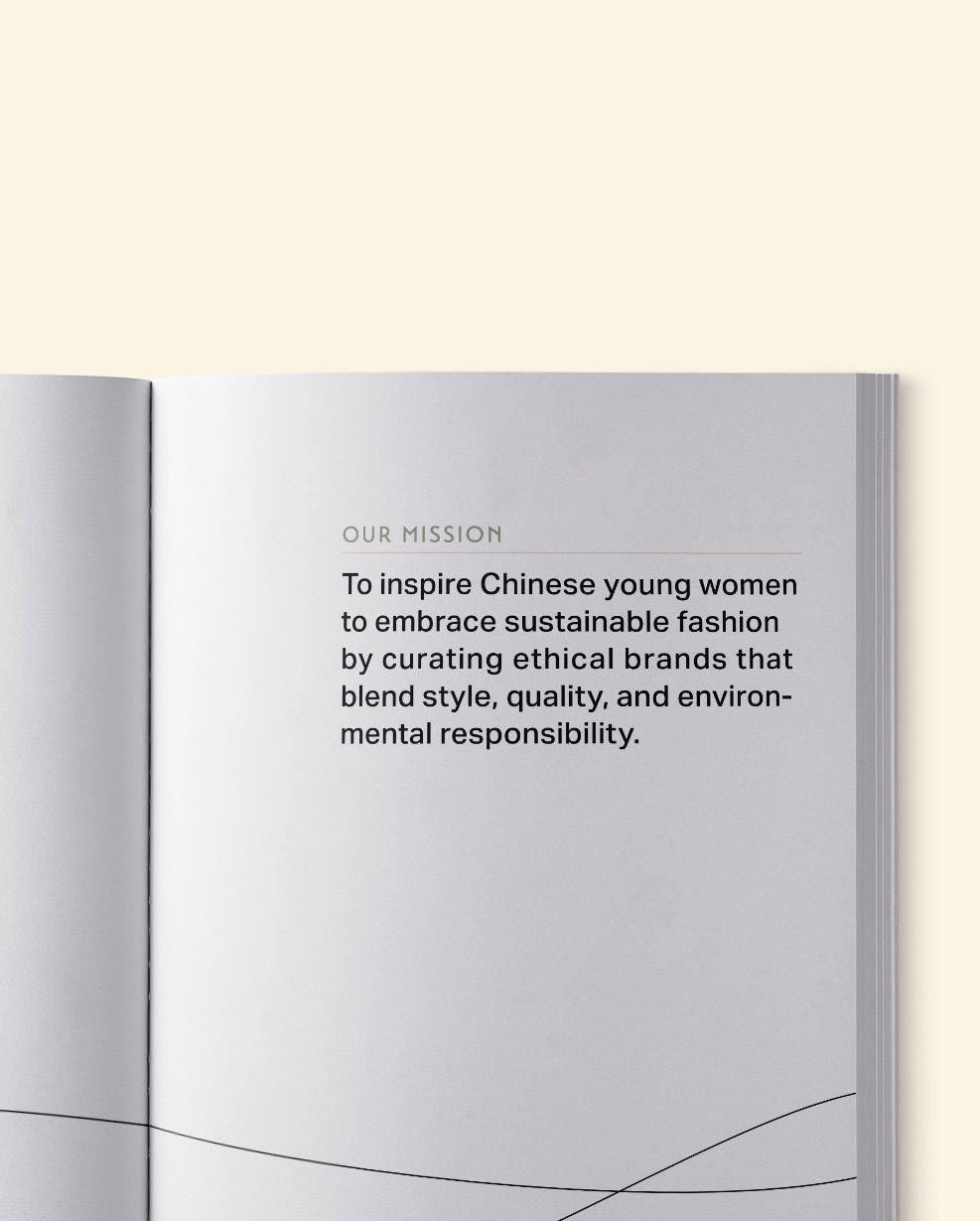
(OBJECTIVE)
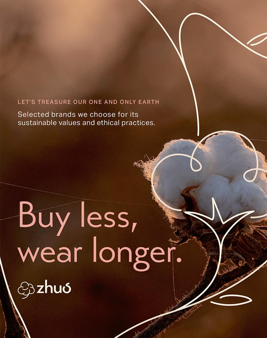
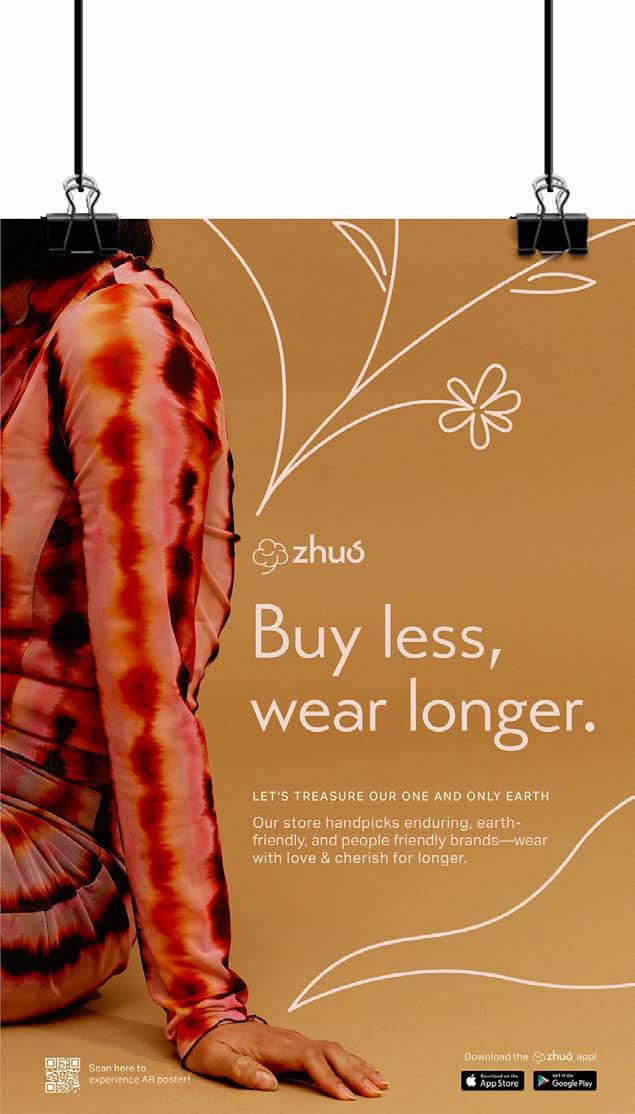
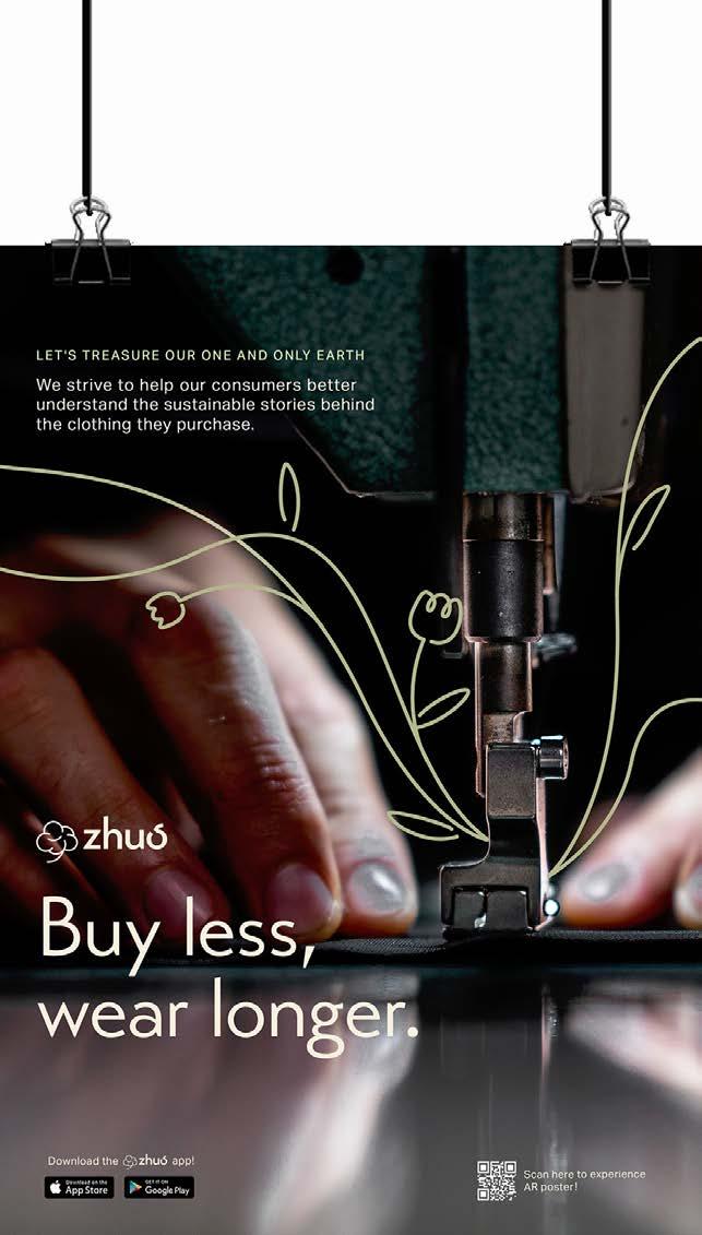
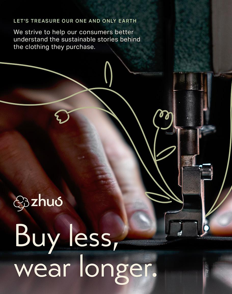
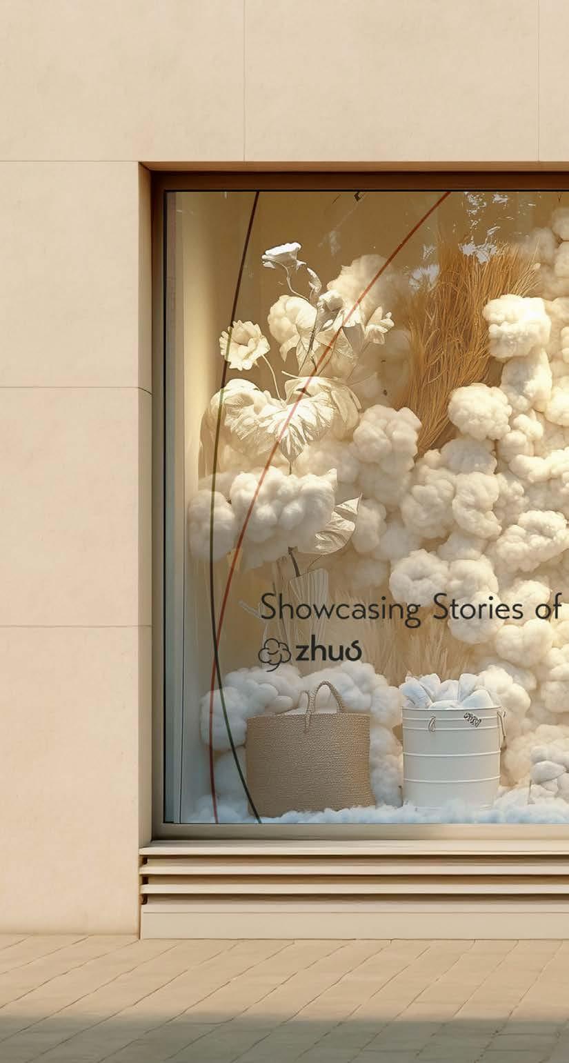
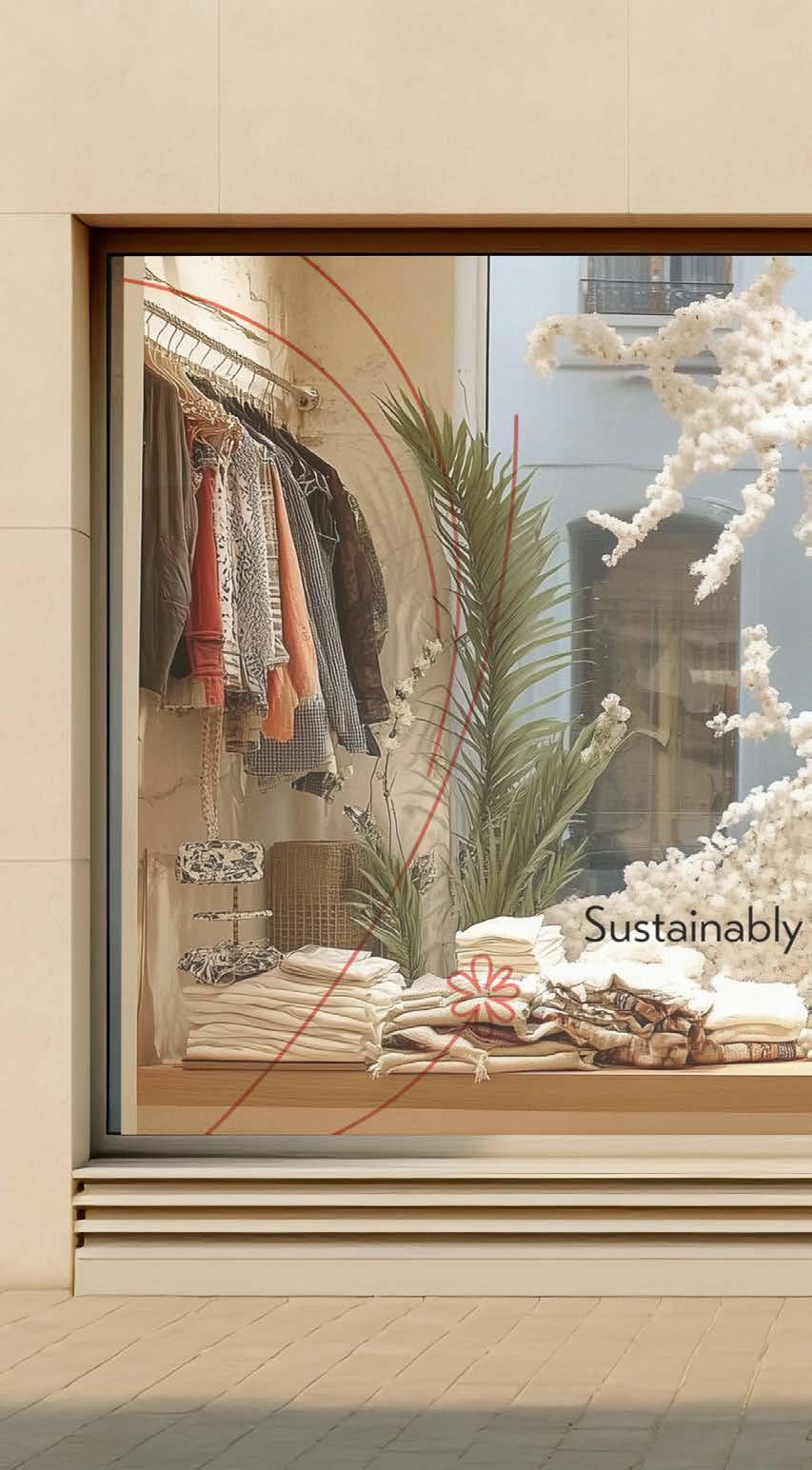
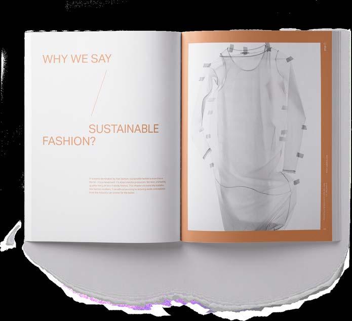
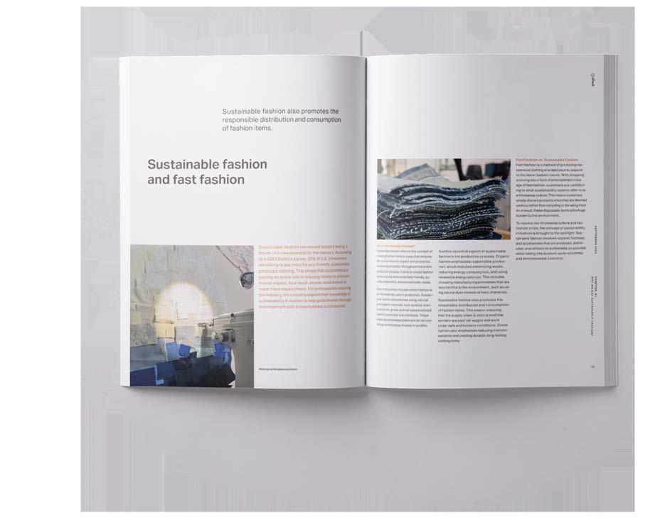
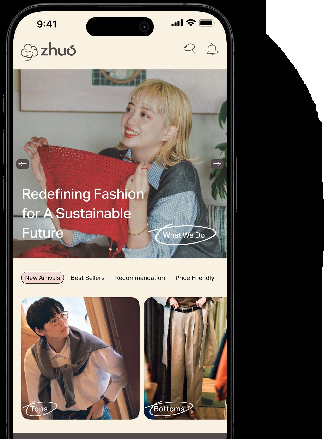
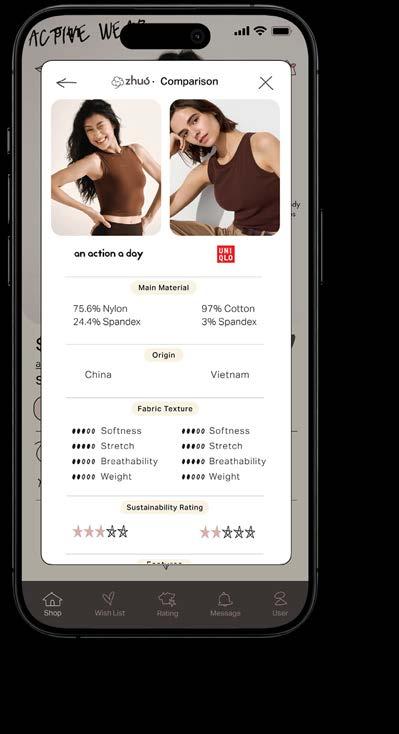
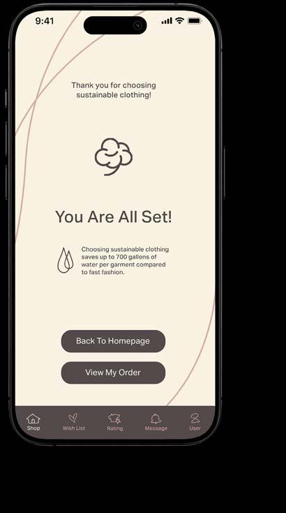
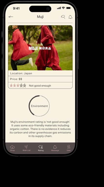
The project focuses on sustainable fashion in China, aiming to encourage young Chinese women to choose sustainable clothing over fast fashion. It includes a total of three deliverables involving sales environment design, user experience design and interactive promotion design.
(APPROACH)
The target audience for this thesis is young women in their 20s and 30s. To appeal to this demographic, I designed the visual system using soft tones to convey the calm and gentle essence of sustainable clothing. Additionally, I incorporated curved lines into the deliverables, adding a sense of dynamism and making the overall design more engaging and lively.
MFA Thesis Sustainable Fashion in China
Instructor, Jeremy Stout, Laurie Makela,
John Nettleton


SYMBOL
LOGOTYPE


Special Thanks
(TO MY PARENTS AND DUODUO)
First of all, I want to thank my biggest sponsor, my dear parents. You have supported me unconditionally both materially and spiritually, helping me to realize my dream. And my dear dog Duoduo, you are my biggest spiritual support. Every time when I have a mental breakdown, you calm my heart. I will always love my family.
爸爸, 妈妈还有多多,我爱你们。
(TO MY FRIENDS)
You guys make my life in San Francisco less monotonous and support me in my studies and life. You inspire me and I am lucky to have such priceless friendships.
(TO MY MENTORS)
I am very grateful to every instructor who has taught me. Your patience and encouragement have helped me to continuously improve and progress on the road to becoming a more professional designer, and guided me to continue to explore and experiment.
Colophon
(TITLE OF BOOK)
File New
(SCHOOL)
Academy of Art University
(DEGREE)
Master of Fine Arts
School of Graphic Design
(COURSE) GR 800
MFA Portfolio Seminar
(INSTRUCTOR) Mary Scott
(CONTACT) Yiwei Li yiwei_li0326@163.com (628) 286-9005
(TYPOGRAPHY)
New Century Schoolbook Area Normal
(PHOTOGRAPHY) Unsplash.com Adobe Stock.com
(PAPER) Mohawk Superfine Eggshell 100# Text
(COPYRIGHT ©2024 YIWEI LI)
All rights reserved. Unauthorized use, duplication, or distribution of any content, including text, images, and design elements, without explicit permission is strictly prohibited.