


Fig.
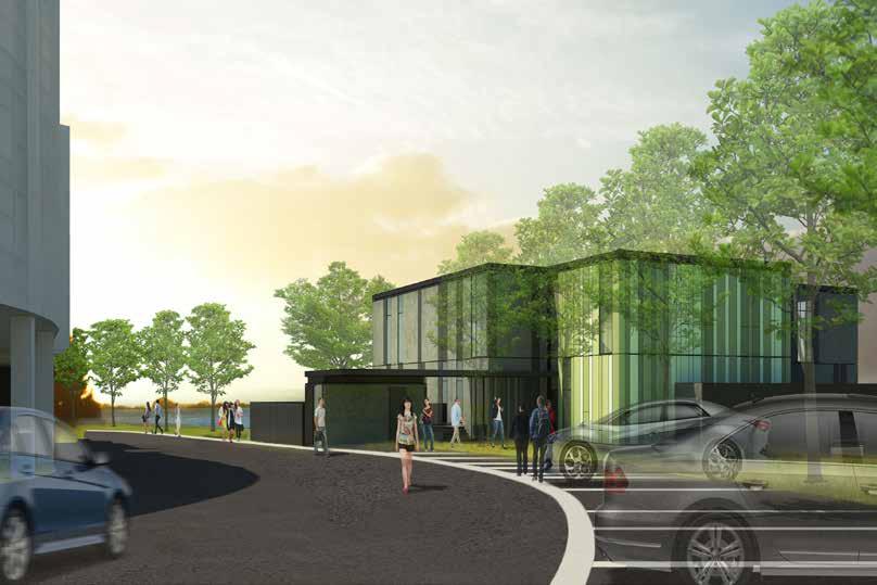
Fig. 1 Clinical Skill Centre from Hospital Main Entrance

Winner of 2018 PCNZ Health and Medical Property Award
Market Sector: Health/Tertiary Education
Size: 1,395sqm GFA total
Budget: Approx NZ$10 million
Arrangement: 2 Levels
Status: Completed February 2017
Design Intent:
The Whenua Pupuke facilities has effectively consolidated multiple services into a purpose-built facility, leading to the streamlined operational efficiency across various sites within the DHB’s campus. It also significantly expand specialised usable space in the WDHB campus.
The design process has been guided by key considerations, particularly the advantageous location at the lake edge and its integration with existing structures.
The building’s geometry is intentionally kept straightforward to harmonise between the large hospital tower and the main hospital building, while also acknowledging the expansive horizontal presence of the lake.
Prominent spaces within the building, such as the Auditorium and Large Meeting Room on Level 1, thoughtfully frame views of Lake Pupuke. These spaces, featuring sizable picture windows, facilitate a strong connection with the outdoors, effectively bringing the outside environment indoors.


The external color and material palette draw inspiration from the existing hospital structures and the natural context of the site. With a deliberate selection of simple and robust materials, the palette is skillfully adjusted to minimise the perceived scale of the building. Subdued dark tones are strategically utilised to blend the building with the surrounding vegetation when viewed from the lake. Furthermore, the pre-cast panels incorporate subtle vertical textural elements, contributing to the nuanced breakdown of the building’s mass.
To enhance the building’s presence when approached from the hospital’s main arterial road, touches of varying green shades are applied to parts of the southern facade, creating subtle highlights against the backdrop of the lake and existing vegetation.


Within the interior, a colour and material palette featuring timber is employed to introduce the warmth associated with the external landscape into the building’s indoor spaces. This choice of finish and colour also aligns effectively with the audiovisual requirements of the 250-seat auditorium.


1
2
3
4


The series of spaces


1 An existing production garden near the staff kitchen. The garden also connects to the secondary entrance.
2 A bird-watching area across the theatres to enjoy the existing bird population thrivin in the wetland.
3 A viewing platform at the high point of the site that looks across the plains. Accessible from the secondary entrance.
4 A meditative labyrinth - walking a labyrinth is an age old form of meditation. There is no getting ‘lost’ as it is made of one single path that leads to a centre.
5 A sculptural walk to connect the western amenities together and an opportunity for art/cultural engagement with local community.

6 A revitalising corner by the main entrance that integrates with the existing cafe. It is also a play area for children.


This section is to be read in conjunction with Patrick Corfe Landscape Architect’s Preliminary Design Report. The report will provide more details in landscape concept and approach around the building, by the entrances and the courtyards.
The wider site will benefit from the existing landscape and habitat by creating pockets of amenities that can be shared with the community. The proposed interventions will tie in with the council proposed broadwalk along the stream with possibility of a cycling path.
The proposed sequence of spaces is not in the current project budget. However, current landscape design take aspiration to create a more holistic site-wide landscape design. Potential area for integration in the future intervention are taken into consideration.

Design Strategies
4.1 Design Strategies


Together with mana whenua representatives, a cultural design framework has been developed, placing a distinct emphasis on the concept of Taiao. Derived from the principles of Te Whare Tapa Whā, the core theme of karakia and traditional healing methods has been translated with the guidance of Ngāti Tamaoho kaumatua, Ted Ngataki. This fundamental concept guides the design of the building façade, interior spaces, and landscaping, ensuring a profound connection to the community and fostering a sense of collective ownership.
The sequence of spaces promotes a walk around the site to enhance physical, emotional and mental wellbeing. These spaces will be connected by a sculptural walk that provide opportunity for cultural and art engagement with the community.
The series of spaces are:
An existing production garden near the staff kitchen. The garden also connects to the secondary entrance.
Market Sector: Health Care
Size: North Building - 8510sqm GFA
East Building - 3350sqm GFA
West Building - 1060sqm GFA
Status: Completed in 2019
Design Intent:


A bird-watching area across the theatres to enjoy the existing bird population thriving in the wetland.
A viewing platform at the high point of the site that looks across the plains. Accessible from the secondary entrance.
‘lost’

Physical + visual connections are created from the built form towards the existing natural landscape and biodiversity.


- GREEN POCKETS
• Bringing the


as it is made of one single path that leads to


The project brief calls for a masterplan facilitating significant redevelopment of current facilities to enhance community health and well-being. There is an immediate need to expand capacity to support a shift in the model of care at the Manukau Health Park (MHP).


The new masterplan for Counties Manukau Health outlines an ambitious vision for the long-term holistic development of their facilities. It includes 3 new sustainable buildings, North and West Building by Warren and Mahoney Architects, and East Building by Brave Architects, creating an engaging environment for staff, patients, and the public. While the broader site landscape strategy seamlessly integrates with landscape architect proposed design.


Landscape is brought into the built form + a relationship with the outside is maintained through an east-west connection via the entrances; punctuated by pockets of ‘green’ courtyard and to the natural landscape beyond. New connection links back to existing east west corridor.


The Radiology entrance (North Building) right next to the Health Park’s main entrance expresses the maihi and amo on the entrance facade. The use of colour to create a stepped pattern within the maihi, forms a spiritual connection in the healing process as part of the karakia narrative. The roof edge protection design builds on the facade design concept of maihi. The screen pattern is designed by Ted Ngataki, with representation of three different iwi coming together.
14 The foundation of the design is the Te Whare Tapa Whā, Māori model of health, which expresses the interconnectedness of health with other factors, in particular Karakia - an important traditional healing process.


The Renal entrance (North Building) next to the Health Park’s secondary entrance located at the west continues the design concept established to ensure coherent wayfinding approach which is guided by the foundational concept of Te Whare Tapa Whaa.


The facade materials (Terracotta and pre-cast concrete) are intended to create a soft warm atmosphere, that makes users feel at ease when approaching the buildings. We aim to carry this feeling into the recpetion and welcome areas through using a warm palette and soft curves.
The concept of earth looks at layering different textures and patterns within the space whilst sticking to an earthy toned colour palette. Using large pieces of joinery with soft curves the space feels grounded but comforting. Long timber ceiling battens and a change in tone of vinyl on the floor creates a wayfinding method that guides users to the outside courtyard area encouraging interaction with outdoors.
The integration of landscaping and natural materials is intended to connect to the whenua and the ‘sense of place’ to make it a part of the local community.
Cultural acknowledgments will be incorporated through material finishes, feature walls and tactile textures to reaffirm the sense of belonging and community,


Warm, De-institutionalized

The concept of light aims to create a soothing, rejuvienating space. Materials and finishes will be chosen to create a sense of calmness based on their sensory qualities, such as soft comforting furnishings, tranquil colours, and associations with the natural and cultural environment (e.g. feature wall prints/ artwork).


Consideration to durability, sustainability and the ‘buildability’ of materials are key in the development of the interior design.

Materials and finishes will be easy to clean, easy to maintain and long lasting to acknowledge infection control requirements.


Winner of BCSE 2009 Inspiring Design: International Award
Market Sector: Education
Size: 12,500sqm
Budget: Approx £25 million
Status: Completed September 2008
Design Intent:
HOK was commissioned to design the school to an extremely tight timescale. The target was to open the school in 20 months from the date of our appointment. The school needed to be flexible enough to deal with a program that would develop as the building was constructed. Above all it would need to provide an inspirational learning environment that met the true vision of the project, a new approach to teaching and learning in the largest city in Kazakhstan.
The strategies adopted to answer these challenges rely on the separation of formal and informal learning spaces. Traditional classrooms’ are provided in a series of simple in-situ concrete framed structures, free from internal columns, that are rigid enough to cope with the seismic conditions but flexible and simple to adapt as needs evolve. Between the more formal structures are three informal areas beneath free form, lightweight roofs covered in highly insulating ETFE cushions which mimic the silhouette of Tian Shan Mountains in the south. These spaces provide a public agora at the entrance to the school, an informal space for the younger pupils and at the centre of the school, a learning resource tailored for independent and project based learning. This central space is the heart of the school, surrounded by all the major teaching spaces it sets out to celebrate learning in all its manifestations.


Market Sector: Education
Size: Main School - 15,000 sqm , 915 pupils aged 11 to 18
Preperatory School - 4,500 sqm, Residential - 23,000 sqm
Budget: Approx. £37 million
Status: Completed 2012
Design Intent:
The Campus Master Plan embraces the beauty and character of a garden campus. The buildings and spaces are designed to ensure that the unique climatic and landscape characteristics of the site are made fundamentally a part of the pleasure of living and learning. The School proper is organised such as to take maximum advantage of the topography and unique landscape of the Marlborough College Campus. The conceptual arrangement is focused on the building’s relationship to hill and valley, as well as to the benefit that comes with elevated terrain; good view corridors, breezes and a strong connection to the landscape.

Sporting Fields provide the major training spaces for students and are placed along the southern boundary to form a buffer from the Main Road. To the north of the site a 50m wide nature reserve forms another separation zone for the school and simultaneously provides access to the river for water sports, as well as space for a crosstraining and fitness trail. A water retention area collects rainwater run-off on site and is employed, sustainably, to irrigate the sporting fields of the campus.
The main entrance courtyard, enclosed by formal buildings housing administrative, dining, and performance facilities, serves as an arrival point into the campus located at the base of the two small hills. From here, terracing west uphill leads into the teaching zone. While the buildings in the main entrance courtyard exhibit a grounded and formal character, the teaching clusters on the hilltop are elevated on stilts to harmonize with the sloping topography. Extending this concept further, an observation tower spirals upward, culminating in a viewing platform above the tree canopy.
At the heart of the educational complex, the Learning Research Centre (LRC) functions as a central learning hub, serving as the point from which classroom buildings extend. The classroom clusters take the form of V-shaped structures, composed of modules measuring 75sqm, 50sqm, and 37.5sqm. The in-between spaces of these classroom wings help to form semi-outdoor learning spaces, which channel breezes into the classrooms and extend what is otherwise a traditional teaching space into a flexible and multipurpose learning environment.


Each building forming the wings of the V-shaped classroom cluster utilises materials and construction methods rooted in local expertise. Employing a concrete frame system with lightweight infill walls, these buildings feature a lightweight steel roof supported by steel members, creating a “floating” effect above the classrooms to effectively manage heat radiating from the heated roof. The roofs are intentionally “split” to promote cross ventilation, enhancing natural airflow. Additionally, generous roof overhangs play a crucial role in shading adjacent areas, not only maintaining a cool internal building temperature but also reinforcing the effectiveness of passive design strategies.


The Prep School is an arrangement of 5 classroom buildings anchored by a central, shared building. These buildings are arranged to follow the gentle rise of the ground. To the south are two upper school modules and to the north, two lower school modules and kindergarten. A continuous, covered pathway that gently rises connects these buildings together and guides staff, students and visitors from the vehicle drop-off to the reception and further to all parts of the Prep School. This curving pathway also forms the edge of two elliptical garden courtyards which are the central gathering and play spaces of the Prep School Campus.

We have drawn from the Swahili urban tradition where we have observed the strong transition from the public to the private realm. Transition between public and private are marked by elaborate doorways and portals. Welcoming meeting spaces occur in this outer zone with the inside space moving out into the public realm. Visitors are taken through portals and passages with long, inviting views into a softer, more open, private world.


A fundamental element of the vision held by all Aga Khan Academies and Institutes for Educational Development is the profound integration of African culture and everyday life into the campus design. It’s essential to recognise that discussing a single ‘African’ approach to daily life would be overly simplistic due to the diverse range of African cultures, resulting in a deeply multicultural society. However, by examining traditional African settlements in Tanzania (see Fig. 5), we’ve identified certain general characteristics in terms of layout and organisation.
The subsequent key insights that have guided our strategy include:
1. Allocating the central area for vital family assets or activities, such as storing cattle in the Thonga house or constructing a ‘men’s house’ in the Makonde house.
• Within the campus, a central open space, known as the Moyo (Swahili for heart), will be designated for use by both students and teachers. This space will serve as the core and hub of the campus.
2. Recognising the significance of trees within African culture. The shaded area beneath a tree canopy becomes a meaningful and significant space—not only offering protection against the elements but also providing a venue for social interaction, idea exchange, shared experiences, and mutual teaching and learning.
• The proposed designs incorporate a variety of covered outdoor spaces with minimal to no walls. These spaces symbolise the importance of trees as sources of shelter.
3. Departing from dominant grids or axial alignments.
• Building arrangements follow the functional requirements outlined in the project brief. Organisational patterns take a backseat to the programmatic elements and spaces they occupy.
The Academy principle buildings are gathered around a central ‘MOYO’ or heart space. All the main elements face onto this space; every individual will have cause to pass around it several times a day. It is this space that is the academic and social heart of the campus. The buildings are simple, modest structures. Instead focus is given to the Moyo which is dominated by shady planting and the activities of students and faculty, from early morning, through the day and well into the evening.


Residential spaces are gathered about naturally ventilated shady courtyards protecting occupants from the sun and the heavy rain of Dar Es Salaam. We have observed the characteristics of many Swahili courtyard spaces, entry is always sequential and staggered revealing the interior gradually.
We observed upper levels of local buildings were open to catch the breeze, privacy where needed was provided by lattice screens. It will be important that the design of the roofs captures this concept. They will function to both protect from extremes of sun and rain and channel trade winds to cool the buildings. The floating roof with deep overhangs coupled with the design of permeable walls will aid in passive cooling.


Market Sector: Health Care
Size: 3,500sqm GFA total
Budget: Confidential
Arrangement: 1 level
Status: Completed in 2015
Design Intent*:
Recognising the importance of the new bus interchange as a catalyst for the revitalisation of the central city, the interchange was one of the first anchor projects to be completed after the 2011 earthquake. As a vital part of the new civic infrastructure it needed to not only provide a highly efficient public transport hub but also help define the rebuilt city’s identity and public space experience.
A ‘L-shaped’ concourse was devised fronting both Colombo and Lichfield Streets with 16 bus bays arranged in a crescent shape on the interior of the site. To minimise the footprint of the bus apron a ‘reversing bus bay’ design was adopted, enabling a concealed and secure bus apron as well as a contiguous and legible concourse that engages with the city.
The concourse is conceived as an extension of the city’s public realm. Along Colombo Street four timber pods sit underneath the main roof. They deliver passenger amenity including cycle and luggage storage as well as retail and food outlets – all of which open to both the street and the concourse. Glazing provides a seamless transition between the two and allows views from the public realm through the concourse to the bus apron beyond.


The experience of the indoor environment is enhanced by providing a fully naturally ventilated environment – a challenge for an indoor space surrounded by diesel buses and two main road frontages. Bus bays with automatic sliding doors prevent passengers from straying onto the apron and with localised air curtains prevent the ingress of toxic fumes. A combination of roof mounted wind catchers modelled on ancient Persian wind-towers and high level louvers on the street frontages draw outdoor air into the concourse. The passenger hall is tempered by hydronic underfloor heating powered through a groundwater heat pump system.
Form and materiality are influenced by Christchurch’s largely lost neo-gothic architecture and remaining nearby brick buildings. This is evident in the folded roof geometry with its gables and large skylights which bring daylight into the space and create an internal volume inspired by the great transit halls of the past. A cultural narrative developed by local Rū nanga Ngāi Tūāhuriri based on themes of early Maori navigation is integrated into the building fabric.
The holistic design approach has resulted in a civic facility that integrates the local urban and cultural context with customer comfort and the requirements of bus operators to launch Christchurch into a new era of modern public transportation.
*Excerpt from text description provided by architects in Archdaily online article .


Market Sector: Transportation
Status: Complete Competition
The competition called for expanding the existing Aeroporto “Amerigo Vespucci” Di Firenze in 5 phases. As a functioning terminal the design must be capable of construction allowing operations to be maintained and disruptions minimised. The submitted entry proposed 2 major interventions. A remodelling of the ground level primary landside circulation and a new facade of modular elements.
The drawings capture the idea of an inclined travelator journey by departure passengers bringing all passengers from a centralised ground location and thus avoiding direct cross flow with arrival passengers below. Two newly formed voids vertically transcend the building allowing arrival passengers a spatial experience on their welcome to Florence. These large interior volumes enhance the articulation of passage with a sense of dynamic movement. These voids also form a centralised space with light sources from above echoing strongly Florentine traditions of internal public space.


The upper facade sails over an under croft or “loggia” reminiscent of Tuscan colonnades at street level. The shadow at pedestrian level contrasts with bright luminance of the upper facade. The natural materials are of local stones including white salmon and green coloured banding inset stone reflecting local craftsmanship and complimenting the local special light quality.
The solidity at the upper levels refers to the dignified quality of massing in Florence as a city. At night it become a light radiating translucent object. The upper facade design displays the terminal to be read and understood in perspective at high speed.
The design intention of the airside facade is without air bridges and their connections, developing a purely architectural treatment of the upper airside levels facades.
The transparency of the facade has been designed to enable an active and interesting passenger experience with clear panoramic views from all of the internal terminal spaces and into the terminal interior from arriving passengers.
Both proposed facade design adopts an additive composition of elements to allow dexterity and ease of construction with minimum impact on passenger circulation and operations. A typical facade section is illustrated to define the simplicity of construction and the architectural intent of employing modular facade components in an active wall indirectly supported by the primary structure.


5 Churchill Place, Canary Wharf, London
Winner of 2007 Autodesk Revit Award
Market Sector: Office
Size: 37,000sqm GIA total
Budget: Approx £100 million
Arrangement: 15 levels
Status: Completed February 2009
Design Intent:
5 Churchill Place is a 15 storey office tower in London’s Docklands. The building was completed within a very tight time schedule at the end of January 2009. The 37,000m2 building rises as a sinuous extrusion from a very complex, asymmetrical plot.
It is a building that twists and turns through its site, showing a far from orthodox plan – like a vase by Alvar Aalto. This complex project was further complicated by the fact that it is sited over a pre-existing basement and a ramp structure which serves a neighbouring building.
This project is distinctive in being the first scheme undertaken by the UK office of this US practice to be conceived, designed, project managed and constructed with the aid of 3D software and BIM techniques.


Market Sector: Office
Size: 37,500sqm
Budget: Approx US$40 million
Arrangement: 15 levels
Status: Winner of the competition. Not built.
Design intent:
This office block competition calls for a maximum floor space in a restricted height zone. The proposal is to design a 15 level office block with a double volume winter garden at the top. A typical floor plate hugs the perimeter of the site with the required set back to fulfill the requirement for a maximum floor plan. Only the ground floor is offset substantially to create a covered alcove space for pedestrian circulation. This also allow the double volume ground floor to have a direct interaction with the external city life.
In order to give the building a distinct characteristic among its neighbouring glass enclosed buildings, the proposed facade design takes its idea by combining the art of weaving and the facetted effect of crystals. It is a skin made of crystal weave (Figure 1). In keeping with the city architecture, the proposed curtain wall design is kept simple and clean down to its detail (Figure 6).