
PROFESSIONAL WORK
Durham School Career Fair
UNL Engineering Dept. Intern - Event branding
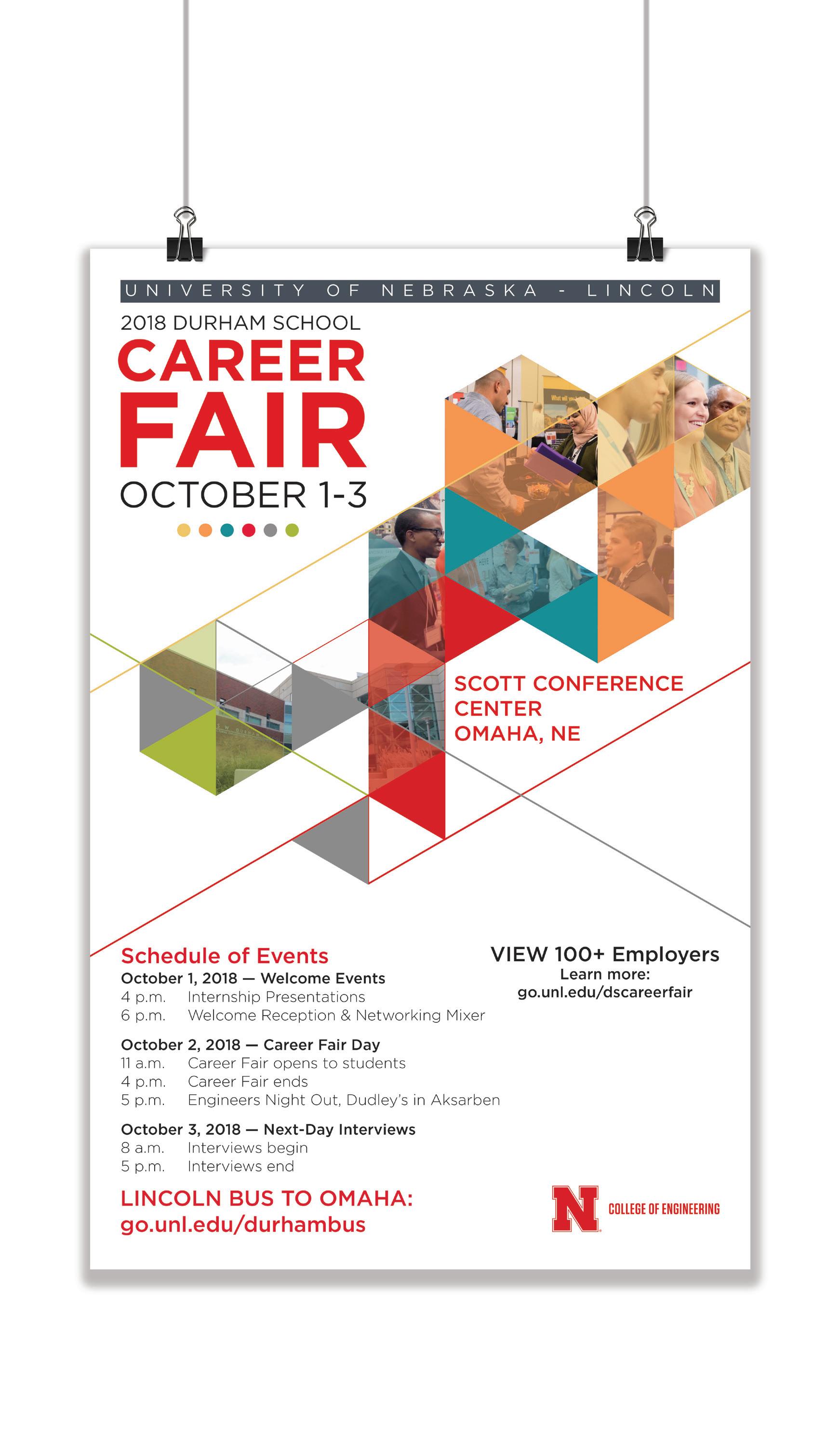
The Durham School career fair gives students in architectural, civil and construction engineering and construction management the opportunity to meet the more than 100 employers face-to-face, make contacts, explore career options and inquire about available full-time and internship opportunities. The deliverables for this project included two postcards, one for the employer and one for the students, two 11x17 posters for Omaha and lincoln and the internship presentation booklet.
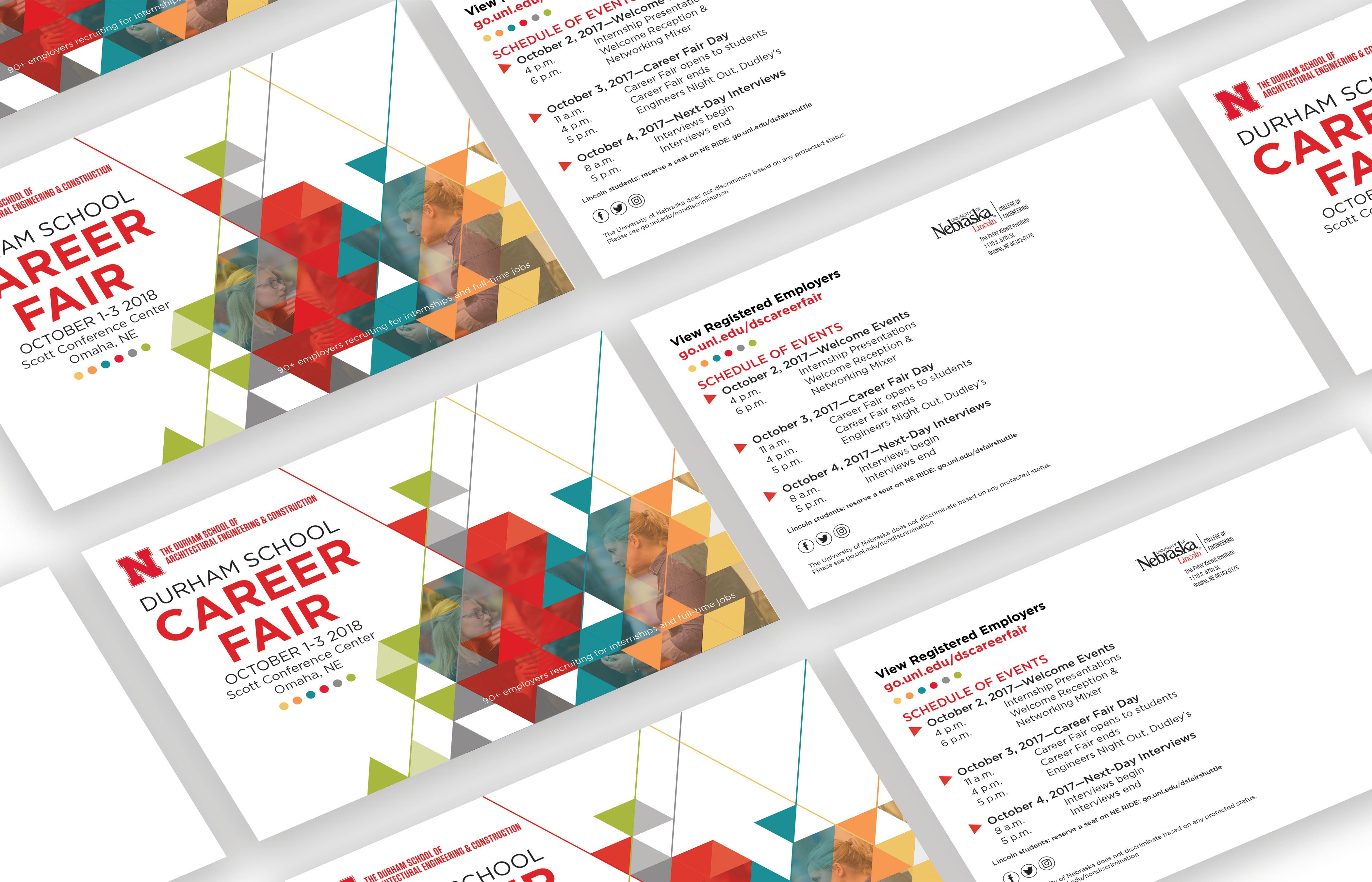
For the employer postcard, I used a simple isometric design to give the sense of building connections. I used the university red for the majority of the poscard to give off a professional feel and used hints of the complete engineer initiative colors to stay within the engineering department brand guidelines.

For the student postcard, I created the same isometric triangle design to stay within the event branding. I chose to to create a more appealing and fun layout by using the complete engineer initiative colors for the majority of the postcard.
The poster and booklet cover was also designed isometrically. However, I created a different layout that also gave a fun welcoming feel that stayed within the event branding.

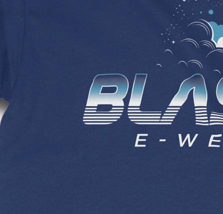
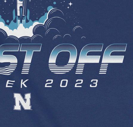
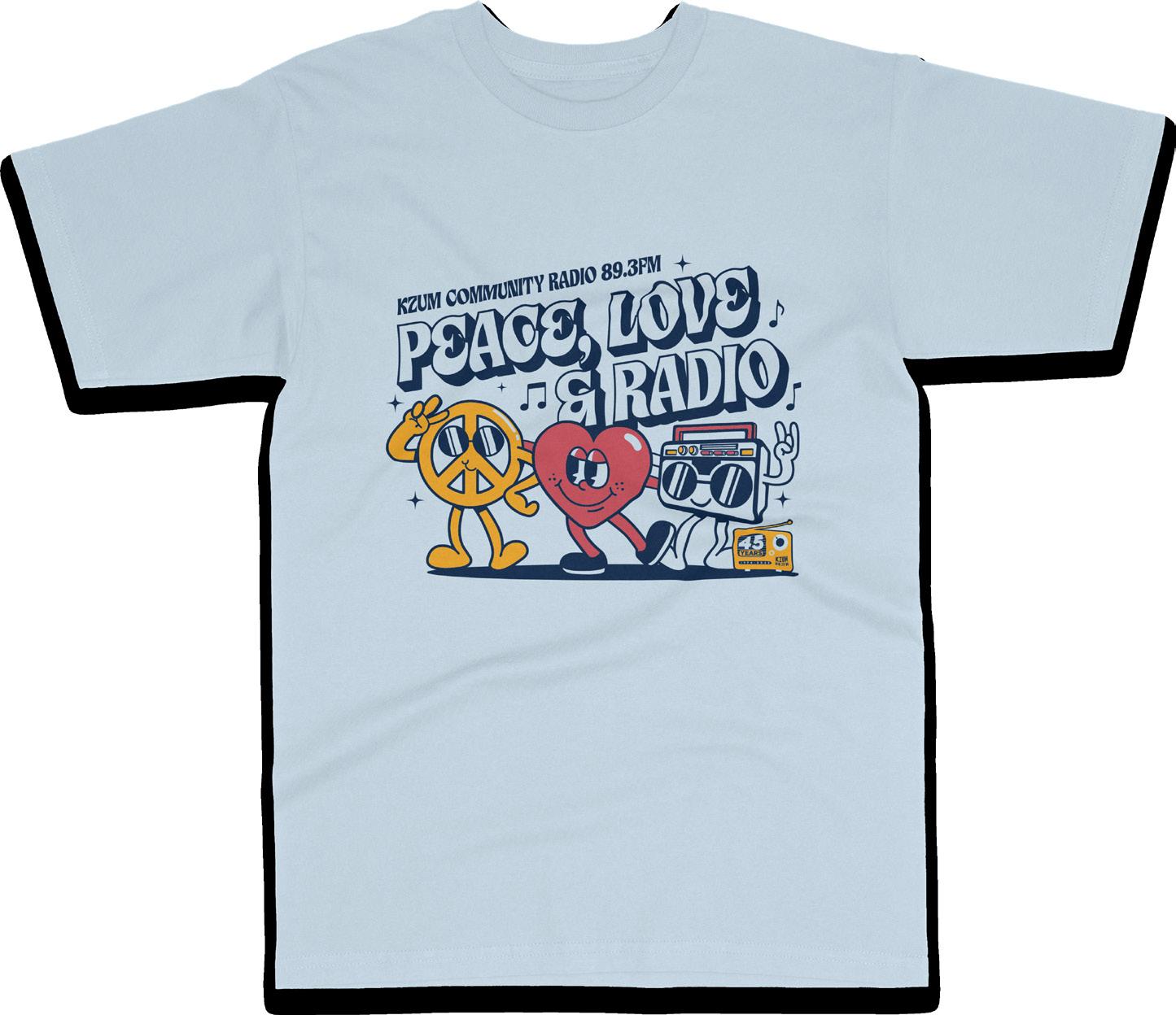
Engineering Week 2023
UNL Engineering Dept. - Freelance Project
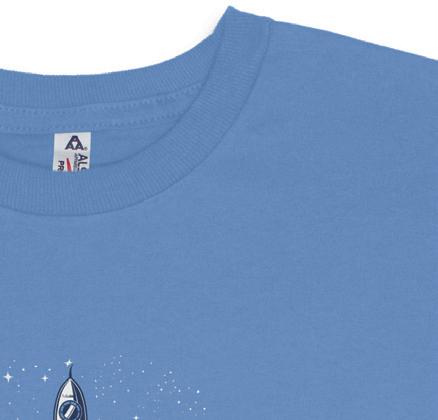
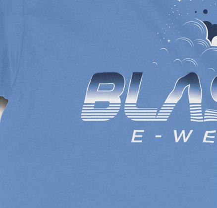
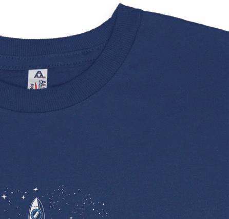
Engineers Week (E-Week) has been a University of Nebraska tradition since 1913. In conjunction with National Engineers Week, engineering students in Lincoln and Omaha come together to celebrate their collegiate accomplishments as they work toward graduation and future careers. College of Engineering students plan and coordinate all events for E-Week. The deliverables for this project included a logo design, T-shirts, sticker decals & a website banner.

The challenge for this project was to create a fun retro design that wen’t along with the theme Blast Off! After going through multiple iterations, the students chose to go with the design above. When creating this, I immediately thought of going with an 80’s retro typographic design while encorporating a rocket ship to go along with the theme.
FINAL DESIGN


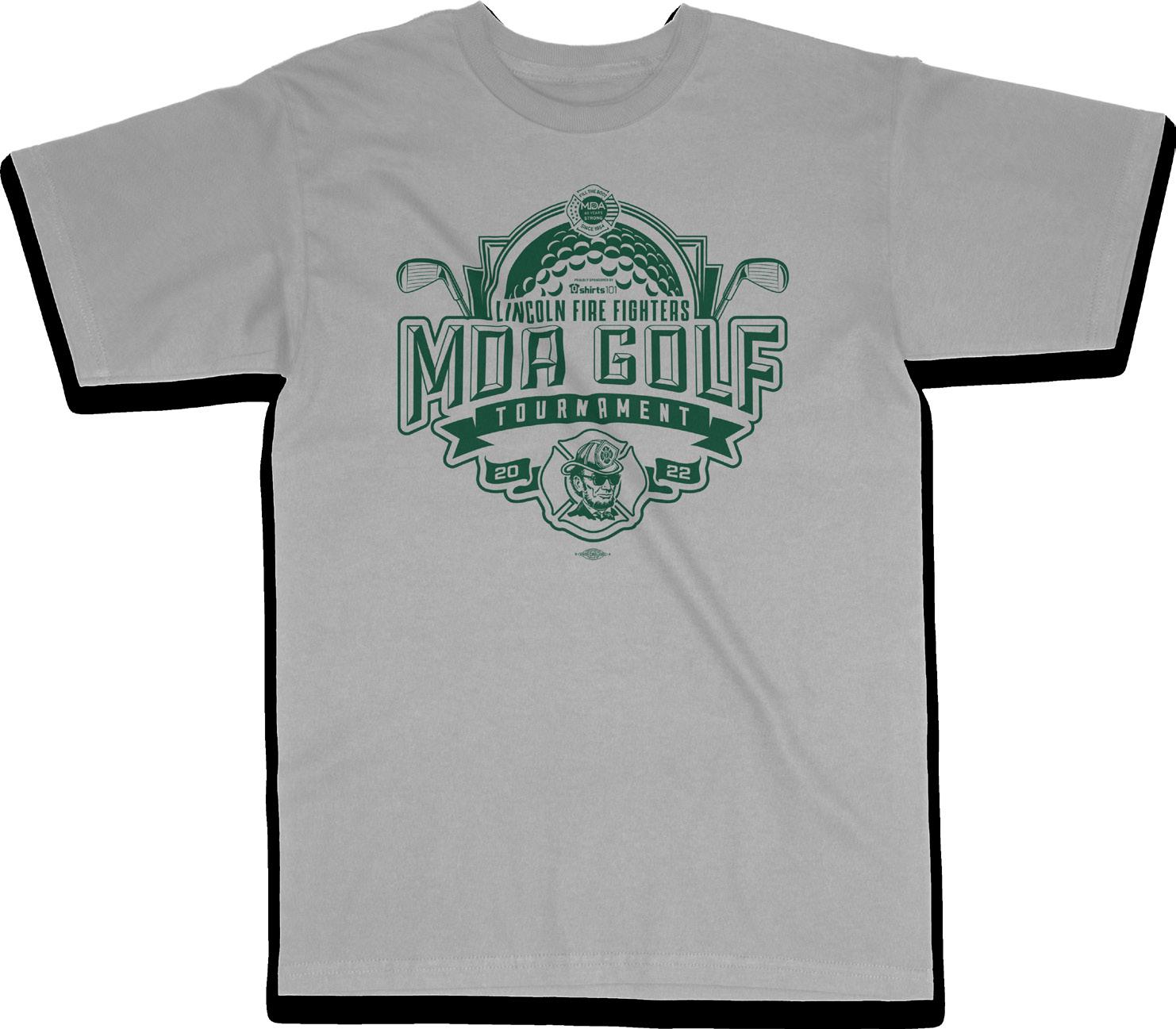
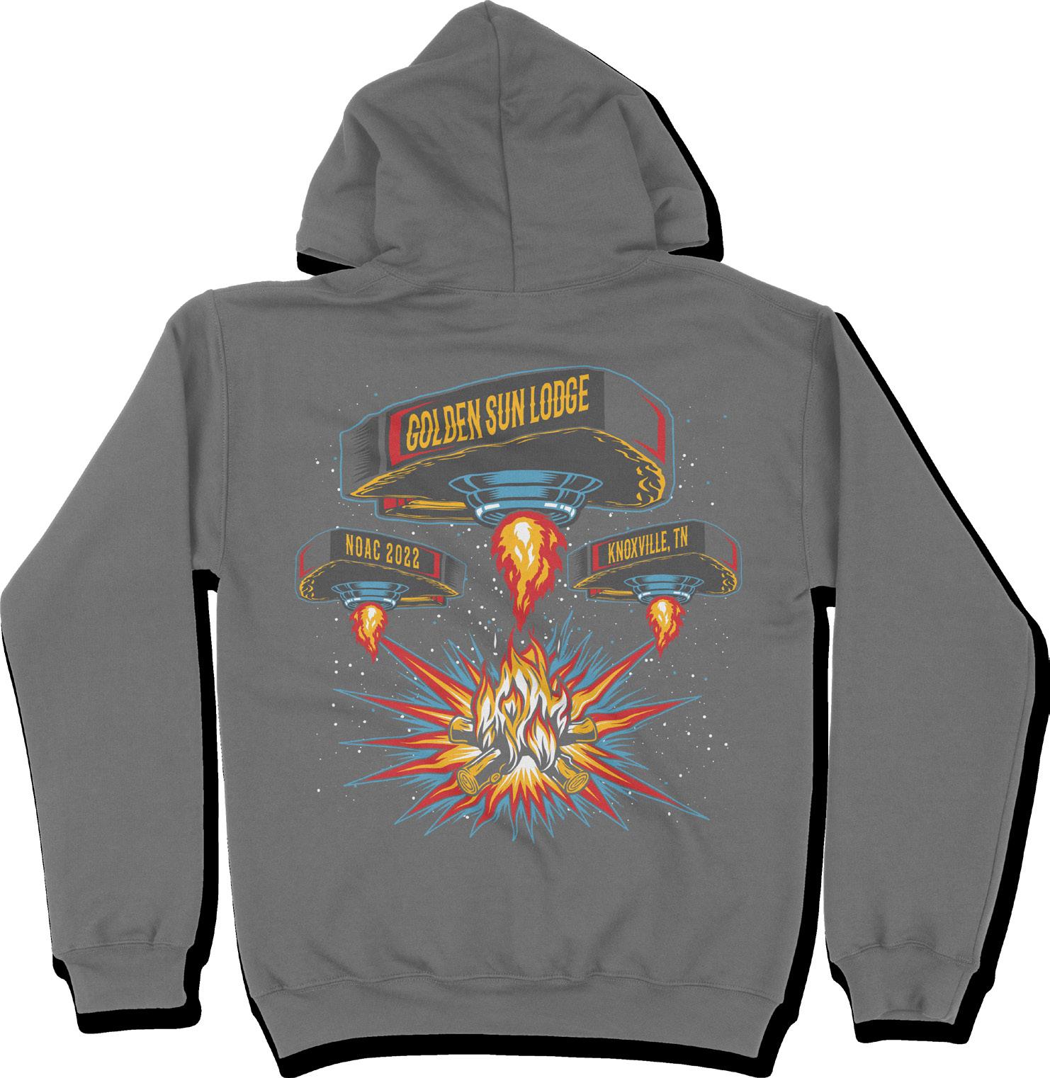
T-Shirt Designs


Shirts101
While working at Shirts101, I was challened to create a multitude of designs to satisfy the client. The designs showcased is just a sliver of everything I created but I tried to select designs that showed off multiple creative skills.


TYPOGRAPHIC POSTERS
Alright
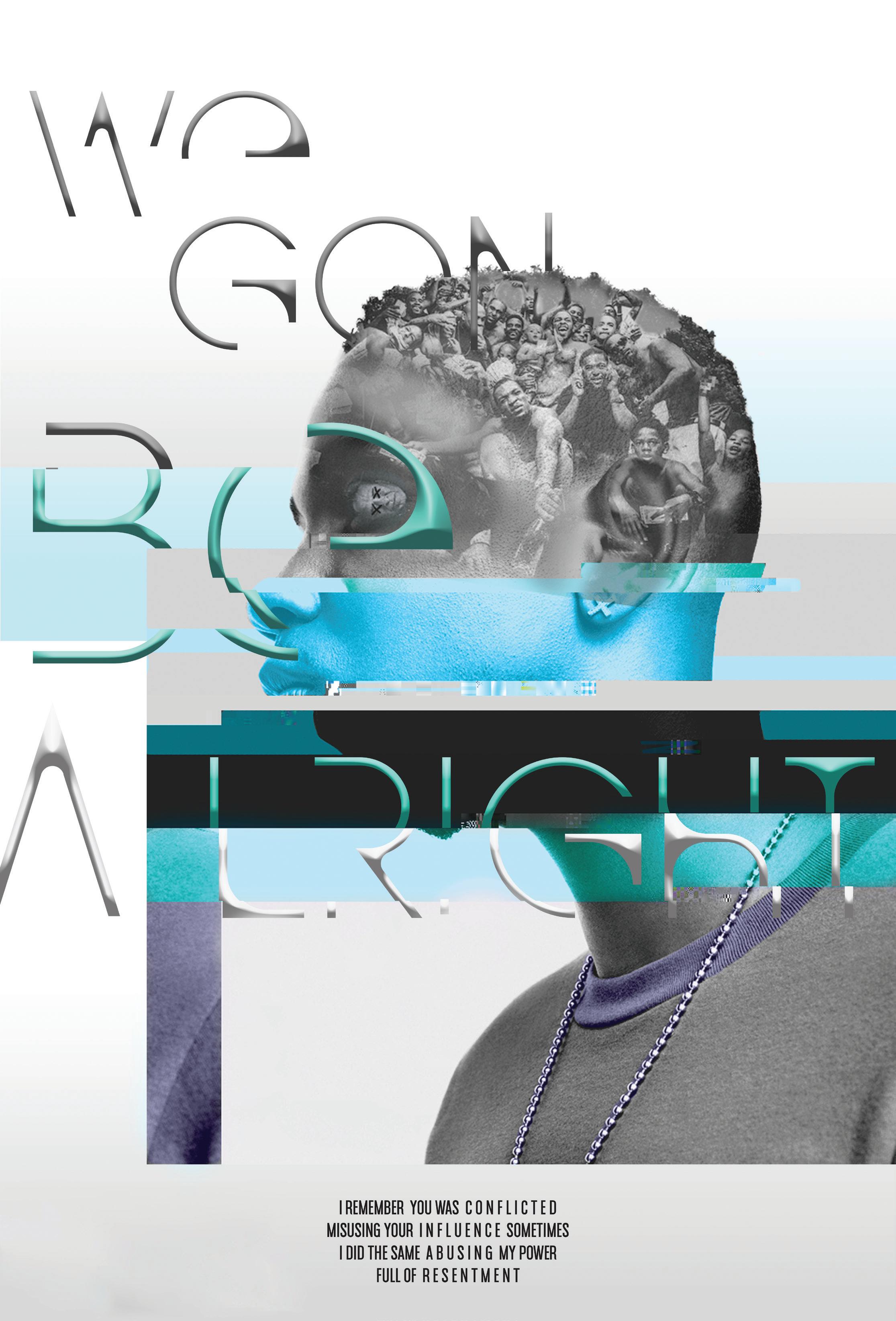
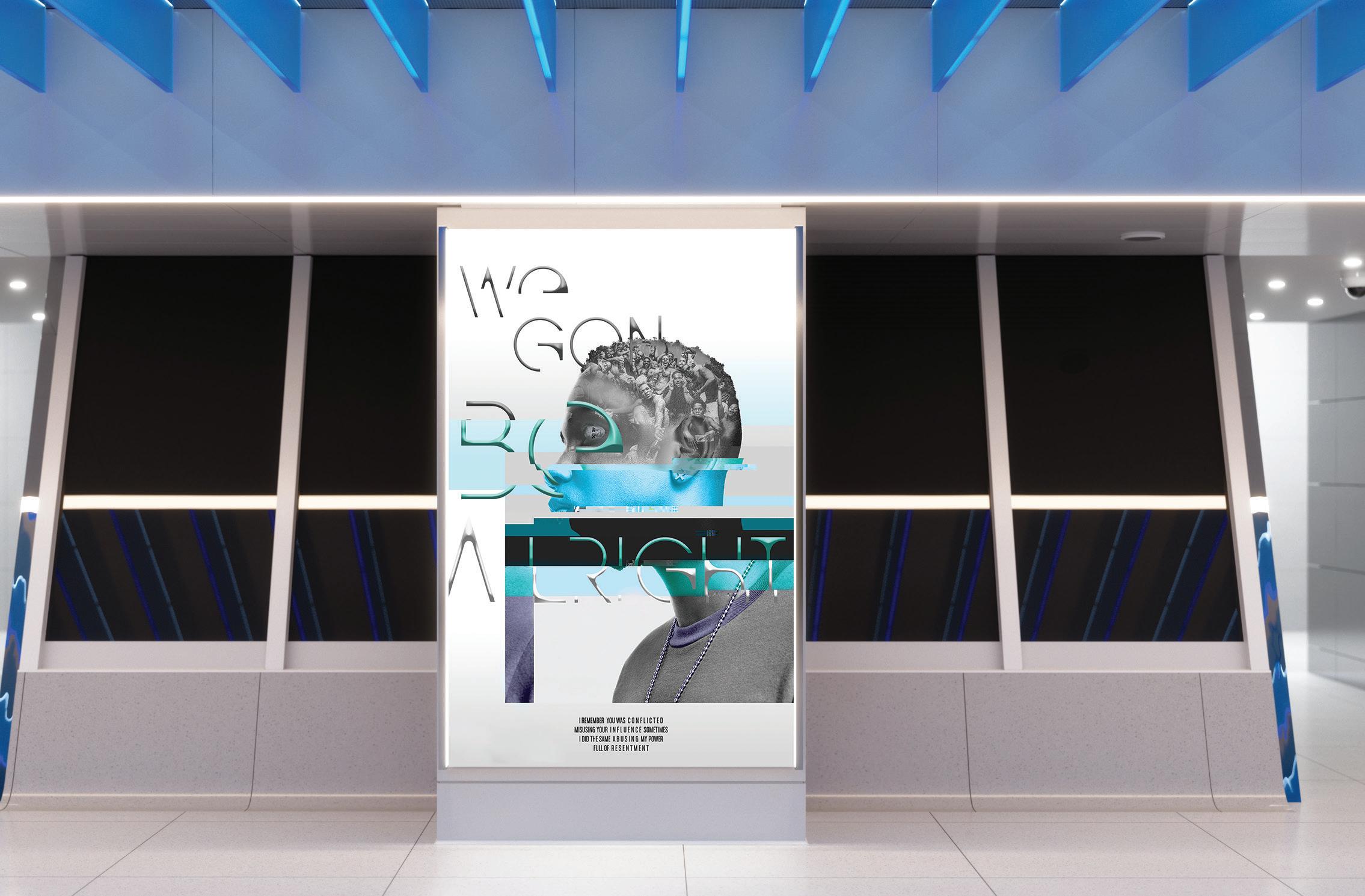
Type/Image Relationship poster
After studying four main areas of image/type relationship; Fragmentation, Infusion, Inversion, and Separation, I had to create a poster that fell within at least one of these areas.The challenge was to include the topic of propagand within the poster design.
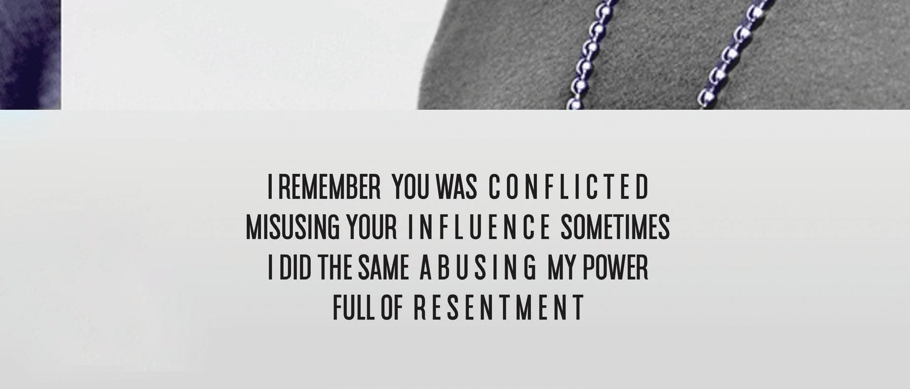
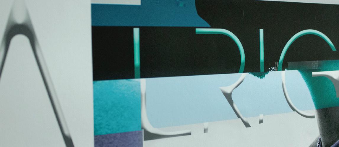
For this poster design I created a glitch effect while using the imagery of Kendrick Lamar and his To pimp a butterfly album cover. The type was pulled from his hit song “Alright”. The glitch effect represents the tensions in this country growing worse and worse, but in the long run, we’re all gon’ be alright.


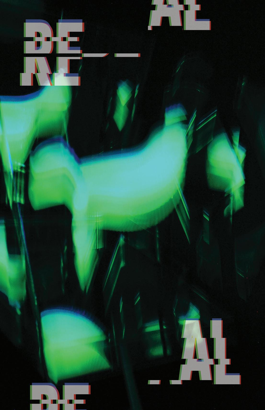
Real Project
Multi-Medium Experience Design
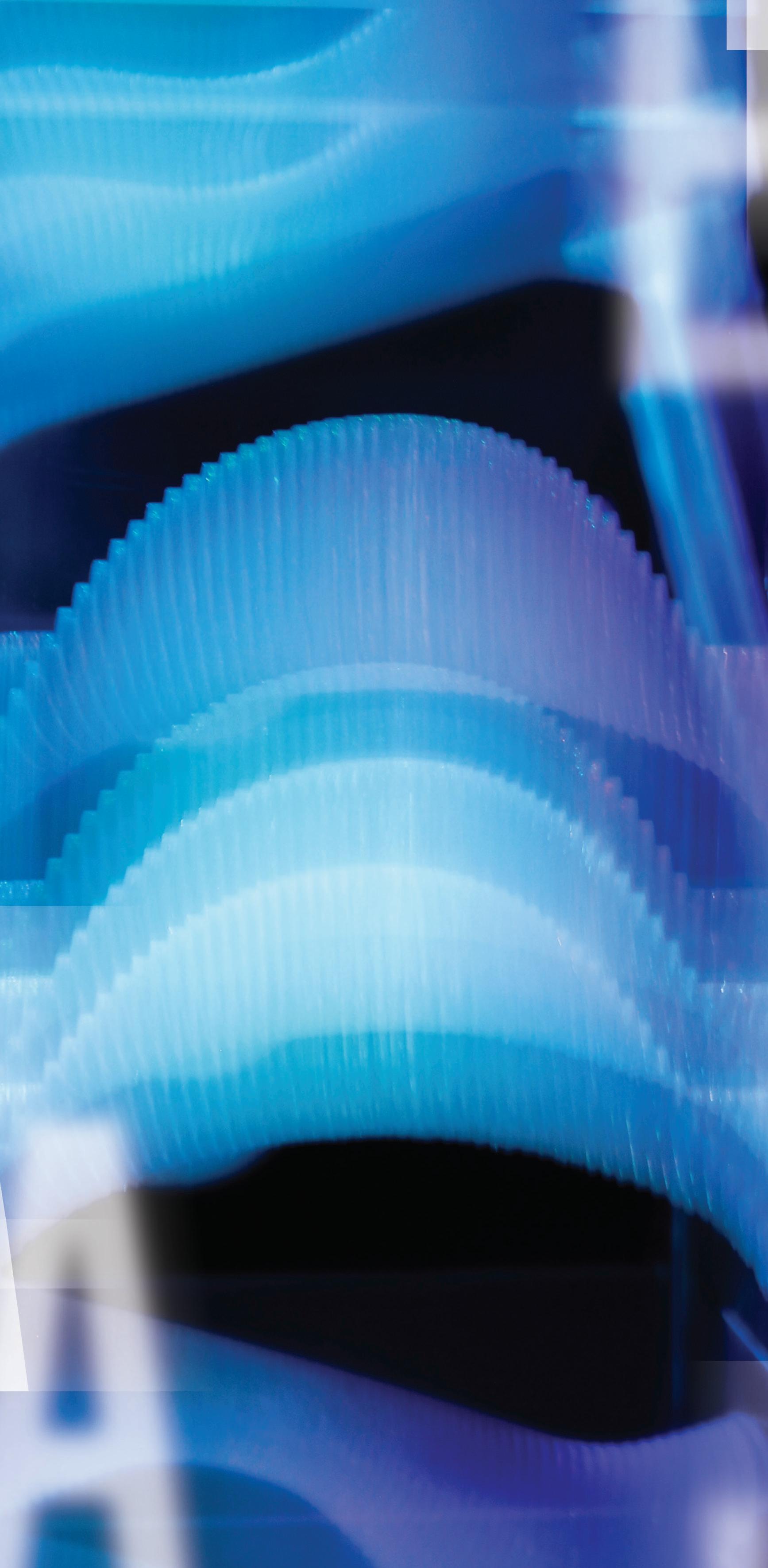
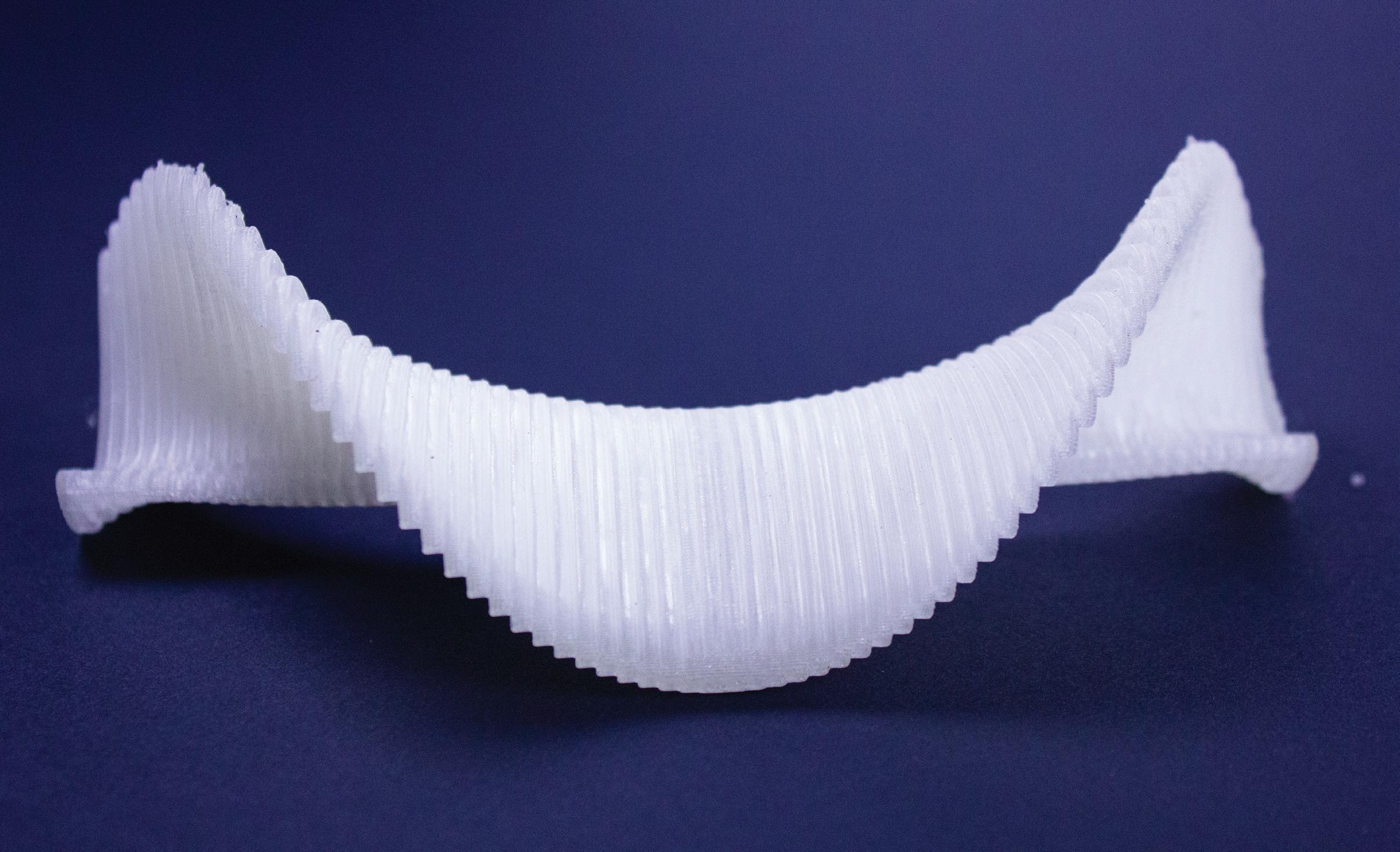
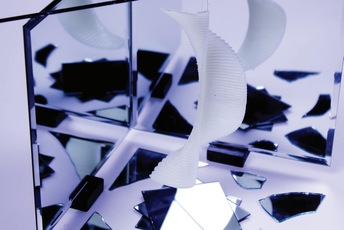
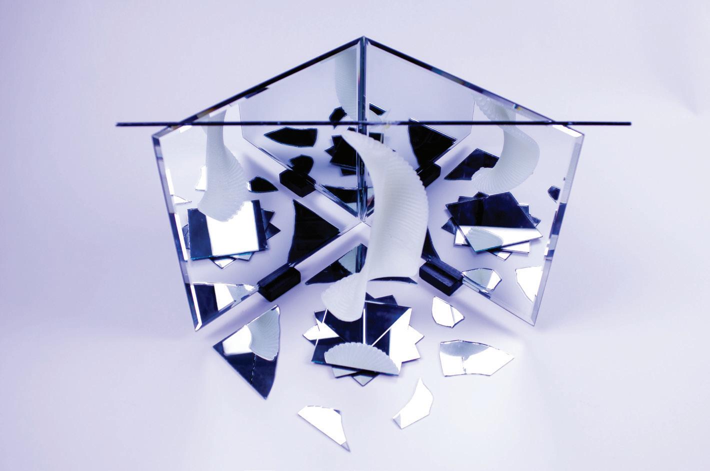
For this projcet I was given the word abstract and had to create and experience that revolved around a particular song. I chose the hit song “Real” by Kendrick lamar simply because of the message it gives off. In short, it’s all about looking in the mirror and knowing who you are as a person and loving yourself. I wanted to challenge myself for this project and do something that I’ve never done. I decided to create an abstract 3d printed object, with the combination of photography and typographic design.
The object is an abstract representation of who I am as a person and was created using the 3d effects in photoshop.


I then created a small strcture of mirrors that surrounded my printed object. The object is elevated above the broken glass to represent all the hardships I overcame in my past and that no matter what, I can always look in the mirror and know that Im real.

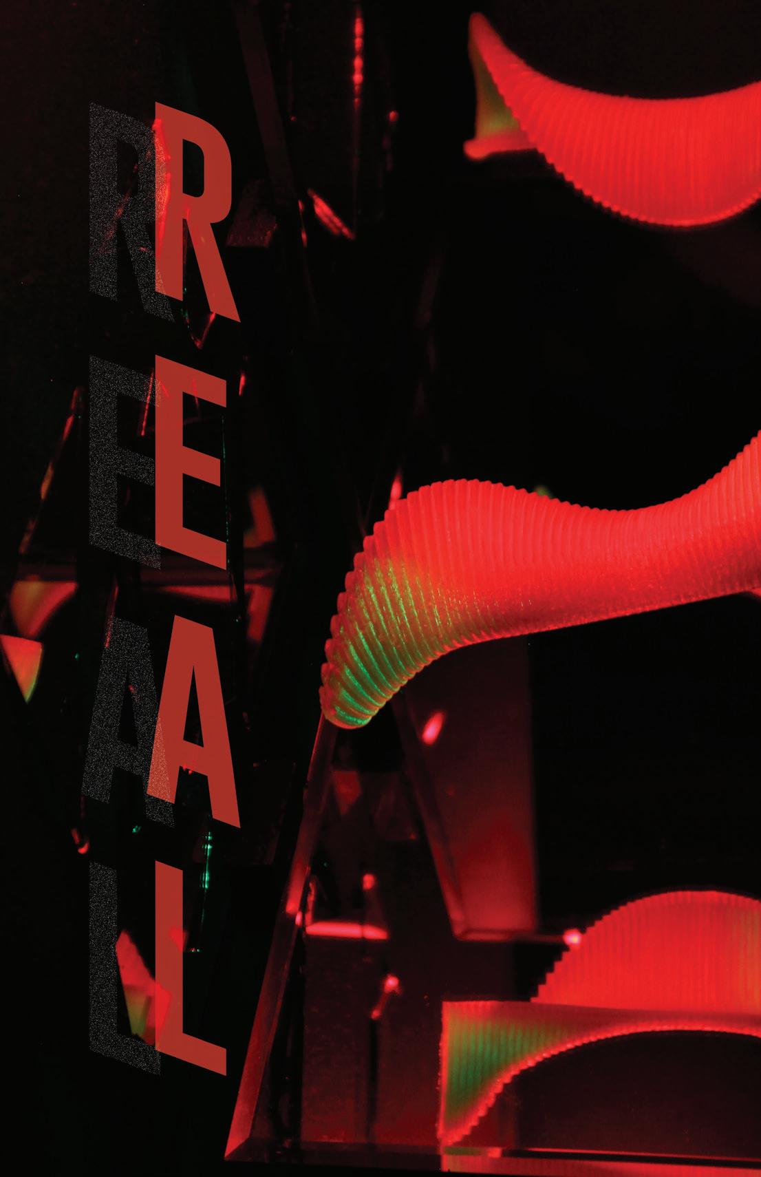
After creating the main structure of my piece, I decided to illuminate the object with an ocean wave light of various colors and photograph it. The blue poster represents my past and not quite understanding the meaning of life while the green represent my growth over the years and lastly the red poster represents the idea of loving myself to the full extent and accpting who I am.

ADVERTISEMENTS
Listerine Adverstisement
Product Advertisement
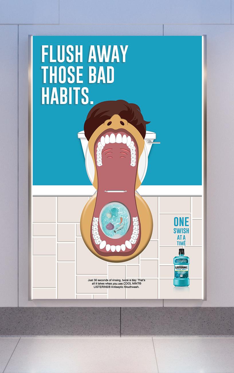
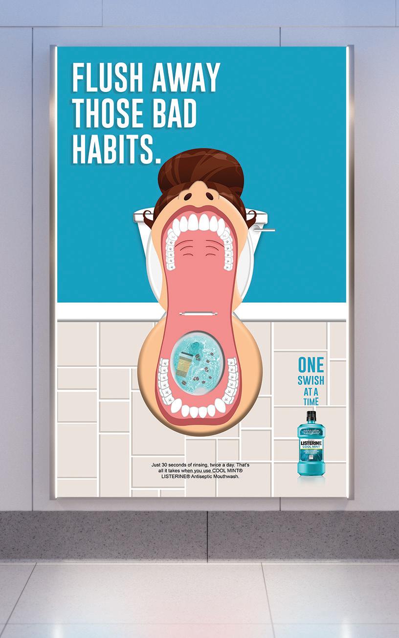
The challenge for this project was to create a print ad for a specific product. I chose to do Listerine simply because I felt I could create a clever but yet fun ad revolving around a mouthwash. After doing extensive research on this brand I came up with a slogan that gave me the idea of using a illustrative human toilet to promote Listerine in an entertaing way.
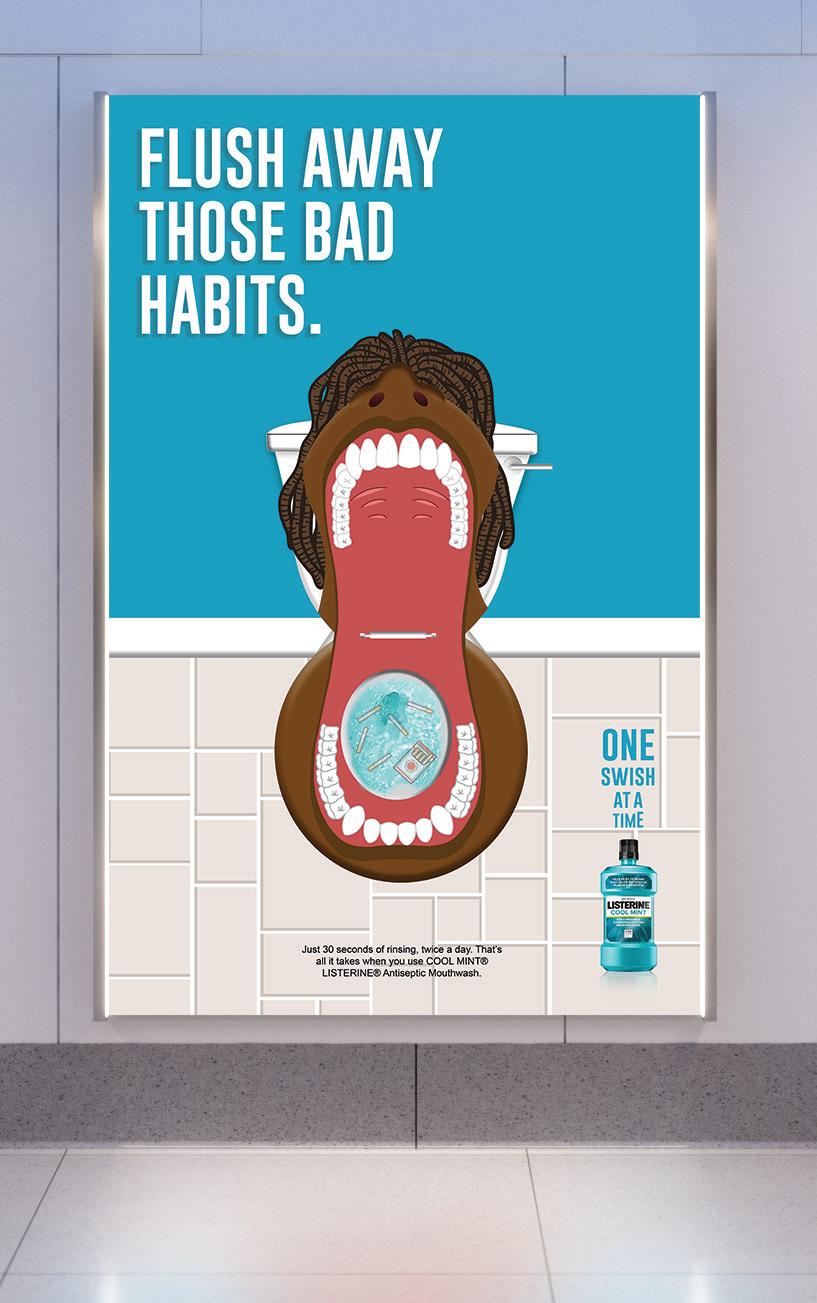
for each ad I used a different habit that could lead to bad smelling breath. These habits include: smoking cigarettes, foods that make your breath stink, and coffee.


For this project I was put into a group and we had to do extensive research around the increase of opioid addiction in Nebraska. We were then given the challenge to create an awareness campaign revolving around this problem. The deliverables included, a postcard, testimonial video, and large print ads. While creating the advertisement I wanted to give off the idea that drug addiction could happen to anyone. In order to give the effect that anyone is vulnerable, our team used frosted glass to make the person anonymous to the viewer.
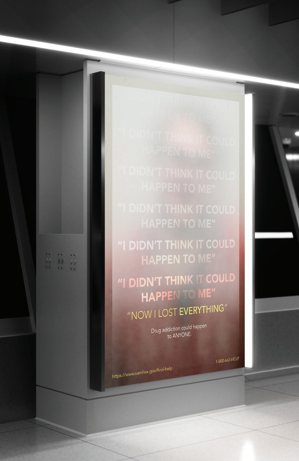 Opiod Awareness Campaign Advertising campaign

EDITORIAL & WEB DESIGN
New York Times Article
Editorial and responsive web design
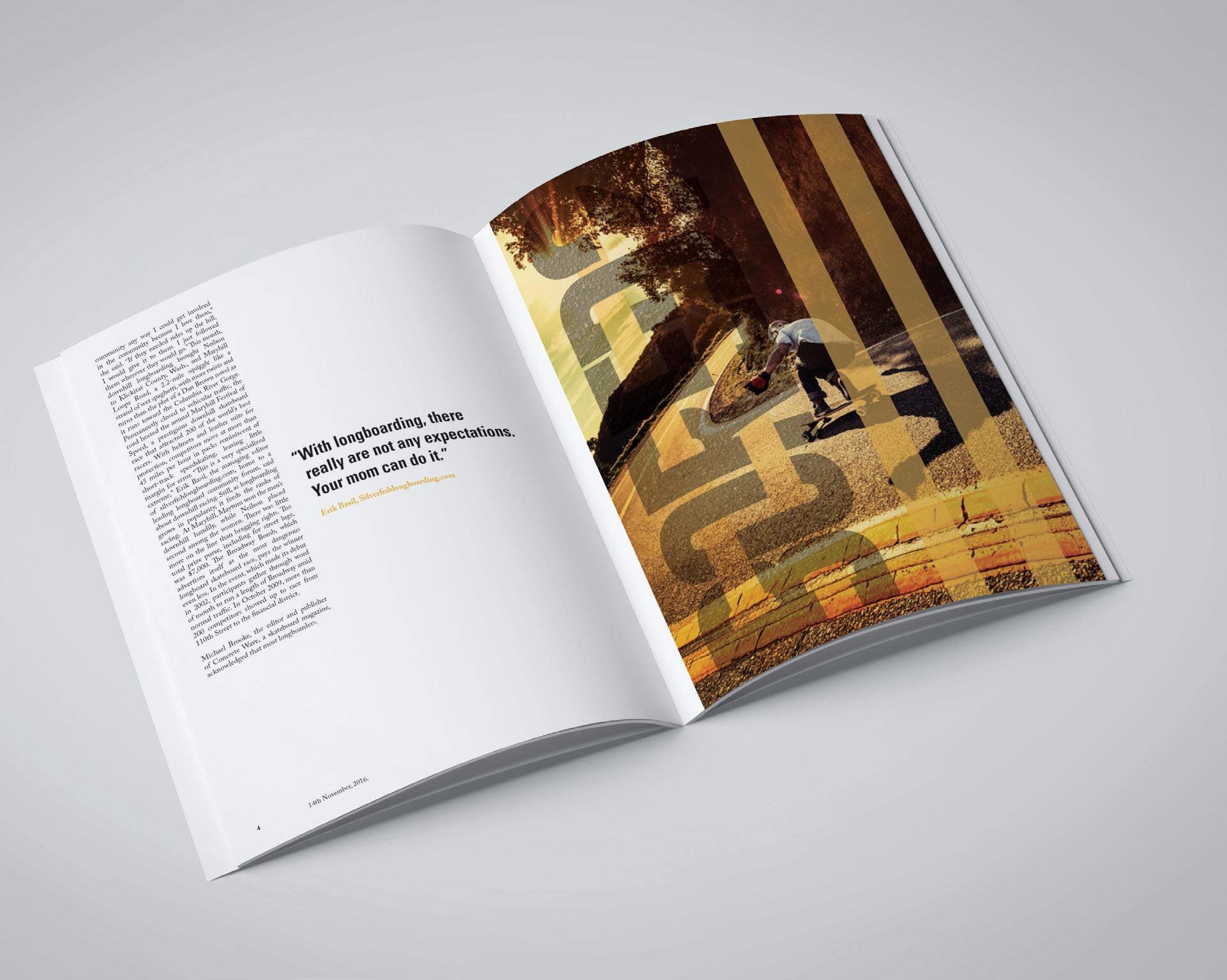
The assignment for this project was to redesign a New York Times article that revolved around something we were interested in. I have always had a passion for longboarding so this was a perfect oppurtunity to create and article about boarding. The challenge was to not only create a printed article but also design a responsive web article using dreamweaver.

The article that I used talked about If you’re ever bored then hop on a longboard and go board! I wanted to create a simple yet appealing first page to engage the viewer. I used a similar grid layout of the New York Times to create the same feel of their articles. Playing with the whtite space was extremely crucial in order to give it that clean look. I decided to play off the word bored and create a typographic image to engage the viewer. I then played around with the white space to make the article more balanced.


The responsive web design was created in dreamweaver. In order to get the same look and feel of the printed version, I used the textured road for my background as well as incorporated the yellow line going down the middle of the page which holds the body text.

Flowvest
Web Design Concept
Within this project I was challenged with creating a web design concept for a buy one give one life jacket program. I first had to create a wirefram the showed the basic structure of what the website would look like. I then worked in illustrator to create the final concept look and feel.

While creating this concept I decided to create a quick brand called Flowvest. This company provides life jackets for those who don’t have access to them as well as promote safe boating practices. The site would have a sticky nav bar as you scroll down the page.

BRANDING IDENTITY
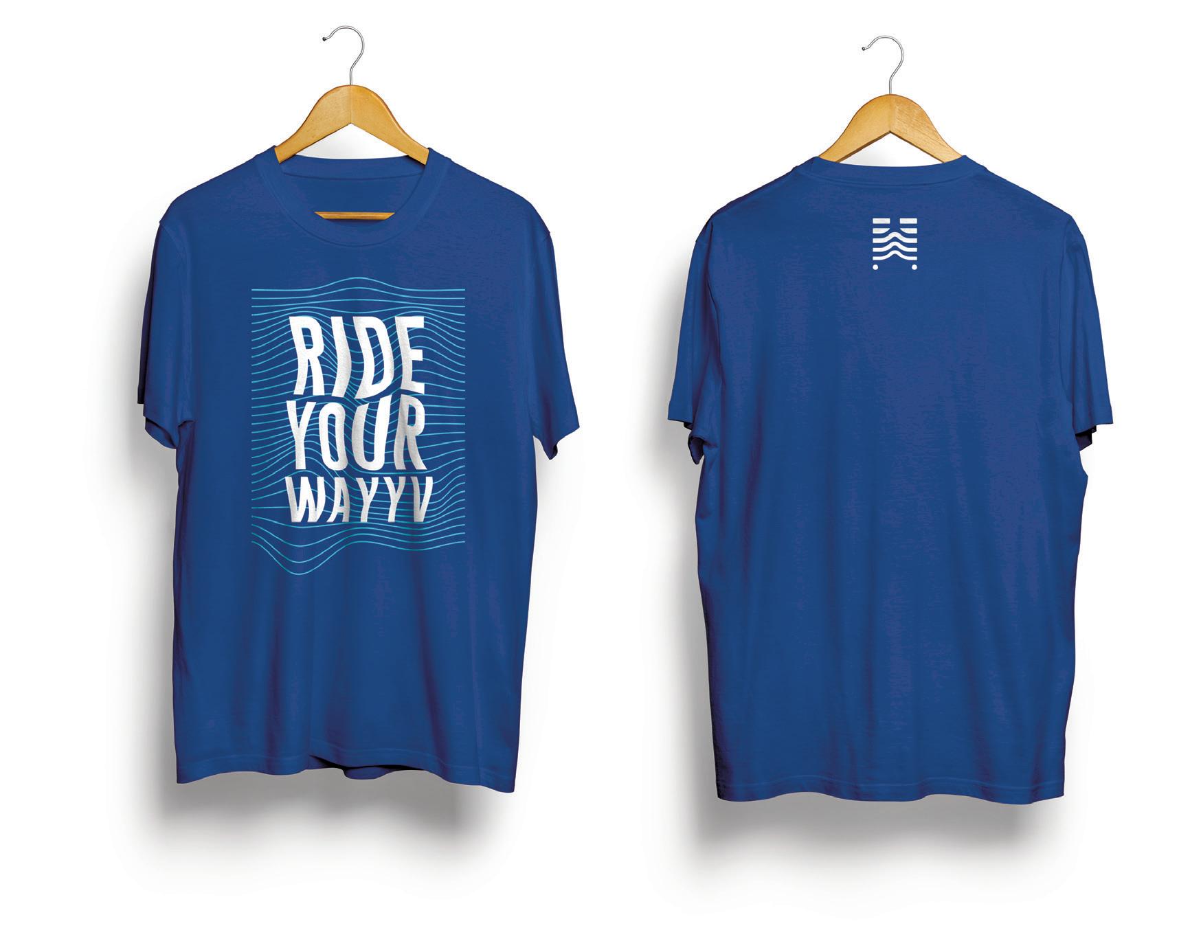
WAYYV LONGBOARDING SHARING SERVICE
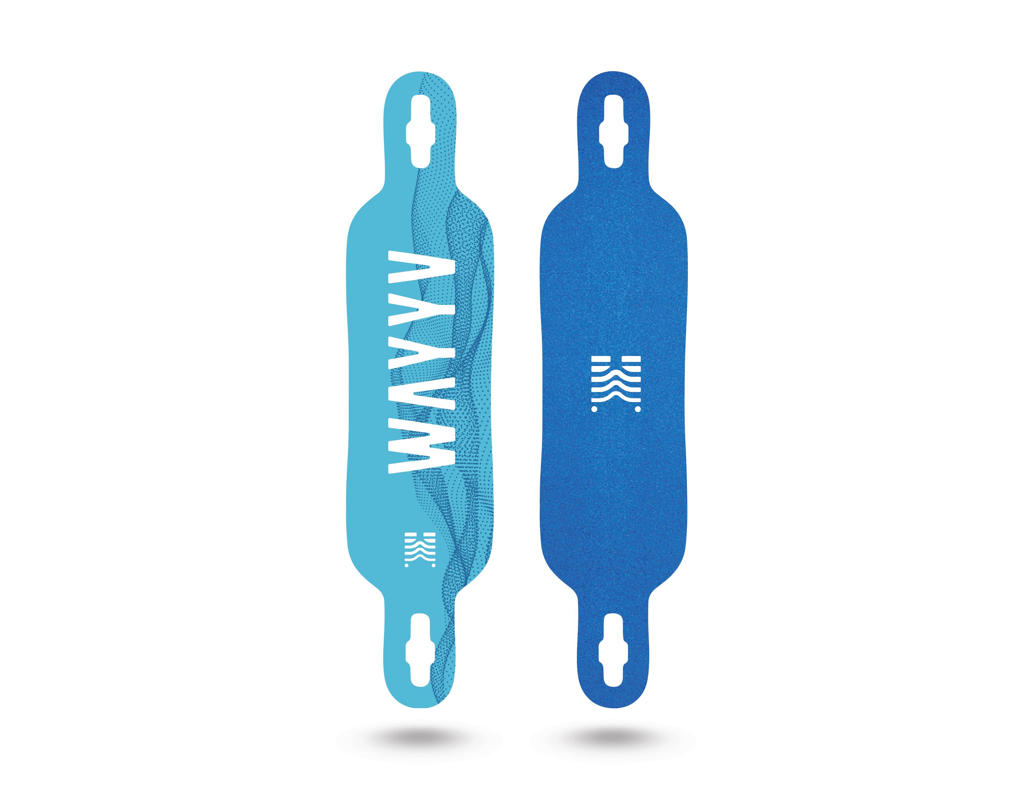
Branding Identity/ Thesis Project
Transportation plays a vital role in urban life and urban pollution. The demand to support cleaner energy transportation options in urban areas has exploded in recent years. Public transportation systems, electric buses, hybrid taxis, and bike sharing programs are examples of strategies to promote active modes of transportation while decreasing the pollution and congestion. While many mayors and urban planners have played an active role in creating a biking infrastructure equipped with bike sharing options, skateboarding and longboarding
I believe the continued marginalization of skateboarding/ longboarding in urban environments is due to the lack of education and accessibility. In my thesis I intend to show how boarding can be made accessible, affordable and fun through the use of a longboarding sharing service. By creating this service, I hope to change people’s perception of boarding and provide them with an enjoyable alternative form of transportation. Since skateboarding carries with it a serious risk for injury, I intend use a mobile app to empower users to employ the sharing system while promoting safe boarding education and encouraging community cohesion. The Wayyv mobile app will enable users to rent and return a board, learn about safe boarding practices and encourage community building.
After researching the history behind longboarding, I found that longboarding originated from surfers in Hawaii. They wanted to bring their surfing hobby to land when the waves were too small to surf. After learning this, I decided to name the longboarding sharing service Wayyv. I chose t o spell it like this simply because I wanted to incorporate a sense of direction as well as play off the wave aspect of surfing. When determining the color palette for my brand, it made sense to have a blue gradient to reflect the waves in the ocean.
AaBbCc
abcdefghijklmnopqrstuvwxyz
ABCDEFGHIJKLMNOPQRSTUVWYZ
Headline - Gobold Regular
AaBbCc
abcdefghijklmnopqrstuvwxyz
ABCDEFGHIJKLMNOPQRS
TUVWYZ
Body Text - Gobold Thin
#55b9d6 #398fbf #2871a6 #14538d #18478b #ffffff


GRAB A BOARD ON 14th & R AND TRY A NEW WAY TO GET AROUND TOWN! #WayyvBoards WayyvBoards.com Download
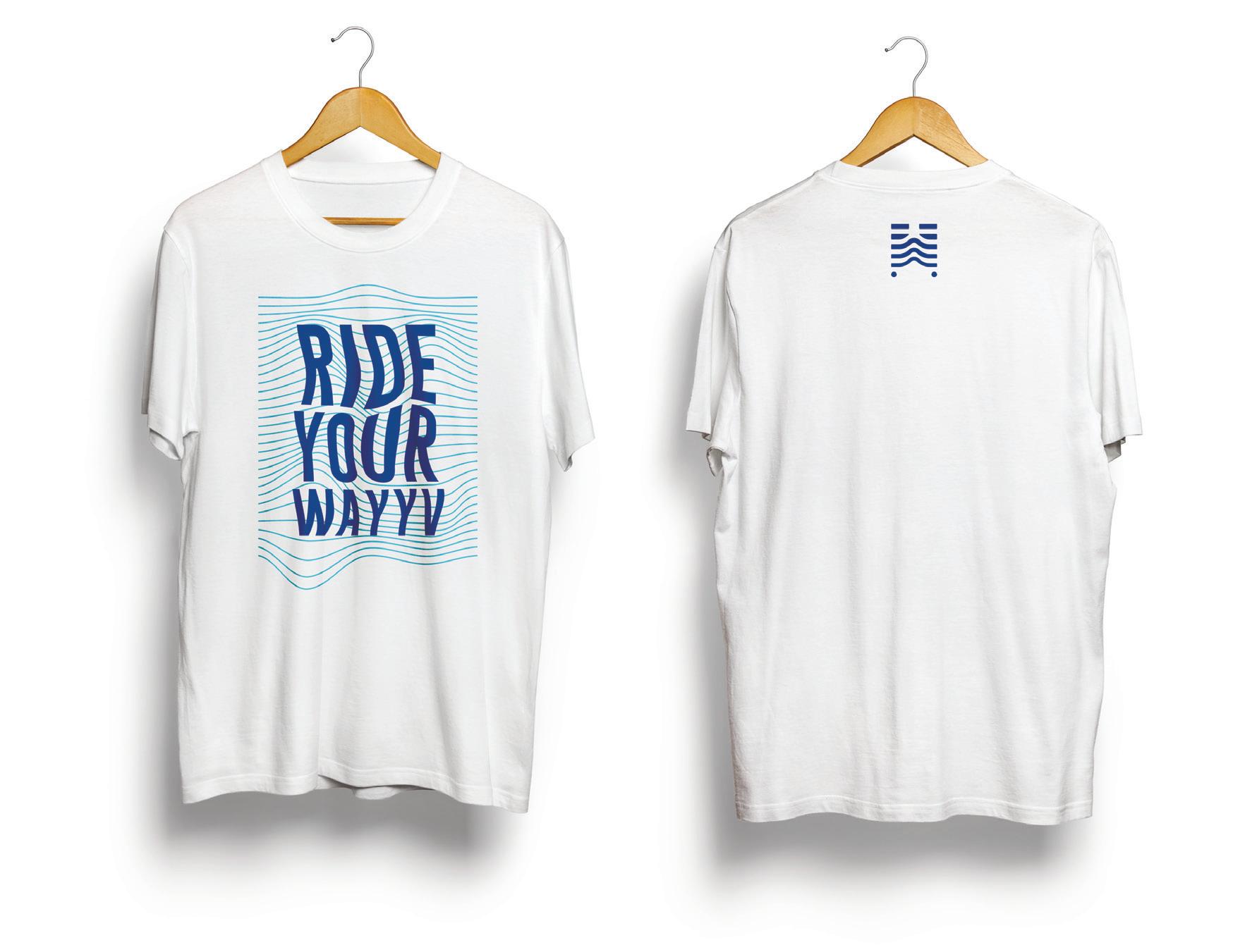
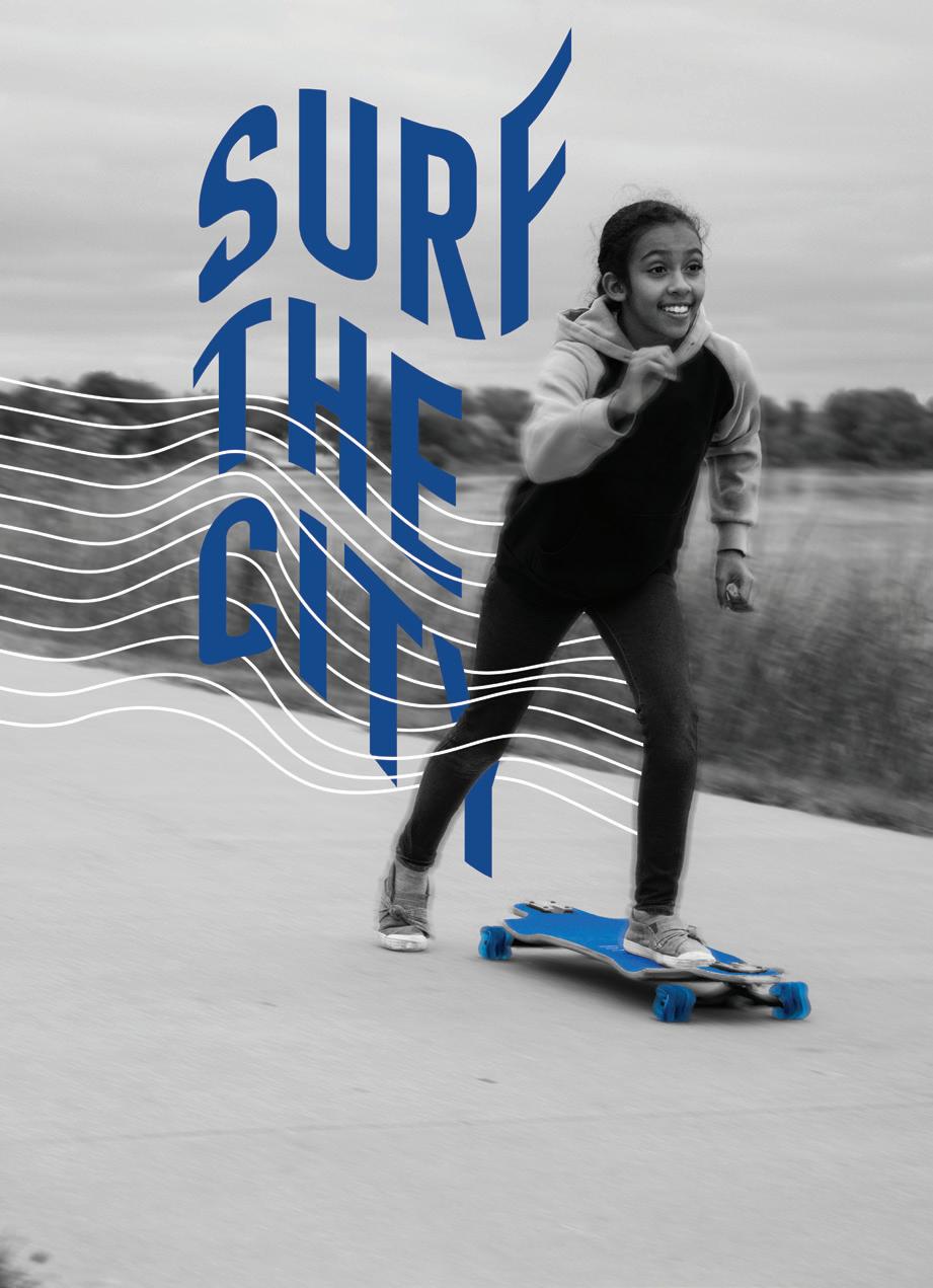
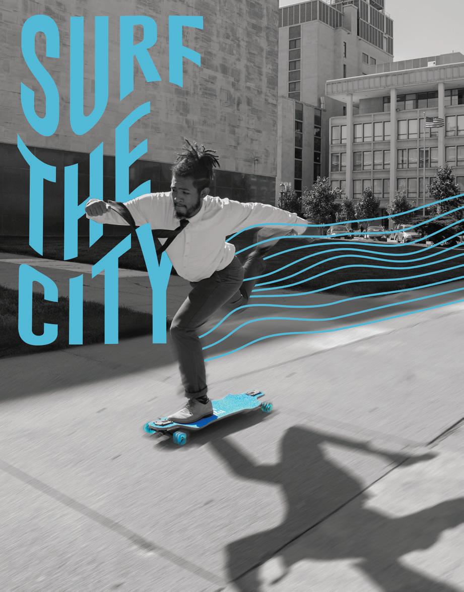
For the advertising portion, I wanted to gear the ads towards anyone and everyone. Therefore I designed two ads that shows two people longboarding in business attire, one ad shwowing a college student riding through campus and lastly a litlle girl riding down the sidewalk on a wayyv longboard. I included the wavy lines to stay within my branding identity as well as create a sense of motion througout the advertisement.


WayyvBoards.com Download the WAYYV app!
GRAB A BOARD ON 14th & R AND TRY A NEW WAY TO GET AROUND TOWN! #WayyvBoards
the WAYYV app!
WayyvBoards.com Download our free app!
GRAB A BOARD ON 14th & R AND TRY A NEW WAY TO GET AROUND TOWN! #WayyvBoards
#WayyvBoards WayyvBoards.com Download the WAYYV app!
GRAB A BOARD ON 21st & Q AND WAVE GOODBYE TO WALKING
#WayyvBoards WayyvBoards.com Download our free app!
GRAB A BOARD ON 21st & L AND RIDE YOUR WAYYV


+ 50¢ trips over 1-30 minutes $1 trips over 31-60 minutes $3 for each additional 30 min. Take as many trips as you want, up to 2 hours each. You pay exrta for trips longer than 2 hours. RE TUR N RIDE RENT Download the Wayyv app, create your account, then scan the QR code on the rack to unlock a board. Slide your board into an open slot at any Wayyv station. Lock the board from the Wayyv app to avoid overtime fees. A maximum of 2 boards may be rented per card. 18+ Riders must be at least 18 years old. Minors must be accomponied by parent or legal guardian. Wear your own helmet and STAY SAFE Ride to your destination. don’ forget to lock your boar 50 cents for 2 hours
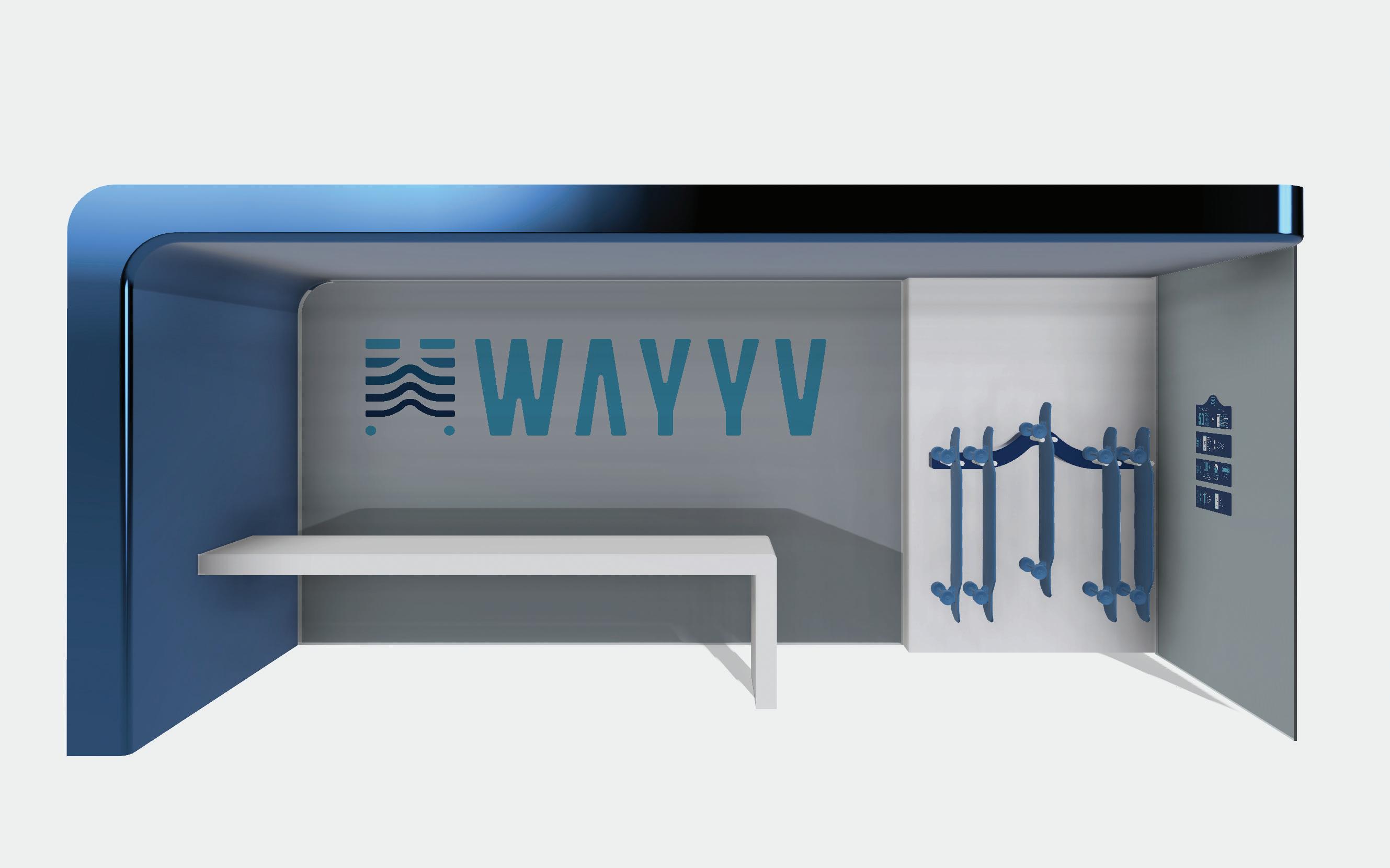
While working within fusion 360 I created a Wayyv station concept that would reuse bus stops around college campuses in order for students to ride the Wayyv. I also created a kiosk longboard rack that would be placed in a more urban environment. In order for users to fully understand how to ride the Wayyv, I also designed a Instruction vinyl that shows the users how exactly Wayyv works.


THANK YOU 402 320 6290 // xarodgers23@gmail.com