
CONTACT Address Blue Jays Beyond 1 Blue Jays Way Toronto , Ontario Canada Phone Phone: 416-764-6779 Phone: 416-219-4994 Online Email: sheldon.kiernan@bluejays.com Toronto Blue Jays Premium Spaces Branding BLUE JAYS BEYOND PREMIUM REIMAGINED DESIGN & BRAND GUIDELINES
DESIGN & BRAND GUIDELINES
2 // 62 3 // 62
TABLE OF CONTENTS
SECTION 2 | TYPOGRAPHYAPHY SECTION 3 | COLOUR SYSTEM SECTION 4 | BACKGROUND CORPORATE STATIONERY SECTION 5 | SYMBOLS & PATTERNS SECTION 6 | IMAGES & TREATMENT SECTION 7 | ICONOGRAPHY SECTION 8 | EMAIL MARKETING SECTION 9 | PREMIUM SPACES SECTION 10 | CONTACT SECTION 1 | LOGO PAGE 14 PAGE 20 PAGE 24 PAGE 28 PAGE 34 PAGE 6 PAGE 40 PAGE 42 PAGE 48 PAGE 60 PAGE 4 Blue Jays Beyond Corporate Brand Guidelines Version: v1 // 2023
SECTION 0 | INTRODUCTION CLICK TO VIEW PAGE
INTRODUCTION
THE DESIGN GUIDELINES
These guidelines describe the visual and verbal elements that represent Blue Jays Beyond corporate identity. This includes our name, logo and other elements such as colour, type and graphics. Sending a consistent and controlled message of who we are is essential to presenting
a strong, unified image of our company. These guidelines reflect Blue Jays Beyond commitment to quality, consistency and style. The Blue Jays Beyond brand, including the logo, name, colours and identifying elements, are valuable company assets.
Where life’s finest in sport and entertainment are uniquely woven into an experience that will make an impression to last a lifetime.
Marvel at spectacle in three marquee clubs, that are the centrepiece of a reimagined Rogers Centre architected to showcase the definition of premium.
Each of us is responsible for protecting the company’s interests by preventing unauthorized or incorrect use of the Blue Jays Beyond name and marks.
Delight in perfection found in the detail of limitless, infinite, and unimaginable that transfers you beyond the game.

Blue Jays Beyond Corporate Brand Guidelines Blue Jays Beyond Corporate Brand Guidelines
4 // 62
THE PRIMARY LOGO
CORPORATE LOGO
1) TBJ Symbol

Consists of a TBJ Birdhead, a powerful complement evoking the culture of the brand services.
2) The Logo Type
Carefully chosen for its modern and yet refined, highly legible style, which has been further enhanced by the use of upper case letters in solid black. The font that is used to construct the wordmark is Integral Bold.
LOGO INTRODUCTION
Our Logo is the key building block of our identity, the primary visual element that identifies us. The signature is a combination of the logo type and the TBJ icon – they have a fixed relationship that should never be changed in any way.
THE FULL LOGOTYPE
The Blue Jays Beyond Corporate Logo comprises two elements, the TBJ Icon and logo type. The TBJ Icon is a powerful image representing the team and overarching umbrella brand.
The Logo Type has been carefully chosen for its modern and yet refined, highly legible style, which has been further enhanced by the use of upper case letters. The typeface is Integral Bold and has also been chosen to compliment and balance perfectly with the logo symbol.
1) The Primary Logo
The Primary Logo is the dark logo used on white or light coloured background. For darker backgrounds you will find an alternative below.
LOGO DARK VERSION LOGO LIGHT VERSION
3) The Logo Dark Version will be used when the background colour is a light colour.
4) The Logo Light Version will be used when the background colour is a dark colour.
Recommended formats are: .EPS | .AI | .PNG
Attention:
Use of any stylized, hand drawn or other versions of a unofficial logo is not permitted. This undermines the logo system and brand consistency. Please consult with Blue Jays Beyond Trademark Licensing if you have any questions or need further help.
3 1 2 4 Blue Bays Beyond Corporate Brand Guidelines Blue Jays Beyond Corporate Brand Guidelines 7 // 62
6 // 62
PRIMARY
LOGO WITH TAGLINE
1) The Primary Logo Consists of a powerful element evoking the culture of design services and a grey square background.
2) The Tagline Carefully chosen for its modern and yet refined, highly legible style, which has been further enhanced by the use of upper case letters in solid black. The font that is used to construct the wordmark is Integral Bold.
It is important to keep corporate marks clear of any other graphic elements. To regulate this, an exclusion zone has been established around the corporate mark. This exclusion zone indicates the closest any other graphic element or
message can be positioned in relation to the mark of the symbol itself and our company name – they have a fixed relationship that should never be changed in any way.
CLEAR SPACE
1) The Logo with Tagline
The Primary Logo with Tagline is the dark logo used on white or light coloured background. For darker backgrounds you will find an alternative below.
LOGO DARK VERSION LOGO LIGHT VERSION
3) The Logo with Tagline Dark Version Will be used when the background colour is a light colour.
4) The Logo with Tagline Light Version Will be used when the background colour is a dark colour.
Recommended formats are:
.EPS .AI .PNG
Attention:
Use of any stylized, hand drawn or other versions of a unofficial logo is not permitted. This undermines the logo system and brand consistency. Please consult with Blue Jays Beyond Trademark Licensing if you have any questions or need further help.
Definition
Whenever you use the logo, it should be surrounded with clear space to ensure its visibility and impact. No graphic elements of any kind should invade this zone.
ComputationToworkouttheclearspacetaketheheightofthelogo anddivideitinhalf. (Clearspace=Height/2).
Blue Jays Beyond Corporate Brand Guidelines Blue Bays Beyond Corporate Brand Guidelines 9 // 62 8 // 62
LOGO
ALTERNATE LOGO
WITH TAGLINE x 1/2x1/2x 1/ 12x /2x
FullLogo
LOGO CLEAR SPACE
3 4
LOGO WITH TAGLINE APPLICATION
The tagline “Premium Reimagined” should be used when the messaging is focused on emphasizing the exceptional quality, uniqueness, and innovation of the Blue Jays Beyond brand. It should be used in situations where the messaging needs to communicate the elevated and exclusive nature of the brand.
PRIMARY REVERSE
PICTURE WITH 75% BLACK OPACITY
PICTURE WITH 95% WHITE OPACITY
Here are some general rules for when to use the tagline:
Use the tagline when the messaging is focused on the premium, exclusive, and elevated aspects of the brand.
Use the tagline when the messaging needs to communicate the unique and innovative features of the Blue Jays Beyond brand.
Here are some general rules for when not to use the tagline:
Do not use the tagline in situations simplicity of design is the focus.
Do not use the tagline in situations where the messaging may not be relevant or appropriate.
The tagline should not be used in situations where the messaging is more focused on the functional benefits or features of the brand. For example, if the messaging is centered around the convenience of the VIP entrance, the tagline may not be necessary. can the tagline change?

Blue Jays Beyond Corporate Brand Guidelines Blue Bays Beyond Corporate Brand Guidelines 11 // 62 10 // 62
LOGO
PRIMARY
APPLICATION
Blue Jays Beyond Corporate Brand Guidelines Blue Bays Beyond Corporate Brand Guidelines 13 // 62 12 // 62 DO DON’T USE PRIMARY LOGO USE PRIMARY LOGO WITH TAGLINE
PRIMARY CORPORATE FONT
CORPORATE TYPOGRAPHY
PRIMARY FONT
THE CORPORATE FONTS AND TYPOGRAPHY
THE CORPORATE TYPOGRAPHY
Typography plays an important role in communicating an overall tone and quality. Careful use of typography reinforces our personality and ensures clarity and harmony in all Blue Jays Beyond communications.
We have selected Integral and Lato, as the primary and secondary corporate typefaces. They will help inject energy and enthusiasm into the entire Blue Jays Beyond communications, as the primary and secondary corporate typefaces.
DESIGNER : CONNARY FAGEN
THE FONT
Integral CF is designed for maximum visual and emotional impact. Its six weights excel in posters, social media, headlines, titling, large-format print – and anywhere else you want to be noticed.
Hidden among the straight lines and corporate confidence is a hint of roguish charm and character; Integral lends your words a strong voice while being lot of fun to use.
14 // 62 Blue Bays Beyond Corporate Brand Guidelines 15 // 62 Blue Jays Beyond Corporate Brand Guidelines
INTEGRAL
IN T EGRAL Bold Regular ABCDEFGHIJKLM NOPQRSTUVWXYZ abcdefghijklm nopqrstuvwxyz ABCDEFGHIJKLM NOPQRSTUVWXYZ abcdefghijklm nopqrstuvwxyz
01234567890 Special Characters !“§$%&/()=?`;: ¡“¶¢[]|{}≠¿‘ «∑€®†Ω¨⁄ø𕱑 æœ@ ∆ ºª©ƒ∂‚å¥≈ç √~µ∞…–≤<>≥˘›‹◊
Figures
SECONDARY CORPORATE FONT
PRIMARY FONT LATO
DESIGNER : ŁUKASZ DZIEDZIC
THE FONT
Lato is an open-source, humanist sans-serif typeface designed by Polish designer Łukasz Dziedzic in 2010.
Lato was originally designed for a corporate client, but after the client went in a different stylistic direction, Dziedzic decided to release the font to the open-source community. Lato is available in five weights—thin, light, normal, bold and ultra-bold—each with matching italics.
TYPOGRAPHY AND TEXT HIERARCHY
Typographic hierarchy is another form of visual hierarchy, a sub-hierarchy per se in an overall design project. Typographic hierarchy presents lettering so that the most important words are displayed with the most impact so users can scan
for key information. Typographic hierarchy creates contrast between elements. There are a variety of ways you can create a sense of hierarchy. Here are some of the most common techniques for Blue Jays Beyond layouts.
Blue Jays Beyond Corporate Brand Guidelines Blue Bays Beyond Corporate Brand Guidelines 16 // 62
LATO Bold Regular ABCDEFGHIJKLM NOPQRSTUVWXYZ abcdefghijklm nopqrstuvwxyz ABCDEFGHIJKLM NOPQRSTUVWXYZ abcdefghijklm nopqrstuvwxyz
Characters !“§$%&/()=?`;: ¡“¶¢[]|{}≠¿‘ «∑€®†Ω¨⁄ø𕱑 æœ@∆ºª©ƒ∂‚å¥≈ç √~µ∞…–≤<>≥˘›‹◊
Figures 01234567890 Special
17 // 62
text
CONTEXT TEXT AND INNER HEADLINES HEADLINES AND TYPOBREAKS Caption Text Copy Text Headlines Copytext Sublines Sections Blue Jays Beyond TypoLato Regular Blue Jays Beyond TypoLato Regular BLUEJAYSBEYONDTYPOIntegral Regular - Capital Letters BLUE JAYS BEYONDIntegral Bold - Capital Letters BLUE JAYS BEYONDIntegral Bold - Capital Letters Big Headlines and Title
GRAPHIC FONT
GRAPHIC FONT DIDOT
DESIGNER : FIRMIN DIDOT
-
DIDOT
GRAPHIC FONT DIDOT
-
THE FONT
Digital use of Didot poses challenges. While it can look very elegant due to the regular, rational design and fine strokes, a known effect on readers is ‘dazzle’, where the thick verticals draw the reader’s attention and cause them to struggle to concentrate on the other, much thinner strokes that define which letter is which.
For this reason, using a font adapted to the intended text size - optical sizing - has been described as particularly essential with Didone designs
THE FONT
Didot can be used as a graphic element by treating the letterforms as individual images rather than as text to be read. This can be done by using the letters in a creative way, such as by arranging them in a unique design or using them to create a specific shape or image.
Italic Bold ABCDEFGHIJKLM NOPQRSTUVWXYZ
nopqrstuvwxyz Blue Jays Beyond Corporate Brand Guidelines Blue Bays Beyond Corporate Brand Guidelines 18 // 62
abcdefghijklm
19 // 62 Blue Jays
APPLICATION
PRIMARY COLOUR SYSTEM
-
CORPORATE COLOUR SYSTEM
Usage:
Use them as the dominant colour palette for all internal and external visual presentations of the company.
PRIMARY COLOUR BLACKCOLOUR CODES
CMYK : C000 M000 Y000 K100
RGB : R000 G000 B000
Web : #000000
THE PRIMARY COLOUR SYSTEM AND COLOUR CODES
THE COLOUR SYSTEM
Voice” colour scheme. Consistent use of these colours will contribute to the cohesive and harmonious look of the Blue Jays Beyond brand identity across all relevant media. Check with your designer or printer when using the corporate colours that they will be always be consistent.
PRIMARY COLOUR WHITECOLOUR CODES
CMYK : C000 M000 Y000 K000
RGB : R255 G255 B255
Web : #ffffff
20 // 62 Blue Bays Beyond Corporate Brand Guidelines Blue Jays Beyond Corporate Brand Guidelines
Colour plays an important role in the Blue Jays Beyond corporate identity program. The colours below are recommendations for various media. A palette of primary colours has been developed, which comprise the “One 21 // 62
23 // 62 22 // 62
AND COLOUR CODES
COLOUR SYSTEM
Usage: Use Black, White and Navy as the primary color pallet Use Whisper White as a supporting background option colour Only use gold to accent and support the primary colour palette. WHISPER WHITECOLOUR CODES CMYK : C011 M 008 Y010 K000 RGB : R 232 G231 B229 Web : #E8E7E5 NAVYCOLOUR CODES CMYK : C100 M068 Y000 K054 RGB : R000 G046 B095 Web : #002E5F Blue Jays Beyond Corporate Brand Guidelines JOIN
AS
BLUE
Blue Jays Beyond Corporate Brand Guidelines
THE SECONDARY COLOUR SYSTEM
SECONDARY
-
US ON THIS JOURNEY
WE GO
JAYS BEYOND.
BACKGROUNDS & USAGE
BACKGROUND COLOUR AND TEXTURE OPTIONS
COLOUR AND TEXTURE OPTIONS
General guidelines: The background color should complement the overall brand identity and message.
The background color should not overpower the product or content being featured.
The background color should be consistent across all brand assets.
PRIMARY BACKGROUND COLOUR SYSTEM
THE COLOUR SYSTEM
A white background will typically be used for assets when the emphasis is on the product or content being featured. This is because a white background provides a clean, neutral canvas that allows the product or content to stand out. It can be used in situations when the brand wants to convey a sense of purity, cleanliness, or simplicity.
A black background will typically be used when the brand wants to create a sense of elegance, sophistication, or drama. It can also be used to create a sense of mystery or exclusivity. Examples of when to use a black background include high-end space photography, and exclusivity designs.

Exceptions: There may be exceptions to these guidelines based on the specific campaign or project. In these cases, it is important to consider the overall brand identity and message and how the background color will contribute to the overall aesthetic.
It’s important to remember that the background color should not overpower the content being featured.
24 // 62 Blue Bays Beyond Corporate Brand Guidelines 25 // 62 Blue Jays Beyond Corporate Brand Guidelines
*use Didot oversized letters to add texture
DARK BACKGROUND
COLOUR AND TEXTURE OPTIONS
General guidelines:
A black background should be used when the brand wants to create a sense of elegance, sophistication, or drama.
Examples of when to use a black background include high-end fashion photography, luxury product photography, and dramatic designs. When using a black background, ensure that the product or content stands out and is easily visible.
Backgrounds do not need to be textured and can remain solid colours.
Add texture when trying to achieve depth.
LIGHT BACKGROUND
COLOUR AND TEXTURE OPTIONS
General guidelines:

A white background should be used when the design requires a clean and simple look. The white backgrounds should typically be used when creating minimalistic designs or when showcasing text or typography.
A white background helps emphasize the text or imagery and can create a sense of clarity and space.
Backgrounds do not need to be textured and can remain solid colours.
Add texture when trying to achieve depth.
Blue Jays Beyond Corporate Brand Guidelines Blue Bays Beyond Corporate Brand Guidelines 27 // 62 26 // 62
SYMBOLS & PATTERNS
SYMBOLS & PATTERN USAGE
Secondary Elements
Beyond is brought to life through the use of star and portal symbols. A star represents all of our celebrated, prominent, and pre-eminent beyond. We invite you to admire our galaxy of stars. A portal represents each window, entrance and doorway into beyond. We invite you to explore each one and be intrigued. Together they symbolize the infinite possibilities of wonder.
USAGE
General guidelines: Use the star symbol to represent the overall concept of “beyond.” The star should be used as a symbol of exploration, wonder, and the infinite possibilities that exist beyond what we know and understand.
Use the star symbol to represent the celebrated, prominent, and pre-eminent aspects of the brand. The star should be used to represent the best and most exceptional aspects of the brand.
THE ‘STAR’ THE ‘PORTAL’
USAGE
General guidelines: Use the portal symbol to represent the different ways in which the brand helps people explore and discover the beyond. The portal should be used to represent the various products, services, or experiences that the brand provides to help people discover new and exciting things.
Use the portal symbol to represent the concept of adventure and the unknown. The portal should be used to represent the idea of stepping into something new and exciting, and the potential for discovery and growth that comes with it.
Blue Jays Beyond Corporate Brand Guidelines 29 // 62 28 // 62 Blue Bays Beyond Corporate Brand Guidelines
STAR BURST STAR CLUSTER
PORTAL CLUSTER
STAR FIELD PORTAL FIELD
STAR FIELD PATTERNS
-
General guidelines:
Use the Star Field pattern when you want to convey a sense of excellence, prestige, and celebration.
Use the Star Field pattern when promoting high-end, premium experiences and events.
Use the Star Field pattern when creating materials for awards, recognition, or achievement-related content.
Use the Star Field pattern sparingly, as it can become overwhelming if used excessively.
-
PORTAL FIELD PATTERNS
General guidelines:
Use the Portal Field pattern when you want to convey a sense of wonder, exploration, and discovery.
Use the Portal Field pattern when promoting new experiences, new products, or when you want to encourage people to try something new.
Use the Portal Field pattern when creating materials for educational or informational content.
Use the Portal Field pattern in a way that complements other design elements, as it can become distracting if overused.
Blue Jays Beyond Corporate Brand Guidelines Blue Bays Beyond Corporate Brand Guidelines 31 // 62 30 // 62
Portal Cluster 2
Star Field 2
Star Field 1 Portal Cluster 1B Portal Cluster 1A
STAR + PORTAL
STAR + PORTAL MIX PATTERN
General guidelines:
Use the Star Field pattern when you want to convey a sense of excellence, prestige, and celebration.
Use the Star Field pattern when promoting high-end, premium experiences and events.
Use the Star Field pattern when creating materials for awards, recognition, or achievement-related content.
Use the Star Field pattern sparingly, as it can become overwhelming if used excessively.
Blue Jays Beyond Corporate Brand Guidelines 32 // 62
Blue Bays Beyond Corporate Brand Guidelines 33 // 62 Blue Jays
STAR +PORTAL MIX
THE BLUE JAYS BEYOND CORPORATE IMAGERY

IMAGES AND TREATMENT IMAGERY
The treatment of imagery for the brand should be consistent and reflect the brand’s identity. Light coloured backgrounds should be used when the image needs to convey a bright, positive message that stands out. Dark coloured backgrounds should be used when the image needs to convey a more serious, sophisticated message.
When selecting images, care should be taken to ensure that the images chosen are of high quality and represent the brand in a positive light. Images should be well-lit, in-focus, and of high resolution. When using images, the brand’s core colours should be used to reinforce the brand’s identity.
34 // 62 Blue Jays Beyond Corporate Brand Guidelines
Blue Bays Beyond Corporate Brand Guidelines 35 // 62
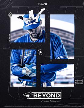
THE BLUE JAYS BEYOND CORPORATE IMAGE : PLAYERS


FULL COLOURED TREATMENT
-
To enhance the sophisticated and timeless feel of the brand, prioritize posing shots over action shots to emphasize the player’s personality and style. Create a feeling of intimacy and familiarity with the players and emphasize their personality and style. Consistent composition and framing across all player imagery is key to creating a cohesive and polished look.

-

BLACK, WHITE, BLUE TREATMENT
The black and white treatment for player imagery should create a timeless and classic feel by using high contrast, light and shadow, and consistent toning and grading. The images should also enhance the dapper feel of the imagery to create a sophisticated and polished look.


Blue Jays Beyond Corporate Brand Guidelines Blue Bays Beyond Corporate Brand Guidelines 37 // 62 36 // 62
THE BLUE JAYS BEYOND CORPORATE IMAGE : SPACES SPACES


-
Lighting: The lighting should be bright and well-balanced, highlighting the premium features of the space. It should not be overly dramatic or moody.
Composition: The composition of the imagery should be clean, crisp, and modern. It should showcase the premium features and amenities of the space in an aesthetically pleasing manner.
Angle: The angles should be selected to highlight the key features of the space, such as seating arrangements, views, and design elements. It should be balanced between close-ups, wide-angle shots, and details.
Editing Style: The editing style should be consistent with the Blue Jays’ brand style. This includes clean and modern image processing with a focus on highlights, shadows, and color correction. The images should be free of heavy editing or filters that could distort the reality of the space.
People: Images of people enjoying the premium spaces should be natural and unobtrusive, not posed or staged. They should showcase people having fun and enjoying the space’s features and amenities.
-
IMAGERY
Utilize imagery to give a glimpse of the exclusive and luxurious experience of the premium spaces. Show the details, design, and unique features of each space to entice potential members and enhance their desire to be a part of this elevated experience.
Use close-up shots to showcase the details of the culinary delights and the bespoke wine selection, highlighting the premium ingredients and unique presentation. Incorporate images of the private dining spaces and meeting rooms to demonstrate the versatility of the premium spaces and their suitability for both entertainment and business purposes.
Overall, the imagery should convey a sense of exclusivity, luxury, and sophistication that embodies the premium reimagined experience, quality of the food and drinks, and feature the stunning views and ambiance of the premium spaces.

For example, you can use the portal shape to show the grand entrance of the premium spaces, highlighting the dedicated VIP entrance and the elegant decor. Show images of the plush seating, intricate lighting fixtures, and the personalized touches throughout the space.

Blue Jays Beyond Corporate Brand Guidelines Blue Bays Beyond Corporate Brand Guidelines 39 // 62 38 // 62
CORPORATE ICONOGRAPHY
THE BLUE JAYS BEYOND CORPORATE ICONOGRAPHY
THE ICONOGRAPHY SYSTEM
Bold and Simple: We will use bold and straightforward icons that are easy to recognize and stand out. Bold icons add an element of luxury and sophistication and can make a strong impact.
Consistency: The icons should be consistent in style, size, and color. This consistency ensures that the icons are recognizable and reinforce the brand’s visual identity.
Minimalism: The icons should be minimalistic and convey the brand’s message in a simple and clear way. Cluttered icons can be distracting and take away from the luxury experience.

Cohesive Style: The icons should follow a cohesive design style that aligns with the brand’s overall visual identity. This cohesiveness will help the icons work together to create a seamless visual experience.
High Quality: The icons should be of high quality, with crisp lines and details. This attention to detail will reinforce the brand’s commitment to excellence and luxury.
40 // 62 Blue Bays Beyond Corporate Brand Guidelines Blue Jays Beyond Corporate Brand Guidelines
41 // 62
-
EMAIL MARKETING
USAGE
BLUE JAYS BEYOND EMAIL MARKETING DARK VS LIGHT BACKGROUND
EMAIL MARKETING


Background color plays a critical role in creating a brand identity and impact in email marketing. The following guidelines will help you determine when to use a dark or light background for Blue Jays Beyond email marketing campaigns easier.
Dark Background:
Use a dark background when the primary message and content of the email is visual or multimedia.
Use a dark background when promoting an evening or night-time event or when the email is targeted towards a mature audience. Use a dark background when the primary CTA is a light-colored button to create a contrast and make it stand out.
Use a dark background sparingly as it can make text and content harder to read.
Light Background:
Use a light background when the primary focus of the email is text-based.
Use a light background when promoting a daytime event or when the email is targeted towards a younger audience. Use a light background when the primary CTA is a dark-colored button to create a contrast and make it stand out.
Use a light background for most email marketing campaigns as it is easier on the eyes and provides a clean, professional look.
Blue Jays Beyond Corporate Brand Guidelines Blue Bays Beyond Corporate Brand Guidelines 43 // 62 42 // 62
EMAIL TEMPLATE
EXAMPLES
GRAPHIC TEMPLATES & EXAMPLES
GRAPHIC TEMPLATES

Blue Jays Beyond Corporate Brand Guidelines Blue Bays Beyond Corporate Brand Guidelines 45 // 62 44 // 62


Blue Jays Beyond Corporate Brand Guidelines Blue Bays Beyond Corporate Brand Guidelines 47 // 62 46 // 62
PREMIUM SPACES
CASUAL CLUB DESIGN
DESIGN
Design Narrative:
CASUAL CLUB
POSSIBLE NAMES - BANNER CLUB/DUGOUT CLUB
Our membership offers an authentic and elevated baseball experience that connects you to the players, the team, and the energy of the game. You will feel like part of the team as you watch players live in the batting cage and feast on ball park treats from your earliest baseball game memories. Surrounded by Blue Jays memorabilia and momentous points in history, you will be treated to beer on tap, premium wines, and easy access to food with freedom to choose when you sit or stand to cheer home runs. This is where VIP is stitched into a baseball experience that is authentic, where passion is shared and you feel you are part of the game you love.
CASUAL CLUB EXPERIENCE
Baseball is at the front and centre of your sports fandom so this is a big part of going to the game. You want to feel connected to the players, the team and the energy of the game.
An elevated game experience that is authentic baseball past and present. Feast on ball park treats from your earliest baseball game memories. Surrounded by Blue Jays memorabilia and momentous points in history, it is a atmosphere for the devoted. You are treated to beer on tap, premium wines and easy access to food with freedom to choose when you sit or stand to cheer home runs.
Blue Jays Beyond Corporate Brand Guidelines Blue Bays Beyond Corporate Brand Guidelines 49 // 62 48 // 62
banner
banner
banner club by
club presents
club
CASUAL CLUB MARKETING
SALES -
Sales Narrative:
Our premium product at Rogers Centre offers the ultimate experience with the best location, in-seat experience, and vantage point. With easy parking and access through a dedicated VVIP entrance, members have all-access to newly constructed premium clubs and an exclusive VVIP space with personalized service. Enjoy an all-access food program, including dine-in or elevated service delivered to your seat, and first access to a private dining space. VVIP members also receive exclusive events and benefits, making this the most premium experience at Rogers Centre.
dugout club
dugout club presents
dugout club by

Blue Jays Beyond Corporate Brand Guidelines Blue Bays Beyond Corporate Brand Guidelines 51 // 62 50 // 62
PREMIUM SPACES
VVIP / MARQUEE MARKETING
DESIGN
Design Narrative:
the nest by
VVIP / MARQUEE CLUB POSSIBLE NAMES - THE NEST/ MARQUEE/WOVEN
Experience the perfect blend of business and sports at our premium baseball lounge. From the invigorating competition on the field to the rhythm of the game that allows for fluid conversation, our location is designed to foster relationships and extend the business day. Our established membership offers a private and intimate atmosphere perfect for hosting clients, with a dedicated entrance and custom cocktails. Surrounded by professional appointments and an all-inclusive chef’s table, our membership provides the perfect space for private conversations and also offers bespoke wine lists, just steps away from premium seats. Come to where business meets pleasure, and enjoy the perfect natural game experience.
VVIP / MARQUEE EXPERIENCE
Baseball is a stage with a 9 inning act that provides you with an adrenaline rush, so this is why you come to the game. You are drawn to the drama, allure and spectacle of the game that takes you on journey.
A personalized experience that ensures optimum ease from the dedicated Marquee entrance, access to the entire level premium clubs and food locations, with first access to a private dining space. Surrounded by the finest details in décor, culinary delights and wine cellar, it is level of lavishness that everyone aspires to achieve. You will never want for more, other than a few more innings to extend your stay and enjoyment.
the nest presents the nest
Blue Jays Beyond Corporate Brand Guidelines Blue Bays Beyond Corporate Brand Guidelines 53 // 62 52 // 62
VVIP / MARQUEE MARKETING
SALES -
Sales Narrative:
Our VVIP premium experience at Rogers Centre offers the most exclusive and highend product at Rogers Centre, offering the best location, in-seat experience, and vantage point for sports viewing. With a dedicated VVIP entrance and access to all newly constructed premium clubs, members can enjoy an exclusive and personalized experience. The food program offers a variety of options, including all-access dining in the club or elevated service delivered to your seat. Members also have first access to a private dining space and can enjoy VVIP events and benefits. This brand statement positions Rogers Centre as the ultimate destination for those seeking the most luxurious and exclusive sports viewing experience.
Blue Jays Beyond Corporate Brand Guidelines Blue Bays Beyond Corporate Brand Guidelines 55 // 62 54 // 62
marquee presents marquee marquee by THE MARQUEE
THEMARQUEE by
by
presents MARQUEE
WOVEN presents WOVEN WOVEN
PREMIUM SPACES
VVIP / MARQUEE DESIGN
DESIGN
Design Narrative:
UPSACALE BUSINESS CLUB
POSSIBLE NAMES - BLUEPRINT/BOXSCORE/EXCHANGE
This premium membership offers the perfect combination of business and pleasure at the baseball game with our established membership that provides a professional atmosphere for fostering relationships and extending the workday beyond the boardroom. With a dedicated entrance, personalized service, and access to a chef’s table and bespoke wine list, our membership offers a private and intimate atmosphere for hosting clients and having fluid conversations, all while enjoying the invigorating competition on the field. Join us and feel the energy shared between work and play.
UPSCALE BUSINESS EXPERIENCE
Baseball is strategic from the first pitch to the last out with competition that is invigorating, so this is why you come to the game. You need a location that is professional, fosters relationships and allows you to extend the business day from board room table to dining table.
An environment that subtly suggests establishment that is perfect for hosting clients in a private and intimate atmosphere. Expedite your arrival by dedicated entrance, order a custom cocktail and watch the visiting team pregame activities live. Surrounded by detailed design and professional appointments, it is a space for major leaguers. Indulge in an all-inclusive chef’s table, bespoke wine list, and premium seats where conversations flip between deals and double plays.
Blue Jays Beyond Corporate Brand Guidelines Blue Bays Beyond Corporate Brand Guidelines 57 // 62 56 // 62
blueprint blueprint presents blueprint lounge lounge the the lounge by
VVIP / MARQUEE MARKETING
SALES
-
Sales Narrative:
Experience the ultimate upscale premium cocktail lounge membership with exclusive access to a private and intimate atmosphere for hosting. Enjoy premium seats with differentiated comfort, in-seat experience, and a great vantage point with live viewing access to the visiting team’s path to the Bat Swing/ Dugout. Savor the food program that includes an all-inclusive chef’s table with action stations, private dining options, bespoke wine lists, and custom cocktails. Expedite your arrival with a dedicated VIP entrance and gain access to VIP events and benefits that have a business focus.
Blue Jays Beyond Corporate Brand Guidelines Blue Bays Beyond Corporate Brand Guidelines 59 // 62 58 // 62
boxscore boxscore presents boxscore lounge lounge the the lounge by exchange exchange presents exchange lounge lounge the the lounge by
CONTACT
A SHORT SUMMARY
These guidelines describe the visual and verbal elements that represent Blue Jays Beyond corporate identity.
This includes our name, logo and other elements such as colour, type and graphics. Sending a consistent and controlled message of who we are is essential to presenting a strong, unified image of our company.
These guidelines reflect Blue Jays Beyond commitment to quality, consistency and style. The Blue Jays Beyond brand, including the logo, name, colours and identifying elements, are valuable company assets.
CONTACT
For further information please contact:
Sheldon Kiernan Director of Brand & Digital Marketing Blue Jays BeyondE: sheldon.kiernan@bluejays.com
P: 416-764-6779
P: 416-219-4994
60 // 62 Blue Bays Beyond Corporate Brand Guidelines 61 // 62 Blue Jays Beyond Corporate Brand Guidelines