EFFECTIVE COVERAGE: A FRAMEWORK LINKING COVERAGE AND QUALITY
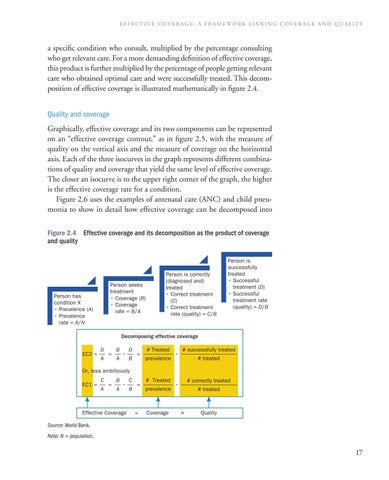
a specific condition who consult, multiplied by the percentage consulting who get relevant care. For a more demanding definition of effective coverage, this product is further multiplied by the percentage of people getting relevant care who obtained optimal care and were successfully treated. This decomposition of effective coverage is illustrated mathematically in figure 2.4. Quality and coverage Graphically, effective coverage and its two components can be represented on an “effective coverage contour,” as in figure 2.5, with the measure of quality on the vertical axis and the measure of coverage on the horizontal axis. Each of the three isocurves in the graph represents different combinations of quality and coverage that yield the same level of effective coverage. The closer an isocurve is to the upper right corner of the graph, the higher is the effective coverage rate for a condition. Figure 2.6 uses the examples of antenatal care (ANC) and child pneumonia to show in detail how effective coverage can be decomposed into Figure 2.4 Effective coverage and its decomposition as the product of coverage and quality
Person seeks treatment • Coverage (B) • Coverage rate = B/A
Person has condition X • Prevalence (A) • Prevalence rate = A/N
Person is correctly (diagnosed and) treated • Correct treatment (C) • Correct treatment rate (quality) = C/B
Person is successfully treated • Successful treatment (D) • Successful treatment rate (quality) = D/B
Decomposing effective coverage EC2 =
D A
=
B A
•
D B
=
# Treated prevalence
•
# successfully treated # treated
Or, less ambitiously EC1 =
C A
=
B A
•
Effective Coverage
C B
=
=
# Treated prevalence
Coverage
# correctly treated
•
# treated
×
Quality
Source: World Bank. Note: N = population.
17
