
Teaching Tips for Each Chapter
CHAPTER 1: GETTING STARTED
Double-Blind Studies (Section 1.3)
The double-blind method of data collection, mentioned at the end of Section 1.3, is an important part of standard research practice. A typical use is in testing new medications. Because the researcher does not know which patients are receiving the experimental drug and which are receiving the established drug (or a placebo), the researcher is prevented from doing things subconsciously that might skew the results.
If, for instance, the researcher communicates a more optimistic attitude to patients in the experimental group, this could influence how they respond to diagnostic questions or actually might influence the course of their illness. And if the researcher wants the new drug to prove effective, this could subconsciously influence how he or she handles information related to each patient’s case. All such factors are eliminated in double-blind testing.
The following appears in the physician’s dosing instructions package insert for the prescription drug QUIXIN™:
In randomized, double-masked, multicenter controlled clinical trials where patients were dosed for 5 days, QUIXIN™ demonstrated clinical cures in 79% of patients treated for bacterial conjunctivitis on the final study visit day (days 6–10).
Note the phrase double-masked. Apparently, this is a synonym for double-blind. Since double-blind is used widely in the medical literature and in clinical trials, why do you suppose that the company chose to use double-masked instead?
Perhaps this will provide some insight: QUIXIN™ is a topical antibacterial solution for the treatment of conjunctivitis; i.e., it is an antibacterial eye drop solution used to treat an inflammation of the conjunctiva, the mucous membrane that lines the inner surface of the eyelid and the exposed surface of the eyeball. Perhaps, since QUIXIN™ is a treatment for eye problems, the manufacturer decided the word blind should not appear anywhere in the discussion.
Source: Package insert. QUIXIN™ is manufactured by Santen Oy, P.O. Box 33, FIN-33721 Tampere, Finland, and marketed by Santen, Inc., Napa, CA 94558, under license from Daiichi Pharmaceutical Co., Ltd., Tokyo, Japan.
CHAPTER 2: ORGANIZING DATA
Emphasize when to use the various graphs discussed in this chapter: bar graphs when comparing data sets, circle graphs for displaying how data are dispersed into several categories, time-series graphs to display how data change over time, histograms or frequency polygons to display relative frequencies of grouped data, and stem-and-leaf displays for displaying grouped data in a way that does not lose the detail of the original raw data.
Drawing and Using Ogives (Section 2.1)
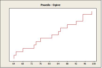
The text describes how an ogive, which is a graph displaying a cumulative-frequency distribution, can be constructed easily using a frequency table. However, a graph of the same basic sort can be constructed even more quickly than that. Simply arrange the data values in ascending order and then plot one point for each data value, where the x coordinate is the data value and the y coordinate starts at 1 for the first point and increases by 1 for each successive point. Finally, connect adjacent points with line segments. In the resulting graph, for any x, the corresponding y value will be (roughly) the number of data values less than or equal to x
For example, here is the graph for the data set 64, 65, 68, 73, 74, 76, 81, 84, 85, 88, 92, 95, 95, and 99:
6
12th Edition Brase
Manual Full Download: http://testbanktip.com/download/understandable-statistics-concepts-and-methods-12th-edition-brase-solutions-manual/ Download all pages and all chapters at: TestBankTip.com
Solutions
This graph is not technically an ogive because the possibility of duplicate data values (such as 95 in this example) means that the graph will not necessarily be a function. But the graph can be used to get a quick fix on the general shape of the cumulative distribution curve. And by implication, the graph can be used to get a quick idea of the shape of the frequency distribution, as illustrated below.
The pseudo-ogive obtained from the example data set suggests a uniform distribution on the interval 63–100 or thereabouts.
CHAPTER 3: AVERAGES AND VARIATION
Students should be instructed in the various ways that sets of numeric data can be represented by a single number. The concepts of this section illustrate for students the need for this kind of representation.
7
112 096 080 064 048 032 016 000 90 80 70 60 50 40 30 20 10 0 UniformHistogram P e r c e n t 10 08 06 04 02 00 100 0 Psuedo-OgiveUniformDistribution 3 2 1 0 -1 -2 25 20 15 10 5 0 NormalHistogram P e r c e n t 3 2 1 0 -1 -2 -3 100 0 Psuedo-OgiveNormalDistribution
Organizing Data


Copyright © Cengage Learning.All rights reserved.
Section
2.1 Frequency Distributions, Histograms, and Related Topics
Copyright © Cengage Learning.All rights reserved.
Focus Points
• Organize raw data using a frequency table.
• Construct histograms, relative-frequency histograms, and ogives.
• Recognize basic distribution shapes: uniform, symmetric, skewed, and bimodal.
• Interpret graphs in the context of the data setting.
3
Frequency Tables
4
Frequency Tables
When we have a large set of quantitative data, it’s useful to organize it into smaller intervals or classes and count how many data values fall into each class. A frequency table does just that.
5
Example 1 – Frequency table
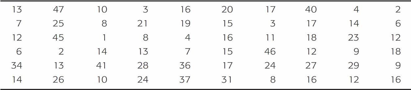
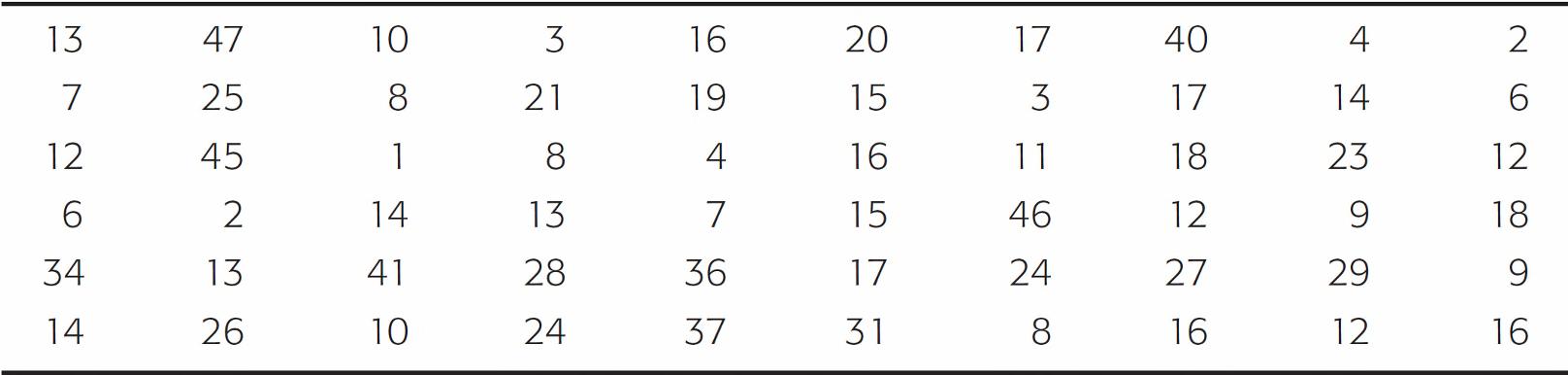
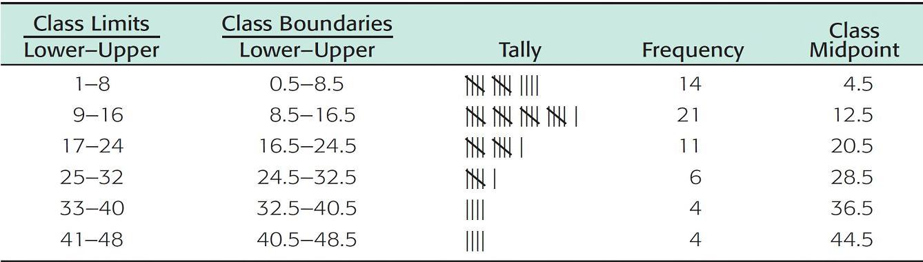
A task force to encourage car pooling did a study of one-way commuting distances of workers in the downtown Dallas area. A random sample of 60 of these workers was taken. The commuting distances of the workers in the sample are given in Table 2-1. Make a frequency table for these data.
One-Way Commuting Distances (in Miles) for 60 Workers in Downtown Dallas
Table 2-1
6
Example 1 – Solution
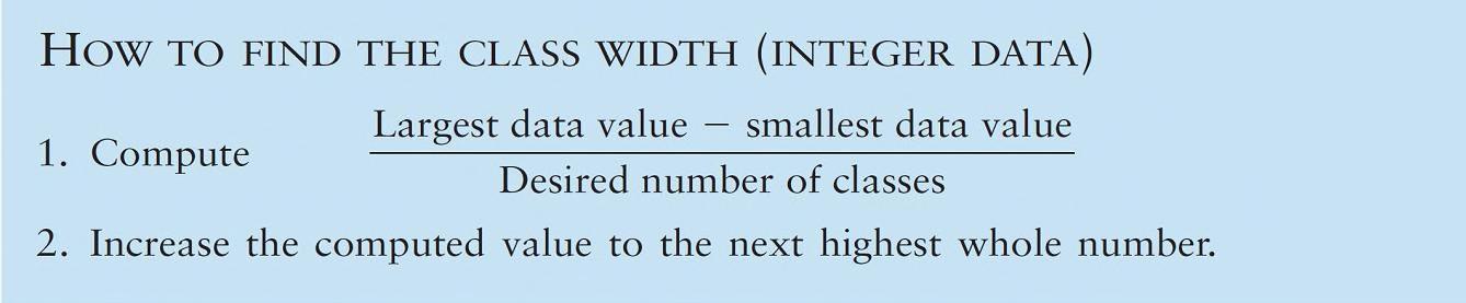
a. First decide how many classes you want. Five to 15 classes are usually used. If you use fewer than five classes, you risk losing too much information. If you use more than 15 classes, the data may not be sufficiently summarized.
Let the spread of the data and the purpose of the frequency table be your guides when selecting the number of classes. In the case of the commuting data, let’s use six classes.
b. Next, find the class width for the six classes.
7
Example 1 – Solution
Procedure:
8
cont’d
Example 1 – Solution
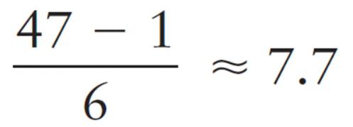
To find the class width for the commuting data, we observe that the largest distance commuted is 47 miles and the smallest is 1 mile. Using six classes, the class width is 8, since
Class width = (increase to 8)
c. Now we determine the data range for each class.
9
cont’d
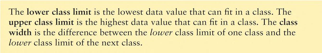
The smallest commuting distance in our sample is 1 mile. We use this smallest data value as the lower class limit of the first class.
Since the class width is 8, we add 8 to 1 to find that the lower class limit for the second class is 9.
Following this pattern, we establish all the lower class limits.
Then we fill in the upper class limits so that the classes span the entire range of data.
10
cont’d
Example 1 – Solution
Example 1 – Solution
Table 2-2, shows the upper and lower class limits for the commuting distance data.
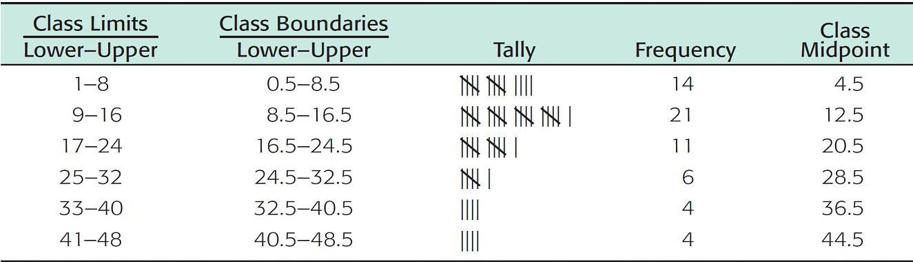
Frequency Table of One-Way Commuting Distances for 60 Downtown Dallas Workers (Data in Miles)
Table2-2
11
cont’d
Example 1 – Solution
d. Now we are ready to tally the commuting distance data into the six classes and find the frequency for each class.
Procedure:
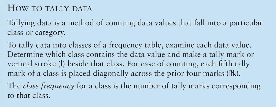
12
cont’d
Example 1 – Solution
Table 2-2 shows the tally and frequency of each class.
e. The center of each class is called the midpoint (or class mark). The midpoint is often used as a representative value of the entire class. The midpoint is found by adding the lower and upper class limits of one class and dividing by 2.
13
cont’d
Table 2-2 shows the class midpoints.
Example 1 – Solution
f. There is a space between the upper limit of one class and the lower limit of the next class. The halfway points of these intervals are called class boundaries. These are shown in Table 2-2.
Procedure:
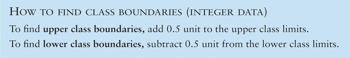
14
cont’d
Frequency Tables
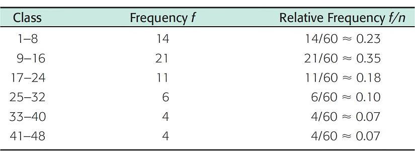
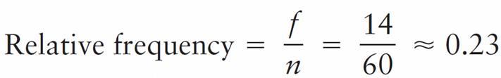
Basic frequency tables show how many data values fall into each class. It’s also useful to know the relative frequency of a class. The relative frequency of a class is the proportion of all data values that fall into that class. To find the relative frequency of a particular class, divide the class frequency f by the total of all frequencies n (sample size).
Relative Frequencies of One-Way Commuting Distances
Table 2-3
15
Frequency Tables
Table 2-3 shows the relative frequencies for the commuter data of Table 2-1.
One-Way Commuting Distances (in Miles) for 60 Workers in Downtown Dallas
Table 2-1
16
Frequency Tables
Since we already have the frequency table (Table 2-2), the relative-frequency table is obtained easily.
Frequency Table of One-Way Commuting Distances for 60 Downtown Dallas Workers (Data in Miles)
Table2-2
17
Frequency Tables
The sample size is n = 60. Notice that the sample size is the total of all the frequencies. Therefore, the relative frequency for the first class (the class from 1 to 8) is
The symbol ≈ means “approximately equal to.” We use the symbol because we rounded the relative frequency. Relative frequencies for the other classes are computed in a similar way.
18
Understandable Statistics Concepts and Methods 12th Edition Brase Solutions Manual Full Download:
Download all pages and all chapters at: TestBankTip.com
http://testbanktip.com/download/understandable-statistics-concepts-and-methods-12th-edition-brase-solutions-manual/
