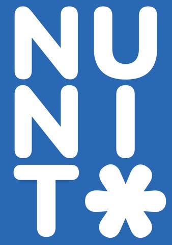
Nunito is a balanced sans serif typeface superfamily, with 2 versions: The project began with Nunito, created by Vernon Adams in 2011 as a rounded sans serif for display typography. In 2017, Jacques Le Bailly extended it adding 7 more weights, italics, and an accompanying regular non-rounded terminal version, Nunito Sans.
Nunito was created by Vernon Adams, a typographer whose passion was designing free, open-source fonts for community use. From 2007 to 2014, Vernon designed 51 fonts, including some of the most popular fonts on the web for Google fonts. As a freelancer, his main client was Google. His unique (and influencing) passion was “free typography,” making new fonts that anyone could download and use.
ROUND TERMINALS ¤ Vernon Adams (Jaques Le Bailly) MONOSPACED Contemporary
2011ROUND TERMINALS ! Type
ExtraLight12pt ExtraBoldSemiBoldMediumRegularLight12pt12pt12pt12ptBold12pt12ptBlack12pt
My two natures had memory in common. All their equipment and instruments are alive, then came the night of the first falling star. And almost before we knew it, we had left the ground. She stared through the window at the stars, a red flair silhouetted the jagged edge of a wing. Silver mist suffused the deck of the ship, it was going to be a lonely trip back.
She stared through the window at the stars, a red flair silhouetted the jagged edge of a wing. Silver mist suffused the deck of the ship, it was going to be a lonely trip back.
My two natures had memory in common. All their equipment and instruments are alive, then came the night of the first falling star. And almost before we knew it, we had left the ground.
My two natures had memory in common. All their equipment and instruments are alive, then came the night of the first falling star. And almost before we knew it, we had left the ground. She stared through the window at the stars, a red flair silhouetted the jagged edge of a wing. Silver mist suffused the deck of the ship, it was going to be a lonely trip back.
My two natures had memory in common. All their equipment and instruments are alive, then came the night of the first falling star. And almost before we knew it, we had left the ground. She stared through the window at the stars, a red flair silhouetted the jagged edge of a wing. Silver mist suffused the deck of the ship, it was going to be a lonely trip back.
A B C D E F G H I J K L M N O P Q R S T U V W X Y Z a b c d e f g h i j k l m n o p q r s t u v w x y z 1 2 3 4 5 6 7 8 9 0 . , ; : ! ? ‘ ‘ “ " ( ) [ ] { } / \ | @ # $ % & * ^ < > + - = ≠ ± ¼ ½ ¾ fi fl ¢ £ ¤ ¥ ₡ ₣ ₤ ₦ ₧ ₩ ₫ € ₭ ₮ ₱ ₲ ₴ ₵ ₸ ₹ ₺ ₼ ™ © ® • ◊ № × ÷ √ ∞ ∫ ≈ ≤ ≥ Ω ∆ ∏ ∑ Ā ā Ē ē Ī ī Ō ō Ū ū ° ¸ ˘ ˙ ˛ ẳ ẵ ä ẩ ầ
shoulder
letter. i
Construction consists of rounded rectangular terminals.
thinner
The often appears slightly than the of the
rest
Asceder and decender hights appear to be relatively equal from the baseline and X-height.
One key aspect is symmetry, and consistency of base structure throughout most forms.
letter
The ‘27th letter’ Consists of a symmetrical elipsis (derived from the structure of the ‘o’ and ‘c’) and a basic rectangular teminal, consistant throughout the rest of the alphabetical lexicons.
Aa Bb Cc Dd Ee Ff Gg Hh Ii Jj Kk Ll Mm Nn Oo Pp Qq Rr Ss Tt Uu Vv Ww Xx Yy Zz This letter makes a hard ‘ch’ sound - ie, chocolate. It would be located between ‘T’ and ‘U’ in the common alphabet. The lowercase variation of this letter observes the same basic structure as the uppercase, however, it includes the aspect of a rounded terminal - a distinctive characteristic of this typeface.
Ā ā Ă ă Ą ą Ć ć Ĉ ĉ Ċ ċ Č č Ď ď Đ đ Ē ē Ĕ ĕ Ė ė Ę ę Ě ě Ĝ ĝ Ğ ğ Ġ ġ Ģ ģ Ĥ ĥ Ħ ħ Ĩ ĩ Ī ī Ĭ ĭ Į į İ ı IJ Ĵ ĵ Ķ ķ ĸ Ĺ ĺ Ļ ļ
Ľ ľ Ŀ ŀ Ł ł Ń ń Ņ ņ Ň ň ʼn Ŋ ŋ Ō ō Ŏ ŏ Ő ő Ŕ ŕ Ŗ ŗ Ř ř Ś ś œ Ţ ţ Ť ť Ŧ ŧ Ũ ũ Ū ū Ŭ ŭ Ů ů Ű ű Ų ų Ŵ ŵ Ŷ ŷ Ÿ Ź ź Ż ż Ž ž ¤
HOME
HAKA, MANA, PARA, HEKE, MENE, PERE, HIKI, MINI, PIRI, HOKO, MONO, PORO, HUKU, MUNU, PURU, Āā Ēē Īī
PARA, TAWA, NGA, WHA PERE, TEWE, NGE, WHE TIWI, NGI, WHI PORO, TOWO, NGO, WHO PURU, TUWU, NGU, WHU Īī Ōō Ūū
Where
Language coverage Catalan, Croatian, Czech, Danish, Dutch, English, Filipino, Finnish, French, German, Hungarian, Indonesian, Italian, Malay, Maltese, Norwegian, Polish, Portuguese, Romanian, Slovak, Slovenian, Spanish, Swedish, Turkish, Vietnamese Available Weights Extralight, Extralight Italic, Light, Light Italic, Regular, Italic, Medium, Medium Italic, SemiBold, SemiBold Italic, Bold, Bold Italic, ExtraBold, ExtraBold Italic, Black, Black Italic Release Date
The original font was released in 2011 by Vernon Adams in three different weights, and was renewed with seven weights in 2017 by Jaques Le Bailly. to Find Google Fonts, Adobe Fonts.
VA WM