
Hidden Navigation01
Users will move to your site with the help of the navigation menu and breadcrumb.
navigation menus affect the users to get

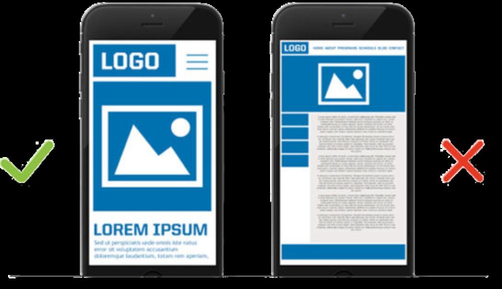
Non-Responsive Design
It doesn’t focus on the user experience & delivers a poor web page layout, resulting in difficulty accessing a website. Most people use different mobile devices than PCs to access the web.
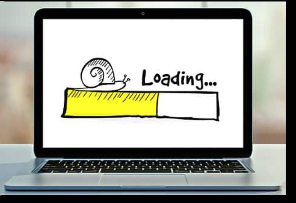
Slow Loading Speed03
Users don’t like to remain for long on a site that is slow to load. To ensure that your site loads quickly & offers a great UX.
Free stock
Using Generic Images

do not provide
to the users and create a weak impression.
you should use original
which convey some story.
Not Having a Favicon05
While browsing with various tabs, users cannot identify your site quickly.
A favicon helps users find what they need & return to their desired tab. It also helps in branding.

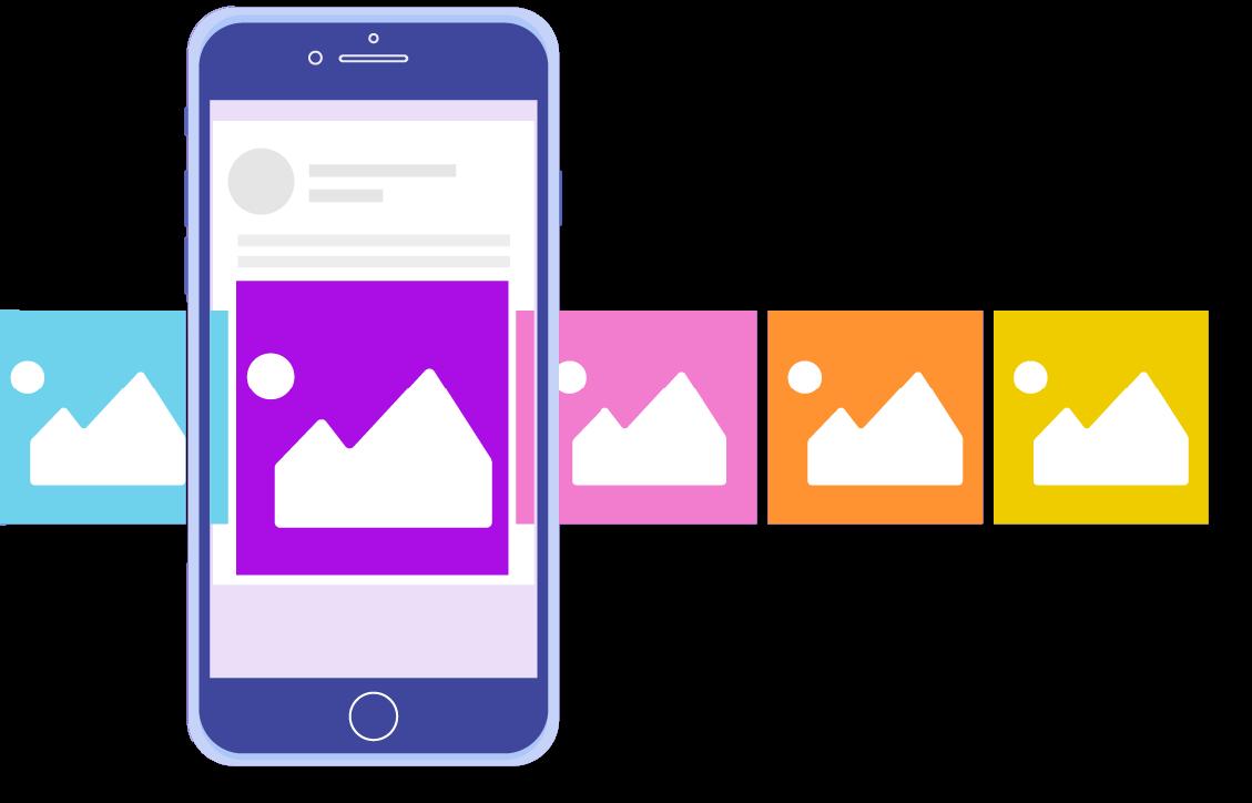
Using Carousels06
Carousels have issues like
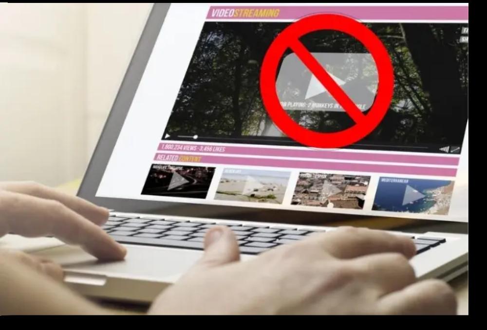
Autoplaying Videos07
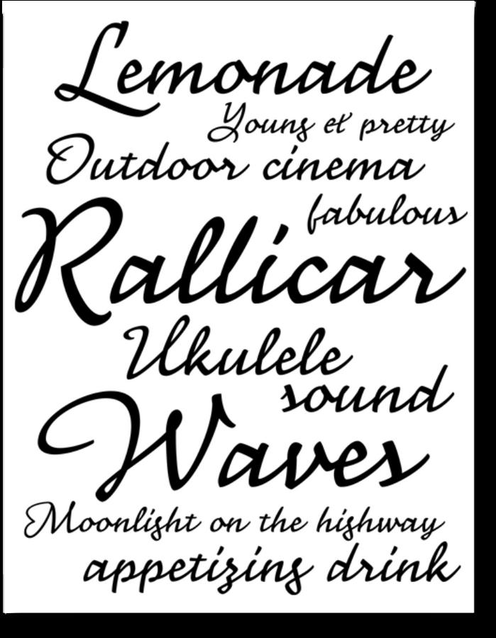
Use Multiple
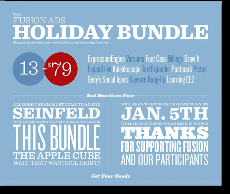
Whitespace
Not Having Whitespace

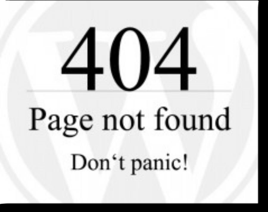
Not Focusing on 404 Pages
Your purpose of a 404 page should be to convert a user’s negative encounter into a positive one.
To achieve this, create a custom 404 page, and add some humor, contact info, & navigation links.
A Lack of Clear CTA12
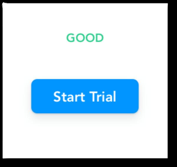
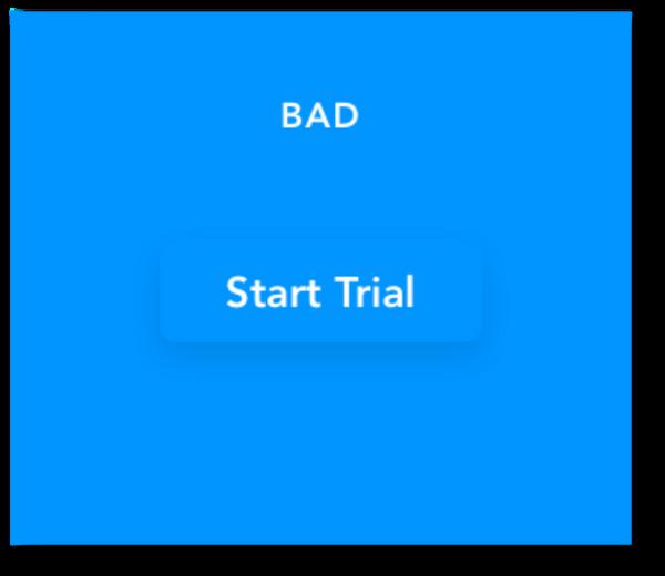
CTA is the main element that urges users to take a specific action. They convert first-time visitors into prospects. Also, if you integrate many CTAs, users might get irritated.
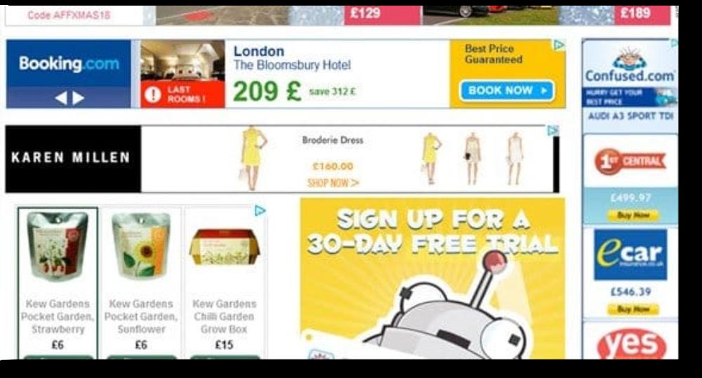
Too Many Ads13
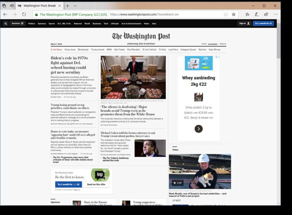
If too many ads are placed above the fold, users might leave your website. Moreover, Google penalizes a website with too many ads. Hence, you should place only one banner above the fold.
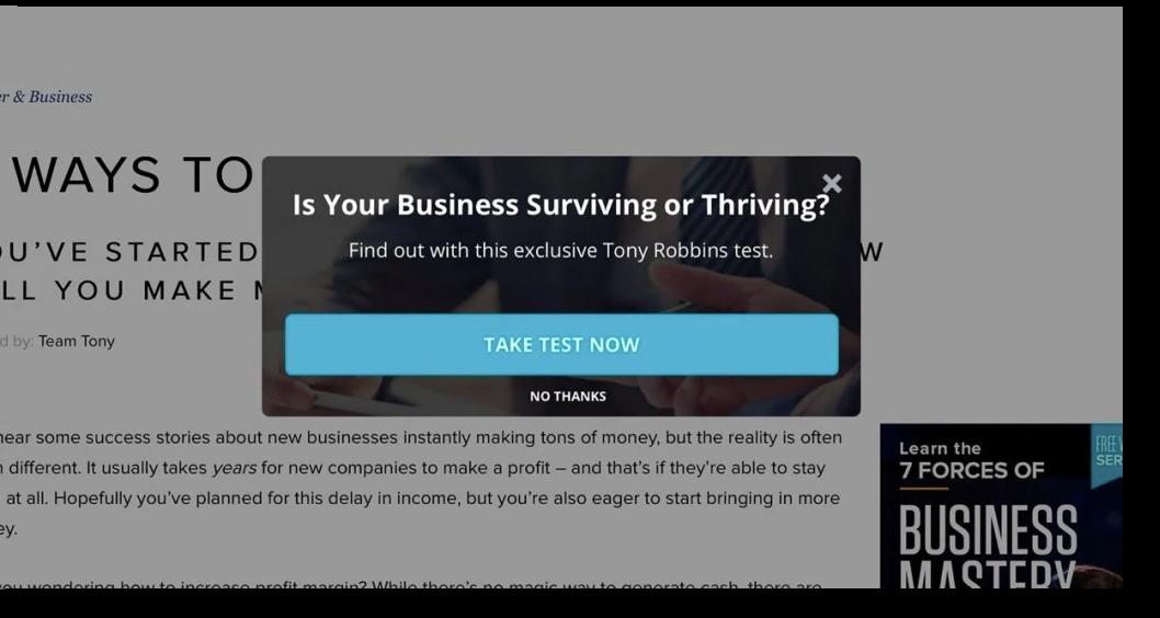
Disruptive Pop-ups
Users can’t view the main content and are forced to watch the ad or find the button to close it. It will increase the bounce rate of your site.
Multiple Ads Separate Main Content
Several sites place the ads within content rather than on the side or the bottom.
Placing multiple ads on webpage results in a dispersed pattern. The pattern includes content, ad, content, ad, and so on.
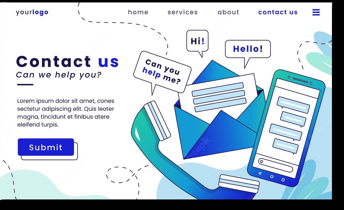
Difficult to Find Contact Info



Thank You

