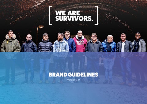
BRAND GUIDELINES
Version 1.0
'To break the silence of the sexual abuse, rape and sexual exploitation of boys and men in order to empower those affected to defeat the legacy of abuse and move towards positive futures.'
LOGO
PRIMARY LOGO
The primary We Are Survivors logo incorporates a blue/ purple gradient within the brackets, with the name always in black.
Whenever possible, the logo should be placed on a clean white background.
A variation with the name in white can also be used where appropriate (e.g. darker solid colour backgrounds).
ALTERNATIVE LOGOS
The alternative colour ways for the We Are Survivors logo are displayed here.
Of the alternative logos, the blue and black are preferable.
The white-out options are preferable to be used on dark backgrounds, or overlaying on to images.
USAGE
Here are a list of examples of how the logo should not be used.
The We Are Survivors logo can be supplied to you by contacting us. Please only use the logo in the supplied formats.
DO NOT warp or stretch the logo.
DO NOT crop or cut any part of the logo.
DO NOT apply shadows, glow effects, outlines, filters or textures to the logo.
DO NOT change the colours of the logo.
DO NOT change the logo orientation.
DO NOT remove any part of the logo.
PROJECT LOGO: OUT SPOKEN
Our therapy team currently provide a trauma-informed talking therapy service within the prison estate. While we predominantly work with adult male survivors of childhood sexual abuse, we also extend our work to men who have experienced signficant early life and young adulthood trauma.
The logo for this service is displayed here in several colour variations that may be used as alternatives depending on the context and background colour where it is being used.
PALETTE
COLOUR PALETTE
We have introduced a gradient as the We Are Survivors key colour way and this should be used whenever possible.
However, we understand that this may not work in all circumstances and in these instances blue or black should be considered the key colour. Please contact us if you need clarification.
A mix of colours from our palette can be used across collateral.
The neutral colours can be used to break up sections in documents and online.
Primary Colour Secondary Colours
45 DEGREE GRADIENT
Use blue and purple colour references.
Neutral Colours
TYPOGRAPHY
HEADLINE FONT
Fat Frank is the headline font at We Are Survivors
This font is to be used in full caps in main titles and headlines across collaterall for We Are Survivors
This font is available from Adobe Fonts as part of the Creative Cloud subscription.
It can also be downloaded from: https://regularbolditalic.com/fonts/fatfrank
Please contact us if you have issues obtaining this font.
TITLE AND BODY COPY
Calibri, a standard PC font, is the default We Are Survivors font to be used. Light is used for body copy. Regular and Bold are used for highlighting sections of copy along with links within copy or online.
Calibri Light
ABCDEFGHIJKLMNOPQRSTUVWXYZ
abcdefghijklmnopqrstuvwxyz
1234567890!@£$%^&*()<>?/”
Calibri Regular
ABCDEFGHIJKLMNOPQRSTUVWXYZ
abcdefghijklmnopqrstuvwxyz
1234567890!@£$%^&*()<>?/”
Calibri Bold
ABCDEFGHIJKLMNOPQRSTUVWXYZ
abcdefghijklmnopqrstuvwxyz
1234567890!@£$%^&*()<>?/”
APPLICATION
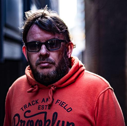
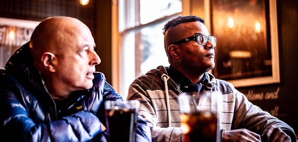
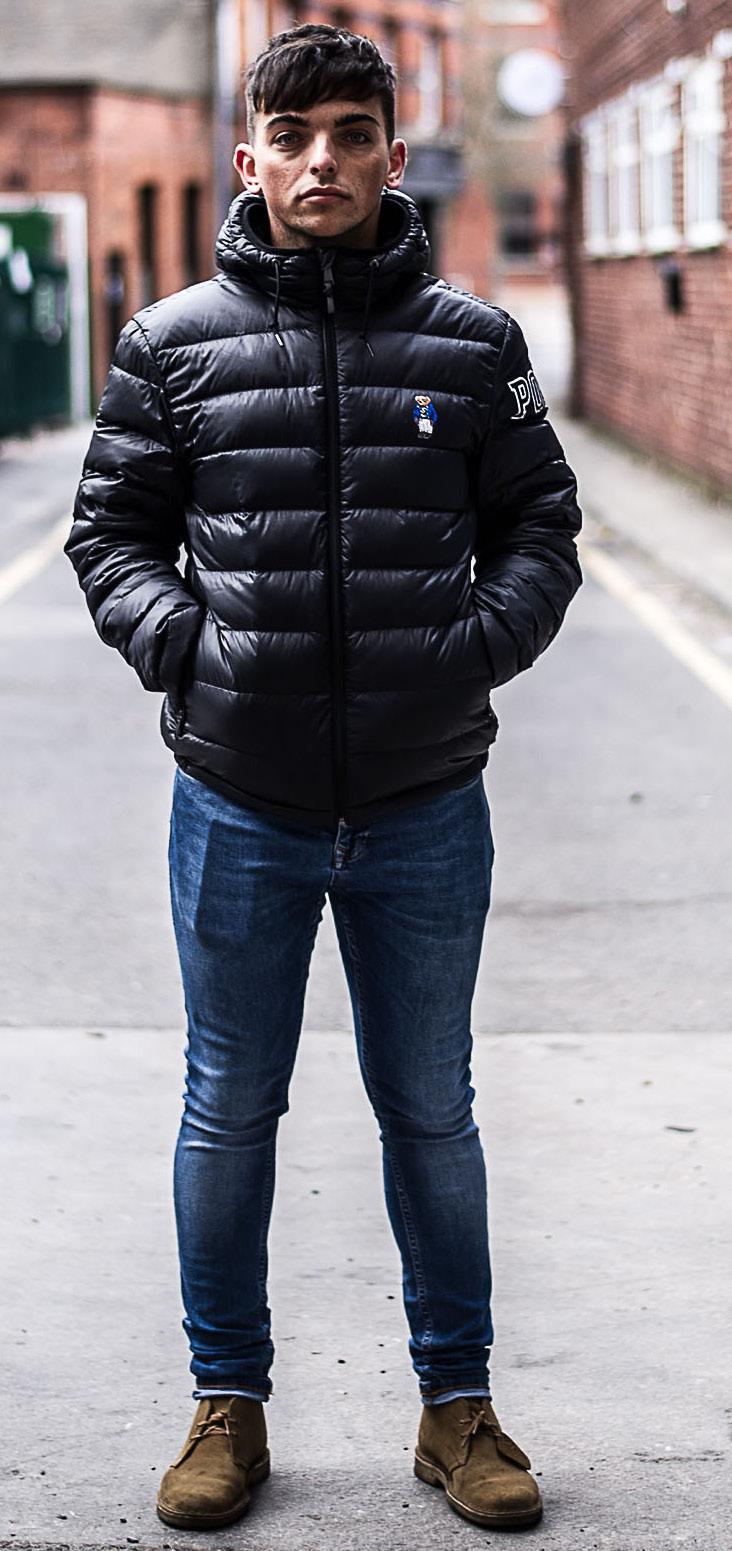
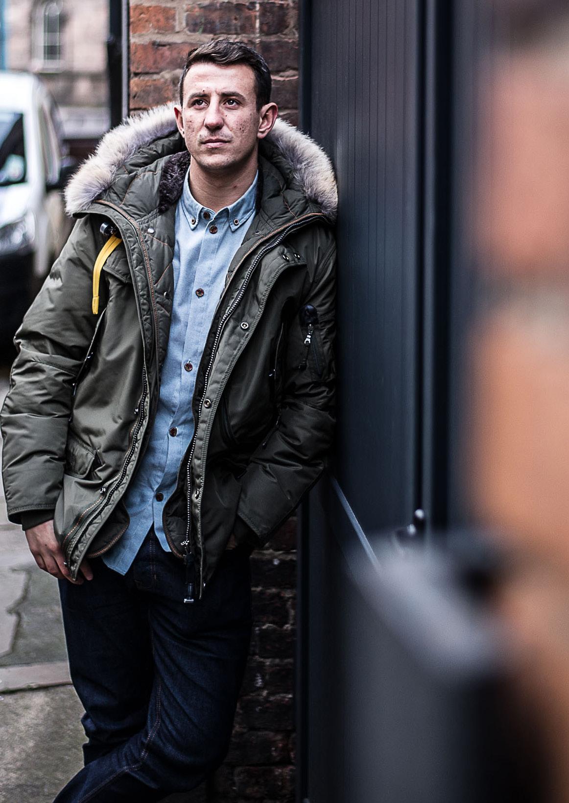
PHOTOGRAPHY
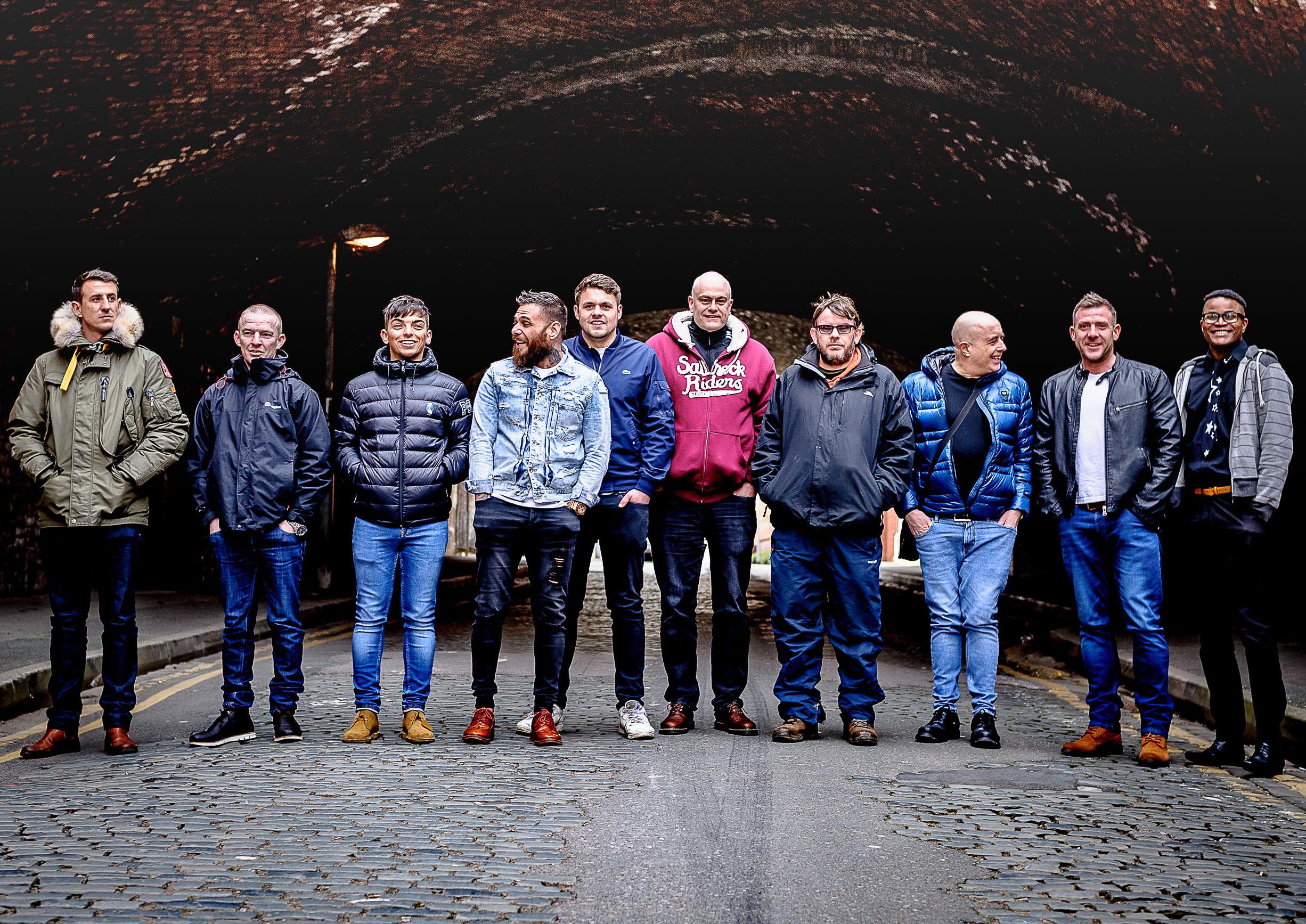
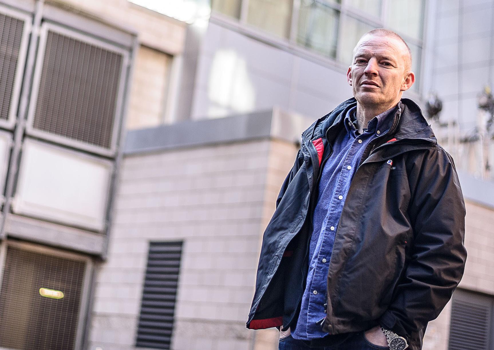
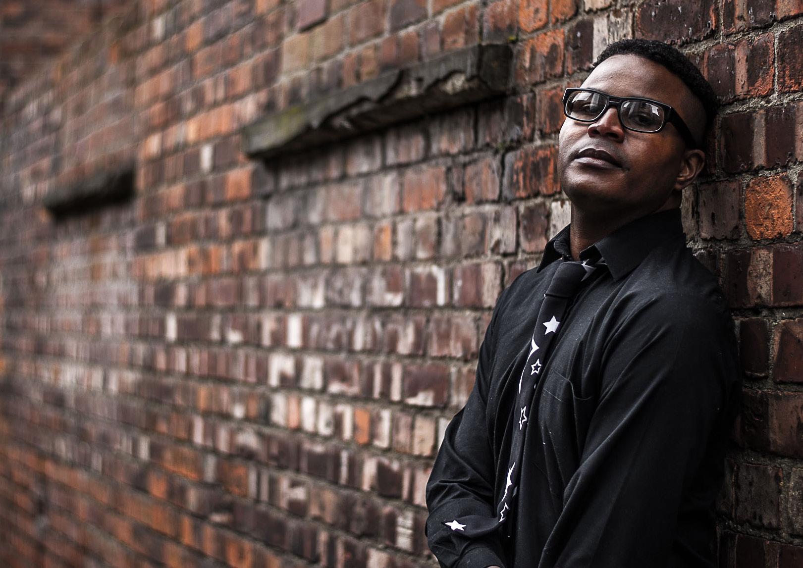
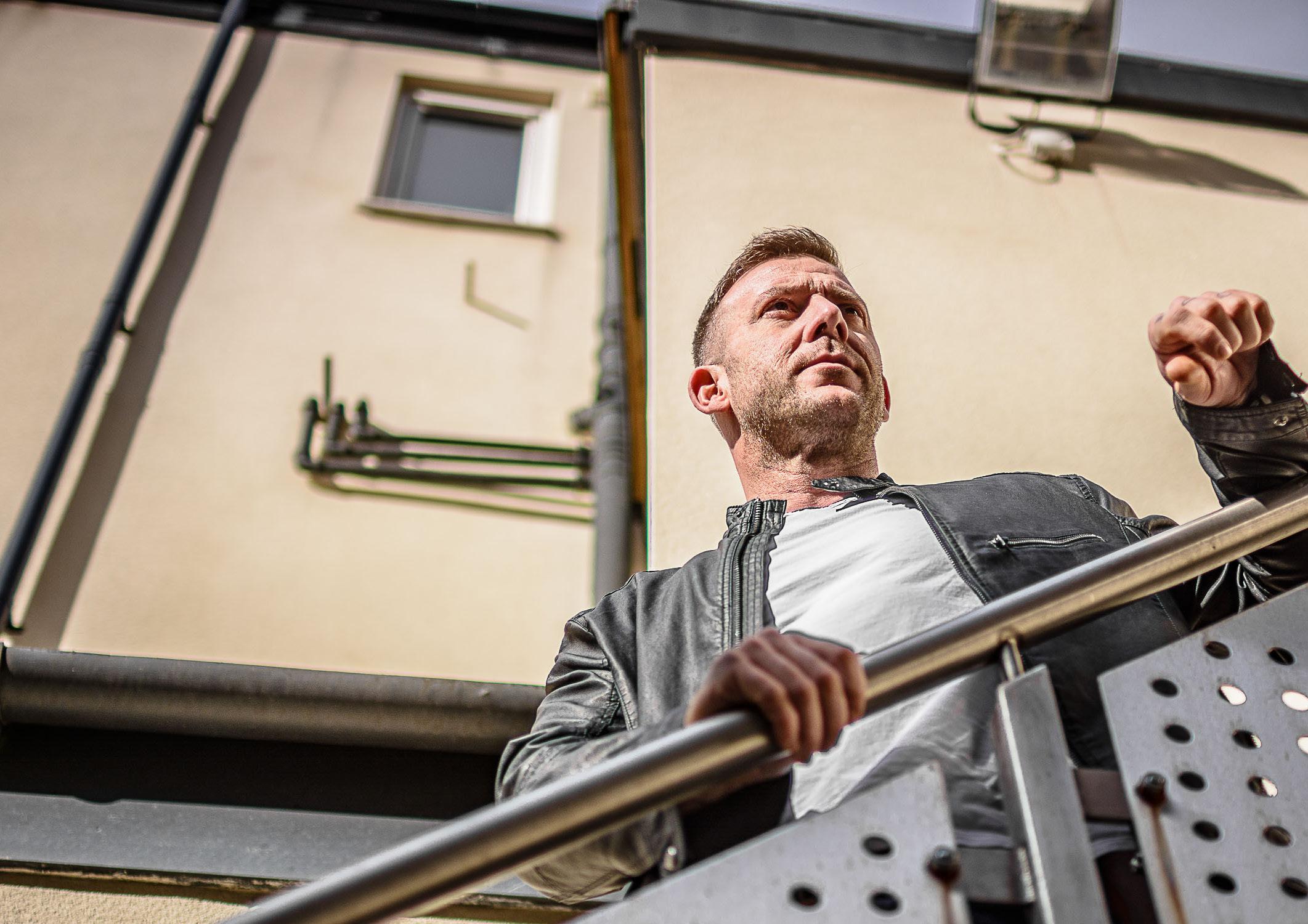
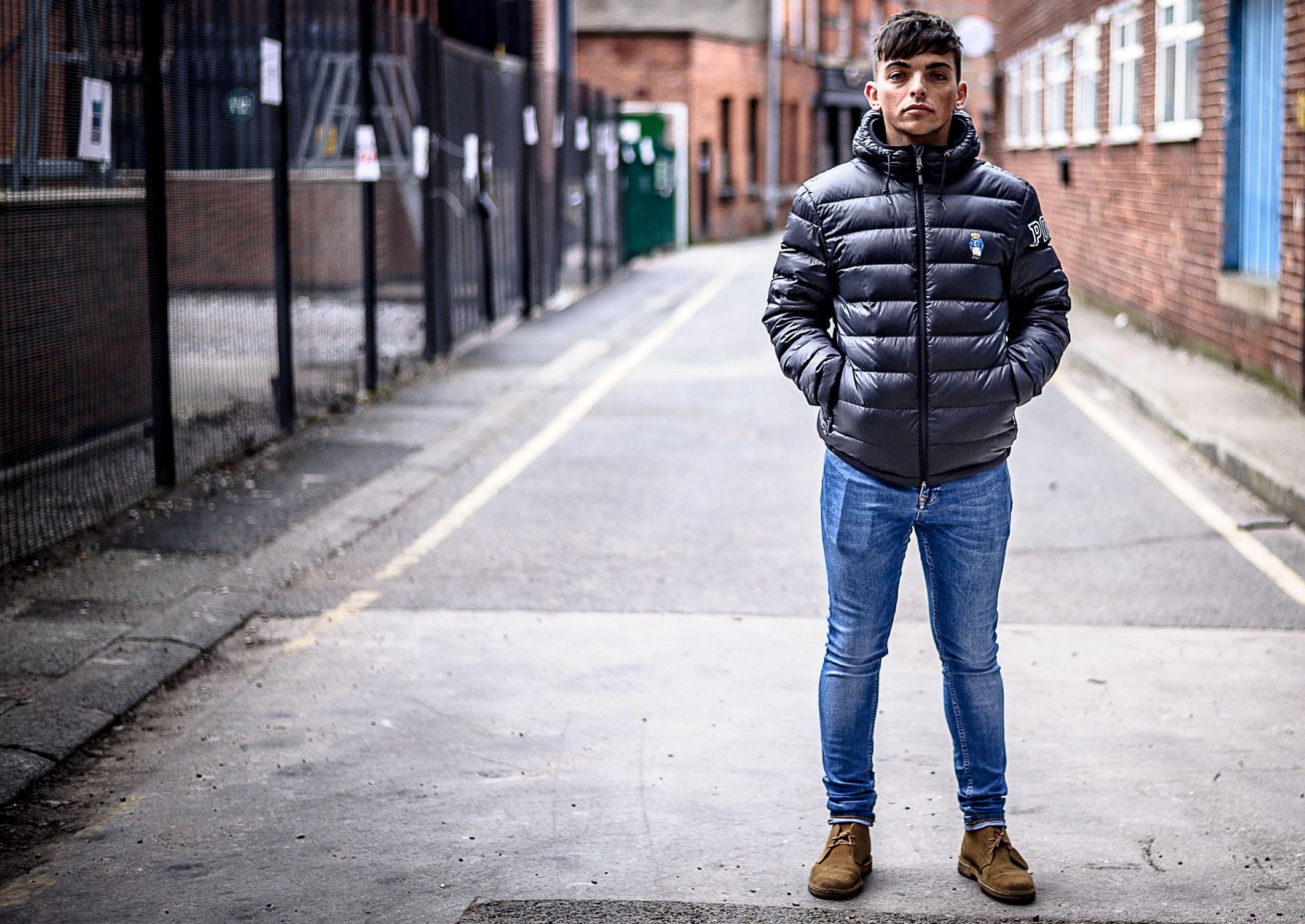
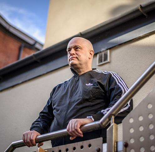
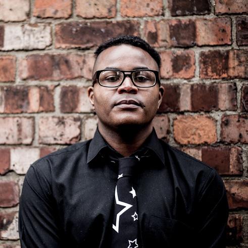
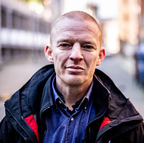
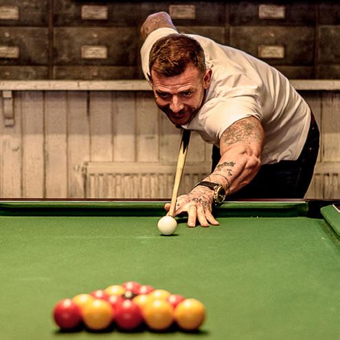
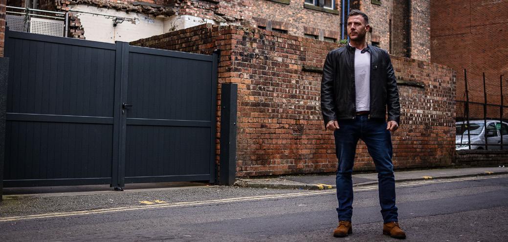
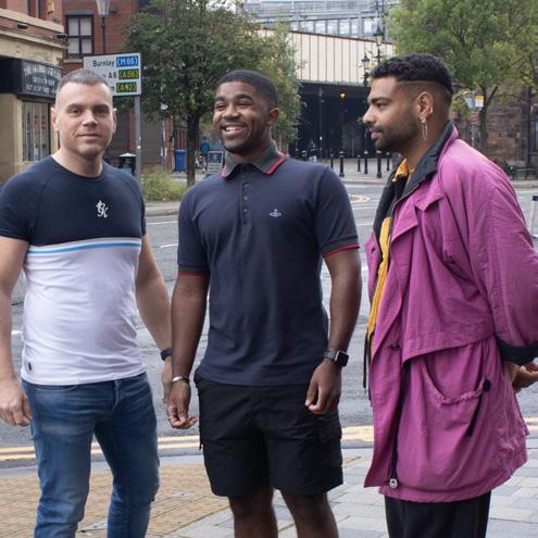
We have an incredible catalogue of images to choose from, with a variety of group and individual shots that can be used across all media.
The great majority of these images feature men who have accessed our services and it’s important to us that - where possible, relevant and respectful - male survivor images are used.
Stock imagery can also be used, but we would ask for sign-off on any stock images before use.
We recommend that images are used in full colour and not converted to single tones or black and white unless essential to any supplied design brief.
For the full catalogue please get in touch.
USE OF PHOTOGRAPHY
We encourage bold use of our photography across reports both internal and external, and in our social media posts where relevant.
A transparent overlay of the gradient - placed over 50% of the image either horizontally or vertically - can be added to photography to enhance clarity of brand elements and titles.
#WeAreSurvivors
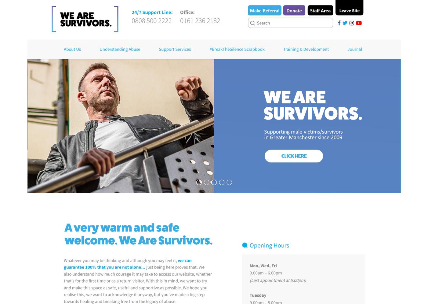
WEBSITE
The new We Are Survivors brand elements set out in this document are transferred to our website.
This makes the information much easier to digest, easier on the eye, and quicker to navigate to the information required and the support needed.
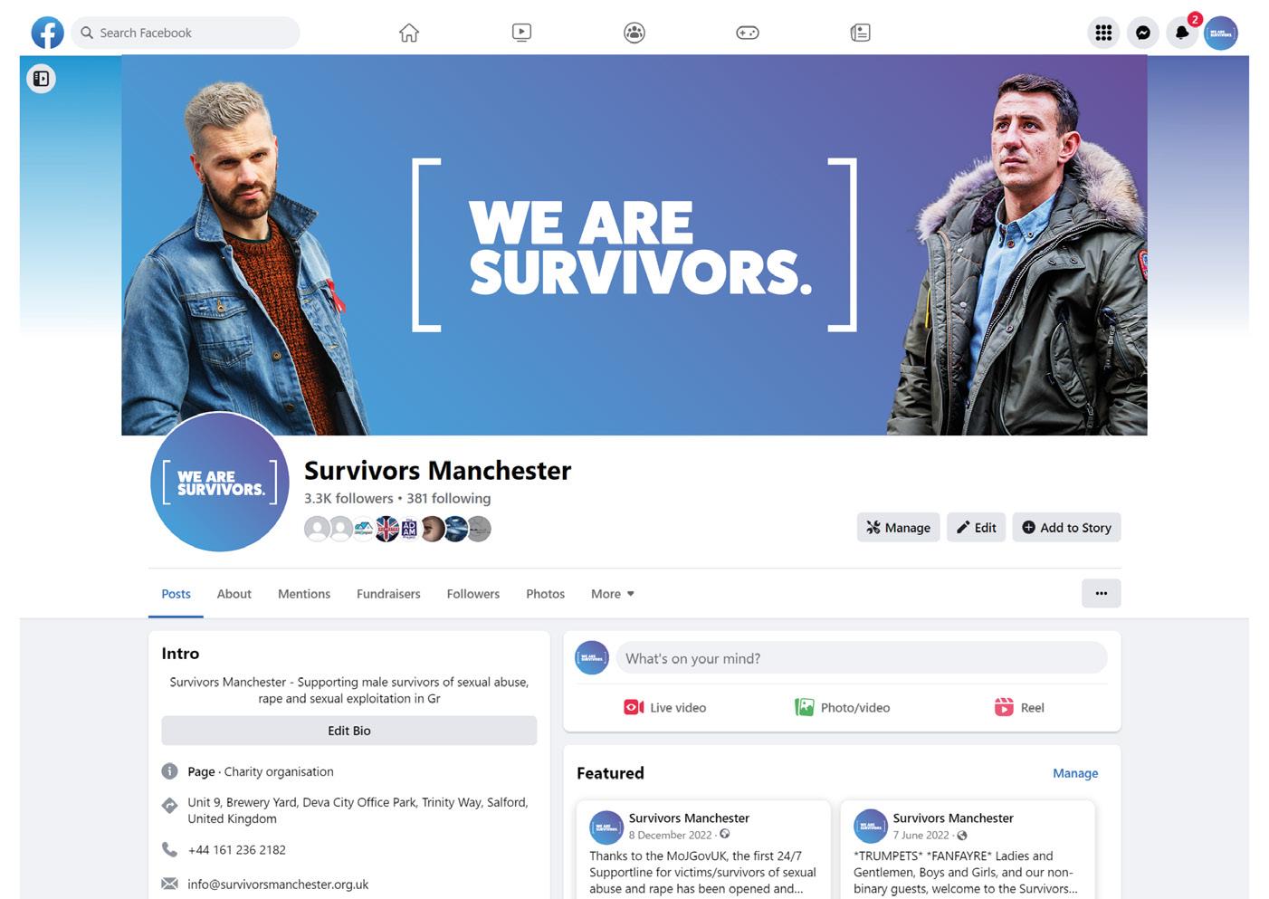
SOCIAL MEDIA FURNITURE
Social media furniture will replicate as closely as possible the brand use on our website, and across all our digital channels.
There is an opportunity to ‘theme’ the branding to certain important calendar dates, e.g. World AIDS Day, Pride month, Sexual Violence Awareness Week, etc.
MERCHANDISE
T-shirts.
#WeAreSurvivors
#WeAreSurvivors
Tote bag.