DESIGN VISION


This book is the culmination of a five year effort to articulate the many loose threads that are woven together in the realization of WDA’s work. The aim was to distill and clarify William Duff and WDA’s Design Vision and disseminate it as a design tool.
We first brainstormed the words that define our 20+ years of design output in terms of atmosphere, aesthetic and philosophy. We looked at the relationships between those words and established four overarching strands to which each thread might be tied. Each word was very deliberately selected and given a definition within the broader context of its place within WDA’s Design Vision.
We then developed a distinctive icon which represents each idea as intrinsic elements of a complete design solution. The four colors represent each overarching strand of thought, with each concentric layer providing substance in the articulation of WDA’s Design Vision.
This document should be used as a working design tool, no different to sketch paper or a scale, with which the WDA Team formulates design solutions to the problems posed in any aspect of our work.
Though the design process is, naturally, particular to each person, this resource should serve as guidebook with which our designs as a collective are curated and so facilitate the expression of each individual’s creativity within a cohesive Design Vision.


noun | or· der | \’ȯr-d(ə-)riŋ\ | prin· ci· ple | /’prinsəpəl/
“The arrangement or disposition of people or things in relation to each other according to a particular sequence, pattern or method.”
BIG MOVE
COMPOSITION
CELEBRATION OF THE OBJECT
PROPORTION
BALANCE
RHYTHM
CLARITY
HORIZONTALITY
ALIGNMENT

adjective | big | \ˈbig\ - verb | move | ˈmüv\
“The use of a bold, clear and significant design move that guides the design.”

“The parti that establishes the design direction.”

The big move is a assertive gesture, prominent object or organizing principle that guides the entire design.
Whether it is obvious or subtle it should become apparent when you see it and permeate the design with boldness and confidence.
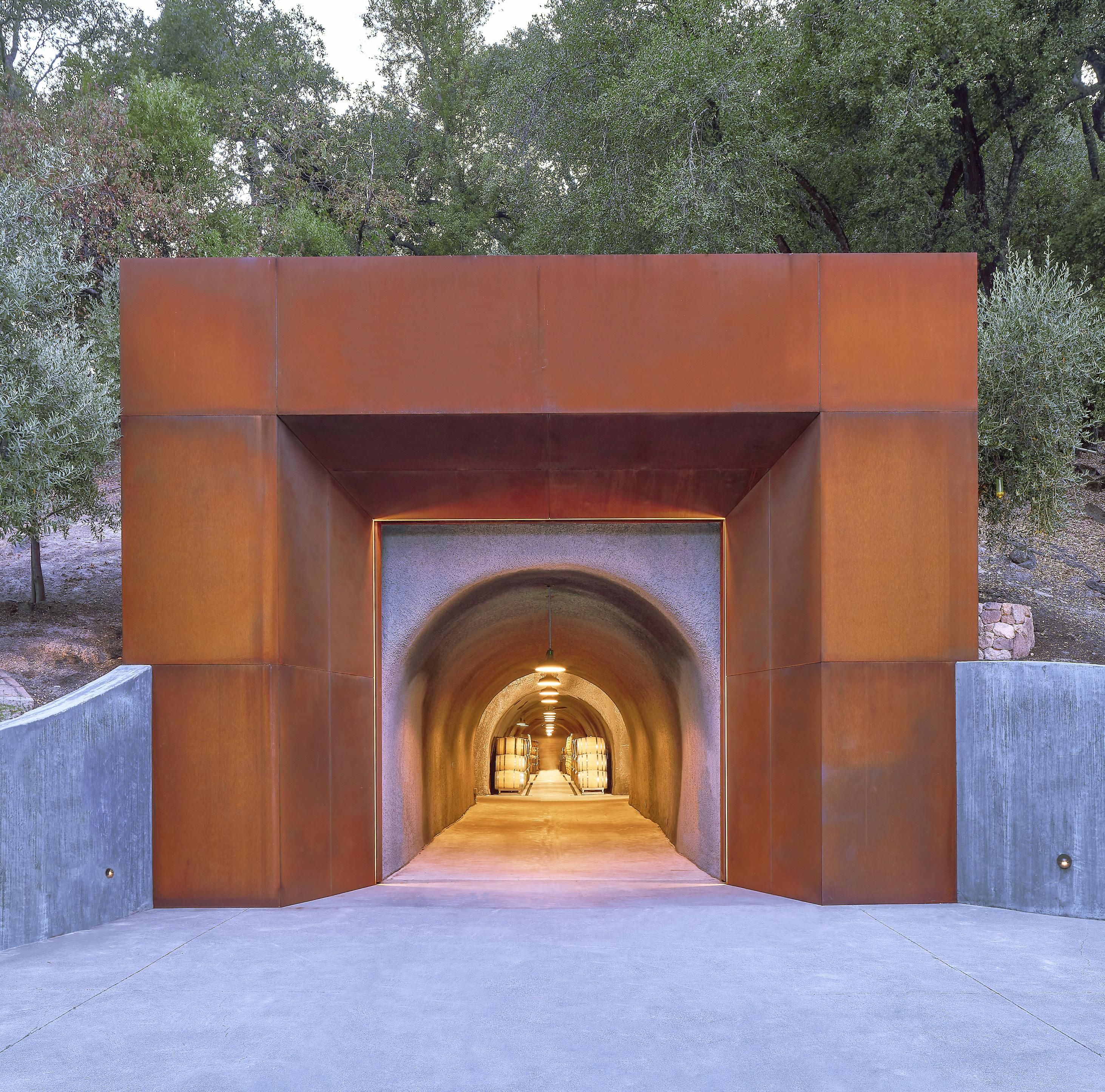
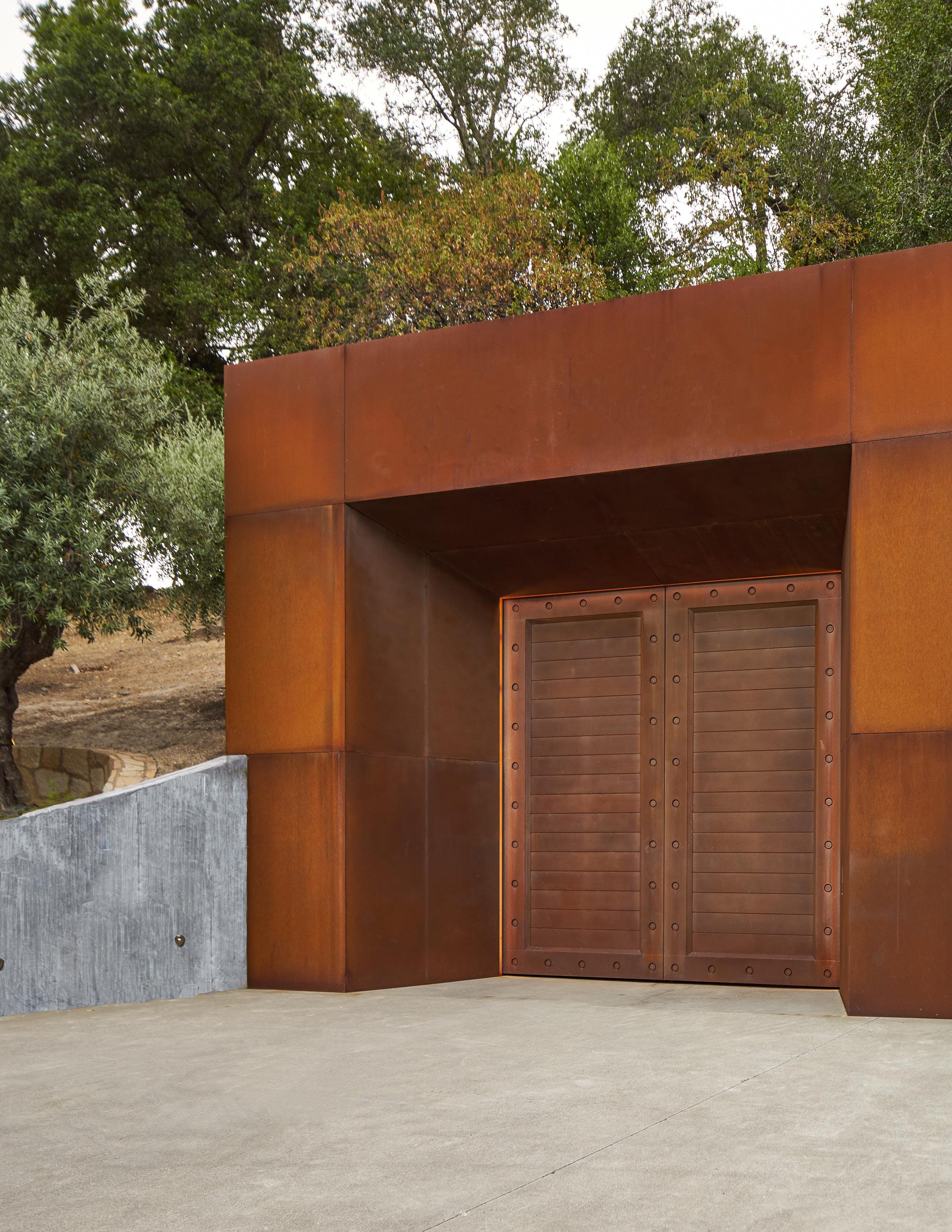
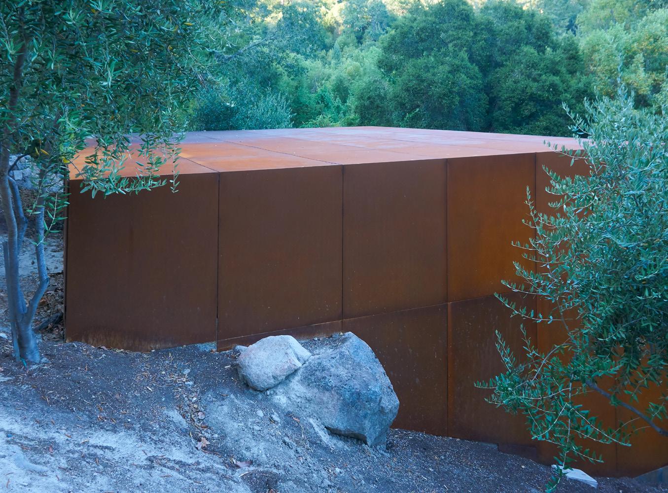
The big move in this wine cave entrance is, in a sense, the design itself; a prominent cube nestled into the hillside highlighting the point at which one enters the cave.
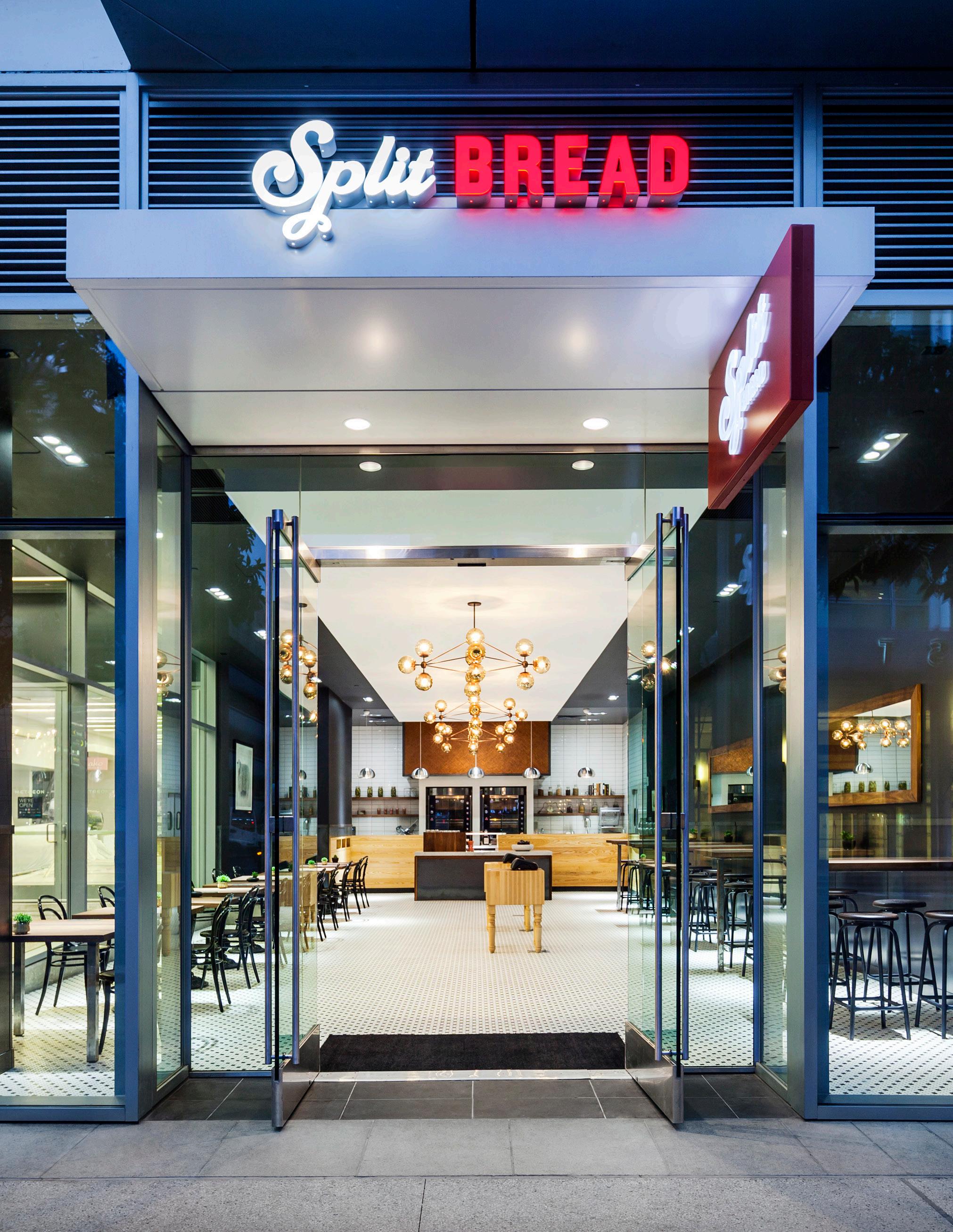
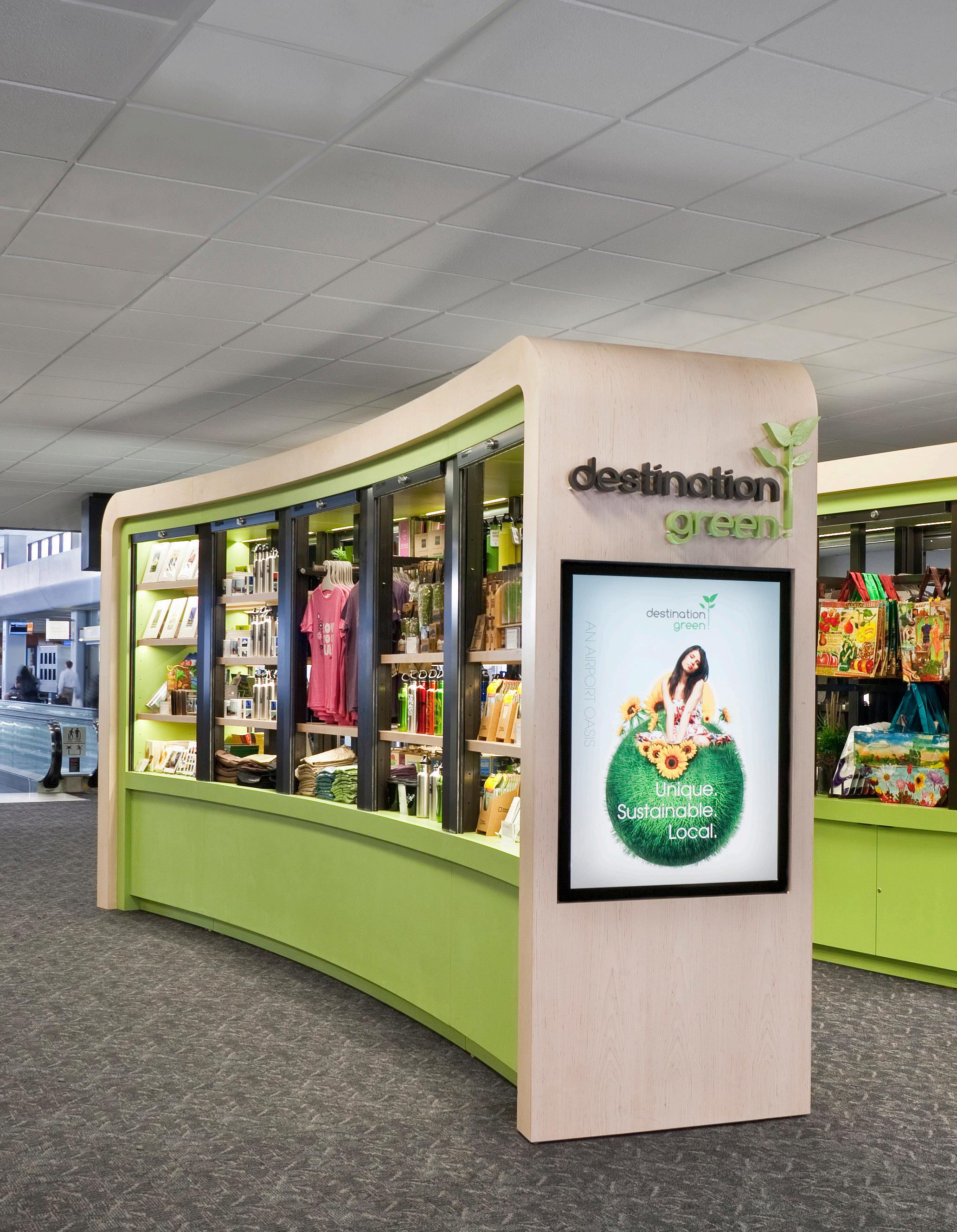
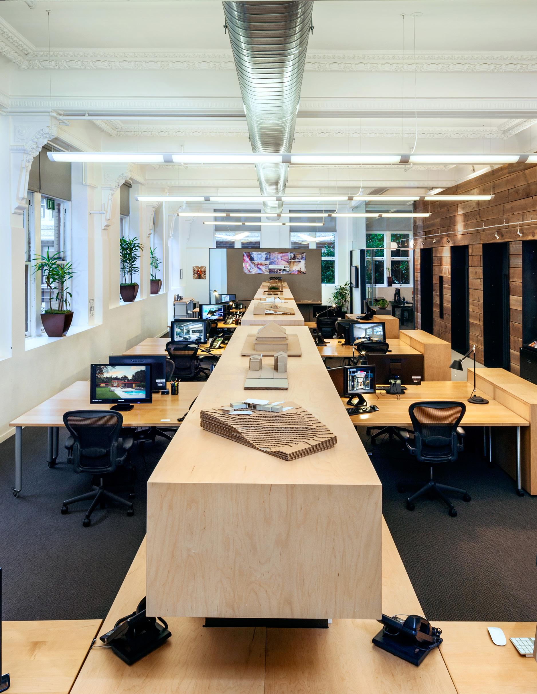
Both of these projects show a dominant big move. The swooping curves of the millwork kiosks and the orthogonal wood spine both affirm a navigation point for each design scheme.
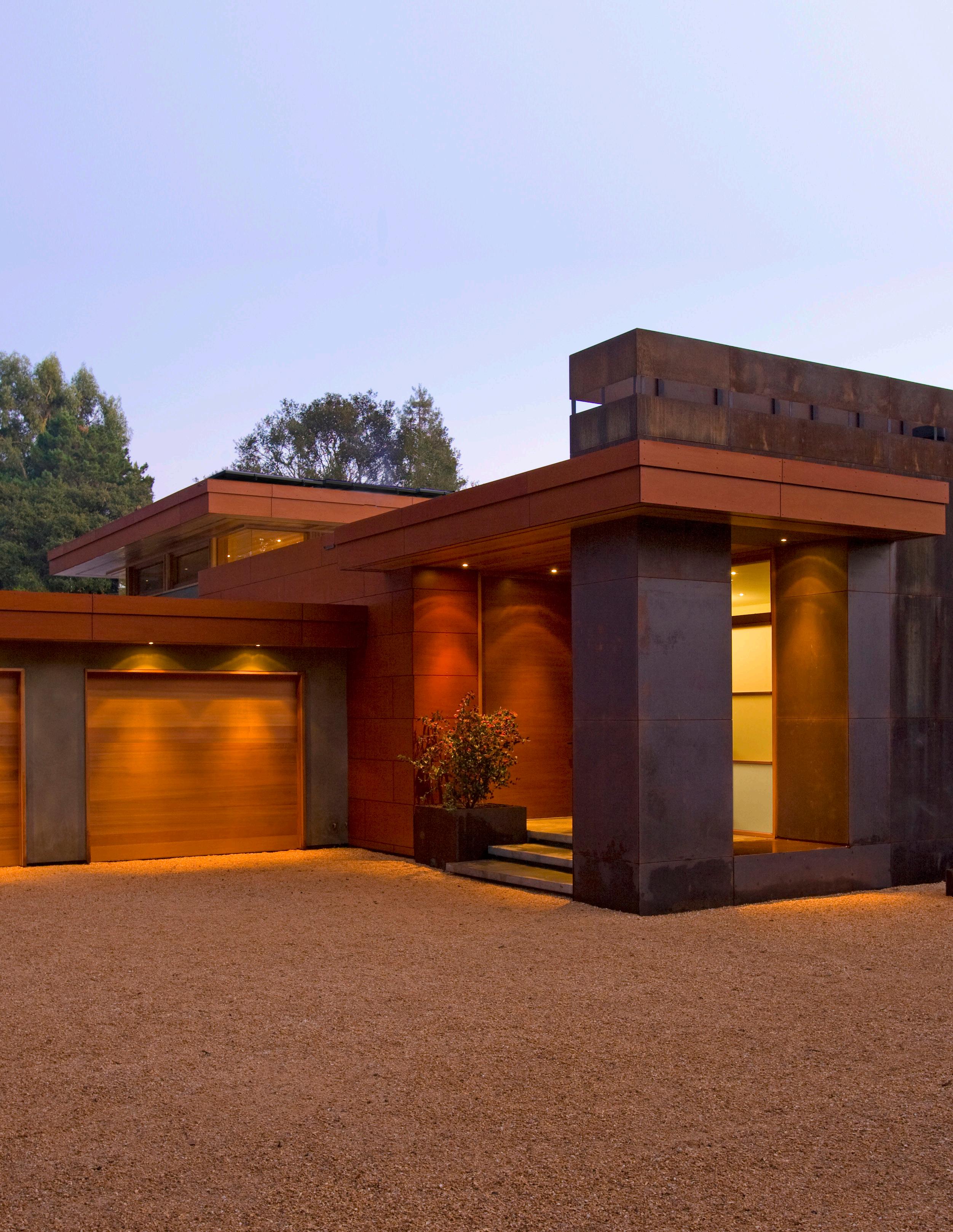
“The combination of various elements in a harmonious manner to form a balanced whole.”


The arrangement of compositional building elements form a frame which celebrates the work of the artist and culture of this family-owned business.
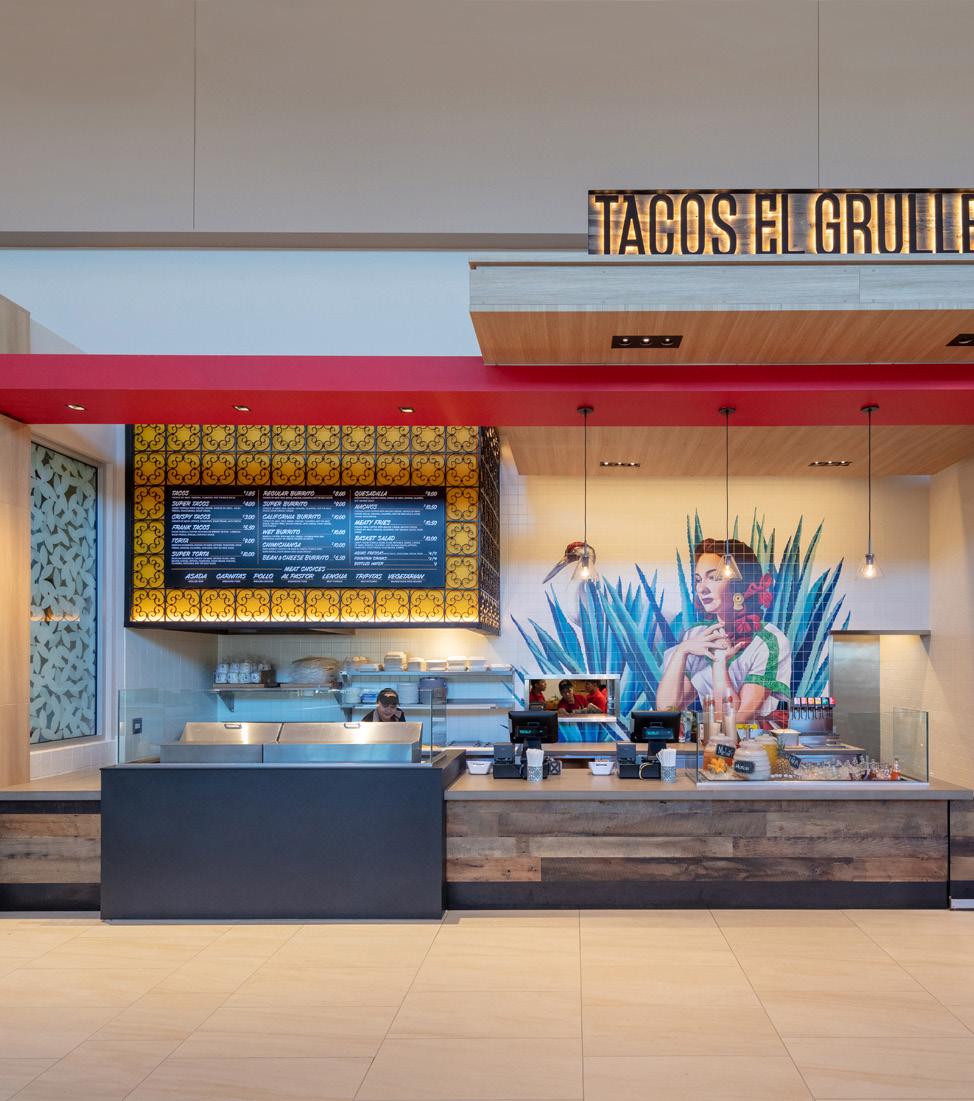
Great buildings, just like great paintings or sculptures, are carefully and artfully composed.
The composition is like a story told with craft and refinement which, in its narrative, is driven primarily by the interplay between design elements.

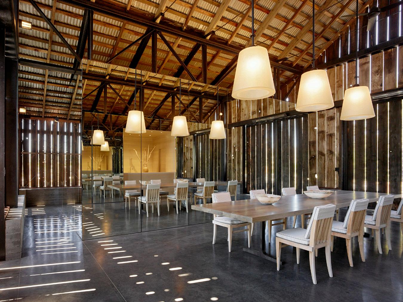
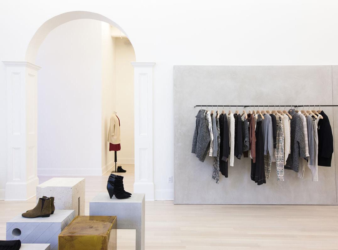
Well composed spaces need not be complicated nor overly simplistic.
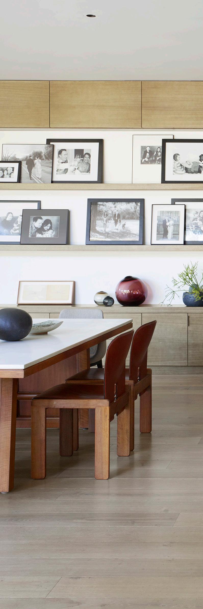
Space, across the spectrum of complexity, should use a blend of colors, materials and textures to conscientiously define its proportions.

The organic lines of the marble island anchor the composition of this kitchen and counter-balance the orthogonal lines of the architecture.

The interplay of shapes and forms begins at the storefront of this building and continues through the space creating interesting compositions from every angle.
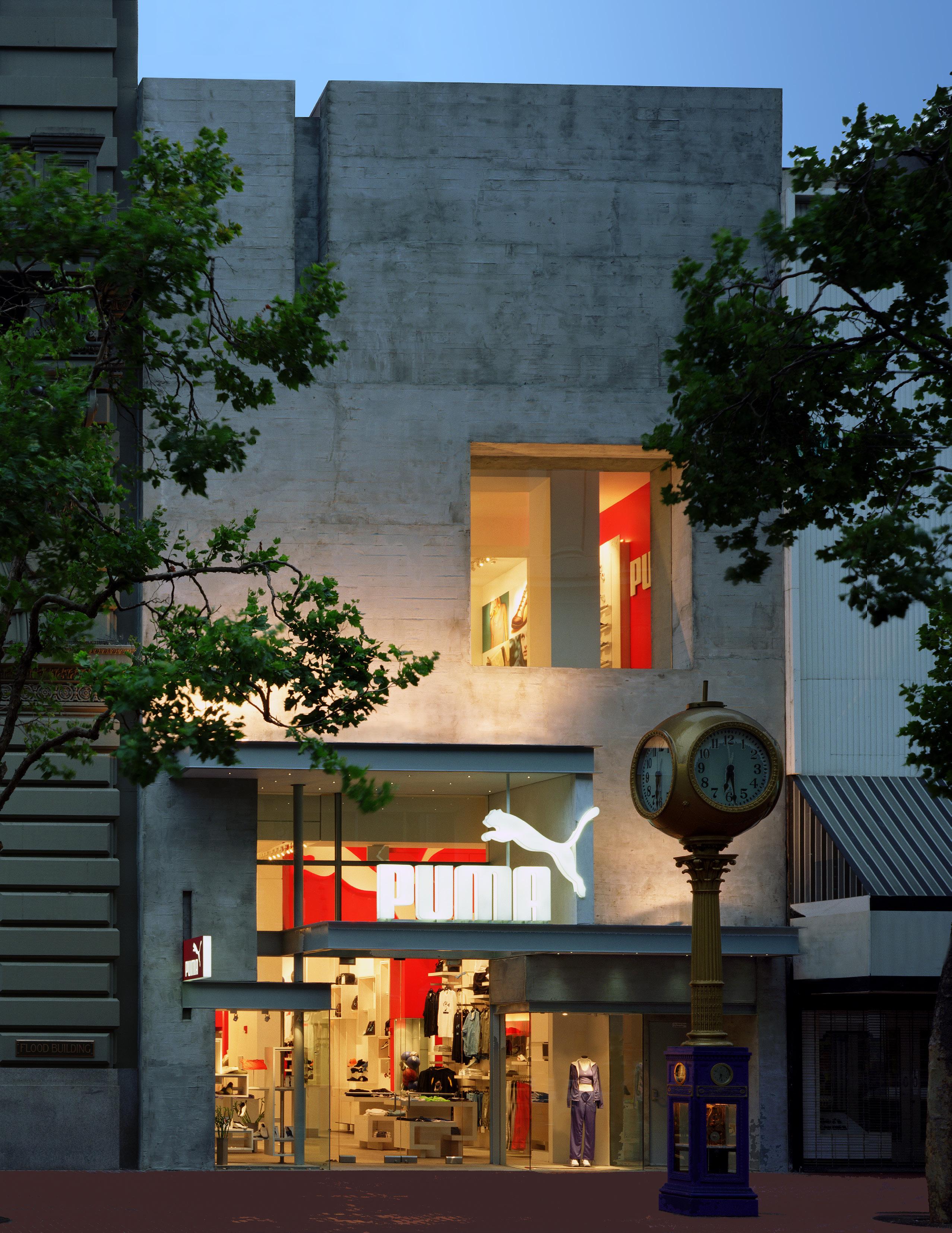
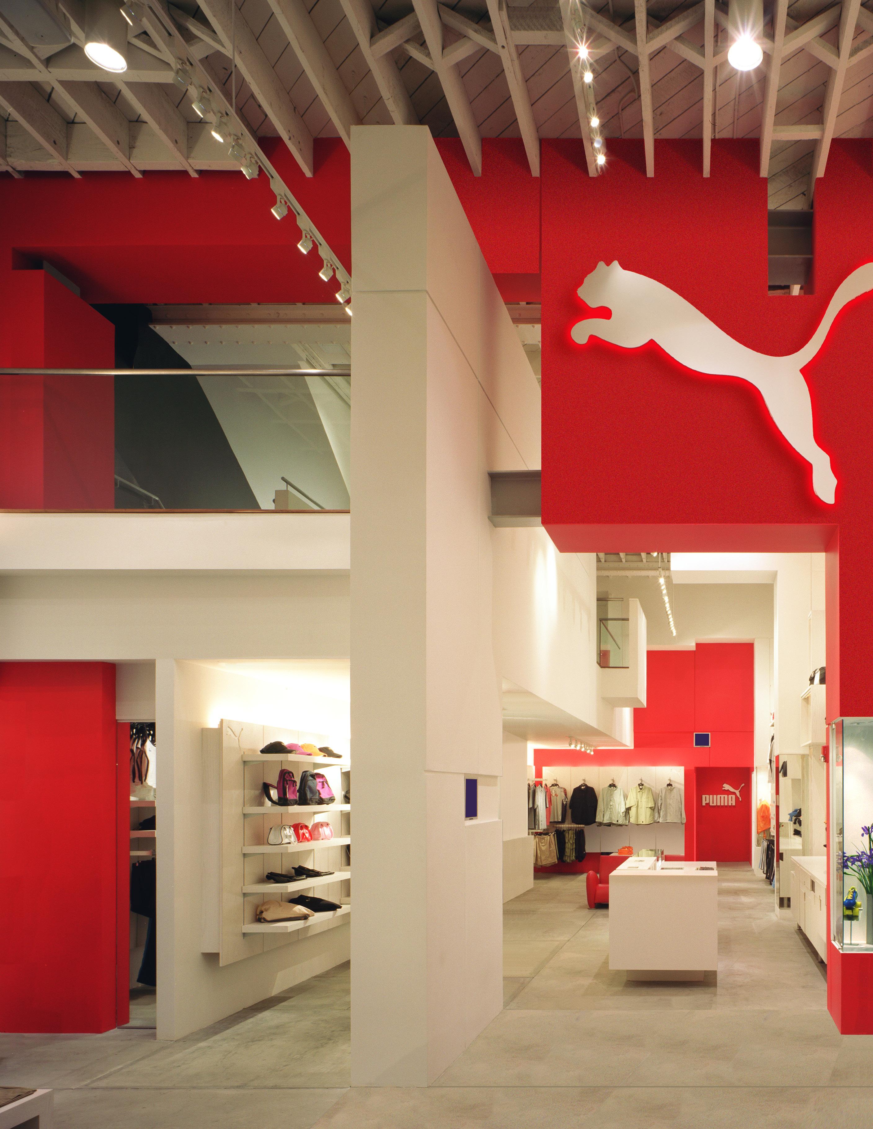
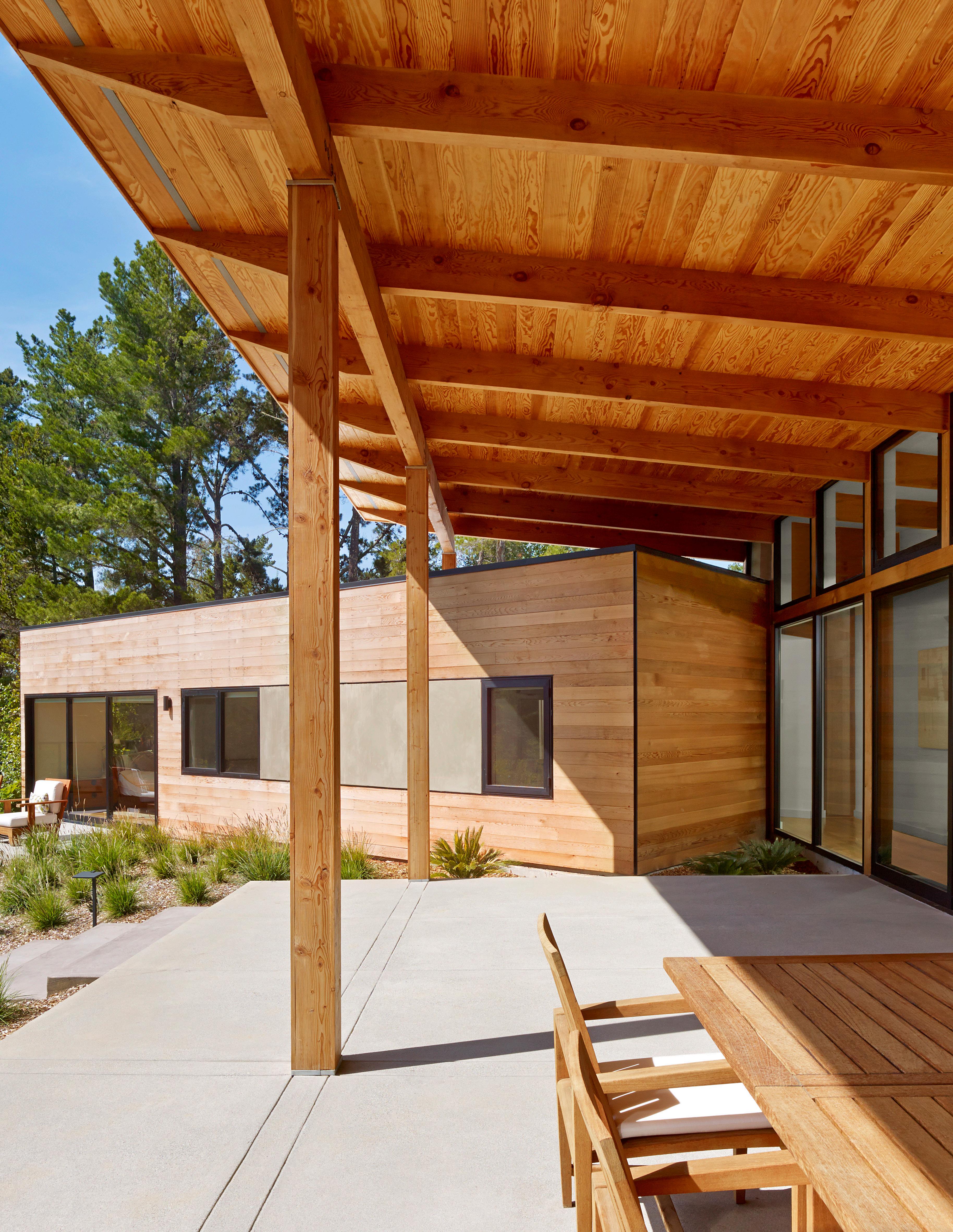
verb | cel·e·brat-ion | \ ˈse-lə-ˌ-shən\ noun | ob·ject | \ ˈäb-jikt , -(ˌ)jekt \
“The accentuation of an architectural element within the design.”


When space and layout constraints forced a bathroom shower to protrude into the bedroom, the solution was to celebrate the object. The wood cladding gives it a sculptural quality which anchors and enhances the room design.
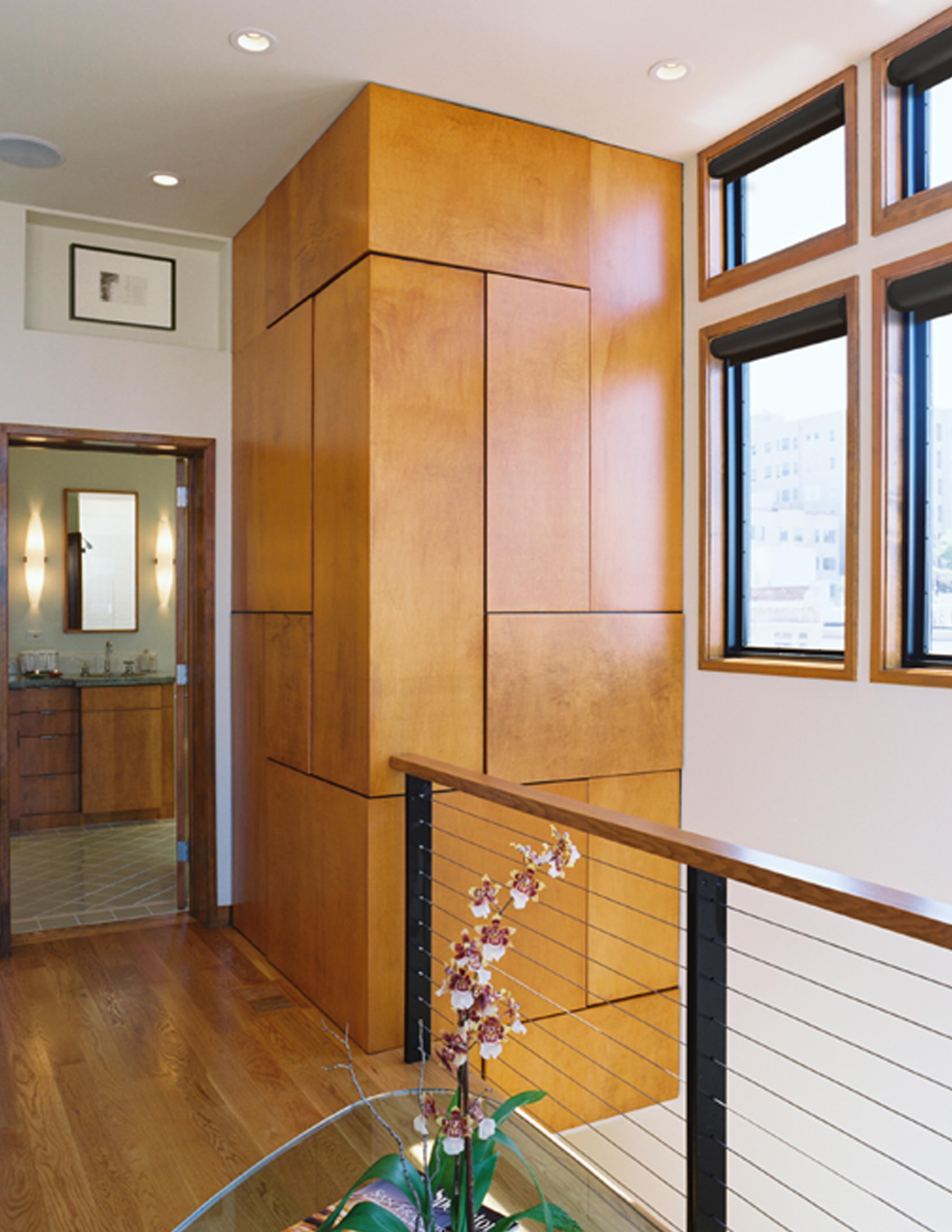
A space or a building can be made special when its anchored by an object, particularly one that gives energy to the design.
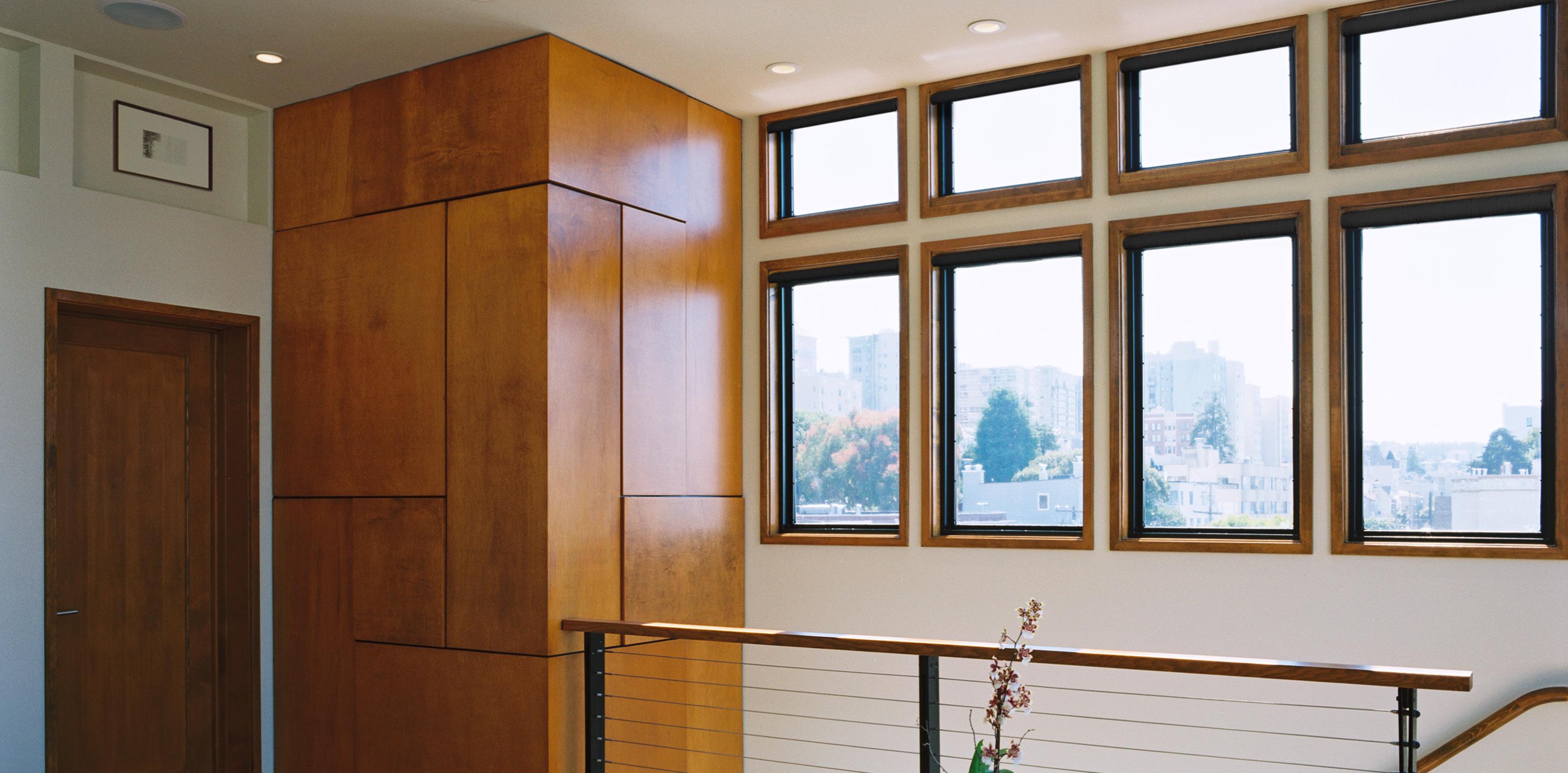
The power of such an object is enhanced when a design celebrates it in the overall composition.
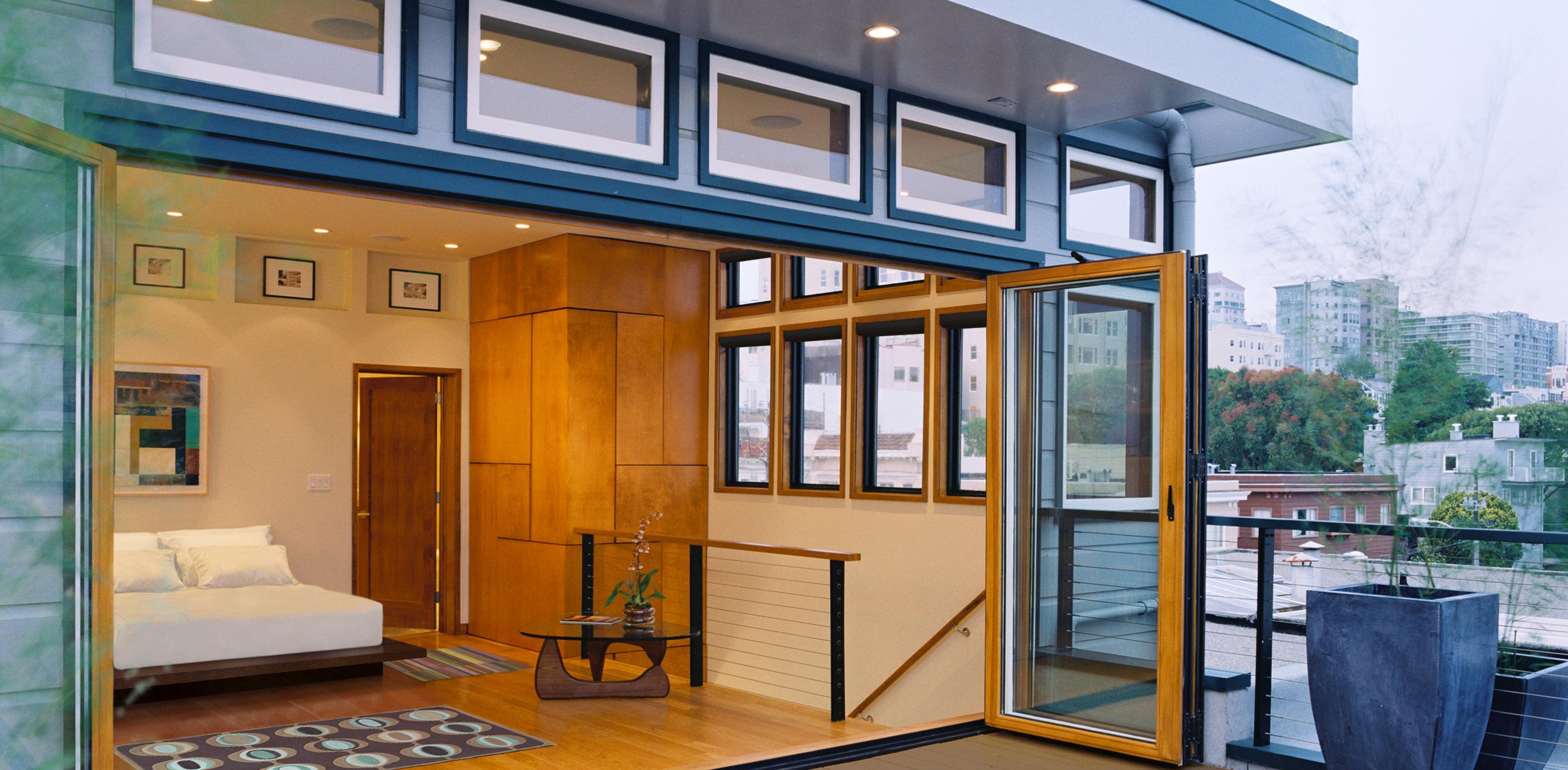

The celebrated object has a symbiosis with the space it occupies.
The design is about both the object and its context; one strengthens the other, and if one were removed the other would be weakened.
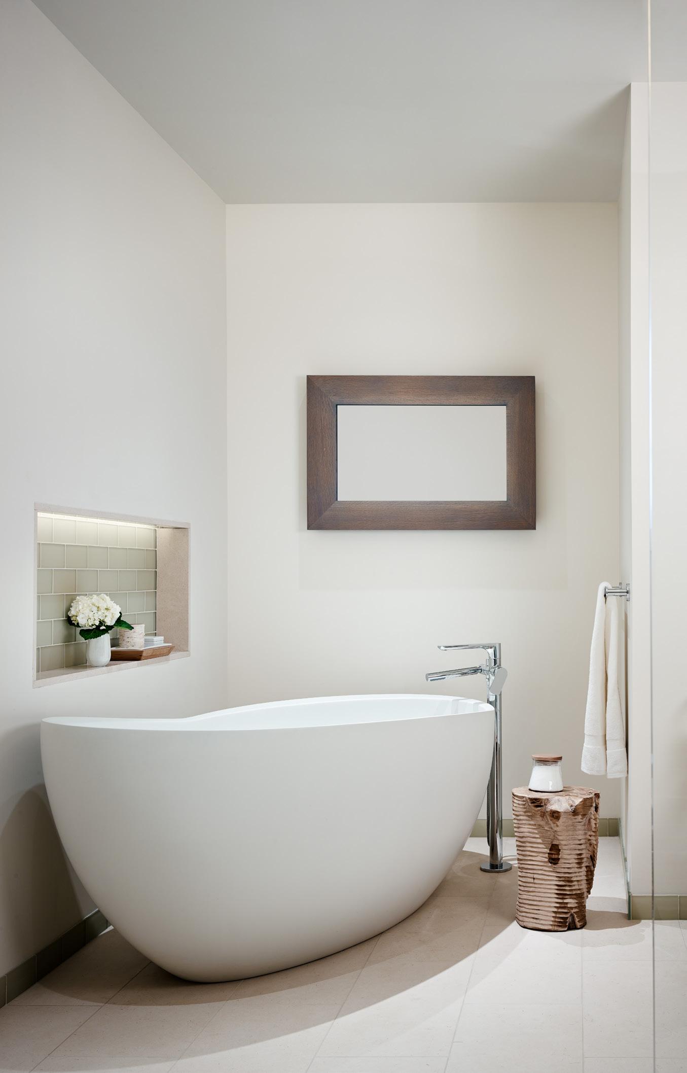
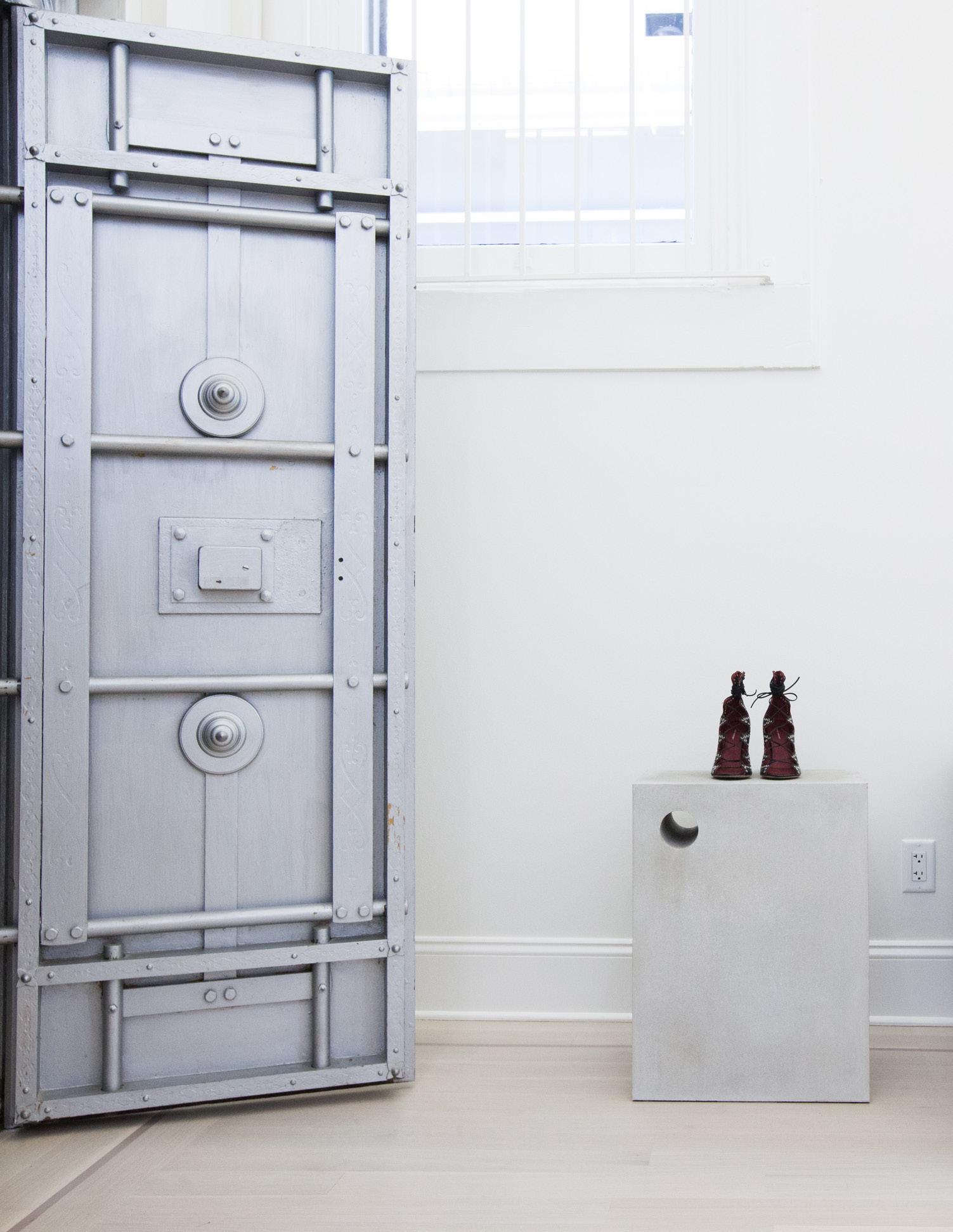
This minimalist room is transformed through the addition of an elegantly detailed fixture and its associated merchandise. Its well-considered placement communicates a sense of dynamism, refinement and sophistication to the space.
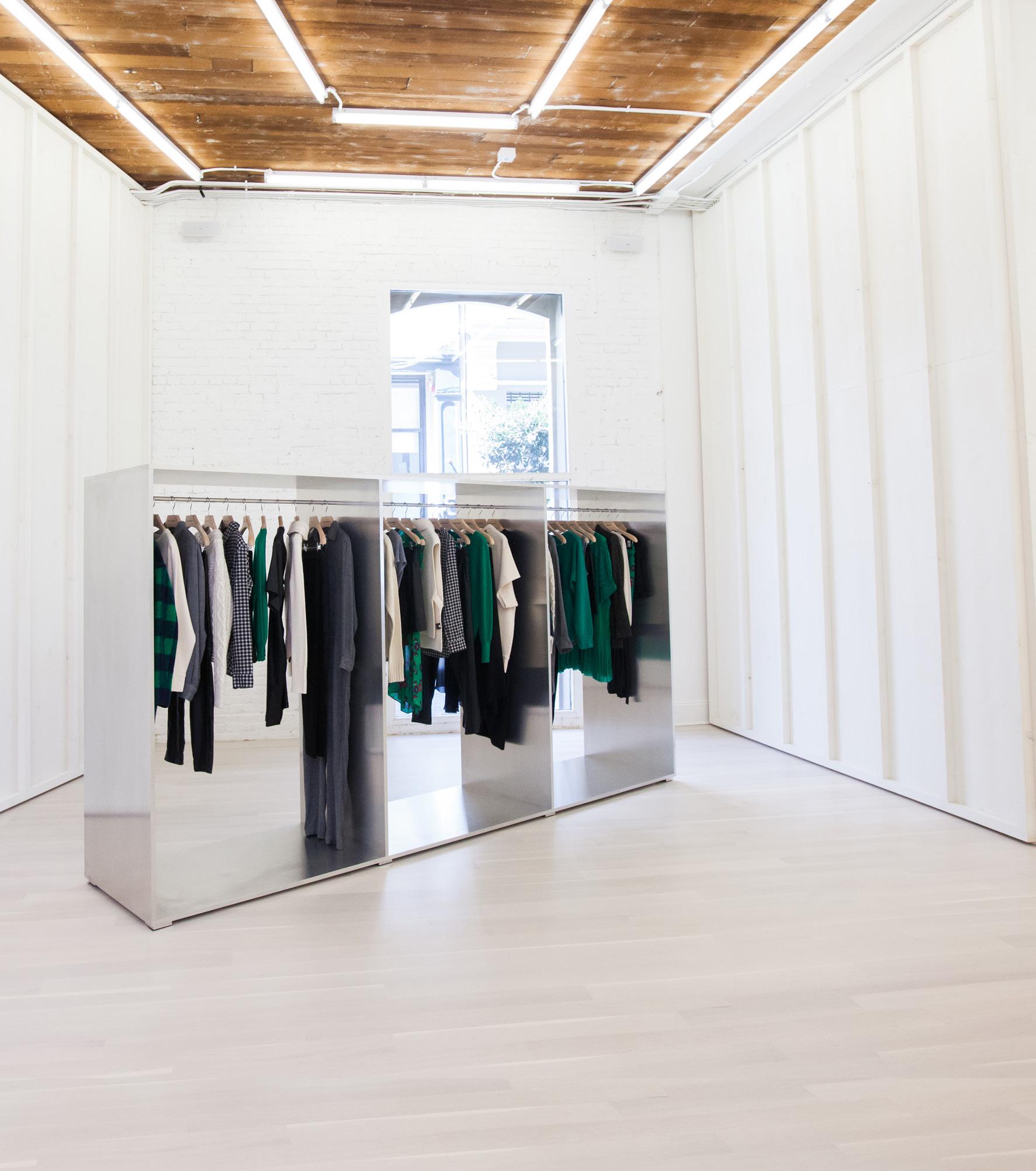
The celebrated object can anchor a space and draw people into it. The orange feature at the back of this store draws the eye to it which in turn draws the shopper inside.
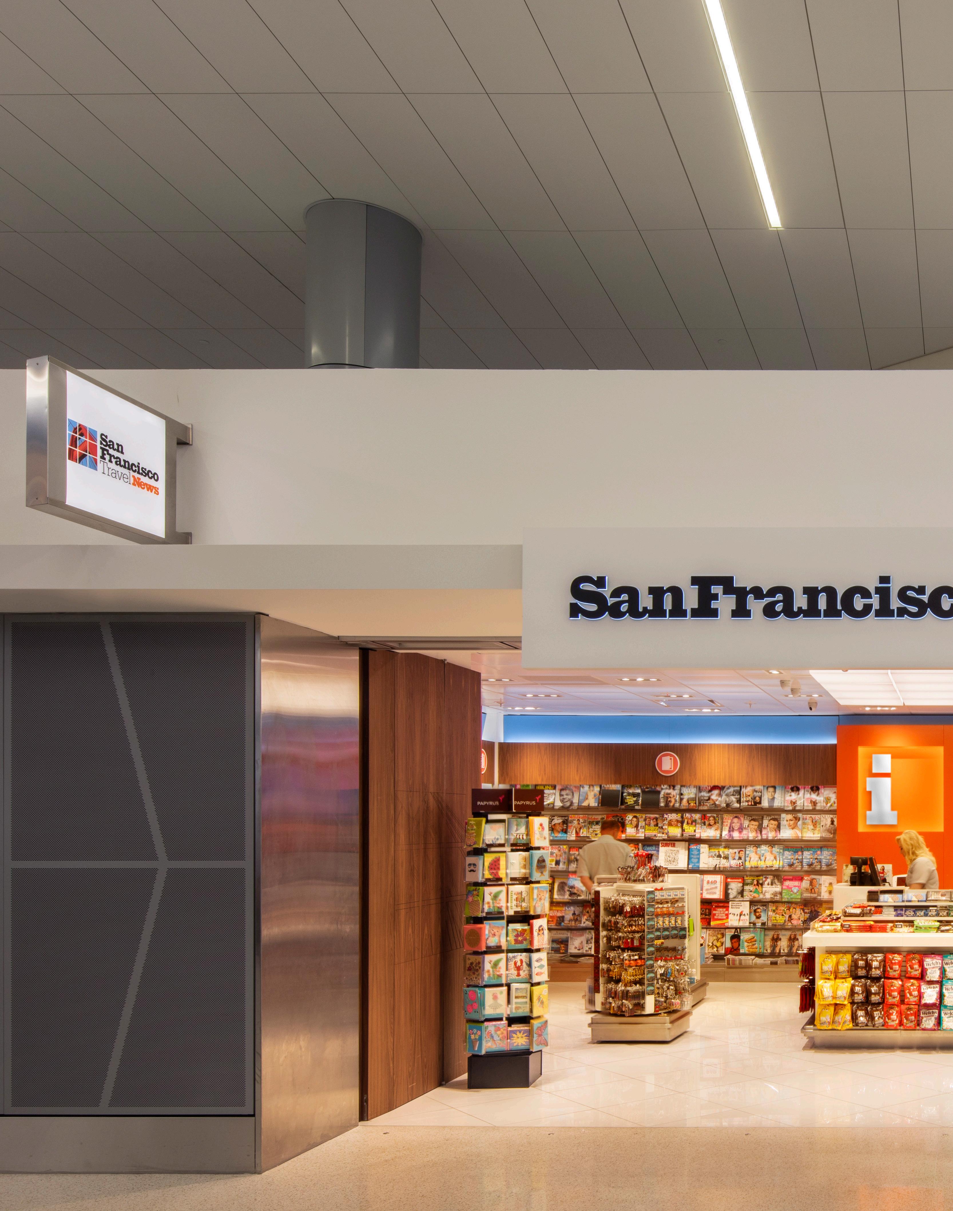
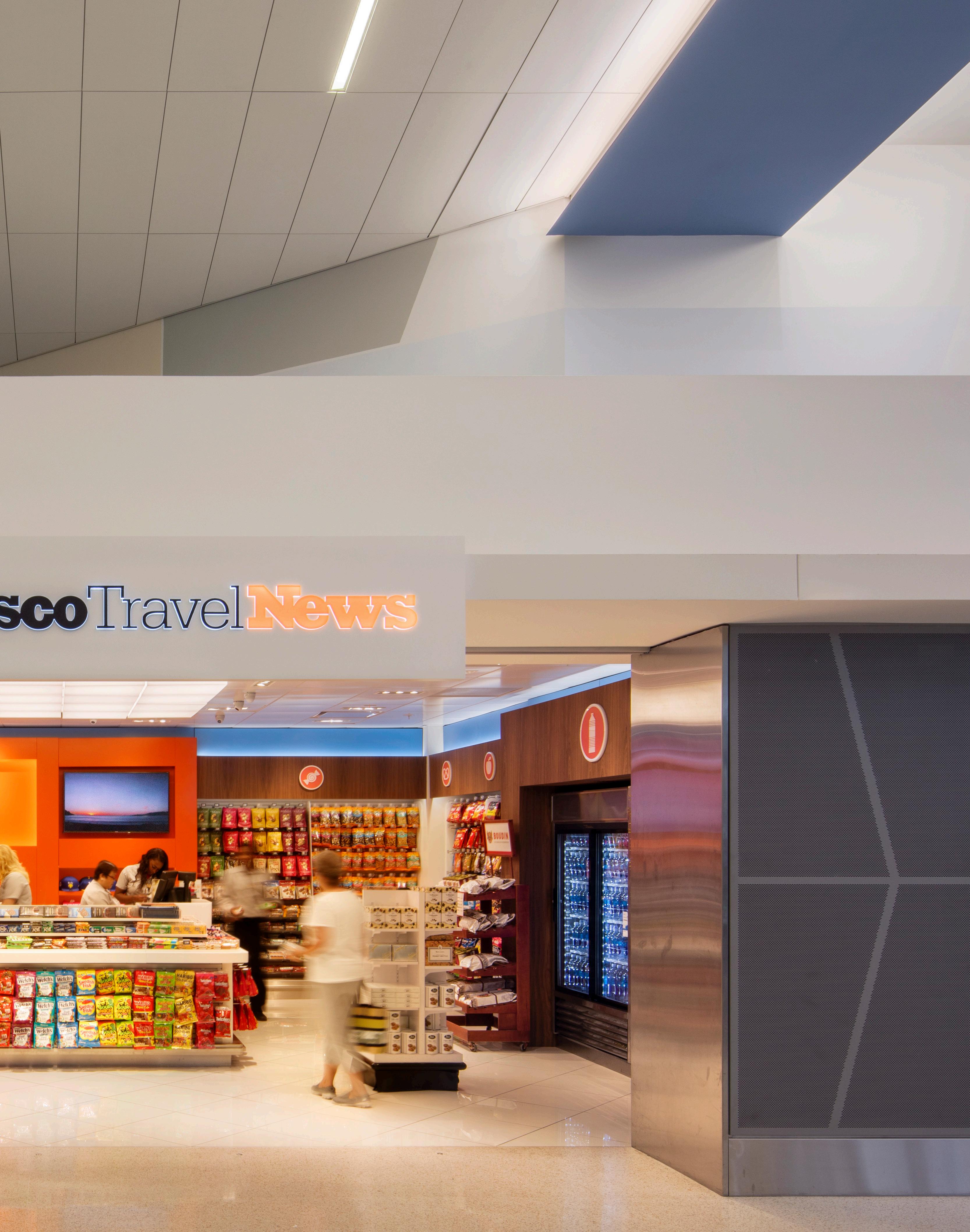


noun | pro·por·tion | \prə-ˈpȯr-shən\
“The harmonious relation of individual parts to each other and to the whole.”
The design moves in this composition, which may initially appear random, were deliberately executed and refined to achieve a natural sense of balance and proportion.
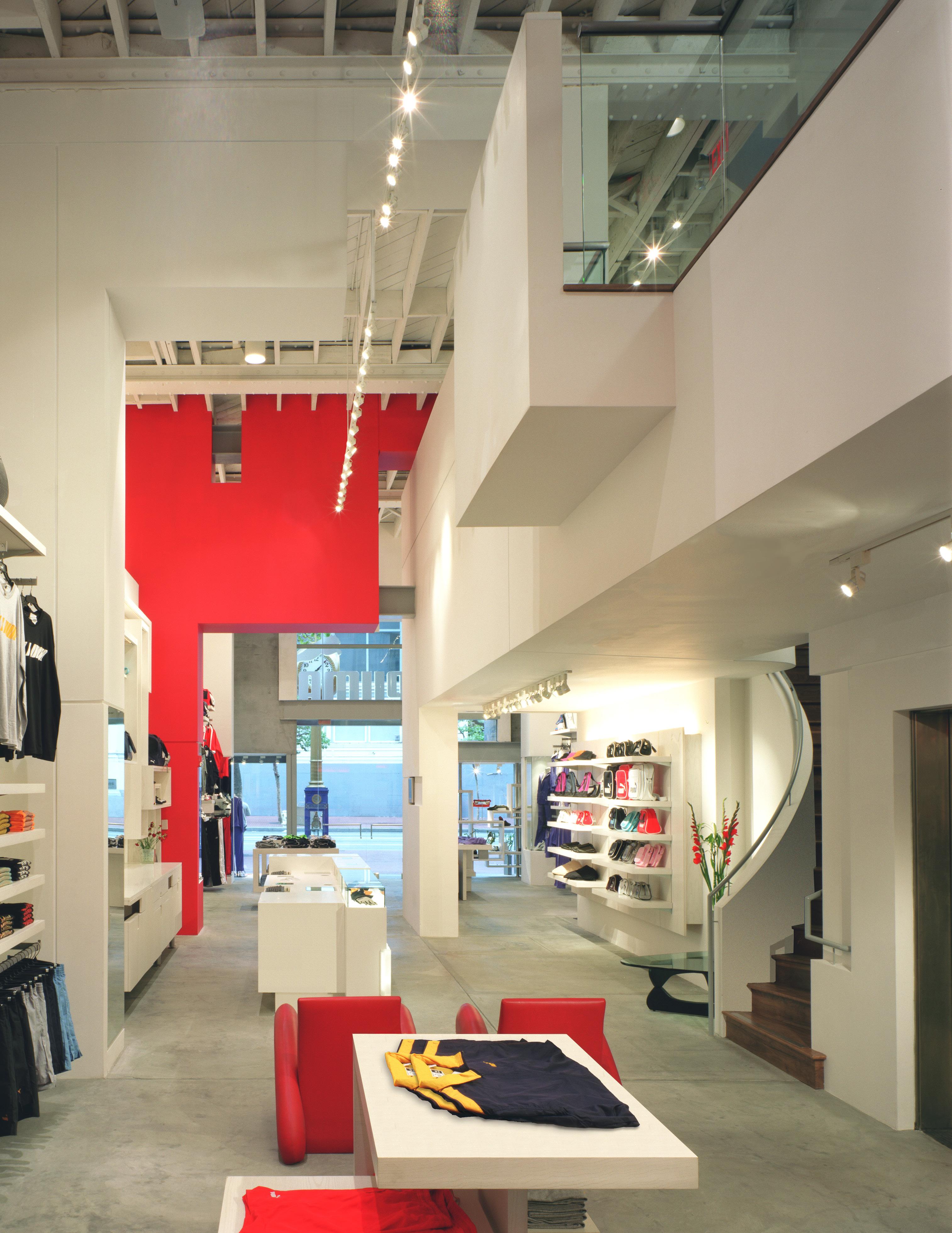
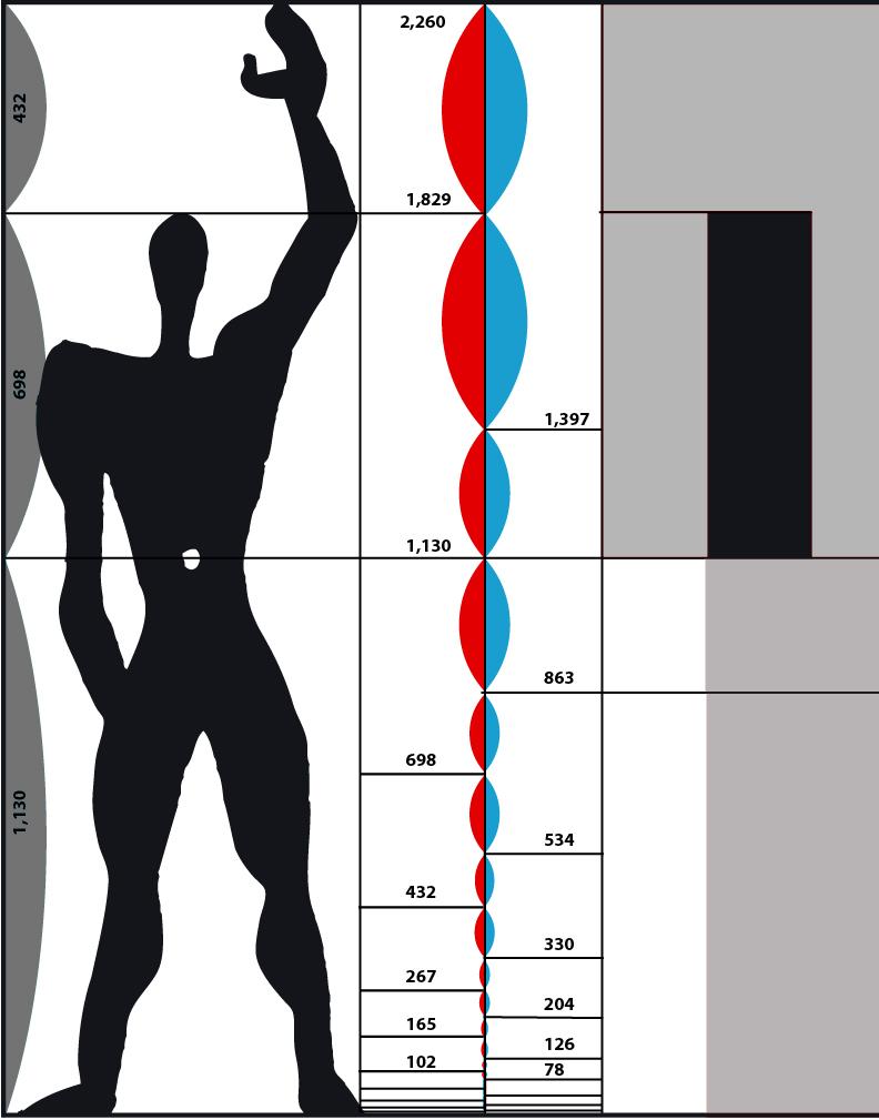
Proportion is about the visual harmony that is formed by the relationship between the size, scale and placement of design objects.
In architecture those relationships and connections are guided, in similar measures, by the principles of mathematics and art.

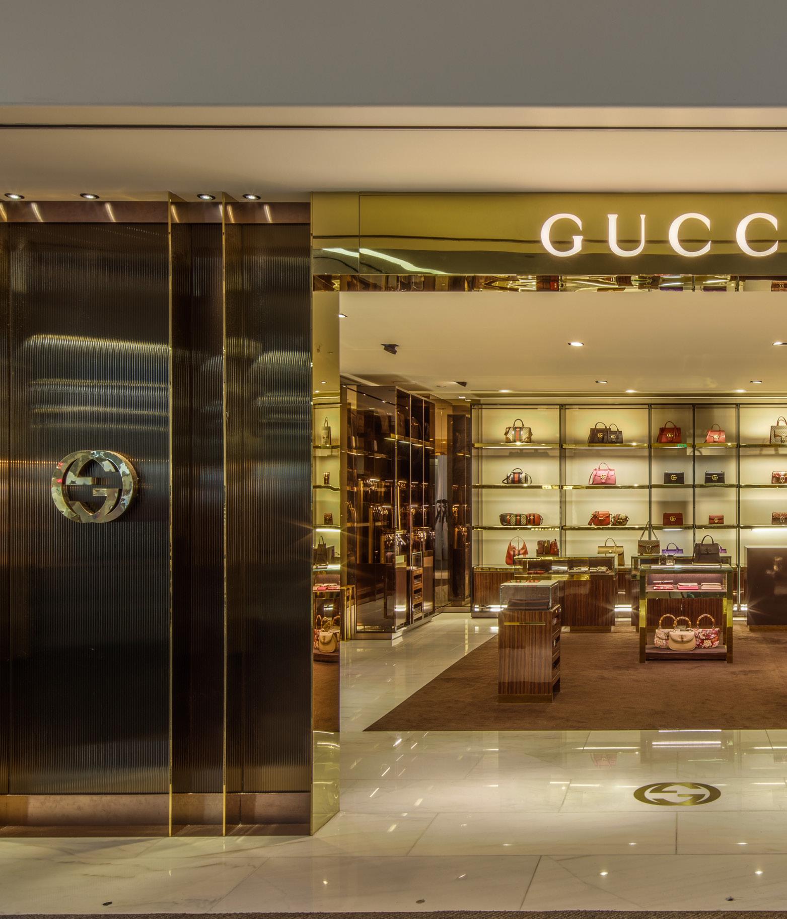
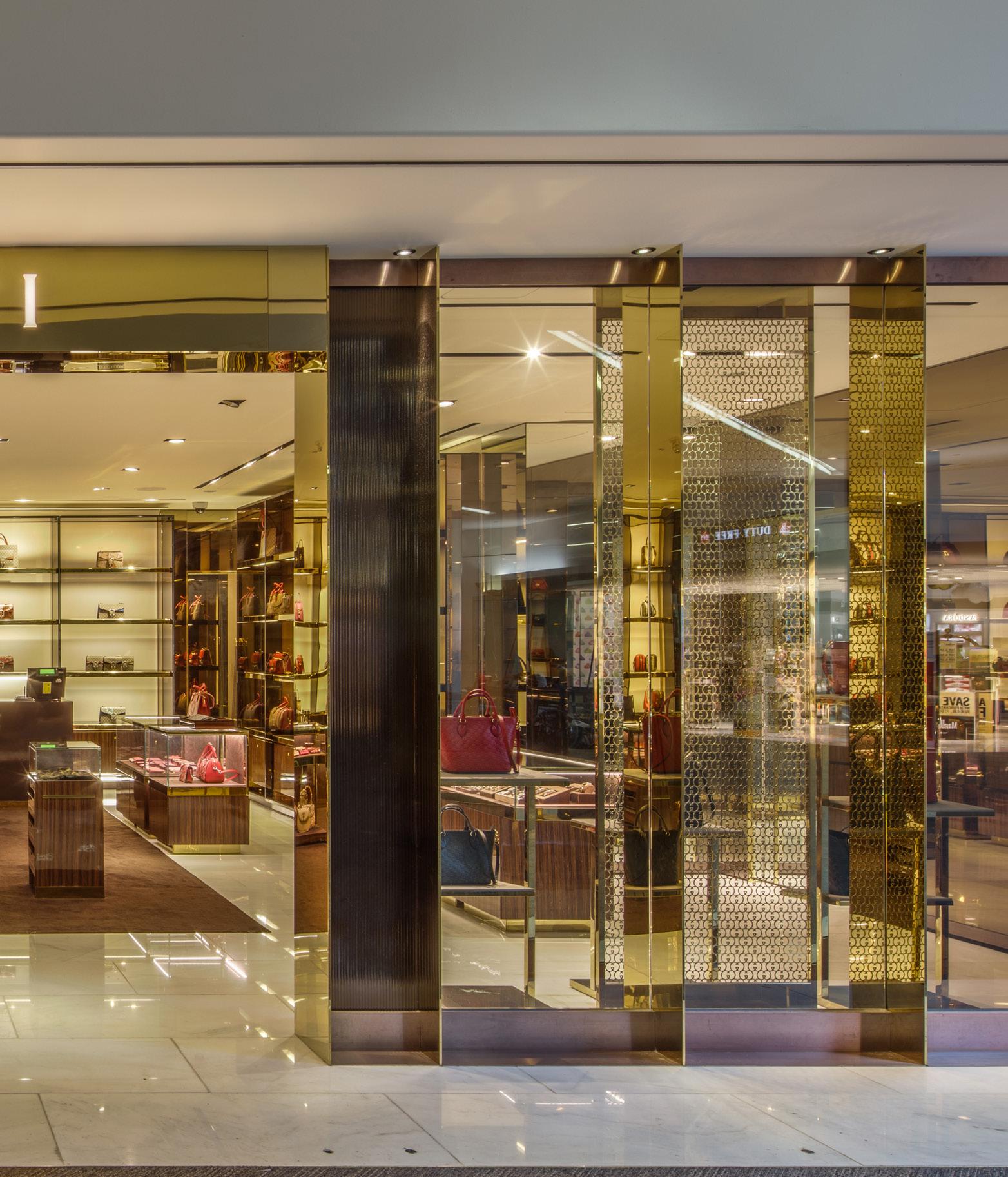
The judicious positioning of elements in this retail design articulates a well-proportioned space and conveys a sense of elegance in the brand.
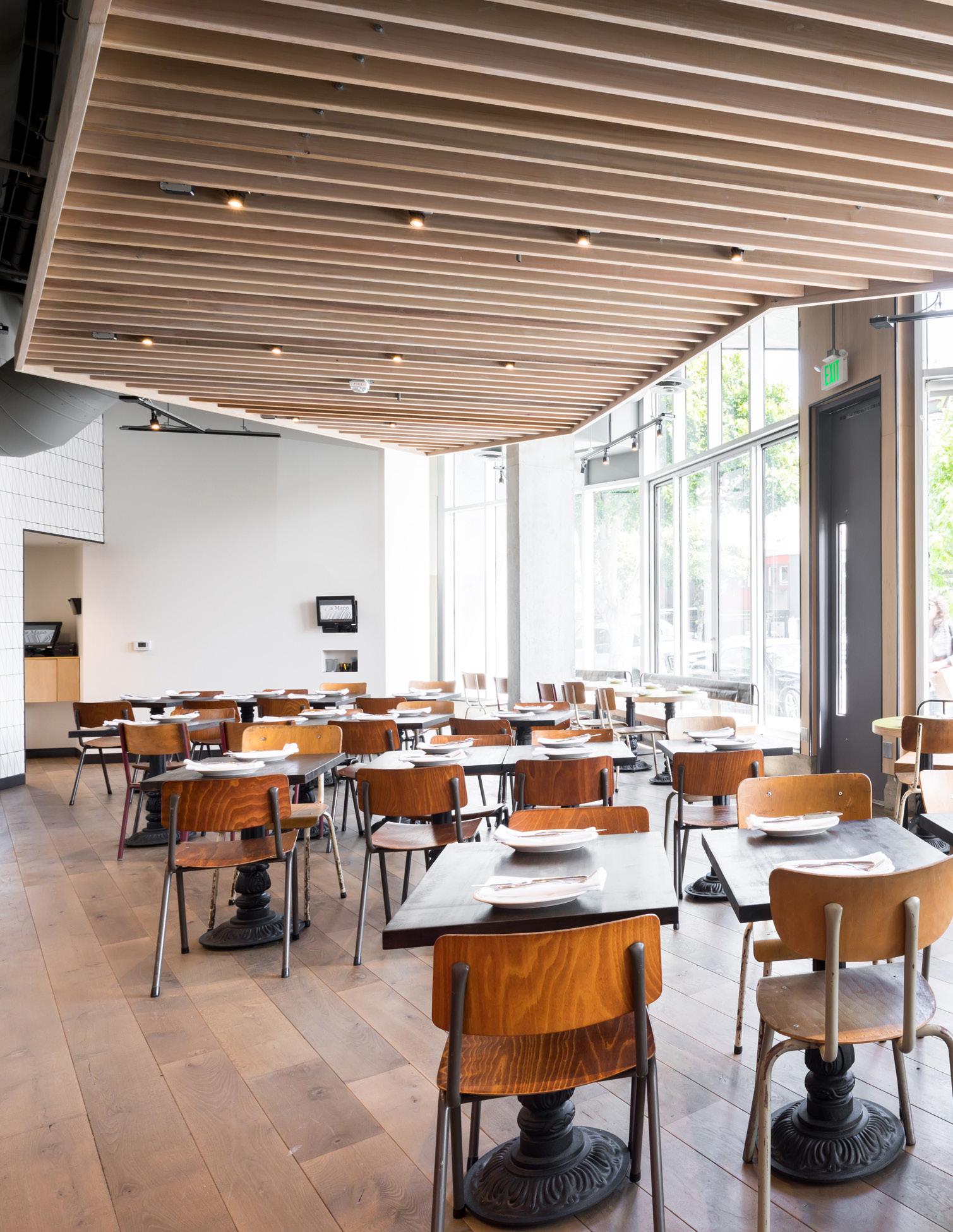
“An


Balance in a design is the measured interplay of all of the elements so that there is not too much or too little or too many or too few.
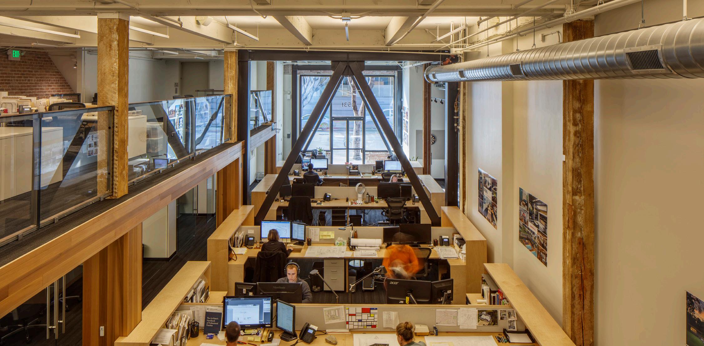
It is not a quantitative measure but rather an aesthetic one, and you know it when you see it.
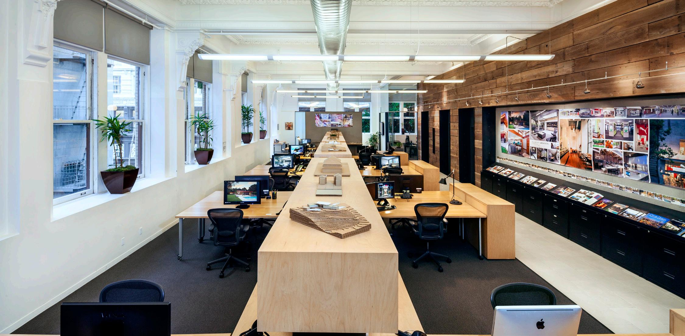
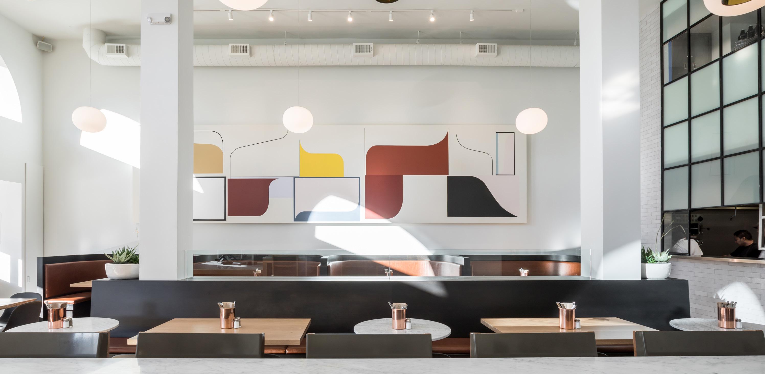
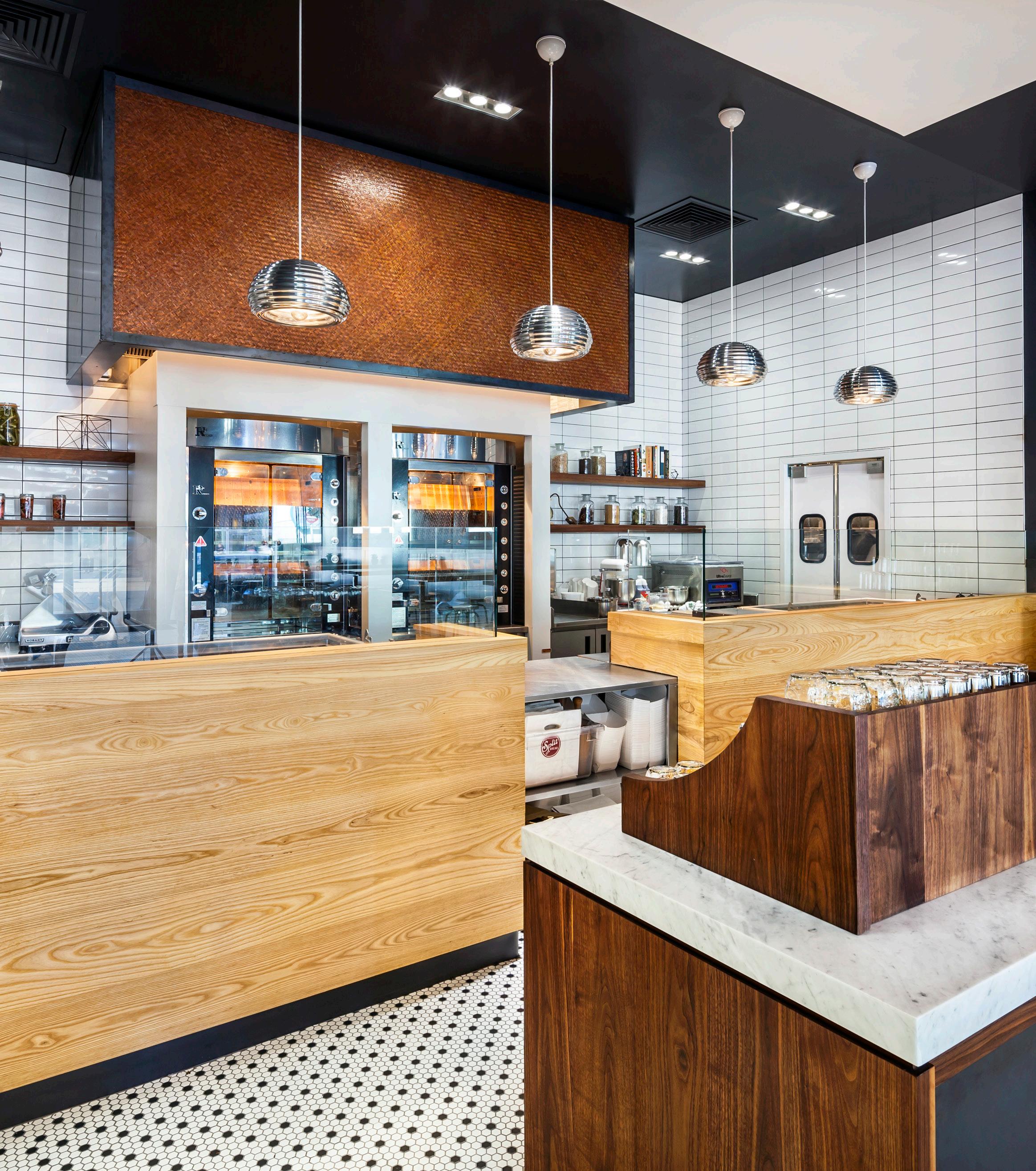
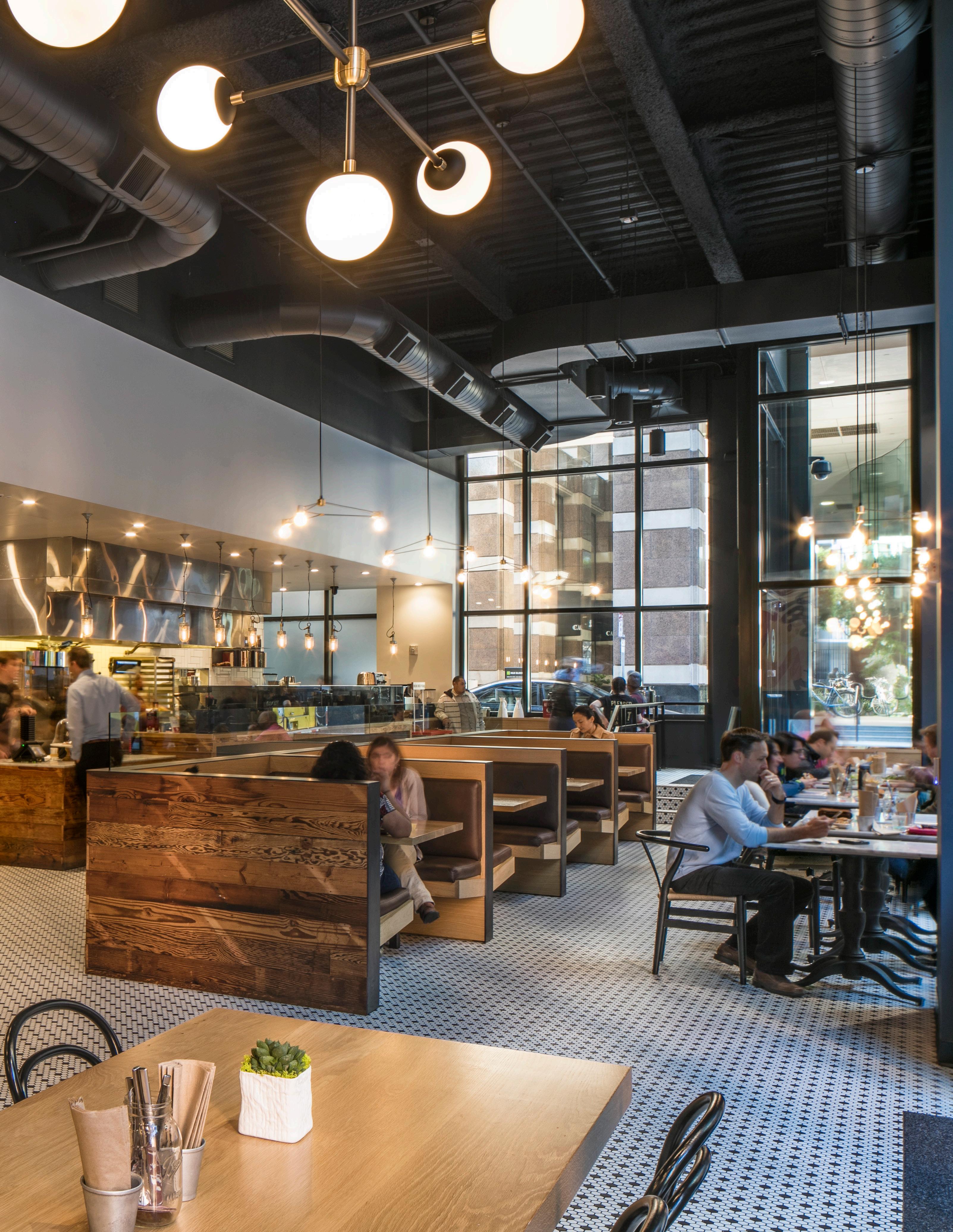
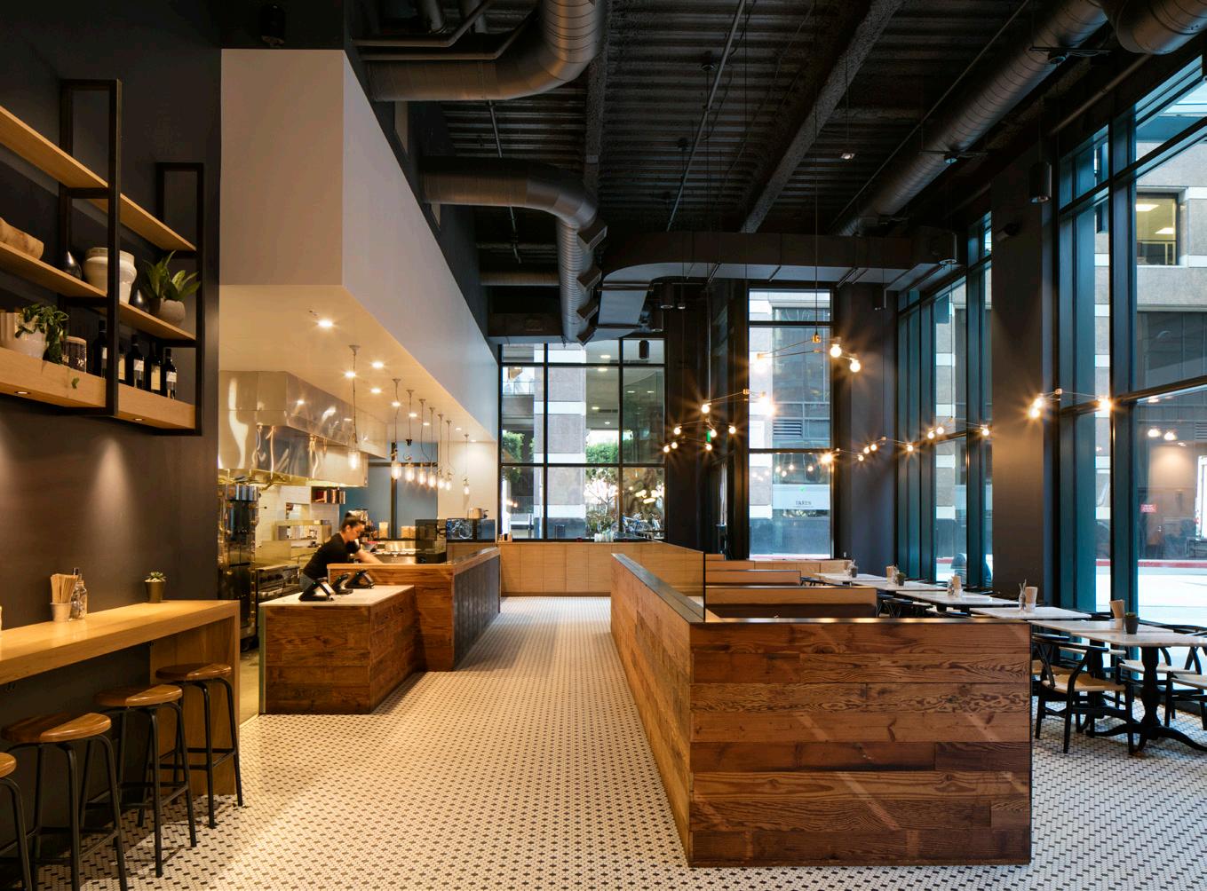
The textured tile floor and use of natural wood fixtures are balanced by the simplicity of the white soffit and black exposed ceiling.
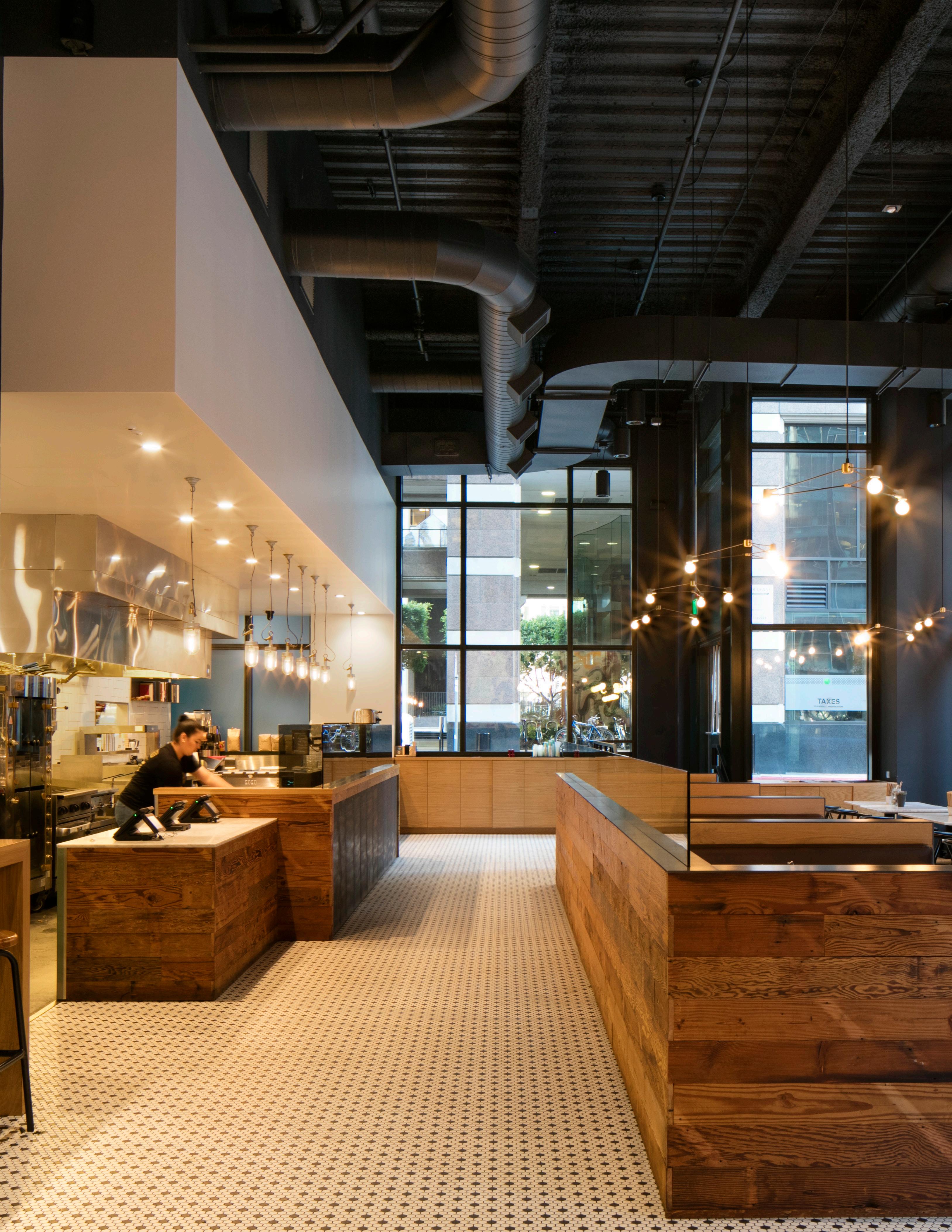
This restaurant space is balanced through a refined selection of complimentary colors, textures and materials.
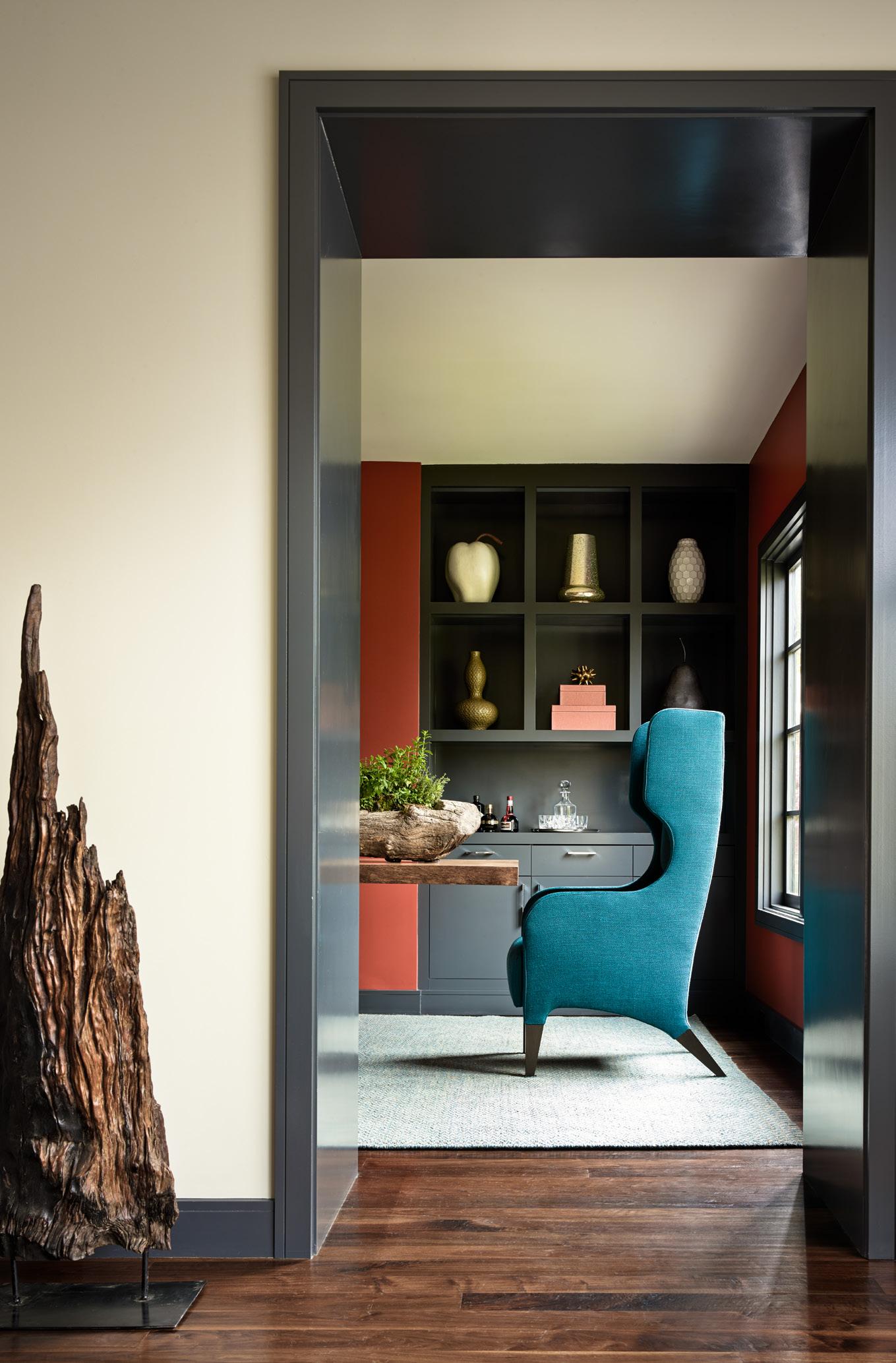
Balance can be nebulous in its nature and difficult to define.
It can be the use of complimentary colors, the combination of textures, the sizing and placement of forms or the interplay between solid and void.

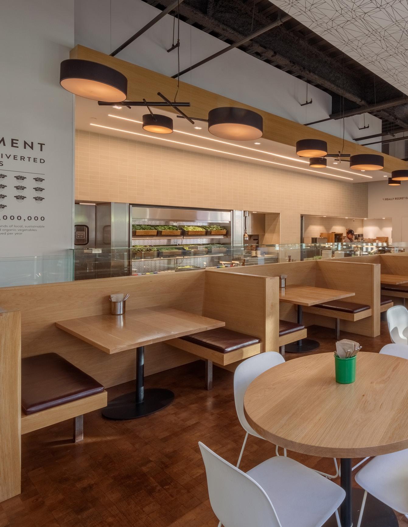
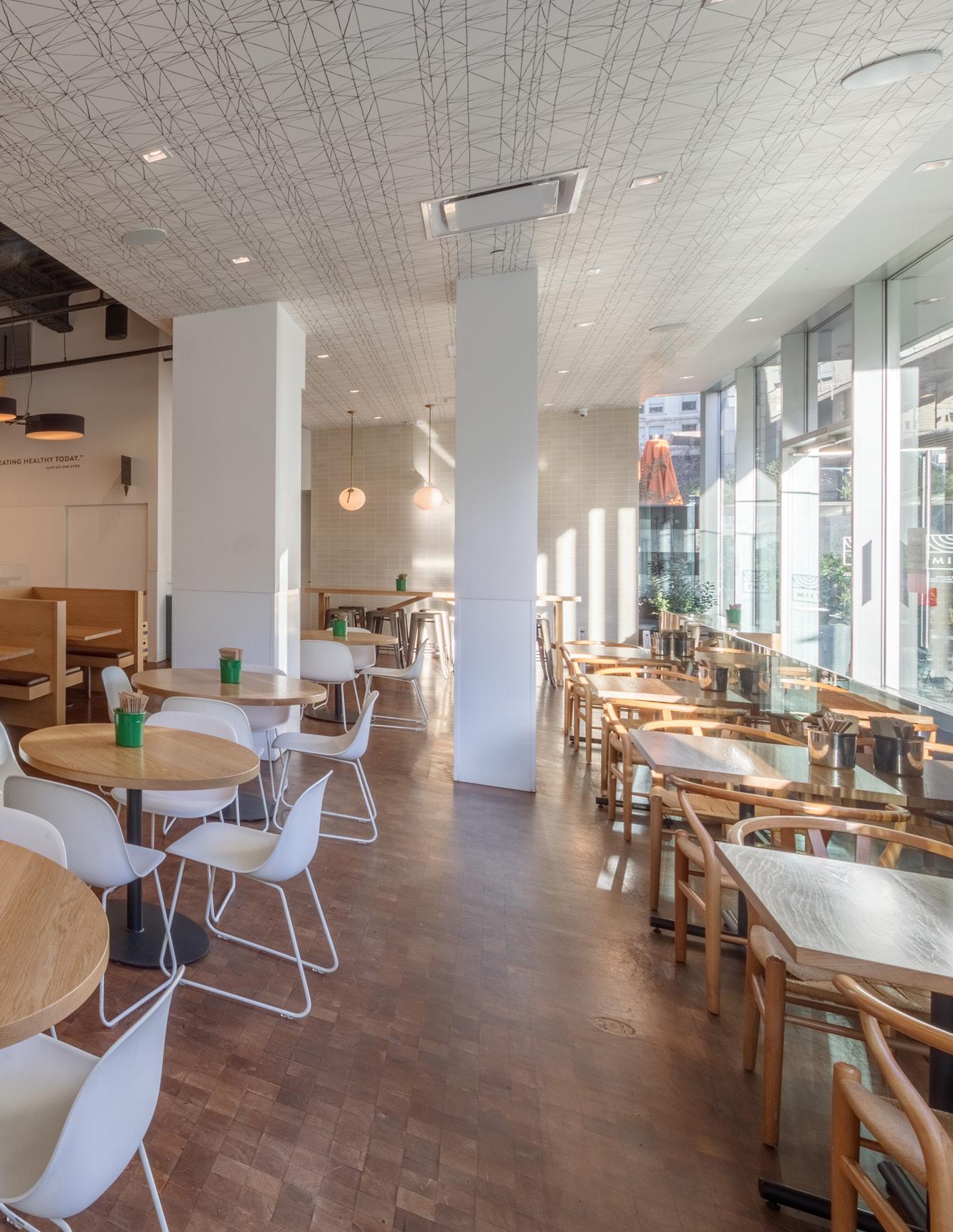
Balance need not be simple. It can be ornate, it can be minimalist, it can be anywhere in between. This space, when fully occupied, could be quite frenzied but it is balanced by a floor, ceiling and millwork that are soothing, calm and visually clean.
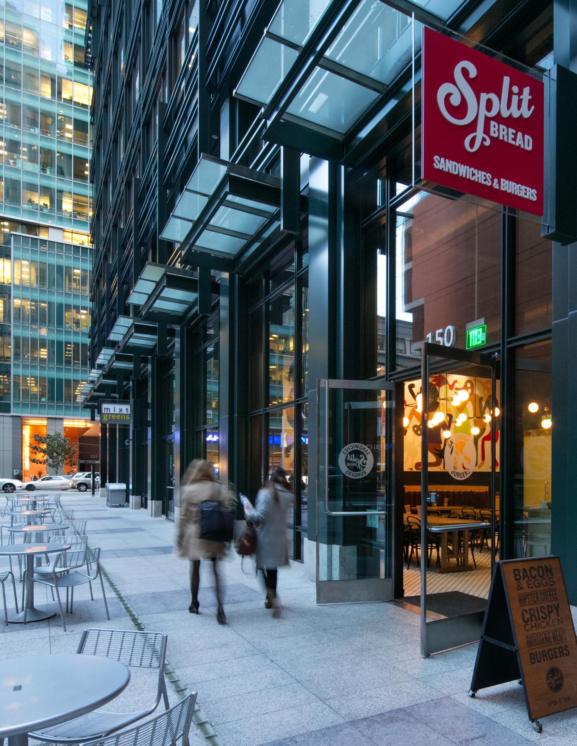
noun | rhythm | \ˈri-thəm\

“The use of patterns or repetition to accentuate the design.”

Rhythm accentuates an architectural design through the dynamism and energy that it can generate, similar to the sense of movement a piece of music can evoke.
It is achieved through the recurrence of elements such as lines, shapes, forms, textures or colors resulting in an organized movement in space and time.
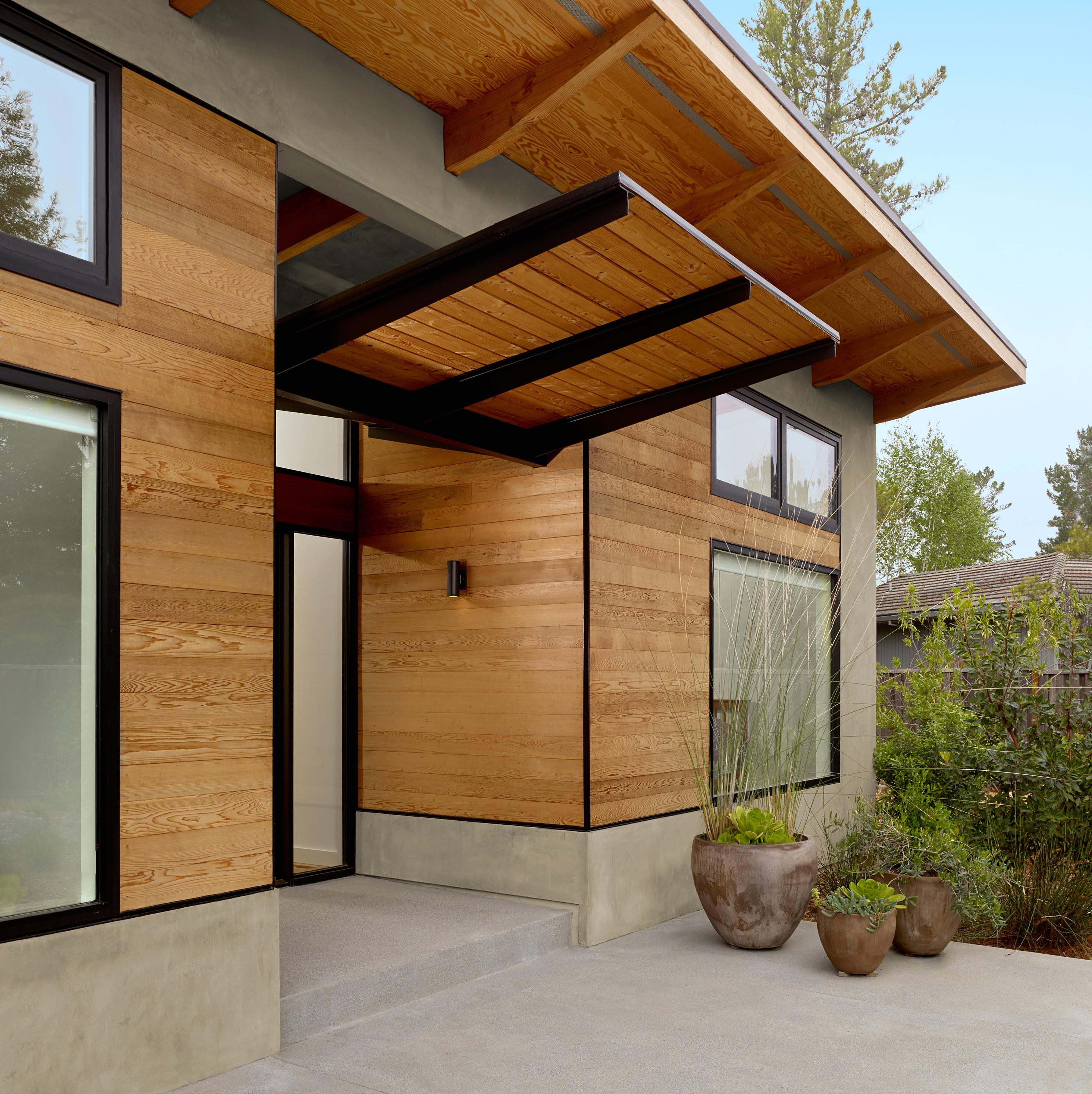
The recurrence of the wood slats and spherical light fixtures forms a rhythmic pattern that maintains a sense of balance.
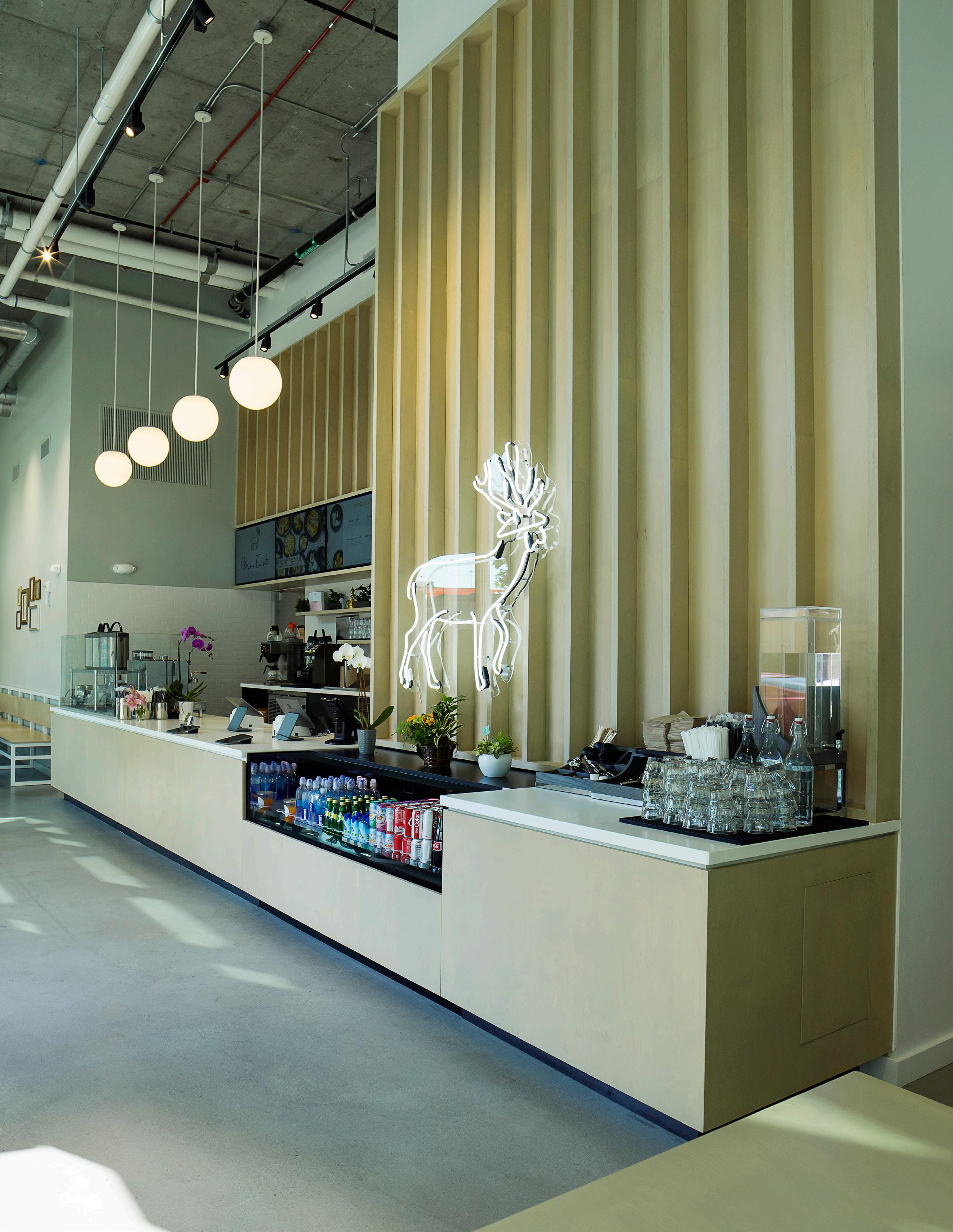
The regularity in the repetition of geometric lines and shapes generate a sense of movement which echoes, but also balances, the energy of the painting.

Rhythm can be linked to natural cycles such as a heartbeat, the rings of a tree, or the cycle of a season but it is chiefly about bestowing order.

When architectural elements, such as bricks, windows or columns, are placed so that they are experienced with intervals between them, our eyes move from one to the next through a sense of organized movement.
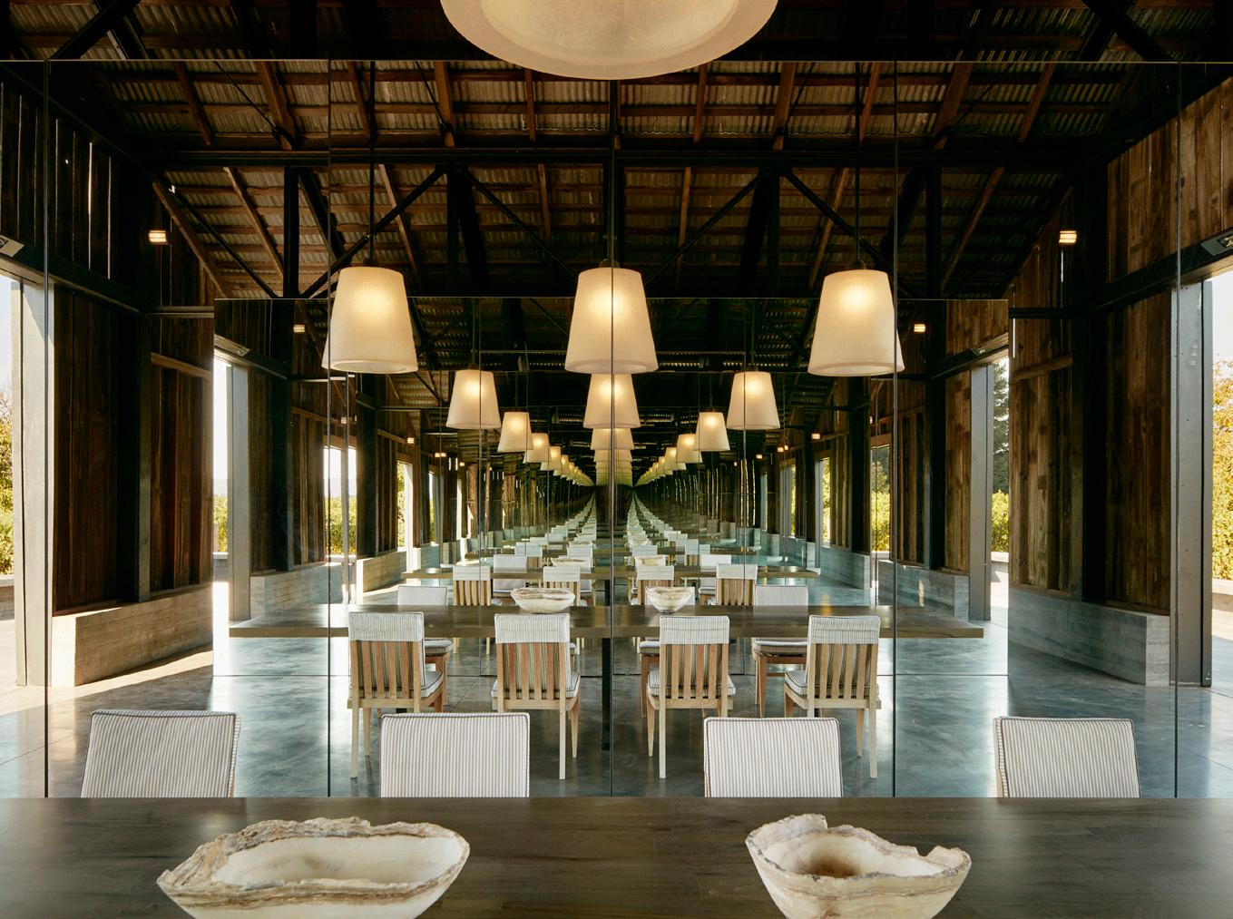
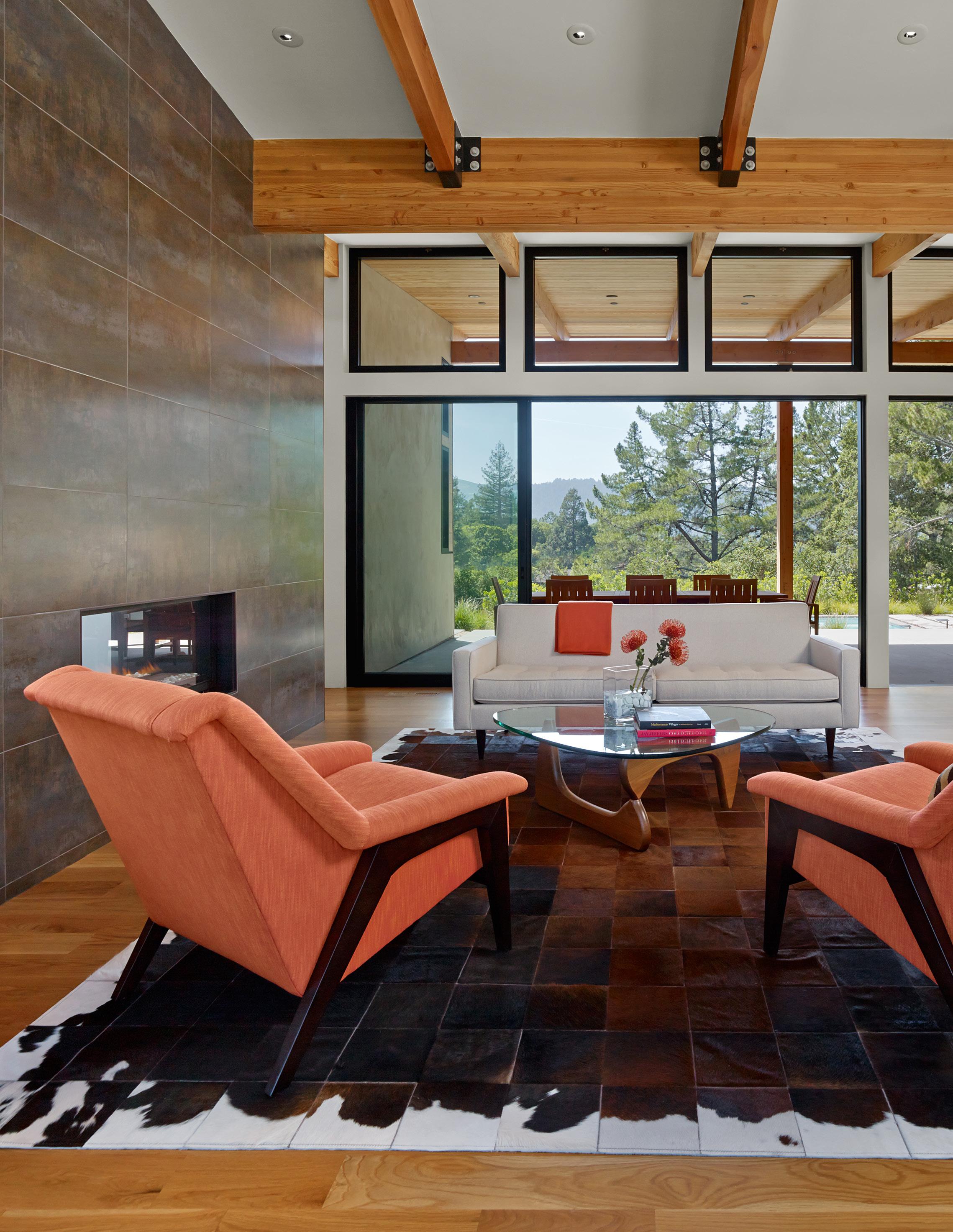
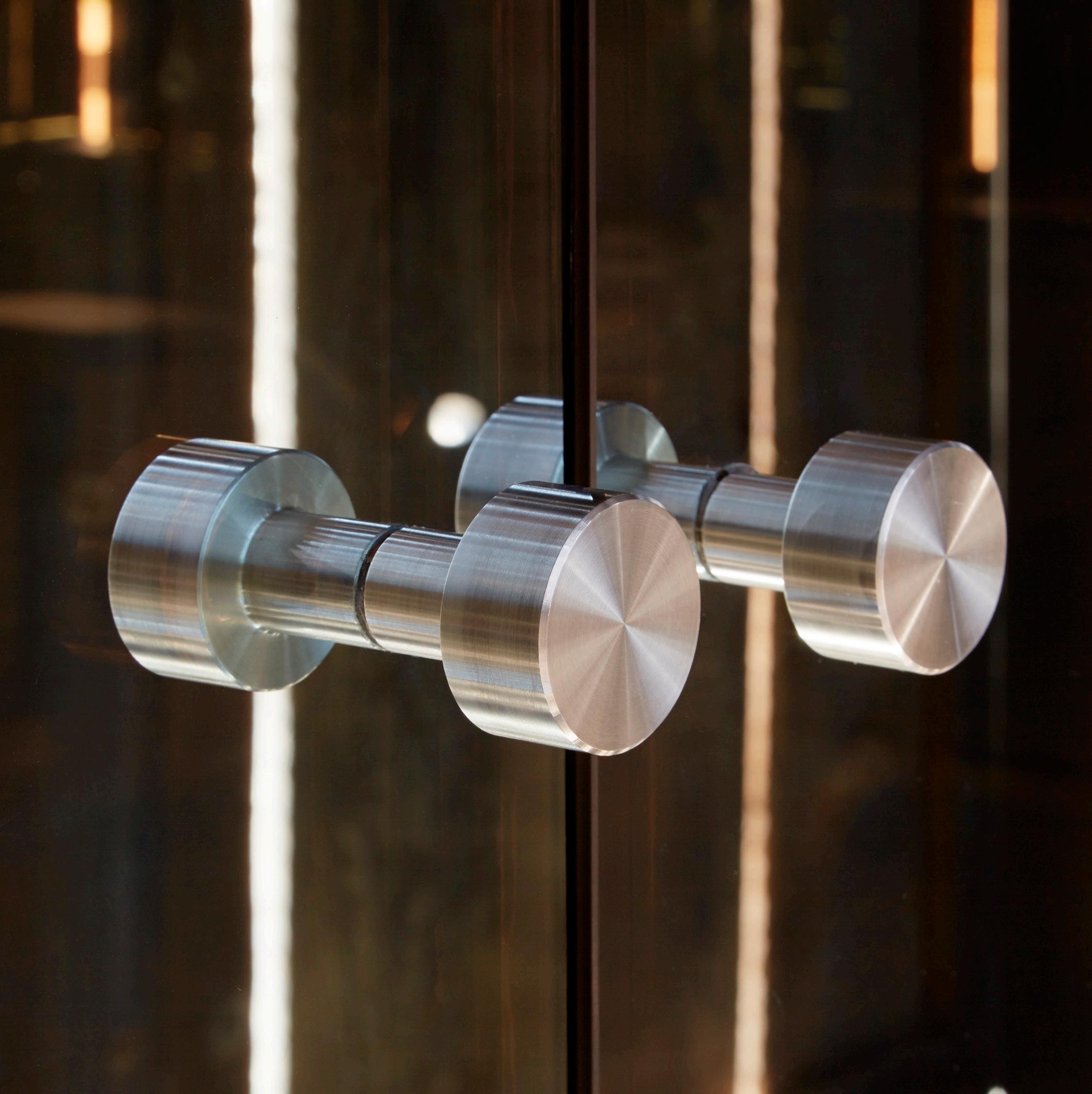
noun | clar·i·ty | \ˈkler-ə-tē\
“A design which is easily understandable and has certainty in concept, intent, and purpose.”


Design clarity is the expression of an idea or element or a quality in clear and unambiguous terms.
The terms are not literal but instead are visual and realized through material, color, light and space.
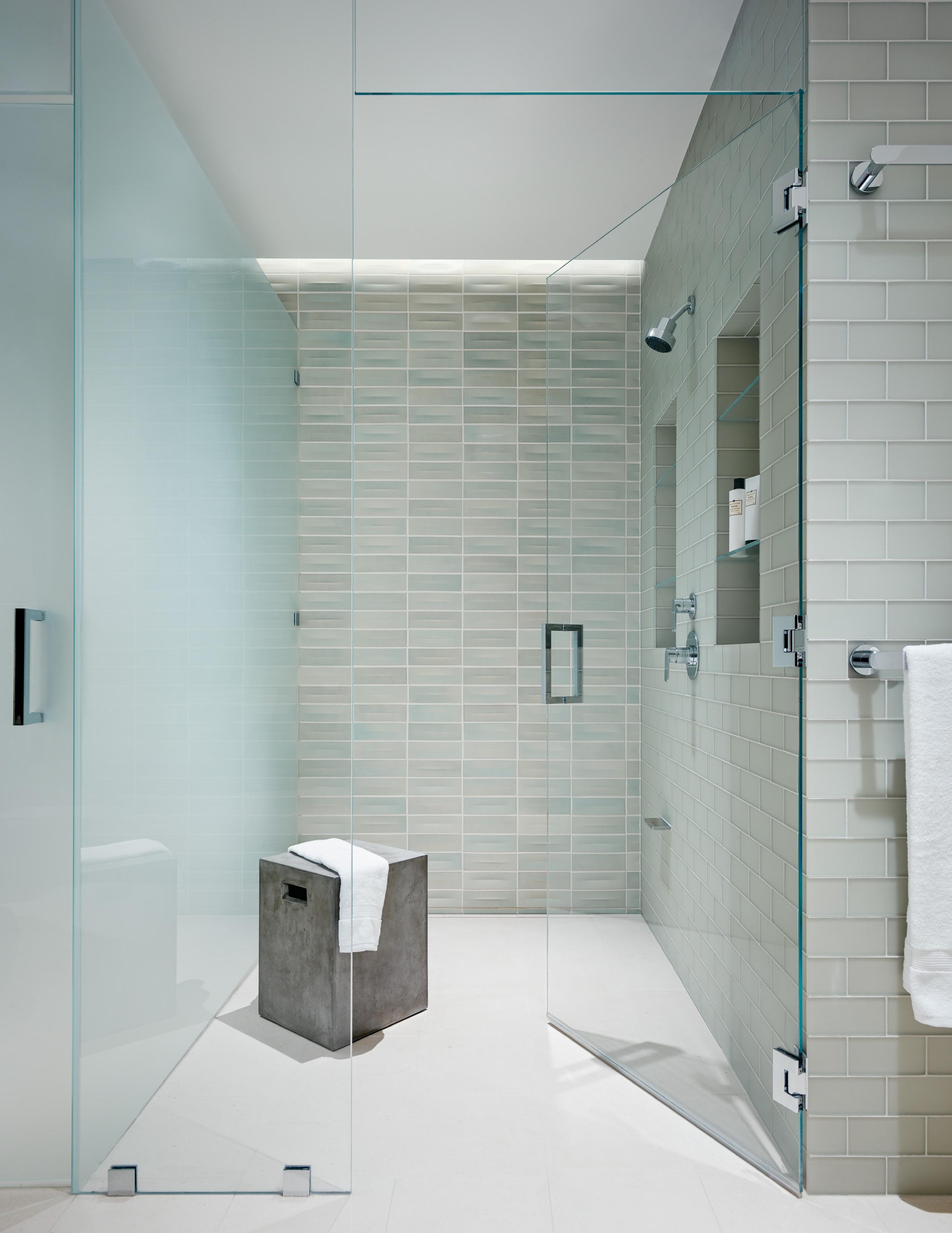
The design intent for this space was to create a soothing, spa-like environment. Conceptual clarity was achieved through the calm, organic color palette & soft indirect light.
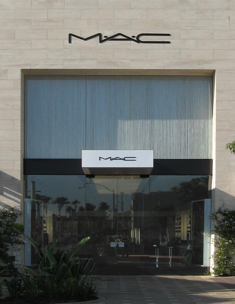
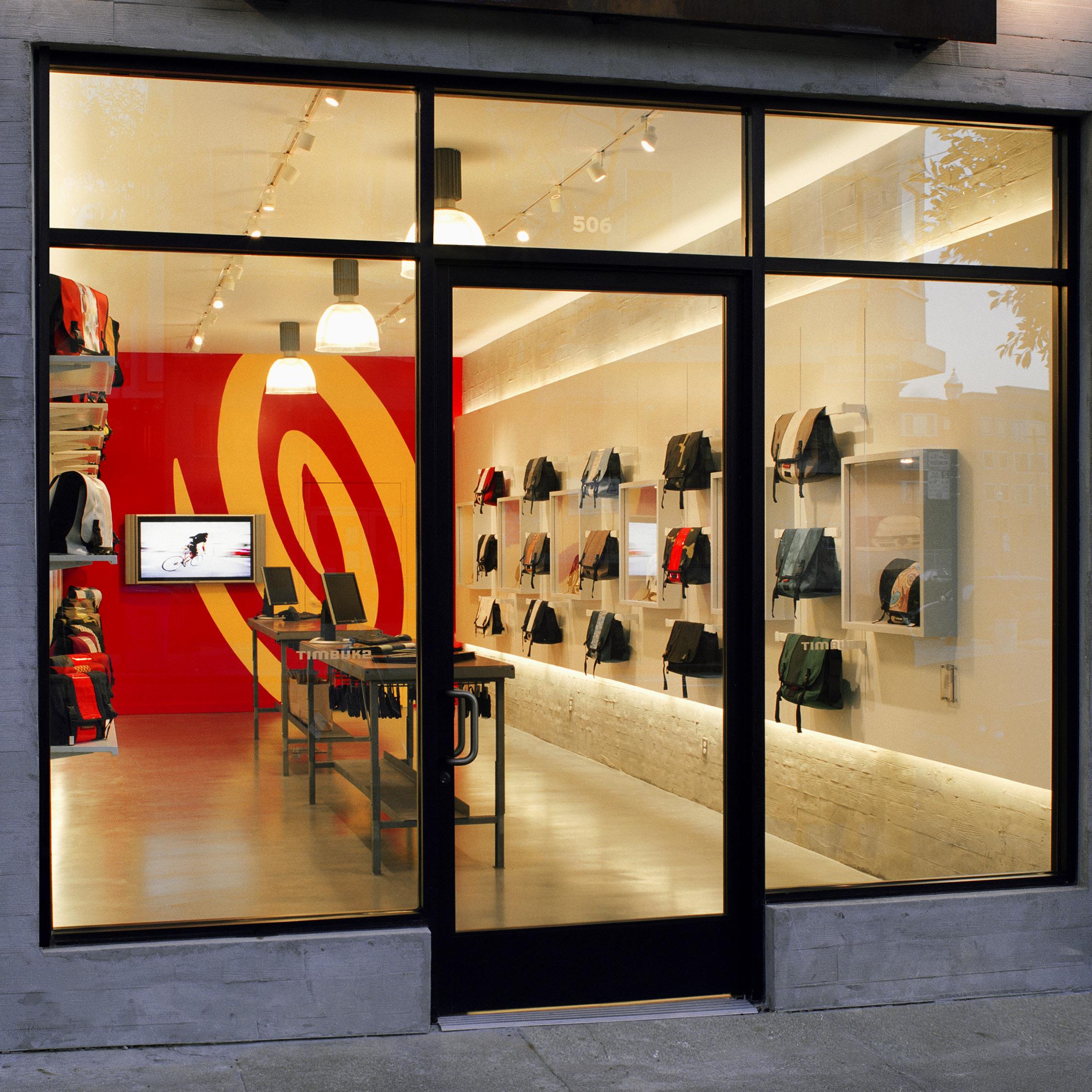
Clarity is especially important in retail projects where expression of the company’s logo or brand is a prime objective. These images show how architecture can be designed to help express a brand identity.

“Accentuation


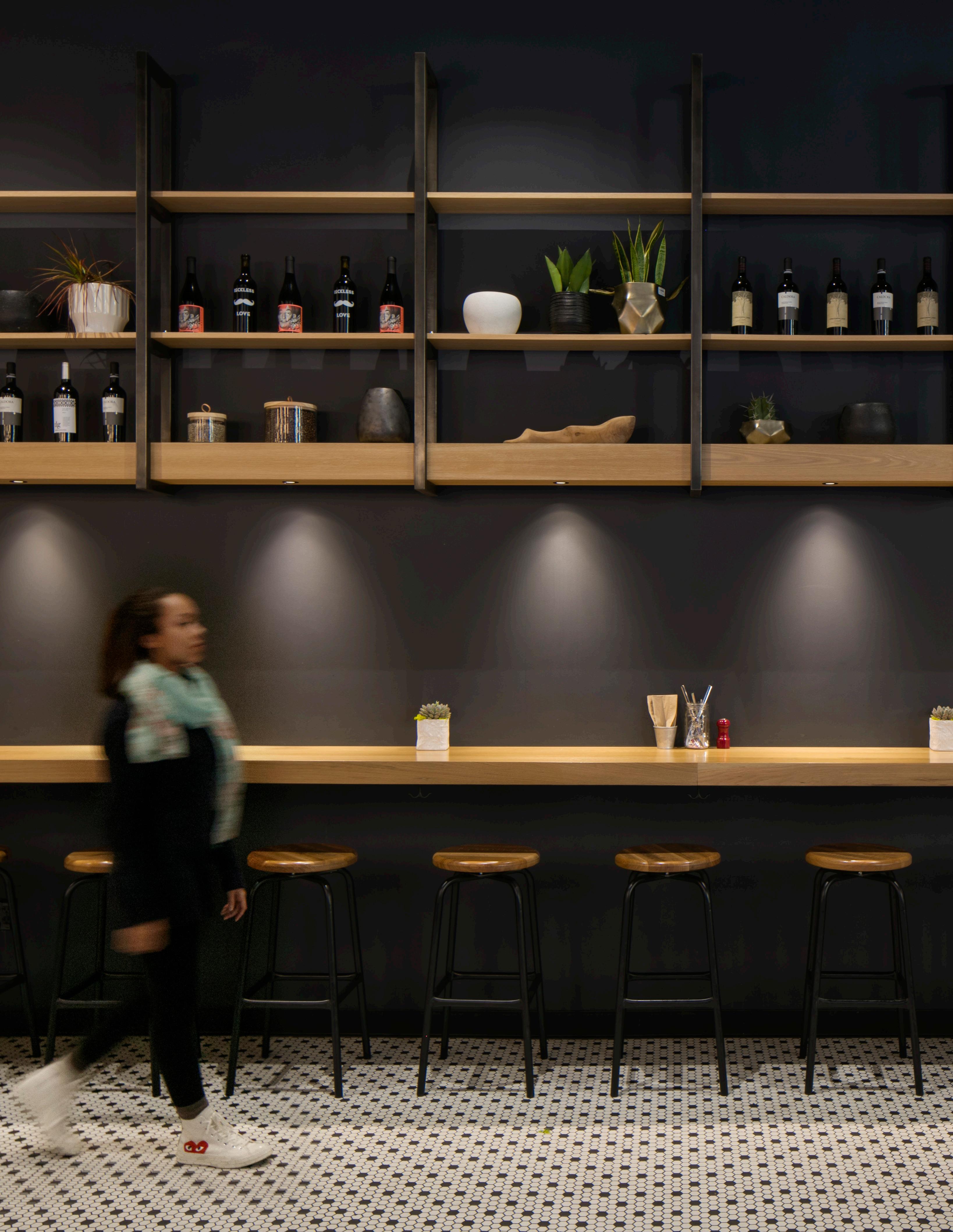
The natural wood finishes highlight horizontality in this restaurant space evoking a sense of visual comfort .
As creatures subject to the earth’s gravity, we are always innately aware of the horizon.
Horizontality is the alignment of design elements with the physical horizon or the instinctive intuition that relates to the earth’s skyline.
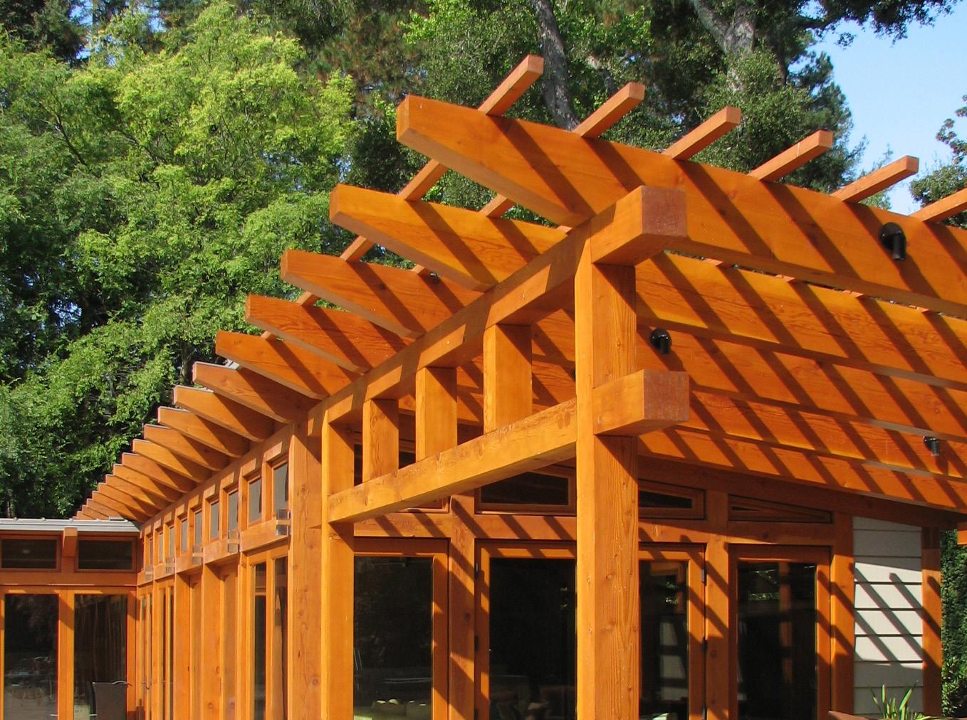
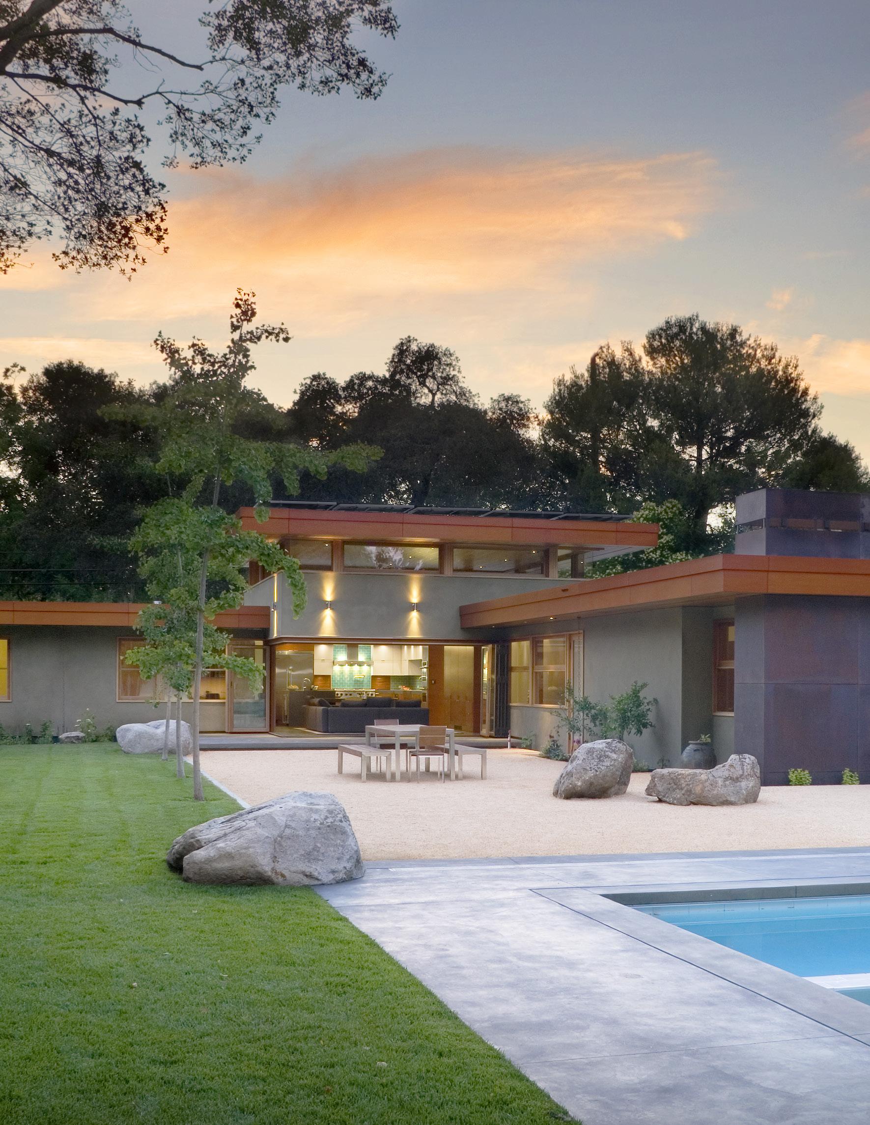
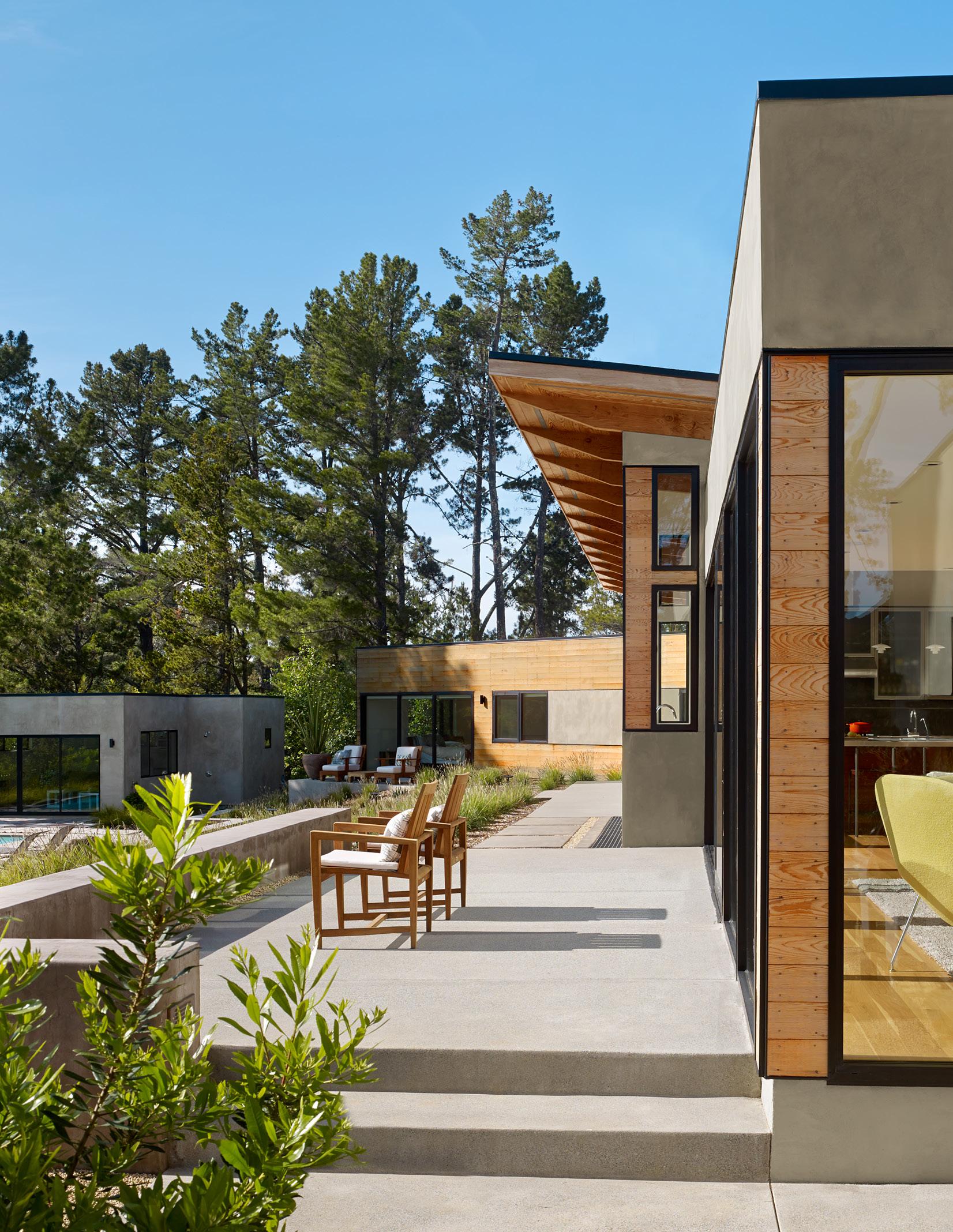
The horizontality of the spaces at the rear of this home are accentuated by the brise soleil above the doors, which serves as a composed counterpoint to the vertical elements.

Horizontality generates a sense of comfort while non-horizontal elements provoke a different and exciting sensation.

When a space is predominantly horizontal the non-horiziontal elements assume greater significance, and each can emphasize the other for the betterment of the whole.
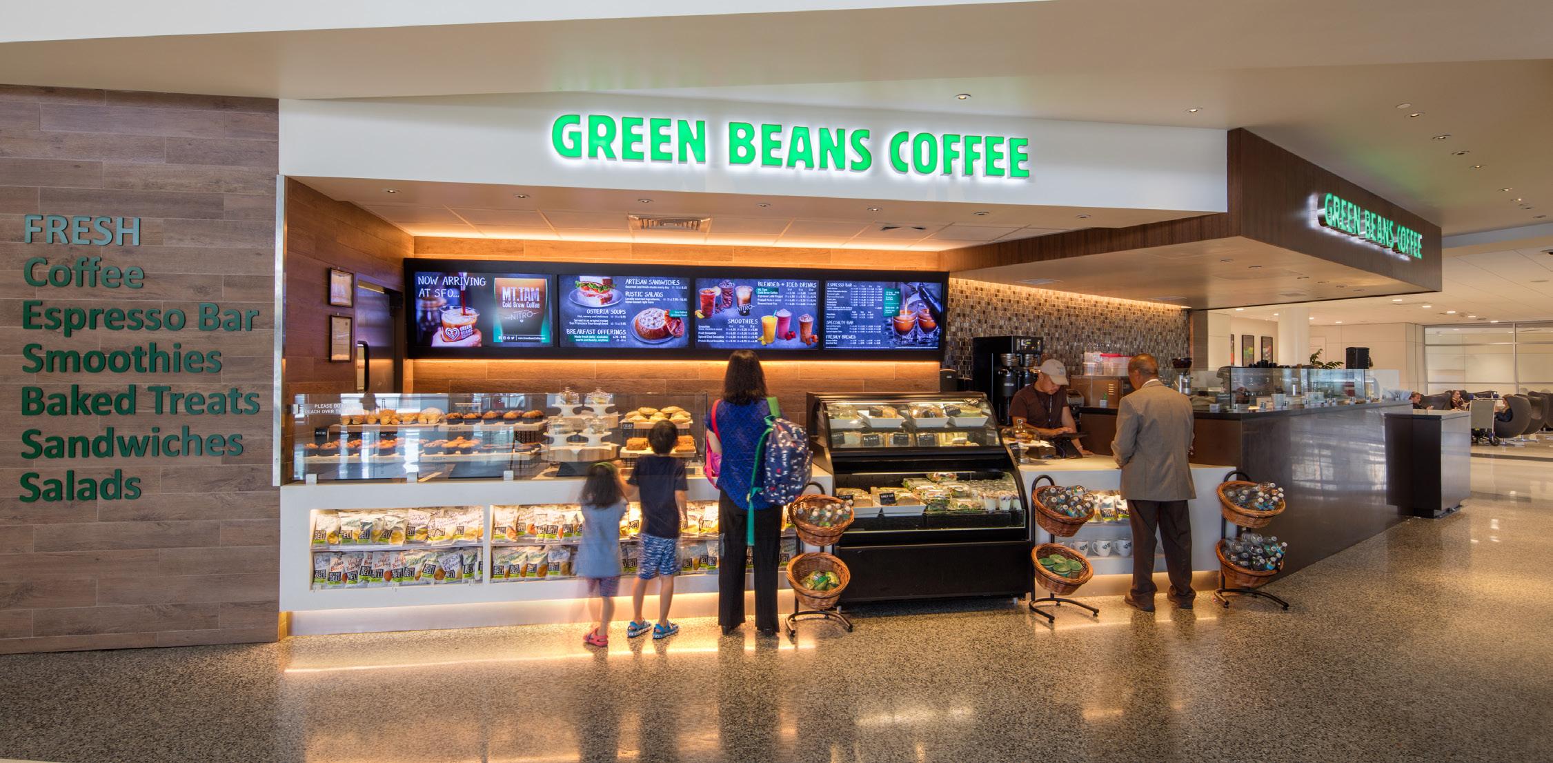
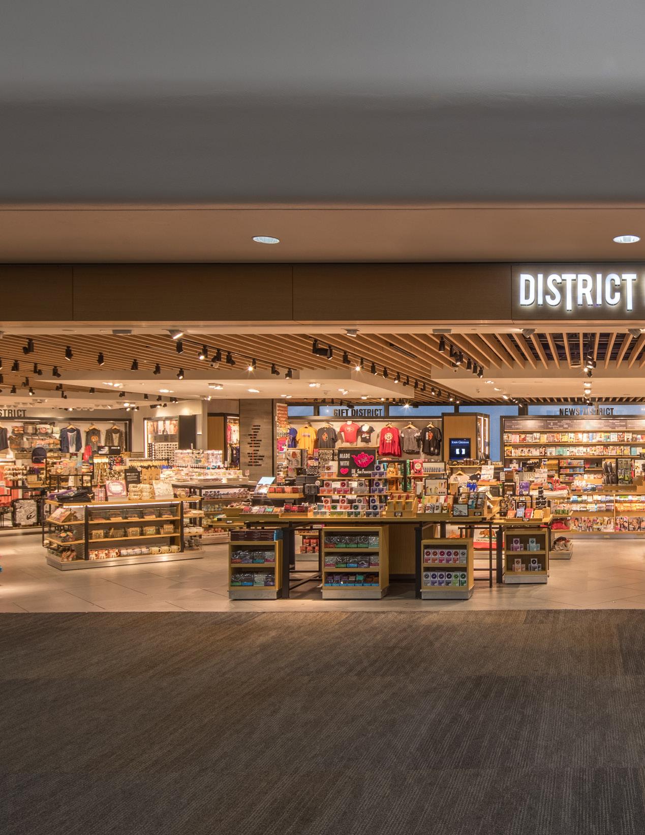
The opening of this store across the airport concourse coupled with the ceiling baffles and a hint of sky beyond creates a horizontality to the space that imbues it with a dynamic energy.


noun | align·ment | \ə-ˈlīn-mənt\
“The harmonious arrangement of elements with one other.”

The alignment of elements within a design, particularly at a detailed level, can be one of the most pleasing moments to experience in architecture.
Rigorous thought and many iterations are required to produce architecture with flawless alignments but a successful outcome is well worth the reward.
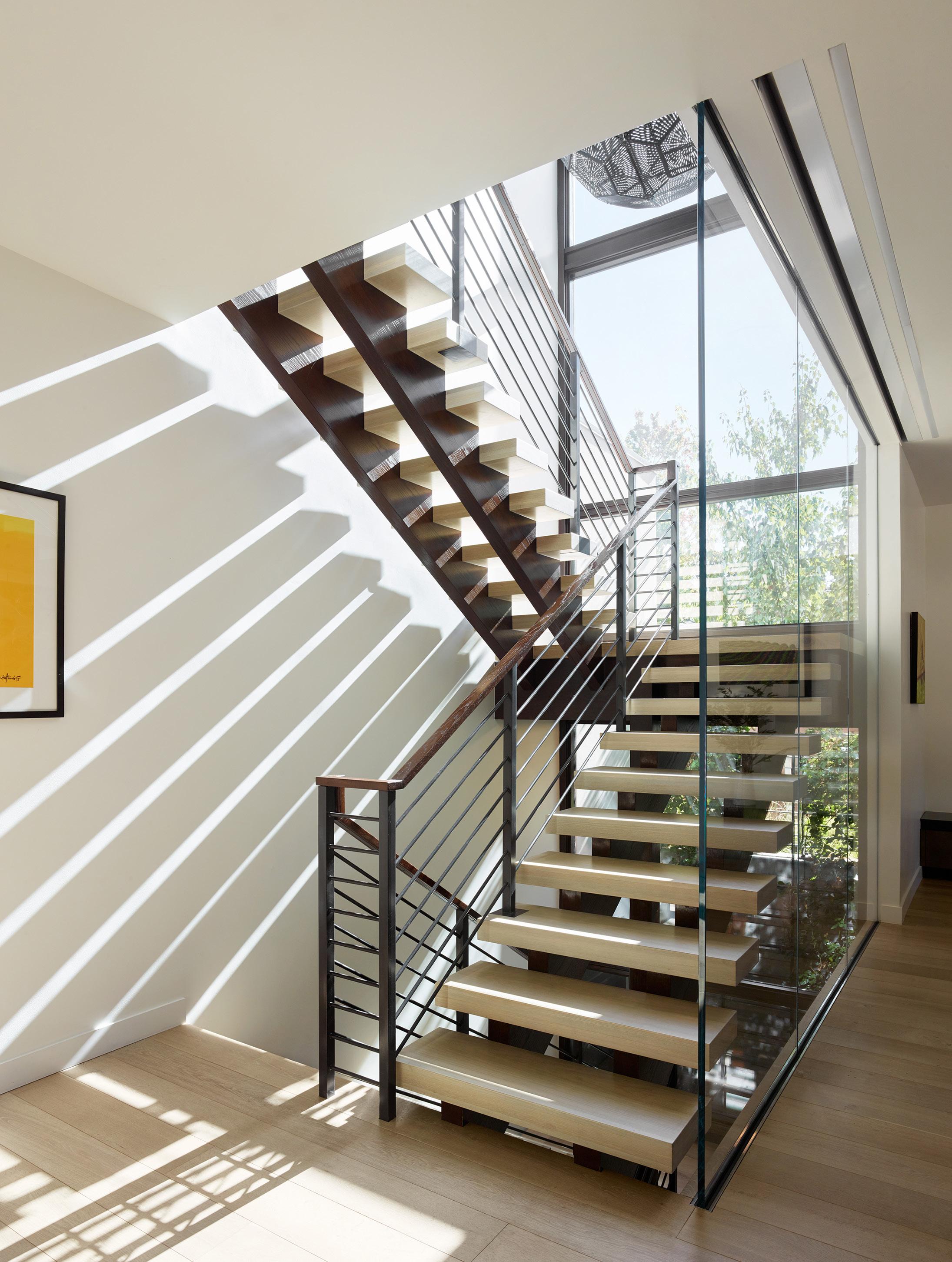
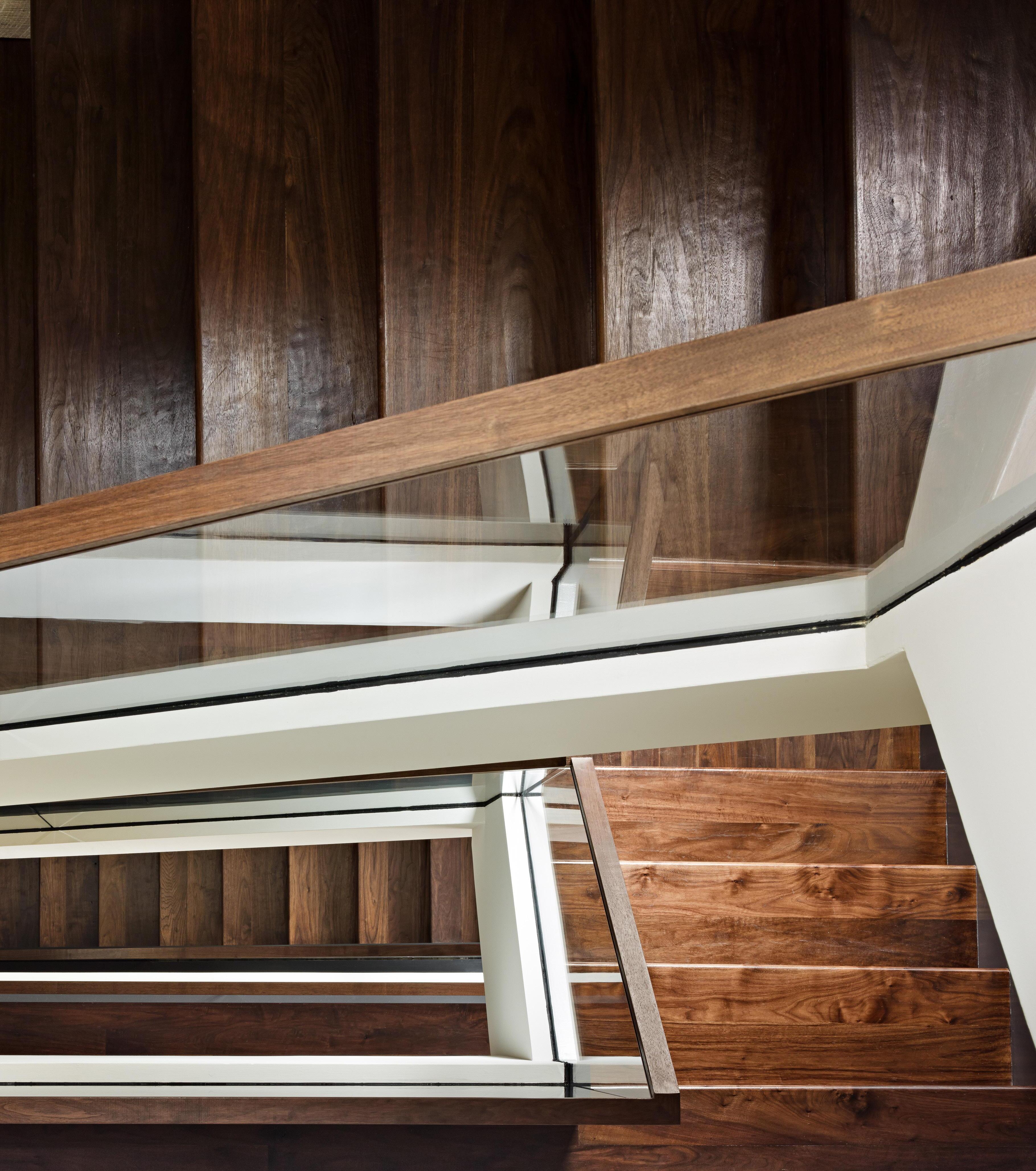
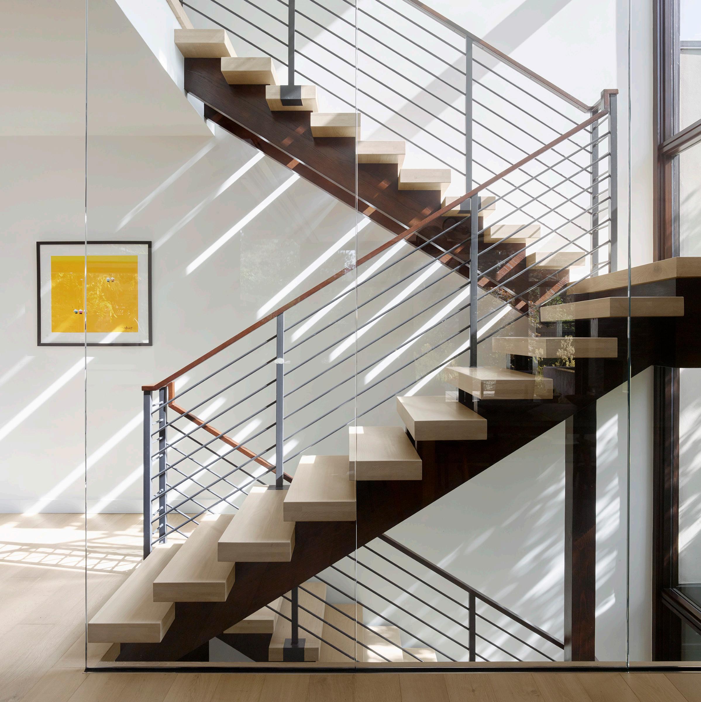
The precise alignment of the elements in this compelling staircase is a reflection of the rigor involved in its design.
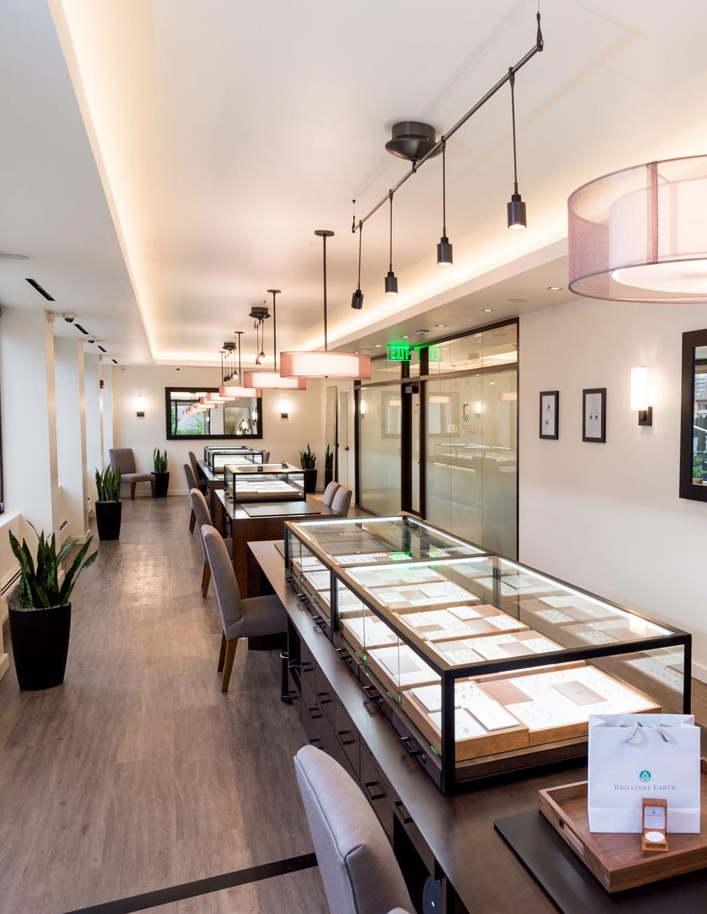
Light fixtures, millwork, framed openings and wall detailing are all carefully aligned in these spaces so that they form a perception of harmony and balance.
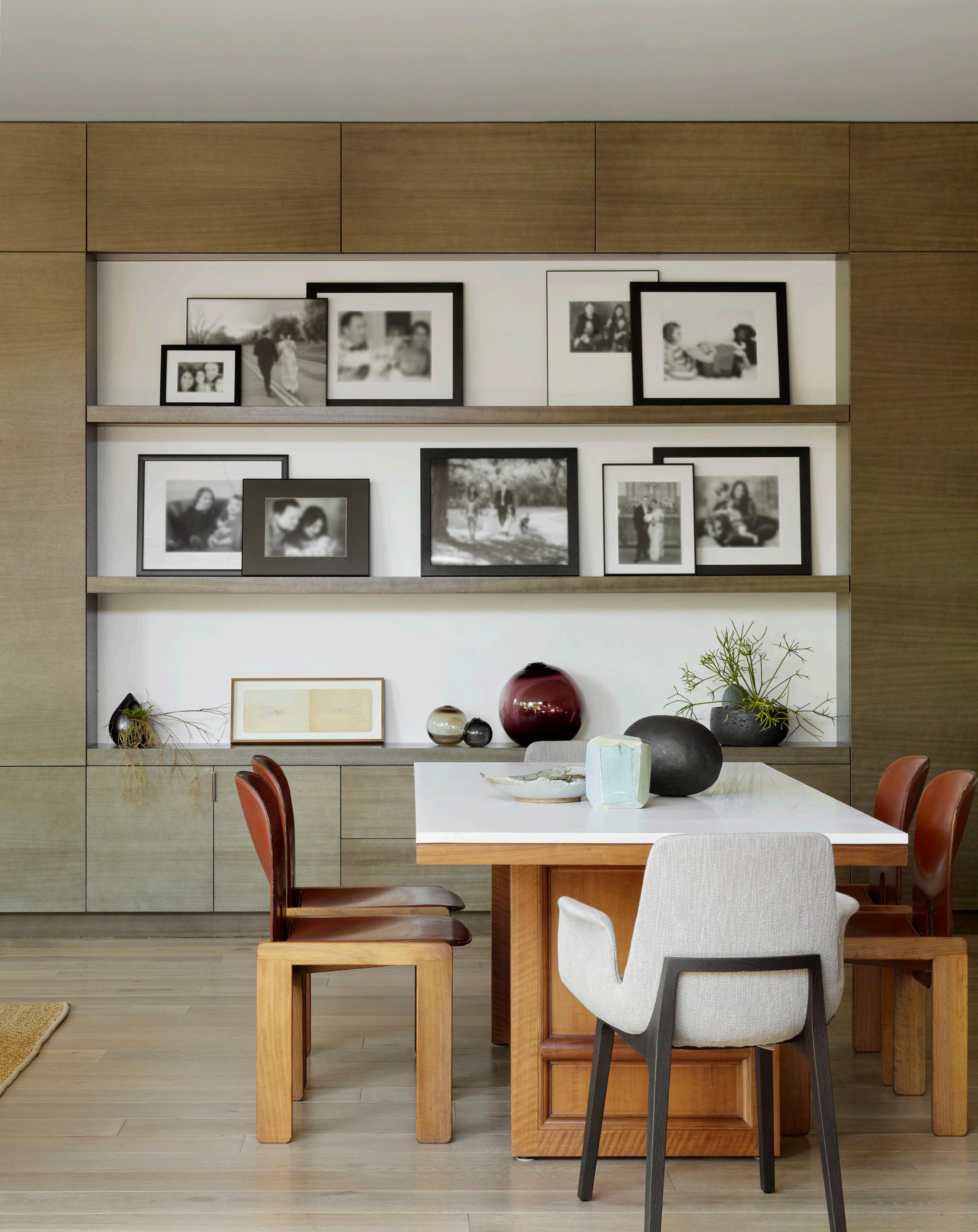


noun | space | \spās\
“The attributes associated with, and the perception of, a volume or space.”
EXPERIENCE
ARTICULATION
TRANSPARENCY
LIGHTING
FLOW
CONNECTION
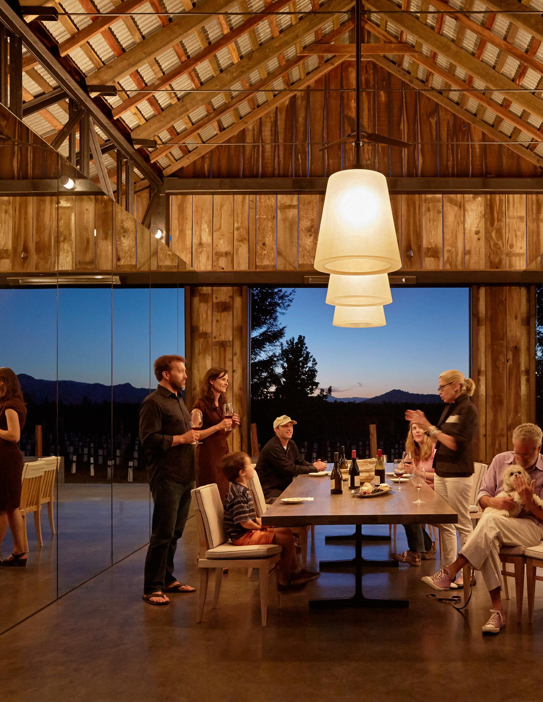


noun | ex·pe·ri·en· | \ ikˈspirēəns\
“A sense of the spirit, quality, and character of a place gained through its relationship with space, use of color and light, and composition of form.”
Crafting the experience of architecture is about the articulation of a story within a design and the spatial and cognitive human interactions with that story.
Spaces driven by experience are designed so that there is regular visual stimulation, where elements reveal themselves sequentially or are transformed when perspective shifts.
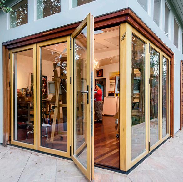
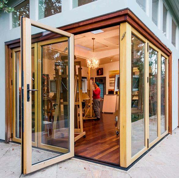
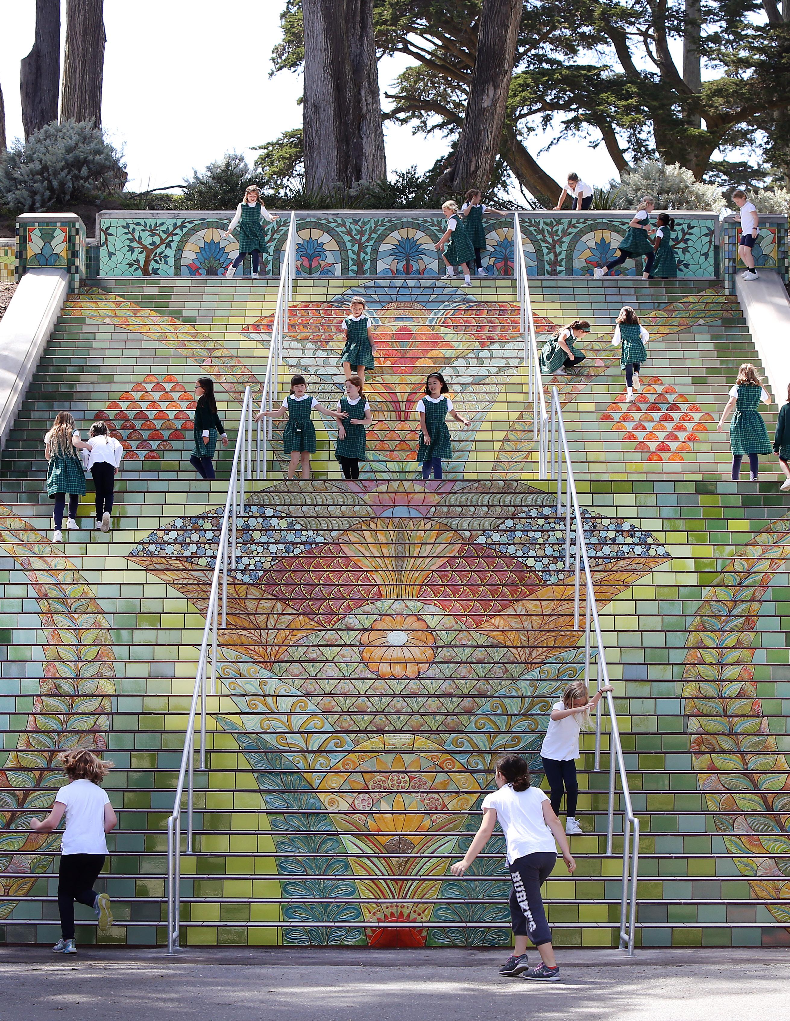
These steps function as both art and architecture. The enjoyment of the piece is enhanced through the constantly changing visual experience while interacting with it.
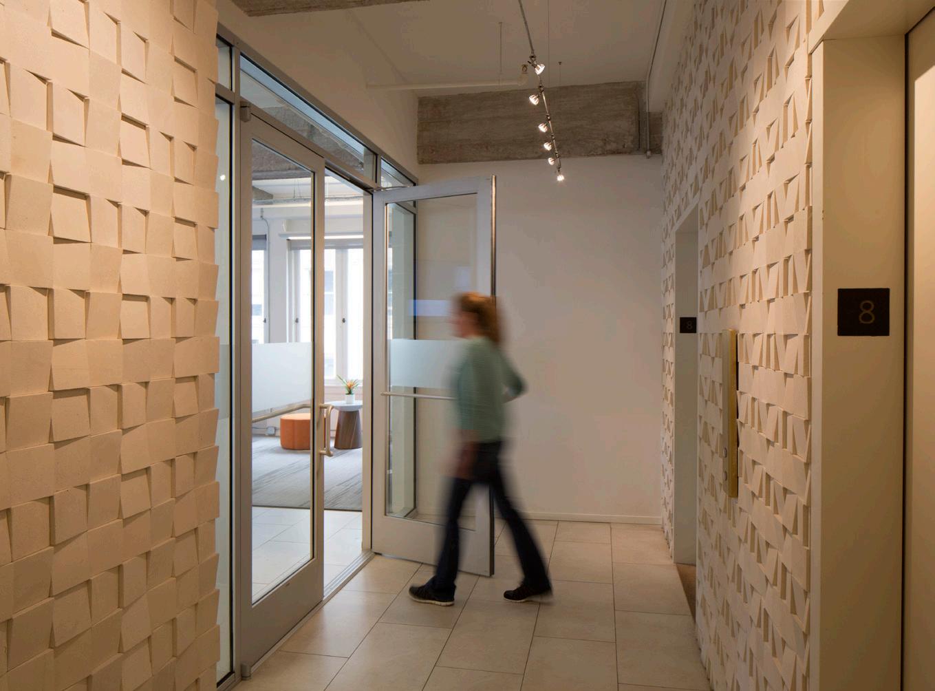
The balance of rich textures combined with the minimalism of walls and ceilings in this restaurant space inspires new experiences through shifting perspectives.

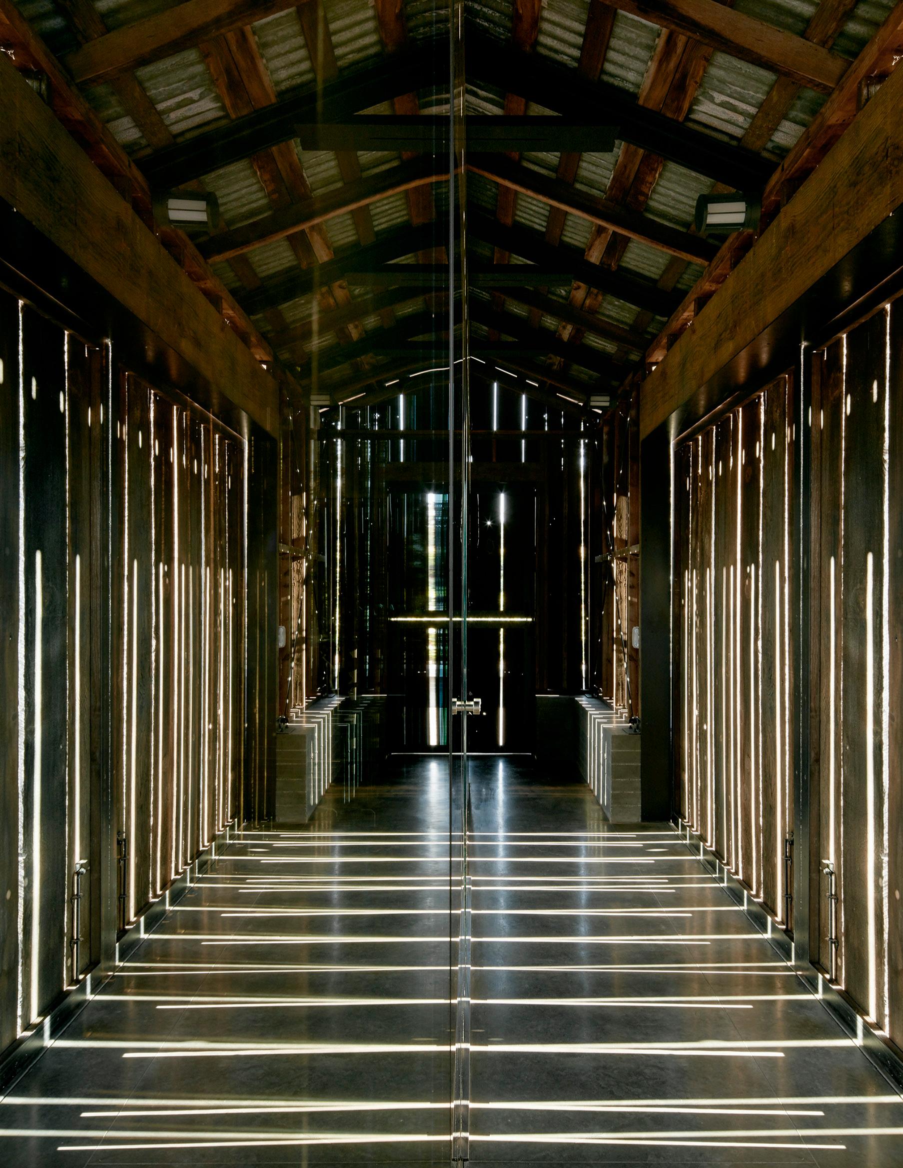
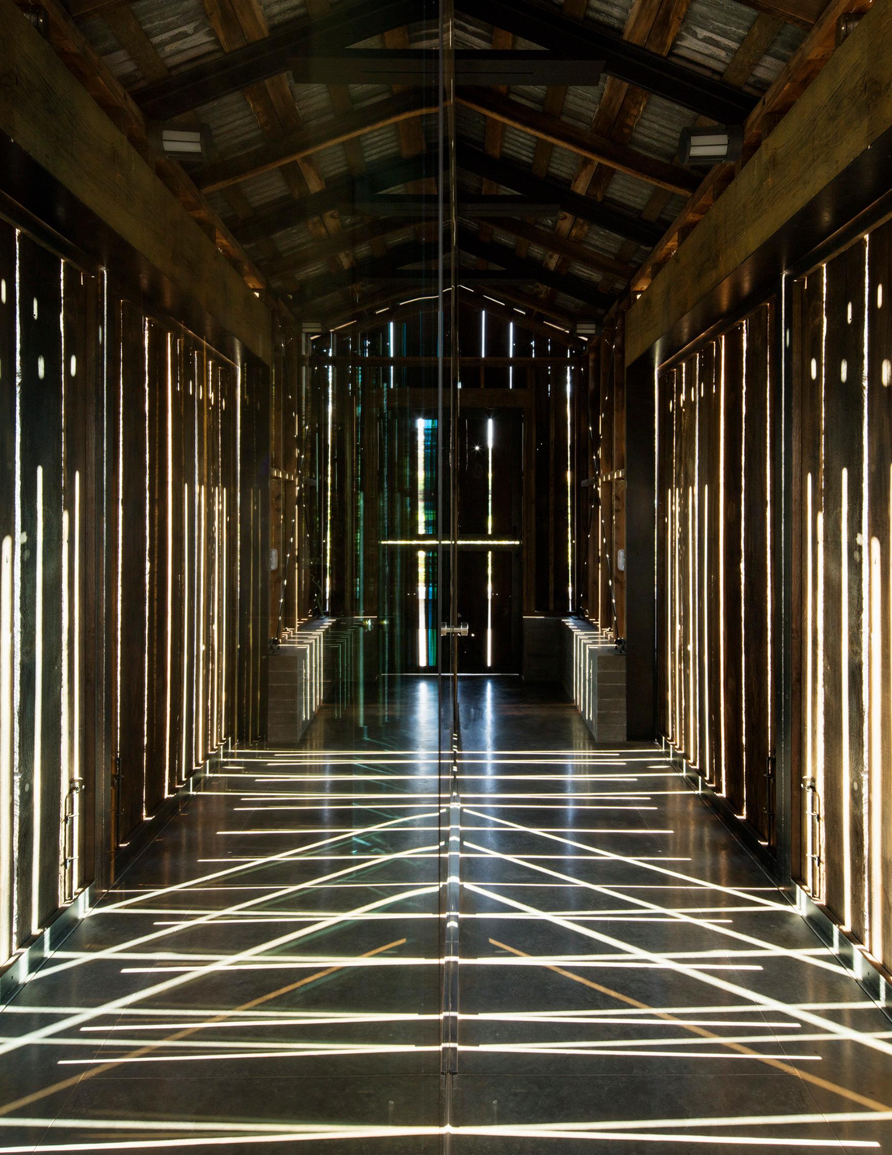
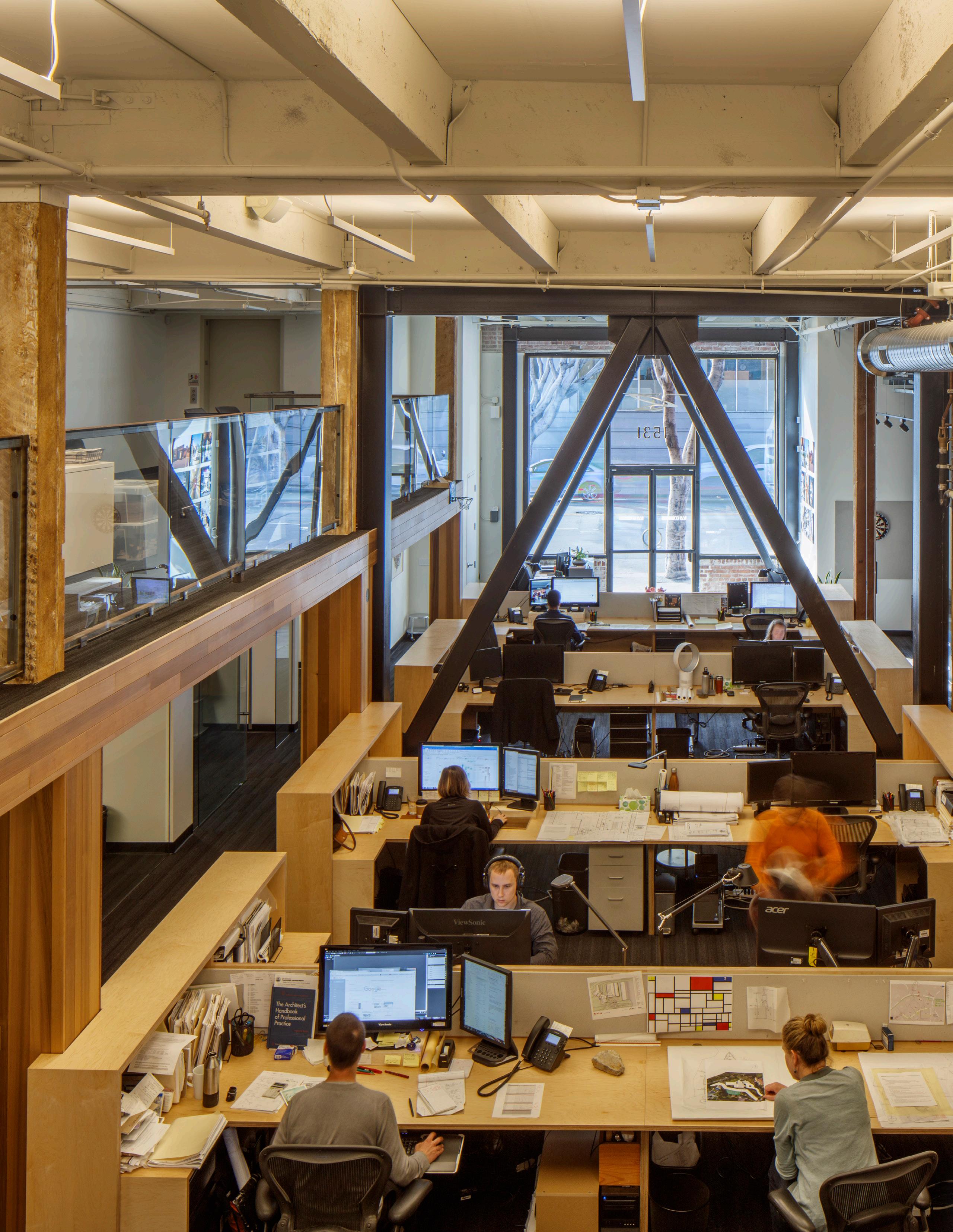
Architecture is experienced while moving through spaces that evoke the senses of the individual.

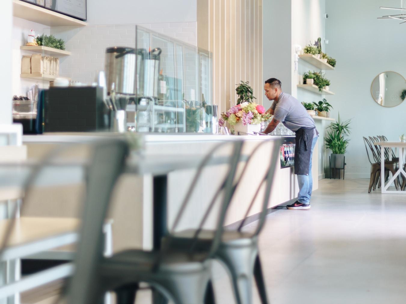
Elements or moments in a design should provide places to stop and rest while others should provoke movement and a sense of exploration.
The dynamism of daylight works with the rhythm of the external skin of this building to generate visual excitement and a captivating experience.
noun | ar·tic·u·la·tion | \ (ˌ)är-ˌti-kyə-ˈlā-shən \
“A clear and distinct language that guides the sculpting of the forms of architectural space.”


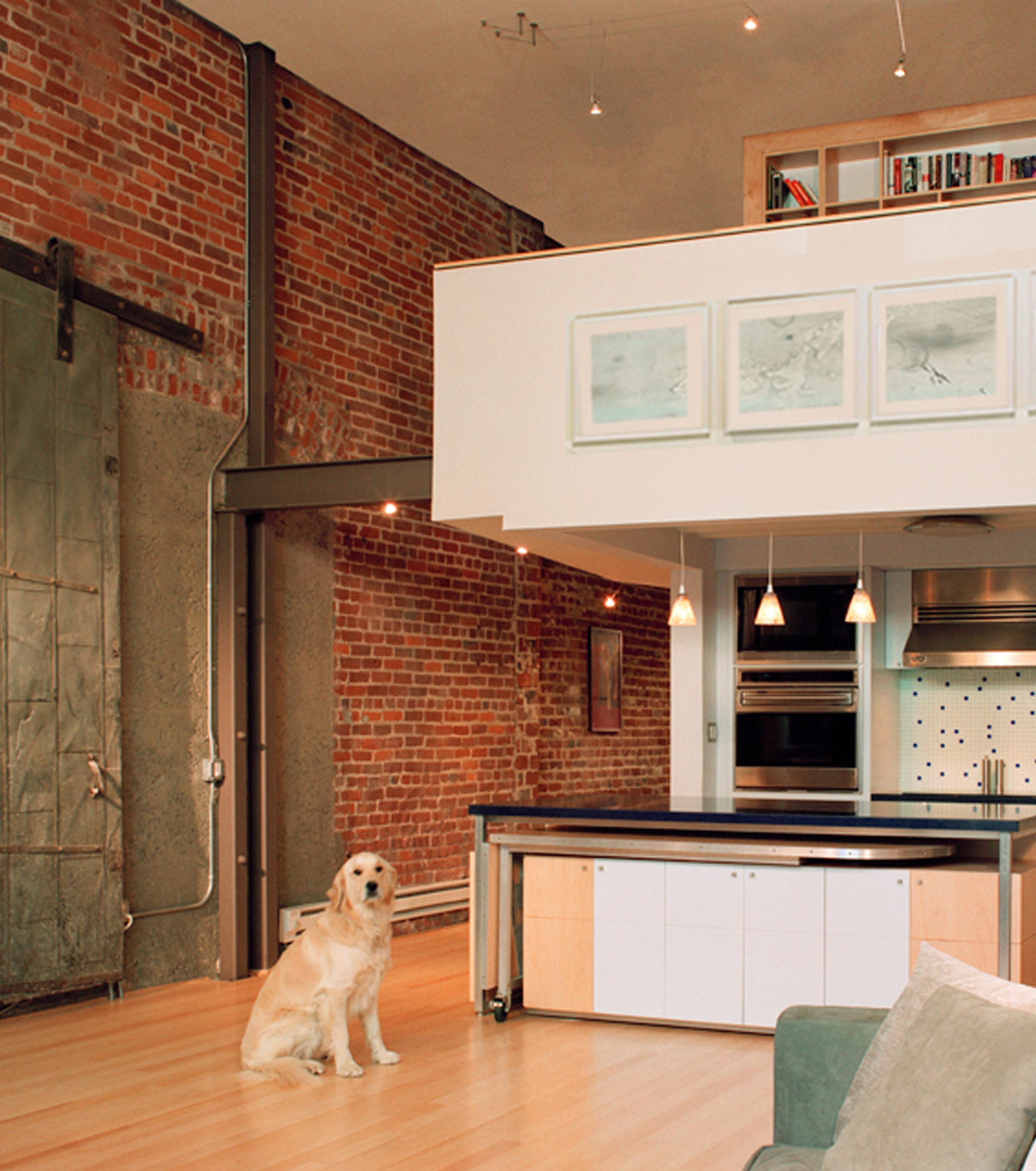
The large expanse of this space is made more interesting by the cantilevered loft cutting through the void.
Architecture is the sculpture and formation of space.

There should be purpose in the sizing, shaping and placement of elements within and around a space to give definition to the character of the design.
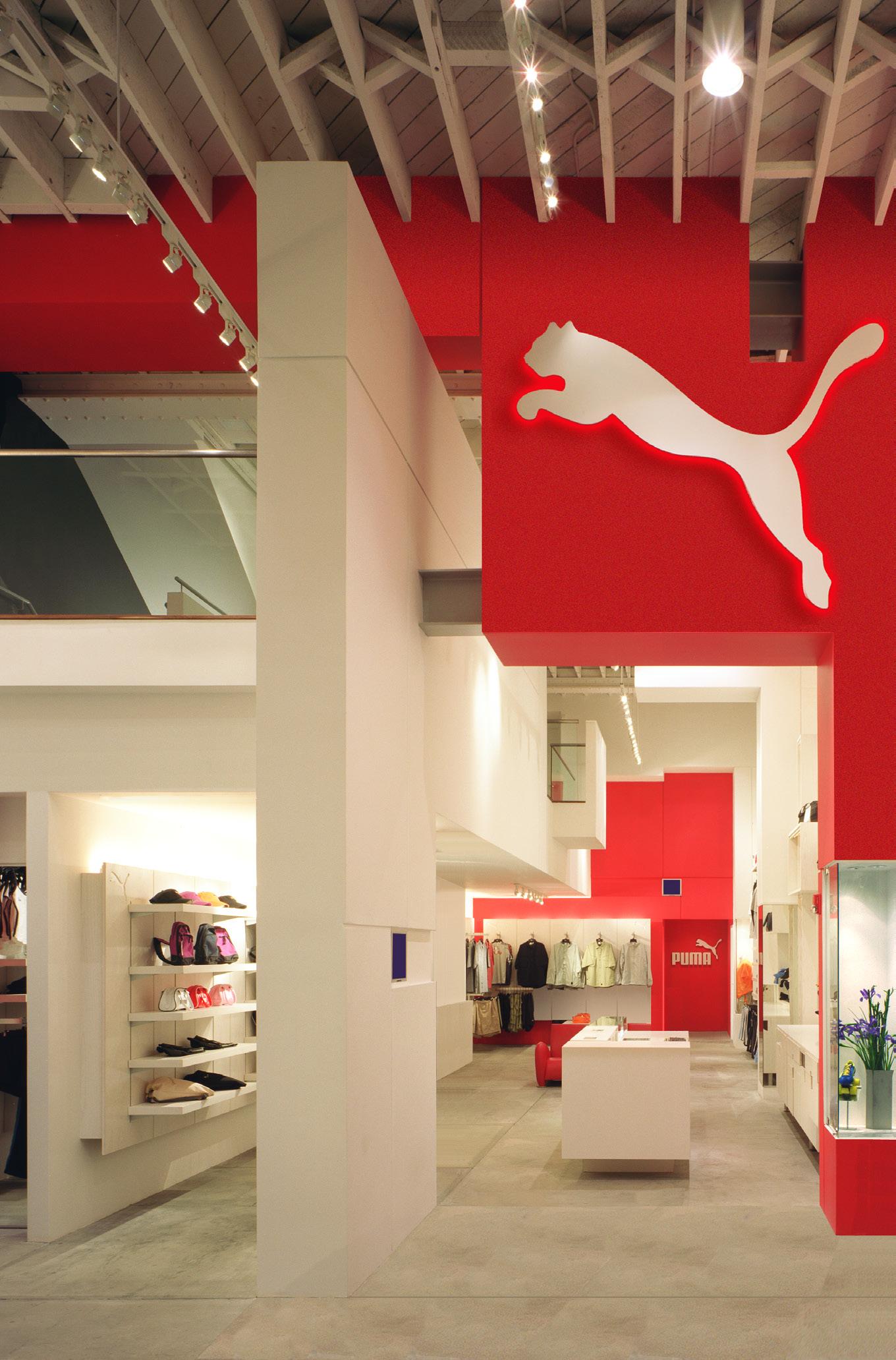
The relationships between architectural elements are a key part of how a space is articulated.

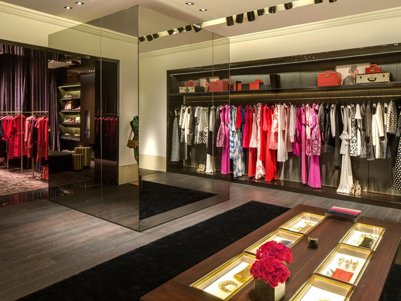
Different components work together to shape the overall composition through an interplay of lightness and weight, or texture and gloss, or transparency and opacity.
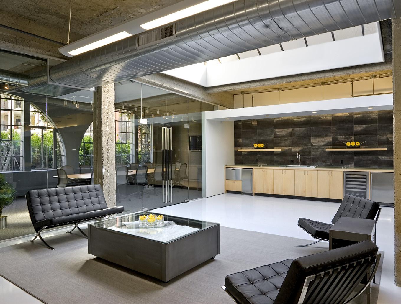
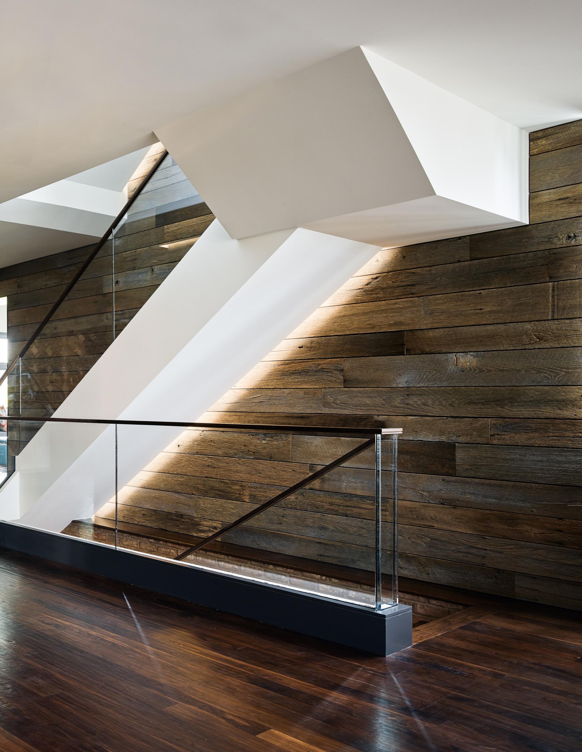
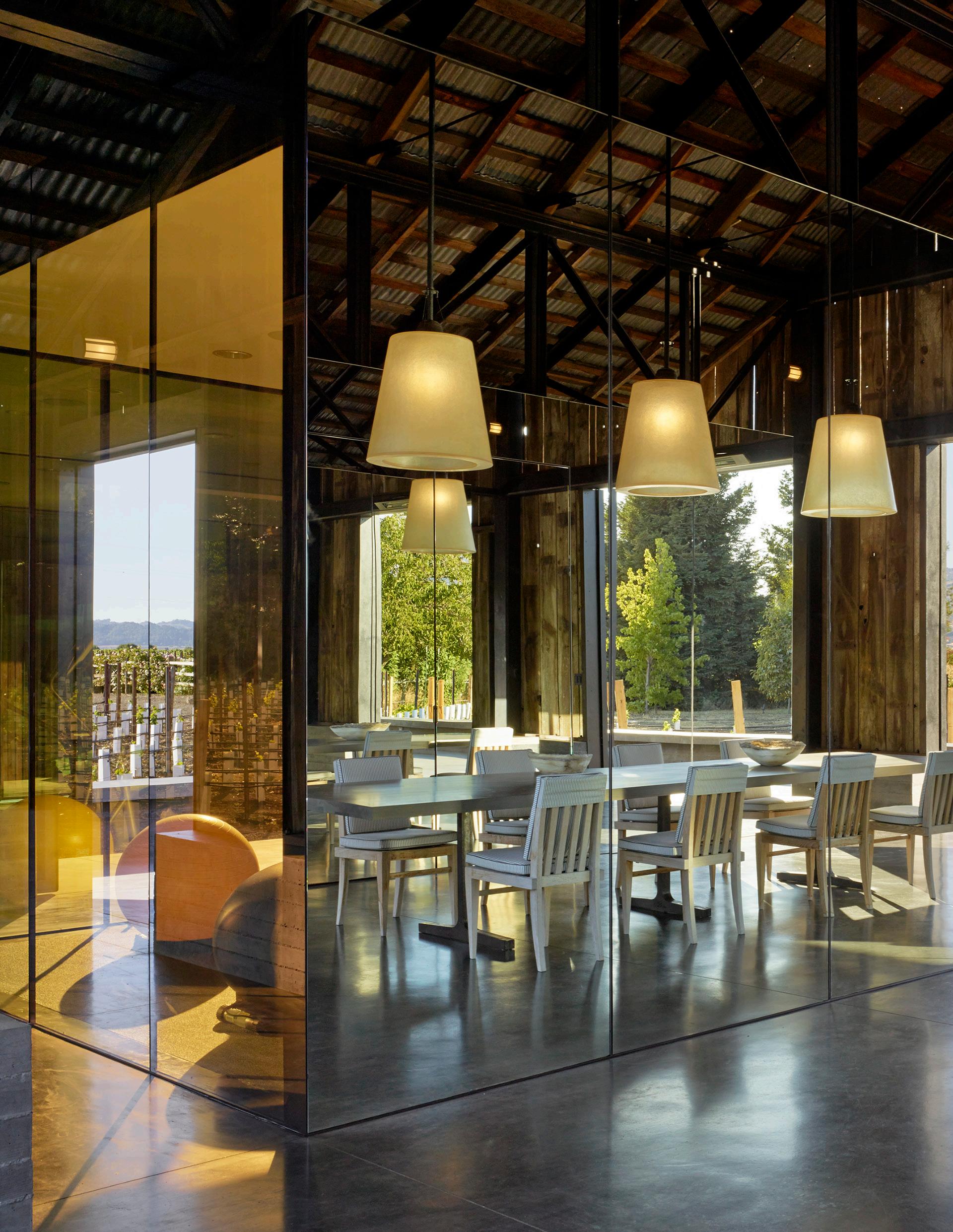
This design achieves refinement through the juxtaposition of the rustic texture of the natural wood against the smooth surface of the mirrors and light fixtures. Each plays off the other to define the mood and flow of the space.
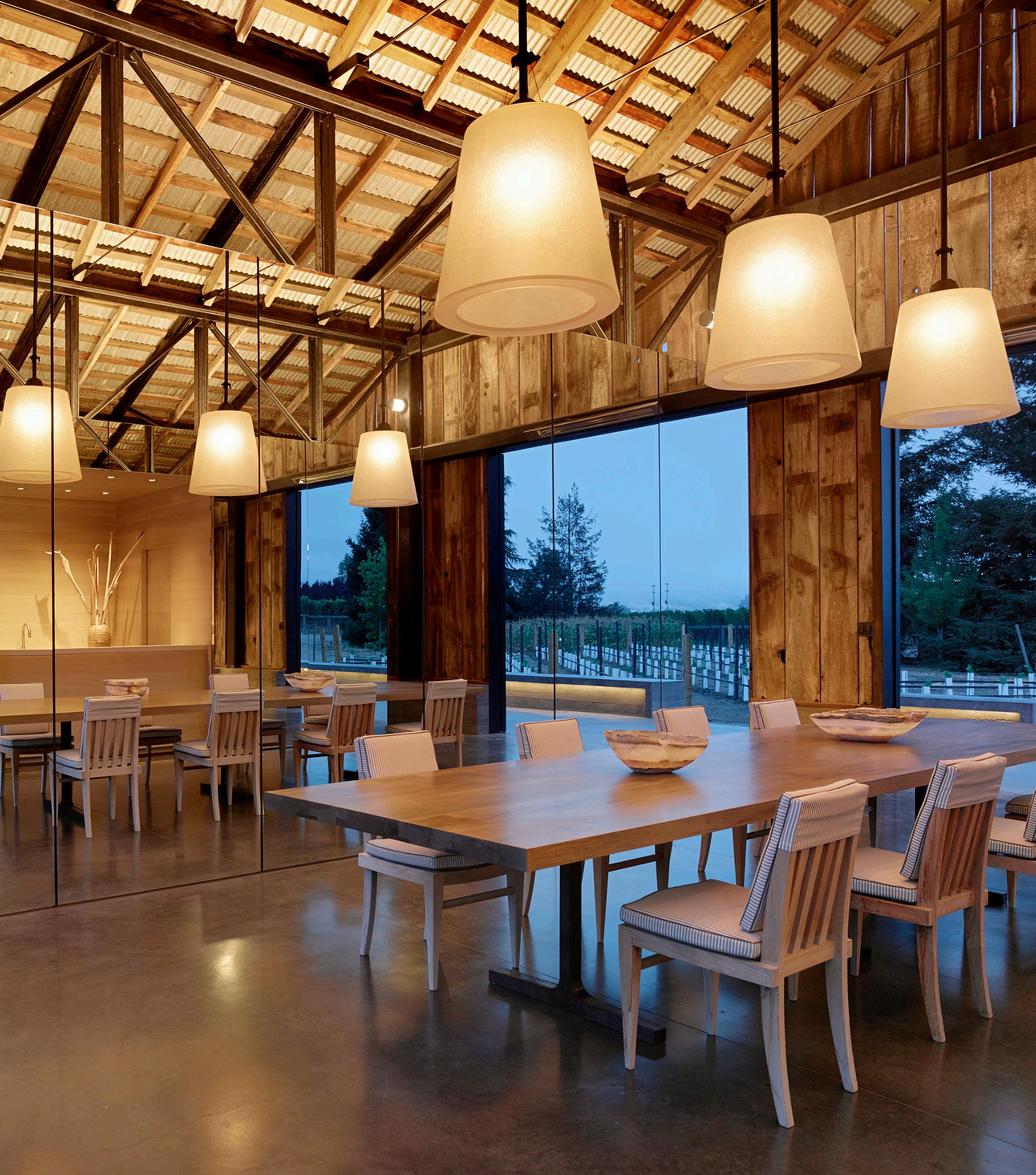
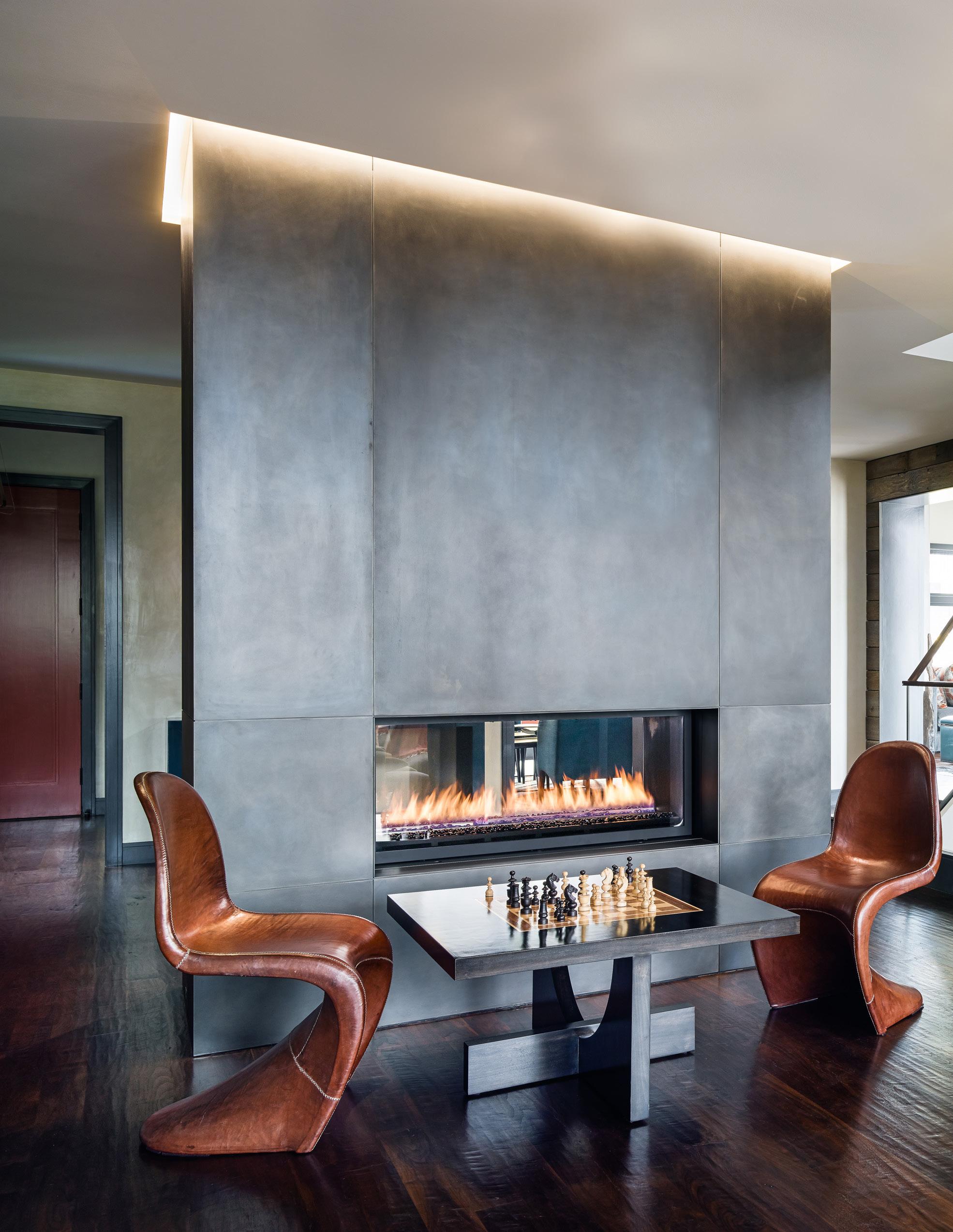
This large, open space is anchored by the metal fireplace element, softened by the natural wood wall and energized by the dynamic form of the stairway.
noun | trans·par·en·cy | \tran(t)s-ˈper-ən(t)-sē\
“The ability to see through architecture and visually connect it with its context.”


The large window in this brick facade invites the viewer into the space. The translucent panel draws attention to it as an object and helps frame the space.

Transparency is an effective tool to open a building to its surrounding environment and also allow that context inside.
Building components can be layered through transparency, affording elements a relationship to each other while remaining distant, distinct and independent.
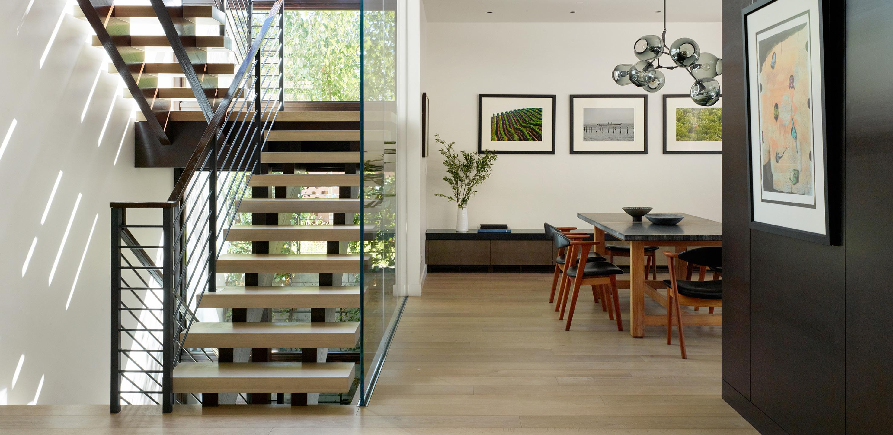
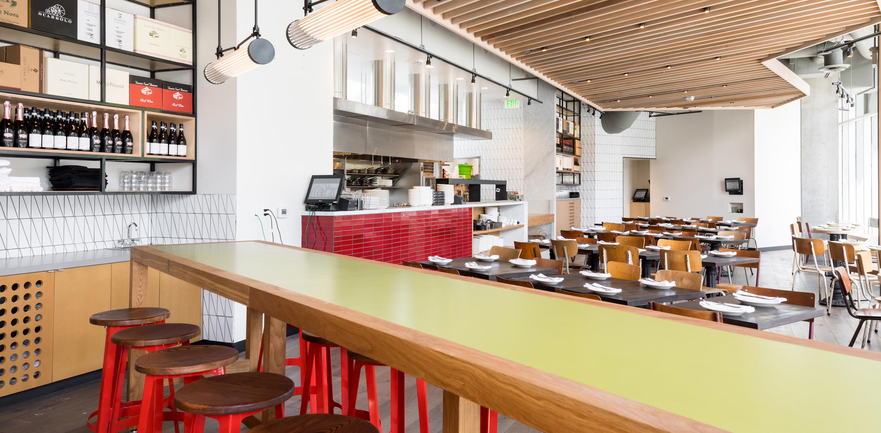
Transparency is the simultaneous perception, literally or conceptually, of different spatial locations.

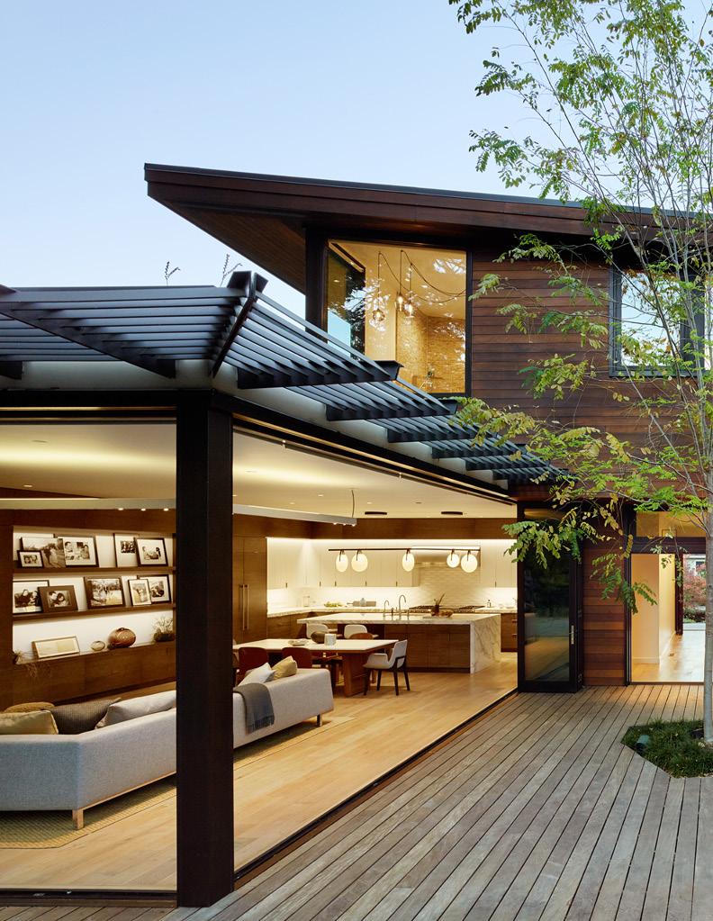
Literal transparency is what the eyes see, while conceptual transparency is interpreted by the mind whereby spatial depth ebbs and flows through the layering of elements in the space.
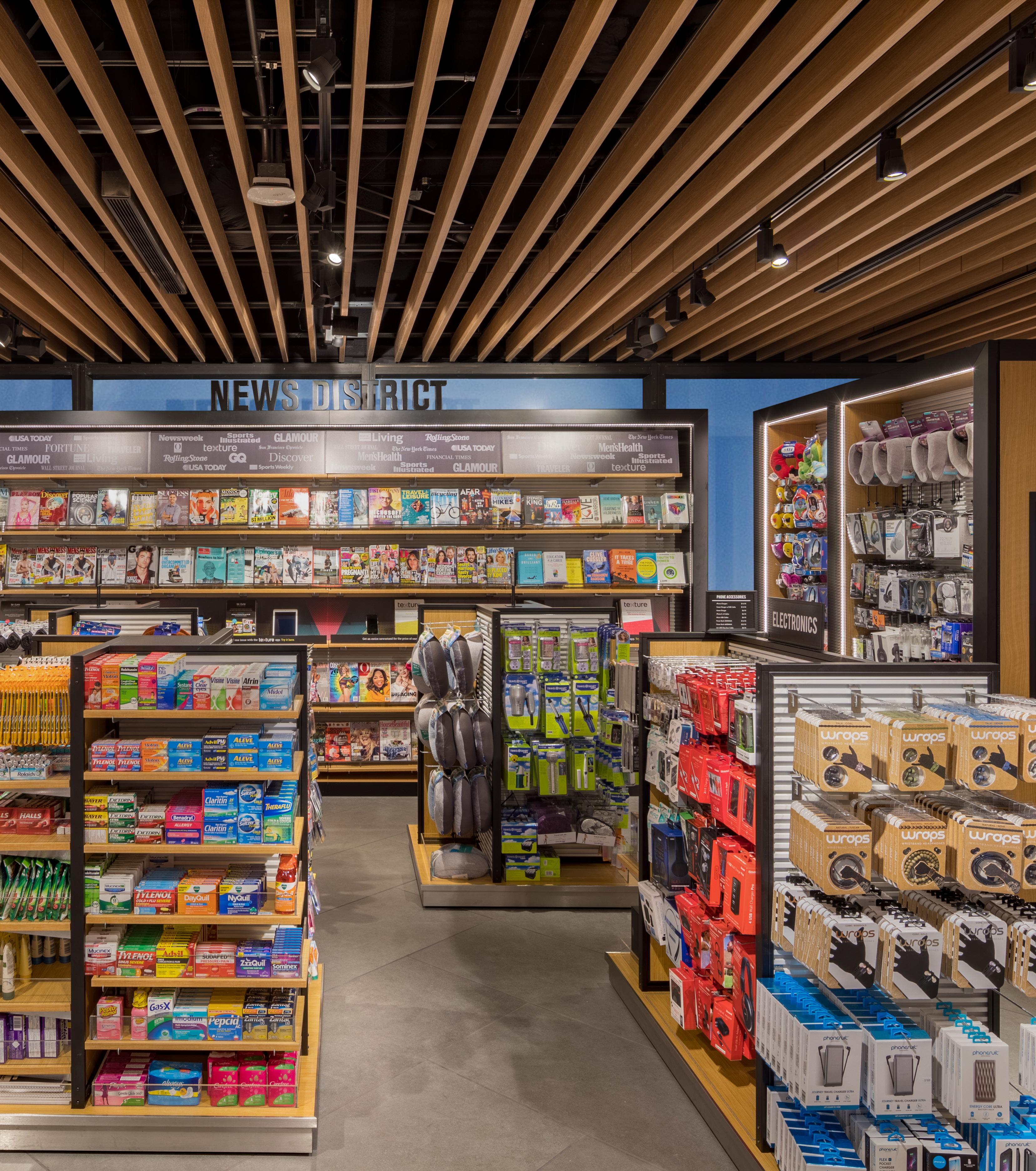
This retail space is layered through the clever use of voids including the spacing of merchandise racks, revealing the translucent exterior glazing and by the slatted ceiling cloud; all of which yield a perception of something beyond.
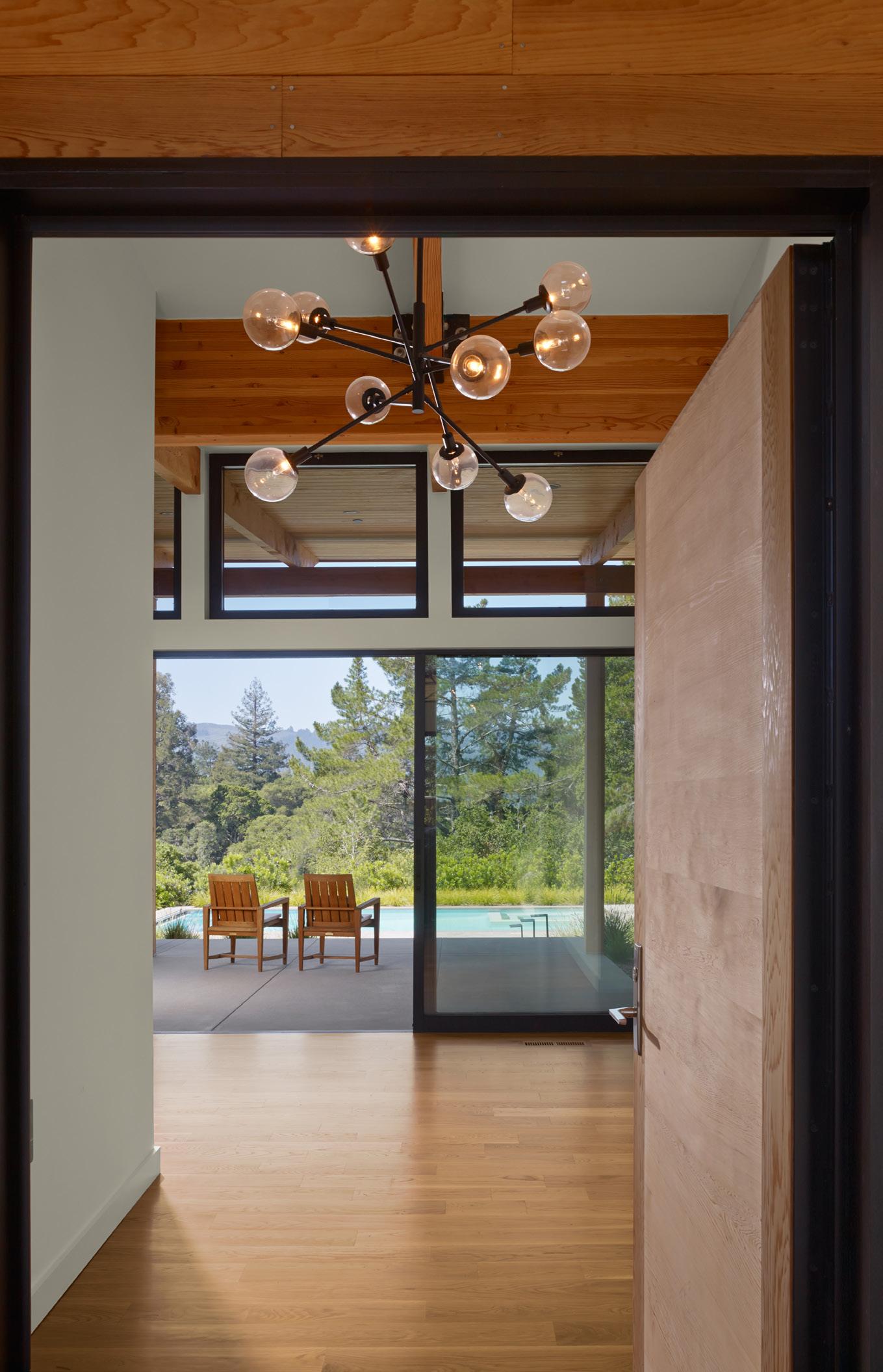
This house is given a layered richness using literal transparency. It connects it to its exterior context and other spaces of the interior, and so enhances the experience of each.
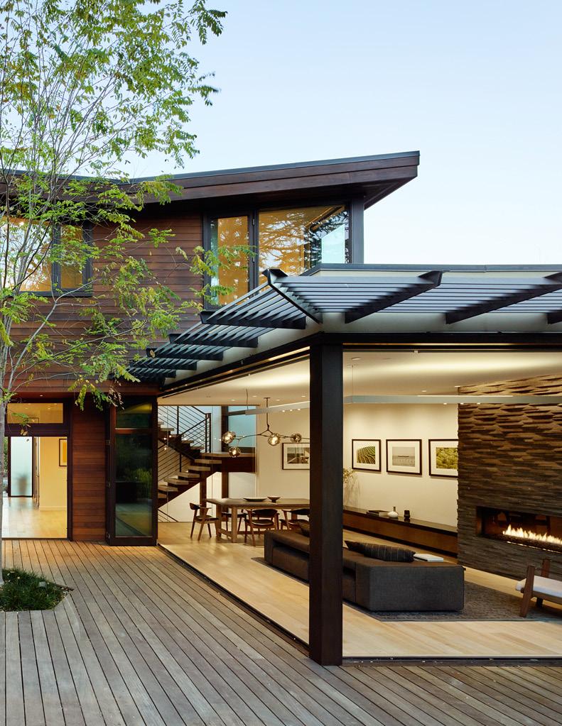
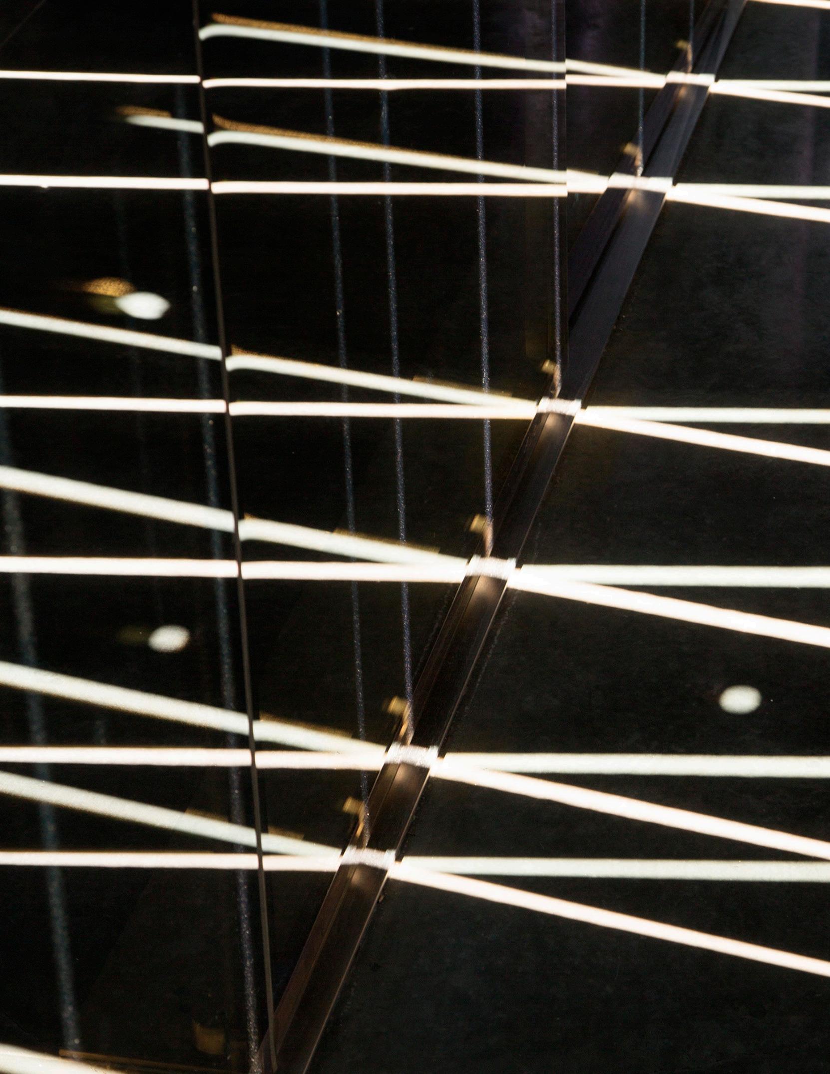
“The


Judicious lighting can enrich and heighten the quality of materials and the components of a design.

A well-lit space sets a mood and accentuates texture, color and detail through highlights and shadow.

Carefully composed direct and indirect lighting accentuate the central gathering space, while softer lighting in the restroom compliments the overall design without distracting from it.

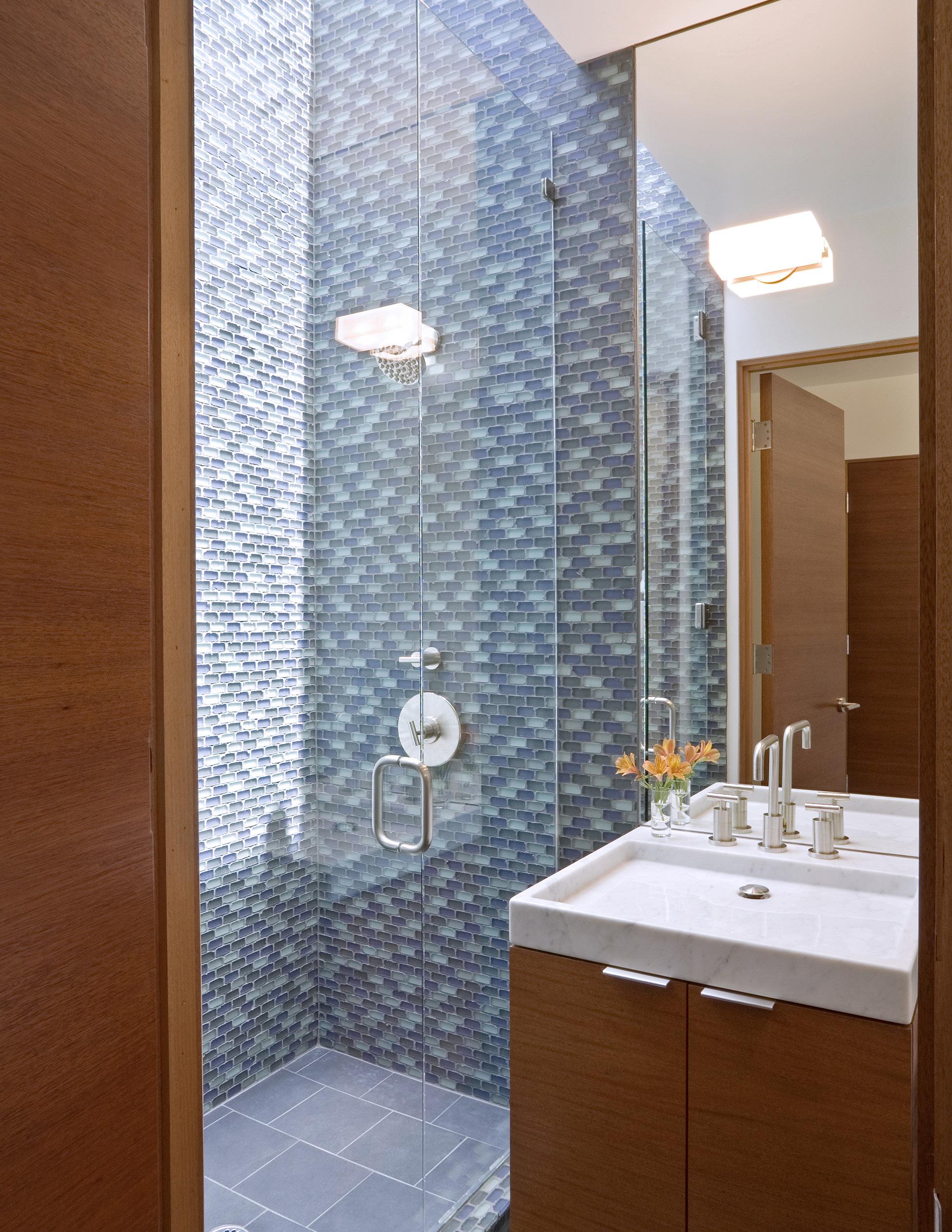
This space draws unexpected natural light from above into the shower and gives life to the architecture while the fixture over the mirror provides consistent illumination when required.
Daylight is a constantly changing, dynamic illuminator. Artificial lighting, generally is not.
Quality architecture should take advantage of the drama of the natural movement of daylight while using artificial illumination to provide consistency, highlights and accents amidst that cycle.

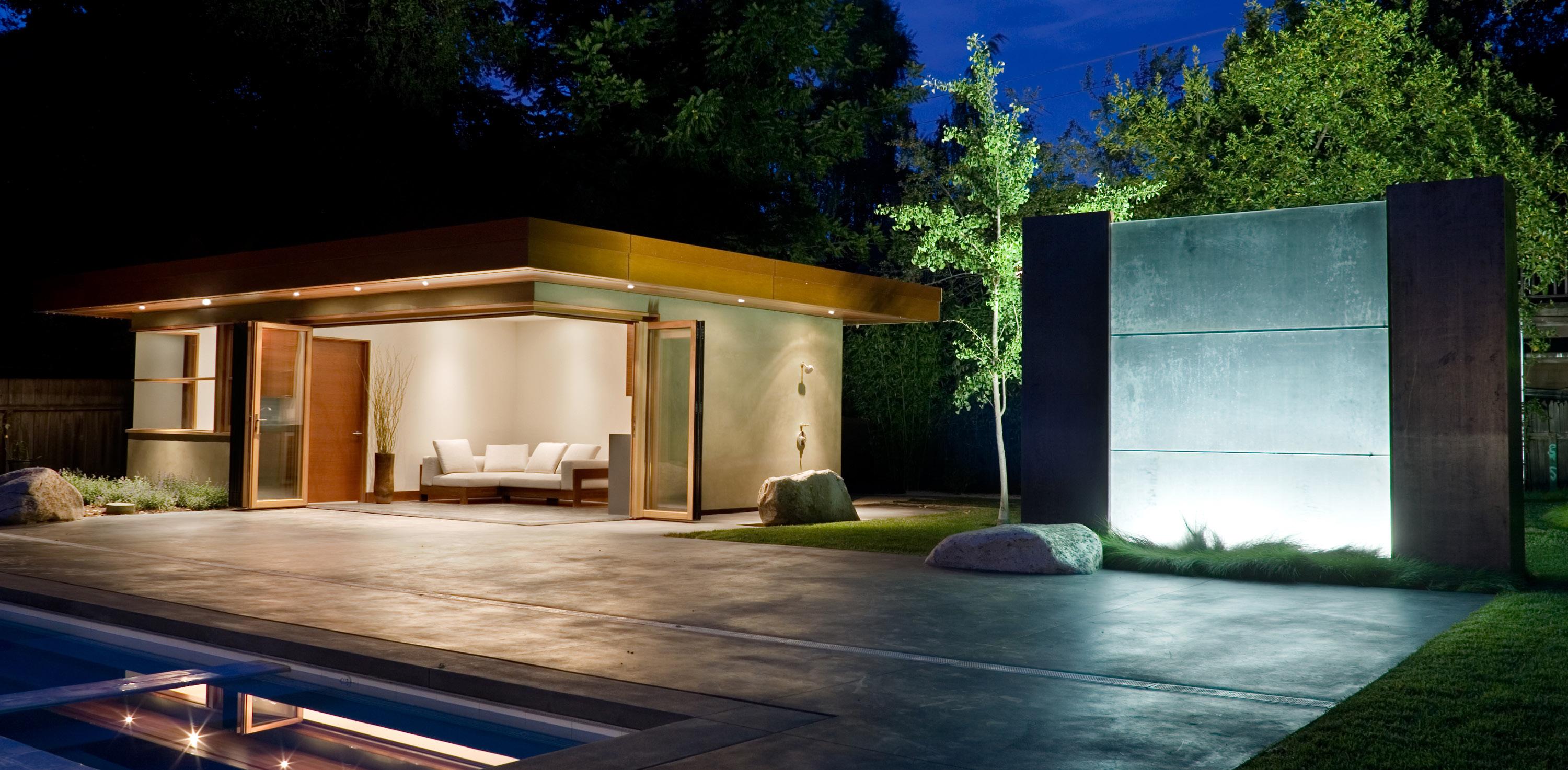
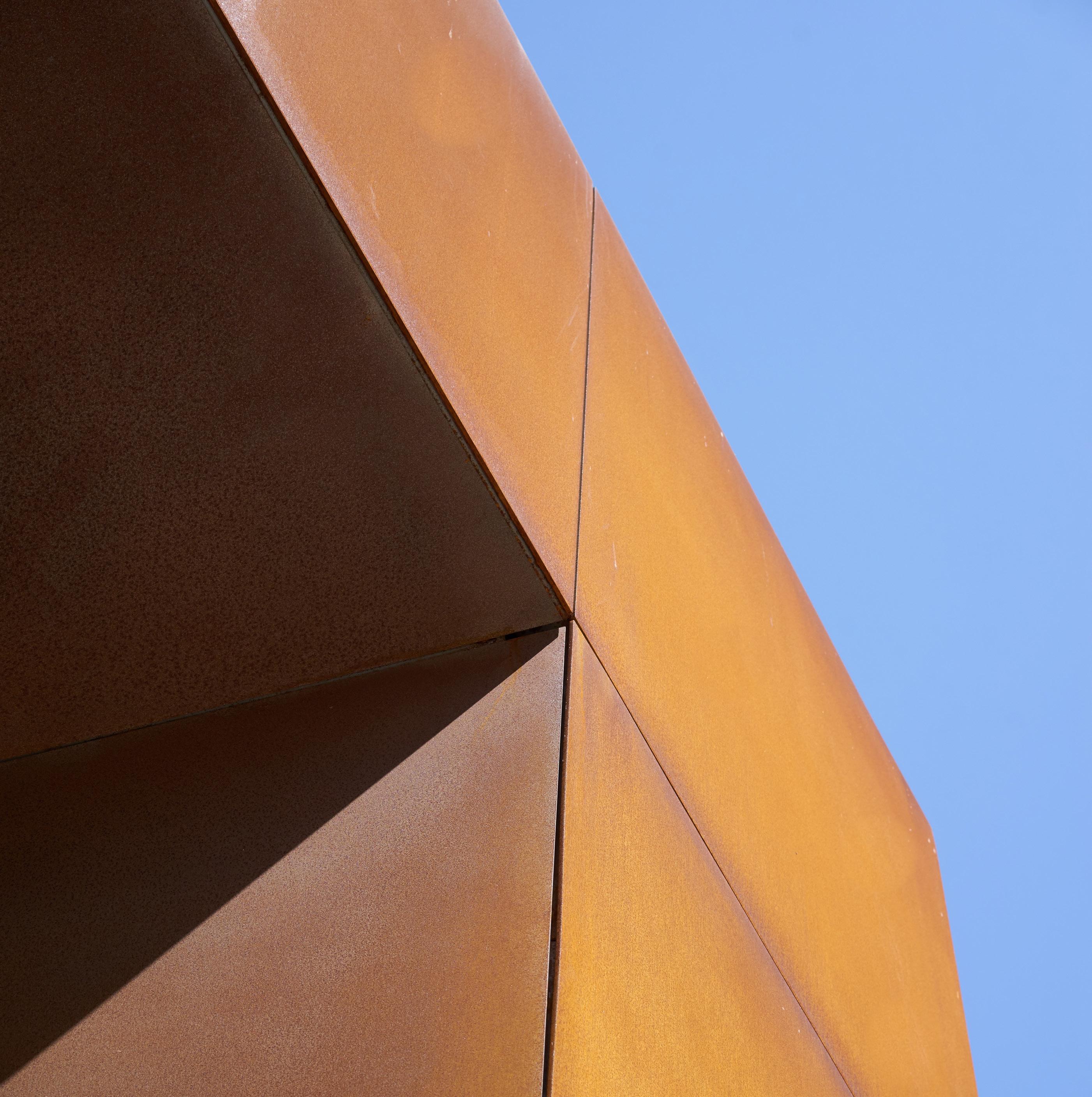
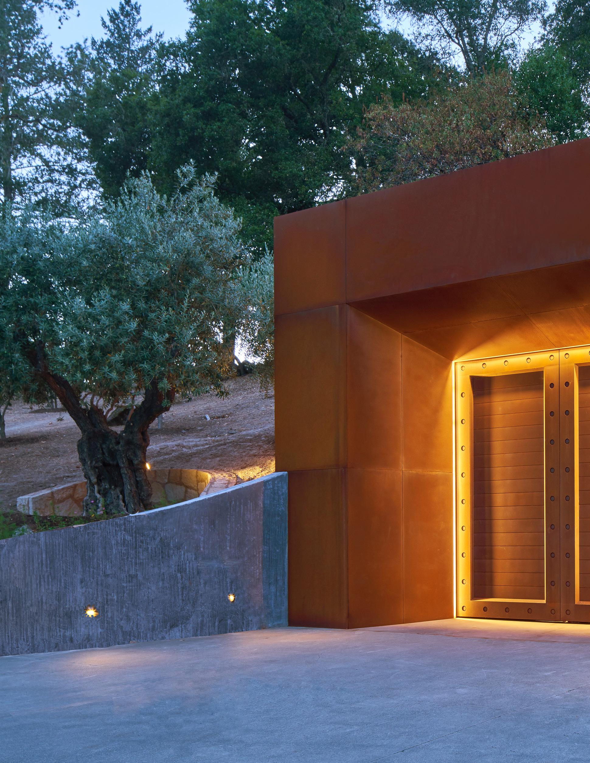
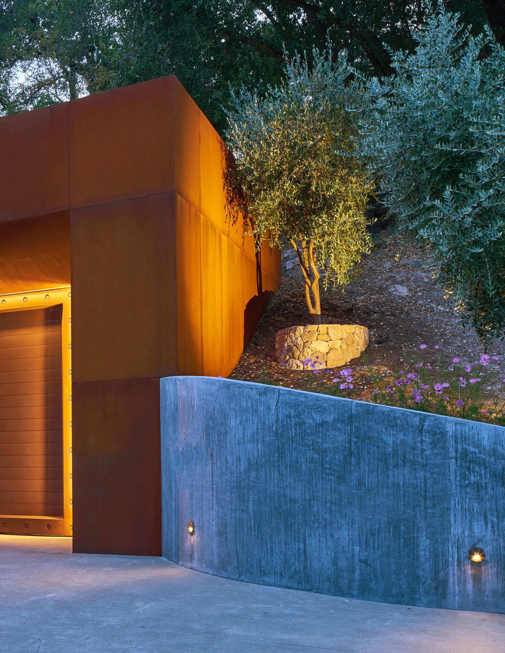
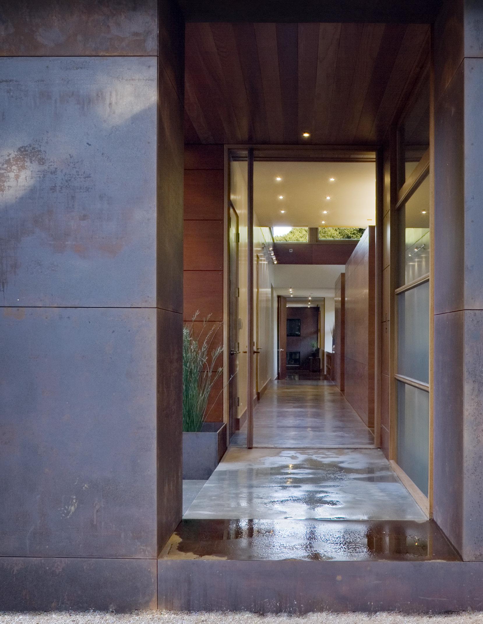
The geometry of the corten steel cube set into the natural hillside is reinforced and its sculptural quality celebrated through a discerning play of light.
The bold light fixtures of this restaurant space define the dining experience as distinct from the serving area through the contrast of their sculptural quality against a more muted background.
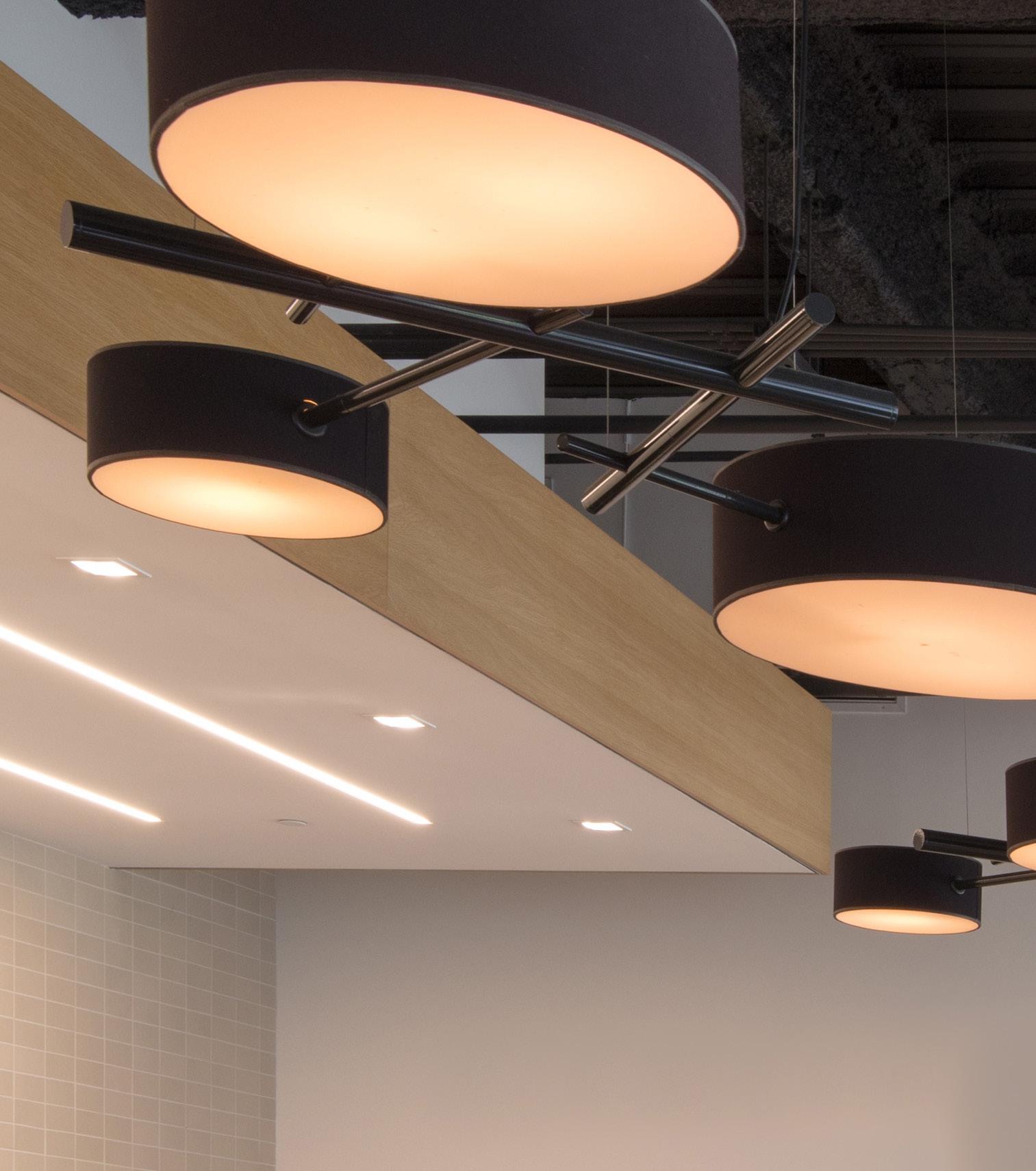
Light fixtures vary in style and expression, many recede while others present opportunities to enhance a space.
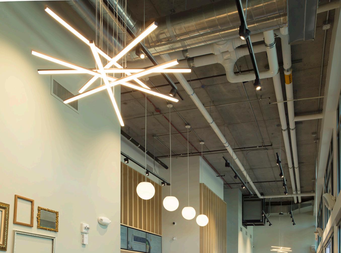
Moments of articulation and delight are created by light fixtures through their luminosity, their color and, most noticeably, their sculptural potential.

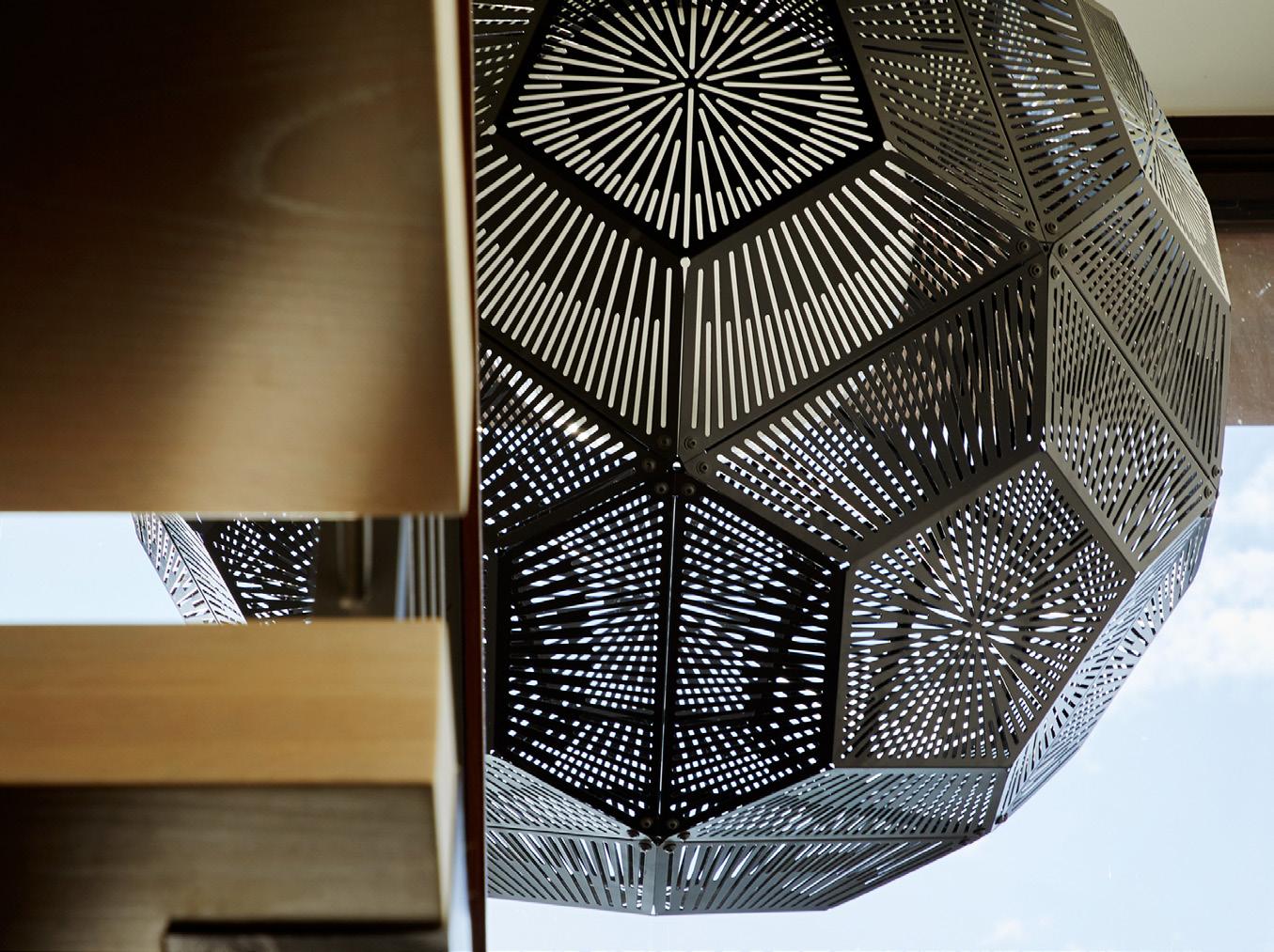


Flow is the connection that occurs between visual elements and architectural components, particularly how they relate to one another as a person moves through a space.
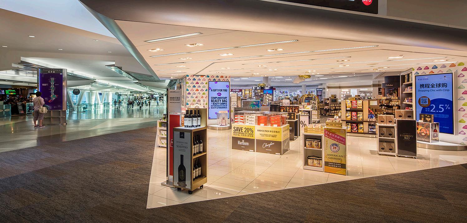
The more clear the communication between these elements, the better the flow will be and the more complete and connected the space will feel.
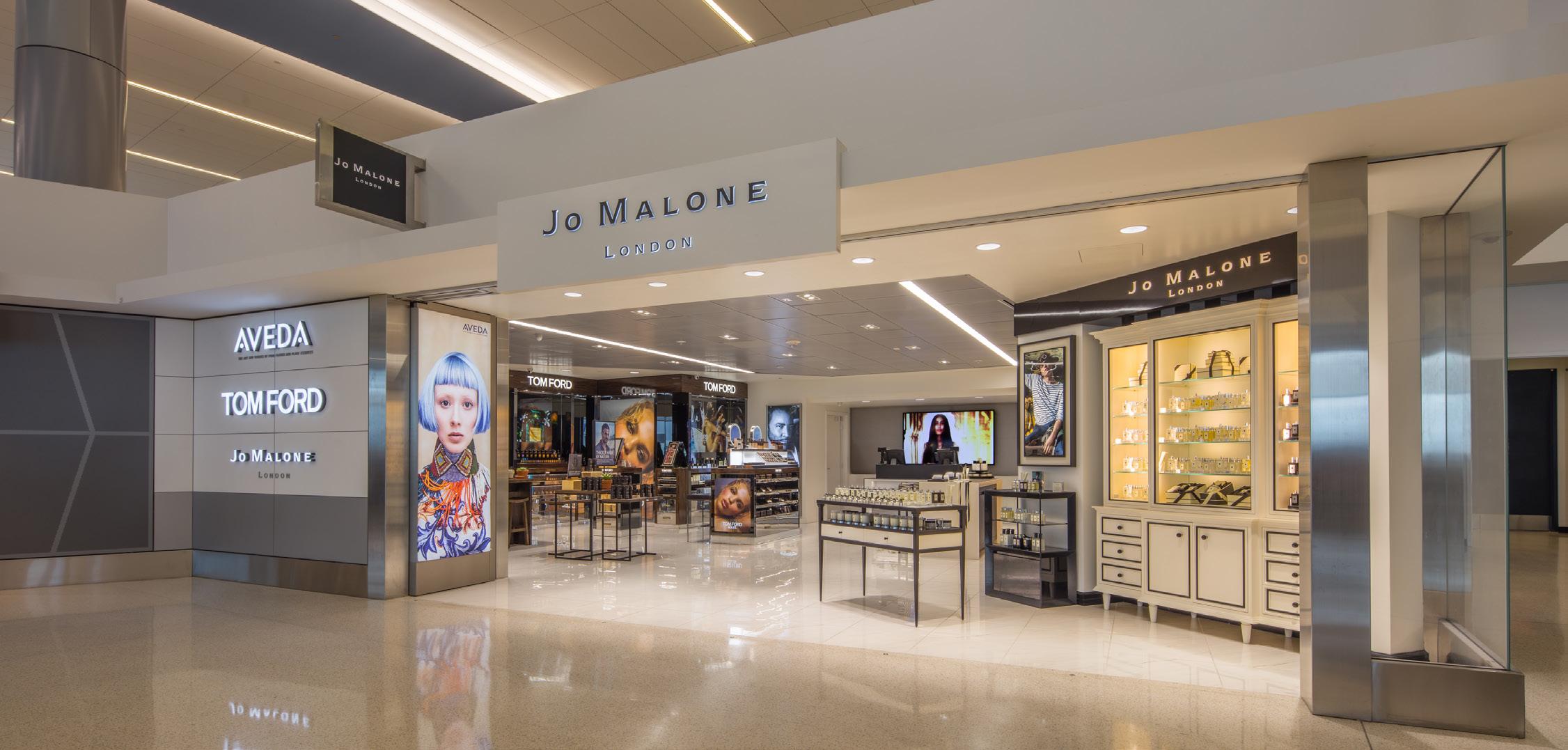
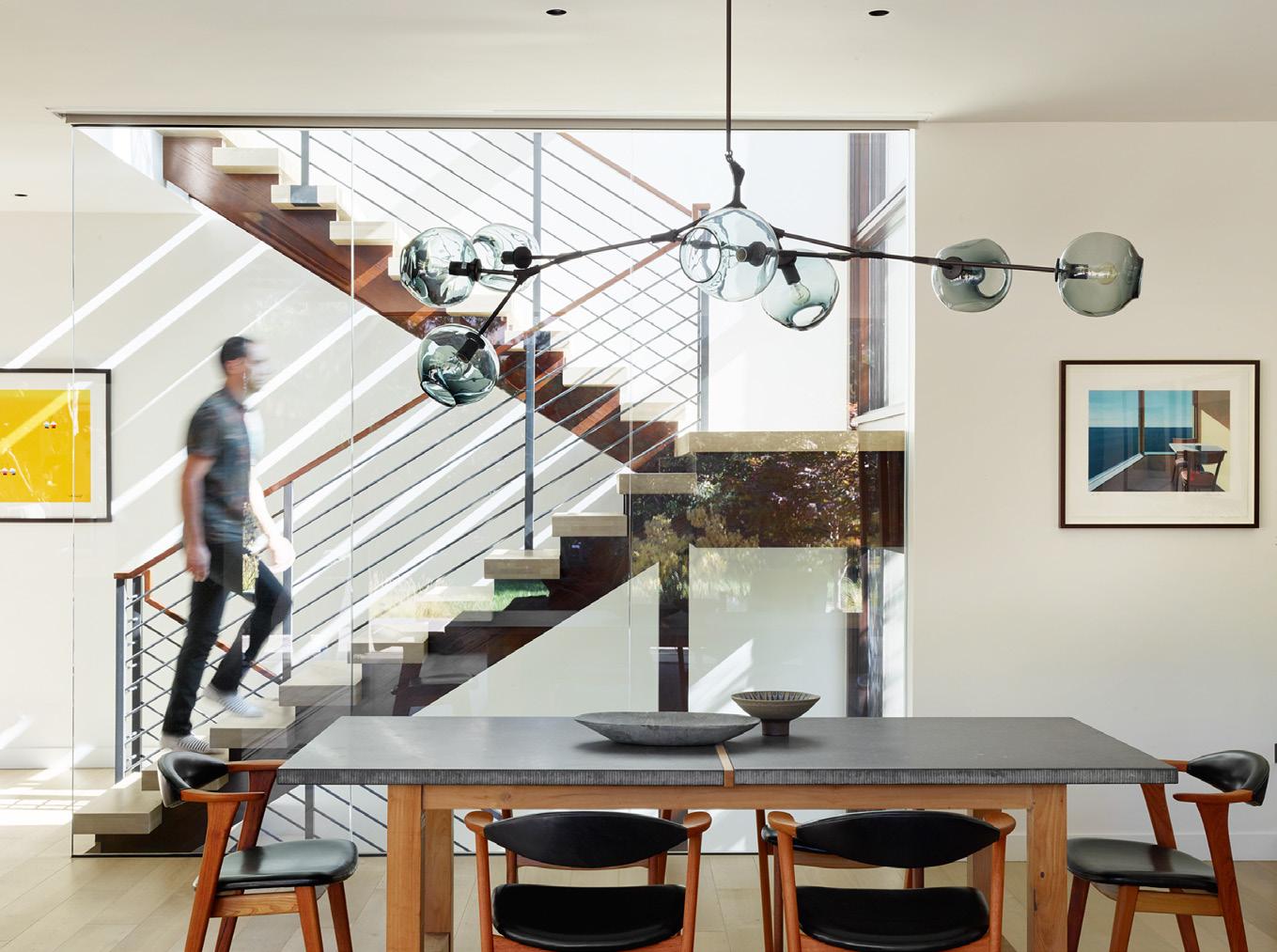
The stair not only establishes the circulation route but is designed so that it facilitates flow between the upper and lower spaces.

The space in this house flows around the focal point of the kitchen which is held below the ceiling, defining a distinct place that is connected to the whole.
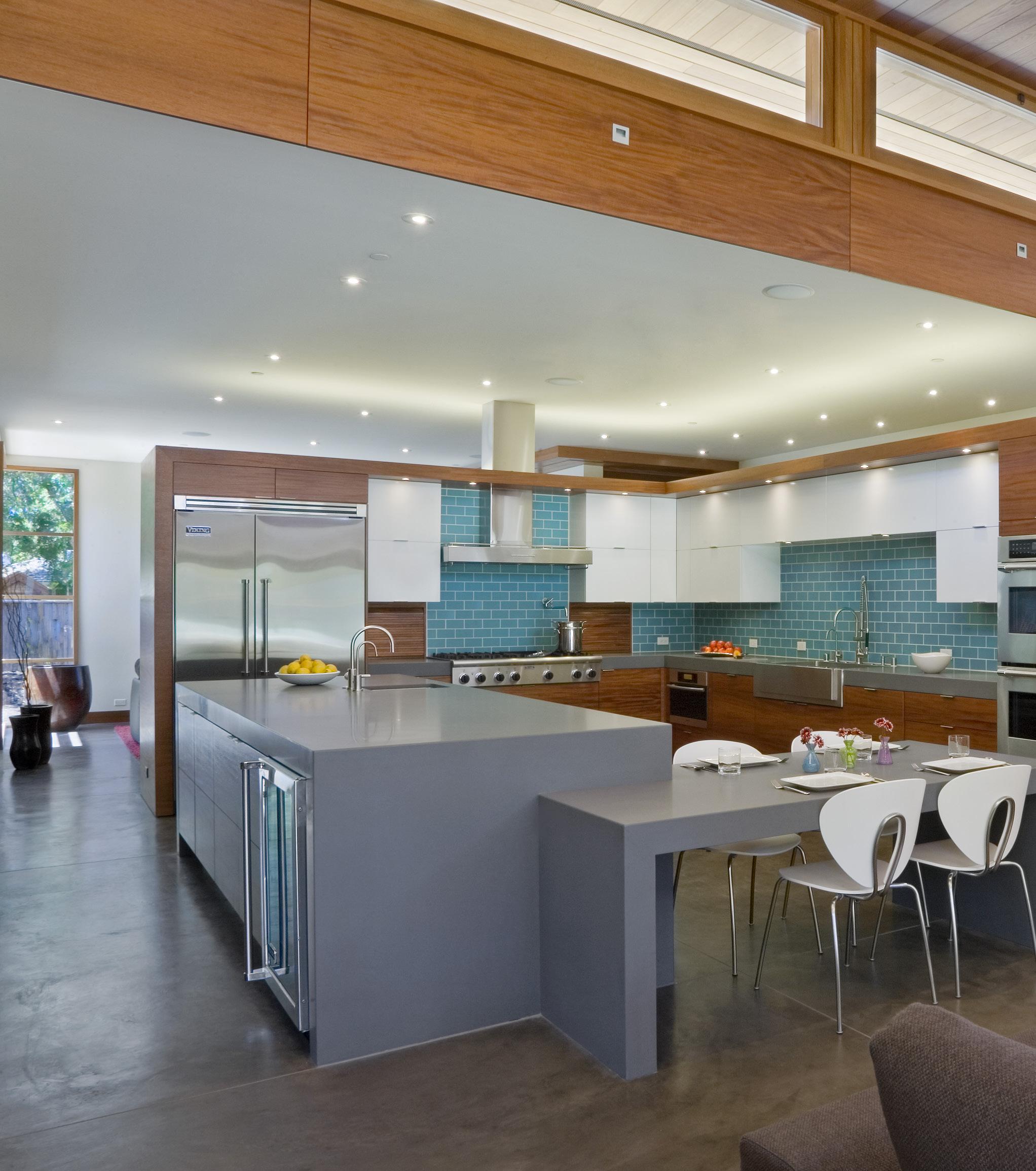
Architecture establishes flow when the spaces around objects are defined within the context of the composition as a whole.
This determines a hierarchy of smaller spaces within a large one and so defines the character of each as parts of a complete design.

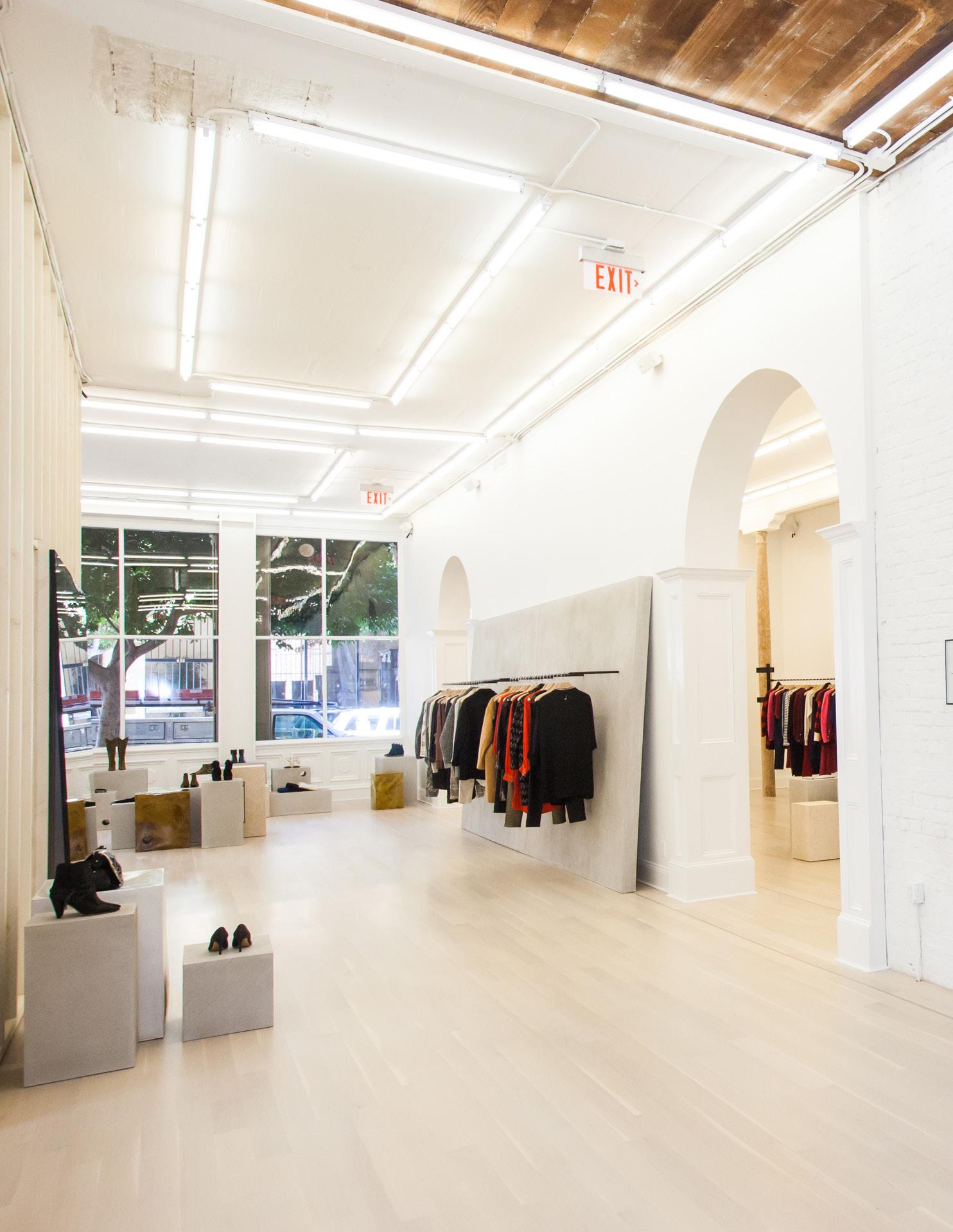
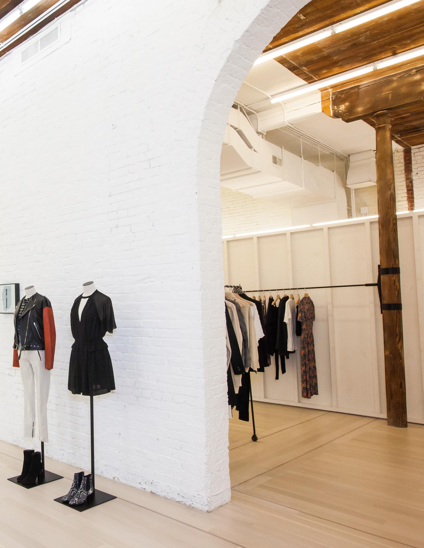
The open, unfettered and minimalist design of this store facilities the free flow of lines of sight and customers from one space to another.
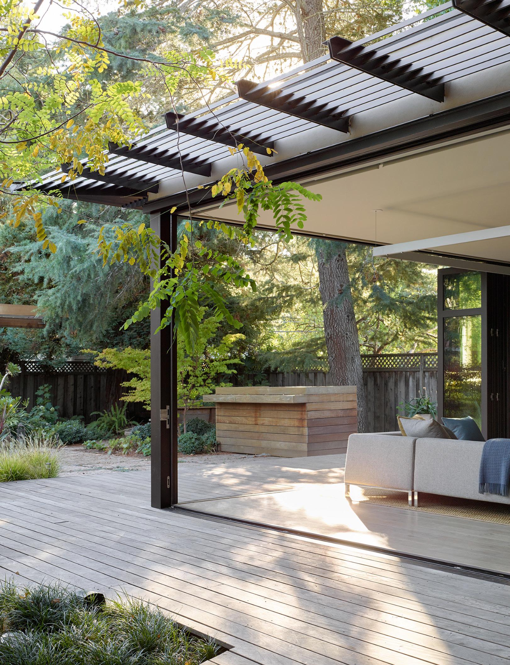
“The


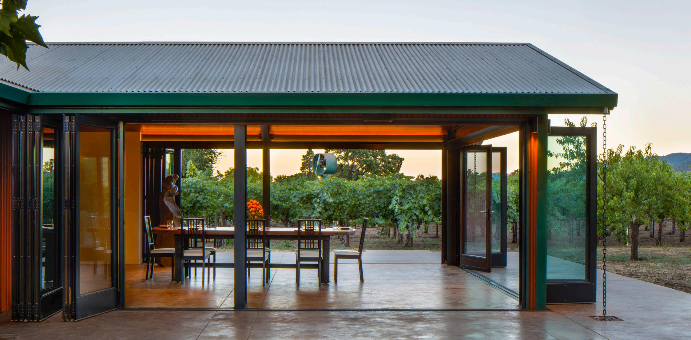
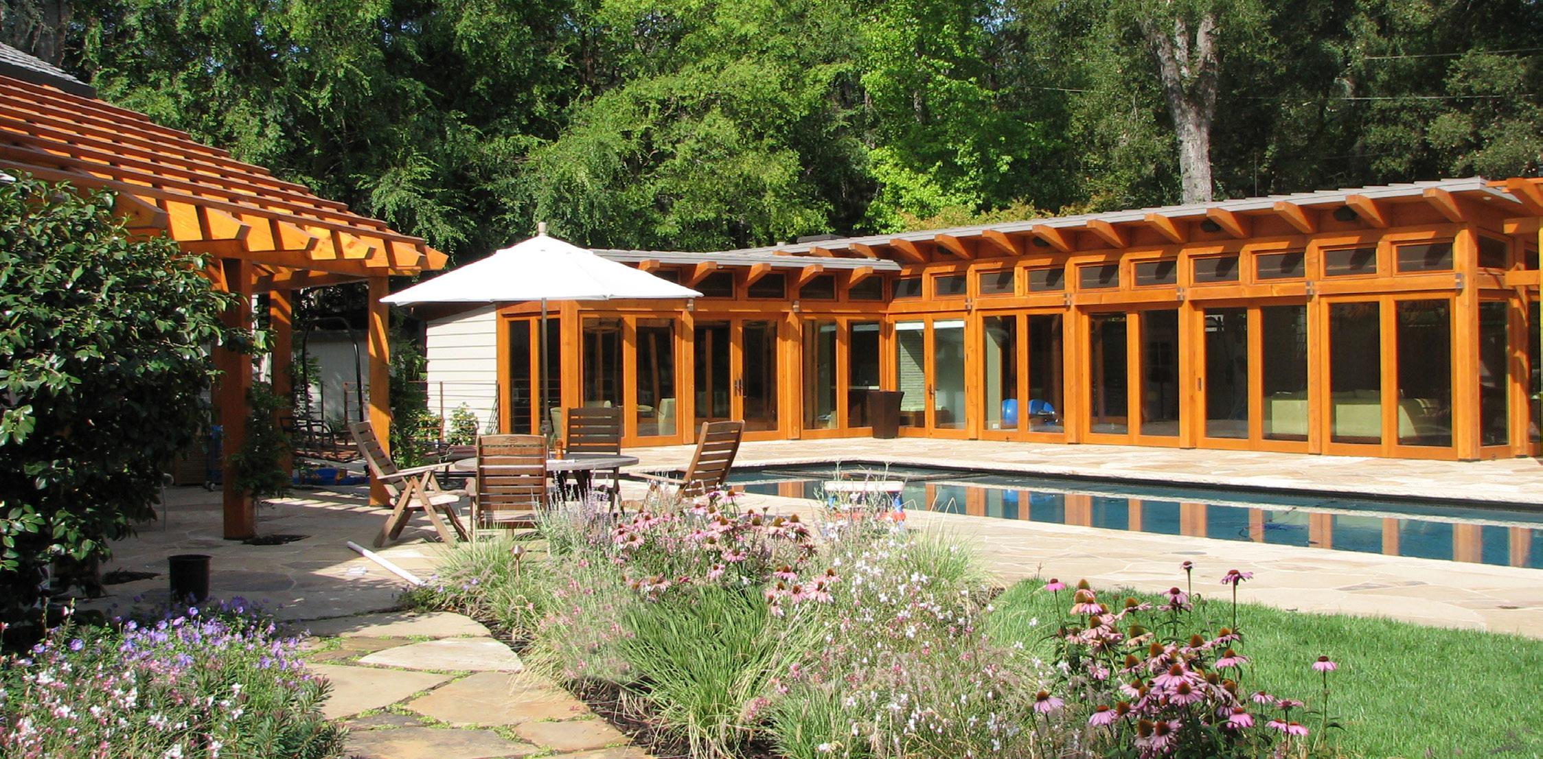
Context, and establishing a connection to it, is important whether it be a natural landscape or the built environment.
The architectural design must relate to and enhance the site as well as those things which surround it.
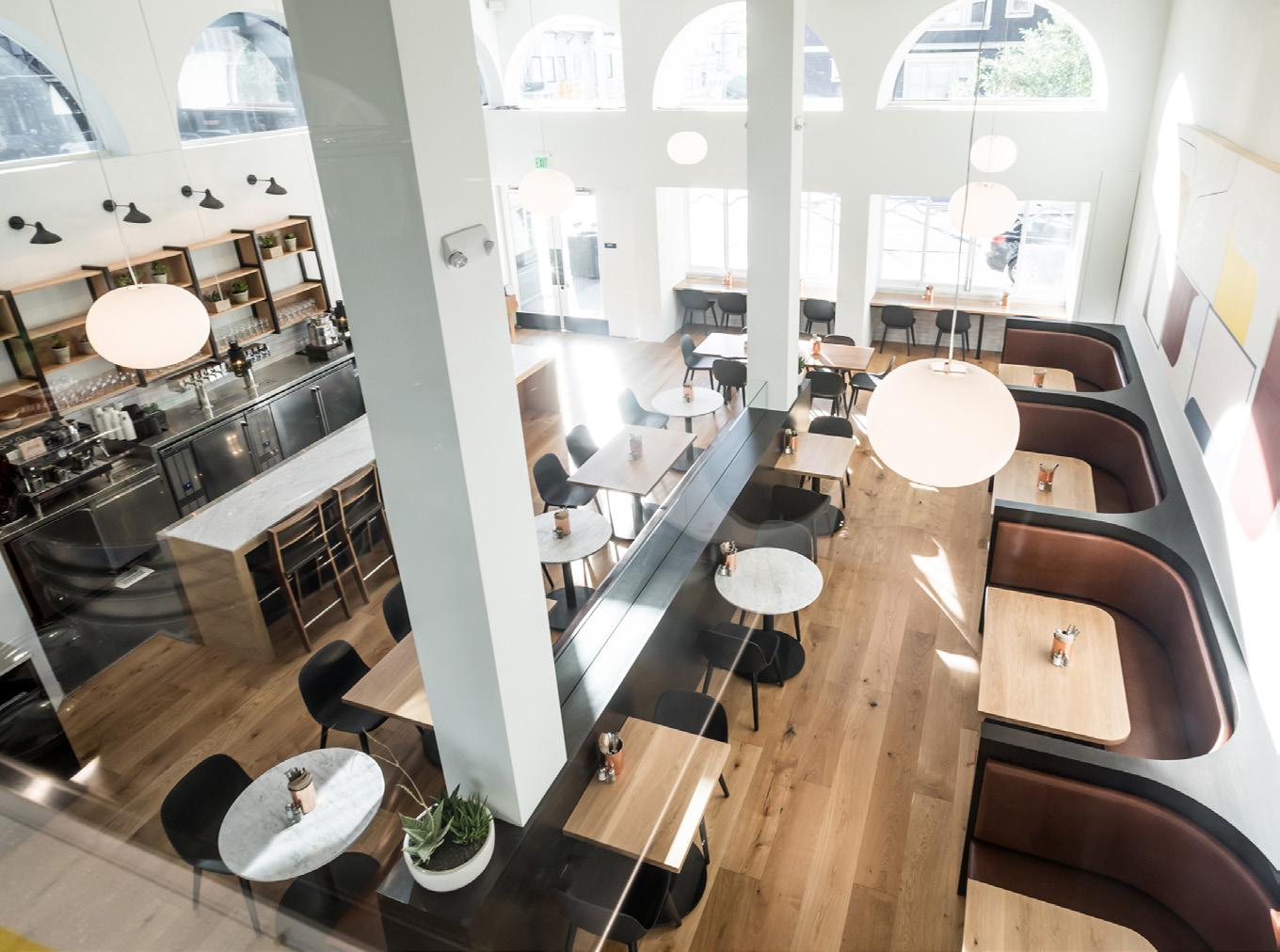
The design of this restaurant draws on the rhythm and character of the building in which it is located while also establishing a unique essence within the whole.
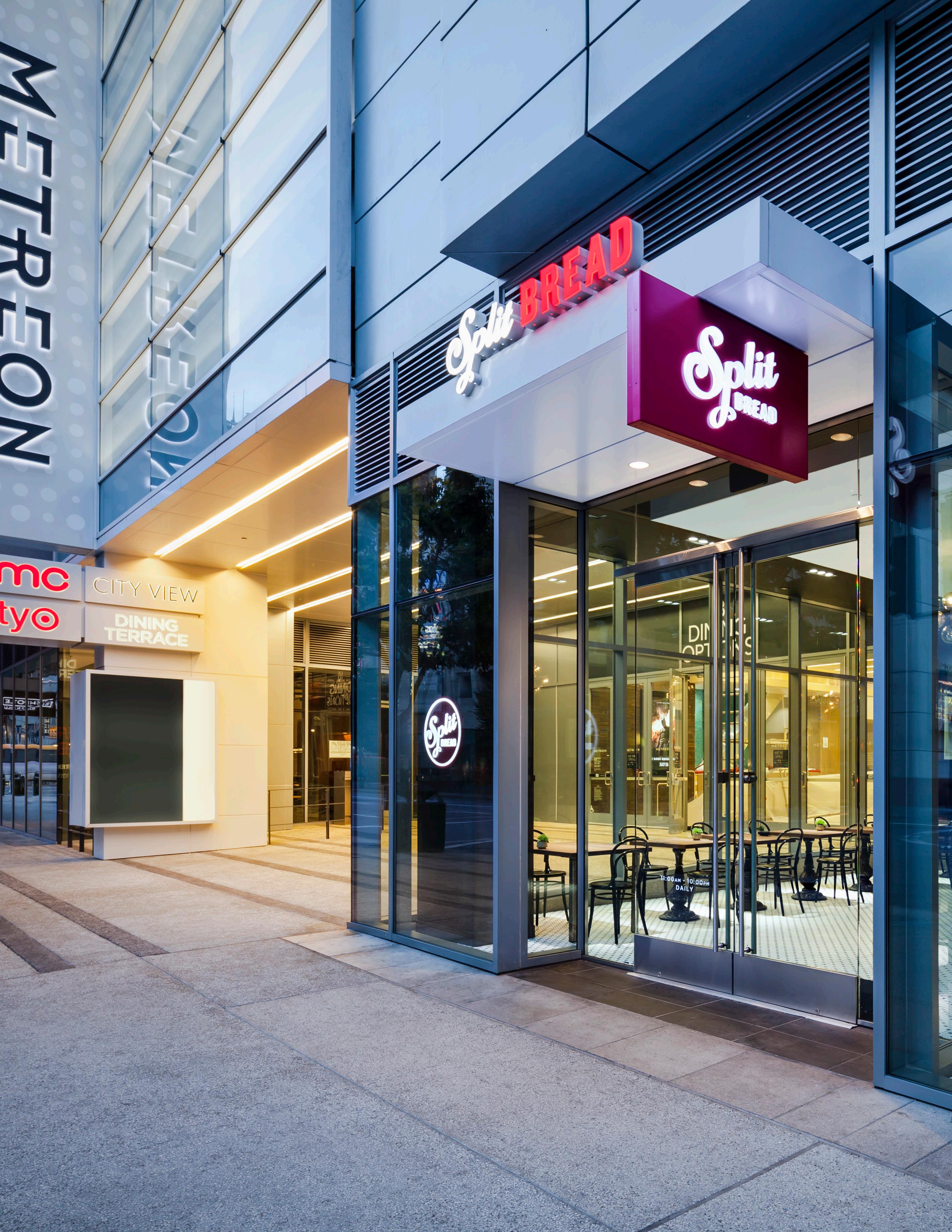
The design of this open-air plaza and the spaces within it are driven by the context of, and a desire to celebrate, the beauty of the existing architecture.
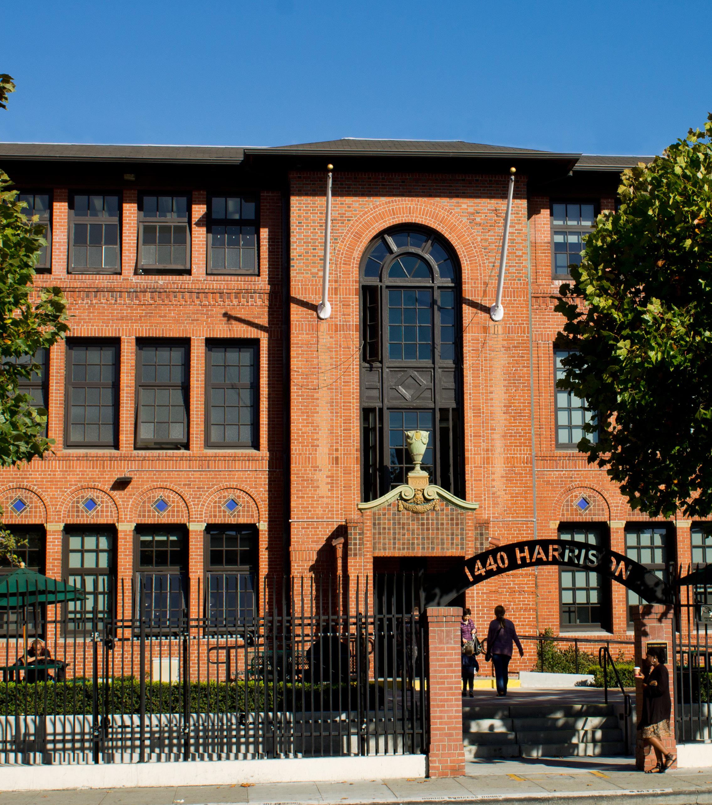
Context is felt from both the inside and outside of a building.
The design can respond to its context by blending in or by standing proud but should always coexist with it in harmony.
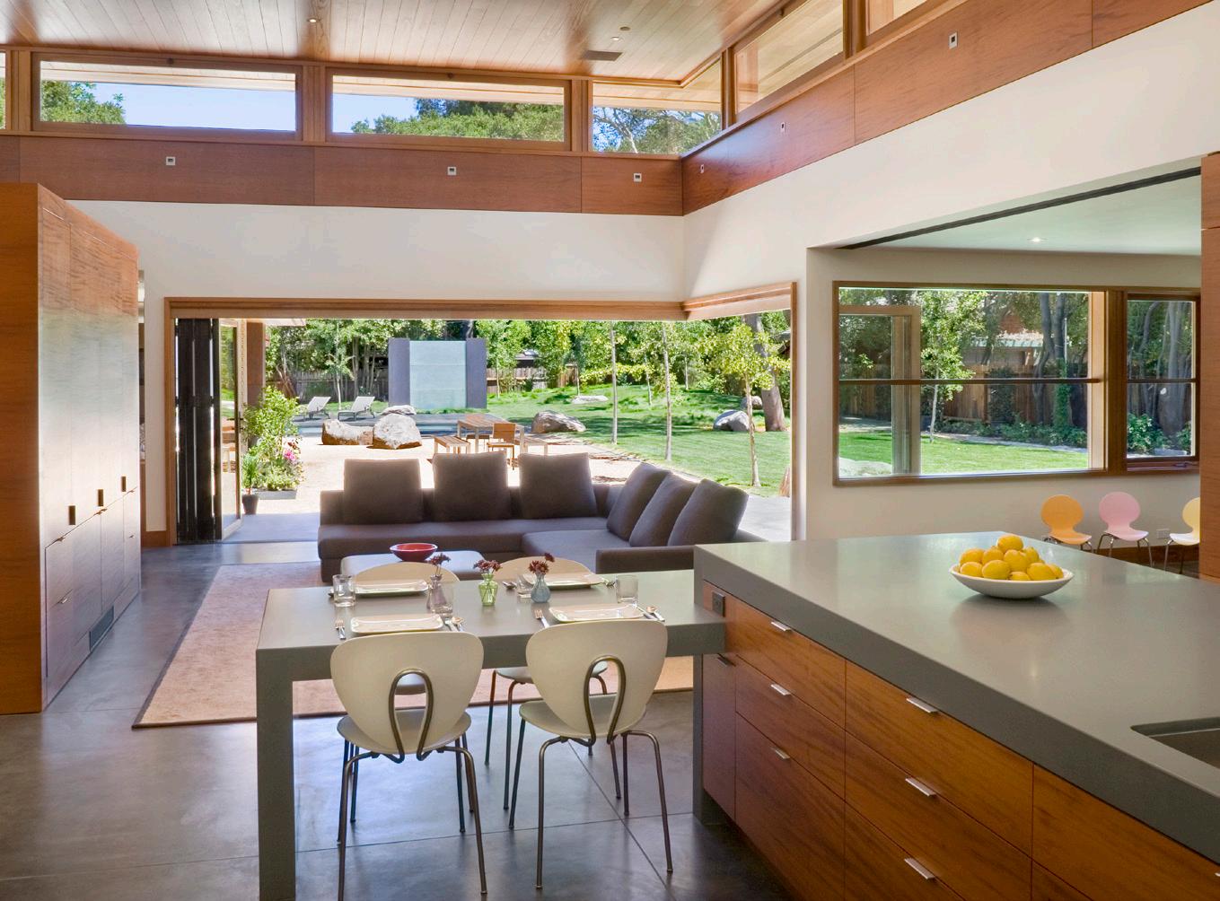

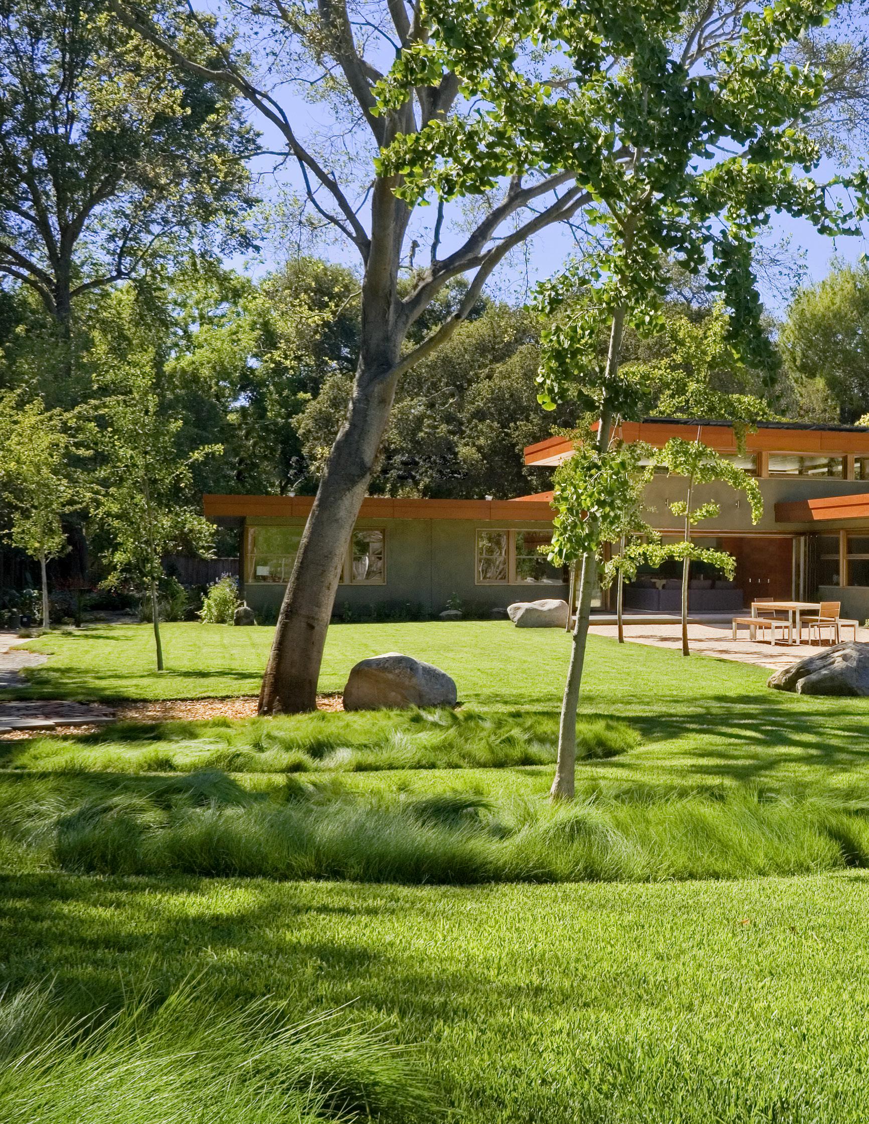
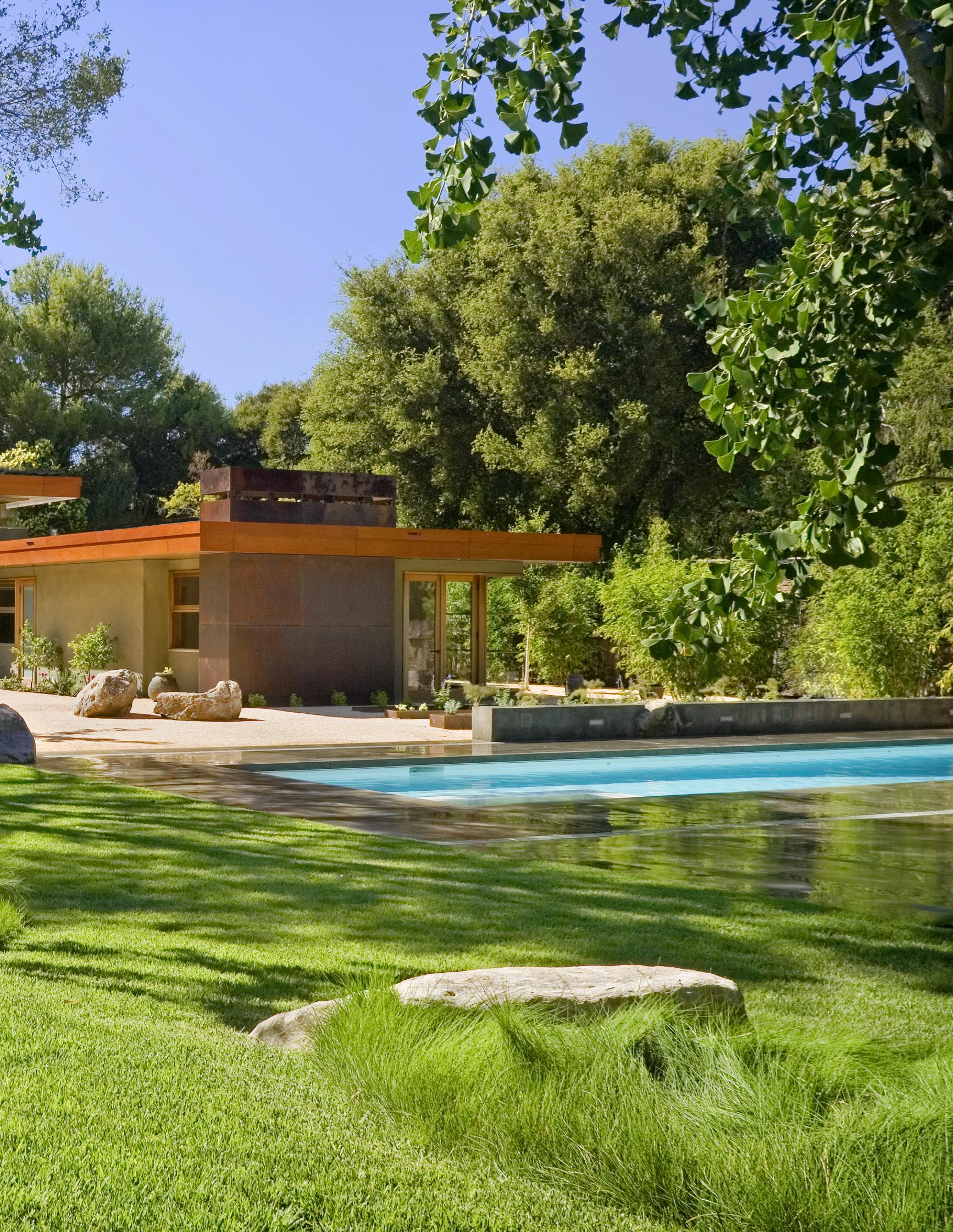
The bold, rectilinear geometry of this design is heightened when viewed in its context of trees, grass and planting. The landscape and geometry compliment one other and are both enhanced by their interplay.


noun | de·sign | \di-’zīn\ adj | sen·si·tiv·i·ty | \,sen(t)-se-’ti-ve-tē\
“The care with which a design connects to a specific context.”
RESTRAINT
ELEGANCE
SIMPLICITY
TIMELESSNESS
CONTEXTUALITY
ECONOMY

“The conscious limitation of design elements to reinforce the essence of the design concept.”


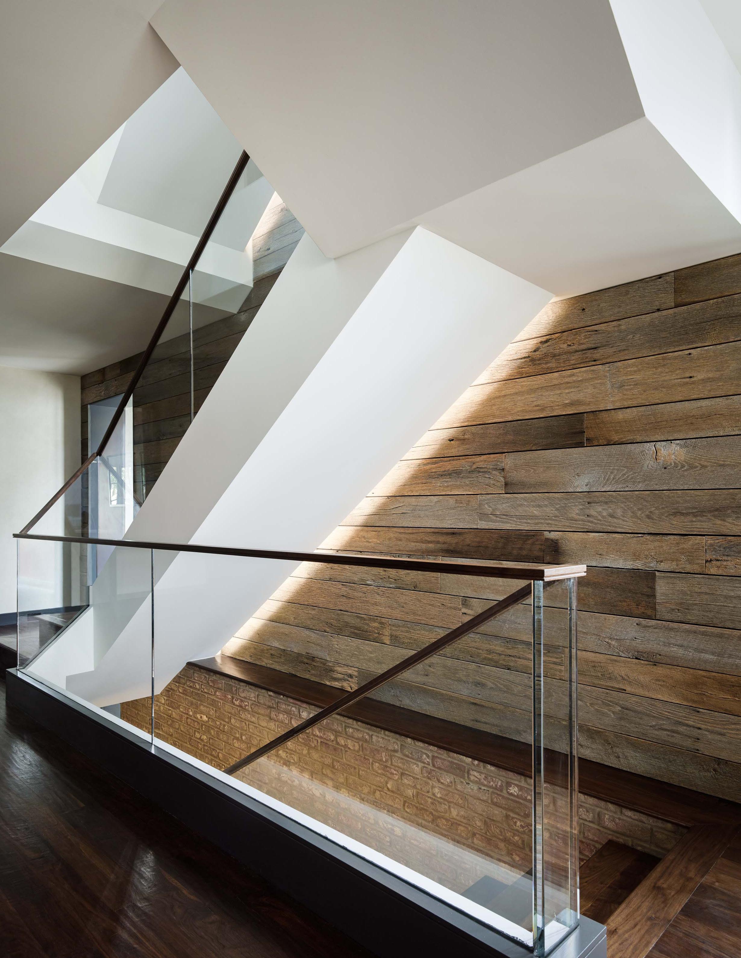
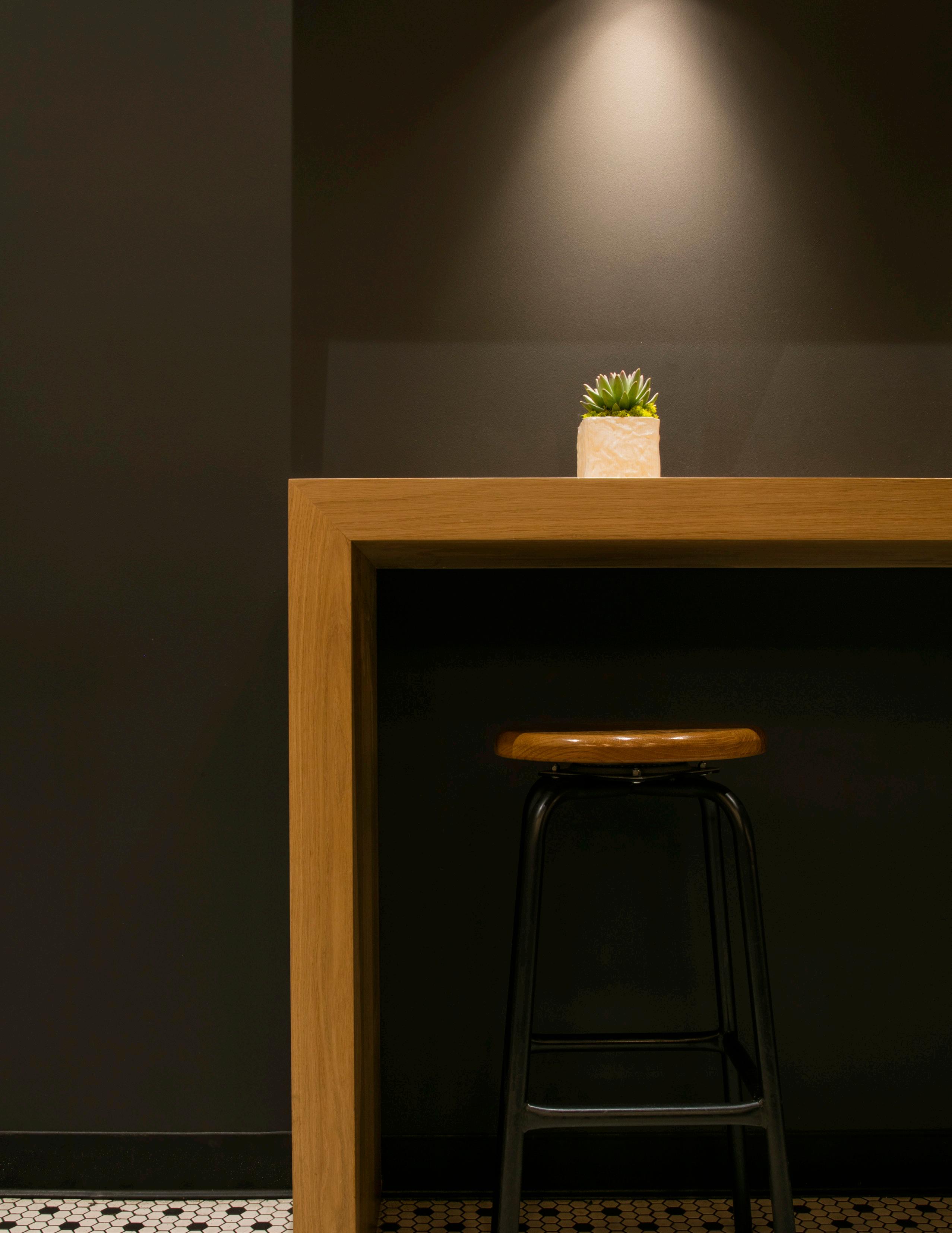
Clean lines and a lack of ornamentation give the architecture a purpose that is clear and deliberate.
The essence of a design, and power of its concept, can be accentuated through the limited and strategic use of detail.
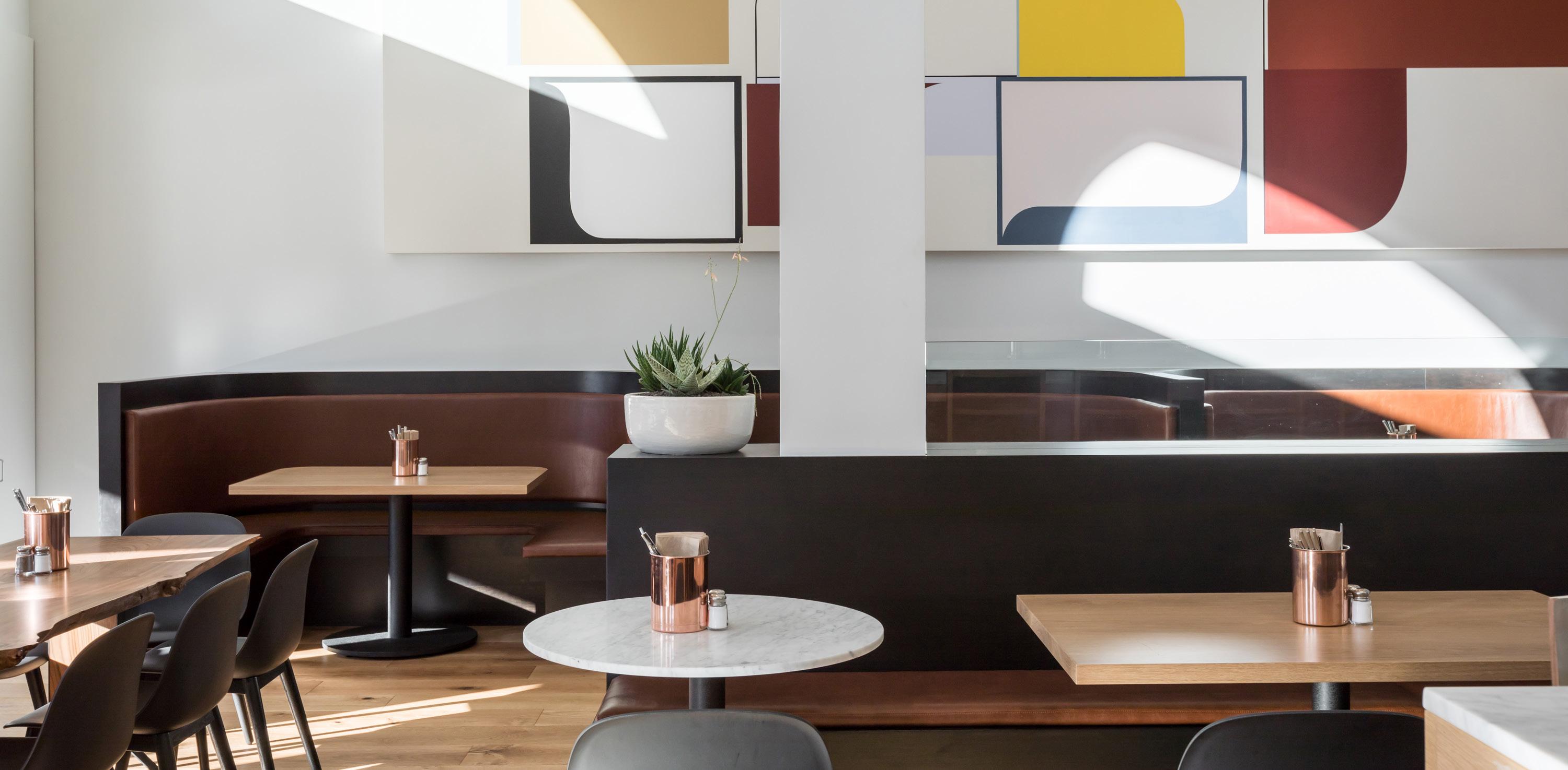
The temptation to embellish with excessive expression should be controlled; it should be employed with care and only to enhance the design concept.
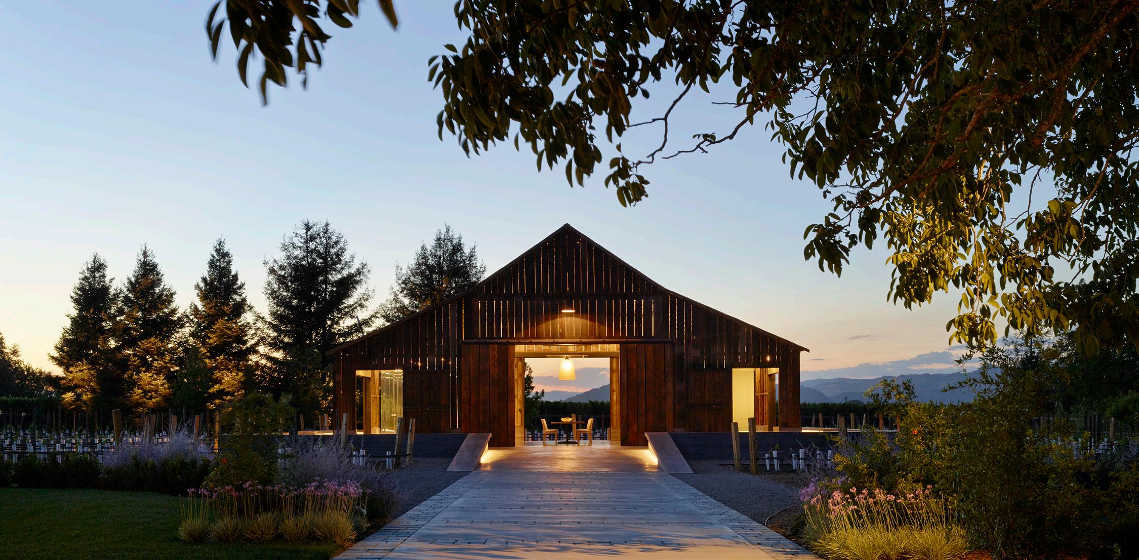
Restraint is about being selective with the number of “moves” that are made in an architectural composition.

The execution of each move promotes its importance especially when judicious consideration is given to how it enhances the overall design.
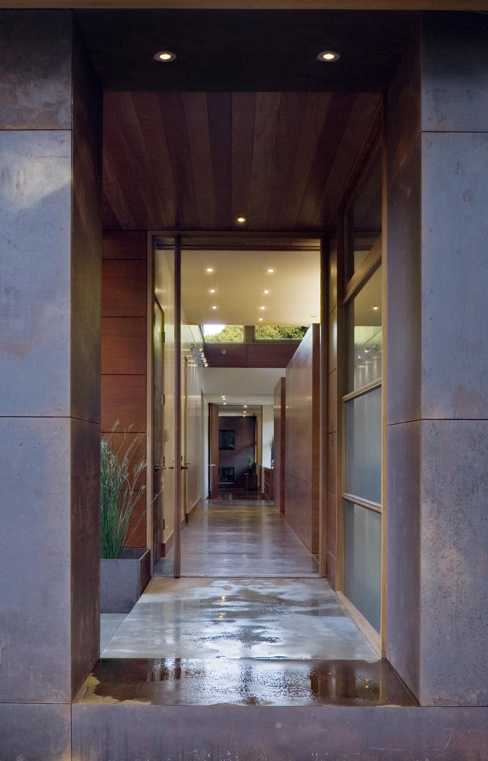
The simple detailing of the wood-clad box under the canted canopy roof helps accentuate the energy of the big move of the building on the site.
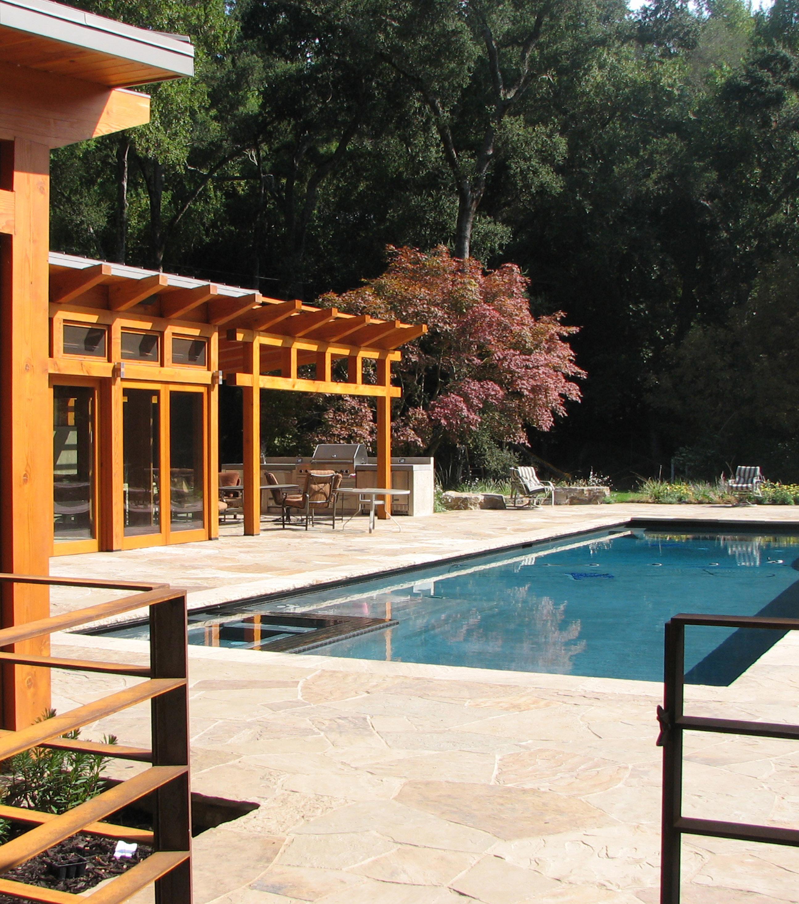
The vibrancy of the architecture is generated by the interplay of forms and their respective materiality. Their shape and detail are only as complex as is necessary to form a dynamic interaction.
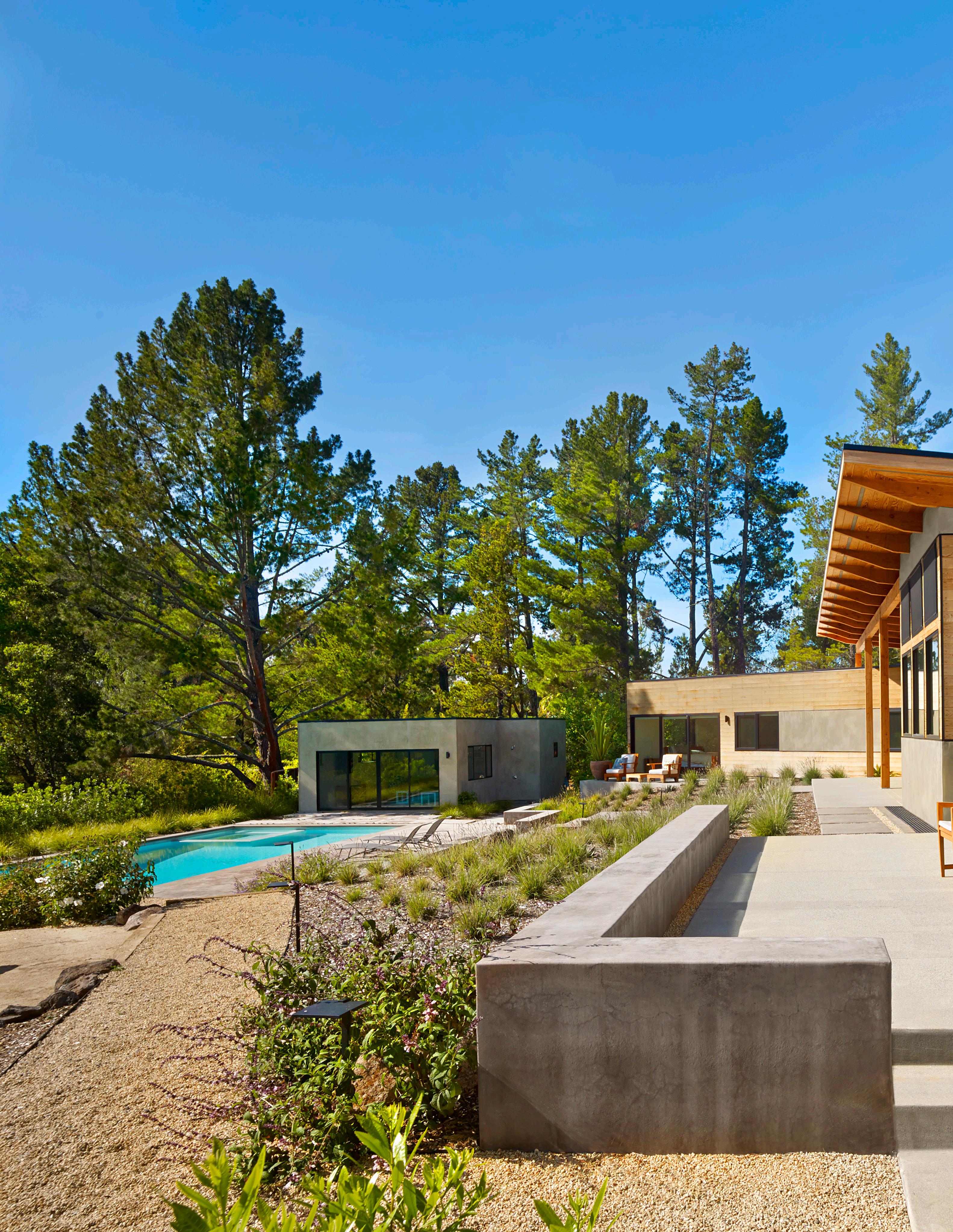
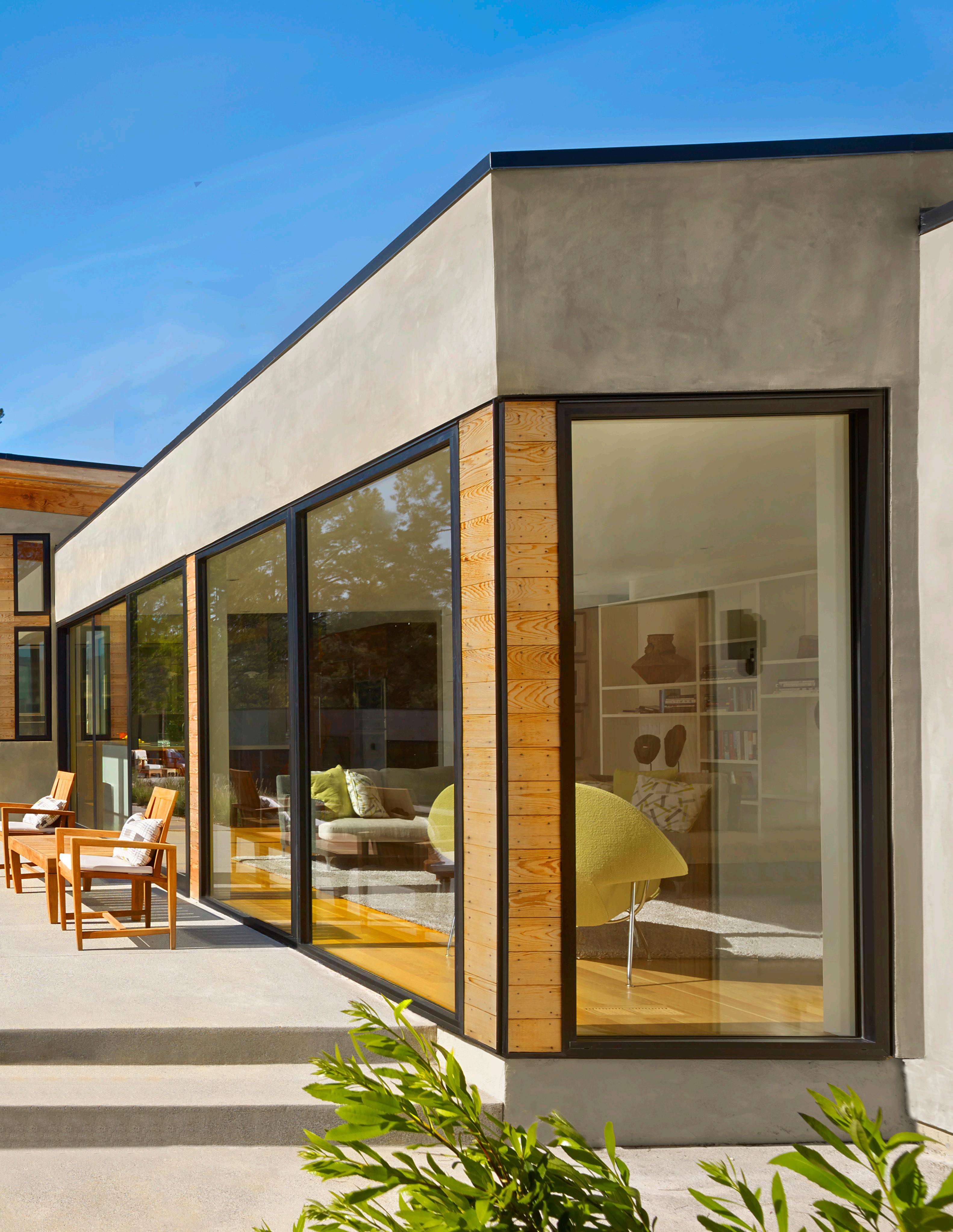
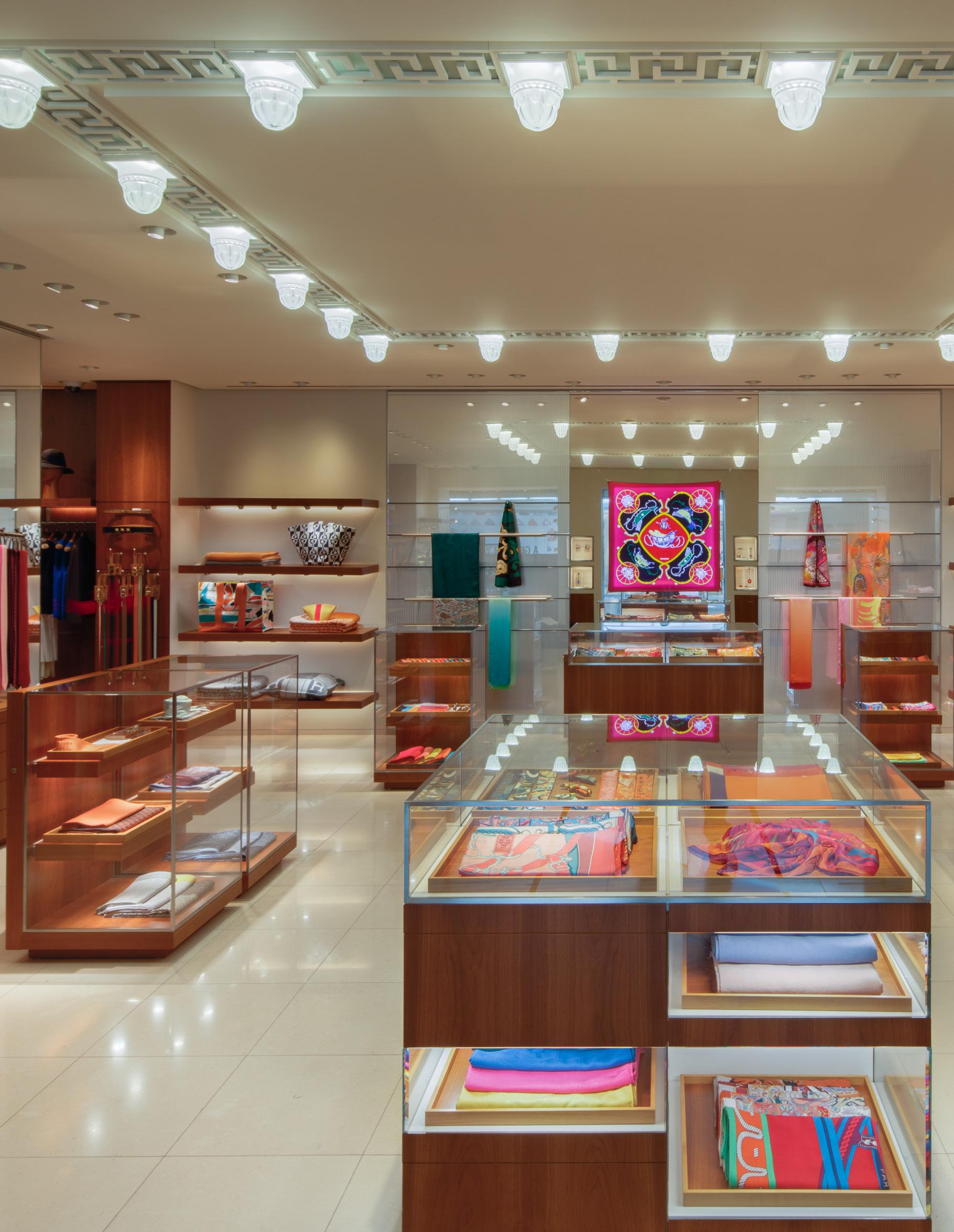
noun | el·e·gance | \ˈe-li-gən(t)s\
“The careful confidence and aesthetic refinement of compositional elements.”


Elegance in design is similar to elegance in fashion; it is the comfortable, confident and rigorously refined synergy between compositional elements.
Successful elegance feels effortless but is a meticulous and iterative process as in the effort involved in establishing the proportion of a cabinet, the stain on a floor, or glaze of a tile.
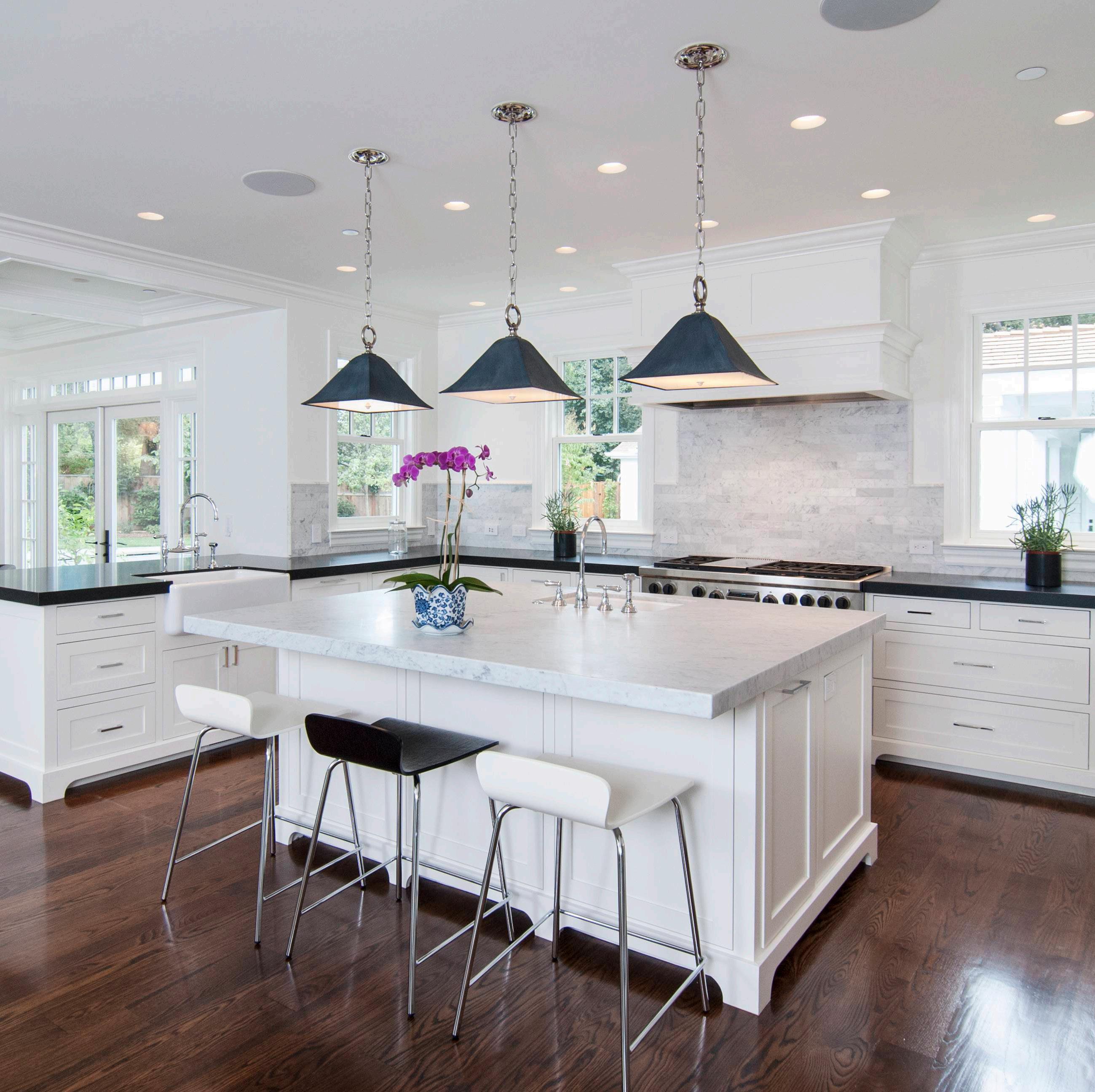
The harmonious interplay between the hues, tones, brightness and reflectivity of this space afford it a serene elegance.
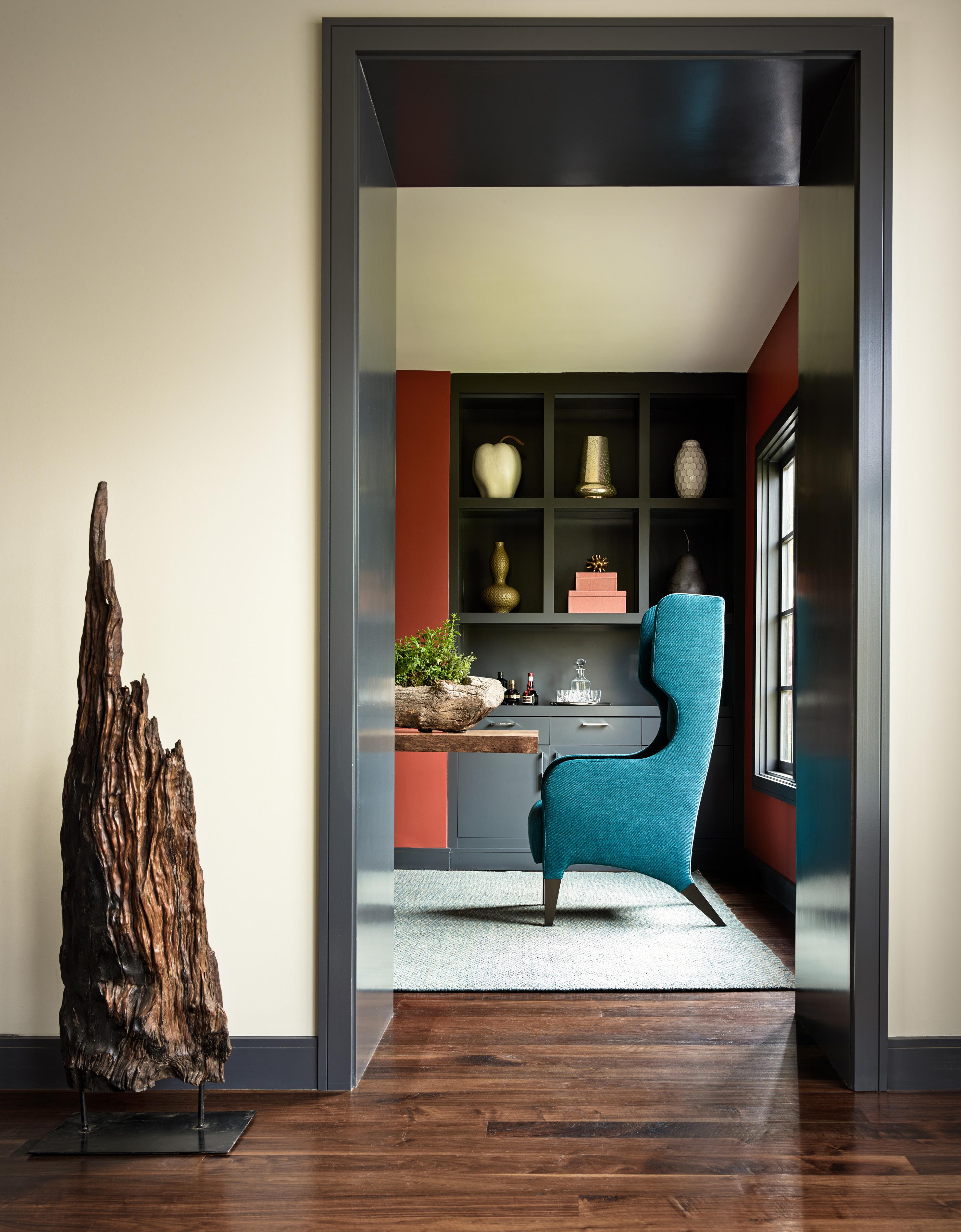
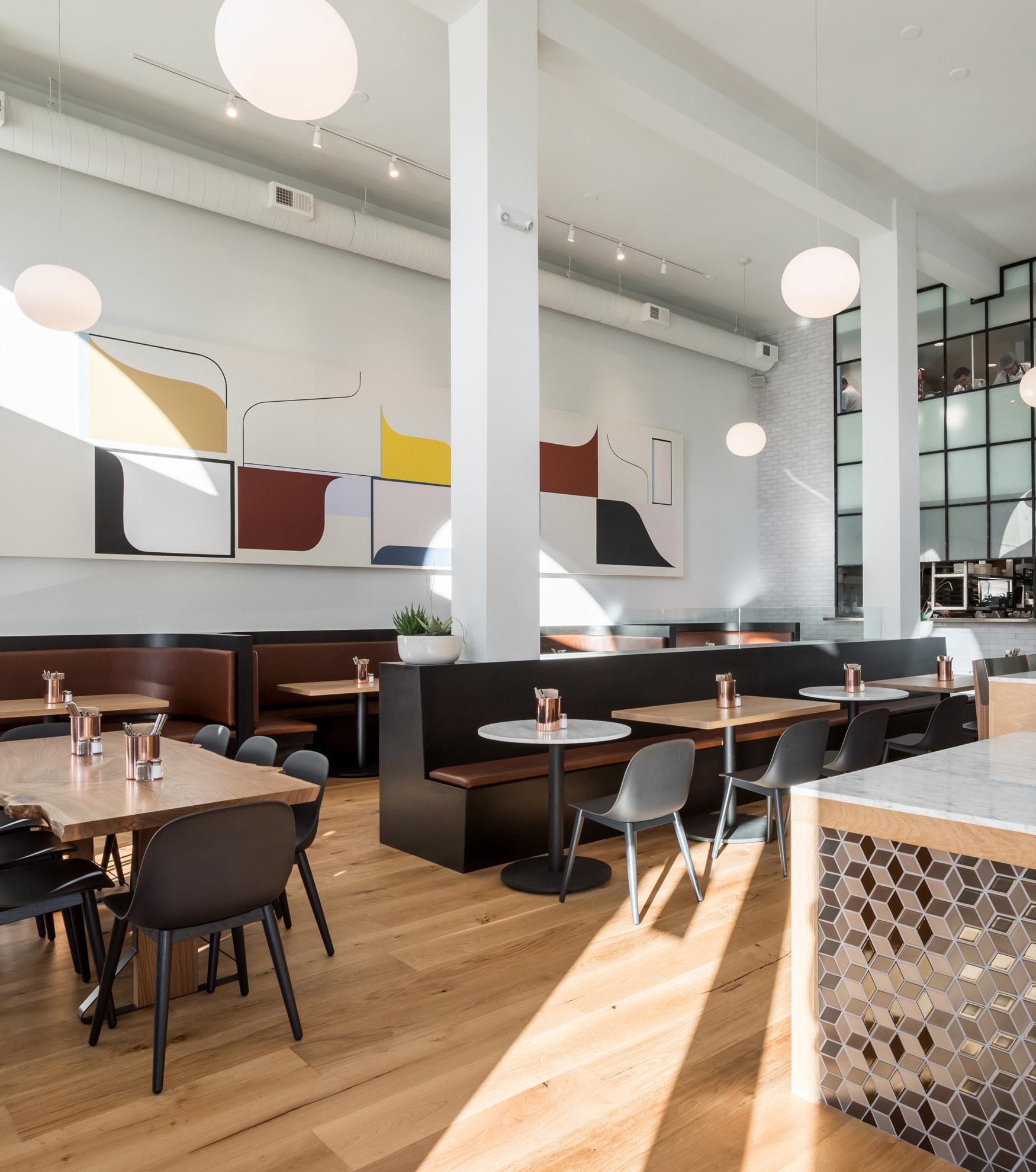
Elegance often achieves its finest expression within the interior environment.
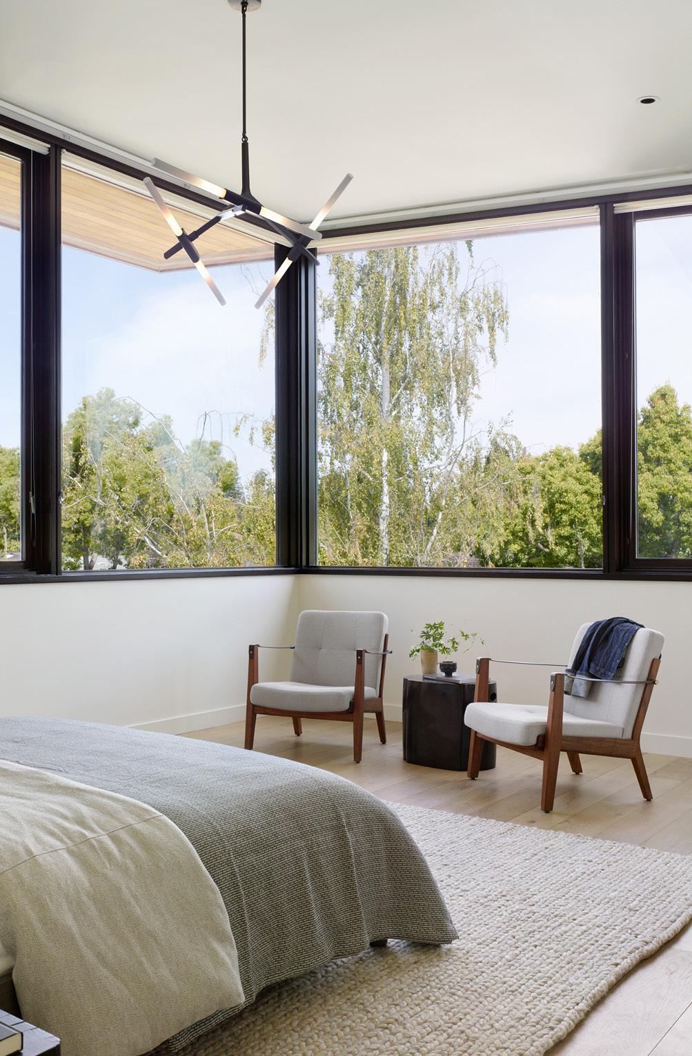
Collaboration and symbiosis with the interior designer is key to achieving architectural elegance throughout the project.

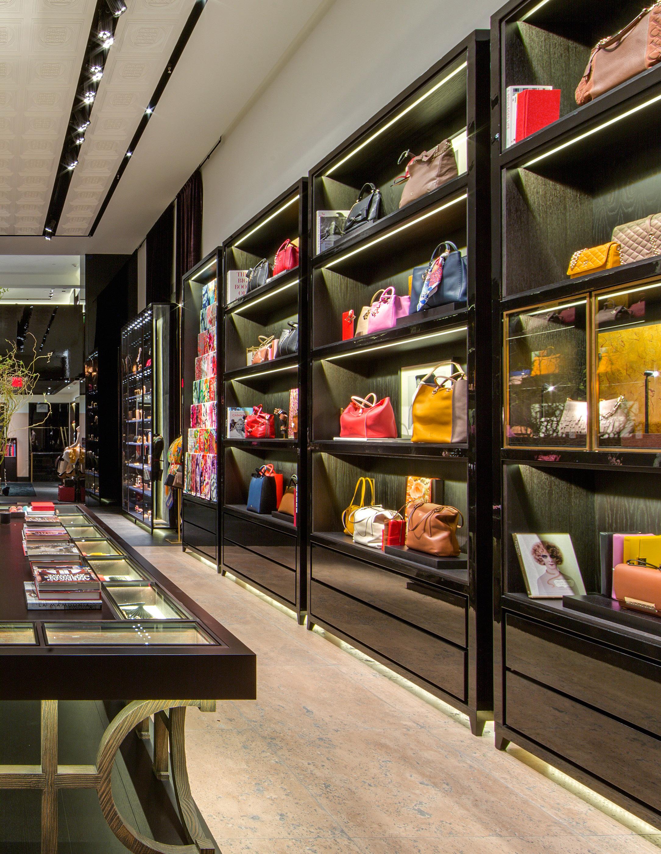
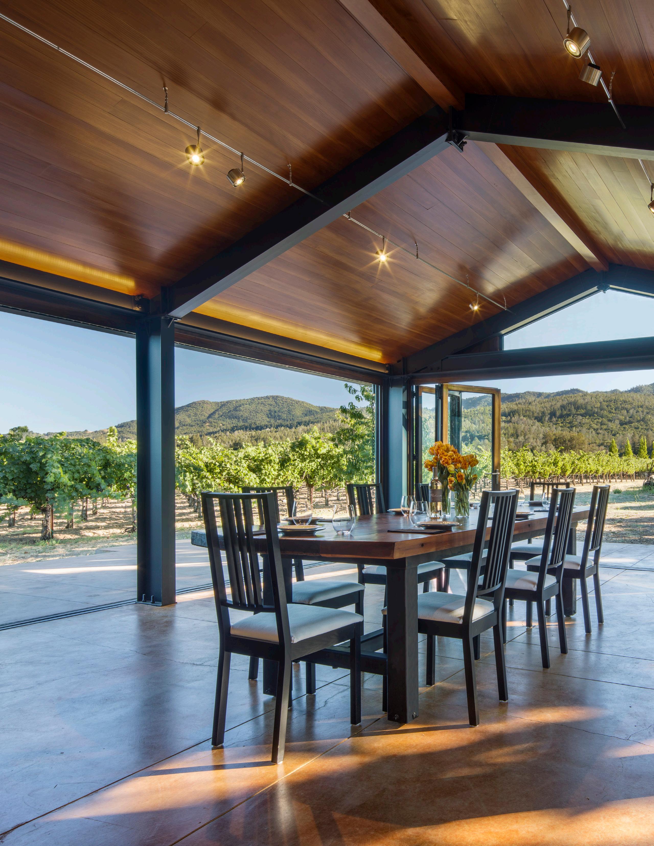
Elegance in this luxurious space is realized through proportion and balance, tone and texture, rich materials, quality finishes and curated lighting.

“The


There can be a tendency for designers to seek unnecessary sophistication in their work believing it will enhance or improve the overall concept.
Keeping it simple is often more appropriate; simplicity augments and articulates the power of a design solution.

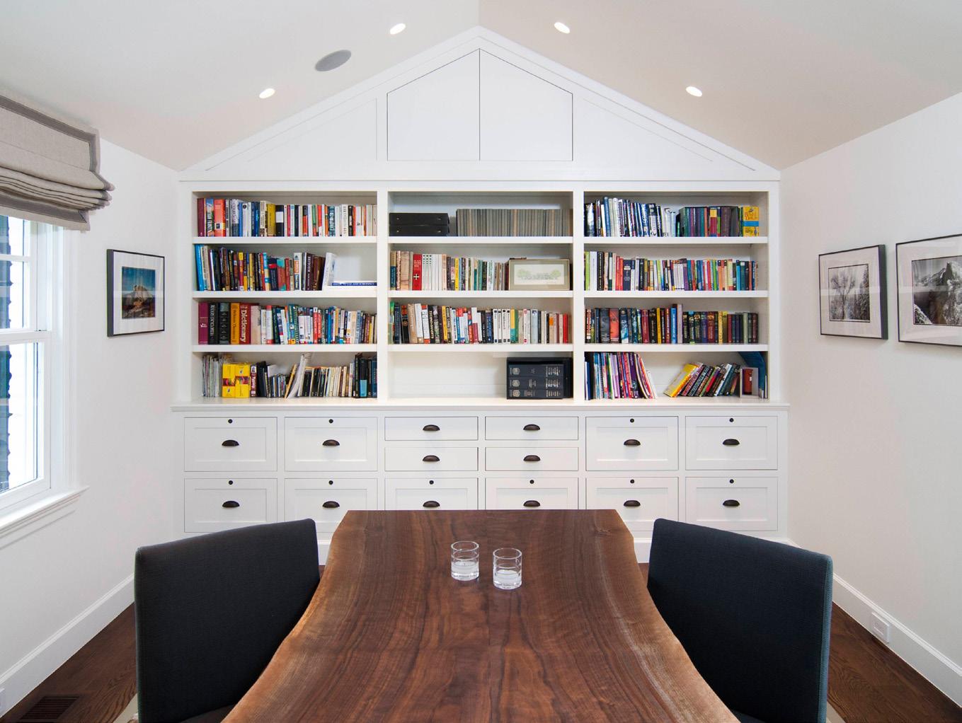
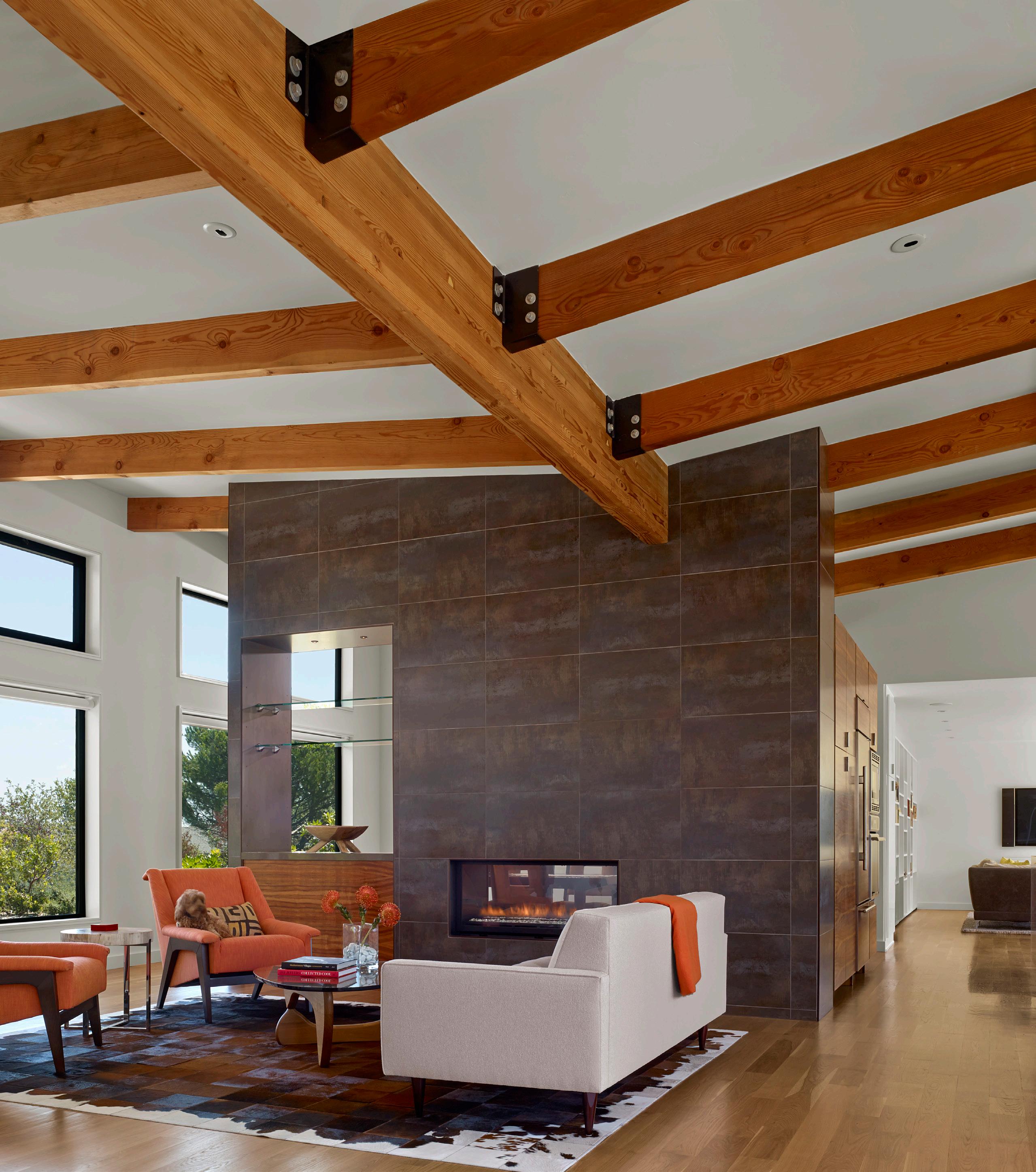
The simple form and finish of the fireplace element draws the eye up to the butterfly roof structure above and reinforces the sense of openness.
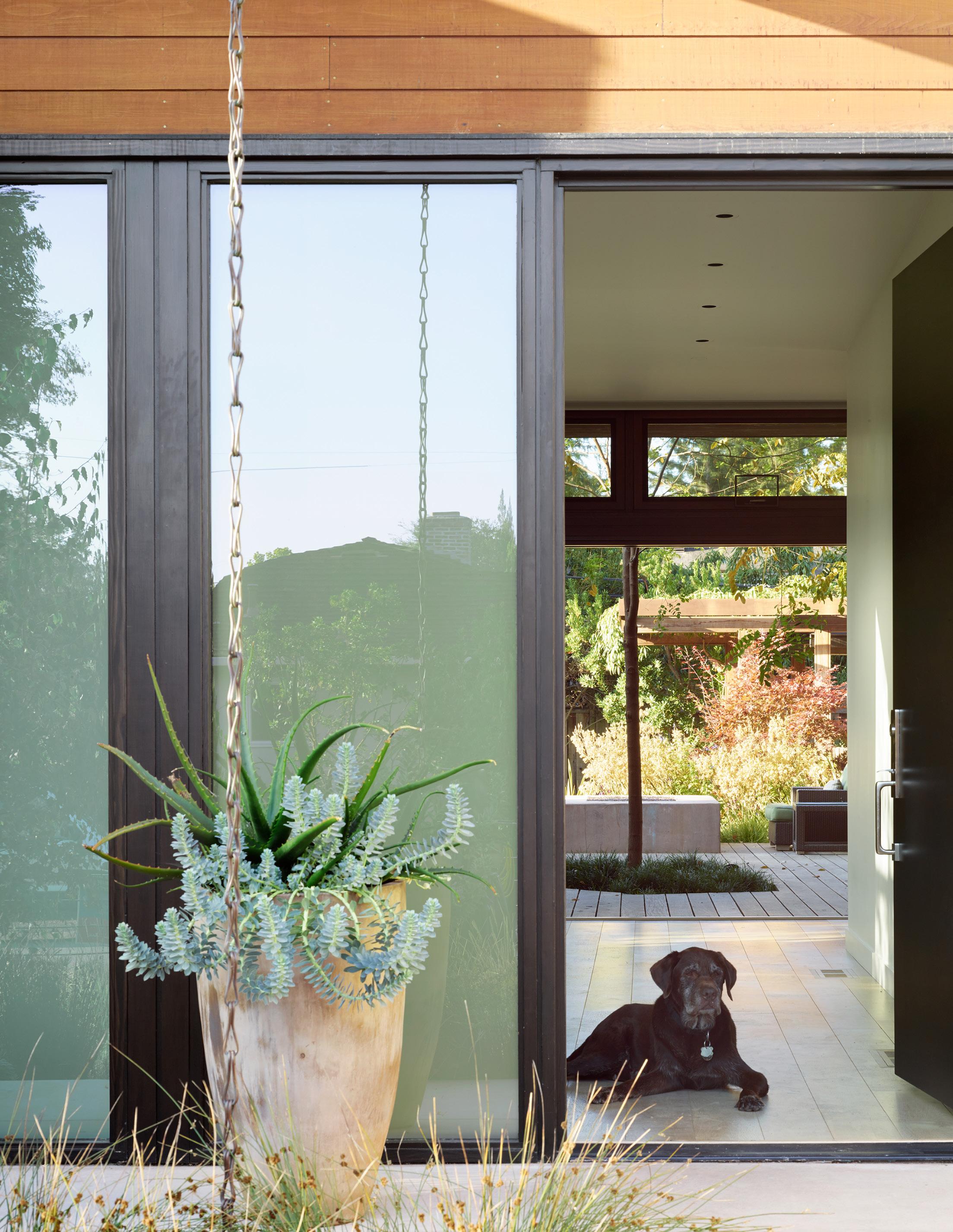
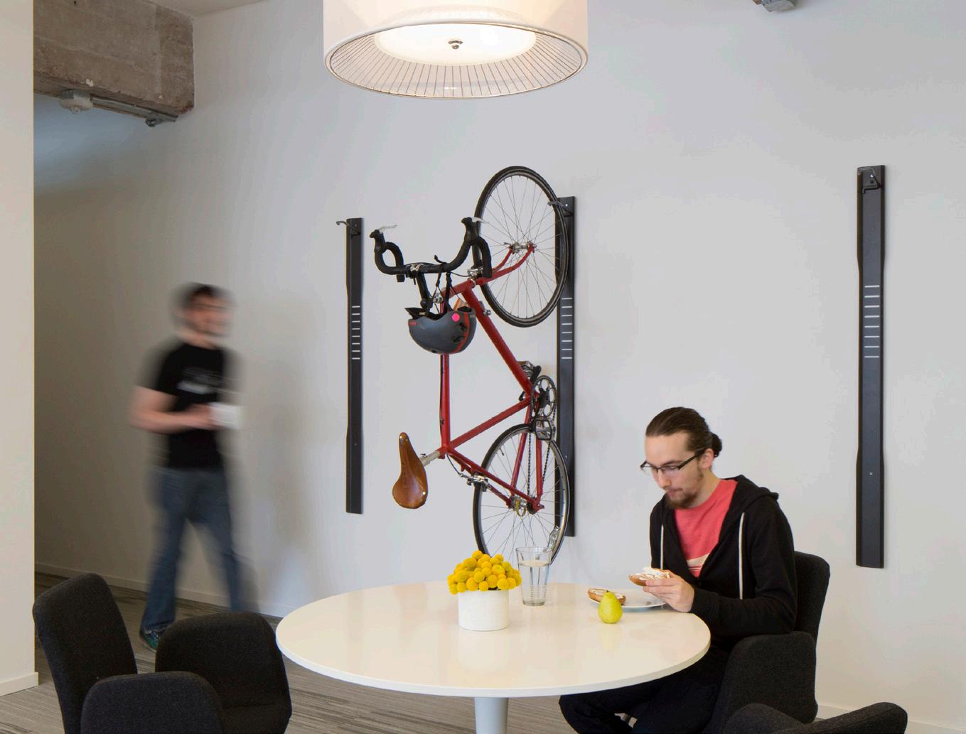
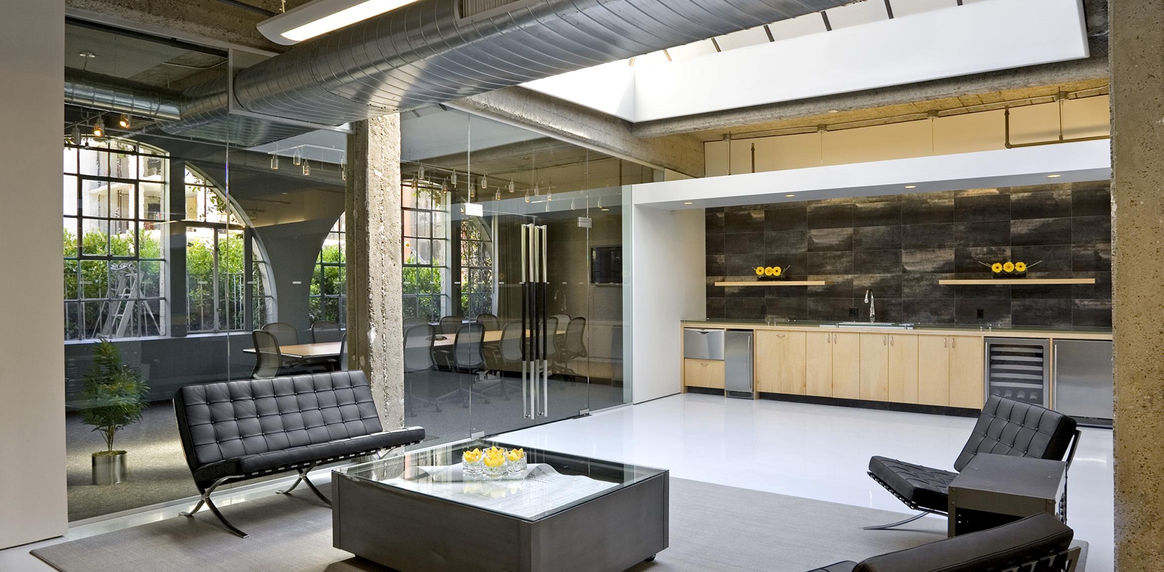
Simplicity can be a powerful tool in retail and workplace architecture, environments which are all about communication of the brand and culture of a company.

Simplicity is an effective mechanism to help focus a design. Clarity through form and finish, when executed well, maximizes the impact of highlighting a brand or its product.
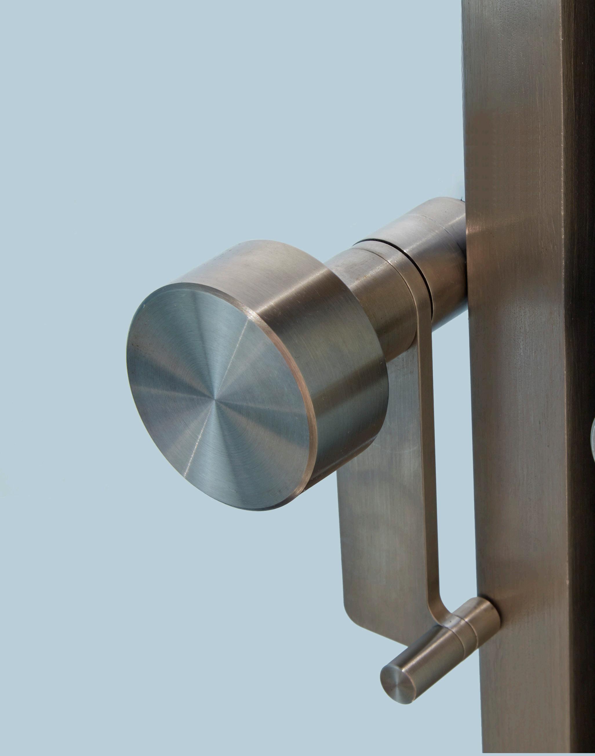
Care in construction, craft and detailing will allow materials to be independently distinguished while creating moments of delight.

“Unaffected

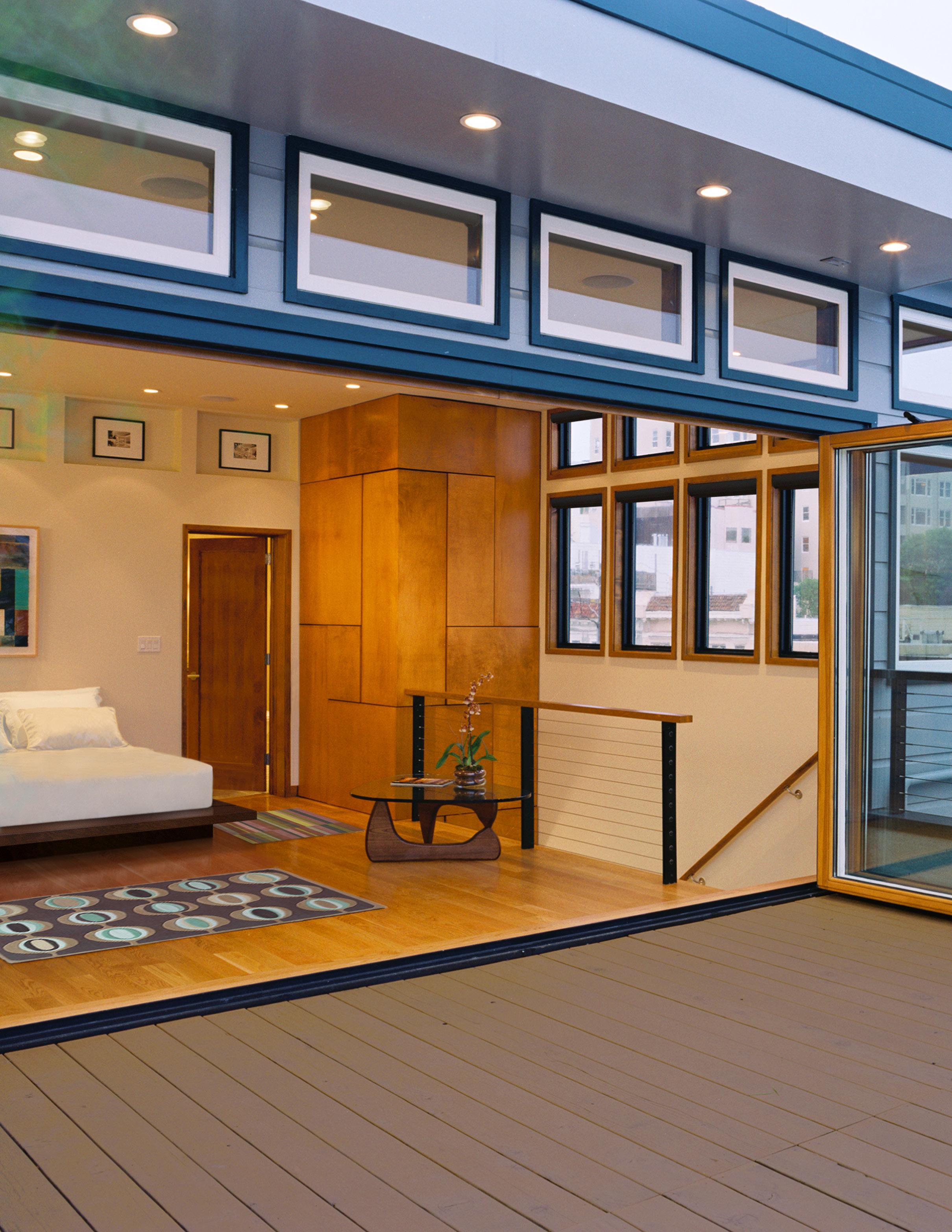
Shelter, structure, light and material are fundamental building elements. When combined in their purest form to enhance the function of a space, they can become timeless.
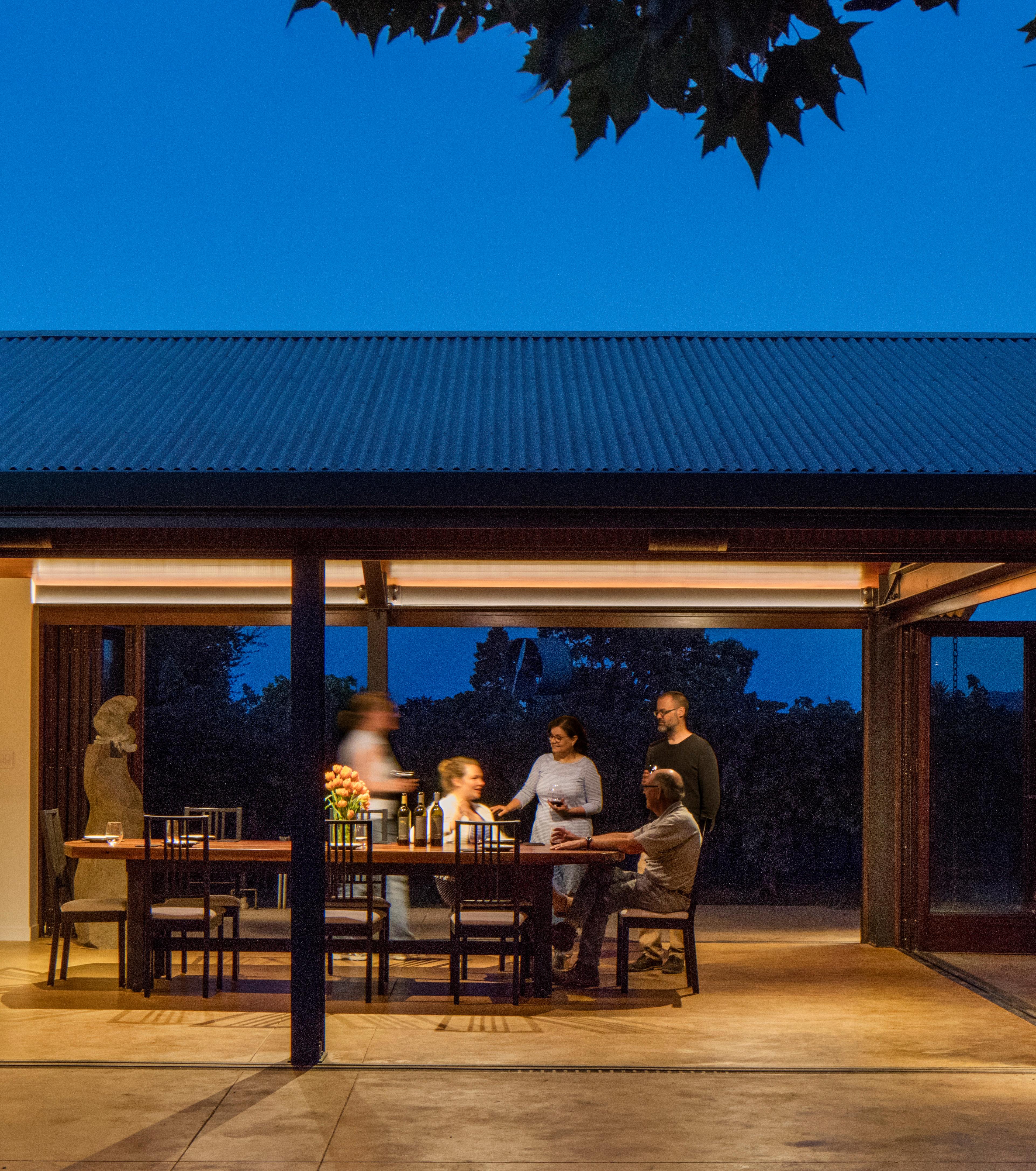
Timelessness is an intangible thing to define in architectural terms let alone identify before a period of time has actually passed.
Designs that are most inclined to a timeless quality are not influenced by trends or fads but instead are those truly committed to a genuine conceptual intent.
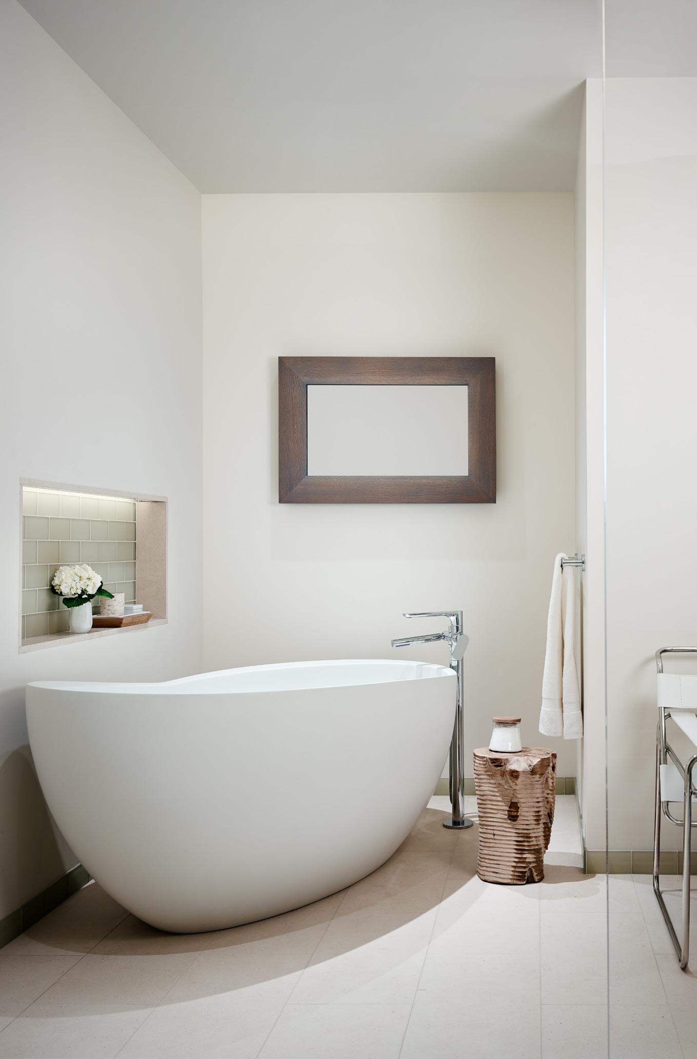

New projects which naturally feel as though they have always been there are those most marked by timelessness.
Responding to the proportion and scale of the context is key to achieving this design outcome.

The juxtaposition of geometric elements with natural wood tones, clear glass and white paint form a timeless composition.
The elements here are detached from trend or fashion, and the time period, if the chairs were removed, is not distinct.
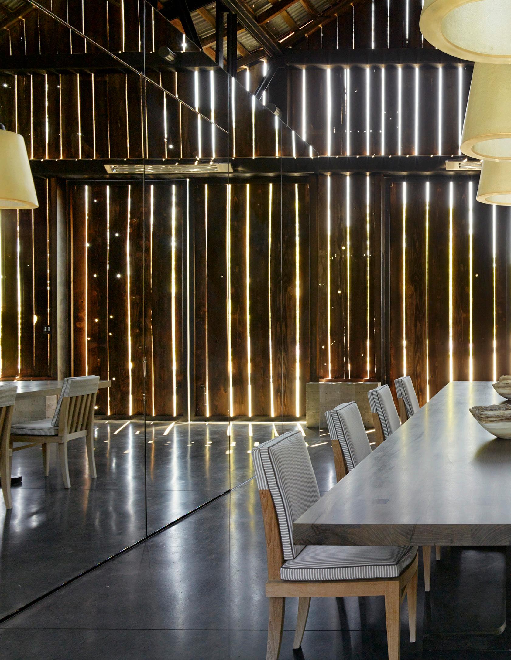
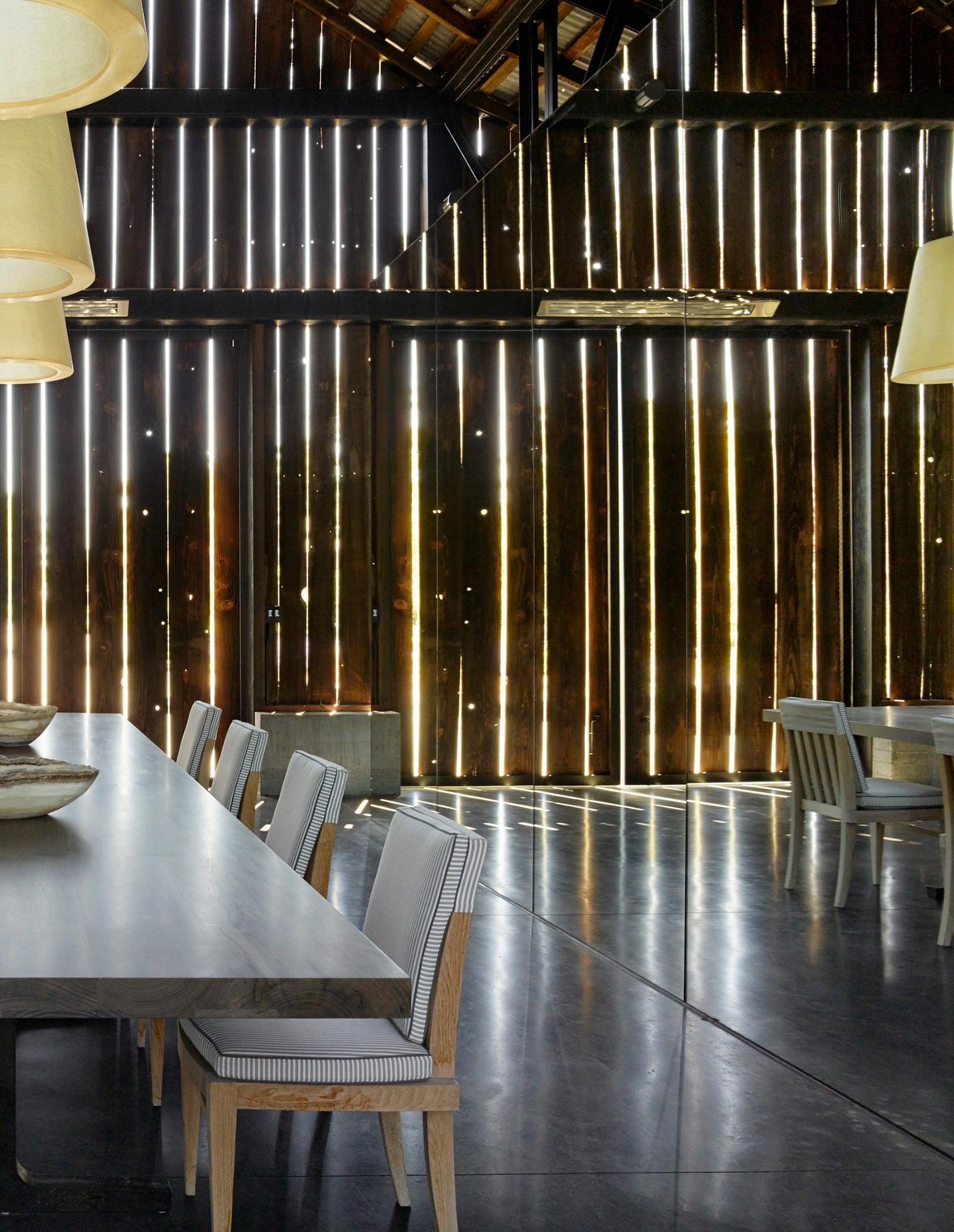
Well-composed forms and spaces may be of a certain time and place.
The more proportionally refined and compositionally balanced they are the more timeless they will be.
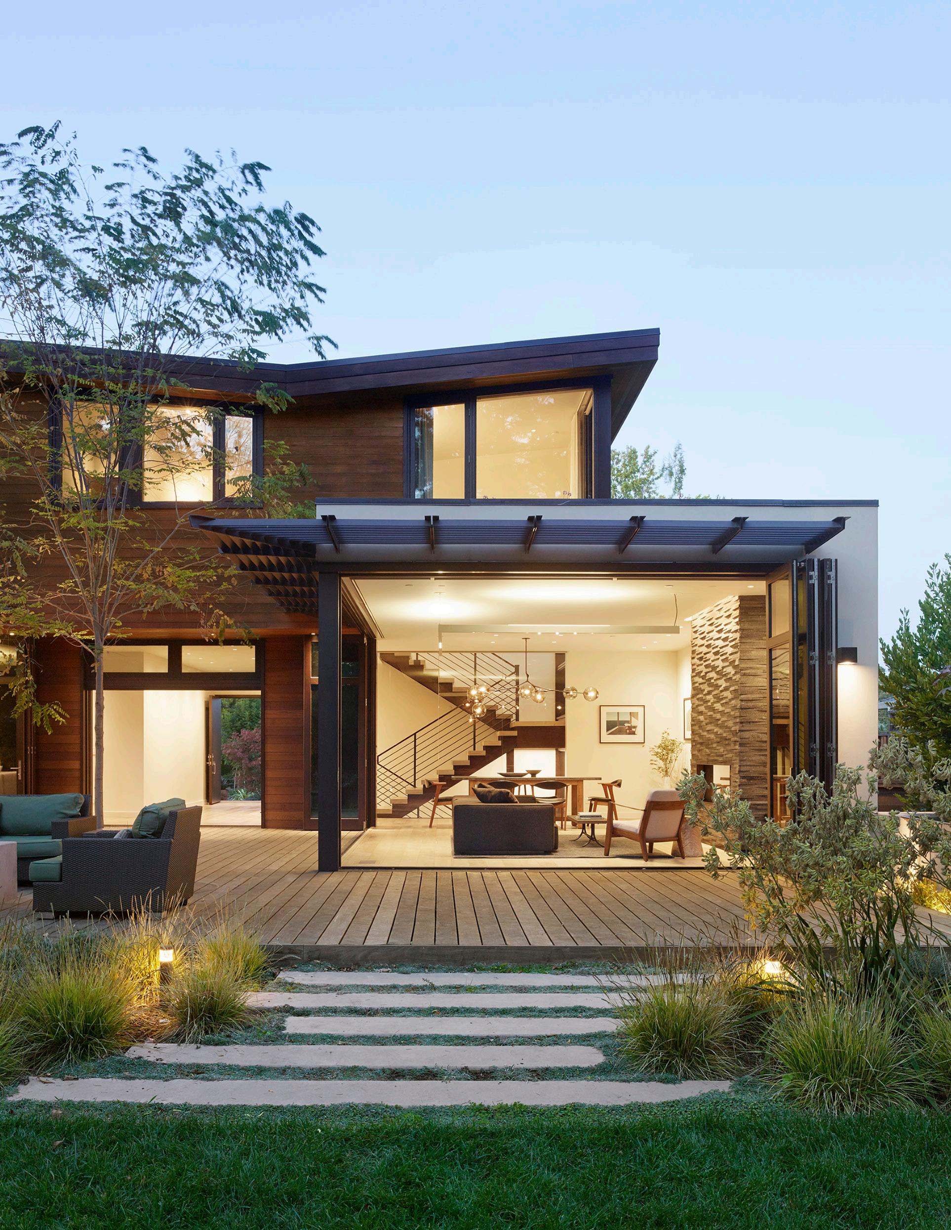
The layering of space, careful proportioning and the juxtaposition against nature accentuates the timelessness condition of this home design.
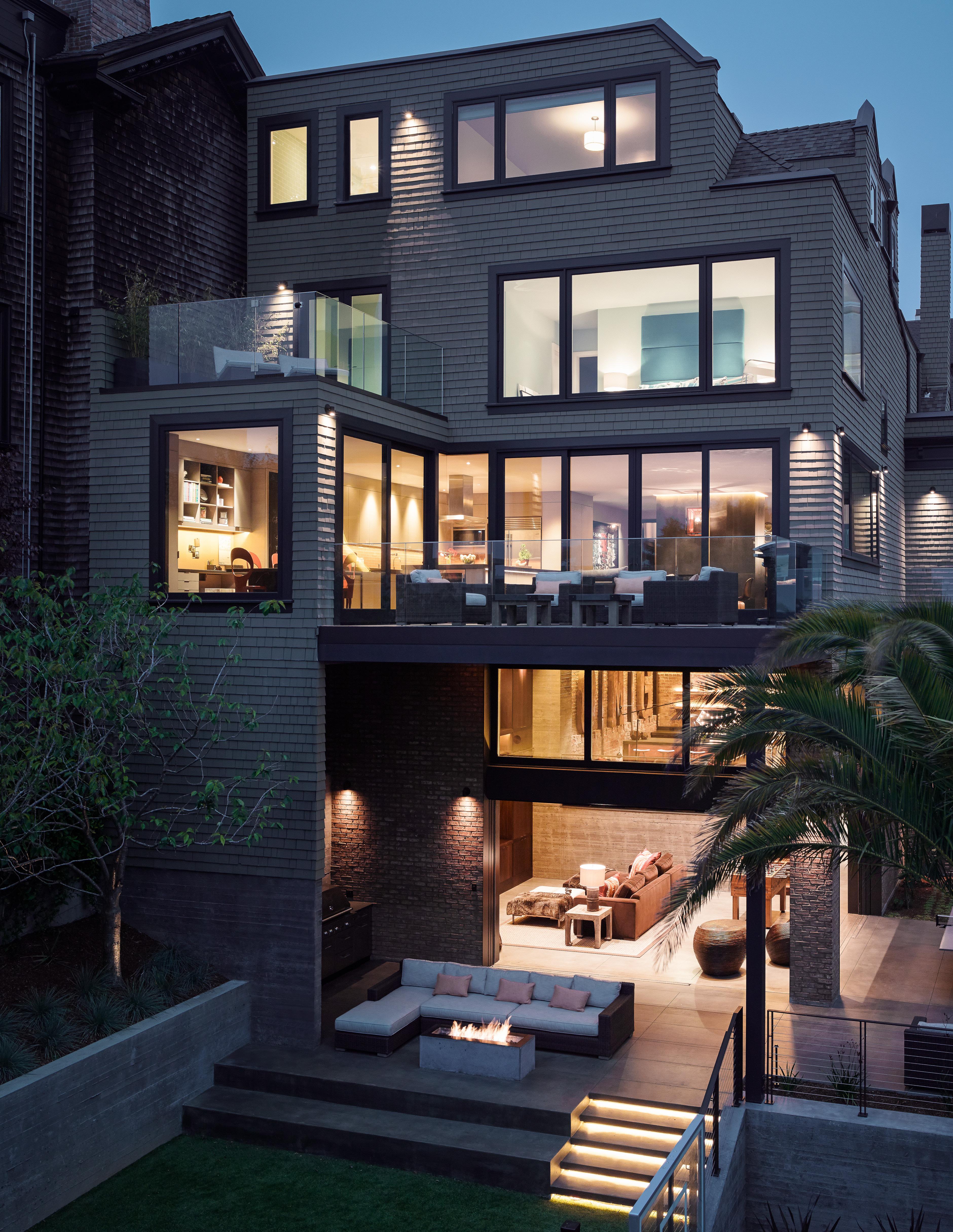


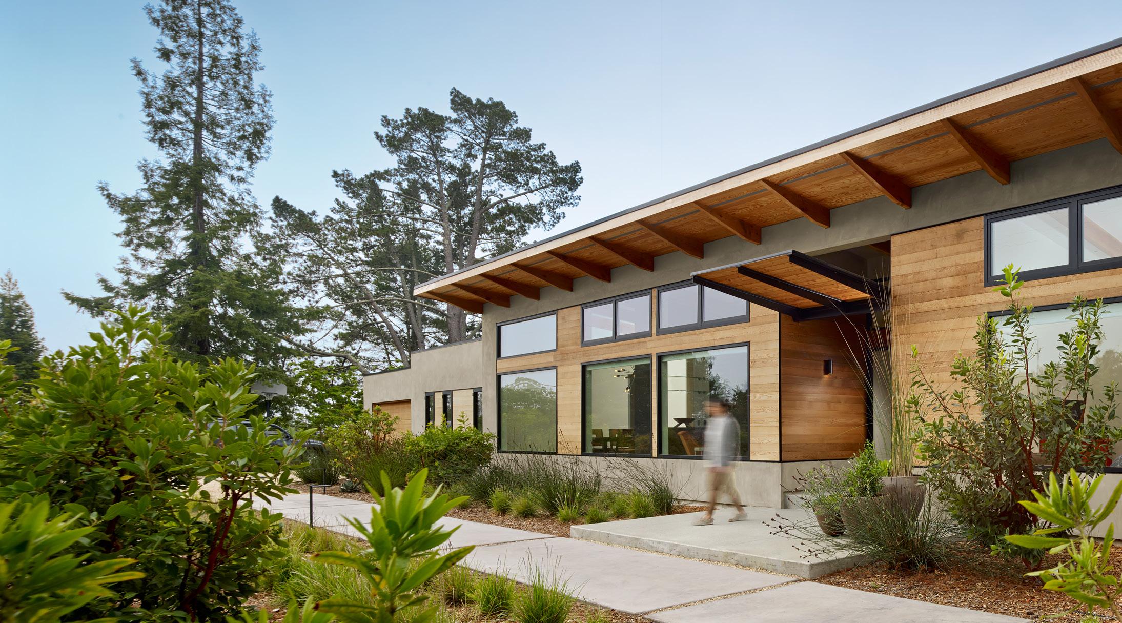
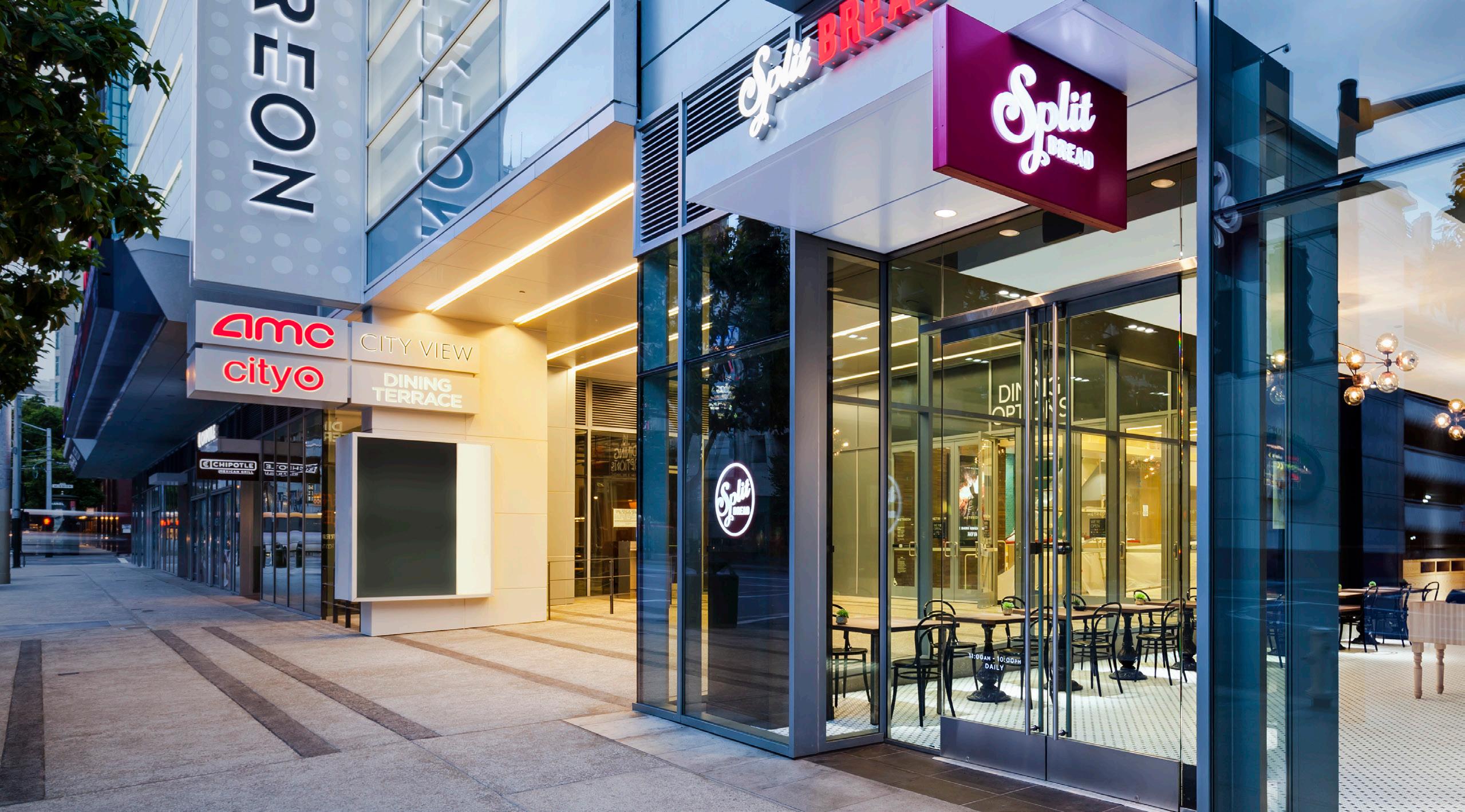
How a building or a space responds to its context is a true measure of the “attitude” of the design.
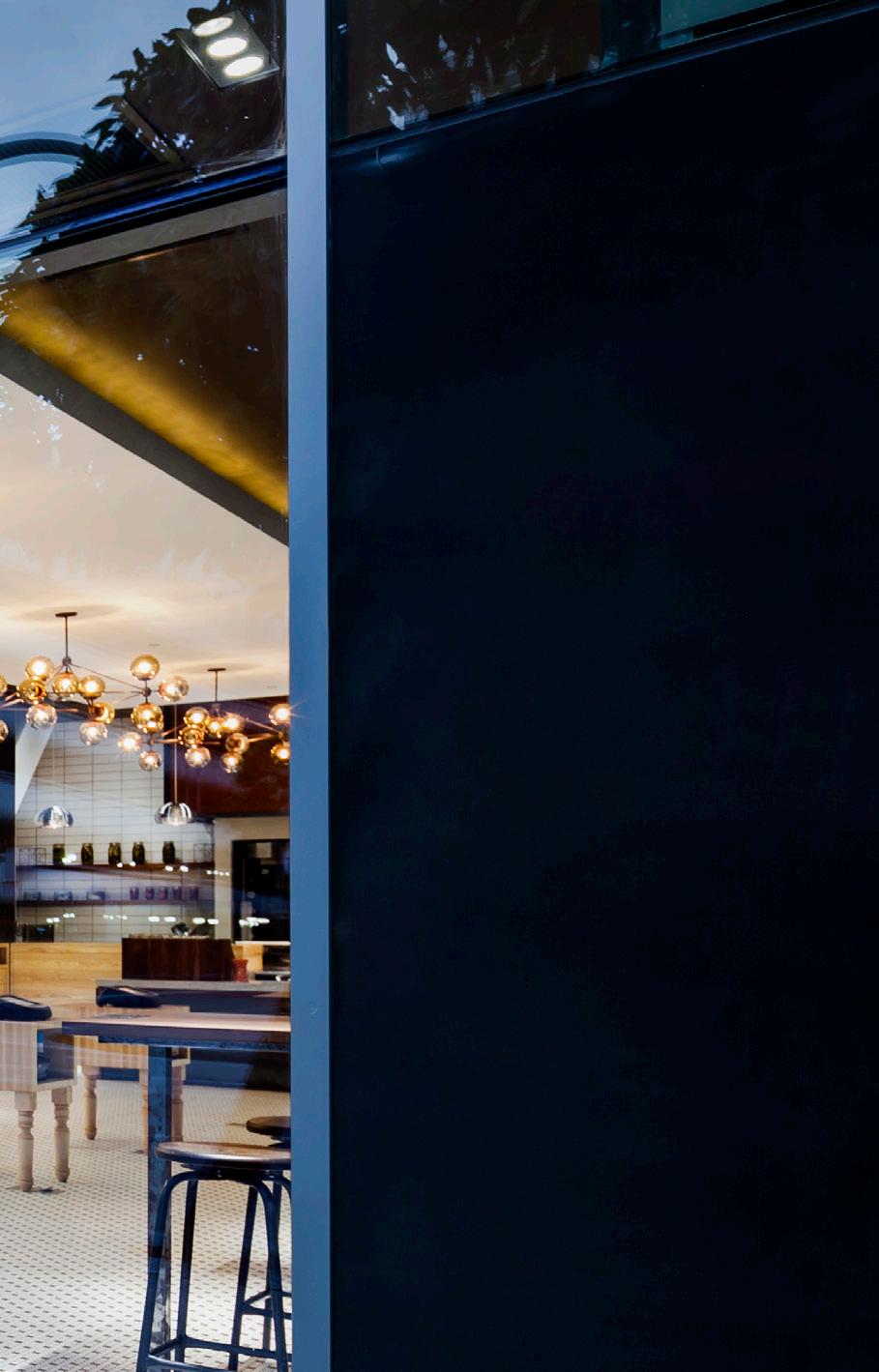
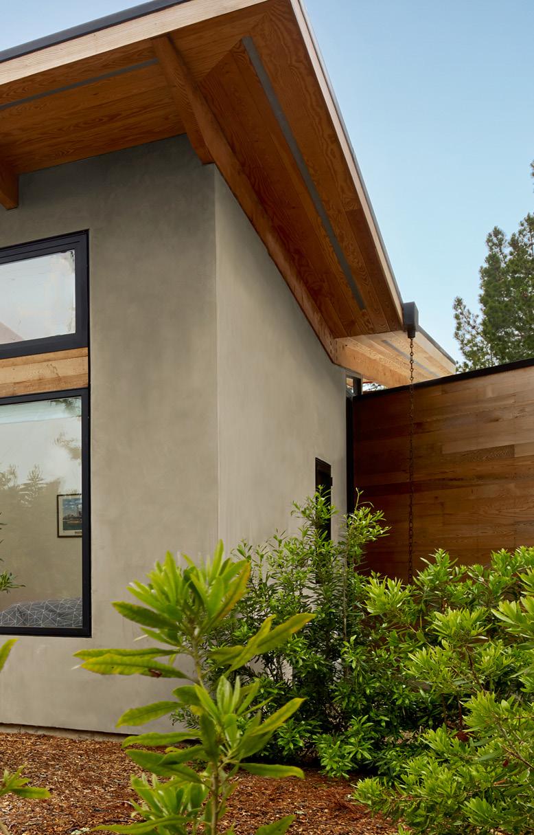
A great project will not only draw inspiration from its context, but will generate an enrichment in everything around it as a consequence.
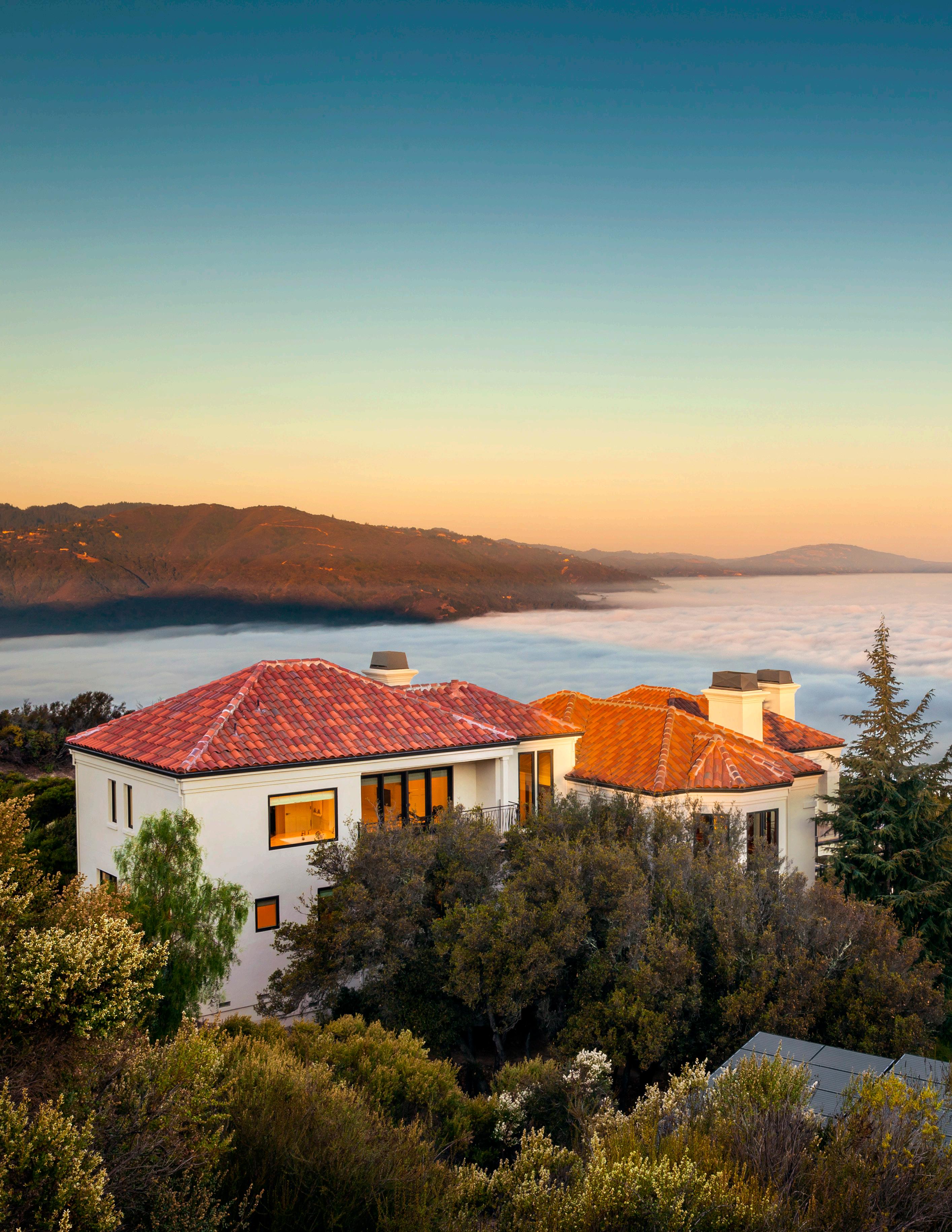
High above the valley floor, the remodel of this existing home simplified and refined the exterior to create a more crisp interface with the surrounding environment.
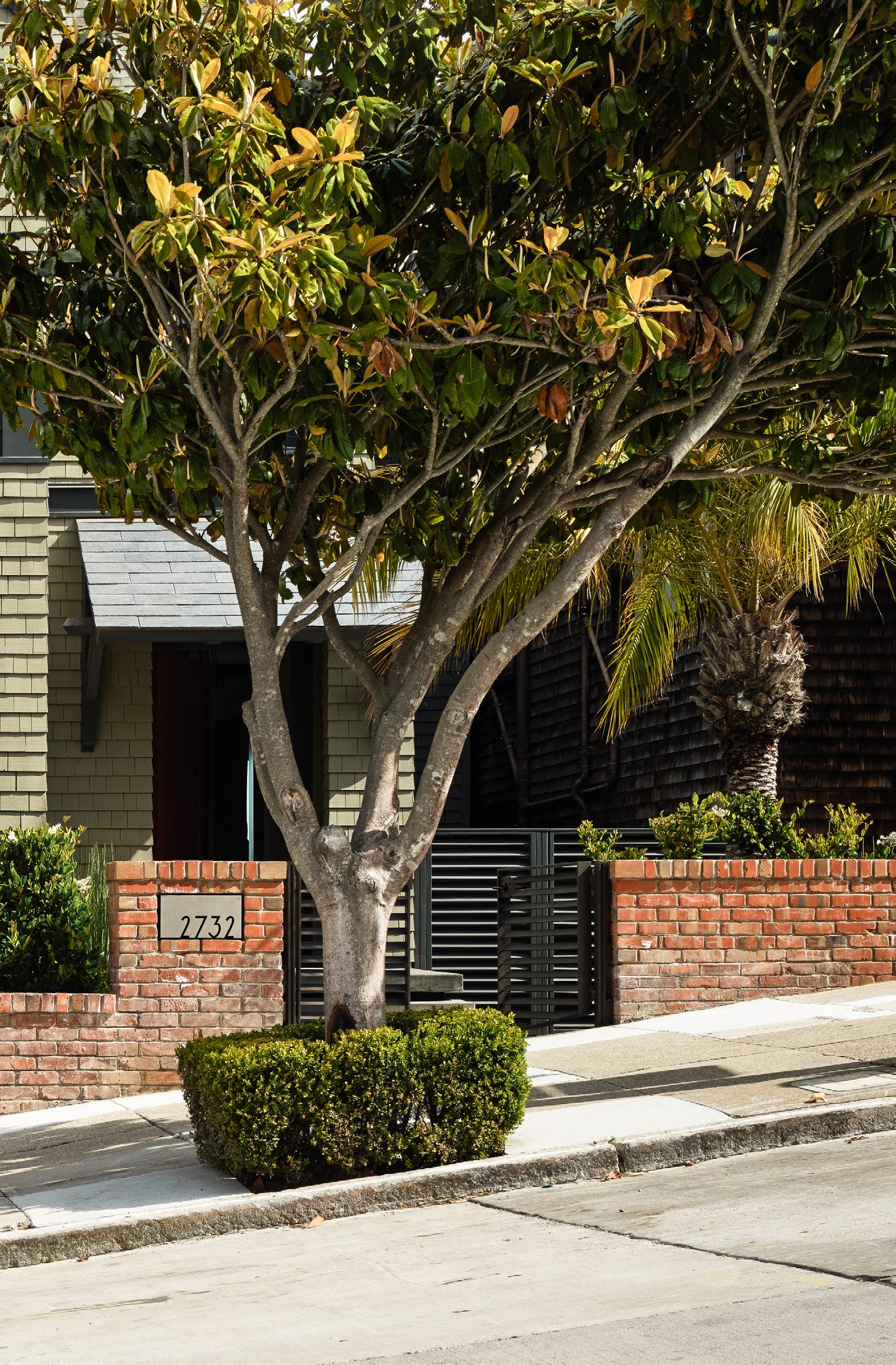
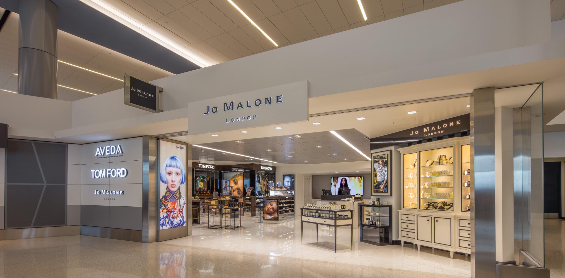
Context can take many forms; a rural landscape, a city street-scape or the interior of an existing building.
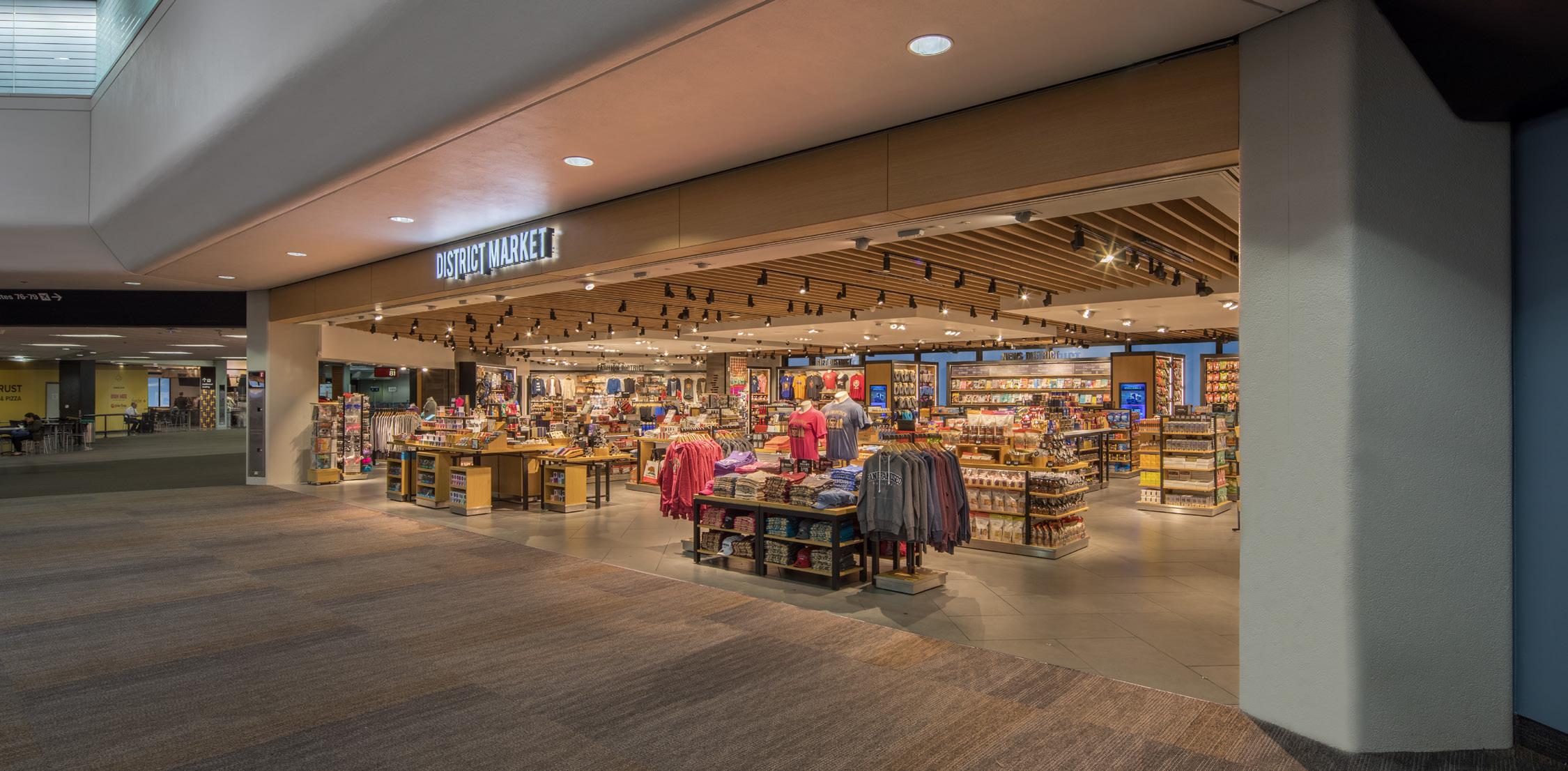
In each there is a moment of inspiration for the project’s design, but there are also opportunities for the architectural intervention to compliment its setting.
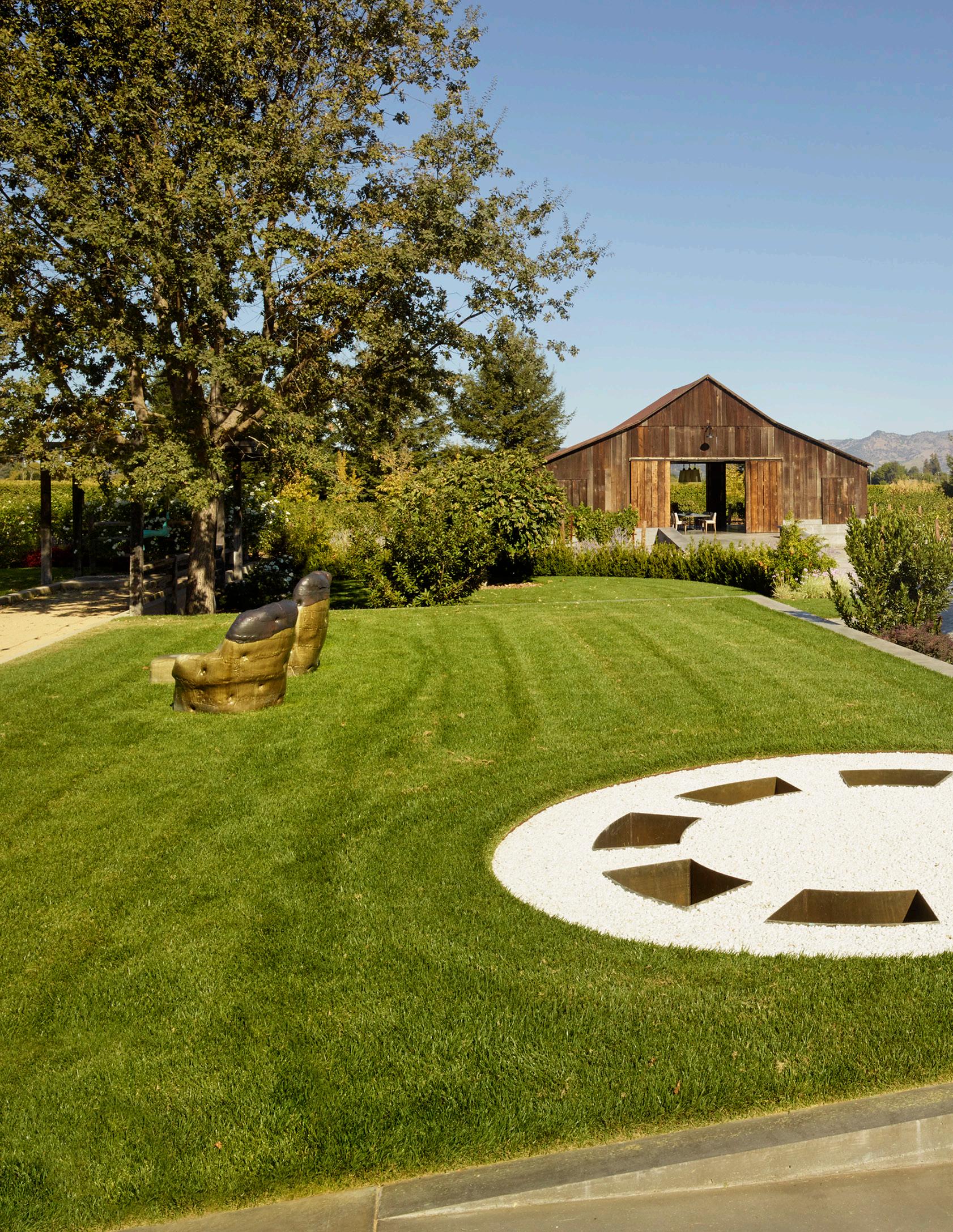
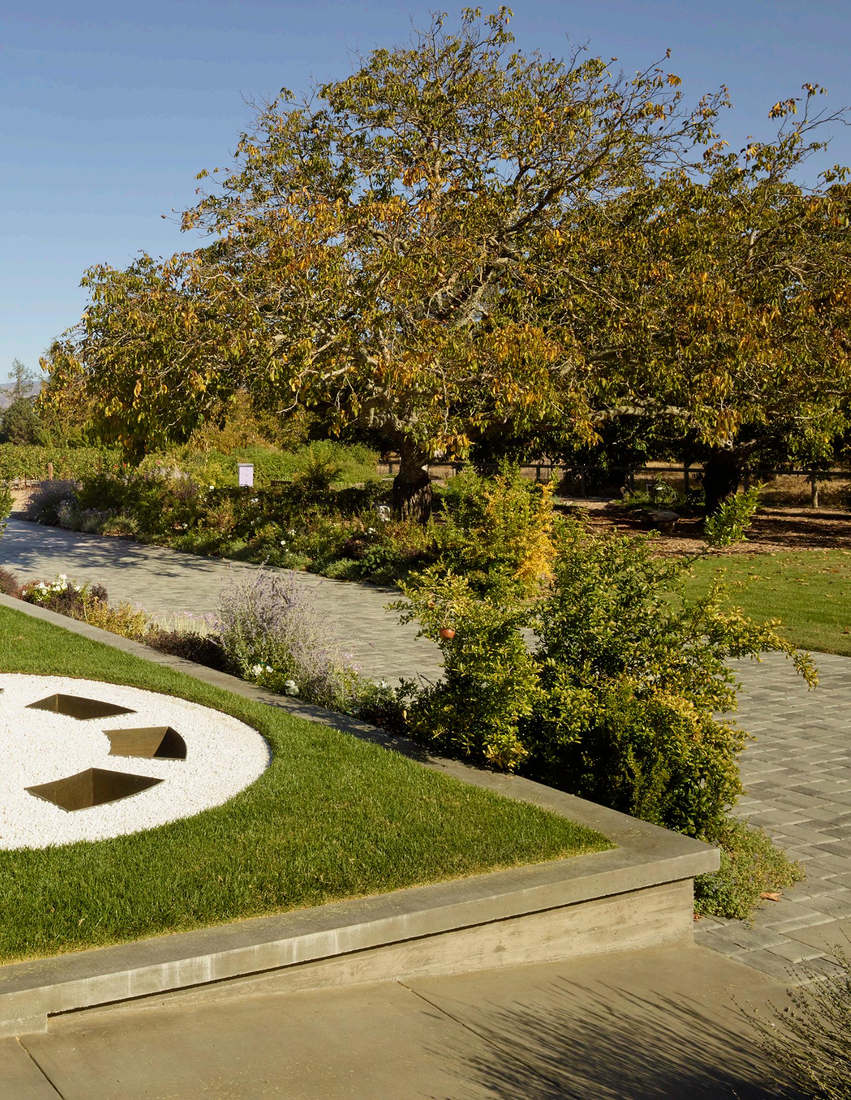
The building and the art enhance the landscape achieving harmony with the surrounding context.
“Maximizing


Architectural space need not always rely on structures or elements that require significant investment.
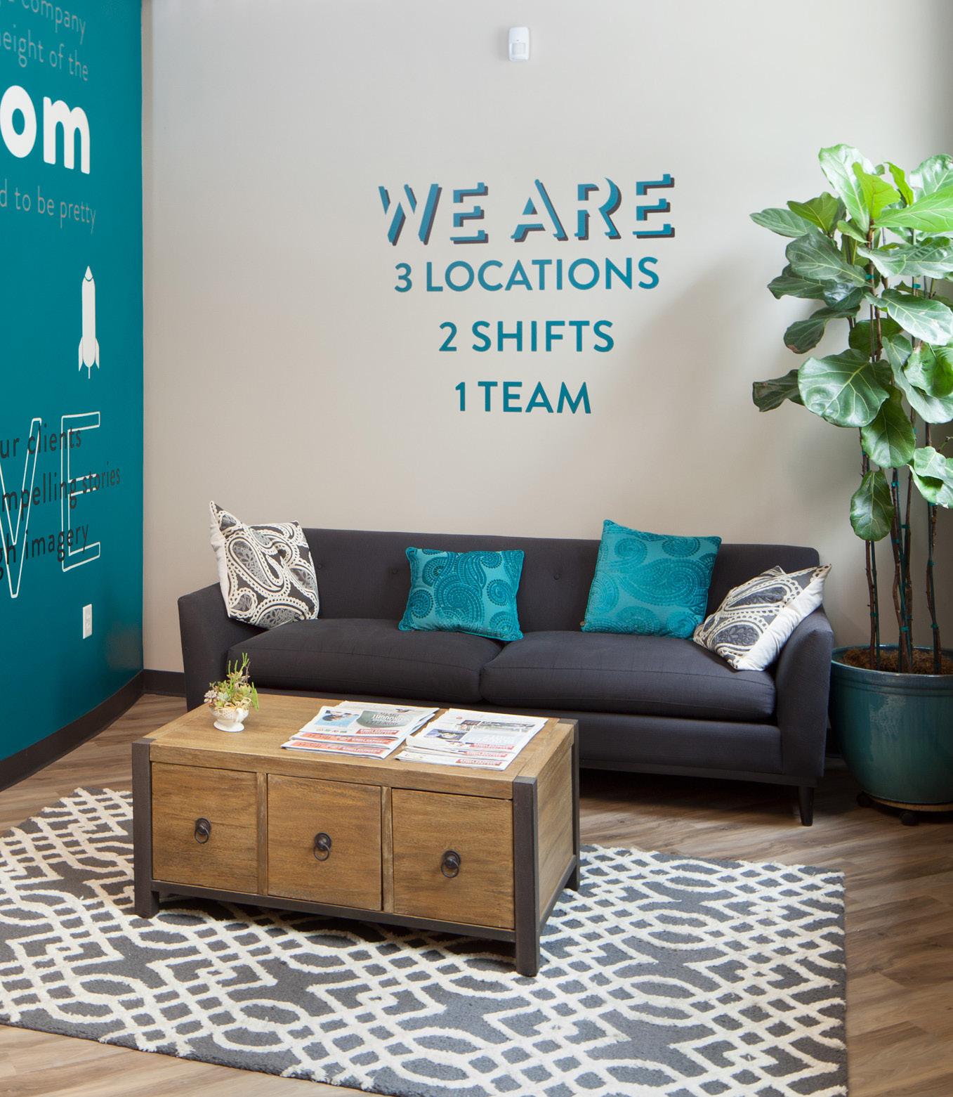
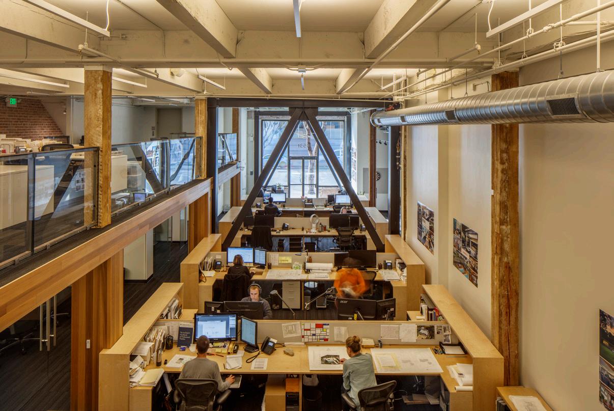
The inherent strength, value and beauty of a space or site can be elevated through economical architectural moves if enough time is spent developing them.
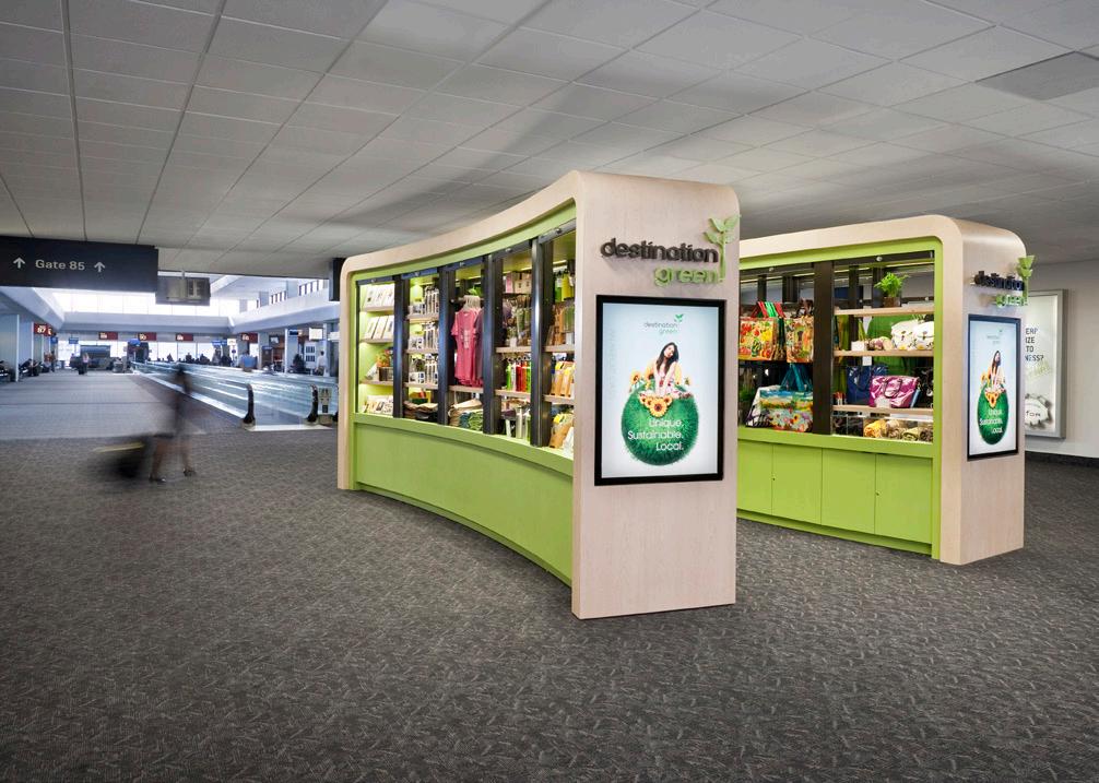
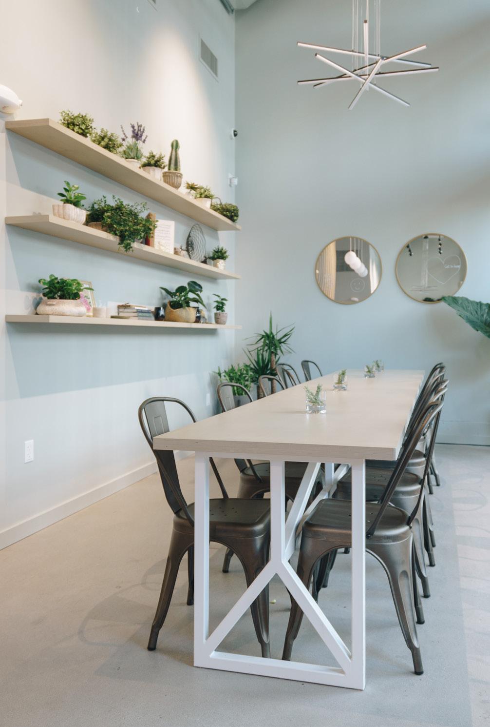
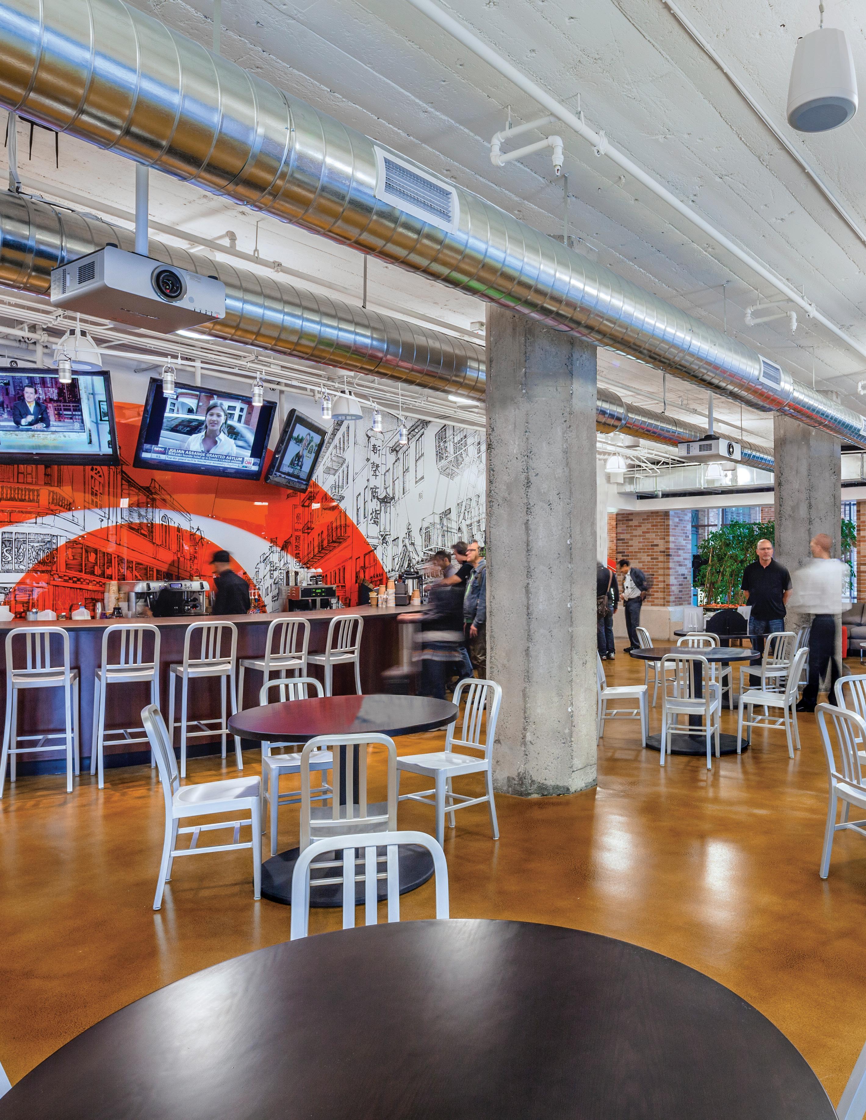
The projects featured in this chapter all work within an existing building shell to create successfully functioning, vibrant spaces through creativity and innovative design.
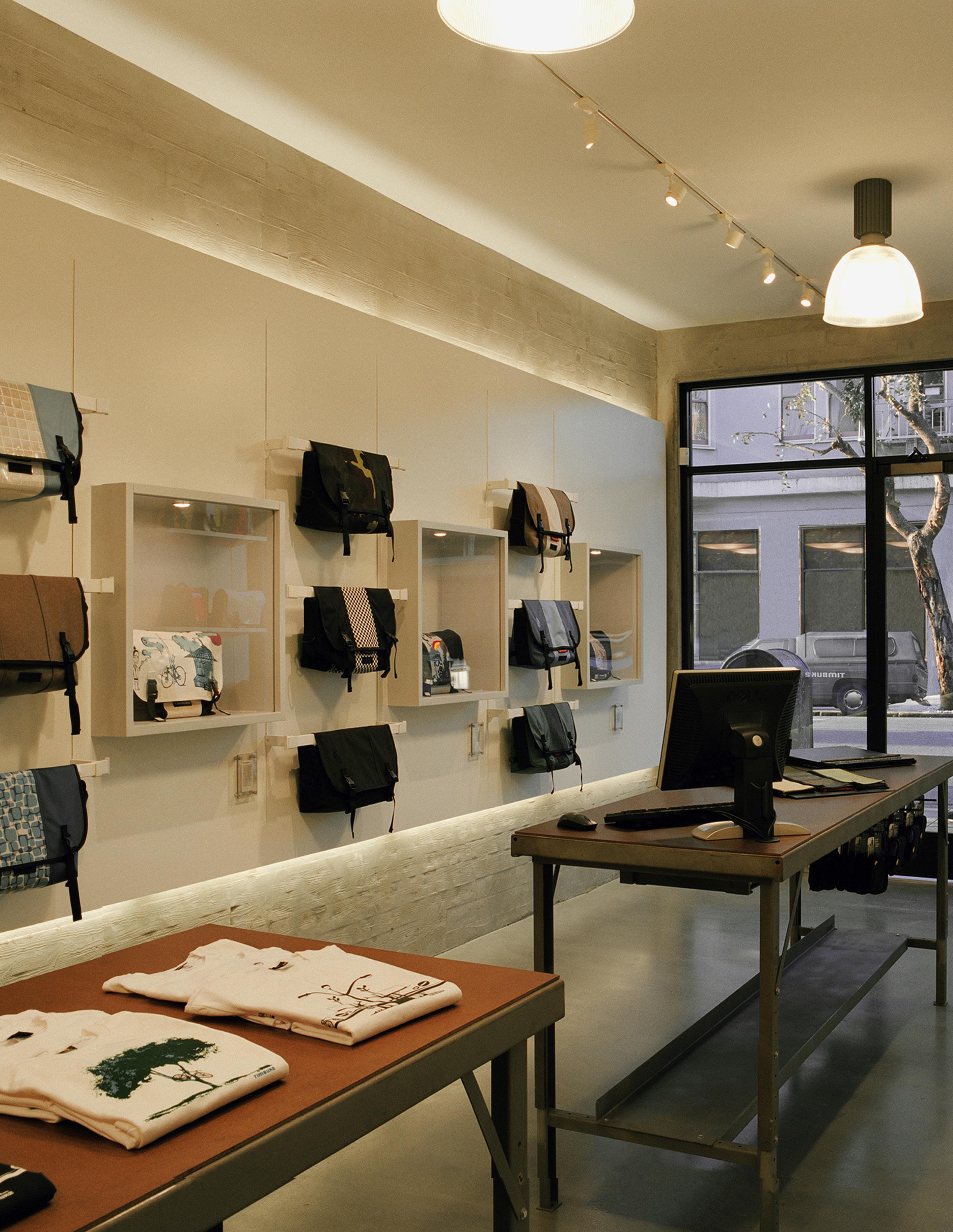
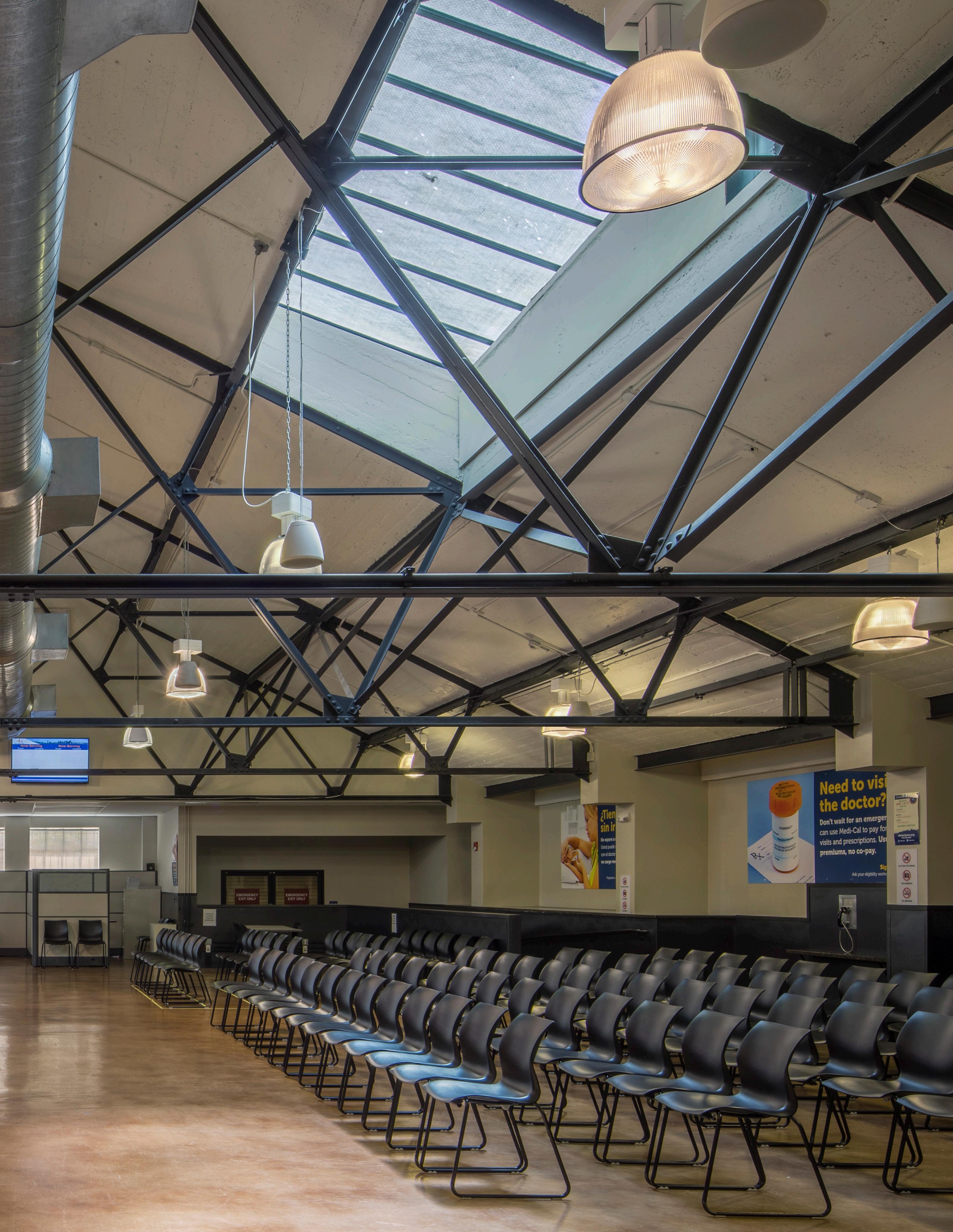
Tight budgets will regularly require an economical approach. This design celebrates an existing truss system to bring character and volume to the space.




noun | warmth | \ˈwȯrm(p)th\
“A textural softness creating an inviting feeling; the opposite of cold and sterile.”

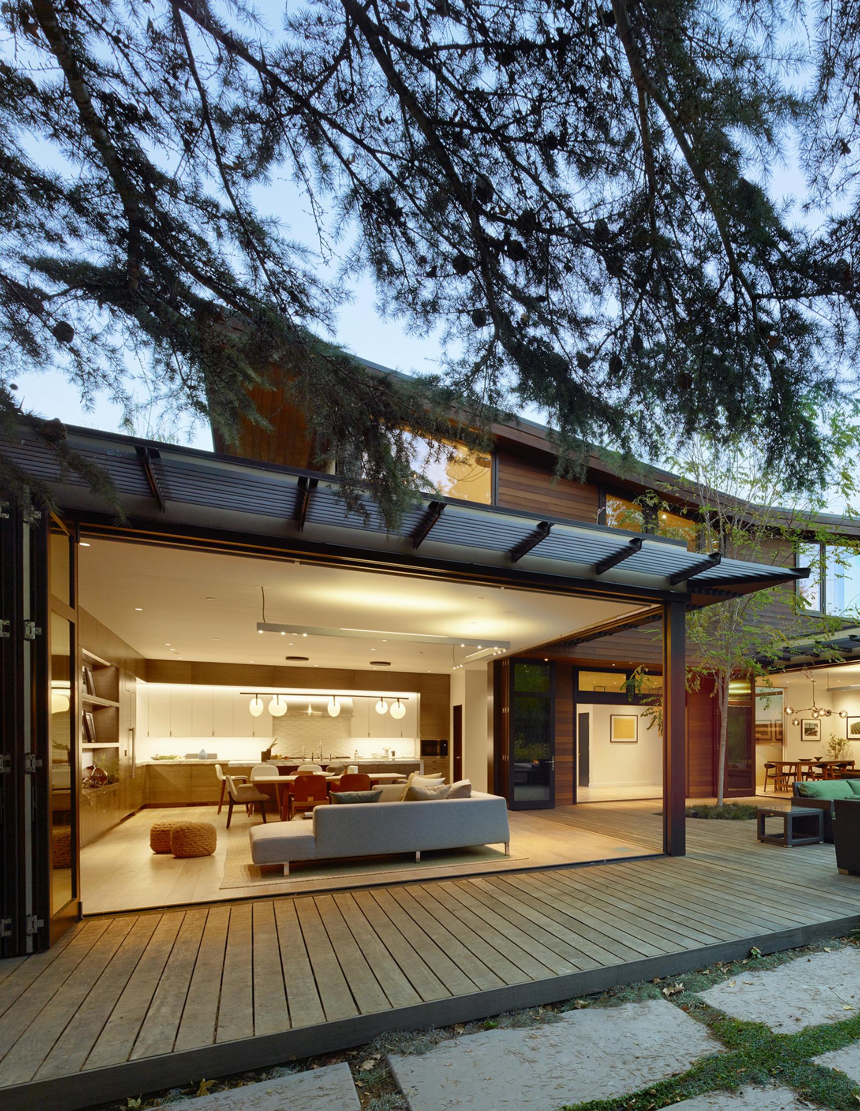
The use of natural wood and flood of daylight give this space an generous feeling of warmth.
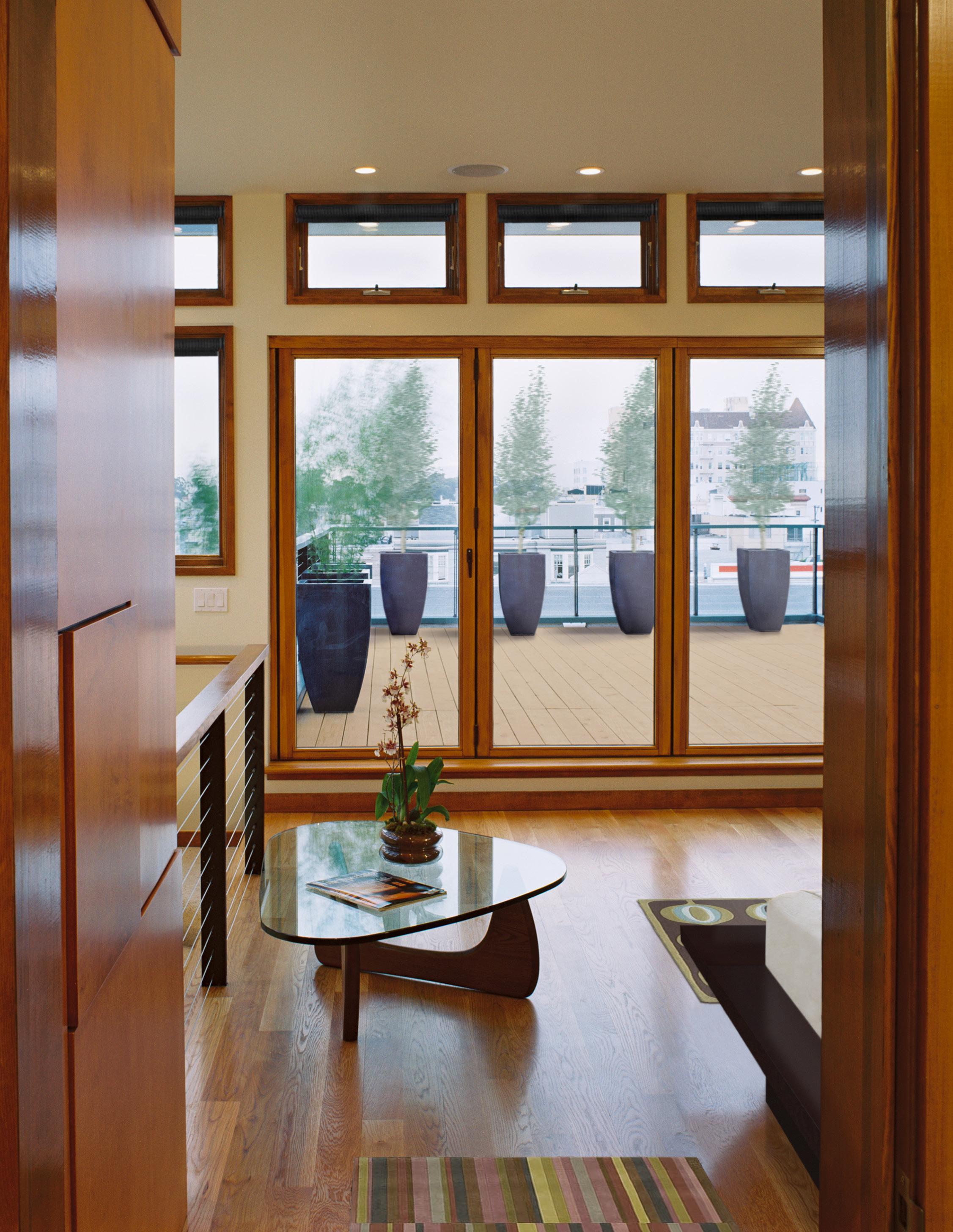
Architectural warmth is the quality of a space or a building that evokes a feeling which is welcoming, comfortable and uplifting.
It typically comprises natural materials which have light colors, warm temperatures and yield no acoustical echo.
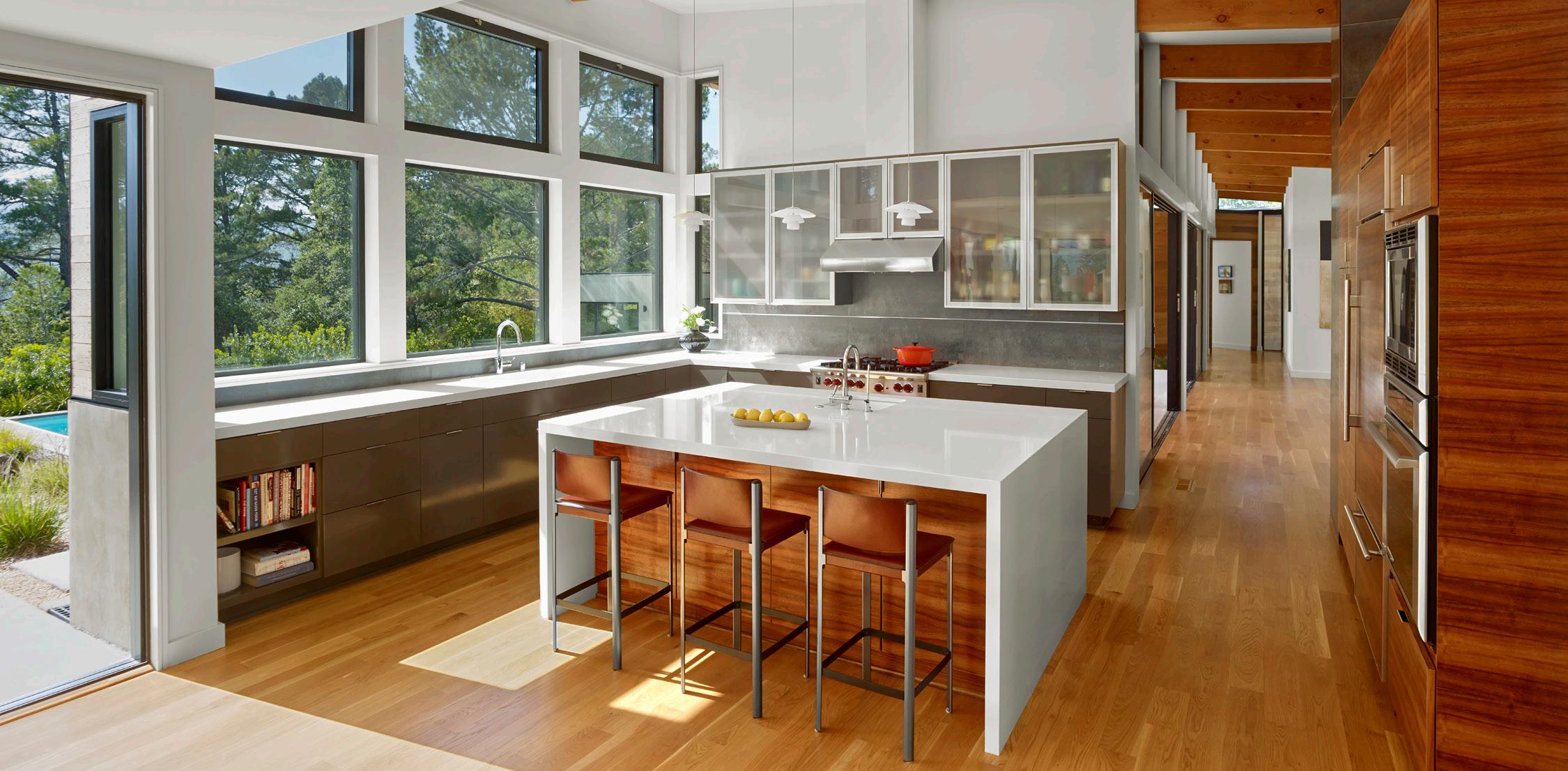
The texture of a material plays a crucial role in generating a sense of warmth.


Finishes with grain relief and materials with natural surfaces feel much warmer compared to excessively smooth surfaces and artificial materials which can often feel cold.
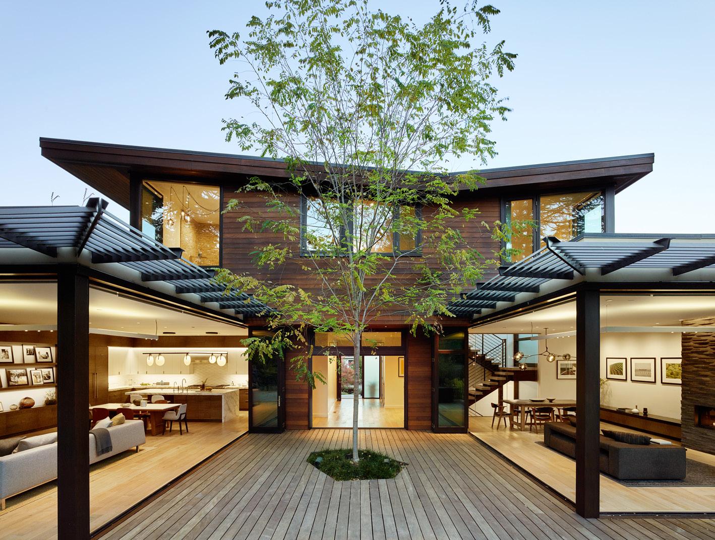
Panels of wood cladding and judicious lighting combine with the careful proportioning of the design elements to give this restaurant a feeling of warmth.
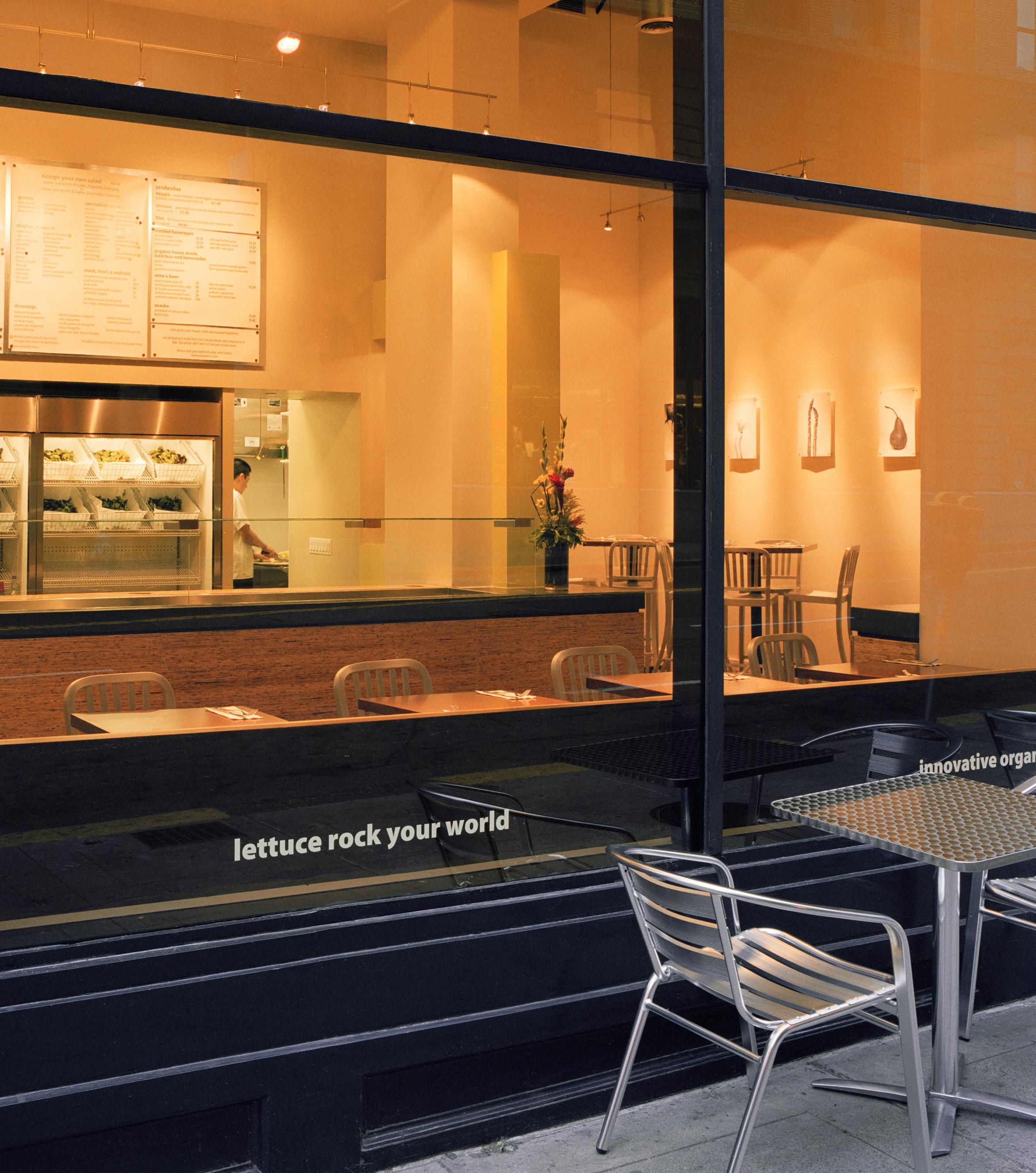
The generous use of wood, natural daylighting and soft white paint on the walls gives warmth to this space and balances the concrete floors and solid-surface counter tops.
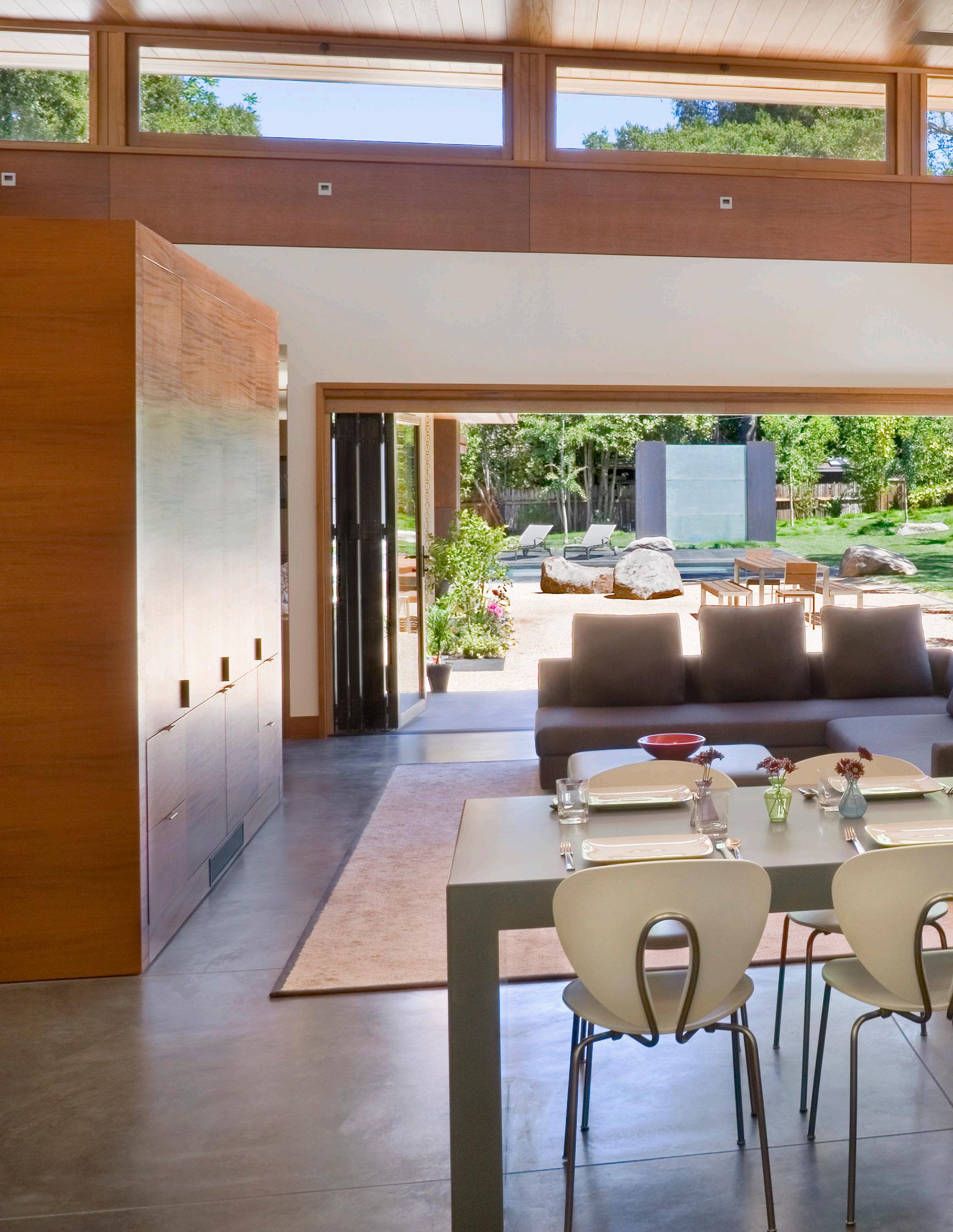
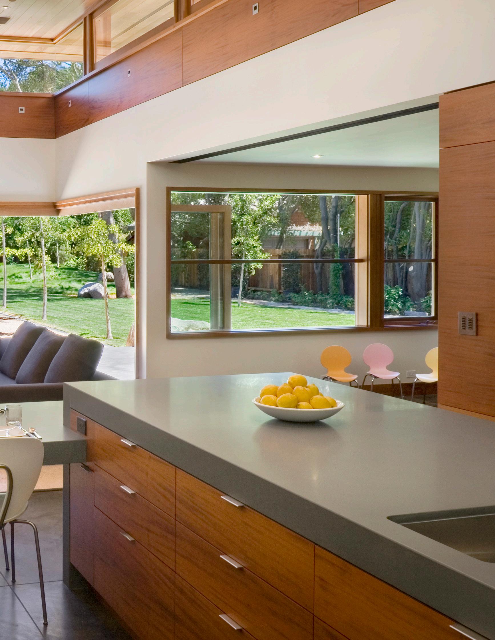


noun | hon·es·ty | \ˈä-nə-stē\
“Integrity with respect to the intent, purpose and use of a material.”

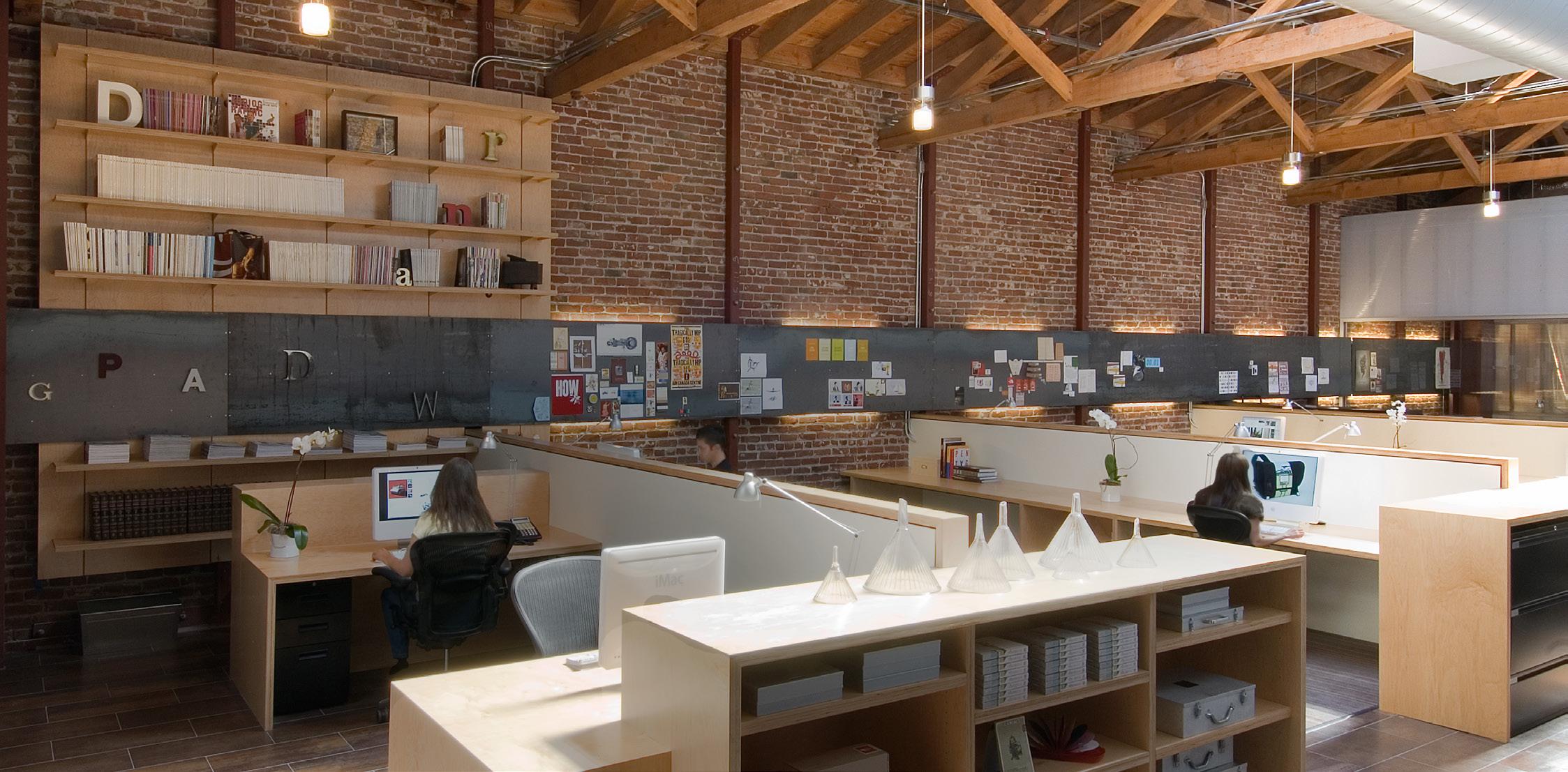
Timber, brick, steel, wood and carpet are being used with integrity to their functional purpose in this design; the steel, for instance, is a magnetized pinboard on the wall, and not a flooring material.
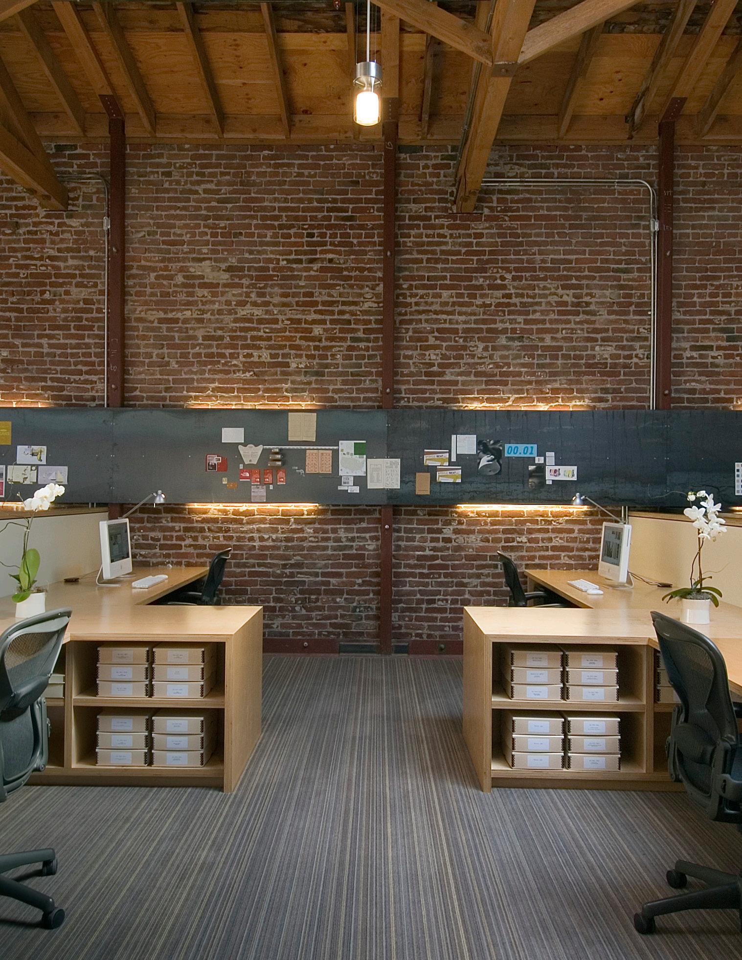
Honesty in design is most evident in the materials.
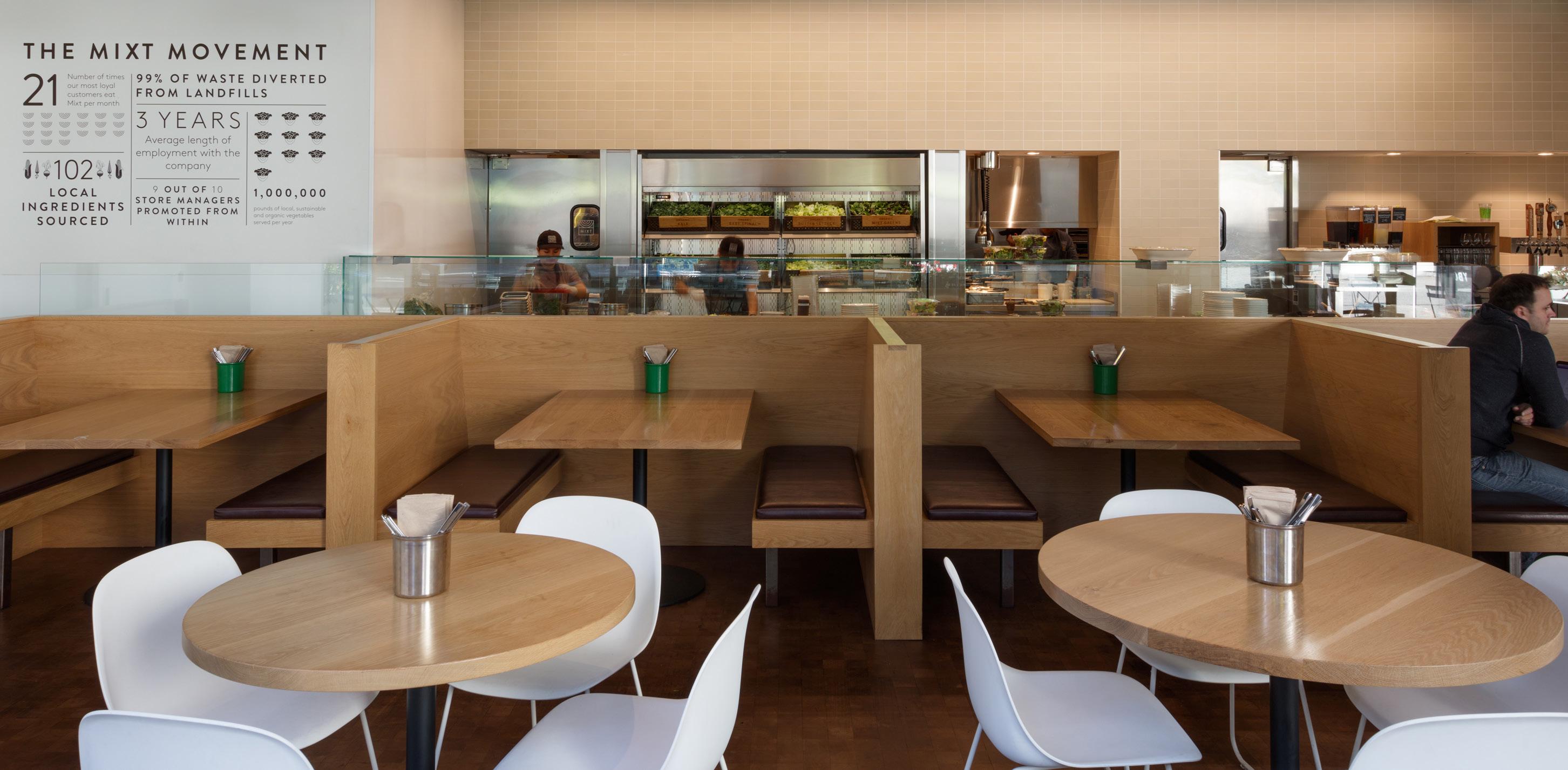
Materials are harvested or designed for a specific use and should be purposed within a design to honor those intentions, including reused or repurposed materials.
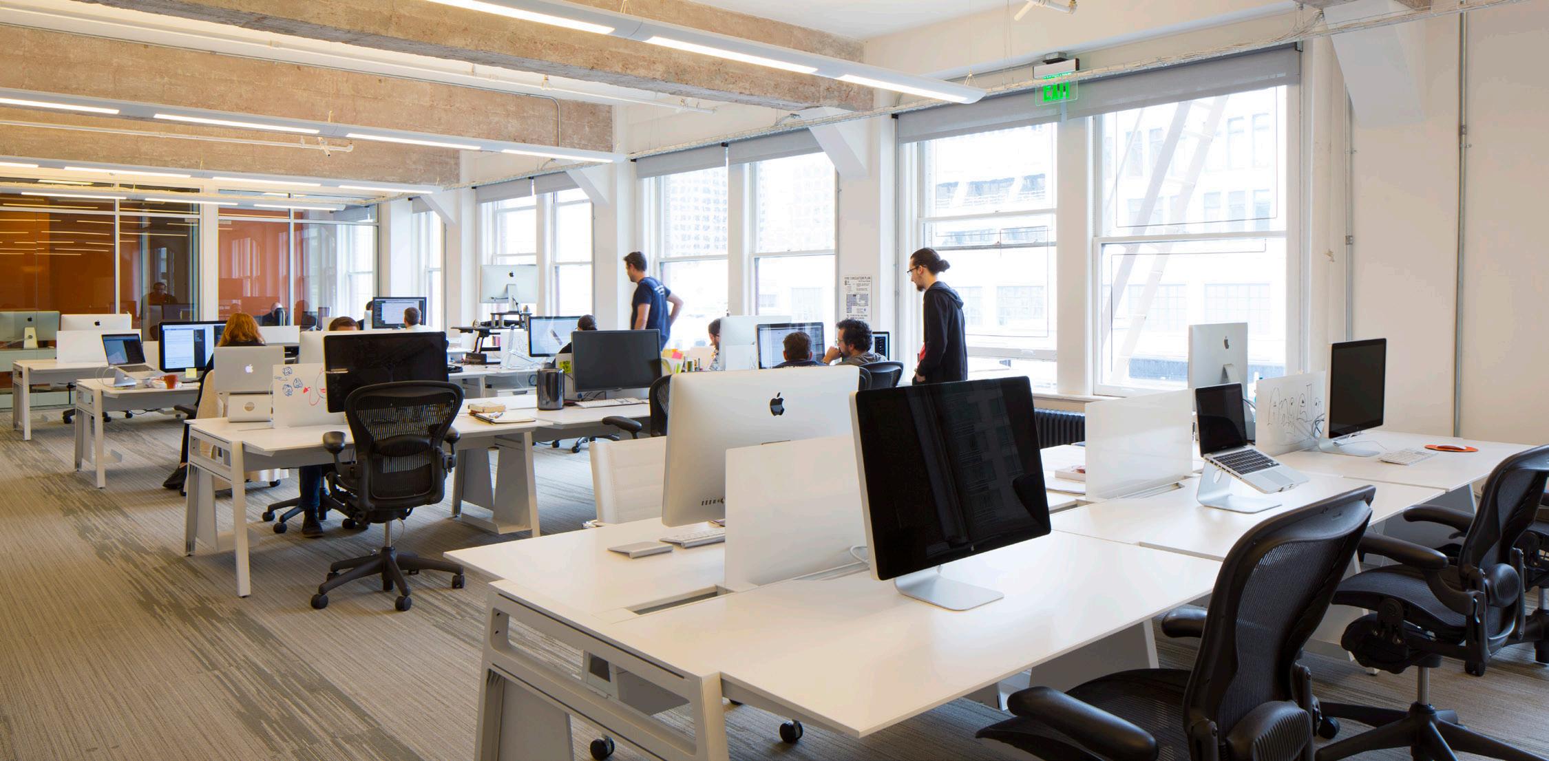
There will be occasions when the most appropriate material cannot be used.
In those cases, any substitute should still meet the intent and function of whatever the ideal material would have been.
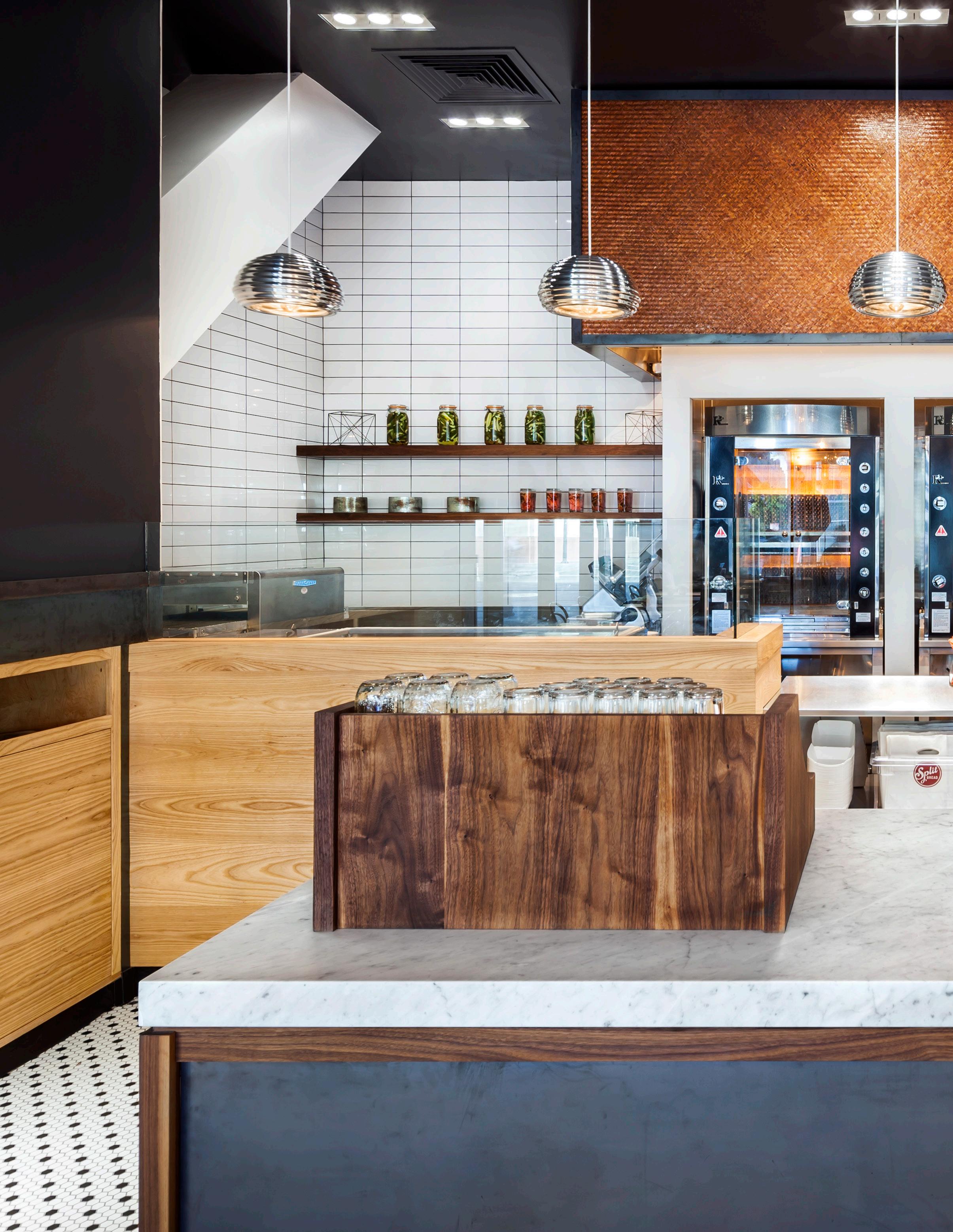
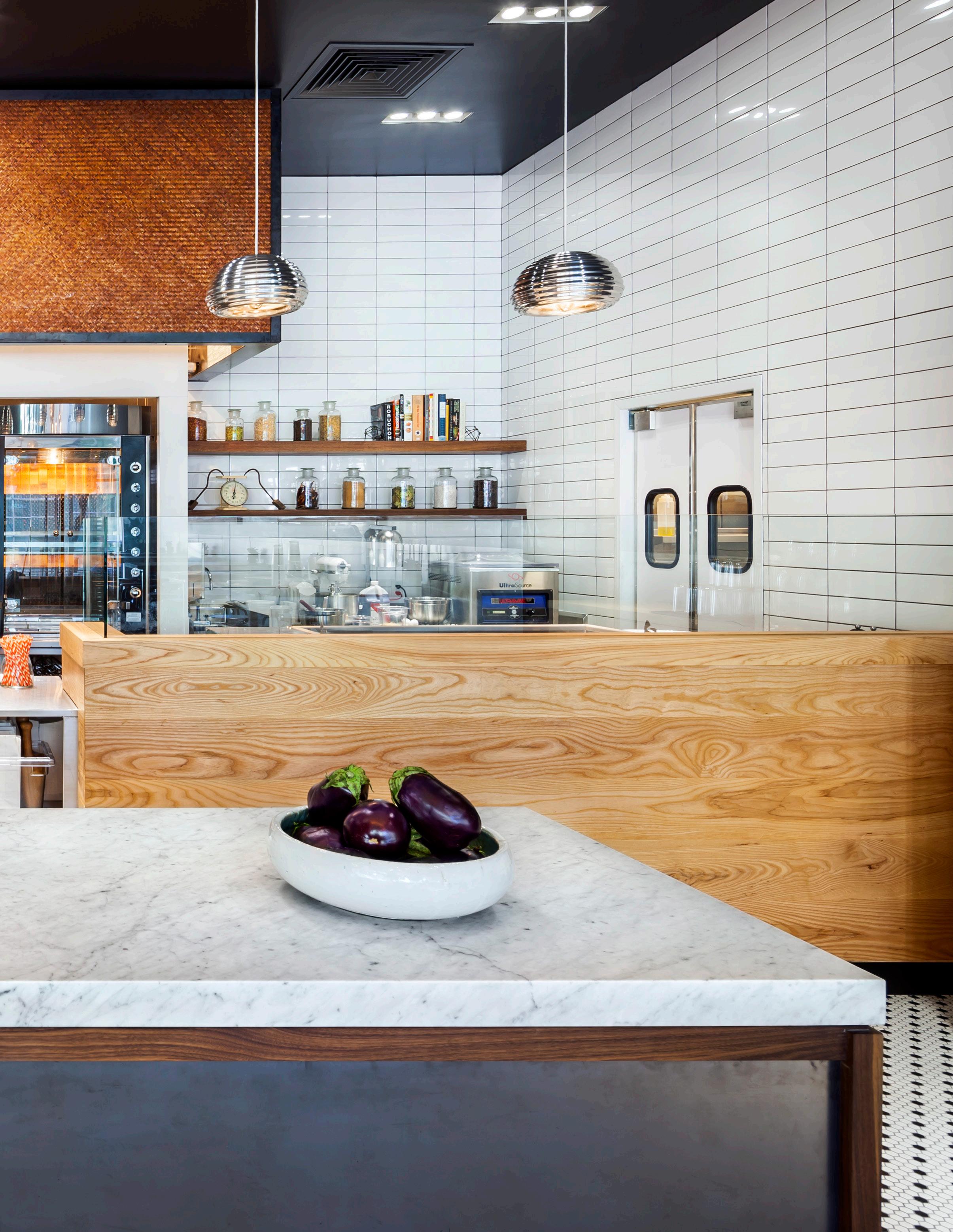
Honesty should not limit creativity. The hood above the roasters in this restaurant is clad in woven copper mesh, a appropriate material for a hood, but transformed creatively for a high-design impact effect.
“How


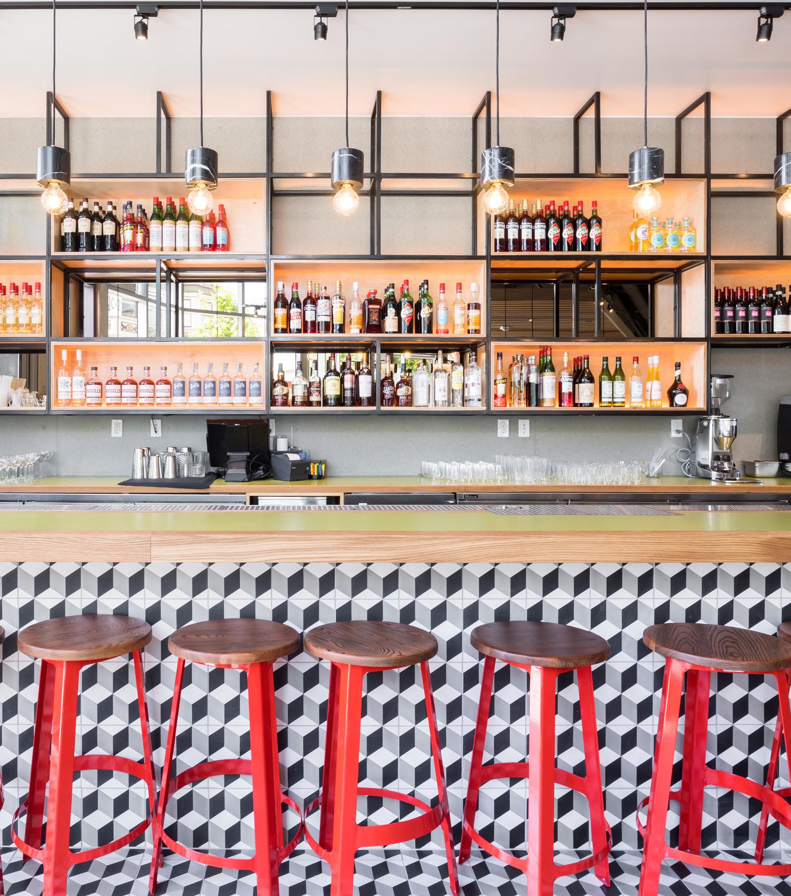
The harmonious exchange between the vibrancy of the tile pattern and the more neutral textures elsewhere give this restaurant a sensuous quality
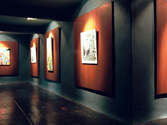
Design is often an exercise in problem solving, but sensuousness is less tangible and is something which is evoked rather than determined.

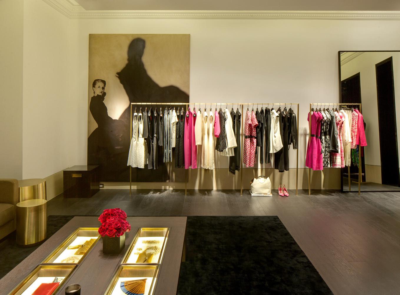
Sensuousness in architecture is ephemeral but its essential qualities can be articulated through subtlety, restraint, suggestion, art and a connection to our humanness.
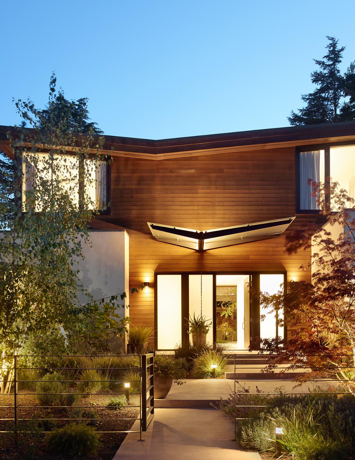
The juxtaposition of organic natural wood against hard steel edges forms a sensuous quality through the details of this project.
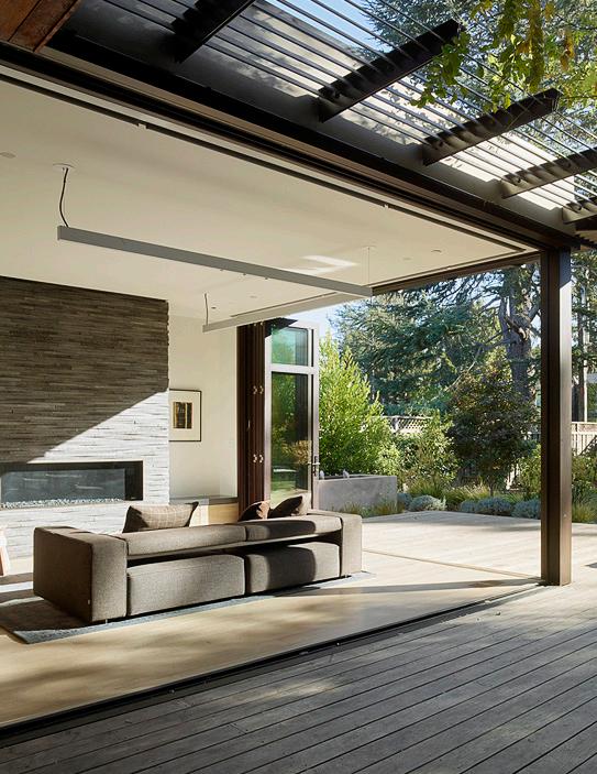
Sensuousness is also a mood and one which can be nurtured through design.
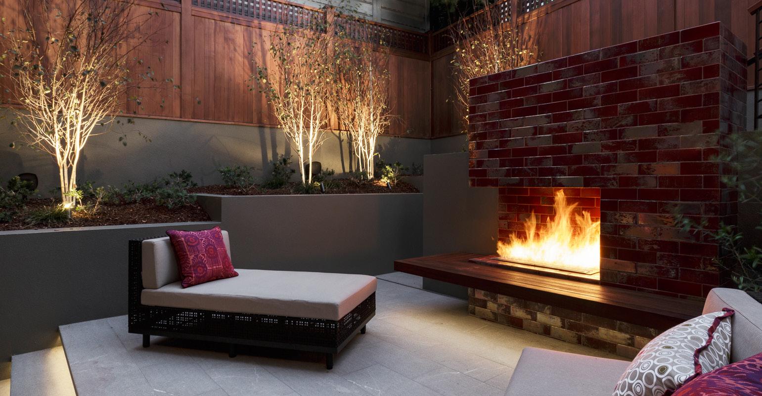
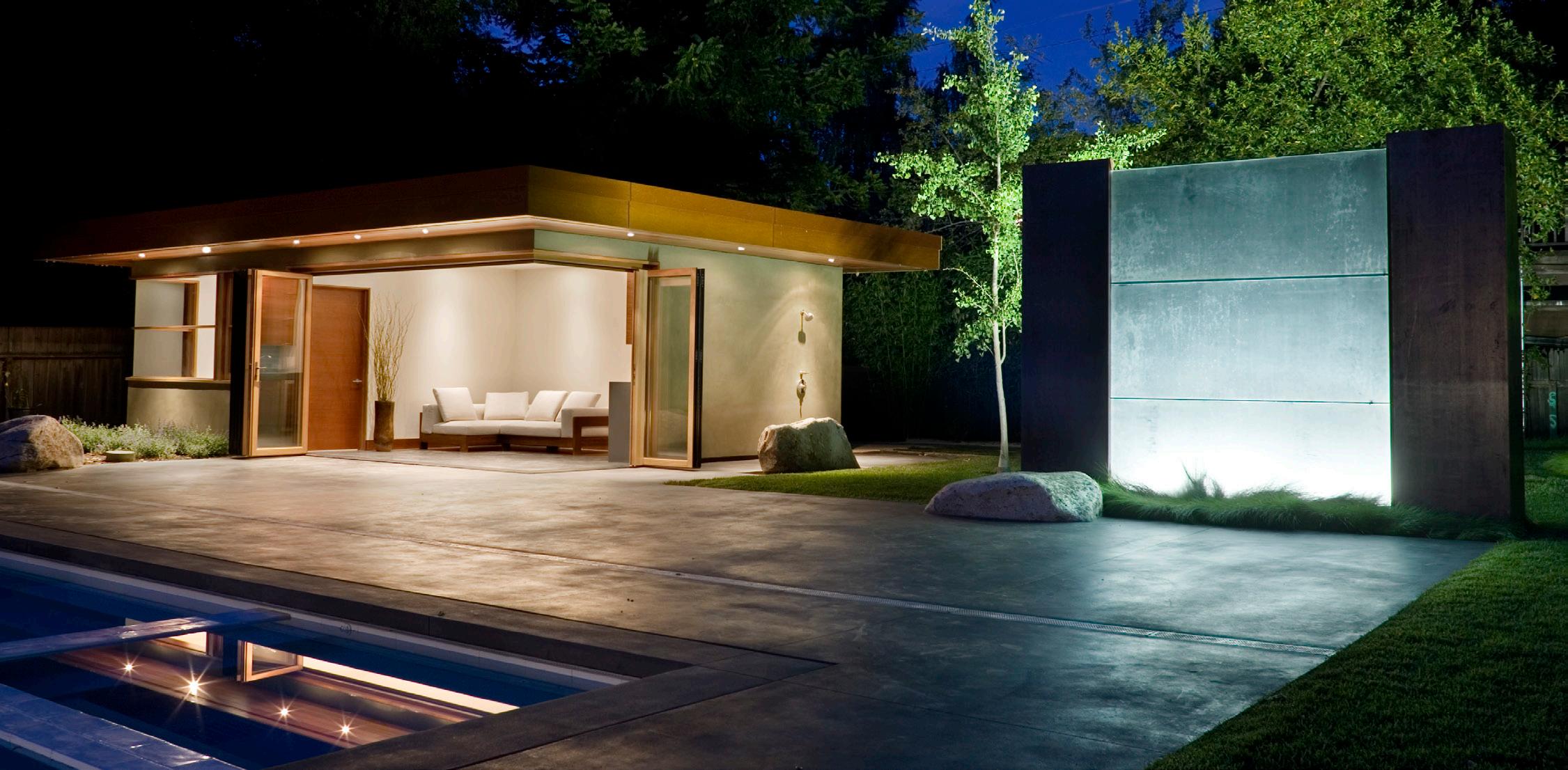
Space, light, material and color are key design elements that help set the mood and should be thoughtfully utilized in a space.
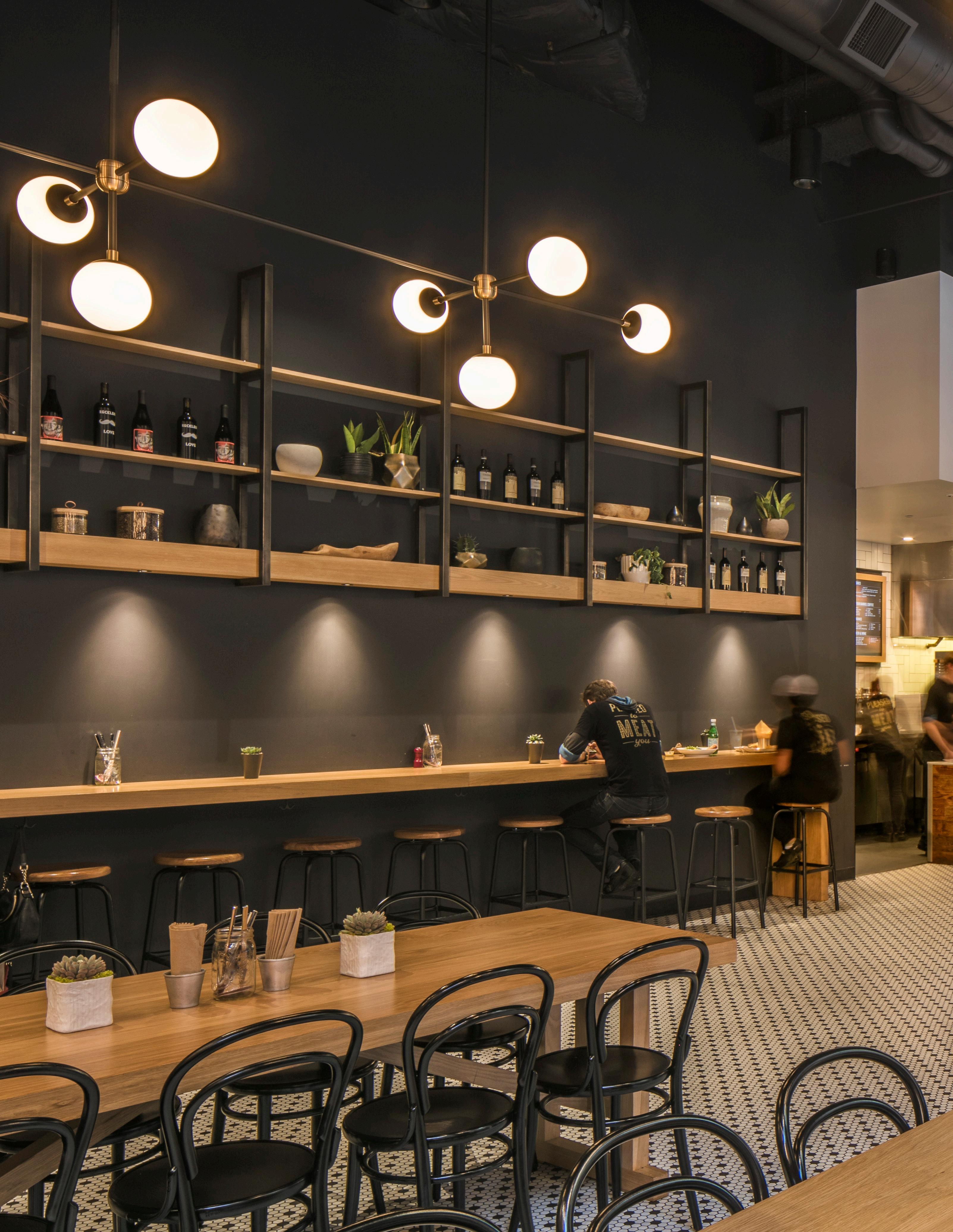
The rich, saturated material palette and elegant but restrained lighting sets a sensuous mood for this restaurant.
“Something


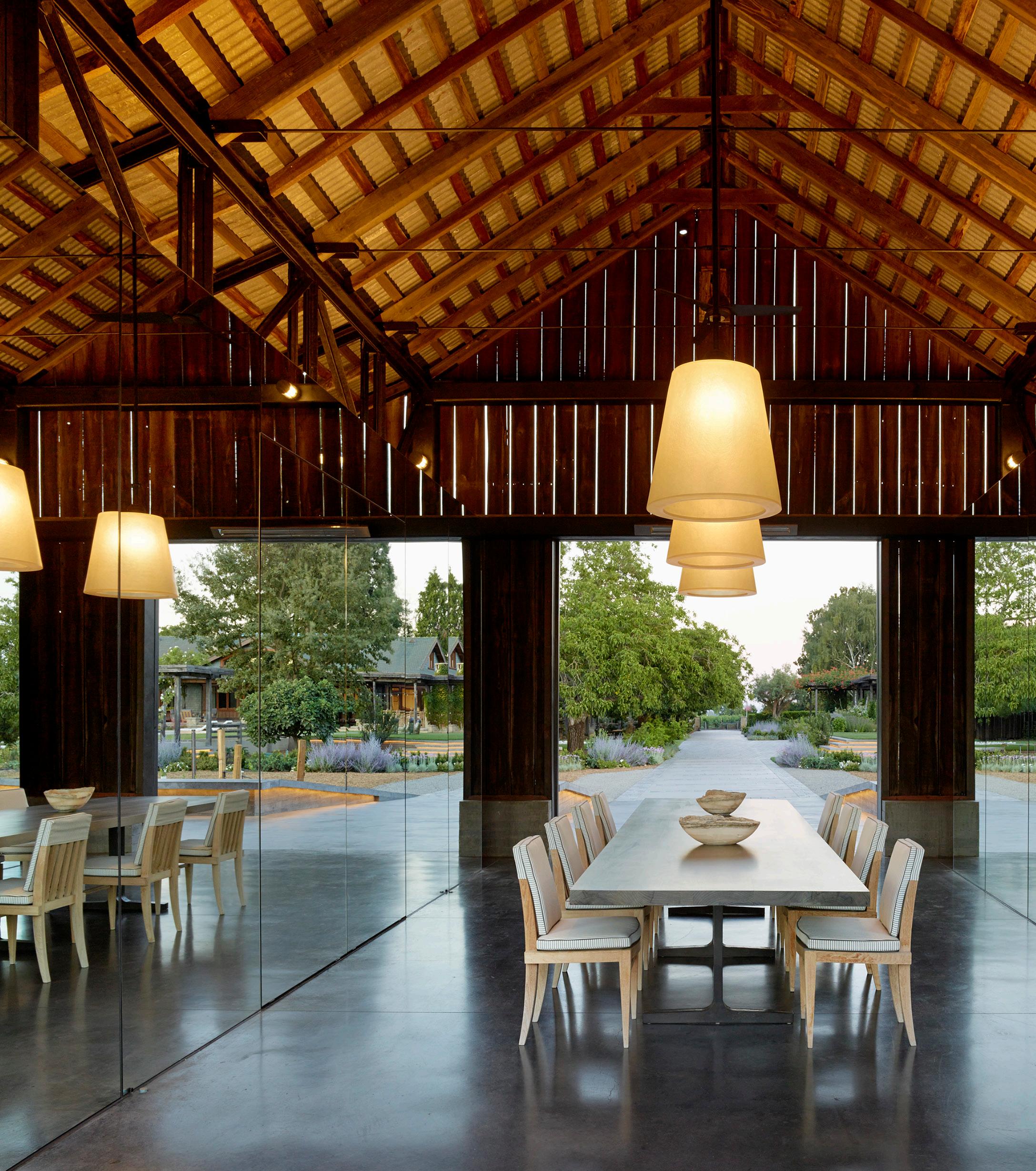
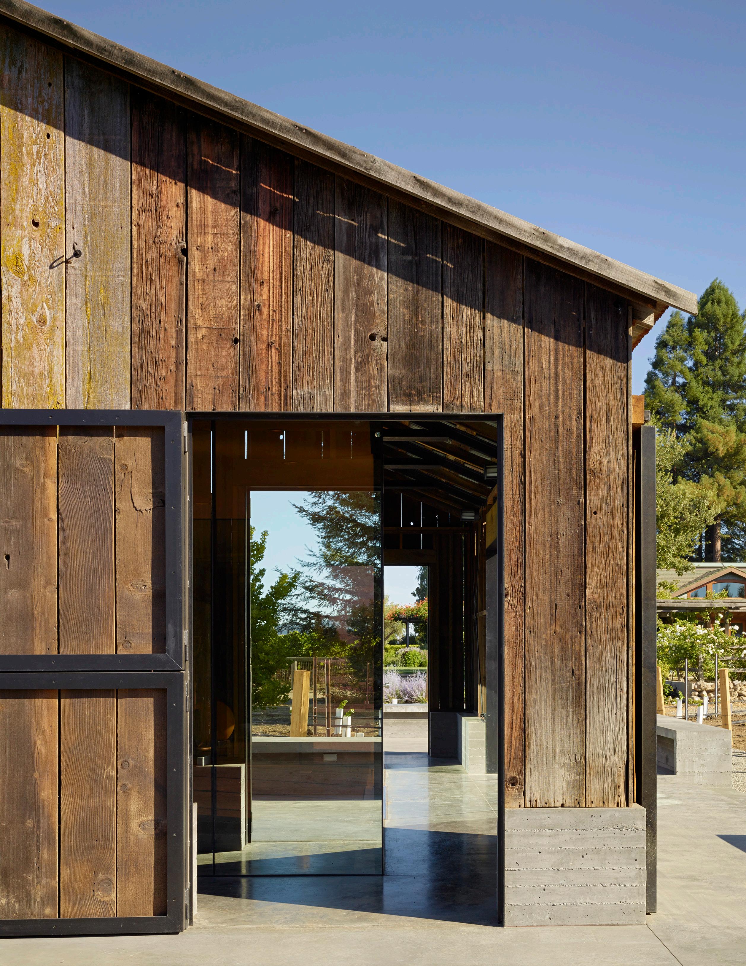
The weathered wood of the repurposed barn shell and the views to the landscape beyond give this project a comfortably natural quality.
Natural materials are an essential component of a warm, inviting and honest design.
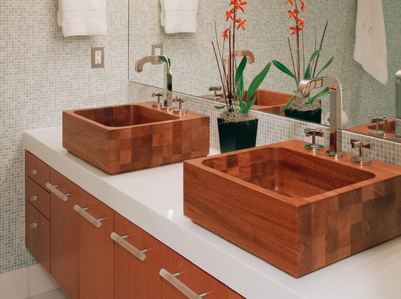
They provide a connection to the environment and appeal to our humanness as creatures of nature.

Even when removed from a visual connection to nature itself, natural materials maintain conceptual and tactile contact with it.
They help “bring the outdoors in” and allow a building to integrate with its natural surroundings.

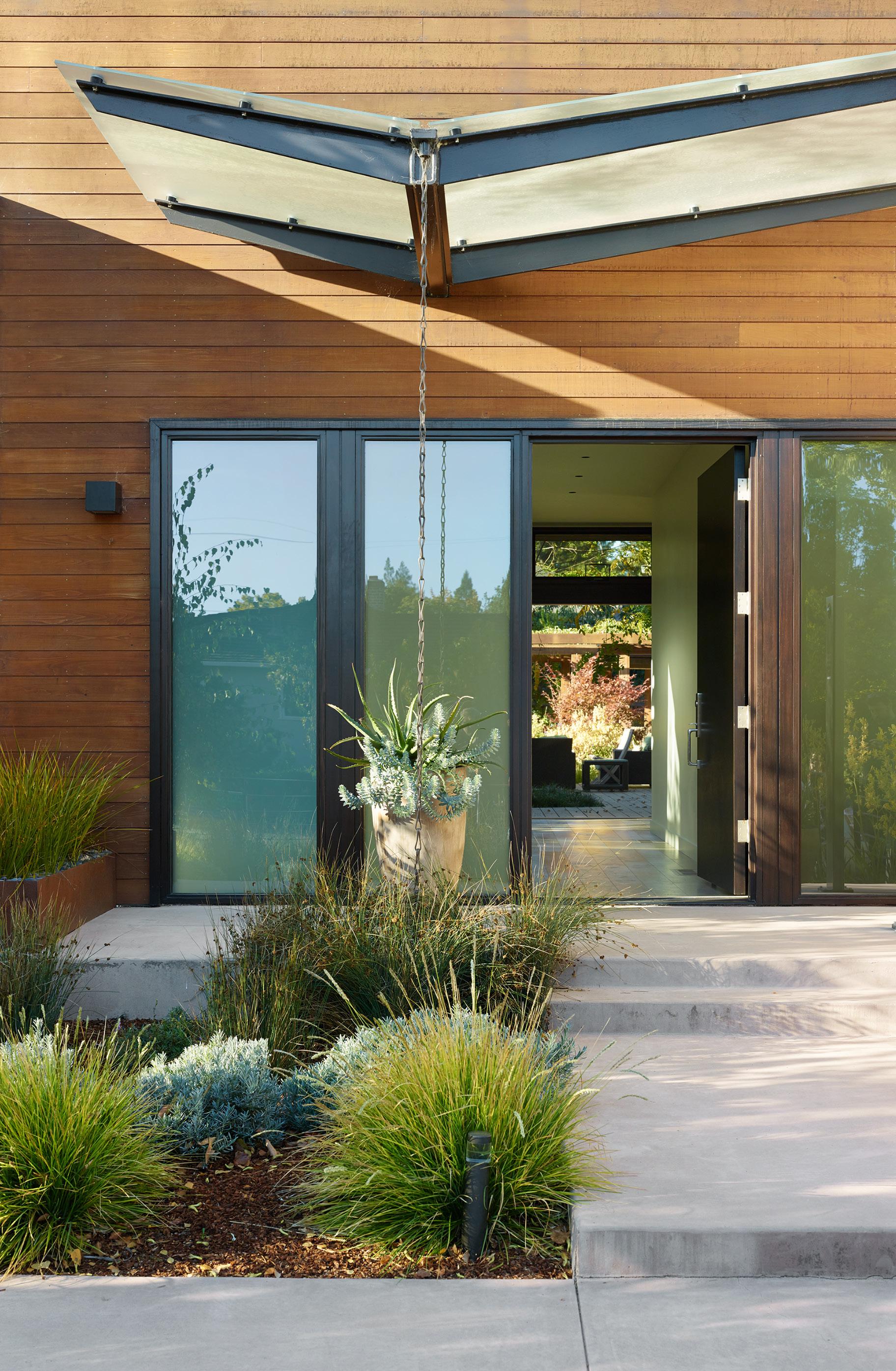
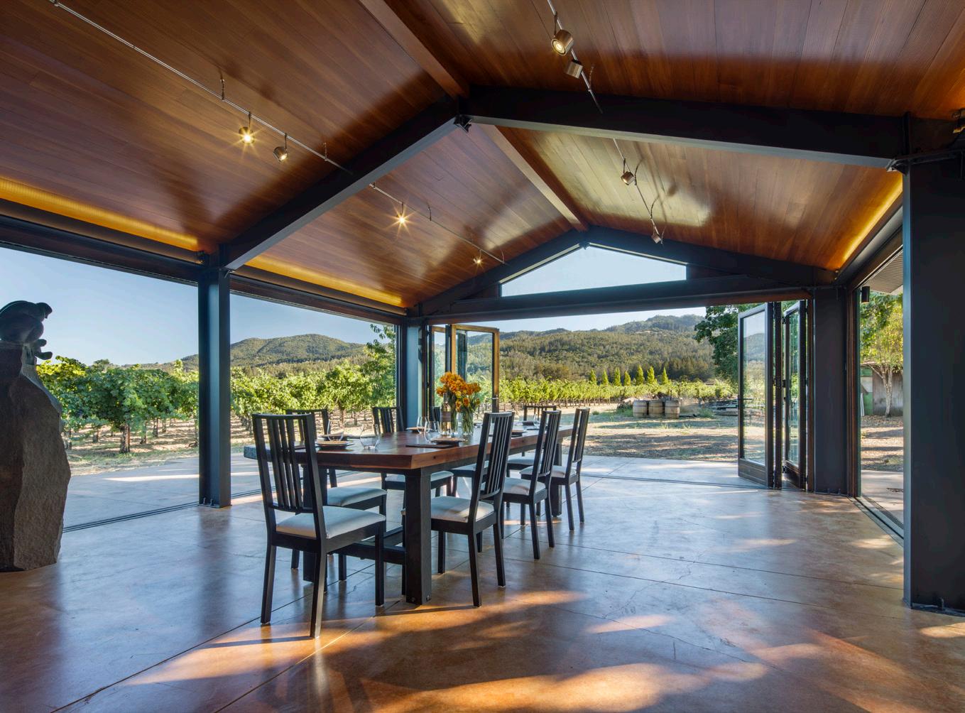
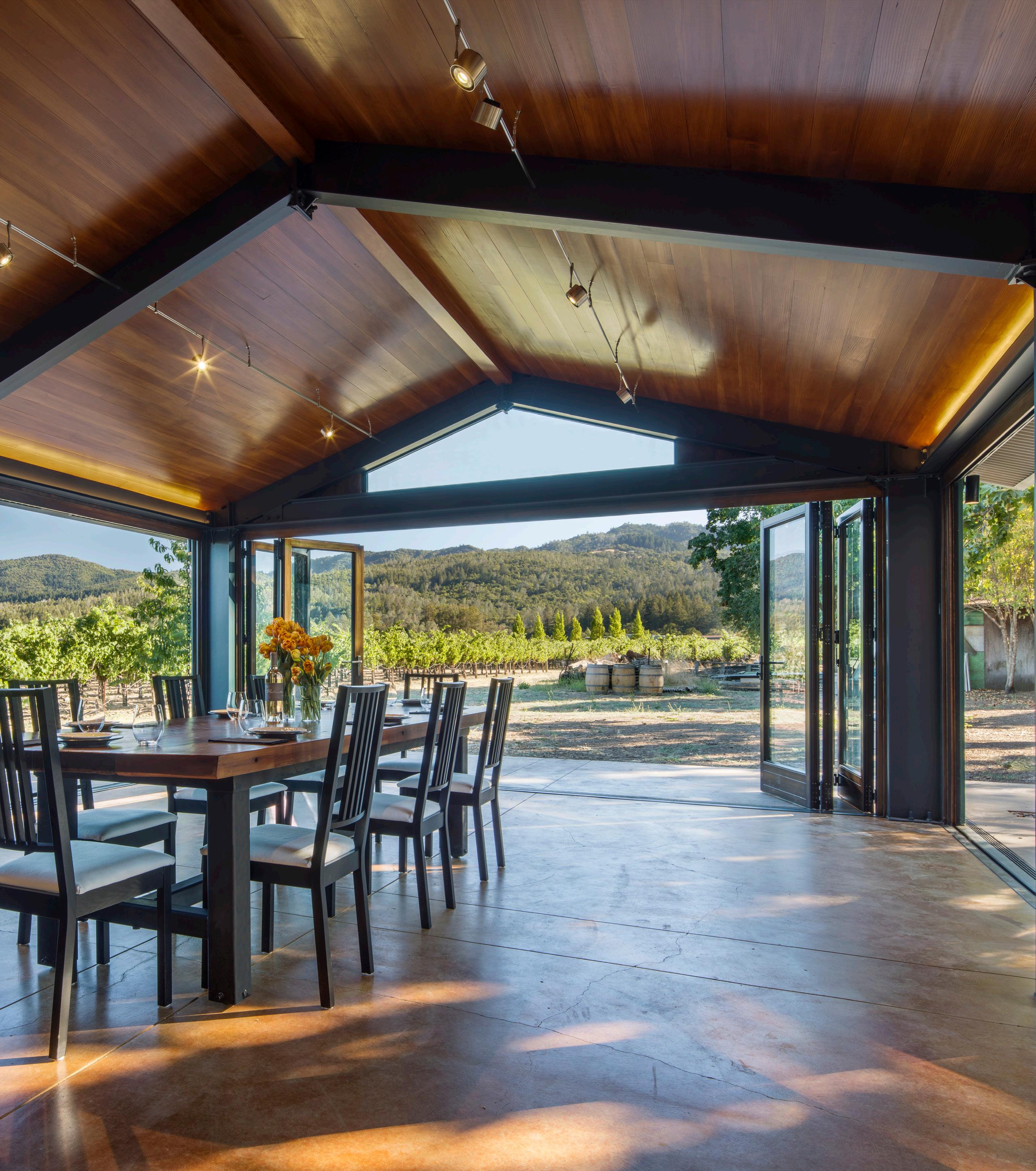
The natural wood ceiling of this wine tasting room adds warmth to the space and affirms a connection to the landscape beyond.
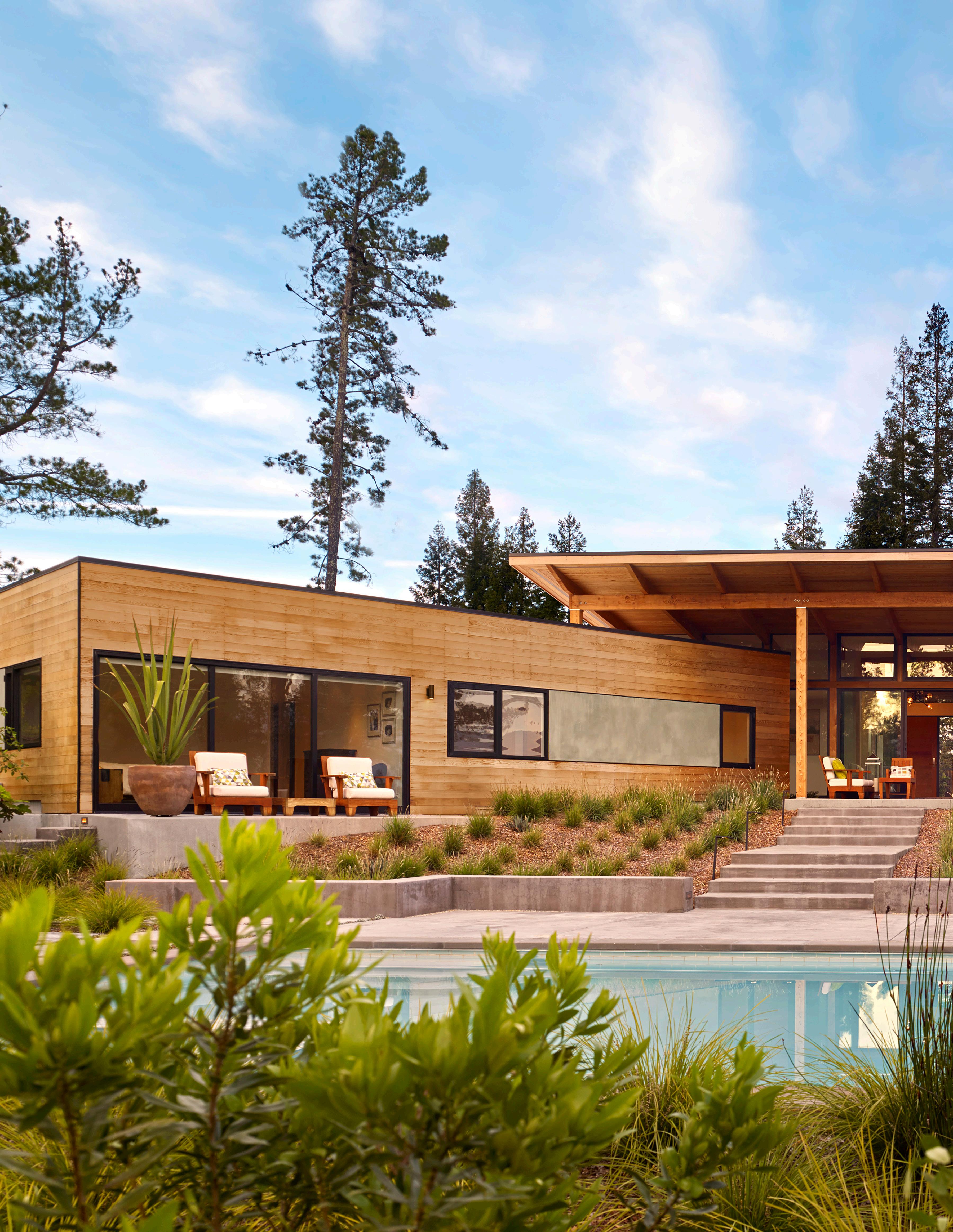
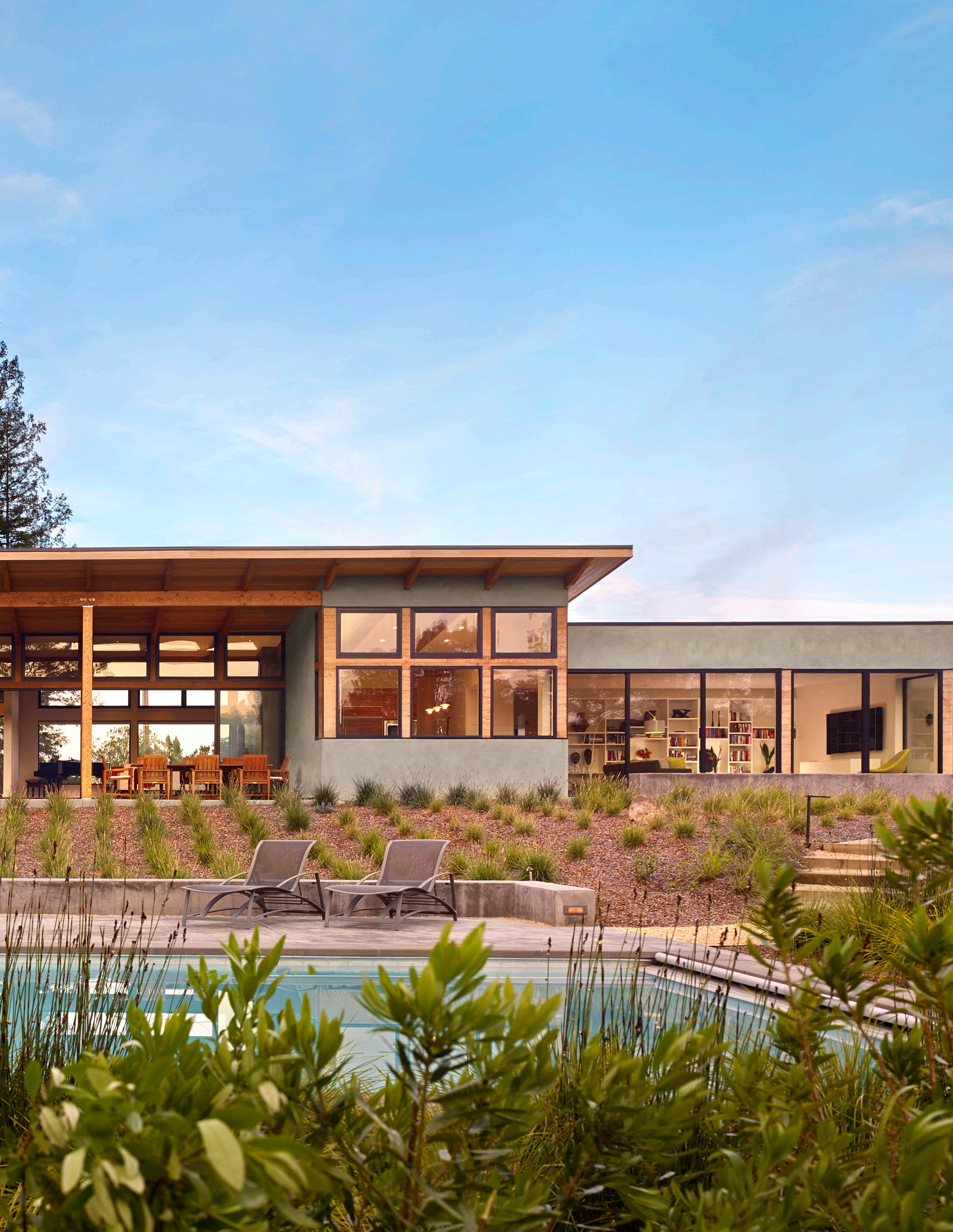
Wood siding, exposed wood structure, and an integral color stucco form a natural material palette for this modern home, helping it blend with the landscape surrounding it.
“The feel, appearance or consistency of a surface which interplays with others to create a visual and tactile architectural quality.” 1


The textural quality of materials is an essential means by which a design move can be emphasized, spaces can be connected, or one element can be differentiated from another.
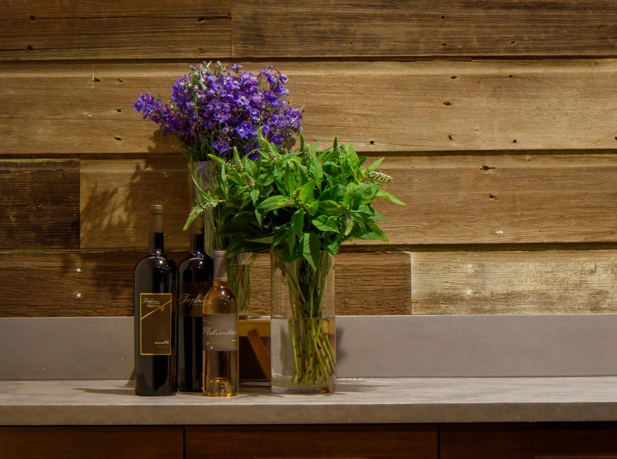
Texture should be used with thoughtful intent and as an effective way to accentuate a design.
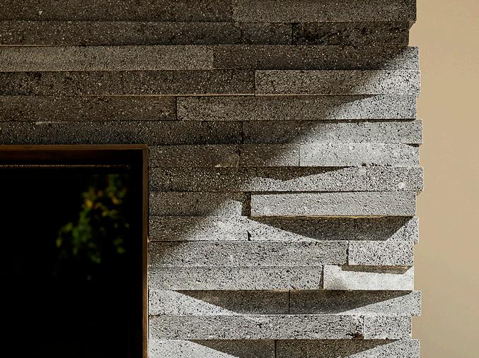
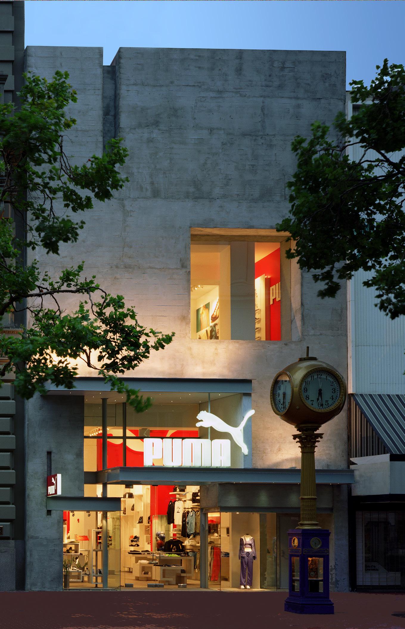
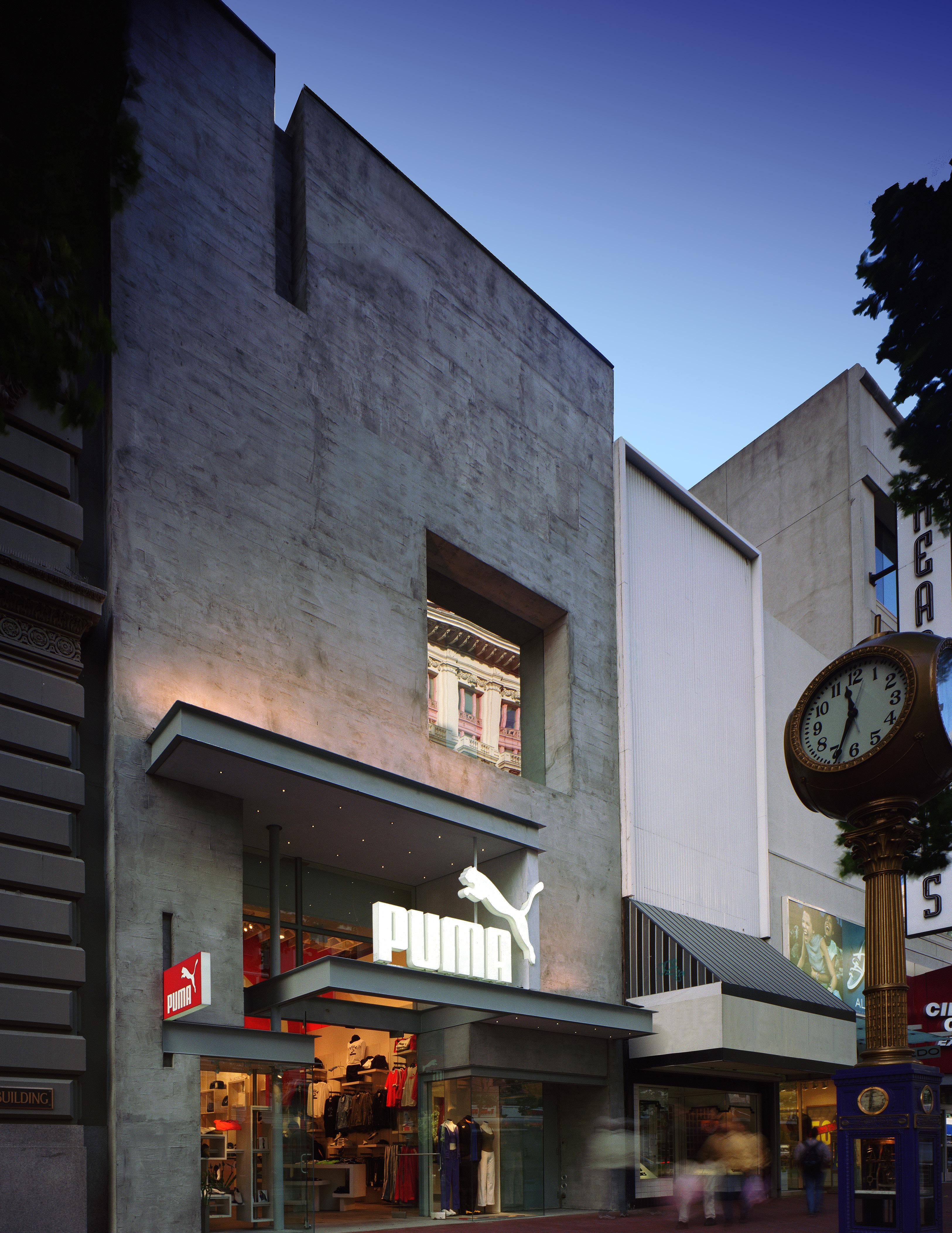
The textured imprint of the board-formed concrete creates a rough and raw counterpoint to the smooth crispness of the steel canopies in this facade, emphasizing the impact of one another on the design.
This retail store uses a full spectrum of textures to accentuate the design moves. They add visual interest and sophistication to the space while not distracting from the featured merchandise.
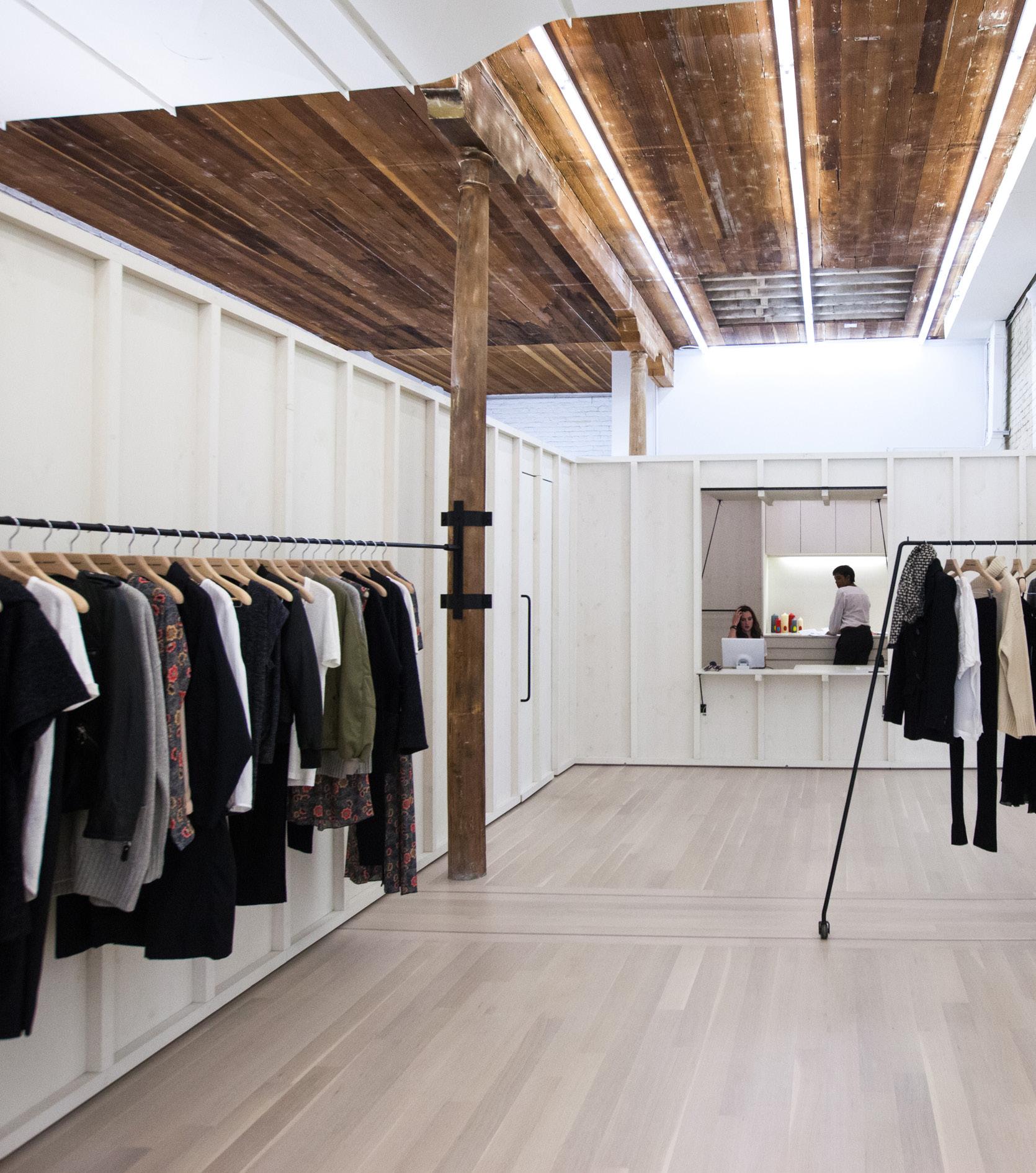
The interplay of textures in a building or space adds layers of complexity to a design.

It can be subtle or bold, but should serve to reinforce and enhance the broader design concept.
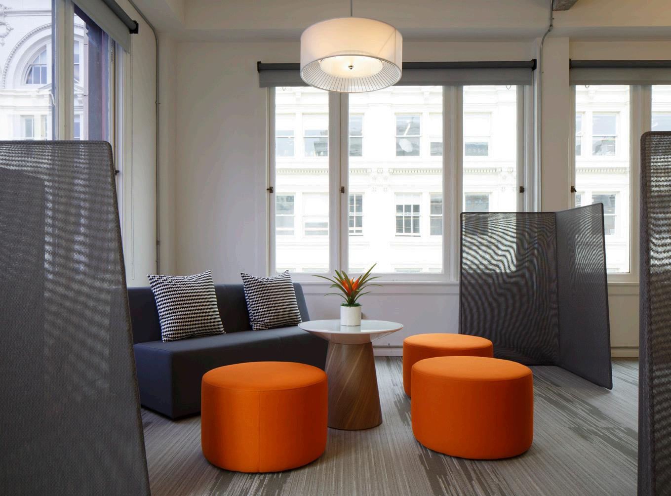
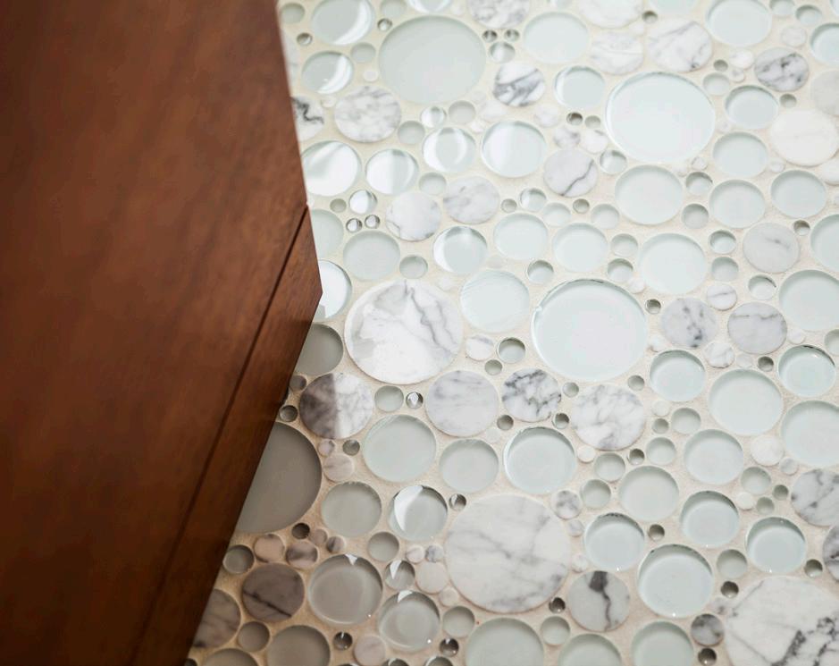
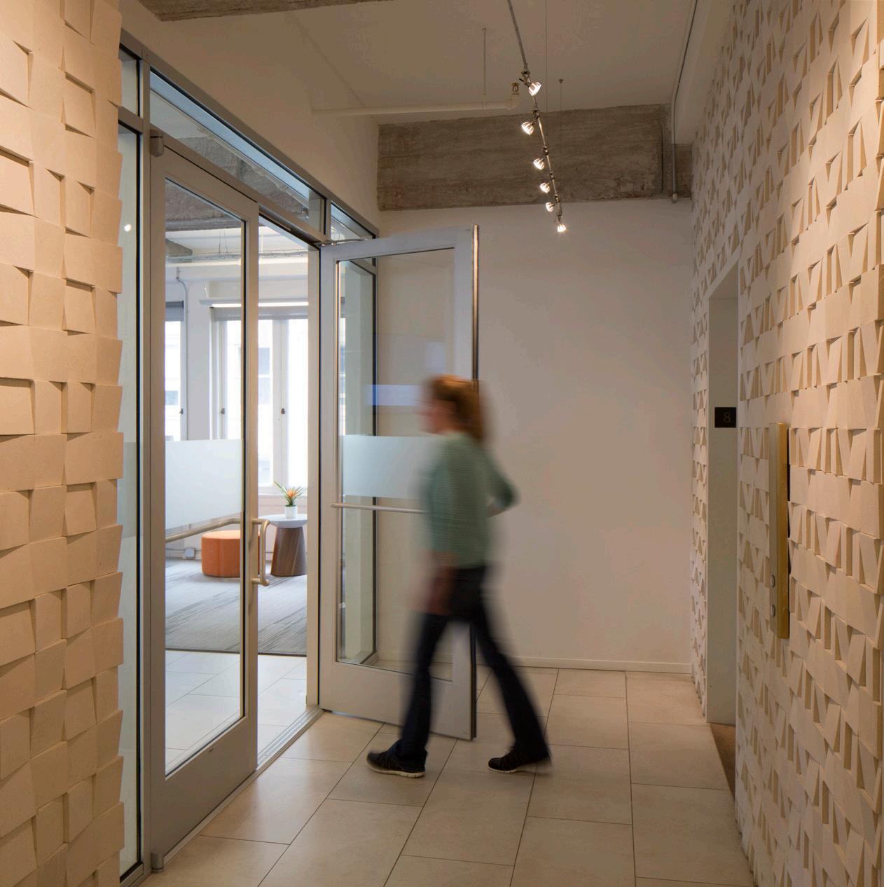
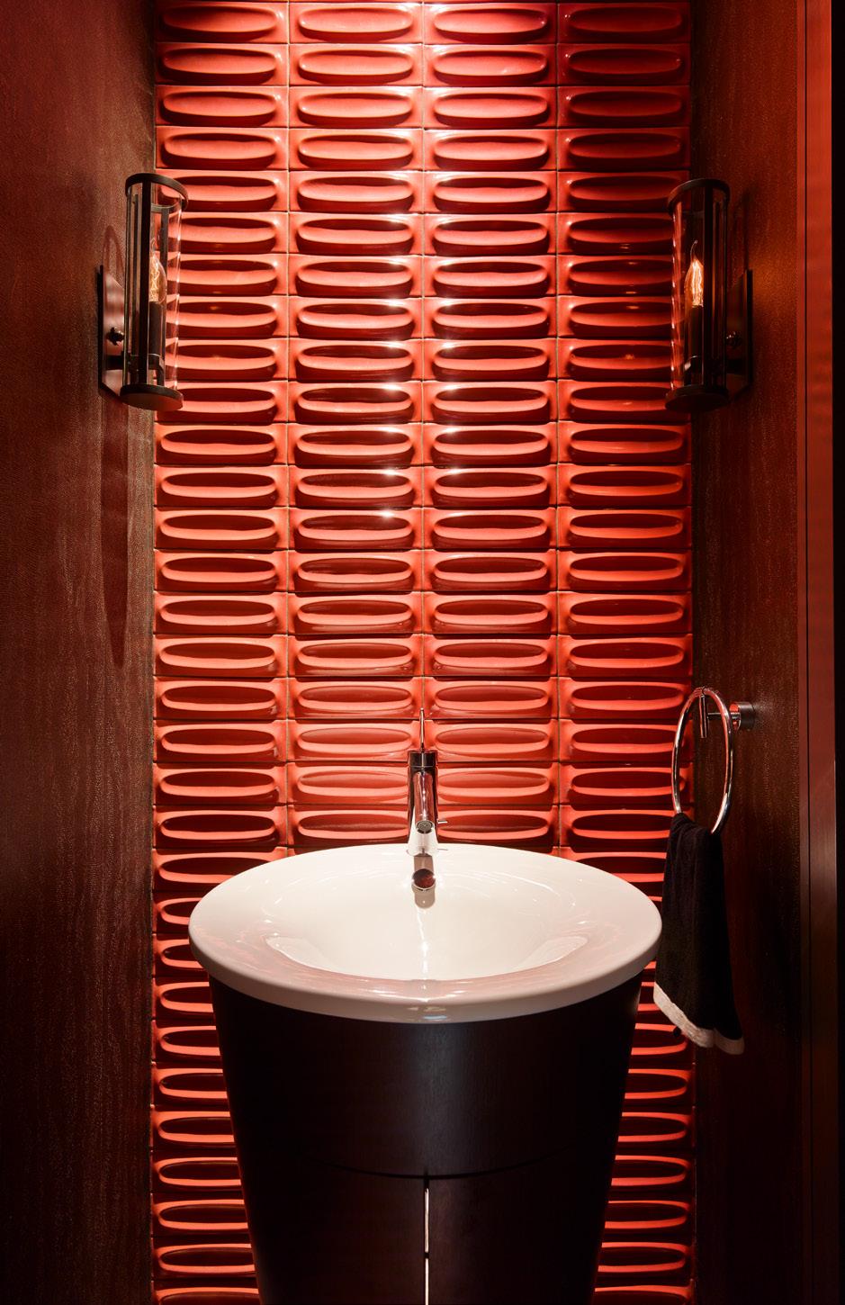
Juxtaposing rough and smooth textures can have a powerful affect on a design. In these images the rough becomes more raw and elemental while the smooth becomes more sophisticated and refined.

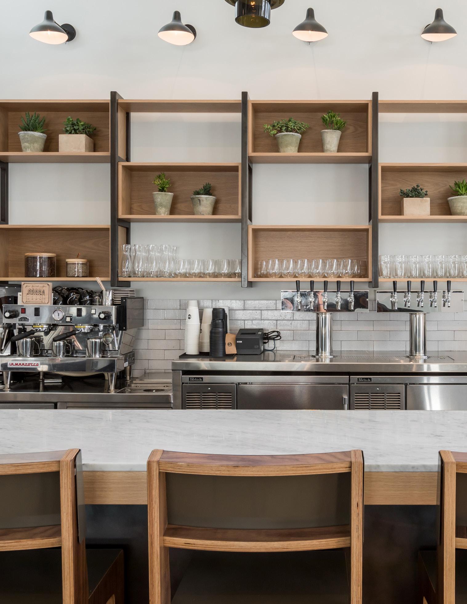
“The skill of making things by hand with an acute attention to the art of

and connections.”

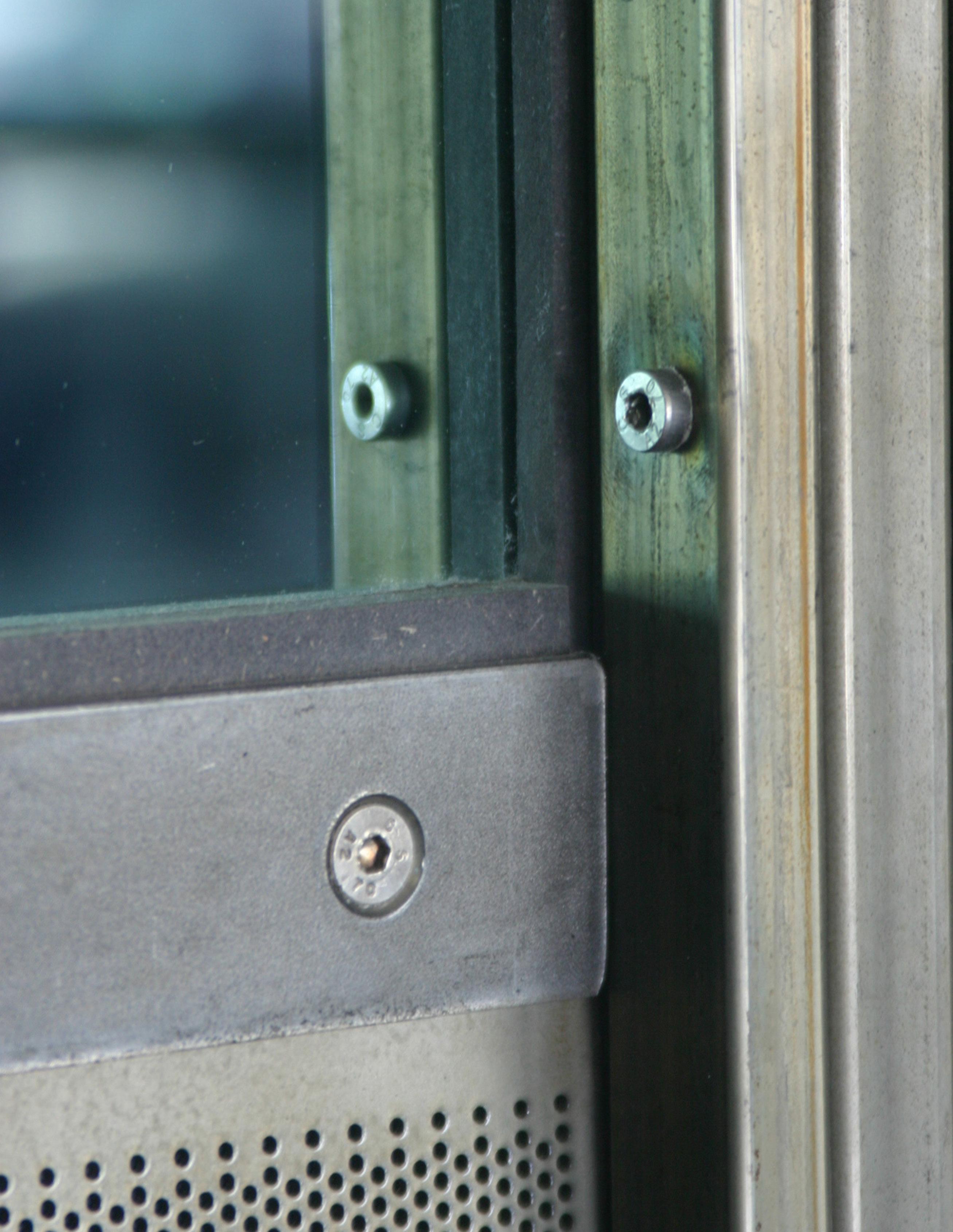
The careful selection of materials and the thoughtful detailing of their connection enhances the overall design.
Craft is at the heart of architecture. What is designed cannot become architecture until it is built, and craft is defined by the care with which it is both designed and built.
Being conscious of craft helps create a connection between the design and a love for the materials and details that work together to make up the overall composition.
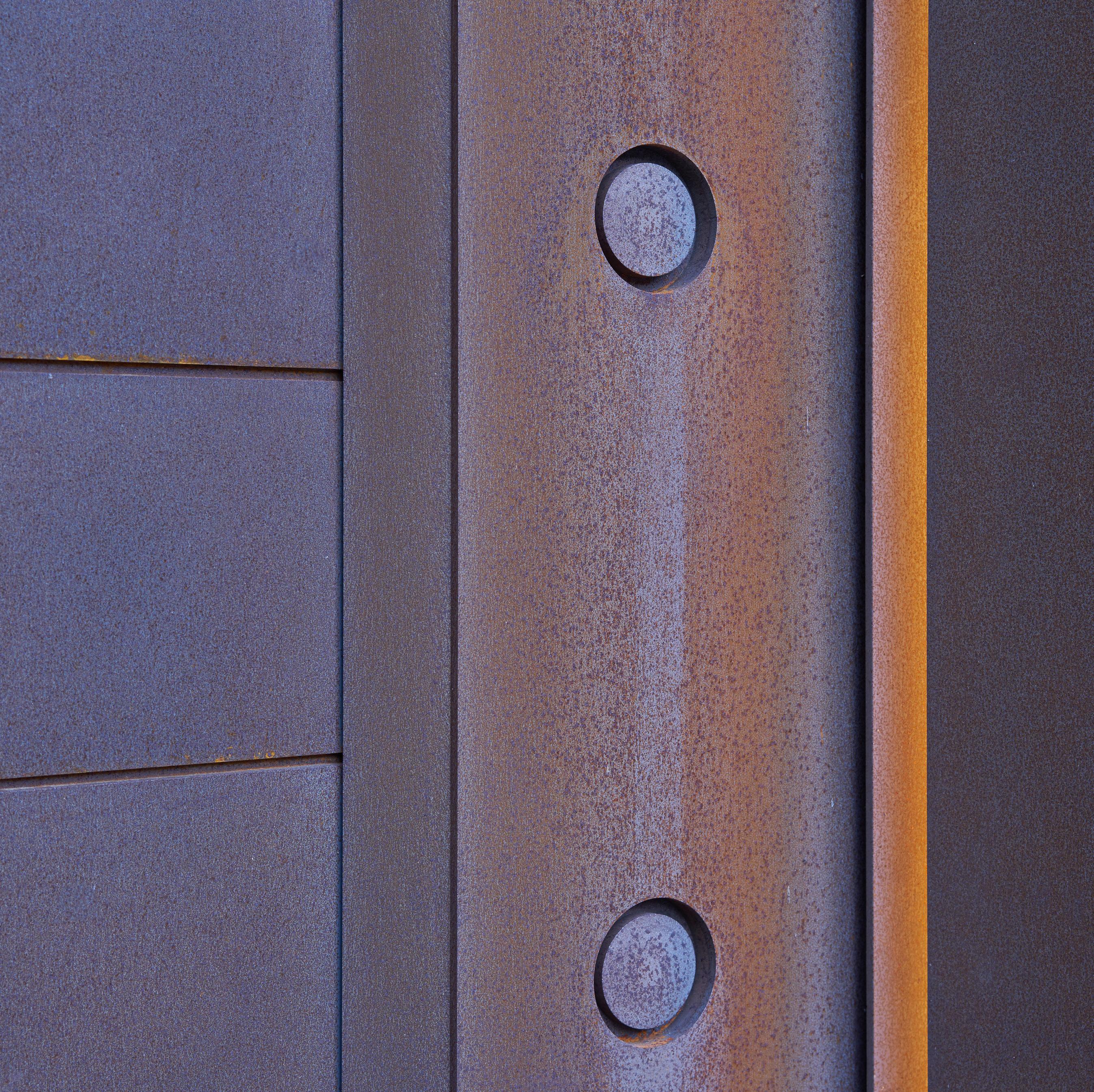
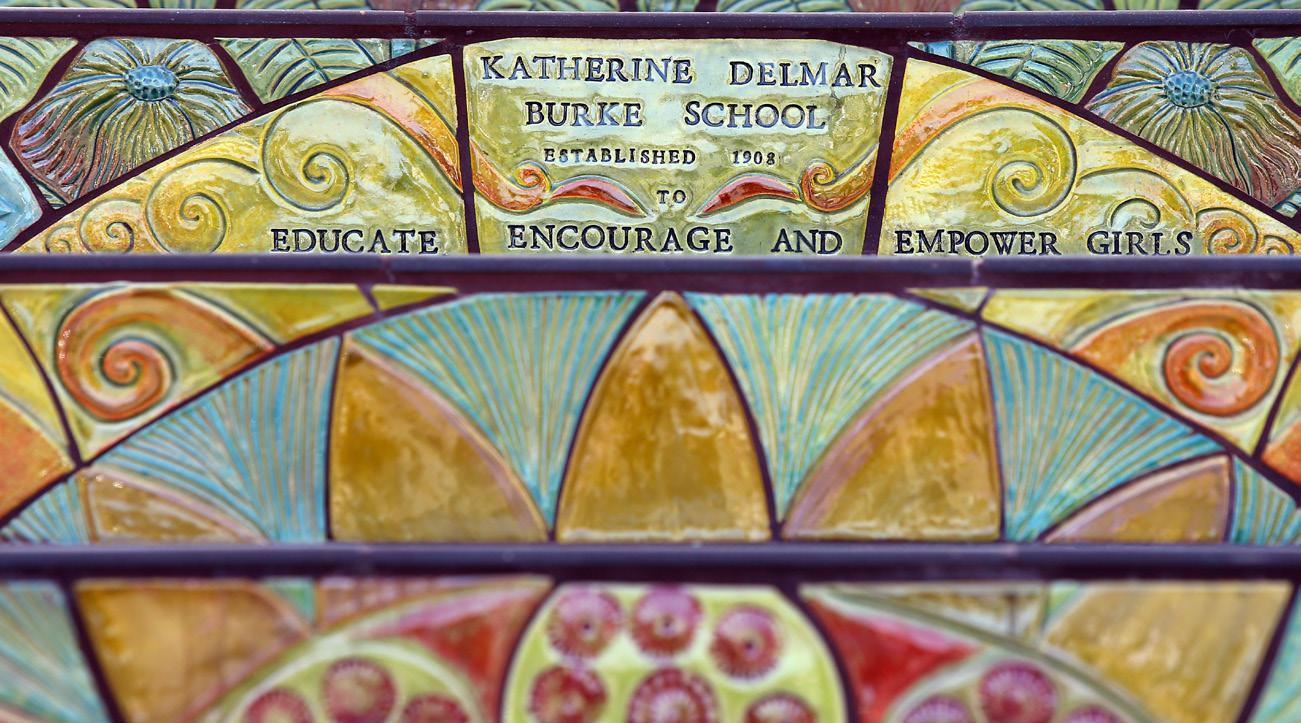
Feature elements play a prominent visual role in a design by drawing attention to themselves through their quality and detail.
The design and construction of feature elements requires great attention as their crafting is crucial in projecting the quality of a comprehensive design.
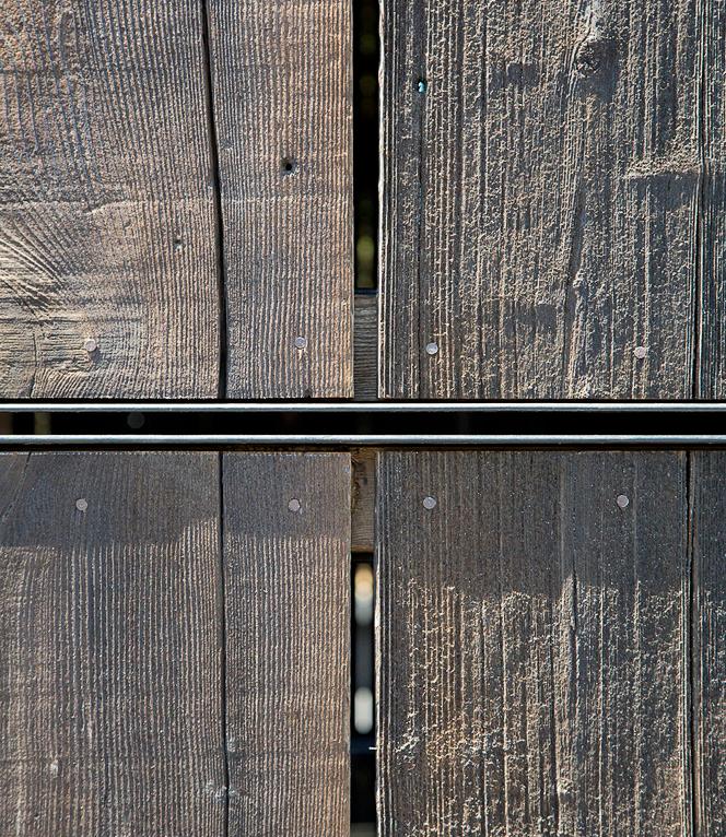
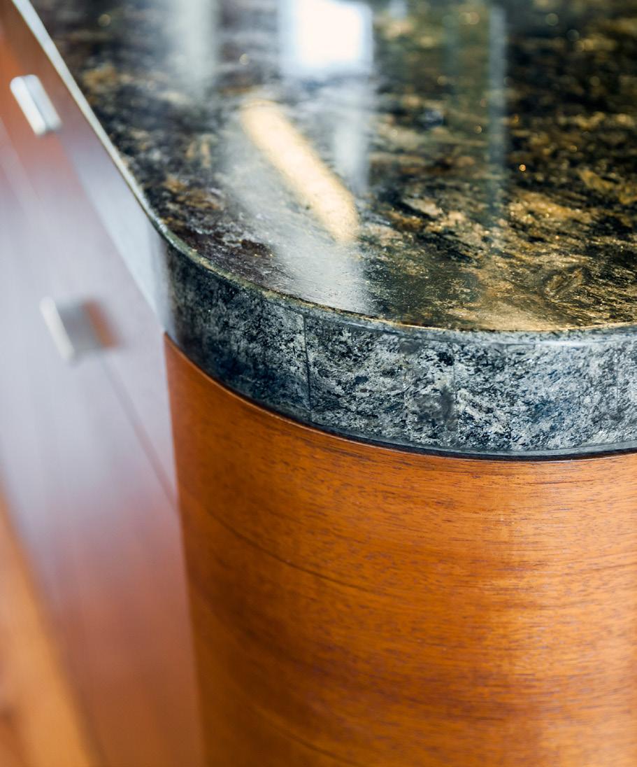
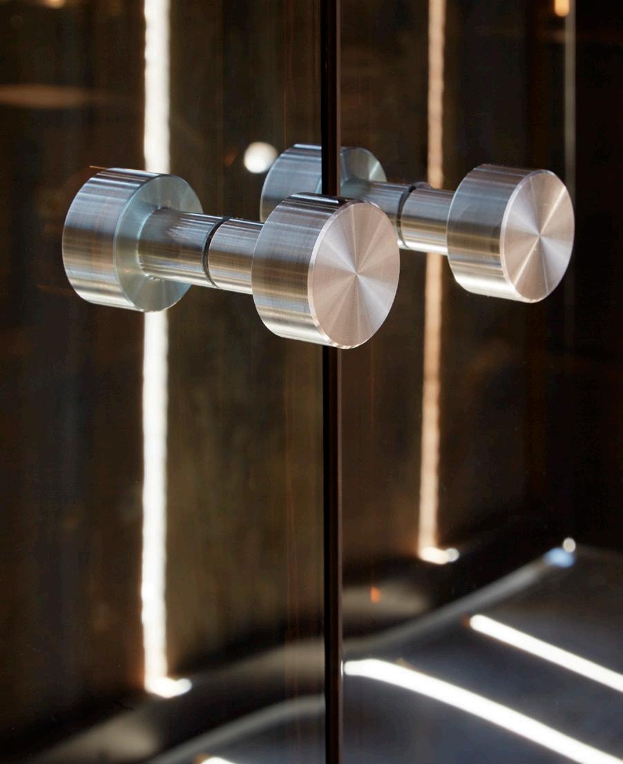
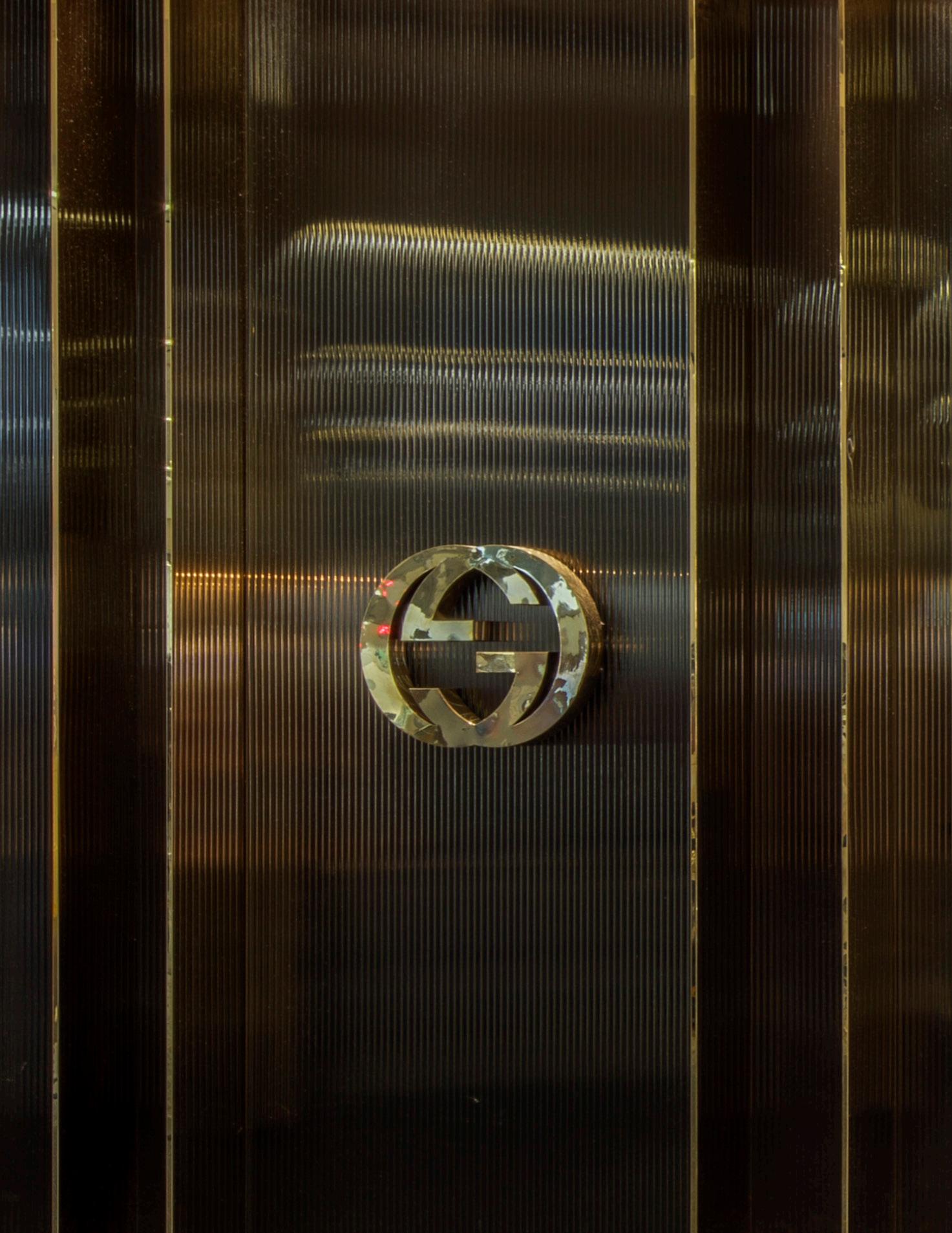
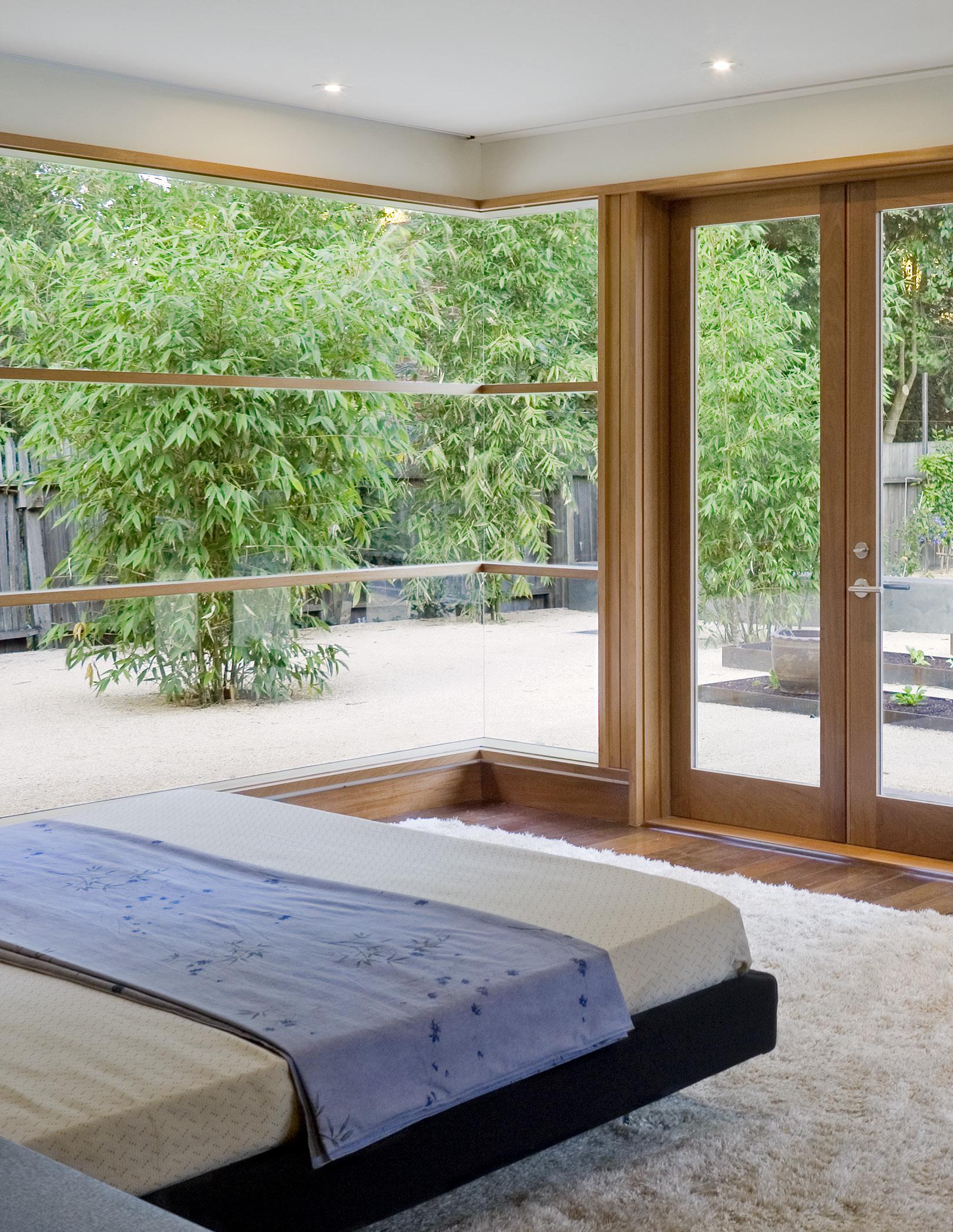
Craft is observed in the detailing of the window and door unit in this room. It was designed and constructed to be light and transparent alongside the metal panelling of the fireplace surround which is rough and earthy yet crisp and aligned.

ALIGNMENT
ARTICULATION
BALANCE
BIG MOVE
CELEBRATION OF THE OBJECT
CLARITY
COMPOSITION
CONNECTION
CONTEXTUALITY
CRAFT
DESIGN SENSITIVITY
ECONOMY
ELEGANCE
EXPERIENCE
The harmonious arrangement of elements with one another (P.063)
A clear and distinct language that guides the sculpting of the forms of the architectural space (P.079)
An aesthetically pleasing arrangement of elements, to achieve a state of equilibrium or harmony (P.035)
The use of a bold, clear, and significant design move that guides the design
The parti that sets the design direction (P. 007)
The accentuation of an architectural element within the design (P.021)

A design which has certainty in concept, intent, and is easily understandable (P.049)
The combination of various elements in a harmonious manner to form a balanced whole (P.013)
The integration of architecture to its surrounding site (P.113)
The constructed and natural space surrounding a design and the harmonious integration into any solution (P.157)
The skill of making things by hand with an acute attention to the art of detail and connections (P.213)
The care with which a design connects to a specific context (P.121)
Maximizing architectural value with minimal use of design elements and design moves (P.165)
Careful organization and aesthetic refinement of compositional elements (P.131)
A sense of the spirit quality, and character of a place gained through its relationship with space, use of color and light, and composition of form (P.071)
FLOW
HONESTY
HORIZONTALITY
LIGHTING
MATERIALITY
NATURALNESS
ORDERING PRINCIPLES
PROPORTION
RESTRAINT
RHYTHM
SENSUOUSNESS
SIMPLICITY
SPATIAL QUALITIES
TEXTURE
TIMELESSNESS
TRANSPARENCY
WARMTH
Free, unconstrained movement from one space, or element to another (P.105)
Integrity with respect to the intent, purpose and proper use of a material (P.181)
Accentuation of the horizon through linear organization of elements emphasized with form and shape against the ground plane (P.055)
The enhancement of architecture through the thoughtful manipulation of natural and artificial illumination to accentuate the elements of the design. (P.095)
The quality or character of materials (P.171)
Something which is not man-made and faithful to its origin (P.197)
The arrangement or disposition of people or things in relation to each other according to a particular sequence, pattern, or method (P.005)
Harmonious relation of individual parts to each other and the whole (P.029)
Conscious limitation of excessive design elements to reinforce the essence of the design concept (P.123)
The use of patterns or repetition to accentuate the design (P.043)
How the atmosphere of a space stimulates the physical senses (P.189)
The quality or condition of being uncomplicated in form or design (P.139)
The attributes associated with, and the perception of, a volume or space (P.069)
Relating to the feel, appearance, or consistency of a surface or a substance
The juxtaposition and interplay of surfaces to create a visual and tactile quality of space (P.205)
Unaffected by the passing of time, or changes in fashion and trends (P.147)
The ability to see through architecture and visually connect it with its context (P.087)
A textural softness creating an inviting feeling, which is the opposite of cold and sterile (P.173)
BRILLIANT EARTH
Brilliant Earth Loft - DC
Pages: 66, 105,
CESAR RUBIO PHOTOGRAPHY
Golden Oak Residence
Pages: 20, 44, 43, 62, 90, 128-129, 141, 158, 175, 202-203
CAROLINA HERRERA
Carolina Herrera Union Square Pages: 82, 136-137, 191
DAVID DUNCAN LIVINGSTON PHOTOGRAPHY
Ashbury Heights Residence Page: 193
DOUGLAS STERLING PHOTOGRAPHY
Hundred Acre Winery
Pages: 9, 64, 100-101,196-197, 199, 215
ERIC HERMANN PHOTOGRAPHY
XYZ
Page: 166
ERIC RORER PHOTOGRAPHY
District Market
Pages: 60-61, 91, 161
Duty Free Galleria
Page: 106
Jo Malone, SFO
Pages: 161
Green Beans
Pages: 57
Gucci
Pages: 32-33, 59, 217
Hamilton Families
Page: 101
Hermes
Page: 130
Human Services Agency
Pages: 168-169
Mixt - Yerba Buena
Pages: 40-41, 102, 183
SF Travel News
Pages: 26-27
Split - Mission Pages: 37, 42, 46, 56, 144, 194-195, 209,
Tacos El Grullenes
Page: 14
Taplin Cellars
Pages: 114, 117, 139, 149, 201, 206
Urthecast
Pages: 75, 140, 183, 206, 209
WDA Office - Mission Street
Pages: 36, 67, 78-79, 165-166, 175, 180
WDFG SFO
Page: 49, 106
GABRIELLE LURIE PHOTOGRAPHY
Isabel Marant
Pages: 15, 25, 99, 110-111, 122, 185, 208
JD PETERSON PHOTOGRAPHY
Jacobsen Residence
Pages: 22, 23, 146, 174
Puma Store
Pages: 18, 19, 30, 81, 150, 207
SF Loft
Pages: 80, 199
Timbuk2
Pages: 7,167,184
WDA Office - Howard Street
Pages: 88, 176
JIM THOMPSON PHOTOGRAPHY
Wheeler Residence
Pages: 13, 54-55, 98, 99, 108, 117, 118-119,126, 178-179, 193, 204-205, 218-219
JOE FLETCHER PHOTOGRAPHY
Vallejo Residence
Pages: 16, 24, 39, 51, 84-85, 107, 124, 133, 149, 151, 156, 159, 206
LE CORBUSIER
The Modular Series
Page: 29
LUCAS FLADZINSKI PHOTOGRAPHY
Blackberry Hill Residence
Pages: 160, 206, 216
CBS Interactive
Page: 164
Chen Design
Page: 182
Destination Green
Pages: 10, 166
HSA - 1440 Harrison Street
Page: 116
Mixt - Sansome
Pages: 6, 74, 173
Novo Construction
Pages: 82, 143
Split - Metreon
Pages: 8, 38, 42,115, 158, 186-187
WDA Office - O’Farrell Street
Pages: 11, 36
MATTHEW MILLIMAN PHOTOGRAPHY
Big Ranch Road
Pages: 15, 47, 50, 70, 76-77, 83, 86, 94, 97, 125, 145, 152-153, 162-163, 198, 211, 216
San Mateo Residence
Pages: 17, 58, 59, 65, 67, 89, 92-93, 96, 103, 109, 112, 135, 142, 154, 155, 172, 176, 188, 192, 200, 210
MIKE KOOZMIN - SF EXAMINER
Lincoln Park Steps
Pages: 73, 216
PATRICIA CHANG PHOTOGRAPHY
Split - Polk
Pages: 31, 109, 125, 134, 213
A Mano Pages: 34, 89, 190
PATRICK ARGAST PHOTOGRAPHY
CCSF Central Shops Page: 57
PRECISION CABINETS
Atherton Colonial Pages: 132, 140
SHARON RISEDORPH PHOTOGRAPHY
Chen Design Page: 3, 175, 182
TITPONG PAEWATTANALERT PHOTOGRAPHY
Mr. East Kitchen
Pages: 45, 75, 103, 143, 166,
WILLIAM DUFF ARCHITECTS STAFF
Artist Studio Loft Page: 72
G-Star Page: 214
Lucid Page: 191
MAC Page: 52
Woodside Residence
Pages: 47, 114, 127
The completion of the WDA Design Vision could not have been accomplished without the support and creativity of dedicated staff, Gustavo Bermudez, Payton Craft, Alexandra Croft, Brenna Daugherty, Taylor Dempsey, William Duff, Sheldon Eaton, Haruka Enokido, Neil Ginty, Brian Hearn, Maryana Heilman, Jon Houck, Glorimar Irizarry-Delgado, Phoebe Lam, Paul Lee, Katerina Leung, Michelle Liu, Sarah Mergy, Parvathy Nair, Wendy Osaki, Dillon Parker, Paige Patterson-Duff, David Plotkin and Danny van Dijk.