

2.1 FREQUENCY DISTRIBUTIONS AND THEIR GRAPHS
2.1 Try It Yourself Solutions
c. Sample answer: The most common age bracket for the 50 most powerful women is 53-61. Eighty-six percent of the 50 most powerful women are older than 43. Four percent of the 50 most powerful women are younger than 35.
b. Use class midpoints for the horizontal scale and frequency for the vertical scale. (Class boundaries can also be used for the horizontal scale.)
c.
d. Same as 2(c).
4a. Same as 3(b).
bc.
d. The frequency of ages increases up to 57 years old and then decreases.


5abc.

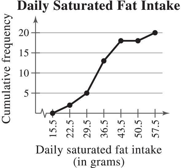
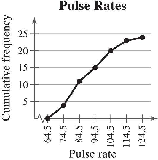
6a. Use upper class boundaries for the horizontal scale and cumulative frequency for the vertical scale.
bc.
Sample answer: The greatest increase in cumulative frequency occurs between 52.5 and 61.5

7a. Enter data.
b.
2.1 EXERCISE SOLUTIONS
1. Organizing the data into a frequency distribution may make patterns within the data more evident. Sometimes it is easier to identify patterns of a data set by looking at a graph of the frequency distribution.

2. If there are too few or too many classes, it may be difficult to detect patterns because the data are too condensed or too spread out.
3. Class limits determine which numbers can belong to that class. Class boundaries are the numbers that separate classes without forming gaps between them.
4. Relative frequency of a class is the portion, or percentage, of the data that falls in that class. Cumulative frequency of a class is the sum of the frequencies of that class and all previous classes.
5. The sum of the relative frequencies must be 1 or 100% because it is the sum of all portions or percentages of the data.
6. A frequency polygon displays frequencies or relative frequencies whereas an ogive displays cumulative frequencies.
7. False. Class width is the difference between the lower (or upper limits) of consecutive classes.
8. True
10. True
11.
19. (a) Number of classes = 7 (b) Least frequency ≈ 10
(c) Greatest frequency ≈ 300 (d) Class width = 10
20. (a) Number of classes = 7 (b) Least frequency = 1
(c) Greatest frequency = 23 (d) Class width = 53
21. (a) 50 (b) 345.5-365.5 pounds
22. (a) 50 (b) 64-66 inches
23. (a) 15 (b) 385.5 pounds
(c) 31 – 6 = 25 (d) 50 – 42 = 8
24. (a) 48 (b) 66 inches
(c) 25 – 5 = 20 (d) 50 – 44 = 6
25. (a) Class with greatest relative frequency: 39-40 centimeters Class with least relative frequency: 34-35 centimeters
(b) Greatest relative frequency ≈ 0.25 Least relative frequency ≈ 0.02
(c) Approximately 0.08
Copyright © 2015 Pearson Education, Inc.
26. (a) Class with greatest relative frequency: 19-20 minutes Class with least relative frequency: 21-22 minutes
(b) Greatest relative frequency ≈ 40% Least relative frequency ≈ 2%
(c)
Copyright © 2015 Pearson Education, Inc.
Sample answer: The graph shows that most of the sales representatives at the company sold between $1000 and $2019.

Sample answer: The graph shows that most of the pungencies of the peppers were between 36,000 and 43,000 Scoville units.

33. Range514291 27.87528
of Class widt clses8 h as
Sample answer: The graph shows that the most frequent reaction times were between 403 and 430 milliseconds.

34. Range22961250 130.75131
of cl Class width asses8
Sample answer: The graph shows that the most frequent finishing times were from 1381 to 1642 seconds and from 1774 to 2035 seconds.

Class with greatest relative frequency: 7-8 Class with least relative frequency: 1-2 and 3-4

with greatest relative
Class with greatest relative frequency:

with least relative

Class with greatest relative frequency: 138-202

with least relative frequency: 333-397
Location of the greatest increase in frequency: 60-63

Location of the greatest increase in frequency: 30-36
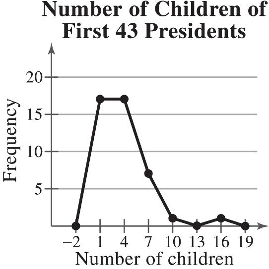
Sample answer: The graph shows that most of the first 43 presidents had fewer than 6 children.
Copyright © 2015 Pearson Education, Inc.
Sample answer: The graph shows that majority of signers were from 35 to 52 years old.


(b) 16.7%, because the sum of the relative frequencies for the last three classes is 0.167.

(c) $9700, because the sum of the relative frequencies for the last two classes is 0.10.

(b) 62%; The proportion of scores greater than or equal to 1610 is 0.62.

(c) A score of 1357 or above, because the sum of the relative frequencies of the class starting with 1357 and all classes with higher scores is 0.88.


In general, a greater number of classes better preserves the actual values of the data set but is not as helpful for observing general trends and making conclusions. In choosing the number of classes, an important consideration is the size of the data set. For instance, you would not want to use 20 classes if your data set contained 20 entries. In this particular example, as the number of classes increases, the histogram shows more fluctuation. The histograms with 10 and 20 classes have classes with zero frequencies. Not much is gained by using more than five classes. Therefore, it appears that five classes would be best.
2.2 MORE GRAPHS AND DISPLAYS
2.2 Try It Yourself Solutions
1a.
Key 36 = 36
c. Sample answer: Most of the most powerful women are between 40 and 70 years old.
c. Sample answer: Most of the 50 most powerful women are older than 50.
Copyright © 2015 Pearson Education, Inc.
3a. Use the age for the horizontal axis.
c. Sample answer: Most of the ages cluster between 43 and 67 years old. The age of 86 years old is an unusual data entry.

c. From 1990 to 2011, as percentages of total degrees conferred, associate’s degrees increased by 3%, bachelor’s degrees decreased by 5.9%, master’s degrees increased by 3.6%, and doctoral degrees decreased by 0.8%.

Copyright © 2015 Pearson Education, Inc.

c. Sample answer: Telephone companies and auto repair and service account for over half of all complaints received by the BBB.
6a, b.
c. It appears that the longer an employee is with the company, the larger the employee’s salary will be.
7ab.
c. The average bill increased from 2002 to 2003, then it hovered from 2003 to 2009, and decreased from 2009 to 2012.

2.2 EXERCISE SOLUTIONS
1. Quantitative: stem-and-leaf plot, dot plot, histogram, time series chart, scatter plot. Qualitative: pie chart, Pareto chart

2. Unlike the histogram, the stem-and-leaf plot still contains the original data values. However, some data are difficult to organize in a stem-and-leaf plot.
3. Both the stem-and-leaf plot and the dot plot allow you to see how data are distributed, determine specific data entries, and identify unusual data values.
4. In a Pareto chart, the height of each bar represents frequency or relative frequency and the bars are positioned in order of decreasing height with the tallest bar positioned at the left. 5. b 6. d 7. a
Copyright © 2015 Pearson Education, Inc.
13. Sample answer: Users spend the most amount of time on Facebook and the least amount of time on LinkedIn.
14. Sample answer: Motor vehicle thefts decreased from 2006 and 2011.
15. Sample answer: Tailgaters irk drivers the most, while too-cautious drivers irk drivers the least.
16. Sample answer: Food is the most costly aspect of pet care. The actual price of the pet is the least costly aspect of pet care.
17.
Sample answer: Most grades for the biology midterm were in the 80s and 90s.
Sample answer: Most nurses work between 30 and 40 hours per week.
Sample answer: Most of the ice had a thickness of 5.8 centimeters to 7.2 centimeters.
20. Apple Prices (in cents per pound) Key: 25425.4 =
25 48
26 113455679
27 13446669
28 0023356
29 18
Sample answer: Most farmers charge 26 to 28 cents per pound of apples.
21. Ages of Highest-Paid CEOs Key: 5050 =
5 023
5 556677888899999
6 011134
6 55667
7 2
Sample answer: Most of the highest-paid CEOs have ages that range from 55 and 64 years old.
22. Super Bowl Winning Scores Key: 1414 =
200011133444 6777779
01111223444
24.
Sample answer: Systolic blood pressure tends to be between 120 and 150 millimeters of mercury.

Sample answer: The lifespan of a housefly tends to be from 6 to 14 days.
Copyright © 2015 Pearson Education, Inc.

Sample answer: The majority of people will either invest more in stocks or invest the same as last year.

Sample answer: Most of the New York City Marathon winners are from the United States and Kenya.

28.
Sample answer: The United States won the most medals out of the five countries and Germany won the least.

29.
Sample answer: The greatest types of medication-dispensing errors are improper doses and omissions.

30.
Sample answer: It appears that there is no relation between wages and hours worked.

Sample answer: It appears that there is no relation between a teacher’s average salary and the number of students per teacher.
Copyright © 2015 Pearson Education, Inc.

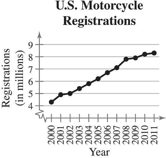
Sample answer: The number of motorcycle registrations has increased from 2000 to 2011.
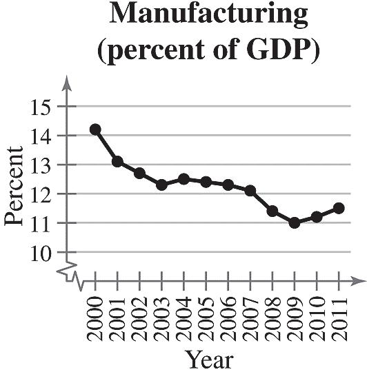
Sample answer: The percentage of the U.S. gross domestic product that comes from the manufacturing sector has decreased from 2000 to 2009.
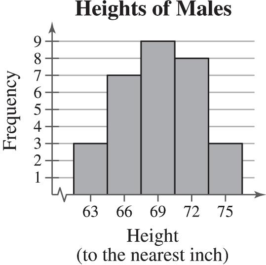
The stem-and-leaf plot helps you see that most values are from 2.5 to 3.2. The dot plot helps you see that the values 2.7 and 3.0 occur most frequently, with 2.7 occurring most frequently. 34. Heights (in inches)

Key:6969 =
6 9
72468889
011233 8
The dot plot helps you see that the data are clustered from 78 to 83 with 78 being the most frequent value. The stem-and-leaf plot helps you see that most values are in the 70s and 80s.
The pie chart helps you to see the percentages as parts of a whole, with summer being the largest. It is also shows that while summer is the largest percentage, it only makes up about one-third of the pie chart. That means that about two-thirds of U.S. adults ages 18 to 29 prefer a season other than summer. This means it would not be a fair statement to say that most U.S. adults ages 18 to 29 prefer summer. The Pareto chart helps you to see the rankings of the seasons. It helps you to see that the favorite seasons in order from greatest to least percentage are summer, spring, fall, and winter.

The Pareto chart helps you see the order from the most favorite to least favorite day. The pie chart helps you visualize the data as parts of a whole and see that about 80% of people say their favorite day is Friday, Saturday, or Sunday.

37. (a) The graph is misleading because the large gap from 0 to 90 makes it appear that the sales for the 3rd quarter are disproportionately larger than the other quarters. (b)

38. (a) The graph is misleading because the vertical axis has no break. The percent of middle schoolers that responded “yes” appears three times larger than either of the others when the difference is only 10%.
Copyright © 2015 Pearson Education, Inc.
39. (a) The graph is misleading because the angle makes it appear as though the 3rd quarter had a larger percent of sales than the others, when the 1st and 3rd quarters have the same percent.

(b)
40. (a) The graph is misleading because the “non-OPEC countries” bar is wider than the “OPEC countries” bar.


(b)
41. (a) At Law Firm A, the lowest salary was $90,000 and the highest salary was $203,000. At Law Firm B, the lowest salary was $90,000 and the highest salary was $190,000.
(b) There are 30 lawyers at Law Firm A and 32 lawyers at Law Firm B.
(c) At Law Firm A, the salaries tend to be clustered at the far ends of the distribution range. At Law Firm B, the salaries are spread out.
class and 31-year old in 8:00 P M. class.
(b) In the 3:00 P M. class, the lowest age is 35 years old and the highest age is 85 years old. In the 8:00 P M. class, the lowest age is 18 years old and the highest age is 71 years old.
(c) There are 26 participants in the 3:00 P M class and there are 30 participants in the 8:00 P M class.
(d) Sample answer: The participants in each class are clustered at one of the ends of their distribution range. The 3:00 P M. class mostly has participants over 50 years old and the 8:00 P M. class mostly has participants under 50 years old.
2.3 MEASURES OF CENTRAL TENDENCY
2.3 Try It Yourself Solutions
1a. 7478818781807780857880837581731193 x å=++++++++++++++=
b. 1193 79.5 15 x x n å ==»
c. The mean height of the player is about 79.5 inches.
2a. 18, 18, 19, 19, 19, 20, 21, 21, 21,21, 23, 24, 24, 26, 27, 27, 29, 30, 30, 30, 33, 33, 34, 35, 38
b. median = 24
c. The median age of the sample of fans at the concert is 24.
3a. 10, 50, 50, 70, 70, 80, 100, 100, 120, 130
b. median 7080150 75 22 + ===
c. The median price of the sample of digital photo frames is $75.
4a. 324, 385, 450, 450, 462, 475, 540, 540, 564, 618, 624, 638, 670, 670, 670, 705, 720, 723, 750, 750, 825, 830, 912, 975, 980, 980, 1100, 1260, 1420, 1650
b. The price that occurs with the greatest frequency is $670 per square foot.
c. The mode of the prices for the sample of South Beach, FL condominiums is $670 per square foot.
5a. “Better prices” occurs with the greatest frequency (399).
b. In this sample, there were more people who shop online for better prices than for any other reason.
6a. 410 21.6 19 x x n å ==» median = 21 mode = 20
b. The mean in Example 6 ( 23.8 x » ) was heavily influenced by the entry 65. Neither the median nor the mode was affected as much by the entry 65.
Copyright © 2015 Pearson Education, Inc.
7.
8.
9. The shape of the distribution is skewed right because the bars have a “tail” to the right.
10. The shape of the distribution is symmetric because a vertical line can be drawn down the middle, creating two halves that are approximately the same.
11. The shape of the distribution is uniform because the bars are approximately the same height.
12. The shape of the distribution is skewed left because the bars have a “tail” to the left.
13. (11), because the distribution values range from 1 to 12 and has (approximately) equal frequencies.
14. (9), because the distribution has values in the thousands of dollars and is skewed right due to the few executives that make a much higher salary than the majority of the employees.
15. (12), because the distribution has a maximum value of 90 and is skewed left due to a few students scoring much lower than the majority of the students.
16. (10), because the distribution is approximately symmetric and the weights range from 80 to 160 pounds.
The mode does not represent the center of the data because 169 is the smallest number in the data set. 19.
The mode cannot be found because no data entry is repeated.
20.
Copyright © 2015 Pearson Education, Inc.
21. 603 43.1 14 x x n å ==»
3940414242424444444444454547
4444 median44 2 + ==
mode = 44 (occurs 5 times)
22. 2004 200.4 10 x x n å ===
154171173181184188203235240275
+ ==
184188 median186 2
mode = none; The mode cannot be found because no data entry is repeated.
23. 481 30.1 16 x x n å ==»
17212125263031313134343435363738
3131 median31 2 + ==
mode = 31 and 34 (both occur 3 times)
24. 1223 61.2 20 x x n å ==»
1218262831334044454961637580808996103125125
4961 median55 2 + ==
mode = 80, 125
The modes do not represent the center of the data set because they are large values compared to the rest of the data.
25. 83 16.6 5 x x n å ===
1.0 10.0 15.0 25.5 31.5 median = 43
mode = none
The mode cannot be found because no data entry is repeated.
26. 197.5 14.11 14 x x n å ==»
1.52.52.55.010.511.013.015.516.517.520.026.527.028.5
mode = 2.5 (occurs 2 times)
Copyright © 2015 Pearson Education, Inc.
+ ==
13.015.5 median14.25 2
The mode does not represent the center of the data set because 2.5 is much smaller than most of the data in the set.
27. x is not possible (nominal data)
median = not possible (nominal data) mode = “Eyeglasses”
The mean and median cannot be found because the data are at the nominal level of measurement.
28. x is not possible (nominal data)
median is not possible (nominal data) mode = “Money needed”
The mean and median cannot be found because the data are at the nominal level of measurement.
29. x is not possible (nominal data)
median is not possible (nominal data) mode = “Junior”
The mean and median cannot be found because the data are at the nominal level of measurement.
30. x is not possible (nominal data)
median is not possible (nominal data) mode = “on Facebook, find it valuable”
The mean and median cannot be found because the data are at the nominal level of measurement.
mode = 24, 35 (both occur 3 times each)
mode = 4.0 (occurs 2 times)
The mode does not represent the center of the data set because it is the largest value in the data set.
15 (occurs 3 times)
Copyright © 2015 Pearson Education, Inc.
34. 3110 207.3 15
= 210 mode = 210 (occurs 5 times)
35. The data are skewed right.
A = mode, because it is the data entry that occurred most often.
B = median, because the median is to the left of the mean in a skewed right distribution.
C = mean, because the mean is to the right of the median in a skewed right distribution.
36. The data are skewed left.
A = mean, because the mean is to the left of the median in a skewed left distribution.
B = median, because the median is to the right of the mean in a skewed left distribution.
C = mode, because it is the data entry that occurred most often.
37. Mode, because the data are at the nominal level of measurement.
38. Mean, because the data are symmetric.
39. Mean, because the distribution is symmetric and there are no outliers.
40. Median, because there is an outlier.
Shape: Positively skewed

Shape: Positively
Shape: Symmetric


The mean was affected more.
The mean was affected more.
59. Clusters around 16-21 and around 36
60. Cluster around 18-27, gap between 27 and 72, outlier at 72
61. Sample answer: Option 2; The two clusters represent different types of vehicles which can be more meaningfully analyzed separately. For instance, suppose the mean gas mileage for cars is very far from the mean gas mileage for trucks, vans, and SUVs. Then, the mean gas mileage for all of the vehicles would be somewhere in the middle and would not accurately represent the gas mileages of either group of vehicles.
(d) If you multiply the mean and median of the original data set by 36, you will get the mean and median of the data set in inches.
Car B
151 30.2 5 x x n å ===
29 29 31 31 31
median = 31
mode = 31 (occurs 3 times)
Car C
151 30.2 5 x x n å ===
28 29 30 32 32
median = 30
mode = 32 (occurs 2 times)
(a) Mean should be used because Car A has the highest mean of the three.
(b) Median should be used because Car B has the highest median of the three.
(c) Mode should be used because Car C has the highest mode of the three.
64. Car A: Midrange = 3428 31 2 + =
Car B: Midrange = 3129 30 2 + =
Car C: Midrange = 3228 30 2 + =
Car A because the midrange is the largest.
65. (a) 1477 49.2 30 x x n å ==»
(c) The distribution is positively skewed.
Copyright © 2015 Pearson Education, Inc.
66. (a) Order the data values.
Delete the lowest 10%, smallest 3 observations (11, 13, 22). Delete the highest 10%, largest 3 observations (76, 85, 90). Find the 10% trimmed mean using the remaining 24 observations.
1180 49.2 24 x x n å ==»
10% trimmed mean 49.2 »
(b) 49.2 x » median = 46.5 mode = 36, 37, 51
9011 midrange50.5 2 + ==
(c) Using a trimmed mean eliminates potential outliers that may affect the mean of all the observations.
2.4 MEASURES OF VARIATION
2.4 Try It Yourself Solutions
1a. Min = 23, or $23,000 and Max = 58, or $58,000
b. Range = Max – Min = 58 – 23 = 35, or $35,000
c. The range of the starting salaries for Corporation B is 35, or $35,000. This is much larger than the range for Corporation A.
Salary, x x – μ (x – μ)2 23 –18.5 342.25 29 –12.5 156.25 32 –9.5 90.25 40 –1.5 2.25 41 –0.5 0.25 41 –0.5 0.25 49 7.5 56.25 50 8.5 72.25 52 10.5 110.25 58 16.5 272.25 415 x = å () 0 x m -= å ()2 1102.5 x m -= å
c. ()2 2 1102.5 110.3 10 x N m s å==»
d. 2 1102.5 10.5, 10 ss=== or $10,500
e. The population variance is about 110.3 and the population standard deviation is 10.5, or $10,500.
3ab. 316 39.5 8 x x n
b. ()2 2 1240 177.1 17 xx s n
å==» -
c. 2 1240 13.3 7 ss==»
4a. Enter the data in a computer or a calculator.
b. 22.1, x » 5.3 s »
6a. 67.1 – 64.2 = 2.9 = 1 standard deviation
b. 34%
c. Approximately 34% of women ages 20-29 are between 64.2 and 67.1 inches tall.
Copyright © 2015 Pearson Education, Inc.
7a. 35.3 – 2(21.1) = -6.9
Because –6.9 does not make sense for an age, use 0.
b. 35.3 + 2(21.1) = 77.5
c.
At least 75% of the data lie within 2 standard deviations of the mean. At least 75% of the population of Alaska is between 0 and 77.5 years old.
Copyright © 2015 Pearson Education, Inc.
10a. Los Angeles: 31.0 x » , 12.6 s »
Dallas/Fort Worth: 22.1 x » , 5.3 s »
b. Los Angeles: 12.6 100%40.6% 31.0 s CV x ==⋅»
Dallas/Fort Worth: 5.3 100%24.0% 22.1 s CV x ==⋅»
c. The office rental rates are more variable in Los Angeles than in Dallas/Fort Worth.
2.4 EXERCISE SOLUTIONS
1. The range is the difference between the maximum and minimum values of a data set. The advantage of the range is that it is easy to calculate. The disadvantage is that it uses only two entries from the data set.
2. A deviation () x m - is the difference between an entry x and the mean of the data μ. The sum of the deviations is always zero.
3. The units of variance are squared. Its units are meaningless (example: dollars2). The units of standard deviation are the same as the data.
4. The standard deviation is the positive square root of the variance. The standard deviation and variance can never be negative because squared deviations can never be negative.
5. When calculating the population standard deviation, you divide the sum of the squared deviations by N, then take the square root of that value. When calculating the sample standard deviation, you divide the sum of the squared deviations by 1 n - , then take the square root of that value.
6. When given a data set, you would have to determine if it represented the population or if it was a sample taken from the population. If the data are a population, then s is calculated. If the data are a sample, then s is calculated.