

Established in 1932, Walker Group Architects Ltd. is a leading, multidisciplinary architectural and interior design firm based in Auckland, New Zealand. With a rich heritage of design excellence, we craft immersive and sophisticated spaces that seamlessly blend aesthetics, functionality, and innovation. We are New Zealand’s most experienced retail and fit-out designers having created highly successful selling environments for most of New Zealand’s leading retail brands and shopping centres. Similarly, we have created many successful hospitality, hotel, commercial and airport spaces. From single rooms to multi-billion dollar shopping centres we have done them all.
At Walkers, our passionate team of registered architects and interior designers specialises in creating or transforming environments across diverse sectors, including Commercial, Retail, Hospitality, Residential, Entertainment, and Community spaces. Our expertise extends beyond traditional architecture, focusing on creating interiors that inspire, engage, and enhance the human experience. We specialise in designing integrated environments where exterior and interior realms flow together seamlessly and harmoniously. We understand and can design everything from lighting to furniture to ensure every aspect of the built environment works together.
Our collaborative studio fosters creativity, precision, and attention to detail. From concept to completion, our directors and senior designers work closely with each project, ensuring a seamless design process that reflects our commitment to quality and innovation. Whether crafting luxurious hospitality interiors, dynamic retail environments, or bespoke residential spaces, Walker Group Interiors are dedicated to bringing your vision to life with flair and technical excellence.
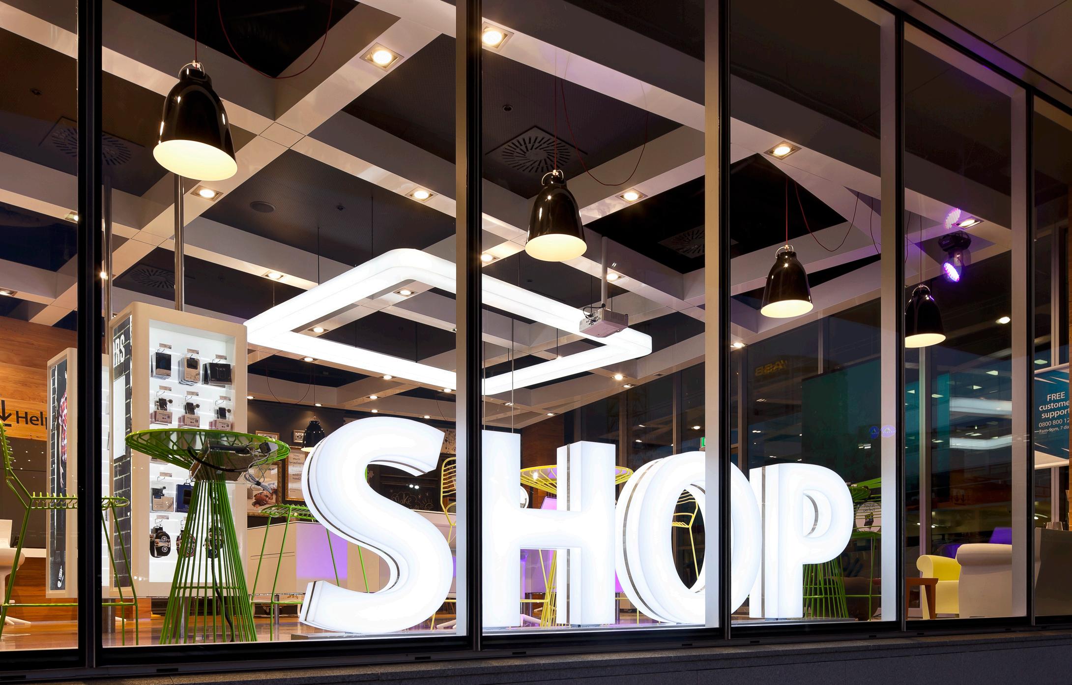
Our passion for crafting lasting, visually compelling interiors has remained unwavering over the decades. We take pride in our structured, yet flexible design process, guiding clients seamlessly through every stage—from concept to completion—ensuring each space is not only functional but deeply inspiring. We believe interior design is more than just a sequence of steps; it is a dynamic and collaborative journey. True innovation emerges through meticulous attention to detail, thoughtful engagement, and meaningful dialogue with our clients and stakeholders. Every project is shaped by open communication, where ideas are refined, visions are brought to life, and interiors are tailored to elevate the experience of those who inhabit them.
Our specialist interior designers approach each project as a cohesive team, integrating client aspirations from the very beginning. By actively listening and responding to their needs, we evolve our designs organically, ensuring every detail reflects purpose, personality, and practicality. This collaboration extends beyond our studio, drawing from diverse expertise and collaborative partners to push creative boundaries and craft spaces that are both functional and inspiring. We are dedicated to exceeding expectations—delivering interiors that are not only beautifully designed but also enduring in impact.
But it is not all about us. We have built our reputation by listening to our customers to tailor interiors specifically to their unique needs. Whether this is a deeply personal residential space, or a hard-working retail environment aligned to the particular needs of its target market. The result is that we have consistently lifted turnover and brand recognition for the many of the worlds most beloved brands by creating spaces that not only reflect the brands culture but also support the highly complex functions of making brands work


We are specialist interior designers offering a comprehensive range of services aimed at guiding clients through every stage of their projects, from initial feasibility studies to on-site construction oversight. Here is an overview of our capabilities:
Walker brings extensive experience in the hospitality industry, covering hotels, luxury lodges, food courts, restaurants, cafes, bars, fast food, and kiosks. Through this experience, we understand that the primary objective of any hospitality project is typically to increase revenue while ensuring cost-effective fitouts, and we possess the expertise to achieve this. Our approach starts with a focus on enhancing the overall customer experience. This begins with thorough site analysis and attentive listening to our clients, aiming to elevate the customer experience through exceptional design and innovative thinking. Additionally, our expertise extends to back-of-house design, including commercial kitchens, where we specialise in creating highly functional environments that optimise operational efficiency. Understanding that the success of a hospitality operation hinges on service quality, we ensure the back-of-house is equipped for hard work and delivering excellence.
Not only is Walker one of the most awarded retail design firms in New Zealand, but we also boast extensive experience in retail rollouts, having completed over 3,000 projects both in New Zealand and internationally. Our portfolio spans nearly every retail category, including fashion, electronics, supermarkets, cosmetics, footwear, automotive, childrenswear, boutique shops, showrooms, flagship stores, furniture, hardware, automotive, stationery, banks, department stores, airport retail, books, furniture, homeware, jewellery, surf wear, sporting goods, and service stations – you name it, we've likely designed it.
We bring extensive expertise in designing cinemas and entertainment centres that redefine the viewer experience. With a focus on innovation and functionality, we integrate cutting-edge technology with architectural flair to create immersive environments. Our portfolio includes a range of projects from multiplex cinemas to bespoke entertainment centres, each tailored to enhance patron’s comfort and enjoyment. Our commitment to excellence is evident in our ability to blend aesthetic appeal with practical design, delivering spaces that cater to both entertainment industry standards and audience expectations.
Our experience in interior design spans spatial planning, finishes selection, lighting design, and specialist joinery. This includes conceptualising layouts, selecting materials, coordinating lighting schemes, and crafting bespoke joinery solutions. We aim to create cohesive, aesthetically pleasing environments that maximise functionality and elevate the overall user experience.
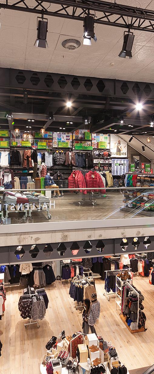
Specialist roll-out, shopping centre, cinema and hospitality designers
Extensive national, and international experience in over 3,000 interior projects.
Recipients of more than 170 local and international design awards
Brand positioning and strategy specialists
Proudly maintaining relationships with some clients for over 40 years
Proven track record of increasing branded-space performance and profit
Proven track record of creativity and innovation
Proven track record of service & cost control
Proven capacity to deliver projects to program
Trusted by many of New Zealand’s most successful retailers for 30 years
Specialists in customer experience and branding at all touch points
New Zealand’s most experienced roll-out specialists
Ability to deliver “End to end” design and implementation service
Significant international retail brand design experience
Strong emphasis on sustainability and minimising environmental impacts
Regardless of your project size, your interior will be handled by our senior staff
Prioritising cultural sensitivity and honoring local heritage and traditions.
Diverse project portfolio of projects of varying scale, category, and complexity
Reputation for timely and on-budget project delivery across numerous projects







// NEW ZEALAND
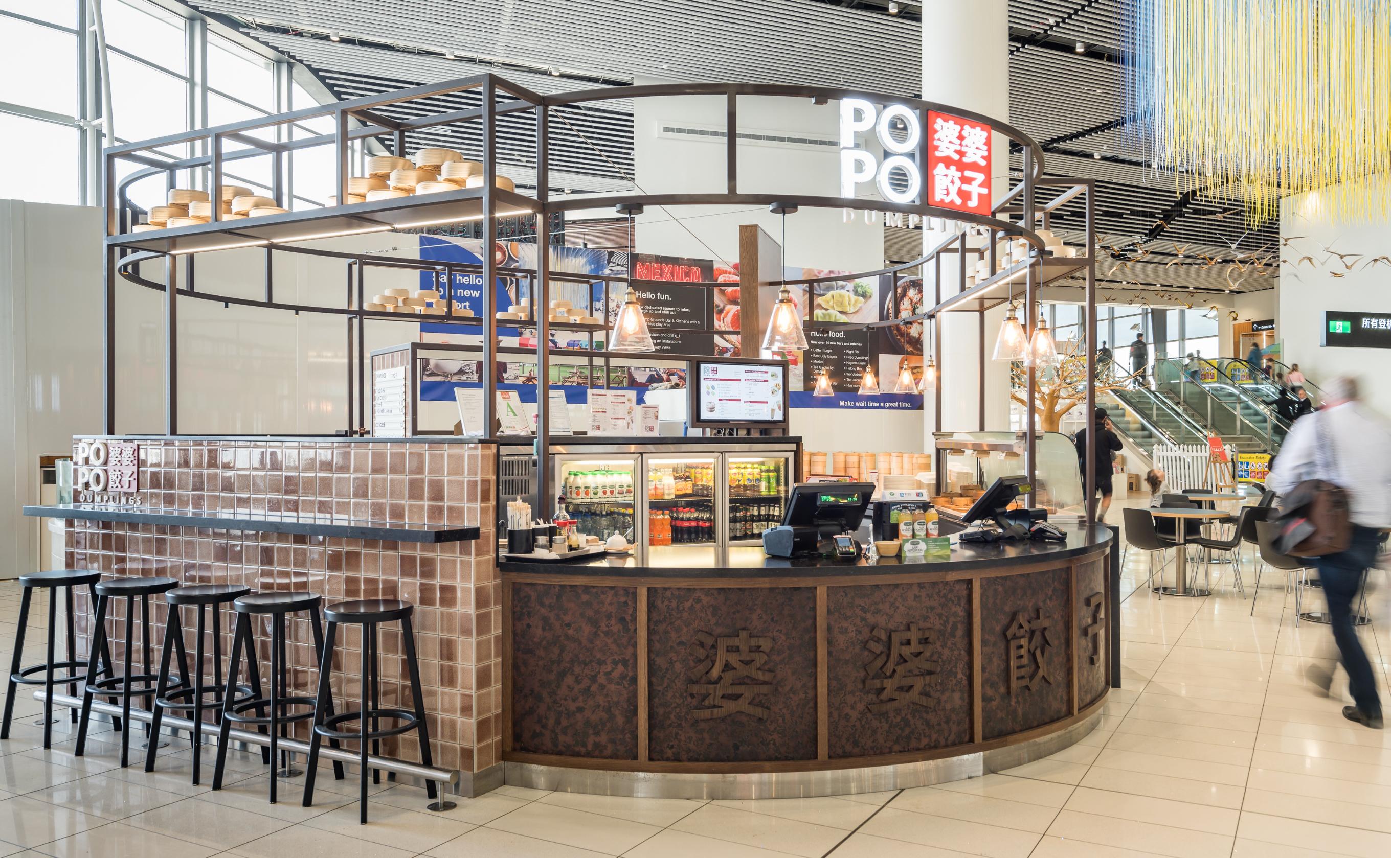
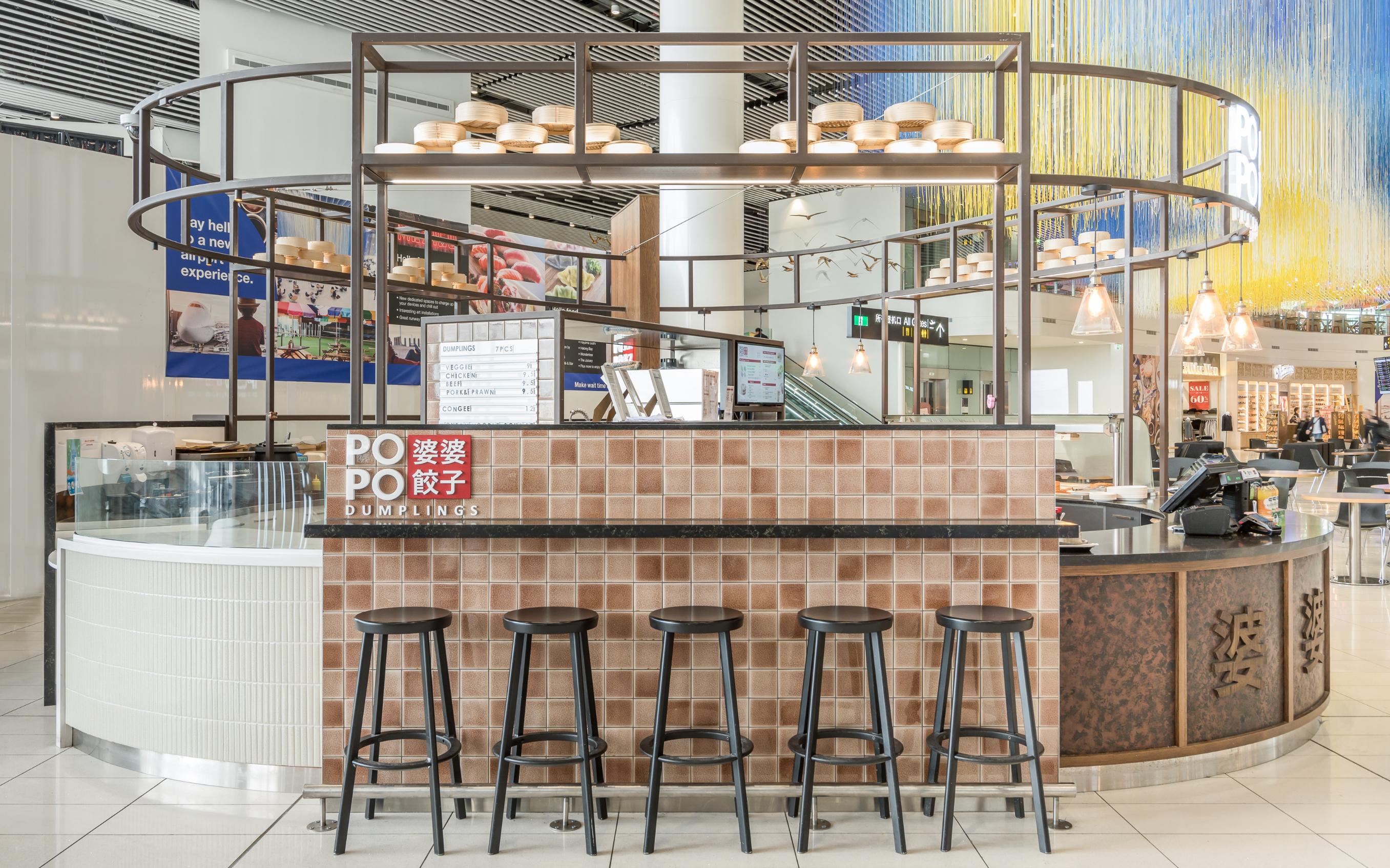
Popo dumplings is a newly created food offer which sits in a freestanding kiosk at Auckland International Airport’s Airside food court. The name derives from the Chinese word for “Grandmother”, referencing the traditional, hand-made nature of the cuisine. The intention was to produce handmade dumplings and noodle dishes prepared fresh on site to serve customers seated at the bar or in nearby common-area seating. The target market is both European and Asian but the kiosk particularly targets travellers from the East who struggle to find familiar food, such as spicy, savoury breakfast dishes.
We deliberately kept the palate quite neutral and wanted to create more of a traditional, old-style Chinese restaurant feel rather than a modern “Chinese take-away” look. Colours were limited to earthtones, coppers, browns and soft pinks to suggest rock salt. Counter faces feature aged copper and antique-looking tiles in brown, pink and bone tones. We created a new logo in English and Mandarin with the Chinese characters set on a red square. We completely prefabricated the kiosk mainly using a steel frame for the higher areas for ease of disassembly and transport.
The cabinet carcasses are made of timber but also made into several parts for portability. As everything is cooked to order, and the kiosk serves almost no pre-prepared food, we had a huge counter frontage but very little to display on it (apart from some drinks) so we added seats to one side of the kiosk to add interest so customers could also enjoy seeing the dumpling preparation up close. Light levels in the area are very low so we hid small LED spots where we could and supplemented these with glass pendants reminiscent of old gas lamps.
The result, although dwarfed by construction hoardings in the photos, sits well in the open space as a beacon to anyone wanting something more authentic than typical food-court offerings.


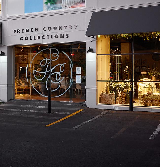
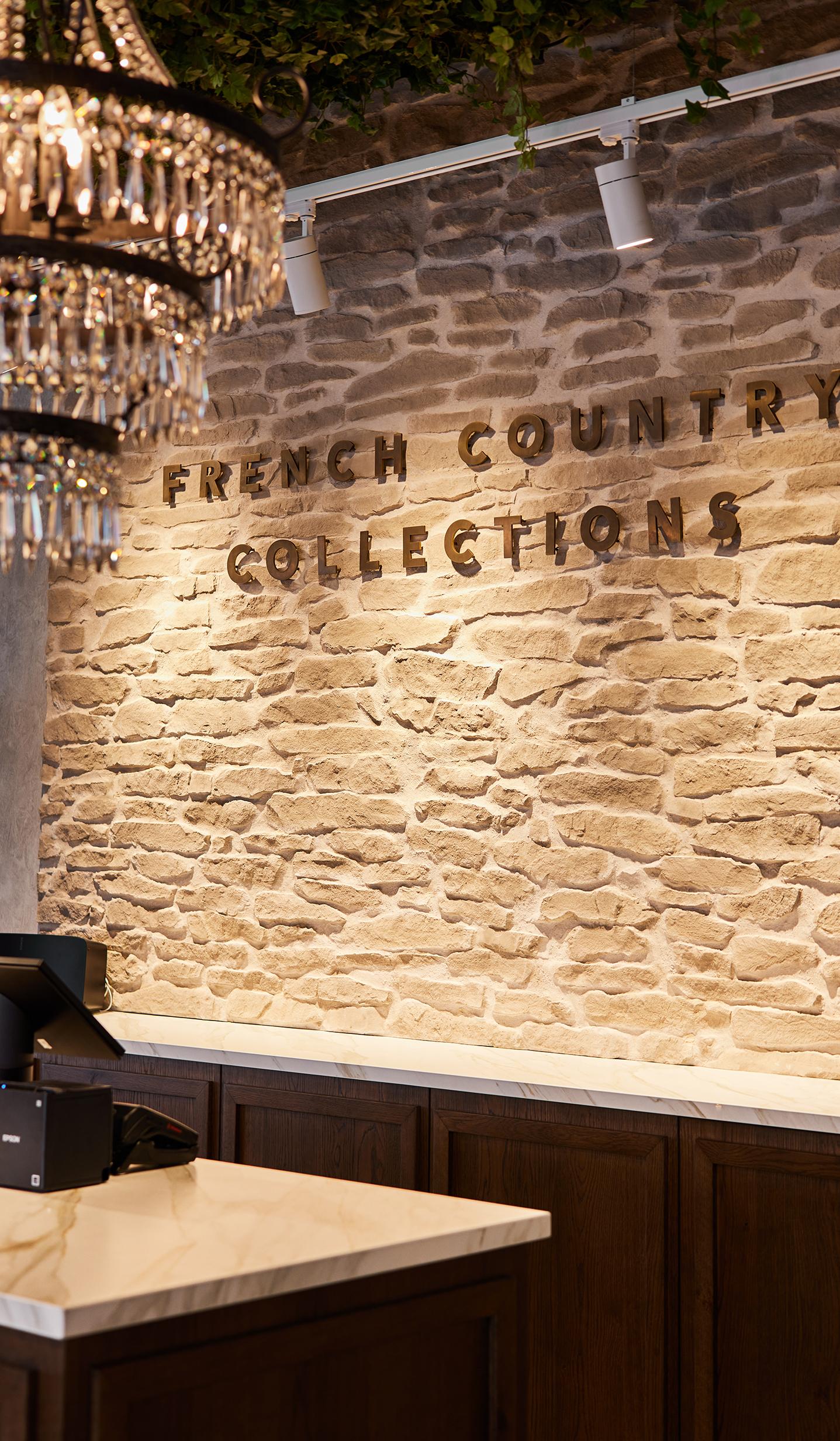
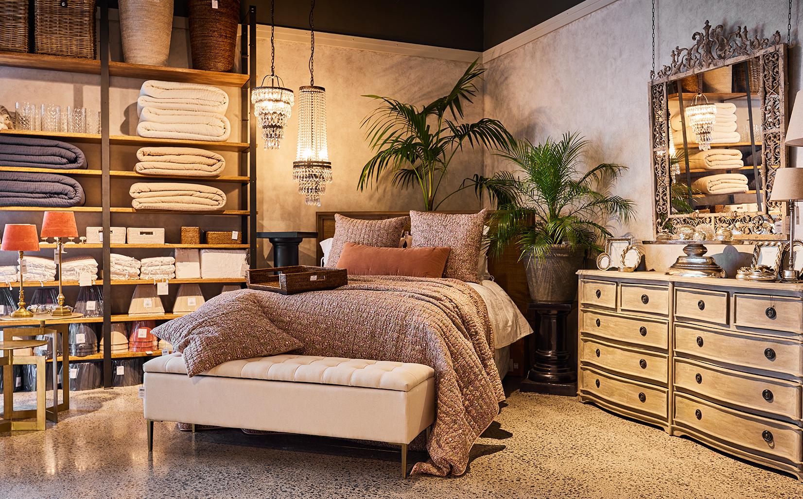
We were thrilled to collaborate with French Country Collections on their flagship store in Newmarket. Having gained a deep understanding of the brand’s aesthetic vision from previous projects, our task was to transform a spacious 350-square-meter corner site into a warm, inviting space that reflects the charm of French food markets, vintage stores, and European boutiques. To achieve this, we carefully selected materials that balance vintage French country style with a fresh, homely feel. A large barn-style swing door was designed to divide the space, creating more intimate areas while allowing for easy transformation due to its movability. Another standout feature is a suspended grid system in the main window, which supports hanging pendants and greenery, adding that organic European market touch.

AUCKLAND // NEW ZEALAND
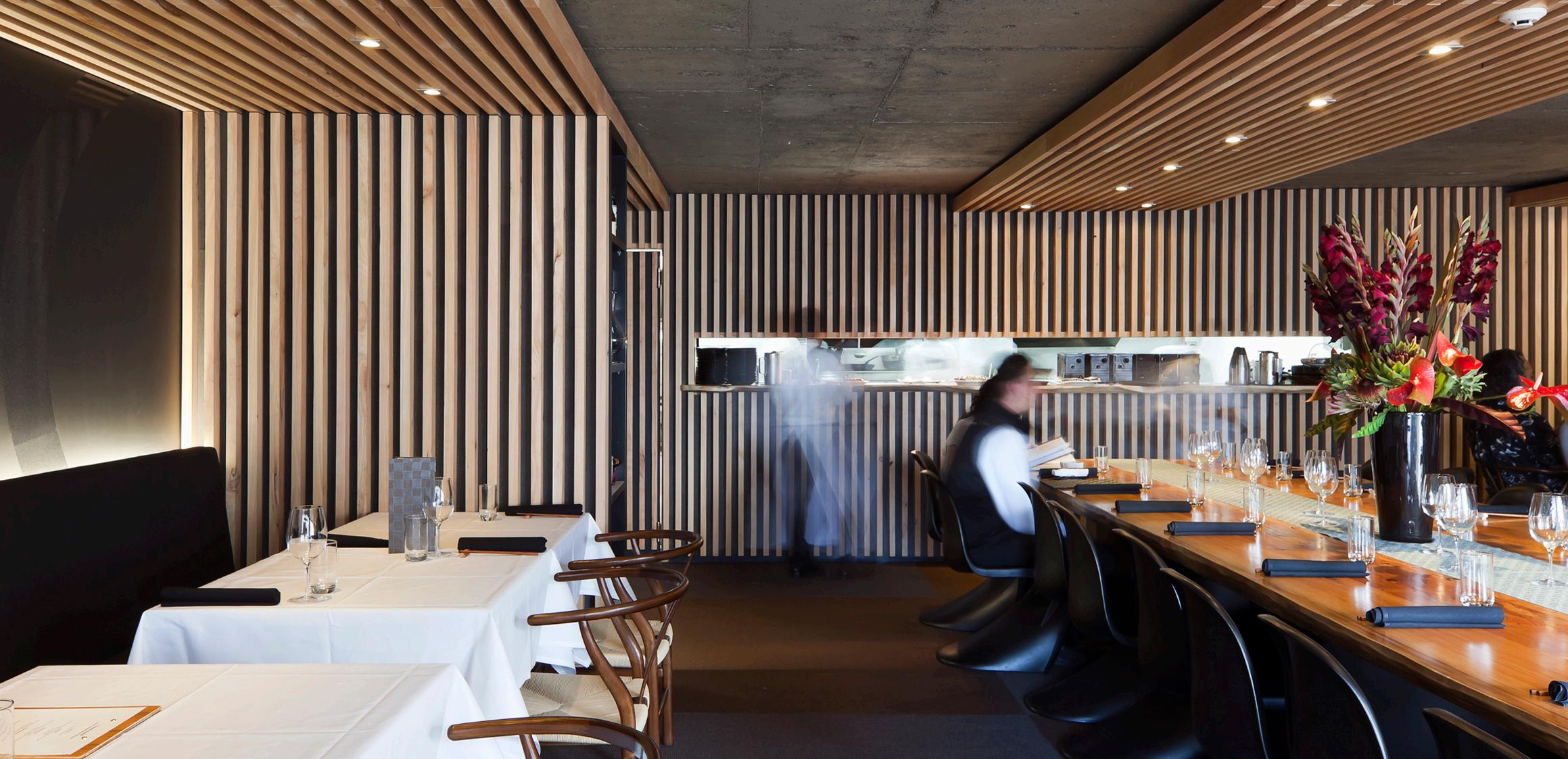
CocorowascommissionedbyformerSotochefMakotoTokuyamaasashowcasefor hisdistinctiveandverynaturaltakeonmodernJapanesefood.
The décor includes asubtle tatami-style matting, sandblasted concrete ceilings, macrocarpaslatsandalargediningtableinthemiddleoftheroomwherecustomers candineside-by-side.
Alloftheselectedmaterialsarenaturalandrecyclable.Theresultisaspacethathas a contemporary Japanese feel and compliments the degustation and tapas style menuwithitssimplicity.
CocorofeaturedoninternationalinteriordesignwebsitesDezeenandWAN,along with being recognised in the Interior Architecture category winning an Auckland ArchitectureAwardatthe2011NewZealandArchitectureAwards(NZIA)andGold atthe2011BestAwardsinthehospitalitycategoryaswellastheRestaurants&Bars Division,NourishmentGroupandSponsorShopfrontAwardsatthe2011NZRIARED awards.

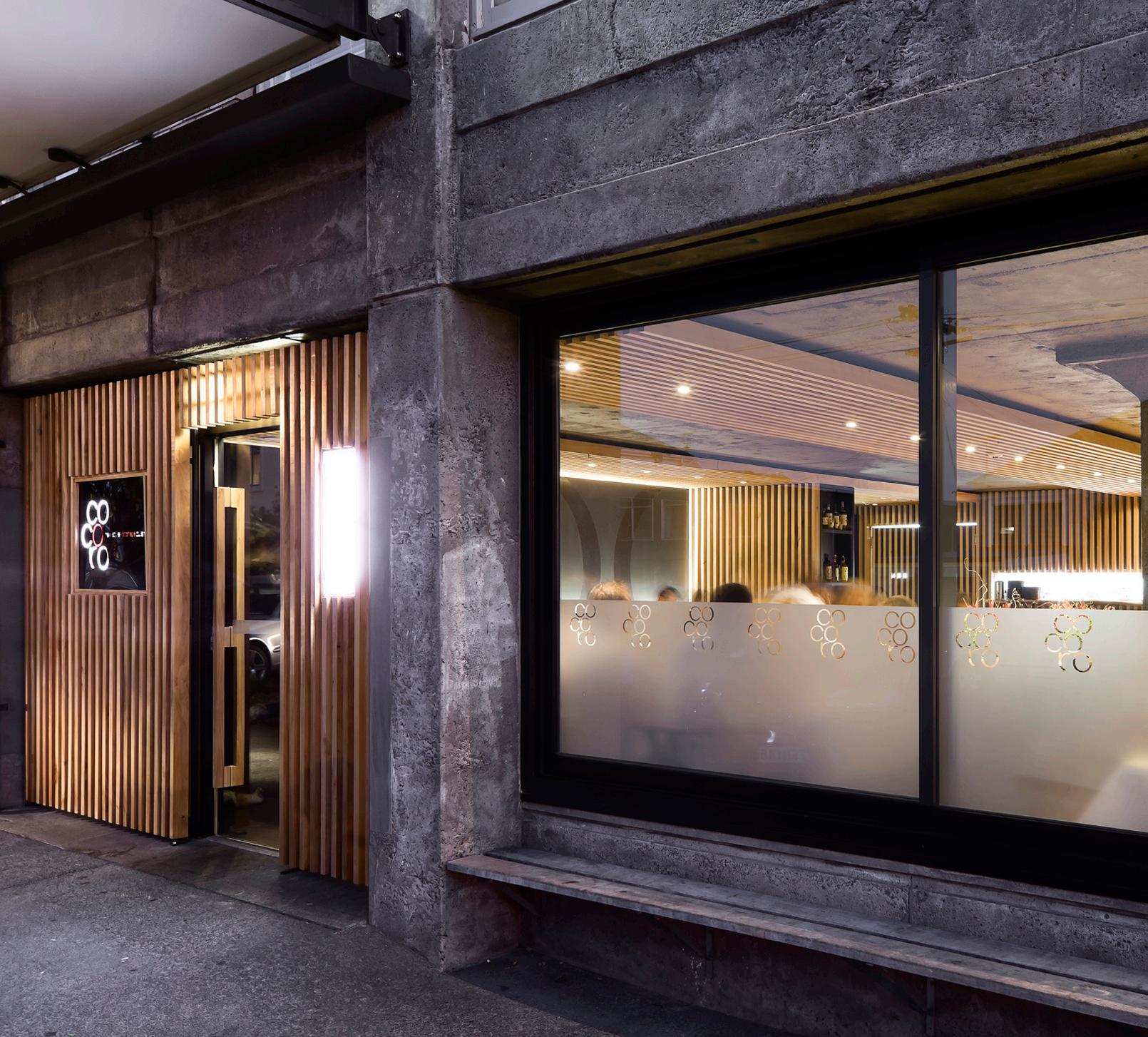

Otepoti Dunedin’s Wall Street shopping mall connects George, Filleul and St Andrews Street with the city’s historic shopping precinct as well as connecting the two other shopping centres, thus making up what is the city’s main retail block.
The development combined both street-front retail and shopping on the lower level of the atrium internal “street”. Office space and car parking make up the balance of the 3 floors. The concept was to create a series of lanes and courtyards to provide continuity within the city’s shopping district, with shelter from Dunedin’s variable weather. The complex comprised a series of different buildings - one traditional and two modern, which would suit Dunedin’s existing scale of architecture better than a large, conventional shopping mall.
The main atrium space initially narrows as you enter from George St, so that sense of expectation is built up before it widens to a generous internal courtyard, capped by a glass roof. The intention was to provide a space which appears to have existed between two buildings for years, rather than a suburban-style shopping mall imposed on the city. The atrium space includes shops, a café, food tenancies, a sunken seating/dining area, landscaping and circulation to upper floors.
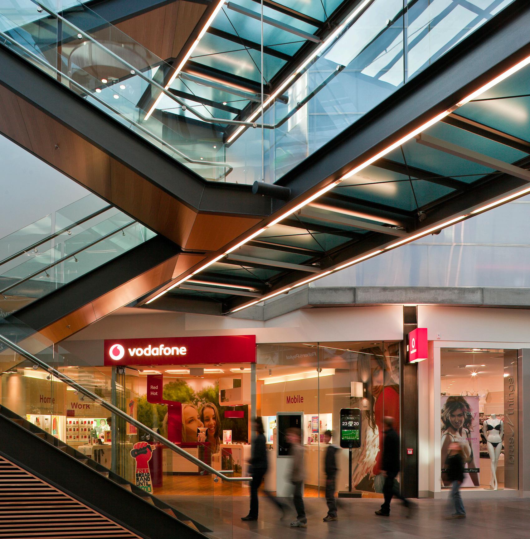


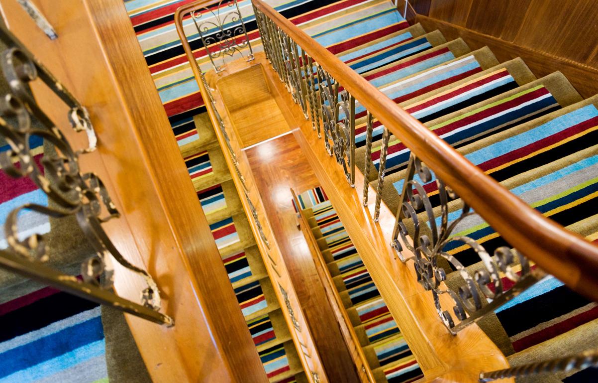
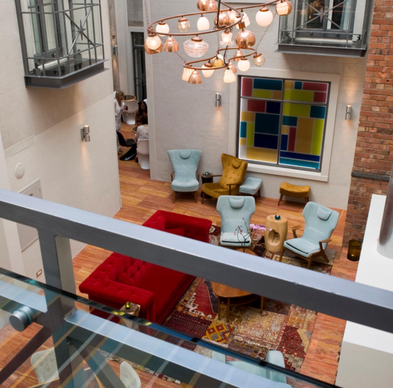
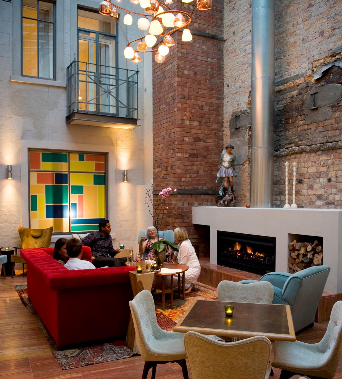
The iconic Hotel DeBrett has been stylishly re-interpreted into a 25-room boutique hotel, with every room individually designed and complimented witheclecticfurniture,NewZealandartandphotography.
Walker Commercial collaborated on the concept with the client Michelle Deery and Mitchinson Simiona Architects, who completed project and documentation for the exterior design, while we handled the design of the atrium space and lighting as well as upgrading the ground floor to suit the need of boutique retail. The interior spaces were done in collaboration with Martin Hughes Interior Architects.
The Hotel won the 2009 NZIA Auckland Architecture Award (Heritage Category), Bronze at the 2009 DINZ Best Awards in the Hospitality category and was Division Winner at the 2010 NZRIA RED Awards. It also made it onto the World Architecture News Retail Interiors Award (a leading European design competition) ‘long list’ in the Hotel category.
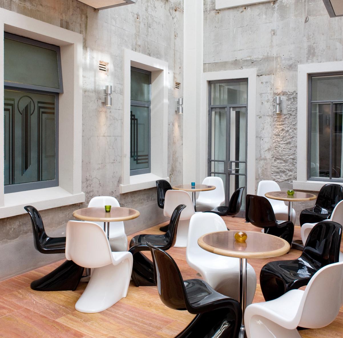

Comvita is a hugely successful but little known New Zealand export brand with around 480 retail outlets, mainly in Asia. Their products include natural health and beauty products mainly formulated from honey and olive leaf. (They own the world’s largest olive plantation located in Australia.) This prototype flagship was conceived to serve as a model for on-going – mainly international – rollouts. It was designed to reflect Comvita’s simple and natural approach, tell their storey and promote its new face and beauty products primarily to its target Asian market.


AUCKLAND // NEW ZEALAND
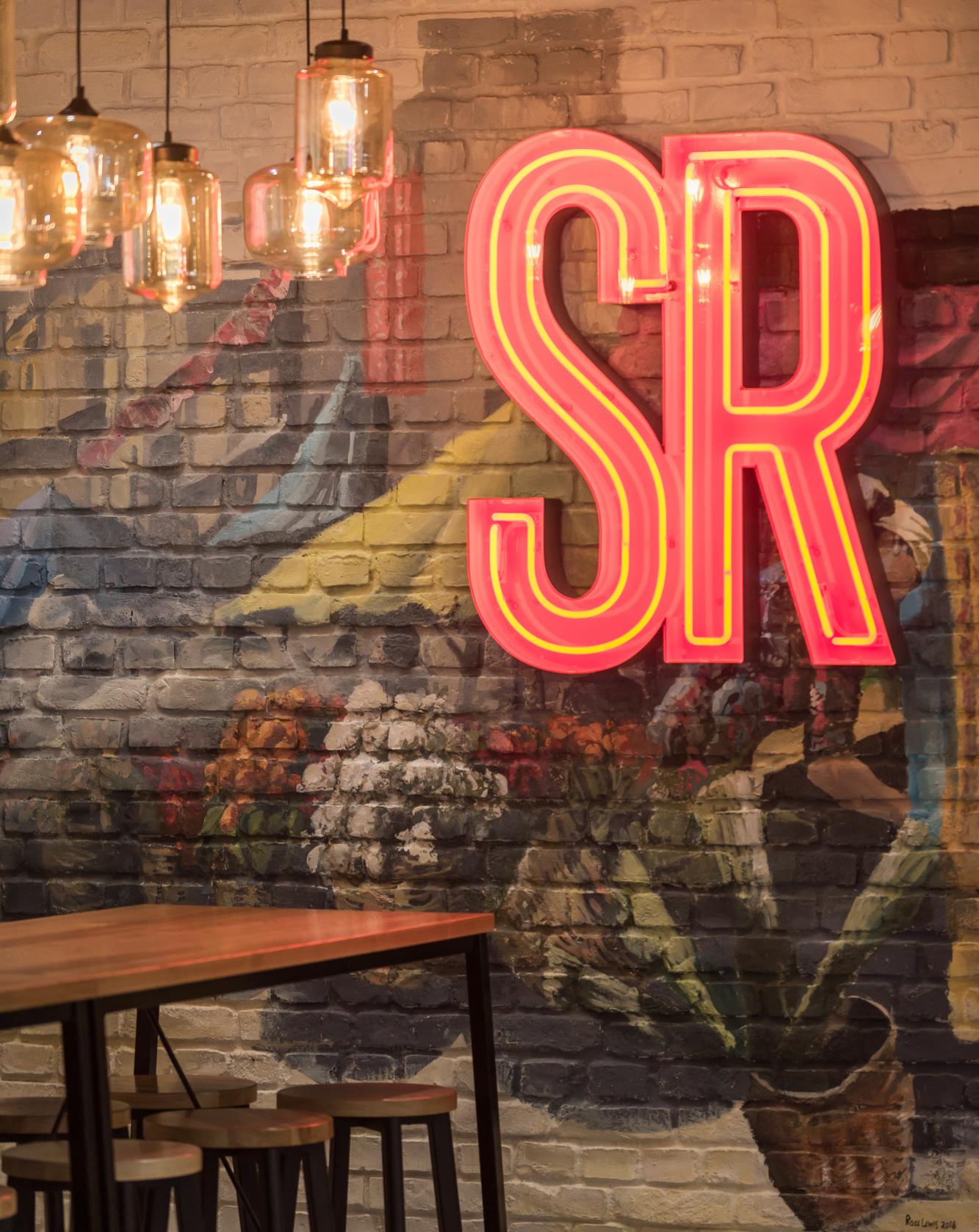
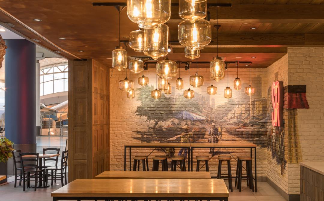
Silk Road is a restaurant at Auckland International airport landside food court serving a variety of Asian cuisines. As part of the refurbishment the airport required a change of menu to focus on Thai food, although Chinese and Indonesian food is also served, therefore the design needed to reflect this combination of influences.
We started by considering the overall “Look and feel” of the newly formatted restaurant and, because the intention was not to reflect only one cuisine, we decided to make it look like a late-colonial merchant house restaurant, as is common throughout Asia.
We wanted to portray this pan-Asian theme without listing the various types of cuisine that were offered so we designed and commissioned wall murals of an Asian street theme, which could be interpreted as being from any food market street in different parts of Asia. The interior was deliberately dark-finished with a number of random light fittings hanging from the ceiling. This ceiling was panelled to look like the underside of a merchant-house floor. The front of the counter is covered in genuine Chinese antique bricks, each of them being well over a hundred years old. The ceiling is painted in brown rust paint. Neon street-food signs complete the look.
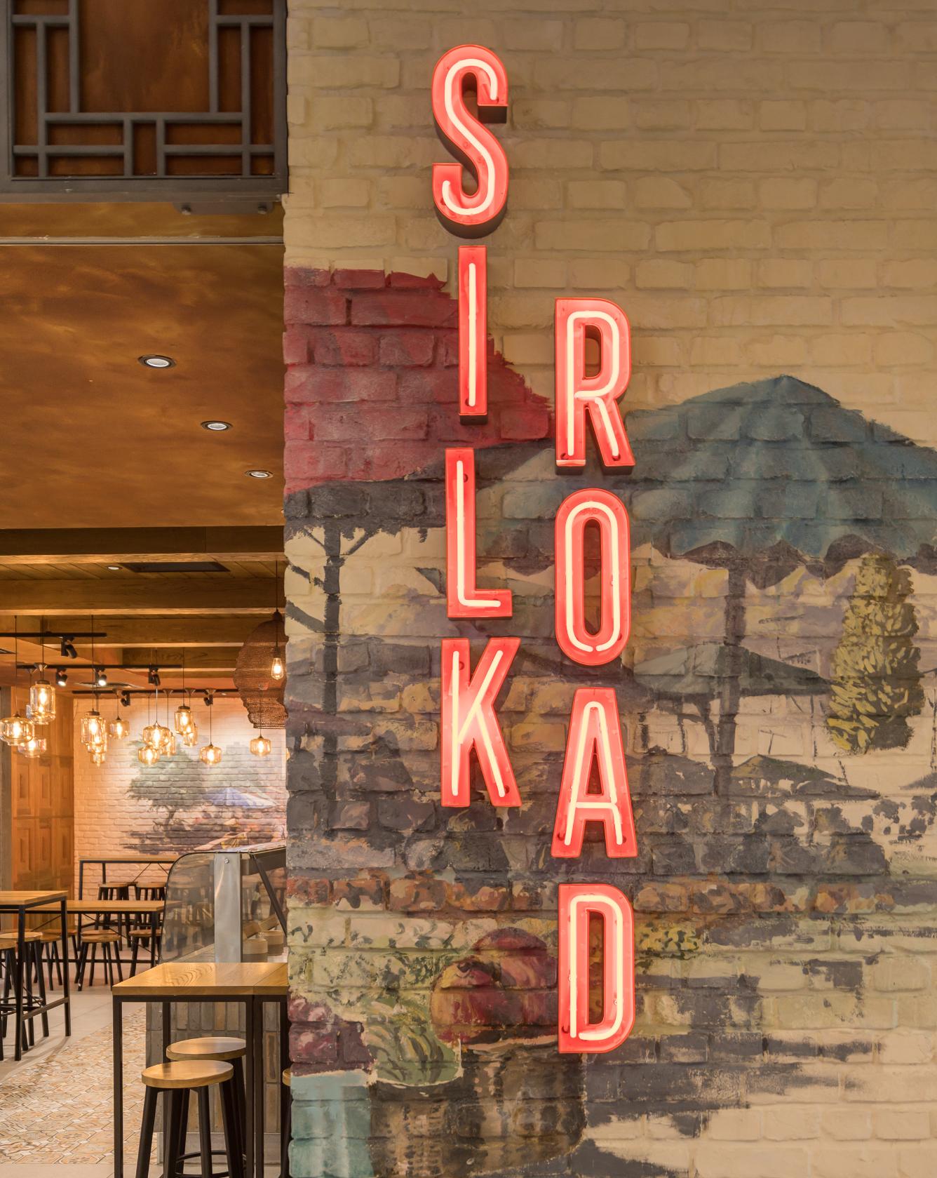
We believe that the result does offer an impression of real backstreet Thai restaurant. In spite of reducing the seating by more than half, sales are strong and the staff no longer have to evict unconscious or grumpy backpackers at the start of every shift.

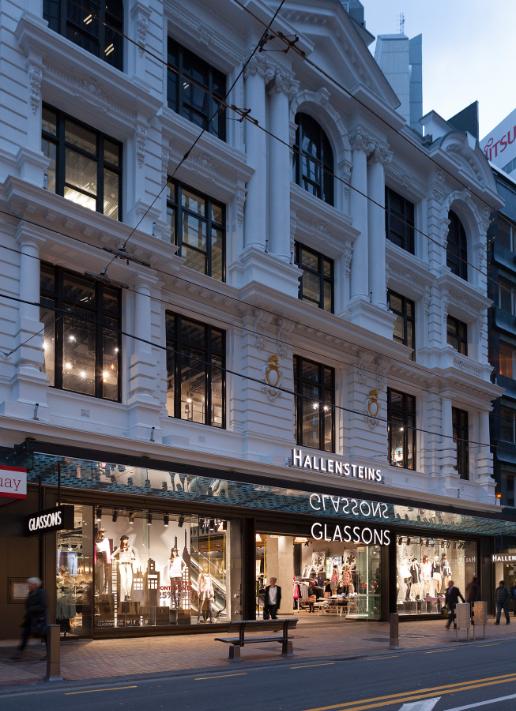
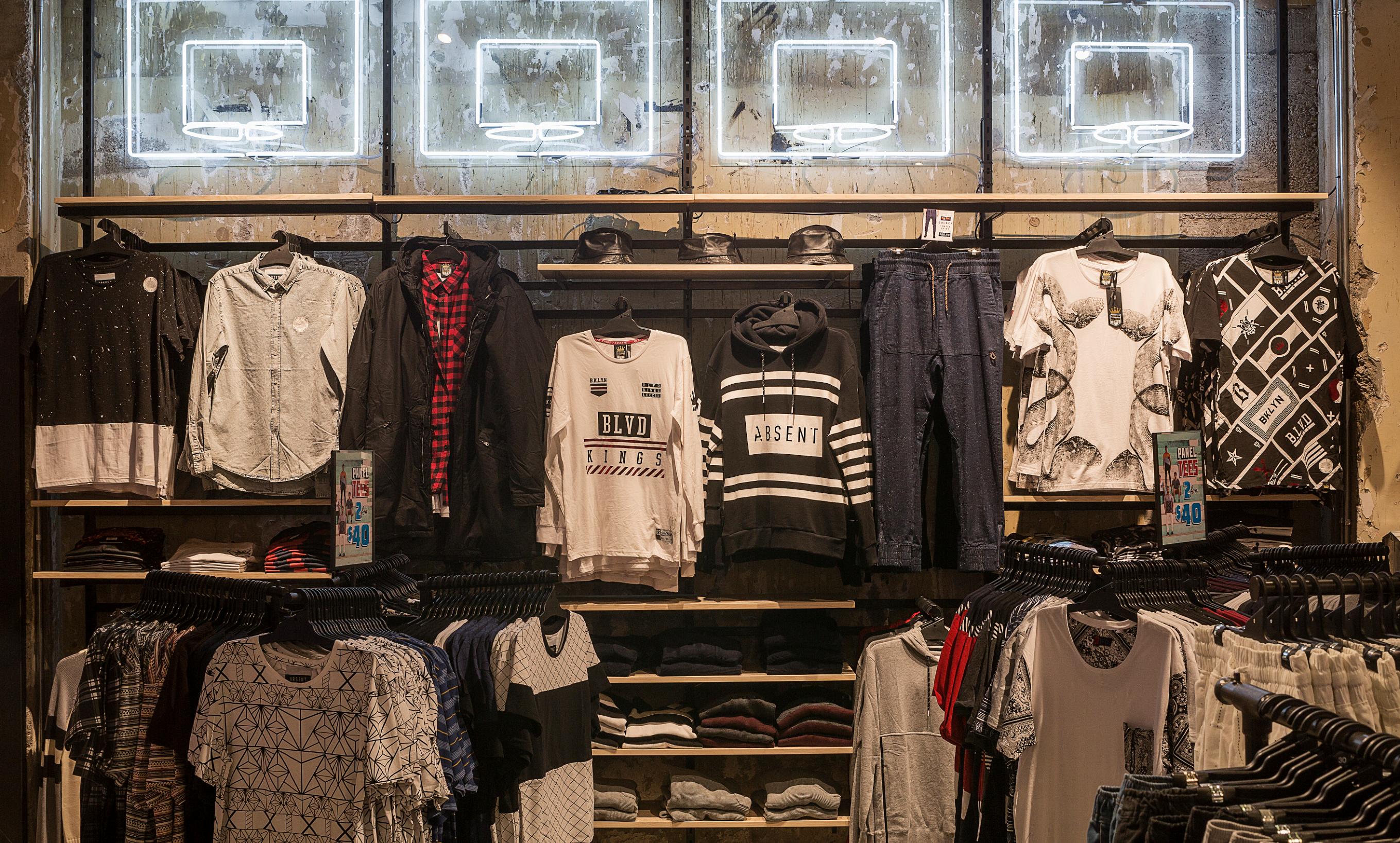
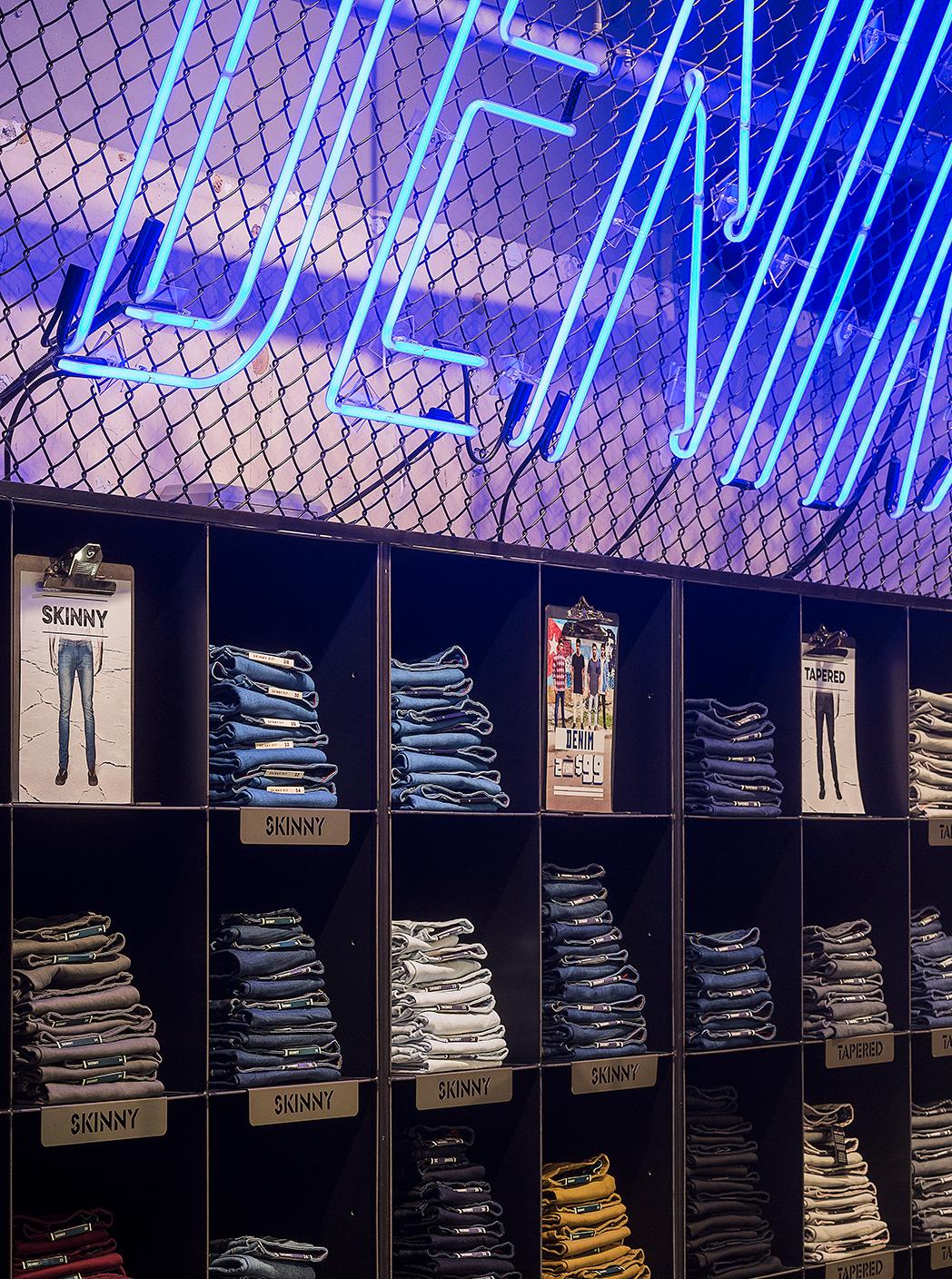
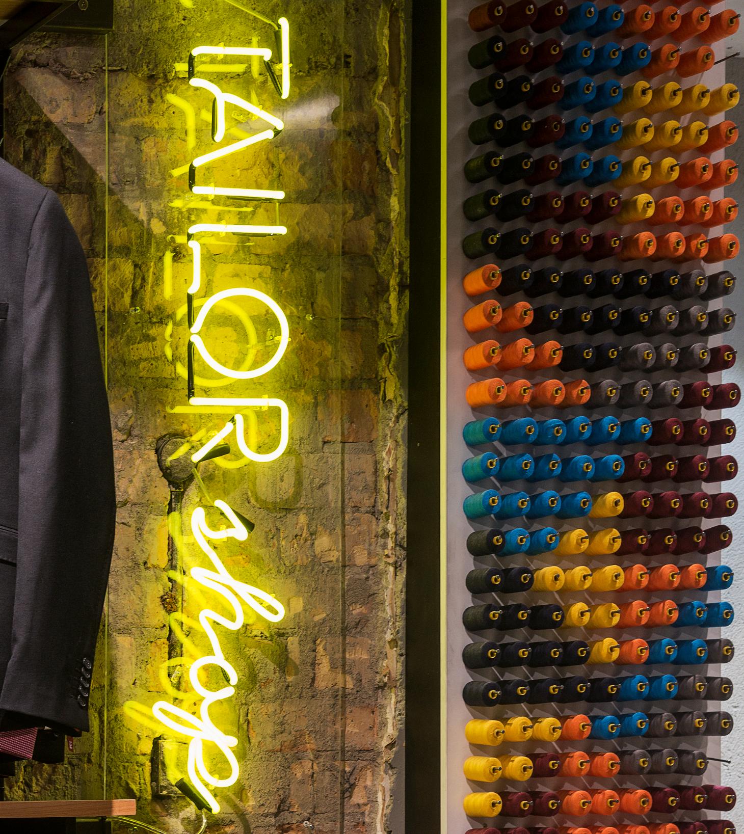
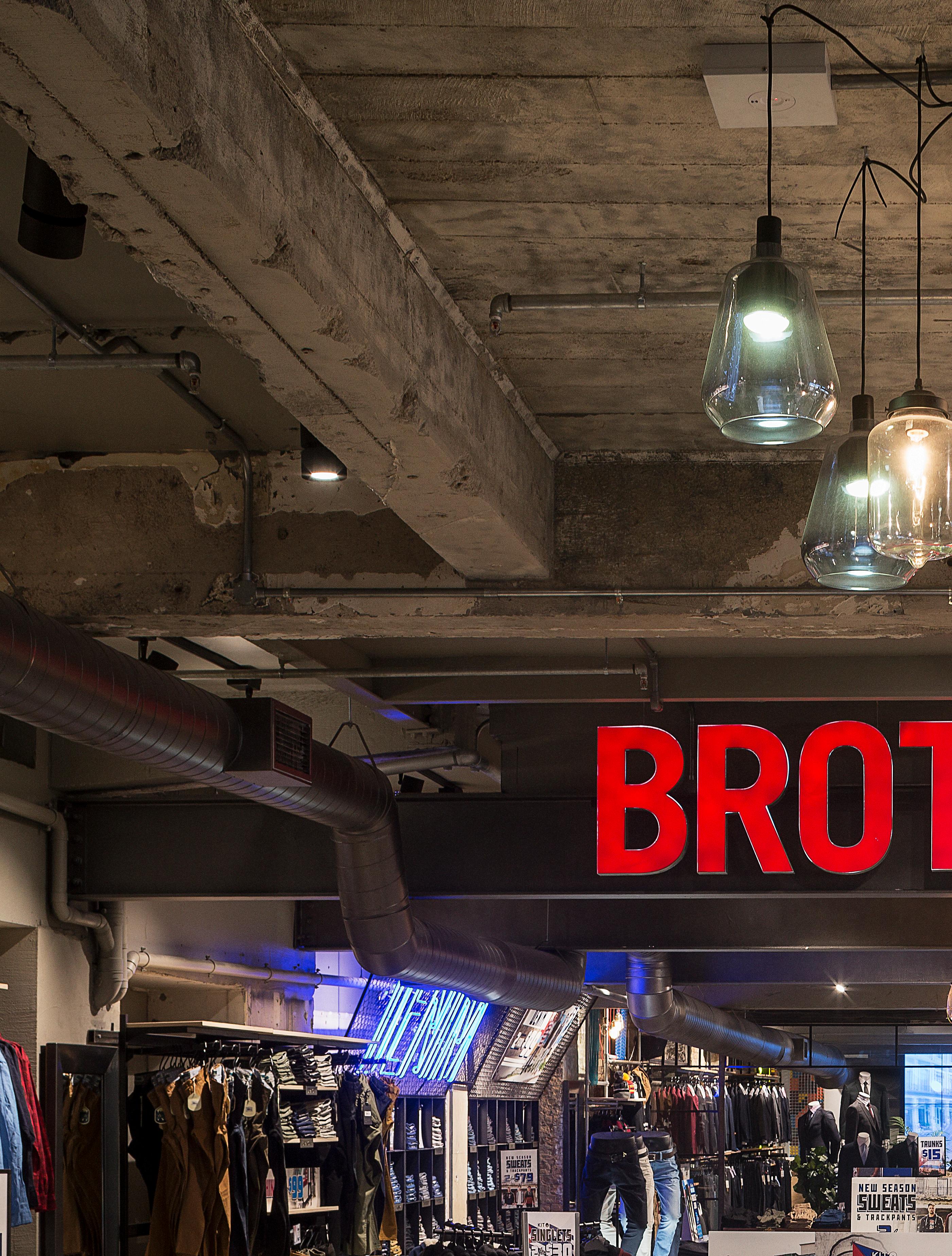
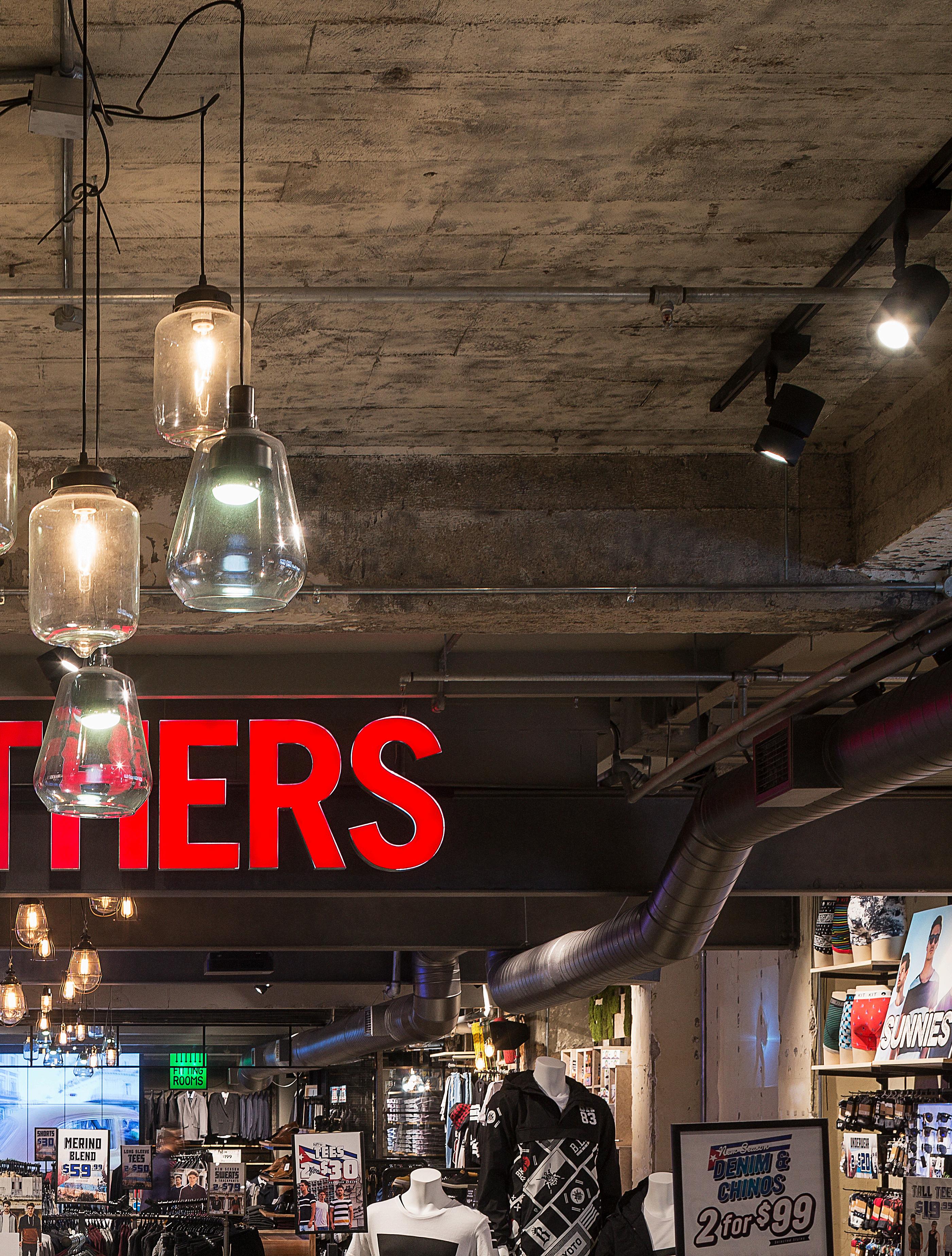
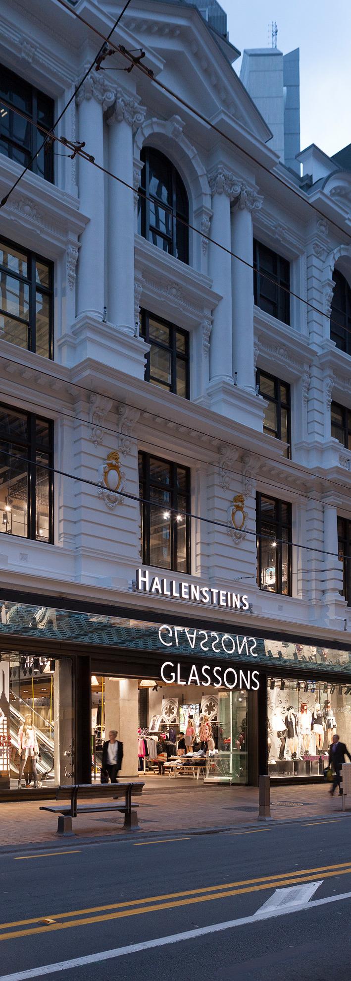
Hallensteins, Queen Street flagship store advances their current fitout model. The site is Hallensteins biggest store at 522m2 and is housed in the historic Lewis Eady building (formerly Supré). It retains remnants of the original interior and existing building elements. Our client didn’t want a complete departure from their current fit-out model but were keen to retain and expose as much as possible of the “raw” building shell as a backdrop to their merchandise. All without alienating their mass-market fashion customer by becoming an unapproachable boutique.. We tried to capitalise on the unique character of the existing building by taking a very pared-back approach to allow its newlyexposed textures come forward while forming a backdrop to the merchandise. This was very difficult as much of the original interior had been lost during previous structural works. Even the shopfront had earlier been removed. We replicated some of the frontage’s geometry and previously destroyed features, such as the column grid and steel joinery. We decided to simply expose everything and not refinish any original surfaces so as to celebrate the innate character of the building and its proud past.
We believe the result is innovative, in that it has taken a massmarket retail format to a new level without appearing too upmarket (which would have alienated the target market). The budget was tight with structural, fire, heritage and services challenges, however the interior has a huge customer appeal that bridges the gap between mass-market and hard-edged urban retail. Original elements of the historic original building were brought back into view while meeting the tough heritage regulations. Overall we believe that the resulting interior is a fun and stimulating place in

PUKEKOHE // NEW ZEALAND
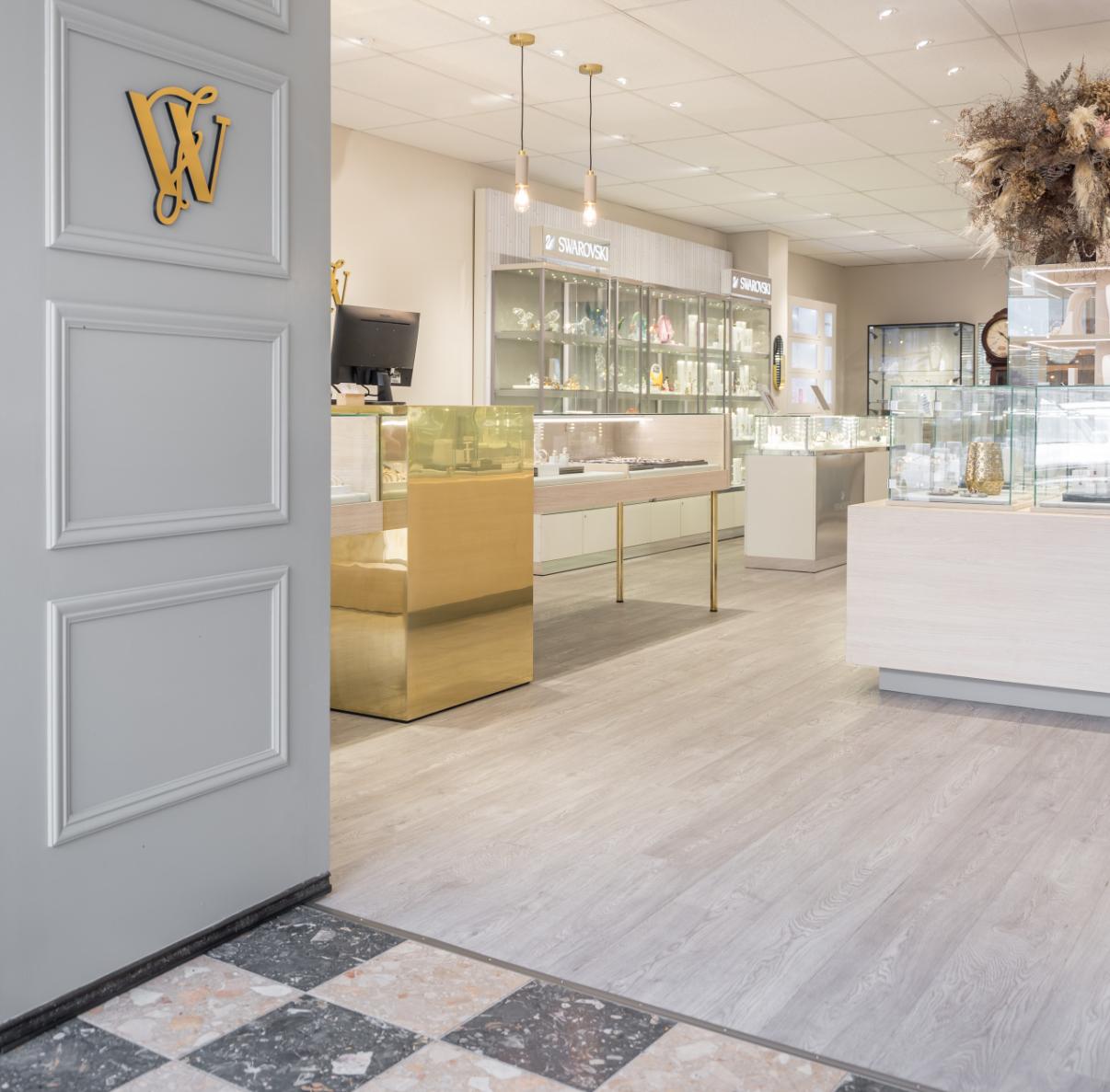
Wrights Jewellers is a long-established family business in Pukekohe, first opened in 1912 by Walter Wright. Our practice fitted this shop out in 1999 for his son, Gary Wright and 20 years later it was passed down to his daughter Rhian and her partner Ben, who approached us to give it a whole new look to reflect a new generation taking over.
There was a desire to shift towards higher-end, trend oriented jewellery, whilst still reflecting on their personalised customer service and ability to create bespoke pieces with their in house jewellery manufacturer.
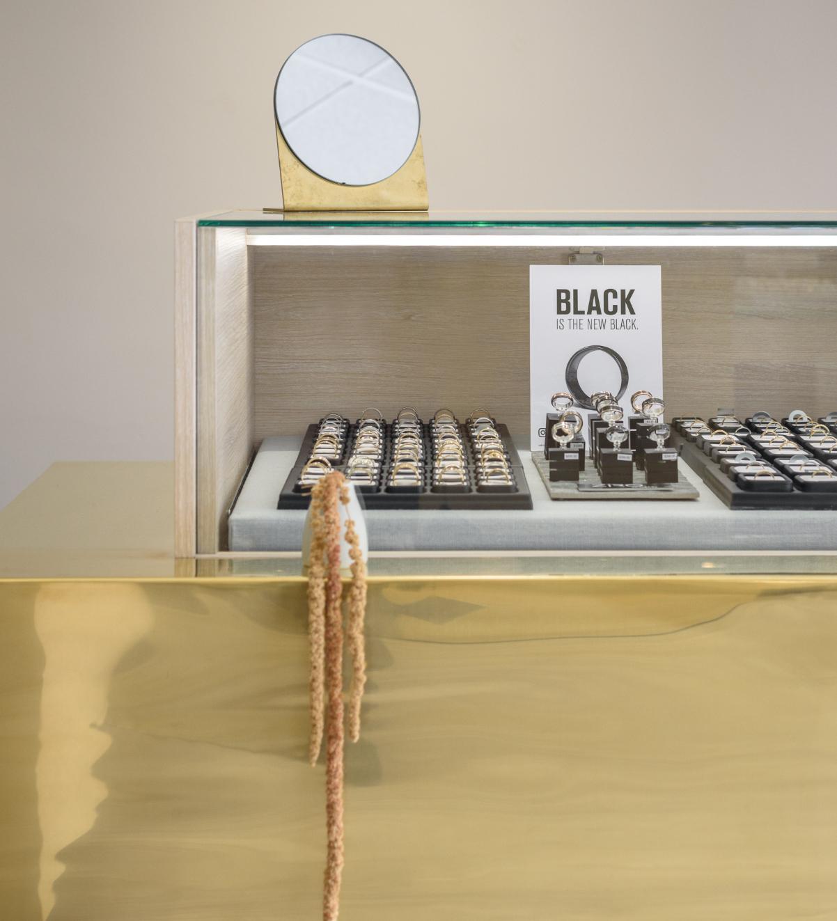
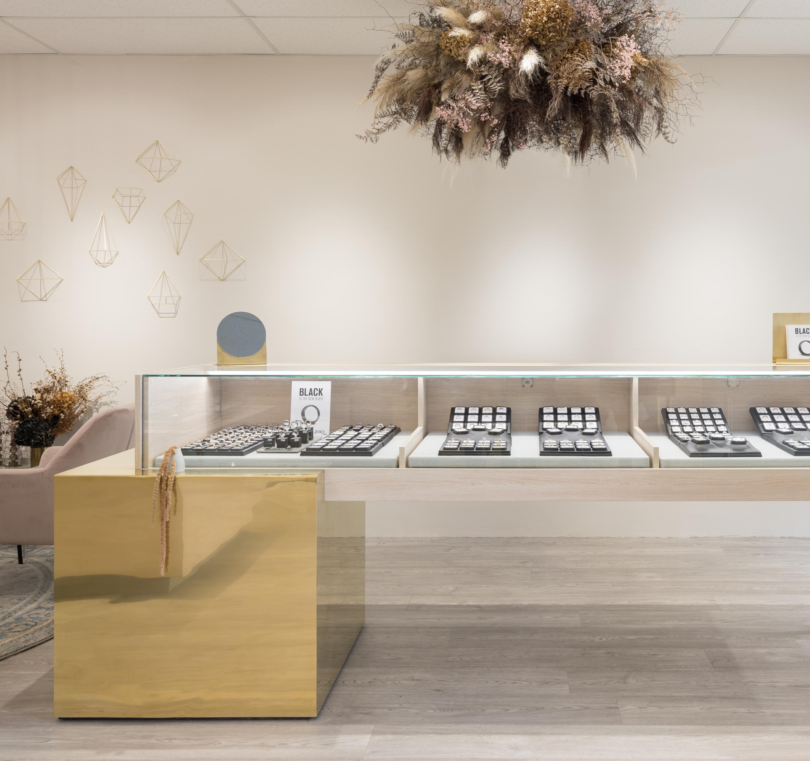
To hold on to the history of the shop the clients requested a number of wall and grandfather clocks to remain, but the old fit-out with its dark timber and navy carpeted floor had to go to make way for the new identity. The set of new jewellery displays counters we designed are open underneath to increase the sense of space in the store while decreasing the sense of separation between staff and customer.
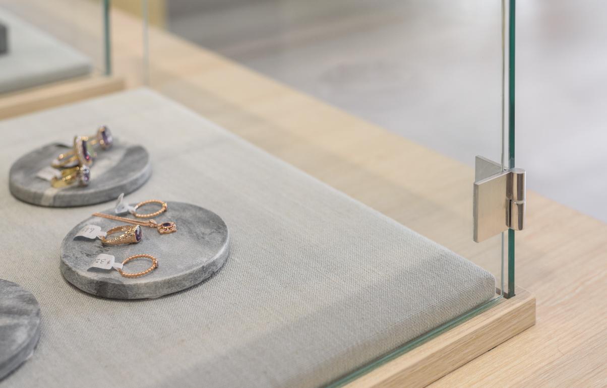
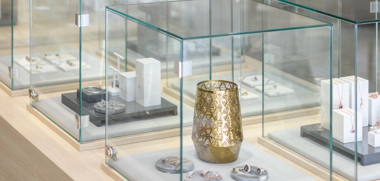
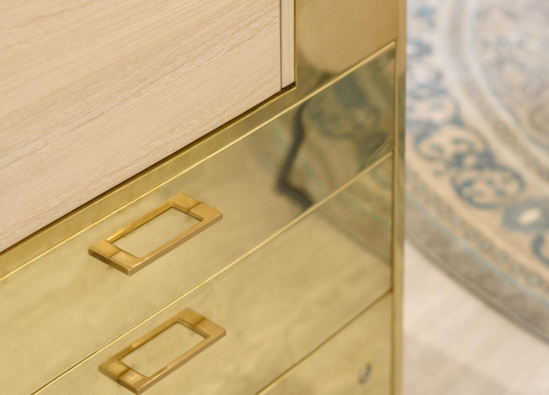
Polished brass accents were used to reflect on the history of the shop, but updated with modern shapes and placement, complimented by the light ash timber-look laminate that was used for much of the joinery (as cost prohibited real timber). Soft greys used for walls, cabinets and drapery created a neutral base to highlight the timber and brass finishes, with the intention of creating a fresh and stylish setting that would still be inviting to the whole Pukekohe community.
Rhian and Ben were able to successfully manage much of the build themselves, using young, local contractors and cabinet-makers who finished their work to an incredibly high standard.
The project came in almost exactly on budget, a minor miracle given the size and scale of change accomplished. The result is delighted clients and a community of locals who now will use any excuse to come in to the shop and admire its fresh new look.
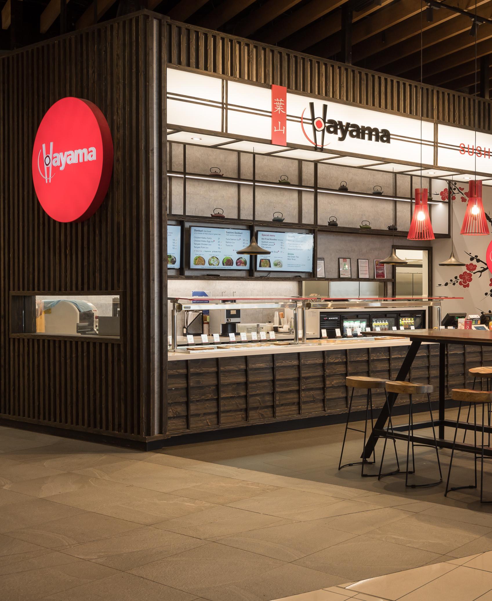
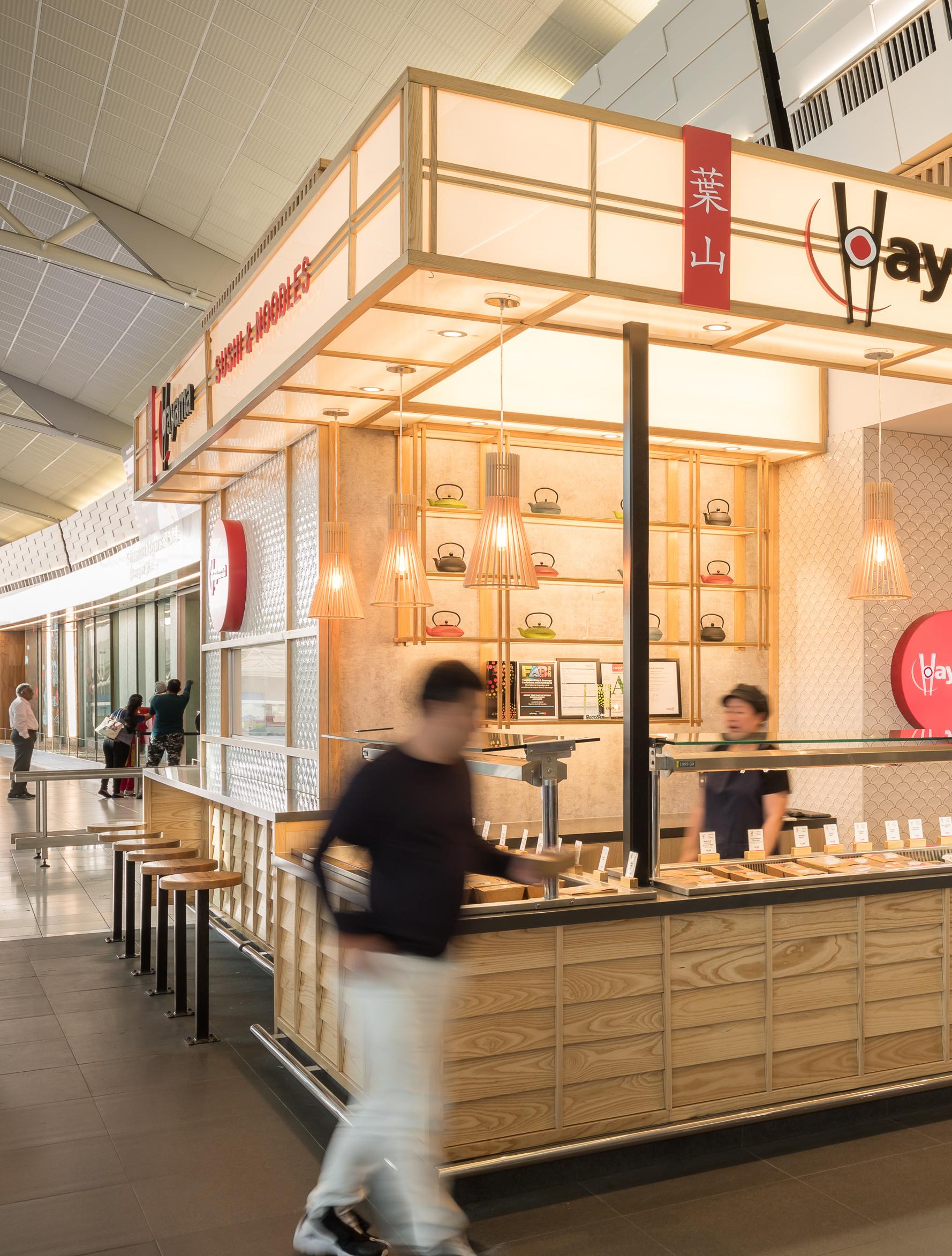
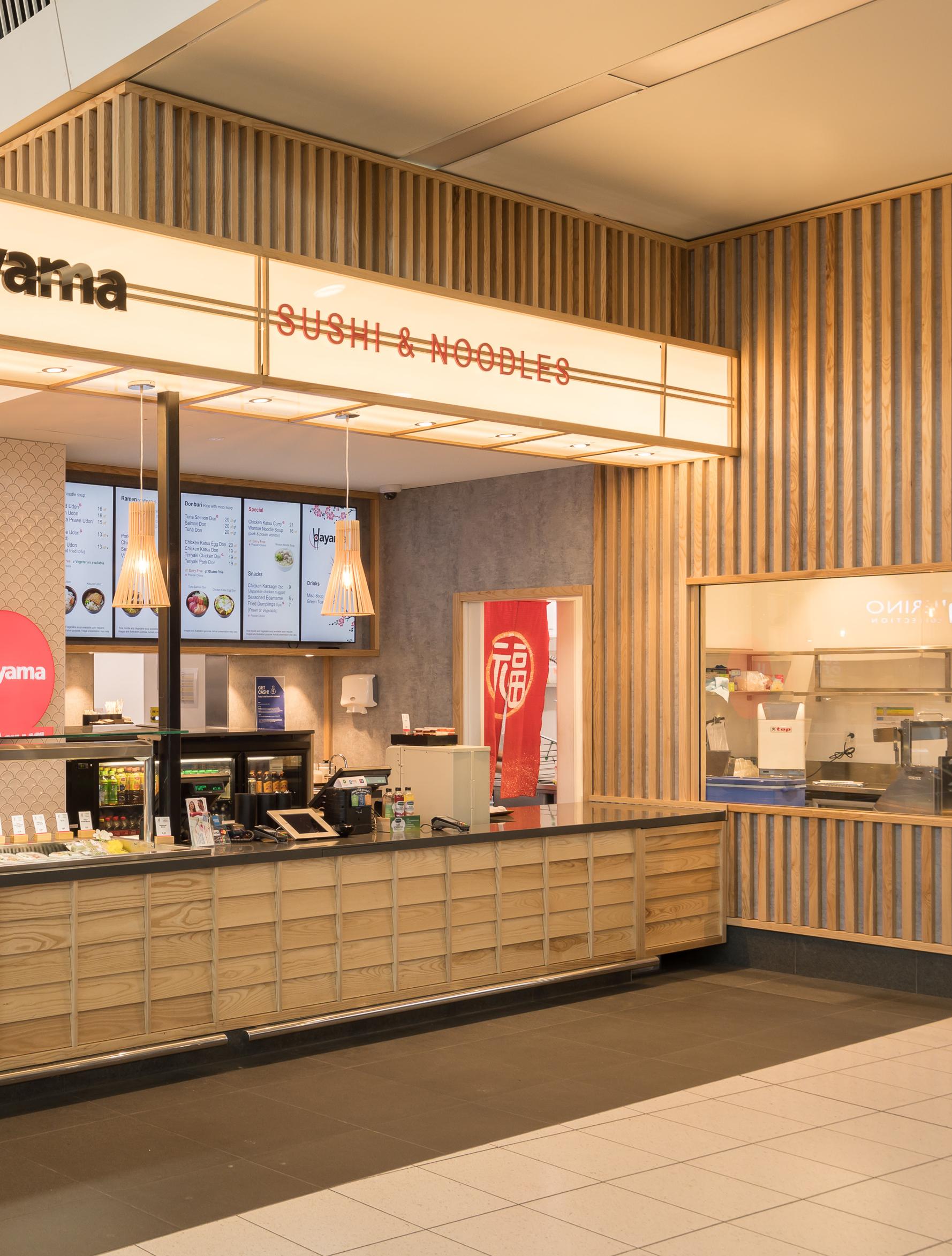
Our long-standing clients, Kiwi Discovery Ltd, approached us to do a new freestanding store in Auckland International Airport‘s landslide farewell zone - more commonly known as the food court. The site itself was especially difficult as, in addition to being very small for the kitchen and refrigeration equipment required, there were very few of the necessary services on site due to the fact it was previously a coffee kiosk.
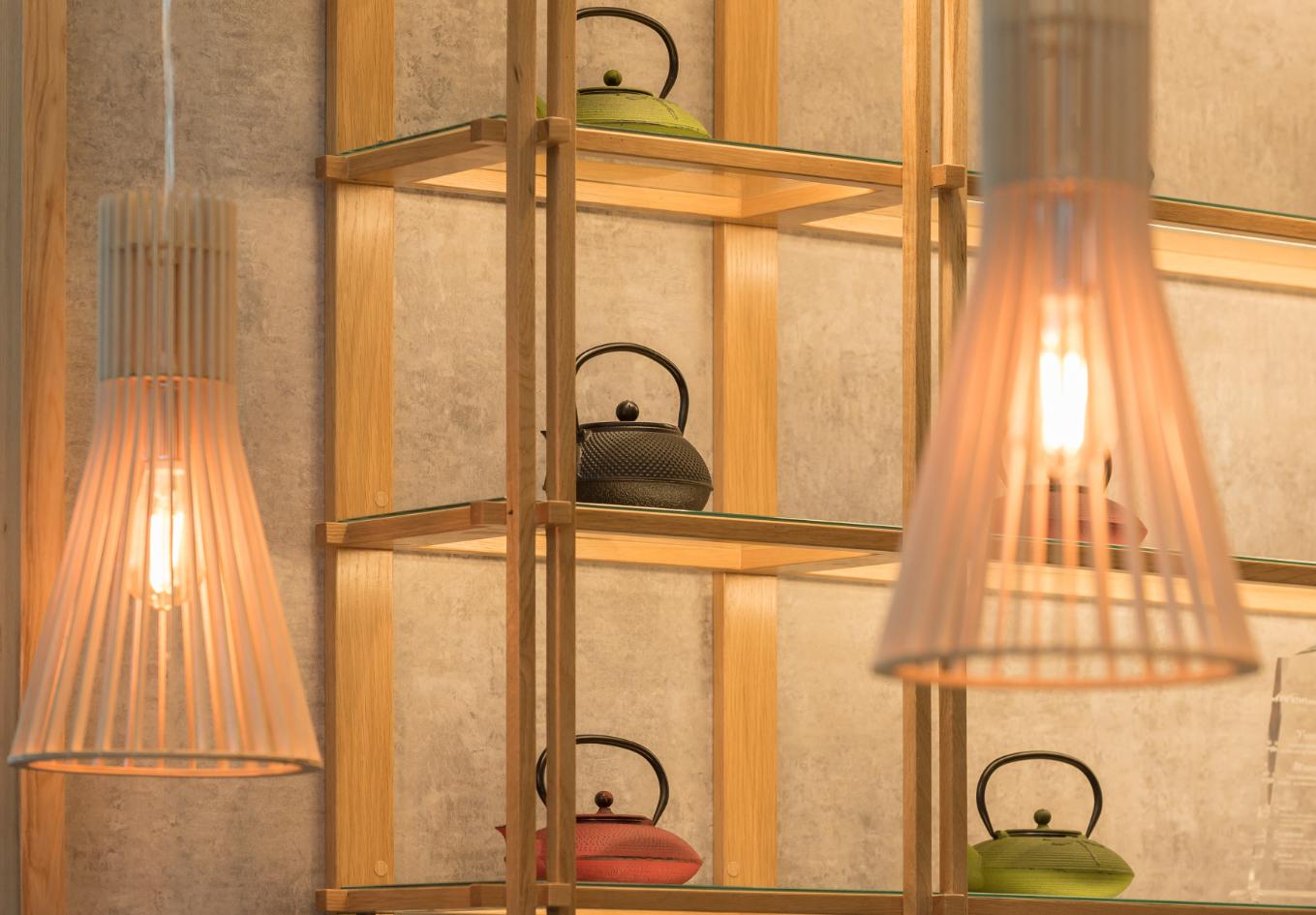
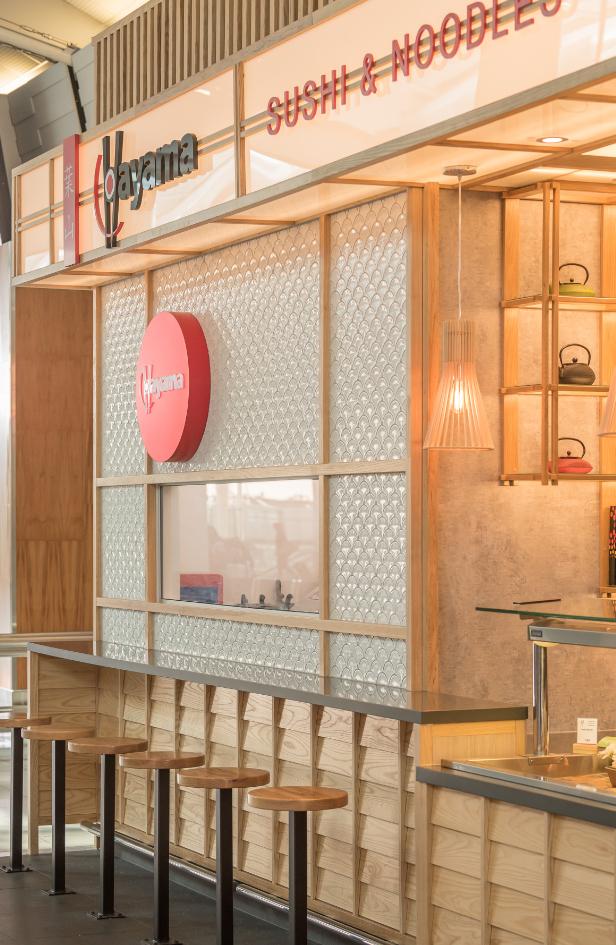
We broke up the bulk of the space by using some large graphic panels, including an illuminated overhead sign, on which we created a traditional Japanese cherry blossom-patterned panelling to balance against the natural Ash timber used elsewhere. TV screen menus and traditional Japanese teapot displays were added to further break up the solid walls and add interest to surfaces which would otherwise be plain, considering that all the products are displayed in refrigerated wells in the counter. The high positioning of the branding enables customers to identity of the kiosk across a very crowded food court. We chose warm-coloured lighting and graphic tones to also enhance the natural timber finishes. We feel the build result reflects the products offered in a way that effectively emulates the traditional Japanese cuisine against the more fast-food orientated food offers in the food court, i.e. KFC, McDonald’s and Nandos, and also brought an element of “food theatre” to the food court.


// NEW ZEALAND
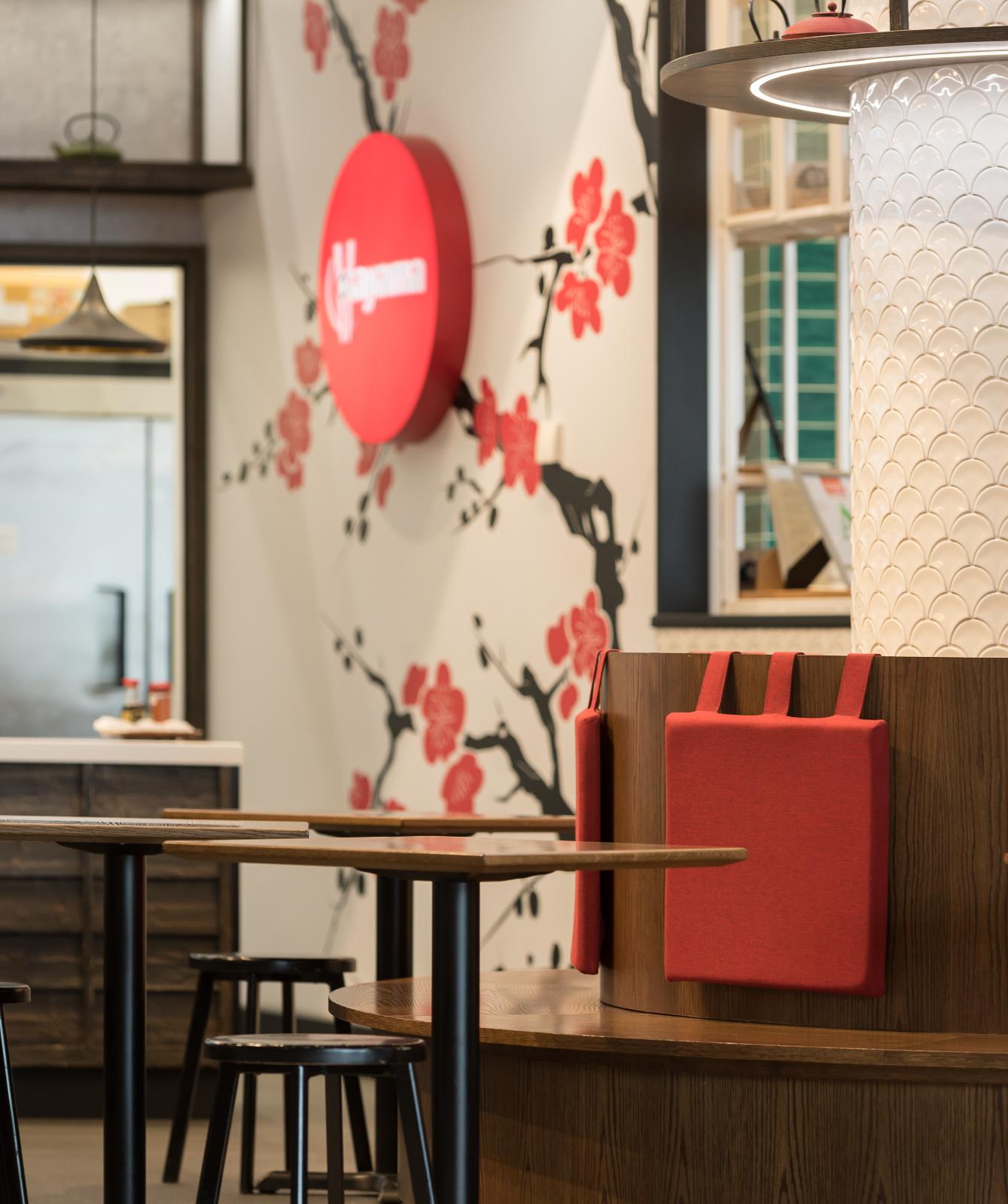
Our clients wanted Hayama’s Airside outlet to reflect the delivery and branding of the other natural looking restaurants throughout Auckland International airport.
We decided to turn the earlier Hayama delivery on its head and stained the timber a near black, charcoal colour (instead of the natural ash used elsewhere), which created more of a “night time dining” vibe to the space while still complementing the black white and red branding used throughout the chain. Space was extremely limited, so we chose to only add high level, freestanding, communal tables to minimise the seating area and allow customers somewhere to put their wheelie bags while dining. In addition, we created some dining height seating around the column with an authentic Japanese feel created by the use of hanging cushions and a traditional Japanese teapot display above. We used scalloped tiles on the columns and elsewhere in the tenancy as a nod towards the predominant use of seafood in the menu. The site was very hard to identify from a distance without any exterior walls, so we persuaded the airport to allow us to add signage onto the front of an existing column, although they insisted that this could not actually touch the column apart from some minimal fixings.
The result has been very well received and is extremely popular with diners. The Auckland international Airport landlords were so pleased with it that they entered it in to an international design competition for airport retail.
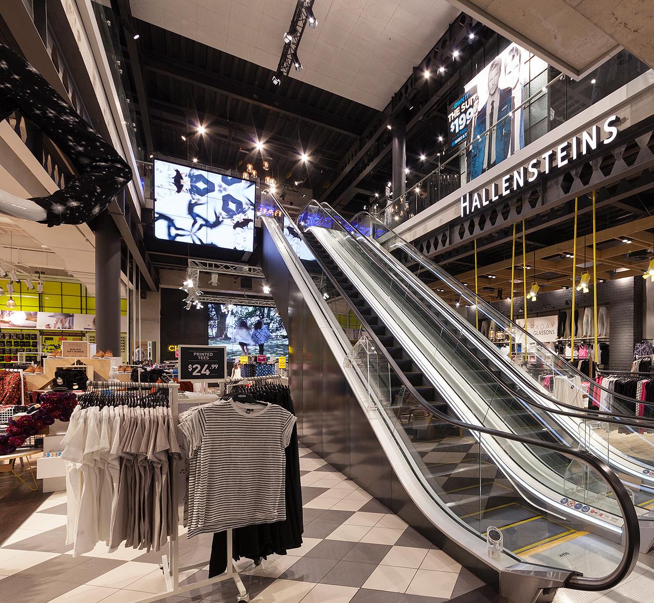
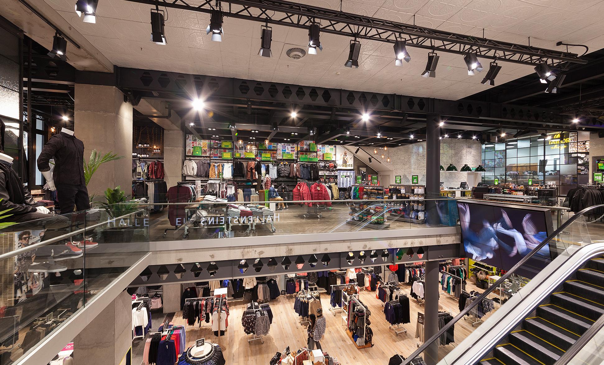
During our 20 year association with New Zealand’s leading fashion chains Hallensteins and Glassons we have helped them to reinvent their brands a number of times. This last iteration was a complete rethink of the fit-outs of both labels right down to the logos and signage. It’s not that the previous retail formats (shown elsewhere in this presentation) were unsuccessful, in fact it was just the opposite helping the brand to achieve a increased revenue off of over 26% per quarter. It’s just that it was time to move the brands even further ahead of the competition. As proof of this another New Zealand fashion brand was actually doing almost exact copies of the Glassons fit-out and having them made in China!
The new flagship store marks a complete departure from previous fit-outs in a number of ways: this is the first time that both brands have been housed within one space, albeit on separate levels. Is also the largest store has so far produced at around 1336 square metres. The look is pared back, minimal, industrial and edgy in keeping with the demands of its target market.
The building itself, formerly Whitcoulls, is a historic building which posed many challenges including requiring a full seismic upgrade. Although most of the interior’s historic features were lost due to the extensive structural work required we tried to retain a semblance of the original hundred year-old building within the new fit-out. We added brick, pressed metal ceilings and old wood to make the space look like it had simply stripped back to its original bones then just let the merchandise, VM and huge video walls speak for themselves. As usual time and budget were extremely tight.
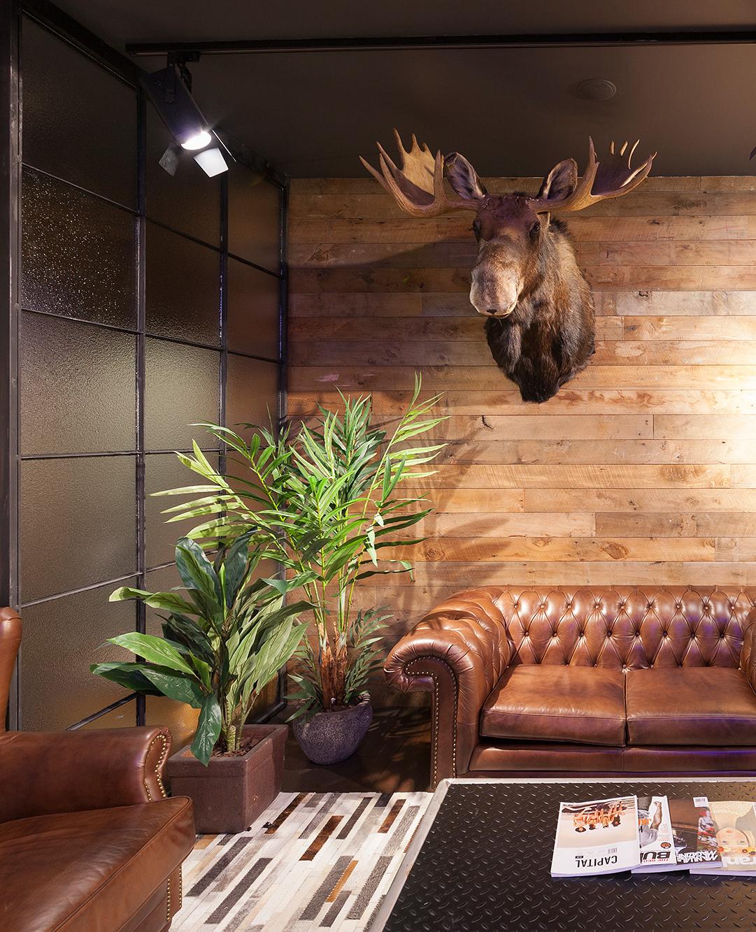


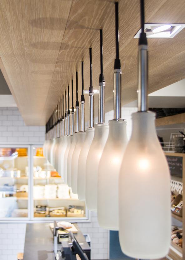
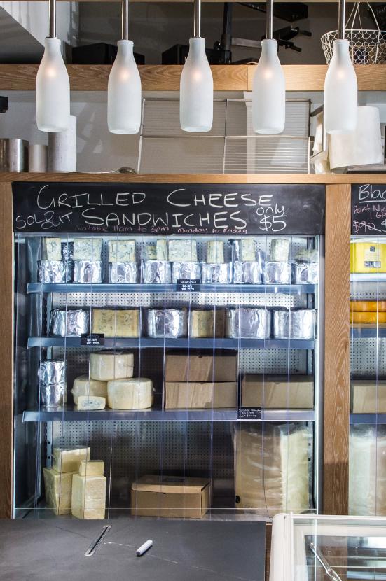
Parent brand Fonterra commissioned Walker to design a one off concept store in Auckland CBD (Shortland St) to showcase its cheese and ice cream ranges. This initiative was driven by Fonterra’s marketing department to build brand awareness of their speciality/ high end product in the restaurant and catering market, as well as high net-worth individuals. The store also acts as a hosting venue for Fonterra’s larger national and international clients. Images supplied in this presentation.
The store won the Supreme Award as well as the Convenience Stores Division and Nourishment Group at the 2012 Red Awards and is currently finalist at the 2012 BeST Awards.
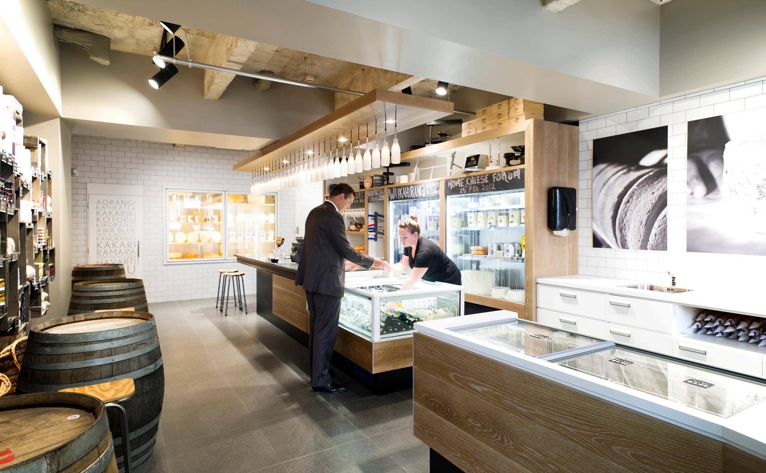
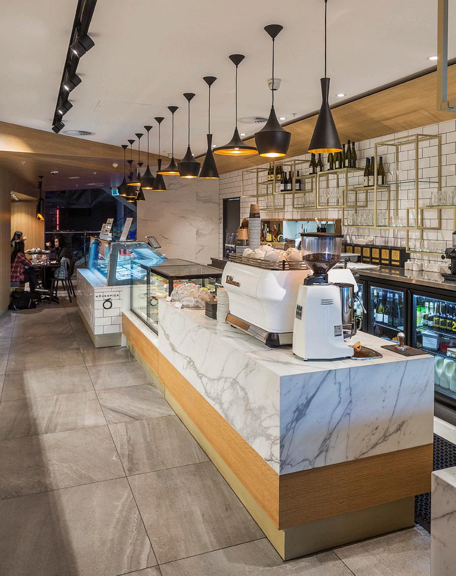
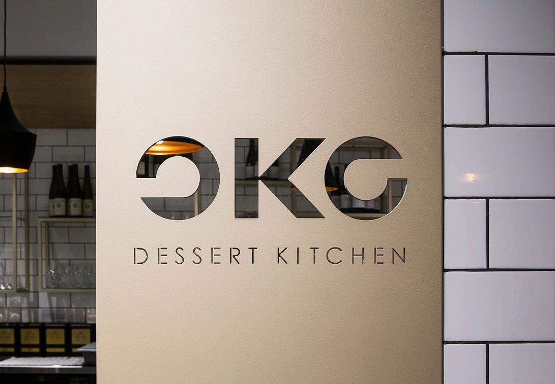
Oko Dessert Kitchen is a restaurant specialising in high-end, individually prepared desserts and a range of patisserie products and beverages, all prepared on site. It also sells Mövenpick Ice Cream. The interior was designed to incorporate a clean but modern and functional aesthetic that would be up-market enough to reflect the premium-priced dessert offering yet not so grand as to discourage casual coffee and ice cream customers. White Carrara marble hints at the traditional French patisserie or an Italian gelato shop. Gold accents and strong-tile and timber also round out the traditional material palette but a clean use of lines and forms points to the very modern and stylish nature of the desserts created. Overall the interior is designed to hint at both traditional and modernity without being able to be pigeon-holed as a cafe, patisserie or regular full-service restaurant. Forms and mirrors are used to break-up a tight and difficult space. We believe that the final result reflects the unique nature and personality of our client’s product offer.

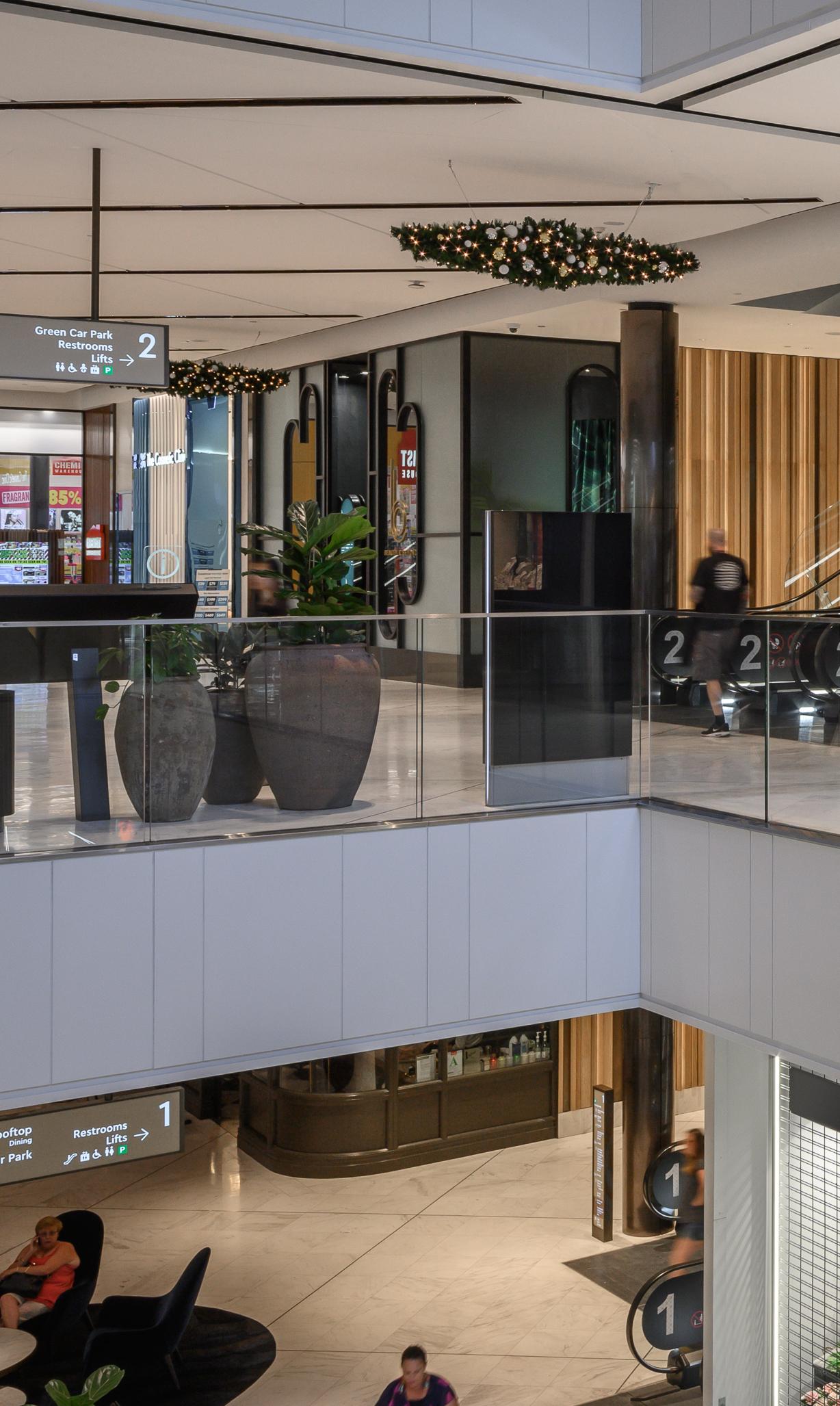
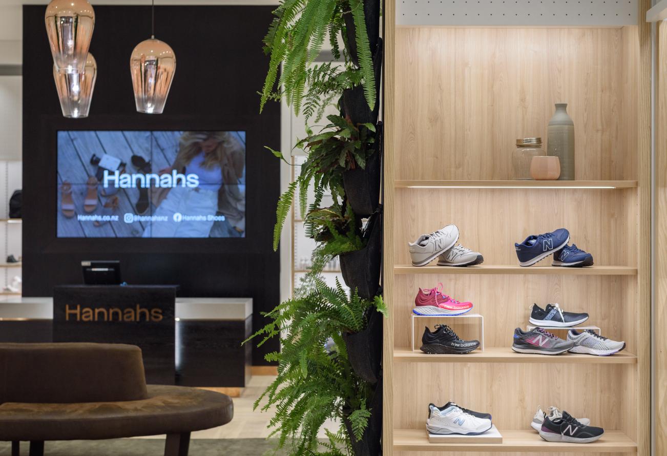
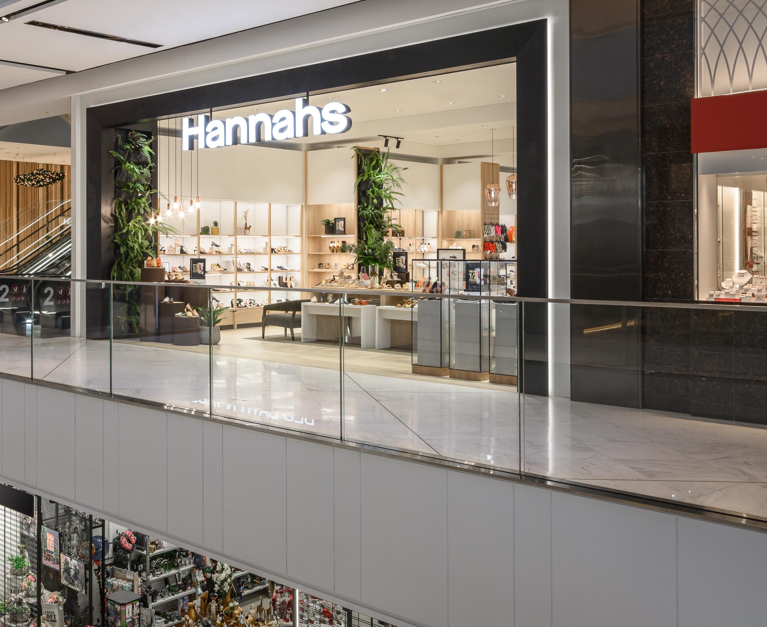
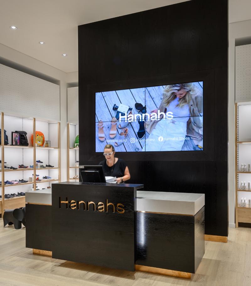
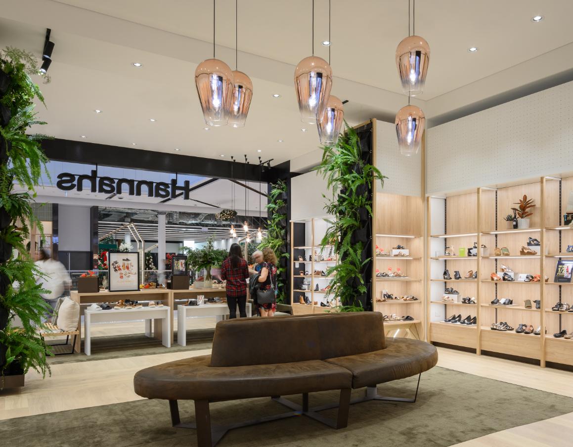
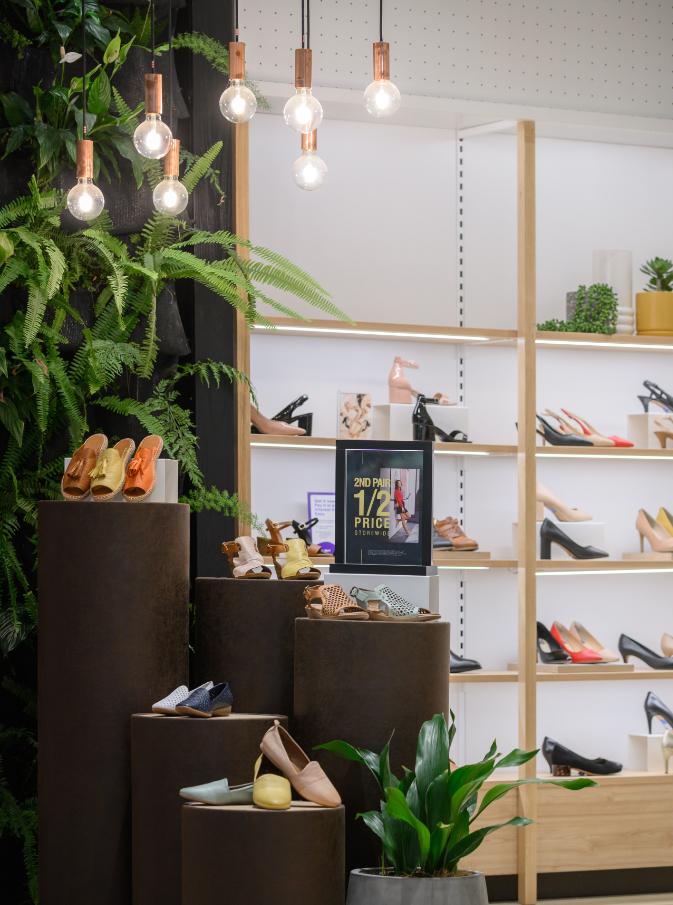
We were engaged by Hannahs to redesign their store, aiming to blend heritage with modern sophistication. Our design honors Hannahs' 150-year legacy of quality craftsmanship while embracing a contemporary, welcoming atmosphere. Every element has been thoughtfully curated to elevate the shopping experience: warm lighting, natural materials, and streamlined displays create a sense of comfort and elegance.
The layout draws customers in with large living walls visible from the entrance, complemented by a highlighted feature display at the entry. Toward the back of the store, a dark veneered counter connects visually with the framed entry portal, creating a cohesive flow. This connection is further emphasized by a large digital screen framed with matching black veneer. Our design celebrates Hannahs’ legacy and commitment to quality, making each visit a step into timeless style.
AUCKLAND // NEW ZEALAND
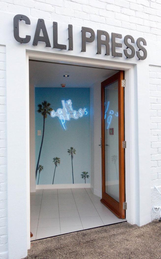
Cali Press, (short for “California Pressed” juice) is an Australian juicer and cafe concept originating from Melbourne. Our clients acquired the New Zealand rights for the brand and, after setting up a small juice factory, needed to establish a retail outlet for their products. Their first site was in Graham Street in central Auckland. They proposed to create a new design concept for this which would reflect, not only elements from the Australian fit-out, but also the very simple and pure nature of the products they offered as well as convey the mood of California and its emergent health-focussed cuisine and lifestyle.
We set about designing the interior, which is quite a tight space given the amount of room needed for food storage and prep. We came out with a simple plan which uses essentially one long stainless steel prep bench (with most of the equipment and much of the storage under it), and a white service bench. The palette is very simple: blonded wooden floor, plywood, walls and joinery, floor white tiles, white laminate cupboards, black steel detailing and stainless steel equipment and workbenches. Decoration is by way of a Californian palm-tree mural that we had custom painted on the back wall and some simple signage. Seating is limited but is mainly to a bench seat running down the left side and some spaces in the window area, mainly for customers waiting to pick up their take-out orders. The result is very simple, functional and very cost-effective one but, we believe, that it reflects the essence of the Californian simple and healthy lifestyle.

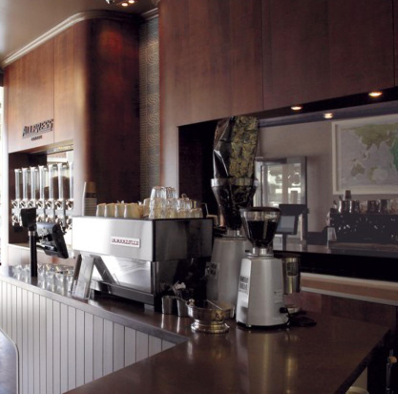
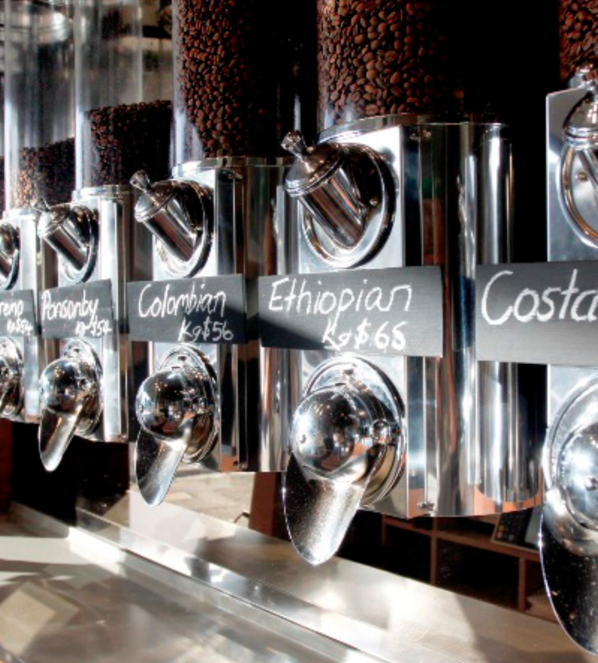
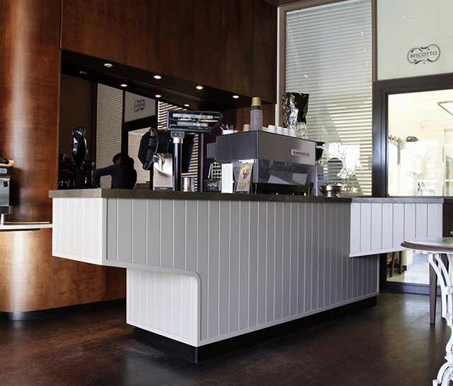
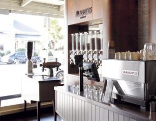
Walker prepared the concept design and carried out detailed design for Allpress Coffee’s “Biscotto” pilot store in Ponsonby Road. This small space is used as a mini-flagship for the Allpress brand on Auckland’s premier café strip where it already supplies most of the leading cafes. The idea was not to compete in terms of a sit-down dining experience but instead to promote the brand’s take-home coffee bean and experimental biscuit product.
AUCJKLNAD // NEW ZEALAND
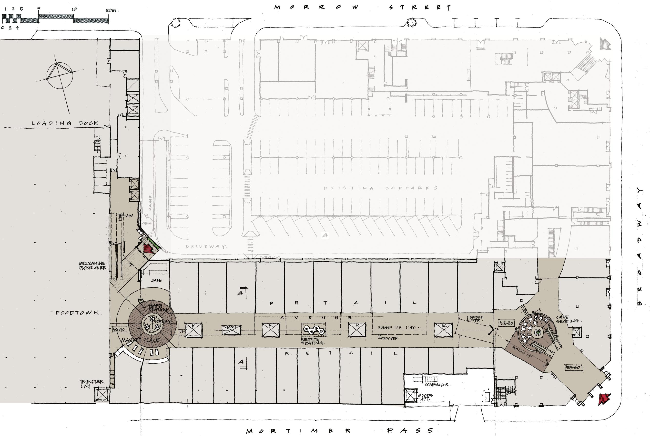
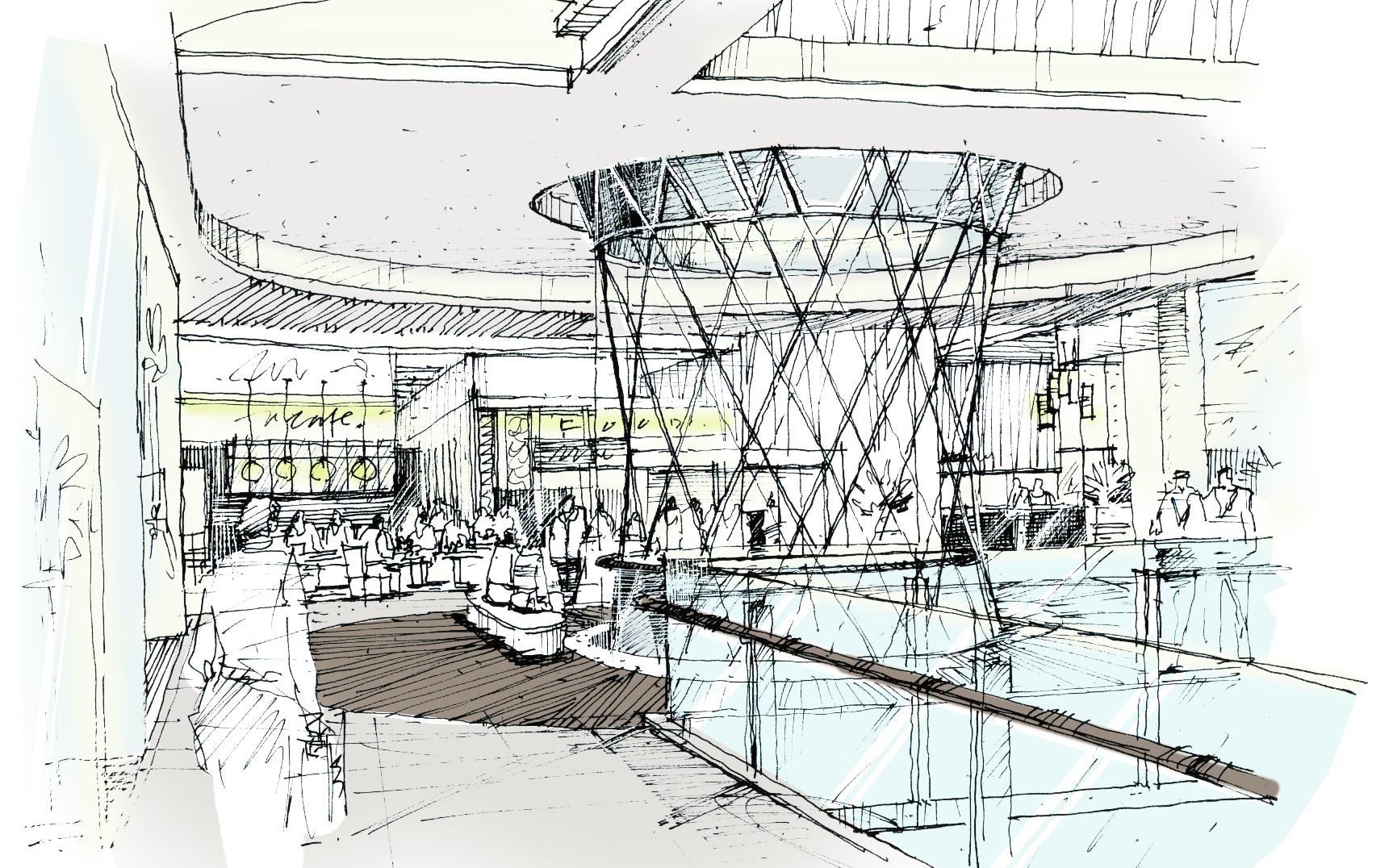
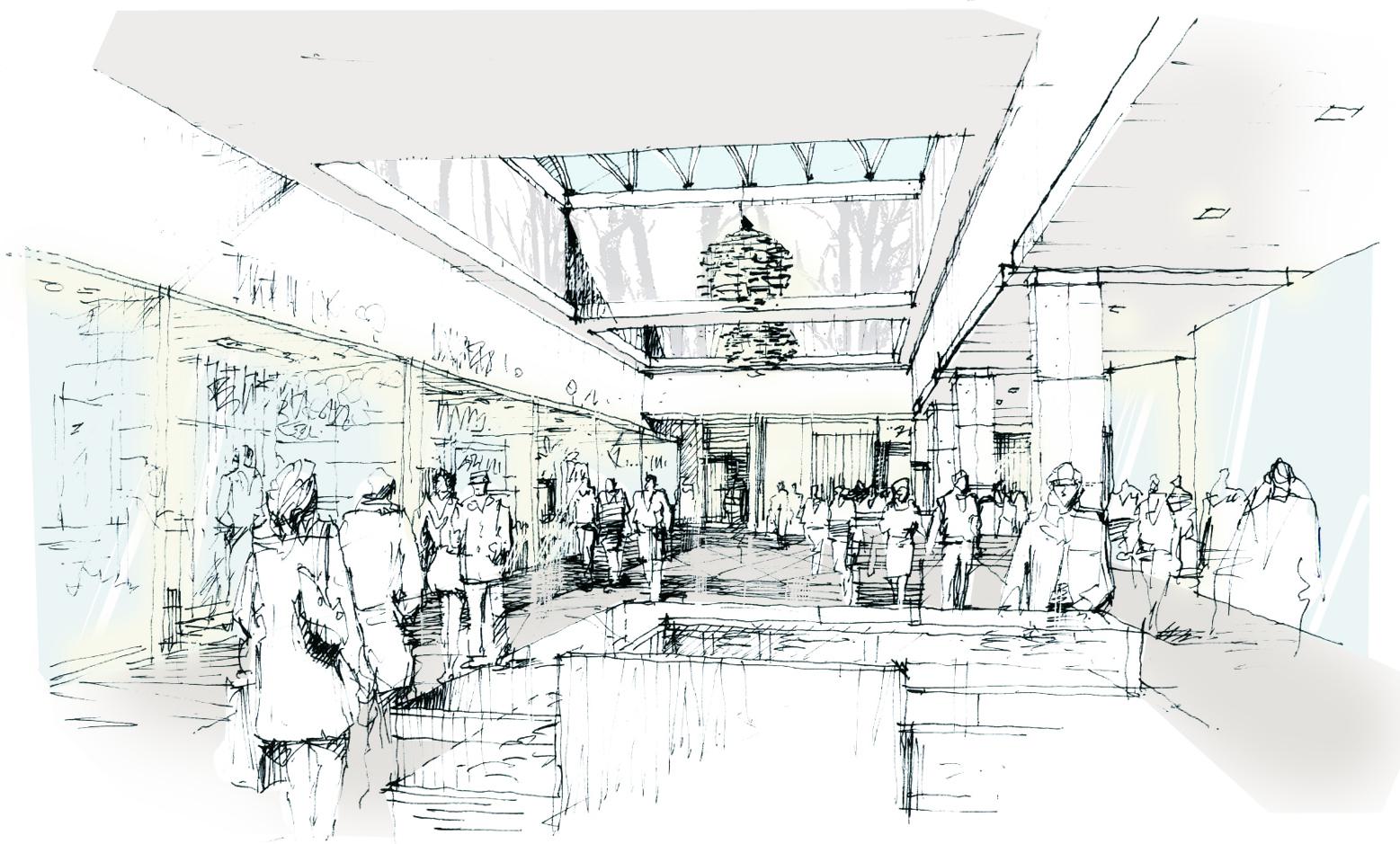
Walker prepared the full design concept for Westfield’s upcoming refurbishment and extension of their 277 Flagship shopping centre.
This will be New Zealand’s only “Black Label” mall which will feature a very high level of design, fitout and customer services. We worked closely on this project with Westfield’s in-house design and architectural team who will complete the construction documentation in Sydney.

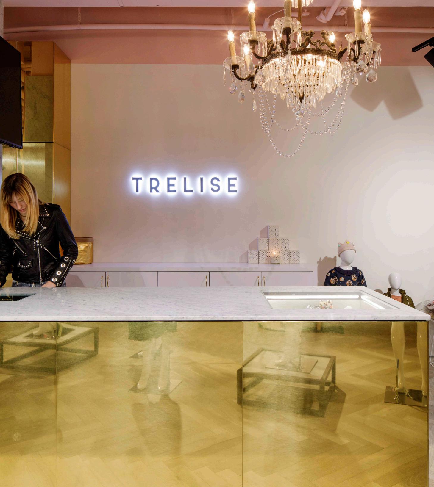


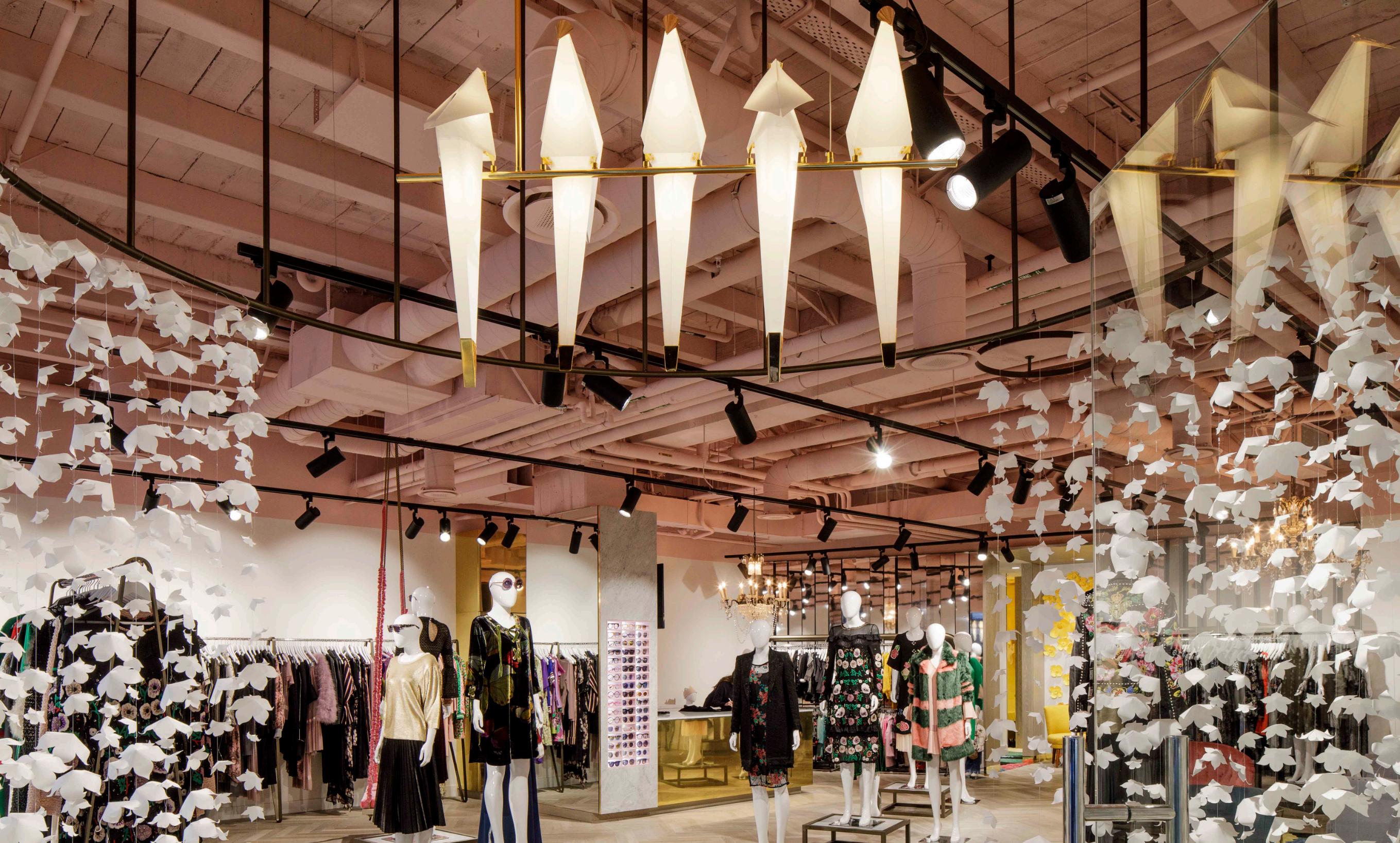
The clients aim was to re-launch their presence in Wellington with a new flagship concept which would include elements that could also be used in future locations.
The challenge of working with a world-famous fashion designer is to support but not overpower the fashions displayed, nor to follow one architectural style. Walkers intent was to combine elements of Trelises’s eclectic, colourful and detailed style into an environment neutral enough to adapt to a variety of clothes, seasons and events. Customer experience was paramount in the design, from the welcoming entry to the comfortable fitting rooms and joy of the velvet swing. Details are especially important to Trelise so the materiality is more complex than a typically minimal contemporary fashion store. The resulting experience has been very well received by client and customers.
Project was awarded in the Red Awards Apparel Division.
QUEENSTOWN // NEW ZEALAND
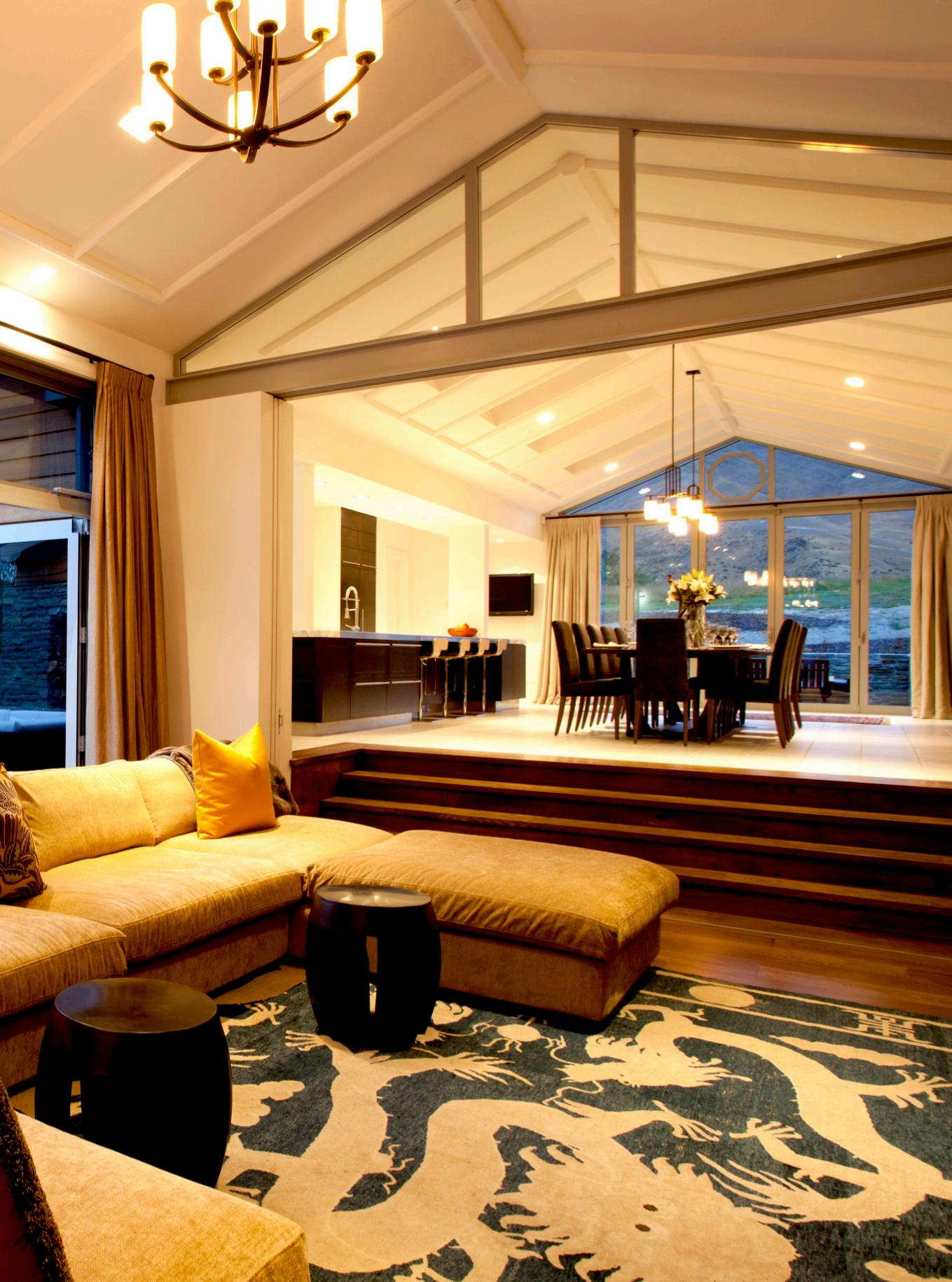
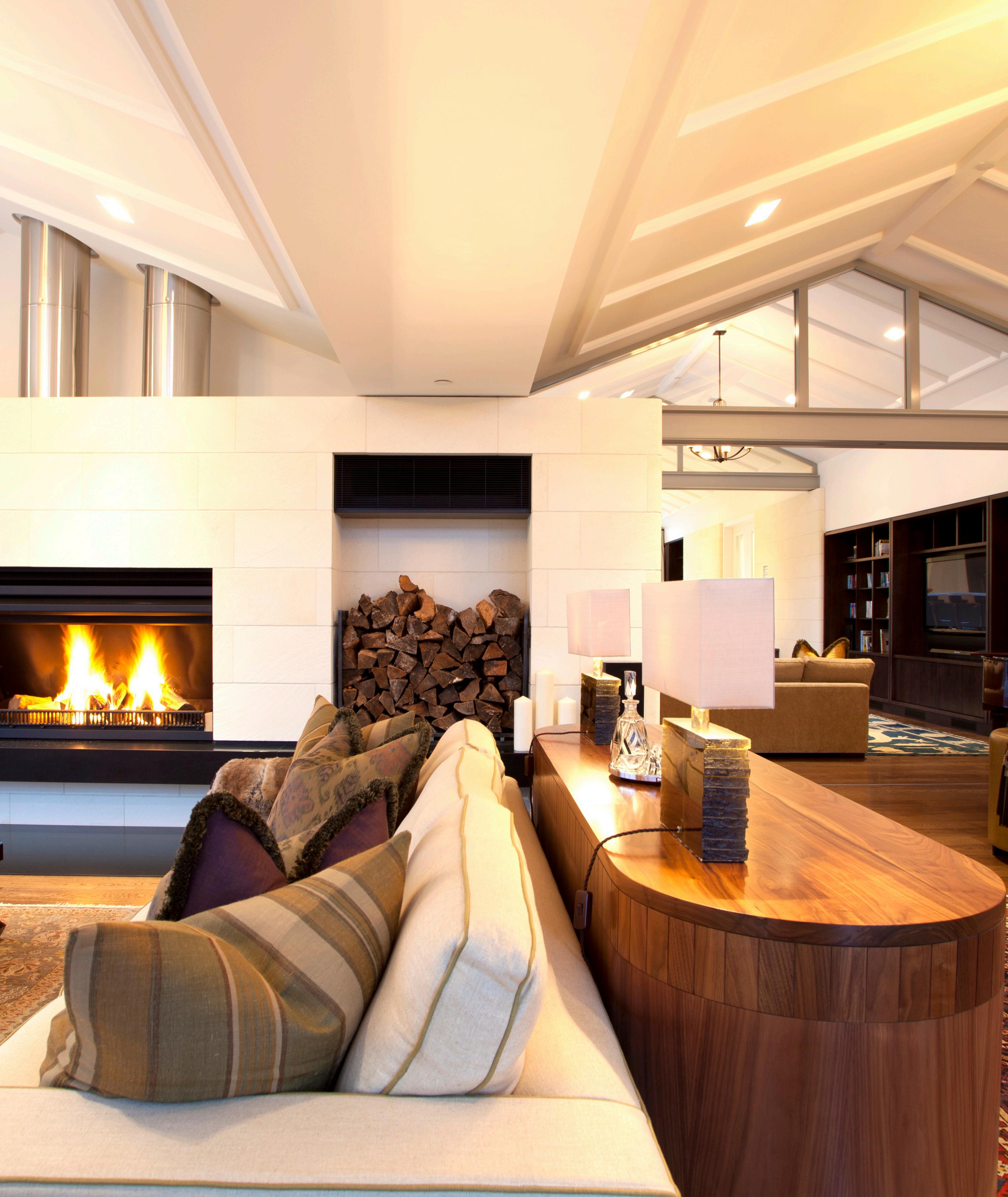
The brief was to provide a holiday home in contrast to our client’s house in Singapore. Large open-plan living areas allow for entertaining, but can also be subdivided to provide more intimate spaces. Accessibility for the client’s elderly parents was also a consideration.
Located on the West face of the Crown Terrace overlooking the Wakatipu Basin, on just under 5 hectares with a building platform to the rear Northeast corner in a large gently sloping field. Constraints included strict covenants on materials, roof shape and an unusual maximum height clause which was measured from excavated ground level. Due to the restricted height of 5.5m, the roof form was broken down into a rhythm of small gables. This allowed a series of skill ceilings which help define the internal space while creating a greater feeling of volume and light.

AUCKLAND // NEW ZEALAND
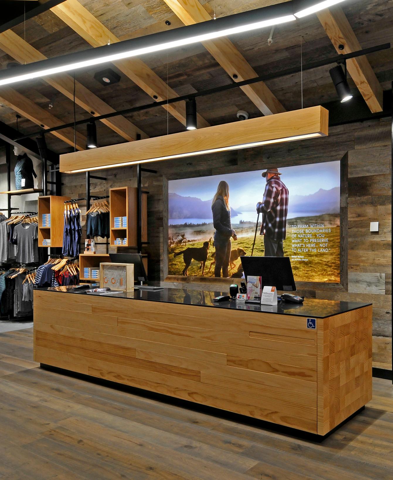
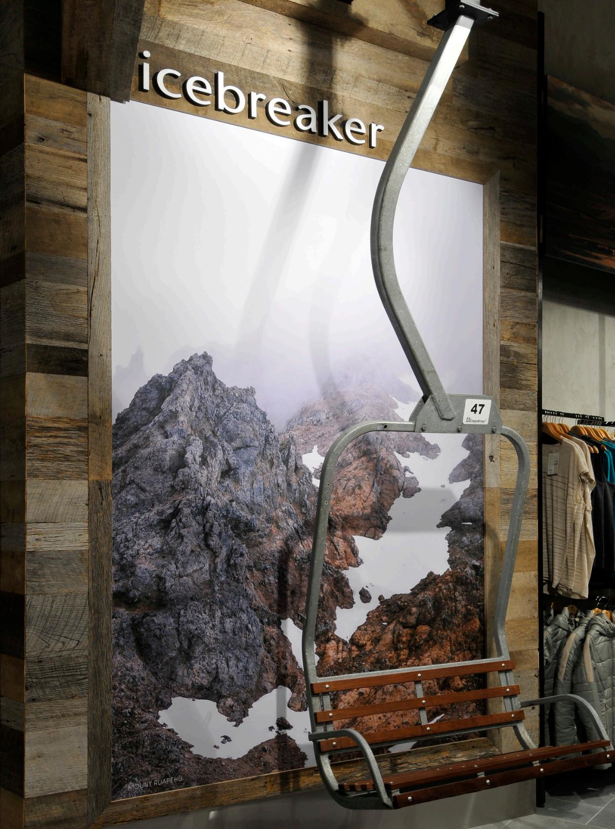
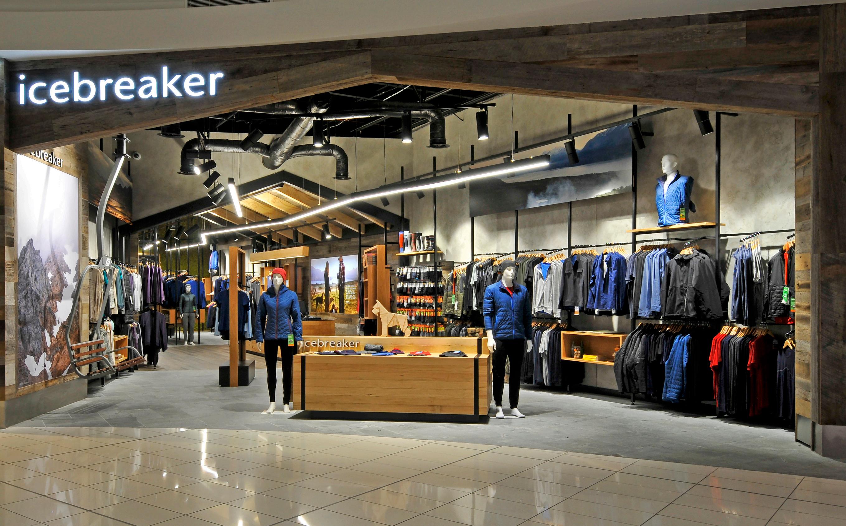
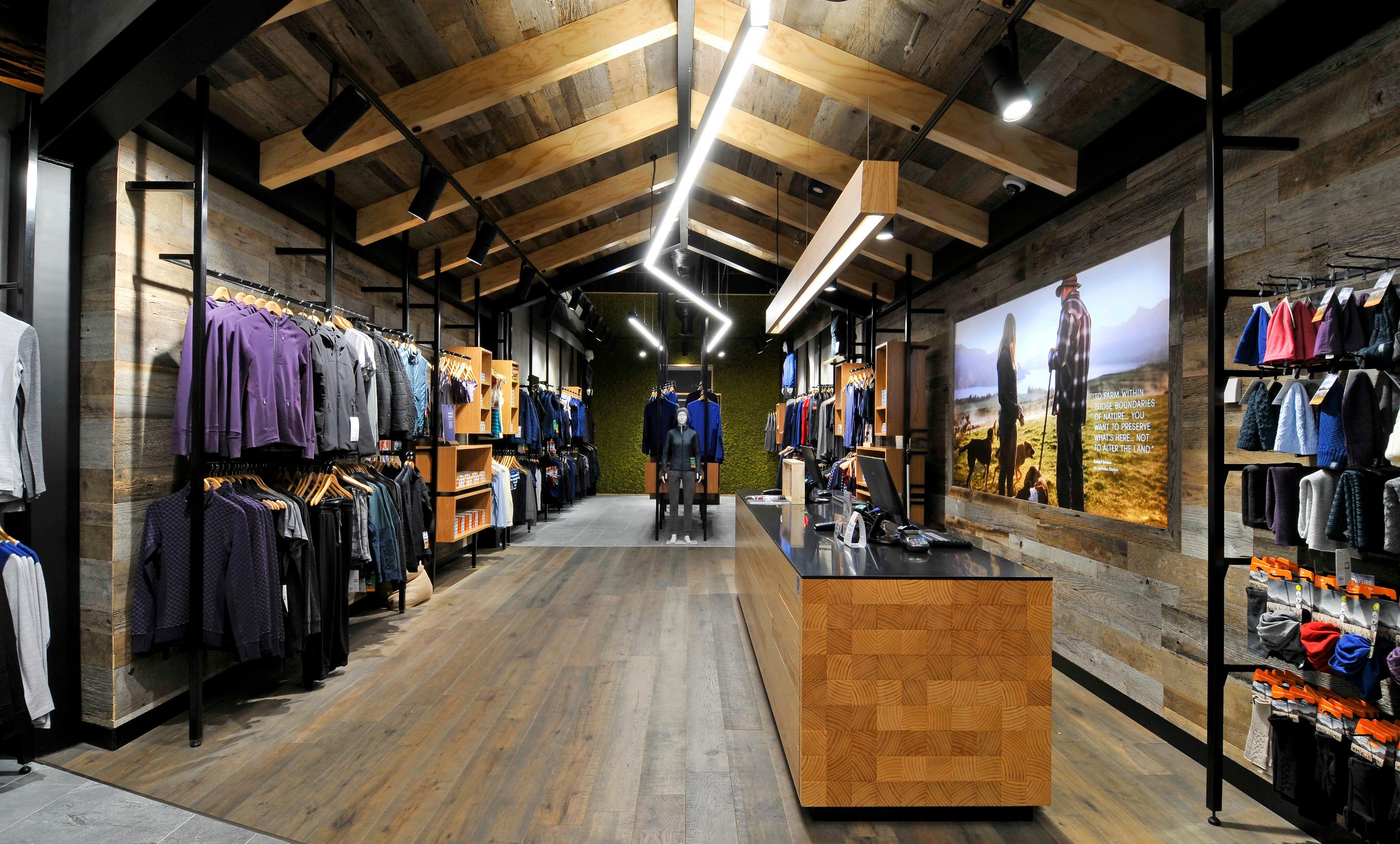
Icebreaker’s new flagship store is located in the International terminal at Auckland Airport. This particular store is aimed directly at departing tourists and serves to not only to showcase latest icebreaker product but also to do this in the context of a very New Zealand environment that also showcases Icebreakers latest of New Zealand.
Materials are all natural: New Zealand pine or ply for fixtures and ceiling beams, natural timber floor, semi-random stone tiles to replicate South Island schist and real barn wood, sourced from Canada. Walls are painted in cementitious paint while the back wall is clad and in real New Zealand moss. The shopfront is also deliberately barn-like and open to allow customers to easily fall into the otherwise narrow store.
The aim is that the shopping environment will be interesting, memorable and evocative if New Zealand’s unique environment, so that customers will seek the brand out in their local markets or by shopping online. As such the store is as much a billboard for New Zealand as it is a retail outlet and, from the sales and customer feedback points of view, it is working very well.
Project was awarded the Red Awards 2018 Brand Implementation Excellence award.

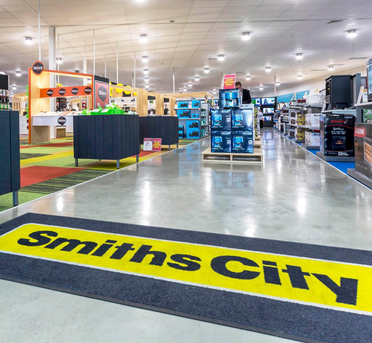
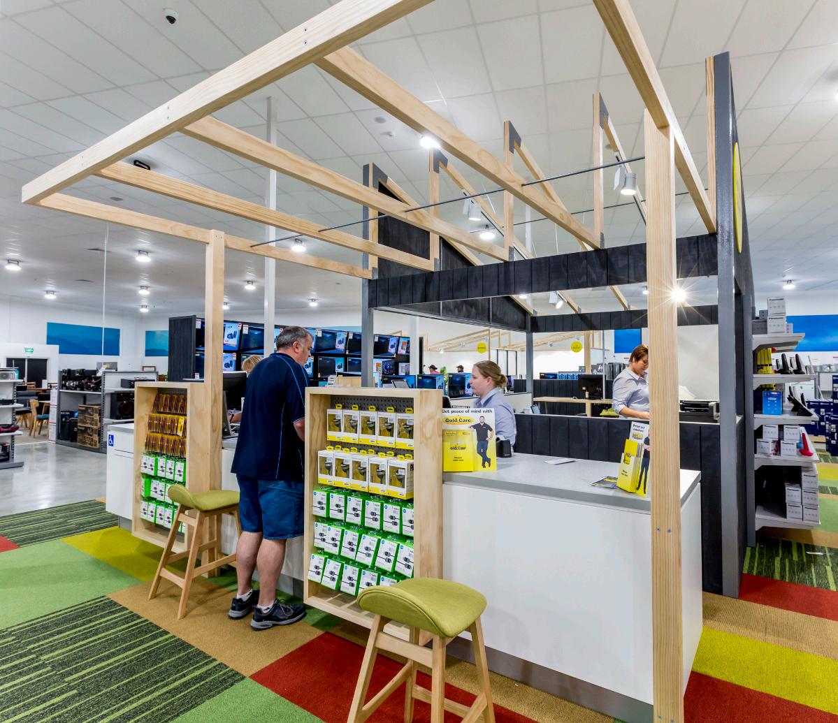
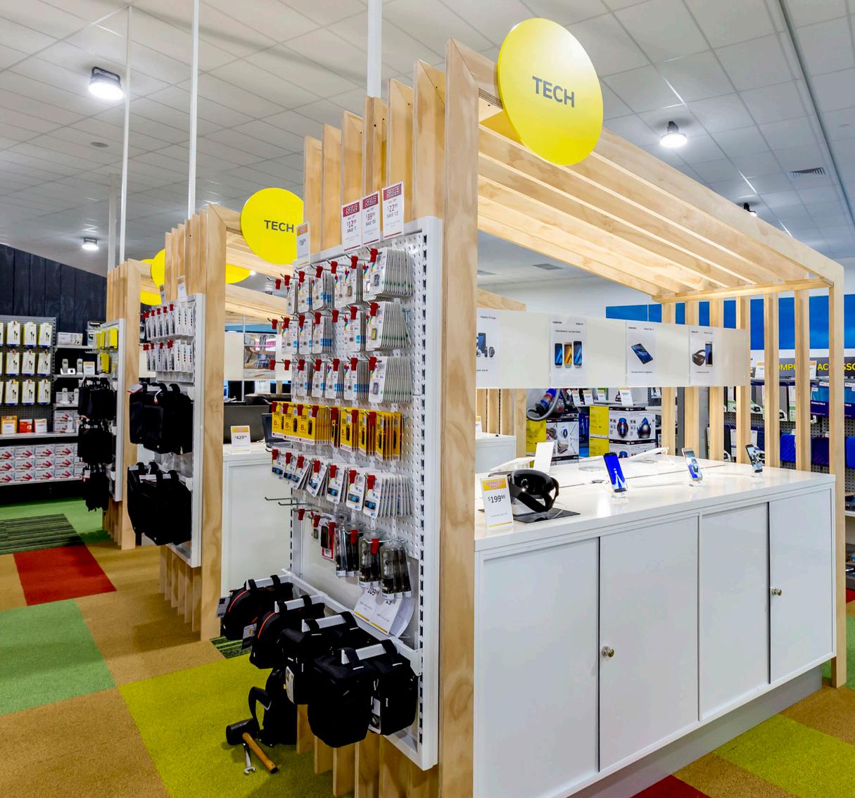
NATIONAL ROLL OUT // NEW ZEALAND
As Smiths City approach their hundredth birthday this iconic Christchurch retailer sought to modernise their large-format furniture and home-wares offer to tackle its next century. Although well known in the South Island hey are less well represented in the North Island and wanted a fresh and competitive format to counter strong competition while reflecting their Live Better” market proposition. This Hastings pilot store was formerly a Mitre 10.
Most retailers in this sector are purely functional offers, where as customers are often looking for “Inspiration” first. We created a more home-like environment with room sets and lifestyle displays, including a working demonstration kitchen. Circulation was clarified with a series of angled “Avenues” and “Lanes” enabling customers to navigate between and within departments. These departments were identified with different coloured flooring.The feature TV wall provides a drawcard to pull people deep into the store.
We positioned the electronics department to the front to draw customers through impulse offers and indicate leadership in this category, not just the furniture department the brand is best known for. A series of “Huts” hints at Canterbury’s architecture and act as signposts to key areas including the central service hub, which facilitates easy interaction between customers and staff.
The material palette was inspired by the brand’s Cantabrian heritage with the furniture area reflecting the colour of the hills, the electronics area indicates the patchwork of the planes, and the “Wets” (white-ware) area in the blue of the Pacific Ocean. Fittings were largely pine and ply to embrace the New Zealand building aesthetic and to show the “Value” nature of the brand.
Fittings were standardised to allow for easy roll-out and consistency of display, rather than the store just becoming a collection of suppliers’ stands. The lighting was replaced with LED high-bays and localised spotlights.

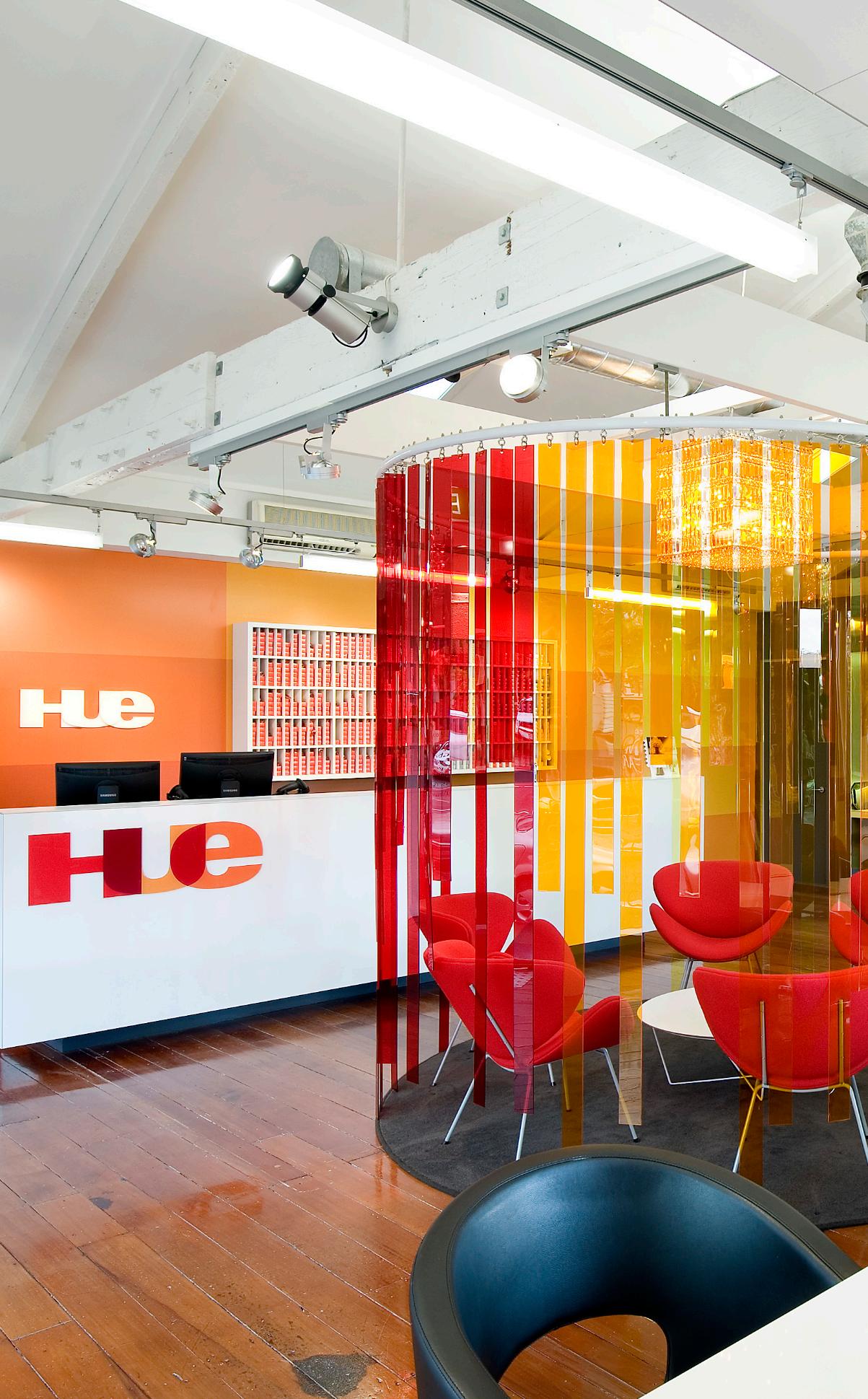
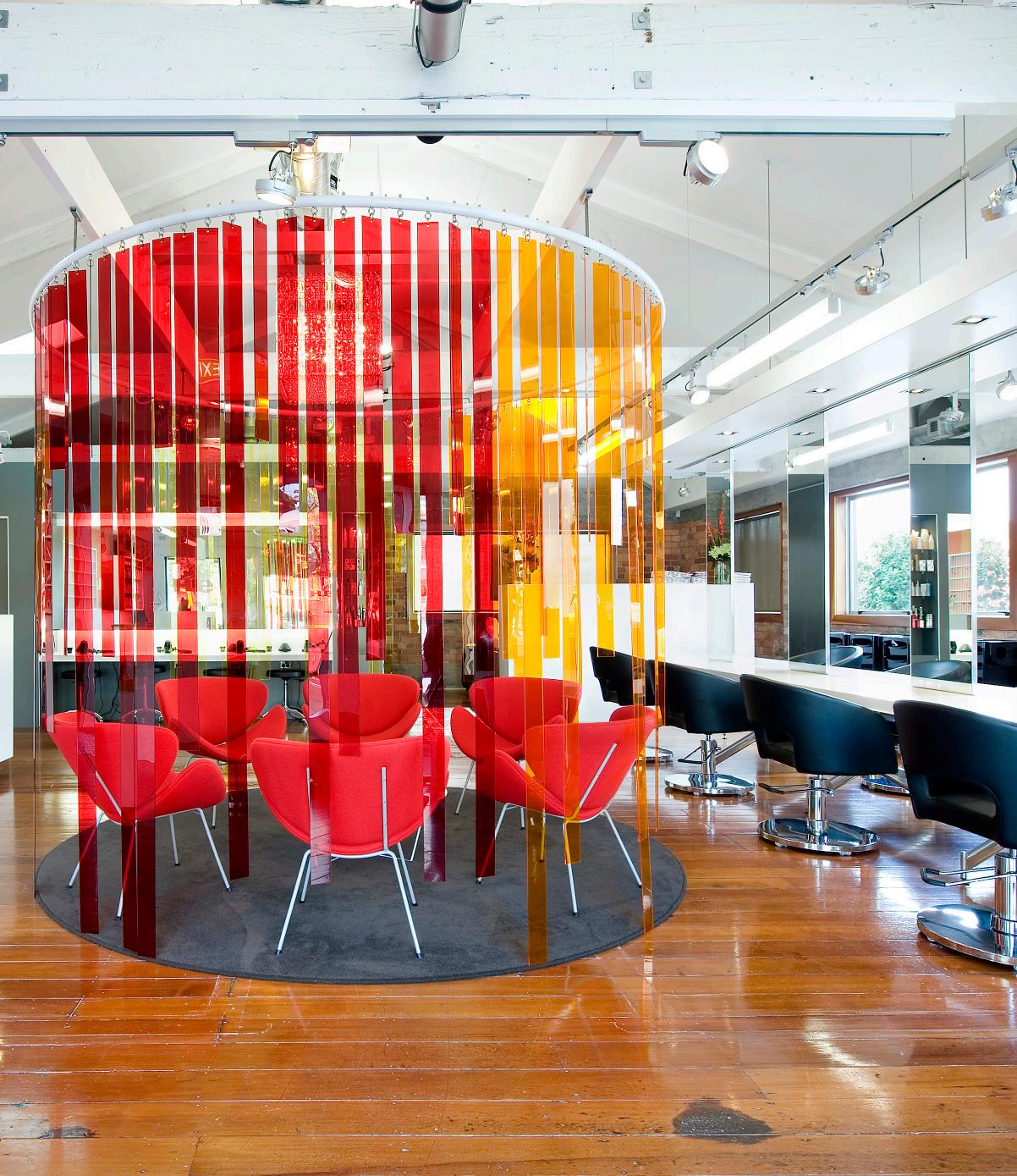
Hue Ponsonby emerged as the second installment in a pioneering chain of colour-only hair salons, targeting women seeking regular hair colouring without the premium salon prices. With a vision to swiftly and economically establish multiple Hue salons within existing structures, our approach prioritized simplicity and adaptability in fitout fixtures, favoring sleek, white designs that seamlessly melded with their surroundings.
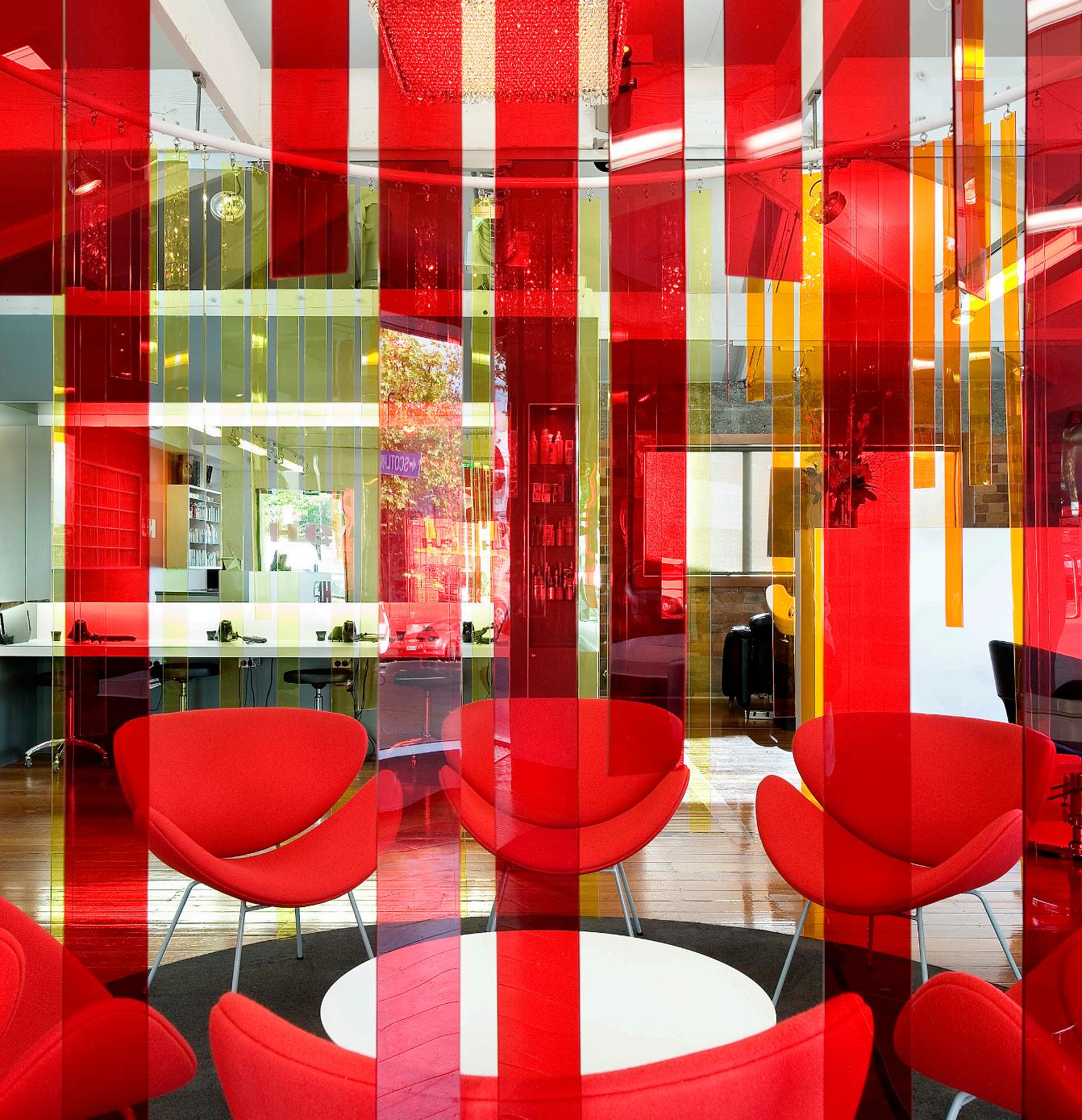
The project redefined the salon experience by revolutionizing traditional layouts to enhance client comfort and foster interaction. Departing from the conventional model where clients are often shuffled and confined to facing walls, Hue introduced a more social setting. Whether seated at the "Colour Table" or lounging in the relaxed ambiance of the "Colour Lounge," clients enjoyed a café-like atmosphere, engaging with each other while stylists attended to their needs.
Nestled within a characterful brick workshop on Franklin Rd, Ponsonby, the salon exuded a rustic yet contemporary charm with its exposed brick and timber interior. Vibrant vinyl graphics adorned the GIB walls, showcasing the Hue brand identity and injecting bursts of colour into the space. A suspended acrylic screen, reflecting the signature Hue colours, defined the Customer Lounge, offering clients a sense of connection to salon activity while providing a tranquil haven for relaxation
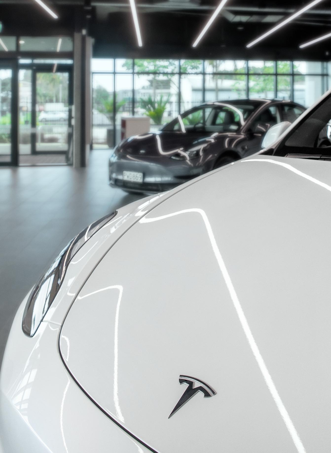
Tesla Kirkbride is a state of the art 28,780sq m EV facility located in Auckland South.
The new site features a full showroom, numerous on-location EV charging stations, a service center, a delivery lounge, parts warehouse and offices. The facility has also been fitted with emission-lowering features like, LED sensor lighting, rainwater harvesting and is partly powered by Tesla solar panels, linked to the Tesla Powerwall.
The key aspect of this project was to make the customer experience seamless from start to finish, whilst maintaining a functional facility for a client that is undergoing huge growth in New Zealand.


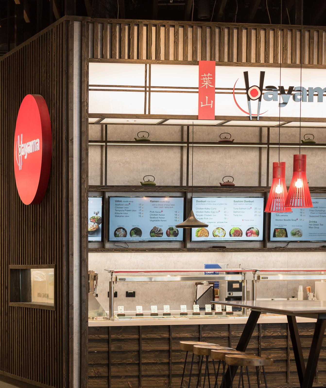
Our clients wanted Hayama’s Airside outlet to reflect the delivery and branding of the other natural looking restaurants throughout Auckland International airport.
We decided to turn the earlier Hayama delivery on its head and stained the timber a near black, charcoal colour (instead of the natural ash used elsewhere), which created more of a “night time dining” vibe to the space while still complementing the black white and red branding used throughout the chain. Space was extremely limited, so we chose to only add high level, freestanding, communal tables to minimise the seating area and allow customers somewhere to put their wheelie bags while dining. In addition, we created some dining height seating around the column with an authentic Japanese feel created by the use of hanging cushions and a traditional Japanese teapot display above. We used scalloped tiles on the columns and elsewhere in the tenancy as a nod towards the predominant use of seafood in the menu. The site was very hard to identify from a distance without any exterior walls, so we persuaded the airport to allow us to add signage onto the front of an existing column, although they insisted that this could not actually touch the column apart from some minimal fixings.The result has been very well received and is extremely popular with diners. The Auckland international Airport landlords were so pleased with it that they entered it in to an international design competition for airport retail.


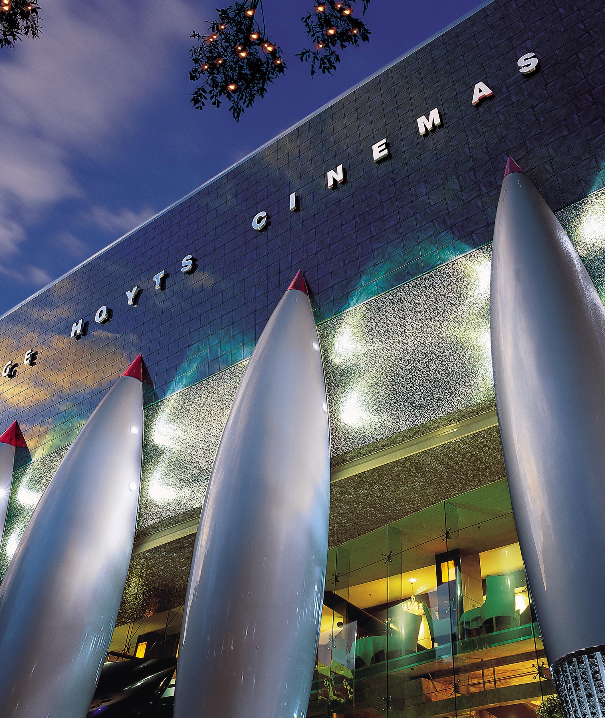
The brief was to produce a quality building to house activities which principally revolve around or feed off entertainment.
A challenging development as we were building over Auckland’s major civic carpark, two existing inner city streets, and having to build around and encompass three historic buildings. This new building had to be exciting, memorable and exude the notion of entertainment.
The building is incorporated into the entertainment hub known as The Edge. The building footprint fronts onto Aotea Square, Bledisloe Concourse, Queen Street and abuts The Civic Theatre, with which it shares loading facilities. The tall, narrow, aerofoil plan shaped atrium runs in a strong diagonal across the complex and serves as a pedestrian link in lieu of the original streets. . With walls and roof of the same material it appears like an alien object above, plunging into and taking root in the old historic Fergusson and Civic buildings. Accentuating the difference between the old and new. Most of the activities housed within the complex such as the Cinemas, Planet Hollywood and Imax Cinema are inward looking. The patrons that visit the entertainment centre enter a ‘different world’ everything is designed to reinforce this. In short, to keep you entertained by stimulating the senses as well as offering enough variety that they can experience something new each time they visit.
BOMA Supreme Award, 2000 NZIA Resene Colour Award for Architecture, 2001 IES Lighting Premier Design Award 2000.


GRANADA // DUBAI
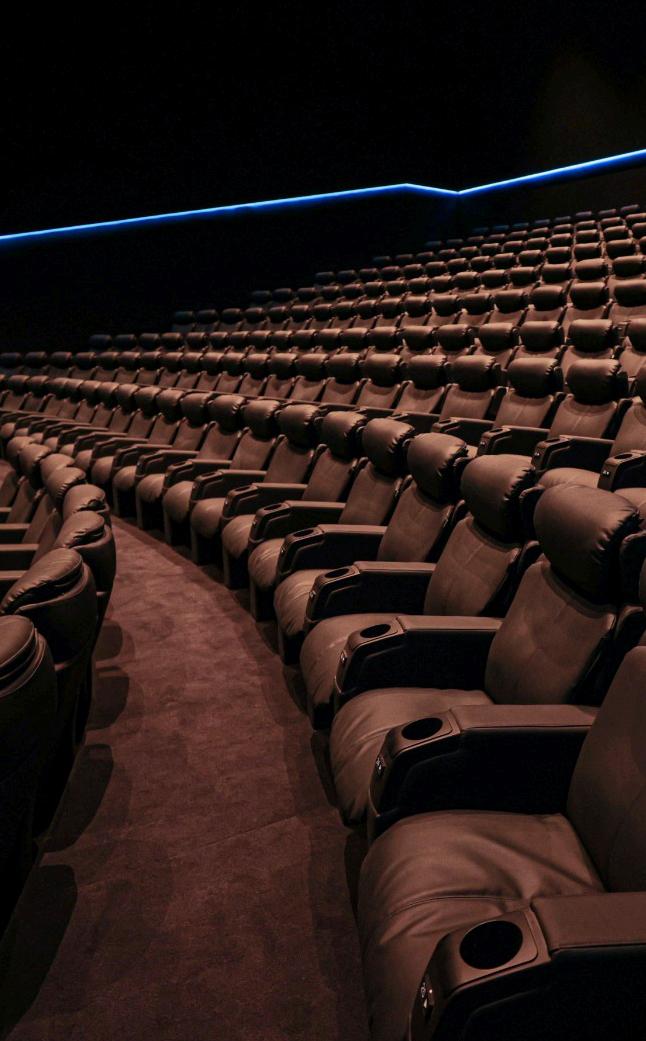
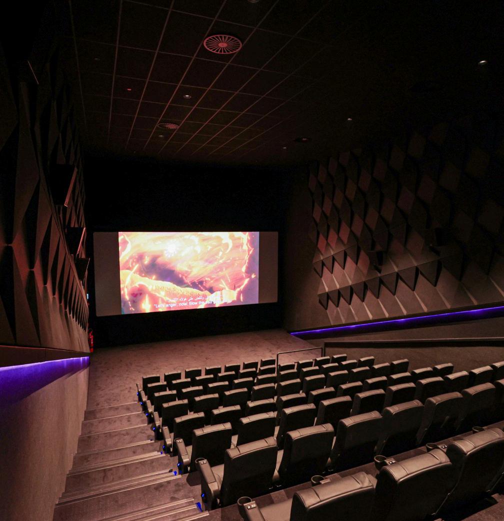
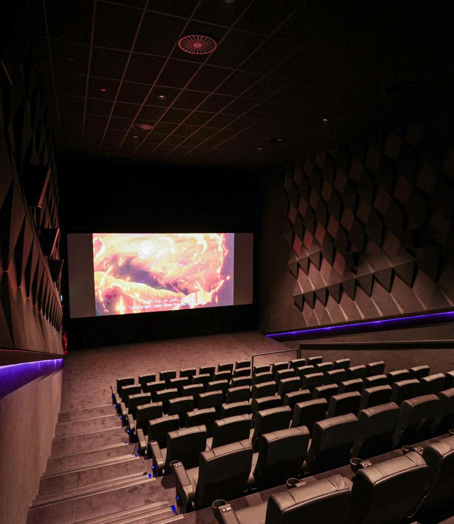
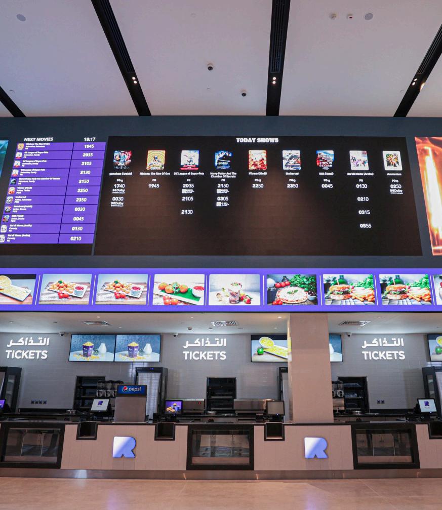
A large size high quality multiplex was required of us but within an existing mall, with a very unfortunate column spacing which provided for difficult and complex design. It did not help that we were not able to remove any existing structure, yet the client still wanted a set number of screens. Just to add extra design consideration this complex was to be a more cost effective multiplex than the last one within the Dubia mall, but yet to have similar feel.
We were able to provide 15 screens, 2 dolby, 3 platinum and 2 children's were within this mix, future expansion of indoor and outdoor functions areas was provided. The cinema has just been completed in 2022.

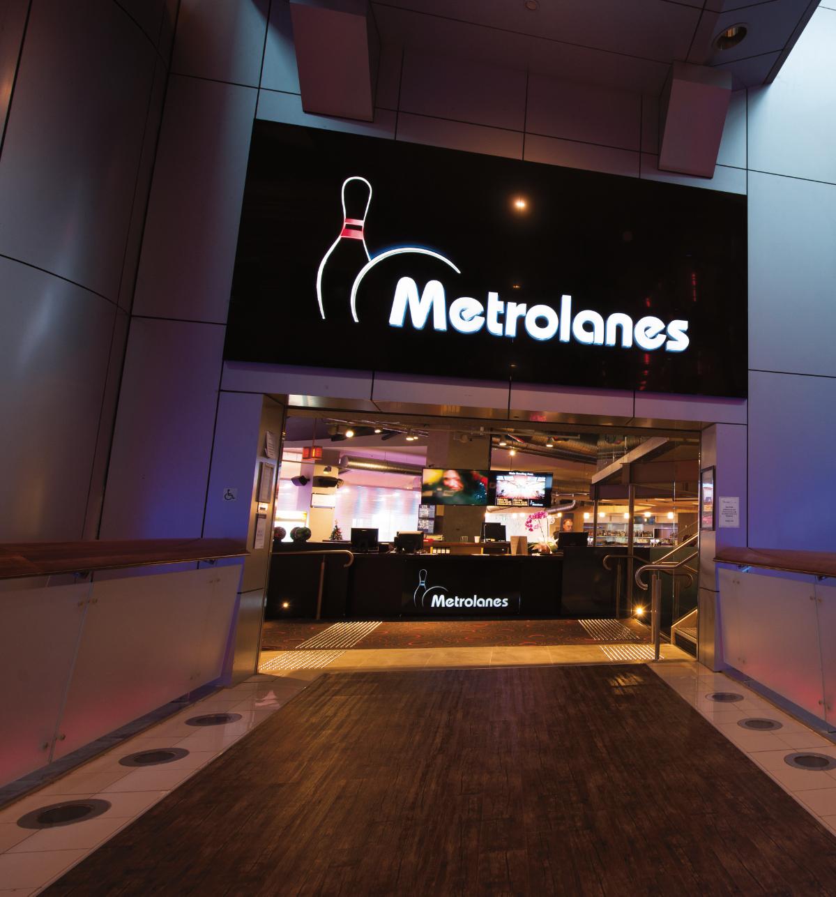
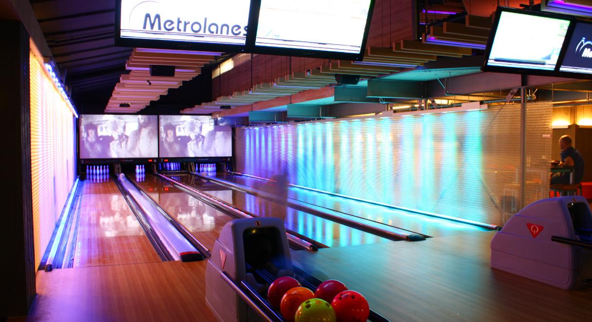
The owners of the Metro Centre in Auckland wanted to strip out 1400m2 of a large volume area for a socially relaxing 10 pin bowling experience focused around a simple food and drink operation and which can also be used for international standard competition.
There are 12 bowling lanes serviced by a bar and kitchen at entry level, a 120m2 deck off the bar seating area onto Aotea Square and 4 mini lanes in a mezzanine functions area. The concept proposed splitting up the lanes and dividing them into separate intimate experiences without the loss of the sense of the whole.
The design allows the playing and bar areas to grandstand over the adjacent public square and to be separated from it. New and youthful technology is everywhere, edgy but comfortable:
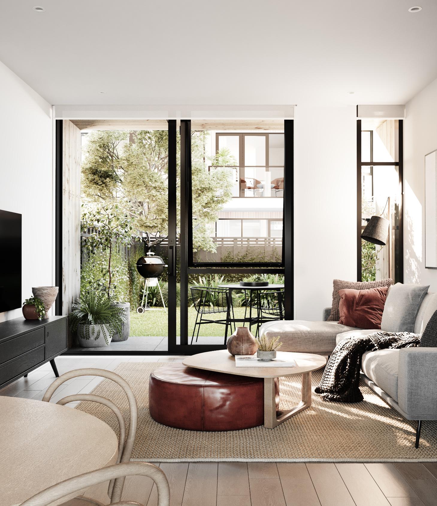
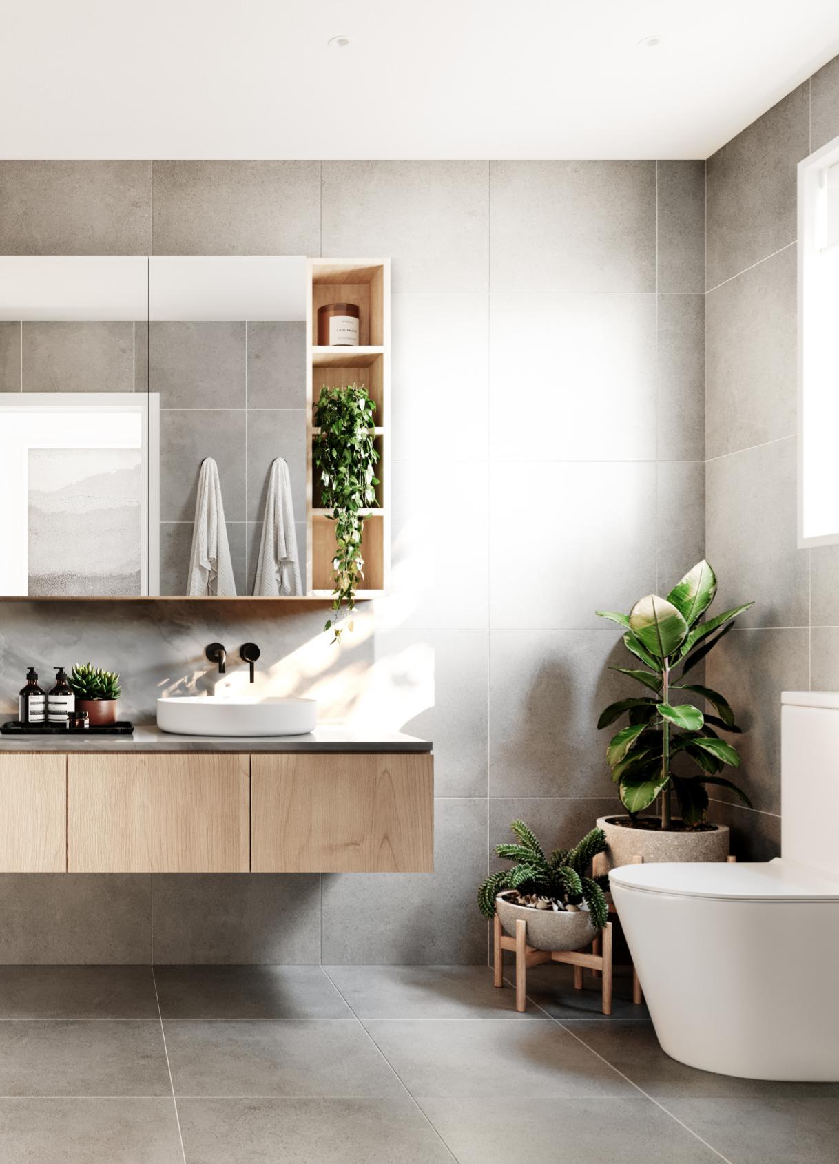
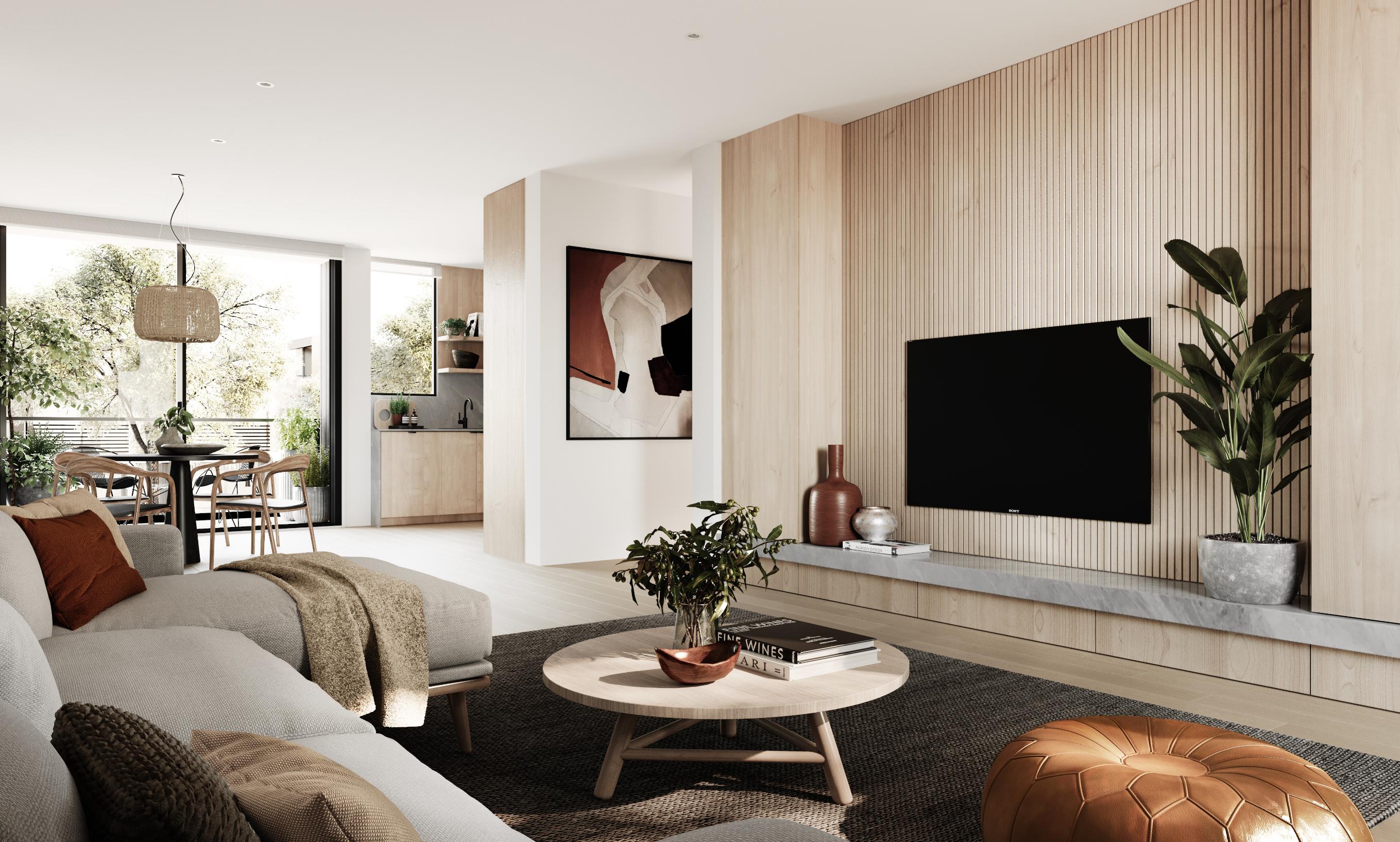
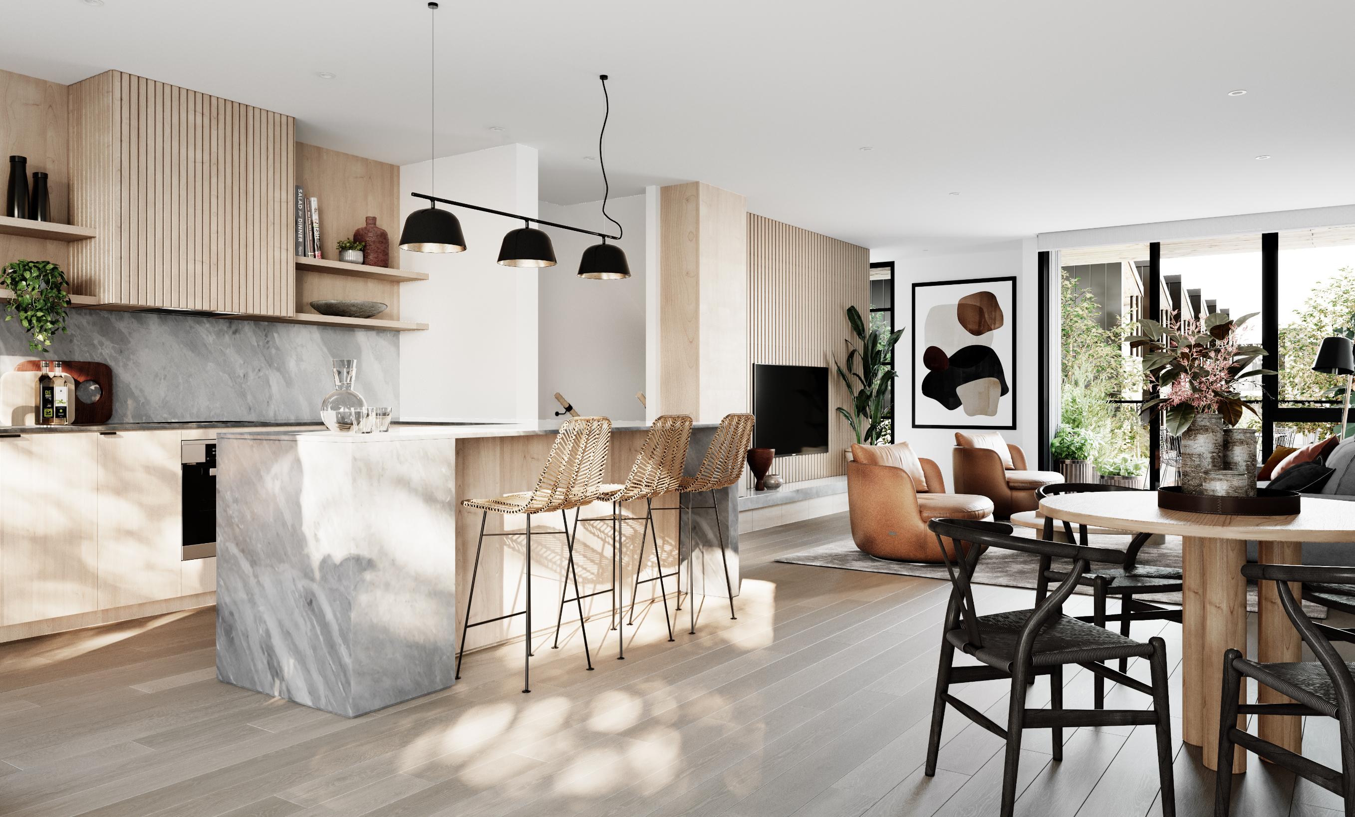
Templeton engaged Walkers to provide masterplanning and then full documentation for a 100 homes development. This sold rapidly off our presentation documentation, the concept was for low cost housing, several house type typologies, and provide a urban neighbourhood that would retain it’s long term value for investor purchasers.
For economy of construction great attention was made for repetition of details and buildibility, especially for terrace houses. The Council urban review requested the main corner of the site to be 4 levels, so a small apartment complex was designed to home 9 apartments and create a strong urban corner element in the Stonefields landscape.
BANGALORE // INDIA
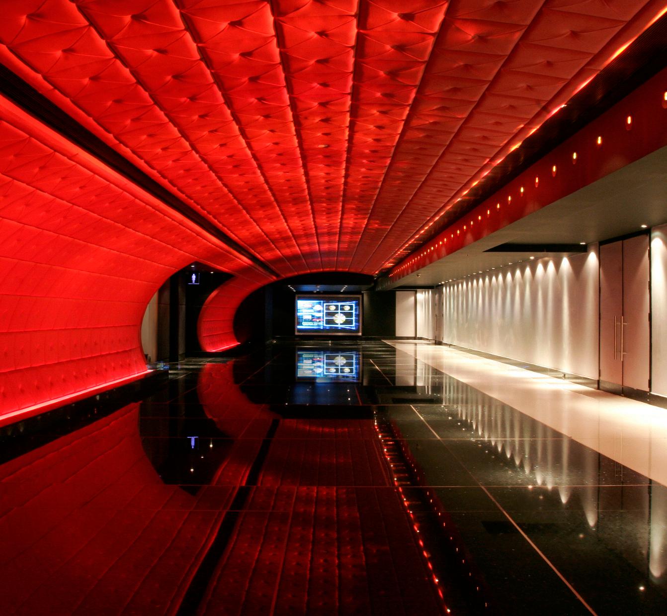
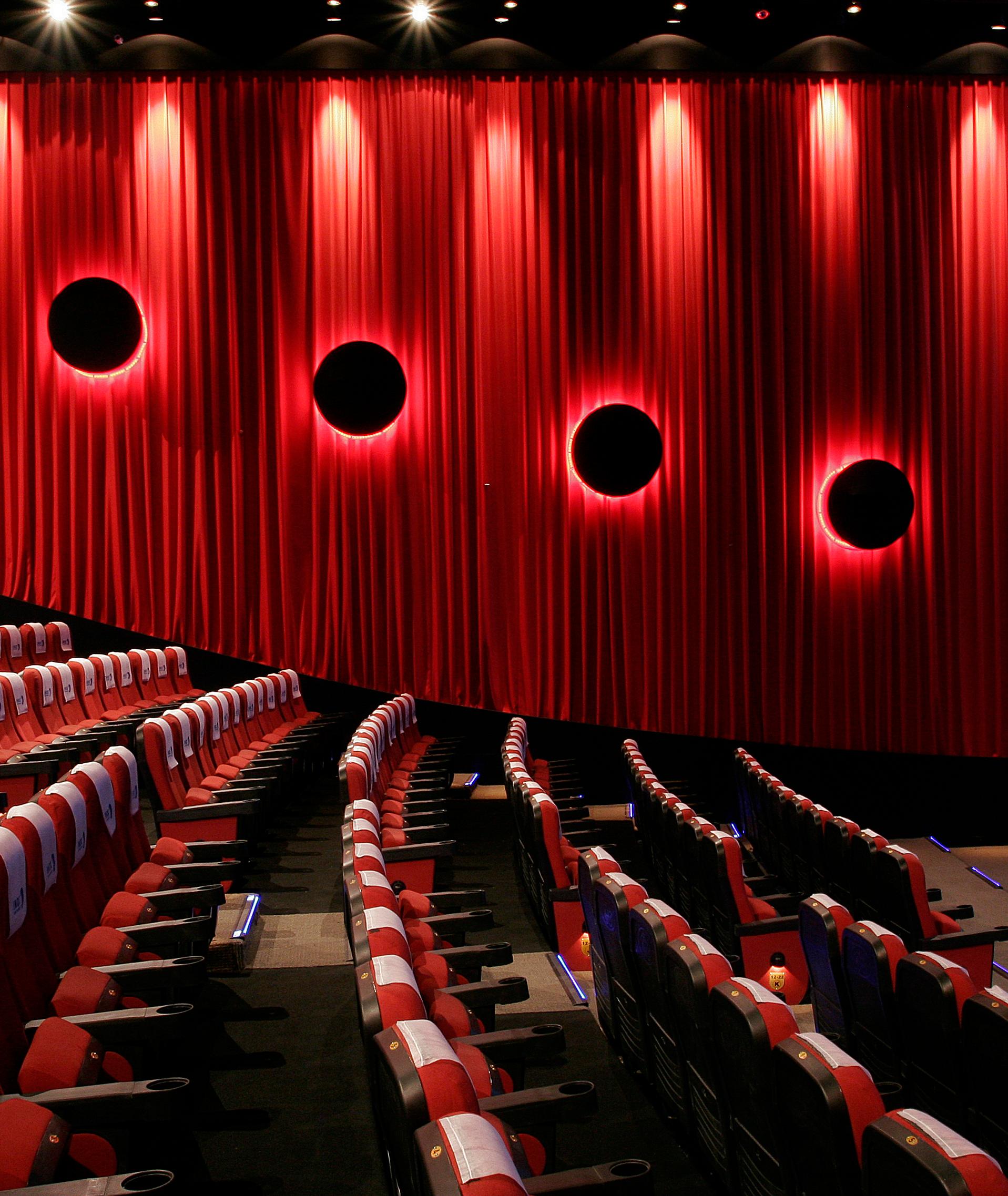
This six-screen, 1100-seat complex occupies the first floor level of a multi-storey shopping centre in Bangalore, India.
The concept is based on a rich colour scheme of red and blue offset against the black and white ceiling and floor backgrounds. Materials were selected to define the shape, changing under the coloured light. Reflective and repeated shape surfaces multiply images of colour and texture. With very low ceiling heights and unworkable volumes in the shell building, this use of light and colour change give a sense of expanding space and richness of detail to the main ticket and concessions areas.

AUCKLAND // NEW ZEALAND
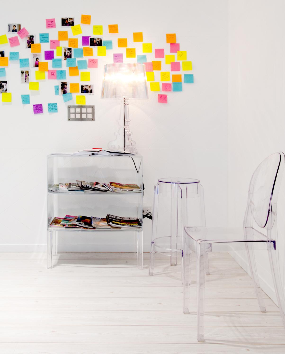
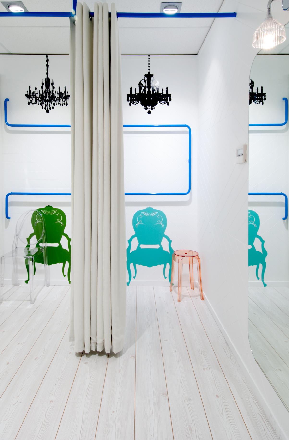
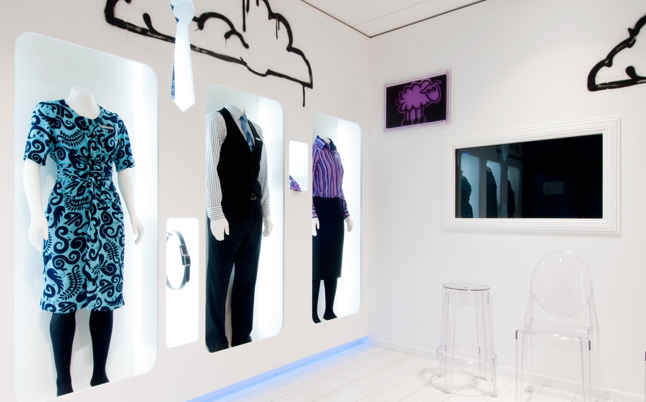
The ‘Clothes Hangar" was created to show-off Air New Zealand’s new uniform created by Trelise Cooper. The solution is a nod to a swept up eclectic kiwi bach, giving staff a 'shopping' experience like no other. Designed by walker, who consulted with Saatchi Design Worldwide to ensure tie-in with the brand and design of in ‘shop’ elements.
The ‘Clothes Hangar’ is located amongst factories and industrial warehouses, not the usual place where you would expect to discover a full service head to toe styling and grooming experience. However, a unique experience is exactly what Air New Zealand staff encounter once they pass through the blocked out front entrance and enter into a bright, clean and white space.
On arrival staff can view mannequins dressed in the new uniform, giving them an opportunity to see and touch different uniform pieces and how they work together as a total wardrobe solution
Walls are finished in random patterned 'V' grooved panelling and floors are a washed ‘oak’. Together they provide the perfect backdrop to the 'blue' tube racking, which ‘taxis’ its way around the 'shop' and into the fitting rooms, reflecting the common thread concept.
Kartell furniture and accessories are positioned on shelves around the walls alongside ‘framed’ 'graffiti' prints, taken from the men’s waistcoat design. The 'check-out' area is highlighted with a bright pink counter with ‘graffiti’ print wallpaper, outside the check-out space is a large framed window covered in Polaroid images of staff in their new uniforms.
The ‘Styling Room’ offers staff the opportunity to select new shoes and beauty consultants can demonstrate preferred make-up applications and hair styles to fully accent the new uniform.
The response from Air New Zealand staff, management and uniform designer Trelise Cooper, was tremendous, all have been ‘blown away’ by the whole experience.

// NEW ZEALAND
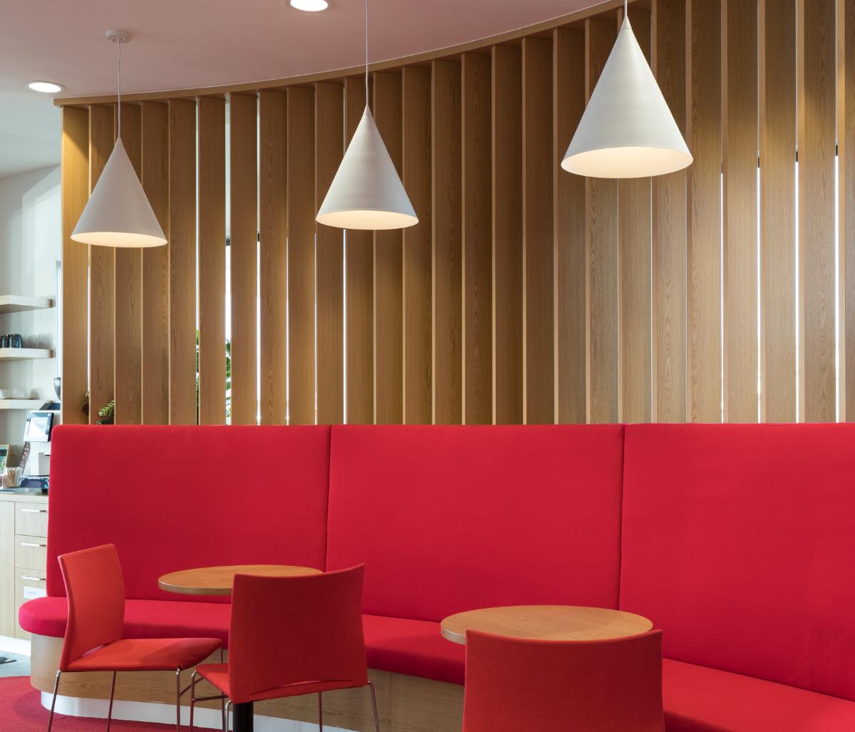
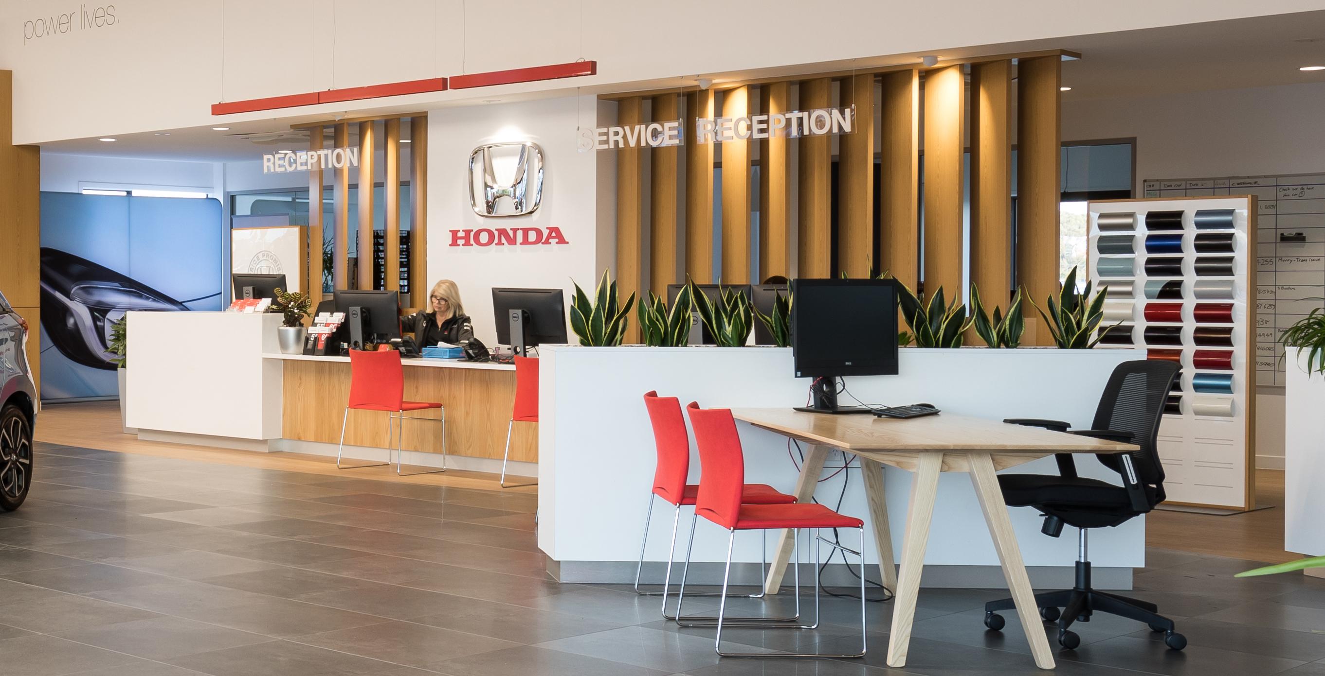
When Honda New Zealand Chief Executive Nobu Sonoda approached us to re-design their flagship branch his main criteria was the customer’s first impression was that it should look like that of a five-star hotel. His reasons for this were that a Honda customer welcome should be second to none so as to reflect the respective the brand has for its customers. This design ethos needed to be woven into an iconic pyramid-shaped space that had been untouched for 30 years.
The new space was designed to really make the most of what is quite an unusual space. The front of the building is raised up, with workshops underneath and showrooms and office on top. The building really needed a bit of a lift to live up to its great location. The space was designed to be much cleaner and spacious . A large foyer space greets the customer upon entry, with the cars given space to breathe, focusing the customers attention. Flanked by a customer lounge to the left and sales executives to the right, customers are guided through their journey to the reception counter at the centre of the space. The ancillary office services are neatly concealed away behind this reception centre.
Customer reaction has been even better than management hoped for, with customers heaping praise on the new facilities and the improved sales and service experiences. This has had a very positive effect on the branches’ turnover.


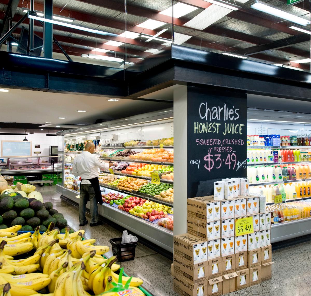
Nosh Mt Eden is part of the expanding boutique supermarket chain and inhabits 825 square meter of an old furniture store on Dominion Rd.
Nosh aimed to undercut supermarket food prices while delivering the freshest ingredients possible. This notion in mind, we created a very minimalist interior consisting of concrete floor and benches, exposed ceiling and very industrial fixturing, showing off the product to its best without undue fuss. Personality was introduced in the way of white tiles, timber accents and the Nosh signature black walls, which double as ‘specials’ black-boards. Nosh won Bronze at the 2010 Best awards.

QUEENSTOWN // NEW ZEALAND
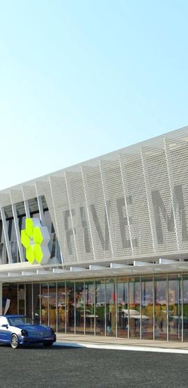
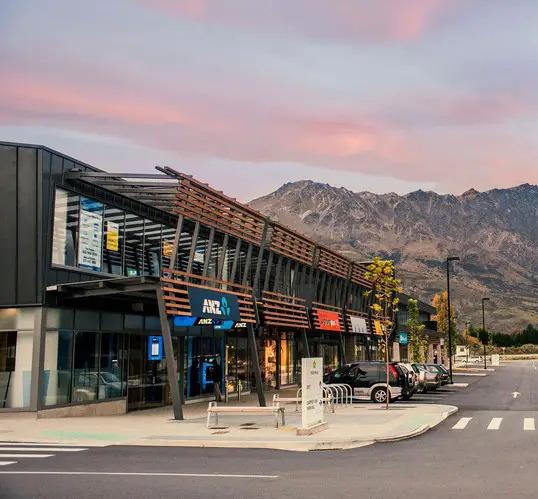
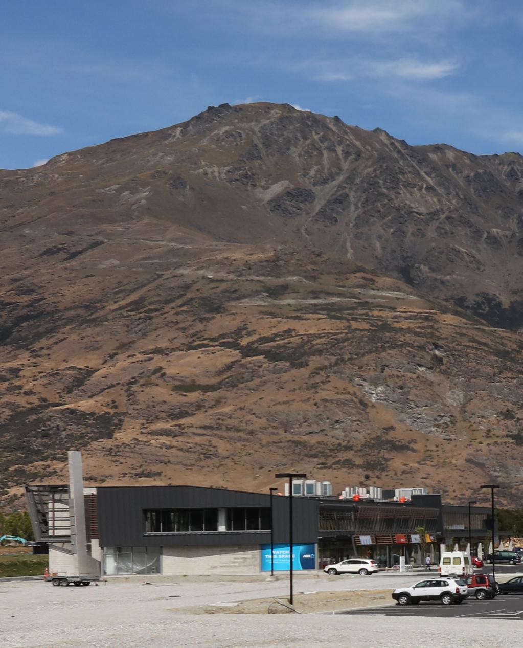
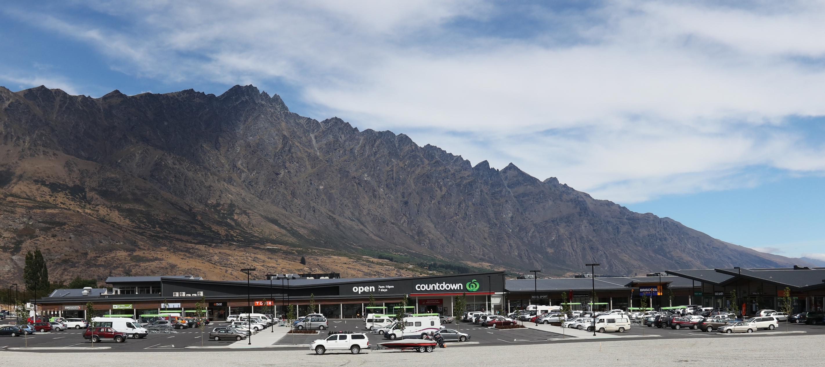
Approaching Queenstown's Franklin area from Cromwell and Alexandra along State Highway 16, a prominent retail hub anchors the corner of Grants Road, adjacent to the airport. At its heart is the region’s first Countdown supermarket delivered as the initial phase of a larger 28,000 m² retail and commercial centre serving Queenstown.
A central, on-grade community car park is framed on three sides by four architecturally unified buildings. Though consistent in material palette, each structure expresses a distinct character through varied forms and detailing.
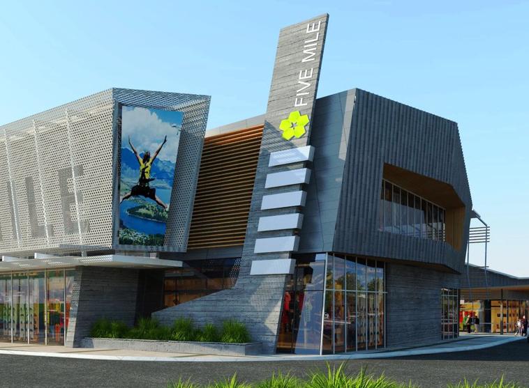
To the east, Building 1 marks the gateway to the precinct. A twostorey structure housing commercial and banking retail at ground level with offices above, it is signposted by a monumental precast pylon that defines the site's entry. Its Grants Road frontage features a dramatic sunshade wall an expansive perforated mesh screen suspended on exposed steel trusses. Glazed and solid canopies extend from a robust concrete core, while the facade composition alternates tectonic panels of metallic tile, precast concrete, and cedar louvres, interspersed with ribbon glazing to create visual rhythm and depth.
