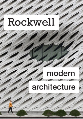

Rockwell modern architecture
Rockwell
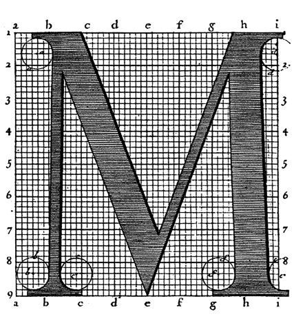
Rockwell is at its core, simple geometry. It is almost entirely composed of circles, straight lines and right angles. Because it is so straight and angular it can be very mechanical, but it also feels friendly and warm. Rockwell is a wonderful example of how some Slab Serifs have an inviting warmth even when they should feel cold and rigid.
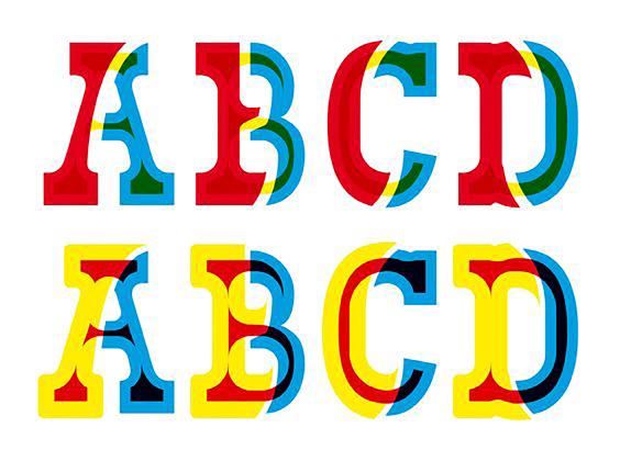
The project was supervised by Monotype’s engineering manager Frank Hinman Pierpont. This typeface is distinguished by a serif at the apex of the uppercase A, while the lowercase a has two storeys. Because of its mono weighted stroke (meaning there is virtually no visible thick/thin transition in the strokes, so the letterforms are the same thickness all the way around), Rockwell is used primarily for display or at small sizes rather than as a body text. Rockwell is based on an earlier, more condensed slab serif design cast by the Inland Type Foundry called Litho Antique.

According to Le Corbusier, the roots of the movement were to be found in the works of Eugène Viollet le duc. The movement emerged in the first half of the 20th century and became dominant after World War.
architechture m od r n e
Modern architecture (also called modernist architecture) was an architectwural movement and style that was prominent in the second half of the 20th century, between the earlier Art Deco and later postmodern movements. Modern architecture was based upon new styles emerging.!!
In his spare time Pierpont enjoyed growing roses. He retired as Works Manager in 1936 and became Consulting Engineer with a seat on the board, an occasion marked by a dinner at the Savoy Hotel, but died the following year.
In typography, a slab serif (also called mechanistic, square serif, antique or Egyptian) typeface is a type of serif typeface characterized by thick, block-like serifs. Serif a may be either blunt and angular (Rockwell), or rounded (Courier). Slab serifs were introduced in the early nineteenth century.


A further important step forward was the invention of the safety elevator by Elisha Otis, first demonstrated at the New York Crystal Palace exposition in 1854, which made tall office and apartment buildings practical.
Another important technology for the new architecture was electric.

It was released just a few years prior in 1927 and shortly after took its place as one of the most widely used geometric sans-serif typefaces (more on Futura coming soon). From here Rockwell took an alternate path than its Slab Serif grandfather Clarendon. Rockwell became a mainstay in the next few decades with its wide use in the era of Modernism and was often associated with the architecture and design of the Modernist movement.
Today, Rockwell and its contemporaries continue to see wide use but in-spite of their age, do not yet to evoke the deeper feelings of nostalgia often associated with the Clarendon style Slab Serifs. We see them widely used in surf and skate culture, home decor and cooking but most prominently in our contemporary web culture.

It is most notably eclecticism, Victorian and Edwardian architecture, and the BeauxArts architectural style. This break with the past was particularly urged by the architectural theorist and historian Eugène Viollet-le-Duc.
In his 1872 book Entretiens sur L’Architecture, he urged: “use the means and knowledge given to us by our times without the intervening traditions which are no longer viable today, and in that way we can inaugurate a new architecture.
Rockwell was informed by early nineteenth century slab serifs that were created by carving wood, called wood type. Craving these letters was a very intricate and challenging process done by hand before the router was invented. Slab serifs, or as they were called during the times Egyptians, entered the 19th century with little resemblance to any other typeface that had been created.
This typeface was informed by early nineteenth century slab serifs that were created by carving wood, called wood type. Craving these letters was a very intricate and challenging process done by hand before the router was invented. Slab serifs, or as the times Egyptians, entered the 19th century with little resemblance to any other typeface that had been created.
Architects also began to experiment with new materials and techniques, which gave them greater freedom to create new forms. In 1903–1904 in Paris Auguste Perret and Henri Sauvage began to use reinforced concrete, previously only used for industrial structures, to build apartment buildings.
At the end of the 19th century, a few architects began to challenge the traditional Beaux Arts and Neoclassical styles that dominated architecture in Europe and the United States. The Glasgow School of Art (1896–99) designed by Charles Rennie Mackintosh, had a façade dominated by large vertical bays of windows. The Art Nouveau style was launched in the 1890s by Victor Horta in Belgium and Hector Guimard in France; it introduced new styles of decoration, based on vegetal and floral forms.


Typefaces of this era, the nineteenth century, were increasingly outrageous. Advertisements such as posters were being printed on larger printing presses than before, so that meant they could be printed on larger paper. In w past, hot metal type was used to set type on posters and other printed materials, but it could only be increased to a given size because it would start to distort.


These innovations were made in London by William Koenig and Andreas Bauer. In 1814 the first commercial machines were available and were purchased by The London Times newspaper. These new machines printed “1,100 pages an hour, more than four times faster” than the old machines (Age of Revolution). This dramatically cut the labor and production costs.In turn, this democratized reading newspapers and books because lower production costs meant lower costs for the reader. Previously print publications were expensive and only elites were able to attain them.


Otto Wagner, in Vienna, was another pioneer of the new style. In his book Moderne Architektur (1895) he had called for a more rationalist style of architecture, based on “modern life”. He designed a stylized ornamental metro station at Karlsplatz in Vienna (1888–89), then an ornamental Art Nouveau residence, Majolika House (1898), before moving to a much more geometric and simplified style, without ornament,

The reinforced concrete exterior was covered with plaques of marble attached with bolts of polished aluminum. The interior was purely functional and spare, a large open space of steel, glass, and concrete where the only decoration was the structure itself.

In 1827 Darris Wells invented the router, which opened the doors for the mass production of wood type. Wood was a fantastic alternative to metal because it could increase in size and maintain its form. Typefaces became increasingly flamboyant, creating a “visual arms race” in the streets of both Britain and the United States. John Parry’s, A London Street Scene, from 1840 gives a sense of the prolific type of that era and how it truly infiltrated visual culture. Type had to compete for onlookers’ attention (Letterform Archive).
While these buildings were revolutionary in their steel frames and height, their decoration was borrowed from Neo-Renaissance, Neo-Gothic and Beaux-Arts architecture.
The Woolworth Building, designed by Cass Gilbert, was completed in 1912, and was the tallest building in the world until the completion of the Chrysler Building in 1929.
The structure was purely modern, but its exterior was decorated with Neo-Gothic ornament, complete with decorative buttresses, arches and spires, which caused it to be nicknamed the “Cathedral of Commerce”.

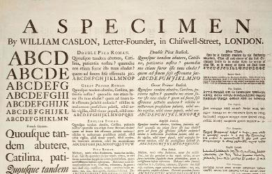
The first known use of a slab serif was woodblock lettering that was found in an 1810 London handbill for the lottery, see image to the right (Typefoundry). Antique, perhaps the first commercial slab serif, was designed in 1817 by the Vincent Figgins of the Figgins Type Foundry in London (Typefoundry). Antique became a type to describe any slab serif typeface in both the United States and Britain.
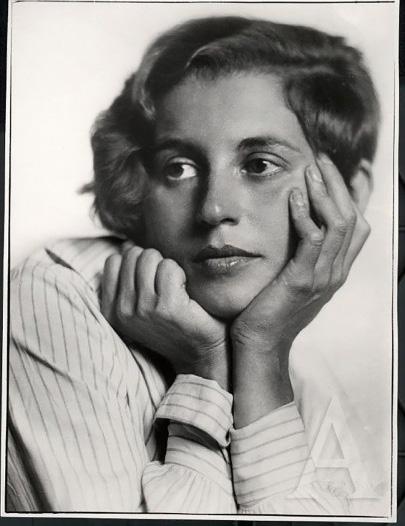


In Germany, a modernist industrial movement, Deutscher Werkbund (German Work Federation) had been created in Munich in 1907 by Hermann Muthesius, a prominent architectural commentator. Its goal was to bring together designers and industrialists, to turn out well-designed, highquality products, and in the process to invent a new type of architecture.
The organization originally included twelve architects and twelve business firms, but quickly expanded. The architects include Peter Behrens, Theodor Fischer (who served as its first president), Josef Hoffmann and Richard Riemerschmid.

He brought along many scholars and scientists as a cover up; and even though his trip to Egypt was ultimately unsuccessful, much knowledge about the county was brought back and “the Western world in Europe and beyond developed a fascination with all things Egyptian” (Creative Market). Home decor and furniture started to be produced that appropriated Egyptian culture. Even though “there was no connection between [slab serifs] and traditional Egyptian writing systems,” they were called Egyptians (Creative Market).
This incorrect name classification still exists today.Predating Rockwell, the Industrial Revolution, beginning in the late eighteenth century, created staple innovations like steam power, the telegraph, and an improved edition of the printing press.
While the printing press had been around from some time, as it was invented in 1463 by Johannes Gutenberg, during the Industrial. Revolution advancements were made so it was faster and more efficient. The first advancement made it powered by steam, instead of physical labor. Before, the machine needed to be operated by hand. This was a very laborious, slow, and physically demanding process for the workers. The second advancement made was adding rotary metal cylinders, “which allowed each page to be printed on both sides at the same time” (Age of Revolution).
Henri Sauvage added another construction innovation in an apartment building on Rue Vavin in Paris (1912–1914); the reinforced concrete building was in steps, with each floor set back from the floor below, creating a series of terraces. Between 1910 and 1913, Auguste Perret built the Théâtre des Champs-Élysées, a masterpiece of reinforced concrete construction, with Art Deco sculptural bas-reliefs on the façade by Antoine Bourdelle. Because of the


Bold, attention grabbing display type was in need, not just any body type increased to a larger size. Slab serifs filled this role. They were distinct. They were bold. They were something new. However, they were not completely welcomed with open arms. Printer and social reformer Thomas Curson Hansard wrote in 1825 that slab serifs were “the outrageous kind of face only adapted for placards, posting-bills, invitations to the wheel of Fortune commonly frolic from one extreme to another”.


The Viennese architect Adolf Loos also began removing any ornament from his buildings. His Steiner House, in Vienna (1910), was an example of what he called rationalist architecture; it had a simple stucco rectangular façade with square windows and no ornament. The fame of the new movement, which became known as the Vienna Secession spread beyond Austria. Josef Hoffmann, a student of Wagner, constructed a landmark of early modernist architecture.


Frank Hinman Pierpont
Slab serifs form a large and varied genre. Some such as Memphis and Rockwell have a geometric design with minimal variation in stroke width: they are sometimes described as sans-serif fonts with added serifs.
These designs may have bracketed serifs which increase width along their length before merging with the main strokes of the letters, while on geometrics the serifs have a constant width.


cA further important step forward was the invention of the safety elevator by Elisha Otis, first demonstrated at the New York Crystal Palace exposition in 1854, which made tall office and apartment buildings practical.
Another important technology for the new architecture was electric light, which greatly reduced the inherent danger of fires caused by gas in the 19th century.
The first known use of a slab serif was woodblock lettering that was found in an 1810 London handbill The first known use of a slab serif was woodblock lettering that was found in an 1810 London handbill for the lottery, see image to the right (Typefoundry).

Frank Lloyd Wright was a highly original and independent American architect who refused to be categorized in any one architectural movement. Like Le Corbusier and Ludwig Mies van der Rohe, he had no formal architectural training.

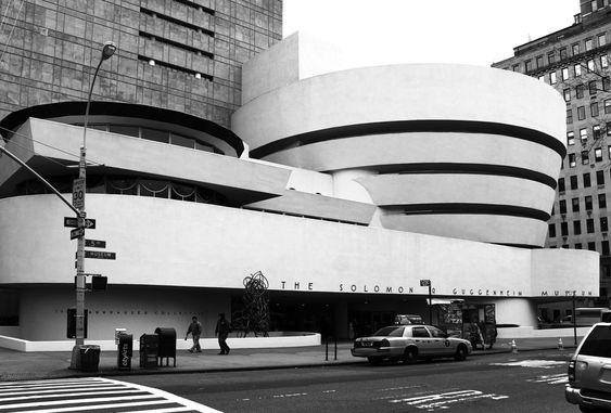
Wright set out to break all the traditional rules. He was particularly famous for his Prairie Houses, including the Winslow House in River Forest, Illinois (1893–94); Arthur Heurtley House (1902) and Robie House (1909); sprawling, geometric residences without decoration, with strong horizontal lines which seemed to grow out of the earth, and which echoed the wide flat spaces of the American prairie.

The first known use of a slab serif was woodblock lettering that was found in an 1810 London handbill for the lottery, see image to the right (Typefoundry). Antique, perhaps the first commercial slab serif, was designed in 1817 by the Vincent Figgins of the Figgins Type Foundry in London (Typefoundry). Antique became a type to describe any slab serif typeface in both the United States and Britain.

The first known use of a slab serif was woodblock lettering that was found in an 1810 London handbill for the lottery, see image to the right (Typefoundry). Antique, perhaps the first commercial slab serif, was designed in 1817 by the Vincent Figgins of the Figgins Type Foundry in London (Typefoundry). Antique became a type to describe any slab serif typeface in both the United States and Britain.
At the end of the 19th century, the first skyscrapers began to appear in the United States. They were a response to the shortage of land and high cost of real estate in the center of the fast-growing American cities, and the availability of new technologies, including fireproof steel frames and improvements in the safety elevator invented by Elisha Otis in 1852.
The first steel-framed “skyscraper”, The Home Insurance Building in Chicago, was ten stories high. It was designed by William Le Baron Jenney in 1883, and was briefly the tallest building in the world. Louis Sullivan built another monumental new structure, the Carson, Pirie, Scott and Company Building, in the heart of Chicago in 1904–1906.

IRON & PLATE
Pierpont worked primarily in England for the Monotype Corporation of Britain. After training as a mechanic in Hartford, Connecticut, Pierpont began employment in 1886 with a patent office where he worked on a typesetting machine. Leaving for Europe in 1894, by 1896 he became a director of Typograph Setzmachinen-Fabrik, a German manufacturer of typesetting machines.Lanston Monotype in Salfords, Surrey, England.

The Crystal Palace by Joseph Paxton at the Great Exhibition of 1851 was an early example of iron and plate glass construwwction, followed in 1864 by the first glass and metal curtain wall. These developments together led to the first steel-framed skyscraper, the ten-story Home.


As you dive deeper into the history of type design, as with all forms of art, you will find that the great typefaces often stand on the shoulders of those before them. Rockwell is no exception. An updated drawing of 1910’s Litho Antique, Rockwell was released in 1934 for the Monotype Foundry. It sits slightly more condensed (more slender in individual letter width) and taller in the lowercase letters (called x-height) than its predecessor but it did inherit Litho Antique’s even stroke weight and perfectly squared serifs.
Its great success appears to have been partly due to a right place at the right time situation as the Godfather of geometric typefaces.
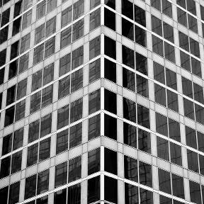

A further important step forward was the invention of the safety elevator by Elisha Otis, first demonstrated at the New York Crystal Palace exposition in 1854, which made tall office and apartment buildings practical.
Another important technology for the new architecture was electric light, which greatly reduced the inherent danger of fires caused by gas in the 19th century. The debut of new materials and techniques inspired architects to break away from the neoclassical and eclectic models that dominated European and American architecture in the late 19th century.
The Guinness World Records used Rockwell in some of its early-1990s editions. Informational signage at Expo 86 made extensive use of the Rockwell typeface. Docklands Light Railway used a bold weight of this typeface in the late 1980s and early 1990s. The poetry publisher Tall Lighthouse also uses Rockwell in all of its books, as well as on its website.

Victorian and Edwardian architecture, and the Beaux-Arts architectural style. This break with the past was particularly urged by the architectural theorist and historian Eugène Viollet-le-Duc. In his 1872 book Entretiens sur L’Architecture, he urged: “use the means and knowledge given to us by our times, without the intervening traditions which are no longer viable today, and in that way we can inaugurate a new architecture.
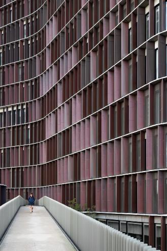

The architectural styles of the Victorian and Edwardian periods, as well as the BeauxArts style, represented a departure from previous norms. This change was particularly championed by architectural theorist and historian Eugène Viollet-le-Duc. In his 1872 book “Entretiens sur L’Architecture,” he advocated for the use of modern resources and knowledge, without being bound by outdated traditions.
References(1)
https://www.meaningfultype.com/rockwell.html
https://en.wikipedia.org/wiki/Slab_serif
https://en.wikipedia.org/wiki/Rockwell_(typeface)
https://en.wikipedia.org/wiki/Frank_Hinman_Pierpont
https://issuu.com/umich759/docs/final_reader_pages
https://medium.com/@mirandaluongnyc/project-3-4-rockwell-typeface-study90289a31594a
https://colab.research.google.com/drive/1he7d5Fbi5dnqtq0dYFdPQbjsdFoJYBpq
https://taraleethompson.com/rockwell-typeface-poster
https://fontsinuse.com/uses/46550/bicycling-1874-a-textbook-for-early-riders
https://www.behance.net/gallery/114191011/Rockwell-Typeface?log_shim_removal=1 https://www.behance.net/gallery/143038125/Rockwell-Typeface-Book
https://www.pinterest.ca/pin/308285537008120734/
https://www.pinterest.ca/pin/526428643955197450/
https://www.deviantart.com/nurdacp/art/RockWell-Typography-969936630 https://www.lessonsindesign.com/my-10-favorite-fonts-for-designers/
https://en.wikipedia.org/wiki/Modern_architecture
https://gohighbrow.com/contemporary-architecture/ https://www.instagram.com/gus_mueller/
Delve into the captivating realms of design with our book, where two compelling narratives intertwine to unveil the essence of creativity and innovation.
Rockwell Typeface: Discover the intricacies of Rockwell, a typeface that defies conventions with its blend of simple geometry and inviting warmth. Unveil the legacy of Frank Hinman Pierpont, the visionary behind this iconic typeface, and explore how Rockwell evolved from its predecessor, Litho Antique, to become a timeless symbol of artistic balance. Dive into the magic of Rockwell as it seamlessly bridges scientific precision with playful charm, making it a staple in contemporary design landscapes.
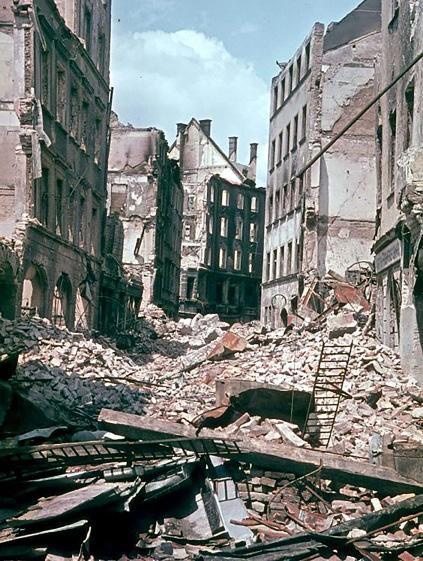
Modern Architecture: Journey through the evolution of modern architecture, from its roots in functionalism and minimalism to its revolutionary use of materials like glass, steel, and concrete. Explore iconic structures that shaped architectural landscapes globally, from the pioneering works of Frank Lloyd Wright to the avant-garde visions of Le Corbusier and Ludwig Mies van der Rohe. Witness the post-war reconstruction era that gave rise to groundbreaking innovations in building technology and urban design.
As you open this book, immerse yourself in a dual narrative that celebrates the timeless allure of Rockwell Typeface and the transformative power of Modern Architecture. Prepare to unlock new perspectives on design, creativity, and the enduring impact of visionary minds in shaping our visual world.


