
BEYOND BORDERS 17 JUNE 23 ALICE TULLY HALL NYC BEYOND BORDERS 17 JUNE 23 ALICE TULLY HALL NYC
HELLO
WELCOME
Thank you for attending our 2023 Adobe 99U conference. We hope that this will be a day filled with breaking borders and stepping outside of your comfort zone. You will hear from qualified creatives on what breaking barriers looks like in their fields, attend engaging workshops, and have the opportunity to have questions answered.
Cheers!
3
BEYOND BORDERS
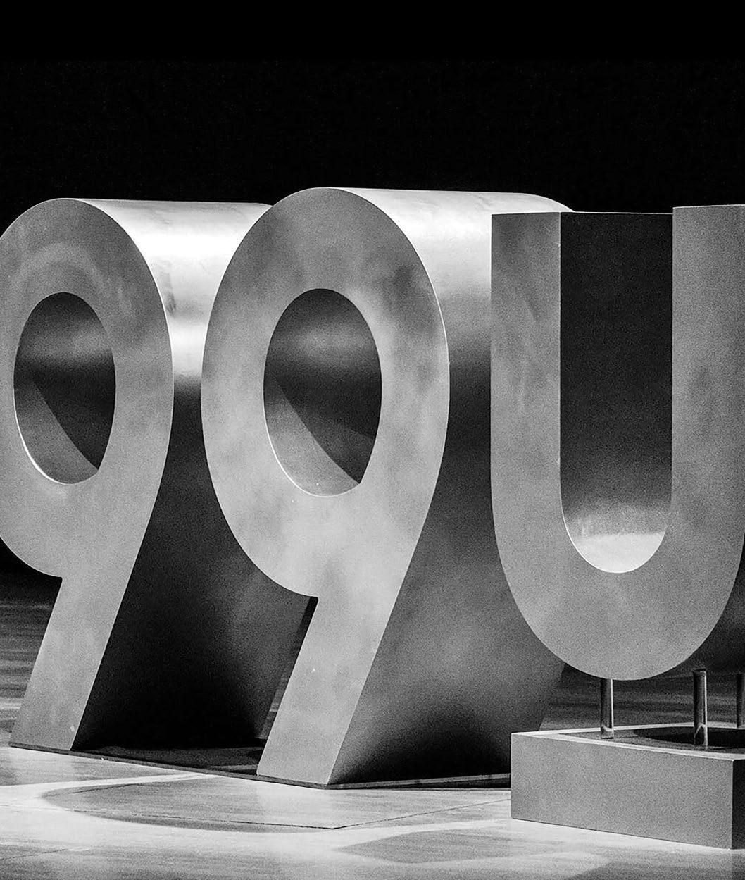
ADOBE 99U
In a technological advancing society, it has become easier to connect with others around the globe. Creatives can do this in work and individual approaches. This raises certain question: Can we help others understand? Is the work we are creating translate well? Does it need an interpreter? How can we communicate differently by breaking borders?
The Adobe 99U conference is an annual event that inspires creatives to supercharge their work, build great careers, and make their ideas happen. For the thirteenth annual conference, a diverse group of thinkers and doers lead discussions about going beyond borders. We encourage you to embrace new challenges and to get excited as we dive into big ideas. With creative leaders, designers and founders tackling inequities, prolific creative directors, and brutally honest consultants.
CONTENTS MORNING SESSION WORKSHOP ONE LIMITED EDITION WORKSHOP TWO AFTERNOON SESION 16 34 43 48 56 AGENDA 08
WORKSHOP THREE Q&A PANEL DISCUSSION PARTNERS 65 78 89 WHAT'S IN THE BAG 89 SOURCES AND CREDITS 89
AGENDA
07:00
WELCOME
Come and grab all your gifts, conference ephemera, and a complimentary coffee to get your day started!
08:00 10:00 11:15
MORNING
Lance Wyman Vallois & Stude Annie Lebovitz William & Tsien
SESSION
Transcending Language Using Design Forming Impressions Through Text Capturing as a Mode of Conversation Building Blocks for Innovative Solutions
WORKSHOP ONE
Michaele Simmering and Johannes Pauwen talking about how to step out of your comfort zone and make a chair.
LIMITED EDITION
Grab a bite to eat and take a break. And while you're at it, stop by our Limited Edition Grab and go poster shop.
WORKSHOP TWO
Try something new with Jim Sherraden & the Hatch Show Print Team leading a Letterpress Workshop.
AFTERNOON SESSION
Kerry Grady Alex Trochut Anna Nordstrom Lance Shields
Designing Under the Influence Speaking The anguage of Typography Using Pop Cuture to Guide Conversation Designing Friendships by Collaborating
WORKSHOP THREE
Communication Challenge with Carlos Rodriguez through a hands-on workshop exploring the concept of less is more.
Q&A PANEL DISCUSSION
Join us with Ayse Birsel, Arem Duplesis, Greg Gresham, Camille Martin-Thomsen talk about diversity in design.
15:45 17:00
13:45
12:15
08:00 ALICE
LANCE WYMAN VALLOIS & STUDE ANNIE LEIBOVITZ TOD & BILLIE
TULLY HALL SESSION
SESSIONONE
BREAKING BORDERS
Transcending Language Graphic
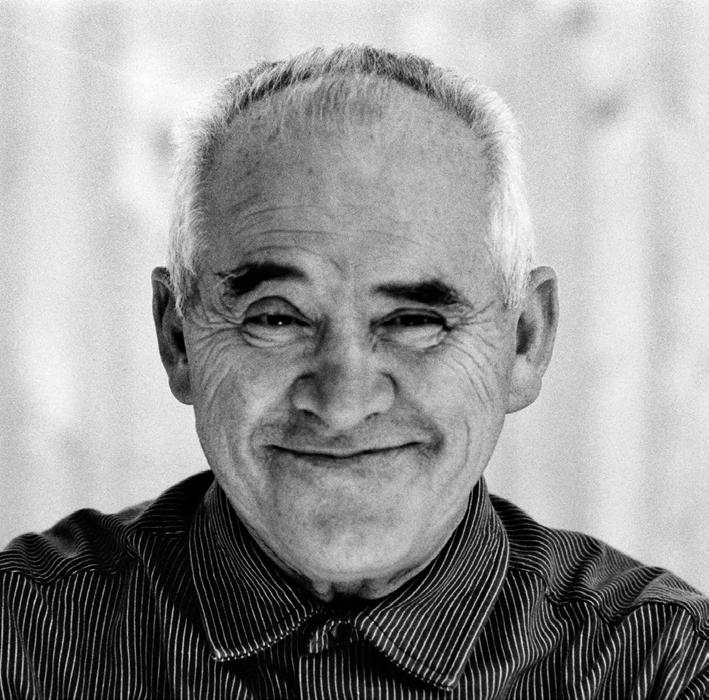
LANCE WYMAN
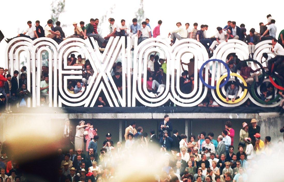
In this talk, Lance Wyman shows us how icons can break communication barriers and how it helps to spread an idea or message beyond any language. Lance Wyman tells us the story behind some famous icons he designed during his career and their impact on our lives today. He discusses the power of design and how they can break language barriers to remove social economic, and structural boundaries.
12
session one lance wyman // 08:00
Transcending Language Using Graphic Design

ABOUT LANCE WYMAN
Lance Wyman is regarded as one of the most outstanding graphic designers of our time. He describes himself as a product of the 'Mad Men' era. He grew up fascinated with clever ways to communicate ideas and concepts that grab you. He was honored for his contribution to the field of environmental graphics, but more specifically in logo design and for creating wayfinding systems for transport, events, guilds, & cities. Many of his logos are familiar and instantly recognizable, including his iconic work for the Olympics (a design that set high benchmarks for all Olympics games). While he is most well known for these works, Wyman has become an unquestioned master of transforming space through branding and wayfinding over his 50+ year career as a designer and respected teacher.
He has created systems for The American Museum of Natural History, the New York Penn Station wayfinding, the Mexico City Metro, The National Zoo and Mall, the Minnesota Zoo, and the Jeddah International Airport, among many more. His design work resonates as much today as it did when he initially designed it. Through his designs for massive urban systems, airports, zoos, and museums, his thoughtful and culture-sensitive work has helped distinguish the design field of environmental graphics.
14
“IMAGERY CAN BE DUMB, JUST AS WORDS CAN. AS LONG AS THE ICON IS CLEAR, YOU’LL HAVE A SYSTEM THAT DOESN’T RELY ON LANGUAGE – THAT’S A BIG PLUS.”
session one lance wyman // 08:00


15
MÜLLER-BROCKMANN
CREATIVES BREAKING
In 1980, Josef Müller-Brockmann laid out the cornerstone for a systematic visual identity for the Swiss Federal Railways with his info graphics at train stations and stops. Given that the Swiss have mutipe languages, the manual proposed a sign system that has no written language; with his functional typography, a pioneer of Swiss graphic design conceived of a comprehensible signage system used throughout the country to guide people to their destination using pictograms. The visual concept still dominates the railways’ visual identity today.
SAAR FRIEDMAN

DESIGNER
As designers, borders are the tools we work with daily. The holy city of Jerusalem is full of borders due to the many reigions within it’s walls. Judaism, Christianity, and Islam are religiously rooted there, and the city gets more public attention than any other place on the globe. Saar speaks out about this divided place, and the strong connection between borders and design. He also talks on how to break away from or use barriers. Saar and his team created a unique and flexible brand identity for the Mekudeshet Festival in Jerusalem - dissolving all the conventional “borders” of design.
RICHARD PAUL LOHSE

Richard Paul Lohse was a Swiss painter, graphic artist, and a highly influential representative of the concrete and constructive art movements. Lohse is renowned for his non-representational works with color combinations based on mathematical formulas. He sought to connect to his audience through color and simple forms to break barriers in his work. In the 1930s, his work as a graphic artist and book designer placed him among the pioneers of modern Swiss graphic design; in paintings of this period, he worked on curved and diagonal constructions.

16
SWISS DESIGNER
SWISS DESIGNER
session one lance wyman // 08:00
BORDERS
SABINE DOWEK
ENVIRONMENTAL DESIGNER
Sabine Dowek is a freelancer who lives in New York City. From 2011 to 2015, Dowek was the art director at MoMA. Exhibitions such as "Matisse," "Jazz Interlude," and "Latin America in Construction" utilize colorways, layout, signage, and more to help guests navigate through the space. Presently, Dowek is freelancing and working with clients such as The New York Times, The São Paulo Jewish Museum, IBM, and Maple.

OTL AICHER
RUDOLPH DE HARAK
ENVIRONMENTAL DESIGNER
Ot l was co-founder of an design school, a professor, communication designer, typographer, defiant spirit, and author. Aicher helped shape the general public idea of the Federal Republic of Germany through the corporate design of many known brands. However, he stands for more than the logos and corporate designs of companies such as ZDF, FSB, Erco, Lufthansa, Braun, and Sparkasse. Two projects stand out: founding the Ulm School of Design with his wife Inge Scholl-Aicher, and the corporate design of the 1972 Olympic Games in Munich.
Rudolph de Harak was known for making the complex seem simple and for adding a spark of life to Modernism. During the sixties his reputation grew, earning him many prominent projects, many of which are as effective and admired still today. Including the timeline and typographic displays for the Egypt Wing of the Metropolitan Museum of Art, and the three-story digital clock and futuristic portal of 127 John St. in Manhattan. He sought to communicate modernist principles and the needs of his clients through his typography and designs.

17
SWISS DESIGNER
Forming Impressions Through
CLOVIS VALLOIS AND ANTON STUDE
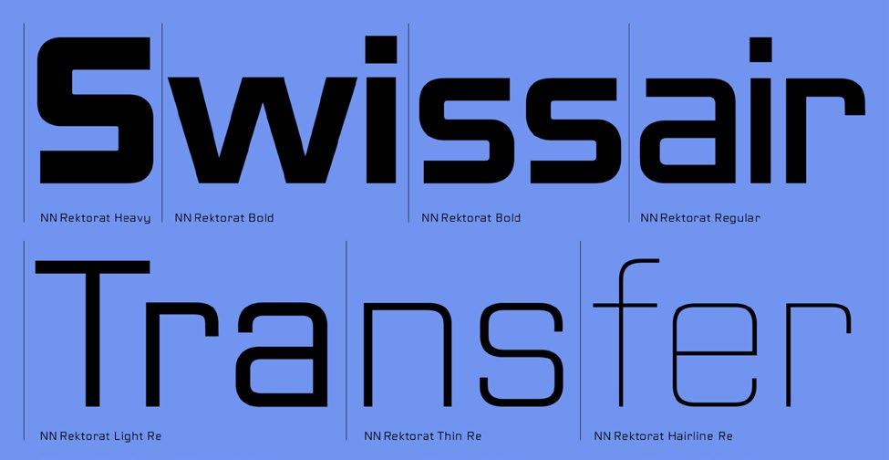
How does typographic selection change the perception of a message? Why is the surrounding context always important for typography? With the help of design, creatives can not only add new meanings to a message but also drastically change the impression the viewer gets, even just through the art of lettering. Clovis Vallois and Anton Stude, a co-founder of the Swiss type foundry Nouvelle Noir, will speak about the place of type in visual communication and the search for inspiration on city streets and will share some examples from their design practice.
18
session one clovis vallois and anton stude // 08:25
Forming Impressions Through Text

ABOUT NOUVELLE NOIR
Two designers, French-German Clovis Vallois and Swiss Anton Studer met at the postgraduate course on type design at Zurich Arts Universit y. They each found an affinity in the other’s passion for type design, and their collaboration that started with a student project led to more professional work together after their graduation. At first, they maintained their careers as graphic designers in addition to their joint graphic design studio that they named Nouvelle Noire (‘New Black,’ referencing printing inks and digital type)—a memorable name with a nice ring to it. The font foundry’s further development was more organic. In 2012, they launched their website with their first fonts. These were Medien, Rekja, and Ernesto. Nouvelle Noire’s approach to type design is as wide-ranged as its list of partners and type designers.
Amid the partners, the variety of fonts already extends from the playful and graphical exploration of letterforms (as in Vallois’s work) to the more crafted and classical type design (in Studer’s case). Their collaborations on typefaces also cover a broader spectrum: from fonts based on the French lettering of postmodern graphic designer Philippe Apeloig, to historical revivals of Swiss sans serifs, to humanist book typefaces by the modernist book designer Jost Hochuli. Nouvelle Noire’s design approach is the sum of its contributors; there are no artifice building ‘images.’ Instead, they remain focused on their passion and they explore what they find interesting. As graphic and type designers, they find inspiration in commissioned projects and custom-type designs with cultural implications.
20
“ALL OF OUR DESIGNS ARE DEVELOPED WITH THE AWARENESS OF TYPE HISTORY IN UNISON WITH A FORWARD THINKING VISION OF VOGUISH VISUAL STRENGTH.”
session one clovis vallois and anton stude // 08:25


21
CREATIVES BREAKING
POOJA SAXENA
TYPOGRAPHER
Pooja Saxena is a typeface designer, freelance graphic designer, and an educator from India. She studied at communication design at New Delhi’s National Institute of Fashion Technology, and type design at the University of Reading, in the United Kingdom. Pooja’s focus lies in Indic script typefaces. She contributed to and led typeface projects for GNOME, Google Fonts, and Complete Access to the Knowledge Program at the Centre for Internet and Society in Bangalore. She also loves to catalog lettering on streets and collects news from across the world to further her means of communication and unity.

ADRIAN FRUTIGER

Adrian Frutiger is a twentieth-century Swiss graphic designer. He is known for designing typefaces and is praised as being responsible for advancing typography for digital use. His valued contribution to typography includes sans typefaces Frutiger, and Univers. Univers takes it's organic shapes from the typeface Gill Sans, but takes a different approach. Adrian has incredible influence in the fields of design and philosophy and shows how breaking barriers can relate to communication within design.
WIM CROUWEL
Crouwel’s design work is firmly based on a systematic approach. He was influenced by the Functionalist Notion and focuses on how strong emotion can be shared through type and color. Being a keen supporter of international debate, in 1963, he was appointed as the first secretary of the International Council of Graphic Design Association. In 1967, Crouwel experimented with embracing the limitations of early display screens in his New Alphabet. Because of the inability to make use of curves, the typeface is structured using horizontal and vertical strokes. Like Nouvelle Noir, Crouwel broke barriers with typography.

22
SWISS DESIGNER
SWISS DESIGNER
session one clovis vallois and anton stude // 08:25
BORDERS
EMIL RUDER
Ruder was a typographer and graphic designer born in Switzerland in 1914. He helped Armin Hofmann form the Basel School of Design and establish the International Swiss style in design. He placed on sans serif typefaces and his work is both clear and concise. He taught that typography’s purpose was to communicate ideas. He was an iconic pioneer of the grid system and showed how placing things within grids and barriers can actually help to break them. For Ruder, what matters the most in type design is precision, proportions and legibility. Type is here to communicate, and that is all.
ARMIN HOFMANN

Armin Hofmann was a Swiss designer. He followed Emil Ruder as head of the graphic design department at the Basel School of Design and was an influencial figure in developing the graphic design style known as Swiss Style. His work is recognized for the reliance on the crucial elements of graphic form while subtly conveying representation, complexity, simplicity, and abstraction. Armin is well known for his posters where he emphasizes the economical use of color and type. This is what Hofmann regarded as the trivialization of color.

Dorothea Hofmann is a Swiss graphic designer, artist, educator and author of Die Geburt eines Stils (The Birth of a Style). Dorthea is one of the first students to pass the Basel education model. She took several educational trips to various parts of the world, collaborting closely with Armin on design education. Dorothea married Armin in 1953 during her third year of a design course where Armin was her teacher. Armin had opened a graphic design studio with Dorothea in 1947.

23
SWISS DESIGNER
DORTHEA HOFMANN
SWISS CREATIVE
SWISS DESIGNER
Capturing a Mode Conversation
ANNIE LEIBOVITZ
When it comes to breaking down pre-existing barriers of communication, Annie Leibovitz is no rookie. In this talk, Leibovitz will discuss the philosophy behind her fantastical photographs and how her growing up has affected the way she has seen the world. She will also speak on the topic of using photos as a way to communicate without words and how to get a viewer to have an emotional connection to one's work in an unexpected way.
24
session one annie leibovitz // 08:50
Capturing as of Conversation

ABOUT ANNIE LEIBOVITZ
Annie Leibovitz is a celebrated American photographer best known for her engaging and dramatic celebrity portraits. Born on October 2, 1949 in CT, the artist studied painting at the San Francisco Art Institute to become an art teacher and took night classes in photography. In 1970, she began working as a commercial photographer at Rolling Stone magazine, and soon became the first woman to be named chief photographer. She later left the publication and began working at Vanity Fair where she developed her style of staged and brightly lit portraits. Annie still contributes to the magazine, as well as to Vogue. She has cited both Richard Avedon and Henri-Cartier Bresson as influences on her work, as well as taking photos during her family vacations as a child.
Fascinated with capturing her subject’s personality and inner life, her images reflect intimate or staged moments that reveal the playful and expressive aspects of her sitters, as seen in her Disney Dream Portraits. “I no longer believe that there is such a thing as objectivity,” she once said. “Everyone has a point of view. Some people call it style, but what we’re talking about is the guts of a photograph. When you trust your point of view, that’s when you start taking pictures.” She famously captured the last image of John Lennon and Yoko Ono before his death in 1980. In 1991, she became the first woman ever to have a solo exhibition at the National Portrait Gallery in Washington, D.C. In 2008, the photographer authored and published the book Annie Leibovitz at Work, which dissects how some of her most iconic images came to be.
26
“SOMETIMES I ENJOY JUST PHOTOGRAPHING THE SURFACE BECAUSE I THINK IT CAN BE AS REVEALING AS GOING RIGHT TO THE HEART OF THE MATTER.”
session one annie leibovitz // 08:50


27
CREATIVES BREAKING
SWISS DESIGNER
Herbert Matter was a talented graphic designer and photographer of Swiss origin. Matter is known for his new pioneering use of photomontage in commercial art. His innovative, iconic, and experimental work helped set the trend for much of twentieth-century graphic design. He is deemed to be the driving force behind the practice of modern art that left indelible marks on the common perceptions of design.


HANNAH HÖCH
HERBERT MATTER RICHARD AVEDON
PHOTOMONTAGE
Hannah Höch was a German Dada artist. She is best known for her work of the Weimar period in which she helped to originate photomontage. Hannah's work was partly intended to dismantle the fable and dichotomy that existed in the original concept of the “New Woman:" a high energy, professional, and bisexual woman, who is ready to take her new place as man’s equal. Her interest was in how the female dichotomy is structured, as well as who structures social roles. Hoch also considered themes such as political discourse and gender roles.
PHOTOGRAPHER
Richard Avedon was an American photographer who focused on fashion and portrait work. He worked for Elle, Harper’s Bazaar, and Vogue. He mainly did moving subjects in still photos. An obituary that was published in the New York Times stated “His fashion and portrait photos...defined [our] image of style, beauty, and culture for much of the last half-century."

28
session one annie leibovitz // 08:50
BORDERS
DORTHEA LANGE

 HENRI CARTIERBRESSON ALBERTO GIACOMETTI
 SCULPTOR PHOTOGRAPHER
Henri Cartier-Bresson was a French humanist photographer considered a master of candid photography, and an early user of 35mm film. He pioneered the genre of street photography and viewed photos as capturing a decisive moment. As creatives, we can learn to appreciate the human condition by Bresson’s work. No matter your style of photography, capturing humanity and the experiences of society as a whole is key to creating art that lasts lifetimes and influences the future.
PHOTOGRAPHER
Dorothea Lange was an American made photo journalist. She focused on much of Depression-era and shot for the Farm Security Administration. Lange’s photos strongly influenced the development of the consequences of the Depression. Lange had little interest in classifying her photographs as art: she made them affect change. Her commitment to social justice and faith in the power of photography remained constant through her life.
Giacometti created a seminal body of work, primarily as a sculptor but also as a painter and draughtsman. In his paintings, he sought to convey his perception of how human beings appear in space. Giacometti felt that because of the ceaselessly changing nature of humanity that any attempt to capture humanity through art is doomed to failure. Yet he continued striving towards that goal and left us with timeless and valid portrayals of the human condition. He once said “I do not work to create beautiful paintings or sculpture. Art is only a means of seeing. No matter what I look at, it all surprises and eludes me, and I am not sure of what I see.”
29
Building for Innovative Solutions
TOD WILLIAMS AND BILLIE TSIEN
Tod Williams and Billie Tsien will talk about solving problems and transcending solutions through a defined sense of slowness. Hear more about how they met, the philosophy behind their designs, and why they believe in the creativity of optimism. Tod and Billie will prove that communication with an audience can be achieved by trusting the process and embracing our human nature.
30
session one tod williams and billie tsien // 09:15
Building Blocks Innovative Solutions

ABOUT TOD WILLIAMS AND BILLIE TSIEN
Tod Williams and Billie Tsien founded their New York City-based firm in 1986. They are committed to reflecting the values of a academic, non-profit, cultural, and helpful institution. A sense of place is defined by experience, light, texture, and detail at the heart of their designs. The couple's dedication to this work has spanned over three decades and has been recognized by many national and international organizations. Among these is the National Medal of the Arts from President Obama, the 2013 Firm of the Year Award from the American Institute of Architects, and the 2019 Premium Imperiale presented by the Japan Art Association. In parallel to their practice, Tod & Billie teach at Yale University where they are professors in practice. They are also devoted participants in the broader cultural community.
Tod is a trustee of the Cranbrook Educational Community and the American Academy in Rome. In 2021, Billie was appointed by President Biden to the United States Commission of Fine Arts. It was here that she served as the first Asian-American woman to be Chair. As both important people educators and practitioners, they are deeply committed to creating a better world through architecture. The couple's philosophy is to view their architecture as an act of optimism. Its foundation lies in believing that it is possible to make places on the earth that can give a sense of grace to life, and believing that this matters.
"It's what they have to give and it's what they leave behind." They wrote these words several years ago and believe in them even more today. They measure the value of their work by the quiet pleasure of the many lives lived in their buildings. They want to solve problems and transcend solutions. The firm tries to work with thoughtful integrity to make buildings that will last and be loved. With the desire to leave good marks on this earth. Their work comes from two voices and many voices.
32
“WE WANT OUR WORK TO MAKE THE WORLD A BETTER PLACE.”
session one tod williams and billie tsien // 09:15


33
CREATIVES BREAKING
WALTER GROPIUS PETER ZUMTHOR LE CORBUSIER
Walter Gropius was an influencial American-German architect. He built the Bauhaus School along with Alvar Aalto, Ludwig Mies Van Der Rohe, Le Corbusier, and Frank Lloyd Wright. Gropius is regarded as one of the first masters of modernist architecture. Gropius broke barriers in his field and shows the power of collaboration.


Peter Zumthor is the third Swiss architect to receive the Pritzker prize.

A native of Basel, Zumthor did an apprenticeship as a cabinetmaker before deeply studying architecture. His approach is unusual, as it leans more towards an artisan’s thinking.
The buildings Peter designs have a strong, yet timeless presence to them. He was described to have a unique talent for combining clear thoughts with a truly poetic dimension. One of his best-known works is the Bruder Klaus Field Chapel in Wachendorf, Germany. The Twelve-Metre Monolith was designed by him free of charge for a farmer.
No discussion of the importance of Swiss architecture would be complete without first mentioning Le Corbusier. A major figure of modernism, he was part of an architectural movement where iron, steel, concrete, and glass were all new materials to be used. He sought to apply these methods of engineering. Breaking Borders can be seen in his development of the Unité habitation. It was meant to conform to human scale. He is often described as both the dreams and nightmares of architects. Le Corbusier’s influence still impacts the present day.
34
session one tod williams and billie tsien //
ARCHITECT ARCHITECT ARCHITECT
09:15
BORDERS
INCHES GELETA ARCHITETTI JOHN PAWSON
Inches Geleta Architetti is made up of both Matteo Inches and Nastasja Geleta. Together, the duo makes up the award-winning Swiss firm which is called Inches Geleta. The idea behind each of the firms works always stems from the interpretation of a way of living and experiencing space in a given context, both physically and through social interaction. They work in local materials that are relevant to the location of each project. In the the Infinity and Palazzo Pioda the structure becomes façade, while the single-family Pallone and Weidmann homes blend into their surroundings yet also take advantage of views.

John Pawson is one of the UK’s most renowned architects. He is known for his signature white, a pared-back aesthetic that also celebrates space over clutter. His projects vary from expensive higher-end private homes to restaurants, hotels, shops, and the well-known London Design Museum. He believes that when environments are stripped of superfluity, remaining objects and surfaces acquire charge. That charge that objects and surfaces inherently have becomes a palpable quality when there is clarity in the spaces surrounding them. A simple object like a kettle becomes a piece of beautiful art, poetry, and archaeology.

George Howe was an impressive U.S. architect and educator. He was also an early convert to the International style. Howe's residence, High Hollow, established the standard for house design in the Philadelphia region in the 20th century. His partnership with William Lescaze yielded the design of Philadelphia’s PSFS Building, considered the first International style skyscraper built in the United States.

35
ARCHITECT
GEORGE HOWE ARCHITECT SWISS ARCHITECTS
WORKSHOP
DESIGN & BUILD CHAIRS WITH KALON STUDIOS 10:00 ALICE TULLY HALL
WORKSHOP ONE
BREAKING BORDERS
Design & Build Chairs

38
workshop one michaele simmering and johannes pauwen // 10:00
MICHAELE SIMMERING & JOHANNES PAUWEN
This workshop will be led by Michaele Simmering and Johannes Pauwen who will guide you through designing and building your prototype chair out of legos. We will discuss their design process, principles, and techniques. By applying these methods, you will be able to go beyond your comfort zone.
39
ABOUT KALON STUDIOS
Kalon was founded in 2007 by Michaele Simmering and Johannes Pauwen and is currently based out of Los Angeles, California. The Kalon Showroom opened as a multi-use gathering place for the vast creative community. A perfect marriage of beauty and utility, Kalon is known for simple, functional forms and a quiet, yet understated aesthetic. Materials used are crafted from durable and time-tested natural make each piece is thoughtfully designed with both a focus on the details and experience. Kalon's practice stems from a belief in the simple beauty and emotive quality of all everyday objects. Their pieces are built by many master craftsmen in the United States using a mix of both traditional and technological methods. All materials are sustainable and domestically sourced.
40
workshop one michaele simmering and johannes pauwen 10:00 //


41
GRAB & GO POSTERS 11:15 ALICE TULLY HALL LIMITED
LIMITEDEDITION
BREAKING BORDERS
Grab and Go Poster

limited edition grab and go posters // 11:15
TAKE HOME A POSTER
All profits from the Limited Edition will be donated to Feeding America and the NAACP Legal Defense Fund. We thank you in advance for your contribution to making the world a better place and to breaking borders.
45
BEYOND BORDERS 17 JUNE 23 ALICE TULLY HALL NYC
46 limited edition grab and go posters // 11:15
47 BEYOND BORDERS 17 JUNE 23 ALICE TULLY HALL NYC
WORKSHOP
LETTER PRESS HATCH SHOW PRINT 12:30 ALICE TULLY HALL
WORKSHOP TWO
BREAKING BORDERS
Letter Press Work Shop

50
workshop two jim s herraden and hatch show print // 12:30
JIM SHERRADEN
This workshop will revolve around printing old cuts from the Hatch Show collection that are in some way damaged or unable to be used in printing presses, which can exert hundreds of pounds of pressure and potentially destroy the cuts once and for all. Therefore, we will experiment primarily with printing by hand, creating the textural, layered effect Hatch is known for to step out of your creative boundaries and learn about a new way to communicate with others.
51
HATCH SHOW PRINT
The Hatch Show Print is led by Jim Sherraden, archivist, and printer. It is one of the country’s oldest, most renowned woodblock printers located in Nashville, Tennessee. They famously print country western show posters and circus posters, the kind that is slapped up on walls and stapled to barns throughout the South.
Letterpress printing is a dirty, messy, and time-consuming challenge that will frustrate you with its tediousness and heavy weight. However, the reward is more wonderful than you could imagine. The Letterpress community offers an abundance of ways in which you can meet other makers, learn more about the process, and see what other folks are doing with their ink and paper.
52 workshop two jim s herraden and hatch show print // 12:30


53
SESSION
KERRY GRADY ALEX TROCHUT ANNA NORDSTROM LANCE WYMAN 13:45 ALICE TULLY HALL
SESSIONTWO
BREAKING BORDERS
Designing Under The Influence
KERRY GRADY
In this talk, Grady will discuss his approach to design in the corporate world. His design methods are influenced by the Swiss International Style designers: Emil Ruder, Armin Hofmann, and Josef Müller-Brockmann. Grady encountered Josef Müller-Brockmann at a Chicago design conference sponsored by the American Institute of Graphic Design. He sat for two hours talking to him.
As a result, Grady’s most important piece of advice received was to design with “clear thinking.” Grady believes thinking clearly means that while there are changing views, cultural shifts, and many technological disruptions, it is importance to step back and remember what is fundamental to good design.
56
session two kerry grady // 13:45
Designing The Influence

ABOUT KERRY GRADY
Kerry Grady is an American designer, educator, author, humanitarian, and a business man. He is best known as the founding principal of Grady Campbell, a dominant strategic brand agency established in 1989 that plans, designs, and produces customized, distinctive multi-dimensional solutions for a wide range of clientele. As the firm’s owner, brand strategist, and design director, Kerry outlines the tone for the creative and strategic work Grady Campbell produces for its clients. They always emphasize the firm’s set commitment to helping build culture, business, and brand value. Kerry’s talent and acumen are a unique blend of a strong design aesthetic and a deep understanding of business strategy.
Kerry’s expertise includes everything from strategic planning, graphic design, visual dentity, brand development, advertising, print communications, web, digital media, packaging, sign systems, video, and magazines. His experience spans all strands of design. He has been a trusted advisor to business leaders and entrepreneurs for over 40 years.In his own reflective and instructive book “From Pencil to Mouse: Forty Years of Graphic Design,” Kerry Grady provides insights regarding the professional practice of graphic design: Illustrating his personal ideas with examples of his work also while addressing such topics as growing up in Iowa, working and operating at the Container Corporation of America,the criteria for good design, International modernist design influences, the ways technology has impacted the progress of design, and the relationship between designer and client.
58
“I DO ARTISTIC THINGS, BUT I AM NOT AN ARTIST. I CONNECT AND COMMUNICATE.”
session two kerry grady // 13:45


59
CREATIVES BREAKING
JESSICA WALSH JAN TSCHICHOLD MAX BILL
SWISS DESIGNER SWISS DESIGNER DESIGNER & DIRECTORWalsh is a designer, illustrator, design director, and partner at the NY based studio Sagmeister & Walsh. She also encourages other females creatives founding Ladies, Wine and Design. She believes that design is a means of communication. Walsh says that if design is done well, it can make communication more delightful, it can make someone’s day easier, and can make someone feel a little happier, it can start important conversations. These are all powerful things that can impact how people perceive the world.

Jan Tschichold is known for his book of modernist typographic principles, and idealizing traditional typographic structures.He believed “the essence of the new typography is simpicity. This puts it into deliberate opposition to the old typography whose aim was ‘beauty’… The aim of all type work should be the delivery of a message in the shortest, most efficient manner. He released “Die Neue Typographie” book where he goes more in depth and shares his guidelines and ideas that shaped international type style.

Max Bill exercised his artistic skills in a wide range of different media, styles and applications. He designed the “Max Bill Kitchen Clock” ceramic in 1956 that exemplified the philosophy of form follows function. The kitchen clock was bright and cheerful, but also functional with a built-in timer and a clean, minimalist design approach that favored both legibility and quality. Bill designed in a way that was both legible and functional. His big design philosophy was to reduce to the bare minimum, which is also how he broke barriers of design.

60
session two kerry grady //
13:45
BORDERS
JUAN CARLOS DISTÉFANO SCULPTOR & DESIGNER
Distefano was born in 1933 in a small home in Argentina. He has an Italian father and a Spanish mother. In his sculptures, he expresses his insights about violence in Argentinean society. In his design he was inspired by the Swiss and the Polish. From the Swiss, he learned great rigor despite a certain monotony, the study of space, and the working method. His advice to young designers is to desire to know, to see, to enjoy. More than an liability, it is to have the desire and a fascination for the world of art.
SAGMEISTER DESIGNER & TYPOGRAPHER
Stefan Sagmeister was born in the small town of Bregenz, Austria in'62. He claims that he became a designer after failing at being a musician and a journalist. Stefan believe that good style and form can help communicate a key message. He has expores the notion of style = fart, and suggesting that style was all hot air that means nothing. If creatives have something to say, then they shouldn’t neglect how they say it. Style can work as a lubricant for their message.
DUNCAN REYBURN PROFESSOR
Duncan Reyburn is a full-time lecturer at the University of Pretoria in South Africa.Before this, he was an animator, design consutant, design consultant, comic artist, and television commercial director. He believes in the thinking of Tschichold. He believes we have entered into an age of typographic narcolepsy, in which embodiedness, situatedness, and ultimately being itself are almost forgotten. Showing a future word obsessed with smoothing out all surfaces so that we can more easily take everything for granted.

61
STEFAN
Speaking Language Typography
ALEX TROCHUT
Similar to fashion or music, letters have a connection with identity and every typographic style will have its place and time in history. Letter design is the nonverbal communication of the written medium. It is not what you say; it is how you say it. Style becomes the message. Letters are a flexible matter, a human creation in constant change. Trochut does not necessarily believe that design and art are the same thing. However, he does believe creatives can and should speak both languages. Trochut puts it this way: Design is an act of empathy; Art is an act of freedom.
62
session two alex trochut // 14:10
Speaking The Language of Typography

ABOUT ALEX TROCHUT
Alex Trochut was born in Spain. After completing his studies at Elisava Escola Superior de Disseny, Alex established his design studio in Barcelona before relocating to New York City. In his design, illustration, and typographic practice has developed an intuitive way of working that has stem into his expressive visual style. According to Alex, typography functions in two hierarchical levels. First, the image of the word we see; reading comes secondary. As a designer, Alex focuses on the potential of language as a visual medium while pushing language to its limits so that seeing and reading become the same action and text and image become one unified expression. Mixing styles and genres and drawing equally from pop culture, street culture, and music.
Alex has created designs, illustrations, and typography for a diverse range of clients: Nike, Adidas, BBC, Coca-Cola, The New York Times, Time Magazine, and many others. Alex’s work has been internationally known, appearing in exhibitions worldwide. He has given many talks and has been honored by the Art Directors Club, including being named a 2008 Young Gun, the Type Directors Club, and the Creative Review, among others. His monograph, reads More Is More and explores his working methodologies and influences and was published in 2011. Alex currently lives and works in Brooklyn.
64 session two alex trochut
“WHAT I THINK ABOUT MOST IS HOW DESIGN IS AN ACT OF EMPATHY AND HOW ART IS AN ACT OF FREEDOM”
// 14:10


65
CREATIVES BREAKING
MARTHA
CERDÀ ROANNE ADAMS RUBIO Y DEL AMOR
TYPOGRAPHER & ILLUSTRATOR
Martha Cerda is a typographer whose work revolves around the boundaries between both letters and illustration. She doesn’t believe in pure aesthetics and believes designers should design for people, not robots. The projects she tends to take on usuallycircle around visual identities. She helps both brands and magazines create a customtypeface for their products or to build visual concepts. Her work makes up of illustration, and custom typography for advertising clients, arts, and culture.
DESIGNER & TYPOGRAPHER DESIGN STUDIO
Roanne Adams launched her personal creative studio 'RoAndCo' in 2006. Adam's studio first gained buzz in the design world for Roanne’s intrepid ability to build successful and scalable brands from the ground up. Over the past 15 years, Roanne and her group have launched hundreds of brands across the fashion, beauty, tech and lifestyle industries. Throughout her creative career, she has cultivated a following of design professionals, devout clients, and mentees. As a studio founder, there's a collaborative culture forher team, many of whom are female.
Rubio y Del Amor believes there is a uncertain history between design and the public sector. This complicated relationship is capable of teaching us a lot about design itself. Does design go beyond selling a product? Does it affect our day-to-day life as citizens? This studio is focused on creating and handling packaging, brands, books, and other objects as communication solutions. They are commited to the clients who are loyal to their projects and defend an effective and honest design based on solid concepts.

66
session two alex trochut //
14:10
BORDERS
RAÚL
GOÑI DESIGNER & ART DIRECTORRaúl Goñi is a believer that protest is inherent to living. Through his projects, Goni aims to engage conversations regarding human rights. He also aims to make it useful as a sensitive way of involving people in social and political struggles, building bridges, as well as helping to process their experiences in a more positive and affirmative way. He partnered with Santi Grau to create an app that will allow people to design their own typography-based posterand share it with the general public. All the anonymous posters are projected from his rooftop terrace, giving a voice to anyone who wants to take part in the the project. It aims to be a gift to the people, neighbourhood and city.
 SINDISO
NYONI
DESIGNER, ACTIVIST, & ILLUSTRATOR
Sindiso Nyoni studied design to get a solid foundation in communication design. His style has been influenced by artistic movements which came out of third world liberation struggles. His culture play a big role in overall work and activism. The style uses protest and dissent to communicate messages through the use of art. He feels that as creatives we all have a duty to contribute to communities by using art that addresses social issues, and advocates awareness. This can then ultimately open minds to act towards makinga difference. Representation is alsoa key element and the underlying theme within his art aesthetic.
TIBOR KALMAN
 DESIGNER
Kalman was an American designer. Tibor saw himself as a activist who thought that graphic design was a way to achieving two things: good design and social responsibility. Good design, whichhe defined as unexpectedand untried, added more interest and was thus a benefit to life. Since design can be used as mass communication, Tibor believed it should be used to increase public awareness of a variety of social issues. Being a master of good design meant nothing unless it supported a message that leads to action. Tibor believed everything had to have meaning and resonance.
67
Using Pop Culture to Conversations
ANNA NORDSTROM
Most of her inspiration comes from popular culture like TV, celebrity culture, adverts, social media, the internet, YouTube and so on to communicate ideas. In this compelling talk, Anna will discuss how to use imagery, quotes, and more to engage and “hook” the viewer to jumpstart conversations.
68
session two anna nordstrom // 14:35
Pop to Guide Conversations

ABOUT ANNA NORDSTROM
Anna Nordström works with a wide range of techniques, centered on patchwork, quilting, and embroidery. She explores themes such as work, femininity, ideals, and desirability. Most inspiration she recieves comes from popular culture like TV, the internet, celebrity culture, social media, YouTube. Nordström chooses quickly and goes with what evokes emotion in her. With regards to creating the pieces, physically feeling and seeing materials take shape in front of her; not on a screen but in her very hands makes her feel some way. It’s deeply human to connect to that feeling. It is more necessary today than ever to understand what powers we have in our hands. Working with your hands is a way of understanding what it is to live your life on this planet. Working repetitively with her hands is what keeps her sane. It’s a good place to be: in the middle of time-consuming work, with hours behind you and hours in front of you. Repetition allows the mind to wander free. Equall y , she has a close relationship with her sketchbooks and pens. Nordström always brings a book, so she is never bored and always has someone to talk to.
70
afternoon session anna nordstrom
“HUMOR IS POWERFUL FORCE. HUMOR HAS THERAPEUTIC POWERS SIMILAR TO WORKING WITH YOUR HANDS.”
// 14:35


71
ORGANIC DESIGNER
One of the 19th century’s best known names is William Morris. He is sti ll renowned today as the designer of patterns such as 'Willow Bough' and ‘Strawberry Thief.' His wallpapers and textiles are only part of the story. Through expanding other products and working on interiors schemes, Morris also mastered other areas of design – as well as finding time to be a social activist and celebrated author. Morris sought and worked to share the importance of eco-friendy and ethical production and communicate quality through his intricate textiles, patterns and designs. His ideas are still influential today.

CREATIVES BREAKING
INTERIOR DESIGNER TYPOGRAPHER
Getachew started Bolé Road Textiles out of a desire to merge her warmth of Ethiopian hand-woven fabricsto her career in interior design. Her love for vibrant colors and patterns was a direct result of her growing up in a loving home filled with traditional Ethiopian textiles. During her time in New York, she helped design the flagships and headquarters of some of the city’s most prominent design companies. Hana has sought to communicate the vibrancy of her heritage. Her designs are an honor to cultural legacy and a reflection of her personal global aesthetic.
Sutnar was an important figure in the modernist art and design circles in Prague between World War I and II. In Prague, he served as a professor and director at the State School of Graphic Arts, and was an art editor at Cooperative Works, a publishing house where he designed many book jackets, utilizing photomontage and asymmetrical typography. He then applied his avant-garde sensibilities to other projects as well, designing magazines, exhibitions, glassware, porcelain, textiles, and toys. In his designs, he communicates the need for a living space to be holistically designed and how that influences the resident’s lives and thoughts.

72
WILLIAM MORRIS HANA GETACHEW LADISLAV SUTNAR
afternoon session anna nordstrom // 14:35
BORDERS
GUNTA STÖLZL
TEXTILE DESIGNER
Gunta Stölzl played a pivitol role in the development of Bauhaus school’s weaving workshop. Stölzl was one of the small number of women teachers on the Bauhaus’ staff. She was even one of the first women to hold the title of “Master.” Her work is described to represent the distinguishing style of Bauhaus textiles. She displayed ideas from modern art to weaving, worked with faux materials, and improved the department’s technical instruction to include courses in math. The weaving workshop at Bauhaus became one of the most successful facilities under Stölzl's direction.

ESKAYEL
TEXTILE STUDIO
Eskayel is a New York-based textile design studio that weaves fine art with exacting craftsmanship. He is dedicated to sustainable innovation and lasting beauty that treats all the environments diligenty. Each of his one-of-a-kind designs originates from a painting inspired by nature or travel. Using eco-friendly methods and sustainably sourced materials, he evolves these artworks into rugs, wall coverings, home linens, fabrics, furnishings, accessories and more. The studio makes each item to order to eliminate stock waste and ensure superior quality. Eskayel seeks to revive this age-old art and bring new ideas into the modern day.
LUCIENNE DAY DESIGNER
Day worked with her husband Robin Day. Together, the Days' pioneered new techniques and design methods in post-war Britain. She is known for her apparel and furnishing fabrics, as well as her carpet, wall paper and porcelain designs, Day’s work also includes unique wall hangings. The printed textile, with abstracted botanical forms, embodies designers’ tendencies in the '50s to move away from the utilitarian fabrics of the war years to designs that were decorative in nature. This trend continued in the following decades and still influences and communicates to designers today.

73
Designing Friendships Collaborating
LANCE SHIELDS
Time and time again the question has been asked, “Can we design friendship for young people?” At Lance’s design firm, they have learned a lot about how design can affect human relationships. Digital products and experiences that help sustain friendships have a better chance to succeed. In this fascinating talk, Lance will discuss how designers can open up channels of communication to create a more unified world.
74
afternoon session lance shields // 14:50
Designing Friendships By Collaborating

ABOUT LANCE SHIELDS
Lance has a twenty-year career as a design director, creative director, and also a hands-on UX/UI designer for four digital agencies. He is committed to leading design to grow product MAU by reaching as large a user base on as many surfaces as he can through international, education, and 1P embedded experiences. Before that, Lance was co-founder and VP of design at experience design agency iiD, where he led a cross-functional team that shaped innovative new products for Fitbit, Zipcar, ADP, Visa, Red Bull and Tokyo Electric. He also has worked on a global scale in a variety of industries including finance, technology, food beverage, insurance, travel, and tech startup. He leverages his MBA combined with deep design experience to drive product innovation and product-led growth. Lance’s work has won numerous awards including the Japan’s sought after Good Design Award, Webby Awards, W3 Awards.
76
“I ASK MANY QUESTIONS AND LISTEN. I POKE, PROD, AND INQUIRE. I PROPOSE IDEAS. I WORK WITH AND DESIGN AND PRODUCTS. I WORK WITH ENGINEERING PARTNERS AS WELL AS THE USERS IS KEY TO DELIVERING SUCCESSFUL OUTCOMES.”
afternoon session lance shields // 14:50


77
CREATIVES BREAKING
MIKE KUS SHANE MIELKE YARON SCHOEN
DESIGNER
INTERFACE DESIGNER DESIGNER
Mike is a UK designer. He specializes in branding, drawing, graphic design, and photography. He has a worldwide client roster and his work is often featured in design related publications, and speaks regularly at conferences. Through his speaking engagements and design work, Mike Kus helps others launch ideas into the world and communicate with their audience.
Mielke is an author, creative designer, developer, animator, photographer, author, speaker, and coach. He was the creative director at 2Advanced Studios. For the last 10 years, he has been an key for agencies around the world. He has also worked directly with clients such as Riot Games and SpaceX. Mielke has worked with lots of companies that are paving the way for the future and communicating groundbreaking ideas with the world.


Yaron Schoen is a designer based in New York. He co-founded a nifty little product called Float, a tool that helps managers allocate their team’s time to their projects. He is also the founder of Made For Humans. This is a small one man design shop that provides services to a plethora of clients. He has also worked with companies such as Twitter, Nat Geo, and more. Through these companies, he was able to communicate with the world in a new way that improves collaboration among many.

78
afternoon session lance shields // 14:50
BORDERS
UNA KRAVETS
Una is a Brooklyn-based developer who is current y giving the web a more aesthetic feel . She works as a Developer Advocate at the Google Chrome campus. She co-hosts two podcasts, Toolsday, and the CSS Podcast. Kravets a lso has an on line video series. She does technological illustrations called Dev Doodles and does ca lligraphy. Kravets started technical groups in DC and Texas. Though Una, Kravets works behind scenes through coding. She breaks barrriers by seeking to help youth understand the importance of web development.

TOBIAS AHLIN
ANTON REPPONEN DESIGNER DEVELOPER

Tobias Ahlin is the Experience Design Director at Mojang, where he directs the design and the UI infrastructure team for Minecraft. Ahlin has worked as a Product Designer at Spotify and GitHub. He is a frequent lecturer at Hyper Island. Tobias has worked on apps that have changed the world and have greatly influenced culture today. He is also passionate about sharing of design ideas through blog posts and teaching.
Anton is based in New York, but is origina lly from Estonia. A lthough he is an interaction designer, he has a background in architecture. He has worked for over 20 years building products and digital experiences. He has created brands and creative products. Anton understands how the human brain works and that programs need to function in order to interact most effectively with us. He seeks to create programs that communicate with us in ways that peop le will enjoy.

79
DESIGNER
LESS VERSUS MORE WITH CARLOSRODRIGUEZ 15:45 ALICE
TULLY HALL WORKSHOP
WORKSHOPTHREE
BREAKING BORDERS
Less Versus More

82 15:45
workshop three carlos rodruigez //
Can I visually communicate well with the least amount of materials? Is it about hammers? Is less really more? Do I need technology? This workshop will test creatives to resolve issues with the material given. Those involved will be split into groups where every group will be given different materials and in different amounts. The objective will be for all groups to communicate a certain prompt with the materials and technology given. This is to push creatives to question whether or not visual communication requires lots of materials.
83
CARLOS RODRIGUEZ
COMMUNICATE VISUALLY
Carlos Rodriguez, a graphic designer, illustrator, and teacher, will be leading this workshop. Carlos believes the arrival of computers has caused creatives to isolate themselves from the production processes. The process includes typesetting, supervising the montages in photo litho, tending and taking care of the printing, the binding, and so many other things in the route of a printed matter. The functions of the design do not change, only the method. The core of the creative profession is stable: Communicate visually.
84
workshop three carlos rodruigez // 15:45


85
AYSE BIRSEL GREG GRESHAM AREM DUPLESIS CAMILLE MARTINTHOMSEN 17:00 ALICE TULLY HALL Q&A
Q&APANEL
BREAKING BORDERS
Diversity in Design

88
17:00 panel discussion diversity in design //
THE PANEL
Join us for a panel discussion highlighting the importance of diverse voices in design and raising up individual experiences and advice from leaders in the field of design. It will feature the Ayse Brisel, Brisel and Seck, Arem Duplessis, Greg Gresham, and Camille Martin-Thomsen.
89
AYSE BIRSEL
Ayse Birsel is one of Fast Company’s Most Creative People 2017 and is on the Thinkers50 Radar List of the 30 management thinkers most likely to shape the future of organizations. She has won numerous awards including Interior Design Best Of Year Product Designer Award in 2020. She is the author of Design the Life You Love and gives lectures on Design the Work You Love to corporations. Ayse is the co-founder of Birsel + Seck, the award-winning and innovation studio, and consults to Amazon, Colgate-Palmolive, Herman Miller, GE, IKEA, The Scan Foundation, Staples and Toyota, among others. Her work can be found in the permanent collection of the Museum of Modern Art (MoMA).

AREM DUPLESIS
Arem Duplessis is currently a Senior Director, Group Creative Director within Apple’s Marketing Department. Previously he served as Design Director of The New York Times Magazine where he led a department named ‘Design Team of The Year’ by The ADC for 3 consecutive years. During his tenure he's received numerous awards including an Emmy for the film series ‘Touch of Evil.' He has been honored as a distinguished alumni of Pratt Institute, an AIGA Medalist and recognized by D&AD, ADC, SPD, TDC, American Photography, the Graphis and others. For his redesign of GQ he partnered with Jonathan Hoefler and Tobaias Frere Jones to create the typeface Gotham, which was used in Obama’s campaigns, advertisements for Coca-Cola and SNL. Gotham soon became one of the most recognizable typefaces of a generation. Arem has served as a visiting professor within Pratt’s Graduate Communication Design Department, SVA and The Royal Danish Academy of Fine Arts in Copenhagen. He has spoke throughthe US and abroad including London, Copenhagen, Oslo, Madrid, Barcelona, Jakarta and Dubai.

90 panel discussion diversity in design //
17:00
GREG GRESHAM

Greg Gresham has more than twenty-five years of experience in architecture and design and has worked on some of The Switzer Group’s most significant projects. His reputation for attention to detail and pragmatism in design has led to many successful projects. Greg consistently develops successful and attractive solutions providing outstanding design for several million square feet of corporate, educational, media groups, financial, not-for-profit and retail clients. As Creative Principal of The Switzer Group, his client-driven design philosophy leads the overall creative strategy for the firm. He has led the design for clients ike Disney, Nielsen, Vice Media, VTB Capital, General Motors, AMC Networks and Columbia University. Greg’s design talents are matched by his excellent management skills which contribute to a well-organized and productive design team. With a broad vision, Greg excels at leading design teams.
CAMILLE MARTIN-THOMSEN
Camille is the founding principal of both Martin-Thomsen Architecture, PLLC, and the creative multi-disciplinary design TCMStudio, based in Brooklyn, New York, and Copenhagen, Denmark. TCM’s work spans across scale and typology but focuses on developing design material strategies that expand the definition of sustainability, foran improved quality of life. Both studios draw on our rea l relationships with local artisans and designers to create forward-thinking, culturally relevant projects that are between temporal and contextual constraints to create meaningful work in New York and abroad. Her current academic research explores inclusive pedagogies and how to decolonize design curricula across disciplines with a particular focus on studio critique and power dynamics.

91
WHAT'S IN THE BAG?


PARTNERS
MAKING A DIFFERENCE
We're deepy appreciative of the continuous support of the Creative Coalition. As they publically advocate for the arts and entertainment community.
All profits from the Limited-Edition poster sale will be donated to Feeding America and the NAACP with the goal of going beyond borders and break barriers such as racial injustice and assisting those in need. Thank you for helping us make a difference in our community.


SOURCES
aiaar.org artland.com artnet.com artsy.net biography.com boleroadtetiles.com braineyquote.com calendar.aiany.org christiesrealestate.com creativemornings.com csadesign.com discogs.com dlwp.com en.wikipedia.org eskayel.com experimenta.es famousgraphicdesigners.org fontstand.com giacometti-stiftung.ch giving.pratt.edu guggenheim.org hatchshowprint.com
houseofswitzerland.org hyperakt.com ideasondesign.com iloveoffset.com johnpawson.com judithbaumann.com kalonstudios.com lanceshields.com lifestylez.com linkedin.com lux-mag.com magazine.artland.com medium.com mikekus.com moma.com moma.org muse.world mymove.com ndion.de nouvellenoire.ch nytimes.com pbs.org
philidelphiabuildings.org photoworkout.com repponen.com rit.edu scandanavianartstandard. com segd.org shanemielke.com tobiasahlin.com twbta.com typecon.com typostgallen.ch typotalks.com una.im vam.ac.uk wikipedia.org workingmagazine.com yaronschoen.com youtube.com
CREDITS
Editor Fil e Manager Layout Design Nav. Pages Lance Wyman Nouve lle Noir Q&A Panel
Welch
le Roux Dominguez Gimple
Photo Coll ection Ga llery Pages Mockups Kerry Grady Alex Trochut Workshop Three
Cover Design Section Dividers Branding Mockups Annie Leibovitz Billie & Tod Workshop Two
Photo Collection Mockups Anna Nordstrom Lance Shieds Workshop One
BEYOND BORDERS 17 JUNE 23 ALICE TULLY HALL NYC
BEYOND BORDERS