All rights reserved. No part of this publication may be reproduced, stored in a retrieval system or transmitted in any form or by any means without, the prior permission of the publisher.
Professor Neil Grant
Head of Art and Design
Welcome to the 2016 University of Chester Art and Design Graduation Show. This is the annual career launch event for new artists designers and photographers. The work represented here and presented in the exhibition celebrates the achievement of the students after three years of study in their chosen disciplines. A particular feature of the experience at Chester is the facility for students to combine courses providing unique interdisciplinary outcomes across fine art, photography, graphic design and in some cases journalism and education. The graduation exhibition is regarded as a key event in presenting the enthusiasm, drive and talent being nurtured in the art and design department and a fantastic opportunity for the public see the potential available. The students and staff are keen to contribute to cultural development locally, nationally and internationally therefore, the exhibition is an opportunity to experience the product of three years of imaginative work and speculate on the contribution these graduates can make to enriching our lives.
The University of Chester has a growing reputation for the employability of its graduates and the impact they can make to the cultural and economic development of the region. The ethos of the department is that the study of art and design is a culturally and economically significant pursuit, that is intellectually challenging and emotionally rewarding. The disciplines studied within the department foster freedom of expression and the development of innovative ideas into objects and experiences. We particularly encourage experiment and generating creative surprise. We aspire to be creative, unconventional and professional.
I am confident that these aspirations are evident in the work and attitude of the students represented in the exhibition and this catalogue. It shows the great potential and creativity of the students that I’m sure will be recognized and appreciated.
Acknowledgements
Professor Neil Grant
Tim Daly
Bernadine Murray
Fine Art
Dr. Jeremy Turner
Maxine Bristow
Steve Carrick
Alexe Dilworth
Lesley Halliwell
Maggie Jackson
Dr. Tom McGuirk
Graphic Design
Dr. Alan Summers
Kevin Furlong
Andrew Hooper
Elizabeth Kealy-Morris
Michael Moore
David Nicholls
Photography
Dr. Cian Quayle
Steve Clarke
Dr. Tracey Piper-Wright
Tom Wood
Technical Support
Chris Bebbington
Greg Fuller
Tom Hignett
Tabitha Jussa
Chris Millward
Administration
Sarah Buckle
Clare Dickens
Head of Department Art and Design
Deputy Head of Department
Deputy Head and Programme Leader BA Graphic Design
Programme Leader BA Fine Art
Programme Leader MA Fine Art
Programme leader MA Design
Programme Leader BA Photography
Art and Design courses
BA (Hons) English Literature and/with Fine Art
BA (Hons) Graphic Design
BA (Hons) Fine Art
BA (Hons) Fine Art with Education Studies
BA (Hons) Graphic Design and/with Fine Art
BA (Hons) Graphic Design and Photography
BA (Hons) Fine Art and French
BA (Hons) Fine Art and/with Graphic Design
BA (Hons) Photography with Fine Art
BA (Hons) Photography and/with Graphic Design
BA (Hons) Fine Art and/with Photography
BA (Hons) Photography with Journalism
Jason Adjapong
BA (Hons) Graphic Design
jmaxta10@hotmail.co.uk
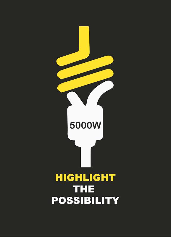
The aim of this entire project is to reach out to all football lovers in the UK who feel that football as a whole, is simply not interesting enough. Along with the issue of there not being an uplifting, tremendous atmosphere when going to various stadiums to rally behind their respective teams, this has lead too many supporters to watch games at pubs or even in the comfort of their respective homes. My project focuses on key things such as the passion, love, religion & unity that exist with the fans while getting behind their teams.
For this degree show, I am exhibiting a 3D promotional billboard, which will communicate through fan chants in type manipulation all in the style of the artist Edward Fella and also through the inspiration of Bauhaus. The billboard will again communicate through chants of what it is like to be at a stadium and experience the euphoria that grips football fans. I also decided that the specific team this work will focus on is Chester FC as I am currently based here.
Lisa Algawi
(Hons) Graphic Design and Photography
I love the creative world I’m in and I dream big! I believe that if you work hard for the things you want in life then you will live the life you dream of and you will succeed.
I take photographs wherever I go and I would say my style is predominantly landscape photography. Most weeks I take myself off and usually travel to Wales. I have noticed that the focus of my recent photography work is based on the Welsh countryside, even though it had been unintentional at the time. I therefore thought it would be a good idea to create a photo-book documenting my travels through Wales.
I would describe myself as quite a hands-on designer. I much prefer to draw or paint designs on paper first and then develop them on the computer. I feel that by working this way, it helps to achieve the best possible creative outcome, and most of all it’s a great way of ensuring
any designs/artwork will always be unique and original!
I also like to include my photography in my design work when I can. I feel it makes a project interesting by combining two disciplines and this was the focus of my recent graphic design project. For this project I worked with Augmented Reality software and used my own photographs. The hidden message behind this particular project, is that the history of towns and villages is slowly being forgotten and lost. I wanted to bring back history in a more contemporary, yet fun manner. My love of photography is based on being able to capture moments that then become memories… that then become a part of one’s own history.
After seventeen years of being in education, I am more than ready to enter the world of professionalism, and I can say with such enthusiasm, that I am really excited to see what my future holds!
Cybil Blyth
BA
(Hons) Fine Art and Photography
Facebook: Cybil Blyth Photography
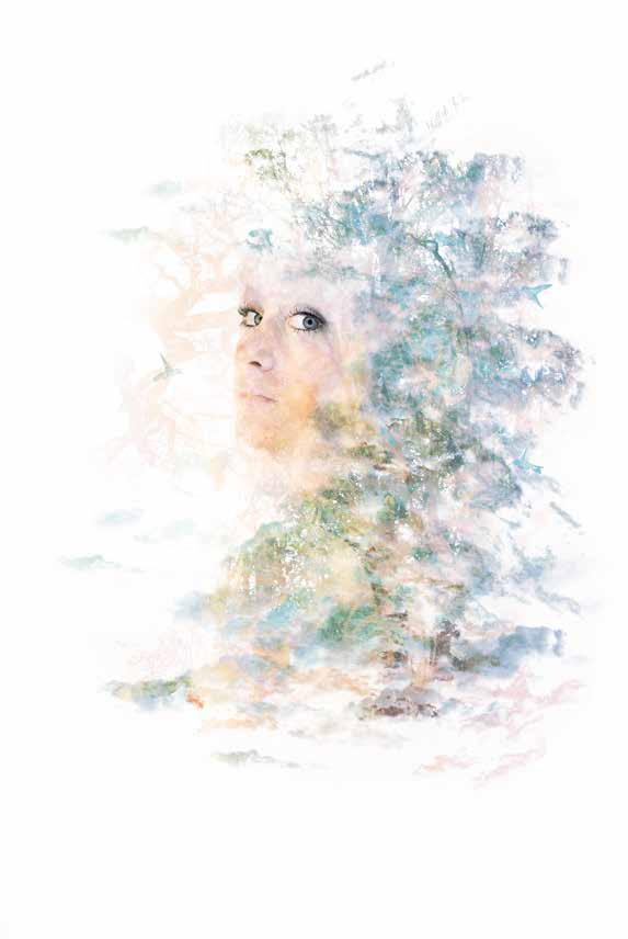
It all began with social media. I was drawn in, and I was inspired
The inspiration of my images stems from the long-standing curiosity and interest in the effect of people’s appearance within the social media spectrum. When surrounded by opinions of every day people, this can effect people in a drastic way.
I do believe that the creative use of layering a series of images on top of one another has the potential to promote new ways of looking at the world without expressing hurtful opinions upon the subject.
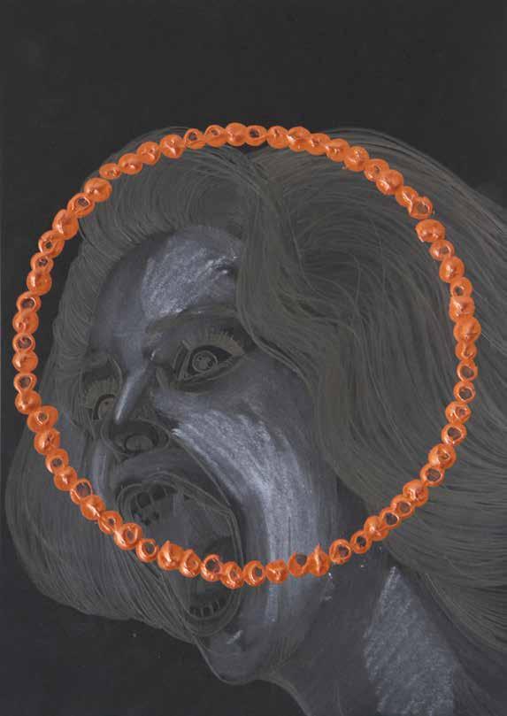
Rather, I like the unpredictability of the outcome of layered pieces and the inventiveness which is necessary to make the piece look as realistic as possible. My current body of work includes a series of distorted subjects faces, with the theme of emotions pushing through. My choice of theme has been an ongoing idea in my mind for many years as I personally have been effected by people’s opinion on my own appearance, but the reality is that we are all the same, no matter how we look. Change and transformation, is the crux of my practice, which continues to develop week by week. The theme will never become stagnant. There is always going to be another area to explore to consider.
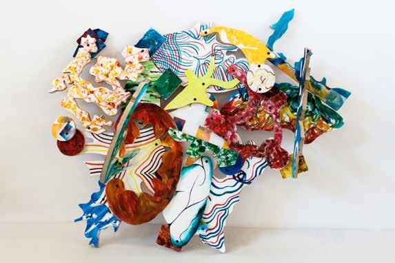
Benjamin Bradbury
The ability to create design enables us to generate inspiration for others – this ability is a privileged empowering skill, which allows our work to speak out differently to each individual. I chose to base my final project as a fashion orientated focus because of the impact of what fashion creates. Fashion has similar qualities as to what art achieves; which was the basis of my work – conceptual fashion garments with depth to the meaning. The area of interest is centred around the theme of well being and equality, which is conveyed in varied abstract patterns and type forms. This was an important decision I made because I wanted the emphasis of just how personal this project is to myself. In the hope of conveying my passion for both the practice and subject matter, I have based my designs in black and white to emphasise the theme of “darkness” to the aura of my work in correlation to the subject matter to support the importance of the focus. Fashion design is a powerful platform, which has a significant impact on each and every individual and with the technique of multi-mediums such as screen-printing and embroidery – I have
worked towards achieving conceptual garments that give integrity to the viewer.
The acknowledgement of classicism and historical recognition within any form of work is important to enable us to understand and appreciate the development, and roots of the area of focus. Both sculptural art form and figurative art are equally vital aspects of historical significance in the history of the art world; this has been the primary focus of my project this year working with both elements to create obvious depictions but with a distorted visual representation. Working in an abstract medium exploiting the human form, as a catalyst to convey the notion of emotion has been the focused direction of my work, achieving a dominating presence that forces recognition. This specific quality to the work of sculpture is a significant component I identified very early on in the project, which is what I hoped to achieve through my work.
Joseph Brassington
BA (Hons) Fine Art with Education Studies
j.jb@live.co.uk
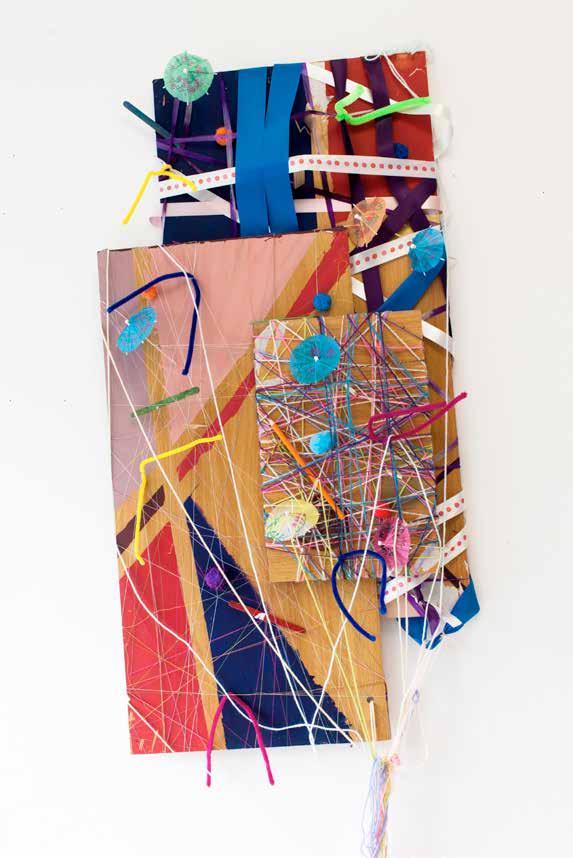
Broadly, my practice investigates the variety of marks that can be achieved when using thread. Drawing with thread has a delicacy and intimacy that I have not found with more traditional drawing. When drawing with thread, secondary marks occur unintentionally on the reverse of the canvas. Beyond representation, these marks exhibit the process of making. The knotted threads and loose ends reflect the reality of work with thread.
Formed by chance, these imperfections evoke more curiosity than the original intentional drawing. Guided by research this repetitive process and the uncontrived marks that it generates have developed symbolic significance for me. Each drawing investigates the value of imperfection. Displaying the reverse thread drawing reflects an honesty with, and acceptance of, these imperfections that can occur when making art.
Jess Brown
The Villagers project started out with early experimentation with acrylic paints. I was doing a series of paintings using a whole range of different colours. I painted a portrait in green and blue and it was from that one piece that this entire project developed. Although the project may have started out purely with acrylic painting I soon saw the potential in using a graphics tablet. Using a graphics tablet allowed me to produce much cleaner, effective portraits compared to that of their painted counterpart.
I then went about creating the world, from the people and buildings, to the quirky colour pallet; I wanted the illustrations that I was producing to be eye catching and to stand out. All the illustrations share the same limited colour pallet consisting of greens, blues, yellows,
greys and reds. Using this limited colour pallet gives the world a unique alien feel to it, and prompts the viewer to look further.
All the illustrations I created for this project are like snapshots from a movie, I focused quite a lot on ways of creating work which has a narrative and a deeper meaning. Within the world, there is a corporation called Villager Corp , similar to that of Big Brother from George Orwell’s 1984 which controls everything. Their logo is subtly on everything, which the viewer wouldn’t realise without finding out what the logo is and the back story.
All the work is Vector based and created on Adobe Illustrator CS6 using a graphics tablet.
Victoria Bryan
BA (Hons) English Literature and Fine Art
The focus of my recent practice has been on the exploration of the visual connections that can be found between human, animal and plant anatomy through the process of drawing, and how each living structure is subject to decay and death.
Although the relationship between nature and anatomy is at the heart of my artwork, there are other binary oppositions I am embracing as a result, including the real and surreal, life and death, the familiar and the unfamiliar and the natural and unnatural.
I am interested in still life artworks, specifically vanitas, and how flora and fauna can be used to demonstrate mortality and the passing of time. However, through my work I aim to subvert this notion as, although I have primarily experimented with traditional forms of still life, I have also reconstructed its distinctive subject matters in order to modernise and challenge the connotations surrounding them.
Through my drawings, I attempt to communicate the notion of immortalisation, and demonstrate the ways in which images can be made to give the illusion of eternal life, despite the fact that they are dying, whilst simultaneously conveying their sense of fragility through the incorporation of anatomy. By suspending my organic imagery on a white background, isolated from its original context, I am presenting it in a timeless state, stabilising the decaying process and creating the illusion that it has been frozen in a stage of its life-cycle.
In mostly drawing from my own imagination, I aim to not only retain the investigative and instinctive properties associated with drawing, but also inject a fictitious aspect into my art, exposing the viewer to a realm of nature that is both beautiful and engaging yet, as the familiar is rendered uncanny, is subsequently disconcerting. The disjointed narratives I produce are initially intended to appear ambiguous; it is not until you look closely that the anatomical associations begin to emerge.
Rob Burgess
BA (Hons) Graphic Design
robburgess94@gmail.com www.theswanologues.com
I’m a graphic designer by practice but my passion is illustration. I’ve spent four years trying to figure out what I want to be when I grow up and I have less of an idea now than I did when I started. Until I figure out what I want to be when I grow up I’ll stick with, my name’s Rob and I draw stuff.
“I’m totally confused with what I’m going to do with my life”
- Bill Hicks
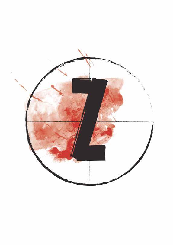
Gareth Chadwick
BA (Hons) Graphic Design gchadwickdesign@gmail.com
As a creative, I love design that is quite simple and contemporary with branding and advertisement being the things that I love the most.
For my final project I wanted to make something quite fun and different to what you might see usually. For this reason, I have created a new brand of beer based around zombies. A different type of zombie represents a different strength of beer, and I have also created a range of different point of sale materials to promote this. As part of the promotion in line with the launch of the new ‘Z’ beer brand, I have come up
with a zombie fun run that would take part in a range of locations in different cities nationwide that would get the public and potential consumers involved in the action.
I have truly enjoyed the past 3 years constantly learning and improving as a designer which makes me look forward to being a part of the industry. I am very excited to see what the future holds.
“Design is thinking made visual”
- Saul Bass
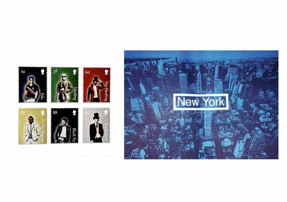
James Chapman
BA (Hons) Graphic Design
james@reloaddesign.co.uk jameschapman.graphics
This brief was to create a series of stamps based upon being British and what makes us special as a nation. I chose to look into events and clothing that is specific to these events that only we have in Britain. These included the Henley Regatta after party were teams dress up in matching clothing to represent the universities they come from; Royal Ascot with morning dress attire; fox hunting and general hunting clothing that must be worn during hunts; Polo clothing that must be worn while playing on the polo field and the black tie suit that was invented in the U.K. Creating a stamp collection that is different to most stamps that are currently used by using high quality images with bold colour backgrounds made the collection stand out. Originally my final major project was
based upon cities around the world, with New York being one of the main cities I was going to do. During the experimental stage of the project I started using a machine called the risograph printer; I was attracted to the different textures and detail that couldn’t be produced through a computer or standard printer.
After two years doing a foundation degree at Mid Cheshire College under the university and topping up to do my final year it has been refreshing to come and experiment in my final year working on work and using materials that I thought I never would. It has enabled me to develop a solid base in graphic design which will support my work in the future.
I have taken a very personal approach towards my projects this year. My artwork has consisted of locations that inspire me along with places I have visited, particularly New York and local places such as Chester! My photography looks at the daily routine of others around me, whether this is whilst I am at home, or when I am studying at university.
Colour is an important element of my work, as well as the juxtaposition of images which I love experimenting with. I have a desire to manipulate images, filling them with collaged elements including photographs, tissue paper, scrap metal and textured paper. New York has been a huge influence upon my studio practice and I have enjoyed combining different cultures/cities in my work.
Photographing my home life and student lifestyle has been the subject of my photography practice. I work as an outsider looking in on my subjects, trying to capture features of everyday life. These photographs could not be any more natural, revealing the personalities of my subjects, whether it is their facial expressions and body posture, or the objects and locations that surround them. Seeing the contrasts between my family home against my university home, helps portray the idea of university students as having a lot of freedom as well as being messy. This subject matter is rather humorous.
Georgina Cuthbert
BA (Hons) Photography with Fine Art georgina.cuthbert@yahoo.co.uk https://www.behance.net/Georginacuthbert
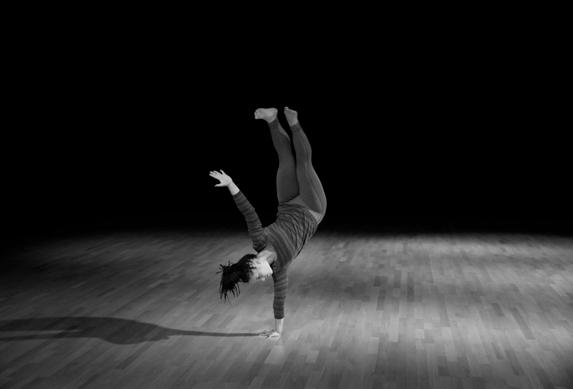
In my photography work I have captured the strength of dancers. I photographed each dancer whilst they moved to the flow of the music. I was intrigued by the concentration that went into each movement, each dancer was able to be at one with her own body, creating different movements and pushing the body to its limits by placing it in positions that to others would seem impossible. I have chosen to show my work in black and white because it enables the viewer to focus on the form and shape of the body.
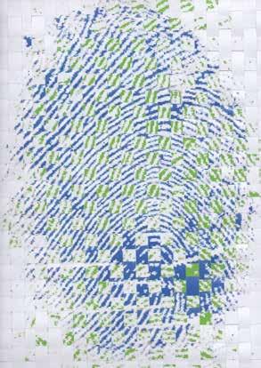
In my fine art work I have been looking at fingerprints and the patterns of the lines. I have taken two different fingerprints from two people and merged them together. The fingerprints that I have chosen and put together are from people that some way are connected: that may include being siblings, parents or partners, you cannot tell just by looking at them. The colours that I have chosen to print the fingerprints in are colours that I feel work well together after working with the colours in experiments that I have done to get to this point in my work.
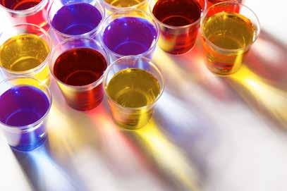
Genevra Louise Dean
(Over 18, Please drink reasonably. DON’T DRINK AND DRIVE)
Hesitation , Life and Journeys reflect on past times or moments, places and objects that have influenced my life, as well as my connection with the present.
Taking into consideration the different challenges that we have to overcome on a daily basis - responsibility, choice, morality, consequences and future aspirations are often referred to as the ‘human condition’. As well as issues that may lie beneath the surface, my work challenges the audience to make decisions. We make decisions on a daily basis, some that seem quite insignificant, such as what to watch on TV or what brand of shampoo to buy, whilst others are more significant such as our careers.
‘Do you, don’t you?’ is a daily conscious and subconscious question, where the wrong decision may effect any one of us. With the consumption of alcohol, our views and standards may become clouded and compromised or indeed, change completely. Do you act in the moment and live with the results or make a more informed decision, acting responsibly and potentially missing out? Do you take different substances, like alcohol or drugs or dismiss them and put them aside? Each decision we make creates a moment that happened, recording a silhouette of the event to refer back to at a point later in life, a point where we may need to make a similar decision.
Connor Dickson
BA (Hons) Graphic Design connordickson@me.com www.connordickson.co.uk
My name is Connor Dickson; I am a graphic designer based in Cheshire.
My approach to each piece of work I produce is to aim for high standards of design, driven by bold creative thinking to meet a clients needs. My work is modern, exciting and extends to a range of disciplines which includes branding, web design and creative advertising. I am passionate about design and draw my inspiration from classical design and by staying informed with contemporary design and trends.
However, this does not condemn me to the slavery of following trends. Instead, I choose to follow the philosophy, ‘form follows function’. I believe that the role of a designer is to solve visual problems by adding value and meaning to
information and by communicating with clarity; ‘form follows function’ allows me to achieve this role because I strive to look for the essence of the problem and from the solution the aesthetic can be achieved.
I try to question my work and myself at every stage of the creative process. I ask myself, can I make it ‘visually powerful, intellectually elegant, and above all, timeless?’ These principles are the words of an idol of mine, Massimo Vignelli, and I agree with him that great design lasts forever and is timeless. When one looks at the breadth of work of the individual designers that I admire, such as Vignelli, Paul Rand, Saul Bass, and Alan Fletcher, you can see that their work is good design and is timeless. This is one of my underlying goals in life, to create great design, which lasts forever.
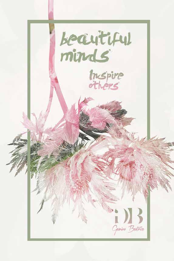
Geanina Beatrice Dragoi
BA (Hons) Graphic Design
geaninaaa@rocketmail.com
geaninabeatrice.wix.com/graphic-designer
“Here’s to the crazy ones. The misfits. The rebels. The troublemakers. The round pegs in the square holes. The ones who see things differently. They’re not fond of rules. And they have no respect for the status quo. You can quote them, disagree with them, glorify or vilify them. About the only thing you can’t do is ignore them. Because they change things. They push the human race forward. And while some may see them as the crazy ones, we see genius. Because the people who are crazy enough to think they can change the world, are the ones who do.”
- Rob Siltanen
Christopher Drury
www.flickr.com/photos/cdruryphotography
Within my design work I try to tackle issues and show pieces that subconsciously work on the mind. My work directs information that is linked to topics that are impacting the earth, the environmental and their processes. I want the audience to figure out what it is they are looking at so that their own thoughts can slowly piece the parts together for their own interpretation and clarity. My method is to not shove information down people’s throats in an aggressive manner, as I feel this is not producible. The information is there to inform people and not to force my ideas or views. It is all about the person’s ability to problem solve and to be informed on processes that they may not have already thought about.
Within my photography I try to understand interactions and the space between other people through photographing them. This enables me to progress towards a better understanding of people, the environment and of my own self as a human being. The presence of space through the un-seeable can be sampled through our own human connection, our emotions and our environment. Concentrating on those aspects whilst photographing my subjects brings me closer towards a meditative state in which the meaning of life can be made clearer. My recent work displays two books of which one is of 35mm black and white film and the other as black and white digital formats. Both of these books show the differences between the speeds in which I capture my work, whilst also achieving similar results of interaction. Personally, film slows everything down and allows me to achieve a greater understanding of this presence.
Laurie Edmondson
Having grown up in a family of artists and designers I was certainly predestined to become a creative. I have had a passion for art, and related practices, since a very young age and have always known that I would pursue a career within it. I have been fortunate enough to study a wide variety of creative subjects in order to discover that Graphic Design and Photography are my forte.
As a creative I always seek to try out new methods, techniques and styles that I’ve never experimented with before. Therefore, within my final year I have researched and developed new practices in more detail to aid both of my projects in Graphic Design and Photography. I have been particularly interested in exploring typography, pattern creation, and abstract compositions. During this year, the focus of my work in both disciplines has been light and shadow.
In Graphic Design I have been exploring the use of light combined with negative space within typographic artworks. The focus of these artworks is the relationship between written text and human persona. I have produced three pieces based on three individuals’ favourite Bible verses and presented them in such a way as to portray the specific person’s personality through unique patterns and letterform layouts.
Within Photography I have been studying the interesting formations of shadows caused by natural light. I have created a series of abstract compositions after studying the arrangements of shapes and patterns caused by natural light within unaltered scenes, rather than being artificially composed. This study has caused me to pay closer attention to the world around me and the way in which artistic inspiration can be drawn from naturally occurring details.
Kayleigh Edwards
“I have not failed. I’ve just found 10,000 ways that won’t work. Our greatest weakness lies in giving up. The most certain to succeed is always to try just one more time. Genius is 1% inspiration and 99% perspiration.”
- Thomas A. Edison
This quote by Thomas Edison has become very relevant to me throughout university it sums up how I like to think about designing and how I approach a project or problem.
There is no right or wrong answers in design, there are just ideas. Some work better than others and some you find out work great for a completely different project than what they were originally designed for. It’s OK if you don’t get the perfect solution straight away; it’s not a bad thing some of the best work takes time to get right.
An idea isn’t a failure if the client doesn’t like it everybody has their own opinions you can’t take it to heart when that happens, as it will happen to every designer at one stage or another and it won’t be the only time it happens either you’ll experience it many times in your career. It’s how you deal with it and take criticism on board is the most important part this is something I have come to learn and appreciate throughout the years of studying graphic design here at Chester. The key is to not give up and just keep trying. You may come up with multiple ideas that don’t work but all you need is that one and you’re set.
I am a combined Fine Art and Graphic Design student. My Graphic Design project is related around daydreams. Research from my own particular daydreams and research taken from others have been gathered together in order to create a motion piece. This motion piece is designed to reflect around the aspects of daydreaming. Not only has it been created to describe daydreams but is designed to enhance them. I wanted to demonstrate the positivity these have upon us, how they can bring out our creative side and my aim was to take away this negative approach people have towards them.
My Fine Art is based around unwanted objects by taking them and reforming them into something desirable. My project started from throwing out old books, which I felt were no longer needed. This then brainstormed into the idea of taking unwanted objects and developing from them, which finished with this final outcome. This process has led me to experiment with many different mediums and materials, which slowly led to this transformation of rubbish in order to create a piece of art. My work has taken something we may see as trash and used its form and structure to create these three dimensional sculptures.
Sophie English
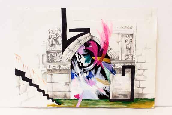
The focus of my project is the architecture and its contrasting elements I perceived whilst living in France and Venice.
I am interested in the old, rustic and historic buildings as well as the abstract shapes, colours and lines found in the more modern structures and street art. My work intertwines these two ideas to create new surreal and playful 2D structures that become increasingly abstract whilst also maintaining the beauty and detail of the original architectural aspects.
I am interested in the use of paint and pencil and how both can be used to create such intricate images but at the same time can be used in a more
experimental way that allows the development of personal style. My images are designed and constructed with precision, detail and measurements when using pencil, almost as if I am constructing the building itself on a 2D surface. The colour and shape can relate to a more modern society layering over such historic buildings with vibrant letters and shapes (street art and graffiti) in an unintentionally exciting way.
My work plays with the idea that anything can be ‘constructed’, whether it is completely from the imagination or taking real life structures, deconstructing them to find exciting elements, and then creating something new with them.
Frazer Evans
BA (Hons) Graphic Design
fjk.evans@live.co.uk
Futsal a 5 a side version of football is something that is close to me in my personal life, I have been playing football my whole life, but when I was introduced to futsal, it has helped me develop as a player and become more passionate for football as a whole. Why didn’t I learn this sport years ago? Because futsal is not a common sport in England!
The idea behind my design is to influence people from a younger age to get involved in futsal, and possibly begin to go through the same progress as great players such as Lionel Messi and Cristiano Ronaldo. Futsal involves quick thinking and more risk taking with the ball (as the pitch is so small), but the beauty of the game comes through the explosive pace and high intensity when playing the game. This will be demonstrated through the pattern you will see continuously through my work while you begin your path to learning about this exciting sport.
Katie Evans
If you were ever invited to a room and opened the door to a strange, secretive club, what would you do? My film “Flower Arranging for Beginners” is set in 1950s England. A dishevelled, young man down on his luck called Sam Carrington stumbles upon such a club. From this club, he is transported into a world of murder and mystery. Other main characters include Miss Robin James, receptionist at a hotel; Sam Carrington, a desperate, down on his luck wastrel; Violet Wilkinson, a charismatic flower arranging club owner, and Hector Spector, an out of town detective, whose suspicions are running high. Filmed in a hotel that gives off a 1950s vibe and atmosphere, Flower Arranging for Beginners explores the themes of a classic 1950s film that spends the entirety of the film figuring out who has committed a murder. So, sit back, relax...or not. You may be on the edge of your seat for this 1950s flick.
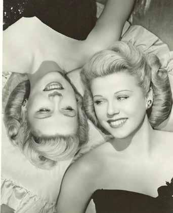
If your doppelgänger were to appear right in front of your eyes, what would be your first feeling? Fear, confusion? Or just plain curiosity? This feature length commercial advertises a spray that can help you get rid of your doppelgänger, for good! In this 1950s style commercial, along with our host Jeanie, you too can learn how to get rid of your annoying double. The commercial that I created deals with them in a completely different way to how doppelgängers are perceived in urban legends and movies, making them seem like an unwanted house guest in your home. A doppelgänger who wants to be just like you, yet eventually wanting to overpower you and replace you. Through my 1950s commercial ‘Seeing Double’, you shall be able to learn how to get rid of your double with a spray, that had been produced so you can easily buy it off the shelf in front of you - shown off in a supermarket-like setting. I’ve included a picture of twins from the 1950s that represent the look I’m going for in my commercial.
Jessica Ferrara-Richardson
BA (Hons) Photography and Graphic Design
J.ferraraa@live.co.uk
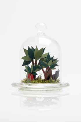
As a combined student, the areas of my work are entirely different. My Photography work is concentrated on my close-knit Italian family, while my Graphics portrays fairy tales in an Arthur Rackham/ Helen Musselwhite inspired dome universe. I chose each of my ventures purely on enjoyment and satisfaction, who better to focus on than my family and loved ones? Over a number of years
I’ve built up a portfolio of family ‘snaps’, which have transformed into a substantial and meaningful body of work. I’ve always been interested and attracted to paper cut artwork and the simplistic beauty of it. I like to create work that is more hands on. A physical piece has an edge which can’t be achieved on a computer, hand crafted works give a personal feel, impossible to gain by any other means.
Jaydine Foley
Mental health, specifically depression and anxiety, affects a significant amount of people each year but it is rarely talked about. I used this project as a way to explore anxiety in a visual medium and help start the conversation.
With anxiety, life can feel fleeting and many people feel out of control or like they are spiralling downwards. To express the intangibility of these feelings, I used long exposures and focused on the idea of movement creating almost ethereal and dream-like images.
To juxtapose this, I created some sharper images to represent loss of balance and feeling on the edge. I feel like mixing these two styles of photography represents some of the different sides to anxiety.
In this project I have explored the idea of the renowned motorcycle manufacturer for the company Harley-Davidson making cars car for motorbike enthusiasts.
Chloe Gallacher
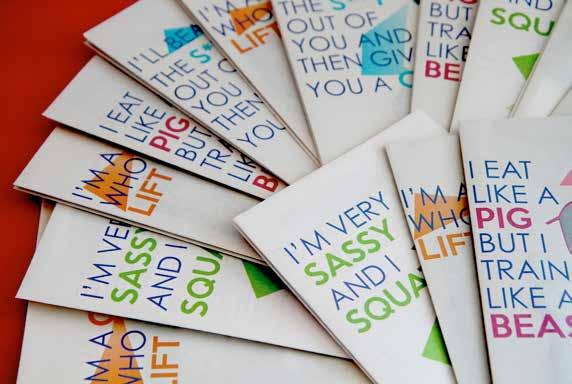
Throughout my degree I have developed a personal style to reflect my interests. I appreciate both design and writing. From seeing how these two work hand in hand, I have created a project that shows how these two work together. Health and fitness is a huge passion of mine and I wanted to explore how I could encourage women like myself to get fit for the right reasons. In today’s society it has become an uprising issue with many different images and perceptions of what the ideal woman should be.
There have been recent advertising campaigns to encourage women to get active but they mainly focus on body image. Through my writing I have created
a series of fanzines to help women start on their journey by changing their health and fitness. Using my design skills, I have been able to create and present them in a unique way. It is written in the first person to help the reader relate easier to myself. It is an honest account telling others both my flaws and positives. Alongside the fanzines is a blog where I have posted updates about training for a run and how sometimes I don’t always stick to my regime just like others can. I believe my project showcases my skills and who I am as a creative.
Hollie Geary-Jones
The focus of my work has been on the relationship between figurative and abstract art. I have been exploring this concept through the juxtaposition of the human form against coarsely formed abstract shapes. I have been completing the majority of my work employing the processes of drawing and painting. I have been extremely interested in revealing raw human emotion, which I have aimed to depict through portraits. I have then layered my portraits with abstract shapes, in order to slightly obscure the figurative art from the viewer, so that the work as a whole maintains a visually confusing air. My aim in doing so was to question
the classifying of art as either figurative or abstract, as I wanted my work to blur the lines between the two. Predominantly, I have been exploring abstract art by continually painting disorganized abstract shapes over my figurative work, in a bid to disrupt the focal point of the work, so that the piece becomes increasingly difficult to view. Additionally, I have also explored themes of repetition in both my figurative work, portraits, and my abstract work, shapes. My overall aim for my work is that it will cause the viewer to question whether work can simultaneously be classified as two types of art.
“If
Shannon Gibson
BA (Hons) Graphic Design
shanngibo@aol.co.uk www.sketchgraphics.etsy.com
“Sadly, the only equality in the world is six feet of soil.”
Laura Grant
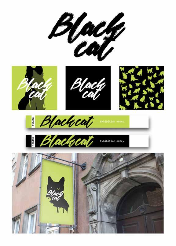
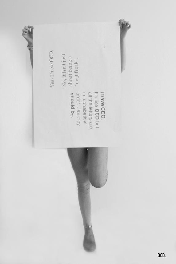
BA (Hons) Graphic Design LL-Grant@outlook.com
This past year I have been studying mental health, in particular obsessive compulsive disorder (OCD). A lot of people jump to conclusions about OCD, thinking it’s all about odd or even numbers, and objects being in a certain place or order, but that’s only just a fraction of what it is about. I aim to show different levels of OCD through using different methods and taking people on a journey to show them the real side of OCD mental health, but visually only. My aim is for people to experience, interact but most importantly learn. Instead of just picking up a leaflet and reading the information it contains,
I want them to feel what it’s like to live with the illness and the struggle that people
with the condition have to over come every day. I have created four zones of different levels of OCD, ranging from one being the lowest case and four being one of the more serious cases. By interacting with my exhibition in each zone of OCD participants will experience the frustration that someone with this illness feels.
I believe that interactive experience is the new learning method. I have experimented and combined fine art installations with graphic design screenprinting and animation in order to create this experience.
Jasmine Green
Natures Floor is a series of textile pieces featuring mixed media collages. The inspiration for this series of work is the undergrowth of different woodland and marsh areas. The idea derived from a walk through abandoned marshlands where rabbits die naturally and their skeletons begin to entwine with the moss and over time become part of the floor again. I wanted to replicate the tones and textures of the floors I see when walking. The pieces are built up using different mediums, such as mud, paint, coffee, materials and paper. I want the work to give an organic feel, allowing people to get lost within nature through my work.
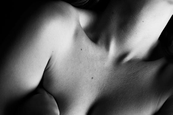
Intimacy is a black and white photographic series showing the forms of the human body and the beauty of a person’s skin. I wanted to display the feeling of being in a close relationship with someone within my photographs. I’ve always been intrigued by the marks that make each persons skin unique. Being close enough to know a person’s skin is something I find beautiful and captivating. When we see people in our day-to-day lives we often don’t notice that tiny freckle just below their bottom rib or that mole just behind their ear. Unless we study a person’s skin, we wont know the small details that differentiate theirs from our own. These photographs reveal the intimacy of knowing a person’s body and skin.
Emma Louise Griffiths
BA (Hons) Graphic Design with Fine Art elgdesign.info@gmail.com www.facebook.com/emmagriffithsdesign
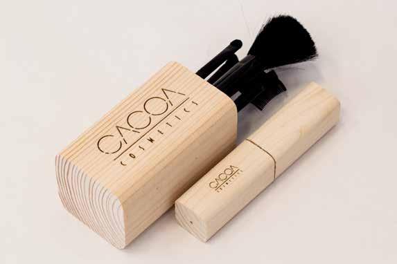
My recent Graphic Design work explores the idea of branding and packaging. Cacoa is a cosmetic brand that combines cocoa beans, chocolate and natural materials together to create a unique idea for one of the worlds largest and growing industries.
I was inspired by the idea of organic products with their clean, environmentally friendly and reusable packaging designs.
The hand crafted wooden packaging and artisan style gives the brand its unique edge. This comes across creative and appealing to its chosen audience, as well as being a reliable product to use and can be recycled.
“Design is the method of putting form and content together. Design, just as art, has multiple definitions; there is no single definition. Design can be art. Design can be aesthetics. Design is so simple, that’s why it is so complicated.”
- Paul Rand
Secondly we move onto my Fine Art practice. I have focused on looking at fine lines and detail to create various illustrative patterns during the last year.
Overall, although the work maintains an illusionary air, it is important that the viewer aims not to judge the work by its most basic function in exhibiting the animal form, as my main intention is that the audience instead, focuses on the majestic style and mesmerising patterns.
Julia Harper
Having started university thinking ‘we’re gonna need a bigger boat’, I have learnt through the past few years that design is subjective and rather ‘like a box of chocolates’. Some briefs are hard, some soft and many completely nutty. University has taught me that ‘no matter what anybody tells you, words and ideas can change the world’. Put your heart and soul into what you do and you will always be proud. Remember, ‘just keep swimming’.
Hannah Heathcote
BA (Hons) Fine Art and Photography
Hannah_heathcote93@hotmail.co.uk
As adults we seem to lose focus on the enjoyment of having our photograph taken. The finer details like hair and make-up become more important, unlike when you are a child. Children are unaware of their image and what is going on around them, it doesn’t seem important that their hair could be a mess, or what kind of facial expression they should be pulling. This is what I have captured in my work. I found it intriguing, that every time I pulled out the camera and took a photograph of my six-year-old sister, she would turn around and pull a ridiculous facial expression (depending on her mood). I wouldn’t dream of pulling that in front of any camera.
Science and Art: The combination of these two subject wouldn’t genuinely cross people’s minds. Nevertheless, they have a link which brings them together. Throughout my work I’ve explored the on-going relationship between these two subjects. This is what I have captured within my work, combining the realistic with the not so realistic, combining Science and Art.
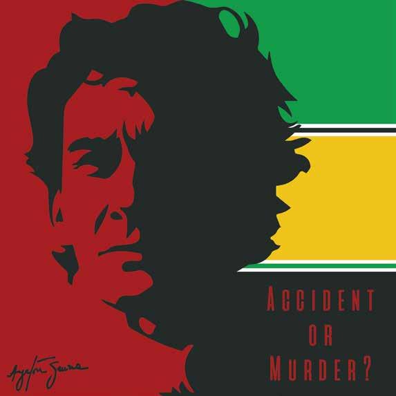
Spencer Heywood
(Hons) Graphic Design
Ayrton Senna was a Formula One driver whose unfortunate death has been the subject of conspiracy theories over the years. This piece looks into the idea of whether it was an accident caused by the car or whether the conspiracy is true and in actual fact Ayrton Senna was murdered.
Rebecca Lea Higginbottom
BA (Hons) Fine Art
For this project I have been interested in creating abstract textures within art and to ensure the surface of the work is the focus of the piece rather than its representation. This eventually developed into the creation of textural monochrome paintings created out of furniture upholstery. My final piece consists of an assemblage of monochromatic works of varying shapes and sizes. By creating all of the work in the same colour and similar format, you can carefully examine the pieces and see evidence of their creation, such as the visible stitches and staples, that would ordinarily be concealed in ‘finished’ works.
The presentation for my work has revolved around the notion of auras in art in relation to display and how displaying art in a formal style creates feelings of importance or transcendence. As well as the idea of art being nothing more than an object and a piece’s value being decided by an audience, I wanted to create a conversation with the viewer about the traditional conventions of display and in choosing to display this work as an informal assemblage on shelves. It was my aim to create an ambiguity in the mind of the viewer, forcing them to judge whether or not the work is even completed.
Michael Paul Holden
BA (Hons) Graphic Design and Photography
michael.holden94@hotmail.com
Behance/Flickr username: MPH94
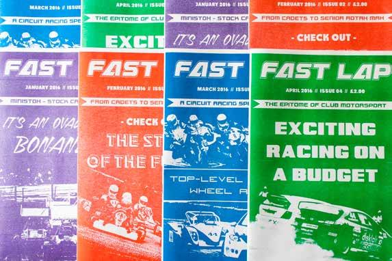
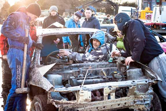
During my final year at the University of Chester, I have had the wonderful opportunity to combine my passion of motorsport along with my graphic design and photography projects. Although these ventures are done on various platforms (and in most cases cross paths), they all share similar intentions – to highlight club motorsport!
Both of my conceptions were inspired by the lack of reportage club motorsport gets in the media (unless sadly there has been a serious injury or death). From previous experience, I have found these grass root events more enjoyable to watch live and are better to interact with the teams. There are fewer boundaries and politics involved.
Within my graphic design work, I devised a range of fanzines that focus primarily on promoting club motorsport. My aim with the designs of these publications was to strip away the glossy features one normally sees in magazines and instead
offer a raw, unvarnished alternative. In order to achieve this, I printed all these spreads on a risograph printer, as I felt the textures were able to replicate the ‘feel’ of club motorsport.
Moving onto my photography, this is a visual narrative of what occurs ‘behindthe-scenes’ of a typical club motorsport event. When watching this on the television, viewers are unable to witness the commitment these individuals put in to get these bikes/cars out for the next race. My series of prints shows that it does not matter what style of motorsport one watches, the passion, adrenaline and determination these families and friends share is universal across all disciplines, and is a true testament to grass roots motorsport.
Holgate
Photography and Graphic Design
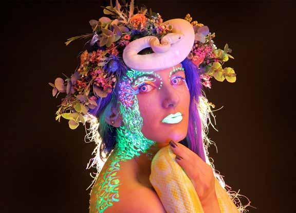
BeaUVty Is In The Eye Of The Beheld is a series of images combining the relationship between beauty and ourselves and how our perception of beauty is in the eye of the person in the mirror. The subjects have all portrayed their interpretation and characteristics about them, that make them a unique beauty, through a digital medium using UV paint as a form of expression of their inner thoughts to be shown on their exterior. This project explores the range of beauty, and how our personal interests, personality, spiritual and conceptual views of the world inform our own views, and of what we see as ‘beautiful’ within ourselves.
This series sets out to establish a first person perspective of self love. Taking influences from how a black light can show our skin in a different light from experiences, whilst connoting positive reinforcement towards the beauty industry, as all the subjects have niche looks that differ them from mainstream modelling.
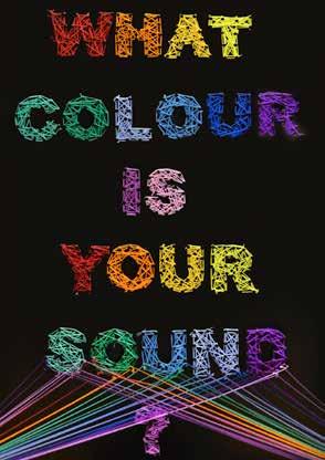
What Colour Is Your Sound? is a multi-sensory experience to gain perspective on what it’s like to be Synaesthetic; a person who can combine two or more senses. Linking the relationship of colour and sound as a combined medium was an important factor from the beginning, on discovery of my Dads personal Synaesthesia and how he utilized his abilities to mix audio recordings to produce colourful displays in his mind. I was fascinated by my inabilities to understand how he sees.
By interacting with the self contained surrounding colours, shapes, words and sounds, each experience is a unique depiction to each user. This project sets out to communicate a visual display of the condition, whilst being informative through its online presence, where users can compare their experiences at WhatColourIsYourSound.com, and absorb acknowledgement of the condition as a secondary perspective of what it is like to see sounds, and hear colours.
Jodie Howard
(Hons) Graphic Design
Hello! What excites me about design is the way it can influence people’s thoughts and mood while also communicating a message. I have used colours encased by an invisible outline in my work. In this book, it intrigues me when using block colours to create shapes and objects that our brains can still understand what is being portrayed without much detail. This may have stemmed from my love of cartoons and animations which themselves quite often restrict their colours with a black outline.
Going further into my particular studies, I have a great love of illustration and animation whilst discovering a lot more about Graphic Design as a craft. I’m sure anyone who is/or knows someone who is involved in Graphic Design has had the discussion about how wide the subject is (“It’s not just Adobe Photoshop and fancy handwriting”). I’m also intrigued about how design integrates itself into society and popular culture. We have a Starbucks on campus and the university itself has its own wine and water bottles, it’s so common to see design it’s thought-provoking to
consider what we subconsciously take in from design every day.
My project in the show is based on introducing the discussion of mental health at a young age. During my psychology A-level in 2012 my teacher discussed the campaign to make mental health more talked about and less of a taboo subject, I think it’s important that we introduce this thinking sooner to children since it well help them understand what some people may be going through in their life, like family or teachers, and it will also potentially help them if they experience mental health problems in the future. To do this I have made an animation of characters to illustrate some mental illnesses and character models. Alongside these are a kit which comes with a simple guide of a lesson plan, some clay, a step to step guide on making the characters with the clay, and a disc with the animation on it. The service would be available for schools and children centres.
Thank you for reading!
Gill Hughes
What started as a journey of selfexpression soon became personal narrative of childhood hopes and dreams. My daughters who feature, have become a representation of my younger self. Being a parent is a stark reminder of the passage of time, with the realisation that life is short and giving thought to lost dreams and forgotten pleasures. My photographs have mostly been taken around the coast where I live, the beaches offers a feeling of infinite space and sense of freedom which I yearn for. They remind me of idyllic childhood memories of carefree days at the beach, when the summer holidays always seemed long and hot.
The use of the lens-less cameras is important to me, as it creates images which are reminiscent of a nostalgic past. The soft focus gives a dreamlike quality
which adds to the atmosphere and the light leaks and flare implies to me hope of regaining those innocent childhood aspirations. The slow shutter speeds which allows for the blurring of moving figures, producing surreal ghostlike apparitions which creating an ethereal mood.
I initially intended to keep my Fine Art and Photography as two independent bodies of work, however the fine art has naturally evolved to compliment the sentiments of my photography.
In Fine Art I explored alternative ways of treating my photographs until I found a process which I was happy with that emulated the ambiance of my photography.
Kate Jane Hughes
BA (Hons) Graphic Design
The theme of my work has been orientated around a direct focus on seasonal affective disorder forming a variety of contrasting designs for each component of furniture pieces. The important influence of my work has been based on my life long interest in effortless illustrative work; simple doodles as such have built up the majority of my work portfolio. I am extremely passionate about this subject matter and wanted to express this in the designs of my work. I exploited this area of interest, channelling the visual appeal of illustrations with a handcrafted value. In my final project working with
interior design I recreated a living room setting with my designs as the pattern for each piece. The practice of patchwork making and screen-printing have been the main techniques applied in my project in creating the contrasting vibrant and homely fabric pieces. I wanted to stress the value of homeliness in correlation with the illustrative work to convey a sense of my personality, in the hope of translating a sense of myself in the visual presentation of my work. One of my biggest inspirations is Cath Kidston because of the visual appeal and the values that are put in place to support the brand.
Olivia Hughes
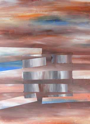
With an abstract and decorative approach to art, this body of work explores abstraction of natural forms and architecture combined, focusing on the formal elements; colour, line and composition. I am questioning how human interaction is continually having a negative effect on natural environments disrupting nature and natural landscapes. These paintings are combining these delicate elements from nature, with the bold architectural structure and pattern. I am taking something which is fragile, temporary and unappreciated, for example the rugged edges of a broken leaf, or the surface pattern and rich colours in a decaying tree. I explore the formal properties of these objects, emphasising the primary forms of nature, stripping away the parts I don’t consider essential to just focus on abstraction of the shape, line, and colour. Each piece begins with carefully planned structural elements, and gradually the work continues to develop into something individual over time creating its own identity. Beginning the painting I do not know what the finished outcome will be. Like a tree, each begins with a structure and then over time becomes unique. I am interested in finding something interesting in what would be considered ordinary or overlooked. The idea is to not go out and look for something out of the ordinary or unusual, but transforming something ordinary or overlooked into something more significant.
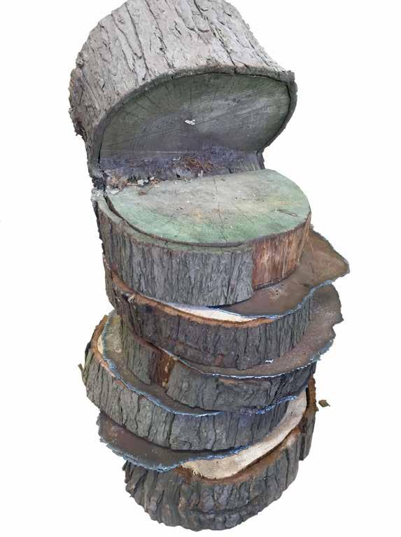
Adam Jones
(Hons) Fine Art
As an Artist, I am reacting to my direct environment with the use of found objects and materials that lay within this environment to inspire my series of works.
The environment itself is part of my family history as both parents and extended family members have been educated or worked within the Kingsway Campus where I am now completing my degree. This history of my family tree is poignant and linked to the use of materials found in my work.
All the trees used in this series of work come from the Kingsway campus site. Judging both the age of the trees and my family members’ dates of attendance, both would have been living and breathing in the same location at the same point in history. I have also found interest in the building’s development and extension; this has also had a strong influence on my work and the man made materials from which they are constructed.
The inclusion of these materials and the colour coordination these materials possess while interrupting the natural aesthetic of the trees, is what, I feel brings all of my work’s inspirations together.
My interests come from the mundane and unnoticed areas that we pass from day to day. I draw semi-abstracted landscapes based on random photographs I have taken of such areas from walking around Chester. It is not important what area is being referenced specifically in my work as the end result is what matters and how it is interpreted by the viewer. The original area I choose is only a means of helping me loosely construct a composition to work with in my mark-making style. The areas or buildings I choose to work from always have an element of straight edges or geometric shape that become a focal point in the pieces.
Craig Lee Jones
BA (Hons) Graphic Design
craigleejones@mac.com craigleejones.wordpress.com
“There are three responses to a piece of design: yes, no, and wow. Wow is the one to aim for.”
- Milton Glaser
I certainly did my best to aim for ‘wow’ throughout my three years here at the University of Chester. It’s been stressful at times, but then again nobody said it was going to be easy. I also couldn’t have done it without the help and guidance of the lecturers and technicians, without them being there for just a ‘quick chat’ (usually lasting about an hour) I would be a complete mess so thank you! A quote that I came up with myself was:
“There is more creativity using the lead in your pencil than using your fingers to push a mouse on screen.”
- Craig Lee Jones
So that is it, my time in university is done, I am excited for the future and looking forward to begin a new adventure.
Nia Jones
In Fine Art, I have been exploring how lines and shapes can disjoint a painting, as building up layers of paint can create depth and dimension. Parts of my paintings have been collaged to create another aspect of layering. The lines and collaging are placed in a consistent manner giving the painting form and structure. This is indicated by the repetitive geometric shapes that are repeated throughout the painting. As an artist I am also interested in colour and experimenting with different textures, in order to engage the viewer.
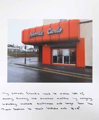
In Photography I have explored the relationship between my family and North Wales, as I have lived in the area all my life. The work focuses on memories
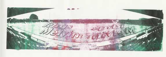
and the journey from past to present. The images have a theme of isolation due to the decline in tourism which has unfortunately destroyed businesses and the economy. I have taken images around Rhyl which have been accompanied by hand written memories from my parents who have grown up around the area. I also have a collection of postcards which I have sent to various members of my family who have also shared their memories of Rhyl. I have always been interested in how the decline of the town has affected the local community - my images are a way of documenting the deterioration of a once popular town.
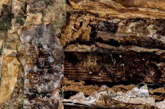
Katya Kirby
My practice explores the realms of abstraction. My photography draws attention to unusual spaces; closing in on the subject to capture detail that concentrates on colour and texture. I challenge the viewer’s perception by restricting their focus. The isolated nature of these images obscures the context and allows the viewer to concentrate on colour and texture before understanding the unidentified spaces. Inspired by Abstract Expressionism, I capture energetic marks from the natural decay of machinery that reflects painterly qualities. I draw attention to detail that is overlooked, capturing
rusted and weathered texture from raw, industrial materials that show traces of their use and highlight that aesthetic qualities exist in mundane places. With my artwork, I take inspiration from my Photography. I manipulate my photographs through hand printed means to exaggerate colour and texture with the aim to create a visually aesthetic and stimulating experience through the presence of vivid, loud colours and interesting textures.
Holly Langtree
As a combined student my work reflects both of my practices by using my photography practice to show I am an Interdisciplinary practitioner. My typographic project for Graphic Design focuses on how typography can portray the five senses, to see, to taste, to touch, to smell and to hear. My work communicates this through chosen typefaces and data I collected from my questionnaire research, using the signifiers to find an appropriate way to show this.
My photography work is a complete contrast. I photograph collections and how people collect the unknown without knowing it. Showing this in a completely different way, it almost takes the approach of abstract art and paper origami by using leaflet and paper ephemera to capture a picture that has more depth to it than just a simple flat image.
Together, both projects are very different from one another and show how passionate I am as a creative individual, using both practices in both assignments and showing what I can do best in a professional manner.
Kerri Mackay
Colour and pattern is a central focus of both my practices. My Fine Art project involves the exploration of pattern and decoration through the use of collage techniques. I started off my project using only paper, creating different paper formations and exploring paper as if it were a three-dimensional material, finding ways in which I could transform the material to make sculptural forms. As I progressed further along with the project I incorporated a variety of materials into my work, such as different types of paper - tissue paper, tracing paper, as well as exploring three-dimensional materials such as MDF, pipe cleaners and PolyFilla. The formation of my work has been heavily based around layers and cut out elements, the addition and subtraction of materials, in order to transform the image from its original composition. I found that adding layers to a composition not only distorted the image but also the piece became more abstract, which has been a key feature to my work. My final outcome has reflected my experimentation throughout the project, such as the investigation of the surface of materials
and how the reverse of the material can differ, as well as physically changing the aesthetics of a material and the composition with the play of layering.
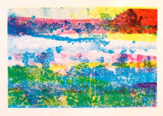
My Graphic Design work consists of exploring people’s perceptions of a city. My piece is based around audience interaction and how people feel towards a city via the use of colours. I began my project by researching into colour and light, particularly light projection artists and exhibitions. From then on I wanted to create something, which involved the audience, something that was physical and playful. I wanted to keep colour as a significant element to my work, as I think it is individual to everyone as colours mean and reflect differently from one person to another. My final exhibition involves a light projection, containing images of cities, which are in the formation of a shape. The audience can use the acrylic squares to place over the projection creating any pattern/image they desire, which they find personally representative to them.
Lee Markall
(Hons) Graphic Design
Over the past five years in higher education for creative design I have developed many skills ranging from illustration, photography and many more sectors. I am happy to have followed this path I have taken, and with confidence, say that graphic design is what I want to do in my future career. This experience with colleagues that I have gained through this time has helped me develop as a designer and I cannot thank more for this experience, and with this I have not only been moulded as a designer by the past few years but have also developed as a person.
“If you’re doing what everyone else is doing, your doing it wrong”
- Casey Neistat
I believe that these words embody what it is to be a designer; you cannot simply follow the crowd in the creative design sector. The way to stand out is to try something new and to make your work unique, push the boundaries to what is possible with design, experiment to places that others may have been frightened to go. This what I look for in my work as I start my design career.
Chloemayo94@hotmail.com
http://chloemayo94.wix.com/cmgraphicdesign
Victoria McFaul
BA (Hons) Fine Art
vmcfaul@outlook.com
The focus of my recent work is all about truth to materials and the idea of luxury. I’ve made a limited collection of pieces all made out of clay and other cheap materials revolving around the idea that if I take the clay, a relatively cheap material that wouldn’t be considered luxury or valuable and I spray paint them colours people see as luxurious and relate to valuable objects and items such as gold, silver and bronze, then can I trick people into believing these pieces are worth more than their original value? The other focus is the fluidity of the pieces and how they travel around the gallery, allowing you as the viewer to
follow them around and travel with them as they evolve or devolve. I’ve really been influenced by artists such as Pip and Pop who create fabulous flowing floor pieces that travel around their gallery spaces. As I have been experimenting with clay and pushing it to its limits and breaking points, I have also been influenced by textile artist Anne Kyyro Quinn by the way she makes her fabric folds and I have tried to implement and imitate fluid fabric folds like these in my work. The pieces are travelling around the studio and gallery so keep an eye out for the 10inch silver, gold, bronze and black pieces at your feet.
Laura Jane McHale
My work represents the process of creating realist paintings and stripping them down to an abstract form. I began this project with the aim to paint detailed portraits that expressed various emotions. I have always had an interest in studying the human face; every face is different and tells a different story. However, when I began to paint I became aware of the fact there was a theme in the colours, media and methods I was using to create my work. The fact I was studying from original photographs made me think about the lighting that was cast across my model’s face and how this exaggerated the contours in his face, therefore enhancing his facial expression and then the emotion that was being portrayed through all of this.
The emotion that came across in one of my photographs was fairly intense and this was achieved not only from the obvious qualities, such as the facial expression of my model but also because of the dramatic and almost theatrical lighting. This lighting
was only highlighting sections of his face but leaving other parts in shades of oranges and reds that gradually blended to a dark shadow, leaving the background completely black. These highlighted sections of the face, with the enhanced contours and vibrantly contrasting shades, stood out to me as something that can be linked to our own identity in the way that we do not always present ourselves fully; we often only give sections of our true identities to others and keep the rest in the shadows. This is the why I have chosen to pull my full scale paintings apart and have stripped them down into sectional studies, representing the raw qualities that make us who we are.
I have finalised this project by stripping those sections into various focus points such as; the contours that make a face, the colours that are so vibrant in the bold lighting and finally the experimentation of using certain paints and techniques when creating portraiture.
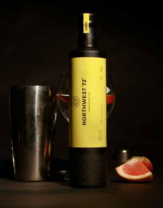
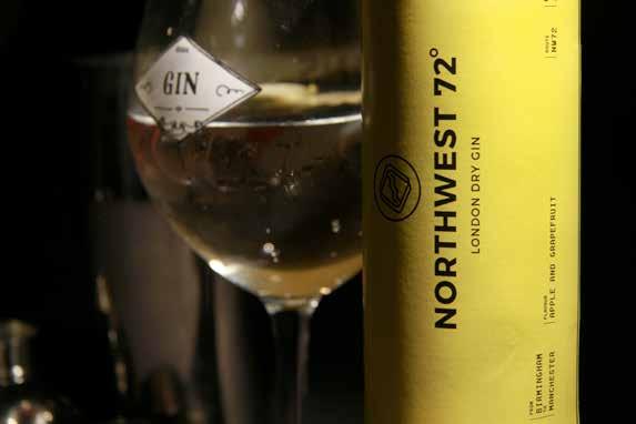
Rick Meads
(Hons) Graphic Design
(In collaboration with Jordan Walker)
We are Northwest 72 . A new gin motivated by the urban connection between Manchester and Birmingham. Our brand aims to capture a new demographic by promoting elements of night-life through the use of a vibrant colour palette integrated with a contemporary graphic style.
We have built a brand narrative that reflects our vision to connect people through urban environments. We have achieved this with our name referencing the compass bearing
between Birmingham and Manchester, our label composition and typography inspired by the modern day train ticket and our bottle designed using a tactile element to represent the texture of the streets.
Our product boasts a unique blend of 12 botanical elements, with a focus on Apple and Grapefruit as dominant notes. With a concrete attitude and desire to differentiate from our competitors, we have crafted our brand to break down the stigmas surrounding gin as a drink for an older audience. The city, the sound, the people.
Northwest 72
Jordan Mercer
(Hons) Graphic Design
I have always been an avid pub-goer, preferring the simplicity and friendly atmosphere of the local than a bar or club. Unfortunately for many years, traditional pubs have been on the decline due to people favouring the purchase cheaper alcohol at the supermarket and drinking at home.
For a while now I have been a follower of the Campaign for Real Ale (CAMRA), mostly for their work in trying to save pubs. Through this project, I hope to help people to fall in love with pubs again, creating something that can be used to great effect both at home or in the pub.
Sarah Morgan
BA (Hons) Fine Art
Morgan.sc@aol.co.uk sarahmorganroberts.com
I find traditional portraiture completely uninspiring and uneventful. Yet in this strong distaste I have found my niche. The fundamental concepts to my work are a subtle hint of tradition that is confronted by a mocking and more contemporary element.
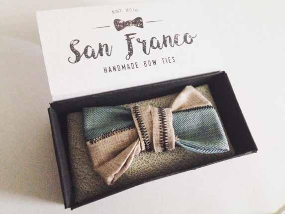
San Franco is a product that focuses on handmade quality bow ties. Each bow tie is made with recycled material and has a unique design which is fun but also has an elegant feel.
Kiera O’Brien
BA (Hons) Graphic Design
obrnkiera@gmail.com www.behance.net/obrienkiera
The difference between an artist and a graphic designer: One says ‘it’s finished when I feel it’s finished’, the other says ‘I will have this done by the 30th.’
Through illustrated prompts and motivational guidance this book encourages creativity and experimentation. Whether you are a designer or not, look for inspiration all around you and notice design in unexpected places. Take this book everywhere with you and have fun creating.
A passionate creative making the world a more interesting place, one brief at a time. I’m excited for what the next adventure will bring.
Matt Oxley
By using the two disciplines of Fine Art and Graphic Design, I have had the chance to work on many different briefs and areas of concern. My work often mirrors my interests in technology and craftsmanship and by using equal measures of these, I have continued to keep my ideas open. Whilst reflecting upon the work carried out over the past year, I think I have reached a level of control within the process of making a variety of different styles of work.
I am eager to continue developing new skills and taking my practice further but right now the exhibited work is a picture window into my thinking. On the one side I have looked to create visual artworks and sculptures which fall under the Fine Art module. The theme of these artworks is to question the comparisons and differences between technology and real-life and how common materials can be used to show a
degree of abstraction. The subject matter in the artwork is often surrounding molecular structures and indulging in their conceptual forms and further distorting their qualities.
On the other hand, my work in Graphic Design is directed towards a more definite response to creating a range of products which could fit into our homes more purposefully. By understanding various scenarios around the home, I have hopefully struck a balance in creating objects that possess beautiful forms and innovative functionality that fit into certain places. The range is focused on the use of new technologies with materials that were more commonly used in Hi-Fi Systems of the past. Sensory technology is something which particularly inspired me to establish new ways of developing common objects placed around our homes to become more useful, with higher levels of interaction between person and object.
24 Hour Party People
This project follows and captures the spirit of the new Brit pop/indie Chester based event ‘Fools Gold’. It tells the story of the journey from when it first started right up until now whilst documenting the characters it pulls in every single month. With every image being taken from an insider’s view each photograph shows the party goer in their true, relaxed form with expressions and hand gestures becoming a very interesting factor in the project. A lot of the music played on this night is from the time of The Hacienda Club in Manchester, which this series of black and white images look like they could even be from the time of. An instalment I hope music lovers will enjoy.
Within my Graphic Design, I undertook a project that incorporated photography and design with textiles and print making. The idea was to create a collection of hand printed fabric that would promote positive thinking (through the colours and designs) when used in the interior design of a home, i.e. as curtains, cushions, lampshades, etc. Displayed are examples of these fabrics along with some handmade products created out of these fabrics to show how they could be used in the home.
Isaacs Jefferson Phiri
(Hons) Graphic Design
An exploration into African prints and mainly focusing on Zimbabwe as the starting point to make a fashion brand that has style and is worthy to be a high street brand. It takes the essence of what the print is, tribal, cultural and a colourful expression of one’s self, to make into a globally appealing fashion style/ trendy brand.
From Burberry with Scottish tartan, Versace with Roman and Greek style inspired by their mythology and Louis Vuitton’s graphic symbols of quatrefoils and flower inspired by Japanese and Oriental design from the late Victorian era, these major brands will serve as a guide on how to achieve popularity and make the brand into a must have for consumers around the world. Zimbabwe has a rich architectural history with multiple design styles, flora and
fauna that people from around the world come to see, and a landscape that offers nature’s own design style and patterns.
The prints vary from hand painted, screen print, lino cut, paper transfers and tiedye. Some are a mix of printing methods to test out the quality and style as the different methods used yield different results on the final product. The end result showcases a brand of t-shirts, jeans, snapbacks and shoes that are able to show a point of origin/inspiration, unique styling and a strong brand identity across the whole range.
I am an illustrator who finds joy in the creation of pieces of artwork from scratch, and for the love of all things beautiful and elegant.
Conner Preston
BA (Hons) Graphic Design
I am a Graphic Designer with a big passion for logo & branding identity. I take inspiration from my surroundings, if I see a logo on the side of a container I will take a picture of it. With my passion for logo’s I have researched some of the logo greats such as Aaron Draplin, Steve Wolf, Paul Rand and many more. My main focus for an idea is the story behind it. Any Graphic Designer can make good design, but to explain the reasoning behind it and why you have gone down that path is what I have discovered over the years is key for clients. I wouldn’t be where I was today if it wasn’t for my love for Motocross. I started riding at the age of six and have done it for fifteen years to where I am now at the age of twenty-one. I got my first taste of
Graphic Design making vinyl graphics for Motocross bikes and knew design was the path I wanted to go down. Alongside that, Motocross has taught me the effort and sacrifice it takes to be good at your desired profession and I have used the highs and lows from my one and a half decades of racing to continually improve and learn in Graphic Design. If I could get to the point in my career where I’m mostly designing logo’s and brand identity for companies would be a nice accomplishment, but I love design no matter if it’s a logo, advertising or editorial. As long as I’m doing what I love to do, I’ll be happy.
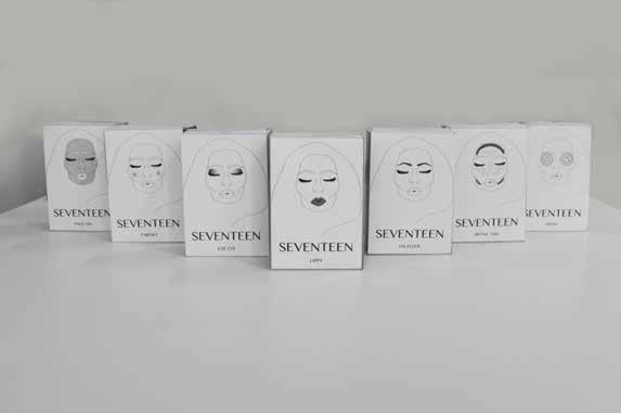
Rach Rizzotti
BA (Hons) Graphic Design
Rachel_rizzottixx@hotmail.co.uk
My passion for makeup has been around since an early age; it’s all about presentation and first impressions. I wanted to make sure that this was present in my final piece, reflecting both my interests and style of work.
For my final piece, my aim was to rebrand the makeup company SEVENTEEN by modernising the logo and recreating a more vibrant look for the brand. This involved changing the logo of the brand as well as the whole colour theme and style of the packaging. I decided to completely change the way customers look at packaging when buying makeup. Each box shows you
exactly what product is without having to look at the contents inside, alongside that introducing the colour coding around the outside linking to the category of each makeup product i.e. eye shadow, lipstick.
I wanted to create brand recognition without promoting a model or anyone in particular; therefore, I illustrated this face, which has become the focal point for my final piece. The face shows versatility as it is displayed on all the packaging and shows the customer what the product is by having a section of the face highlighted. The section will differ in colour depending on the colour of the product is inside.
Emily Grace Robinson
I love the feeling of experiencing new things and places for the first time. It’s a feeling that’s short lived and can never be felt again for the exact same thing. To me, it’s a feeling of curiosity and perplexity. This is why I wanted to create something unseen, by combining unusual compositions and playing with the aesthetic qualities and properties.
When I started using expanding foam I was exploring ways to be able to manipulate and control the formation which developed the bizarre idea of containing it within balloons. The resulting objects reminded me of shrivelled brains (prompting me to think of mental illnesses such as dementia). This current piece hanging has been
created from using the more restraining and controlling methods and materials used in the 19th century in mental asylums to give the piece a tense and restricted sense with the realisation of the amount of control it’s under.
Eva Hesse has been an influence in my work, encouraging me to exploit body references as she did in her work. Although, I have encouraged other interpretations in these balloon forms to provoke more ideas generated from the combination of the viewer’s memory and my work in front of them.
Hannah Ruth Rossetti
BA (Hons) Fine Art
A series of interconnected movements, moments, memories and thoughts in life.
My recent work stems from an ongoing interest in memory; how we classify, organize and memorialise events in our lives.
The modification of objects and their transformation is key. Throughout my practice my approach to making has been almost instinctive. Underpinned by the impact of my father’s trade as a carpenter and my own position as a mother has played an integral part in my work, guiding my use of materials and their transformation creating new identities with a personal yet ambiguous narrative.
I am playing with the ideas of the Abject, Abstraction and femininity. I create through questioning, re-phrasing, construction, de-construction and re-working a range of sculptural matter. I am an artist and collector and have accumulated an
abundance of materials with which to initiate projects, excited by every new find, be it mass produced, the opportunist skip dive, charity shop gem, or second hand find; the possibilities are infinite.
I have been greatly inspired by the work of Duchamp, Louise Bourgeois and Chiharu Shiota and many more.
My work describes stories or memories, the details of which are imparted bit by bit in layers, creating a puzzle, assembling the pieces so they flow together with a sense of belonging in an uncanny way. I view this work as a metaphor for these ideas. I have enjoyed working and discovering within this complexity of revelation.
“It is in playing and only in playing that the individual child or adult is able to be creative and to use the whole personality, and it is only in being creative that the individual discovers the self.” - D.W. Winnicott. (Playing and Reality)
Yasmin Rowlands
BA (Hons) Photography with Fine Art yasmin.rowlands@hotmail.co.uk http://yasminrowlands.wix.com/mysite
My photography represents my relationships with individuals. I have captured women and the beauty within them. My vision is to create something that is pleasing to the viewer’s eye, whilst my motivation to create my work came from my love of fashion and portraiture. My aim is to have a soft and feminine feel to my images. Having a love for fashion I wanted incorporate that into my artwork. I have created expressive pieces using a variety of materials and paint. I have incorporate dashes of colour with a mixture of neutral tones using paint, whilst having the element of fabric to bring in texture.
My Photography and Fine Art work have some similarities, mainly being that they are both ‘raw’. Within my art pieces, they are expressive and don’t represent anything, whilst my photography is raw in the sense that the whole shoot is styled by myself. There’s almost stillness and a peaceful feel when you look at my photography work, which is a sense you get from my artwork too.
Aaron Dennis Russell
Hi I’m Aaron Dennis Russell, a Graphic Design student based at Chester this past year. This is Ground Level - a brand that I have produced to bring people back down to earth from a height. My aim is to leave messages about modern culture and wakening people from their sleeping state of mind.
One of my favourite quotes comes from a film called Hugo. Hugo Cabret says, “Everything has a purpose, clocks tell you the time, trains takes you to places. I’d imagine the whole world was one big machine. Machines never come with any extra parts, you know. They always come with the exact amount they need. So I figured if the entire world was one big machine... I couldn’t be an extra part. I had to be here for some reason. And that means you have to be here for some reason, too.”
I think that the human race hasn’t reached their full potential, by expanding our mind to conform to technology are we not just putting our self out of action?
Does buying a named brand make you any more of a person than that of someone who is homeless? Is class, religion, and belief just a mechanism to separate us from one another so that we don’t march forward and bring the real terrorists to justice? (If justice even does exist at all). I welcome you to my final show there you will be given your stomping ground.
Taiwo Adesina Sangster
The focus for my works has been the reinterpretation of the Adire (Tie-Dye Batik) textile patterns of the Yoruba people of western Nigeria in West Africa. Traditional Adire textile patterns originated from history, legends, myths, proverbs and the observation of the environment. I have always been excited seeing the patterns and colours of those textiles fabrics and often wondered how they were done. As a University of Chester undergraduate, a great opportunity was given to me to experiment more with the textile patterns in a painterly way.
I am interested in the relationship between patterns and colours by using painted and drawn surfaces, but then I do not want my
work to be flat - I wanted it to have depth and texture. I like the rich smooth texture of colours that resulted from the painting. I also use found materials to further enhance the textual nature of my painting. The ideas are to create schematic colour drawings where you have a threedimensional effect.
I am using my works to define and expand on the ideas of freedom which you see in the movement of the colours drawing in my paintings and I enjoy the process of making the paintings. In order to get the free movement in the painting I use acrylic paint with PVA glue as this create flexibility in the paint which allows for free flow of the colour and drawing.
Graphic Design fuels how I view the world. It allows me to be curious and to explore. I have a love for solving creative problems and pushing ideas as far as they can go. I have learnt that you can take inspiration from anywhere and transform it into much more. With an infatuation with beautiful things, designing allows me to leave my mark, even though I always struggle to deem a design finally complete. Typography is everywhere and I have developed a keen interest in the subject during my time at university. The choice of typeface and arrangement of lettering can convey so much in a design and is a main focus of my practice and final degree
show project. Looking particularly into the emotions behind letterforms, I also adore combining colours and hope that my work is as fun and enjoyable for the viewer, as it is for me when I’m creating it. I aspire to make my way into a career that involves typography. I have thoroughly enjoyed the beginning of my journey as a designer at university. There are so many things I am looking forward to learning as I enter the diverse world of the design industry.
“Thinking about design is hard, but not thinking about it can be disastrous.”
- Ralph Caplan
Emma Jade
Well what can I say, A creative blonde bursting with fun and laughter, keen to see where her Degree will take her. Let the next chapter begin.....
Paige Tayla Slade
BA (Hons) Photography with Journalism paigets@hotmail.com
https://paigetaylaslade.wordpress.com/
This project explores how dreams and the subconscious affect our imagination. I have a keen interest in the ‘fantastic’ and I often pass the time caught up in a fantasy novel. I found that these novels have often influenced my own daydreams. I have always enjoyed things that take me out of this world and into another; it’s an escape from reality. The process of imagination and daydreaming is combined with my love/transformation through post-production techniques could lead to an interesting result.
I looked at Freudian theories on the interpretation of dreams and how dreams affect art. I found that Freud believed that dreams represent deep-seated secret desires that are kept in the subconscious mind away from societal judgment and are released while we sleep. So by looking into my own subconscious imagination and daydreams I could access a part of me that many people are unaware of, and I might be slightly ashamed of.
The work reveals fantasies of a world within our own that we are oblivious to. For me this is a release, to show the world my secret passion for the otherworldly, something that I carry deep within my soul. Turning to multiple exposure and manipulation techniques, which merge human portraits with nature and its elemental energies connecting my work with my inner subconscious.
The work crosses over with advertising and commercial culture. Editorial practice has had an impact on the outcomes for this project, leading to large-scale work. Visual culture and theory assist with negotiating the relationship between fantasy and reality, examining the ways in which the imagination and utopia are signified and connoted, can be different per individual. Using clouds as a metaphor throughout my work as a symbol of the imagination and dream world, as they are often associated together; as the saying goes “head in the clouds” .
Madeline Smart
The focus of my third year project has been on the relationship between the internal and external features of the human body and mechanical objects, focusing specifically on clocks.
Our bodies play a vital role in everyday life, as they carry out functions that allow us to live, of all which are taken for granted. Organs are typically perceived as unpleasant and repulsive. The external features of the body are the main concentration of one’s attention, whilst the intricate internal structures and complex systems are ignored and unacknowledged. Likewise, to the structure of a clock, the face is what makes the object visually striking and is primarily focused on. Arguably, the internal components are equally attractive, delicate and interesting.
Through my body of work, I have selected and attempted to illustrate multiple sections of the organs and clockwork, to emphasise the importance of the overlooked interior and the fascinating shapes that create the body and mechanical objects. The combination of both subjects also
explores the contrast between the animate and inanimate, flesh and metal and the modes of different machines.
Typically, images of organs are depicted in a formal, diagrammatic arrangement. However, by using vibrant colours and extravagant patterns, I have tried to present the subject in a playful and appealing manner. By doing so, I aim to decrease this stereotypical ‘gruesome’ perception and ignorant attitude towards the organs.
I experimented on a large scale so that my work would have a demanding presence in the gallery space. I hoped that the impact would compel the onlooker to observe and appreciate the subject and the variety of internal shapes. The collision of the diverse forms constructs a complex, compact and abstract composition, much like the inner structure of the organ systems and clocks. The shapes may not be recognisable at initial sighting, yet I hope that this will encourage the observer to look deeper into my work and recognise the aesthetics in the forgotten internal features.
Bethan Smith
BA (Hons) Fine Art
Basmith17@hotmail.co.uk
With an air of enticing openness, this piece engulfs and encrusts around its environment using deep, glistening blues and greens to create a mysterious, magical and ethereal landscape, while still exploring the properties of reflectivity and translucency using clusters of pale, shimmering spikes. A little fantastical, mystical world built from clusters of glue, glass, foam and sugar sprinkles; structured on top of a Perspex layered table to lure people into a more diverse and interactive environment. A portrayal of an undisturbed dystopia, where the elements are both fragile and sharp, using an aquatic, crystal-like blue to entice people into an almost frosty crystal cave. With connotations to Disney’s Frozen and influences from David Altmejd, Tanya
Schultz, and Roger Hiorns, the piece aims to ‘blur the distinctions between interior and exterior, surface and structure’, with both an ‘attraction and an aggression’ to it, where its aesthetic is to be ‘beautiful but not nice’. This piece aims to tempt people into interacting with it, with its enticing, shimmering and reflective qualities creating a juxtaposition to the sharp, delicate and potential danger of the glass. The piece transforms mundane and everyday materials into otherworldly, ethereal elements; engulfing and absorbing audiences into an aesthetically pleasing, mystical, yet disturbing environment.
Nikita May Smith
BA (Hons) Fine Art
Bright, vibrant and colourful things have always been a recurring theme throughout my work, and a strength I have played to yet again. My work for this exhibition revolves around an exploration of wrapping techniques and contrasts of hard and soft against different patterns and shapes. I have turned everyday objects into something unrecognisable and enhanced their aesthetics. I have taken the norm and turned it into abstract. Since coming to university as a painter my work has changed completely and each year has increased in size and style. My work for this project is more three-dimensional
and sculpture/installation based and I have continued to step out of my comfort zone and push my abilities to the maximum. I enjoy creating a chaotic and contrasting scene for people to be mesmerised by and get lost in, to then be broken up by blocks of powerful colour and objects. The work is very kitsch and playful in an attempt to encourage the viewer to be positive and happy which a lot of people associate being in memories of their childhood. My work with wool associates the old with the young therefore everyone should be able to relate to my piece.
Andrew Spencer
(Hons) Graphic Design
Malaysia Airlines suffered two of the most devastating disasters in aviation history in the short space of four months in 2014, namely flights MH370 and MH17. In the days, months and now years following these tragic accidents, there have been very few definitive answers as to why either of the disasters took place and this has resulted in a barrage of speculation and scaremongering from many within the media that has severely damaged the airlines image.
On 9th June 2015, Malaysia Airlines announced that they had begun a rebranding process that could take up to two years to complete. As a designer with a keen interest in branding I took this as an opportunity to really test myself with a large brief in an unfamiliar industry that crossed cultural boundaries.
In order to tackle this brief, I conducted extensive research into many areas. These included; the airline, its customers, the airline industry and Malayan culture.
My findings allowed me to set a plan to rebuild the airlines battered image and reinstate their customer’s confidence in the airline.
The main problem the airline has faced with its current branding is its association with the two disasters of 2014. This problem could be fixed by eradicating the old brand and starting afresh. However, in doing so, this approach could alienate the airline’s loyal customers that have a connection with the brand. This posed a problem that needed a well thought through solution.
In my approach to the re-branding of Malaysia Airlines , I have found a perfect medium in bringing together several key areas; culture, modern design and the airlines current/historical branding. I have incorporated elements from each of these areas to form a modern and culturally rich airline that has kept its substantial heritage at the forefront of its branding.
Alex Stenner
BA (Hons) Graphic Design
alex-stenner@live.co.uk
www.alexgdblog.tumblr.com
My design is heavily influenced by my own ethics. When necessary, I often apply the theme of equality to my personal work because I take a lot of interest in tackling social issues through my creative ability.
My final project is a design solution for children suffering with bereavement. I have created an interactive children’s book that serves the purpose of provoking relevant conversation with children for when they are placed back into school following the death of a family member. I am aware that the lack of support for children in schools who have lost family members is a massive issue and not enough support is available.
The art style is melancholic and the colours are purposely washed out to express how the grieving process can be such a colourless experience. However, as the book gradually progresses, the colour is restored.
I have enjoyed my time studying at the University of Chester and will continue as a postgraduate to study for a PGCE. I will also take my design skills further by working on personal projects.
Laura Taylor
BA (Hons) Graphic Design and Photography
laura060195@hotmail.co.uk
I have been passionate about graphic design and photography for as long as I can remember, and I have always dreamt of turning these hobbies into a living, and studying at University of Chester has made me realise that I can turn these dreams into a reality.
Both of my projects that I am exhibiting are based around subjects that are very close to me. My graphic design exhibition piece is based on a project that revolves around funny slang words used by not
only my family, but by the majority of people from a place where I grew up, Tipton, in the West Midlands. My photography exhibition piece on the other hand is based on a long exposure project, which is a technique that I have always been interested in, and my intentions with this project were to allow the audience to see things beyond their senses.
I focus on making people start to see scrap and disregarded materials in a different light, and to see the potential in everyday mundane objects. I use objects that have been created for a particular purpose, yet give them the potential to be manipulated in to other roles. Through the use of varying materials, yet mainly metal I focus on how nature collides with the modern world. The industrial being eroded and manipulated by nature, looking at the overgrown decay and rust.
The collision of juxtaposed textures is what embodies my practice as I embrace the playfulness and undercut the monumentalism of traditional sculpture. I purposely weld on show as It’s used as a vessel to organically integrate characterised and burnt colourings. Thus showing it can be used as a practical purpose, but an aesthetically pleasing one too.
The small clusters of intricate detail combined with the stark, clean spacing is vital as I aim for the viewer to be enchanted with the numerous sides of the piece, every side being unrecognisable
from the previous. Thus creating a form of involvement for the viewer, as they have to physically move with the piece’s different heights and scales to appreciate all elements. While focusing on geometric and angular shapes that create a sense of movement and fluidity, the structure defies gravity as it preciously balances, yet looking menacing and trap like with its sinister, sharp and jagged edges contrasted in layers.
I have discovered how sculpture has many practical issues that can prevent progression, however I have recognised how the practical challenges actually start to define the work itself, creating questions about the reasoning behind it as the structural frame work starts to provide more than just support. Sometimes blurring the lines between the accidental and the intentional mark making process. Having embraced a new-found skill of welding, I have massively enjoyed working within a medium that I have never touched on before, truly pushing myself out of my comfort zone, yet ironically it seems, finding my niche.
Eve Chanamon Tochuen
BA (Hons) Graphic Design
evechanamon@yahoo.co.uk
https://evechanamon.wordpress.com
This is one of a poster series I designed for the YCN ‘Save the Children’ brief. The aim of this project is to come up with ways to encourage dads to read to their children, building a strong start in education and literature for their kids from a young age. My approach in this was to tackle it in a personal, heart warming way, reminding all the dads the importance of a family
and the future of their child’s. I used a child-like and care-free theme in an attempt to get the idea across. I created a series of simple drawings and hand written quotes related to the project as I feel like they will represent the rewarding feeling to the dads from when their kids come home from school and give them drawings that they did inspired by the stories they have read together.
BA (Hons) Fine Art with Graphic Design
http://teeullah1995.wix.com/thayfullah
As an artist and designer, I’m the sort of person who likes a challenge. By having this principal, I am able to push myself further and take my projects to other heights. As a result, this has enabled all my projects to be unique and eye catching. Personally, I would not say I have a particular niche style when it comes to art, as I like to explore many aspects within the art world which allows me to create many different styles of work.
My three years at the University of Chester has allowed me to recognise and develop my practice, but also has allowed me to
express my ideas and translate them into physical forms. The works I have chosen to exhibit reflect my abilities as an artist. Both projects took months to complete, and involved many investigations and experiments, to achieve these two final results.
But what do I want to do in the future? I want to be a unique artist with a visionary mind. I want to be fun and creative, and create works that show off my skills and talents, as well as represent me as an artist.
Jennifer Vane-Stobbs
BA (Hons) Fine Art
Jenni@HeyDoll.co.uk
www.JenniferNina.co.uk
As an artist, I have always been fascinated by with organic formations within nature, scientific process and man’s inventiveness with materials. Part of my process is scientific and data driven, through the collection of commonplace discarded objects and the location data. Much of my inspiration for this body of work has come from walking in coastal locations in Wales, observing the eroding actions of wind and waves upon rocks, breakwaters and the washed up beach debris. This provides a rich source of subtle colours,
textures and ambiguous forms, their original shapes worn away almost to abstraction.
Throughout this project, I have attempted to change the meaning and way in which we observe debris, which is often pushed out of view. Bringing the plastic debris into view once more, elevating its worth in a sculptural form transforms it to become a monument of our throwaway modern society.
Angela Walker
I have always been enthusiastic about art, from sculpture, moving art to paintings. I can look at a piece and find something that will interest me in one way or another. My passion means throwing myself into that relationship, goal, dream, or activity. It means casting aside my worries or distractions and embracing instead the delights of the moment or the hope of a successful piece. My passion for art makes me feel fully alive. It is one of the roots of my joy. I have created two figurative painting with some element of water incorporated into them.
Although I love trying new and old techniques when creating a piece of artwork, I always find that I am drawn
to incorporate water. I feel very comfortable when I paint this subject as it has been an interest of mine for many years. Being able to capture moving water with paint is the best way to express my love of art. Having attended many galleries and in awe of portrait paintings, trying it myself has always been my Achilles heel. I was never satisfied with my attempts to recreate a portrait. Not just portraits, the human form is in itself an amazing structure to recreate with whatever media. I wanted to explore my fear of this and combine both water and the human form into the paintings. My enthusiasm is echoed in the hope and energy we stir around us and my ambition and aim was to hopefully express that to the viewer.
(In collaboration with Rick Meads)
We are Northwest 72 . A new gin motivated by the urban connection between Manchester and Birmingham. Our brand aims to capture a new demographic by promoting elements of night-life through the use of a vibrant colour palette integrated with a contemporary graphic style.
We have built a brand narrative that reflects our vision to connect people through urban environments. We have achieved this with our name referencing the compass bearing
between Birmingham and Manchester, our label composition and typography inspired by the modern day train ticket and our bottle designed using a tactile element to represent the texture of the streets.
Our product boasts a unique blend of 12 botanical elements, with a focus on Apple and Grapefruit as dominant notes. With a concrete attitude and desire to differentiate from our competitors, we have crafted our brand to break down the stigmas surrounding gin as a drink for an older audience. The city, the sound, the people. Northwest 72
BA (Hons) Photography and Graphic Design rebecca_weetman@hotmail.com
Being a combined student, my Photography and Graphic Design work are completely different. They are both on different subjects - one on Disney because I have always loved Disney since a young age and it shows different identities within the different characters. My intention was to show the various story lines in the films and I also wanted to show how the Disney characters influence your life and make you want to be like them.
My other work is on Infertility because I found it an interesting subject and wanted to learn more about it. My mum
had an infertile experience so that was my inspiration to find out more about it. I figured that the best way to use this information was in a magazine because it is more personal. Even though my subjects are completely different I had to think about the messages behind the photography in both areas. The message in the photography for the Disney is that there are hidden notes behind the films of Disney , whilst the message communicated in the infertile project is that you shouldn’t give up and that there’s always a light at the end of the tunnel.
Jessica Whitley-Baylee
Photography has been a practice that I have thoroughly enjoyed learning about and experimenting with during university.
The inspiration for my photography project came from an unusual discovery. When we moved house, I found a rusty old box under the floorboards in the living room. When it was opened I saw a key and a handwritten note that read, “This is the key to untold wealth” . This triggered my interest in working with old antique objects. I have become fascinated by the history of these objects and how they seem to maintain a link to people of the past. I decided to use a different technique to take an image other than using a camera. I have used
a flat bed scanner to create my images. I used the scanner because it created flattened space and created unusual focus within the images.
My Graphic Design project revealed itself through my love of animals and how I feel connected to them. I have explored other people’s relationships with animals and their personal connections with pets. I wanted to bring different skills into this project like my photographic skills and also how I like to physically make something with my hands.
Three - dimensional models have been used within the project to create a different view of the animal and to show a connection to a particular person.
Charlotte Whysall
BA (Hons) Graphic Design
charlottewhysall@hotmail.co.uk
Most of my work contains some level of illustration, whether it is by hand or digitally. I mainly work by combining my passion for illustration with other techniques such as animation and interactive things. I am constantly exploring and expanding my practice by keeping up to date with new technologies and incorporating them into my work. I love learning new things and using them in interesting and unique ways, creating something completely new. Which is why combining several techniques and creating new things is what my work mainly consists of, as this is how the job of a creative practitioner has developed in modern times.
Demi Louise Williams
BA (Hons) Fine Art
demi-w14@hotmail.co.uk
This year has given me the confidence to develop work on gender roles and differences. As a female artist I became dedicated to represent the roles women had to fulfil in the ammunition factories. My motivation for this project came from background research which truly highlighted the burden placed upon women when men went to war. Women’s roles changed dramatically as they were left to take control of the ammunition factories, a role historically undertaken by
men. For my project I chose to develop casts of weapons to represent the war, I chose to change the materials they were made from in order to challenge the concept of gender. For example, weapons are generally made from hard materials and associated with men. In order to challenge the perception of gender I created weapons from soft materials to represent the concept of femininity.
BA (Hons) Fine Art and Photography
paigewoods34@yahoo.co.uk
Architecture, form, and a strong sense of design are evident within my work. My Fine Art practice combines multiple printmaking processes including screenprinting, intaglio, and emulsion transfer.
I appreciate the direct creativity and methodology of printmaking, and have thoroughly enjoyed juxtaposing colour with Architectural forms and shapes. I have found that my prints continued to develop throughout, thus creating potential possibilities for future projects. Printing onto material using the emulsion transfer technique has created a degraded and textured surface, which as a result has enhanced the materiality of my prints.
I have incorporated textiles into my practice, because I have an affinity for sewing. The incorporation of textiles led me inevitably into the three dimensional realm. I enhanced the presence of circular forms within my prints, and created 3D objects by sewing prints together.
Repeated pattern, motion and a pseudoscientific reference are present within my
prints. My exploration of printmaking techniques has helped me to realise, that it is one of my favourite forms of art making.
My Fine Art practice has been heavily influenced and inspired by my Architectural images from my photographic work. Throughout my Photography practice, I have aimed to capture the subjective beauty of Architectural structures that dominate our surroundings. I explored the urban environment within the city of Liverpool, photographing Architectural structures that intrigued me. I approached the structures as if they were humans having their portraits taken.
I wanted my Architectural photographs to challenge the notion of constructed beauty, and question whether anything made by man can truly be beautiful. My approach was a methodical and meticulous one; I employed the clean and modular style often associated with Architectural Photography to capture my images.
Calvin Woodworth
BA (Hons) Graphic Design and Fine Art
calvintyler@live.co.uk
Twitter/Instagram: @demedicia
Prior to enrolling at the University of Chester, I had preconceptions of my practice and my intended career. Coming to the end of my final year, I have found my direction has completely changed. Being a combined student, I have had the opportunity to progress in multiple disciplines. In doing so, I have discovered new attributes about myself and my art. I have worked on developing languages, alphabets, and communication, as well as abstract drawing, animal anatomy, and painting. Over time I have accumulated
an eclectic mix of art and design, that has slowly formed into a unique style of work. I hope to continue my studies at the University of Chester to develop my practice even further. University hasn’t been easy, I found myself questioning my work and struggling to justify myself as an artist, but I have been given the confidence and space to develop and understand my art.
“Not all those who wander are lost”
- J. R. R. Tolkien
Jocelyn Woolgar-Jones
The focus of my sculptural work over the duration of my course has been the use of found objects and reinventing them as new entities. For this composition I initially focused on provoking an emotive response. I wanted to intimidate the viewer and I decided the best way to achieve this was through scale. I also decided that black would be the best colour to represent intimidation. I have also utilised black as a way of uniting the different aspects of my composition.
The more I worked the more I realised I had fallen in love with the aesthetic of the sculptures and therefore decided to balance the emotive response I initially wanted with the aesthetic I’d developed. The sleek black lines and shiny surface brought a luxury element to the work. I decided to enhance this aspect whilst bringing something more to the composition through the addition of faux fur. Fur, fake or otherwise, has represented luxury and seductiveness since its conception. This led me to use a mixture of materials not only metal and fur but also wood, plastic and rope.
I wanted to create a visually interesting and somewhat confusing dialogue. To achieve this, I have used objects that are recognisable and then warped them. This intervention confronts what the viewer knows and expects and challenges them to define what my sculptures are. Balance has always been a key feature of my work and this composition is no different. For every choice I have made in one section there is a counter choice made to keep the composition balanced. Creating balance is an aesthetic principle that humans have always practiced in art, also on an emotive level the act of creating harmony demonstrates a need for control.
In summary I have aimed to make the viewer feel intimidated, confused and conflicted. However, because art is subjective depending on the person, I am intrigued to see how the audience reacts. I have also aimed to challenge preconceived ideas of what an object can or should be. Finally, I have aimed to create balance and harmony within the composition.
Maria Worrall
BA (Hons) Photography with Fine Art
My work aims to represent the relationships within families that are hidden from the outside world - the tension, arguments, emotional outbursts and issues that arise from a group of people living so closely whilst trying to meet the conceived expectations of a ‘family’.
These moments are not photographed to be remembered, hung on the living room wall or stuck to the fridge, however locked away, forgotten as soon as the front door is closed on the way out to drop the children off at school. These moments are shut away, only to eventually escape through the cracks behind the perfectly wallpapered dining room walls, or with the steam of the kitchen kettle as a father makes only himself a cup of tea. They may escape with the turn of the bathroom tap, or be hiding under the bedroom rug to be found when hovering
on a Saturday afternoon. These moments may appear and re-appear at any time, creating more moments to be added to the collection of hidden memories, this time in the cereal box, the biscuit tin, with the crisp white fluffy towels in the airing cupboard and with the wires behind the 50” Ultra HD TV. As one escapes more begin to seep into the room. Before you know it they are all out, flying around the room as if you had just hit a wasp nest.
Strongly influenced by my own family life, and my parents divorce, my work explores the idea that there is a hidden aspect to family life that can only be seen by those on the inside.