The State of Design in Nebraska and Surrounding Territories

Actual Architecture
Alley Poyner Macchietto Architecture
BVH Architecture
Carlson West Povondra Architects
DLR Group
The Heartland Interior Design
HDR (Great Plains Studios)
LEO A DALY
RDG Planning & Design
Sinclair Hille Architects
TACKarchitects
Premiere Issue Fall 2023
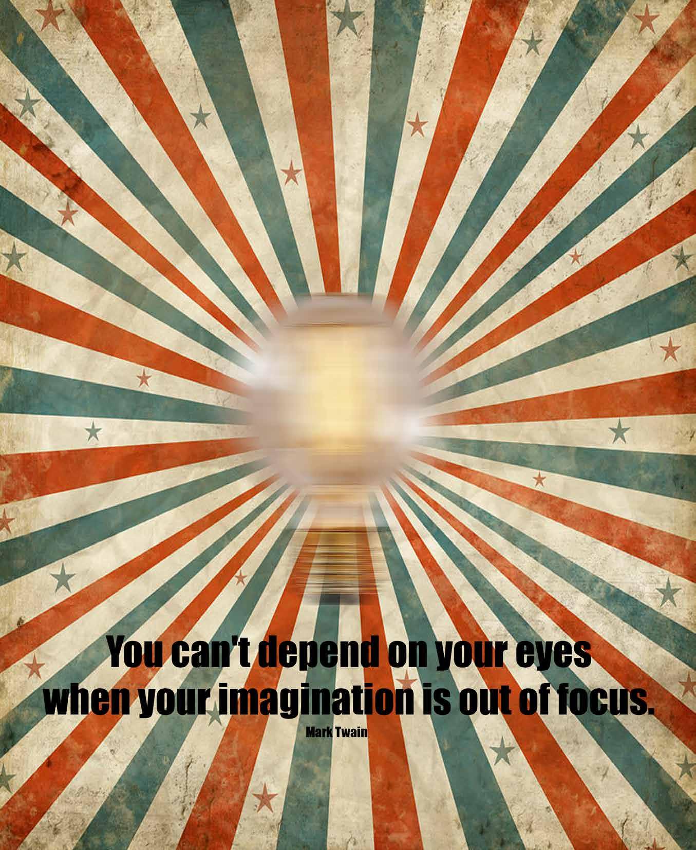
Form follows function.
Form follows form.
Form follows beauty.
Louis Sullivan
1895.jpg; Guaranty (Prudential) Building, Church Street and Pearl Street, Buffalo, NY 5267453990; Sony Building
David Shankbone crop.jpg|thumb|Sony Building by David Shankbone;
Niemeyer Quelle: selbst fotografiert am 21.11.2002, Fotograf oder Zeichner: Ulrich Gärtner
circa
by
Oscar
LouisSullivan,Architect
Philip Johnson, Architect Oscar Niemeyer, Architect
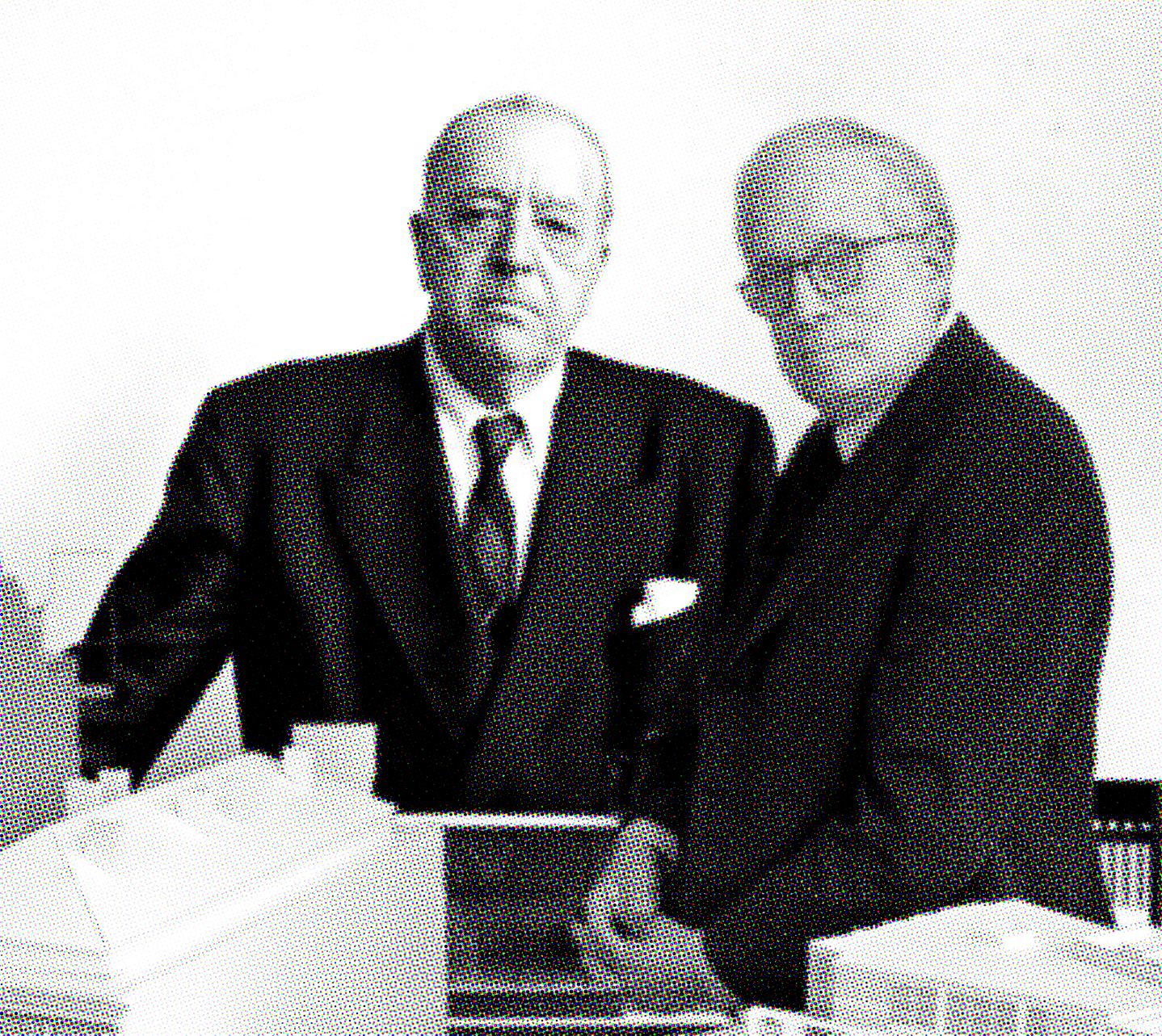
LESS IS MORE LESS IS A BORE
Mies van der Rohe (left), Robert Venturi (right).
Why Unicameral?
A defining element of the State of Nebraska is the fact that our state government consists of a single or unicameral legislative body. It is something that is unique to our state alone in the great diversity of the United States of America. Throughout Nebraska’s history, our small population has made it necessary to work together and think differently. Therefore, the idea of a design publication for the State needs to be one that blurs boundaries and break down traditional formations with a singular disciplinary focus.
This design publication will also look to engage across the traditional categories of academic faculty, professional practitioners, and the students that ultimately enter these worlds after they have completed their period of study and internship. The publication will occupy a middle ground that takes the worlds of magazines and journals and combines them.
It will be formed to create a unified creative team comprised of members of the University of Nebraska, College of Journalism and Mass Communication, the Johnny Carson Center for Emerging Media Arts, the College of Architecture, and members of the State of Nebraska’s diverse design professions.
Unicameral will combine the public outreach and audience of a magazine and merge it with the focus of a journal. Its aim is to provide a window into Nebraska’s design culture, work(s), ideas, and personalities that create and define our communities, urban spaces, workplaces, and homes.
Photography: Dana Damewood. Reprinted with permission of the National Trust for Historic Preservation in the United States. OPPOSITE PAGE Photography: Madeline Cass.
By supporting Unicameral these groups and individuals attest to their belief in the power of design and its importance in creating great environments, places, and products in the great state of Nebraska and surrounding territories. This publication would not exist without their passion and commitment to great design in the middle of everywhere. Thank you for continuing to make Nebraska a great environment to practice and create.
To the students, professionals and faculty of Unicameral—thank you.
AIA Nebraska AOI DLR Group Nebraska Masonry Alliance GreenSlate Development
HDR (Great Plains Studios) IIDA Great Plains Chapter LEO A DALY Noddle Development Company
Olsson Ronco Construction RDG Planning & Design Sheppard’s Business Interiors | Steelcase
TACKarchitects Tom & Amy Trenolone Whiting + Turner
EDITOR IN CHIEF Thomas J. Trenolone, FAIA

ART DIRECTOR Encarnita Rivera
SENIOR EDITORS Brendan Colford, Bridget Knudtson
CONTRIBUTING EDITORS Vy Cao, Caroline Goertz, Audrey Huse, Louis Khu, Mitch Neujahr, Jay Quemado, Emily Scheidler, Tiffany N. Scwheer, Anastasia Wand, Megan Willoughby
COPY EDITOR Kathryn Ineck
CONTRIBUTING ILLUSTRATORS Vy Cao, Audrey Huse
EDITORIAL SUPPORT Danette Hunter
EDITORIAL OFFICE: University of Nebraska-Lincoln, College of Architecture

400 Stadium Drive, Lincoln, NE 68508
PHOTOGRAPHY OF PROJECTS : AJ Brown, Madeline Cass, Colin Conces, Dana Damewood, Corey Gaffer, Thomas Grady, William Hess, Kurt Johnson, Emma Morem, Tom Kessler, Lea Schuster, Dan Schwalm
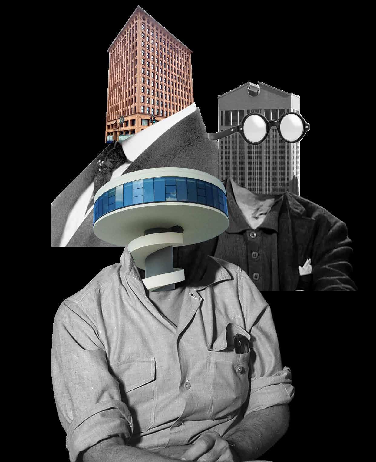
COVER ART: Collage by Bridget Knudtson
ACKNOWLEDGEMENTS
College of Architecture; Kevin Van Den Wymelenberg, Ph.D., Dean, David Karle, Associate Professor and Director of the Architecture Program, University of Nebraska College of Architecture Professional Advisory Committee

College of Journalism and Mass Communication; Shari R. Veil, MBA, Ph.D., Dean; Adam Wagler, Associate Dean for Academic Programs

Johnny Carson Center for Emerging Media Arts; Megan Elliott, Founding Directo r; Ash Smith, Assistant Professor of Emerging Media Arts
Barnhart Press; John Barnhart, President
HDR (Great Plains Studios); Matt Whaley, Managing Principal

Photography: © 2023 Dan Schwalm, OPPOSITE PAGE © 2023 Colin Conces
WINSTON CHURCHILL
WE MAKE A LIVING BY WHAT WE GET.
WE MAKE A LIFE BY WHAT WE GIVE.
Printed by Barnhart Press, Omaha, Nebraska. PROFESSIONAL & ACADEMIC PARTNERS
18 Love, Aretha Franklin, and the Dead Poets Society 50 Split or Steal 60 An Evolving Urban Core 68 Redlining’s Ripple Effect 86 The Case for Community Engagement 106 There’s No Place Like Home 116 Entangled Evolution 126 Hostile Architecture 170 Becoming a Master of the Archido Arts –One Must Have Balance
Essays
Design
RDG Planning & Design 20 Entrepreneurial Studio 20 RDG Landscape Architecture 22 Omaha Office Central Stairs 24 First National Bank, CSU 28 The New North Makerhood 34 Casper Wayfinding Master Plan 40 La Vista Civic Space 44 Carlson West Povondra Architects 54 Lexus of Omaha 58 Alley Poyner Macchietto Architecture 62 The Switch Beer and Food Hall 66 HDR (The Great Plains Studios) 72 Judy Varner Adoption and Education Center 74 Siena Francis Miracles Treatment Center 78 HDR feat. Sinclair Hille Architects 82 Concordia University Music Center 82 TACKarchitects 90 Bridges Trust 92 Dvorak Law Group 100 LEO A DALY 110 Omaha Rapid Bus Transit (ORBT) 110 DLR Group 118 UNL Dinsdale Family Learning Commons 120 Nebraska Medicine PES Unit 124 Actual Architecture Company 130 DVLP Basketball Training Center 132 The Heartland Interior Design 138 Lulubee Artisanal Chocolates 138 BVH Architecture 144 Crete Public Library 146 Barnato Entertainment Venue 152 Nebraska Center for Advanced Professional Studies (NCAPS) 158 Niobrara River Valley Preserve Visitor Center 164 Feature Stories
Editorial
 By Thomas J. Trenolone
FANBOY LETTER TO THE DESIGN DISCIPLINES / CULTURE IN NEBRASKA
I am a fortunate son, as I am a Nebraska native: I arrived here via Archbishop Bergan Mercy Hospital on July 1, 1970, in the pre-dawn hour of 4:01 AM CDT, to be exact. Since that moment, regardless of where I have called home, this wonderful place in the middle of everywhere has defined me in so many ways. As I have gotten to know so many of my colleagues here in the heartland, I have learned that this is a common thread we all seem to share regardless of where we practice, be it Kearney, Kansas City, New York, or Paris.
The intent of this publication is to be a snapshot in time, one that features professionals and academics contributing to our design culture. It is written, curated, and directed by the students at the University of Nebraska-Lincoln and printed in partnership with chambers of commerce, professional organizations, and community groups that advocate for the importance that good design and creative businesses contribute to our state’s health, economy, and overall vitality.
The essays included in this magazine are written by students about topics on their mind regarding our professions and the features reflect the outcomes of the awards juries held by the local and regional chapters of the AIA, IIDA, and ASLA. In this manner, we see Unicameral as a consolidated outreach for each of these great professional organizations. When we asked the students to write a feature, we asked them to consider three things: the people who did the work, the place where the work was done, and, ultimately, the project that was the outcome of this chemistry.
As we have no advertisements but are fans of this form of art direction and graphic design, we introduce you to “blurbs”—small moments of transition between content that offer notes of wisdom, sarcasm, and pop-culture sweetness. Inspired by CliffsNotes, created by a fellow husker Clifton Keith Hillegass, we have pored through TV, video, Google, and theoretical texts: like that kid who fished all the raisins out of the Raisin Bran or marshmallows out of the Lucky Charms box we have taken some of the work out of finding the “good stuff”. These little moments of reflection focus on Nebraska and design. They offer insight into how the world sees us (Nebraska – good and bad) and how designers/creative thinkers see their world.
On this auspicious occasion as you hold this first copy of Unicameral Design magazine, I am hopeful that this is the start of a new institution in our state’s design culture. We have never had a design magazine for our state and it is my sincere hope that Unicameral in its eccentricities of academic and commercial “hybridness” will become something of a standard for the designer class. We have worked to create a publication that looks to create a single body for all types of designers. That is why we chose the name Unicameral, not only is it an element unique to Nebraska as the only unicameral government in the United States, but it also established the idea that design is common in its process and application, regardless of the discipline that we each espouse to practice.
One challenge we have always had to overcome in Nebraska is population—or lack of it. Ranked 37th out of the 50 states, our entire population can fit in the borough of Manhattan in New York City. Because of this Nebraska, we have the need to become the fanboy, fangirl, fanperson to see our communities continue to demand progressive and inclusive design, for graphics, buildings, parks, environments, and spaces. We must create strong partnerships with artist, professional, and engineer alike. That mission begins with getting the word out to the world. Unicameral is intended to be the vessel to do just that.
8
9 Fall 2023 Unicameral Letter from the Editor
Photography: Dana Damewood. Reprinted with permission of the National Trust for Historic Preservation in the United States.
Contributing Photographers
People & place photography was contributed by the following Nebraska photographers.
An old soul, an unplugged see-er, a soaker up of moments. I’m an outdoorsy explorer who nurtures a touch of wanderlust—while remaining deeply rooted in home. These passions are reflected and revealed in my work. I’m a professional image maker based in Omaha, Nebraska. My focus is capturing people, places, and spaces in real moments, in real time. I’ve honed my skills through my education in photojournalism, countless hours of practice and 15 years of business as a professional photographer.
I picked up my first camera at 16 and have not stopped taking pictures since. I started my formal education in high school and went on to finish a Bachelor of Fine Arts in Photography at the Savannah College of Art and Design. Throughout my long career I have worked in all processes and mediums, film and digital. My work has been recognized in various national publications and platforms such as Bon Appetit, The Food Network, The Wall Street Journal, This Old House, National Parks Conservation Association, Culture Magazine, Preservation: Magazine for the National Historic Trust, Mother Earth Living, Country Living, Covey Rise, Cosmopolitan Magazine, Diabetes Magazine, Travel Kansa s and Country Woman. My personal work can be found in the following private collections: Aksarben Living, Bridges Trust, Peter Kiewit Foundation, UNMC, Scoular and at the Corvina Apartments. I am based out of Omaha, Nebraska, and split my time in Savannah, Georgia; Asheville, North Carolina; and other areas in the Southeast.
10
Colin Conces
Dana Damewood
Mad Cass is a multidisciplinary artist based in Lincoln, Nebraska. She primarily works within photography, poetry, artist books, painting, and drawing. In 2017 she earned a Bachelor of Fine Arts in studio art with an emphasis in photography from the University of Nebraska. Her work has been exhibited nationally and internationally. Her book, How Lonely, To Be A Marsh, was featured at Fotobokfestival Oslo, and has been collected by institutions such as The Museum of Modern Art Library, The National Gallery of Art Library, The Getty Research Institute Library, and The Museum of Fine Arts Houston’s Hirsch Library. Her photography has been published in the following list of selected publications: The New York Times, The Washington Post, Wall Street Journal, and National Geographic
Dan Schwalm is an architectural photographer for HDR’s global architecture company based out of Omaha, Nebraska. He creates visually compelling images for projects ranging in size from 1,000 square feet to millions of square feet for both domestic and international HDR architects, interior designers, and other professionals to help tell their project stories. Dan was exposed to photography at a young age, with his father having a passion for photography. While initially interested in photographing skateboarding, Dan eventually transitioned into working as a photography assistant at HDR. This exposed him to a more diverse pool of subject matter and helped him realize his passion for architectural photography. Today, Dan’s work is featured in many publications, and he has helped HDR win an ever-increasing number of design awards.

11 Fall 2023 Unicameral Contributing Photographers
Mad(eline) Cass
Dan Schwalm
1 VY CAO
Growing up in a small town just south of Vietnam, at fourteen years of age, Vy moved to the United States. A high school teacher suggested that he could be a LEGO designer—one of his favorite mediums—and pursue an education in architecture. Completing his bachelor’s degree in 2021, Vy is pursuing a master’s degree in the College of Architecture, University of NebraskaLincoln. One of his primary goals is to design for LEGO and, more importantly, to make the world a better place than when he found it.

2 BRENDAN COLFORD
Brendan Colford is an associate editor for Unicameral Design magazine and a design coordinator at HDR Omaha. Brendan received a Bachelor of Science in Architecture and a minor in industrial product design at the University of Nebraska-Lincoln. He is now pursuing his Master of Architecture at the University of Washington in Seattle. When not at work, he spends his time camping, hiking, and rock climbing.
3 CAROLINE GOERTZ

A sixth-year master’s student in the Master of Architecture program, Caroline Goertz feels that architecture has always been the perfect creative outlet for her love of complex problem solving. Working on a design publication has been an exciting new way to flex those skills and develop a few new ones. Originally from New Jersey, she has chosen to make Lincoln her true home while working at Sinclair Hille Architects upon graduation. When she is not in school or at work, Caroline collects every experience the “little-big” town of Lincoln has to offer, weather that be a sporting event, open mic night, or adult volleyball league.
4 AUDREY HUSE
A graduate s tudent in the Master of Architecture program at the University of Nebraska-Lincoln, Audrey finds the ever-challenging subjective nature of design a never-ending battle of personal growth. Inspired by her peers and individual experiences, her designs typically reflect her passion for balanced aesthetics, form exploration, and human interaction. Though newly pursuing journalistic expression, she has long wanted to follow this path that was once considered her backup plan from architecture.
5 LOUIS KHU
Originally from Omaha, Louis is a graduate architecture student at the University of NebraskaLincoln. He is also a first-generation college graduate in his family and holds a Bachelor of Science degree in architecture, anticipating his master’s degree in the Spring of 2024. As a member of the AIA and AIAS, Louis aspires to collaborate with designers nationwide to continuously innovate the standards of architecture and health. His hobbies include playing volleyball, drawing, and binge-watching his favorite shows.
6 BRIDGET KNUDTSON
Bridget is a design coordinator with HDR

Architecture and an associate editor of Unicameral Design magazine She earned her Bachelor of Science in design with high distinction from the University of Nebraska-Lincoln in 2022. Originally from Brookings, South Dakota, Bridget is passionate about design in the Great Plains and its surrounding regions. This fall, she plans to attend the University of Texas at Austin to pursue a Master of Architecture and certificate in historic preservation. In her free time, Bridget enjoys practicing yoga and watching movies with her cat, Binx.

12
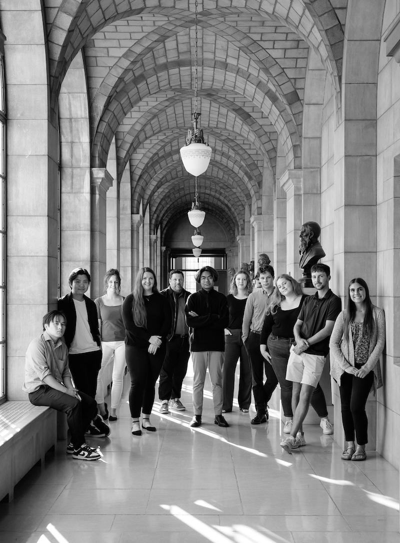
Unicameral Staff 1 2 3 4 5 6
Unicameral staff, Fall Semester 2022.
7 MITCH NEUJAHR
Mitch is a Master of Architecture student at the University of Nebraska-Lincoln. He grew up in Omaha and is in his final sixth-year study towards his master’s degree. He plans to dive into his architecture career as a designer at a local firm in Nebraska. His main interests are large-scale commercial projects and residential apartments. He hopes to provide thoughtful design to improve upon environment. Mitch’s passions include playing golf on the weekends and watching football with the boys.

8 JAY QUEMADO
Jay is a big vibe. The concept of “you only live once” is what he lives by and stands for because to be human you need to experience life to its fullest intent. A new soul trying to make his mark on the world, one step at a time—because you’ve got to start somewhere—he is an aspiring technical director and broadcast journalist, and strives to tell interesting stories to the world-at-large. Jay is currently a part of Nebraska Nightly, a COJMC news broadcast. He enjoys the everlasting concept of learning and prefers adventure and getting lost. He is a student at the University of Nebraska-Lincoln College of Journalism and Mass Communications.
9 EMILY SCHEIDLER
Emily Scheidler is a Colorado native from Colorado Springs. She is a junior at the University of Nebraska- Lincoln, and is a double major in journalism and advertising with an emphasis in public relations. Emily is passionate about being able to spread awareness for a variety of different topics including politics, the arts, and social justice. In her free time Emily enjoys analyzing movies and playing with her golden retriever, Homer.
10 TIFFANY N. SCHWEER, ASSOC. AIA


Tiffany is a project coordinator, architectural designer, and marketing assistant at arCuretecture in Lincoln, Nebraska. Born and raised in Clay Center, Nebraska, she moved to Lincoln to study architecture at the University of Nebraska-Lincoln. She graduated in 2021 with her Architectural Bachelor of Science in design with high distinction. As a young professional, Tiffany is a member of the Nebraska AIA. She has a passion for helping clients by using creative problem-solving to design beautiful and functional spaces.
11 ANASTASIA WAND
Anastasia is a first-year student in the two-year Master of Architecture program at the University of Nebraska-Lincoln. She is originally from Woodstock, Illinois. For her undergraduate degree, she attended the University of WisconsinMilwaukee where she received a Bachelor of Science in architectural studies (BSAS). Her goal is to become a licensed architect and specialize in residential and hospitality design. Being a part of the Unicameral Design magazine staff has been an exciting opportunity for her to learn more about design in Nebraska.
12 MEAGAN WILLOUGHBY
Meagan Willoughby is a Master of Architecture student at the University of Nebraska-Lincoln. She’s lived in Lincoln for over 15 years but spent her early life and summers in Montreal. Living in such different places created a curiosity about the different ways cities were designed, and combined with her love of drawing and science,this led her to architecture. She is passionate about bringing attention to and resolving inequalities perpetuated through design and encouraging diversity in designs and the design community.

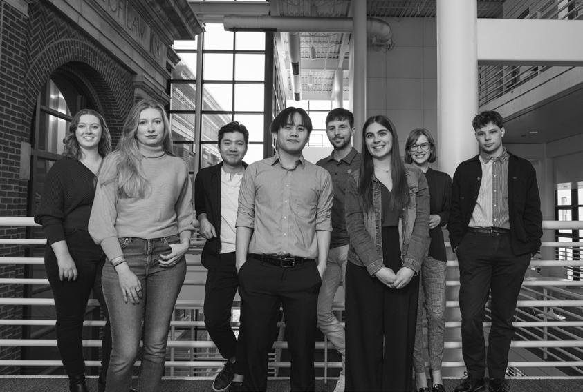
Photography: © 2023 Madeline Cass 9 7 10 8 11 12 13 Fall 2023 Unicameral
Unicameral staff, Spring Semester 2023.
A building has at least two lives—the one imagined by its maker and the life it lives afterward—and they are never the same.
Rem Koolhaas, Dutch Architect, CO-Founder and Partner, OMA, Rotterdam
LOVE, ARETHA FRANKLIN, AND THE DEAD POETS SOCIETY
By Thomas J. Trenolone
18
LOVE . We want to be loved by our clients (cue your internal soundtrack—1975 song “Love Hurts,” by Nazareth: “Love hurts, Love scars, Love wounds…”). The difficulty is love comes with honesty, heartache, vulnerability, anger, and passion. It knows compromise and sometimes failure. Being liked is simply being cordial or kind; it lacks the commitment of love. Love from a client will see you through the difficult times that our profession is often defined by. Architecture, design, and the creation of great new environments and products is never easy (if it is, we are doing it wrong). Love comes with danger and risk; we often work diligently to remove these from the business. I believe truly great practices—ones that define long periods of time and improve the human condition— are loved.
ARETHA FRANKLIN, A.K.A. RESPECT. We want to be respected by our peers, our colleagues, and our communities (cue internal soundtrack—the 1967 song “Respect,” by the great Aretha Franklin: “What you need. Do you know I got it. All I’m askin’ is for a little respect when you come home…”) We want to be true to ourselves, to our values. I believe that it does not matter where you practice. I was once told that Omaha is where an architectural career goes to die. The type of work you do or the size of firm you run or practice with does not matter. If you are passionate about the work and its importance to our world and our communities, you will earn respect. Hopefully it will be in your lifetime, but I ultimately believe that, through this practice the path to it will come. Respect is often much like karma. Your attitude, knowledge, and commitment to the world of architecture, design, and interiors will define you and how your peers and clients perceive you. These perceptions—reinforced by your actions—will establish the foundations of a respected practice.
THE DEAD POETS SOCIETY. I have always believed that there is something special, even magical about what we do (cue internal soundtrack—1989 instrumental “Keating’s Triumph” by composer Maurice Jarre). A scene from the 1989 film Dead Poets Society has always stuck with me regarding this matter. In the scene, John Keating (Robin Williams) says to his students:
“We don’t read and write poetry because it is cute. We read and write poetry because we are members of the human race. And the human race is filled with passion. And medicine, law, business, engineering, these are noble pursuits and necessary to sustain life. But poetry, beauty, romance, love, these are what we stay alive for.”
(N. H. Kleinbaum)
I know it sounds self-important, but I have always wanted to place design in that quote. However, one day when I had become a little older and wiser, I realized that when it is done right, architecture and design inherits all these qualities. Architecture done well is poetry, beauty, romance, and love.
So, go forth and be loved and respected.
19 Fall 2023 Unicameral Essay: Love, Aretha Franklin, and the Dead Poets Society
Architecture, design and the creation of great new environments and products is never easy (if it is, we are doing it wrong).
PLANNING & DESIGN
Entrepreneurial Studio
By Vy Cao
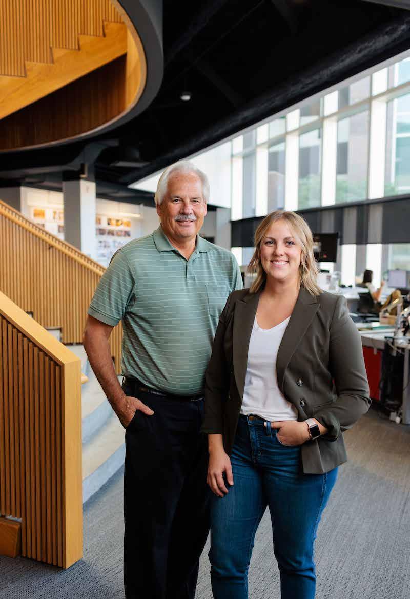
John Sova is managing principal of RDG Planning & Design. He has lived and worked in Nebraska his entire life. Graduating from the College of Architecture at the University of Nebraska-Lincoln, John applied for a position through a newspaper advertisement and has since been with RDG. Starting out as a draftsperson and working his way up to become president of the firm, his journey has been a gratifying 41 years. Managing the business end requires constant and thoughtful attention but John makes sure to spend at least 20% of his time involved in projects, staying active in the design process, and participating in meetings with clients. RDG has nearly two hundred staff members located in Omaha, Des Moines, St. Louis, Denver, Dubuque, and Iowa City.
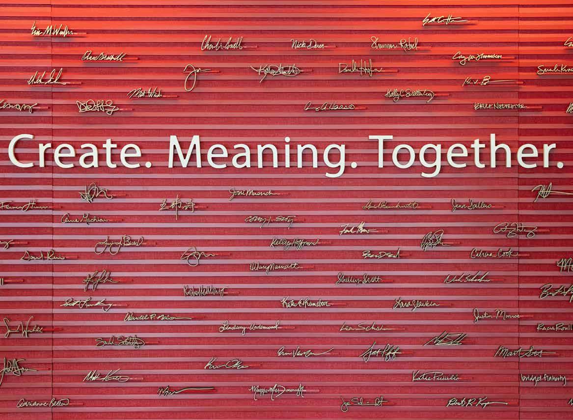
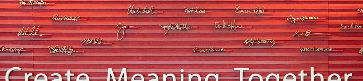
A core value at RDG is a strong culture of work-life balance with eight communities’ lifestyles. This allows their employees to have the opportunity to do a lot of things as John has been able to do in his career. As you walk into their office, the first thing you will see is a red installation displaying all the names of the staff. John explains that the wall is a reflection of their mission, to create meaning together with each other and with their clients.
Responsiveness to clients’ needs is of the highest priority, not simply to give the clients what they want, but also to challenge them to think outside of the box. Clear client communication is critical, making sure that clients understand the project scope and that designers understand their clients’ needs and expectations. Providing design solutions to unforeseen issues is a key factor in building trust and continuing relations with their clients.
Having a diverse client base and wide-ranging project types, the aesthetics of RDG’s style adapts to the uniqueness of each scope. The Omaha office is staffed with visual designers specializing in the creation of three-dimensional renderings, in addition to project models that enable the client to experience the spatial qualities by video. A virtual walk-through with the client has become a critical part of their communication and is vital to the success of each project.
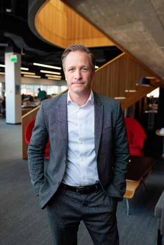
Benjamin Kroll has been with RDG since 2015. After living and working in New York for over a decade, Kroll was ready for a change. What stood out to him about RDG was the culture. RDG takes a holistic approach to working with their clients and the way they manage their employees. They employ eight “Lifestyles” that provide a foundation for their company’s culture: Design, Learning, Healthy, Sustainability, Community, Technology, Fun, and Leadership. The by-product of the culture at RDG is a strong entrepreneurial spirit; staff are not only allowed, but encouraged to pursue their passions and find ways to integrate those passions in their workplace. Kroll explains that this strong entrepreneurial spirit sets RDG apart and allows people to excel because they get to implement their passions into their work and into their projects.
20
RDG
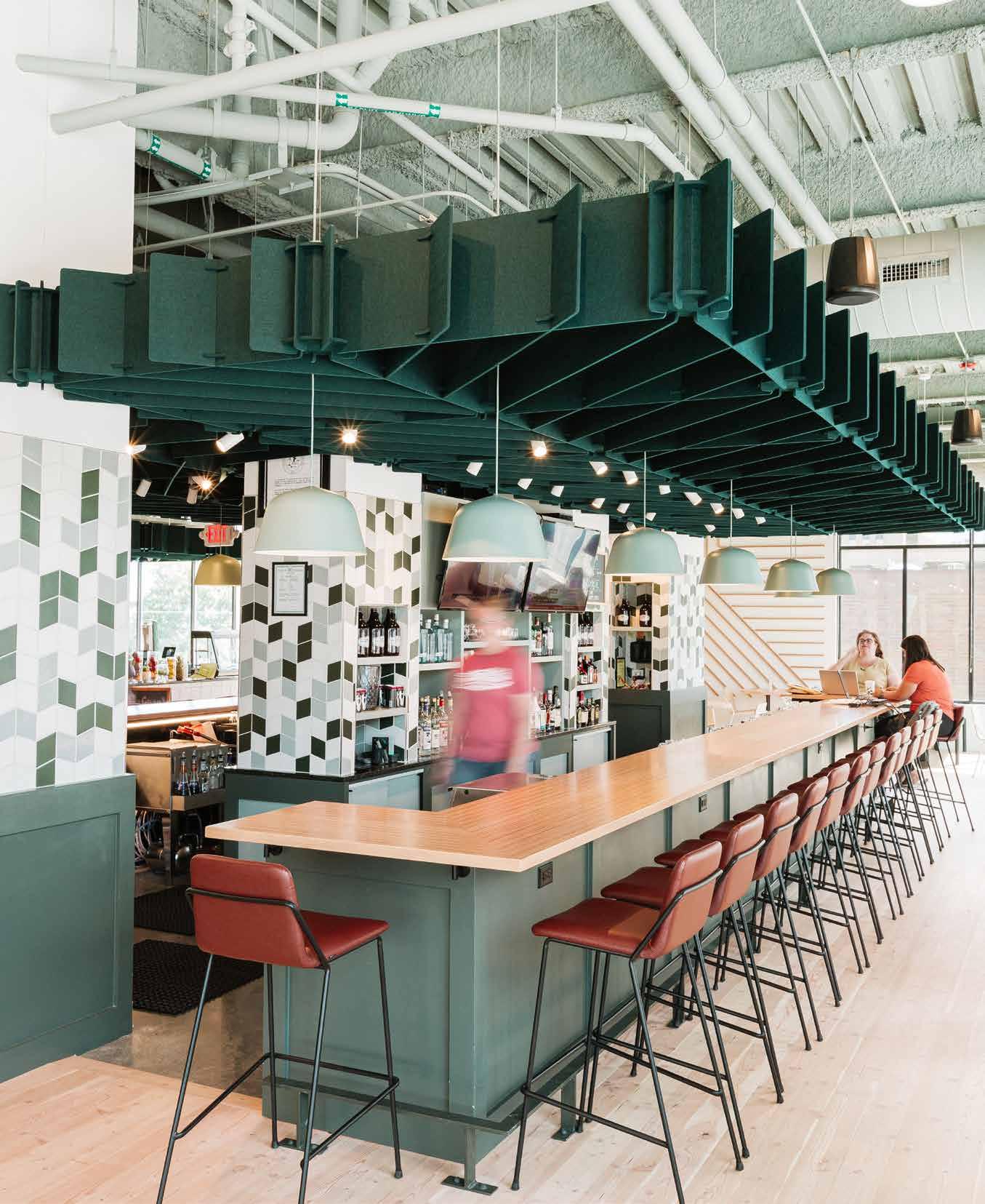
John Sova and Hilary Navratil, interior designer for the Omaha Office Central Stairs.

21
Above
and at right; First National Bank designers Benjamin Kroll, Bob Krupa and Gina Lorkovic. Photography: © 2023 Lea Schuster, Colin Conces Photography

22
Photography: © 2023
Dan Schwalm
The Road to RDG
By Bridget Knudtson
Both Bruce Niedermyer and Kene Okigbo exemplify the eight RDG lifestyles outlined on the firm’s culture wall. Niedermyer, a partner of the firm and Okigbo’s senior, is pragmatic and encouraging. Okigbo, a young designer with a passion for diversity, freely admits that the RDG lifestyle he most relates to is “fun.” Together, the two landscape architects lead with a laid-back and can-do attitude.
Okigbo considered a variety of majors before settling on a landscape architecture degree from North Dakota State University. The design market in Fargo was sparse at the time of Okigbo’s college graduation, so he took several jobs to make ends meet. “If you look at my resume,” he said, “there’s a period of continuous change.” That experience paid off when he landed a position with a landscape firm in Omaha. After gaining a year of experience, he transferred to RDG and has now been with them for four years.
Niedermyer took a more straightforward path in his education, graduating in 2011 from Iowa State University (“Let the record show that everybody groaned,” Okigbo noted). As a first-year student, Niedermyer was pre-architecture but made the switch to landscape after a convincing presentation from a professor in the program. After graduating, he hoped to work with an individual he had met from RDG but the firm didn’t have any openings at the time. Accepting another opportunity, he travelled halfway across the country to Alexandria, Virgina. “Six to nine months later, RDG called and said, ‘we’re hiring.’” Niedermyer jumped at the chance to interview and was immediately hired by the Des Moines office. After five years, he transferred to the office in Omaha.
One thing that sets RDG apart is its emphasis on urban planning and landscape architecture. In fact, it’s right there in the name: RDG Planning & Design. I asked Okigbo and Niedermyer about their thoughts on this. “[Landscape Architecture] is not the leading revenue source for the firm by any means, but the number of projects that we lead and have a large stake in is very robust,” said Niedermyer. Okigbo and Niedermyer are both in the urban design market. That market is housed under RDG’s community studio, which involves mostly landscape architects and planners. “I think that's an important point that within the community studio, there's a lot of collaboration between planning and landscape.” Collaboration is a key theme at RDG, and landscape architects hold a very significant position. As Okigbo said, “Including landscape architects early in the conversation during the planning and design of a project will provide a more complete experience.”
RDG’s dedication to inclusion of multiple disciplines is part of what secures great employees like Niedermyer and Okigbo. In 2021, their team was recognized with three awards by the Nebraska/Dakotas Chapter of the American Society of Landscape Architects (ASLA) for their work in the Midwest and surrounding regions. The three projects— the Casper Wayfinding Plan, New North Makerhood, and La Vista Civic Space—encapsulate a wide range of contexts and scales that the team works successfully within.
23 Fall 2023 Unicameral RDG Planning & Design
Above; Bruce Niedermyer (right) and Kene Okigbo (left) interviewed by Bridget Knudtson.
24
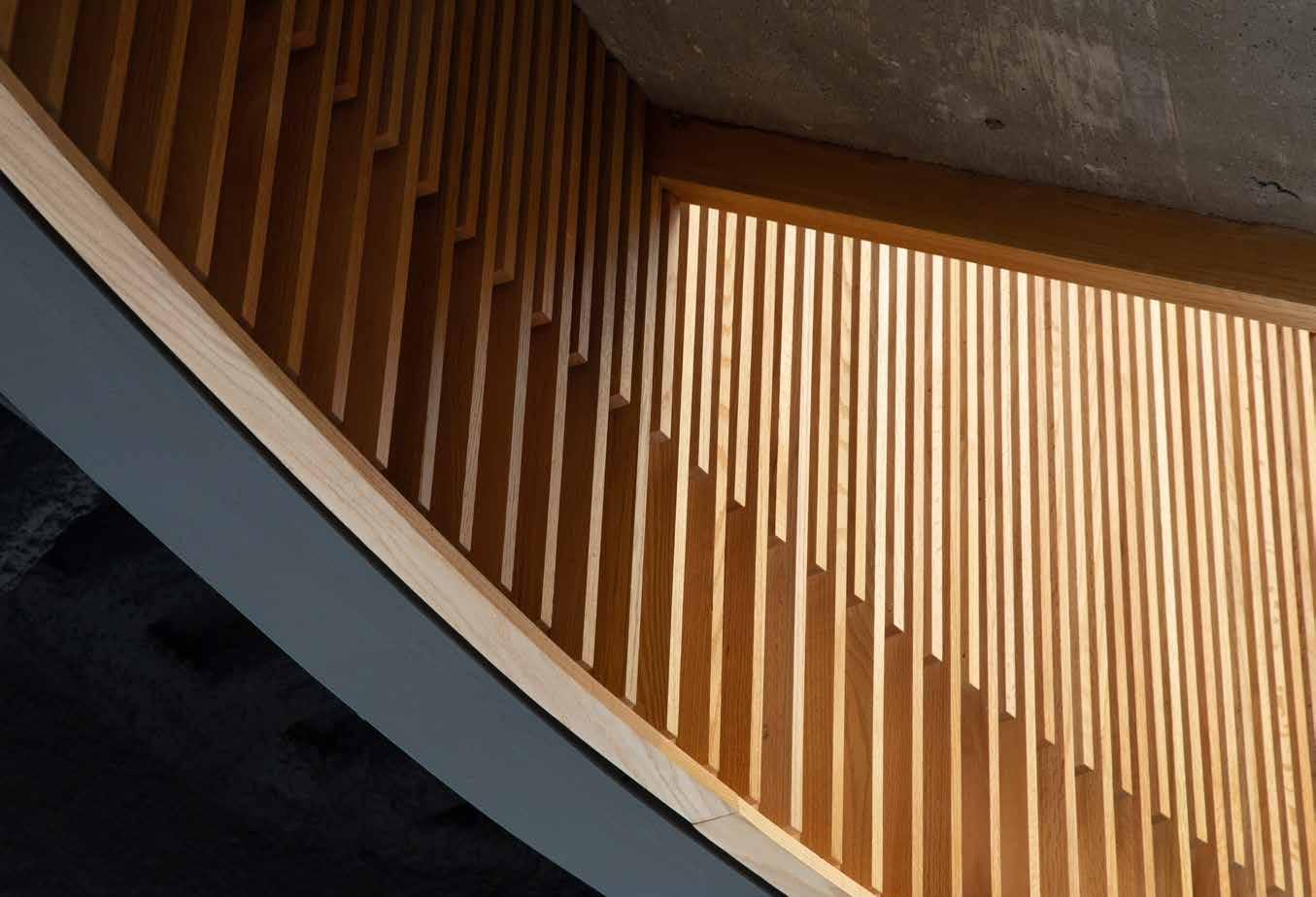
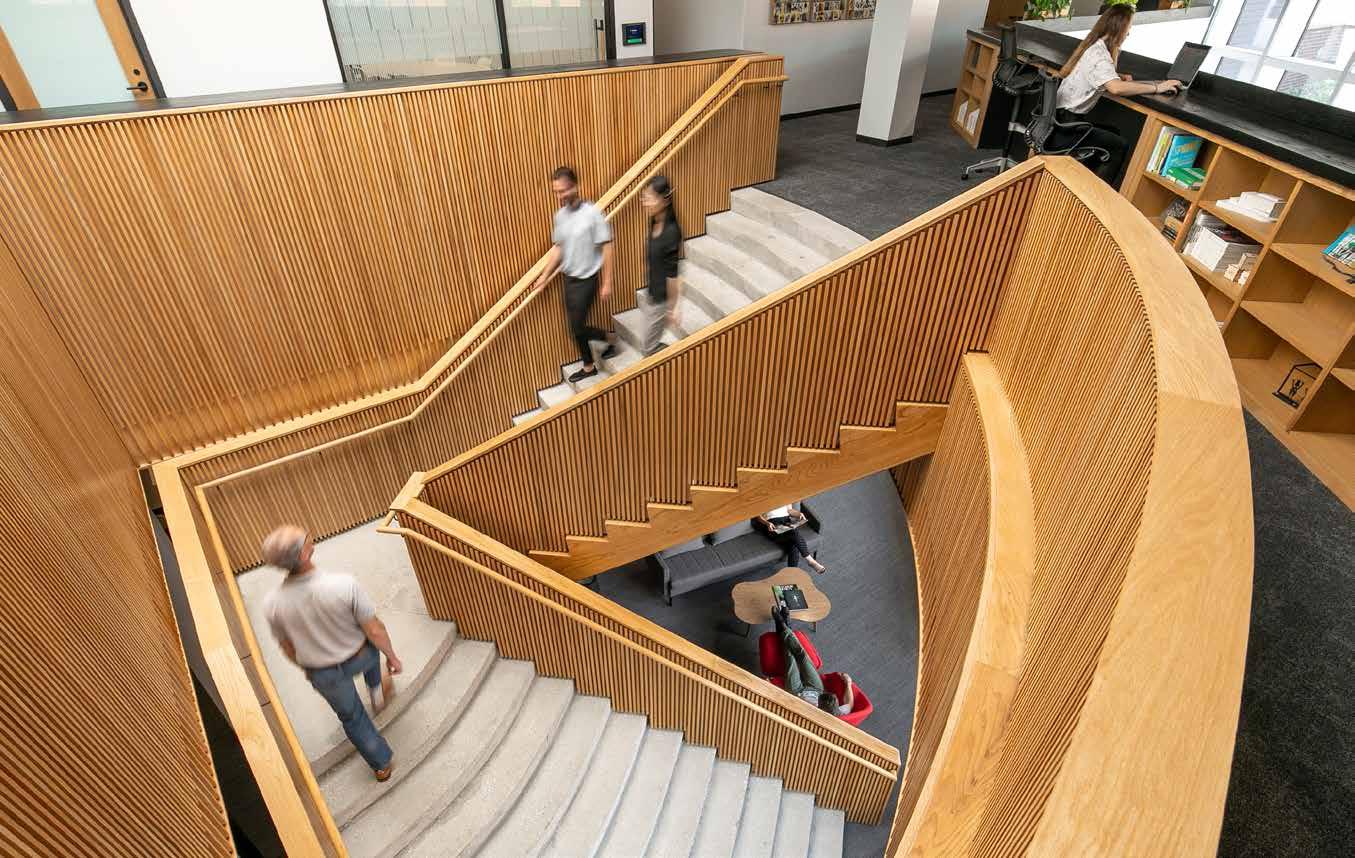
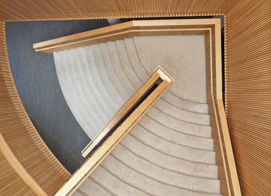
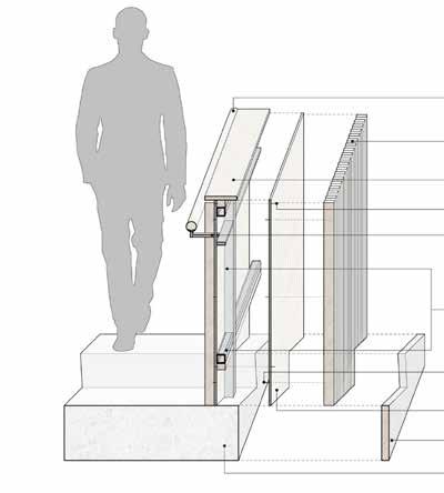
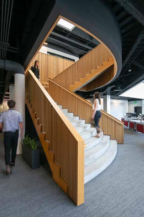
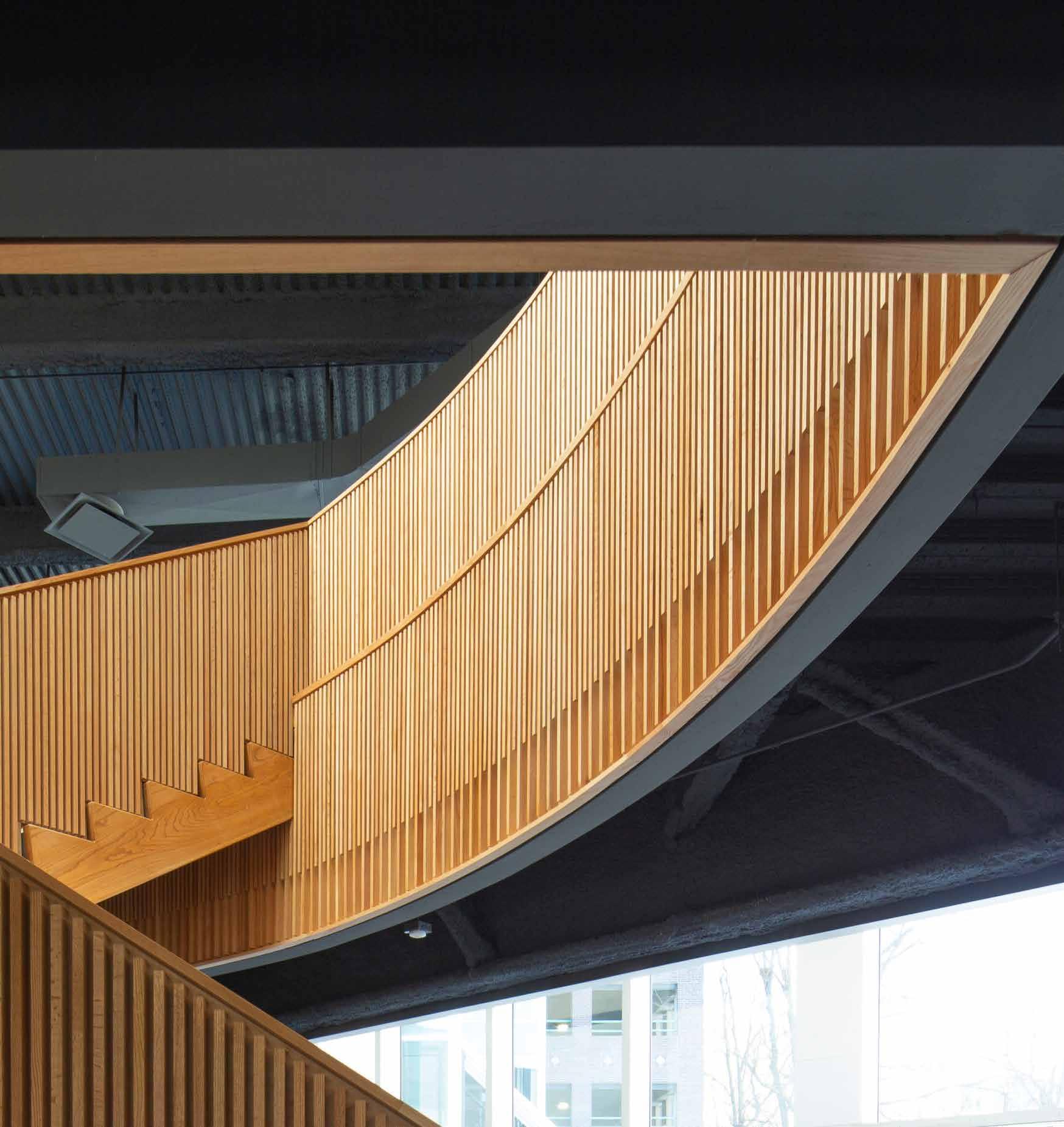
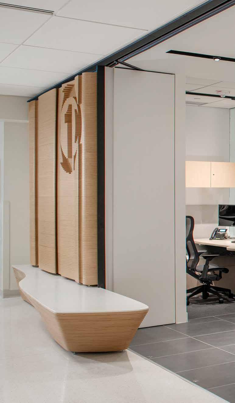
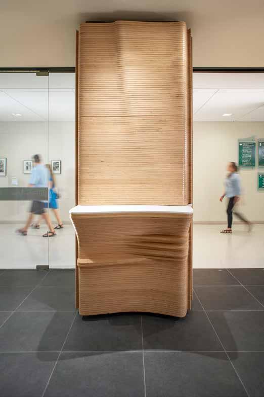
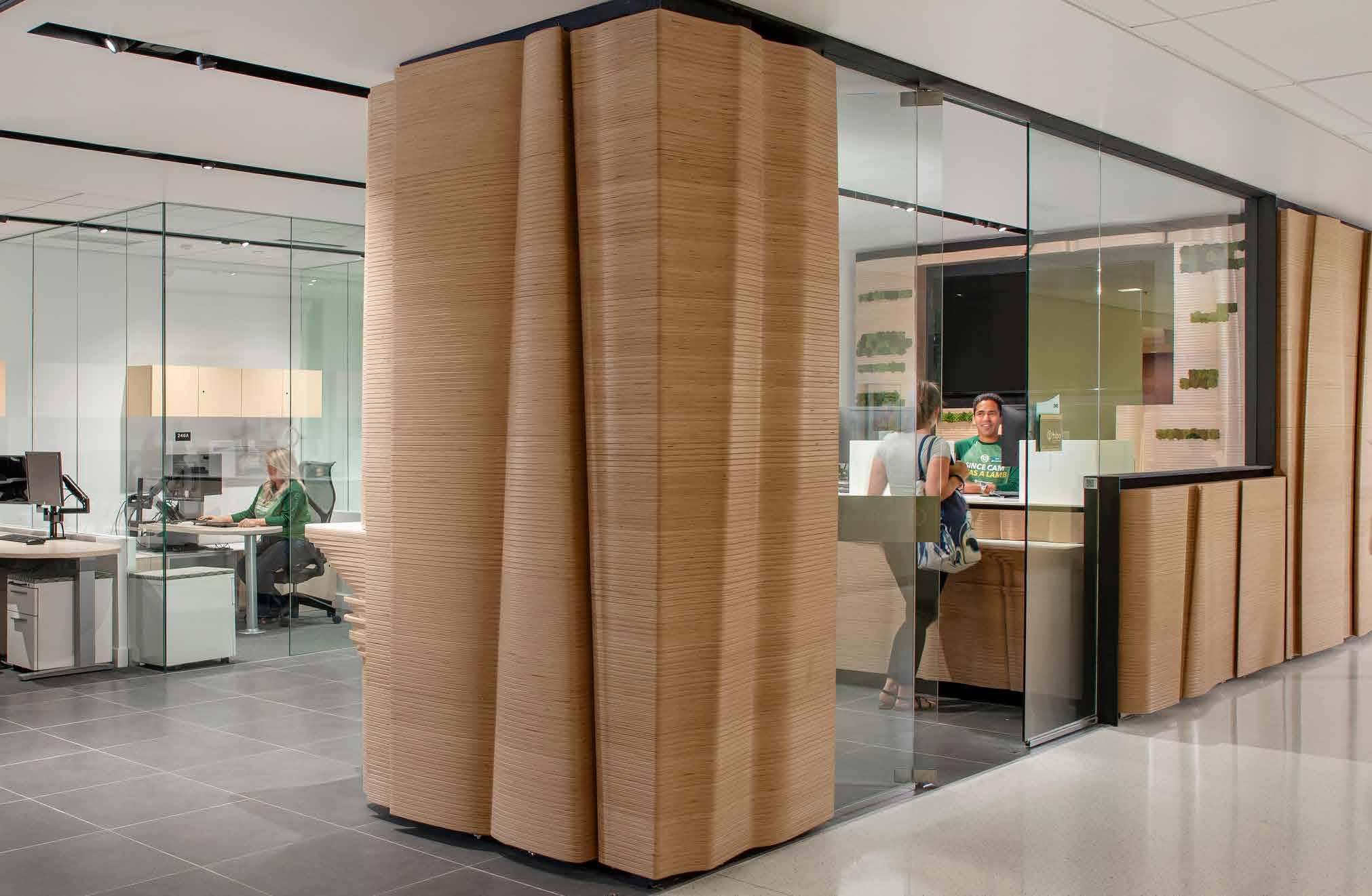
OMAHA OFFICE CENTRAL STAIRS
A Natural Connection
By Vy Cao
The renovation of the Omaha stairs was a design decision to create a focal point in the office. Part of the Chamber of Commerce for the last 35 years, the stairwell is integral to everyone’s day-to-day workflow. The stairs are shaped like circular sectors, a wide entrance leading to a narrow landing then widening again at exit. The uniqueness of this architectural detail is the highlight of the office interior.
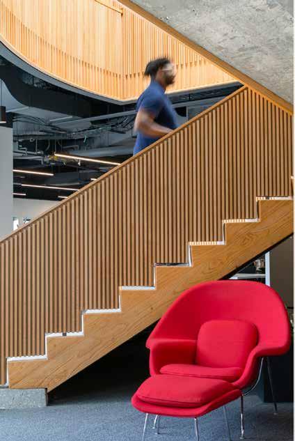
Originally, RDG wanted to take the carpet and walls off, and the stairs were supposed to be exposed concrete stairs to fit with the simplicity of the renovation. When the design team visited the site, they noticed there was a significant amount of wood from the original design’s door jams, window frames, and millwork. Thus, the design team decided to reuse as much of the material as possible. They found a carpenter who loved the idea, so it turned into a design-build project. The team spent three months planing down the wood planks to wrap around the stairs. In the end, about 80% of the wood on the stairs was recycled.
RDG started the project with no grand vision because of the design-build nature of the project, they were more concerned about how to recycle, and process the wood into the right dimensions with the carpenter. Though there were no expectations for the stairs—except to minimize the waste from the original design—the result is a resilient focal piece to the space that is beautifully detailed.
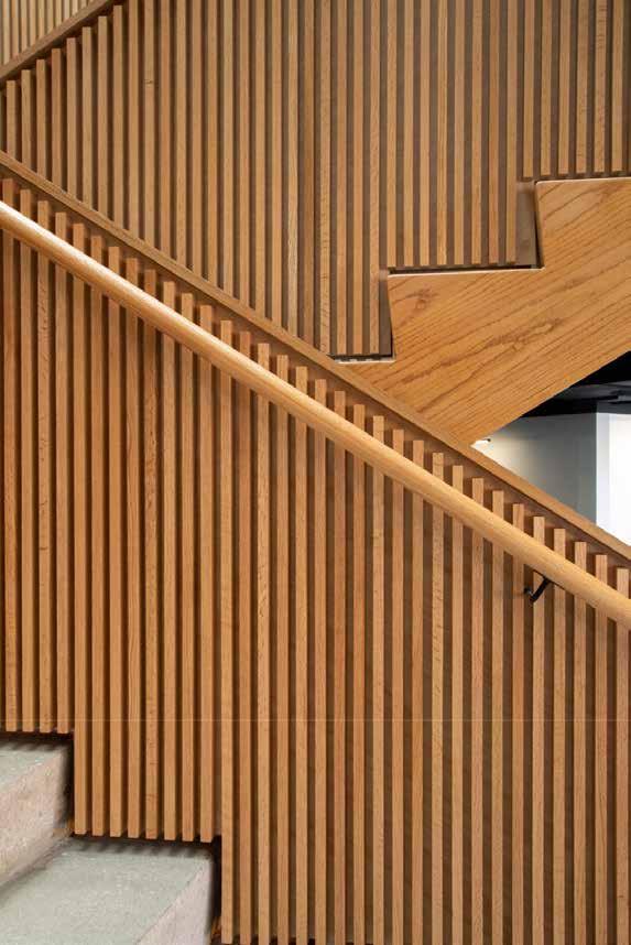
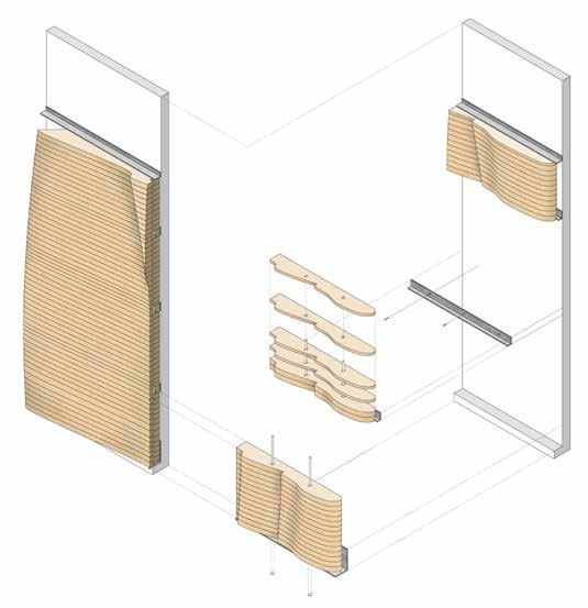
25 RDG Planning & Design
1.25″ Oak handrail
1 x 2″ Refurbished and hand-milled oak slats
Recycled oak cap
Hidden panel fastener
Steel handrail bracket
Existing steel guardrail
Hidden wood slat fastener
0.25″ Fastening panel
Refurbished oak fascia
Existing concrete stairs
26
27 Fall 2023 Unicameral RDG Planning & Design
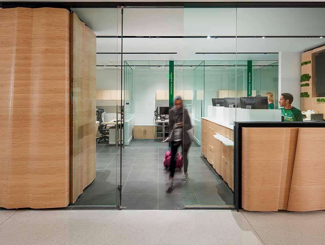
Financial Strata
by Tiffany Schweer
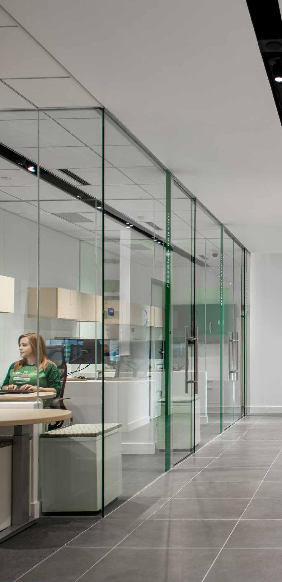
First National Bank of Omaha (FNBO) has been a client of RDG’s for many years. What is unique about FNBO is that they are the largest privately owned bank in the country. As the front page of their website states, “We’re more than a bank. We’re a neighbor you can count on.” FNBO primarily focuses on independent banking, and the result of this, along with their mission, is a level of authenticity as an institution that customers can trust with their money. FNBO makes a point to be involved in the communities they serve, and even though they are a large company, there is a level of intimacy that inherently comes hand-in-hand with their business model.
It is important to understand their mission when looking at this project and their other branches. FNBO’s mission and values translate directly to the physicality and intent of their spaces. The intimacy and friendliness in their interactions between the banker and the customer directly tie to the functionality of their branches, the Colorado State University (CSU) branch in particular.
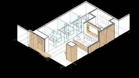
28 FIRST NATIONAL BANK, CSU
FLOOR PLAN
Photography: © 2023 Thomas Grady
29 Fall 2023 Unicameral RDG Planning & Design
Although RDG has done many projects for FNBO and has a good understanding of their mission and goals, like any project the design process begins with listening. Kroll explains that the best projects come out of the passion and vision of the client, taking that information and applying the architectural principles that come out of that vision. The design team focuses on the storytelling opportunities, by defining linguistic terms to solve the design challenges at hand. Kroll describes how their design process starts with linguistics, with thought, rather than with imagery. By removing the imagery, RDG can focus on designing a solution that the client can take unique ownership of—because really, they are either helping the owner determine the design challenge, or they are regurgitating the owner’s defined challenge back to them through architectural concepts and principles. After the linguistic storytelling phase is complete, the design team begins researching the site, followed by massing and iterative design.
EXPLODED AXONOMETRIC 30
The biggest challenge of this project was square footage. The CSU branch’s previous space was 3,400 square feet. The new space was less than half of that, yet Kroll’s team still had to fit all of the same program elements into a significantly smaller space. RDG worked closely with the client, to really dive deep and think about the transactional experience between the banker and their clients, how can they provide the same (or better) experience in such a small space, while simultaneously expanding the branch’s presence on campus. The client wanted to “expand their footprint” on campus by providing a sense of openness and welcome that invites clients in.
RDG’s design team employed several design elements that helped to achieve these goals and address this challenge. The new individual offices in the branch are smaller, but because the wall partitions are all comprised of clear glazing, the office spaces feel larger than they are. Retractable glass walls that pocket back into the walls completely open up the corner of the space to the corridor, blurring the line between a main
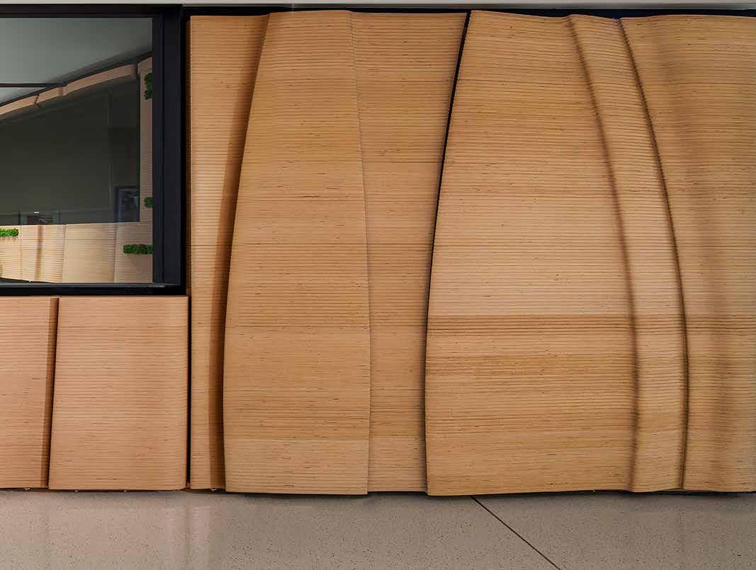
circulation path in the building and the FNBO’s space. The wrapping of materials on the exterior and the way the wood flows into a bench out in the hallway helps make the bank feel like it is expanded out into the corridor environment.
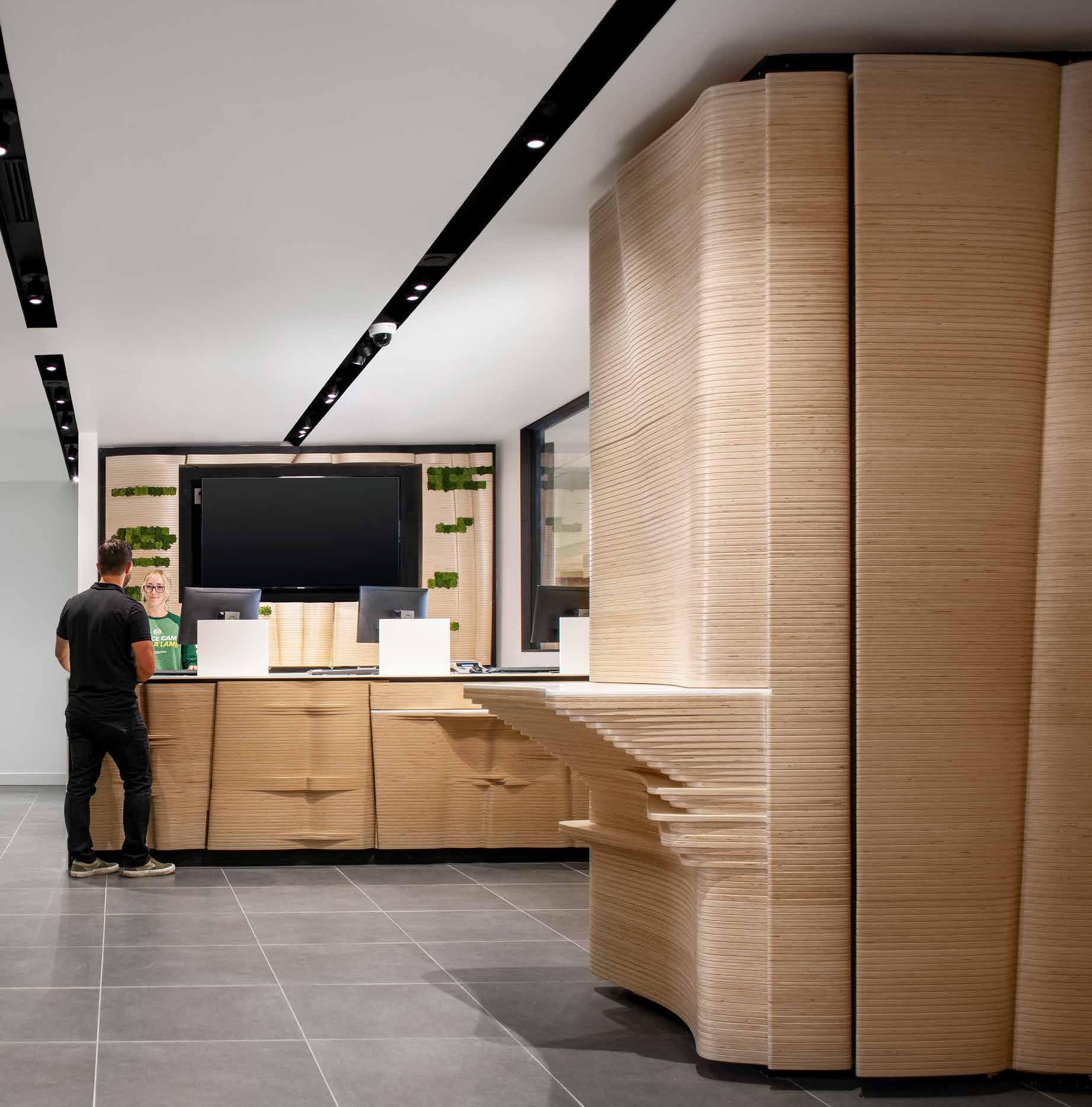
The parametric sculptural wall fabricated in wood attracts passersby to reach out and touch the wall as they stroll by. It creates a tactile experience that helps draw people in. The wavy wood design is a nod to the natural environment of Colorado but does so in a way that is not only unique, but also functional. The undulations, the pushing and pulling of the material, naturally create programmatic functions, such as the check-writing table and a wheelchair-height table, seamlessly blend into the design of the front desk. Something Kroll strives to do in his designs is to make sure to give the design element multiple programs. This not only provides a bigger return on the investment and bigger impact to the users but helps tie the whole space together.
31
RDG’s design concept for the CSU branch became a reality after teaming with Polynomial, an interdisciplinary fabrication and design shop collaborating with designers, architects, and contractors on unique and daring projects. Polynomial has a keen eye for details, and they are industry experts when it comes to constructability and the installation of all sorts of projects like the First National Bank, CSU. Polynomial was quickly able to take RDG’s design, run budget numbers, and help refine the design based on their knowledge of machinery capabilities, and design details like the routing on this project that helped take it to another level of craftsmanship. Polynomial worked with RDG
and the client to design and construct the project in a way that it could be fabricated in pieces in their studio, and then transported to Fort Collins, Colorado where it would need to fit through the doors of the existing building and be pieced together on-site.
One of the greatest challenges for designers across all industries is convincing a client to have trust in the expertise of the designer. Sometimes designers and clients don’t always see eye-to-eye, and at the end of the day, clients will choose to do what’s right for them—after all, it is their project and the space has to ultimately serve their purpose. Right or wrong, as the designer you can only do so much. This project was one of those
32
cases. The professional photos of the project showcase completely clear glazing surrounding the exterior of the space, however users don’t quite get that same experience: the owner has since completely frosted over all the clear glass walls in order to provide more privacy and added oversized logo graphics across the glass, including a huge FNBO logo and a giant ram, the mascot of CSU.
Although the owner’s modifications might hinder the design intent, the overall program successfully aligns with the student union at CSU. The same natural, oak-colored wood finish with forest green accents (both FNBO’s and CSU’s primary color) is scattered throughout the student
union building, some of which are new additions since the FNBO installment. This cohesive element unifies the wide-variety of programs found under one roof, from the coffee shop to the welcome desk, and even to the open lounge space where students hang out and study between lunch and afternoon classes. This level of cohesiveness not only adds to the school spirit in the primary student hub on campus, but directly ties FNBO to the CSU community accomplishing the client’s vision.
33 Fall 2023 Unicameral RDG Planning & Design
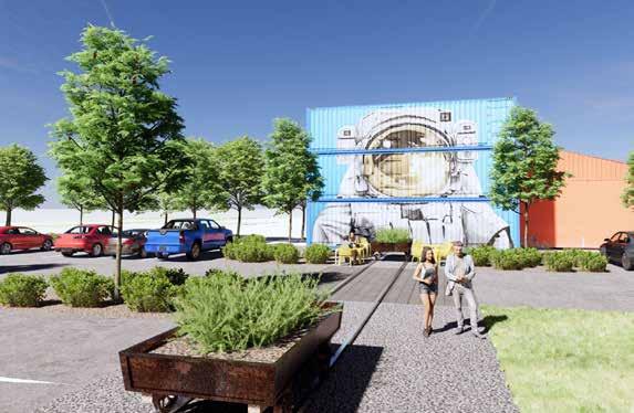
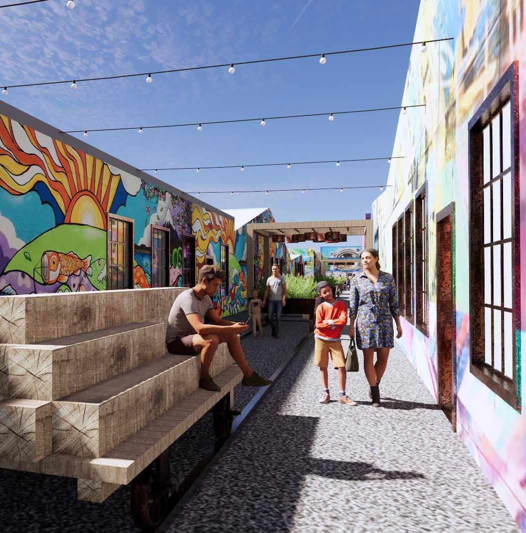
THE NEW NORTH MAKERHOOD
Artists In Residence
 By Bridget Knudtson
34
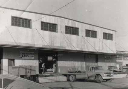
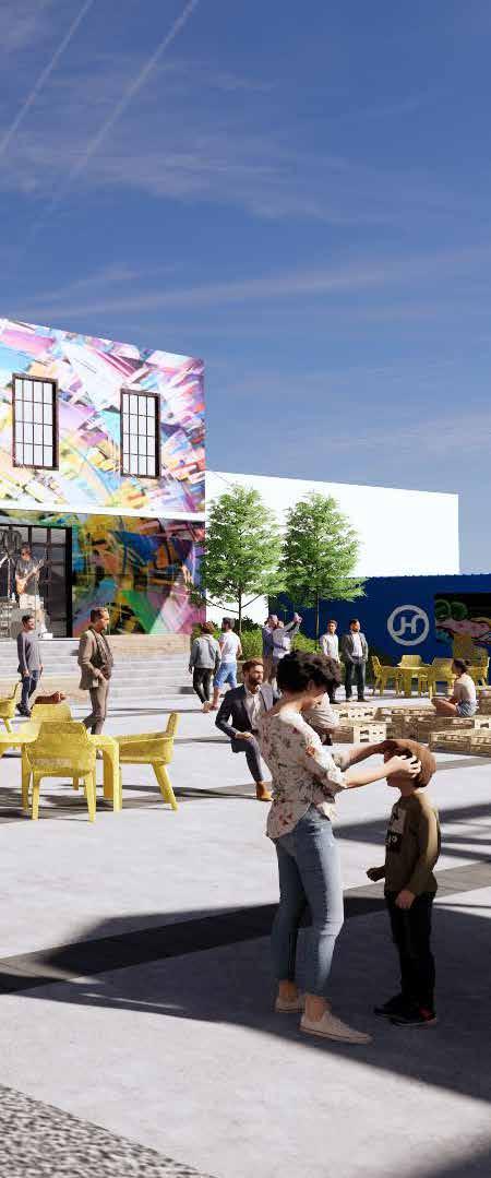
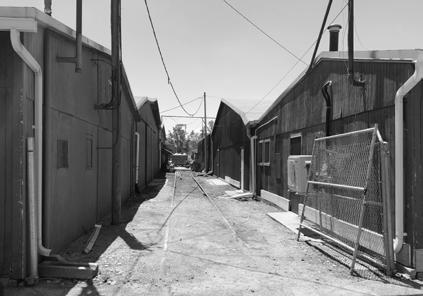
The New North Makerhood space is situated at the site of the former Omaha Hardwood Lumber Company. During its industrial past, the place was a thriving lumber mill with a busy railroad line running directly through its warehouses. Now, the site sits derelict, despite its proximity to the Missouri River and Omaha downtown core. Future Forward, an Omaha non-profit, plans to change this. They have partnered with RDG to create a master plan that imagines what the space could one day become. The New North Makerhood transforms the site of the old lumber mill into a haven for artists and a cultural hub for the Omaha community.
RDG brought a unique vision to this project having its own in-house art studio. Artists from the Iowa-based art studio and Omaha-based landscape architects and interior designers all worked in close collaboration to develop this high-level plan for the Makerhood. Future Forward wanted to ensure that studios for Nebraska artists have an economical approach so the RDG team kept their interventions minimal. “There was a lot of visual listening , we'll call it, of other industrial renovated sites that keep that grit and charm that's associated with the history of its site,” Bruce Niedermyer, project champion, said of their inspiration. Taking cues from the site itself, specifically its logging history, they decided to keep the existing rail tracks running through the site and use them as the main corridor for circulation. The concept is strong and provides visitors with several spatial experiences with direct access to the proposed artists’ studios.
35 Fall 2023 Unicameral RDG Planning & Design
36
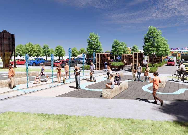
In order to facilitate pedestrians crossing through parking lots and into the site, RDG’s team had to design physical dividers to denote spaces not accessible by vehicles. They did so by creating stacked towers of logs, another nod to the site’s past. As it is currently, the partitions do not provide much separation from the street, which may prevent the space from beign used safely and comfortably. Incorporating the site’s logging history by creating a green screen or a canopy to enclose the pedestrian space could create opportunity for a more elegant integration of this crucial moment within the site’s history while also providing much needed shade currently lacking within the space. Another feature, a small park at the beginning of the complex, experiences the same problems. Called “River Meander Park,” this space pays homage to the Missouri River and its role in the logging industry. The team at RDG has plans for several fountains and seating areas, but the design has potential to be pushed futher. In the future, when the project is realized, this park can become a fun and interesting landscape for family recreation. Some small changes in grade, more water features, and strategic foliage could help bring this design to life.
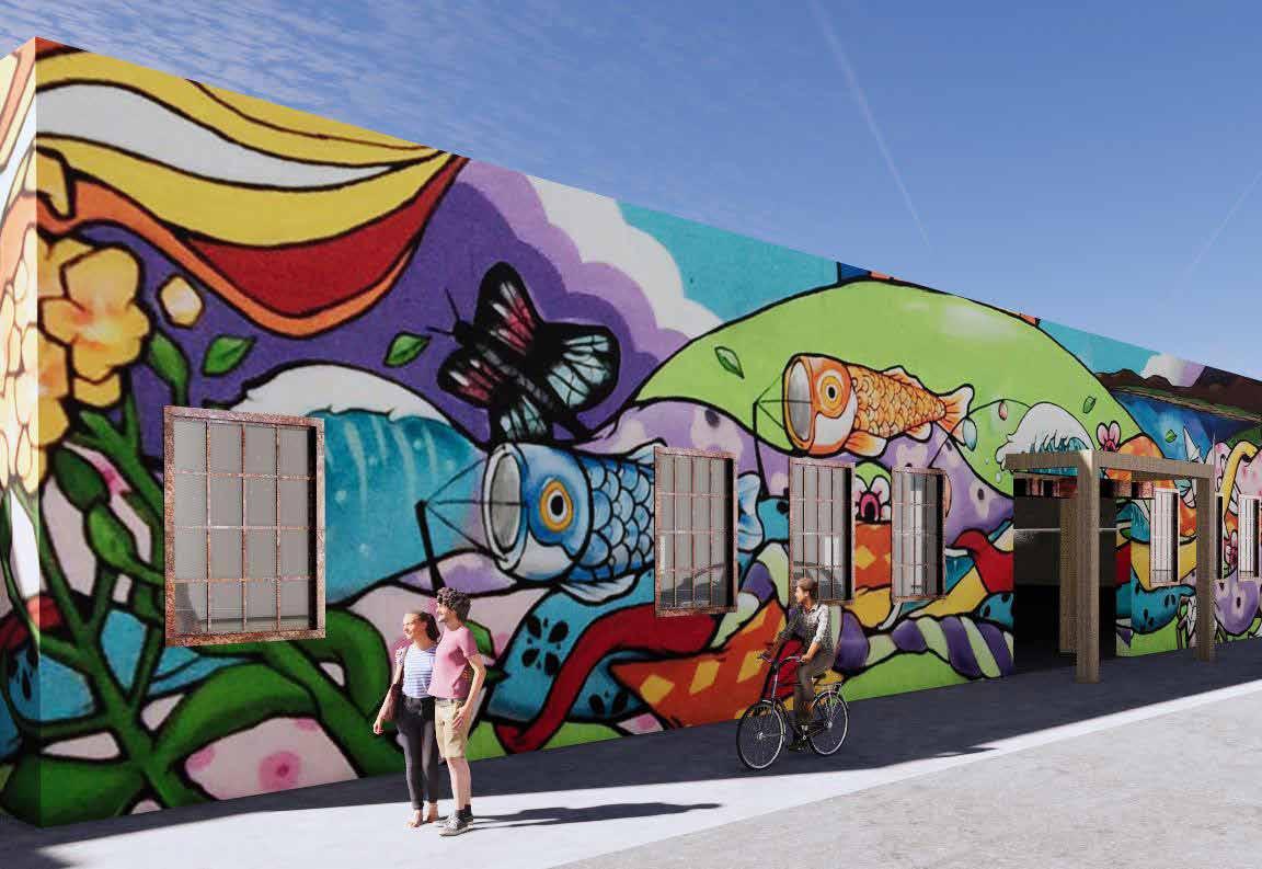
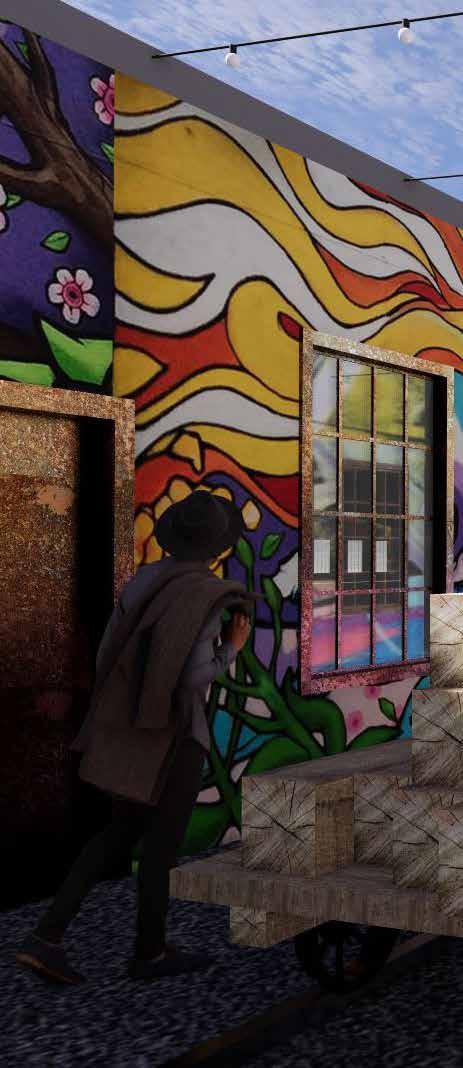
A notable feature sure to be a highlight is the incorporation of public art throughout the site. RDG proposed the installation of vibrant murals with the addition of sculptural pieces strategically placed to hide mechanical and electrical boxes. Due to a limited budget, much of RDG’s proposal focuses on how to repurpose
37 Fall 2023 Unicameral RDG Planning & Design
existing materials into new and useful objects like planters, benches, and lighting. “There's not a large budget for new improvements, the main goal is to create spaces accessible to artists. It's intended to respect the history of the site and make sure it doesn't change the vernacular,” said Bruce. RDG’s masterplan provides many opportunities for local artists to make their mark on the space and showcase their work. The eye-catching murals will hopefully bring visitors further in to explore the site.
At the heart of the Makerhood is a large plaza which will provide several opportunities for engagement between artists and the community. This area will become an adaptable space for community events like art fairs, musical performances, and farmer’s markets. To help facilitate these events, the space includes a stage, stepped seating, and a special pavement design. The concrete patio is offset with a line of dark brick tiles at 10-foot intervals providing the perimeters for the installation of tents or tables. The space will help bring people into East Omaha and boost the economy of a oncederelict district. The timeline has not yet been solidified for the start and completion of Makerhood. Currently, Future Forward is prioritizing its funding. Regardless of the site’s challenges, RDG hopes to see the project realized. The New North Makerhood site could potentially add an energetic venue for the creative community in the city of Omaha.
38
39 Fall 2023 Unicameral RDG Planning & Design
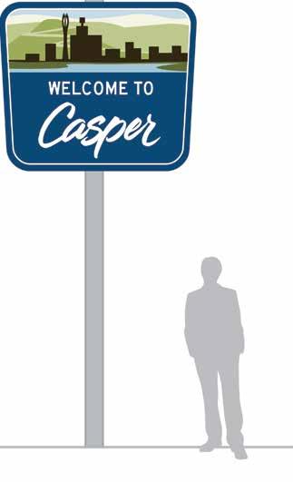
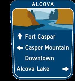
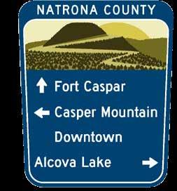
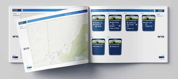
CASPER WAYFINDING MASTER PLAN
40
By Bridget Knudtson
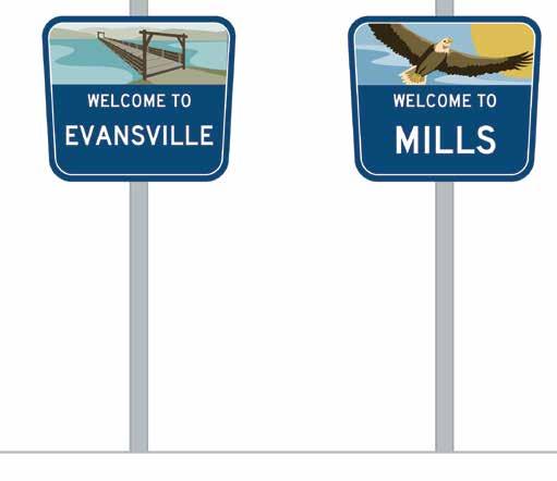
The Casper Wayfinding Master Plan was a team effort between RDG’s landscape architects, environmental graphic designers, and community planners to develop a unified signage and wayfinding standard for the county, cities, and towns within the Casper area in Wyoming.
Leading the team was landscape architect, Ryan Peterson, based in Madison, Wisconsin. The Casper Area Metropolitan Planning Organization (MPO) was looking for guidance in creating and implementing a wayfinding system for residents and tourists to their jurisdiction. With the help of Natrona County residents and Casper MPO, RDG devised a detailed plan for the design and placement of over 200 signs throughout the community. They also gathered extensive GIS data to aid Casper MPO in carrying out the implementation and maintenance of the new wayfinding system.
“The primary challenge was in providing clear directions to key destinations. How do we help people navigate our streets?” says landscape artchitect, Kene Okigbo. He agrees that it is not standard practice for landscape architects to drive the design approach for a signage and wayfinding project: nevertheless they are an important asset to the multidisciplinary team in design development. “Making something that worked for all of these different jurisdictions, both in aesthetics, function, and cost, was going to be huge because Evansville compared to
41 Fall 2023 Unicameral RDG Planning & Design
Casper are drastically different size communities with drastically different budgets.”
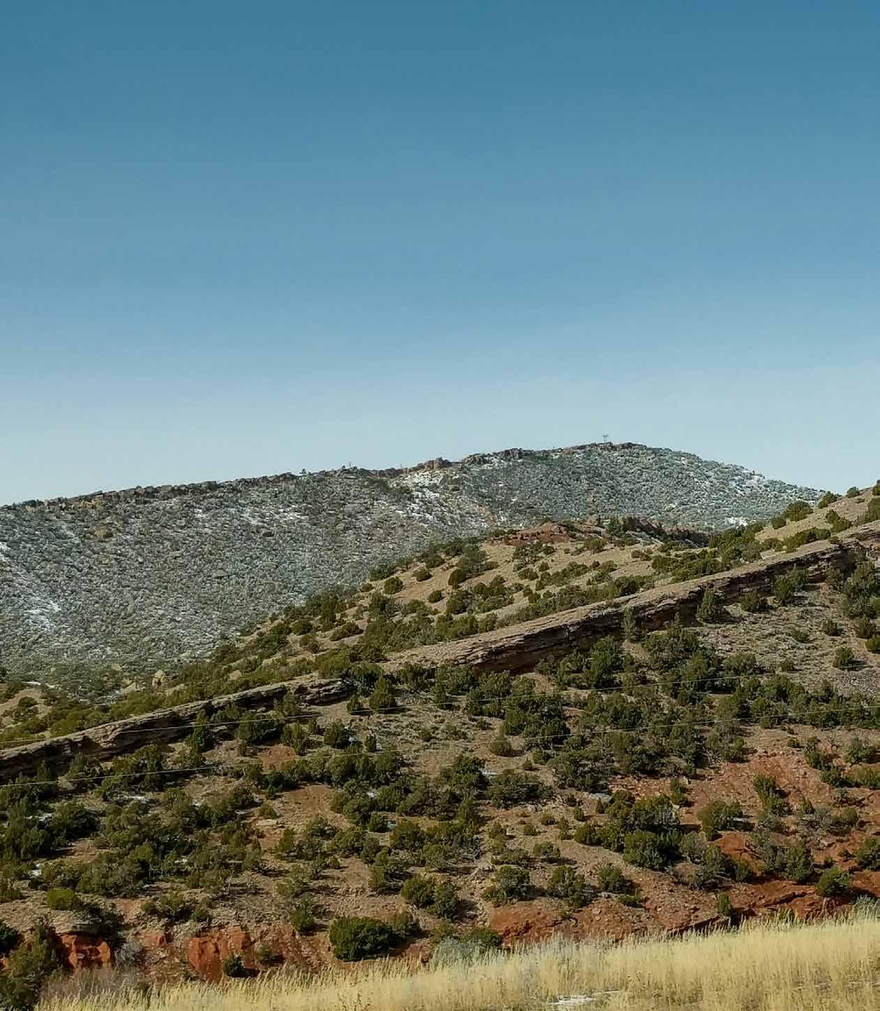
The team relied on public engagement to determine what was most valued by each community within the client’s jurisdiction. Determining areas that receive heavy traffic, Casper Mountain was identified as the premier destination for tourists. Prioritizing by location, RDG submitted specifications for over
200 vehicular signs for Natrona County. The effort involved combining huge amounts of data both received from Casper MPO and generated by RDG’s GIS specialists. This included data on traffic flow, road speeds, and the coordinates of each location. The final deliverable for the project was a GIS database comprising completed information and location of every sign.
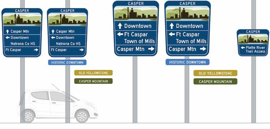
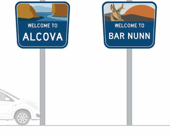
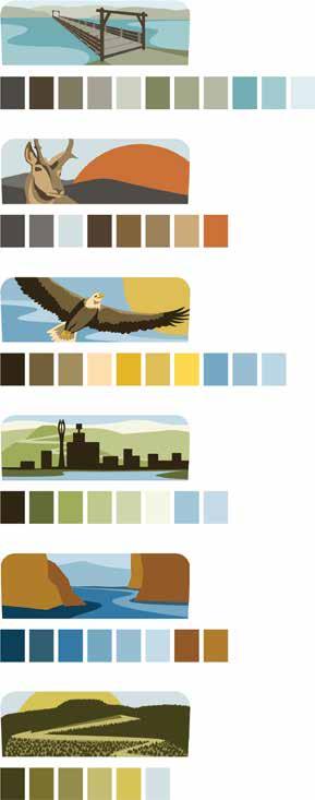
In-depth studies of iconography representing each community was tasked to the graphics team. “While visiting the project site, we prioritized exploration of the environment, noting flora, fauna, and everything in between, these facets represent what is important for our community,” says Okigbo. Each community was assigned a unique image and color palette to symbolize that jurisdiction. The town of Casper is symbolized by its iconic skyline, the Waterways region by an
image of the North Platte River, and the town of Bar Nunn a native pronghorn. Bar Nunn was another instance where public engagement proved invaluable. Where Main Street was once an old landing strip, an aircraft seemed the logical choice for iconography. That was not the case, as the residents of Bar Nunn felt little connection to their aviation history and instead opted to choose the beloved Nebraskan wildlife: the pronghorn.
42
As a final exercise, Casper MPO asked RDG to provide several options for gateways into the community. Okigbo and his team proposed designs aligned with the existing style of the architecture and materials in Casper. The town is phasing RDG’s wayfinding standards into new construction projects. Rather than replacing all the
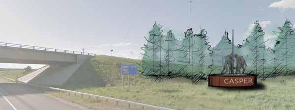
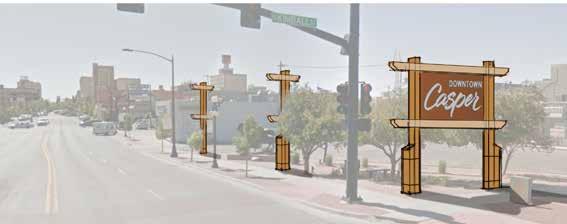
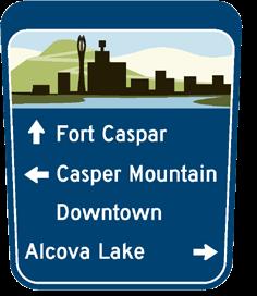
signs in their jurisdiction at once, they are updating signs and markers as new construction projects begin. The local community anticipates that the signage and wayfinding system will help establish a positive identity for Casper, providing an enjoyable experience for tourists to discover their beautiful environment.
43 Fall 2023 Unicameral RDG Planning & Design
LA VISTA CIVIC SPACE
A Spotlight on Community
By Bridget Knudtson
44
La Vista Civic Space, dubbed the “Interface,” provides a new cultural hub for the community and connects La Vista’s City Centre to Central Park. RDG has a long history with the city and has been a part of a decades-long process to develop La Vista’s central core. Their first project in La Vista was a master plan turning a par 3 golf course into Central Park in 2011. Now that the park is complete and the city’s core is on the rise, the landscape architects at RDG were hired to merge the two projects into a nexus for art and culture. With 38 feet of vertical grade change, an indoor/outdoor music venue, and a sensitive wetland to work around, the effort was no small feat, but the team at RDG once again delivered. Though the work was gained through an RFP, it was RDG’s familiarity with the community and diversity of skills that set them apart. Oftentimes in the world of planning, the firm that does the initial master plan is not the same group that designs and constructs the project. “You’re setting it up for somebody else to dunk,” explains Okigbo. But RDG Planning & Design has a secret weapon that many groups lack, and it says so right in their name. Bruce Niedermyer adds, “I think what helps us be successful in those pursuits is showcasing exactly what Kene is describing: our ability to take a project from early planning through implementation, whether we have the invitation or not, it doesn’t necessarily matter.” RDG has a strong focus both in the worlds of planning and in architecture and design. The firm employs a diverse group of professionals who excel in their respective fields but are also able to navigate the overlaps between the two disciplines. This trait allows RDG to take on projects like the Interface and see them to completion.
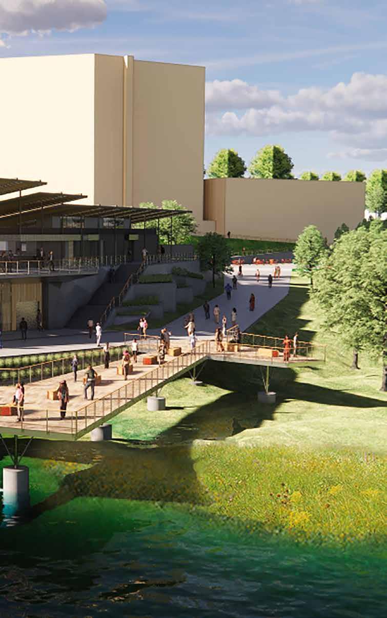
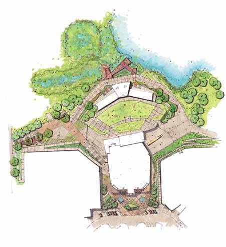
45 Fall 2023 Unicameral RDG Planning & Design

46
The Interface involved a crossover of multiple disciplines including landscape architects, architects, engineers, artists, and urban planners. The team had three goals for the space: to converge people into the space; build energy around it; and amplify that out into the community. At the center of the project will be a new indoor/ outdoor music venue, designed by a separate firm. This venue provided key inspiration for the Interface. “This angularity of a spotlight was big from early on, shaping how these spaces get created, and how they relate to one another.” Niedermyer says, “And so we ended up with multiple zones in the overall design, but each one is kind of informed by that iconography.” The first zone, City Centre Commons, provides a front door to the downtown and welcomes visitors into and around the music venue. The angularity of the design aids in this process. The team wanted to enhance the design of the music venue, while also keeping in mind that the form will change as work moves forward. Carefully placed landforms, benches, and water features compliment the angles of the venue, while providing much needed shelter from the street and the elements.
The second of the three zones RDG created is La Vista Landing. Located northwest of the music venue, the landing accounts for 27 of 38 feet of grade change. A grand staircase and ramping system are carefully carved into the hillside to safely get visitors down to the level of the park. This zone includes colorful seating, play equipment, and
picnic tables which point to La Vista’s past. “La Vista was first established as a bedroom community and people, when they first moved there, didn’t know anybody. So they would have these community dinners where all their neighbors would come together, potluck-style and just get to know one another.” From this came the idea of the Community Table which Niedermyer and his team wanted to implement in the final scheme.
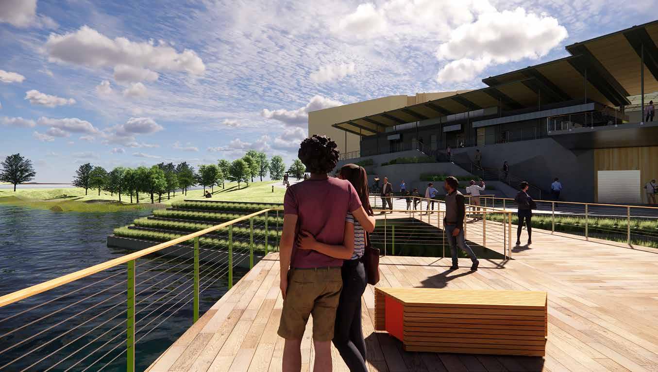
To the east of the landing is the true star of the entire design: a pavilion connecting with the music venue and overlooking Central Park Pond. The form of the pavilion again embraces the spotlight iconography with elegant, angled roof structures that provide shade and directionality for the whole complex. This building was done in collaboration with RDG architects and lighting designers to give the right feel to such a monumental structure adjacent to an idyllic park. Geometric planters along the edge of the overlook blend the building into its context and move visitors to the final zone of the design. The final zone, Water’s Edge Terrace, expands the usable park space and offers cohesion with the pavilion and overlook. The terrace is suspended above the lake in order to maintain usability during a storm event in which the park’s retention pond can fluctuate up to ten feet higher than normal.
Finally under construction, the building’s strong angular iconography remains intact. The Interface is a triumph by landscape architects, Niedermyer and Okigbo in collaboration with RDG’s multidisciplinary team.
47 Fall 2023 Unicameral RDG Planning & Design
48
49
SPLIT OR STEAL
By Brendan Colford
The Architects Dilemma: Split or Steal is a thought experiment based on a game theory concept called the Prisoner’s Dilemma, created in 1950 by Merrill Flood and Melvin Dresher.
50
The experiment goes like this: two participants are presented with a large sum of money. Each participant is then given the option to press one of two buttons; one to split the pot between the two of them, and one to steal the pot for themselves. However, there is a caveat. If both players choose to steal the pot, they get nothing. Neither player can see what the other chooses. If Player One chooses to split and Player Two chooses to steal, then Player One gets nothing. This is where the Prisoner’s Dilemma comes in. The Prisoner’s Dilemma shows why two completely rational individuals might not cooperate, even if it appears that it is in their best interest to do so.
The Farnsworth House, first designed in 1946 and then built in 1951 by Mies van der Rohe, is an iconic masterpiece of internationalstyle architecture. It has no doubt been used countless times as a design precedent for aspiring architects looking to emulate its deceptively simple elegance. One year earlier, Philip Johnson announced the completion of his own design, aptly named Glass House. While not totally similar to the Farnsworth House, it’s not entirely dissimilar either. Johnson admittedly used Mies’s designs as a basis for his own: this culminated in Mies supposedly telling Johnson that he got the design all wrong.
Despite the apparent similarities and criticisms, Glass House is widely considered one of Johnson’s best designs. Whether or not these two designs are rip-offs of each other is not the point I am trying to make: these are both highly celebrated works of architecture regardless of their context to each other, but should their context to each other matter at all? Is it better to split your work in the hopes that others will choose to split as well, rather than stealing it for themselves? By safeguarding our own designs from becoming a facsimile of another, are we just contributing to the dullness of our own built environment? We must ask ourselves what is actually important when it comes to architecture.
The Architect’s Dilemma, much like the Prisoner’s Dilemma, is that designers want to improve and leave a mark on the world, but they want that mark to be their mark. Imitation is tolerated to a fault, do it too shamelessly and you lose total authorship of your work.
SPLIT/SPLIT. T his is typically the sweet spot of design. Everyone wins, ideas are shared, and boundaries are pushed. Architecture shouldn’t be the baseless stealing of ideas or the gatekeeping of good ideas, but a careful mix between the two, a mutually beneficial imitation and improvement of what we got right about design while still protecting the unique beauty of what made the first design successful. Architecture (especially Architecture school) has this concept of precedent, aka the projects you look at on archdaily.com and spend the rest of the design process retrofitting your design intent to back up your eerily similar design. This is tasteful imitation, pulling from multiple designs to create an original piece of work that may or may not be strongly influenced by a single design. When publishing work online or in journals, a designer understands that their ideas might become a part of someone else’s idea. If everyone operated this way, our built environment would be filled with beautiful, unique designs.
SPLIT/STEAL. A more cynical food for thought is that stealing is good— if it looks good. At the knife’s edge of imitation is the carbon copy, the unabashedly unoriginal design, the kind of building you look at and think, “that’s a Fay Jones building! What’s that doing here in Nebraska?” Shameless? Yes. Wrong? I’m not so sure. I would say we should lean further into imitating other projects. Steal, but steal well. In an idealist world, this wouldn’t be necessary, but we live in a built environment plagued by ugly design. At a certain point, when does it stop being about the ethics of ideas and start begging the question, “how do we effectively improve our surroundings?”
STEAL/STEAL. The problem with uninspired stealing is that, at some point, you end up with junk design. We’re talking cookie-cutter houses, strip malls, those “Live, Laugh, Love” signs everyone’s mom puts in the living room. This is a Steal/Steal situation, both players have lost, game over. This is where the power of the architect comes in. It’s the duty of the architect to ensure good quality work is produced; the source of that work is of secondary importance when it comes to improving the lives of people.
WRAPPING UP. Architectural intellectual property does have its issues with plagiarism but not nearly as much as entertainment media or product design. There’s no shortage of junk knockoffs of good products out there, it’s basically all Split/Steal and Steal/Steal at this point. Architecture suffers from the opposite problem: there’s an immense amount of good-quality ideas being put out and a total underutilization of those ideas. Bad ideas are being ripped off and good ideas stand alone as monoliths to great design. It’s not enough that these good ideas exist: they need to be used, and they need to be used a lot.
51 Fall 2023 Unicameral Essay: Split or Steal
By safeguarding our own designs from becoming a facsimile of another, are we just contributing to the dullness of our own built environment?
Pre-Crit C o nfidence
DARE THEM TO TEAR APART MY DESIGN
WOULDN'T THOUGH, RIGHT?
Overheard C o n versations
I
THEY
IT'LL PRINT IF I LEAVE
BACK LATER TAPE AND STICKY NOTES EVERYWHERE, THIS IS WHY WE CAN'T HAVE NICE THINGS
A DIAGRAM IS SUPPOSED TO SIMPLIFY A DESIGN MAYBE
AND COME
C o mments
BUT I NEED THEM TO KNOW ITS NOT A SIMPLE DESIGN Studio
I'D RATHER CLEAN UP A MAKE2D THAN READ THIS ARTICLE
SHOULD I DRAW EVERY MULLION LINE?
THAT WOULD TAKE HOURS
A LITTLE ERASER FOR LITTLE MISTAKES
YOU MIGHT NEED A LARGER ERASER
I UNPLUGGED MY LAPTOP 15 MINUTES AGO AND IT'S ALREADY DOWN TO 40%
WHOSE SKETCHBOOK JUST FELL AND HIT ME!?
hT e A r c h i te c ture StudentDilemma
C o n v e snoitasr
Overheard
Photography: © 2023 Madeline Cass 54
The Bridge to Collaboration
By Mitch Neujahr
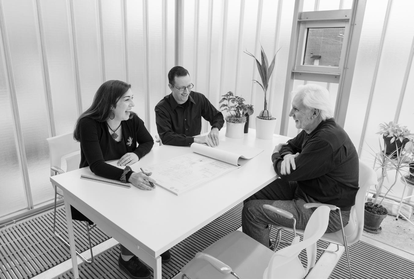
Mentorship plays a pivotal role in career development. In architecture, this could not be any more true. Mentors are crucial to the architecture industry; they help guide and shape the next generation of designers. Having a mentor is helpful during every stage to becoming an architect, but it is much more crucial during the beginning of your architectural career. At Carlson West Povondra Architects (CWP), mentoring the next generation of designers is central to their firm culture. CWP states that, “strong mentorship helps us maintain continuity of firm culture as we look to the future.”
There are currently 24 employees at CWP and each play a role in making CWP a successful firm in Nebraska. They pride themselves on having a diverse group of people of all ages and backgrounds. They have recruited and maintained a highly-motivated staff, and each employee has the ability to bring their own perspective to future projects. The more experienced staff are partnered with younger designers providing a balanced collaborative environment.
CWP’s built works around Nebraska include a wide range of project typologies. Their “experience and expertise encompass 35 years of work in commercial, educational, municipal, justice, public safety, recreational, healthcare, civic/community, senior and supportive housing, and spiritual architecture.” They solve the needs of their clients with an innovative design approach that is unique to each project and specific to its user type.
During my interview, I sat down with Al Povondra, Owner; Bob Soukup, Principal; and Jamie Eckmann, Business Development/Interior Designer. Al Povondra started the firm in 1987, having previously worked at Leo A Daly, then as a staff architect under Paul Rudolph. He then went on to work for DLR Group before venturing on to start Carlson West Povondra. Bob Soukup earned his architectural degree at the University of Nebraska-Lincoln and soon after graduating, he came onboard at CWP. Jamie Eckmann is one of three interior designers at CWP and also leads business development. She has been working at CWP for 16 years and has enjoyed every minute of it.
The CWP office has undergone many renovations since its establishment in 1987. Initially a Great Western Bank, the building was purchased by several attorneys. One of the attorneys, Mike Boyle, was the former mayor of Omaha. Eventually the office of attorneys broke up and the building went up for sale in 1992, that’s when Povondra bought the property. Soukup said, “for a time we shared this building with the graphic design firm, Webster Design,” and the two firms split the building in half. Granted, CWP was nowhere near the size it is today, and it was manageable. Dave Webster, the founder of the graphic design studio, ended up merging with another company and sold his business. The timing was perfect because CWP was growing quickly and needed more space.
55 CARLSON WEST POVONDRA ARCHITECTS
Left to right; Jamie Eckmann, Bob Soukup, and Al Povondra.
The building located at 5060 Dodge Street has been through many renovations over the last three decades. One of the most notable renovations made by CWP in 2003, addressed the entrance facing Dodge Street. Before this renovation, the ordinary entrance to the building was hardly noticeable to drivers passing by. The final design has stood the test of time, its modern style looks as though it was designed yesterday. When Soukup led me through this entrance, he emphasized that this renovation was important because, at that time, CWP’s design vision became a major factor in the future success of the firm. Their most recent renovation, completed in 2017, accomodated the growth of the firm by providing a more suitable space for effective collaboration.
Beyond the front desk on the second floor are spaces that can be closed off, offices designed for private meetings or calls. Soukup explained that they want the firm to be open and collaborative but also allow for private rooms when needed. On the first floor is a large, open studio filled with architects. This space is surrounded by offices on the perimeter and a large central meeting desk. The desk positioning acts as the bridge that joins everyone together. The open studio space is reflective of who CWP is as a firm. Walking through the space, observing everyone working together in harmony was motivating and inspiring.
56
57 Fall 2023 Unicameral Carlson West Povondra Architects
LEXUS OF OMAHA
Driven by Modernism
By Mitch Neujahr
If you live in Omaha, it is hard to miss the Lexus of Omaha dealership on 130th and Dodge Street. Its modern appeal is timeless beyond its construction in 2014. Carlson West Povondra Architects (CWP) was tasked to meet the highest levels of design thinking to represent the luxurious standards of the Lexus brand.
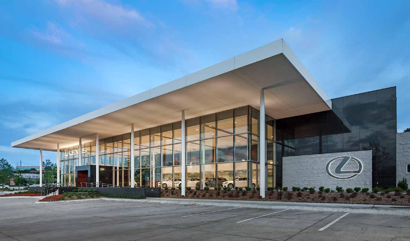
Al Povondra led the team with Mike Lacey and Bob Soukup as project architects. Povondra explained that “Lexus decided that the dealership was outdated,” with very few corporate architecture existing around Omaha at that time, “CWP had complete freedom to re-imagine the building.” Complete freedom. Some might see this as a huge benefit, but with unlimited freedom it's sometimes hard to know where to start.
Povondra said, “There were no blueprints established so we started with the founding principle of designing a museum for cars.”
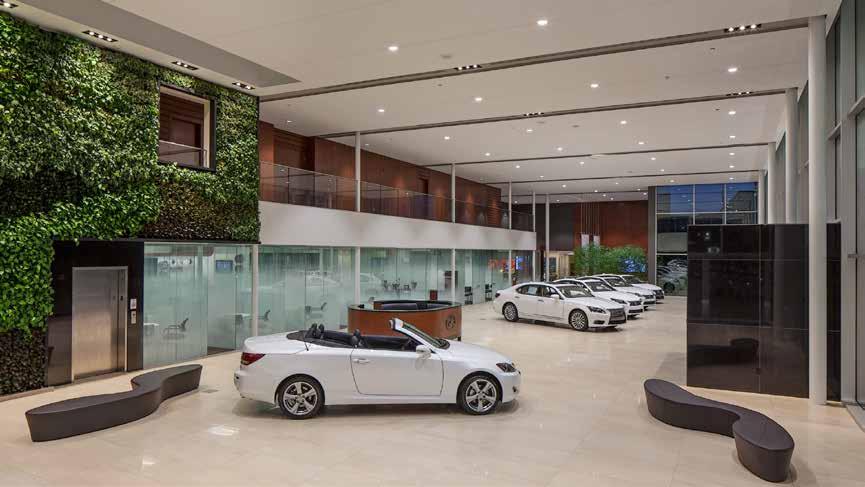
Katsuhiro Yamaguchi was the main inspiration for the project, he explained. More specifically, they looked at Yamaguchi’s renovation to the Museum of Modern Art in New York. The Japanese architect uses elegant canopies and deep overhangs in his projects and this is reflected on the Lexus of Omaha building. The large deep overhang canopy makes the building look streamlined and elegant. The 7.1 acres of land was at a lower grade than Dodge Street. The client wanted to make sure the building was visible from the busy expressway. In order to achieve this, the building was raised up by sculpting the terrain. This also helped the building rise over the parked cars out front. Onlookers are able to see directly into the entrance from Dodge Street without obstruction. Lifting the building onto a “podium,” as Povondra describes it, allows for the main design feature of the building to stand out more—this feature being a sustainable biophilic wall.
58
Povondra is a “big proponent of biophilic design,” a reoccuring design element seen in other projects designed by CWP around Omaha. He explained, “It’s was one of the first green walls in Omaha.” A biophilic wall at this scale comes with a commitment from the client to maintain the health of a living wall. Soukup explained, “there will be varying degrees of sunlight and different amounts of moisture from the top or bottom of the wall.” A variety of plants were strategically placed throughout the wall space to create a well-balanced growth.
The dealership includes a service garage, a detached detail bay, and a carwash to the south. The service garage houses 33 service stalls with rooftop parking that can accomodate 70 cars. The project site is surrounded by single-family residences to the south. Povondra mentioned that the south area is protected by a thick wall of trees to keep the noise and light pollution away from the residential area.
The 60,000-square-foot dealership houses two showrooms, a customer’s lounge area, sales offices, and an employee fitness area. The material choices of the interior reflect the richness of the luxury vehicles in the showroom. The subdued interiors accentuated with rich mahogany wood, combined with the textures of the green biophilic wall, sets a stage that is both environmentally-aware and impactful to the experience of a potential Lexus owner. To catch a glimpse of this modern building from the expressway should appeal to anyone interested in buying a luxury car, at minimum, and also to lure those who appreciate and understand thoughtful architecture.
59 Fall 2023 Unicameral Carlson West Povondra Architects
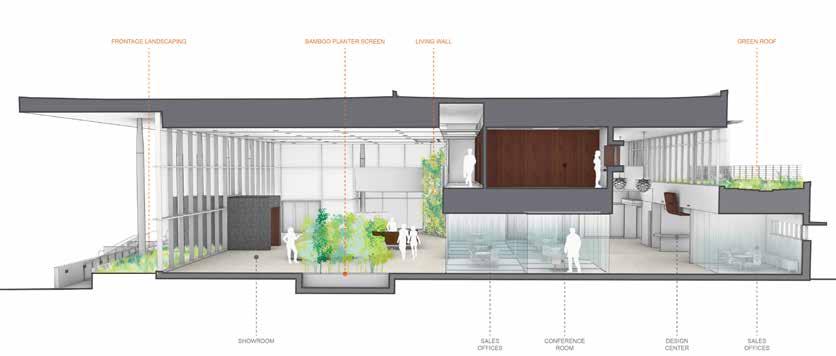
SECTION
Landscaping
Sales
Photography: © 2023
Frontage
Bamboo Planter Screen Living Wall Showroom Sales Office
Office Conference Room Design Center Green Roof
Tom Kessler
AN EVOLVING URBAN CORE
By Louis Khu
When was the last time someone told you they wanted to move to downtown Omaha—or Nebraska in general—for the rest of their lives?
60
People are always talking about wanting to move away to California, Florida, or New York; Nebraska is not even close to being a part of that conversation. If we take inspiration from successful urban redevelopment initiatives, could we make incremental adjustments towards our very own downtown Omaha? We’ve already seen a wide range of cities successfully urbanize their downtown core, such as the River District in Portland, Oregon and Brick Town in Oklahoma City. Downtown Omaha has been playing it too safe when it comes to ambitious design, and it’s scaring off our architects, communities, and businesses.
In recent years, the Greater Omaha Chamber Committee has decided to push our urban core to the next level. According to the Urban Core Strategic Plan, recent market studies indicate that our urban core is falling short of capturing the jobs and population it should. This has caused a negative impact on the neighborhoods surrounding the core on both sides of the river. The committee’s response is to invest $425 million towards a major revitalization project through the brand-new Gene Leahy Mall and the upcoming Kiewit Luminarium project, both of which will serve to reactivate the aging riverfront parks in downtown Omaha. We need to make sure we not only reactivate our core but also build upon and continually revitalize our central city to maintain growth. The committee makes it clear their mission is not to fix the problem in a short-term manner, but to help it develop into a model metropolitan area for others to emulate moving forward.
Though Omaha is behind on urban trends, we are already starting to see incremental developments. Take the new Gene Leahy Mall for example; Omaha’s version of Central Park Mall in Manhattan. This piece is one of three upcoming parks which include a sculpture garden, performance pavilion, and dog park. Surrounded by restaurants such as Omaha Tap House, Kitchen Table, and Dynamite Woodfire Grill, the Gene Leahy Mall component can serve as an extension of the Old Market district which is within walking distance. Overall, the parks are expected to increase civic engagement between downtown and the riverfront.
So, what can we expect moving forward? Over the next 20 years, this plan aims to attract 30,000 residents and 30,000 jobs to the urban core, drastically increasing the density of downtown Omaha. Public transportation will be developed to support a growing urban population as affordable housing programs provide new communities for diverse income levels. For the first time, outsiders may finally be interested in embracing a lively urban lifestyle in downtown Omaha. And maybe this will help put an end to the stereotype that Nebraska is nothing but plains and cornfields.
61 Fall 2023 Unicameral Essay: An Evolving Urban Core
Downtown Omaha has been playing it too safe when it comes to ambitious design, and it’s scaring off our architects, communities, and businesses.
ALLEY POYNER MACCHIETTO ARCHITECTURE
People First
By Mitch Neujahr
Alley Poyner Macchietto Architecture (APMA) started out as a two-person group in a spare bedroom and has grown to become one of the most influential and successful firms in Nebraska. APMA prides themselves on putting people first and they “aim to lift up communities, making them more beautiful and vibrant, helping them be healthier, and inspiring them to learn and create.” Eric Westman, a long-time architect at APMA, explained in that they have a strong “dedication to put people first.”
With a current staff of 67 employees, their firm culture revolves around a sense of community and collaboration. Westman defines the firm culture as a place to “absorb” information in an open and collaborative environment. APMA architects, interior designers, and engineers are a varied group of people, they bring perspectives from different backgrounds and are dedicated to making Omaha a better place.
Westman, who earned his bachelor of science in architecture at the University of Kansas, wanted to become an archaeologist from early on in his childhood. In the 8th grade, his academic choices were limited, so he instead chose the next subject in alphabetical order to archeology which, as you might have guessed, was architecture.
APMA has a diverse range of project types in their portfolio in Nebraska and across the country. Projects range from government buildings to theaters to food halls. Over three decades of experience have produced award-winning architecture and interior design. Their website states: “we strive to create spaces that not only perform functionally, but also stir the imagination of their users while reconnecting them experientially to the world.”
62
Opposite page, left to right; Victoria Estep, Eric Westman, Loucinda Bauer, and Jeanie McCorquodale, design team for The Switch.
63 Photography: © 2023 Dana Damewood, Courtesy Alley Poyner Macchietto Architecture
The firm has two offices: one in Omaha, and one in Red Oak, Iowa. They were first founded in 1987 in a spare bedroom and have grown into a firm powerhouse in the Omaha area. The Omaha office is in the vicinity of the Charles Schwab baseball field on 16th and Cumming Street. With collaboration being the key to APMA’s success, the studio space is open to promote interaction between employees.
The front entrance is tucked behind a large parking lot. It can be easy to miss when driving down Cumming Street. At the entrance you are greeted with a massive open aperture spanning multiple floors that extend to the rooftop allowing natural daylight to filter down to the ground floors.
The studio is an open environment and cubicles are non-existent. Despite the expanse of this open space, it was a surprisingly quiet workplace. Large windows on the north and west side of the building provide natural light throughout the day minimizing the need for electrical lighting.
High ceilings enhanced the openness of the space. Modern and minimalistic in style was consistent throughout the building. The materiality and color schemes, which are a mix of neutral and vibrant tones, create an effect of calm for creativity. Conference rooms and open spaces provide a healthy balance between private meetings and team discussions promoting interactive collaboration.
64
65 Fall 2023 Unicameral Alley Poyner Macchietto Architecture
THE SWITCH BEER AND FOOD HALL
Setting the Bar High
by Mitch Neujahr
Local food has always been an important aspect of Nebraskan culture. It can be a competitive scene for some local restaurants around Nebraska. The Switch Beer and Food Hall provides a home for up-and-coming local restaurants and provides a space for the citizens of Omaha to indulge in unique foods and drinks. APMA, the main designer for the food hall, “provides the perfect opportunity to celebrate Omaha’s industrial history and agricultural pedigree, all with a forward-thinking view of our city,” according to Eric Westman.
The Switch is capable of housing seven unique vendors with both indoor and outdoor dining. Westman explains they gained inspiration from the Milk Market in Denver, Colorado. The food hall in Denver is a much larger scale, with over 16 venues, but still helped APMA to start developing their own twist to define what a local food hall could be.
The waste solutions for the food hall is one of the best in the country. When consumers dine at the Switch, 100% of what’s tossed will be composted. They have set a zero waste goal, where 90% or more of expected waste output will be diverted from the landfill. Most importantly, The Switch educates take-out customers how to responsibly dispose of those materials.
What set this food hall apart from the rest was the fact it was a 3-Star Certified Green restaurant. To achieve this, they chose eco-friendly design routes like 100% LED lamps, dry wall with 95% preconsumer waste, and solar heat-blocking window film. Westman stated that it was a challenge to meet these goals due to the different needs of each vendor with varying degrees of requirements.
The Switch has closed business at the time of this writing; it is undergoing a new renovation and rebranding. The Switch was a creative concept that enabled local vendors to thrive; we hope to see something similiar to develop in the future.
66
Photography: © 2023 Emma Morem
REDLINING’S RIPPLE EFFECT
By Meagan Willoughby
Contamination Snow. While lead is often discussed concerning lead toys and household paint, in Omaha, residents in some neighborhoods unknowingly inhaled lead for over a century. The city was home to multiple lead-smelting plants, in operation from roughly 1870 until 1990, piping contaminants high into the air to then fall onto the neighborhoods around it and the Missouri River nearby in the form of “lead snow.” People had the potential to ingest lead from simply gardening or playing in their yard, where the soil had absorbed the lead snow for decades.
68
Lead exposure’s worst effects occur in children and infants. Early in life, lead exposure can interfere with gene development and can lead to an increased risk of disease and chronic health conditions. Lead exposure in childhood has been linked to increased aggression and likelihood of incarceration, and the health effects can include memory loss and difficulty concentrating, mood disorders, hearing and vision problems, and cognitive disabilities.
The worst of this lead pollution fell within a 7-mile radius from the plants. In a single zip code, over 40% of children tested showed elevated lead blood levels in 1998. Upon this shocking discovery, the City of Omaha invited the EPA into the city to help remediate. Within the 7-mile radius from the plants, 25% of children displayed elevated lead blood levels. The EPA designated a 27-square-mile zone contaminated and was officially labeled a Superfund site—the largest in the US.
Omaha’s Superfund site is home to a much larger percentage of the city’s Black and Hispanic population than the city, overall. This reflects a troubling but well-documented pattern in the US showing that, on average, areas with larger populations of racial and ethnic minorities experience higher levels of pollution and contamination. But why does this occur?
DESIGNED SEGREGATION. In the 1930s, the Home Owners’ Loan Corporation (HOLC) inaugurated a practice of analyzing and categorizing areas of a city into one of four categories: A) Best, B) Desirable, C) Declining, and D) Hazardous. This process was known as redlining, and it occurred in hundreds of cities across the US. It aimed at providing relief from the Great Depression by assessing “loan risk” based on home location.
On paper, determinations on how a neighborhood was rated were done using qualities like average home age, home prices, and proximity to industrial areas. In practice, racist ideas coupled with housing covenants that had kept any racial minorities out of White neighborhoods made it simple to redline existing non-White neighborhoods and classify them as “D” areas. Any areas with low income were similarly classified.
Homes being bought in “A” areas had low interest rates, while those in “D” zones had very high interest rates. Those who were deemed more likely to default on a loan were given the worst deals. This heavily affected all low-income Americans, but disproportionately affected minority Americans - mainly immigrant populations: Black, Hispanic, and Latino Americans. They were relegated to areas designated “declining” or “hazardous.”
69 Fall 2023 Unicameral Essay: Redlining’s Ripple Effect
This heavily affected all low-income
Americans, but disproportionately affected
minority Americans…
DISTRIBUTIVE INJUSTICE.
In Omaha, redlining funneled low-income and minority populations into hazardous neighborhoods close to the lead-smelting plants, disproportionately distributing the risks among neighborhoods rated C and D, but the consequences of redlining go far beyond the lead pollution in Omaha. Across the country, A and B neighborhoods (also known as “greenlined” neighborhoods) were afforded more opportunities and privileges, while passing over C and D areas for improvements in places like neighborhood infrastructure, green spaces, and employment opportunities. Cities invested in areas they perceived to be worth more, and redlining became a selffulfilling prophecy.
Without the necessary investment in redlined neighborhoods, these areas were much more likely to remain stagnant or decline and the effects are still seen today. The vast majority of these neighborhoods have remained low to moderate income. Property values in D areas have risen 52% less than similar properties in greenlined areas over the last 40 years. Lower property values and therefore lower property taxes in these neighborhoods led to less funding for schools, and consequently show lower test scores and lower satisfaction with schooling when compared with their greenlined counterparts.
Neighborhoods in redlined areas were demolished when new facilities like highways or landfills needed to be built as the city would be losing the least perceived value by choosing a D neighborhood over an A neighborhood. This contributed to the continuing higher rates of exposure to hazardous materials and pollution, as well as further decreasing the home values for homes surrounding it. Compounded with redlined areas having less access to nutritious food and less accessible healthcare, this is especially dangerous. On average, people living in previously redlined areas are shown to live five years less than those within greenlined areas. Without the investment needed to mitigate these effects, stopping the cycle becomes more and more difficult as time goes on. While redlining was made illegal in 1968, the effects that redlining created have continued to affect people in systemic ways that are difficult to notice because they are so deeply ingrained in our society. The lack of investment in a previously redlined community that occurs over decades can easily go under the radar unless we are actively looking.
The lead pollution in Omaha had an easily-studied result: the blood levels in children (with a seemingly simple source), the lead smelting plants and proximity. We could simply choose to stop questioning there, but it’s only upon digging deeper that we can see a much larger, more complex system of redlining that is leading to disproportionately distributed harm today. We will only ever be solving surface-level problems if we are unable to acknowledge when it stems from a deeper issue.
70
TARGETED REINVESTMENT FOR A TARGETED PROBLEM. Between 1999 and 2021, the EPA remediated over 13,000 properties (approximately 96% of those identified) within the Superfund site. Omaha has developed one of the most progressive interventions for lead pollution in the States. The City of Omaha will remediate any property for free if a child has a blood level of 3.5 micrograms per deciliter, the current hazardous level as classified by the CDC, and as a result, only 0.5% of children tested have elevated blood levels today, compared to the national average of 2.5%.
The city has made a concentrated effort to rejuvenate previously redlined areas in more recent years, and there has been marked improvement. The site that once held the famous ASARCO leadsmelting plant has since been demolished, covered with concrete to lock the lead-polluted soil away from humans, and is now home to the new Lewis and Clark Landing. Beyond just eliminating a potential health hazard and decaying site, this solution creates a public green space, bringing more value to the neighborhoods nearby and increasing home values. Construction is ongoing, but the city of Omaha has invested $300 million in the rejuvenation of its riverfront property, setting this area up to be Omaha’s newest urban core. The city has approved additional revitalization efforts for many previously redlined neighborhoods and community groups have been created specifically to address the issues stemming from redlining. This targeted approach toward creating improvements is instrumental in remedying the issues left behind by redlining. Because redlining disproportionately affected certain populations and areas, the ways that we alleviate the issues must be as specific. The work is not even close to done, but Omaha has taken the first steps in creating a more equitable environment for all the city’s residents.
BEYOND REDLINING. Redlining continued the discriminatory agendas originating centuries ago, and inequities have continued to ripple outwards. The policy reinforced structures keeping people systemically disadvantaged, and these populations are still experiencing the effects in subtle but compounding ways. We have made massive improvements in design since the days of overtly racist redlining practices, but our world has never been designed for everyone. Agendas are being pushed, no matter where or what we’re designing, even without our intention.
The choices that we make today and will make going forward will affect people for decades to come, and racist and classist systems are not the only ones in need of being deconstructed. There are huge gaps in accessibility for people with various health conditions or disabilities, neurodivergent people, the LGBTQIA+ community, and many others. Even something as simple as not having access to a car creates an entirely different way that people experience the world. We have the power to passively perpetuate these systems or intentionally dismantle them. It’s irresponsible to act as if design has the power to fix the issues we face, isolated from the systems we work within. But designers do have the unique power in that we are the ones to make decisions about who and what our world will be designed for. Everyone must have a seat at the table.
71 Essay: Redlining’s Ripple Effect
HDR (THE GREAT PLAINS STUDIOS)
Finding the Balance
 By Louis Khu
HDR is an employee-owned firm with over 11,000 employees in over 200 offices around the globe. Building Design + Construction ranked HDR the third largest architecture firm in the world in 2022. They employ architects, engineers, graphic designers, marketing professionals, and many others. Collectively, these people help to make sure that an entire project’s design, from the very beginning with schematic design to structural, electrical, and mechanical engineering, can be completed by the firm. They’ve undertaken projects in all 50 states and in over 60 countries.
I visited the Omaha office of HDR, located in Aksarben Village. Aksarben is a relatively new mixed-use development in Omaha, only having been completed in 2008, and HDR had a large part in its development. The firm has a modest sign along the sidewalk in front of a 10-story building. The shining newness of the building creates a sense of modernity and youth; a fitting setting for HDR. The Omaha office is home to one part of the Great Plains Studio(s), which is a combination of studios in Omaha, Lincoln, and Kansas City. The firm’s architecture studio is located on a single floor, but a social stair lit by firework pendant fixtures creates a connection between the architecture and engineering floor.
Floor-to-ceiling windows frame the entire floor. There are many open desks organized by discipline, much like what you’d expect from such a large firm. These individual spaces are balanced with groups of more collaborative spaces, small private rooms for Zoom meetings or group gatherings, and open tables surrounding the feature staircase. As I walked in, I could see a few of the rooms being used, with people leaning over papers and conversing animatedly.
I sat for an interview with four designers at HDR’s headquarters. Taylor Nielsen and John Dineen, both architects; Andrew Wilson, an electrical engineer; and Rebecca Cherney, a lighting designer, conversed about the project and their experiences at the firm.

HDR appears to be the perfect balance between large and small firms. Despite their size, the way that they work together feels unified and more collaborative. “It really feels like a small firm in that you’re able to express yourself and take ownership within the project in a really strong, impactful way,” said Nielsen. “To feel you have the ability to bring your own voice to a project is really important.” A common theme mentioned was the appreciation in being able to work on local projects. “It’s nice to be able to drive by the projects and see how they’re impacting the community,” said Wilson. The size of HDR has advantages as well. “There are deeper resources,” said Cherney, “We have people who specialize in [everything], so you could just walk upstairs and talk to an expert.”
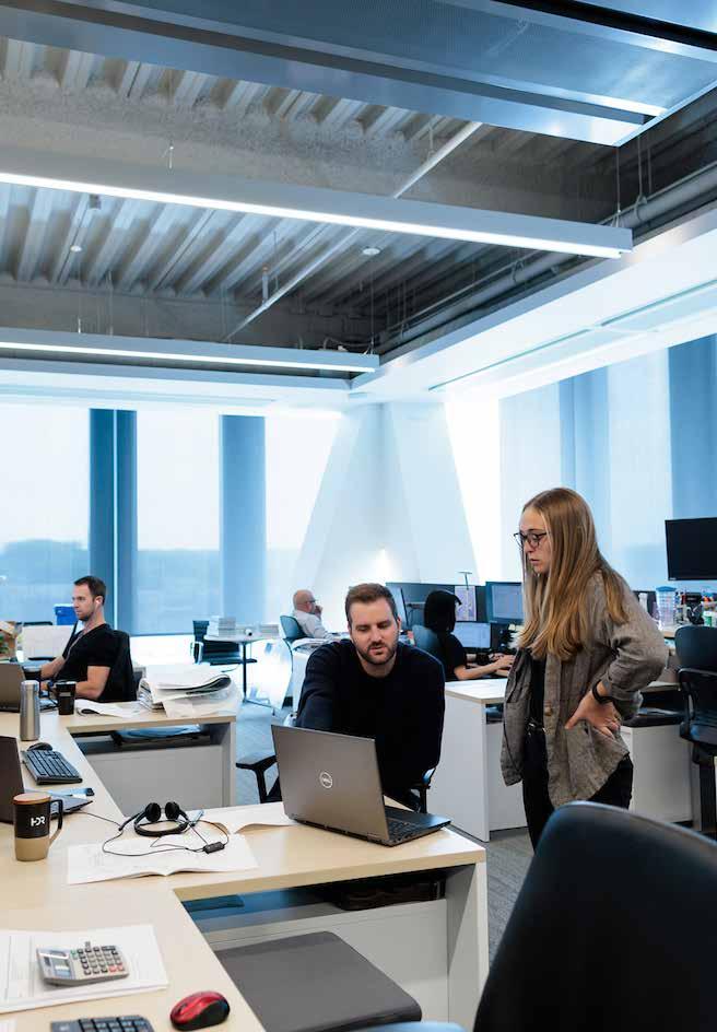
72
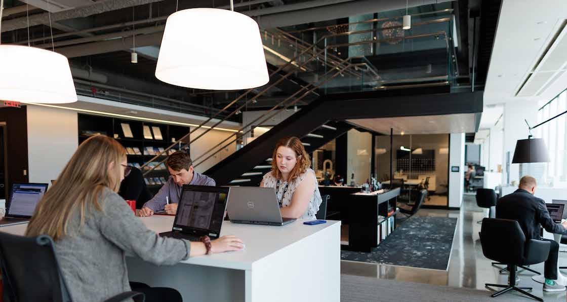
73 Fall 2023 Unicameral HDR (The Great Plains Studios)
Photography:
© 2023 Colin Conces Photography
JUDY VARNER
ADOPTION AND EDUCATION CENTER
Designing for Animals
 By Louis Khu
The Nebraska Humane Society is widely regarded as one of the leading peers in animal shelter and control operations in the Omaha metro region. The facility has undergone significant changes over the last 20 years as standards for building performance and animal care have evolved. I had the opportunity to sit down and chat with William DeRoin, a design principal at HDR who worked closely with the Nebraska Humane Society to design the new Judy Varner Center alongside Animal Arts from Boulder, Colorado. The Animal Arts practice focuses entirely on designing spaces for animals, so they came on board as a valuable partner on the team to lead some of the initial programming needs and provide vision for the renovated space. From 2001 to 2007, DeRoin studied architecture at the University of Nebraska–Lincoln where he received his Master of Architecture degree. After living in Chicago for some time, DeRoin returned to Nebraska to continue his career at HDR. He has over 15 years of architectural experience, most of which have been in the Omaha area.
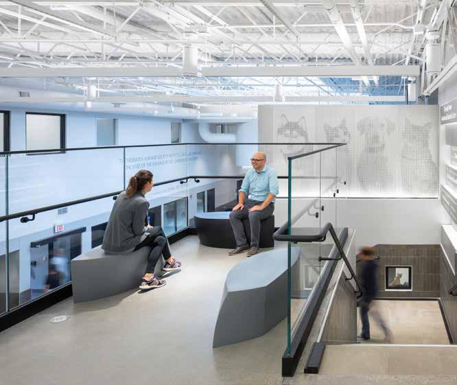
DeRoin pointed out that HDR had previously done work for the Nebraska Humane Society 20 years ago, where they renovated a big box grocery store to become the new headquarters for animal shelter operations. Formerly an empty warehouse, the 65,000 square-foot building was perfect for housing up to 1,000 cats and dogs.
Since design standards and program operations evolve over time, moments of opportunity began to appear. DeRoin explained how the society wanted a serious renovation to undertake a comprehensive design. This is not to say the first renovation was wrong, but the existing problems of air quality and plumbing could not be ignored. DeRoin made it very clear that his team had to go above and beyond with the integration of robust mechanical systems better suited to institutional facilities.
Historically, the Nebraska Humane Society has had greater challenges adopting out cats than they have dogs, so the concept was to have cats directly in front of the entrance. As the cats were front and center, they would be exposed to lots of
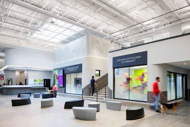
74
Photography: © 2023 Colin Conces, Dan Schwalm
Left to right; Tyson Fiscus, William DeRoin, Jenna Donley
other animals frequently, resulting in high levels of stress, which was one of the big challenges for the Nebraska Humane Society. DeRoin’s team responded by designing a mezzanine level near the entrance to keep cats out of direct contact with other animals entering the building.
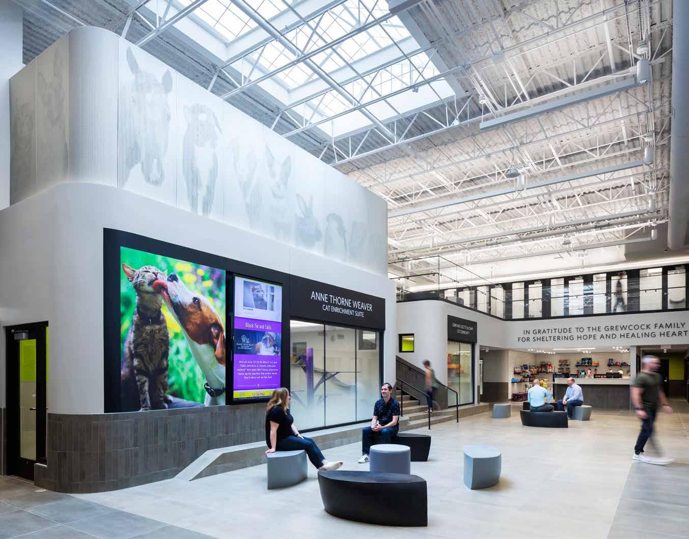
The mezzanine level remains consistent with the original concept but now adds a layer of privacy for the cats while keeping them in the main activity space. The design team had to incorporate materials that went above and beyond utility to ensure that animals scratching the walls or sanitary maintenance would not be an issue.
I asked DeRoin if there was anything he would change or do differently in the design. The architect in DeRoin always wanted to go to the next
level and completely transform the facility, which I believe most architects and architect students can relate to. From the community feedback, designing a new façade became a concern, since funding would have to be offset by major donors for the nonprofit organization. At the end of the day, a new façade would be designing for people, when the real mission of the project was designing for animals. The team did pursue multiple concepts for the exterior façade of the building to reflect the level of work done on the inside, but eventually, they had to scale back and settle on a stain finish for the existing façade’s precast panel.
While the approach toward the entrance still feels familiar to visitors, the interior experience is completely transformed. Upon entering, the Judy
75 Fall 2023 Unicameral HDR (The Great Plains Studios)
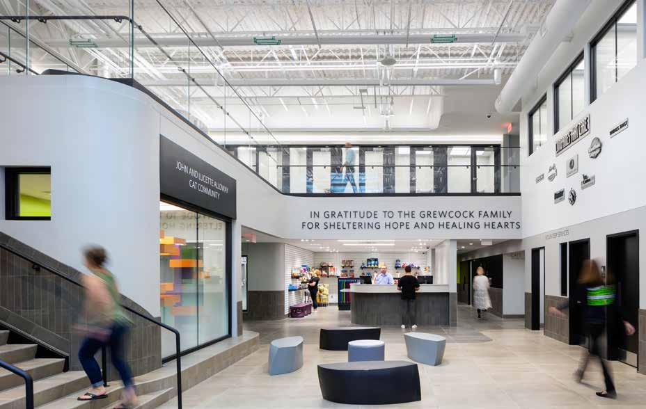

76
Varner Center greets you with an open and airy lobby space. You are drawn to an illuminated wall of donor names by the mezzanine stairs, located above a cat housing shelter. Although these names may seem like a simple decoration detail, it helps to illustrate how the community came together to support animal protection and sheltering. The use of fritting on the glazed windows adds privacy for cats as well as draws in visitors for interactions.
The mezzanine level incorporates the high ceilings effectively, as well as encouraging animals and visitors to linger around the main lobby due to its extensive open space. Seating in the lobby has odd shapes and monochromatic colors that resemble seeds, bringing this environment closer to nature which I found to be very fitting, especially because the birds are also housed near this space. There are about three to four dogs in each pod, as well as information about their names, ages, and pending adoptions. This facility is not only comfortable and safe for dogs, but it also has hand sanitizers in front of each entryway, which reinforces the Nebraska Humane Society’s health priorities.
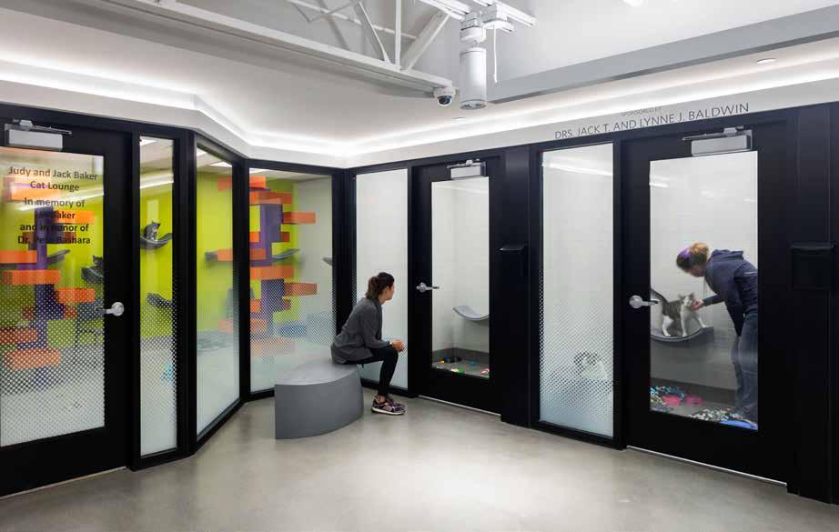
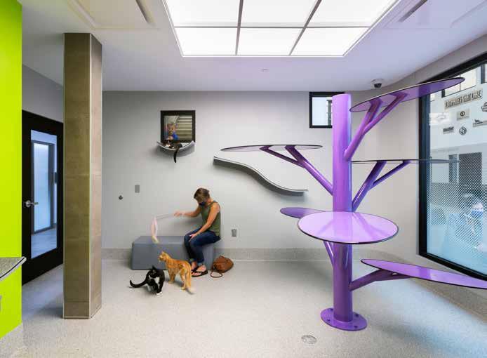
77 Fall 2023 Unicameral HDR (The Great Plains Studios)
SIENA FRANCIS HOUSE MIRACLES TREATMENT CENTER
Dignity Through Design
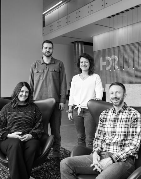 By Meagan Willoughby
The Siena Francis Miracles Treatment Center is Nebraska’s largest service provider for people experiencing homelessness. The nonprofit has existed for 47 years, founded in 1975. In that time, they’ve far expanded their services and continued to outgrow their space. The design wasn’t simply about upsizing and creating more space, though. The Siena Francis Miracles Treatment Center and HDR didn’t want to create just another place to keep people without homes out of view of the public. The Siena Francis Miracles Treatment Center’s mission is about creating a path out of homelessness. “There’s really not a good strategy to just create more space than what you have to accommodate what we think is going to be a continuing problem,” said architect John Dineen, “Can we program this facility, right-size it appropriately, so that Siena Francis Miracles Treatment Center can achieve the mission that they set out to do?”
The Siena Francis Miracles Treatment Center encompasses a variety of services ranging from addiction treatment to transitional housing to permanent supportive housing. This particular facility was created as Siena Francis Miracles Treatment Center’s Emergency Shelter for men and women, part of the Siena Francis Miracles Treatment Center’s wider campus. The emergency shelter is meant to house those most desperately and urgently in need of housing. “Any design flaw can be a negative experience for a person in their vulnerable situation. The stakes felt really high, and we wanted to make sure we didn’t misstep in any way,” said design architect Taylor Nielsen.
The Siena Francis Miracles Treatment Center is a low-barrier shelter, meaning there are little to no requirements for being accepted into the shelter. Low barrier shelters attempt to eliminate reasons that someone may not go to the shelter, for example, some shelters require sobriety before admittance. The Siena Francis Miracles Treatment Center’s Emergency Shelter prioritizes getting people off the street and into a safe, climate-controlled place to live and sleep no matter what they’re going through, but this also means that this facility sees people in some of the most difficult situations they’ll likely ever experience.
The light brown, brick and concrete block exterior of the shelter is accented with geometric black-framed windows. Cylindrical modern light poles matching the window frames’ colors are set on either side of the walkway to the entrance, and young trees are scattered between modern concrete seating and pavers placed in the ample grassy space between the sidewalk and building. The entrance to the building is recessed, creating a semi-private courtyard and queueing area, providing a transition space between the street and the building for the population. The courtyard overhang leaves an opening by the elevated windows, allowing daylight into the recreation/lounge area where people enter the building. Small seats, couches, and tables sit along the polished concrete floor. Directly ahead is a large stainless steel desk where people check in and receive a bed and locker. Further back in the space is the dining hall. Wayfinding became a key aspect of the design with such a large and constantly changing population, and simplicity in the building’s layout was key.
Cement block walls sit above the datum line, painted white and reflecting the light from the windows. Each of the windows sits above the datum line, allowing daylight to come streaming in. They create an openness and lightness to the space by providing views outward to the sky. With a population that may be reluctant to feel “closed in” this is a vital design element for the shelter. Further up, the maple-veneered
78
Left to right; Rebecca Cherney, Taylor Nielsen, Alison Ingunza, Andrew Wilson.
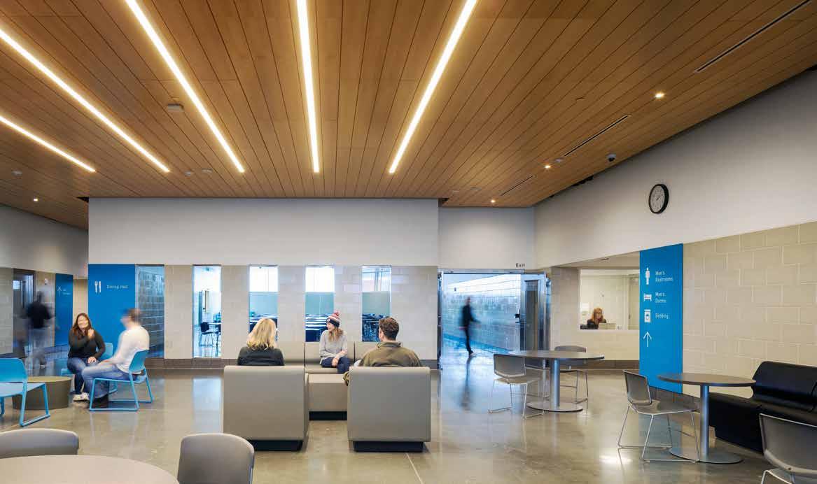
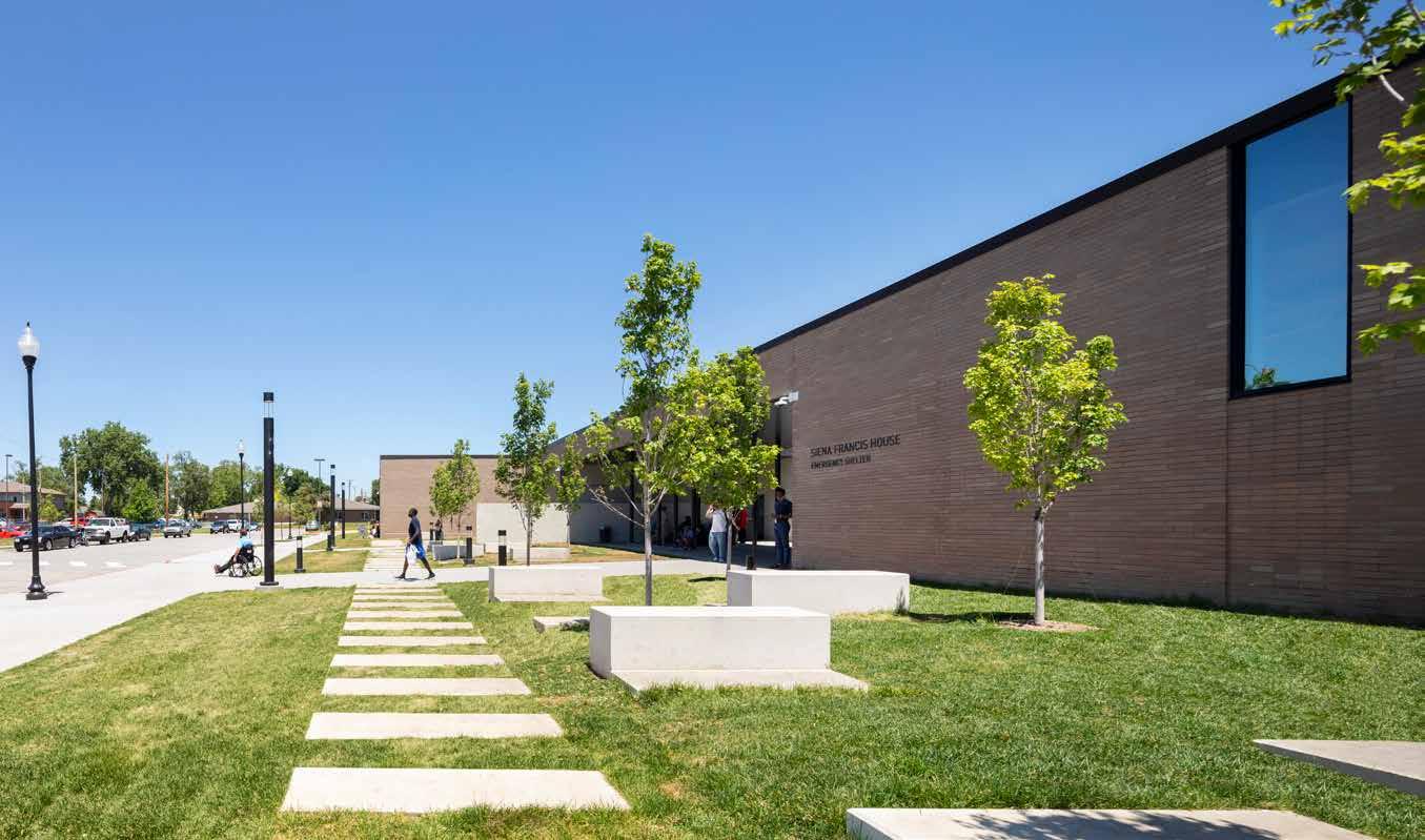
79
Photography:
©
2023 Dan Schwalm
plywood ceiling appears to float between the walls. It adds an element of warmth among materials that could otherwise feel cold. The inlaid lights in the ceiling panels further brighten the deep spaces.
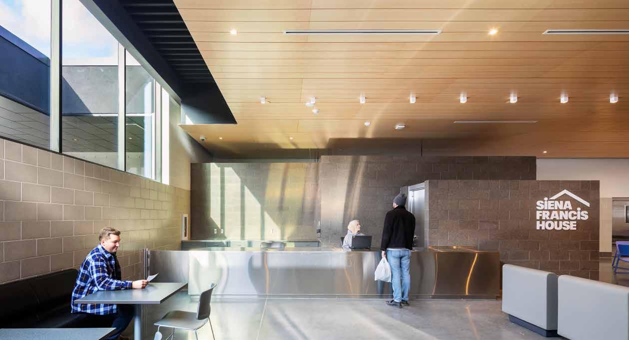
The windows sitting above the datum line also maintain the privacy for the people within, as people from outside can’t look in. Privacy became another piece of creating a sense of dignity. The shelter has a capacity of 458 people, and the sleeping arrangements for this many are complicated. The dorms were subdivided with partial-height walls to provide privacy and create a more human scale within the large spaces. HDR also designed six private rooms to provide for those with special needs.
The shelter is only one floor and takes up approximately 43,000 square feet, divided into zones by use. To one side of the common areas is the women’s dorm and showers, and to the other are the mens’. The facility also accommodates private consultation/counseling spaces, laundry areas, as well as a dock where supplies can be dropped off.
The design of the shelter heavily prioritized a core theme of dignity. HDR created an eight-foot-tall datum line in the common areas, using burnished concrete blocks for the walls everywhere below that line. Large, bright blue signs on the wall direct people through the spaces, their tops aligning with the datum. The stainless steel door frames align with the datum as well, creating a consistency while traveling through the spaces. The materials were chosen very specifically, not just for their aesthetic quality, but for maintenance as well. “It needed to be extremely durable and easy to maintain for the user so it could always be a clean environment. And that all really revolves around dignity and making sure it’s a dignified environment for people getting care and shelter,” said Nielsen.
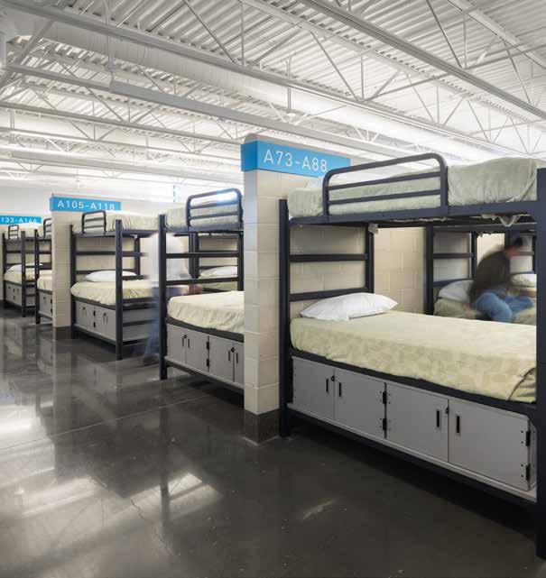
80
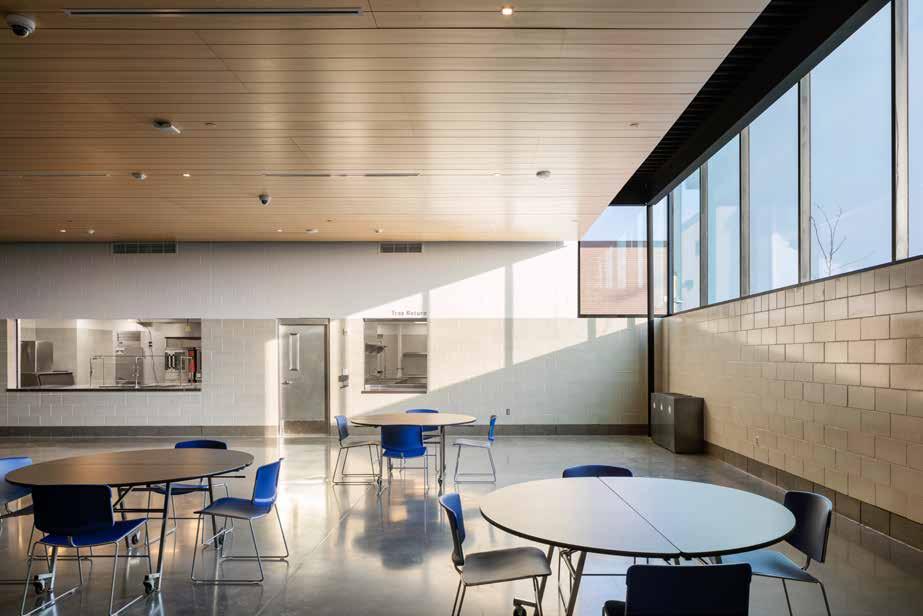
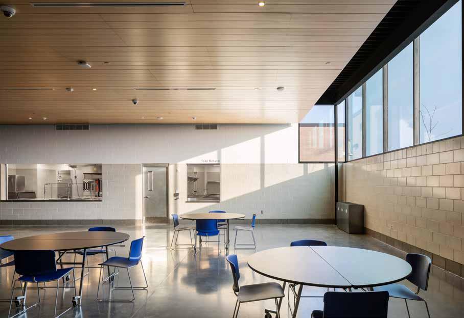
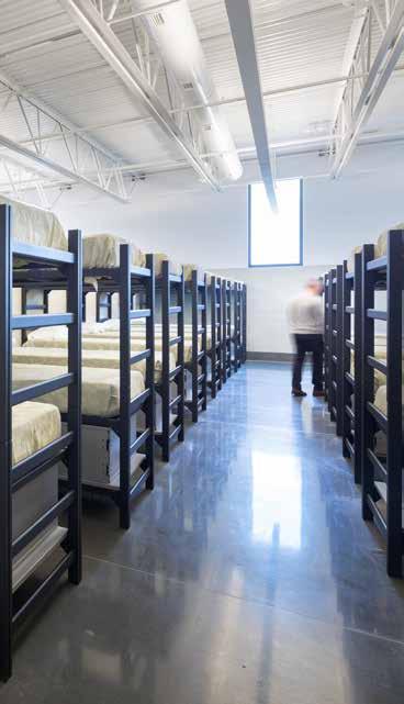
81 Fall 2023 Unicameral HDR (The Great Plains Studios)
NO PAINT ZONE
Burnished concrete masonry unit
Polished concrete flooring Stainless steel doors
DAYLIGHTING
Elevating glazing frames views of sky while maintaining privacy for occupants
BRING IN WARMTH Maple veneer plywood ceiling with routed reaveals, minimizing panel joint visibility
FLOOR PLAN
HDR feat . SINCLAIR HILLE ARCHITECTS
Concordia University Music Center: A Celebration of the Arts
 By Louis Khu
I had the opportunity to sit down with HDR’s Taylor Nielsen and Sinclair Hille Architect’s Dan Grasso to talk about their recent involvement in the upcoming Concordia University’s Music Center. In partnership with Grasso and the Sinclair Hille team, the desire for this project was genuine and motivated by their personal experiences. Although HDR and Sinclair Hille are two separate companies, their design processes share similar collaborative efforts.

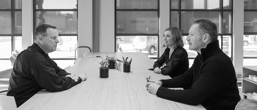
Based in Seward, Nebraska, Concordia University is a private university founded on Christian values with focused programs dedicated
to the performing arts. In 2017, Sinclair Hille had the opportunity to design the Dunklau Center for Science, Math and Business. Due to their lack of expertise in designing performance facilities, the team turned to HDR, a firm that has relevant experience in music buildings, for a proposal and later awarded them the project.
Concordia University’s reputation for Christian values made me wonder if the design concept was related to Christianity. Nielsen, a former member of a band himself and an HDR music and acoustics expert, explained that they were more interested with the music
82
Far left; Taylor Nielsen, Dan Grasso (left); At the table; David Quade, Kjersten Tucker with Dan Grasso. Photography: © 2023 Madeline Cass
program itself and its role within the campus. In no way do I mean to say that they weren’t inspired by religious ideologies, but rather that they considered ideaology as well as the building’s prominent role on campus to celebrate the arts. The team worked closely with the university’s department of music to establish some primary goals for the project to drive the concept.
According to Grasso, the first key element was to reflect Concordia’s Christ-centered mission, academic distinction, and campus identity. The second key element was to provide superior and adjustable acoustics in the building. It was also important to evaluate the future of the music programs with space and technology to inspire an audience with exceptional artistry. Presently providing a flexible and adaptable space is essential to ensuring the design measures up to modern standards, but consideration for future programs—including a bachelor of music in selected areas of performance and a bachelor of arts with an emphasis in music recording techniques—carries weight for the long-term success of the music center.
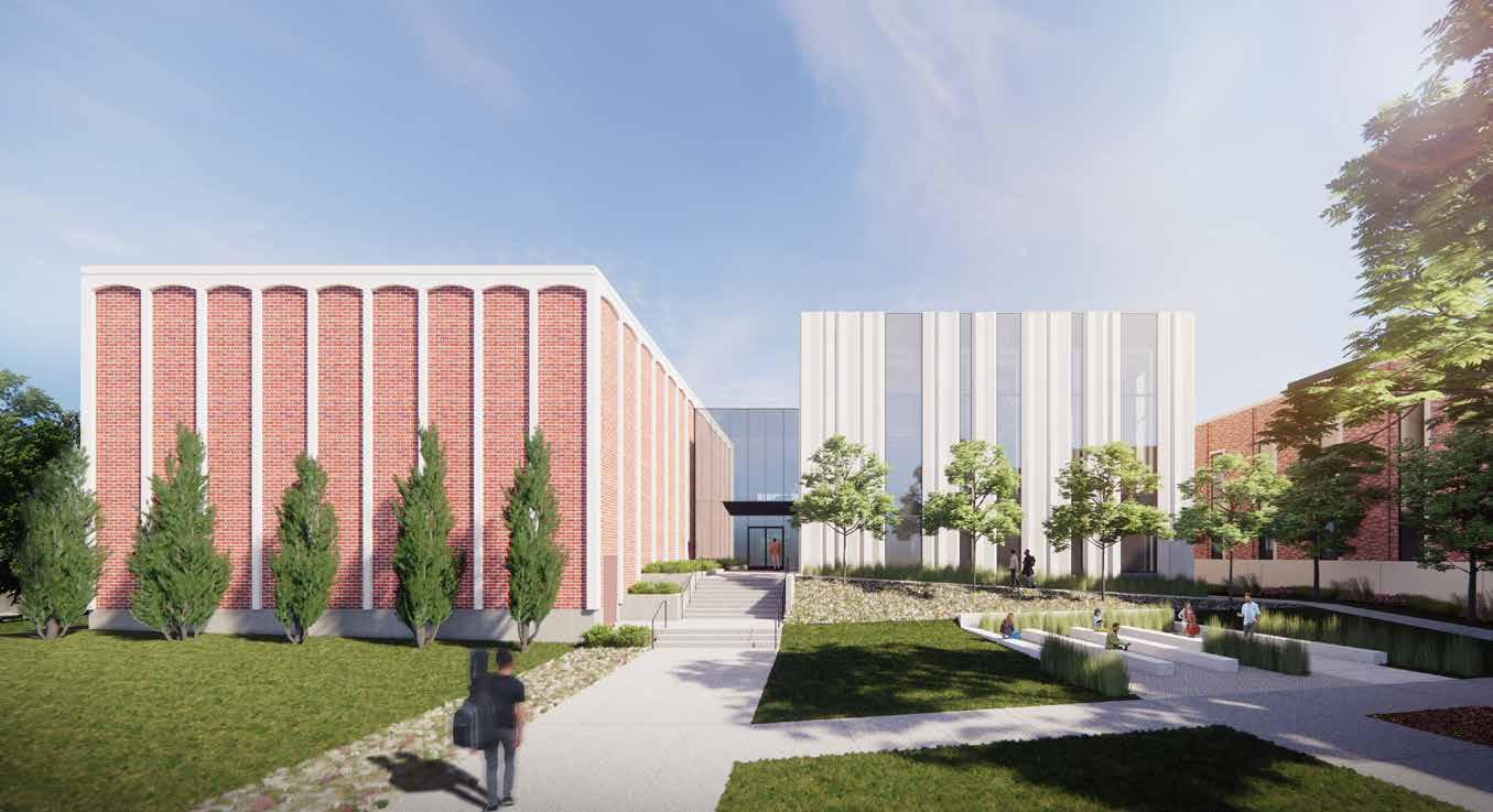
Controlling sound absorption is the key to improving the acoustics in music rooms. It is also necessary to effectively soundproof recording studio spaces to further reduce sound transfer. Several of these qualities contribute to the success and efficiency of a music center, especially when frequently used by university students. With the development of digital recording and technology, universities and other educational institutions are expected to provide high sound quality and control in their recording studios. As a result, students will be equipped with the necessary environments for success, as well as attract other artists in the performing arts discipline.
83 Fall 2023 Unicameral HDR feat. Sinclair Hille Architects
SITE PLAN
Diagram of new addition.
Prominent spaces in the new design include the choir and band rehearsal rooms. The existing spaces were too small in volume and not acoustically treated. It was also important for the team to respond to the existing quality of the acoustics and enhance the ability of students to listen to their own performances. In the new-andimproved rooms, tall spaces have been properly sized and their volume treated with variable acoustics, so they can change the acoustical character of the room. For example, organ and choral music requires a more reverberant space, while instrumental ensembles require a drier space without as much reverberation. With updated acoustics, each practice room will remain below the decibel limits recommended by the National Association of Schools of Music, which accredits the music department. The design team also incorporated a new black box theater and increased the quantity of practice rooms.

Concordia University will have its first theater dedicated to its drama program with this addition. Students and faculty can rehearse at any time, even during ongoing recitals, with soundproof practice rooms tailored to their individual needs. Additionally, all practice spaces will be accessible electronically, eliminating the need for keys and keeping students safe. With floor-toceiling windows, many of the rooms in this facility have plenty of natural lighting that helps inspire creativity and bring energy to the environment. Accessibility was also an important aspect of the project, as the existing building only utilized a small wheelchair lift to navigate a few of the trouble spots. The new addition rectifies that issue with the addition of an elevator and provides a fully accessible and inclusive design. This has resulted in extremely positive responses from the people at Concordia’s music department and administration.
24' 48' 0' 8' 84
LOWER LEVEL FLOOR PLAN FIRST FLOOR SECOND FLOOR
Diagram of floor plates.
Having a top-caliber musical arts facility on campus in a prominent location has been a long time coming for the university. In addition to the higher quality of audio production, these updated rooms will also provide opportunities for collaborating with local musicians. It is open to both secular and church music, reflecting the music center’s commitment to diversity and inclusion. The proposal involves tearing down the existing, outdated east wing, replacing it with a new addition that is aligned with the first and second levels of the west wing, providing much-needed acoustic space which also helps ease the transportation of musical equipment and instruments. As a university striving for musical excellence, this renovation is gamechanging for the community which has massive potential to attract more activity.
This music center, located in a populous area on campus, will not only serve as the university’s face for students and staff to be proud of, but it will also set a standard for music facility standards. I asked Grasso and Nielsen if there was anything they would have changed or done differently on the project as architects. They both agreed that it’s been a very positive experience and felt very good about the outcome. With his background as a former musical artist, Nielsen is eager to see the black box theater in action this spring, whether for a theatrical performance or a music recital. Personally, I have never been to a black box theater, but I would love to have the opportunity to visit once it is complete.
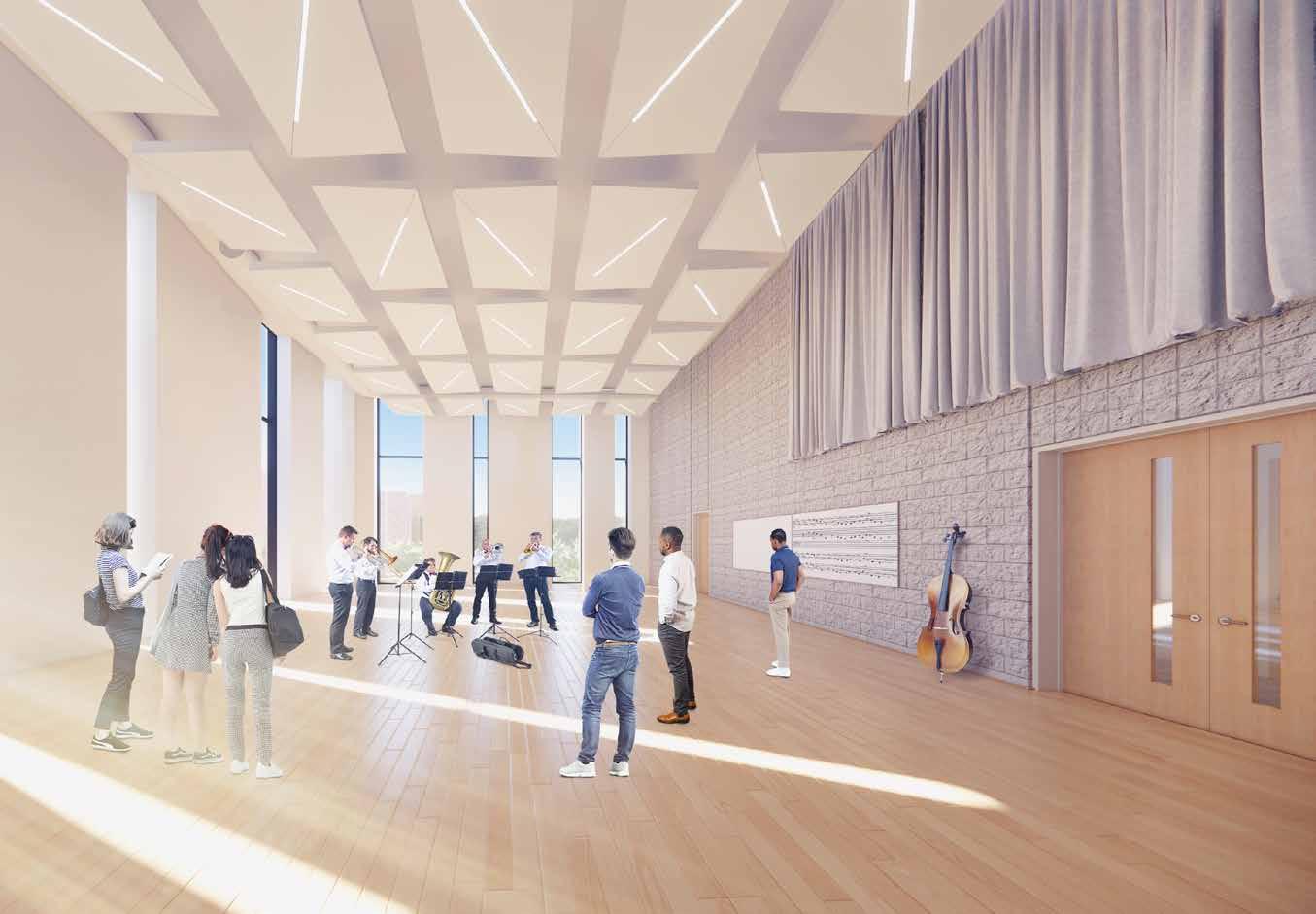
85 Fall 2023 Unicameral HDR feat. Sinclair Hille Architects
Diagram of window frames.
THE CASE FOR COMMUNITY ENGAGEMENT
By Anastasia Wand
In architecture school, we are taught the importance of designing for the user’s and client’s spatial experience. However, projects tend to focus on program or site analysis, but how are those elements involved in user focused design?
86
Everyone has their own research strategies, but typically designers will try to imagine themselves and how they would experience the space. While this is a valid first step in designing, talking to actual users would be more beneficial in ascertaining what they want from their space. Alternatively, designers could engage research experts for specific building types such as medical or educational facilities. Engaging different perspectives in the design process is important and leads to a more informed design to improve overall user experience. Community engagement within the design process is another way of improving a user’s experience by involving them in the design process.
Community engagement comes in many different degrees of involvement, but one thing that remains constant is an end product that reflects real user input and is characterized by more informed and insightful decision-making. This process typically involves multiple disciplines, many users, and a broad spectrum of perspectives in the planning stages so that community needs can be incorporated. Ultimately, the intention is to have community engagement early in the design process so that the end result better serves their needs.
The American Institute of Architects (AIA) has released resources defining community engagement and explaining its importance in creating more inclusive and equitable spaces. Equitability in design has come to the forefront of design thought, as it fosters trust within a community. In the past, certain practices—and even formal policies such as redlining and housing discrimination—have led to a lack of trust in building design and planning. Design impacts people’s lives in variably distinct ways, and it has the opportunity to address broader issues within society in a meaningful way. By involving more perspectives into the early design process, designers are better able to create more inclusive and equitable environments. Listening and understanding how designed space can begin to address problems faced by marginalized communities is the first step to creating spaces that combat these issues.
There are a variety of ways in which designers choose to foster community engagement. Design charrettes, open to the community, are a common way that firms actively seek user participation. These charrettes are a good way to open up dialogue with many users in the early stages of the design process for a project. While community engagement strategies are useful, a critical component to their success is ensuring they are accessible to as diverse a group of people as possible. This diversity is important to gathering truly impactful design information. Offering a variety of different community engagement styles is one way to increase the accessibility of these sessions.
Engaging the community allows designers to gain a perspective that is unique and userspecific. This is important because there may be overlooked needs from underserved or unknown populations. No one is an expert on everything and diversity of community perspectives is the key to success in designing for inclusivity.
With all of these obvious benefits, what prohibits community engagement from being a common step in the design process? In general, this comes down to various project constraints such as budget, time, and resources. Community engagement strategies are commonly seen with public/government projects or private projects funded by public grants because it is a requirement, but with other projects it’s not always a top priority. It can be the first step cut when a project deadline is approaching, or budget is limited.
A few Nebraska-based projects that have worked to involve the community in their design process are The University of Nebraska Omaha Barbara Weitz Community Engagement Center by Holland Basham Architects and The La Vista Civic Centre Park Master Plan by RDG Planning & Design.
While community engagement is an invaluable tool, it’s important to remember that incorporating it in the design process doesn’t mean the designer just collects a list of “wants” and throws them together into a piecemeal building: there is still a need for thoughtful articulation of these concepts and ideas. Not everyone is going to have ideas that mesh and match perfectly into one. The architect’s role is to think critically and synthesize these community needs into a coherent and thoughtful design.
87 Fall 2023 Unicameral Essay: The Case for Community Engagement
NEBRASKA IS HERE.
So put your drinks up for Nebraska. For Nebrasksa, I love you.
(Nebraska)
MOSER, AMERICAN ACTOR AS THE ICE TRUCK KILLER, A.K.A CHRISTIAN CAMARGO
LADY GAGA, SINGER, SONGWRITER
This place
would turn anyone into a homocidal maniac. BRIAN
Dexter, Created by James Manos Jr., Lauren Gussis
MY HARDEST JOB IS TO CONVINCE THE PEOPLE OF NEBRASKA THAT 10-1 IS NOT A LOSING SEASON.
TOM OSBORNE, FORMER COACH, CONGRESSMAN
I want
Anyone who spends time on the road knows there’s something special about being in the middle of Utah or Nebrasksa. You sit with it, and there’s a peace about it.
 Nope,
Omaha. JULIA LOUIS-DREYFUS, AMERICAN ACTOR AS SELENA MEYER Veep, created by Armando Iannucci
Nope,
Omaha. JULIA LOUIS-DREYFUS, AMERICAN ACTOR AS SELENA MEYER Veep, created by Armando Iannucci
IF I’M LUCKY, IN A MONTH FROM NOW, BEST-CASE SCENARIO, I’M MANAGING A CINNABON IN OMAHA.
BOB ODENKIRK, AMERICAN ACTOR, AS SAUL GOODMAN, Breaking Bad, created by Vince Gilligann)
JASON MOMOA, AMERICAN ACTOR
Placing Home Base
By Audrey Huse
TACKarchitects is a small architecture firm based in Omaha, Nebraska, that was established just over 10 years ago. Having previously worked together, the three principals, Jeff Dolezal, Rebecca Harding, and Chris Houston, came together to discuss starting a firm focused on smaller scale design and emphasizing the joy of people’s business. Though this was a daunting leap as they were starting families and re-establishing themselves in the Midwest, their workplace experience in nationally-recognized firms served as a solid foundation.
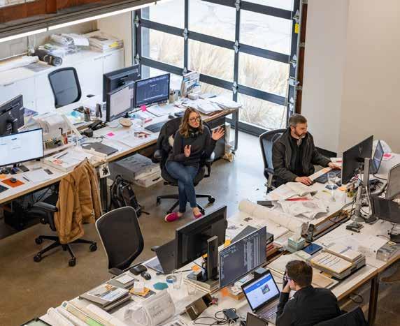
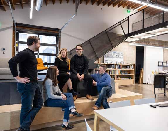
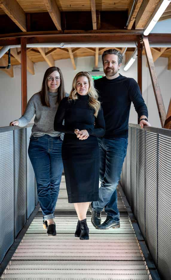
90
TACKarchitects
Photography: © 2023 Dan Schwalm
As a local firm, TACKarchitects prioritizes their cultural and community impact as an opportunity to directly shape the community in which they live. They take on a variety of nonprofit work for this reason; regularly designing for nonprofits supports their efforts to positively shape Omaha’s identity. In the years after their founding, TACKarchitects grew as they became more established within the Omaha community. Their current office location in the Benson area of Omaha, near the heart of the city, allows them to better immerse themselves within the community. One of the mindsets that helped direct the growth of the firm was the idea of “working with the people that you trust.” Co-founder Rebecca Harding used this to bridge the ideas of firm and process. Working with a trusted community means, at the end of the day, the direction of the design process is shared and becomes a mutuallybeneficial exploration.
Emphasizing an early deep dive into clients’ businesses and companies is a significant aspect of the firm’s design process, according to Harding. Taking the time to fully understand the client makes the schematic approach more intuitive for the firm. Understanding the essence of the company maximizes the capability of the design team to focus on the early schematic design phase. Being proactive in the initial phase streamlines the rest of the design process through documentation and construction.
Design teams are led by a principal on every project, with support from interior designers and other professionals. Because of the opportunity for small scale teamwork, there is greater emphasis on organic collaboration within the firm. The open floor plan of the building, as well as the scale of the teams, facilitates design charrettes and the free exchange of ideas. Harding continued, saying “everyone touches a project.” This speaks to the importance of collaboration in their design process beyond the immediate project team.
Design is a finicky pursuit; there are unavoidable obstructions in day-to-day tasks, and client contributions inspire redesign at times. For the inherent success of a scheme, passion for the work has to be the key motivator so that ordinary intrusions don’t become obstacles. This disposition fosters a sense of care and pride which promotes a positive company culture and reinvigorates the design process itself and those involved.
TACKarchitects’ office is open and spacious allowing creative ideas to stir and execute a powerful impact through their designs. They are known for being able to replicate their clients’ ideas with passion and unique expression. In turn, their goal is to return to the “heart of architecture” and tell their clients’ stories through their personal vision and values.
With 16 designers at the office, there are 13 architects, two interior designers, and an office manager, which forms a tight-knit working environment. Project teams are typically comprised of designers with an array of backgrounds, with exact team size contingent upon the scale of the project. One aspect of the team distribution that is integral to the firm’s design model is the fact that teams are established from the very beginning of the schematic design phase. They remain consistent throughout the entirety of the project for the sake of continuity and easy communication. Though the designers work in small teams, the arrangement of people varies from project to project in order to guarantee that various designers work with shifting groups of coworkers, which additionally encourages collaboration between teams.
The dynamics of a small firm, such as variable project types and flexibility, mean that employees and project architects have opportunities to explore different avenues of design within each project scope. Designers have power at an individual level to broaden the scope of their skills with niche opportunities on a project-by-project basis, since their roles are defined at the project level and not a task level.
91 TACKarchitects Fall 2023 Unicameral
Left; studio members Ryan Henrickson, Kelly Buzzard, Rebecca Harding, Ryan Hier, and Jeff Dolezal
BRIDGES TRUST
A Composition of Bridges
By Audrey Huse
As a wealth management company, Bridges Trust had a focused vision of what brand identity principles would translate to the interior design. An overarching structure of sophistication, capability, and trust were design parameters set by the financial firm, and from this point, the design team resolved the detailing and expression of these values. Design priorities included interior expression as means of articulating the brand identity of Bridges Trust, and program functionality to allow for the flexibility of a prosperous company while taking advantage of the office space at current capacity.
Motivation for interior expression is contextualized by a few key characteristics. Bridges Trust as a brand and company is the primary design concern. TACKarchitects focused on color and materiality since they are typically the most prominent expressions of identity. Additionally, the intersection of alignments and spatial layouts inform detailing of material connections. Here, the overlay of considerations becomes a design moment in itself. The process of design uncovers a collective identity as these elements are applied.
The Bridges Trust aesthetic is a refined black and white color palette that uses red accents for emphasis. These neutral base colors have nearly limitless complementary materials and textures. Another focus of the financial firm’s identity is the prioritization of the client, which is why the concepts of sophistication, capability, and trust are emphasized. As intangible values, the challenge Rebecca Harding and her team faced was realizing this interpersonal, social image into tangible details of interior design.
The team’s method for this involved leveraging implicit human perceptions of composition. Take, for instance, the project entry. After rising to the fifth floor in the elevator, the doors open to reveal a clean stone wall with the Bridges Trust logo. A singular seam splits the space between the two titular words; the wall itself has no other ornamentation. Using stone as the backdrop material communicates strength and reliability; being paired with the simple uniform texture implies organization and comprehensibility.
93 Fall 2023 Unicameral TACKarchitects
Photography: © 2023 Tom Kessler
For color and materiality, Harding chose to expand upon the Bridges Trust color palette. This is done primarily through graceful materials, and the additional color was sparing incorporated, only used in specific and intentional moments. The main materials used to accomplish this were travertine, to focus primary walls and furniture; glass, to signify transparency between private offices being used to service the public; and gold in furniture and architectural accents. As the complementary colors are used as accents, the main color scheme of the firm is used in the structural elements of the interior: in typical walls, ceiling and ground planes.
Harding mentioned another reason for the careful consideration of palette: the striking interior artwork. Bridges Trust has an extensive art collection of pieces from local artists or that illustrate local values; displaying these works communicates their firm’s values.
From a programmatic standpoint, the design team balanced the public and private spaces, and the intersection of the two. The fifth floor is primarily where all client interactions occur: with this being the public face of the brand, it had to communicate
94
FIRST FLOOR SECOND FLOOR
95 Fall 2023 Unicameral TACKarchitects
Bridge granite slabs
Bridge steel structure
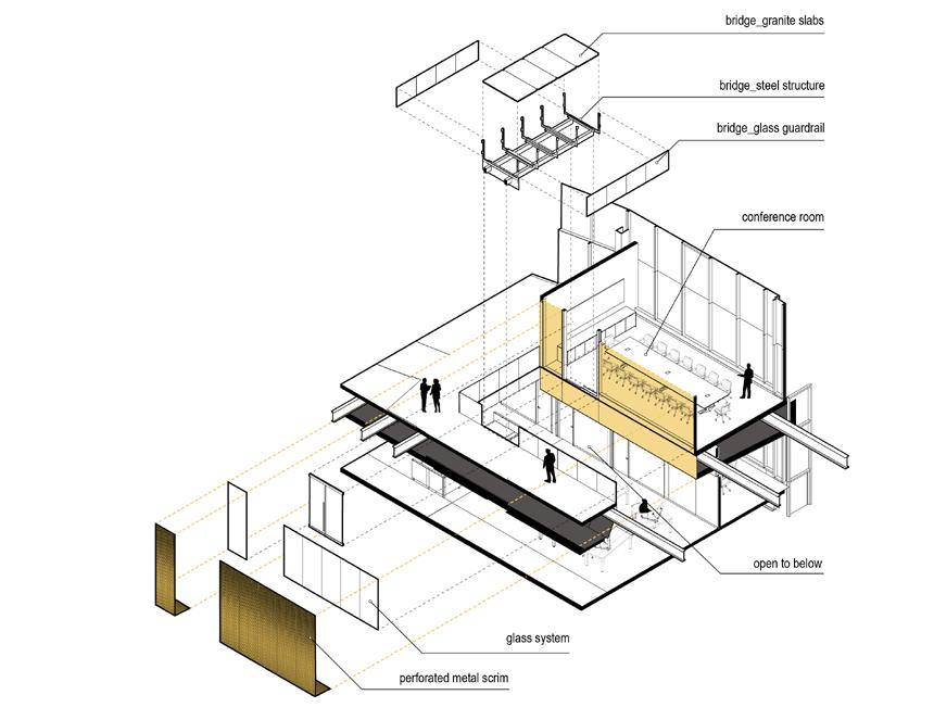
Bridge glass guardrail
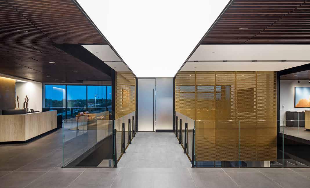
96
EXPLODED ISOMETRIC
Conference room
Open to below
Glass system
Perforated metal scrim
everything that has been established this far. The fourth floor is where the business operations side of the firm takes place: more private in nature, but there is still connectivity, circulation, and movement between the two. The project’s key design moves occur in the transition between the fourth and fifth floors. These bold moves embody the metaphorical representation of Bridges Trust, and as such, are detailed to an acute degree.
The first instance of connection is the staircase. The composition of the staircase utilizes the idea of positives and negatives. Along the horizontal plane, one side of the staircase is a black wall with a handrail subtractively carved out; the opposing side is a glass guardrail and a black railing. Vertical movement between levels are emphasized with contrasting stair treads, the lower half being wood
and the upper half being stone, which signifies the transition from a formal public presence, while the lower private office spaces become softened with the introduction of woods.
The other instance—more monumental of the two—is the bridge that demarcates the threshold from entry to the client meeting room. TACKarchitects had the opportunity to specify floor plate openings during the construction of this project and was able to create this symbolic moment where the client physically crosses a bridge into the meeting space, metaphorically representative of the client’s trust placed in the company. This design move is not subtle but detailed meticulously enough that it seamlessly integrates and elevates the interior of the public space.
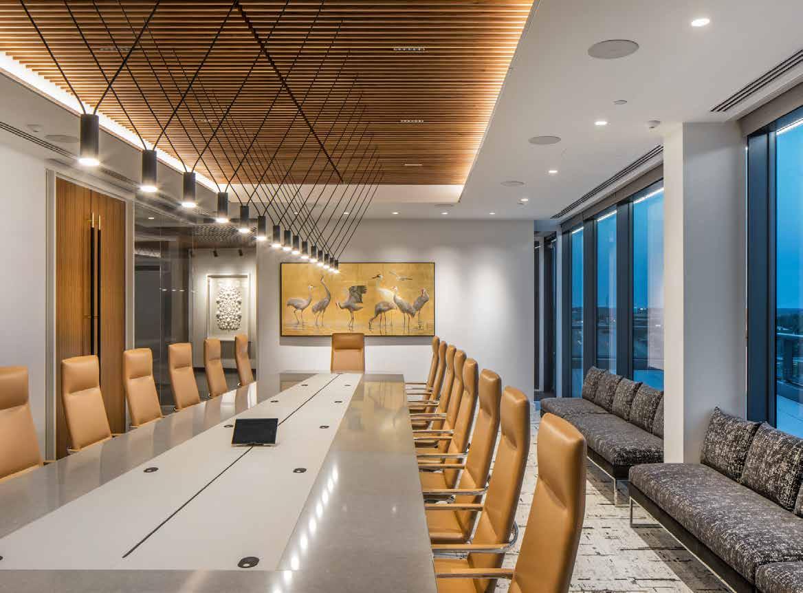
97 Fall 2023 Unicameral TACKarchitects
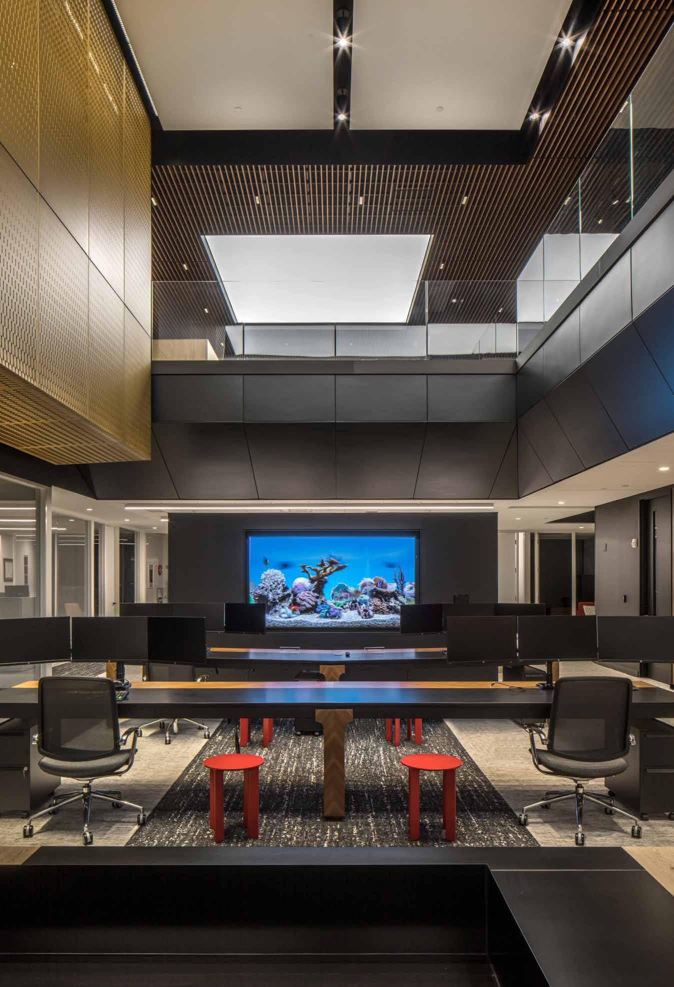
98
Moving further into spatial relationships, the programmatic demands of a growing firm had to balance with evolving workplace culture and pace. Offices lining the exterior walls of the buildings are permanently situated, but employee workspaces are potentially mobile, allowing for flexibility in business operations and collaboration as the firm moves forward. TACKarchitects’ strategic planning approach ensured that each operations team at the firm had a home base, but that it also had room to expand as processes fluctuated.
Client amenities on the fifth floor are also permanent fixtures in the office space. Here, conscientious choices had to be made in order for the design to exemplify certainty and exceptionality.
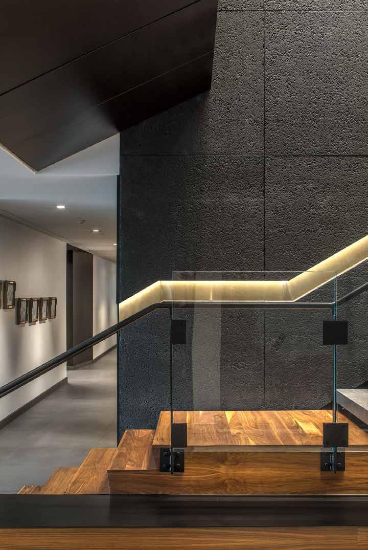
Client meeting rooms have specialized seamless technological integration, and the kitchens have intricately designed light fixtures and handpicked furniture that complement the image of distinction.
Though the design team had defined end results of characteristic design fundamentals, they composed materiality, space layouts, and brought vision to the concepts that Bridges Trust desired— molding form from sensibilities, shaping program from brand identity, and fashioning details from composition perception—all the while, articulating a composition of firm identity.
99 Fall 2023 Unicameral TACKarchitects
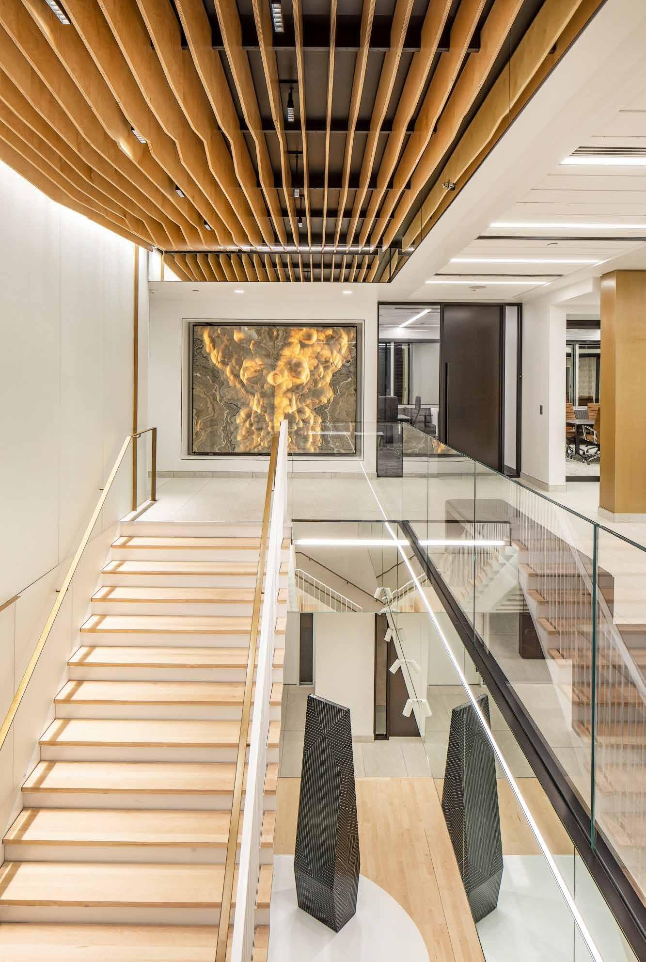
DVORAK LAW GROUP
Through the Wood Slats
By Emily Scheidler
One of the most important characteristics of an attorney is their credibility. These tenable aspects include the amount of time they’ve spent practicing, their passion for the client, or even their basic, yet careful, listening skills. Attorneys should have a special capability of building comfort and trust between themselves and their clients to ensure their case is strong and well presented.
One Omaha law group has built their credibility using their brand and their relationships with surrounding communities. The Dvorak Law Group Building, its interior designed by TACKarchitects, sits right along Dodge Street—one of the busiest
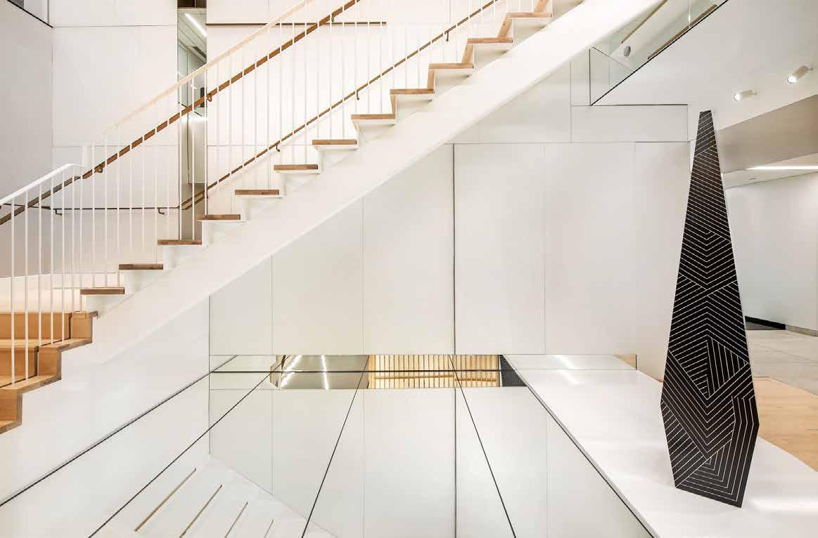
streets in Omaha. The building’s windows glisten in the sunlight, making it all that more eye-catching, and its prestigious interior design not only attracts interest from those who pass it, but also invites members of the public to embrace its shelter and beauty inside.
Project designer Ryan Henrickson was tasked with creating a memorable experience for every foot that would step inside Dvorak’s new interior. These aspirations connect back to the overall goal of the firm to return to the heart of architecture by replicating their clients’ ideas with passion and unique expression.
101 Fall 2023 Unicameral TACKarchitects
Photography: © 2023 Tom Kessler
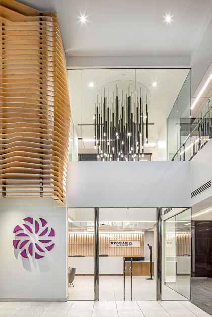
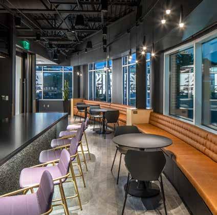
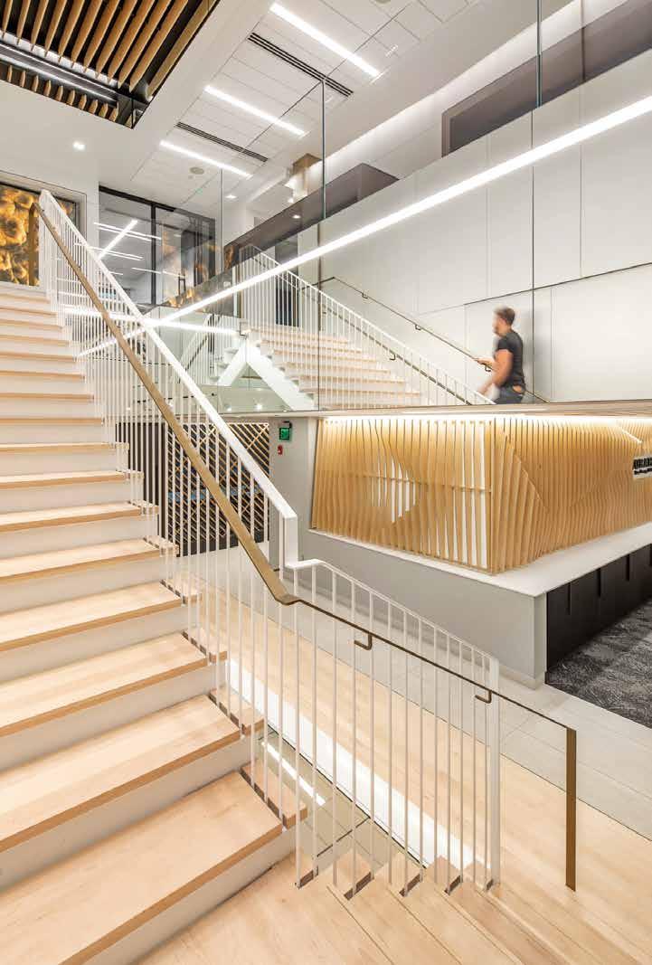
102 FIRST FLOOR PLAN 1 1 1 1 1 1 1 1 1 1 1 1 1 1 1 1 1 1 13 1 1 1 1 1 1 1 1 1 1 1 1 1 1 1 1 1 1 1 1 1 1 10 4 2 2 2 11 8 7 12 5 6 6 9 6 3 1 1 1 1 1 1 2 2 2 1 Office 2 Conference Room 3 Conference Lounge 4 Break Room 5 Lobby / Reception 6 Open Work 7 Work Room 8 Hospitality 9 Café 10 Lounge 11 Phone 12 Supplies 13 Data
Dvorak’s building renovation was not intended to go further than its lobby. The office had intended on moving buildings until David Dvorak, the president of the law firm, noticed the beauty of the existing lobby’s re-design—specifically the wood detailing. Henrickson explained. “David Dvorak fell in love with the wood screen elements so those are what populated themselves throughout the space.” Due to this realization, Ryan and his team had a guaranteed adventure in their future. As of October 2022, the Dvorak project is still being completed, but various notable features of the building are continuing to reveal themselves in phases.
There are five phases in this project, the designers at TACKarchitects most recently finished phase three. This phase is a vital connecting piece for the design of Dvorak, mostly because it features a beautiful staircase that connects the first and second floors of the building and provides a sense of flow through each space. Even though this staircase became a vital, yet unexpected, point in the continuation of Dvorak’s new design, the clients were initially hesitant about the connection.
“It was never in the project. [We] came back to them to say that we think we should really connect these two floors because then you’ll have a communal stair that your employees will go up.” Henrickson said. The design team knew they had to convince Dvorak to add the stairs, and to do this Henrickson made sure to touch on the impact of simple, but meaningful design moves. After the client finally gave the go-ahead on the stairs, Ryan was adamant on pushing its design.
“I want to really push the design on this; make this clean and take everything we’ve done on one level and cram it into a stair.” He said, “ it wasn’t until we were pretty much done with that portion that Dvorak told me, ‘I get it now,’ which brought it all full circle.”
In turn, this powerful impression in phase three was a unique continuation of the design done in the lobby. The stairs feature a similar sleek design with the same kind of wooden slats complimenting the ceiling, instead of a wall. By growing their space to the second floor, Dvorak also grew their opportunity to interact with their surrounding communities.
Henrickson explains: “They have utilized their space to host the governor quite a bit and have even given speeches. The second floor can be rented out by nonprofits. They wanted to really focus on the community and give back a little bit if they can. That’s what a lot of the second floor is too.”
When asked about what kinds of challenges the architecture firm faced, Henrickson paused and gave a three word answer: “Yes and no.” He explained that while there are always constraints in architectural design, there are so many opportunities to create unique and special spaces.
“Dvorak was interesting because the client was motivated to do really good design, and usually in projects, there’s always budget and constraints that are around.” He said, “On a number of occasions, we’d show up to a meeting with the client and they would ask us the question ‘What more could we do to our space to make it cooler? What more could we add to it that would set us apart? It was really interesting to have that as a relationship because you don’t get that very often. It’s a lot of responsibility that gets put on us.”
With an inclusive and welcoming space, Dvorak Law Group is able to build a plethora of experiences and exciting memories. Henrickson says that the project was interesting and that the client’s motivation for a unique and well-designed space was important, but making appropriate decisions concerning budget was vital.
The Dvorak building is sure to excite and comfort each person that walks through its doors. With a glance at the wall with the wooden slats, or a trip up the sleek stairs complimented by bright white and purple lights, one is guaranteed to feel in a reliable and comfortable environment.
103 Fall 2023 Unicameral TACKarchitects
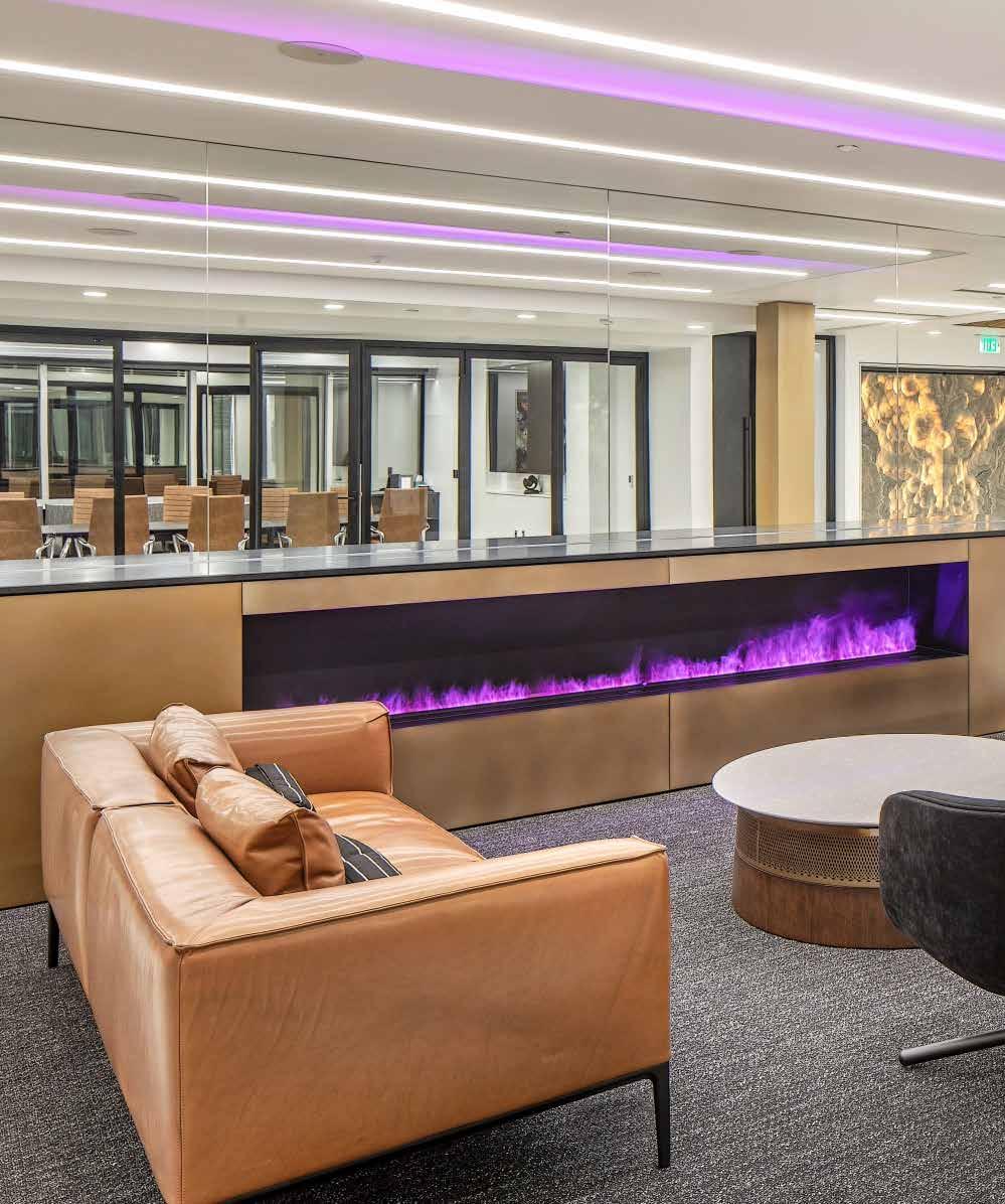
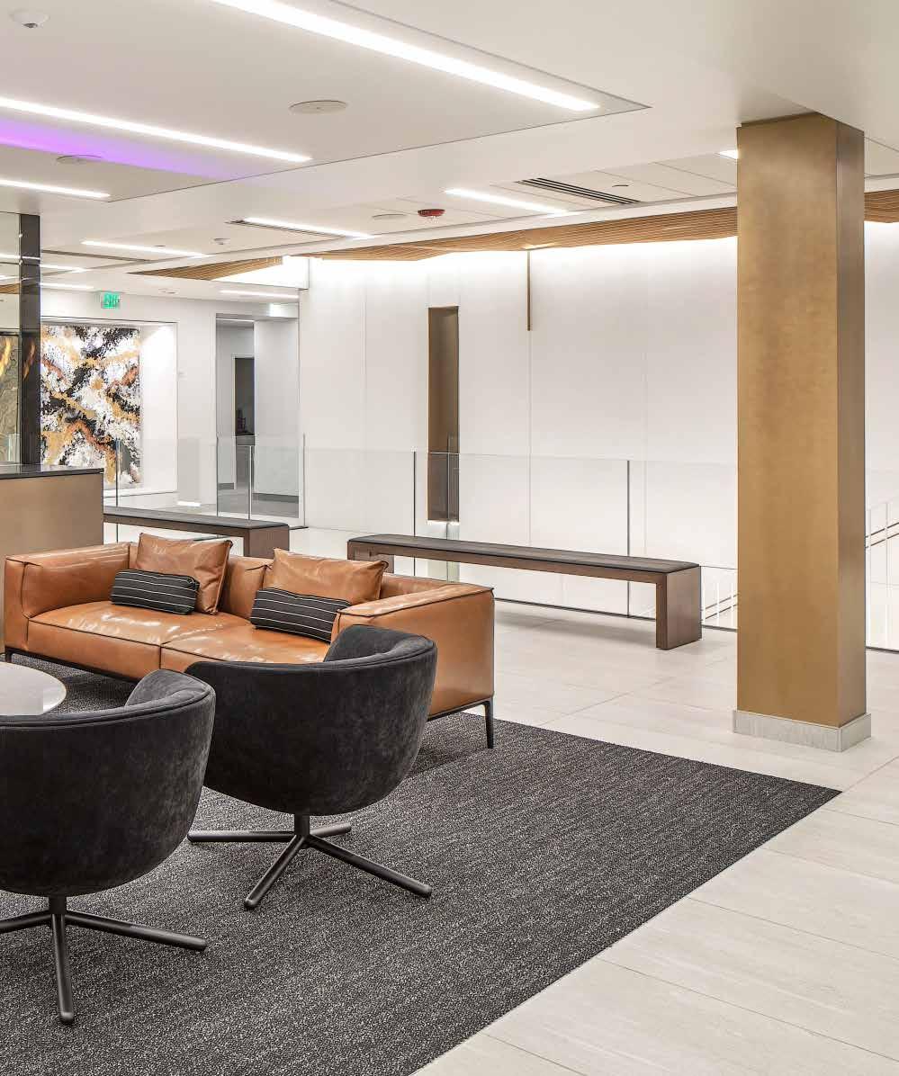
THERE’S NO PLACE LIKE HOME
By Bridget Knudtson
If you would have asked me a year ago whether I wanted to live and work as an architect in South Dakota, I would have laughed out loud.
106
Opportunities are bleak for a young designer in my home state of South Dakota. The state has very few design firms compared to its neighbors, Iowa and Nebraska, and its architecture program is only a decade old. Don’t get me wrong, South Dakota is full of talented designers, but they don’t have the support they need to make a difference. Most of what gets financed and built there has much more to do with function rather than aesthetics. There are very few opportunities for a young architect, especially one who wants to push the boundaries of what design can be and do.
Last spring, while listening to a Design:ED podcast for studio at the University of Nebraska, I heard something that struck a nerve with me. Joshua Ramus, renowned architect and founding principal of REX, gave this piece of advice for young architects: work within your community. He cited the remarkable career of Peter Zumthor, a Swiss architect who has made a name for himself by “working locally with integrity for a lifetime.” This advice is all well and good if your hometown is in the idyllic Swiss Alps, but not all of us are so lucky. I found these words even more ironic coming from Mr. Ramus, whose own career wouldn’t have been possible without the support of his Dutch mentor, Rem Koolhaas.
Arguably the most important achievement of Ramus’s career was the completion of the Seattle Public Library in 2004. Ramus, a native of Seattle, may be able to take pride in his contributions to
the project, but it was arguably his connection to Koolhaas and OMA that secured the commission. When he eventually split from OMA in 2006, Ramus took the entire New York office with him. Rebranded as REX, Ramus’s firm currently resides in New York and so do most of their clients. The last time they completed a project in the Pacific Northwest was while still affiliated with Koolhaus. This calls in to question the earlier stated principle of “working within your community.” It seems that over the years, Ramus has abandoned his hometown and chosen to pursue high-profile projects in every part of the country except Seattle. He is largely successful, but his hometown hasn’t seen much of that success.
In direct contrast to Ramus is the career of Allied Works founder and principal, Brad Cloepfil. Cloepfil grew up in the state of Oregon when there was little to no architectural discourse happening there: “The cycle of my generation and probably the generation after me was ‘get out as fast as you can’ and then when you couple up and start having kids, maybe come back because it was cheaper here.” Instead, Cloepfil chose to invest in his hometown from the start of his career. After receiving degrees from the University of Oregon and Columbia University, he returned home in 1994 to begin an innovative design practice. Unfortunately for him, innovative project opportunities at that time were few and far between. Luckily, an executive at a global advertising firm took a chance on him, and his practice only grew from there. Now, Allied Works is regarded as one of
107 Fall 2023 Unicameral Essay: There’s No Place Like Home
The state is full of talented designers, but they don’t have the support they need to make a difference.
the top firms in the Pacific Northwest, and Portland is a cultural hub for artists and designers. Cloepfil crafted an extremely successful career in a place where that previously did not seem possible.
Cloepfil’s story offers hope for young designers like me who feel like there aren’t opportunities for them in their place of origin. He and his firm might have had a rough start, but with the help of other like-minded groups and individuals, they turned Portland into a place that fostered their careers and those of the next generation of designers. Cloepfil credits this success to both a shift in population and changes in government policies. “The energy of young people staying, that’s what’s really changed,” Cloepfil said on his episode of Design:ED.
I believe that the same sort of transformation is possible in South Dakota. Unfortunately, the past six years have marked a period of decline for the state’s creative population. Myself and my peers have chosen to leave because of a recent increase in hostile and discriminatory policies by the state government. Now the economy is struggling as young people continue to leave home for places that offer a brighter and more inclusive future. To change
the trajectory of South Dakota’s design discourse, two things need to happen. First, the state government needs to enact policies that encourage growth and diversity. Second, young people like myself need to make a commitment to return to the state and contribute to building a better future.
What Ramus’s and Cloepfil’s stories ultimately tell us is that you can build a design community anywhere. Through his partnership with Koolhaus, Ramus earned a spot in New York City’s prestigious and competitive design circle, and Cloepfil’s relationships in Portland helped him reach international acclaim. Though Ramus doesn’t seem to practice what he preaches, his advice still has merit. It may seem easier to build a career in an established design market such as New York’s, but a career back home may be just as fruitful. Hometowns provide meaningful relationships that can lead to extraordinary design opportunities. While working in Nebraska, I have witnessed a host of design projects be born from friendships between architects and their communities. The relationships I’ve built along the way during my design education have become the most powerful tool in my personal career.
After a year of working within the design community in Omaha, the possibility of a career in South Dakota now excites me. From growing up in the state, I have several ideas for potential projects that I would love to work on someday. There is a great quote by Australian architect Glenn Murcutt which sums up my goals for my own architectural practice: “Life is not about maximizing everything, it’s about giving something back – like light, space, form, serenity, joy. You have to give something back.” I hope that someday I will get to do work in South Dakota and give back to the place that made me. Whether that means living in the state, or working from a distance, I am determined to improve life there for the next generation. I hope that my peers wil choose to join me.
108
young people like myself need to make a commitment to return to the state and contribute to building a better future.
Good design comes from everywhere, It’s more important to recognize a good idea than to author it.

Drawing is the putting of thoughts on paper. Visibility is given to the creative and the inconceivable, often blurred and vague. The computer gives focus and creates comprehension.American Architect

Architecture is not just to fulfill man’s need for shelter, but also to fulfill man’s belief in the nobility of his existence on earth.
109 Fall 2023 Unicameral Essay: There’s No Place Like Home
Without freedom of choice there is no creativity. The body dies.
If you’re good at something never do it for free.
Success comes from standing out not fitting in.
Don Draper a.k.a. Jon Hamm, Mad Men – 2007 to 2015 (Created by Matthew Weiner)
James T. Kirk a.k.a. William Shatner, Star Trek: The Original Series – 1966 to 1969 (created by Gene Roddenberry)
The Joker a.k.a. Heath Ledger, The Dark Knight - 2008 (Director Christopher Nolan)
Jeanne Gang, American Architect
Thom Mayne, American Architect
Eero Saarinen, Finnish American Architect
The Start of the Line
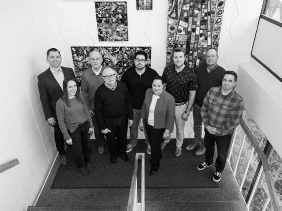 By Emily Scheidler
From Westroads, to UNO, and to the Old Market, the Omaha Rapid Bus Transit (ORBT) system helps residents and visitors build a strong and diligent connection to the Omaha metro area. The stations, designed by LEO A DALY, enhance the everyday lives of Omaha’s residents and have become a shining new addition to the overall structure of the city.
110
A DALY – ORBT
LEO
Photography: © 2023 Madeline Cass
ORBT Team from left to right; Ben Ries, Abby Goranson, Tom Hysack, Martin Janousek, Tim Morrison, Chris Rupert, Zach Klebba, Jonathan Fliege, and Josh Ropski
Omaha’s 8-mile, 24-station public transportation system follows 12 stations eastbound and 12 stations westbound—starting at Westroads Mall and looping at the edge of the Old Market. This updated system has revitalized Omaha not only in its mass transportation systems, but in its use of technology and accessibility. ORBT’s designer, LEO A DALY, believes in enhancing the environment and enriching the human experience through design. Some of their most notable projects include the UCLA Ronald Reagan University Medical Center Hybrid O.R. and the Savannah College of Art and Design campus. ORBT’s stations were designed with the residents of Omaha in mind. The firm began the project in 2018; designing structures that would be accessible, visually pleasing, and efficient.
Chris Rupert wanted to experience and understand urban city life, and the ORBT project gave her exactly that opportunity. After graduating from Michigan State University with a dual degree in psychology and engineering, she decided to go to urban planning school where she would learn to understand how different entities could enhance their mission. Rupert joined LEO A DALY’s Omaha office in 2004 where she found a variety of opportunities and experiences in urban planning. This included the ORBT project, which
would not only connect urban Omaha, but also give city transportation an opportunity to reevaluate its brand and efficiency. “They hired a branding consultant. They explored everything from—was it orange, was it blue, was it green, what did those colors mean, and what does that express subjectively to the public?” Rupert explains. “The intention of the ORBT stations was to be a simple, timeless form. We really kind of pulled a modern take on a bus station.”
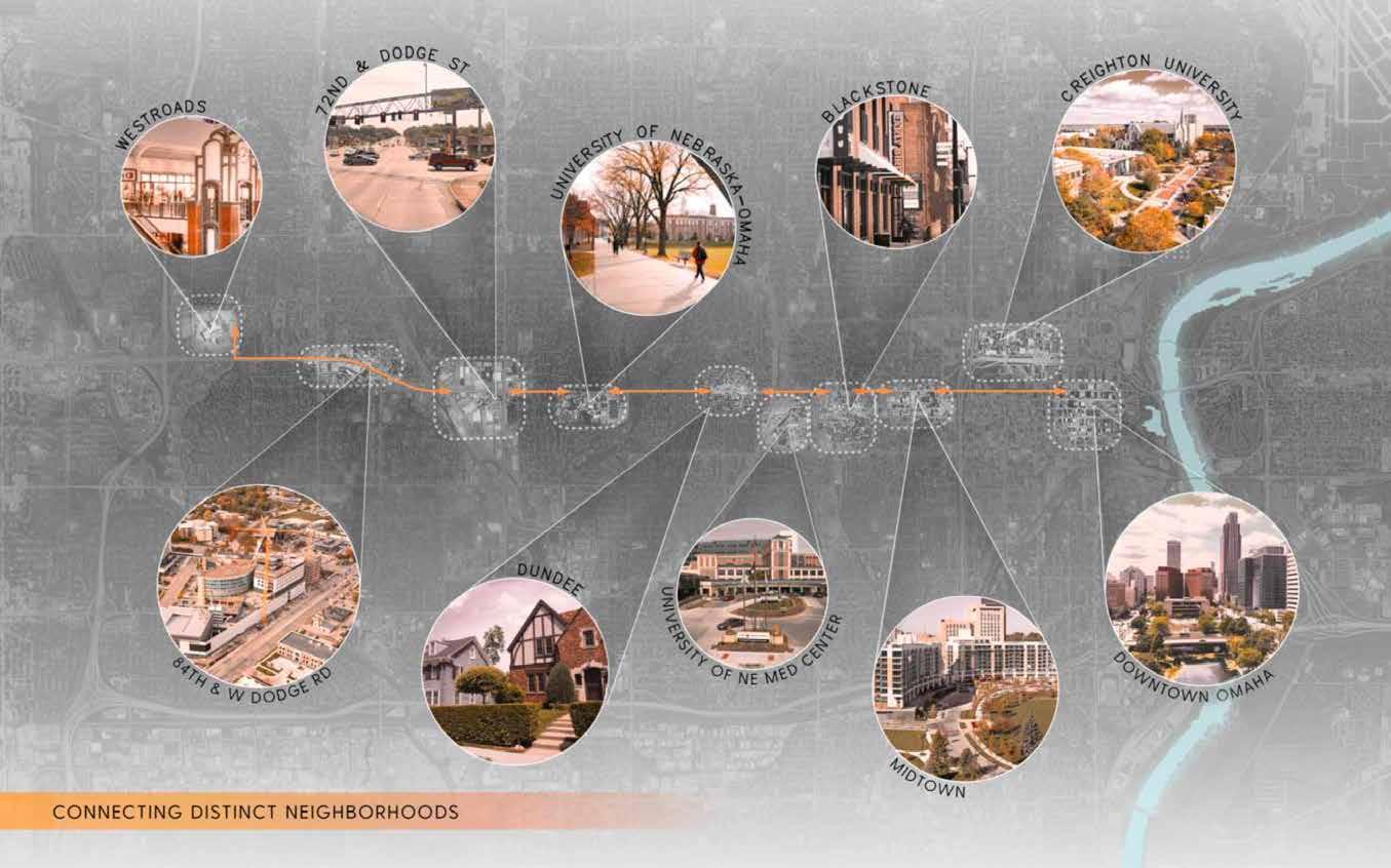
In turn, these stations support Omaha Metro Transit’s new brand and aesthetic by revitalizing Omaha’s public transportation to enhance accessibility around the city. The concrete platforms are embedded with heating elements to help clear snow and ice when winter hits the city. They also utilize 12-foot canopies to shelter passengers at 19 of the stations, while the five busiest stations use 24-foot canopies.
With lighting complementing the bright orange structure, each station is described as “a wayfinding beacon throughout the city’s urban core” by Metro. Rupert explains: “The canopy is essentially a light box to provide a safe environment for someone underneath. Each station’s signpost not only has the station location and name on it, but it was fully intended to be a beacon to call pedestrians to that station as the light at the top can be seen from a distance.”
111 Fall 2023 Unicameral L EO A D ALY
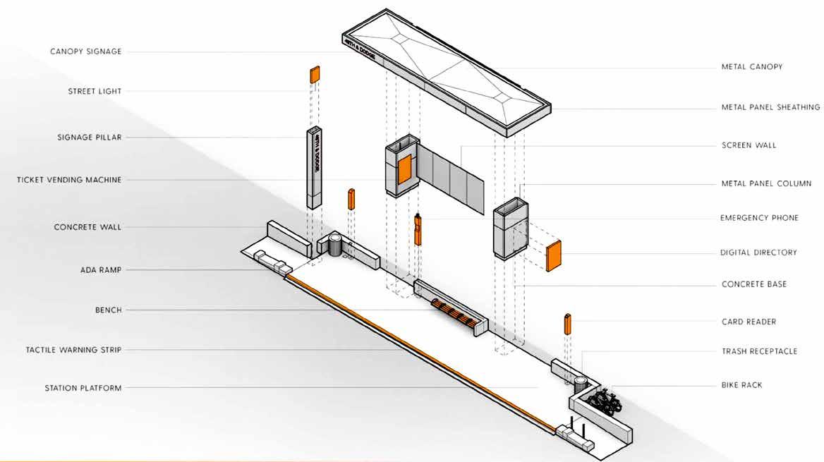
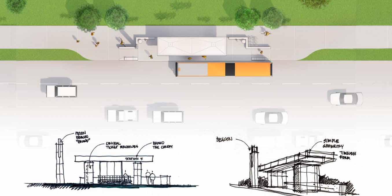
112
Because the design of the ORBT stations enhance accessibility and expedite travel around Omaha’s busiest areas, it was important for the design team to also ensure the installation process was quick and efficient. The stations sit at some of the city’s most active areas, like Creighton University; The University of Nebraska at Omaha; and at various places in Downtown Omaha. Each area sees a lot of vehicle and foot traffic, so it became a challenge for designers and engineers to make sure the installation process was as short as possible. Despite the busy street locations, they were able to cut installation times down to a matter of minutes. While building the stations, designers ensured its interruption to the city’s day-to-day life would not be significant by specifying the pre-manufacturing of various design components to help make the installation process shorter.
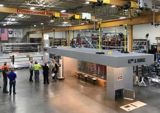
“It takes years of planning to create a 20-minute-install as long as it’s well planned and well-designed with everything connected to everyone’s delight,” Rupert said. The stations are also level-boarded, giving those with strollers, wheelchairs, and bicycles the easiest access to its buses. Signs and announcements also help direct passengers around the stations, while built-in, touch-screen kiosks expedite ticket purchases. The overall mission of the ORBT system is to be a beacon throughout the city’s urban core—the design team at LEO A DALY made no exceptions and creatively executed Omaha Metro’s needs and expectations by creating innovative details and processes that furthered the mission of the project.
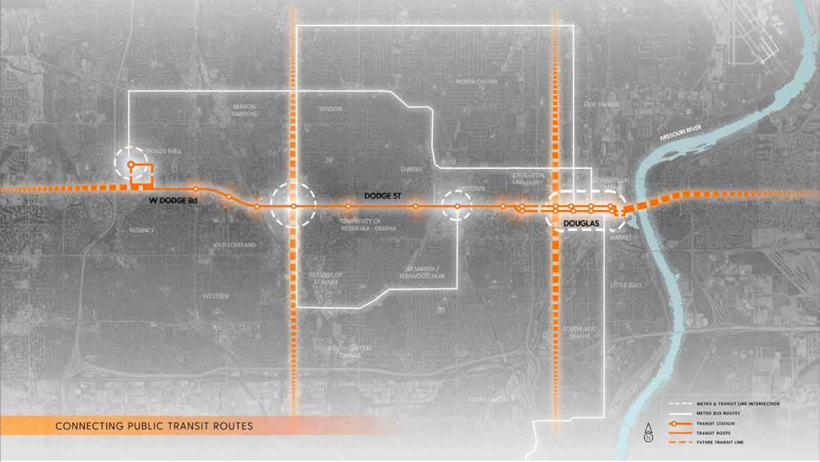
113 Fall 2023 Unicameral L EO A D ALY
Having to interrupt the environment and the lives of a city’s metro area is a challenge many architecture firms deal with. The ORBT system was no exception as designers and engineers found unique challenges in each of the 24 stations, including their locations. Rupert explains that some property owners completely objected to having a station near their property. The team worked with this hesitancy by flipping the station to the other side of the road and finding another property owner that would be willing to have a station on their property.
Other challenges the design team faced included the foundation of some of the structures. Rupert says that digging and hitting power lines, telephone lines, or even sewer pipes was a big challenge for the bus stops. “When digging the foundations for the structure where we needed about three feet, we did not have three feet before we were hitting sewer pipes, telephone lines, electrical lines and it just becomes a little spaghetti web of infrastructure right there in the way.”
Designers also had to keep in mind each station’s surroundings and the kind of activity that goes on around a busy urban area. Because of the heavy traffic along Dodge Street, designers had to ensure each station would not only be able to withstand a hit from an oncoming vehicle but also would keep those within the individual station as safe as possible. This challenge was overcome by creating various steel column designs that could break away when impacted by an incoming vehicle and implementing deep foundations that would be able to withstand the collision. “What we were instructed to do was design it to be substantial enough to stop an oncoming
vehicle; to specifically protect those within that station area. Some of the columns that you see are superficial—it’s essentially a metal wrap around a steel column. Those have pretty substantial foundations, and they have held up to being hit by vehicles,” Rupert explains.
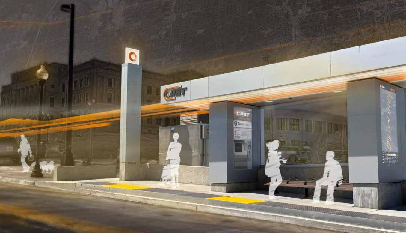
Each individual ORBT station also enriches Omaha Metro’s overall appearance and aesthetic by providing local artists an opportunity to showcase their work. Plain power and communications cabinets were incorporated into the design of the station as the artist’s canvas, and in turn the citizens of Omaha can appreciate local art just by walking or driving by. Rupert explains that there were good intentions, from all teams, behind the idea of using local art to enhance the stations, but this idea presented a challenge for both the design team and Omaha Metro. “There was definitely an intention, or a want, from the client to have some form of art incorporated,” Rupert said in our interview. “And we’d identified those ugly electrical cabinets as an opportunity. There’s a little bit of marketing that you have to do as the design lead sometimes. That’s a canvas; that’s an opportunity for public art.”
Public art can be found on the back of the new bus stations, on the back screen wall, as well as various areas where the electrical cabinets are. Rupert also explained that utilizing public and local art was an opportunity to connect local neighborhoods with local artists. The ORBT system allows Omaha to grow into a bustling city that is wellconnected and innovative, while also aesthetically enhancing a busy area and improving the day-to-day life of thousands of people.
114
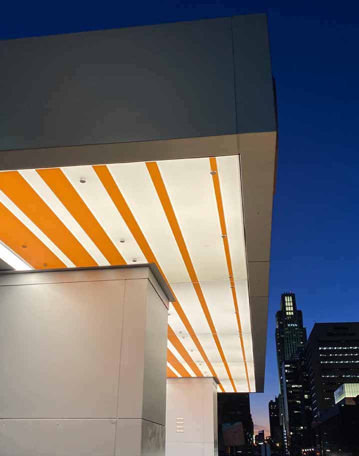
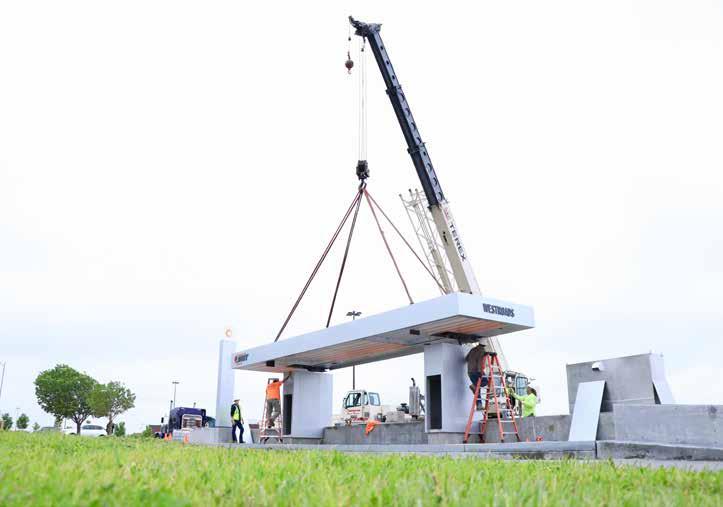
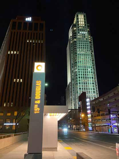
115 L EO A D ALY
Photography:
© 2023 Thomas Grady, Courtesy of Leo A Daly
ENTANGLED EVOLUTION
By Audrey Huse
History is made one day at a time and time itself is unforgiving in its passing. People have set lifespans, small in the grand scheme of evolution, but the traces they leave behind can surpass a lifetime. The built environment remains, impacting future generations until, slowly, humanity will succumb to time’s ever waging battle.
116
In the spirit of resistance to mortality, human nature lies in constructing tangible moments of perceived permanence, principally in buildings. Each generation designs new architecture, according to their values, dating the building and creating movements over time, inspiring eras within history.
Take this idea of layering through history, a linear evolution, of how buildings and places originate as daily essential locations, as places of functionality. Some of the greatest works of architecture standing today were not designed solely for the purpose of longevity; they were designed to live, worship, gather, and express art. With the integration of cultural connection, a place becomes the destination, where it overcomes the barrier of use and becomes consequential to the community.
Culturally monumental architecture serves the people and their—often times variable—needs over time, becoming a haven for expression and community life. When human values are at the forefront of design, economic progress becomes secondary to society’s basic needs. Today, designers do not have that luxury, which has introduced a built enviornment lacking in essence and personality. With this shift in focus and attention, architecture today faces a barrier, where buildings lose value from generation to generation because of misdirected motivations. Buildings that withstand the test of time have to either be approached with the ideation of expression and community, or they have to be able to adapt to the demands of function through the decades.
THE DURHAM . Reference in Omaha: The Durham, today a widely successful museum with vast permanent and traveling exhibits, originally a train station for Union Pacific. Then known as Union Station, it marked downtown Omaha as a connector to the larger puzzle pieces of growing America. Multiple rail lines provided the integration of Omaha into a social and production aspect and helped frontier transportation across the country. This concourse became obsolete with Congress’s establishment of a National Railroad. In order to preserve the purpose and value of the building, Union Pacific donated the land and building to the city of Omaha, after which the city reopened it as a Western Heritage Museum. From there, collections only grew with donations and time. The preservation of the train station and historical elements within became a significant part of Omaha’s cultural identity, with thousands of visitors a year.
Renamed The Durham, the station-turnedmuseum changed with the vision of Omaha and its needs, and consequently was further established
into the fabric of the city as it grew, addressing the missing values of art and expression, mixing with the historical context of the city’s roots. Though it began with function in mind, the shift towards culture is what cemented the building’s presence as a great work of architecture. The building and its design are not what makes it great, but society’s perception of its cultural importance marks The Durham as monumental.
NEBRASKA STATE CAPITOL. Take also the Nebraska State Capitol building, built in 1868, which did not need to adapt its program or purpose because expression and function were entwined from the beginning of its existence. As time passed, the capitol was not made obsolete by function, in fact government itself is one of few programs that seems to change at an impossibly slow rate. Architectural innovation moves quickly by comparison. This is not to say the building has remained exactly as it was; time wears on anything as the progression of humanity moves forward with innovation and technology, but the purpose of government, interaction, and social pride remained constant as people changed.
Though constructed nearly 40 years before The Durham, the capitol building has an entirely distinct architectural style: ornamentation was not done with the exterior architecture, but with the interior design. The history of Nebraska’s native and pioneer cultures are integrated into the architecture as mosaics and murals, which are not as interchangeable as historical artifact collections on display. The permanence of program and features is why this building is guaranteed to remain throughout the foreseeable future. Integrating a building into the very foundation of a culture ensures its significance to society and preservationists.
Buildings are not functional as stand-alone architecture, instead there is an entire contextual consideration of social impact and how a building is entrenched into the community in which it is built. Functionality alone cannot guarantee legacy, as human-driven programming evolves with progress. Community core values ultimately dictate the longevity of buildings and their relevancy to the communities they serve. This subjectivity cannot be defined by exact parameters, as culture varies from people to people, and age to age. Not every instance of designed architecture should conform to these ideals, but in terms of civic engagement, not responding to these considerations creates instability in identity; generational history is lost, cultural values themselves become obsolete, and architecture without purpose devolves into barren buildings.
117 Fall 2023 Unicameral Essay: Entangled Evolution
Integrating a building into the very foundation of a culture ensures its significance to society and preservation into the mind of the future.
Connection Through Design
By Anastasia Wand
DLR Group is a global architecture firm with 30 offices worldwide. The group thrives due to its setup as an integrated firm: its leadership and resources are being dispersed and shared throughout their offices. This allows for more collaboration and a wider range of expertise and information that can be used for projects. Since the firm is employee-owned and its leadership roles are dispersed between offices, employees have more opportunities to take on leadership roles than at other firms. Throughout their numerous offices, there is a wide and diverse range of work being undertaken in different project sectors; K-12, Higher Education, Healthcare, and Sports, to name a few. The theory behind having a global firm with resources and integration of disciplines is that if a client comes to DLR Group with an idea, there will be someone within at least one of the offices that has the knowledge, expertise, and resources to help.
DLR Group is a firm that invests in its employees and allows them opportunities to grow in different interests and areas of practice. An aspect that sets them apart from other firms is that fun is one of their core values. Incorporating fun as a core value adds more positivity to their firm culture and promotes a healthy work-life balance. In speaking with some of DLR Group’s employees, they described the firm culture as relaxed, family-oriented, flexible, collaborative, and equitable.
While there is no official DLR Group headquarters, and leadership roles are spread throughout their offices, the firm is divided into different regions. The central region consists of the Lincoln, Omaha, and Des Moines. What’s unique about this region is how close together the offices are, which allows for more cross-collaboration and social events.
The Lincoln office is 16 to 18 people strong and is set up to have a very open and collaborative work environment where there are no private offices. The firm is supportive of its employees’ interests and passions. If an employee has expressed that they want to work on a certain project type, the regional team who handles workload breakdown will try to find a role for that person within those projects.
The Lincoln team’s design process is heavily focused around understanding what the endusers’ needs are and how they can develop a project that supports those needs. Communication and collaboration among the team early on are key to their success with projects. A perk of being an integrated firm is that many disciplines can be involved early on in the dialogue of the project which allows everyone a better understanding of the project in the end.
118 DLR GROUP
Adam Post is an architect who leads DLR Group’s higher education practice for the central region. He received his M.Arch degree from the University of Nebraska-Lincoln. As the head of the region’s higher ed practice, he mainly focuses on university work. Early in his career, Post expressed his interest in higher ed design, and his colleagues at DLR Group supported him by putting him in a role where he can focus solely on this interest. In speaking about his journey and experience, he advised, “If you are passionate about something, express that clearly and show what value you can bring with it, and you will find places that will support you.”
Anna Mumm is an interior designer at DLR Group’s Lincoln office. She received her undergraduate degree in interior design from the University of Nebraska-Lincoln. In her time at DLR Group she has worked in a variety of project sectors, giving her exposure to different types of design including healthcare. Anna remarked that one of the best parts about design is that it’s a career where you get exposure to different types of work and a wide range of knowledge, and not many careers can give you that exposure.
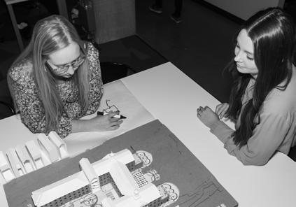
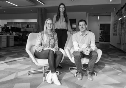
Rachel Andersen is an interior designer at DLR Group’s Omaha office who has worked on a number of K-12 projects in her time at the practice. She received her undergraduate degree in interior design from the University of NebraskaLincoln. She says DLR Group is a great fit for her because it is an integrated and global firm with many resources and opportunities. When speaking about the Dinsdale Family Learning Commons she described: “This was one of my first projects and so as a young designer, it was nice to have a voice in something so intricate and detailed as that project. It was a great learning experience.”
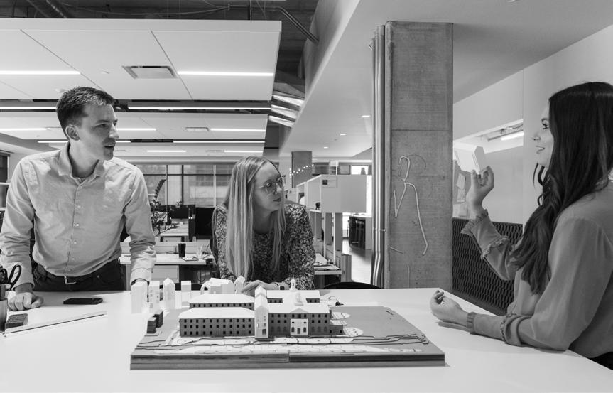
119 Fall 2023 Unicameral DLR Group
Photography: © 2023 Madeline Cass
Top from left to right; Adam Post, Rachel Andersen, and Anna Mumm in DLR’s Lincoln office
University Library Brought Back to Life
By Anastasia Wand
The UNL Dinsdale Family Learning Commons is a story of transformation. Previously the Agriculture Library, the building was as bustling with life as the Greek temples it was modeled after, but over time it became only a monument to the past. DLR Group brought the building back to life by opening up both the exterior and interior spaces to create a more welcoming environment with ample natural light. Once a proud but underused historic building, it is now a vibrant and active study space for UNL students.
The main focus of this design was to create a central connection that would activate the space and help the building reach its full potential. The newly-renovated library features a learning commons, café, various presentation and reading rooms, a gallery, and flexible study spaces for students. The Engler Agribusiness Entrepreneur Center and Rural Futures Institute are also located within the building. Additionally, there is an outdoor plaza with spaces for students to study and relax. Through the wide variety of open and flexible spaces and embedded programs, this building is now engaged with lively activity.
To achieve a seemless and open feel, the building’s central core was opened up to create a three-story light well. Two learning stairs were added to vertically connect the space, bringing more student circulation and interaction to the center. The design team clad the light well in glass to allow for views into and out of the central stair. However, opening the core provided the design team with a tough challenge. They coordinated closely with the structural and mechanical engineers in order to sucessfully integrate the mechanical and electrical systems into the project. Surrounding this central core is a series of differently-styled study rooms. Even the enclosed rooms use glass walls, making each space feel bigger.
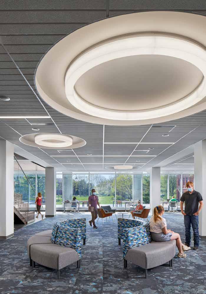
120 UNIVERSITY OF NEBRASKA-LINCOLN DINSDALE
FAMILY LEARNING COMMONS
Photography: © 2023 William Hess
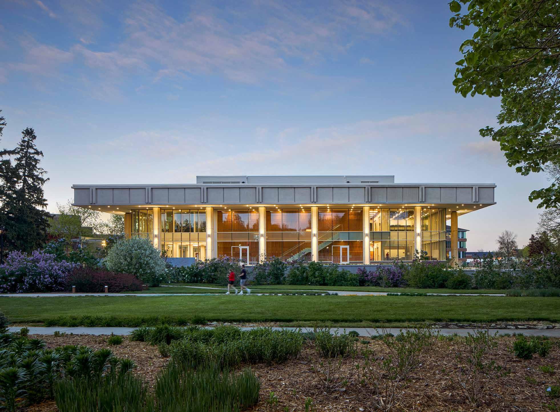
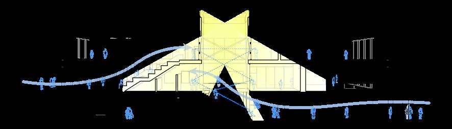
121 Fall 2023 Unicameral DLR Group SECTION
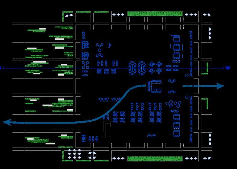
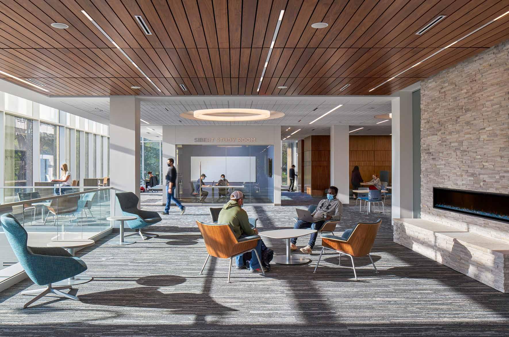
FLOOR PLAN 122
The Dinsdale Family Learning Commons is located at the heart of UNL’s East Campus which has a distinctly different feel from City Campus. East Campus is dedicated to agriculture and veterinary medicine, so it is fitting that this building has a more natural feel and aesthetic different from the typical “Red Nebraska” aesthetic found in many other UNL buildings. The new learning commons is nestled within the beautiful East Campus landscape, tucked behind the trees of the arboretum. Being in the space, with the entire exterior perimeter of the building now glass, there is a seamless blend between the exterior and interior space.
The design team used natural materials on the interior in order to contribute to an agrarian aesthetic. Images of agricultural fields, crop and pivot circles, and natural color tones are translated into the design of the carpet, ceiling, and lighting accents. The use of these simple circular and linear patterns is meant to be an abstraction of Nebraska’s terrain. DLR Group describes their approach as a “macro and micro thought process,” which explains how they were able to sucessfully pull these concepts all the way through the design process.
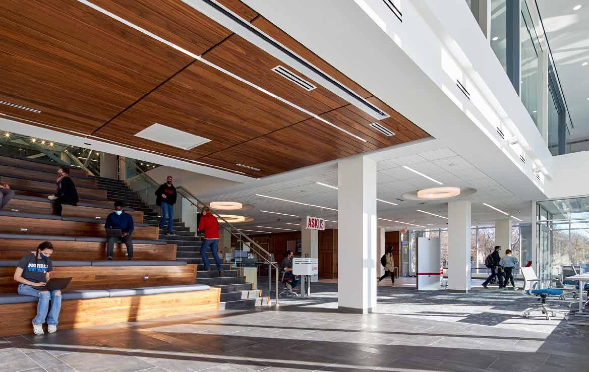
Architects and designers always imagine how their spaces will be experienced and used by people. Being able to see it being used exactly as they pictured it is a great feeling and reflects how the project’s intention is pulling through. Interior designer Rachel Andersen described having this experience when speaking about the professional photoshoot. “The space was so engaged and activated at that time that it wasn’t necessary to style people for the photos.”
“To see a space already so activated and engaged is rewarding, but in addition, to see its impact on design is equally important,” said architect Adam Post. He believes that the impact he’s seen this project have on similar library projects is positive and is a good precedent of how universities can transform and reutilize existing buildings instead of designing new ones. This project successfully proves that existing, underutilized buildings have potential to be great activated spaces if brought back to life with new ideas and purposes.
123 Fall 2023 Unicameral DLR Group
It’s All in the Details: A Precedent in Psychiatric Care Design
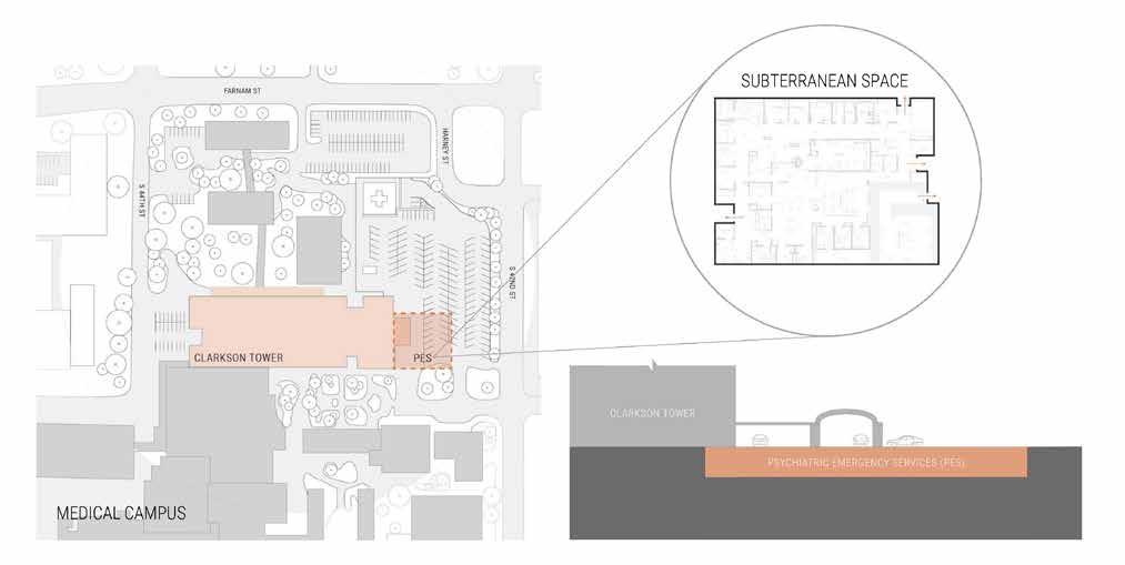 By Anastasia Wand
Monotone. Gloomy. Dismal. Bleak. These words are what come to mind when describing a stereotypical mental health institution. Thinking about the experience that image creates: how is that space supposed to help someone with a mental health crisis heal and recover? Historically, mental health has been overlooked as a whole, and the needs of those struggling are underserved. Mental health is a topic that has received more attention from designers over recent years, particularly through explorations in how designed spaces can be reimagined to better serve the needs of patients.
DLR Group is breaking this mental health institution stereotype with the design of the Nebraska Medicine Psychiatric Emergency Services Unit (PES) in Omaha. This project is serving as a precedent in behavioral and psychiatric care facility design through its innovative thinking and attention to detail.
This project was developed in response to Nebraska Medicine’s current inability to expand their emergency department, and needing to alleviate emergency department cases and needs as a result. Specifically, they were seeing an increase in patients with mental health emergencies being brought in—whether they should have been brought there or not. Developing a PES allows the emergency department to be relieved of unnecessary visits and for these patients to have a dedicated space to
relax and regain composure. The intent of this space is to get patients back to their baseline and then to determine what further steps and care are needed. Keeping this intention in mind, the space needs to be designed in a way that’s flexible and supportive of varying needs.
Because of the nature of a psychiatric care facility and the emergency aspect of this specific one, staff don’t know what kind of patients will arrive ahead of time and what those patients’ needs will be. This could range from a simple matter of someone needing a break to calm down to a more serious case of self-harm. Flexibility and attention to detail are key drivers behind the design of the space.
The unit features a combination and range of spaces from semiprivate and individual treatment rooms to dedicated group spaces to treat both low-and high-acuity patients. A central nurse station provides direct visual and physical connections to all spaces for safety and awareness. The three individual treatment rooms feature color light therapy technology to treat patients. Overall, the space is designed in a very open and flexible way to support staff in their mission and patients in their healing.
124 NEBRASKSA MEDICINE PES UNIT
One impressive aspect of this project is the amount of research and attention to detail that went into its design. While research plays a role in any project, in the case of psychiatric care facilities, it is essential. The tiniest of details—from doorhandles to corners to picture frames–can be harmful to patients. While they may not seem dangerous at first glance, in mental health cases, they are. Ligature is a term used in psychiatric care design to describe anything that could be a potential harm to someone. Almost anything can fall into this category. Designing a space that complies with institutional requirements but also elevates patients’ experience from a stereotypical facility is a real challenge at times. Some things this project focused on to create a safe and welcoming environment are the use of curved spaces, large wall graphics, color and light technology, and modern furniture with concealed hardware.
Every design project inevitably runs into challenges along the way, especially when it comes to working with existing space and structures. Depending on the challenge, sometimes these can be a blessing in disguise as they allow for more thoughtful and critical reasoning behind design choices. The space for the PES project was previously a former hospital imaging suite in the basement of the building. There were old imaging devices and equipment embedded within the walls. When opened up, one wall was found to be a 24-inchthick concrete wall. This would have created a huge dent in the budget to remove, but it actually worked in favor of the design. The semiprivate treatment rooms are located behind it; it provides a better acoustical quality for these rooms, making them quieter. A big aspect of this project focused on light and how that affects a patients’ mood. However, being located in the basement made bringing in natural light a challenge. To tackle this issue, new ceiling light technology was implemented into the design to allow for staff to dim and tune the color of the lights to match the different times of the day and/or positively influence the mood of the patient group. Color light therapy was also utilized in the semi-private rooms. These rooms have the ability to luminate with a different color, based on how the patient is feeling.
This project demonstrates how important research is in the design process and how it can drive innovative and new ways of thinking about different project types. DLR Group’s design promise of “elevating the human experience through design” really shines through clearly with the NE MED PES project. Their drive and efforts to rethink the design of psychiatric care facilities in a way that focuses more on mental health recovery shows how they are actively engaging to understand the needs of patients and how design can better support healing.
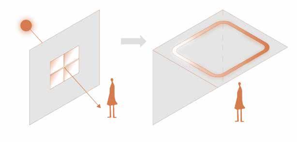
The mimicking of natural light established through cove lights, reduces depression among patients and gives a sense of the time of day.
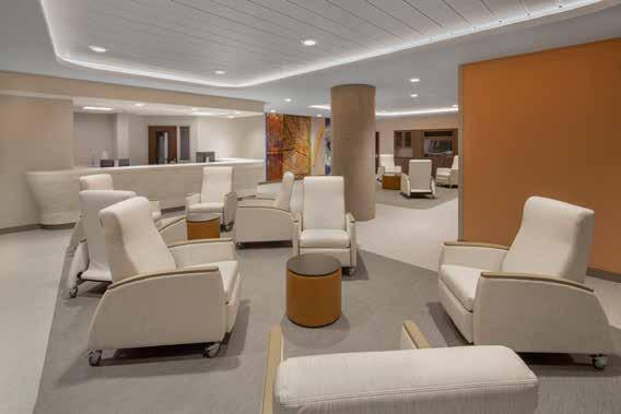
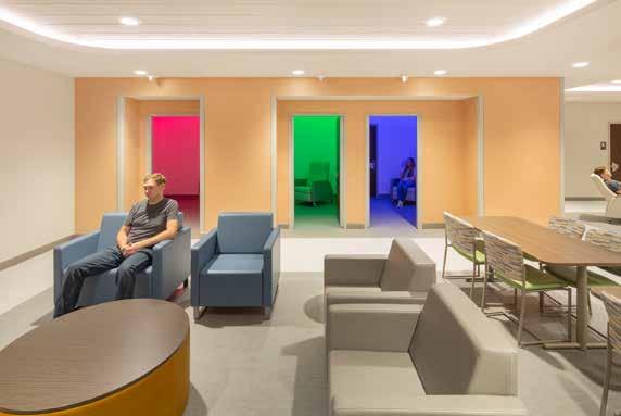
125 Fall 2023 Unicameral DLR Group
Photography: © 2023
Kurt Johnson
HOSTILE ARCHITECTURE
By Vy Cao
Using the designed environment to prevent certain human behaviors has been around for a long time. In the 1800s, Georges-Eugène Haussmann redesigned Paris to prevent uprisings of workers. In the 20th century, Robert Moses designed parkways with a clearance too low for buses to pass under, preventing anyone who could not travel by car—mostly lower-income families and people of color—from visiting the parks in New York City. In modern day, the addition of a simple spike on a bench was engineered to prevent homeless people from sleeping in public spaces.
126
When did defensive architecture become hostile architecture? And does this architectural style help anyone, or does it just mainly hurt people and act as a quick, ineffective solution to a much bigger problem?
Defensive architecture has been around for a very long time. The stairways of medieval castles are an example of this. Stairways were built clockwise to limit the movement and the ability of invaders, since right-handed soldiers would have problems with the wall to their right side when they tried to wield their weapons as they ran up the stairs. The defenders would have an advantage because they wouldn’t have the wall on their right side. The steps of these stairs also have different sizes. Inhabitants of the castle would be familiar with the steps, but the invaders would easily slip and lose their footing while fighting their way up.
A more modern example would be concrete boulders, benches, or planters surrounding the outside of federal buildings to stop unwanted entry from vehicles, especially if they carry bombs.
But, when did defensive architecture become hostile? Hostile designs are designs against humanity. They are made specifically to exclude, harm, or otherwise hinder the freedom of a human being. Quite often they aim to remove a certain section of a community from a public space. One of the earliest examples were the urine deflectors implemented in the UK in the 19th century, or Robert Moses’s design for segregation in the 20th century. Nowadays, hostile architecture can be seen from every corner of a city. It’s not hard to notice spikes on surfaces, benches with an armrest unnecessarily installed in the middle, or some variation of the Camden bench, the design intent for which was to make it extremely difficult to lie on, skate on, hide any contraband in, and from the look of it, to sit on.
But sometimes, organizations spend extra effort and go the extra mile to come up with very creative ways to prevent people from taking shelter without any consideration for their well-being. Saint Mary’s Cathedral in San Francisco installed sprinklers above the church’s doorways to douse people
seeking shelter there in 2015. One Guardian article talks about the issue and opens with an ironic verse from the Bible “Whoever is generous to the poor lends to the Lord, and he will repay him for his deed” (Proverbs 19:17). Fortunately, people were quick to call it out and the church dismantled the system.
These designs were made just to hurt people and act as a bandage to an infective open wound as they don’t do anything to help the people in need or address the core reasons for these issues. Because of the inhumane nature of hostile architecture, there are a lot of people fighting back, trying to make the environment more friendly. Take the Camden bench, for example: one of the main purposes of its design is to stop skateboarders from skating on it. However, what will happen when a bunch of teenagers are told not to do something? They will see it as a challenge and do exactly that. It’s not hard to look on the Internet to find videos of people trying to skate on the bench, or on pig ears, pieces of metal attached to low edges of pavement or walls that will send a skater flying if they try to slide or skate on them. Then again, it’s not hard to find YouTube tutorial videos where skateboarders show you how to completely remove these attachments. Closer to home, in Lincoln, a citizen is trying to get city officials to rethink the benches along P Street. He said the bars on these benches exclude people expriencing homelessness and even drive them away. There are many more people, forums, and movements out there that are trying to raise people’s awareness of hostile architecture and trying to change the way cities deal with these problems.
Successful solutions for homelessness, skateboarding, and loitering should be safe, effective, and help everyone. While there are still debates about the specifics of what needs to be done to solve these problems, simply driving people away or harming them is definitely not the solution. Mahatma Gandhi said it best: “The true measure of any society can be found in how it treats its most vulnerable members.” We should spend time and effort to help these populations to improve their lives because no amount of spikes and metal bars will help.
127 Fall 2023 Unicameral Essay: Hostile Architecture
 David Bowie, English singer-songwriter, musician, and actor.
Architecture should speak of its time and place, but yearn for timelessness.
FRANK GEHRY, CANADIAN-AMERICAN ARCHITECT
The Value in the Unexpected
by Meagan Willoughby
Actual Architecture Company’s work evades simple definition. Their portfolio includes single-family residential housing to large community projects to furniture design. “We’ve struggled to explain what we do and why. Every day it can be a different answer,” says Jeffrey Day, the company’s founder. While some firms specialize in specific disciplines, or specific goals in their solutions, Actual Architecture does not adhere to just a singular approach. “We look at each project in specific terms but we do not apply the same approach to every project. That is our approach – to be different for each project. We try to find the unique circumstances of each project scope and amplify those qualities, this leads to very divergent results.”
Day started Actual Architecture in 2018 as a continuation of his prior firm MinDay which was a dual office, one run by E.B. Min, Day’s co-founder, in San Francisco, and the other run by Day in Omaha. The two offices initially collaborated but eventually split to focus on projects within their region. Since then, Actual Architecture has taken on projects across the states, adding international projects to their portfolio. However, the majority of their work is in Nebraska. Working in Nebraska has had a big impact on Actual Architecture’s ability to create unexpected solutions. Day commented, “It’s a little bit more challenging to explain to clients the value of design, but once you get their attention, some interesting things happen. The projects we’ve done can be more experimental because our partners and clients do not have preconceptions about the process.”
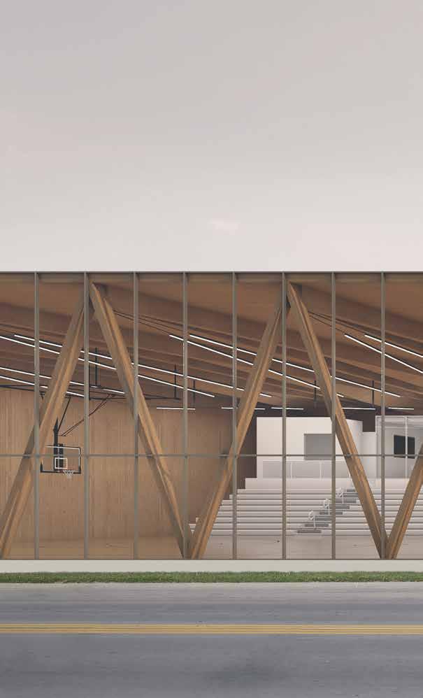
Actual Architecture’s portfolio is diverse, encompassing projects as large urban planning and design, to projects as small as a coffee table. Day likes to descirbe their style as “mid 21st century,” meaning he draws inspiration from mid-century modernism, but tries not to adhere to a specific stylistic framework or time period. For their multitude of projects, the firm is surprisingly small. At the time of this writing, Actual Architecture is a studio of four people, with architecture projects as well as interior design works. Their capacity can easily manage small to medium projects, fully refining the details of the design.
When asked about his feelings on what enables the firm to get all the positive recognition it has, Day stated, “there’s always something unexpected and surprising. I think that differentiates us from a lot of firms. It’s not to say that our work is radical and different that much, it’s understated maybe more, but it’s understated in a way that makes it stand out.”
130 ACTUAL ARCHITECTURE
COMPANY
Right: Actual Architecture designers Dennis Krymuza and Ethan Boerner with studio founder Jeffrey Day.
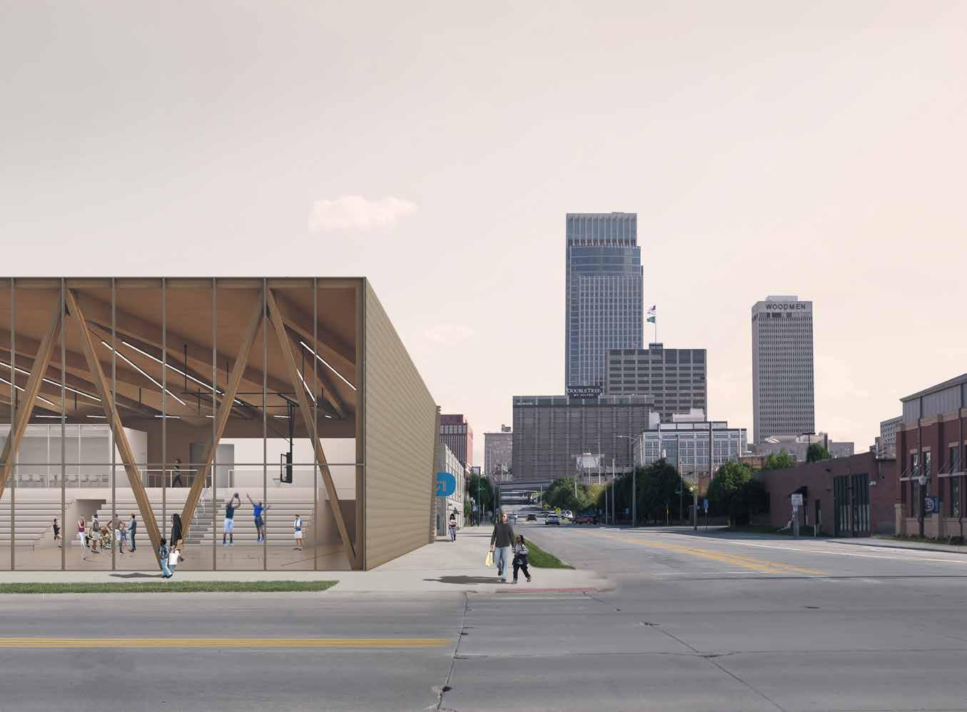
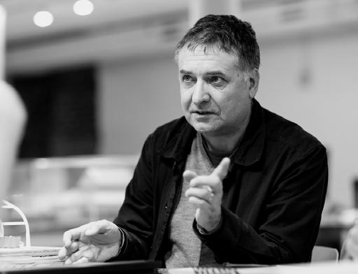
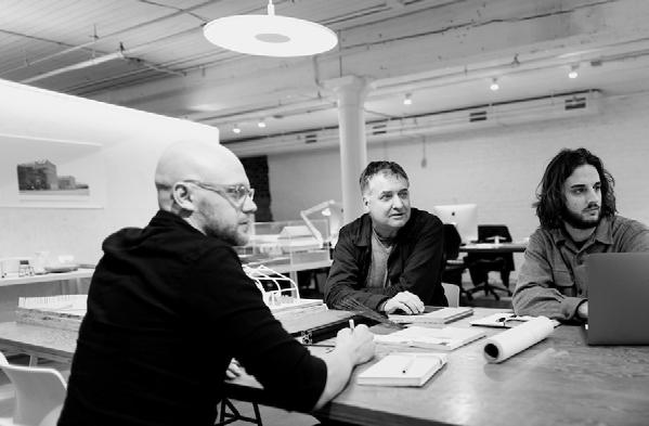
131 Fall 2023 Unicameral
Actual Architecture Company
Actual Architecture, Photography: Colin Conces Photography
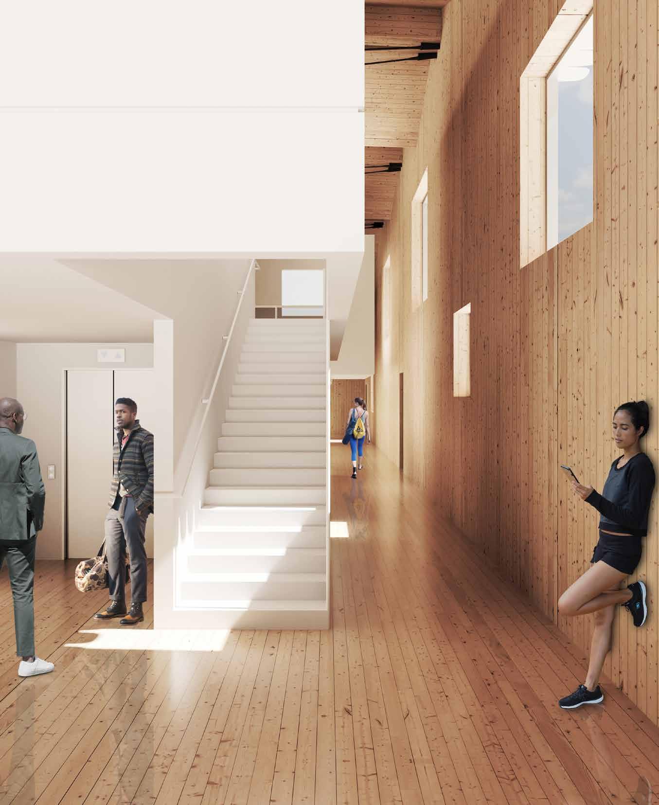
132
DVLP BASKETBALL TRAINING CENTER
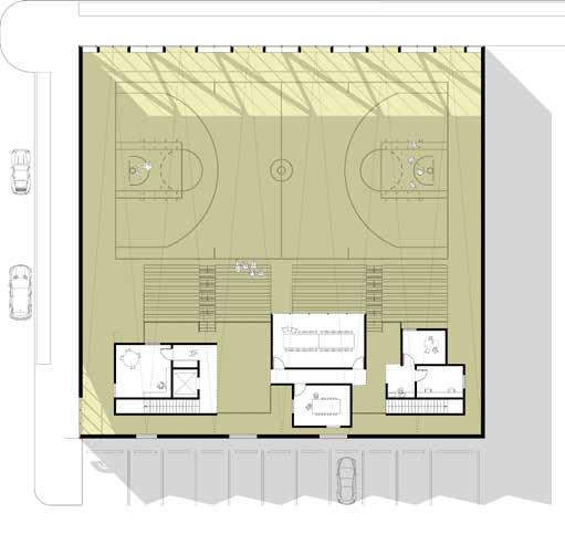
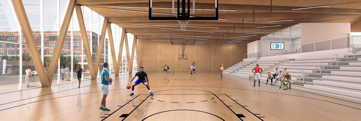
Killer Crossover
by Megan Willoughby
DVLP Basketball is a foundation focusing on providing wider access to training and coaches for student athletes in Omaha, Nebraska.
“I wanted to build a platform that allows for all young, driven athletes to have access to the people and resources that will maximize their potential,” says founder Chevelle Saunsoci on DVLP Basketball’s website. They have been renting gyms and bouncing between spaces, but their ultimate goal is to have their own location. DVLP Basketball approached Actual Architecture Co. about creating a design and renders for a fundraising effort, in the hopes that they’d be able to fundraise enough to build the design.
Overall, the building’s form is simple and elegant. The perspective from three sides of the building shows the roofline appearing flat, giving the building a modern look, but the fourth reveals the angles in the roof structure that allow rainwater to flow off. Highlighted by the glue-laminated wood beams and steel tie rods supporting them, the interior celebrates the angular slope. The exterior of the building is clad in anodized aluminum shingles, a warm yet muted, almost gold-colored metal, tying itself into the traditionally industrial areas of North Omaha, yet elevating it beyond a simple warehouse-like building.
10 20 0 2 3 4 5 6 1 133 Fall 2023 Unicameral Actual Architecture Company
FLOOR PLAN 1 Open Office 2 Conference Room 3 Private Conference Room 4 Kitchen 5 Private Office 6 Open Office
SECOND
Entrance into the building is framed with a diagonal cut through the metal facade relating to the angled roofline, revealing a glass storefront behind it. One façade of the building is entirely glass, allowing the passersby to view directly into the basketball court. The warmth of the exterior complements the warm, wooden interior that can be seen. Storefront windows show the interior floors aligning with the sidewalk, making the entire space feel open and connected to the city of Omaha, a key piece of DVLP Basketball’s mission.
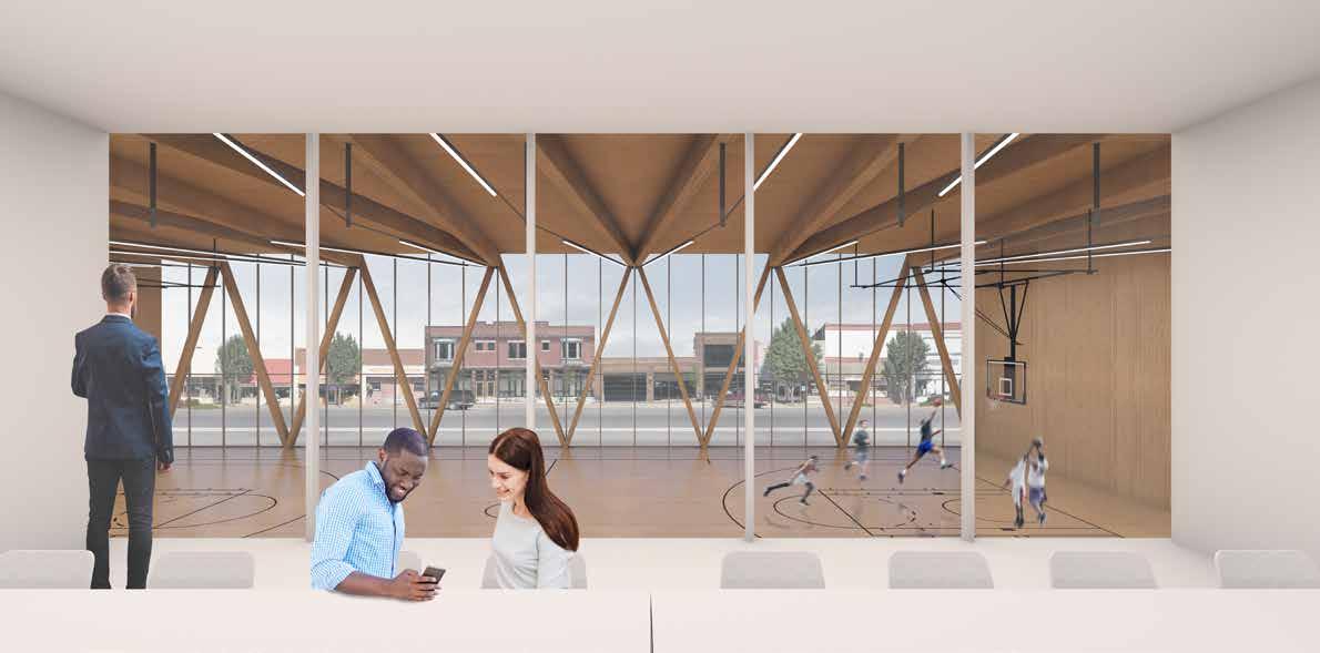
A unique challenge for this design was the lack of a site. Because this was created to aid in fundraising efforts, no site had been chosen yet. The DVLP Basketball Training Center is designed as a siteless building. Day chose the dimensions based off the standard lot sizes in the north downtown Omaha area, where DVLP Basketball wants to be located. Renderings show areas of Omaha that are accurate to the neighborhood DVLP Basketball envisioned, but they’ve misaligned each of the areas to create enough ambiguity that it no longer seems to have a specific site.
134
Reduction of information is something Actual Architecture has explored in their work. Their visualizations show an acute attention to materiality and detail in the wooden walls and structure; the interior forms are left a muted white material which serves to highlight the surrounding wood texture.
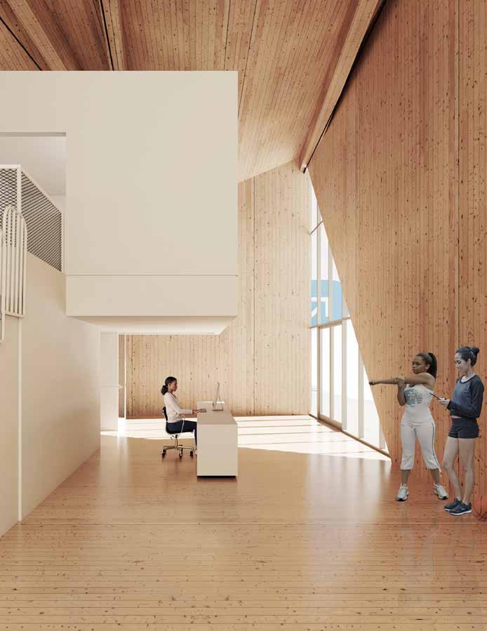
In a project such as this, one with many undetermined pieces, design solutions are flexible and deliberate. By having a simple form the building is able to be placed on many different sites. The individual boxes containing the auxiliary program can be easily rearranged when DVLP Basketball has a more definitive list of needs. While not needing to consult with structural or mechanical engineers for a project like this, Actual Architecture designed a feasible and simple way to integrate building systems. It’s an elegant, thoughtful design that clearly exhibits the mission of DVLP Basketball.
Actual Architecture’s design won the AIA Central States Honor Award for Unbuilt Architecture in 2020, and the AIA Nebraska Honorable Mention Award for Unbuilt Architecture in 2021, with the jury stating that “this proposal is a striking and simple celebration of basketball, boldly presented and embedded in its community. The shape and plan are simple, well-organized, and effective. As the project is developed, we hope the realities of structure and enclosure are allowed to be expressed and the path of the rainwater is celebrated.”
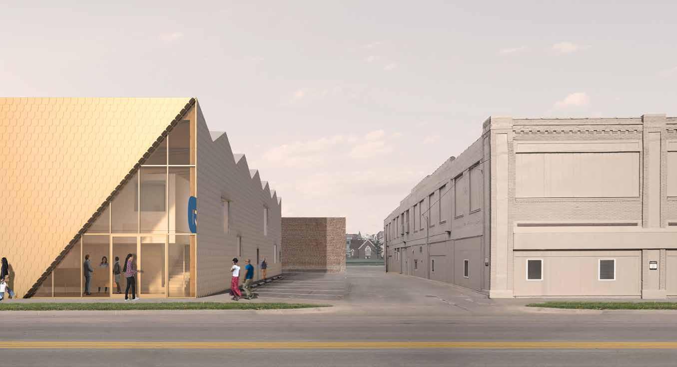
135 Fall 2023 Unicameral Actual Architecture Company
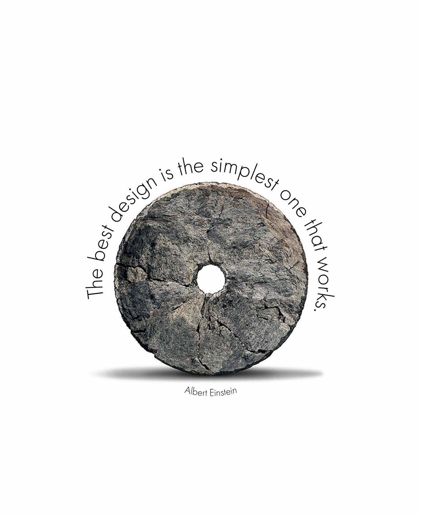
THE HEARTLAND INTERIOR DESIGN – LULUBEE ARTISINAL CHOCOLATES
A Taste of Interior Design
by Jay Quemado
Tara Miller is the owner and founder of The Heartland Interior Design. She is a Nebraska native who grew up in Lincoln and always leaned toward the artistic side of life. In high school, she had to make the choice between graphic design and interior design and chose the latter due to her fascination with space and the diverse ways we inhabit it. Miller stayed close to her Nebraska roots and graduated from UNL with a degree in interior design. After graduating, she worked as a design rep during the work week and moonlighted as a freelance designer for various projects. Eventually, this became too big of a workload, so she took a leap of faith and decided to start her own firm. That was four-and-a-half years ago, and The Heartland Interior Design has been serving clients ever since. The transition was not simple; Miller went from being at the bottom of the corporate ladder to owning and running her own business overnight.
Her personal philosophy of “constant learning” encompasses the work environment and ethos of The Heartland. As a young mother, Miller chooses to work from home in a studio she created in her basement. During the workday, she can shut the door to her studio and focus on her designs, but afterwards she has a quick commute up the stairs to spend quality time with her husband and their son.
While Miller’s studio maintains a clean look with tall cabinets and neutral tones, the space is also filled with playful accents, like kaleidoscope stickers decorating a window. By having a non-traditional office space, Miller is able to personalize her studio area to best cater toward her design process and aesthetics. A collection of books can be found in the room, along with samples of tiles and carpets. From the funky deer-print carpet to the various projects that line the wall, the details work together to tell the humble story of The Heartland.
Miller is an expert in branding, and her social media is a great example of her ability to curate the perfect image, both of a project and of her firm. Instagram has been a huge tool for her to grow her business and share information about interior design, a discipline which is often misunderstood. “My goal with social media is to take people behind the scenes and to show people that there is a lot of depth to interior design…. with my social media I really try and take people into our everyday lives and show them that we are working with floor plans, and we do work with the architects.”
This stigma surrounding interior design in the Midwest often leads Nebraska designers to move out to bigger cities, but Miller wants to bring the bigcity appreciation for design to the rural regions of the country. “For a long time, I have said we bring big design to small towns because I think the Midwest has a thirst for good design and I want to be the person to help bring that to them.”
With the Lulubee Artisanal Chocolate project, Miller succeeded in bringing an elegant design to a utilitarian space. She aimed to reinforce the existing brand identity of the company through the use of colors, tones, and the space itself. You can feel an appreciation for her subtle craftsmanship apparent within the space.
138
Photography: © 2023
Colin
Conces, Dana Damewood
Tara Miller in her studio.
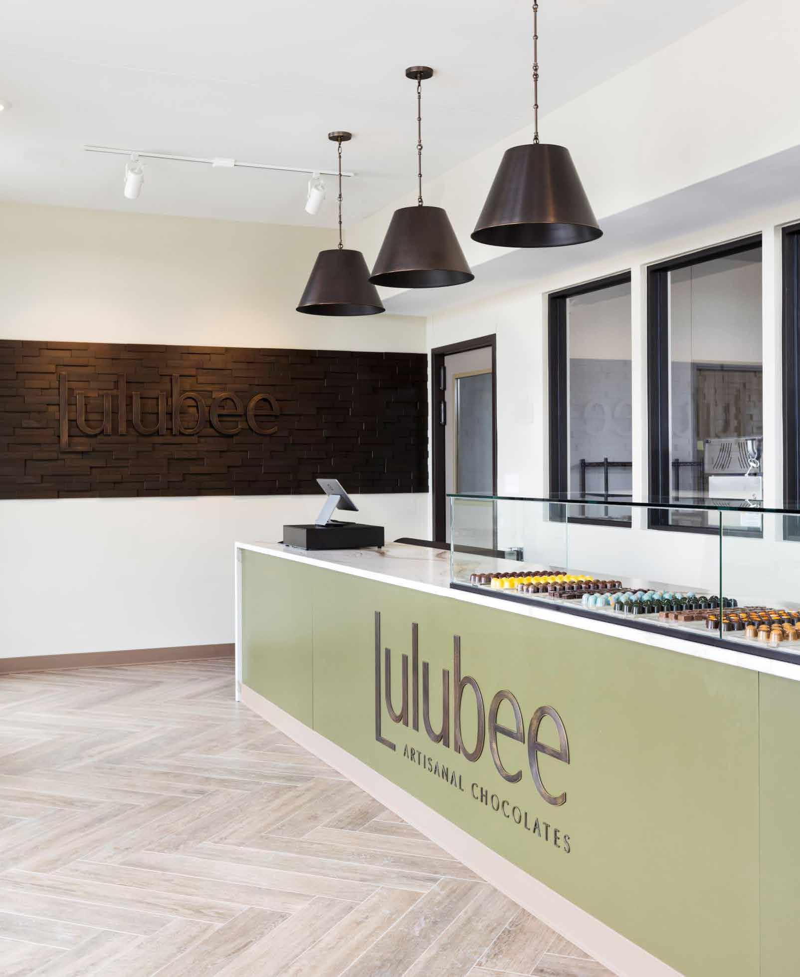
139 Fall 2023 Unicameral The Heartland Interior Design
This small shop celebrates connecting clients to the experience of the chocolatier. Through viewing windows, visitors can look into the kitchen from the main retail space and watch as the confections are made. From pouring molds to intricate detailing, chocolatiers prepare the sweets with steady precision and care. The main counterspace acts as a pedestal that displays the final product on rows of frosted acrylic trays. Dark brown shelves holding golden bags of chocolate line up along the northern wall, contrasting against the light beige paint and allowing for the products to stand out to the clients. Despite its small footprint, the shop’s large windows allow for natural light to highlight the room and open up the space. Through the project’s use of natural tones, like browns and greens in conjunction with white, and complementary works of artistry, like the dimensional wooden wall with a pattern reminiscent of abstracted chocolate bars, Miller’s creative direction works to reinforce the organic and earthy authenticity of the Lulubee brand.
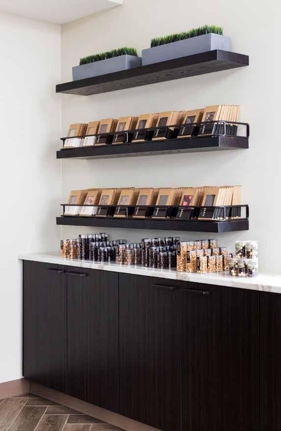
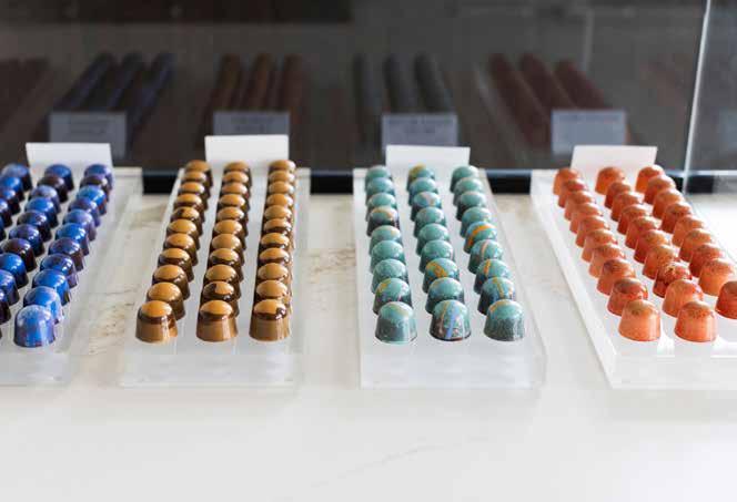

140
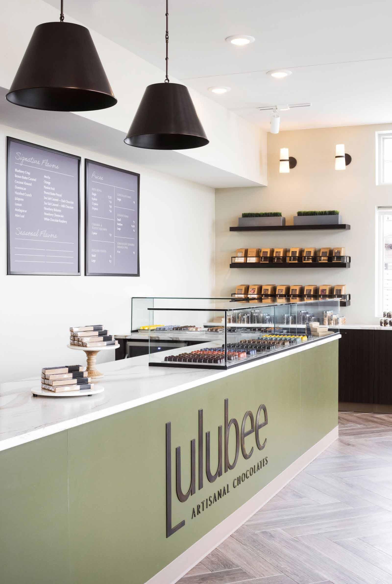
141 The Heartland Interior Design
ROOTS
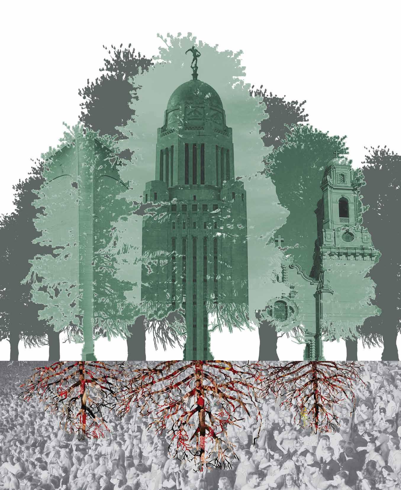
People ignore design that ignores people.
Frank Chimero, Brand & Product Designer
BVH ARCHITECTURE
Pinpoint Practice
by Louis Khu
BVH Architecture is a design firm practicing architecture, interior design, and planning, and was founded in 1968 with three offices located in Lincoln, Omaha, and Denver. Across the firm, they have three teams, which are not building type or market sector based to ensure that they can be agile and nimble for project pursuits. It also makes sure that the staff is personally and professionally developing within the field of design. Each team has graphic designers, architects, and interior designers that work on multiple projects at various stages at the same time.
For BVH, team communication is very important, especially after the Covid-19 pandemic. In a hybrid work environment, where some staff work from home, some are onsite, while others are traveling, it can be challenging to synchronize. Without efficient communication, there will be cracks and that is what BVH tries to avoid. BVH does not specialize in just one building type however, they are highly experienced with K-12, higher education, civic and cultural, and multifamily projects.
144
Clockwise from top left; architects Mark Bacon, Dennis Coudriet, Matt Wegener, and Kevin Meyer.
Photography: © 2023 Madeline Cass
Most of the work that comes in the door are repeat clients, projects won through competition, and referrals. In the start of a design process, they set their goals and project objectives. Oftentimes, the objectives are open-ended questions that evolve with the client’s needs.
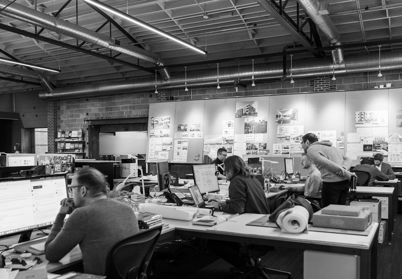
Mark Bacon is a design principal at BVH. He is originally from Kansas. After graduating from Kansas State University, and a brief stint in the East Coast, Bacon saw a chance to return home and practice architecture. He loves the authenticity and the honesty of the locals and wants to make an impact on the environment he lives in. One of the most valuable skills to Bacon, is that an architect should be empathetic toward the clients’ and the communities’ needs.
Dennis Coudriet, also a principal of the firm, is involved with the design of a variety of projects for specific target sectors. His area of expertise is education, primarily higher education academic spaces and student housing. Coudriet also designs for K-12 schools which is
how he became intimately involved with the Nebraska Center for Advanced Professional Studies (NCAPS) project.
As an associate principal, Matt Wegener wears many hats: he designs for different project types while incorporating artistic flourishes and problem-solving solutions into the architecture. Wegener is passionate about pushing the potential of designing for eduction to provide the best possible learning environment for students. His career is exactly the path that he dreamed about in his first drafting class in high school.
Project architect, Kevin Meyer is educated not only in the field of architecture but also in music production and songwriting. An enthusiast of various creative mediums and research, he leverages his deep knowledge in the performance arts to inform progressive design. The four leads at BVH each have unique design strengths they bring to the studio. Given their specific disciplines, their projects are a collective success in collaboration.
145 Fall 2023 Unicameral BVH Architecture
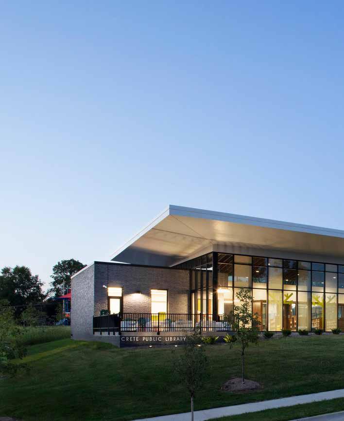
146
Coming Back Home
By Vy Cao
Crete is a city with a population of 7,000 people in Saline County. It’s about 30 miles southwest of Lincoln. When the old library became outdated, city officials decided to do more than just add more books or renovate. The city wanted to build a more comfortable and welcoming space with updated technology and resources where residents could gather to learn and create. With the community’s approval, BVH Architecture started to design Crete’s first new library in more than a century.
What resulted is a 20,000 square foot library, community center, and technology space located in a neighborhood close to the town’s elementary school, middle school, and Doan University. The project was designed by Mark Bacon at BVH with Olsson providing engineering services. The main challenge was the site’s size: it was a whole city block with challenging topography. There was a big change in elevation: 22 feet from one corner to the opposite side. By placing the library inside
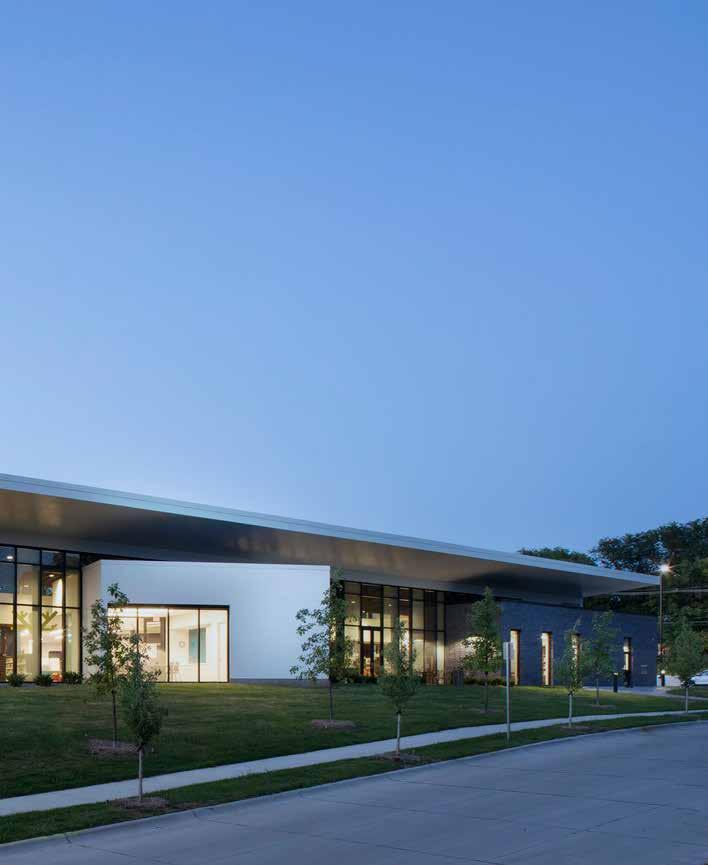
147 Fall 2023 Unicameral BVH Architecture CRETE PUBLIC LIBRARY
2023
of the footprint a demolished building, it offered a cost benefit, allowing the new design to use the existing sidewalks, which removed the costly process of regrading them. As the user enters from the parking lot, the building houses both the library on the left and a community center with after-hours access on the right.
The library has a park component; melding them together was the main aspect that influenced the design process, according to Bacon. Large open views to the outdoors frame the landscape that is indigenous to Nebraska. The library’s structure and ceiling mimic the forest’s maple canopy to provoke a sense of shelter. There is a sitting area in the park and a reading porch near the children’s program area for users who like reading outdoors.
On the interior, they wanted to make the finishes feel timeless so they will age well and be authentic to the building. They also focused on sustainability and user friendliness to improve the users’ experience.
Crete Public Library’s construction was finished in 2019. It opened in January 2020 during the beginning of the Covid-19 pandemic. However, the number of library card users was up almost 40% making the number of books being checked out rise dramatically. Through those indicators, community reception toward the new library has been very positive. The Library has become an asset to the community of Crete.
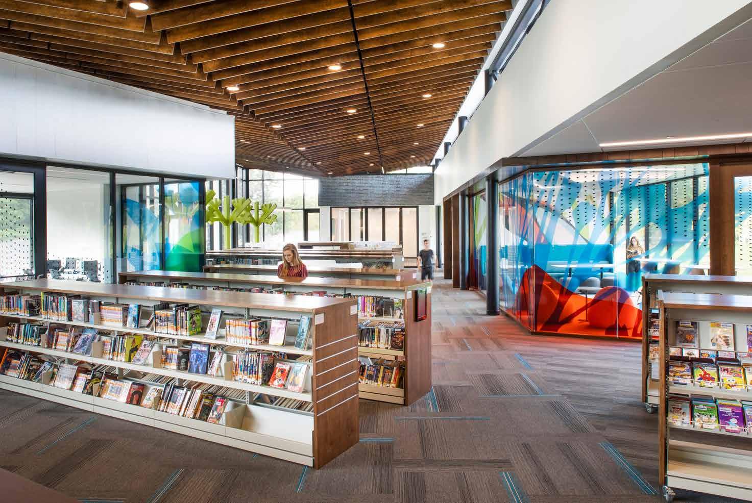
148
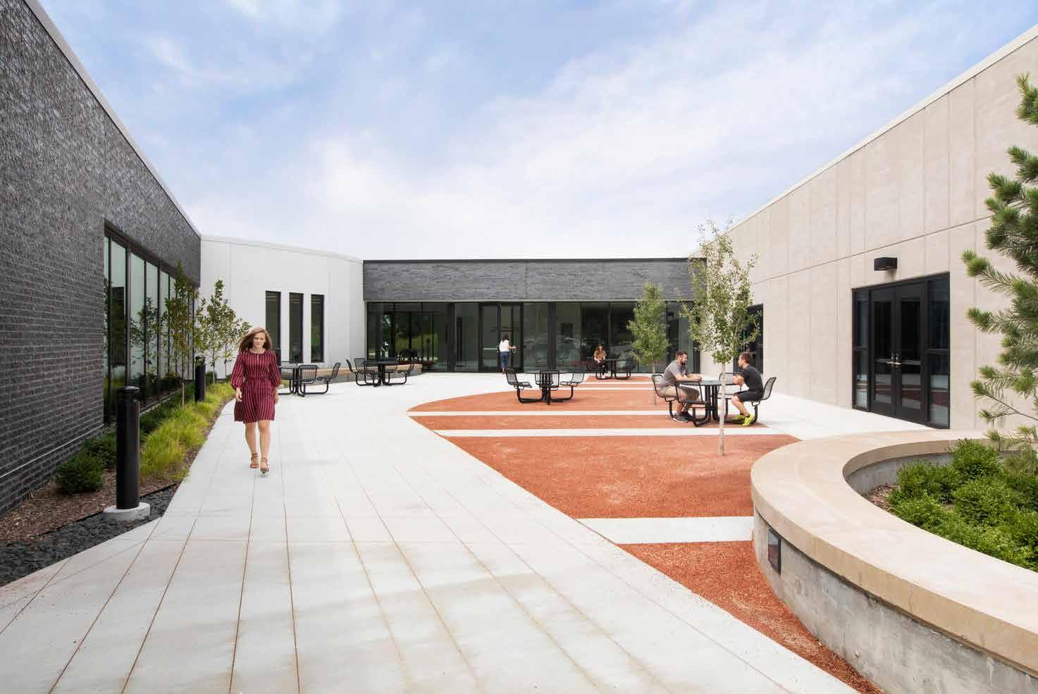
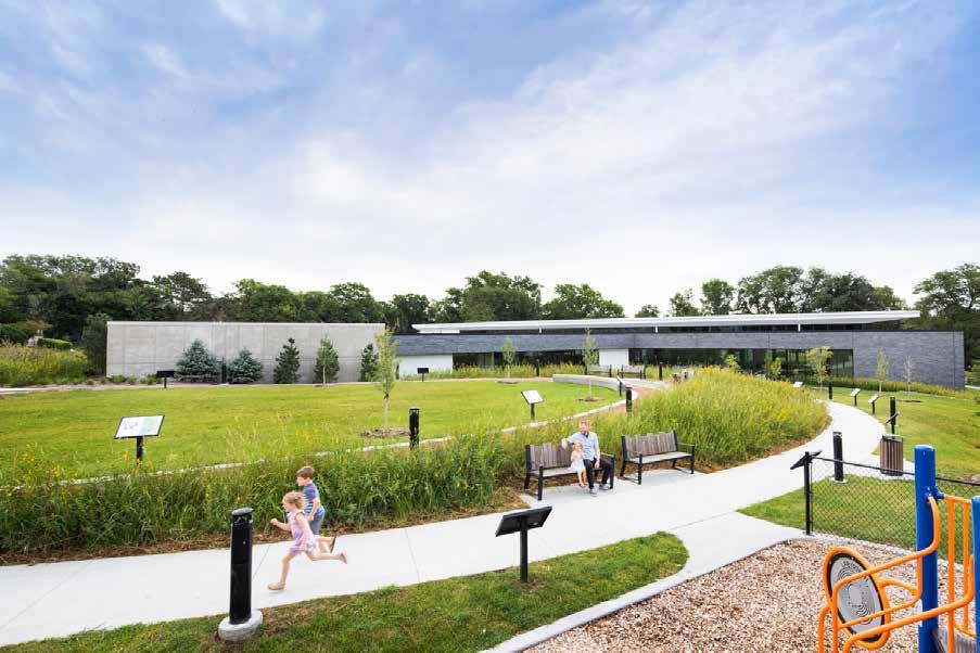
149 Fall 2023 Unicameral BVH Architecture
©
Photography:
2023 Dana Damewood
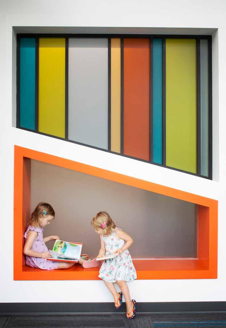
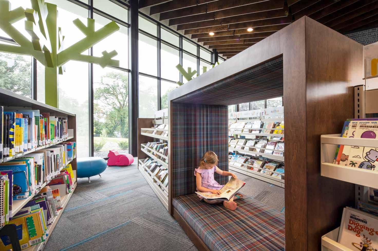
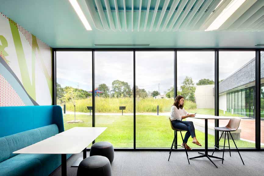
Fall 2023 Unicameral BVH Architecture
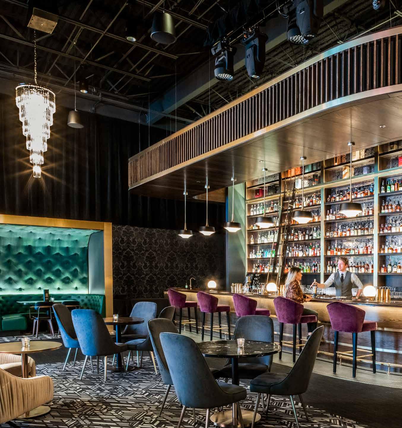
152
BARNATO ENTERTAINMENT VENUE
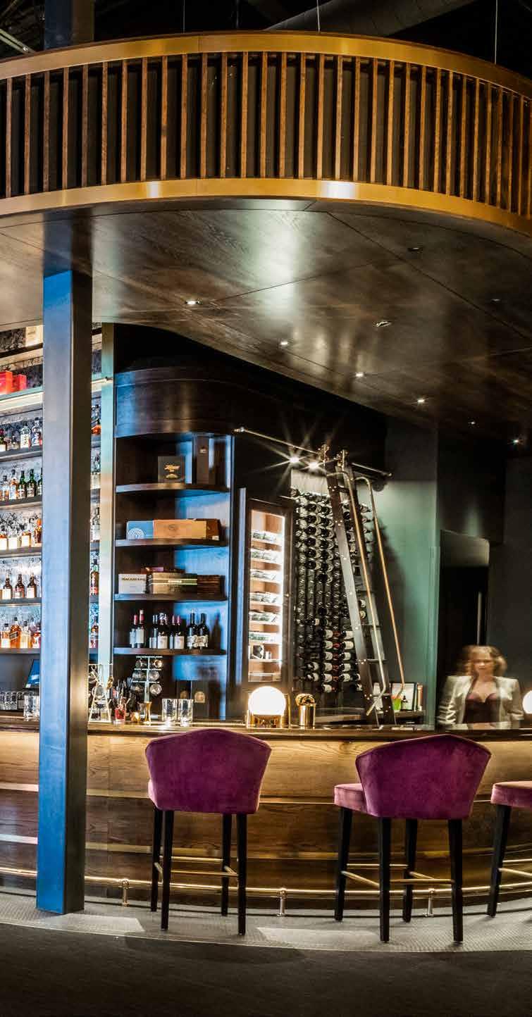
Whiskey Endeavors
By Audrey Huse
In the evenings, guided by a warm backlit sign, one can roll into the Bentley parking lot and walk toward the brick-and-steel storefront. Brass lettering of “Barnato” gleaming in the moonlight promises a night of glistening glassware and lively conversation. The entrance reveals new layers of intrigue upon approach with black glass doors accented with brass handles nearly as tall as the door itself. Just through the doorway, one is met with a dark interior, black walls vanishing into the darkness above.
Crossing the threshold of Barnato, one is fully enveloped in an entirely new atmosphere. Immediately to one side, blue and ivory velvet armchairs sit illuminated by glass chandeliers; a layered walnut stage canopy gently frames a curved low stage, curtained with a black velvet backdrop, waiting for an artist to assume position in the center under the canopy lighting; just beyond the stage, dark green booths melt into the far wall, kept from disappearing with a framing brass plate marking the casework, similar to the stage but contrasted by the dark fabrics. Sweeping further back, past the initial entrance lies the bar, boasting the same wood as the stage, but accented with mirrors, and in a sense, the alcohol and glass bottles themselves act as part of the palette.
153 Fall 2023 Unicameral BVH Architecture
Photography: ©
2023 Dana Damewood, William Hess
Clearly an entertainment venue, the main room has famous details of 1920s themes, setting the tone of the primary entry area as one of luxe textures, bold fixtures, and plush furniture. Matt Wegener’s design team used the concept of sectioning enfilade spaces to create layers of gradient history, revealing various atmospheres. Paralleled modern contrast is seen in the transparency to the Bentley exhibition room. The clients were inspired by prohibition-era art deco elements, as well as Bentley-inspired detailing such as the woods, the abstracted grill patterning, and green that is seen in the velvets and upholstery materials. Brass accents, geometric considerations of softened corners, and an overall glamorous interior are successful details incorporated into the main room. From lighting integration to modern
audio-visual considerations, there is an attention to detail; the integration of technological elements yield to the desired interior atmospheric experience of the space. Past the bar, a barely green-tinted light glows softly, and with it a wallpapered hall comes into focus. Through the darkened corridor, guided by wall sconces and into the buzz of the kitchen, is a gray metal door. In the fridge overstock cider and fruits can be found, but those are for supplementing the narrative of ordinariness.
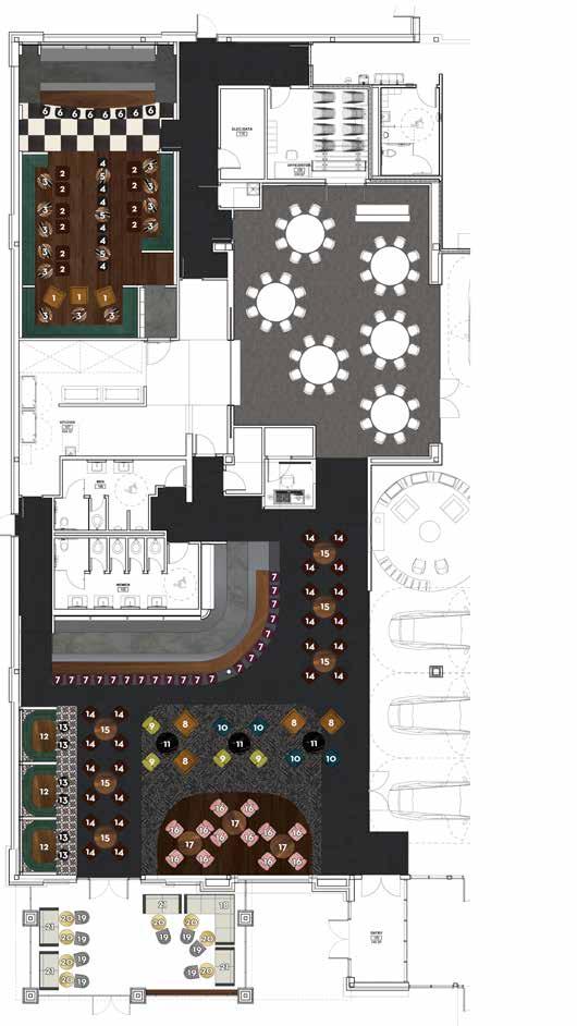
The far door sits unblocked by groceries; moving through this door is what reveals the true heart of Barnato: a wall. But slightly past the short wall is a speakeasy camouflaged by a bar, with many ties to the designs of the front room but done in a more intimate fashion. A low, wooden ceiling softens the volume of space, but the energy is animated with an
1 Custom button-tufted club chair
2 Cb2 Aragon velvet sienna chair
3 West Elm wood + resin bistro table
4 Custom bar stool
5 West Elm wood + resin bar table
6 Stellar Works Lunar bar chair
7 Custom bar stool
8 Custom button-tufted club chair
9 West Elm Roar + Rabbit swivel chair, wasabi velvet
10 West Elm Roar + Rabbit swivel chair, performance velvet, ink blue
11 West Elm black marble round bistro table
12 Custom wood table with black pedestal disc base
13 Stellar Works utility armchair
14 Cb2 Aragon velvet sienna chair
15 Custom wood table with black pedestal disc base
16 West Elm Roar + Rabbit swivel chair, luster velvet, dusty blush
17 West Elm Silhouette pedestal dining table, dark walnut
18 West Elm Portside aluminum outdoor 3-piece sectional
19 Cb2 Brava dining, lounge grey wicker chair
20 Cb2 Watermark brass bistro table
21 West Elm Portside aluminum outdoor sofa
154
MAIN FLOOR FURNITURE PLAN PROPOSAL
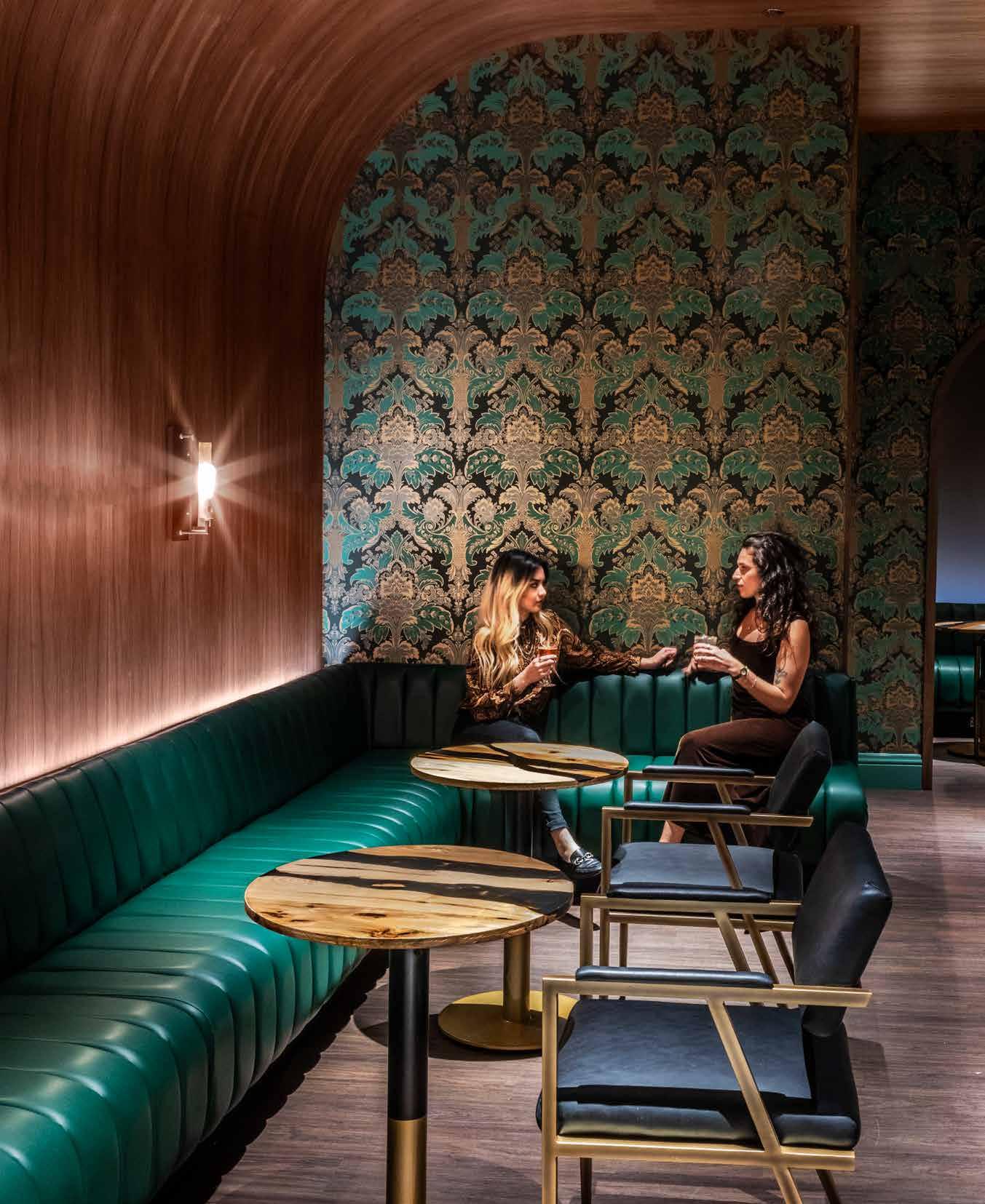
increase in brass and wood detailing. Here, Kevin Meyer explained the Bentley culture is at the core of each piece of furniture, trim, and pendant fixture; the character warm, social, with a hint of mystique.
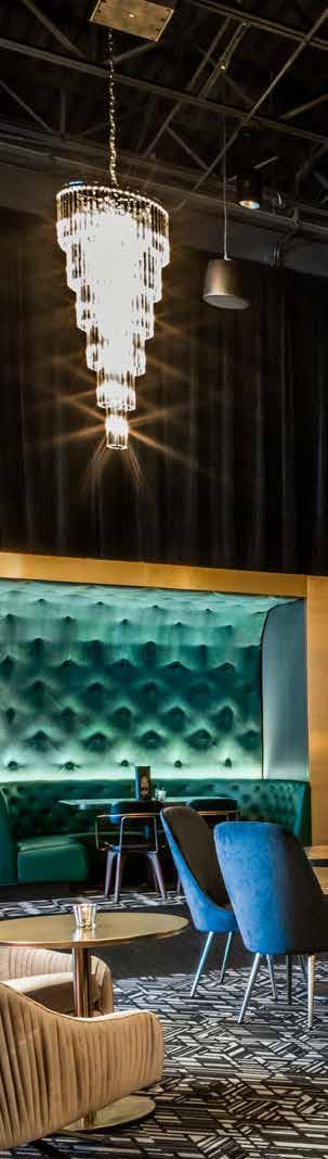
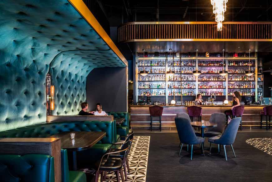
Behind the doorway lies the final piece of the gradient: the speakeasy, nestled beyond the bustle of the bar and restaurant kitchens. The language of the entryway is continued here but done in a way that is concentrated. Rather than having hints of wood, brass, and metals, these materials become focal to the experience. Overlap of materials and finishes becomes critical to the composition of the room. Mockups made of furniture and booths ensure a quality of character, more than material samples alone could offer. Further curation of the signature elements in this room, but present throughout the entirety of the project, help differentiate this piece of the gradient. The speakeasy is the culmination of the designed fragments that suggest its very existence; the 1920s materials of the entry, the Bentley palette and show room, all parts of the puzzle.
BVH approached this scheme with a precision that is admirable in respect to design, materials, continuity of intention, and built execution. There’s not just consideration for the architecture as it existed but there is adaptation of how an existing shell can be manipulated to craft an atmosphere. Precise detailing in spatial and material transitions elevates the user experience, eyes travel through the space continuously, not stuttering at hiccups. The level of cohesion and harmony in the palette paired with the clear thematic narrative makes for a compelling argument to disregard the rules of prohibition, to risk the wrath of the roaring twenties in an endeavor to venture into a night of liveliness and secrecy.
156 “
The Bentley culture is at the core of each piece of furniture, trim, and pendant fixture; the character warm, social, with a hint of mystique.”
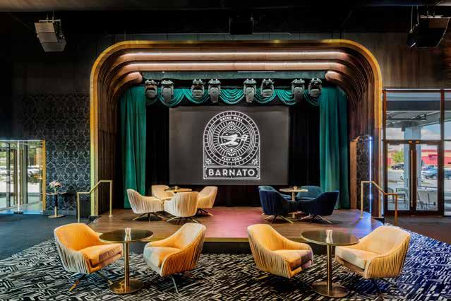
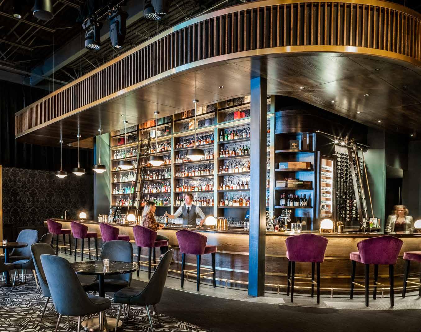
157
Collaboration From Top to Bottom
By Tiffany Schweer
In 2015 to 2016, a school in Fairfield began offering new curriculum for high school students, specifically more career path-targeted college credit classes including drafting, nursing, business, and more. In May of 2016 a tornado hit that school, causing enough structural damage that administrators had to decide whether to fix the costly repairs, or take a giant leap and make–what was at the time still a distant dream–a brand-new state of the art high school, a reality.
Nebraska Center for Advanced Professional Studies (NCAPS) is part of a rural pre-K through 12th grade school in south central Nebraska, better known as Sandy Creek, designed by Dennis Coudriet. Surrounded by cornfields and cow pastures, like many rural schools, the school is comprised of five small towns that have consolidated over the years as their shrinking populations could no longer support their schools. NCAPS stands out from other secondary schools because they have a completely restructured
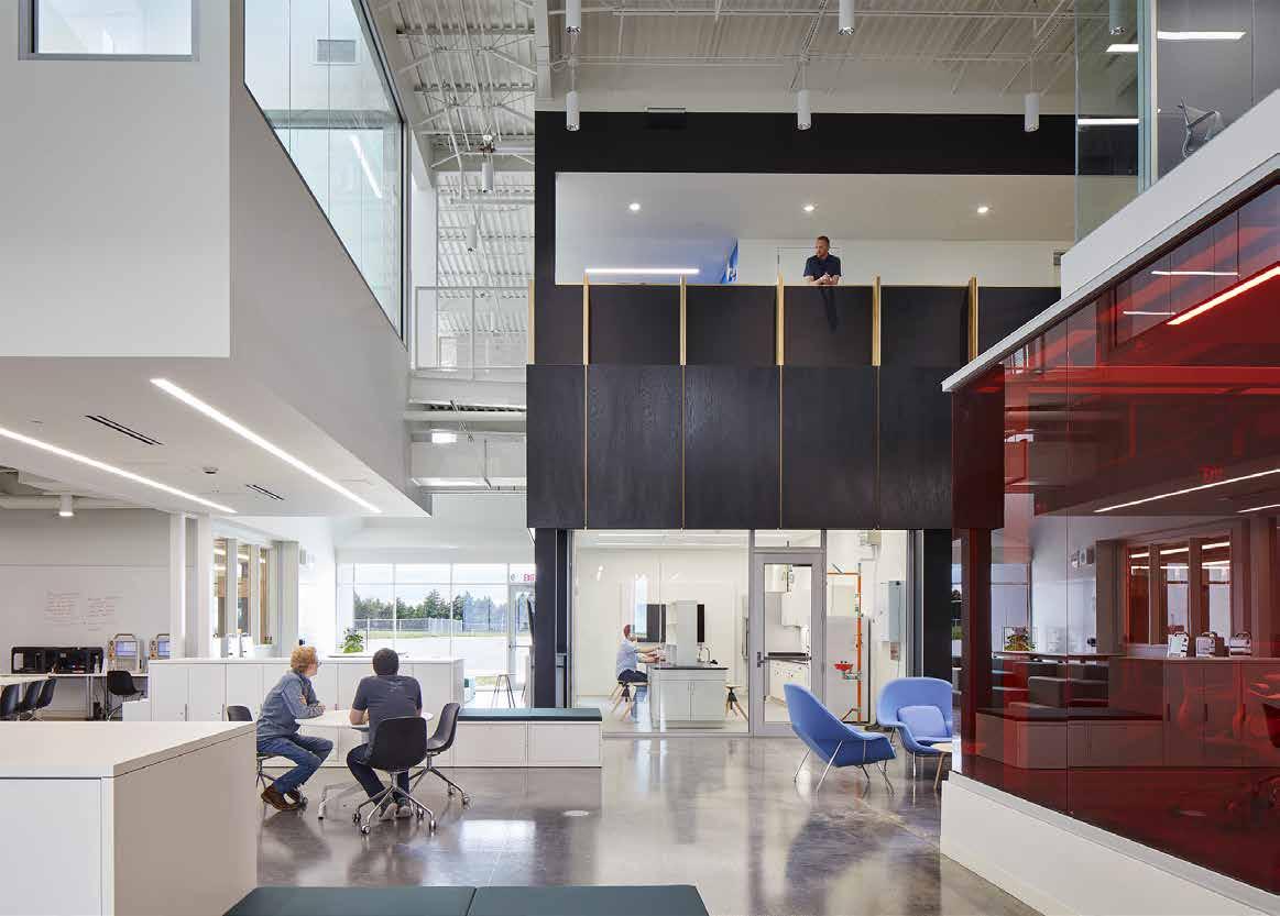
158 NEBRASKA
CENTER FOR ADVANCED PROFESSIONAL STUDIES
Photography: ©
2023 Corey Gaffer
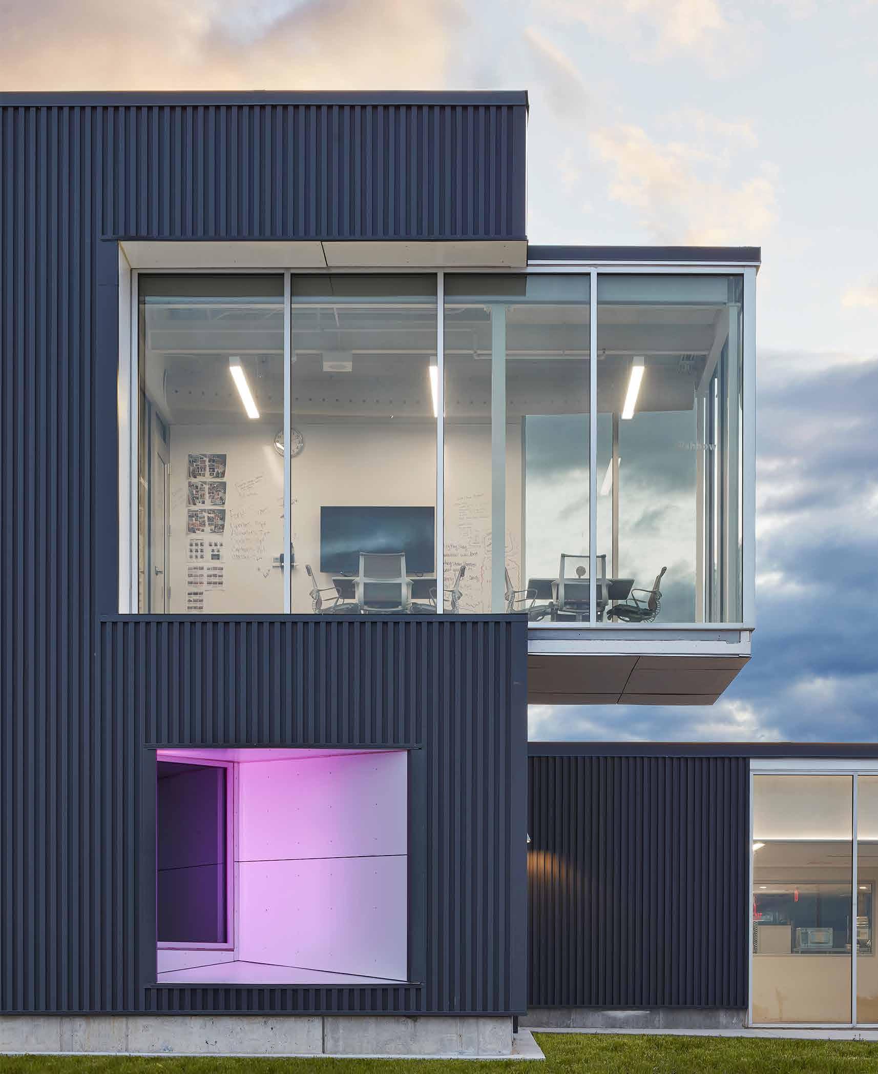
159 Fall 2023 Unicameral BVH Architecture
curriculum. This offers a personalized education for each student and prepares them for wherever they decide to go after high school.
BVH was selected to provide architectural and interior design services, as well as help with master planning and programming and facility analysis. When BVH was first brought on, the client wanted the interior to be one big open space. The design team loved the idea, but there were certain code requirements and program parameters that wouldn’t allow for a completely open concept.
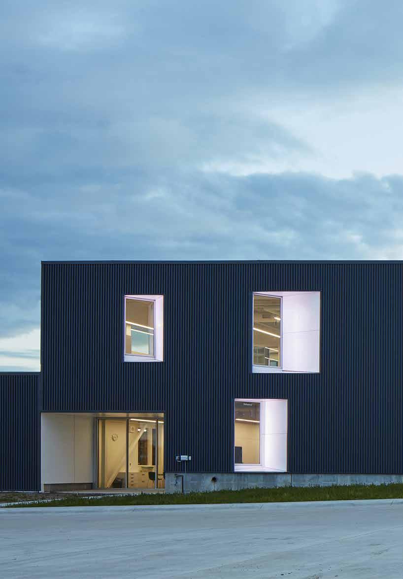
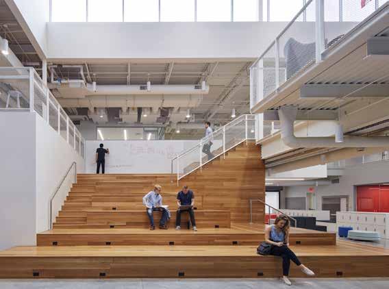
Coudriet took their client’s input to heart, and through the design process, they explored iterations using sketches and physical models. The team looked at how they could take completely different programs and let them interplay physically and visually throughout the space. The spatial relationships are critical in the two-story building design; the team worked with foam models in addition to sketching to explore these relationships sectionally. One of the design team’s primary challenges was finding a way to organize the building’s program while keeping the client’s open concept, in a way that is not chaotic. “Highschool can be chaos, regardless,” laughs Coudriet, “but how do you do that, so the architecture has some order but at the same time allow for the playfulness and the creativity that you want to happen in those spaces – the project does that well.”
During design and construction, teachers and administrators continued to evolve and implement their new pedagogy that they had only just begun to develop before Mother Nature threw them headfirst into this project. Organizing something that does not yet exist is not an easy task yet, that is what the BVH team was doing in the beginning of the project. Early in their design process, they were designing without a defined program. Because this was a completely new teaching model, the school didn’t know exactly what they would need for space requirements. There was no set number of rooms they would need, because there would be no more assigned classrooms. There were no K-12 education precedents of this kind. Coudriet and his team acknowledged the exciting opportunity that was this project, a concept that has not been done before. However, they could look to similar design concepts outside of K-12 education.
160
1 Medical simulation laboratory
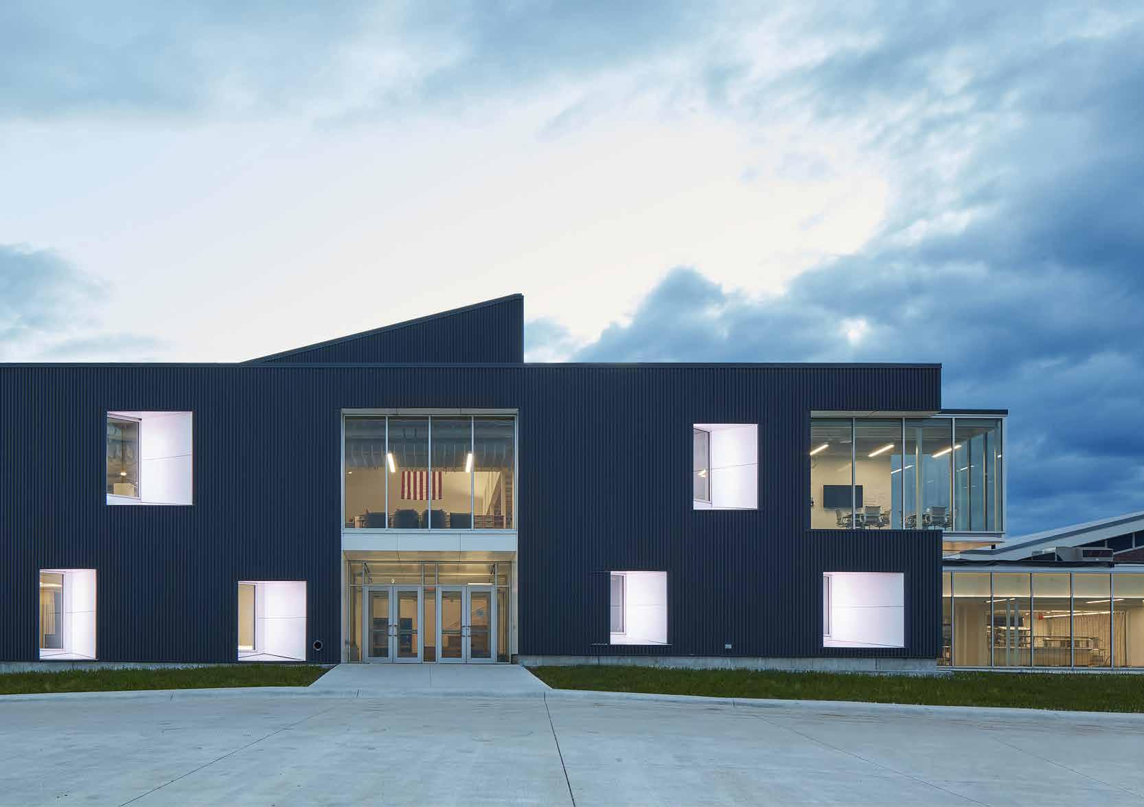
2 Medical laboratory
3 Flexible learning area
4 Wood lab
5 Metal lab
6 Ag lab
7 Cafe
8 Forum
9 Music room
10 Reception / Office
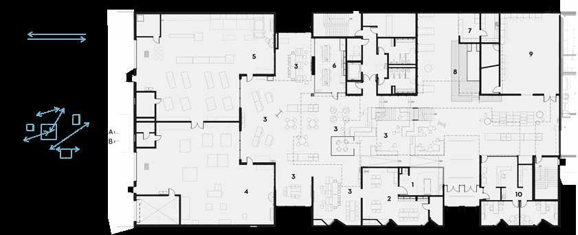
15 30 0 161 Fall 2023 Unicameral BVH Architecture
AREA A – FIRST FLOOR
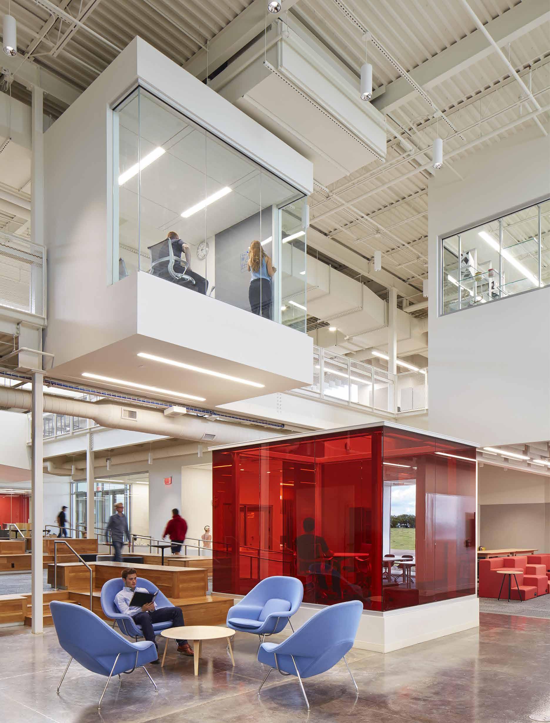
Their design goals aligned with the design concepts used in design studios, higher education, and workplace design, tech companies in particular. Not only did these other types of projects align conceptually, but they build on the client’s goal of setting their students up for success after high school. The design team and the client were looking at “where are these students going, and how can this design help them transition from k-12 to the workforce or higher ed,” stated Coudriet. This project does a great job of keeping the open, flexible environment that the client desired, while still defining spaces into nodal areas with different but overlapping functions. Rather than a traditional school design consisting of a long corridor with rooms along it, they created touchdown spaces, meeting areas, and zones, using simple architecture and a variety of furniture, all of which is intended to function however the users want it to. This included redefining how traditional school program spaces are used. The commons, for example, a place that is traditionally only used during lunch or extracurricular activities, is now a place for meetings and instruction or a place to study. This concept “encourages
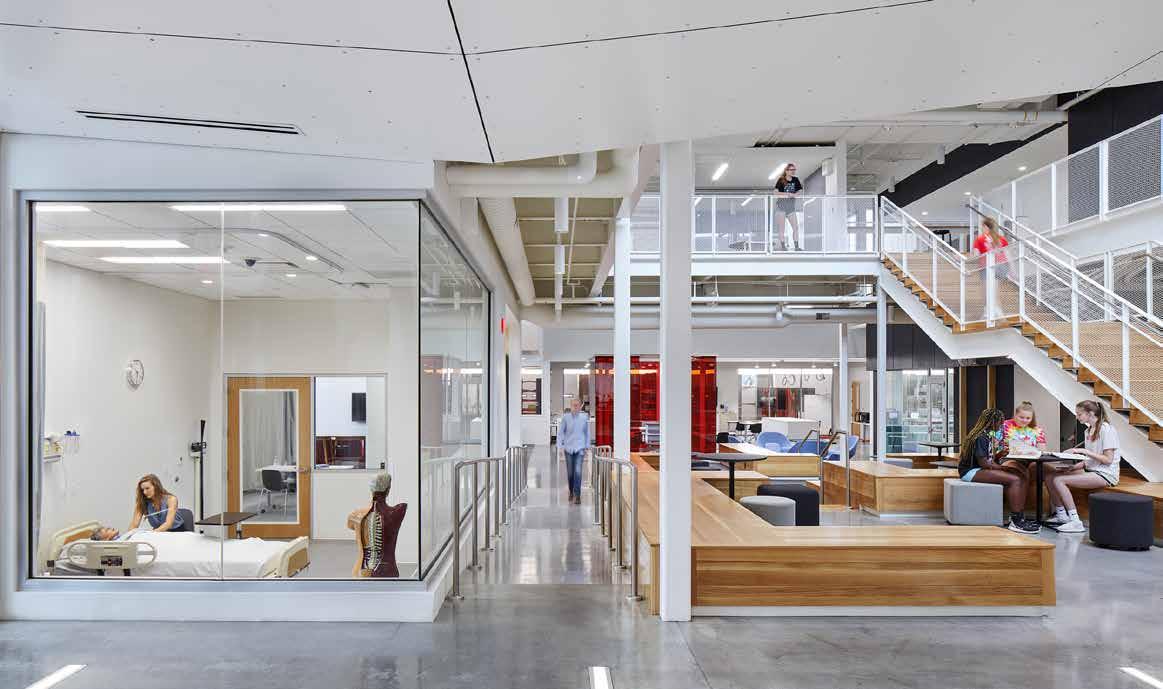
impromptu interactions that traditional school models can hinder.” It enables students working on diverse subject matter or different electives to work seamlessly, creating new opportunities that would have been considered disruptive in the old school’s model.
This project is successful because the school’s leadership team had a very clear vision for the future of their pedagogy; they worked with BVH’s design team to create a building that is a tool for their new teaching model. This is a perfect example of form and function working together fluidly to support each other; neither would be as successful without the other. NCAPS is an entirely new teaching model and design concept for secondary education. What does this concept mean for the future of K-12 school models? Only the future will tell, but for now, the NCAPS program will continue to pave the way for the future of high school education models, and BVH will continue to be a leader in innovative educational design.
163 Fall 2023 Unicameral BVH Architecture
 NIOBRARA RIVER VALLEY PRESERVE VISITOR CENTER
Environmental Awareness in Architectural Design
By Brendan Colford
As part of a feature for Unicameral, one of the things a writer on staff must do is visit the project in person. One of the biggest benefits of doing this is getting to see the finished project in its intended context. In award packages and magazines, the viewer experiences the project solely through the curated images presented to them. Sometimes this means that less-desirable aspects of a design are strategically left out or even digitally removed. This practice of photoshopping out electrical outlets, fire exit signs, and even entire HVAC Systems, is increasingly more common in this digital age.
Some refer to this as architectural acne. However, at other times without the right context, the viewer might fail to see what makes a project so successful. In the case of this BVH project by Mark Bacon, the crucial context is the 56,000-acre nature preserve in Niobrara, Nebraska. Niobrara is a peaceful slice of Nebraska life located at the upper northeastern edge of the state. During the summer, this area is popular for those wishing to hike, camp as well as kayak, and tube down the river. In the fall the experience at Niobrara is much more peaceful.
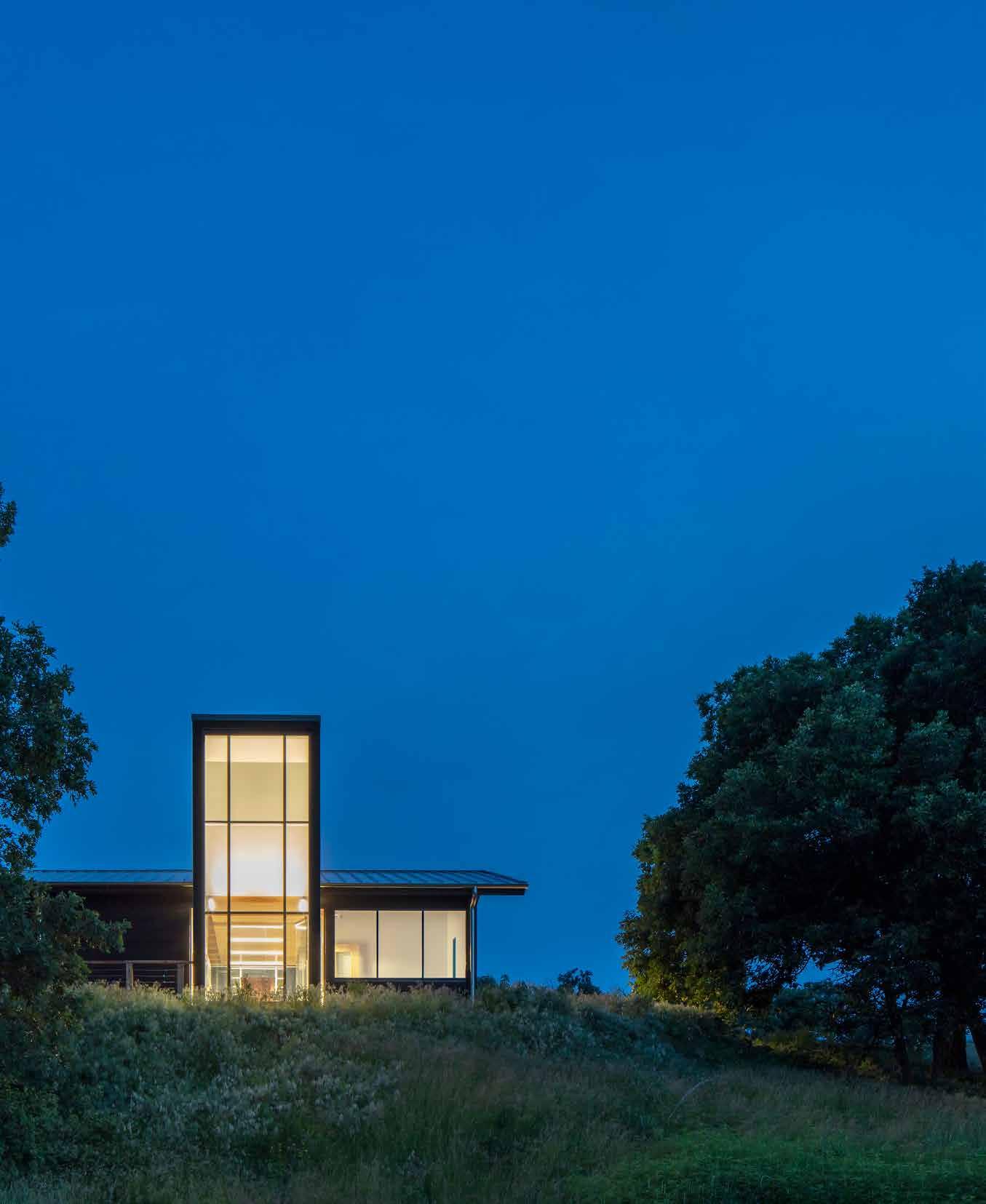
165 Fall 2023 Unicameral BVH Architecture
NORTH ELEVATION
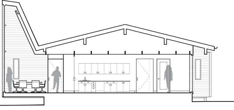
The rapidly changing terrain is covered in scorched cedar, and the deep reds of the smooth sumac scrubs define its peaks and valleys. During the day, turkeys walk through empty campsites and dear run along the river. Through the night, the sounds of coyotes, mountain lions, and many other animals in the nearby hills fill the air. Niobrara in the fall is much more indicative of what makes this project so successful
The Niobrara River Valley Nature Preserve Visitor Center (The Visitor Center) is filled with subtle yet eye-catching moments that complement the beauty of its environment while managing to remain understated. Bacon explained that, with this project, he wanted to create something that touched lightly on the earth, letting it become a part of the site. The Visitor Center is 16 miles off the nearest paved road in the outskirts of Johnston, Nebraska, making it somewhat ironically isolated from those who might want to find it. Typically, a visitor center serves as an introduction point for visitors before entering the park. In this case, The Visitor Center is more of an arrival point, a final destination for travelers to stumble upon. By traveling through the winding roads of Niobrara you are eventually rewarded for your curiosity with a perfect spot that overlooks the entirety of the river valley.
The design is a single-story structure that is part of a larger master plan developed for The Nature Conservancy, a non-profit organization that owns and maintains the Niobrara River Valley Preserve. The building serves as an office space for the preserve management and as an educational space. Typical visitors include nature enthusiasts, students from the University of Nebraska-Lincoln who are staying on-site to conduct research, as well as a large contingent of grass-and forest-fighters.
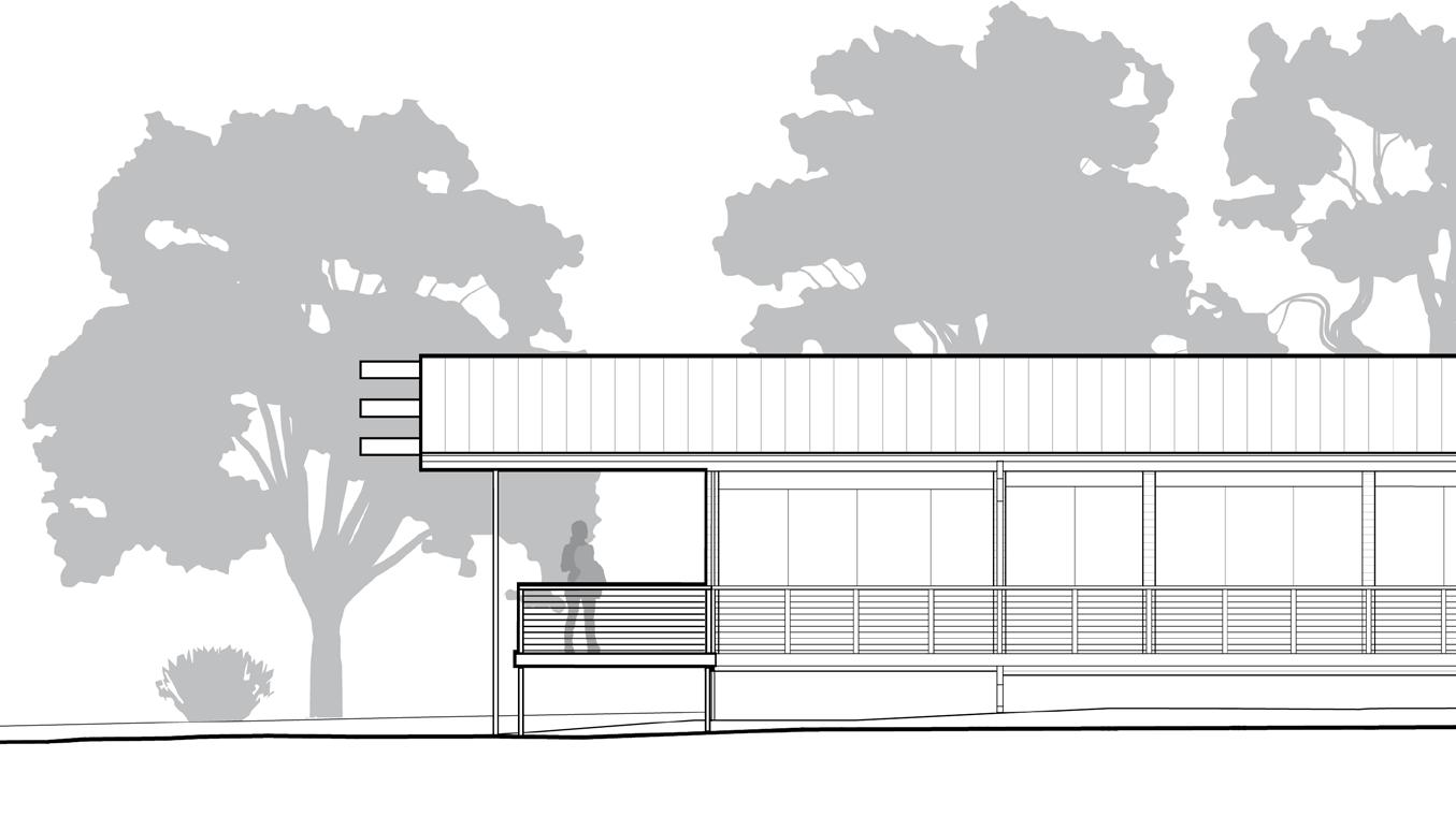
166
Section diagram looking west, showcasing the roof condition.
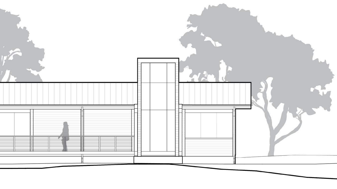
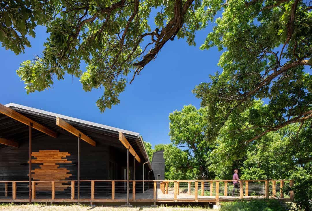
167 Fall 2023 Unicameral BVH Architecture
Photography: AJ Brown Imaging
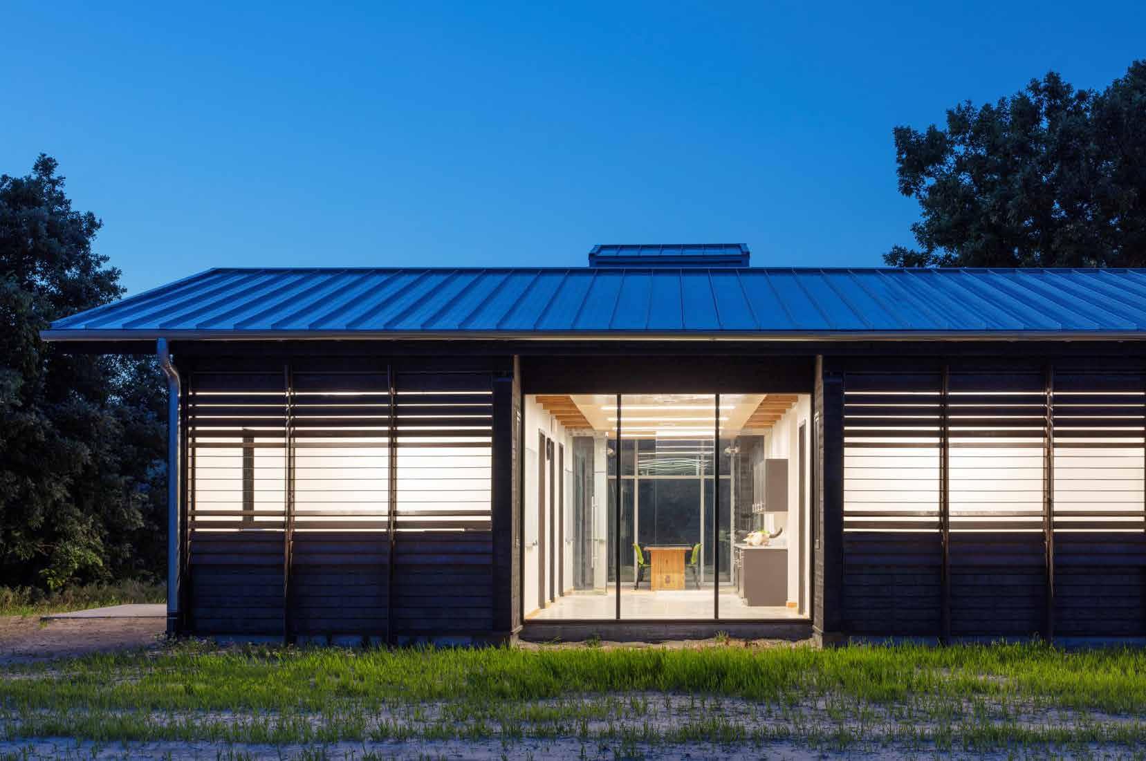
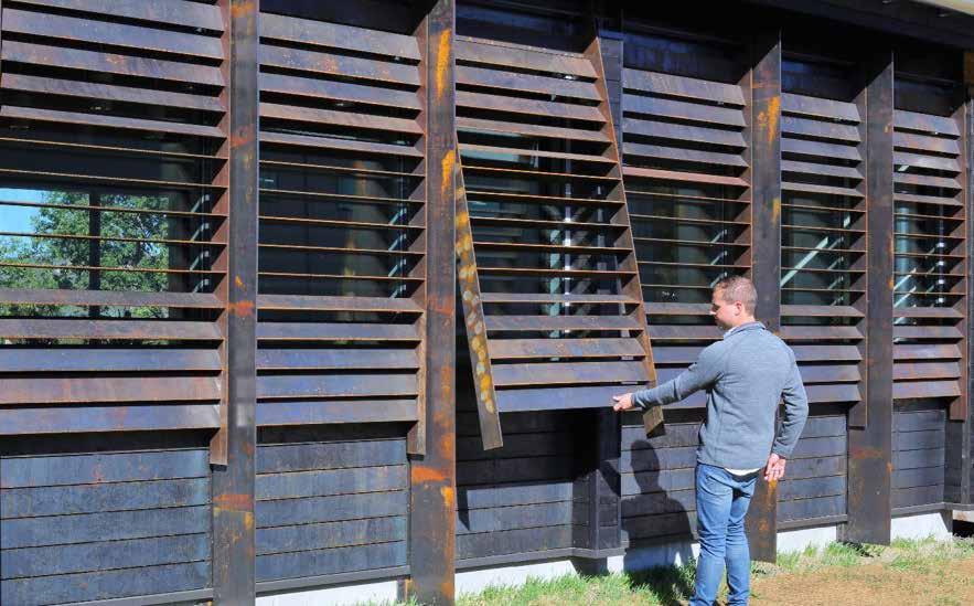
168
The building materials that are used convey a complex relationship with the site. The exterior was harvested from nearby overgrown cedar trees that were milled down and torched in the Japanese method of Shou-Sugi-Ban. This method gives the Visitor Center a strikingly black exterior and creates a protective layer that makes the wood more resistant to future fires. The use of Shou-Sugi-Ban and locally-sourced lumber is both in reference to and in response to Niobrara’s ever-present risk of forest fires and serves as a reminder of nature’s destructive force.
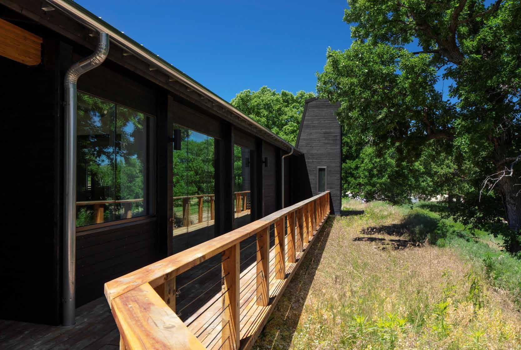
Custom-fabricated Corten steel shades were made to cover the windows of the building. The steel shades are meant to oxidize and create a natural patina, blending in with the surroundings over time. A large deck wraps around the building, inviting visitors to explore leading them to a vantage point that overlooks the valley. The majority of the building is a modernized gabled roof design except for a large, protruding,
truncated form that makes up the Visitor Center’s conference room. The interior is also made up of locally-sourced cedar, although this time unburnt. Structural and mechanical components are on full display throughout the building. This all results in a building that’s honest in its material choices. Nothing is hidden, yet it manages to feel intentional and thoughtfully designed.
What should the relationship between the built environment and nature be like? And what should be the true purpose and function of a visitor center? I found the juxtaposition between a space that’s meant to orient a visitor on their journey and the reality that finding the visitor center becomes the journey to be interesting. During Niobrara’s offseasons, operational services like camp groups become dormant, yet the Niobrara Visitor Center stays actively engaged with the site through its responsive use of material and form.
169 Fall 2023 Unicameral BVH Architecture
BECOMING A MASTER OF THE ARCHIDO ARTS – ONE MUST HAVE BALANCE
By Thomas J. Trenolone
170
As a kid, to stay up late and watch movies was special. On Friday evenings it was Dr. San Guinary KMTV’s local host of Creature Feature. Saturday evenings it was WTBS (now just TBS) on cable and old Kung-Fu films. Bruce Lee classics were favorites of mine. Films like Fist of Fury (1972), Enter the Dragon (1973) and Game of Death (1978) with Kareem Abdul-Jabbar became a gateway to Chuck Norris films. Even to this day when I am flipping through channels and see a Chuck Norris film, I must text one of my long-time friends and old roommate Jason Mahan. It started with phone calls and has evolved into a text like “Prime Chuck Octagon on HBO”. The classics, like Way of the Dragon with Bruce Lee (1972), The Octagon (1980) and Forced Vengeance (1982). The silhouette fight scene on the stair with the red neon backdrop? Enough said. This is the good stuff before the Missing in Action years. Some trivia: in Forced Vengeance, Norris plays a U.S. Army Airborne soldier named Josh Rambo. Sound similar to another 1982 Rambo character? My love of this film genre got a group of us riffing one afternoon and the “ARCHido Arts” were named. Much like a classic Kung-Fu origin story, the ARCHido Arts outline a path of discipline and shaolin dedication. These are the four fighting styles you must master, Young Grasshopper, if you wish to grab the pebble from the hand of the master…
DESIGN – FU. The fundamental style. This is the foundation of all the styles. In mastering Design-Fu, we become acutely aware of proportion, composition, mass, and volume. We learn the way the great masters used monochrome white and wood models in the early stages of their process, to be able to evaluate the pure form, mass, and shadow of the building before the next layer of detail was added. Design-Fu introduces the discipline of using human proportion and modulation in creation of an environment (all bow to Master Corbu). It teaches us not to over think it, remember “…beauty in architecture is driven by practicality” (all bow to Master Zumthor) and “less is more” (all bow to Master Mies). Masters of Design-Fu ultimately learn… “The aesthetic of architecture has to be rooted in a broader idea about human activities like walking, relaxing and communicating. Architecture thinks about how these activities can be given added value.” (all bow to Master Mayne)
TECH – KWON – DO . In parallel with the discipline of Design-Fu we must learn Tech – Kwon – Do, the art of assembly and material. The time-honored adversary of the architect and her buildings is the elements of sun, wind, water, and gravity. The true Master uses the energy of their opponent against them. Sway with the wind and allow water a safe path to flow. We must design for harmony with the planet while providing an element of refuge from her moments of corrective fury. Knowledge of materials must always consider durability, tactile, and performance qualities. Ask “what do you want brick” (all bow to Master Khan)? When an assembly has been fabricated with craft and precision “if the architecture is any good, a person who looks and listens will feel its good effects without noticing” (all bow to Master Scarpa). Defy gravity, cantilevers and bridges offer moments of wonder. Seek moments of true innovation “you never change things by fighting the existing reality. To change something, build a new model that makes the existing obsolete” (all bow to Master Fuller).
171 Fall 2023 Unicameral BVH Architecture
Sway with the wind and allow water a safe path to flow. We must design for harmony with the planet while providing an element of refuge from her moments of corrective fury.
ACCOUNT – TAE. Sadly, a world run by bankers, financiers, lawyers, and accountants have created the deadliest forces any Master of the ARCHido Arts will face in their lifetime. A beautiful and functional environment constructed on budget is not enough. Buildings and environments must measure up to the pro forma, show significant cost-savings and at the end, you must still have enough to pay yourself and your creative partners. To do this, we must maximize the powerful tools of this generation and become great manipulators of data and parametrics. There are many in the world looking to take advantage of our personal values and the great assets we bring to the world of business. Always follow your passions and enthusiasm but be aware of those that would take advantage of you and the skills you have mastered. Account-Tae must be used for “knowledge and defense never attack” (all bow to Master Yoda). However, if you have provided time, talent, and vision to a project/endeavor, you have every right to simply say “F*%k you, pay me!” (all bow to Master Paulie a.k.a. Paul Sorvino). In your journey to become a Master, you will come across noble practitioners of banking, finance, law, and accounting. Do not hesitate to add them to your band of design warriors. Even the most accomplished Master of Account – Tae needs these trusted allies to design and create great buildings and environments. And remember “if you are good at something never do it for free” (all bow to Master Joker, a.k.a. Heath Ledger).
THEORY – CHI. Like the bushido code, those that wish to master the ARCHido Arts must endeavor to create a practice rooted in Theory–Chi, a style defined by service and a sense of purpose. The bushido values of rectitude, courage, benevolence, politeness, honor, and loyalty can be directly attributed to the noble practice of architecture. The path of the Master requires patience in a world that wants everything to move at the speed of light. The experience and exchange that forge a Master cannot be accomplished without time and commitment. This commitment is reinforced when we “add community activity to office activity to become a leader as well as a servant” (all bow to Master Gropius). You will meet members of the profession that pretend that they are a Master and they may lead a studio or possess some of the greatest illustration skills you have
ever encountered, but you will find upon engagement that they have no balance, no knowledge of architecture, design history, technical acumen, or understanding of the true value of design. Theory – Chi demands we know the greats that came before us, their writings, buildings, environments, and studio culture. Do not idolize them to the point that you overlook their human frailty and failings. Be aware of the notable buildings of the past. Understand the full story and costs in cultural, economic, and human terms (all bow to Master Utzon). Surround yourself with a library of literature and imagery composed of more books than you will ever be able to read in your lifetime, but do not hoard them (all bow to Master Johnson). Share them freely with those seeking knowledge and examples of our great art and profession. Seek out other Masters/students of architecture and design, and enjoy a “good conversation” (all bow to Master Katsumoto a.k.a. Ken Watanabe) about its future and relevance in our world.
ENJOY THE JOURNEY. As you navigate this path, do not seek to shorten it as you will be tempted to do from time to time. The shortened path will deprive you of rich experiences that will rob you of valuable skills that will serve you well in the future. In parting, remember as Masters we provide the best service to our clients and communities by creating engaging environments and buildings.
To do that and find balance remember “every great building pushes boundaries – which also means pushing the client” (all bow to Master Gehry).
172
Like the bushido code, those that wish to master the ARCHido Arts must endeavor to create a practice rooted in Theory – Chi a style defined by service and a sense of purpose.
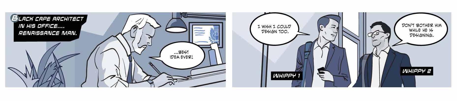

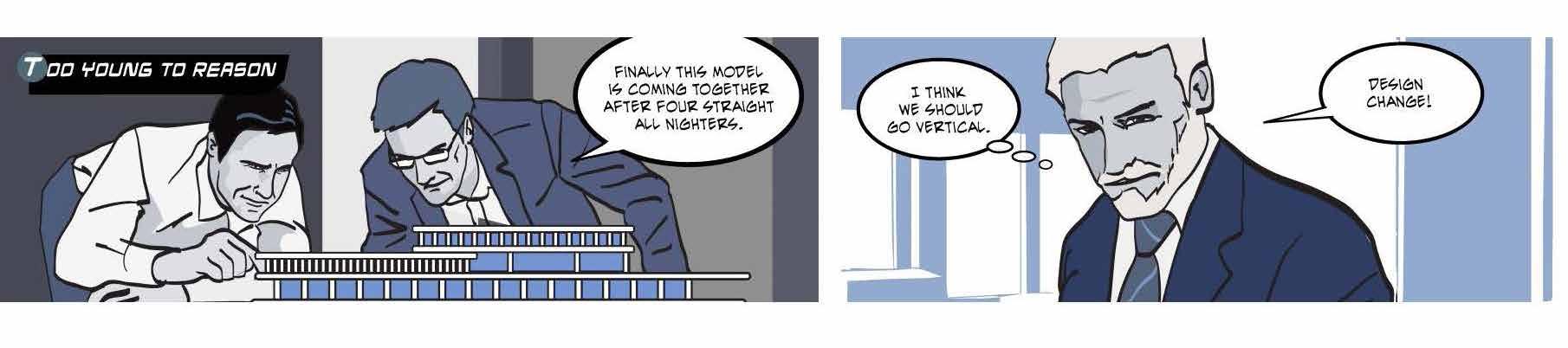
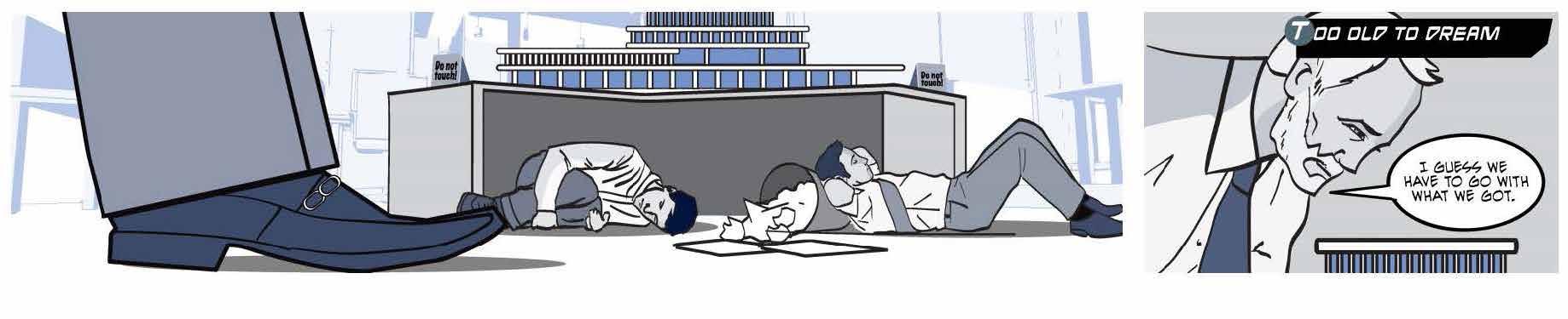
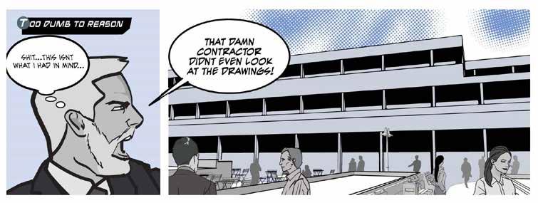
173 Fall 2023 Unicameral BVH Architecture
I love the campus squirrels... they bring so much joy to my day. KAITLYN
There's no place like Nebraska CORNHUSKER MARCHING BAND Nebraska, I'd rather die without you and I
LADY GAGA [SINGER-SONGRWRITER]
EVERYONE
RICHARDS [UNL STUDENT] NOT FOR
Art, like Nebraska, is a journey into thin air... where you lose everything but yourself.
…cities observed from planes at some point, so deceptively, all start to look the same.
Today is watching Nebraska Day and tomorrow is the Turkey Bowl.
The only noticeable thing about Nebraska was that it was still, all day long, Nebraska.
JOAN ACOCELLA [JOURNALIST]
NANA GRIOL [SINGER]
KATHY O'GARA [UNL STUDENT]
WILLA CATHER [AMERICAN AUTHOR]
I don't want to be interesting. I want to be good.
MIES VAN DER ROHE [ARCHITECT]
This publication was made possible with the generous support of the following individuals and organizations;
AIA Nebraska AOI DLR Group Nebraska Masonry Alliance

GreenSlate Development HDR (Great Plains Studios)
IIDA Great Plains Chapter LEO A DALY Noddle Development Company
Olsson Ronco Construction RDG Planning & Design
Sheppard’s Business Interiors | Steelcase TACKarchitects
Tom & Amy Trenolone Whiting + Turner
