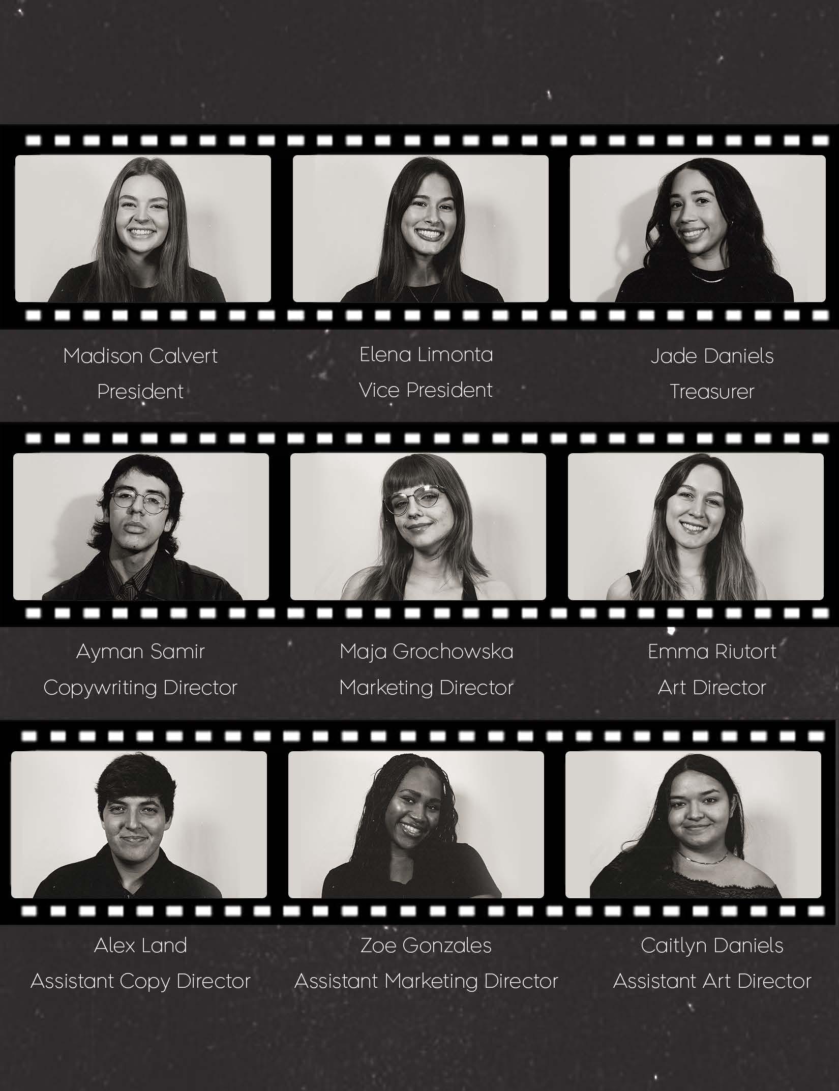
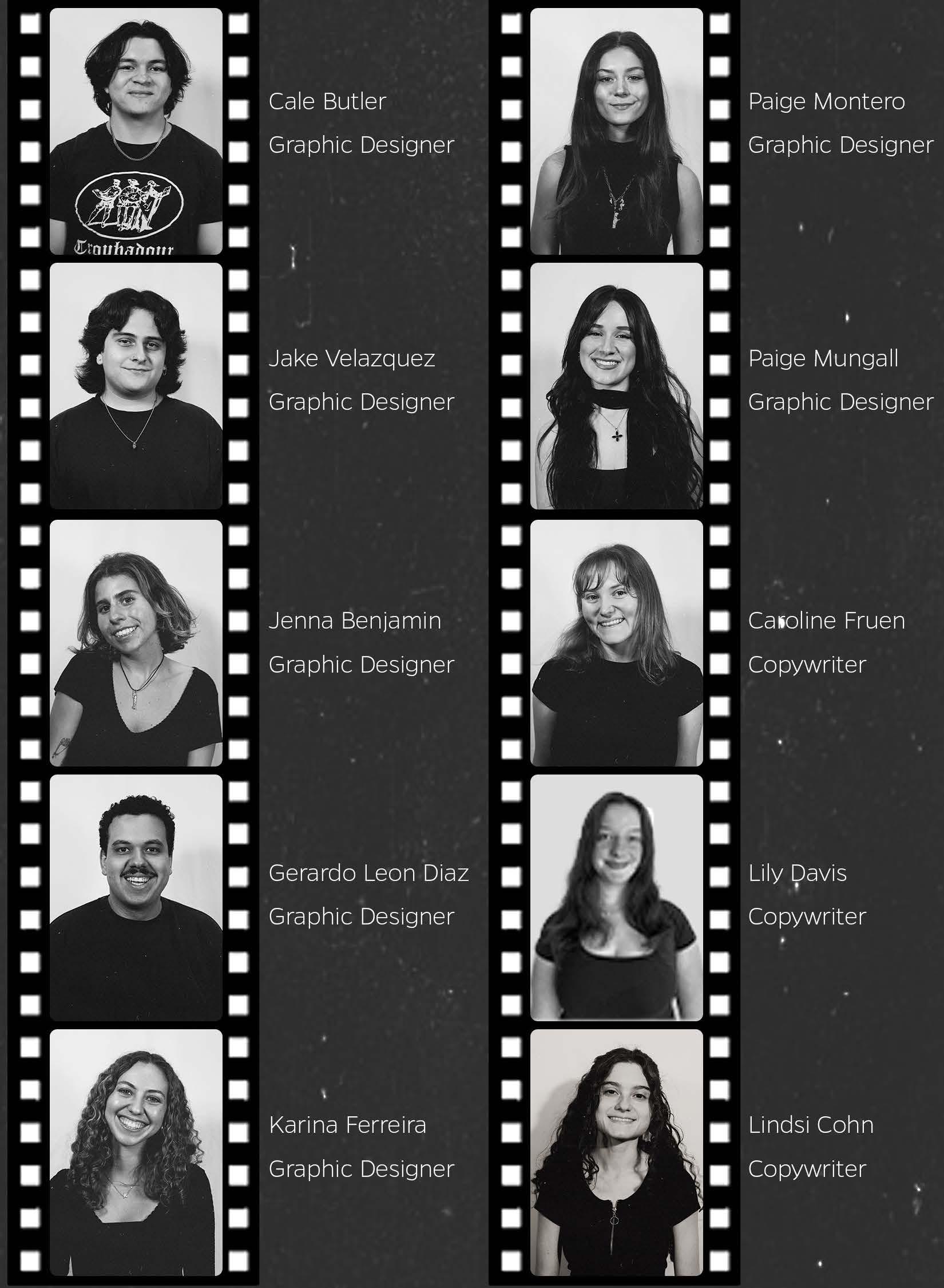
College of Journalism and Communications
University of Florida
Weimer Hall
1885 Stadium Rd.
Gainesville, FL 32611
Inside Cover: Jake
@advntuf
advntuf.com
ufadvnt@gmail.com
Front Cover: Jenna Benjamin
Velazquez


College of Journalism and Communications
University of Florida
Weimer Hall
1885 Stadium Rd.
Gainesville, FL 32611
Inside Cover: Jake
@advntuf
advntuf.com
ufadvnt@gmail.com
Step inside! Look around! Get acquainted with our host of alluring advertisements. If you’re anything like us, it’s a captivating, hard-to-ignore curiosity that lured you here. This year’s edition of advnt is inspired by the thrill of casinos, but don’t worry– there’s no need to risk it all. You’ve already won big by scoring a copy of advnt volume 7.
The University of Florida is a hub for creativity, and advnt is the perfect outlet for students’ big ideas. Since 2016, advnt has existed as a student-led platform for young people with an interest in advertising. Advertising can be a risky game, but the rewards are well worth it when you play your cards right. At advnt, we share all kinds of advertising: copywriting, graphic design, photography, social media, and more all find a home in this unique publication.
From intricate designs to perfectly executed simplicity, advnt volume 7 boasts an array of impressive student-made artistry. Once our books have been bound and printed, we deal them out to agencies and industry leaders. By submitting to advnt, you can bet on your work and share your talent with more people.
They say the number 7 brings great luck, and that sentiment rings true for the advnt team. We hit the jackpot with our team of designers, marketers, and writers, and we’re so grateful for their contributions to advnt. Lose yourself in our enchanting casino of ideas, and take time to admire the brilliant work submitted by students at The University of Florida.
Pick a page, any page, it doesn’t matter! You’ll be looking at a winning hand.
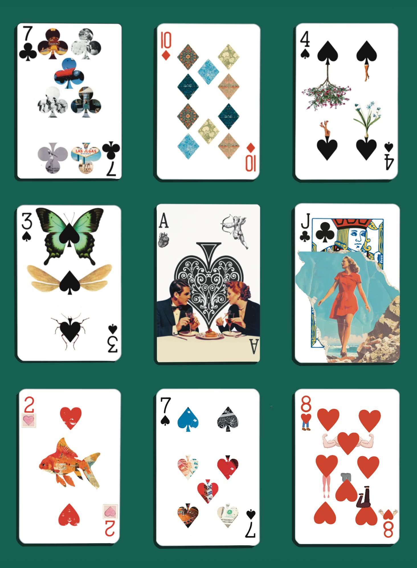
Artwork by Karina
Ferriera
Copy by Caroline Fruen
The air hums with anticipation. The inviting clack of poker chips sliding across felt.
The entrancing snap of cards shuffling in the deck. A slot machine erupts in triumph, bells ringing as a lucky player rakes in their winnings. You can almost feel it—fate pulsing through the room, waiting to be grasped.
Do you take the risk? Do you turn the page?
Hi, reader. Welcome to Lucky 7! Where bold bets meet big payoffs, and the spirit of chance fuels creativity. Advertising, like a high-stakes game, is all about strategy, intuition, and the thrill of the unknown. Every campaign is a gamble, every idea is a roll of the dice—some land with a jackpot, others fold under pressure. But the ones who dare to play? They define the future.
Within these pages, you’ll find a collection of risk-takers, innovators, and creatives who bet big on their craft. Their work is a testament to the power of seizing the moment, trusting your instincts, and leaning into the unknown.
So go on–ante up. Take the leap. Turn the page.
Your lucky streak starts now.
Copy by Alex Land
A quick pull of the lever.
Spinning… spinning… spinning… to a slow stop.
Did you get lucky? Of course you did – you’re reading advnt volume 7!
Playing the slot machine isn’t always about winning big: it’s about the thrill and the endless possibilities each pull of the lever offers. Each spin will reveal a different pattern, a new way to win. Just like pulling the lever, print media has that familiar suspense of turning the page, each layout will be different than the one before.
There is something special about the classics. In a casino, slot machines are a staple. In advertising, print media remains a staple in many checkout lines, offices, et cetera. From cherries to lucky 7s, a slot machine has many colorful symbols that tempt you to pull the lever. Print media’s bold headlines, intricate layouts, and unique typography grab your attention in the same way. Every spin and every page turn will keep you guessing what is about to unfold.
The odds are unpredictable, but so is life. After pulling the lever and waiting for the spinning to finally stop, all you can hope is that you hit the jackpot. Print media can build that same suspense and curiosity as people flip to the next page. We’ve gathered pieces of print media all around the casino just for you to see. So, flip the page and win big!
Artwork by Caitlyn Daniels
Copy by Lindsi Cohn
for keeps sake.
for keeps sake.
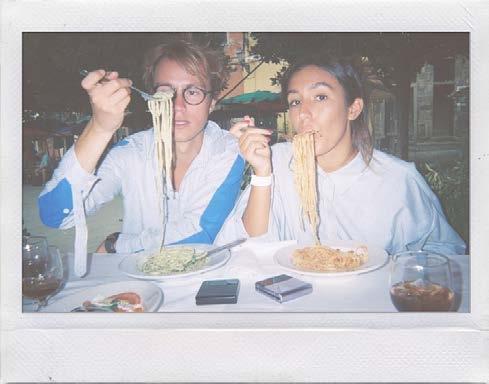
These print advertisements were developed as part of the Polaroid OneStep2 campaign for a Copywriting and Visualization course at the University of Florida. The objective was to engage individuals aged 18 to 24 by highlighting the novelty and charm of capturing memories through Polaroid photography. The campaign sought to position the OneStep2 camera as a modern tool for preserving authentic, unfiltered moments, appealing to Gen Z’s appreciation for nostalgia and originality. To build a connection with this target audience, the concept drew inspiration from how their parents documented life through digital camera prints in the early 2000s.
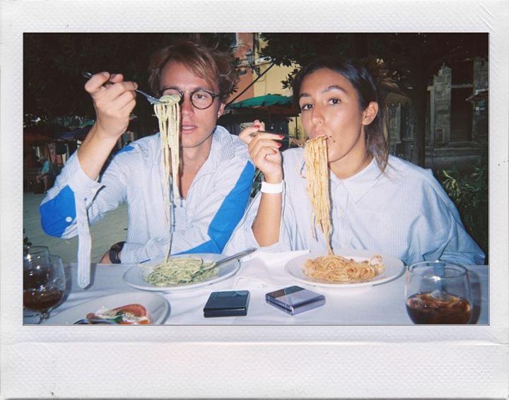
By emphasizing the tactile and personal nature of instant prints, the campaign aimed to demonstrate how Polaroid photography allows users to create tangible keepsakes that digital media often lacks. This approach resonated with the growing trend of young consumers seeking meaningful, real-world experiences that contrast with the transient nature of digital content. Through visually compelling and relatable messaging, the ads encouraged Gen Z to explore the creative possibilities of capturing life’s spontaneous moments with Polaroid. Ultimately, the campaign aimed to inspire a new generation to rediscover the joy of storytelling through physical photographs, positioning Polaroid as a timeless yet relevant medium for memory preservation.
Brendon Kerkela
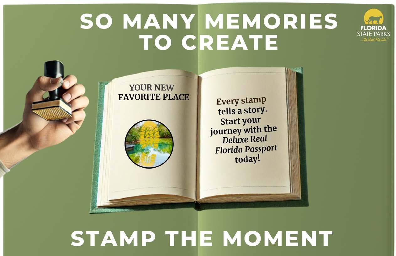
This campaign spotlights the Florida State Parks’ Deluxe Real Florida Passport program, an initiative currently inactive but expected to return. The passport offers a tangible booklet featuring descriptions of all 175 parks and designated spaces for visitors to collect stamps from each location. Drawing from the concept that “every stamp tells a story,” the tagline “Stamp the Moment” was crafted to be both catchy and memorable. The campaign features two ad formats: a traditional sign, poster, or flyer, and a two-page magazine spread designed to transform seamlessly into the passport itself.
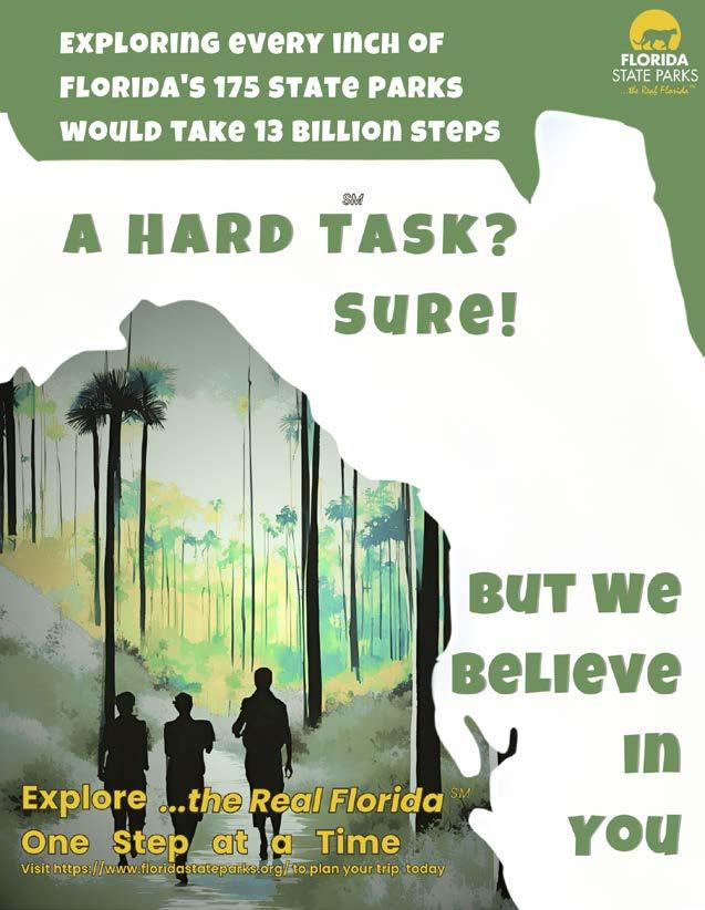
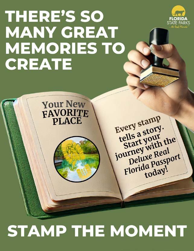
This interactive design approach not only enhances visual appeal but also highlights the immersive and personal experience of collecting stamps. The creative concept encourages visitors to capture memories at every stop, making each stamp a meaningful memento of their journey through Florida’s natural landscapes.
Caitlyn Daniels & Isabelle Shannon
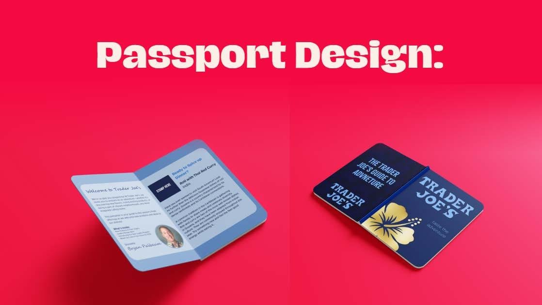
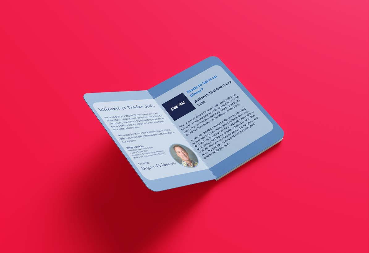
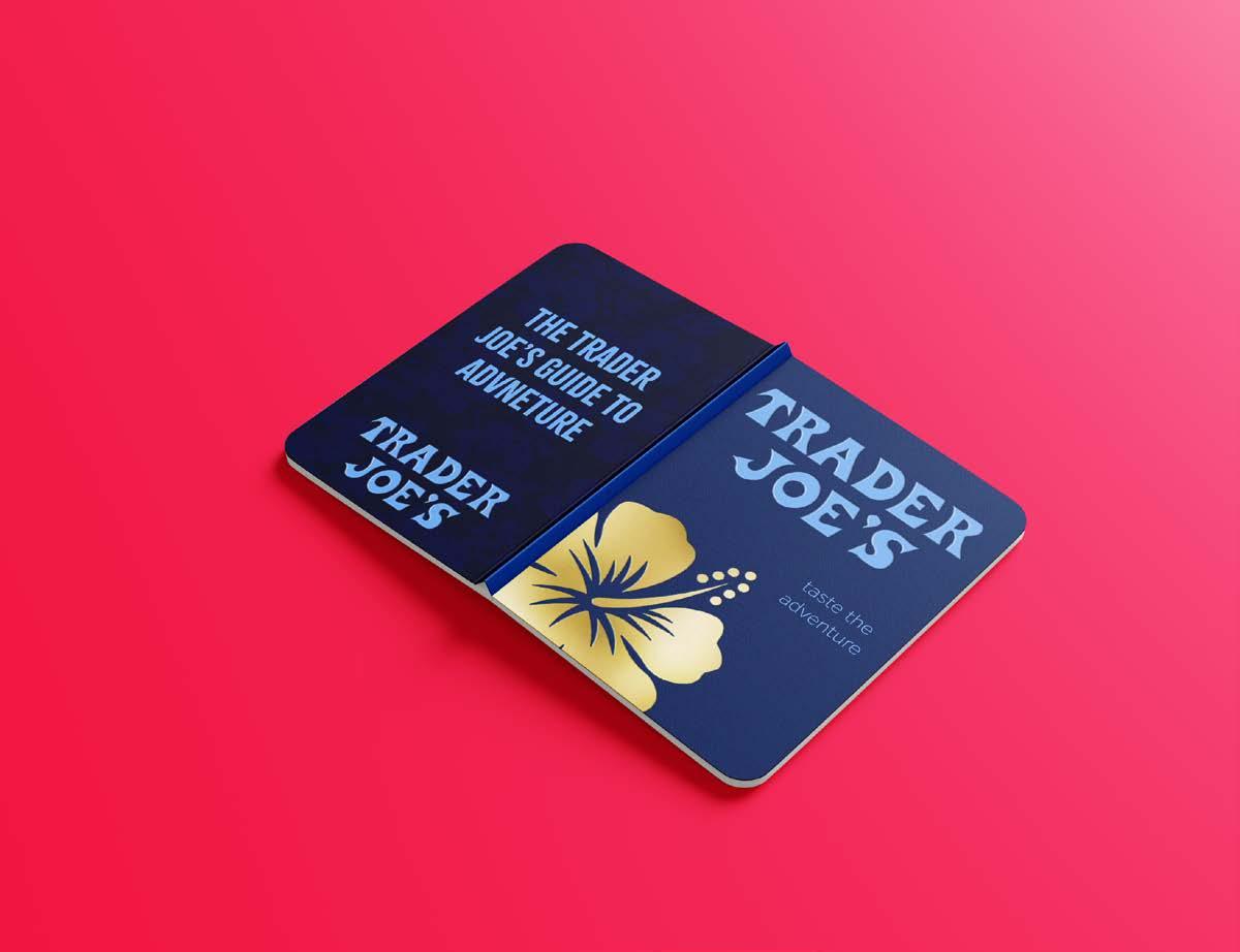
This interactive passport serves as Trader Joe’s guide to adventure, showcasing seasonal, globally inspired products. Organized into categories like drinks, snacks, and desserts, it offers cultural insights into each item’s origin. Every product is paired with a vibrant, exclusive sticker representing its country or theme, adding a fun, collectible element to the experience. Addressing the challenge of seasonal product turnover, the passport transforms limited-time items into exciting discoveries rather than fleeting disappointments. By positioning the pamphlet as a collectible, it enhances brand connection and builds anticipation, turning each visit into an opportunity to explore and collect.
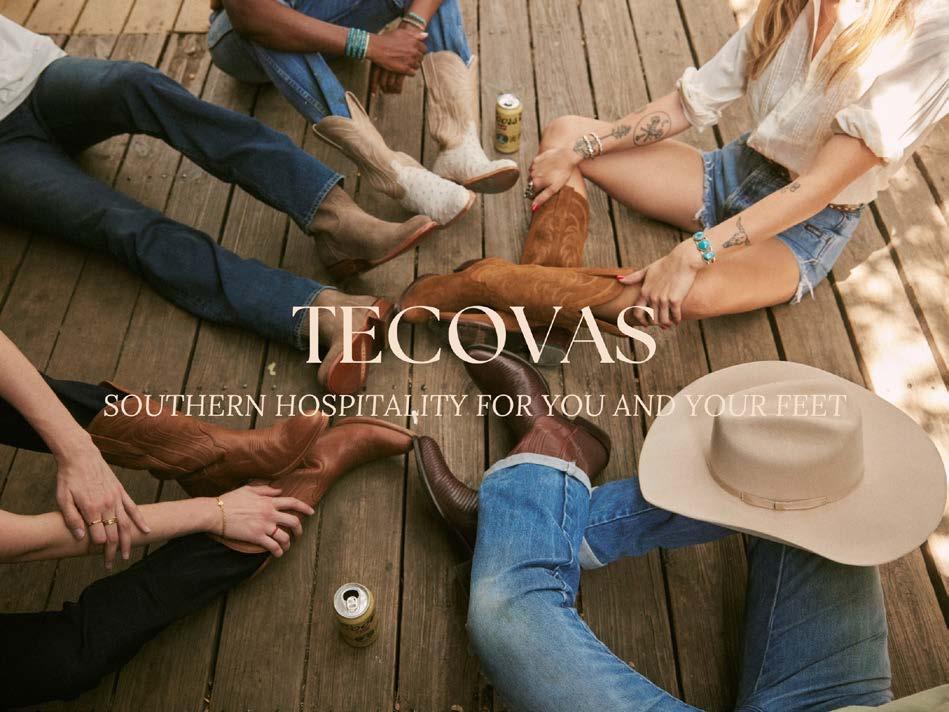
The client for this mock advertisement is Tecovas, a distinguished boot brand based in Austin, Texas, renowned for its high-quality craftsmanship and timeless designs. Tecovas embodies southern values, emphasizing quality, authenticity, and kindness. The campaign’s tagline—“Southern hospitality for you & your feet”—captures these values while highlighting the comfort that Tecovas boots provide, both physically and emotionally. The advertisement features a visually engaging image of multiple individuals wearing Tecovas boots, evoking a sense of camaraderie and connection. This imagery encourages consumers to associate the brand with community and shared experiences, reinforcing the idea that Tecovas boots are not just footwear but a symbol of togetherness and meaningful moments.
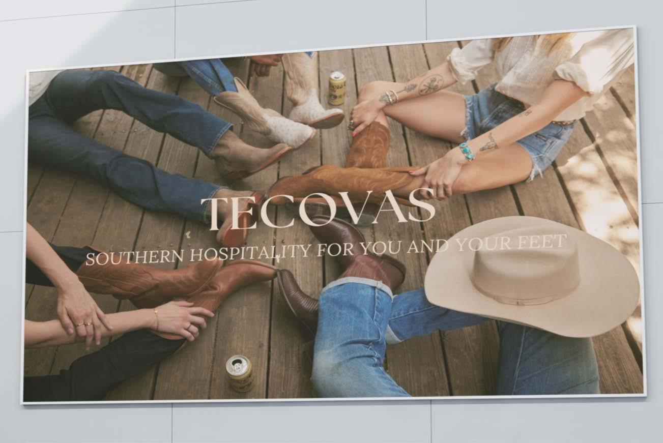
By emphasizing these emotional connections, the ad positions Tecovas as a brand that extends warmth and hospitality to its customers. The campaign aims to appeal to individuals who value tradition and seek products that combine comfort with authenticity. Ultimately, the ad seeks to cultivate brand loyalty by fostering an emotional bond between the audience and the Tecovas lifestyle, underscoring the idea that these boots are made not just for walking, but for experiencing life’s memorable moments with others.
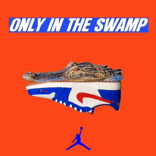
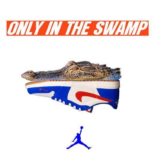
The “Only in the Swamp” ad was inspired by the unique pride, culture, and history that come with wearing orange and blue at the University of Florida. As a UF student, the motivation was to capture the essence of Gator Pride in the design of the Nike Jordan 1 Low. Featuring the iconic gator head, the ad highlights the deep connection between the shoes and the UF community. More than just footwear, these shoes symbolize the spirit of the Swamp and the resilience captured in the phrase, “Only Gators Get Out Alive.” Whether you’re a student or a fan, the design embodies the bold pride that defines being part of the Gator Nation.
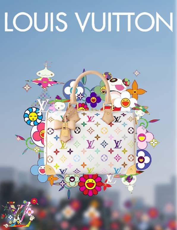
Inspired by Louis Vuitton’s collaboration with Takashi Murakami, “Flower Power,” this concept reflects a deep appreciation for designer fashion—especially Louis Vuitton. The collection’s launch earlier this year was captivating, not only for its bold aesthetic but also for its innovative marketing, which significantly influenced the creative approach. For this campaign, the designer took a unique approach by imagining Murakami’s iconic designs as if they were picking up the “LV x TM Speedy Bandoulière 25” and floating it in the air. Drawing from the collection’s flowy and crowded aesthetic, the ad seamlessly blends the luxury and timelessness of Louis Vuitton with Murakami’s playful, artistic vision, while adding a personal twist. The result is a design that captures the essence of both brands while presenting an innovative and dynamic take on high fashion.
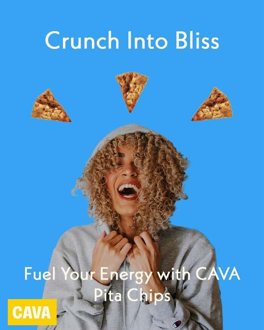
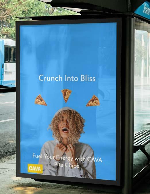
In a branding class, Aarlyn Llenas Villao analyzed CAVA’s brand identity, exploring its tone and personality. CAVA was chosen due to its unfamiliarity, allowing for an in-depth exploration of its bold, energizing brand elements. The analysis revealed that CAVA highlights the functional benefits of its offerings—healthy, flavorful, and protein-rich food—while emotional appeal was less emphasized. Inspired by this insight, a poster ad was created to reflect CAVA’s identity while capturing the pleasurable experience of enjoying its food, especially the pita chips. The ad integrates CAVA’s bold branding to maintain consistency while evoking the enjoyment and satisfaction associated with its offerings, ultimately delivering a more holistic brand experience that goes beyond showcasing the product.

The DairyPure Lactose-Free Awareness Campaign is designed to reconnect lactose-intolerant consumers with the joy of drinking real milk again. For many, digestive discomfort led to giving up milk, leaving behind its rich taste and nutritional benefits. This campaign reassures them that DairyPure Lactose-Free 2% Reduced Fat Milk offers the same delicious dairy experience—without the lactose. The tagline, “Enjoy the Milk You’ve Been Missing!” captures the excitement of rediscovering milk without worry. The campaign positions lactose-free milk as an easy, inviting choice, ensuring everyone can once again enjoy the simple pleasure of milk. This ad holds a personal connection, as the experience of being lactoseintolerant inspired the desire to create an inviting and relatable message for others seeking to enjoy real milk again.
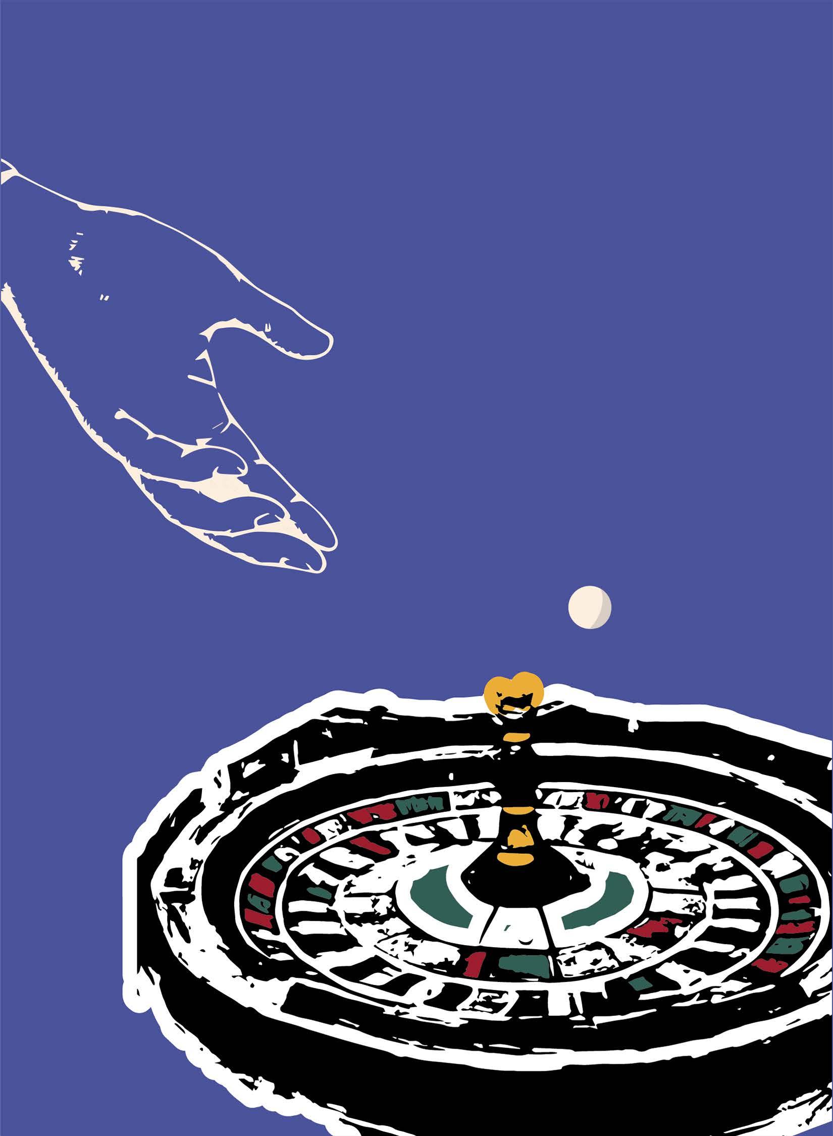
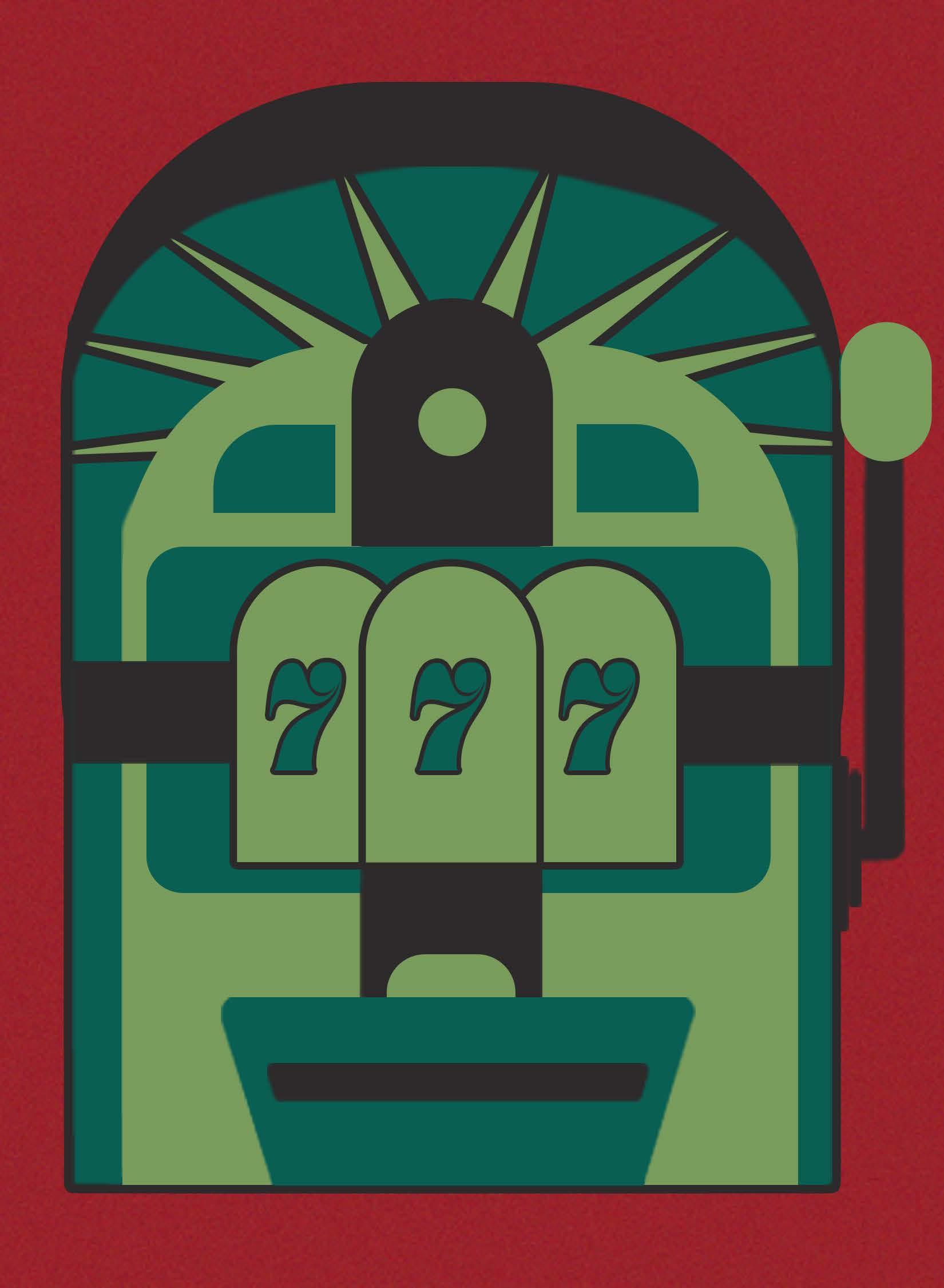
Spin the wheel and place your bets—that is the essence of every game of chance!
No matter what slot the ball lands on, or how far off your initial bet was, it’s the thrill of the gamble that keeps you coming back. Try something new! A different number. A different possibility. Each spin of the wheel comes with a new chance to win big. Think carefully, stay creative and bet on a number that feels right to you.
Finite slots and infinite possibilities—digital media is just as rewarding as risking it all.
Within every advertisement is a casino rich with never before seen risks. Digital media rewards the bold. A new color. A new style. A new tagline. Each feature is another creative gamble. Digital is about breaking new bounds, and betting on a number others wouldn’t think to do. Feeling the pressure of a loss? Start the call bets; now’s your chance to kick the night into high drive! Faster. Watch the wheel spin closely. Once, twice. Look where it’s stopped! Digital media is just as hypnotic. It’s all about the next surprise, the next trend. Don’t worry about your record at the roulette. You’re sure to win with brave calls that emblazon your digital media with individuality.
So what are you waiting for? Let the wheel of digital media spin to your heart’s content, and watch it carefully. After all, you never know what campaign it’ll land on next!
Artwork by Gerardo Leon Diaz
Copy by Lely Truong
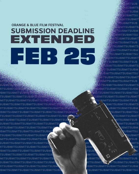
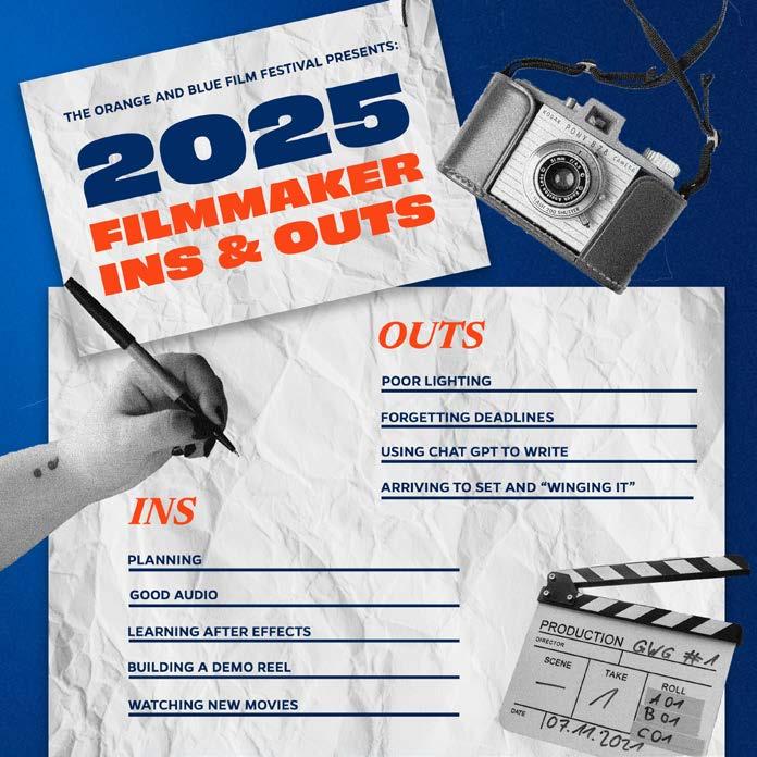
These designs were developed as part of a comprehensive social media campaign for the Orange & Blue Film Festival, utilized across posts, stories, and various marketing channels. The designs aimed to engage high school and college students by promoting calls for submissions, ticket sales, important event dates, and festival reminders. Each design adhered strictly to University of Florida’s branding guidelines, incorporating the institution’s signature colors, fonts, and design principles. The visuals were carefully crafted to appeal to a youthful audience interested in participating in or attending the festival.
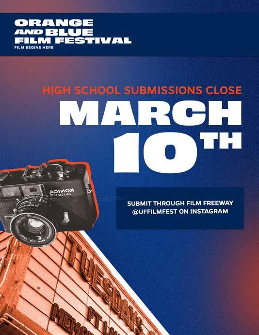
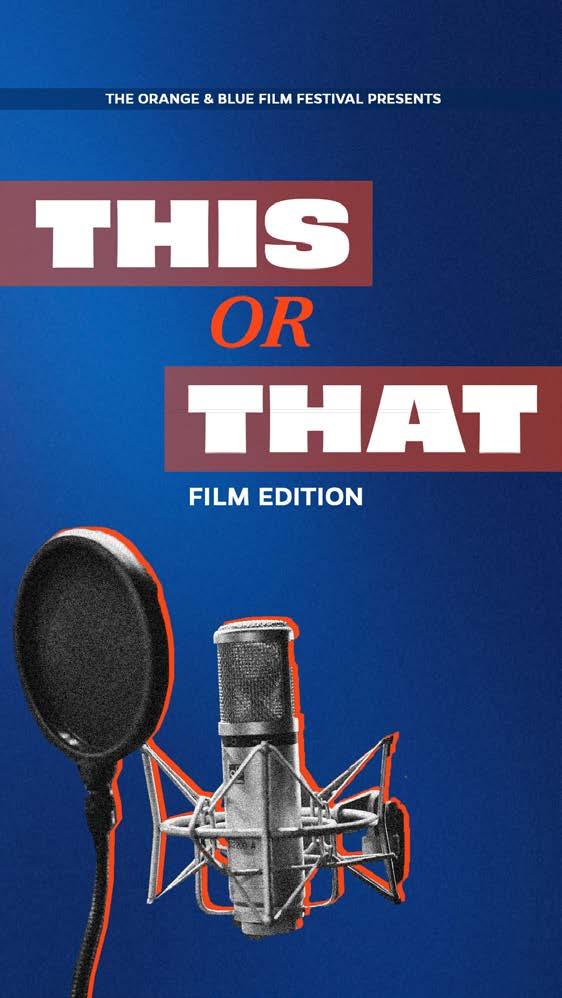
The campaign successfully merged a modern aesthetic—using vibrant oranges and blues with contemporary fonts—while incorporating an “old Hollywood” touch, achieved through grainy black-and-white imagery and collage techniques. This fusion created a distinctive and memorable look for the festival, setting it apart from other events and reinforcing its unique identity. The designs aimed to balance tradition with innovation, capturing the essence of both the festival’s history and its contemporary relevance.
Saunders
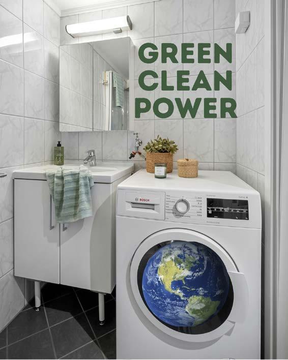
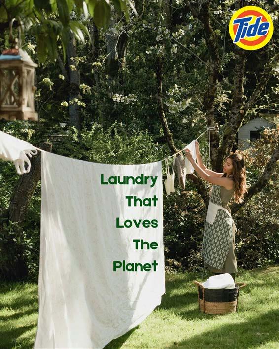
This Tide sustainability campaign was developed for a visualization course, where the objective was to create a campaign for Tide Laundry Detergent with a focus on its eco-friendly product line. The campaign aimed to highlight Tide’s commitment to sustainability by showcasing its efforts toward a more environmentally responsible future. The approach involved identifying key consumer insights, establishing a clear brand positioning, and crafting a narrative that resonates emotionally with the audience. By emphasizing Tide’s dedication to sustainable innovation, the campaign sought to position the brand as a leader in eco-friendly laundry solutions.
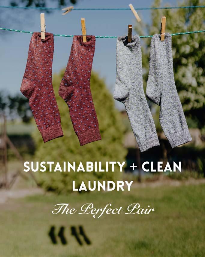
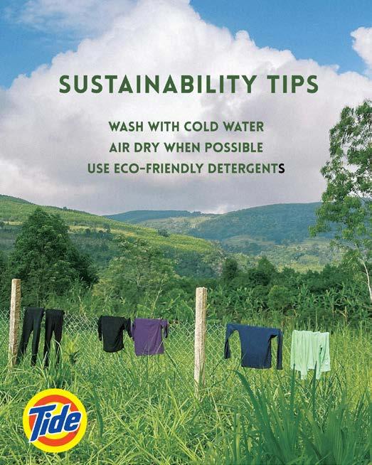
To differentiate Tide in the competitive marketplace, the campaign used storytelling to create a personal and inspiring connection with consumers. It illustrated how small, everyday choices—such as selecting eco-friendly detergent—can contribute to a healthier planet. Through engaging visuals and meaningful messaging, the campaign aimed to motivate consumers to align their purchasing decisions with their environmental values. Ultimately, the campaign reinforced Tide’s commitment to sustainability while encouraging consumers to take an active role in protecting the environment, positioning Tide as a trusted, eco-conscious brand that empowers individuals to make a positive impact.
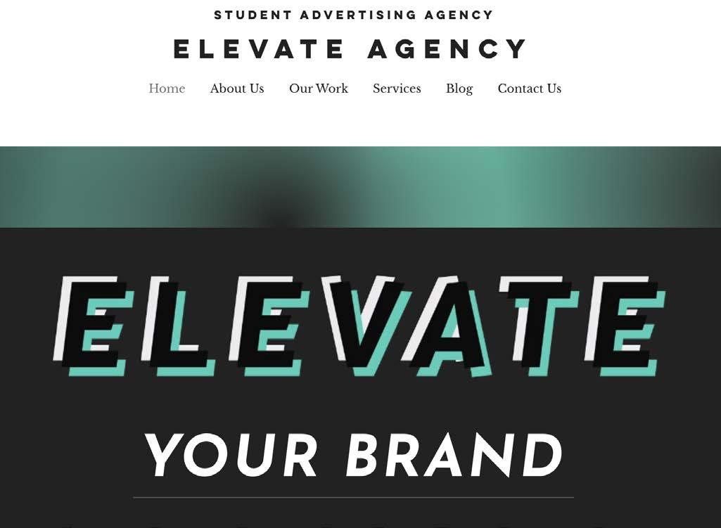
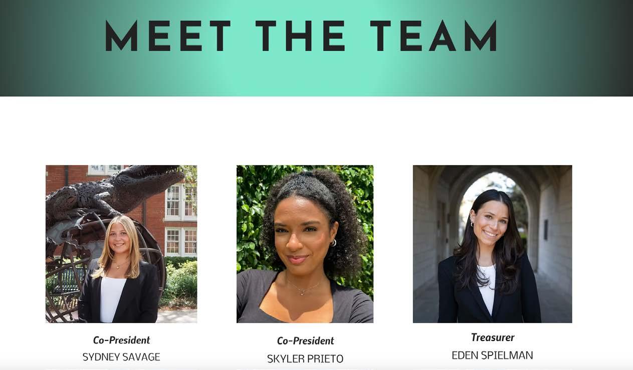
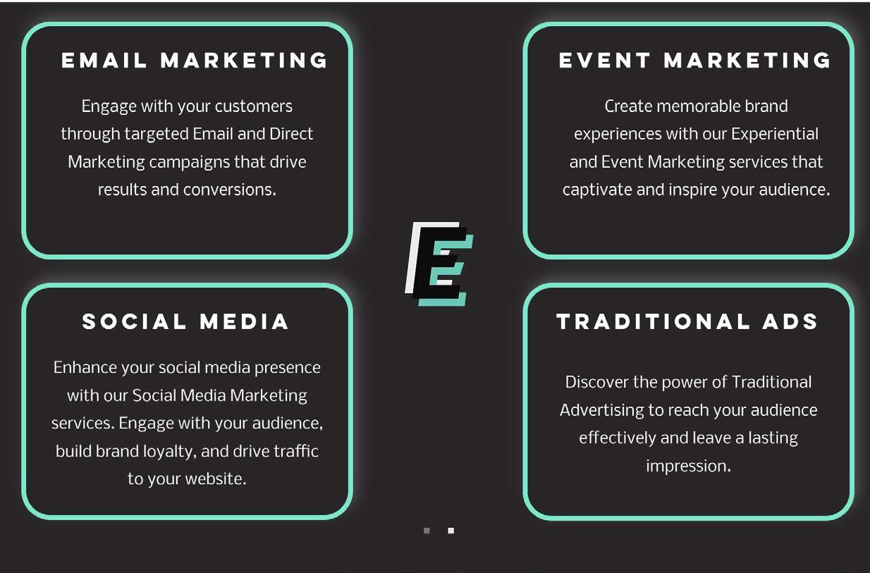
As Co-Presidents of Elevate Agency, Prieto and Savage repositioned the agency to foster a professional, career-advancing environment. A new website was developed as a central hub for members and potential clients, providing easy access to offerings, past campaigns, applications, and contact details. This initiative boosted visibility and engagement, increasing brand awareness by 28% and applications by 16%. The website promotes Elevate Agency’s professional image, streamlines communication, and highlights its services and successes. This project reflects the commitment to advancing members’ careers while enhancing the agency’s reputation in the industry. ufelevate.wixsite.com
Emma Riutort
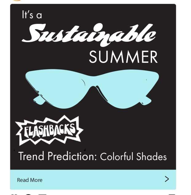
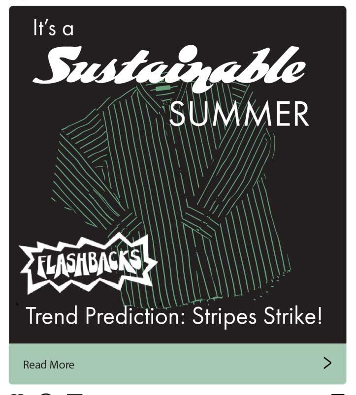
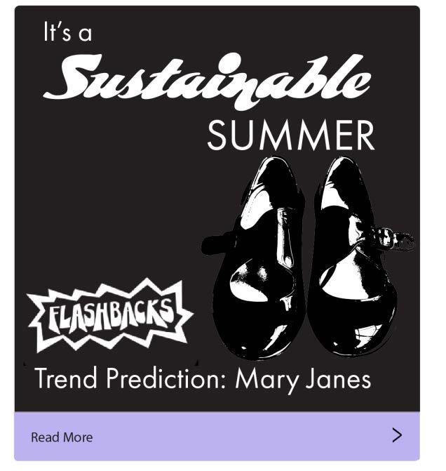
For a strategic communications class, Emma Riutort developed a native advertising campaign for a popular Gainesville thrift store.
Focused on the store’s mission of encouraging sustainable shopping practices, “It’s a Sustainable Summer” combines eye-catching graphics and relevant fashion insights. By relaying the graphics on Instagram and linking to blog posts about incoming fashion trends, these posts are designed to capture the attention of college students looking to elevate their wardrobes. These posts would each link to a blog post curated by Flashbacks explaining their expert insights on fashion and sustainability. It’s a sustainable summer, you heard it here first.
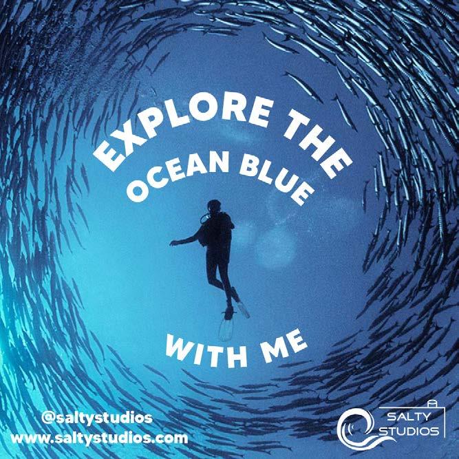
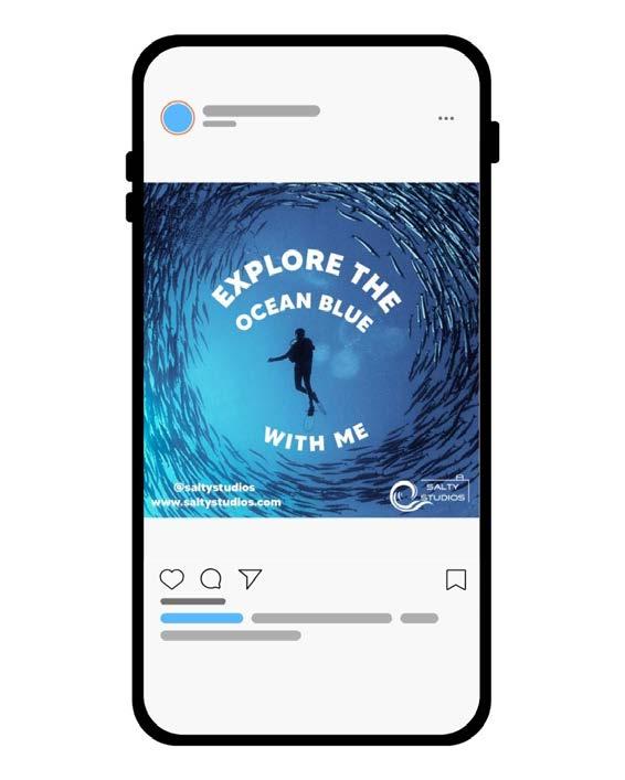
Salty Studios is a fictional company specializing in marine, surfing, and diving photography. With an emphasis on portraying an easygoing, chill vibe, Karina Ferriera drew inspiration from brands like Patagonia and Poler, known for their outdoor and adventure-driven aesthetics. In addition to the logo design in a sans-serif font, the company aimed to showcase the type of photography they specialize in—capturing the essence of marine life, surfing, and diving. This creative direction influenced the development of an accompanying advertisement that highlights the company’s portfolio, as well as their social media and website presence. The ad was designed to reflect the brand’s laid-back yet adventurous persona, ensuring it connected with their target audience while reinforcing their identity as a provider of immersive, ocean-inspired photography.
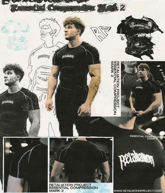
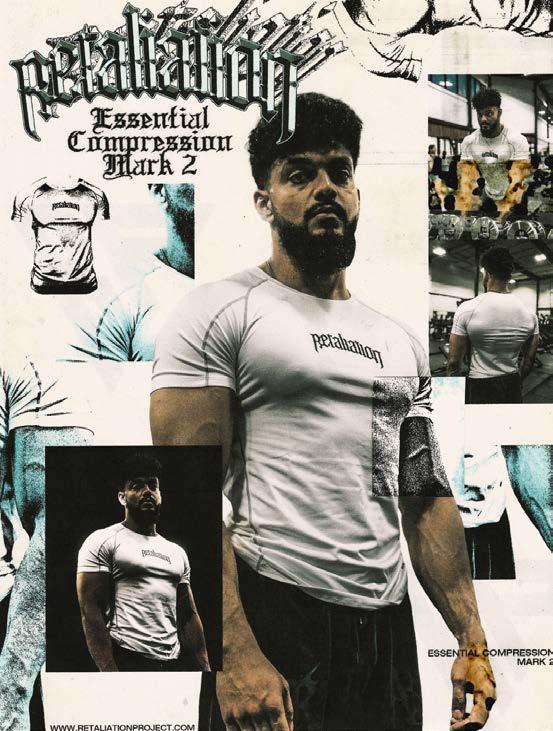
Retaliation is a gym wear brand known for its edgy, hardcore, and mysterious tone. Targeting young males aged 13 to 24, Cale Butler’s goal was to create visually intriguing content that broke away from traditional advertisements. Using a mixed media approach, the design combined digital manipulation in Adobe Photoshop with physical print, scan, and collage techniques. The chaotic yet structured layout kept the product as the focal point, while grain, grunge textures, smeared ink, and rough cuts enhanced the raw, rebellious aesthetic. This approach aligned with Retaliation’s bold, unconventional brand identity, engaging the target audience by delivering an authentic, visually captivating experience that strengthened brand connection.
| Jessica Cattanach
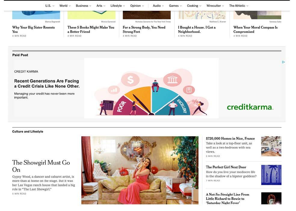
Jessica Cattanach created this work for Credit Karma, a free financial service owned by Intuit, specializing in finance software. Credit Karma offers credit scores, financial recommendations, and checking and savings accounts, targeting millennials and Gen Z who prefer digital solutions. These generations make up a significant portion of The New York Times’ digital readership, making it an ideal platform for this ad. The Times, a respected news source, attracts a tech-savvy audience, with 69% of its readers engaging with their banks across multiple platforms, compared to 50% of the general population. This makes Credit Karma’s services highly relevant to the Times’ audience, who are financially aware and eager to explore digital financial solutions.
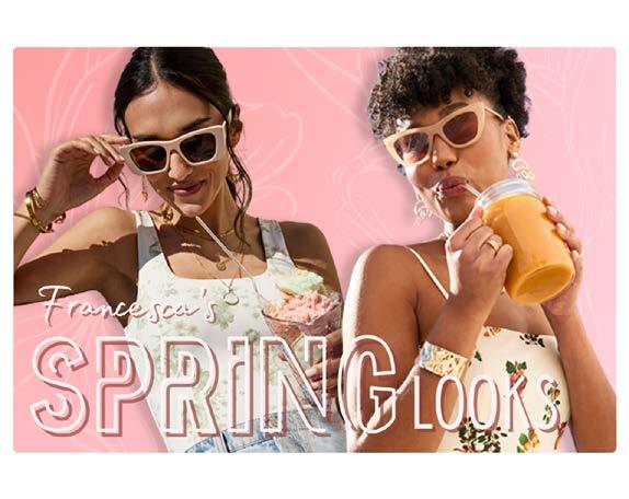
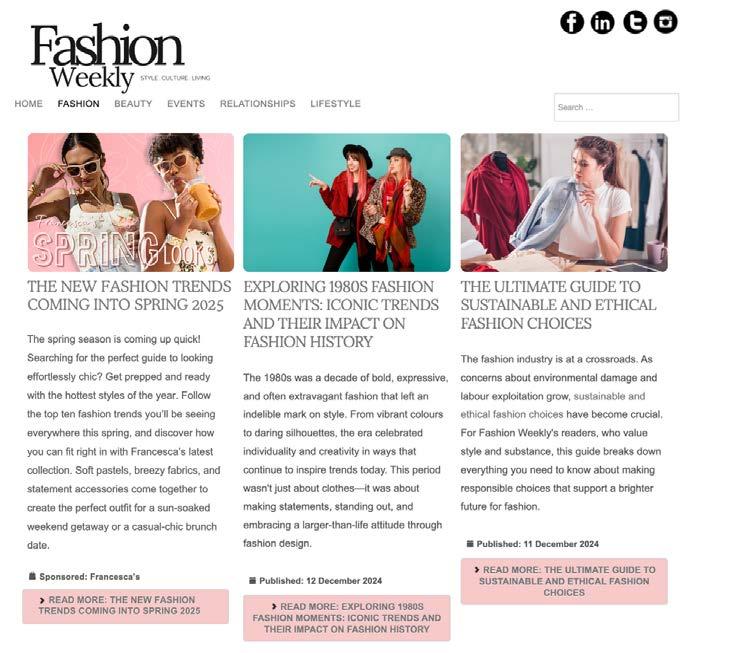
Ainsley Abell developed a native ad for Francesca’s on a platform that effectively reaches its target audience. Francesca’s spring collection was selected due to its trendy aesthetic, and Fashion Weekly was chosen as the platform for its fashion-forward audience of women aged 18 to 30. The site’s clean layout, featuring engaging cover images and concise summaries, ensured seamless ad integration. To maintain consistency, the ad mirrored this editorial style, using bright colors and featuring two models in Francesca’s spring collection. This approach allowed the ad to blend naturally with Fashion Weekly’s content while resonating with the target audience.
Tension lingers in every breath, every fidget. Eyes scan the room, searching.
The knowing glance of a dealer, the subtle tap of fingers against the table. A chip spins on its edge before clattering down, fate decided. Every hand is a story, every bet a statement. The game isn’t just about the cards you’re dealt—it’s about how you play them.
Welcome to the table. Welcome to the world of integrated campaigns.
Great advertising isn’t a single bold move; it’s a carefully orchestrated strategy, a full deck stacked in your favor. A campaign isn’t just one platform, one ad, one moment—it’s a hand played across channels, each element reinforcing the next. The best players don’t rely on luck alone; they know when to hold, when to raise, and when to go all in.
A winning campaign follows the same logic. The right message, the right medium, the right timing—layered together like a masterfully played hand. It’s not about a single jackpot; it’s about staying in the game, reading the room, and making sure your brand is always in play.
So, are you ready to bet big? To play smart? To make your mark? The deck is shuffled. The cards are in your hands. Your move.
Artwork by Paige Mungall
Copy by Lily Davis & Ayman Samir
Jake Velazquez
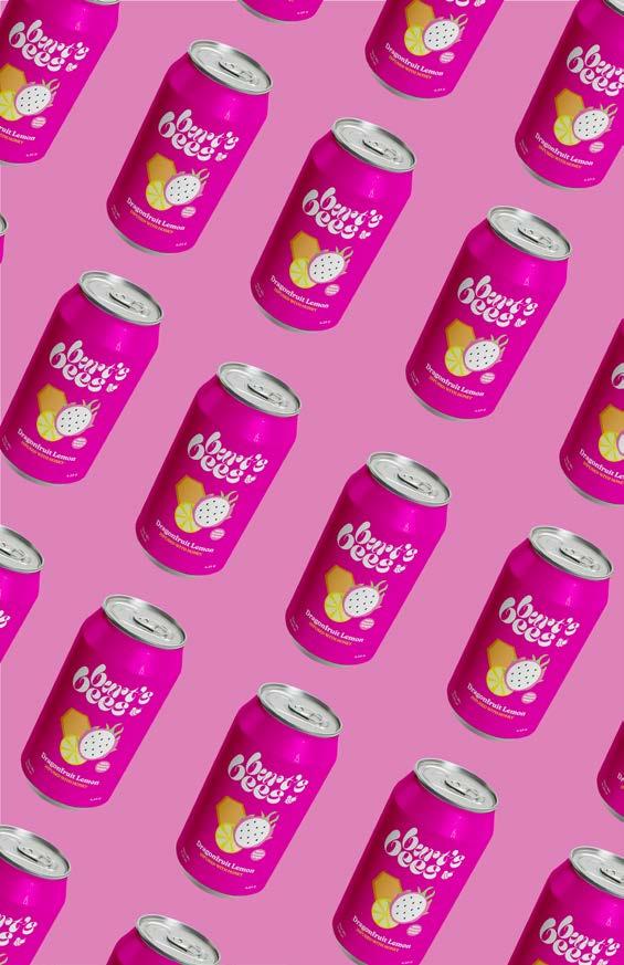
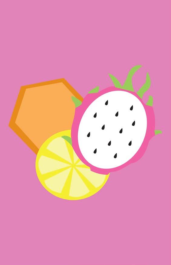
For this redesign, the goal was to reimagine Burt’s Bees Lip Balm as if it were a sparkling water beverage. The packaging concept includes vibrant colors, bold typography, and an overall visually engaging aesthetic designed to appeal to a young adult audience. The final product is a fully realized redesign, complete with Nutritional Facts, that makes it look like an irresistible drink, sure to catch the eye of anyone looking for a refreshing beverage. After considering the lip balm’s flavor, the idea was born to transform it into a honey-infused sparkling water.
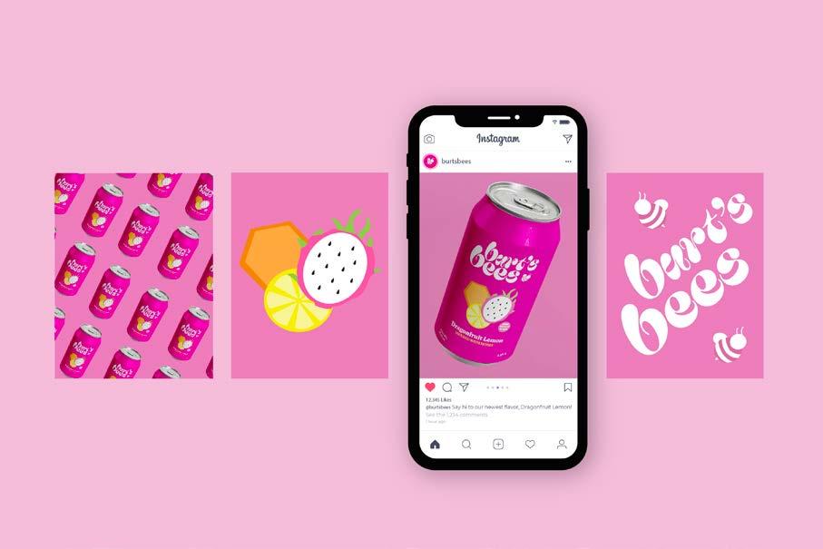
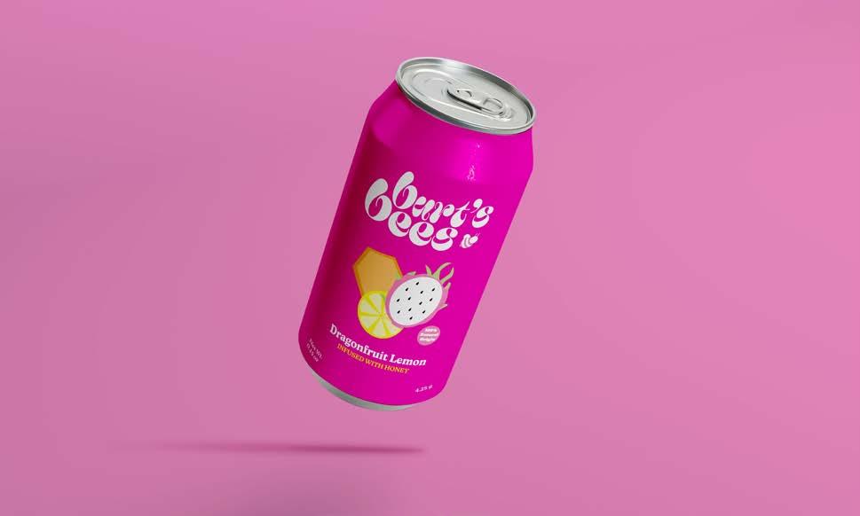
The infusion of honey reflects the essence of Burt’s Bees, while the sparkling water format adds a modern and trendy twist. The bright, lively colors and flashy typography are intentionally chosen to attract a younger demographic, making the product feel both fresh and fun. The redesign aims to create a unique connection between Burt’s Bees’ natural ingredients and a vibrant, thirst-quenching experience, inviting customers to pick up a can and enjoy a refreshing new take on a familiar brand.
| Erin McNamee, Emily Brundage, Aya El Ladiki, Hannah Sanchez
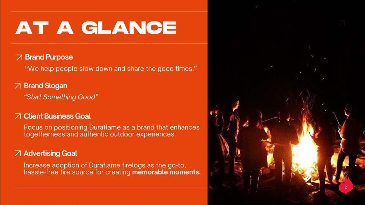
The brief was to market Duraflame’s 6lb fire log to Gen Z, with a focus on connecting with others. The key insight was that Gen Z values authentic connections, and we identified fire as a powerful medium for fostering those connections. Being around a fire creates a sense of warmth and intimacy, encouraging face-to-face conversation without the distraction of devices. Building on these insights, an integrated campaign was developed that highlights how fire can bring people together. The campaign centers on the idea that a Duraflame firelog creates an environment where genuine connections can thrive.
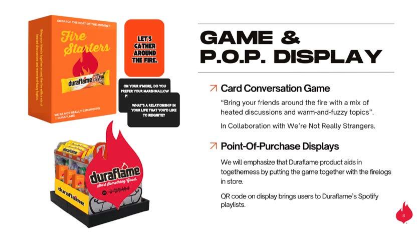
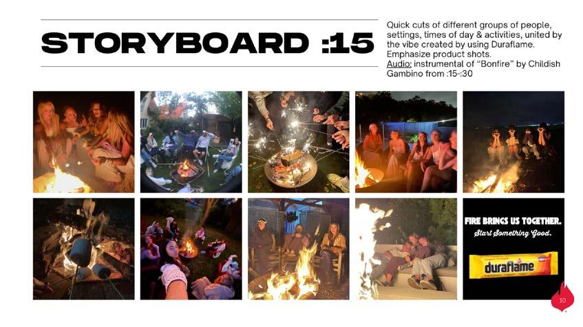
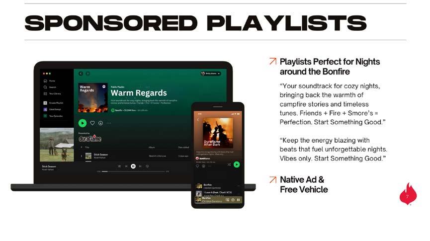
Whether it’s sharing stories around the fire, enjoying the comfort of a cozy setting, or simply disconnecting from the digital world to enjoy real-time interaction, the campaign emphasizes the unifying power of fire. By tapping into Gen Z’s desire for meaningful, authentic experiences, the campaign positions Duraflame as the perfect companion for moments of connection, offering not just warmth, but an opportunity to create lasting memories with friends and loved ones.
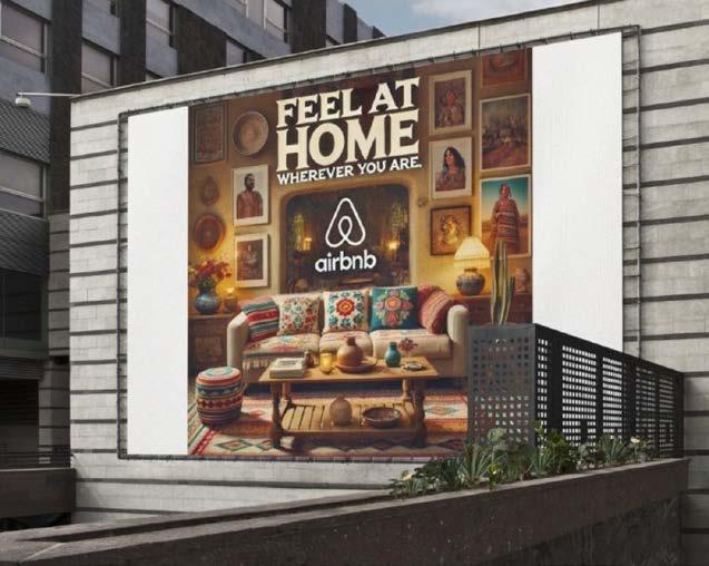
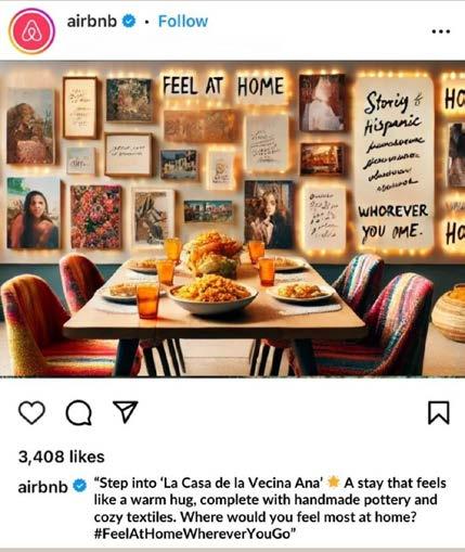
The “Stay at Home Wherever You Are” campaign for Airbnb in partnership with Habitat for Humanity aims to position Airbnb as a platform where Hispanic Millennials can rediscover and celebrate the feeling of “home” through unique stays and meaningful travel, while also contributing to Habitat for Humanity’s mission of creating safe, welcoming homes that embody warmth and connection. The key insight driving this campaign is the deep connection Hispanic Millennials have to their heritage, families, and the homes where they grew up. Many come from families that have left their original homes in search of a better life, and they often feel a profound sense of longing for the connection, warmth, and identity that those spaces represent. By blending the emotional warmth of culturally inspired Airbnb stays with Habitat for Humanity’s impactful mission, the campaign empowers Hispanic Millennials to travel meaningfully.
Zoe Gonzales
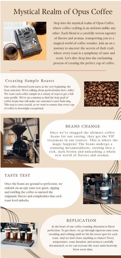
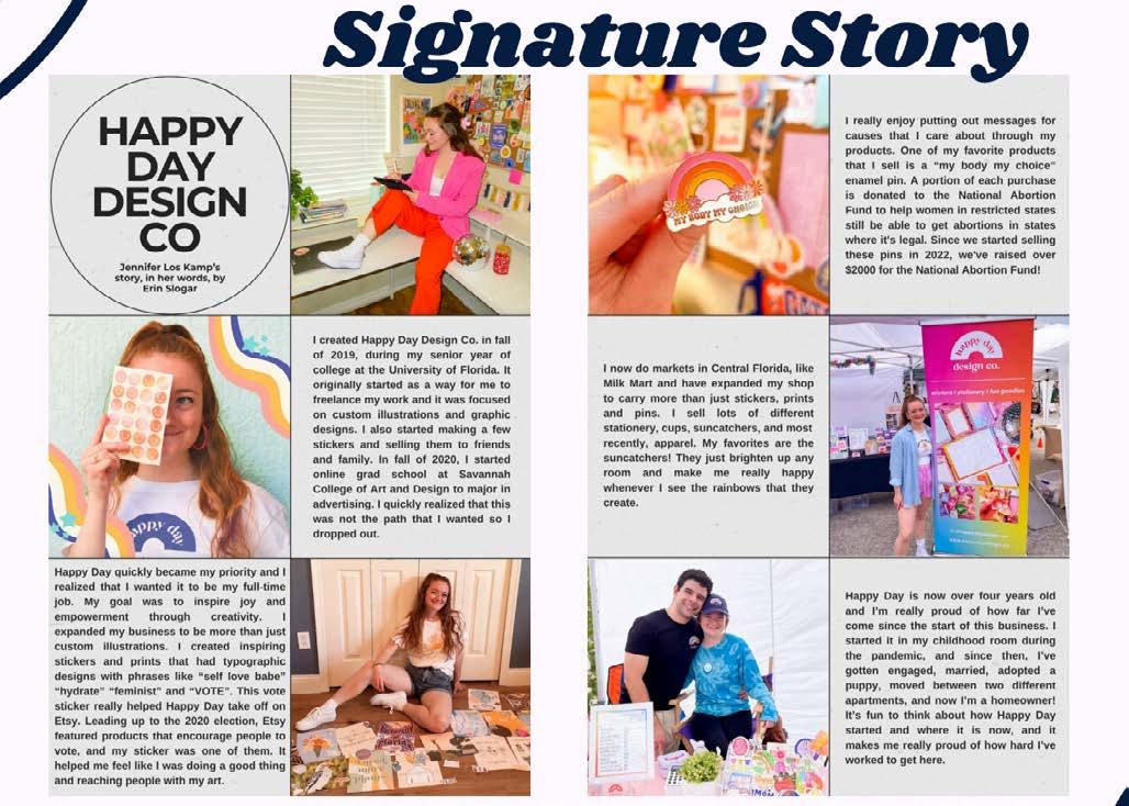
Opus Coffee’s content marketing campaign was designed to enhance brand recognition, boost sales, and expand social media engagement, particularly on Instagram and TikTok. The strategy features two real examples of social media content—a knowledge post and a signature story post—to build meaningful connections with the audience. A content calendar was developed to ensure consistency alongside KPI measurement strategies and future content brainstorming. The signature story post was inspired by the idea that people connect deeply with authentic, heartfelt narratives. Through storytelling and consistent engagement, the campaign strengthens the brand’s identity while encouraging growth across platforms.
Fishman, Paige Mungall, Tamar Hassman, Bryn Walsh, Nicole Mladenovska
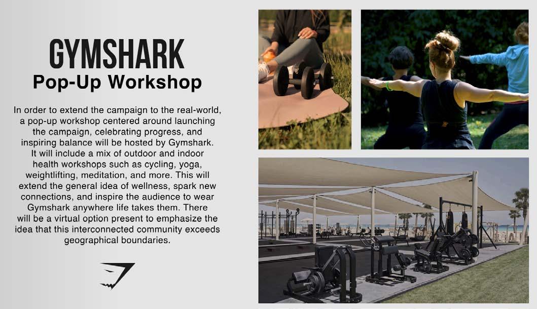
“Gymshark Takes Us Anywhere” targets 18 to 21-year-olds who are seeking an uplifting community to support them during times of change. The campaign creates a platform where young adults can bond over a shared passion for conditioning, no matter their location or stage of life. It emphasizes the importance of prioritizing both mental and physical wellness, encouraging young adults to expand their definitions of well-being by utilizing the resources available to them, including the outdoors. By showcasing how Gymshark products support every stage of an individual’s fitness journey, the campaign inspires young adults to push beyond limitations and embrace the idea that their passion for conditioning cannot be stifled.
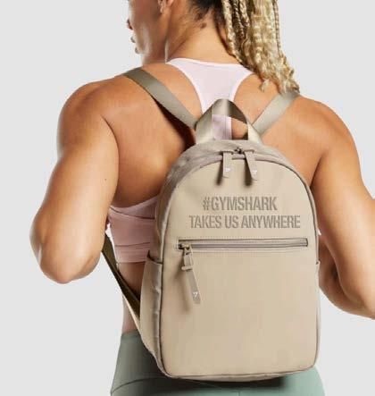
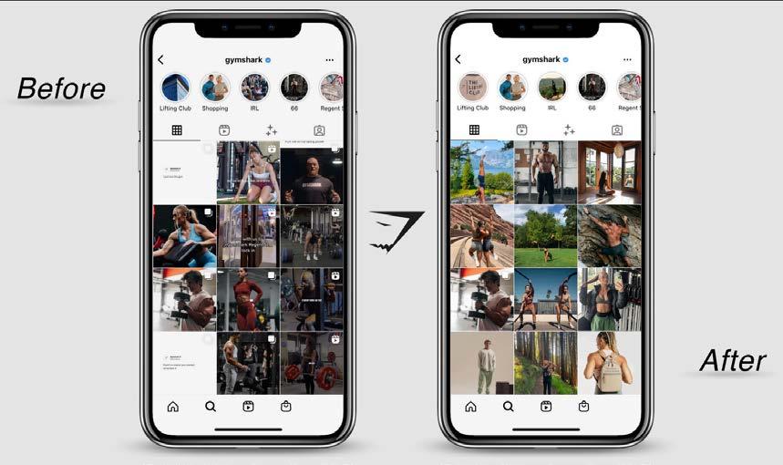
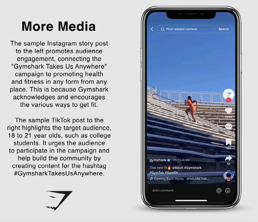
Whether working out at home, outdoors, or in a gym, Gymshark demonstrates that it can take them anywhere. The campaign aims to foster a sense of community and empowerment, illustrating that fitness and wellbeing are not confined to specific places or circumstances. Gymshark’s inclusive approach reassures young adults that no matter where they are, they have the resources and the support to stay motivated and reach their wellness goals.
FOX Sports University, a program available to students at the University of Florida, offers students the opportunity to tackle realworld business challenges through creative competitions. In this program, students engage in semester-long case studies that involve developing strategic advertising and PR concepts. For this particular challenge, this cohort was tasked with creating strategies to increase awareness and excitement for the Copa America and UEFA Euro tournaments scheduled for Summer 2024. The deliverables included a range of off-air and on-air promotions, as well as digital and social media concepts, all of which emphasized the use of FOX Sports talent to connect with audiences. The team’s innovative pitch won the competition, earning us the opportunity to attend a Copa America game during the summer in Atlanta.
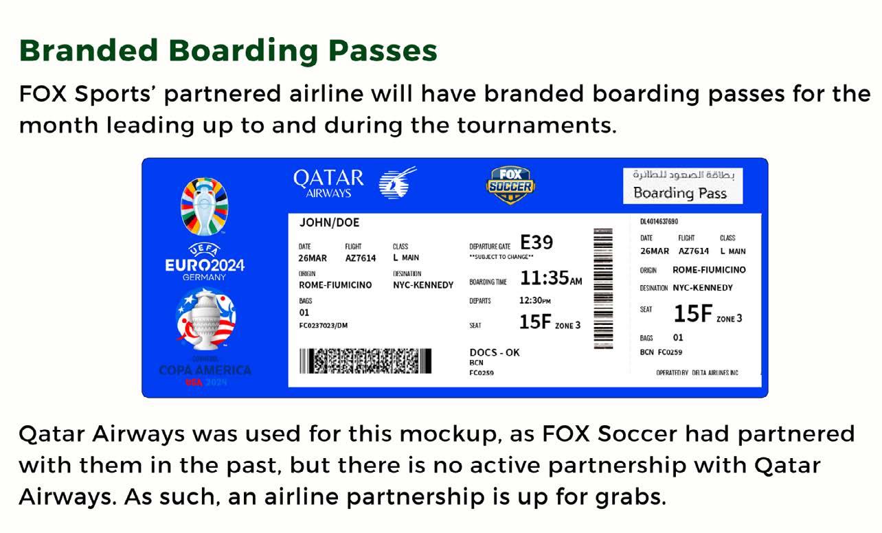
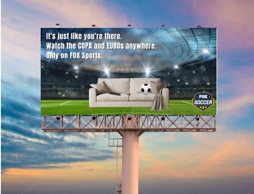
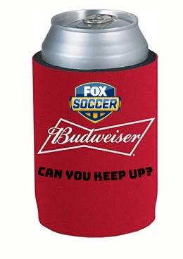
This achievement not only highlighted the ability to craft engaging and strategic campaigns but also allowed them to experience the excitement of live sports, further enhancing our understanding of the industry. The success of this project reinforced the team’s passion for sports marketing and demonstrated our capability in delivering impactful promotional strategies.
Erin Slogar
This content marketing project involved creating a signature story and knowledge branding piece for Happy Day Design Co., an Orlandobased small business focused on empowering women through products designed to brighten their day. The founder of Happy Day, Jennifer, is a woman entrepreneur whose vision aims to support and inspire others. Given the nature of the business, which sells art-focused, non-essential products, the project emphasized the importance of content marketing to help Happy Day grow its audience. Content marketing provides a unique opportunity to establish trust with consumers by showcasing the values behind the brand.
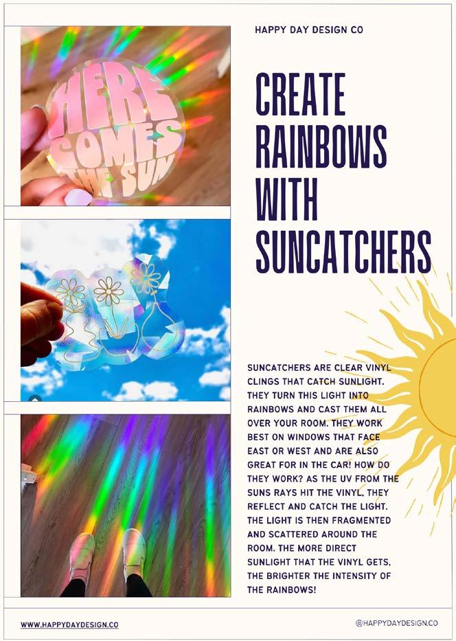
It communicates that purchasing from a small business is more than just buying a product—it’s about supporting the people and mission behind it. The strategy focuses on introducing Jennifer to the audience, sharing her story, and educating followers about the creation process behind the products. This content will primarily be distributed through Happy Day’s social media platforms, with the website also playing a role in sharing the brand’s narrative. By connecting on a personal level, this strategy aims to foster deeper relationships with customers.
Kanesa Burke
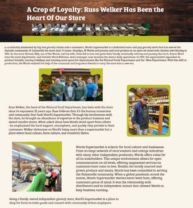
Ward’s Supermarket, a longstanding Gainesville establishment with over 70 years of history, is well-positioned to benefit from strategic content marketing. Despite its deep community roots and commitment to locally sourced products, Ward’s faces competition from larger grocery chains. However, its rich history and focus on fresh, local ingredients appeal to natural food enthusiasts and conscious consumers. In an era marked by growing concerns over food recalls, Ward’s can emphasize its direct, middleman-free approach—ensuring products go straight from local sources to store shelves, prioritizing freshness and quality.
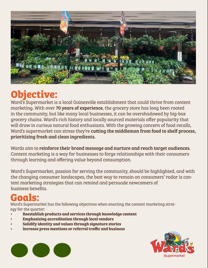
By sharing stories about its local partnerships, commitment to fresh produce, and dedication to Gainesville, Ward’s can remind and persuade customers of its unique value—positioning itself as more than a grocery store, but a trusted part of the community.
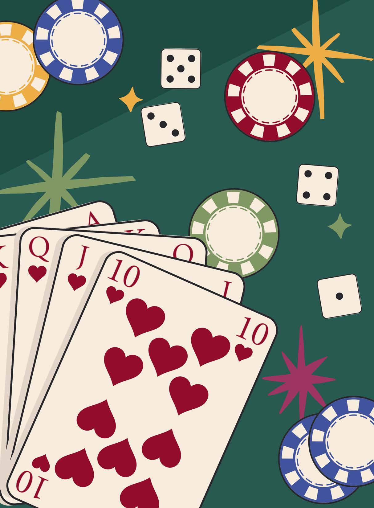
Your hand is on full display. Your heartbeat quickens at the suspense.
A Queen and a Five of Hearts lay in front of you—six away from a perfect 21. Hit and get anything higher, you bust. You’re up next. The dealer points to you. One. You must decide. Two. You anxiously tap the table. Three. The dealer cautiously flips the card over…
Will you reach 21? Was the move worth the risk?
Blackjack is about taking chances and deciding what type of gambler you are — compulsive, safe or a risk-taker. You only have so many opportunities to reach 21, so each decision is critical to your success. Much like branding, every move matters. Each move either moves you closer to your goals or sets you farther back. If you play too safe, your brand may stay irrelevant. If you’re too risky, you may appear reckless and uncalculated.
How do you reach the perfect balance and establish your brand? Strategy. In blackjack and branding, it’s about so much more than just luck.
Great branding requires strategy, and strategy differentiates you from the crowd. It establishes a concrete way to develop unique connections with each consumer. A creative and intentional strategy will include your choice of typeface, tone, color scheme and imagery. Strategy is about mitigating the risk, making the decision, and reaching for that perfect 21.
Artwork by Paige Montero
Copy by Sarah Messemer
Michelle Gilman
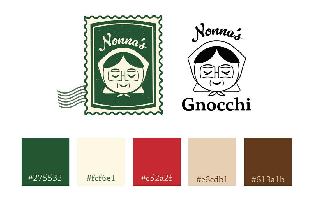
This project was developed for Nonna’s, a startup pasta company based in Bangkok, Thailand, specializing in authentic, handmade gnocchi.
The brand’s mission is to make it easy for families to prepare delicious and healthy dinners while maintaining the rich traditions of homemade Italian cuisine. Nonna’s branding blends a vintage aesthetic with a softer, modern appeal that ensures easy recognition. The brand’s central icon character draws inspiration from grandmothers across cultures, including Italian Nonnas, Russian Babushkas, and Spanish Abuelas, reflecting the warmth and care associated with homemade cooking.
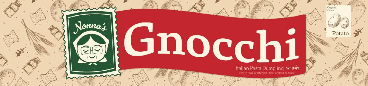
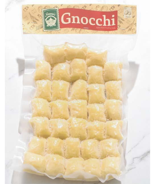
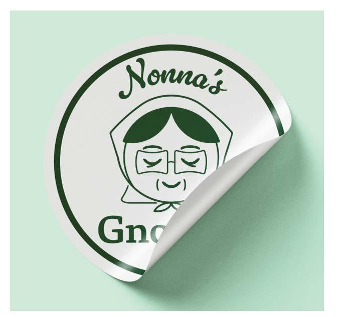
The logo design incorporates elements reminiscent of vintage printed stamps and the graceful movement of a flag, adding a timeless charm to the brand’s visual identity. The color palette is inspired by the Italian flag, carefully selected to evoke a natural, friendly, and inviting feel. This approach aligns with Nonna’s goal of creating a brand that feels both nostalgic and approachable. Nonna’s has already gained traction in the international market, with its products being featured in prominent grocery stores such as Paleo Robbie. By honoring tradition while embracing modern design elements, Nonna’s successfully captures the essence of homemade quality and international appeal, positioning the brand for continued growth and recognition.
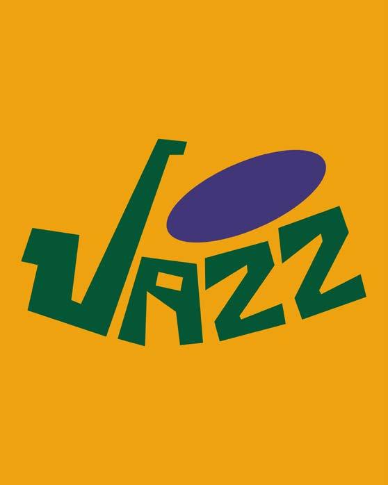
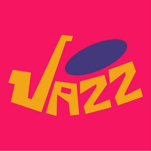
Jazz is a self-initiated branding project developed as part of a speed design challenge, where the objective was to experiment and create something new every day. In just 30 minutes, Ashley Collins crafted a bold and rhythmic visual identity for a fictional ultimate frisbee team called Jazz, drawing inspiration from the vibrant energy of New Orleans and the dynamic movement of the sport. The logo and branding system reflect the city’s lively culture through the use of fluid shapes and a vibrant color palette that captures both the rhythm of New Orleans and the motion inherent in the game of frisbee.
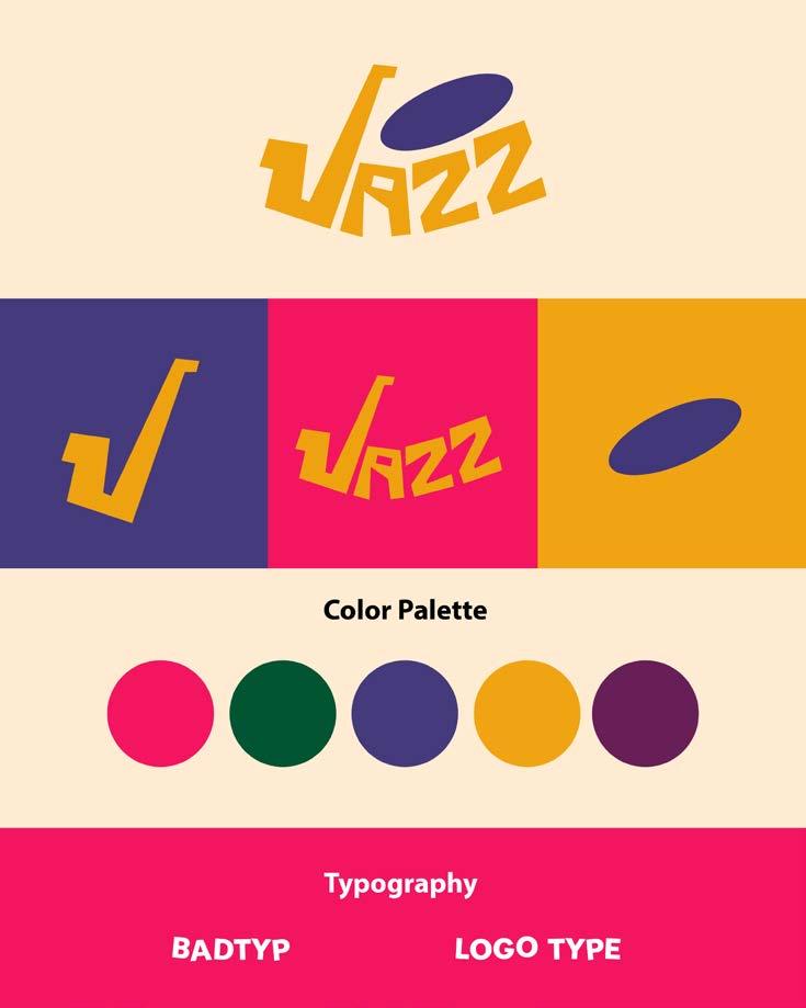
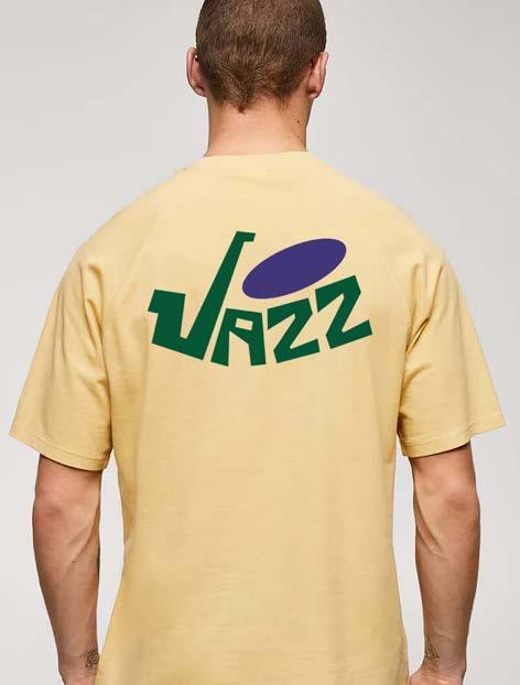
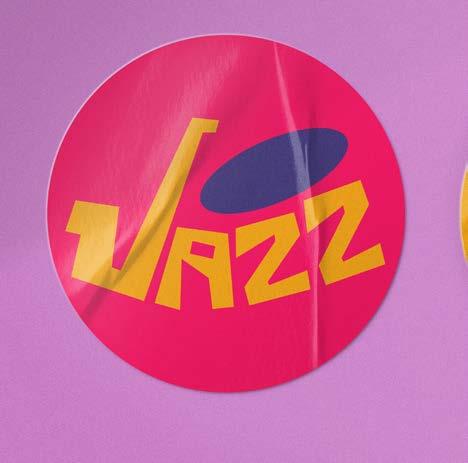
The result is a visual identity that feels fast, free, and deeply connected to its cultural roots. This project served as an exercise in rapid creative thinking, demonstrating how much can be achieved when working with a clear vision and under tight constraints. Beyond being a brand for a sports team, Jazz represents a celebration of movement, culture, and design. It embodies the spirit of both the game and the city, highlighting how design can tell a story that resonates beyond the surface.
Elena Limonta led the branding initiative for The Third Place, a coffee shop located in downtown Gainesville, during her time as an account supervisor for Alpha PR. The primary objective was to develop a new color palette and typography pairing that would refresh the brand’s visual identity and enhance its presence on social media platforms. Limonta focused on selecting tones that were earthy, homey, and bright, aligning the visual elements with the coffee shop’s core values of community, comfort, and warmth. The rebranding aimed to create an inviting and authentic aesthetic that resonates with both existing and potential customers.

The Third Place’s typography balances contemporary style with timeless simplicity RL Aqva, with its unique and distinctive character, adds personality and style, making it ideal for headlines and key messaging Futura, a clean and geometric sans-serif, ensures readability and a contemporary feel across body text and supporting content Together, these fonts create a polished and approachable identity that reinforces The Third Place’s aesthetic


The secondary colors add energy and versatility while complementing the brand’s earthy tones Golden Amber (#fcb044) and Crimson Berry (#d91a5c) bring warmth and energy, while Slate Violet (#7a79b9) and Orchid Plum (#c7539f) add depth Soft Clay (#e7766d) and Sky Mist (#9bbde6) provide balance, rounding out a dynamic yet cohesive look for branding and marketing
The Third Place’s color palette is designed to create a warm and inviting atmosphere Evergreen (#1d7653) represents freshness and growth, inspired by plants and natural greenery Charcoal Bean (#35302e) offers a deep, muted alternative to black adding sophistication with an organic feel Steamed Cream (#f8f6ef) provides a soft, neutral base that keeps the palette balanced Morning Peach (#f9d7ba) adds a subtle warmth, complementing the other tones without overpowering them Together, these colors establish a balanced and comforting brand identity, reflecting The Third Place’s dedication to quality and community


By thoughtfully integrating these elements, the project successfully elevated The Third Place’s brand image, ensuring it felt both modern and connected to its roots. The final design reflects the coffee shop’s mission to be a welcoming space—a true “third place” between home and work— where patrons can relax, connect, and enjoy quality coffee. This branding project not only strengthened the shop’s visual identity but also positioned it for greater engagement and growth on digital platforms.
The University of Florida Center for Arts in Medicine is a pioneering leader in the field of arts and health. As communication specialists within the department, Calvert and Cheon were tasked with revamping the brand guidelines to create a more distinct identity while maintaining the professional positioning. The previous brand guidelines closely resembled others in the industry, prompting a need for differentiation. While retaining key colors from the original palette, the updated design introduces new tones that bring freshness and vibrancy to the brand.
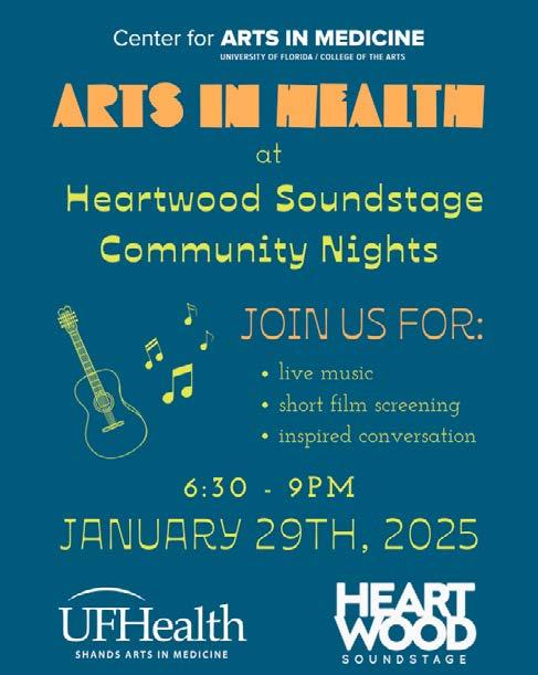
The selected fonts strike a balance between playfulness and professionalism, ensuring an inviting and joyful tone while maintaining the credibility expected of a university department. Serene, with her expertise in graphic design, played a key role in shaping the visual identity, while Madison led the implementation of the new brand guidelines across all platforms. Their collaboration resulted in a refreshed, cohesive brand presence that enhances the Center’s ability to communicate its mission effectively while standing out in the field of arts and health.
Oriana Dos
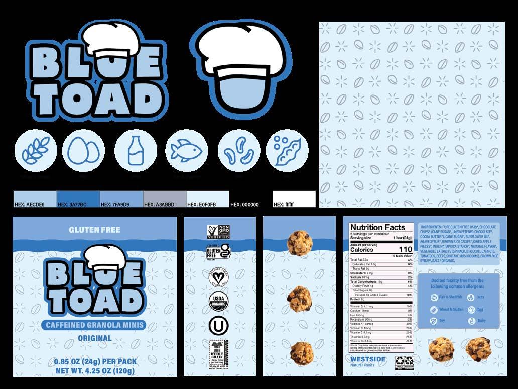
As part of a class project, the brand identity for Blue Toad was developed to position it as a provider of nutritious, portable granola clusters designed for busy college students with dietary restrictions. The brand caters specifically to individuals seeking gluten- and dairy-free options, offering a solution for those with specialized health needs or personal preferences. The branding strategy aimed to portray Blue Toad as a healthy yet fun snack option, aligning with the active and dynamic lifestyles of college students.
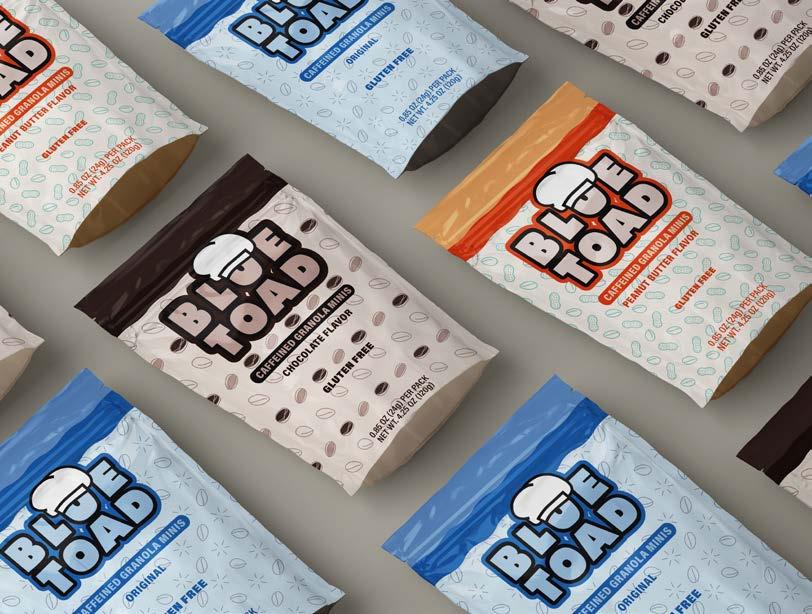
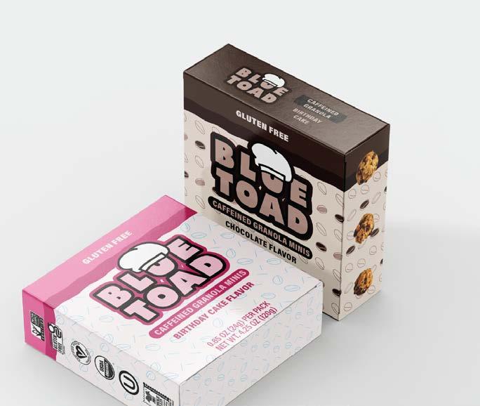

Visual elements were crafted to emphasize the product’s natural ingredients and nutritional benefits while maintaining a playful and approachable aesthetic. The goal was to communicate that healthy eating can be both accessible and enjoyable, even for those with dietary limitations. Through this approach, Blue Toad successfully positions itself as an inclusive and convenient choice for healthconscious students. The brand’s identity highlights the balance between wholesome nutrition and everyday convenience, reinforcing its appeal as a go-to snack for students on the move.
Savannah Doremus
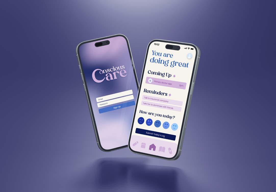
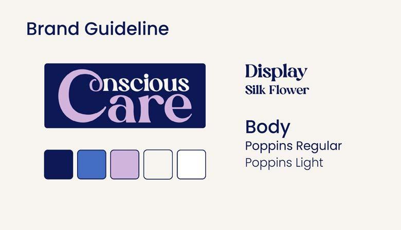
Conscious Care is an innovative app prototype designed to support caretakers of Alzheimer’s patients by providing essential tools to navigate the complexities of the disease and manage the emotional challenges that come with caregiving. The app offers a range of thoughtful features aimed at enhancing both practical care and emotional well-being. Key functionalities include reminders for doctor’s appointments and daily activities, ensuring important tasks are never overlooked. A comprehensive medical profile allows users to track medications, monitor symptoms, and document past health concerns, providing a centralized space for essential health information.
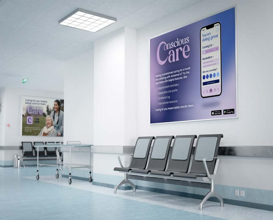
Recognizing the emotional toll of caregiving, Conscious Care also includes a personal log where caretakers can process and reflect on their experiences, offering a space for emotional expression and stress management. Additionally, the app features an education and resources page tailored to the specific stage of the disease, ensuring that users have access to relevant, stage-appropriate information and support. By combining practical organization with emotional support, Conscious Care empowers caretakers to provide better care while prioritizing their own well-being. The app is designed to simplify caregiving, foster understanding, and offer reassurance through every stage of the Alzheimer’s journey.
During an internship at Patch of Heaven Sanctuary as a Marketing and Communications Intern, Angelica Herrera developed branding materials for the Bee Goodies product line. This initiative was a collaborative project with in-house beekeeper Melissa Sorokin, aimed at promoting and selling beeswax products at the sanctuary. Half of the proceeds from these sales were designated to support Patch of Heaven’s mission of nature conservation and education. The branding project included designing a logo using Adobe Illustrator and creating a pricing list that reflected the product’s handcrafted nature.
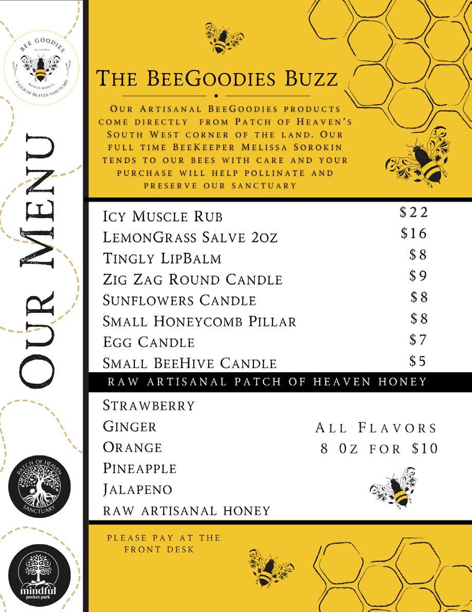
The logo was inspired by the sanctuary itself, incorporating native and pollinator plants found on the grounds into the bee’s wing design. This approach not only honored the sanctuary’s commitment to the environment but also visually connected the products to their place of origin. Additionally, the pricing menu was crafted to complement the rustic, handmade aesthetic of Melissa’s beeswax creations, ensuring consistency across the branding materials. The result was a cohesive visual identity that captured the essence of both the sanctuary and the artisan quality of the products. This project successfully blended conservation values with creative branding, enhancing the appeal and purpose of the Bee Goodies line.
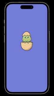
Khalida Clark, Karis Dunnam, Ky’mani Brown
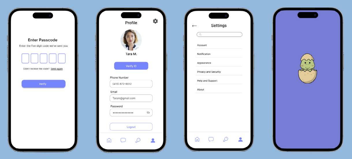
Hatchly is a rental property platform designed to simplify the search for trustworthy short-term housing, specifically catering to University of Florida students and the broader Gainesville community. Recognizing that college students often struggle to find reliable sublease agreements or available units for temporary stays, Hatchly provides a streamlined solution. The app connects students with verified sublease opportunities and available rental units, ensuring a safe and convenient browsing experience. Users can easily search for listings based on criteria such as location, price, and lease length, making it ideal for those seeking flexible, short-term arrangements.
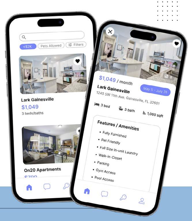
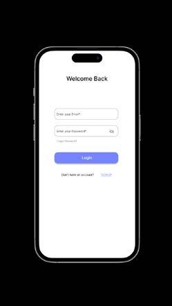
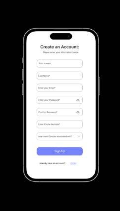
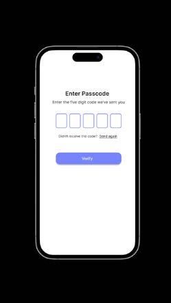
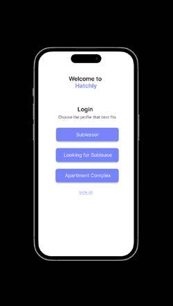
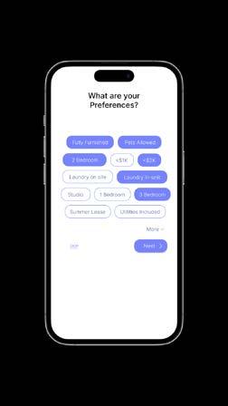
The app’s design focused on principles of text fields, image views, search fields, digit entry, buttons, and more to make the app as user friendly as possible to those who may be less educated in the real estate field. By focusing on trust and convenience, Hatchly addresses the unique challenges students face when navigating the short-term rental market. The app’s intuitive design and local focus make it an essential resource for Gainesville residents and students looking for reliable housing options.
Saadia Saleh
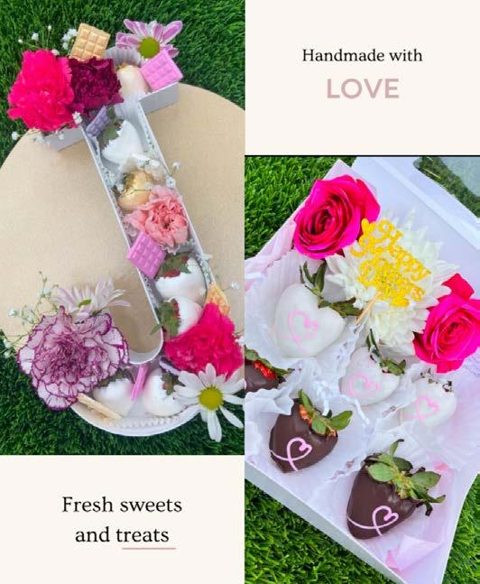
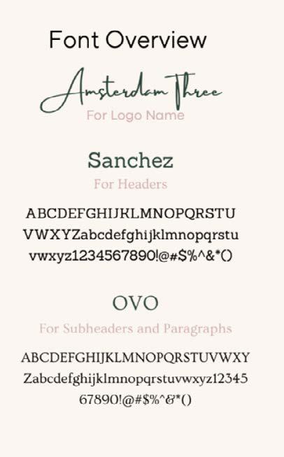
This project was a personal passion rooted in Saadi Sweets, a small business specializing in chocolate-covered strawberries and custom sweet treats. To bring the brand vision to life, Saadia Saleh developed a comprehensive brand kit and guidelines that capture the essence of the brand. Every element—from the color palette and logo to typography—was carefully designed to reflect Saadi Sweets’ core values: handcrafted quality, feminine flair, and a personal touch. The primary objective was to elevate the brand with a cohesive identity that seamlessly extends across social media, packaging, and promotional materials.
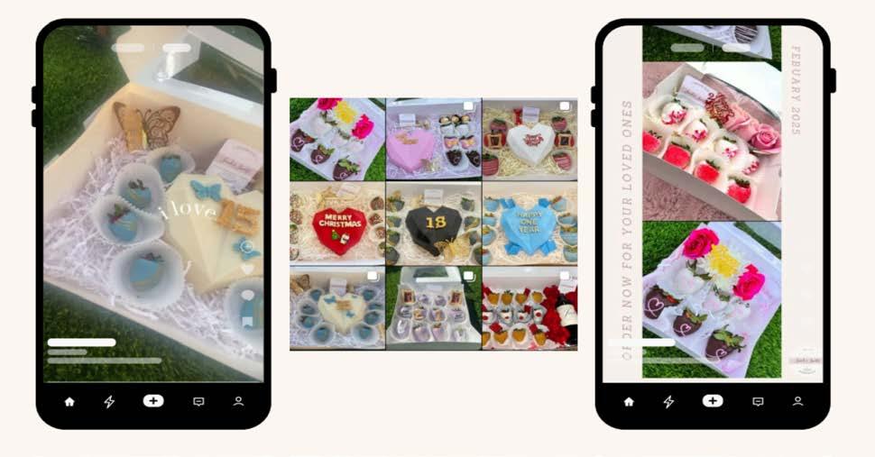
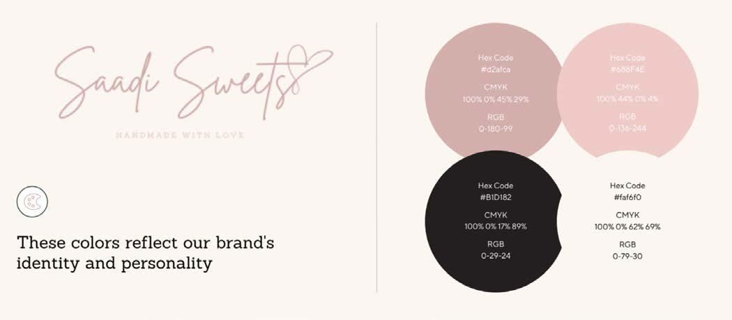
This brand kit not only enhances the visual presentation but also shapes the overall customer experience—from the initial impression to the unboxing and that final sweet bite. It represents the transformation of Saadi Sweets from a fun idea into a polished and thoughtful brand. Beyond the visual elements, the brand guidelines were created to maintain consistency in tone, messaging, and storytelling, ensuring that all communications align with the heart of the brand. This project blends creativity with strategic thinking, establishing a strong foundation for future growth and fostering deeper customer engagement.
Volume 7 of advnt would not have been possible without the support of everyone mentioned.
Thank you to all of the creatives who submitted their work. Your pure talent and drive inspires us in our our own creative endeavors.
Thank you to Ad Society and Elevate Agency for helping us to spread the word about recruitment and submissions.
Thank you to our staff advisor Dan Windels for your wisdom and guidance, and for helping to keep us grounded throughout this crazy journey.
Thank you to the College of Journalism and Communications for providing us a space to nurture and spread our creativity, as well as the advertising department staff for your continued support.
Thank you to Lee Jensen and the staff at Alta Systems for helping us to immortalize this work through the printing process.
Thank you to every UF student who shared our social media content and helped us to spread the word about our seventh volume.
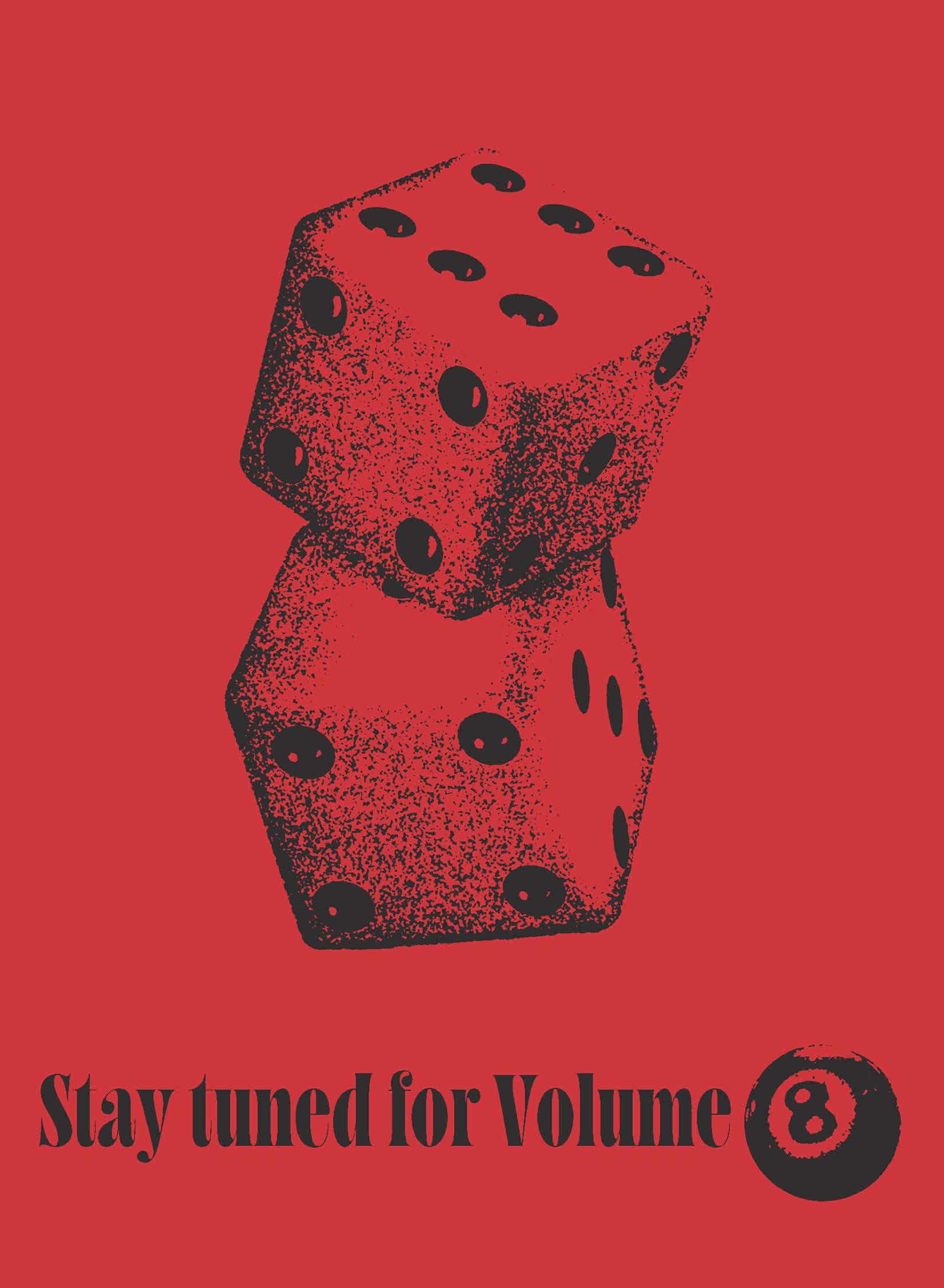
“Lucky Number 7” is the seventh volume of advnt. The theme of this book compares different elements of advertising to the theme of luck. Throughout the book, our team members created visual illustrations and copy explanations to guide you through classic games of chance, encouraging you to try your luck. We hope you enjoyed the journey.
The portfolio is divided into four sections: Print, Digital, Integrated Campaigns, and Branding. Print is dedicated to work that is meant to be printed across mediums like newspapers, magazines, billboards, and posters . The Digital section features different digital activations and in-app integrations. Integrated Campaigns section features cross-platform cohesive campaign work made for placement across multiple media channels. Finally, Branding contains any work contributing to a brand’s identity and development.
Between November 2024 to February 2025, our team solicited submissions from students across University of Florida’s College of Journalism and Communications (UF CJC) through an integrated campaign digitally & in print. Our team spoke to courses and encouraged students to submit any advertising work they had created for a course, for a job or an internship, or just for fun. After the submissions campaign closed, an internal team reviewed and screened the work and we proudly feature over 60 students’ hard work in this volume.
The visual layout was created in Adobe InDesign CC 2025. The illustrations for the front and back covers as well as each divider were brought to life by our illustration team in Procreate, Canva, Adobe Illustrator, and Adobe Photoshop. The divider and editorial copy were created by members of our copy team.
This book wouldn’t have been made possible without the passion and dedication of our entire team. The vision behind “Lucky Number 7” was only realized through painstaking rewrites and meticulous visual polishing. Our portfolio is a love letter written to each creative who works day and night to fearlessly bring their art out into the world, and we hope to continue this tradition in our future publications and communications.
-Madison Calvert, Executive Director & Elena Limonta, Creative Director
Skylar Prieto & Sydney Savage
Karina Ferreira Emma
Cale
Erin
Brundage,
Leetal Fishman, Paige Mungall, Tamar Hassman, Bryn Walsh & Nicole Mladenovska
Manuel Uribe, Faith Hundley, Avery Brennan & Spencer Linkhorst
Kanesa Burke
Michelle Gilman
Ashley Collins
Elena Limonta
Madison Calvert & Serene Cheon
Oriana Dos Santos
Savannah Doremus
Angelica Herrera
Khalida Clark, Karis Dunnam, Ky’mani Brown
Saadia Saleh